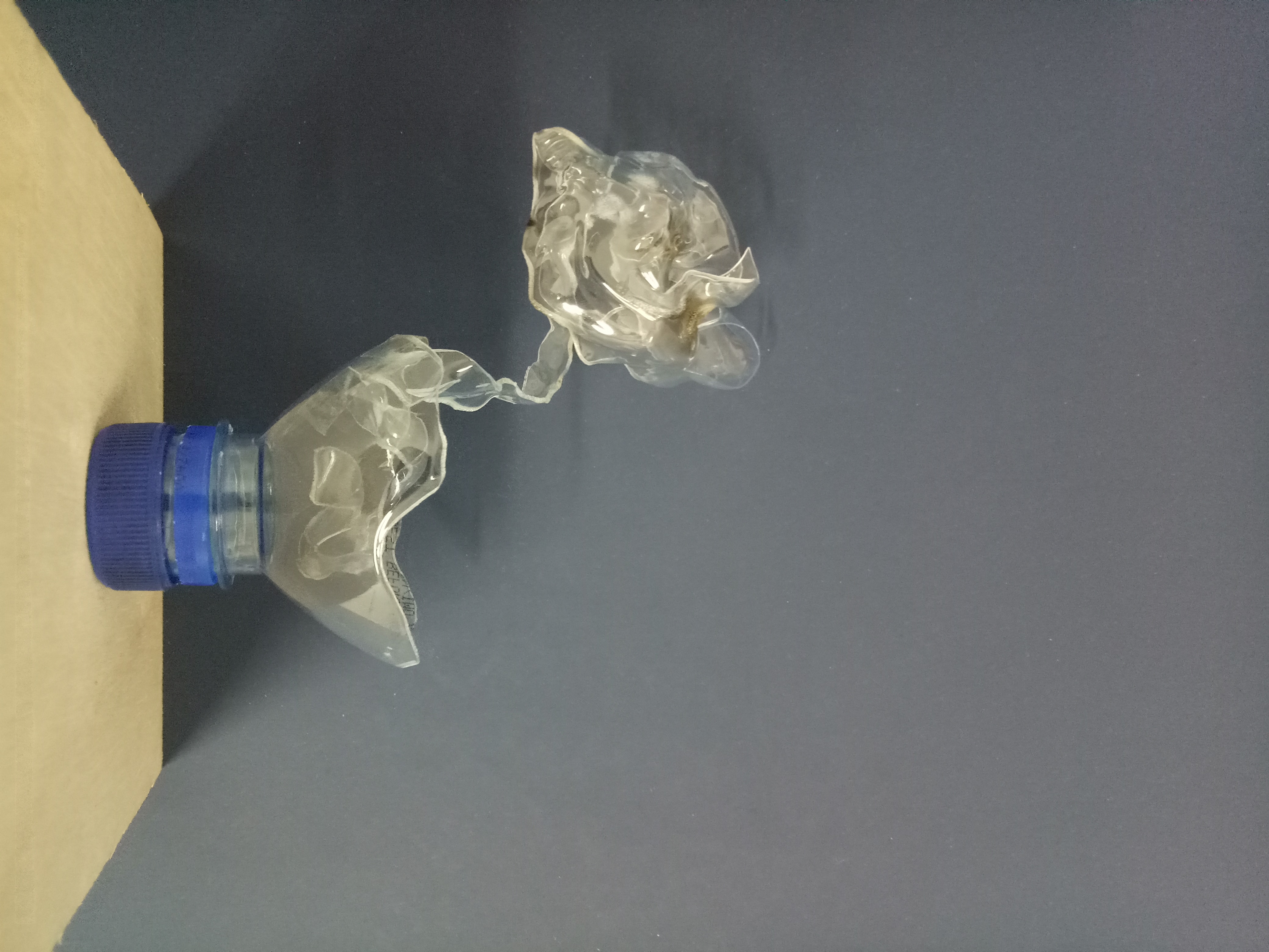
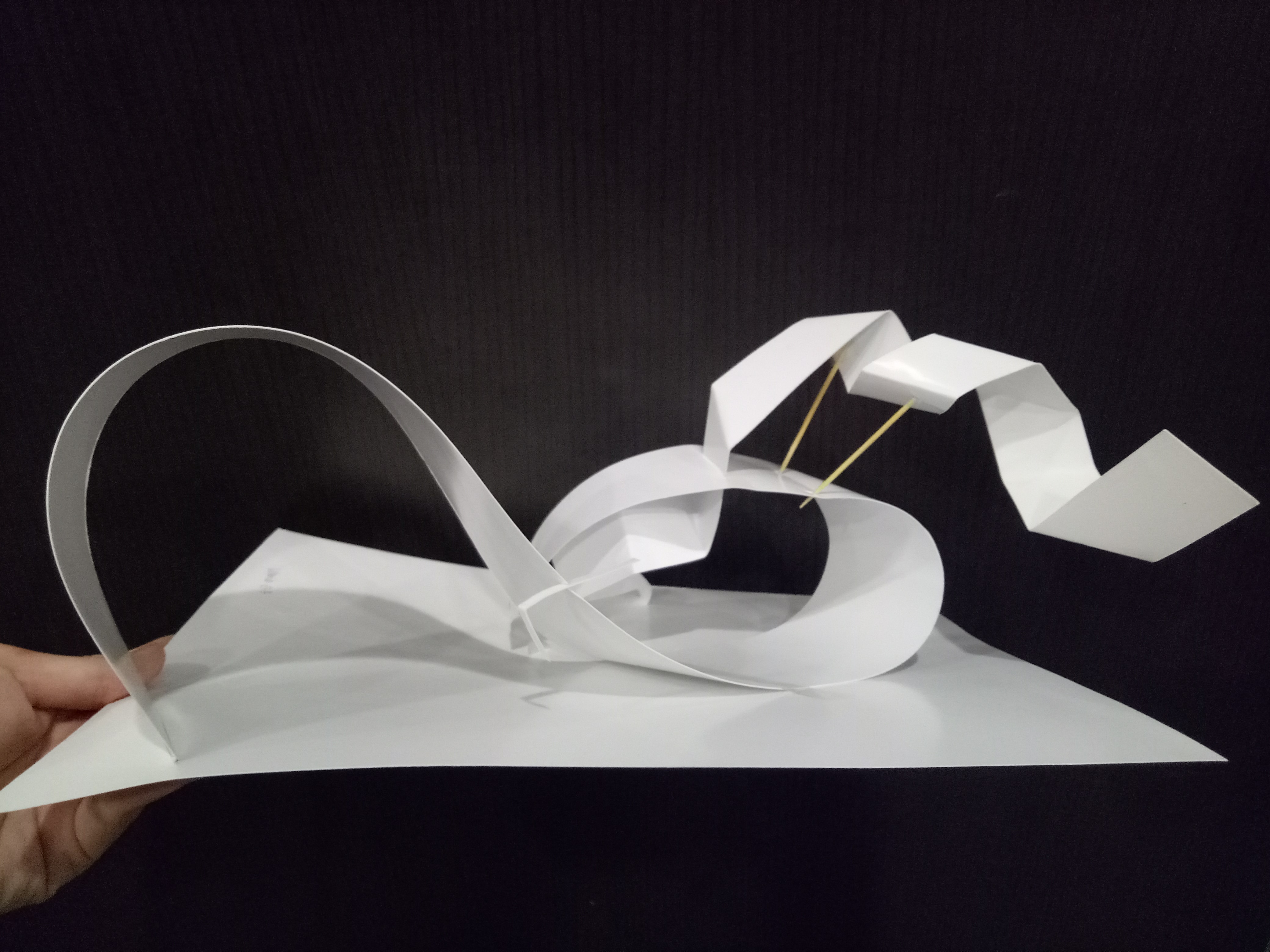
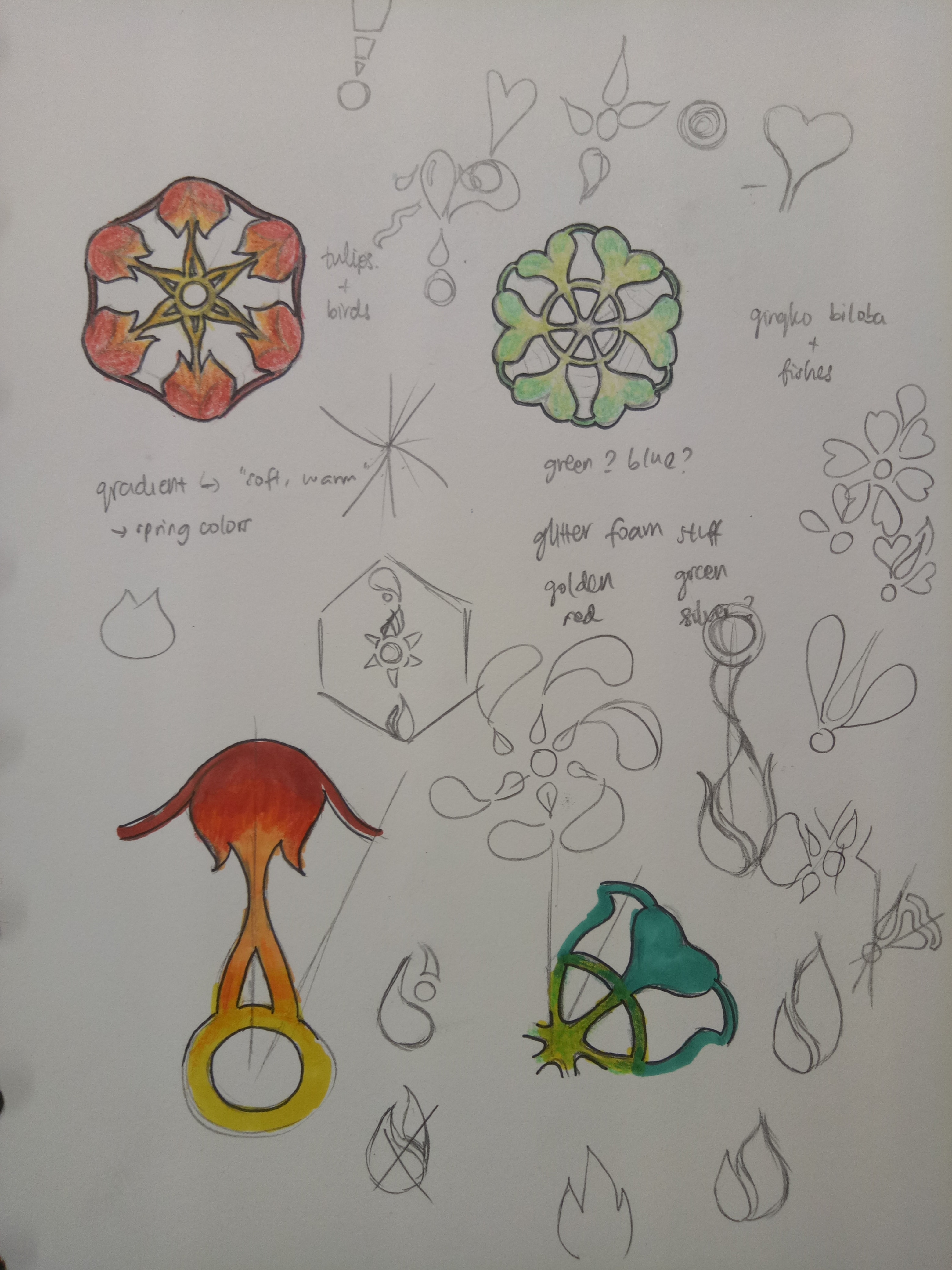
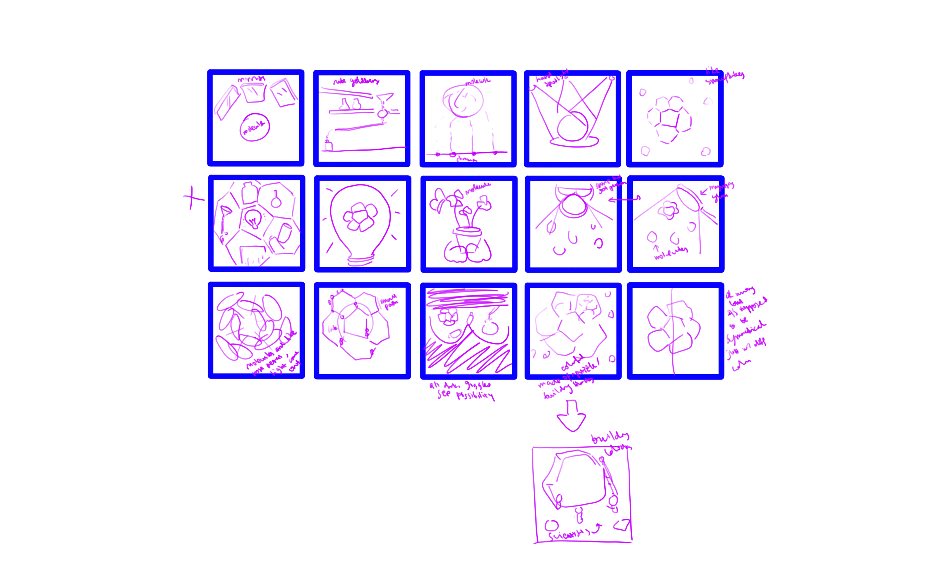
Process

Thumbnails

I came up with the thumbnails. Some of the keywords that I used in my ideation process are light, mirror/reflection, possibilities, symmetry, beauty, research, and discovery.


Sketches

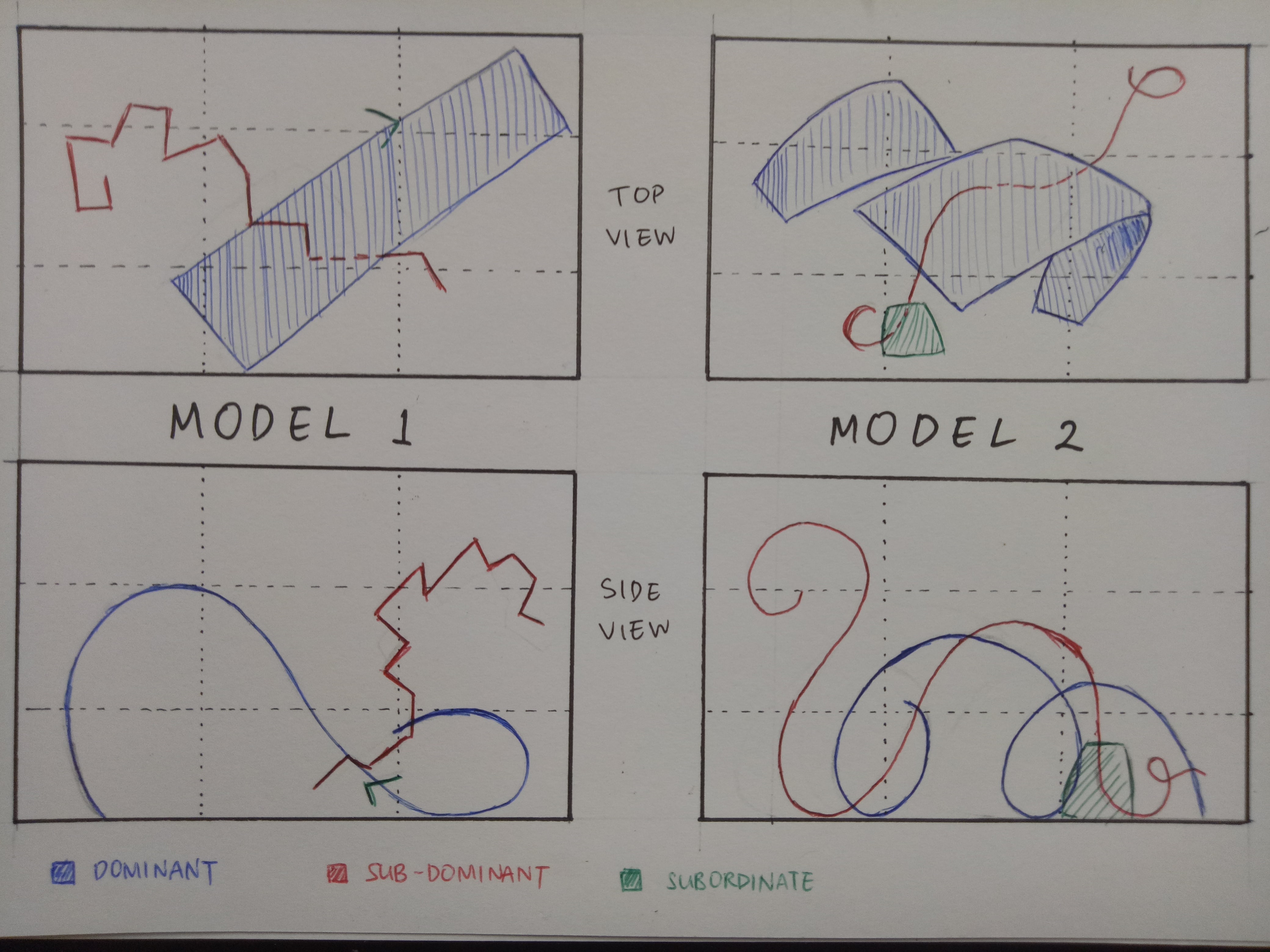
From the thumbnails, I decided on three of the strongest ideas.

  1. Corannulenes under the hard spotlight from magnifying glass. Straightforward, simple, illustrating discovery and research. The corannulenes would be in different colors to suggest possibilities. I was thinking of making them look like falling snowflakes.
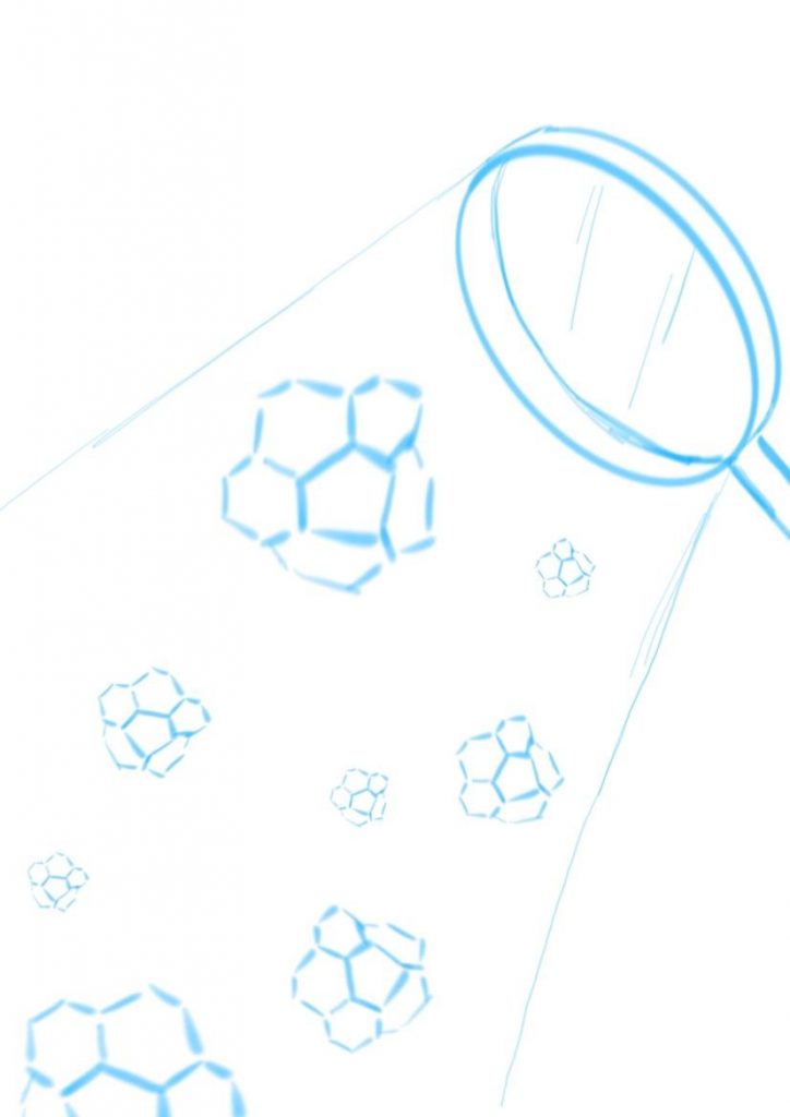
    Idea 1

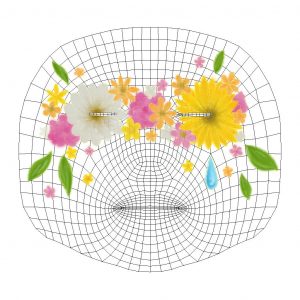
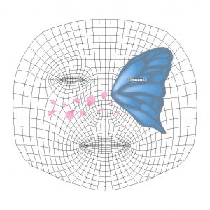
  2. Corannulene in the center as the main character, with mirrors surrounding it and showing reflections of the different possibilities of what it could be. The focus is on possibility and variability in research and discovery.
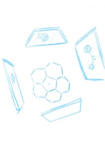
    Idea 2


  3. I’m not sure what it is but it’s sort of like pinball machine/Rube Goldberg machine/just some kind of mechanism, like an arcade game where a ball rolls down to the bottom. Instead of a ball, a corannulene will roll down. It portrays the fun and insightful side of research.
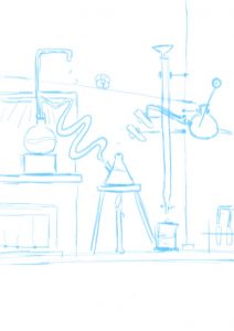
    Idea 3


I asked for feedback from Professor Ela and she really liked the mirror idea (idea 2). To be honest, that is not my favorite idea (mine is idea 3). I wasn’t sure whether I should go with the idea that I liked the most or the one that the client liked the most. In the end, I went with idea 2. It is not going out of my comfort zone per se, since I don’t have any comfort zone (I am not that well-versed in illustration yet…) so I thought it’d be a good exercise for when I go out into the “real world” to follow what the client likes more. It is, in a way, a challenge I posed to myself.
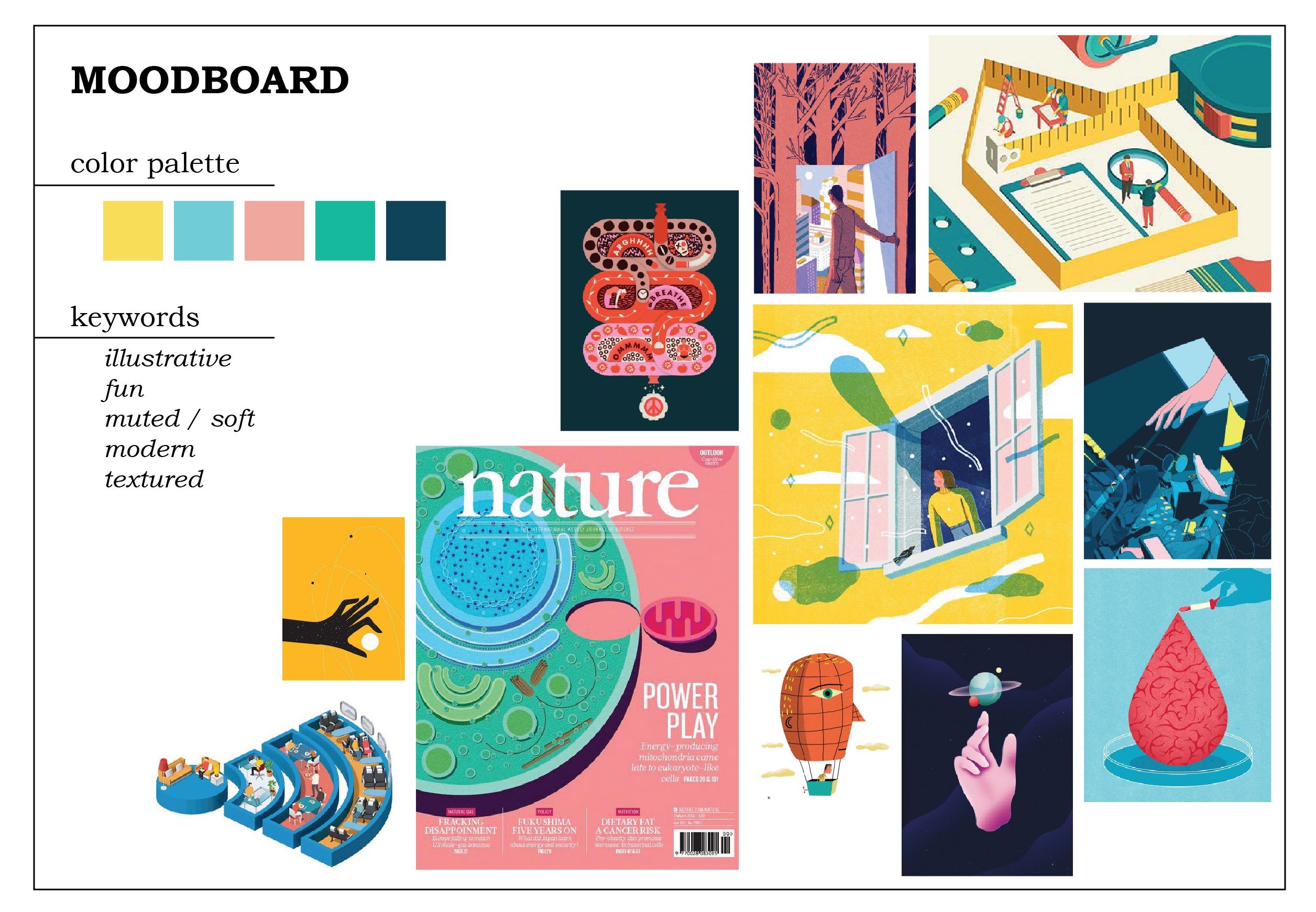
 

Moodboard

I want to practice drawing flat illustrations more, so here is my moodboard. I love the soft colors, especially the pink and yellow, and wanted to try using them.

I had some difficulties as I was envisioning idea 3 with this art style. For idea 2, I thought I had to go with a more realistic style for it to fit, but then I thought again, why not. Just try it. So I didn’t change my original moodboard and decided to just… go with it.

Final

This is my final result.


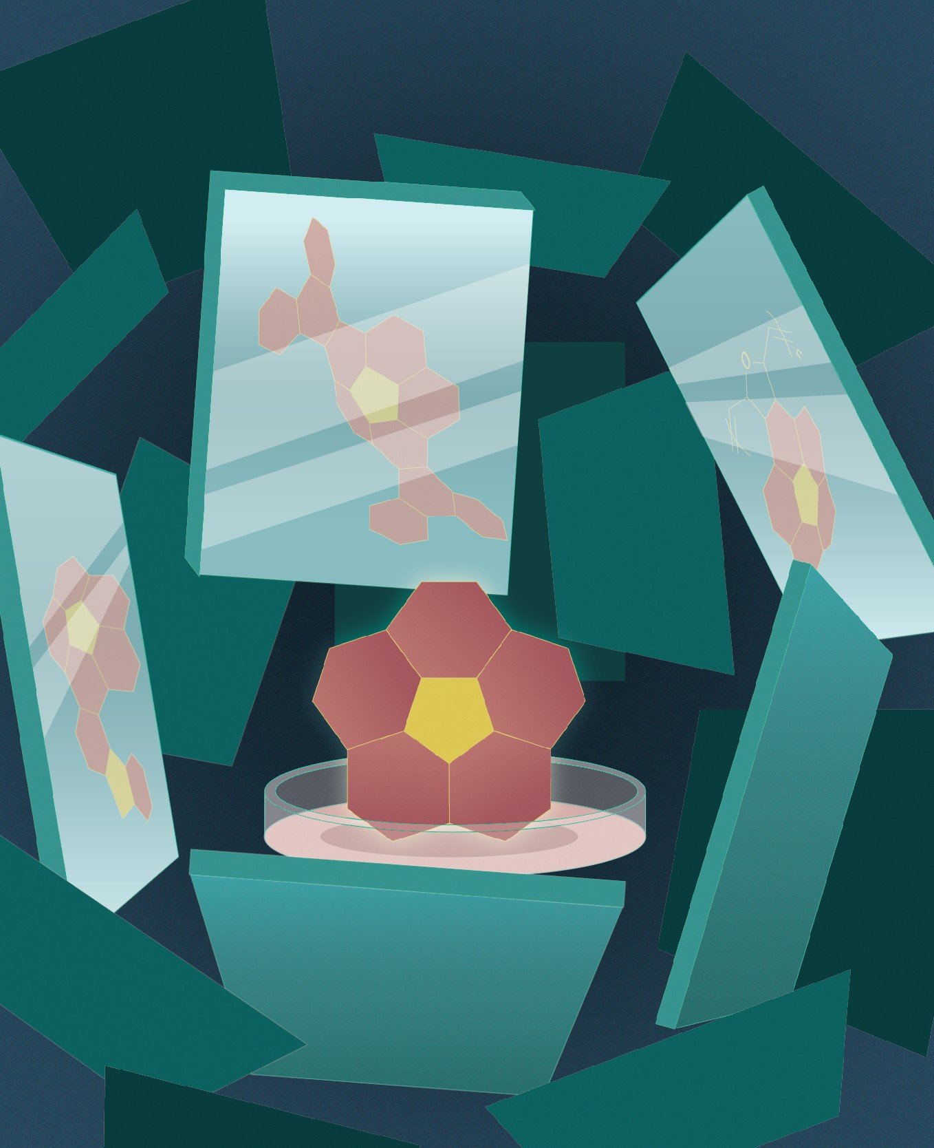
I put the corannulene in a petri dish to emphasize the fact that it is a molecule because one of the feedbacks that I got from my friend(s) is that they didn’t recognize it as a molecule, especially because I used color fill on them instead of the molecular skeleton. Taking into account the fact that the title of the journal would be in white, I used dark colors as the background. To draw attention to the corannulene, I gave it a bright color, although now I’m wondering if the pink and the yellow are too eye-catching.

My biggest struggle is giving depth to the whole composition. I added more mirrors with darker colors to illustrate mirrors that are further away, but it still fell flat. I also added noise (which made my Illustrator run slow…). In the end, I added gradients to most of the elements and a slight glow to the corannulene as an attempt to “save” the flatness. It’s still lacking, but it’s admittedly much better than before. However, I really should have made the gradient on the background more contrasting. I could also do better with my color choices.

I didn’t want to use gradients at first because they often turned out duller in prints compared to in screen, and prone to printing failures. I wanted to use a stipple brush for a shadow effect, but I am not sure how to do that (even after watching a video on how to do that) and I was running out of time (yes, I have terrible time management) so I took the shortcut which is using gradients.

There are so many things I could do better. However, it has passed! I’m kind of relieved since I was struggling and stressing over this assignment so much, and the result is certainly not the best I could’ve done, but I’ll give myself a pat on the back. All in all, that had been a great exercise for me.

Filter 1: Client

For this project, I asked my non-ADM friend to become my client. (She’s happy to do it.)

We have known each other for years, so suffice to say, I know her pretty well. I asked her about what she’s passionate about nowadays and she said sustainability; she’s been trying to reduce plastic usage more by bringing her own lunchbox for take-away food from the canteen and always using reusable bags when shopping.

Recently she encountered something that made her realize that a lot of people around her are aware of sustainability issues, yet are not moved to do something about it, and it made her rather upset.

Taking that, I put two keywords together: nature and sadness.

Here is the artwork.

Nature here is symbolized by flowers and leaves. I chose a daisy and a sunflower as the main flowers as those are my friend’s favorite flowers. Since my friend is a bright and positive person, I chose a bright color palette for the flowers in general, with occasional pale white flowers to balance out the daisy. Yellow and orange are especially her favorite colors.

As for the sadness, I put a single teardrop. It also portrays the loneliness of being alone, since she felt that she was fighting with the issue alone sometimes. Since the flowers are mainly yellow-white-orange-pink, the blue teardrop stands out well.

I also outlined the entire artwork with glowing pencil texture, but it’s not very visible. I wanted to give it a handmade feeling since my friend loves arts and crafts. I made it “glowy” to represent her confidence, the way she carries herself.

At first, I created the flower to cover the eyes completely to represent blindness to the issue of sustainability, but it might not look good as a filter, so I create openings for the eyes. I wanted to portray the saying “see no evil, speak no evil, hear no evil” but I got stuck on thinking of what elements to put. I didn’t want to ruin the composition altogether by adding too many unnecessary details, so I decided to focus on one, which is the eye part.

Here’s how it looks on her:

(She was excited to model for me.)

It does look a little weird on some types of faces since the brown centers of the flowers are located right at the corner of the eyes, but I’m quite satisfied with how it looks on my friend.


Filter 2: Self

One thing I need to say: I like BTS. I chose three BTS songs that I love the most, and I feel, represent me in different ways. (Also disclaimer: it didn’t take me very long to decide on this. Really, whenever I have projects about myself or my interests, my personality is suddenly reduced to either mental health or K-pop or both.)

Before I go into the explanation, here is my artwork.

The half-wing of a butterfly represents the loss of hope and the inability to live up to potential. I am not the most positive person and I also have issues with self-esteem, so I think it’s a perfect representation of my inner problems. It is also linked to a BTS song titled “Butterfly”, which speaks about the fear of losing loved ones. In a sense, it also relates to me. In this pandemic, I can’t return back to my home country, so I’m really concerned about my family back in Indonesia and whether they are doing well.

The color of the butterfly is blue and grey, which is the title for another BTS song: “Blue & Grey”. The song symbolizes depression and loneliness as the colors blue and grey, and I relate to that a lot.

Lastly, the flower petals are the symbolization of the song “Spring Day” (because there’s a line that says “Flower blossoms are falling”), which is about longing to meet loved ones. This relates back to the point about my current situation of not being able to return home, and the desire to do so.

For the technicality, I tried to make it look more sentimental since the topics that I’m symbolizing are mostly emotional ones. I like how it turns out; it’s simple yet aesthetic, and there’s a nice balance between the somber blue and grey and the lively pink. Overall they look like they are symbolizing the arrival of spring (referral to “Spring Day” again?) and budding of new hope, which contrasts my representation of the half-winged butterfly. (I hope it makes sense.)

Here’s me with the filter:

I think it doesn’t look half bad on me. I still really like the colors. Blue just happens to be my favorite color as well.


Reflection

After I finished creating these, I was excited to see how they look on the faces. However, I was (and am) worried that it may be too simple. This is almost my first time creating digital illustrations (I’ve also never drawn anything by hand and scanned it digitally). I don’t know what my style is; I don’t know what to do, I don’t know how to blend colors. Time passed by so fast when you know nothing.

However, despite that worry, I’m still satisfied with how they turn out. Mostly though, it’s just me, just doing it. I didn’t think much about stylization, honestly, because I’m lost myself. So I told myself to just draw and that’s how it turns out. I suppose I should have dug deeper to find my style. For now, I’m happy just exploring. One step at a time!

Also, you can see that I drew the flowers first before the butterfly since the flowers are all drawn on one layer while the butterfly is very beautifully layered. I have learned from my mistakes.

I still feel like I should’ve done more, adding more elements? But this is what I can make within the time. So. Yeah.

Through the interview, I also learned the differences when I’m making things for myself compared to when I’m making things for others. For me, it was easy to just create something very personal. Also, when I’m creating for others, inevitably I’m adding things that reflect my perception of them.

All in all, this has been a fun project. Learning about Spark AR is interesting, and I can feel my own personal development throughout this assignment as well. Hope I can do better next time.


Here’s the link to the assignment folder!


Here are the two posters that I find interesting.


Poster for Frankfurt exhibition by Kazumasa Nagai (from http://theanimalarium.blogspot.com/2011/01/life-is-change.html)


I found this on Pinterest and can’t find who made it. (from https://www.designspiration.net/save/1446483313272/)


I will be talking about the second poster, the yellow one.

This poster is promoting a festival of industrial design in Sydney, and the slogan is “Ignored Everyday”. At first I’m really interested because of the minimalist appearance, with only yellow and black colors. My eyes were immediately drawn to the title due to the black highlights that contrasted the yellow background. After that, I shifted to the yellow paperclip, which didn’t blend with the background due to the outline and the shadow. It created a visual interest that makes people question, “Why a paperclip?” And that prompts the audience to read the information provided.

The information is written using sans serif fonts, which makes the whole look consistent and simple. All of them used black color, which contrasted the bright yellow background very well. I feel that the font size of the festival information could be a little bit bigger because the font is very narrow and thin, which compromises the readibility – but overall, I think it’s eye-catching, simple, and effective.

The theme for my project is the spring that comes after winter – the starting of hope, an early spring.

Winter is something that is associated with death, with coldness. On the contrary, spring symbolizes the birth of life and warmth. I want to symbolize hope as something that you can find even in the hardest moments.

My initial idea was to create a snowflake design made of flowers, but after the first presentation, I got the idea of putting the “spring” using the negative space in the snowflakes instead.

The very first design that I did was all connected because I was still thinking of the shape as something that needs to be able to be cut out from a paper. Moreover, the shapes are all either vague or too obvious. So after consultation, I tried to break free from the cut out form, combining the idea of winter and spring. The things that I chose to symbolize spring is sun, fire, water, and plants.

I made two snowflake designs. The first one is made of the shapes of leaf, sun, and fire. I chose yellow and red as the colors, as I want it to be triadic with the blue snowflake color.

The second one is made of the shapes of flower, water, and gingko biloba (a type of tree that grows in Japan and blooms in spring). For the colors, I chose orange and two tones of blue, playing on the complementary colors.

I gave a pale blue color to define the snowflake shapes, but they got lost after printing. The slight difference between the red and orange was also lost, making them look like the same color. The yellow was definitely too bright as well. (This taught me not to print last-minute.)

I arranged them randomly, with three foam circles on top to represent a cloud. I used nylon strings because I want it to be invisible, so it looks more like snowing, but it turned out really messy. I couldn’t really tie them properly. My craftsmanship is… bad. The paper cuts are pretty messy (I didn’t know something like x-acto knife exists before, or even if I spelled that right) and I only glued them with glue stick. I did leave them for hours under heavy books, but I forgot to attach the string so I had to rip them open again.

“I can cut all of these in 30 minutes”


*1 hour later* “…well I’m halfway there”


My bad.

Craftsmanship aside, I actually like my end design. It’s something I’ve never thought of before, and I felt like I understand more about forms after doing this. Positive-negative space is not as easy as it seems, no matter how cool they seem. I do think that I’m not pushing myself out of my comfort zone enough, that I still could do better – but overall, I’m satisfied. I did kind of lost my purpose halfway and realized that the mobile did not really represent hope; the blue color gave some cold feeling to it. Moreover, some of the edges for the snowflakes are quite harsh. I agree that at first glance it doesn’t convey hope, but I think that if you look at it closer, you can see the hope in it, and that goes with my initial idea.

I was so worried the day before submission because I felt like I haven’t done enough. Well, true, I could have done more, but I’m content with what I have made. Hopefully from now on I can make better and better works.

UPDATE: I took off all the fishing lines and replaced them with strings. Initially I poked the strings through the foam circles using a needle, and it was fine but it started falling apart the day I planned to submit it. I fixed them hastily with masking tape. It doesn’t look as neat, but it actually looks better than the fishing line.

Here’s my final design!


Sometimes, I feel like people living in Singapore lead a very structured, scheduled life. Compared to the people of Indonesia (I was born and raised in Indonesia), everything in Singapore feels very organized, to the point of rigidity. When I first came to Singapore, I was surprised by the stark difference between Singapore and Indonesia.

At first, I thought Singapore would be a “follow-the-rules” country, which hinders creativity. However as I spent more time in Singapore, I realize while there may be a lot of rules, as long as you can justify yourself, creativity is not being frowned upon.

I represent that discovery of mine with this Bauhaus piece; the blue circles are all in the box, seemingly following a set pattern; but actually inside every single blue circle there is a little yellow triangle that can go out of the box and explore more possibilities (represented by different shapes and sizes of the triangles).


Bauhaus piece

The theme that I’m trying to convey is ignorance towards preservation, especially poaching activities, in Labrador Park. Labrador Park is the only rocky seashore left in mainland Singapore, with abundance of marine life. Due to illegal poaching and other reasons such as safety, the beach area has recently been closed to public.

I feel that not enough people know about those aforementioned facts (or maybe they know, but choose not to be concerned about it) and that is why I want to take the theme up. However that proved to be a big challenge for me because my intention is to show the ignorance or lack of knowledge, but the zine just came out very vague (i.e. people can’t tell at all what my place is). I want to say that it proves my point that people are unaware, but I still feel a little concerned since it wouldn’t go with the zine brief.

In the end I went with something I’m more comfortable with, that is, by focusing on the narrative and flow instead of the actual layout. I’m also concerned since it looks more storybook-ish rather than a zine, and although it’s very reflective of my personality, it may not be very suited for the project.

Here is my final zine!

cover page

page 1 and 2

page 3 and 4

page 5 and 6

back cover page


So the narrative revolves around a little shell who gets poached for aquarium decoration. Since the zine is intended more for children, I want to evoke the feeling more that “sea creatures too don’t want to be separated from their home”.

About the cover page

The cover page took me way too long to make, since at first I made one row of waves and just copy-pasted everything, but my friend said it’s too repetitive so I went through the trouble to make the rows one by one so they all look more varied. To be honest I really love the colors that I used. For the pages I used different blues for the backgrounds and the blues get darker at different pages because I want the feelings to slowly become “darker”.

About the narrative

The first and last page inside kind of envelope the whole experience with narrative; I received a comment saying they wish the narrative is a bit longer. I feel that that may reduce the impact since if the narrative is too long people will get bored faster, especially children.

By the way, I tried so hard to make a rhyming poem, and I actually think they’re okay. Maybe I should’ve chosen a different font, but I actually feel like this font is enough since it fits the storybook feeling. I also received comments saying that I should have capitalized the first letter. I did that at first, but then the letter stands out (of course) and I don’t really like the overall look, so I stuck with the all-small letters.

About the pattern

As for the background pattern on the first and last page, at first I only made the sea waves pattern but after consulting, I realized that it lacks representation of the place so I added the buildings that you can view there. Some people say it adds more characters, some people say it’s kind of out of place, but I like it.

About the character

I choose orange as the shell color because I want a contrast to the blue, since I already know from the beginning I will use a lot of blue. I tried red, but I think it comes out too jarring. Orange provides a warmer, friendlier feeling while staying bright.

I choose a shell because it’s simple to make, and also I want it to blend with the sea waves at first.

About page 2

In the wave, I added different sea creatures to tell audience about the diversity. The yellow scales on the fish provides a line that people can follow to see the orange shell at the end. For the other creatures, I outlined them blue and use mainly red-dark orange-pink so they won’t draw too much attention. I want the shell to be the star of the page.

About page 3 and 4

At first I only put one sign there, and it looks very empty. So I put an excessive number of signs there instead to show that there are efforts in preserving the sea, it’s just that people choose to ignore them. In some ways, it’s a sarcastic remark to point out people’s ignorance. I put rocks right by the waves to illustrate Labrador Park’s rocky shorelines. The characteristics are also shown by the sign, which is considered pretty unique of Labrador Park, and the buildings which can be viewed from Labrador Nature Reserve. I do regret not putting in more characteristics (like the Dragon’s Tooth Gate or some of the war relics?), maybe I could have put them floating between the sea waves pattern on other pages or something.

At the right side of the page, you can see a hand dropping a shell into a bucket. The hand gesture may be a little unclear, it looks like someone is picking up something instead.

About page 5

This is the page I had the least trouble with, because I had envisioned this ending right from the start. I just now think that maybe the aquarium shouldn’t be placed right in the center of the page, but a little bit lower so the shell looks like they’re “falling” from its positioning in other pages. For this page, I made the shell’s color darker so as to say that it’s losing its vibrancy after being separated from home, and subconsciously saying that even if you take a beautiful shell for yourself to decorate your aquarium with, it won’t look as beautiful there compared to when it’s in the sea.

Overall

I’m actually really happy about how my zine turns out! Looking back, I never thought I would have made this. I like the flow of the story, however again, it feels more storybook-ish than a zine. I was worried it’s not graphic design-ish enough, but then I decided to go with something more reflective of my personality and focus on the narrative instead. I realize I wasn’t pushing myself out of my comfort zone enough and decided to play with something I know I can do better at; I definitely should have explored more.

I tried to portray the characteristics of the places more by adding the buildings, but still maybe the characteristics aren’t portrayed enough since people can’t tell about the place at all. (Which proves my point of lack of knowledge, but goes against the brief.)

For the software, I used mostly Adobe Illustrator, but I can’t make a whole page and just copy-pasted them to InDesign because I used the chalky brush stroke, and it came out very pixelated in InDesign. (Turns out it’s just my display preference, but I only noticed it later.) Because of that there’s a lot of layers in InDesign and it took forever compressing them into a PostScript file (I spent an hour at the printing place trying to make it right, fortunately the people are so nice to wait for me and even teach me what to do). My laptop is laggy especially bad whenever I use InDesign, so I have to be smart in choosing what to create in Illustrator and what to create in InDesign and I spent more time than I should have (I also took shortcuts), but luckily they turn out as I want them to.

As for the printing, surprisingly I didn’t have a lot of problems with it. I went to RJ Papers and took my time looking at different papers. I didn’t know there are so many different kinds of papers before! I was considering between using a glossy, magazine-style paper or the paper that I used in the end (I forgot the name, I think it’s Maple Bright?). Glossy paper will make my color pop up more, but it feels colder somehow, so I decided to use the maple paper to convey a warmer feeling of “home” to fit in with my narrative. I choose the 170 gsm one because I want it to be thicker, so it feels nicer to flip.

The colors come out exactly how I wanted them, except for the hand on the 4th page–the printed hand is too yellow compared to my digital illustration, but that’s fine. The different shades of blue came out brilliantly and I like them very much. I even printed an extra zine for myself to keep.

My final zine and feedback (thanks for the comments!)


Me, my zine, and cupcake


All in all, it’s a valuable experience for me. At first I wasn’t sure if I could do it, but I did, and I’m proud of myself (although it actually is something that I am supposed to do so I shouldn’t be too proud of it). I learn a lot more about my style and work attitude. I also learn to ask help from my friends more, be it to comment or to guide me in using software. I was always reluctant to ask for comments because I tend to take things negatively, so I’m glad that my friends are willing to put up with my stubbornness and continued to give me insights.

And thanks to the people who say it’s cute. I think my zine is cute too.

It’s been a really fun journey!

My final jobs are thief, barista, gamer, and watchmaker.

To be honest I was pretty disappointed after printing because:

1. The printing person stretched the image to fit A3, so the images are not A4 anymore (and I just noticed it when I was arranging them)

2. Some of the colors didn’t turn out like I hoped they would or didn’t even turn out at all. For example, my thief job supposedly has a different color for the hole on the wall and some shadow, but they’re not there.

And the worst is,

3. The barista job did not turn out well at all. The wood grain is lost and replaced by super dark brown, making it impossible to see the coffee beans. The shadows on the coffee beans are lost too.

I’ll show you the image comparisons later.

Printing aside, the images turn out pretty well for me, in a sense that I enjoyed the process of creating them and they all pretty much turned out like I had pictured them to be. I learned a lot about Illustrator and Photoshop about this project.

Without further ado, here are the end products:

1. Thief

Compared to the first draft, I made the letters three-dimensional to give more depth and added some sort of “action” to emphasize the idea of “stealing” something. I used clipping mask to make the surroundings all black to give the idea of thieves being caught in action by a flashlight.


Printed version

Although it’s not very obvious, the color of the hole on the wall is different from the printed version, and the opacity of the shadow is not shown. (To be fair, I put 95% opacity so maybe that’s why it turned out really close.)


2. Gamer

To emphasize the idea of gaming, I added the start button, the mouse, and a character (to make it look like the starting of a game). I didn’t want to add too many clouds since I thought it would be too messy, but without clouds it was too plain so I just added a few. As for the character, I made it up myself to represent “me”.


Printed version


3. Barista

Making the latte art is so. Hard. I played around with the effects and I think this quite resembles real latte art, although I have to admit the letters are not very obvious. I added coffee beans to emphasize the “coffee” idea, and I also added a wood grain texture at the back. At first I just wanted to trace a ready image of wood grain texture but apparently they’re pretty simple to make, so I just tried although it may not be THAT good.


Printed version


The printed image is… really bad. You can’t see anything in the background at all; it just looks like a dark brown background.


Zoom in to the background and coffee beans


It’s very different from the image I created. I tried re-printing it but the result is more or less the same.


4. Watchmaker

For this one, I tried to find a sort of vintage font and traced it. After that it’s just creating some different gears and putting things together. It was pretty simple actually. I chose not to add colors to emphasize the “mechanical” feel. There’s also some contrast between the letter V, which contained a wrist watch, and the letter J, which resembles a pocket watch. Both of them are watches so they still fall under the watchmaker’s expertise, but they sort of represent “modern” watch and “vintage” watch so I want to put them both.


Printed version


Some shades didn’t turn out exactly right (like the chains) but it’s still okay.

Reflection

I’m the type of person who usually jumps into things before thoroughly thinking about it first (doing before thinking), that’s why I tend to go backwards when generating ideas but I realized I have to redo a lot of steps that way and it’s not very efficient.

As for techniques, I really learned a lot about digital drawing. I realized that I encountered a lot of problems because I didn’t arrange my layers nicely. Another point: I need to be tidier while working.

Lastly: I shouldn’t print in north spine again.

Here are my end results for this project! Featuring: the mouse, the elephant, the banana, and the turtle.

1. The Mouse

Me, facing a problem + Faith = Problem solved!


I represent myself as a mouse because (I think) my Chinese zodiac is a rat, so my family at home sometimes refers to me as the “mouse” in the family.

The story is that the mouse wanted to get the cheese but was hindered by the presence of the cat. So the mouse began going to church and gained a pair of wings, which enabled her to overcome the problem.

This is the representation of me when I face a hindrance or problem in doing something. The “faith” here is represented by going to church, but actually it’s not necessarily a religious faith. It can also represent faith in my own abilities, since I tend to think that I can’t do things before I actually try them. By having faith, I can actually overcome my troubles in achieving what I want.

I chose to use colored pencils and markers because I wanted to work with something simple, and I wanted to give a child-like vibe. I used markers for the important objects in the panels as emphasis. As for the colors, I used similar colors (shades of brown) for the first panel except for the mouse and cheese because I wanted to emphasize their significance. The background of the second panel also has brown color to create some connection between the panels. From the second to the third panel, the mouse wore the same habit (apparently the uniform that nuns wear is called a “habit”) to create a connection.


2. The Elephant

Me, an introvert + Party = I “disappear”


I used an elephant because of the phrase “elephant in the room” – it’s there, but people don’t talk about it.

The story is that the elephant is so introverted that when she went to a party, she blended in right away with the surrounding and became unnoticed. It was as if she became a furniture, a part of the background.

The elephant represents my introverted and awkward side. I’m not good around strangers, and even within my circle of friends, I’m not good at interacting with people in big groups. In a sense, I’m physically there, but it feels like I “disappear”.

I used the color blue for the elephant because blue is my favorite color. The sofa in the first panel is orange to complement the blue elephant. I used yellow for the floor since yellow and orange are analogous colors. The background (the wall) is supposed to be pale blue, but the color came out a little differently than I expected. I used blue background to emphasize the feeling of the blue elephant “blending” into the environment.


3. The Banana

I have a dream! + Hard work = Success (?)


Banana is one of my favorite fruits. That’s why.

The story is that the banana wanted to become an acrobat. To achieve that dream, the banana worked hard to practice circus acrobat. In the end, the banana became banana split instead. (It’s a pun, because split is kind of a gymnastic movement, and gymnastic is usually related to acrobat.)

To me, it is a good representation of me when I set a goal for myself. Sometimes we dream high and work hard for it, but the end result is not exactly as we want. However that doesn’t mean you’re not successful – you still succeed, although the success might be different from your initial intention. That’s how I feel sometimes when the end result of my work is not exactly like how I want it to be, but I know I worked hard for it, and thus the journey still makes a success in the end.

I used purple background for the first and third panel to complement the yellow banana. As for the second panel, I used the red-and-white background to show that it’s a circus. I used purple juggling pins to make some sort of connection between the panels.


4. The Turtle

Me + Anxiety = Overthinking


Turtle, in my opinion, is a very chill animal. I like it because I’m a chill person (most of the time), so I feel that I can relate to it.

The story is that the turtle, a very chill animal, was just chilling. But then the turtle ate a mysterious black pill and turned into an ink-spewing sotong. (This story sounds more reasonable in my head, but now that I wrote it down, I understand why my friend – to whom I showed my sketches – looked extremely confused.)

The turtle represents me as a person. Usually I’m very chill and somehow normal, but when I’m anxious (I represent anxiety with the black pill), I tend to overthink trivial things until they muddle my thoughts. I represent the state of overthinking with the black ink muddling the seawater. In a sense too, the sea represents my thoughts. It’s usually very calm and clear before I start getting anxious.

I used mainly cool colors like green and blue for this one since I want to give the calm vibe to represent my thoughts. I used some yellow and orange also for the seabed and the inside of the shell as green-yellow are nice analogous pair and blue-orange are complementary.


Reflection

I had trouble deciding what style to go with, so in the end, I told myself, why not just try different styles?

Since I didn’t really do art before studying here, I didn’t have an idea what my style would be like. I’m not even sure what technique I’m good at. So I decided that this project can be a good opportunity to explore my options more, and see what technique or style I’m more comfortable with. It’s really fun, and it’s a really good learning experience for me. I realize that working digitally ensures a “cleaner” result (and there’s undo button as well), but it requires a lot of time (or maybe just because I’m not used to it). I spent a lot of time tracing the outline of the banana split. Also, I learned some illustrator techniques, which I find to be really fun.

Working traditionally is faster, yet since I’m a messy person, there’s bound to be some mess. Moreover, there’s no undo button, so I have to be extra careful. I think the mouse story is really messy since the colored pencils smudged a little. As for the watercolor, I actually had a lot of fun doing it. I’ve always liked watercolor, although I’ve never really worked with them. I just tried putting layers of colors and smudging them with more water. Although they’re very messy (I didn’t expect the pen lines to smudge that much), in fact, I really like how they turn out.

Coming up with ideas isn’t the hardest part – the hardest part is realizing the ideas. I realize that it’s not enough to just have a good idea; I have to consider the feasibility and the aesthetics as well.

I also learn that doing projects is not a show of skills. I’m worried at first because I feel that I’m lacking in skills and experience, and thus my work might turn out “less” compared to other people. I’m scared that my work may be too simple, too child-like – what if I look like I don’t put in enough thought or effort into this?

But then again, why should I compare myself to other people? This is my project, and I’m proud of what I have done. Looking back, I have definitely improved – from someone who never used Photoshop to someone who can create a story using Illustrator. You see, when you’re at the bottom, there’s nowhere else to go but up.

All in all, this project has been a really fun and enlightening ride.

Bottle Sculpture


How is smell related to memories?

Our memory is triggered by a lot of things; what we see, what we touch, what we feel. What we smell can also trigger memories. In fact, scent is one of the greatest trigger of memory. The concept of recollecting memories with the use of scent is also called olfactory memory.

Image result for scent memory
My pleasant smell is the smell of Chinese tea…


…while my unpleasant smell is the smell of carrot juice.


Here is my bottle sculpture.

Front view

Top view

The base (dominant part) is supposed to represent a cup. The rest of the sculpture has the idea of going “up” because I want to portray a “steaming cup”, which represents my pleasant smell. At the top there is just a whole chunk of wrinkled bottle, which shows something very “cringy” and unpleasant for me, and even almost nauseating.

At first I wanted to make the wrinkly part by cutting some holes in the bottle and then heating it, but it didn’t turn out as expected.


Planar Model


A plane is an element with surface direction without mass.

There are two types of plane, 2D and 3D. The difference is, if you look from above, 2D planes fit in a rectilinear shape, whereas 3D planes don’t.

Types of planes

Here are my planar models.


2D analysis of my models

Model 1

I used a grouped plane for the dominant, broken plane for the subdominant, and bent plane for the subordinate. I tried to make the curves for the dominant at two-thirds and one-third of the total height respectively. I filled the void above the shorter curve using the subdominant. I put the subordinate at the same area as the subdominant to leave the bigger curve area empty, to contrast with the “crowd” at the other side. In a sense, it is also a form of counter-balancing.

From top view, I made the subdominant point away to kind of fill in the empty area at the top corner.


Model 2

For this one, I used twisted plane for the dominant, grouped plane for the subdominant, and a straight plane for the subordinate. I just realized that actually both of my models are similar in a sense that I made the subdominant go up and leave the rest of the area above empty.

From top view, the corners are generally empty while the center part is fully covered by the dominant and even the subdominant.

To me, this model looks like a snake in a playground for some reason. That was my initial idea for that, but I don’t think I convey it well enough.


I feel like I should have explored more with the ideas I want to convey, because although I did use different types of planes and different arrangements, they have similar vibes.

I tried to find the keywords from the quotes and find elements to represent them.

Quote 1

“Happiness can be found even in the darkest of times, if one only remembers to turn on the light.” -Harry Potter and the Prisoner of Azkaban (2004)


Keywords:

Light, happiness = light bulb, a little girl (represents hope), intricate background

Dark times = dark surroundings


At first I wanted to use daffodils to represent happiness, because in the flower language, daffodil means happiness. However my first draft turned out awful; there are just too many things going on, but they are not interacting with each other.

In the end, things are kept simple. The light bulb acts as a source of light or “hope”. Hope is also represented by the face of a little girl. As for the part “happiness can be found”, it implies that happiness is actually there, but we just can’t see it because it’s obscured by the darkness. Hence happiness can be represented by the intricate background that is slowly revealed by the light. In further distance, it looks all black and dark due to the absence of light.

I put the light bulb off the center so it won’t be symmetrical. Also, the face of the girl inside the light bulb is facing to the right side, to lead our eyes into the dark void all around the canvas.


Final


Quote 2

“A paper girl for a paper town.” -Paper Towns (2015)


Keywords:

Paper = fake, mask, mirror


I used a lot of masks to represent a lot of “fake” people, which represent a “paper town”. As for the girl, I used a broken mirror as a face. It represents the idea of fakeness as a broken mirror can’t show exactly what’s reflected there.

At first I wanted to use the mirror as a background and use human figures looming at the girl to show a “paper town” but it didn’t turn out very nicely. Actually I even wanted to use the figure of Cara Delevigne (the main actress in the movie Paper Towns) as the girl but I couldn’t find a perfect picture of her. To save time tracing path, I purposely searched for pictures of girls with straight hair.

The whole canvas actually looked pretty symmetrical if not for the broken mirror. At first I considered adding something else, but I liked the idea of using the broken mirror to “break” the symmetry. I also didn’t want to make the canvas more jam-packed since there were a lot of masks as the background.

The symmetry also represented uniformity, which can be caused by herd mentality. Usually people tend to follow popular beliefs although that go against their own convictions. For me, that is the idea of “fakeness”.


Final


Quote 3

“Even miracles take a little time.” -Cinderella (1950)


Keywords:

Miracle = butterfly

Time = hourglass, clocks


I represented miracles with a butterfly, since just like Cinderella who turned from rags to riches, beautiful butterflies were once ugly caterpillars too. The change or the rebirth is representative of the “miracle”.

As for the time, I used two things; hourglass and clocks. Hourglass indicates more about a time that is running out. In a way, it is implying that in the end, if you wait long enough, something (in this case, a miracle) will happen.

The clocks leading to the butterfly were supposed to represent time passing and to lead us to the result of a miracle, which is the butterfly.

I wanted to put magical elements in it at first such as a magical wand or glittery effect, but it looked very childish, so I scrapped it off.

To make the picture looks more dynamic, I tilted the hourglass and put it slightly off the canvas. The clocks were also placed in a curve and were getting smaller to lead our eyes to the butterfly.


Final


Quote 4

“It’s not like there isn’t air inside.” -Narnia: The Lion, The Witch and the Wardrobe (2005)


Keywords:

Inside = a confined space

Air = atmosphere, wind, sky


I used a jar to represent “inside”. I made it look transparent to make it the overall look more cohesive. Moreover, the transparency also suggests that there is actually a very thin line between “inside” and “outside” – it’s only the confines of walls. To emphasize the idea of “inside”, which is contrasting with “outside”, I put a scenery as a background.

The jar is slightly open and clouds are coming out from it. For me, the quote is saying that things that usually can be found outside can be found inside as well. Talking about air, I connect it with the sky, and hence the clouds.

Actually I did a pretty positive interpretation of this quote although it was meant to be mocking. Edmund, the character who said that quote, was arguing with his siblings. They told him to go play outside with them to get some air and he countered with that quote sarcastically.

I made the jar disproportionately bigger to make the comparison between the inside and the outside easier. I also put more things at the lower half (the jar and the scenery) to balance out the void at the top. I filled around two-thirds of the top part with clouds, leaving a completely empty void above the jar area, which should be roughly one-ninth of the canvas.


Final


Reflection

Somehow my gifs are not moving and I don’t know why.

I have no experience using Photoshop before, so it was a challenge (especially the tracing part – I am not patient enough sometimes). Moreover I had troubles interpreting the quotes and turning them into a cohesive picture. My interpretations are bits and pieces that did not speak to each other at all, resulting in a very disconnected picture. I have to admit, I really have a lot of problems with this project.

Even with these finalized pictures, although I am happy with them, I realize they’re far from perfect.

I hope I can use this as a stepping stone and for me to learn so I don’t repeat the same mistakes again.