Recap
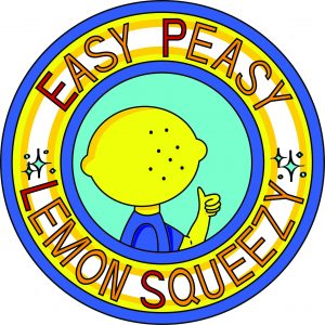
So, the event that I chose to do is a stand-up comedy show that is a little dark and/or sarcastic. The concept is lemon-related puns with a lemon as the main character for the design.
The collaterals that I decided on are a poster promoting the show, a bottle label, and six-pack packaging for the bottles. The idea is the audience will be given a bottle for free to drink during the event, but they can choose to purchase packs of the drinks after the event. (Disclaimer: the drink is lemonade. This is a lemon event, after all. But for the sarcastic points, I do admit that they look like alcoholic beverages.)
Process & Final
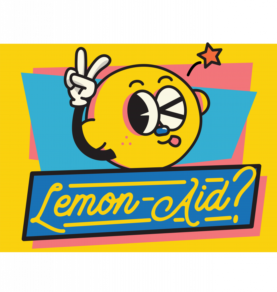
Poster
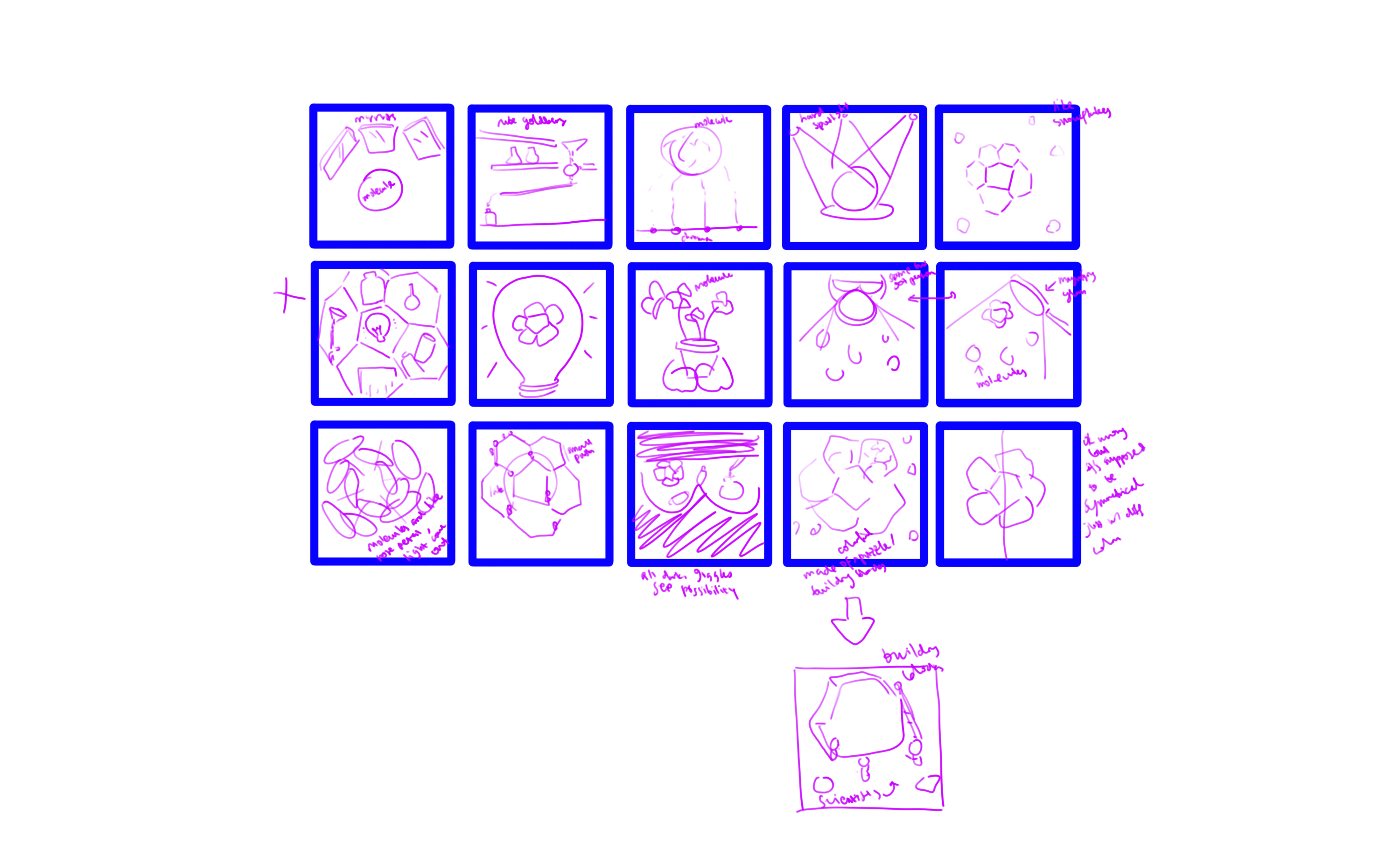
So I came up with the character (lemon) and the “title”: When Life Gives You Lemons. Here are some of the drafts:
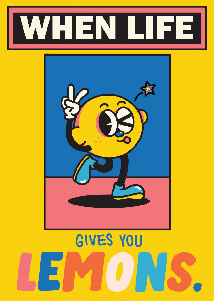
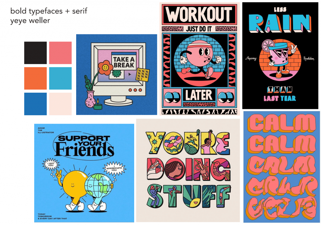
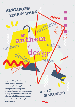
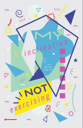
At first I came up with this, but it felt very limiting and way too similar to Yeye Weller’s style.
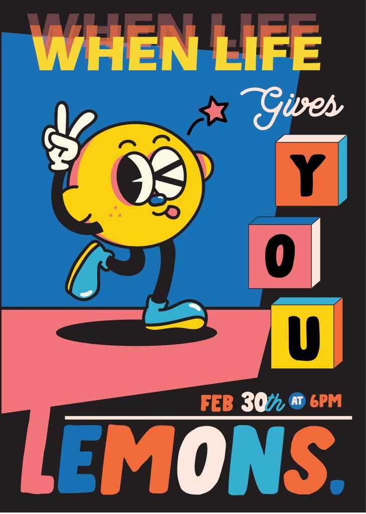
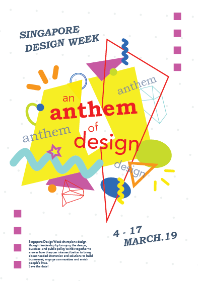
After some trial and error, here is the final poster:
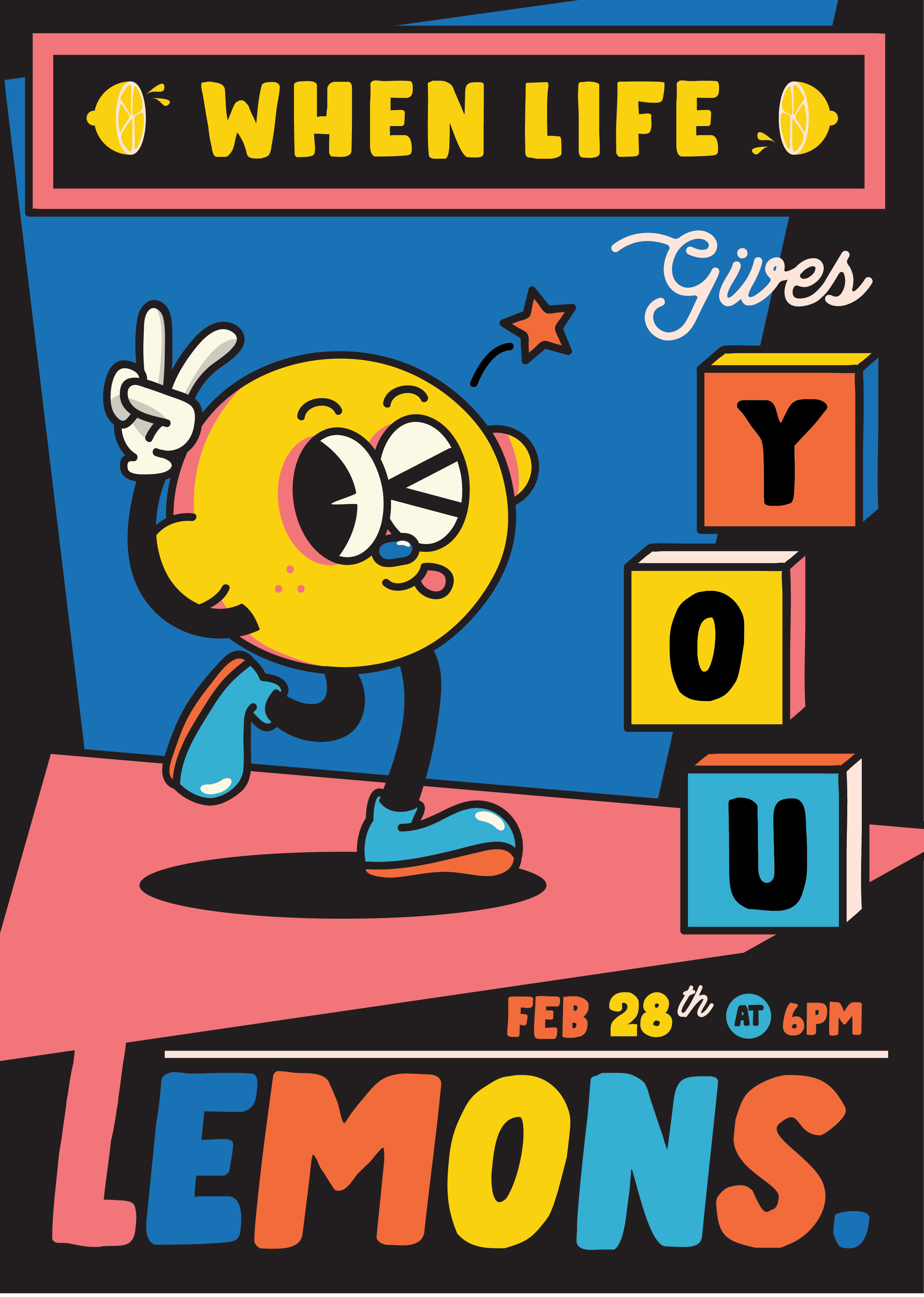
For the typefaces, I chose a thick handwritten-style font, paired with an elegant yet friendly cursive for contrast. I think they make a good pair in the theme I’m going for.
The biggest challenge with this poster was adjusting the colors, but I’m satisfied with the end result.
Bottle Label
So for the drinks, I used a pun with lemonade and called the drink “lemon-aid”. Since it’s an “aid”, my immediate idea was to draw the lemon sick or injured. Also, since the concept of the event is pretty dark, I figured that drawing a lemon cut in two will be perfect. So that’s what I did.
Here’s how the label looks like:
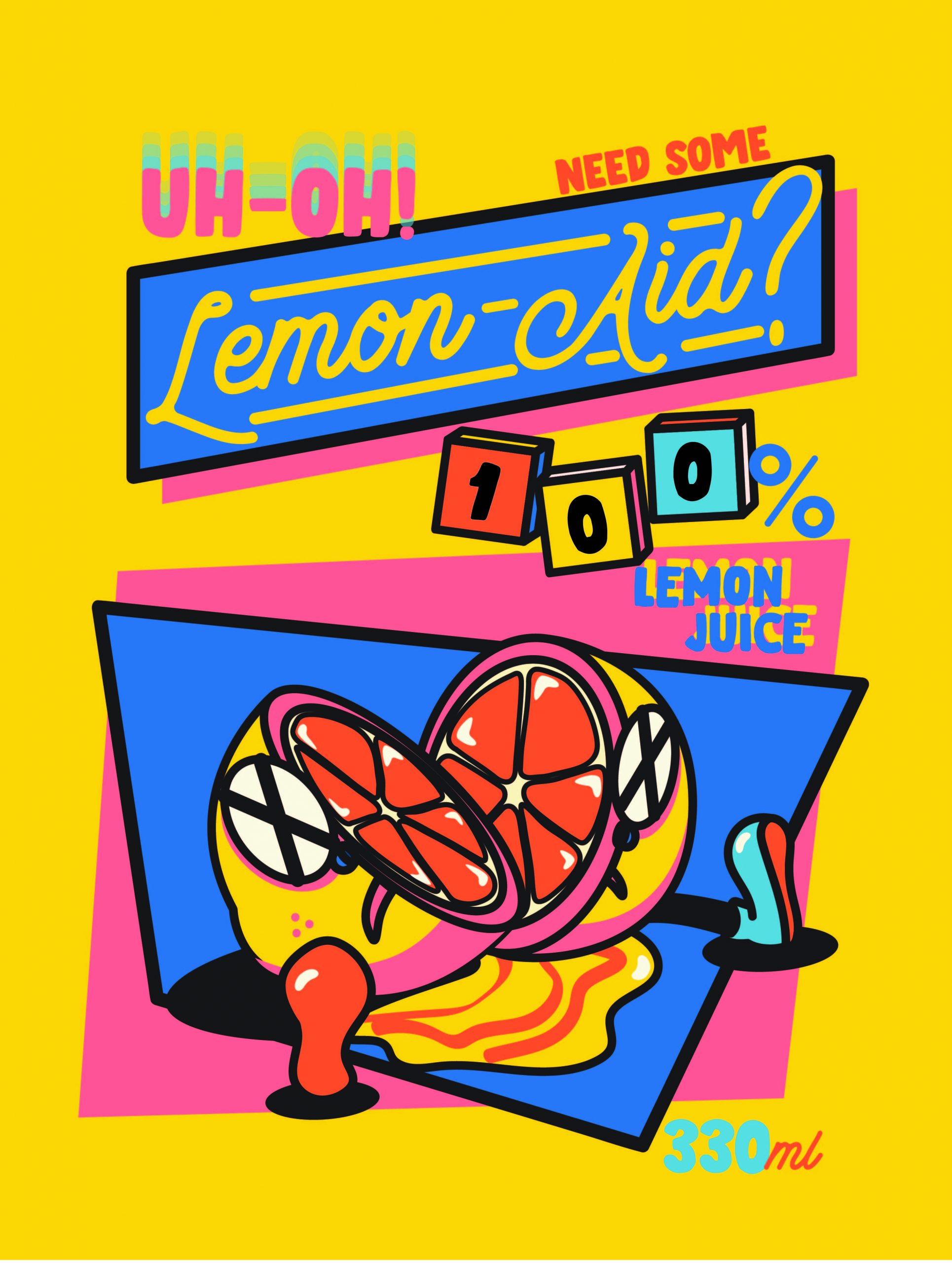
It’s definitely not perfect, but I’m really happy with how it turned out. Again, adjusting the colors is one of the biggest challenges I faced in the design process.
Six-Pack Box
Again, same with the other two, my issue was adjusting colors. So pretty much I did a lot of trial and error with different colors.
Another issue that I had was the composition. Unlike the poster and the bottle label, I wasn’t sure what to put at the front and how to arrange them in a way that is still within the theme, interesting, yet not too similar to my previous designs.
This is my first draft:
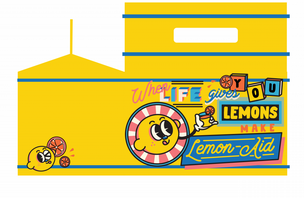
When I put it on the mockup file, I thought that having different colors for the side and front would be fun. Also, the side was too empty and it was too much of a “drop” compared to the front, so I added more stuff to the side. Here is the final:

Others
Besides the collaterals, I also made a label for the neck of the bottle.
I came up with two designs for the neck label:
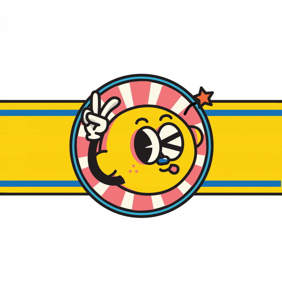
I decided to go with the first one after trying both out on the mockup file since it looks less packed.
Final (Bottle & Box)
Putting everything together on the mockup file, here’s how they look like (minus the poster):
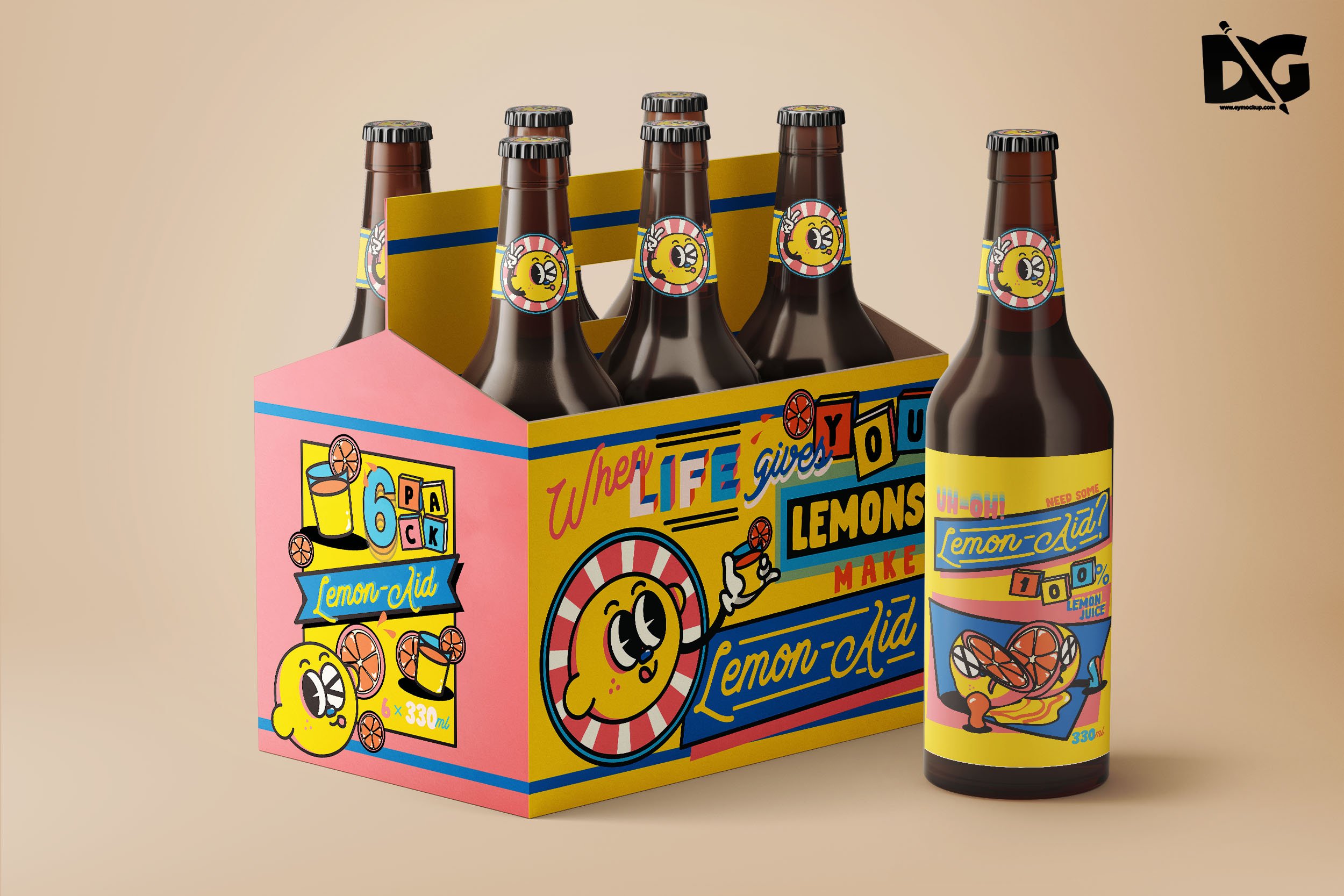
I think it turns out fun and cute while being a little sarcastic, just the way I wanted it.
Reflection
I find out that I really like doing this style. Also, that designing with this style is not as easy as it looks. I’ve always been drawn to flat illustrations and softer colors, but doing things with a fixed set of strong colors is actually good for me since I’m weak in color composition.
While doing this project, I asked for my friends’ opinions a lot (since we study together a lot) and I find that I can be quite stubborn with my ideas. When they give me feedback, I keep trying to justify why I did it that way. Now I’m a little worried about having to deal with clients in the future.
Adjusting colors has always been a big weakness for me, and I think there’s no other way rather than trial and error to come up with the best color composition. The thing is sometimes I’m not patient enough; when I see something that’s “pretty good”, I tend not to continue trying and settle with that. Which is also why feedbacks from my friends helped a lot in pushing me out of that comfort zone.
In addition, since the style for the design direction is more playful and “packed”, I had to be smart with the arrangement and styling of the words. Even just adjusting which component comes in front can make a huge difference in creating the overall look.
Also, designing things for 2D and 3D objects are similar, yet different. I had to adjust the label for the bottle several times to make it fit better with the face of the bottle, considering the way the bottle curved and everything.
All in all, I had a really good time working on this assignment. I think it’s become one of my favorite works. I might just use the concept and the character for something else in the future.
Here’s the link to my Google Drive folder for the final PDFs. Cheers!