Hyperessay: Unnumbered Sparks (2014) by Aaron Koblin and Janet Echelman


About the artist

The artist that I will be talking about here is Aaron Koblin. He is best known for his innovative use of data visualization and work in crowdsourcing, virtual reality, and interactive film.


“So I think data can actually make us more human. We’re collecting and creating all kinds of data about how we’re living our lives, and it’s enabling us to tell some amazing stories. Recently, a wise media theorist tweeted: ‘The 19th century culture was defined by the novel, the 20th century culture was defined by cinema, and the culture of the 21st century will be defined by the interface.’ And I believe this is gonna prove true.”

-Aaron Koblin (TEDTalk, 2011)


A lot of his works is collaborative in nature, where people come together to create something, since more people will mean more data and more data will result in a greater story produced. In those projects, usually the engagement of the audience is highly crucial, making the audience the artists themselves. Without the audience, the project will not be. Literally, will not be. Some examples are the Johnny Cash Project and This Exquisite Forest, where he literally asked the audience to create the art itself.

In a sense, as the creator, he often only creates the platform and concept, leaving the creation of the actual “art” to the audience themselves.


About Unnumbered Sparks


[Taken from http://www.unnumberedsparks.com/]

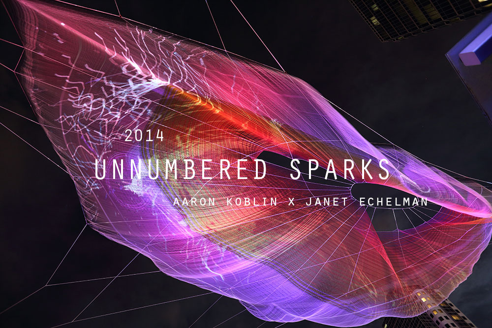
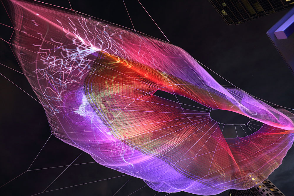
Aaron Koblin and Janet Echelman (an American sculptor and fiber artist) worked together to create Unnumbered Sparks for TED’s 30th anniversary in March 2014. Unnumbered Sparks, as quoted from Koblin himself, is a “monumental interactive sculpture in the sky”.

How it works


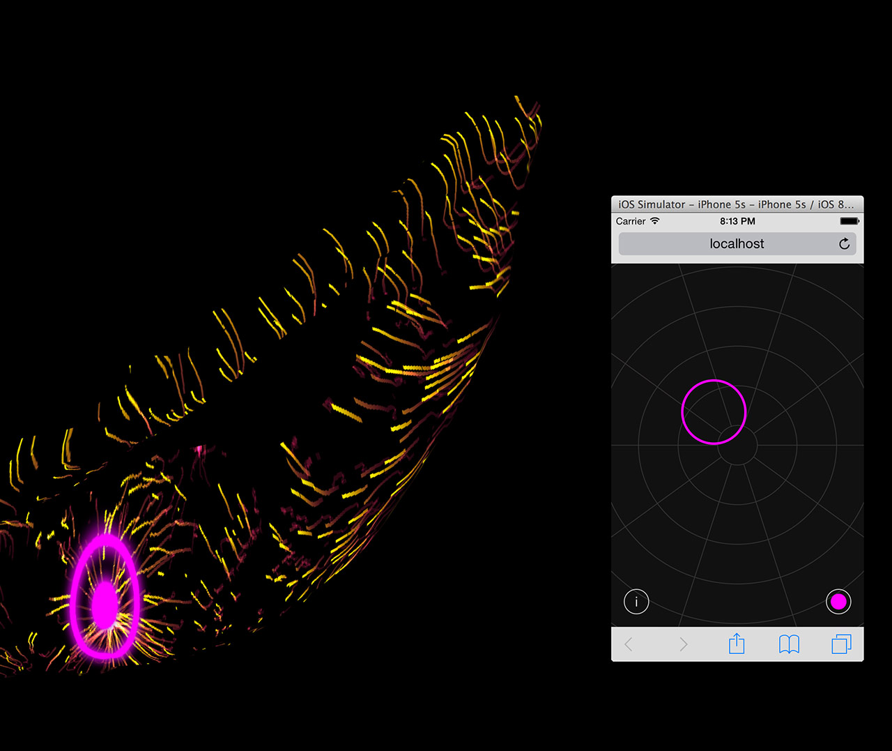
Interface and projected result. [Taken from http://chrisdelbuck.com/projects/unnumbered-sparks/]

Basically, they created a massive net sculpture (745 feet long, or around 227 meters) and spread them from buildings to buildings across the sky in Vancouver, Canada. Five bright HD projectors will emit light beams onto the nets, which will result in shapes being projected on them, creating a stunning visual. The light beams were choreographed by participation from the audience, who could sign into a WiFi network created specially to connect to the program that controls the projectors. Signing into the WiFi would prompt the audience immediately to a website, which will display the nets. Audience could then touch the nets on their screen. It will correspond in real time, as the spots they touched will be translated into colorful light rings using the projectors. Those light rings will also “interact” with the other light beams projected on the nets.


Old and New Media

Unnumbered Sparks relied heavily on the programming, with a lot of elements relying on each other in kind of a relay to create the final outcome.


“The lighting on the sculpture is actually a giant website. It’s one huge Google Chrome window spread across five HD projectors. The content is being rendered in WebGL. It uses Javascript and shaders to render particles and sprites based on user motion, which is transmitted from mobile browser to our rendering browser via websockets. There are a lot of moving pieces here, from the local area network to the server (written in Go), to the sound system (also running in Chrome with Web Audio API) all the way through the LED light control system, which pulls pixel data directly from the browser.”

Aaron Koblin on how Unnumbered Sparks works


Honestly, reading that, I am not sure of what is going on since most of the terms is unfamiliar to me. What I could gather is that the program, or the “language”, is constantly being translated to something else until it reached something that could produce the expected outcome.

Due to that heavy dependence on computational parts, I think it’s safe to say that Unnumbered Sparks falls within the New Media. However, while programming is crucial, there is another part to this installation: the nets. The creation of fiber nets itself, I believe, is more within the Old Media and I think it is “artistic” enough to be considered an art by itself, even without the light beams projection. The nets didn’t just function as a screen for the light beams, but rather, adding variability to the visuals. The choice of material and crafting method affected how the nets will behave under different circumstances, i.e. weather conditions. Imagine if they used a simple screen or just project the light beams onto a wall; it won’t be as beautiful.

Analysis

Unnumbered Sparks has a high entropy—the possibilities of the visuals created are endless, since humans’ behaviors are unpredictable. They can create spots wherever they like. In addition, the net itself is constantly changing, allowing the visuals to be projected to different dimensions. Different number of audience would produce different results as well—there are so many aspects that contribute to the variability.

I thought that Unnumbered Sparks doesn’t possess high automation at first; however, I then realized that there is still certain artistic visuals portrayed even without the participation of the audience; it’s just not as varied, but it will still be pleasing to the eye.

The machines (in this sense, the projectors) give immediate feedback with regards to the inputs, which are the spots pointed by the audience on the screen of their mobile devices. However, the feedback itself is a programmed response. There is no memory—the machine will not change its feedback, regardless of time or condition.

There is also a lot of communication between humans and machines, since the actions of the machines are always controlled by humans. There is also machine-to-machine interactions, as the program is constantly translated from the mobile device interface all the way until it reaches the projectors, which will create the light beams. I didn’t think there is any human-to-human interactions at first, however Koblin did say that he saw a lot of strangers started interacting with each other under the sculpture. I’m not sure if he referred to the interaction as something that caused the creations of the projections or something that is caused by the projections instead, but I guess in some level, there may be some human-to-human interactions.

What I think is interesting is the immersion. I think having massive nets hovering above the audience is interesting and effective, since it will immediately make anyone standing under the nets to feel “engaged” to the artwork, even before they are actually interacting with it. The effect will be vastly different if the lights are projected on a screen or a wall; it will not be as immersive, as it would seem more like a screening.

Unnumbered Sparks also can cater to the needs of a lot of people at once; the experience is not singular. In a sense, I can see where the human-to-human interactions may come from this; when you share a common experience, you usually can feel some kind of connection with others, even strangers. You can also see how the light rings you create interacted with others’, which is the whole point Koblin wanted to convey—engaging people, and letting them collaborate. However, I do think the interactivity is more prearranged than intuitive, as the audience has to be given clear instructions to sign into the prepared WiFi network.


Questions

Firstly, it is clear that Unnumbered Sparks depends on the audience to create the visuals. If that is so, can we consider the audience the “artist”? While it may not be a big idea, if we refer back to some of Koblin’s other works, he just provided a platform and concept in some of them. If that is so, can we still consider him the artist?

I believe that Koblin is not an artist per say—but rather, a creator. He created the platform for people to collaborate, which corresponds to his goal (or his manifesto) of bringing people’s stories together, to create an amazing story. So maybe no, he’s not the artist to some of his works, but he is the creator, and his beliefs are always clearly conveyed in his creations. I think artists do not equal to creators, and that is fine.

Secondly, Unnumbered Sparks plays on light beams a lot and is placed outdoors, which will make it a highly different experience when viewed at different times, at different conditions. Is it a weakness, or an advantage?

I’ll have to say that it is both. At night, the visuals created by the light beams will be more visible, and hence more stunning, rather than when viewed during the day. Moreover, if it’s raining, it will be hard for people to look up to view it. However, it may be the attracting point as people will be interested to view it at different times (or probably just at the best time, at least). Moreover, some conditions such as the wind may also allow the lights to be projected to different dimensions and creating a whole new visual.


Reference

http://www.aaronkoblin.com/

http://www.unnumberedsparks.com/

https://blog.ted.com/unnumbered-sparks-fly-through-the-sky-initiated-by-ted-attendees/

http://chrisdelbuck.com/projects/unnumbered-sparks/


The work by Aaron Koblin that I chose for my essay is Unnumbered Sparks.

[http://www.unnumberedsparks.com/]

As quoted from Aaron Koblin’s website, Unnumbered Sparks is a “monumental interactive sculpture in the sky”. For this installation, he worked together with Janet Echelman, an American sculptor and fiber artist. It was displayed between buildings in downtown Vancouver, Canada in March 2014 for TED’s 30th anniversary.

The interactivity of this installation comes from the fact that it could be “choreographed” in real-life time by anyone through their mobile devices.

How does this installation work? Basically, the artists created a massive net sculpture and spread them from buildings to buildings across the sky. Visuals shaped from beams of light would then be projected onto the nets using five bright projectors. The beams of light were controlled by the audience. They could sign into the WiFi in their mobile phones or tablets, which would prompt them to a website that would allow them to choreograph the beams of light in real time (and additionally, vary the colors). Your mobile devices became sort of a “remote control” for the visuals. Also, there is spatial audio. Ambience sound that set up the atmosphere would be played through the audience’s mobile devices.

Not only is that really engaging and interesting, I think it’s very much reflective of the new media. It has a high entropy – the possibilities of the visuals created are endless, since humans’ behaviors are unpredictable. In addition, the net itself is constantly changing due to the string tension and the weather condition such as the wind, allowing the visuals to be projected to different dimensions. Different number of audience would produce different results as well – there are so many aspects that contribute to the variability.

The machines (in this sense, the light beam projectors) give immediate feedback to the inputs, which are the movements or the spots pointed by the audience through the mobile site. Numerous code were created for this, and also numerous calculations. Numbers were important to calculate the dimensions of the net and the tensions required when hanging the net, as the creators needed to make it such that people are able to see the visuals at any angle, at any time. The codes have to be created in a more modular way, such as that the activity of one projector does not affect another, and that one command does not interfere with another. The organization of orders and data are crucial.

There is a sense of “retaining memory” too in this installation as the light projected will need to remain for some time before disappearing. However, the memory itself does not affect future projections – in a sense, there is no actual feedback coming from the machine, but maybe more from the participants. There is a high human-machine interaction in this installation.

I think the purpose of this installation is to show people more about “collaboration”. More beautiful visuals can only be produced when there are multiple light beams with multiple colors; so to speak, the concept is that when people work together, the world can be richer and more beautiful. Also, in this installation, the audience becomes the artist as well. They are not merely watching something changing, but also contributing to that change.

However, I do think this installation is not “automated” as without people’s participation, there will be no visuals or audio. The net will just be a net. While it may be the message they’re trying to get across, I do think that without proper publication, people will not know what to do. The interaction part is not something that is intuitive, but rather prearranged. Another weakness is that people without mobile devices will not be able to contribute, which may adverse their idea of collaboration entirely.


Here are the five artists/designers that I would like to feature in the Singapore Design Week.

Joo Choon Lin

Joo Choon Lin is a Singapore-based artist with a philosophical interest in the nature of reality. She has interest in technological developments, and constantly experiments with a range of materials and media to examine the relationship between visual and tactile experiences. She graduated from Glasgow School of Art, and she has exhibited her works both locally and internationally; some of them being “Your Eyes Are Stupid” at 2013 Singapore Biennale and “Roving Eye” at Sorlandets Kunstmuseum, Norway (2011).

http://www.joochoonlin.com/


Your Eyes Are Stupid by Joo Choon Lin

Fyerool Darma

Fyerool Darma was born in 1987 in Singapore. He works in the traditions of painting and embraces its unorthodox and plausible vocabularies. History and myth form the undercurrents of his work and are starting points that echo his encounters in the constellation of words, images, symbols and complexities that he embraces to celebrate. He graduated from LASALLE College of the Arts, Singapore in 2012, and has presented a solo exhibition, Moyang (2015) and recently Monsoon Song (2017).

https://www.fyerooldarma.com/


“At dusk we return to perch together” from Fyerool Darma’s Moyang exhibition

Jonathan Lim (@whereartjon)

Jonathan Lim is a Singaporean artist whose works depict Singapore stories, mainly through paintings and illustrations. His paintings are tinged with sentimentality and a sense of urban loneliness, showing us the moments of Singapore that we are familiar with, yet often overlook. He mostly showcases his works through his Instagram account, @whereartjon. He also works in graphic novel form, and has collaborated with local musician Inch Chua. Music and film are heavy influences in his works.

https://www.instagram.com/whereartjon/?hl=en


Natasha Law

Natasha Law is a London-based painter and graphic designer, who is best known for her graceful silhouettes which lie on the boundaries between high art and high fashion. Her paintings and drawings alike capture the allure of the subject through color, tone, and contrast. Her figures are suspended in a moment whether posed and purposeful or casual and spontaneous. After graduating from Camberwell College of Art, she embarked on a career that encompassed graphic illustration, photography and styling. She has since worked with many reputable clients, some of them being Vogue, Tiffany & Co, and Mulberry.

https://elevenfineart.com/pages/natasha-law

Yellow Socks on Pink by Natasha Law

Noma Bar

Noma Bar was born in 1973 in Israel. As a graphic designer, illustrator and artist, his work has appeared in many media publications, including BBC and The Economist. He has illustrated over one hundred magazine covers, published over 550 illustrations and released three books of his work. He has won many industry awards; one of them being a Yellow Pencil award at the D&AD Professional Awards. His London Design Festival exhibition “Cut It Out” was also selected as one of the highlights of the festival.

https://www.dutchuncle.co.uk/noma-bar/

From Noma Bar’s Cut It Out project

Naoto Fukasawa designed aluminum stools to be displayed at 2005’s Milan Furniture Fair—however, instead of being displayed on plinths like other new products, the Japanese designer’s stools were “plonked” on the floor, where people were allowed to sit on them. Fukasawa was worried that no one would notice the stools. However, a British designer named Jasper Morrison praised them, and their mutual friend gave a term to describe the stool: “super normal”.

That was the beginning of Super Normal movement.

Both Fukasawa and Morrison defined the Super Normal design as something that is “used on a daily basis to the point that they become invisible” (Fukasawa, 2006), something which use is “instinctive or even subconscious… and we take them completely for granted” (Morrison, 2015). In addition, they also mentioned that Super Normal objects are valued by how you feel about them. Their value did not come from an extremely intricate or well-thought design, but rather from the memories and sense of familiarity that develop over time. Hence, it could be said that naturally, some objects will have more spirit than others, as it highly depends on how and how long people have been using them or interacting with them.

Although functionality is a significant factor, feeling and meaning are more important in Super Normal objects—but the feeling does not come from tiresome expressions. Morrison felt that the design world “has drifted away from normality” and that designers have forgotten the basics of design. They wanted people to realize that simple, basic designs are design too, and that the idea of something new is not always better than something good that has been continued over time.

The characteristics special to this movement are its simplicity, familiarity, and anonymity. Anonymity not only in the sense that the creator is unknown, but also the nuance that the creator was not trying to “design” or “express himself”—similar to yugen (a Japanese design philosophy, where the beauty is subtle) and mingei (another Japanese design, which roughly means “folk art”, where the creators are average people as opposed to known designers, hence making the creators anonymous). Mingei especially resembles Super Normal due to the fact that mingei objects are very simple and normal, as they are made by average people, yet they are still used for centuries—which is the same as the concept of Super Normal, that the value of the object comes from the experience and normality. Super Normal objects are also context-sensitive, as something that is familiar in a setting does not necessarily mean it is familiar in other settings.

The movements that are similar to and/or influence Super Normal movement are Minimalism (1960s – 1970s) and Neo-Conceptualism (1970s – 1980s).

It is especially easy to mistake Super Normal and Minimalism due to the similar concept of simplicity. However, Minimalism is a design movement where the concept is reducing everything to the simplest form, but still with the visual aesthetic in mind. The focus of Minimalism is creating something that is simple, yet still pleasing to the eye. On the contrary, Super Normal does not focus on becoming simple. The focus of Super Normal lies in the concept of familiarity, where an object is “super normal” because we have grown so accustomed to it, that we often do not realize that it is also an object that also possesses design values.

Meanwhile, between Super Normal and Neo-Conceptualism, the similarity lies in the idea that both of them focus on the concept or the meaning behind the creations. However, Super Normal objects still place functionality of high importance, because the value of those objects can be found through constant use and experience over time. Meanwhile, Neo-Conceptualism does not care about functions—it’s all about the concepts the designers want to convey, which are usually something unconventional and unique, as opposed to Super Normal objects which are usually something ordinary and less obvious.

We can see also that Super Normal bears similarity to Droog concept (1980s – now). Just like Super Normal, Droog pointed out the idea of over-production and consumption in the society by emphasizing the value of objects in the memory and associations attached to them—which also shows how powerful inanimate objects can be in evoking emotions and thoughts, transcending the time. Both movements boil down to Dadaism, which basically defies logic, reason, and aestheticism of the capitalistic society. It also shows that objects can have spirit that evokes feelings and gives meaning—which contrasts the Bauhaus movement (1920s – 1930s), where objects are more valued through their industrial-like practicality—almost scientific even.

An example of a Super Normal object, taken from the Super Normal exhibition by Fukasawa and Morrison: a uni-tray.


Uni-tray (Riki Watanabe & Sato Shoji, 1976)


At one glance, one can easily tell that it is a tray—its shape and simple design are familiar to you. It gives off the super normal radiance—something that you see in your house, or other people’s, every day. However, do you know what tray it is? Is it an accessories tray, or a pen tray, or a coin tray? It is strange that you feel familiar seeing the object while it is your first time seeing it, and you are even unable to accurately pinpoint its use. However, just like “love at first sight”, you can immediately tell that “it is the one” without actually having to experience interacting with it before. The familiarity does not come from sight, but from phenomena. Moreover, the idea that it is a “universal” tray (because you don’t know what specific type of tray it is) allows people to “misuse” it intentionally as the tray is familiar to different uses, depending on who is using it.

In hindsight, I would like to say that super normal is not necessarily a design movement—it’s more of a concept, an idea that Fukasawa and Morrison are trying to convey to public—that we often overlook things around us and take them for granted. In this globalized world, we start to forget where the actual value of things lies—is it in its price, its function, its creator, or simply in how it makes us feel?

You may not think much about it, but one day you might come back into your house and realize that your favorite mug is not there—and although it’s just a cheap Daiso mug, you would feel a sense of loss that you yourself could not explain why.

So we went to the National Design Centre. I’ve seen the exhibition a few times, but I’ve never actually paid attention closely to them.

Some types of design practices I saw:

Product design


Graphic design


Fashion design


Architecture


Over the years, I could see that in the beginning (starting from the 1965-1975), Singapore was still very focused on building the country. Design was made with a clear purpose to serve the needs of the people, instead of actually building the identity of the nation. However as time passed, design in Singapore began to take shape. A lot of design was made to promote Singapore’s national identity, especially when Singapore started to be noticed globally. As new technologies were introduced, Singapore slowly got modernized, but even until now the design in Singapore never really left the roots. Now the design in Singapore, I feel, is modernized, yet still really showing the national identity. Design is also not just “art”; it’s always used to improve other sectors such as economy and education.

I think even in the future, the goal for design in Singapore is to continue to develop fresh ideas that not only are aesthetically pleasing, but also contribute to Singapore’s growth and promote national identity at the same time. While that is not easy, I feel that Singapore designers are moving in the right direction. I can see some designs nowadays that combine some of the ideas – like, combining modernization and national identity.

Design continues to be of importance, and I feel like people’s awareness of that will only grow from now. Some things that used to just be functional, now can possess aesthetic values – a simple example is HDB buildings which walls are painted in pleasing colors or certain colors to create rainbow / gradient. And as more people see the significance of design, more people will be encouraged to think critically about it, and design in Singapore will hopefully grow to be better.

Here are the two posters that I find interesting.


Poster for Frankfurt exhibition by Kazumasa Nagai (from http://theanimalarium.blogspot.com/2011/01/life-is-change.html)


I found this on Pinterest and can’t find who made it. (from https://www.designspiration.net/save/1446483313272/)


I will be talking about the second poster, the yellow one.

This poster is promoting a festival of industrial design in Sydney, and the slogan is “Ignored Everyday”. At first I’m really interested because of the minimalist appearance, with only yellow and black colors. My eyes were immediately drawn to the title due to the black highlights that contrasted the yellow background. After that, I shifted to the yellow paperclip, which didn’t blend with the background due to the outline and the shadow. It created a visual interest that makes people question, “Why a paperclip?” And that prompts the audience to read the information provided.

The information is written using sans serif fonts, which makes the whole look consistent and simple. All of them used black color, which contrasted the bright yellow background very well. I feel that the font size of the festival information could be a little bit bigger because the font is very narrow and thin, which compromises the readibility – but overall, I think it’s eye-catching, simple, and effective.

The theme for my project is the spring that comes after winter – the starting of hope, an early spring.

Winter is something that is associated with death, with coldness. On the contrary, spring symbolizes the birth of life and warmth. I want to symbolize hope as something that you can find even in the hardest moments.

My initial idea was to create a snowflake design made of flowers, but after the first presentation, I got the idea of putting the “spring” using the negative space in the snowflakes instead.

The very first design that I did was all connected because I was still thinking of the shape as something that needs to be able to be cut out from a paper. Moreover, the shapes are all either vague or too obvious. So after consultation, I tried to break free from the cut out form, combining the idea of winter and spring. The things that I chose to symbolize spring is sun, fire, water, and plants.

I made two snowflake designs. The first one is made of the shapes of leaf, sun, and fire. I chose yellow and red as the colors, as I want it to be triadic with the blue snowflake color.

The second one is made of the shapes of flower, water, and gingko biloba (a type of tree that grows in Japan and blooms in spring). For the colors, I chose orange and two tones of blue, playing on the complementary colors.

I gave a pale blue color to define the snowflake shapes, but they got lost after printing. The slight difference between the red and orange was also lost, making them look like the same color. The yellow was definitely too bright as well. (This taught me not to print last-minute.)

I arranged them randomly, with three foam circles on top to represent a cloud. I used nylon strings because I want it to be invisible, so it looks more like snowing, but it turned out really messy. I couldn’t really tie them properly. My craftsmanship is… bad. The paper cuts are pretty messy (I didn’t know something like x-acto knife exists before, or even if I spelled that right) and I only glued them with glue stick. I did leave them for hours under heavy books, but I forgot to attach the string so I had to rip them open again.

“I can cut all of these in 30 minutes”


*1 hour later* “…well I’m halfway there”


My bad.

Craftsmanship aside, I actually like my end design. It’s something I’ve never thought of before, and I felt like I understand more about forms after doing this. Positive-negative space is not as easy as it seems, no matter how cool they seem. I do think that I’m not pushing myself out of my comfort zone enough, that I still could do better – but overall, I’m satisfied. I did kind of lost my purpose halfway and realized that the mobile did not really represent hope; the blue color gave some cold feeling to it. Moreover, some of the edges for the snowflakes are quite harsh. I agree that at first glance it doesn’t convey hope, but I think that if you look at it closer, you can see the hope in it, and that goes with my initial idea.

I was so worried the day before submission because I felt like I haven’t done enough. Well, true, I could have done more, but I’m content with what I have made. Hopefully from now on I can make better and better works.

UPDATE: I took off all the fishing lines and replaced them with strings. Initially I poked the strings through the foam circles using a needle, and it was fine but it started falling apart the day I planned to submit it. I fixed them hastily with masking tape. It doesn’t look as neat, but it actually looks better than the fishing line.

Here’s my final design!


The theme for this project is hope. I started out by searching for keywords that symbolize hope; stars, candle, fire, dove, flower, butterfly, sun, rainbow, fish…

In the end, there are a lot of keywords that can be used to describe hope. Hope is different for everyone, after all.

I started by looking for some themes. I came up with two major ideas.


Yin and Yang

I want to represent that life is always balanced; in goodness, there is always something bad – but conversely, in badness, there is always something good as well.

My plan is to make koi fish and arrange them differently; one school of fish will be “swimming” upwards, but one fish in that school of fish would be going against the flow (going downwards). Another school of fish will be doing the reverse, “swimming” downwards with one fish going upwards. Their colors can work inversely, or maybe complementary colors. But with that idea, I actually hadn’t really though about the positive-negative form (which is the whole idea of the project), so I thought I should scrap the idea off.

(Unfortunately, I lost my sketch for this one.)


Early Spring

This idea came from when I was looking at snowflakes cut-out tutorials from Pinterest.

I was thinking that the shapes of snowflakes are really interesting and unique, since they are all different from one another. At first I was thinking of making the snowflakes flower-shaped, but then after the first presentation I realized that I could make use of the negative space instead of just leaving them meaningless.

In the end I chose to work with the “early spring” idea. At first I wasn’t sure if I should go with the idea since my others smaller ideas, which I haven’t really thought through, were said to have some potentials as well. Like the birds and propeller idea, or the tortoise idea, which could be developed following the story of the hare and the tortoise.

I was debating between the tortoise and the snowflake in the end, but I couldn’t really think of an original, exciting story for the hare and the tortoise, as well as the positive-negative space.

I didn’t think that it would be so difficult to play and make use of a form. Whenever someone makes use of positive-negative space – for example, when I see posters or advertisements that use those, I would notice them, but never think much about it. In the end, when I tried making it myself, I spent myself stressing about it. How do I make a form that is subtle, but noticeable, yet interesting and can convey my idea as well?

I finally chose the snowflake idea – “early spring”, simply because its form is the one that I can picture the clearest (and also because it’s the one I like the most). See my final post for the end result of my idea!

Sometimes, I feel like people living in Singapore lead a very structured, scheduled life. Compared to the people of Indonesia (I was born and raised in Indonesia), everything in Singapore feels very organized, to the point of rigidity. When I first came to Singapore, I was surprised by the stark difference between Singapore and Indonesia.

At first, I thought Singapore would be a “follow-the-rules” country, which hinders creativity. However as I spent more time in Singapore, I realize while there may be a lot of rules, as long as you can justify yourself, creativity is not being frowned upon.

I represent that discovery of mine with this Bauhaus piece; the blue circles are all in the box, seemingly following a set pattern; but actually inside every single blue circle there is a little yellow triangle that can go out of the box and explore more possibilities (represented by different shapes and sizes of the triangles).


Bauhaus piece