What are some of the current issues confronting our world today? Amongst them, what is of interest and a cause of concern to you?


  • Social Media/Technology

News: Social-media use ‘disrupting teen sleep and exercise’Instagram is worst for mental health?

The prevalence of social media is, and has always been, a double-edged sword. It does help connecting people all over the world—but because of the vast amount of information, a lot of people are trying too hard to absorb everything, hence spending too much time in social media. Moreover, the ease of access causes various messages to be posted in the Internet, including negative or harmful messages.


  • Bullying

News: US university sued over Malaysian PhD student’s suicide after months of racist abuse

Bullying has been an issue for a long time that is constantly addressed, but never really solved because it’s considered a minor problem. A lot of people are unaware of recognizing what line shouldn’t be crossed when making jokes or conveying your personal opinions, and not only will that reflect badly on themselves, it can affect other people’s lives more than they know.


  • Mental Health

News: In charts: Report into children’s mental healthChild mental health referrals up 26% in five years, says reportAdolescent health: Teens ‘more depressed and sleeping less’The Dark Side Of Harajuku You Haven’t Seen Yet

In a lot of countries, especially Asian countries, mental illnesses are still considered kind of a taboo. While the openness to the topic has increased over time, that doesn’t mean people are aware of what mental illnesses are about, what causes them, or even how serious it actually is.


  • Extinction

News: The animals that will survive climate change, How brain biases prevent climate action

One in every four species currently faces extinction. While it is a great problem, cognitive biases (e.g. bystander effect and hyperbolic discounting) prevent real, significant changes from happening in the world.


Most of my issues gravitates more towards the social implications, which is what I’m more interested in exploring further. I would like to discuss more about mental health issues.


Why is the issue important? Who does it affect and how?


Aside from my personal interest in this issue, mental health problems keep on becoming more prevalent while the lack of information doesn’t change. World Health Organization (WHO) had predicted that depression will be the leading cause of disease burden by 2030 (WHO, 2011).

A lot of people seem to be unaware still that mental illnesses can be as life-threatening as some physical illnesses. That lack of awareness influences the way people see and treat others with mental illnesses. It discourages sufferers of mental illnesses to actually ask for help due to fear of being judged by society or perception that no one will understand how they feel.

In addition, people experience mental illnesses differently, so a testimony from one person may not be applicable to another. This causes people who suffer from mental illnesses to be unable to effectively express themselves sometimes because they can’t exactly pinpoint how they feel and the descriptions from others may not match their emotions. That can be frustrating for both them and people around them—family, friends, therapists—and it also doesn’t help the healing process.


Who do you need to communicate to, and why?


There are a lot of issues under this “mental health” umbrella, but I would like to focus more on the people with mental illnesses, specifically depression (which is considered the most prevalent mental illness currently). I would also focus more on young adults in Singapore. Depression develops frequently during adolescence, between the ages of 18 to 25 (Eaton et al., 2008), and the number of young adults with depression is increasing (Mojtabai, Olfson, & Han, 2016). Moreover, according to the Singapore Mental Health Study conducted in 2010, 5.8% of the adult population in Singapore suffered from Major Depressive Disorder at some time in their lifetime. Since in Singapore depression is still somewhat considered a taboo, I think it would help people with depression if there is something that can help them express their emotions to make people around them understand that depression shouldn’t be a taboo, but an issue to be discussed together.


How has visual communication contributed to address the cause?


DDW: Tools for therapy


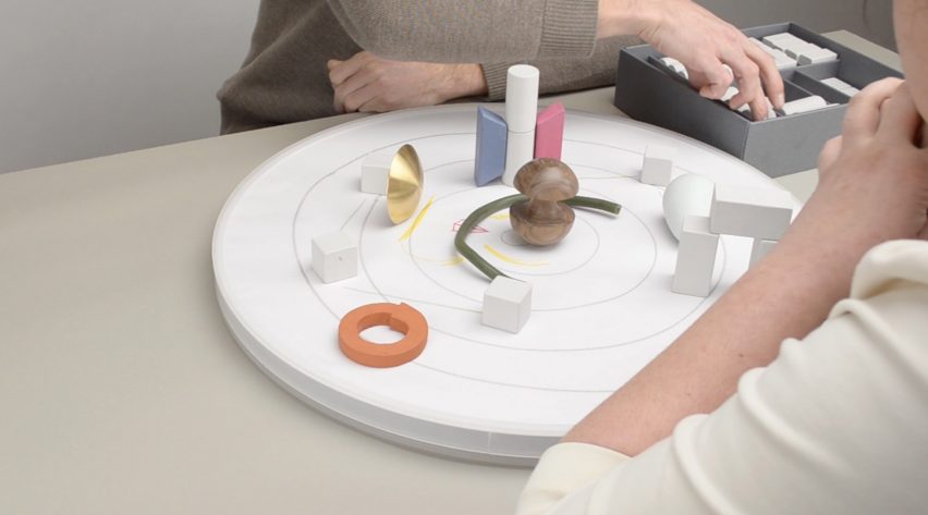
This was the example shown in class that really captured my interest. The so-called tools are supposed to help people visualize their feelings. I like how Bodewes created different shapes and used different materials to provide a wider range of emotions to be visualized, and how she chose more affordable materials to make her entire toolkit more affordable for people. I think it’s a simple yet effective idea to help people visualize their feelings to others, but it may be prone to misinterpretation since people may understand a tool slightly differently from others. I also like how Bodewes also provide a board and workbook with the tools; the board to set up the tools and the workbook for the therapist to write on. The tools were clearly made for two people to work together and discuss.


  • Olive (Indiegogo, Digital/Interactive, 2014)


Olive is a bracelet that can detect your heart rate, motion, skin temperature, and skin conductance—and through those, be able to identify if you’re stressed. After that, you can connect it to an app which will track your daily stress levels and provide ways to calm down, e.g. breathing exercises. While it’s not directly connected to my topic, I like this invention because it’s able to identify stress without you needing to realize it first. It can help you notice when you’re actually stressed and not just feeling “a little off”, so I think in a way, it helps you to express yourself. The company made it to be fashionable with different choices of colors and textures because they want the wearers to feel that the bracelet “express” themselves. While it’s not a big point, I think it’s nice because it will encourage people to actually wear them with pride instead of hiding it.


  • Mindnosis (Sara Lopez Ibanez, Graphic/Publication, 2017)


Mindnosis by Sara Lopez Ibanez


Mindnosis is a self-assessment kit, made with the intentions to make people identify what area they need help with, and where they can get it from. The whole design looks minimalistic and spacious. The box doesn’t have any patterns or colors, which made the colored triangles and cards stand out, making them look like a fun game instead of a procedure to go through. The designer used a clean, easy-to-read sans serif font, complemented with symbols and icons which made the kit look welcoming and interactive.


  • Replika (Eugenia Kuyda (Luka, Inc.), Application/Interactive, 2018)

Replika is an application which allowed you to chat with a bot who will act as your friend and therapist. It will ask you questions about your day and condition and respond accordingly (to the limits of a bot, of course) to your responses. They will also prompt you questions, ask casual questions like a friend would, and offer you mind exercises to make you feel better. I tried it myself because I was skeptical of how interactive a chat-bot can be, and to be honest, I was impressed. While the bot is clearly a bot, it’s much friendlier and conversational than I expect it to be. It even uses emoji and slangs to enhance the feeling of talking to a real person. I find it easier for people to open up in that case, and the application can then ask you more questions to help you identify your feelings better. The application has a pretty simple interface, with a customizable chat background. The main page has classified different topics that you can easily choose to be your topic of conversation, if you want to. You can also customize your bot’s profile picture, gender, and voice.


Naoto Fukasawa designed aluminum stools to be displayed at 2005’s Milan Furniture Fair—however, instead of being displayed on plinths like other new products, the Japanese designer’s stools were “plonked” on the floor, where people were allowed to sit on them. Fukasawa was worried that no one would notice the stools. However, a British designer named Jasper Morrison praised them, and their mutual friend gave a term to describe the stool: “super normal”.

That was the beginning of Super Normal movement.

Both Fukasawa and Morrison defined the Super Normal design as something that is “used on a daily basis to the point that they become invisible” (Fukasawa, 2006), something which use is “instinctive or even subconscious… and we take them completely for granted” (Morrison, 2015). In addition, they also mentioned that Super Normal objects are valued by how you feel about them. Their value did not come from an extremely intricate or well-thought design, but rather from the memories and sense of familiarity that develop over time. Hence, it could be said that naturally, some objects will have more spirit than others, as it highly depends on how and how long people have been using them or interacting with them.

Although functionality is a significant factor, feeling and meaning are more important in Super Normal objects—but the feeling does not come from tiresome expressions. Morrison felt that the design world “has drifted away from normality” and that designers have forgotten the basics of design. They wanted people to realize that simple, basic designs are design too, and that the idea of something new is not always better than something good that has been continued over time.

The characteristics special to this movement are its simplicity, familiarity, and anonymity. Anonymity not only in the sense that the creator is unknown, but also the nuance that the creator was not trying to “design” or “express himself”—similar to yugen (a Japanese design philosophy, where the beauty is subtle) and mingei (another Japanese design, which roughly means “folk art”, where the creators are average people as opposed to known designers, hence making the creators anonymous). Mingei especially resembles Super Normal due to the fact that mingei objects are very simple and normal, as they are made by average people, yet they are still used for centuries—which is the same as the concept of Super Normal, that the value of the object comes from the experience and normality. Super Normal objects are also context-sensitive, as something that is familiar in a setting does not necessarily mean it is familiar in other settings.

The movements that are similar to and/or influence Super Normal movement are Minimalism (1960s – 1970s) and Neo-Conceptualism (1970s – 1980s).

It is especially easy to mistake Super Normal and Minimalism due to the similar concept of simplicity. However, Minimalism is a design movement where the concept is reducing everything to the simplest form, but still with the visual aesthetic in mind. The focus of Minimalism is creating something that is simple, yet still pleasing to the eye. On the contrary, Super Normal does not focus on becoming simple. The focus of Super Normal lies in the concept of familiarity, where an object is “super normal” because we have grown so accustomed to it, that we often do not realize that it is also an object that also possesses design values.

Meanwhile, between Super Normal and Neo-Conceptualism, the similarity lies in the idea that both of them focus on the concept or the meaning behind the creations. However, Super Normal objects still place functionality of high importance, because the value of those objects can be found through constant use and experience over time. Meanwhile, Neo-Conceptualism does not care about functions—it’s all about the concepts the designers want to convey, which are usually something unconventional and unique, as opposed to Super Normal objects which are usually something ordinary and less obvious.

We can see also that Super Normal bears similarity to Droog concept (1980s – now). Just like Super Normal, Droog pointed out the idea of over-production and consumption in the society by emphasizing the value of objects in the memory and associations attached to them—which also shows how powerful inanimate objects can be in evoking emotions and thoughts, transcending the time. Both movements boil down to Dadaism, which basically defies logic, reason, and aestheticism of the capitalistic society. It also shows that objects can have spirit that evokes feelings and gives meaning—which contrasts the Bauhaus movement (1920s – 1930s), where objects are more valued through their industrial-like practicality—almost scientific even.

An example of a Super Normal object, taken from the Super Normal exhibition by Fukasawa and Morrison: a uni-tray.


Uni-tray (Riki Watanabe & Sato Shoji, 1976)


At one glance, one can easily tell that it is a tray—its shape and simple design are familiar to you. It gives off the super normal radiance—something that you see in your house, or other people’s, every day. However, do you know what tray it is? Is it an accessories tray, or a pen tray, or a coin tray? It is strange that you feel familiar seeing the object while it is your first time seeing it, and you are even unable to accurately pinpoint its use. However, just like “love at first sight”, you can immediately tell that “it is the one” without actually having to experience interacting with it before. The familiarity does not come from sight, but from phenomena. Moreover, the idea that it is a “universal” tray (because you don’t know what specific type of tray it is) allows people to “misuse” it intentionally as the tray is familiar to different uses, depending on who is using it.

In hindsight, I would like to say that super normal is not necessarily a design movement—it’s more of a concept, an idea that Fukasawa and Morrison are trying to convey to public—that we often overlook things around us and take them for granted. In this globalized world, we start to forget where the actual value of things lies—is it in its price, its function, its creator, or simply in how it makes us feel?

You may not think much about it, but one day you might come back into your house and realize that your favorite mug is not there—and although it’s just a cheap Daiso mug, you would feel a sense of loss that you yourself could not explain why.

So we went to the National Design Centre. I’ve seen the exhibition a few times, but I’ve never actually paid attention closely to them.

Some types of design practices I saw:

Product design


Graphic design


Fashion design


Architecture


Over the years, I could see that in the beginning (starting from the 1965-1975), Singapore was still very focused on building the country. Design was made with a clear purpose to serve the needs of the people, instead of actually building the identity of the nation. However as time passed, design in Singapore began to take shape. A lot of design was made to promote Singapore’s national identity, especially when Singapore started to be noticed globally. As new technologies were introduced, Singapore slowly got modernized, but even until now the design in Singapore never really left the roots. Now the design in Singapore, I feel, is modernized, yet still really showing the national identity. Design is also not just “art”; it’s always used to improve other sectors such as economy and education.

I think even in the future, the goal for design in Singapore is to continue to develop fresh ideas that not only are aesthetically pleasing, but also contribute to Singapore’s growth and promote national identity at the same time. While that is not easy, I feel that Singapore designers are moving in the right direction. I can see some designs nowadays that combine some of the ideas – like, combining modernization and national identity.

Design continues to be of importance, and I feel like people’s awareness of that will only grow from now. Some things that used to just be functional, now can possess aesthetic values – a simple example is HDB buildings which walls are painted in pleasing colors or certain colors to create rainbow / gradient. And as more people see the significance of design, more people will be encouraged to think critically about it, and design in Singapore will hopefully grow to be better.

The phrase that I got from the Pandora’s box was “the golden rule”, or probably better known as the golden ratio.

It was hard for me to illustrate that since I had no idea about it before, so I conducted a research and tried to make something based on my interpretation.  In mathematics, two quantities are in the golden ratio if their ratio is the same as the ratio of their sum to the larger of the two quantities. So basically the fraction of the length of object A compared to object B should be similar to the fraction of the length of object B compared to object C – the golden rule is all about fractions.

Taken from https://en.wikipedia.org/wiki/Golden_ratio


Based on that interpretation, I have made a few models. I tried to use all similarly-looking boxes in a model, so I can emphasize the comparison of the fractions more easily.


Model 1

[Red – dominant, blue – subdominant, yellow – subordinate, green line – principle axis]

I used all the slender, lean-looking boxes for this model.The sizes of the boxes were quite good in my opinion, since I can tell the different roles clearly.

The application of golden rule here is that the ratio between A to B is roughly the same compared to the ratio between B to C (refer to the picture), which is roughly 0.55.

However, the fraction is too great since now the length of B is more than half of C. Ideally B should be around one-third to half of C. Similar idea needs to be applied to A as well in regards to B.

At first, I feel that the positioning is okay since I can see all three boxes from every different angles. However, the placement is actually a mess; I completely disregard the rule of thirds . Ideally, the subdominant should be shifted a little bit more to the right and up so it is placed at the intersection of the imaginary grids. As for the subordinate, I should either move it to the left more or to the right.


Model 2

[Red – dominant, blue – subdominant, yellow – subordinate, green line – principle axis]

For this one, I used the slightly bulkier types of boxes. The roles of the boxes are quite clear although the subdominant and subordinate can be made smaller.

I used a slightly different calculation for this one. Instead of comparing the same length (i.e. longest axis for all), I compared the longer side of the dominant box to the shorter side of the subdominant box. Basically, instead of comparing B with D (see the picture above), I compared A with B instead. In this model, A and B roughly have the same length, and C and D also roughly have the same length.

However, due to that calculation, the non-dominant boxes become too big, so that comparison cannot work.

Again, I ignored the rule of thirds in the placement; they are almost there, but not quite. The subdominant box needs to be shifted up a little and the subordinate needs to be shifted left or right – preferably left, so it would be “protruding” out and easier to see from other angles.


Final Model

For the final model, I based it off the first model since the proportions for the second one don’t work well.

I was excited to make the final model with the actual materials because of the idea I had.

My idea is to make a puzzle box. To put it simply, in order to open the dominant box, the whole entity needs to be disassembled first (the non-dominant boxes have to be taken out first).

Material used: wood (covered with black paper and black marker), semi-transparent paper, wood (covered with bronze paper)


From one side, the subordinate box is hidden. The idea is that since the subordinate box acts as the “key” to unlocking the whole thing, I feel like it will give a more mysterious effect if the key isn’t immediately spotted.

The subdominant is semi-transparent to balance the opacity of the wooden boxes.

At first I wasn’t sure I could make an actual, working puzzle box (although technically, this one can’t work too…) so I was thinking of just using plain solid wood box as the dominant, then I would just wedge the other two boxes in. However by chance I found the required materials, so I just needed to do some sawing and covering-up (they still took me hours and they still don’t come out perfect. Sorry for bad crafting skills).

The so-called mechanism is just attaching things to the boxes. For the subdominant box not to be able to come out, I put a piece of wood as stopper. For the subordinate box to act like the key, I attach a hook to lock it with the subdominant box.

This is roughly how it works.

When the dominant box is opened, you can see reflective paper at the bottom of the box. I thought it was a great idea because the exterior of the box is all black (which gives a mysterious feeling), and reflective paper is somehow contrasting the all-black idea.


It’s not very obvious, but it’s reflective paper. Ignore the bad crafting skills.


It’s like human life! Life is mysterious and full of “puzzles” (pun intended) to solve. When you solve those “puzzles”, you can learn more about yourself… you can do some “self-reflection” (again, pun intended)!


Real-Life Application (besides a punny puzzle box): accessory box and fitting room.


In hindsight, I really enjoyed the process of doing this project (although it stressed me out as well). I learned a lot more about design, about how to keep things visually interesting and eye-catching. Instead of playing around with size and mass, the use of different materials or colors can also shift people’s attention.

I also learned that planning is an important part in designing in order not to waste time and material, although even when you finish designing something, that doesn’t mean you can’t make amendments to it. (Like my idea at first; I just made the basic parts first. I added the holes in the SD and the hook in the SO afterwards.)

I do realize that my crafting skill is very lacking, so I hope in the next assignments I can improve on that. Nevertheless, it had been a fun ride.