I’ve never gone to Night Light Festivals previously, so this is a new experience for me. It was fun – my friend and I walked from place to place, exploring the installations. They are very spread out, which may be good since people have more places to explore, but it makes it difficult for people who want to go through everything in one go. I visited several of the installations, and I think they look magnificent.


Hyperbands by KopI/O

Pulse by Galina Mihaleva, Hedren Sum, Pat Pataranutaporn, Kathrin Albers, Audrey Ng

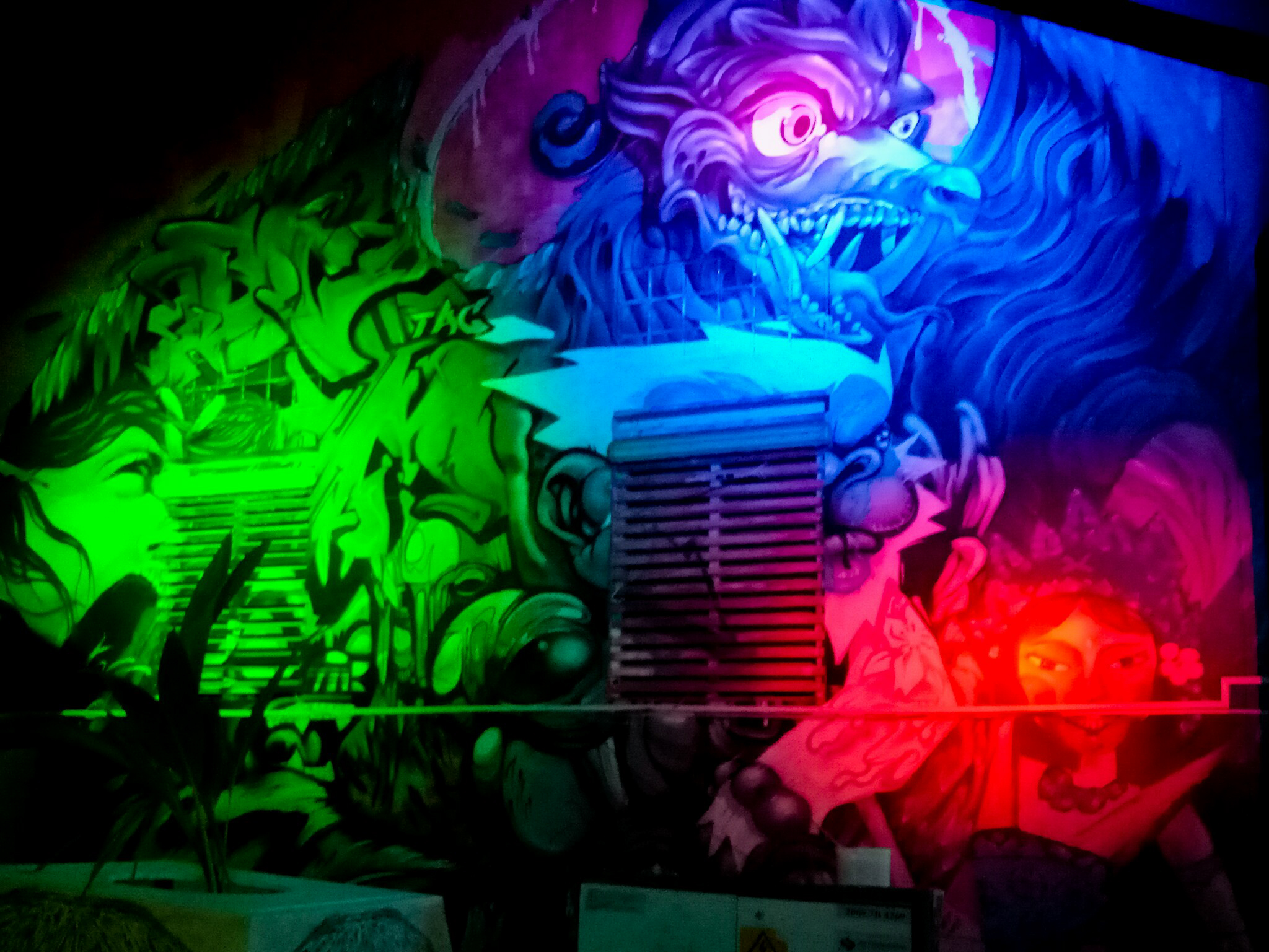
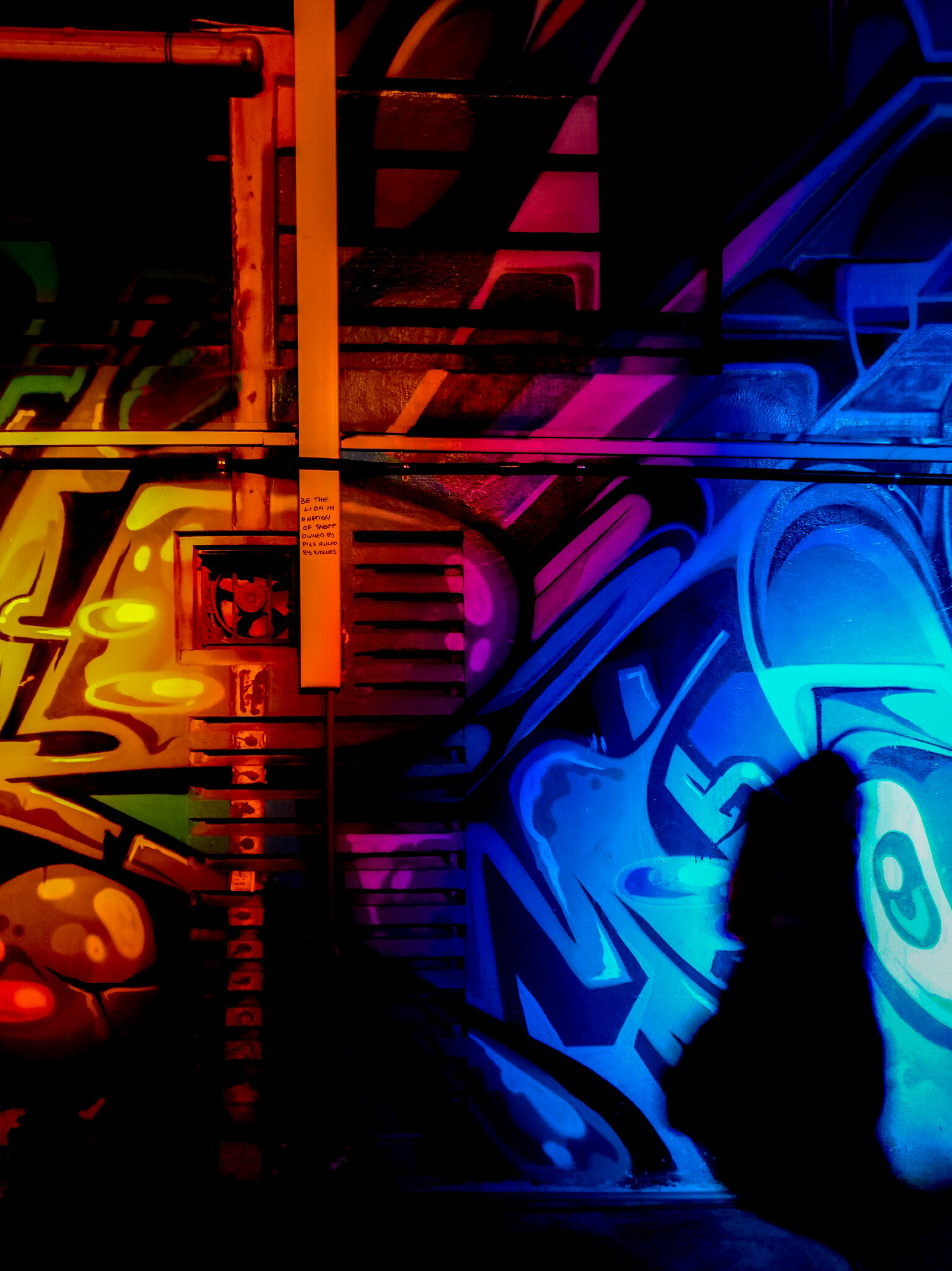
Graffiti Alive by Arup

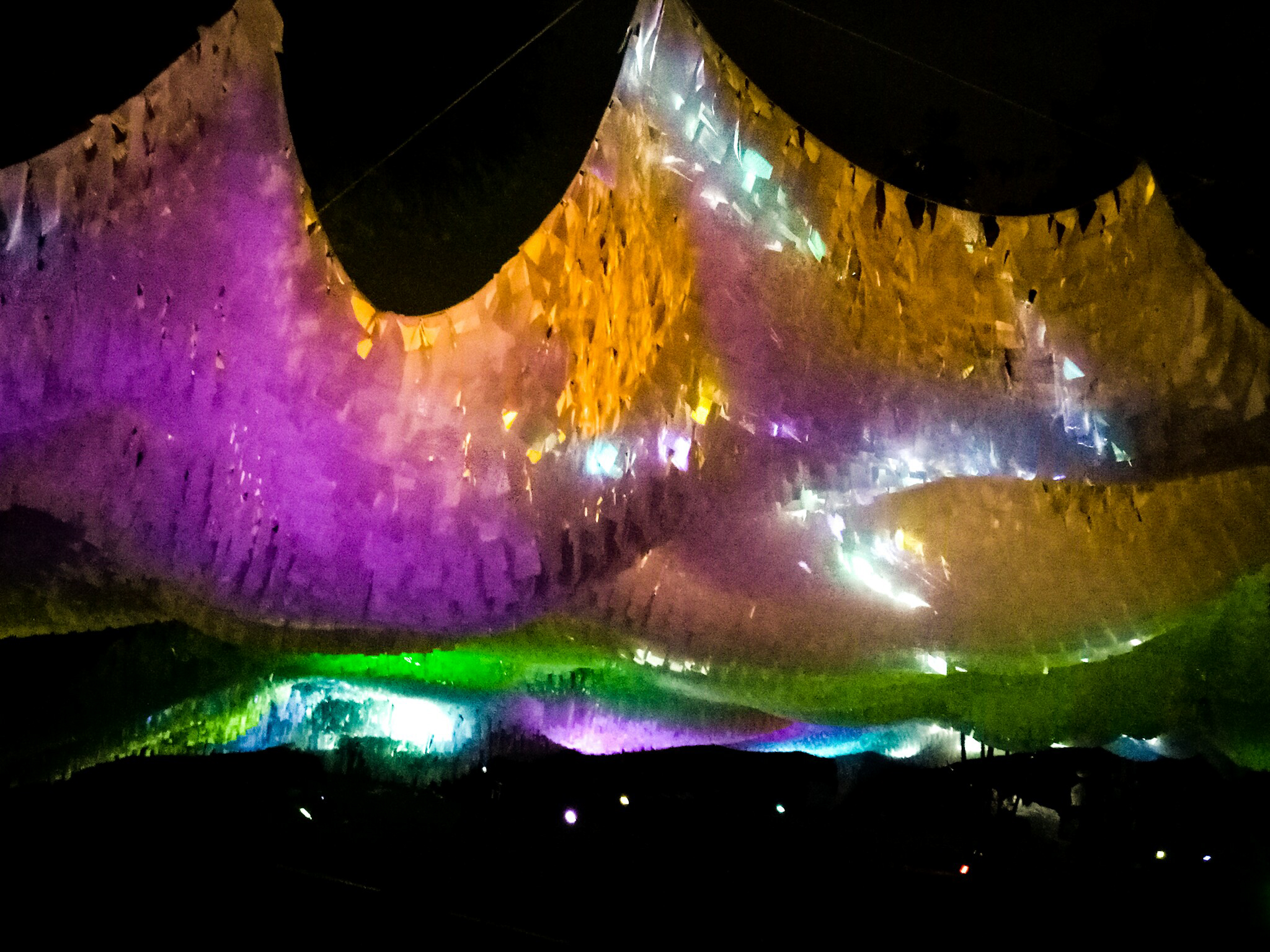
Ember Rain by Starlight Alchemy

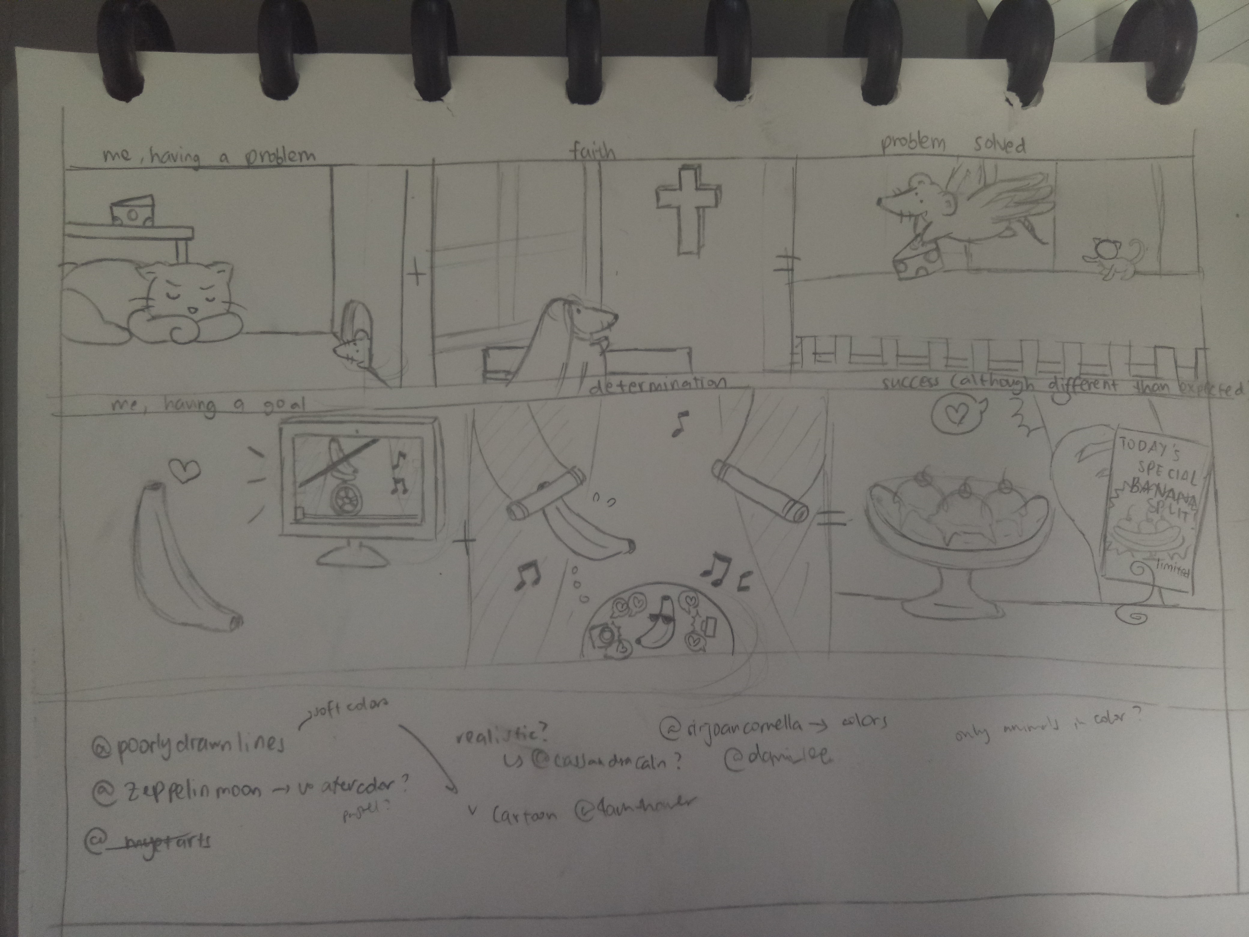
That being said, I have chosen two installations for me to talk about.
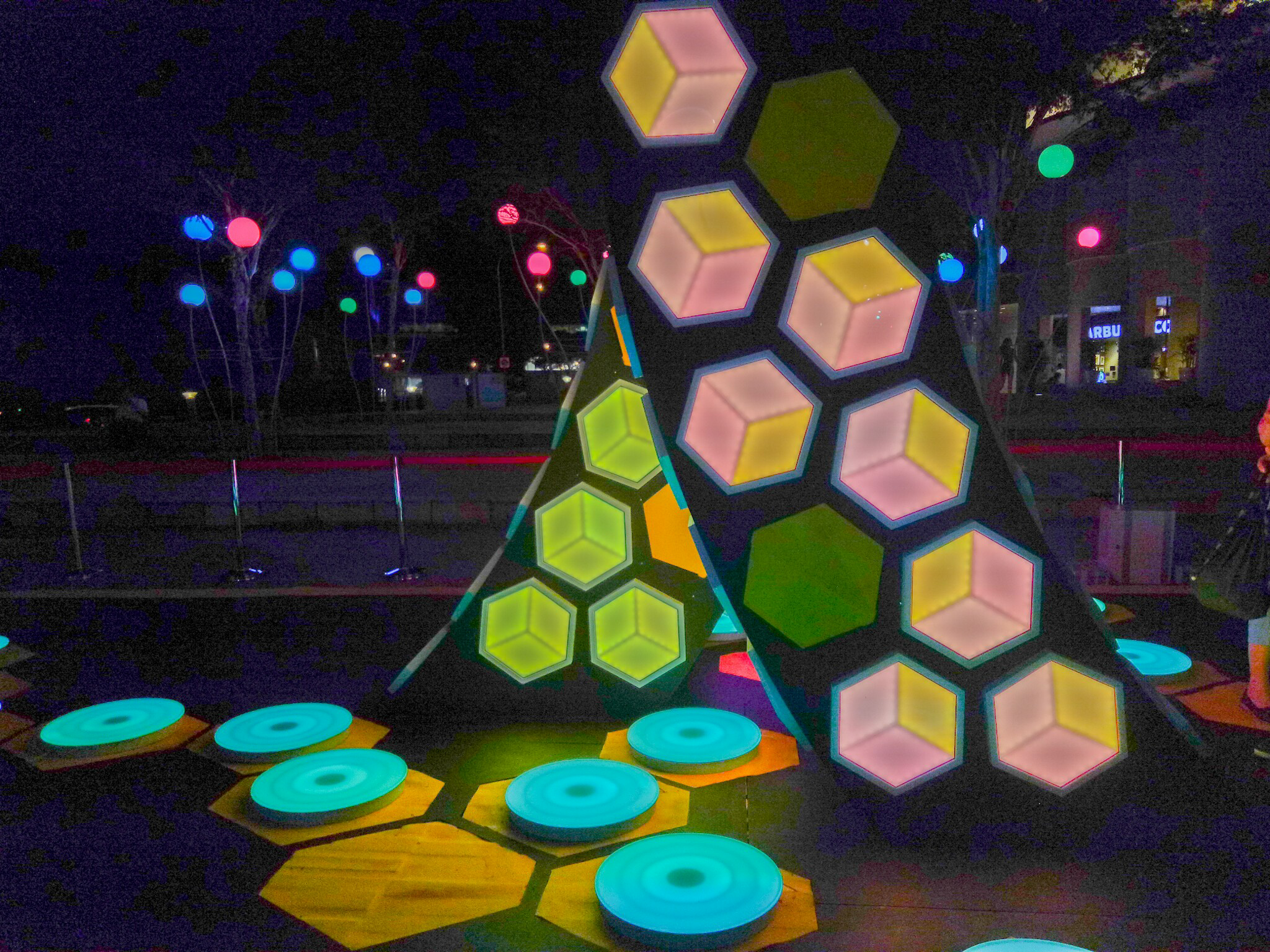
Orbit

By LiteWerkz X 3M

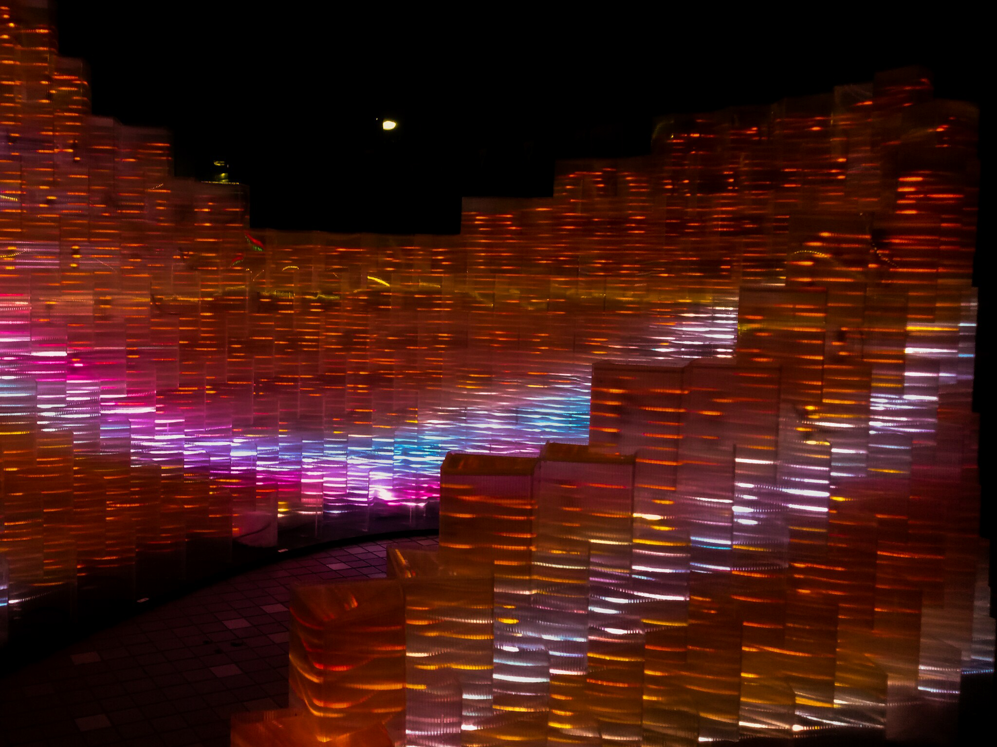
This is the first installation that I went to. From afar, I could see a group of spheres – some of them lighting up, some of them don’t.

As I walked closer, I could see the see-through spheres, with quirky geometric shapes inside. The spheres were lined with lights so that we could see the insides of the spheres even in the darkness. Circular shapes were adorning the surface of the spheres. In the middle of the spheres, there is one sphere that is different from the others – it has circular objects that light up instead of geometric shapes inside the see-through sphere. A nearby sign informed us to try taking picture of the spheres with a flash.

At first, I took pictures without flash first.

After that, I tried taking picture with flash. The picture was so different from what I expected:

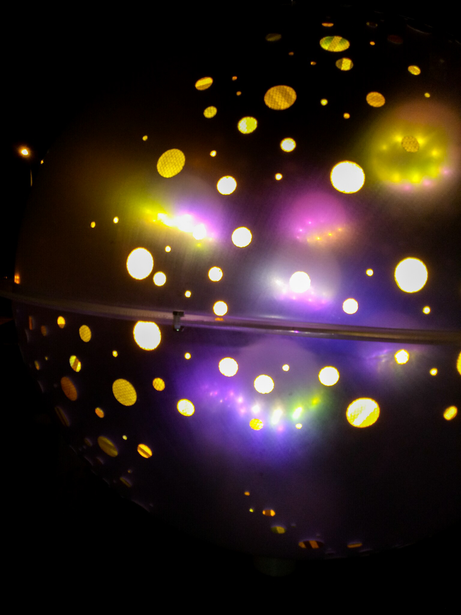
Upon closer inspection, I found out that the circular-shaped stickers were actually made out of 3M retroreflective materials. When given light (i.e. the camera flash), the stickers reflected light and gave the effect as if they were sources of lights (!). That’s the interactive part of the installation. Moreover, I think there’s motion sensors inside the spheres that triggered the lights inside the sphere, so the lights will only light up when you spin the sphere. (I wanted to post a video, but it’s so hard to post a video in OSS, i.e. I can’t.)

It reminds me of a galaxy (and apparently that was the intention of the installation, based on the description put in the National Heritage Board website), not in the appearance only, but also because it gave me a sense of wonder when I tried to find out how the thing works.

I think the installation is interesting for that reason, and also that the design of the geometric shapes are all unique; there’s also a center piece which is a bigger sphere that attracts attention although it actually works the same way as the others. However the fact that everything works in the same way may dull people’s interest quickly, and people may not take their time to see the spheres one by one; they may just check one or two and leave (that’s what I did). In addition, it might not look very good when no one is interacting with it.


The Leap of Faith

By Teng Kai Wei

Even from a distance, I could see the lights from the installation. At once, it captured my attention. My first thought is that it looks beautiful, and it reminded me a bit of hopscotch. From the explanation board, I found out that the intention of the installation is to encourage people to take a “leap of faith”, to trust in yourself while going on a journey to reach your destination.

The anatomy looks simple; it seems that the plates are equipped with pressure sensors, so when someone steps on it, the color will change. Moreover, the original color of the plates will change constantly; hence if you step on it after some time, the color change will be different. I found that interesting, and may compel people to re-do the experience. In addition, the color change is unique as well; when you step on it, the color effect will resemble a ripple.

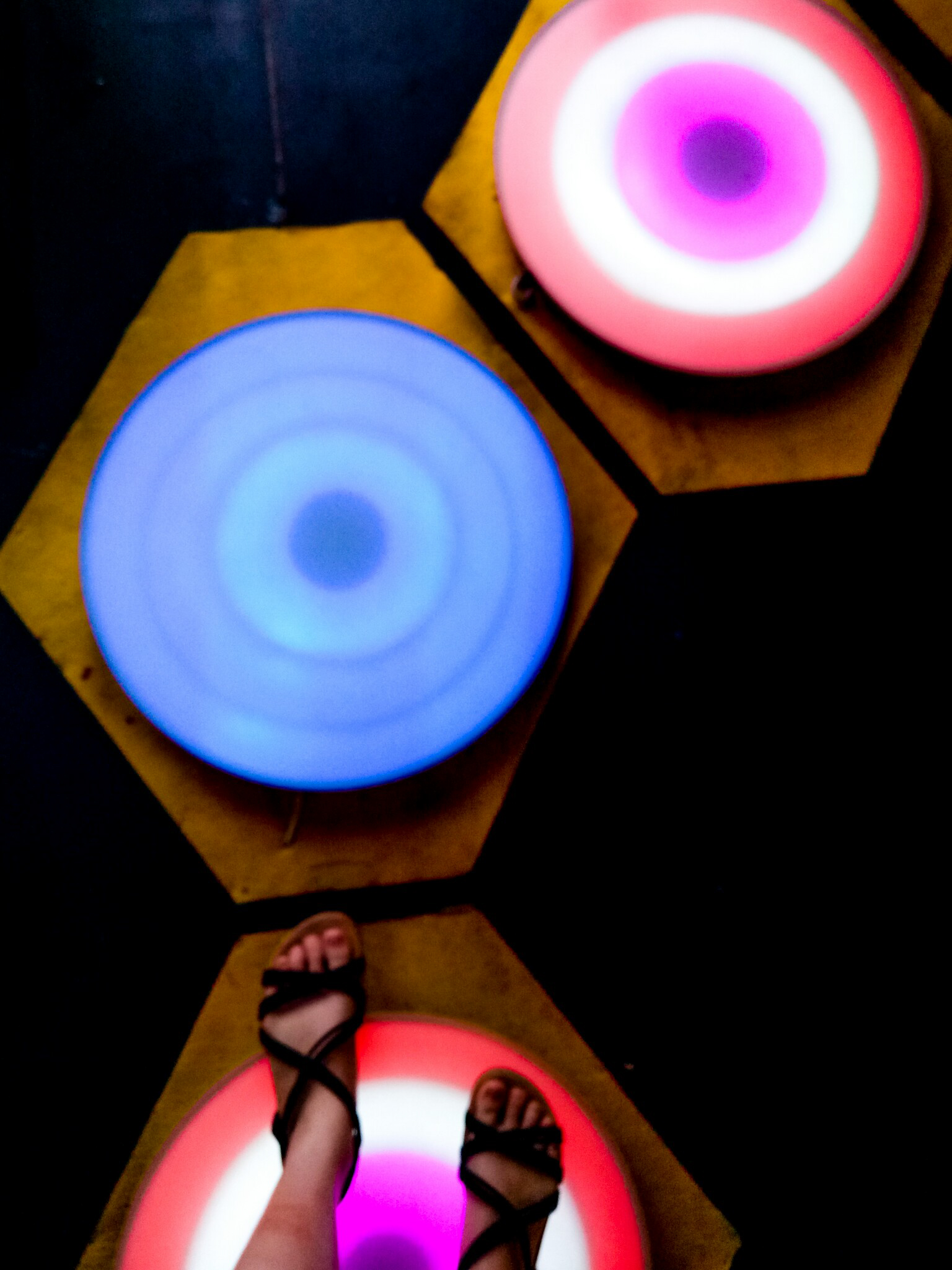
There’s also some kind of sculpture in the middle with geometric-shaped lights. I am not sure what the intention is, but it probably acts as a center, which could also be used to represent the “destination”.

Anyway, it’s really interesting to see different people interacting with it; I could see how different people can be. Little kids jumped from plate to plate excitedly, exploring every single plate although the resulting light would be the same; adults stepped on each plate carefully, looking around, deciding where to step next. Some people travelled back and forth; some people just walked across nonchalantly, even stepping down on the ground when they needed to make a jump across the plates.

I enjoyed playing around with that installation. I do think it would be better placed over water to actually force people to step on the plates, but I realize that may be dangerous and more difficult to set up. The lights were also constantly changing, which made the installation looked beautiful without anyone interacting with it, and noticeable even from a distance.


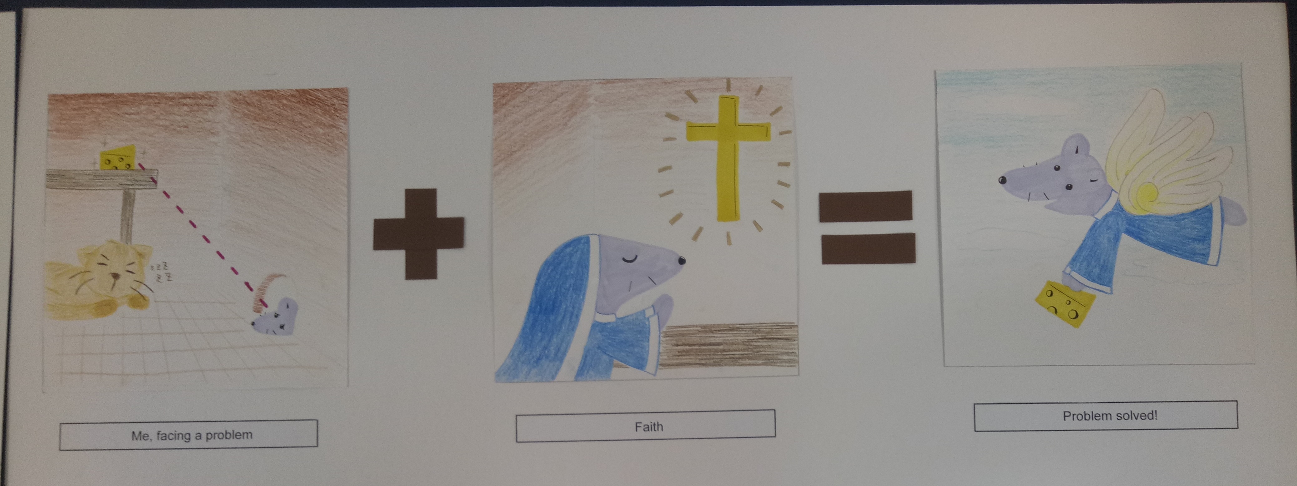
All in all, I found the installations really intriguing. I could see how even with instructions, people interact differently with the installations. I could also see how important it is to compel people to interact with the installations, and that depending on how they could interact, people could easily get bored by the installations or may not even be interested to interact at all. I realize I’m not familiar with the anatomy of the installations, which left me guessing a lot of times. However, I really enjoyed looking at those; definitely would go there again.

The four jobs that I (tentatively) chose are barista, gamer, thief, and electrician.


Initial Sketches

Those are two of my earliest sketches. As you can see, they’re heavily image-driven; so I scrapped all of them off.

I made other sketches, but this time they’re too simple (see below). But somehow I have a better view of what my idea has to be; they have to be manipulated to show the techniques, but they can’t be too picture-driven as it will take the attention away from the letters.


Final Sketches

1. Barista

Keywords: coffee, latte art, coffee cups, steam, coffee beans, coffee grinder, cafe (usually associated with wood / warm colors)

I intentionally made the latte art as simple as I could because I wanted the attention to be purely on the letters, but then it looked pretty boring and didn’t really reflect latte “art”, so I will edit the latte art. I was thinking of using a wood-colored background and add some shadow, so maybe I will try it out to see if it’s too much.


2. Gamer

Keywords: characters, start / play button, consoles, pixels

I always associate “games” with “pixels” since it reminds me of the earlier games (actually I get the inspiration from Mario Bros), so I really, really want to do pixel art for this idea. It took me pretty long but I managed to make this (thank goodness).

However just from the interface, you can’t really tell of the “gamer” idea. It can be game designer or developer as well. So I plan to add a character and a “start” button underneath to emphasize the idea that someone is playing.


3. Thief

Keywords: illegal, getting caught, shady / dark atmosphere, guns, stolen goods (money), mafia, action

I know it’s very hard to tell that it’s criminal. It kind of looks like magicians performing onstage.

My idea is to make it look like they “get caught” (hence, the spotlight) when doing something bad. I used the striped pattern to replicate the image of a prisoner (which is related to something illegal), but I think the idea is not conveyed very well and it can be a lot of things instead (people may see criminal, or prisoner, or magician probably). So I need to edit it to make it more specific.


4. Electrician

Keywords: light, circuits, battery, electricity, switch, cables, transformers, light bulb, LED, resistor

To be honest, that is a bad one.

I wanted to make out the letters using cables, but they didn’t turn out nice so I added the “glow” effect to make them like neon lights instead, but now the whole thing didn’t look like electrician at all. This one needs a lot of changes.


Takeaways

For most of my sketches, you can’t really tell what the exact occupation is, although you can guess something close to it. So the problem is I don’t make the pictures specific enough; I’ll have to research more about symbolism and semiotics related to the occupations I want to use.

I’ve never been very good at digital art (actually, I just learned Illustrator recently) so this is a challenge as well as a good learning experience for me. I learned more about Illustrator such as how to make glow effects, how to make clipping mask, how to unite two different things, etc. However due to this lack of knowledge I’m doing this project slower, as when there are things I don’t know how to do effectively, I still try to make them–and they either turn out bad or I wasted a lot of time doing them… or both. So I’ll have to do more research and learning about this platform I’m using as well.


UPDATE!

After I wasted a lot of my sleeping time to think, I decided to change a few ideas of mine.

For thief, I fixed it so it looked more like “in action” by adding gold coins and a hole on the brick wall, suggesting that they’re in the middle of stealing.

Gamer and barista will stay the same; the only difference is that I’m adding background to both of them.

For barista, the latte art will be much, much softer than my process illustration since after I did some research, latte art doesn’t really have sharp edges.


My reference picture [taken from https://makezine.com/2016/01/03/skill-builder-steam-milk/]

I also made the art more “fancy” and although (to me) it sort of takes the attention away from the letter, I think the letters are still recognizable so it should be fine.

As for the electrician, I think I’m completely scrapping the idea. I realized that from the beginning I was going backwards with the electrician job; I thought of what to make first rather than what job I want to convey, which makes me confused in the end. Because of that I couldn’t make good progress with my electrician, so I decided to just stop and start a new one. It’s probably a bit late, but I think I could manage it since now I have better idea on what to create. So,

4. Watchmaker

[from https://www.pinterest.com/pin/300896818830991738/?lp=true]

My idea is to simply put the letters of my name and fill in the letters with the gears of a watch. I won’t use much colors, probably just black and white and some grey.

I’m thinking of making one of the letters look like a pocket watch.


I just realized that all my four jobs have different style (kind of) of illustrations. I don’t know whether it is a good thing because it can mean that I’m flexible, but that can also show that I haven’t found my own style yet. That’s true, though–I haven’t really had my own style yet, so I think this is a good opportunity too to explore various styles for me.

Here are my end results for this project! Featuring: the mouse, the elephant, the banana, and the turtle.

1. The Mouse

Me, facing a problem + Faith = Problem solved!


I represent myself as a mouse because (I think) my Chinese zodiac is a rat, so my family at home sometimes refers to me as the “mouse” in the family.

The story is that the mouse wanted to get the cheese but was hindered by the presence of the cat. So the mouse began going to church and gained a pair of wings, which enabled her to overcome the problem.

This is the representation of me when I face a hindrance or problem in doing something. The “faith” here is represented by going to church, but actually it’s not necessarily a religious faith. It can also represent faith in my own abilities, since I tend to think that I can’t do things before I actually try them. By having faith, I can actually overcome my troubles in achieving what I want.

I chose to use colored pencils and markers because I wanted to work with something simple, and I wanted to give a child-like vibe. I used markers for the important objects in the panels as emphasis. As for the colors, I used similar colors (shades of brown) for the first panel except for the mouse and cheese because I wanted to emphasize their significance. The background of the second panel also has brown color to create some connection between the panels. From the second to the third panel, the mouse wore the same habit (apparently the uniform that nuns wear is called a “habit”) to create a connection.


2. The Elephant

Me, an introvert + Party = I “disappear”


I used an elephant because of the phrase “elephant in the room” – it’s there, but people don’t talk about it.

The story is that the elephant is so introverted that when she went to a party, she blended in right away with the surrounding and became unnoticed. It was as if she became a furniture, a part of the background.

The elephant represents my introverted and awkward side. I’m not good around strangers, and even within my circle of friends, I’m not good at interacting with people in big groups. In a sense, I’m physically there, but it feels like I “disappear”.

I used the color blue for the elephant because blue is my favorite color. The sofa in the first panel is orange to complement the blue elephant. I used yellow for the floor since yellow and orange are analogous colors. The background (the wall) is supposed to be pale blue, but the color came out a little differently than I expected. I used blue background to emphasize the feeling of the blue elephant “blending” into the environment.


3. The Banana

I have a dream! + Hard work = Success (?)


Banana is one of my favorite fruits. That’s why.

The story is that the banana wanted to become an acrobat. To achieve that dream, the banana worked hard to practice circus acrobat. In the end, the banana became banana split instead. (It’s a pun, because split is kind of a gymnastic movement, and gymnastic is usually related to acrobat.)

To me, it is a good representation of me when I set a goal for myself. Sometimes we dream high and work hard for it, but the end result is not exactly as we want. However that doesn’t mean you’re not successful – you still succeed, although the success might be different from your initial intention. That’s how I feel sometimes when the end result of my work is not exactly like how I want it to be, but I know I worked hard for it, and thus the journey still makes a success in the end.

I used purple background for the first and third panel to complement the yellow banana. As for the second panel, I used the red-and-white background to show that it’s a circus. I used purple juggling pins to make some sort of connection between the panels.


4. The Turtle

Me + Anxiety = Overthinking


Turtle, in my opinion, is a very chill animal. I like it because I’m a chill person (most of the time), so I feel that I can relate to it.

The story is that the turtle, a very chill animal, was just chilling. But then the turtle ate a mysterious black pill and turned into an ink-spewing sotong. (This story sounds more reasonable in my head, but now that I wrote it down, I understand why my friend – to whom I showed my sketches – looked extremely confused.)

The turtle represents me as a person. Usually I’m very chill and somehow normal, but when I’m anxious (I represent anxiety with the black pill), I tend to overthink trivial things until they muddle my thoughts. I represent the state of overthinking with the black ink muddling the seawater. In a sense too, the sea represents my thoughts. It’s usually very calm and clear before I start getting anxious.

I used mainly cool colors like green and blue for this one since I want to give the calm vibe to represent my thoughts. I used some yellow and orange also for the seabed and the inside of the shell as green-yellow are nice analogous pair and blue-orange are complementary.


Reflection

I had trouble deciding what style to go with, so in the end, I told myself, why not just try different styles?

Since I didn’t really do art before studying here, I didn’t have an idea what my style would be like. I’m not even sure what technique I’m good at. So I decided that this project can be a good opportunity to explore my options more, and see what technique or style I’m more comfortable with. It’s really fun, and it’s a really good learning experience for me. I realize that working digitally ensures a “cleaner” result (and there’s undo button as well), but it requires a lot of time (or maybe just because I’m not used to it). I spent a lot of time tracing the outline of the banana split. Also, I learned some illustrator techniques, which I find to be really fun.

Working traditionally is faster, yet since I’m a messy person, there’s bound to be some mess. Moreover, there’s no undo button, so I have to be extra careful. I think the mouse story is really messy since the colored pencils smudged a little. As for the watercolor, I actually had a lot of fun doing it. I’ve always liked watercolor, although I’ve never really worked with them. I just tried putting layers of colors and smudging them with more water. Although they’re very messy (I didn’t expect the pen lines to smudge that much), in fact, I really like how they turn out.

Coming up with ideas isn’t the hardest part – the hardest part is realizing the ideas. I realize that it’s not enough to just have a good idea; I have to consider the feasibility and the aesthetics as well.

I also learn that doing projects is not a show of skills. I’m worried at first because I feel that I’m lacking in skills and experience, and thus my work might turn out “less” compared to other people. I’m scared that my work may be too simple, too child-like – what if I look like I don’t put in enough thought or effort into this?

But then again, why should I compare myself to other people? This is my project, and I’m proud of what I have done. Looking back, I have definitely improved – from someone who never used Photoshop to someone who can create a story using Illustrator. You see, when you’re at the bottom, there’s nowhere else to go but up.

All in all, this project has been a really fun and enlightening ride.

For this final project, I think I have a lot of difficulties trying to figure out what style I should go for. There are so many choices, but of course I have to choose rationally, considering the amount of time I have and my skills as well.

Research: Style

As for the style, at first I was thinking of doing some “watercolor”-ish style because I like soft colors and lines, but then I realized that it might be difficult (especially since I don’t really use watercolor).

Image result for watercolor styles

Something like this. [taken from https://watercolorblast.wordpress.com/styles-of-rapid-watercolor-sketch/]


So I turned to other simpler styles and from Instagram, I found some comic artists whose style I really enjoy because they’re simple, yet they can convey the intended messages effectively. Here are some of my references;


Image result for dorrismccomics

instagram.com/dorrismccomics (Artist: Alex Norris)


Image result for thesquarecomics

instagram.com/thesquarecomics (Artist: Alvin Juano)


Image result for safely endangered comic

instagram.com/safely_endangered (Artist: Chris McCoy)


In general, the three artists use thick outlines, simple art style, and bright colors. I’ll need some time, but I think I can make something with that style using Adobe Illustrator.

I’m also thinking of combining “realistic” photos and plain digital color background. That idea is inspired by movies that mix animation and real actors in one frame, like Space Jam.


Image result for space jam

A scene from the movie Space Jam (1996)


Research: Color

I found a website where they provide color palettes to download, and from there I found a lot of analogous color palettes that I think can work, like this one:

Image result for analogous color palettes

[taken from http://www.color-hex.com/color-palettes/?keyword=analogous]

But I will look at other types of color palettes as well, like the triadic color scheme, for example. I’ll see which one can bring out my ideas best.
Image result for triadic color palettes

[taken from https://shannon-brinkley.com/blogs/shannon-brinkley-studio-1/color-confidence-for-quilters-part-4-triadic-color-palettes]


Experiment

Here are my concepts.


In the end, since I couldn’t decide on one style, I ended up using four different styles.

The first one I did is just a combination of various things, such as colored pencil and copic marker.


Colored pencil, pen, and marker


I wanted it to have a cartoon-ish, childish look. I also didn’t give an outline because I think it will look less cute if I did. I used the markers only for the important figures, such as the cheese, the mouse, and the cross. For the wings, I used gold pen (which I used for the “shiny” effects as well). I used minimal coloring for the background because I feel that too much color would distract viewers from the actual point.

For the second one, I used Photoshop to merge pictures.


Photoshop trial


I showed that one to my friend and he said that my “contemporary art is on point”. I feel like the end result is interesting, although it is plainer than I expected. I chose purple background to complement the yellow banana.

The third style that I tried is watercolor.


Watercolor experiment

End results (mirrored image)


They actually turned out better than I expected. I never really tried watercolor before, so I watched a couple of YouTube videos before trying it out. It was messy and there was some smudges, but overall, I actually love the end result. I think I would do more watercolor in the future. I especially like how the background turned out. I used mainly calm colors like green and blue, which made the color black stood out even more.

Lastly, I used Illustrator.


Illustrator trial


This is my first time actually using Adobe Illustrator, so I needed a really long time just to create those three panels. I used blue elephant because blue is my favorite color, and pale blue background to emphasize the idea of “blending in”. The sofa and floor are orange and yellow to complement the blue.


All in all, I actually enjoy making all of those. Although they take a lot of time to create, I had fun experimenting with different tools and styles. I just hope they turn out well in the end.

For this assignment, we are supposed to make a story about long-lost friend using still images and audio. To be honest, I’m bad at this. Extremely bad. But well, I tried.

Our group’s story is based on my story about my long-lost friend. Back in Indonesia, I had a childhood friend – her name is Smita. She was my best friend, but because I left for Singapore, we didn’t keep in touch. We still follow each other’s social media, but we rarely talk or meet even when I go back for holiday. (Typical modern friendship.)

We try to imagine what my childhood friend has become now, and since I really don’t know what’s happening in her life right now, there are literally countless possibilities.

She might have become a spy for all I know.

And that’s our story idea.

What if she really become a spy, and I happen to stumble upon her one day?


Process and Research

The four of us took a lot of time brainstorming the storyboards, and even a lot more time shooting. At first we didn’t have a clear storyboard, hence we just took pictures and realized afterwards that a lot of key scenes were missing. We did fix it afterwards, though.

Here is a part of our first storyboards. Thanks Christina for your awesome drawing.


Since our story is about a spy (kind of), the genre is roughly thriller/mystery. After we conducted research (I ended up reading a manga of which the movie Old Boy was based on) (we looked at some of Alfred Hitchcock’s work as well), we could see that the scenes in those types of movies usually have dark tones, so we try to give off similar feelings. The spy character usually dressed in dark colors with obscured faces, so our “spy”, Esther, was dressed similarly in dark-colored attire and even wearing a black cap to obscure her face.

We encountered a problem with the lack of resources; since it is a spy movie, the presence of a gun is almost like a given. However we don’t have a gun. We used glue gun instead, and apparently it was so obvious it became hilarious. In the end, we edited the pictures.

Before edit

After edit


Moreover, we couldn’t really find a good setting. Spy movies usually have very specific backgrounds such as industrial buildings or underground buildings to make secret conversations, but we just tried our best to make do with what we have. Living quarters may look unlikely as death scene settings, but I’m sure there are thriller movies where the victims are killed in their own houses. It is not weird because house, or rather home, is where people usually put their guard down, even professionals. Hence actually I feel that it’s very reasonable for someone to be killed in their living quarters.

I feel that our story portrays more of the conflicts that are happening between people (Smita and I, Smita and the kidnapper, Smita and the victim) than the internal conflicts (e.g. someone’s personal struggle in achieving something), hence making the story seem simplistic. I thought simple, straight-forward stories will be easier to deliver, but apparently it’s just as hard. It’s especially hard to portray the people’s expressions since neither Esther nor I could act. We kept on laughing during the takes.


Final Conclusion

This task is, again, a challenge for me. However because of this, I become more conscious of what makes a movie good, and I don’t think I can watch a movie the same way again. Movies have proven to be more complicated than a mere entertainment.

Before I give you the video, let me give the summary of the story (spoiler alert):

Vania and Smita (played by Esther) were childhood friends. One day, they had to separate as Smita was accepted into the University of London (fictional place). They said goodbye and went their own ways. However, on the way, Smita was kidnapped by an unknown person and drugged. Due to the effect of the drug, Smita lost her memories and she was made into a spy by that unknown person.
One day, a long time after that, Smita was receiving instructions from the unknown person to kill someone when Vania accidentally saw her. Excited to find her old friend, Vania said hi, but Smita ignored her. Curious to prove that the person really was Smita, Vania followed her and found out that she really was Smita. At that moment, Smita was about to kill her target. Vania saw that and tried to stop her. They struggled for a while, resulting in Smita bumping her head and regaining her memories. However, due to their struggle before, Smita accidentally killed Vania.


Special thanks to my group mates who have put up with me; Esther (thanks for the acting), Christina (thanks for the storyboard and editing), Yan Ran (thanks for the pictures). Here’s the video.

(I don’t know why I can’t upload the video here.)


https://vimeo.com/238788227

I found this project to be a challenge.

I looked up some of the reference artists to find inspiration. Some of them really captured my attention, like Jo Spence’s self-portraits, for example. I was also intrigued by Richard Billingham’s works. From my Google image search, I found a lot of self-portraits done by him. Compared to Spence, I found Billingham’s works to be more “relatable” since he used a lot of colored background, or background which features a lot of other things. However, I think they are similar in a way that they capture a lot in a seemingly simple picture.

One of Jo Spence’s works. [Taken from http://metro.co.uk/2008/07/03/jo-spence-self-portraits-246644/]

One of Richard Billingham’s works. [Taken from https://www.theguardian.com/artanddesign/2016/mar/13/richard-billingham-tower-block-white-dee-rays-a-laugh-liz]


As for landscape picture, I found a picture by Mariko Mori that I really like. It looks very relaxing and balanced to me, maybe due to the idea of vastness captured here. Similarly, the idea of vastness is also reflected in some of Catherine Opie’s work (which I came to enjoy).

Mariko Mori’s work that I really like. [Taken from http://www.tokyoweekender.com/2016/06/artist-mariko-mori-brings-a-mysterious-ring-to-the-rio-olympics/]

One of Catherine Opie’s works. [Taken from http://www.tfaoi.com/aa/8aa/8aa298.htm]


I hope I can integrate the idea of simplicity in my works too.