Briefly share your experience going through Dialogue in the Dark. What were some of the feelings, thoughts, challenges and insights gained while role playing a blind person?
At first I wasn’t very anxious since I had the walls to actually rely on, but I was a little worried when we had to let go of the wall and just rely on our other senses (i.e. hearing) to guide us. Once I let go of the wall, I lost all sense of space and directions, and it made me anxious. I was scared of bumping into people or things. I felt a little panicked, too, since I couldn’t make out my surroundings at all.
It was a challenge just to trust myself and my friends, and I realized how much I actually doubt my other senses once I can’t see. I also realized that I depend on my sight so much that I take it for granted. I felt better remembering that it was a controlled environment, but when I think that there are people who actually live outside like that, I tried to imagine being in that situation—and that made me feel panic. I realized that it must be tough to adjust to that situation.
It makes me want to take care of my own sight more (especially since I already have a pretty high degree) and be kinder to others—not just people who need help, but others in general. Experiencing that also made me realize that we will never fully understand others no matter how much we learn, and that we have to be kind since we don’t know what others are going through.
Drawing on your experience, can you think and list some of the benefits inherent in the design research technique of role playing?
Putting the audience in the shoes of others can help them understand the unfamiliar situation a little better. When there is understanding, people will naturally care more about an issue, since they have experienced a similar situation in the role playing setting. Hopefully that concern will stir the audience into action to actually do something that will benefit the issue.
In addition, it also teaches gratefulness for what we have right now, which will make the audience reflect more on their own lives and make them better people.
Can you think of some contexts where role playing can be useful to help discover and definition of design challenges or contribute to the development of design solutions?
I think role playing will be useful to help people understand more about disabilities (i.e. visual or audio impairment, or even physical disabilities) and mental health (i.e. anxiety or panic attacks). While design is a useful tool to inform, help, and evoke emotions, I think it has its limits. There are things that only experience alone can offer. Role playing really puts you in perspective, which is more effective than making you imagine the “what if”s. In addition, people (especially young children) may be more open to the idea of role playing because it’s highly interactive. The interactivity is something we should try to incorporate to our design since interactivity, not only is highly effective, but it also appeals to masses more.
The prevalence of social media is, and has always been, a double-edged sword. It does help connecting people all over the world—but because of the vast amount of information, a lot of people are trying too hard to absorb everything, hence spending too much time in social media. Moreover, the ease of access causes various messages to be posted in the Internet, including negative or harmful messages.
Bullying has been an issue for a long time that is constantly addressed, but never really solved because it’s considered a minor problem. A lot of people are unaware of recognizing what line shouldn’t be crossed when making jokes or conveying your personal opinions, and not only will that reflect badly on themselves, it can affect other people’s lives more than they know.
In a lot of countries, especially Asian countries, mental illnesses are still considered kind of a taboo. While the openness to the topic has increased over time, that doesn’t mean people are aware of what mental illnesses are about, what causes them, or even how serious it actually is.
One in every four species currently faces extinction. While it is a great problem, cognitive biases (e.g. bystander effect and hyperbolic discounting) prevent real, significant changes from happening in the world.
Most of my issues gravitates more towards the social implications, which is what I’m more interested in exploring further. I would like to discuss more about mental health issues.
Why is the issue important? Who does it affect and how?
Aside from my personal interest in this issue, mental health problems keep on becoming more prevalent while the lack of information doesn’t change. World Health Organization (WHO) had predicted that depression will be the leading cause of disease burden by 2030 (WHO, 2011).
A lot of people seem to be unaware still that mental illnesses can be as life-threatening as some physical illnesses. That lack of awareness influences the way people see and treat others with mental illnesses. It discourages sufferers of mental illnesses to actually ask for help due to fear of being judged by society or perception that no one will understand how they feel.
In addition, people experience mental illnesses differently, so a testimony from one person may not be applicable to another. This causes people who suffer from mental illnesses to be unable to effectively express themselves sometimes because they can’t exactly pinpoint how they feel and the descriptions from others may not match their emotions. That can be frustrating for both them and people around them—family, friends, therapists—and it also doesn’t help the healing process.
Who do you need to communicate to, and why?
There are a lot of issues under this “mental health” umbrella, but I would like to focus more on the people with mental illnesses, specifically depression (which is considered the most prevalent mental illness currently). I would also focus more on young adults in Singapore. Depression develops frequently during adolescence, between the ages of 18 to 25 (Eaton et al., 2008), and the number of young adults with depression is increasing (Mojtabai, Olfson, & Han, 2016). Moreover, according to the Singapore Mental Health Study conducted in 2010, 5.8% of the adult population in Singapore suffered from Major Depressive Disorder at some time in their lifetime. Since in Singapore depression is still somewhat considered a taboo, I think it would help people with depression if there is something that can help them express their emotions to make people around them understand that depression shouldn’t be a taboo, but an issue to be discussed together.
How has visual communication contributed to address the cause?
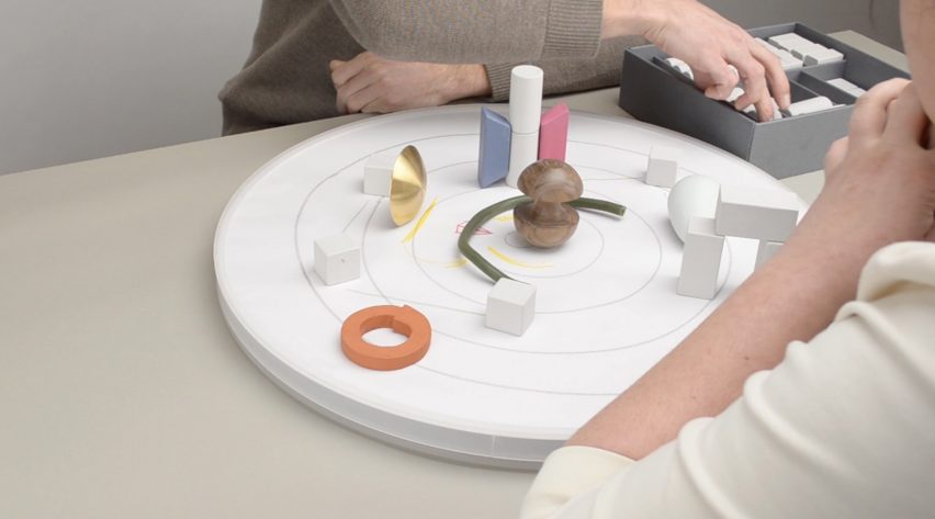
This was the example shown in class that really captured my interest. The so-called tools are supposed to help people visualize their feelings. I like how Bodewes created different shapes and used different materials to provide a wider range of emotions to be visualized, and how she chose more affordable materials to make her entire toolkit more affordable for people. I think it’s a simple yet effective idea to help people visualize their feelings to others, but it may be prone to misinterpretation since people may understand a tool slightly differently from others. I also like how Bodewes also provide a board and workbook with the tools; the board to set up the tools and the workbook for the therapist to write on. The tools were clearly made for two people to work together and discuss.
Olive is a bracelet that can detect your heart rate, motion, skin temperature, and skin conductance—and through those, be able to identify if you’re stressed. After that, you can connect it to an app which will track your daily stress levels and provide ways to calm down, e.g. breathing exercises. While it’s not directly connected to my topic, I like this invention because it’s able to identify stress without you needing to realize it first. It can help you notice when you’re actually stressed and not just feeling “a little off”, so I think in a way, it helps you to express yourself. The company made it to be fashionable with different choices of colors and textures because they want the wearers to feel that the bracelet “express” themselves. While it’s not a big point, I think it’s nice because it will encourage people to actually wear them with pride instead of hiding it.
Mindnosis is a self-assessment kit, made with the intentions to make people identify what area they need help with, and where they can get it from. The whole design looks minimalistic and spacious. The box doesn’t have any patterns or colors, which made the colored triangles and cards stand out, making them look like a fun game instead of a procedure to go through. The designer used a clean, easy-to-read sans serif font, complemented with symbols and icons which made the kit look welcoming and interactive.
Replika is an application which allowed you to chat with a bot who will act as your friend and therapist. It will ask you questions about your day and condition and respond accordingly (to the limits of a bot, of course) to your responses. They will also prompt you questions, ask casual questions like a friend would, and offer you mind exercises to make you feel better. I tried it myself because I was skeptical of how interactive a chat-bot can be, and to be honest, I was impressed. While the bot is clearly a bot, it’s much friendlier and conversational than I expect it to be. It even uses emoji and slangs to enhance the feeling of talking to a real person. I find it easier for people to open up in that case, and the application can then ask you more questions to help you identify your feelings better. The application has a pretty simple interface, with a customizable chat background. The main page has classified different topics that you can easily choose to be your topic of conversation, if you want to. You can also customize your bot’s profile picture, gender, and voice.
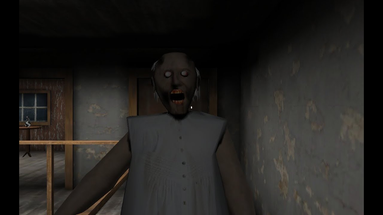
Henry Jenkins’ Game Design as Narrative Architecture discussed the argument between ludologists and narratologists. This argument regarding the necessity of narrative in games came from a lot of different aspects, but in my opinion, the most important factor is that there is a very narrow understanding of what a narrative is and how to convey them. A lot of people argued that narrative had to be paragraphs of texts or long-winded dialogues; something that has a clear beginning, conflict, and resolution. In fact, it is not necessarily so. For example, the horror game Granny doesn’t have a clear story: how did the player get there? What is wrong exactly with the grandma? But everyone knows there must be a story behind it; that is what compels the character to escape.
Granny
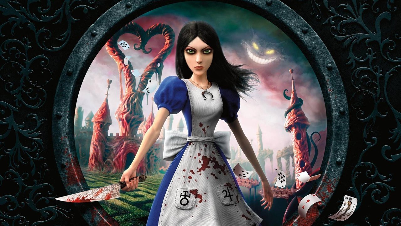
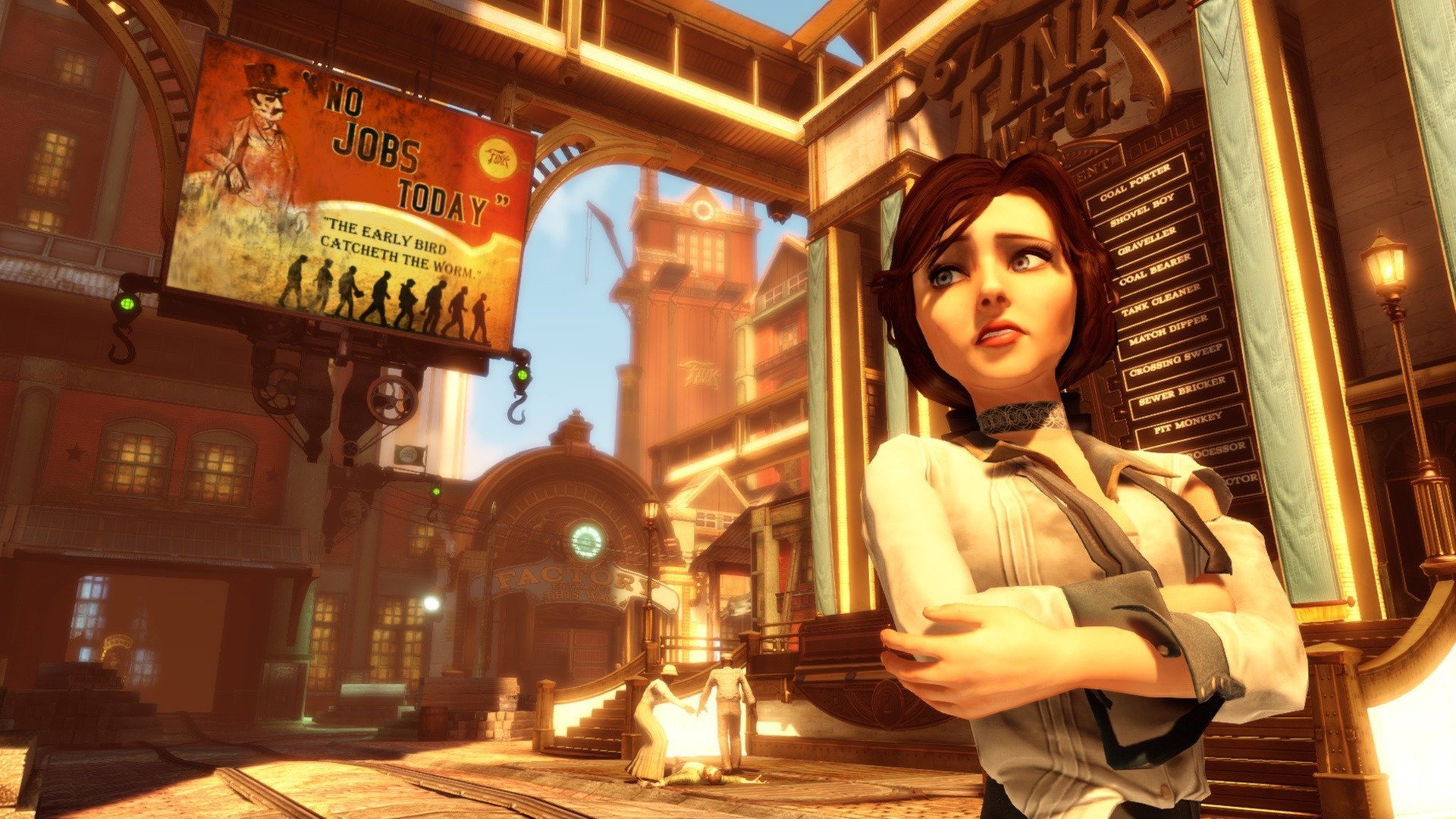
In the article, Jenkins mentioned various ways to tell a narrative without relying on words. In short, game designers can always use other things such as visuals (such as the background, the appearance of the characters), actions, and even the audience’s prior knowledge (like the game Alice, which made use of the knowledge of the story Alice in Wonderland) to enhance the experience of gaming. Especially visuals—books might spend pages trying to describe the fantasy world, but through game, it could be establish in one scene (e.g. the background, costumes, and technology in Bioshock Infinite can express the timeline and maybe even country it’s probably set at).
Alice
Bioshock Infinite
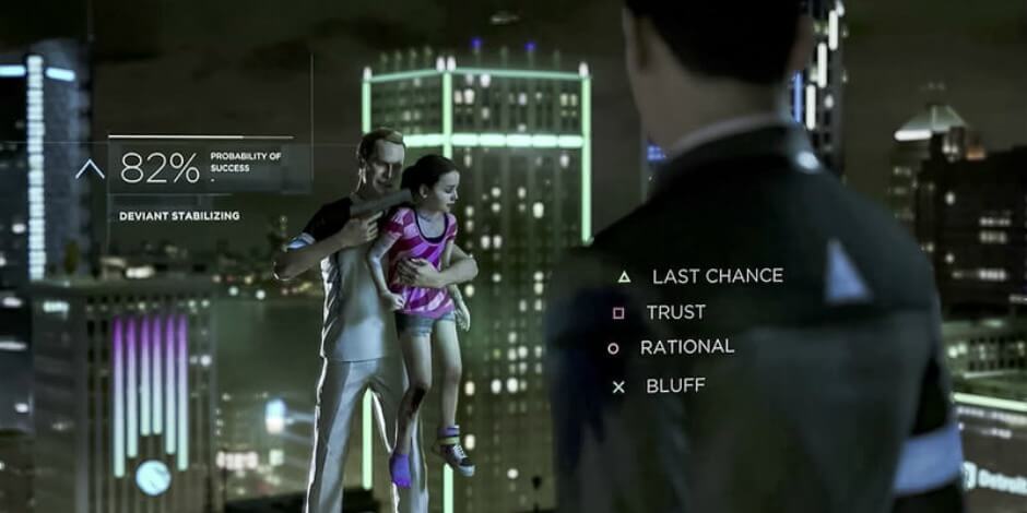
One might argue that visuals could also be achieved through movies—and here is where the interactivity of games comes into play. Adams said that interactivity is “almost the opposite of narrative”, and I disagree. Interactivity, in my opinion, is a form of narrative. Although a story might be predetermined to the letters, when the players are able to do something to trigger the uncovering of the story, they will undoubtedly feel more connected to the narrative. The difference between game and movie, hence, is when people watch movie, they are aware that they are watching someone else’s “life”. Meanwhile in games, the interactivity encourages people to think that it is their lives. Moreover, there are more games that try to provide alternative endings to the storyline in order to make things more engaging for the player—ranging from simple two or three endings (e.g. Undertale) to various endings to the point that it’s difficult for two people to sync their choices perfectly (e.g. Detroit Become Human).
Undertale
Detroit Become Human
I think this relates a lot to my project since we’re giving the players a certain plot for them to follow, with predetermined backstory and characters (comparing to The Sims, where those points might have to be developed by the players themselves). We do try to implement interactivity through choice-based actions—but the choices need to be important enough for the players to actually feel engaged. I think that’s a challenge that we’ll have to overcome in the making of the game.
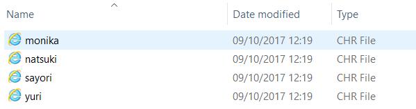
Doki Doki Literature Club (DDLC) is a visual novel created by Team Salvato, a game development studio founded in 2017 by Dan Salvato. It has the premise of a dating simulation game.
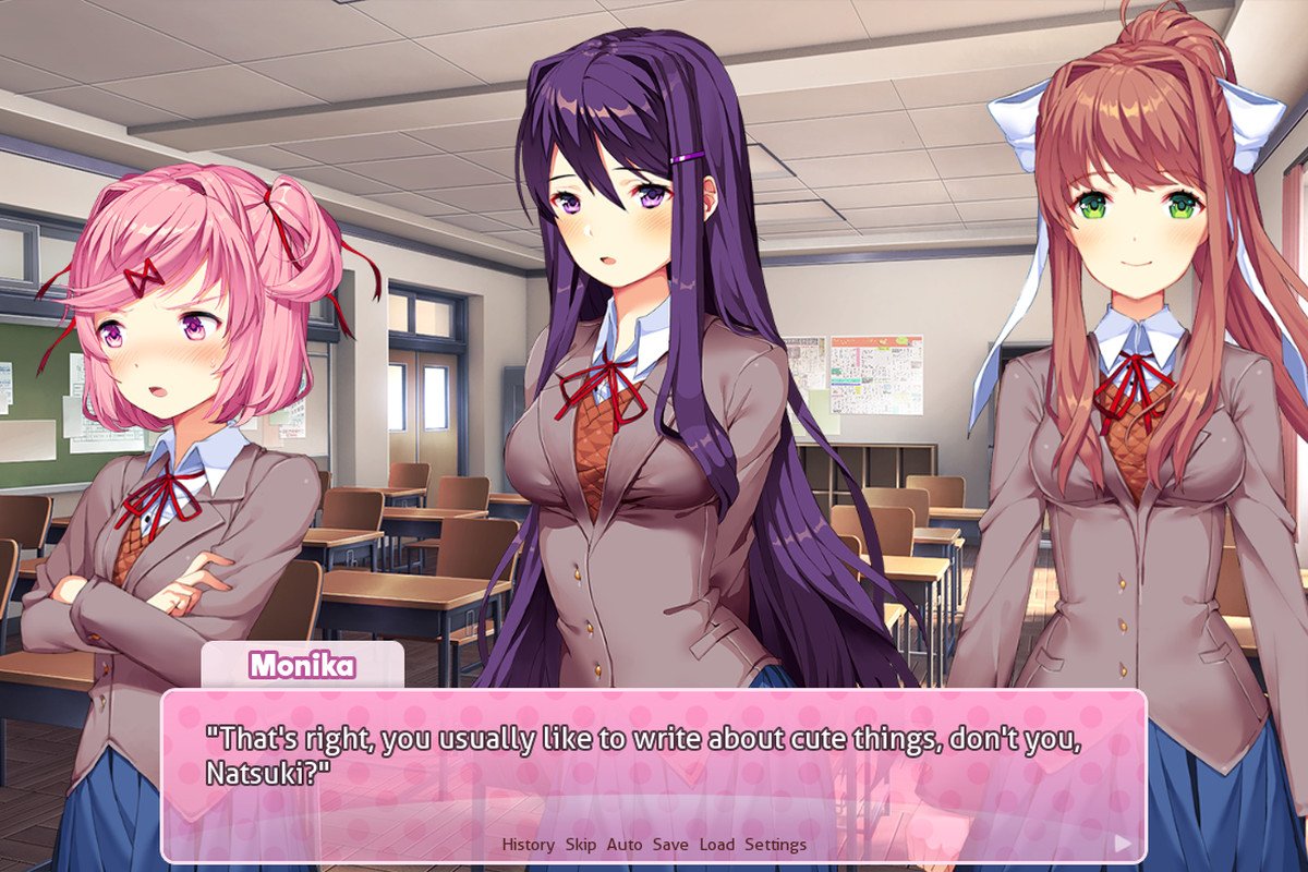
You play as the male protagonist who is invited by your obnoxious childhood friend, Sayori, to join the club of which she is the vice-president: the Literature Club. You reluctantly agree in hopes of quieting her down. In the club, you meet three other girls–Natsuki, the petite girl who can’t be honest sometimes; Yuri, the sophisticated girl with a taste for mysteries; and Monika, the popular and dependable club president.
Gameplay
It’s mostly text-based (since it’s a visual novel), but there are some interactions. You can gain favor from the girl of your choice by choosing them directly when prompted to (e.g. when being asked who you want to help, etc) and by creating poems. Since it is a Literature Club, you will have a “homework” of creating a poem every day. The way you create poem is by choosing the words you want from several lists of words. Different words will appeal to different girls; for example, the mature girl will prefer complicated words, and the cute girl will prefer fluffy, simple words.
The next day, in the club, you can show your poem to the girls and they will give their opinions on it (depending on what words you chose). As they develop better opinion of you, you will get to know them better.
[Just a thought: they call it a “Literature Club” but really, it’s more of a “Poem Club” since all they make are poems.]
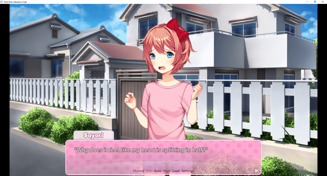
Screenshot of the gameplay. [https://www.polygon.com/2017/10/22/16512204/doki-doki-literature-club-pc-explained]
Making poems [https://www.polygon.com/2017/10/22/16512204/doki-doki-literature-club-pc-explained]
Twist
However, as you progress through the game, you will find out the darker side of the characters. You find out in the end that their issues are “triggered” and even “enhanced” by Monika, who is aware that all of them are in some kind of a dating game. Some of the characters end up dead in less than pleasant ways because of that.
In the game, Monika does not have a route–you cannot “get together” with her. Monika poses questions about the culture of dating games; why do the characters not have any “choice” whether they want the protagonist or not? Why are the characters always so obsessed with the protagonist? And she will mention that she does what she does to the other characters because she falls in love with you, which inevitably makes the audience sympathize with Monika. However, is that really justifiable for her to drive her friends to the brink of madness, just because the world is “unfair”?
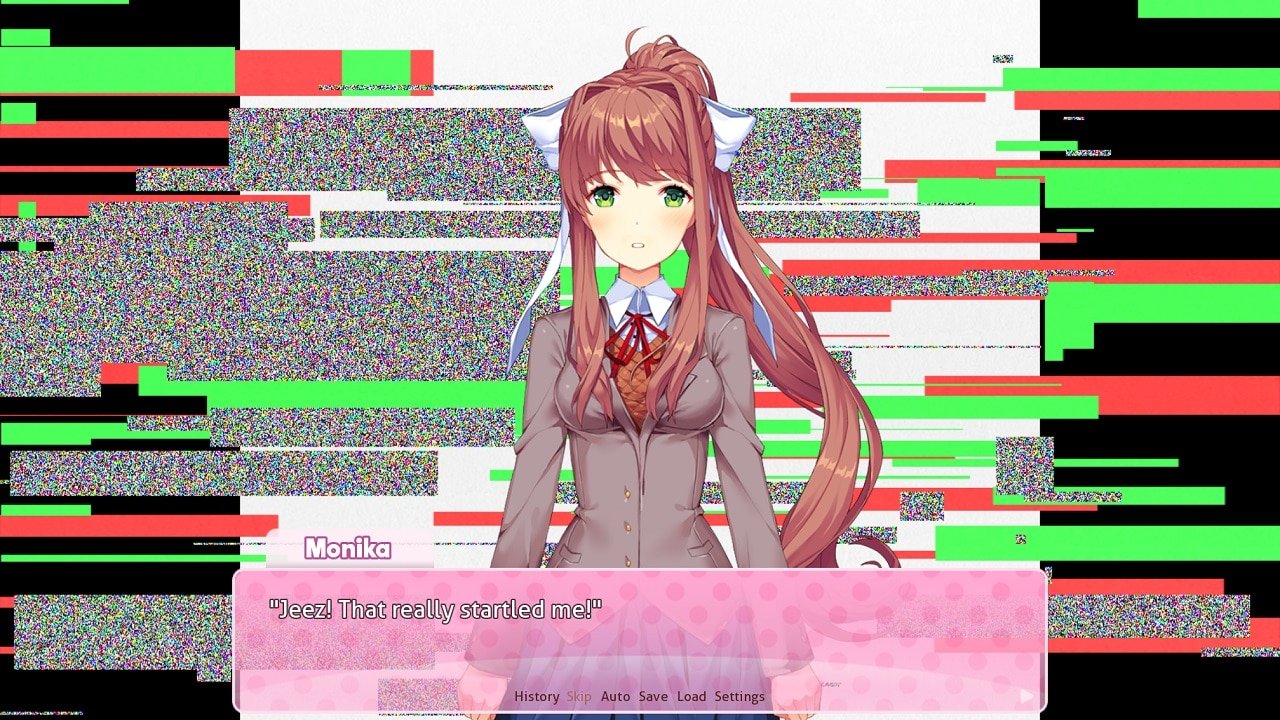
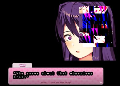
The color palette of this game consists mostly of bright pastel colors, which enhances the cute and comforting mood. The contrast then becomes stronger compared to the moment after the story takes a dark turn, where the visuals will change. At first the change will be small and unnoticeable; the screen turning red for a split second or a very quick glitch moment. But then it will grow to be something bigger; change of fonts, change of the characters’ personality or appearance, etc.
I feel that those small changes can give a lot of impact; it unsettles the players in a subconscious way, compared to a direct way where a bloody dead person is shown on the screen. (Although this game definitely has the direct way as well.)
Paired with the visuals, the music also starts off bright and cheerful, and slowly changes. The song is the same, but there is slight changes in the tempo, key, and volume that, again, subconsciously unsettle players.
Characters
All the characters in this game have so-called problems. Sayori has depression, Yuri is obsessed and enjoys cutting herself, Natsuki is abused by her father, and Monika is obsessed with the protagonist to the point that she deletes her friends’ character files so she can monopolize the protagonist.
Those make the characters feel more realistic. They all still some kind of cookie-cut personalities or archetypes–which is totally fine, since there is no such thing as an original personality anyway. But what defines them is how they interact with each other and how they act to handle their so-called problems. Through their different ways of coping, audience can readily relate and sympathize. That’s why I think the characters in this game are very well fleshed out, and although the concept of the story itself is not new, the characters can make the story good. It makes me think that a narrative doesn’t have to be complicated, as long as you can find a mean to make people relate in some ways to the narrative–in this game, through the characters and the difficulties they face.
Use of Files
In order to progress with the game, at a certain point, you have to open the game’s files and delete a file. Moreover, if you open some of the files, they will show special images that you won’t see in the game, or descriptions that hint at the idea that someone is breaking the fourth wall. I think it’s an effective and interesting way to show that a character is “self-aware” instead of just showing a monologue like “I feel like someone is controlling us”.
However, the downside is that players may not be aware of this. It’s not common for people to open up the game’s files while playing or actively altering the files as a part of the gameplay. I think it robs some level of excitement when you have to research to find out how to progress in the game. Some people who are not aware of that just leave the game in the loop, unknowing that you can actually progress, because the loop does look like a proper ending. (It is the so-called “bad ending”.)
In order to progress, you need to delete Monika’s file at one point. [https://gameplay.tips/guides/1299-doki-doki-literature-club.html]
Interactivity
Since it is a visual novel, the interactivity is definitely lacking. However, aside from that, the thing that I find a bit tedious about this game is its nature of repetition.
In order to fully understand the game or to get the “true” ending, you will have to play the game more than once–ideally three times. Since this is a text-based visual novel, the texts and conversations can be chunky to the point that I feel they are dragging the gameplay. There is an option to skip the texts, but they might also skip the small changes in the unread dialogues, resulting in you skipping things you don’t know. However, contrary to my opinion, some people actually say that they wish there is more time for them to interact with the girls.
In addition, there is a very fixed way to playing this game–in order to progress, you have to do this exact action, and you have to do this, and so on.
The choices you made matter very little since it only has one fixed ending. Moreover, since the gameplay was making poems but the ending has nothing to do with that, it makes me wonder what the point of the entire interaction is.
Theme
Besides addressing the problem with dating games, the game also touches on the subject of mental health issues. Sayori, is suffering from depression. Dan Salvato based her on his own acquaintance who suffered from depression, making her character’s emotions and expressions highly realistic and even relatable to a certain degree.
Since the game is not promoted as something about mental health, I think it will expose more about that to people who are not interested in understanding mental health in the first place. Sayori uses simple expressions to try to explain her depression. I think that’s an effective way to show people what depression actually feels like, and actually intrigues people to learn more about mental illnesses.
“People become disturbed when forced to think about things they don’t want to, or shown a reality that they always try to ignore,” he said. “But humans aren’t rational creatures. It’s when we’re emotionally charged that we become inspired to do something for ourselves, or for others.”
Since this game contains disturbing contents, there are warnings at the beginning of the game and even in the download page. However despite of those, children and people who are easily triggered still play it anyway. Firstly, because they are curious. Secondly, because it “doesn’t look that bad”.
Dan Salvato made this game out of his “love-hate relationship with anime” as he wanted to address the culture of anime–cute, moe stuffs. He always liked things that take a sudden dark turn and he integrated it into DDLC. But looking at how people think that “it won’t be that bad because it has a cute interface”, is it wrong of him to do so? Can it be considered false advertisement, even if he already explicitly put warnings?
Conclusion
All in all, I think DDLC is a good visual novel. It certainly sticks with me. It evokes a lot of emotions–especially sympathy for Sayori who committed suicide in the end due to her depression. In the story, regardless of whatever you said to her, you won’t be able to save her. That’s sad, but it’s honestly realistic. It makes me feel sympathetic towards people who are suffering from mental illnesses.
I even sympathized with the “villain”, Monika. What she does isn’t justifiable, but she is just trying to achieve her dream. The world is unfair, but do we have to accept that as a fact, or does everything we can to deny that? And when we do try to deny that, where do we draw the line between “acceptable” and “unacceptable” effort?
The game is long, and tedious sometimes. I can only play it all the way through because I watched a playthrough and I just want to experience it myself. But in the end, since watching the playthrough makes me want to play it myself… I guess in a way, it is a “good” game then.
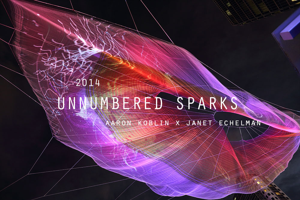
Hyperessay: Unnumbered Sparks (2014) by Aaron Koblin and Janet Echelman
About the artist
The artist that I will be talking about here is Aaron Koblin. He is best known for his innovative use of data visualization and work in crowdsourcing, virtual reality, and interactive film.
“So I think data can actually make us more human. We’re collecting and creating all kinds of data about how we’re living our lives, and it’s enabling us to tell some amazing stories. Recently, a wise media theorist tweeted: ‘The 19th century culture was defined by the novel, the 20th century culture was defined by cinema, and the culture of the 21st century will be defined by the interface.’ And I believe this is gonna prove true.”
A lot of his works is collaborative in nature, where people come together to create something, since more people will mean more data and more data will result in a greater story produced. In those projects, usually the engagement of the audience is highly crucial, making the audience the artists themselves. Without the audience, the project will not be. Literally, will not be. Some examples are the Johnny Cash Project and This Exquisite Forest, where he literally asked the audience to create the art itself.
In a sense, as the creator, he often only creates the platform and concept, leaving the creation of the actual “art” to the audience themselves.
About Unnumbered Sparks
[Taken from http://www.unnumberedsparks.com/]
Aaron Koblin and Janet Echelman (an American sculptor and fiber artist) worked together to create Unnumbered Sparks for TED’s 30th anniversary in March 2014. Unnumbered Sparks, as quoted from Koblin himself, is a “monumental interactive sculpture in the sky”.
How it works
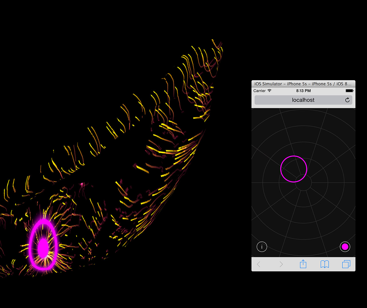
Interface and projected result. [Taken from http://chrisdelbuck.com/projects/unnumbered-sparks/]
Basically, they created a massive net sculpture (745 feet long, or around 227 meters) and spread them from buildings to buildings across the sky in Vancouver, Canada. Five bright HD projectors will emit light beams onto the nets, which will result in shapes being projected on them, creating a stunning visual. The light beams were choreographed by participation from the audience, who could sign into a WiFi network created specially to connect to the program that controls the projectors. Signing into the WiFi would prompt the audience immediately to a website, which will display the nets. Audience could then touch the nets on their screen. It will correspond in real time, as the spots they touched will be translated into colorful light rings using the projectors. Those light rings will also “interact” with the other light beams projected on the nets.
Old and New Media
Unnumbered Sparks relied heavily on the programming, with a lot of elements relying on each other in kind of a relay to create the final outcome.
“The lighting on the sculpture is actually a giant website. It’s one huge Google Chrome window spread across five HD projectors. The content is being rendered in WebGL. It uses Javascript and shaders to render particles and sprites based on user motion, which is transmitted from mobile browser to our rendering browser via websockets. There are a lot of moving pieces here, from the local area network to the server (written in Go), to the sound system (also running in Chrome with Web Audio API) all the way through the LED light control system, which pulls pixel data directly from the browser.”
Honestly, reading that, I am not sure of what is going on since most of the terms is unfamiliar to me. What I could gather is that the program, or the “language”, is constantly being translated to something else until it reached something that could produce the expected outcome.
Due to that heavy dependence on computational parts, I think it’s safe to say that Unnumbered Sparks falls within the New Media. However, while programming is crucial, there is another part to this installation: the nets. The creation of fiber nets itself, I believe, is more within the Old Media and I think it is “artistic” enough to be considered an art by itself, even without the light beams projection. The nets didn’t just function as a screen for the light beams, but rather, adding variability to the visuals. The choice of material and crafting method affected how the nets will behave under different circumstances, i.e. weather conditions. Imagine if they used a simple screen or just project the light beams onto a wall; it won’t be as beautiful.
Analysis
Unnumbered Sparks has a high entropy—the possibilities of the visuals created are endless, since humans’ behaviors are unpredictable. They can create spots wherever they like. In addition, the net itself is constantly changing, allowing the visuals to be projected to different dimensions. Different number of audience would produce different results as well—there are so many aspects that contribute to the variability.
I thought that Unnumbered Sparks doesn’t possess high automation at first; however, I then realized that there is still certain artistic visuals portrayed even without the participation of the audience; it’s just not as varied, but it will still be pleasing to the eye.
The machines (in this sense, the projectors) give immediate feedback with regards to the inputs, which are the spots pointed by the audience on the screen of their mobile devices. However, the feedback itself is a programmed response. There is no memory—the machine will not change its feedback, regardless of time or condition.
There is also a lot of communication between humans and machines, since the actions of the machines are always controlled by humans. There is also machine-to-machine interactions, as the program is constantly translated from the mobile device interface all the way until it reaches the projectors, which will create the light beams. I didn’t think there is any human-to-human interactions at first, however Koblin did say that he saw a lot of strangers started interacting with each other under the sculpture. I’m not sure if he referred to the interaction as something that caused the creations of the projections or something that is caused by the projections instead, but I guess in some level, there may be some human-to-human interactions.
What I think is interesting is the immersion. I think having massive nets hovering above the audience is interesting and effective, since it will immediately make anyone standing under the nets to feel “engaged” to the artwork, even before they are actually interacting with it. The effect will be vastly different if the lights are projected on a screen or a wall; it will not be as immersive, as it would seem more like a screening.
Unnumbered Sparks also can cater to the needs of a lot of people at once; the experience is not singular. In a sense, I can see where the human-to-human interactions may come from this; when you share a common experience, you usually can feel some kind of connection with others, even strangers. You can also see how the light rings you create interacted with others’, which is the whole point Koblin wanted to convey—engaging people, and letting them collaborate. However, I do think the interactivity is more prearranged than intuitive, as the audience has to be given clear instructions to sign into the prepared WiFi network.
Questions
Firstly, it is clear that Unnumbered Sparks depends on the audience to create the visuals. If that is so, can we consider the audience the “artist”? While it may not be a big idea, if we refer back to some of Koblin’s other works, he just provided a platform and concept in some of them. If that is so, can we still consider him the artist?
I believe that Koblin is not an artist per say—but rather, a creator. He created the platform for people to collaborate, which corresponds to his goal (or his manifesto) of bringing people’s stories together, to create an amazing story. So maybe no, he’s not the artist to some of his works, but he is the creator, and his beliefs are always clearly conveyed in his creations. I think artists do not equal to creators, and that is fine.
Secondly, Unnumbered Sparks plays on light beams a lot and is placed outdoors, which will make it a highly different experience when viewed at different times, at different conditions. Is it a weakness, or an advantage?
I’ll have to say that it is both. At night, the visuals created by the light beams will be more visible, and hence more stunning, rather than when viewed during the day. Moreover, if it’s raining, it will be hard for people to look up to view it. However, it may be the attracting point as people will be interested to view it at different times (or probably just at the best time, at least). Moreover, some conditions such as the wind may also allow the lights to be projected to different dimensions and creating a whole new visual.
The work by Aaron Koblin that I chose for my essay is Unnumbered Sparks.
[http://www.unnumberedsparks.com/]
As quoted from Aaron Koblin’s website, Unnumbered Sparks is a “monumental interactive sculpture in the sky”. For this installation, he worked together with Janet Echelman, an American sculptor and fiber artist. It was displayed between buildings in downtown Vancouver, Canada in March 2014 for TED’s 30th anniversary.
The interactivity of this installation comes from the fact that it could be “choreographed” in real-life time by anyone through their mobile devices.
How does this installation work? Basically, the artists created a massive net sculpture and spread them from buildings to buildings across the sky. Visuals shaped from beams of light would then be projected onto the nets using five bright projectors. The beams of light were controlled by the audience. They could sign into the WiFi in their mobile phones or tablets, which would prompt them to a website that would allow them to choreograph the beams of light in real time (and additionally, vary the colors). Your mobile devices became sort of a “remote control” for the visuals. Also, there is spatial audio. Ambience sound that set up the atmosphere would be played through the audience’s mobile devices.
Not only is that really engaging and interesting, I think it’s very much reflective of the new media. It has a high entropy – the possibilities of the visuals created are endless, since humans’ behaviors are unpredictable. In addition, the net itself is constantly changing due to the string tension and the weather condition such as the wind, allowing the visuals to be projected to different dimensions. Different number of audience would produce different results as well – there are so many aspects that contribute to the variability.
The machines (in this sense, the light beam projectors) give immediate feedback to the inputs, which are the movements or the spots pointed by the audience through the mobile site. Numerous code were created for this, and also numerous calculations. Numbers were important to calculate the dimensions of the net and the tensions required when hanging the net, as the creators needed to make it such that people are able to see the visuals at any angle, at any time. The codes have to be created in a more modular way, such as that the activity of one projector does not affect another, and that one command does not interfere with another. The organization of orders and data are crucial.
There is a sense of “retaining memory” too in this installation as the light projected will need to remain for some time before disappearing. However, the memory itself does not affect future projections – in a sense, there is no actual feedback coming from the machine, but maybe more from the participants. There is a high human-machine interaction in this installation.
I think the purpose of this installation is to show people more about “collaboration”. More beautiful visuals can only be produced when there are multiple light beams with multiple colors; so to speak, the concept is that when people work together, the world can be richer and more beautiful. Also, in this installation, the audience becomes the artist as well. They are not merely watching something changing, but also contributing to that change.
However, I do think this installation is not “automated” as without people’s participation, there will be no visuals or audio. The net will just be a net. While it may be the message they’re trying to get across, I do think that without proper publication, people will not know what to do. The interaction part is not something that is intuitive, but rather prearranged. Another weakness is that people without mobile devices will not be able to contribute, which may adverse their idea of collaboration entirely.
The artist that I chose for my hyperessay is Aaron Koblin.
Aaron Koblin is best known for his innovative use of data visualization and work in crowdsourcing, virtual reality, and interactive film. In his TED talk (see below), he mentioned that he believes “data can actually make us more human”, as it can show us how we have been living our lives and tell our story. He is highly interested in collaborative projects, where people can come together to create something, since more people will mean more data and more data will result in a greater story produced.
I think his works are worth discussing because a lot of his works are highly interactive and immersive. Most of his works that I have explored require direct audience participation in order to be able to work (for example, the Johnny Cash Project and This Exquisite Forest), making it highly interactive. There’s also one project that I think is highly immersive, called The Wilderness Downtown, where the experience is tailored specially for each individual (it’s pretty interesting, I actually tried it out). There’s also a very high variability in his work because of the unpredictability of what the participants will do.
In addition, I like that he’s making use on the rise of technology (more specifically, the internet and social media) to create interactive media. Some of his works require contributions from the audience through websites or mobile apps, for example, and I think that encourages people to participate even more.
Our idea is to portray a gap in people’s understanding by portraying them using physical gaps on a door.
Our prototype was kind of a miniature of what the actual thing is going to be. Our whole idea is revolved around a story that would be revealed after “exploring” around the door, but we didn’t have a story yet. We put earphones behind the cardboard door and played some e-book as substitute.
For the set of actions we required the participant to do, we only told the participant to approach the door and just try to listen carefully. At first she looked unsure of what to do since the sound from the earphone was very soft, but then she could still catch the sound. She began exploring different spots on the door and I tried to match that by playing different recordings as she moved, but I couldn’t keep up and she didn’t get what the recordings were about either, so it just confused her. But she did think that she felt like eavesdropping (which is kind of our idea) due to the low volume, so that’s good. She also said that the concept is interesting, and if the gaps do play different recordings or sounds, she would be interested to test all of them to find out. She also added that at first she wasn’t sure of what to do because the door was a plain piece of cardboard with no handle or keyhole, but if there is a handle and keyhole, she would know naturally that the participants are expected to open the door.
Feedback we received:
The door may not have to be real-life size, it can just be something like a dollhouse
The concept of revealing a story is interesting; maybe we can make the door have several screens inside, so you can open it up like pages of a book to fit in the concept
We can make use of the gaps between door and door frame to put in speakers, but we can also put in a lot of keyholes instead so participants will have to continuously find keys to progress with the story. Moreover, it will be visually intriguing.
We can also make use of different heights of people; so maybe in one big door, there are smaller doors. The different gaps will play different people’s sounds, e.g. a small door will play a child’s sound and a big door will play an adult’s door. So we can make a story but through different perspectives.
One-person experience would be better. If the door is placed in an empty room, people will definitely be compelled to approach the door and find out more about it.
As for now, what we have to do based on the feedback is to focus on what we want to do first. Now we received a lot of feedback because we still have a lot of things we can play around with, and we still haven’t decided which idea to use exactly. After we decided on one idea, only then we can move forward with the project.
I do think this bodystorming helped a lot because the feedback we received are really valuable. They provide objective opinions and point out the strength and weaknesses we didn’t see in the beginning. At first I was really worried that people won’t be interested to find out about the door, but the participant told me she would be interested and even gave her idea on how to improve on that. Moreover, I can see other people’s works and learn from their troubleshooting as well.
I’ve never gone to Night Light Festivals previously, so this is a new experience for me. It was fun – my friend and I walked from place to place, exploring the installations. They are very spread out, which may be good since people have more places to explore, but it makes it difficult for people who want to go through everything in one go. I visited several of the installations, and I think they look magnificent.
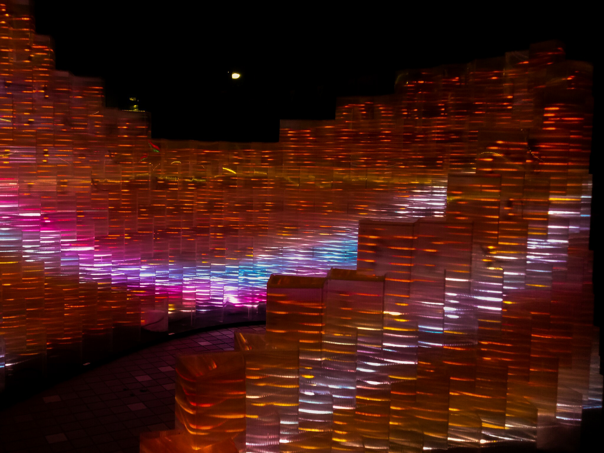
Hyperbands by KopI/O
Pulse by Galina Mihaleva, Hedren Sum, Pat Pataranutaporn, Kathrin Albers, Audrey Ng
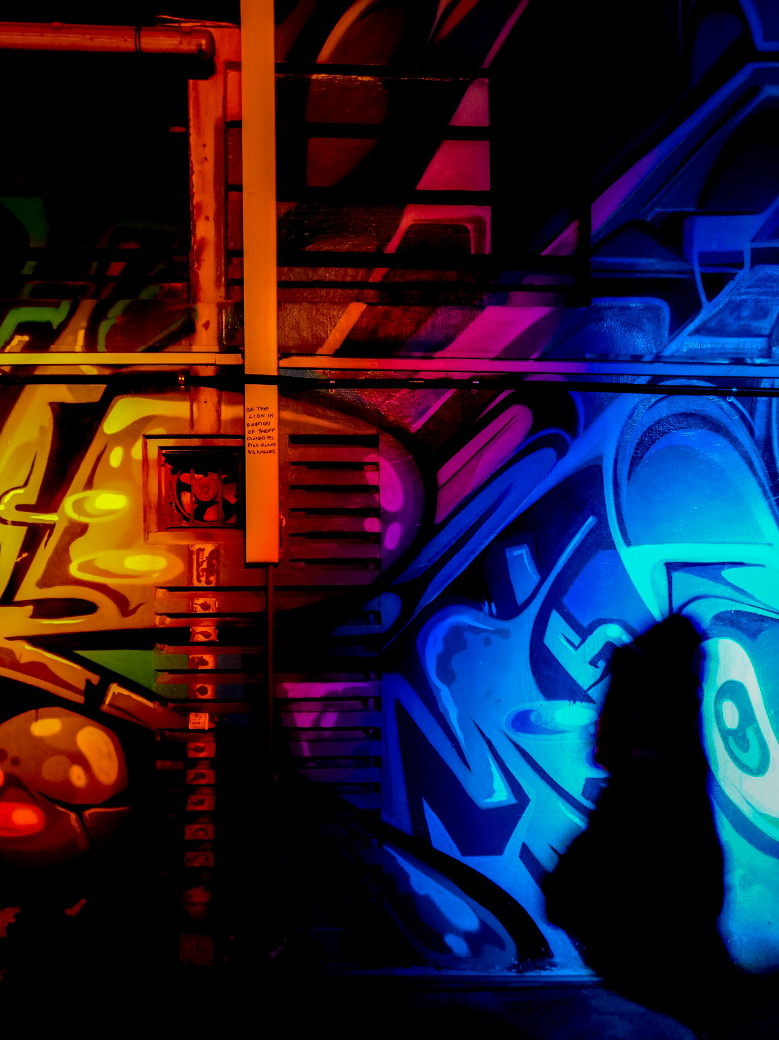
Graffiti Alive by Arup
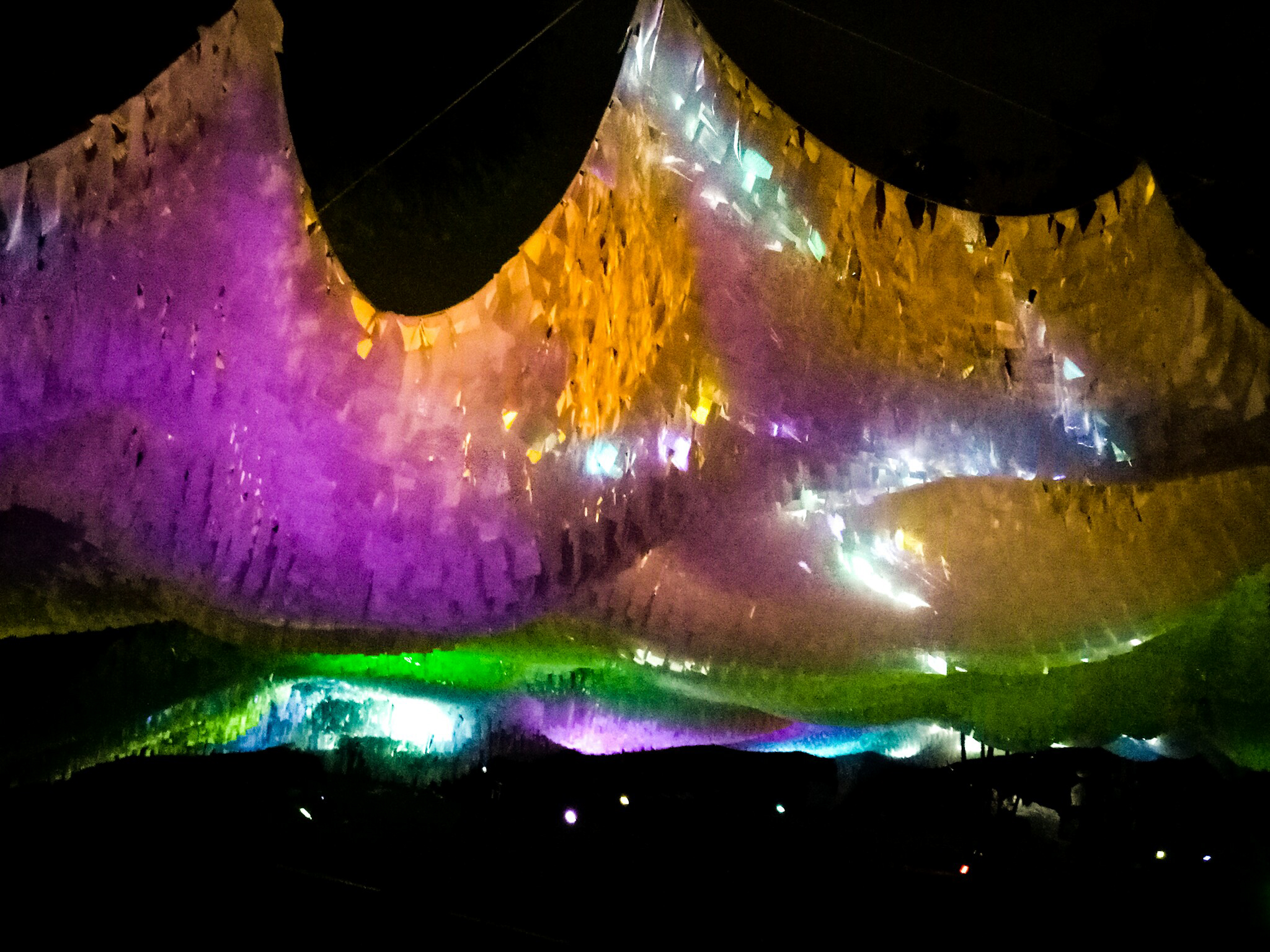
Ember Rain by Starlight Alchemy
That being said, I have chosen two installations for me to talk about.
Orbit
By LiteWerkz X 3M
This is the first installation that I went to. From afar, I could see a group of spheres – some of them lighting up, some of them don’t.
As I walked closer, I could see the see-through spheres, with quirky geometric shapes inside. The spheres were lined with lights so that we could see the insides of the spheres even in the darkness. Circular shapes were adorning the surface of the spheres. In the middle of the spheres, there is one sphere that is different from the others – it has circular objects that light up instead of geometric shapes inside the see-through sphere. A nearby sign informed us to try taking picture of the spheres with a flash.
At first, I took pictures without flash first.
After that, I tried taking picture with flash. The picture was so different from what I expected:
Upon closer inspection, I found out that the circular-shaped stickers were actually made out of 3M retroreflective materials. When given light (i.e. the camera flash), the stickers reflected light and gave the effect as if they were sources of lights (!). That’s the interactive part of the installation. Moreover, I think there’s motion sensors inside the spheres that triggered the lights inside the sphere, so the lights will only light up when you spin the sphere. (I wanted to post a video, but it’s so hard to post a video in OSS, i.e. I can’t.)
It reminds me of a galaxy (and apparently that was the intention of the installation, based on the description put in the National Heritage Board website), not in the appearance only, but also because it gave me a sense of wonder when I tried to find out how the thing works.
I think the installation is interesting for that reason, and also that the design of the geometric shapes are all unique; there’s also a center piece which is a bigger sphere that attracts attention although it actually works the same way as the others. However the fact that everything works in the same way may dull people’s interest quickly, and people may not take their time to see the spheres one by one; they may just check one or two and leave (that’s what I did). In addition, it might not look very good when no one is interacting with it.
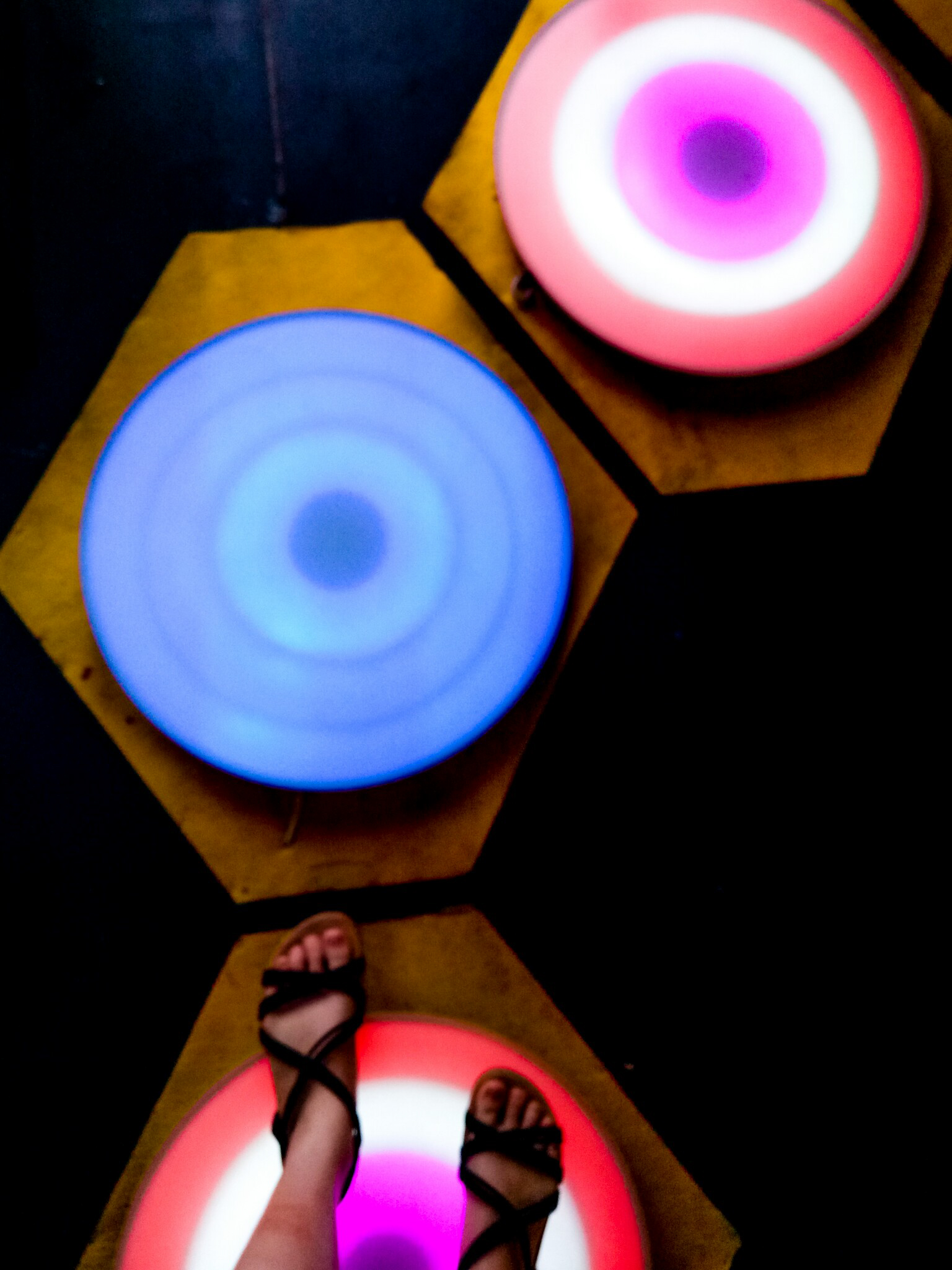
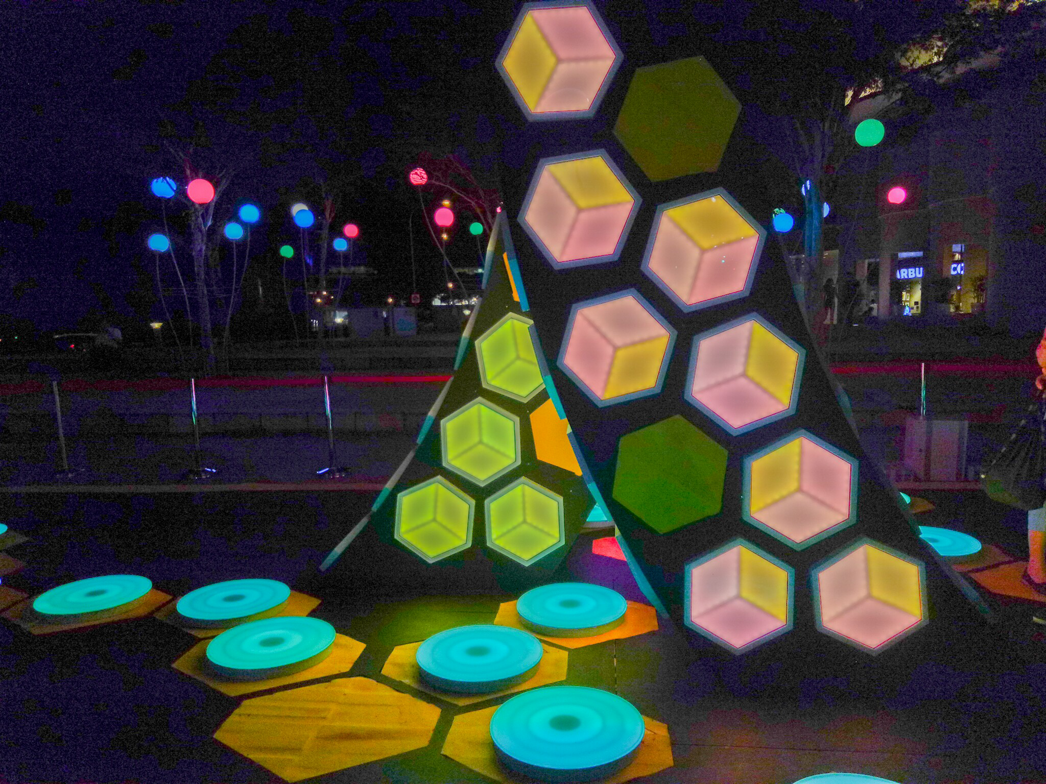
The Leap of Faith
By Teng Kai Wei
Even from a distance, I could see the lights from the installation. At once, it captured my attention. My first thought is that it looks beautiful, and it reminded me a bit of hopscotch. From the explanation board, I found out that the intention of the installation is to encourage people to take a “leap of faith”, to trust in yourself while going on a journey to reach your destination.
The anatomy looks simple; it seems that the plates are equipped with pressure sensors, so when someone steps on it, the color will change. Moreover, the original color of the plates will change constantly; hence if you step on it after some time, the color change will be different. I found that interesting, and may compel people to re-do the experience. In addition, the color change is unique as well; when you step on it, the color effect will resemble a ripple.
There’s also some kind of sculpture in the middle with geometric-shaped lights. I am not sure what the intention is, but it probably acts as a center, which could also be used to represent the “destination”.
Anyway, it’s really interesting to see different people interacting with it; I could see how different people can be. Little kids jumped from plate to plate excitedly, exploring every single plate although the resulting light would be the same; adults stepped on each plate carefully, looking around, deciding where to step next. Some people travelled back and forth; some people just walked across nonchalantly, even stepping down on the ground when they needed to make a jump across the plates.
I enjoyed playing around with that installation. I do think it would be better placed over water to actually force people to step on the plates, but I realize that may be dangerous and more difficult to set up. The lights were also constantly changing, which made the installation looked beautiful without anyone interacting with it, and noticeable even from a distance.
All in all, I found the installations really intriguing. I could see how even with instructions, people interact differently with the installations. I could also see how important it is to compel people to interact with the installations, and that depending on how they could interact, people could easily get bored by the installations or may not even be interested to interact at all. I realize I’m not familiar with the anatomy of the installations, which left me guessing a lot of times. However, I really enjoyed looking at those; definitely would go there again.