Here are the two posters that I find interesting.
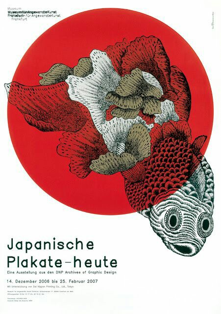
Poster for Frankfurt exhibition by Kazumasa Nagai (from http://theanimalarium.blogspot.com/2011/01/life-is-change.html)
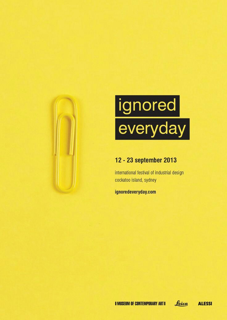
I found this on Pinterest and can’t find who made it. (from https://www.designspiration.net/save/1446483313272/)
I will be talking about the second poster, the yellow one.
This poster is promoting a festival of industrial design in Sydney, and the slogan is “Ignored Everyday”. At first I’m really interested because of the minimalist appearance, with only yellow and black colors. My eyes were immediately drawn to the title due to the black highlights that contrasted the yellow background. After that, I shifted to the yellow paperclip, which didn’t blend with the background due to the outline and the shadow. It created a visual interest that makes people question, “Why a paperclip?” And that prompts the audience to read the information provided.
The information is written using sans serif fonts, which makes the whole look consistent and simple. All of them used black color, which contrasted the bright yellow background very well. I feel that the font size of the festival information could be a little bit bigger because the font is very narrow and thin, which compromises the readibility – but overall, I think it’s eye-catching, simple, and effective.