The phrase that I got from the Pandora’s box was “the golden rule”, or probably better known as the golden ratio.
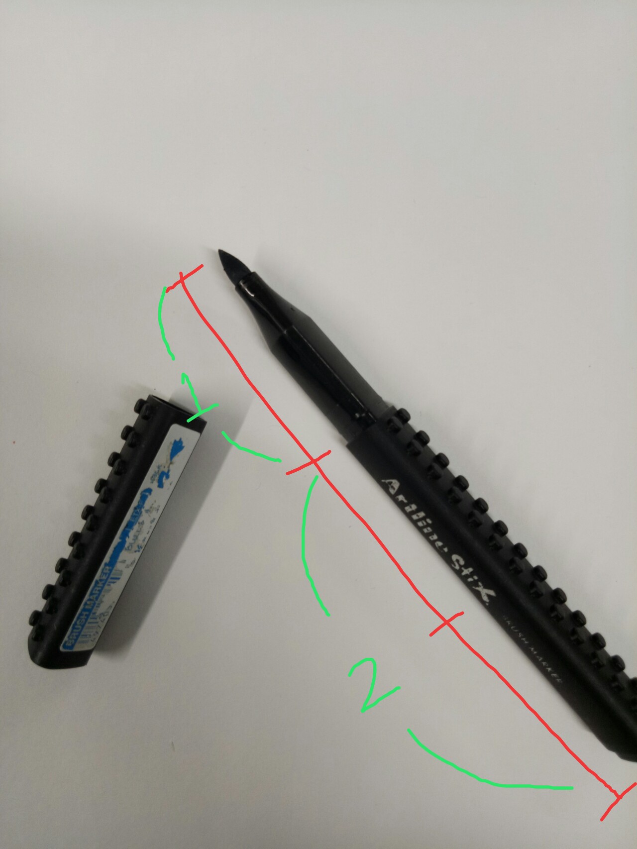
It was hard for me to illustrate that since I had no idea about it before, so I conducted a research and tried to make something based on my interpretation. In mathematics, two quantities are in the golden ratio if their ratio is the same as the ratio of their sum to the larger of the two quantities. So basically the fraction of the length of object A compared to object B should be similar to the fraction of the length of object B compared to object C – the golden rule is all about fractions.
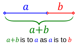
Taken from https://en.wikipedia.org/wiki/Golden_ratio
Based on that interpretation, I have made a few models. I tried to use all similarly-looking boxes in a model, so I can emphasize the comparison of the fractions more easily.
Model 1

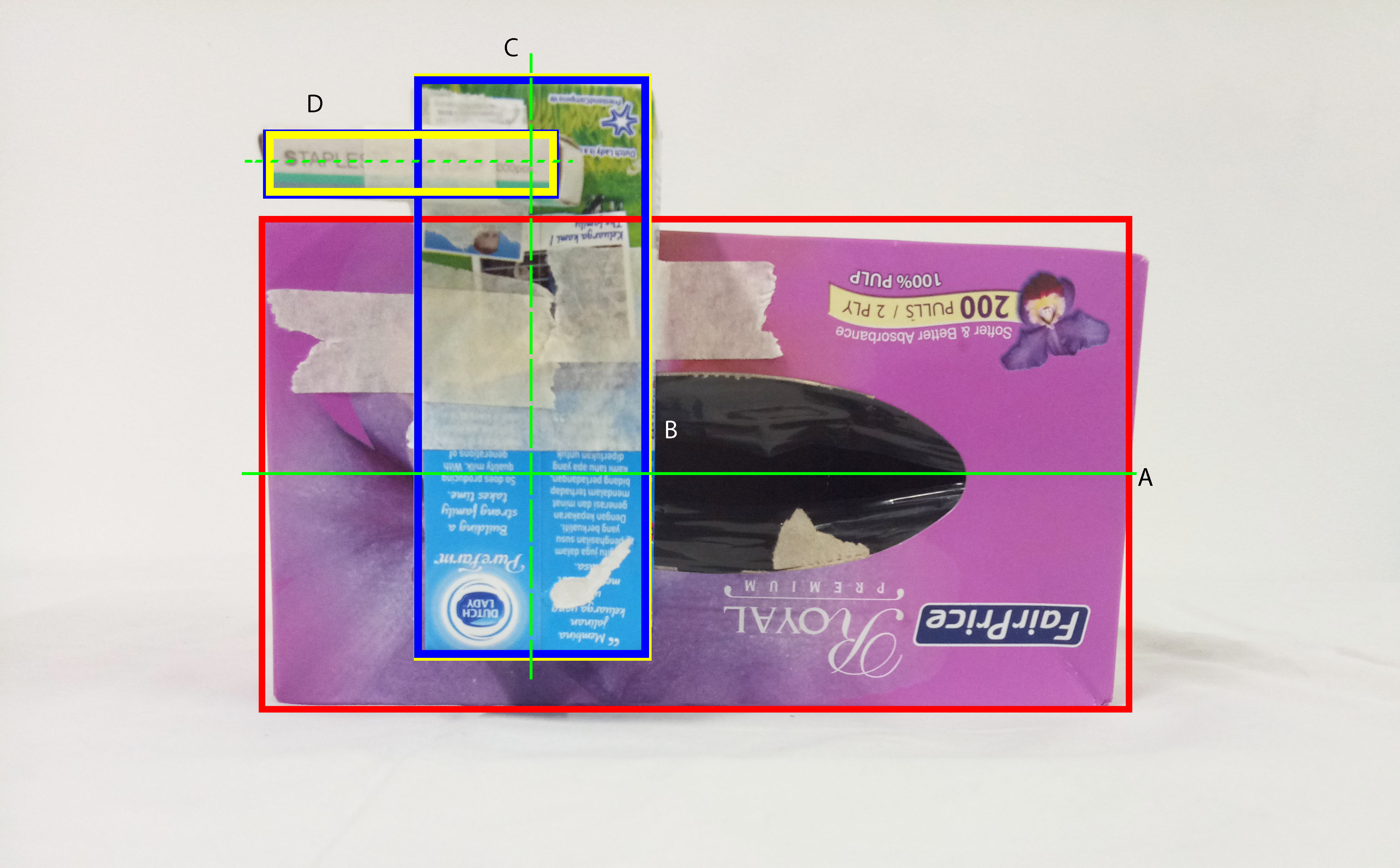
[Red – dominant, blue – subdominant, yellow – subordinate, green line – principle axis]
 I used all the slender, lean-looking boxes for this model.The sizes of the boxes were quite good in my opinion, since I can tell the different roles clearly.
The application of golden rule here is that the ratio between A to B is roughly the same compared to the ratio between B to C (refer to the picture), which is roughly 0.55.
However, the fraction is too great since now the length of B is more than half of C. Ideally B should be around one-third to half of C. Similar idea needs to be applied to A as well in regards to B.
At first, I feel that the positioning is okay since I can see all three boxes from every different angles. However, the placement is actually a mess; I completely disregard the rule of thirds . Ideally, the subdominant should be shifted a little bit more to the right and up so it is placed at the intersection of the imaginary grids. As for the subordinate, I should either move it to the left more or to the right.
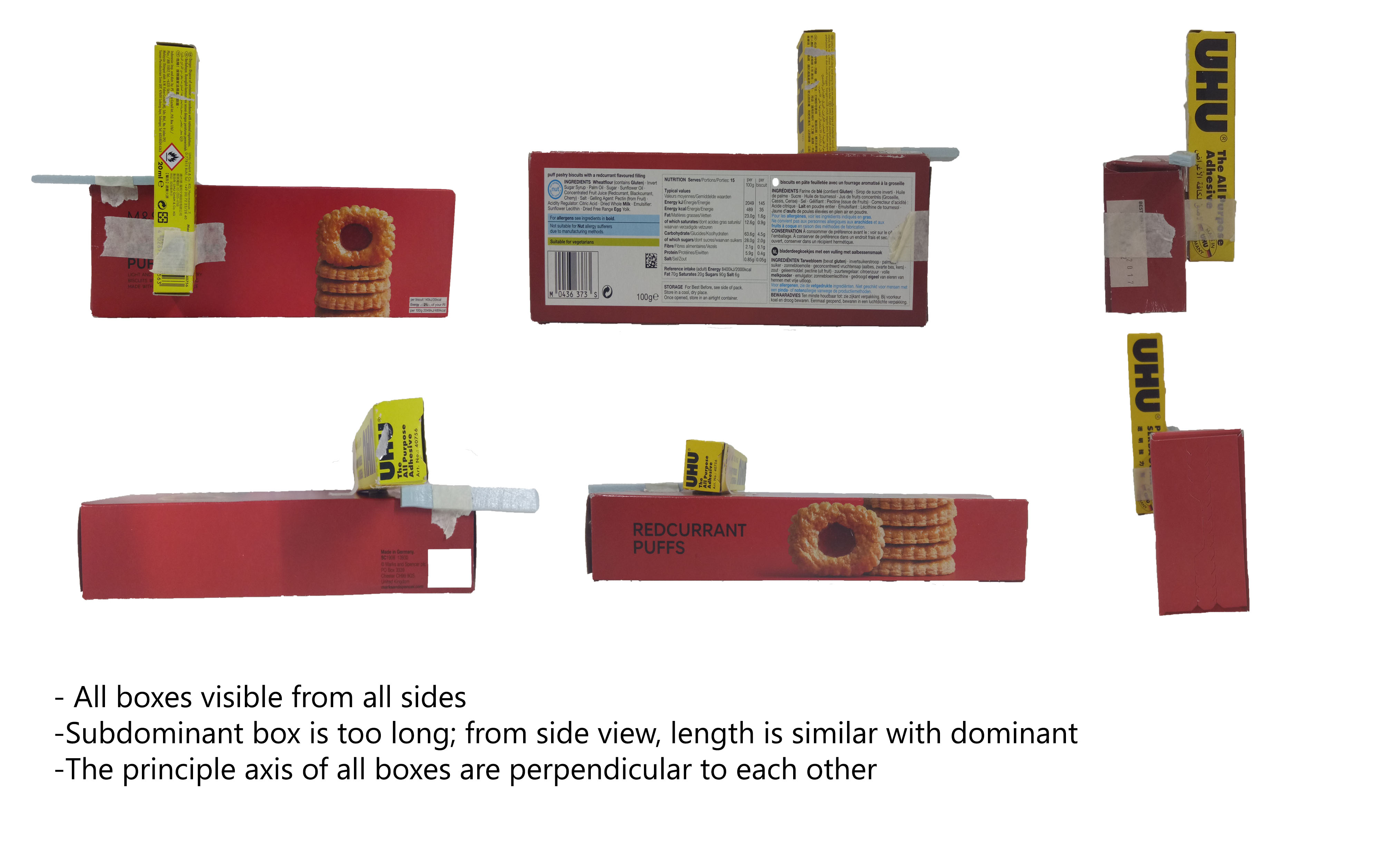
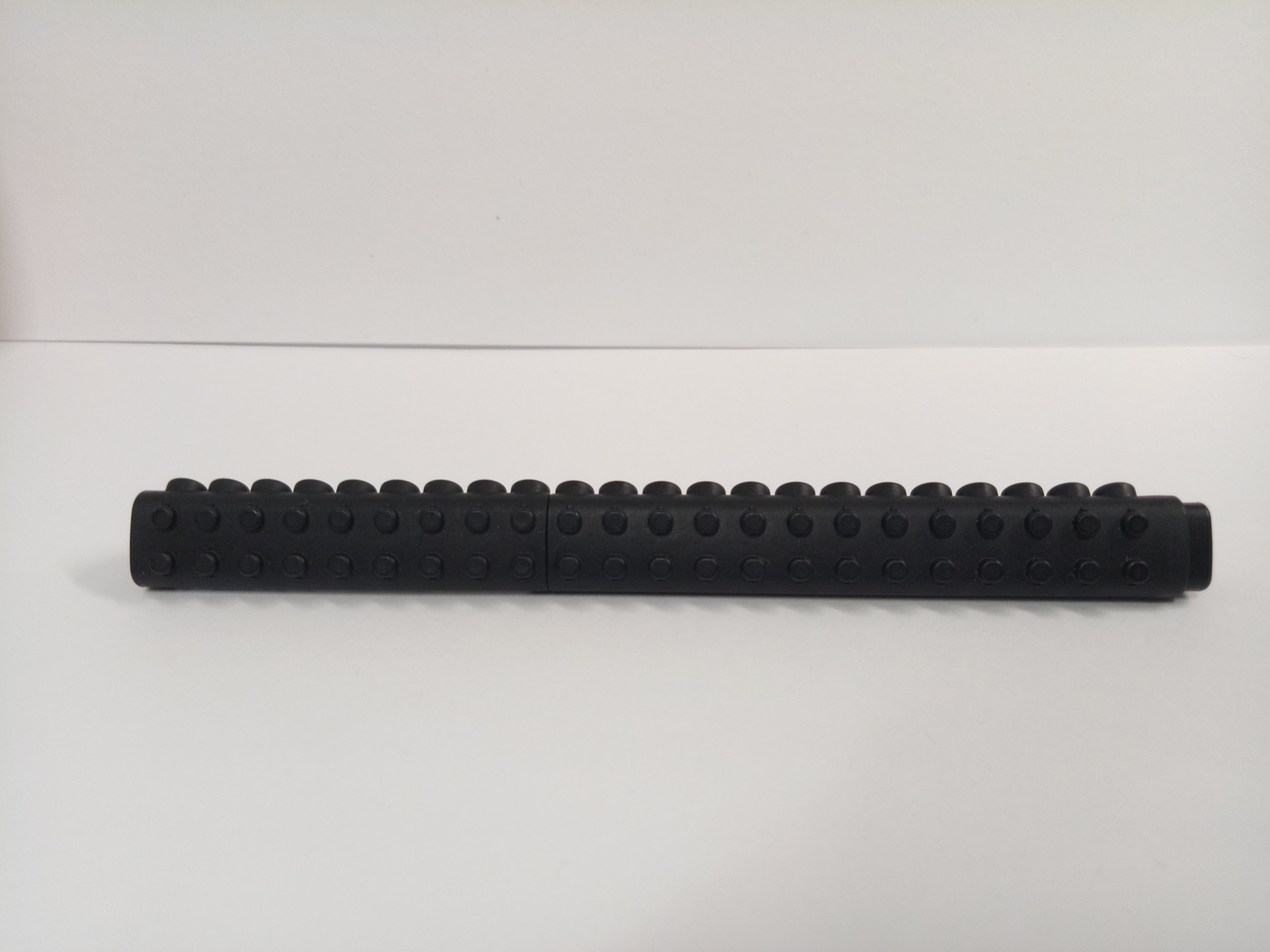
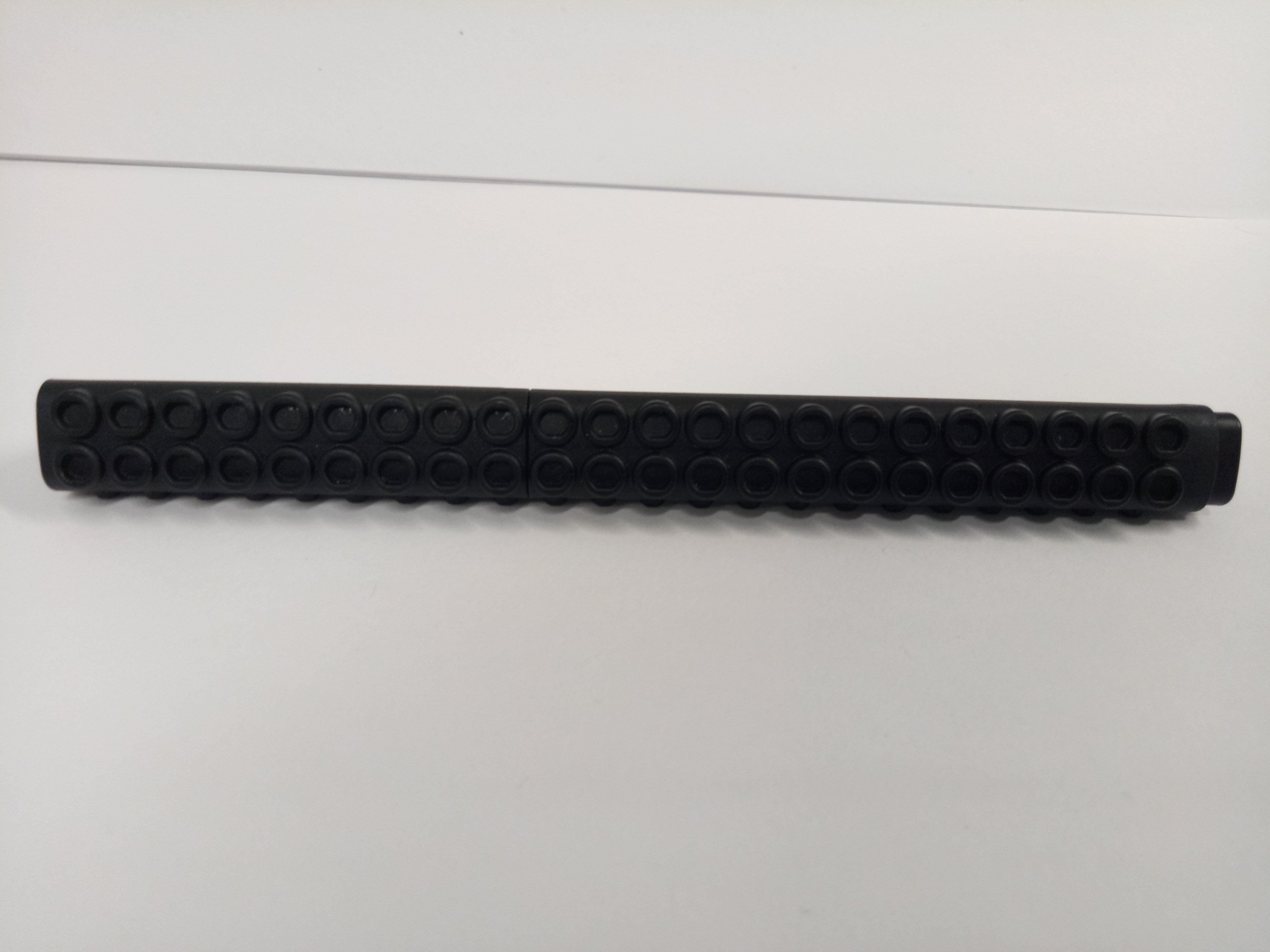
Model 2
[Red – dominant, blue – subdominant, yellow – subordinate, green line – principle axis]
For this one, I used the slightly bulkier types of boxes. The roles of the boxes are quite clear although the subdominant and subordinate can be made smaller.
I used a slightly different calculation for this one. Instead of comparing the same length (i.e. longest axis for all), I compared the longer side of the dominant box to the shorter side of the subdominant box. Basically, instead of comparing B with D (see the picture above), I compared A with B instead. In this model, A and B roughly have the same length, and C and D also roughly have the same length.
However, due to that calculation, the non-dominant boxes become too big, so that comparison cannot work.
Again, I ignored the rule of thirds in the placement; they are almost there, but not quite. The subdominant box needs to be shifted up a little and the subordinate needs to be shifted left or right – preferably left, so it would be “protruding” out and easier to see from other angles.
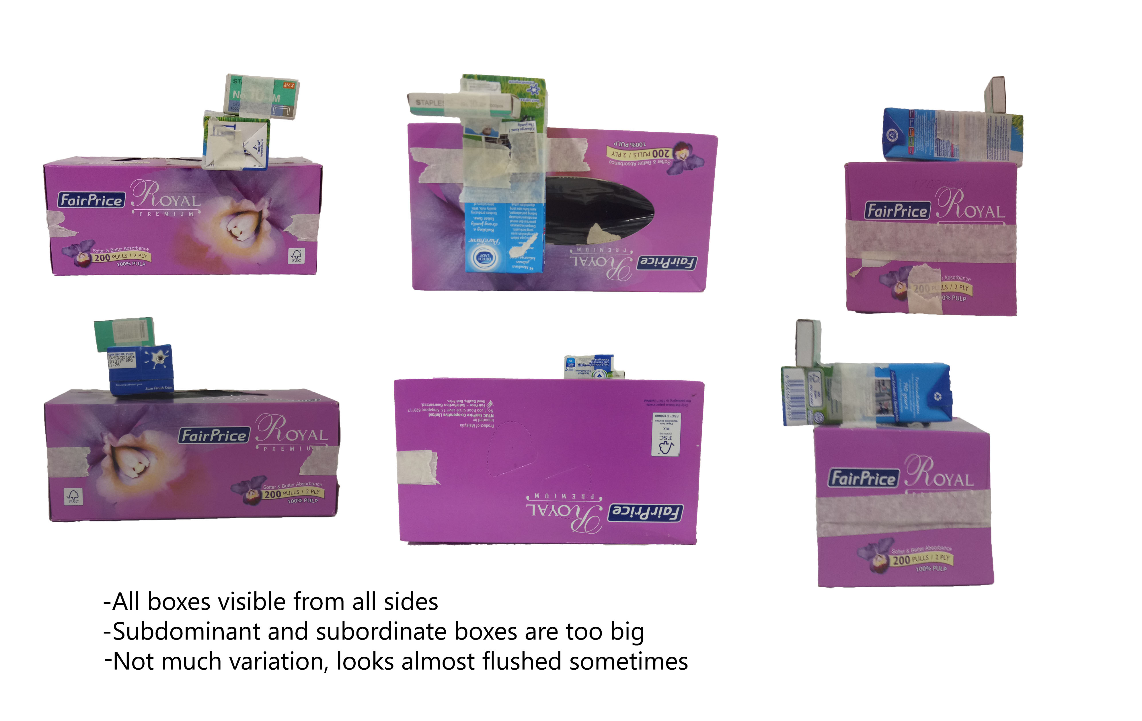
Final Model
For the final model, I based it off the first model since the proportions for the second one don’t work well.
I was excited to make the final model with the actual materials because of the idea I had.
My idea is to make a puzzle box. To put it simply, in order to open the dominant box, the whole entity needs to be disassembled first (the non-dominant boxes have to be taken out first).
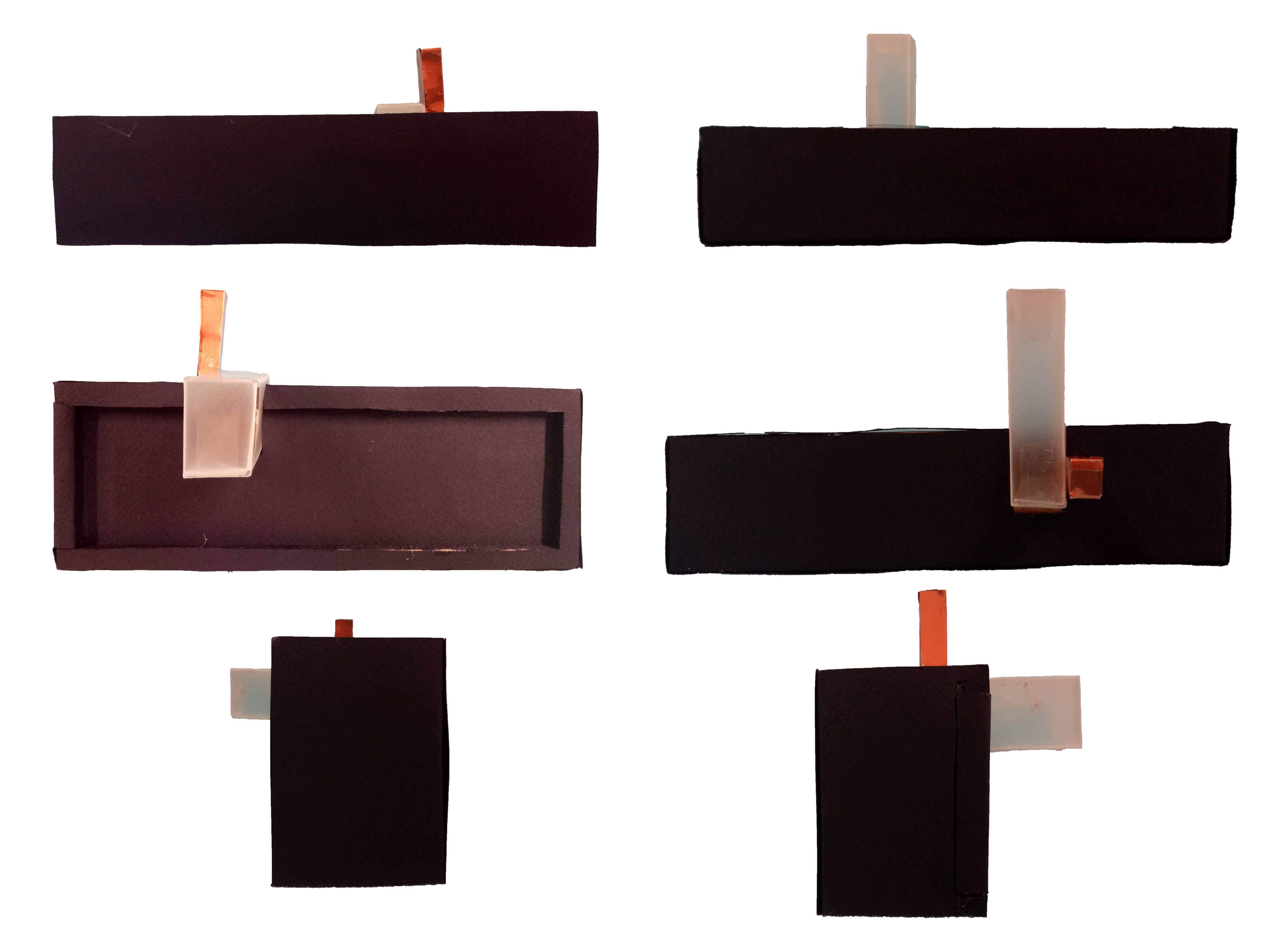
Material used: wood (covered with black paper and black marker), semi-transparent paper, wood (covered with bronze paper)
From one side, the subordinate box is hidden. The idea is that since the subordinate box acts as the “key” to unlocking the whole thing, I feel like it will give a more mysterious effect if the key isn’t immediately spotted.
The subdominant is semi-transparent to balance the opacity of the wooden boxes.
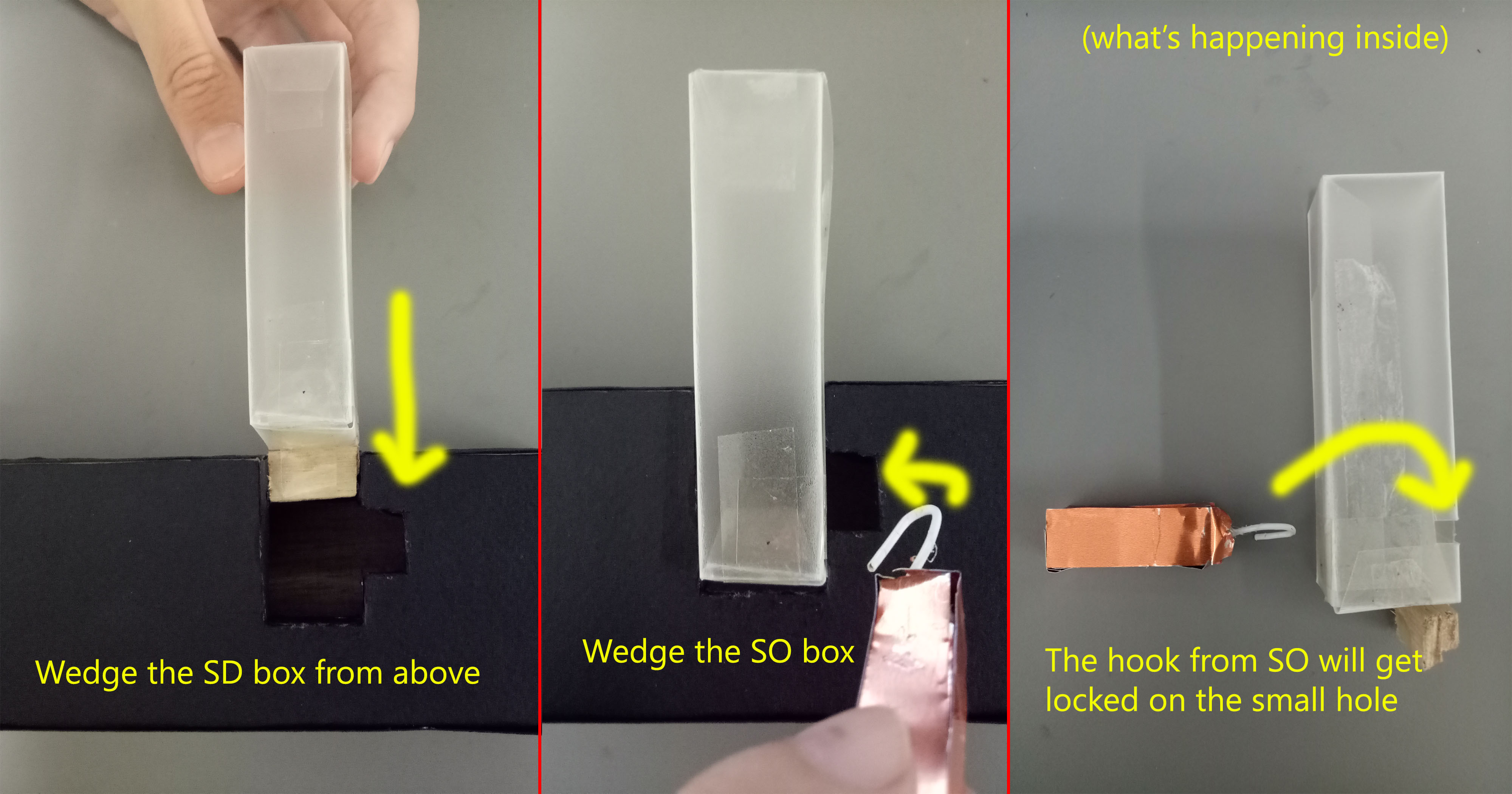
At first I wasn’t sure I could make an actual, working puzzle box (although technically, this one can’t work too…) so I was thinking of just using plain solid wood box as the dominant, then I would just wedge the other two boxes in. However by chance I found the required materials, so I just needed to do some sawing and covering-up (they still took me hours and they still don’t come out perfect. Sorry for bad crafting skills).
The so-called mechanism is just attaching things to the boxes. For the subdominant box not to be able to come out, I put a piece of wood as stopper. For the subordinate box to act like the key, I attach a hook to lock it with the subdominant box.
This is roughly how it works.
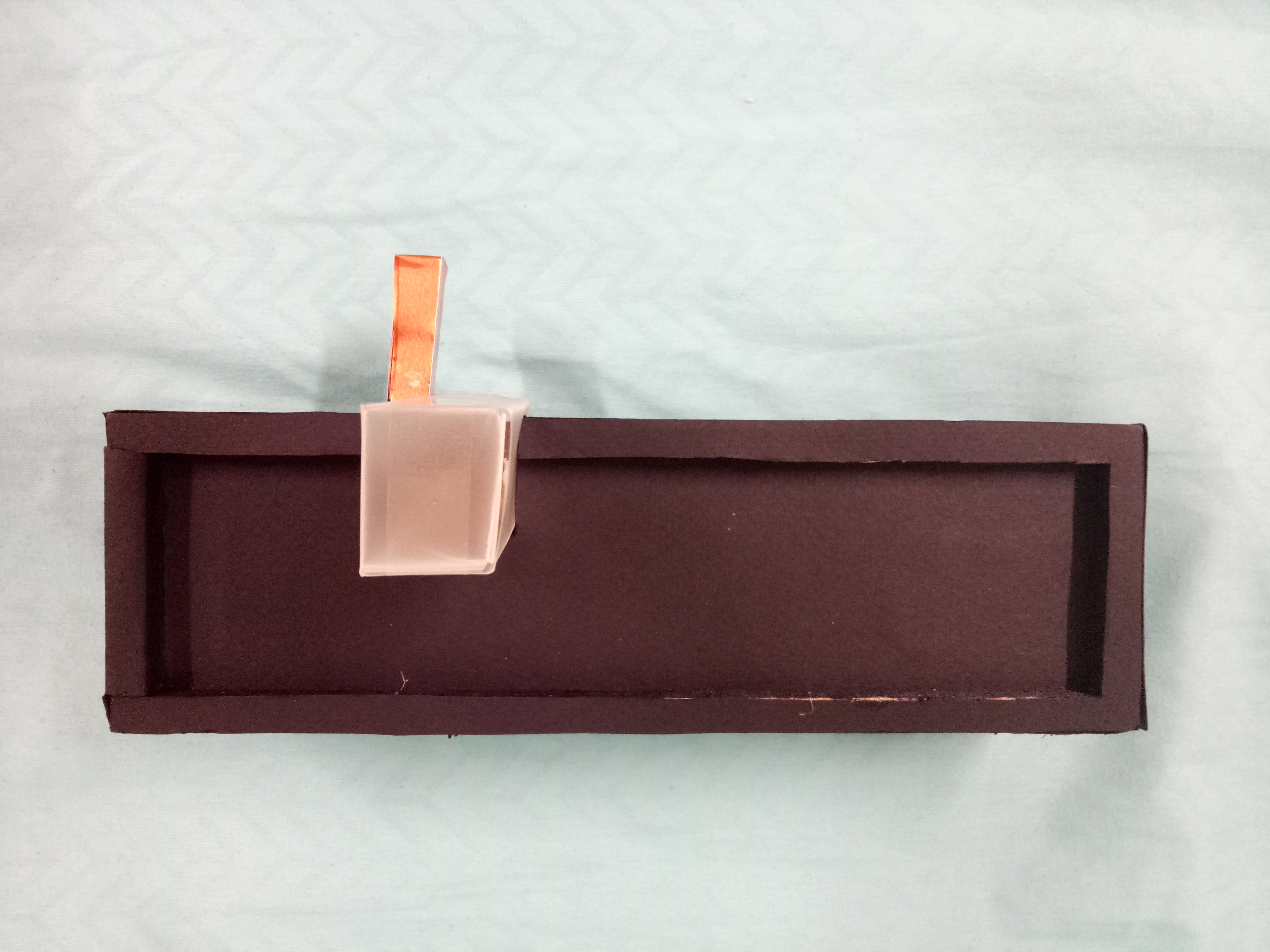
When the dominant box is opened, you can see reflective paper at the bottom of the box. I thought it was a great idea because the exterior of the box is all black (which gives a mysterious feeling), and reflective paper is somehow contrasting the all-black idea.

It’s not very obvious, but it’s reflective paper. Ignore the bad crafting skills.
It’s like human life! Life is mysterious and full of “puzzles” (pun intended) to solve. When you solve those “puzzles”, you can learn more about yourself… you can do some “self-reflection” (again, pun intended)!
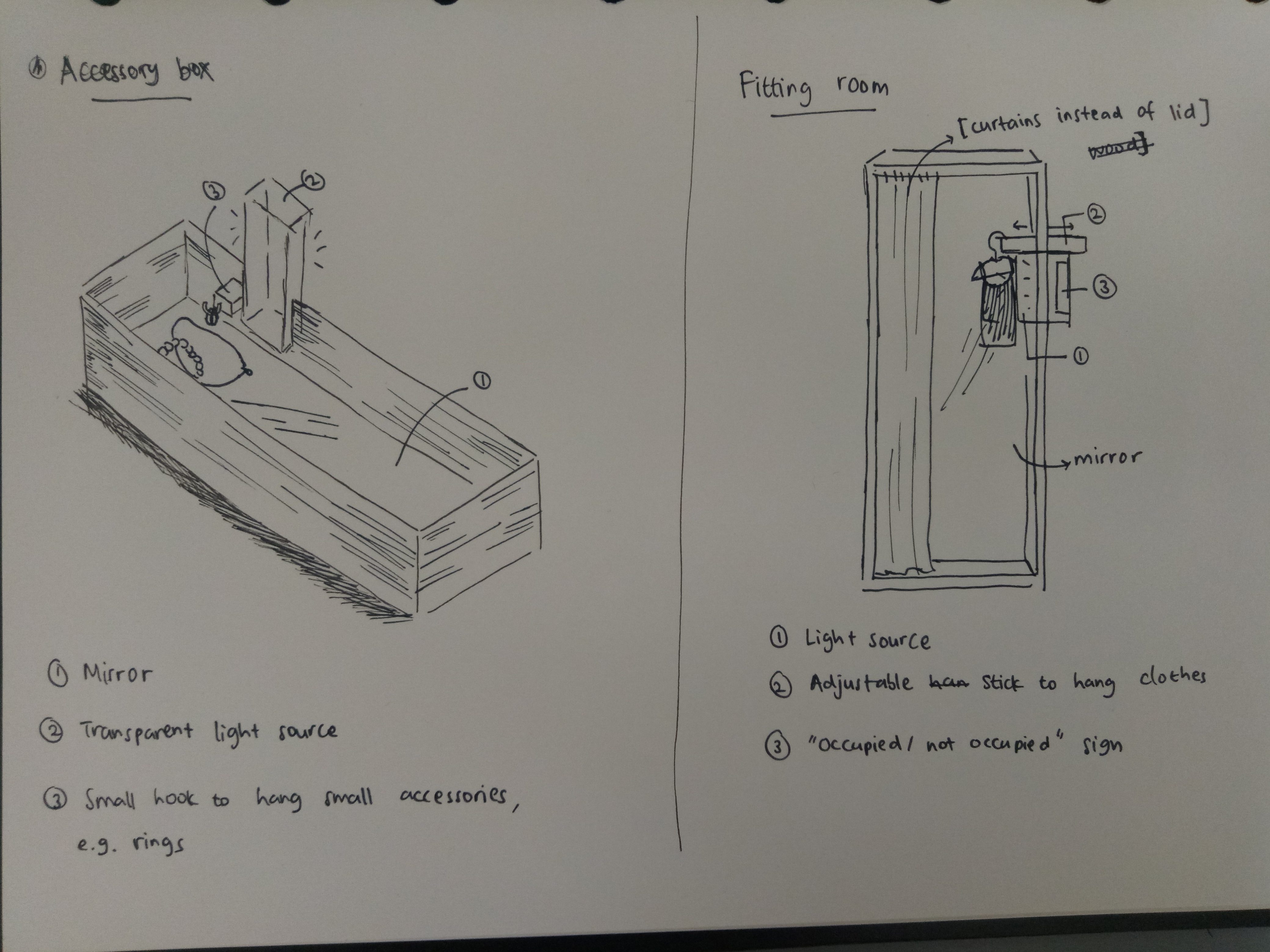
Real-Life Application (besides a punny puzzle box): accessory box and fitting room.
In hindsight, I really enjoyed the process of doing this project (although it stressed me out as well). I learned a lot more about design, about how to keep things visually interesting and eye-catching. Instead of playing around with size and mass, the use of different materials or colors can also shift people’s attention.
I also learned that planning is an important part in designing in order not to waste time and material, although even when you finish designing something, that doesn’t mean you can’t make amendments to it. (Like my idea at first; I just made the basic parts first. I added the holes in the SD and the hook in the SO afterwards.)
I do realize that my crafting skill is very lacking, so I hope in the next assignments I can improve on that. Nevertheless, it had been a fun ride.
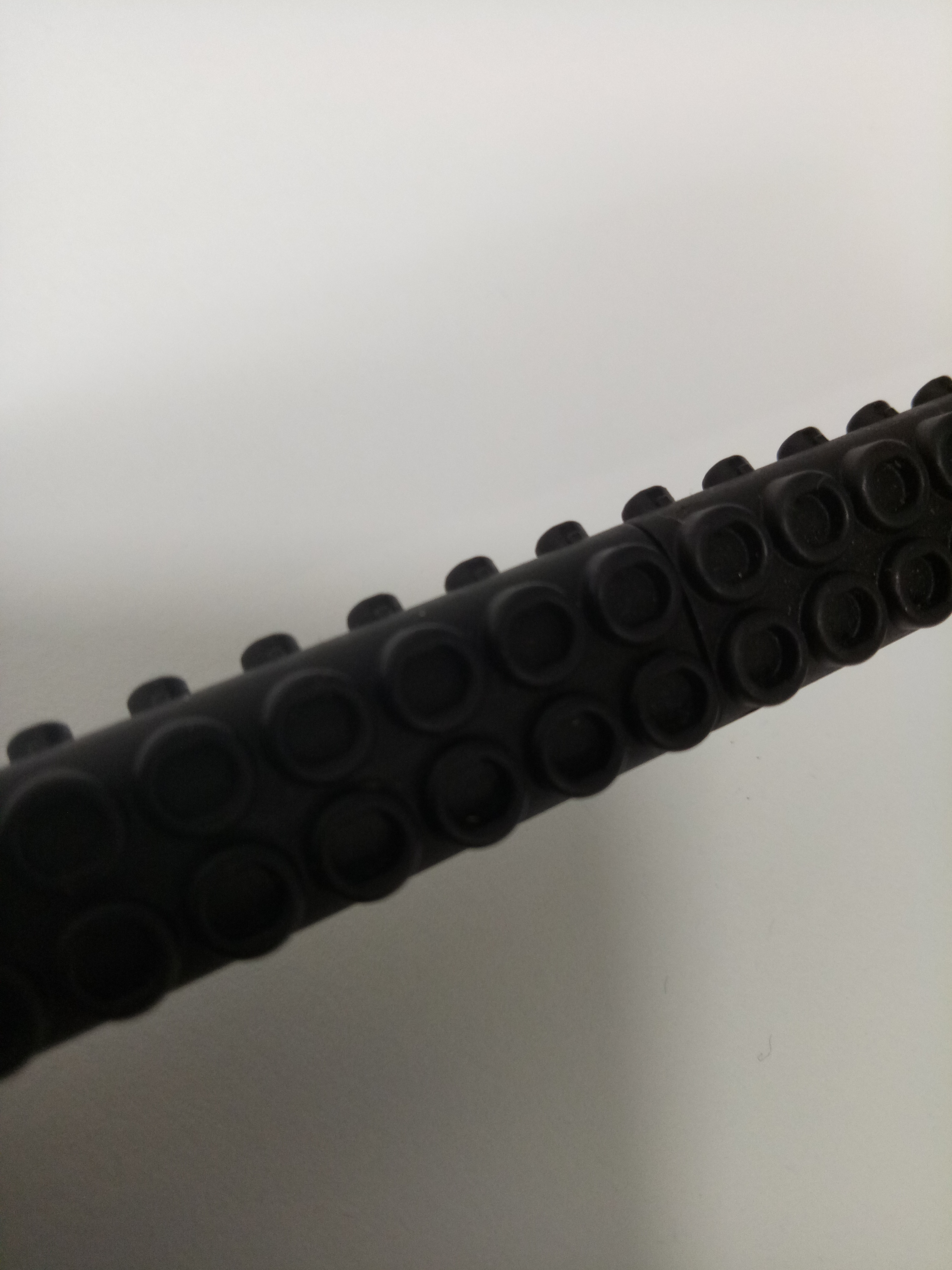 Zoomed in.