Task 1: Type as Image
Font: I decided to use experiment with Rockwell and Lucida Grande as they were serif and sans serif fonts respectively and I wanted to test the contrast between both fonts.
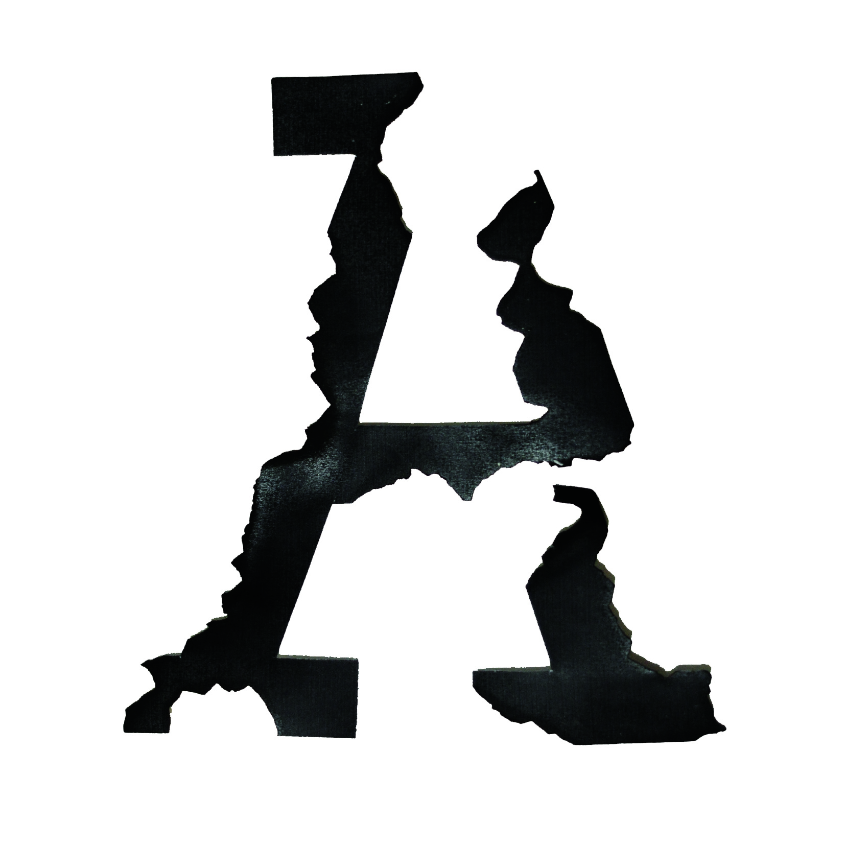
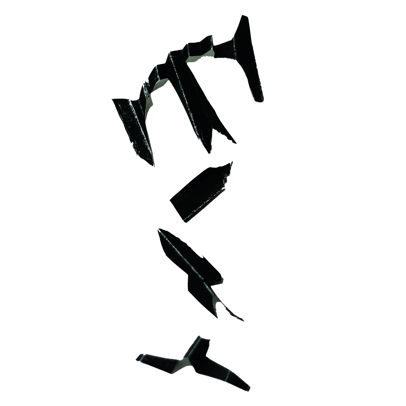
Final image 1: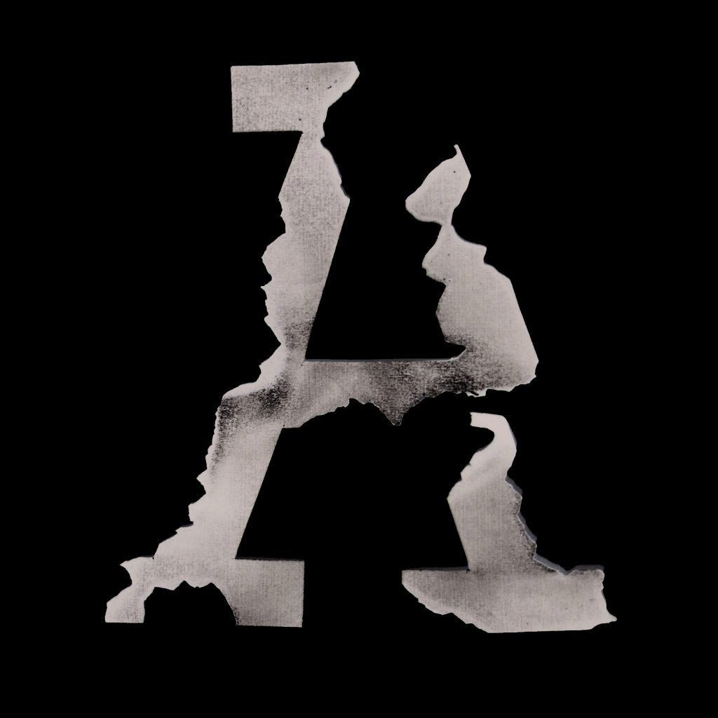
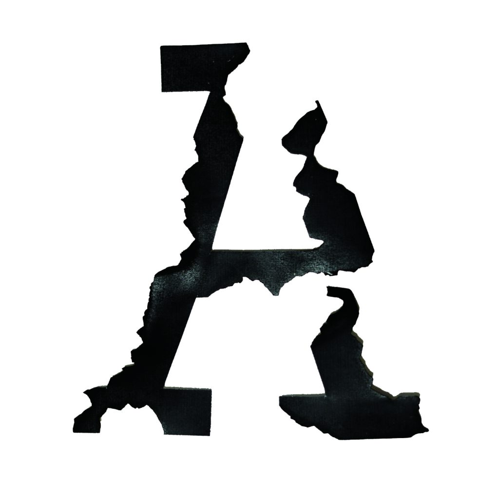
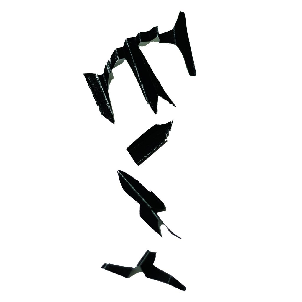
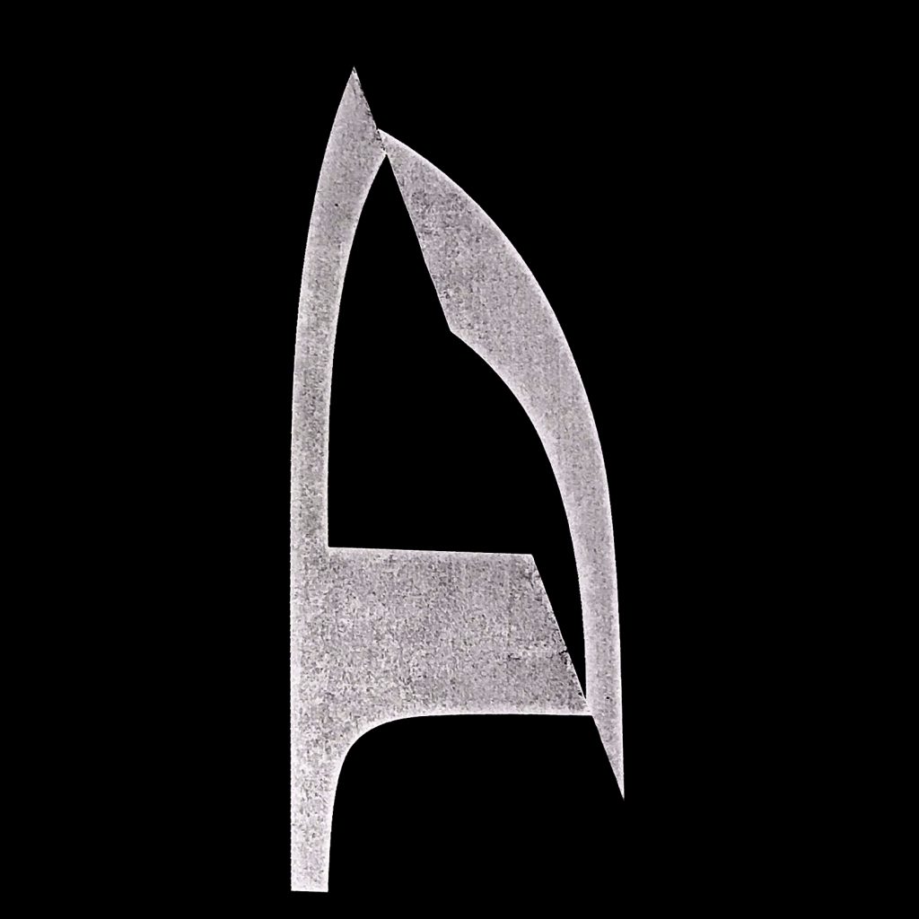
I started off by burning the edges of the paper, before the lower right leg of the A came right off. It looked good contrasting the organic forms with the rigid serifs of the letterform. I also played with inverse and it had an old school charm about it, almost similar to American Horror Story.
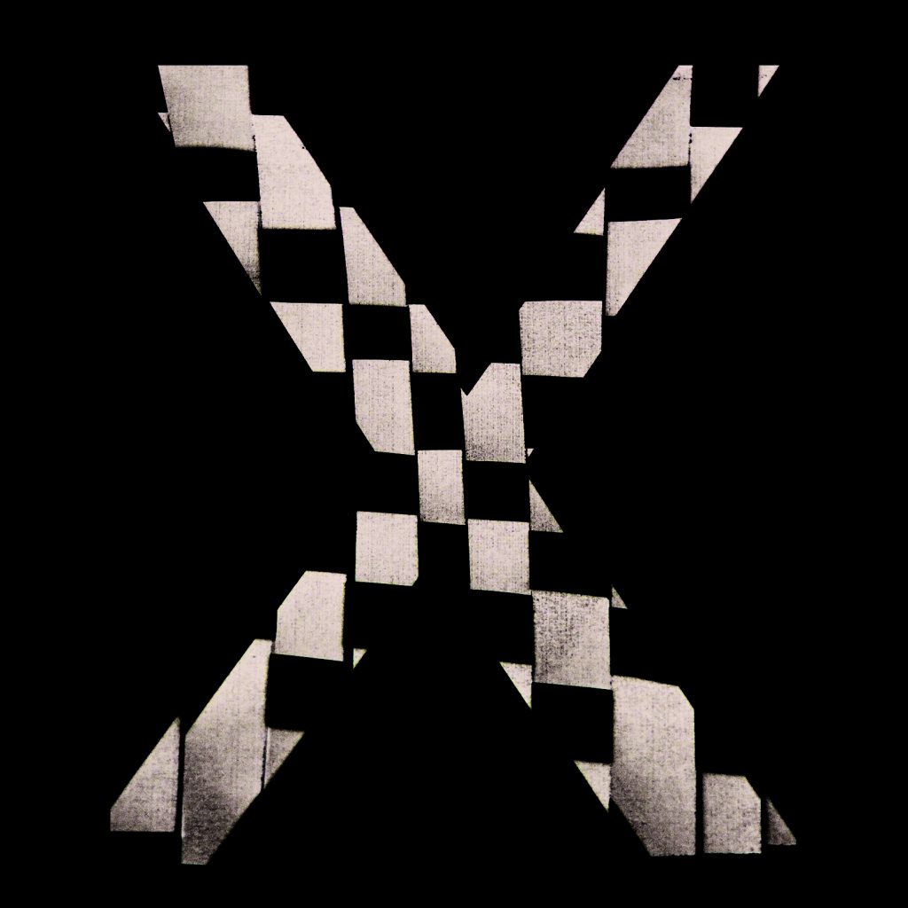
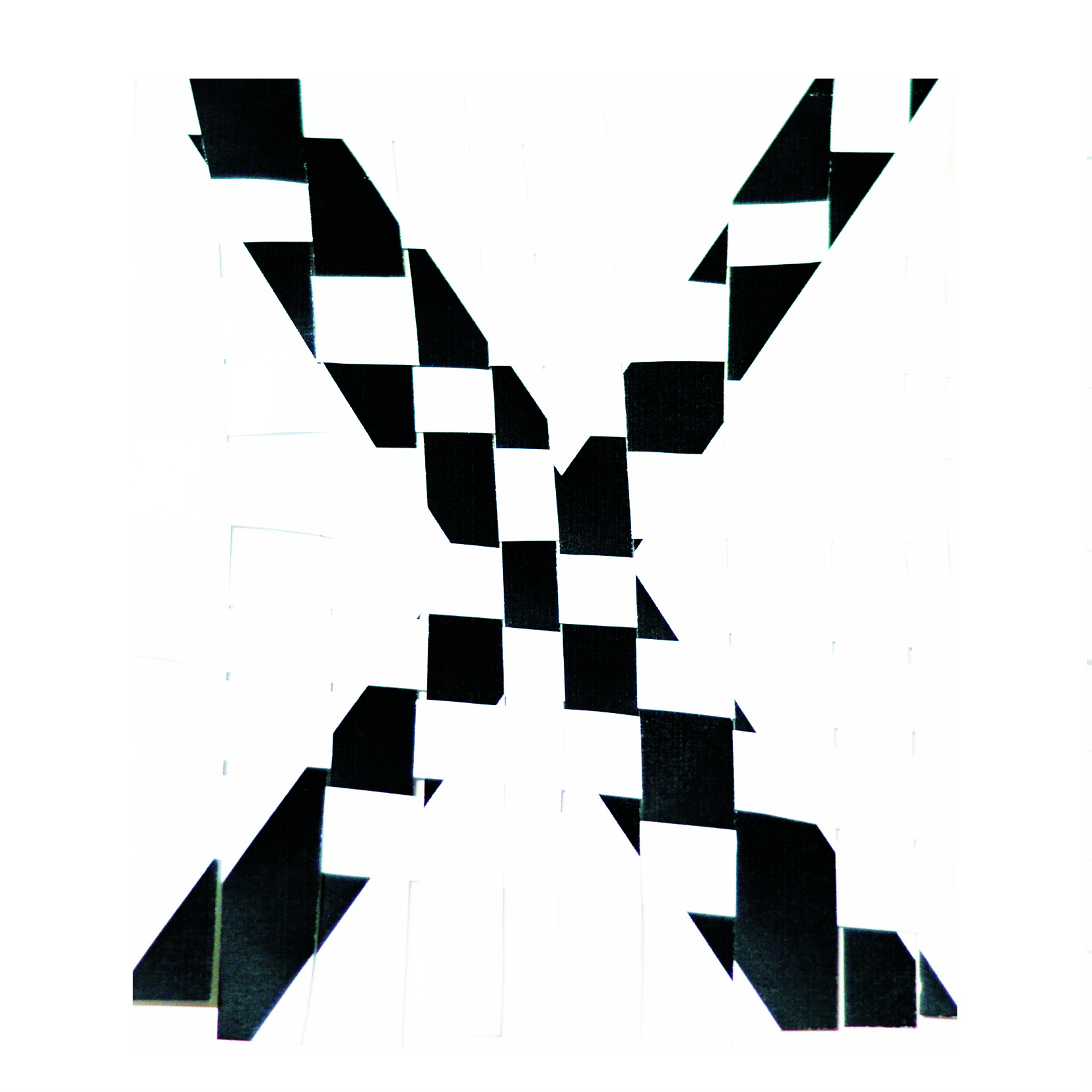
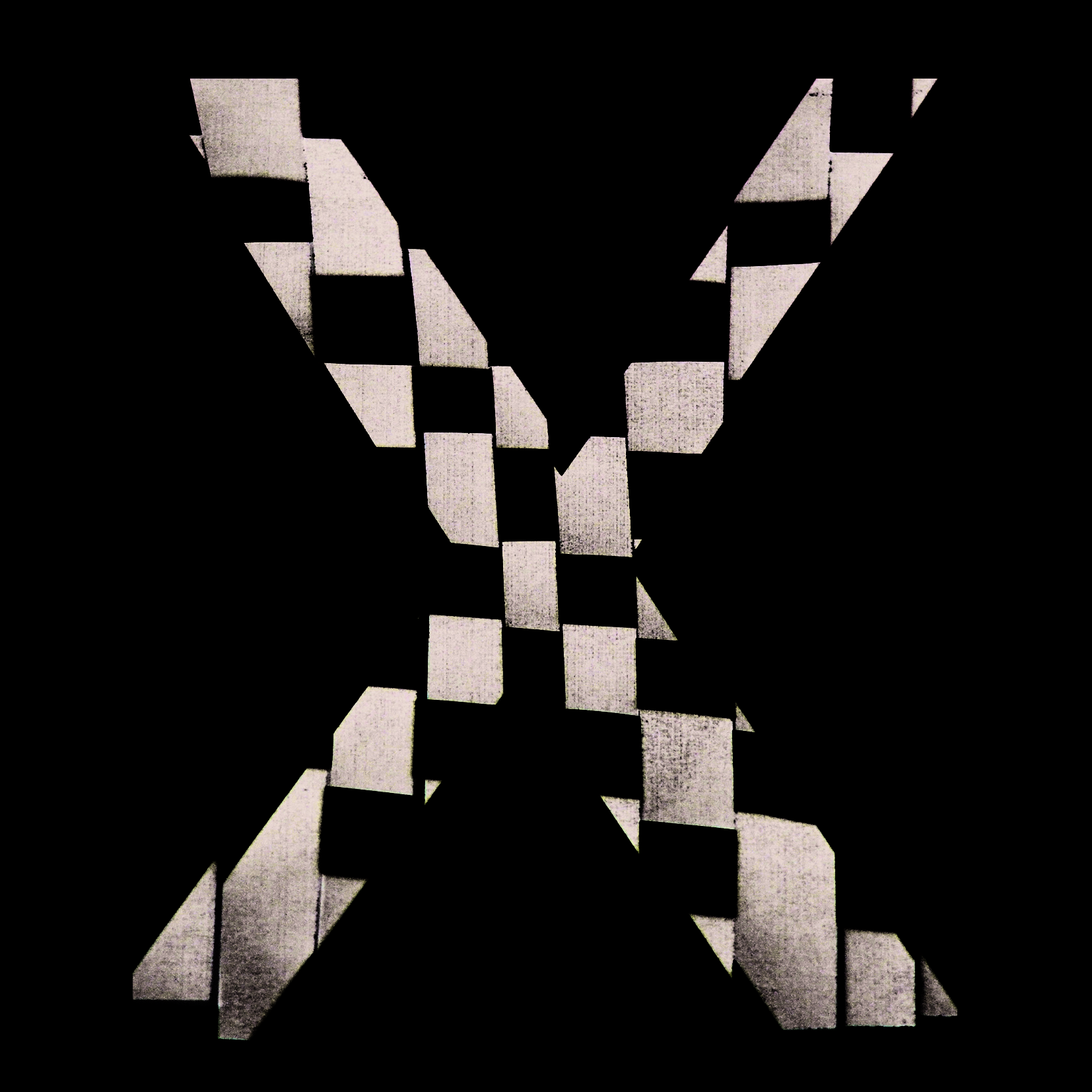
Next, I threaded strips of X through each other, creating a crochet effect. It didn’t look as good in inverse as A.
Final image 2:
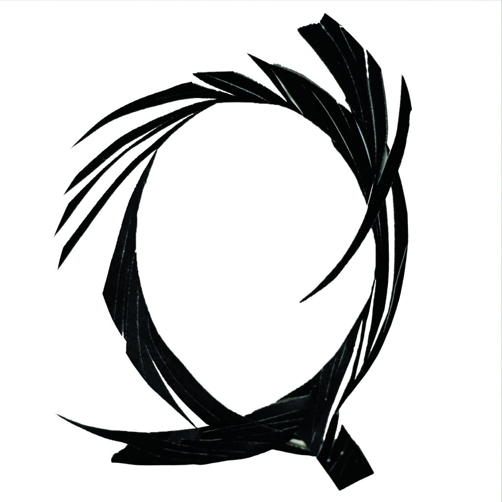
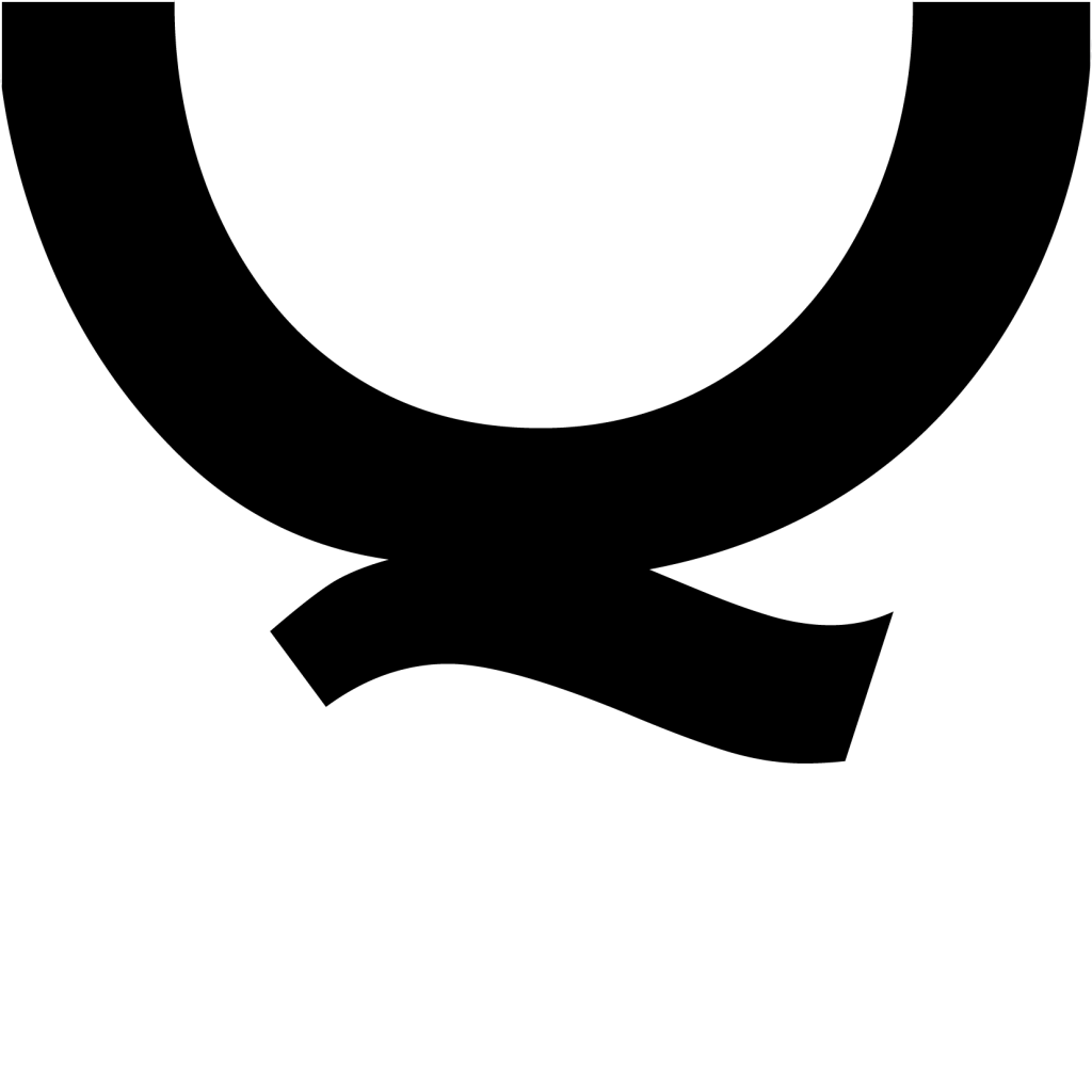
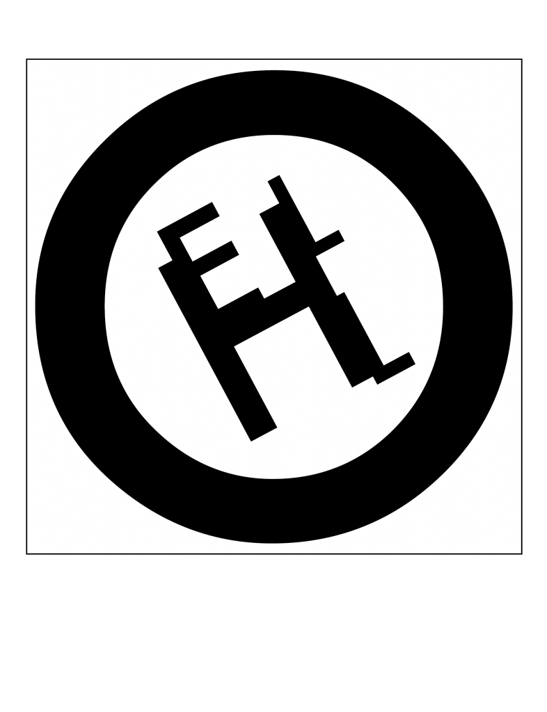
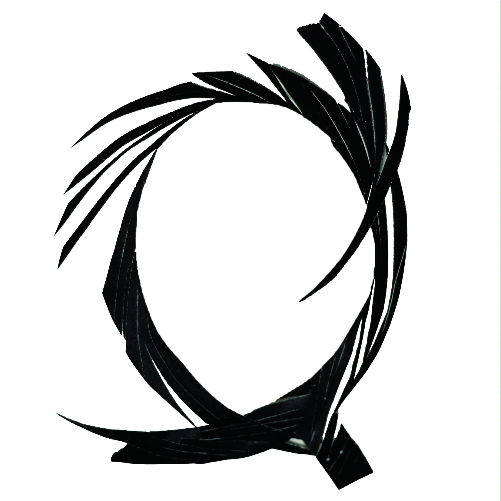
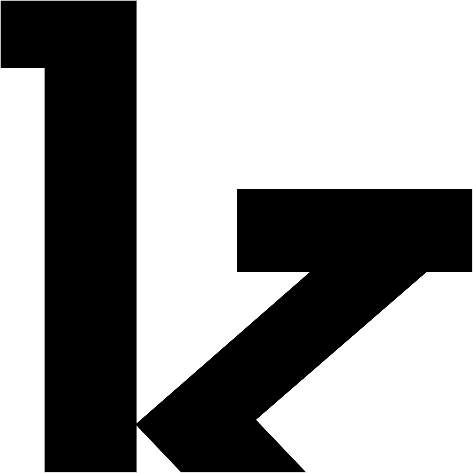
On top of the above 2 manipulations, I also cut Q into close strips, creating a feathery effect. Although a lot of people liked this design during consultation, I felt that the A was still better because it could invoke a feel from a different era. The T was cut vertically before cutting off segments of the stem and reorganising them together.
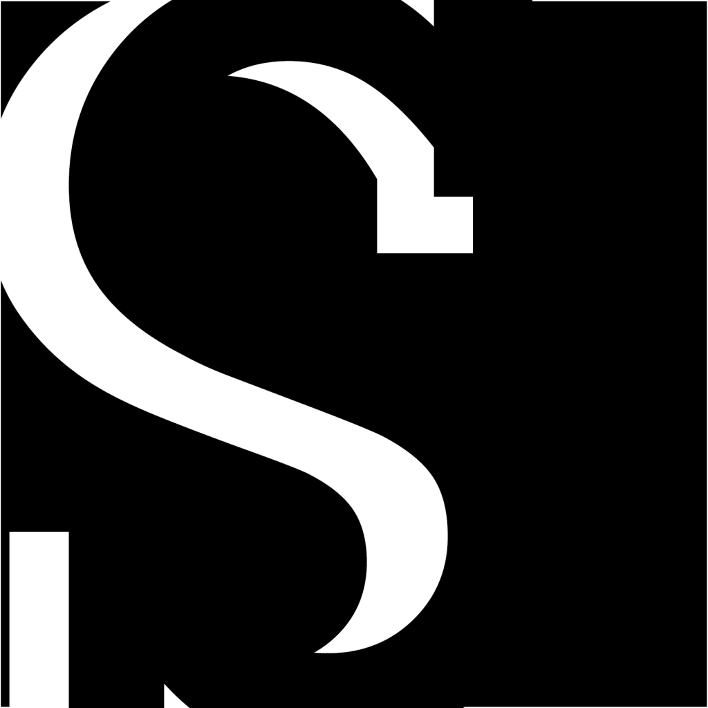
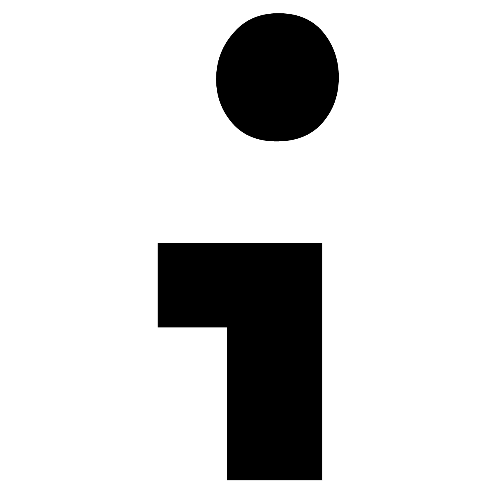
There was also the simple manipulation where I folded a piece of paper in half, and inversed the image. That looks possibly like a logo.


I also played with close-ups of type, namely Rockwell. These experimentations produced some beautiful abstract forms.
Task 2: Type as patterns
Font: I chose Giddyup as I liked its playful spirit, with its twirling tails and thin squiggly strokes.
Final pattern 1:
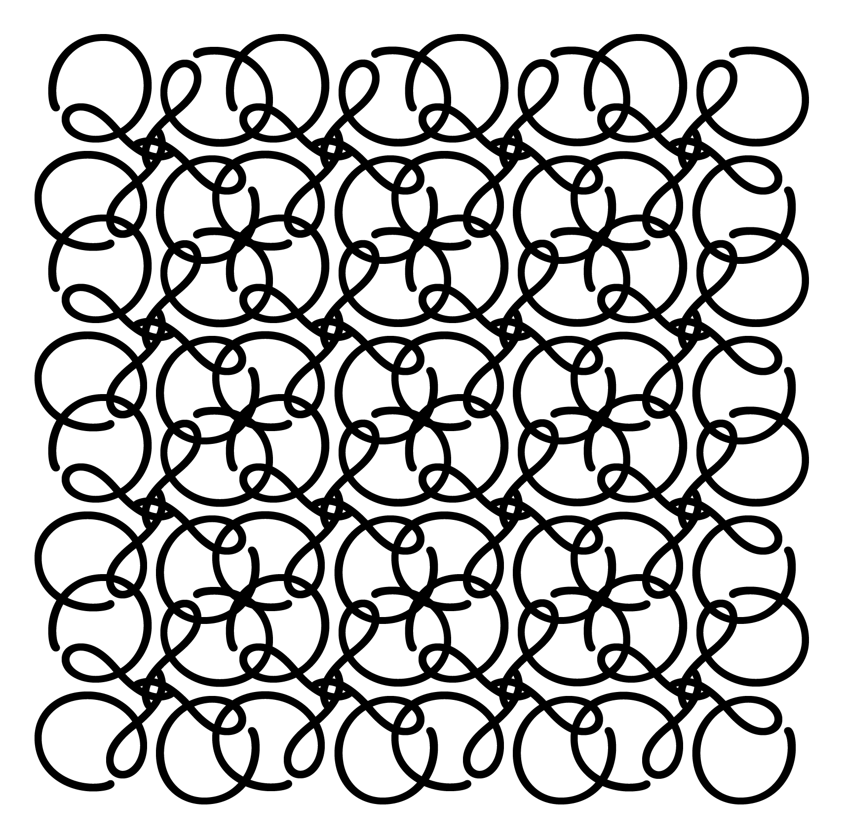
I made this pattern out of the letter Q, rotating it and creating a clover shaped pattern.
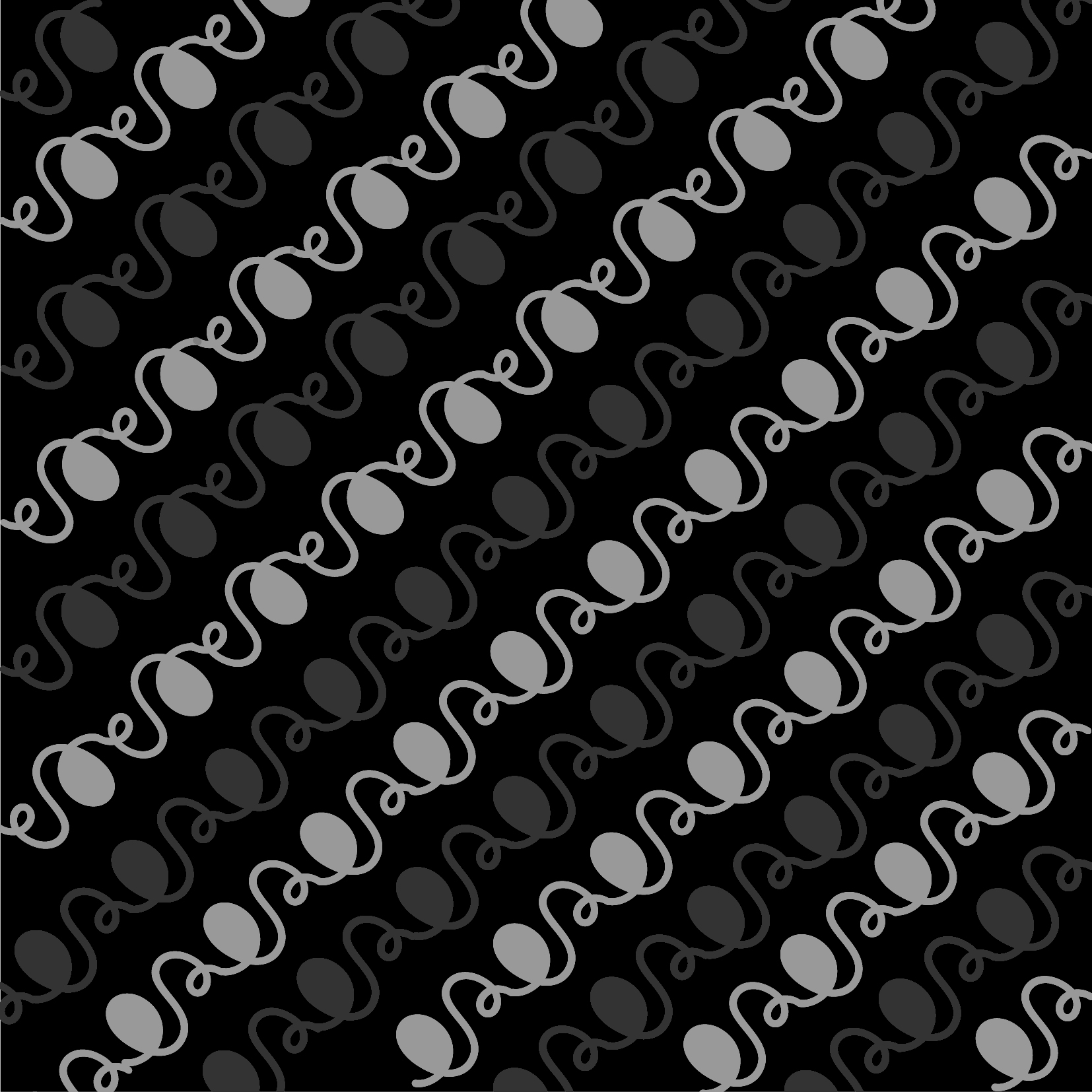
Final pattern 2:
I made this pattern out of the letter S, layering over a black background and working with greys. I created an alternate pattern of grey and darker grey to give the pattern a sense of depth.
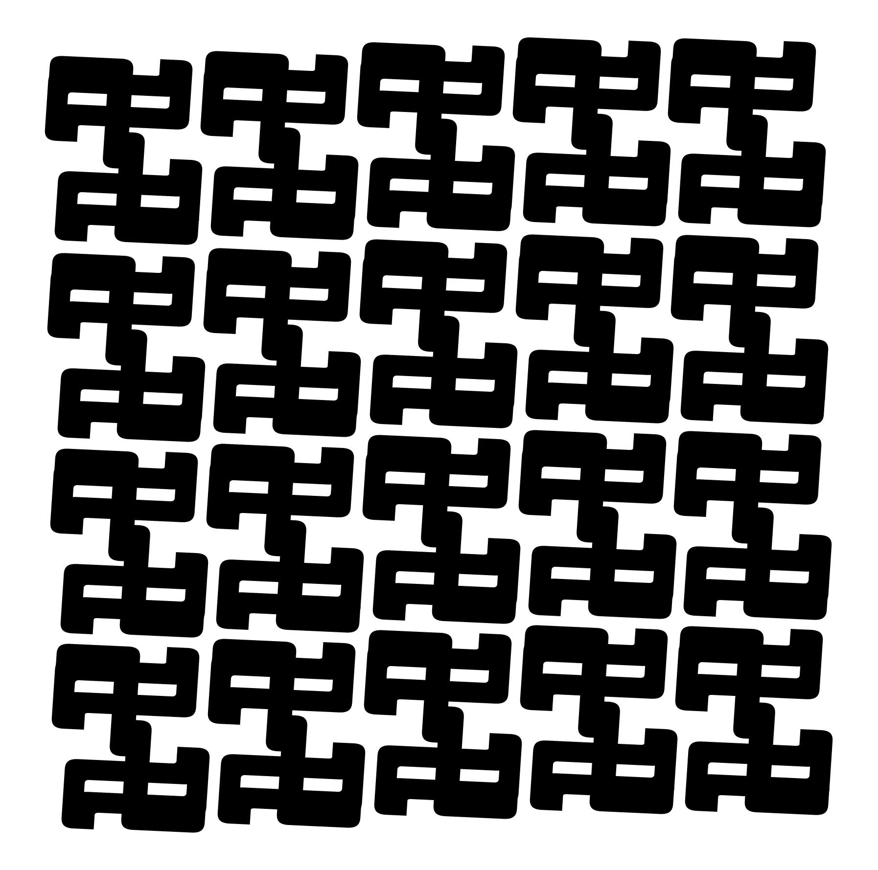
 I also experimented with Didot, making this HDB-like pattern made up of Hs.

This series of mask-like patterns were made out of Museo 700 Fs. 
I also played with Futura Cs, tiling them up and playing with scale.
Task 3: Type as emotions
Font: I chose Futura as it was quite a versatile font yet not as ubiquitous as Helvetica. I used Regular and Bold in my compositions.
Final image 1: Confused
I stacked the different letters atop each other in a haphazard way, similar to the way a confused person thinks; with logic jumbled up and lacking any coherence. The negative space between the letterforms also adds interest.
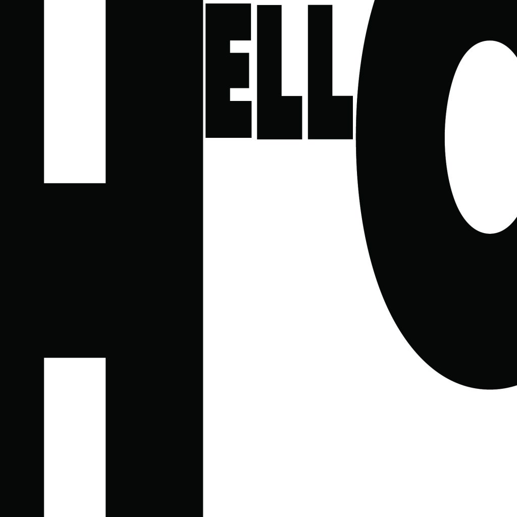
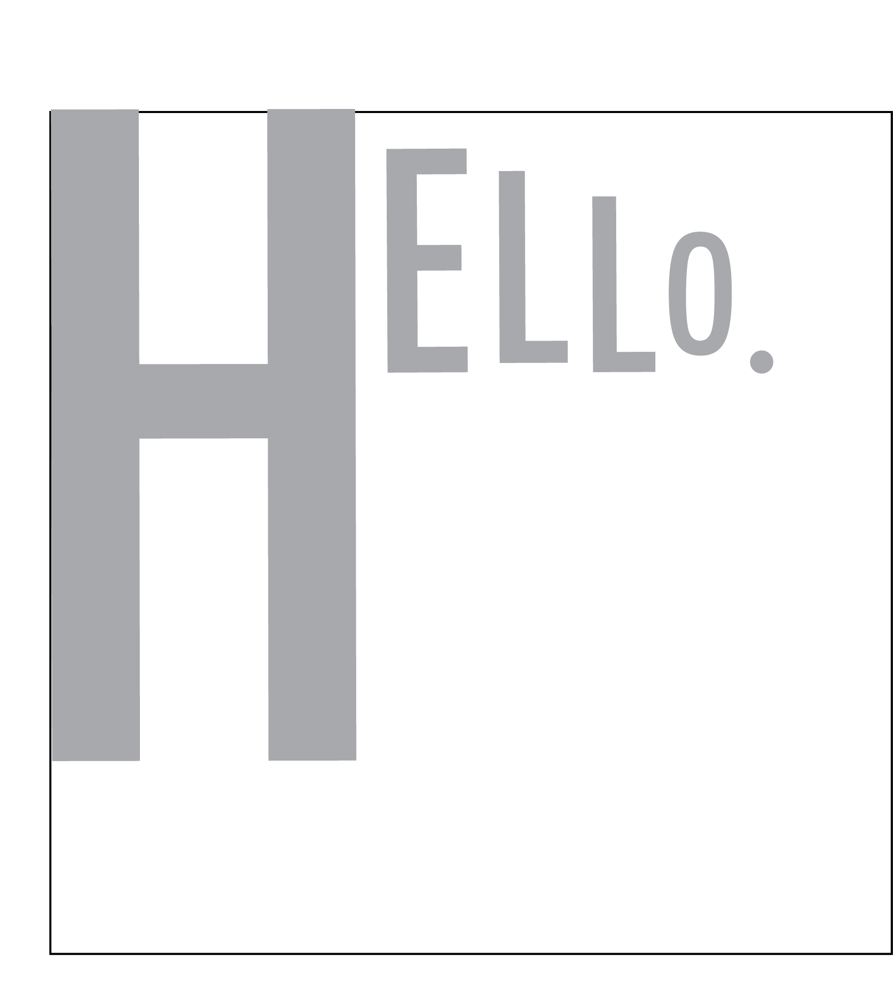
Final image 2: Arrogant
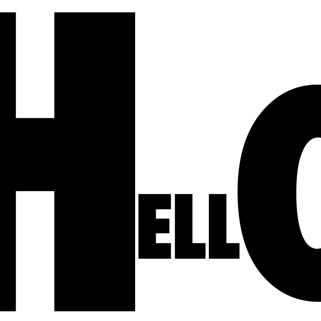
I wanted to represent the way a character is larger than life, having excessive confidence, even referring to himself in third person. Its an overbearing presence that could easily be seen as arrogance.
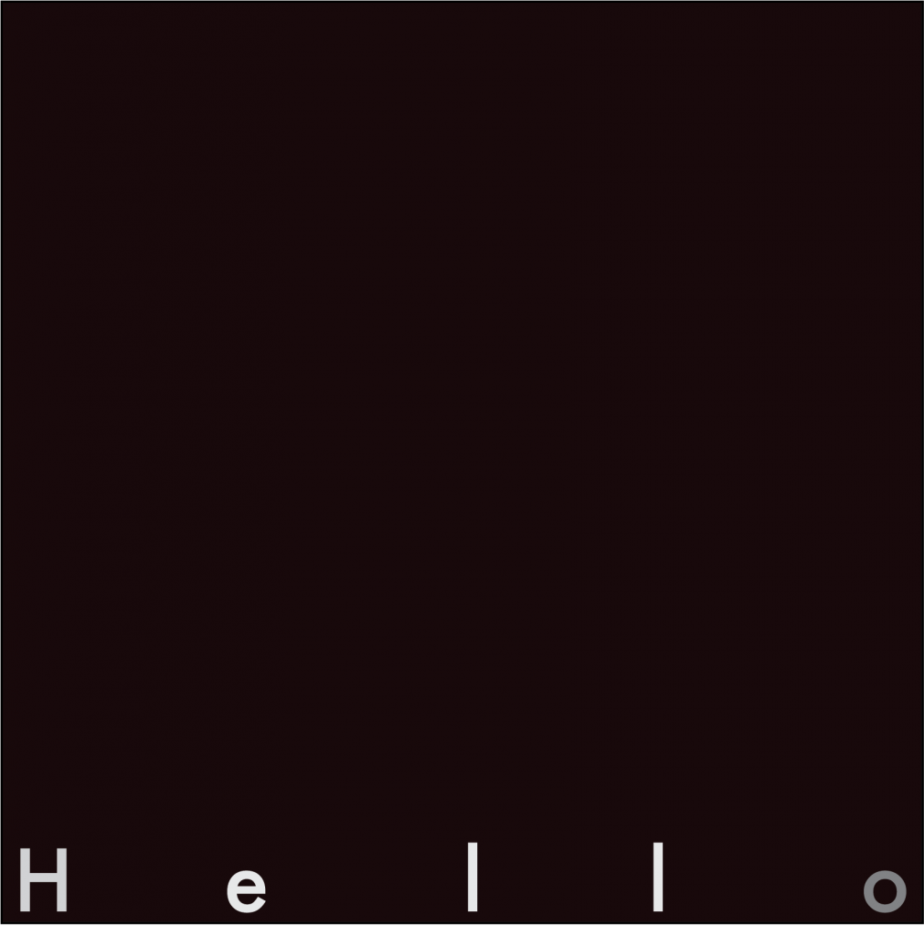
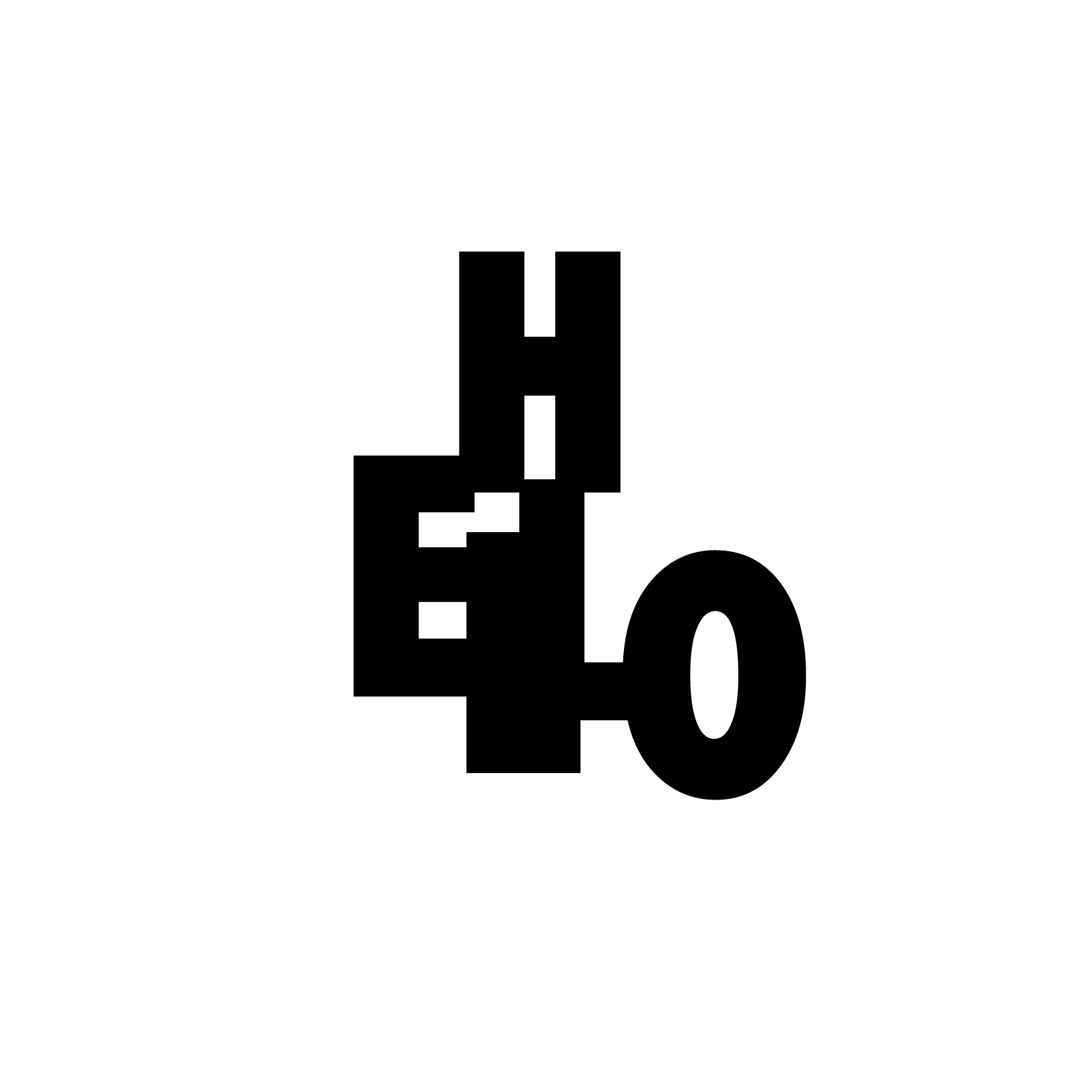
Final image 3: Depressed
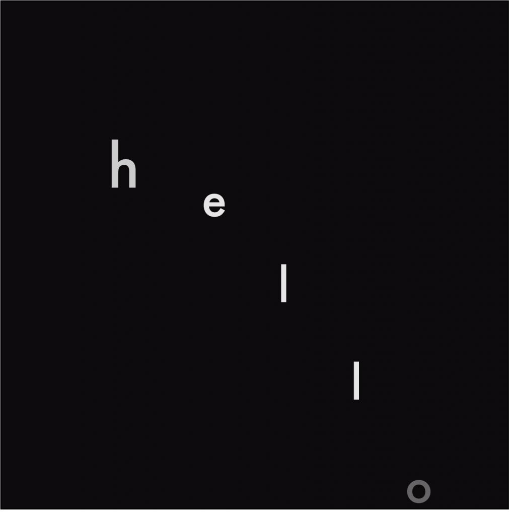
I wanted to portray the image of someone jumping off a building, or doing that mentally. Depression often entails “falling into the depths of despair”. In this image, shrouded in the darkness, the last vestiges of hope are extinguished, with the o barely visible, almost like a life extinguished.
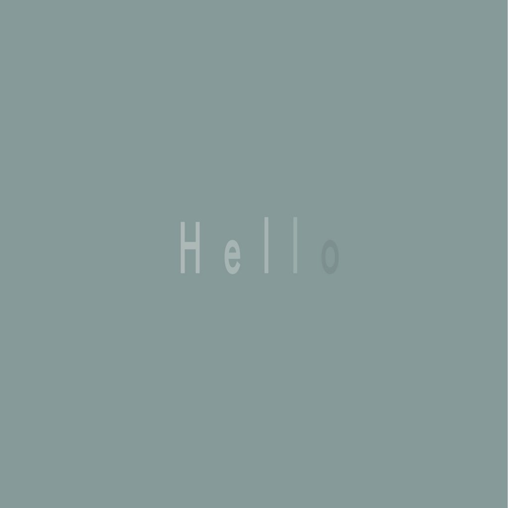
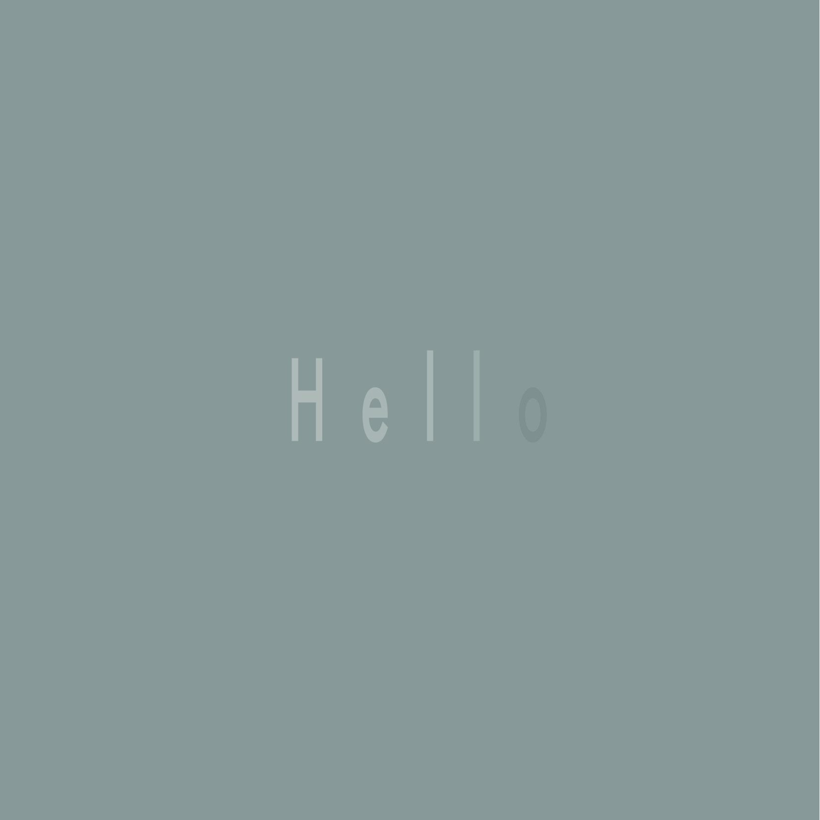
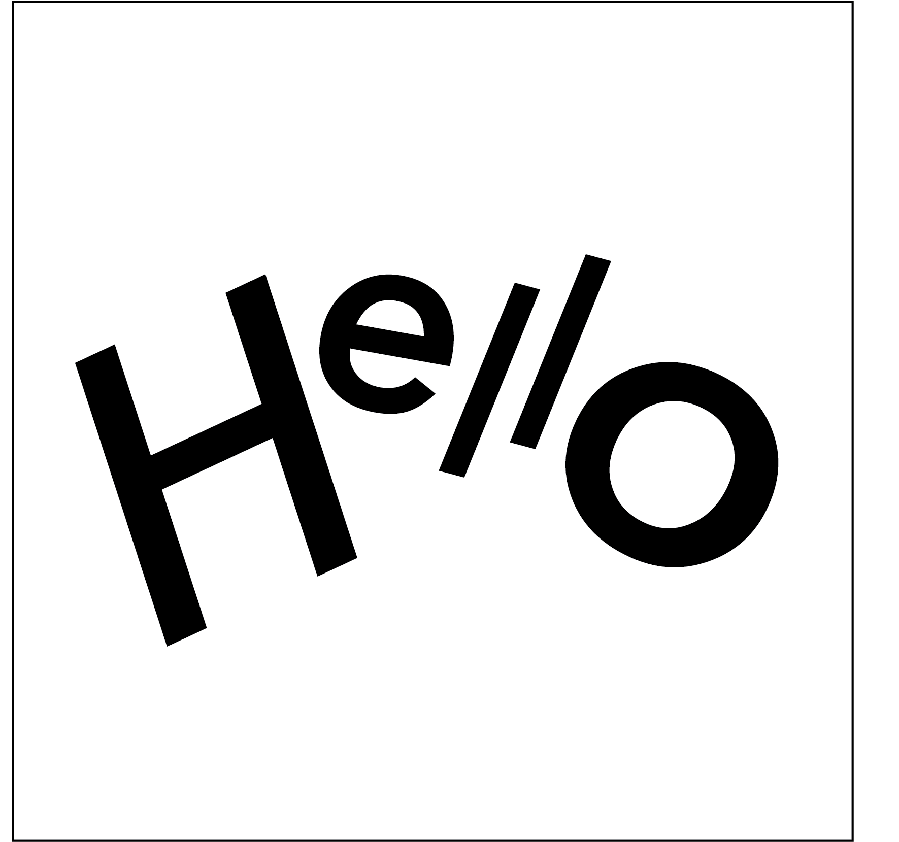
Final image 4: Friendly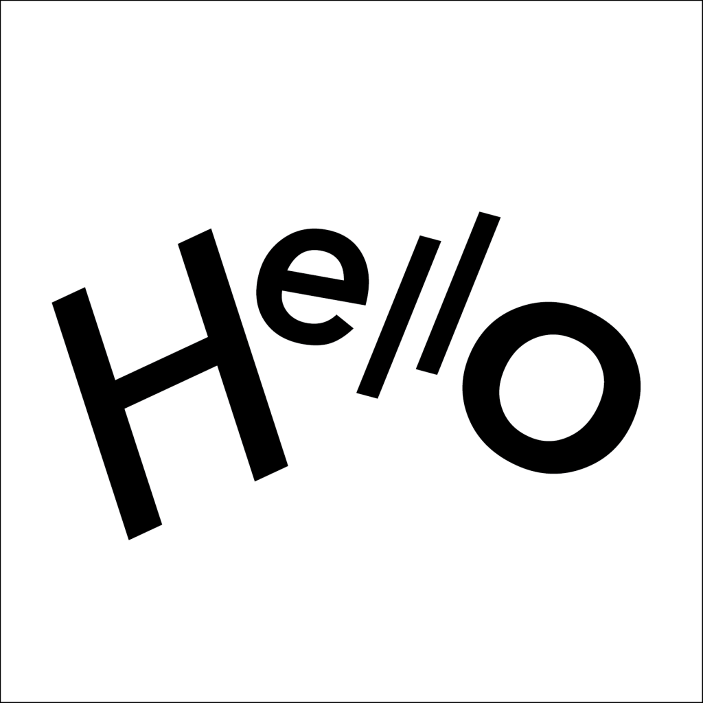
This was a fairly simple concept. I used italics for this emotion as it mirrors speaking breezily and in a lighthearted tone. The arc of words resemble a wave, as though the ‘hello’ is beckoning to a friend.
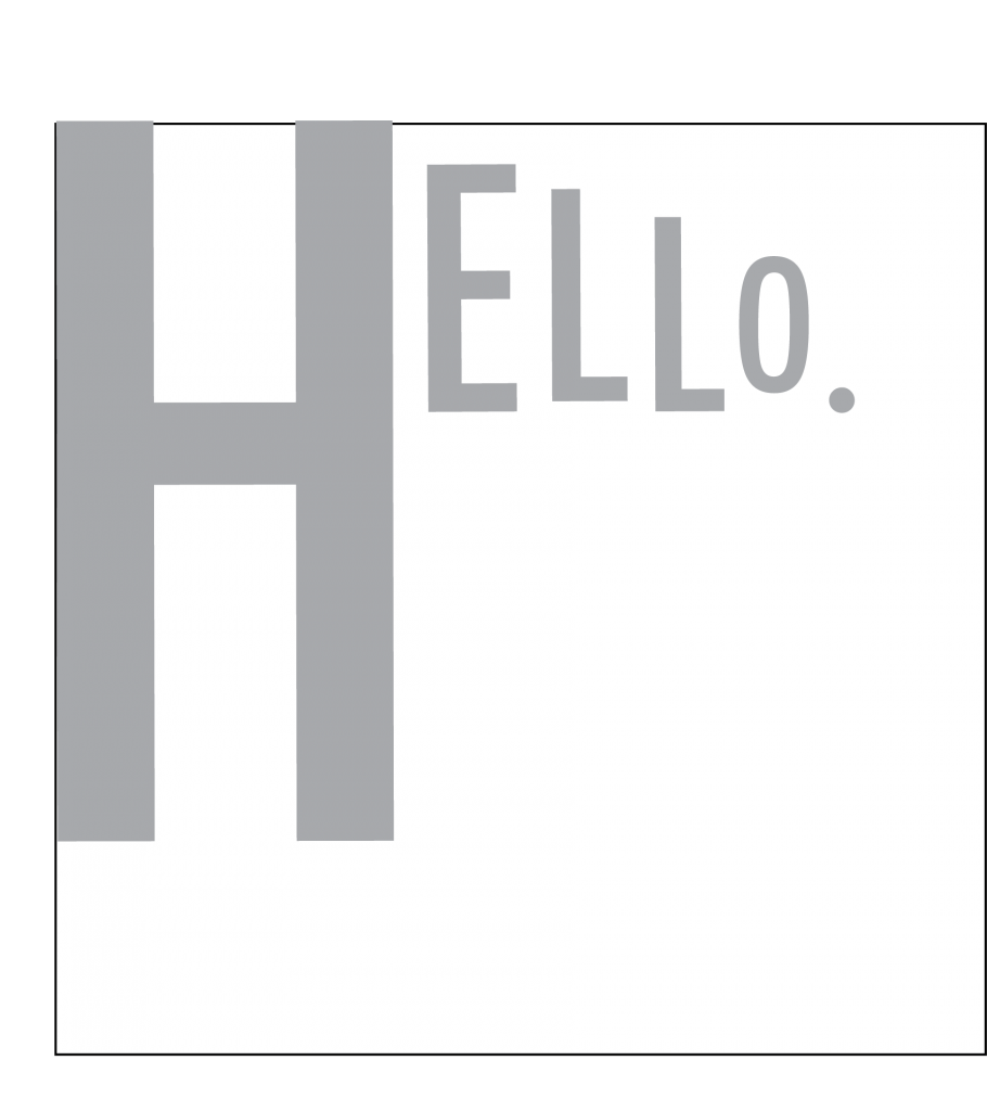
I also explored other variations which were hit and misses.


Recent Comments