- Cyclist
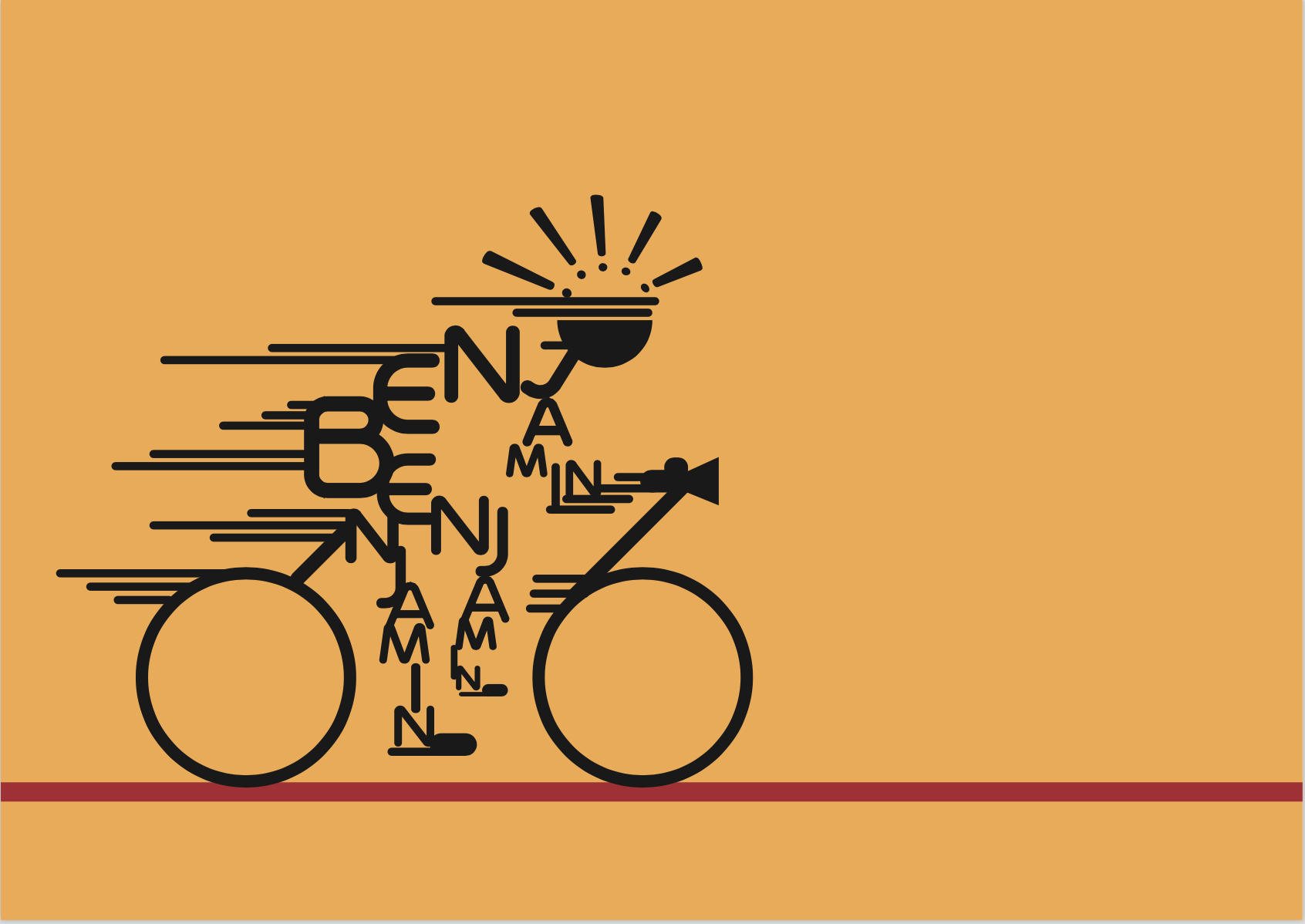
Mimi’s advice for draft 1: Reduce the number of colors, reduce the width of wheels and look at a way to make a leaner figure to denote speed i.e. change of font.
Result: I cut out some unnecessary lines, reduced the font size of some letters to create a leaner, cleaner and clearer typographic pictogram.
2. Mountain Climber

Mimi’s advice for draft 1: ensure that both side of the “mountain” have the same texture to create unity in the composition.
Result: I created jagged rock forms on both sides, playing with figure / ground relationships to create ambiguity for the letterforms.
3. Bar owner
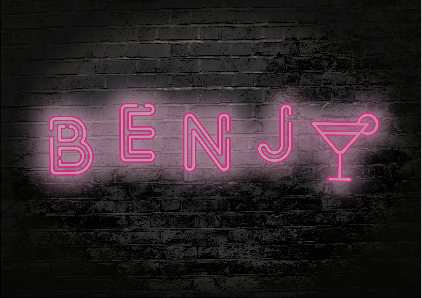
Mimi’s advice for draft 2: lose the bar sign as it is unnecessary. Keep the rendered font and background.
Result: A simpler, cleaner look.
4. Programmer

Mimi’s advice for draft 2: try to play around with the arrangement of letterforms / play with repetition.
Result: I wasn’t able to create a better arrangement of shapes to create the linear perspective that I wanted, and thus I sacrificed a bit of legibility for the 3 dimensionality for this piece.
Recent Comments