I’ll continue with occupations 3 and 4 on the list, but they are by no means definitive as I will continue to edit the occupations if I manage to come up with better concepts along the way.
Just a quick recap, here was the list from part one; I’ve made some changes after consultation.
- Software Programmer
- Bike Racer
Jungle Explorer—> Mountaineer / rock climber (Jungle explorer may be too vague for the brief, and people may have many interpretations of what an explorer can and cannot do.)- Cowboy
Mountaineer / Mountain Climber
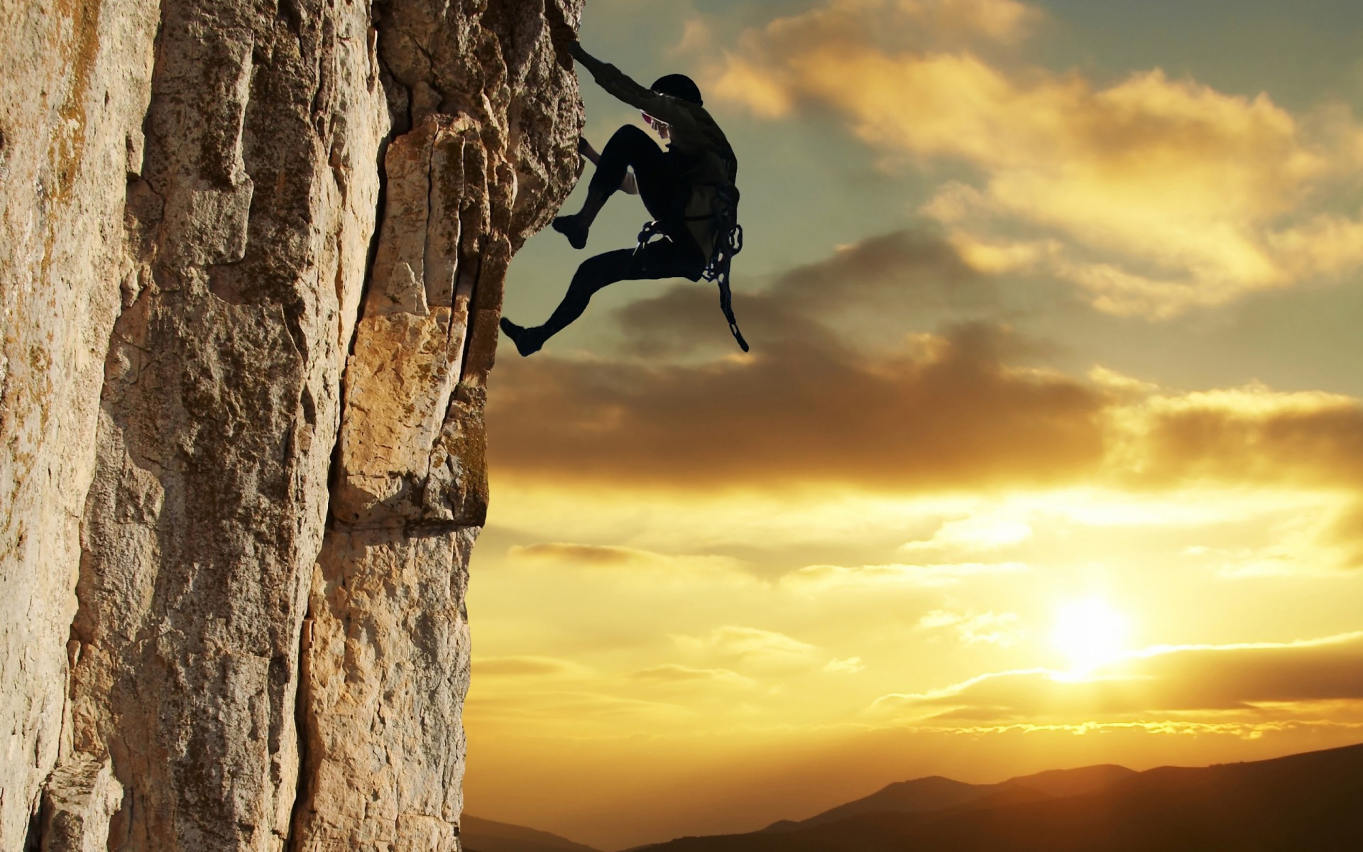
Edmund Hillary and Tenzing Norgay, the duo who first ascended the treacherous slopes of Mount Everest and reached its peak, must have felt like immortals after living to tell the tale. A tale of exhilaration, sheer grit and victory over one’s limitations.
Even as I was fascinated with my father’s work and grew to be as competitive as he was, there was a part of me that always wanted to live life like an adventure. I would read of stories like Robinson Crusoe and wonder if I could lead a life that had no limitations one day.

Mount Everest, the highest peak in the world
In a way, I wondered if I could fulfill the competitive aspect of my personality with something thrilling. Nature was so vast and unexplored, and I wanted to be part of something bigger than myself.

I researched on the typographic expressions for mountain climbing and managed to find some phenomenal work. On the right is an inspirational Christian poster with its very effective treatment of the typeface. The font used is clean, and the peaks of the letterforms like M, N and A correspond with the peaks of the mountains. There is uniformity in the composition and the overlapping forms create additional interest due to the law of enclosure (Gestalt).
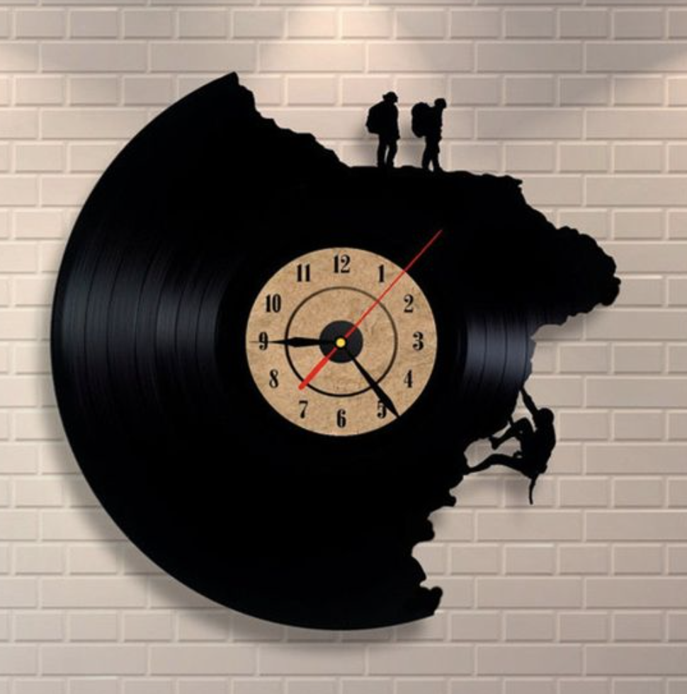
I then looked towards playing with silhouettes and negative space, to see if I could draw inspiration from these areas.

In the above picture, the clock draws the viewers’ focus towards the silhouette of the climber..
In the picture on the right, the play of figure/ground relationship form a meaningful concept of the typographic image.
Another example of playing with figure-ground relationships.
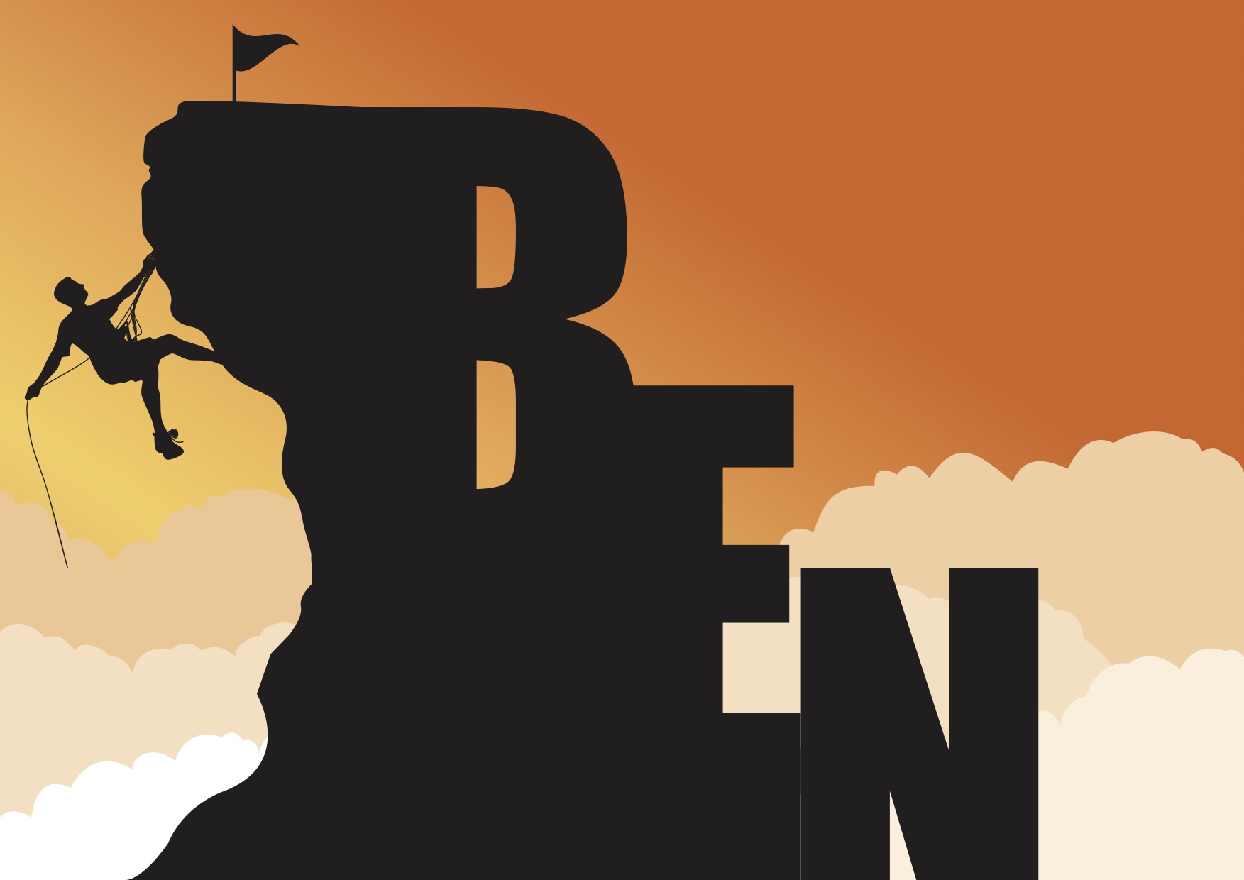
3. Mountain climber
I made use of what I learnt in the book Typography Essentials and the material that I researched on to come up with the typographic image based on the figure / ground relationship.
Font: Impact 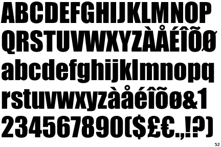
Impact has a thick body and shoulders, similar to the the shape of rock formations. It also melded well with the side of a rocky mountain edge. I could then combine the image and the font to form a silhouette of a mountain peak.
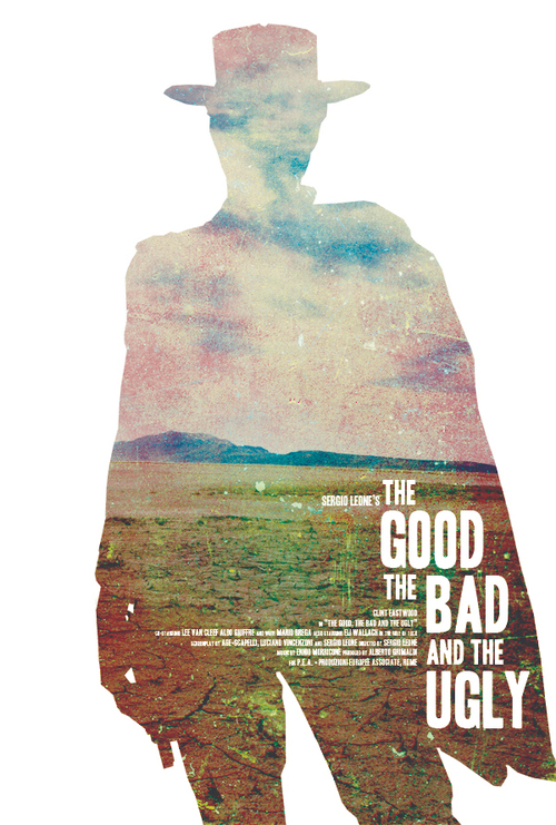
Cowboy
Adventure without limits is also a benefit of being a cowboy, and that drew me towards the Old West. The stoic, independent cowboy who just needed his horse and pistol. The dusty old towns inhabited with all kinds of queer people; from quacks selling fake medicine to the elderly to the bounty hunter who kills to put food on the table. The poker pubs in the centre of town. Five finger fillet behind the sheriff’s outpost. Heh, my kinda town.
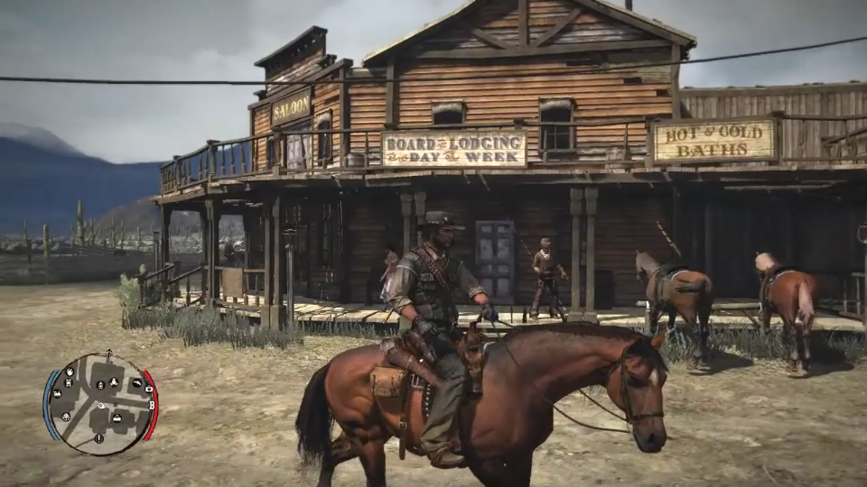
This is one of my favourite games ever — its called Red Dead Redemption 2, where you play as … yes, a cowboy.
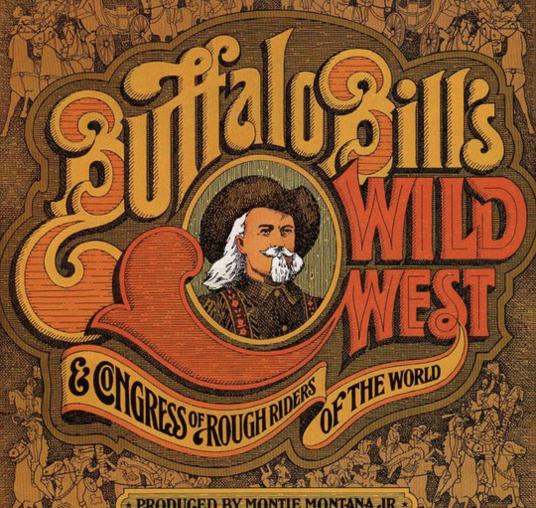
My research for this theme came from many sources, like films, games, and one of these included Old West posters. The rustic, dusty mood is conveyed through the use of more earthly colours, e.g. ocher. The texture of the poster also seems like a wood carving, another feature of an Old West design.
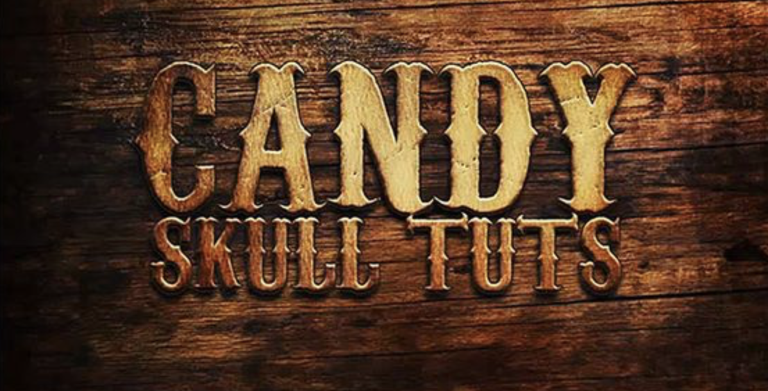
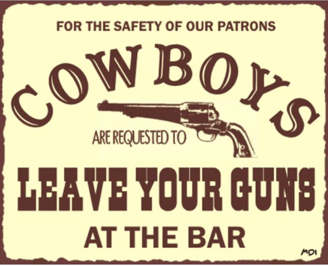
A few other examples of Old West signages.
I have a few more ideas that I want to explore, so I’ll leave this open-ended for now as I explore other themes.
February 5, 2017 at 1:40 pm
Thanks Benjamin. The mountain climber design looks clean and solid. Maybe you could explore applying the uneven terrain within the space of the letters B, and the edges of E and N? Just a thought.
February 10, 2017 at 9:12 am
Hi Mimi,
Ah yes, to unify the design. Alright I will make the changes ASAP, thank you 🙂
Ben