The initial research brought me to look at 3 predominant ideas: the adventurer, the spirit animal and the lighthouse.
Adventurer:
![]()
![]()
Although I managed to mould it into a more ambiguous form, it did not feel complete. The feedback I received also included the fact that some of the final versions of the sketches were too complicated.
![]()
I realised the potential of these batch of sketches via the consultation, but perhaps because of the choice of animals they looked more like a Tesla logo than an Art on the Move logo. It was time to move on. 80/20 rule.
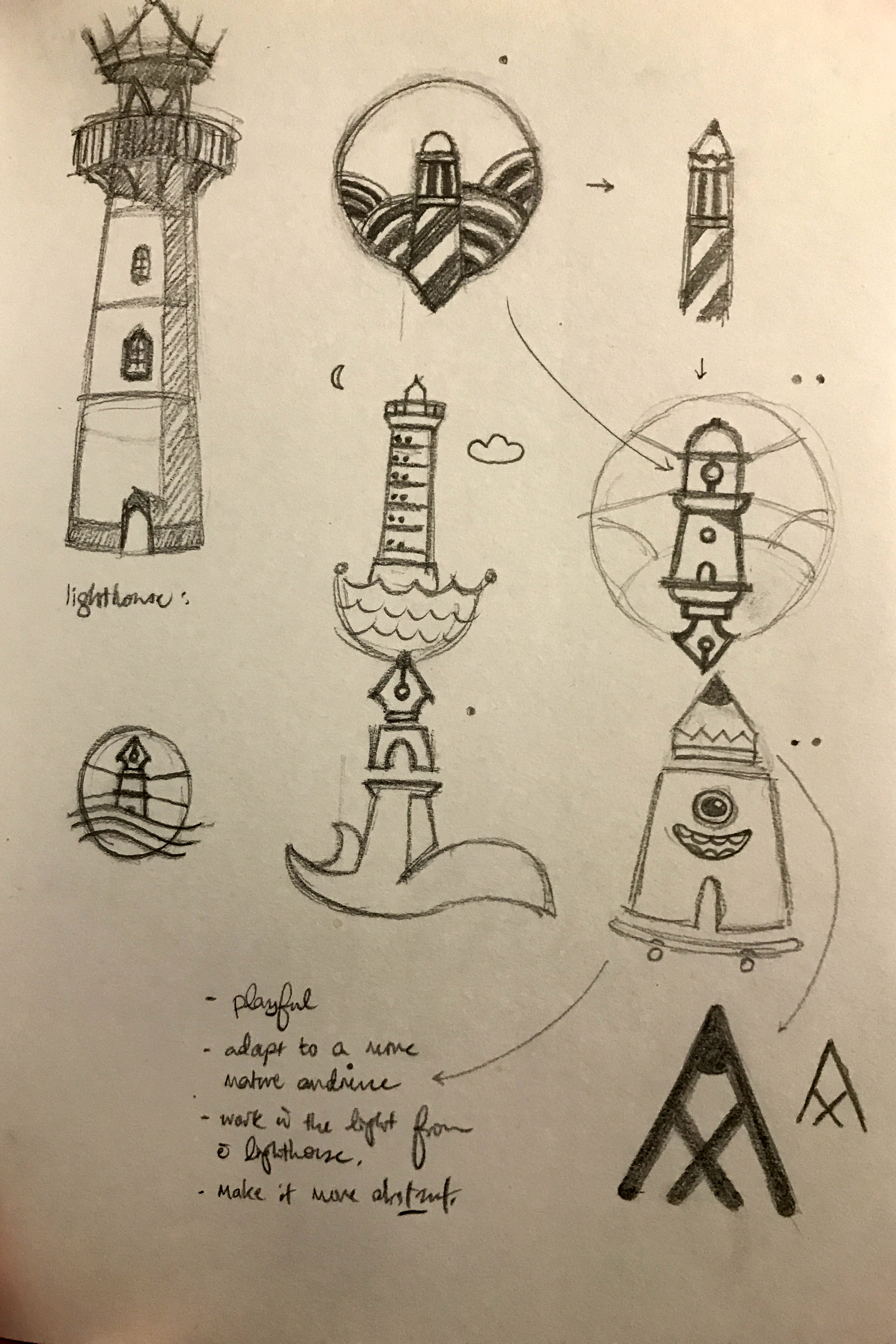
![]()
I received the most positive feedback on this batch of sketches. The lighthouse was a beacon of hope to patients and volunteers, and the symbolism was carried through with clarity. The top 2 sketches i.e. Minion and Lighthouse pen/pencil were digitised on Illustrator.
![]()
![]()
![]()
![]()
![]()
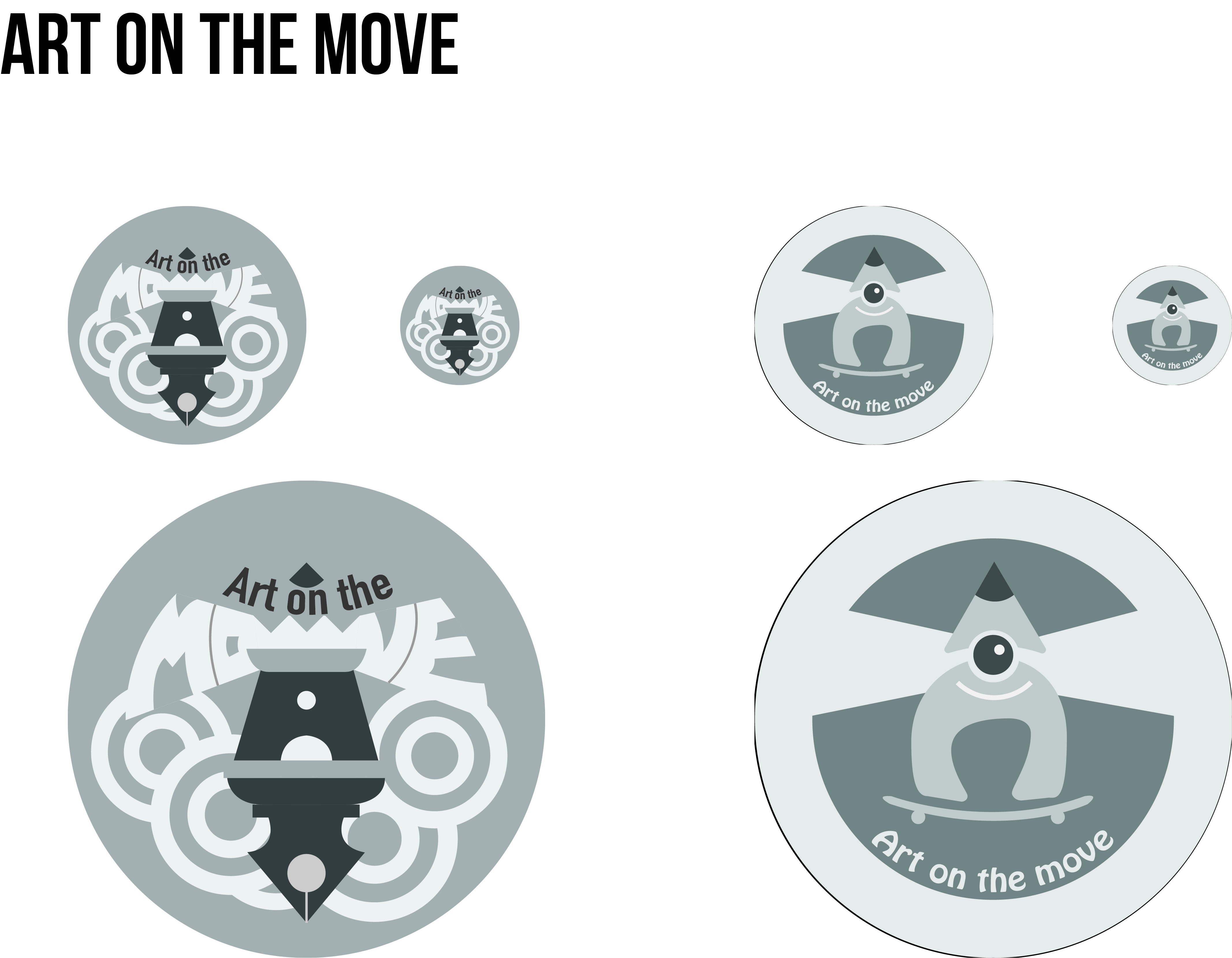

Honestly I have no idea why there seems to be a difference in tones in the individual batches and the ones on the spread. The individual badges’ colours are the ones with the accurate colours. I went for more muted colours that were complementary, giving them a subtle contrast, retaining the A letterform while playing with imagery and symbolism. I look forward to refining these 2 ideas.
Recent Comments