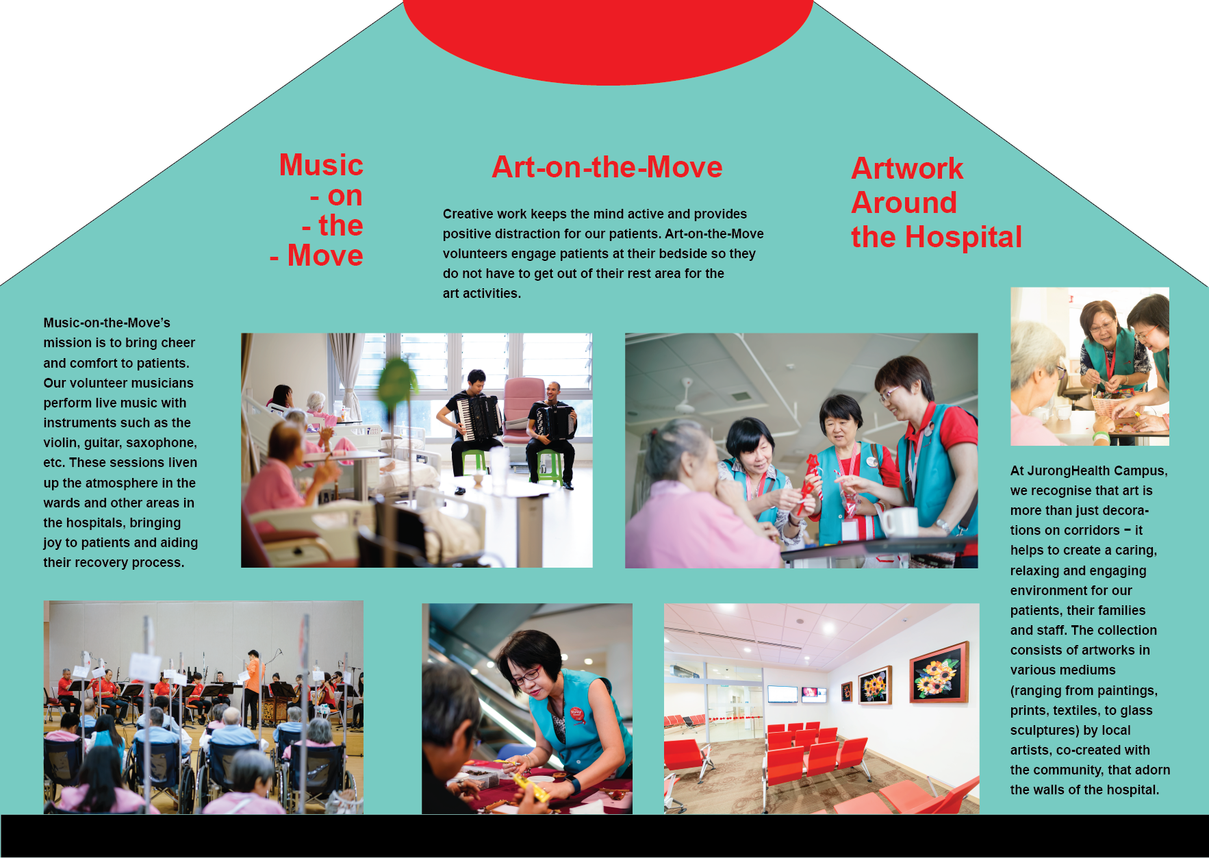
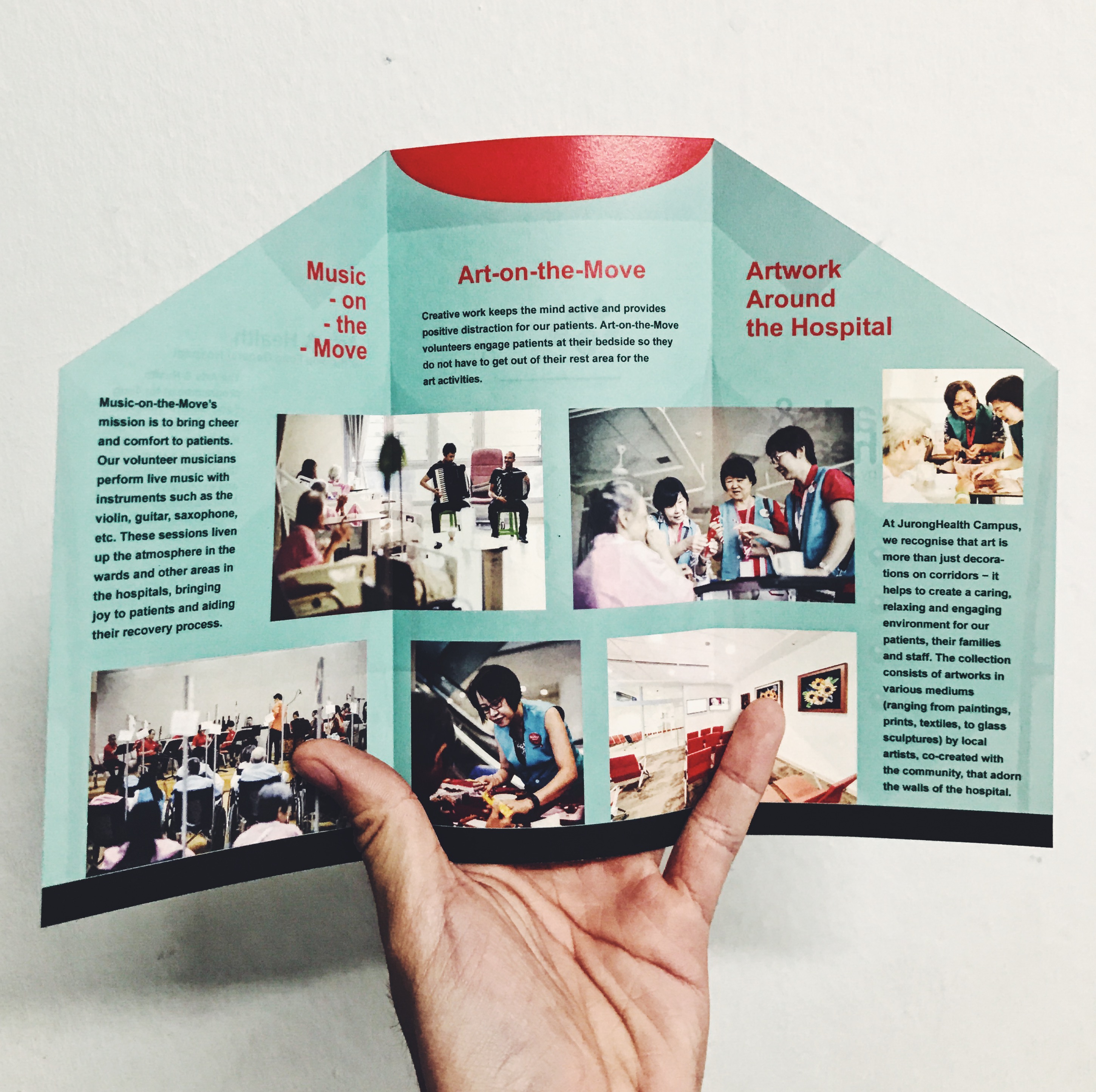
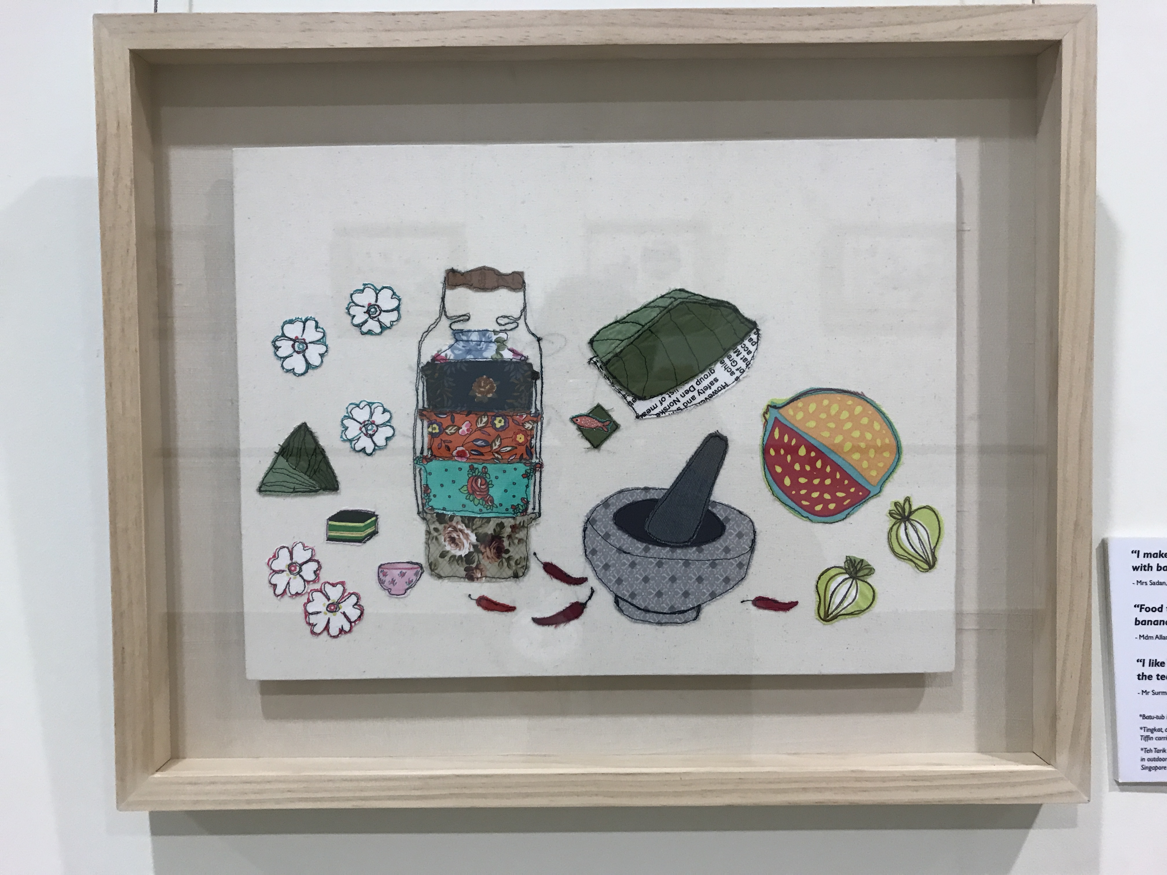
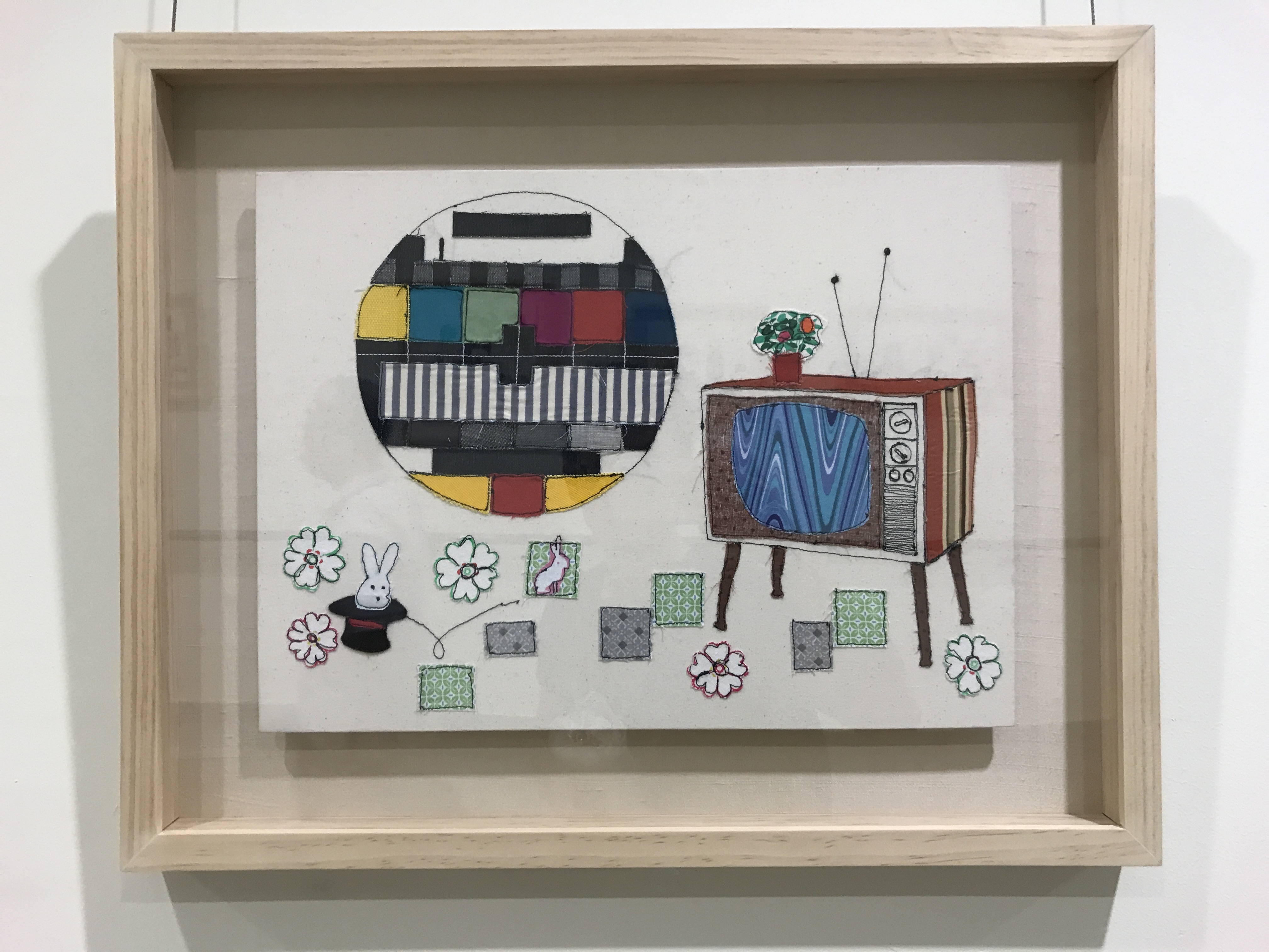
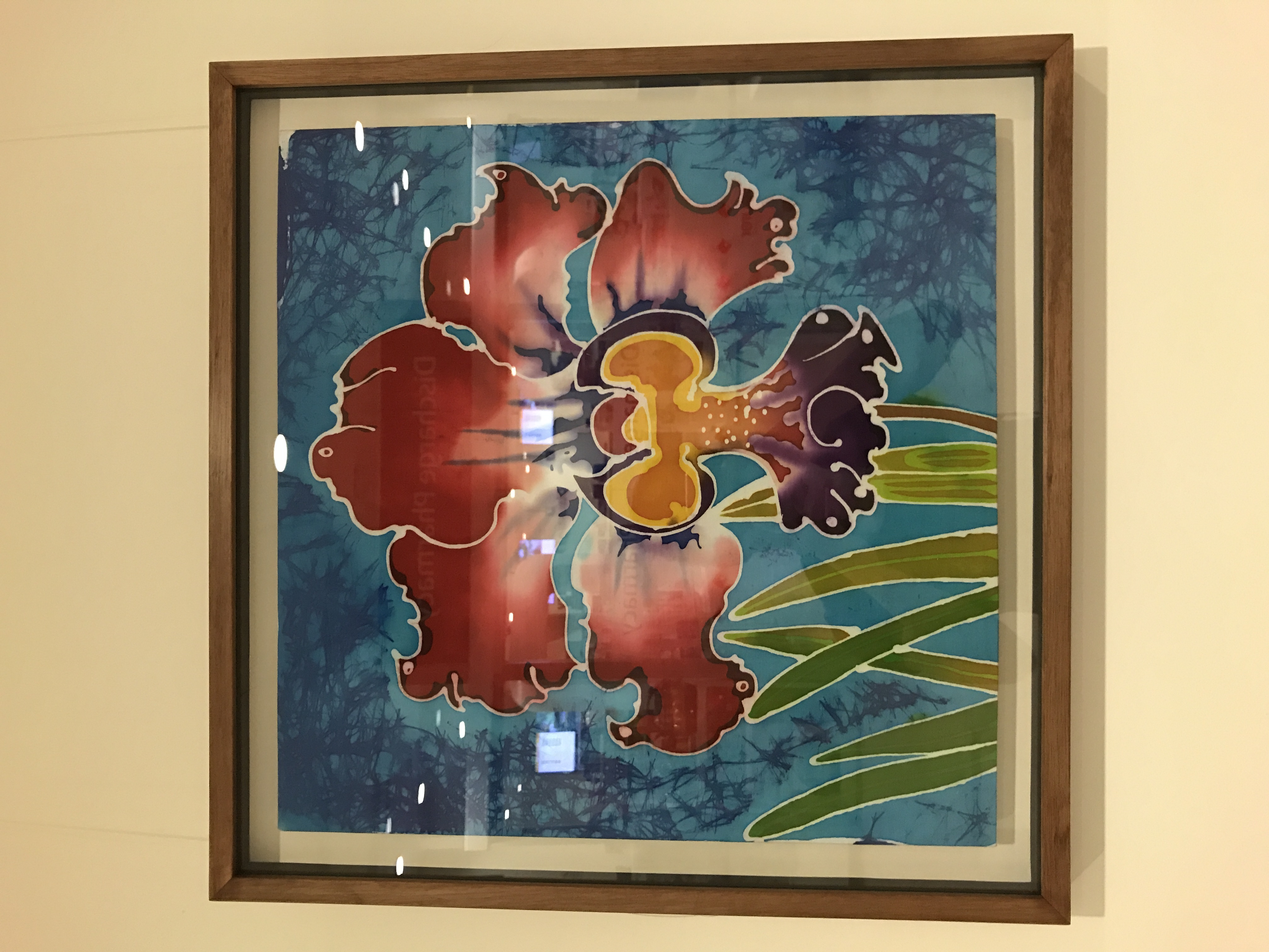
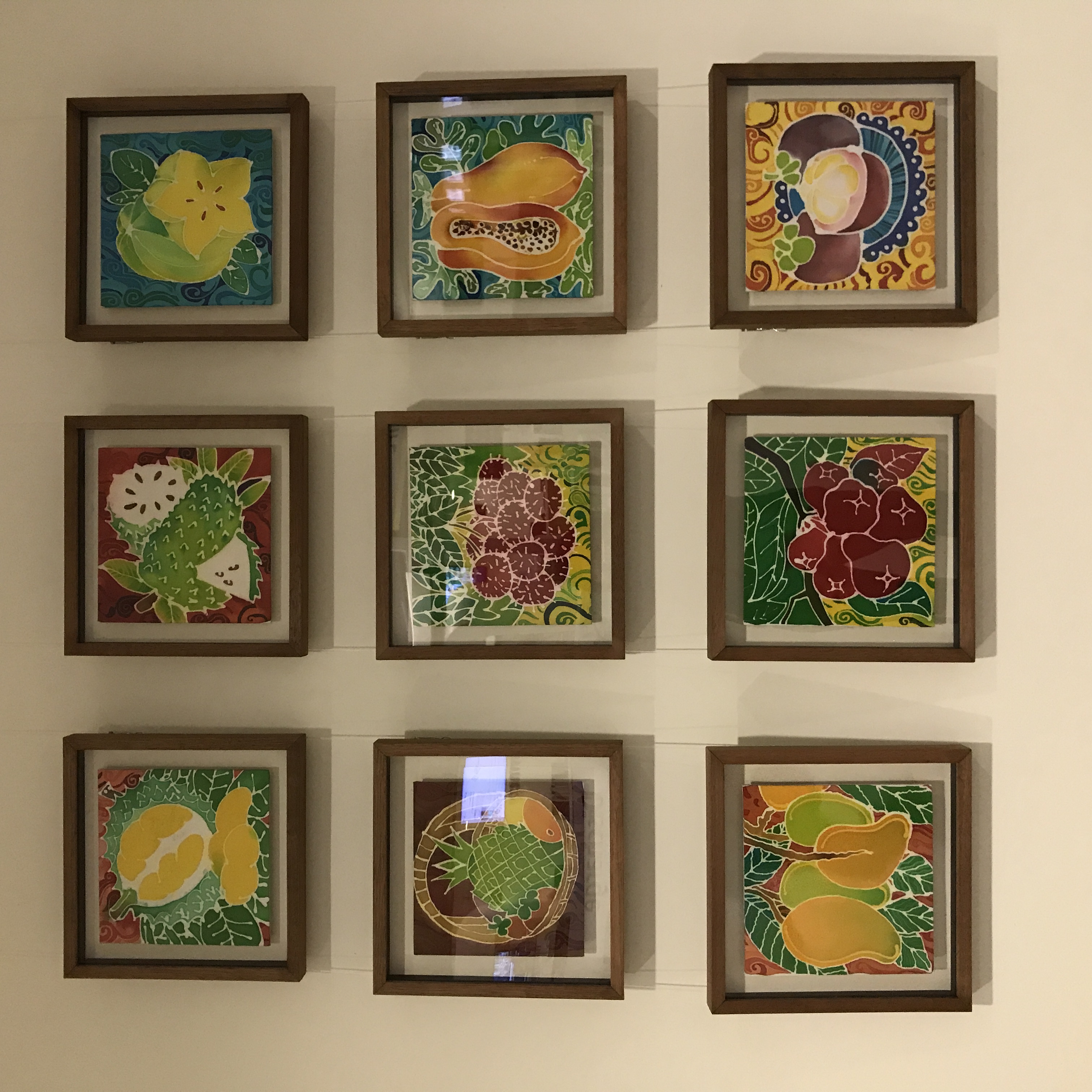
We began our visit to Ng Teng Fong hospital for our assignment brief prior to embarking on our project. Taking a look around the hospital, I noticed the hospital liked expressive, vibrant illustrations with a touch of nostalgia.
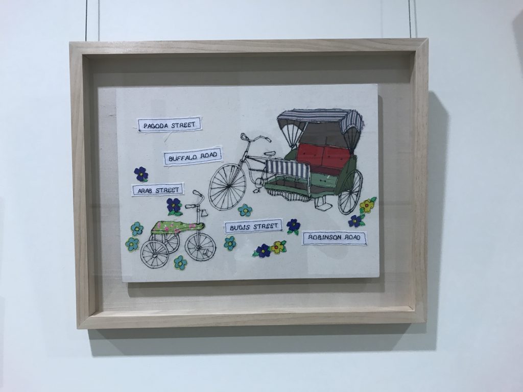
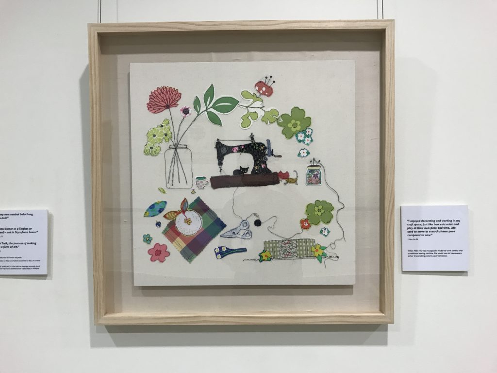
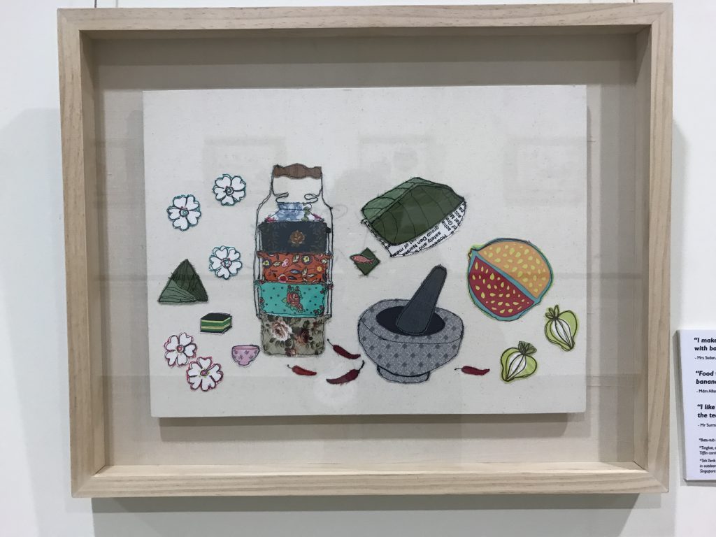
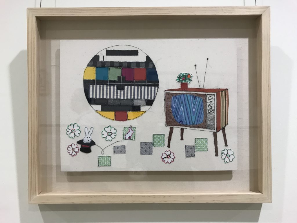
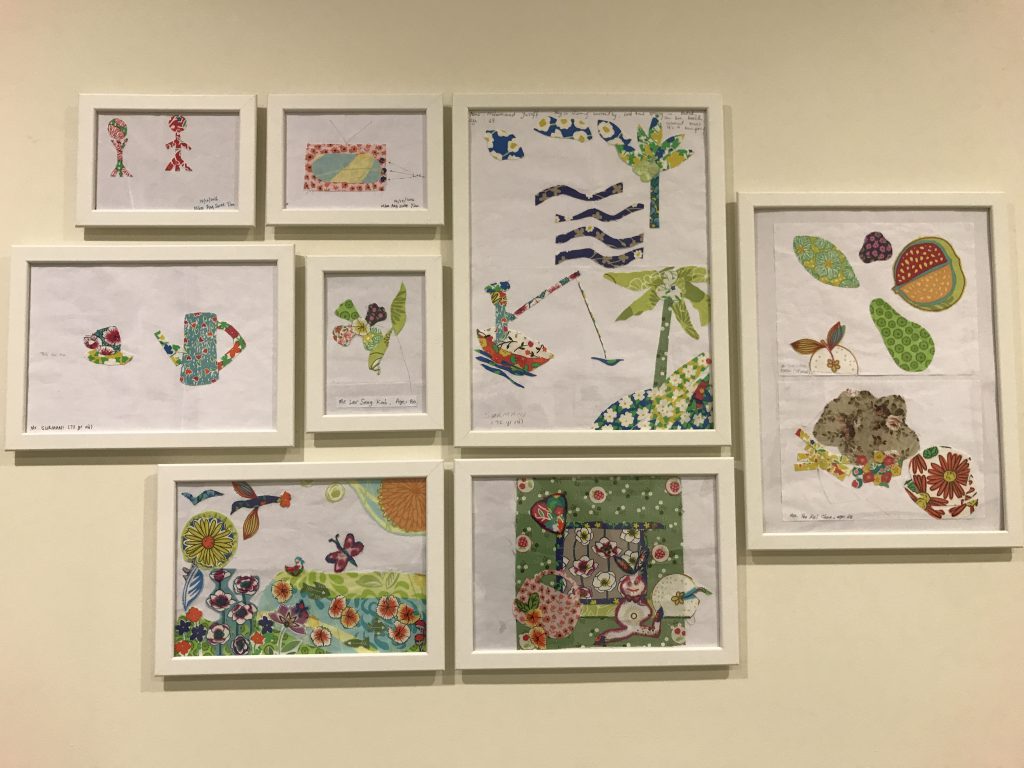
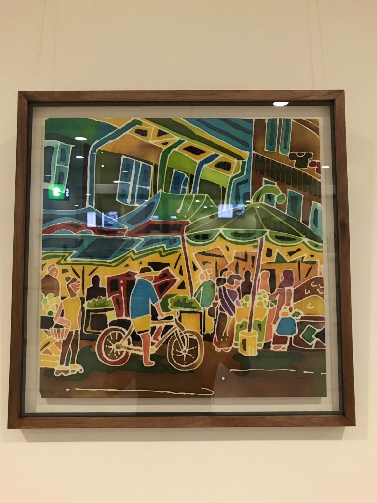
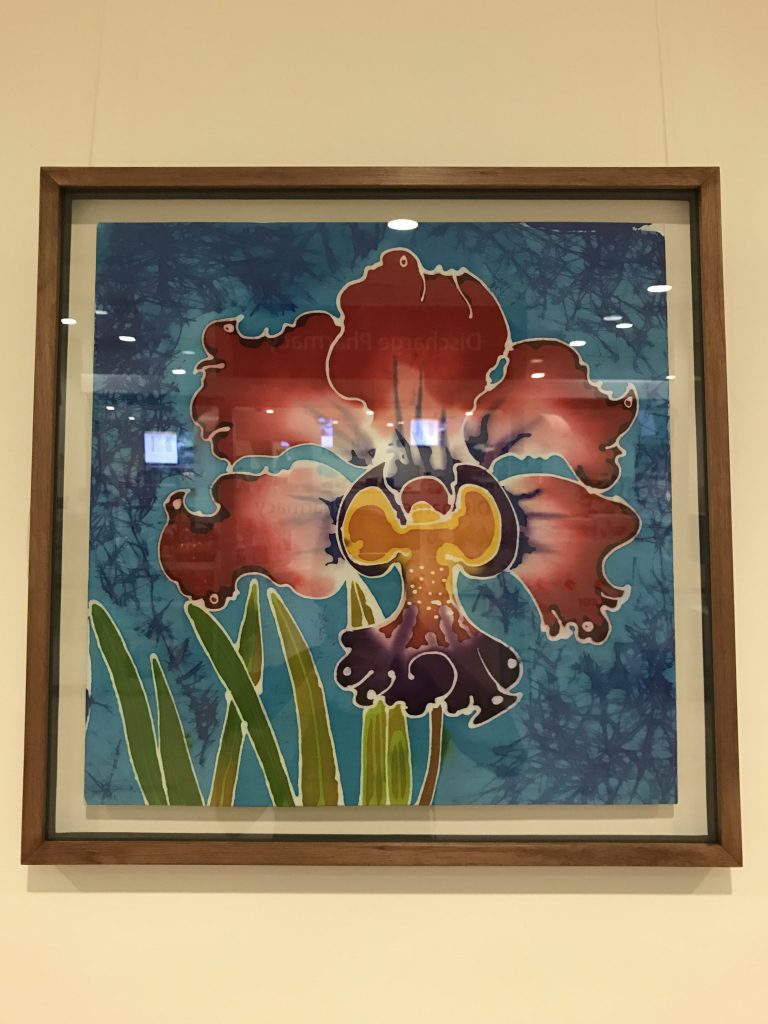
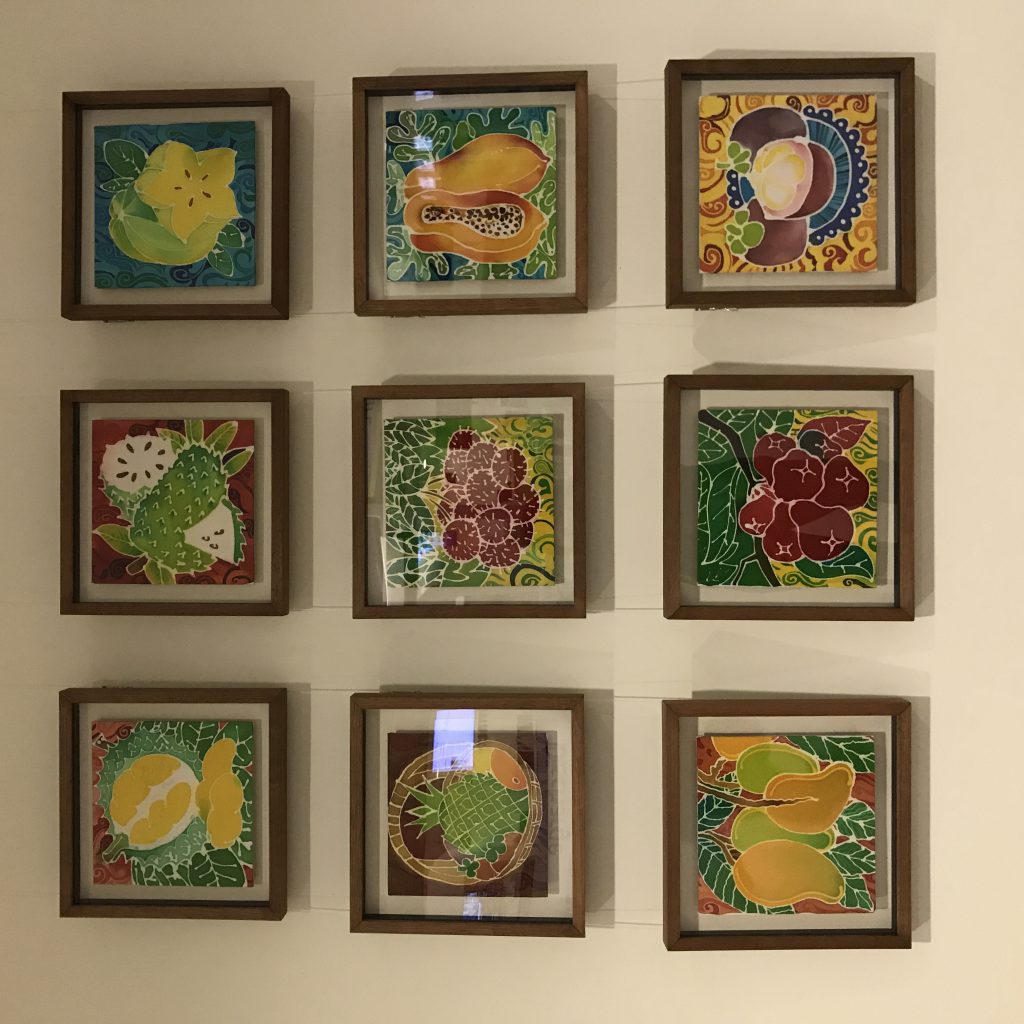
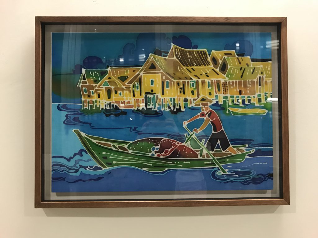
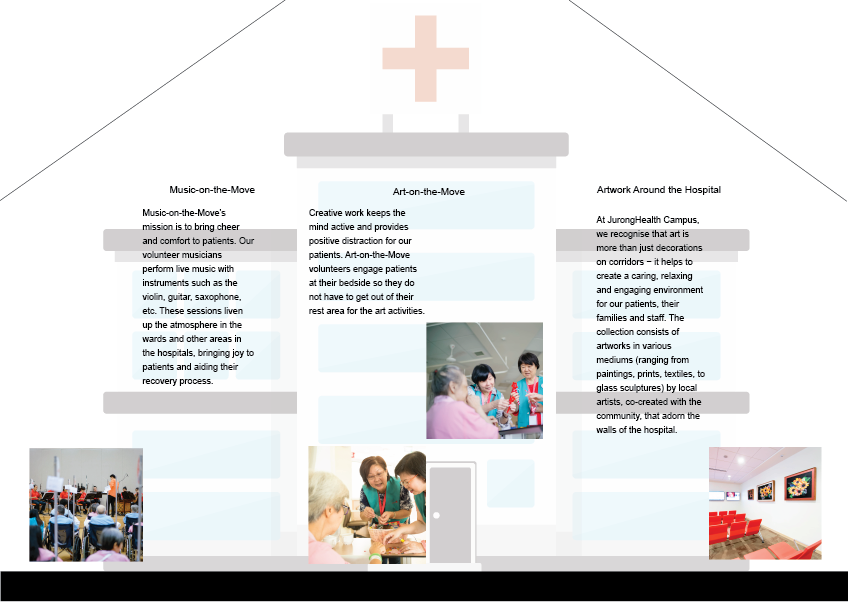
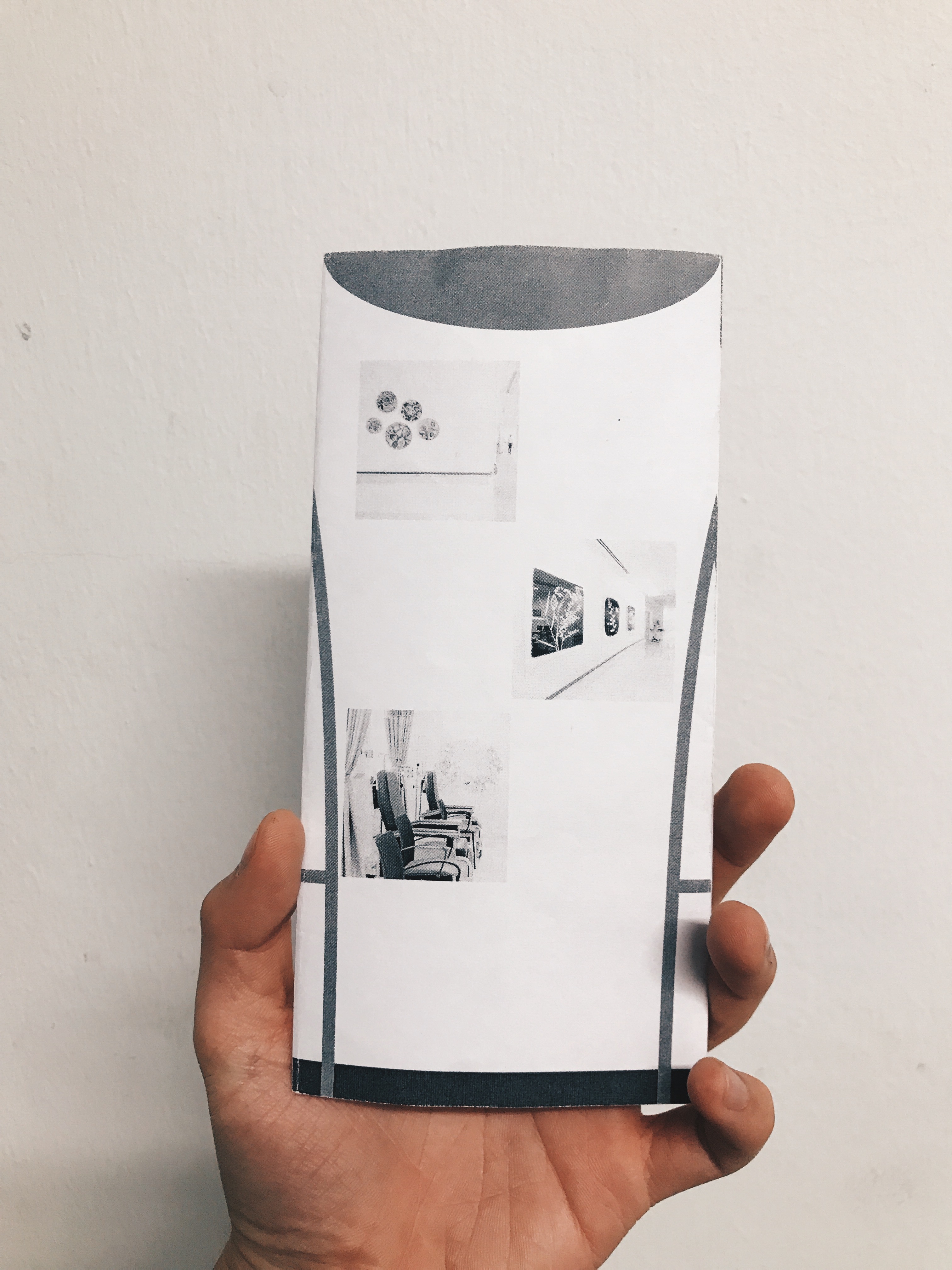
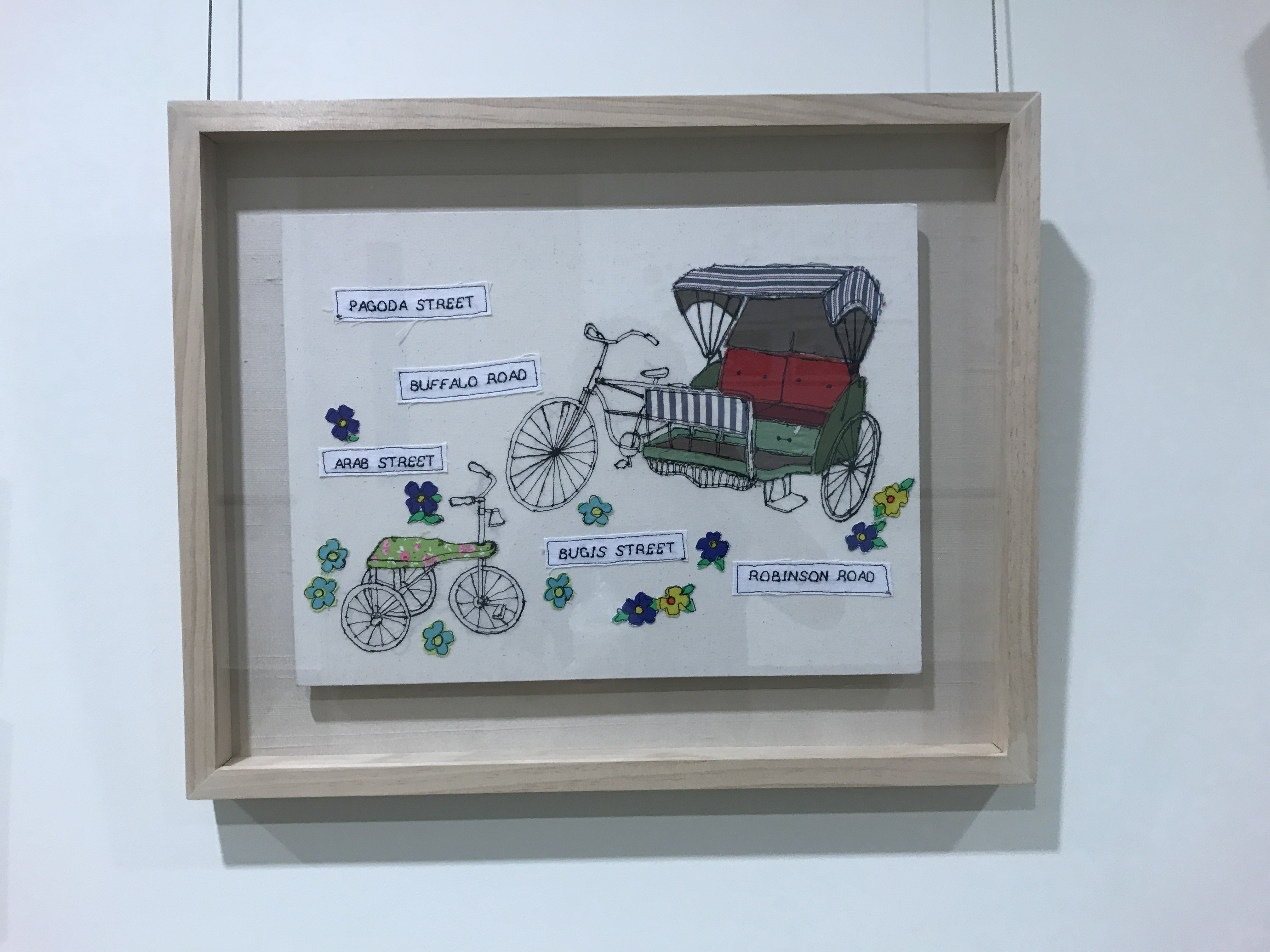
These were some of the paintings and illustrations that adorned the walls of the hospital. Batik and sewing were mediums that offered a lighter mood to patients. Venturing into the wards, I liked the simplicity and elegance of its architecture, its gentle curves contrasted with the rhythm of the steel beams. I wondered what would complement such an environment, perhaps even contrast it, since art in this case served at the behest of the patients’ health.
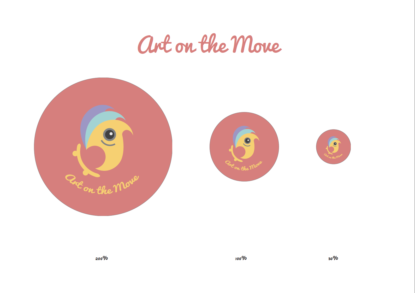
Design Aims: Designing a button badge that requires us to reflect the values of the Art on the Move programme by Ng Teng Fong hospital, a voluntary effort to decorate the hospital with murals and art that reflects the cultural identity of the patients, as well as to build upon the existing body of work that is currently in the hospital. This will give the volunteers a sense of belonging to the organization and a sense of pride in what they do, keeping the badge as a representation of their efforts. Equally important, it will aid identification of the volunteers.
Target Audience: Volunteers of NTF hospital under the Art on the Move programme
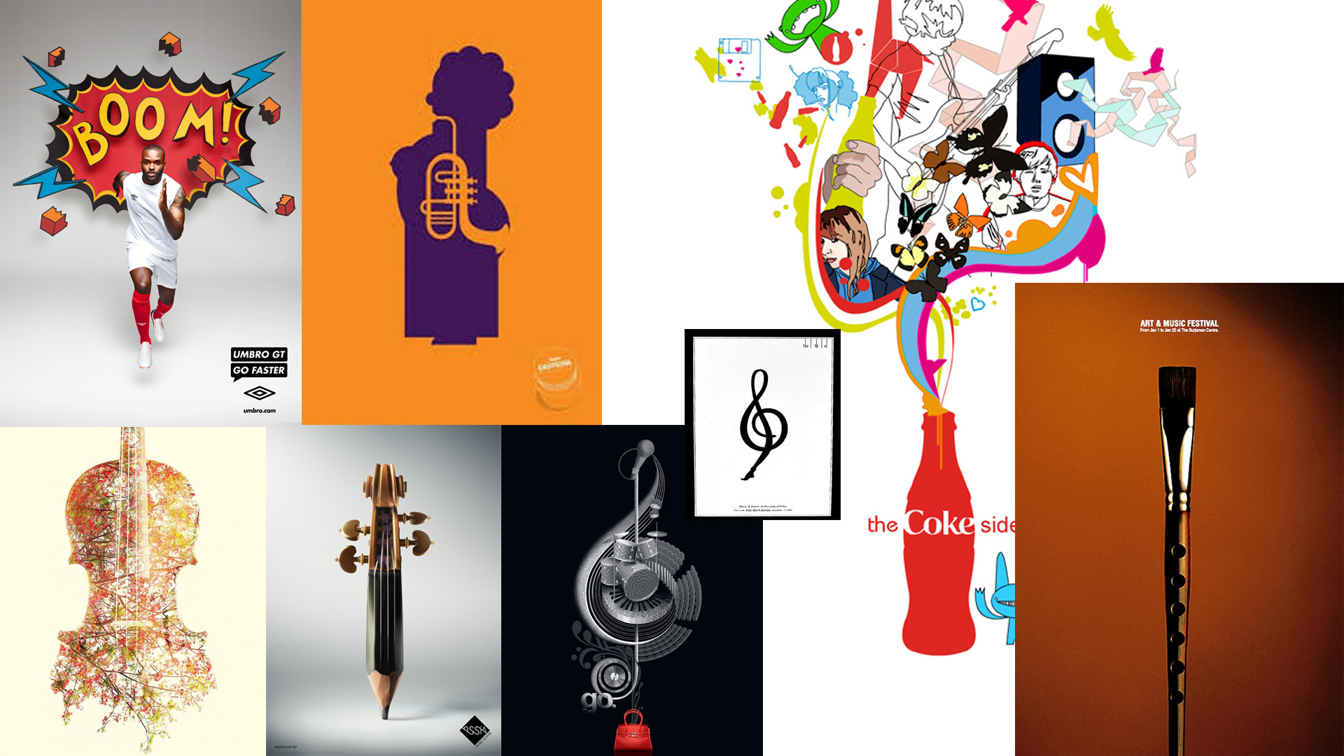
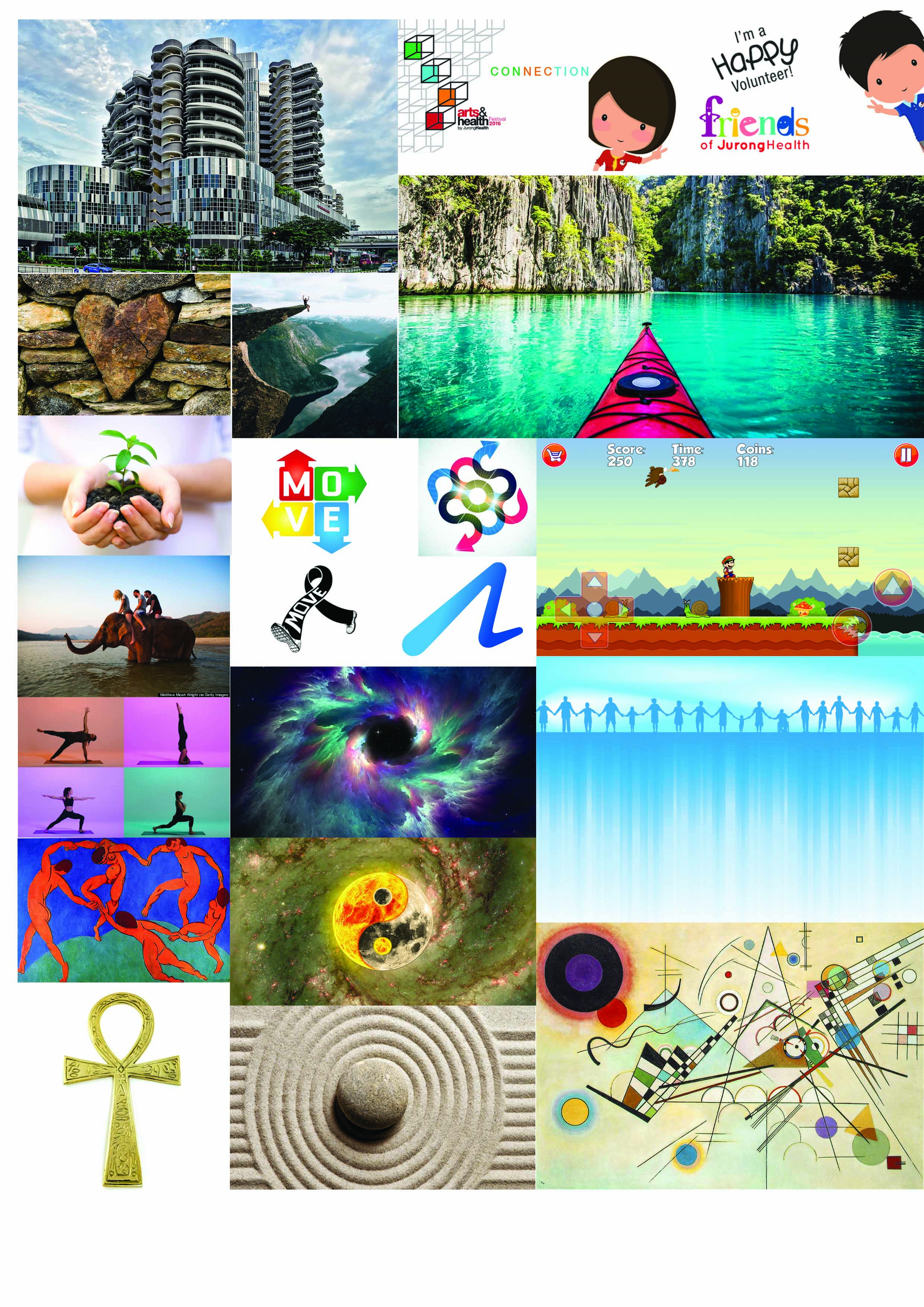
Keywords: The main themes that we came up with during the class brainstorming session were compassion, love, excitement, hope, inspiring, life, peaceful, adventure, transformation and vitality.
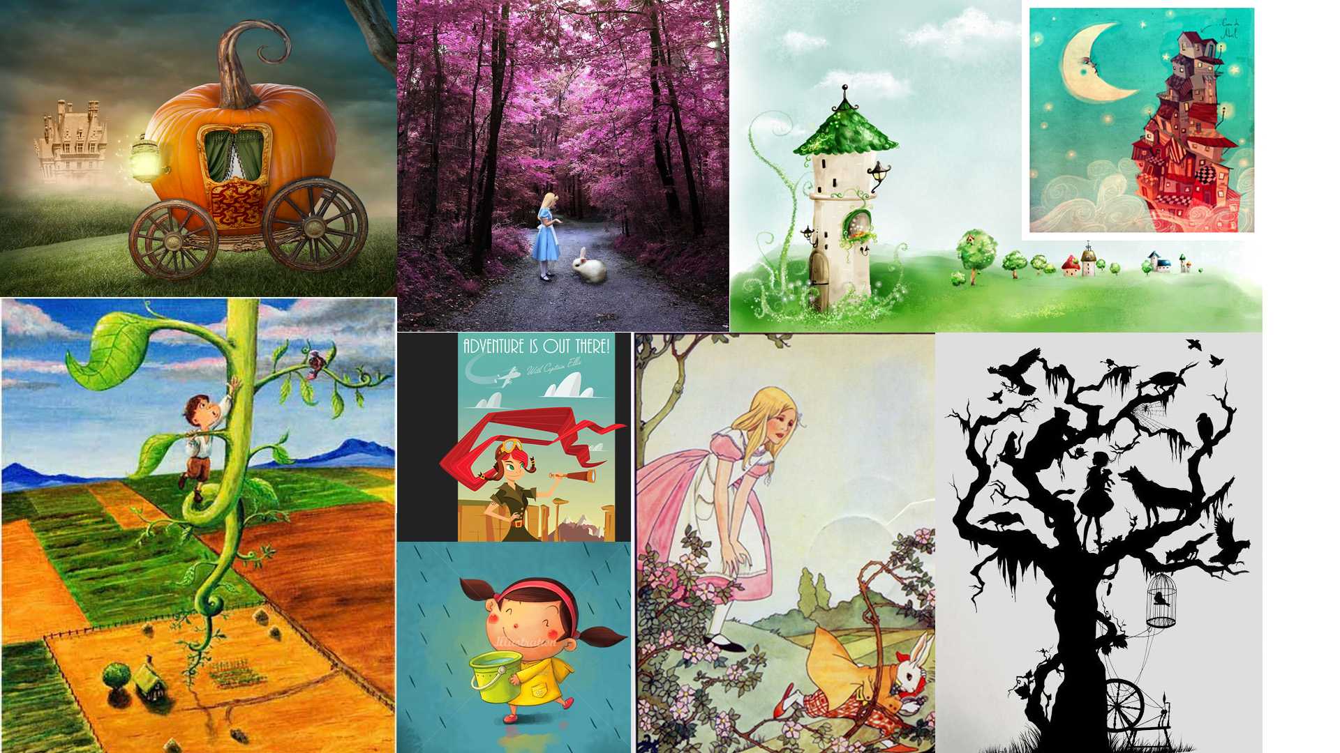
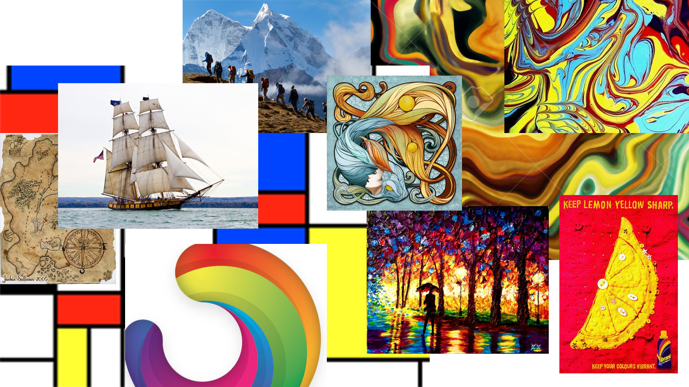
Based on the aforementioned keywords, I created a mood board that summarised all the different buzzwords.
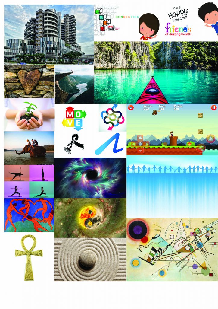
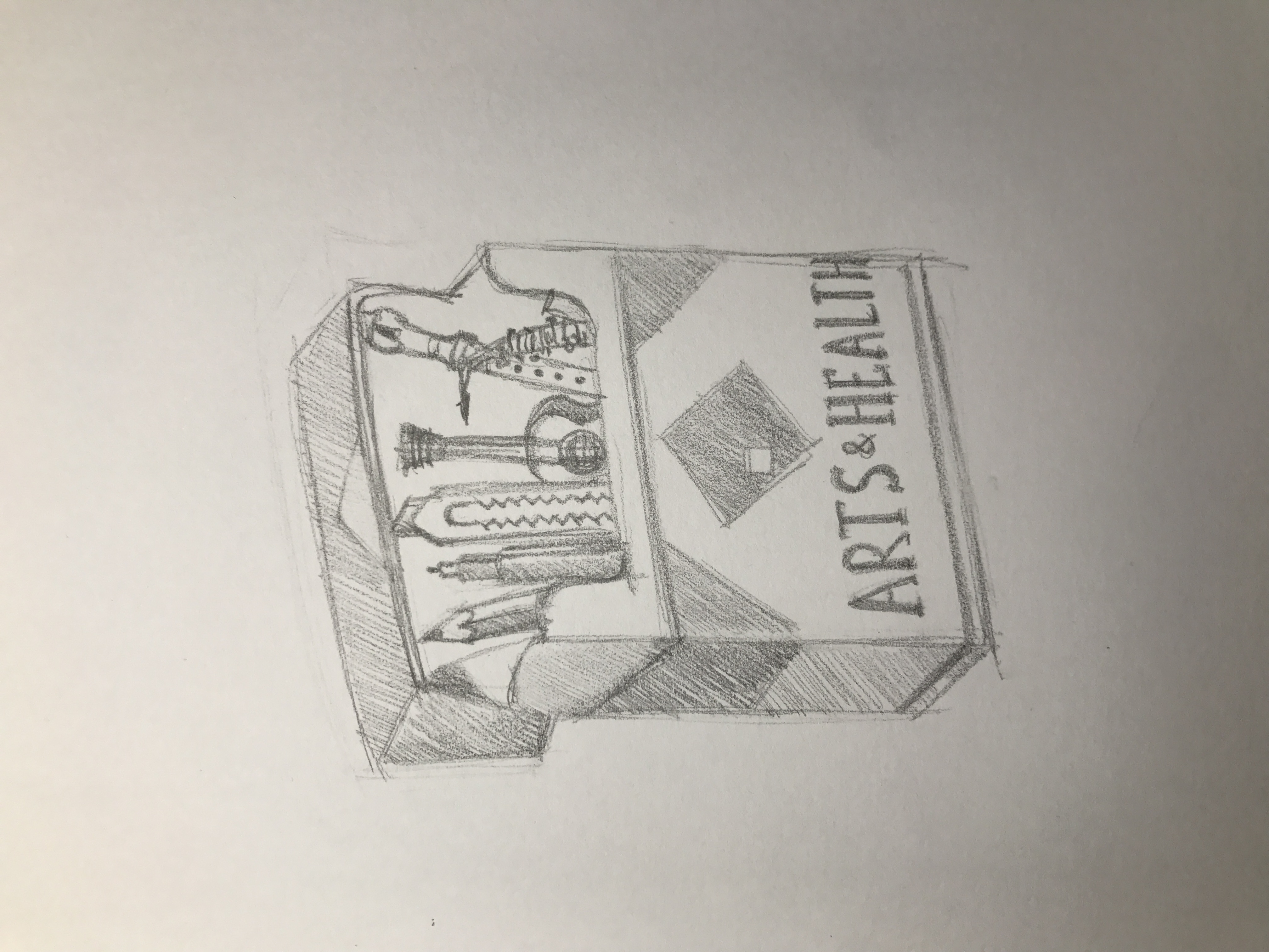
I began to whittle things down from the bigger picture to the more specific details.
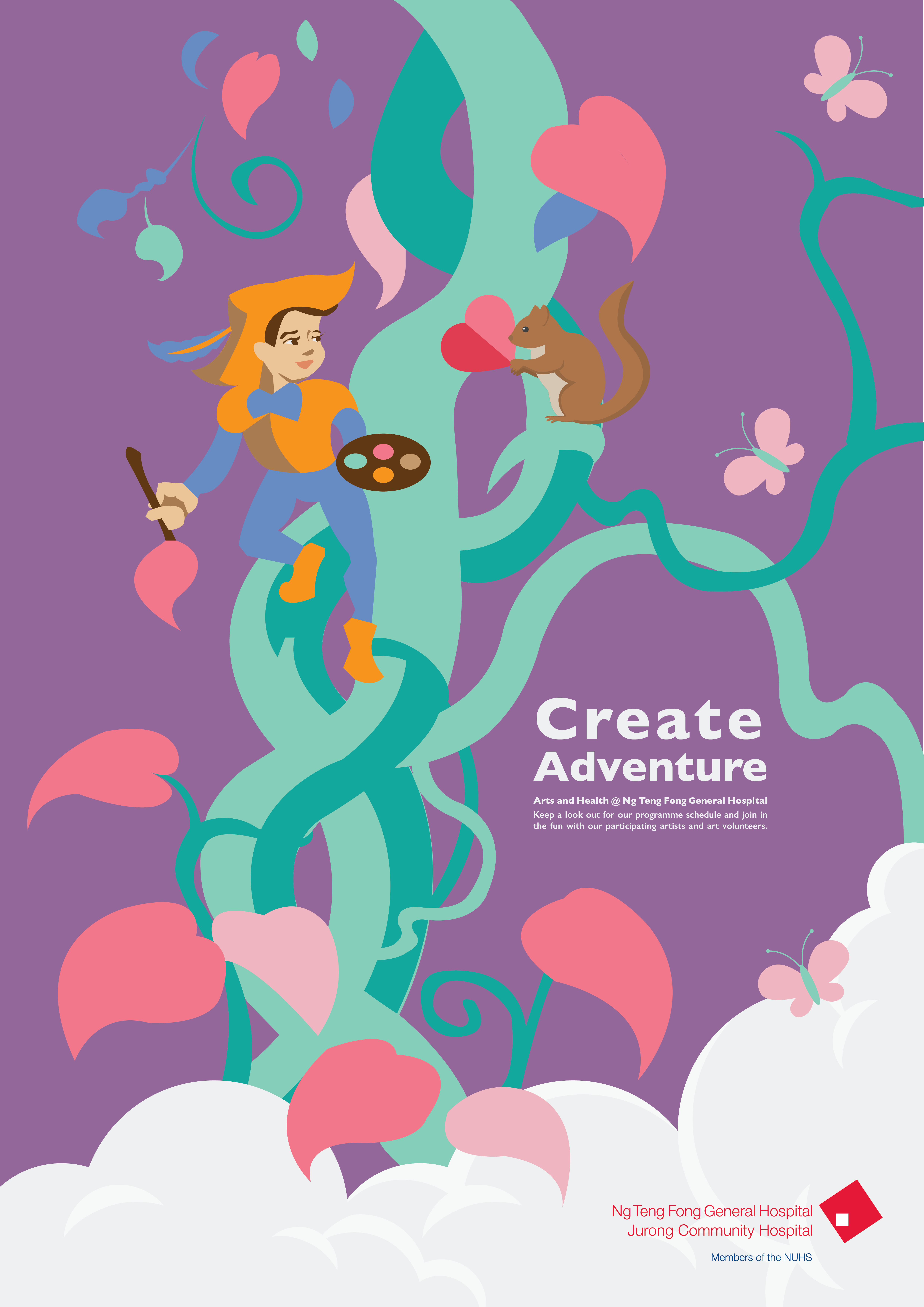
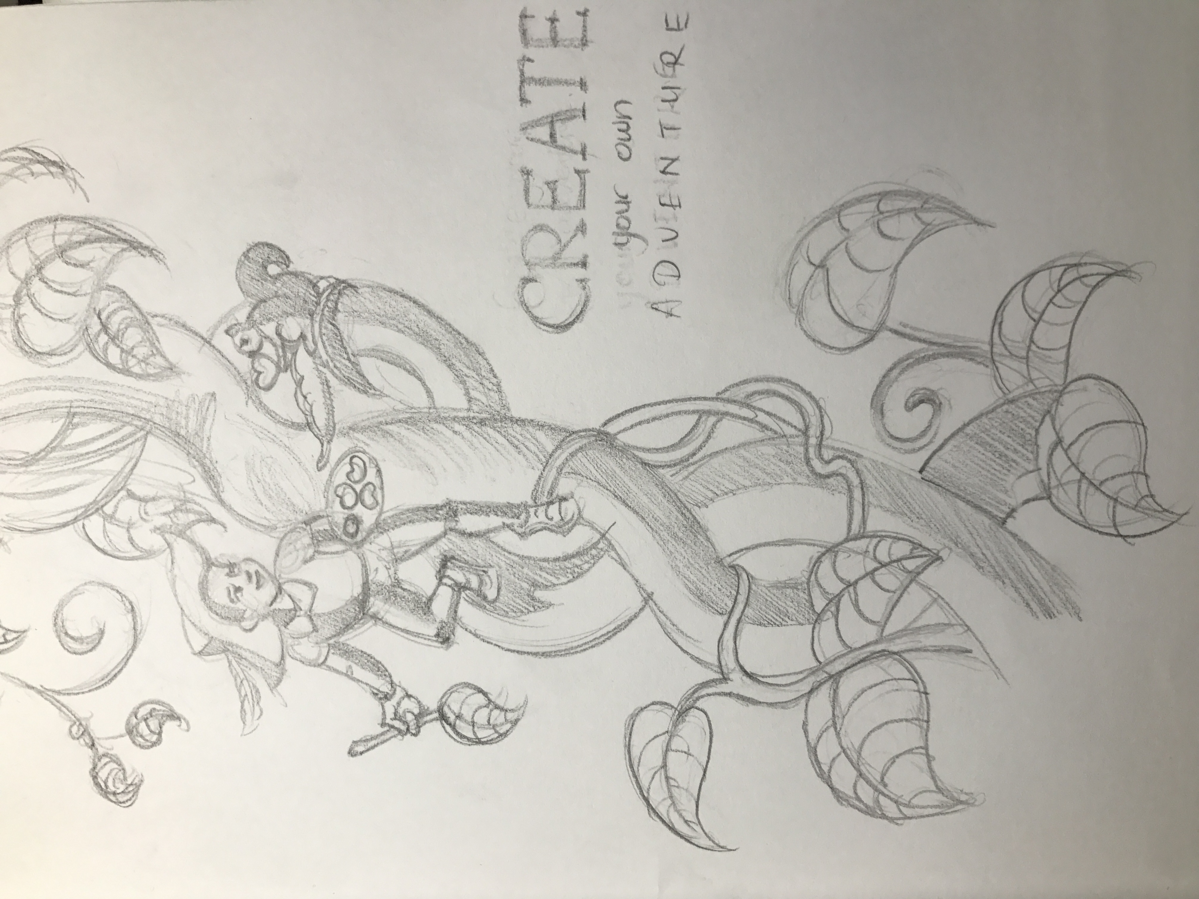
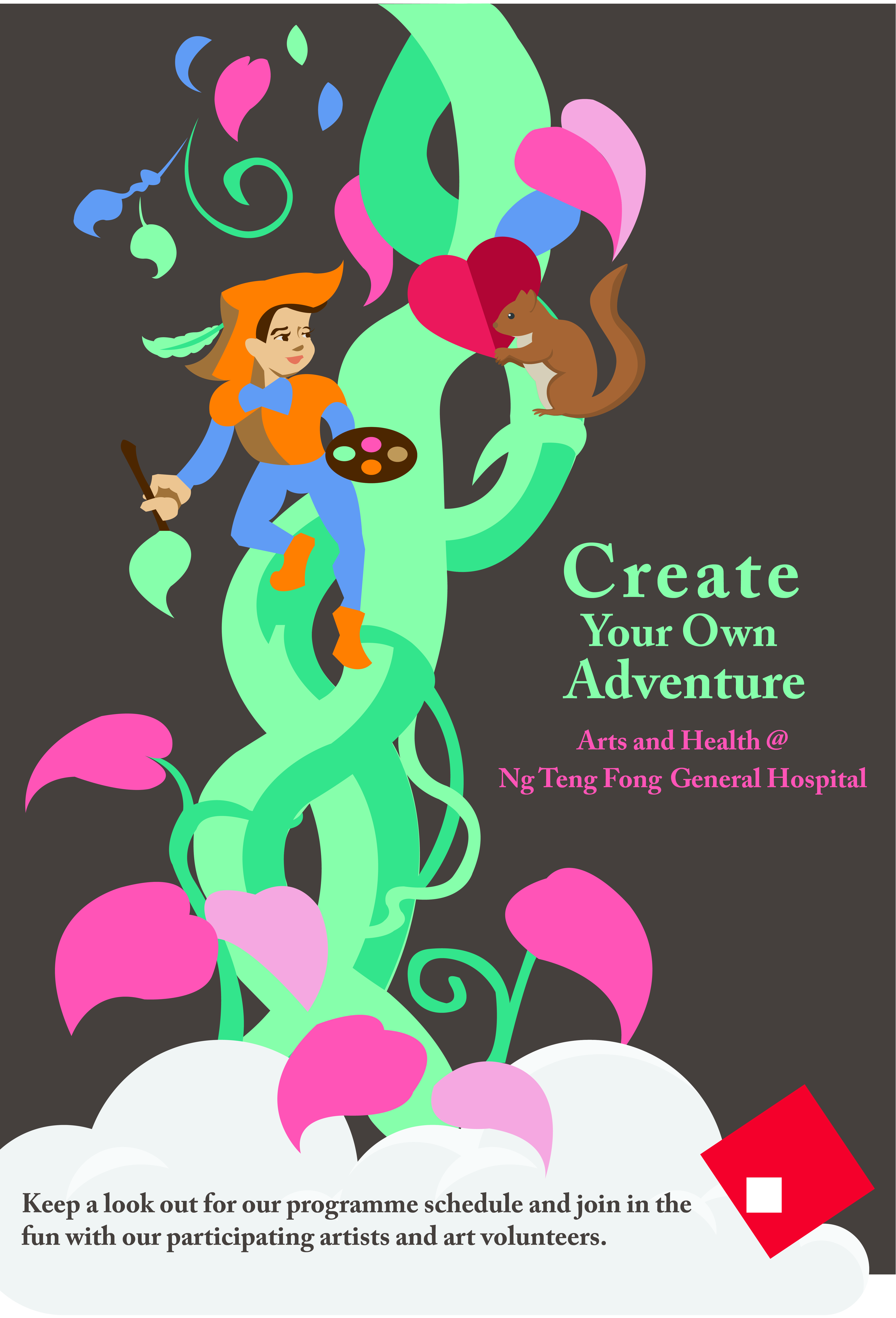
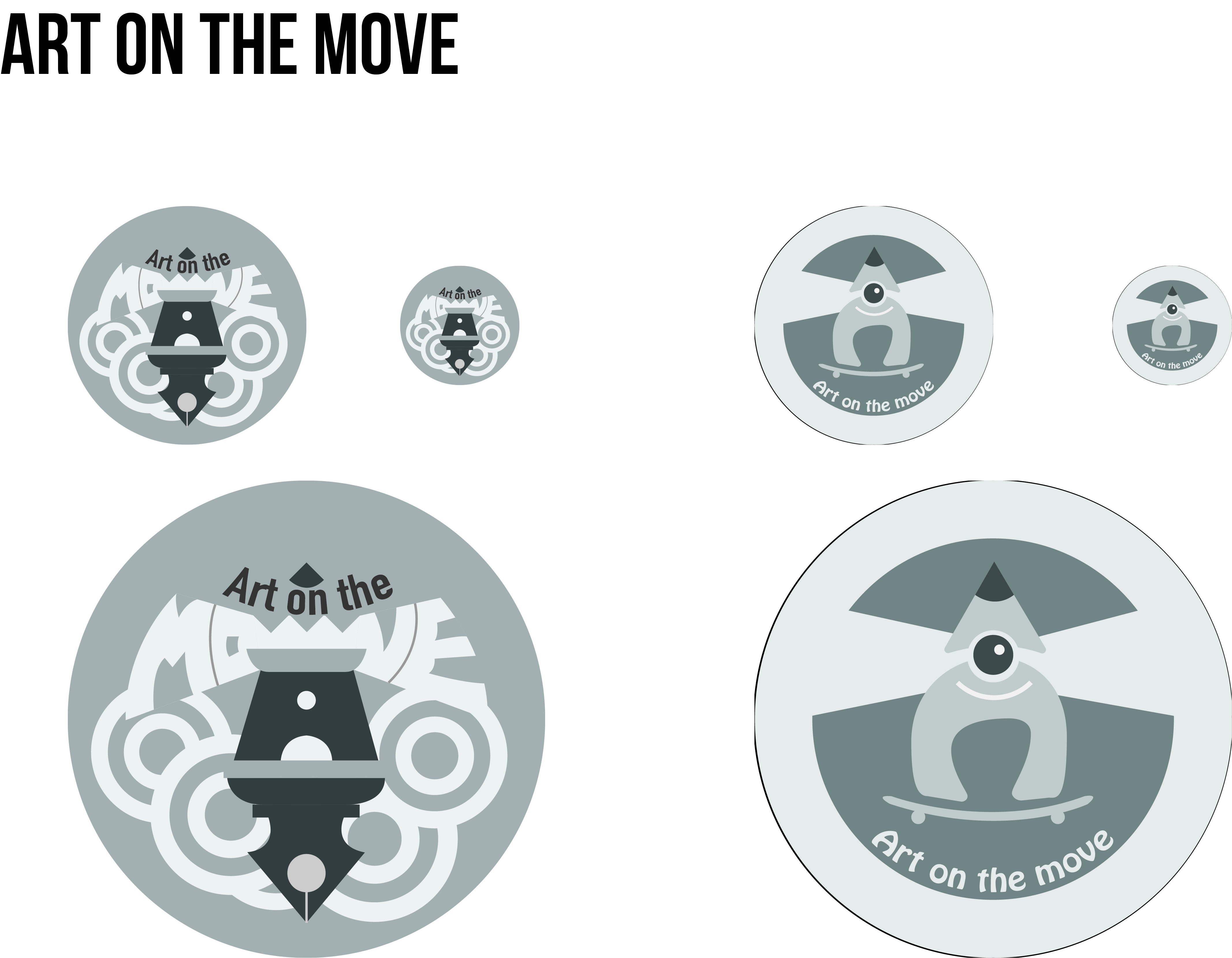
CONCEPT 01: Embarking on Adventure
Rationale: As the badge is designed for the volunteers, our direct clients are the volunteers and indirectly the patients. Thus, a sense of exploration and artistic daring should be present on the badge. Without a sense of adventure, the programme would be clinical and sterile. The badge thus acts as a conduit to highlight the adventure both volunteers and patients will embark on, creating and receiving art that is bold and engaging, enhancing the environment of the hospital in the process.
Keywords: Vibrant, fun, excitement, outgoing, bold, colourful, journey, setting sail

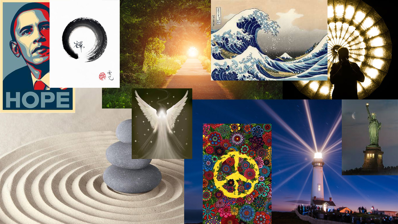
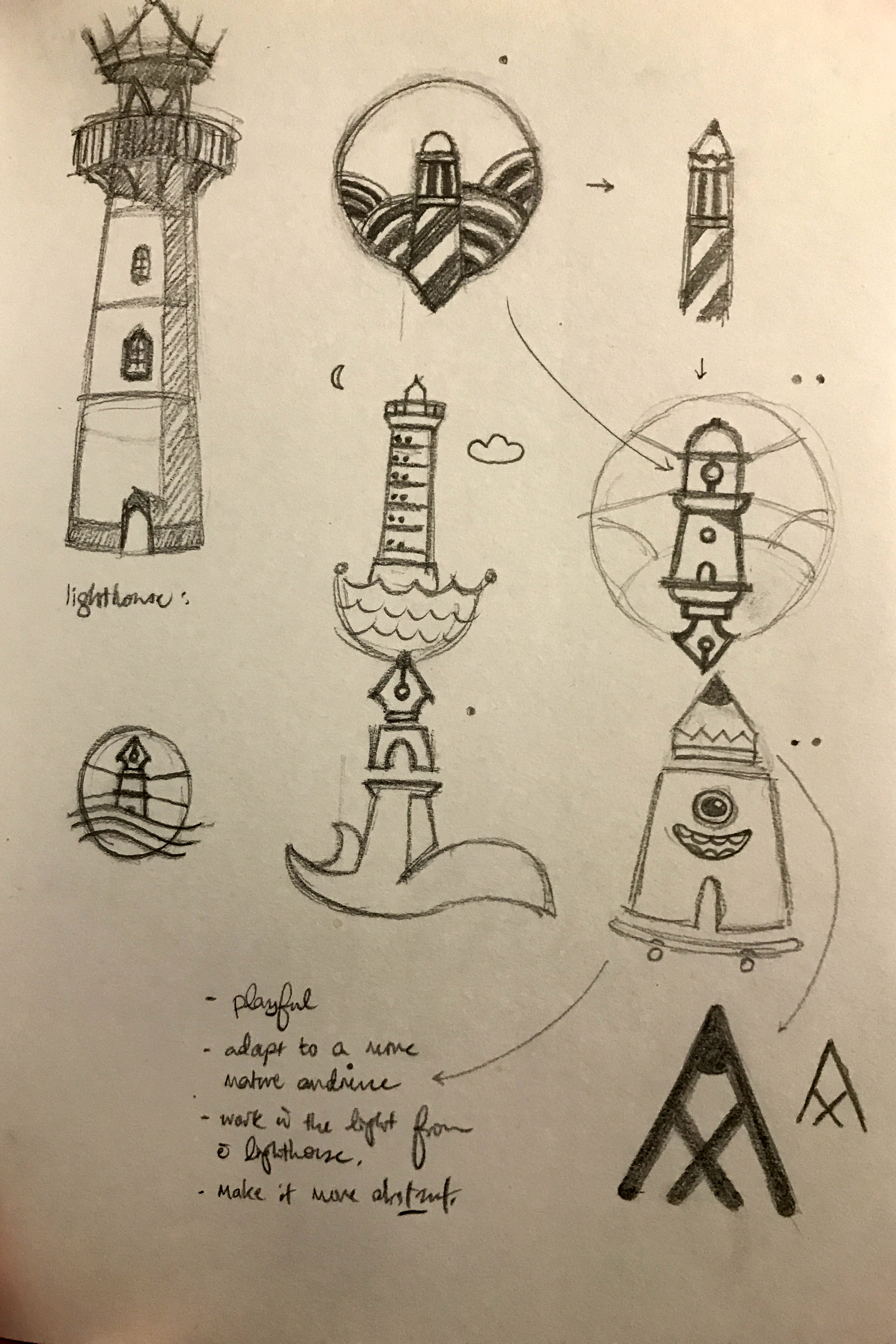
CONCEPT 02: Beacon of Hope
Rationale: The spirit of volunteerism is alive and well, with volunteers ushering the patients through their stay in the hospital and creating a place of safety and hopeful recovery. The volunteers stand as beacons of hope, their artworks engaging and delighting their benefactors and bringing added joy to their lives. These artworks bring peace to the chaos and uncertainty that may surround a patient who awaits treatment or recovering slowly from a debilitating illness.
Keywords: Light, lighthouse, peace, safety, zen, tranquility, purpose

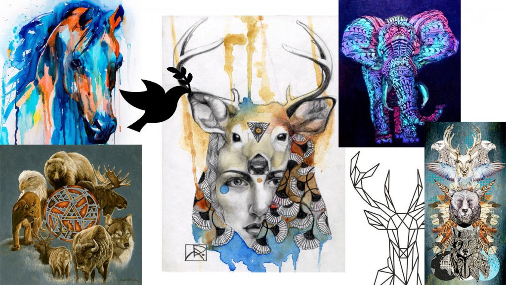
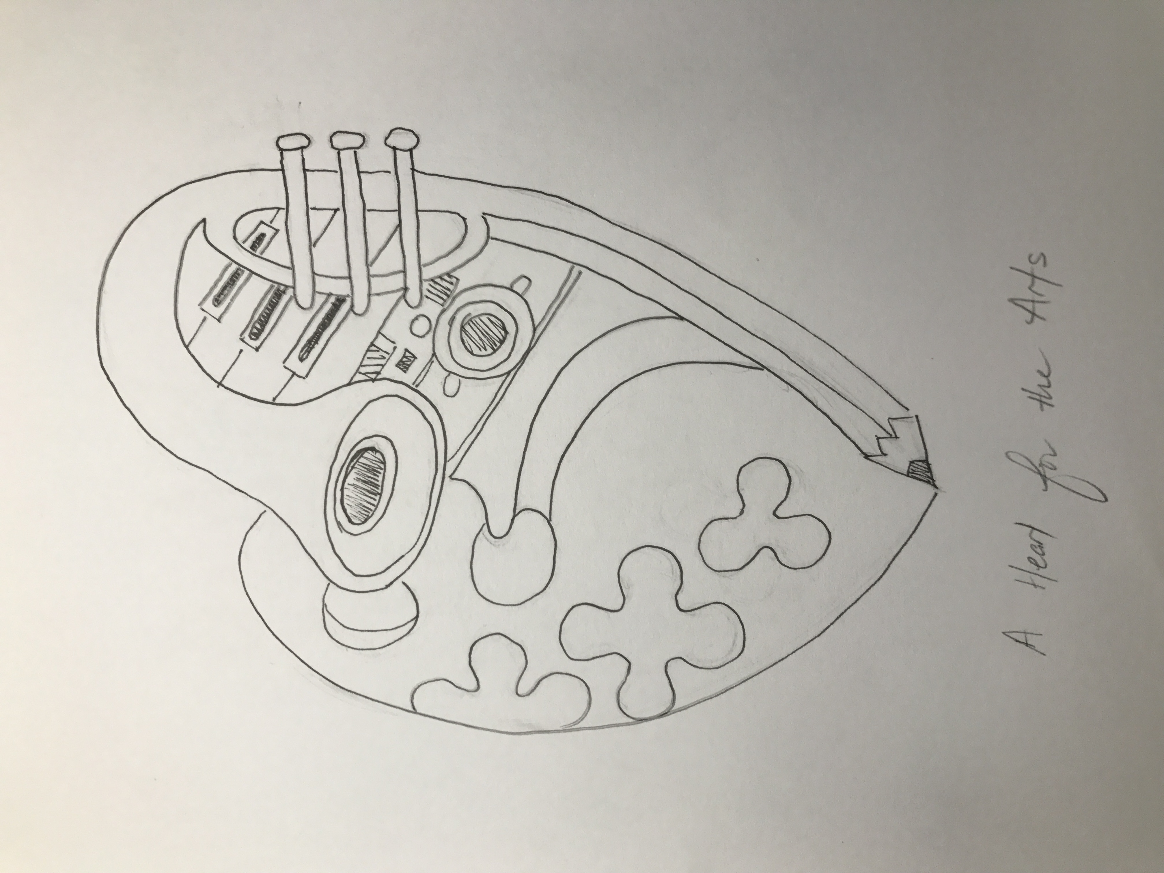
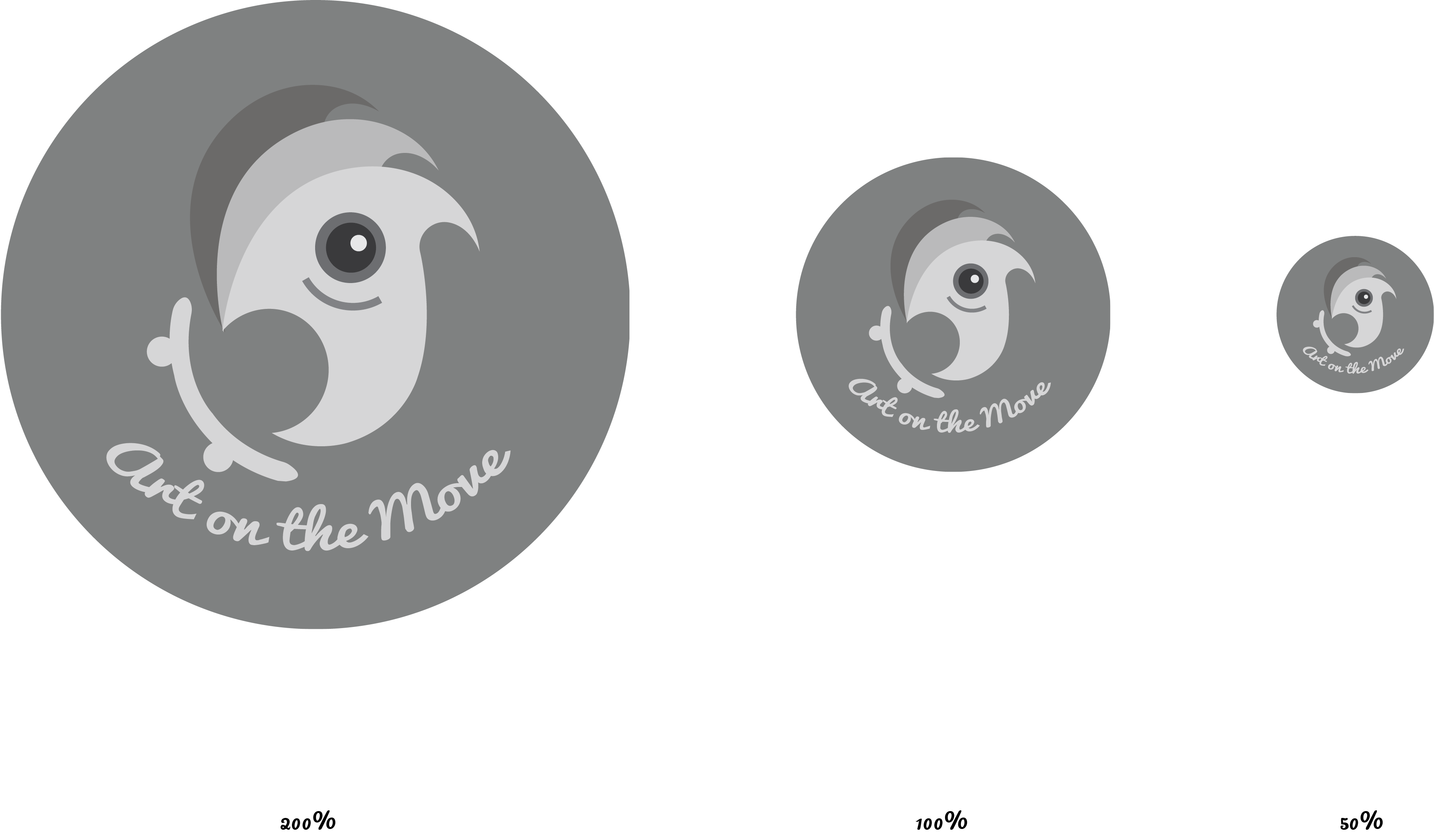
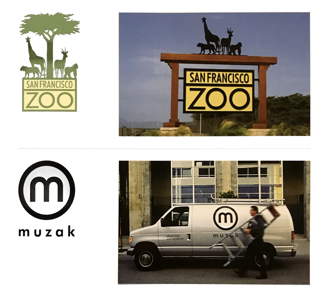
CONCEPT 03: Spirit Animal
Rationale: Spirit animals represent certain characteristics that may lend great meaning to the spirit of volunteerism. Through the badge, the spirit animal may invoke certain ideals or values that the volunteers shall represent, e.g. strength in adversity (elephant) and kindness (deer). Though different volunteers may have different personalities, they all represent the same thing to patients, a source of strength and comfort through times of uncertainty. Art on the Move then becomes an animal that is constantly on the move, travelling through the savannahs of life, documenting, expressing and performing.
Keywords: elephant, deer, strength, protection, stability, gentle, compassion


Recent Comments