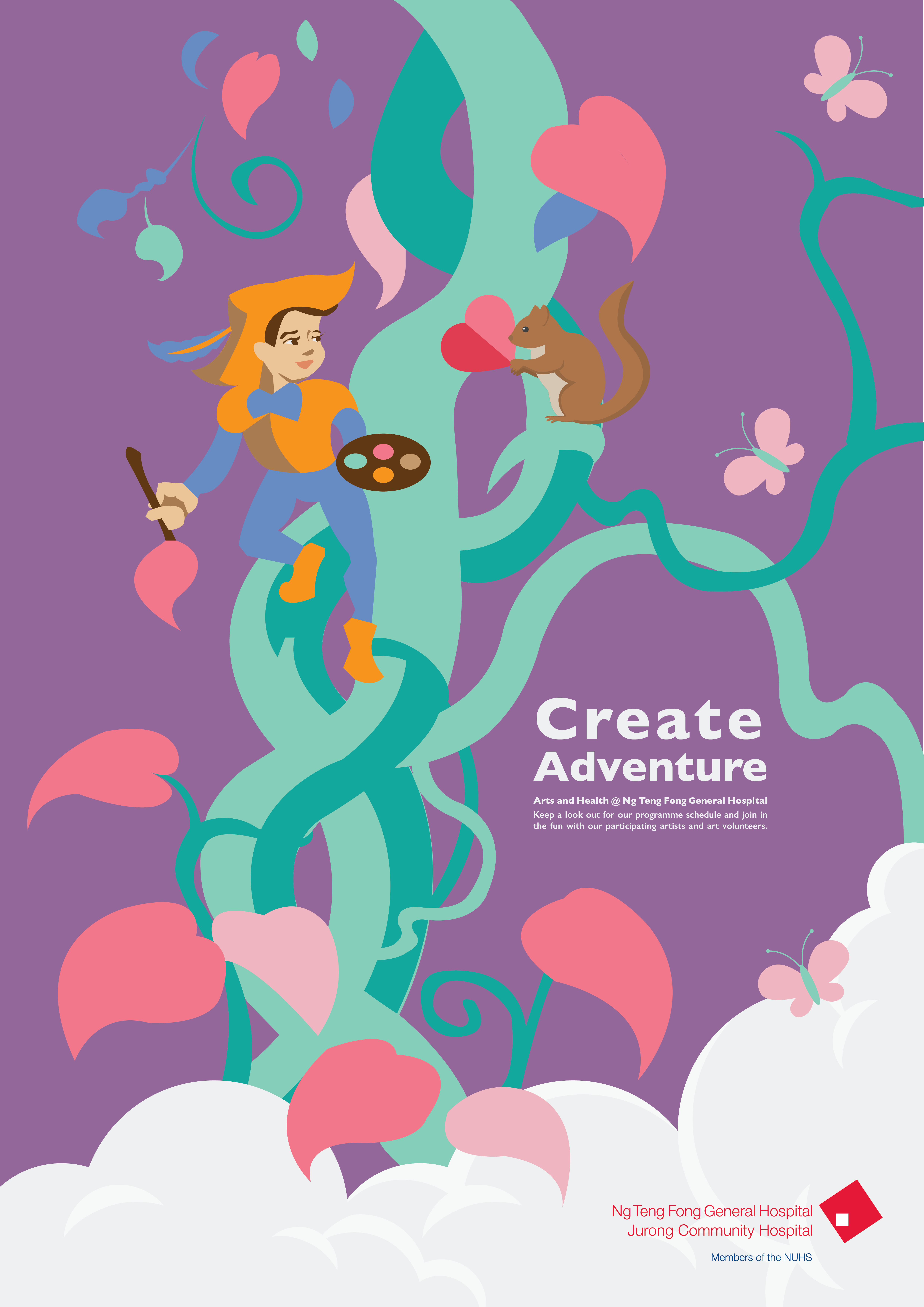
I added more branches laterally across the composition to integrate the text and the art. I chose Gill Sans as it was a san serif type, and was less rigid and formal than the other typefaces that I experimented with. I extended the clouds to the edges, with butterflies near the periphery of the poster. Overall, I think the composition is well balanced after a few rounds of editing. The text integrates well with the art and the overall feel of the poster is serene, yet with an element of excitement and unexpected fun.
Recent Comments