Category: Process

Zine: Bukit Merah exploration (II)

PIVOT

  • a pin, point, or short shaft on the end of which something rests and turns, or upon and about which something rotates or oscillates.
  • the end of a shaft or arbor, resting and turning in a bearing.
  • any thing or person on which something or someone functions or depends vitally.
  • the person in a line, as of troops on parade, whom the others use asa point about which to wheel or manoeuvre.
  • a whirling about on one foot.

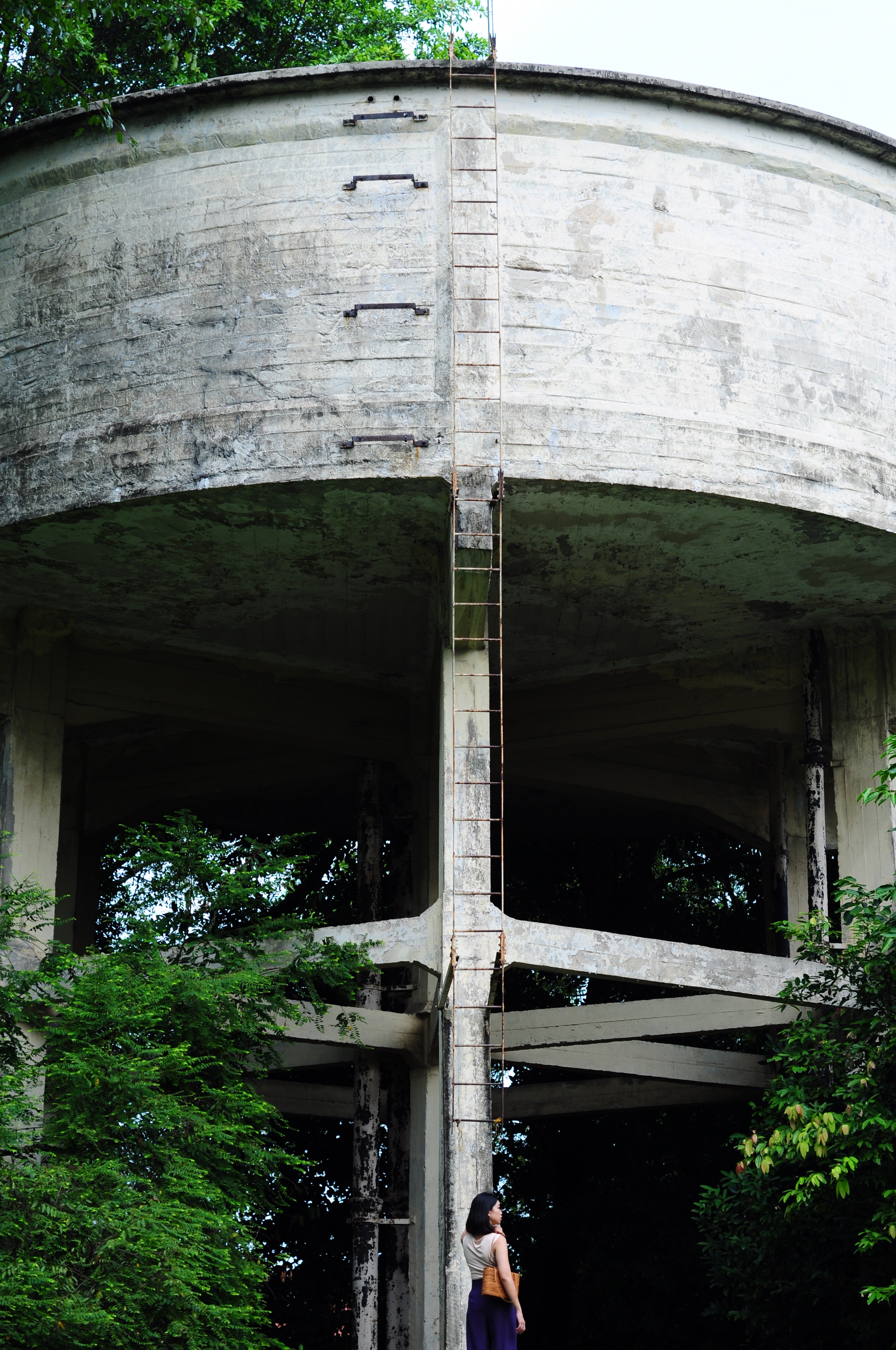
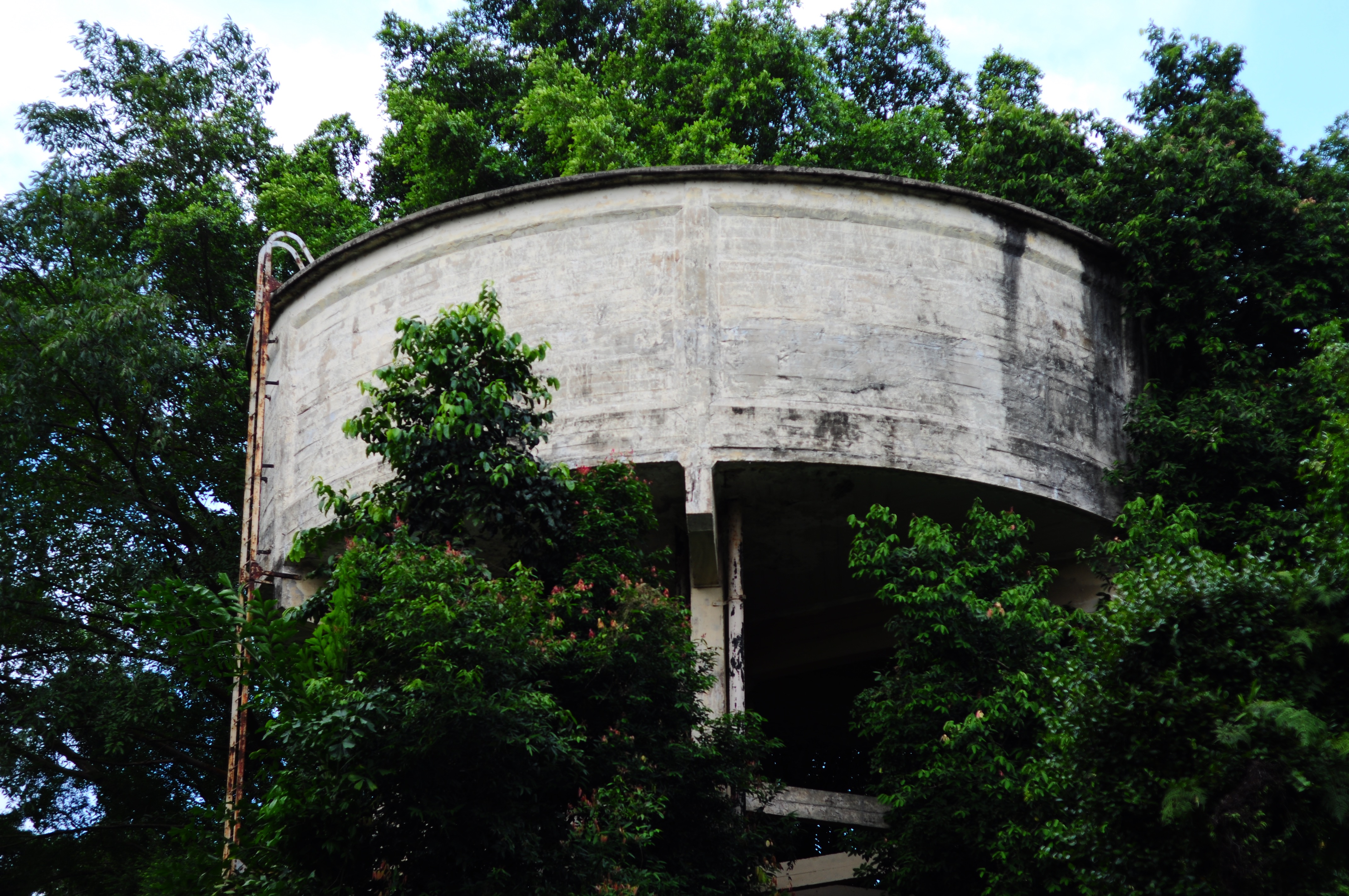
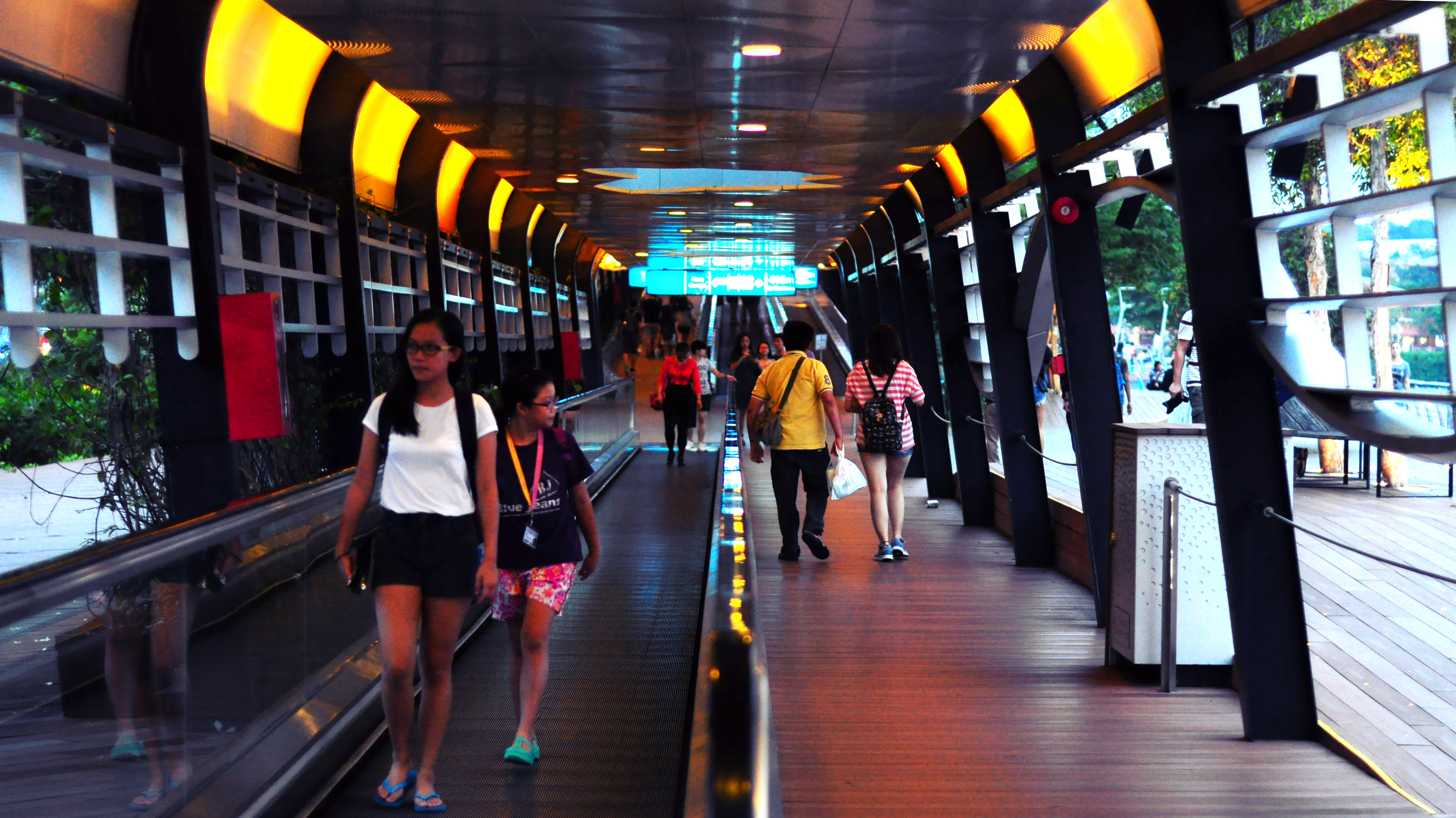
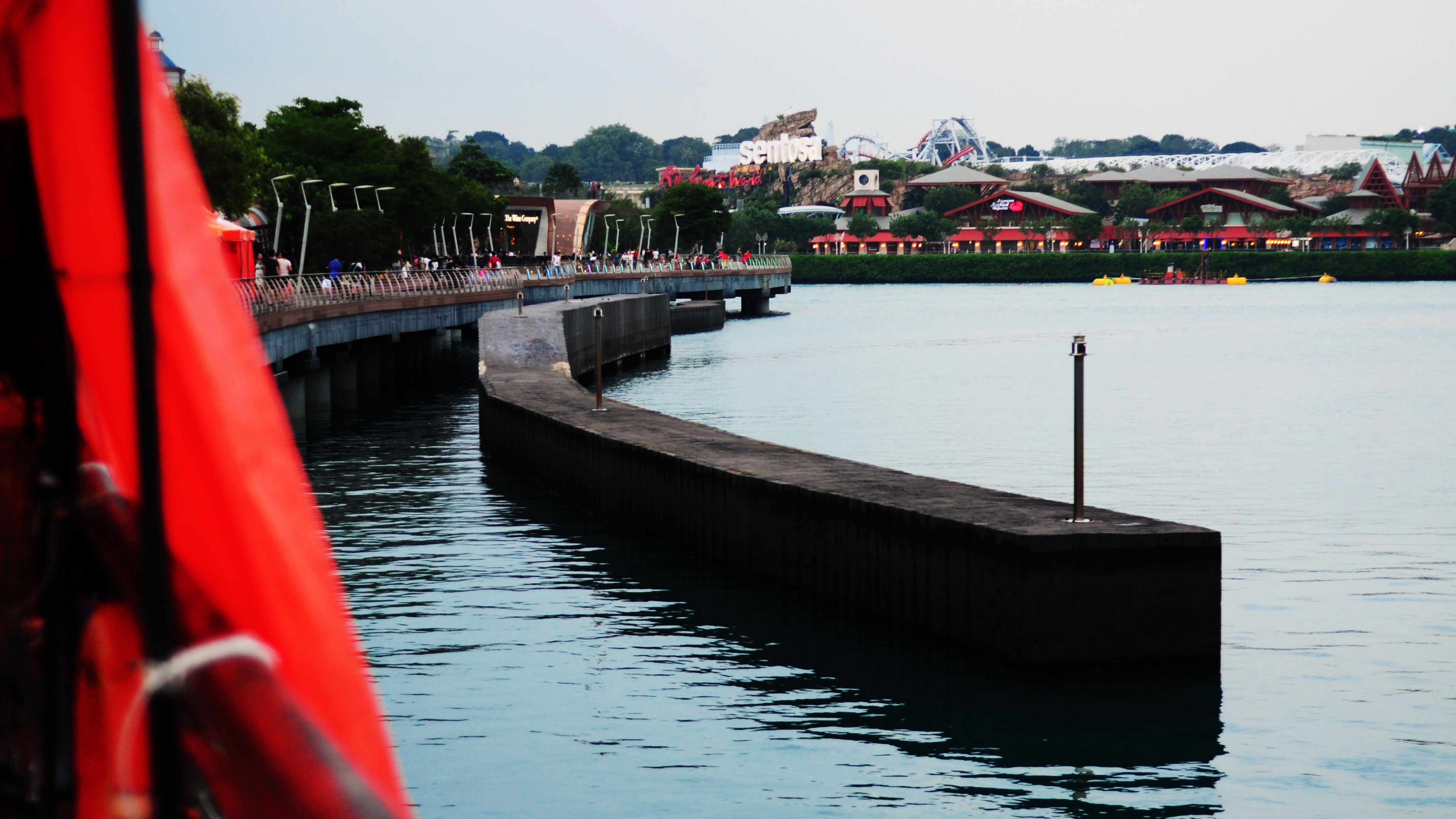
Pivoting is what I did after realising the initial concept of Wabi Sabi didn’t quite fit what I was trying to express. I went back to Bukit Merah, looking for the elusive mood and spirit to capture through my lenses.

I wanted something contrasting to the norm of the everyday life in Singapore; capturing an unseen side of the Red Hill. The recurring theme came to me as I as shooting.

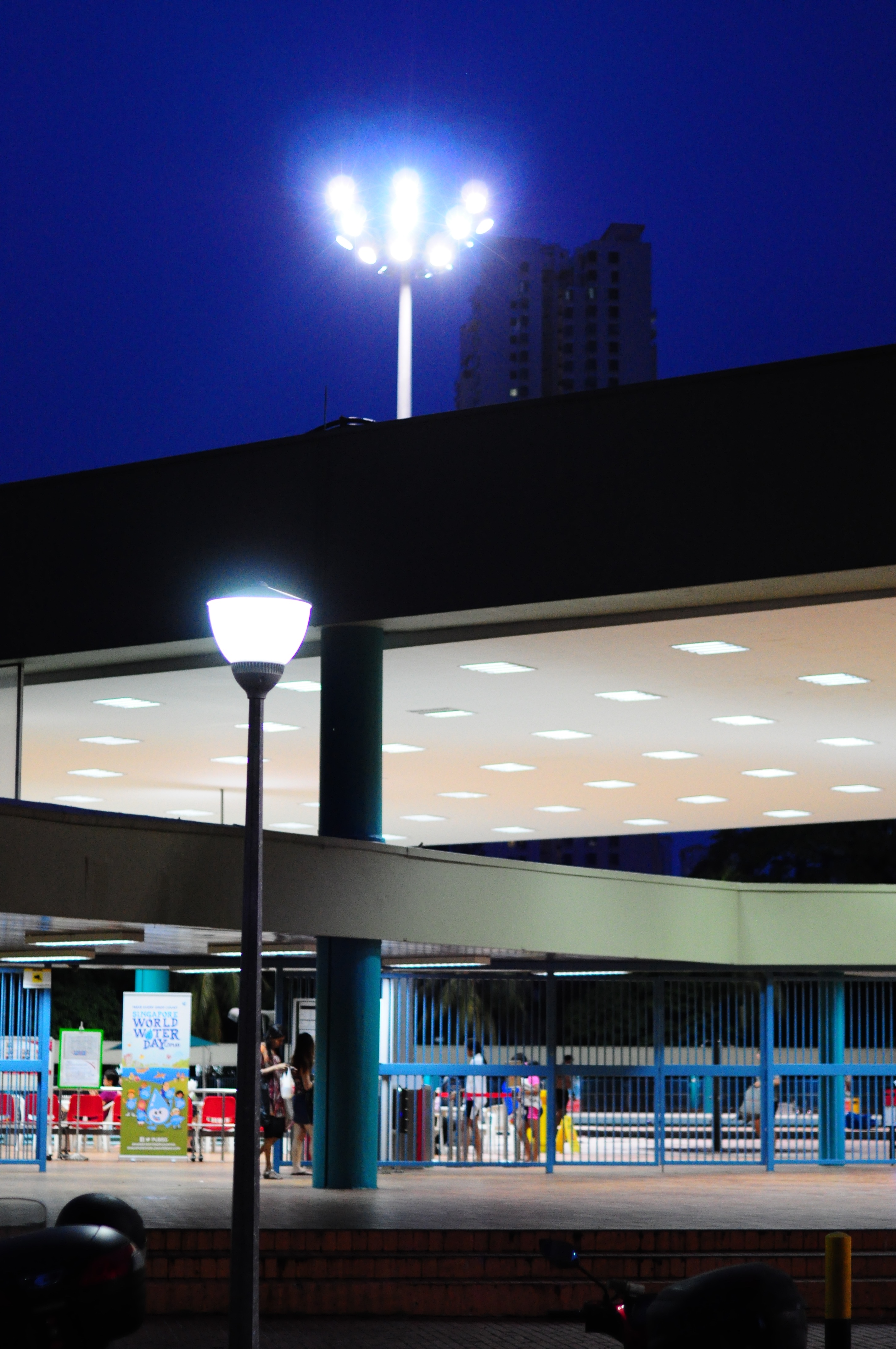
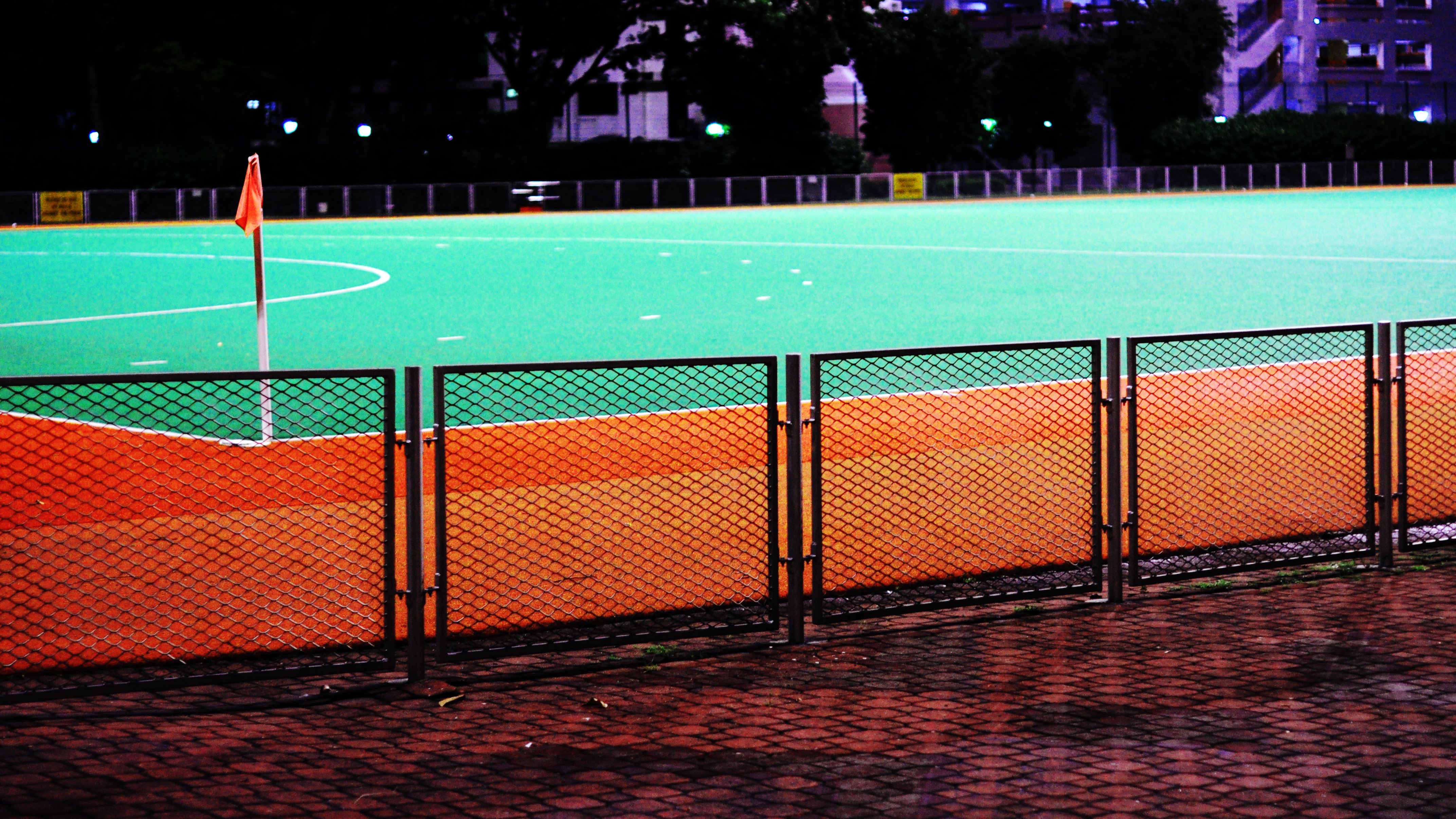
  1. Night photography brings out the character of the place, often revealing the places that might have looked nondescript in the day, but come to life at night. And I don’t just mean shady places. :/
  2. Zines are often straightforward in their message, going straight into content without much hesitation.
  3. Nothing seems as straightforward as color in photography as it brings out both character and contrast.

I set out believing there was more to Bukit Merah than its sterling sterility. I was not disappointed. Presenting to you Round 2 of Bukit Merah…

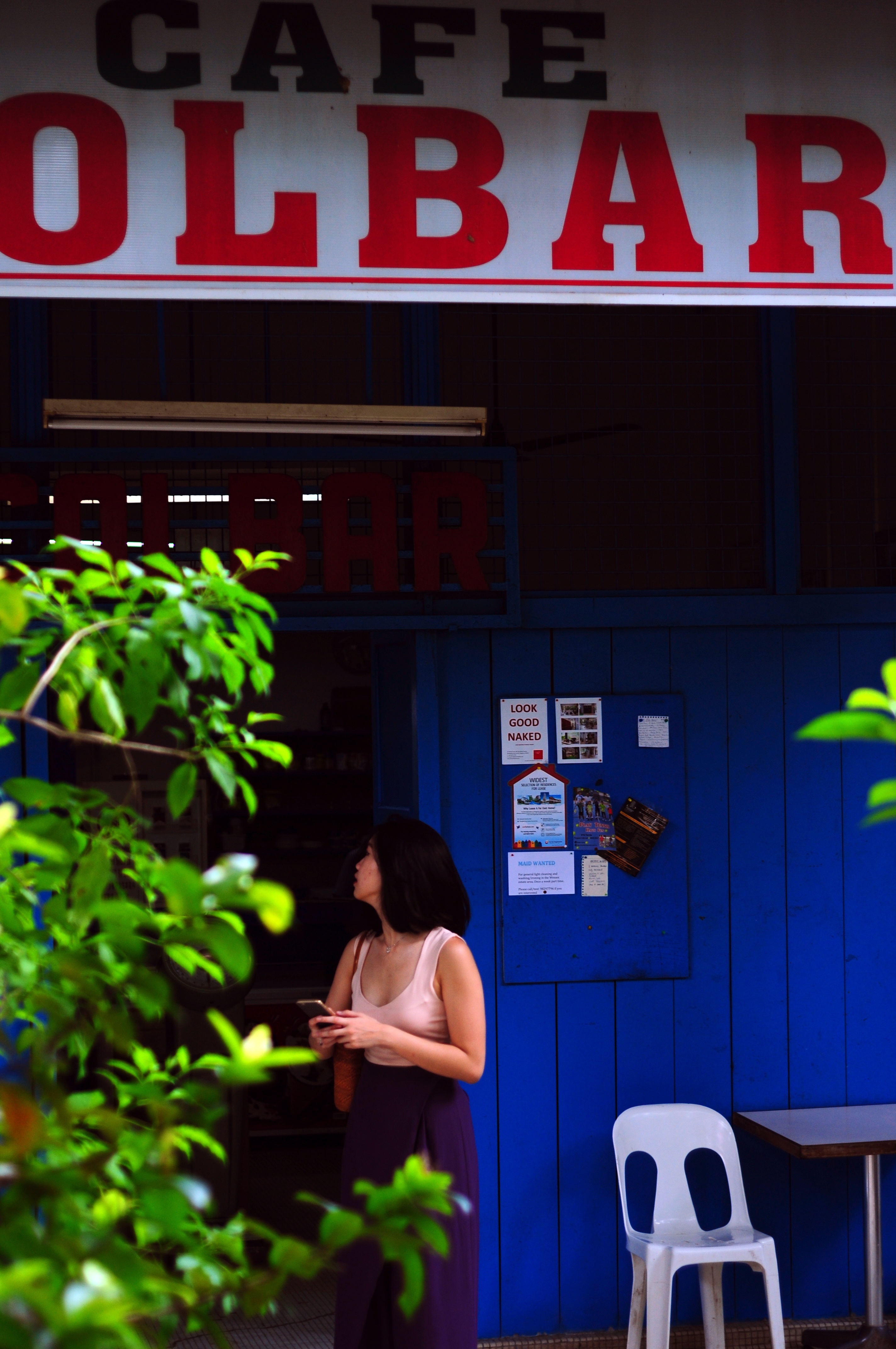
Taken outside a row of shophouse pubs at Tanjong Pagar, I love the neon flood that bathed the walls with an unearthly luminescence.

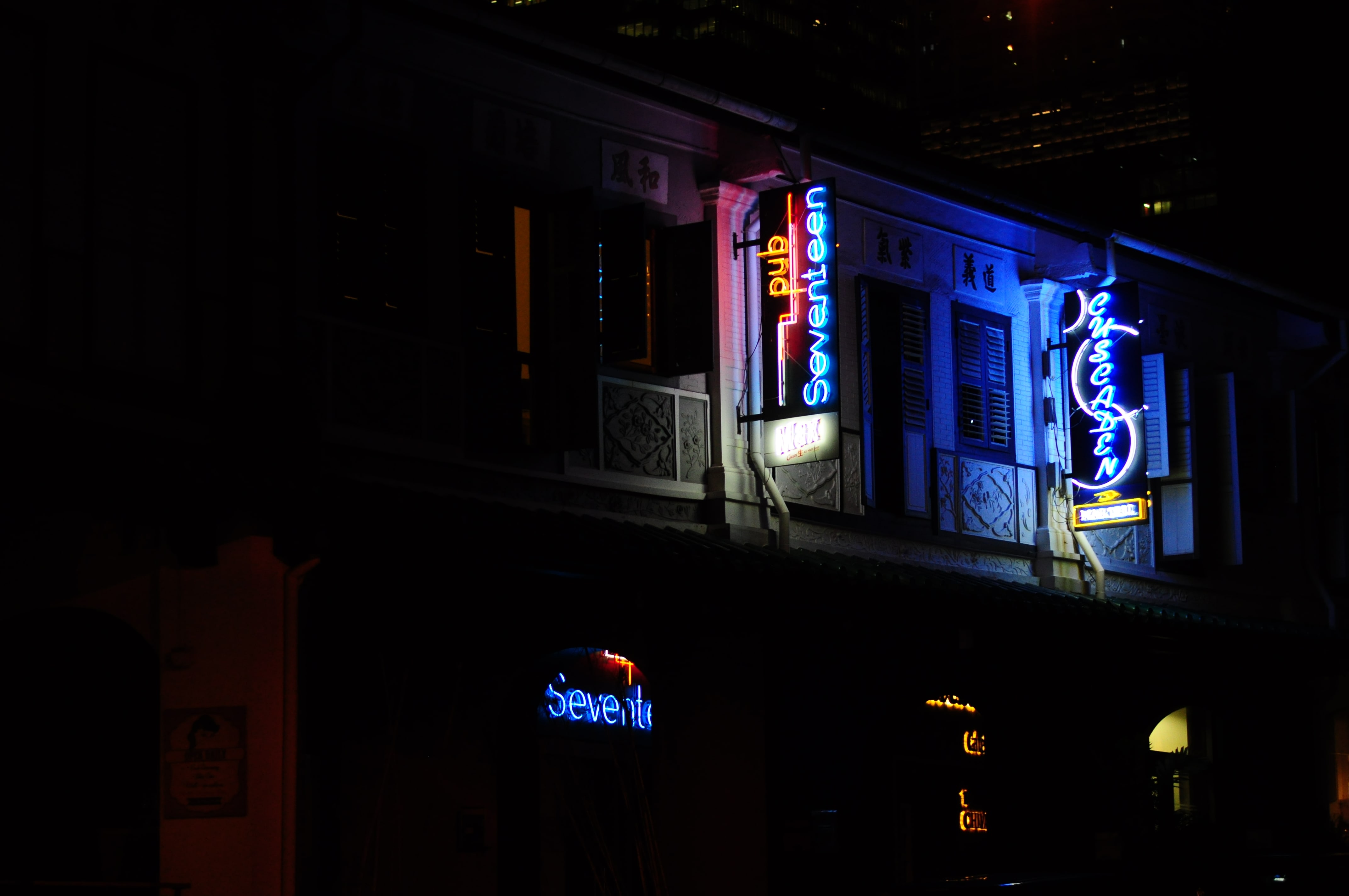
One of the aforementioned pubs was Billboard. Its blue hues caught my eyes immediately, and I waited for a car to pass before snapping the shot of the red and blue hues. Notice the man smoking at the bottom right corner? He adds focus to the picture, barely visible, but subtly drawing your eyes towards him.

A pity that there wasn’t enough detail in this photo, but if the lighting were a little brighter, I think it would have been a good picture.

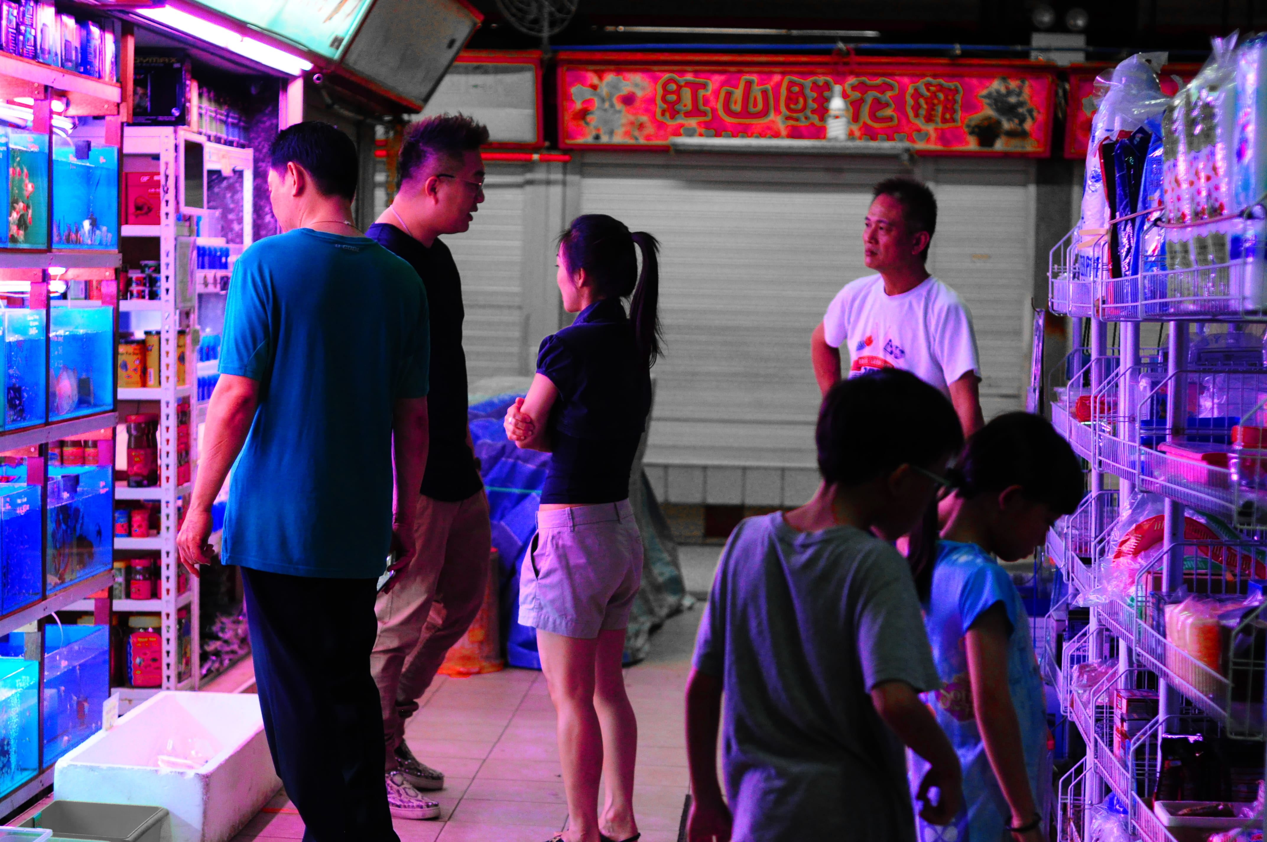
The flow of the composition appeals to me. While the 2 children on the bottom right are immersed in this pet fish shop’s exotic keeps, the adults are busy negotiating, haggling, hustling.

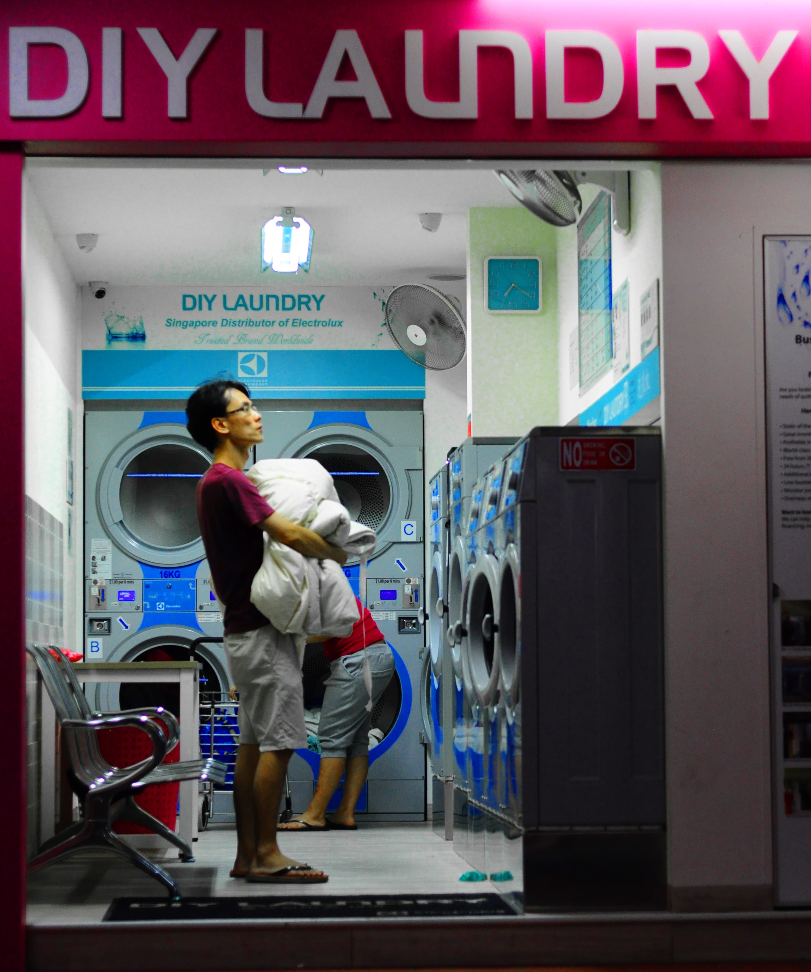
This man was looking rather forlornly at the machines. He inadvertently posed for me, so I took this melancholic picture.

This domestic worker was talking to her (presumably) family over a public phone. I always thought nobody used these phones anymore, and this sight fascinated me. Everybody’s trying to make it, including her, scrimping on money for a phone to mail cheques back home.

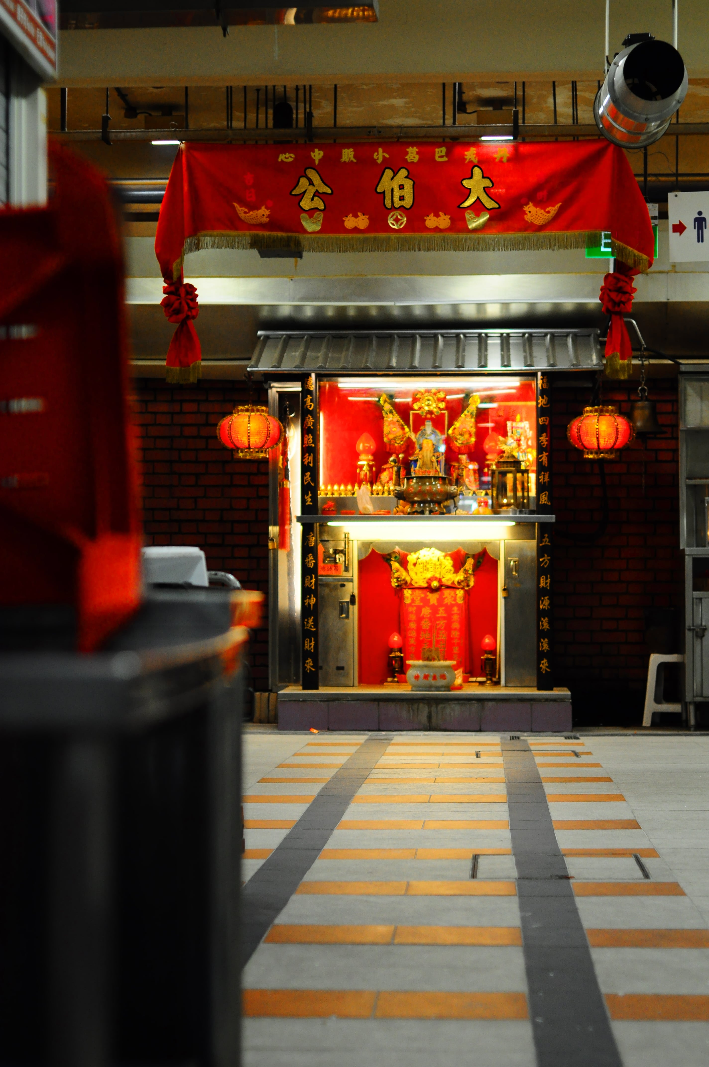
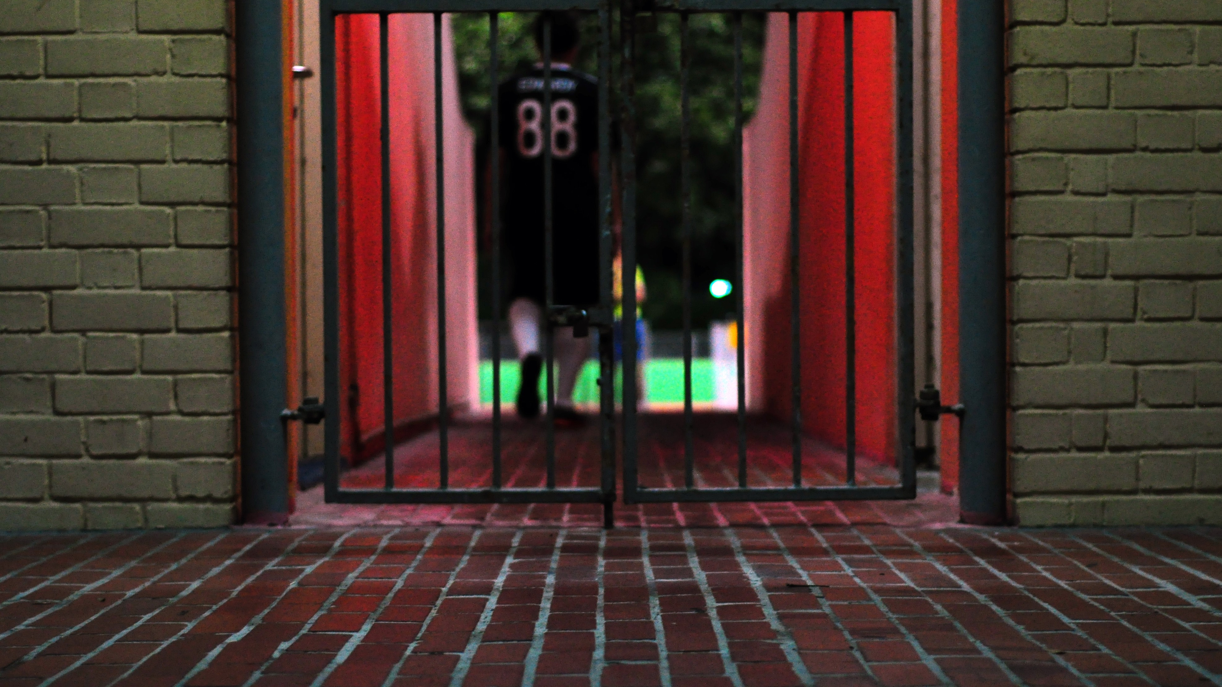
The bright reds of altars attracted me, so I decided to find and angle, shoot, and see what I got. Shoot first, think later.

Shoot first, think later culminated in this picture. Ambiguous enough to be mysterious, contrasting enough to be engaging.

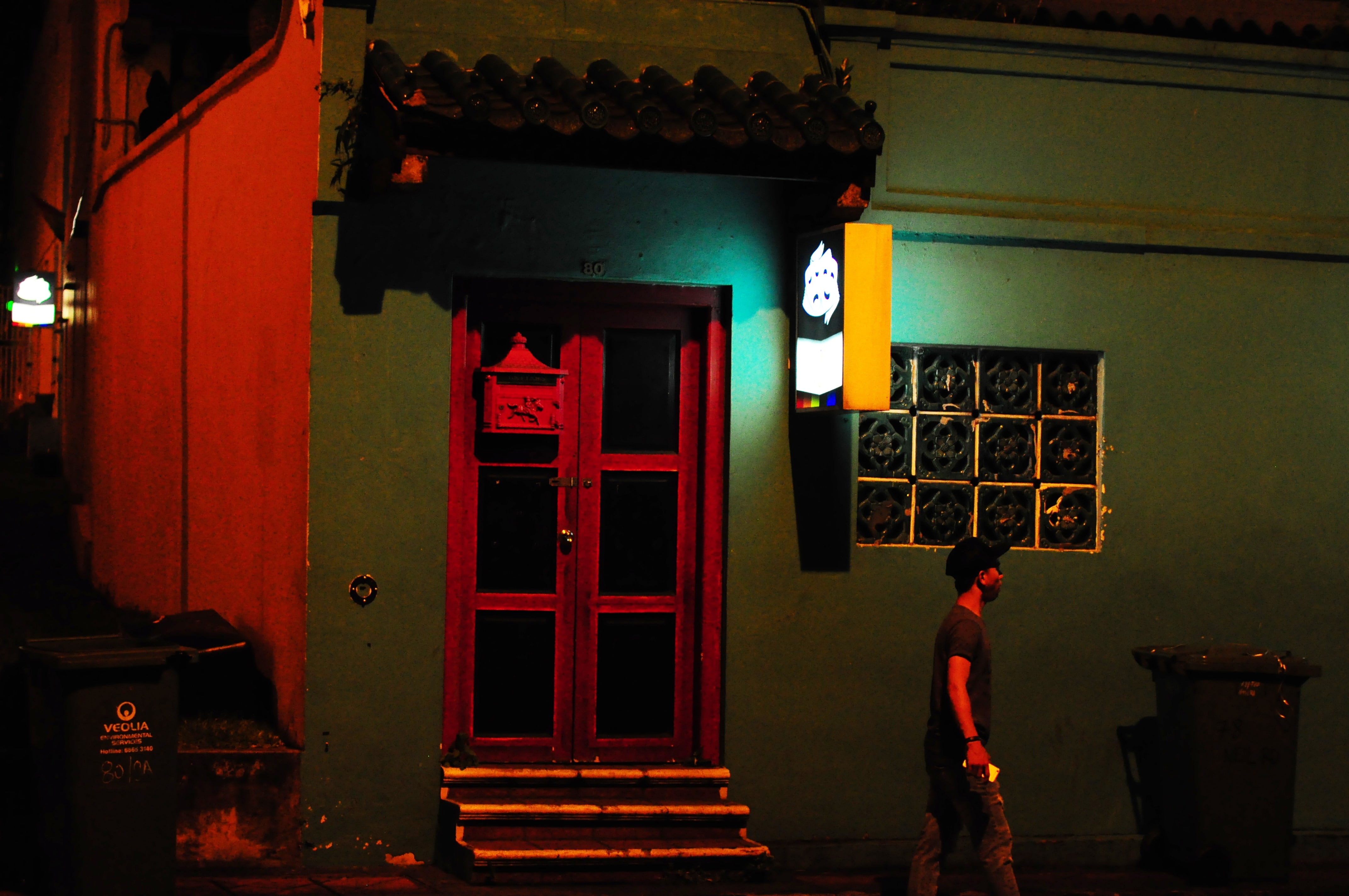
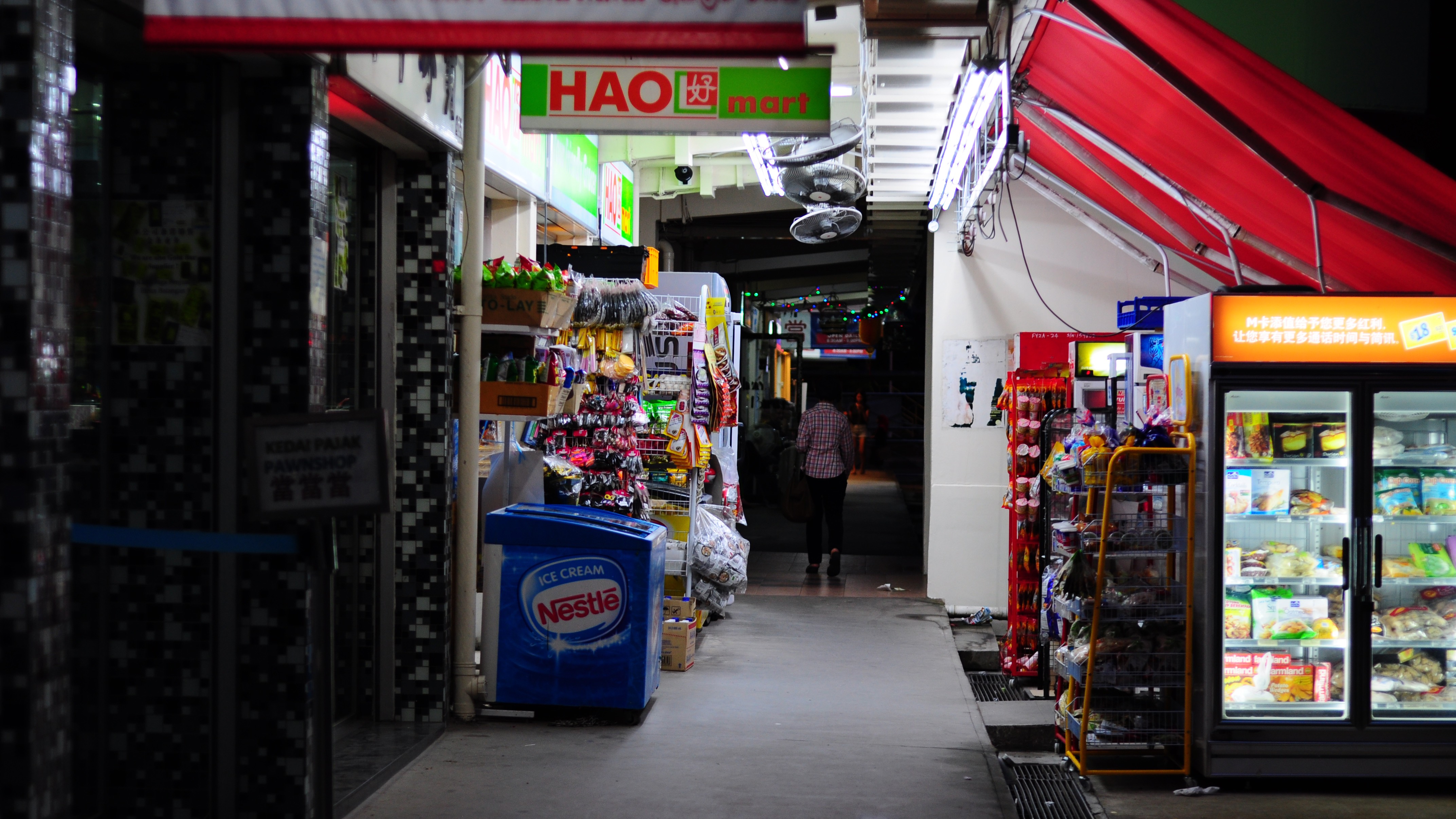
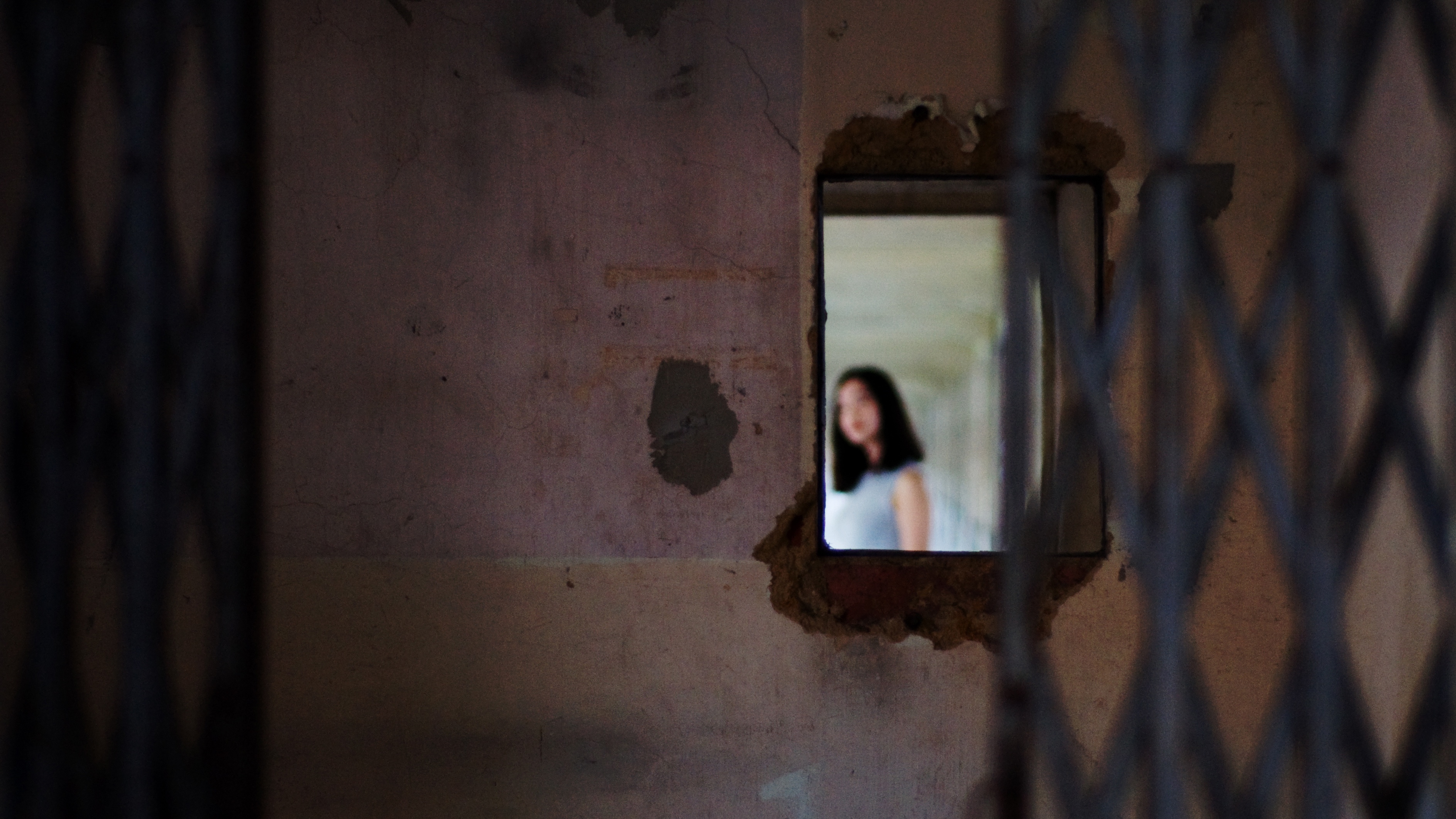
Further down the road, the shady alleys dominated the landscape. No light? No problem, just look for neon signs and the familiar hues of back alleys…

Vibes: “What makes a good man?” – The Heavy.

Gritty, groovy, guttural tones; the music elegantly sums out what I’m trying to capture: the gritty gut of Bukit Merah.

PIVOT

Zine: Research on wabi sabi

“Western beauty is radiance, majesty, grandness and broadness. In comparison, Eastern beauty is desolateness. Humility. Hidden beauty.” So says kendo sensei Shozo Kato in a video by The Avant/Garde Diaries. “Desolateness” is used in the subtitles when the Japanese Kato actually uses is wabi-sabi  び.

In his book, Wabi-Sabi for Artists, Designers, Poets & Philosophers, Leonard Koren describes it as occupying “roughly the same position in the Japanese pantheon of aesthetic [that is, the philosophy of beauty] values as do the Greek ideals of beauty and perfection in the West.”

Originally, wabi’s main feeling was of loneliness. The Japanese have a knack for thinking up words that describe specific feelings, and this is one of them.

Sabi , on the other hand, is a bit simpler, It has been described as “chill,” “lean,” or “withered.”

“An active aesthetical appreciation of poverty … To be satisfied with a little hut, a room of two or three tatami mats, like the log cabin of Thoreau, and with a dish of vegetables picked in the neighboring fields, and perhaps to be listening to the pattering of a gentle spring rainfall.”

D. T. Suzuki

More than anything he stresses this philosophy is a deliberate choice. The samurai and wealthy merchants had the option to drape gold over everything (sometimes literally). But they chose to use simple tools and architecture instead.

R E S T R A I N T .

We can link it to the “Three Marks of Existence,” or sanbōin 三法印さんぼういん that are described in Buddhist teaching.

Roughly, they describe how all things have impermanence (mujō 無常むじょう), suffering (ku ), and emptiness, or absence of self ( くう). Buddhism tells us wisdom comes from making peace with these marks, as they are intrinsic to our natures, and wabi-sabi can be seen as a way of practicing this peace and acceptance.

  • Impermanence has probably the clearest link: one embraces the wear, tear, and sometimes damage that comes with age. One accepts an object will change as they use it.
  • Suffering too can be linked to damage, again in the acceptance that wear and damage is possible and likely as part of normal life.
  • Absence of self is the hardest, but I would argue we can find this in the appreciation of objects as a process or state, moving either from or towards nothingness.

Source: https://www.tofugu.com/japan/wabi-sabi/

Zine: Ideas and inspirations

For our zine project, I took inspiration from zines in terms of both layout and style. Here are some of the resource material that might come in useful later in the project.

Love the grunge texture and punk look of this zine — almost reminiscent of a woodblock print.

Simple and clean illustration for the cover page of a zine, with a contrasting and engaging color combination (red and black). Typography and art complement each other, forming a dynamic whole.

Greyscale cartoon illustration, with black outlines and simplistic forms, create a fun and edgy look.

I particularly like the diagonals used in this Japanese zine, i.e. the title banner, sub-heading and posture of the robot. The black, orange and yellow palette also add interest.

A zine that is parodying the concept of “models” in a superficial world. Simple azure blue background and the black and white halftone image feels like a Warhol silkscreen print; a Pop-art feel aimed at social commentary.

Symmetry across a centrefold is a fun way to portray the art concept. The color scheme also harken back to the early age of television — telecolor.

Celebrating Process: illustration as a practice that resonates with zine making

  • explore mixed media?

Simple Japanese styled illustrations can perhaps convey the idea of wabi sabo better?

Editorial illustrations focus on complementing the article with the appropriate artwork.

Zine: Bukit Merah exploration (I)

The term Bukit Merah is literally translated to mean ‘red hill’ in Malay. The name originated from the hilly Malay kampung (village) made of red soil. The red-orange tinge is actually due to the presence of lateritic soils in the area, which when exposed without vegetation, makes a striking impression of a ‘blood soaked’ landscape.

There are a number of historic sites in this zone. Keppel Harbour dates back to the 14th century when it was known as Lung-Ya-Men, or Dragon Teeth Gate. Mount Faber was once known as Telok Blangah Hill. Its name was changed to Mount Faber after Captain Edward Faber cut the road up to the top in 1845 to set up a signal station. The Singapore General Hospital site dates back to 1882. Labrador Nature Park was used as a defence outpost in the 19th century until World War II.

There are nine sub-zones in Bukit Merah; Maritime Square, Bukit Merah, Redhill, Singapore General Hospital, Alexandra Hill, Henderson Hill, Bukit Ho Swee, Kampong Tiong Bahru, Depot Road, Telok Blangah Drive, Telok Blangah Way, Telok Blangah Rise, Everton Park and Tanjong Pagar.

I started off my journey into Bukit Timah with Redhill.

This is the corridor leading into a row of shops in an HDB estate minutes away from the MRT station.

This is Delta Sports Complex, best known to me for its hockey pitch. I spent a good two years here, up until the A Division Hockey Finals where VJC managed to clinch our championship. Good times.

I remember standing in the dugout before every match, anticipation mixed with adrenaline.


Next on the journey was Tanjong Pagar railway station.

I managed to get beautiful shots there as it was golden hour, and a wild streak of light struck the abandoned railway station, so there I stood, at crossroads, wondering where the winds would take me next…

I also took a shot of my girlfriend from one of the tollbooths that were left derelict. It has a rustic yet aesthetic feel,  recalling memories from years long forgotten.


After that, it was Keppel bay / Keppel harbour.

I rented a small boat for us to make our way around, looking for specific shots that could be interesting.

Unfortunately, once we were past the harbour, there was not much to see of Bukit Merah except for the huge cranes needed for loading / unloading maritime cargo. The vast sea and the smell of salt in your lungs were exceptional. 10/10 would get a yacht license in future.

Loved the night shots at Keppel harbour. Splendid lights, coupled with a clear night sky, gave me some of the best night shots I’ve done thus far. Was thinking of doing a long exposure light streak under the bridge but there was a security camera. Shag.

This is the night view. Impressionist Sundown? I think Monet would approve.


One of the last stops of the journey — Depot Road and its famous water tank and Colbar Cafe.

The water tank is HUGE. Its vastness dwarves the space and houses dotted around it.

Appearing out of the foliage, it stands out as a relic of how water used to be collected in Singapore.

There we have it — Colbar Cafe. An old school cafe with an old school vibe. The interior of the cafe remained unchanged over decades, with a cement floor, wooden walls and simple tables and chairs, they harken back to a time long forgotten.


And the last stop for the journey — Vivocity and the boardwalk.

Attempting a street photography style, I wanted to depict the contrast between isolation and company, with a nice background at the back.

A cinematic shot of the railway leading towards Sentosa.

Depicting the everyday people who walk across to and from Sentosa.

Boardwalk aesthetics.

Mood: Reflective.

I need to select a genre to work with and cleave the rest aside. No room for sentimentality here. Its just making the right decision to fit the zine. At the moment, I’m still looking for an edginess to my theme, perhaps a slant in a particular way, but as of now, Wabi Sabi is what I have chosen; I’ll have to simplify photos even further, and find a way to incorporate illustration into editorials.

Theme of zine: Wabi Sabi, finding the aesthetics in the ordinary.

2D Y1S2 P1: Que Sera Sera (III)

My ideation made me come up with a few more occupations:

5. Bar Owner

6. Astronaut

Bar Owner
flamingo-hotel-las-vegas-neon-sign-light-car-neon-bulbs-signage-vintage-neon-signs-business-real

One of the places where I first drew inspiration from was the neon signs of a famous club in the Vegas Strip — The Flamingo. I have been fascinated from young about bars, clubs, parties and the razzmatazz of nightlife.

772ac127683721-563690f5bd6ab

I tried to draw inspiration from the Great Gatsby as well; it was a great time to be living in where people who beginning to experiment with their own freedom and the limits of their wealth. This created the Art Deco period earmarked by flamboyant designs with luxurious embellishments.

cabarettitle

I looked into Cabaret clubs and the iconography / typography, and they shared a similar flamboyance to the bars and clubs. I wanted to incorporate the neon lights of nightlife into my work, but I didn’t want my typographic art to be seen as too sleazy, so I decided against opting for too much embellishment at the risk of appearing obtuse.

nightclub-draft-1

This was one of the first designs I came up with. The colour was drawn from the pinkish hues of the neon signs. The font I used was Pacifico, which was a cursive font with a certain handwritten quality to it. I liked the fact that it made the typographic art a bit more personal, but the drawback was that it was “too much like a family restaurant”, according to one too many people.

screen-shot-2017-02-11-at-4-53-27-pm

Another example I looked at was Heineken’s typographic ads.

screen-shot-2017-02-11-at-4-53-04-pm

RISD’s exhibition poster made use of overlapping fonts, which I felt was quite neat but unnecessary if I applied it to my own work. Still, I could explore this idea if time allows.

screen-shot-2017-02-11-at-4-52-45-pm

I liked this installation approach to typography, with the background of the design bringing out the intensity of the lighting.

nightclub

I developed a brick wall background and made it really dark. On hindsight it might’ve been a bit too dark. Selecting a more purplish color for the “nightclub” font, I tried to exaggerate the lighting effect as much as possible, and complement the fullness of the cursive neon with the more rigorous, but still dynamic hollow signage of “Benny’s”. I also gave “nightclub” a bit of slant so that the design wouldn’t be too static.

Fonts:

DIN alternate condensed bold alternategothicnotwo

I liked the DIN alternate condensed because it was tight and compact. Neon signs are costly to maintain, so in order to make the sign realistic, real life considerations affected my selection of this clean and economic font.

Pacifico

pacifico_specimen

The cursive of Pacifico complemented well with the straight-edged DIN. It was lively and helped make the signage pop.

Astronaut

tumblr_m7bavrqlgk1qzt7h7o2_500

NASA, the quintessential place one would look to find inspiration for astronauts. Growing up, there was always a fascination with deep space, and when I was in my teens and a churchgoer I started to wonder if humans were the only ones that existed in this vast universe. I like NASA’s thick and smooth-edged font, almost mirroring the designs of the space shuttles it sends to space.

nasa-logo-ft2

 nasa_scan_tests_grid-copy

Form and function go hand in hand.

star-wars-1200x675

Star Wars also brought an added layer of curiosity, where inter-galactic conflict was possible and interplanetary travel was almost as easy as taking the bus. Along with the movies came a lot of iconography and typography which I drew from as inspiration. 452389950cb9847aed53a395a4ac61a6

This is one of the examples of typographic art I found, and the character is Darth Vader.

design-invisible-creature-05

I liked this poster a lot as it uses color simply and effectively. The poster is composed such that not much is seen except for red. And Mars is known as the red planet. The yellow is used to denote light and the shadow stark black. The shapes used to make up the rocket are also simple and hard-edged. The adherence to simplicity is what makes this poster stand out, and makes me want to create something like this for the typographic assignment.

screen-shot-2017-02-10-at-9-12-34-am

I also looked into the idea of constellation, whereby your name can be made up of many different letters scattered across the “universe”.

Unfortunately, quite a number of friends have used this concept for their assignments, which makes me a bit late to the party. 🙁

I’ll keep looking, and will work on new designs if better ideas come up.

2D Y1S2 P1: Que Sera Sera (II)

I’ll continue with occupations 3 and 4 on the list, but they are by no means definitive as I will continue to edit the occupations if I manage to come up with better concepts along the way.

Just a quick recap, here was the list from part one; I’ve made some changes after consultation.

  1. Software Programmer
  2. Bike Racer
  3. Jungle Explorer —> Mountaineer / rock climber (Jungle explorer may be too vague for the brief, and people may have many interpretations of what an explorer can and cannot do.)
  4. Cowboy

Mountaineer / Mountain Climber

skalolaz_1920x1200

Edmund Hillary and Tenzing Norgay, the duo who first ascended the treacherous slopes of Mount Everest and reached its peak, must have felt like immortals after living to tell the tale. A tale of exhilaration, sheer grit and victory over one’s limitations.

Even as I was fascinated with my father’s work and grew to be as competitive as he was, there was a part of me that always wanted to live life like an adventure. I would read of stories like Robinson Crusoe and wonder if I could lead a life that had no limitations one day.

Mount Everest, the highest peak in the world

In a way, I wondered if I could fulfill the competitive aspect of my personality with something thrilling. Nature was so vast and unexplored, and I wanted to be part of something bigger than myself.

2e37d4c3f5162c756e97e72580c0acdc

I researched on the typographic expressions for mountain climbing and managed to find some phenomenal work. On the right is an inspirational Christian poster with its very effective treatment of the typeface. The font used is clean, and the peaks of the letterforms like M, N and A correspond with the peaks of the mountains. There is uniformity in the composition and the overlapping forms create additional interest due to the law of enclosure (Gestalt).

screen-shot-2017-02-04-at-5-01-11-pm

I then looked towards playing with silhouettes and negative space, to see if I could draw inspiration from these areas.

acee4ae99b5acfb57dccf5010b8d212e

In the above picture, the clock draws the viewers’ focus towards the silhouette of the climber..

In the picture on the right, the play of figure/ground relationship form a meaningful concept of the typographic image.

 screen-shot-2017-02-04-at-6-01-38-pm

Another example of playing with figure-ground relationships.

mountaineer

3. Mountain climber

I made use of what I learnt in the book Typography Essentials and the material that I researched on to come up with the typographic image based on the figure / ground relationship.

Font: Impact 125b38f2-ca01-49c3-a6de-46e1e738cfe5image3

Impact has a thick body and shoulders, similar to the the shape of rock formations. It also melded well with the side of a rocky mountain edge. I could then combine the image and the font to form a silhouette of a mountain peak.

Cowboy

Adventure without limits is also a benefit of being a cowboy, and that drew me towards the Old West. The stoic, independent cowboy who just needed his horse and pistol. The dusty old towns inhabited with all kinds of queer people; from quacks selling fake medicine to the elderly to the bounty hunter who kills to put food on the table. The poker pubs in the centre of town. Five finger fillet behind the sheriff’s outpost. Heh, my kinda town.

red-dead-graphics

This is one of my favourite games ever — its called Red Dead Redemption 2, where you play as … yes, a cowboy. 

screen-shot-2017-02-04-at-6-53-18-pm

My research for this theme came from many sources, like films, games, and one of these included Old West posters. The rustic, dusty  mood is conveyed through the use of more earthly colours, e.g. ocher. The texture of the poster also seems like a wood carving, another feature of an Old West design.

screen-shot-2017-02-04-at-6-56-58-pmscreen-shot-2017-02-04-at-7-07-16-pm

A few other examples of Old West signages.

tumblr_m62izjwuwo1qe2w1uo1_500

01ac_cover_1_thumb_w_580 be45faa38a8b324390d308e2d1ff44c3

I have a few more ideas that I want to explore, so I’ll leave this open-ended for now as I explore other themes.