Category: My Work

Task 1A: Exploratory Research

Task 1A: Exploratory Research

  1. What are some of the current issues confronting our world today? Amongst them, what is of interest and a cause for concern to you?

Wealth Management

As Singapore grows into a global financial hub, there is a greater need for Singaporeans to put their money where money can grow. More often than not, foreigners that come to Singapore for work are also looking for solutions that can enhance their wealth. Wealth management firms are competing to provide the best end-to-end service for high net worth individuals to fund their next big purchase or retirement needs. These aforementioned services come in the form of asset management, tax planning, investment vehicles and insurance protection.

https://hubbis.com/article/choosing-the-right-wealth-management-firm

https://www.enterpriseinnovation.net/article/schroders-launches-beta-chatbot-asset-management-336775428

Animal Conservation

As the wealth of the Asian continent shows no signs of abating, steps should be taken to prevent rapacious hunting of wildlife for the sake of exotic collectibles or delicacies. With illegal animal parts being sold on the black market for high prices, it is no wonder that a lot of animals are facing extinction. With recent arrests of high profile kingpins in wildlife trafficking syndicates, this demonstrates governmental effort in tackling conservation at its core; demand and supply of illegal animals.

http://www.straitstimes.com/asia/thai-police-arrest-kingpin-in-asian-wildlife-trafficking

http://www.straitstimes.com/asia/se-asia/wildlife-smugglers-dump-300-rare-birds-into-water-to-escape-malaysian-authorities

Healthcare Coverage

Admired by countries around the world for her stellar healthcare system, Singapore is no stranger to healthcare. The tier system of hospital wards allow the population to be segmented according to affordability, and Medisave / Medishield provide sufficient healthcare for the average Singaporean. However, according to a recent study done by the Straits Times, Singaporeans are still generally under-insured.

https://www.nytimes.com/2017/10/02/upshot/what-makes-singapores-health-care-so-cheap.html

http://www.straitstimes.com/singapore/look-out-for-gaps-in-insurance-coverage

Ageing Population

The biggest issue facing Singapore would be an ageing population. Just like the other 4 Asian Tigers, Singapore has become an Ageing Tiger. With that comes cause for concern, as with population growth comes lower productivity. Although the minimum retirement age has been raised again to 67, there is a limit on the lifetime productivity and output per head.

http://www.businesstimes.com.sg/government-economy/singapores-ageing-population-a-ticking-time-bomb

https://www.todayonline.com/singapore/spores-gdp-capita-growth-faces-15-drag-every-year-until-2060-because-ageing-population

Out of the 4 current issues, I would combine the themes of wealth management and an ageing population to research on legacy planning.

  1. Why is the issue important? Who does it affect and how?

https://www.investopedia.com/terms/l/legacy-planning.asp

Definition:

Legacy planning is a financial strategy that prepares a person to bequeath his or her assets to a loved one or next of kin after death.

After a person passes away, his or her wealth and possessions are passed on to next of kin or to people or charities specified in a will. If you don’t have a plan in place for your estate, its management might go against your wishes once it is passed on. Legacy planning is especially important for those with small businesses or other assets that require maintenance.

https://www.cnbc.com/2018/01/19/more-retirees-have-saved-enough-heres-what-they-need-to-do-next.html

Reducing equity exposure:

Even as the stock markets are rallying, retirement money can be wiped out in the dicey game of equity investments. However, that doesn’t mean you have to sell something to buy something else. Rather than unloading a winner (and having to pay tax on those gains), use cash that’s sitting on the sidelines from dividends or earned interest to buy bonds or laddered CDs — or just plain leave it alone. Strategies like readjusting your asset allocation from a 70/30 stocks/bonds mix to enter retirement with a 50/50 split will help reduce risk exposure to your portfolio.

Multigenerational planning:

In the U.S. alone, $30 000 000 000 000 USD is about to be passed on from the baby boomers to their heirs. If not handled well, things like estate taxes and probate court fees can take up a lot of money and time. Across developed countries, tax planning and setting up trust funds are some of the ways money can be kept within the family for generations.

https://www.forbes.com/sites/danielscott1/2017/11/15/three-common-misconceptions-about-legacy-planning/#4a5a8183281e

  1. Who do you need to communicate to, and why?

The target audience will be based on 2 criteria: family nucleus and occupational income. For legacy planning to be effective, per capita income in the household should be more than $50 000. The ideal age range should be around 30-50, where couples would have started a family and have high earning capacity. They are likely to be either expats (Employment Pass holders) or Singaporeans in the STEM professions. Business owners and entrepreneurs are also included in this segment.

The needs of this demographic would be to look for legacy planning solutions for wealth preservation and transfer. As most of them would not have the knowledge or expertise to carry out tax planning, estate planning and setting a trust on their own, independent brokerage services can be offered to them to facilitate an end-to-end solution for their financial needs.

  1. How has visual communication contributed to address the cause?

The infographic designed by Search3W is clear, instructive and formatted in a logical way. They chose to use an infographic because there is a lot of technical detail required in constructing a savings and investment retirement portfolio.

https://www.business2community.com/infographics/personal-guide-savings-investment-retirement-0715450

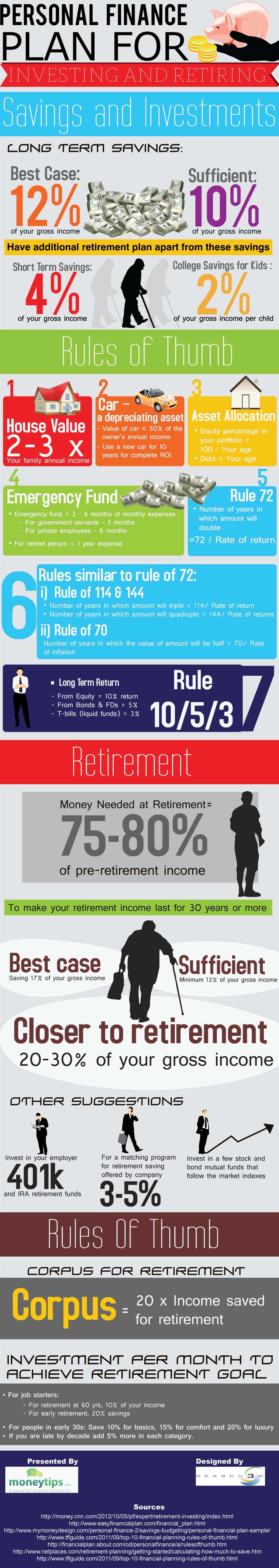
I like how the design firm used the concept of percentages to explain asset allocation. They also included appropriate graphics so that it would be easier to remember the detail. Included are also certain principles one should follow in order to get the optimal savings needed for certain goals: i.e. car, children’s education fund. I like the font as it is friendly and engaging, the colours also appeal as they are bright and flashy. In terms of clarity I can see where they put emphasis in e.g. Money needed at retirement: 75-80% of pre-retirement income.

http://www.businessinsider.com/heres-40-stock-market-terms-that-every-beginner-should-know-2017-2/?IR=T

The other infographic by Visual Capitalist lists down the key terminology used in stock trading. They succeeded in making the terms look less daunting and more accessible to the everyday man. I like the composition of the infographic, where they package each term and give it a little “story” and illustration to accompany the story. The colour and font is also bright, easily legible and friendly. There is also a colour pattern in terms of the trading card arrangement.

I couldn’t find the source for this poster by Kararfarin Advertising, but the concept is poignant and delivers a punch with simplicity. The analogy of saving / preparing for a rainy day is never better demonstrated than here.

Zine: Ideas and inspirations

For our zine project, I took inspiration from zines in terms of both layout and style. Here are some of the resource material that might come in useful later in the project.

Love the grunge texture and punk look of this zine — almost reminiscent of a woodblock print.

Simple and clean illustration for the cover page of a zine, with a contrasting and engaging color combination (red and black). Typography and art complement each other, forming a dynamic whole.

Greyscale cartoon illustration, with black outlines and simplistic forms, create a fun and edgy look.

I particularly like the diagonals used in this Japanese zine, i.e. the title banner, sub-heading and posture of the robot. The black, orange and yellow palette also add interest.

A zine that is parodying the concept of “models” in a superficial world. Simple azure blue background and the black and white halftone image feels like a Warhol silkscreen print; a Pop-art feel aimed at social commentary.

Symmetry across a centrefold is a fun way to portray the art concept. The color scheme also harken back to the early age of television — telecolor.

Celebrating Process: illustration as a practice that resonates with zine making

  • explore mixed media?

Simple Japanese styled illustrations can perhaps convey the idea of wabi sabo better?

Editorial illustrations focus on complementing the article with the appropriate artwork.

Zine: Bukit Merah exploration (I)

The term Bukit Merah is literally translated to mean ‘red hill’ in Malay. The name originated from the hilly Malay kampung (village) made of red soil. The red-orange tinge is actually due to the presence of lateritic soils in the area, which when exposed without vegetation, makes a striking impression of a ‘blood soaked’ landscape.

There are a number of historic sites in this zone. Keppel Harbour dates back to the 14th century when it was known as Lung-Ya-Men, or Dragon Teeth Gate. Mount Faber was once known as Telok Blangah Hill. Its name was changed to Mount Faber after Captain Edward Faber cut the road up to the top in 1845 to set up a signal station. The Singapore General Hospital site dates back to 1882. Labrador Nature Park was used as a defence outpost in the 19th century until World War II.

There are nine sub-zones in Bukit Merah; Maritime Square, Bukit Merah, Redhill, Singapore General Hospital, Alexandra Hill, Henderson Hill, Bukit Ho Swee, Kampong Tiong Bahru, Depot Road, Telok Blangah Drive, Telok Blangah Way, Telok Blangah Rise, Everton Park and Tanjong Pagar.

I started off my journey into Bukit Timah with Redhill.

This is the corridor leading into a row of shops in an HDB estate minutes away from the MRT station.

This is Delta Sports Complex, best known to me for its hockey pitch. I spent a good two years here, up until the A Division Hockey Finals where VJC managed to clinch our championship. Good times.

I remember standing in the dugout before every match, anticipation mixed with adrenaline.


Next on the journey was Tanjong Pagar railway station.

I managed to get beautiful shots there as it was golden hour, and a wild streak of light struck the abandoned railway station, so there I stood, at crossroads, wondering where the winds would take me next…

I also took a shot of my girlfriend from one of the tollbooths that were left derelict. It has a rustic yet aesthetic feel,  recalling memories from years long forgotten.


After that, it was Keppel bay / Keppel harbour.

I rented a small boat for us to make our way around, looking for specific shots that could be interesting.

Unfortunately, once we were past the harbour, there was not much to see of Bukit Merah except for the huge cranes needed for loading / unloading maritime cargo. The vast sea and the smell of salt in your lungs were exceptional. 10/10 would get a yacht license in future.

Loved the night shots at Keppel harbour. Splendid lights, coupled with a clear night sky, gave me some of the best night shots I’ve done thus far. Was thinking of doing a long exposure light streak under the bridge but there was a security camera. Shag.

This is the night view. Impressionist Sundown? I think Monet would approve.


One of the last stops of the journey — Depot Road and its famous water tank and Colbar Cafe.

The water tank is HUGE. Its vastness dwarves the space and houses dotted around it.

Appearing out of the foliage, it stands out as a relic of how water used to be collected in Singapore.

There we have it — Colbar Cafe. An old school cafe with an old school vibe. The interior of the cafe remained unchanged over decades, with a cement floor, wooden walls and simple tables and chairs, they harken back to a time long forgotten.


And the last stop for the journey — Vivocity and the boardwalk.

Attempting a street photography style, I wanted to depict the contrast between isolation and company, with a nice background at the back.

A cinematic shot of the railway leading towards Sentosa.

Depicting the everyday people who walk across to and from Sentosa.

Boardwalk aesthetics.

Mood: Reflective.

I need to select a genre to work with and cleave the rest aside. No room for sentimentality here. Its just making the right decision to fit the zine. At the moment, I’m still looking for an edginess to my theme, perhaps a slant in a particular way, but as of now, Wabi Sabi is what I have chosen; I’ll have to simplify photos even further, and find a way to incorporate illustration into editorials.

Theme of zine: Wabi Sabi, finding the aesthetics in the ordinary.

Fan Fiction: Architecture


Your head seems a little heavy while driving towards the crime scene. The thoughts of your father fuzzily weigh down upon you, imperiously pushing you forward, motivating you to solve the crime before you have to refresh yourself once again. The neon lights of the red light district come into view as your make a turn into Geylang Road. The streets may have been refurbished, but sleaze stays where it wants.

146259877

You silently lament the prevalence and even growth of the sleaze trade in Singapore. In order to stabilize our declining birth rate, Singapore had to adopt an open door policy to immigration, and some doors that were opened were not as ideal as one expected. Rising crime rates have strained police resources, and a sprawling sex trade was among the chief causes of a nation struggling with crime in the mid 21st Century.


Exotic Live Acts. Broadway in Singapore. Cabaret themed nightclubs. Massage parlours. Their neon hues are reflected onto your electric Nissan, glowing in an unholy luminescence. You can only imagine what goes on inside those establishments. The traffic light changes to green, and the silent humming of the electric cars almost feel like the silent but pervasive nightlife.


“Isabelle, we are nearing your destination. Making a left turn into Lorong 18,” your friendly VR avatar guides your car into the alley of the crime scene. “Good luck for your investigations, hopefully you’ll find something today.”

rld-alley

You step out into the hellish glow of neon. The body was found just in front of an infamous brothel, so you decide to enter to interview and canvass for any possible witnesses.


The brothel you enter has the smell of cigarettes, coupled with the sickly sweet smell of cheap perfume, gives a heady euphoria to any curious or seasoned visitor. The hookers are seated in a large couch on the right. The girls see you coming in and shush themselves into silence, eyeing at you suspiciously. The pimp looks up from the front counter, nods and stands up to greet you. He looks to be in his late forties, his greyish hair slicked back, wearing a cheap Giordano collared shirt with the collars turned up and khaki slacks. His skin hangs loosely from his gaunt frame.


“Good evening officer, what can I do for you?” The pimp grins, showing a row of teeth marred by decades of smoking illegal substances and a few gold implants.


“Evening, I would like to ask you a few questions regarding the murder that took place a few days ago.”


The pimp’s expression changes from patronizingly servile to coldly indignant. Spot for micro-expressions, you remind yourself. “I don’t know anything about her. She wasn’t even one of my girls.”


“What’s your name?”


“You can call me Peng.”


“Peng, do you know what happens when you don’t disclose information to a police officer?”


“I already told you, I don’t know anyth—“


“It’s called an obstruction of justice, and I can have you arrested for interfering with my investigation.”


“Eh, okay. Okay. Relax ma’am. You tell me what you want to know.”


“How did you know the victim?”


“She did work in this house from time to time, but she was never officially in our books.”


“Why did you lie when I asked you the first time?” You start to tighten your questioning.


“Aiya, because I was afraid of getting into trouble for not registering her in our books. But she had no place to stay, so I took pity on her and decided to give her a place to eat and sleep. Who knew I would be so suay, kena this kind of unnecessary bad luck.”


“Do you know anybody whom she was close to, or was sleeping with on a regular basis?”


The pimp ponders, looking up at the bare ceiling. “Come to think of it yes. There were quite a few times when she would visit this KTV pub across the street, instead of working to pay her dues.” He ushers you to the entrance of the brothel where he gesticulates to the KTV named < China Dollies >.


< Saved in iCloud. >


“She will always go until very late, maybe even returning in the morning. The other girls started to dislike her because she never helps them with the chores.”


“Did she tell you what she did there?”


“Not much, except she had a “VIP customer” who was the pub owner.”


<connecting the dots…>


Okay. Time to pay this pub owner a visit.

2D Y1S2 P1: Que Sera Sera (III)

My ideation made me come up with a few more occupations:

5. Bar Owner

6. Astronaut

Bar Owner
flamingo-hotel-las-vegas-neon-sign-light-car-neon-bulbs-signage-vintage-neon-signs-business-real

One of the places where I first drew inspiration from was the neon signs of a famous club in the Vegas Strip — The Flamingo. I have been fascinated from young about bars, clubs, parties and the razzmatazz of nightlife.

772ac127683721-563690f5bd6ab

I tried to draw inspiration from the Great Gatsby as well; it was a great time to be living in where people who beginning to experiment with their own freedom and the limits of their wealth. This created the Art Deco period earmarked by flamboyant designs with luxurious embellishments.

cabarettitle

I looked into Cabaret clubs and the iconography / typography, and they shared a similar flamboyance to the bars and clubs. I wanted to incorporate the neon lights of nightlife into my work, but I didn’t want my typographic art to be seen as too sleazy, so I decided against opting for too much embellishment at the risk of appearing obtuse.

nightclub-draft-1

This was one of the first designs I came up with. The colour was drawn from the pinkish hues of the neon signs. The font I used was Pacifico, which was a cursive font with a certain handwritten quality to it. I liked the fact that it made the typographic art a bit more personal, but the drawback was that it was “too much like a family restaurant”, according to one too many people.

screen-shot-2017-02-11-at-4-53-27-pm

Another example I looked at was Heineken’s typographic ads.

screen-shot-2017-02-11-at-4-53-04-pm

RISD’s exhibition poster made use of overlapping fonts, which I felt was quite neat but unnecessary if I applied it to my own work. Still, I could explore this idea if time allows.

screen-shot-2017-02-11-at-4-52-45-pm

I liked this installation approach to typography, with the background of the design bringing out the intensity of the lighting.

nightclub

I developed a brick wall background and made it really dark. On hindsight it might’ve been a bit too dark. Selecting a more purplish color for the “nightclub” font, I tried to exaggerate the lighting effect as much as possible, and complement the fullness of the cursive neon with the more rigorous, but still dynamic hollow signage of “Benny’s”. I also gave “nightclub” a bit of slant so that the design wouldn’t be too static.

Fonts:

DIN alternate condensed bold alternategothicnotwo

I liked the DIN alternate condensed because it was tight and compact. Neon signs are costly to maintain, so in order to make the sign realistic, real life considerations affected my selection of this clean and economic font.

Pacifico

pacifico_specimen

The cursive of Pacifico complemented well with the straight-edged DIN. It was lively and helped make the signage pop.

Astronaut

tumblr_m7bavrqlgk1qzt7h7o2_500

NASA, the quintessential place one would look to find inspiration for astronauts. Growing up, there was always a fascination with deep space, and when I was in my teens and a churchgoer I started to wonder if humans were the only ones that existed in this vast universe. I like NASA’s thick and smooth-edged font, almost mirroring the designs of the space shuttles it sends to space.

nasa-logo-ft2

 nasa_scan_tests_grid-copy

Form and function go hand in hand.

star-wars-1200x675

Star Wars also brought an added layer of curiosity, where inter-galactic conflict was possible and interplanetary travel was almost as easy as taking the bus. Along with the movies came a lot of iconography and typography which I drew from as inspiration. 452389950cb9847aed53a395a4ac61a6

This is one of the examples of typographic art I found, and the character is Darth Vader.

design-invisible-creature-05

I liked this poster a lot as it uses color simply and effectively. The poster is composed such that not much is seen except for red. And Mars is known as the red planet. The yellow is used to denote light and the shadow stark black. The shapes used to make up the rocket are also simple and hard-edged. The adherence to simplicity is what makes this poster stand out, and makes me want to create something like this for the typographic assignment.

screen-shot-2017-02-10-at-9-12-34-am

I also looked into the idea of constellation, whereby your name can be made up of many different letters scattered across the “universe”.

Unfortunately, quite a number of friends have used this concept for their assignments, which makes me a bit late to the party. 🙁

I’ll keep looking, and will work on new designs if better ideas come up.