I started off this project with a few moodboards based on a few different themes. I wanted to deviate from the common portrayal of arts in posters, with an element of storytelling.
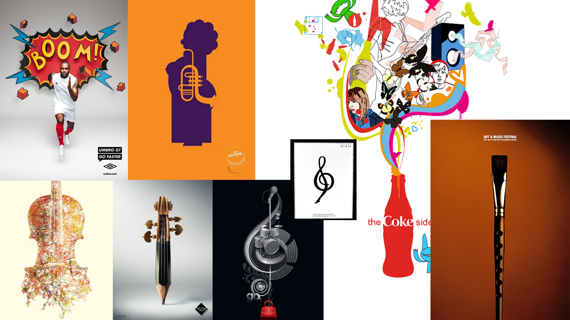
Moodboard 1: art and music

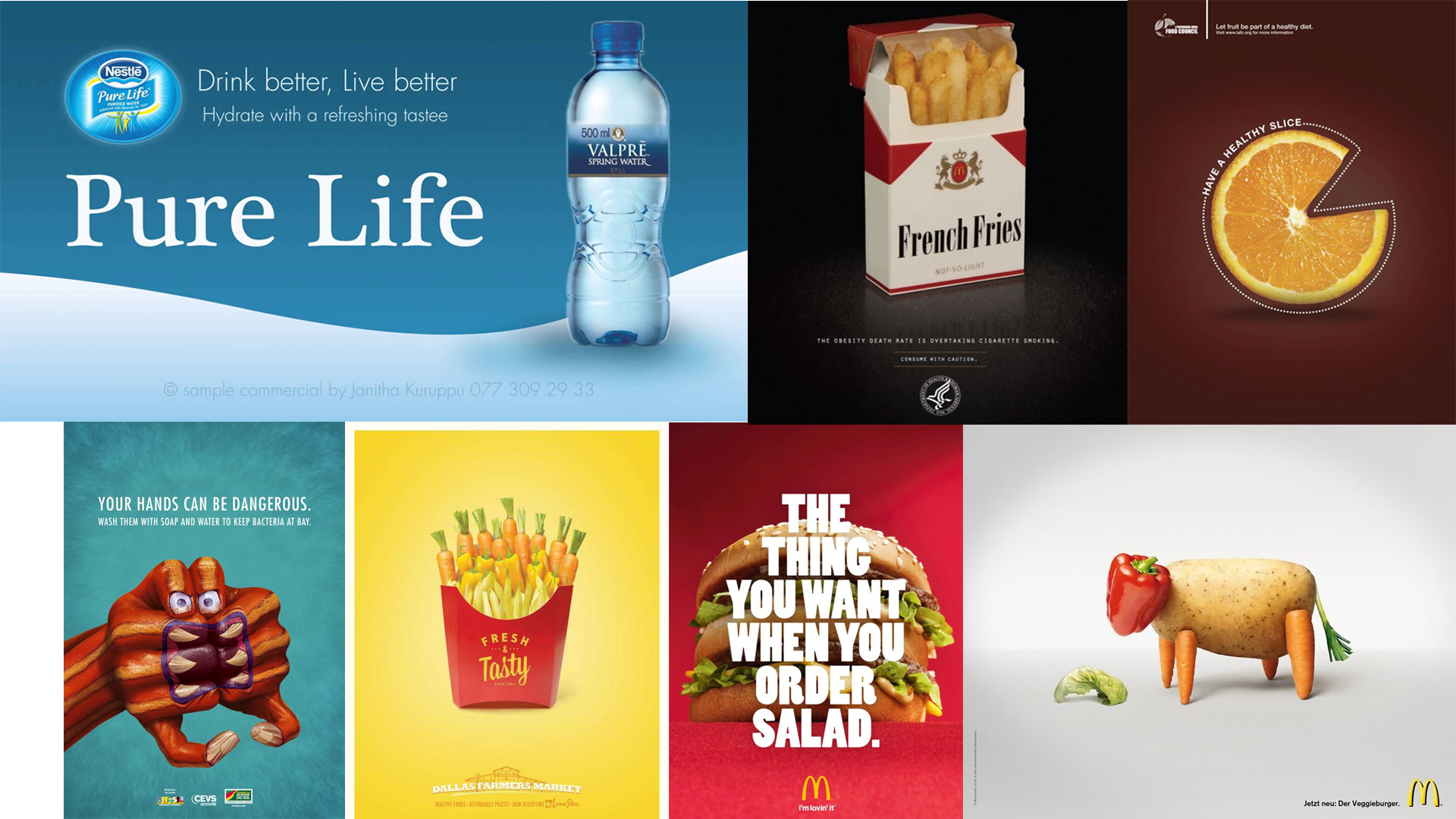
Moodboard 2: enjoyment

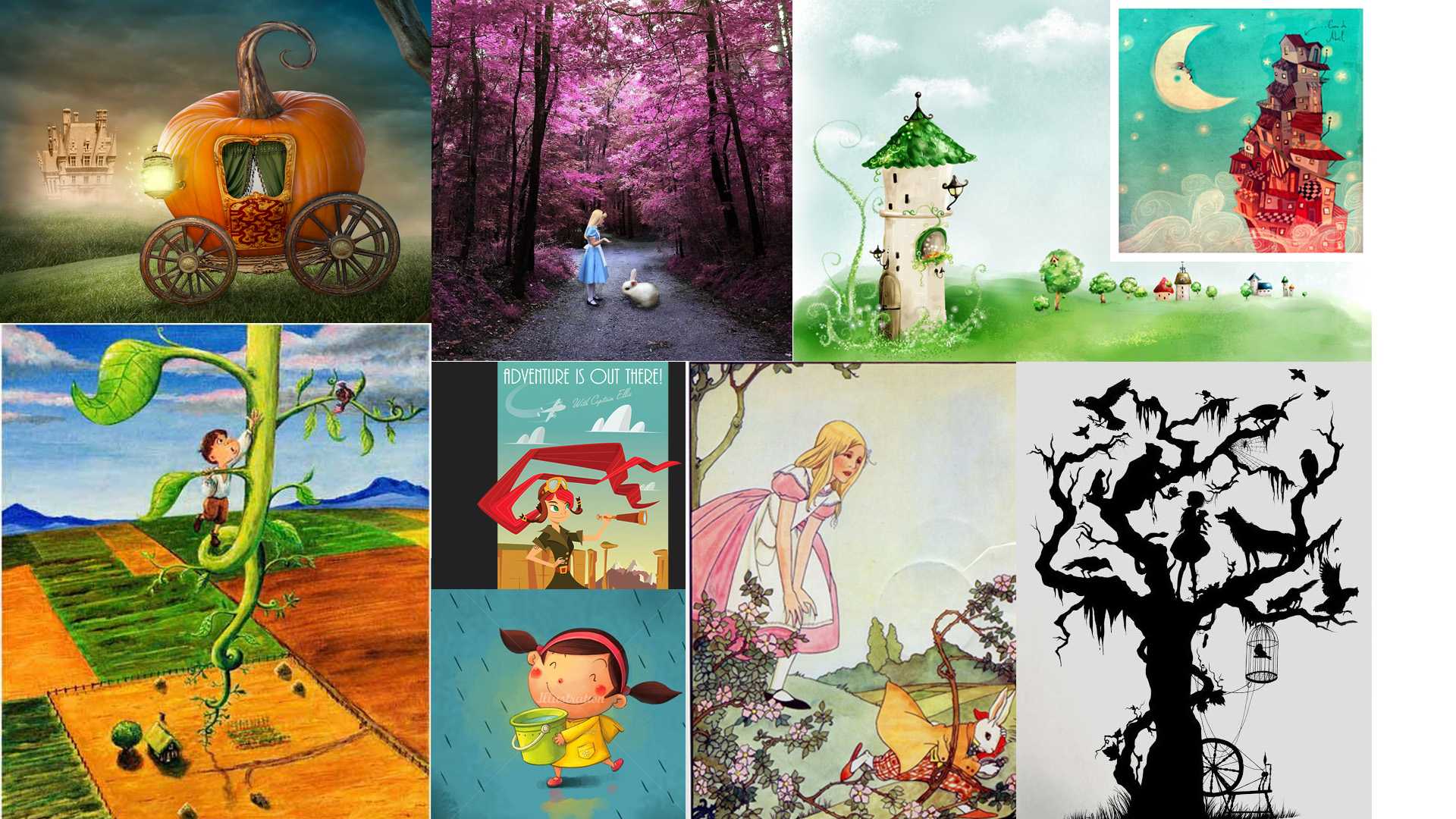
Moodboard 3: fairytale

Thereafter, I came up with drafts of all 3 ideas based on the mindmap i created
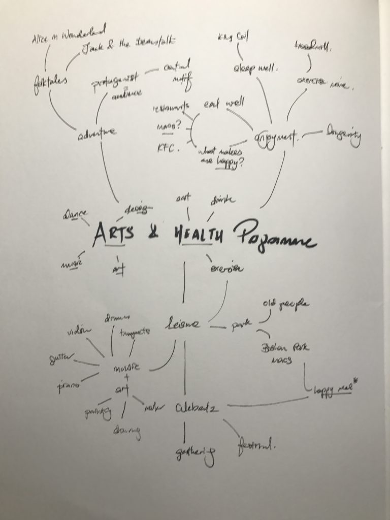
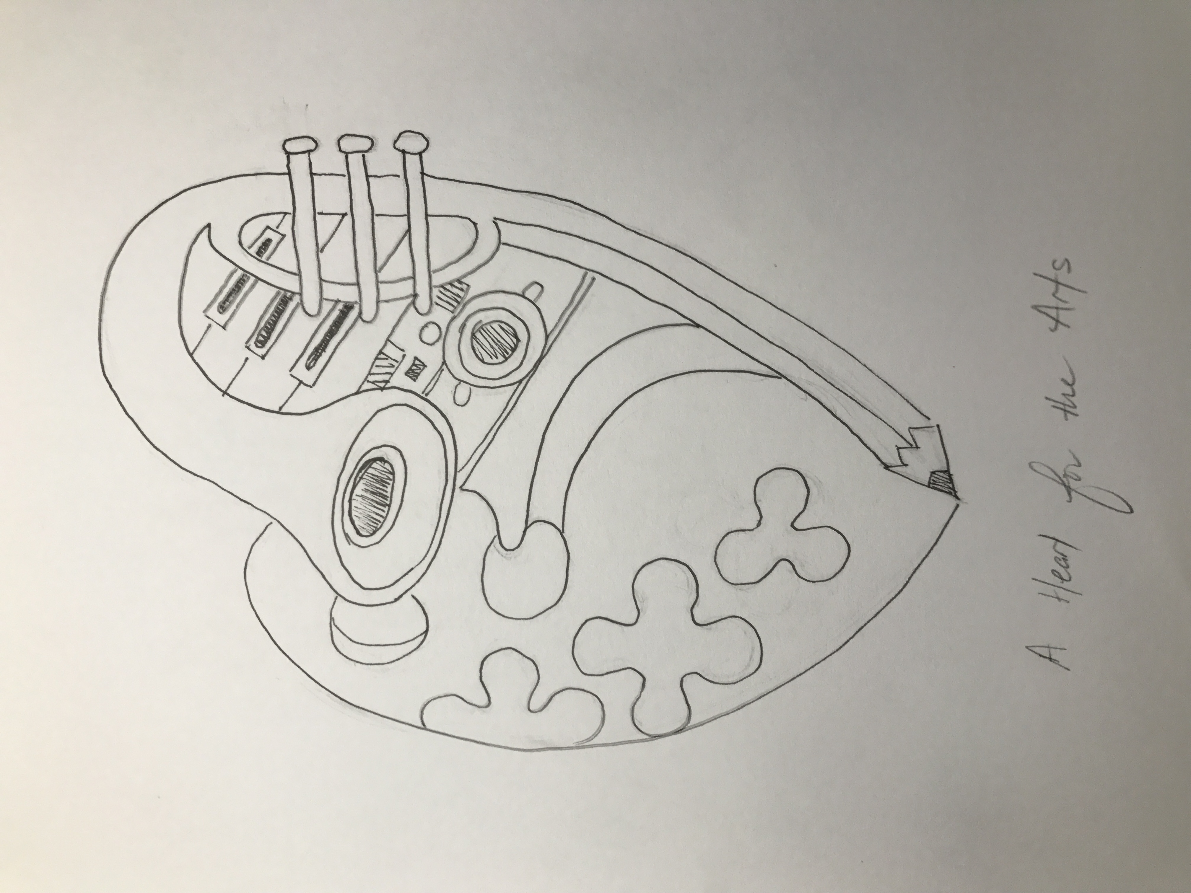
Enjoyment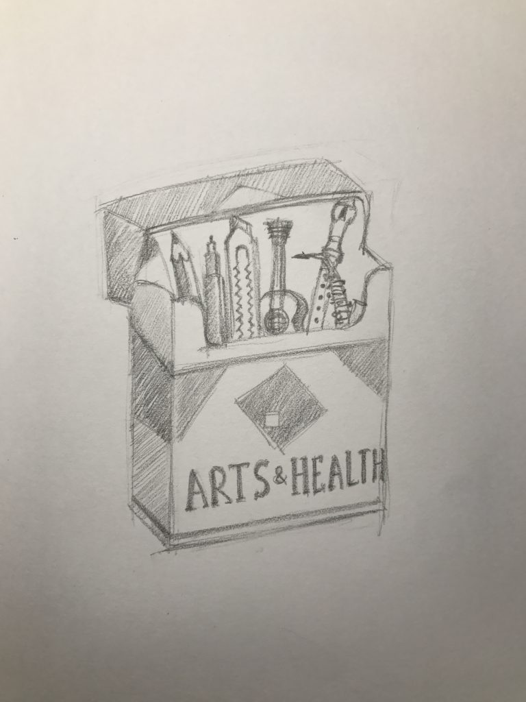
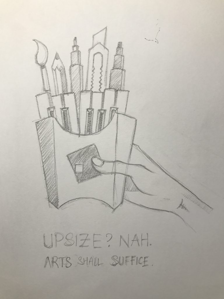
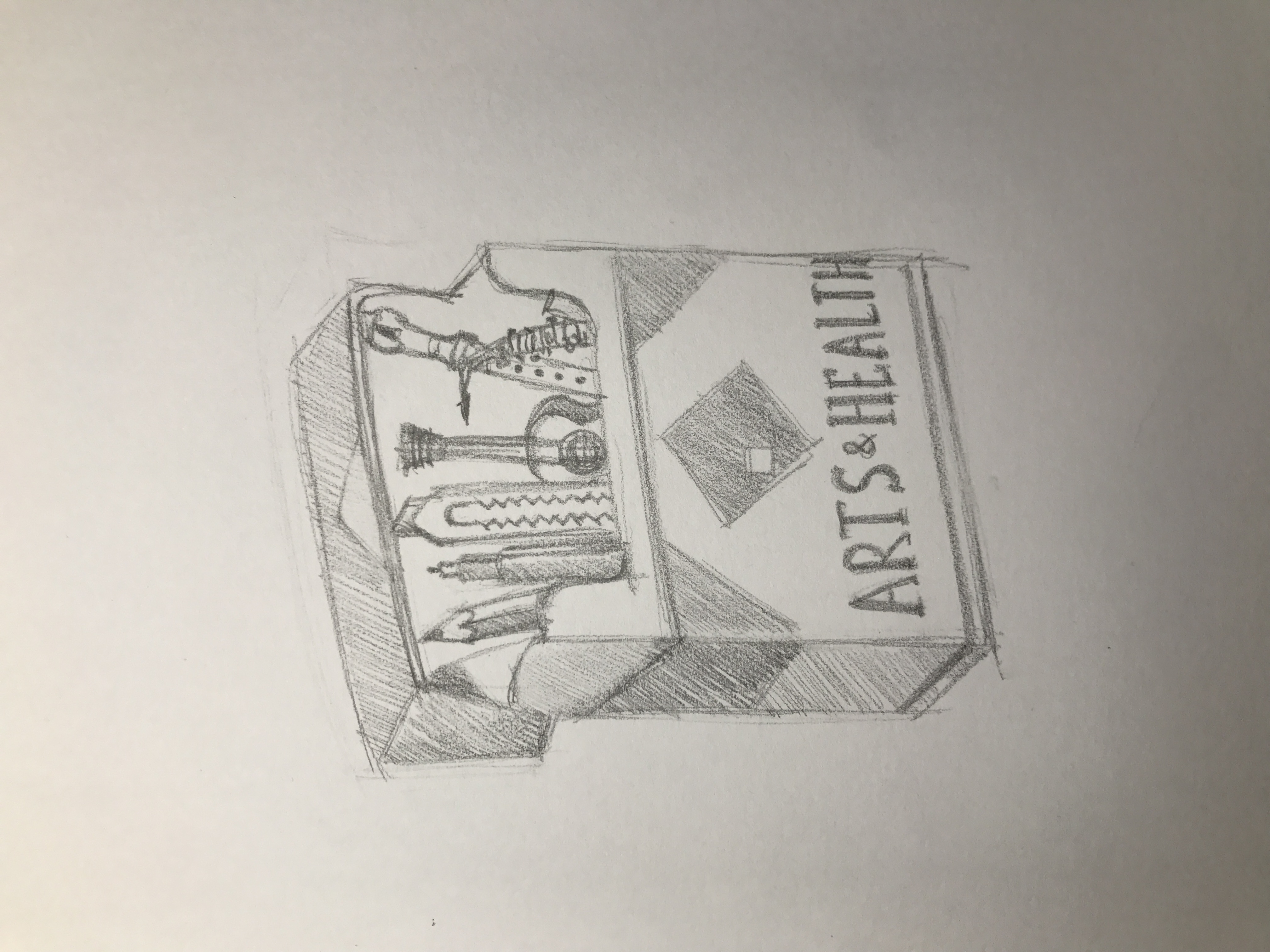
Arts and music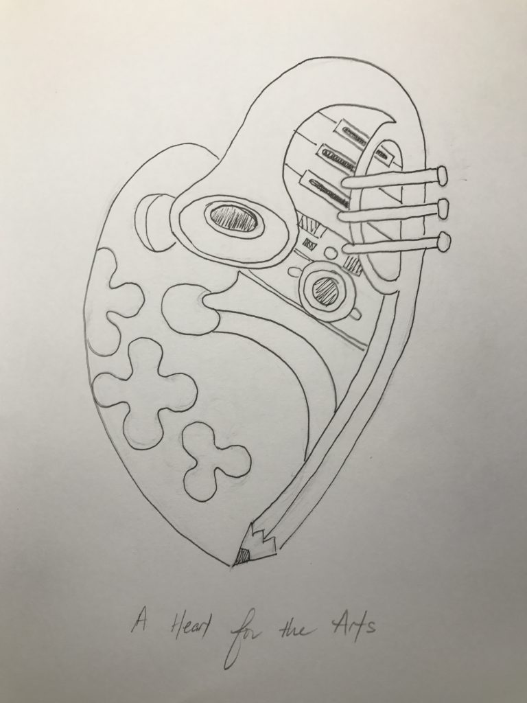
Fairytale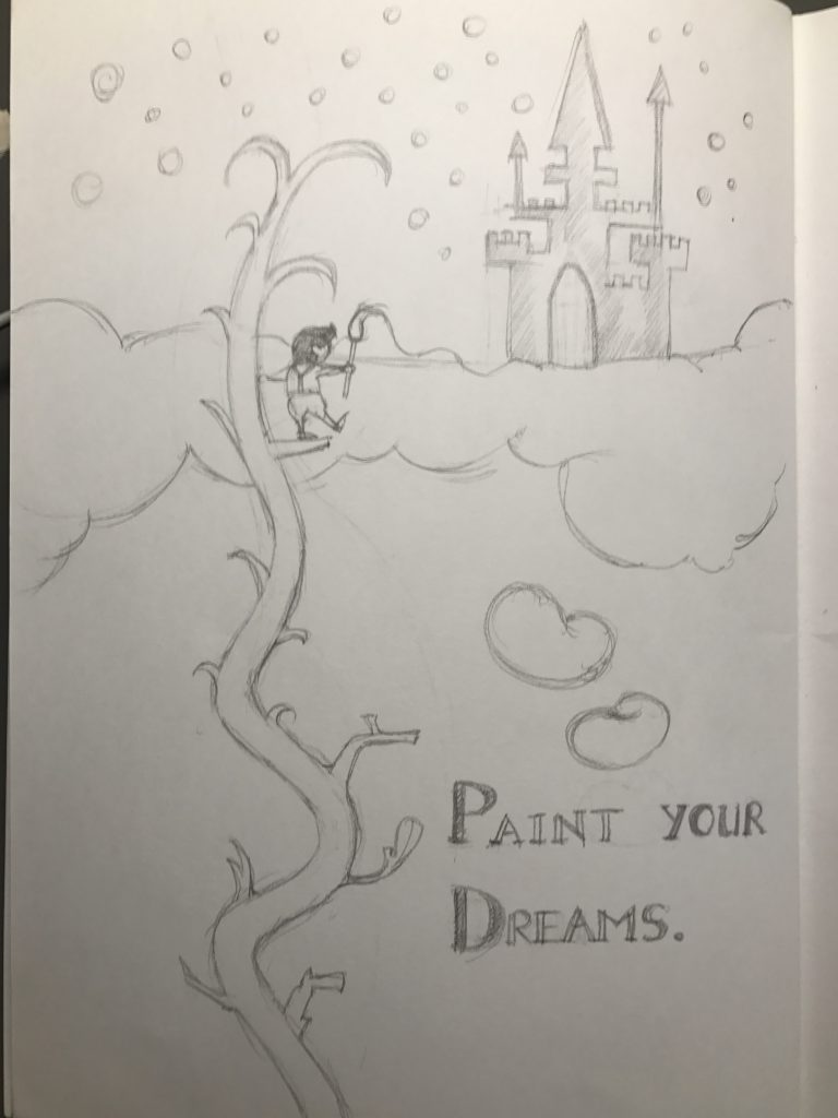
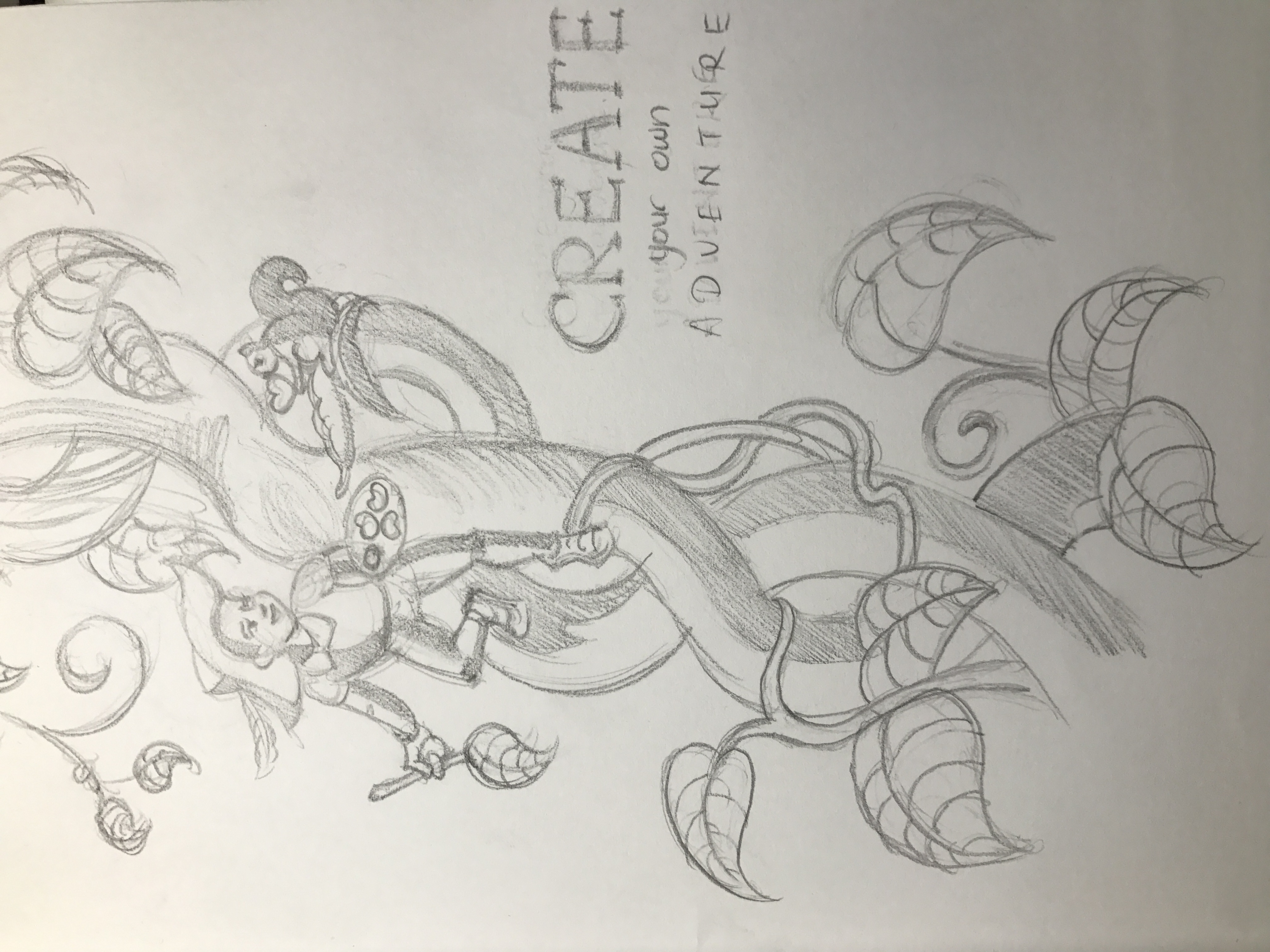
The first draft was too immature, and the visual narrative was quite misleading; is Jack climbing the beanstalk to visit the hospital? Or is he painting a heaven? With these questions in mind, I then decided to create a cleaner composition.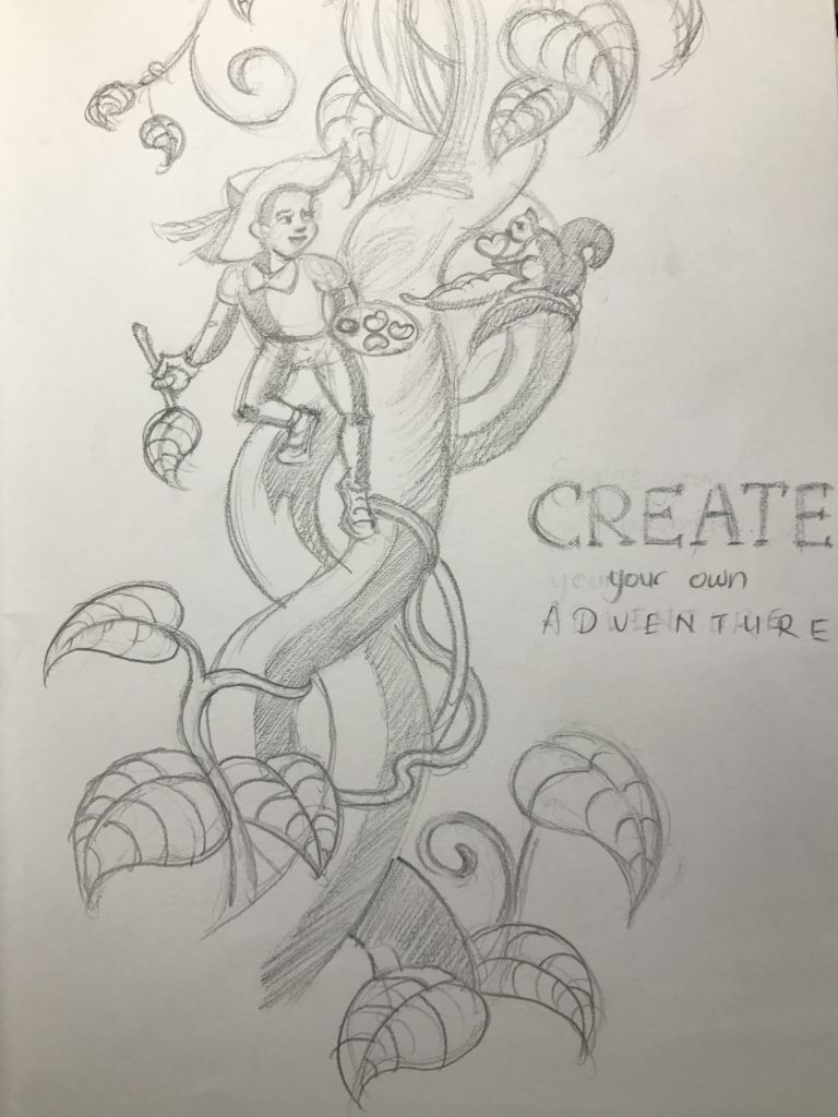
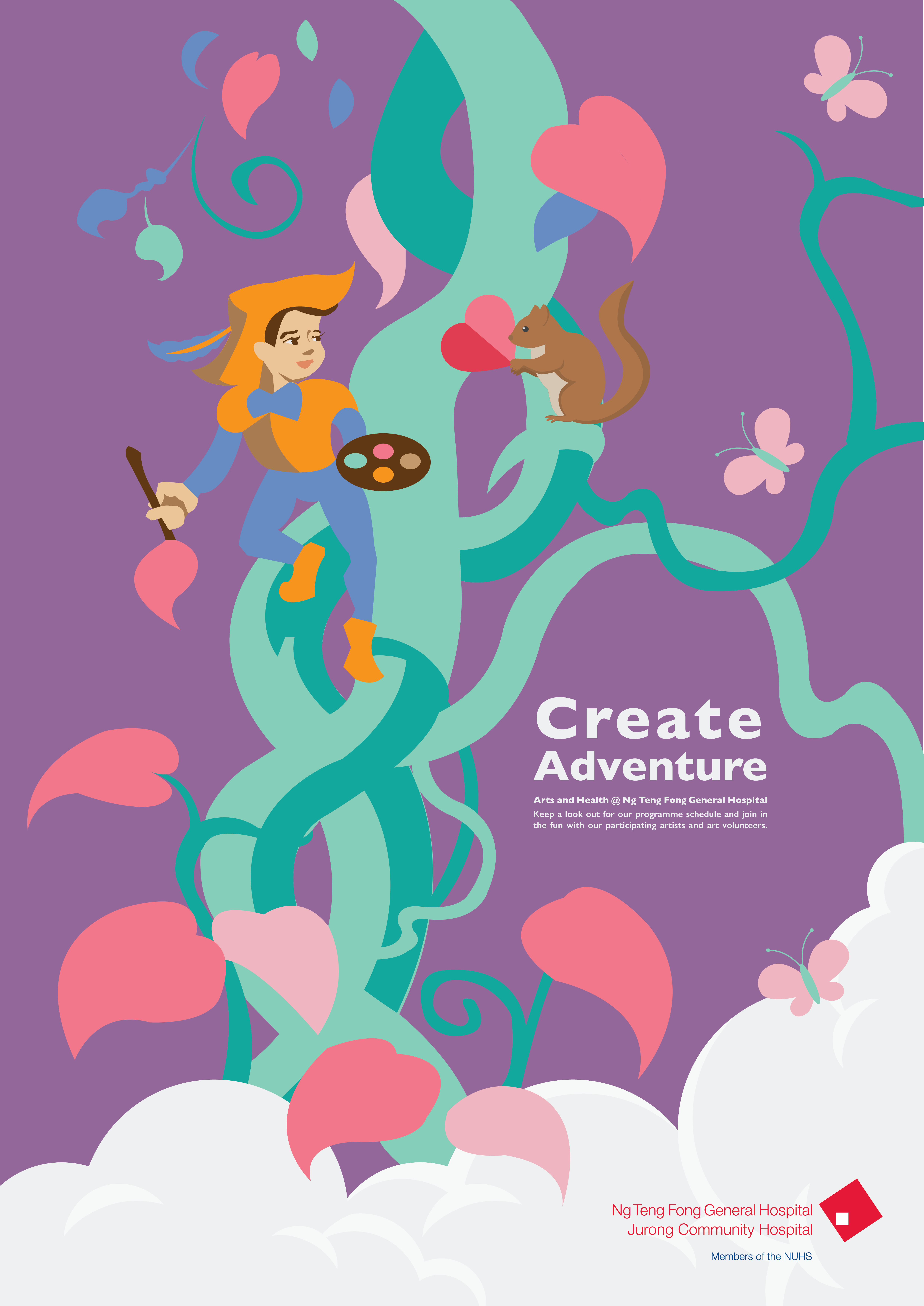
I decided on the fairytale as a theme for my poster. Using Jack and the Beanstalk as a reference point, I used illustration to portray the idea of “creating your own adventure”, with the patient or volunteer identifying with the character Jack painting a mural that comes alive, filled with passion and immersing himself into the environment of the hospital.

This is the composition before I added in colour. I felt that there was a flow to the image, with the overlapping forms and the visual narrative. The font I initially chose was Bebas Neue, but I eventually realised it was too geometric for a fun composition.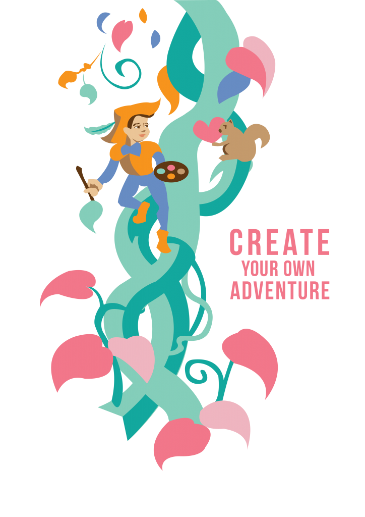
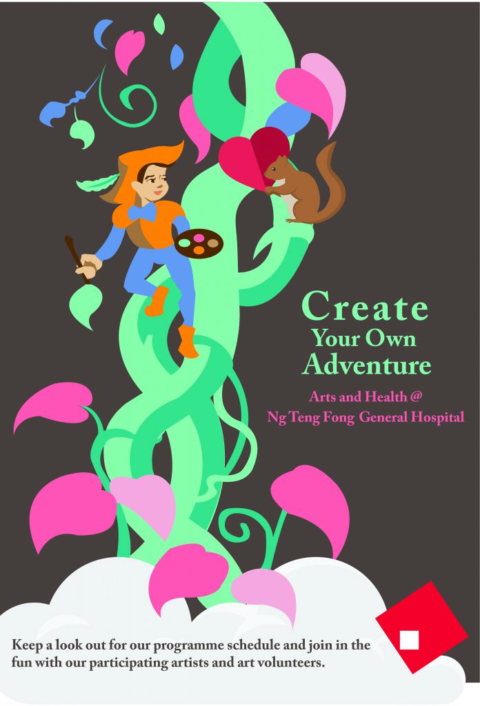
This was draft 1 of the poster. (the colour is a bit off after uploading jpeg to OSS) The feedback I got was that the background was a bit too dull. I decided to explore more exciting colours for the background. I decided to stick to the current narrative as I liked the idea of the squirrel having been painted by Jack, decides to give back in love. In terms of the composition, the type also does not meld well with the art, which was something to consider. The type was too big and rather distracting. Again, the serif fonts felt too formal for the informal design.


Recent Comments