Tag: illustrator

Task 3: Final Designs

From the previous 2 designs, I reduced the number of elements in the logo and sought to combine both ideas. The biggest challenge I faced were to incorporate elements of the previous 2 drafts into the final versions.

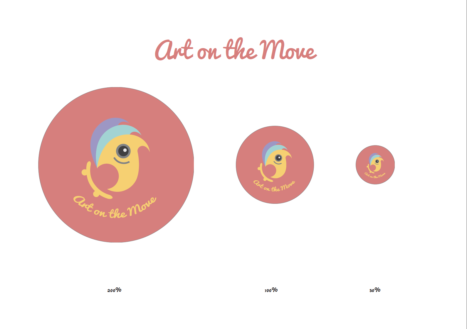
I started working with a pink background as i felt it would complement well with the teal vests given to volunteers.  The lighthouse made way for a more abstract form that resembled the sails of a ship. I morphed the pencil head of the previous logoform into the tip of a brush. I retained the eye in the logoform to make it come alive, imbuing it with a life of its own. This created movement and dynamism in the logoform.

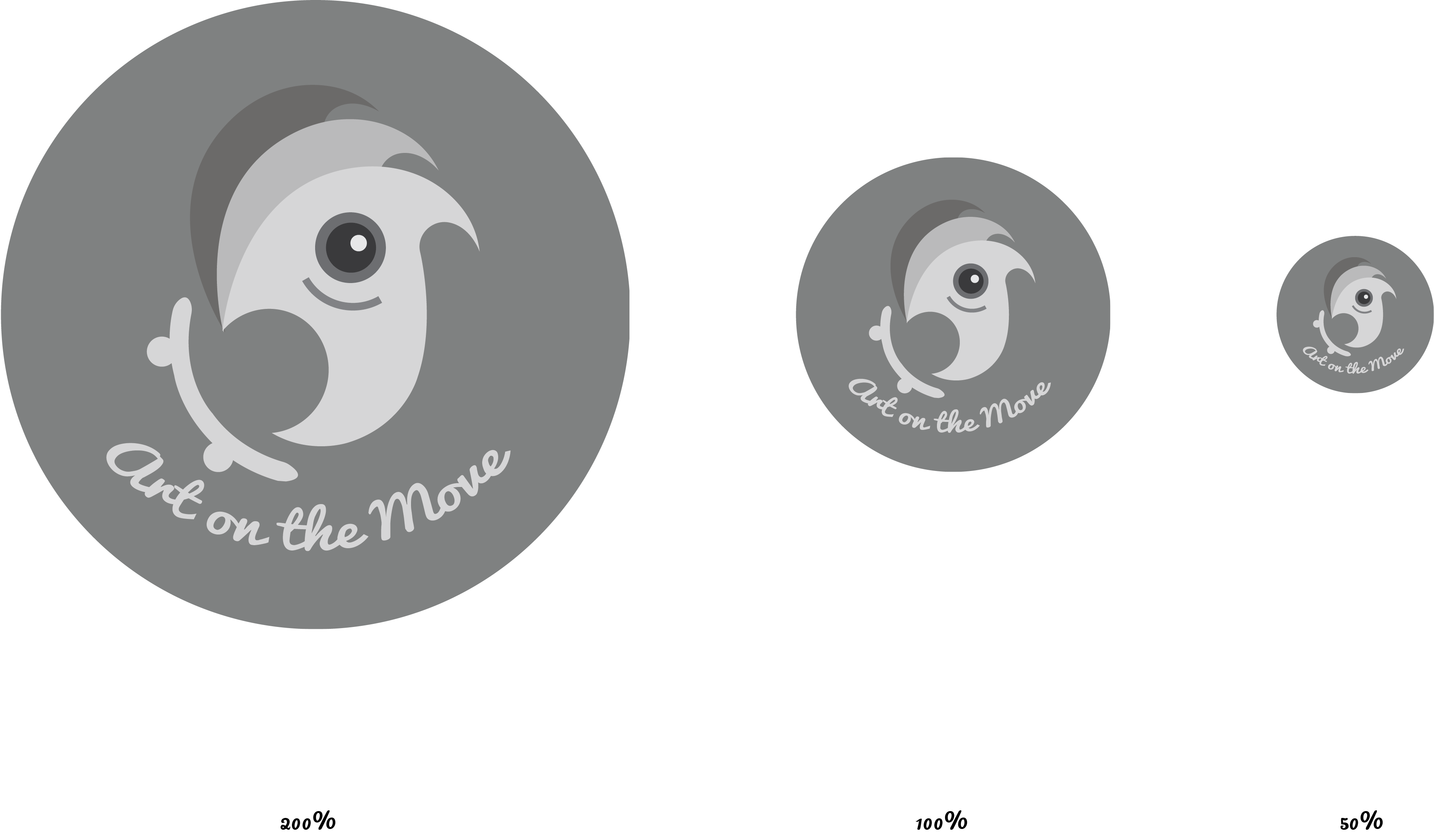
In greyscale, the colours are more muted, but it was still very visible and contrasted well with the background. The form can be analysed objectively from colour, and the way the brushtip rode the skateboard with an upward movement made it fun.

I made another draft in a different color, without the eye.

This design looks less ambiguous after the removal of the eye, and thus won’t be misconstrued as a bird. As blue is the color of wisdom and reliability, it will complement well with the bold, energetic orange, pink and purple of the logoform and type, symbolising vitality.

2D Y1S2 P1: Que Sera Sera Final Designs

  1. Cyclist

screen-shot-2017-02-15-at-11-16-21-pm

Mimi’s advice for draft 1: Reduce the number of colors, reduce the width of wheels and look at a way to make a leaner figure to denote speed i.e. change of font.

Result: I cut out some unnecessary lines, reduced the font size of some letters to create a leaner, cleaner and clearer typographic pictogram.


2. Mountain Climber

screen-shot-2017-02-15-at-11-16-50-pm

Mimi’s advice for draft 1: ensure that both side of the “mountain” have the same texture to create unity in the composition.

Result: I created jagged rock forms on both sides, playing with figure / ground relationships to create ambiguity for the letterforms.


3. Bar owner

screen-shot-2017-02-15-at-11-15-05-pm

Mimi’s advice for draft 2: lose the bar sign as it is unnecessary. Keep the rendered font and background.

Result: A simpler, cleaner look.


4. Programmer

screen-shot-2017-02-15-at-11-14-50-pm

Mimi’s advice for draft 2: try to play around with the arrangement of letterforms / play with repetition.

Result: I wasn’t able to create a better arrangement of shapes to create the linear perspective that I wanted, and thus I sacrificed a bit of legibility for the 3 dimensionality for this piece.