Tag: infographic

Infographic Poster: Process
I began working on the infographic poster by identifying the target audience and looking at what type of poster would best appeal to the target audience.
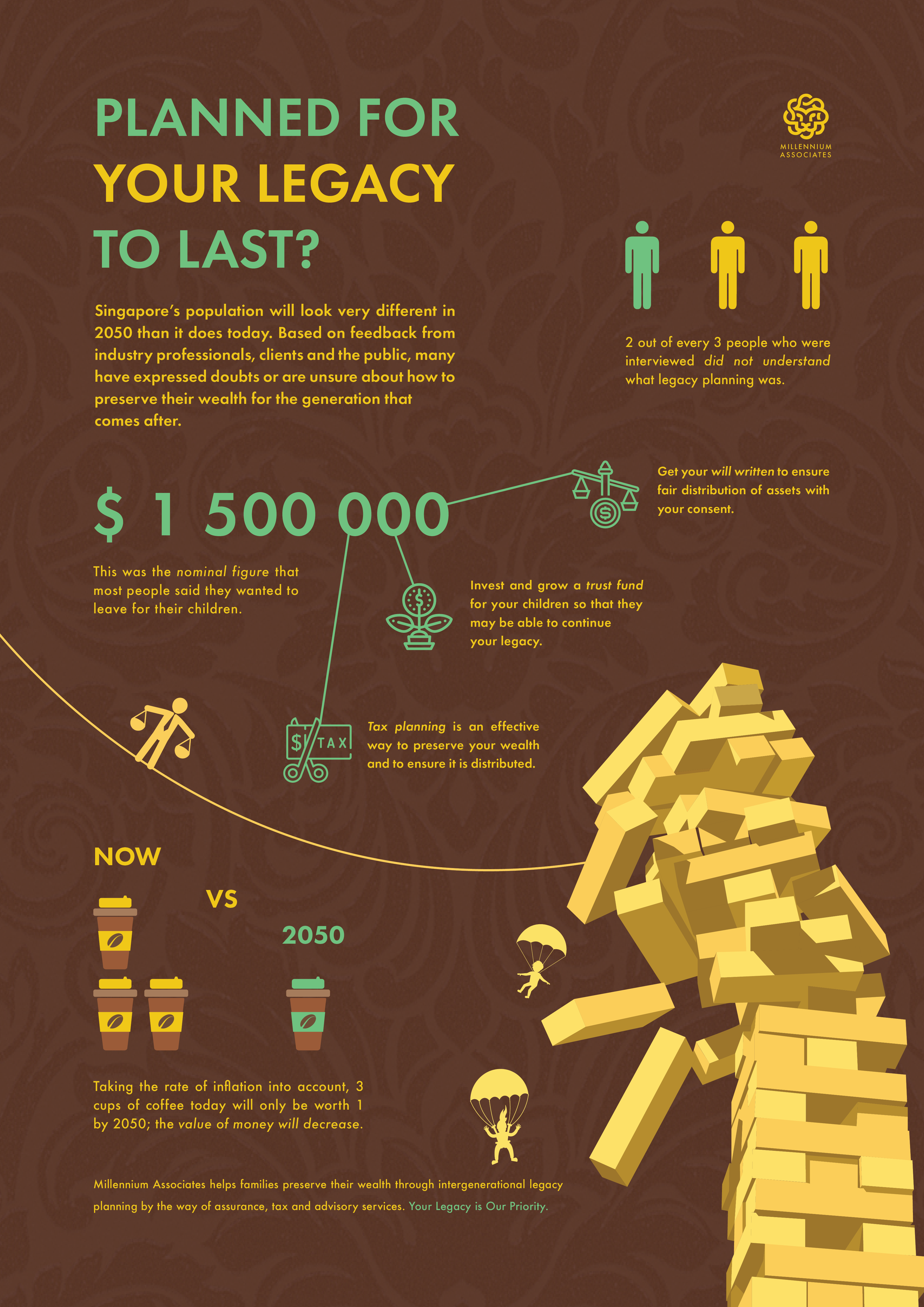
Target Audience: married couples, above 30, planning to have children or already have children.
Purpose: to explain legacy planning to these people, getting their buy-in and helping them set up a trust fund or engage in tax or legal services to preserve and grow their wealth for their children.
Problem identification: the biggest issue that I faced when doing data collection is the fact that most people are not aware of the avenues available that will counteract the problem of their wealth depreciating over time. A lot of Singaporeans are generally complacent as we think that CPF is sufficient to live a good life after retirement and to pass on to our children but that is hardly the case.
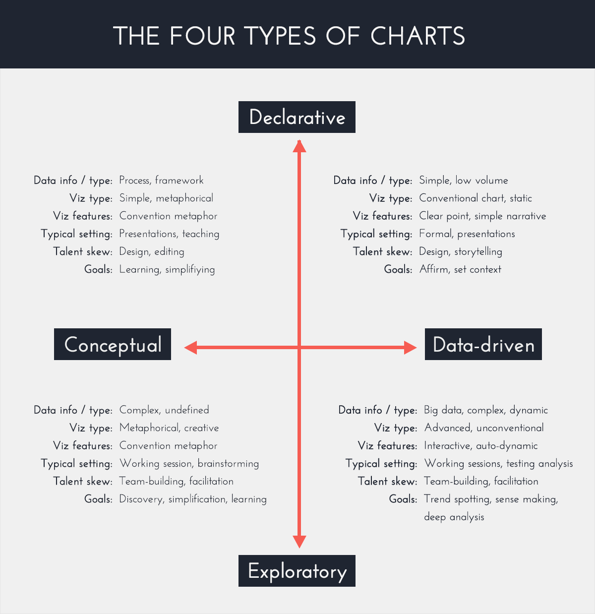
Based on the chart above, I strove to achieve a poster that was declarative and simplified a concept. The reason why was because the poster is meant to sell the consultancy company’s services, by educating clients and simplifying the concept of legacy planning into 3 basic strategies.
The use of a visual metaphor to integrate the information into a singular image would be important to drive home the importance of legacy planning. On top of that, the poster also needs to drive home the big picture framework / process of legacy planning.
First, I came up with the logo for the consultancy firm. This look a while as I looked for a metaphor that was suitable to convey boldness and wealth. I did toy with the idea of using an umbrella / tree but that turned out to be too esoteric.
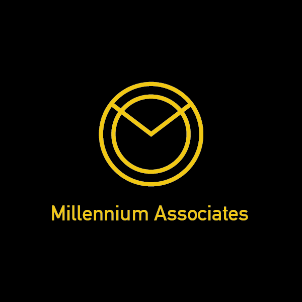

I finally rested on this design as I felt it best conveys the boldness and wealth of the consultancy group giving tax, legal and advisory services. Another consideration was the target consumer; which eventually will be upper middle to upper class.
Logo: By using a lion masthead moulded into a Chinese infinity symbol, it is a suitable metaphor to convey the longevity and steadfastness of our brand.
Color: The yellow denotes gold and the colour of wealth and vitality while the earthly brown denotes our hardnosed practicality and trustworthiness.
This is the first poster that I came up with, based on a 4 column grid with the use of Futura as a preferred typeface.

During the initial critique, some of the comments that I received were that the titlehead was too small to be visible from afar and more could be done to integrate the information and the artwork. The use of italics and regular font was a bit haphazard as well. The NOW VS 2050 was a bit confusing as it seemed to some that the coffee got bigger over time, as one put it, “issit upsize?“
Overall, the first draft had a lack of dynamism that made it feel dry. It was something I would try to overcome over successive drafts and revision of ideas.
Some of them gave the suggestion to turn the stack of Jenga blocks into gold bars. I did initially toy with the idea, creating a few gold bars via vector illustration, but I soon realised even with a Jenga tower with gold bars, it still lacked the human factor; it felt too stiff.
Thus, I explored the idea of walking the tightrope towards the Jenga tower and using that as a metaphor for the timeline of one’s life, and what would happen if left unplanned.
Recent Comments