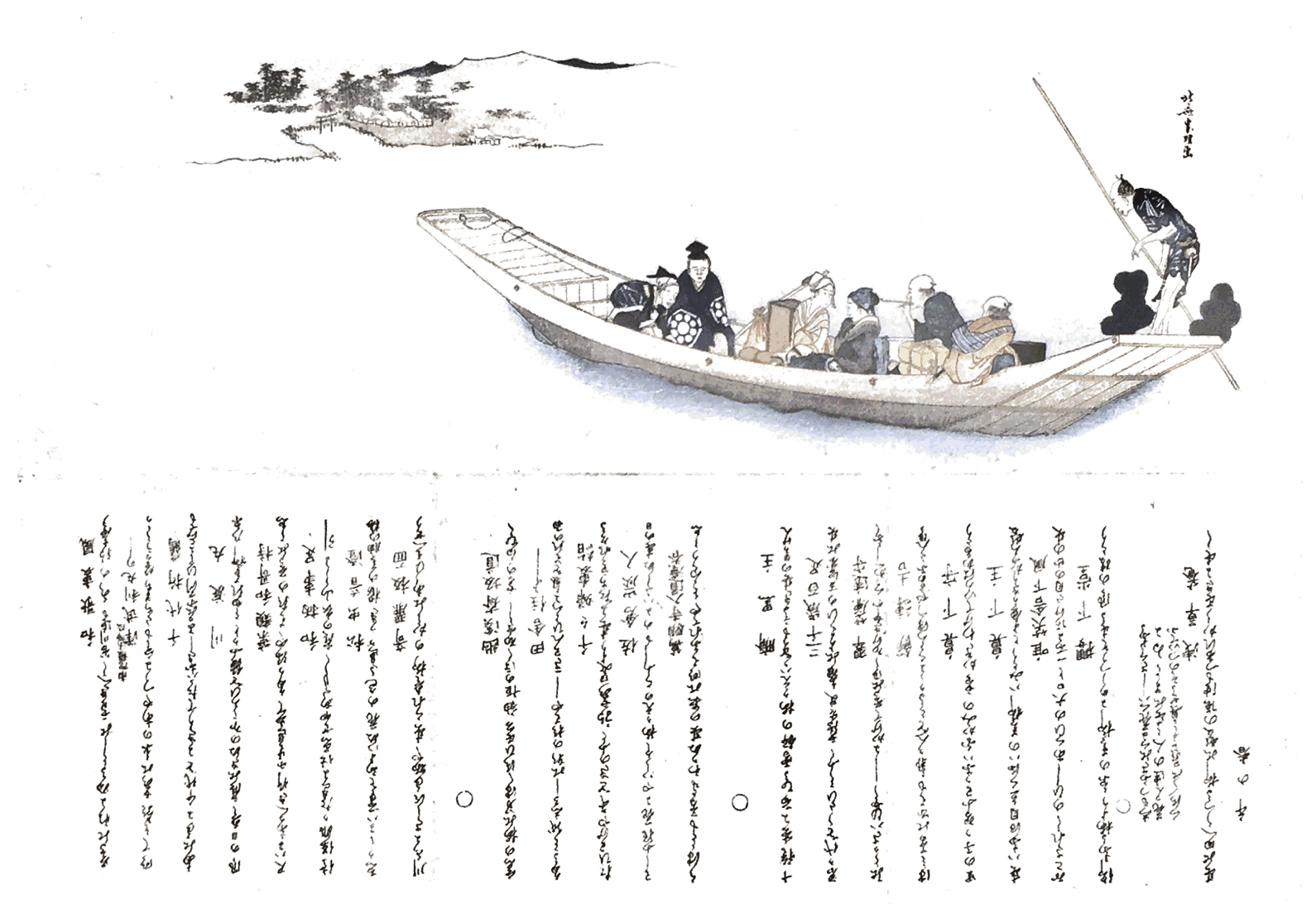
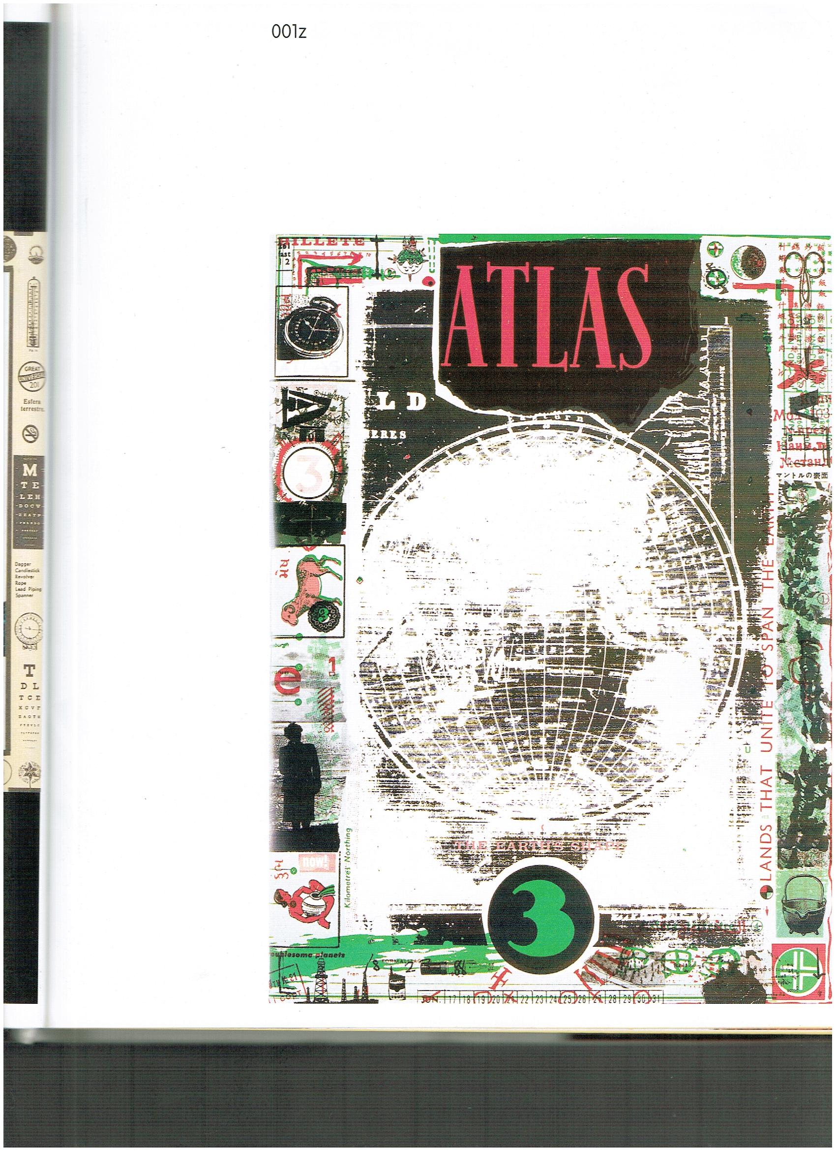
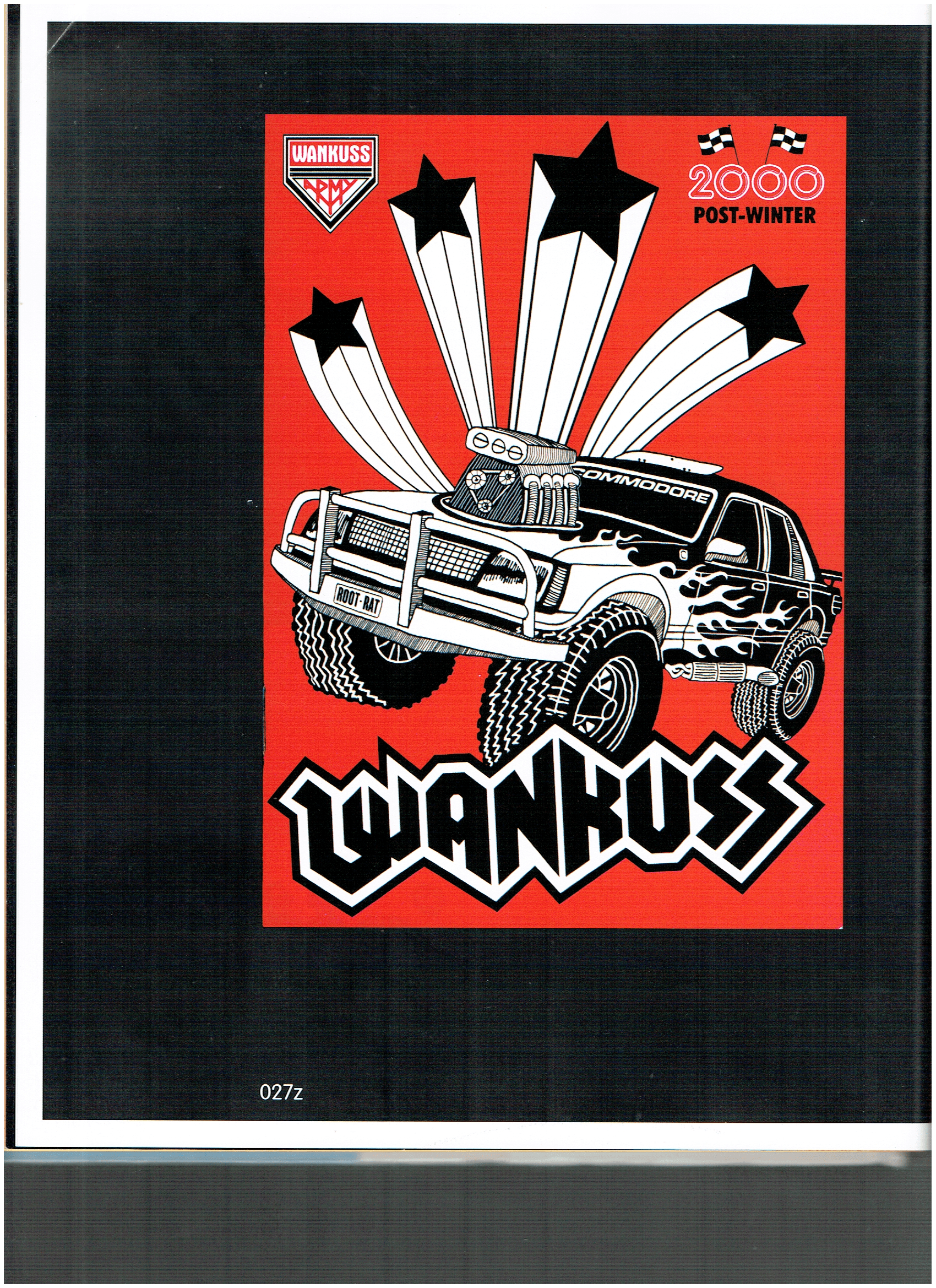
For our zine project, I took inspiration from zines in terms of both layout and style. Here are some of the resource material that might come in useful later in the project.
Love the grunge texture and punk look of this zine — almost reminiscent of a woodblock print.
Simple and clean illustration for the cover page of a zine, with a contrasting and engaging color combination (red and black). Typography and art complement each other, forming a dynamic whole.
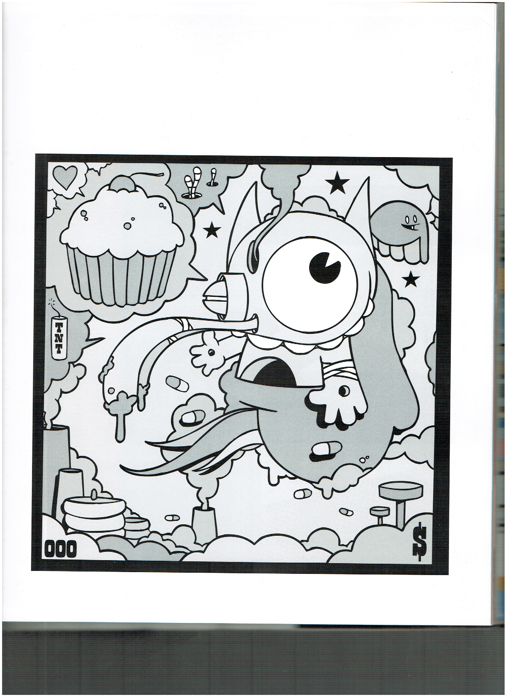
Greyscale cartoon illustration, with black outlines and simplistic forms, create a fun and edgy look.
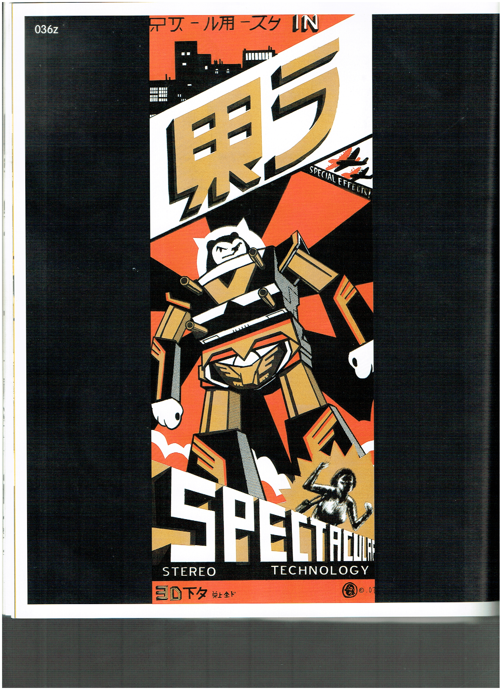
I particularly like the diagonals used in this Japanese zine, i.e. the title banner, sub-heading and posture of the robot. The black, orange and yellow palette also add interest.
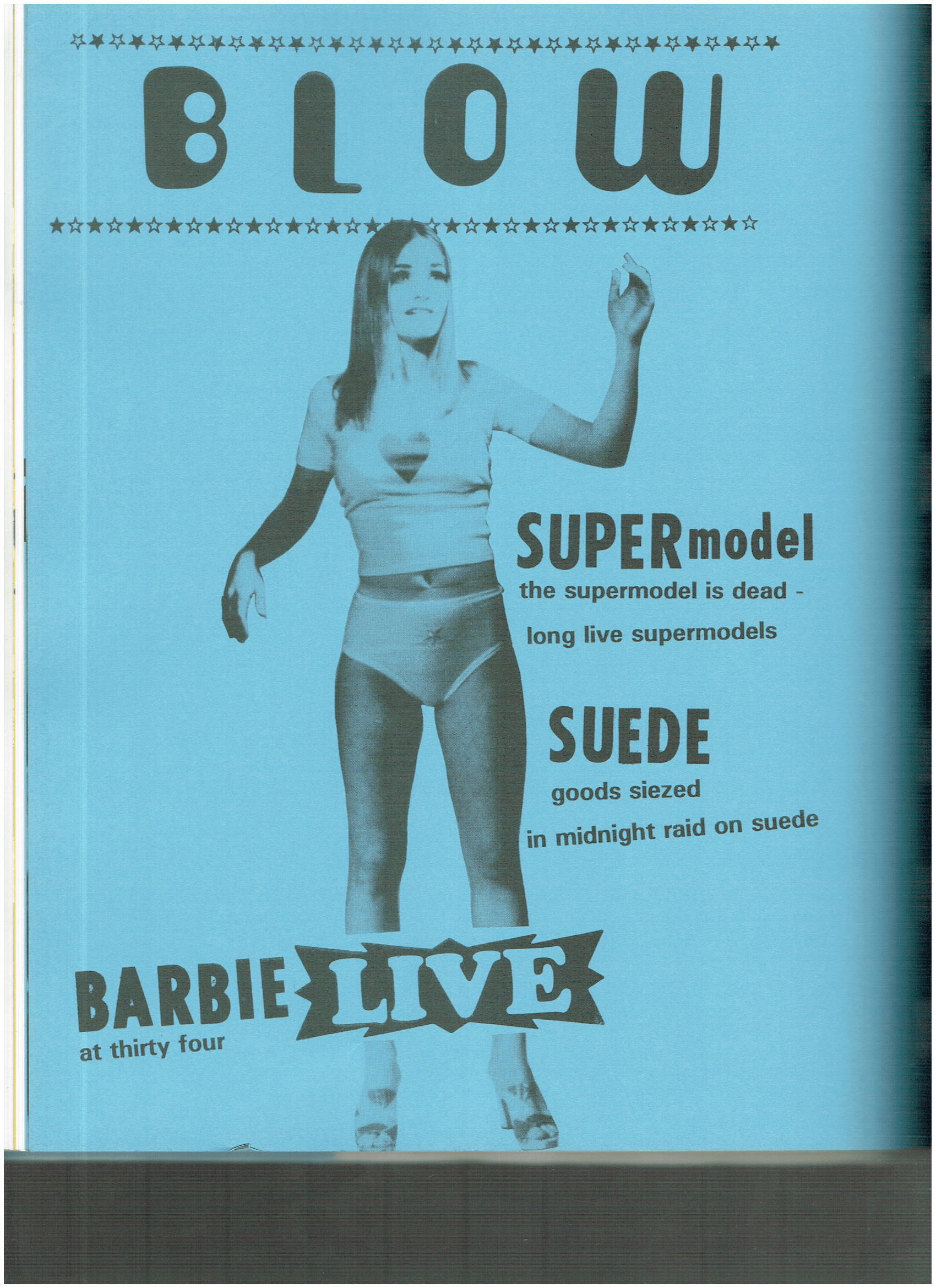
A zine that is parodying the concept of “models” in a superficial world. Simple azure blue background and the black and white halftone image feels like a Warhol silkscreen print; a Pop-art feel aimed at social commentary.
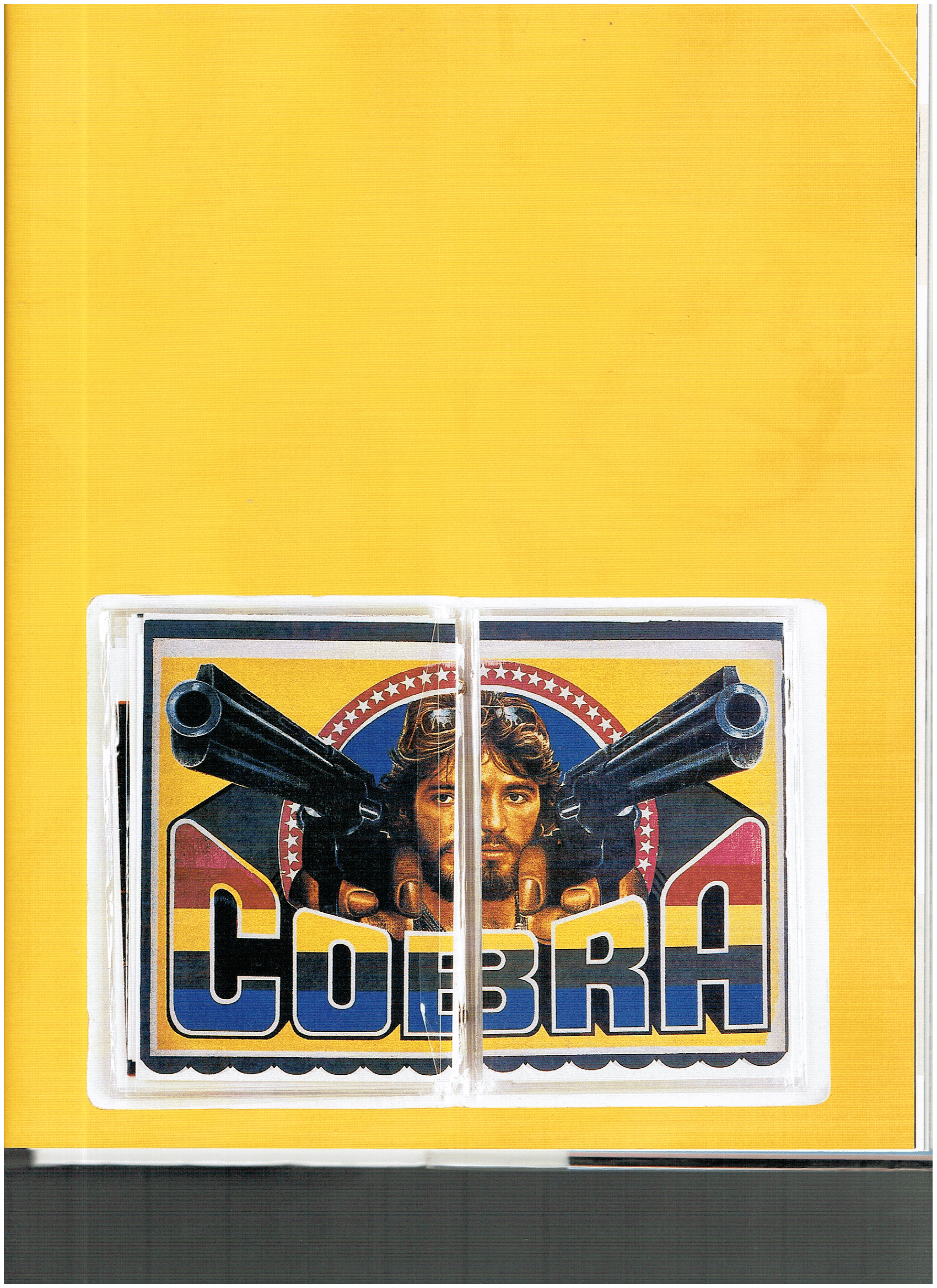
Symmetry across a centrefold is a fun way to portray the art concept. The color scheme also harken back to the early age of television — telecolor.
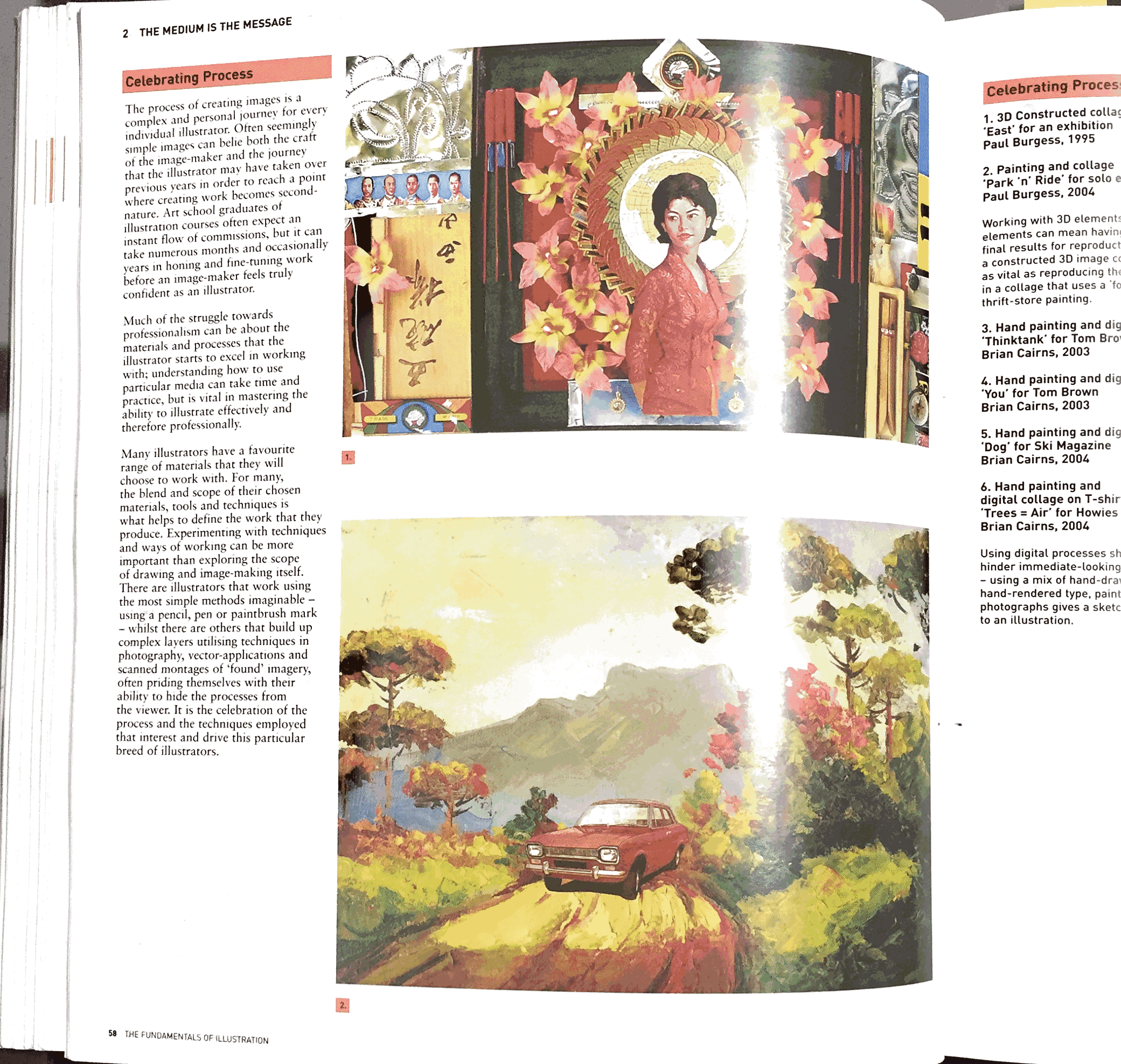
Celebrating Process: illustration as a practice that resonates with zine making
- explore mixed media?
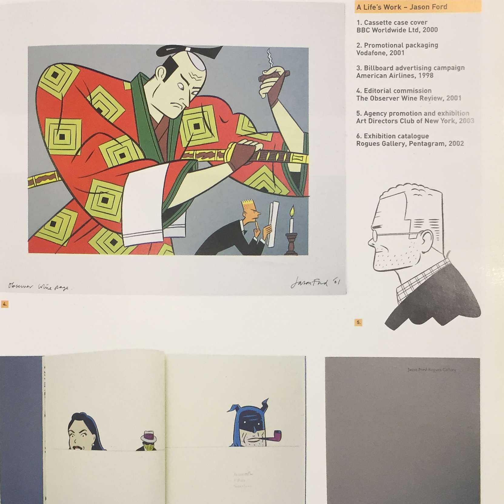
Simple Japanese styled illustrations can perhaps convey the idea of wabi sabo better?
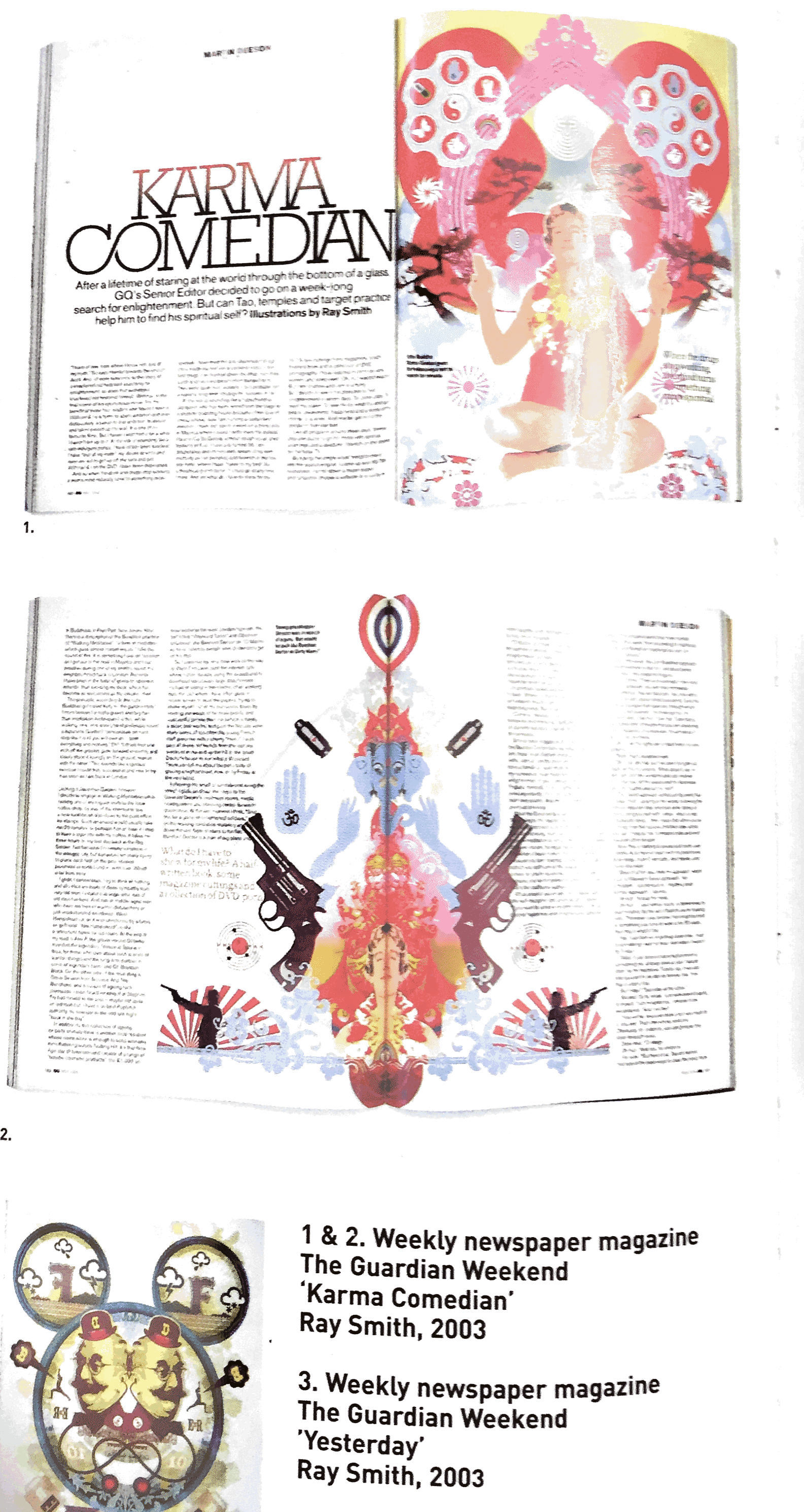
Editorial illustrations focus on complementing the article with the appropriate artwork.
Recent Comments