Tag: photography

Design Artefact 1: Process

Design Artefact 1: Posters / EDM

I started off designing posters for the financial brokerage firm Millennium Associates. The posters were intended to target the recently married or married couples who just had children. This would allow the brokers in the company to help to facilitate setting up a trust fund to help with their children’s education and future expenses.

Poster 1: Don’t lose your children’s bread and butter

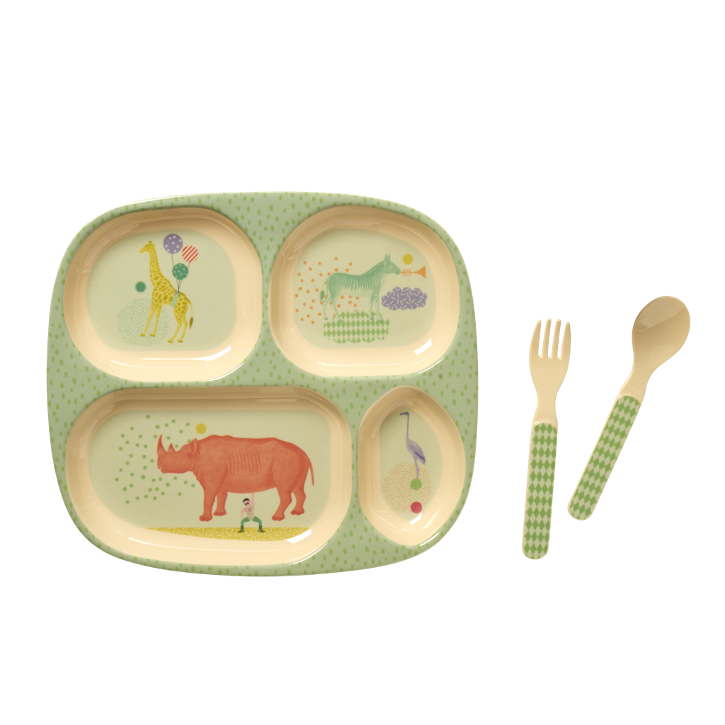
I started off by taking a simple top down photograph of my baby sister’s cutlery, and rending it in photoshop to make it look better.


The attempt to express a visual metaphor came from the idea of a plate, and playing with the idea of a plate to communicate the urgency of financial planning and ensuring that clients’ families are well protected.

I did not like the outcome of rendering the plate on illustrator, and I felt it may be a bit too boring, hence I decided to merge the mediums of photography and illustration to get a desired effect.

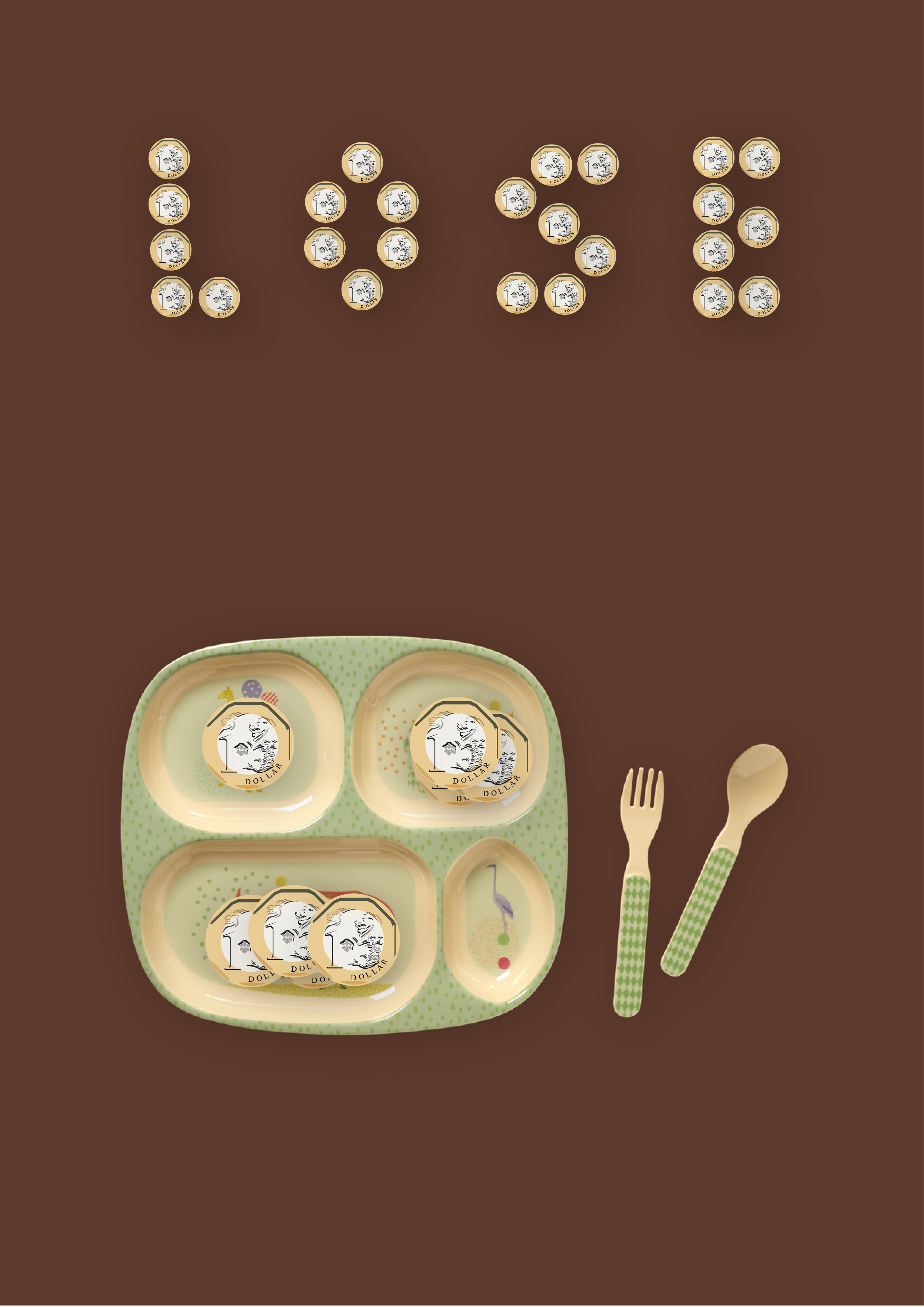
The idea of “loss” is conveyed through putting a couple of dollars on a baby’s plate, communicating the lack of sustainability in the way most couples are going about planning for their children’s education.

This was draft 1 of the poster. I created a table cloth patterned background and information that was placed in a central composition, while the logo was placed in the top right. During the consultation, it was mentioned that the message might be too strong, as “losing your child” can mean many things; like a child dying etc. Therefore, I had to rework on the message, and perhaps make the logo a bit smaller.


Poster 2: The race begins early

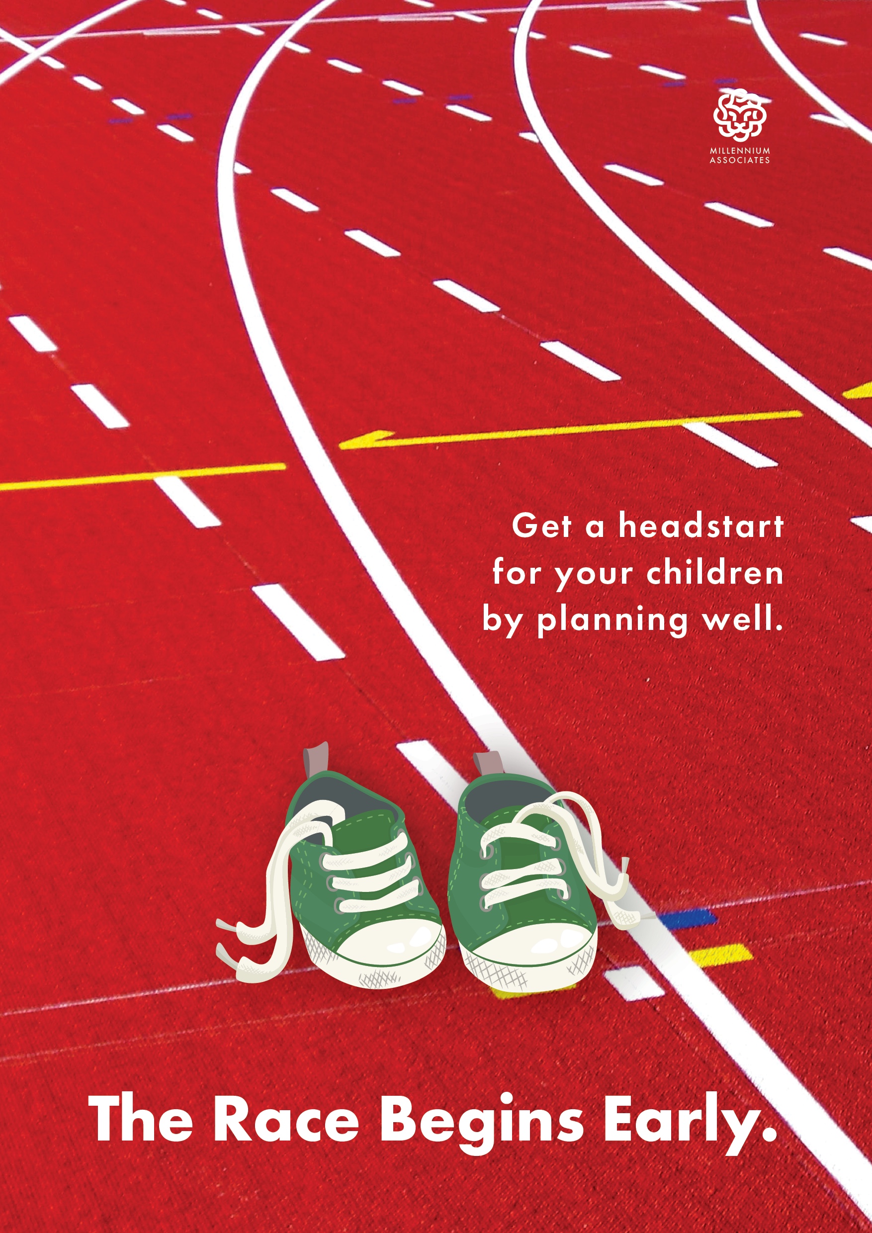
I started off with a simple concept of the race track, where every parent wants their children to get a headstart in the rat race. There are different ways to ensure that one’s children have an advantage, but the firm’s focus was to start early to end well. Thus, our ads have to be targeted at children, so that the trust fund has time to grow and deliver the results needed.

Again, it was a blend of vector illustration and photography. This gave the poster an element of youthful playfulness, and would not feel as static as a poster incorporating just one medium.

The advice given during consultation was that the 2 posters had 2 radically different compositions; the first adopted a central composition whereas the second was more dynamic and off-centre. Thus, I worked to ensure that both posters had the same composition, tightening the grids and playing with type to ensure that both posters conveyed the same kind of playfulness and yet gravitas of the message.

Assignment 4: RnD + Final

My project’s theme is based on architecture x photography. I aim to use architectural photography to express the 26 letters of the alphabet. This is achieved through composition and cropping of architectural features.

I started off with 2 moodboards with the central themes of type as architecture and type as human anatomy.

I decided to go with type as architecture as I felt it would be more interesting looking for local architecture with interesting features rather than simply illustrating human organs and morphing them into type.

The following are the images taken around (but not limited to) Suntec City, Promenade, City Hall (National Gallery, Victoria Concert Hall), Outram Park (People’s Park Complex, Pearl Bank Apartments), Clarke Quay, Bencoolen MRT station, Victoria Street, Dhoby Ghaut.

With this compilation of photos, I began to work on creating the alphabet.


After editing the photos, I managed to come up with the 26 letters.

A

B

C

D

E

F

G

H

I

J

K

L

M

N

O

P

Q

R

S

T

U

V

W

X

Y

Z


On top of the book, I also designed a promotional poster for architectural photography.


This is the printed version of the typographic book. I chose Futura as the typeface as I felt it was clean, geometric and simple, much like the architectural forms I tried to simplify. I also used ring binding as I felt it would better resemble an architecture lookbook with a skeletal spine exposed, almost like “scaffolding”.

Vernacular Type: Exploration and Final

For this project, I started off with a night shoot, exploring the unseen nightlife of Tanjong Pagar. What got me inspired was the song by rapper Jay Z, Heart of the City. The gritty, groovy track with its smooth lyrics felt very apt for the series of night shots.

https://www.youtube.com/watch?v=hcWAvBb65bc

^ that’s the song if you wanna listen.

I started off with Guoco Tower, an office building just outside the train station. I like the sans serif typeface and the illuminated background.

Times New Roman, usually seen on road processors but adorned on the signage outside Maxwell Rd.

Love the Tron Legacy vibes.

Japanese Restaurant near Guoco Towers.

Richard Branson’s famous Virgin Group also has a fitness club here. Love the V and the upward swoosh of the logo.

A bar.

Another cafe-bar.

Yet another cafe. But this one’s quite cool as it has the concept of mini trains / traintracks everywhere in its interior.

Every wannabe Instagram influencer should join this club.

Draft has a bar along the stretch too.

This is a Korean street food restaurant. The custom fonts can take some time getting used to though.

One of my favourite, the neon signs with fluorescent lighting reflecting off the black boards, creating an intriguing and arresting image of nightlife.

As i walked farther, I came across a creative agency with the name CRE8. Awesome stuff.

Like the icon and typeface of this patisserie. Very art deco, a tad bit flamboyant but matching the luxurious interiors as well.

Finally, a neighborhood jewellery store with a good old storefront sign.

I decided to go with Heart of the City as I think it reflects the mood of Tanjong Pagar. It is, after all, a business district laden with eateries, pubs and pockets of entertainment at night. As with any financial district, nightlife is often nearby due to the affluence and decadence that surrounds the place. The use of light to enhance the visual imagery of typography is something I could perhaps explore further. I’ll be going back to Tanjong Pagar soon for a day shot.


The electric night scene of Tanjong Pagar left a deep impression on me as I walked through the streets, bathed in a neon hue. I tried to soak it all up, and then it hit me. Tanjong Pagar wasn’t just a place for you to drink alcohol after a hard day’s work in the CBD, it was also a place where you could simply get lost in, drinking in the vibes of the place.

The first composition more balanced and structured than the second. The word BEAMS is larger than the rest, as it is the focus puller of the entire phrase. THE and NEON and almost like an afterthought, but positioned with negative space in between. This separates “neon beams” with ‘drinkin the”, splitting the phrase into smaller chunks, enhancing readability. There is also a bit of space in between the horizontal blocks of words, splitting them up and making them more readable as well. Overall, this is a balanced, symmetrical composition.

The second composition is more dynamic, with NEON BEAMS rearranged in a more chaotic fashion. With the irregular positioning, some of the unique features of certain typefaces can be seen. The O of NEON looks almost like an eclipse with its organic, minimalistic form. This enhances the visual meaning of the whole word. BEAMS is also arranged in a jagged fashion, with A jutting out as the “peak”. I wanted to activate the negative space between NEON and BEAMS as well, thereby creating a tension that would add visual interest. Overall, this is a more asymmetric composition that has more energy and tension. One can almost feel the electricity of nightlife here.

The letterform that I have chosen is M. Notice how the M is almost made up of 2 Vs. I have a love for anything that is art deco, and this letterform just screams ART DECO. I’m a sucker for anything that looks stylish and lavish. Its simple angular forms also gives it strength. It would look good on its own as a logotype too.

In summary, I have grown to appreciate the use of type in our everyday lives, and the invisible influence that it has on branding and community building.

Zine: Bukit Merah exploration (I)

The term Bukit Merah is literally translated to mean ‘red hill’ in Malay. The name originated from the hilly Malay kampung (village) made of red soil. The red-orange tinge is actually due to the presence of lateritic soils in the area, which when exposed without vegetation, makes a striking impression of a ‘blood soaked’ landscape.

There are a number of historic sites in this zone. Keppel Harbour dates back to the 14th century when it was known as Lung-Ya-Men, or Dragon Teeth Gate. Mount Faber was once known as Telok Blangah Hill. Its name was changed to Mount Faber after Captain Edward Faber cut the road up to the top in 1845 to set up a signal station. The Singapore General Hospital site dates back to 1882. Labrador Nature Park was used as a defence outpost in the 19th century until World War II.

There are nine sub-zones in Bukit Merah; Maritime Square, Bukit Merah, Redhill, Singapore General Hospital, Alexandra Hill, Henderson Hill, Bukit Ho Swee, Kampong Tiong Bahru, Depot Road, Telok Blangah Drive, Telok Blangah Way, Telok Blangah Rise, Everton Park and Tanjong Pagar.

I started off my journey into Bukit Timah with Redhill.

This is the corridor leading into a row of shops in an HDB estate minutes away from the MRT station.

This is Delta Sports Complex, best known to me for its hockey pitch. I spent a good two years here, up until the A Division Hockey Finals where VJC managed to clinch our championship. Good times.

I remember standing in the dugout before every match, anticipation mixed with adrenaline.


Next on the journey was Tanjong Pagar railway station.

I managed to get beautiful shots there as it was golden hour, and a wild streak of light struck the abandoned railway station, so there I stood, at crossroads, wondering where the winds would take me next…

I also took a shot of my girlfriend from one of the tollbooths that were left derelict. It has a rustic yet aesthetic feel,  recalling memories from years long forgotten.


After that, it was Keppel bay / Keppel harbour.

I rented a small boat for us to make our way around, looking for specific shots that could be interesting.

Unfortunately, once we were past the harbour, there was not much to see of Bukit Merah except for the huge cranes needed for loading / unloading maritime cargo. The vast sea and the smell of salt in your lungs were exceptional. 10/10 would get a yacht license in future.

Loved the night shots at Keppel harbour. Splendid lights, coupled with a clear night sky, gave me some of the best night shots I’ve done thus far. Was thinking of doing a long exposure light streak under the bridge but there was a security camera. Shag.

This is the night view. Impressionist Sundown? I think Monet would approve.


One of the last stops of the journey — Depot Road and its famous water tank and Colbar Cafe.

The water tank is HUGE. Its vastness dwarves the space and houses dotted around it.

Appearing out of the foliage, it stands out as a relic of how water used to be collected in Singapore.

There we have it — Colbar Cafe. An old school cafe with an old school vibe. The interior of the cafe remained unchanged over decades, with a cement floor, wooden walls and simple tables and chairs, they harken back to a time long forgotten.


And the last stop for the journey — Vivocity and the boardwalk.

Attempting a street photography style, I wanted to depict the contrast between isolation and company, with a nice background at the back.

A cinematic shot of the railway leading towards Sentosa.

Depicting the everyday people who walk across to and from Sentosa.

Boardwalk aesthetics.

Mood: Reflective.

I need to select a genre to work with and cleave the rest aside. No room for sentimentality here. Its just making the right decision to fit the zine. At the moment, I’m still looking for an edginess to my theme, perhaps a slant in a particular way, but as of now, Wabi Sabi is what I have chosen; I’ll have to simplify photos even further, and find a way to incorporate illustration into editorials.

Theme of zine: Wabi Sabi, finding the aesthetics in the ordinary.