My ideation made me come up with a few more occupations:
5. Bar Owner
6. Astronaut
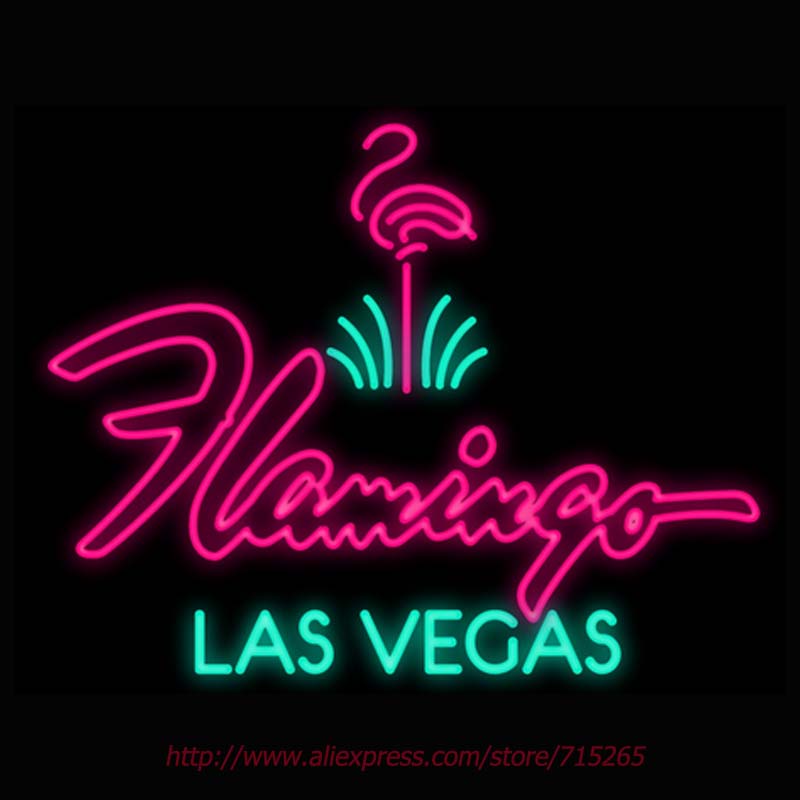
One of the places where I first drew inspiration from was the neon signs of a famous club in the Vegas Strip — The Flamingo. I have been fascinated from young about bars, clubs, parties and the razzmatazz of nightlife.
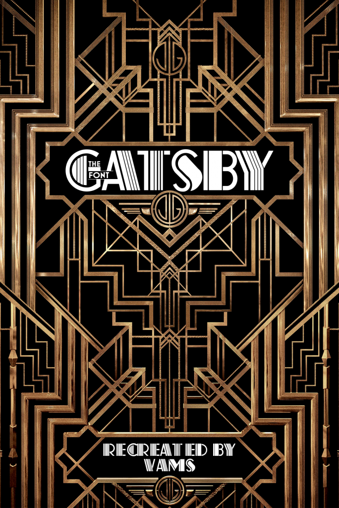
I tried to draw inspiration from the Great Gatsby as well; it was a great time to be living in where people who beginning to experiment with their own freedom and the limits of their wealth. This created the Art Deco period earmarked by flamboyant designs with luxurious embellishments.
I looked into Cabaret clubs and the iconography / typography, and they shared a similar flamboyance to the bars and clubs. I wanted to incorporate the neon lights of nightlife into my work, but I didn’t want my typographic art to be seen as too sleazy, so I decided against opting for too much embellishment at the risk of appearing obtuse.
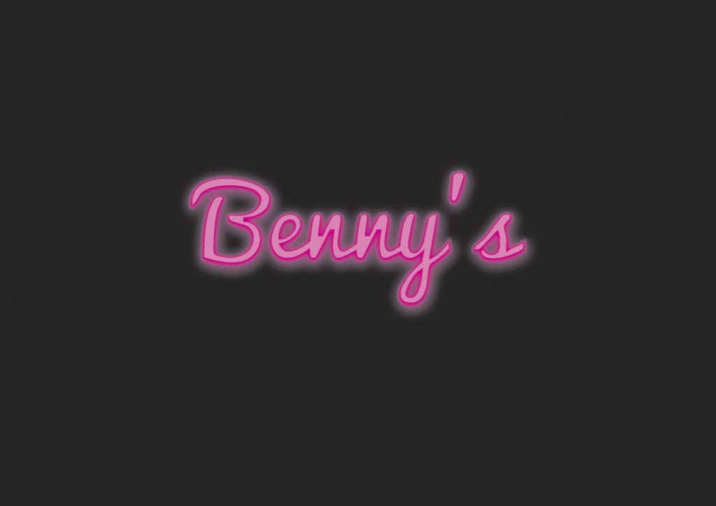
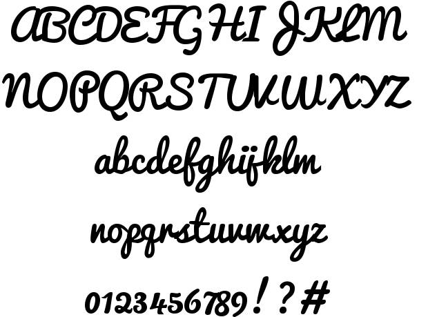
This was one of the first designs I came up with. The colour was drawn from the pinkish hues of the neon signs. The font I used was Pacifico, which was a cursive font with a certain handwritten quality to it. I liked the fact that it made the typographic art a bit more personal, but the drawback was that it was “too much like a family restaurant”, according to one too many people.
Another example I looked at was Heineken’s typographic ads.
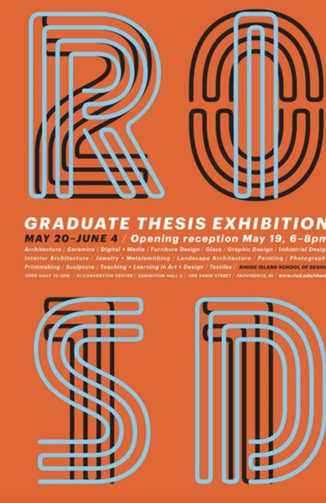
RISD’s exhibition poster made use of overlapping fonts, which I felt was quite neat but unnecessary if I applied it to my own work. Still, I could explore this idea if time allows.
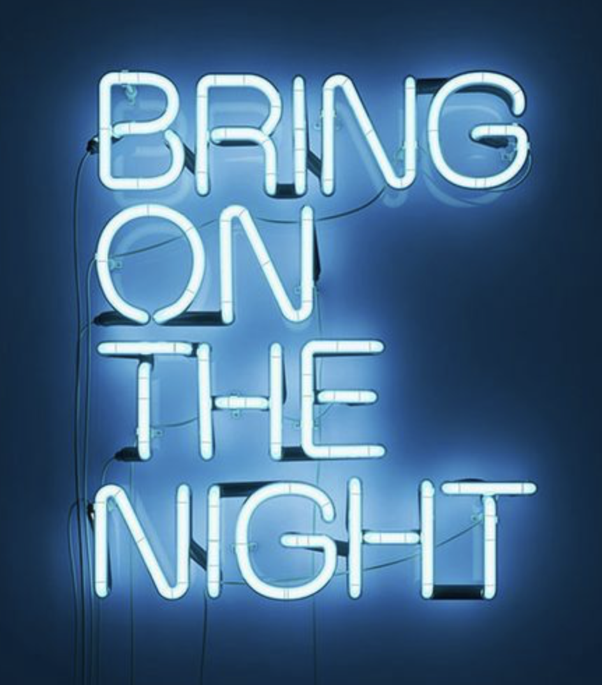
I liked this installation approach to typography, with the background of the design bringing out the intensity of the lighting.
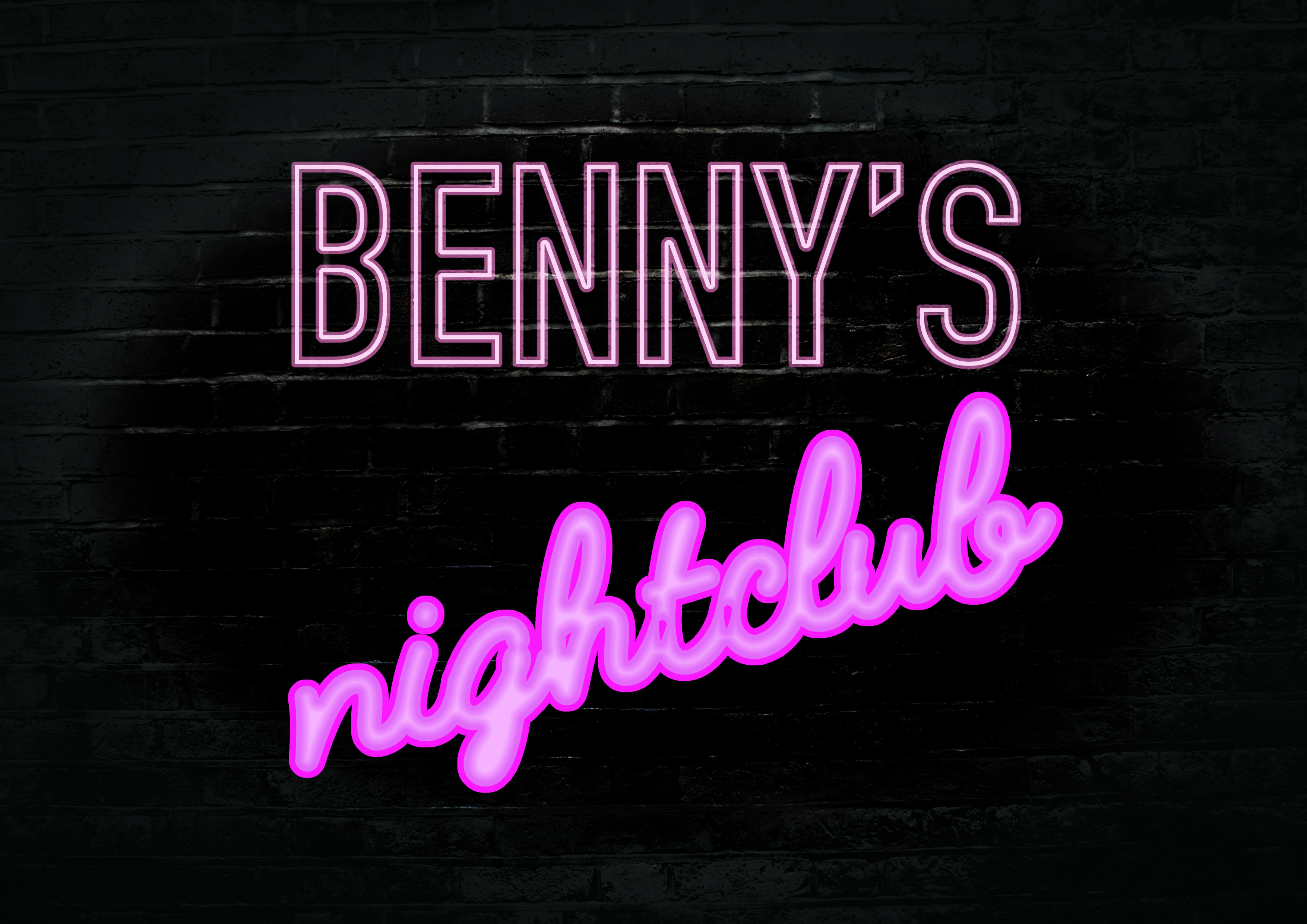
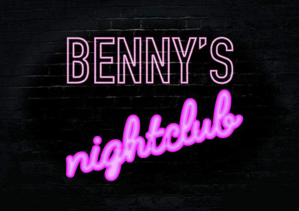
I developed a brick wall background and made it really dark. On hindsight it might’ve been a bit too dark. Selecting a more purplish color for the “nightclub” font, I tried to exaggerate the lighting effect as much as possible, and complement the fullness of the cursive neon with the more rigorous, but still dynamic hollow signage of “Benny’s”. I also gave “nightclub” a bit of slant so that the design wouldn’t be too static.
Fonts:
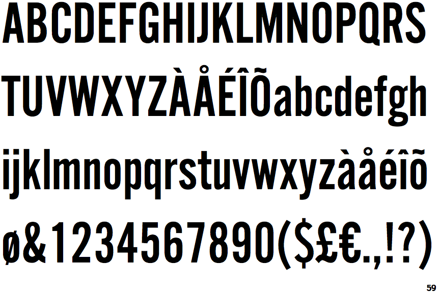
I liked the DIN alternate condensed because it was tight and compact. Neon signs are costly to maintain, so in order to make the sign realistic, real life considerations affected my selection of this clean and economic font.
Pacifico
The cursive of Pacifico complemented well with the straight-edged DIN. It was lively and helped make the signage pop.
Astronaut
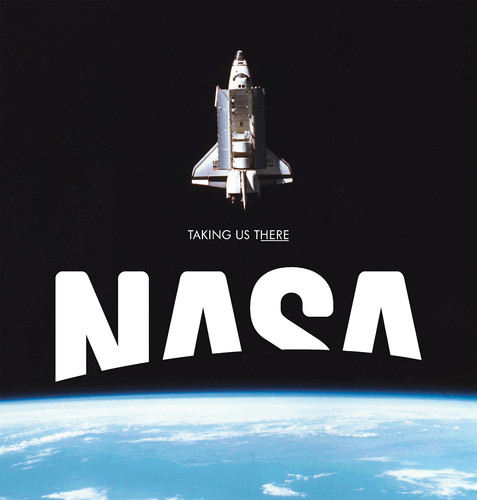
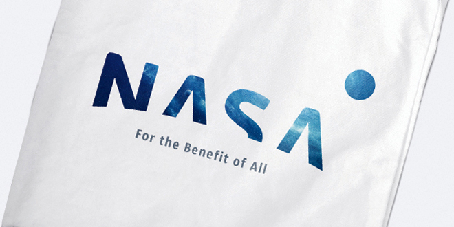
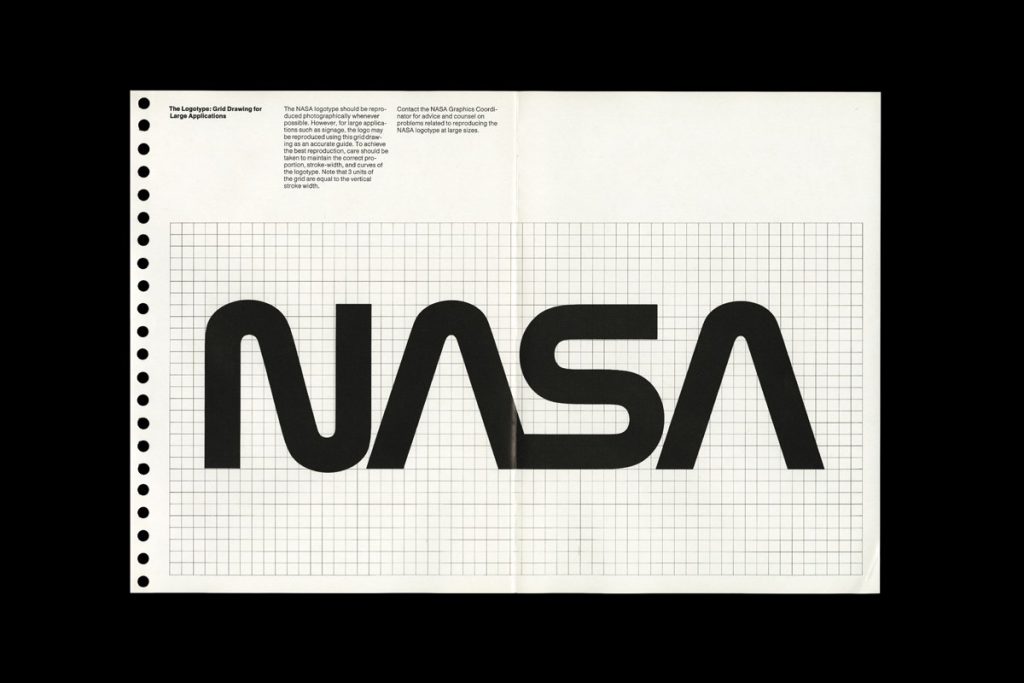
NASA, the quintessential place one would look to find inspiration for astronauts. Growing up, there was always a fascination with deep space, and when I was in my teens and a churchgoer I started to wonder if humans were the only ones that existed in this vast universe. I like NASA’s thick and smooth-edged font, almost mirroring the designs of the space shuttles it sends to space.
Form and function go hand in hand.
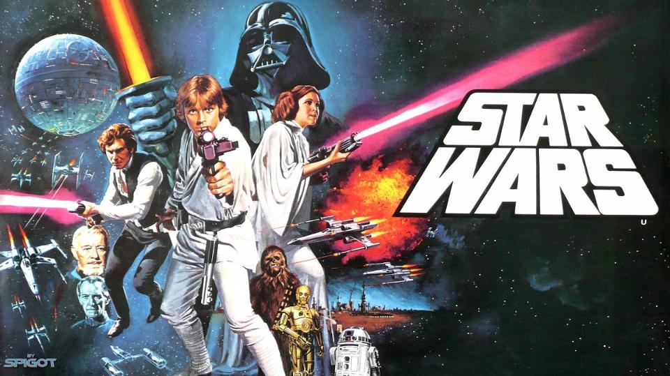
Star Wars also brought an added layer of curiosity, where inter-galactic conflict was possible and interplanetary travel was almost as easy as taking the bus. Along with the movies came a lot of iconography and typography which I drew from as inspiration. 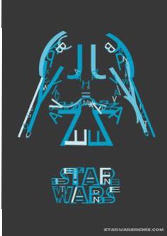
This is one of the examples of typographic art I found, and the character is Darth Vader.
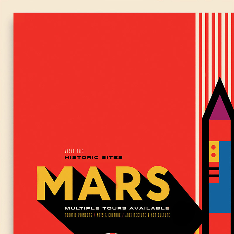
I liked this poster a lot as it uses color simply and effectively. The poster is composed such that not much is seen except for red. And Mars is known as the red planet. The yellow is used to denote light and the shadow stark black. The shapes used to make up the rocket are also simple and hard-edged. The adherence to simplicity is what makes this poster stand out, and makes me want to create something like this for the typographic assignment.
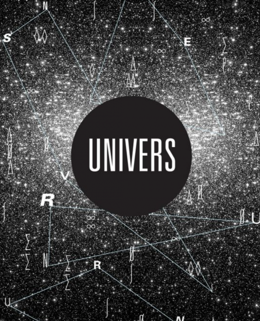
I also looked into the idea of constellation, whereby your name can be made up of many different letters scattered across the “universe”.
Unfortunately, quite a number of friends have used this concept for their assignments, which makes me a bit late to the party. 🙁
I’ll keep looking, and will work on new designs if better ideas come up.


Recent Comments