Tag: type

Organic type: Exploration and Final

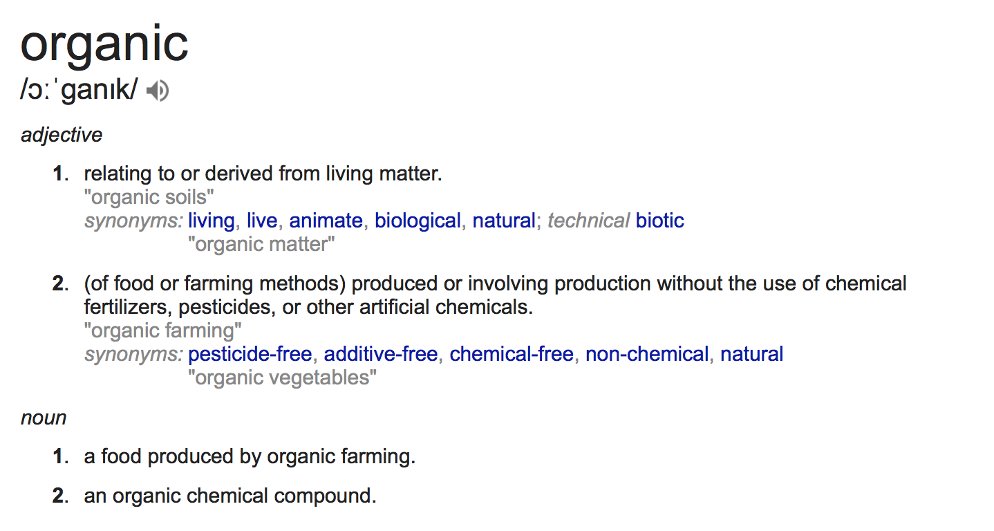
As the definition goes, organic type would have to do with something derived from living matter, away from the neon signs and corporate influence. I wanted to totally deviate from that line of thought, so I went the opposite way. Zen.

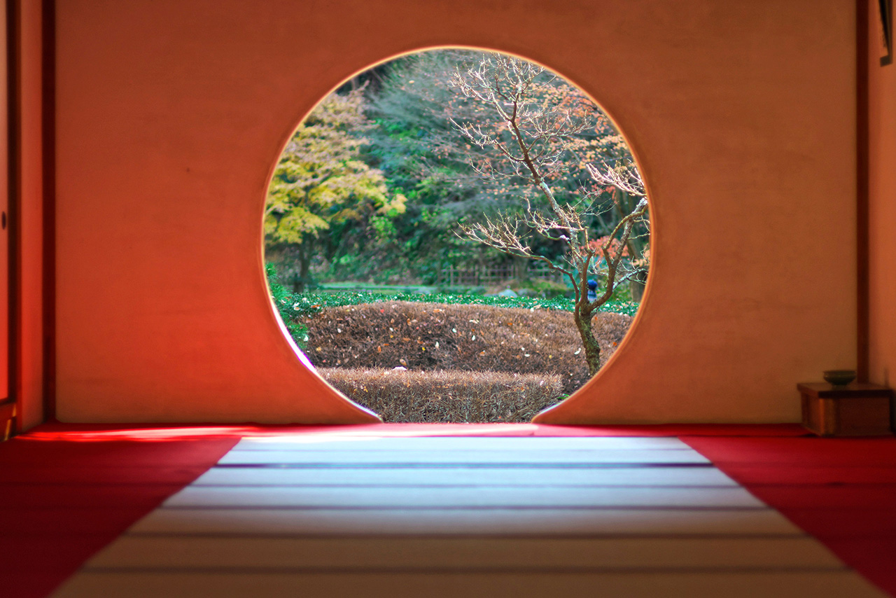
I went back to nature to look for inspiration. Focusing on nature and plants (as animal carcasses would be taking organic type to an extreme) I looked at how I would be able to bend an organic form into a manmade form aka type.


I started off by gathering leaves and twigs. What would add visual interest would be these tiny fig leaves that would fall along with the twigs. Having dried up, they had a tanned, crisp look that i thought would go well with the dried twigs.

Before consultation, this was what I came up with. I split the thickness of twigs between the 2 words; with NATURE having the thinner twigs and BECKONS consisting of the thicker twigs. I thought it would emphasise the word BECKONS. What I didn’t realise was that it looked strange as the 2 words didn’t appear unified. Furthermore, the awkward space between the 2 words made the phrase look disjointed. Fortunately, the plus point was that the leaves did add interest.

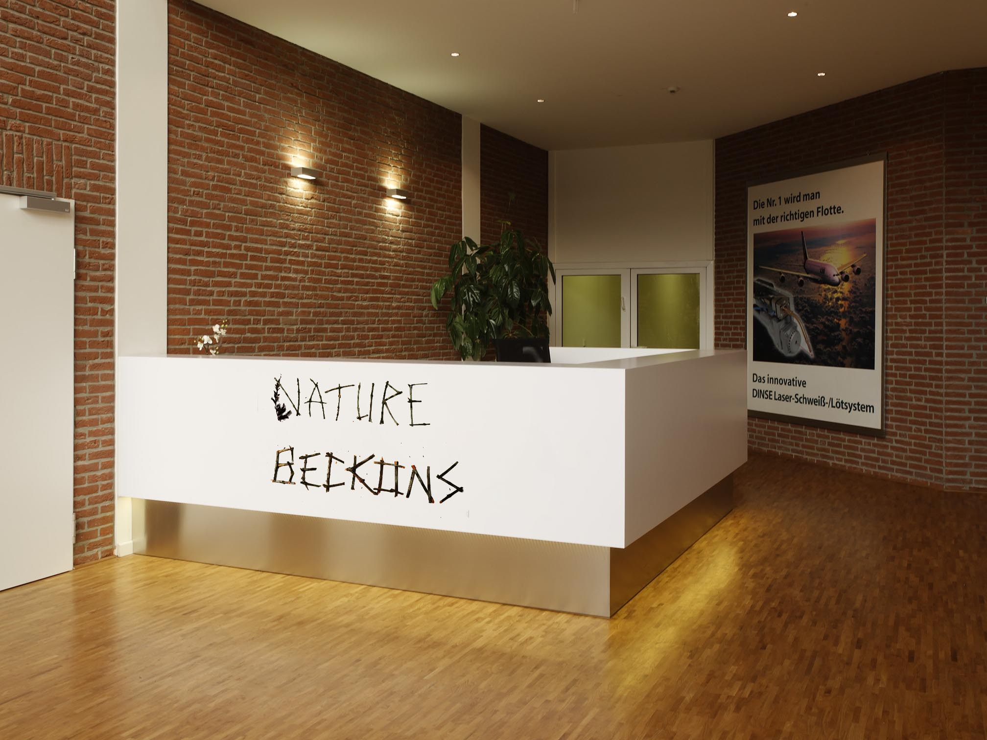
The application of the first round of exploration also yielded much to be desired. The type was not the focus on the picture in the office desk on the left, and the structure of the words on the bottom ad were also haphazardly placed.

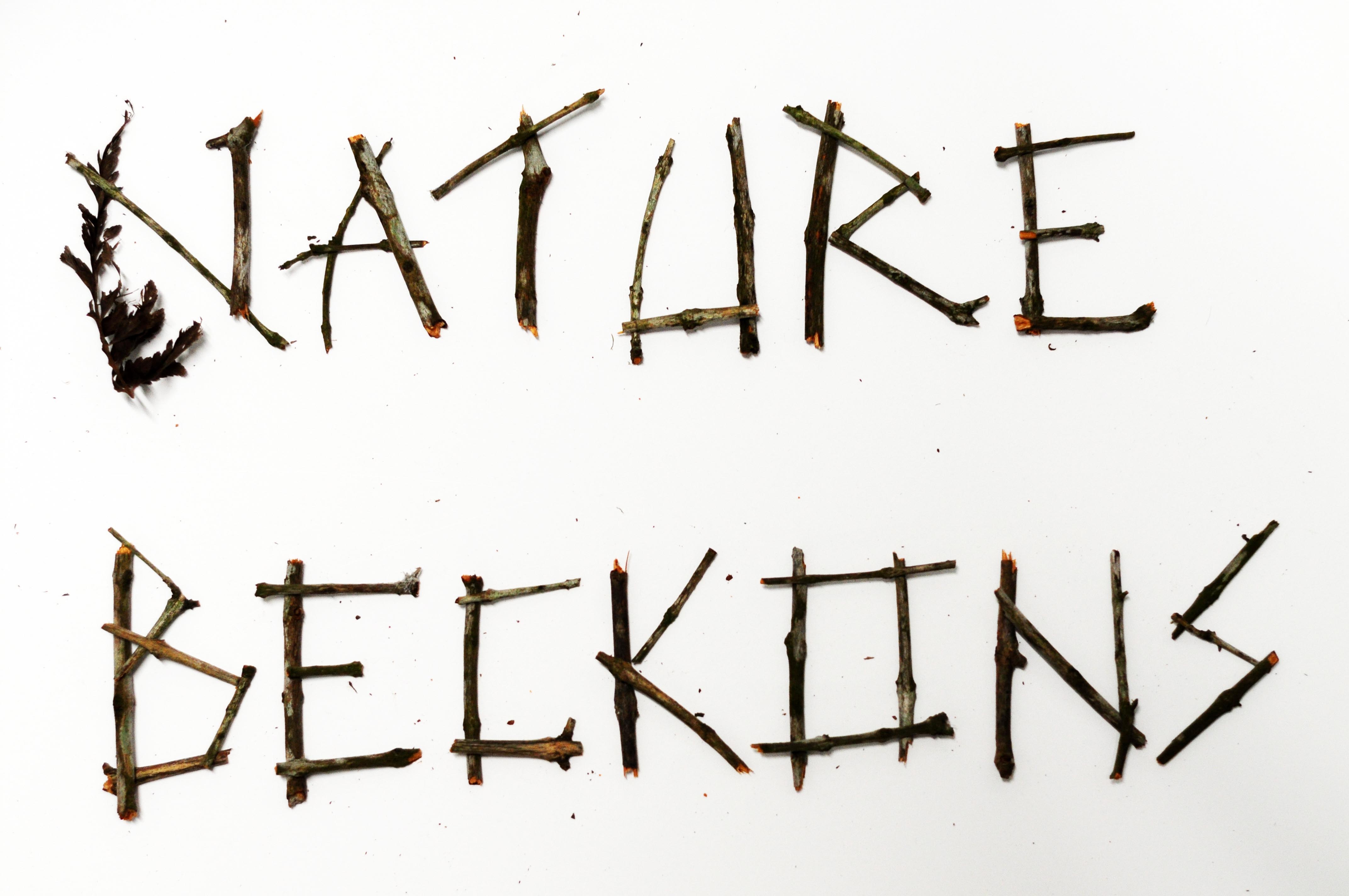
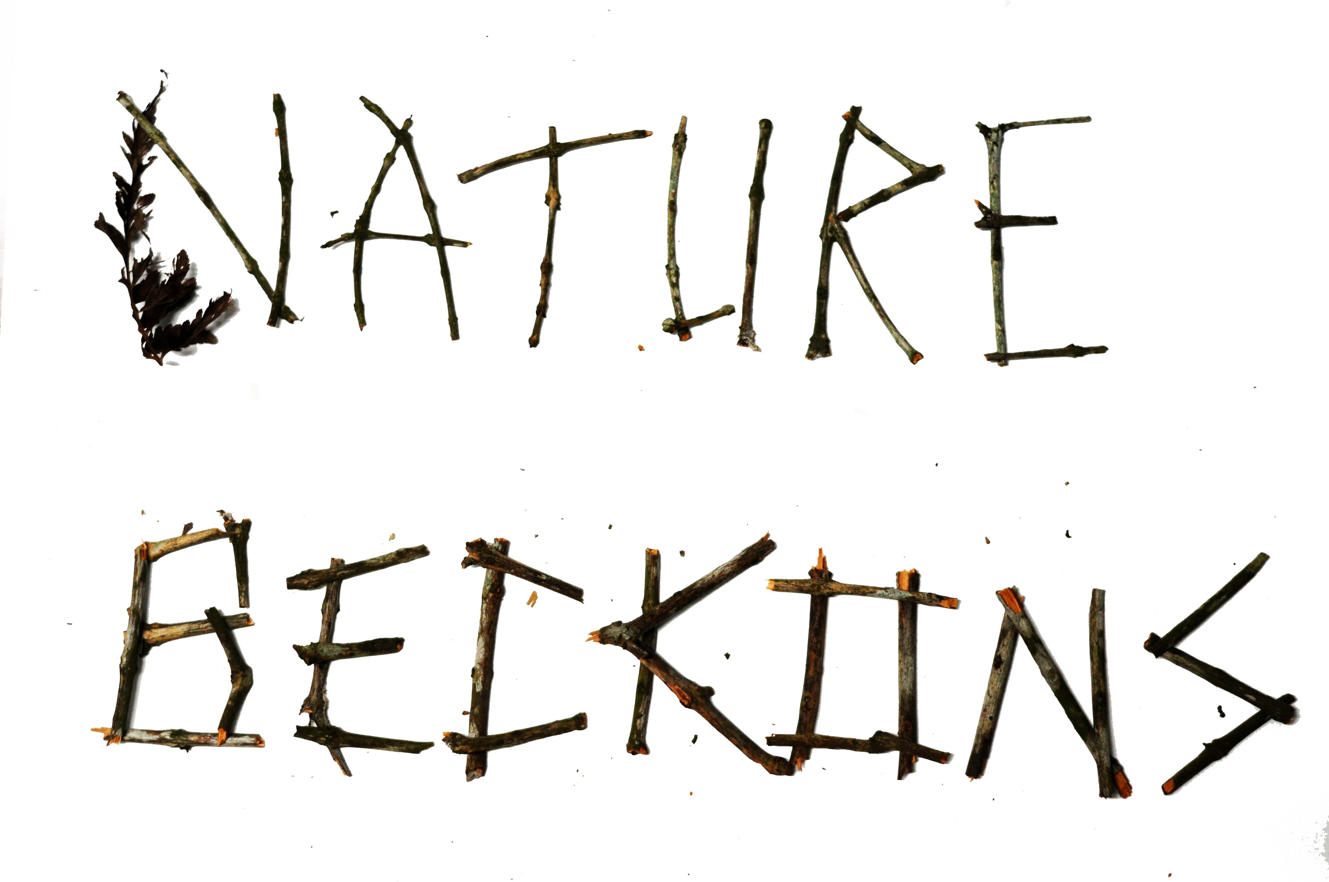
This was the result post-consultation. I mixed up the different densities of twigs and came up with a hybrid typeform. This looked a lot more unified. However, there was still work to be done regarding the space between the 2 lines of words. Angeline also suggested that I play with the texture of the twigs, shaving some off to reveal the orange bark beneath.

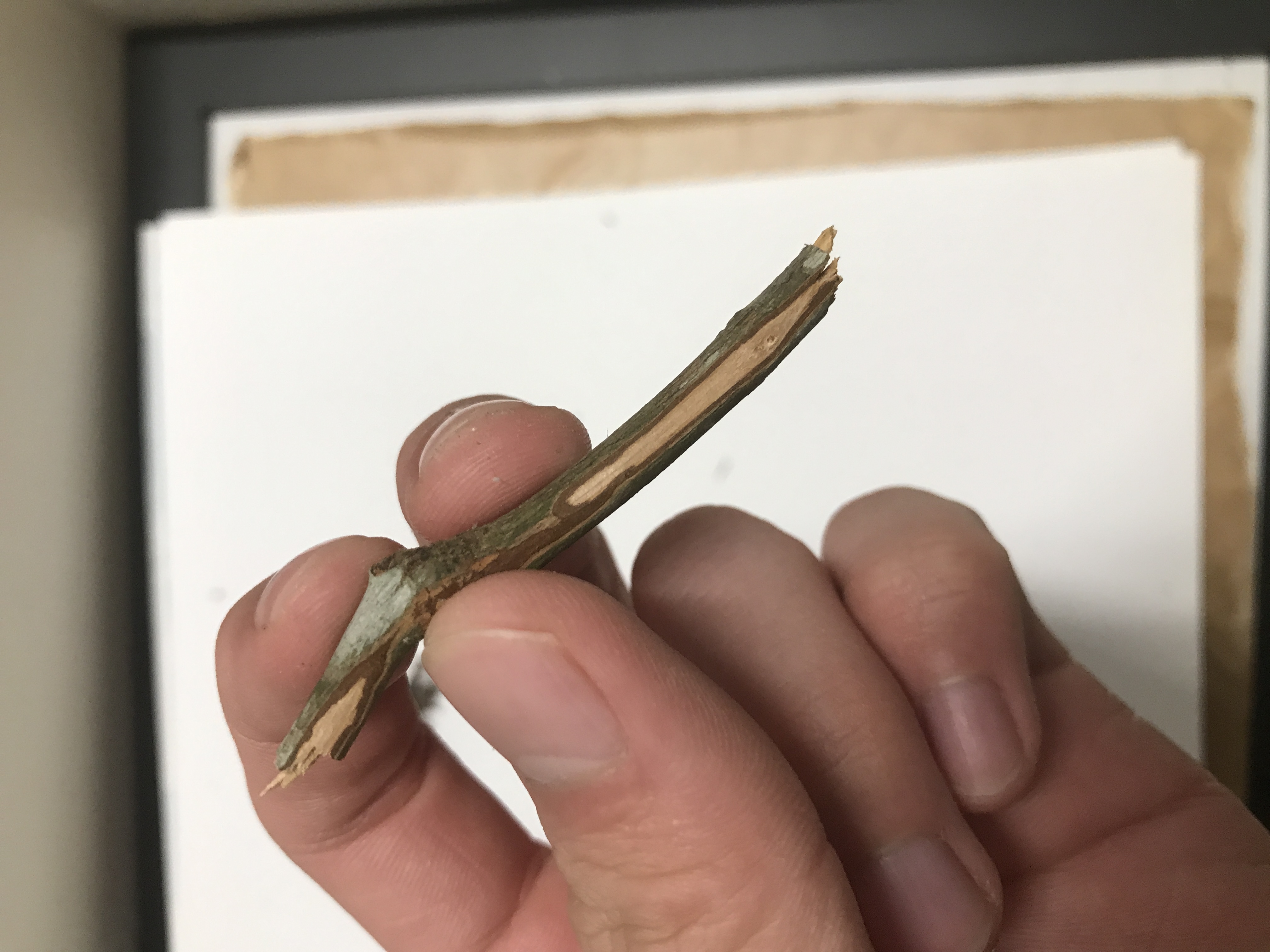
Above is the result of shaving off a piece of twig. It looks absolutely beautiful, with a touch of wabi sabi, with imperfections enhancing its beauty.


Having explored with the twig densities, I spruced in a few more leaves intermittently which resulted in a pattern of foliage. The shaved twigs gave the twigs a lot more life. I also corrected the spacing between the 2 words, bringing them closer. The result was a more unified typeform.

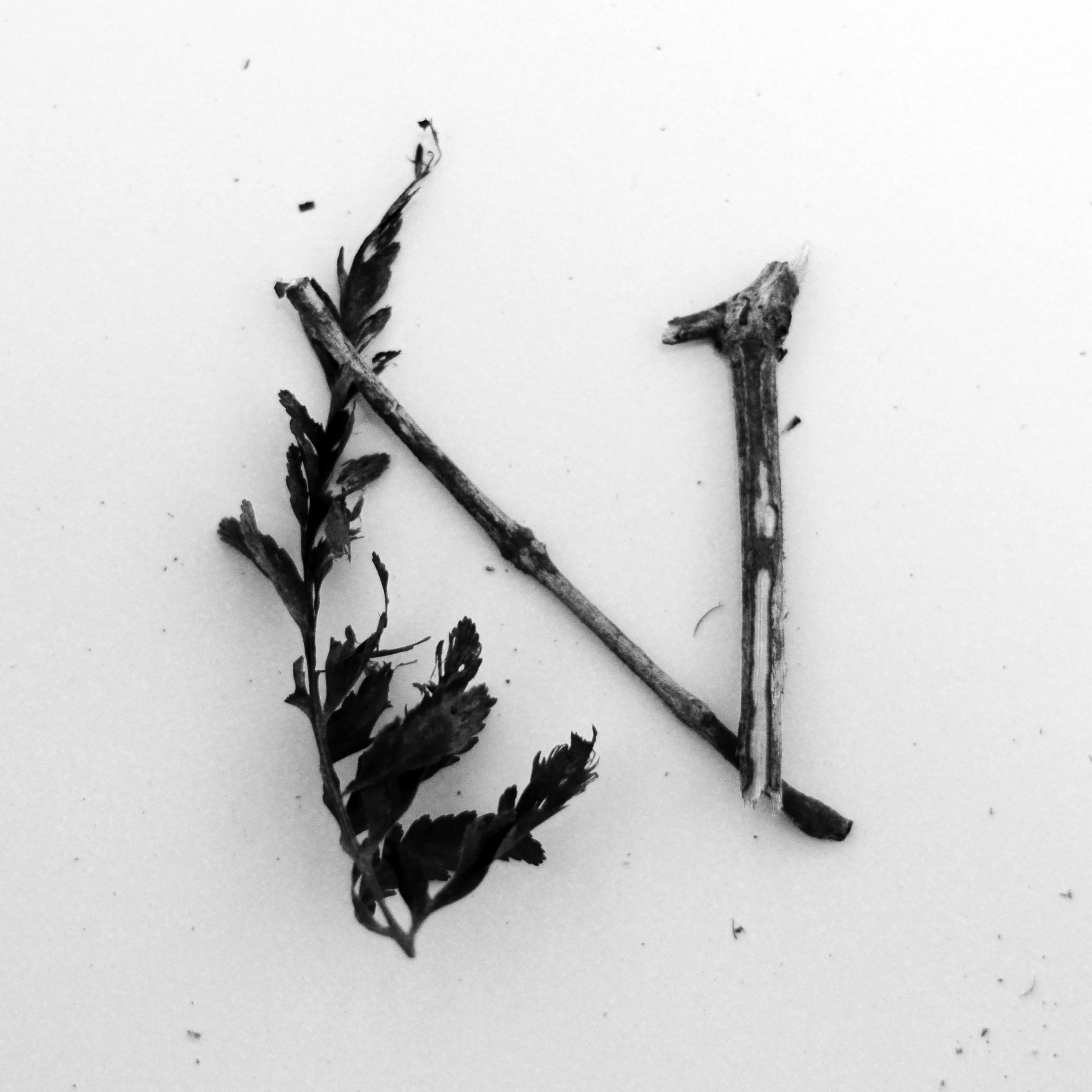
My choice for the single letterform would be N, as it has 3 interesting features.

  1. The leaves and twigs bend inwards slightly, giving the form a lot of holding strength and visual unity.
  2. The overlapping forms do not interrupt one another, allowing the viewer’s eyes to travel from left to right, inviting participation.
  3. I love the right terminal, almost similar to a serif font. Gives credibility to an organic type.

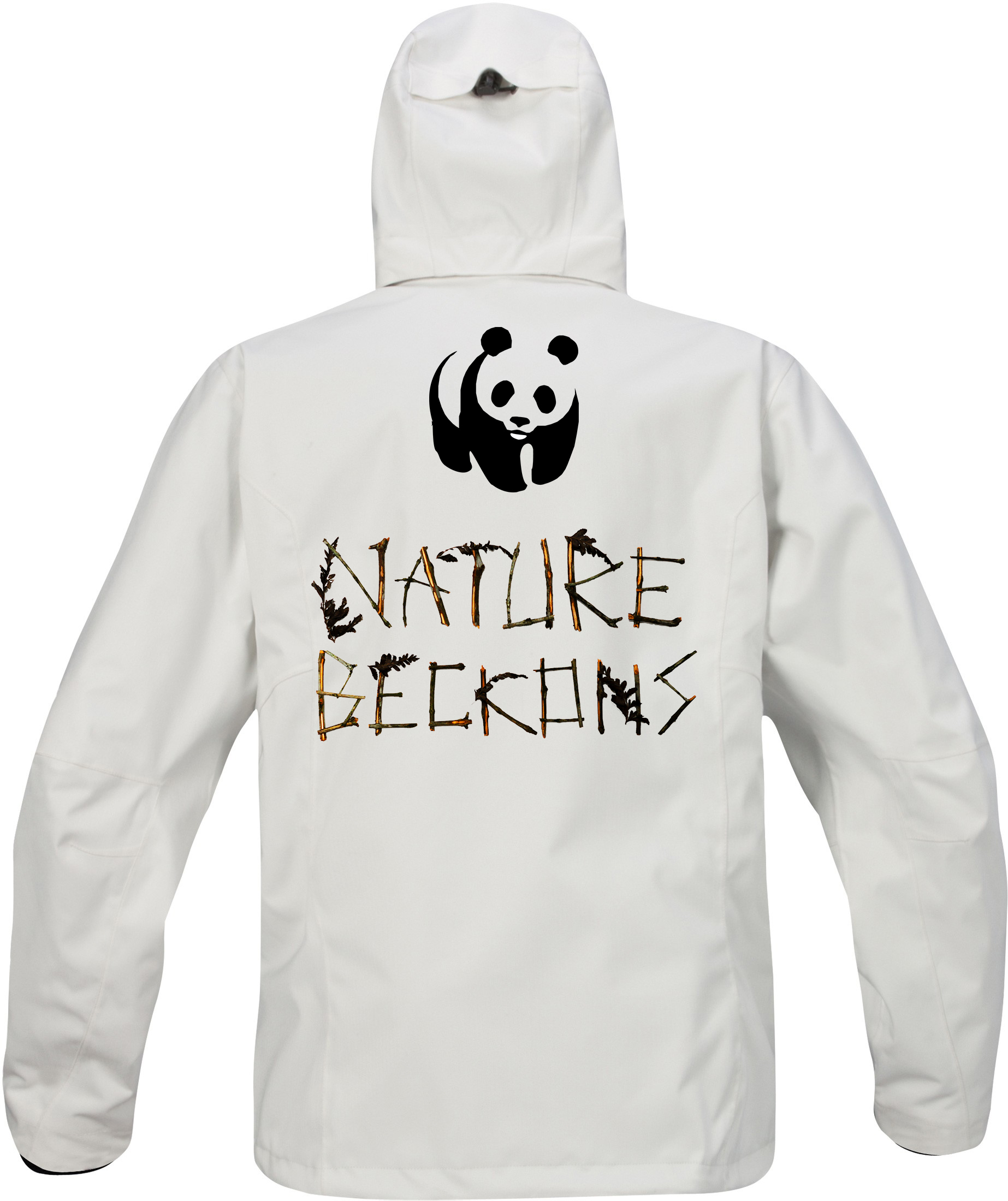
To establish credibility, the first potential partner I would pitch to would be World Wildlife Fund. This could be a jacket for conservationists and scientists.

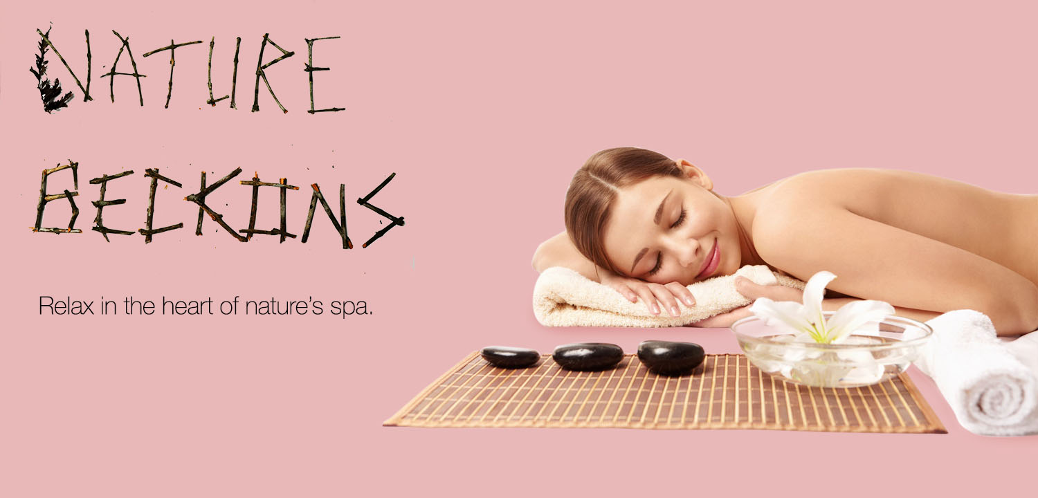
These 2 ads are based on the notion of relaxation and adventure in the outdoors.

This project has really surprised me in terms of the ability to morph something from nature into a legible, engaging typeface. I will definitely seek inspiration from organic type in future.

Vernacular Type: Exploration and Final

For this project, I started off with a night shoot, exploring the unseen nightlife of Tanjong Pagar. What got me inspired was the song by rapper Jay Z, Heart of the City. The gritty, groovy track with its smooth lyrics felt very apt for the series of night shots.

https://www.youtube.com/watch?v=hcWAvBb65bc

^ that’s the song if you wanna listen.

I started off with Guoco Tower, an office building just outside the train station. I like the sans serif typeface and the illuminated background.

Times New Roman, usually seen on road processors but adorned on the signage outside Maxwell Rd.

Love the Tron Legacy vibes.

Japanese Restaurant near Guoco Towers.

Richard Branson’s famous Virgin Group also has a fitness club here. Love the V and the upward swoosh of the logo.

A bar.

Another cafe-bar.

Yet another cafe. But this one’s quite cool as it has the concept of mini trains / traintracks everywhere in its interior.

Every wannabe Instagram influencer should join this club.

Draft has a bar along the stretch too.

This is a Korean street food restaurant. The custom fonts can take some time getting used to though.

One of my favourite, the neon signs with fluorescent lighting reflecting off the black boards, creating an intriguing and arresting image of nightlife.

As i walked farther, I came across a creative agency with the name CRE8. Awesome stuff.

Like the icon and typeface of this patisserie. Very art deco, a tad bit flamboyant but matching the luxurious interiors as well.

Finally, a neighborhood jewellery store with a good old storefront sign.

I decided to go with Heart of the City as I think it reflects the mood of Tanjong Pagar. It is, after all, a business district laden with eateries, pubs and pockets of entertainment at night. As with any financial district, nightlife is often nearby due to the affluence and decadence that surrounds the place. The use of light to enhance the visual imagery of typography is something I could perhaps explore further. I’ll be going back to Tanjong Pagar soon for a day shot.


The electric night scene of Tanjong Pagar left a deep impression on me as I walked through the streets, bathed in a neon hue. I tried to soak it all up, and then it hit me. Tanjong Pagar wasn’t just a place for you to drink alcohol after a hard day’s work in the CBD, it was also a place where you could simply get lost in, drinking in the vibes of the place.

The first composition more balanced and structured than the second. The word BEAMS is larger than the rest, as it is the focus puller of the entire phrase. THE and NEON and almost like an afterthought, but positioned with negative space in between. This separates “neon beams” with ‘drinkin the”, splitting the phrase into smaller chunks, enhancing readability. There is also a bit of space in between the horizontal blocks of words, splitting them up and making them more readable as well. Overall, this is a balanced, symmetrical composition.

The second composition is more dynamic, with NEON BEAMS rearranged in a more chaotic fashion. With the irregular positioning, some of the unique features of certain typefaces can be seen. The O of NEON looks almost like an eclipse with its organic, minimalistic form. This enhances the visual meaning of the whole word. BEAMS is also arranged in a jagged fashion, with A jutting out as the “peak”. I wanted to activate the negative space between NEON and BEAMS as well, thereby creating a tension that would add visual interest. Overall, this is a more asymmetric composition that has more energy and tension. One can almost feel the electricity of nightlife here.

The letterform that I have chosen is M. Notice how the M is almost made up of 2 Vs. I have a love for anything that is art deco, and this letterform just screams ART DECO. I’m a sucker for anything that looks stylish and lavish. Its simple angular forms also gives it strength. It would look good on its own as a logotype too.

In summary, I have grown to appreciate the use of type in our everyday lives, and the invisible influence that it has on branding and community building.