Tag: typography

Assignment 4: RnD + Final

My project’s theme is based on architecture x photography. I aim to use architectural photography to express the 26 letters of the alphabet. This is achieved through composition and cropping of architectural features.

I started off with 2 moodboards with the central themes of type as architecture and type as human anatomy.

I decided to go with type as architecture as I felt it would be more interesting looking for local architecture with interesting features rather than simply illustrating human organs and morphing them into type.

The following are the images taken around (but not limited to) Suntec City, Promenade, City Hall (National Gallery, Victoria Concert Hall), Outram Park (People’s Park Complex, Pearl Bank Apartments), Clarke Quay, Bencoolen MRT station, Victoria Street, Dhoby Ghaut.

With this compilation of photos, I began to work on creating the alphabet.


After editing the photos, I managed to come up with the 26 letters.

A

B

C

D

E

F

G

H

I

J

K

L

M

N

O

P

Q

R

S

T

U

V

W

X

Y

Z


On top of the book, I also designed a promotional poster for architectural photography.


This is the printed version of the typographic book. I chose Futura as the typeface as I felt it was clean, geometric and simple, much like the architectural forms I tried to simplify. I also used ring binding as I felt it would better resemble an architecture lookbook with a skeletal spine exposed, almost like “scaffolding”.

Assignment 3: process and final

Task 1: Type as Image

Font: I decided to use experiment with Rockwell and Lucida Grande as they were serif and sans serif fonts respectively and I wanted to test the contrast between both fonts.

Final image 1:

I started off by burning the edges of the paper, before the lower right leg of the A came right off. It looked good contrasting the organic forms with the rigid serifs of the letterform. I also played with inverse and it had an old school charm about it, almost similar to American Horror Story.


Next, I threaded strips of  X through each other, creating a crochet effect. It didn’t look as good in inverse as A.


Final image 2:

On top of the above 2 manipulations, I also cut Q into close strips, creating a feathery effect. Although a lot of people liked this design during consultation, I felt that the A was still better because it could invoke a feel from a different era. The T was cut vertically before cutting off segments of the stem and reorganising them together.

There was also the simple manipulation where I folded a piece of paper in half, and inversed the image. That looks possibly like a logo.

I also played with close-ups of type, namely Rockwell. These experimentations produced some beautiful abstract forms.


Task 2: Type as patterns

Font: I chose Giddyup as I liked its playful spirit, with its twirling tails and thin squiggly strokes.

Final pattern 1:

I made this pattern out of the letter Q, rotating it and creating a clover shaped pattern.

Final pattern 2:

I made this pattern out of the letter S, layering over a black background and working with greys. I created an alternate pattern of grey and darker grey to give the pattern a sense of depth.

I also experimented with Didot, making this HDB-like pattern made up of Hs.


This series of mask-like patterns were made out of Museo 700 Fs.

I also played with Futura Cs, tiling them up and playing with scale.


Task 3: Type as emotions

Font: I chose Futura as it was quite a versatile font yet not as ubiquitous as Helvetica. I used Regular and Bold in my compositions.

Final image 1: Confused

I stacked the different letters atop each other in a haphazard way, similar to the way a confused person thinks; with logic jumbled up and lacking any coherence. The negative space between the letterforms also adds interest.

Final image 2: Arrogant

I wanted to represent the way a character is larger than life, having excessive confidence, even referring to himself in third person. Its an overbearing presence that could easily be seen as arrogance.

Final image 3: Depressed

I wanted to portray the image of someone jumping off a building, or doing that mentally. Depression often entails “falling into the depths of despair”. In this image, shrouded in the darkness, the last vestiges of hope are extinguished, with the o barely visible, almost like a life extinguished.

Final image 4: Friendly

This was a fairly simple concept. I used italics for this emotion as it mirrors speaking breezily and in a lighthearted tone. The arc of words resemble a wave, as though the ‘hello’ is beckoning to a friend.

I also explored other variations which were hit and misses.

Organic type: Exploration and Final

As the definition goes, organic type would have to do with something derived from living matter, away from the neon signs and corporate influence. I wanted to totally deviate from that line of thought, so I went the opposite way. Zen.

I went back to nature to look for inspiration. Focusing on nature and plants (as animal carcasses would be taking organic type to an extreme) I looked at how I would be able to bend an organic form into a manmade form aka type.


I started off by gathering leaves and twigs. What would add visual interest would be these tiny fig leaves that would fall along with the twigs. Having dried up, they had a tanned, crisp look that i thought would go well with the dried twigs.

Before consultation, this was what I came up with. I split the thickness of twigs between the 2 words; with NATURE having the thinner twigs and BECKONS consisting of the thicker twigs. I thought it would emphasise the word BECKONS. What I didn’t realise was that it looked strange as the 2 words didn’t appear unified. Furthermore, the awkward space between the 2 words made the phrase look disjointed. Fortunately, the plus point was that the leaves did add interest.

The application of the first round of exploration also yielded much to be desired. The type was not the focus on the picture in the office desk on the left, and the structure of the words on the bottom ad were also haphazardly placed.

This was the result post-consultation. I mixed up the different densities of twigs and came up with a hybrid typeform. This looked a lot more unified. However, there was still work to be done regarding the space between the 2 lines of words. Angeline also suggested that I play with the texture of the twigs, shaving some off to reveal the orange bark beneath.

Above is the result of shaving off a piece of twig. It looks absolutely beautiful, with a touch of wabi sabi, with imperfections enhancing its beauty.


Having explored with the twig densities, I spruced in a few more leaves intermittently which resulted in a pattern of foliage. The shaved twigs gave the twigs a lot more life. I also corrected the spacing between the 2 words, bringing them closer. The result was a more unified typeform.

My choice for the single letterform would be N, as it has 3 interesting features.

  1. The leaves and twigs bend inwards slightly, giving the form a lot of holding strength and visual unity.
  2. The overlapping forms do not interrupt one another, allowing the viewer’s eyes to travel from left to right, inviting participation.
  3. I love the right terminal, almost similar to a serif font. Gives credibility to an organic type.

To establish credibility, the first potential partner I would pitch to would be World Wildlife Fund. This could be a jacket for conservationists and scientists.

These 2 ads are based on the notion of relaxation and adventure in the outdoors.

This project has really surprised me in terms of the ability to morph something from nature into a legible, engaging typeface. I will definitely seek inspiration from organic type in future.

Vernacular Type: Exploration and Final

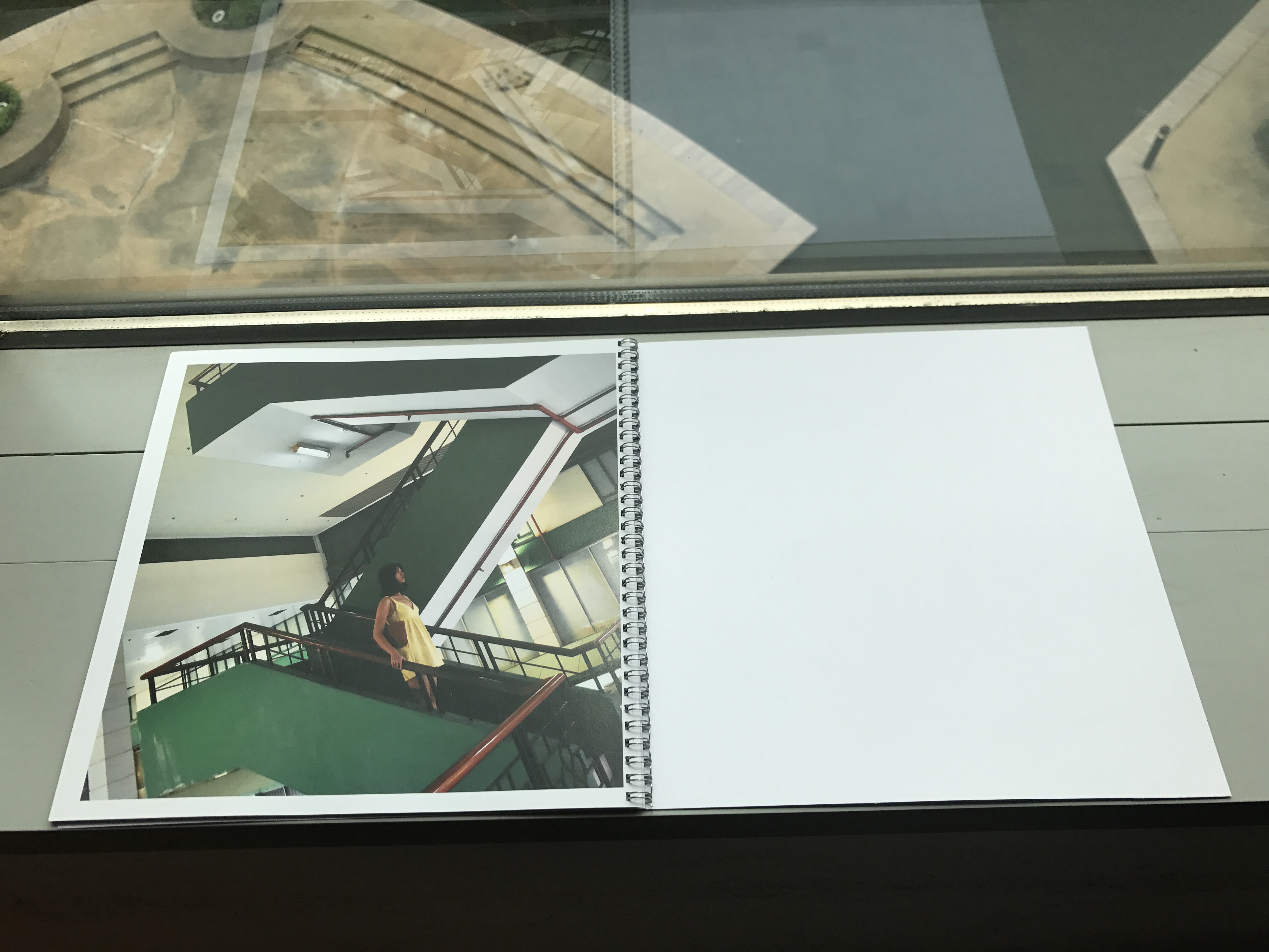
For this project, I started off with a night shoot, exploring the unseen nightlife of Tanjong Pagar. What got me inspired was the song by rapper Jay Z, Heart of the City. The gritty, groovy track with its smooth lyrics felt very apt for the series of night shots.

https://www.youtube.com/watch?v=hcWAvBb65bc

^ that’s the song if you wanna listen.

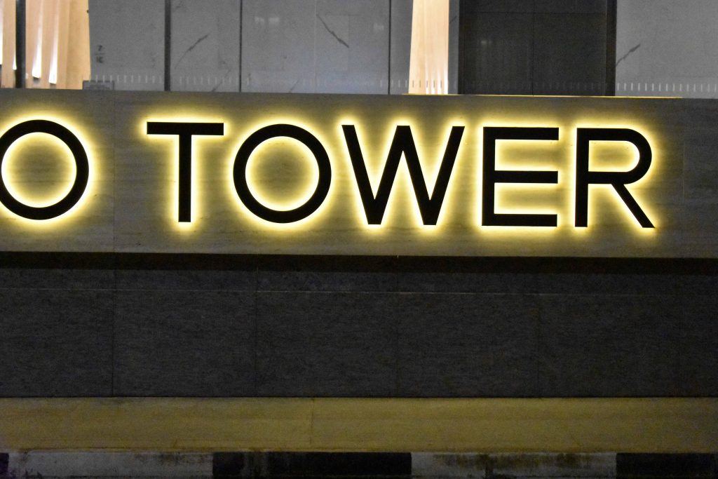
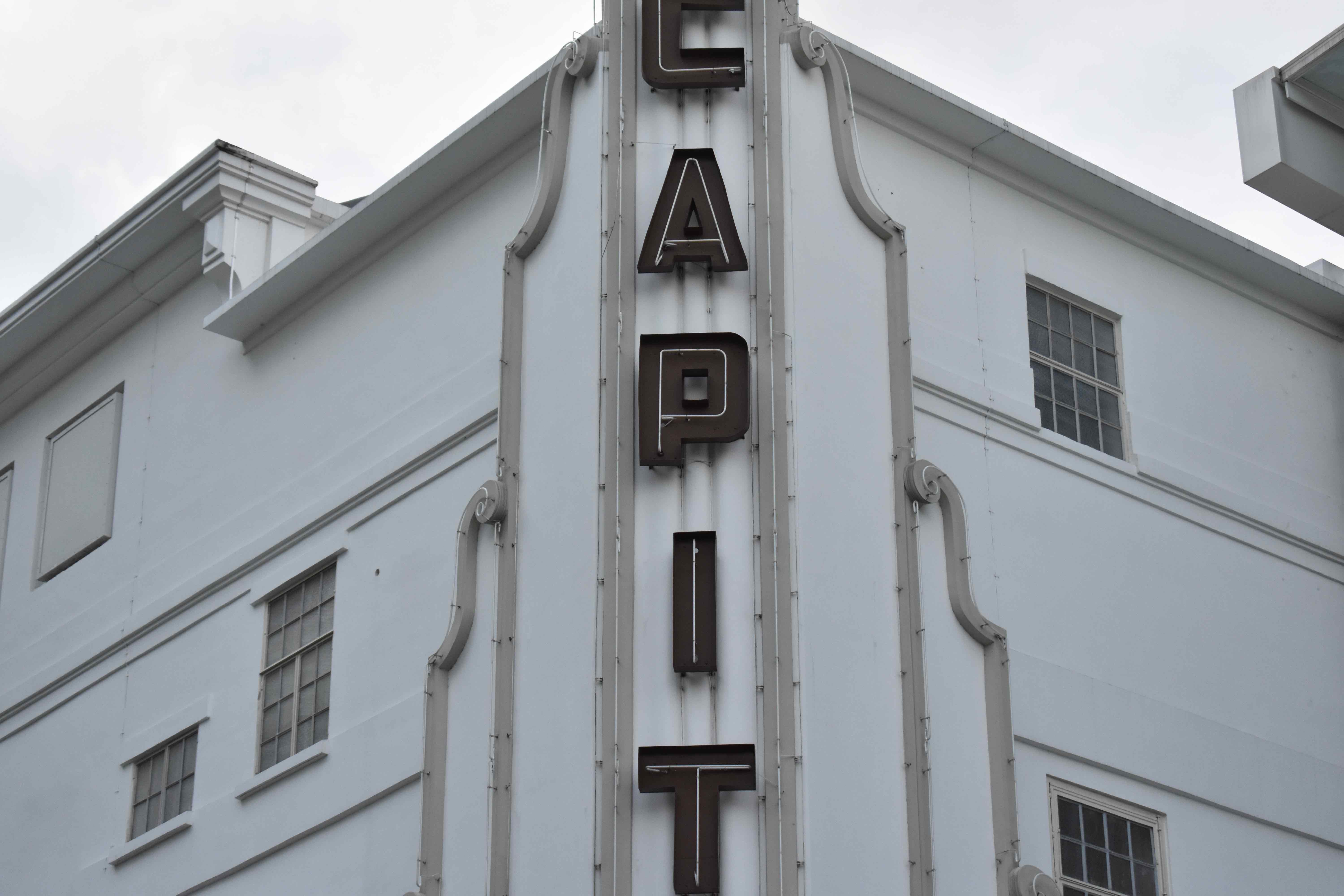
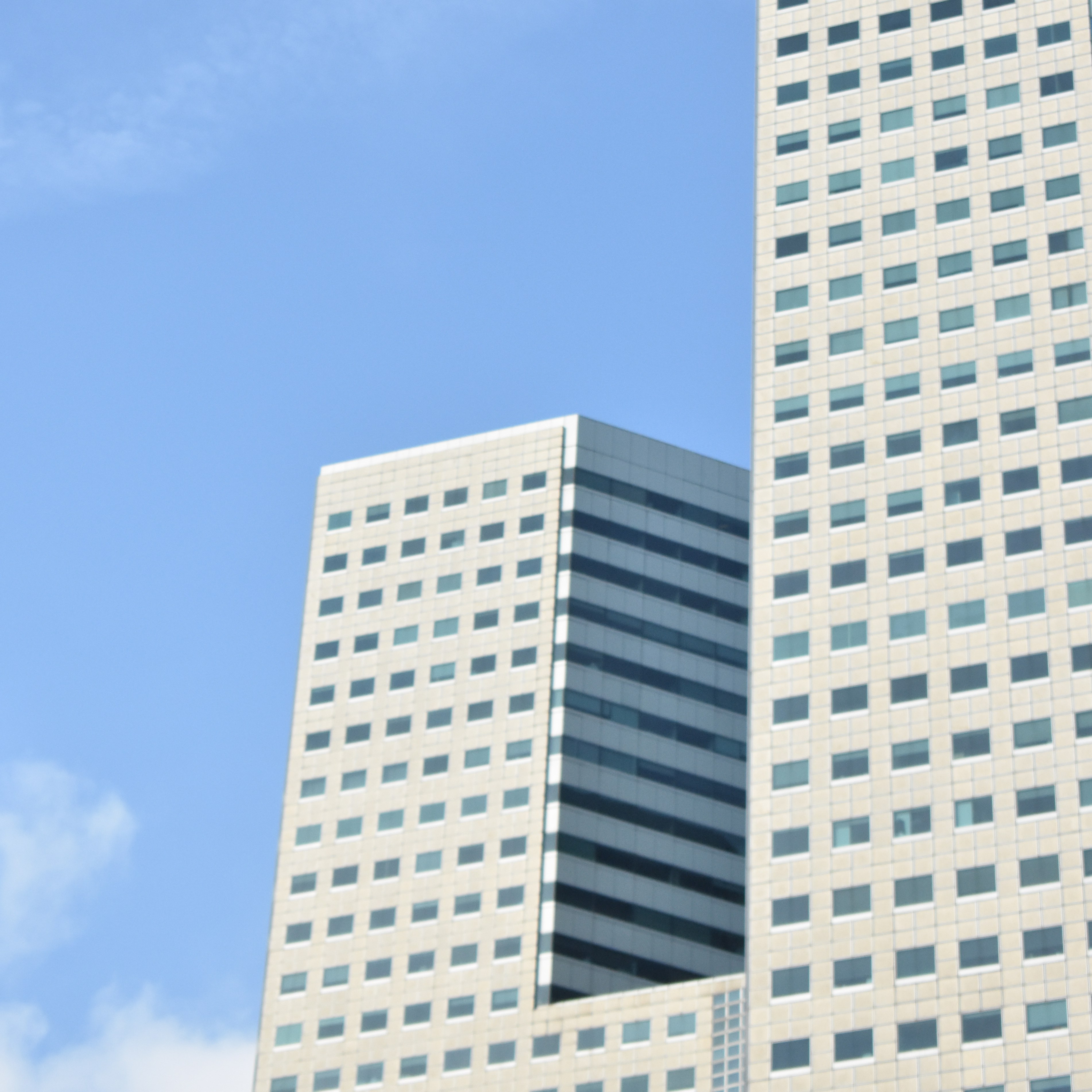
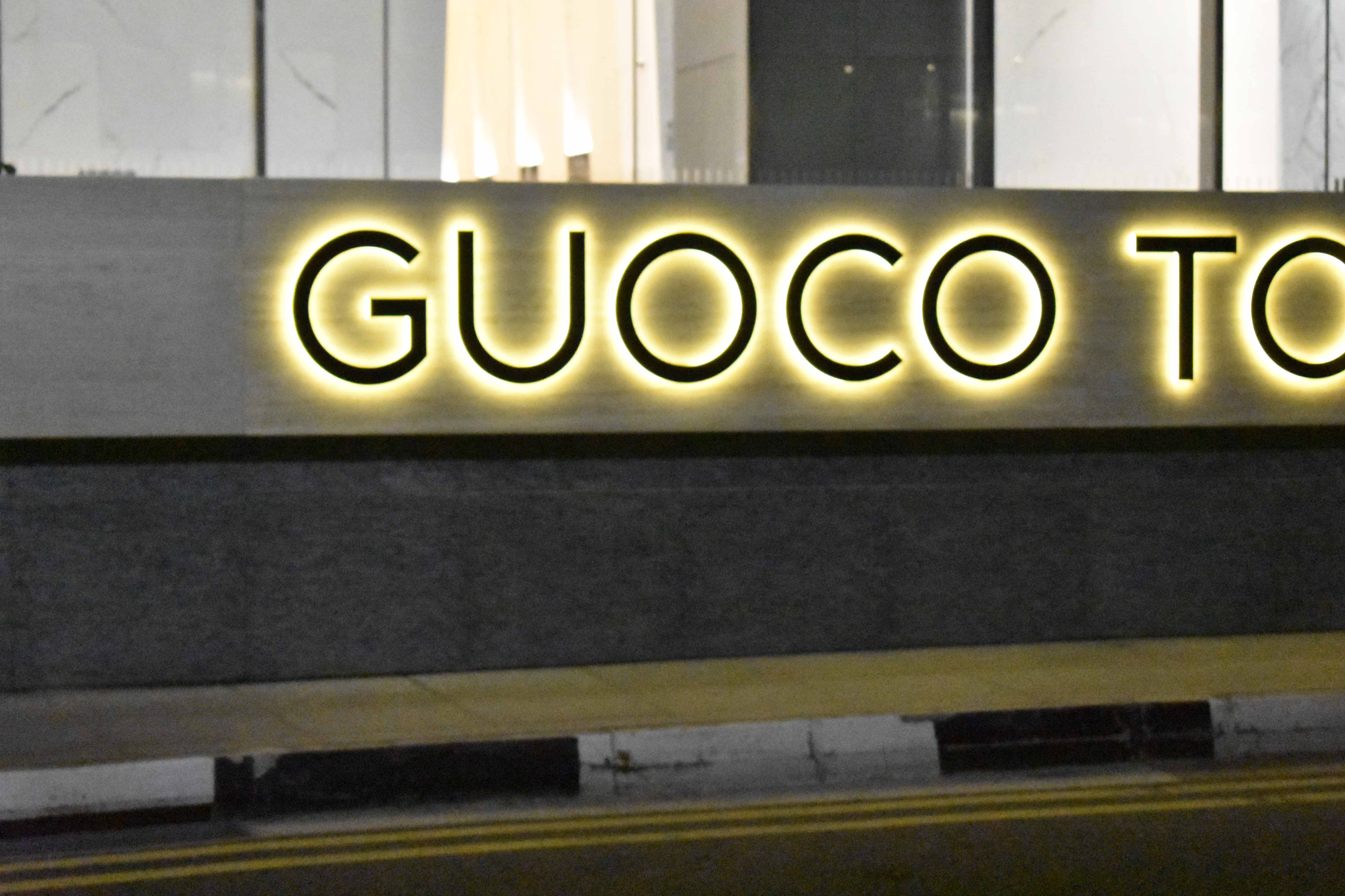
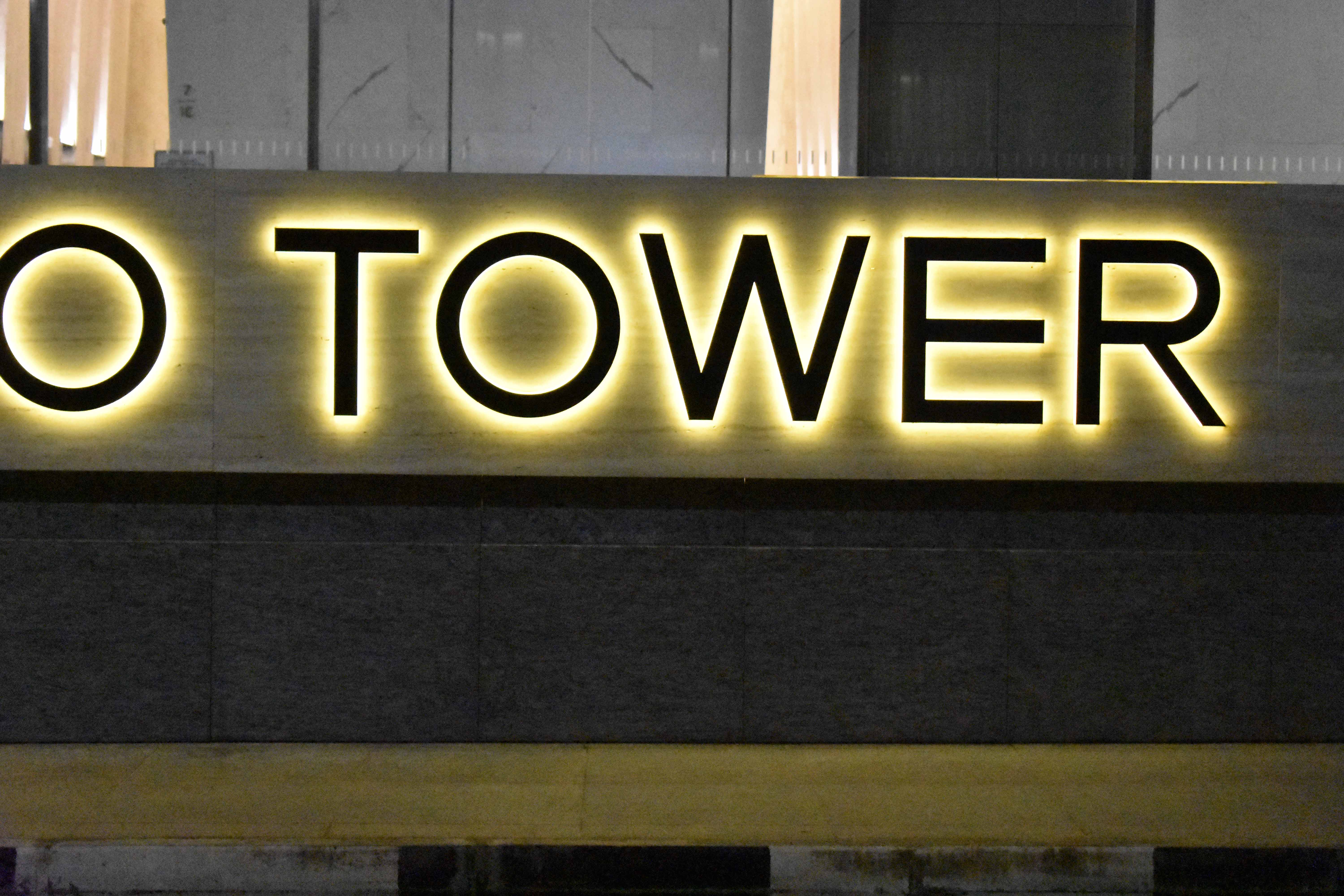
I started off with Guoco Tower, an office building just outside the train station. I like the sans serif typeface and the illuminated background.

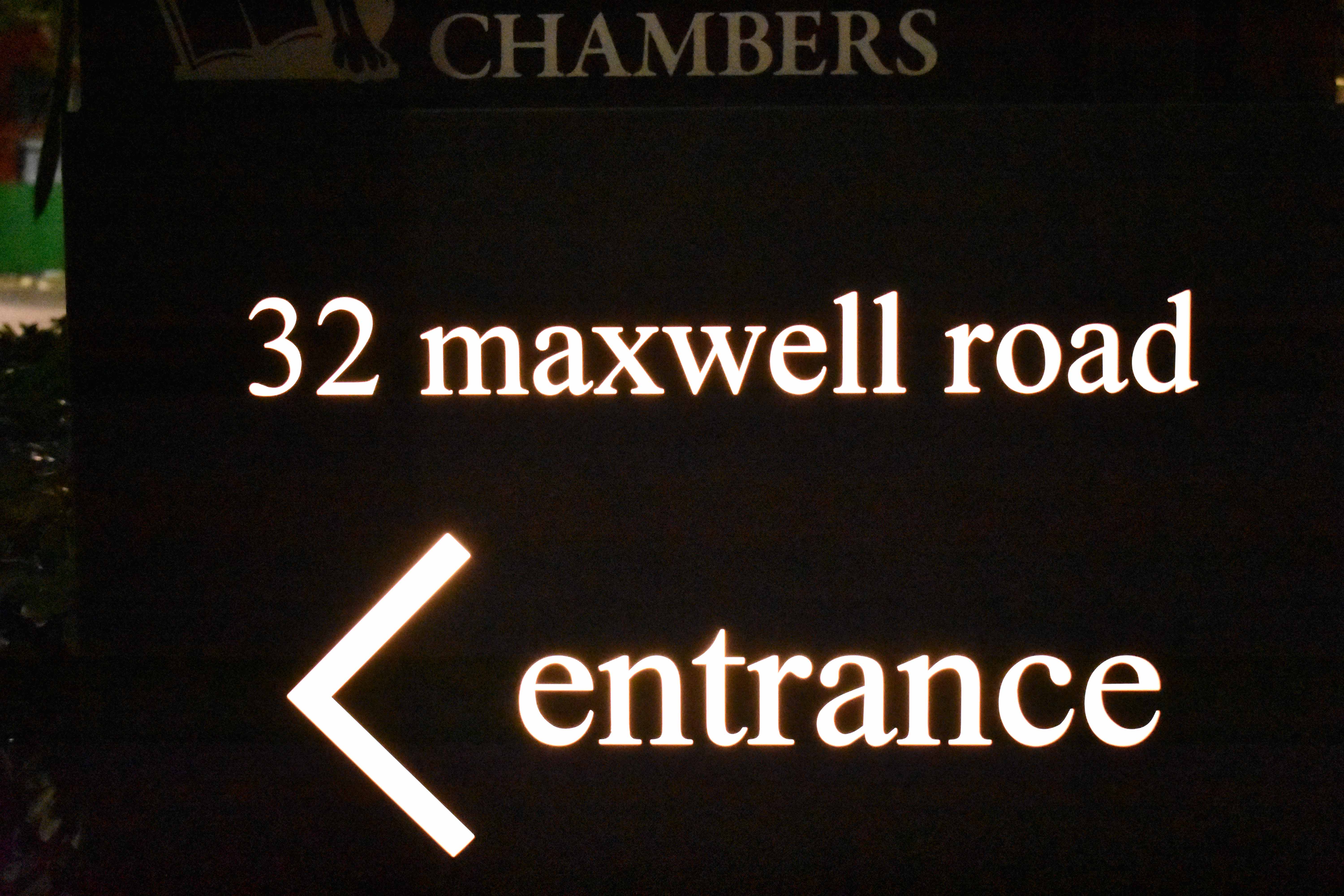
Times New Roman, usually seen on road processors but adorned on the signage outside Maxwell Rd.

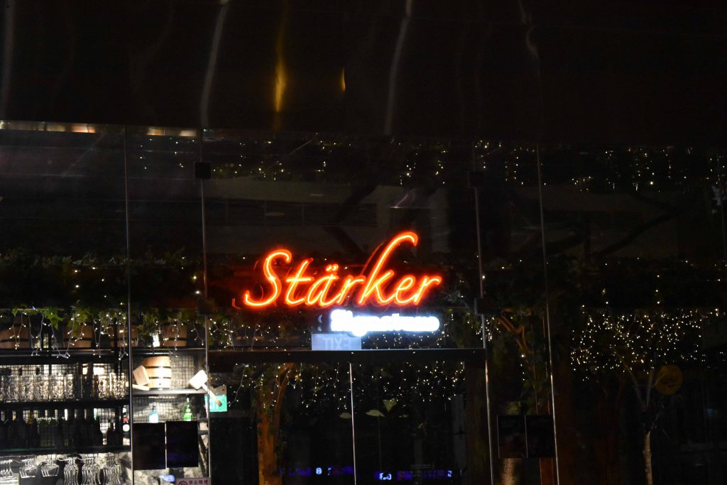
Love the Tron Legacy vibes.

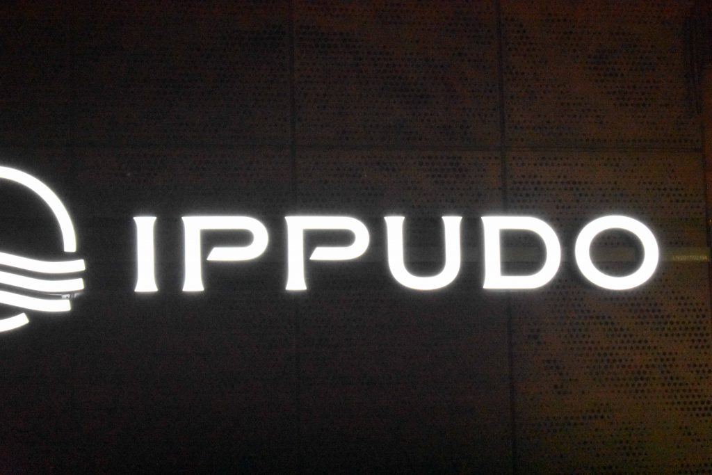
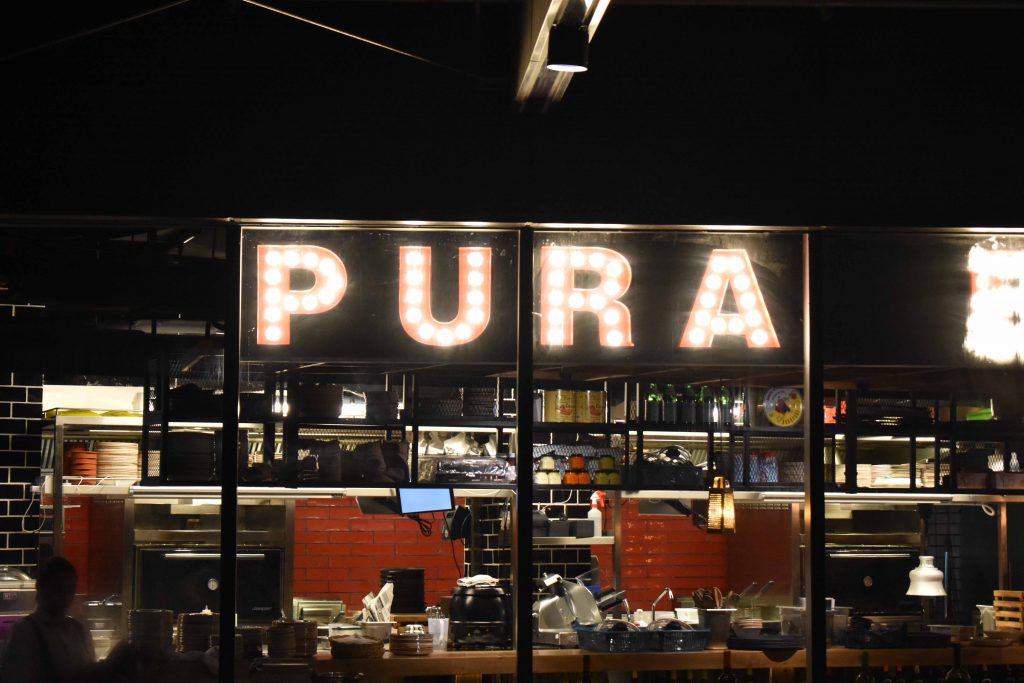
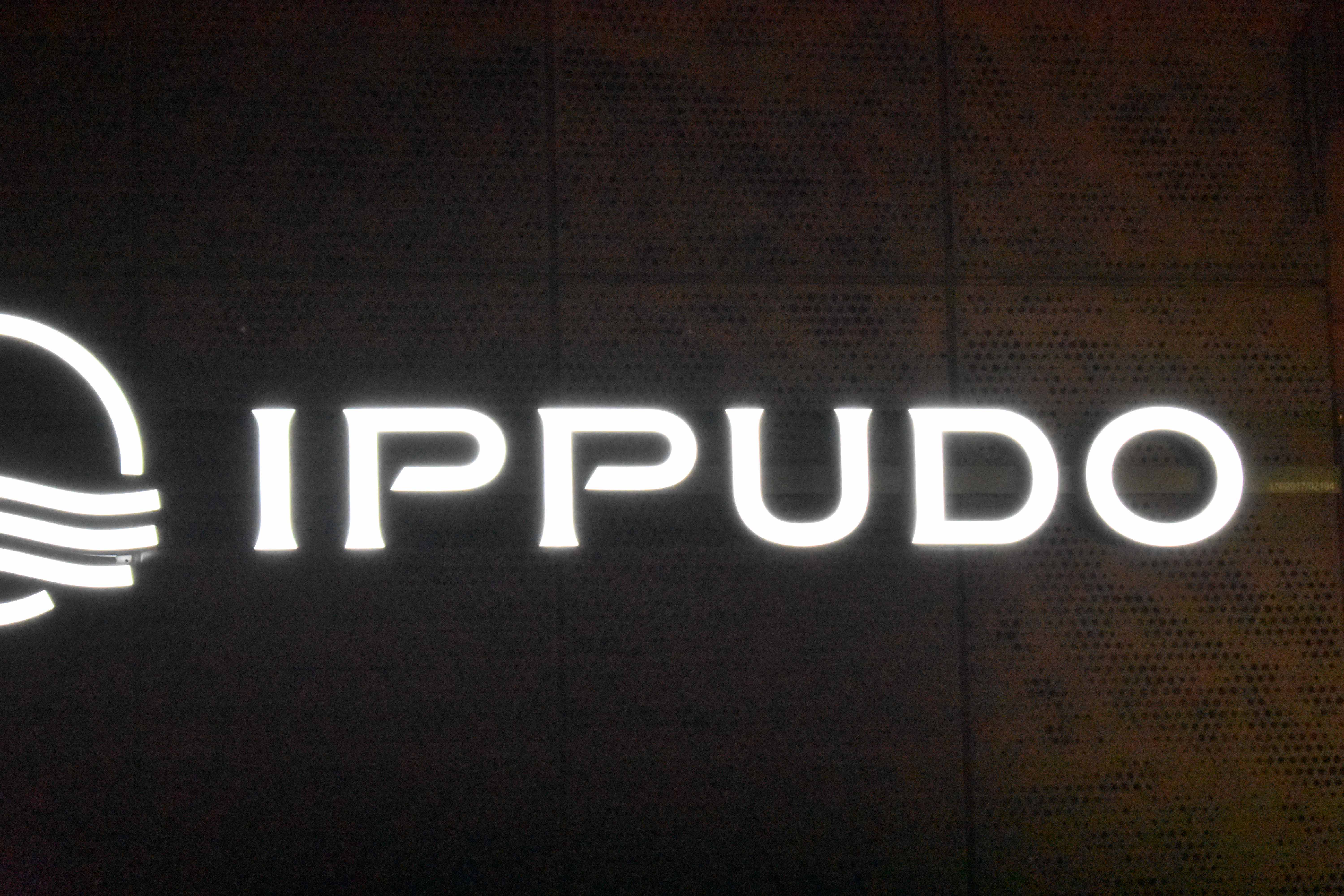
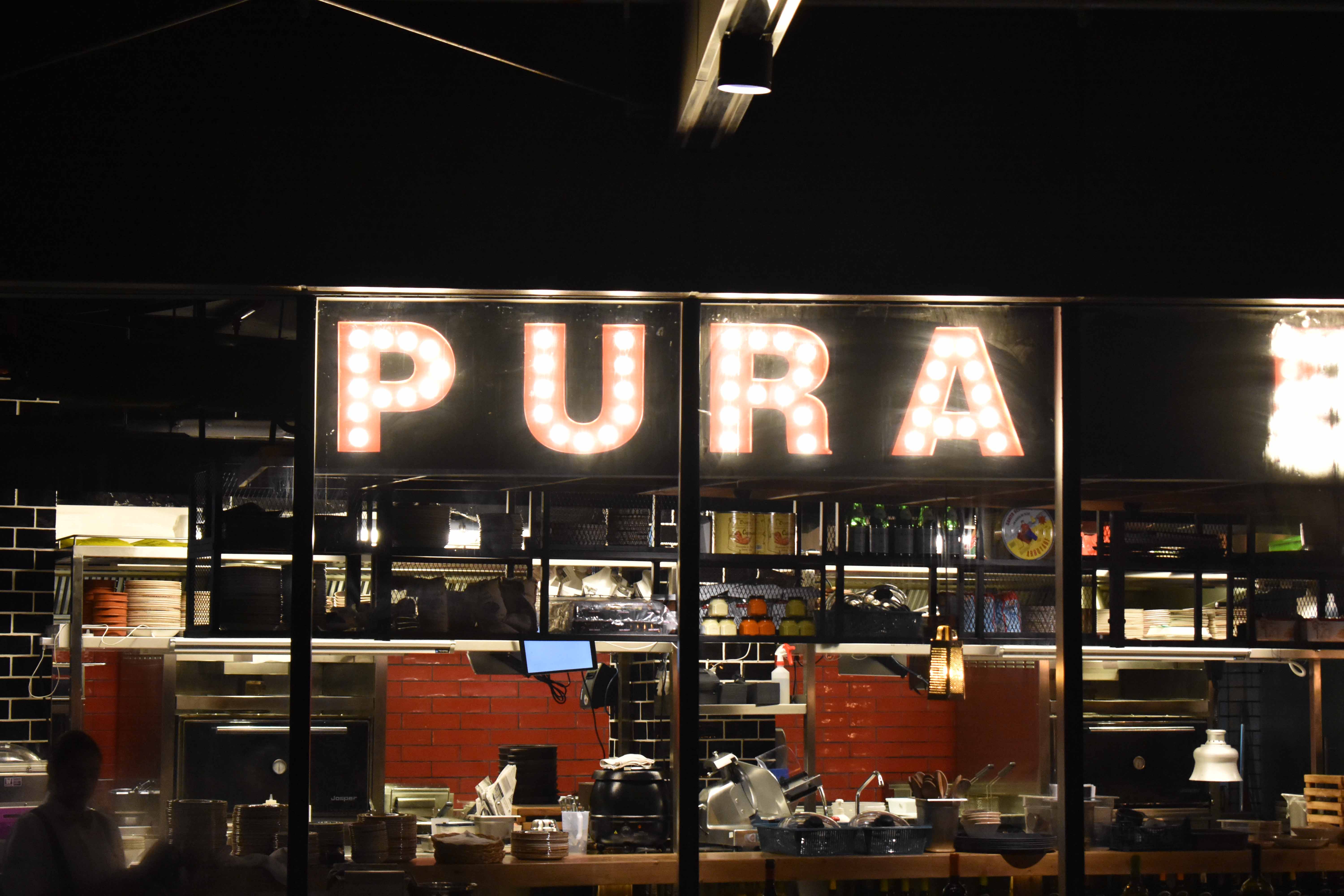
Japanese Restaurant near Guoco Towers.

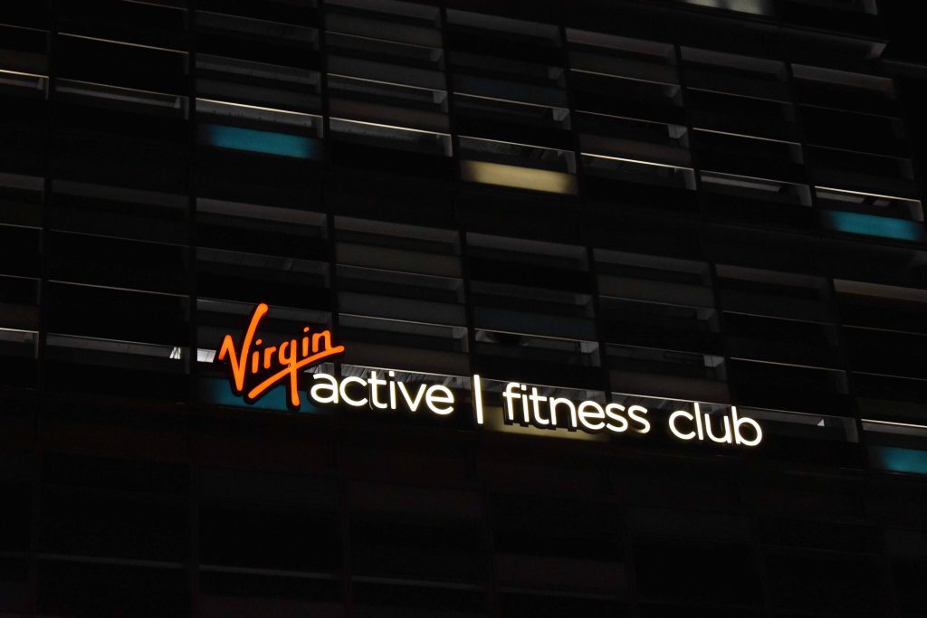
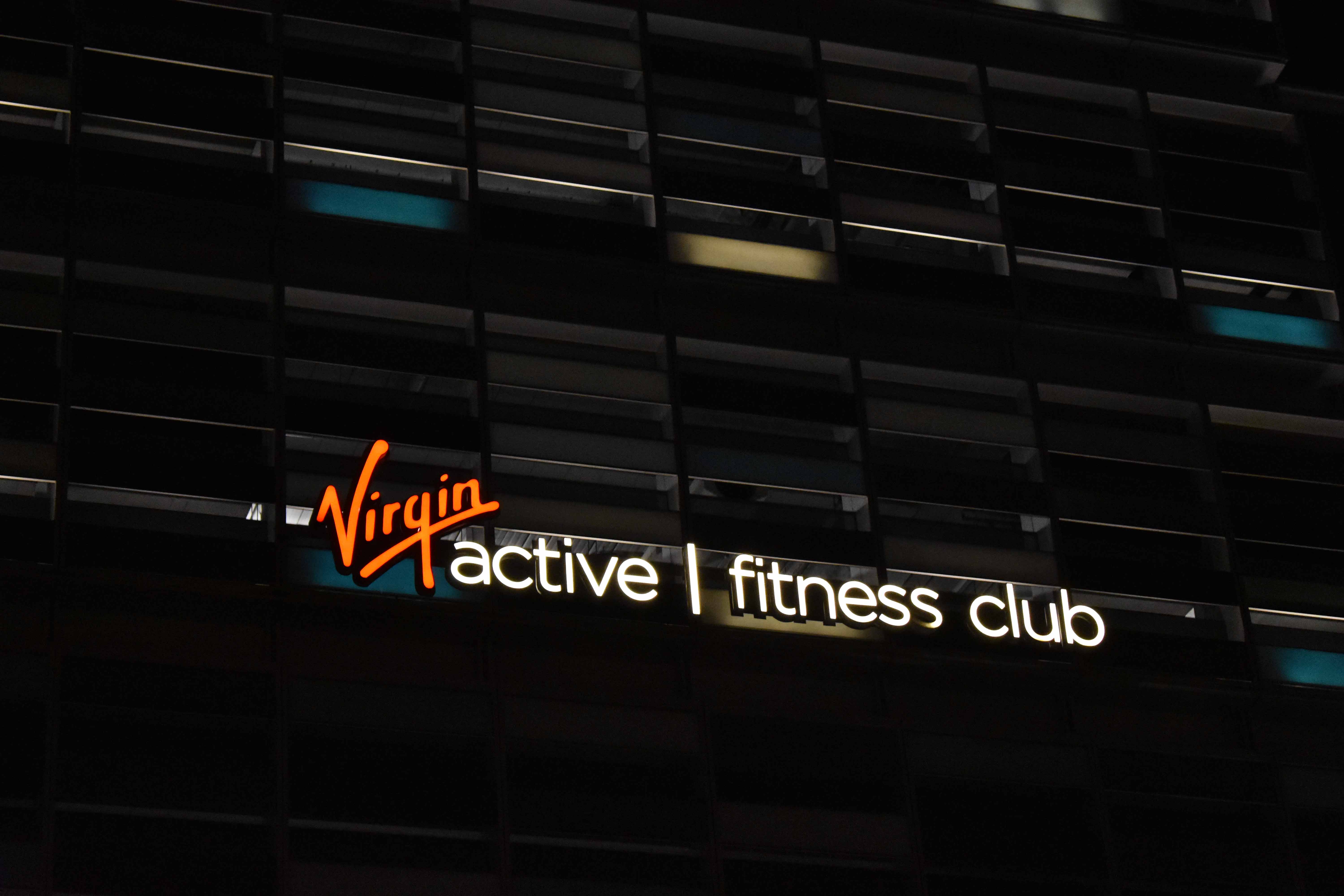
Richard Branson’s famous Virgin Group also has a fitness club here. Love the V and the upward swoosh of the logo.
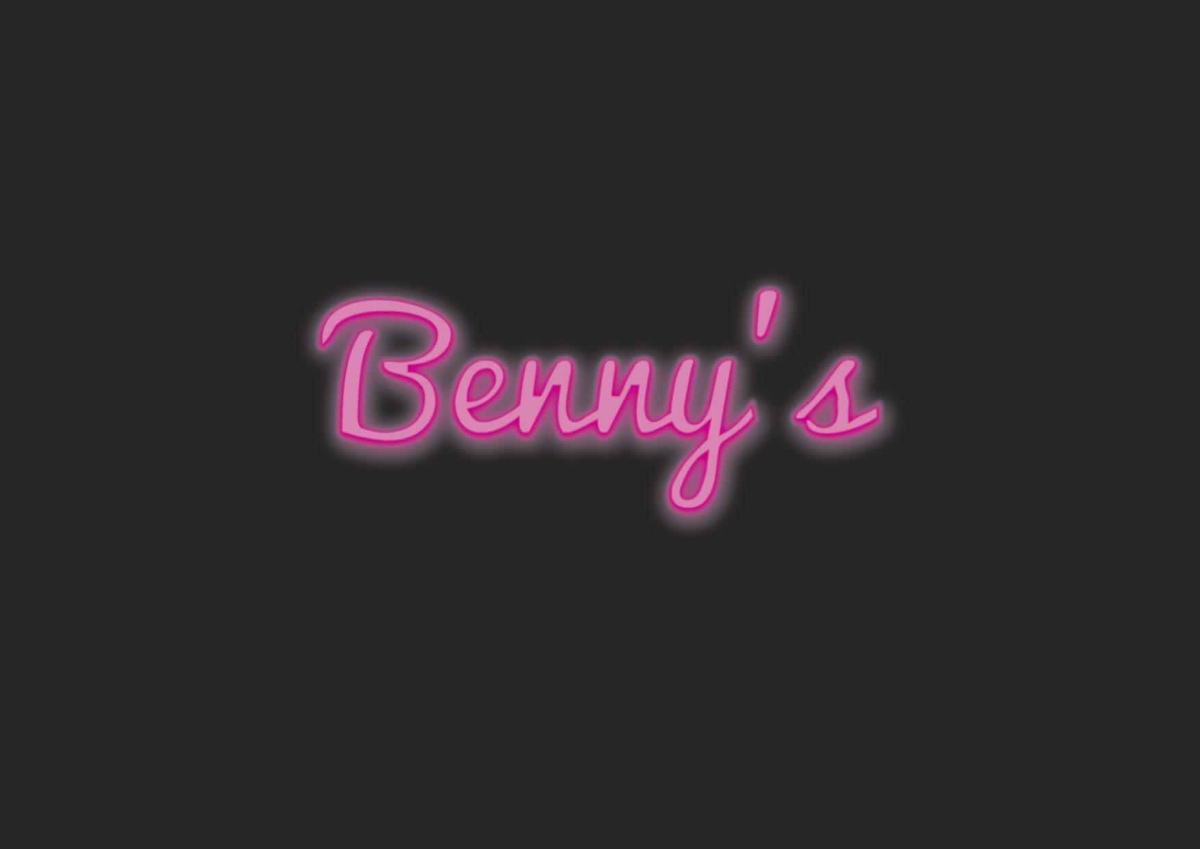
A bar.

Another cafe-bar.

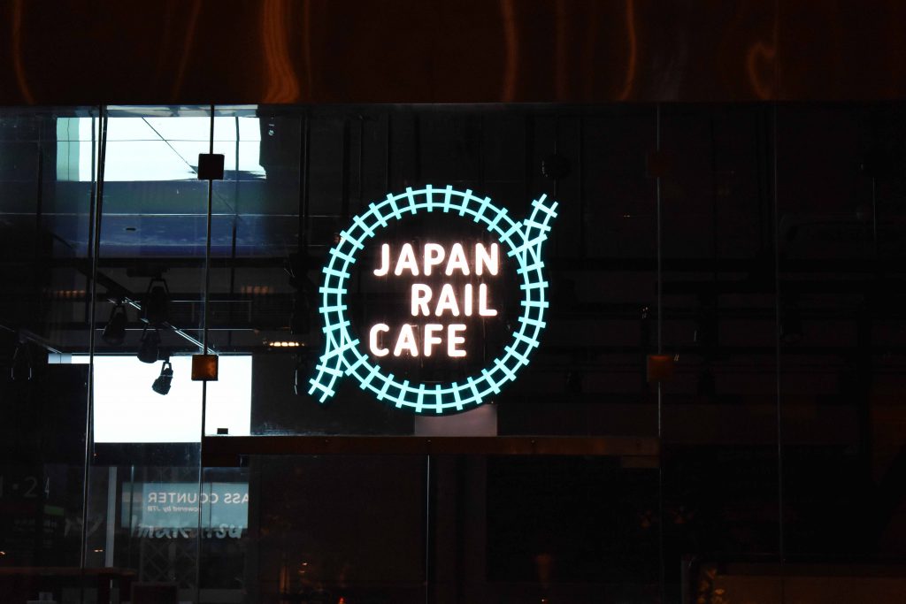
Yet another cafe. But this one’s quite cool as it has the concept of mini trains / traintracks everywhere in its interior.

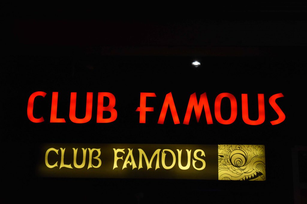
Every wannabe Instagram influencer should join this club.

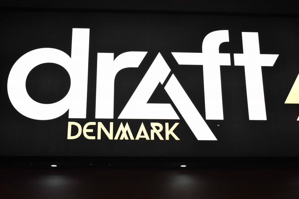
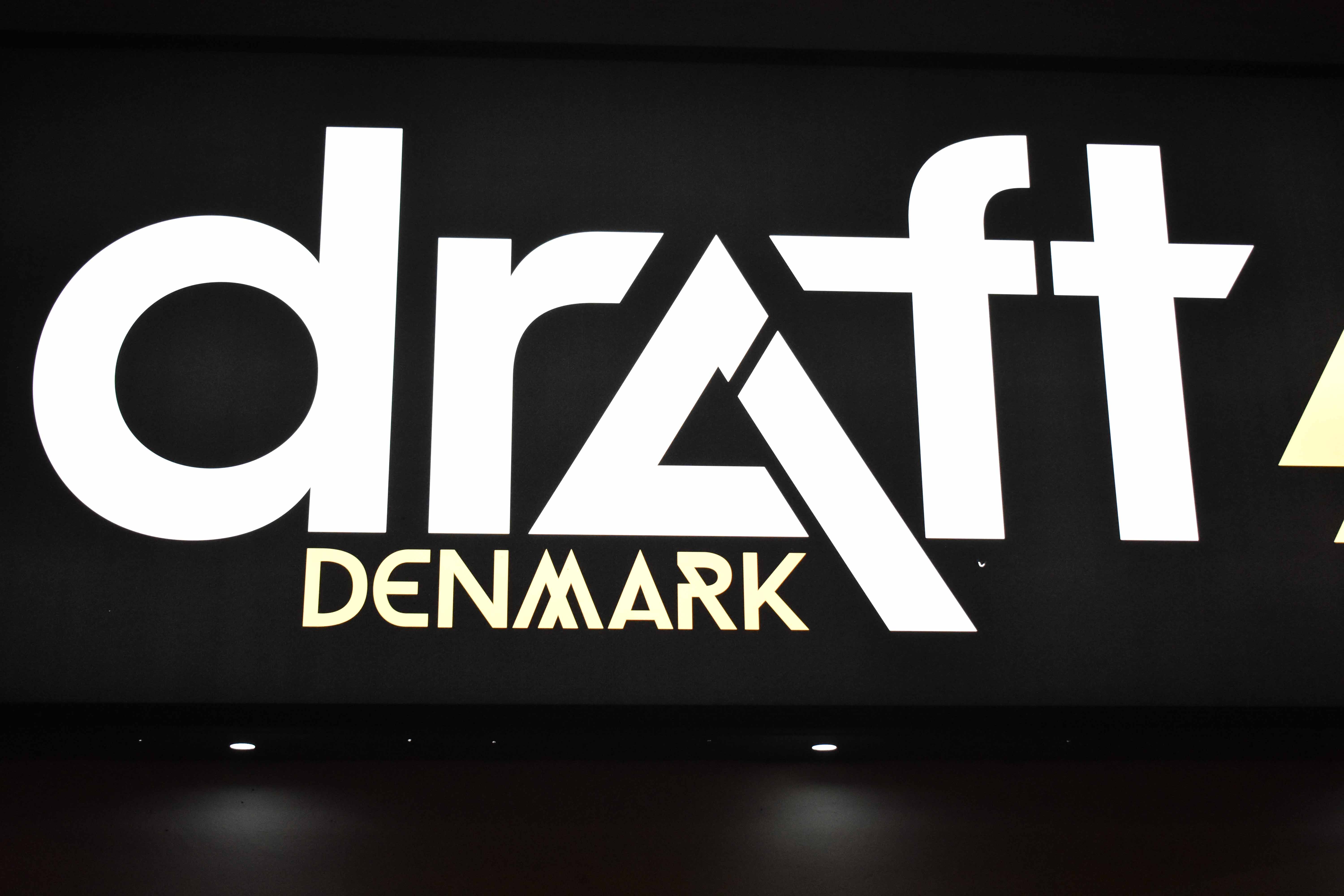
Draft has a bar along the stretch too.

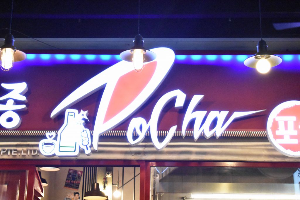
This is a Korean street food restaurant. The custom fonts can take some time getting used to though.

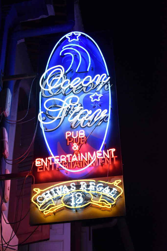
One of my favourite, the neon signs with fluorescent lighting reflecting off the black boards, creating an intriguing and arresting image of nightlife.

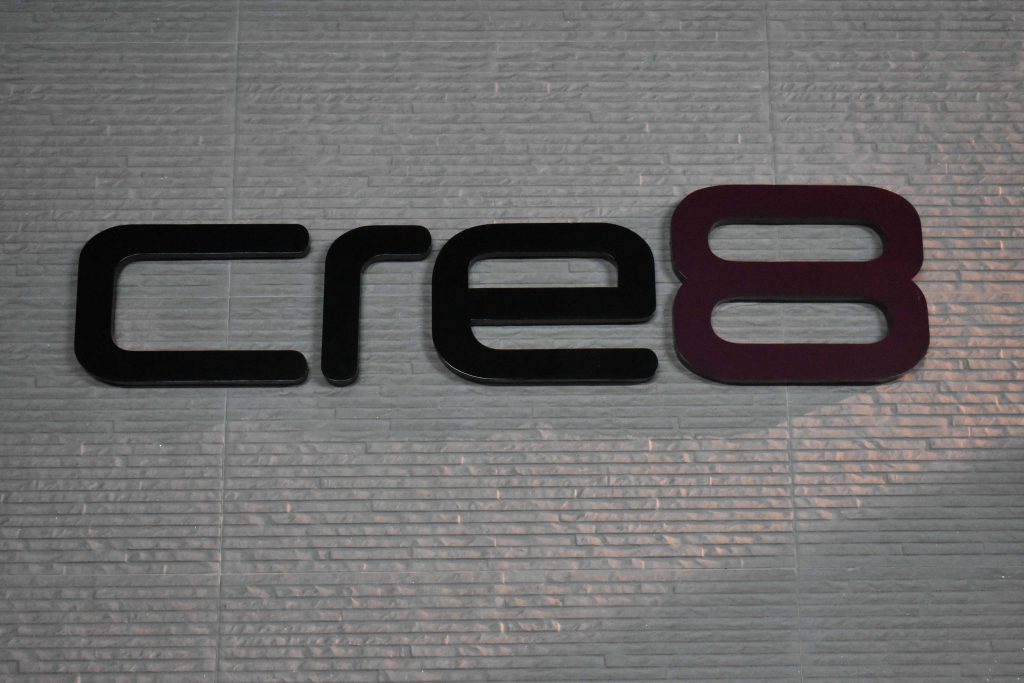
As i walked farther, I came across a creative agency with the name CRE8. Awesome stuff.

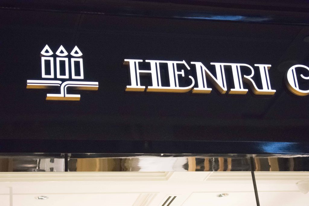
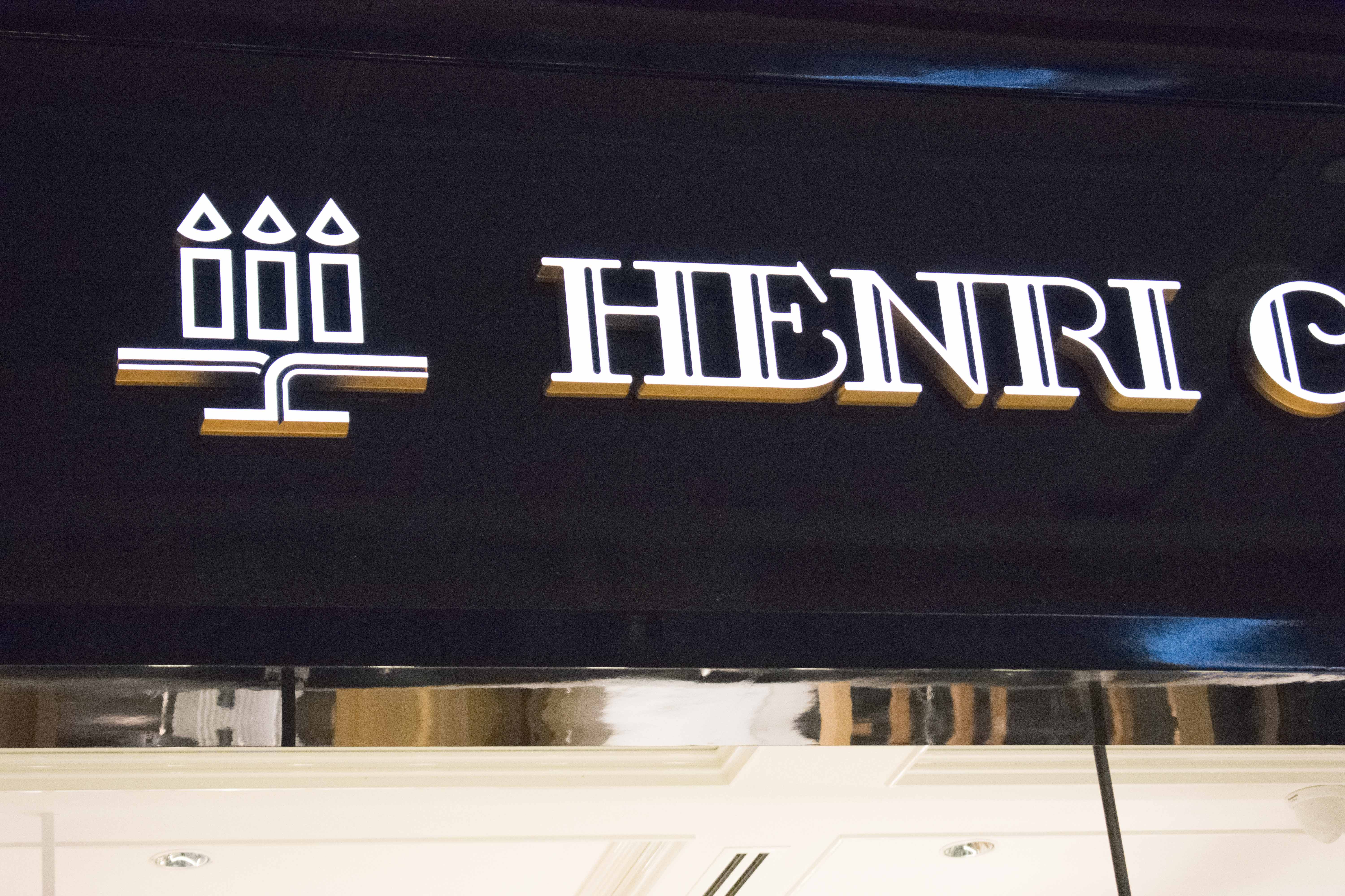
Like the icon and typeface of this patisserie. Very art deco, a tad bit flamboyant but matching the luxurious interiors as well.

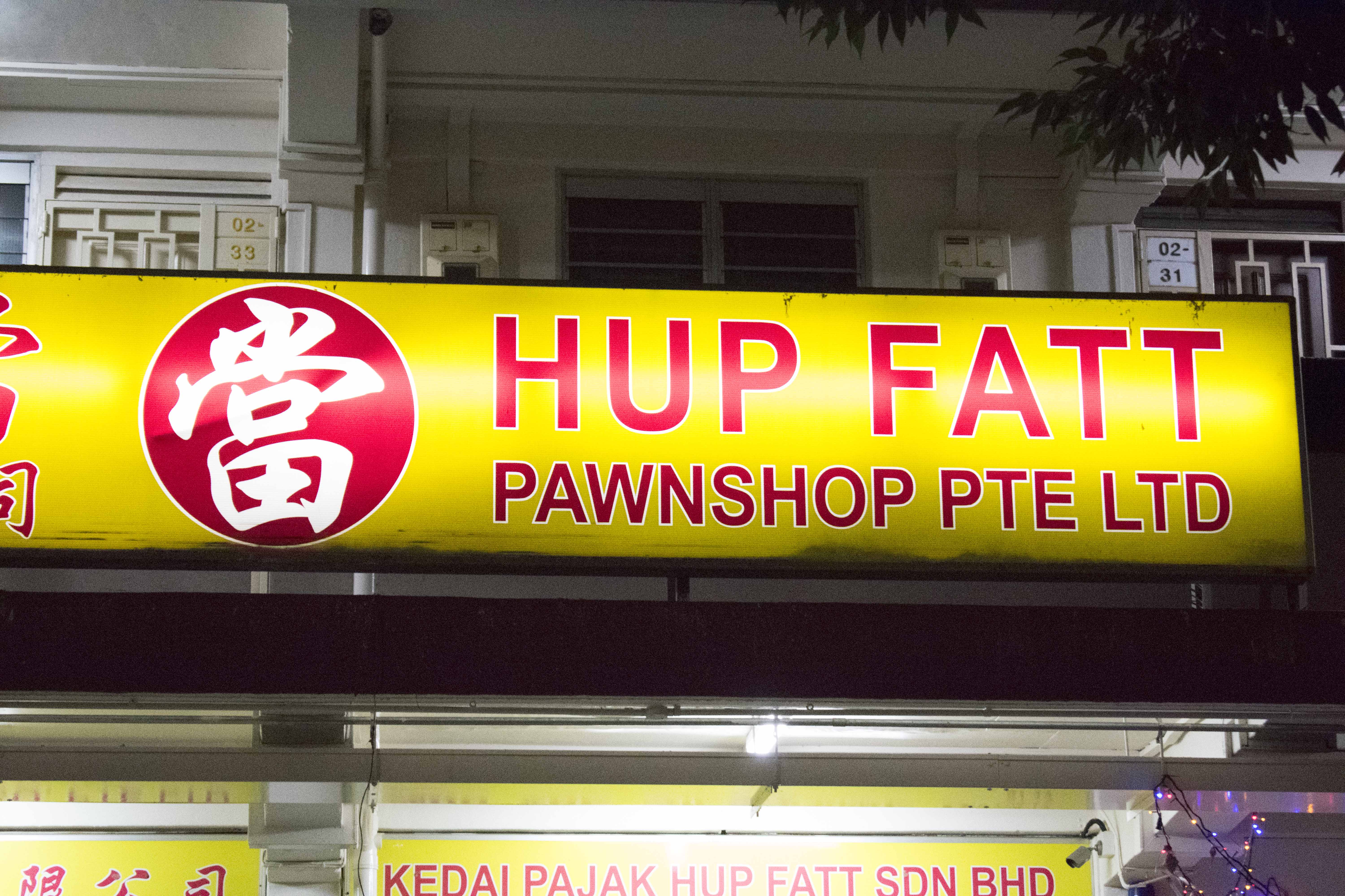
Finally, a neighborhood jewellery store with a good old storefront sign.

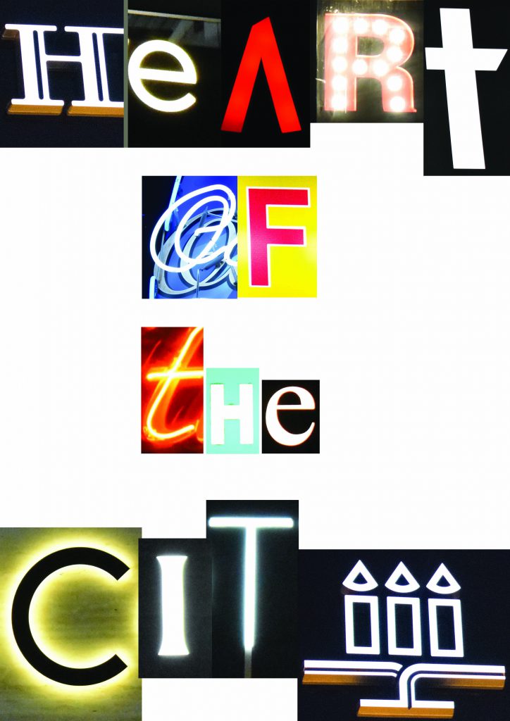
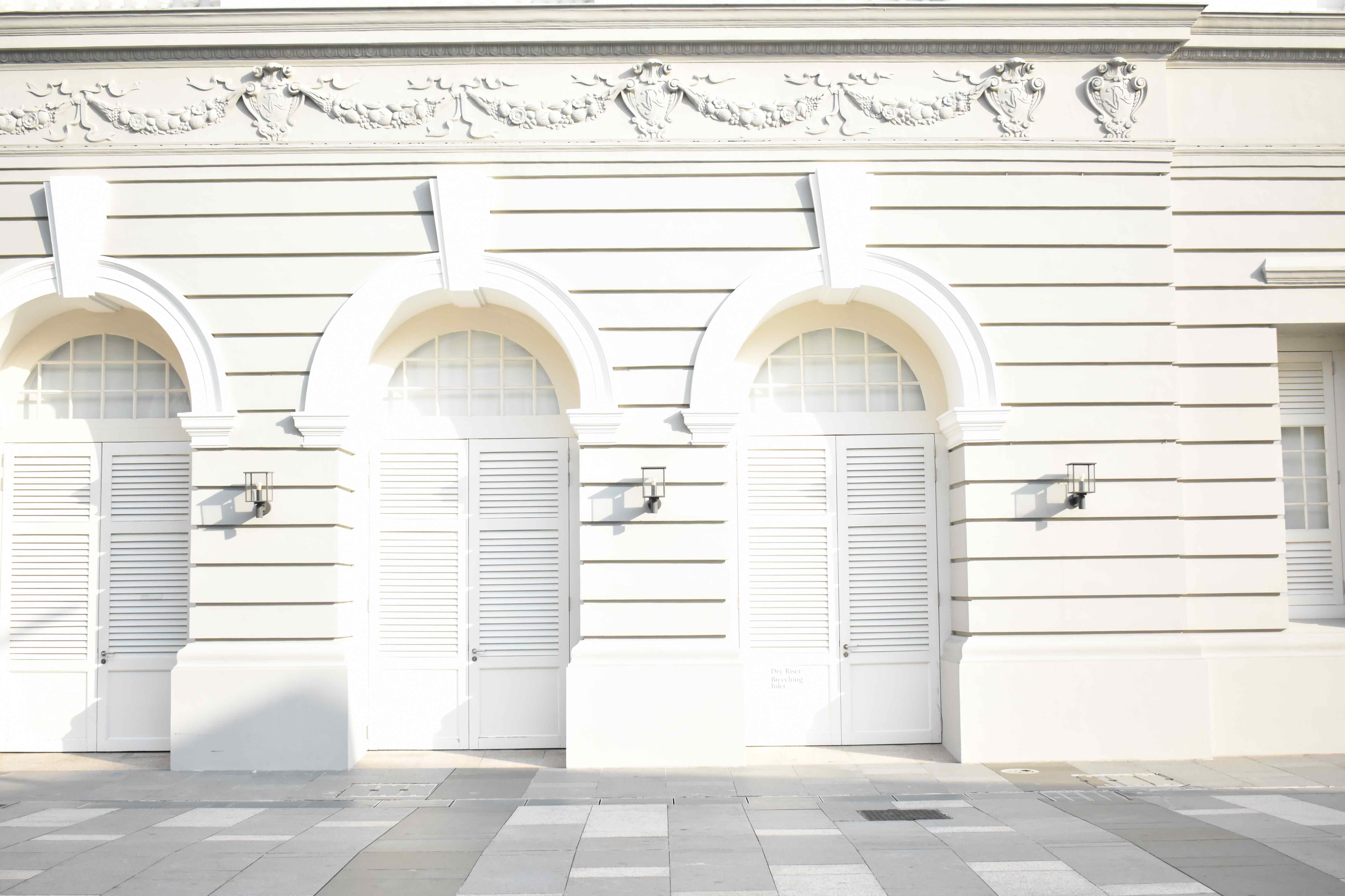
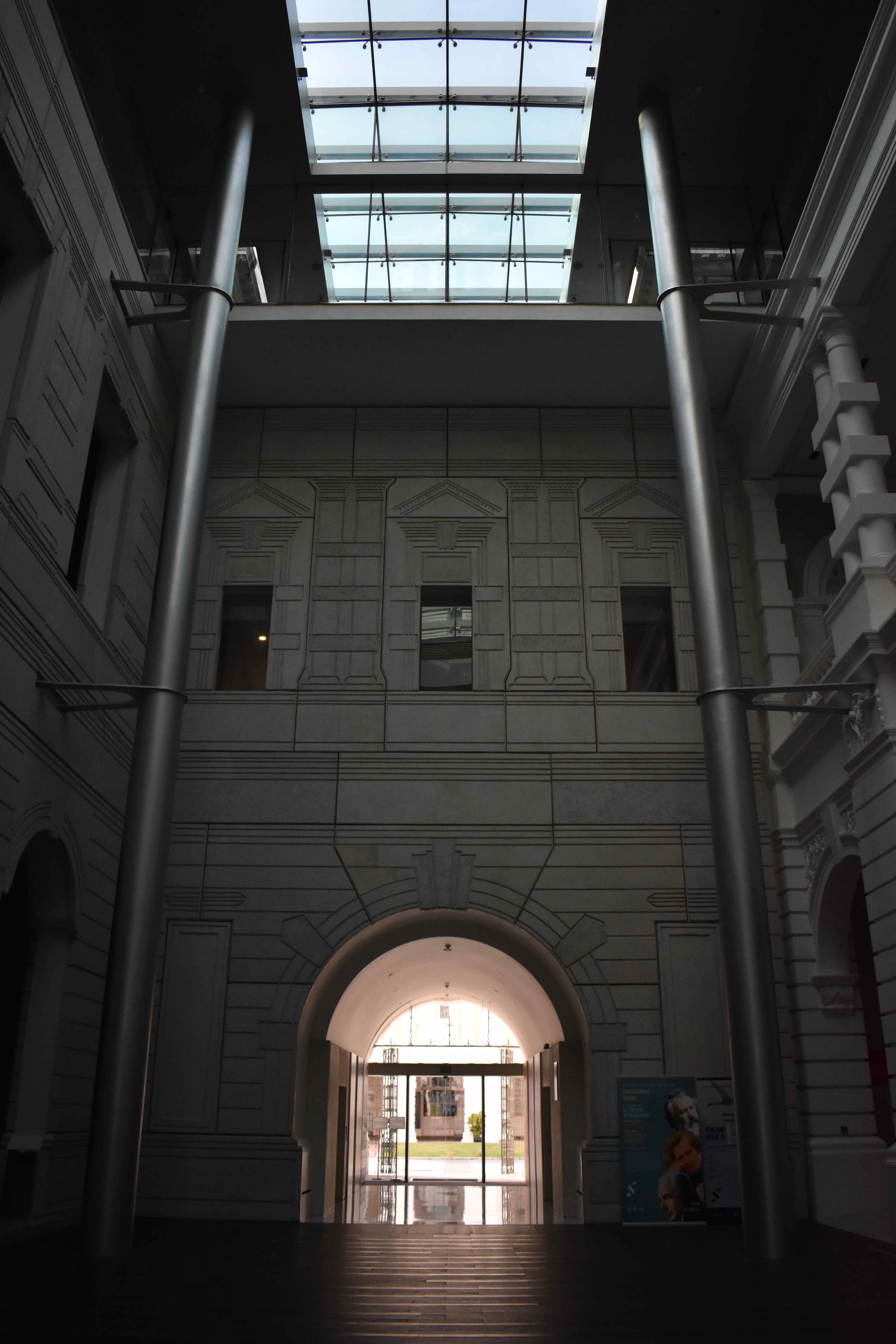
I decided to go with Heart of the City as I think it reflects the mood of Tanjong Pagar. It is, after all, a business district laden with eateries, pubs and pockets of entertainment at night. As with any financial district, nightlife is often nearby due to the affluence and decadence that surrounds the place. The use of light to enhance the visual imagery of typography is something I could perhaps explore further. I’ll be going back to Tanjong Pagar soon for a day shot.


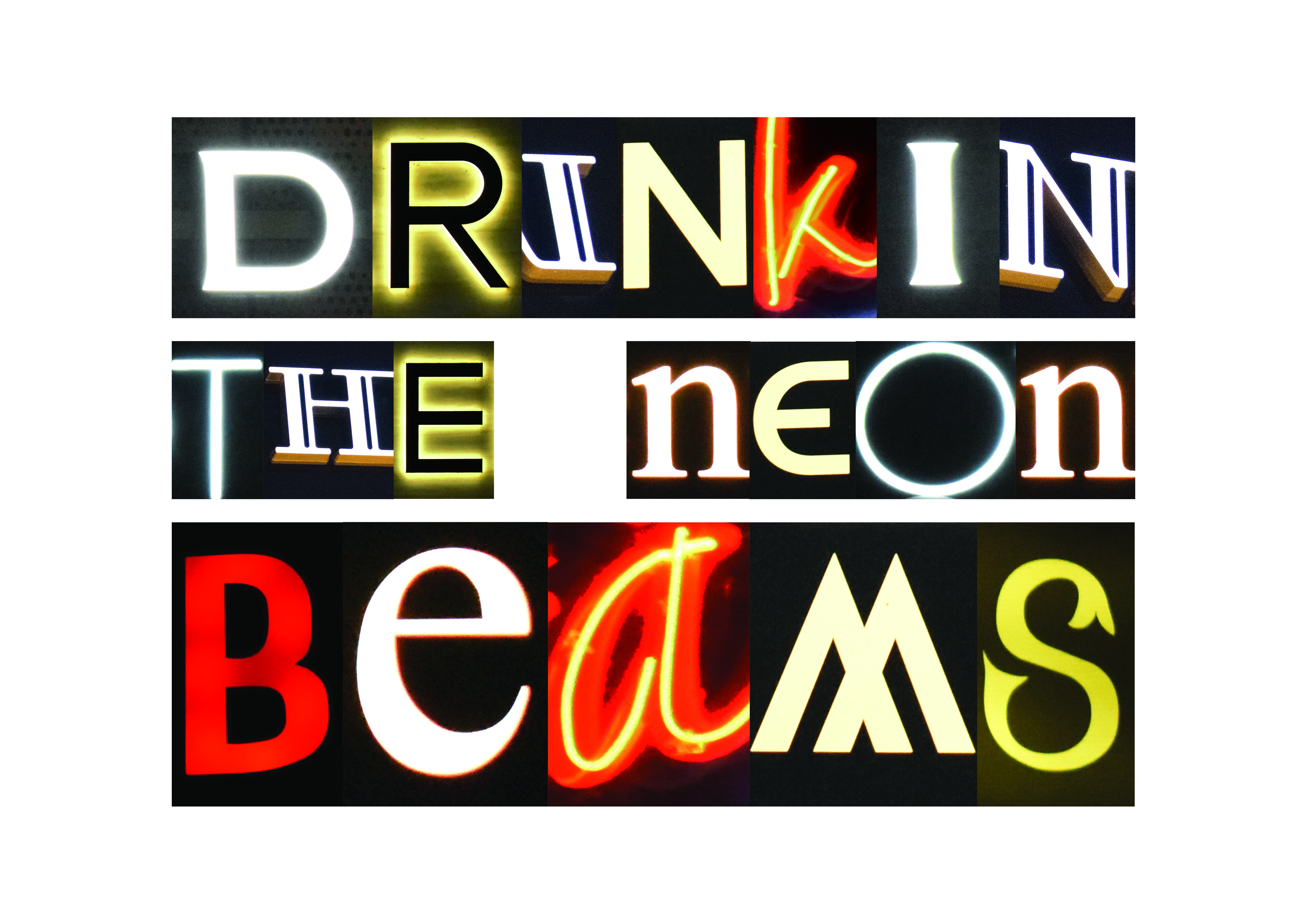
The electric night scene of Tanjong Pagar left a deep impression on me as I walked through the streets, bathed in a neon hue. I tried to soak it all up, and then it hit me. Tanjong Pagar wasn’t just a place for you to drink alcohol after a hard day’s work in the CBD, it was also a place where you could simply get lost in, drinking in the vibes of the place.

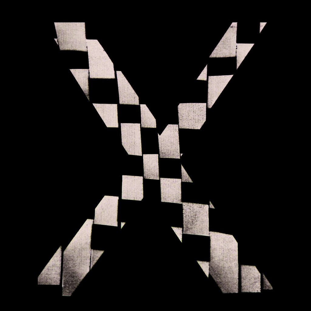
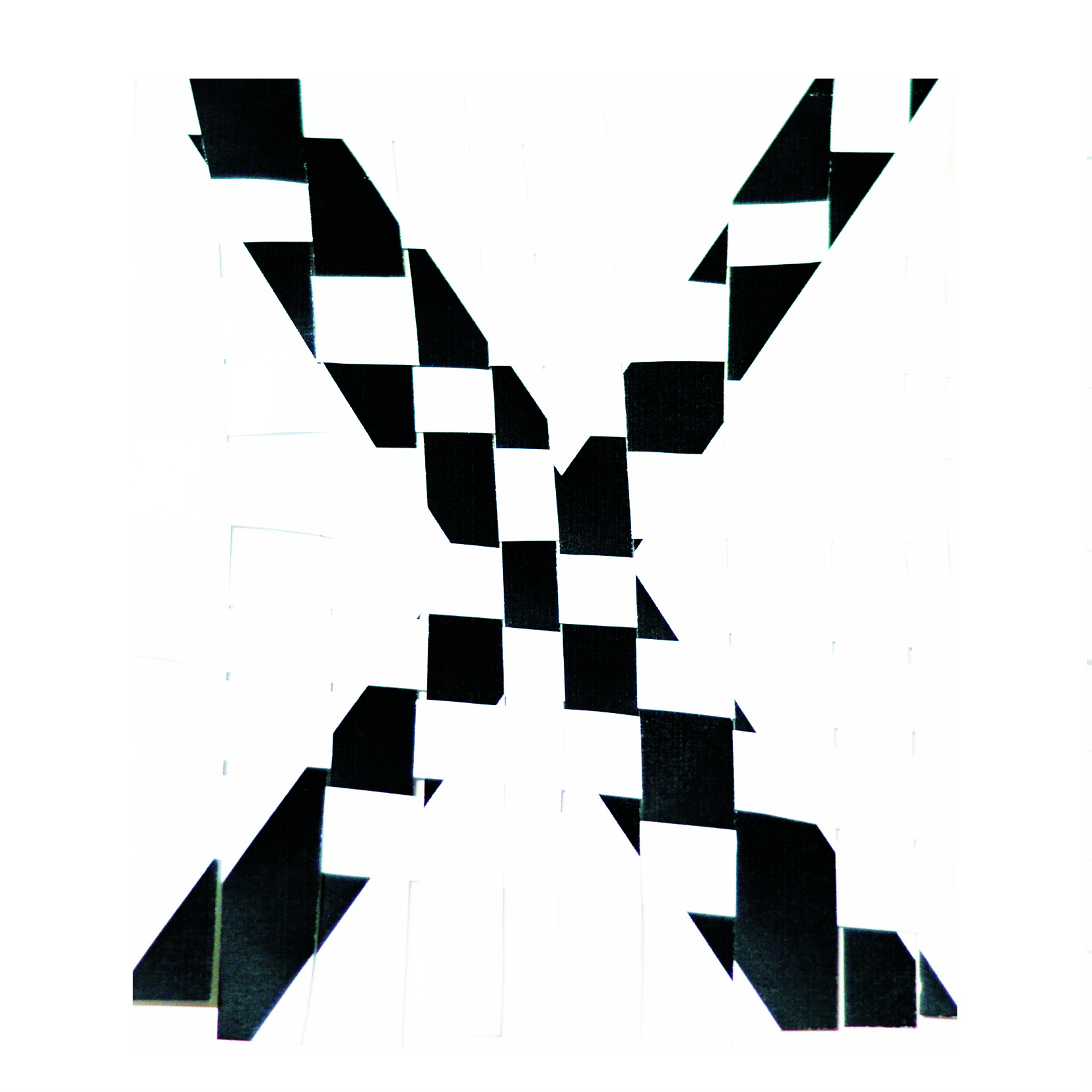
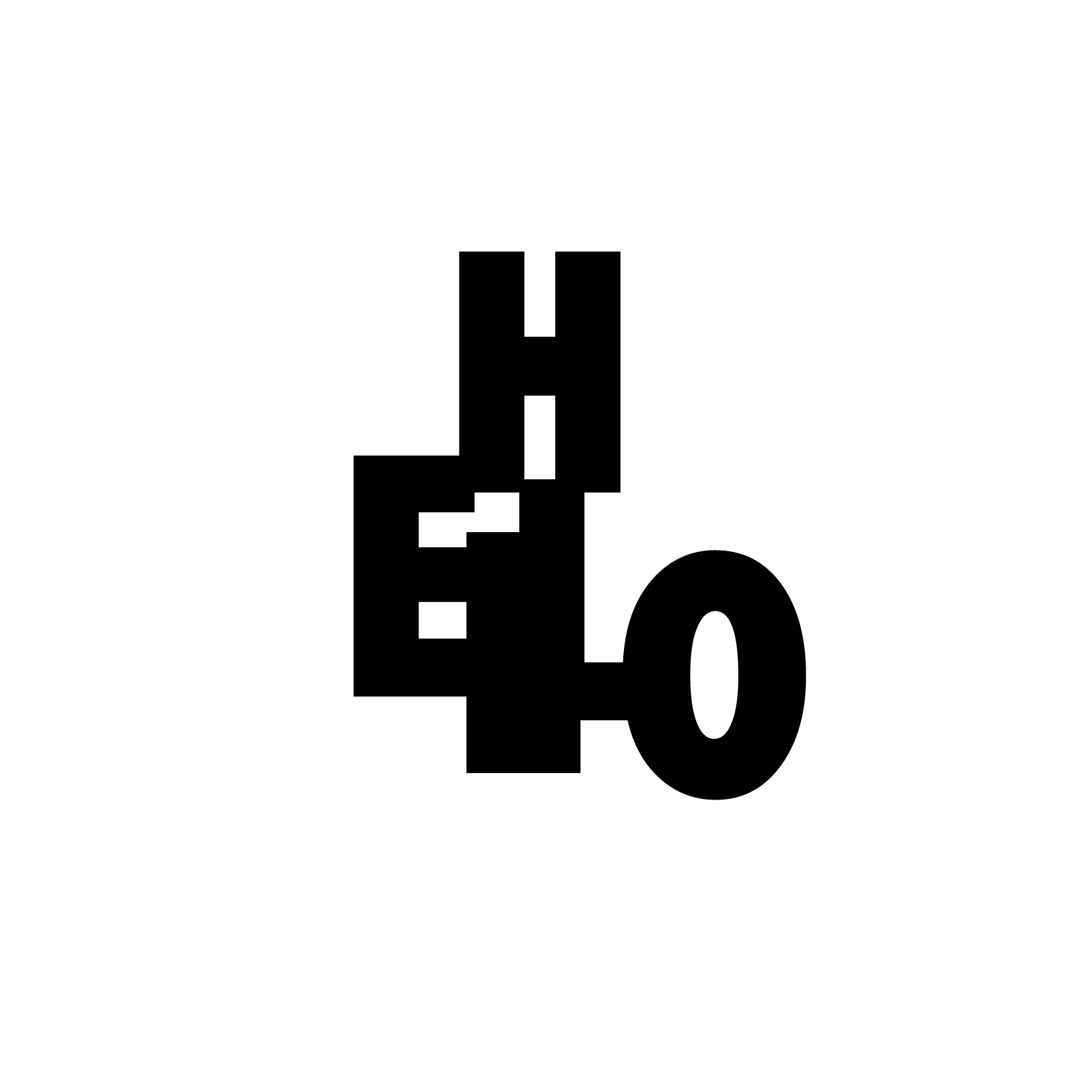
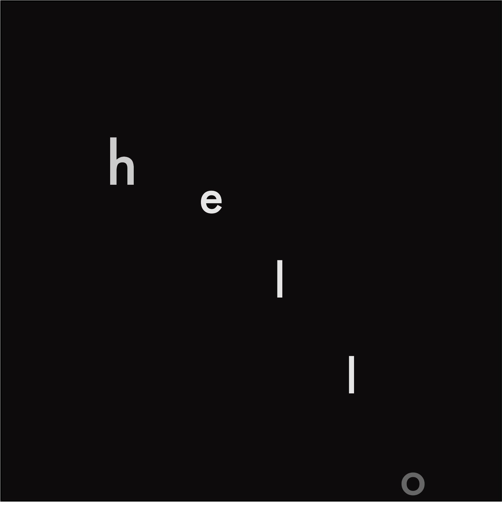
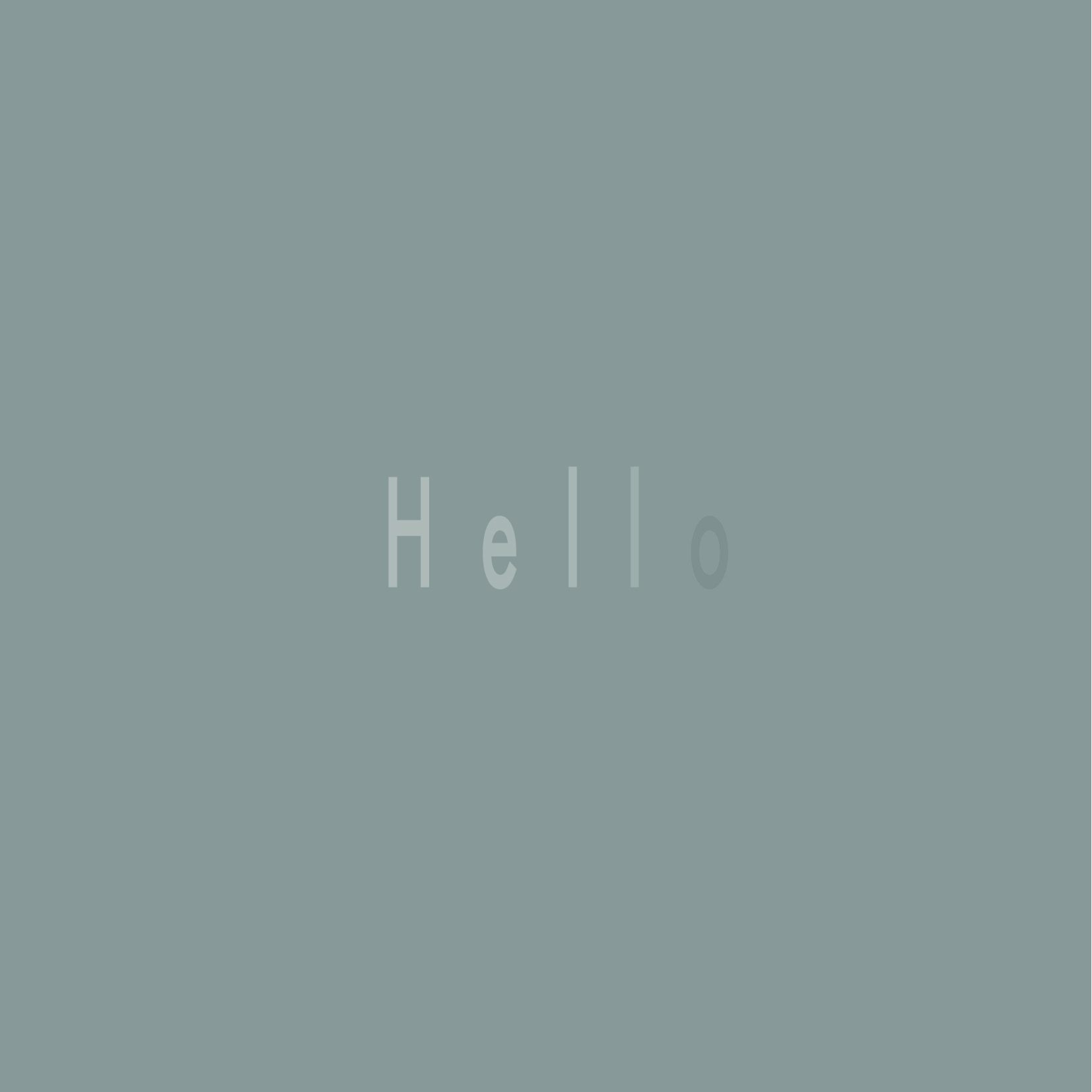
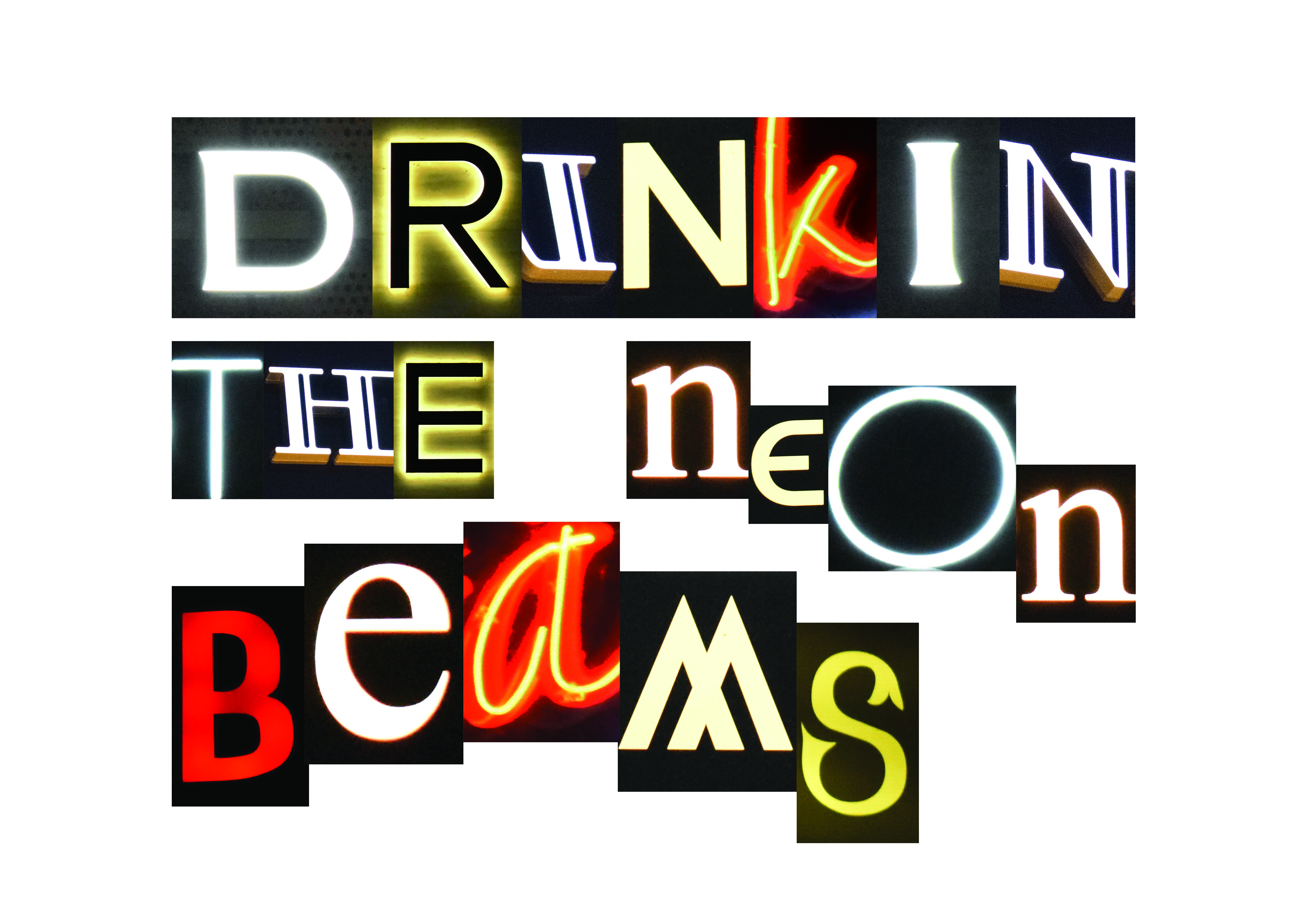
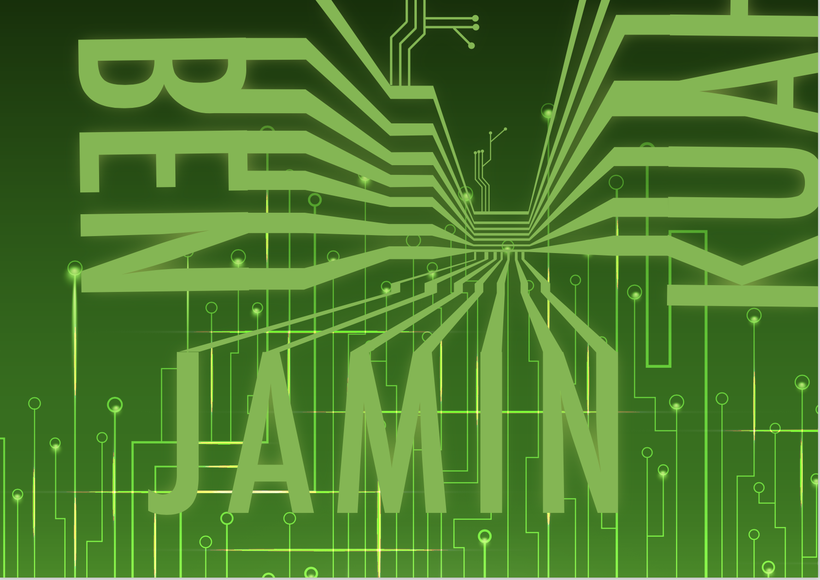
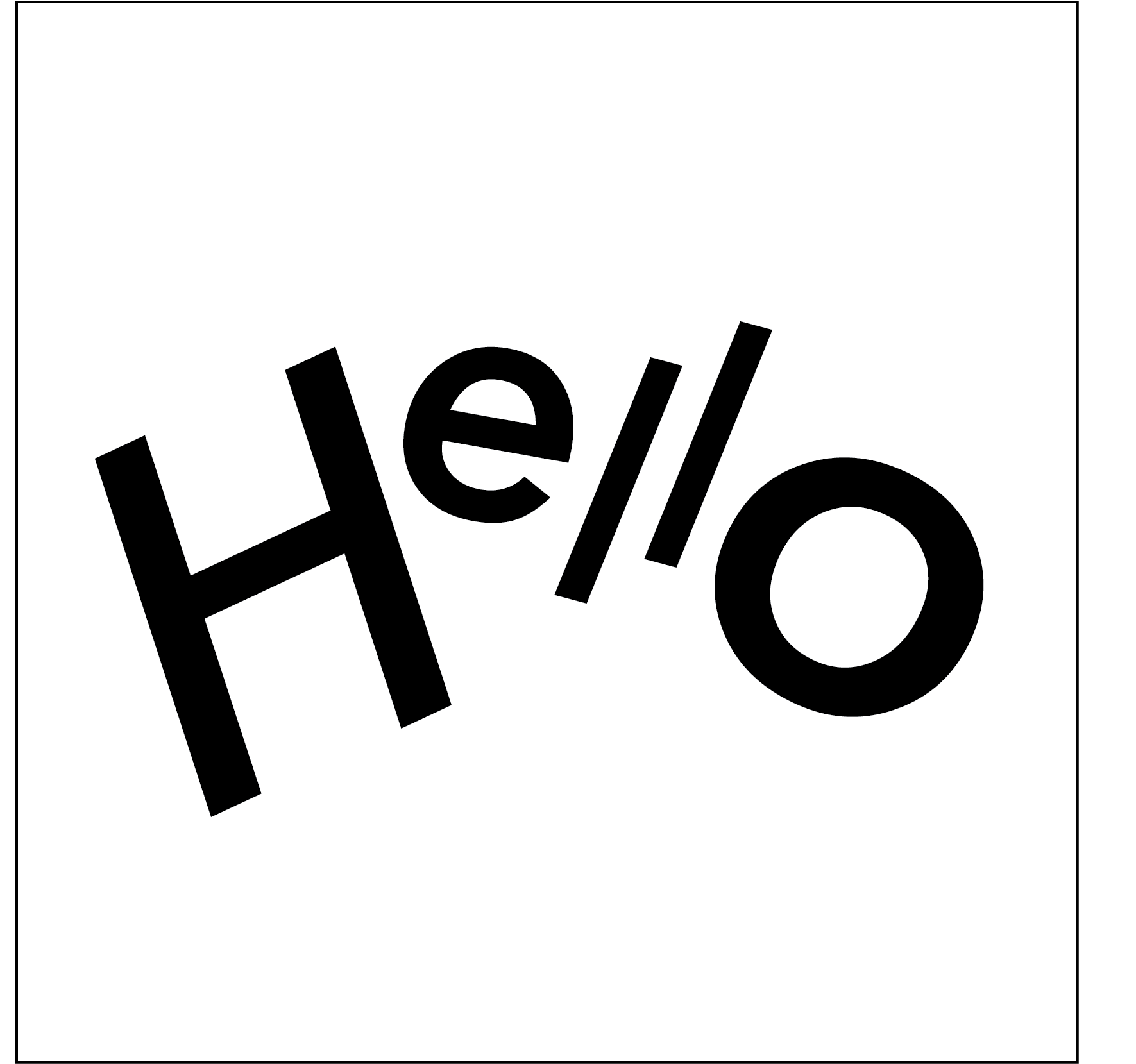
The first composition more balanced and structured than the second. The word BEAMS is larger than the rest, as it is the focus puller of the entire phrase. THE and NEON and almost like an afterthought, but positioned with negative space in between. This separates “neon beams” with ‘drinkin the”, splitting the phrase into smaller chunks, enhancing readability. There is also a bit of space in between the horizontal blocks of words, splitting them up and making them more readable as well. Overall, this is a balanced, symmetrical composition.

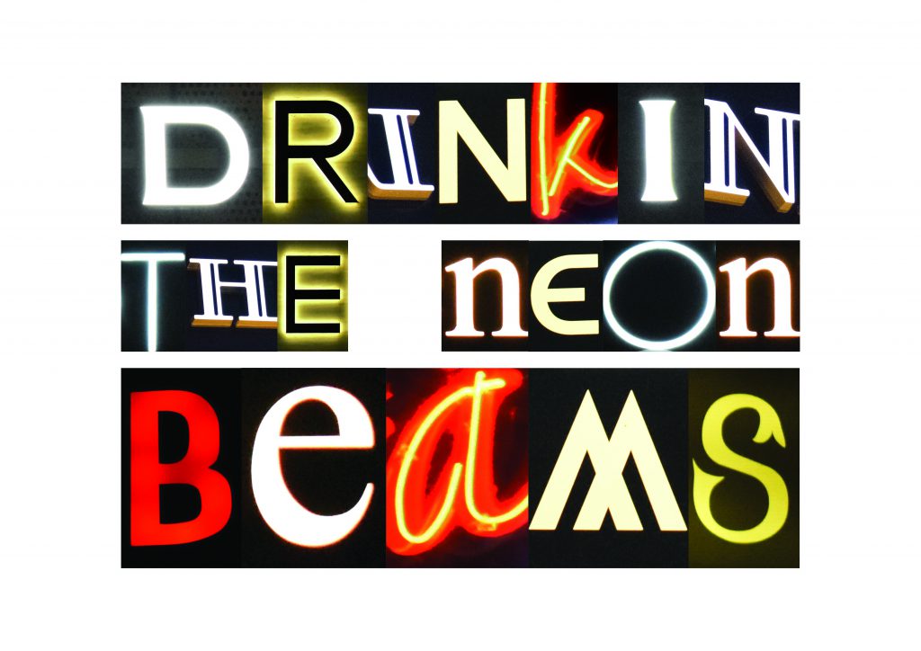
The second composition is more dynamic, with NEON BEAMS rearranged in a more chaotic fashion. With the irregular positioning, some of the unique features of certain typefaces can be seen. The O of NEON looks almost like an eclipse with its organic, minimalistic form. This enhances the visual meaning of the whole word. BEAMS is also arranged in a jagged fashion, with A jutting out as the “peak”. I wanted to activate the negative space between NEON and BEAMS as well, thereby creating a tension that would add visual interest. Overall, this is a more asymmetric composition that has more energy and tension. One can almost feel the electricity of nightlife here.

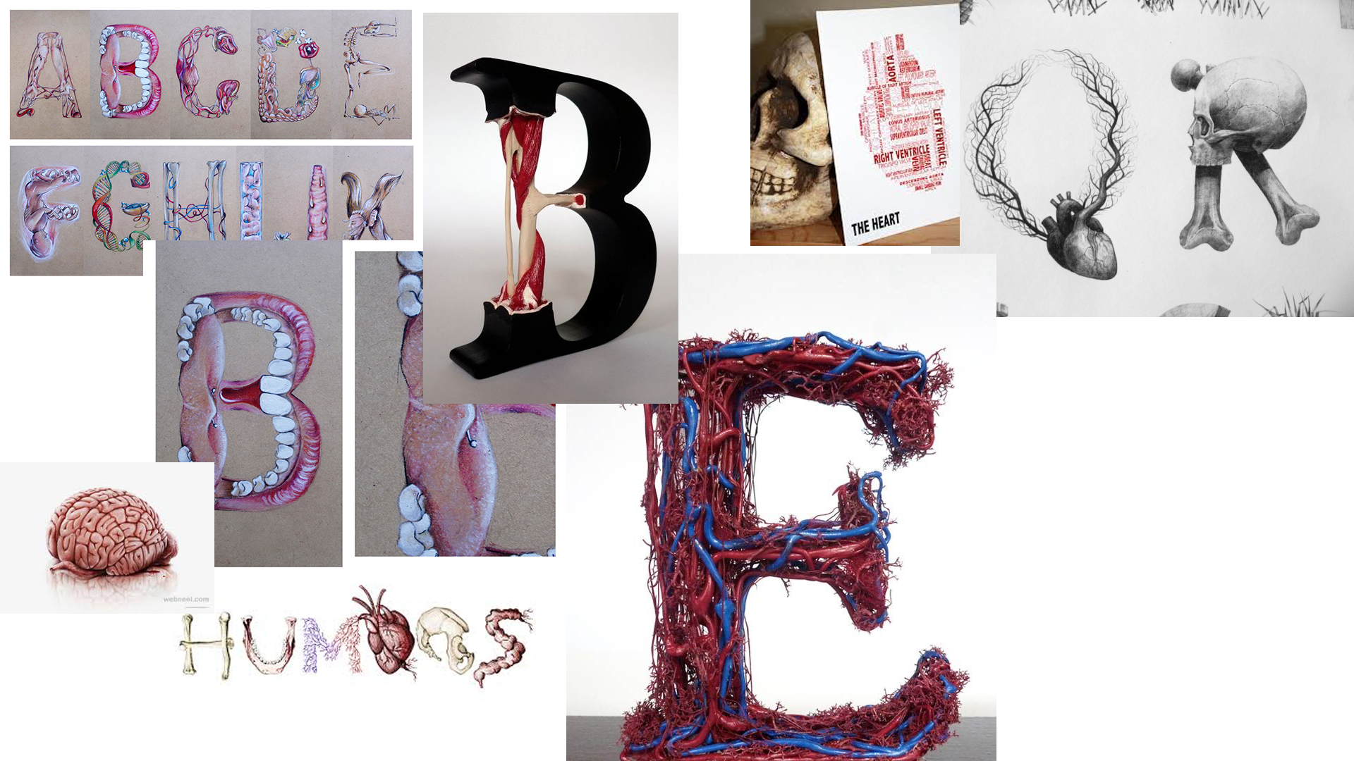
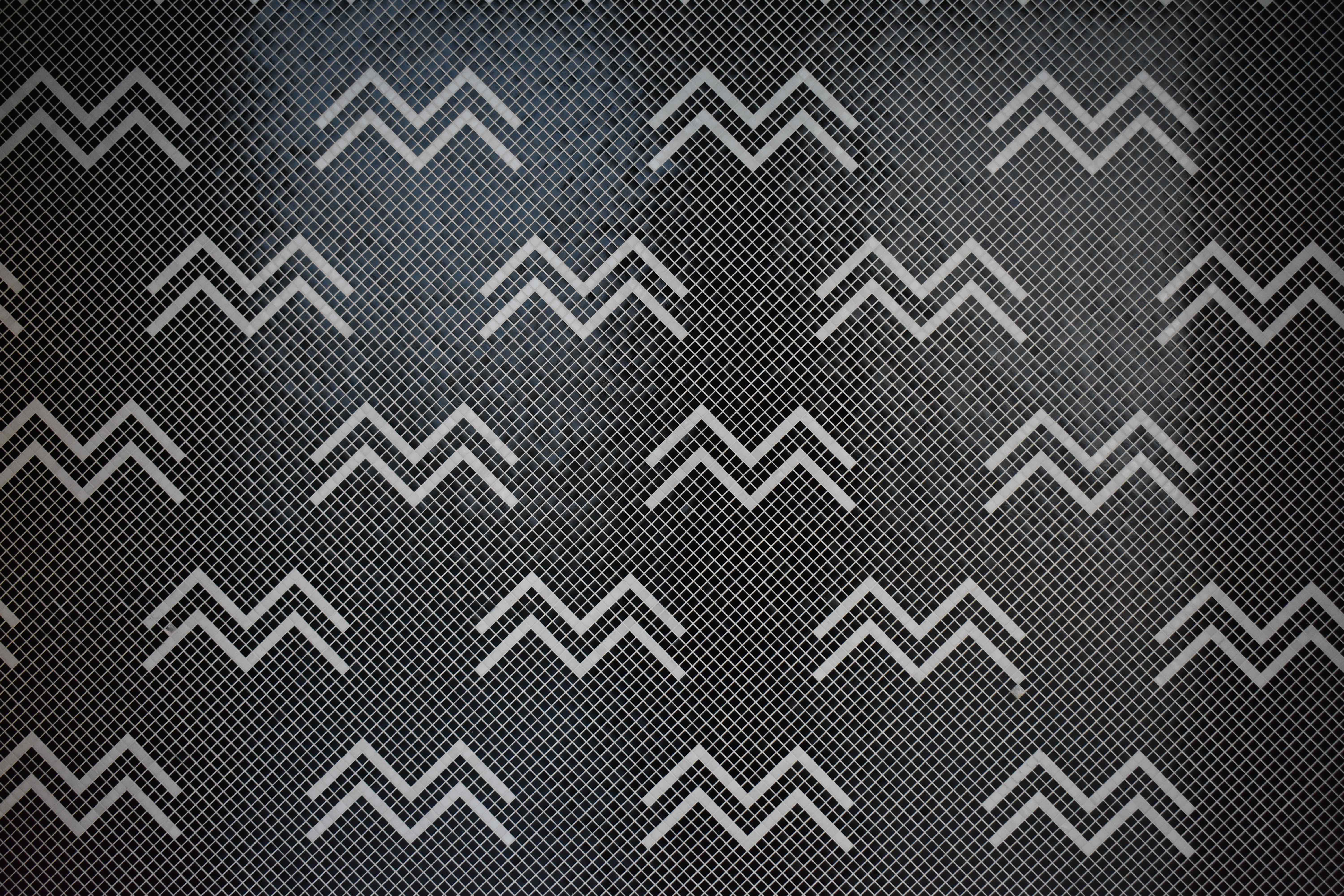
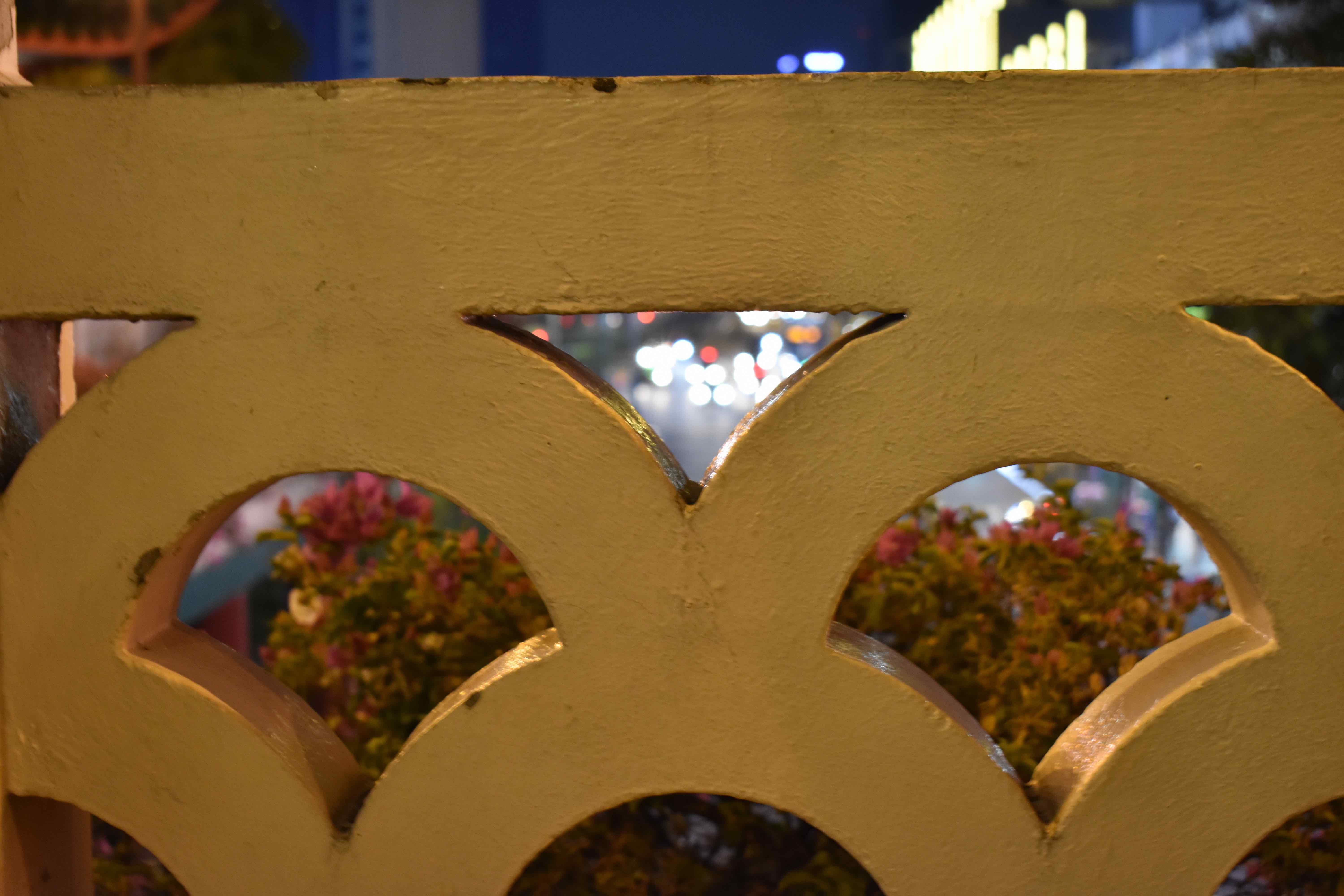
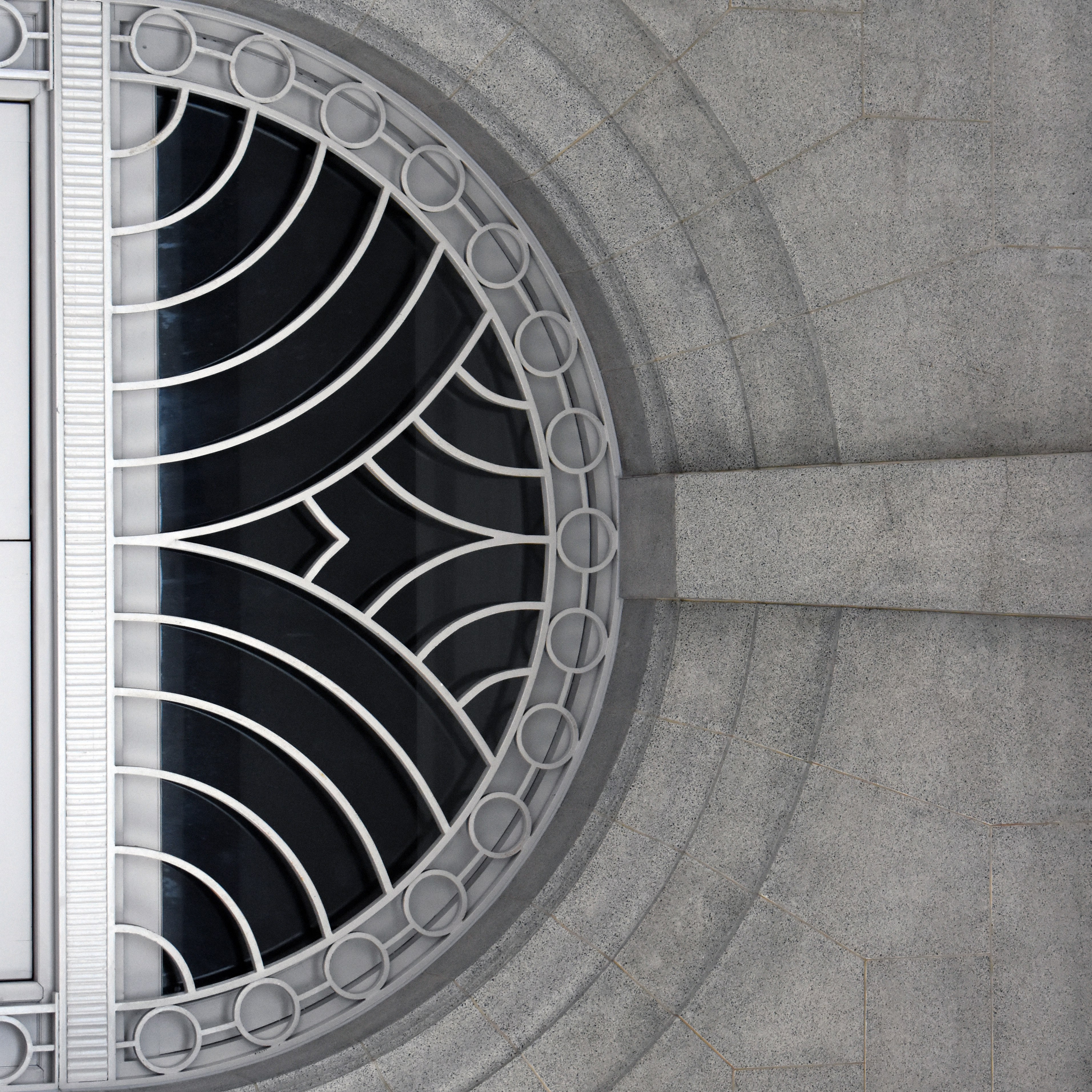
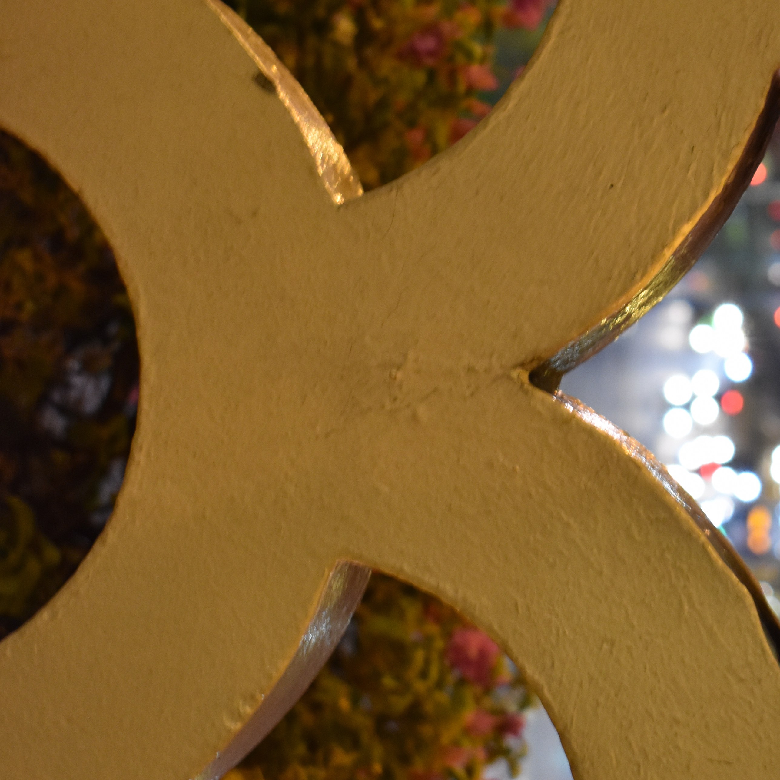
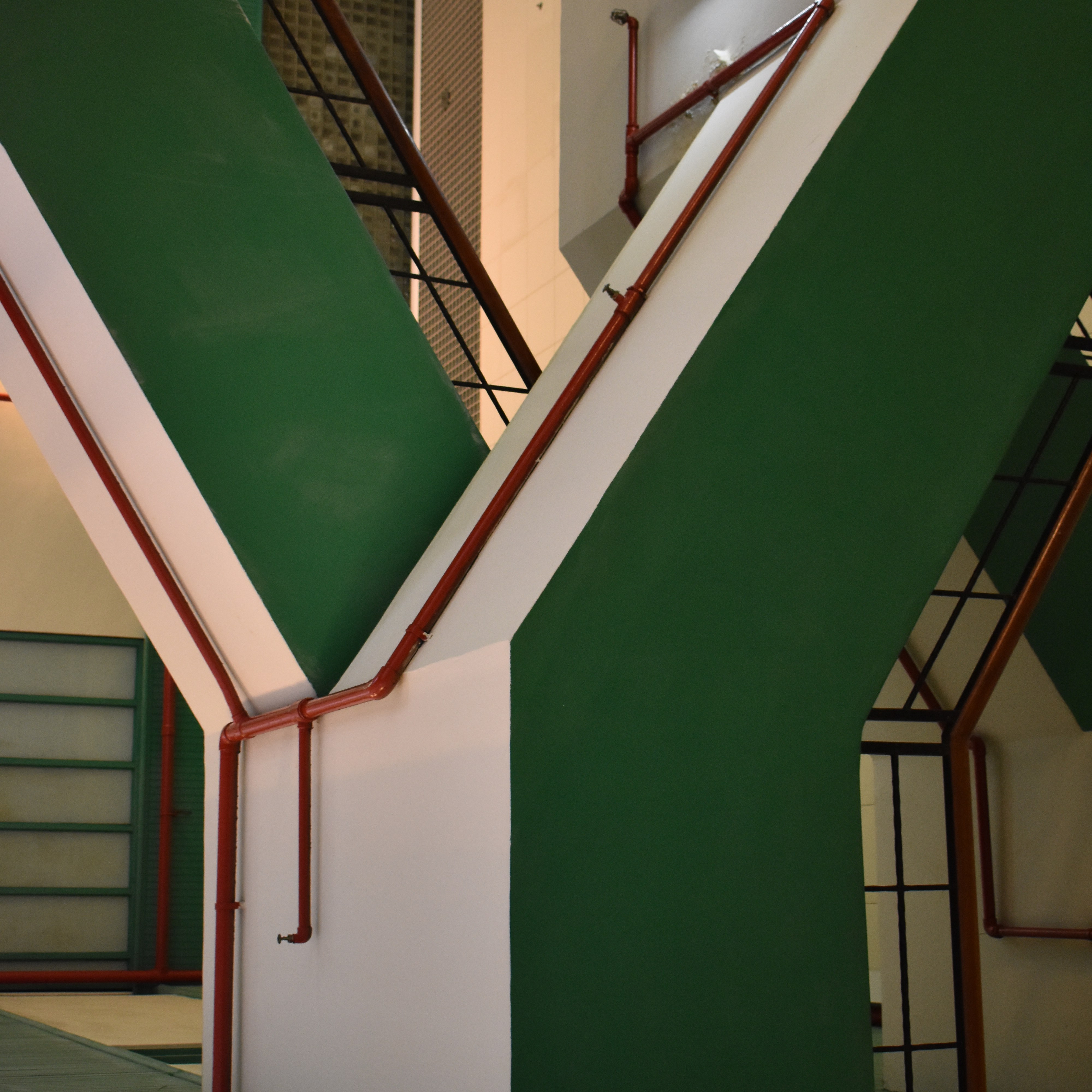
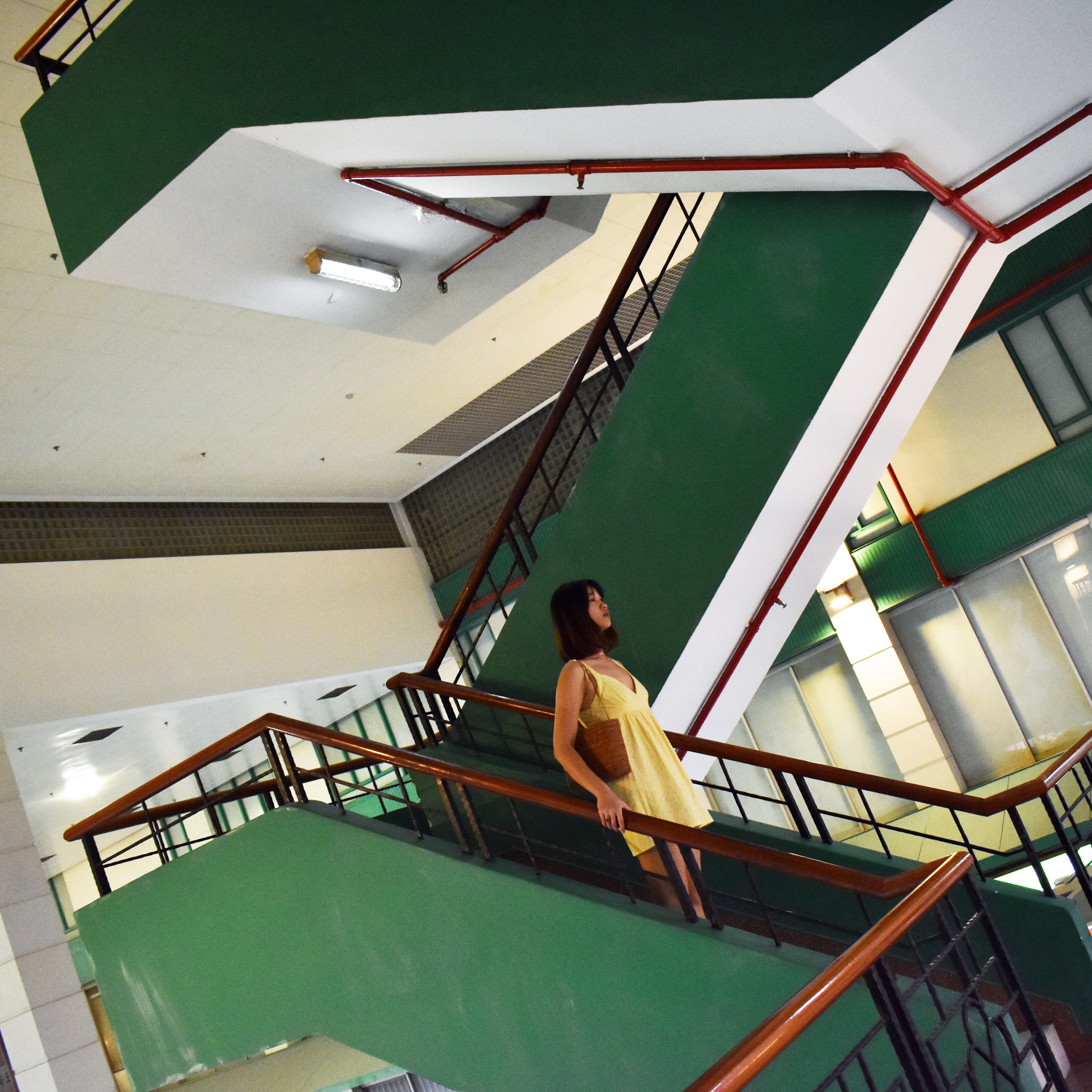
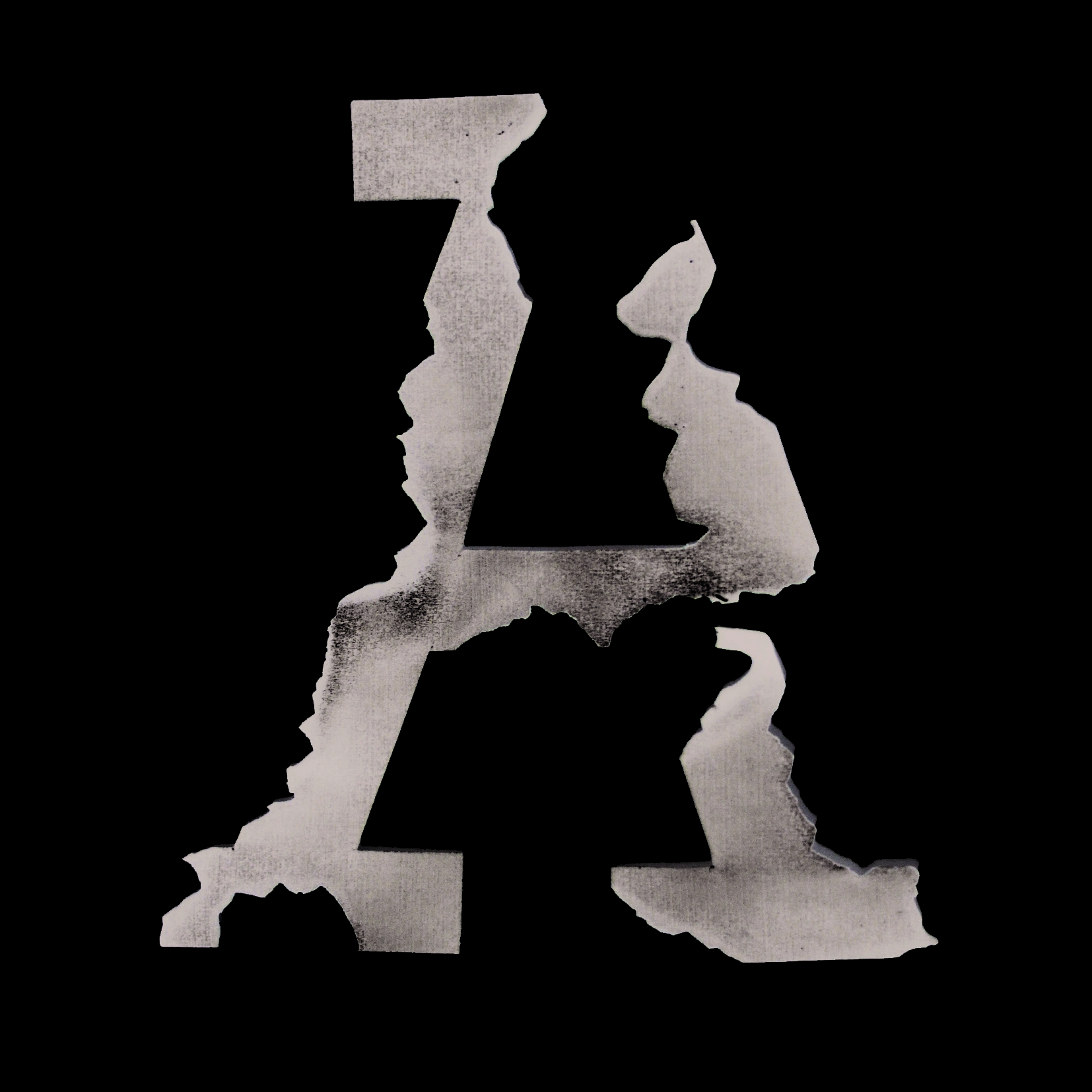
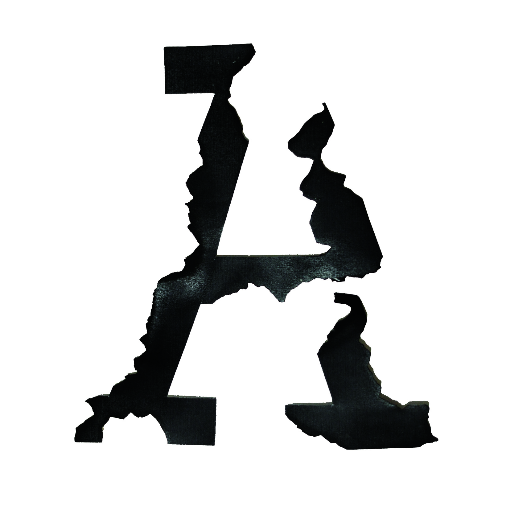
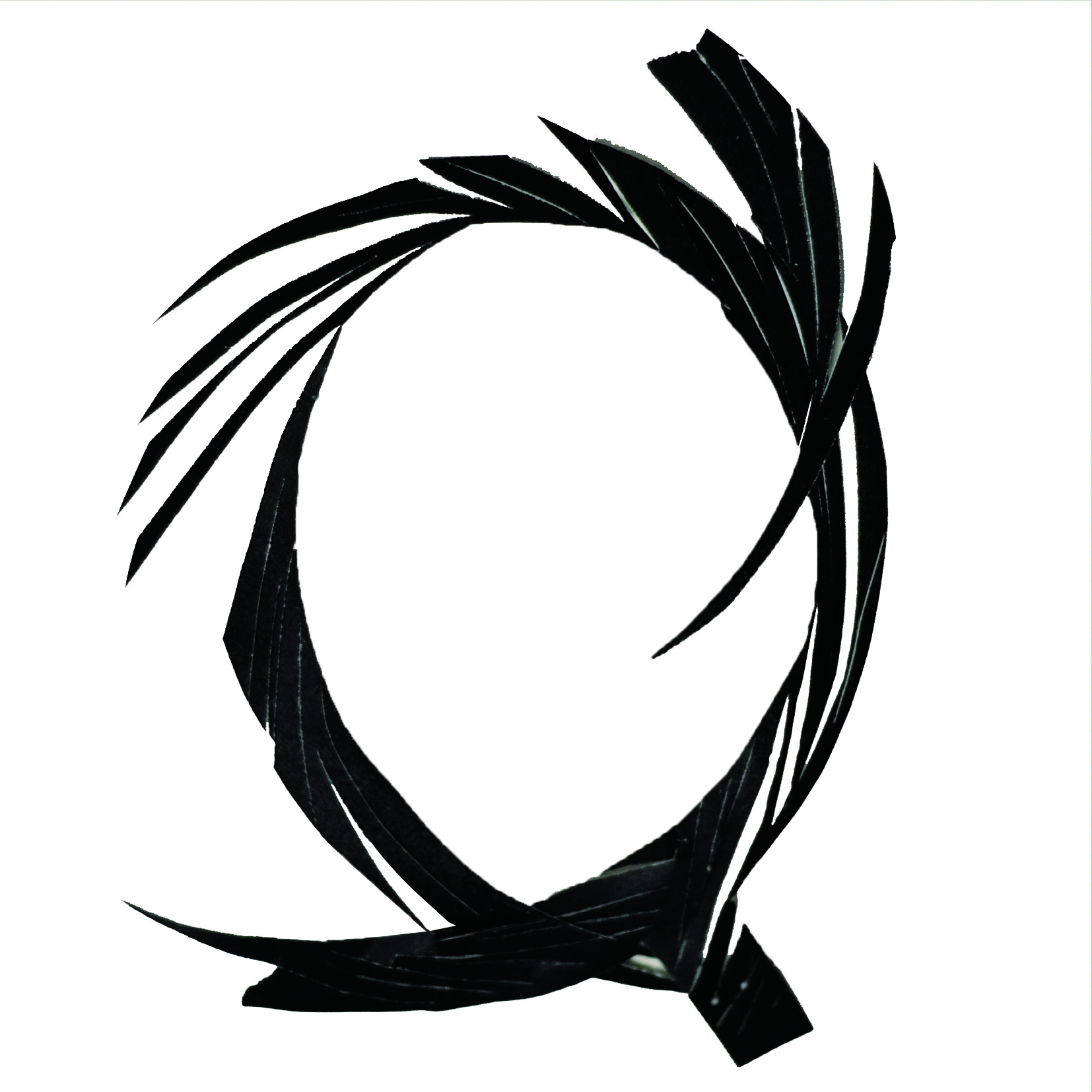
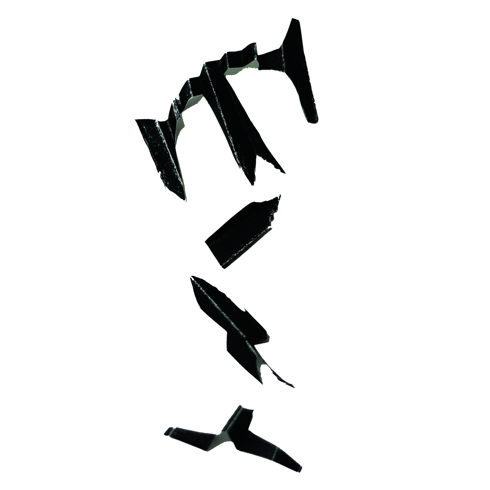
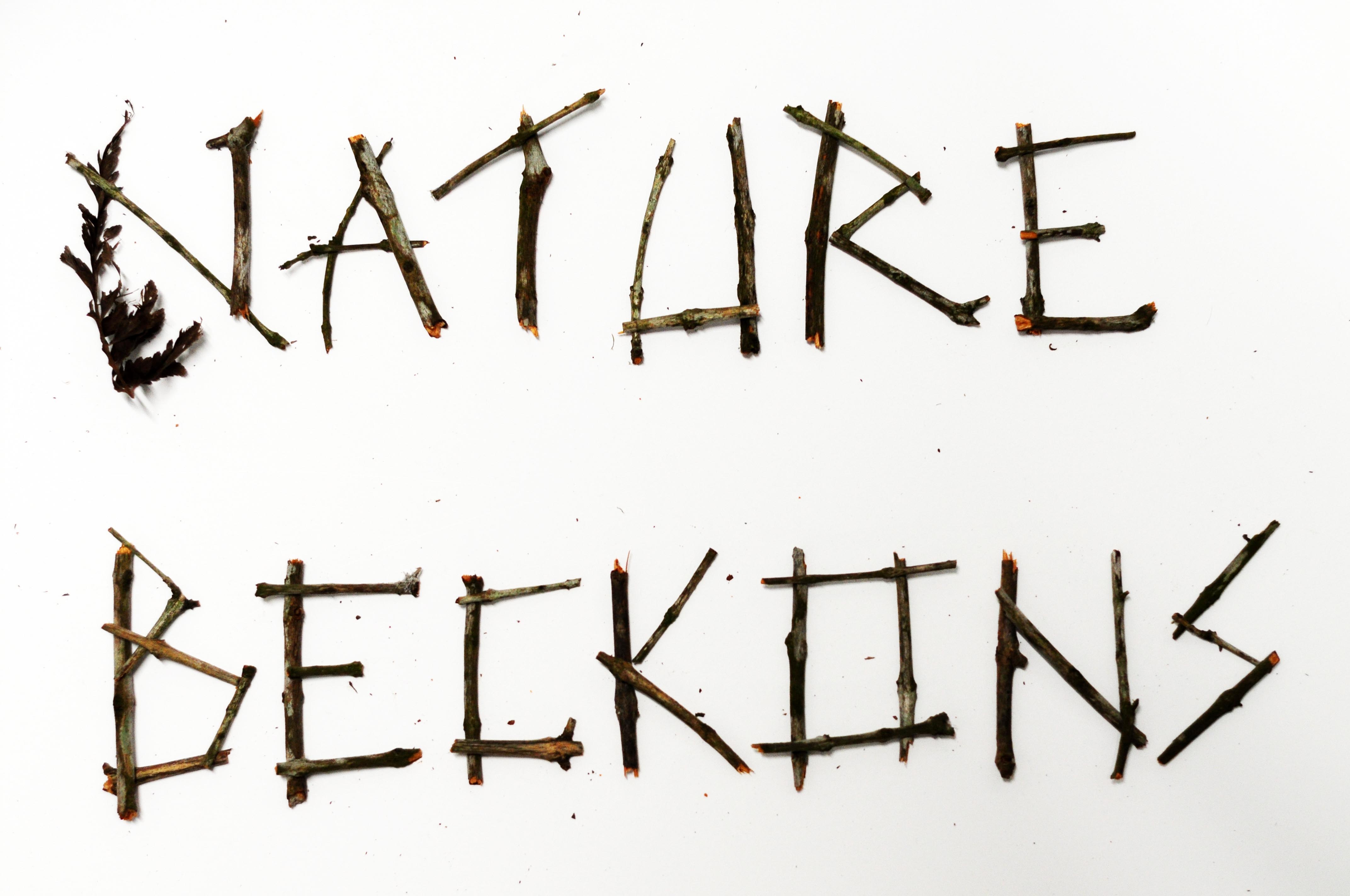
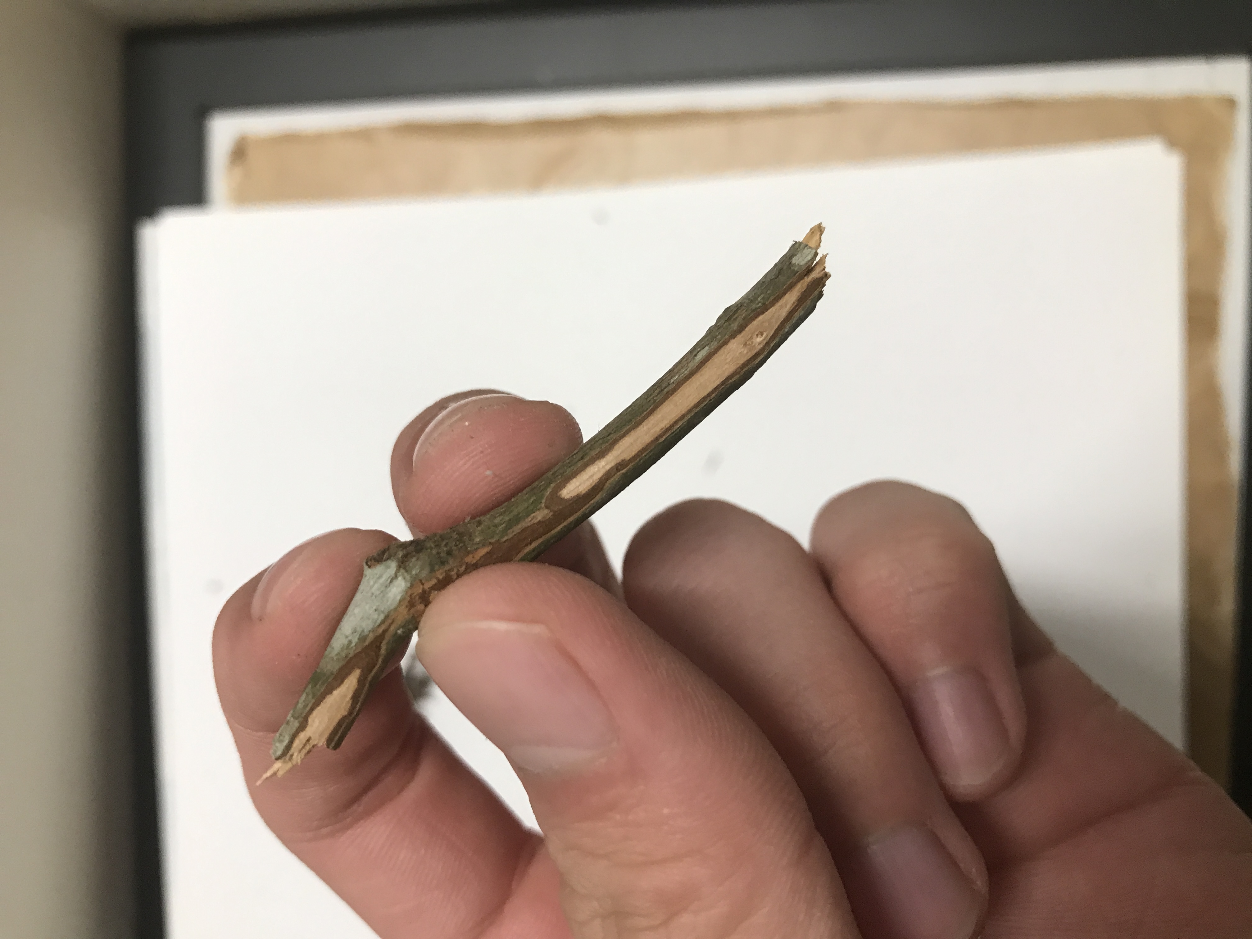
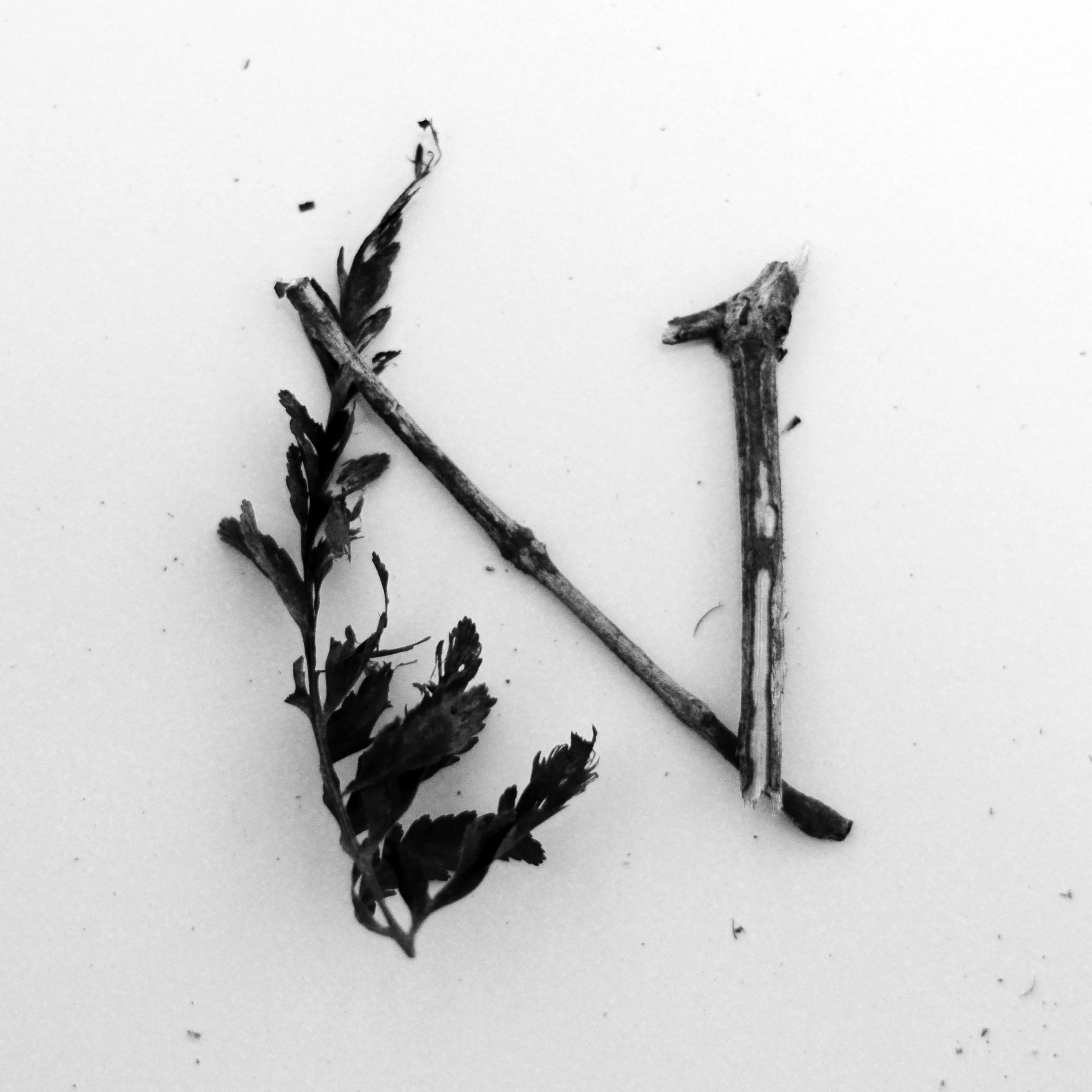
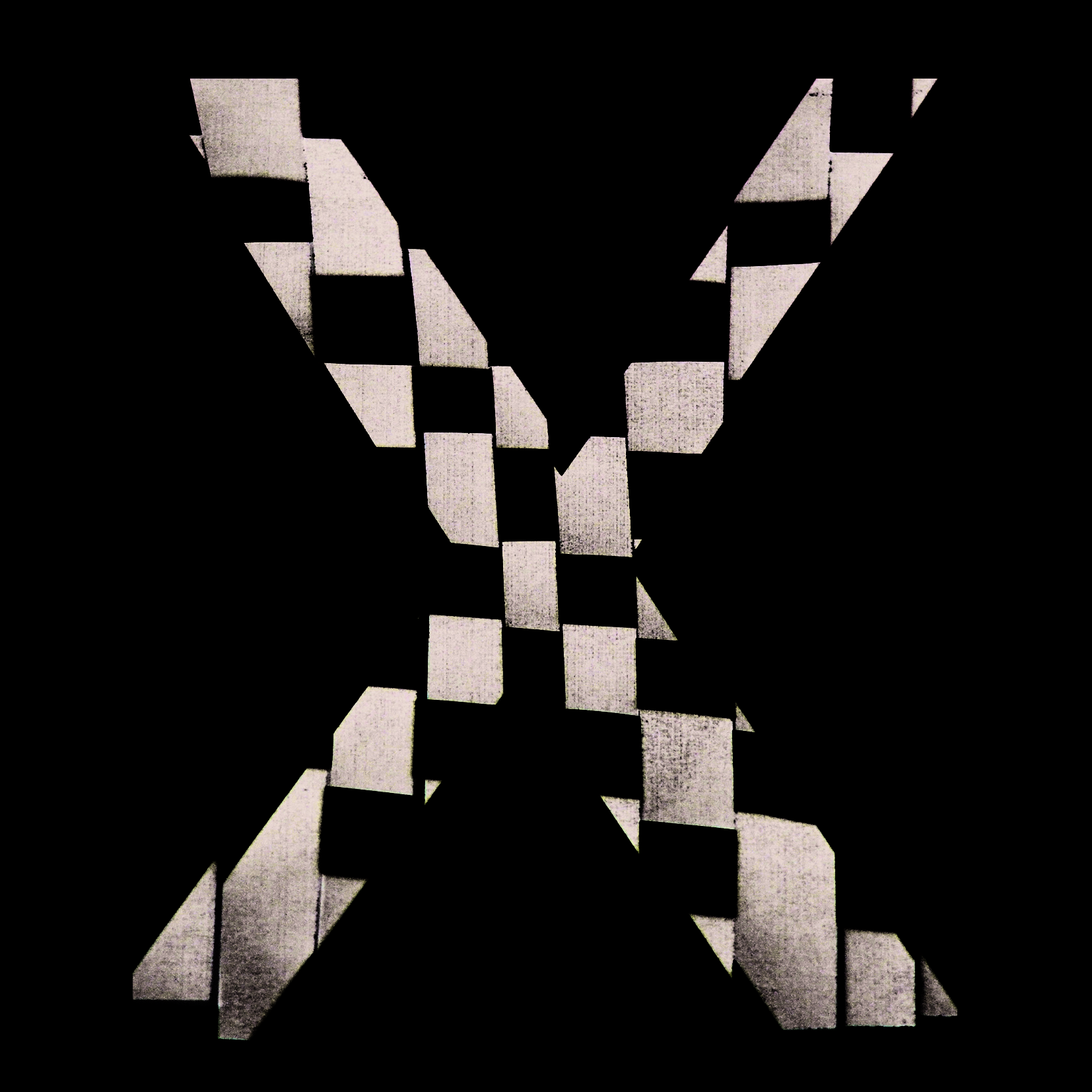
The letterform that I have chosen is M. Notice how the M is almost made up of 2 Vs. I have a love for anything that is art deco, and this letterform just screams ART DECO. I’m a sucker for anything that looks stylish and lavish. Its simple angular forms also gives it strength. It would look good on its own as a logotype too.

In summary, I have grown to appreciate the use of type in our everyday lives, and the invisible influence that it has on branding and community building.

2D Y1S2 P1: Que Sera Sera Final Designs

  1. Cyclist

screen-shot-2017-02-15-at-11-16-21-pm

Mimi’s advice for draft 1: Reduce the number of colors, reduce the width of wheels and look at a way to make a leaner figure to denote speed i.e. change of font.

Result: I cut out some unnecessary lines, reduced the font size of some letters to create a leaner, cleaner and clearer typographic pictogram.


2. Mountain Climber

screen-shot-2017-02-15-at-11-16-50-pm

Mimi’s advice for draft 1: ensure that both side of the “mountain” have the same texture to create unity in the composition.

Result: I created jagged rock forms on both sides, playing with figure / ground relationships to create ambiguity for the letterforms.


3. Bar owner

screen-shot-2017-02-15-at-11-15-05-pm

Mimi’s advice for draft 2: lose the bar sign as it is unnecessary. Keep the rendered font and background.

Result: A simpler, cleaner look.


4. Programmer

screen-shot-2017-02-15-at-11-14-50-pm

Mimi’s advice for draft 2: try to play around with the arrangement of letterforms / play with repetition.

Result: I wasn’t able to create a better arrangement of shapes to create the linear perspective that I wanted, and thus I sacrificed a bit of legibility for the 3 dimensionality for this piece.

2D Y1S2 P1: Que Sera Sera (III)

My ideation made me come up with a few more occupations:

5. Bar Owner

6. Astronaut

Bar Owner
flamingo-hotel-las-vegas-neon-sign-light-car-neon-bulbs-signage-vintage-neon-signs-business-real

One of the places where I first drew inspiration from was the neon signs of a famous club in the Vegas Strip — The Flamingo. I have been fascinated from young about bars, clubs, parties and the razzmatazz of nightlife.

772ac127683721-563690f5bd6ab

I tried to draw inspiration from the Great Gatsby as well; it was a great time to be living in where people who beginning to experiment with their own freedom and the limits of their wealth. This created the Art Deco period earmarked by flamboyant designs with luxurious embellishments.

cabarettitle

I looked into Cabaret clubs and the iconography / typography, and they shared a similar flamboyance to the bars and clubs. I wanted to incorporate the neon lights of nightlife into my work, but I didn’t want my typographic art to be seen as too sleazy, so I decided against opting for too much embellishment at the risk of appearing obtuse.

nightclub-draft-1

This was one of the first designs I came up with. The colour was drawn from the pinkish hues of the neon signs. The font I used was Pacifico, which was a cursive font with a certain handwritten quality to it. I liked the fact that it made the typographic art a bit more personal, but the drawback was that it was “too much like a family restaurant”, according to one too many people.

screen-shot-2017-02-11-at-4-53-27-pm

Another example I looked at was Heineken’s typographic ads.

screen-shot-2017-02-11-at-4-53-04-pm

RISD’s exhibition poster made use of overlapping fonts, which I felt was quite neat but unnecessary if I applied it to my own work. Still, I could explore this idea if time allows.

screen-shot-2017-02-11-at-4-52-45-pm

I liked this installation approach to typography, with the background of the design bringing out the intensity of the lighting.

nightclub

I developed a brick wall background and made it really dark. On hindsight it might’ve been a bit too dark. Selecting a more purplish color for the “nightclub” font, I tried to exaggerate the lighting effect as much as possible, and complement the fullness of the cursive neon with the more rigorous, but still dynamic hollow signage of “Benny’s”. I also gave “nightclub” a bit of slant so that the design wouldn’t be too static.

Fonts:

DIN alternate condensed bold alternategothicnotwo

I liked the DIN alternate condensed because it was tight and compact. Neon signs are costly to maintain, so in order to make the sign realistic, real life considerations affected my selection of this clean and economic font.

Pacifico

pacifico_specimen

The cursive of Pacifico complemented well with the straight-edged DIN. It was lively and helped make the signage pop.

Astronaut

tumblr_m7bavrqlgk1qzt7h7o2_500

NASA, the quintessential place one would look to find inspiration for astronauts. Growing up, there was always a fascination with deep space, and when I was in my teens and a churchgoer I started to wonder if humans were the only ones that existed in this vast universe. I like NASA’s thick and smooth-edged font, almost mirroring the designs of the space shuttles it sends to space.

nasa-logo-ft2

 nasa_scan_tests_grid-copy

Form and function go hand in hand.

star-wars-1200x675

Star Wars also brought an added layer of curiosity, where inter-galactic conflict was possible and interplanetary travel was almost as easy as taking the bus. Along with the movies came a lot of iconography and typography which I drew from as inspiration. 452389950cb9847aed53a395a4ac61a6

This is one of the examples of typographic art I found, and the character is Darth Vader.

design-invisible-creature-05

I liked this poster a lot as it uses color simply and effectively. The poster is composed such that not much is seen except for red. And Mars is known as the red planet. The yellow is used to denote light and the shadow stark black. The shapes used to make up the rocket are also simple and hard-edged. The adherence to simplicity is what makes this poster stand out, and makes me want to create something like this for the typographic assignment.

screen-shot-2017-02-10-at-9-12-34-am

I also looked into the idea of constellation, whereby your name can be made up of many different letters scattered across the “universe”.

Unfortunately, quite a number of friends have used this concept for their assignments, which makes me a bit late to the party. 🙁

I’ll keep looking, and will work on new designs if better ideas come up.

2D Y1S2 P1: Que Sera Sera (II)

I’ll continue with occupations 3 and 4 on the list, but they are by no means definitive as I will continue to edit the occupations if I manage to come up with better concepts along the way.

Just a quick recap, here was the list from part one; I’ve made some changes after consultation.

  1. Software Programmer
  2. Bike Racer
  3. Jungle Explorer —> Mountaineer / rock climber (Jungle explorer may be too vague for the brief, and people may have many interpretations of what an explorer can and cannot do.)
  4. Cowboy

Mountaineer / Mountain Climber

skalolaz_1920x1200

Edmund Hillary and Tenzing Norgay, the duo who first ascended the treacherous slopes of Mount Everest and reached its peak, must have felt like immortals after living to tell the tale. A tale of exhilaration, sheer grit and victory over one’s limitations.

Even as I was fascinated with my father’s work and grew to be as competitive as he was, there was a part of me that always wanted to live life like an adventure. I would read of stories like Robinson Crusoe and wonder if I could lead a life that had no limitations one day.

Mount Everest, the highest peak in the world

In a way, I wondered if I could fulfill the competitive aspect of my personality with something thrilling. Nature was so vast and unexplored, and I wanted to be part of something bigger than myself.

2e37d4c3f5162c756e97e72580c0acdc

I researched on the typographic expressions for mountain climbing and managed to find some phenomenal work. On the right is an inspirational Christian poster with its very effective treatment of the typeface. The font used is clean, and the peaks of the letterforms like M, N and A correspond with the peaks of the mountains. There is uniformity in the composition and the overlapping forms create additional interest due to the law of enclosure (Gestalt).

screen-shot-2017-02-04-at-5-01-11-pm

I then looked towards playing with silhouettes and negative space, to see if I could draw inspiration from these areas.

acee4ae99b5acfb57dccf5010b8d212e

In the above picture, the clock draws the viewers’ focus towards the silhouette of the climber..

In the picture on the right, the play of figure/ground relationship form a meaningful concept of the typographic image.

 screen-shot-2017-02-04-at-6-01-38-pm

Another example of playing with figure-ground relationships.

mountaineer

3. Mountain climber

I made use of what I learnt in the book Typography Essentials and the material that I researched on to come up with the typographic image based on the figure / ground relationship.

Font: Impact 125b38f2-ca01-49c3-a6de-46e1e738cfe5image3

Impact has a thick body and shoulders, similar to the the shape of rock formations. It also melded well with the side of a rocky mountain edge. I could then combine the image and the font to form a silhouette of a mountain peak.

Cowboy

Adventure without limits is also a benefit of being a cowboy, and that drew me towards the Old West. The stoic, independent cowboy who just needed his horse and pistol. The dusty old towns inhabited with all kinds of queer people; from quacks selling fake medicine to the elderly to the bounty hunter who kills to put food on the table. The poker pubs in the centre of town. Five finger fillet behind the sheriff’s outpost. Heh, my kinda town.

red-dead-graphics

This is one of my favourite games ever — its called Red Dead Redemption 2, where you play as … yes, a cowboy. 

screen-shot-2017-02-04-at-6-53-18-pm

My research for this theme came from many sources, like films, games, and one of these included Old West posters. The rustic, dusty  mood is conveyed through the use of more earthly colours, e.g. ocher. The texture of the poster also seems like a wood carving, another feature of an Old West design.

screen-shot-2017-02-04-at-6-56-58-pmscreen-shot-2017-02-04-at-7-07-16-pm

A few other examples of Old West signages.

tumblr_m62izjwuwo1qe2w1uo1_500

01ac_cover_1_thumb_w_580 be45faa38a8b324390d308e2d1ff44c3

I have a few more ideas that I want to explore, so I’ll leave this open-ended for now as I explore other themes.