Aesthetics in Red Dot Museum

The Red Dot Museum holds a collection of really beautiful and well designed products that was inspiring for me. It was strange to see products that we still use outside of the museum, which made me think about how well designed they are to be displayed here.

I will talk about some products that I feel strongly about. (Note I did not save a photo of the names of these items so I’m just going to call them what I think they are!)

#1 – Swiss Army Knife

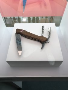
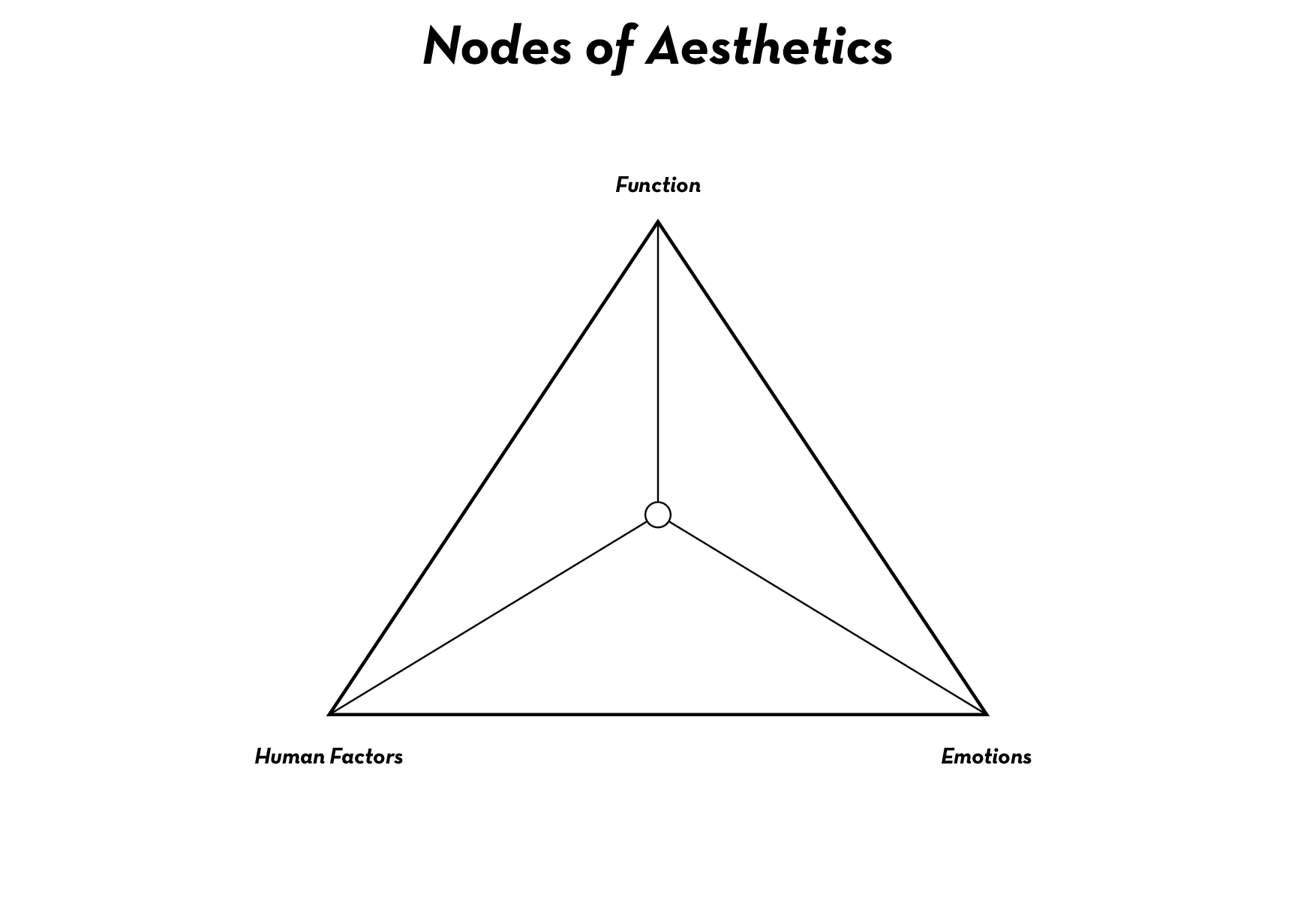
It was interesting to see this on exhibit as it is something that’s quite classic for many. That kind of already proved how good a design it is. Looking at it in the perspective of the triangle, I can see why:

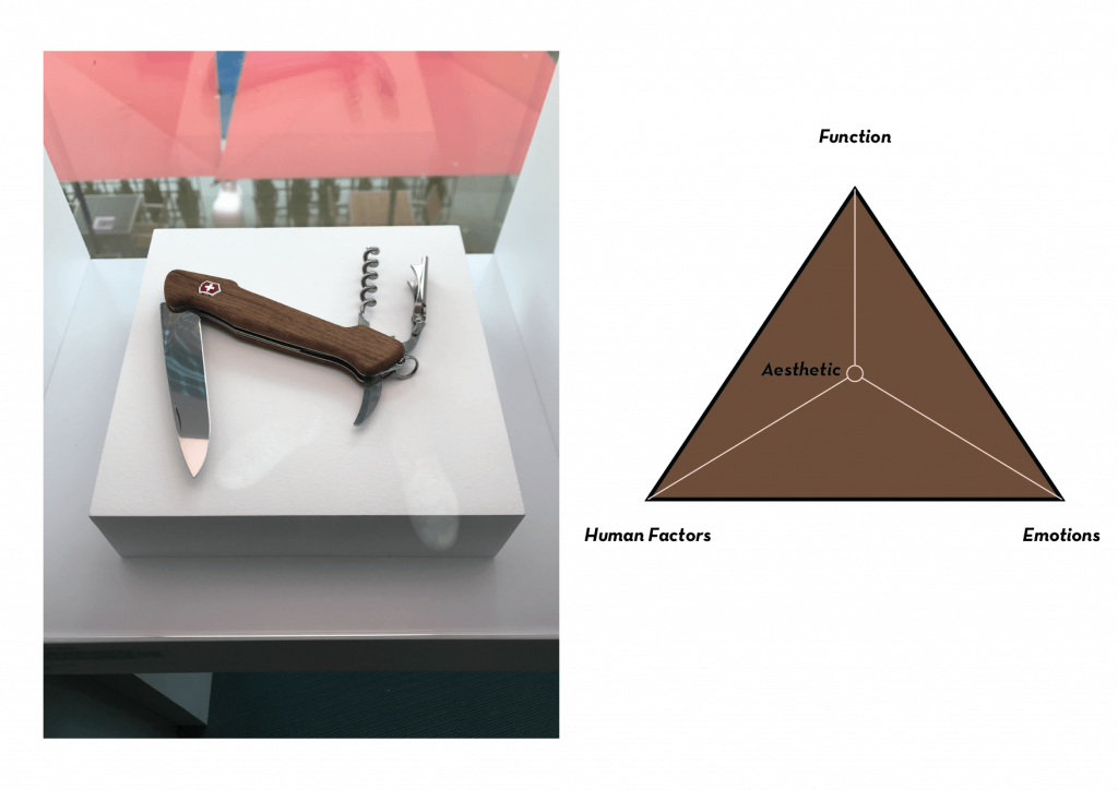
I put its aesthetics in the middle as it excelled in all three aspects. The knife is extremely functional due to its multi-function. Designed as a tool, it makes sense for people to use it to perform its function, and is as such supposed to perform its function well. The knife is very ergonomic as well, designed to fit in the hand of the user without problems, as well as creating a good grip through its hand-friendly grip shape. It is also easy to use and convenient — take it out of the pocket, pull out the tool you want, and if you finished using it, push it back in. Finally, the design speaks very well for itself, its wood finishing and quality invokes a sense of trust in the product. We know it is reliable and well made. It is a reflective design, as it does not only excel in its appearance and its usability, it also is sleek enough to allow one to make a statement with it. Using it allows one to think about how it will portray the user’s identity when using the product, how reliable and ready he/she is.

#2 – Pizza Cutter

This pizza cutter was one of the first few items on the window side exhibit that caught my attention. This is how I rate it:

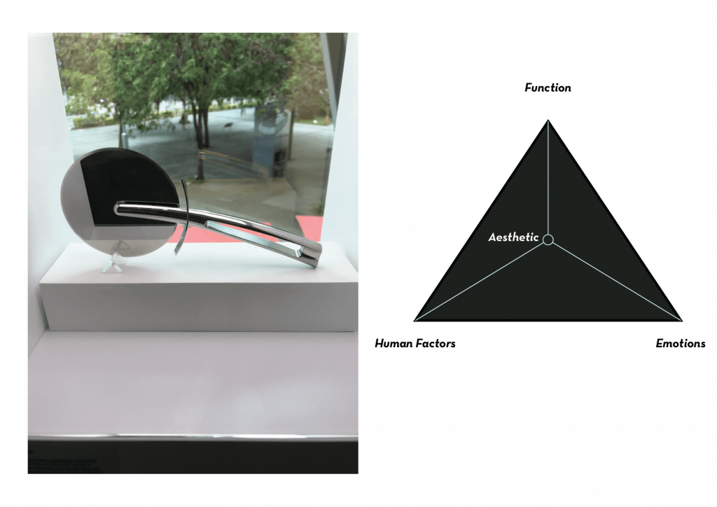
Once again, another perfectly balanced product in terms of aesthetics. In terms of function, it is what it is, a simple pizza cutter. In terms of human factor, the appearance do feel comfortable to hold, with that gradual curve that allows our finger to grip it comfortably. In terms of its composition, it was made to look weighted towards the cutter side, which allow users to know which way to grip it to allow the cutter to be most effective (which is downwards, in the way it is displayed). Lastly, the product can evoke some kind of emotions, as it is designed to not just be sleek, but also reflective. These qualities made it look very clean and swift, almost as it the pizza cutter is some kind of samurai sword. This makes it very classy but at the same time aggressive. That in itself can give users a good feeling using the product. The design is also a reflective design (literally, too), surpassing visceral and behavioural design, as it is of a certain taste that would start conversations on the dining table.

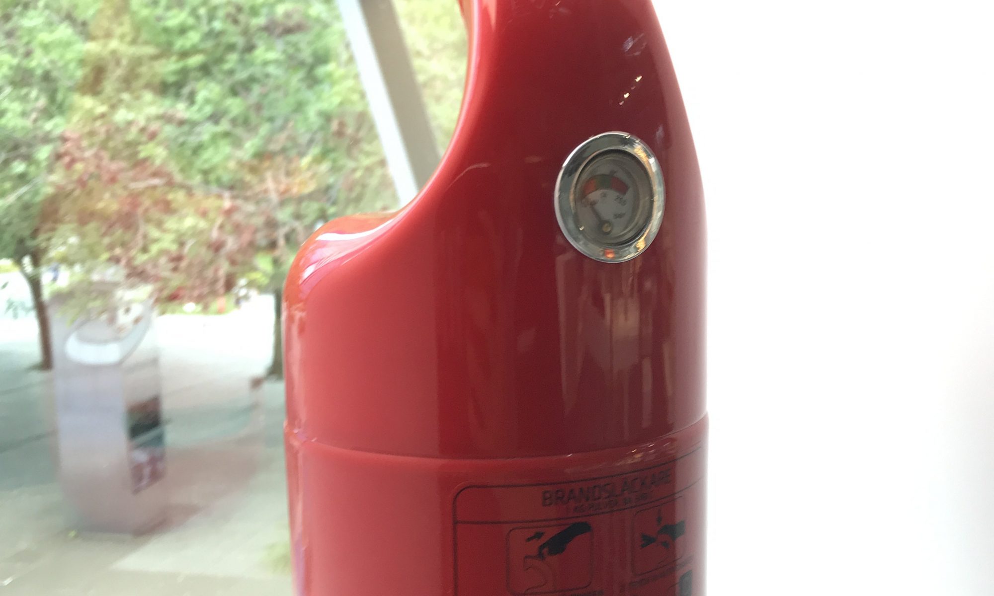
#3 – Elephant Fire Extinguisher

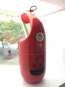
This product was an interesting take at the fire extinguisher, redesigning its grip and hose to resemble an elephant trunk.

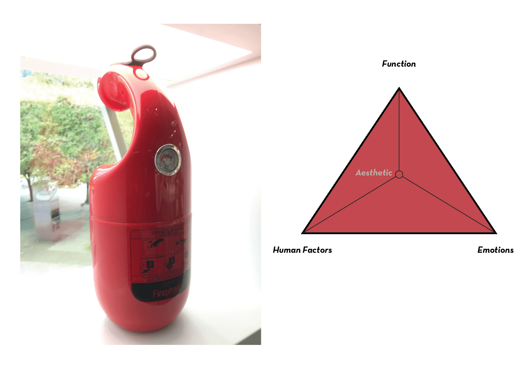
In terms of functionality, it works very well as it has the gauge and instructions at the right place, the overall pin and the nose is at a location that is easy to see and operate, which makes it easy to operate and perform its function. In terms of human factor, it is very friendly especially to people who don’t know how to use a fire extinguisher. Too many times I looked at a fire extinguisher and wonder how to operate it in an emergency as it looks too complex to use with all the tabs, knobs, and levers. The design is rounded, which makes it comfortable to hold especially at the part where the hand is supposed to grip the extinguisher. It is clearly designed to be held in a certain way that makes it comfortable and effective. Like I said earlier, it is designed to be intuitive to use, and as such excelled in human factor. In terms of emotions, this one appears to be very cute and friendly. This personality therefore allows one to feel comfortable to pick it up and use it, no matter who they are or whether they know how to use a fire extinguisher or not. The design is, unfortunately, not a reflective, but more behavioural due to the fact that we do not use fire extinguishers in our daily lives. It is designed to be more intuitive and easy to use in the event of an emergency, rather than something that one will keep for others to consider how it looked on them.

Conclusion

This trip allowed me to see and compare what design is aesthetically pleasing within its own product archetype. I was deeply inspired by many designs, and I hope to be able to have something I designed to be displayed at the museum in future.

Principles of New Media

In Lev Manovich’s ‘The Language of New Media’, Manovich identified 5 different principles of new media. They are:

  1. Numerical Representation
  2. Modularity
  3. Automation
  4. Variability
  5. Transcoding

According to Manovich, works that uses new media would follow these principles. Would our artwork, Inter-macy (WIP name), be considered a new media work?

Inter-macy converts analog, continuous data like heart rates and light intensity into digital / discrete data, digitising a supposed spectrum of inputs into a sample and quantified into a value from 0 to 1024. The computer is able to run these discrete data in the digital code in the Arduino software, which uses algorithms and mathematical functions to run. Through this analog-to-digital conversion and programmability of Arduino, the work is considered to have numerical representation.

pulse sensor converting analog ‘continuous’ data into digital ‘discrete’ data. Image taken from https://pulsesensor.com/pages/code-and-guide

Inter-macy contains parts that are Modular, in terms of the different circuit paths that connects to different components that collects discrete data, which can always be removed or added. This is also true for the code that is used to run the components, where sections or lines of codes can be edited. Individual components, wirings, resistors, and objects like gloves or the LED strip can be replaced whenever needed, and it does not have to be a 1 for 1 replacement, meaning that a flex sensor can be replaced directly with a photocell sensor. At a larger scale, all the components lead to an output that gives feedback to the participant as they interact with the artwork and with other participants. The participants are also considered to be part of the modularity of the work. All these modular pieces work individually, but on a macro scale, works like a fractal structure that performs a bigger function as a whole. 

Wires and components that are just plugged in and can be changed any time

Inter-macy also use many low-level Automation, mostly in terms of how the code runs in a loop with different settings when different input is present. The LED light is coded to glow on its own when the artwork is idle, and then does a variety of things when there is an input. The detection of pulse and light is also automatic through the component itself, as they are created to do so. Through the code, the inputs and outputs run on its own, and that is where human interaction is enhanced as the automation makes it easy for the participants to focus on the interaction. Another form of automation in the work is media access, which is in the code itself as they are taken from examples in Arduino thanks to the internet.

Automation in loop codes
Automation in the examples given

Inter-macy has Variability as the modular parts can be recreated and changed into an infinite number of possibilities through adding or subtracting of components to scale it up or down, modifying the code to do different functions from a tiny colour change to making the entire LED light up differently. Even, through the different kinds of interaction that different people will have with the artwork or the different locations, spaces, and uses for the artwork, in which its interfaces will vary even from the same sets of data.

video: As can be seen here, there are a few variabilities here with the components. This is still a prototype, so there are still many possibilities.

Variability also reminded me of John Cage’s Variation series where he sets up a stage made of motion sensors that a dancer can move around in, creating music composed by the dancer’s body as the dancer move about.

I can also draw many similarities from this example, particularly how modular it is and how variable it can be, in the way that the parts can be disassembled, reassembled, and moved from place to place.

Finally, Inter-macy has some elements of Transcoding, as the Arduino code file is written in computer language and its information is organised in its own ways, represented in the what ‘human culture’ could understand through the code itself which we can read and write, and through tangible outputs on the LED. The code can possibly be transferred into another format, like if it were to be on another program and component like Python and Raspberry Pi, although I don’t know how to do so. This principle works because in the computer culture, these codes have similar usage and can be understood in the different programs.

Thus, with all these principles applied to our artwork, Inter-macy can be considered as a new media work.


Edit: after presenting, I realised how I misunderstood variability, as I had interpreted it as that there is always potential for variability versus what variability actually means which is variability that is achievable within the work itself. As such, I would say, there is still variability in my project as there are different heart rates and different kinds of interactions between the two participants, creating different outputs.

I was quite enlightened when I was told that the book was written 20+ years ago. Back then, these principles were probably something so new to many people, yet now we take them for granted. Although the reading feels outdated, there’s still some kind of respect I could have given to the book while reading it and not just dismiss it as ‘common sense’.

Nodes of Aesthetics

Product design can be looked at from three perspective — Function, Human Factors, and Emotions. These factors thus define the product’s aesthetics. Here are my interpretations of these perspectives:

Function: How well the product perform its intended functions

Human Factors: How well it fits human usage

Emotions: How it makes us feel connected with it

Previously, I saw 2 product designs during the trip to Harvey Norman that I think are aesthetically pleasing and well designed, the Delonghi Retro Toaster and the Nescafe DG Mini Me. Here’s my analysis on these products based on the above model.

The Delonghi Retro Toaster is more on the emotional side, due to its design being based around the retro style that many love. Taking many elements from an idealised style that represents the 1960s like knobs, dials, and some elements of streamlining, the toaster is meant to evoke feelings of nostalgia. Thus, in terms of emotions, it really fared very well, and to be honest, I love this toaster mostly due to the fact that it is very stylish. However, I feel that the design is not very good in terms of human factors, as the edges juts out, the toaster looks big and bulky, and there are too many buttons and excessive elements that may obstruct the user. In terms of function, I would say it fared pretty okay, that is why in the triangle, the aesthetics is skewed towards the left, and slightly to the bottom as it fared better in terms of emotions rather than function.

The Nescafe DG Mini Me is a pretty well-balanced design. In terms of its emotion, it fared pretty well with its bubbly appearance, which looks cute and friendly for many. The shape also looks quite like a tired human being, which makes sense for being a coffee maker. It also looks quite like a penguin, which was pretty cute. However, the strange composition of shapes in this product (the ‘head’ jutting out) may seem a bit off, which can in turn, be interesting to look at. What I’m trying to say here is that, I have mixed feelings with this design’s form and thus I believe that it evokes a lot of emotions. At first, I thought that the design would lack in human factors, as the odd-looking form looks awkward to use. However, the form turns out to be pretty user-friendly as the elements are easy to reach and does the round form makes it very friendly for use. In terms of function, the product has all its intended functions displayed for the user, which makes it very accessible. However, it was not very intuitive to use as there are different settings and different levers or openings that makes it difficult to use without a manual. Therefore, it falls short in terms of both function and human factors. Thus, I have placed its aesthetics near to the right side, but have it balanced out between human factors and function.

Noice, Metaverse!

Noise Metaverse was a pretty good experience for me and it was really interesting to see interactive artists tackling different types of project that is both cool and well presented in terms of the aesthetics and its subject matter. The artworks have mostly succeeded in allowing their audience to immerse in the artwork, even if it is just for a moment.

What defines immersiveness? My take would be on how it allows the participant to be consciously and subconsciously engaged with the work. An immersive work should be intuitive, where one do not need to overthink the process. It has to be direct, what we see should be what we get, so it is more familiar to our own physical reality. I would say there is also emotional immersion where we spend energy to invest our deeper feelings into an artwork. In this post I will talk about a physically immersive work and an emotionally immersive work.

  1. Dreamscape by Zenith Chan

Dreamscape is a virtual reality world that allows the audience to look around, walk around to explore, and listen to the ambience. This is really immersive as it engaged in a person’s two main senses — sight and hearing. By isolating these 2 senses in the virtual reality world, one is able to feel like one is within the world, immersed and ‘plugged in’ to this new world. The visual cues also pulls the participant in, by animating some parts of the world while making it mostly static, one is able to perceive the tiny movements, which heightened our awareness. When I was wearing the VR headset and looking around, I kept asking “is that thing gonna move?” I feel that the longer we use the VR headset, the more we are able to feel connected to the virtual space, allowing us to further immerse ourselves. Honestly, I would stay in this virtual world for as long as I would to explore the different corners of the world. Unfortunately, there is a time constraint as I had to move on, and the wires also restricted me in exploring the world.

After learning that the artist had hand painted the entire world using the VR painting tool, I was deeply impressed by the artist’s perseverance and skill in painting something of such large scale to such detail.

To me, virtual reality is potentially the most immersive medium one can explore (currently, who knows what will happen in the future?). It is not just the amount of 3D space one can explore in a virtual world, but also how one can interact with the environment using certain controllers.

2. Time Space (If Things Could Change) by Akai Chew

A clock with a mirror as its base, connected to a shredder, illuminated by a single spotlight. This installation draw viewers attention despite standing motionless amongst all the visual stimuli all around the exhibition. The visitors are encouraged to pick up the paper, write something they wish to forget, and shred it with the shredder. The outcome: The clock winds back as the paper gets shredded, which symbolises not just the removal of the unwanted memory, but also the unwinding of time. This means the complete removal of the event, metaphorically and emotionally, which can relieve some participant’s pain despite the fact that the event is simply not erased at all.

The shredded paper becomes part of the artwork, lying as a cluster on the floor, filled with other unwanted memories. I would imagine that the shredded paper will be thrown out eventually, symbolising the cleansing of the events, but at the same time also rendering the shredded unwanted memories intangible. Does this means that the cleansing of the memory is only temporary? Despite this, I think that the clock, to me, symbolises the collective time rewound by all the visitors, which meant that the rewind on the clock is permanent. The relationship between the intangible (rewind of clock) and the tangible (shredded paper) is what’s unsettling for me.

In terms of immersion, I find myself not visually or physically immersed but rather, emotionally. The idea of putting in a memory I want to forget draws be back into an unhappy time. The thought process of putting the memory down on paper made me think and rethink over and over again the series of events and the decision on whether to ‘shred’ it or not. By putting the event or name down, I put in a lot of my past and invest myself into the artwork, which turns out rewarding looking at the paper shred and the clock rewind. At that moment, I understood the artwork, and I felt relieved for that moment, for after that moment I know that, even for only a few hours, I would have that memory gone, for I have put in the effort to removed it from my brain.

Honorable mentions:

  1. Aistronaut by Jake Tan Jun Kang
  2. Void Deck Whispers by Tay Yu Xian

Mid Terms

Inter-macy

Project Description

Our project on Interstices was initially about the physical interstice between the human body, both between parts of a human body and between two human being. We wanted the participants to be aware of the hidden areas around their body, as well as the kind of spaces one can find in another person’s body. This leads to the idea of intimacy, which branched off into another idea of letting people become aware of the interstice between human relationships. The non-physical space between two humans is invisible, but can be felt by the emotions and body’s natural reactions like heartbeat or sweat. We wanted to look at such interstices and perhaps use our work to not just show them, but also allow the participants to learn about themselves, and maybe start a new relationship with another human being. We wanted this work to not just talk about interstices, but also let the participants learn something meaningful about themselves and others. This is why we approached the project with the idea of having two people interacting with one another. In terms of interactivity, we would say our work is somewhere in between reactive and interactive, as the work reacts to the inputs of the participants, but the participants are free to interact with one another, through this work.

We also wanted it to be a multi-sensory installation, so we are thinking of not just touch, but also sound and lights.

development sketches

development circuits

development codes

[if needed we will upload!]

Mid Term Review

During the mid term review, we only managed to create the circuit as we were still trying to figure out the code to allow for the function we desire. As a result, our testing were not optimal, though, we gave the participants some heads up so they are able to interact with it better.

Here’s our notes:

Experience
– Participants try to increase and decrease heart rate to see feedback (tried to hold breath, jump around)
– Intrigued by a green led on the finger and also pulsing of blue and red LEDs
– People started moving fingers to generate feedback

Participants feedback
– What they think it means: Heartbeat, the relationship between 2 users, pressure, vulnerability because making something invisible visible, something very private
– Keeyong’s experience tainted because can see wires n techs, felt a bit like medical checkup
– Lei thinks that context is very important, difficult to communicate idea
– Lei intrigued by idea of touching hands and aggregated heartbeat/ interstices between 2 people
– Audience reacts better with wows to led strip beating to pulse
– Interstices between two people and two heartbeats: Lei “combine 2 interstices instead of highlighting” “collective light and sound sculpture that is contributed by interstices and heartbeat between 2 people
– Celine and Alvin did not know intention at first and wriggled fingers because she didn’t know it was pulse influenced
– Different ppl have diff size, could affect contact point for each person: design problem
How do people know how to use it? People have to take the first step, and to take that leap to participate in it (bc for the longest time we have been staring at paintings), how else could you facilitate the intuitiveness
Couples therapy hahaha
– Different parts that combine into one whole system instead of one whole glove to fix fitting problem
– The more the two parties interact with each other the more the sculpture will blossom
– “Clap my handsssss very harddddd” lma0
– Maybe hi 5s? Different kind of interaction? As opposed to strangers and friends with different relations.
Progressive interaction? Start w high 5 then progress into touching palms
– How to guide participants? Maybe retractable string & 2 same hands, maybe place them on stands
– How do u even motivate people to do the hi 5? How to encourage strangers to do it
– Put them in a box, outsiders dk what is happening inside it, and they r already in the box so they have to touch it, and it creates a reaction and a sound

changes to ideas

The biggest issue discussed was how do we get people to come together to interact with one another. What was observed during the mid-term review was that our participants interacted with the glove on their own and did not attempt to interact with one another. Thus, Melo suggested this idea where we can have the interaction happen underneath a box, which puts participants in a position where they have to interact with one another. The participants then can interact whichever way they wish with their hands in the box, and would be able to see the sculpture light up and react according to the interaction. This makes the artwork easier to approach and may make it more meaningful for participants, to have a connection hidden in a box while creating art with the sculpture.

We like this idea a lot as it solves our problem, which is how much freedom should we give to the participants. It also adds some depth to the installation in the way the participants interact with each other, as they are now able to focus their attention in interaction using just their hands. In a way, adding control helped us make the installation more interesting.

Conclusion

With this new idea, we decided that we will remove the flex sensor as the wrist movement wasn’t moved as much when in a box. We wanted to have the flex sensors on the fingers instead but flex sensors were too expensive, so we decided to replace them with photocell sensors instead, where the hand interaction will cover the sensors, creating different inputs.