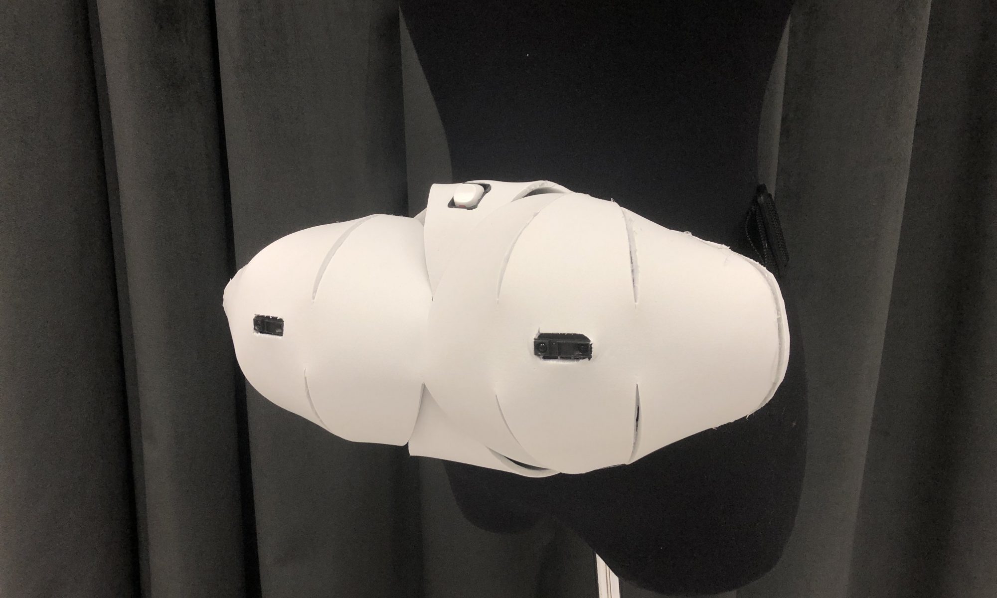
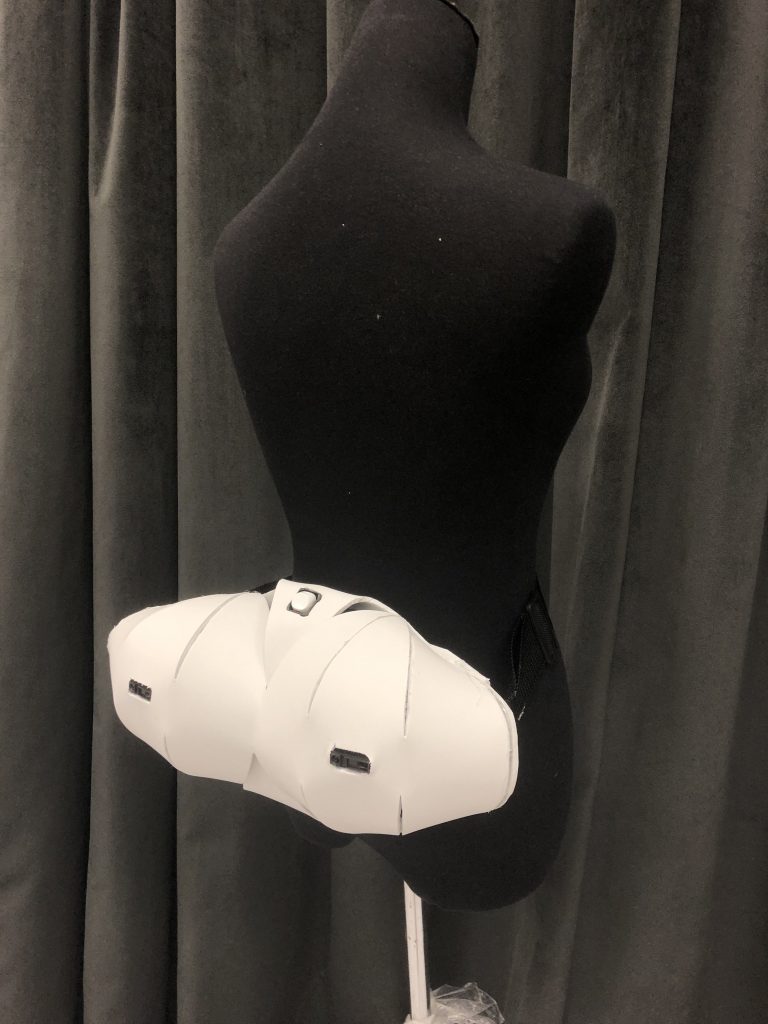
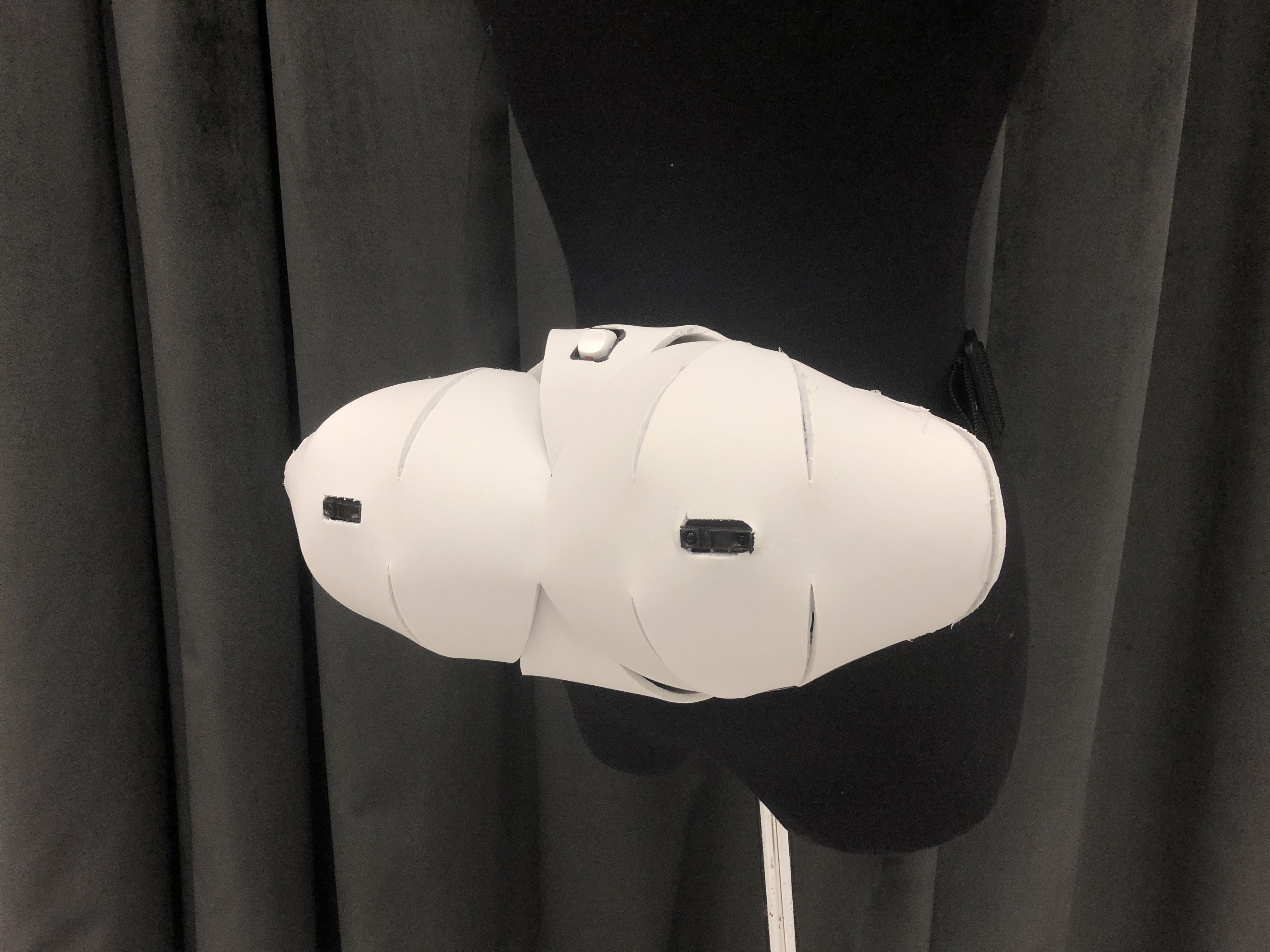
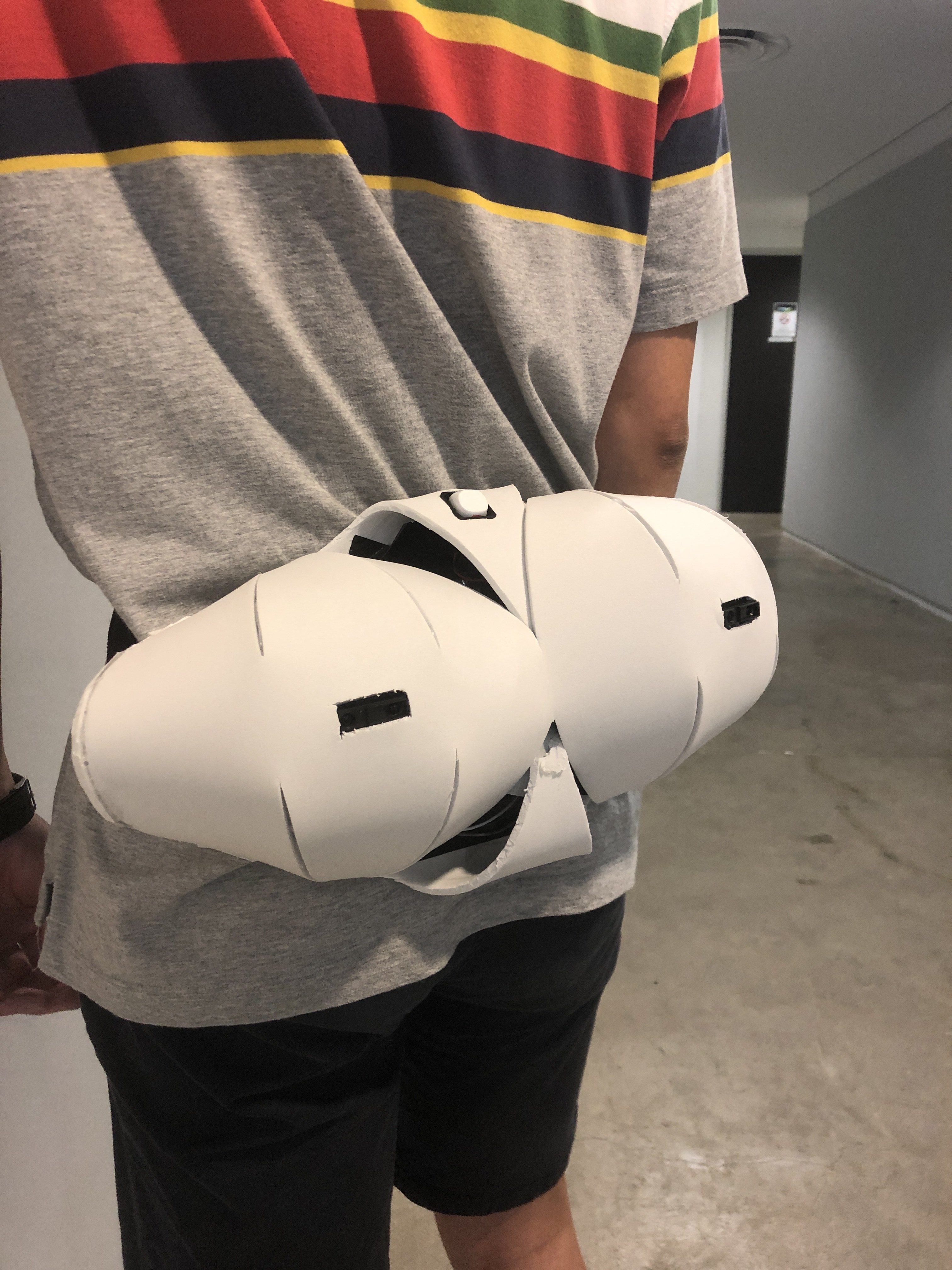
This interactive device makes use of 2 Infrared sensors to detect presence of obstacles from behind, particularly useful in places where you may potentially block someone’s path (narrow paths, etc). It can also be used as a defensive too for early warning of someone sneaking up on you.
How it works:
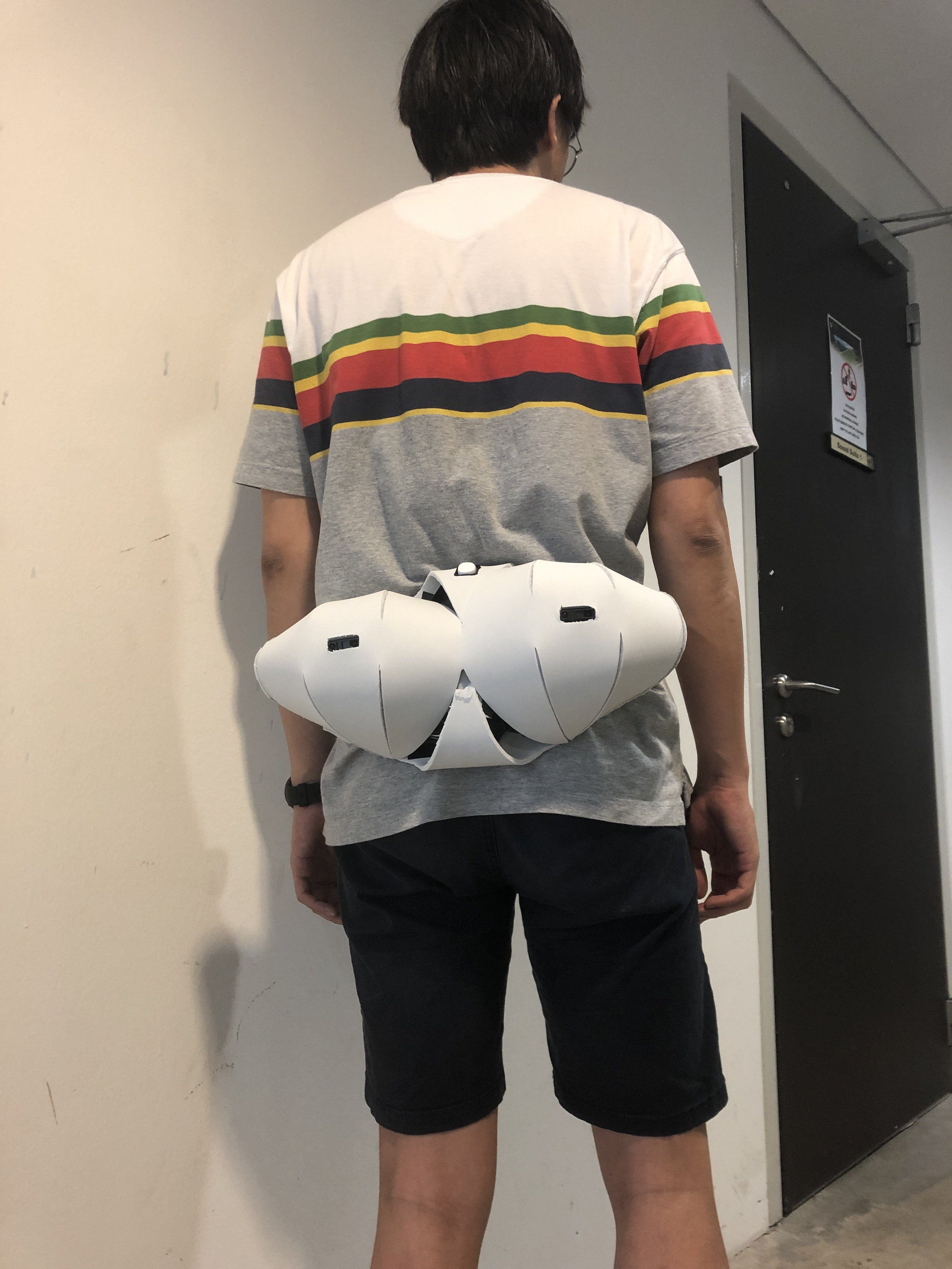
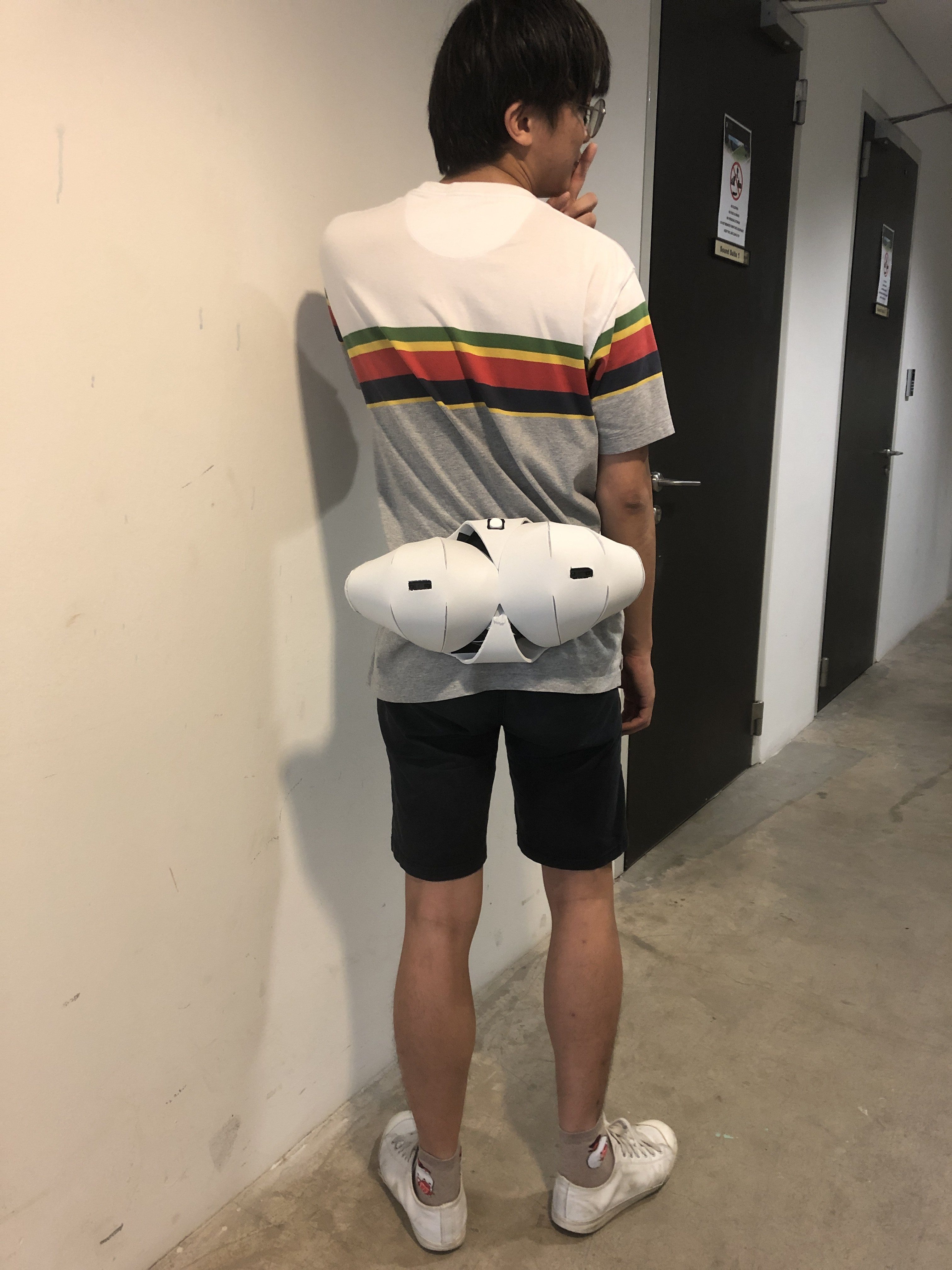
Wearer will wear this like a belt.
Switch to switch on
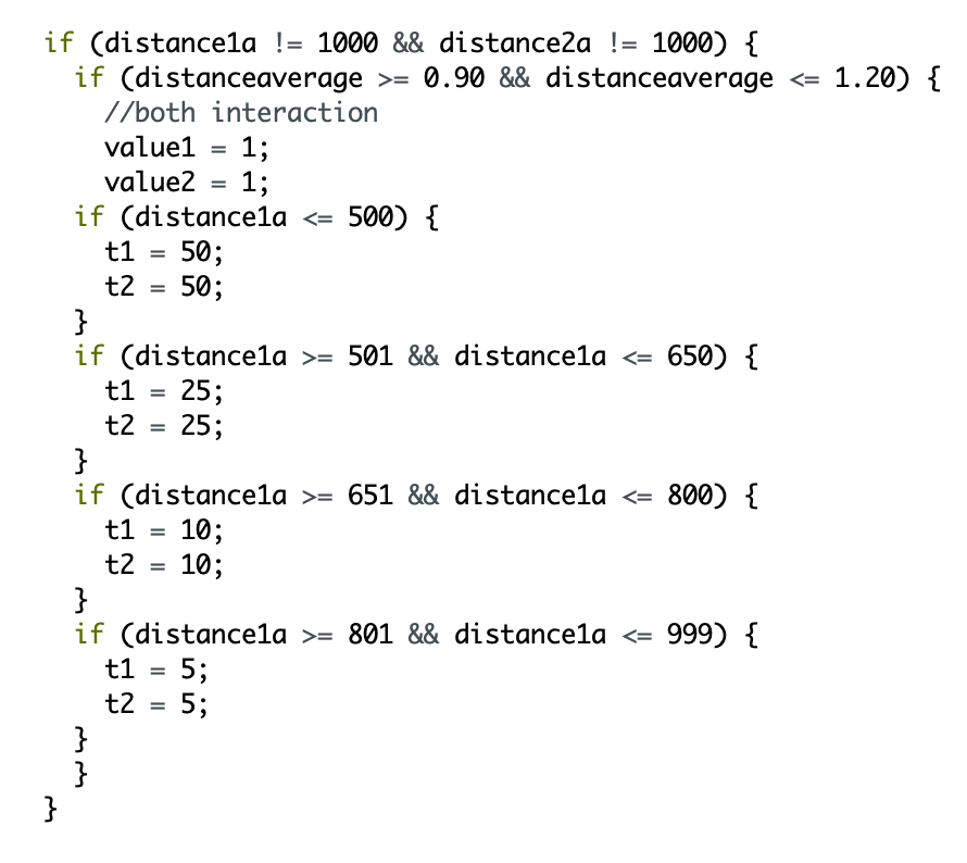
If something is in the proximity of 1 of the sensor (eg. the left side), the left vibration module will start to vibrate
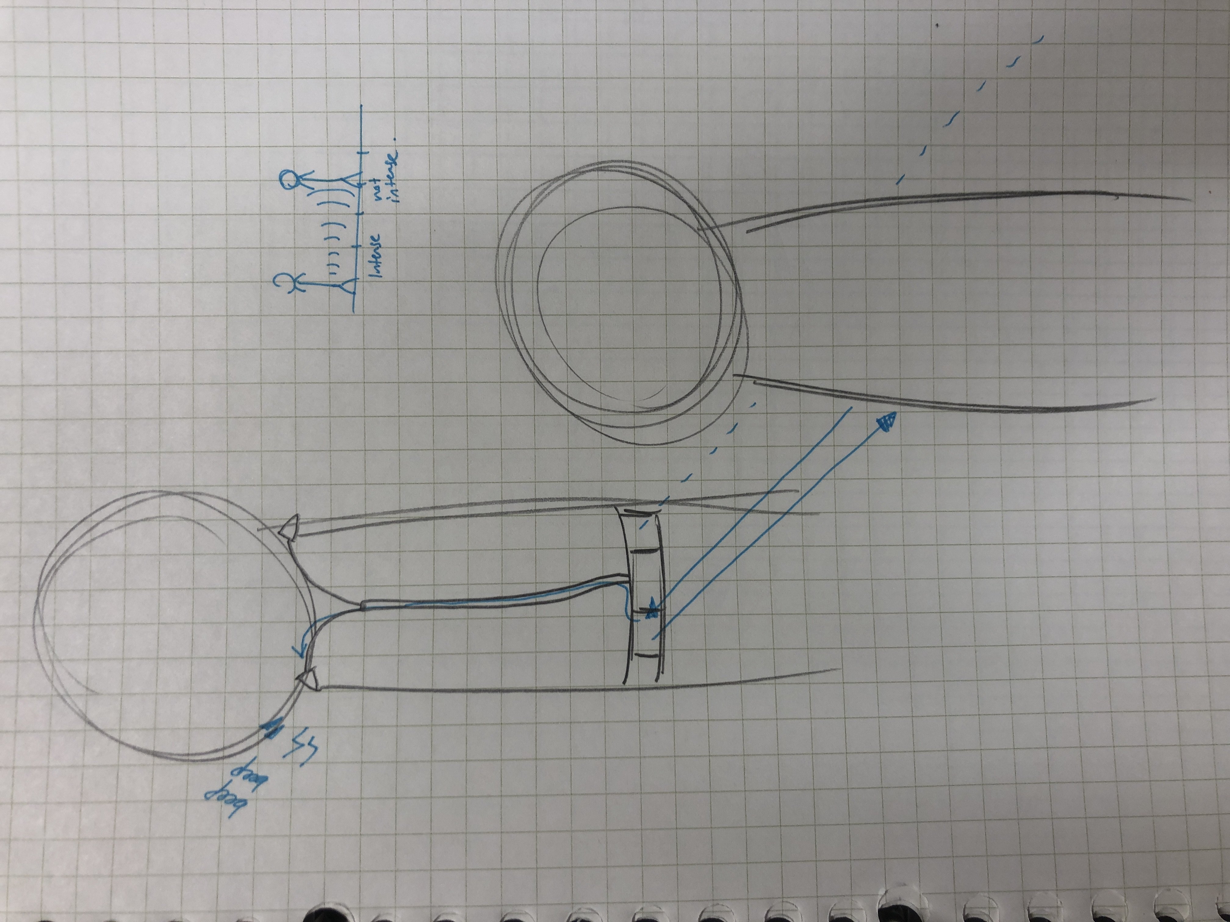
Depending on the proximity, the vibration varies. As the strength of the vibration cannot be controlled, I only controlled the frequency of vibration in relation to the proximity. The closer something is, the more frequent it vibrates. This is similar to car reversing system.
If the obstacle is in between both sensors, and both sensors pick up the obstacle, both will vibrate indicating the obstacle being in the middle. But the threshold for this is too low (I think) and as such it isn’t very sensitive.
Problems:
the vibration is very strong so it can be uncomfortable, and that cannot be controlled.
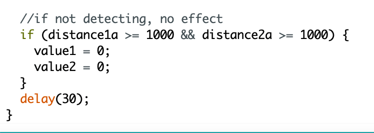
if the wearer is leaning against the wall, it will keep vibrating. To solve this, one can simply switch it off
Form not fitting, could be more flexible and concave rather than convex
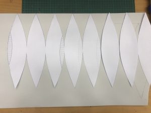
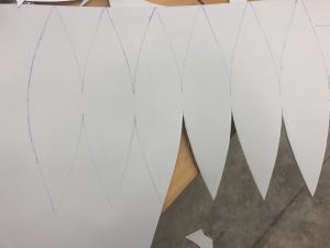
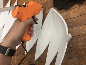
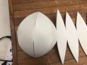
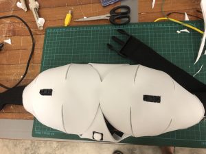
Process
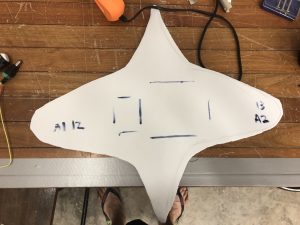
Template for the form
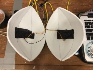
Putting it together into a half-sphere
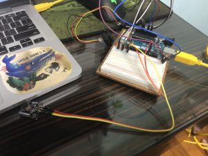
Trying out the sensors
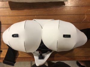
Putting the IR sensors on
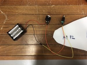
Putting the switch and the battery pack together
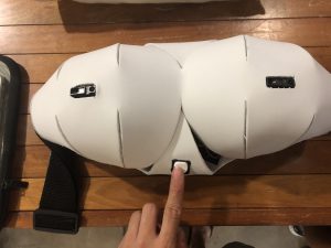
The final form!!!
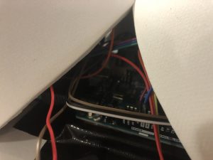
Code
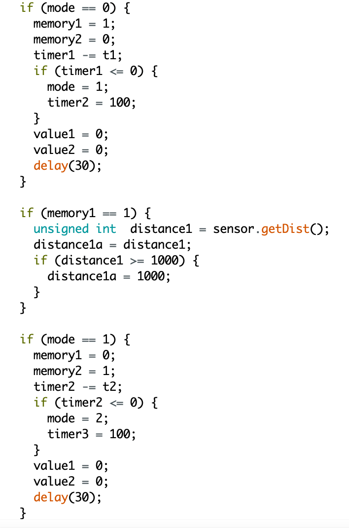
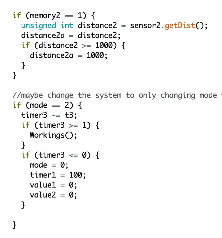
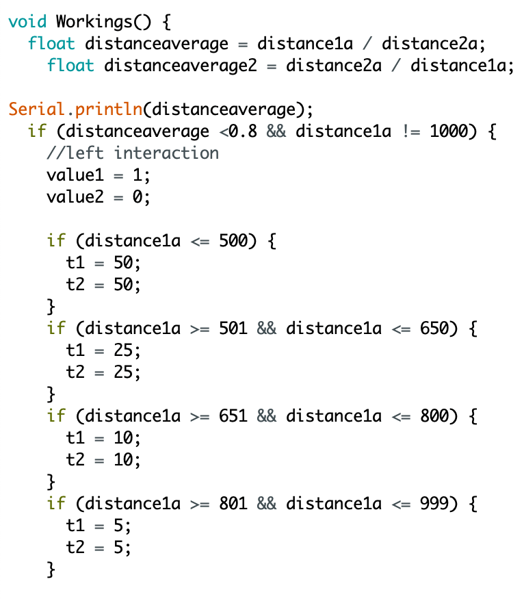
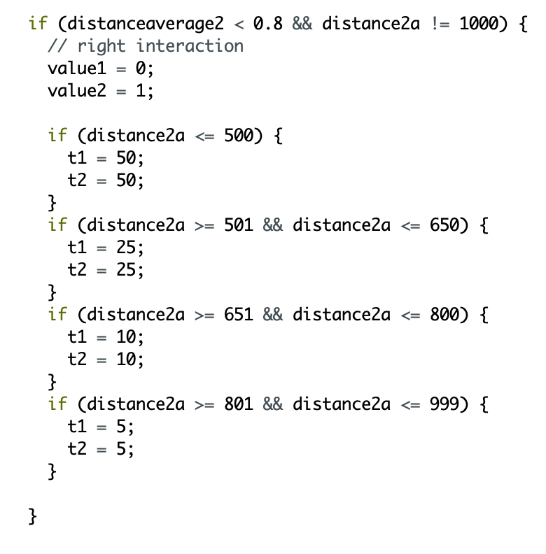
Base system:
How the vibration module and IR sensor working together
This is some extra stuff I did to make the vibration not repeat itself if its within the same range for at least 1 cycle of the code. Doesn’t work well so I didn’t use it.
There are 2 main ideas I pulled out from this reading that I find reflect a lot in Krzysztof Wodiczko’s work. The first is the idea of “Interrogative Design” (which I like!), which is how design should reflect the real world and not work around it.
Screenshot from the reading
In schools, we always are required to work around a problem instead of directly solve it due to us being just the ‘designer’ and not an engineer that is capable of solving problems with complex solutions. This is especially relevant in product design where we have to imagine new ways to use a product while bypassing a problem faced by an existing product. Now thinking back, that is what fuels our creativity, and I would say it is still a somewhat legitimate way to work towards a solution if designing for trivial objects. However, his point is that design should be real and confrontational, rather than avoidant. This is an interesting and relevant thought for my works.
The second main idea is on the need to add meaning and function to public art.
screenshot from the reading
In this passage, the artist basically mentions that public art is useless. I half agree with this as I think commission spoils the artistic freedom of artists, turning the artwork into an awkward blend of artist intention and corporate influence. Its lack of practical function (other than to beautify the space and assert their dominance through richness) also makes it a redundant creation. However, I think that the best kind of art should really be public, perhaps not commissioned, but public. I mean, other forms of art is already non-functional (practically speaking). I find public art to be one of the least intimidating forms of art as they are all very approachable, or perhaps, designed to be approachable. The lack of symbolic meaning frees the work from all the “deep” meaning that artists like to inject in their work, which not just makes their work intimidating and difficult to understand but also not adding important information for the artwork to be at least functional in doing what it needs to do.
I think I understand his sentiments, and I think there are many ways artists can improve on in their works to make it more ‘useful’. This is the same as us designers trying to make the world a better place through solutions and not just “raise awareness“.
I find that the artist’s work “City Hall Tower Projection” in Krakow, 1996 embodied these 2 ideas. The artist’s use of projection and sound onto an exist ‘permanent’ structure also reminds me of previous week’s reading about ‘relational architecture’ that temporarily changes the narrative and meaning of a space through the use of media and technology.
screenshot from the reading
The idea goes further into transforming the bell tower into a confrontational figure that discusses the unspoken or taboo topics in the country like homophobia and domestic abuse. The belltower acts as a middle person between victims recounting their narratives of said topics and the general public, essentially becoming the voice of the minority.
screenshot from the reading
This turns the architecture not just into a confrontational work, but also a functional one in terms of speaking out the unspoken, providing perspectives of the people’s humanity while also calls for people to reflect upon themselves.
Thoughts
I think the artist have very valid points and I have some similar sentiments with the artists in his view on art and design. I think we all can be a lot more thoughtful in our works in making it serve an objective function.
I was burnt out after a series of try-harding at making everything good because #newsemnewme, but after 2 weeks of being uninspired, I’m feeling better now and I think I’m going to go with a less tedious project.
While in my burnt out phase I made this mindmap:
I kind of broken down the types of messages there can be, as well as what forms a wearable can take. I was stuck with the idea that a notification must be from a phone.
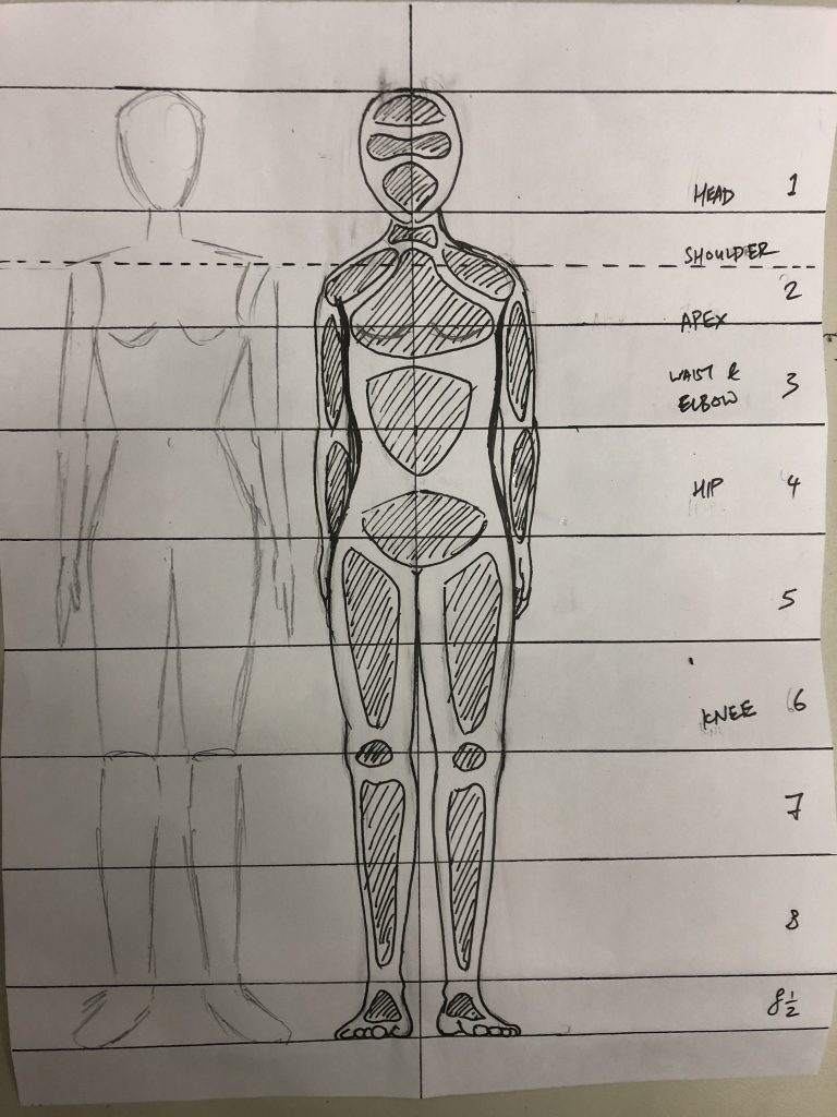
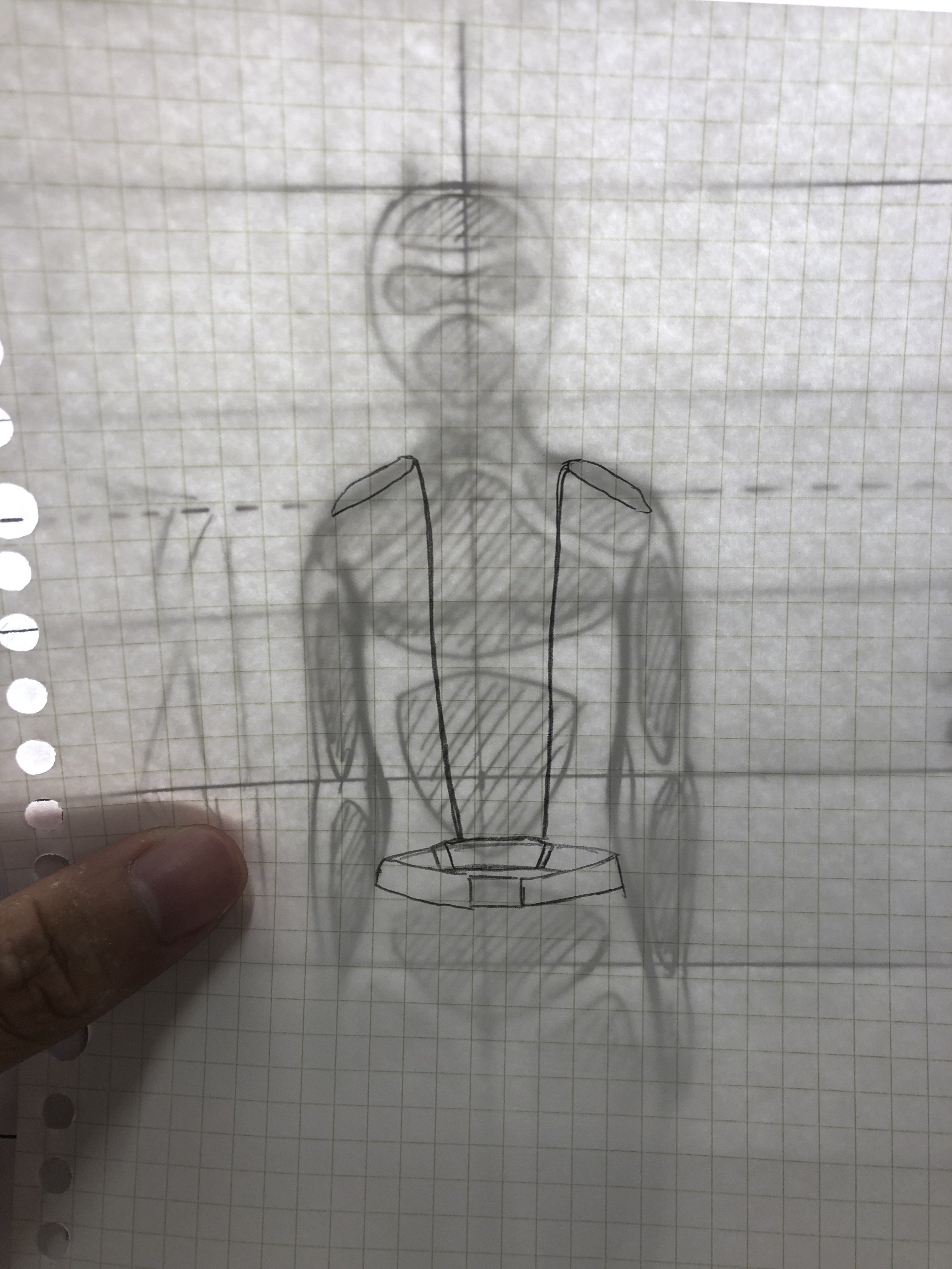
During the lesson last week, we were introduced to the 8.5 head human figure, which allows us to accurately depict our device on a human body.
Along with the lesson, I was also told that the notification can even be something that’s outside of the mobile phone. Things like a touch or press of an object that can be translated into a vibration on another person’s forearm.
With that, I felt more at ease that there are more ideas to explore. So I started this new mindmap
Very unclear, what I highlighted are:
money transactions
water plants
knock on glass window
every website visit / instagram
friend proximity
reverse / who’s behind (eye on butt)
I found out that notifications should always be personally catered to an individual. The individual should care about the notification and not just something that is sent for a cause. As such, the ones that I highlighted are the more feasible ones (except for the one I striked out, which I included at first thinking it will be nice if it can work together with my Interactive Spaces project)
The Device
I was interested in the idea of having a sensor on the back that can detect people that are behind us. It works as some kind of rear mirror for people, a 6th sense for us to ‘see’ what’s behind us. I like it as I think it’s interesting to think of ways to enhance our senses, and wearables are perfect for that. Also, I found way too many times that I have to pull my friend when he/she is blocking someone from passing.
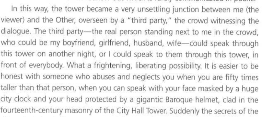
My idea of a wearable is going to be a belt which sends a signal to the shoulders. My rationale is that a belt will be stable and inconspicuous. The belt will also allow the sensor to always be facing the back of the person as that’s the only side of the body that it can face. The shoulder, as the vibration should feel like a tap on the shoulder to prompt the person to move away when there is something or someone behind him or her. The notification will also tell the user whether the incoming object or person is coming to the left or the right side.
A quick sketch of how this will look like in comparison to the 8.5 head model
The Interaction
So how this device should work is, if something is in the vicinity, at least 1 sensor should pick it up. The arduino will then compare both ultrasonic sensors: if one side is higher than the other, it will notify the user on the correct side. If both side detects a similar output (maybe within a certain range), both shoulders will vibrate to alert that the object or person is directly behind. The intensity will be determined by the closeness. The sound will come in the form of short beeps with decreasing intervals as the gap gets smaller, just like a car when in reverse.
Problem: if the user is leaning onto something on purpose, the device will keep beeping and vibrating. To solve this, I would make it such that the user can switch the device off at anytime, so as to prevent disruption or disturbance.
Something more advanced… If I can do it
I wonder if I can change the idea to the arduino detecting change in speed (acceleration) of oncoming ‘entities’, basically detecting change in environment so static environment will not trigger the system. This will solve the problem mentioned above. We shall see.
I want to focus on my previous project ‘What We Left Behind’ and build upon it. I was more interested in the idea of the birds dying or getting lost in ADM, and I thought there is a lot of potential in requesting for the school and the students to take a stand in helping the wildlife we unintentionally kill everyday.
I think the project background requires some more research and interviews, so maybe I will not focus too much on that as I don’t think there’s time. As such I will focus more on the interaction.
I was also inspired by Siah Armajani’s Sacco and Vanzetti Reading Room #3 in the way that it is a space that is functional to the public, yet makes a statement. To also conclude from what we have learnt from the past few weeks, I wanted to create a space that intervenes through confrontation with meaningful objects, and also to create an environment that can change through movement.
The Setup
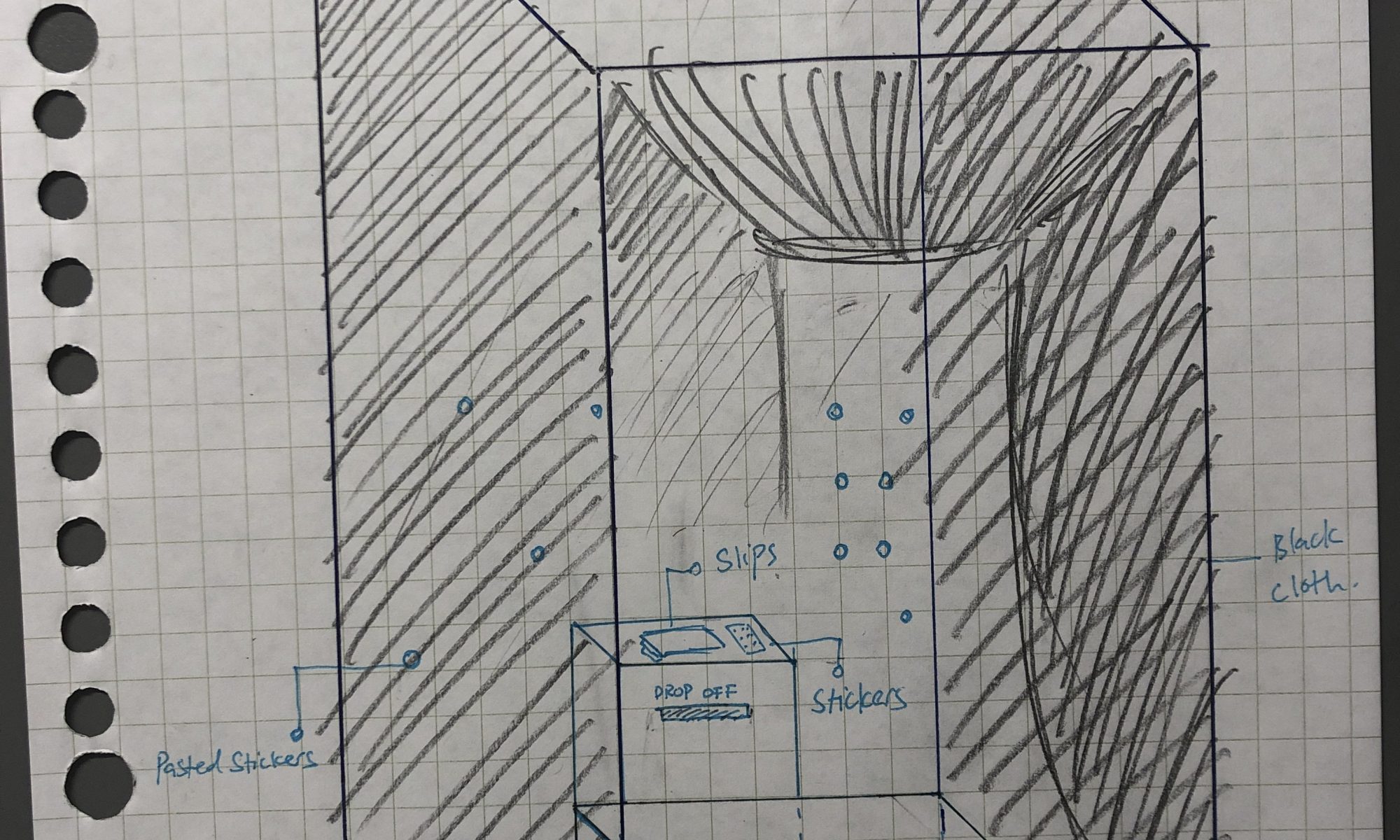
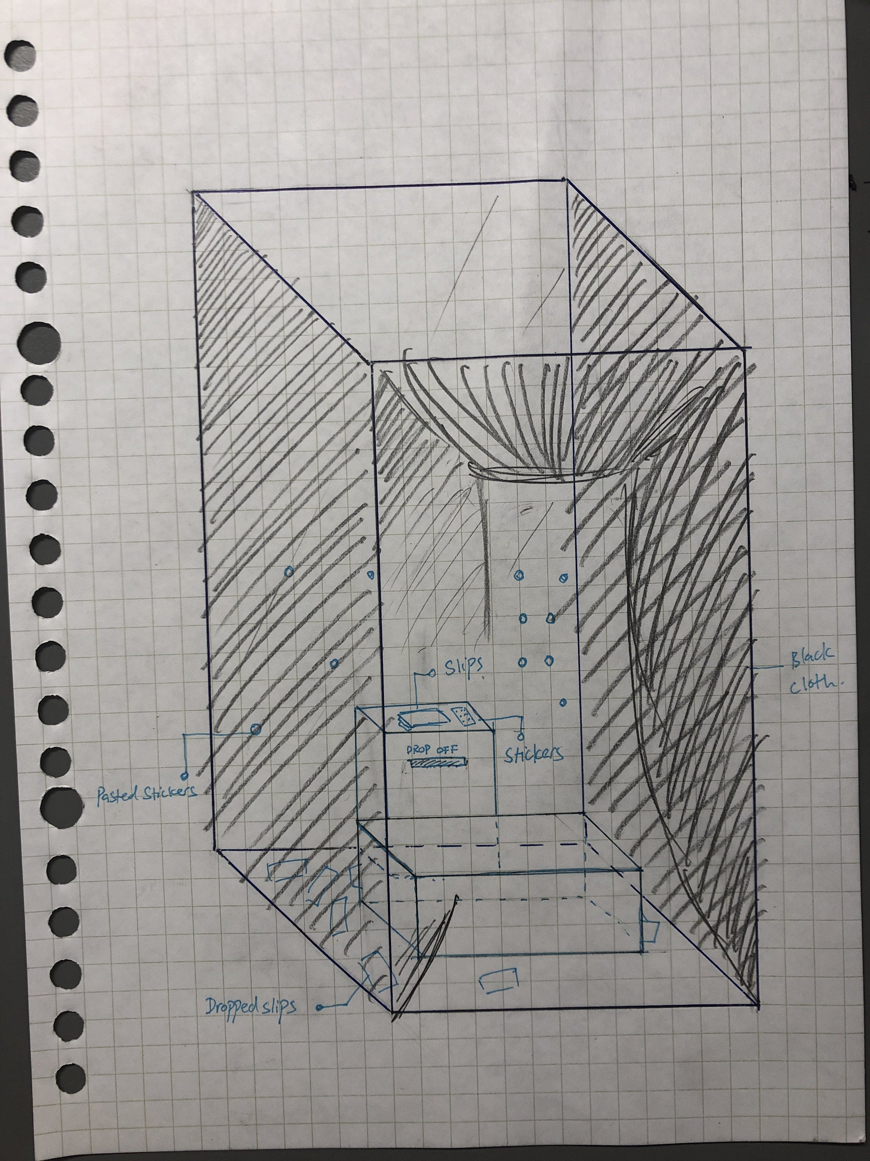
The idea is to have a booth facing the window at level 1 lobby area. This provides a view of the Sunken Plaza, which is where many birds enter and get lost in. The space will take up 1 window pane, and it will be covered by framed black cloth so that I can use as little materials as possible so as to save cost and not be overly wasteful.
There will be a bench or few chairs placed inside for visitors to sit on. It will face the window so as to allow them to have a view of the outside while seated. There will also be a platform that works like a table, placed directly in front of the window. There will be a stack of paper and some stickers on top of it.
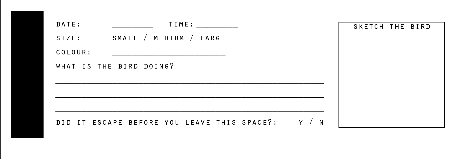
The paper will be forms for people to write on. The visitors will be prompted to observe birds through the window. If they spot any birds, they will be encouraged to pick a sticker from the sticker pack and paste it on the window. Afterwhich, they shall write on the form with the following information:
Date
time
bird size
colours and patterns
species (if they recognise)
what it is doing or what it did
maybe do a small sketch of the bird.
whether the bird escaped
This allow visitors to record the information about bird sightings and many information about the bird. If the bird escapes ADM before the visitor leaves the space, the form shall be dropped into a box placed on the side of the table. If the bird did not escape, the visitor shall drop the form on the floor and leave it. The visitor may crush or fold the paper before dropping it.
The Interaction
The Inside
The visitors will interact with the room passively through using it as a common space. The space is designed to provide a good view of the Sunken Plaza, possibly for one to sit and think, or rest.
Another interaction comes in the form of bird-watching, where they find and face entities that do not belong to the space itself. Once they do so, they start to engage in the interaction by putting a sticker and writing a form, before dropping the form off.
Visitors also can engage by picking up the dropped forms to read and find out the kind of birds that visited the Sunken Plaza, and try to find if the birds are still around.
The Outside
From the outside, people can see the booth, especially when it is darker on the outside. However, as the stickers are not placed from the outside, it will not be very visible and the window pane will still be mostly reflective. Thus there is a flaw in this design. However, I will argue that the space is not meant to provide for a functional solution but as a way to track the number of birds that flies into ADM and also as an inspiration for solutions. Stickers can be implemented outside of ADM if the faculty wants to.
The Intention
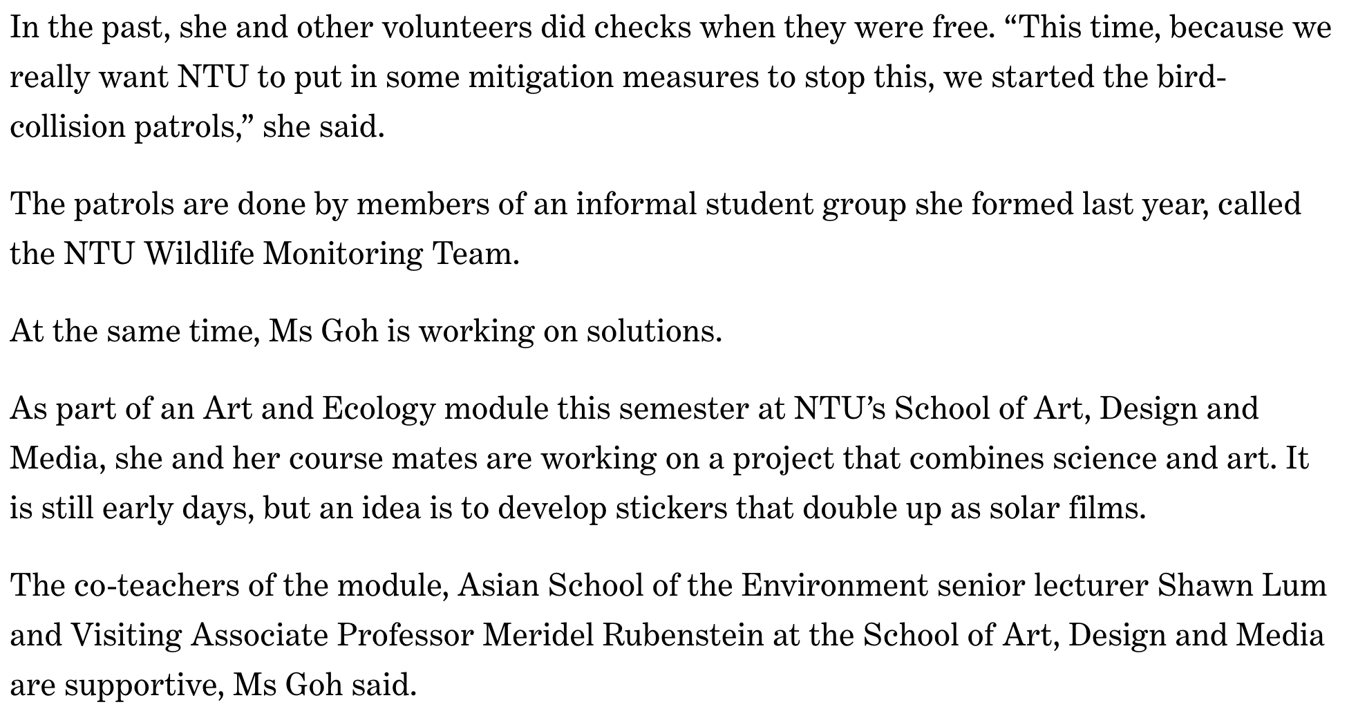
Originally, I had the idea to have people stay inside the space to leave their mark, either through smudges on the glass, or the hair they drop. However, I find that there is very little link between hair and smudges with birds, even though there are many implied links (for example, smudges = birds that smacked onto the window, or hair = the dead birds that dropped).
I replaced the hair with the forms and the smudges with stickers so people can connect with the idea better. The stickers are also inspired by an actually functional and (more) aesthetically pleasing way to prevent birds from hitting windows as seen here:
Image taken from https://www.heraldextra.com/sanpete-county/seven-tips-to-keep-birds-from-hitting-windows/article_a2e1228a-fab3-5f55-80dc-205a87c3dd2c.html
Overall, the intention of this space is to create a space for people to learn about the issue of birds getting lost in Sunken Plaza through their own observation. The space also provides people with a way to act towards helping the birds — which is also through a totally plausible solution. Lastly, if the space do accumulates a number of forms and stickers, it will also serve as a space for people to ponder about the problem. In its passive state, the space should be a conducive space for people to rest in, or think in.
I’m not sure how successful the installation will be, as it is mostly dependent on the people interacting with it and the bird sightings (which may be very random). This is also dependent on the timing people enter the booth. If there are many birds lost in ADM, but nobody enters the booth, the information will not be recorded. The installation is also somewhat time-based. Eventually, when the slips accumulate, the numbers will become more visible.
To Rafael Lozano-Hemmer, permanent architecture don’t connect with people as much as an installation does, even though they are places people visit all the time. Architecture should be a space for day-to-day interactions as well and not just a static entity. He calls this idea ‘Relational Architecture‘, which is the transformation of existing architecture and moulding it into new experiences using projection, sound, visuals, etc. As this ‘Temporary Architecture’ always change with different technologies, the experience will always be different and is much more interactive even though it uses the same space.
I think it is a revolutionary idea that the form of the building itself should also have an interactive function other than just something for us to look at or use (internally). Relational Architecture is something that we take for granted today after seeing the incredible projection mappings on the National Museum and many other transformative projections around open spaces.
I would like to design a personal portfolio website to help me with my future endeavours in the design world. I aim to use this platform to display my works and perhaps processes in an easy-to-use and easy-to-understand manner. To do this, I hope to use intuitive layouts and intuitive interactions to provide a comfortable experience when browsing my website.
But first, who am I as a person?
In order to build a website that cater to my needs, I need an understanding of what I want. But the thing is, it is hard to know what you really want. So I need a moodboard and some inspirations to work with first.
But generally…
I am a 24 year old Interactive designer that is interested in Experience design and analog interfaces. I am currently studying in NTU School of Art, Design, and Media, graduating in 2021. I love what I am doing now, and I wish to improve further in my knowledge in the field and the things I can do.
I am a sucker for vintage technology. I love turntables, cassette players, radios, anything with clunky loud buttons. I guess I like tactile / haptic responses a lot. I can include these buttons explicitly within my sites, or maybe some kind of lowkey versions of those so it simulates the haptic experience but does not aesthetically look like a 70s ripoff (which kind of troubles me).
I also like to be as maximalist as possible without hindering usability, as I like to press many things. But in a portfolio, it should not look too complicated so I shall see if I can make this a reality.
I like music that is kind of funky, synthy, melodic, or jazzy, I also like cafe music that isn’t pop, and and and I also like music that gives off summer vibes. Perhaps I can include that in as well.
What will be on my page:
Home, About (with biography, past achievements, etc), Works (essentially portfolio), fun area (may not include if it takes too much, basically a space for people to play) , (what I am working on currently? / processes?), Contact
Next step: I need references, moodboard, and a timeline.
a lightweight, portable device that delivers an electric shock through the chest to the heart. The shock can potentially stop an irregular heart beat (arrhythmia) and allow a normal rhythm to resume following sudden cardiac arrest (SCA). SCA occurs when the heart malfunctions and stops beating unexpectedly. If not treated within minutes, it quickly leads to death.
How an AED work is… (here’s a video but I will also explain through text)
First, responders have to open the case to retrieve the AED, and in doing so, alerts a nearby medical response team to the location of the AED. The responder have to bring the AED to the victim and open the AED up and switch it on. The AED will guide the responder to what to do and the responder just have to follow the instructions step-by-step. There are adhesive electrodes in the AED, which, when pasted on the victim, detects the victim’s heart rate which will help the responder assess when defibrillation is needed. If a shock is required, the AED will charge up and notify the responder to press the button to deliver a shock. The shock will momentarily stun the heart, which causes it to stop for a brief moment. This helps to ‘restart‘ the heart so it will begin to beat effectively again. Afterwhich, CPR should be performed to prolong the heartbeat until medics arrive.
The AED is a really frightening yet fascinating device. It is meant to save a life, and yet, it is for public use for when emergency arise. The amount of responsibility this device give to its users is very, very great, despite how easy one is able to access and use it.
Device Breakdown
At the most basic level, the AED must be able to perform its main objective which is to defibrillate, and as such requires hardware that delivers the required electricity and a pulse detector for feedback. In order to perform its function as a public life-saving device, it needs to be portable, as user-friendly and intuitive as possible so that even the most unskilled person can attempt to use in an emergency. It must also be able to deploy quickly and teach its user as quickly as possible. For, according to this source, 7-10% chance of a person surviving cardiac arrest is lost in every minute of delay.
We can analyse how these points fare in the AEDs with reference to the image below:
Image taken from https://www.aed.com/
The AED has 2 obvious buttons that stands out first, the green being the switch and the red being to deliver a shock. These buttons are easy to spot for most people that operates a modern device and as such, allows people to recognise and operate efficiently. The buttons are also very spherical which allow for a quick and easy press.
The image on the AED clearly tells the user on where to place the shock pads. The pads themselves also have images on them to show how to use which allows the responders to use it quickly.
There seems to be a “PULL” label tells one to pull the case open, although the directional arrows are not very strategically placed. If not for the cut in the glass case, I would have tried pulling the part surrounding the label itself. That is not good interface design. This compartment probably holds the shock pads which are taken out to display in this image.
The overall form of the AED is very compact and hand-held friendly.
Although not seen, the AED probably have vocal instructions that people can follow, which I think helps a lot as we want to be told what to do during a stressful situation.
However, it could be better as there are no text instructions as some responders may not be able to hear clearly or are deaf. Text can be simplified to easily communicate during high stress situations, but it may affect the compact form of the AED.
Overall, the device has a good form and easy to understand interface that allows the AED to perform all of its function as effectively as possible. Even though the process puts the responders at high stress and is fairly complicated to use, its interface allows people to use it quickly and correctly, saving many lives. So I would say that it has successfully concisely packaged the entire defibrillator into a portable public tool, transferring the medic’s responsibility to the public where a member of public can help save a life just as easily as he/she operates a toilet bowl. The article below is an example of how an AED can change the lives of many.
If anything were to be improved on, it would be to add text instructions for the hearing impaired. Perhaps another point of improvement is the inclusion of a female image alongside the male one, or to have an androgynous person so people will be able to respond to female victims confidently as well. See this link to why we should not always use a male body as reference to design.
My Suggestion
I do not wish to disrespect the invention of the defibrillator but I like the idea of using a defibrillator to do the opposite of what it is designed to do. As the device is designed to prevent death, what if it causes death instead? But of course, not to humans, but to mosquitoes / flies / annoying bugs.
Imagine a portable bug killing device where you go around zapping them! Would anyone be afraid of a cockroach now? Could it be turned into a game? It will definitely not be ethical as it can be misused GREATLY so it’s probably not a good idea. Still, it will be cool to own a smaller non-lethal voltage ‘stunner’ that can stun or kill insects.
I really can’t think of anything else that a defibrillator can be modified into…
I am afraid of IM room at night as it is usually too dark, nobody comes here, and the lights are behind the door when we open it. With that in mind, I was wondering what makes us scared or creeped out in a space. After some research, I found a few points:
Age of the space
Stories linked to the space (legends)
Attributes that dulls certain sense
Uncertainty
Prospect: how easy it is for us to move through the space
Refuge: how safe we are within the space
The spookiness of a space is associated with physical properties which we evaluate and make psychological connections to an unknown threat.
I feel that fear is a very interesting way to evoke a sense of body as it plays with people’s imagination in filling up the spaces of the lack of a physical presence. Can fear or creepiness transform a familiar space into an ‘unsafe’ space? Can we feel unsafe in a safe space?
I’ve seen the process thousands of times from behind the walls in ScareHouse—someone screams and jumps and then immediately starts laughing and smiling. It’s amazing to observe. I’m really interested to see where our boundaries are in terms of when and how we really know or feel we’re safe. – Allegra Ringo
I thought this is an interesting observation. What makes someone feel safely scared? Perhaps it is the knowledge that the threat is unable to harm them. I want to let people willingly enter and stay in a space that makes them feel uncomfortable so as to make them reflect about their view of the space they are in versus the creepiness I designed for them, juggling between what they think is real and what they think is fake. There are a few considerations to start with. How big of negative (or positive) space would we decide that a space is spooky? How dark or bright would it be? How isolated is it? How rundown is it? What objects are placed within it? What materials are used in the construction of the space? What are the associations to such spaces? What are our cultural beliefs?
These are just some questions to ask. But these are not applicable to what I want to do now as I will be using a familiar space in school (the lounge). But I spent a long time thinking about these before finalising my concept so let me just let those questions stay here? Haha
My Concept
What is the relationship between people and a sense of ‘presence’ in a space? Using a ‘spooky’ setup in a room that visitors are familiar with, I wish to (or at least attempt to) create dissonance between their idea of the space and the space itself to bring about the question.
My Idea
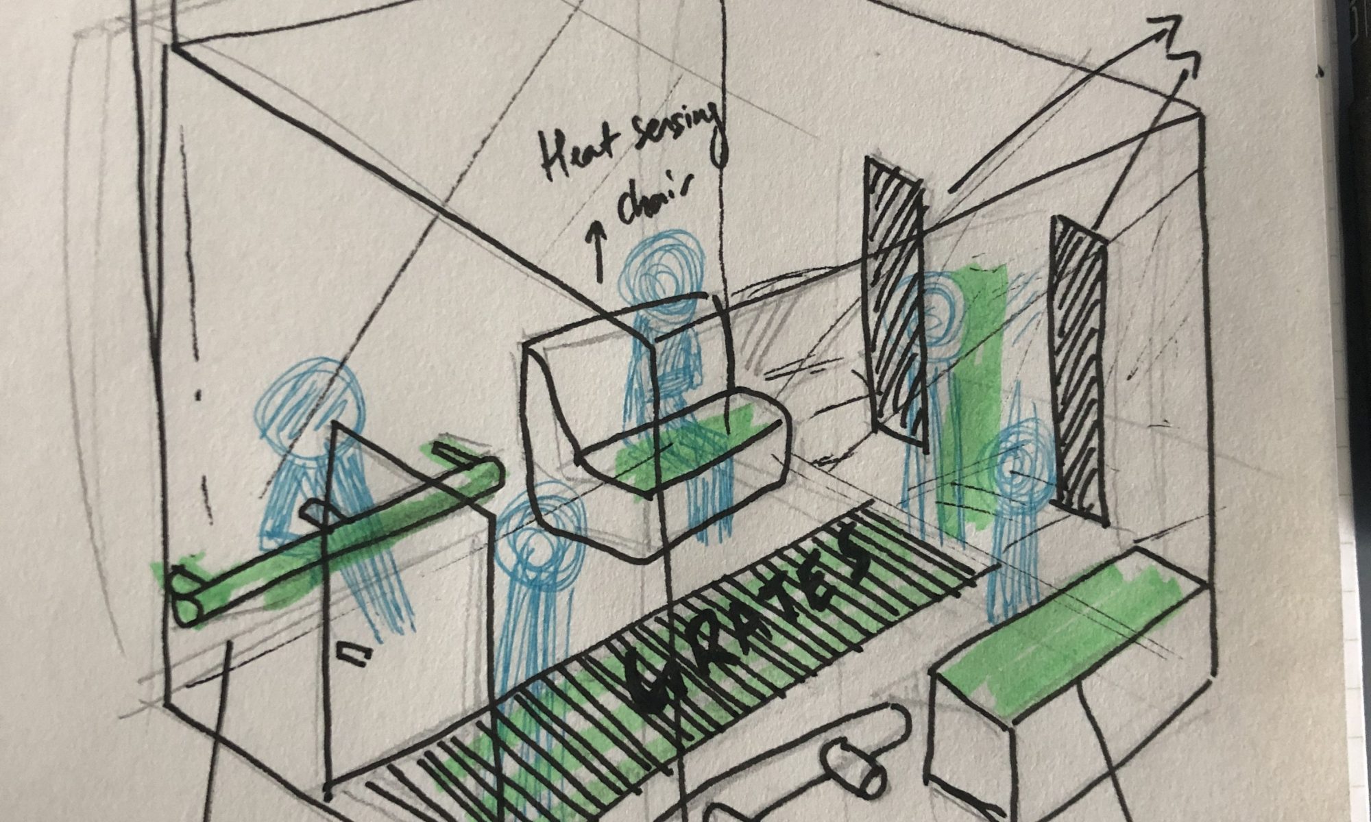
Use the school lounge because it is a bustling place in the morning but desolate at night. It is a familiar place for many, yet can also be creepy when nobody is in school.
Recording of the past 12 hours to create commotion when at night.
Soft background speaker to play the recording to create soft sounds from 12 hours ago
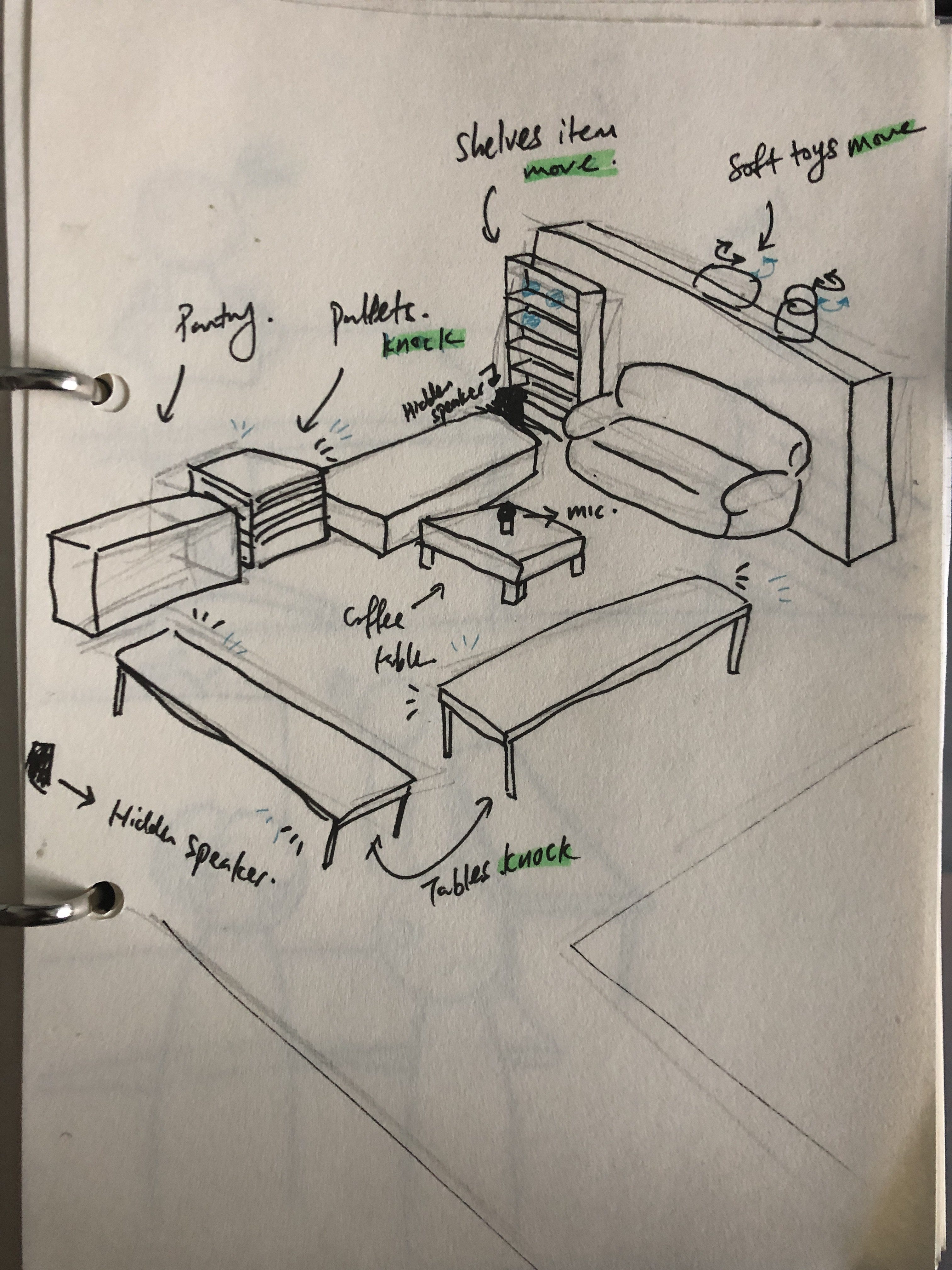
Sensors placed at various points to play knocking sounds or giggles or cause movements at some areas of the lounge:
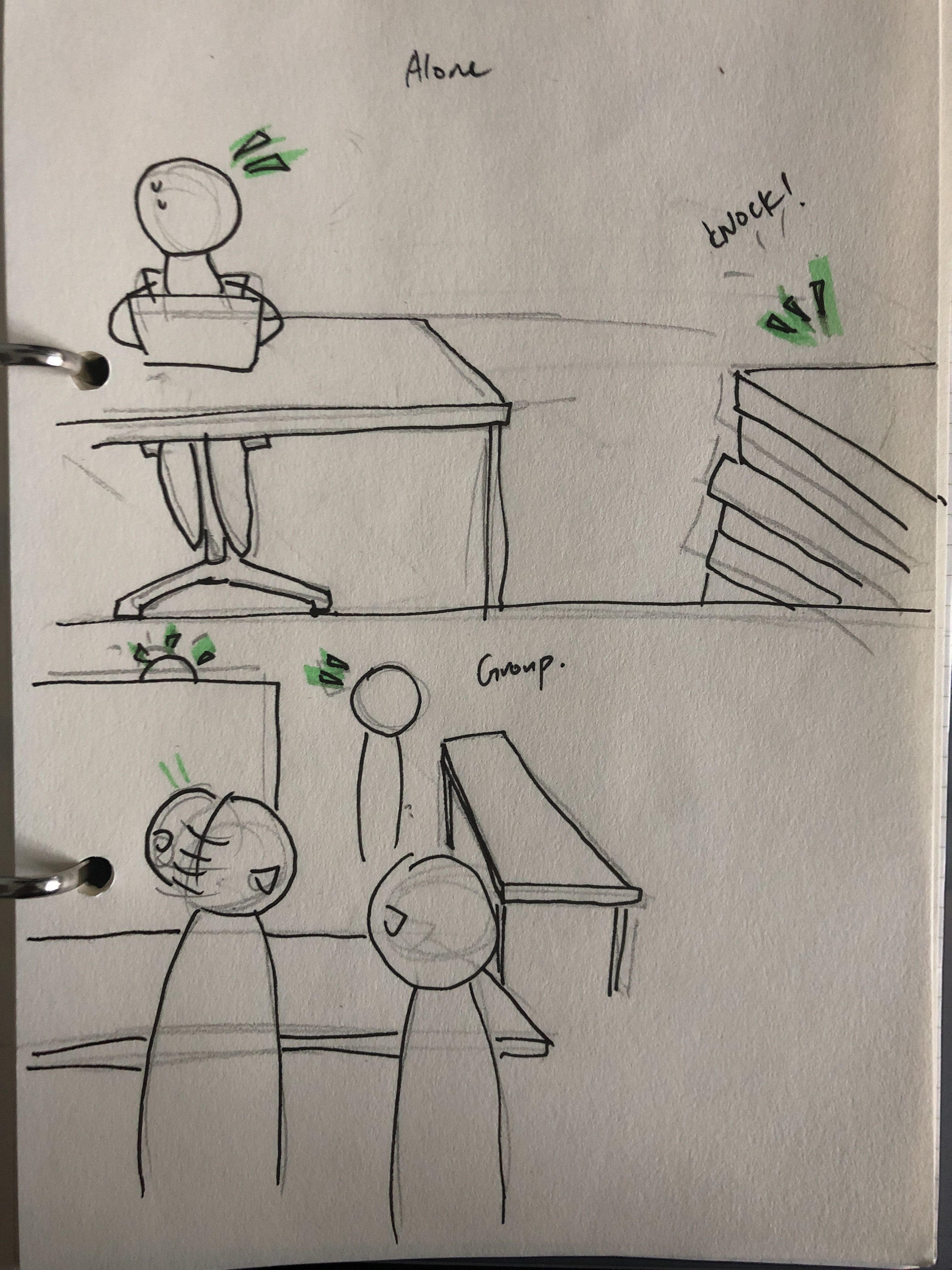
Sitting alone should feel uncomfortable with the constant soft chatter in the background even though there is nobody
Walking around will cause sensors to operate, causing sounds to play, or objects to move around. (This can be replaced with motion sensors as people are usually stationary in a spot)
In the morning, this would have a lesser effect as the lounge is quite bright in the morning. So the location may not work as well (was thinking of a more obscure place like level 2 corridors but nobody really goes there at night anyway) But the sound recorded at night would be so minimal that, perhaps there wouldn’t be any spooky noises at all.
Group:
Group chatter may dull the experience which can make everyone feel more comfortable
Movement causes sensors to operate a lot, may cause alarm at first but annoyance after a while. Perhaps this can be controlled to specific areas that allow people to activate at will. But as a group
In the morning it will not do much to groups, but what helps would be the chatter and happenings in the morning that will be recorded so it will be played at night. Visitors that are aware of this can spice things up by making spooky noises.
Overall, it could be packaged as a challenge, although I try to not turn it into a social experiment. I want people to be aware of the intentions of the project and have fun within an interactive space, while also confront the idea of being spooked.
Looking back, perhaps the morning experience can be more active as visitors can affect the outcome of what happens at night with their recordings. This ensures that visitors of the lounge all have a participatory role no matter when they enter the space.
Wrapping it up… (basically summarising what I written above)
Imagine a space that everyone is familiar with: The ADM Lounge. The interactive space will be set up there, and visitors of the lounge will know that there is an installation going on in that location. A speaker will be hidden around the lounge to playback live recordings set to play at a 12 hour delay, so at 3am, recordings from 3pm will be played. A mic would be out in the open, recording everything going through so visitors can voluntarily contribute to the recording. Groups gathering at the lounge making conversations will also be recorded. Some spots at lounge will also have sensors that, once triggered, plays a soft haunting sound, or causes a knock on the wooden pallets, or rotates/moves a soft toy. This will have little effect in the day, so visitors in the day have a more contributing role to the installation in terms of how they create the haunting experience for people using the space at night. At night, the installation comes to be fully alive as ADM quieten down. The soft playback will be audible and the lounge will be filled with softened chatter from 12 hours ago. This creates the presence of people when there is nobody, creating a sense of an unknown entity wandering around the space. Sensors that get activated amplify this effect by creating more audible and tangible experiences for visitors. Overall, visitors should be aware of the entire setup so they are able to think about whether the setup affects them or not. They should be able to evaluate their feelings and responses, and gain some insights about how these sounds and movements affected their experience in a space.
IDEA 2: What We Left Behind
Tech involved: NO
Before I begin with this concept, I’d like to thank Shah and Tanya for starting a conversation about our ideas which led me to thinking about this idea. It is sort of an idea built upon their’s but in a different direction so THANK UUUUUU
Concept
We are always leaving things behind, whether we are aware of it or not. Our hair, our marks on metal or glass, our smell, our footprints. We don’t often notice them, but when it gets accumulated, it becomes acknowledgeable. It is through these accumulations that we can feel a presence of people that entered and left. However, that is also when we decide to remove these marks. Sweeping away the debris we leave behind. Wiping away the marks. Doing so, we erase what we left behind over time, only for it to accumulate again. Out of sight, out of mind.
With this analogy, I would like to raise an awareness of what we produce as humans, in terms of the waste we leave behind like plastic, unfinished food, or garbage.
Singaporeans produce an average of 800g of waste per day. That’s about the weight of 5 iPhones. Multiply that by the 5.6 million people in our population, that is a lot of waste. With this piece, I aim to bring awareness to our wastage and also offer solutions to help the situation.
My Space
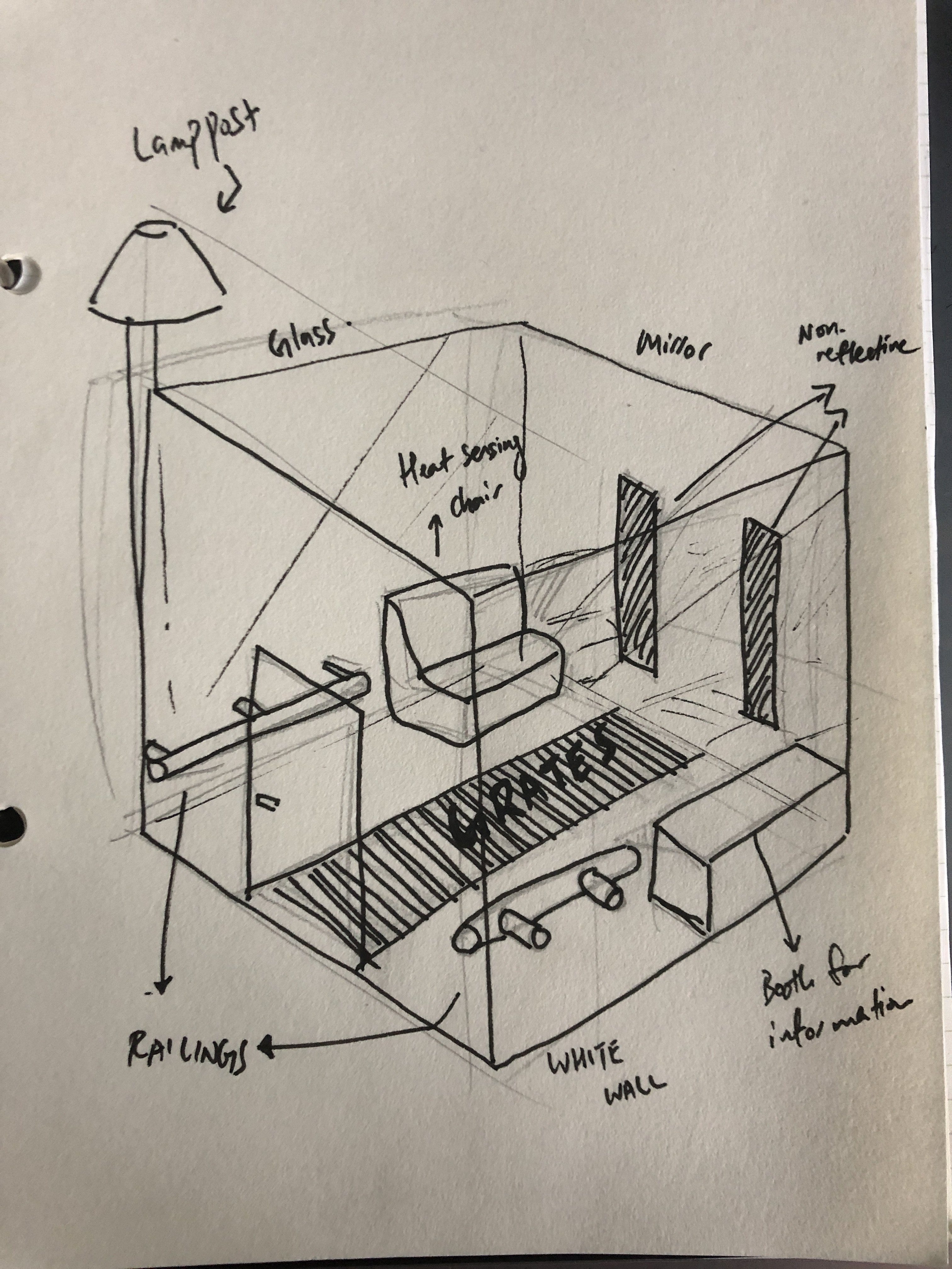
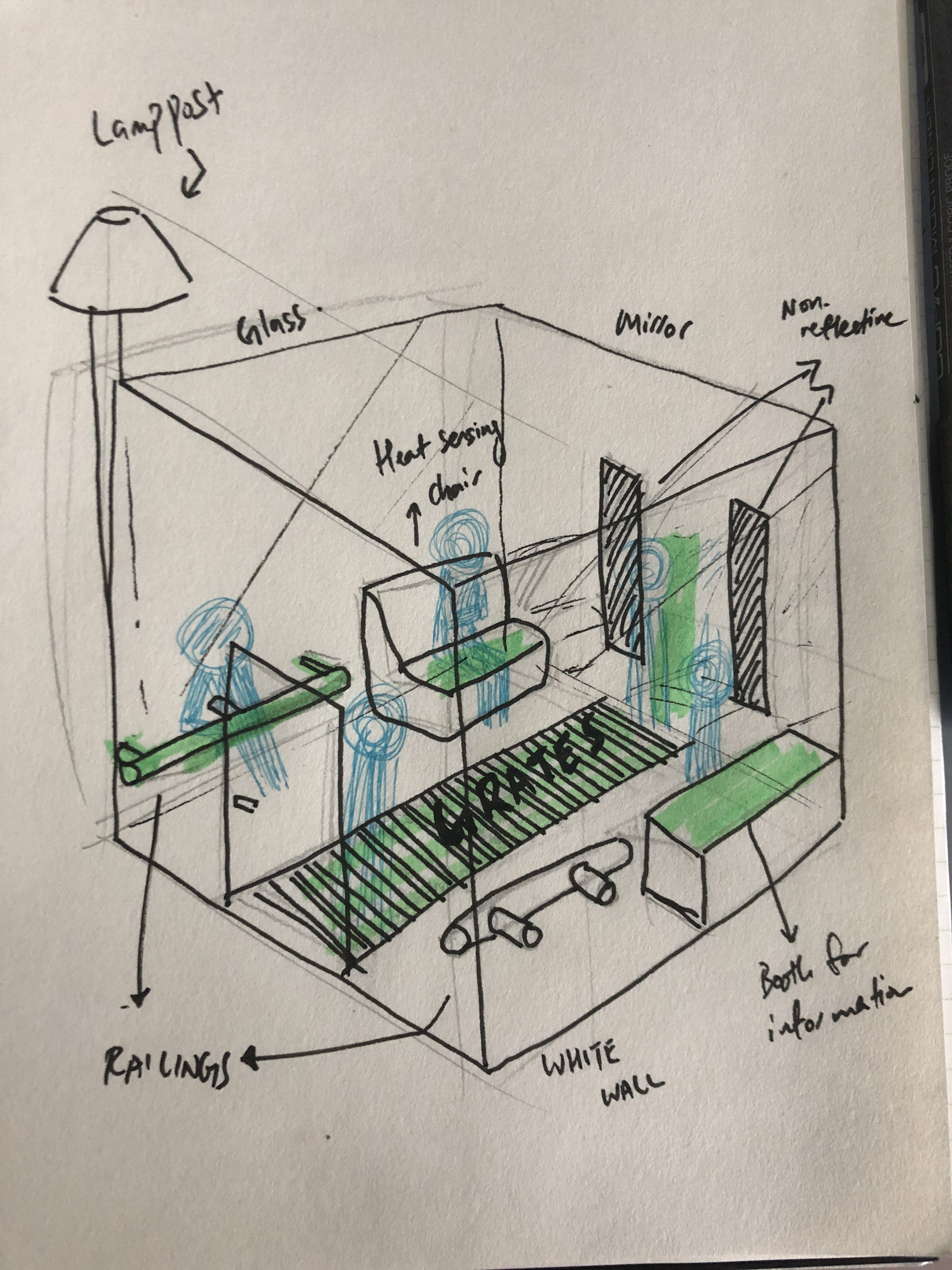
The installation is going to be placed within the CBD area. This is a 3m x 3m cube that is white in colour in the interior. There are mirrors, glass panels, and metal railings inside the space. There are also grates on the floor that collects the hair and objects left behind by individuals.
The Interaction
People entering and leaving will leave behind their odours, firstly. They will be able to explore the space and look around. This can be a space for people to rest in as well. The main attraction is the gutter — it is going to eventually collect enough debris to be very noticeable. There are also panels to help people make the connection between the left-overs and waste. At the every morning, the remaining residues will be swept into the gutter.
Within the space itself, there are also objects to interact with. One can lean on the railing, take a seat on a few of the designated seats that is coated in heat-sensitive paint. Eventually, footprints and damage will also appear inside the room. All these will evoke a sense of presence within a space. As the work progresses, it will be interesting to see how people leave their marks, where they leave them, and perhaps this can create a persona for Singaporeans using an urban space which can help in urban design.
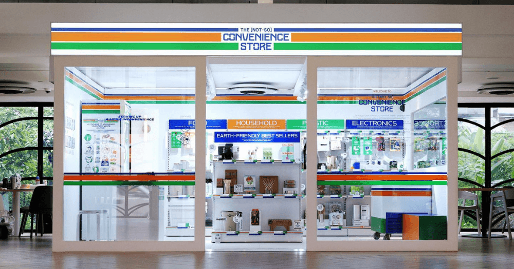
Image taken from https://mothership.sg/2019/06/convenience-store-sustainable-dhoby-ghaut/
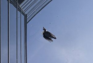
Image taken from http://www.nanyangchronicle.ntu.edu.sg/News/2504bird.html
I also wanted to further link this idea with the idea of birds and migratory birds dying while in transit in Singapore because they wander into glass-filled urban spaces which disorients them. One very good example is the ADM building itself and the amount of dead birds we can find around ADM. This seems to be a problem that we ignore, or literally sweep away (thanks to the cleaners that clean our city every morning, which is also why I want the space to be cleaned in the morning). Mr. David Tan is one person that collects these dead bird samples to understand where birds are dying and what kind of birds they are. (https://www.todayonline.com/dead-birds-wingman) I feel that our impact on other animals as humans can be a topic to discuss in the same space too. But I was afraid if that will make the entire concept too complicated, that’s why I want to write that here. I think bringing awareness to the amount of bird deaths is not the only thing we can do. We can teach the world what we can do to help this situation. Within the installation, there can be non reflective stickers on the mirrors to block the view of people looking into the mirror, as like how it would work for birds in real life to re-orientate themselves. We can put railings for people to lean on which works like perches for birds to safely rest on. We can create a low-light environment to hint at a way of lowering light pollution.
A screenshot of the same article article talks about our school as a hotspot for bird collisionImage taken from https://www.todayonline.com/singapore/school-tries-keep-buildings-killing-birds-nparks-release-design-guidelines-next-year
Why is this in the front of ADM when it could be placed in the Sunken Plaza where most birds died in?
Anyway, I was thinking, the artwork can have a plug to help Mr. David Tan in his research by providing the visitors with his contacts.
Conclusion
The experience in this space should be mostly passive but also informative. The entire concept revolves around human waste in terms of our bodies’ sheddings. It serves as an analogy for the physical wastes we created that we sweep out of our existence everyday. To quantify the damage we do to the world. It also serves as an analogy for the wildlife that we indirectly killed as they wander into our urban spaces. Overall, visitors should be able to take away certain messages about awareness and perhaps some information of how they can help.
Seems comfortable to be honest but also a bit weird in terms of form
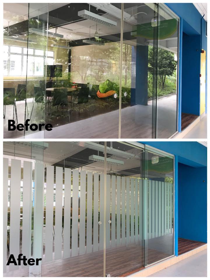
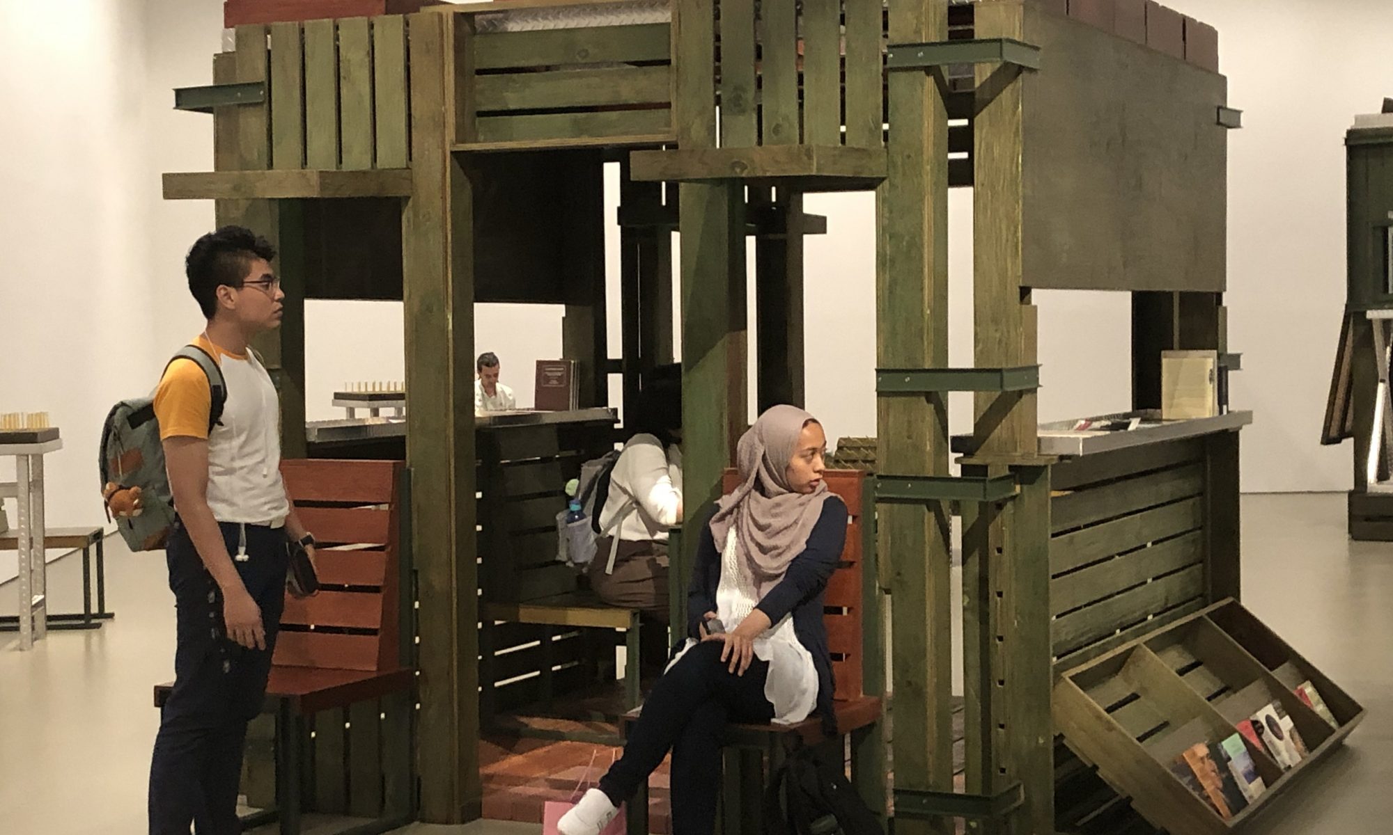
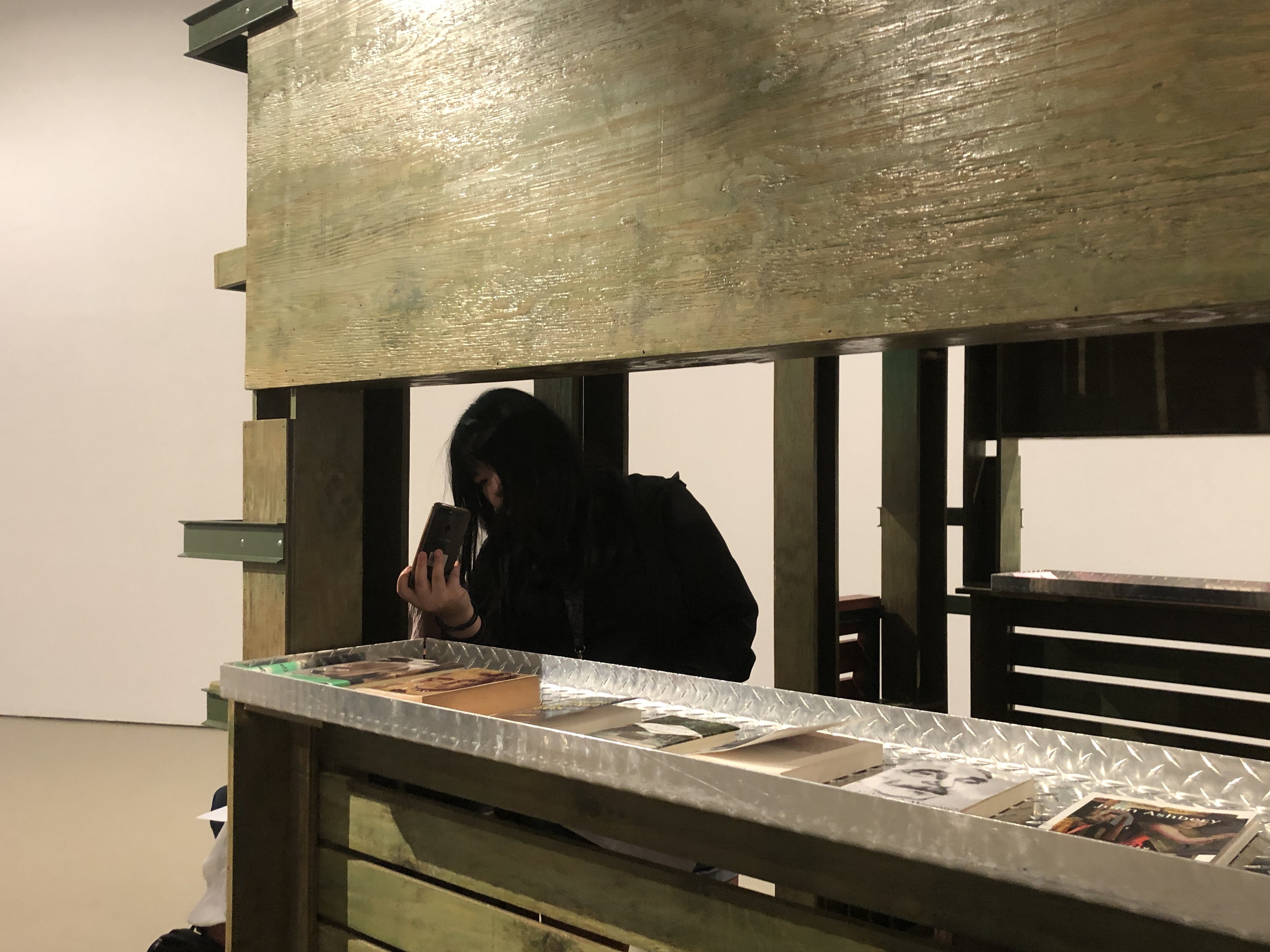
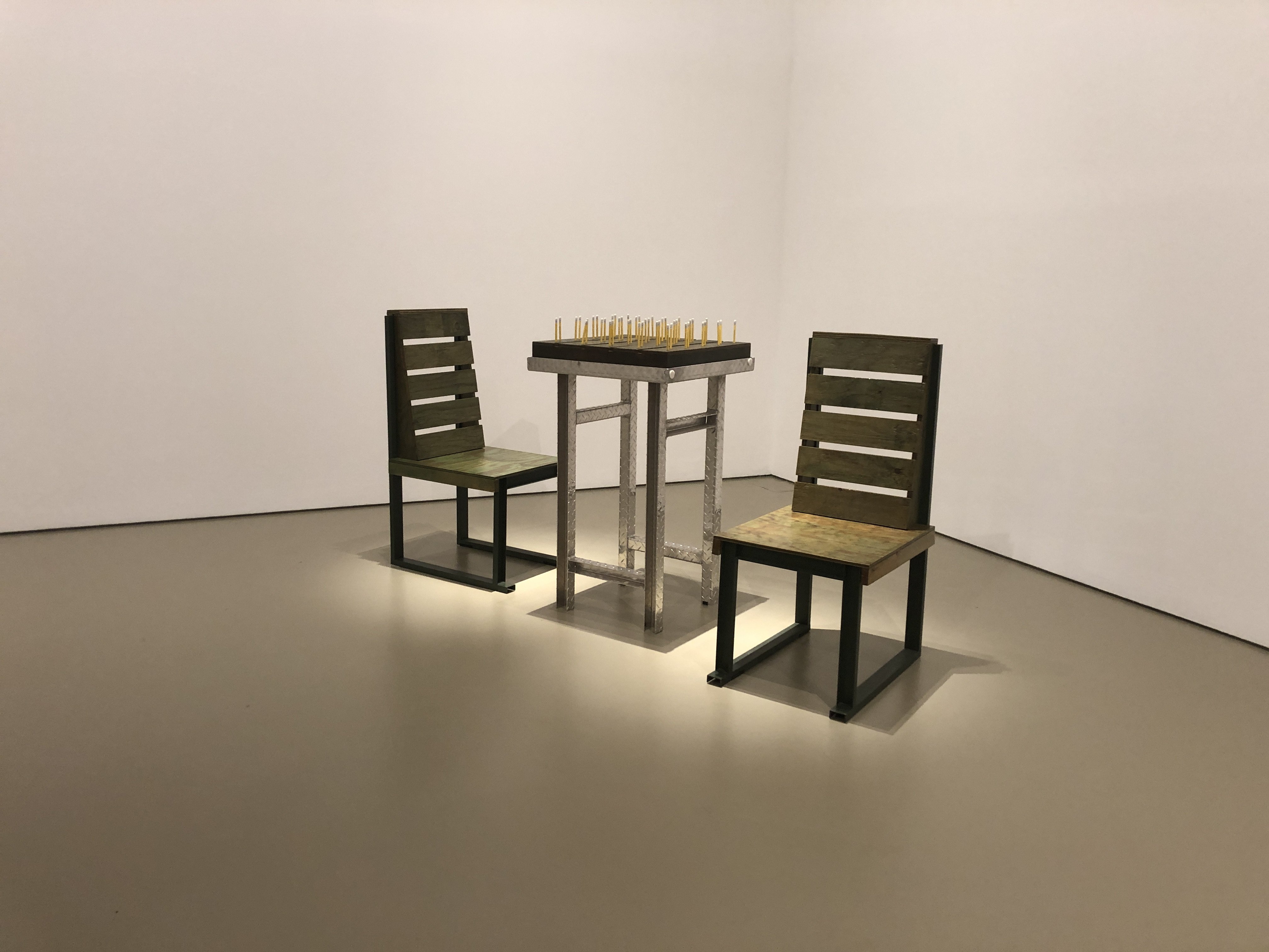
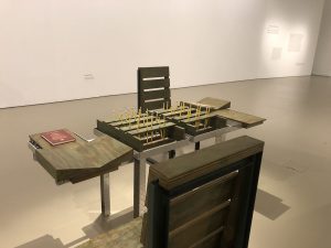
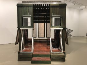
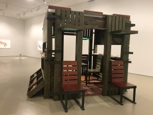
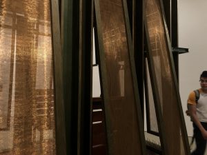
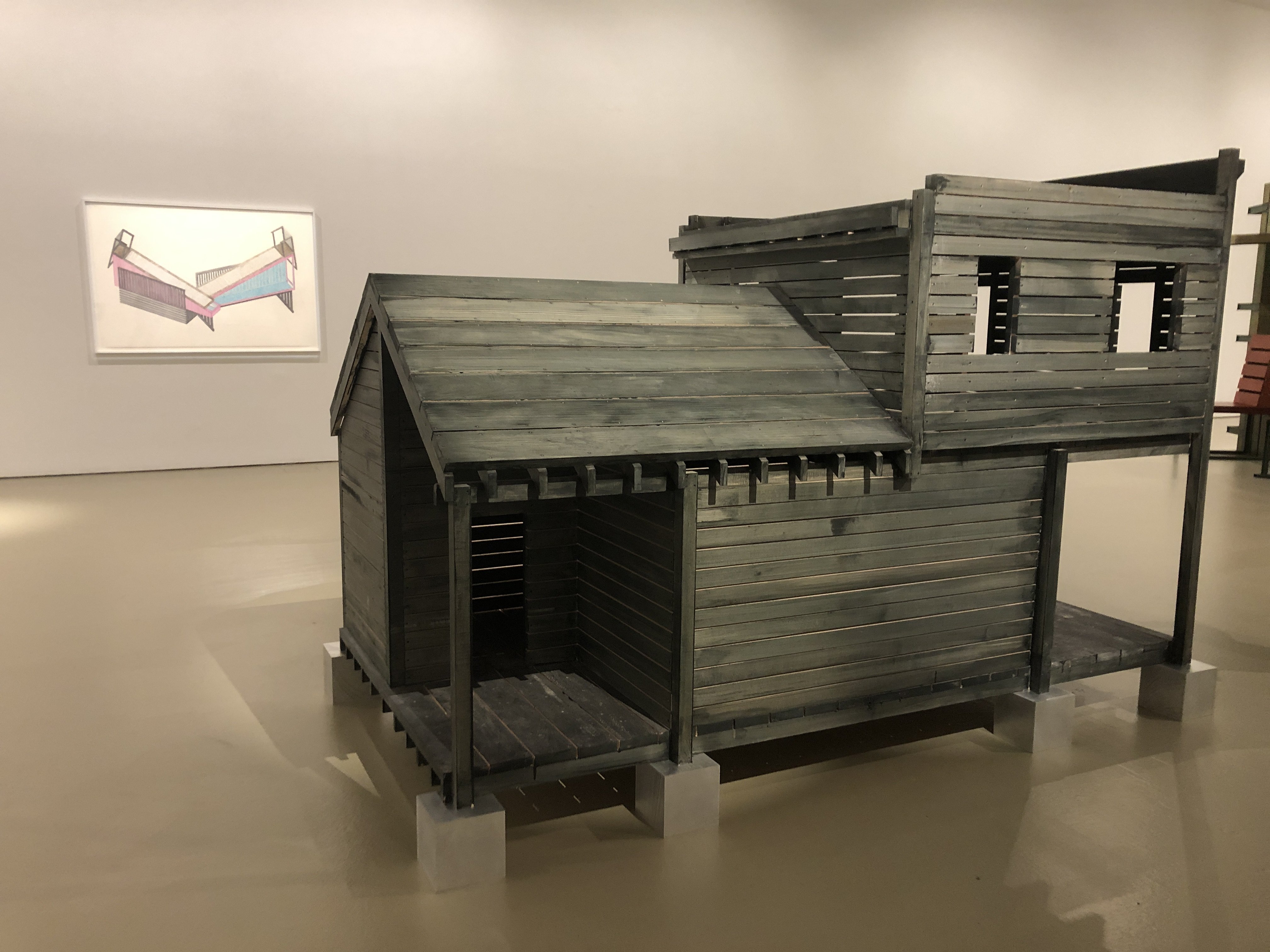
Siah Armajani’s notion of ‘Common sense architecture‘ created a certain rustic aesthetics for his artworks that speaks about rawness to me. This was perhaps done by mixing both warm and cool materials (i.e. wood and metal) that creates contrast. I’m not sure of its intention other than to use rural-found materials, but it does give off an odd vibe.
Joey taking photos but I also want to capture the metal racks that I like
The materials are also cut in a sharp and straight way. I tested the sharpness of an edge of the Sacco & Vanzetti Reading Room #3 and it was actually sharp enough to cause injury. The intention of the room being for common use, together with the hostility of the materials makes it quite a conflict in me to approach the structure.
I wanted to try breaking the 90 degree rule but Fizah stopped me. I guess the angular look makes it feel more uniform but also uneasy
Still, I love the solidness of the forms he give to the furnitures and the beams that hold up the structures. This leaves me wondering how the material itself can affect the hostility / hospitality of a space.
I don’t understand the pencils so I’m not gonna talk about it
Some other observations:
Why did he chose to use bricks to on the floor to welcome visitors into the reading room?
Why is everything so 90 degree? Could it be to create the idea of sharpness?
The books are welcoming, I wouldn’t mind reading them
But the placement of the books are at the bottom, which makes it hard to reach, intentional discomfort?
How would it look in an outdoor setting? Would indoor light affect the experience of being in the reading room? Or the other pieces? Especially the pieces with metal, as it is very reflective to light.
The hip-leveled sharp metal corners are a potential danger for kids
Another thing that attracted me was the compositions of his Tomb for Heidegger and the Tomb for Richard Rorty which features wooden ‘pens’ that has many holes that allow light in. I think I’m just fascinated with house-like structures that have an interior that one can imagine moving around in.
Also, I really love the computer-generated short films he made. Maybe I’m just a sucker for vintage electronic aesthetics, but there is something very satisfying about seeing computer generated mathematics-based interactions.
I also like his take on public art from his manifesto, particularly these:
“Public sculpture is less about self-expression and the myth of its maker and more about its civicness.”,
“Public sculpture is a cooperative production. … To give all the credit to the individual artist is misleading and untrue.”,
“public sculpture should not intimidate, assault, or control the public. It should enhance a given place.”
Through these, he suggests that there is a higher purpose in art that is in public, which I truly agree on. (if only this don’t just apply in public art) Art and their artists should not be self-absorbed and overly vague, but has a purpose. I think I appreciate what he do a lot more after reading this.
Conclusion:
I think this exhibition was quite informative in terms of how we can apply architectural ideas into our interactive spaces. I understand that it is not just the interaction, but also the setting and the feel of a space that makes up an interaction, which in my opinion is equally important to the interaction we design for the users of the space. I think his philosophy is also a good takeaway for me, and I’m glad to know that there are still humble well-known artists out there that truly wants to make the world a better place.
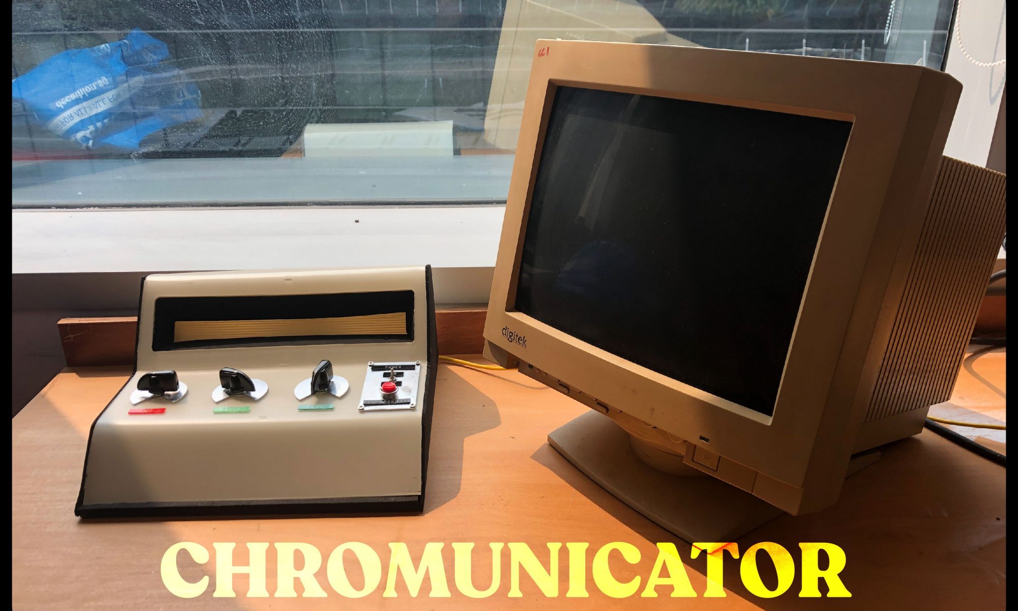
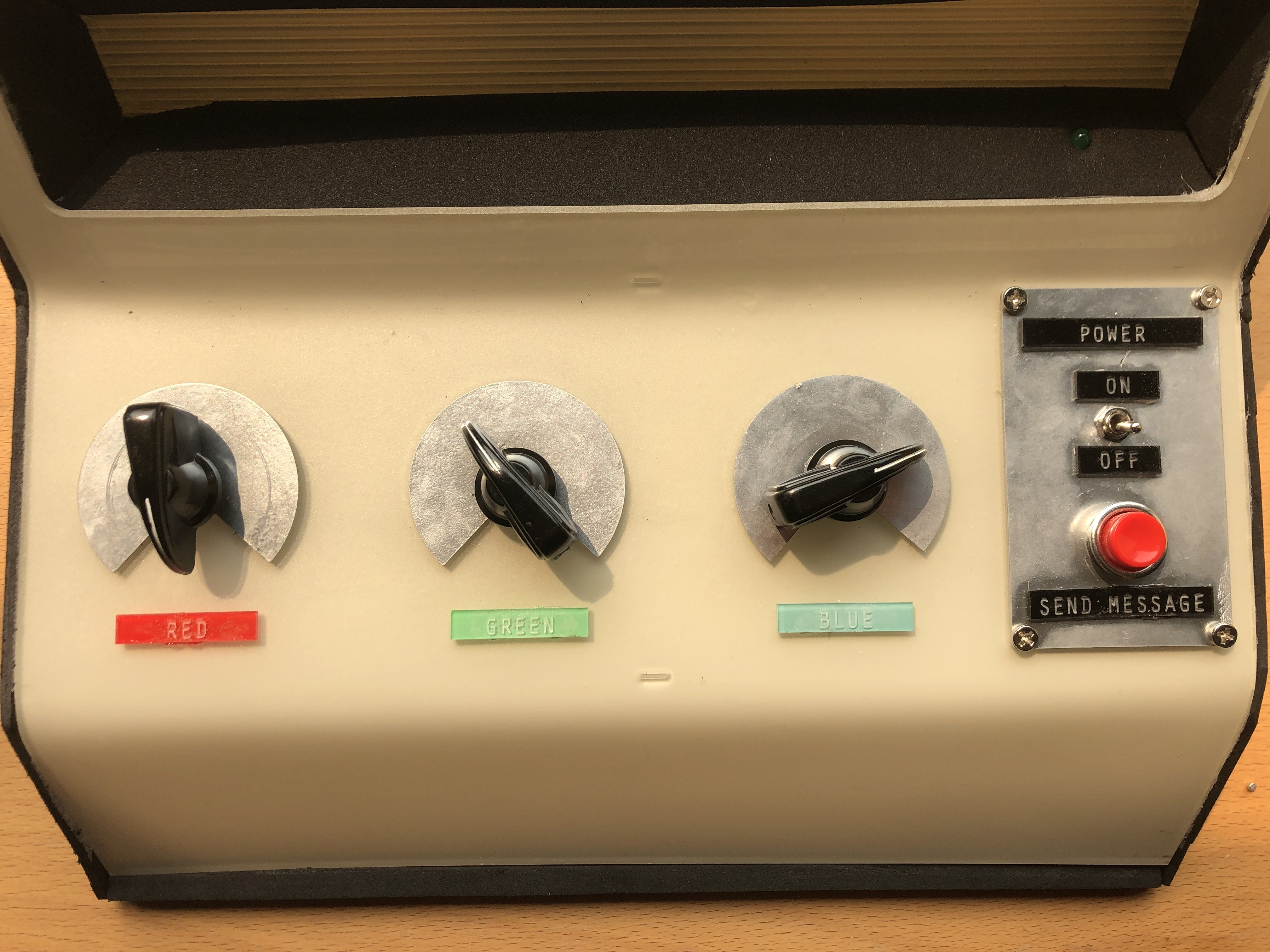
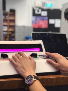
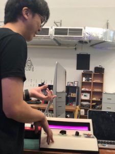
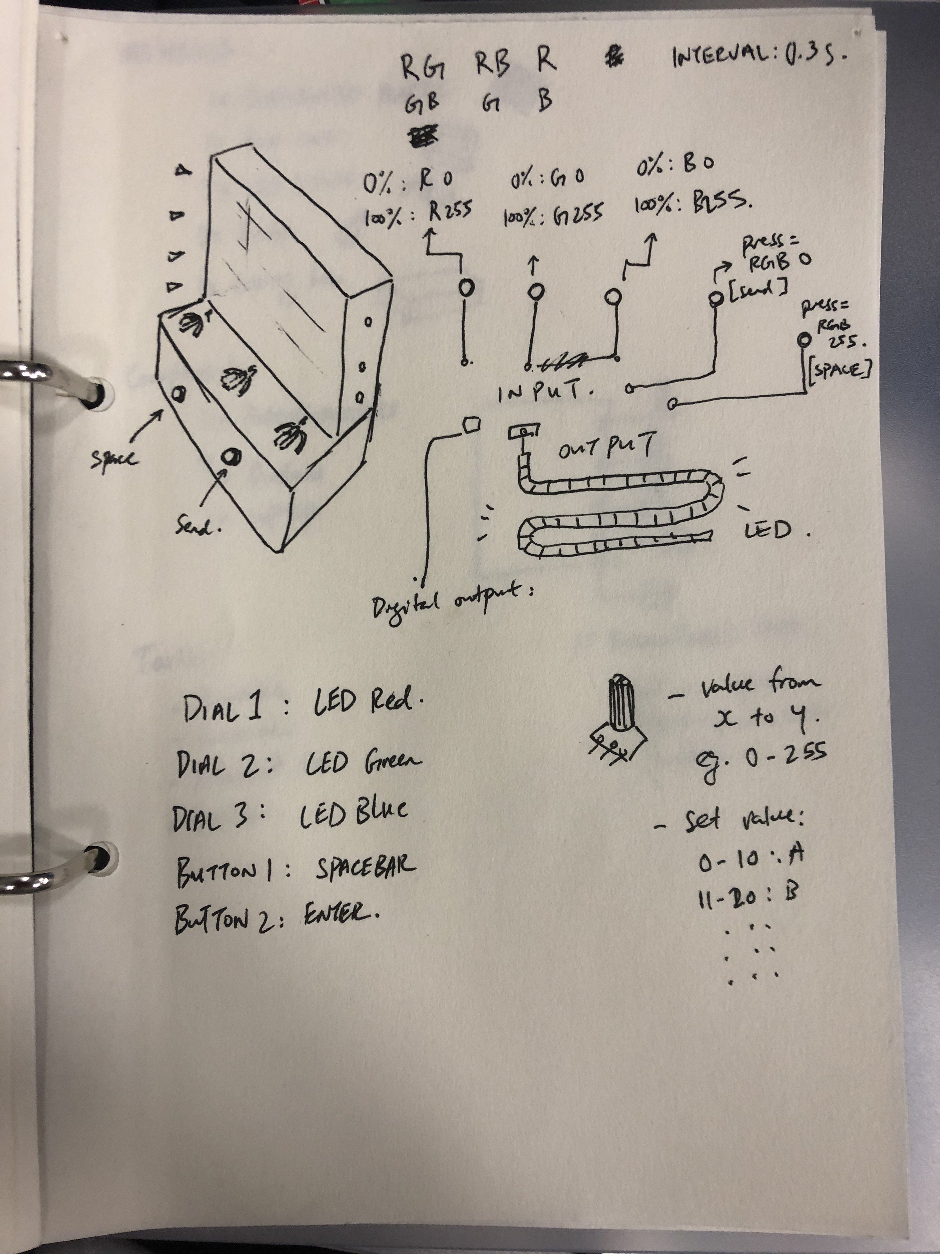
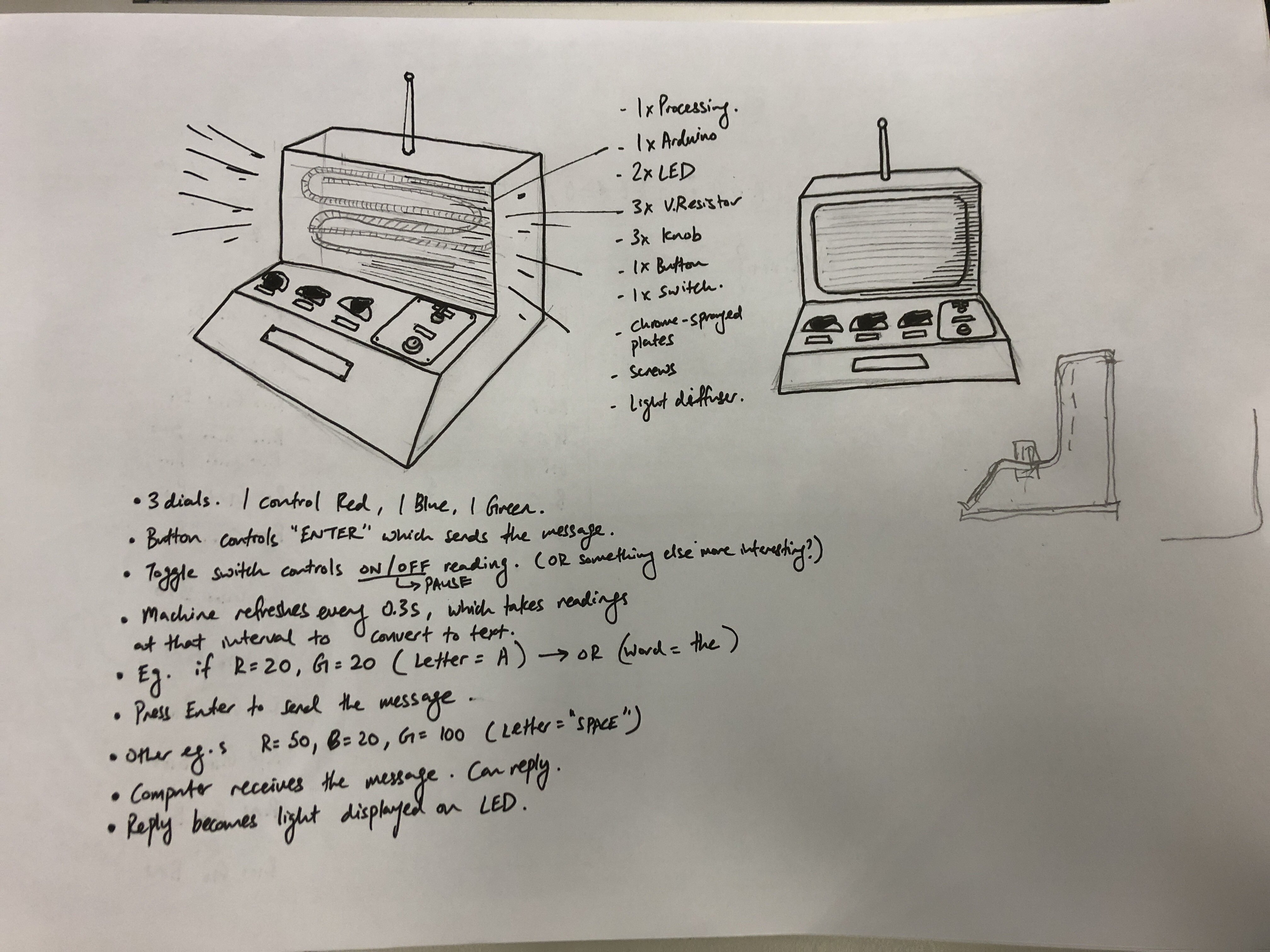
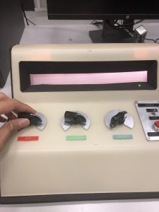
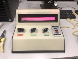
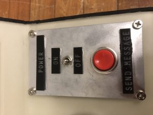
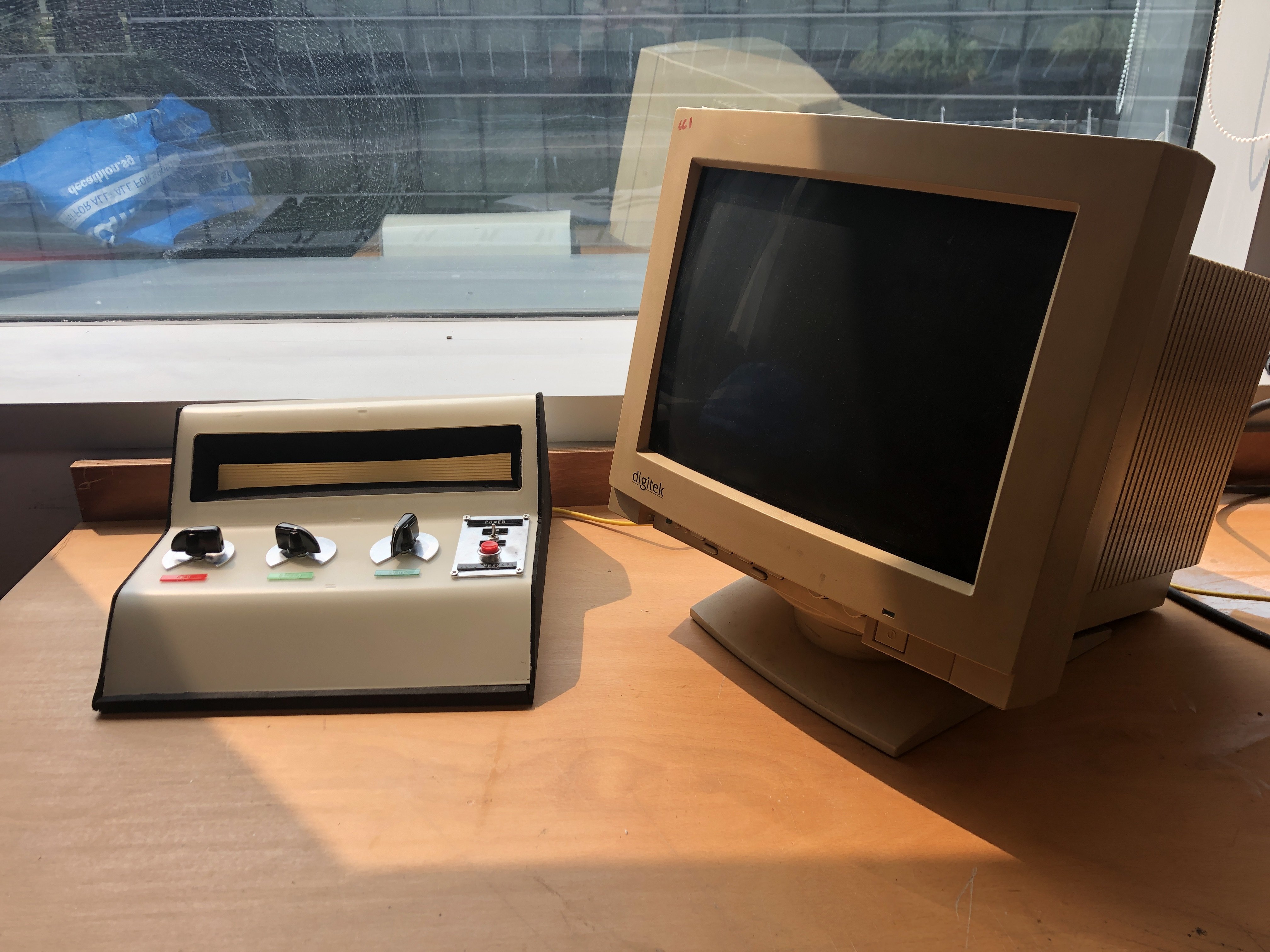
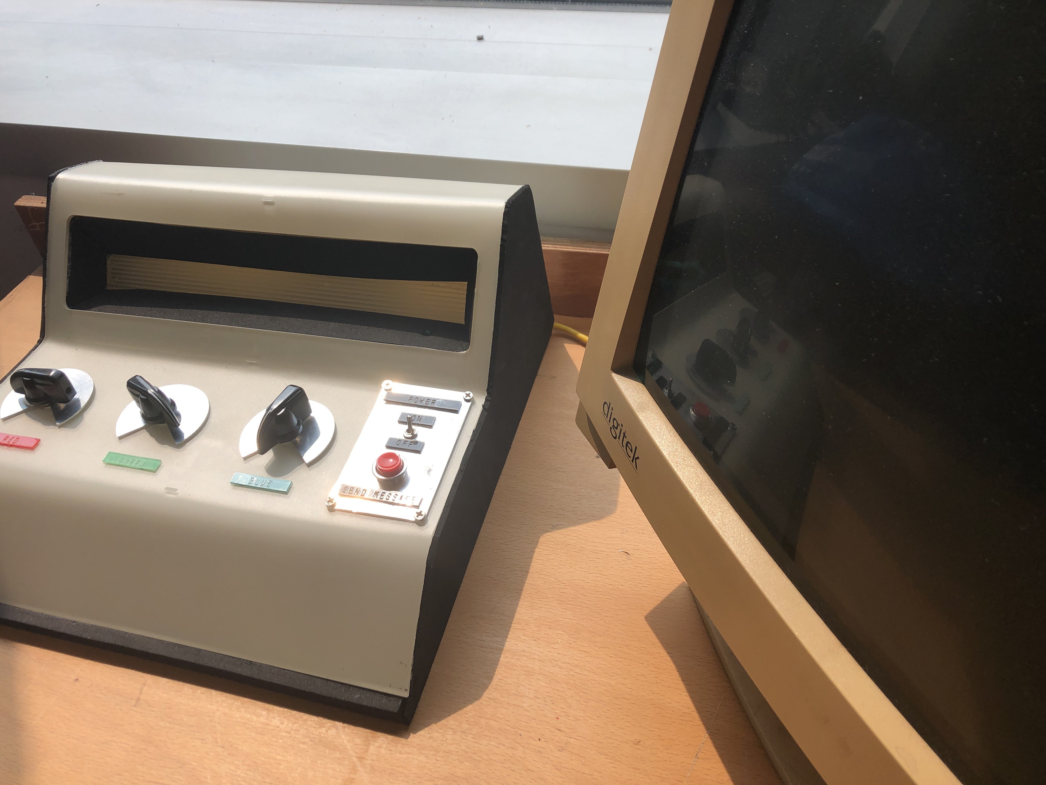
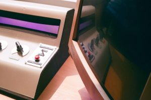
This device is an analog machine that provides full tactile and visual feedback through the use of dials, a button, a toggle switch, an LED strip, and computer screen. The device ‘converts’ coloured light into text. Users can turn the dial to alter the colours’ red, green, and blue values manually. After selecting a colour they like, they are to press the red button to ‘save’ the colour. The machine can save up to 10 colours. The users can then send the message to the computer by pushing the toggle switch down. This results in the machine entering ‘transmit’ mode, and promptly repeats the selected colours on its screen. Meanwhile, the ‘translation’ happens in real time, displaying the translated words on the computer screen. Users can then press the red button again to repeat the transmission. Users can then flick the switch back up to return to ‘record’ mode.
In a nutshell:
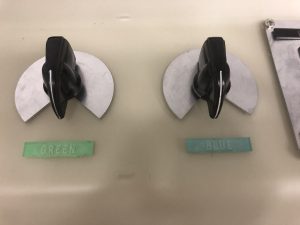
In record mode (toggle switch up)
dials: control RGB values on the LED
button: record (up to 10) colours
In transmit mode (toggle switch down)
dials: does nothing
button: repeat transmission
*Note: the words at the toggle switch and buttons do not mean what they mean now as the concept is changed. Switch ‘up’ should mean “input” and switch ‘down’ should mean “transmit”, and the red button should be “record”
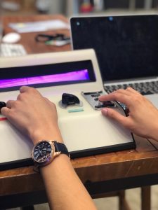
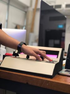
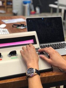
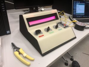
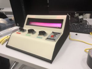
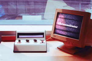
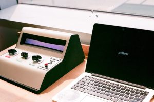
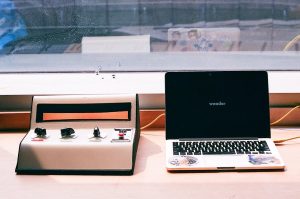
Presentation
Thanks Fizah for helping me take these SUPER HIGH RES PICS!!! And Shah for playing with the model!
Why this device?
In the context of a trade show, I would use this device as an attractive ‘toy’ to attract people to come to the stall. The manual control of LED allow visitors to test the strip’s potential while also having fun.
Personally…
I wanted to make this as I was really excited to do this when I had this idea. I also wanted to improve my workflow and the way I treat school projects. I was also deeply inspired by the group last year that did the Light Viola, and also Zi Feng in the way he document and work on his assignments. After this project, I found that I have a real interest in making physically active and immersive experiences, things people can play around and fiddle with.
Process
I started with simple sketches to illustrate my idea. I had a few different ideas. The one that stuck with me was the current setup with a different rule: the device remembers an input every 0.3seconds, and the button sends all the words together in a string.
The sketch developed to this in class:
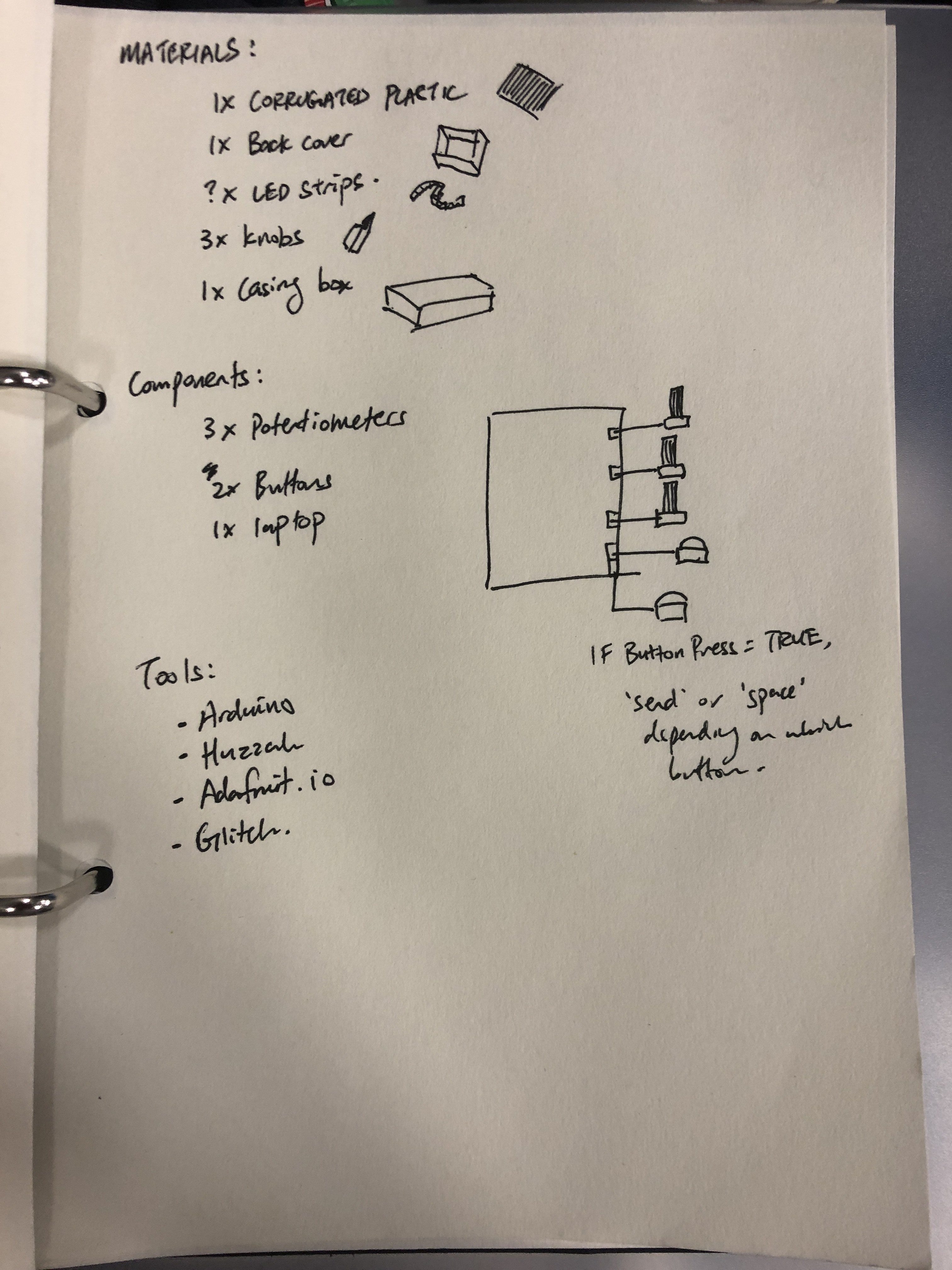
After the sketch and some consultation with Galina and Jeffrey, I went around finding scrap materials. Before this, I also went on a trip with Shah, Joey and Elizabeth to look for components and bought an LED strip (forgot what type it is), 3 knobs, 6 variable resistors, a button and a toggle switch. So with these, I pretty much knew what I wanted to do.
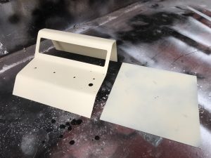
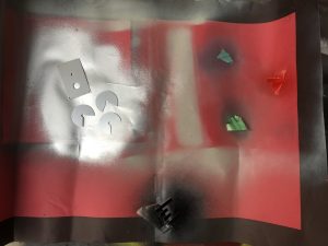
I went on to make the model. I found a large matt sheet of acrylic and decided that it was a good material for my casing. I lasercut it after making measurements to ensure that every component can be installed in. I then bent it using hot gun and a table (unfortunately there is no documentation of that). After that, I went to spray paint the case and the other parts using the left over spray paints I had last few sems when I was in Product Design.
For the case, I spray painted from the back side so the front remains matte and the paint won’t be scratched. The bottom piece was sprayed black in the end to fit the aesthetics better. The other parts are sprayed in their respective colours.
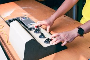
This is how it looked like after installation. YAY!
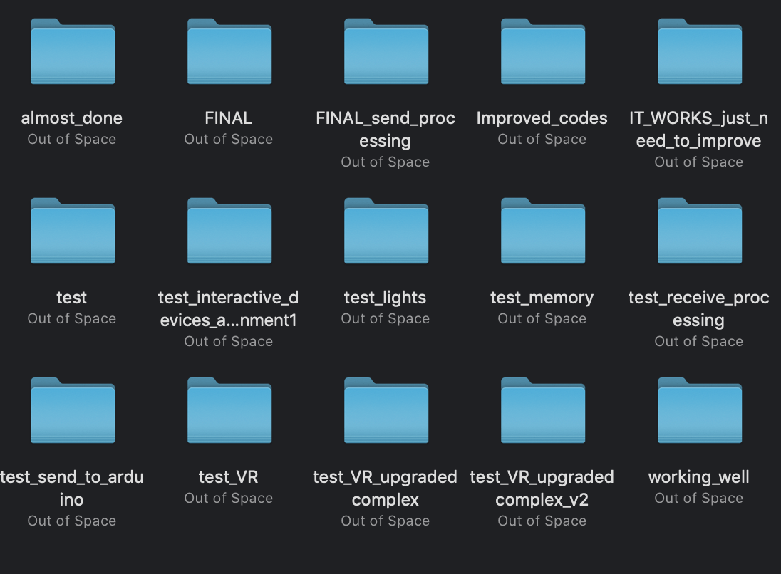
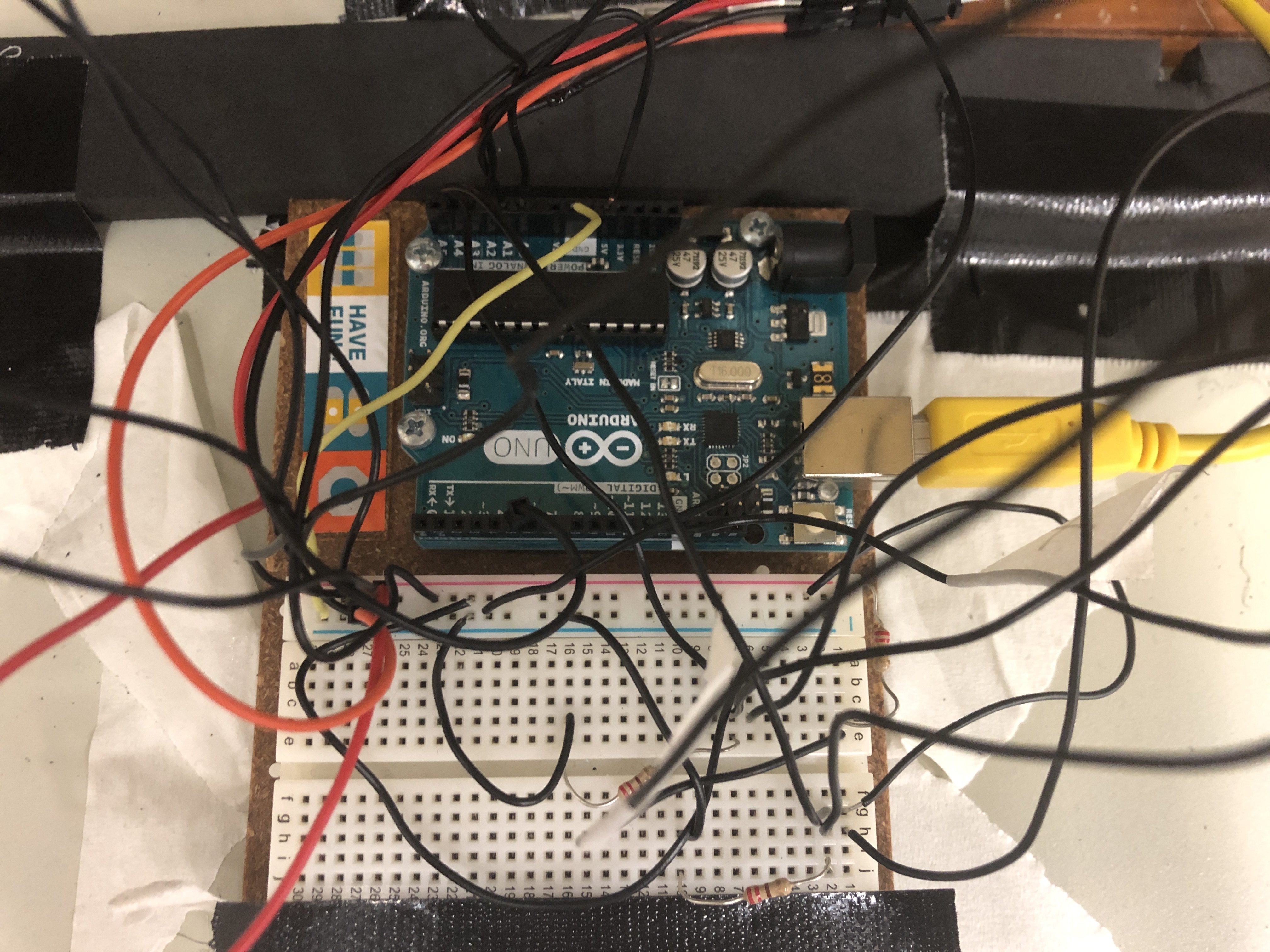
So after I was satisfied with the cover, I went on to work on the code. It was a long process of editing, adding, testing.
All my previous files. I save them separately with each big edit in case I needed to return to the previous one
The first variant of my code is like my original idea, which works like this:
switch is on
input from the dials are recorded every 0.3s
each individual inputs will form words
the words form a sentence
press button to send the message to the computer to be displayed
With this variant, I found that it keeps repeating the words, and that the user has to turn the knob quickly enough to create an interesting mix of words. It is too restricted in general and as such I changed to the new idea which allow users to take their time to select the colours they want and send the message as and when they wish.
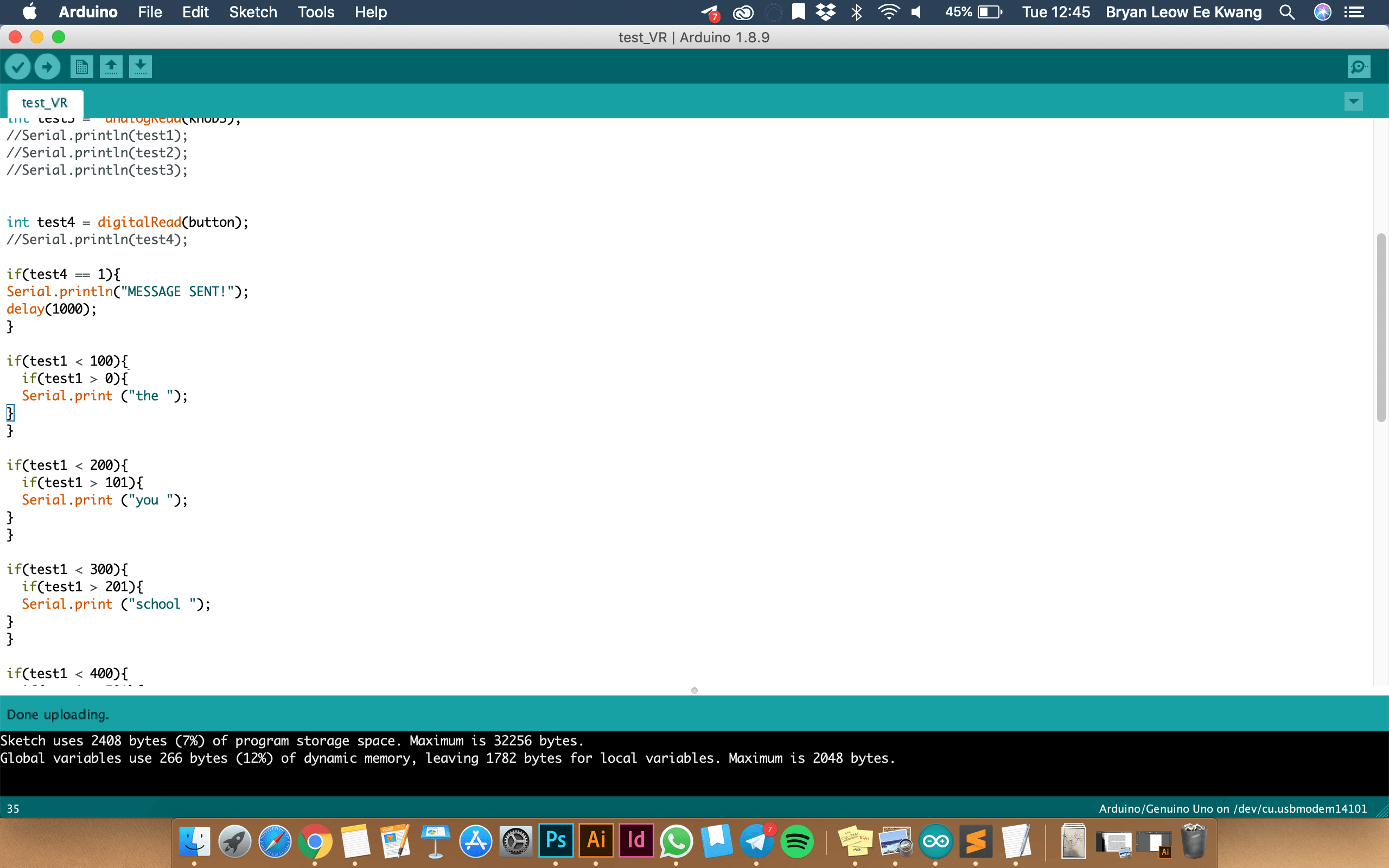
The basis of my final code is:
Fast LED libraries which runs the LED strip
Here are some examples of how fast LED works (CRGBPalette16, CRGB)
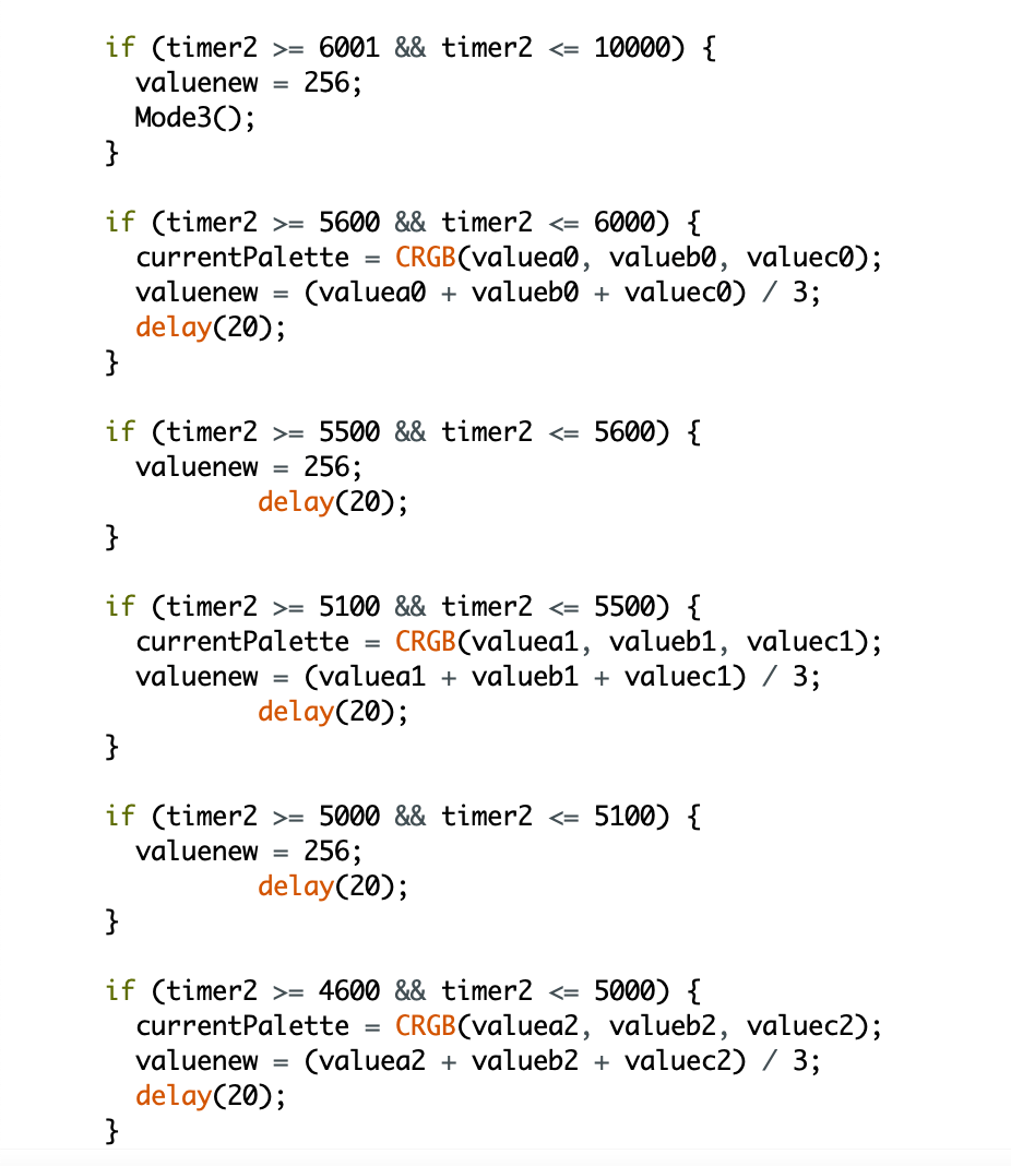
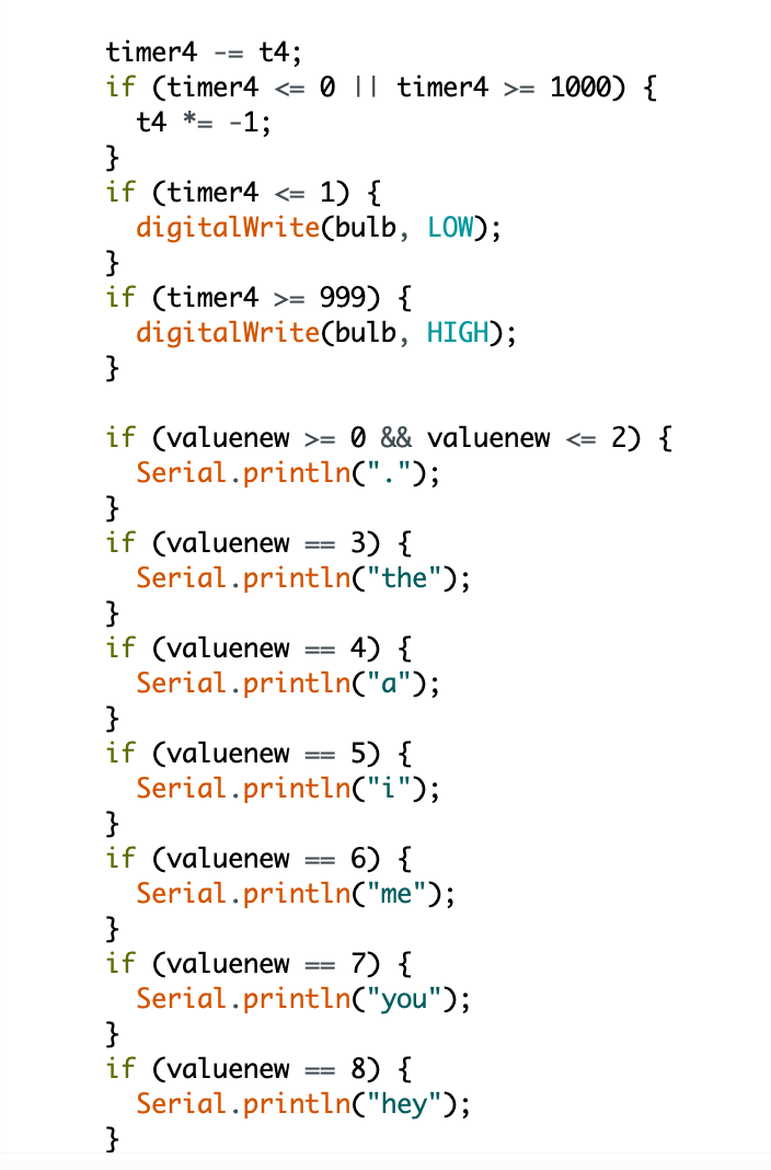
Timers
Timers helped me a lot in controlling the variables. The code above helps me constrain the variable ‘valuenew’ (which controls what word will be printed) during the ‘transmit’ stage. How my timers work is, for instance:
int timer 1000;
int t = 10;
timer -= t;
if(timer <= 0){
timer = 1000;
}
In this example, timer will minus 10 every tick, until it becomes 0, then it will reset to 1000 and repeat. If I want to control a variable, I can make something happen when timer <= 0.
How ‘valuenew’ controls the words printed
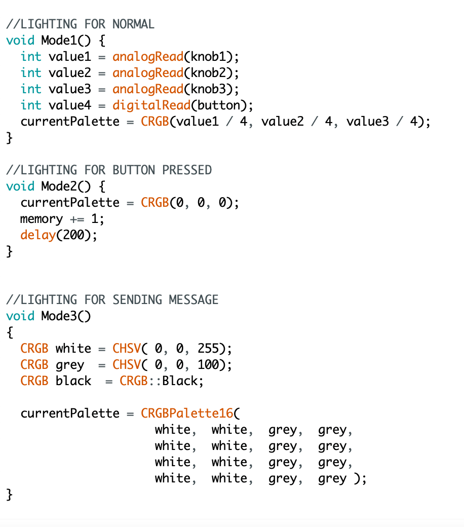
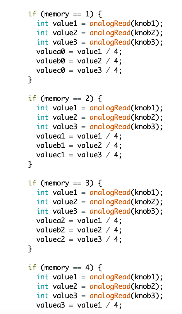
Modes
The above screenshot is an example of a mode. Each variant of ‘memory’ stores a set of instructions, and these set of instructions will play when the mode is changed.
Other ways I used mode is as such:
int buttonpress = digitalWrite(button,HIGH);
if(buttonpress = 1){
mode = 1
}
if (mode == 1){
Serial.println(“something should happen here”);
}
In this example, if button is pressed, the mode will switch to 1, which causes the serial monitor to print “something should happen here”. It’s a very versatile way of coding although it can be very clunky in a complex code.
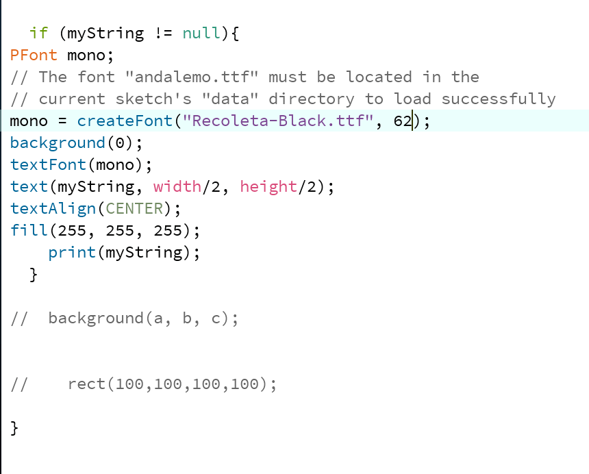
In Processing
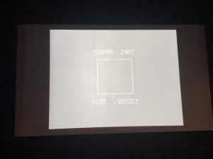
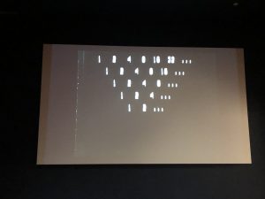
The code in Processing is very simple. It’s basically receiving inputs from the serial monitor and displaying it on the screen as texts. There is only 1 problem: if there is nothing in the serial monitor, it will print ‘null’ which causes an error “null pointer exception” which crashes the program. What I did to counter it is to only run the program if there is no ‘null’s.
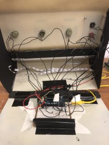
Physical Model Part 2
I continued with my model while working on the code, as a way of me taking a break from constantly pulling my hairs out with codes. I went on with using foam to cover up the rest of the form as it is a versatile material for my oddly-shaped case. It also fits the aesthetics. I also used a white corrugated plastic sheet as a screen as I wanted a diffused look.
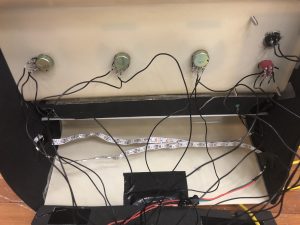
I forgot to mention wiring. So I soldered the wires onto the components and learnt the best way to solder through Zi Feng. It was amazingly easy after he shown us the magic!
Wiring isn’t that complicated as it looks. It’s just because I used the same wire for every component. The casing really helps a lot to keep things organised.
This video was recorded in my Instagram story last weekend, when it was pretty much finalised.