
Quotes
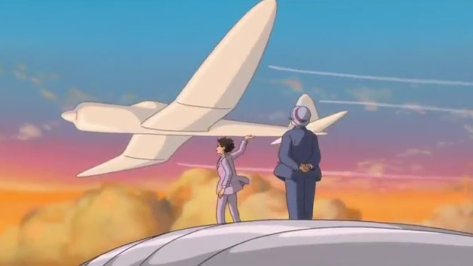
Image taken from http://www.nerdophiles.com/2014/03/06/discussing-dreams-and-reality-with-the-wind-rises/
Airplanes are beautiful, cursed dreams, waiting for the sky to swallow them up. – The Wind Rises
She was beautiful, just like the wind. – The Wind Rises
Every engineer has his 10 years in the sun – The Wind Rises
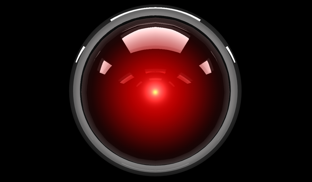
I am afraid I can’t do that Dave. – 2001: A Space Odyssey
I’m afraid. I’m afraid, Dave. Dave, my mind is going. I can feel it. I can feel it. My mind is going. There is no question about it. I can feel it. I can feel it. I can feel it. I’m a… fraid. – 2001: A Space Odyssey

Which knot did you tie, Borden? – The Prestige
That’s why every magic trick has a third act, the hardest part, the part we call “The Prestige” – The Prestige
So, I guess we are who we are for alot of reasons. And maybe we’ll never know most of them. But even if we don’t have the power to choose where we come from, we can still choose where we go from there. We can still do things. And we can try to feel okay about them. – Perks Of Being A Wallflower
Right now we are alive and in this moment. I swear we are infinite. – Perks Of Being A Wallflower
We accept the reality of the world with which we’re presented. It’s as simple as that. – Truman Show

In your face, Neil Armstrong! – The Martian
I’m going to have to science the shit out of this. – The Martian
Let’s write our names on each other’s palms – Kimi no na wa
Please make me a handsome Tokyo boy in my next life! – Kimi no na wa

Despite knowing the journey… and where it leads… I embrace it… and I welcome every moment of it. – Arrival
“Language is the foundation of civilization. It is the glue that holds a people together. It is the first weapon drawn in a conflict.” – Arrival
Abbott is death process. – Arrival
Coffee with some aliens… – Arrival

I love this thing because you gave it to me. But the truth is… it is one fuckin’ ugly tie! – Shutter Island
Which is worse, to live as a monster or to die as a good man? – Shutter Island
SELECTED QUOTES
Those aren’t mountains, they’re waves. – Interstellar, 2015
https://www.youtube.com/watch?v=4Hf_XkgE1d0 01:39
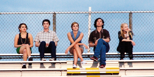
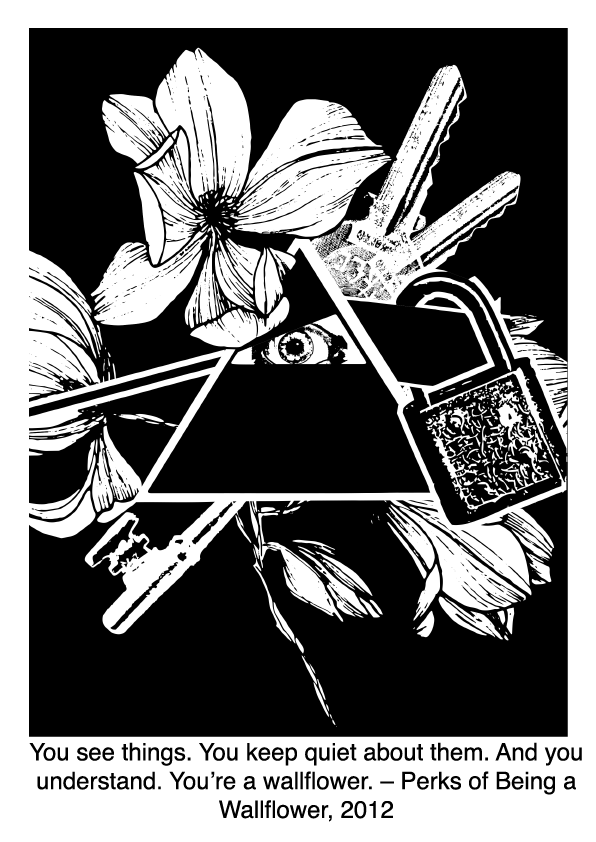
You see things. You keep quiet about them. And you understand. You’re a wallflower. – Perks Of Being A Wallflower, 2002
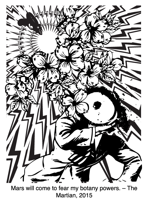
Mars will come to fear my botany powers. – The Martian, 2015
https://www.youtube.com/watch?v=5KsVojEaoms 00:34
Good morning, and in case I don’t see ya, good afternoon, good evening, and good night! – Truman Show
https://www.youtube.com/watch?v=-_zYn-HHcyA 03:57
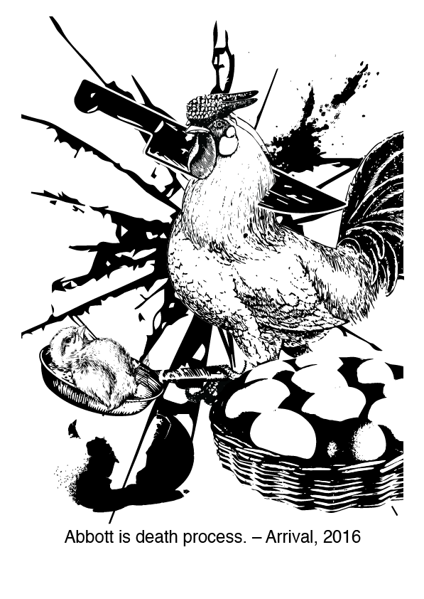
Abbott is death process – Arrival, 2016
https://www.youtube.com/watch?v=-o0MwXqS0Q4&t=558s 08:59
Alright, with these quotes, let’s break them down!
1. Mountains, waves, doubt, fear, reaction.
- Mountains: Rock, giant, wall,
- Waves: Ripples, fishes
- Fear: Constricted eye
2. Sight, quiet, understand, wallflower.
- Sight: Eye, bird, light, camera (without button),
- Quiet: Lips closed or covered, water,
3. Fear, botany, powers, mars, plant.
- Fear: retreating action, constricted eyes,
- Botany: Plant parts / whole plant, soil, spade
- Powers: Electricity, muscles,
- Mars: Ares, chocolate bar, rock, boy, curiosity
4. Morning, speculate, afternoon, evening, night.
- Morning: Breakfast, sunrise, 8am, people going one direction, (transport)
- Afternoon: Lunch, sun high, 1pm, people at work (work)
- Evening: Dinner, sunset, 6pm, people going the other direction (chilling)
- Night: Bed, moon, 10pm, people at home (home)
5. Abbott, alien, heptapod, death, process.
- Abbott (alien): alien crab, octopus,
- death: corpse, skull,
- process: duration, 4th dimension,
Compositions and detailed explanations
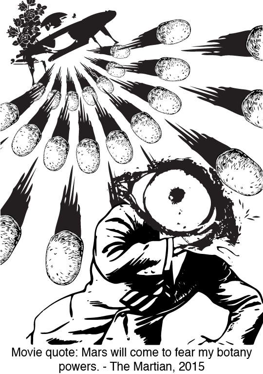
First composition: Mars will come to fear my botany powers. – The Martian

I’ve gotten an idea from the quote ‘Men are from Mars, women are from Venus’. Upon further research, I realised tha the male symbol is the same as the Mars symbol:

So, I used a man to represent Mars.
Next, botany is the study of plants, so plant designs will suffice. I used an alien gun to represent the main character in the movie, who is a botanist stranded in Mars. I like the idea of using a man to represent Mars, and an ‘alien’ to represent the human, who is really an alien to Mars. By using the alien gun shooting plant parts to ‘Mars’, I want to create the idea of an invasion, man invading Mars with botany.
I further enhance the idea of an invasion by spreading electricity in a circular manner, making it look like the powers are spreading across the whole of Mars. I tried to arrange the bolts in a way that makes it look like it is coming from the flowers, instead of the other way round. It works by making the flowers big and having small bolts overlapping the flowers, making it seems like it’s coming out from the flowers.
Then, I added an eye, covering the entire face of the man representing Mars, and constrict its pupil to represent fear itself.
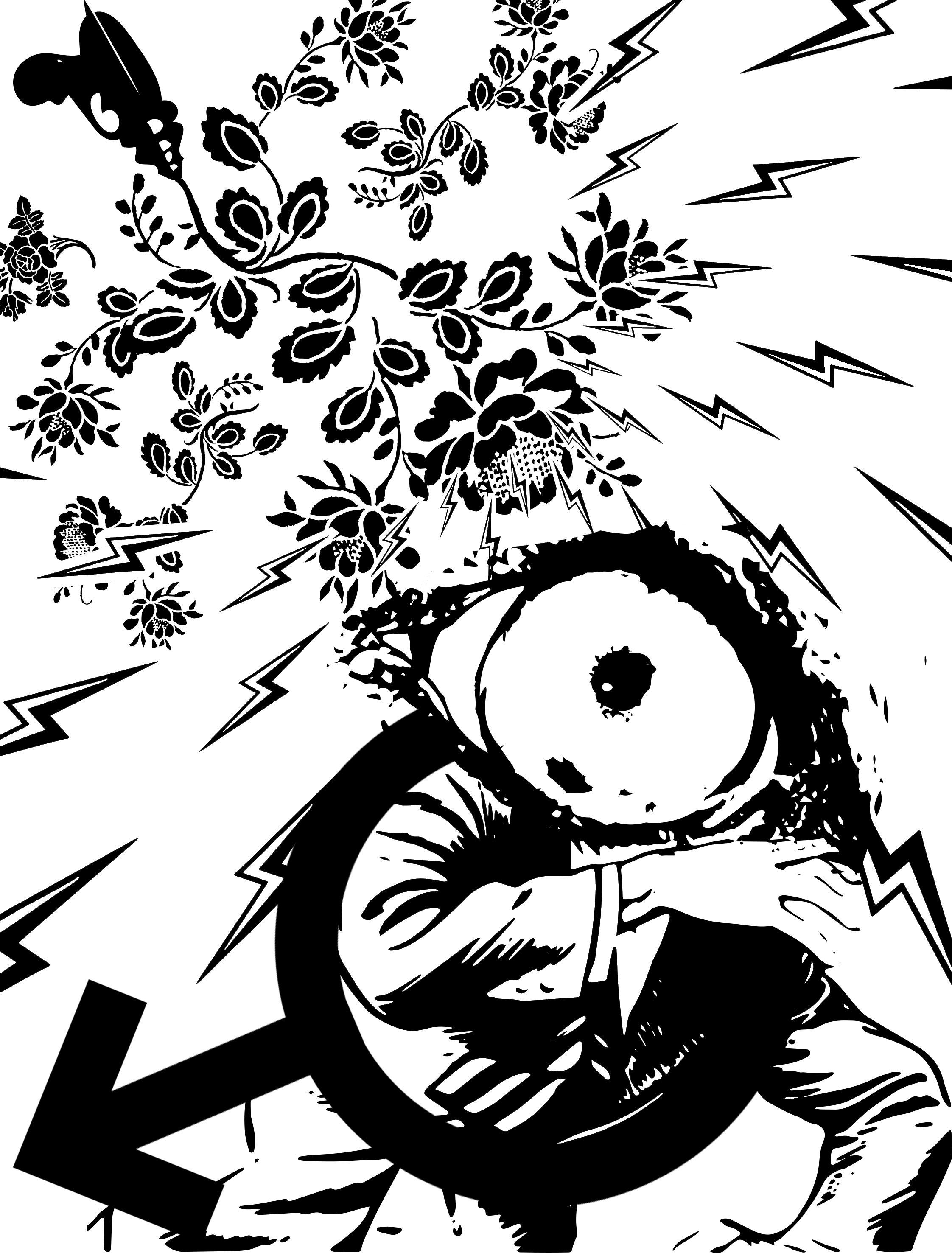
Although the meaning is present, the composition looks a bit plain, so I added the symbol itself to enhance the identity of the man being Mars.
And there we go. The first composition, filled with meaning, but lacking in composition.
Here are thumbnails of my work process / variations


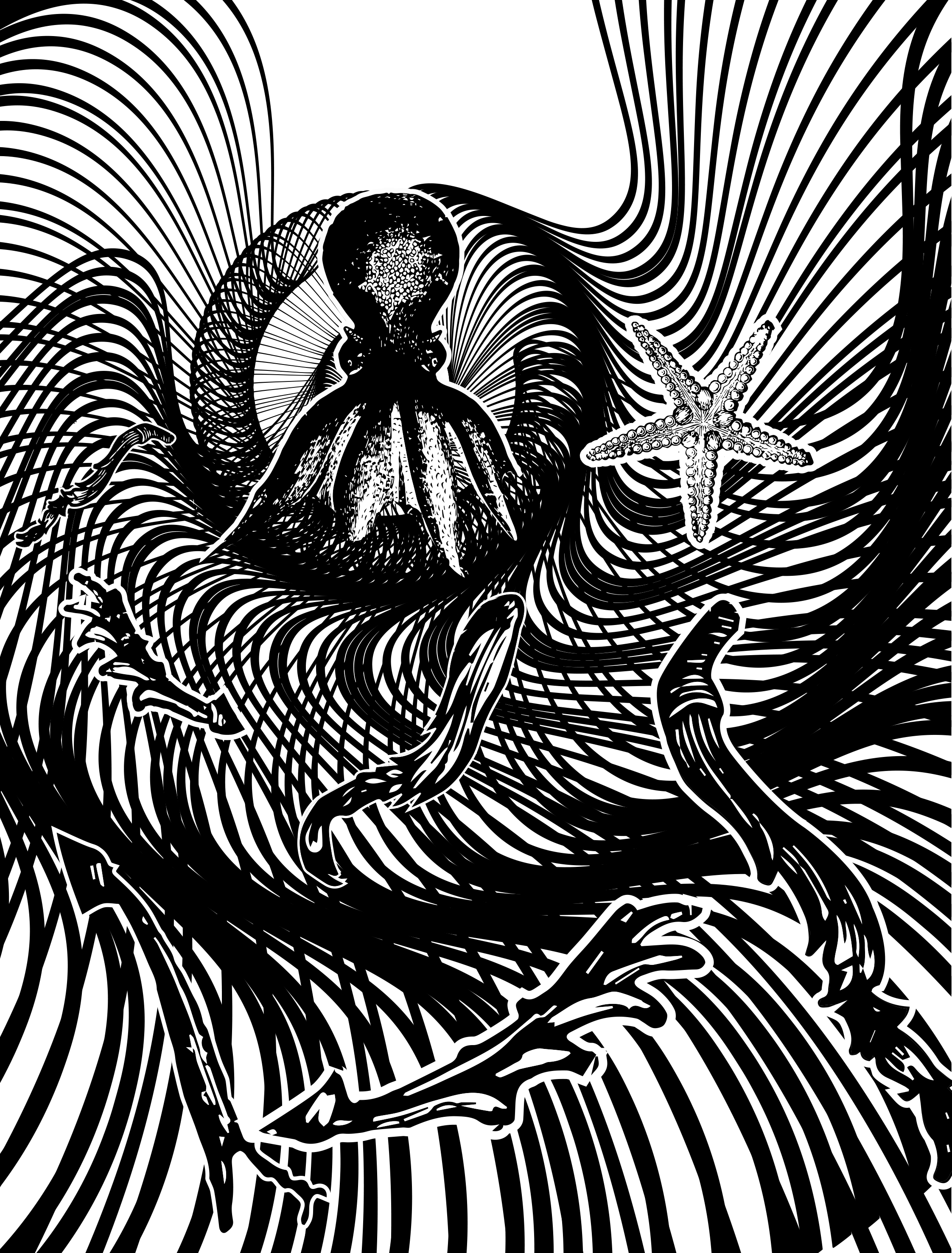
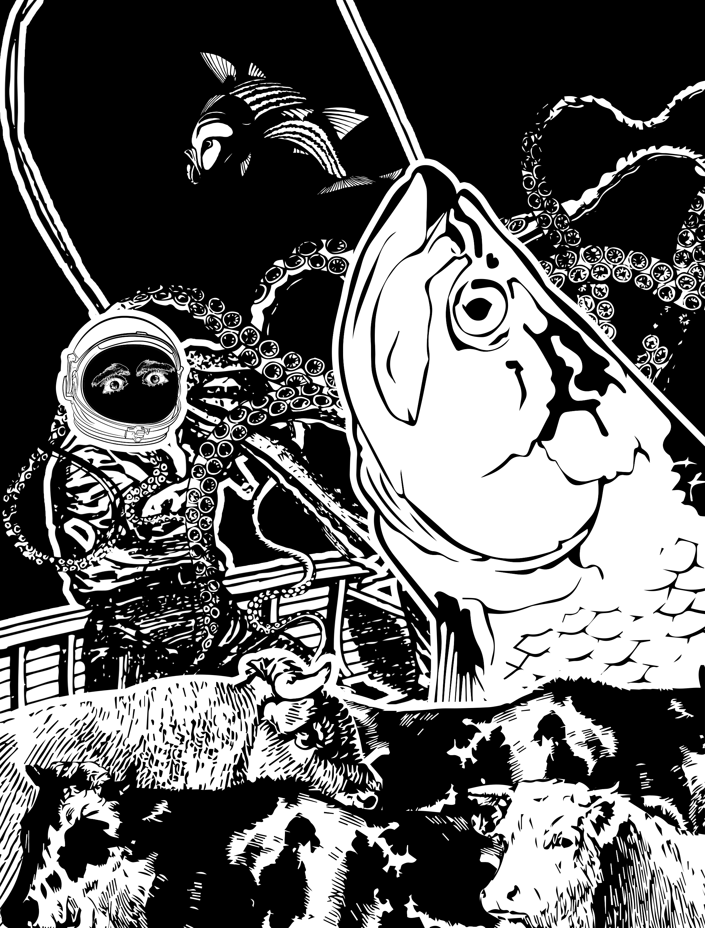
Composition 2: Those aren’t mountains, they’re waves. – Interstellar, 2015
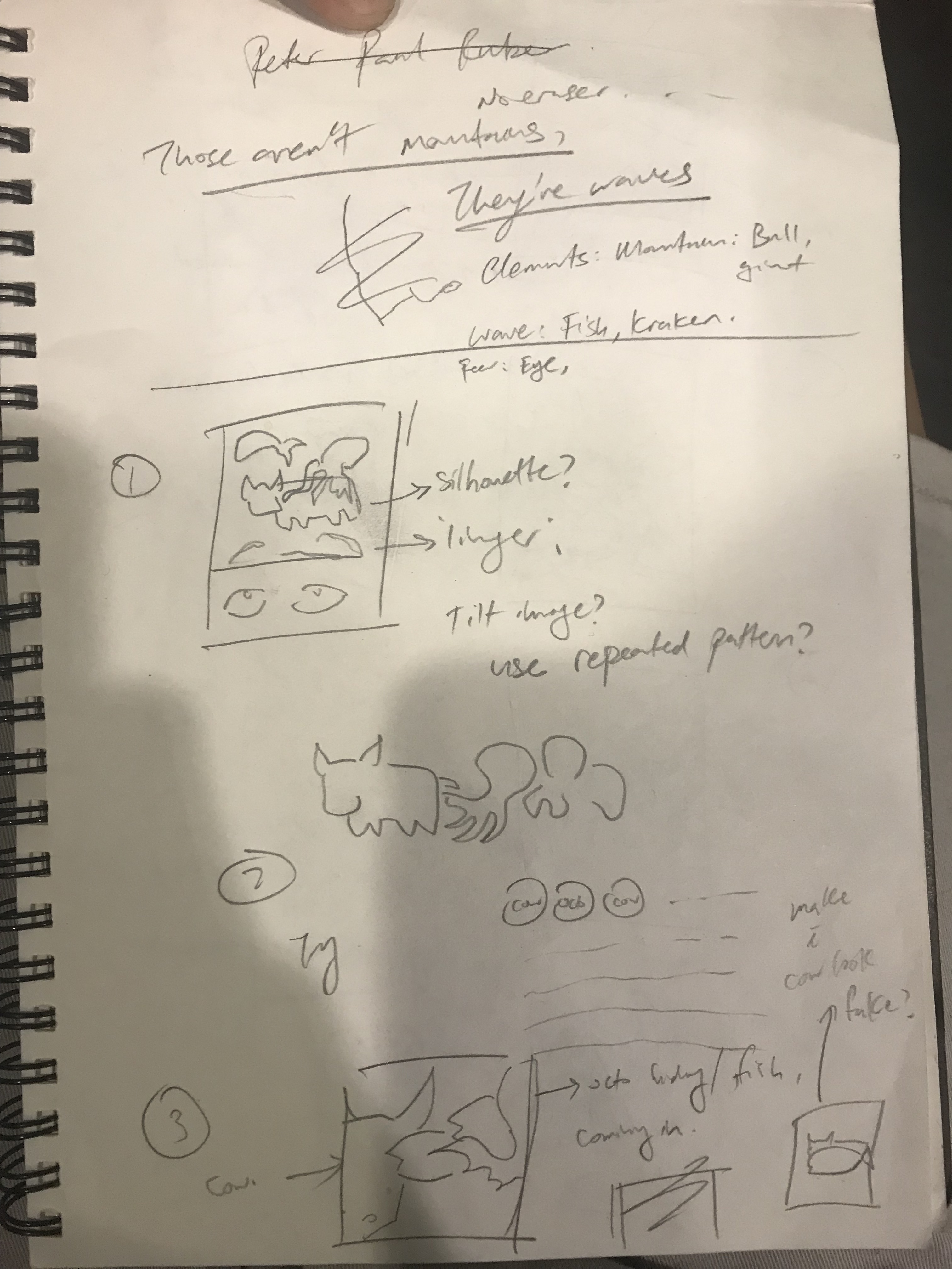

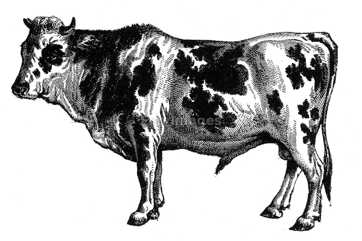
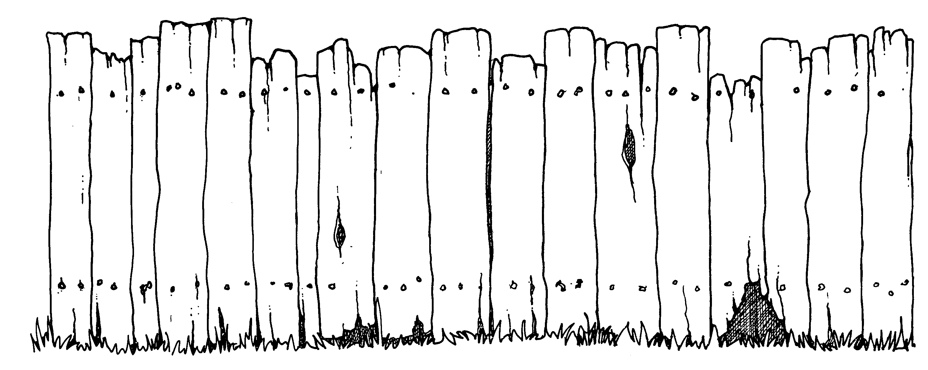
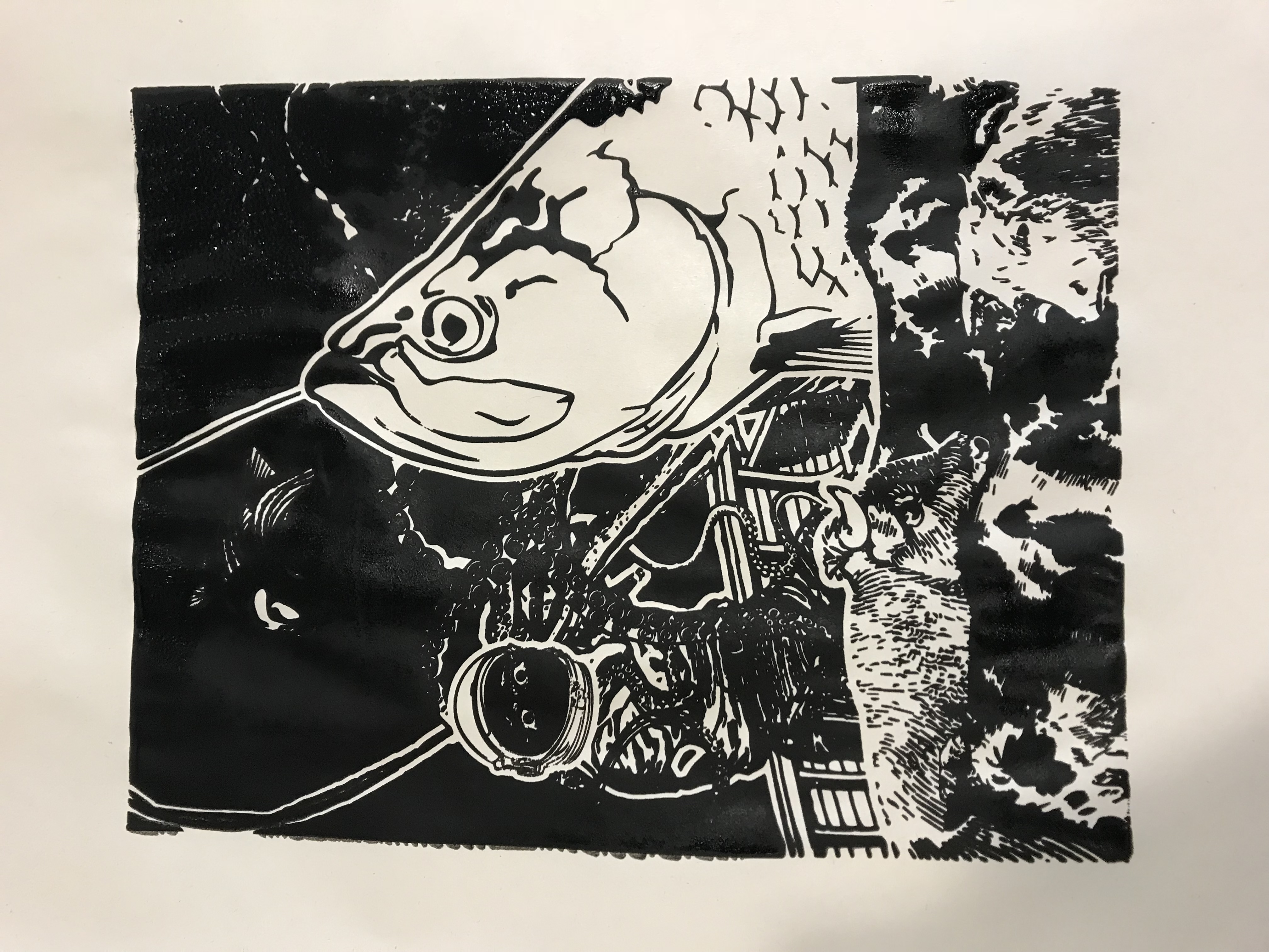
Initially, I wanted to use giants or fences to represent mountains, but I ended up using cows, as cows’ bodies have interesting shapes that looks like mountain. Cows are also grounded and strong, so they are good representation of mountains.
To represent waves, I use fishes and sea creatures, because they’re not just a part of the ocean, their movements are also like waves, left and right.
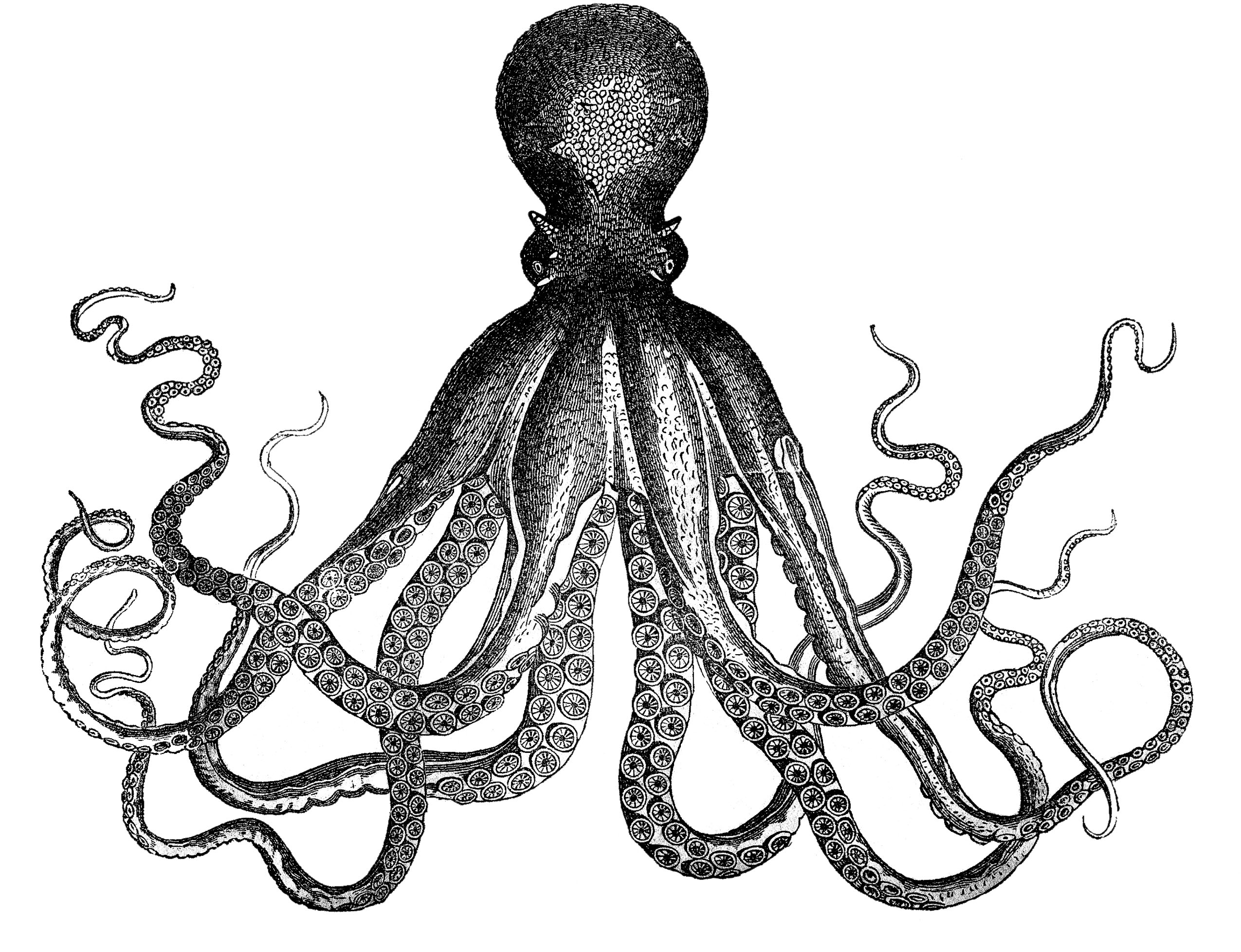
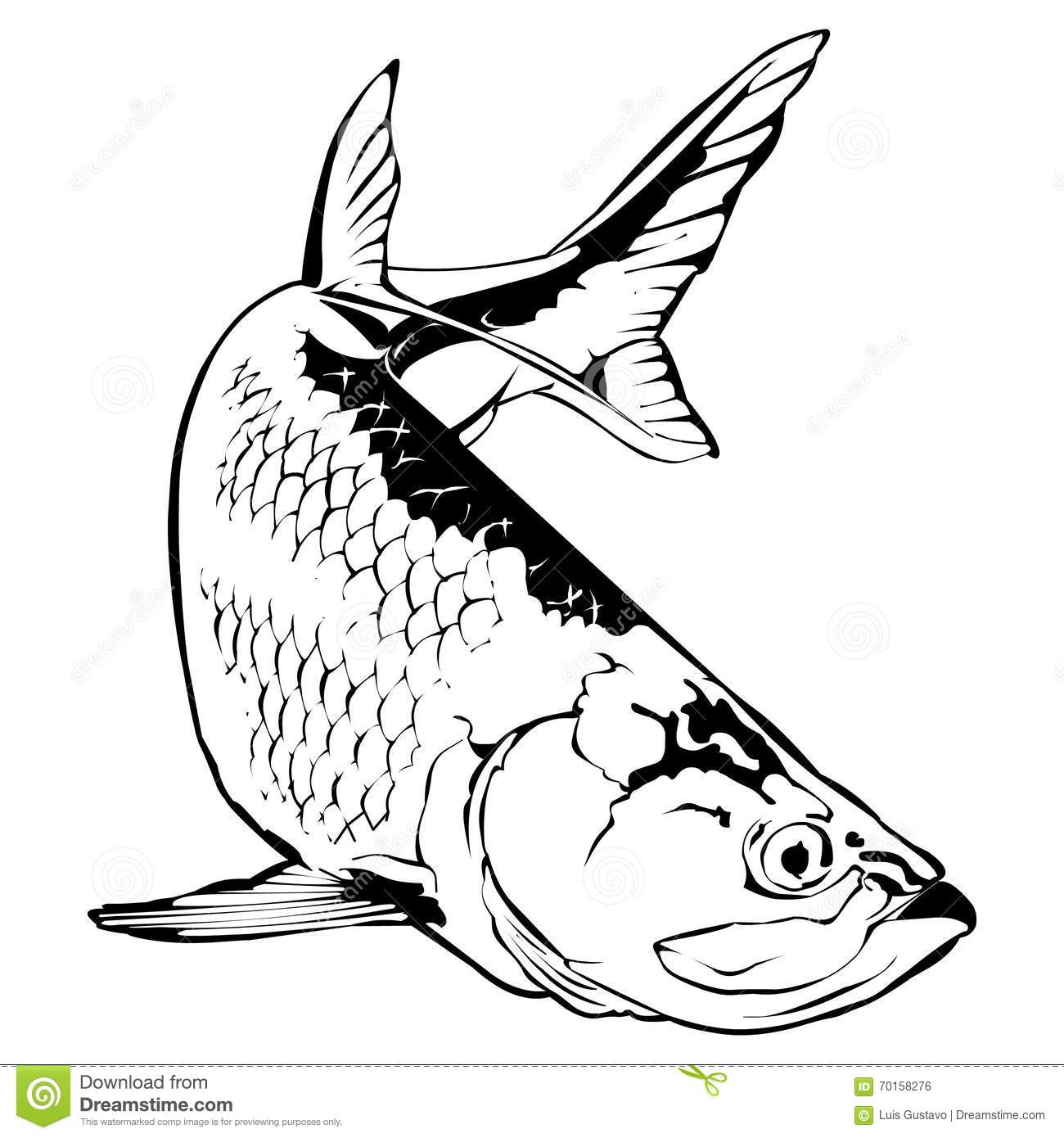
At first, I wanted to use an octopus to represent the waves, hiding behind a cow. But it’s very odd. I decided to have a fisherman, because I just like the idea of fishing.

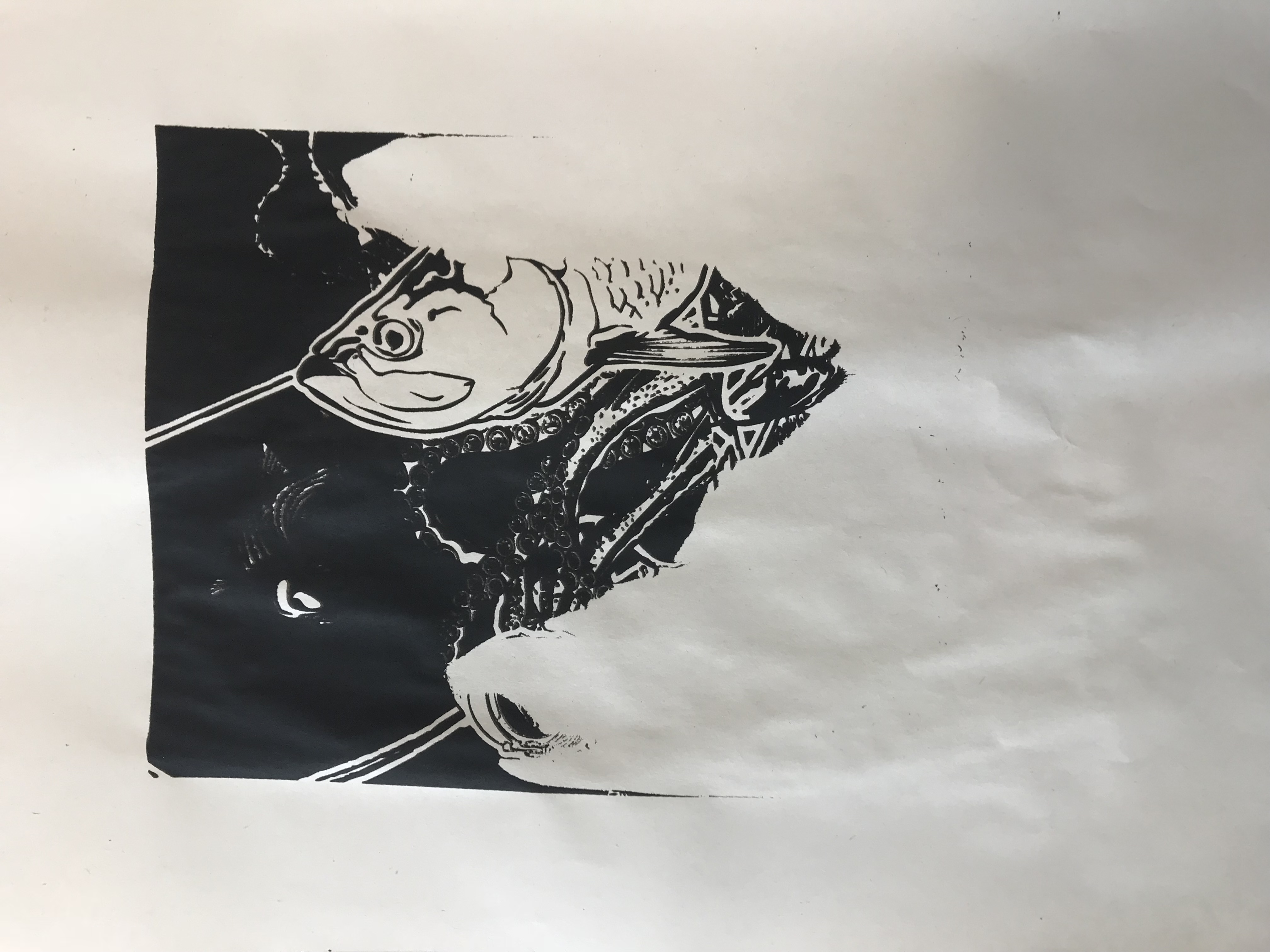
I think it adds on to the whimsicality of the whole composition, and it is also very symbolic. In the movie, the characters are like the fishermen, trying to find the source of a GPS signal in a planet filled with water. Their spaceship is like the boat, and they are the fishermen, fishing for the GPS. They looked afar and saw mountains, which, upon closer inspection, are huge tidal waves.
In the composition, I used the sea of cows (strong foreground) to represent the water world, and the fishermen are fishing within the cows. (if you look from far, the cows do look like mountains) But to their surprise, a fish came up, and sea creatures crawled upon the boat, causing havoc, like the waves in the movie. The fisherman, conveniently wearing a space helmet, has eyes that expresses fear, like in the movie.

The composition is designed to bring the quote to another context, while maintaining its meaning. For instance, the mountains are usually on the background, but I’m using it as a foreground in this case. This also creates a visual hierarchy, fish, fisherman, cow.
I applied rule of thirds to the fish, making sure that the focus is the fish, even though there are other elements fighting for attention. I also arranged the elements around to lead the eyes from the fish to the fisherman, through the curves and the movements of the tentacles.
So there we go, the most precise composition I did, the one I am most proud of.
Other variations:

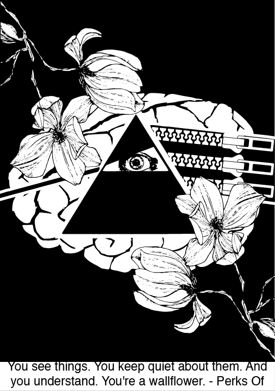
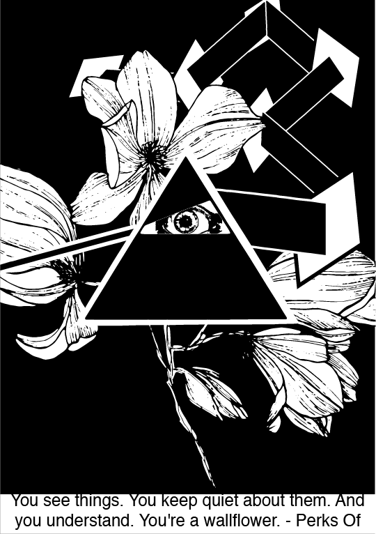
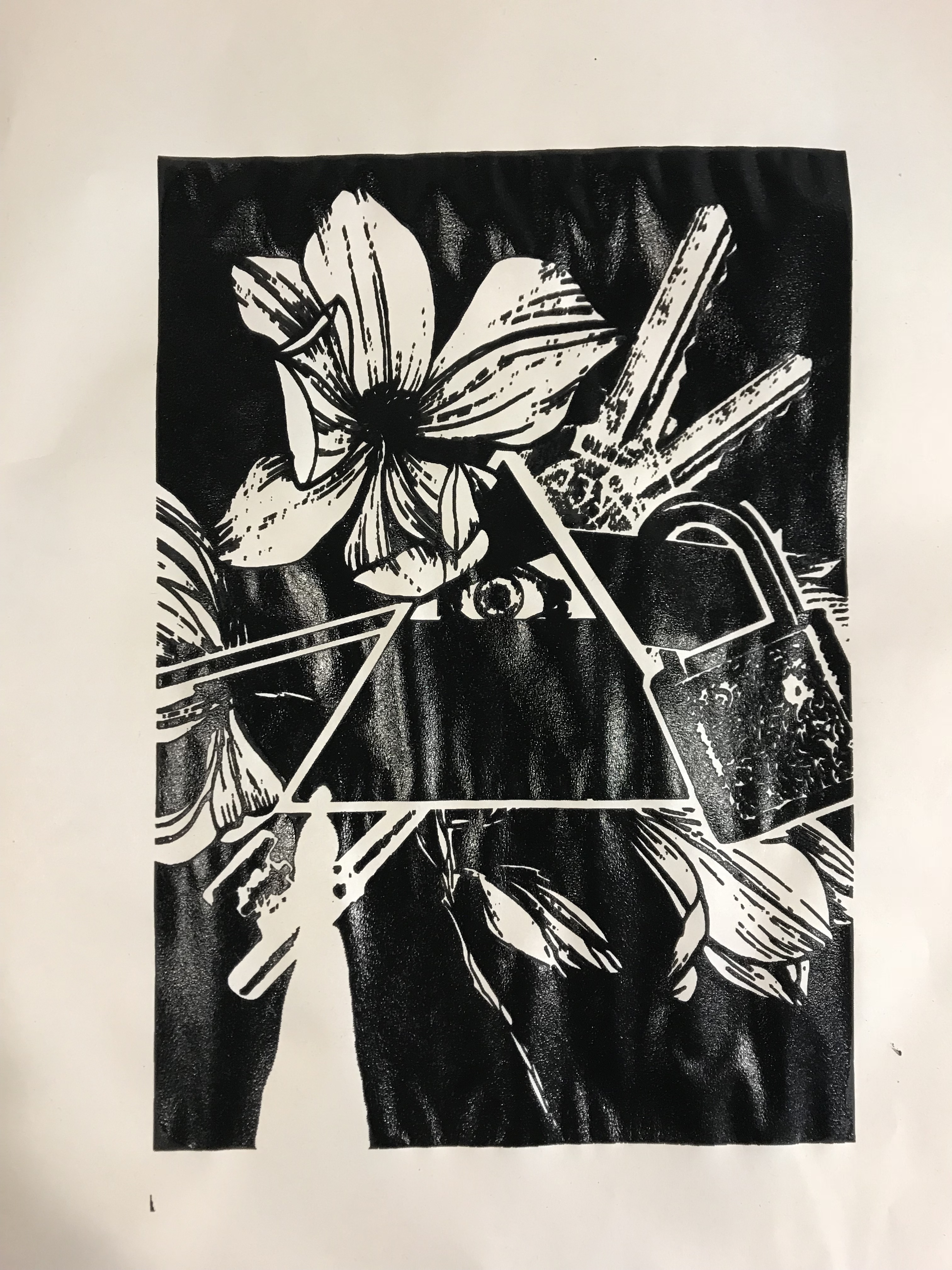
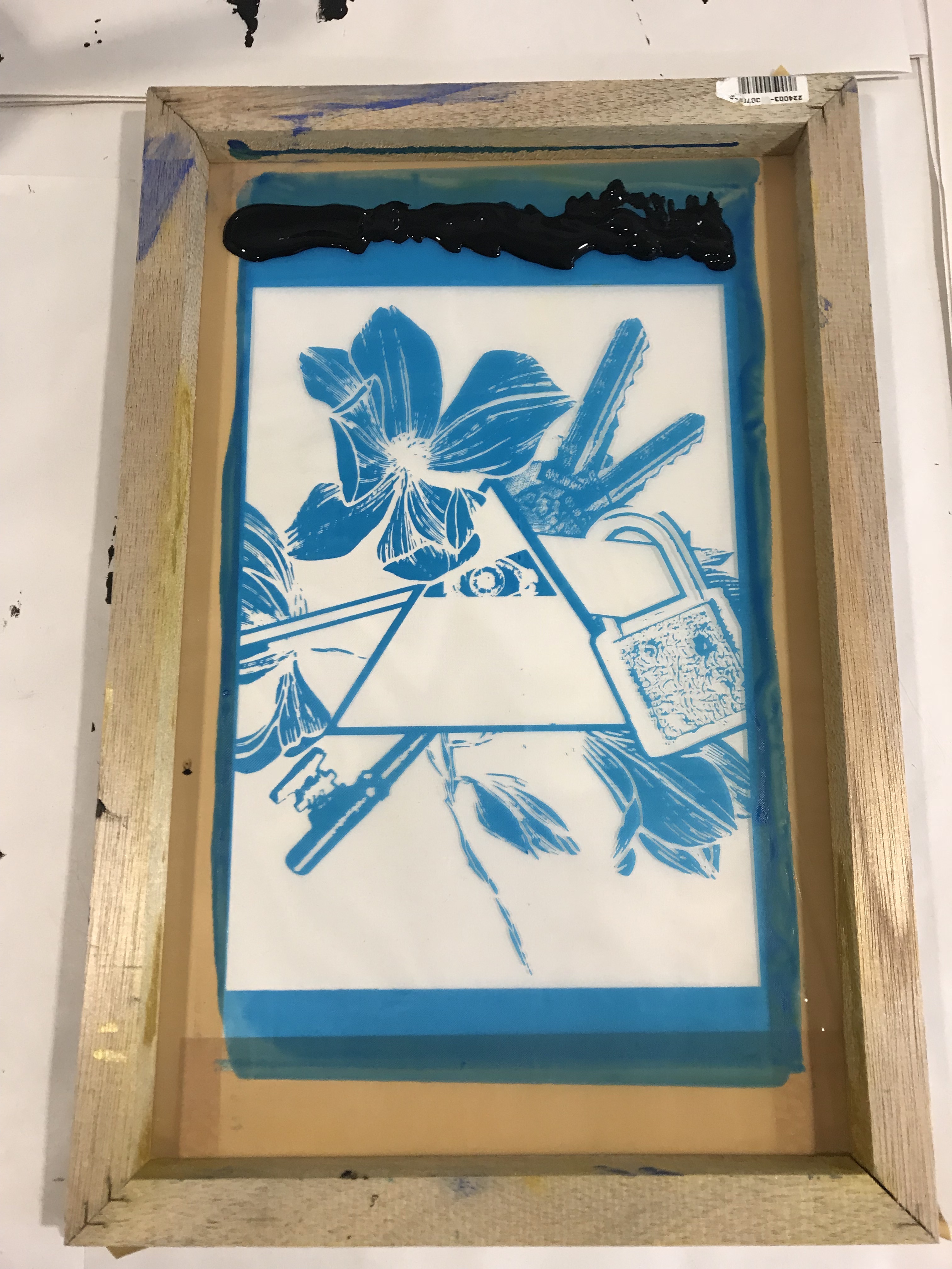
Composition 3: You see things. You keep quiet about them. And you understand. You’re a wallflower. – Perks Of Being A Wallflower, 2002
The initial idea is to literally have an eye, mouth, zip on mouth, connected to a brain. The idea is too literal, despite how nice I could imagine it to be. I scrapped the idea completely, and went on with something more in depth.
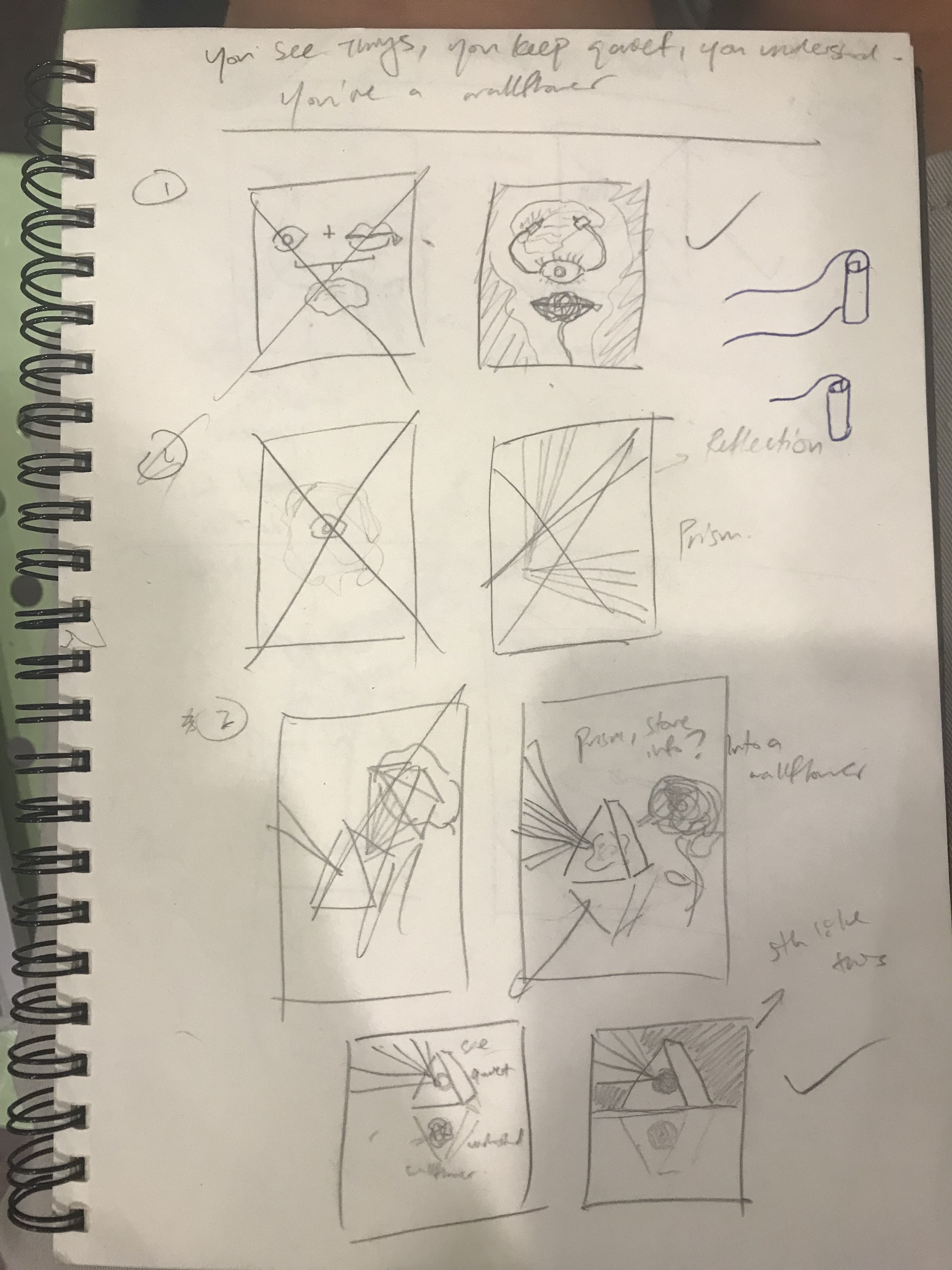
I liked the idea of having a prism. A prism captures light, then refracts it internally, and then spreads the light out into a rainbow. In a way, it can be a metaphor to the whole seeing and talking and understanding thing.
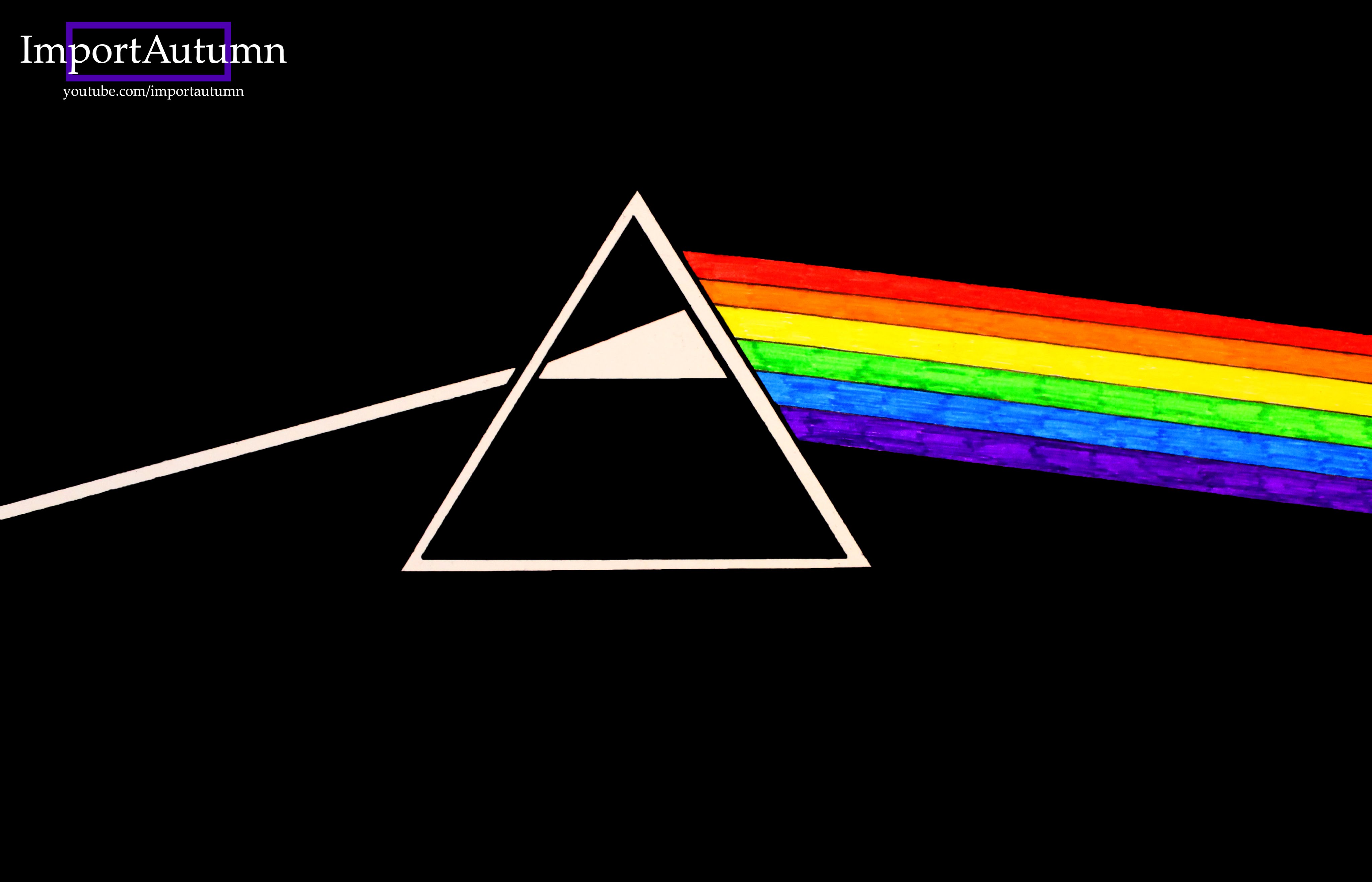
I’m inspired by this fanart of Pink Floyd’s album ‘The Dark Side of the Moon’, which showcases a prism spreading light. The prism basically ‘sees’ the light by absorbing it, processing it (understanding) by refracting, and then spreading it out into a rainbow, like when someone talks about something they see, it tends to be a bit different from the original.
For my composition, I’m using different elements to craft the idea of seeing, keeping quiet, and processing. Oh, and the last part, wallflower.
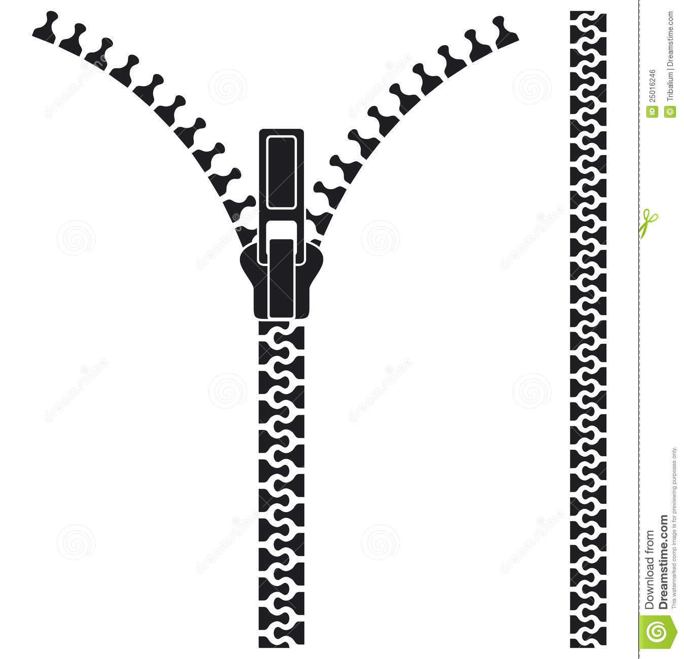
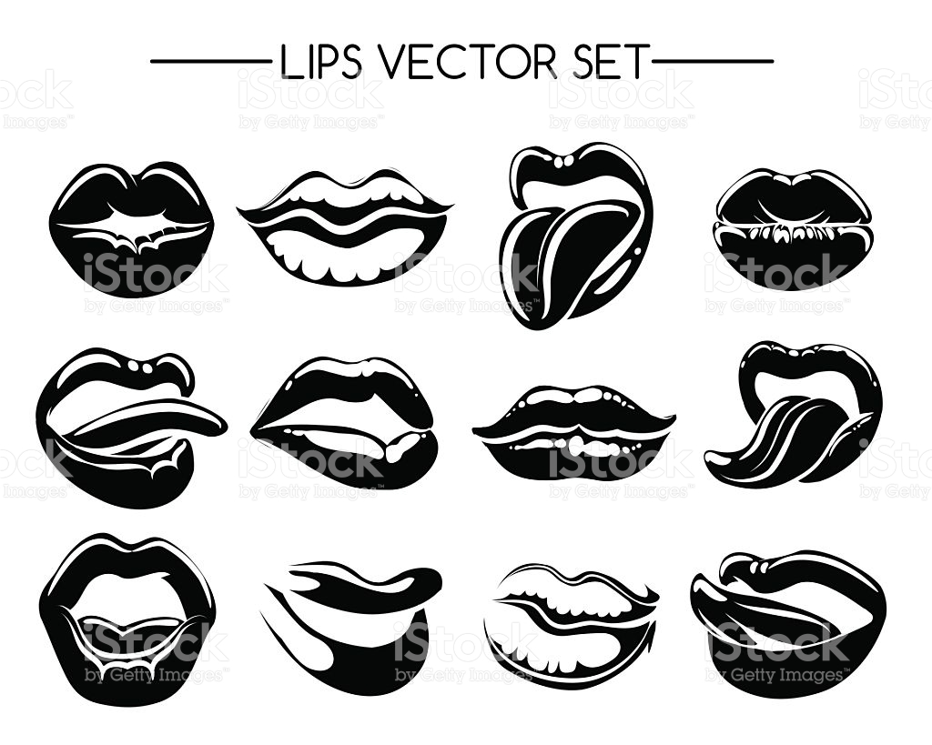

These are some of the images I intended to use for my composition. After some iteration, I decided to drop the zippers and the brain, and add in some dingbats of eyes, locks, and keys, which I feel enhances the overall idea.
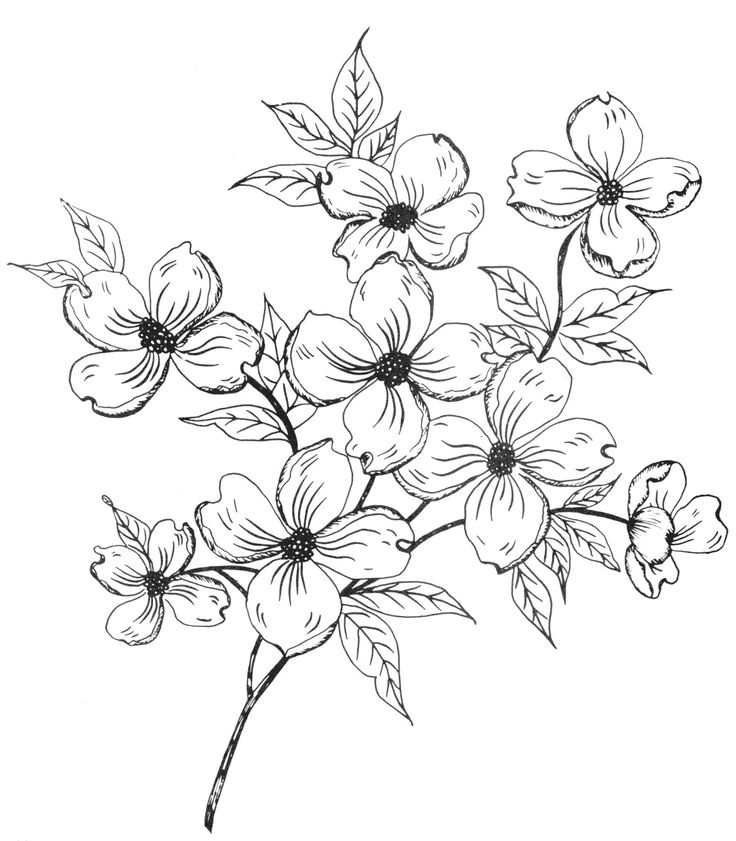
The eye enhances the idea of sight. The lock is used to lock away the scattered beam of light, and the keys are behind the prism, suggesting that the keyholder has the power over the light scatter but it doesn’t do so. Finally, a flower is in the background, representing the wallflower.

The overall composition is framed around the prism, which is the representation of the main character in this quote. The rest are just supporting elements. I want to use lock and keys to create some distortion of reality, so as to make the overall composition more interesting, and also break away from any literal meaning in the composition.
Other iterations:


Composition 4: Abbott is death process – Arrival, 2016

This is a tricky one, but I am not daunted! I really like this quote for its sheer simplicity and its meaning is so strong and whole, it’s one of the most impactful quote in the movie. This quote leaves the viewers in the mystery of what it means by ‘death process’, and makes us wonder where did Abbott go in the movie. Did he really die? Why can’t Costello just say that Abbott is dead? Is it because of the lapse in understanding between the alien language and the human’s? Or is it a way of saying ‘death’? (turns out, it’s the last one).
In the movie, the alien don’t see time as we humans do. They see it as a whole, and they know the timeline of themselves and everything they interact with. To them, time is like space, you can always revisit yourself in another time. In short, they live in the fourth dimension, where time is just like another spatial dimension.
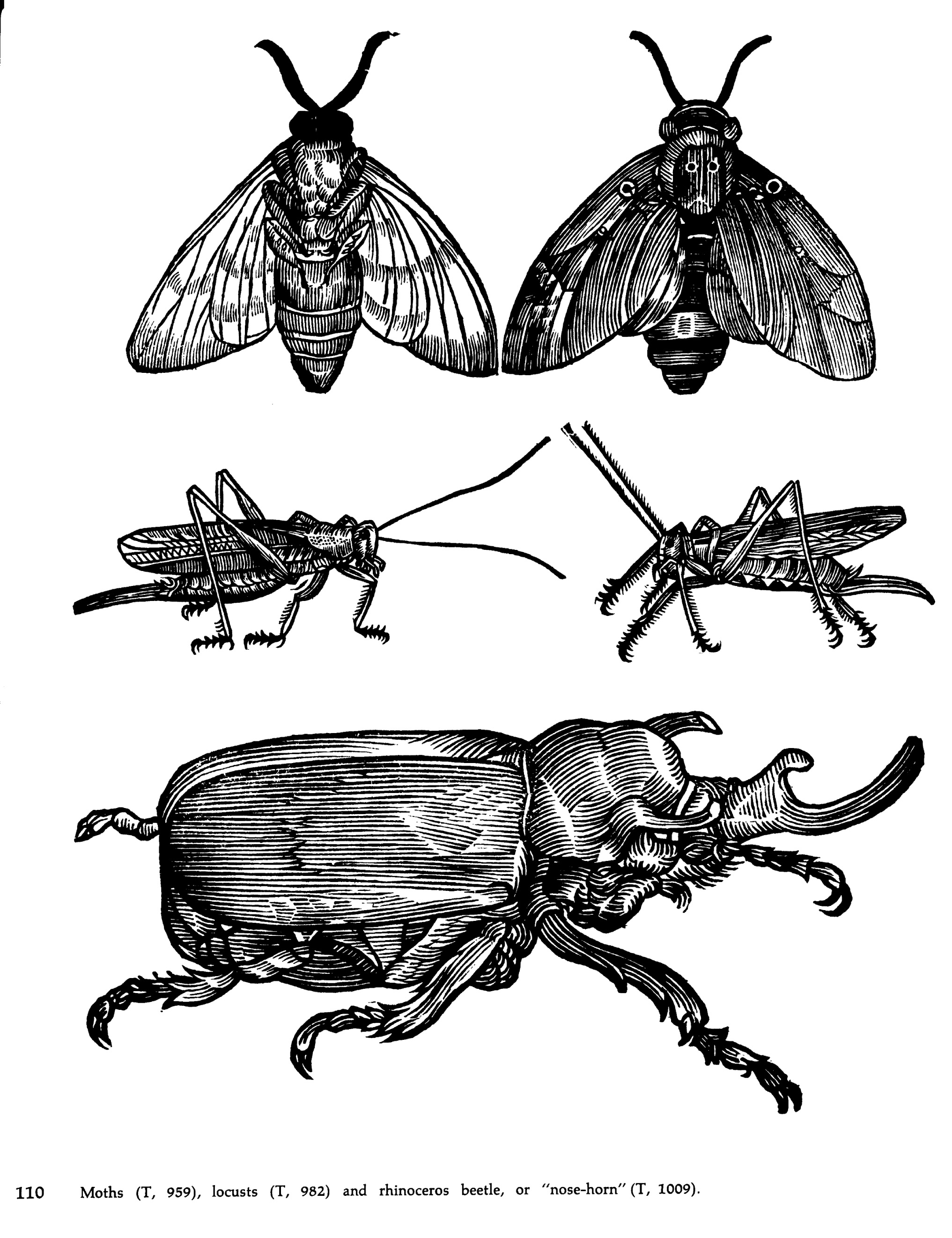
Okay, I digress. So these aliens look like octopuses because they are squid like creatures with 7 legs (named heptapods). Initially, I wanted to create a heptapod out of insect limbs, and then remove them along a path, like in my sketch.

Here are some examples of images I used. I was also inspired by the image of evolution:
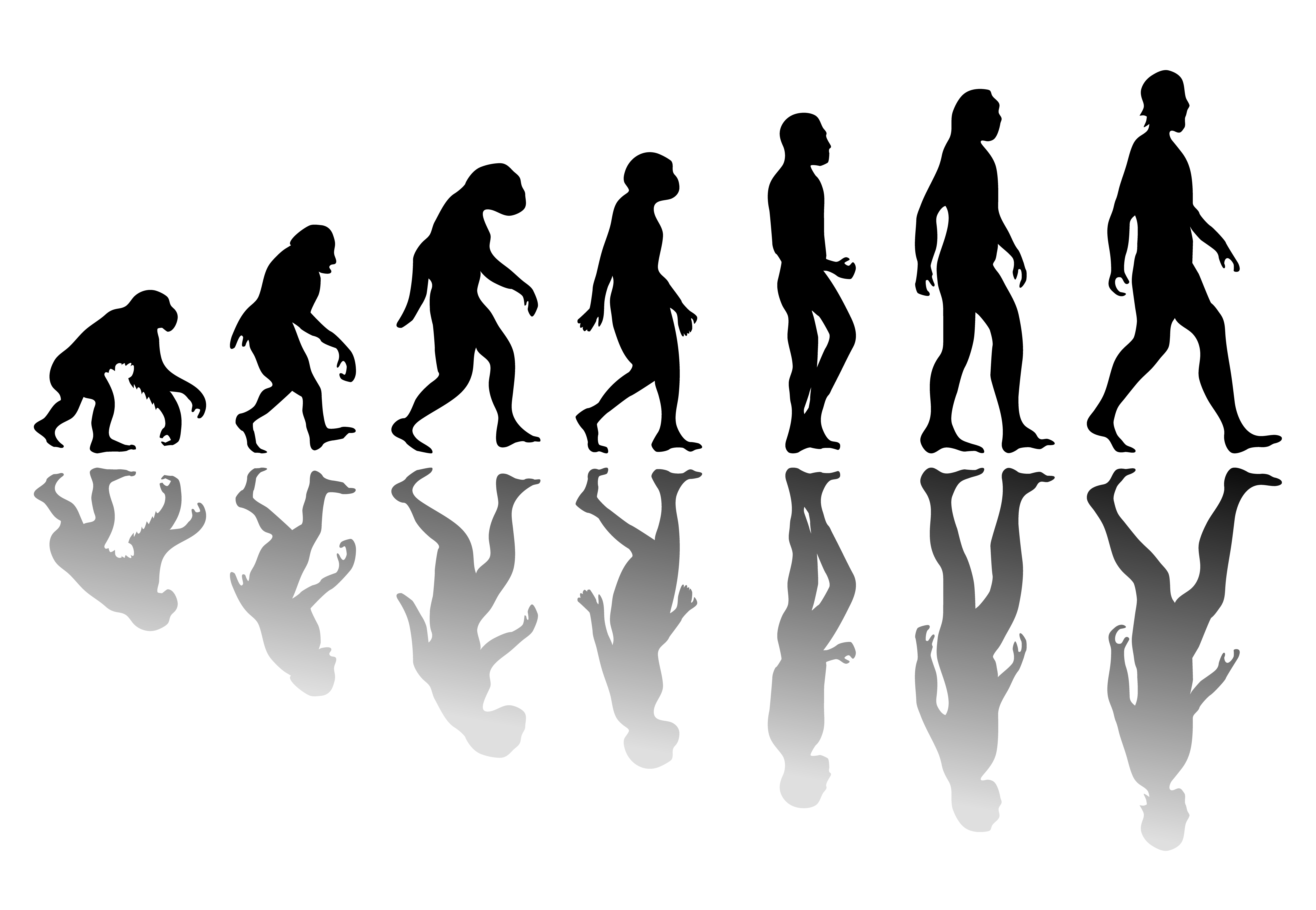
However, I try to break away from creating a linear design because I want to amplify the idea of the creature’s perception of time. I want something that is happening all at one time.
This was my first lazy design. It wasn’t that great even though the background is pretty cool. Now, I’m thinking of creating something more surreal.

I’m using chicken as the subject. Why? I am inspired by how every part of the chicken, from the unborn to the adult, can be killed for food. I am also inspired by the question ‘which comes first, the chicken or the egg?’.
All these properties of the chicken describes the character in the quote, Abbott. Abbott cannot see time, therefore he is the unhatched egg, the chick, the chicken. I want to show here that every version of Abbott is dying, thus him being in ‘death process’.
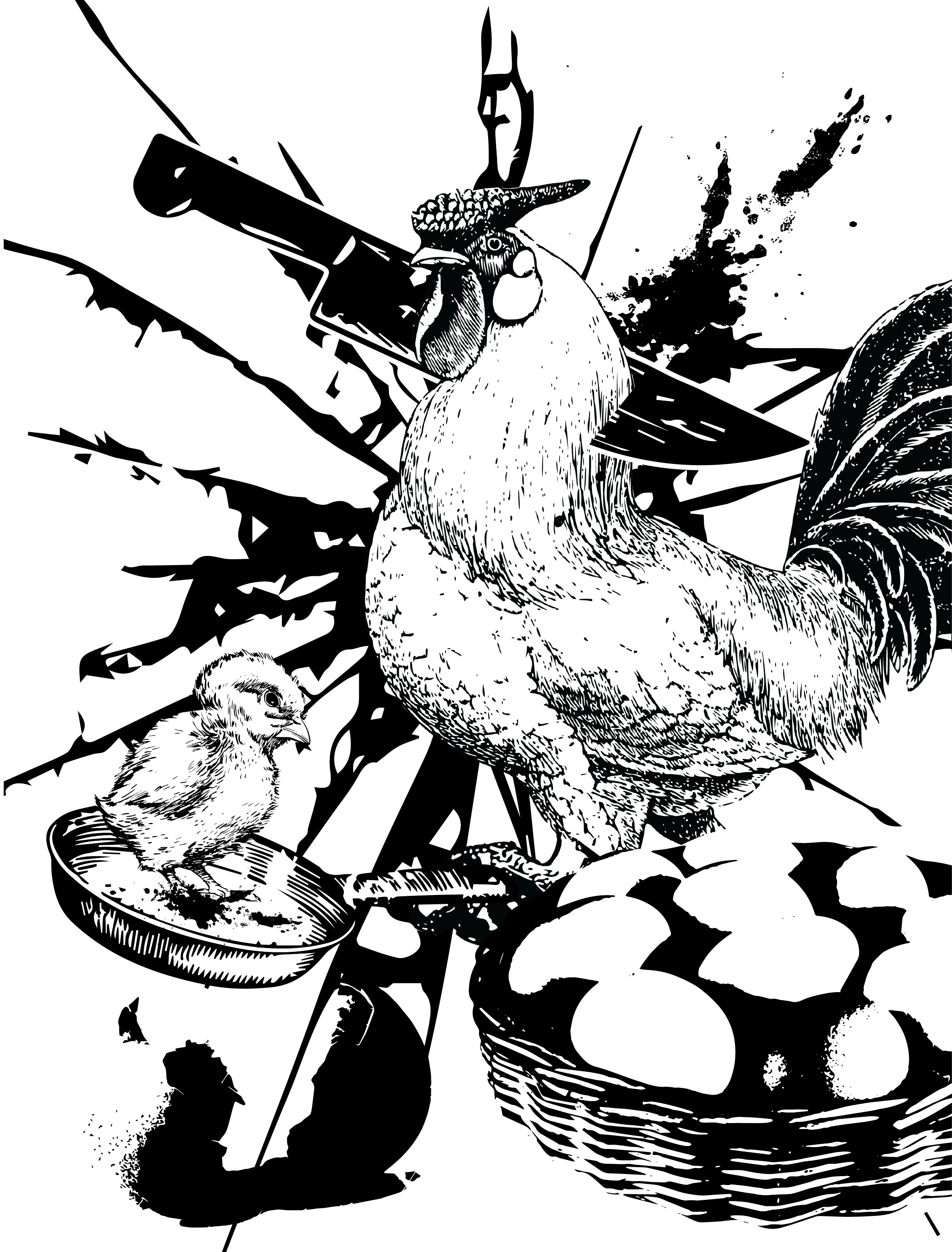
I wanted all of Abbott to be in the frame, and all of Abbott to be dying, that’s the idea. Although it isn’t really the same as the exact meaning in the quote (which is that at that moment in ‘time’, Abbott is dying), I feel that this composition holds the meaning of the quote out of context and in its own interpretation.
Anyhow, I use leading lines and rule of thirds to lead the eye to the chicken.
p.s. now come to think of it, it may look funnier to have the chick lie down instead of standing up. I guess I’ll consult first and edit it in the refinement.
Refinements
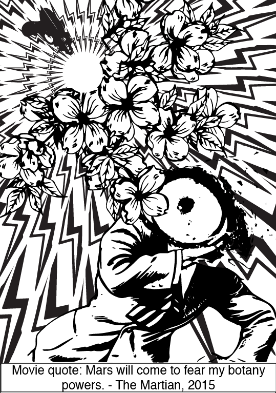
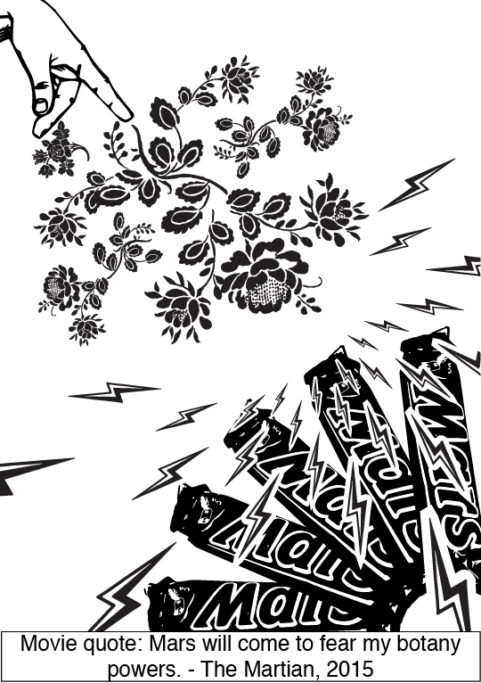
Composition 1 improved: changed the background to more consistent lightning bolts, to create more density and depth. Changed the flowers from ding bats to an image, which works better as it makes the composition more ‘whole’. Made use of negative space within the lightning bolts to create the effect of an energy ball coming from the gun. Overall give a more powerful feeling, less bland. Satisfied.
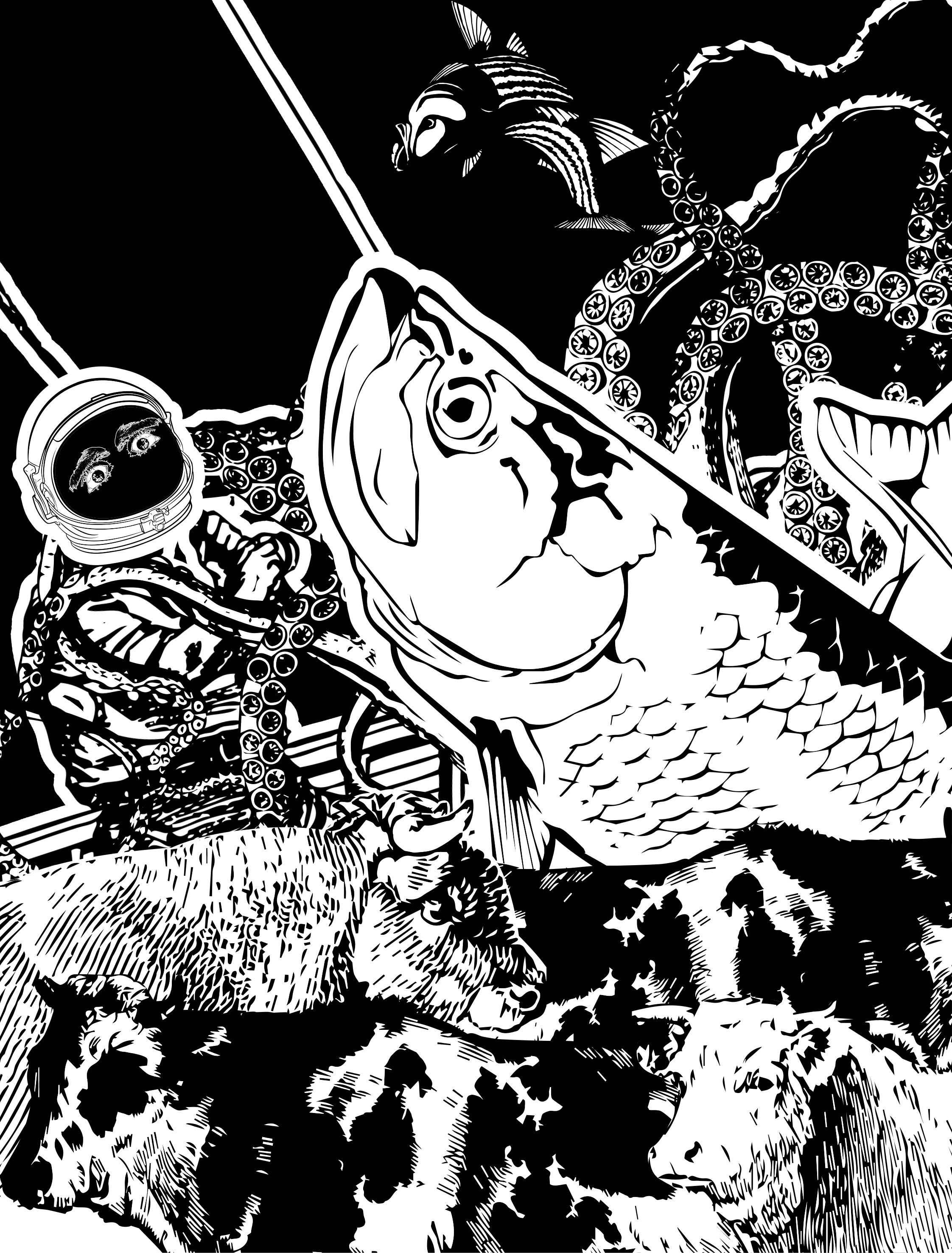
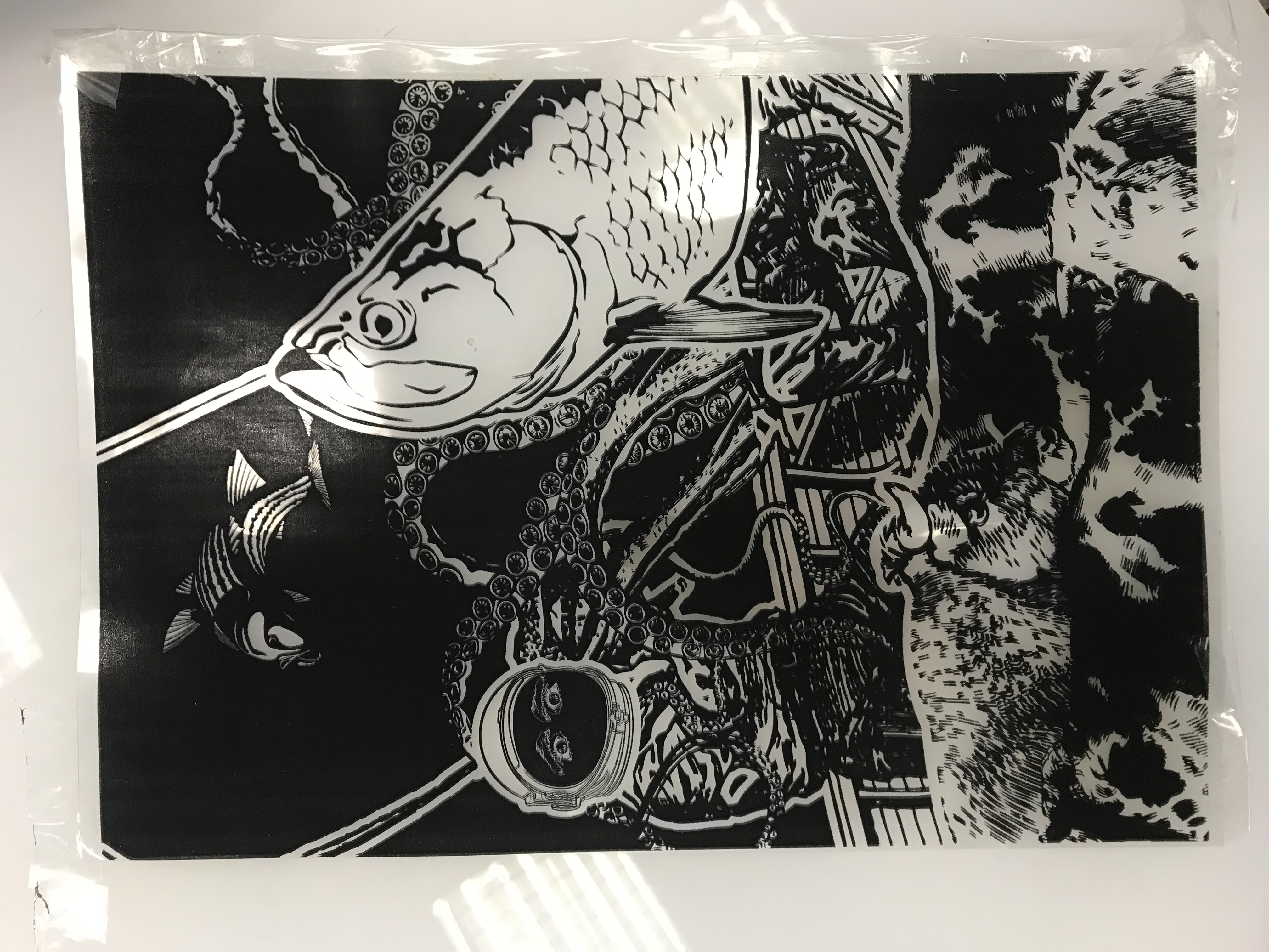
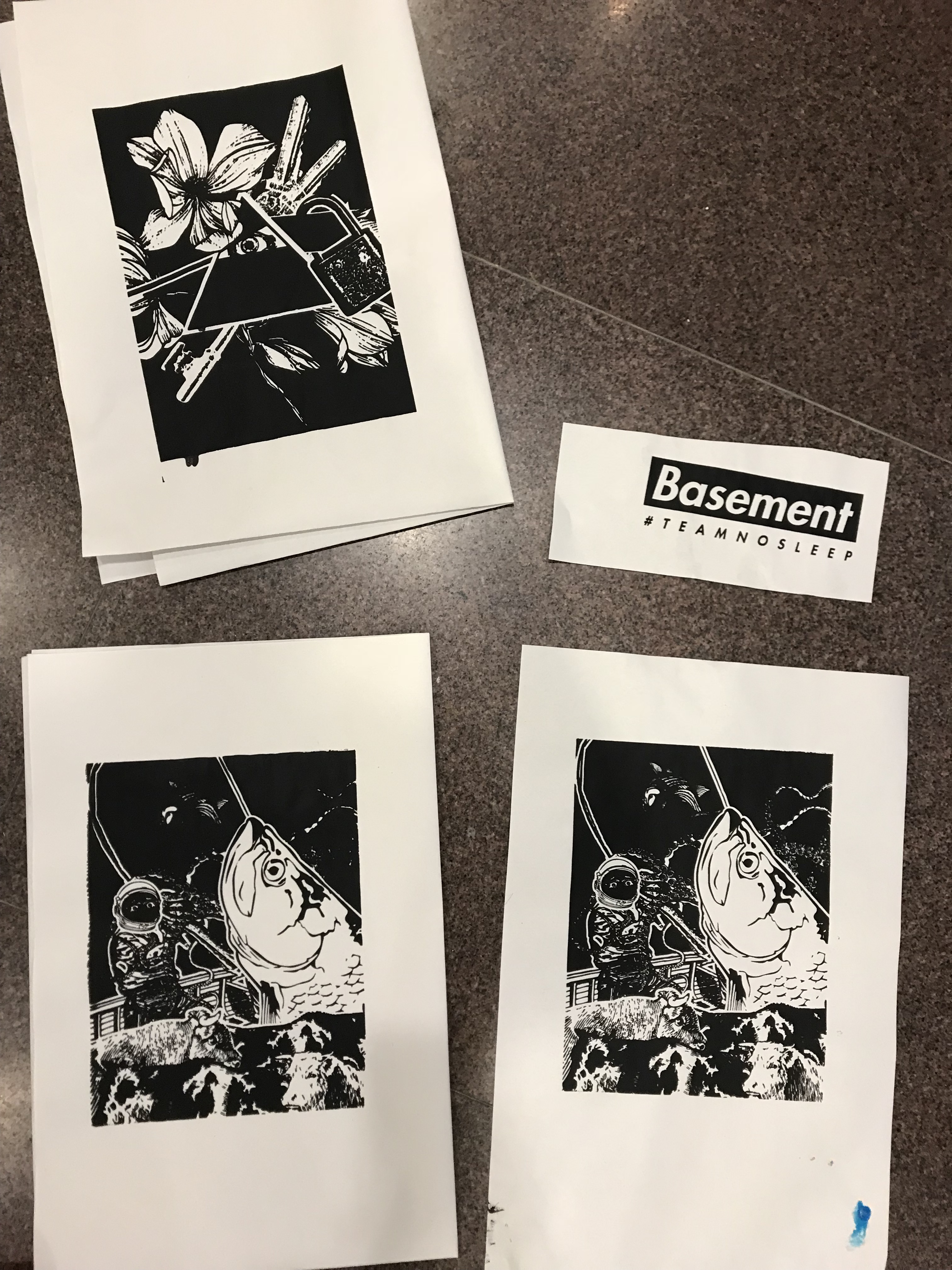
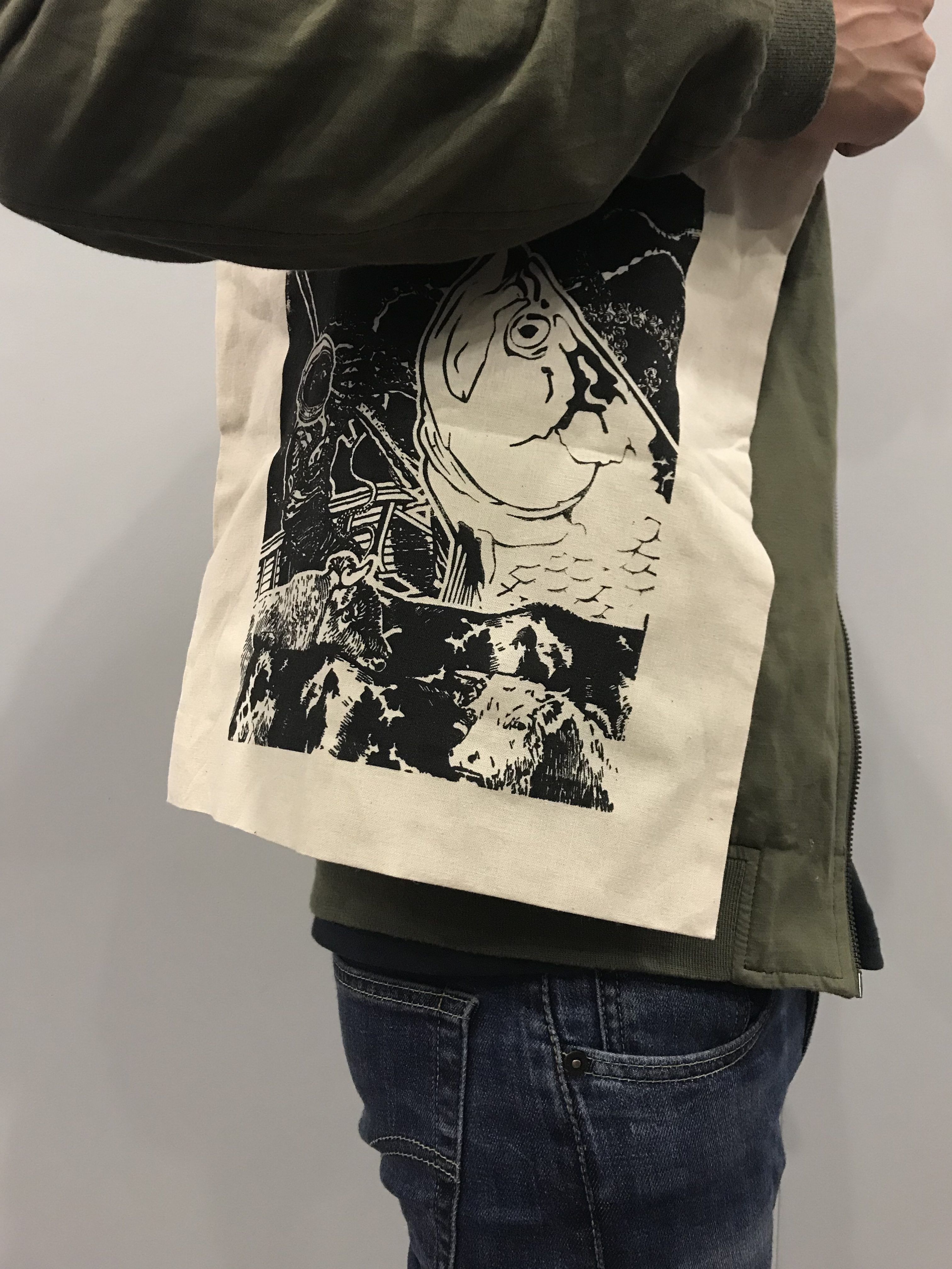
This is my final one for print. I only resized some elements slightly and added a black background to make the fish more outstanding, and also dampening the other elements that are fighting for attention.
Unfortunately I have printed the wrong version for silkscreen, so for the test print I will just do the one I printed, and I will redo this during recess week. (cons of having too many versions 🙁 )
Silkscreen Trial and Process
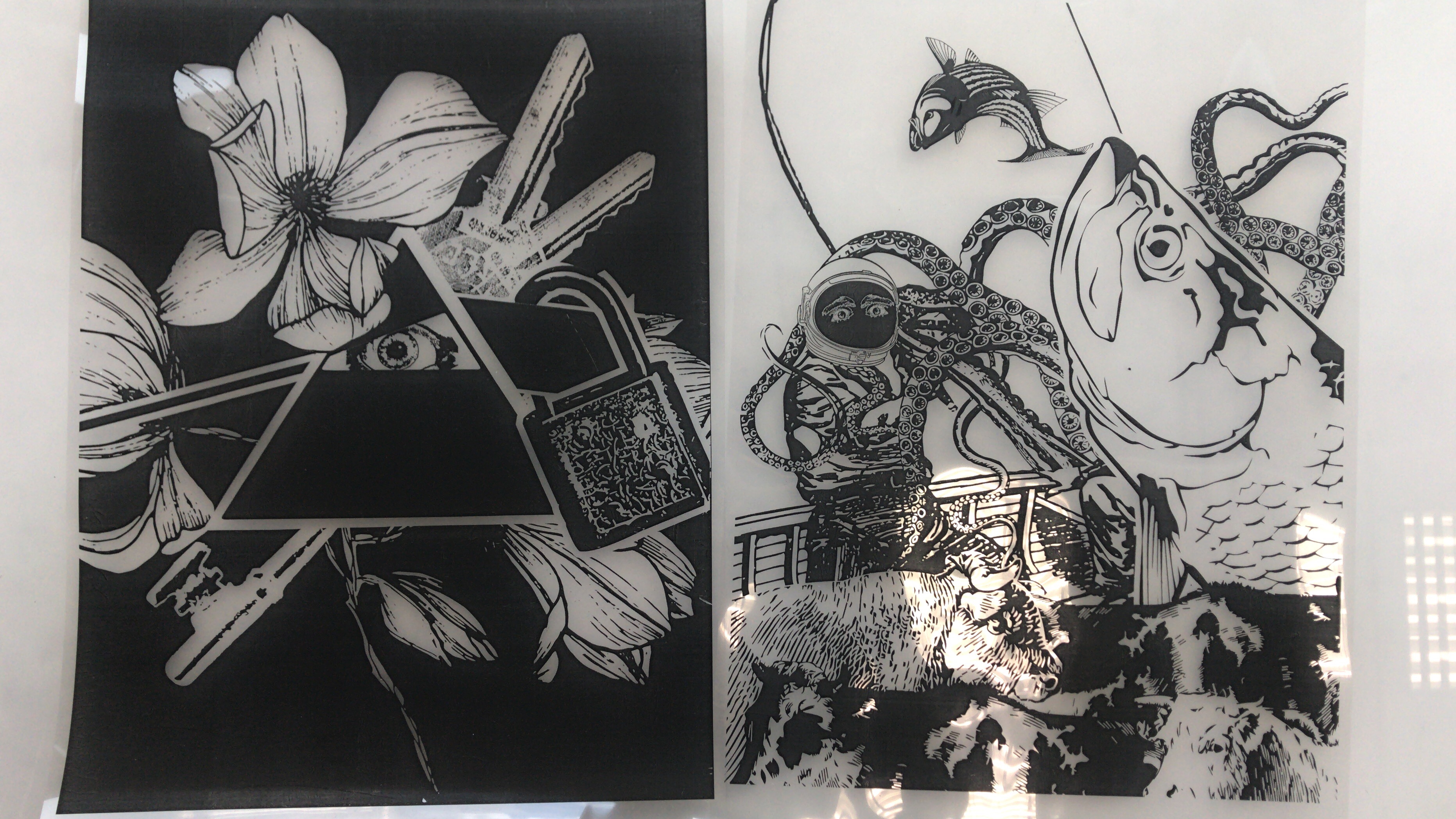
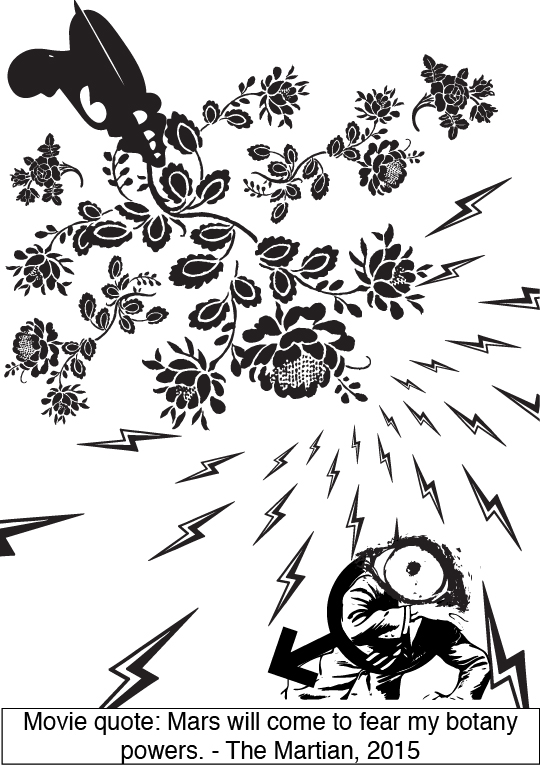
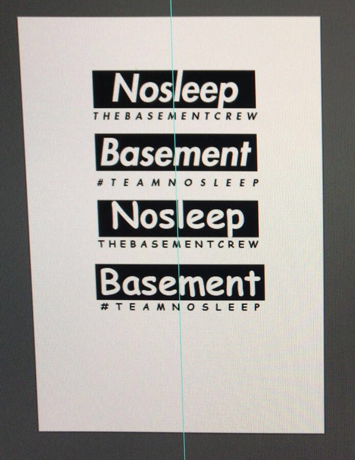
It was hard for me to decide which composition to use. I grew attached to the right one, but I like the overall composition of the left one!!!
In the end, after asking for different opinions, I chose the one on the right, as it explains more about the movie and has decent composition.
After drying the silkscreen board, coated both sides of the board with emulsion, drying it again before sticking our transparency onto the front of the silk screen board.

Next, we send the silkscreen into the UV light machine thing, which uses UV to harden the parts that aren’t covered by the black ink in our transparency.
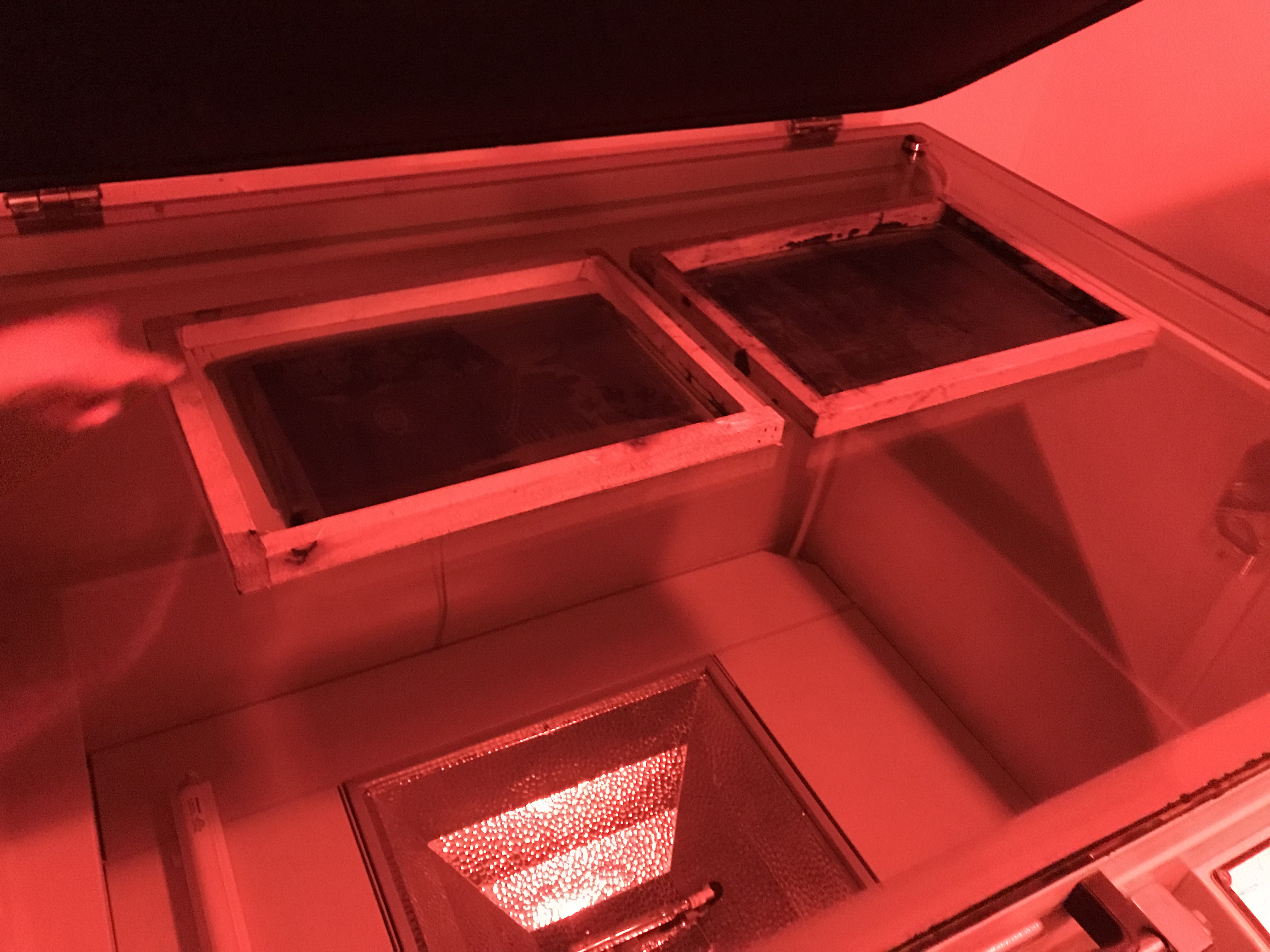
After that, we sent the silk screen to wash. Here’s a video of the process:

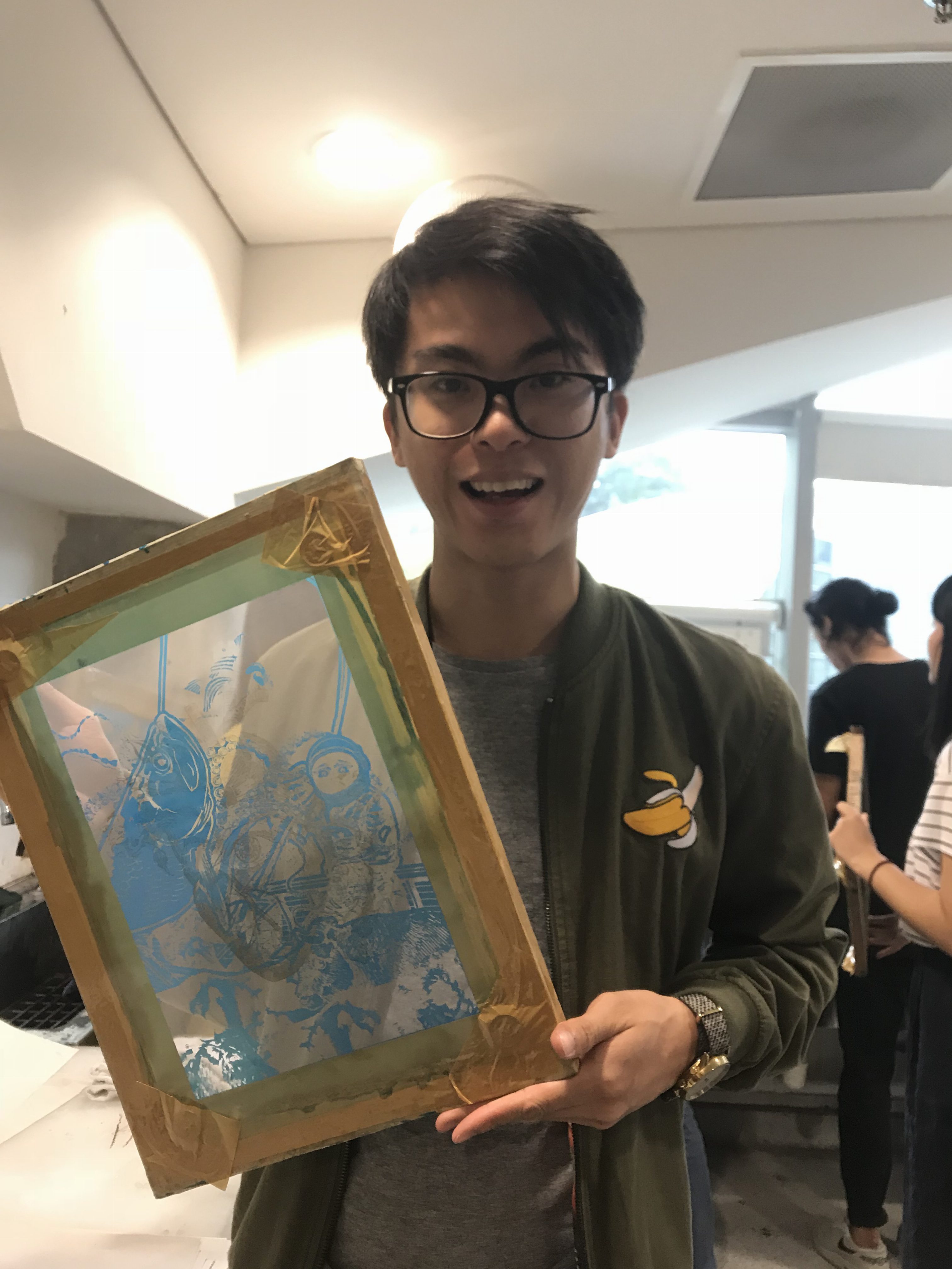
Shag face aside: Yay! My silkscreen is ready.
It was at this point when I realised that I printed the wrong design, which means I have to redo it on recess week.
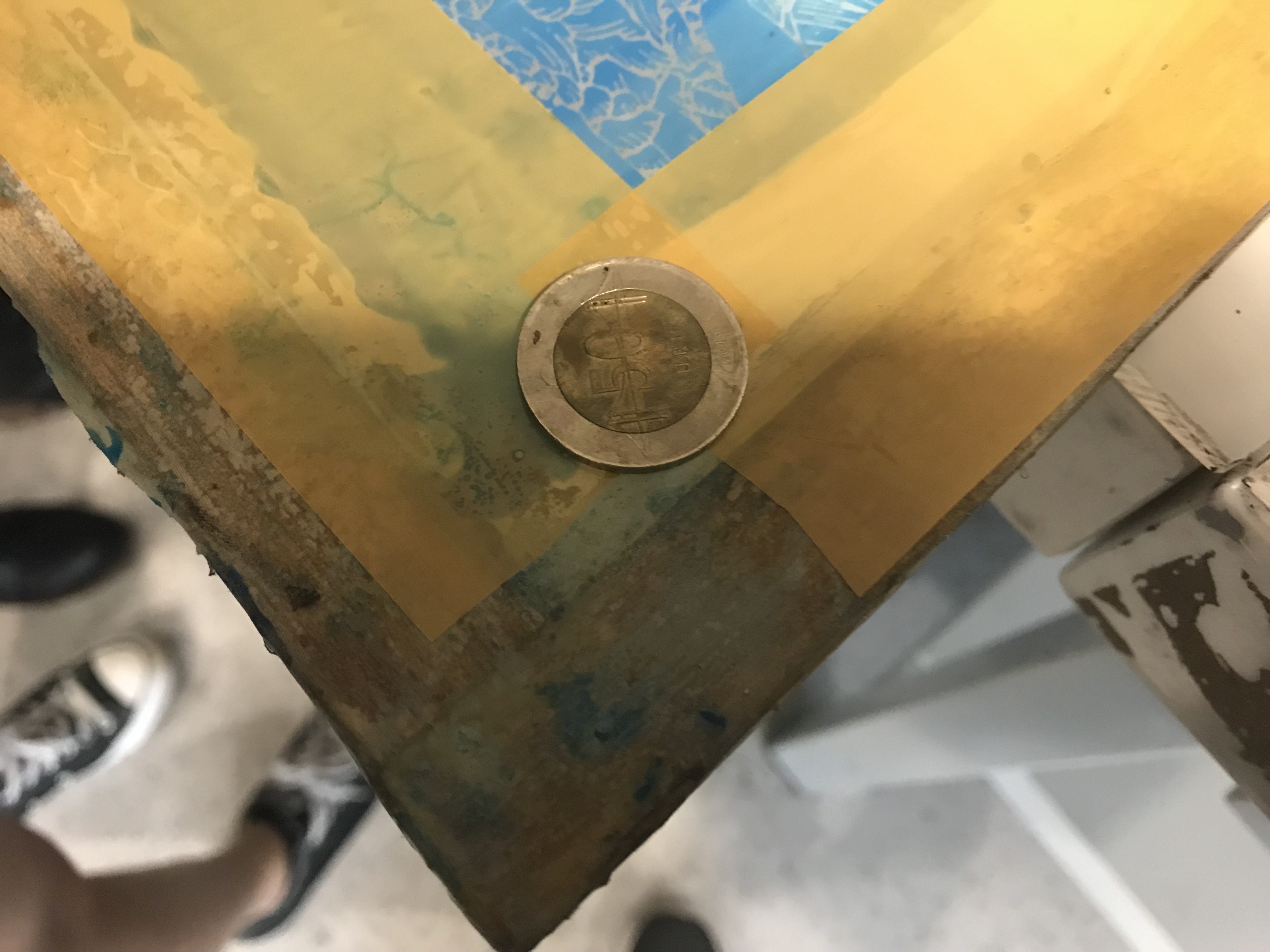
Once the edges are taped off, coins are used on all 4 corners of the screen to create a gap between the screen and the medium that is to be used for the print.
The next few shots are taken by Claire, and Tiffany helped with holding the board for me. The MVPs!!!
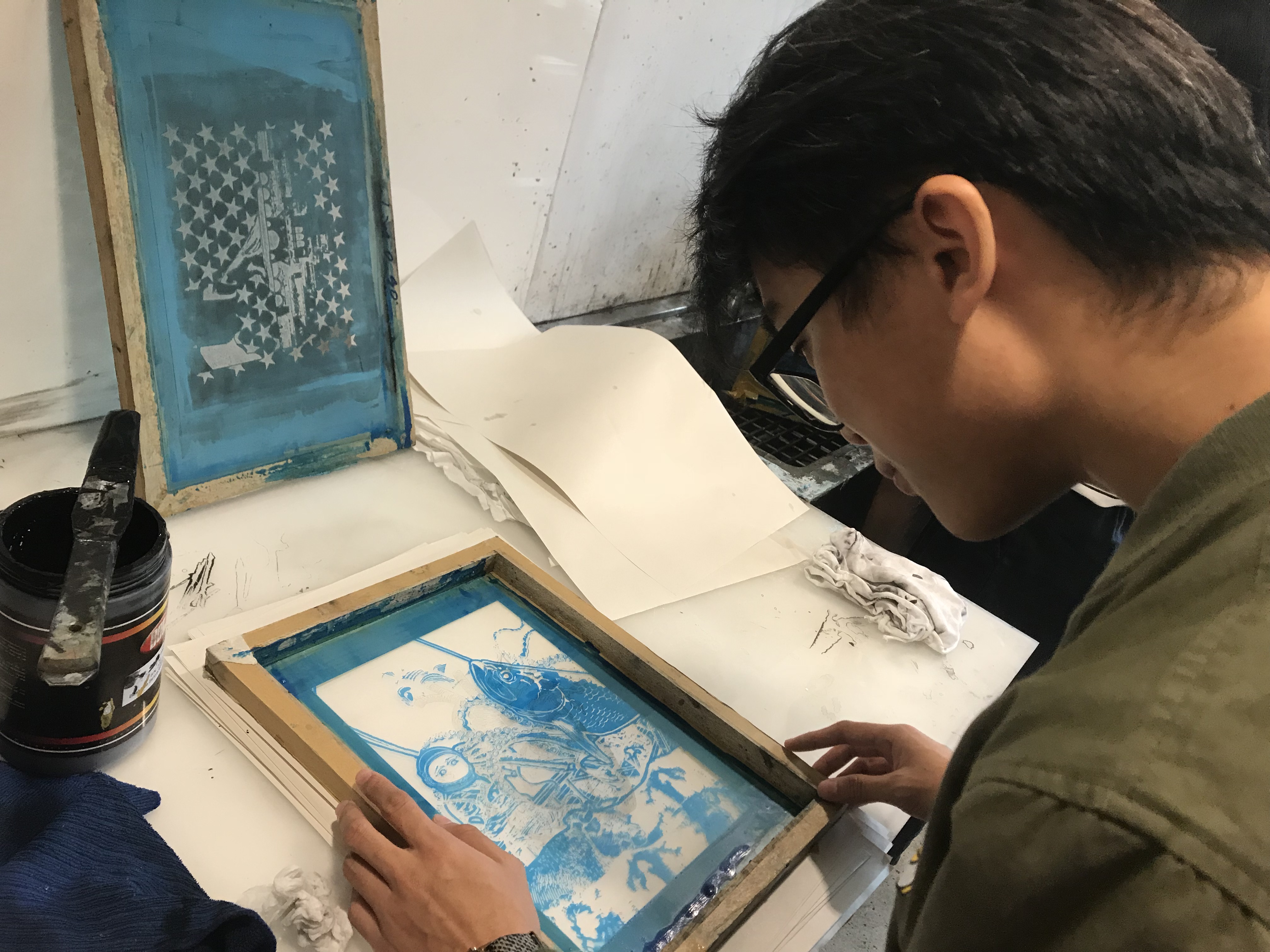
Aligning
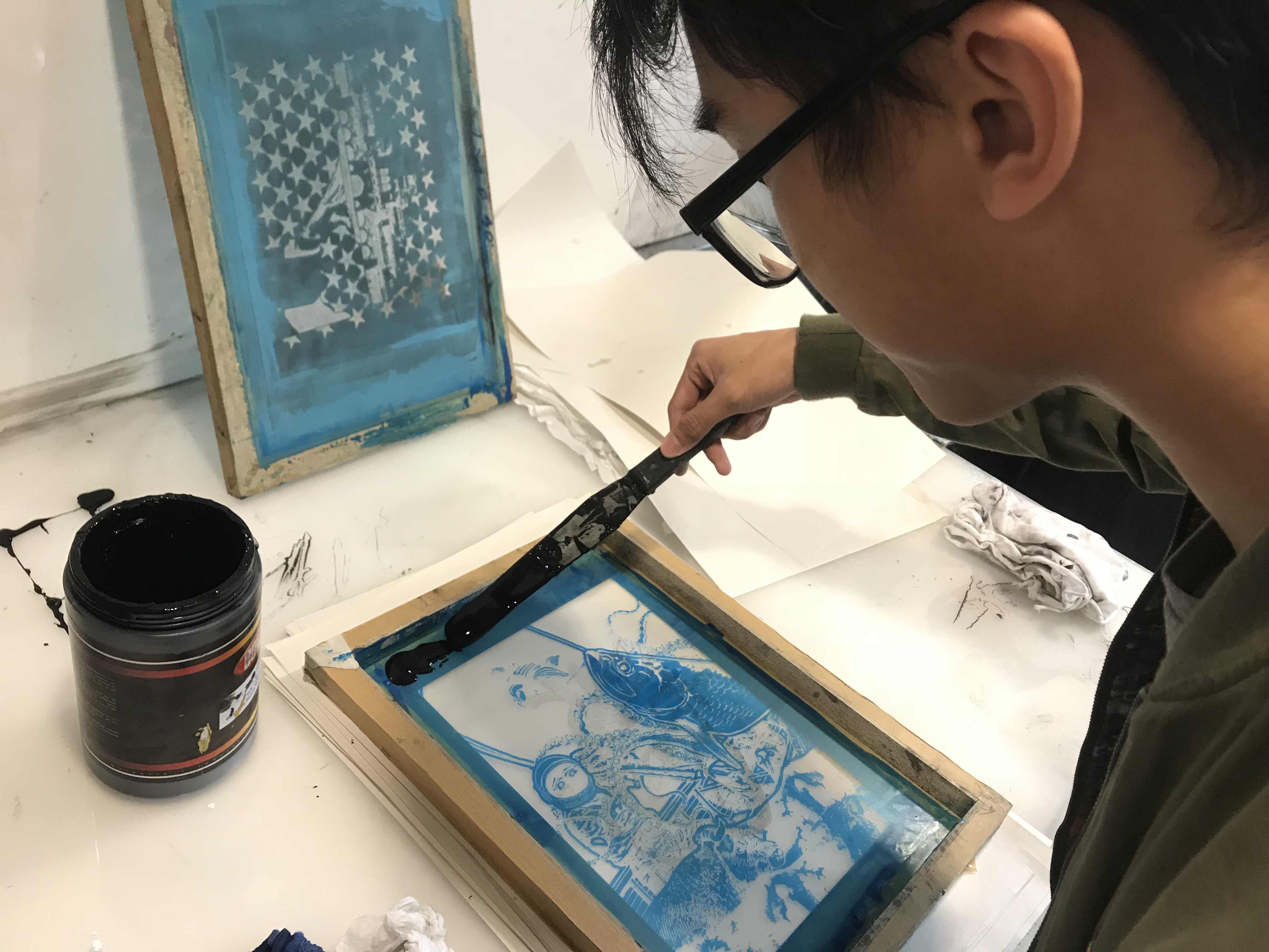
Spreading ink like butter
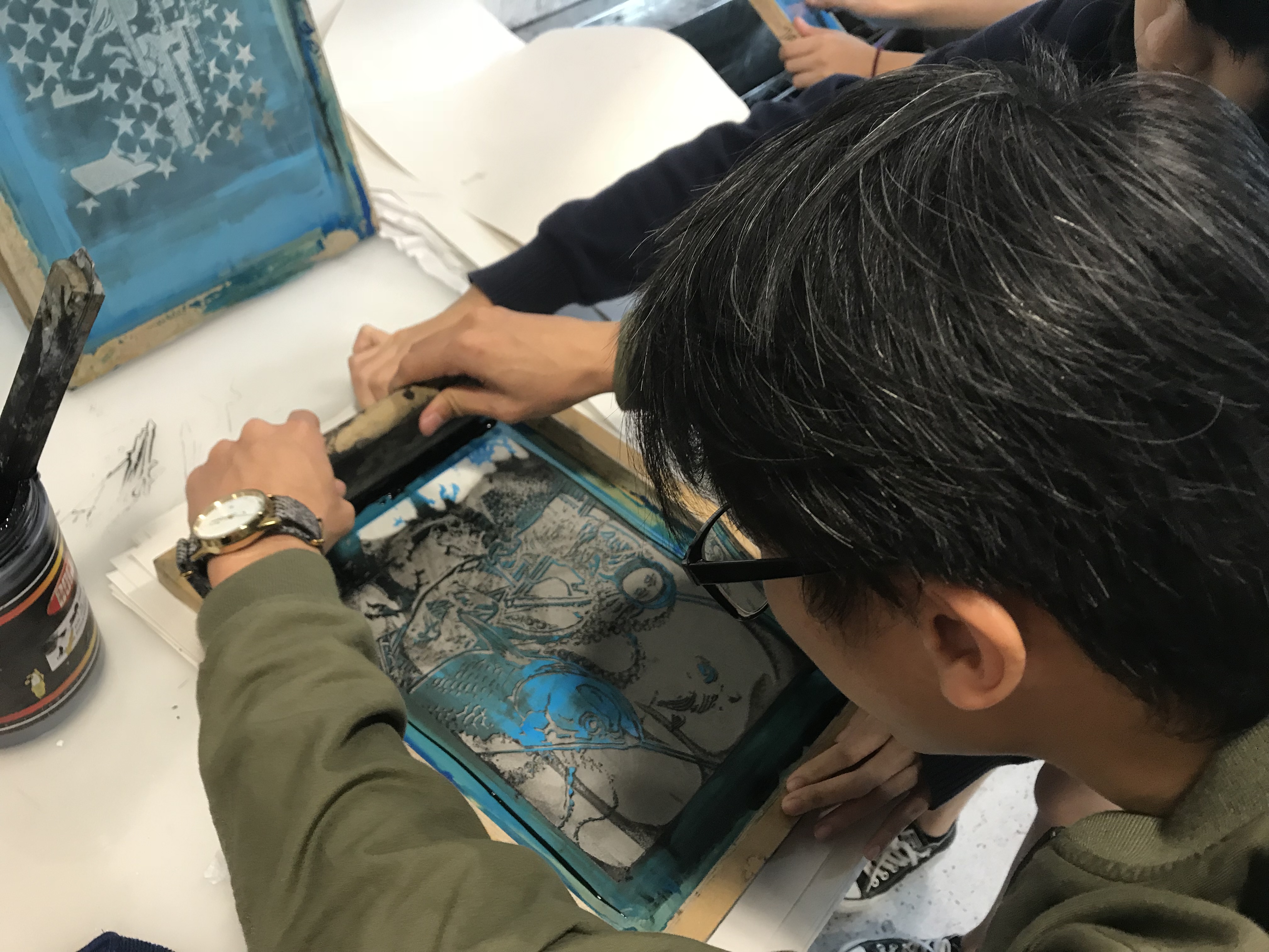
Here we gooooo
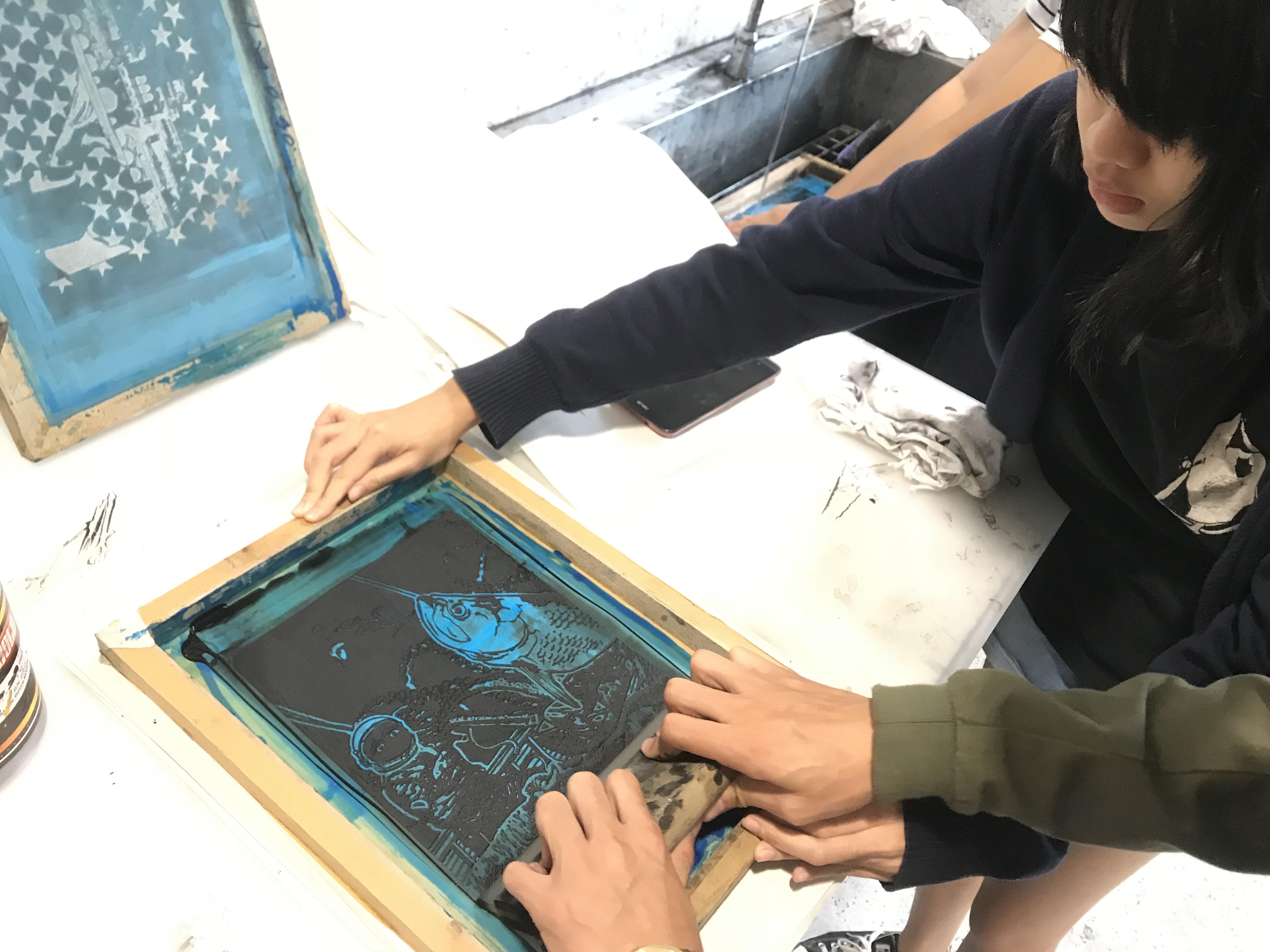
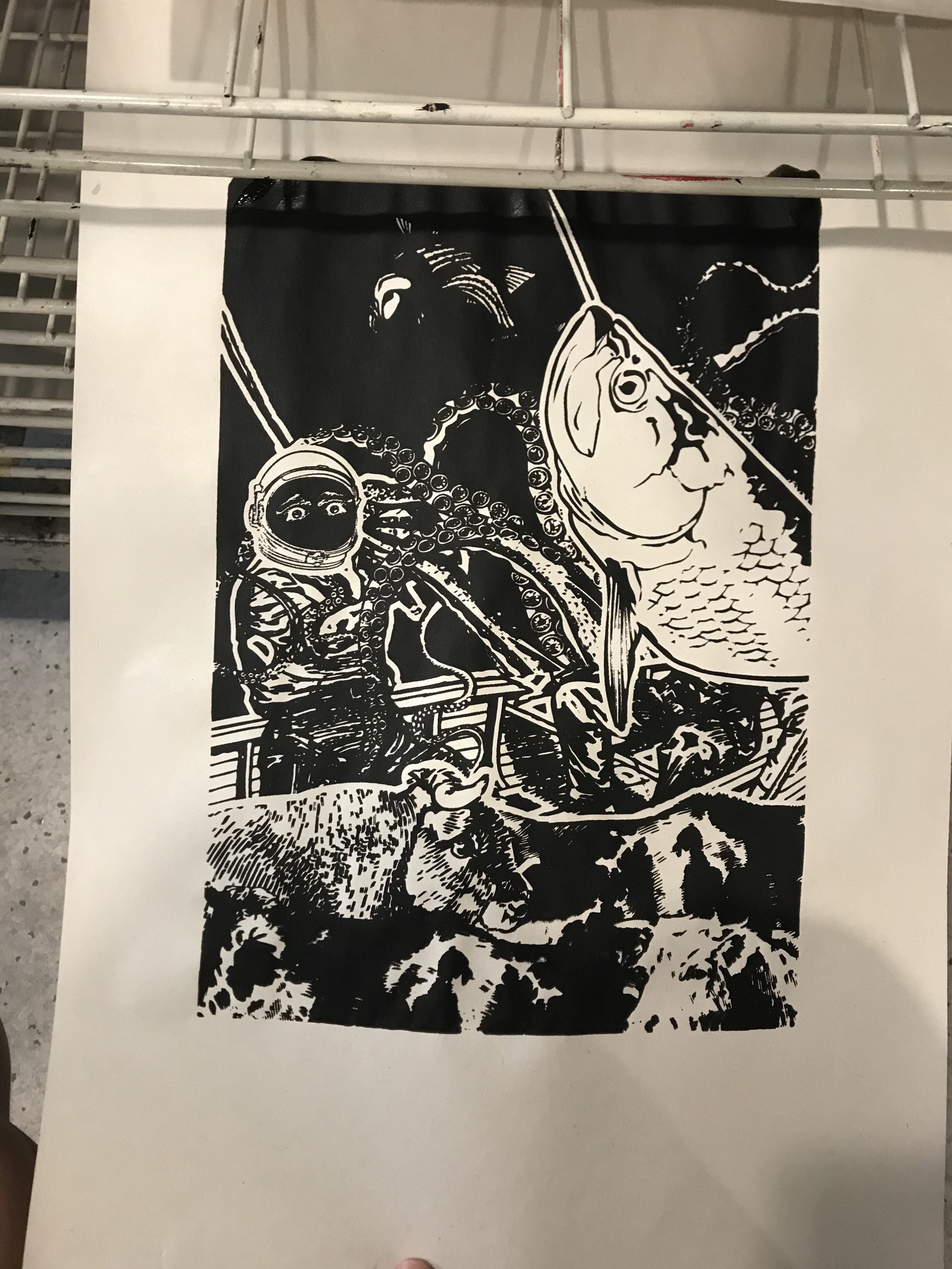
The outcome
A failed attempt
Takeaway from this is, the first print will always be bad, so there is a need to ‘season’ the silkscreen first to allow the ink to be spread more easily on the second attempt. It’s best to nail it on the second or third attempt, because the ink will seep through the board if there’s too much ink (too many attempts).
The squeegee should glide across the board, not pressed down hard. It should be one motion, swift and accurate.
I’m looking forward to printing this on my tote bag, and also on a spare t-shirt. Actually, I might use both designs and see which works best. I may also want to try my own designs!!! A bit xiao exciting 🙂
Silkscreen Final
Before I go with the final prints, I wanna show some of the other prints made on newsprint which I find successful and worth showing hahaha
I decided to try printing my other design on my tshirt as a trial, since I feel that it is visually more appealing than my final one, even though my final one is more meaningful.
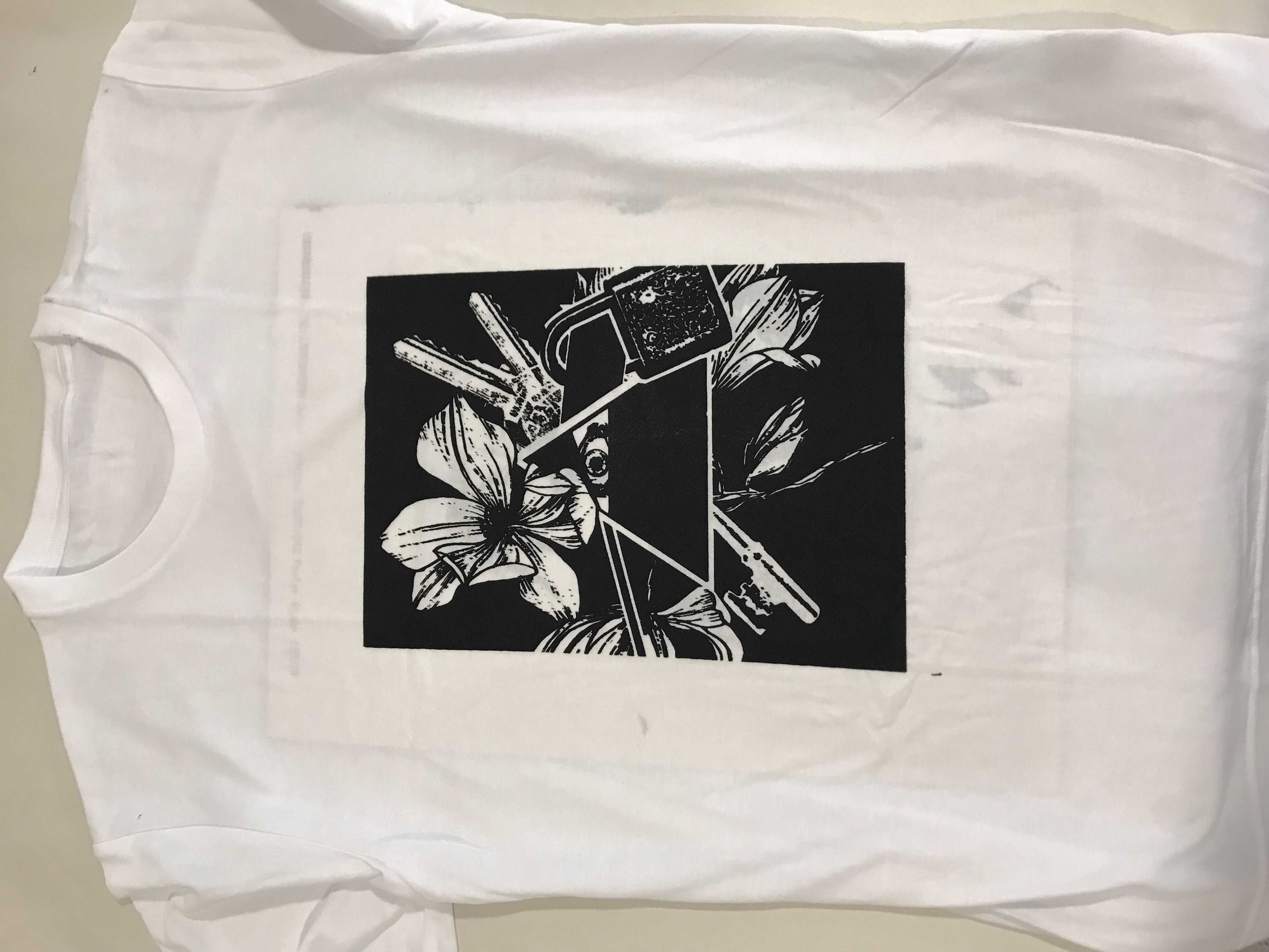

Turns out so well! I’m really proud of this. Unfortunately, this isn’t the print that I’ve chosen for my final. Because I love this design so much, I’ve made it into my own tshirt 🙂
But then, there’s new instructions that there isn’t a rule that the design must be on a tote bag, so yay! I’m gonna wear this during submission and bring my tote bag as well!
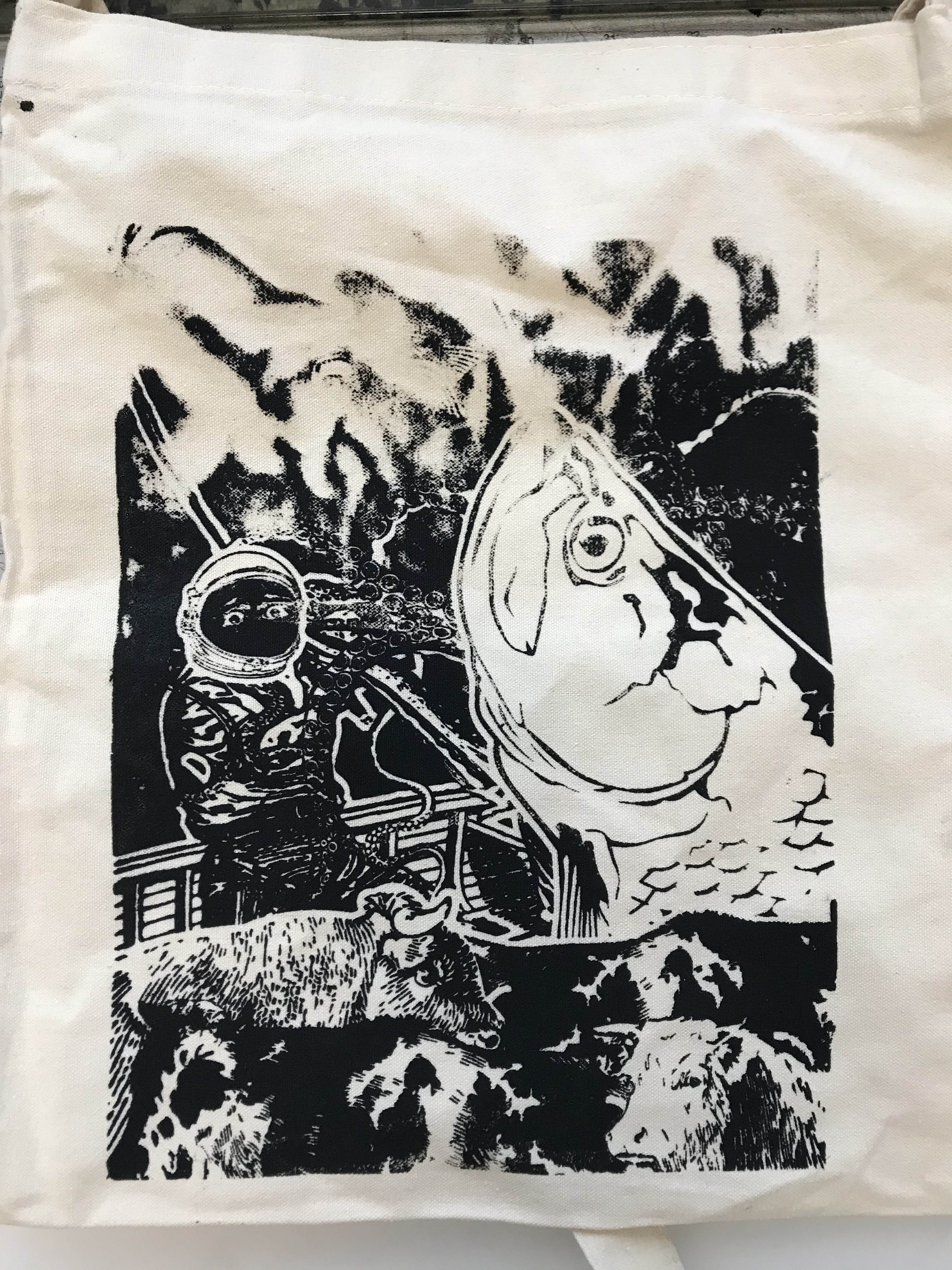
IT DIDN’T TURNED OUT WELL D:
The tote bag was too uneven, and the design seems to be too complicated, so the results ended up wonky. It is hard to gauge how much ink I need, and my design on emulsion wasn’t aligned well on the screen, basically everything was wrong.
Here’s the video of the fail:
I had to go get another tote bag. I’M REALLY GRATEFUL TO JOY (not the teacher) FOR PROVIDING ME WITH HER TOTE BAG TO PRINT T . T
I went to try again, this time, pressing harder, using more ink, and aligning better
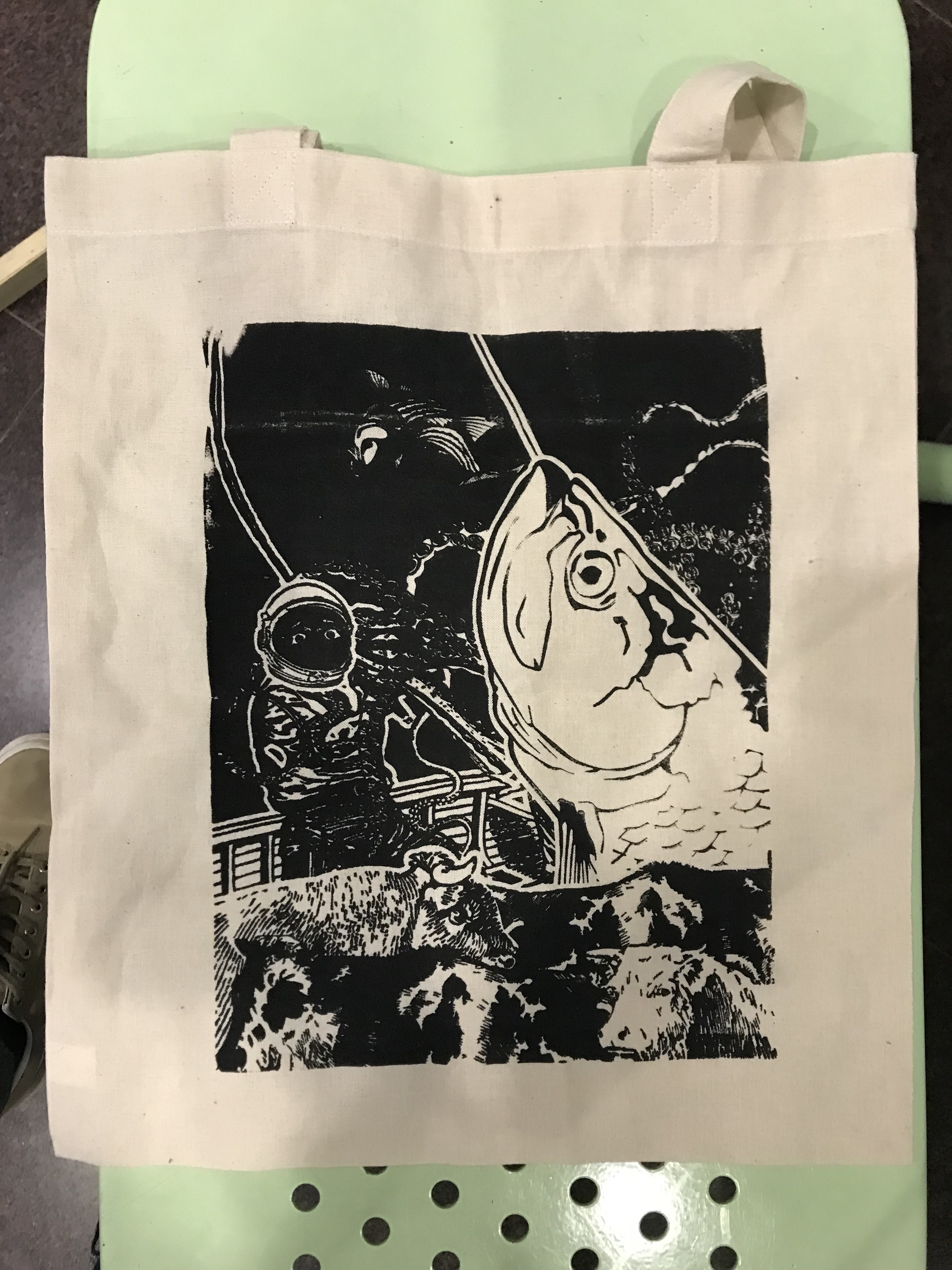
AND YES. IT TURNED OUT WELL
There we go.
My A4 printed pieces:

That’s this assignment, all done and well. Yay!
Before I end off, I’d like to share some extra stuffs we done too!
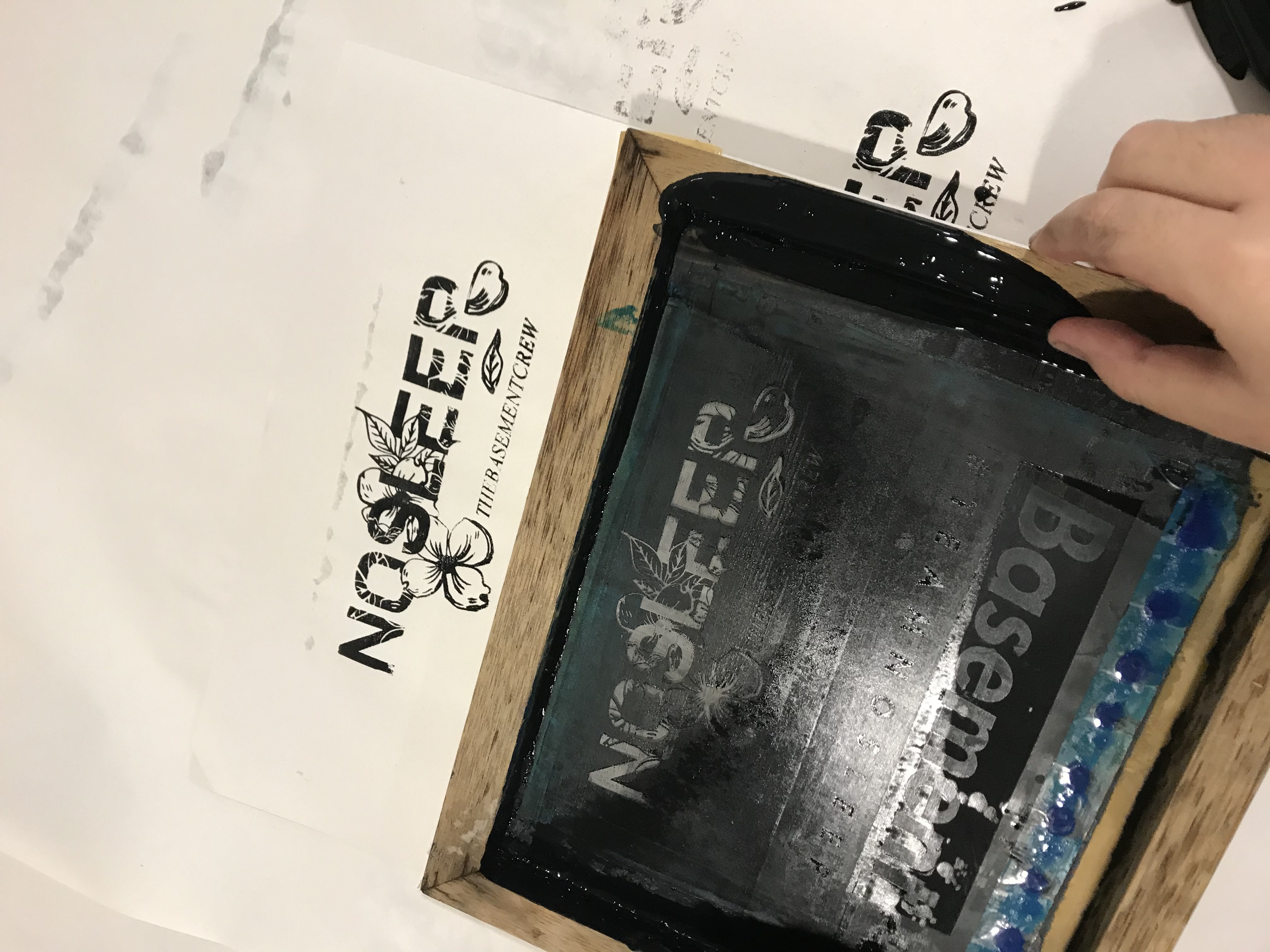
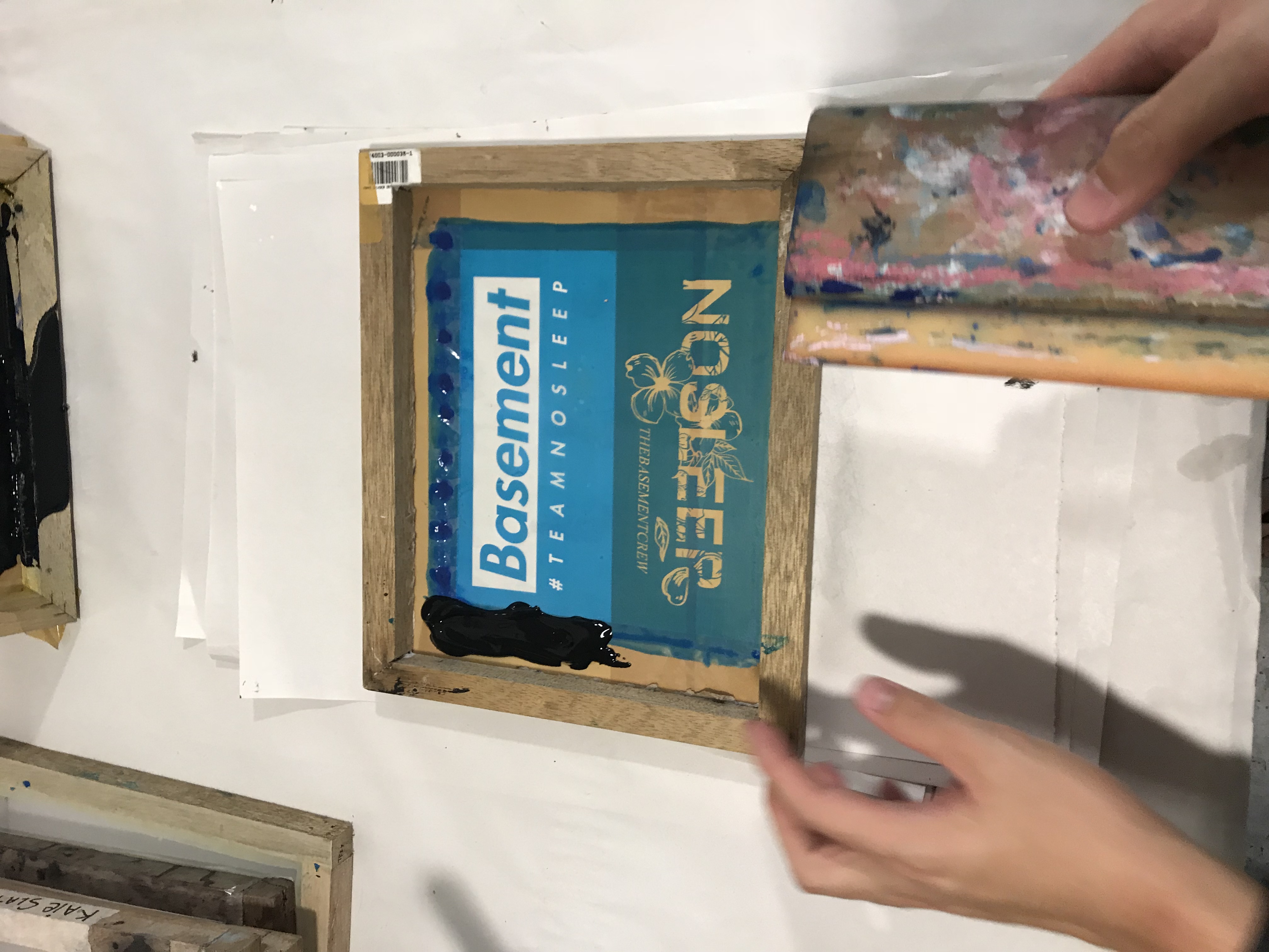
Making of the basement crew tshirts (2 different designs)
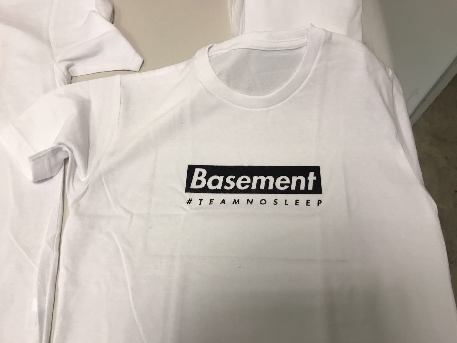
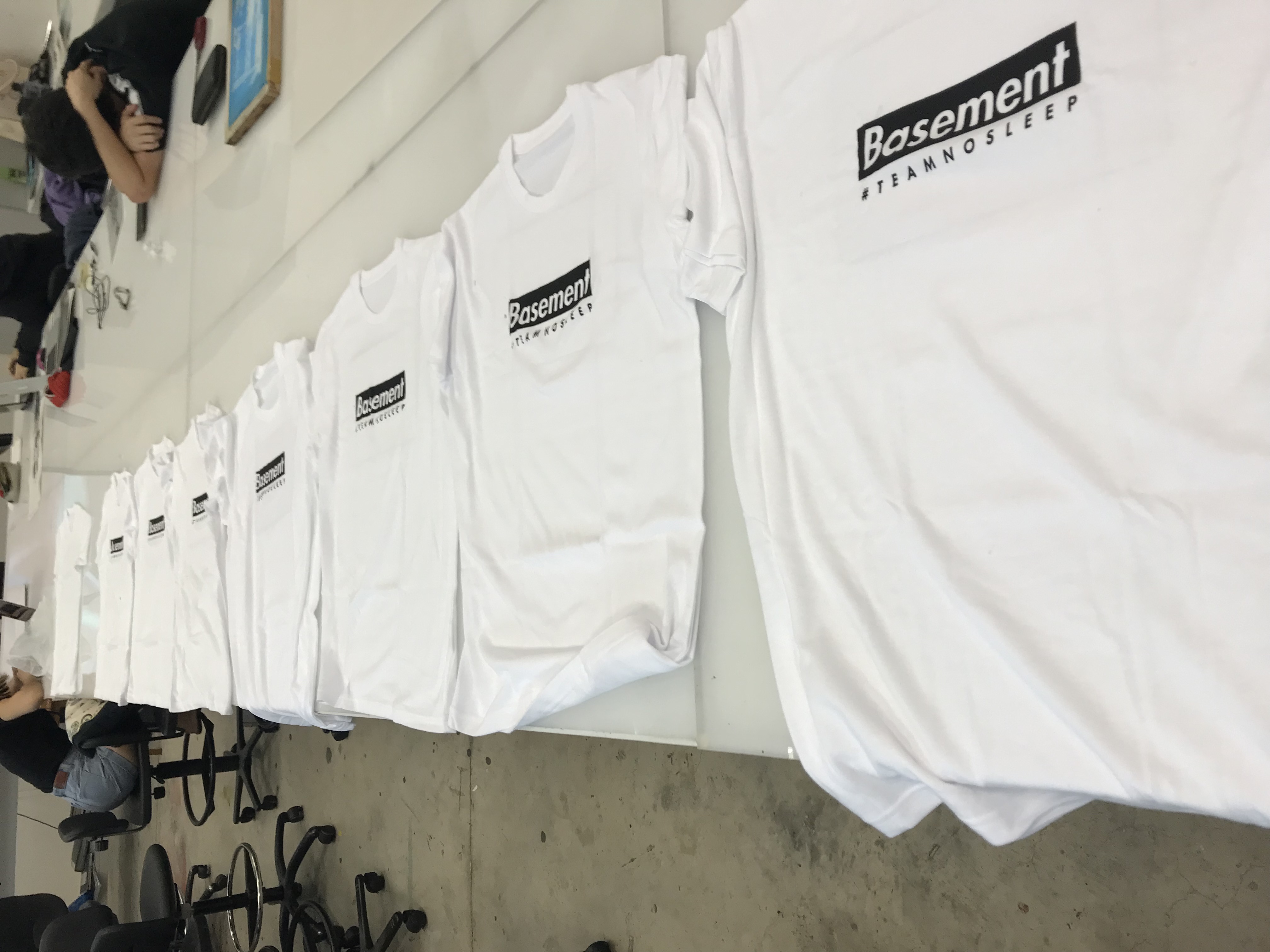
Outcomes
Timelapse of printing:
Final thoughts
What I learnt from this: I did silkscreen before in poly, using stencils. This time, I learnt that there is another way to do it, which is much simpler and more effective, that opened my eyes to new processes I never seen before. Also, I learnt to be more flexible with my adobe programs, as I have learnt photoshop now, I can mix both photoshop and illustrator skills together to create more things.
Working on silkscreen is so fun, especially when you get to keep what you make! The satisfaction from a successful print is like… woooooooooooooowz.
I also enjoy the process of creating the visuals from the quote. It is fun to conceptualise and create something unique and holds meaning too.