
Bryan Leow Ee Kwang
Welcome 2 da ride pls wear ur seatbelts
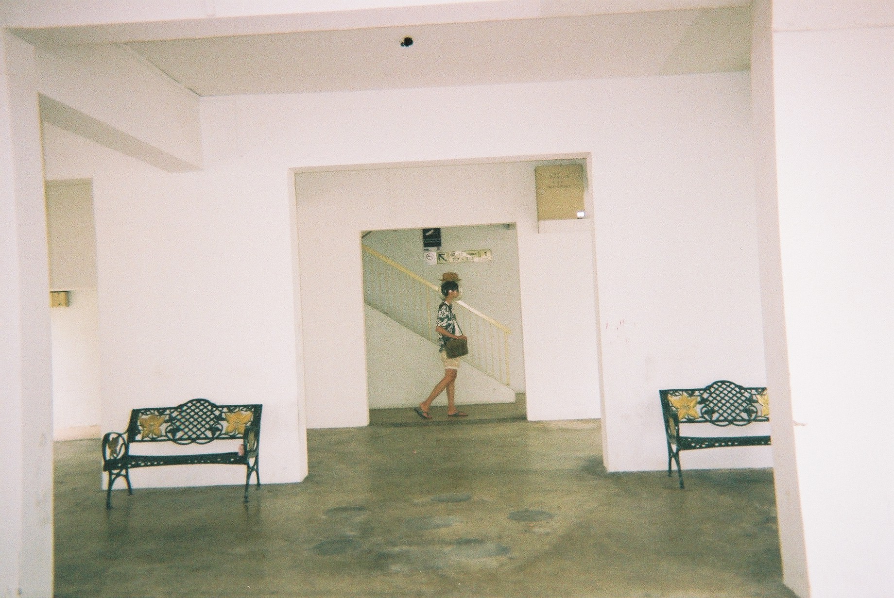
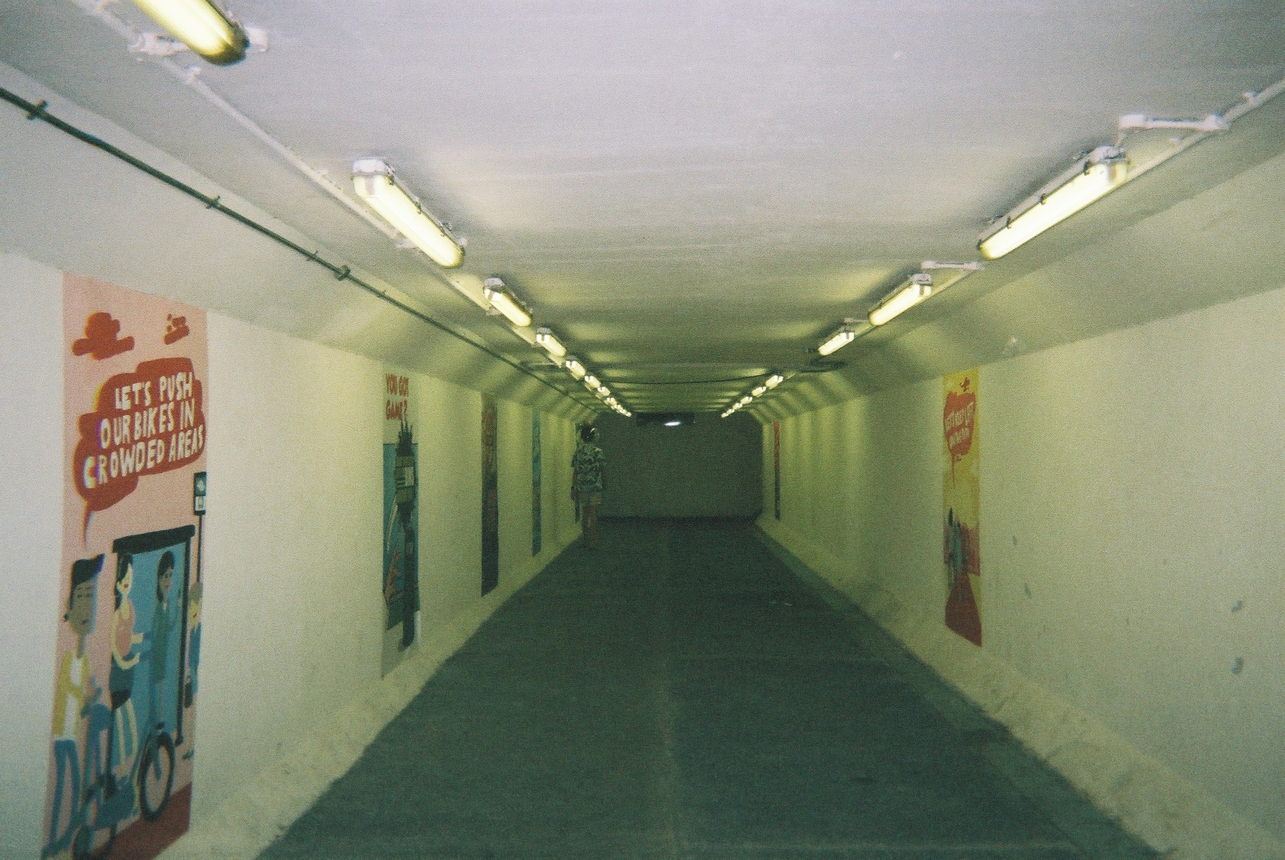
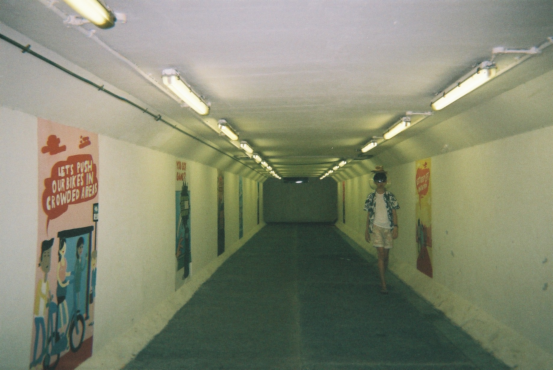
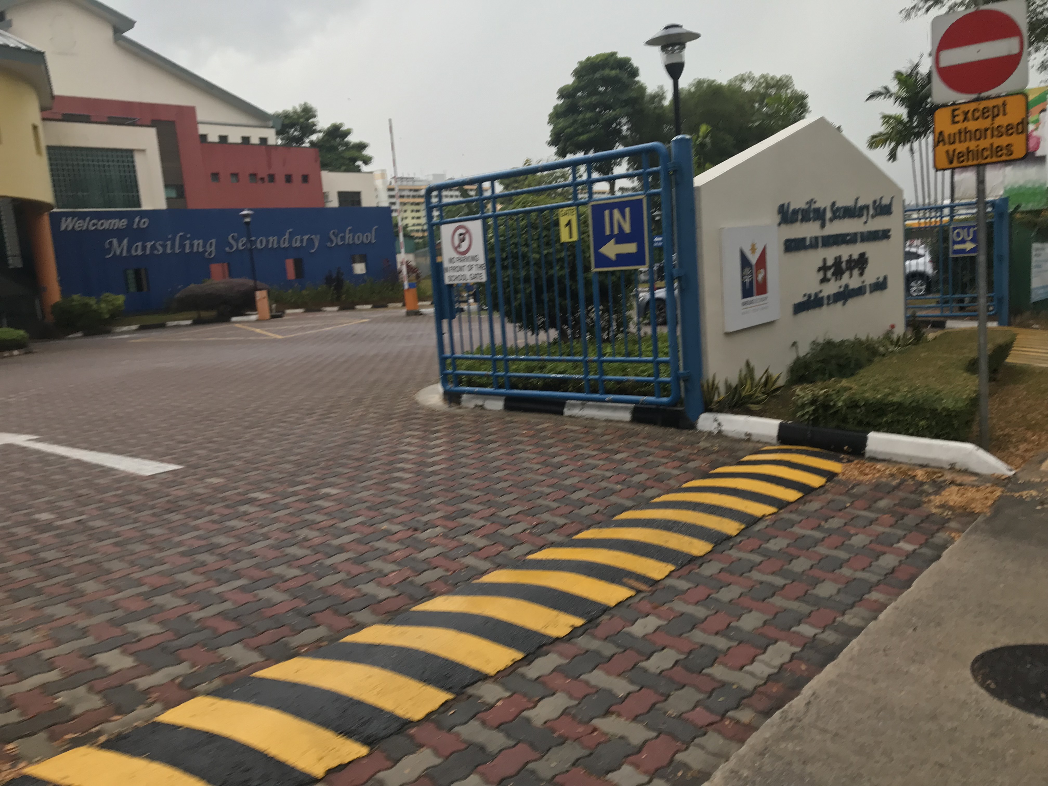
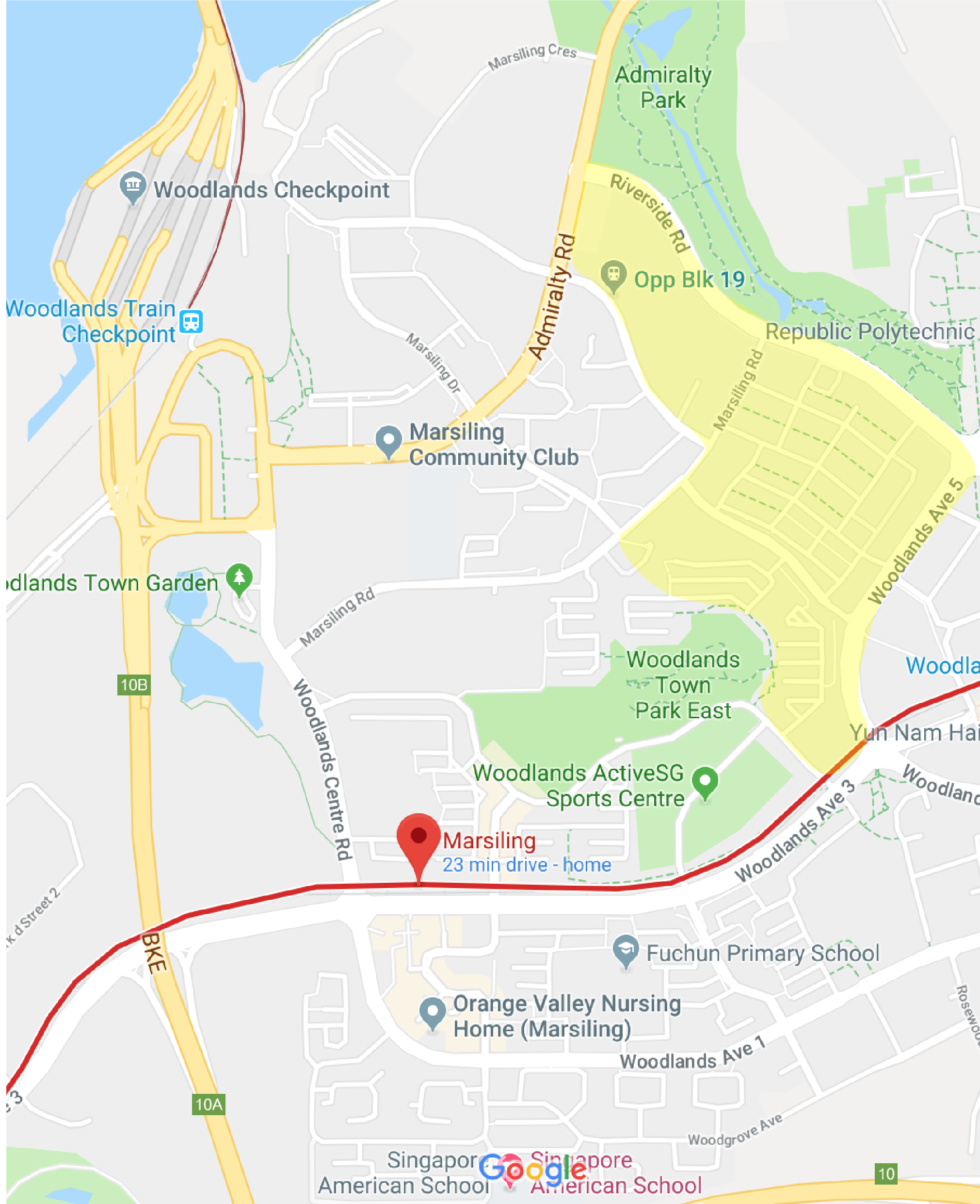
I revisited Marsiling on 25th March.
After the 17th March visit to Marsiling, I decided to revisit it to plan my shoot. Here are the few selected locations:


So, pinpointing these locations, I planned my zine’s Art direction. I decided to go for a spacey theme as I want to depict Marsiling as a strange “planet”, using a pun I got from Marsiling (Mars and iling). Using this idea, I want to try to depict a tourist’s trip to this strange land called Mars iling.
Here’s my mood board:


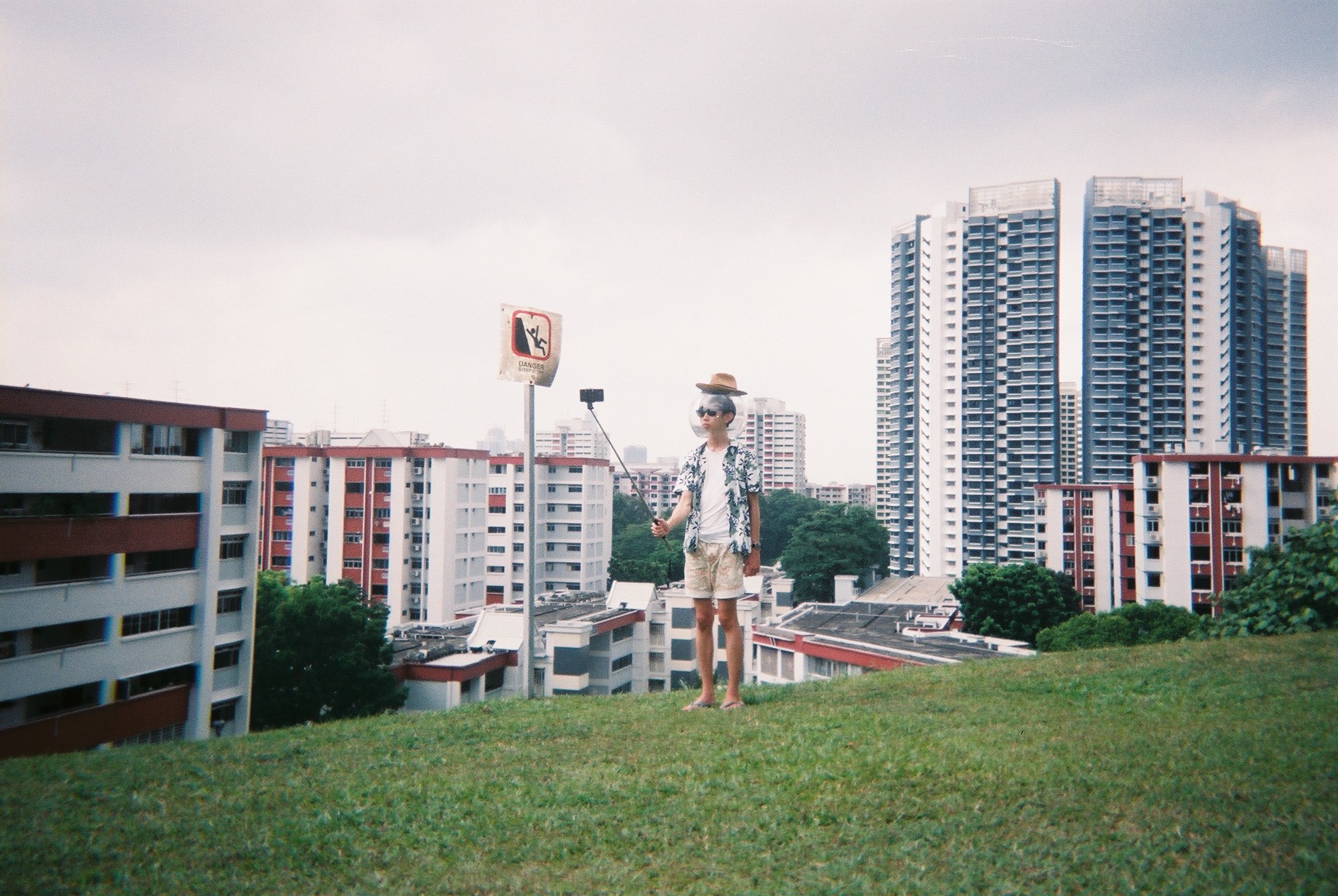
I want to go for a vacation-esque style stereotypical tourist. So by merging this theme and the space theme, I designed my character — a space tourist.
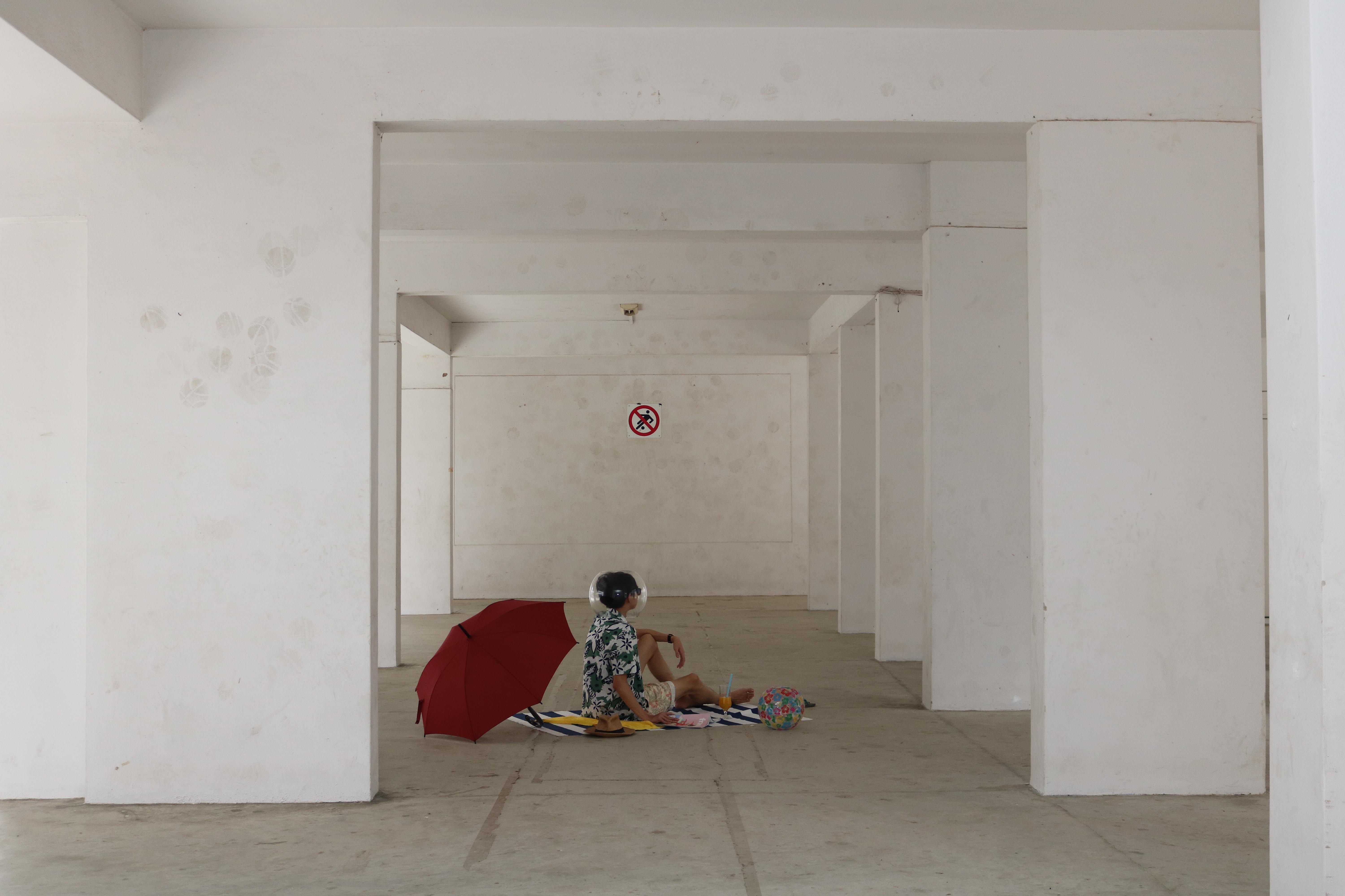
With these in mind, I prepped my props.
Space Helmet
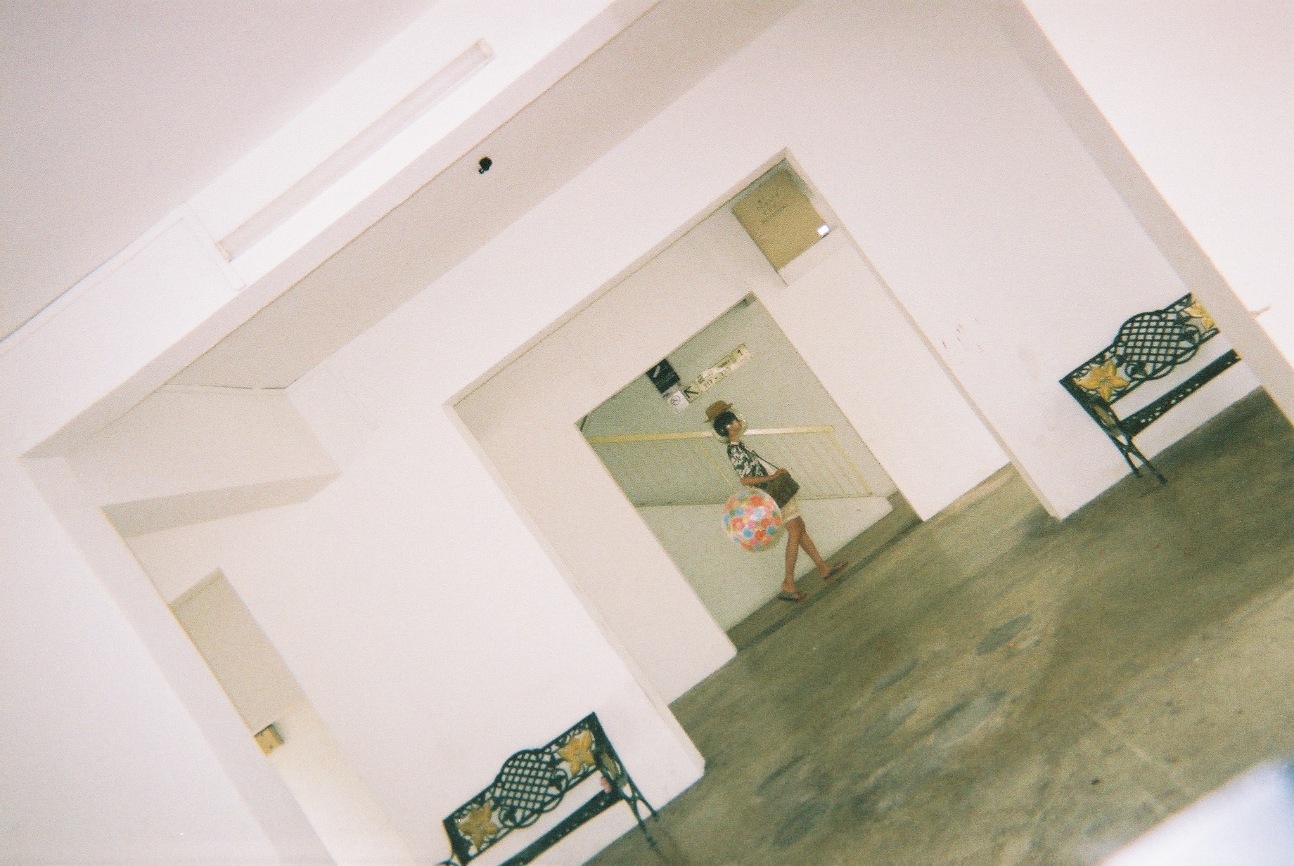
I couldn’t find a space bubble helmet so I got a beach ball from Daiso and started making paper mache.
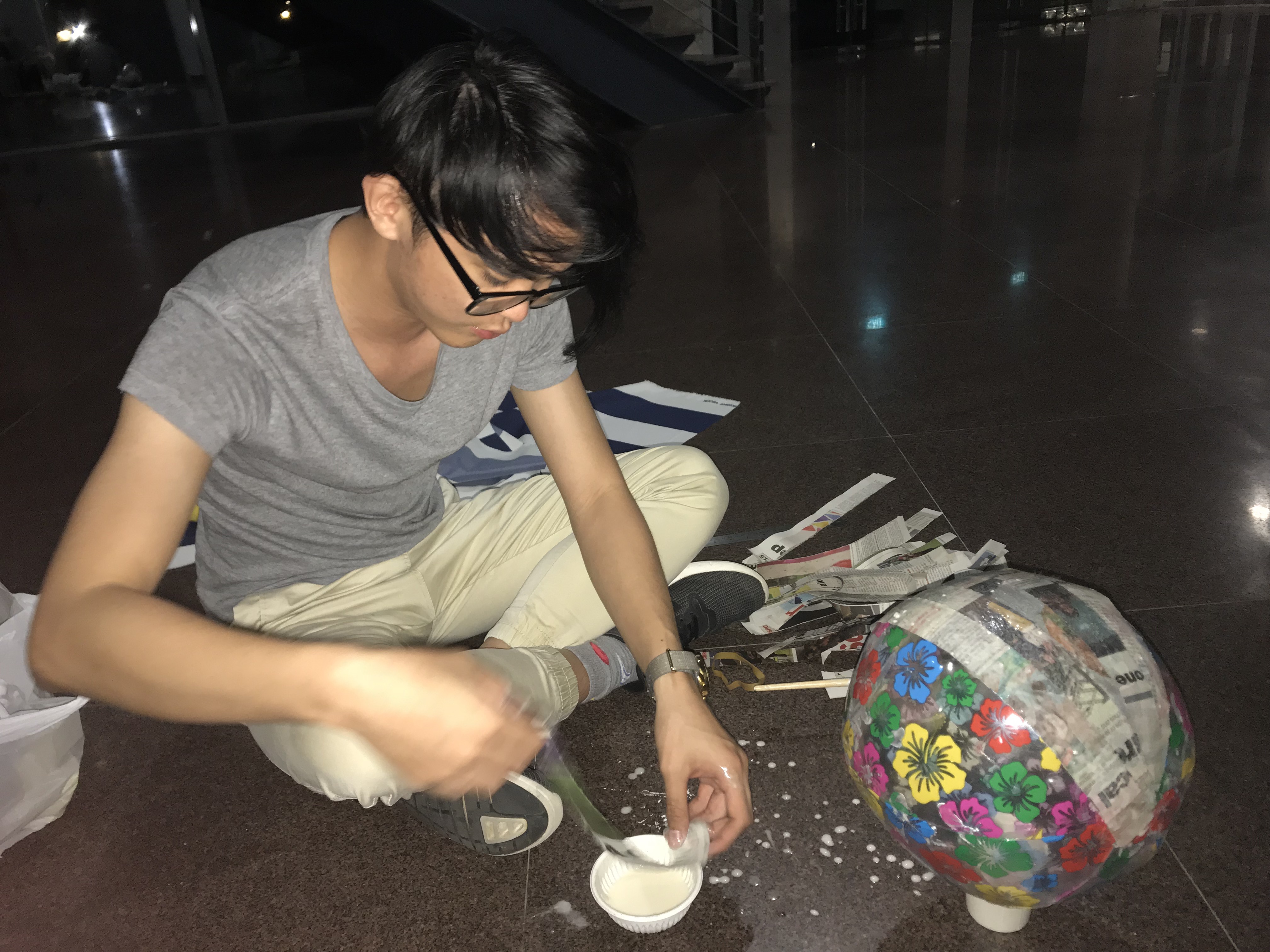
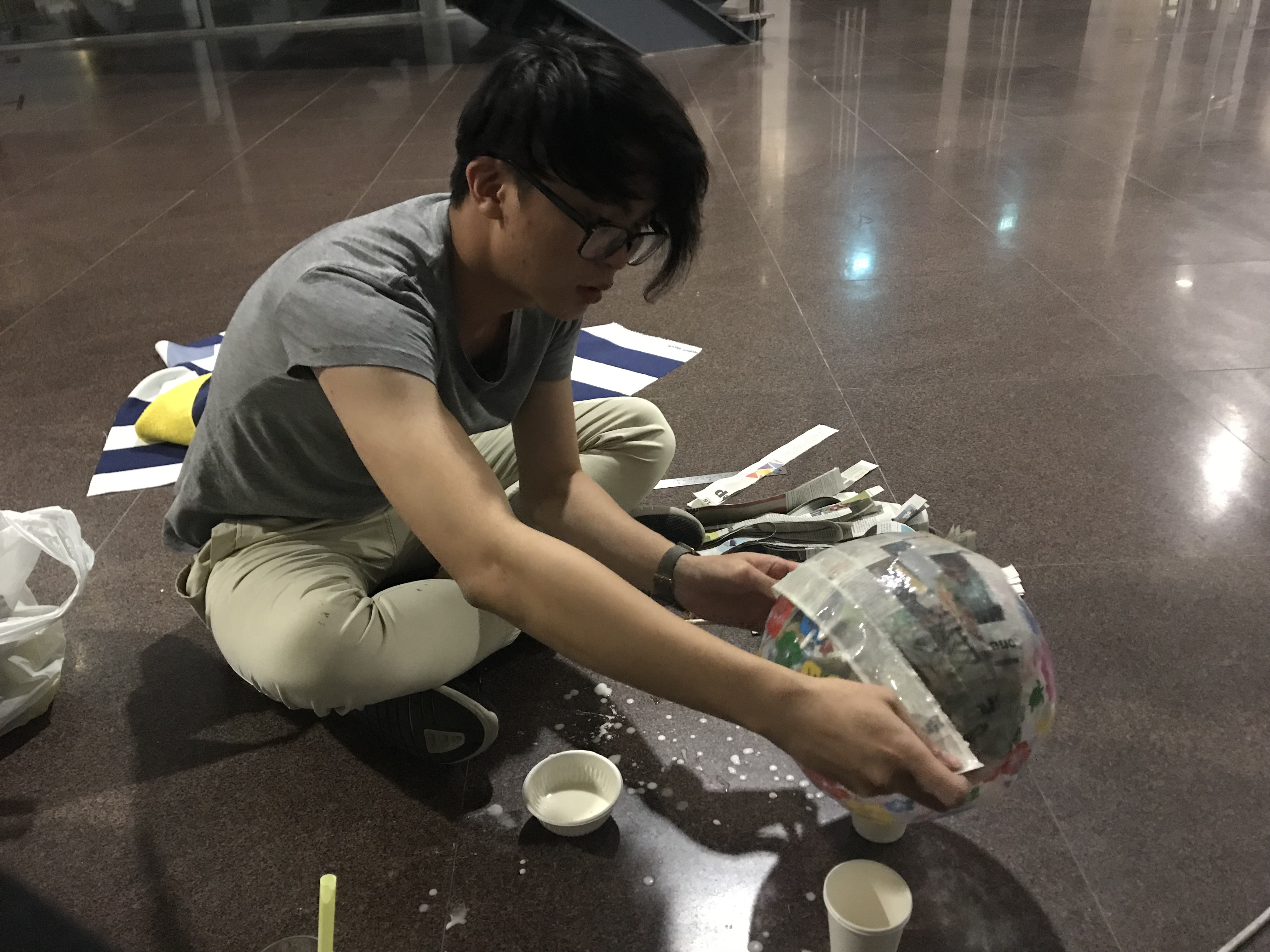
Afterwhich I used a heat gun to melt a few sheets of transparencies to create the “glass” capsule.

It fits but I really dislike it as it became very crumply due to the transparency sheet not being the proper shape to warp it down to a sphere. Still, I rolled with it since I couldn’t find any other materials.
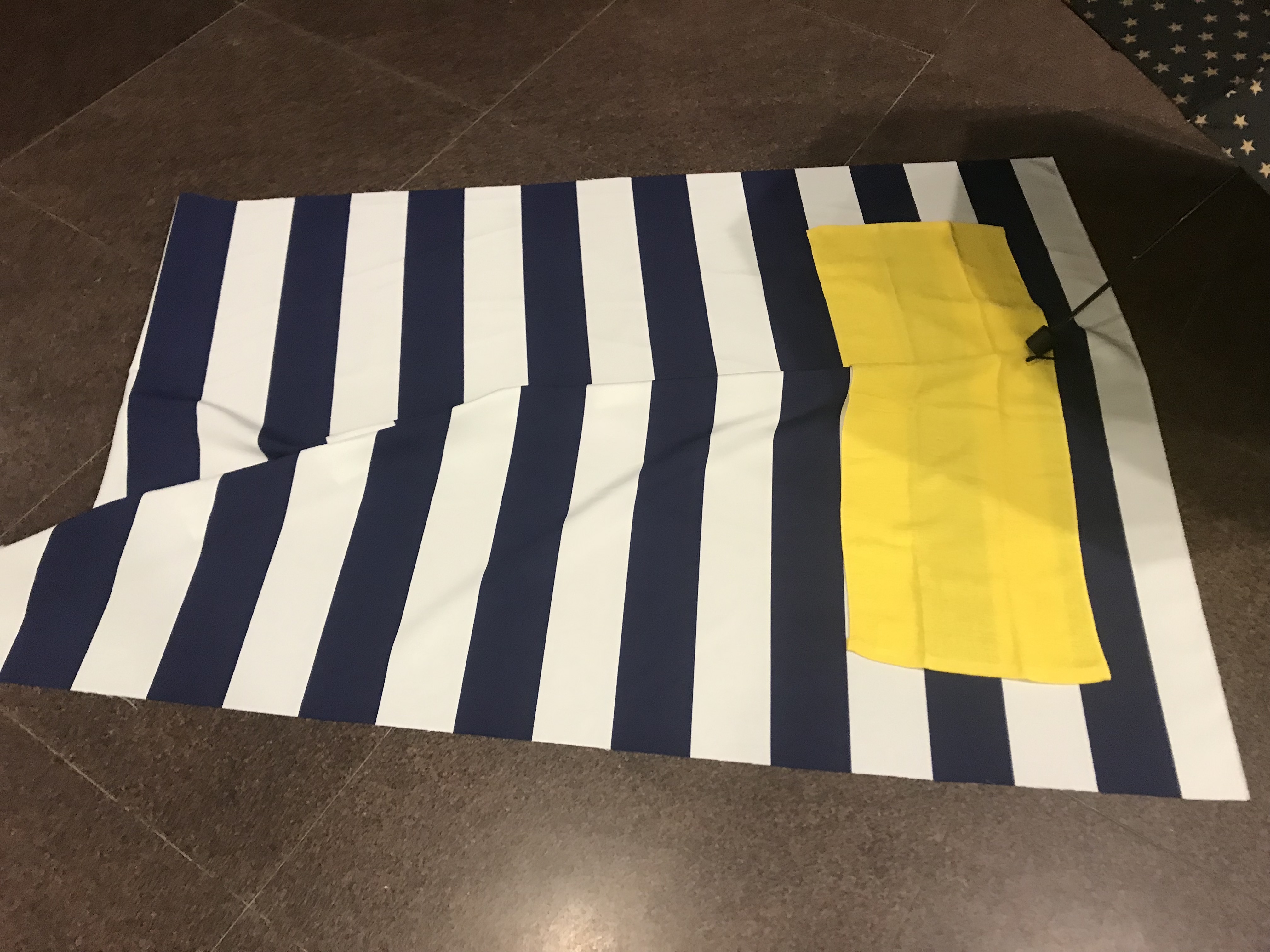
Other Props
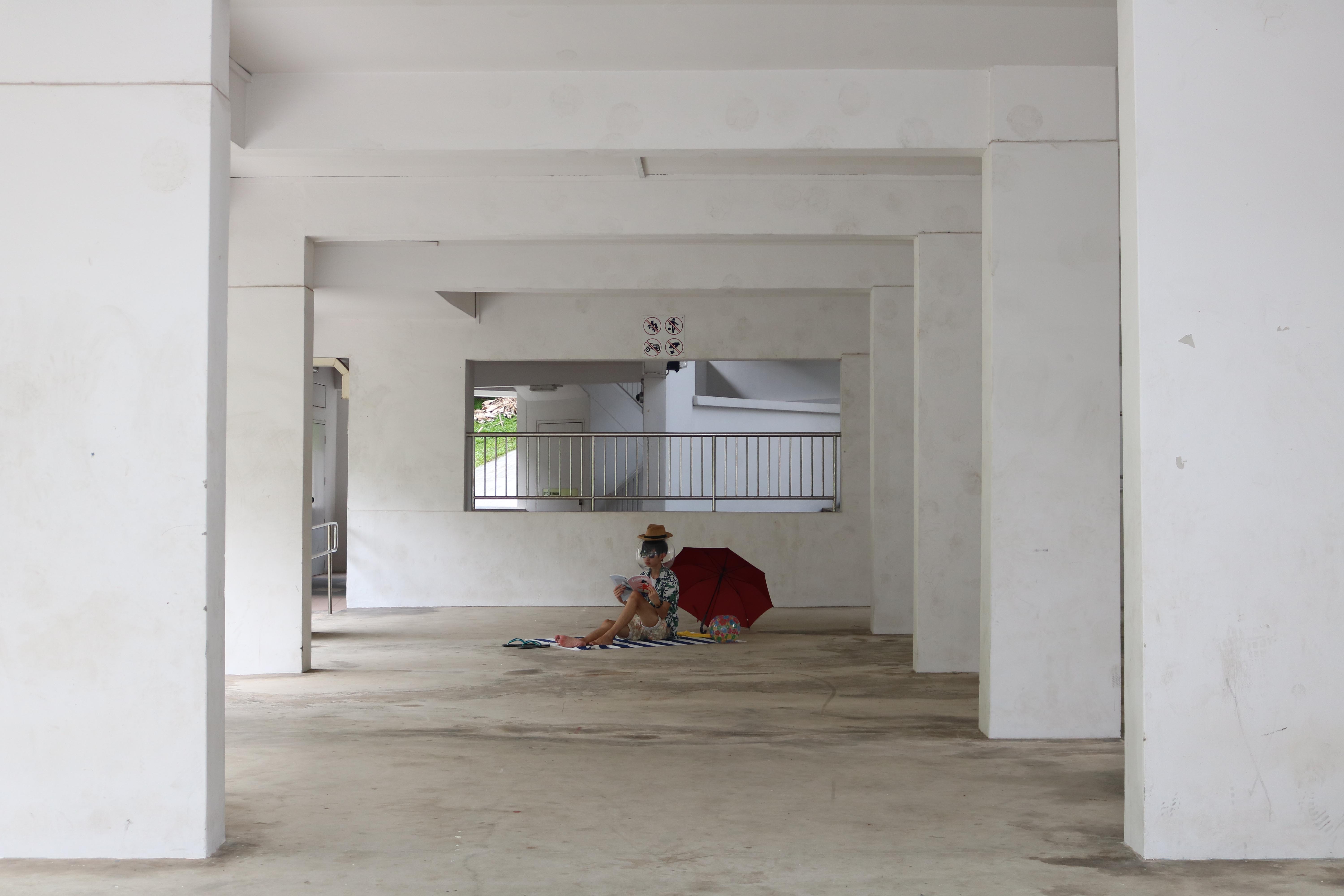
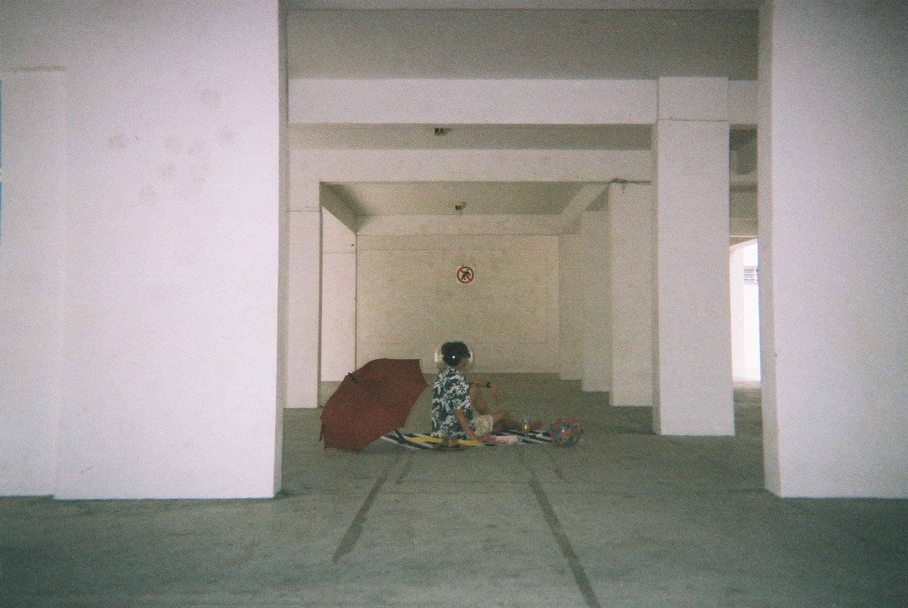
I also bought some other props: this beach-mat looking canvas and a yellow towel. I also bought an extra beach ball, red umbrella, books&magazines and wine glass to add to the aesthetics.
My model is Jeremy Lim, my good friend from my NS days.
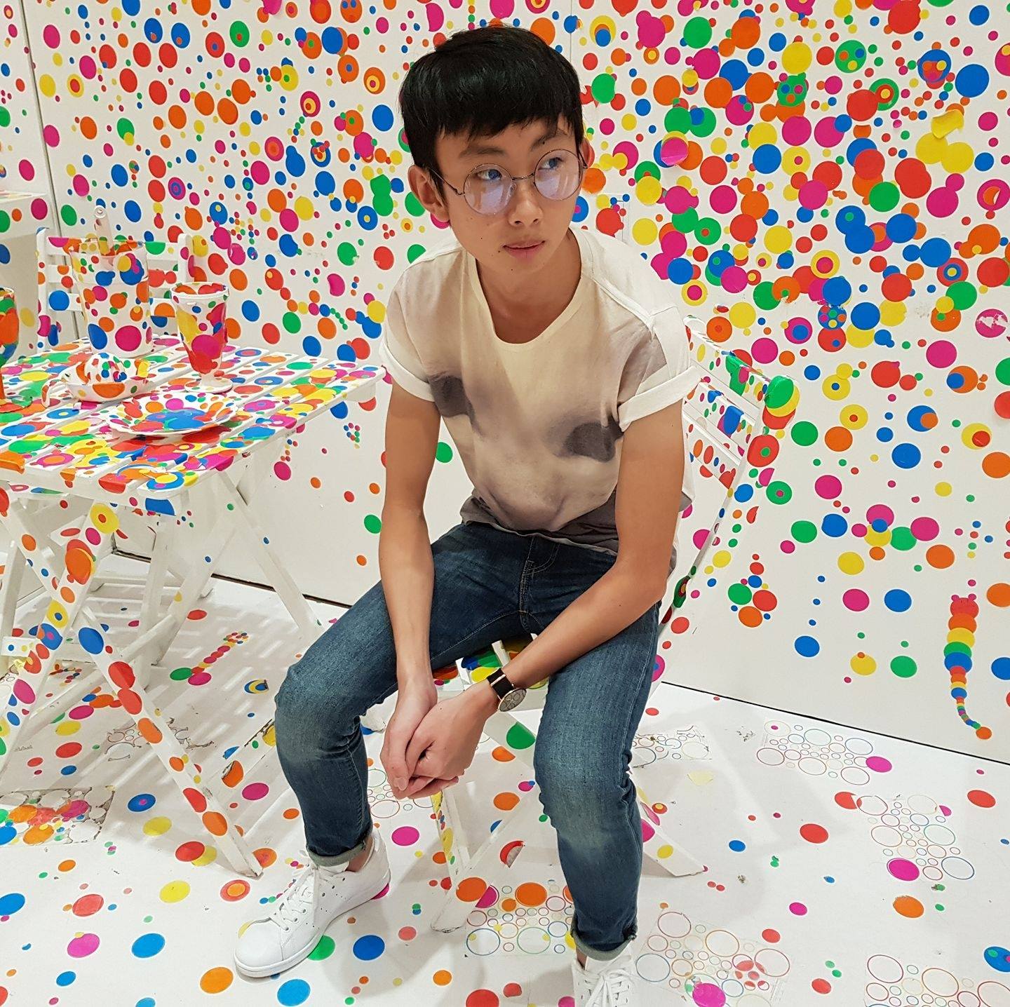
Please follow @j.emery on Instagram 🙂
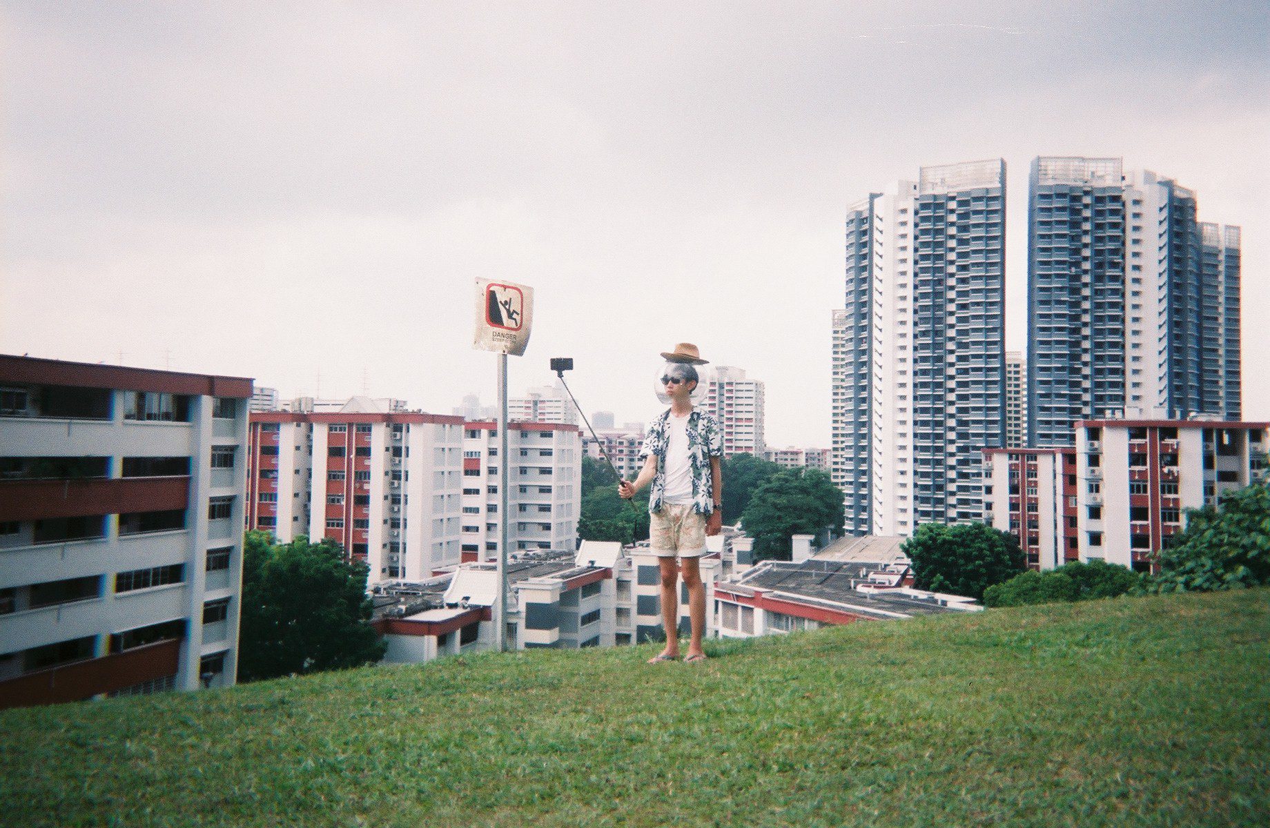
For the attire, I went for holiday shirt, a straw hat, shades, shorts, and slippers.

Shoot
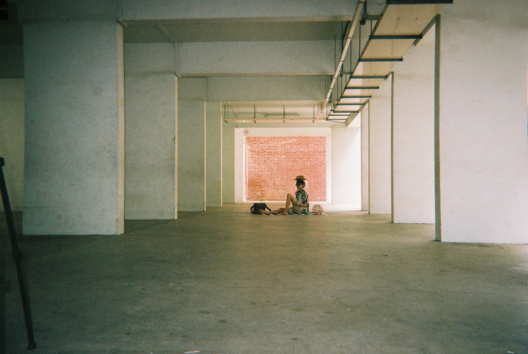
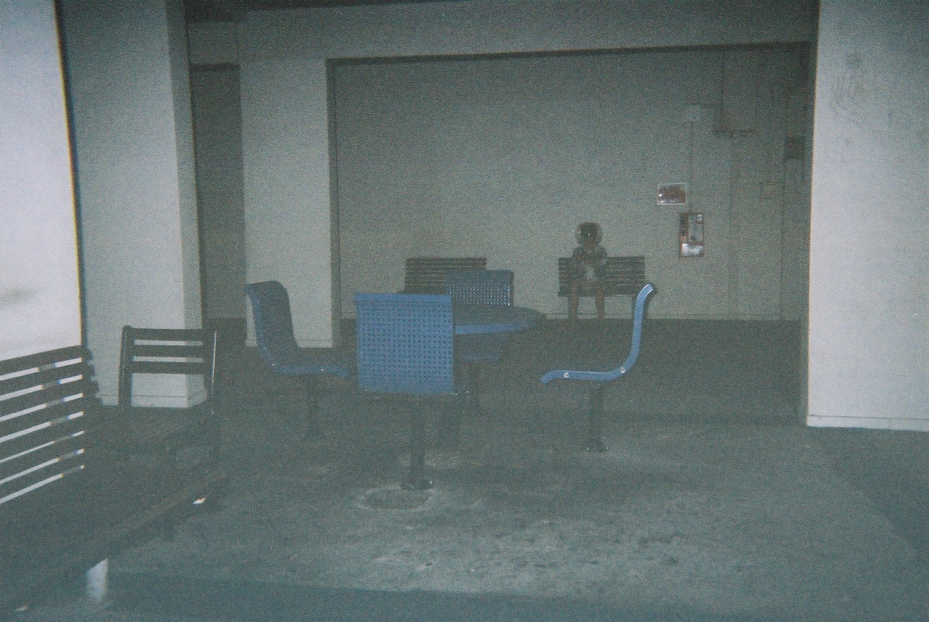
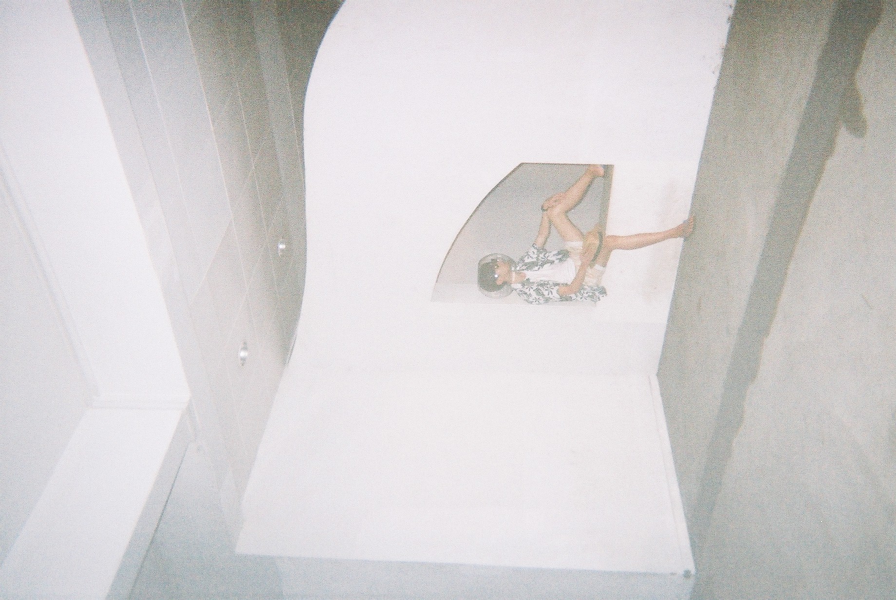
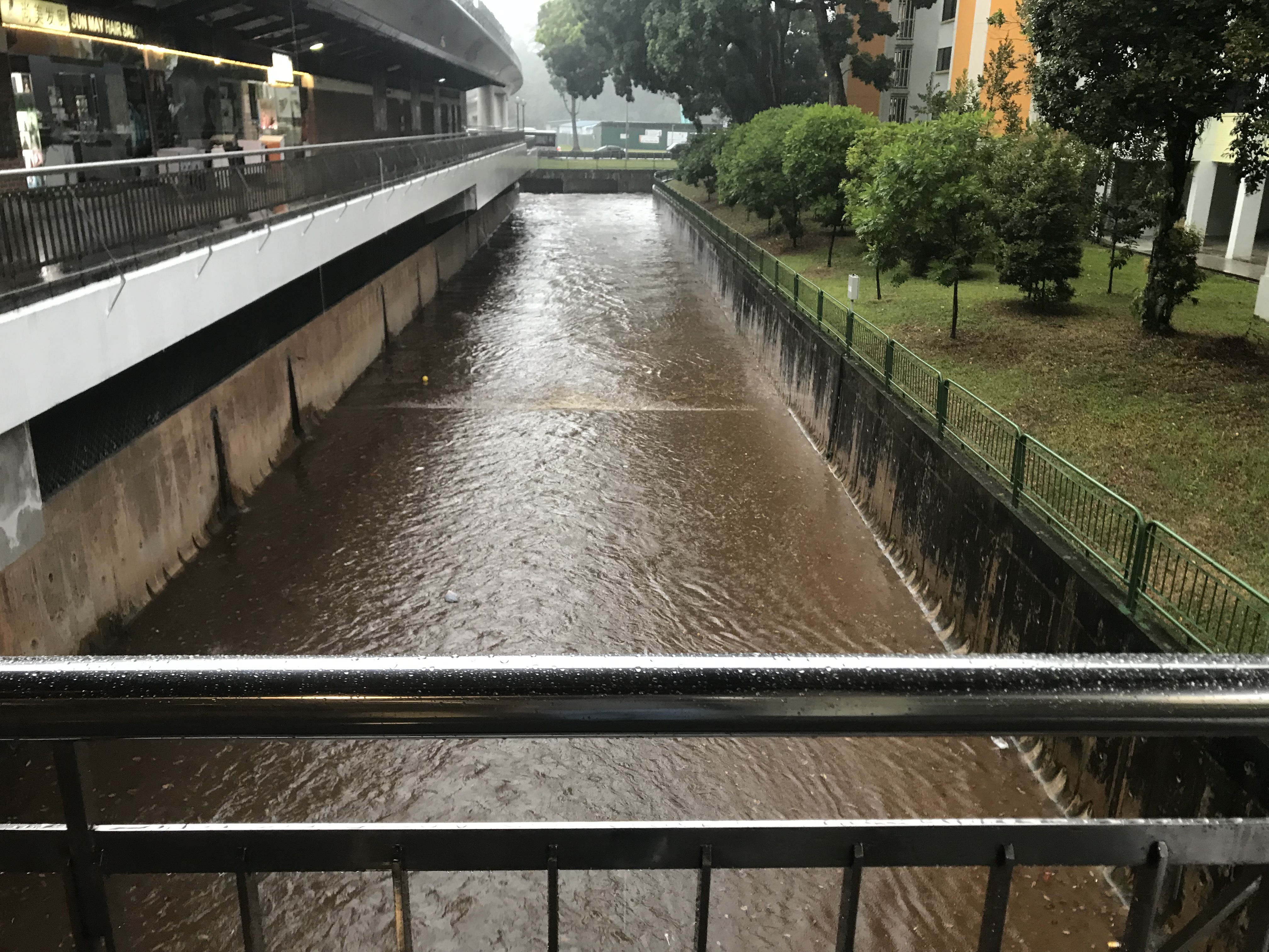
I went on a shoot on 30th March. I brought all the props, as well as a DSLR and a disposable camera (Fuji Simple Ace, 39 shots, 400 ISO). The DSLR is a backup to the disposable camera in case the shot did not go well, as do with all disposable cameras. The DSLR is also a really great way for me to test my shots and compose it before taking it on the DSLR. Despite the higher quality, I opt for the film for a more personal effect. I shot halfway and it rained, so I couldn’t continue and decided to go back and shoot again.
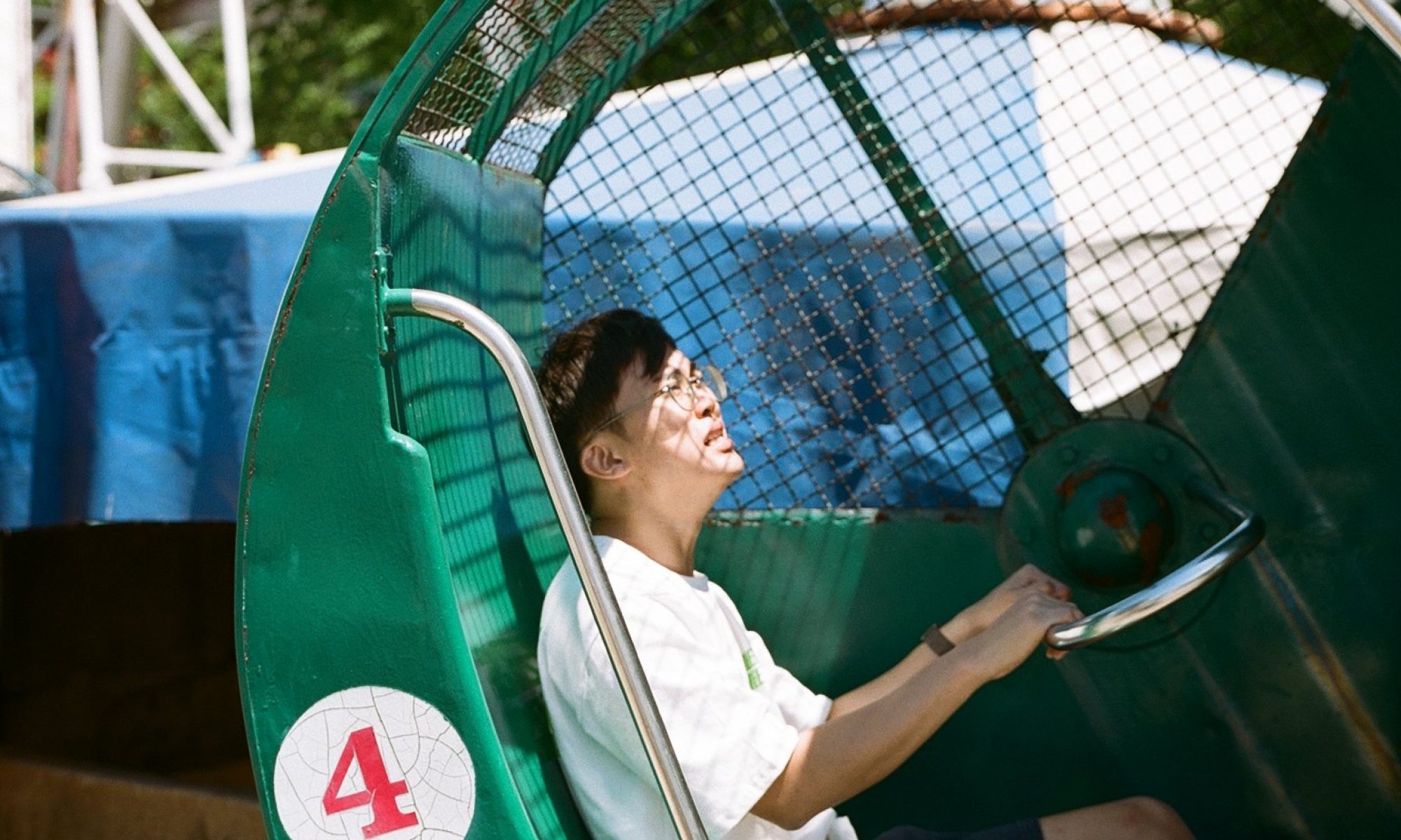
On the 1st of April, we went on another shoot and this time, we braved through the rain (AGAIN, it always rains when I go Marsiling) and we completed the shoot by 8PM.
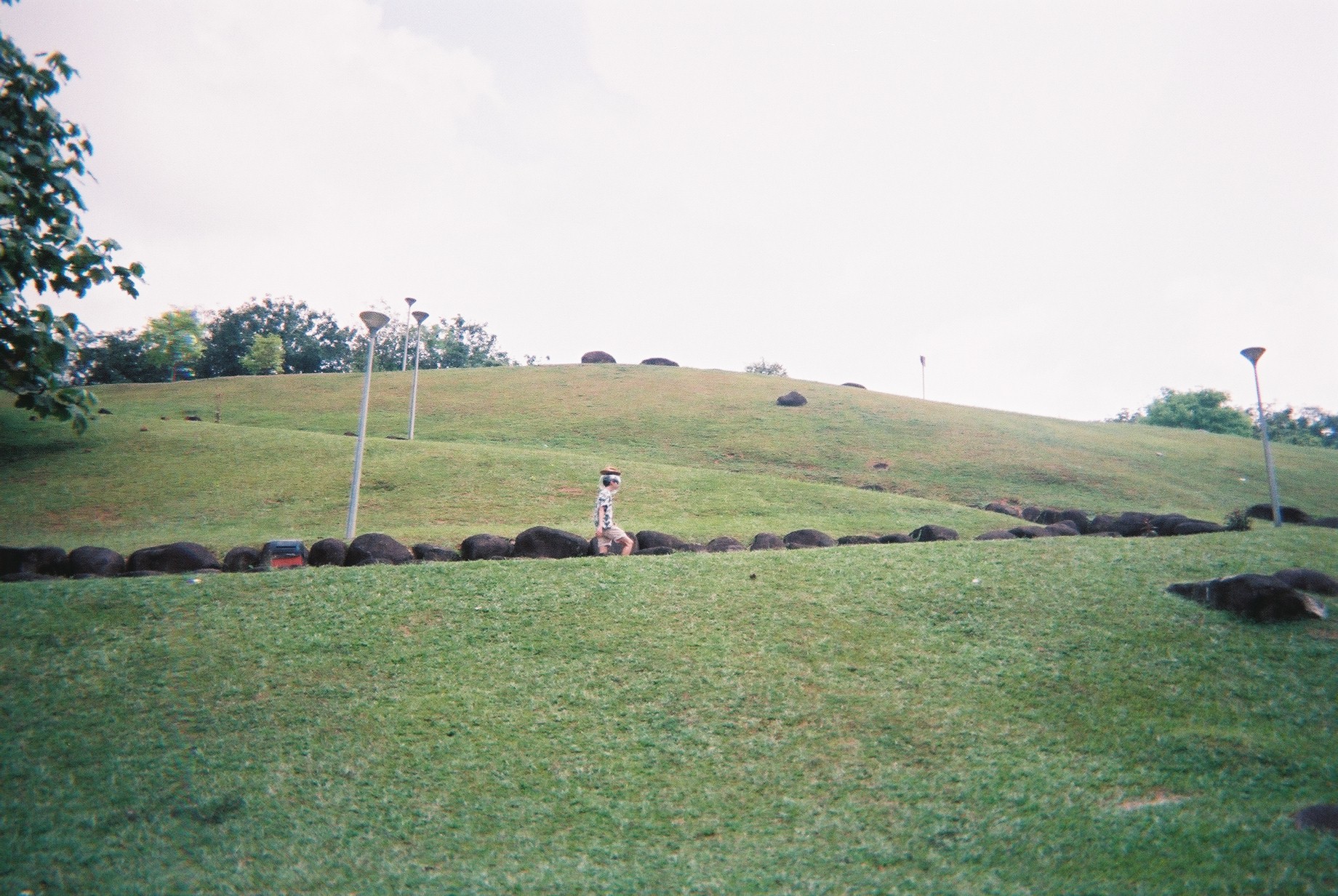
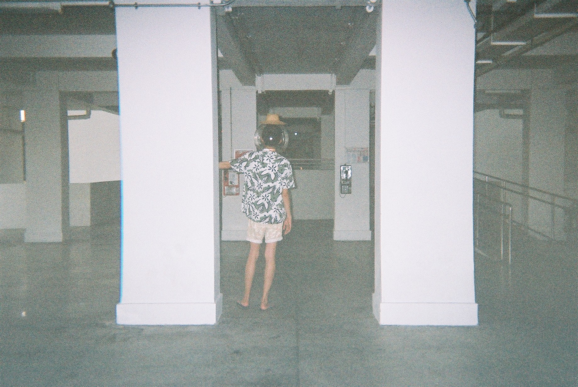
Halfway through, I found an actual fish bowl in an aquarium shop and I went for it! So the second half of the photos are Jeremy with an actual fish bowl on his head.
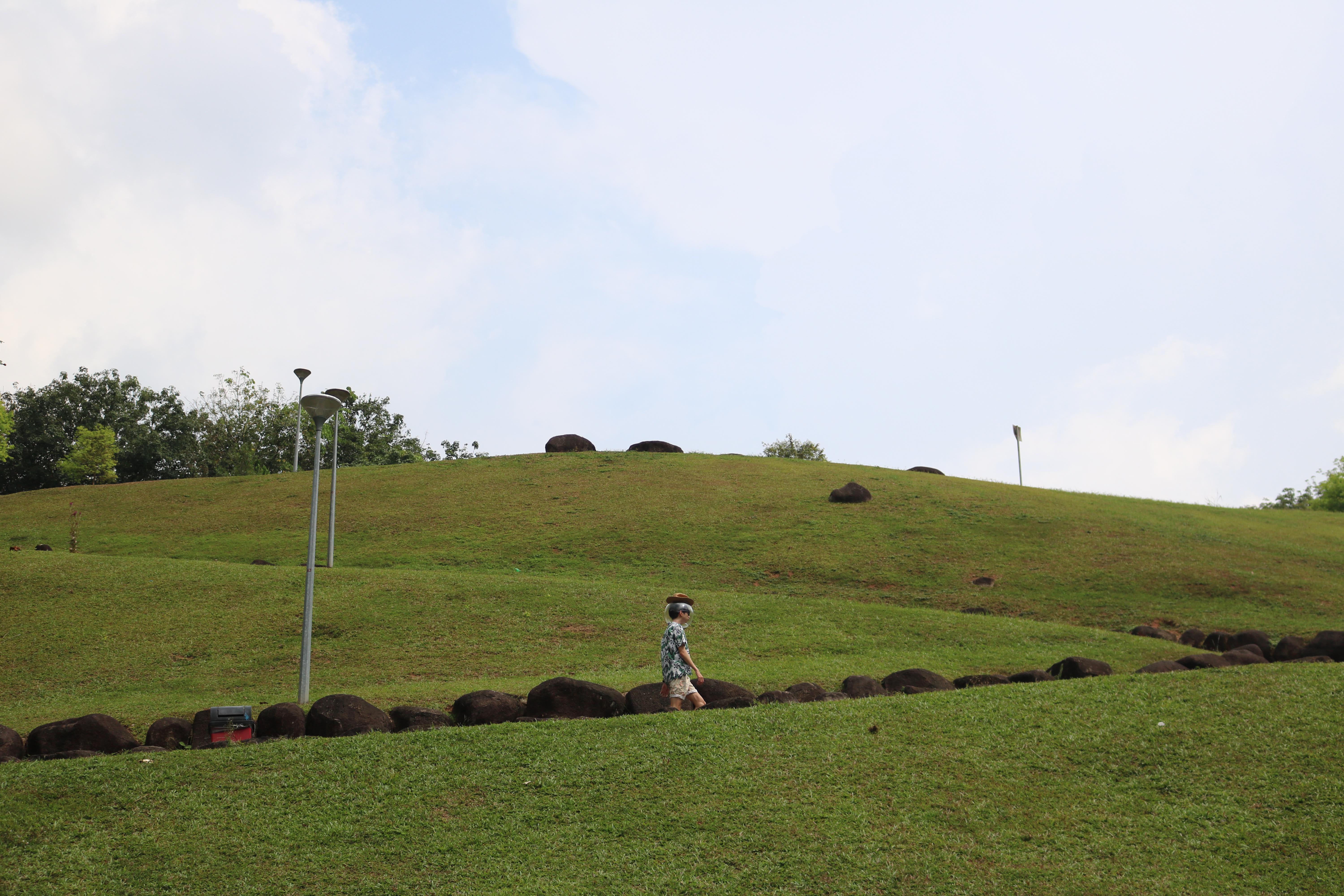
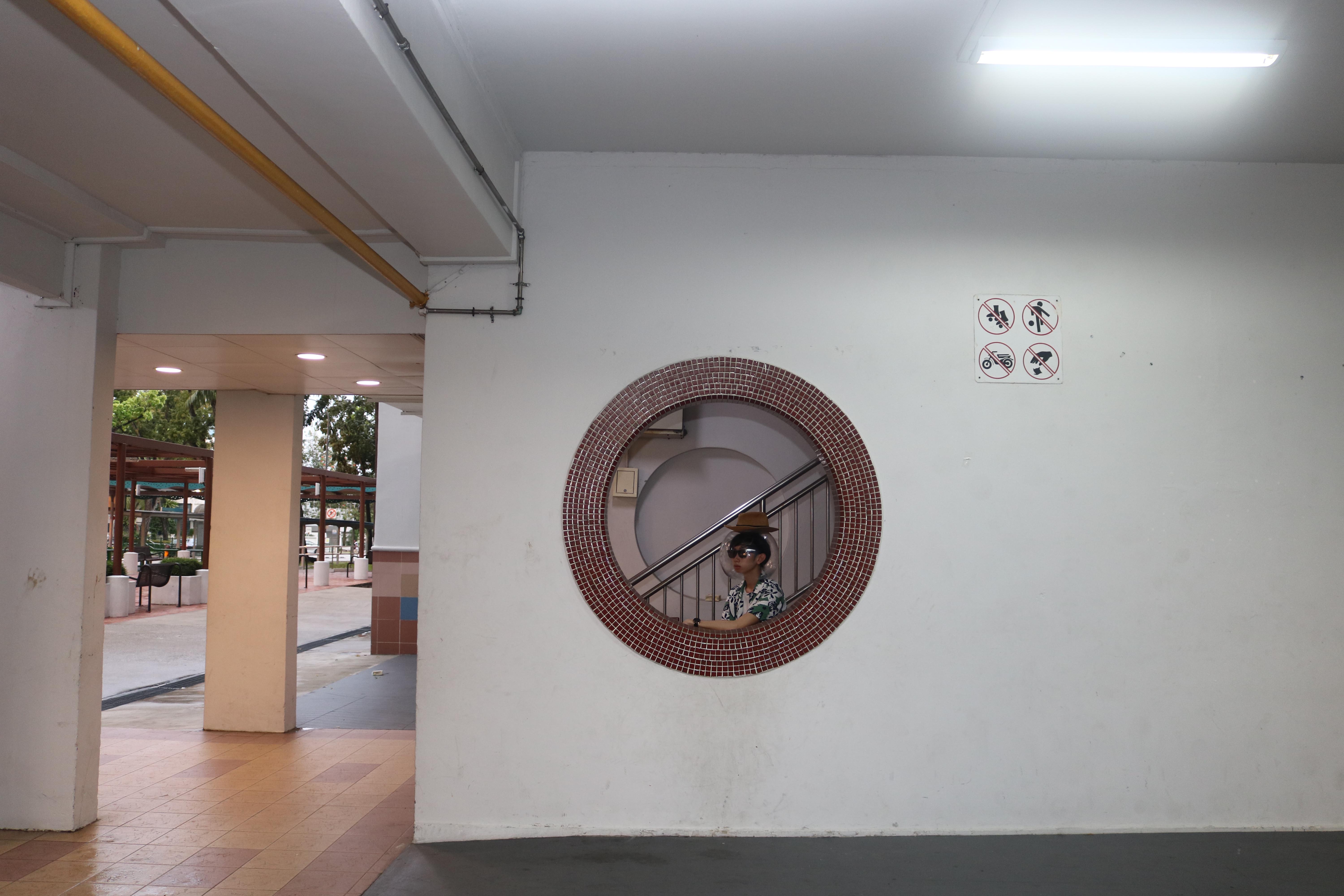
Here are some shots:


These are from the disposable camera.
The shots from the DSLR:

Although the quality is MUCH better, I decided to stick to the disposable film shots as it really creates some sentimental value and uniqueness.
Photo edits
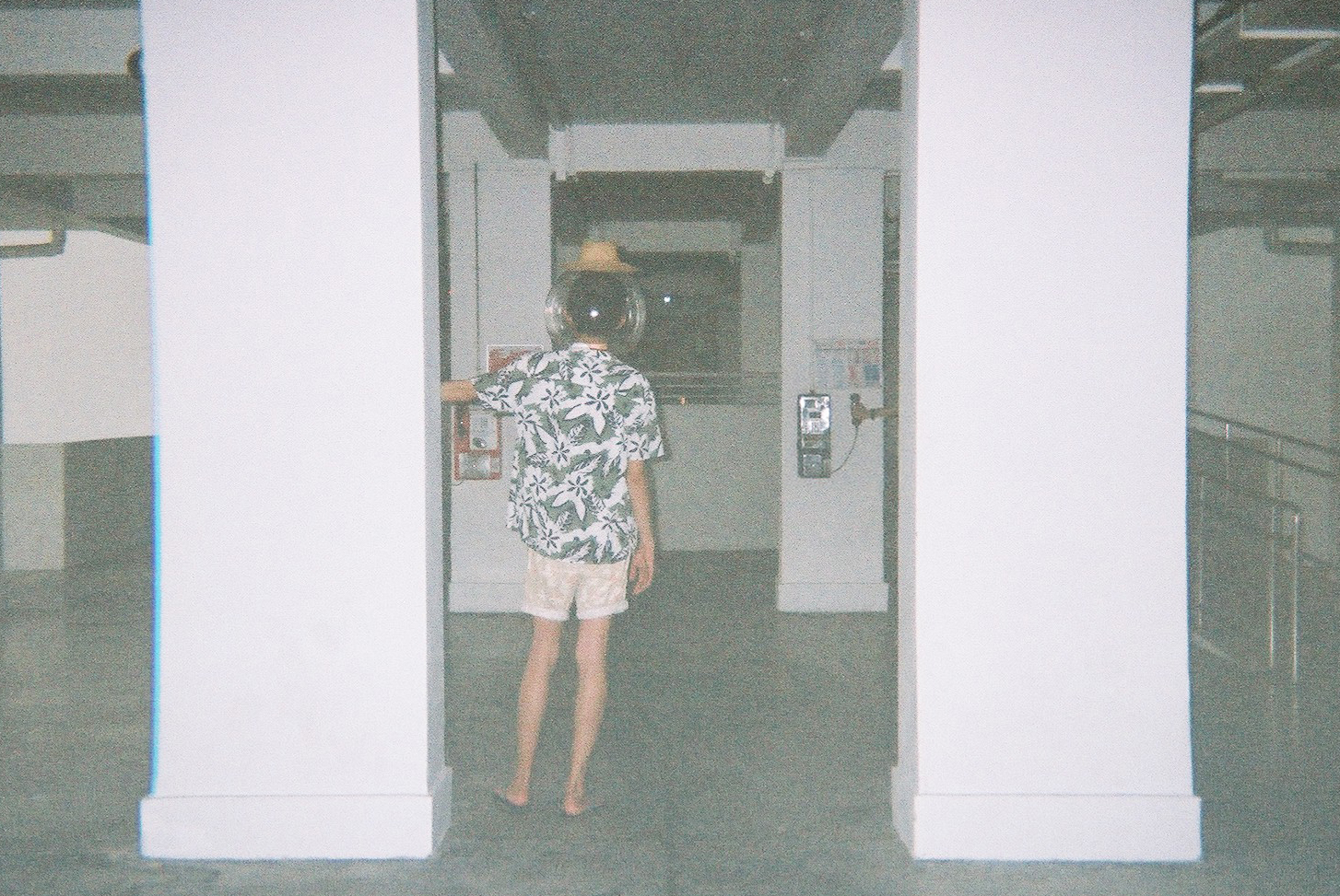
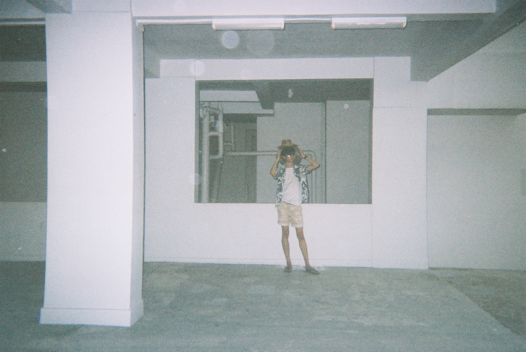
So in order to get the effect of the “portal” and “strangeness”, I decided to photoshop my friend such that two of himself is in the frame.
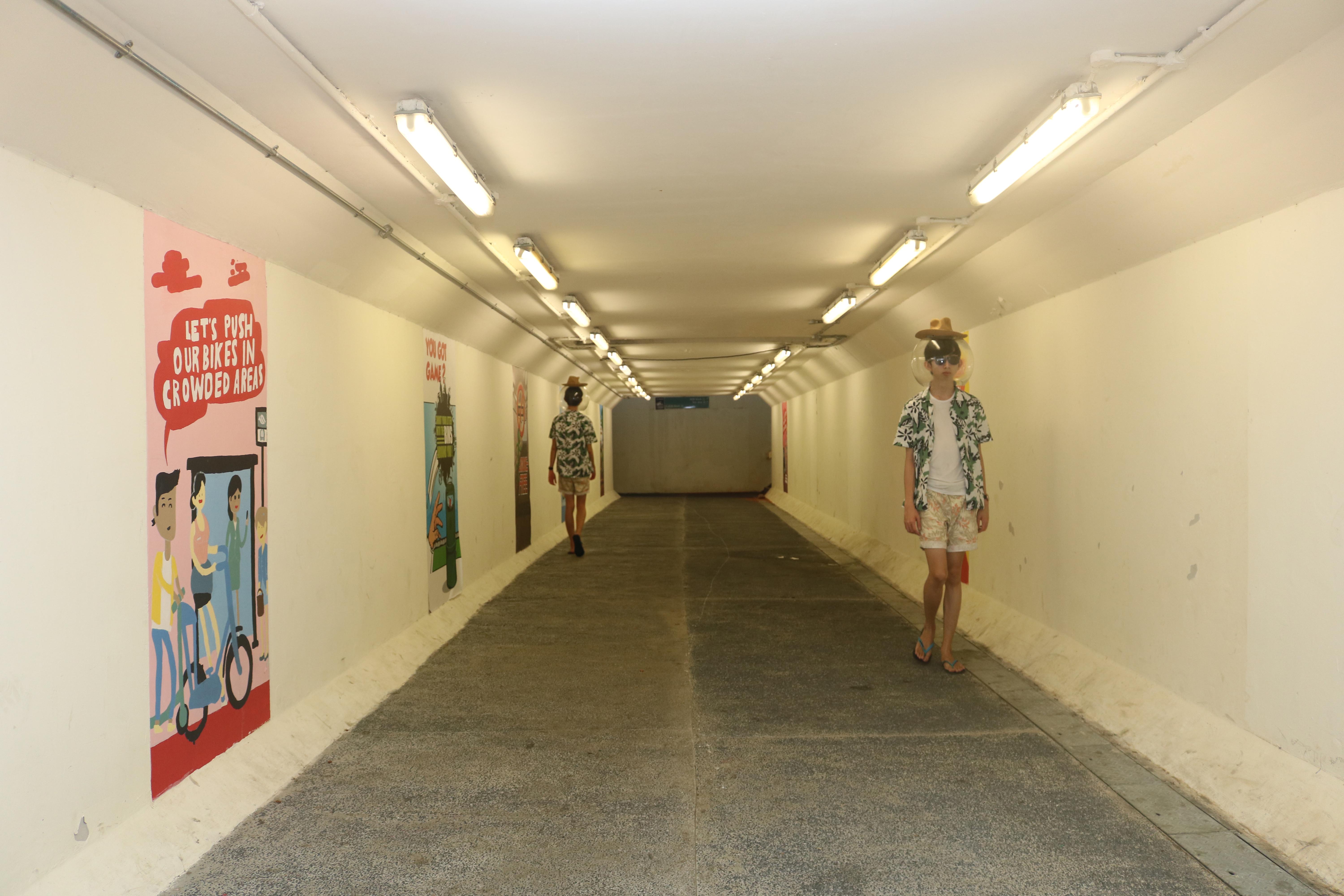
This is one example of said edit, but on a DSLR photo. I tried around with editing the DSLR shots before moving to the films.
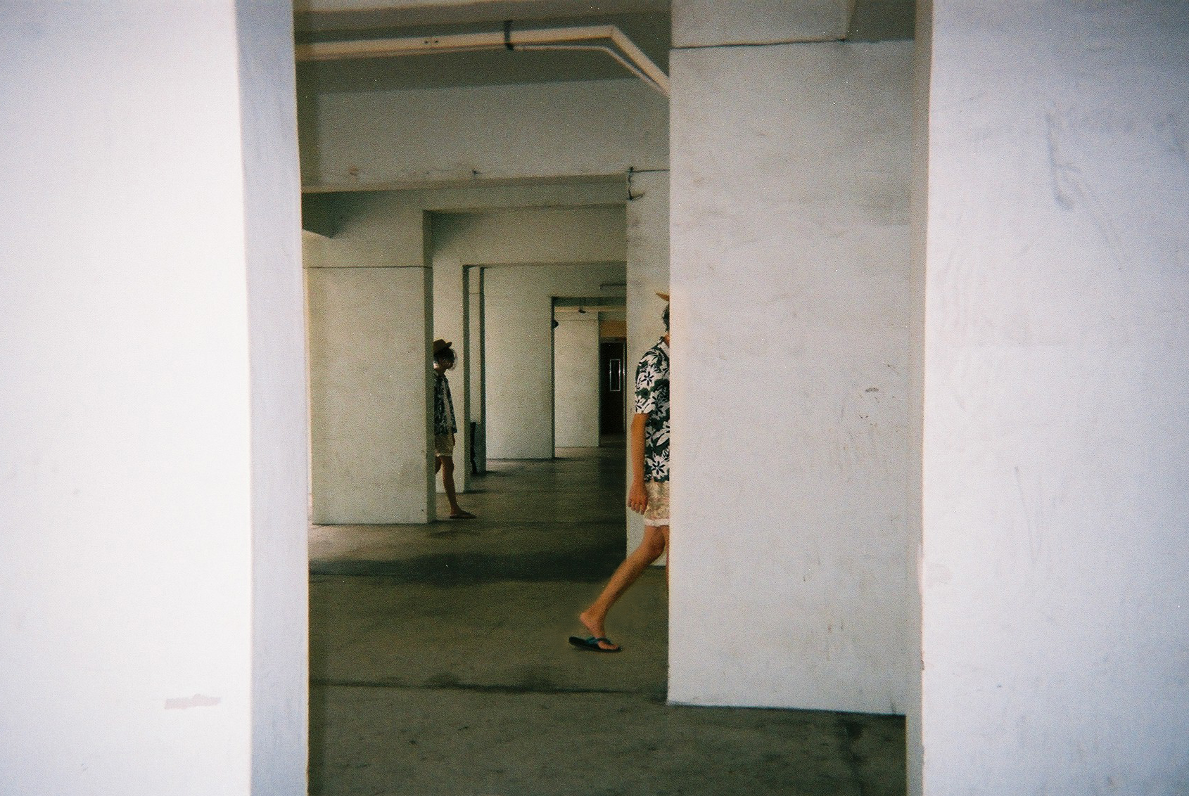
Here are some examples of the shots I have edited. These are to convey the “portalling” between pillars.
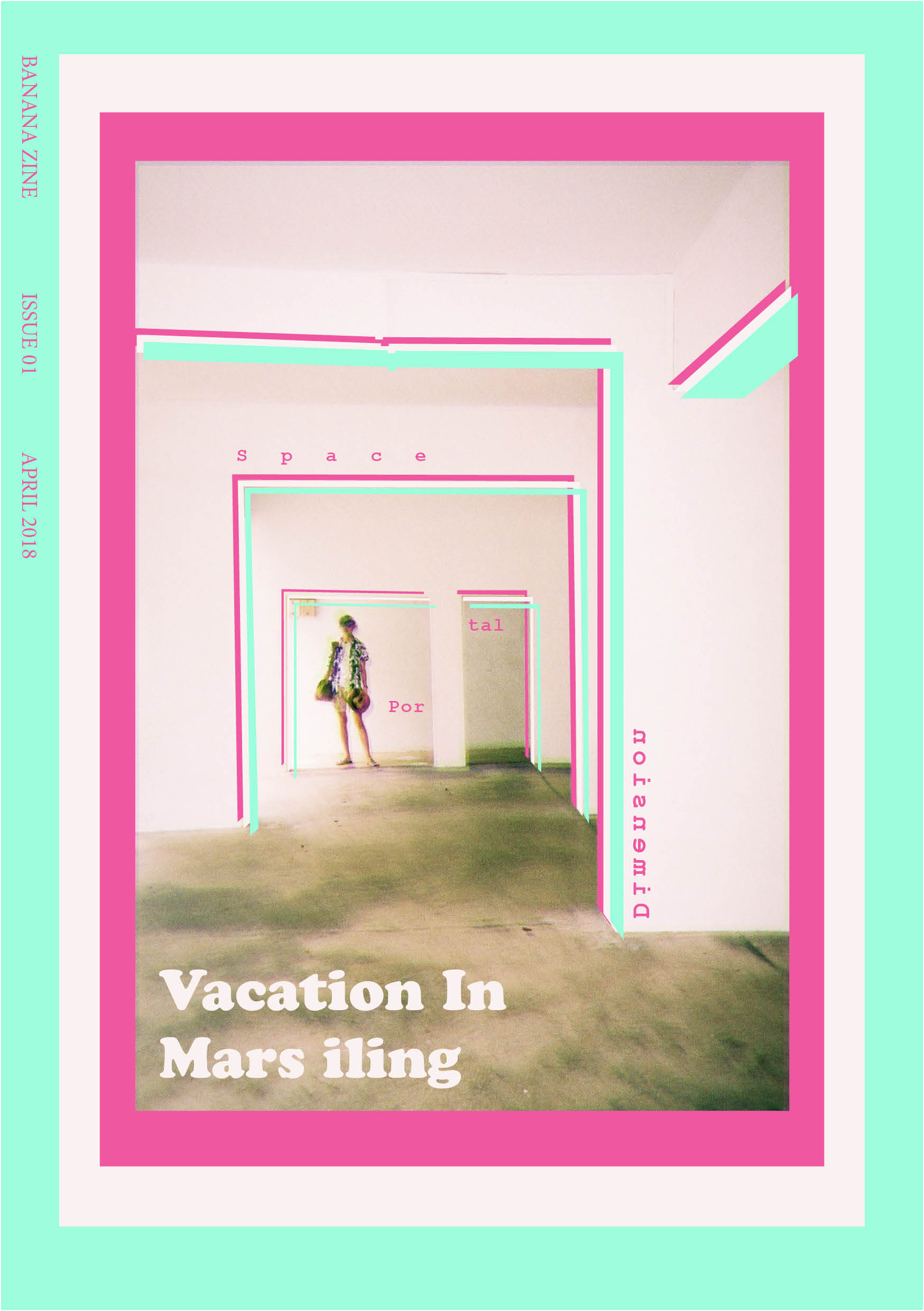
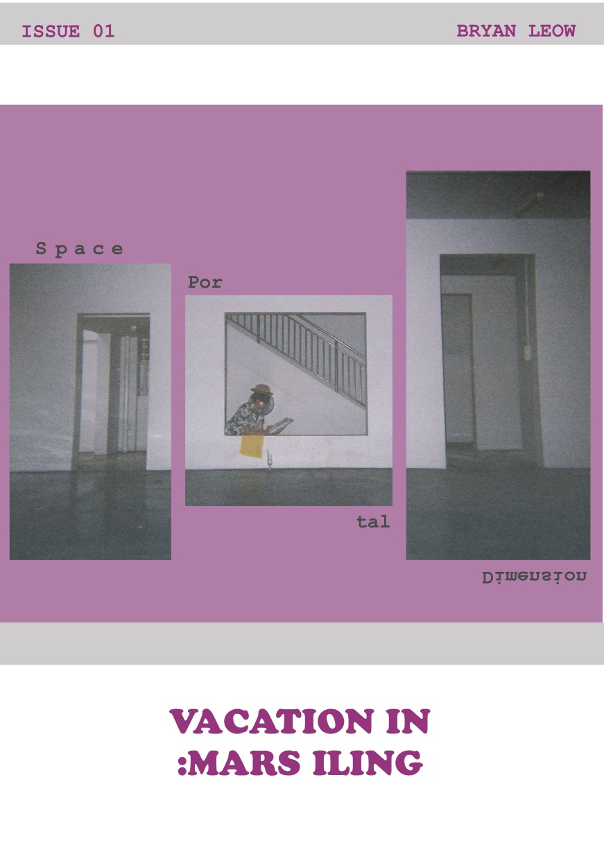
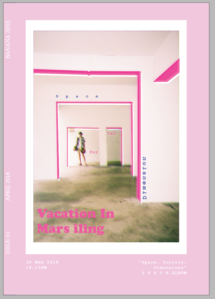
Zine!
So finally, I went to do on the ACTUAL ZINE!!!
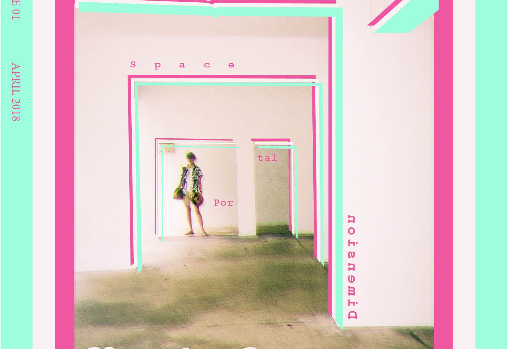
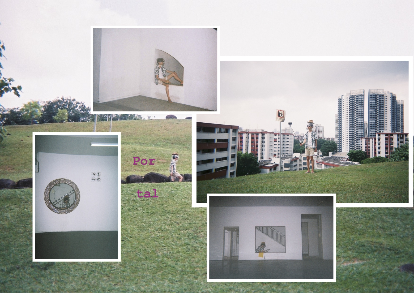
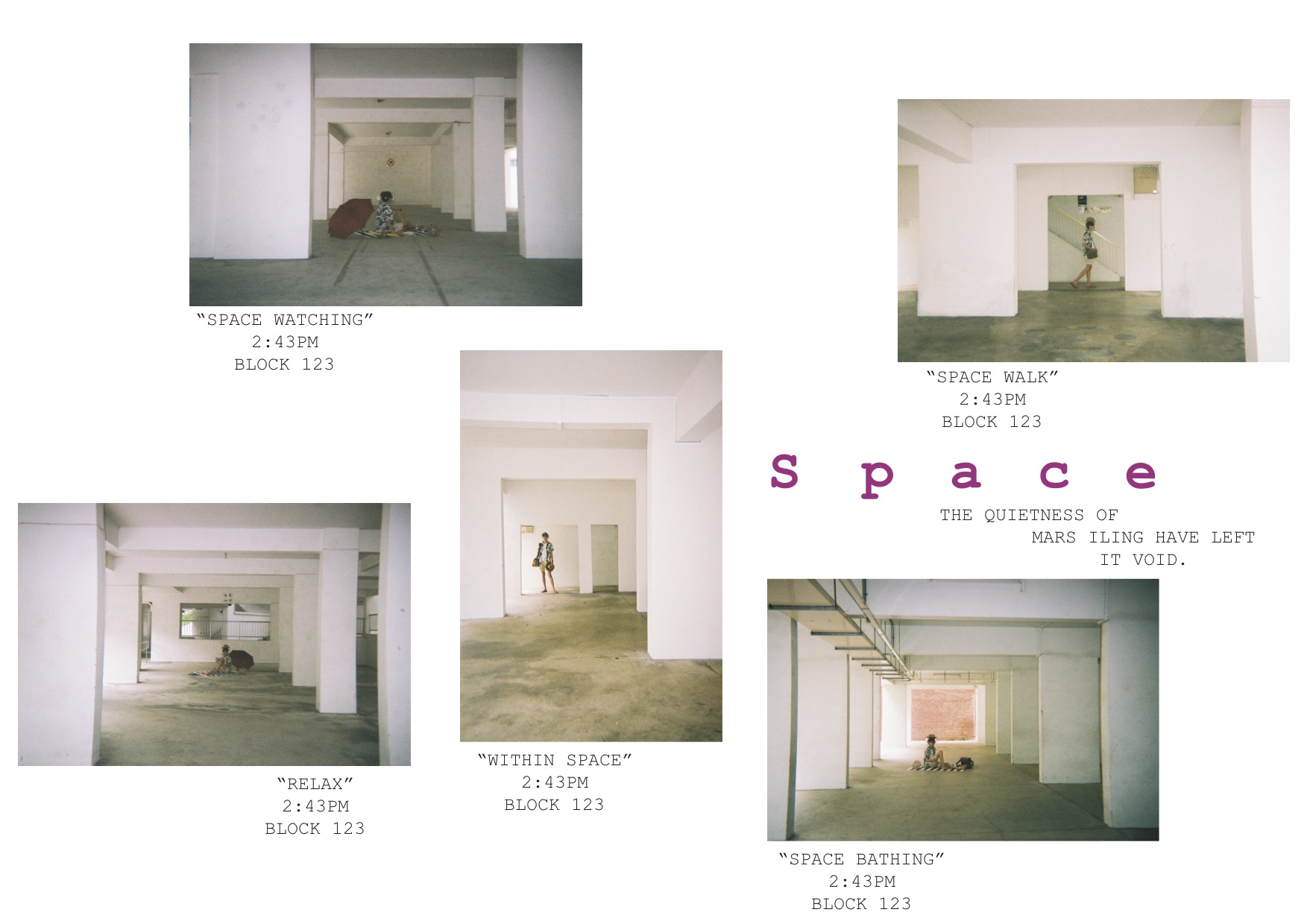
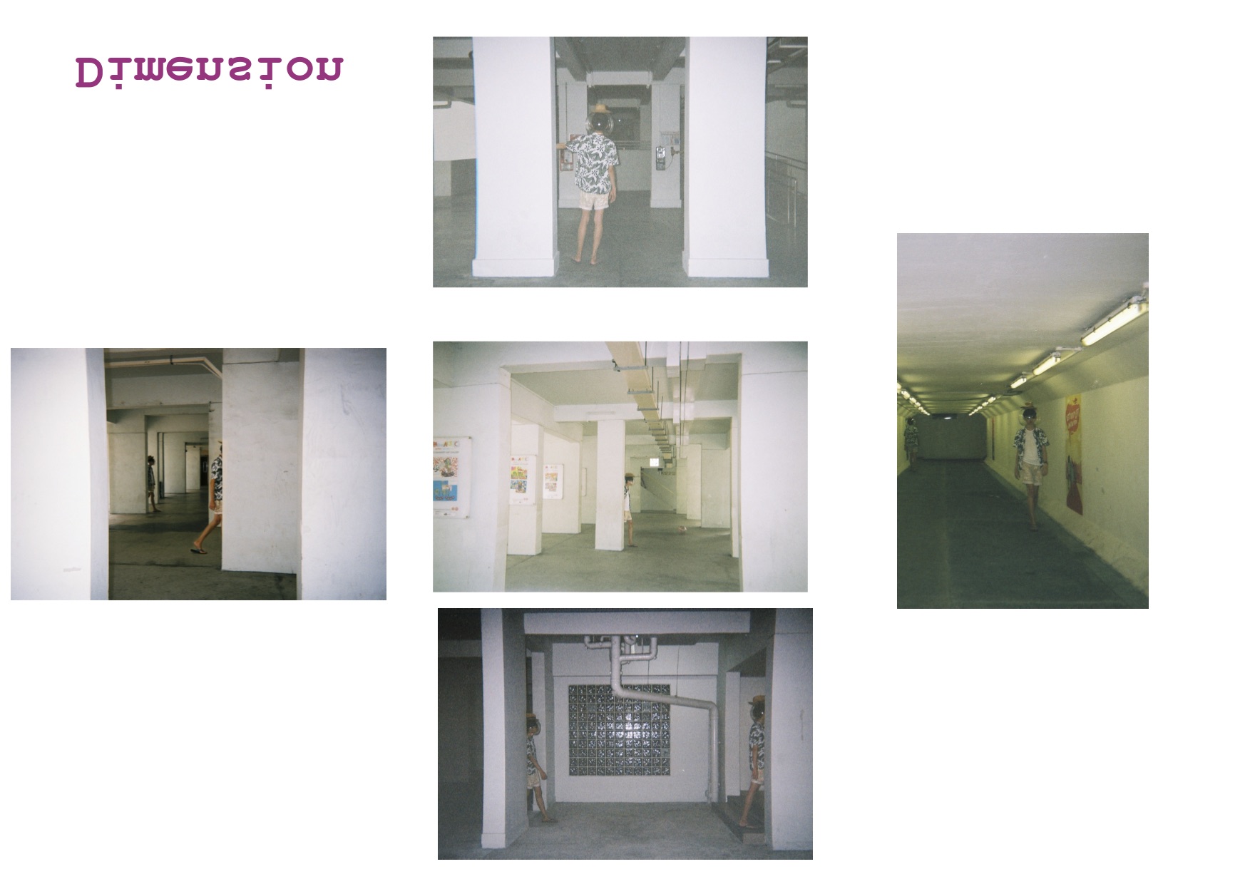
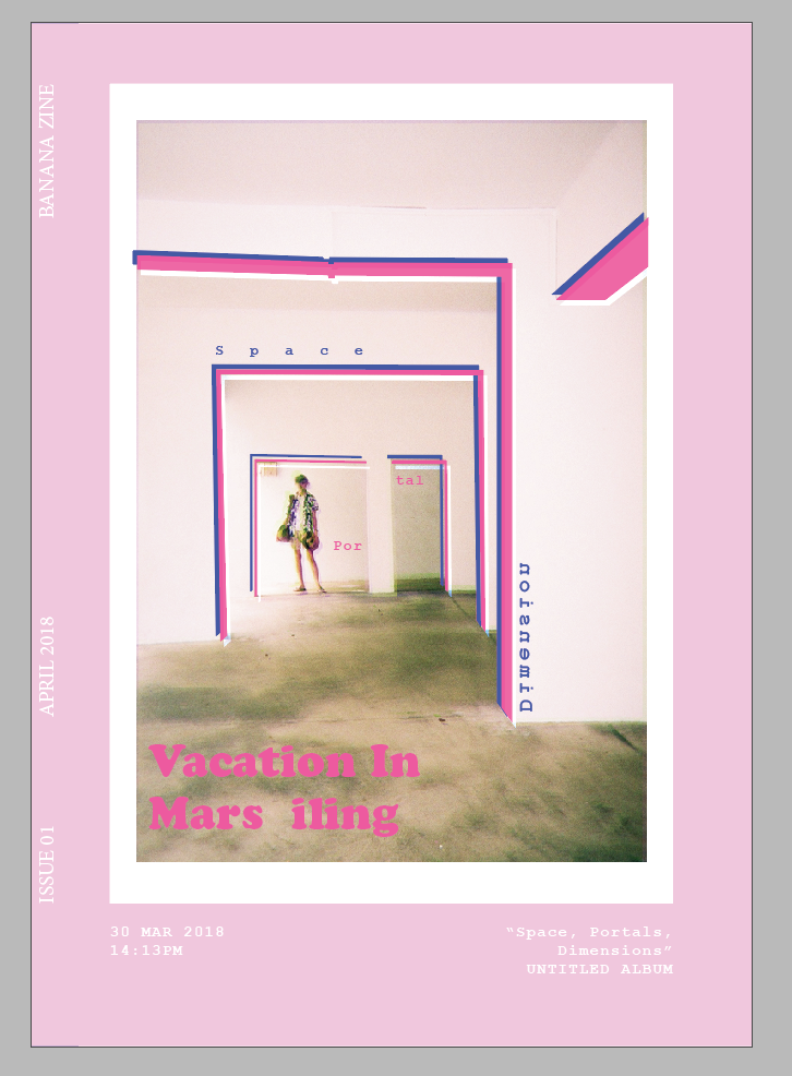
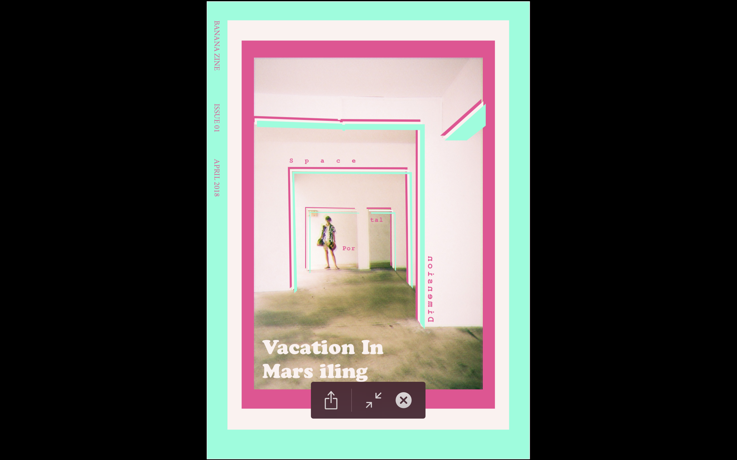
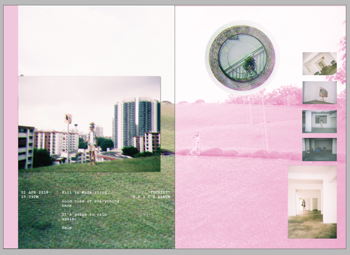
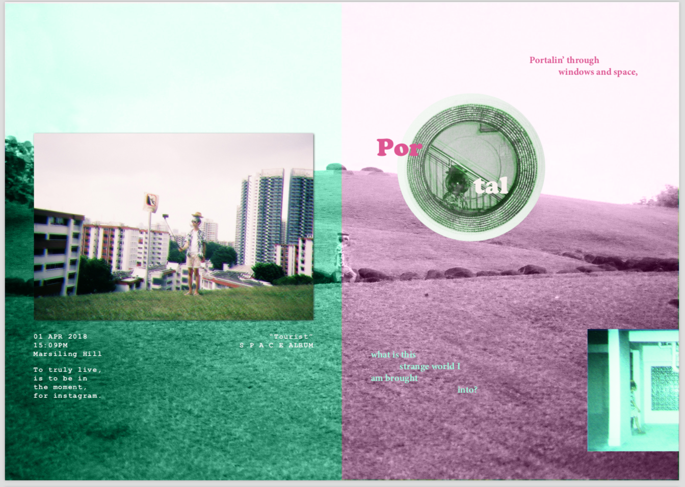
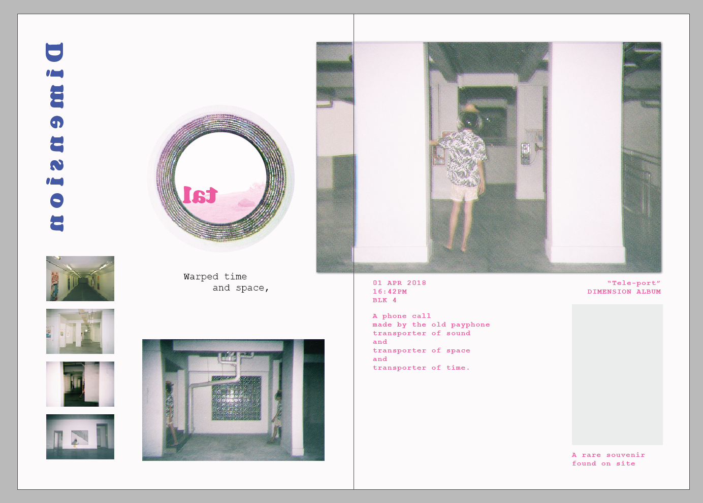
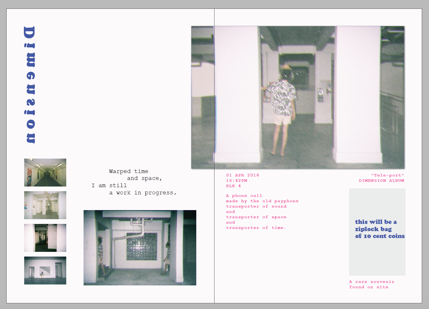
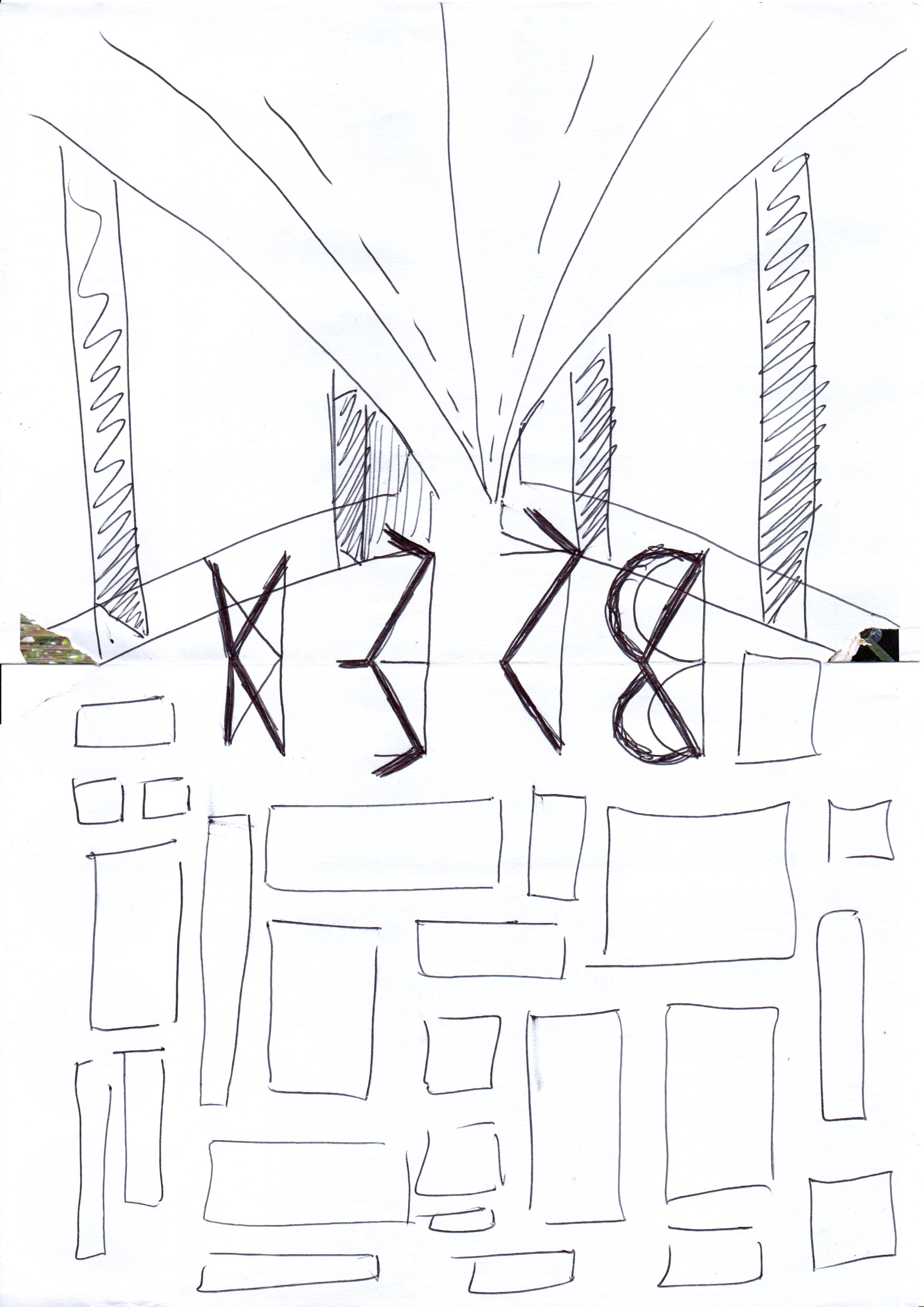
I separated the zine into 3 parts: Space, Portals, and Dimensions.
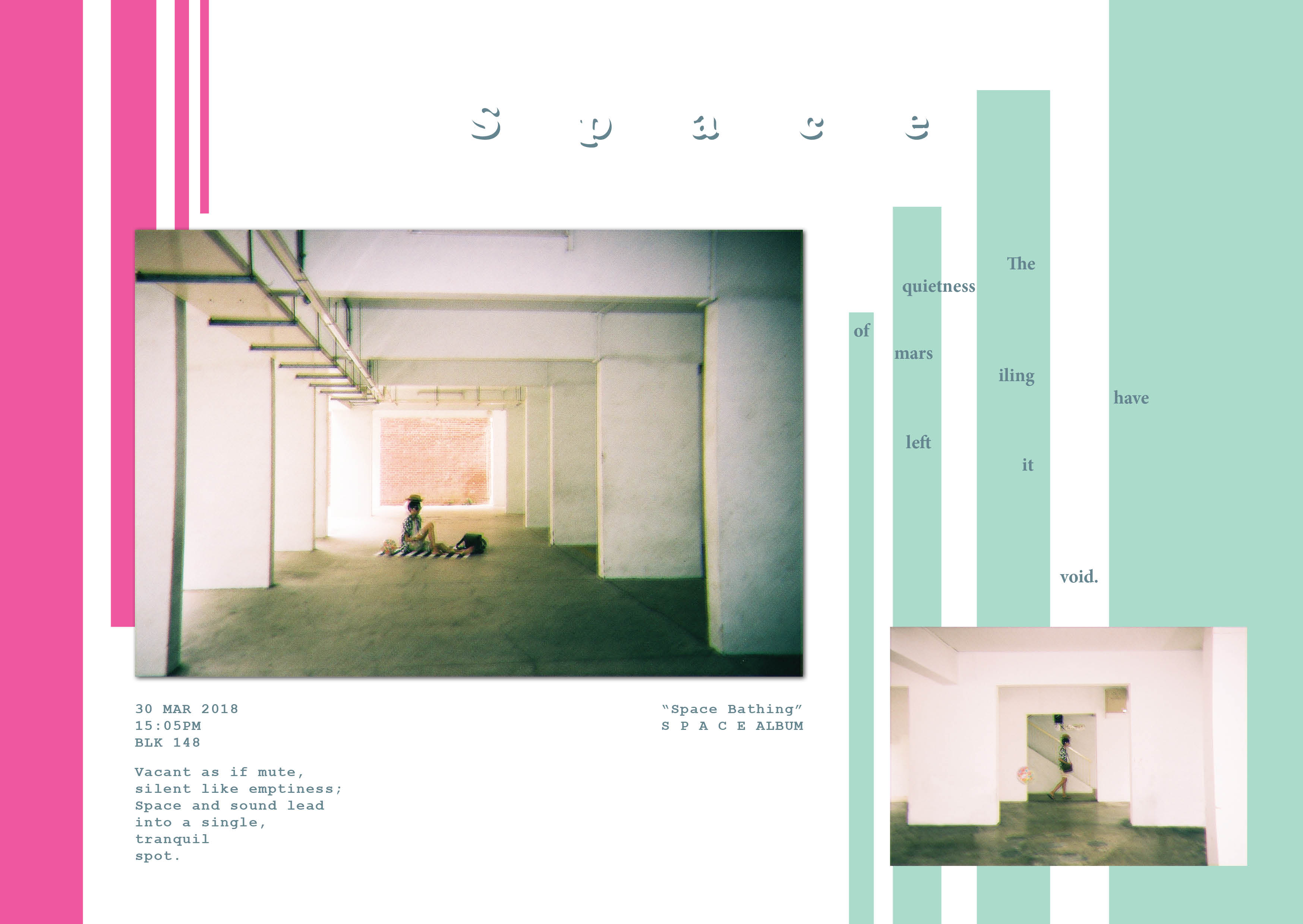
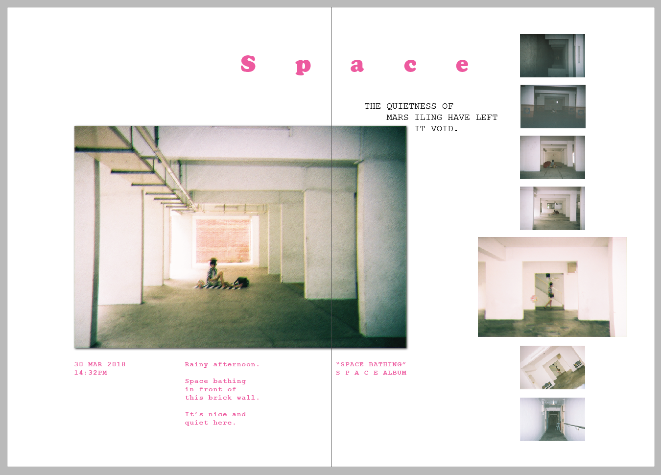
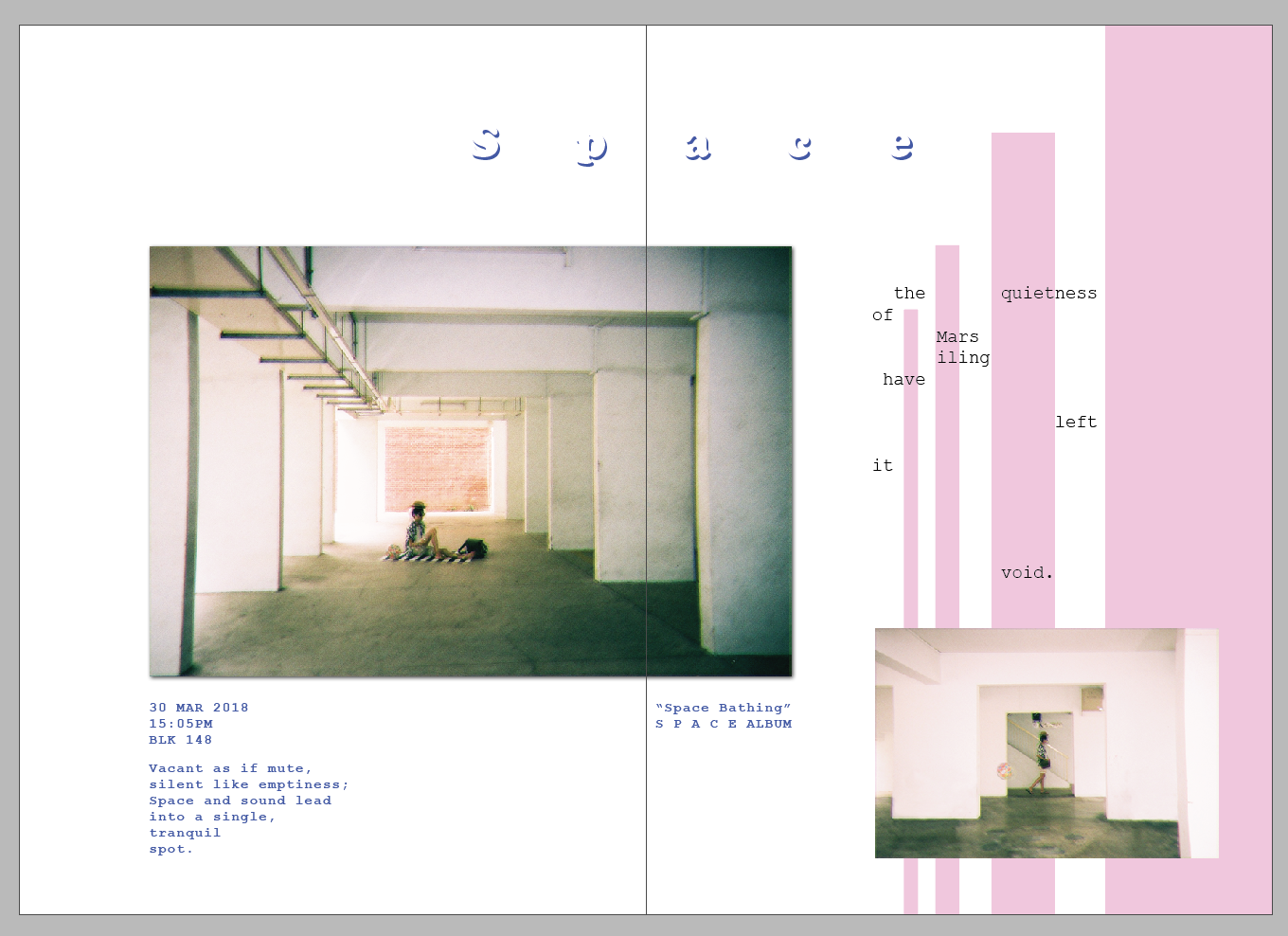
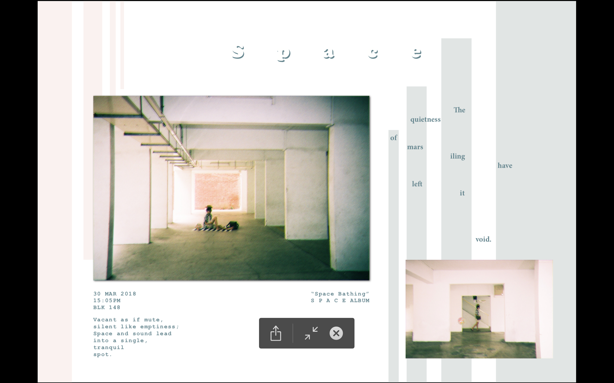
Space – Showcase the quietness of the location by using spaciousness
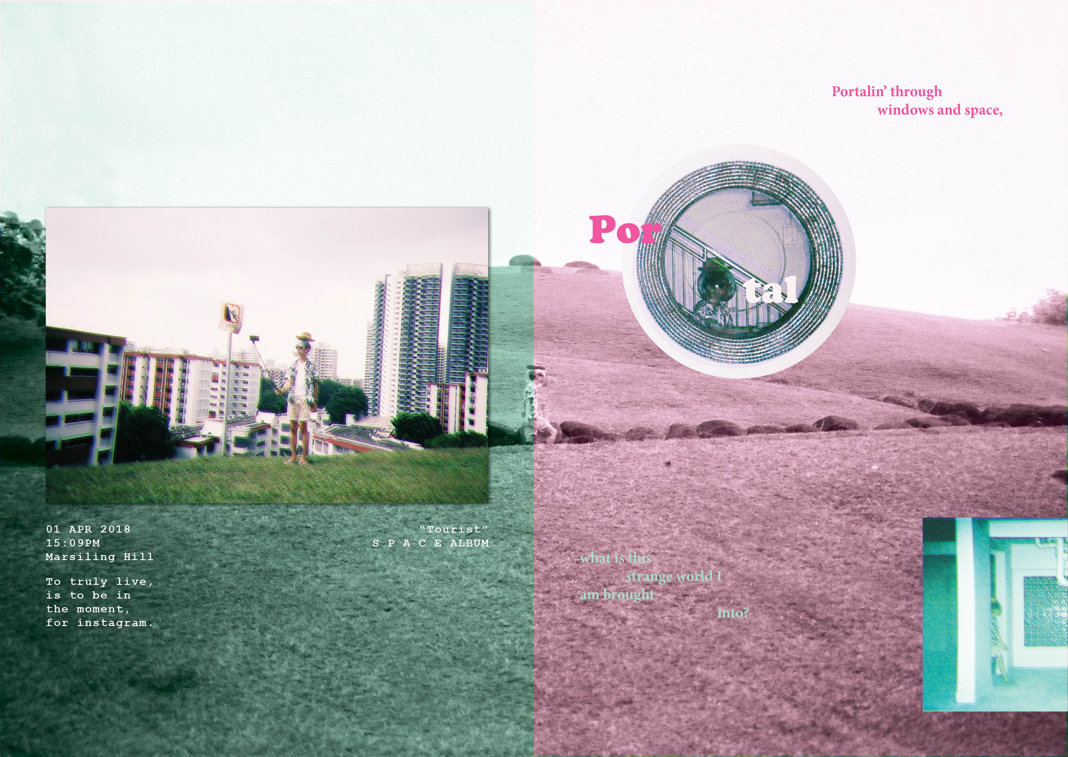
Portals – Show the transportation from a world I am familiar with into a different world (Mars iling)
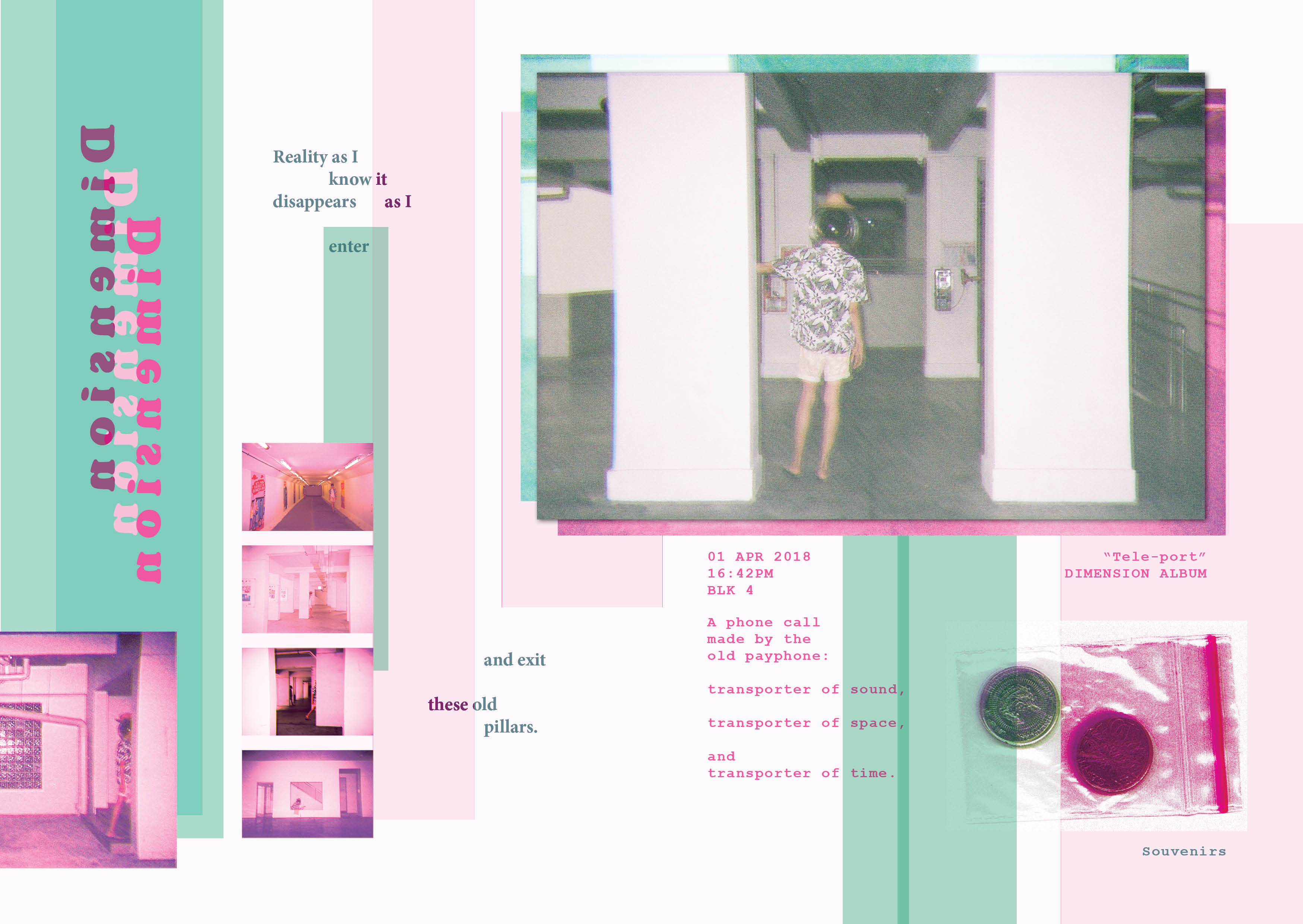
Dimensions – Show the strangeness of Mars iling
Using some inspiration from Rubbish famzine by HolyCRAP, as well as zines from my moodboard, I decided to create a vacation documentary that is not just personal, but also minimalistic.
I started with a few variations of my cover page:
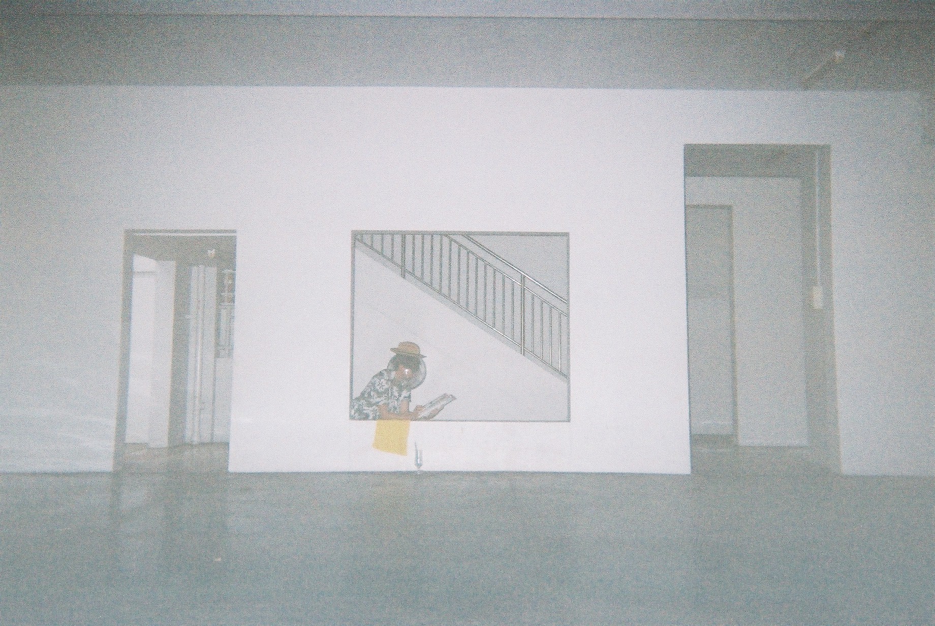
Then, I tried out some spreads:
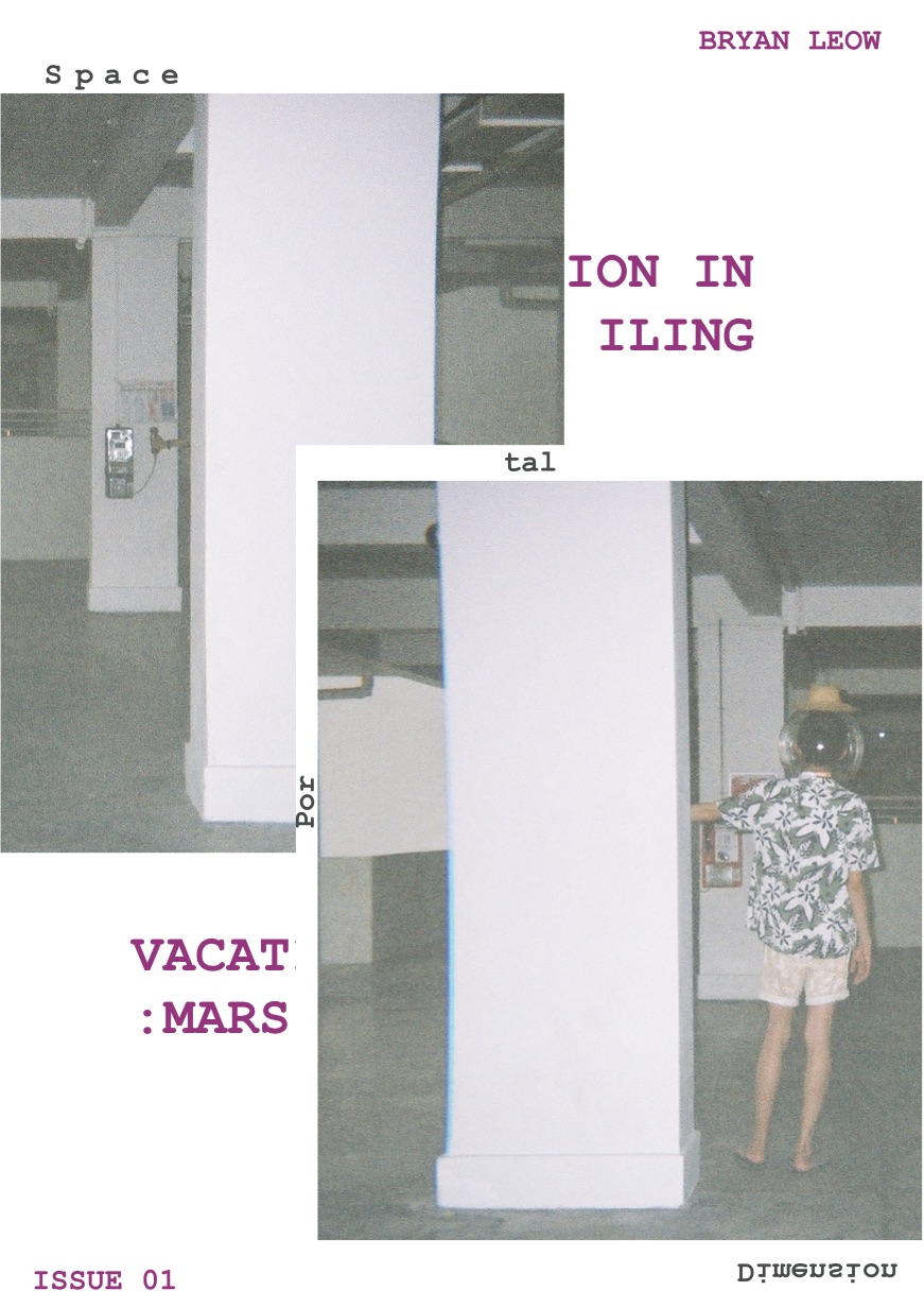
With these, I consulted and selected my cover page. I also got the feedback that my images are all the same size, which is undesirable. I wanted to try for the photobook effect where all images are the same size, but it seems to not be working. I was more harsh on my image selections and tested out new spreads.
Evolution of my Cover Page

Evolution of SPACE Spread

Evolution of Portal Spread

Evolution of Dimension Spread
FINAL
Overall, all my images are glitched somewhat to create a more otherworldly feel, although I try not to overdo it so as to keep it subtle.

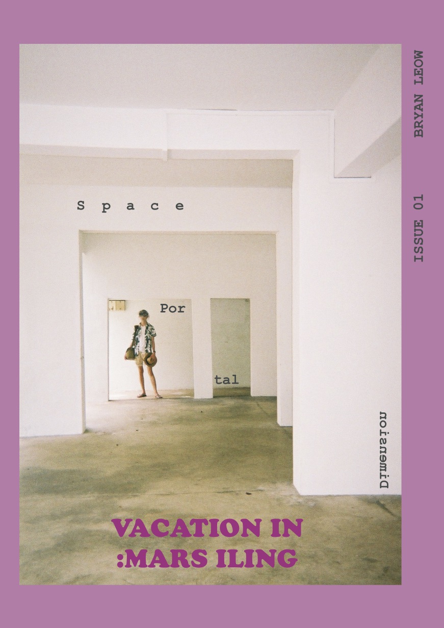
For the cover page, I chose this image because it embodies everything I want to convey in the zine. It also have the best composition and colours. I really love the pink that the disposable camera created, which reminded me of the photographer nguan. This inspired me to use the pink scheme. I used a mint-green colour to complement the pink, creating a zine that is unconventional, energetic, but strange.
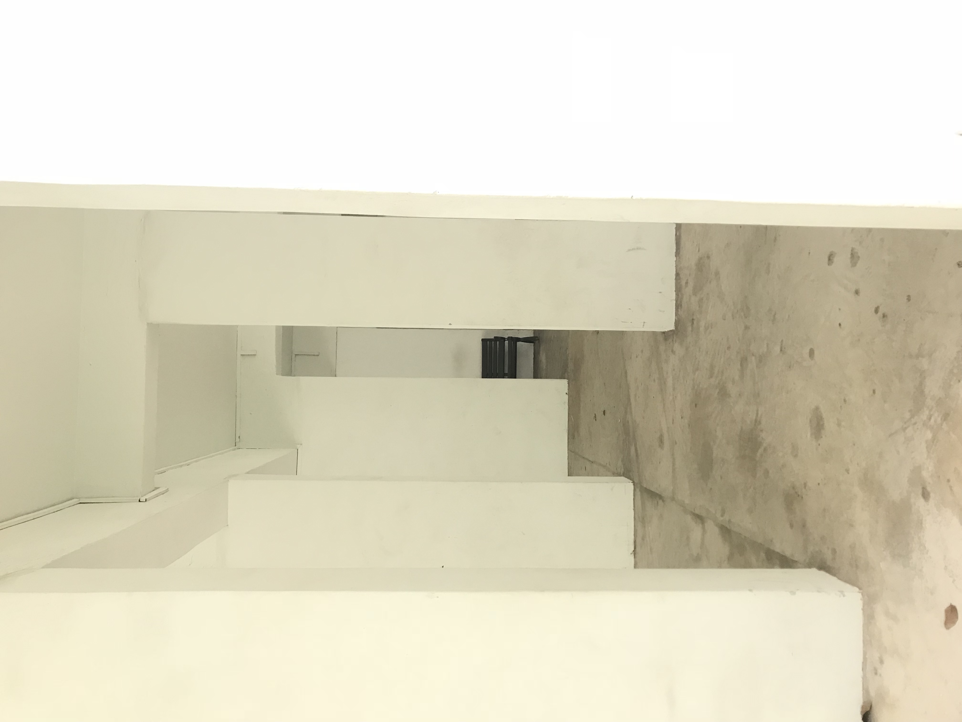
The extra graphics I added are to frame the model, as well as to bring out the pillars.
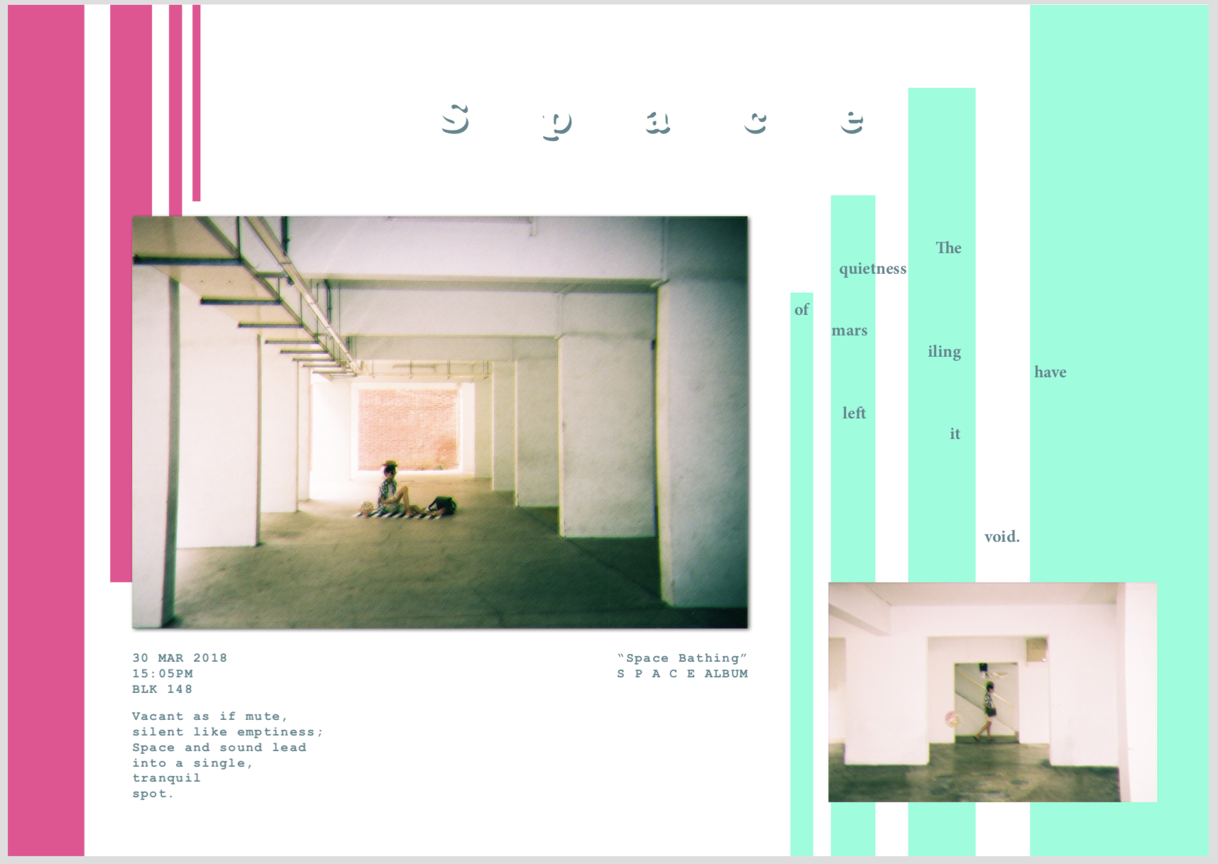
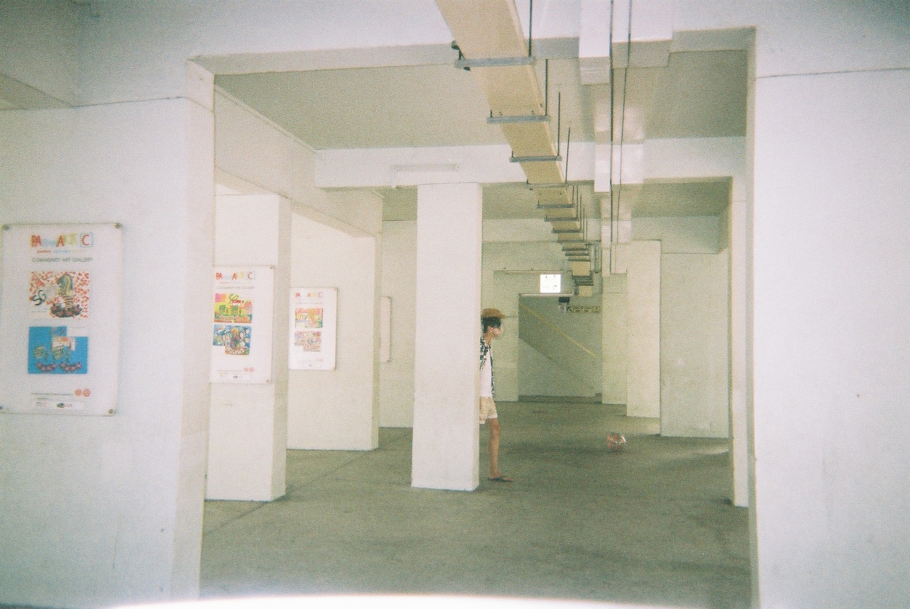
For this spread, I spaced out the kerning for the word “Space” so that I can get the message across by typography. The whole page was supposed to be very spacious and empty, but it does not fit the other pages. So I added in the complementary colour scheme to make it harmonious. The lines are arranged to look like pillars so I can show that the idea of space and quietness is in the spaces between the pillars and void decks.
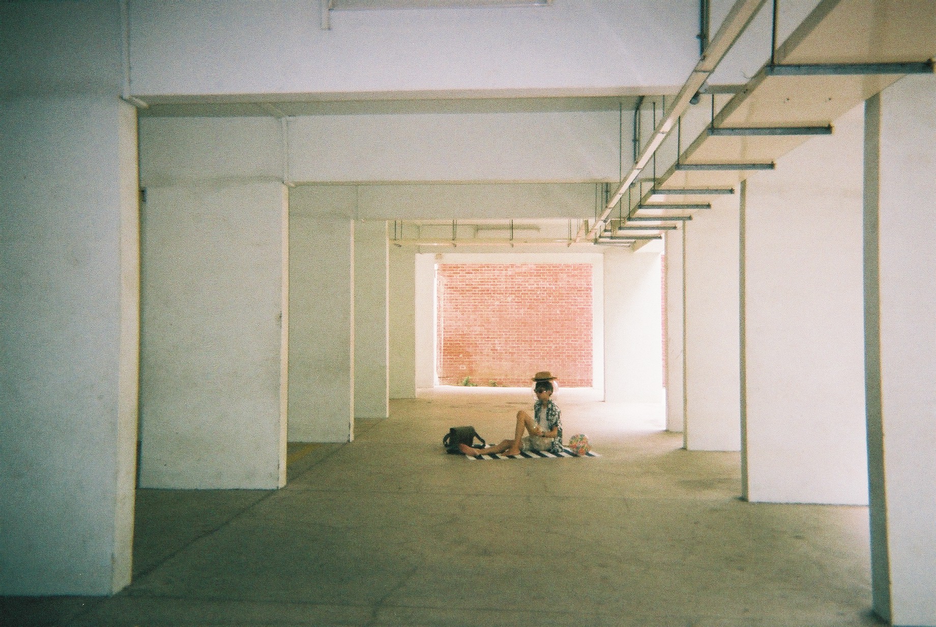
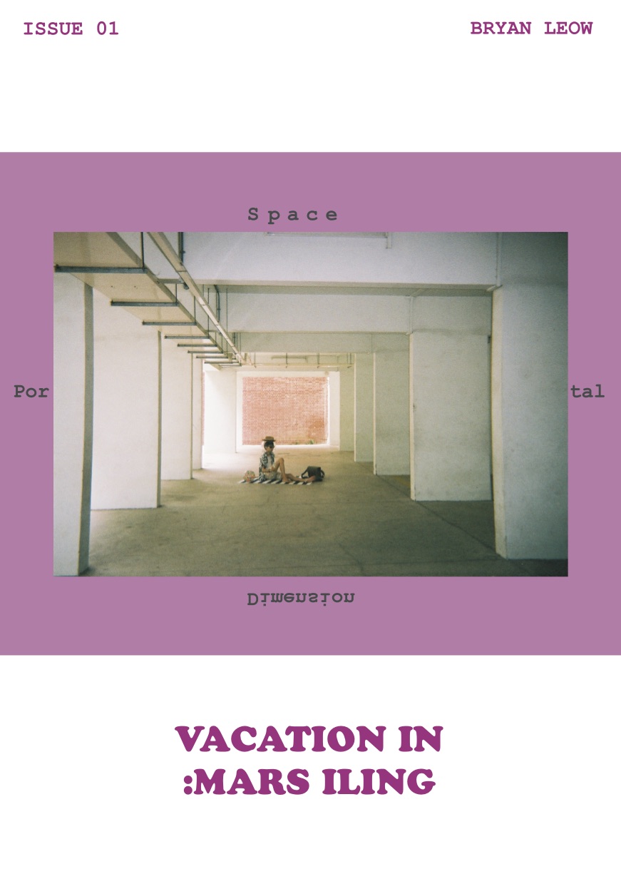
The image used was a 4R image of the tourist sitting on the beach mat enjoying himself. This is to convey the idea of a vacation right from the beginning so as to set the mood. The poetry is used to explain what I am trying to do with the space to depict emptiness. At the same time, as this zine is supposed to be personal, I want it to be expressive and not just informative. I want the information to be understood through expression.
The text at the right side is spaced to not just amplify the idea of space, but also to create the idea of the texts aligning to the pillars.
Finally, the image on the right is another image that I want to show to depict the holiday-ness that goes together with the spaciousness.

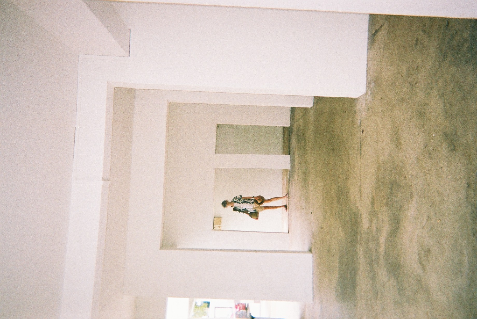
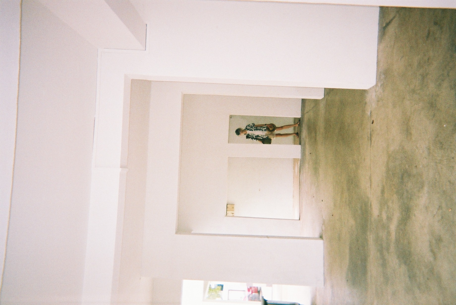
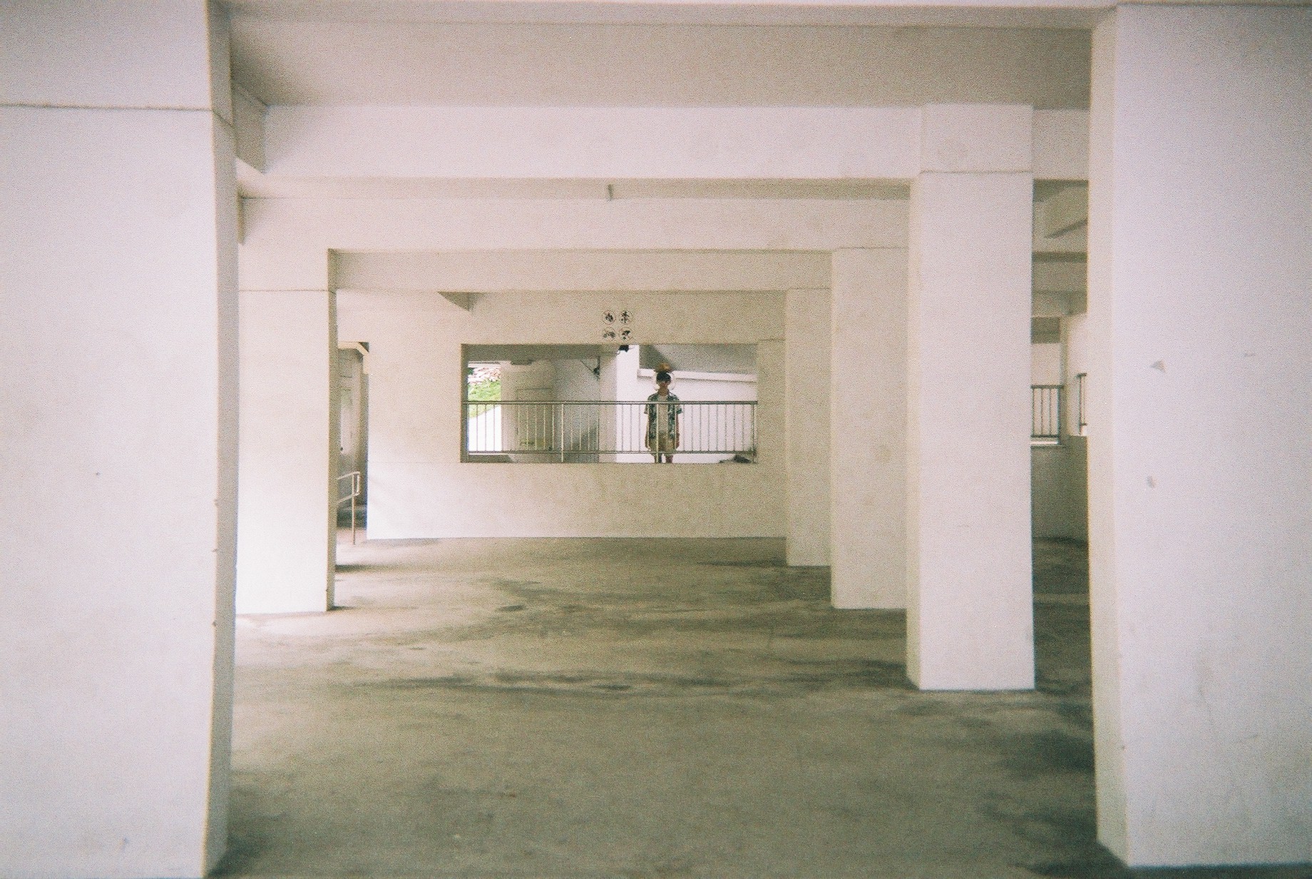
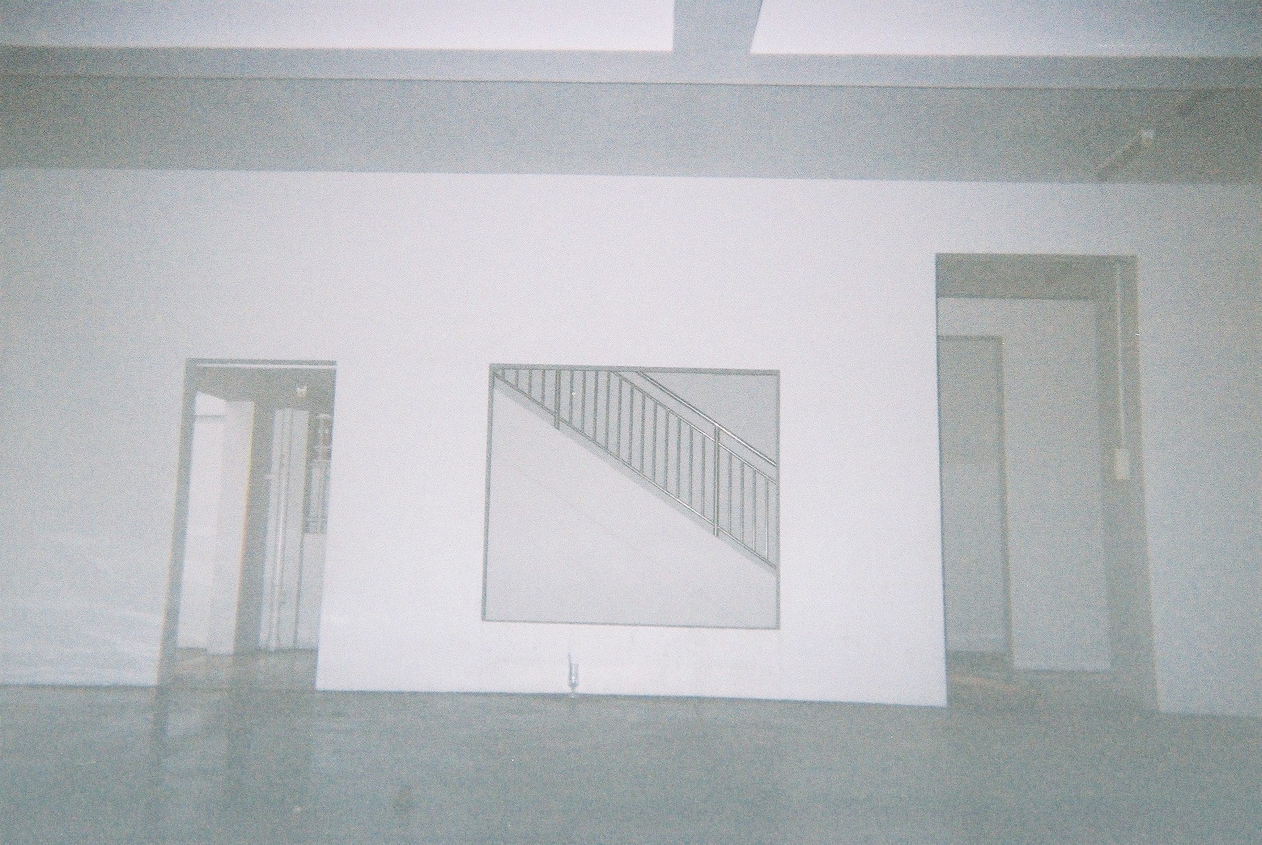
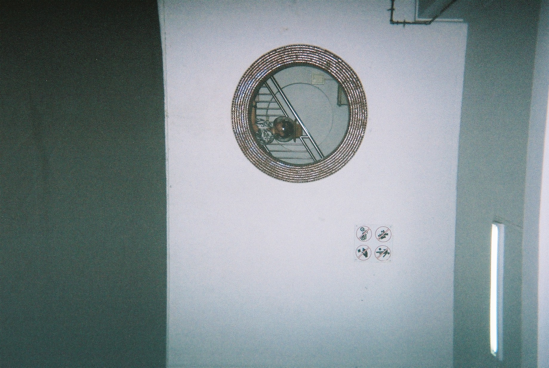
This spread talks about portals. Although the background does not have much to do with it, I really liked it as I think it have a lot of potential to be an image that covers the entire spread. I instead use the difference between an outdoor and an indoor area to suggest the idea of portals. The odd placement of the circular HDB void deck window in the middle of the spread is to add on to the idea of portals and strangeness. The usage of the complementary green/pink is very present here. This is to expand on the idea of duality in portals. In terms of placement of texts, photos, and colours, I have played around with increasing the space between linked objects to distant them. eg, distancing a single image with 2 colours, but they are linked in the same image, or distancing two sentences, even though they go together.
Another thing I did here is to connect the photo of Jeremy holding the selfie stick with the background. The grass and buildings align with the background, creating a separate, yet interlinked relationship between the image and background.
The poetry and the subject’s touristy action is a representation of the tourist. Again, I made sure to make him very stereotypically touristy. The background of the image is also a suggestion of emptiness as there are nobody there. I also purposely made the poem pretentious so as to convey the pretentiousness of stereotypical tourists.
Finally, I added half an image on the bottom right side so as to link the spread to the next page, conveying another idea of portals. In this case, it’s the portal from one page to another.
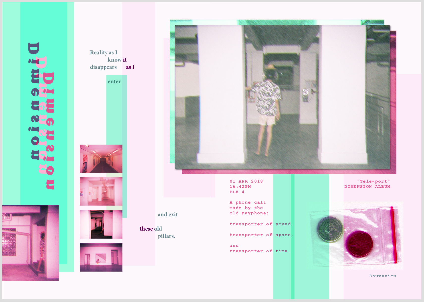
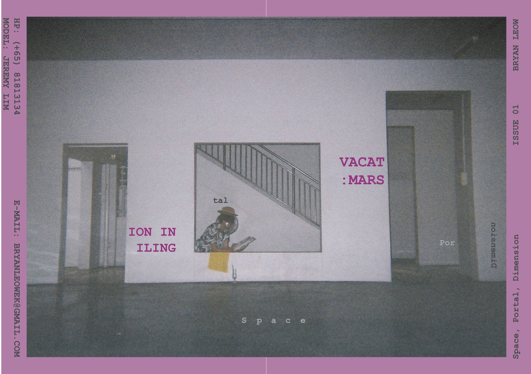
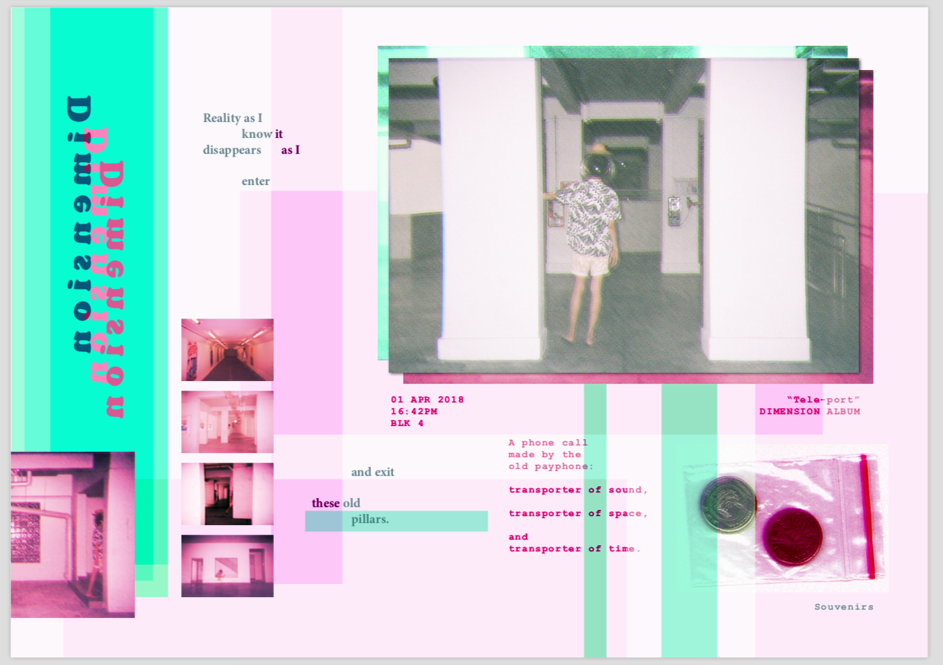
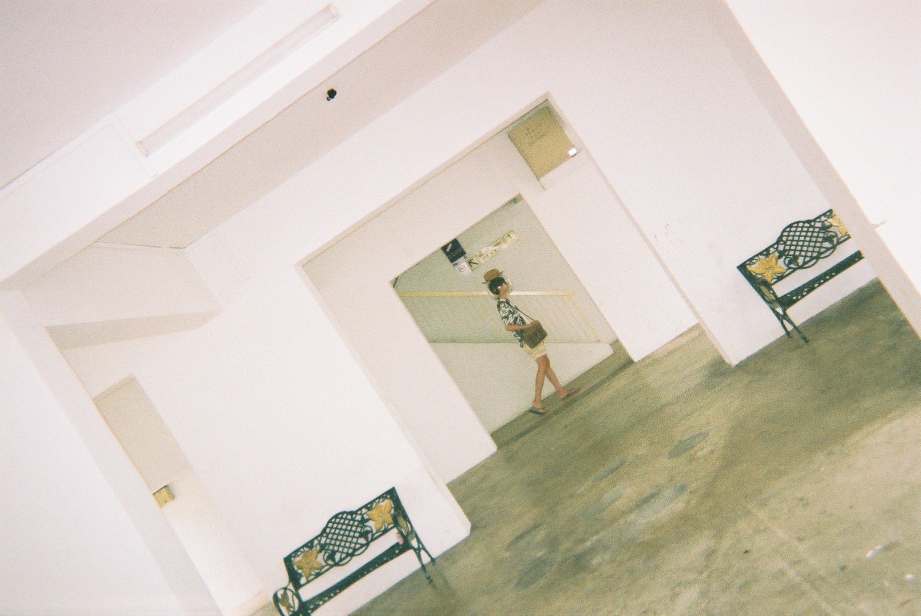
This spread is about dimensions. I combined the first two spread together to create this page — a combination of space and portals. Repeated and glitched “pillars” are created to show the idea of space, but also in a different world. I try to arrange everything vertically, so as to construct the pillars like in the first spread. The usage of all images present here are images of Jeremy entering from one pillar and exiting another pillar. This helps convey strangeness, and some sense of portalling.
In the 4R image, Jeremy is holding a telephone. This is to represent tourists’ curiosity with strange object, specifically objects with heritage like an old telephone. It suddenly clicked in me that phone is a representation of a transportation of sound. I tied everything together like this:
The colours, again, I used the complementary scheme that is consistent to my other spreads.
At the bottom right, I added a ziplock containing two 10 cents coin, which I labelled as “souvenirs”. This is a representation of tourists keeping souvenirs found in foreign lands. This concludes what I think about what tourists in Mars iling will do, as well as concludes my perception of Mars iling.
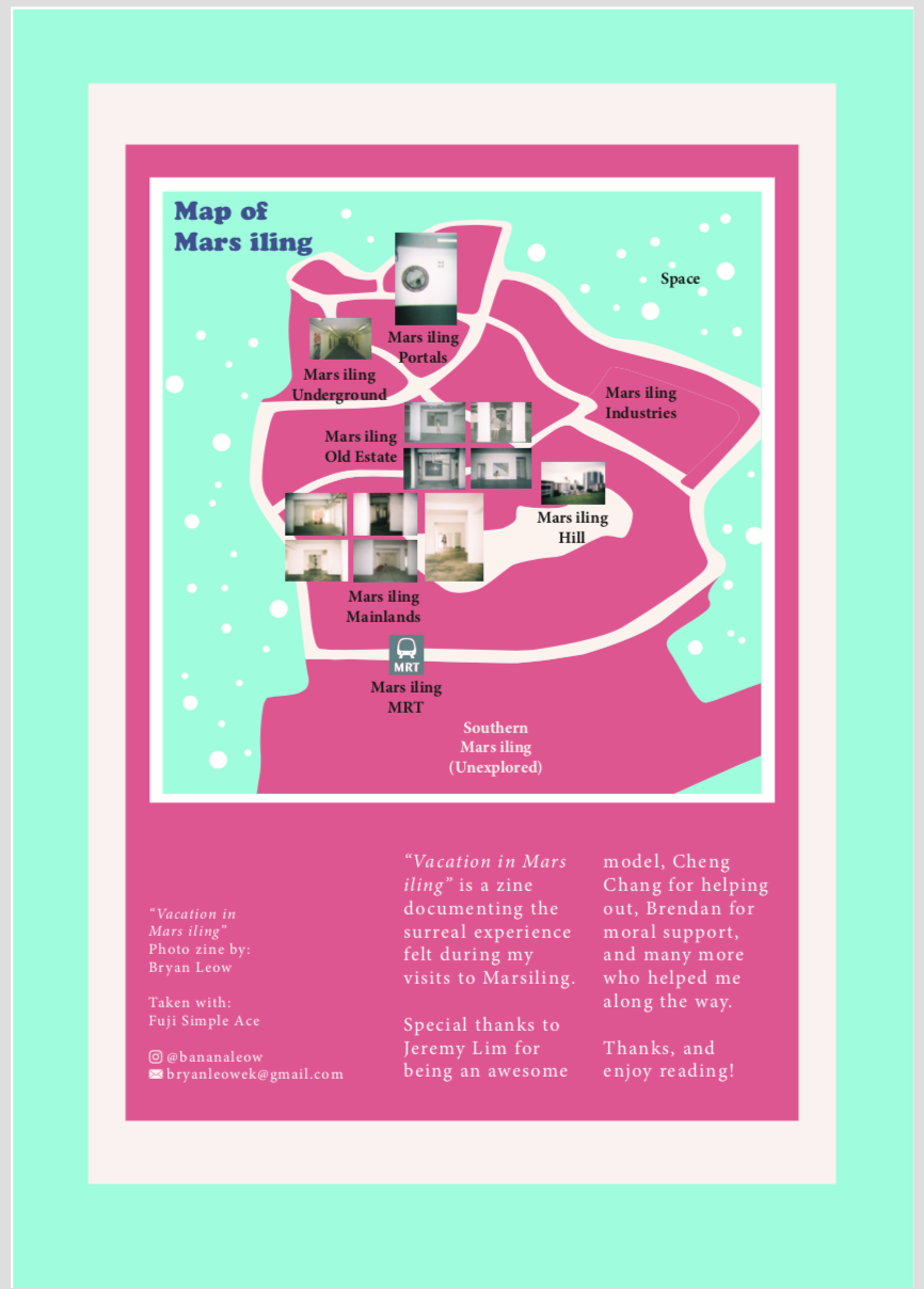
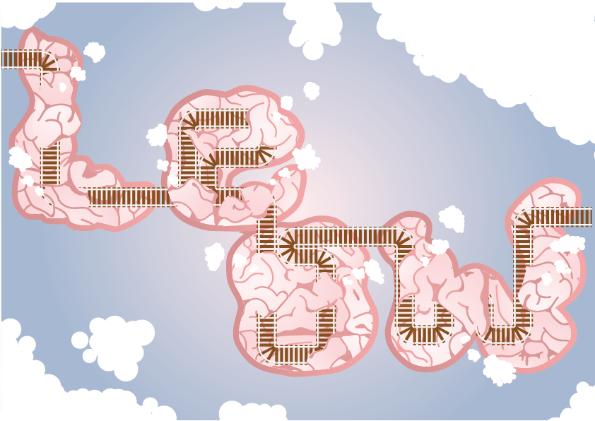
On the last page, I included credits and contact details, as well as a map. In the map, I try to label the different parts of Mars iling, categorising them into zones that I find define each area best. In specific areas, I placed the few significant images that I took at the area to let readers know which image is from which zone. I try to make it as if Mars iling is a planet, which is why I added “stars” and a label “space” outside the map.
And that’s my zine!
LASTLY
I’d like to show off all my disposable camera photos. I REALLY LOVE THEM.


Takeaways & Reflections
I really enjoyed this project, even though it was really tough. I am really grateful of my friend Jeremy for carrying all the camera equipment and props around Marsiling with me for two days. I enjoyed shooting with an intention in mind and directing the shots, as I have never done it before and it’s about time I actually do something that helps me to train my assertiveness and decisiveness. I also enjoyed thinking about the art concept and direction, and generally love the idea of having props and weird props around. There was even once I wanted to buy an inflatable flamingo float just for this shoot and I held back. I REALLY LOVE THE BEACH I GUESS?
OH. and I was also exposed to like a lot of different zines and that PUMPED ME UP a lot. They are really nice to look at and inspiring.
I also have discovered a new love for film and I really would love to go do more photoshoots from now on.
About the zine, I have relearnt how to use InDesign, and it’s quite good even though I disliked it at first. I was a bit reluctant to use it as I was too comfortable with illustrator. After a while, I decided to bring everything to Indesign so as to try it out. That was when I realised that the guides and spreads in InDesign actually makes everything easier.
One more thing is I learnt about composition, layout, and colours. These are always important, but I finally knew how to control it in pages.
I am proud to have created this zine even though I could still improve it, and even though I am not pursuing graphics design, I believe I’ll continue making zines for fun!

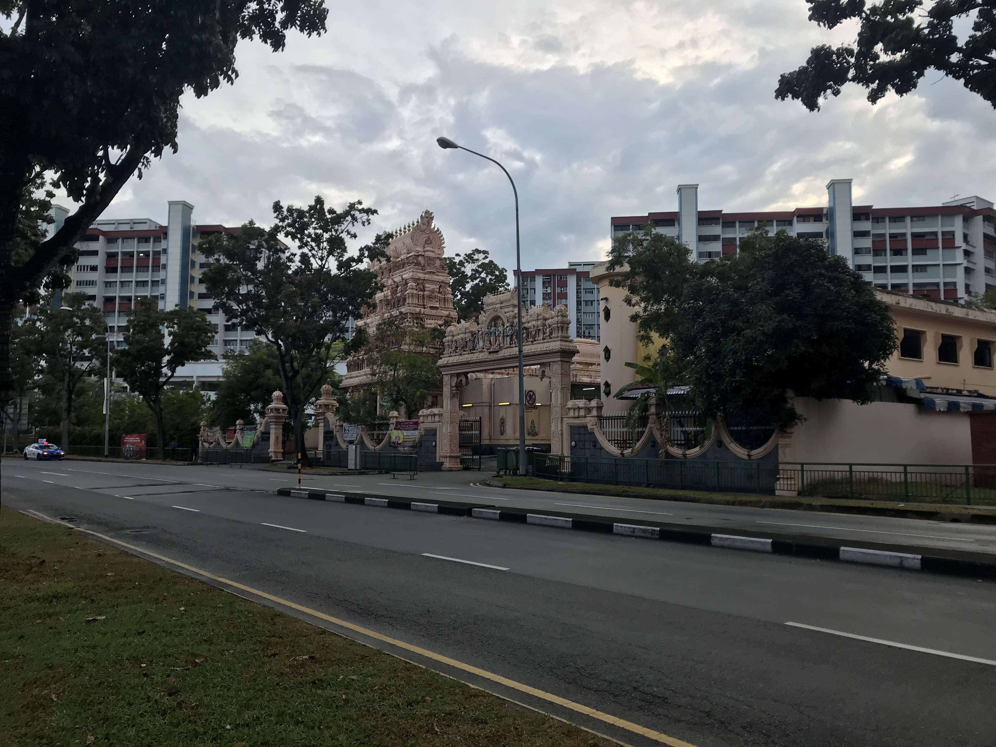
I went to Marsiling!
The journey was from my house, Punggol -> 119 -> Sengkang -> 161 -> Woodlands -> NS Line -> Marsiling
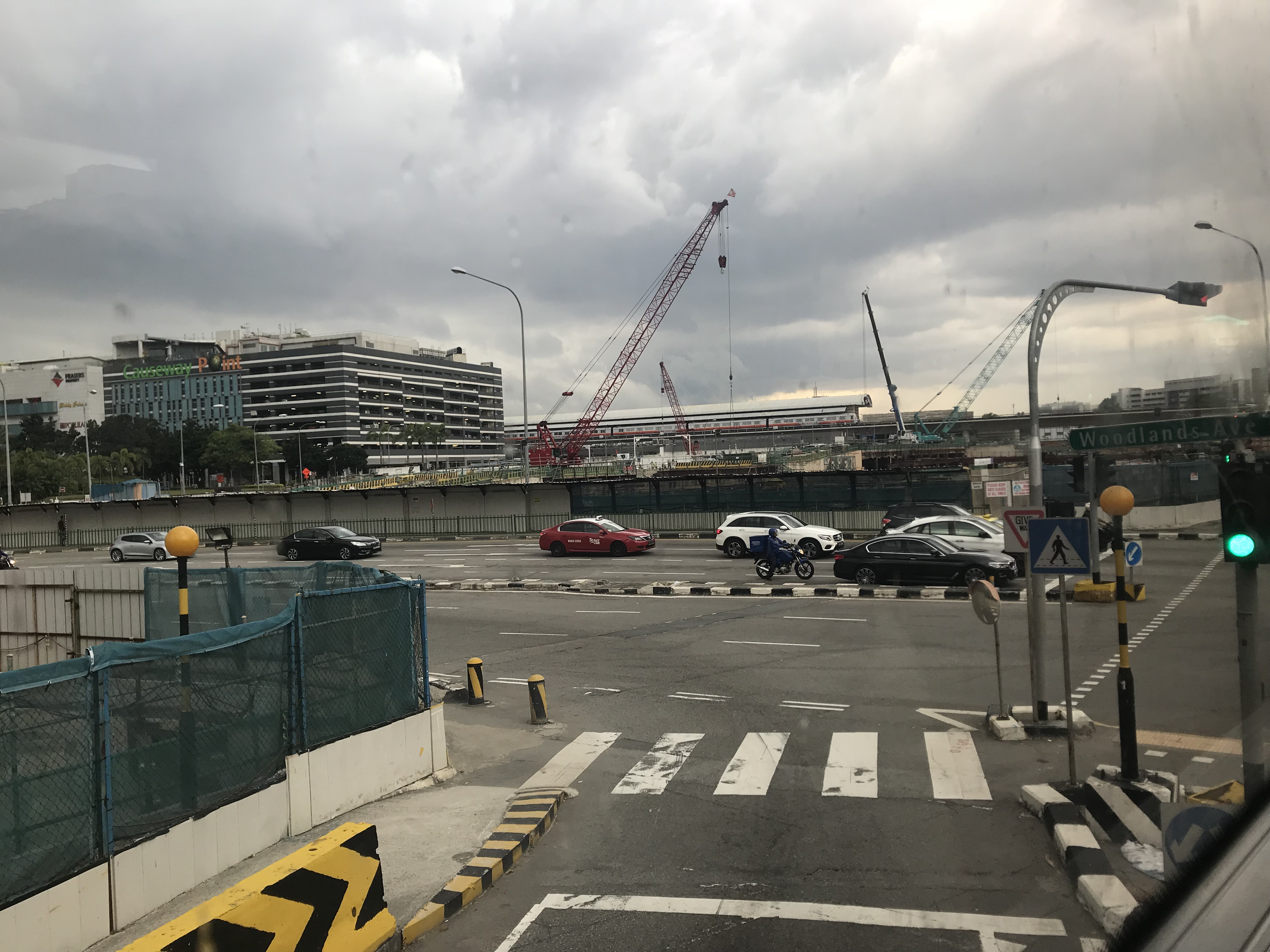


Upon reaching Marsiling, I was a bit unsure on where to start. Before this trip, I had not researched on Marsiling so that I will take in everything raw. I will make my own impression of Marsiling rather than let other people do that for me.
Zone 1
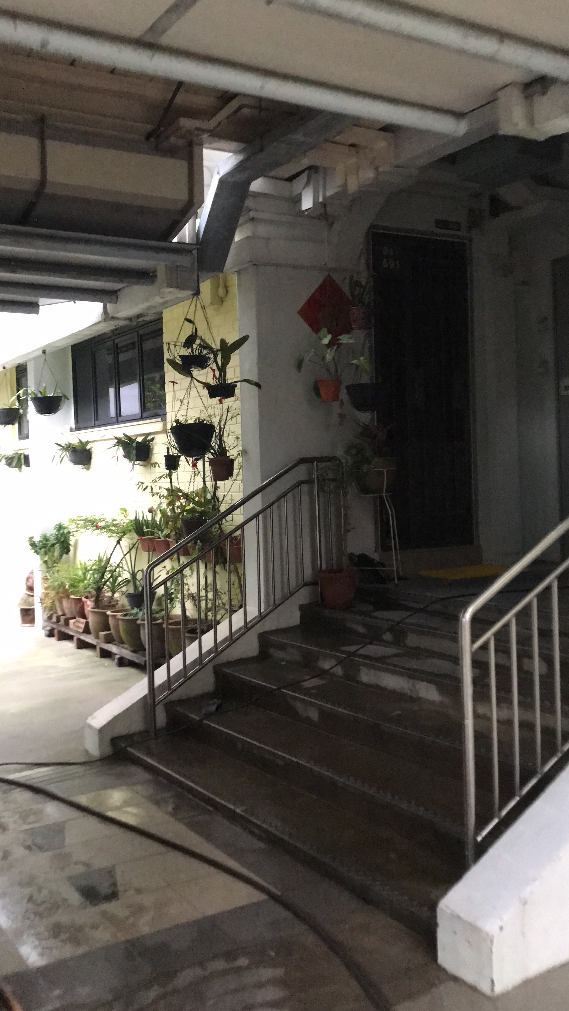
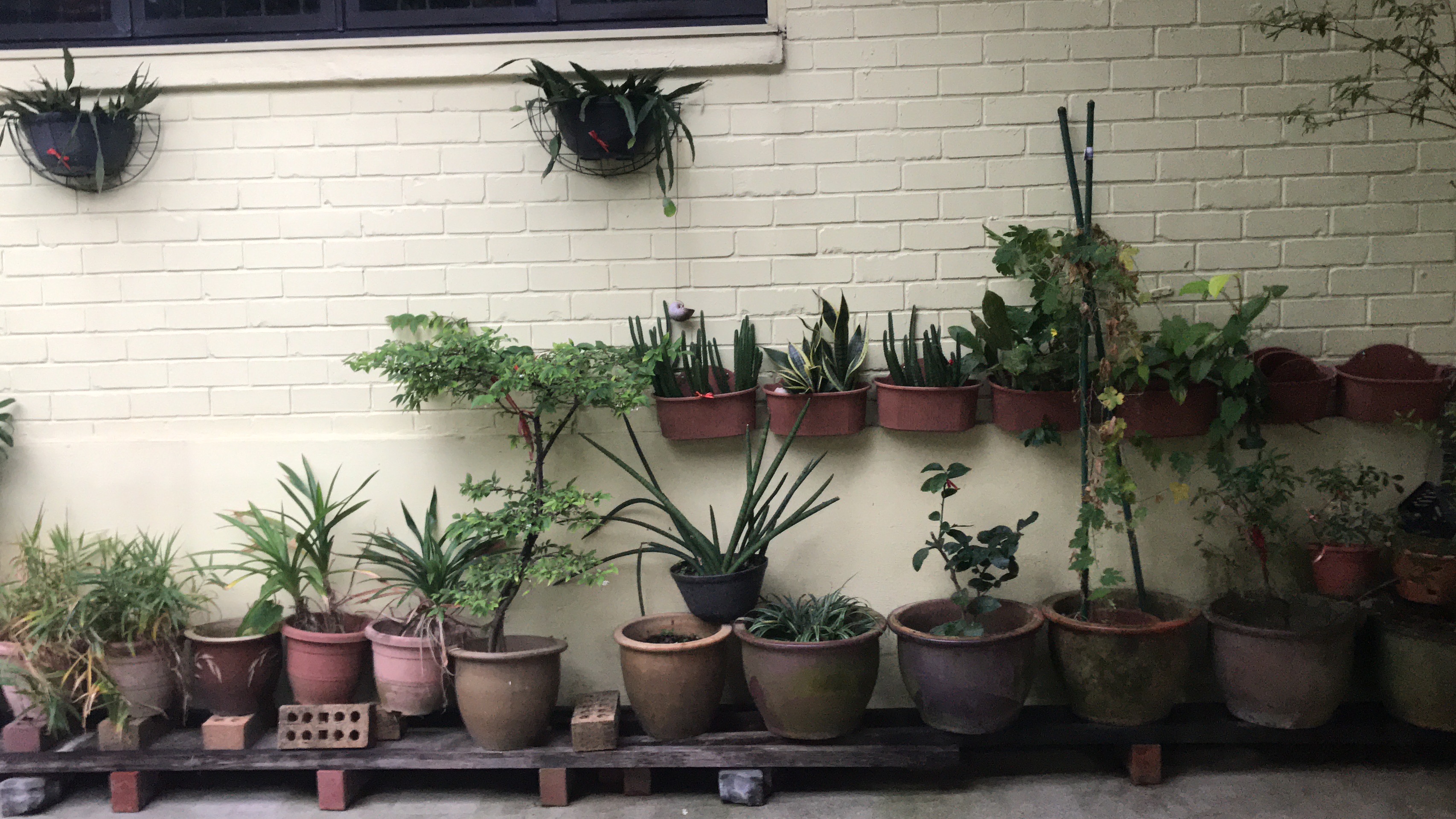
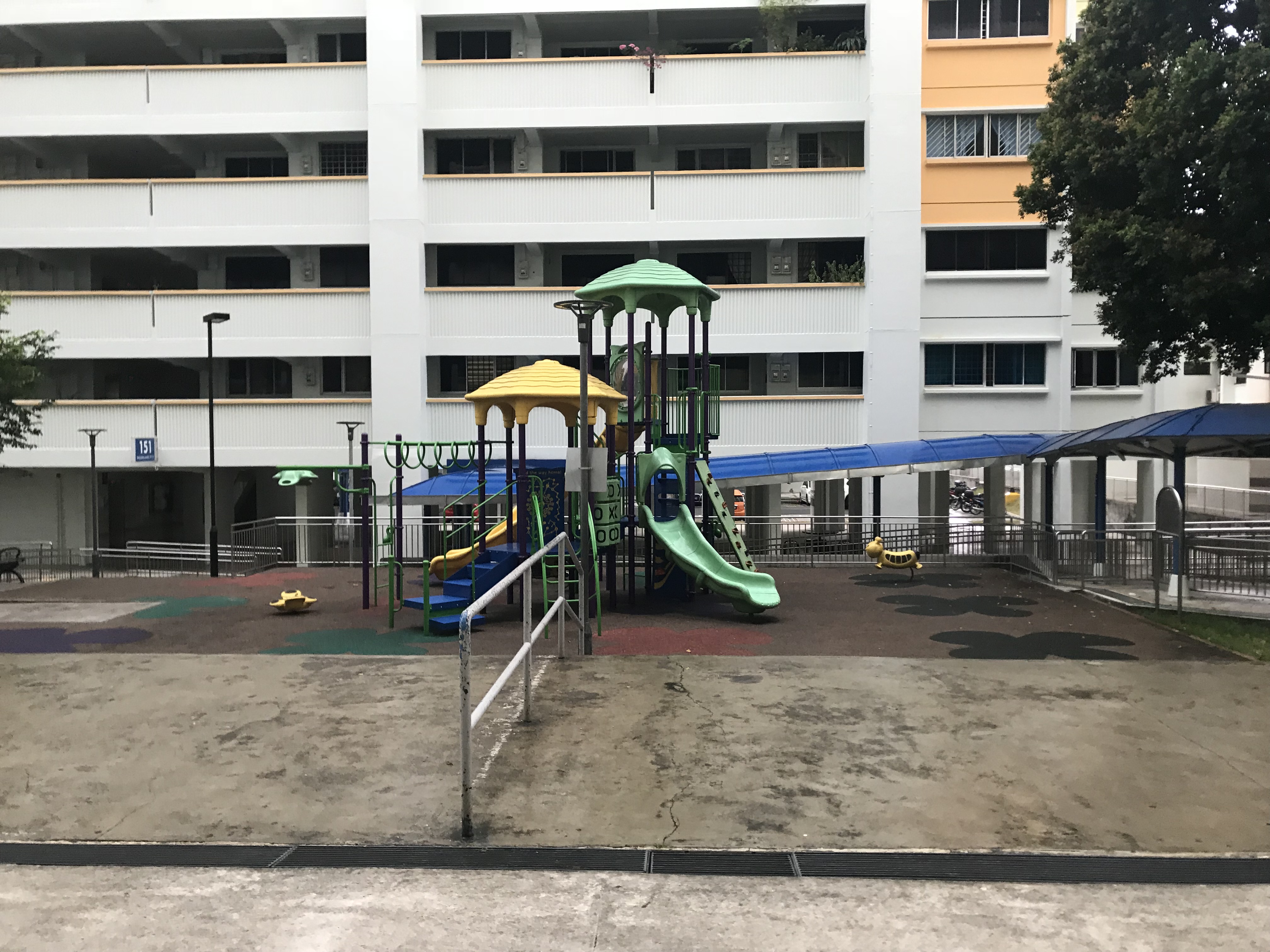
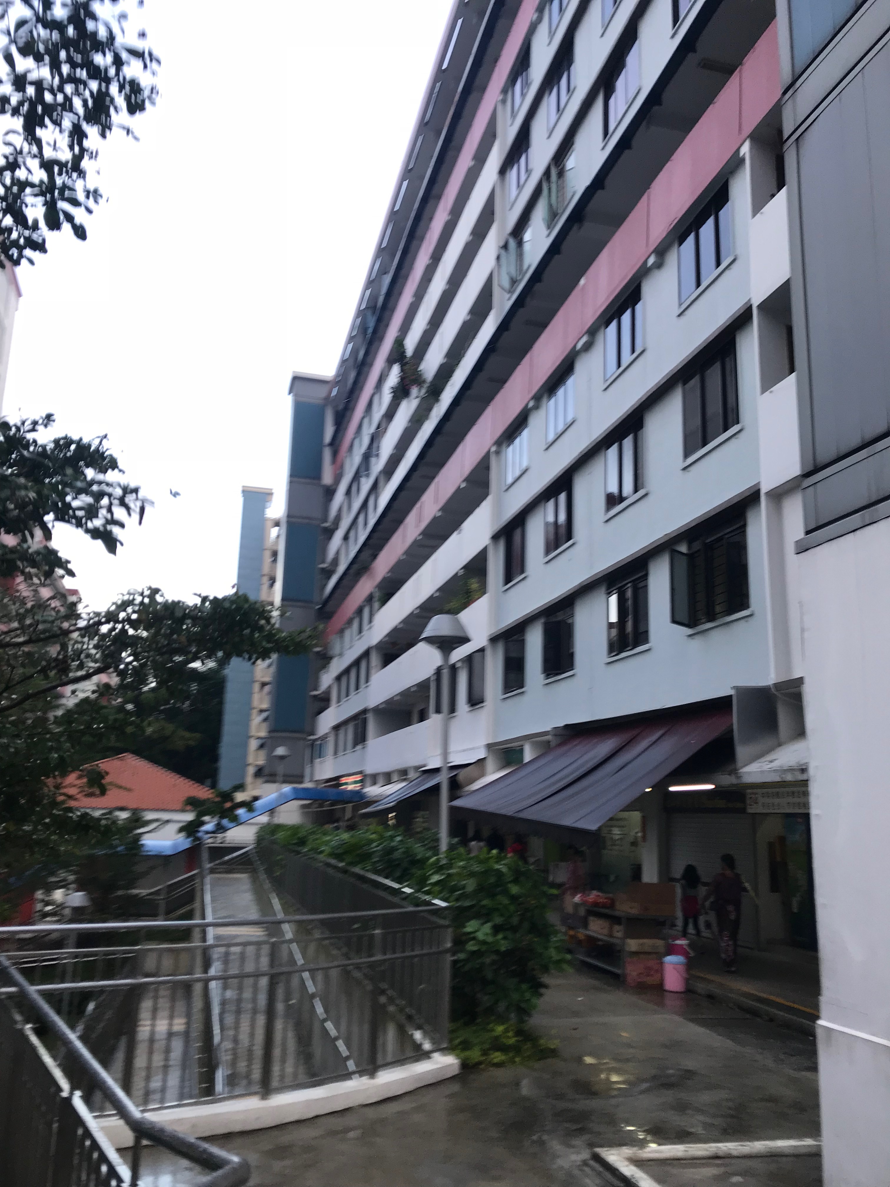
So I decided to walk the most obvious path, which leads me to these low rising houses. They looked old and the first storey have a lot of plants! It was interesting to me as I never seen such things before (or maybe was just too used to the lack of plants in the crampy new gen HDB I live in)
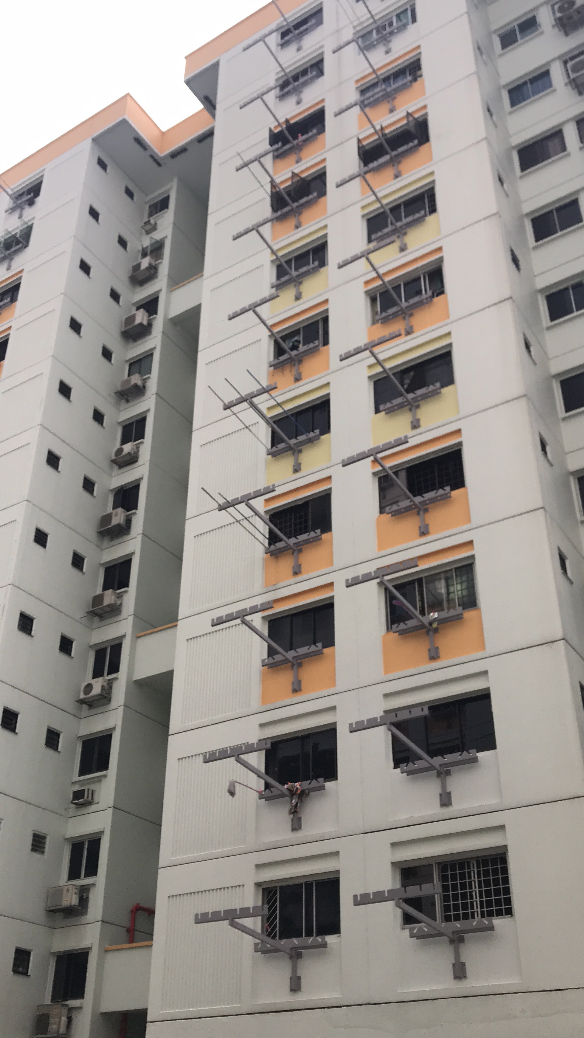
As I explored, I noticed the HDB have these metal thingy jutting out of the HDB. They are bamboo pole hangers (probably upgraded as I never seen it designed like this before)
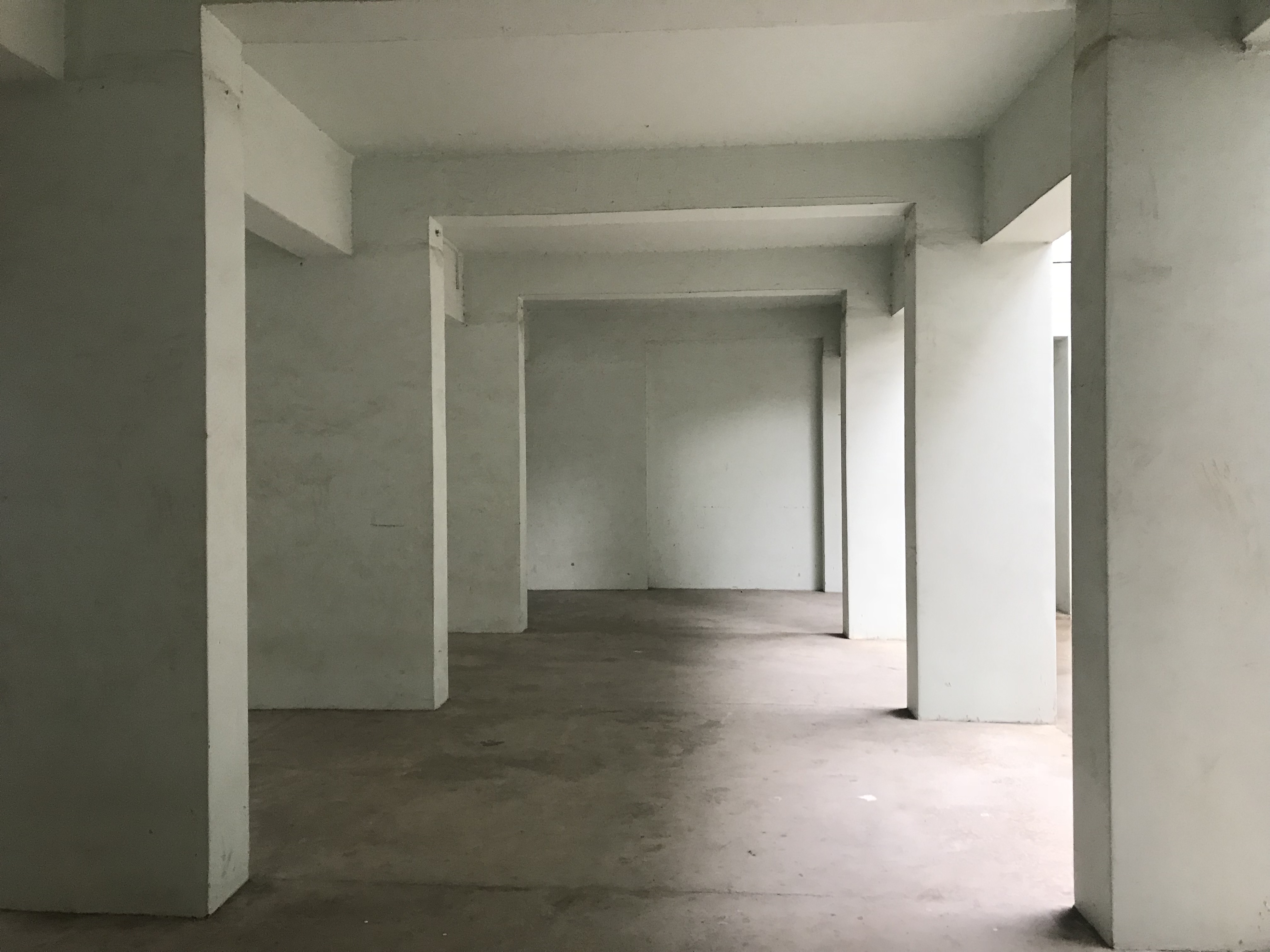
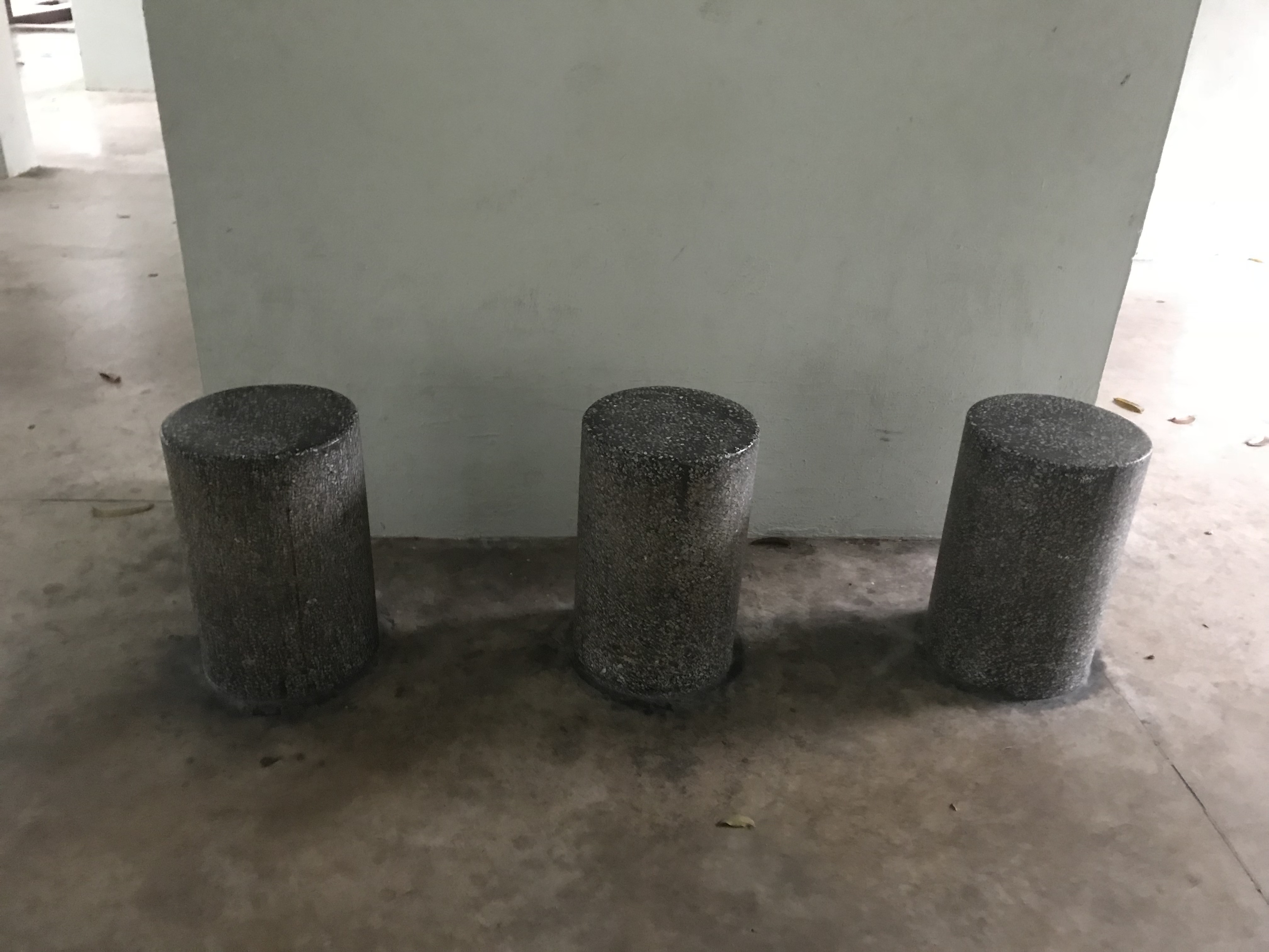


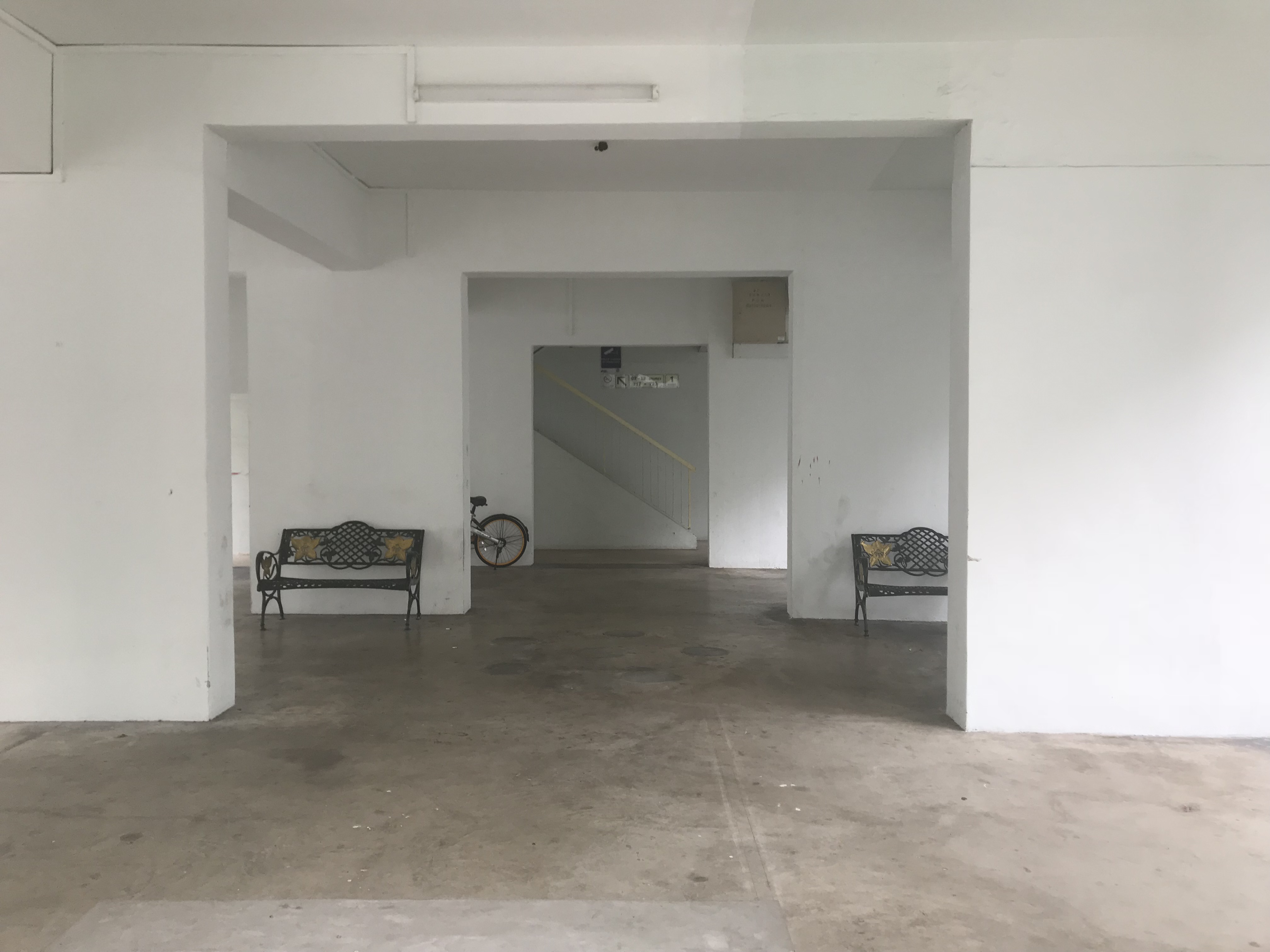
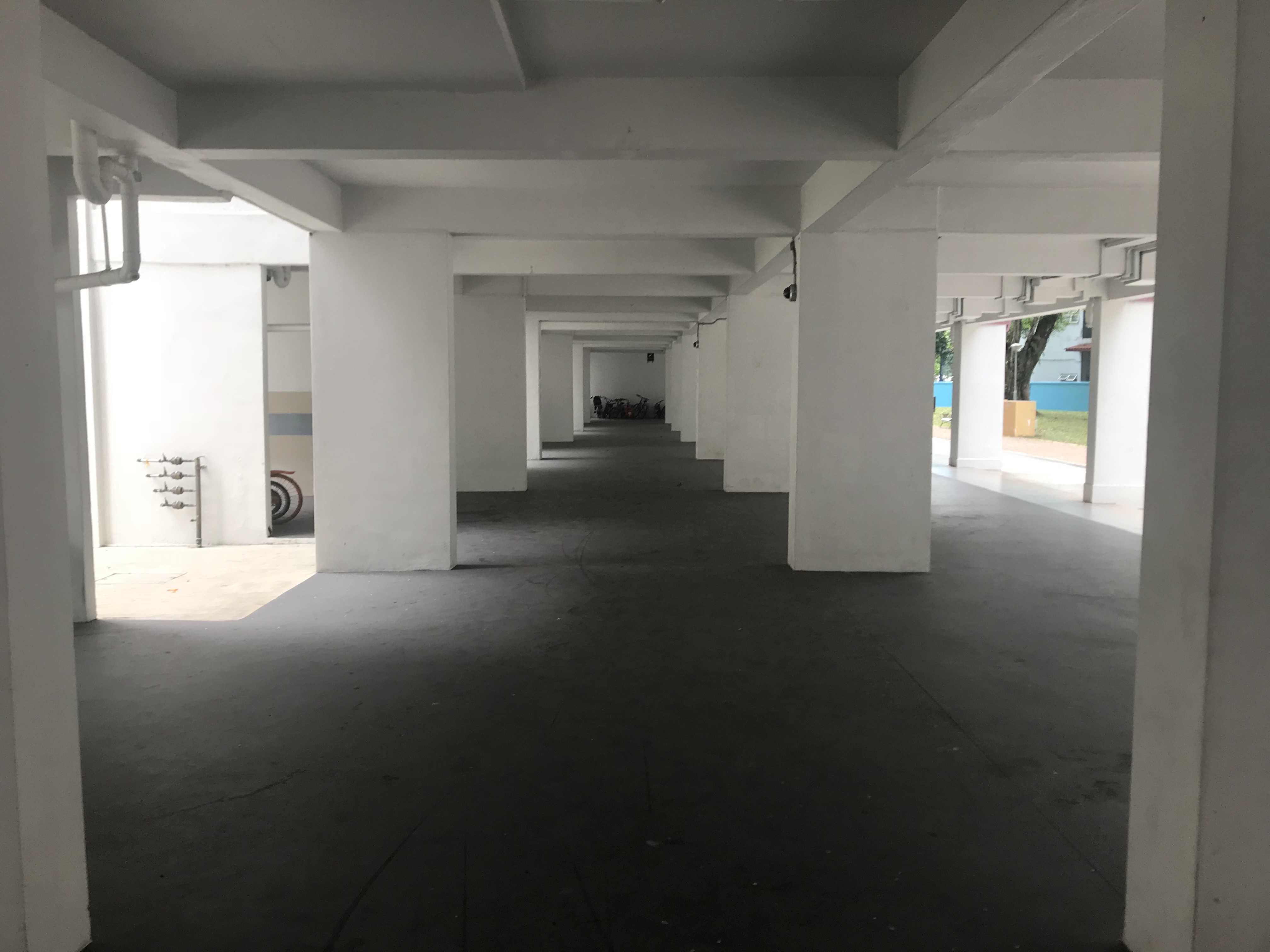
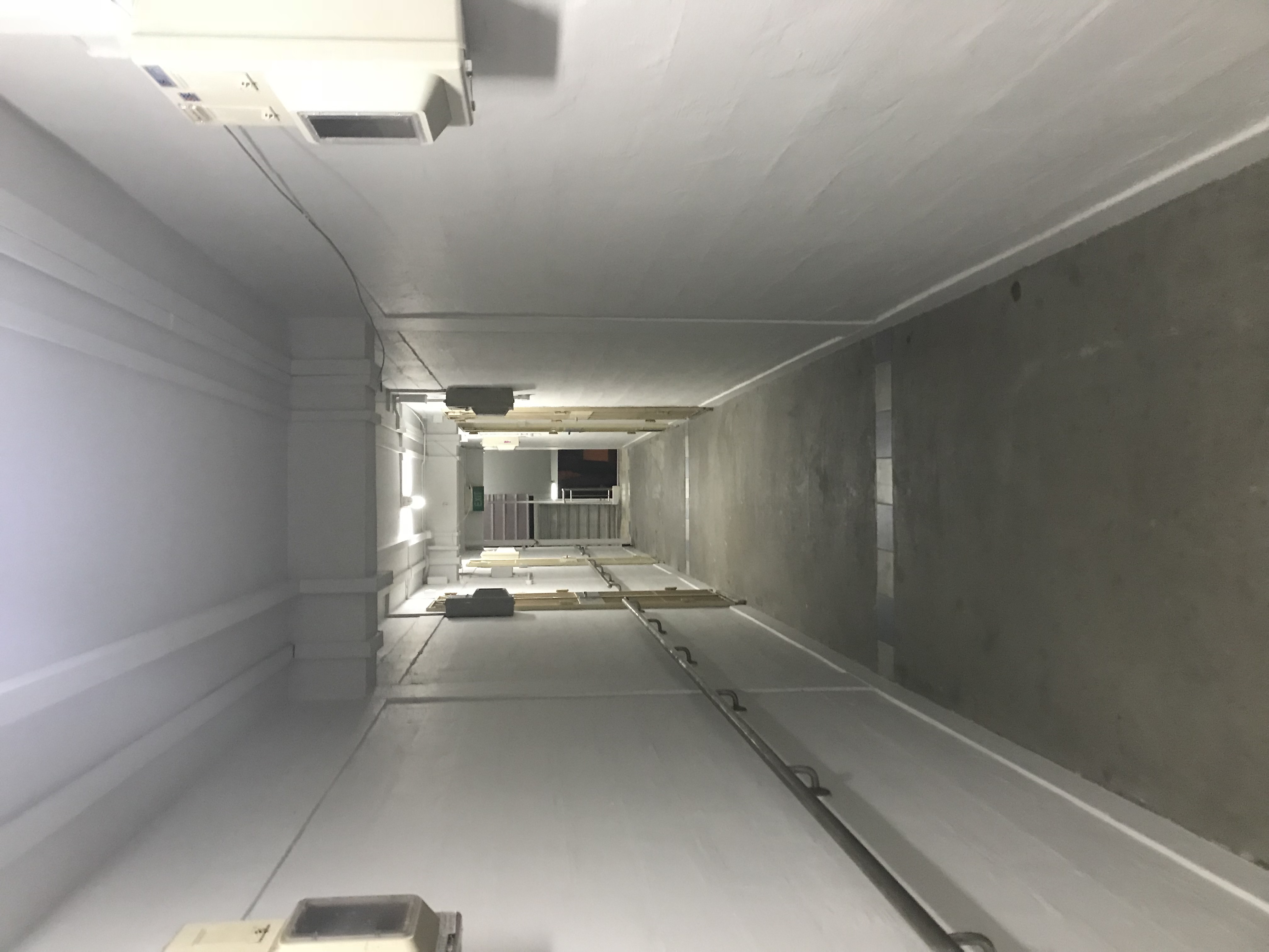
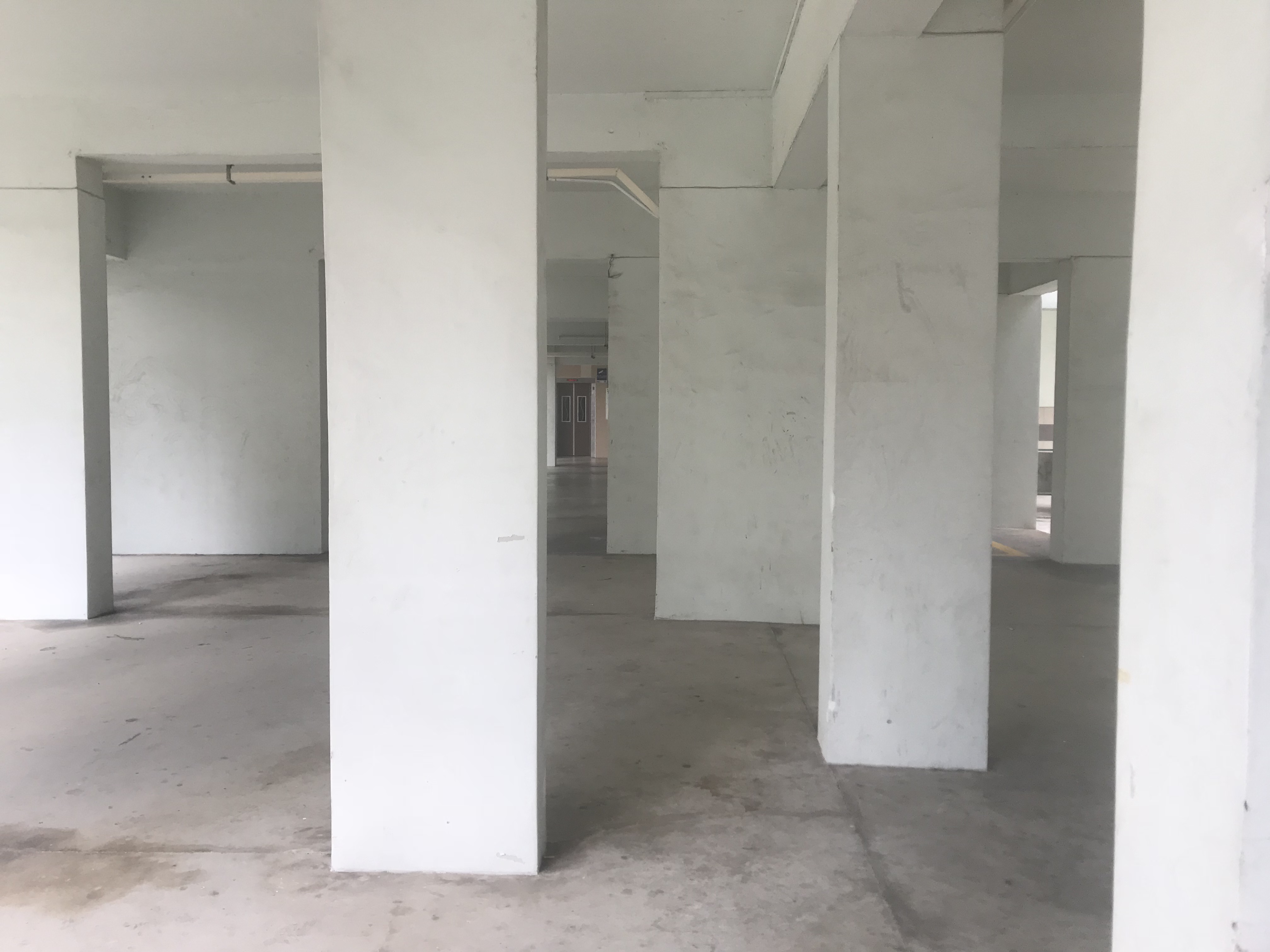
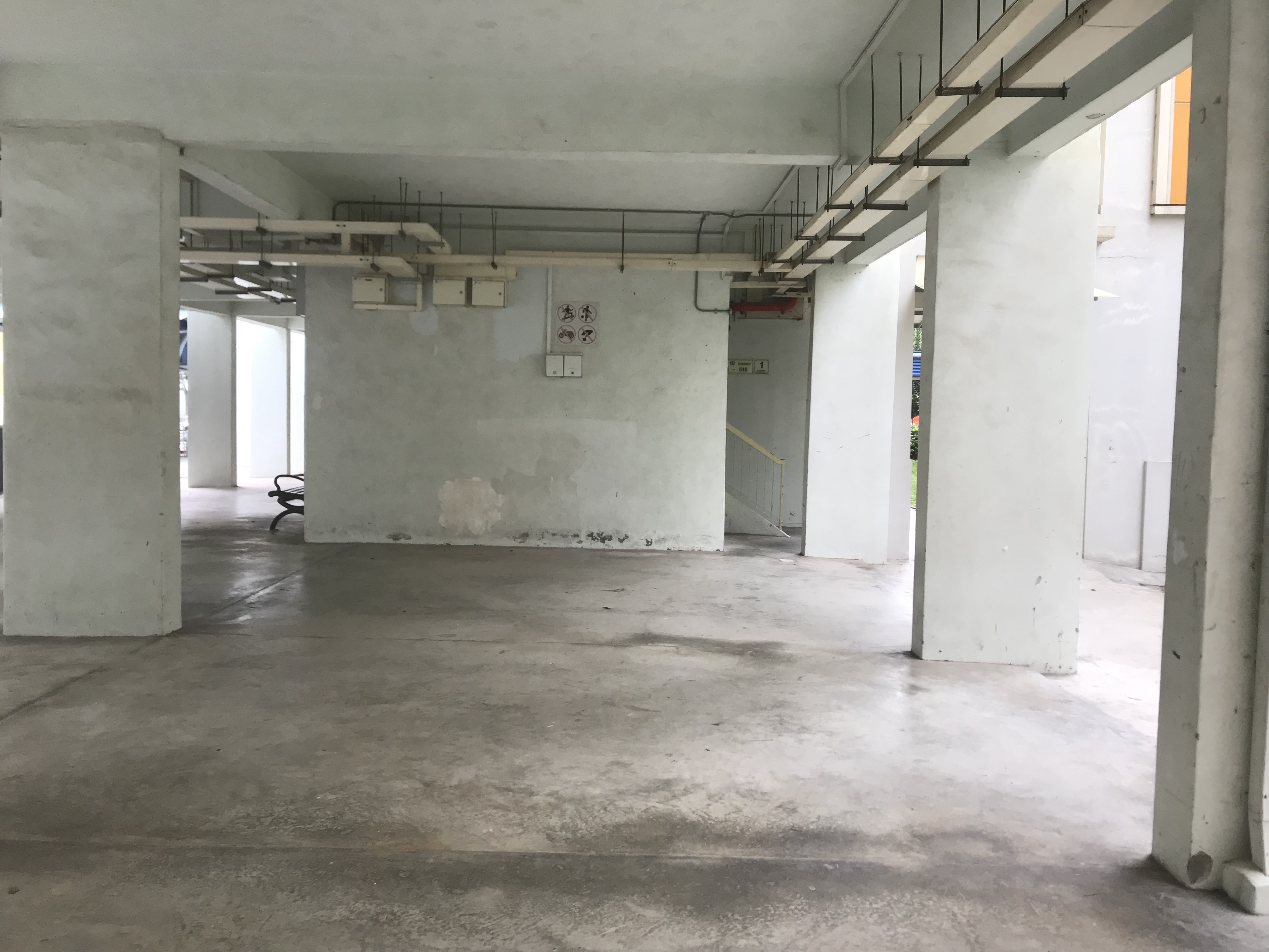
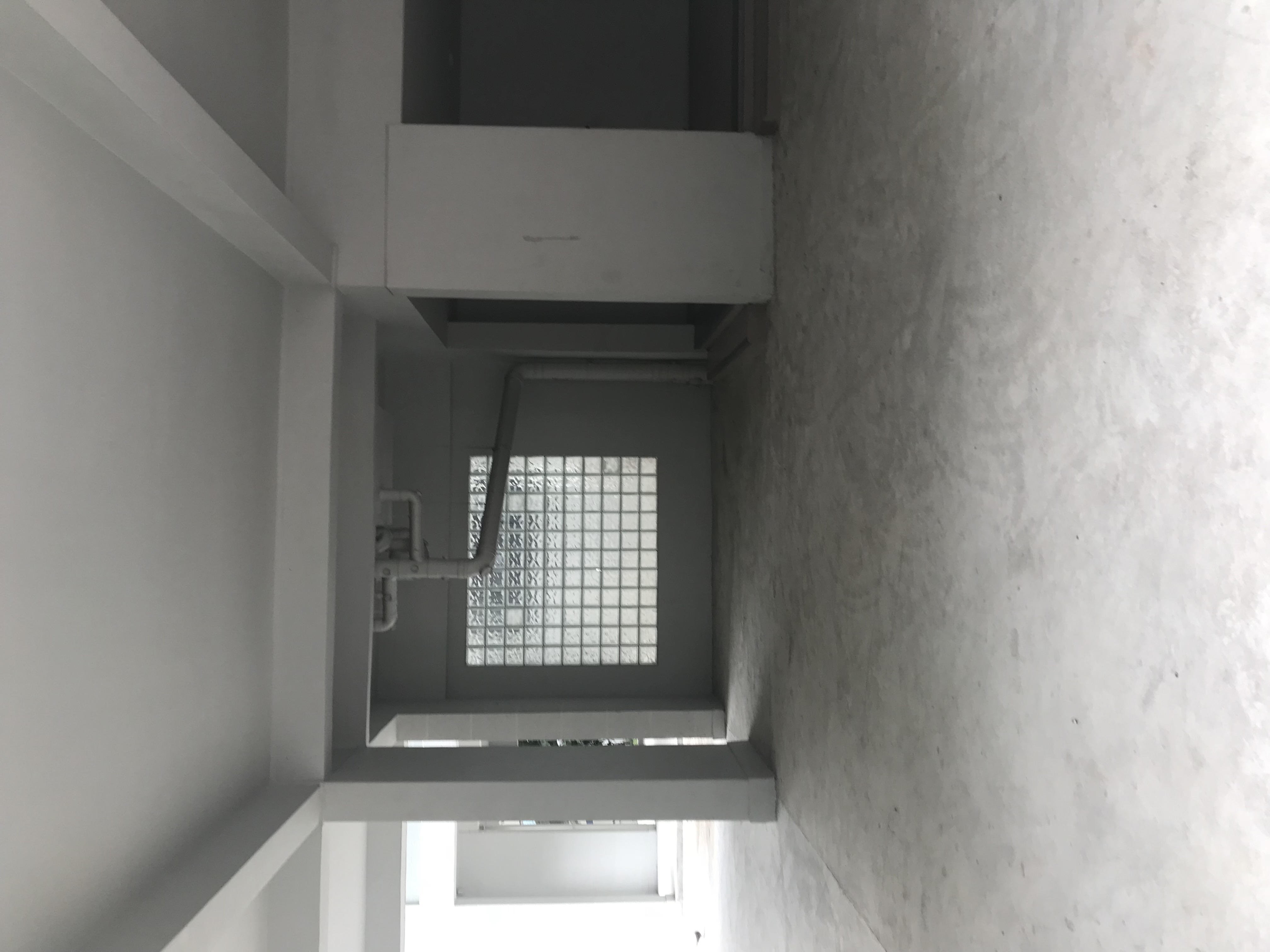
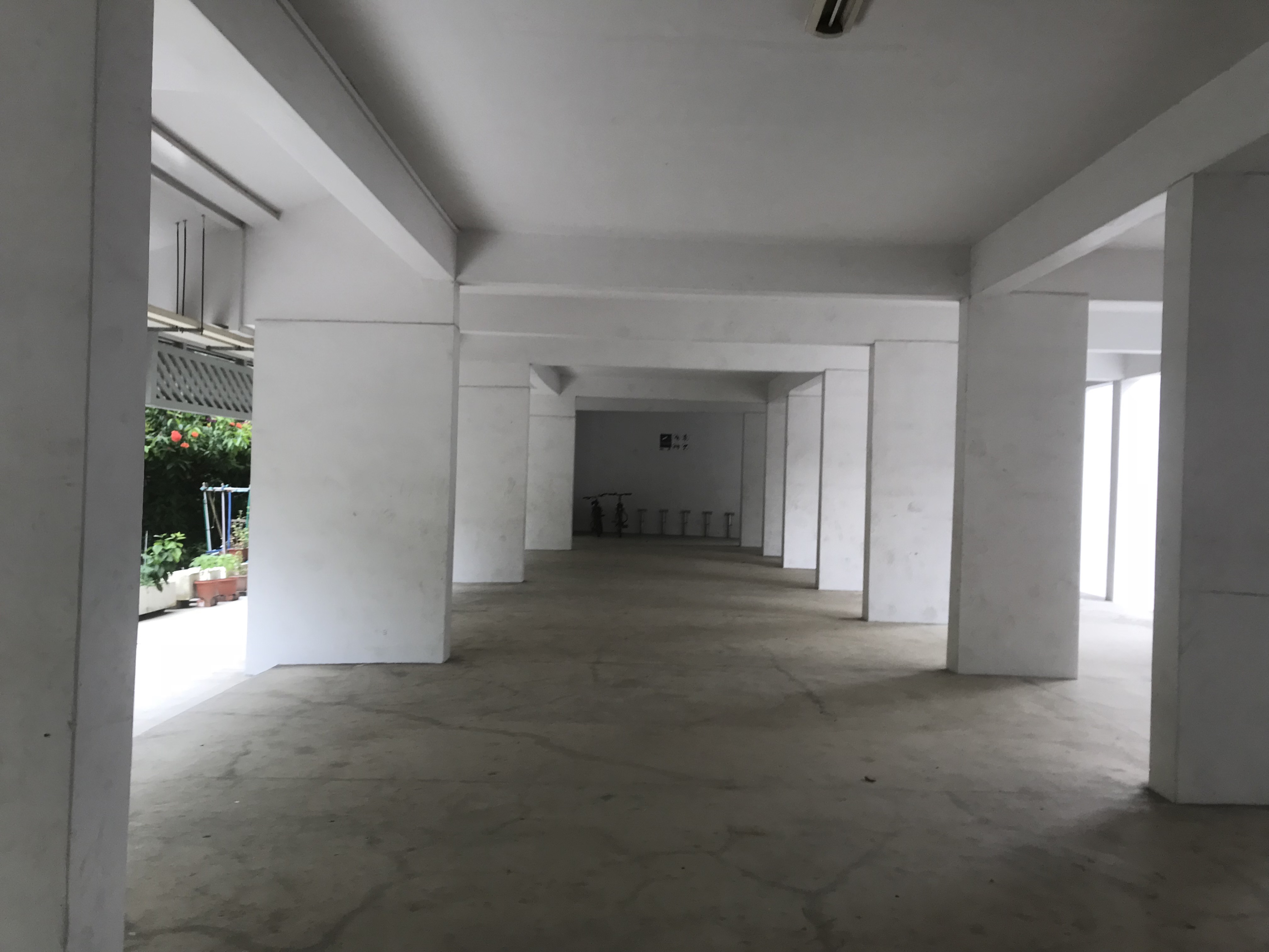
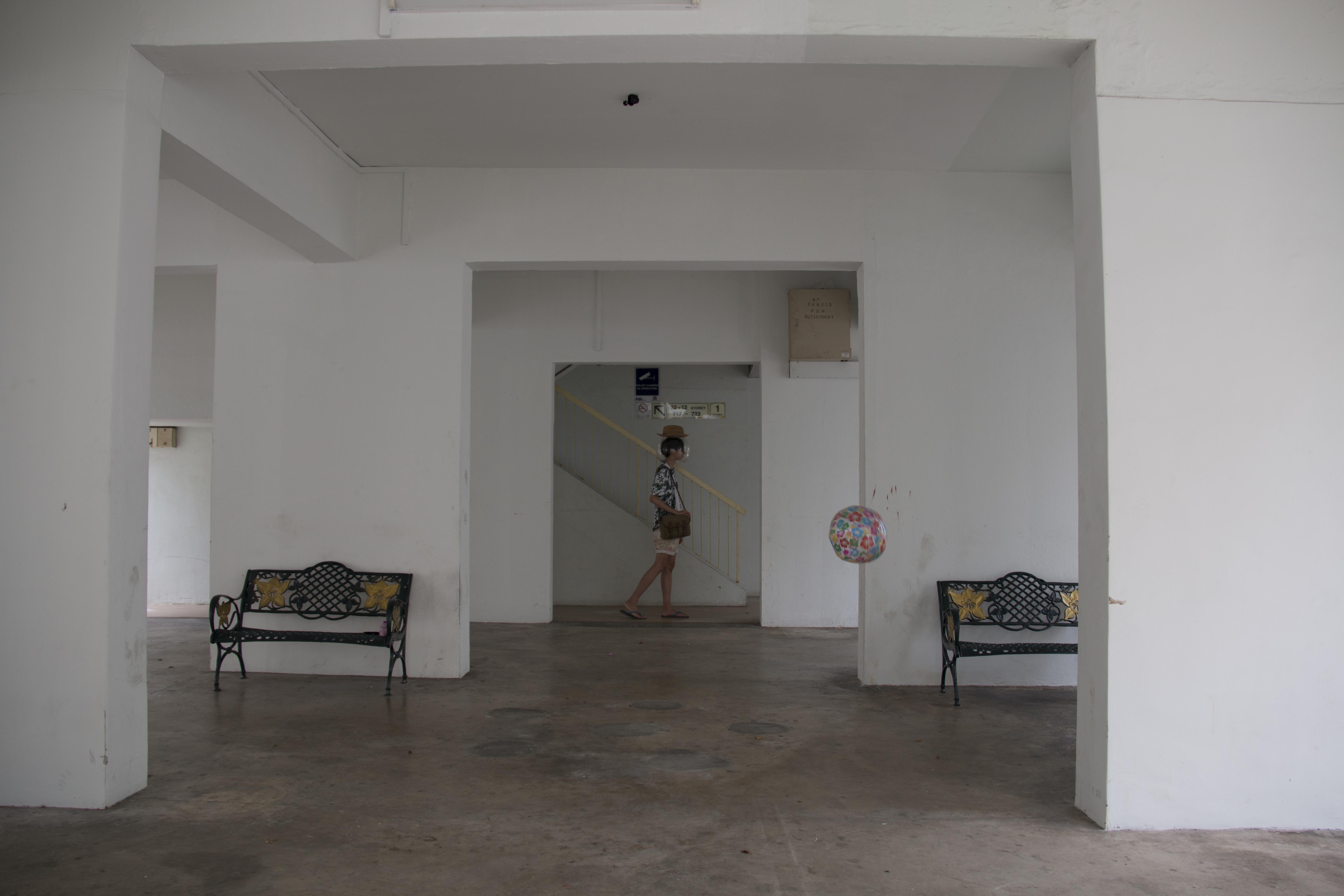
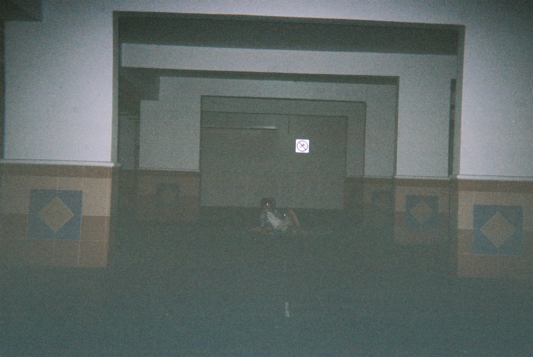
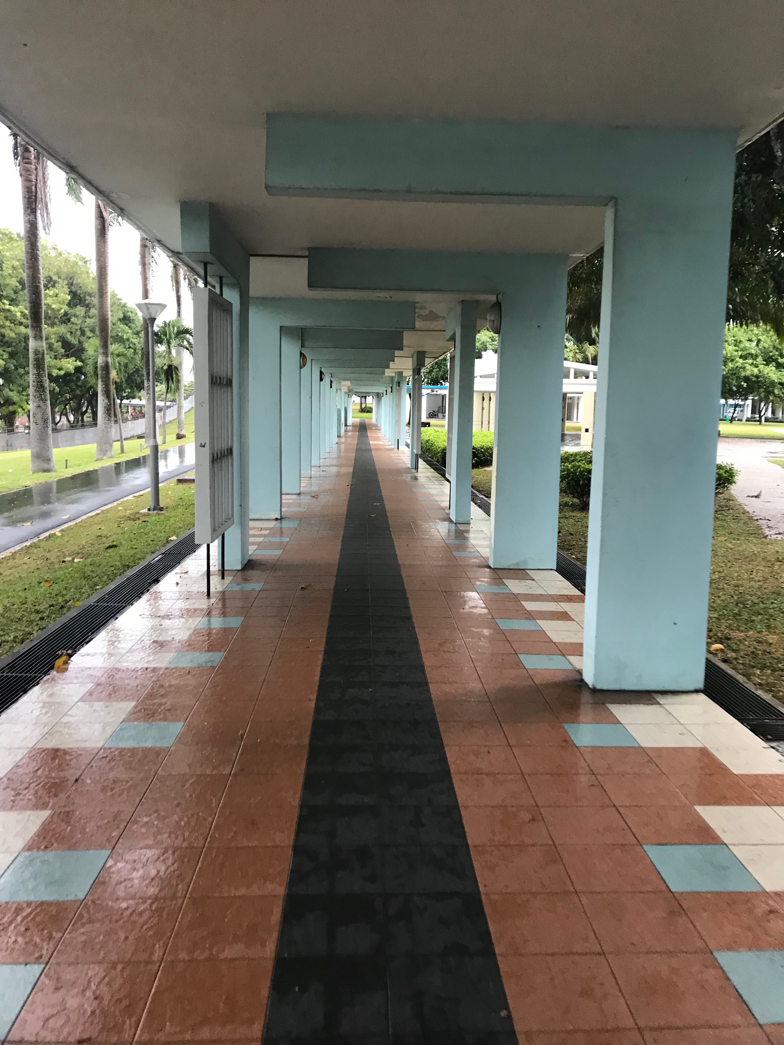
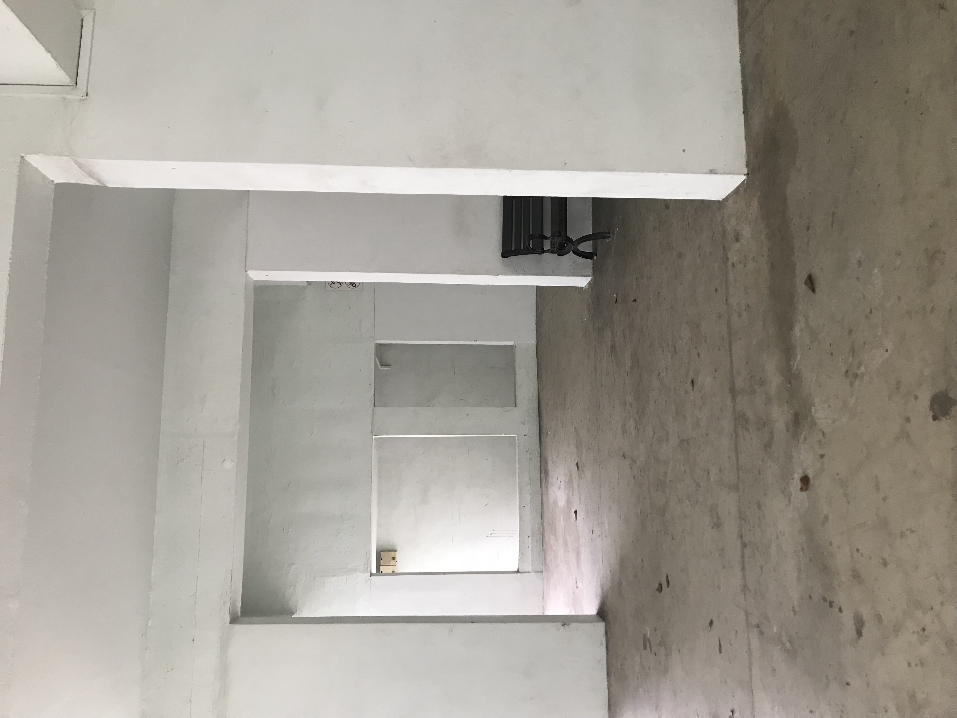
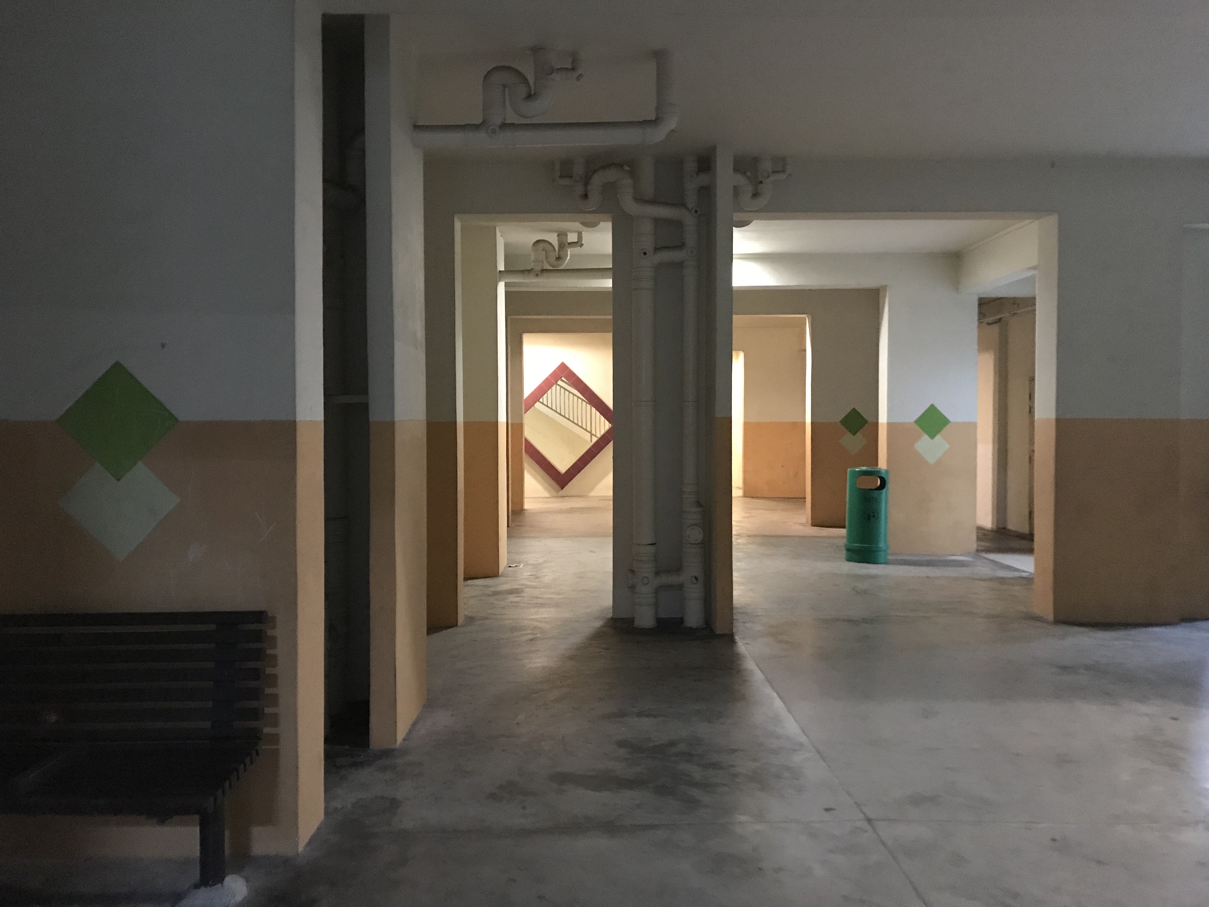
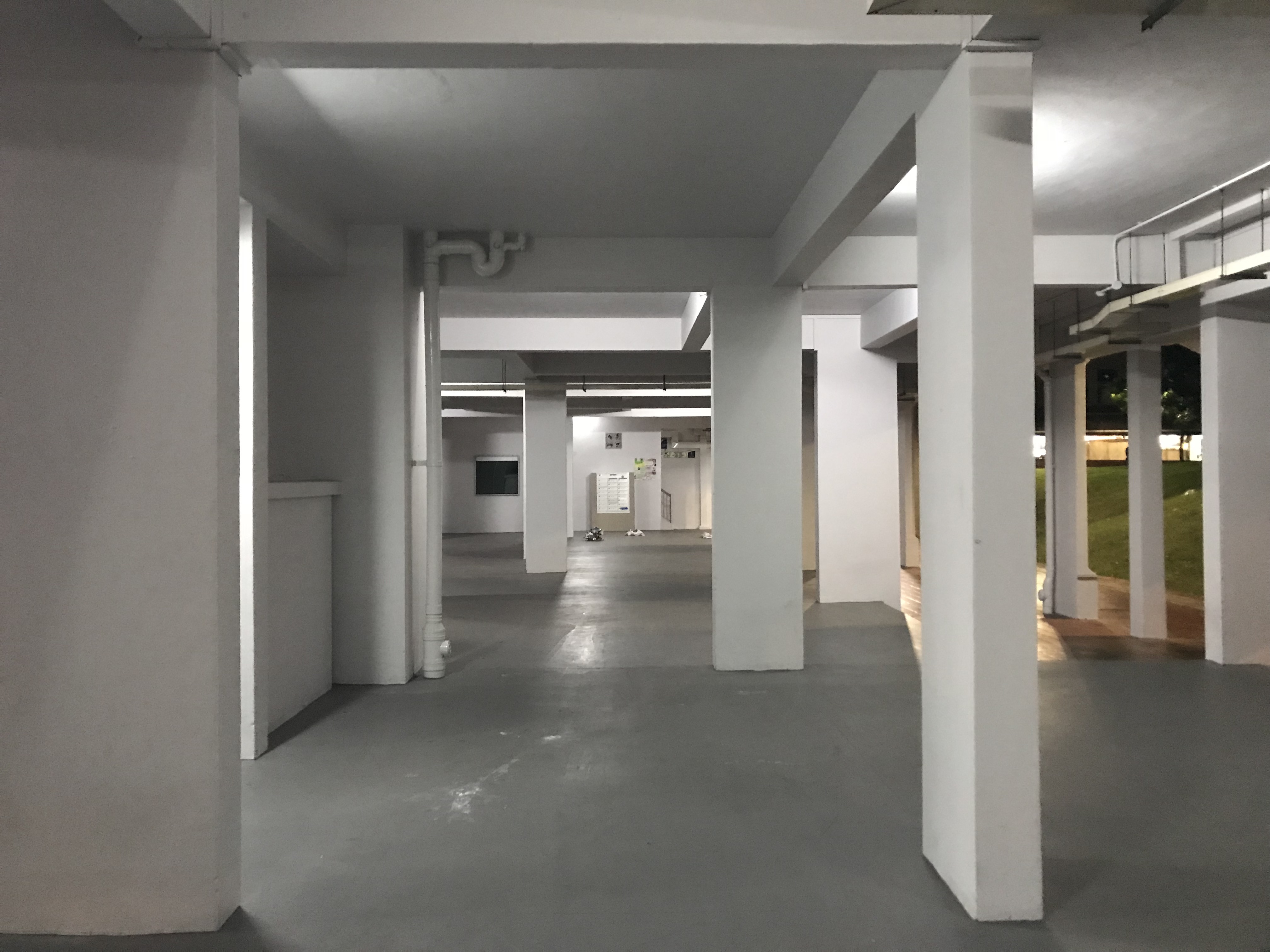
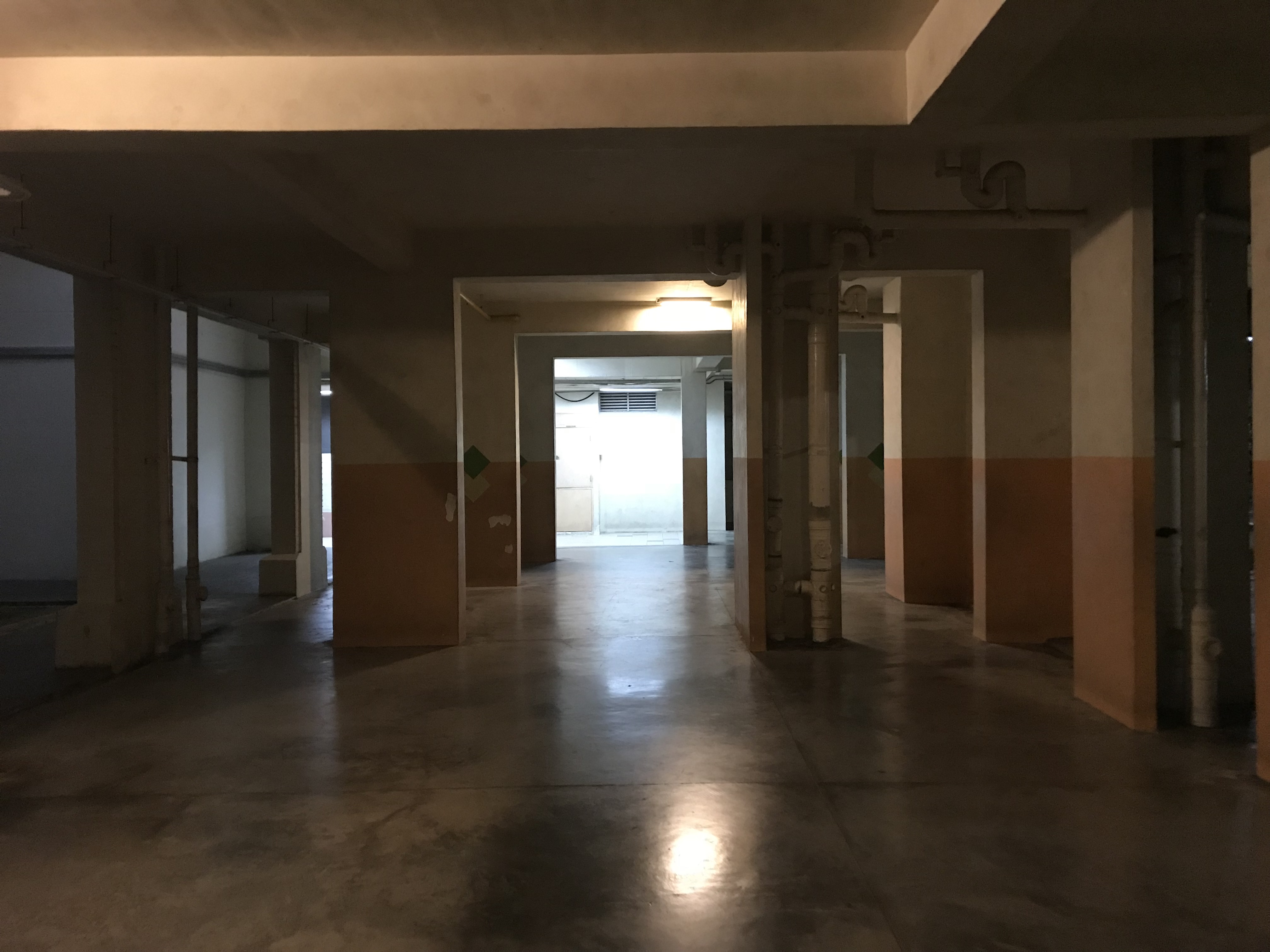
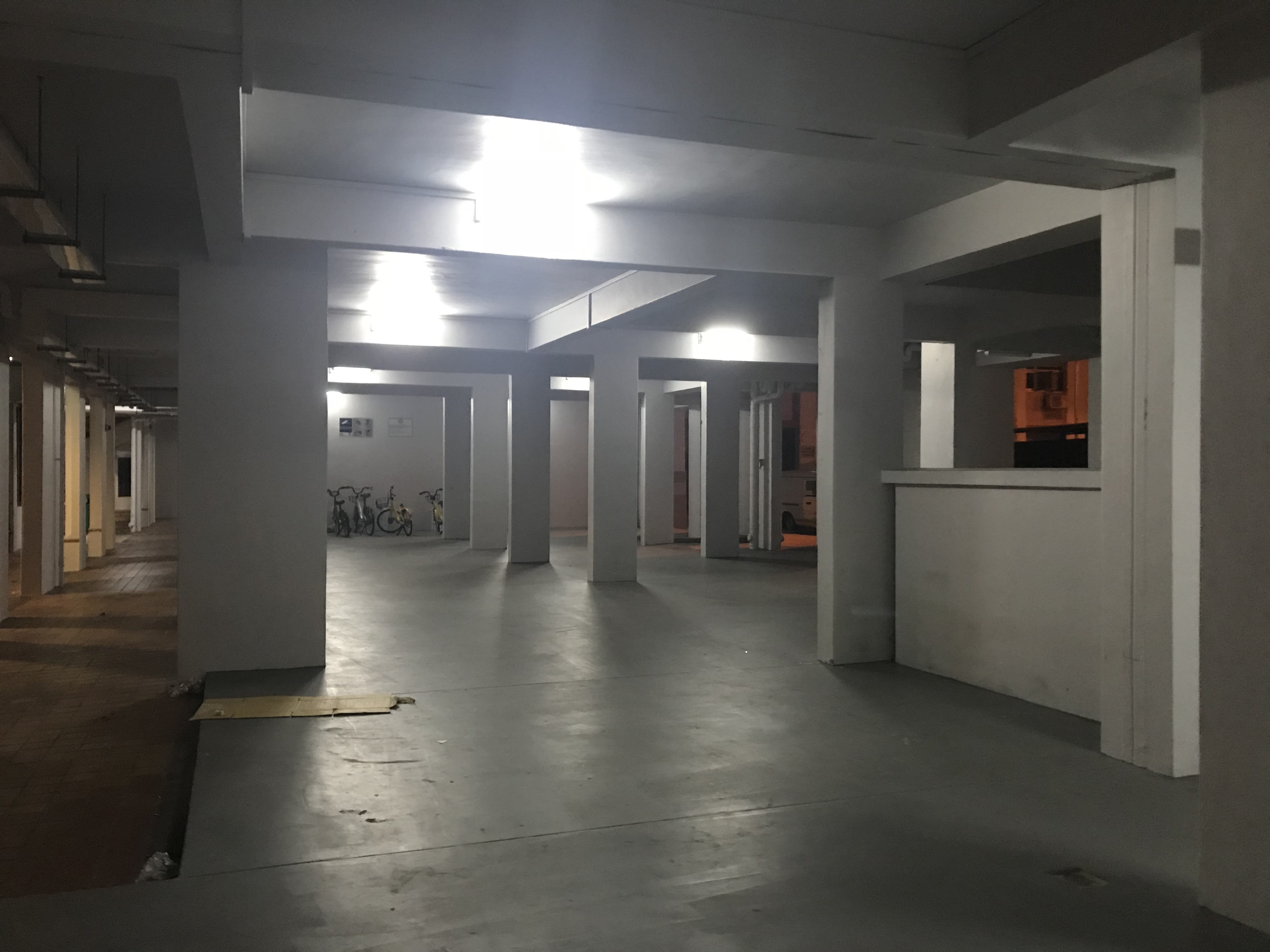
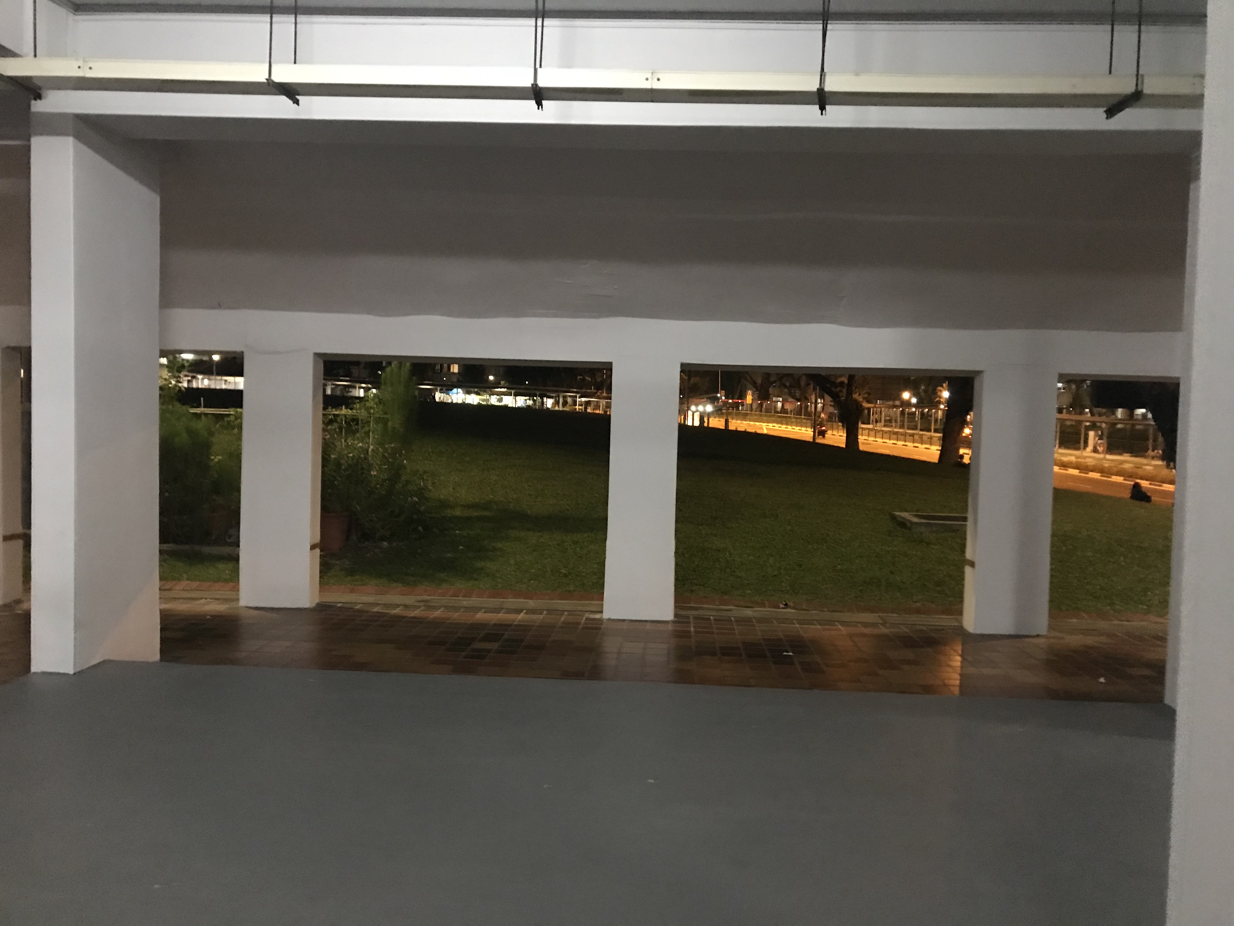
I started to notice the spaciousness of the area under the HDB. There is really very little people there.
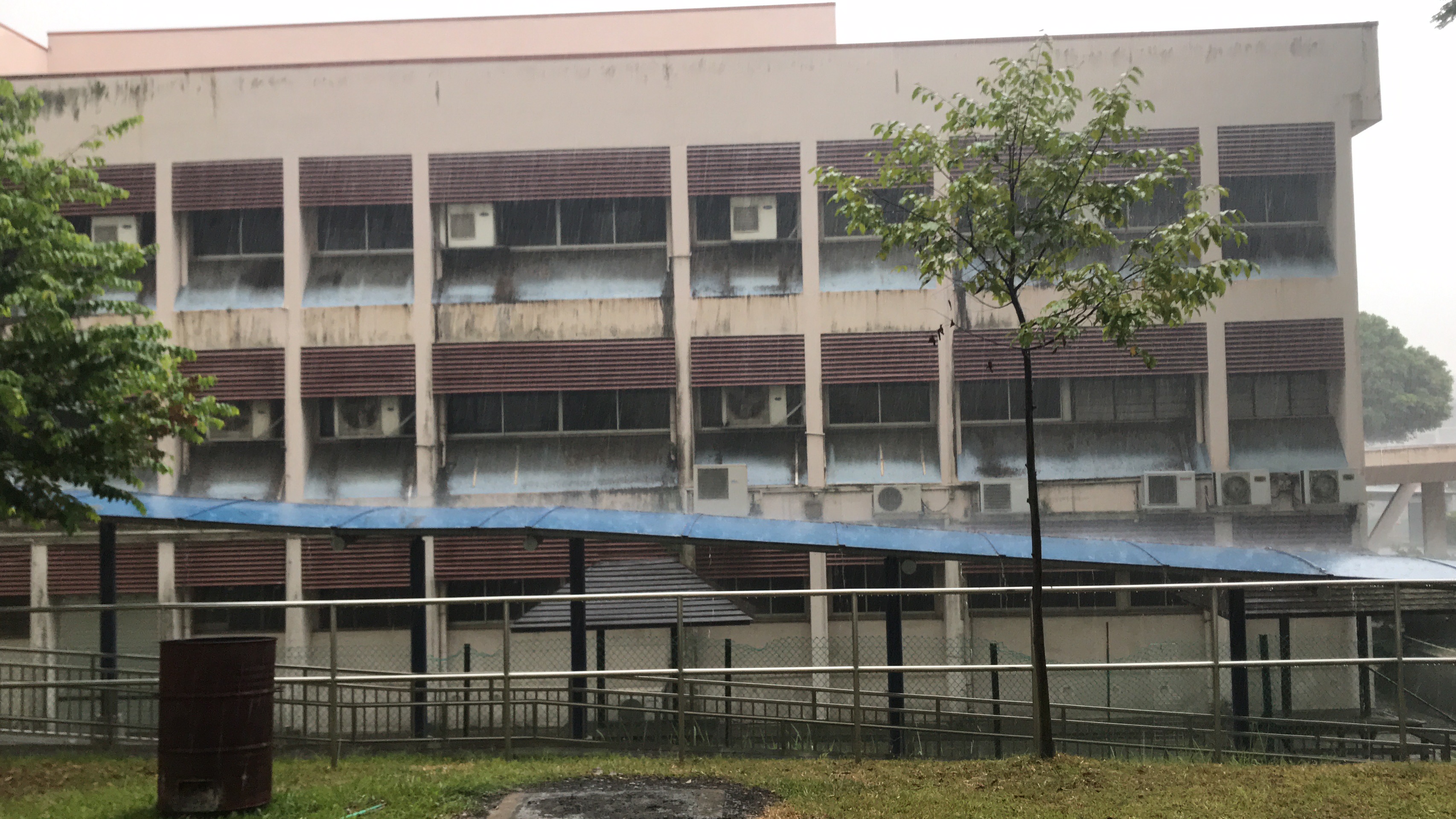
Then, it started to rain. I took a glipse of the abandoned school which I find is interesting. It is not reflected on the Google Maps so I was surprised to see it.
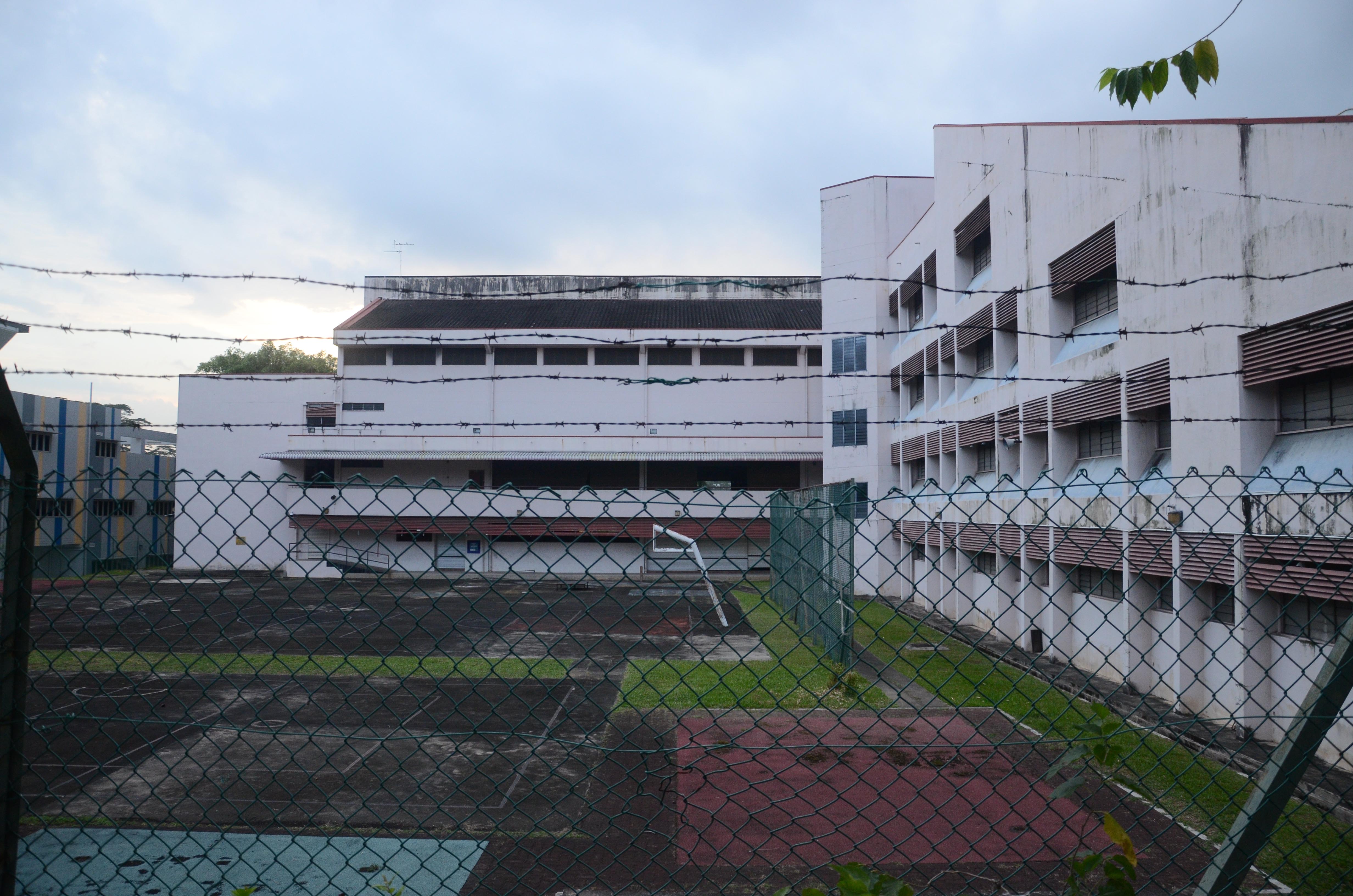

I waited for the rain to clear and continued my journey up. So I entered Zone 2!
Zone 2


Once the rain cleared, I walked up towards Woodlands Secondary School to explore the barren lands around it. This was when there were more people — students. It’s the time for students to go home, that’s why. The barren land had a bit of construction equipments on it.


So I ended up walking towards the customs. Knowing that, I u-turned back to find more HDBs which interested me more than anything else.
Zone 3
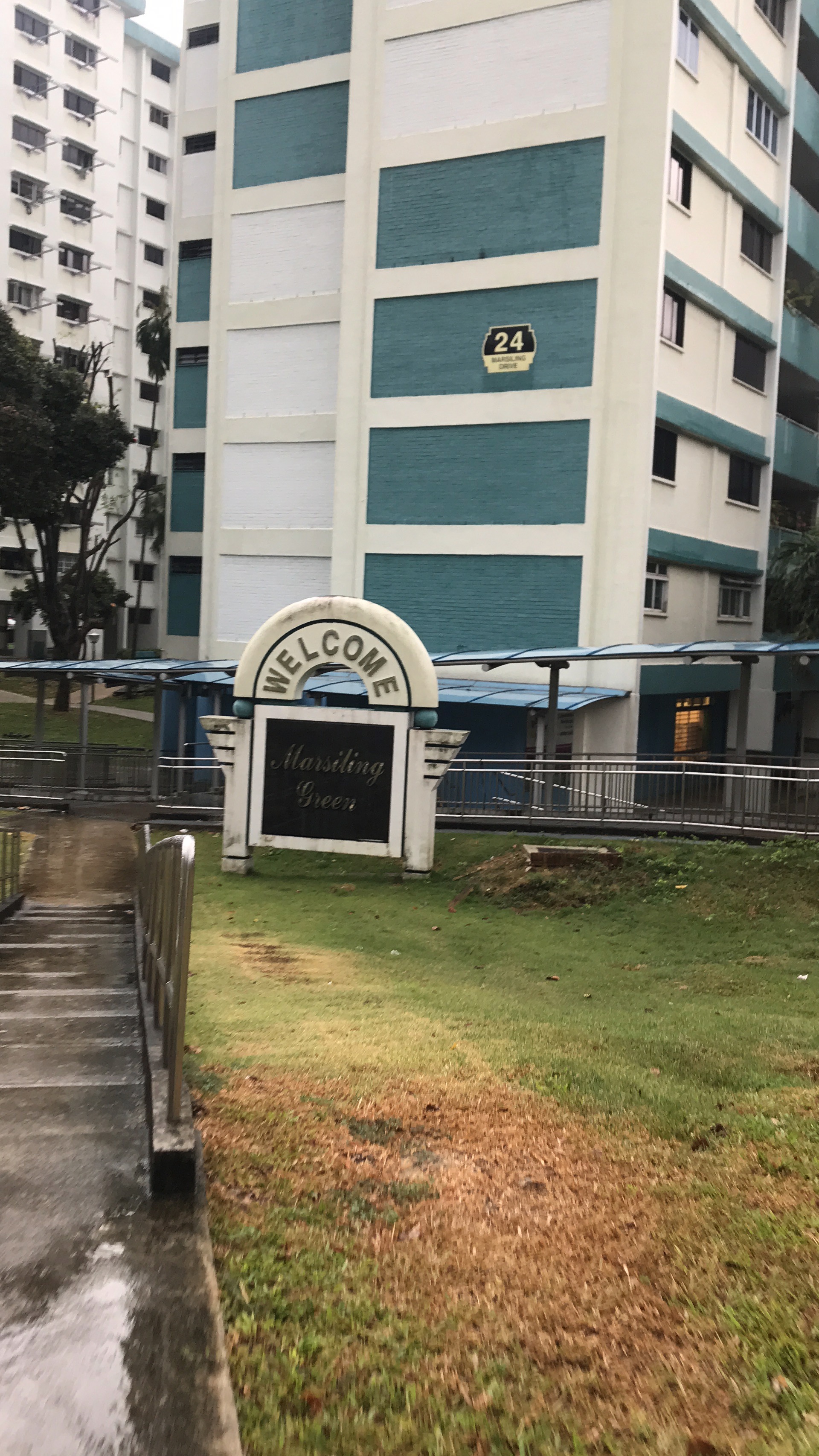
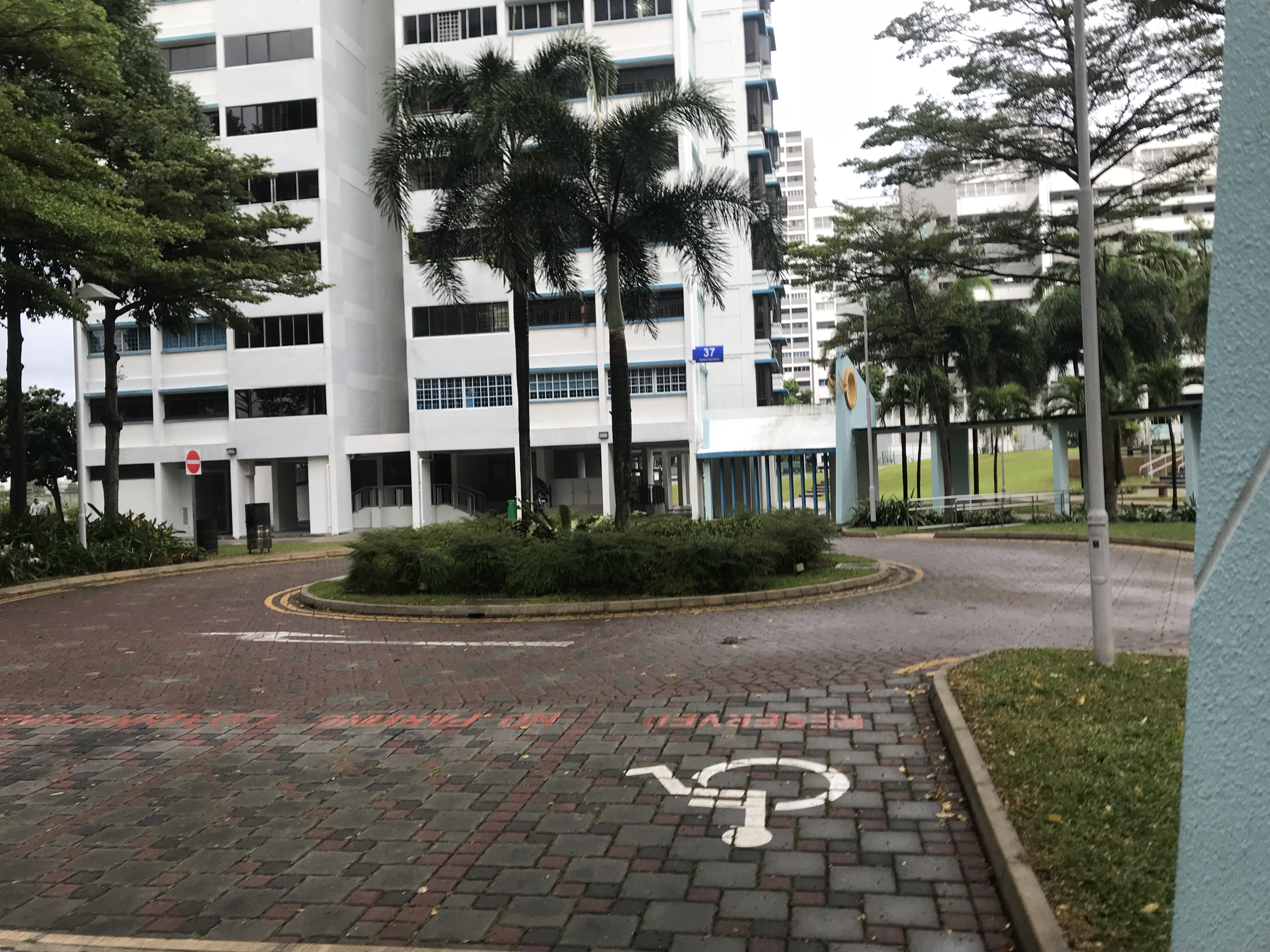
This HDB says Welcome so I decided to enter.

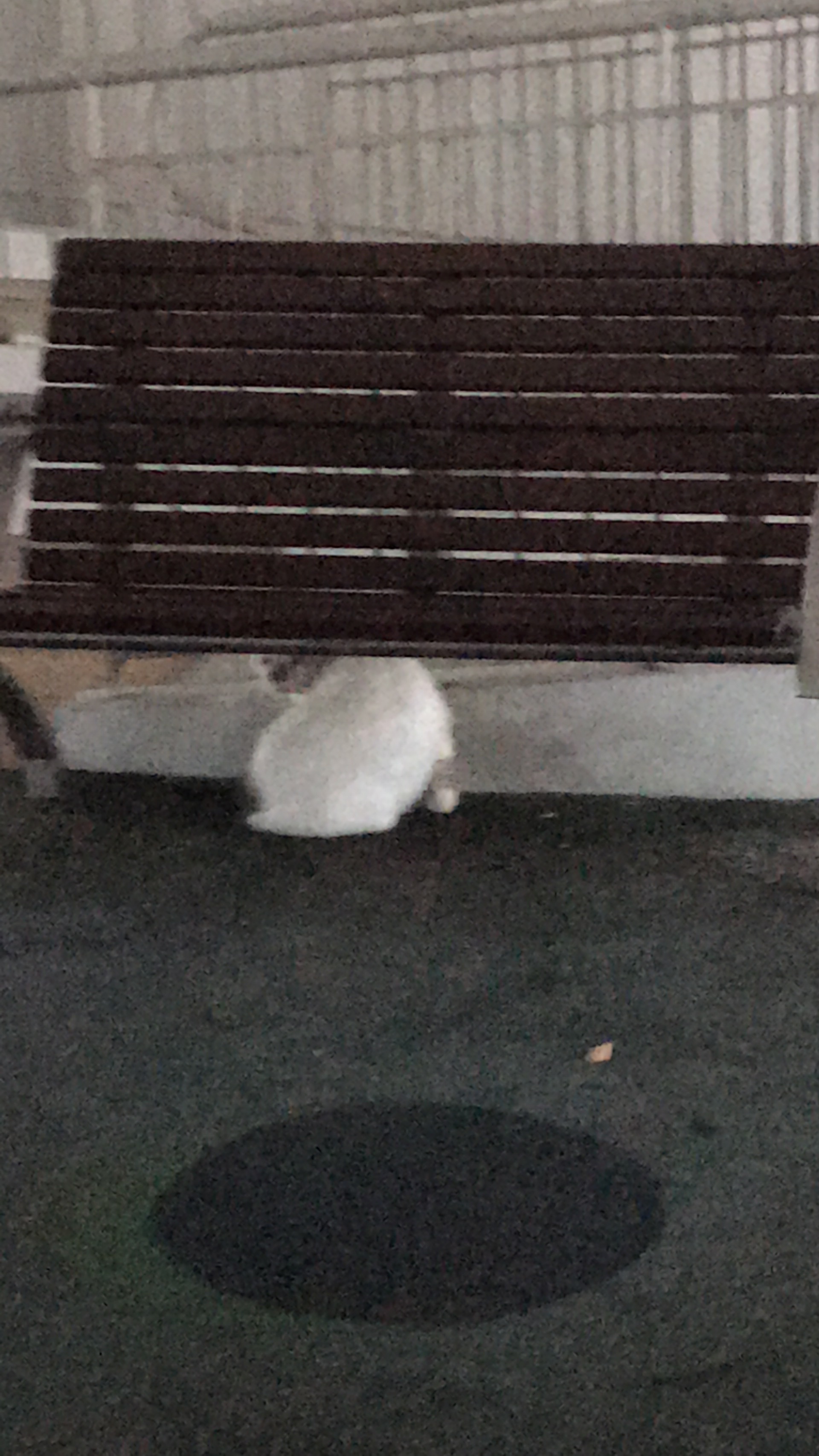
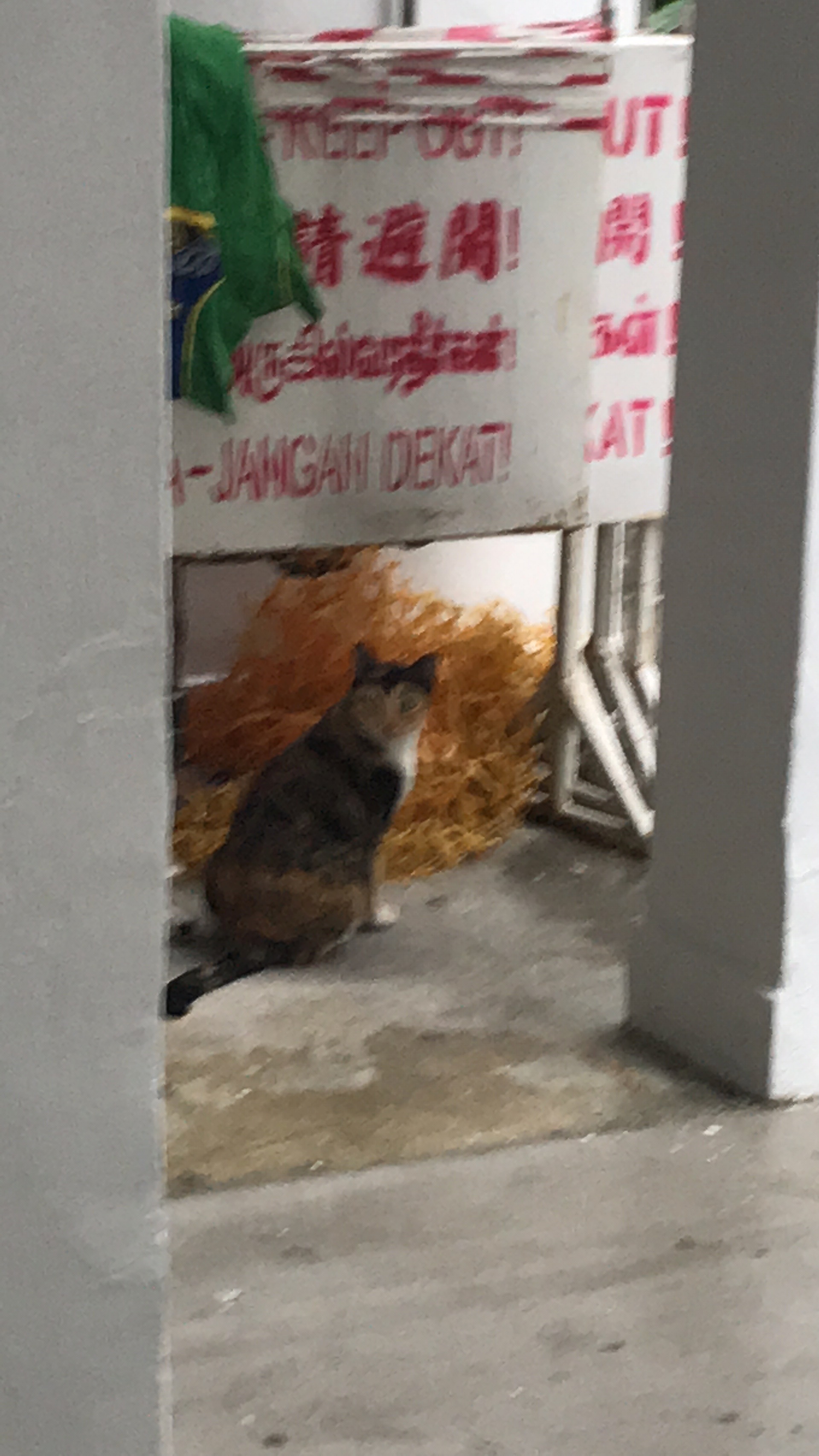
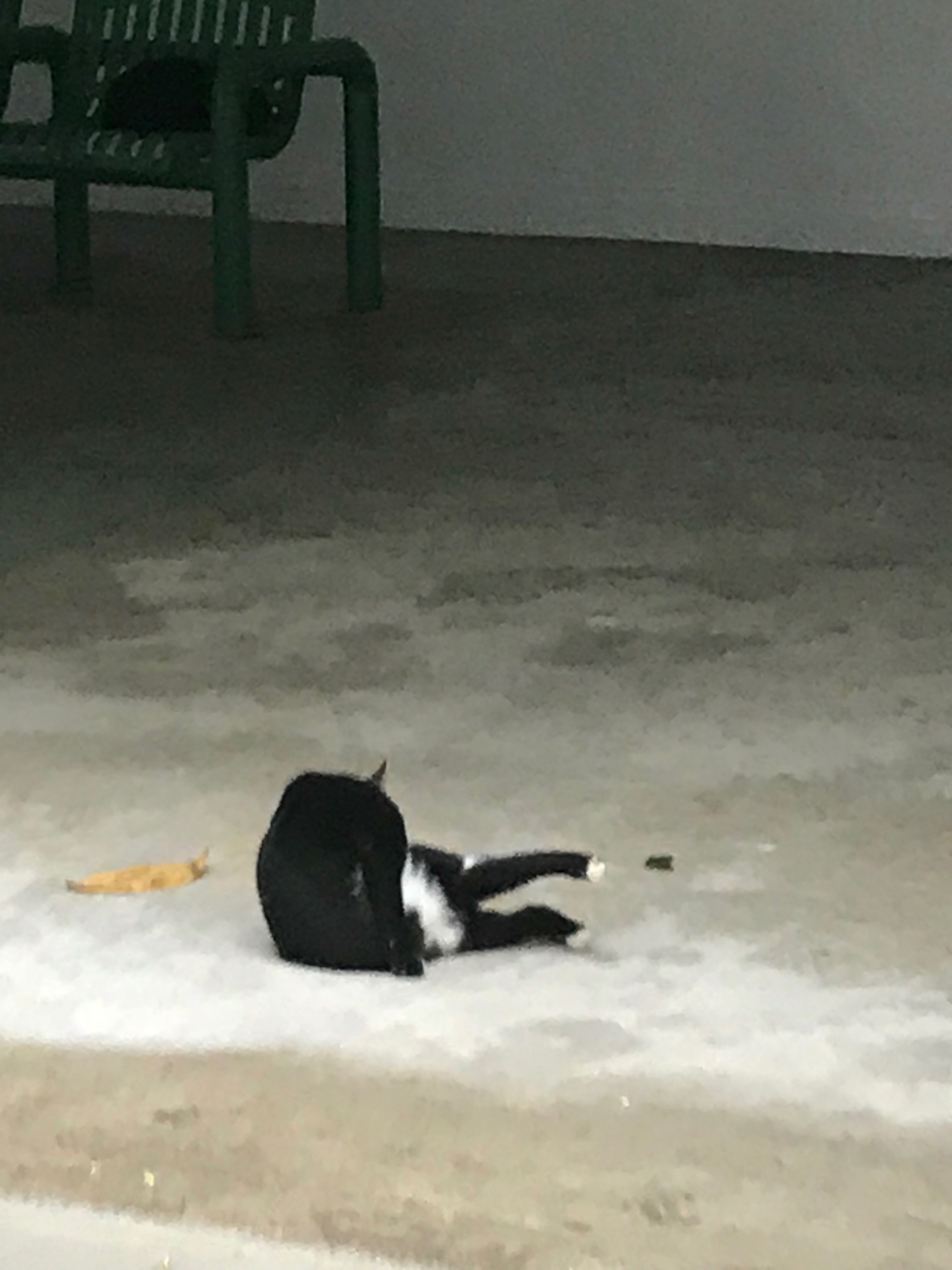
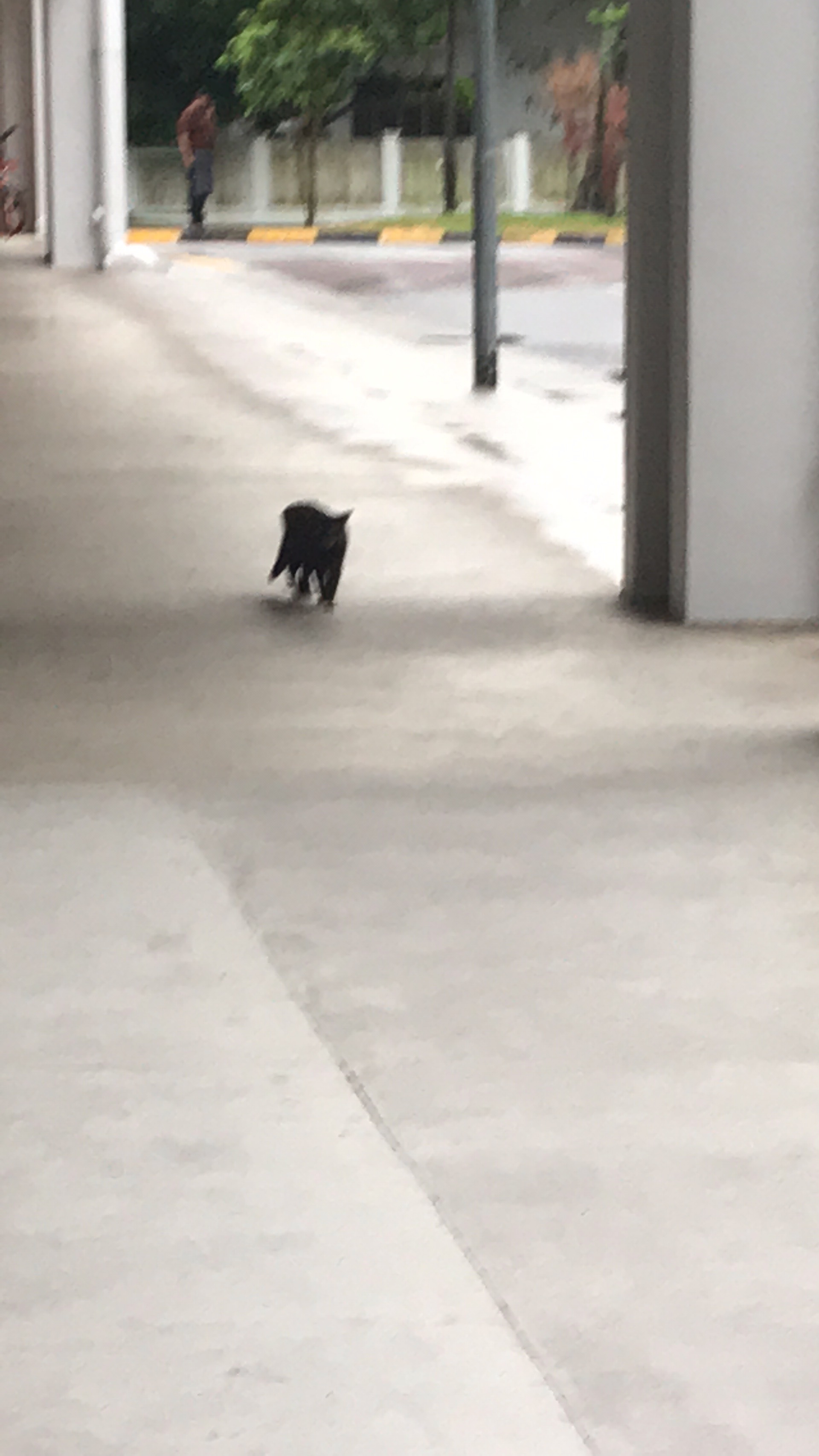
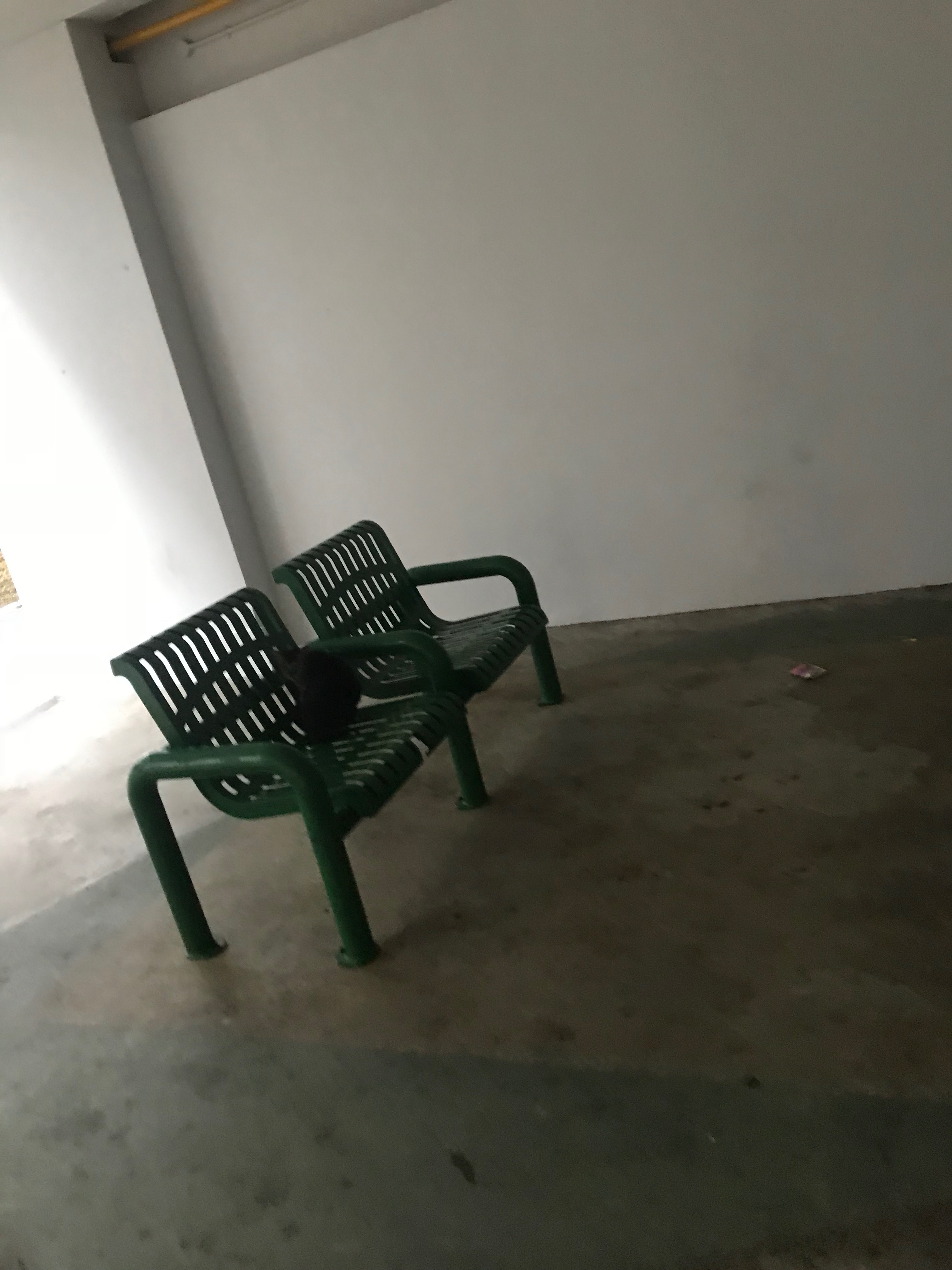

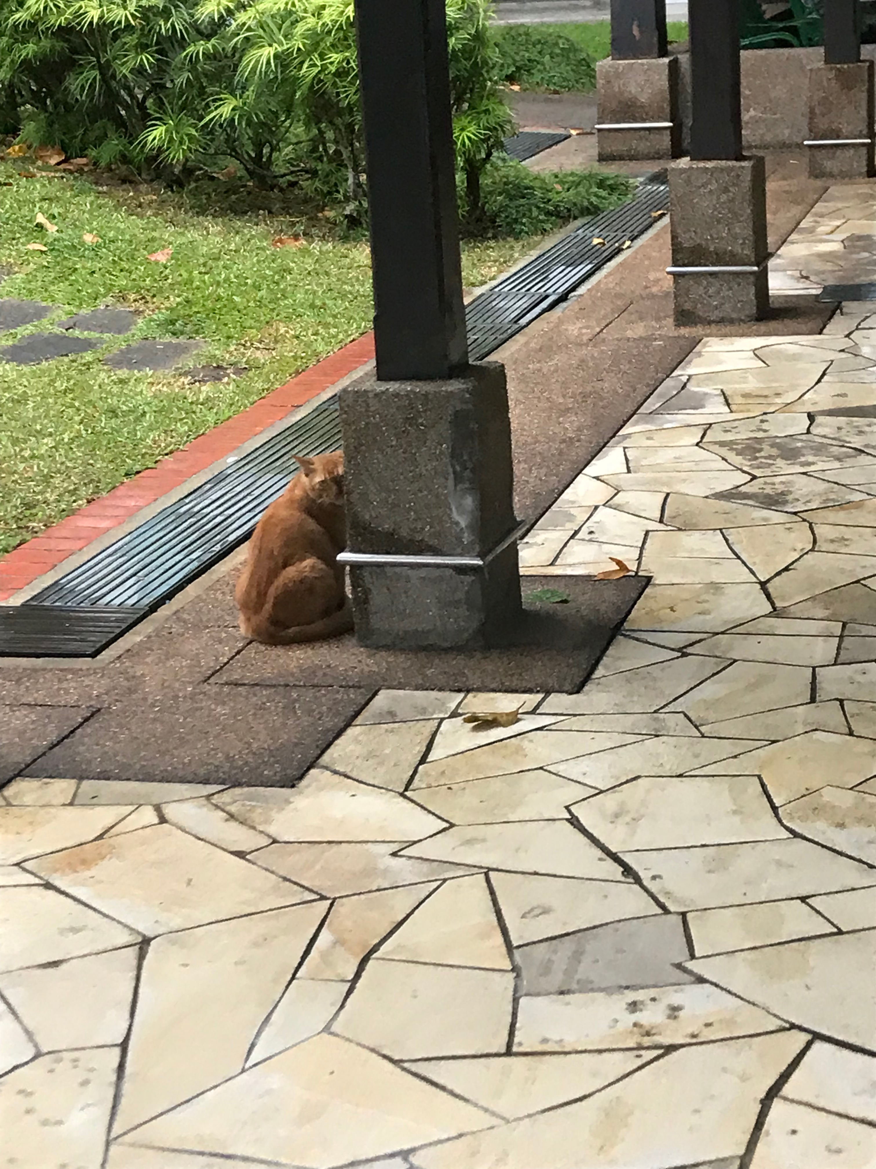
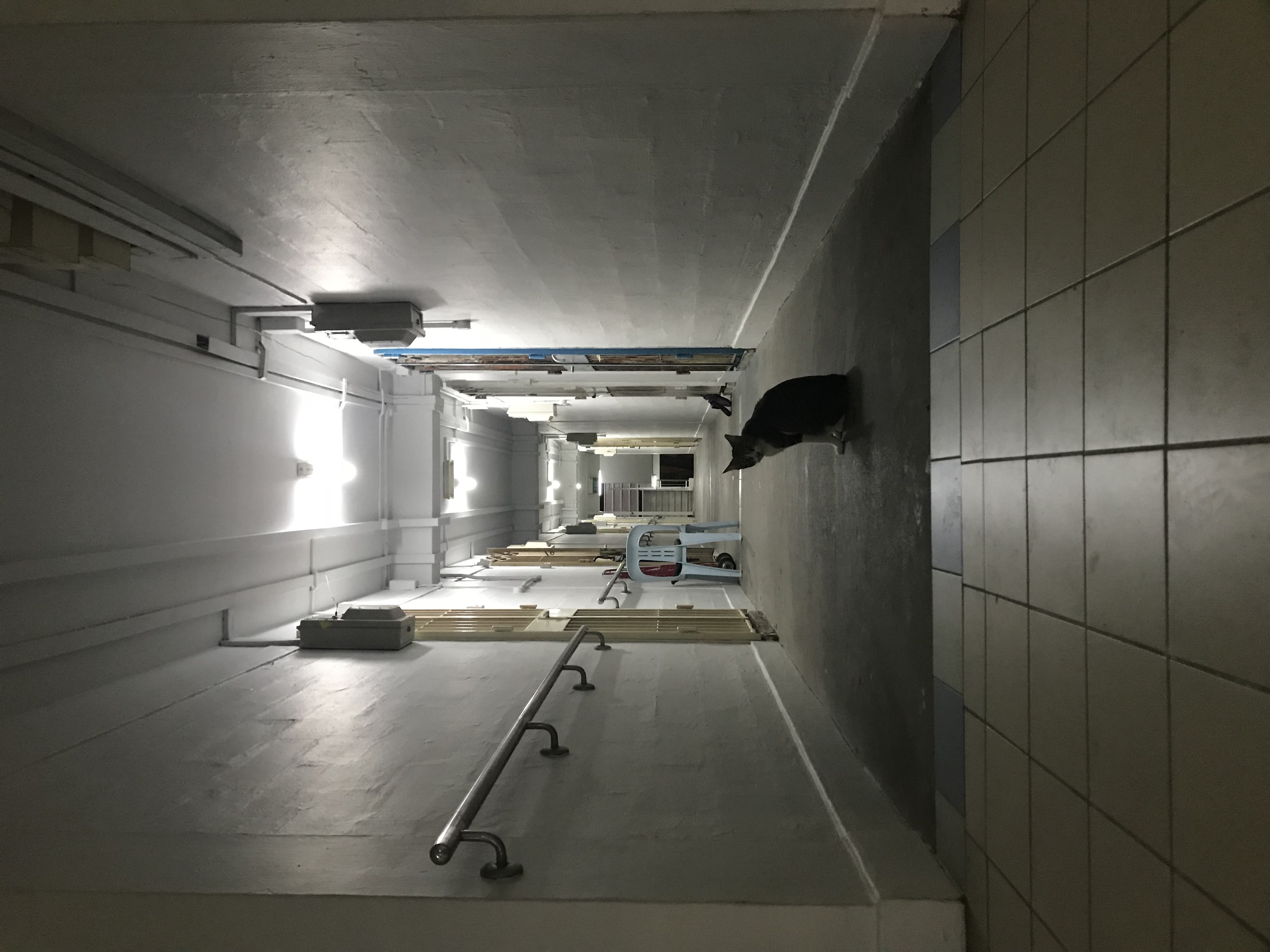
I found A LOT of cats after that. It wasn’t all from one area, but around the deeper part of Marsiling, there are really a lot of them.
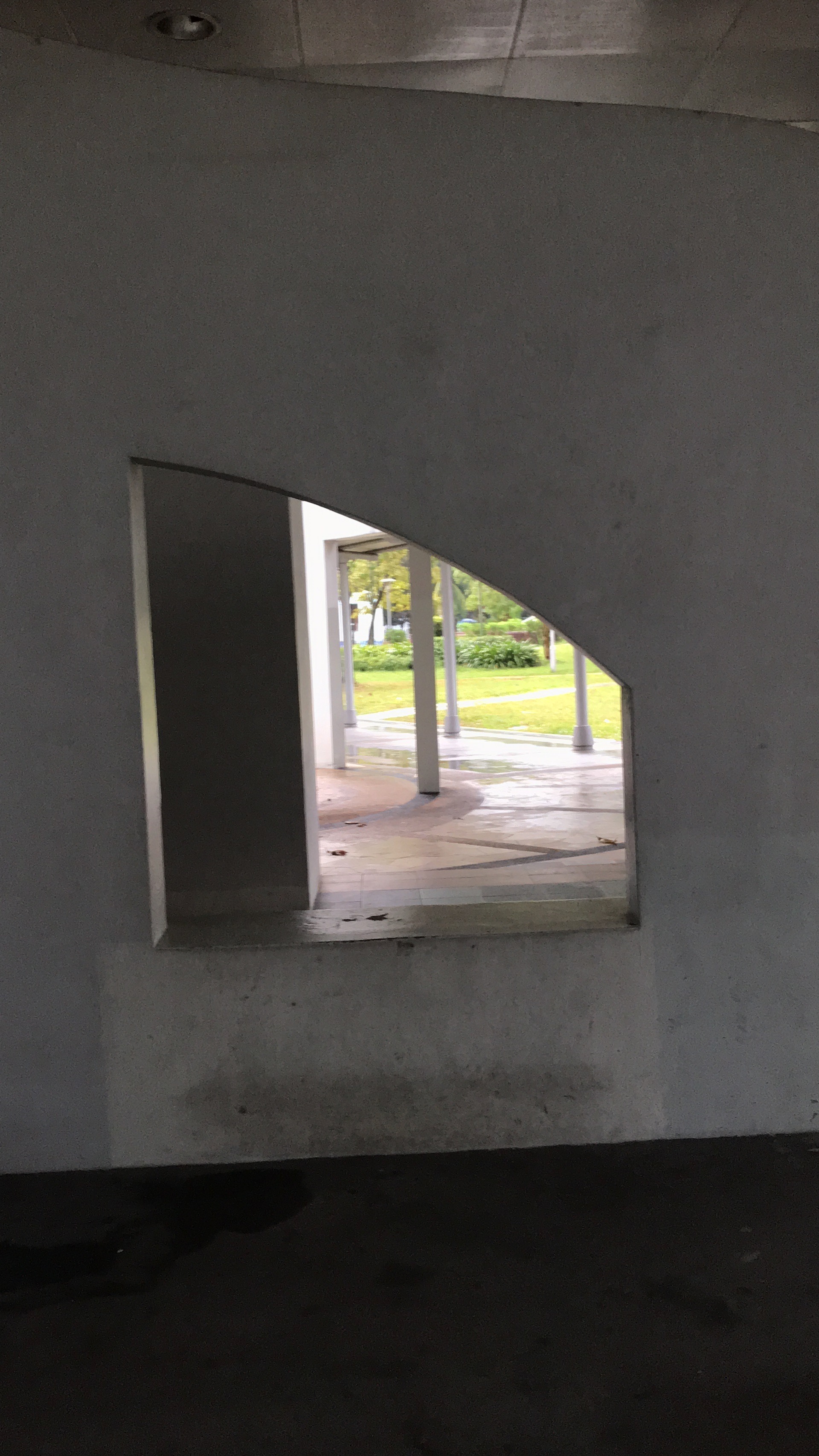
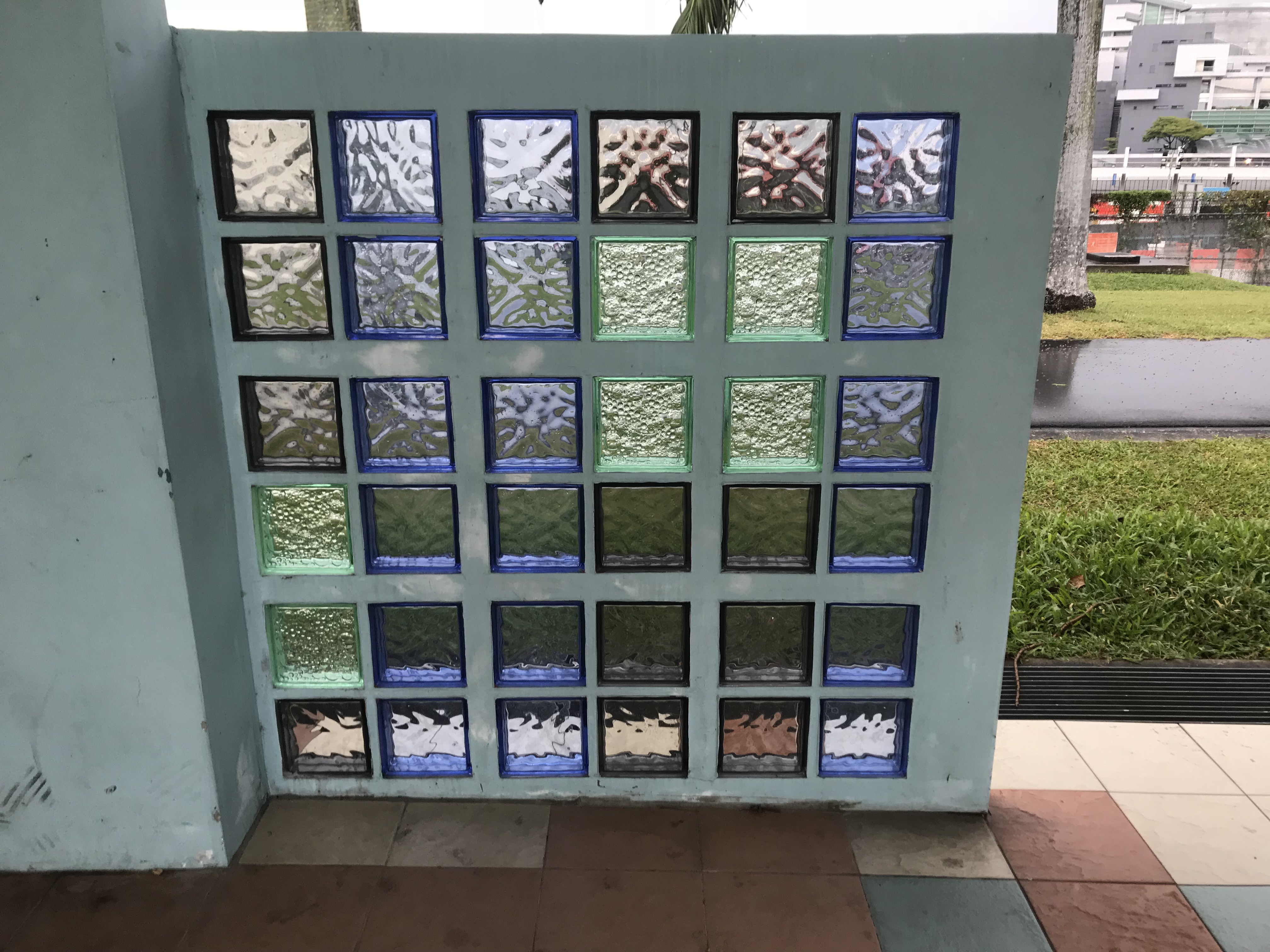
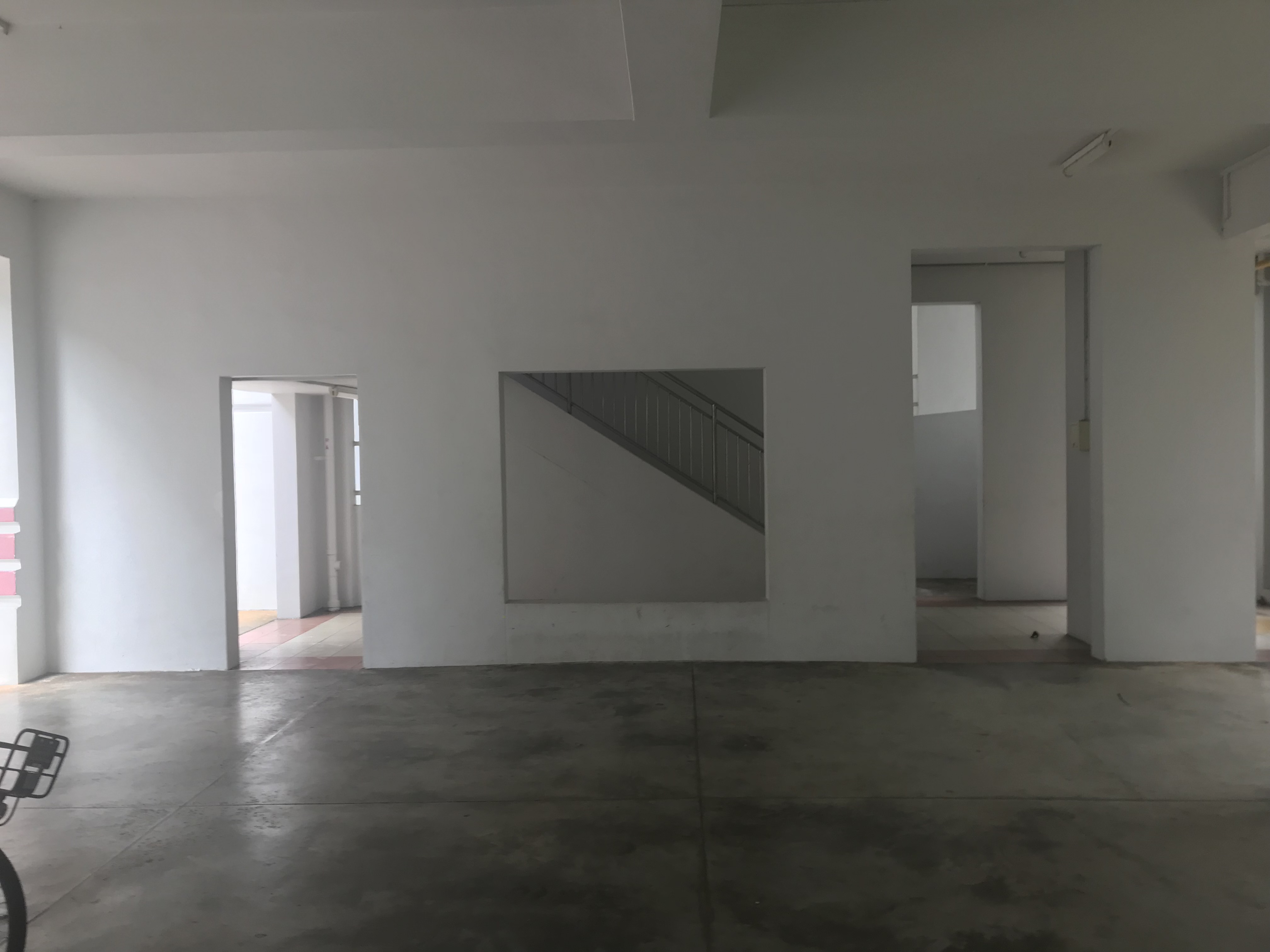
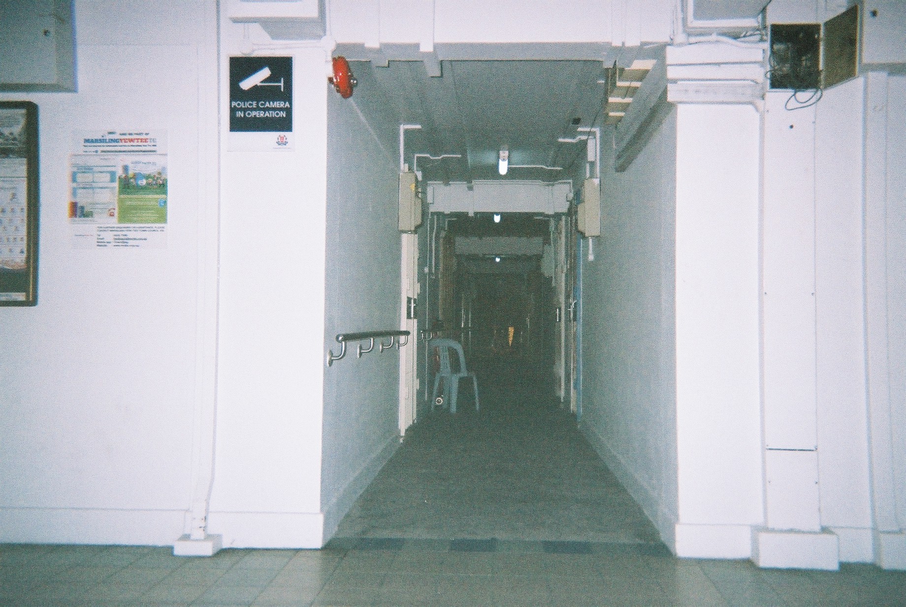
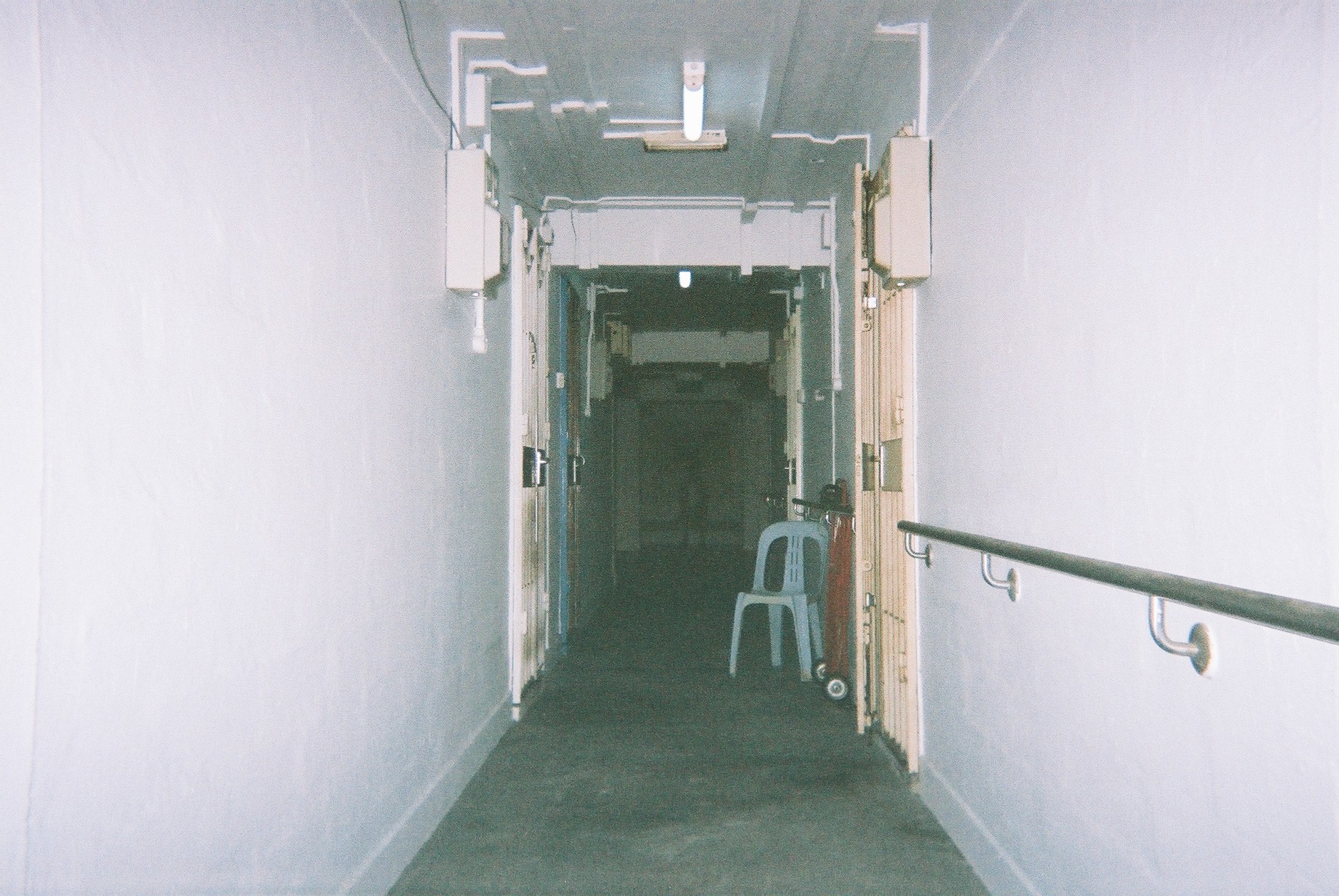
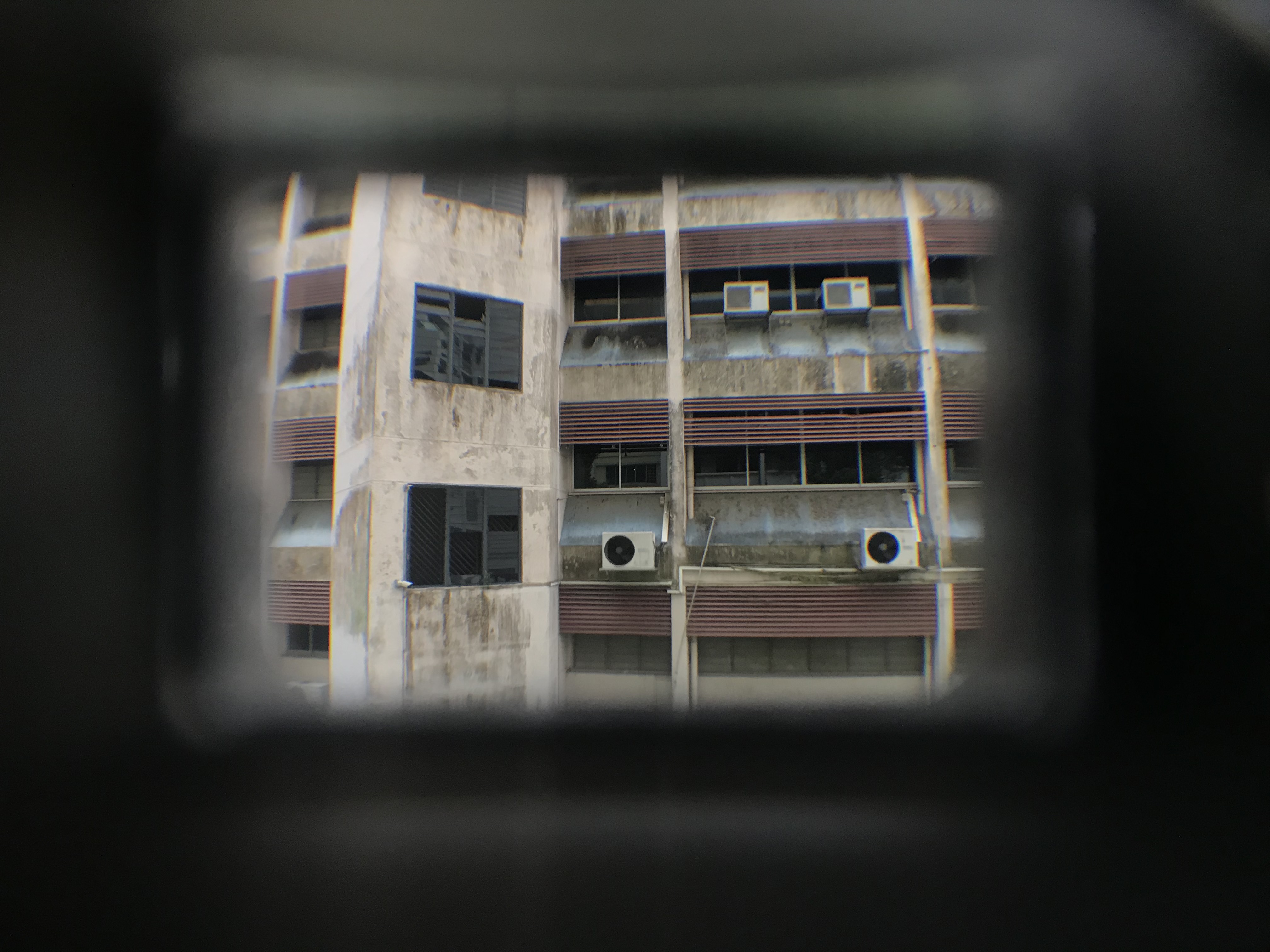
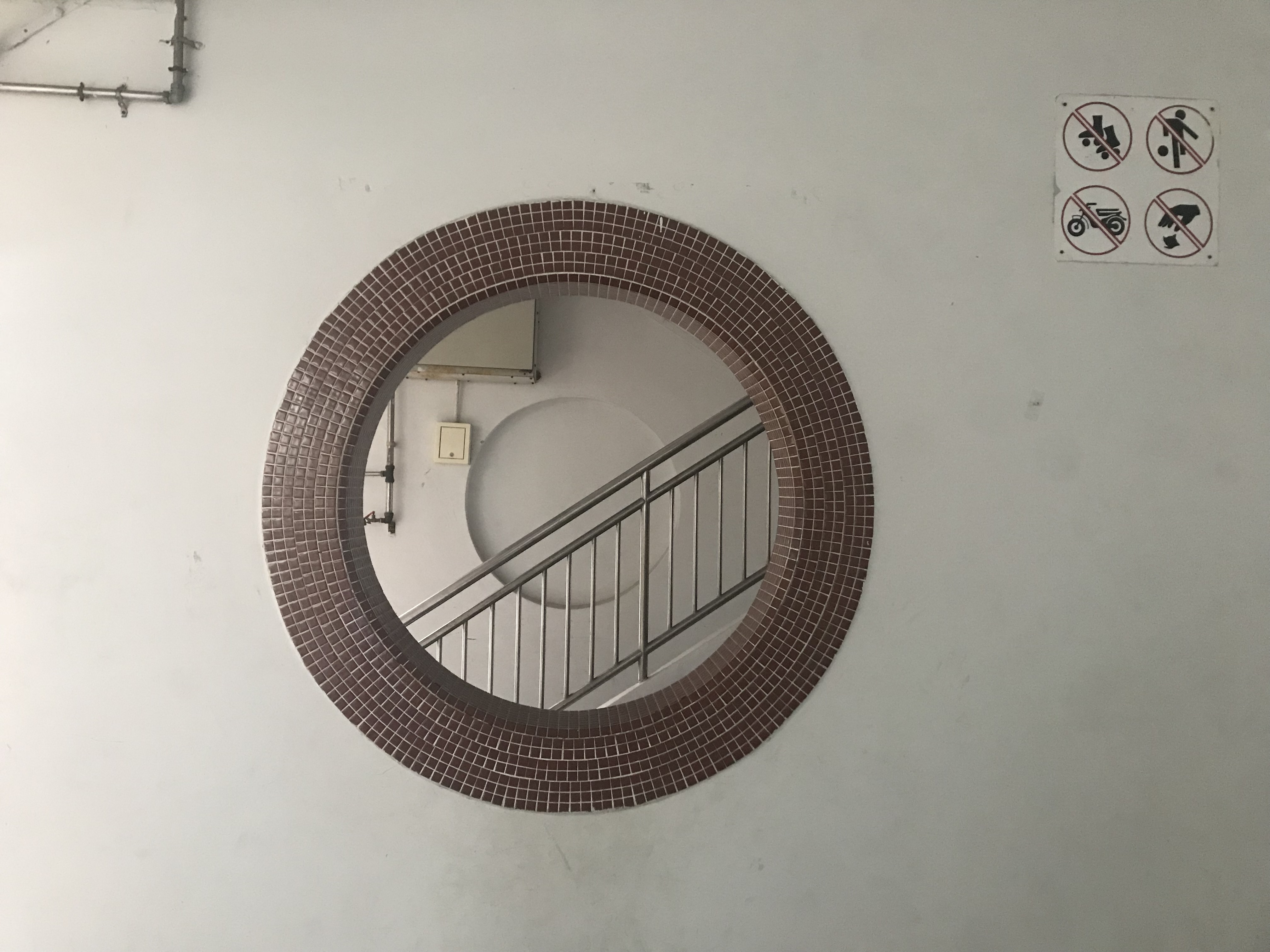
Some interesting structures I found in buildings around here. I started to notice these “windows” that I thought was interesting. I questioned why they existed in the first place, as they don’y really need to be around honestly.
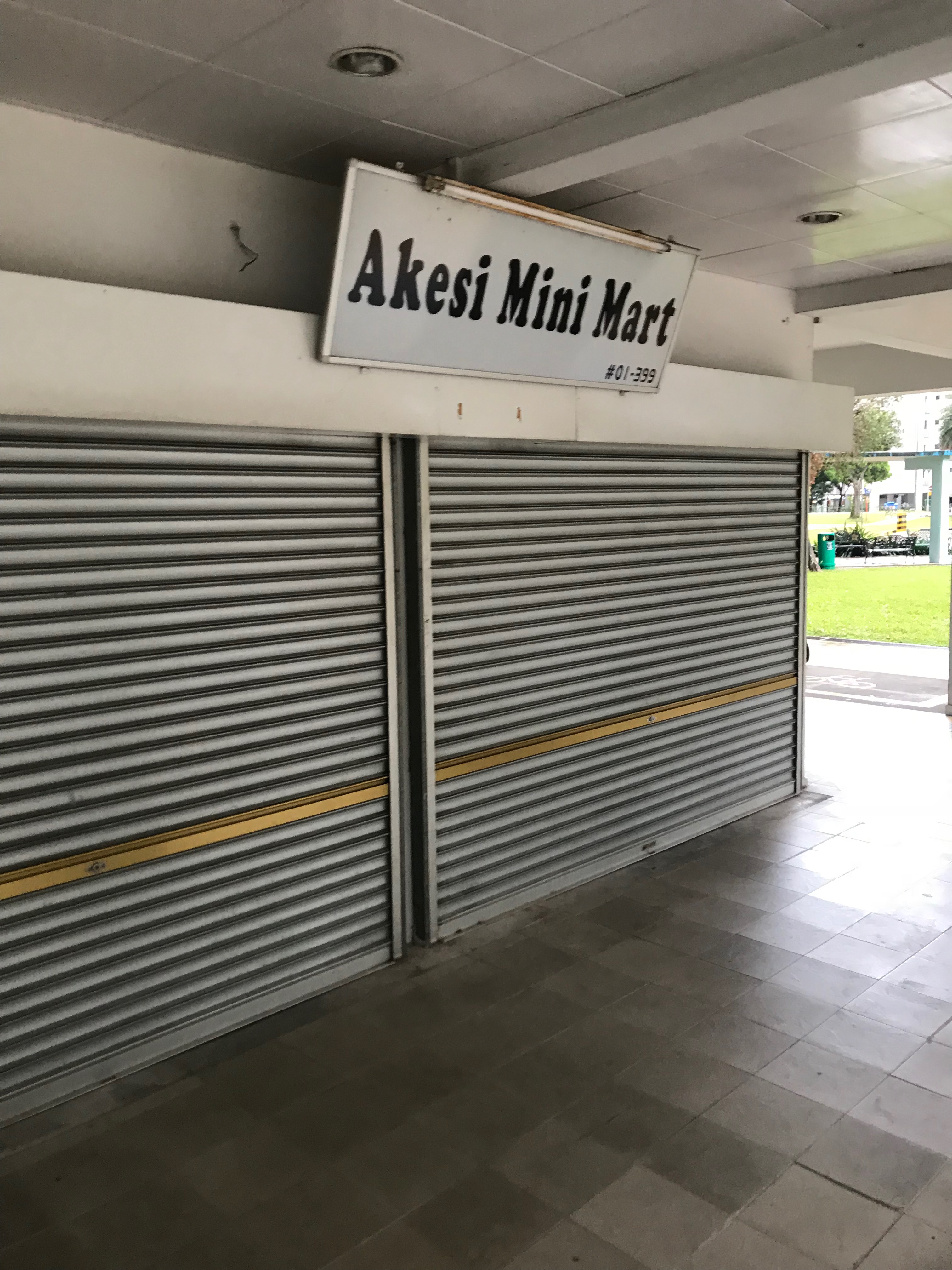
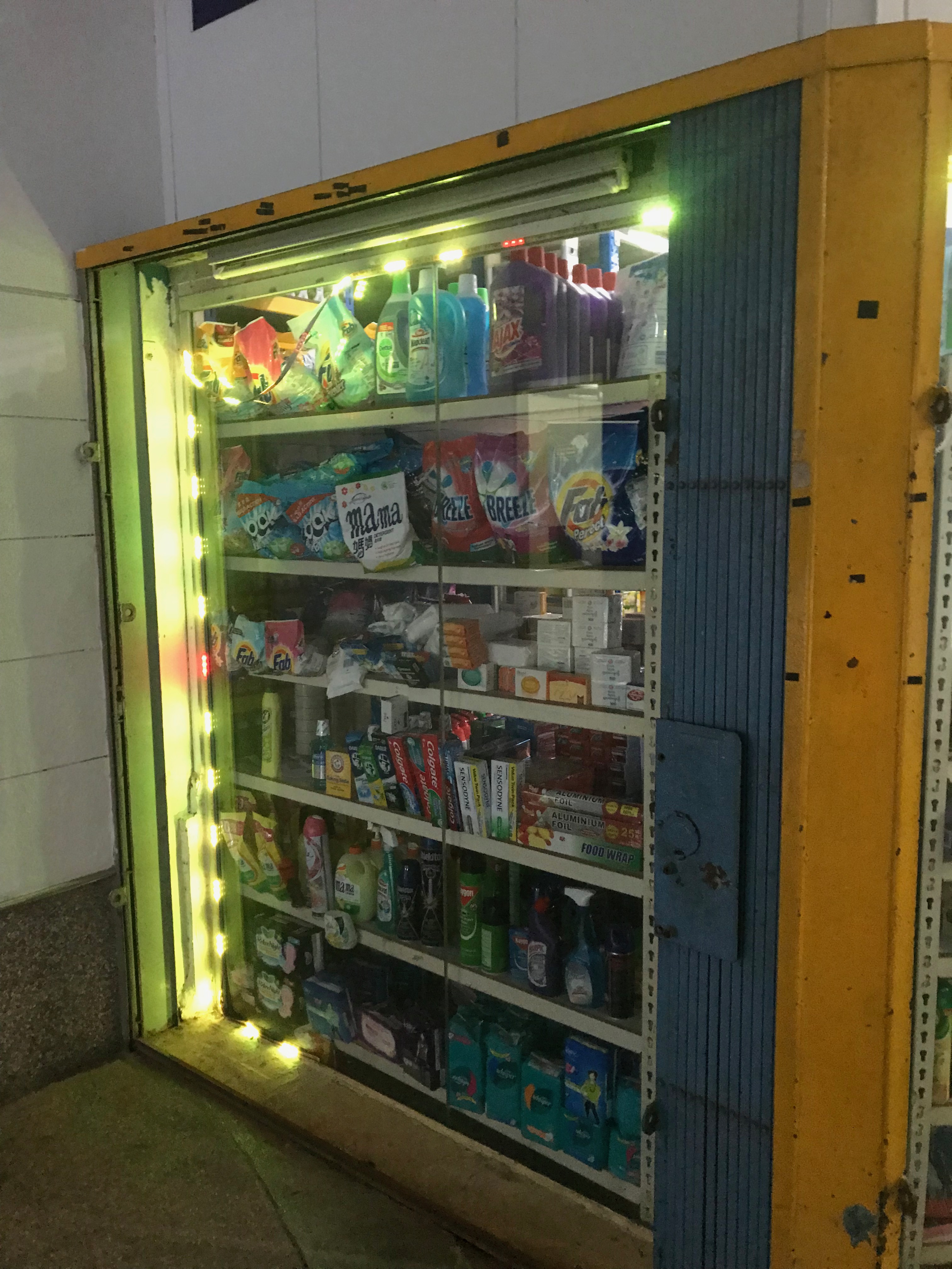
Mini marts are also a common thing around here.
Zone 4
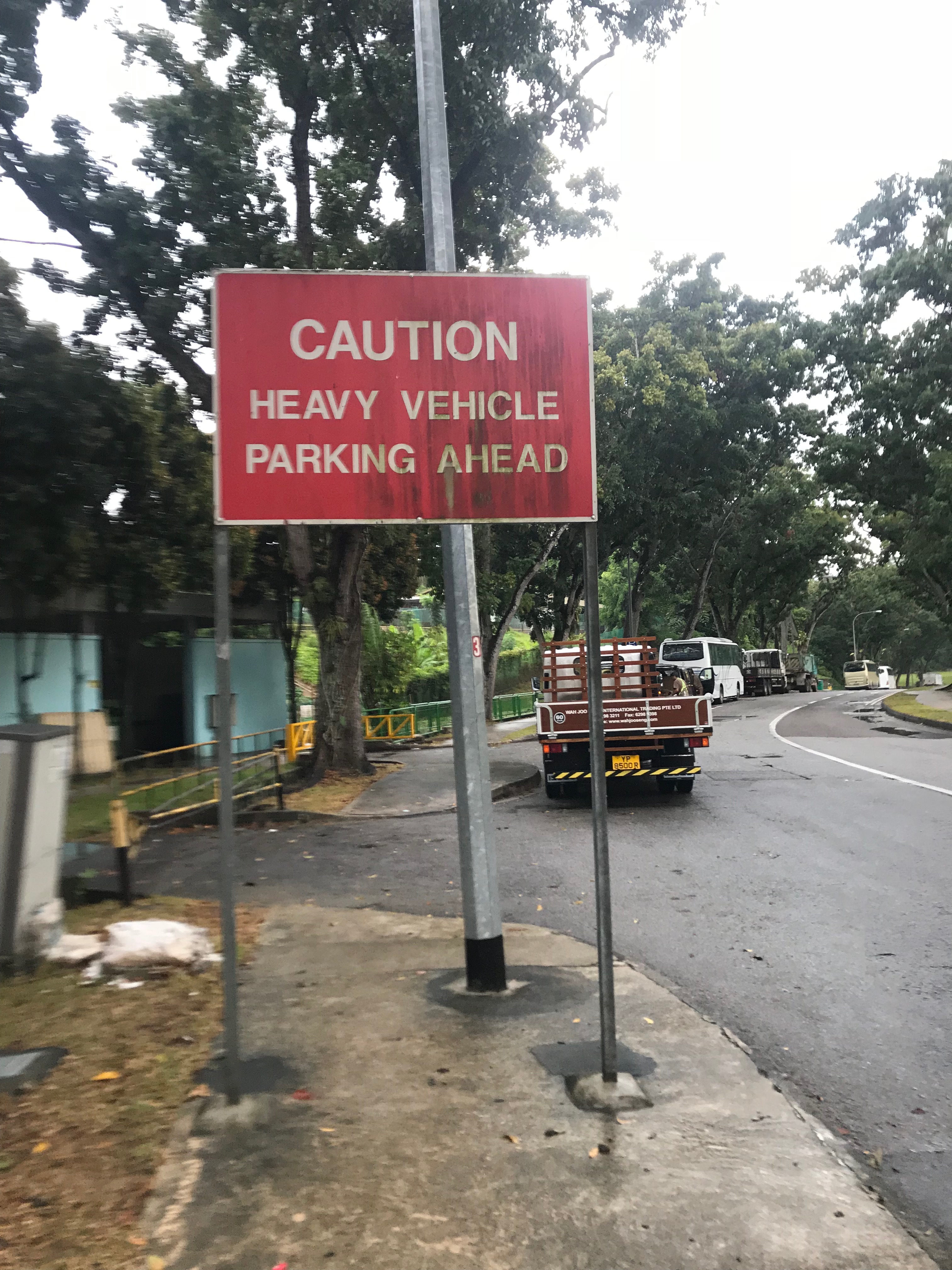
After walking around more, I chanced upon an industrial area, which is even more empty. I decided to take the long walk around the Heavy Vehicle Park. My battery was dying at that point so I did not take a lot of pictures. That place is just… abandoned.
After exiting the vehicle park, I walked down to find Marsiling Market. The area here is very crowded and I walked down further to find a super crowded plaza area. At this point, I’m left with 5% battery so I quickly scanned through. It felt very homely and neighbourhoodly, which gave me a warm feeling.
I found myself near Woodlands MRT before my battery went flat, so I went to Woodlands and went home.
Survey
So after the first site visit, I had the impression that Marsiling is a very quiet and out of place location. I decided to create a survey to confirm my idea.
Here are the results:

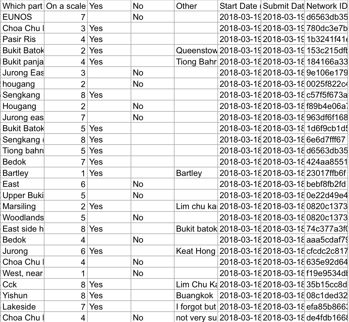
I find out that most people actually thinks that Hougang is the quietest place in Singapore. This is followed by Marsiling, and then Punggol and Dakota. Thus, this supports my claim that Marsiling is super quiet.
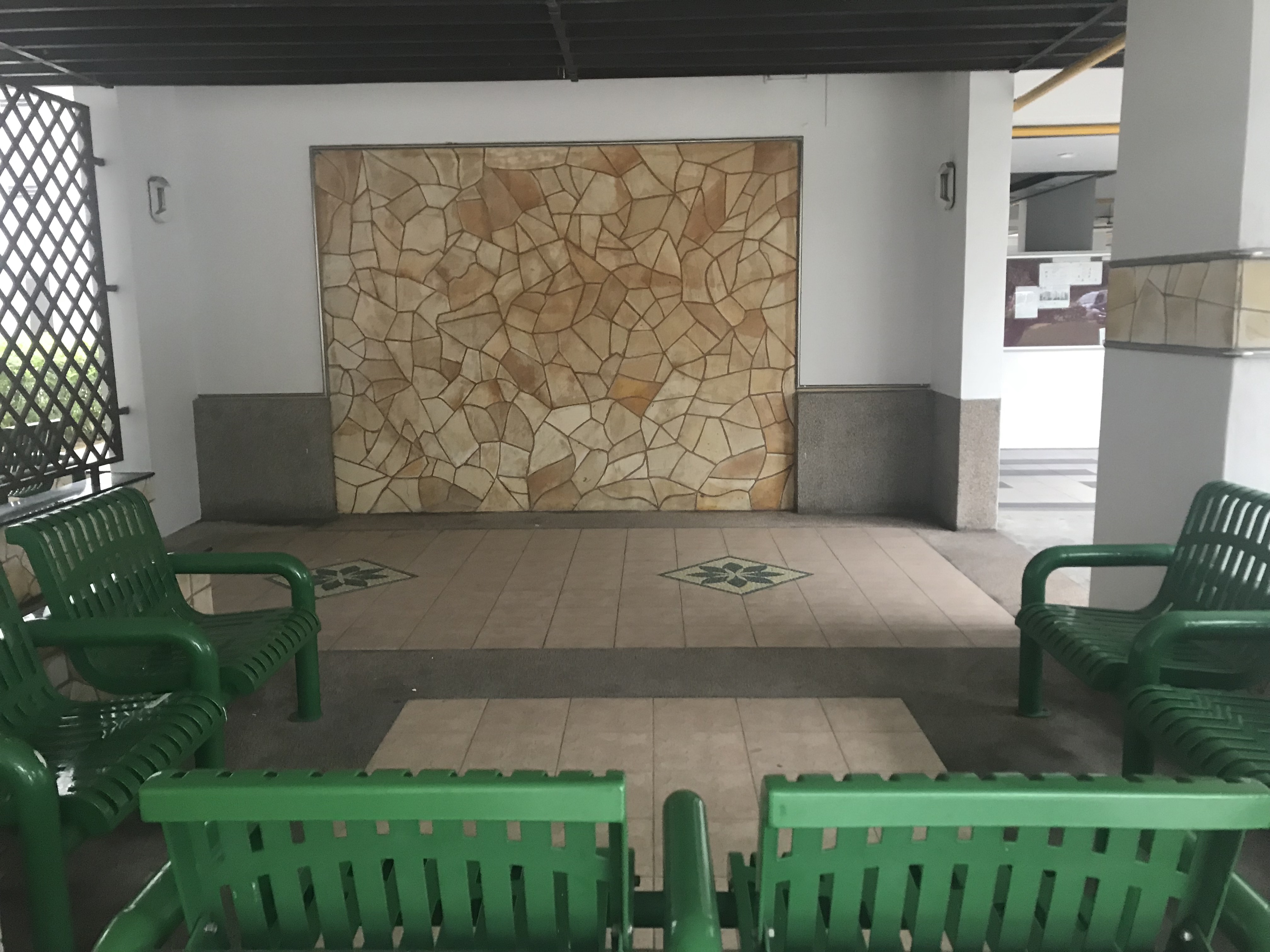
I visited Marsiling again! This time, I decided to explore further into a few parts of Marsiling that I find more unique in depicting quietness.
I went in the evening so it turned dark quickly. I decided to look at the space when it is dark and discovered that it is creepier.
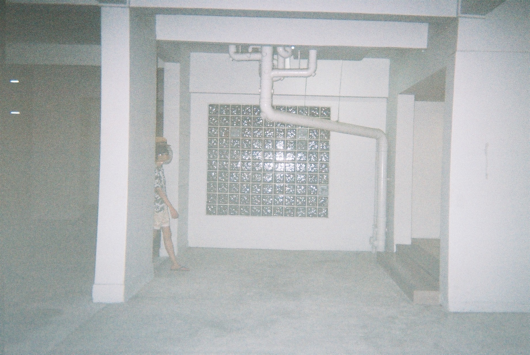
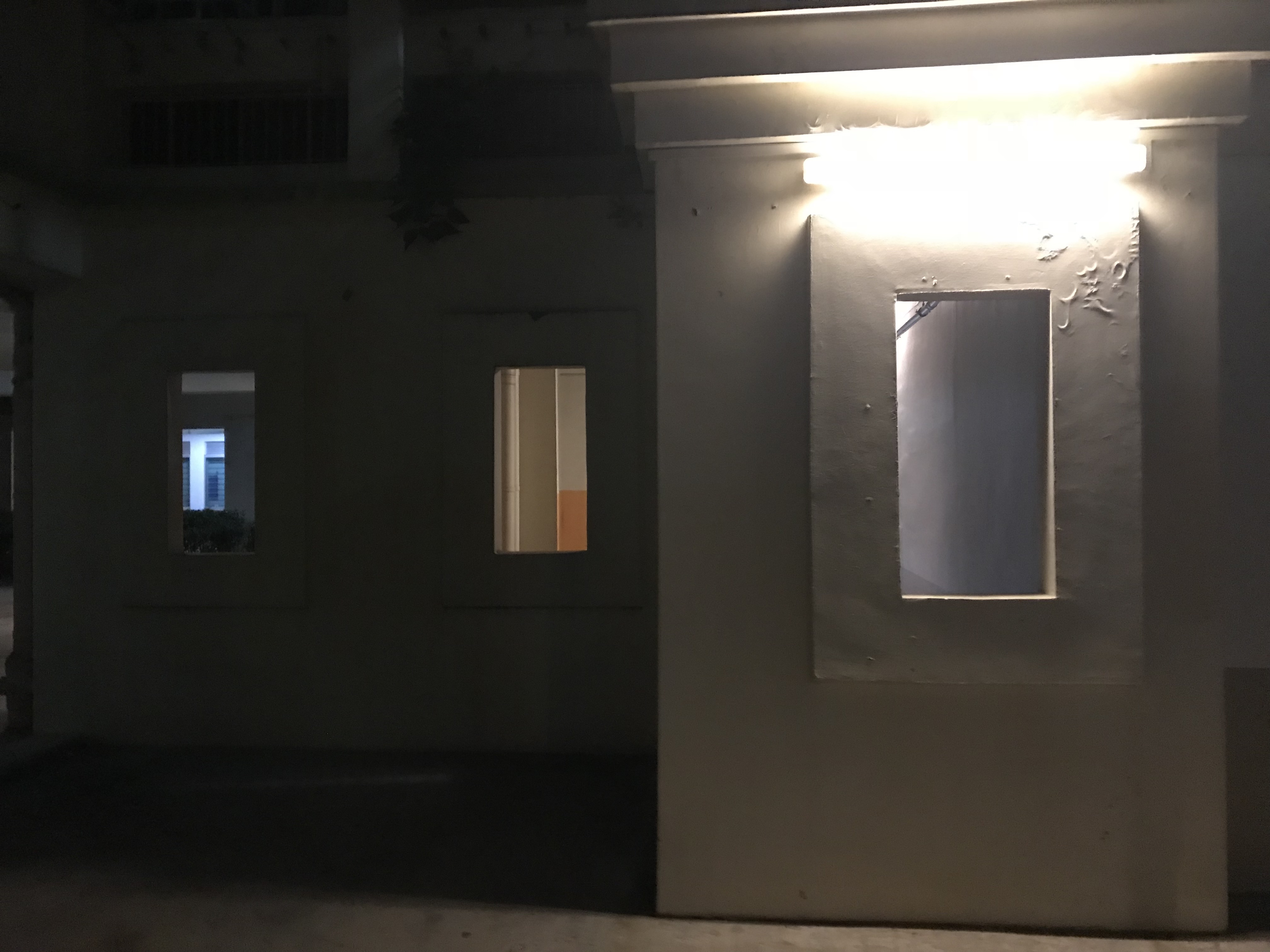
I also took a closer look at the windows in the HDB void decks

So from this visit, I gathered some more insights.
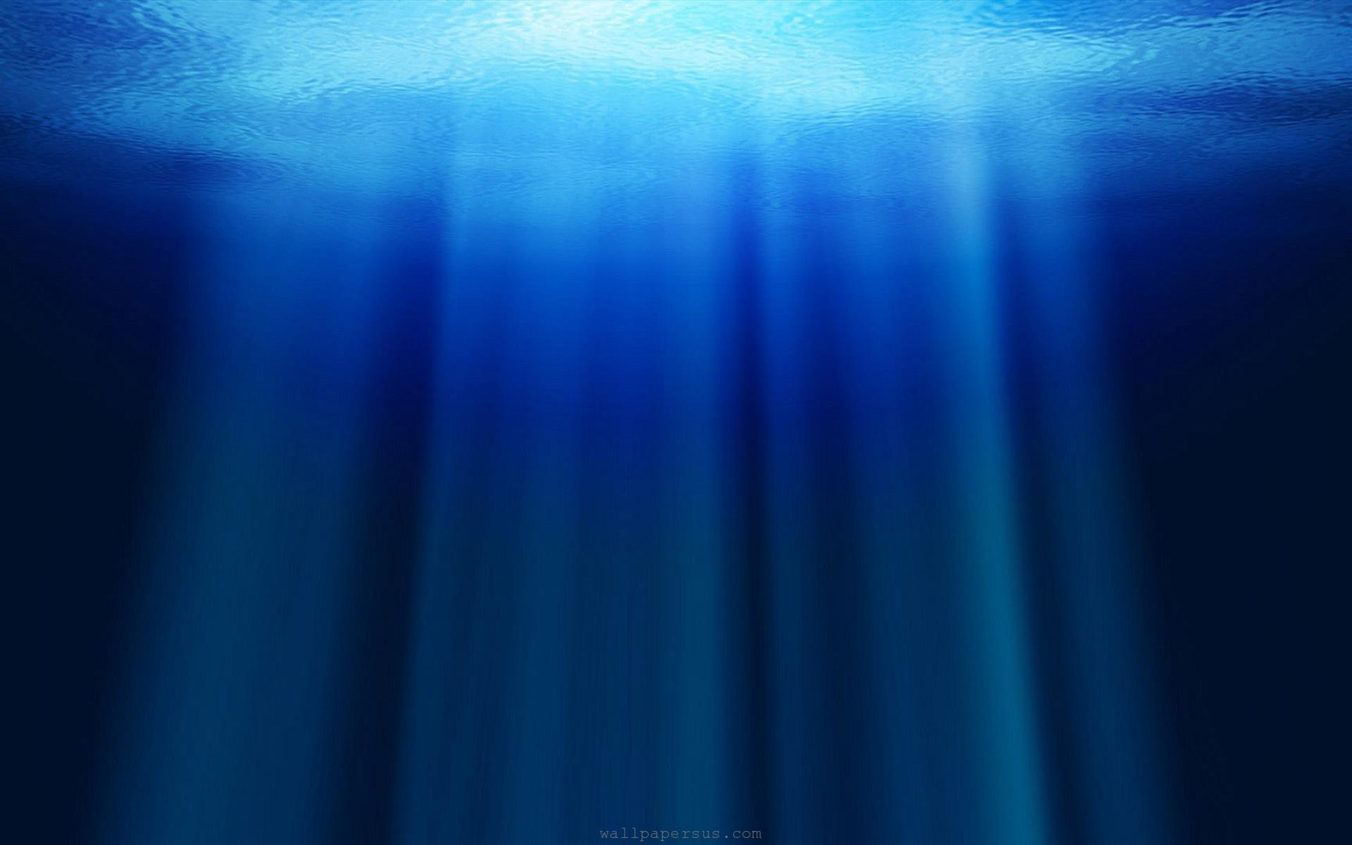
Using SPACE to depict quietness
So, in order to depict quietness in Marsiling, I decided to compare space with sound. When a space is empty, it is usually quiet. Drawing that reference, I started looking into the HDB space in Marsiling. Even though its no different from most other older HDB estates, the spaciousness depicted the quietness I want to show.

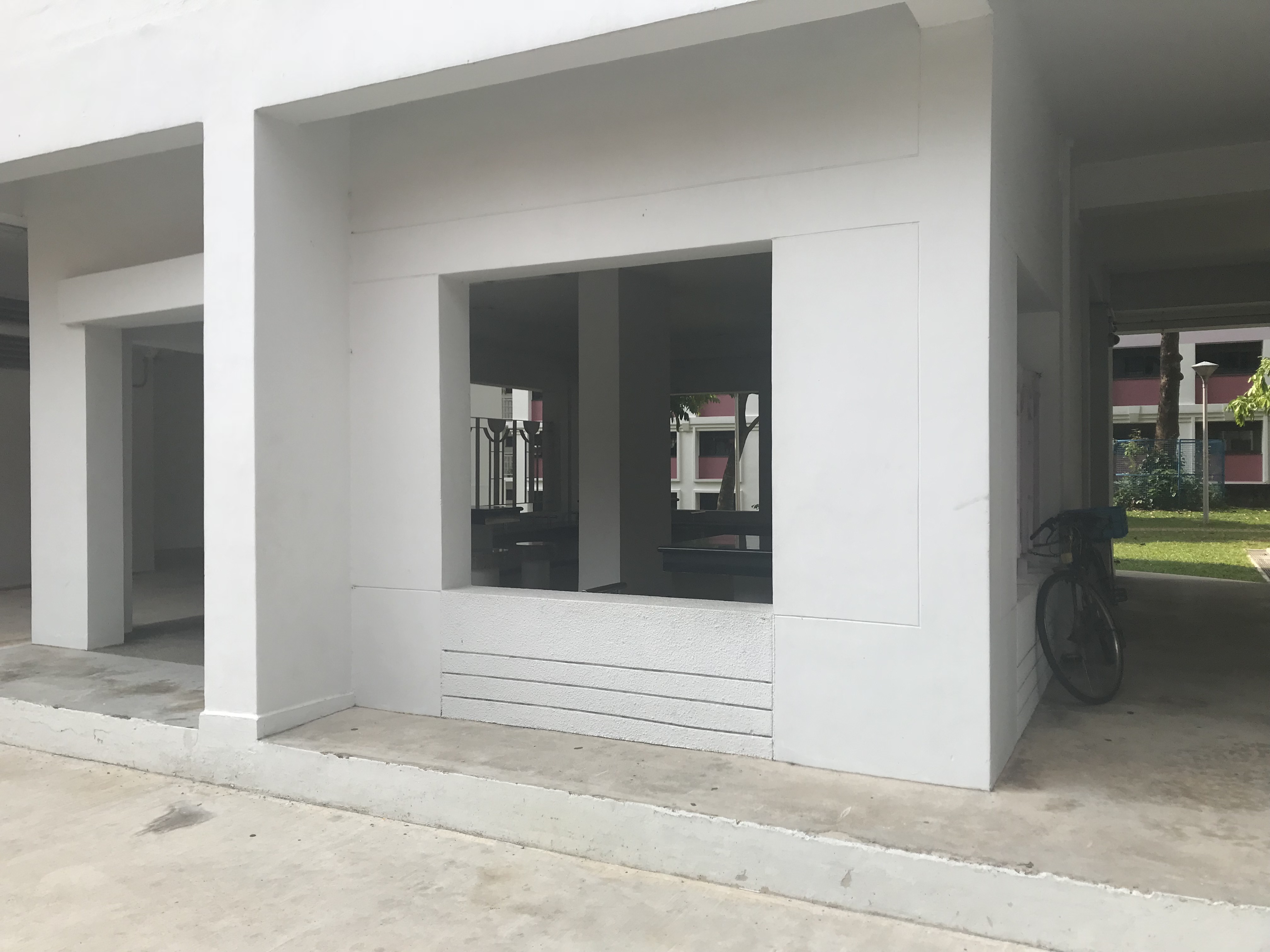
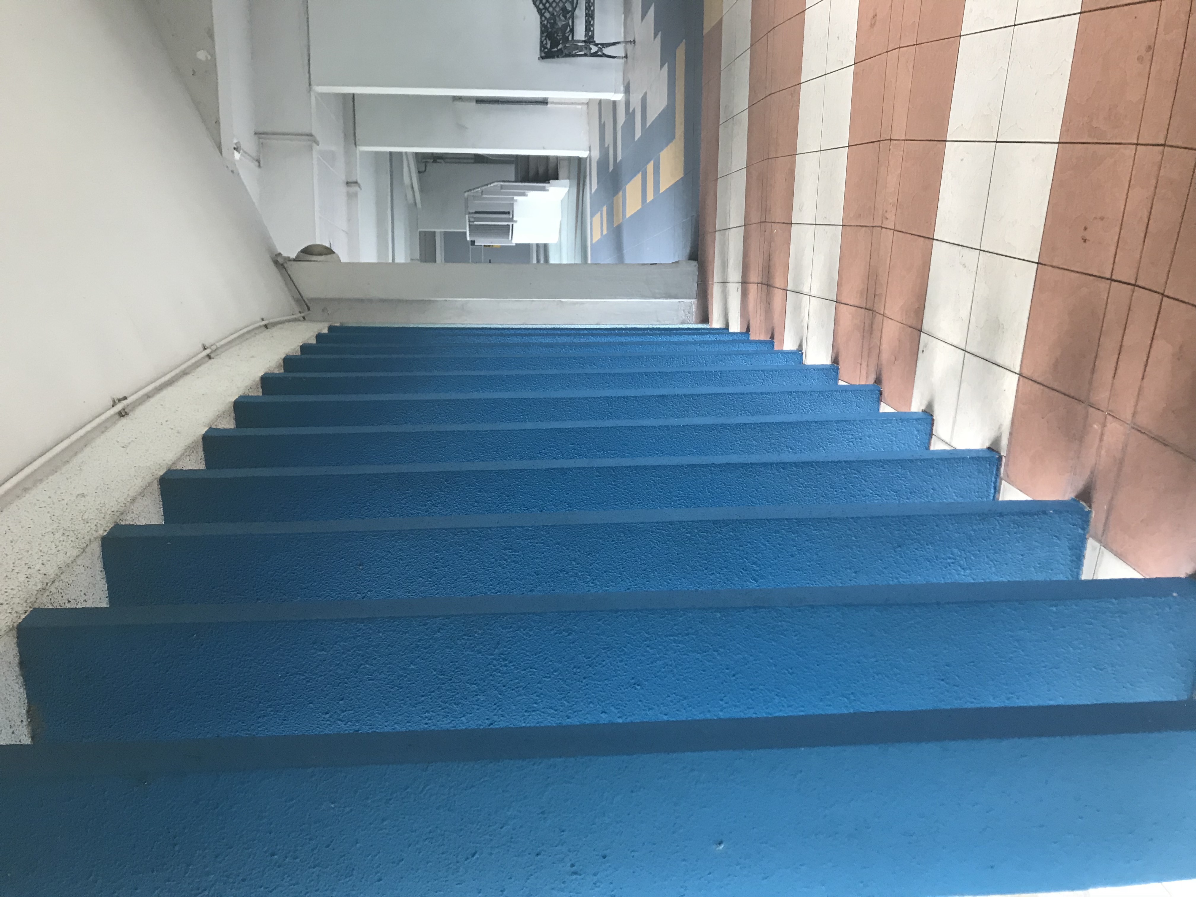
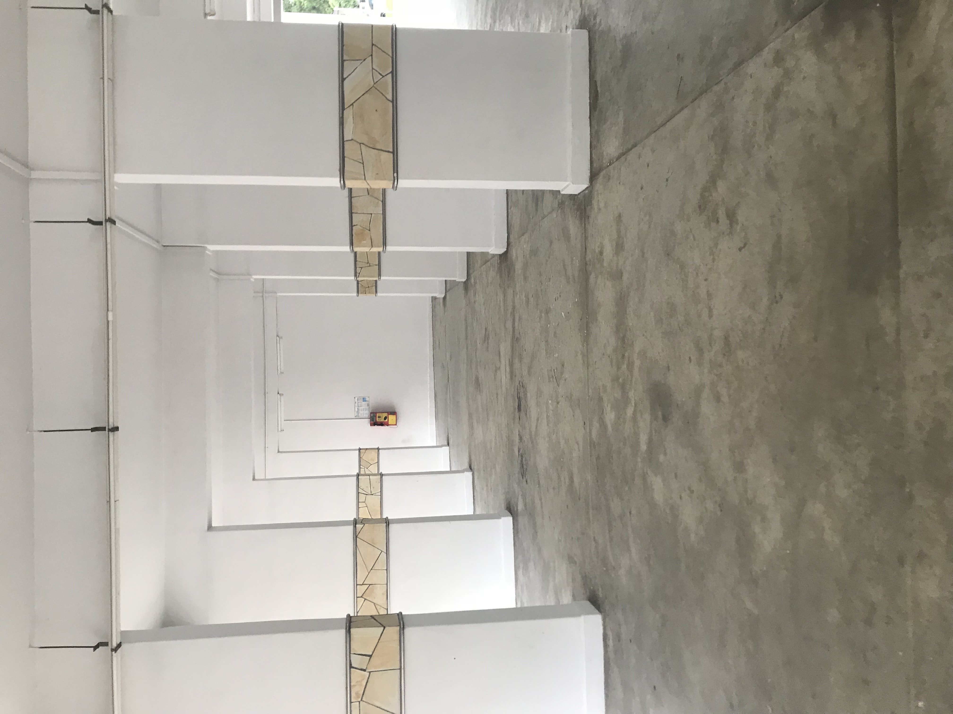
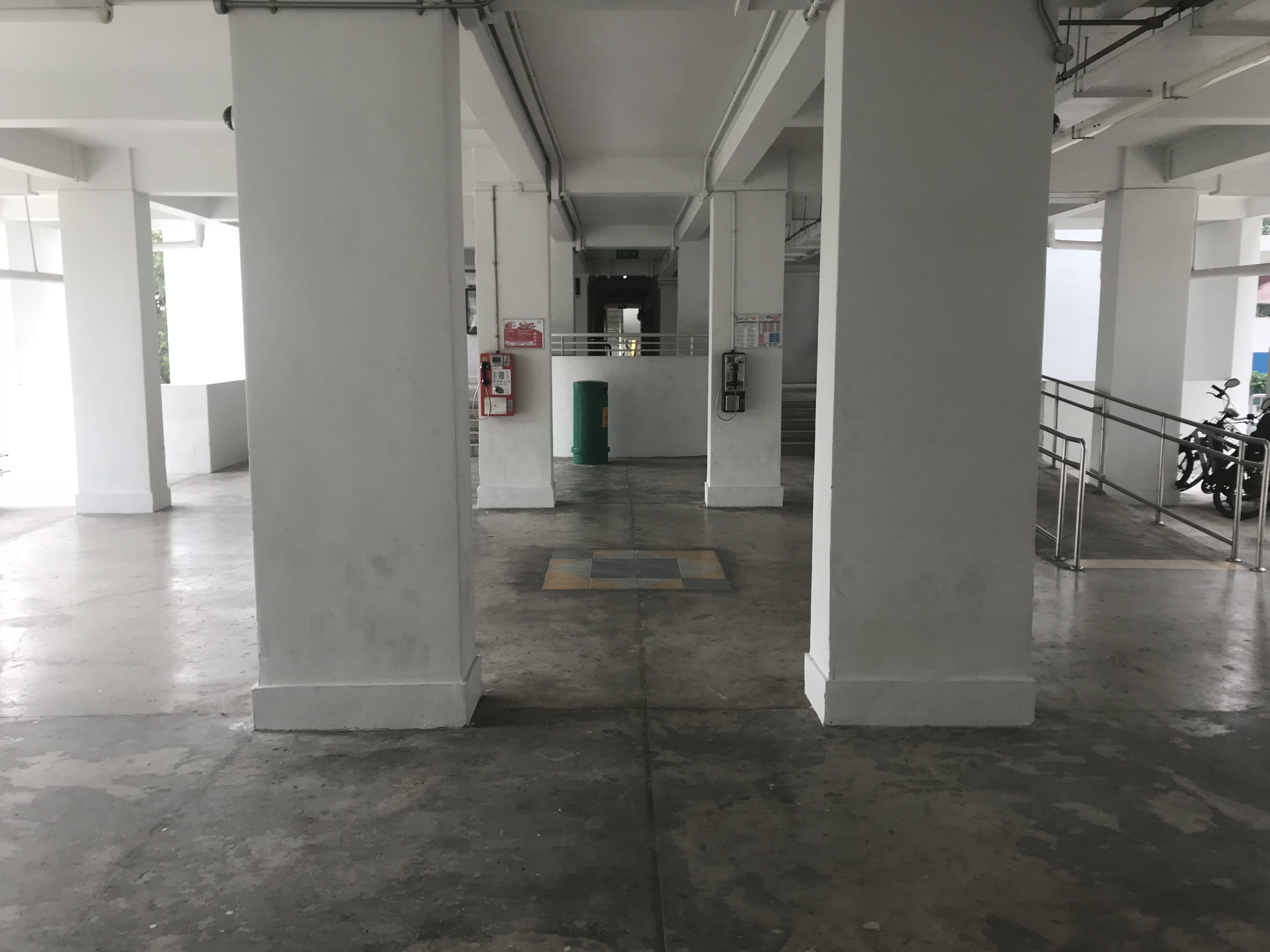
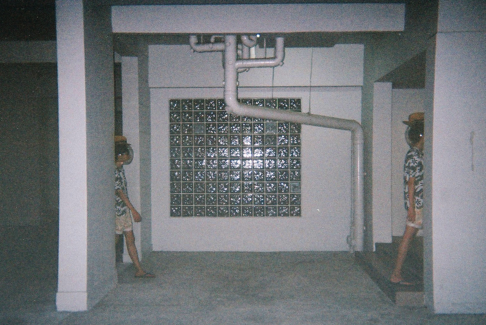
Another way I want to portray Marsiling is through its strangeness. Being in Marsiling makes me feel out of place, and this is probably because I stay in Punggol which is a newer area. The old-ness and the kind of vibes it give out makes me feel like the place is quite eerie. To show this strangeness, I decided to make use of the HDB pillars to warp the space.


An example is this, where I use different perspectives to change the space to make it look narrow, even though its actually pretty spacious.
Lastly, I also want to make use of the pillars and windows found in the void decks to convey the idea of “portals”, as if transported to another world.

From this gathered data, I created my presentation slides which can be found here:
https://docs.google.com/presentation/d/1ZioFV0ilk8j_H7TAQh9Xqbr7NAd4zpaDeCE7d3uiNRc/edit?usp=sharing
https://docs.google.com/presentation/d/123tEtMpzFfb3fPqvJHbiQUSpVe69iBz0nZ_py5Kr6_4/edit?usp=sharing
Done with Frederick Lee

Research; https://oss.adm.ntu.edu.sg/bleow001/graphic-forms-typography-research/
Process: https://oss.adm.ntu.edu.sg/bleow001/graphic-forms-typography-process/
Keeping my researches in mind, I’ve came up with a few ideas on the jobs. I want to be as experimental and creative as possible.
Here is my list:
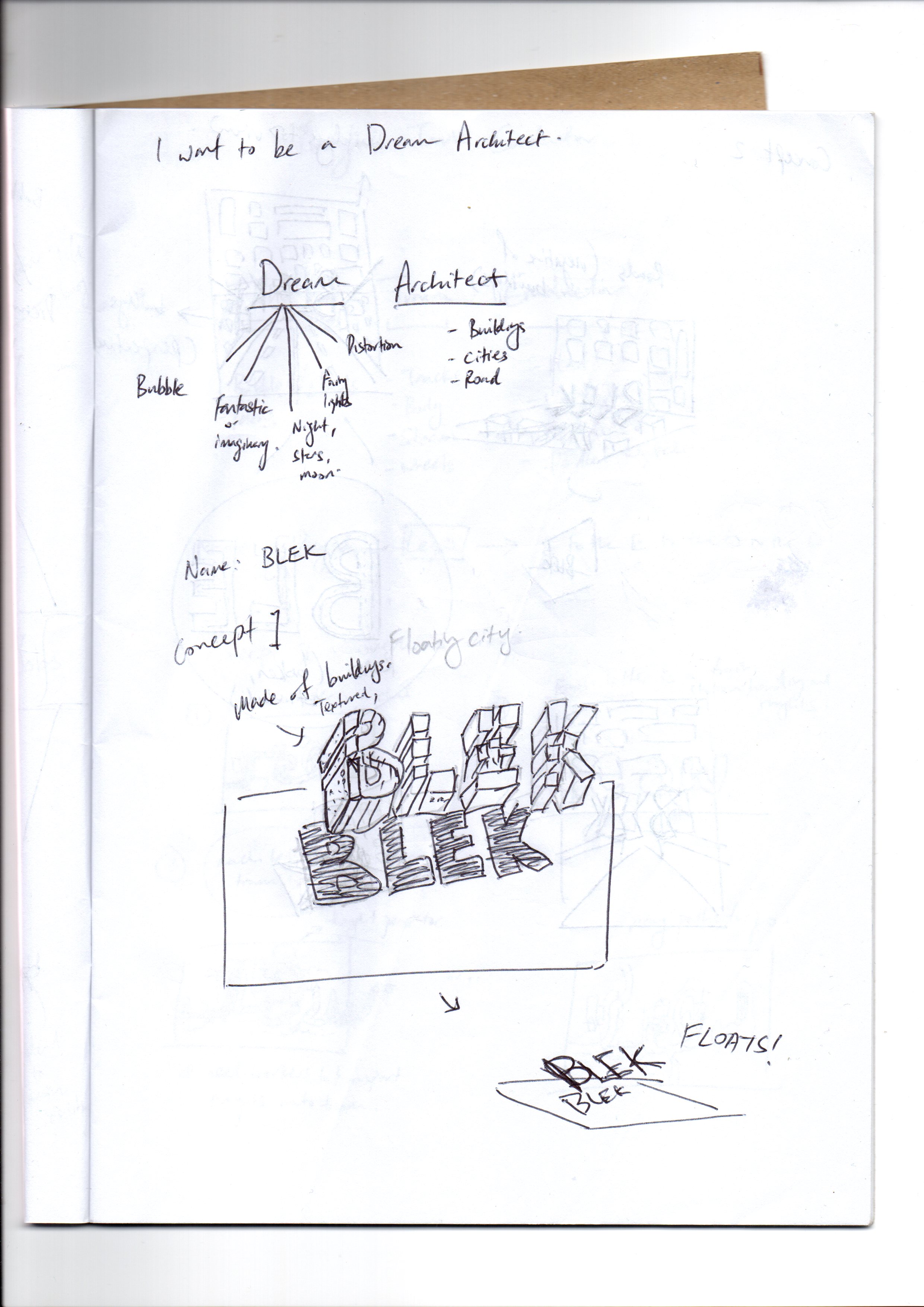
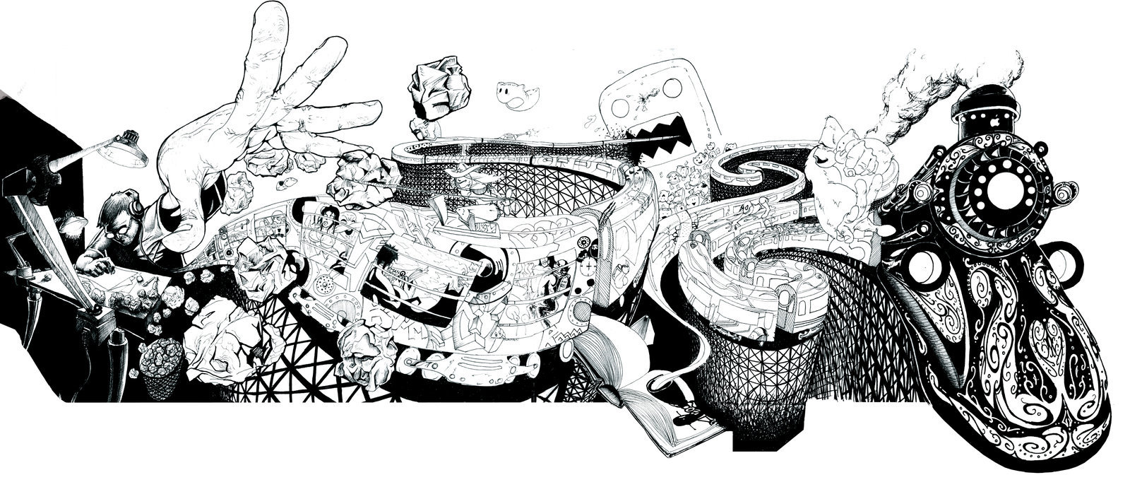
Job Idea 1: Dream Builder or illusionist
Using optical illusion to create 3D within 2D. The idea is that a dream builder builds a dream, so I would use this optical illusion as a foundation to whatever that is going to be built.
This is inspired by the 3D illusion artworks seen in trickeye museums and on youtube videos:
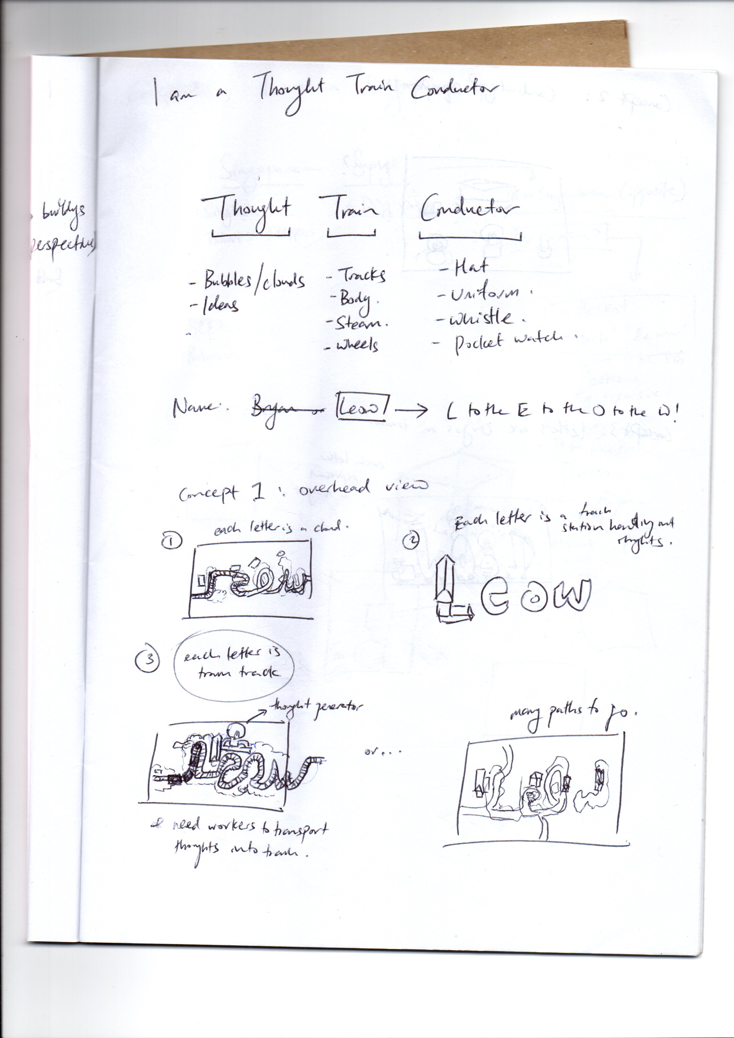
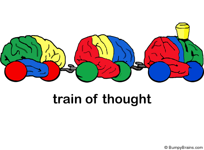
Job Idea 2: Thought Train Conductor
I merged a ‘train conductor’ with ‘thought train’ to create a Thought Train Conductor. This job is basically someone who controls a person’s thoughts by conducting the thought train. The idea is inspired by Pixar’s Inside Out
Job Idea 3: Ant Trainer
I thought it will be funny to have a trainer that control ants to make them do tricks. I got inspired by looking at animal trainers, and I stumbled upon a thing called Flea Circus
It intrigued me, it’s so weird, I feel like it made the cut for an imaginative job. So I decided to be an ant trainer instead of a flea trainer.
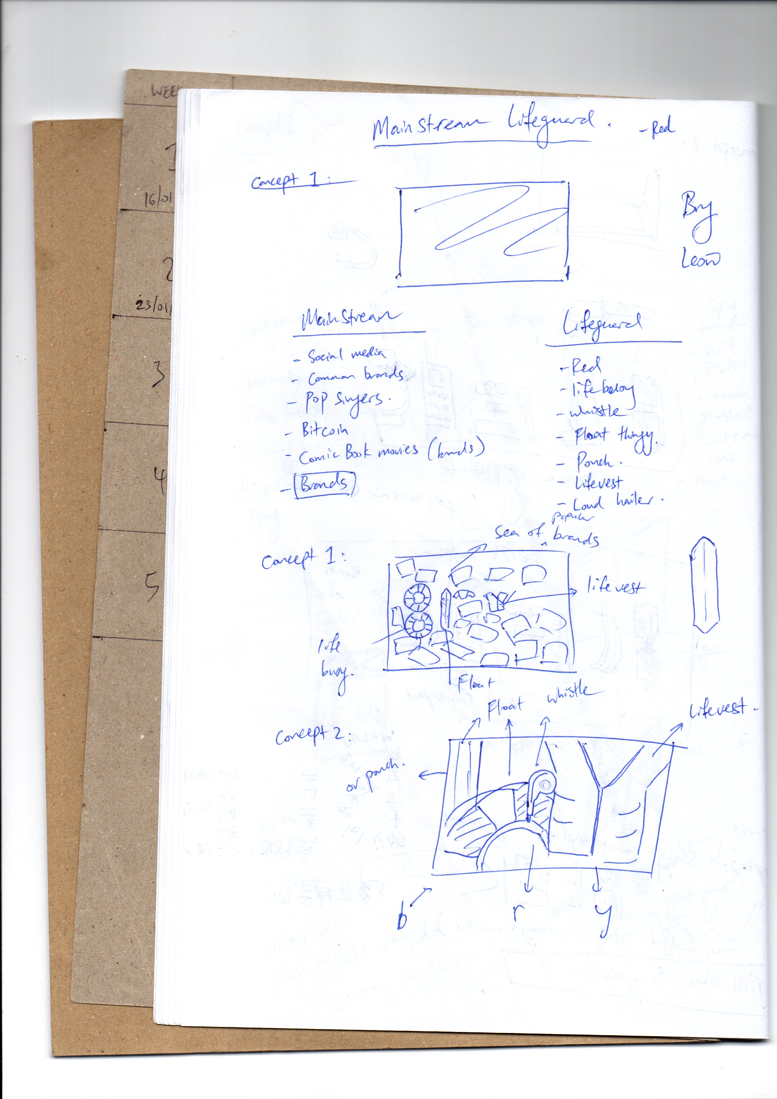
Job Idea 4: Mainstream Lifeguard
The idea is that a mainstream is not just what is popular, but also something like a river. To be a lifeguard at a mainstream is to be someone who rescues people from what is popular. It’s a complex idea. I would combine elements of a lifeguard and popular stuffs like social media, pop culture, popular fashion brands, etc.
Job Idea 5: Apocalypse specialist
An apocalypse specialist is a person that is an expert at all kinds of apocalypses (zombies, alien invasion, nuclear war, etc). I’d imagine taking apart the destructiveness of all sorts of apocalypses.
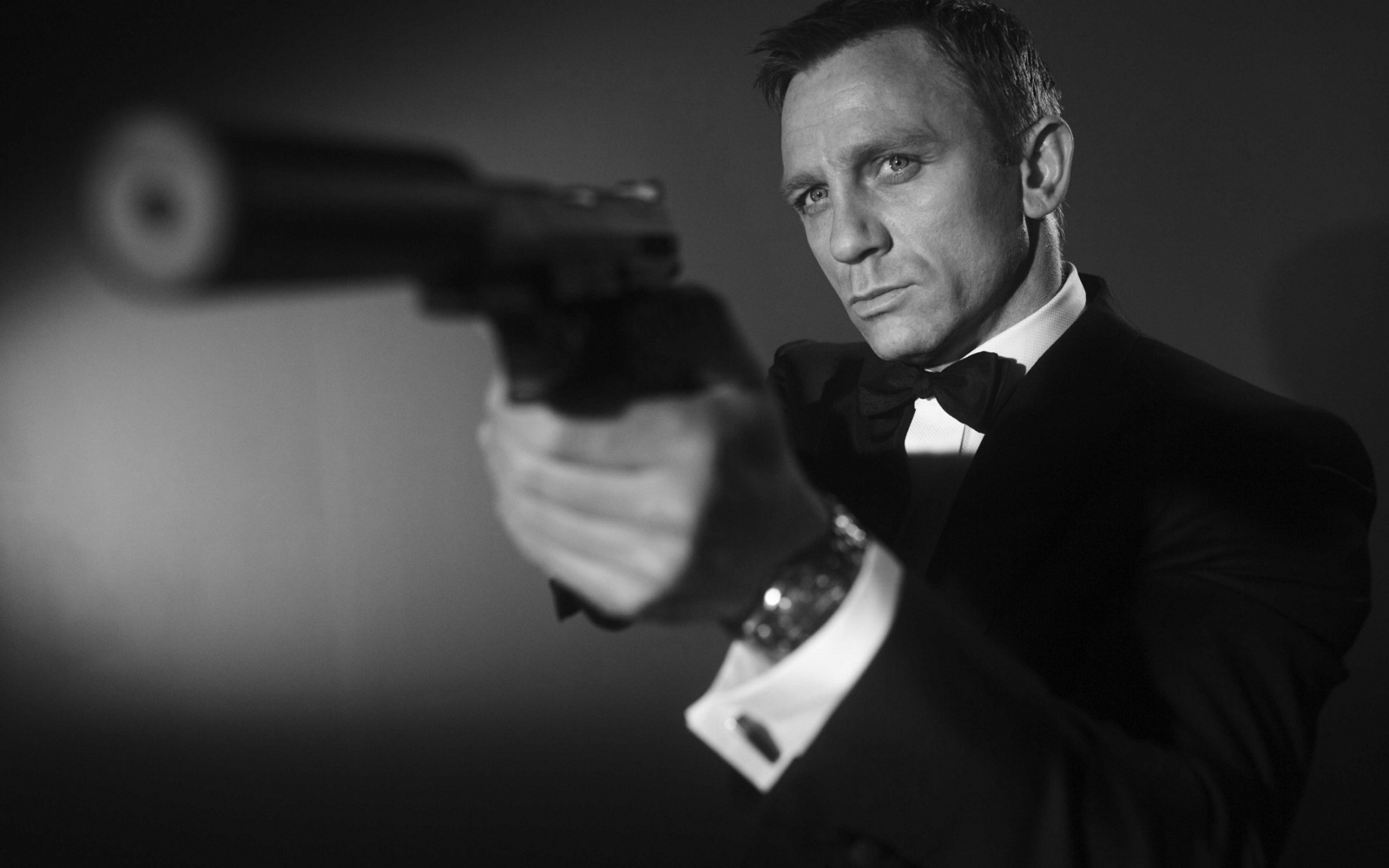
Job Idea 6: Singaporean Spy
I thought about the idea of a “Russian Spy” in USA, and I thought about how a spy that Singapore sends out is oddly called a “Singaporean Spy”. Sounds funny. Anyway, to be a “Singaporean Spy”, one have to be in another country, so I thought it should be Malaysia. The idea is to create an artwork that looks Malaysian, but secretly hides elements from Singapore.
Other jobs that didn’t make the cut:
Tilt Master (because I’m always tilted)
Space Traffic Controller (I love space)
Cloud Traffic Controller (like, iCloud, Dropbox, etc)
Alien Biologist (alien body parts)
Doomfist (The Overwatch character)
Sneeze Blesser (Someone who blesses anyone who sneezes)
Earth Rotator (The person that rotates the Earth)
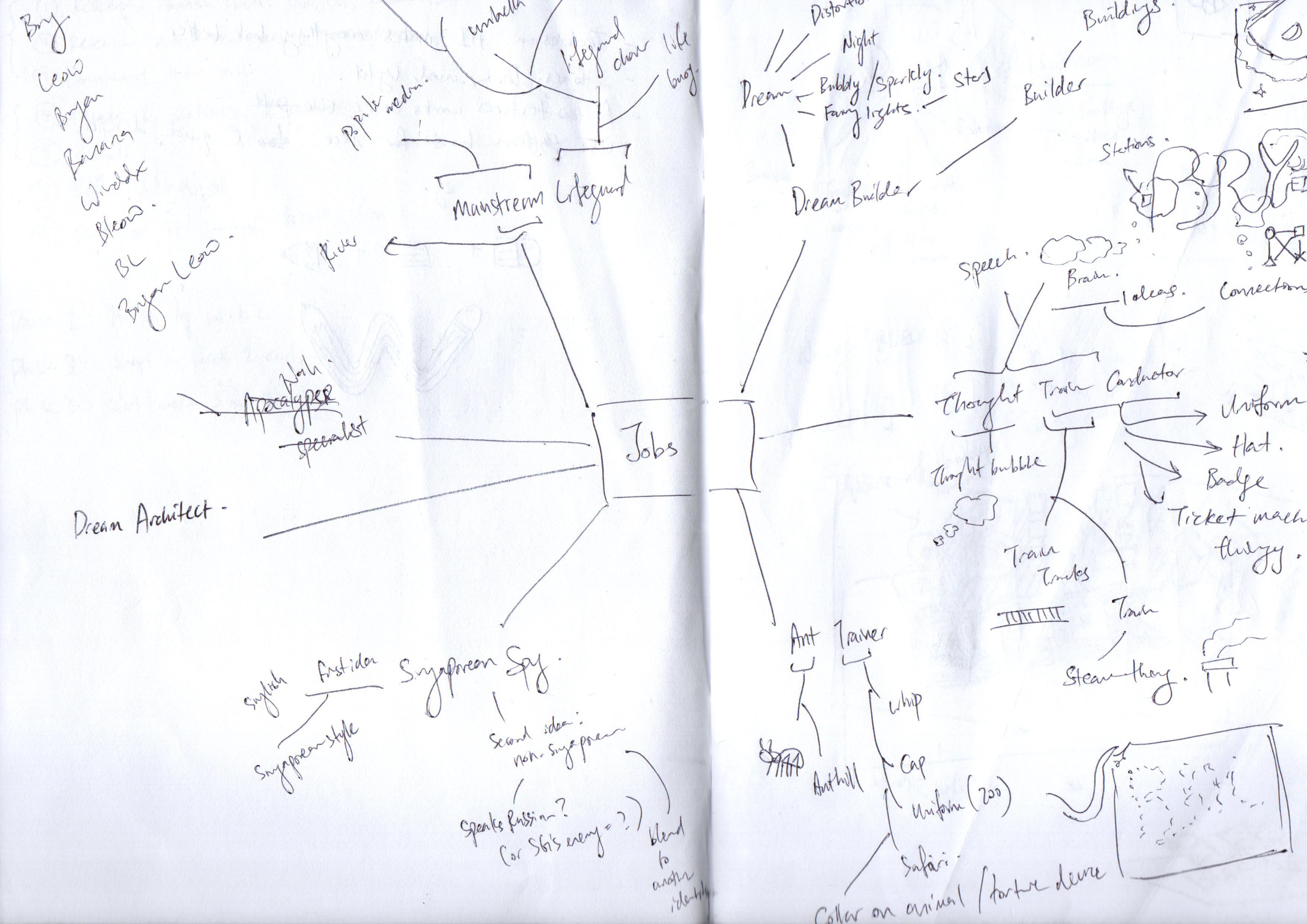
I decided to stick with just 4 jobs:
I started creating drafts for the jobs.
What my idea were for them:
Dream Builder
Idea 1: To make use of the movie Inception’s idea of a dream to let audience know the idea of a dream builder.


This is where I got my inspiration from. I like the idea that a 2D drawing can trick the mind to think that it is 3D. By doing so, it became in line with my concept of turning dreams into reality.
To breakdown thought train conductor, it’s Thought, and Train Conductor. For thought, it can be brain, thought bubble, and for train conductor, it can be train tracks or train body.

Mainstream Lifeguard
My idea is to use elements of lifeguard and put it into a sea of brands. The lifeguard objects will form my name.

Singaporean Spy
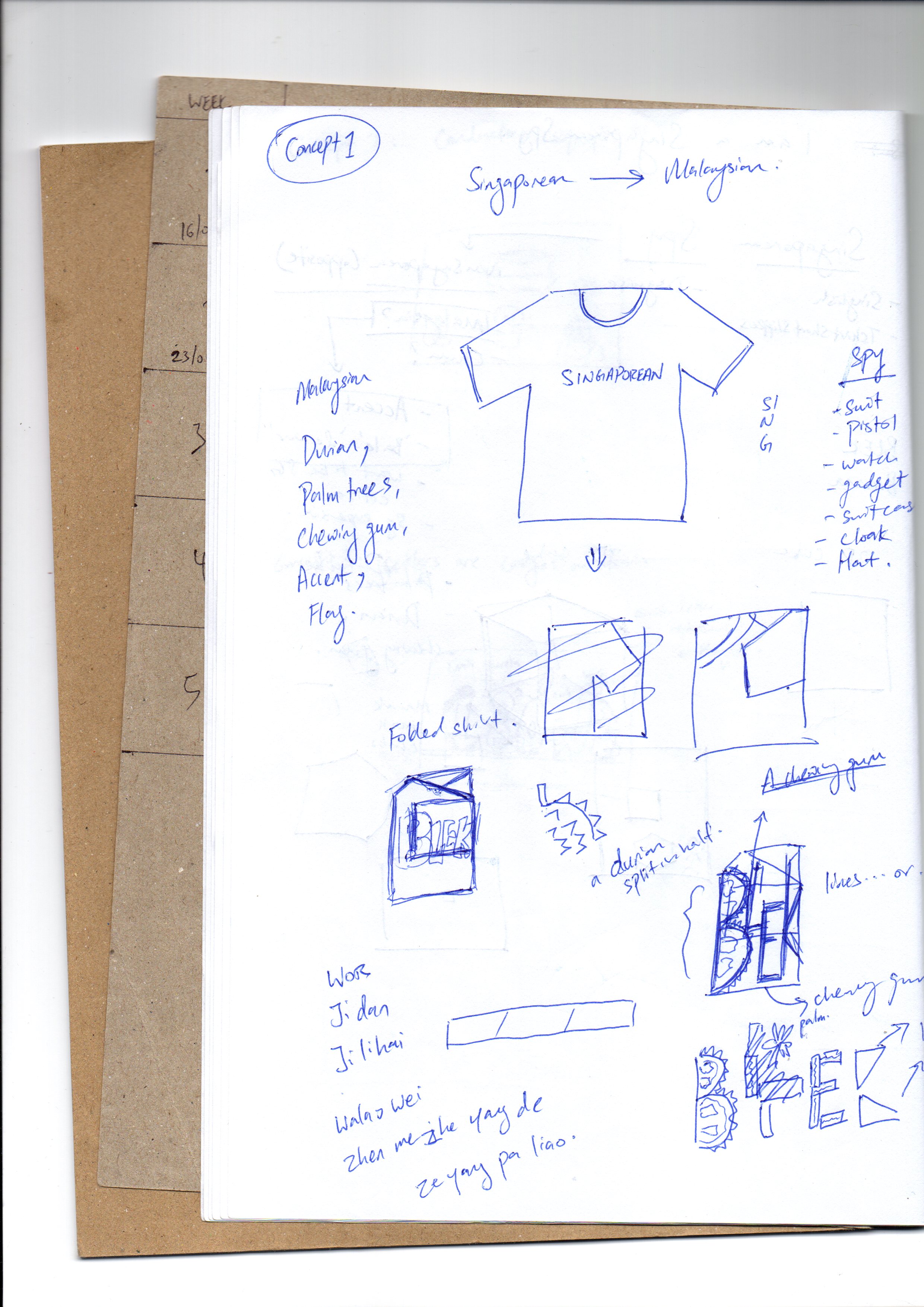
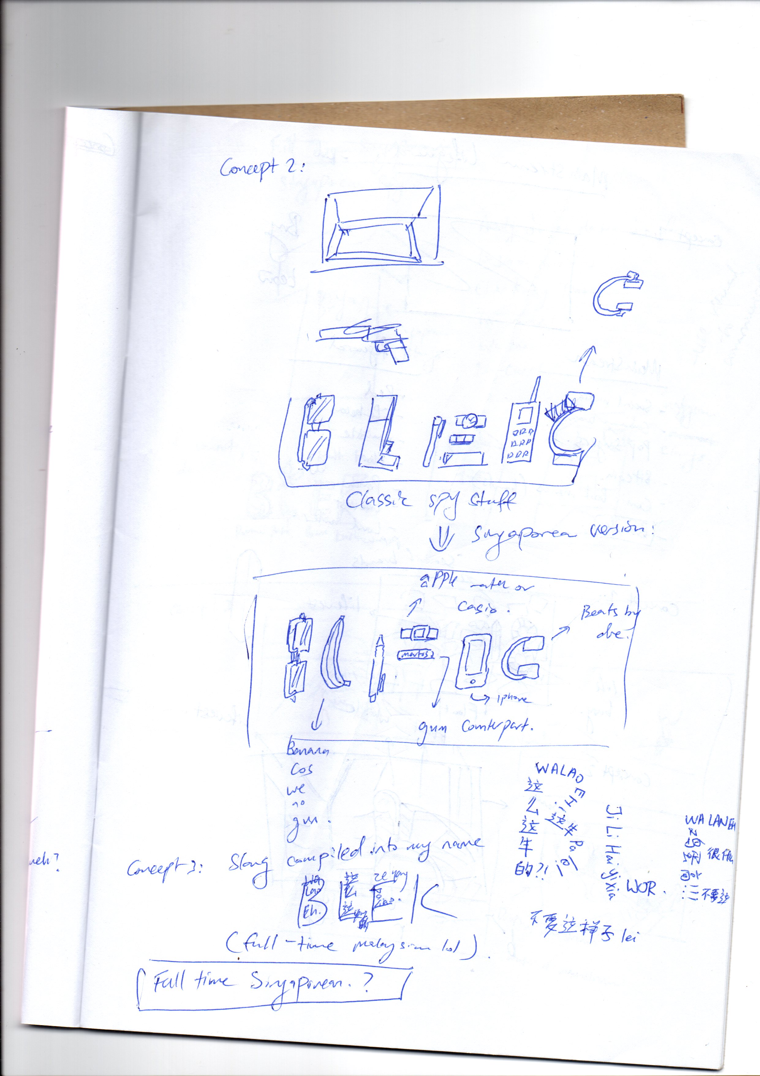
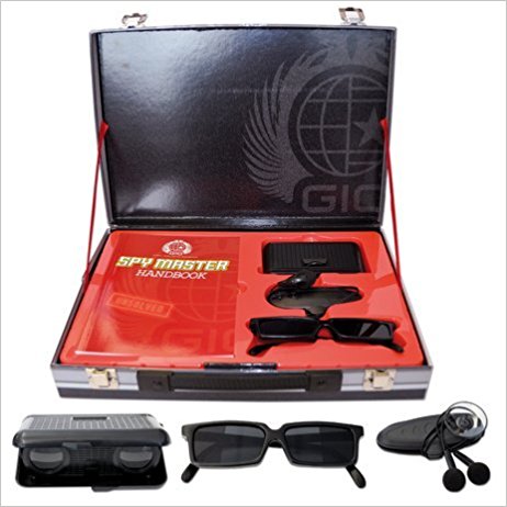
I have a very interactive and complex idea for this one. Let’s talk about the simple one first: I wanted to use a spy suitcase containing very Singaporean items to convey the idea of a Singaporean spy. The complex idea is to scrap the entire idea of conveying a straightforward message, and strip the idea of a Spy to its fundamentals.
To be a Singaporean is to have T-shirt / shorts / slippers combo. That goes the same for Malaysians. So using this idea, I intended to create a disguised t-shirt.
A tshirt is folded whenever we first see it in a store. Therefore, my idea is to fold a tshirt as if it is new from a store, and on it, it will reveal my nickname, formed out of chains of Malaysian slang. This represents the first impression of a stranger to the tshirt, a Malaysian. And this also represents my “Singaporean Spy’s” alter ego, the disguised Singaporean acting like a Malaysian, speaking their slang.
Once opened, there will be another name, my real name, this time, it is in Singaporean slangs.
Another idea is simply to use the super secret spy suitcase and use Singaporean items to fill it up.
Consultation One

I received feedbacks that the texts must be created first before the image is added in. I couldn’t really understand what that means, but I supposed I need to create something that is more straightforward and use semiotics to convey the job. The feedbacks for the jobs are:
Dream Builder
Generally alright to go the direction I am heading, but I must keep in mind not to do anything that is physically 3D. The idea of using Inception as a clue to the concept is not recommended as it didn’t take the real essence of the job title. An example given by Shirley was to use architectural blueprints, but I thought those are too literal.
To move myself forward, I decided to use the same concept of using 3D illusions. With that, I made an accurate template that I can use to trace out for other ideas:

Thought Train Conductor
The idea is generally accepted, but there are some issues too. Using just clouds and train tracks, it does not really convey the idea of a “conductor”.
Mainstream Lifeguard
The usage of objects to form the letters is not recommended. Instead, I was told to personify the letters (giving it character instead of using objects to form it)
Singaporean Spy
The idea is too interactive and did not use semiotics to convey the message. The assignment’s objective is to use visual cues to suggest the job to people. The idea was rejected, and I had to look for other ideas as this job is too hard to illustrate for me.
I finally understood the brief this time. With feedbacks in mind, I decided to change some ideas around.
I changed Dream Builder into Cloud Maker, as it would be easier to convey than a Dream Builder, using semiotics. There are very little association with “Dream Maker” to me.
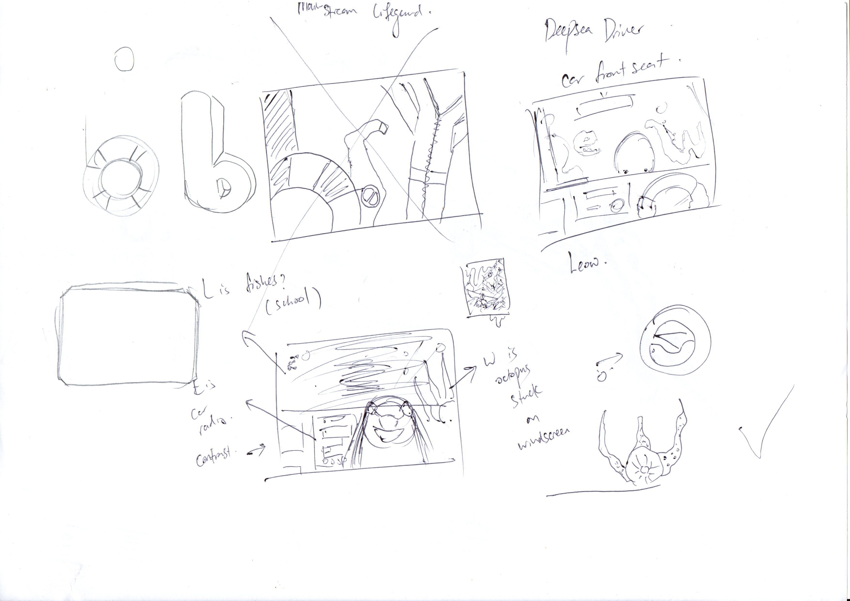
I removed Mainstream Lifeguard as it is too hard to depict, too, and thought of a new job out of puns: Deep Sea Driver (not diver). I believe this would be not only easier for me, but would also be successful.
I also changed Singaporean Spy to Singaporean Breakfast Enthusiast, keeping the idea of something Singaporean, but make it easier to do, too. Idea is to use Singaporean breakfast set to form the name.
Consultation Two
The next consultation, I had most of my concepts settled. However, there are still some changes. Most of my text are not of the same typeface, which is one of the requirement for this brief. Understanding this, I know how to move forward. With that information, I moved away from sketching drafts and tried doing the actual artwork.
In the meantime, I changed to Breakfast Enthusiast to Kaya Toast Maker, as I intend to use only the kaya toast to build the text.
Consultation Three + Final
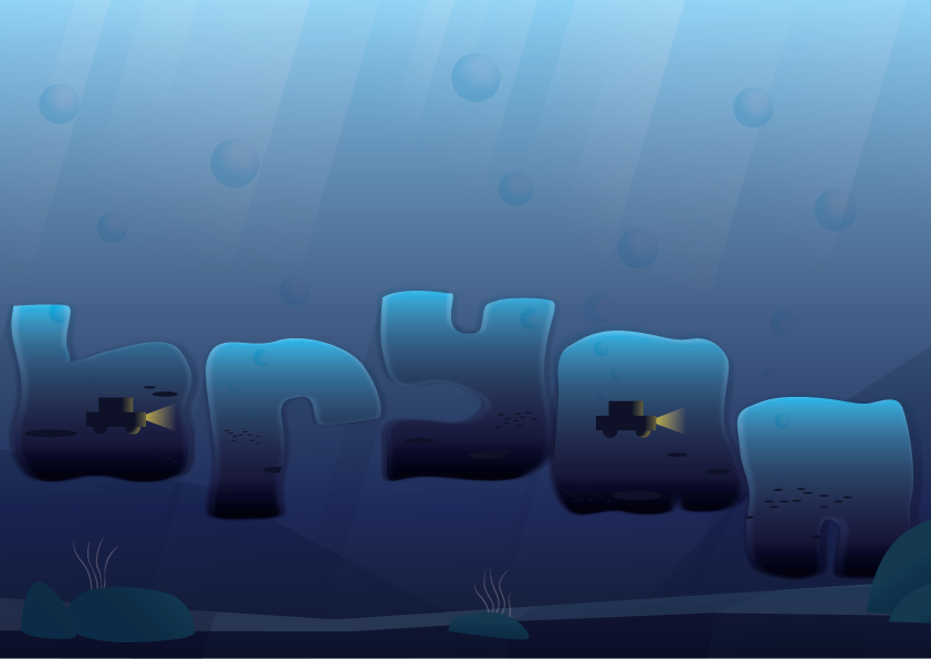
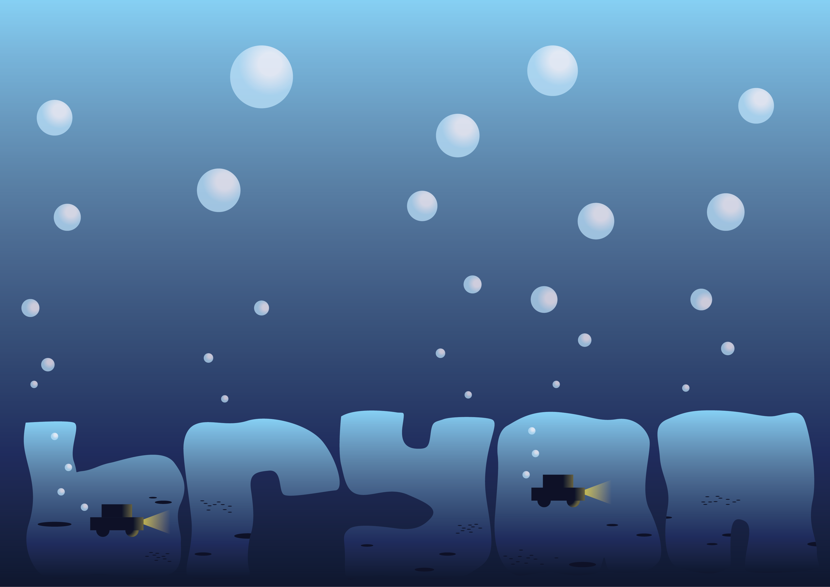
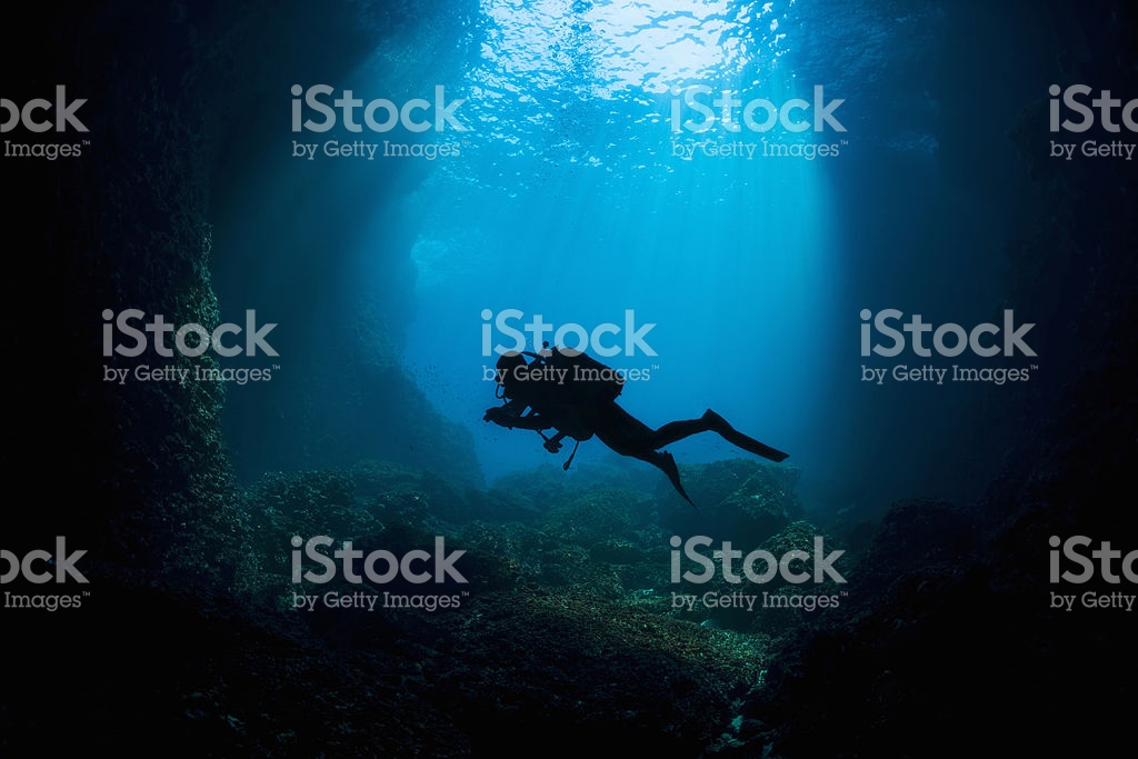
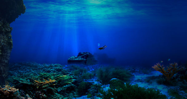
Deepsea Driver

Deepsea driver was moved to be done horizontally, and the “underwater vibes” is done such that it will be consistent with each letter.
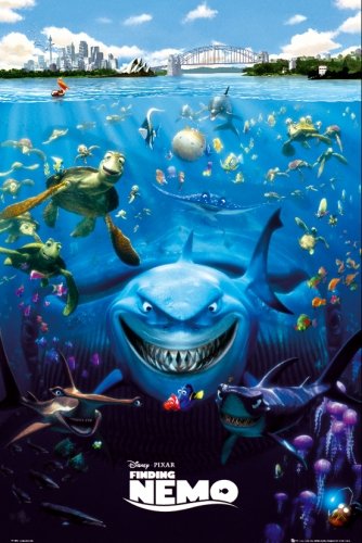
The look was inspired by the Finding Nemo poster
I received feedback that I was one of the few that put my text at the bottom (so I’m unique, yay?) But there are some things that still needs to be fixed. The background seemed too plain, and the texts have no texture.
I went online to see if there are any tutorials to create such effect and found a really good video that did the under sea texture really well!
Taking some references from the method, I created the final work:
That’s the end of Deepsea Driver process!
The name is made with my name “bryan”. The gradient inside the name signifies the descending depths of the ocean. The cars replace the holes in the letters that have them, which signifies that there is some driving involved in the job. The letters are made with multiplied layers over it to create the wavy effect of being underwater. The background further sets the context for the job.
Semiotics: Depth, water movement, car, bubbles, light stream, seabed
Colour Palette: monochromatic, blue to symbolise the ocean
Textures: the clarity of water and the light that stream through to indicate rough waves that refracts light
Composition: sinking, at the bottom, as though it is like moving at lower depths, floaty. Horizontal to depict the vastness of the sea
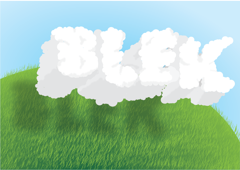
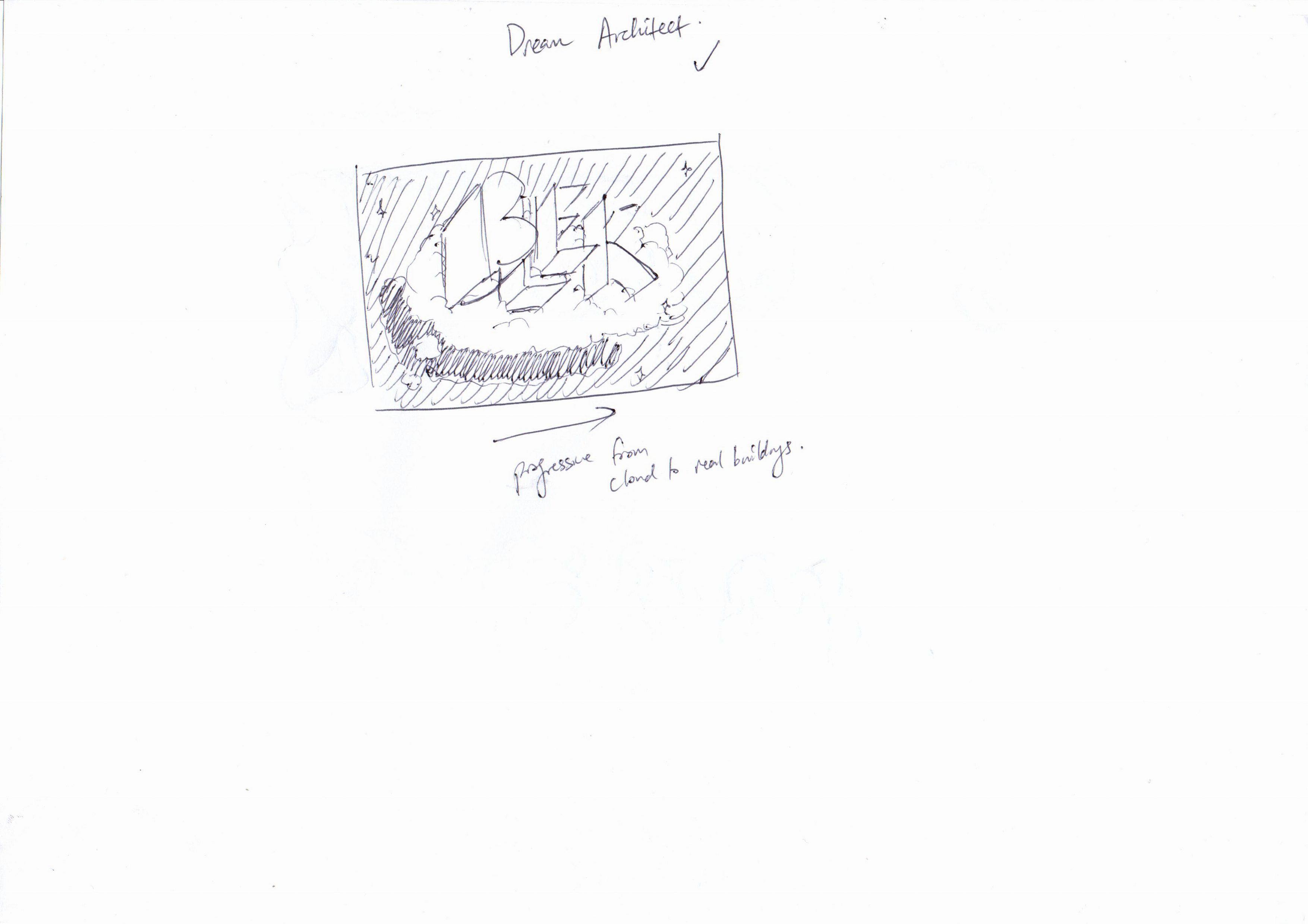
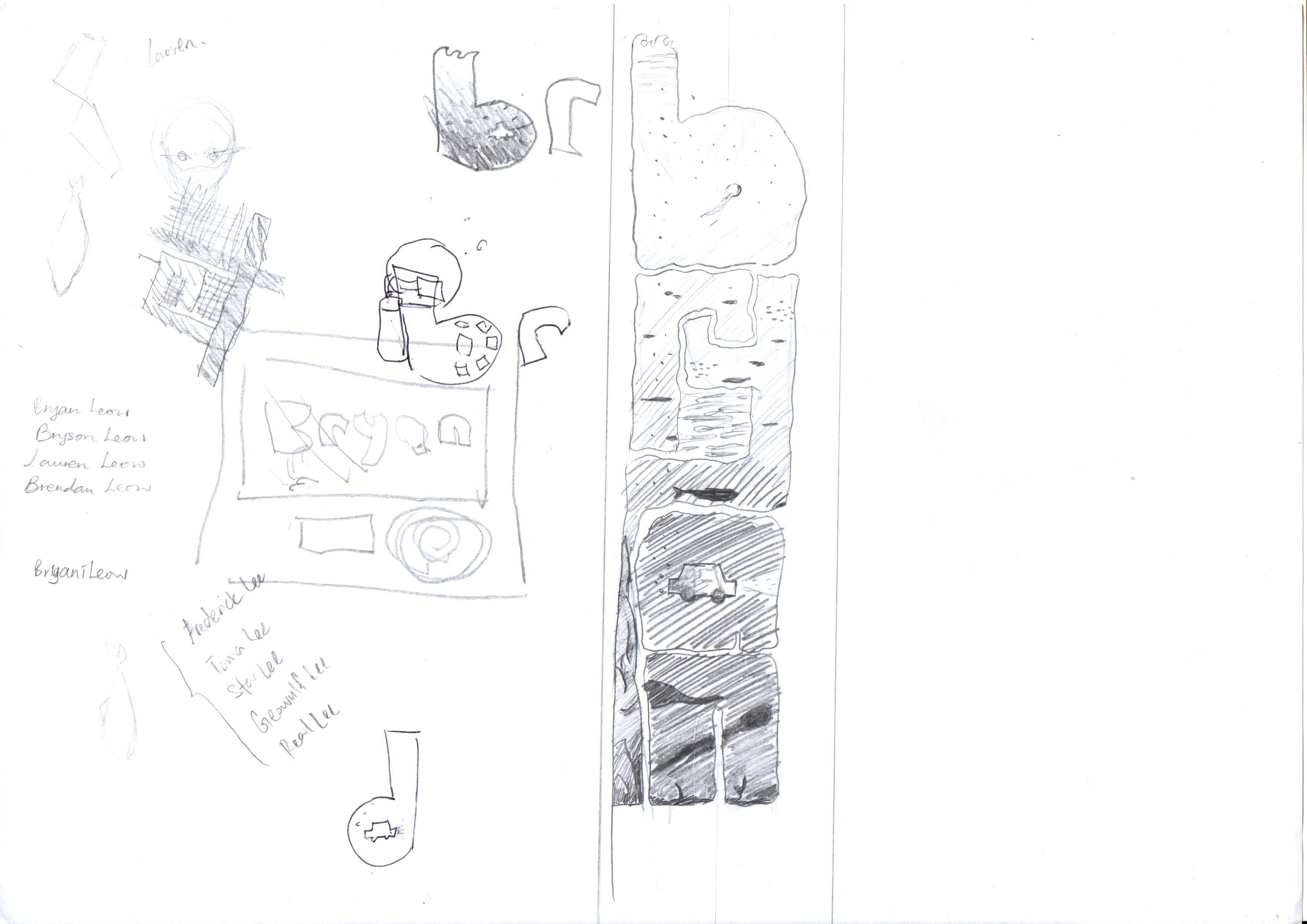
Cloud Maker
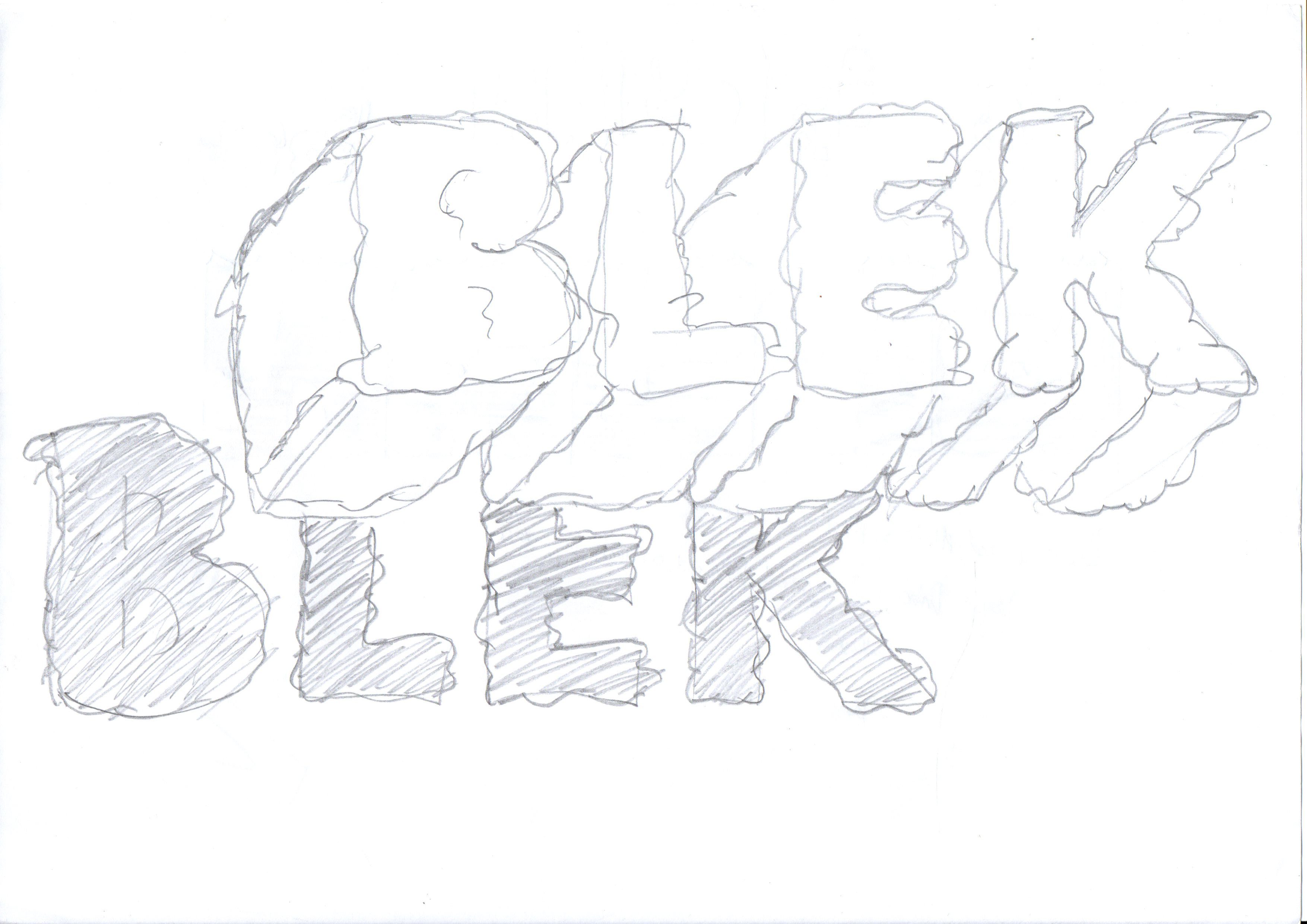
Using the template I made, I traced a cloud texture to the text. I then scanned the new sketch and added texture onto illustrator using a random cloud brush I made using a guide I found online:
The outcome:
The clouds form my initials “BLEK”, as I’d imaging an builder or maker to use their initials. The grassland creates a context for the audience to understand that these are clouds, as well as to split the page into two different colours so the 3D effect can be seen if the page is tilted to the side.
Semiotics: Cloud, shadow of cloud, and the grass to indicate that it is outdoors
Colour Palette: Analogous, calming
Textures: Cloud’s puffy texture, grass
Composition: Central and slightly to the right to enable for the 3D effect
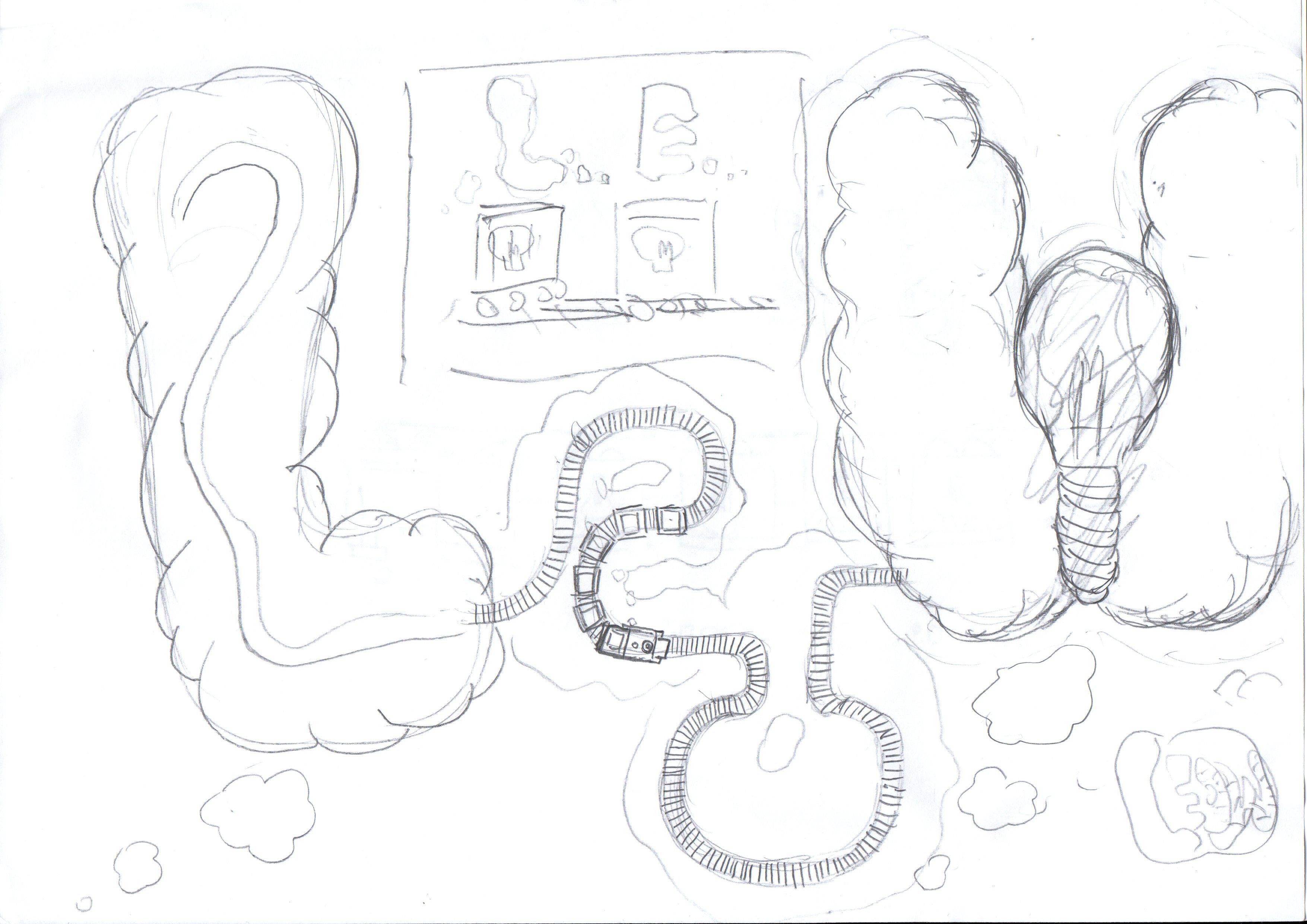
Thought Train Conductor
I decided to add brain textures to the text to create a more obvious idea that there is some thinking involve and therefore, thought.
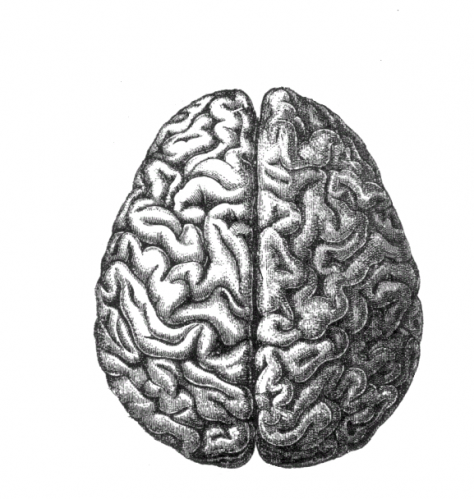
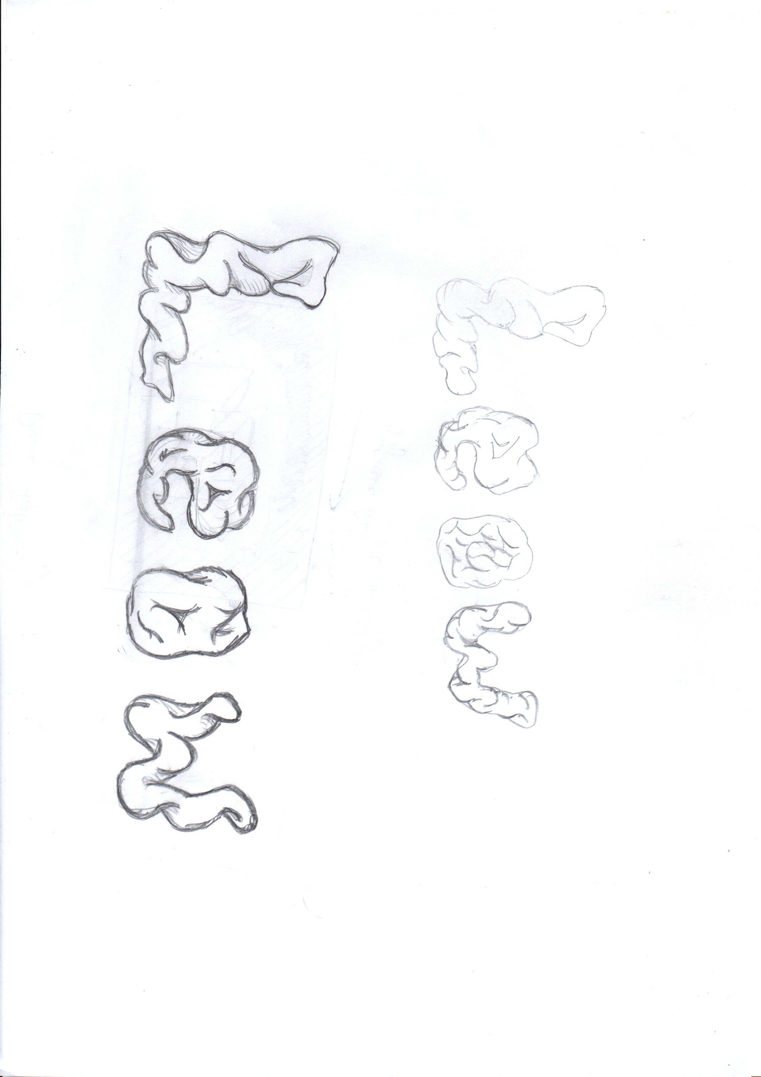
I used the brain image as a reference to the texture of the text.
I did a mockup on Adobe Illustrator to have a brief look at the outcome. They looked too much like intestine to be thought of as a brain, although there are clues from the thought bubble. Feedbacks suggested me to give the font more brain texture.
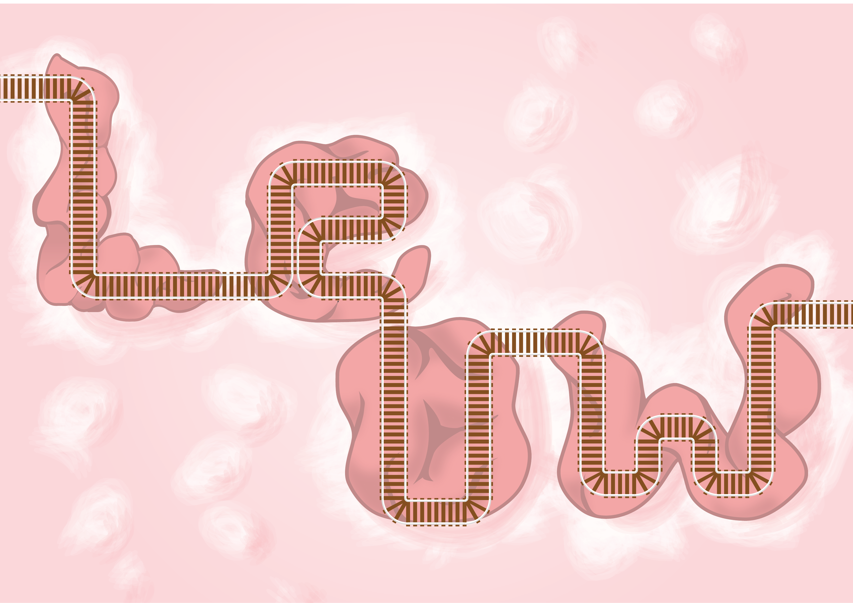
A close up to the train tracks made by vectors
The Thought Train Conductor is made by using my surname, Leow. The reason is that as a train conductor, I will be addressed by my surname.
The tracks are coming from the left side, as if connected from something, and goes around the brain, weaving in and out the brain loops. With each weave, the thought bubbles comes out. This represents the train tracks being interconnected to the different parts of the brain, and with each passing, generates thoughts. This defines the thought train.
Semiotics: Train tracks, brain, thought bubble
Colour Palette: Analogous, with purple ~ pink gradient in the background as the representation of the deep, calm, inner side of our subconscious
Textures: Brain folds, train tracks, thought clouds
Composition: to create the idea of a continuous path, yet trying to not make it look boring, so I split Le and ow to make the train track route more dynamic
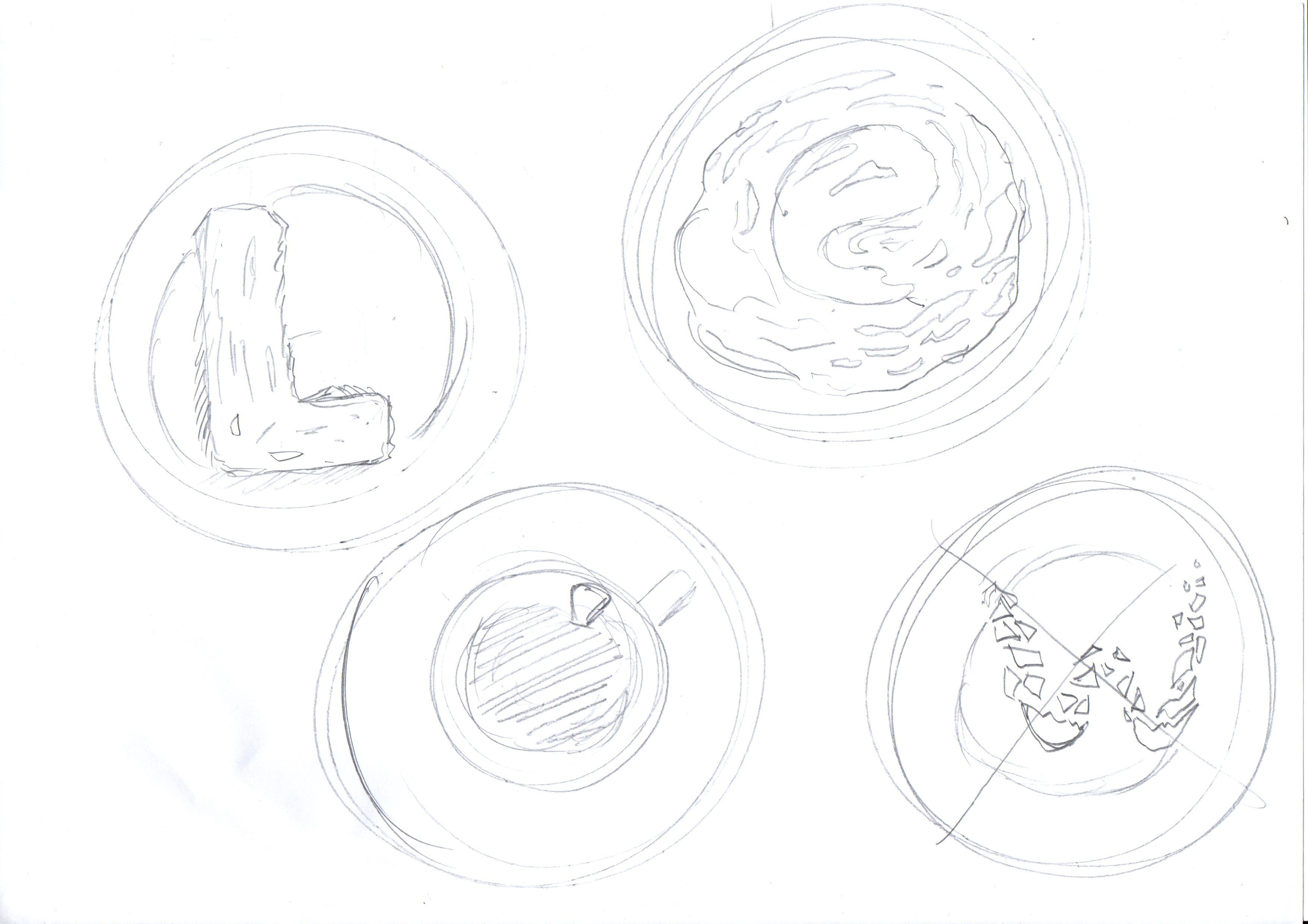
Kaya Toast Maker
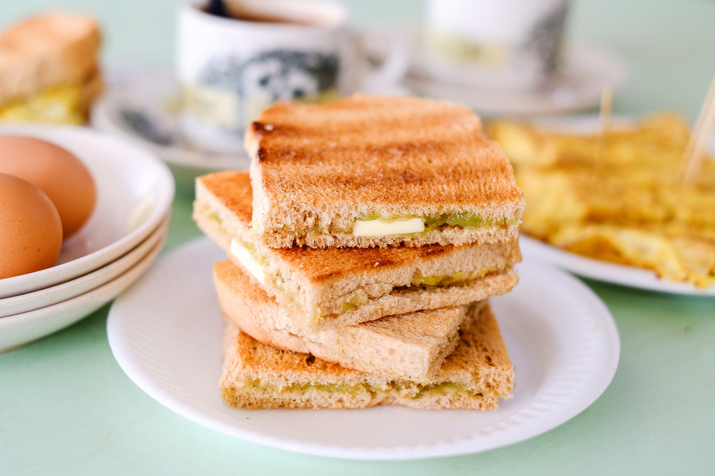
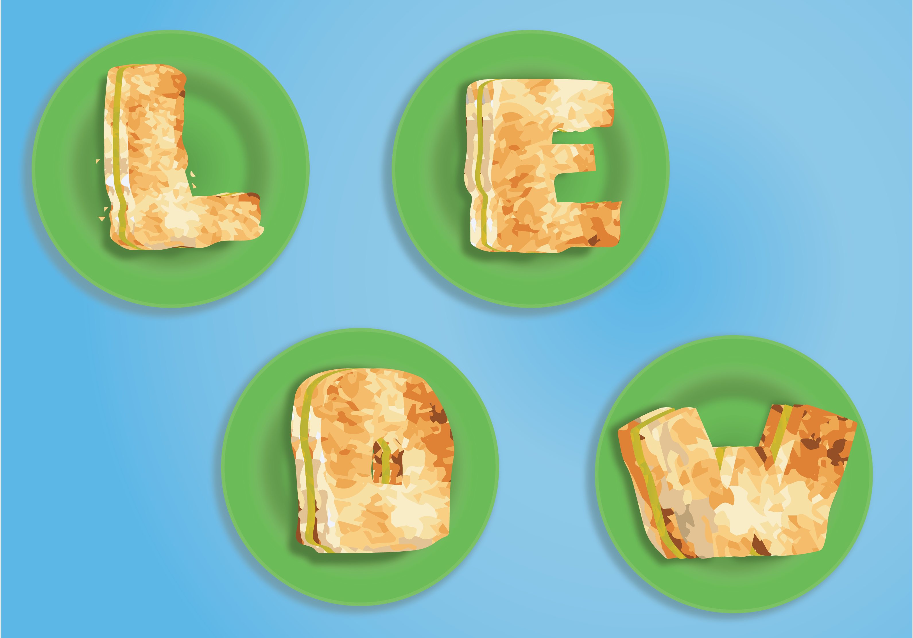
I took the texture from a photo of kaya toast and did an image trace, which I then edit some of the colours individually to fit the shape of words. The green plates, the dull green kaya, and the blue table are coloured according to image references.
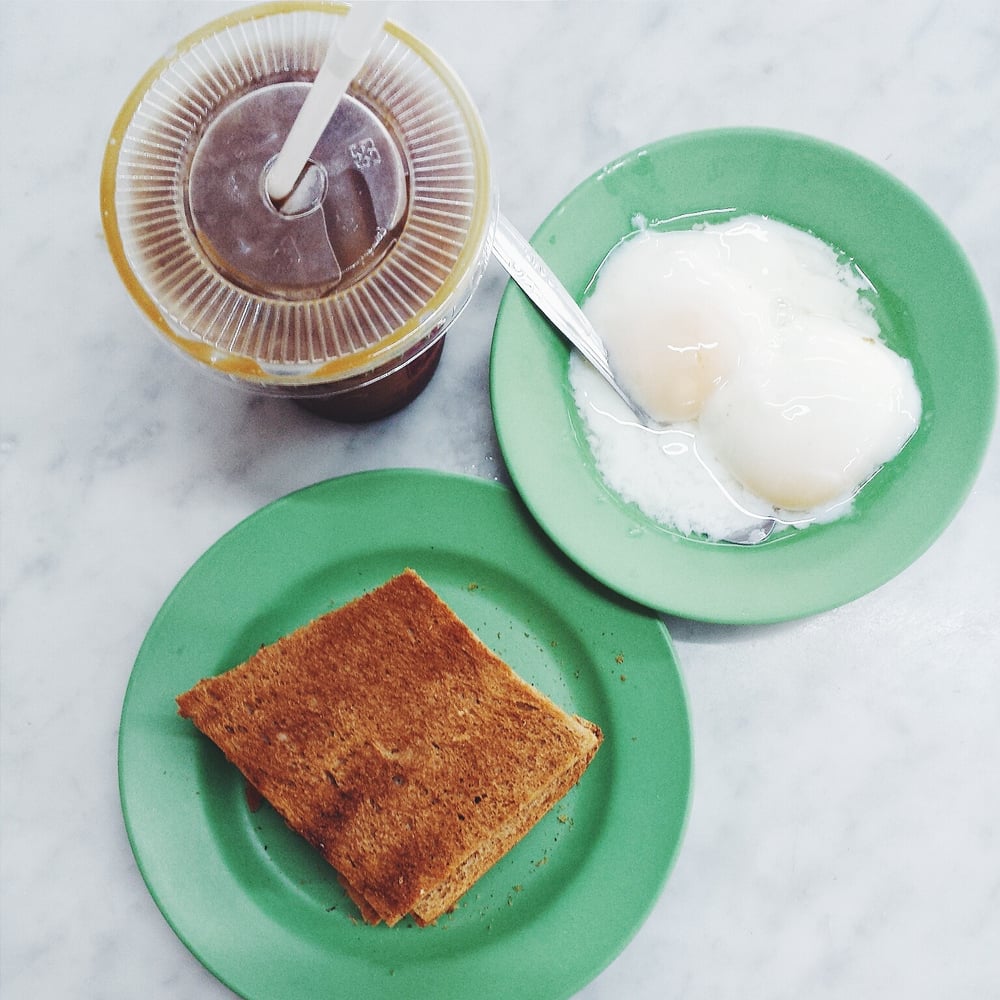
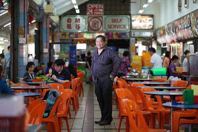
I used my surname for this composition as I imagine a kopitiam uncle would always be called by that. “AH LEOW AH, LIANG BEI KOPI!” then I’ll be like “OK”
Semiotics: Toast, condiments, kaya
Colour Palette: RGB, but I used blue as the background as with blue tables in kopitiam. The kaya is interesting as, if the colour is off by a bit, it will look like lettuce.
Textures: Kaya toast, kaya, plastic plates.
Composition: I made it look like an instagram shot taken from above so that it will bring the context of it being food.
Final works
Take aways and Lessons
I thought I had good Illustrator knowledge until I came across this project. The usage of Illustrator to create graphics design and texture is so different from that of creating 2D renderings of object in product design.
I also learnt to appreciate the flexibility and fluidity of Photoshop, as Illustrator did have its limitations.
Also, I learnt through the hard way to stick to the brief instead of doing what I want. As I did not understand it initially, I had to back track a lot, wasting a lot of precious days (or even weeks).
There is chance to create better works, so it was unfortunate that this happened. Nonetheless, I am excited for the next project Zine, and hope I will do better there.
Who is Hannah Baker Hoch?
Hannah Hoch is a German Dada artist. She was one of the few woman who is involved in dadaism, who also consciously promoted the idea of women working creatively more generally in society, and is a pioneers of photomontage art form. She used photomontages to express her frustrations with the ideas of woman in the modern society in her time.
But first, we must know that Dadaism is a movement that reacted to World War I, which rejects logic and reasoning and instead, embraces nonsense, anti-capitalism, and irrationality. It is formed as a way to criticise issues with the world, a form of ranting or venting of dissatisfaction. Dadaism is a movement evolved from anti-art; other factors that brought Dadaism to life are Italian Futurism and German Expressionism.
Dadaism is a protest towards the war and its roots, which are reason and logic, are the cause of the war. In turn, they express chaos and irrationality as a form of protest. Being anti-art, dadaism ignored aesthetics and instead intended to offend people with their expressions.
One of Dadaism’s creation is the photomontage, which artists use scissors and glue instead of paint brushes to express their views using existing objects or images that are presented by the media.
One of the originator of the photomontage is none other than Hannah Hoch herself. Borrowing images from popular culture to create androgynous figures, which went against the Nazi’s idea of the ‘New Woman’. She rejected this idea and expressed herself through her photomontages.
One of her work, Ohne Titel (Aus einem ethnographischen Museum), 1930, which depicted a deformed androgynous person.
Dadaism, to me, is a movement that redefined the idea of expression. Expression can be political, too, and the use of photomontage to protest is an interesting take on art. The artwork used existing images, and that represented the current world. By creating a vulgar image using such collages, the artist is insulting the subject that he or she is tackling on. In another way, it has its own beauty. Despite the chaotic nature, it is still arranged in a meaningful way that allows for interpretation.
What is Russian Constructivism?
It is a movement that started in 1913 that is essentially the beginning of abstraction of art. The themes surrounding this movement are stripped to its fundamental appearance: minimal, geometric, experimental and rarely emotional. Taken apart, the minimal pieces, together with the use of new media affected the style of art, making them more orderly, representing understanding, unity and peace.
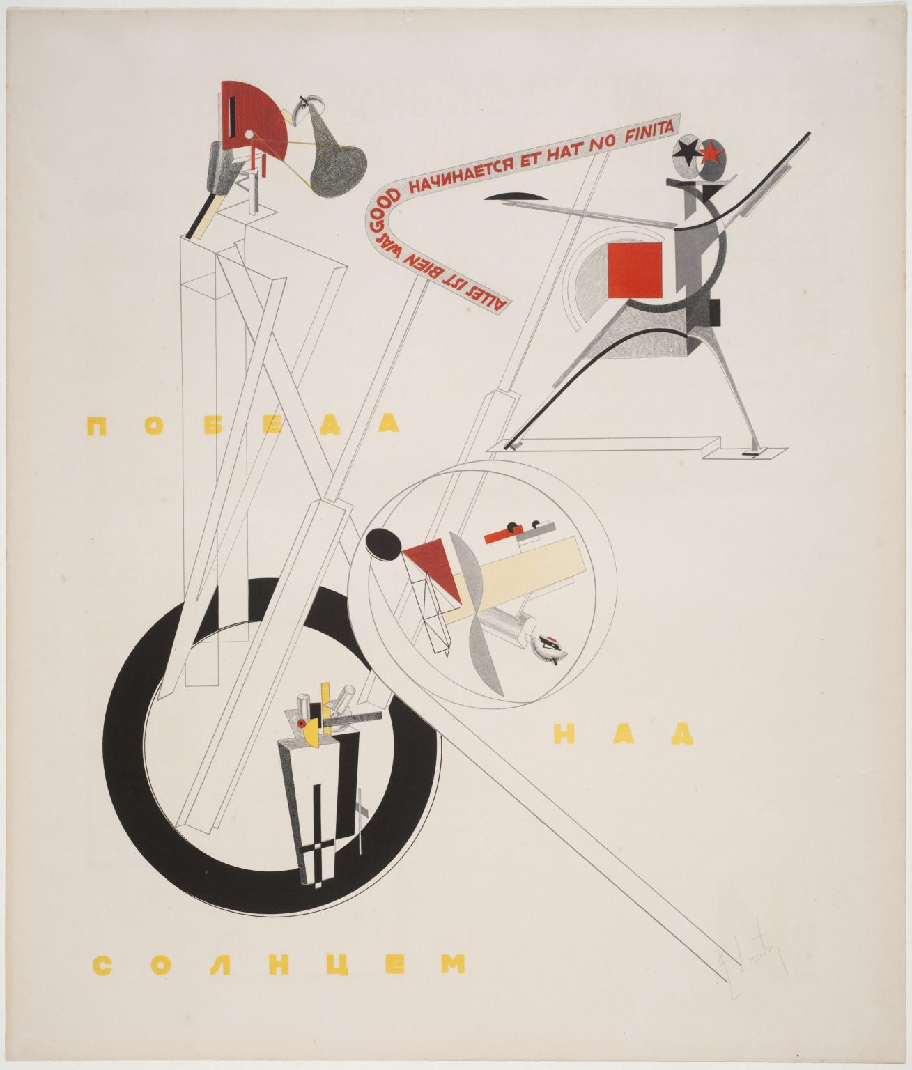
“Part of the Show Machinery” by El Lissitzky, 1923. This piece is an example of a work showing the essences of Russian Constructivism. The things depicted here are abstracted and arranged in an orderly manner.
Because of their admiration for machines and technology, functionalism, and modern mediums, members were also called artist-engineers.
http://www.arthistoryarchive.com/arthistory/constructivism/
http://www.tate.org.uk/art/artworks/lissitzky-1-part-of-the-show-machinery-p07138
László Moholy-Nagy
László Moholy-Nagy was a Hungarian Painter and photographer. He is highly influenced by constructivism and very interested in integrating technology and indutry into art. He is very experimental, and very fascinated by light throughout his career.
His ended the Bauhaus’s expressionistic teaching and moved into teaching design and industrial integration. Despite being proficient and innovative in many fields, he is known for his photography. He coined the term Neues Sehen (New Vision), as he believed that photography can create a new way of seeing things outside of what the human eyes could. He have also greatly influenced on modern art education.
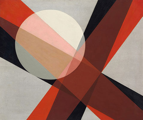
This is one of his famous work, Composition A 19 (1927), where he depicted light and transparency in painting by used geometric shapes and layered them over one another. I believe this have reflected his fascination with light.
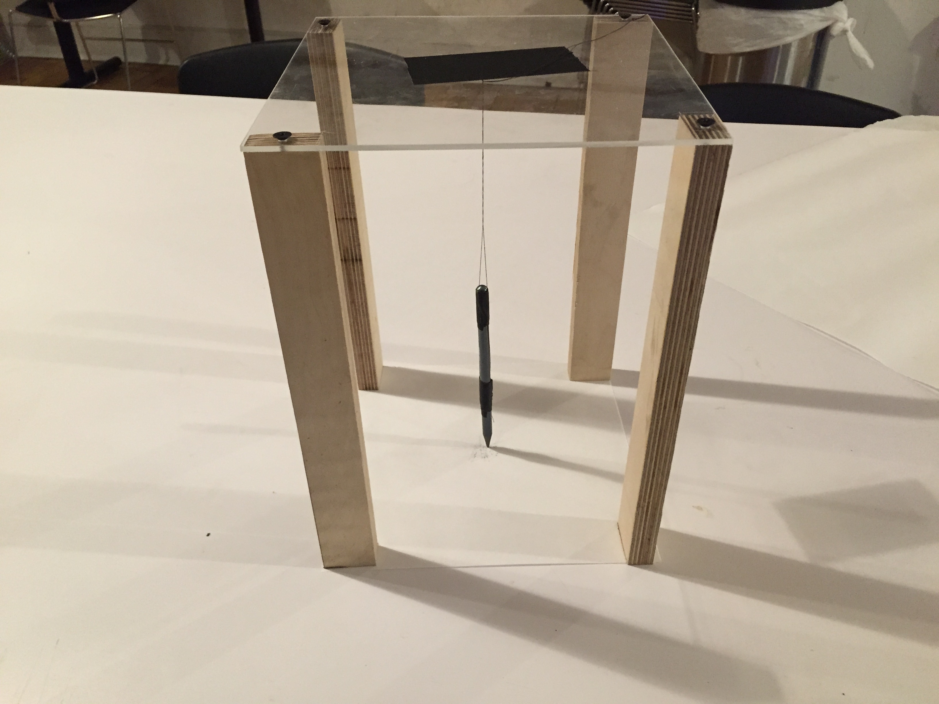
Unconventional Art Tools
I’ve went to search up for unconventional tools and came across a website where students posted unconventional drawings. They are very interesting.

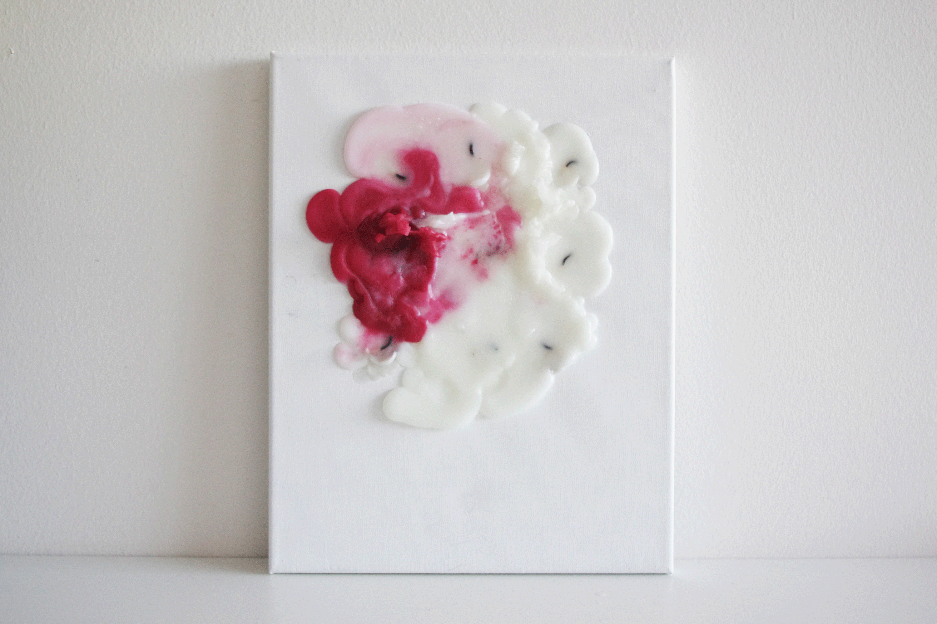
Using candles to create art — the outcome will definitely be unexpected. The way it melts, the direction it melts in, the speed of which different candles melt that creates a different layering. All these creates variation.
Heres a video of Alberto Breccia using different parts of a razor blade to create marks that indicated different textures, which I thought was pretty cool as I’d think of only using the blade and not the different parts of it.
Other forms of unconventional art found on https://www.hongkiat.com/blog/unconventional-art/
Here are some ideas taken from online that can be useful for this project:
Holographic type — use of materials + layering


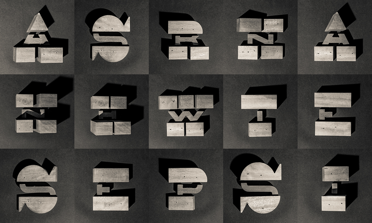
The artist used 3D modular parts to form letters
This is subtle, yet impactful. The use of optical illusion to create a subtle contrast is interesting.

This is so nice!!! I love it. The 3D fonts have expressed the playfulness of the TV channel nickelodeon, and the colours are bold and loud.
Something that moves – Research on paper folding that have mechanism.
Something that moves by rotating, or generally moves
Optical illusions
tshirt folding
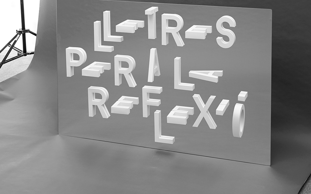
The use of mirror and 3D shapes that form letters created this surreal floating fonts that seems to be out of the world. Very interesting concept.
Inspired by artist Josef Albus, this artist layered acrylic to create numbers, and at the same time, celebrated the style of Josef Albus. I like how we can determine the numbers even though it is greatly abstracted.
Job Researches
Mainstream Lifeguard
Mainstream is defined as the ideas, attitudes, or activities that are shared by most people and regarded as normal or conventional. Some ideas of what mainstreams are pop-culture elements, popular brands, and to some extend, social media.
Some things that a mainstream thing have in common is in its influent on media and people. As such, there is a link from what is mainstream to mediums like the internet, TV, radio, or any sort of broadcasting medium.
A lifeguard is an expert swimmer employed to rescue bathers who get into difficulty at a beach or swimming pool. They are always on standby to look for people in trouble. Their standard objects are:
whistle, life buoy or flat, towel, shades, caps, sunblock, swimming attire (usually red), lifeguard chair, umbrella, pool, beach


Dream is defined as a series of thoughts, images, and sensations occurring in a person’s mind during sleep.
As written from https://www.psychologytoday.com/blog/dream-factory/201411/what-are-the-most-common-dream-themes, the common themes in a dream are:
These are semiotics that can be used in the design. Other than that, dreams are also usually symbolised by surreal images that are also calming. Blurring and vignettes are also clues about a dream. The night sky, stars and moon are other signs. Most iconic of all, is the dream bubble and the “zzz”.

Singaporean Spy
It is hard to describe a Singaporean. Singapore is known for the merlion, durian, kopi, chicken rice, rules and fines, banned cheweing gums, people dressed too casually for the hot weather (typical tshirt, shorts, slippers).


A spy is a person employed by a government or other organization to secretly obtain information on an enemy or competitor. There are 2 kinds of spy:
A thought is an idea or opinion produced by thinking, or occurring suddenly in the mind. Semiotics relating to Thought is:

https://www.virginexperiencedays.co.uk/vintage-steam-train-trip-on-the-spa-valley-railway-with-dinner-and-wine-for-two
https://www.seat61.com/Australia.htm
A train conductor is person that controls the train
A thought train refers to the interconnection in the sequence of ideas expressed during a connected discourse or thought, as well as the sequence itself, especially in discussion how this sequence leads from one idea to another.

New Jobs:
Kaya Toast Maker
Kaya toast is… well just kaya toast. As a kaya toast maker, I am the hawker uncle.

Deesea is the deeper parts of the ocean, especially those beyond the edge of the continental shelf.

Cloud is a visible mass of condensed watery vapour floating in the atmosphere, typically high above the general level of the ground.
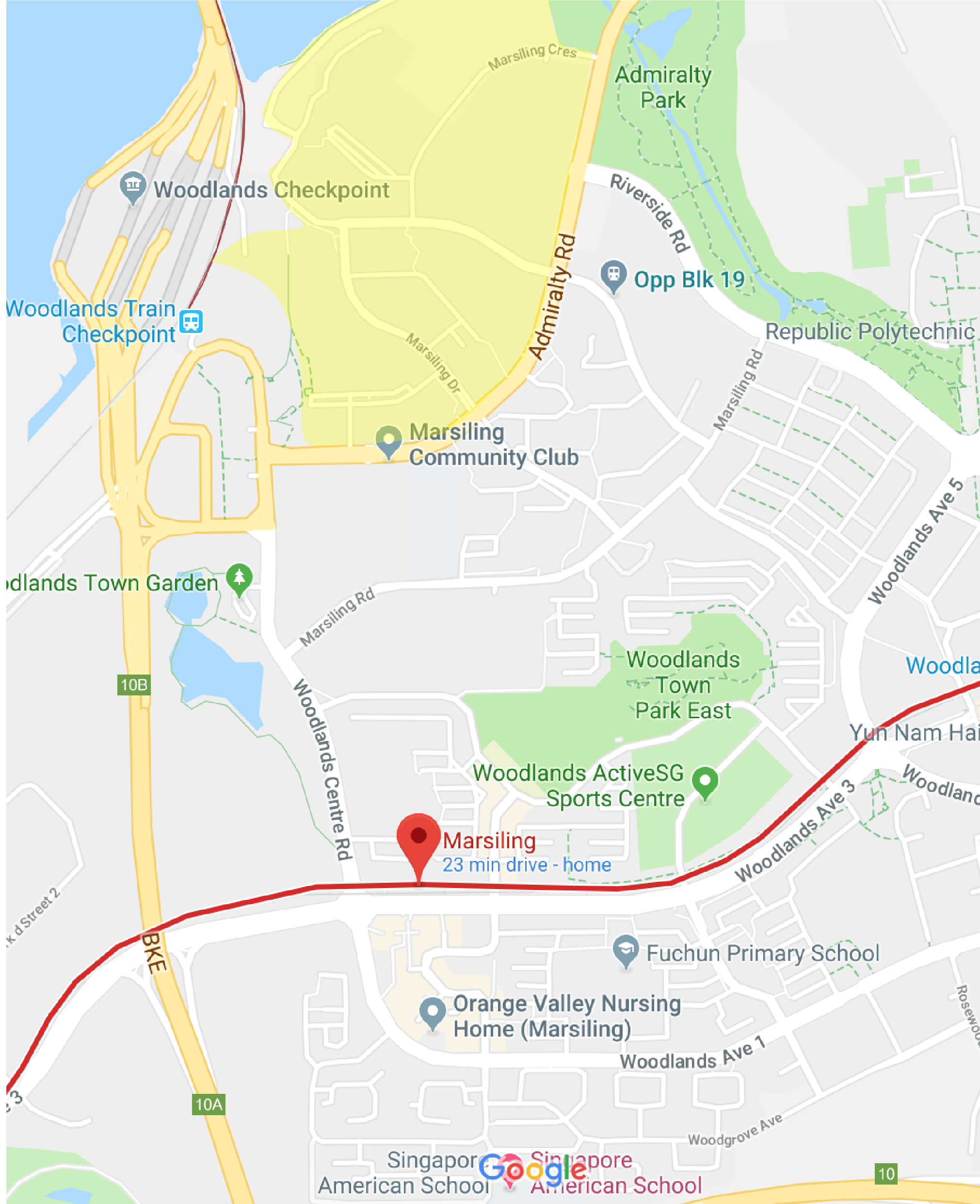
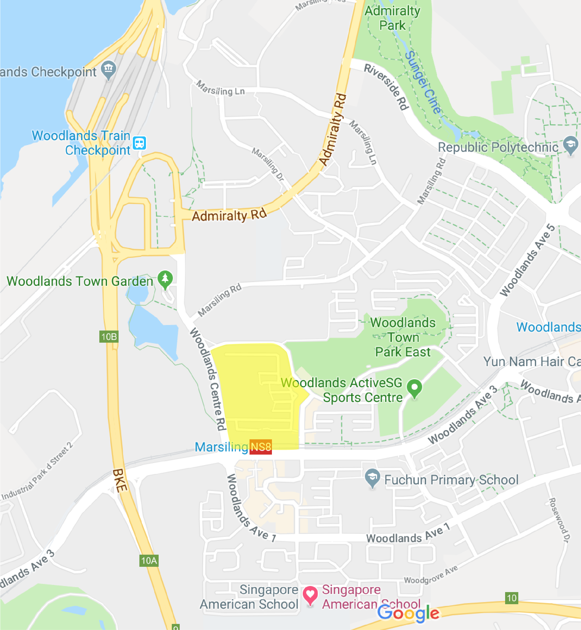 Zone 1 marked in yellow