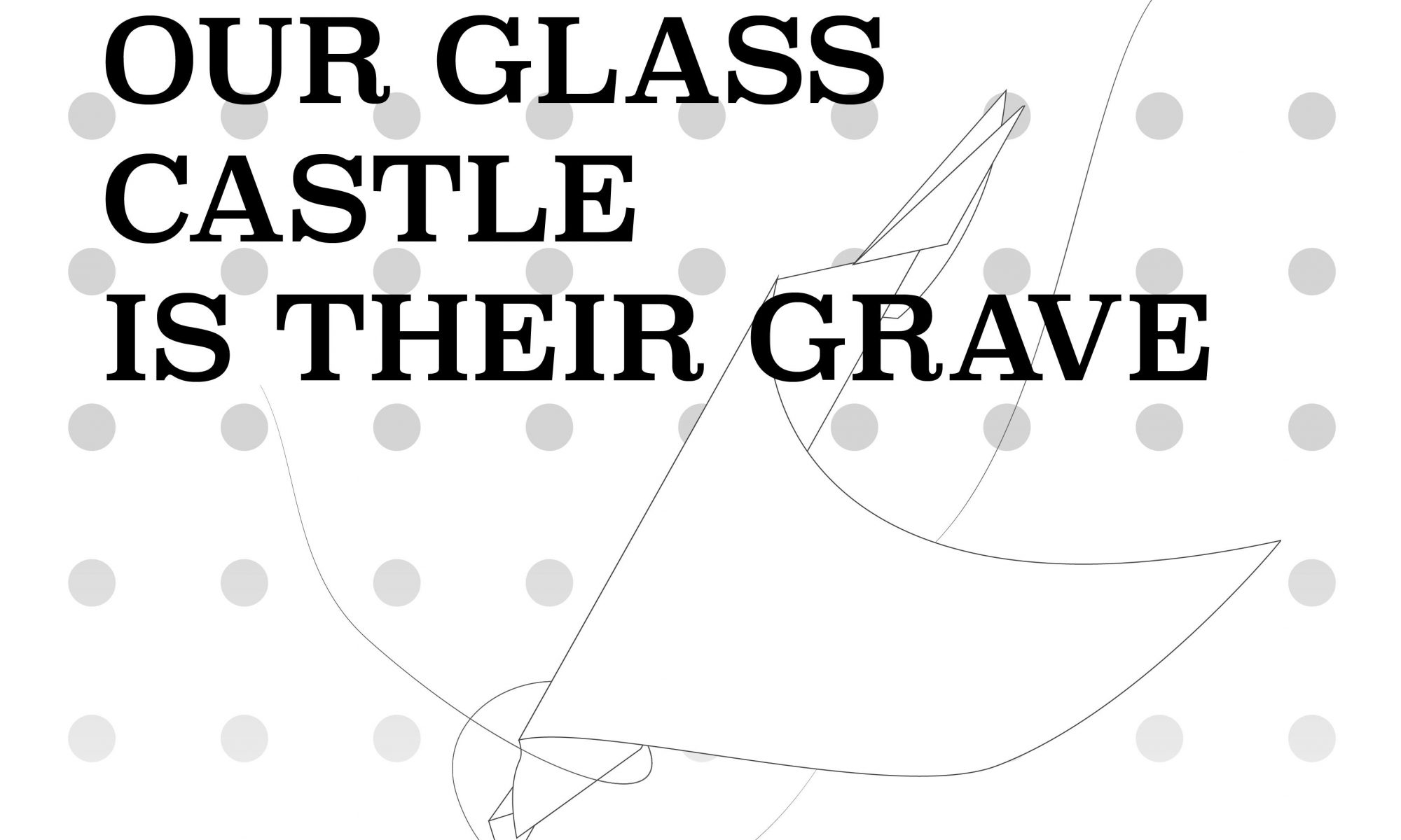
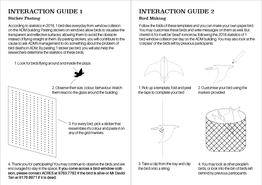
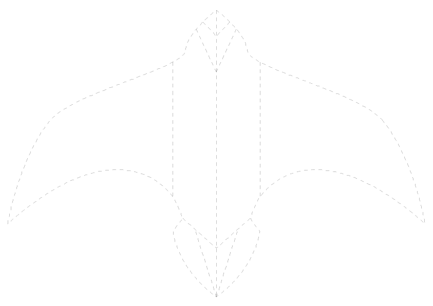
Our Glass Castle is Their Grave – Final Documentation

Updates:

After the last consultation, I was told to try building the space and test physically as there is no way to find out how the experience will be like without testing. However, there was a lot of difficulty in booking a space which I will briefly talk about later. I decided to drastically reduce the size of the installation after that. This is because the whole experience is clunky in my opinion and it will require too much material. But that’s also untested.

I spent >$100 the next few days buying materials like cloths and stickers, while I booked a few equipments and pillars that I can use to fix up the installation. Unfortunately, it was near crunch time for many modules so there wasn’t time to setup and test physically. From that, I learnt that I must really start testing earlier and not keep everything in my head until its too late.

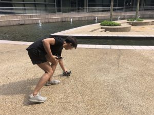
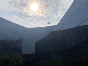
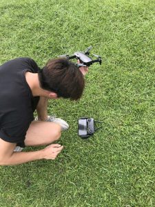
I also got senior Chris to help me film some scenes with his drone! This was done as part of my previous idea of projecting greenery vs the sunken plaza’s reflective surface, which was the scrapped. (Sorry Chris! Thanks for all the trouble :’)))) ) As I don’t want to waste the footage, I’m going to put a small part here:

After that, I stopped working on the space until I was able to which was… 1 day before the presentation.
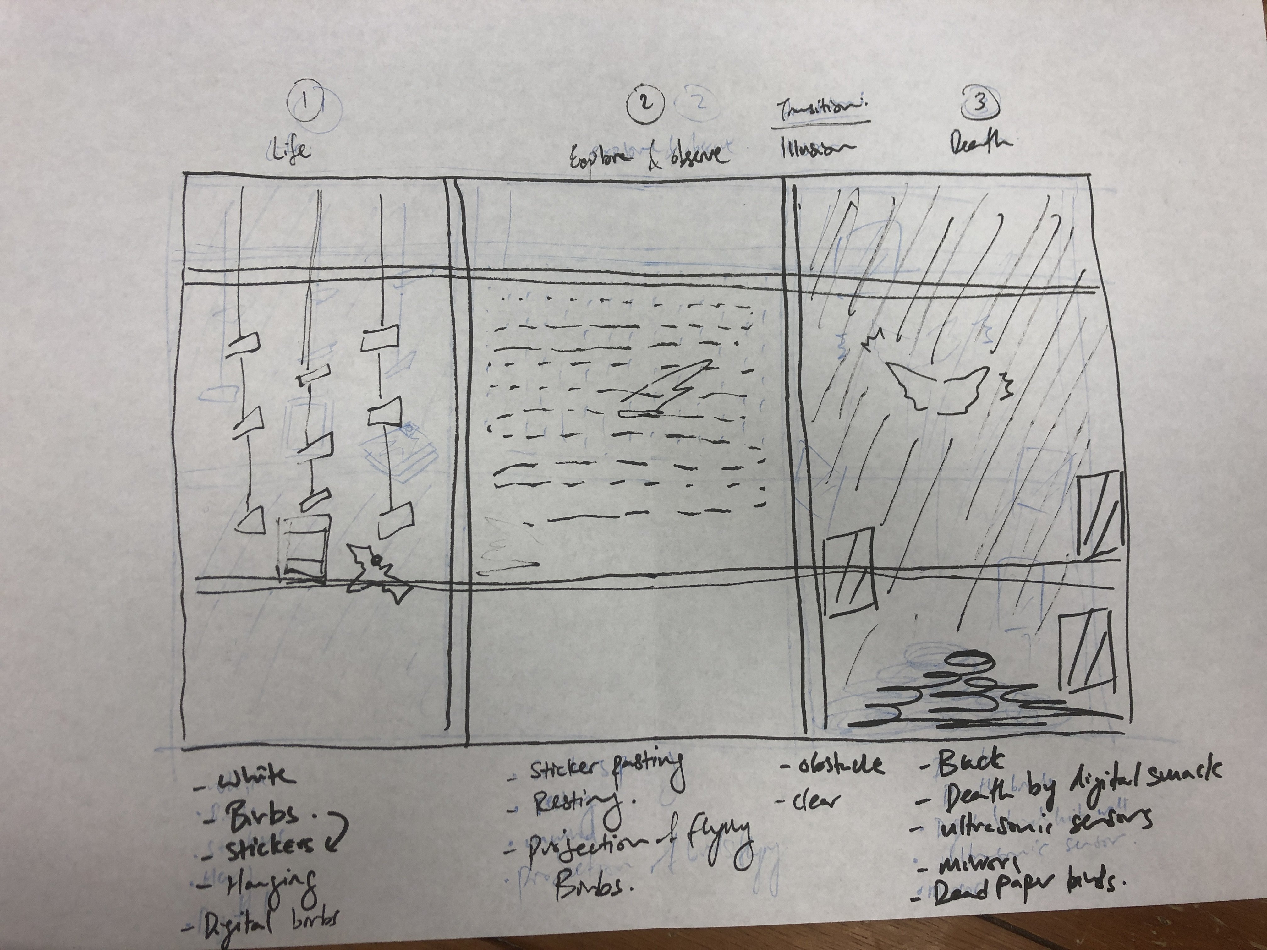
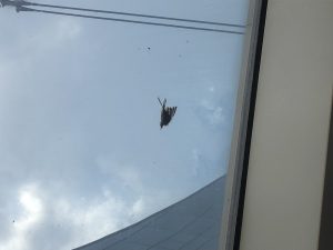
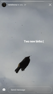
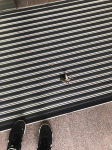
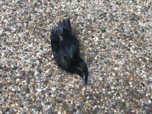
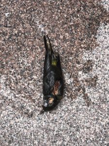
The Birds

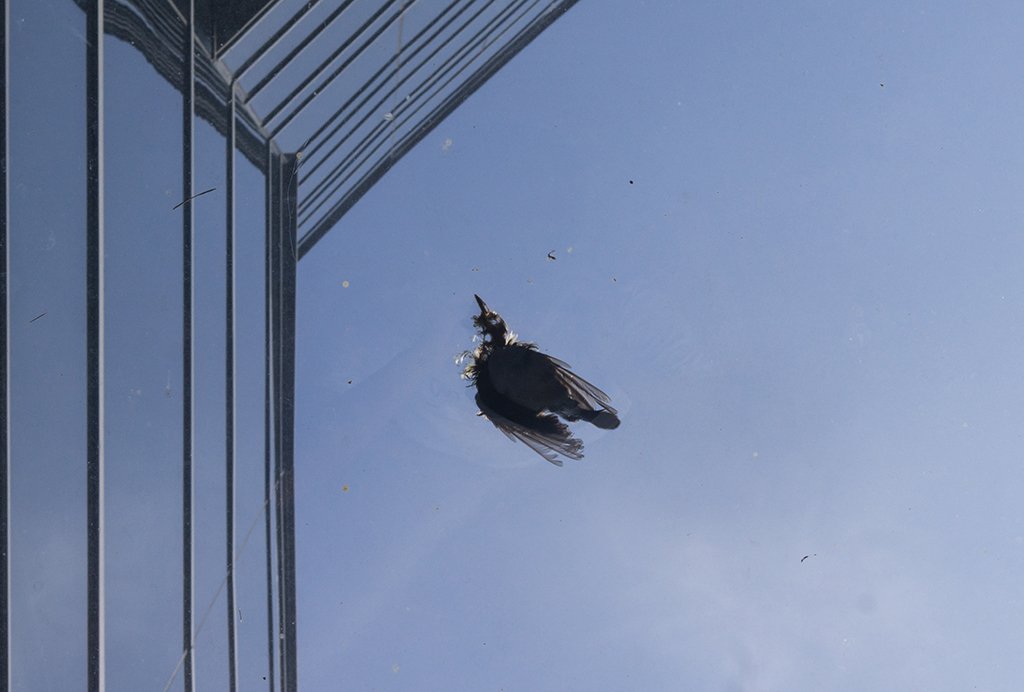
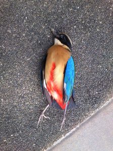
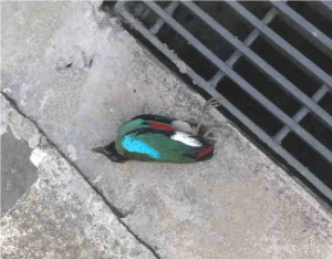
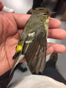
While everything else was happening, I was trying to passively work on the project by collecting images of dead birds. There wasn’t much that I collected, which was strange (but also means it’s a good thing that lesser birds are dying haha)
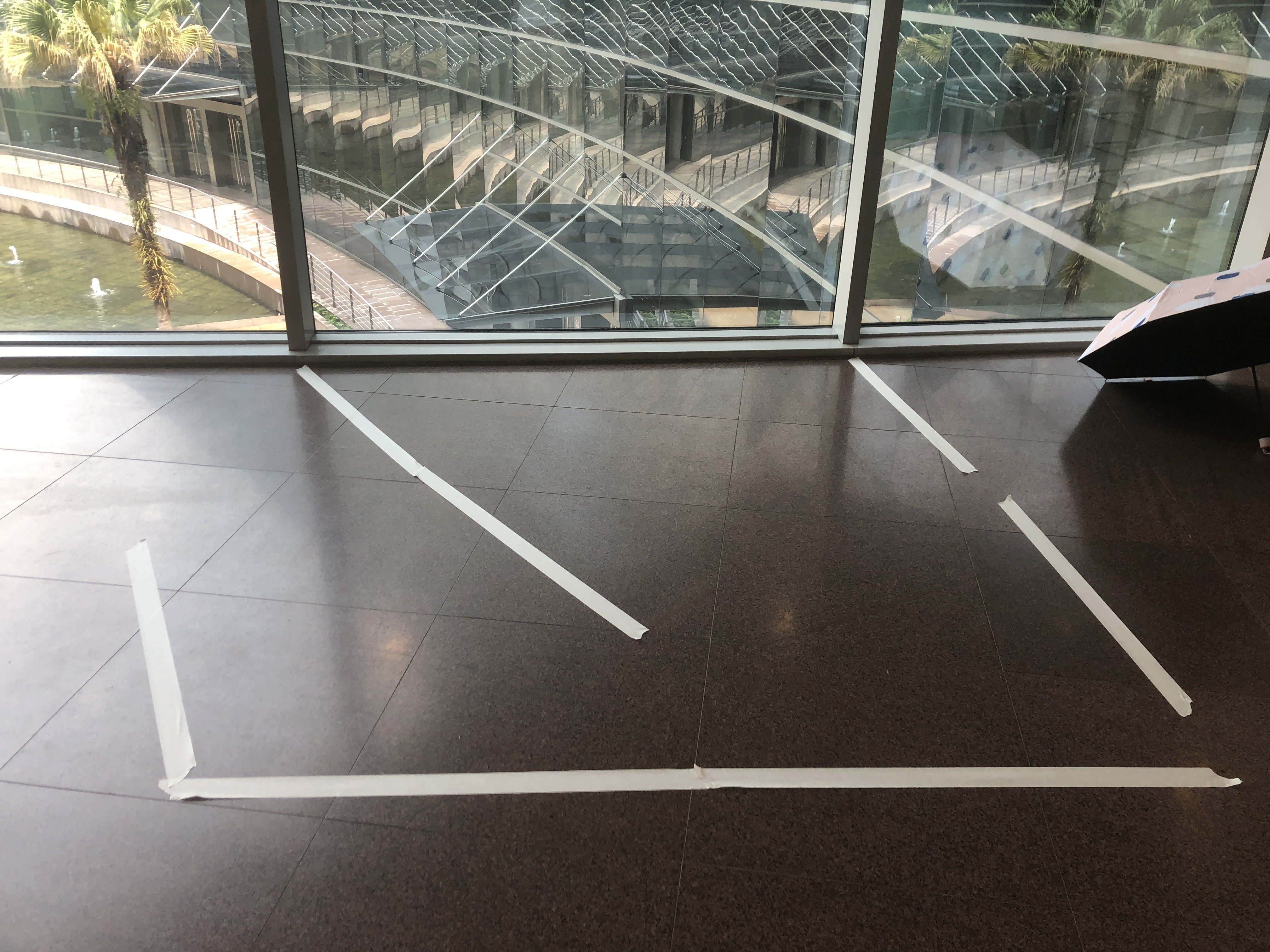
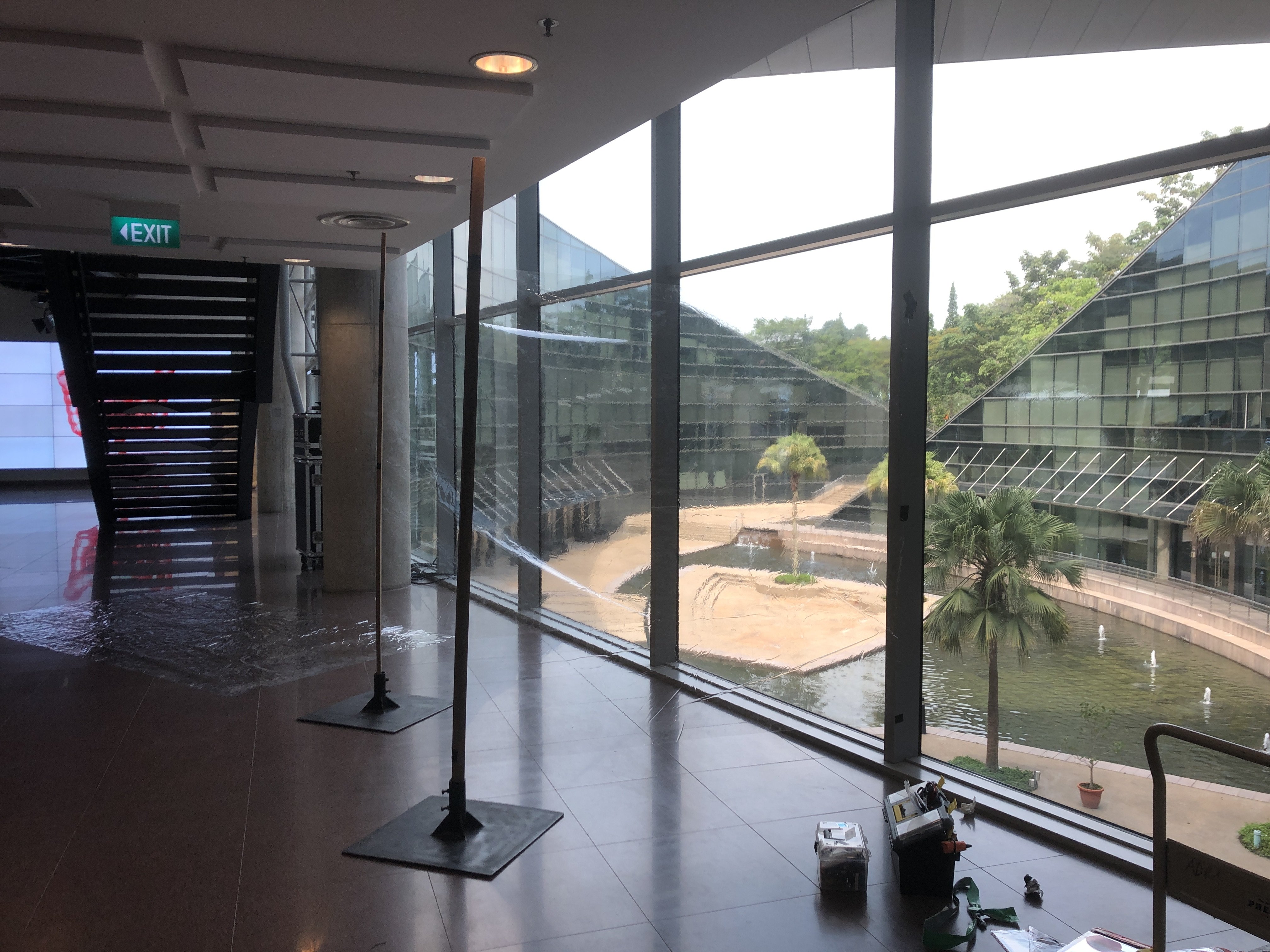
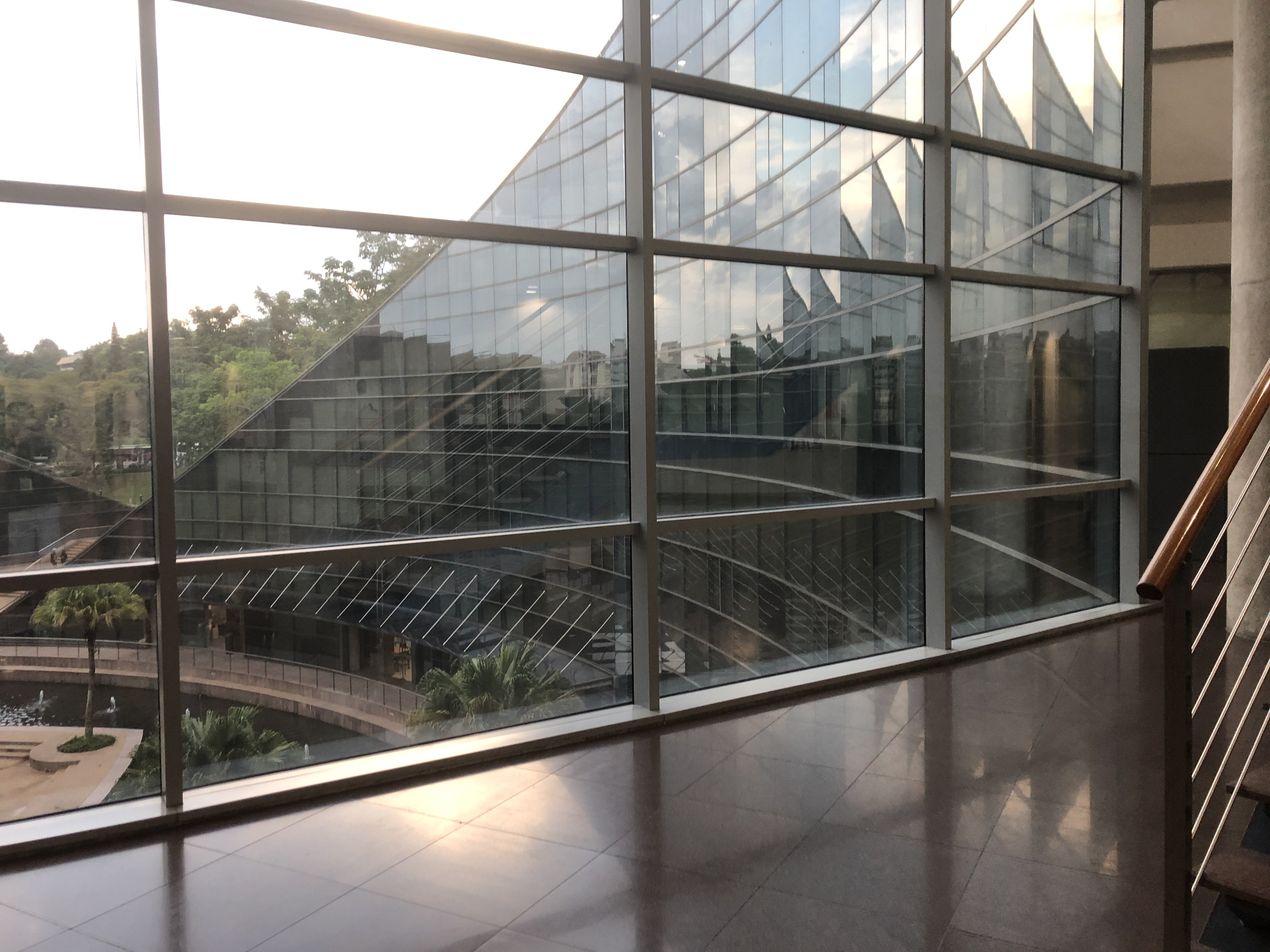
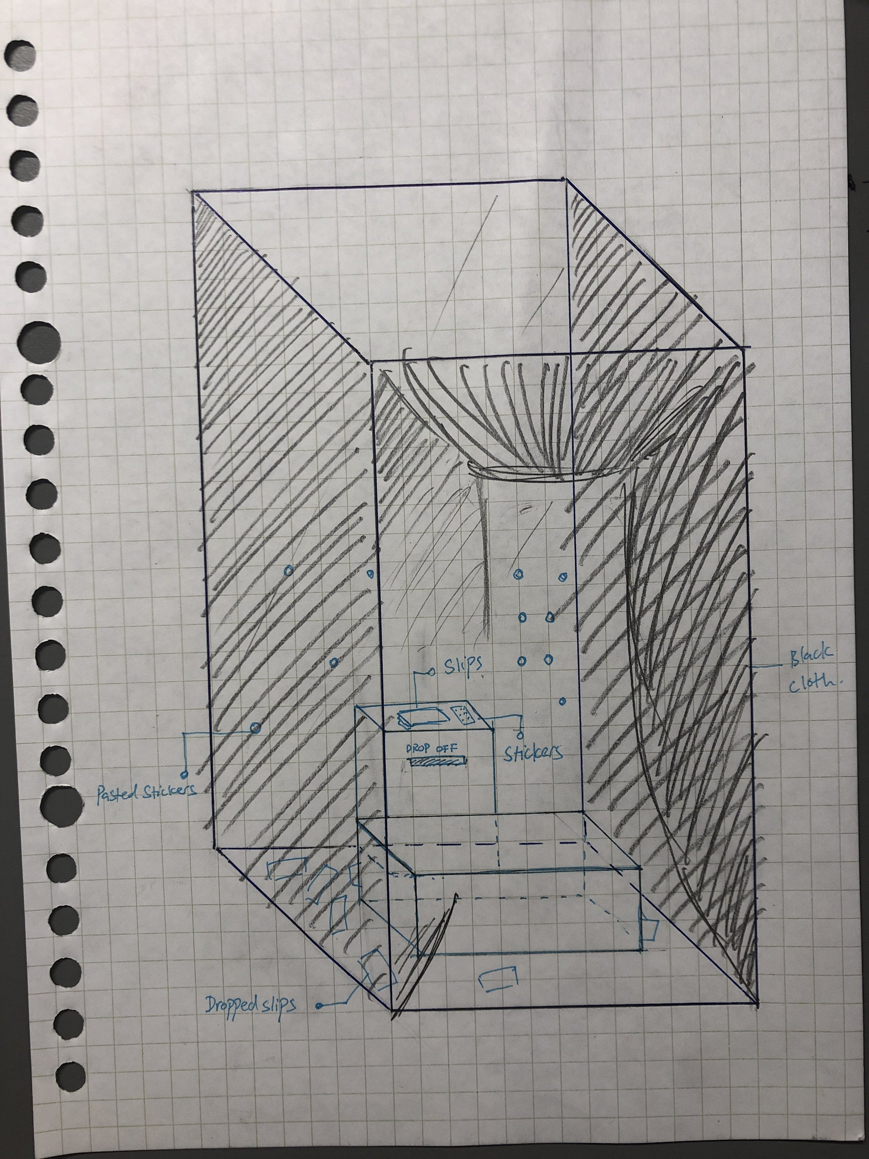
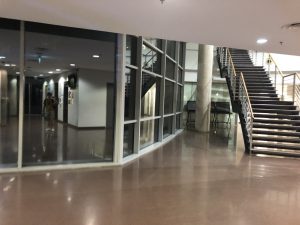
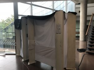
 

The Space:

There was a lot of trouble to book the space. Firstly, Bharat was always not in, so I was not able to get approval even though I have requested for the space early. When I managed to catch Bharat early November, I was told that the space was to be shared with Prof. Joan Marie Kelly, who will be exhibiting her Painting class artworks. I had to make special arrangements with her in order to secure my space (which is that I will help her class to setup the exhibition).

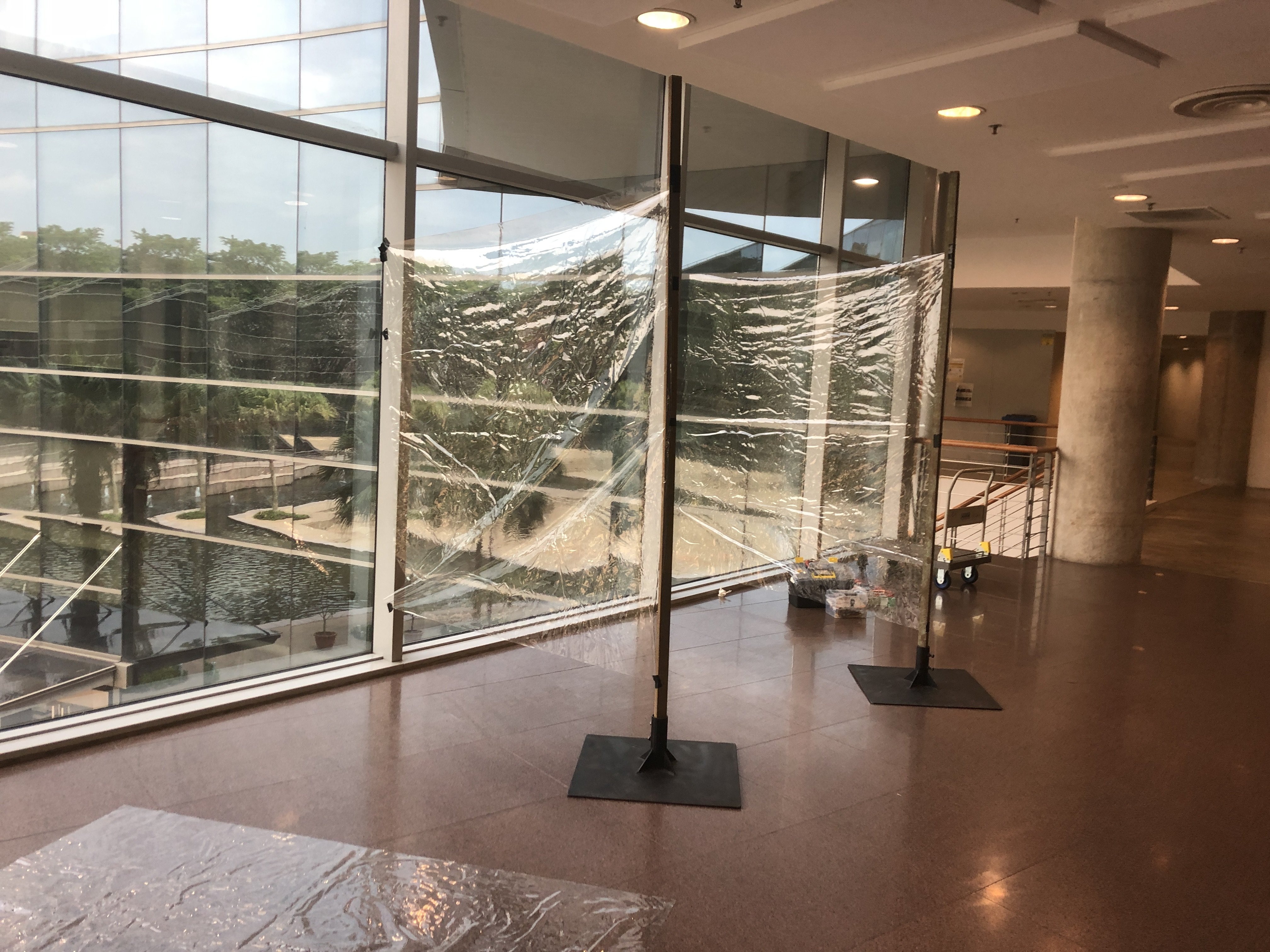
The Setup + Final Presentation:

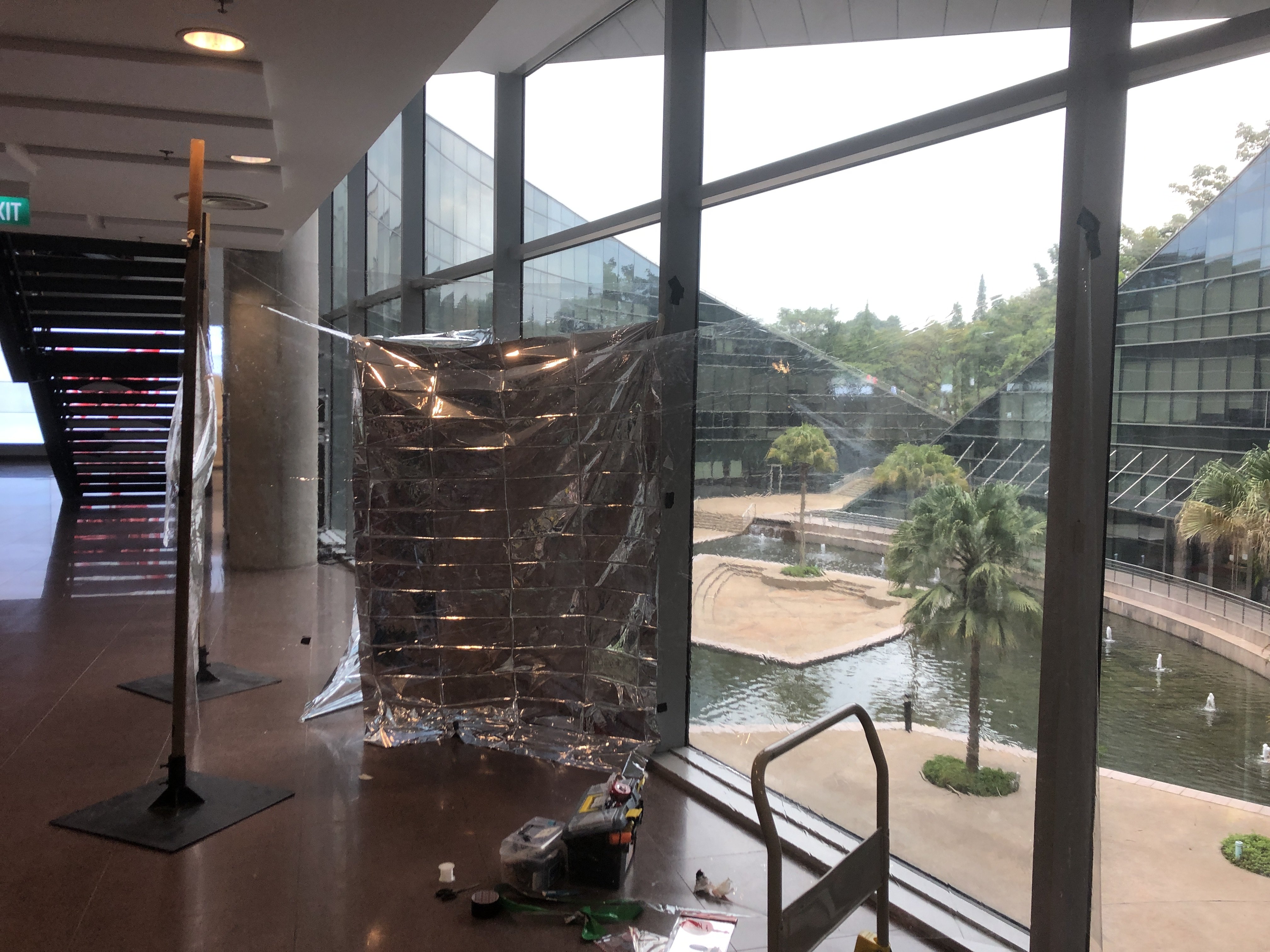
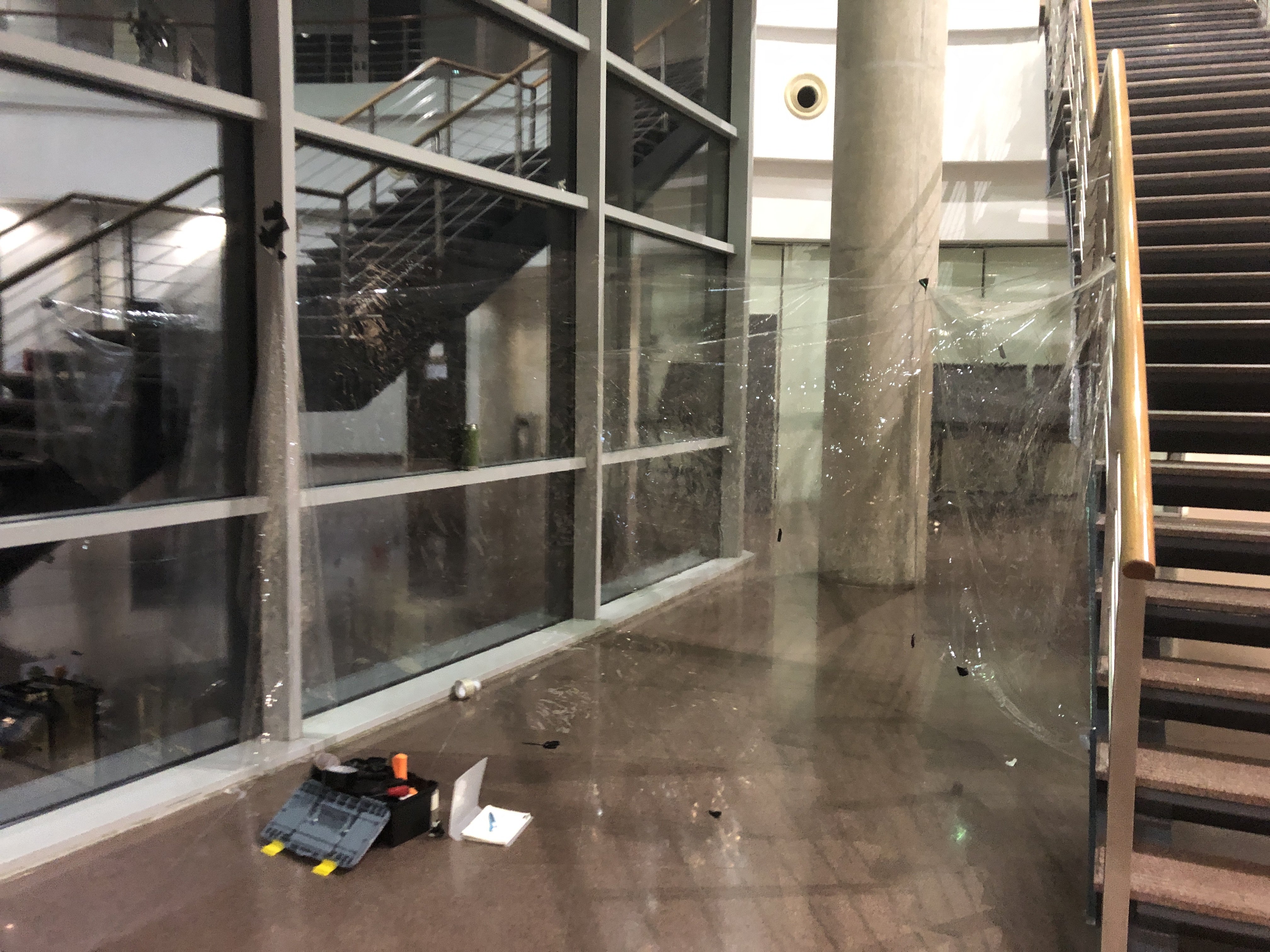
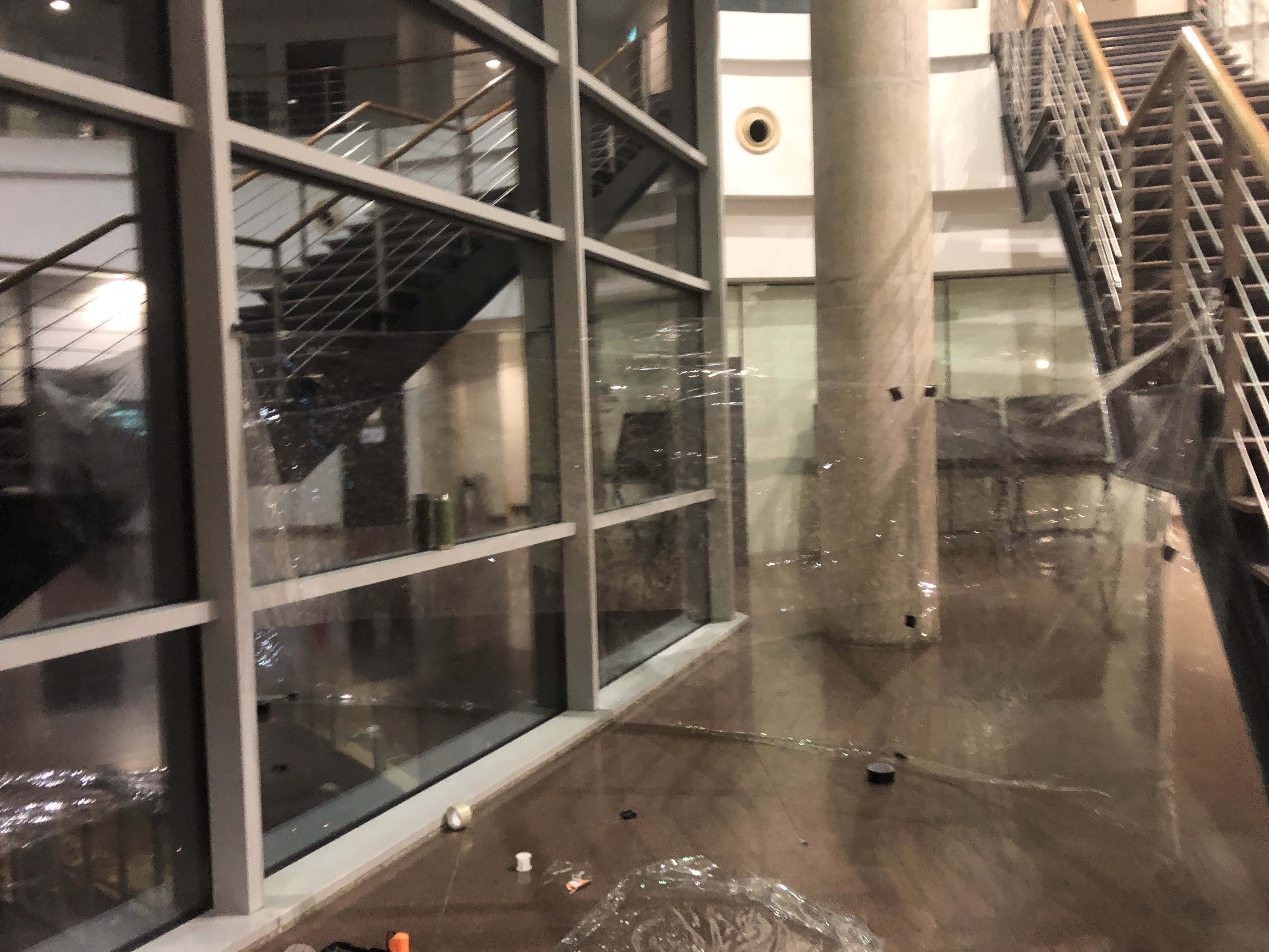
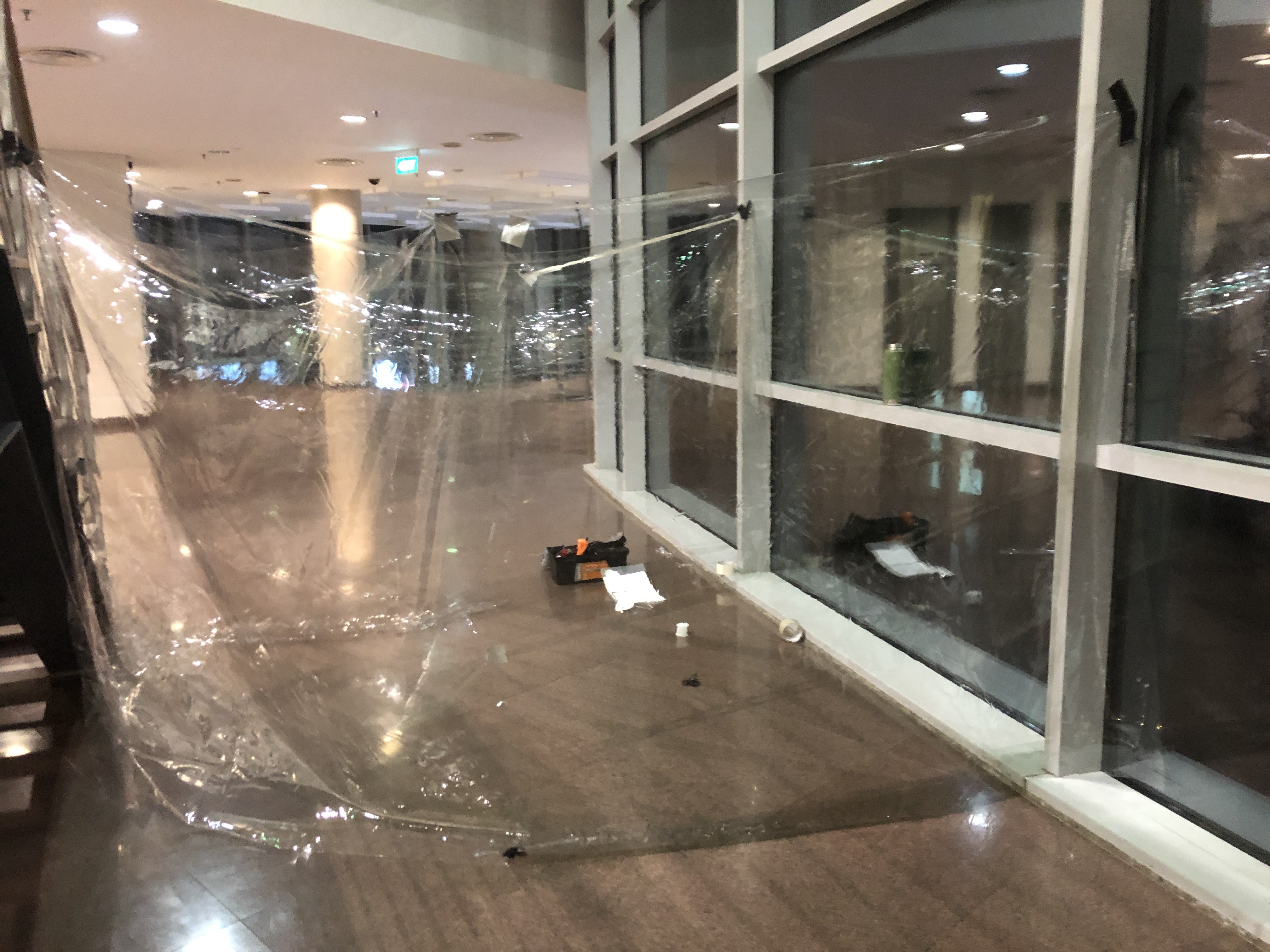
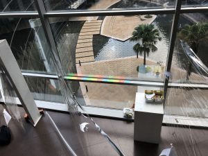
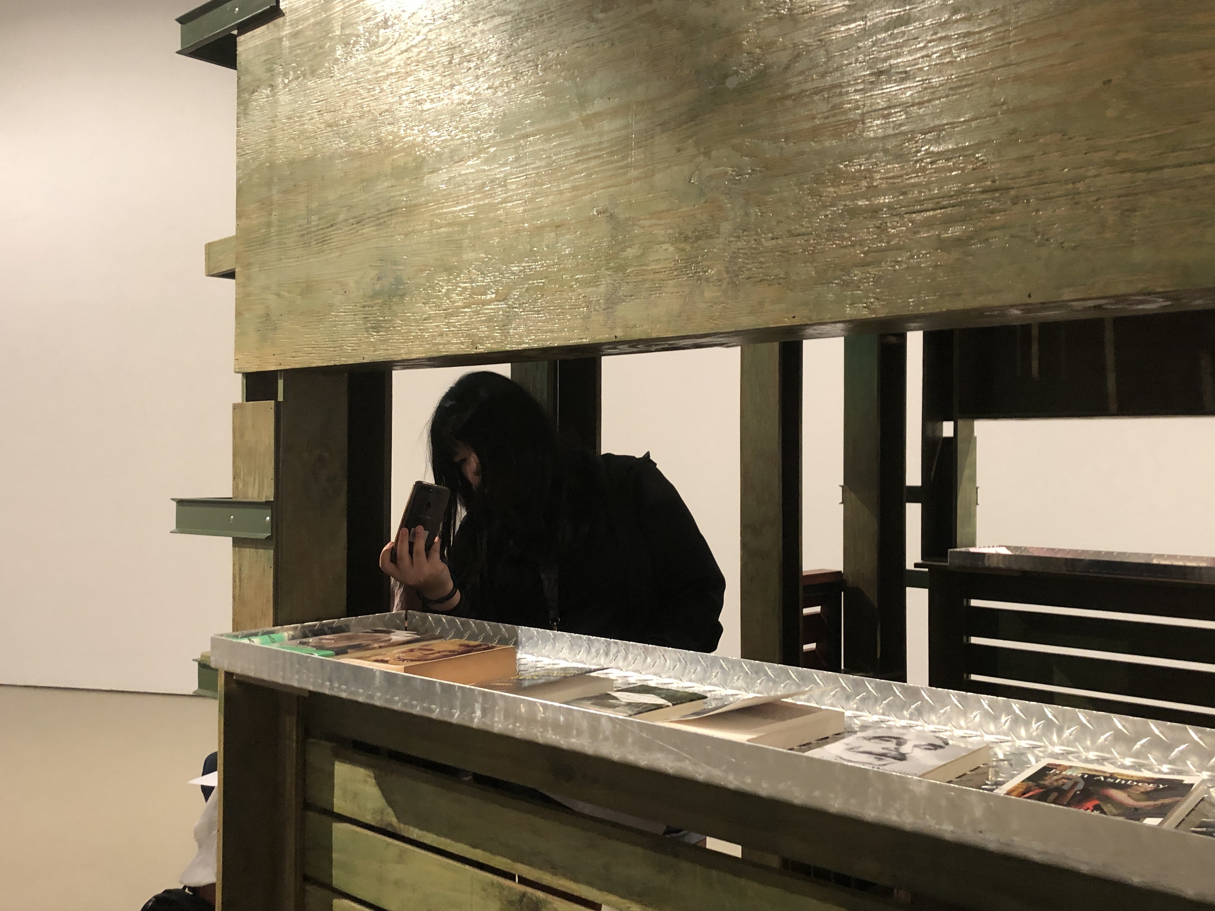
The afternoon before the presentation, I started setting up. I brought the necessary equipments and logistics down.

Initial setup
After putting cloth

Unfortunately, I did not document the form which was shown during the final presentation as I did not really like it. I already intended to continue working on it after the presentation so I have the newer pictures.

Video documentation of walkthrough:

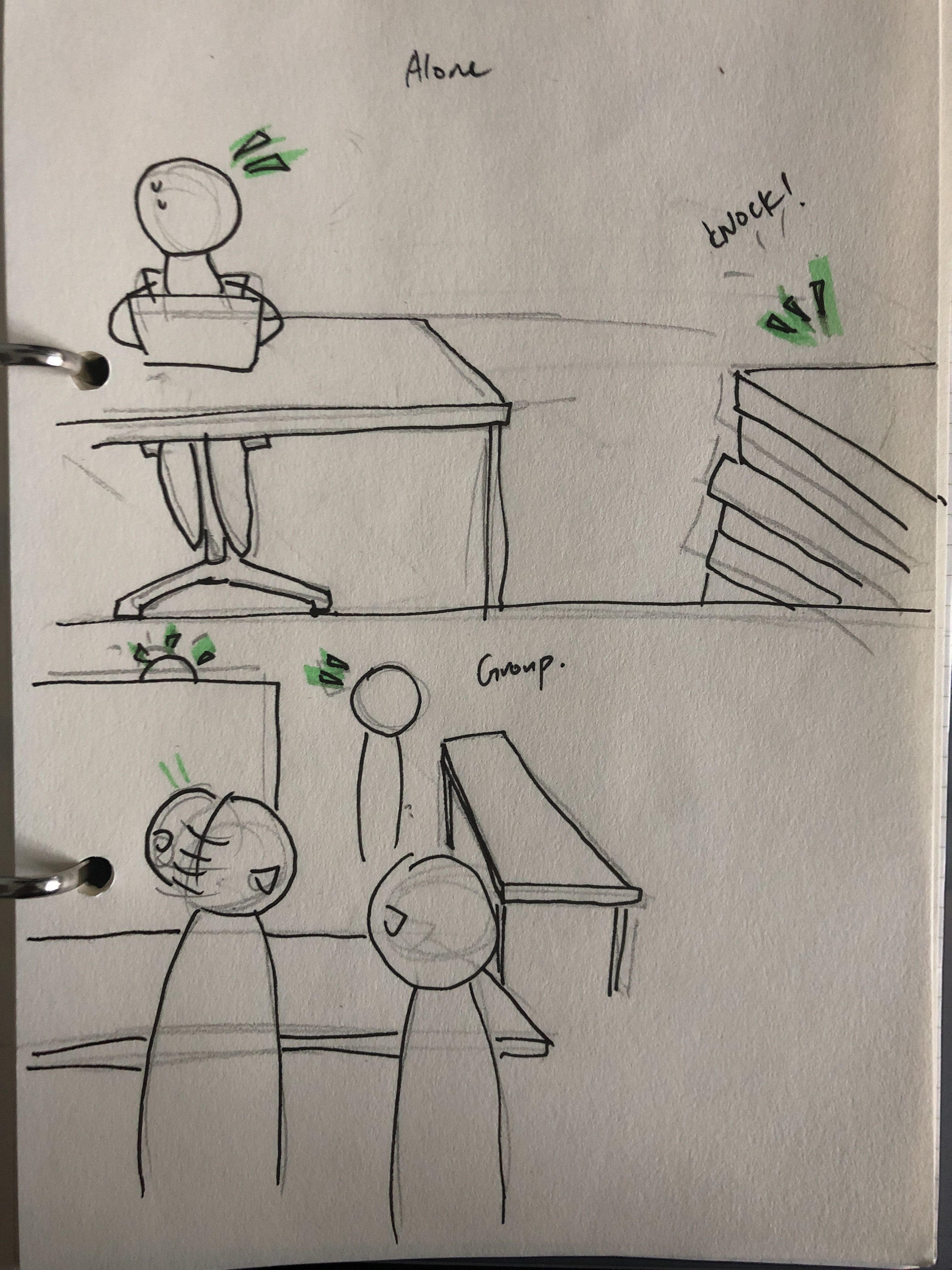
In the above 2 videos, the participants enter from the back instead of the front. This was due to me thinking that entering from the front was not a very good experience. The profs then tried entering from the other side and thought it was better.

During the discussion we brought up a few points:

  1. The photos of the dead birds could replace the blood splat which was quite cheesy and doesn’t really look good in terms of aesthetics.
  2. Going from the front is better as there is a better narrative and it is more intuitive to navigate through.
  3. The experience worked as the impact sound and the visualisation is able to show what I wanted to show. Digital implementations helped to bring the experience to the next level which was successful.
  4. There should be variations in the knocking sound which can make the experience more diverse. Also, the sound of the bird hitting window is not the same as just a regular knock.

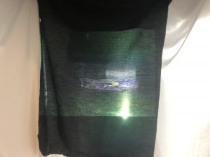
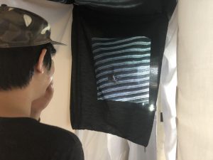
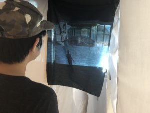
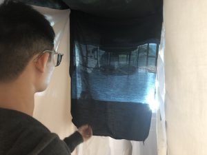
The projection I shown is this. It’s a compilation video of people hitting against glass, but a picture of a dead bird found in ADM after each hit.

Further analysis

Overall, going in from the front is much better. Although there should be some kind of cue to let people know that they should not walk past the acrylic, and there should be something to distract them to slow them down. This was tested with participants before the final presentation, so that’s why I decided to let participants go from the back (which actually was not any better).

I realised that people usually stand there to see if there are more to the video on the monitor. I usually have to tell people to move on instead. So if possible, I should let participants know that they have to exit.

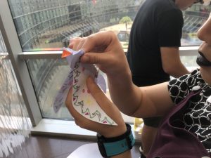
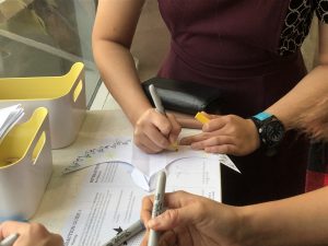
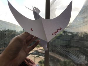
The sticker sticking part feels out of place now. It’s more of a personal touch than anything that is related to the installation. This is because the installation is experiential, while the sticker part is more activistic. I still kept it as I still want the idea of this artwork to not just “spread awareness”.

Finally, I realised that people don’t really look up to see the splat. This changed after I told participants about the concept before they experience it.

Further Improvements

After the presentation, I continued working on it after a good sleep (yay!).

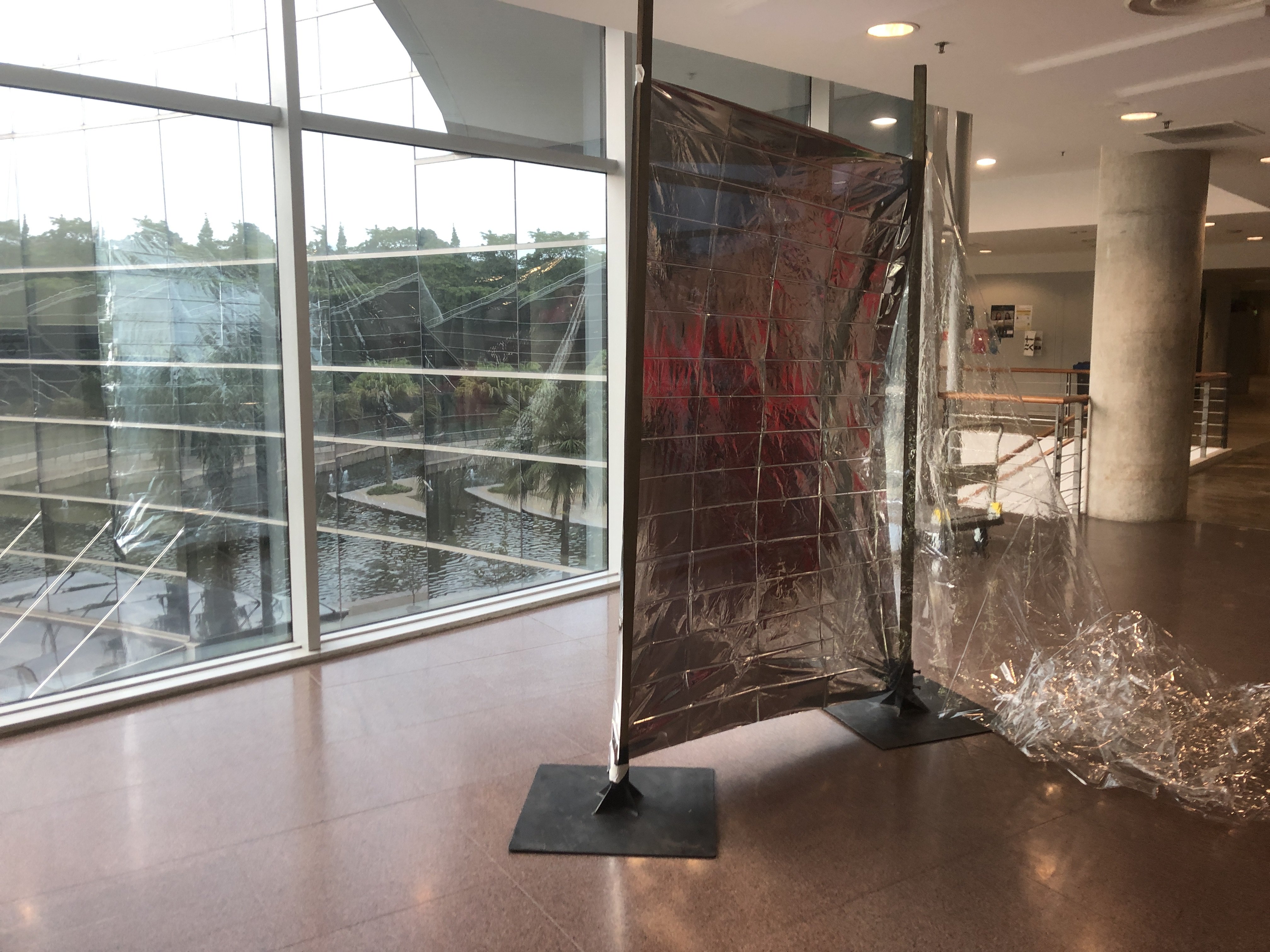
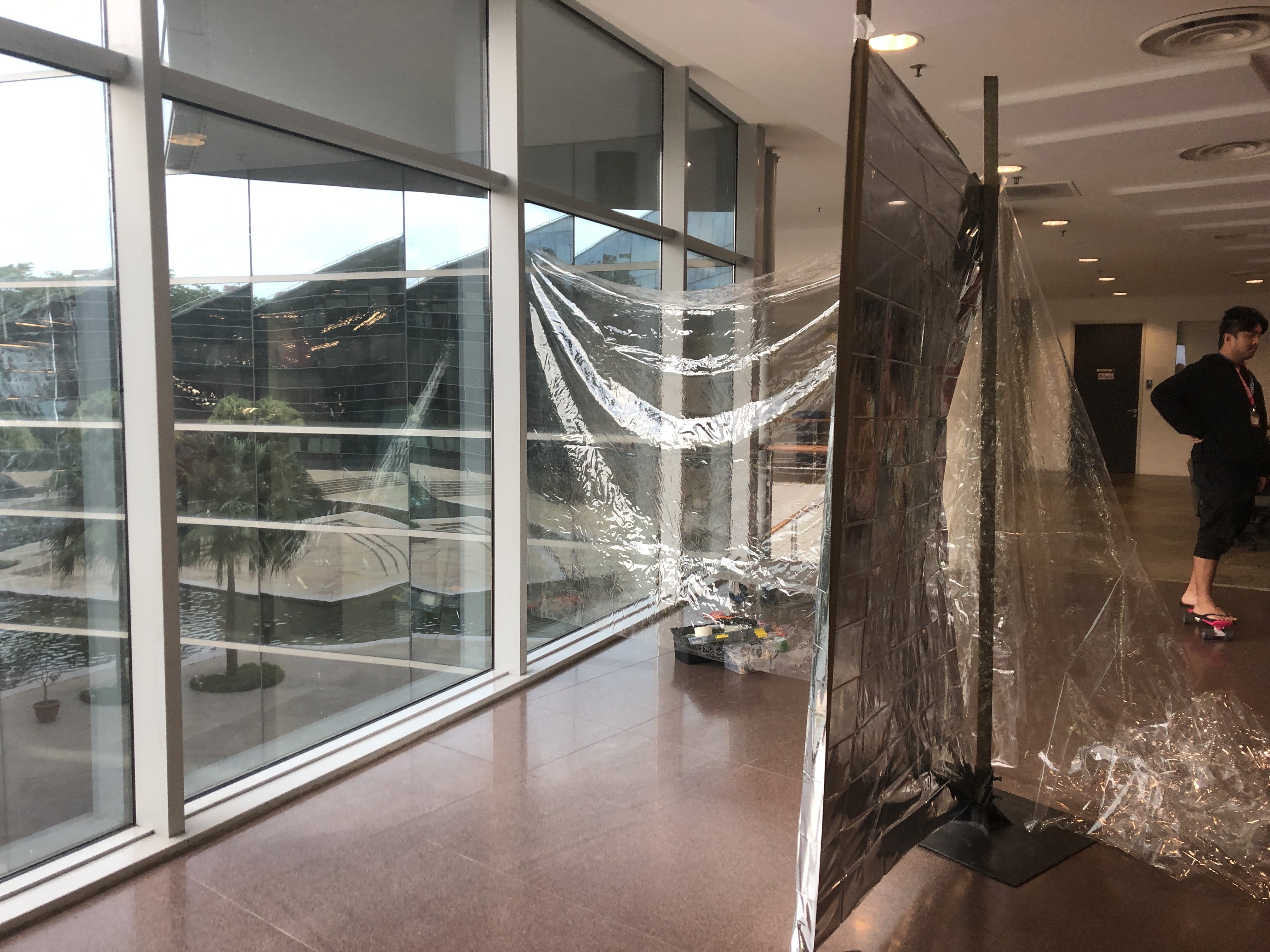
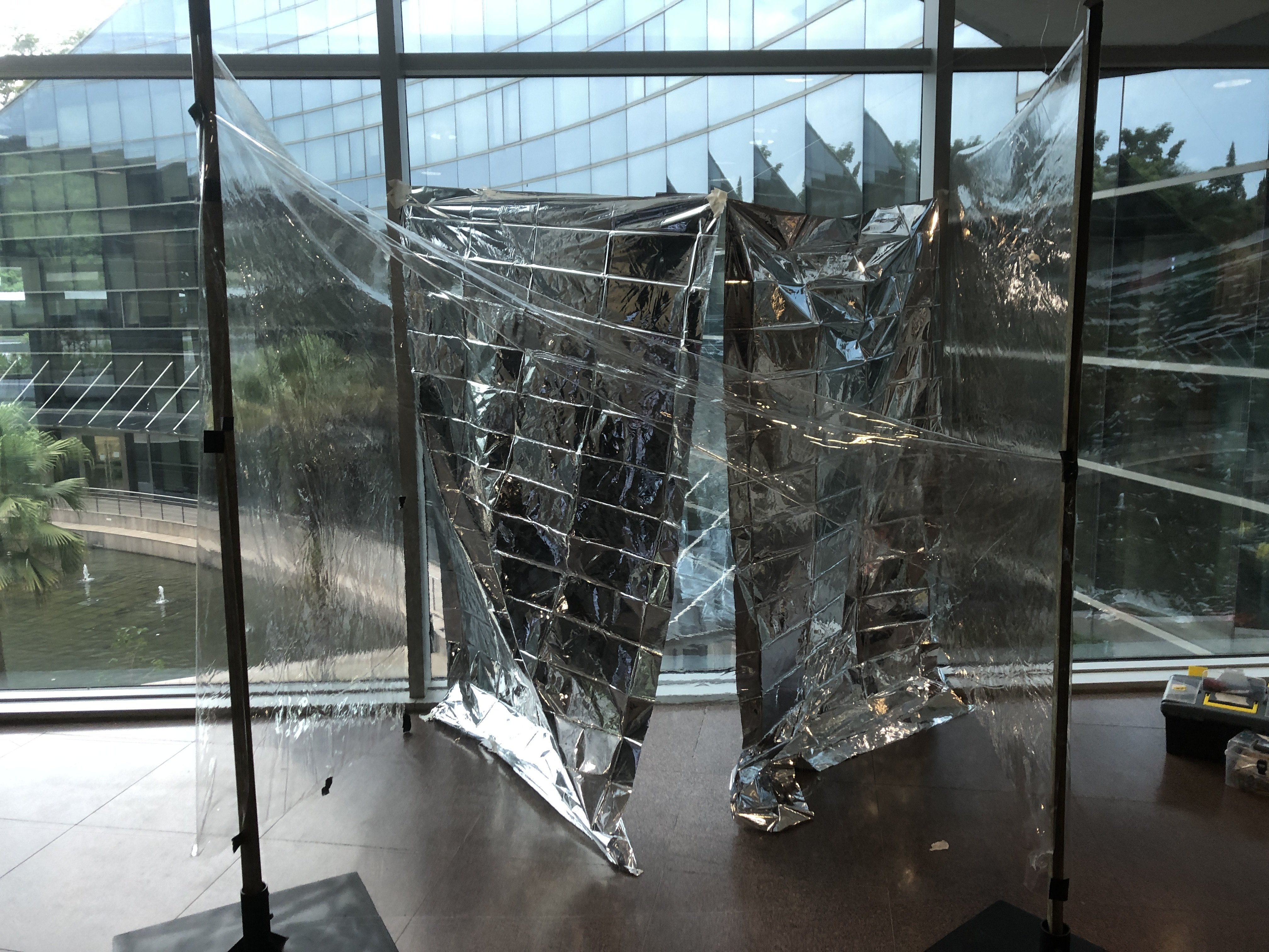
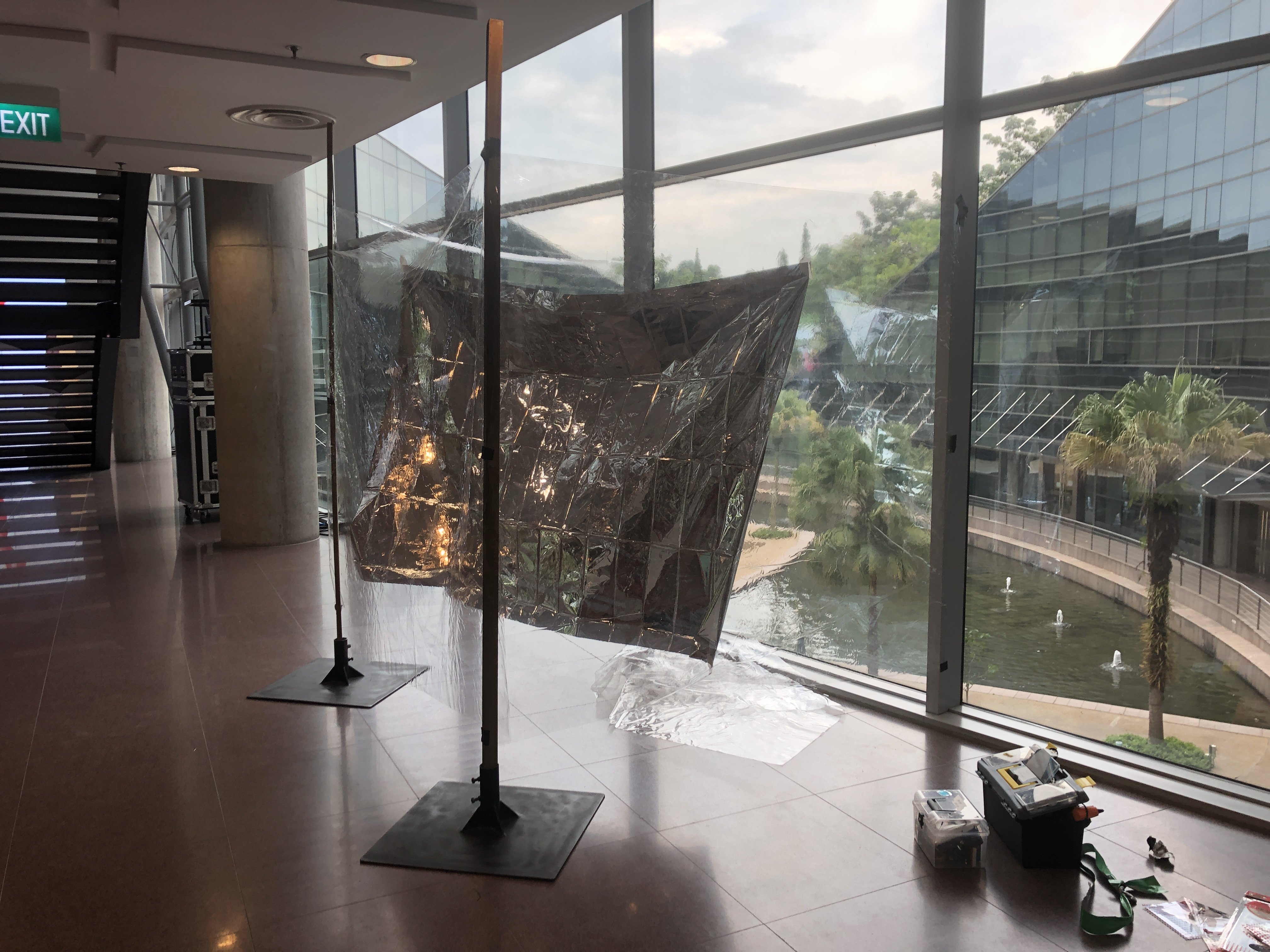
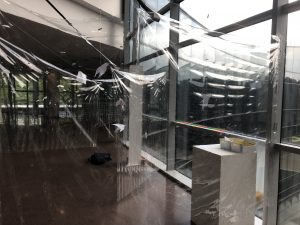
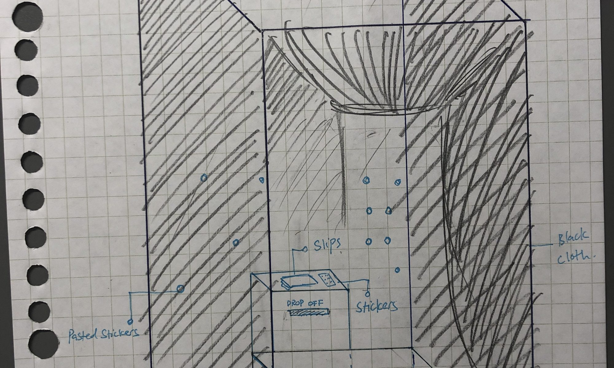
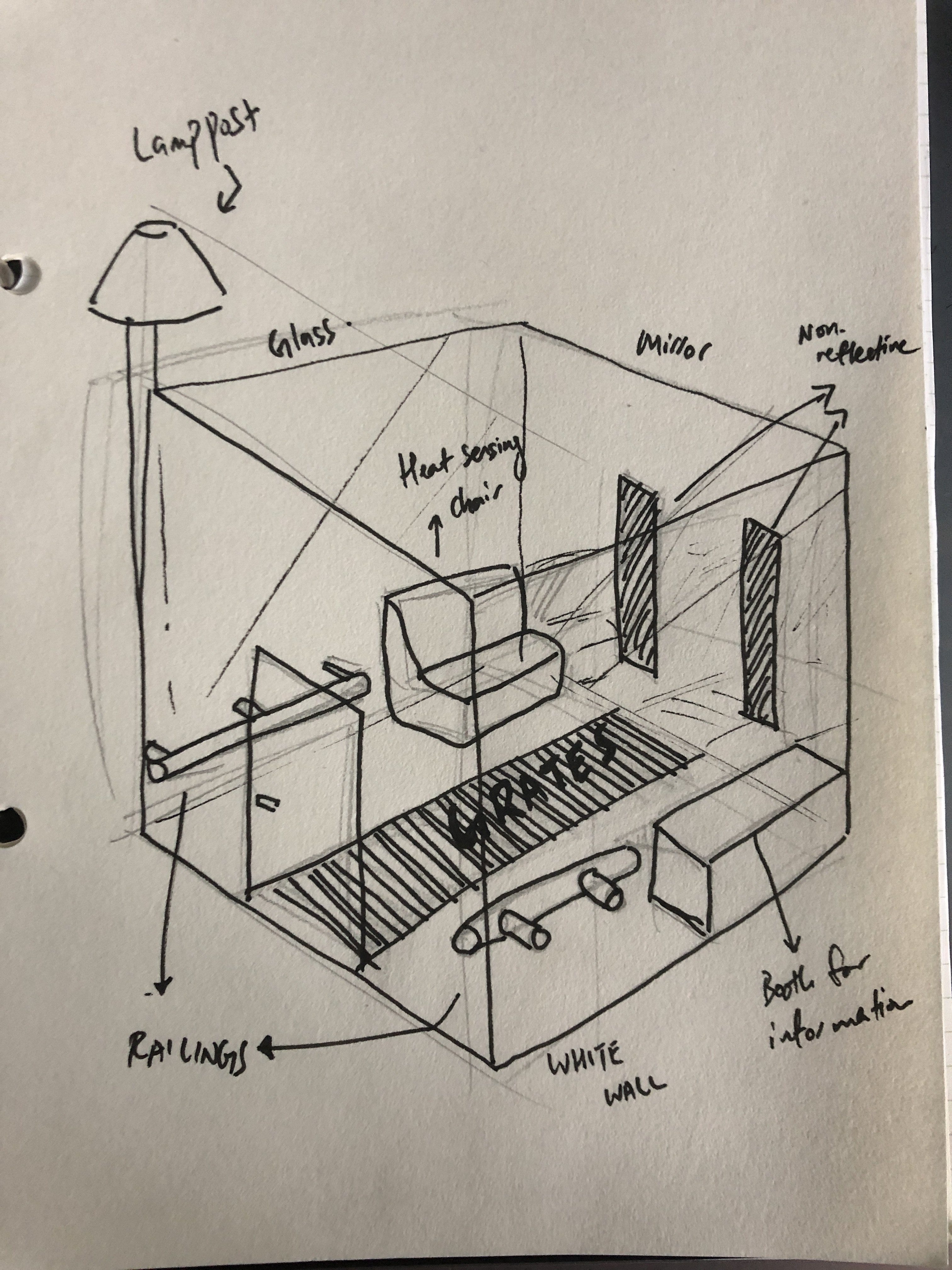
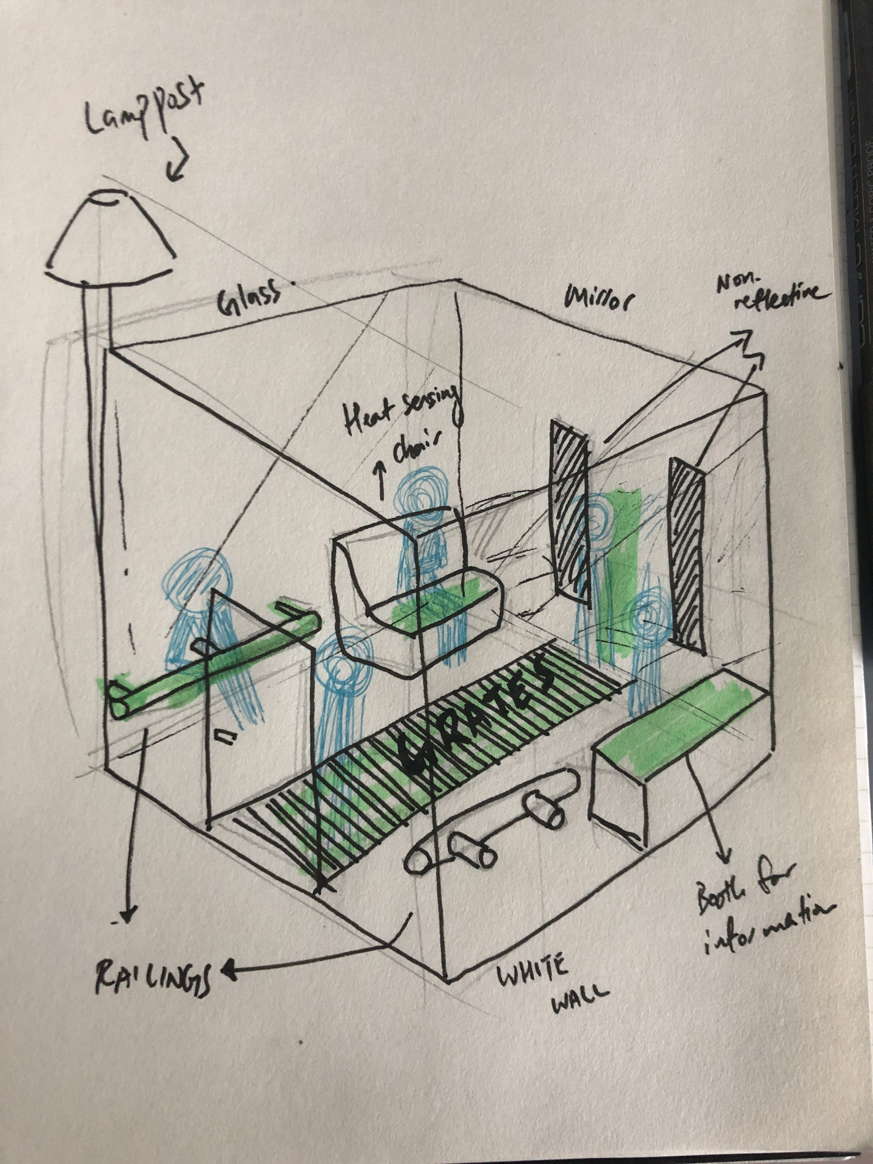
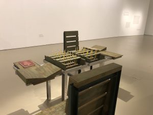
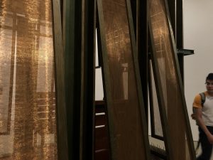
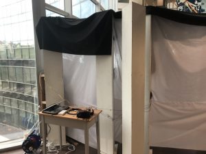
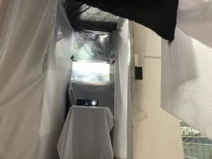
I removed the area where the projection was and placed the projection in the middle of the “tunnel”. The projection is now projecting onto a piece of cloth which that will have to unveil to move on, which leads to the acrylic sheet.

This essentially halves the setup, which makes everything look less clunky.

Overall, this makes everything better in a lot of ways.

  1. Navigation was easier. It was clearer for participants to understand the flow of interaction and the narrative.
  2. The participants will now move slower in the tunnel as there is a video to watch
  3. The whole setup is more compact and less detached

However, there are still flaws that I have to address:

  1. the light in the projection makes the acrylic sheet visible and should be turned off when the cloth is unveiled (this was newly added after discovering this problem)
  2. Projection on black cloth makes it not very visible (as mentioned by my friend Clemens) and the later changes, I switched to white cloth.
  3. The visuals are still not the best, the blood splat is still very…. weird. What I did next was to add an overall red hue to make the splat less off-putting, which kind of worked in bringing attention to the screen
Clemens’s reaction
The projection kind of blinds the participants and reveals the acrylic sheet which is not good

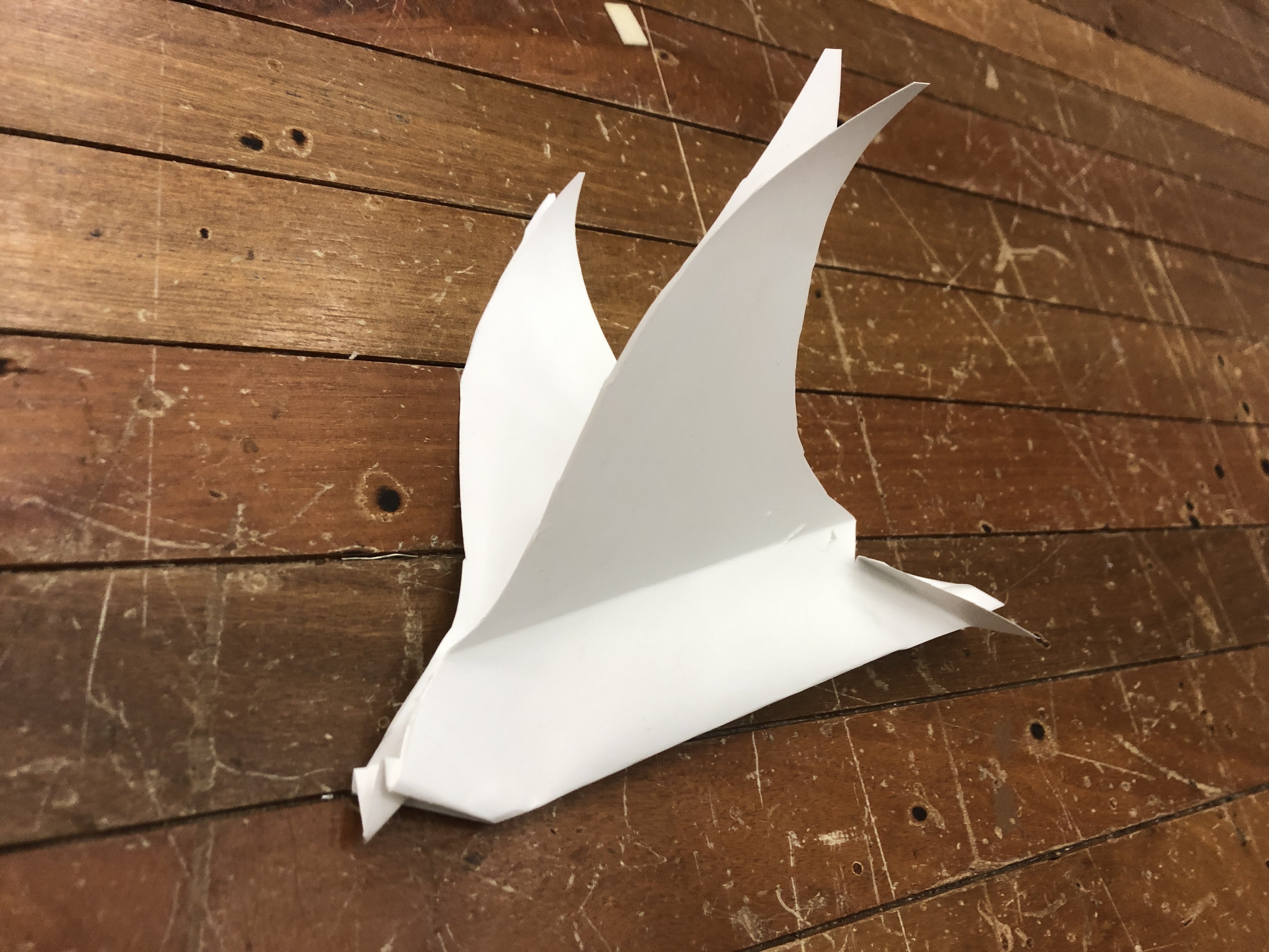
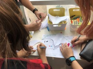
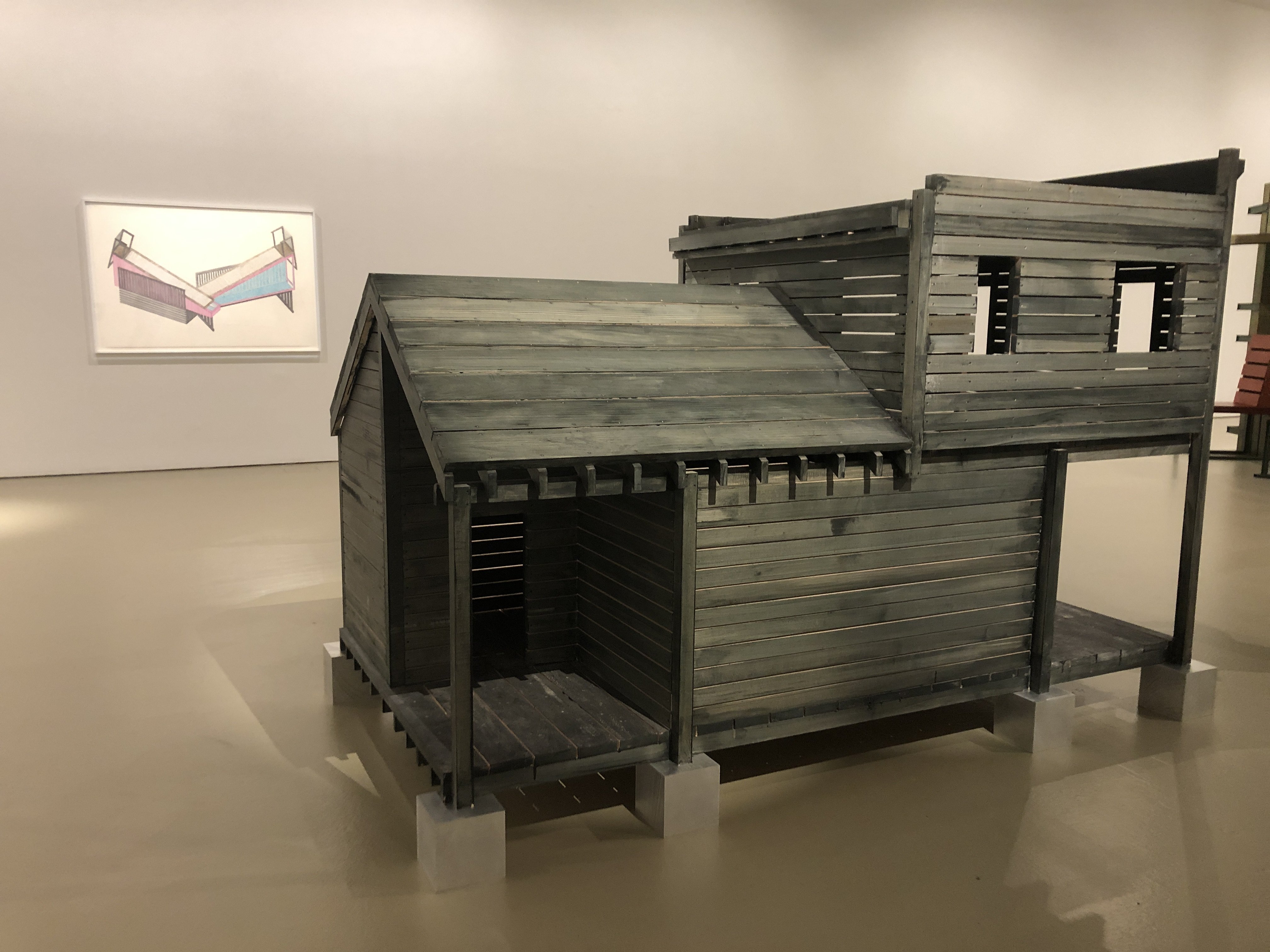
I also created a poster that will be pasted on my installation so people will know what it is about.

Reiteration of Concept

I would like to go through one more time to summarise everything, and how all the elements worked / not worked out

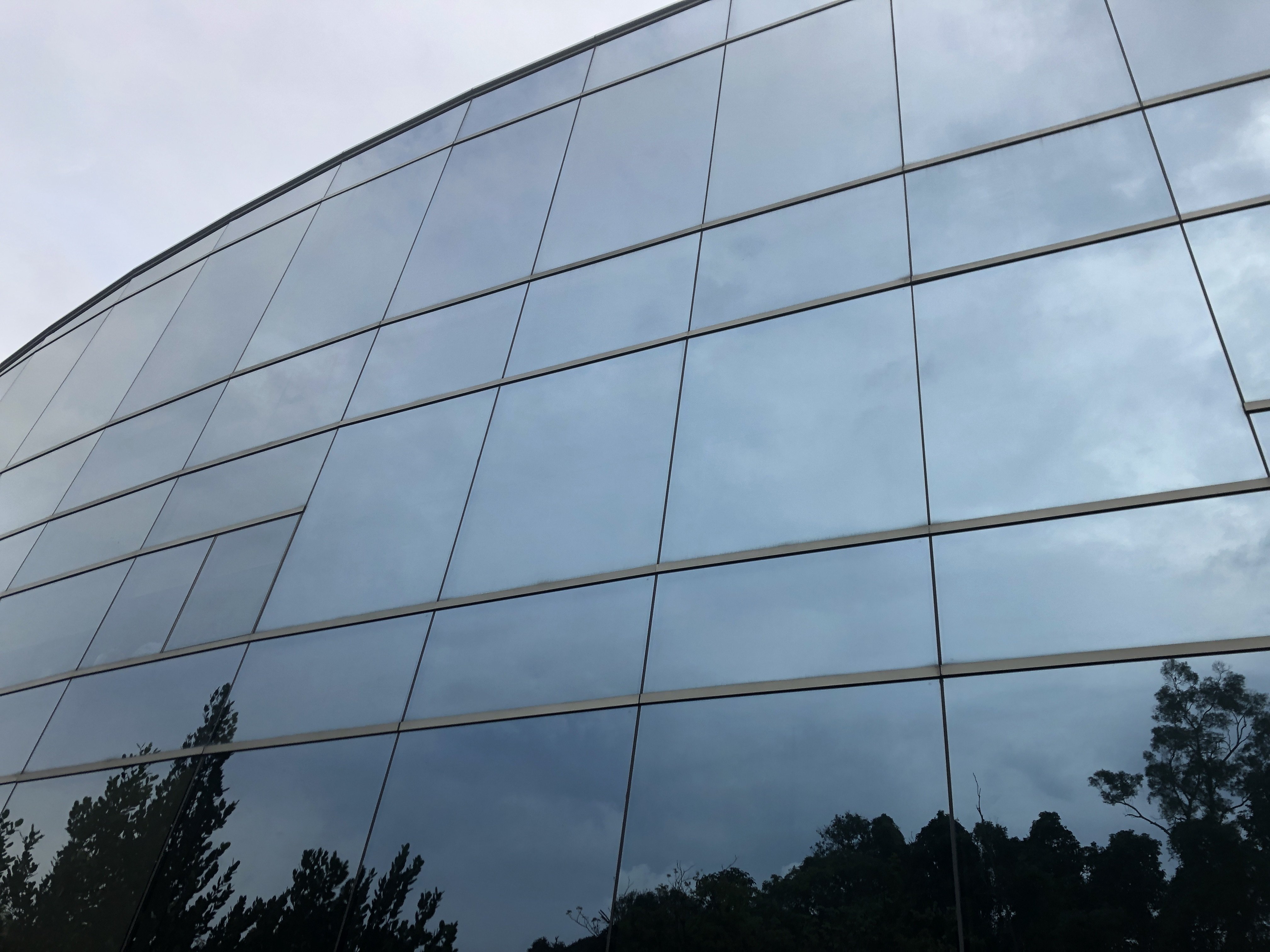
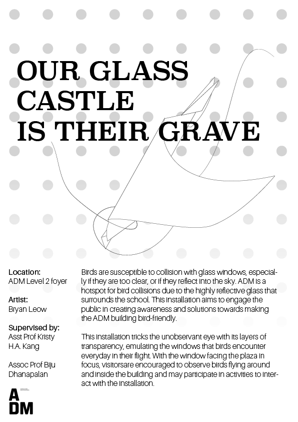
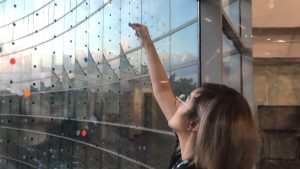
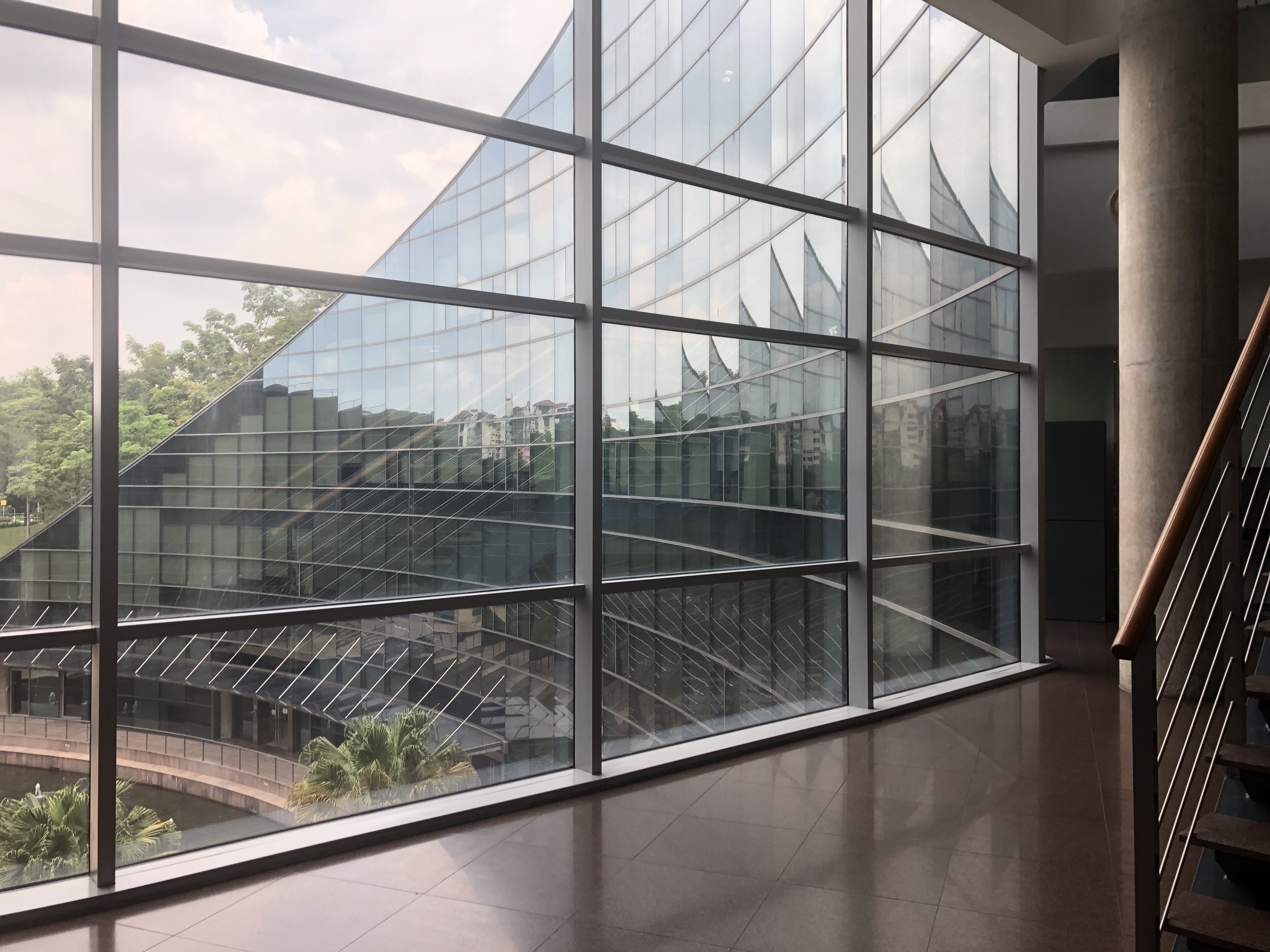
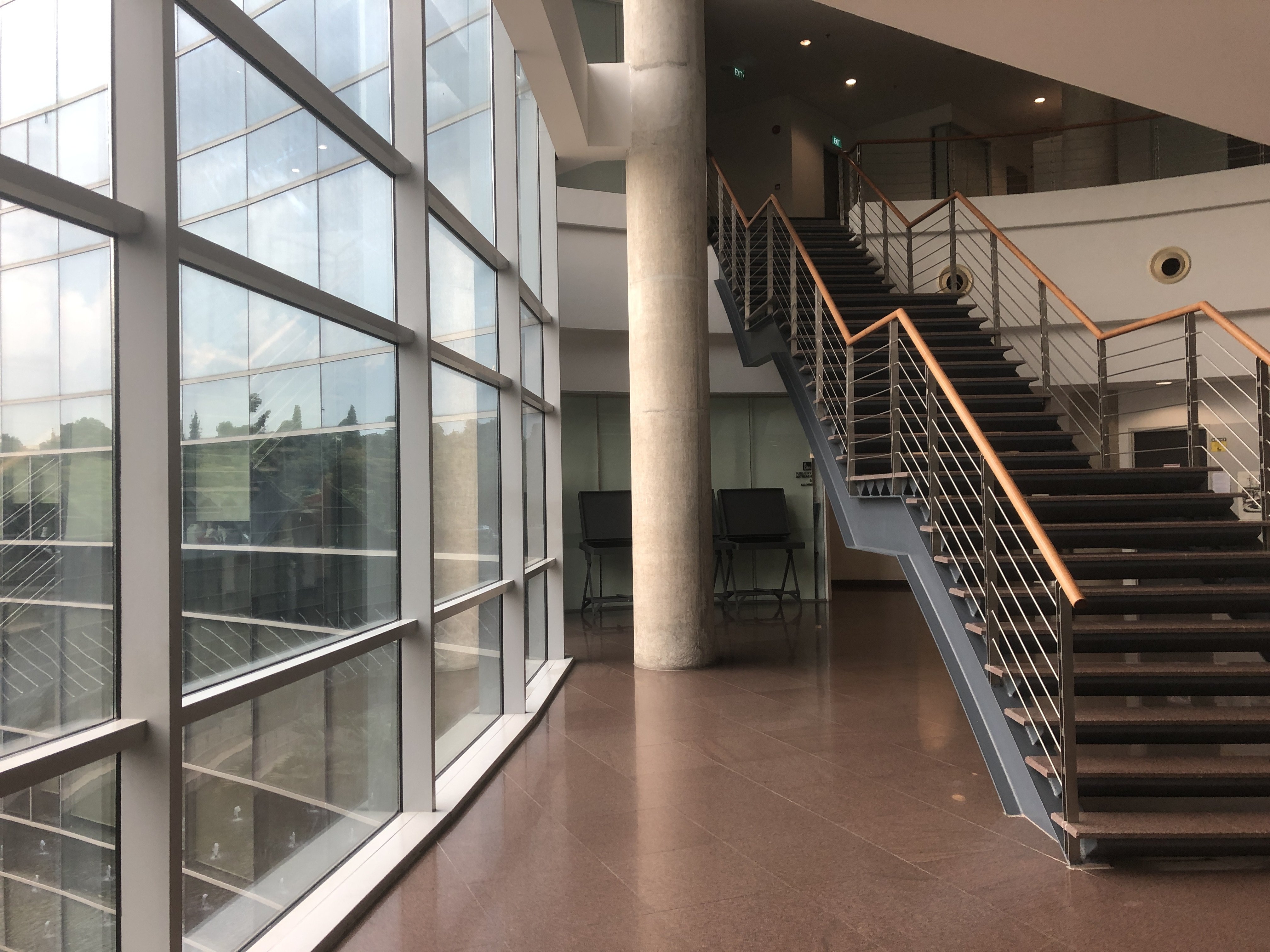
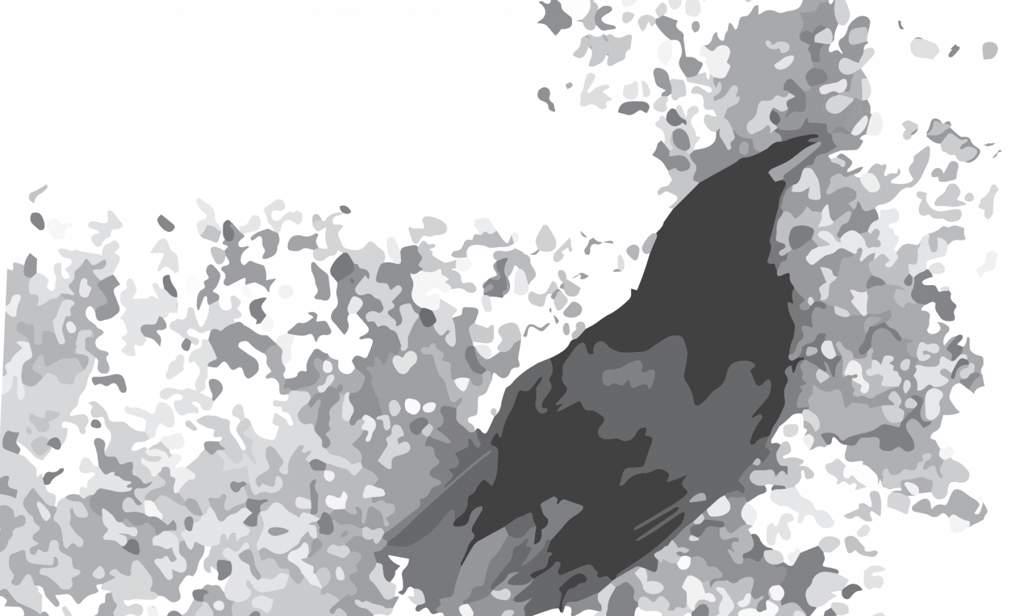
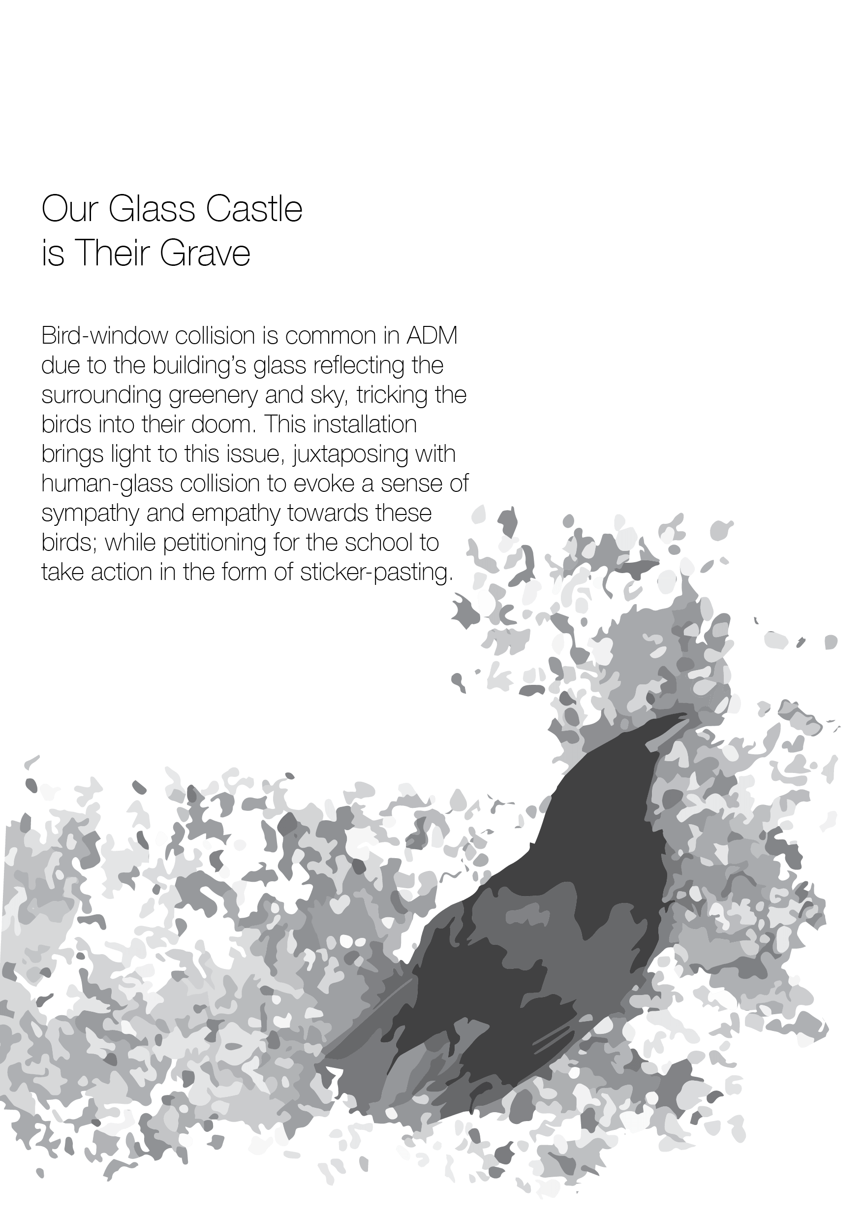
The concept is from an observation of birds hitting the reflective glass window around the ADM building. Upon further research, I discovered that many birds had died due to the building’s reflective glass windows. I wanted to make an installation that solves this problem through bringing awareness to the problem, letting people know the solution, and asking the school to do something about it.

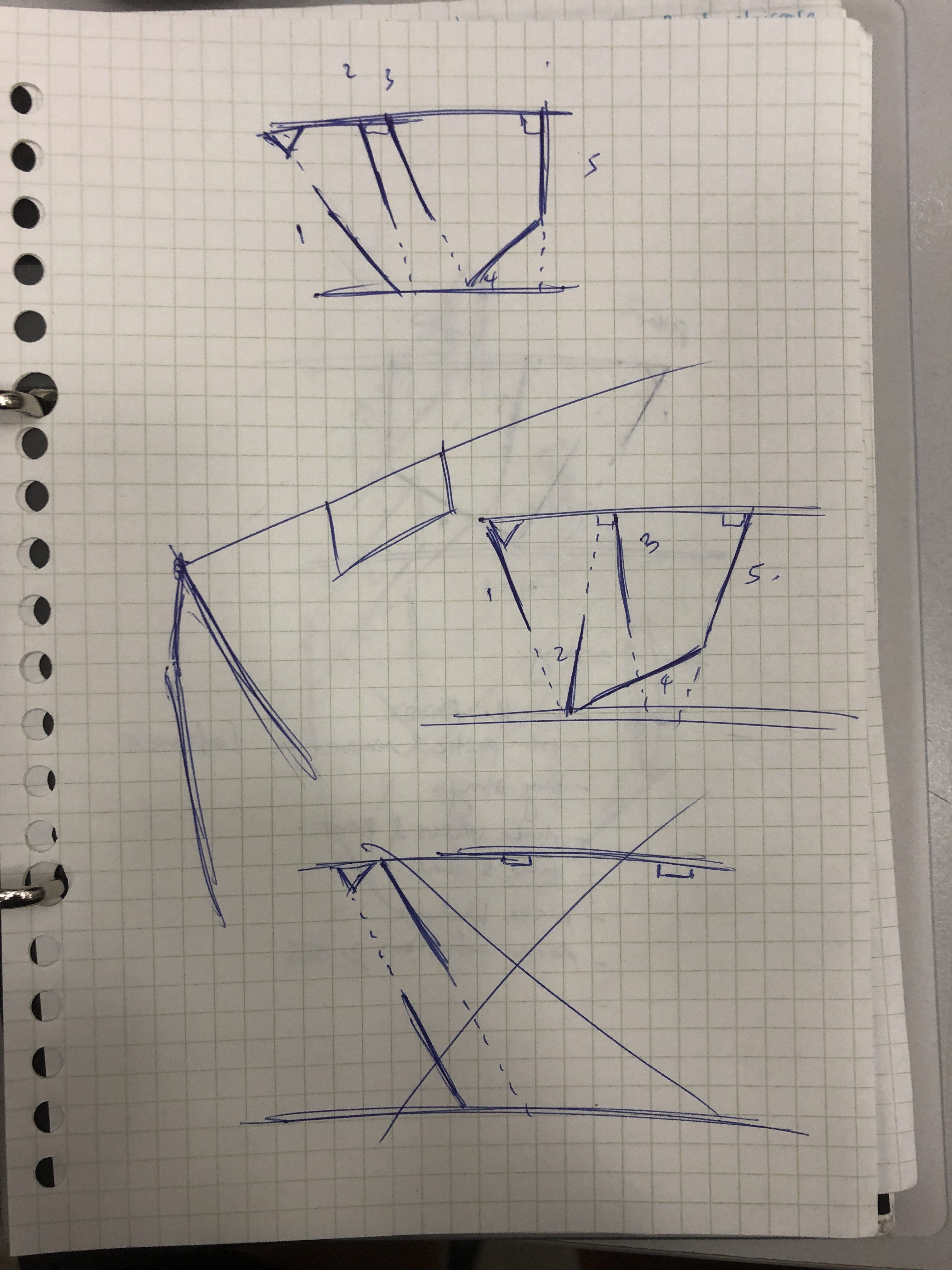
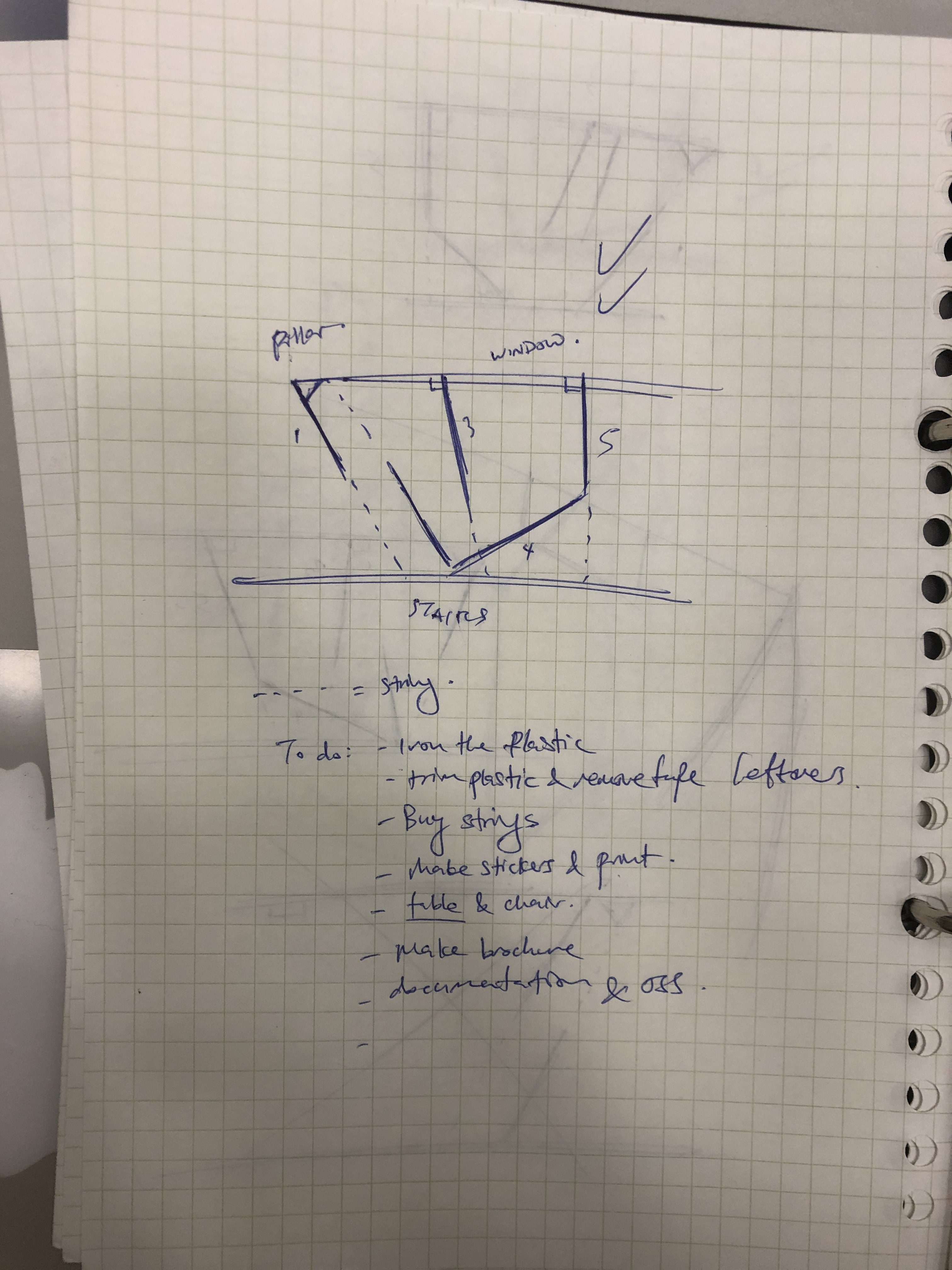
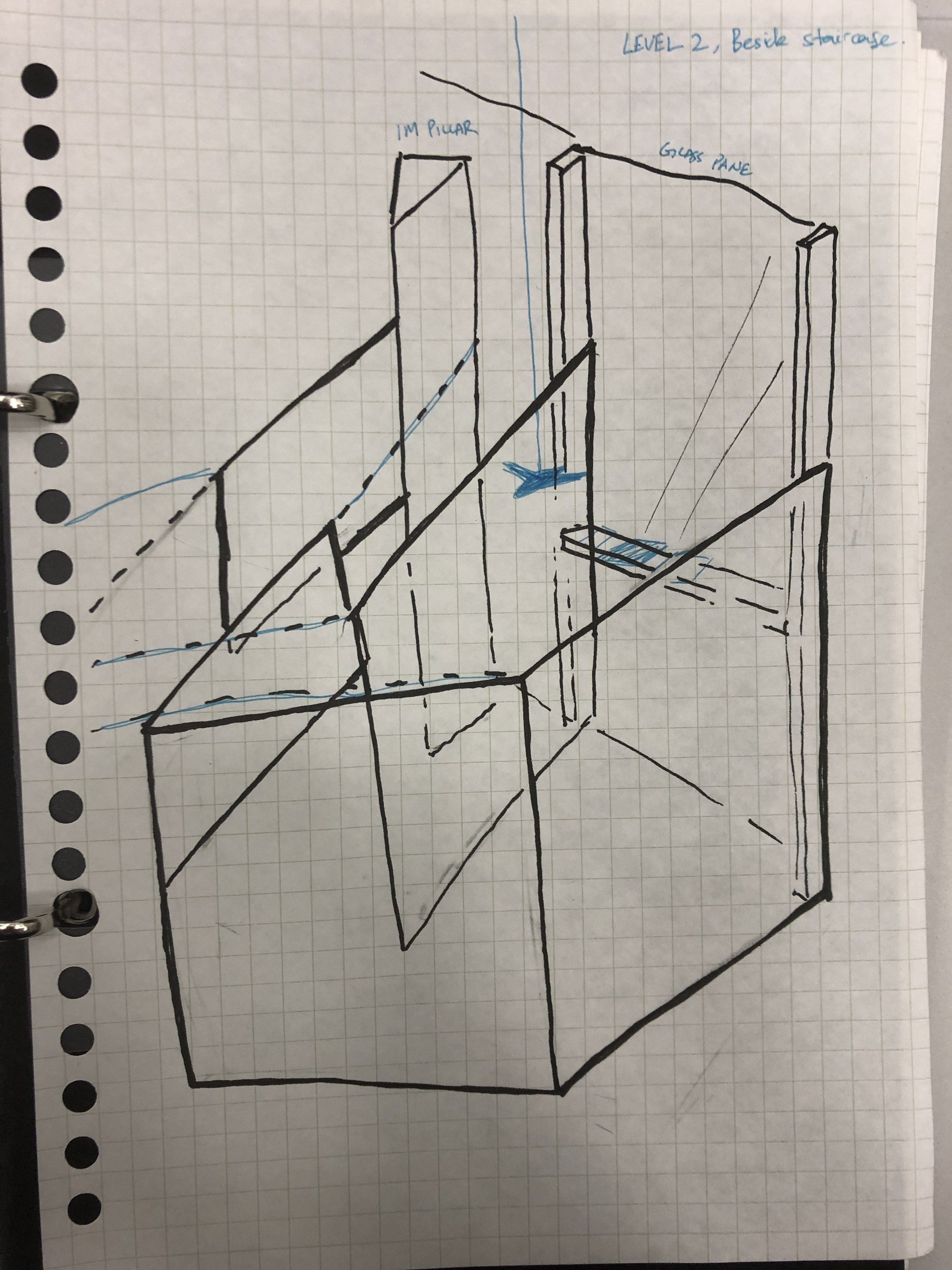
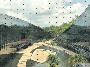
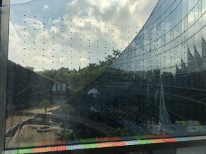
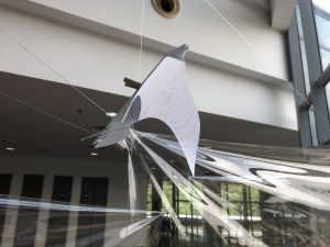
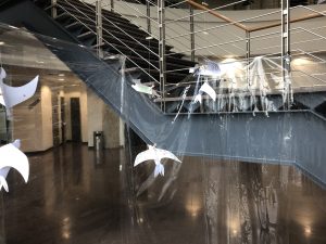
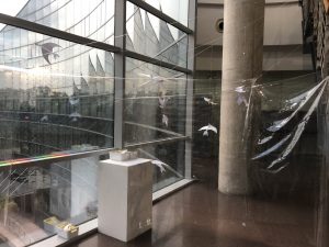
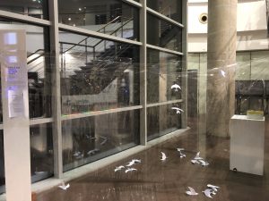
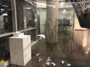
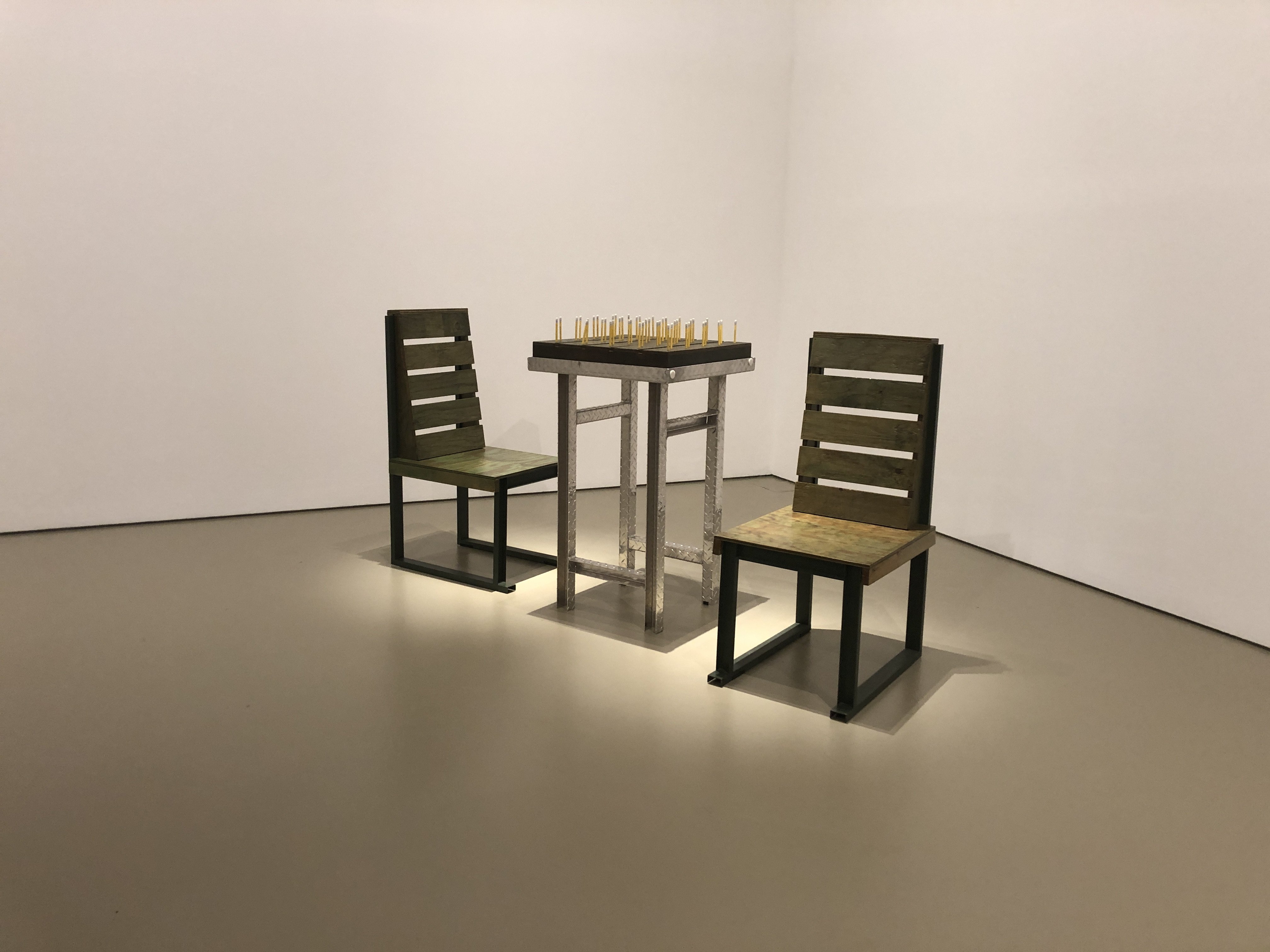
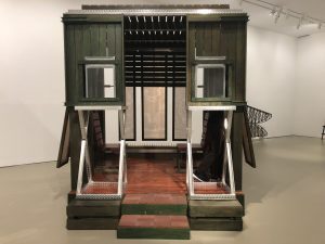
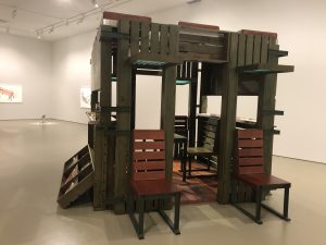
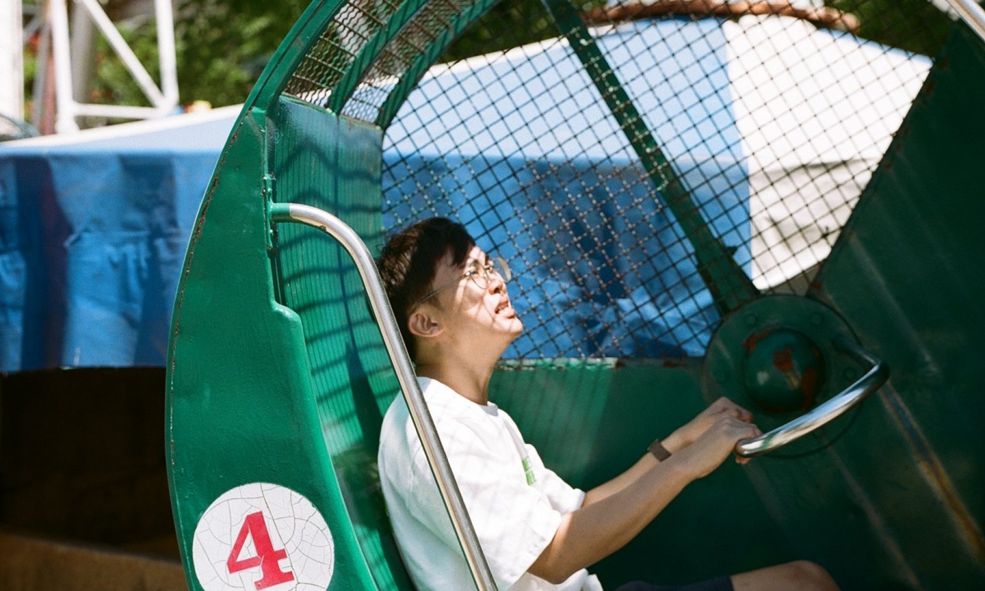
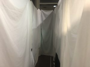
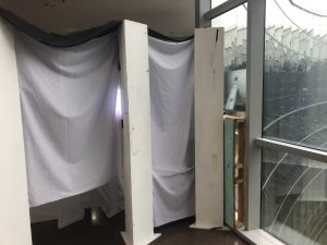
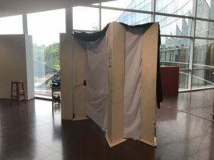
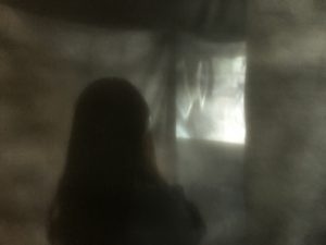
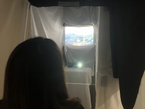
The installation features an experiential space alongside an activity. The experiential space is a long narrow “tunnel” made of white and black cloth. The  use of white cloth was intended for the space to look like a funeral. The tunnel also represents the route into Sunken Plaza.

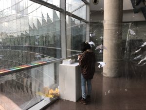
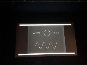
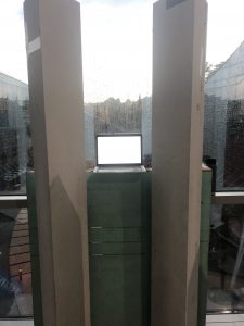
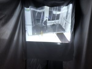
Inside the space, the first thing to see is the video projection. This projection shows found CCTV footages of people walking into glass. Each time a person walks into the glass, a picture of a dead bird found in ADM is shown. This is done to draw reference to birds flying into glass, and I want it to stir some emotions within people. Watching people walk into glass is funny. But is it funny when you see a bird dying from that? Using that, I want to create a sense of guilt and pity. The video is about a minute long and loops.

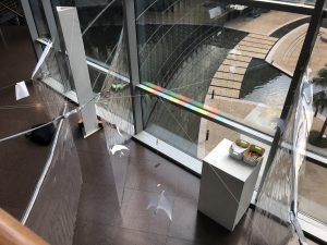
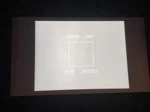
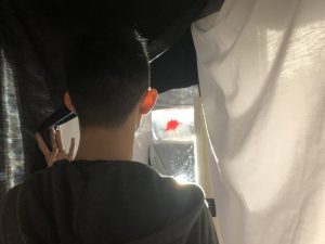
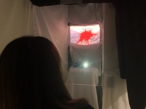
When the audience moves on, they will unveil the cloth and walk forward. This activates 2 sensors (previously only 1). 1 sensor will turn off the video that the projector is showing, making it easier for the participants to see what’s in front of them. Another sensor will activate the bird-window collision simulation. This happens on the front, which is a monitor that shows a live video of the window behind the installation, pretending to be an actual glass window. This was inspired by an advertisement by LG and another by Pepsi, which features a screen that looked like windows to trick participants. In my installation, a sound of a “bang” is heard, followed by the screen turning red and a blood splat appearing on the screen. This part is to cue the participants into knowing that a bird has hit the glass, and this let participants understand how it sounds and feel the impact.

Once that interaction is done, the participant can leave from the side, and move on to paste a sticker to ask for change.

Here are some user testing videos:

Note: she didnt notice the video and the blood splat, but was startled by the bang.

Her rewatching the video

Lessons and Reflections

I also learnt that in an art installation, I should focus more on the experience and feelings rather than facts as that is more effective in incepting ideas into people.

I also learnt that when it comes to spaces, it does not have to actually be physical space. It can be something more experiential, which I could focus on rather than creating an entire space for people to move around in. (which is costly and hard to build)

I also learnt that I should have started building much earlier and use the building as a testing ground for me to see how the experience feels.

I also appreciate the feedbacks which are all good especially Biju’s suggestions to having the glass wall that people walk into.

However, overall, I didn’t really enjoy working on this project as it requires a lot of work and money. Setting up a space is really difficult, especially with a space that is quite large like mine. Working alone on this is just not recommended. (There was once when my setup fell and I had to shout for help and the photography people came to help me I must thank them :’) )

I also lost motivation halfway through the semester as the concept wasn’t that strong in terms of the requirements of the module. Still, I’m happy that I pushed through and the installation looks fine now. I guess larger-scale installation stuffs isn’t my thing, and I should build something smaller in future.


More Updates:

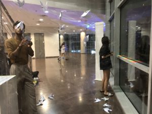
Participants viewing the video & the impact

Videos:


Our Glass Castle: What’s Next? (info dump)

[WIP, but I’ll put the most relevant information first]

Okay so I need an OSS post to collect my thoughts. The most recent updates will be mentioned here.

After 2 weeks of searching for meaning, I discovered that I’ve been straying from my concept. I keep wanting to create something emotionally surprising, but I failed to come back to the original idea which is to create a space that make people act. After a bit of thinking, I realised my concept may lean more towards activism rather than art. After some research, I found “Why Artistic Activism: Nine Reasons” by Stephen Duncombe and Steve Lambert from The Center for Artistic Activism. Below are a few quotes I found applicable to what I’m working on.

Art and activism do different work in the world. Activism, as the name implies, is the activity of challenging and changing power relations. There are many ways of doing activism and being an activist, but the common element is an activity targeted toward a discernible end. Simply put, the goal of activism is action to create an Effect.

Art, on the other hand, tends not to have such a clear target. It’s hard to say what art is for or against; its value often lies in providing us perspective and new ways to envision our world. Its effect is often subtle and hard to measure, and confusing or contradictory messages can be layered into the work. Good art always contains a surplus of meaning: something we can’t quite describe or put our finger on, but moves us nonetheless. Its goal, if we can even use that word, is to stimulate a feeling, move us emotionally, or alter our perception. Art, equally simply stated, is an expression that generates Affect.

Artistic Activism is a practice aimed at generating Æffect: emotionally resonant experiences that lead to measurable shifts in power.

The ability of artistic activism to surprise us – to show up in unlikely places (e.g. not a gallery) or take on unfamiliar forms (e.g. not a protest march) provides an opportunity to disrupt people’s preconceived notions of art and protest, and their predetermined ideas about the messages we are trying to communicate. Artistic activism creates an opportunity to bypass seemingly fixed political ideas and moral ideals and remap cognitive patterns. Surprise is a moment when hearts can be touched and minds reached, and both changed.

I also looked at different works that is similar to what I want to achieve, some are advertising, some interactive.

https://www.instagram.com/jasvicphotography/?hl=en

https://www.jasvicphotography.com/

Alright. So my current concept would be a 3 part installation.

PART 1: The Collision

In part 1, I want the focus to be on the bird collision. I think people don’t know or don’t feel much about the birds situation as they have not experienced it before.

  1. Participants have to enter one at a time to engage in this work.
  2. The participants enter wearing a device that distorts their vision through mirrors. The view should look like there are multiple images and the center of their vision will be blocked just like how birds see with 2 eyes on the sides of their head.
  3. The participant then walk through a short maze, which includes mirrors that further disorients them
  4. As the participant gets closer to the end of the maze, the ambient sound gets louder, this helps the participant to orientate themselves towards the goal
  5. When they reach the end, they will hit against the transparent acrylic. Simultaneously, there will be a thud sound while an image of a ‘bird’ (plasticine or something) will ‘hit the window’. The environment will turn silent too.
  6. After a short while, the ambient music fades in again. As that happens, LED lights up the acrylic to reveal dots that previously cant be seen due to the dark.
  7. At the same time, the bird corpse will fade into dots which will fill the screen. When that happens, birds’ silhouette can be seen flying around without harm. (unsure thats why i underlined)
  8. Participants then can exit the installation to the right and enter PART 2.

What this is supposed to achieve:

  1. empathy towards the birds in realising the difficulty of navigation
  2. experiencing how it sounds and looks like when a bird hits the window
  3. sympathy towards the bird, enough to want to do something

What will be added after:

  1. more interactions with the space itself, perhaps through a slightly added complication with the maze so as to create a non-linear experience

PART2: The Dead and The Injured

This part is dedicated to the injured and dead birds. After exiting the smack zone, there will be a zone where a projection of videos of people walking into glass, where in the end, the image of a dead bird around ADM is shown. This is a reflection of what happened previously and gives people the context that many birds have died due to such collisions. As they walk towards the projectors, a sensor gets triggered and an injured bird is projected using Pepper’s Ghost method on a platform. The participant is then able to interact with this bird by using a phone placed in front of it. When they pick it up, the phone will explain how one is able to help the injured bird. The bird will also animate according to the instructions (depending on my capability if its doable).

What people should feel:

  1. sympathy towards the dead birds
  2. empathy due to seeing the context
  3. education on how to help an injured bird

PART3: Using the Dots

I am 100% certain it’s the most elegant solution towards this issue. The school have already turned off light at midnight to reduce light pollution which helps night migratory birds. But the school is not taking enough responsibility in reducing the deaths by the windows when the structure mirrors the sky and forest around the school.

In order to make it extra clear about the intention for this part of the installation, my focus will only be on the dots.

The participant will enter this next zone where the first thing they see will be clear acrylic with dots marked on them. This goes along with a brief description on how the dots help us to see it better. (see how this works out)

After that, it will be where they paste stickers.

What participants should feel and get out of it:

  1. I did something to help!

[Process and further research]

input process for:

  1. first iteration which is the shitty 3-window panel thing, feedbacks, improvements. Week 9 was all about thinking of a way to putting tech
  2. second iteration which is the shitty maze, feedbacks, improvements, and actions to take. Week 10 was all about buying and getting materials together.
  3. third iteration which is what I’ll be proposing this tuesday, which will be the final form and I’ll present it while i continue to physically experiment with the different physical elements (on monday) Week 11 was all about
  4. Week 12 will be working on experimenting with the space and see what works


Why Artistic Activism?

Transparent LED embedded inside a glass window for building facade

https://www.tate.org.uk/art/art-terms/s/socially-engaged-practice


Our Glass Castle, Their Grave : The Complete Collection of Concepts, Thoughts, and Feedbacks

Disclaimer: This post is written in a train-of-thought manner with my 1 remaining brain cell so I’m sorry if it’s boring to read. I’ve highlighted the main points as much as I can hopefully it helps.

Birds are susceptible to collision with glass windows, especially if they are too clear, or if they reflect into the sky. ADM is a hotspot for bird collisions due to the highly reflective glass. According to Nanyang Chronicles, 2018, the glass windows in ADM are responsible for almost 1 collision per day.

Birds like to smack here.
Image taken from http://www.nanyangchronicle.ntu.edu.sg/News/2504bird.html

NTU sees a large number of bird species as it is surrounded by forests that have abundant food and resources, said Mr David Tan, an avian ecologist who has collected more than 700 carcasses of birds killed in local building collisions over the past five years. He uses the carcasses for research and analysis on the phenomenon.

NTU has many glass-panelled structures, with more than 95 per cent of its buildings in line with the Building and Construction Authority’s Green Mark scheme. Glass panels are common in green-marked infrastructure as they allow natural light to come through, reducing the need for electricity.

While such designs help to lower energy use, environmental policies often fail to consider biodiversity, said Campus Creatures member Gina Goh, 24, who leads NTU’s bird-building collision patrol team.

  • – From Nanyang Chronicles, 2018

This installation aims to engage the public in creating awareness and solutions towards making the ADM building bird-friendly, hopefully prompting the building manager to take action.

This installation appears invisible to an unobservant eye, and its layers serve as transparent obstacles that birds encounter everyday in their flight. This supposed obstacle (if one were to not pay attention) is a reflection of what the birds face and allows us to empathise with them. This is mostly inspired by the saran wrap pranks which people do on both their pets and people:

Inside the installation is a space that is both confining and transparent, which creates a conflict between being in the open and being confined in a small space. This is also a direct reference to the birds flying into the Sunken Plaza in ADM where they are trapped in the enclosed plaza with the reflected illusion of the sky.

The window stands right in front of the visitors of the space where a clear view of the entire Sunken Plaza can be seen. Here is where markers are placed on the window, and round stickers are placed in containers on the ledge, prompting them to paste a sticker onto the marker to make their mark in preventing birds from colliding with the glass. The stickers will be 2cm (subject to change) in diameter and spaced 5cm apart to create a grid that allow birds to see that there is some kind of obstacle for them. This video is an example of the grid:


The stickers are also in primary colours much like Yayoi Kusama’s Obliteration Room, which I believe will beautify the space and allow for the participants’ expression of creativity in regards to where they place them and how they place them in relation to the other colours.

Image taken from https://www.arch2o.com/obliteration-room-yayoi-kusama/

I want the visitors to paste a sticker for each bird they see flying in and around the plaza. I would like the visitors to paste the sticker according to what they feel about the bird, and they are allowed to paste wherever they want on the grid. In order to fully interact with the work, they have to observe outside the window. However, visitors may still peel a sticker and paste it for fun, which I will allow since it is freely up to the visitors to use the space.

I have considered making the sticker-pasting to be free from the grid, as I thought the birds just require something pasted on the window to see that there is an obstacle, it does not matter if there is a grid at all, there just has to be something on the window. However, I think, a grid will make more sense as a whole to nudge the management to apply the idea, and makes the installation more specific which is always better than a vague one. Other than that, I don’t want my work to be like the obliteration room. I would say, if the stickers are all filled, I will allow the participants to overlap the stickers such that it still forms a grid, but it does not go out of the pattern too much.

At the end of the day, the installation should look like an art piece by itself, filled by the public.

The aim of the sticker-pasting is mostly to educate people that such solutions exists. Ultimately, it is up to the management to do something about the bird problem. A really easy and elegant solution is to paste the grid stickers on the outside of ADM’s windows, which, if done properly, will not obstruct the view of people, will not make the building ugly, will not block light or reduce the amount of heat reflected, and will be friendly to wildlife. With this, I really hope my installation will create such impact.

A newly integrated idea is to add paper birds inside the installation. These paper birds come from templates that participants can use to make their own birds. They are then allowed to colour it using markers and personalise it, as well as add their own message to it. The participants can then hang it on a string using clips to clip them on. The birds will be left hanging and thrown into a bin within the installation the next day, ‘delete’ or ‘killing’ the birds. This is a reference to how the 1 bird have been dying everyday due to window collision in ADM. When the installation ends, I would like to collect the birds to create a more permanent display, before recycling them.

The purpose of crafting and personalising is to create a sense of attachment between the participants and their birds, such that they will feel like it is a pity that their birds will be discarded. This prompts the participants to be more protective towards the birds and take more responsibility of the issue rather than just being a passive by-stander of the issue.

The birds will also be the physical representation of the birds that interacted with the glass window. Visitors can interact with the bird by swinging them, taking photo with them, or looking at how each bird is personalised. I hope that it will be heavy enough to make a ‘thud’ sound if a participant swings too hard and hit the birds against the side walls. This will make the installation feel more impactful.

I am greatly inspired by Siah Armajani’s Sacco and Vanzetti Reading Room #3 ever since our visit to the exhibition as I really liked his idea of a space being not just meaningful but also functional as a communal space. I want my space to be the kind of public installation that is useable and functional. I imagine it as ‘interior design with interaction’. That is the ultimate form for my installation.

Outside of being a space for people to learn about the birds, I want the space to be a contemplative space for general use too. I want the space to be a quiet and calming space for people to just relax and look out of the window. However, with the implementation of transparent walls, I’m not sure if I can achieve that as the transparency makes the space not-so-private. We shall see, but that is not the primary concern, as the most important thing is about the birds.

Problems or things that can be done better

If I had more information about the types of birds that ADM encounters (as I did not have enough time to observe them and I can’t find relevant information online), I would make this installation specific to them. To solve this, I used different coloured stickers.

The work is time-based so there are many layers that will unfold over-time so I can only explain during presentation.

Further research other than what I’ve discussed before:

The top 4 most vulnerable-to-collision migratory species are the blue-winged pitta, yellow-rumped flycatcher, western hooded pitta and oriental dwarf kingfisher.

Bird collisions were most frequent during the fall, or autumn migration period between October and November compared to any other period during the migratory season for 2014/15 (Figure 1).

Image taken from https://singaporebirdgroup.wordpress.com/2015/05/15/migratory-bird-collisions-in-singapore/

As one can see, the west is the second most common collision area, which is HERE! We need to start being bird-friendly!

Image taken from https://singaporebirdgroup.wordpress.com/2015/05/15/migratory-bird-collisions-in-singapore/

Migratory Bird Collisions in Singapore

Installation Process

After a few brain storming sessions (with myself) I came up with some sketches to add on to my previous idea.

A brief pencil sketch of the installation setup
Top-down plan view to plan out how I want people to navigate through the installation
The plan view that I settled on
The final sketch of how I want the installation to look like. Note there are still some changes so not exactly final but… its close enough for me to work with!

After the sketches, I went to buy the materials. I bought a 7m by 1.8m long 0.3mm transparency sheet from CN Canvas and Hardware which costed $46 (ouch…). The transparency was a bit dirty and creasy so I had to make use of what I have.

I then tried to setup. Initially, I was planning on using the windows at Level 1 lobby area due to there having high traffic. Here are my tryouts with tapes and very quick setups. I also used emergency blankets which I thought was an interesting material as it has both reflective and transparent qualities (just like the windows!) but it does not fit the aesthetic. Referencing Peter Zumthor’s Atmospheres, in order to make my space work well, the main points that the space need to have are compatible materials, tension between interior and exterior, and intimacy.

markings for me to take note. This was actually done wayyyy before the current plan
I like that it is actually quite transparent even though the material has a lot of creases
With the emergency blanket, it looked too reflective on one side. Too silver

Love that it looks almost invisible here.

I began experimenting with how I should put the emergency blanket to make it interesting. I dropped the whole idea afterwards as it is too constrasting with the materials I use.


I also tried using strings and realised how fishing line is able to help me hold up the transparencies reliably.

I then began to scout for a better location as I dislike having 2 big holes sticking out that tells people that my installation is there. I want it to be as invisible as possible.

I found the staircase beside level 2 to work very well as it provides a much higher ground than level 1, which give visitors much more things to look at. It is also situated directly at the middle of the sunken plaza, which is better. Also, there is a mark left behind by a fallen bird on the window. I deduced this was from a bird last year that fell onto the shelter at basement after it collided with the window.

A better view

I begin my work:

Here are some photos of my setup. It’s not very easy to see, which is the main point and I think the stairs eased my setup by a lot.

That was the end of my set up trial. I moved on to working on the other parts of my installation, mainly the print-outs and the paper birds.

My instructions panel to guide visitors on what to do inside the installation
My poster. I just thought it would really be nice to have this so…. hahahhahahahahahahahahahhahahaa
My origami bird template which I will cut for participants
cardboard bird is my first prototype and that’s when I thought, why not paper.
my original idea was to make a soft and fun to play bird but it’s not gonna work out….
ah, so beautiful. This works really well and allow for a lot of customisability.

So, with everything I need and every test tested, I will now set up the installation and hope it does not crash during presentation. Stay tuned.

The Installation

The Stickers

FEEDBACKS:

  • My friend Clara gave me a suggestion to making it about the mood of the birds as the colours of the bird wasn’t very strong and obvious. I liked that and took that in. However, I think there is some more depth that can be added to the colouring of the birds.
  • The colourfulness is kind of offputting, mostly because it was messy, but also because it makes the whole installation feel cheery which was not really the point.
  • Very little birds so its a very slow process.
  • The dots look a bit disorienting, commented by Shah. Perhaps I can use that as a way to further disorientate visitors to sell the idea of the disorientation. Through looking at optical illusions. But of course, with similar gap arrangements.

Birds:

FEEDBACKS:

  • The birds are well-received as it was a fun activity for most.
  • People spend a lot of time on it so it crowds the place up a bit quickly
  • the hanging birds, to Clara, felt like they are desperately looking to exit the space. However, to prof. Biju, they looked happy. Perhaps theres a need to find ways to make the birds feel more like they are trapped.

The Space:

FEEDBACKS:

  • The space felt calming despite it supposed to feel like its uncomfortable
  • The transparency kinda works as it’s safer that it’s visible.

OVERALL THINGS TO IMPROVE

I think as a whole, I need to be more specific about the feeling i wish to incite in my installation. Now, I am too focused on the activism of the project than on the experience. That blinded me a lot as I was only trying to make the space functional and not how it feels. I don’t like art. Especially when it’s art that does not add value. I want to say that out loud first as I think that influenced a lot of my decisions. I want to make something that make people act.

It’s safe to say, the installation is very intuitive to navigate through, as observed with different people who entered and did everything I wanted correctly without asking me anything. With that aside, I can now focus on experience. The idea also sells, I believe, as many are shocked to realise what I tell them, and are sympathetic towards the birds.

However, I still need to work on what exactly I want them to feel, and the effectiveness in making people feel those feelings. What I’m missing out now is the discomfort. This is a bit conflicting as I previously mentioned that I wanted the space to also be a nice space to chill at.

To combat these problems, a few solutions can be explored:

  1. Make the space more cramp, so if theres more movement, people will get more uncomfortable. But if one person goes in and look out the window without moving, they should feel ok.
  2. Make the walls more illusion-like, so participants feel uneasy looking at the walls, but feels ok looking at the window. This is where I can add projection to improve my project.
  3. Make the birds red, as suggested by Khairul, as it will be associated with death and blood.
  4. Make the stickers of reddish hue. So it will also add on to the redness, hopefully making people uncomfortable.
  5. Throw the birds on the floor instead of using a bin. This makes the birds pile up over time, which adds to the discomfort. This also works better as symbolism for the death of the birds. I will still get the participants to hang the birds as that creates the idea of attachment that I want. I also find it very odd if participants were to just throw it to the floor directly as it makes it a very destructive act which is… just odd for me. Also, what I realise also is, day and night have different moods. Perhaps the installation will look more sinister at night ( which is where I test out most of the stuffs) so it feels different.

Anyway, I tried this after the presentation and I feel that it becomes much more meaningful afterwards:

Finally, how can I augment my work digitally? Here’s my idea dump

  1. Use projection on my transparent walls to make them more illusionary, and I can use a few ways to do this.
  2. use projection on the floor to portray dead birds, and every sticker pasted, a bird vanishes. This is a bit too direct for me, but still an idea that can be entertained.
  3. Make the hanging birds spin? As if the birds are trying to fly out of the plaza, but that will be noisy. Will be interesting if the bird flies out of the clips as they swing.
  4. Make the birds drop over time using a mechanism that times it.
  5. Using Augmented Reality to depict the birds or some other things on the stickers or birds or something
  6. Crowdsourced images of dead birds can be projected
  7. YOLO to detect birds?
  8. ultrasonic sensor glass hit
  9. what if the birds are all digital and people release the birds, only for their bird to hit the window and die
  10. Project dots on sunken plaza exterior and with each visitor’s exit, 1 dot is added or coloured

Final words (after presentation)

I really regret messing up my presentation and there’s no way to reverse that. After regaining composure and realigning my mind, I feel more confident in working forward with the feedbacks I have. I just hope to be clearer with where I’m headed with this project and hopefully produce a project that is more meaningful and less pretentious.

UPDATES: Enhancing with Digital

I have an update to my idea. Here’s what I have.

I decided to use more space, expanding my installation to cover at least 3 window panes. Will also split the installation up into 3 parts.

Materials to help prevent bird death:

https://www.birdscreen.com/index.php

https://www.birdsavers.com/

https://www.collidescape.org/

Information:

https://www.ncbi.nlm.nih.gov/pmc/articles/PMC5756612/

https://www.straitstimes.com/singapore/environment/collision-into-buildings-cause-of-many-birds-deaths-study

https://pdfs.semanticscholar.org/4f2c/634fc135e9186be1a0d538767f8c1a529bbd.pdf

https://www.fws.gov/migratorybirds/pdf/management/reducingbirdcollisionswithbuildings.pdf

https://www.fws.gov/birds/bird-enthusiasts/threats-to-birds/collisions/buildings-and-glass.php

http://tinyurl.com/SGBirdCrash


Reading: Critical Vehicles

There are 2 main ideas I pulled out from this reading that I find reflect a lot in Krzysztof Wodiczko’s work. The first is the idea of “Interrogative Design” (which I like!), which is how design should reflect the real world and not work around it.

Screenshot from the reading

In schools, we always are required to work around a problem instead of directly solve it due to us being just the ‘designer’ and not an engineer that is capable of solving problems with complex solutions. This is especially relevant in product design where we have to imagine new ways to use a product while bypassing a problem faced by an existing product. Now thinking back, that is what fuels our creativity, and I would say it is still a somewhat legitimate way to work towards a solution if designing for trivial objects. However, his point is that design should be real and confrontational, rather than avoidant. This is an interesting and relevant thought for my works.

The second main idea is on the need to add meaning and function to public art.

screenshot from the reading

In this passage, the artist basically mentions that public art is useless. I half agree with this as I think commission spoils the artistic freedom of artists, turning the artwork into an awkward blend of artist intention and corporate influence. Its lack of practical function (other than to beautify the space and assert their dominance through richness) also makes it a redundant creation. However, I think that the best kind of art should really be public, perhaps not commissioned, but public. I mean, other forms of art is already non-functional (practically speaking). I find public art to be one of the least intimidating forms of art as they are all very approachable, or perhaps, designed to be approachable. The lack of symbolic meaning frees the work from all the “deep” meaning that artists like to inject in their work, which not just makes their work intimidating and difficult to understand but also not adding important information for the artwork to be at least functional in doing what it needs to do.

I think I understand his sentiments, and I think there are many ways artists can improve on in their works to make it more ‘useful’. This is the same as us designers trying to make the world a better place through solutions and not just “raise awareness“.

I find that the artist’s work “City Hall Tower Projection” in Krakow, 1996 embodied these 2 ideas. The artist’s use of projection and sound onto an exist ‘permanent’ structure also reminds me of previous week’s reading about ‘relational architecture’ that temporarily changes the narrative and meaning of a space through the use of media and technology. 

screenshot from the reading

The idea goes further into transforming the bell tower into a confrontational figure that discusses the unspoken or taboo topics in the country like homophobia and domestic abuse. The belltower acts as a middle person between victims recounting their narratives of said topics and the general public, essentially becoming the voice of the minority.

screenshot from the reading

This turns the architecture not just into a confrontational work, but also a functional one in terms of speaking out the unspoken, providing perspectives of the people’s humanity while also calls for people to reflect upon themselves.

Thoughts

I think the artist have very valid points and I have some similar sentiments with the artists in his view on art and design. I think we all can be a lot more thoughtful in our works in making it serve an objective function.

Project 1

Observatory

Bird Observatory Installation

The Concept

I want to focus on my previous project ‘What We Left Behind’ and build upon it. I was more interested in the idea of the birds dying or getting lost in ADM, and I thought there is a lot of potential in requesting for the school and the students to take a stand in helping the wildlife we unintentionally kill everyday.

I think the project background requires some more research and interviews, so maybe I will not focus too much on that as I don’t think there’s time. As such I will focus more on the interaction.

I was also inspired by Siah Armajani’s Sacco and Vanzetti Reading Room #3 in the way that it is a space that is functional to the public, yet makes a statement. To also conclude from what we have learnt from the past few weeks, I wanted to create a space that intervenes through confrontation with meaningful objects, and also to create an environment that can change through movement.

The Setup

The idea is to have a booth facing the window at level 1 lobby area. This provides a view of the Sunken Plaza, which is where many birds enter and get lost in. The space will take up 1 window pane, and it will be covered by framed black cloth so that I can use as little materials as possible so as to save cost and not be overly wasteful.

There will be a bench or few chairs placed inside for visitors to sit on. It will face the window so as to allow them to have a view of the outside while seated. There will also be a platform that works like a table, placed directly in front of the window. There will be a stack of paper and some stickers on top of it.

The paper will be forms for people to write on. The visitors will be prompted to observe birds through the window. If they spot any birds, they will be encouraged to pick a sticker from the sticker pack and paste it on the window. Afterwhich, they shall write on the form with the following information:

  • Date
  • time
  • bird size
  • colours and patterns
  • species (if they recognise)
  • what it is doing or what it did
  • maybe do a small sketch of the bird.
  • whether the bird escaped

This allow visitors to record the information about bird sightings and many information about the bird. If the bird escapes ADM before the visitor leaves the space, the form shall be dropped into a box placed on the side of the table. If the bird did not escape, the visitor shall drop the form on the floor and leave it. The visitor may crush or fold the paper before dropping it.

The Interaction

The Inside

The visitors will interact with the room passively through using it as a common space. The space is designed to provide a good view of the Sunken Plaza, possibly for one to sit and think, or rest.

Another interaction comes in the form of bird-watching, where they find and face entities that do not belong to the space itself. Once they do so, they start to engage in the interaction by putting a sticker and writing a form, before dropping the form off.

Visitors also can engage by picking up the dropped forms to read and find out the kind of birds that visited the Sunken Plaza, and try to find if the birds are still around.

The Outside

From the outside, people can see the booth, especially when it is darker on the outside. However, as the stickers are not placed from the outside, it will not be very visible and the window pane will still be mostly reflective. Thus there is a flaw in this design. However, I will argue that the space is not meant to provide for a functional solution but as a way to track the number of birds that flies into ADM and also as an inspiration for solutions. Stickers can be implemented outside of ADM if the faculty wants to.

The Intention

Originally, I had the idea to have people stay inside the space to leave their mark, either through smudges on the glass, or the hair they drop. However, I find that there is very little link between hair and smudges with birds, even though there are many implied links (for example, smudges = birds that smacked onto the window, or hair = the dead birds that dropped).

I replaced the hair with the forms and the smudges with stickers so people can connect with the idea better. The stickers are also inspired by an actually functional and (more) aesthetically pleasing way to prevent birds from hitting windows as seen here:

Image taken from https://www.heraldextra.com/sanpete-county/seven-tips-to-keep-birds-from-hitting-windows/article_a2e1228a-fab3-5f55-80dc-205a87c3dd2c.html

Overall, the intention of this space is to create a space for people to learn about the issue of birds getting lost in Sunken Plaza through their own observation. The space also provides people with a way to act towards helping the birds — which is also through a totally plausible solution. Lastly, if the space do accumulates a number of forms and stickers, it will also serve as a space for people to ponder about the problem. In its passive state, the space should be a conducive space for people to rest in, or think in.

I’m not sure how successful the installation will be, as it is mostly dependent on the people interacting with it and the bird sightings (which may be very random). This is also dependent on the timing people enter the booth. If there are many birds lost in ADM, but nobody enters the booth, the information will not be recorded. The installation is also somewhat time-based. Eventually, when the slips accumulate, the numbers will become more visible.

Reading: Illuminating Embodiment Rafael Lozano-Hemmer’s Relational Architectures

To Rafael Lozano-Hemmer, permanent architecture don’t connect with people as much as an installation does, even though they are places people visit all the time. Architecture should be a space for day-to-day interactions as well and not just a static entity. He calls this idea ‘Relational Architecture‘, which is the transformation of existing architecture and moulding it into new experiences using projection, sound, visuals, etc. As this ‘Temporary Architecture’ always change with different technologies, the experience will always be different and is much more interactive even though it uses the same space.

I think it is a revolutionary idea that the form of the building itself should also have an interactive function other than just something for us to look at or use (internally). Relational Architecture is something that we take for granted today after seeing the incredible projection mappings on the National Museum and many other transformative projections around open spaces.

Evoking The Sense of Body – Interactive Spaces

IDEA 1: The Spoopy Room

Tech involved: YES: Sensors, speakers, mics, motors

I am afraid of IM room at night as it is usually too dark, nobody comes here, and the lights are behind the door when we open it. With that in mind, I was wondering what makes us scared or creeped out in a space. After some research, I found a few points:

  • Age of the space
  • Stories linked to the space (legends)
  • Attributes that dulls certain sense
  • Uncertainty
  • Prospect: how easy it is for us to move through the space
  • Refuge: how safe we are within the space

The spookiness of a space is associated with physical properties which we evaluate and make psychological connections to an unknown threat.

I feel that fear is a very interesting way to evoke a sense of body as it plays with people’s imagination in filling up the spaces of the lack of a physical presence. Can fear or creepiness transform a familiar space into an ‘unsafe’ space? Can we feel unsafe in a safe space?

From an article by theatlantic.com, I found this quote:

I’ve seen the process thousands of times from behind the walls in ScareHouse—someone screams and jumps and then immediately starts laughing and smiling. It’s amazing to observe. I’m really interested to see where our boundaries are in terms of when and how we really know or feel we’re safe. – Allegra Ringo

I thought this is an interesting observation. What makes someone feel safely scared? Perhaps it is the knowledge that the threat is unable to harm them. I want to let people willingly enter and stay in a space that makes them feel uncomfortable so as to make them reflect about their view of the space they are in versus the creepiness I designed for them, juggling between what they think is real and what they think is fake. There are a few considerations to start with. How big of negative (or positive) space would we decide that a space is spooky? How dark or bright would it be? How isolated is it? How rundown is it? What objects are placed within it? What materials are used in the construction of the space? What are the associations to such spaces? What are our cultural beliefs?

These are just some questions to ask. But these are not applicable to what I want to do now as I will be using a familiar space in school (the lounge). But I spent a long time thinking about these before finalising my concept so let me just let those questions stay here? Haha

My Concept

What is the relationship between people and a sense of ‘presence’ in a space? Using a ‘spooky’ setup in a room that visitors are familiar with, I wish to (or at least attempt to) create dissonance between their idea of the space and the space itself to bring about the question.

My Idea

  • Use the school lounge because it is a bustling place in the morning but desolate at night. It is a familiar place for many, yet can also be creepy when nobody is in school.
  • Recording of the past 12 hours to create commotion when at night.
  • Soft background speaker to play the recording to create soft sounds from 12 hours ago
  • Sensors placed at various points to play knocking sounds or giggles or cause movements at some areas of the lounge:
    • Near the tables
    • Sofa area
    • Bean bags
    • Walking corridor
  • These may also be activated at intervals

Note: I’d like to credit The Lapse Project by Inter-mission for the idea of a sound lapse

What it should feel like:

Alone:

  • Sitting alone should feel uncomfortable with the constant soft chatter in the background even though there is nobody
  • Walking around will cause sensors to operate, causing sounds to play, or objects to move around. (This can be replaced with motion sensors as people are usually stationary in a spot)
  • In the morning, this would have a lesser effect as the lounge is quite bright in the morning. So the location may not work as well (was thinking of a more obscure place like level 2 corridors but nobody really goes there at night anyway) But the sound recorded at night would be so minimal that, perhaps there wouldn’t be any spooky noises at all.

Group:

  • Group chatter may dull the experience which can make everyone feel more comfortable
  • Movement causes sensors to operate a lot, may cause alarm at first but annoyance after a while. Perhaps this can be controlled to specific areas that allow people to activate at will. But as a group
  • In the morning it will not do much to groups, but what helps would be the chatter and happenings in the morning that will be recorded so it will be played at night. Visitors that are aware of this can spice things up by making spooky noises.

Overall, it could be packaged as a challenge, although I try to not turn it into a social experiment. I want people to be aware of the intentions of the project and have fun within an interactive space, while also confront the idea of being spooked.

Looking back, perhaps the morning experience can be more active as visitors can affect the outcome of what happens at night with their recordings. This ensures that visitors of the lounge all have a participatory role no matter when they enter the space.

Wrapping it up… (basically summarising what I written above)

Imagine a space that everyone is familiar with: The ADM Lounge. The interactive space will be set up there, and visitors of the lounge will know that there is an installation going on in that location. A speaker will be hidden around the lounge to playback live recordings set to play at a 12 hour delay, so at 3am, recordings from 3pm will be played. A mic would be out in the open, recording everything going through so visitors can voluntarily contribute to the recording. Groups gathering at the lounge making conversations will also be recorded. Some spots at lounge will also have sensors that, once triggered, plays a soft haunting sound, or causes a knock on the wooden pallets, or rotates/moves a soft toy. This will have little effect in the day, so visitors in the day have a more contributing role to the installation in terms of how they create the haunting experience for people using the space at night. At night, the installation comes to be fully alive as ADM quieten down. The soft playback will be audible and the lounge will be filled with softened chatter from 12 hours ago. This creates the presence of people when there is nobody, creating a sense of an unknown entity wandering around the space. Sensors that get activated amplify this effect by creating more audible and tangible experiences for visitors. Overall, visitors should be aware of the entire setup so they are able to think about whether the setup affects them or not. They should be able to evaluate their feelings and responses, and gain some insights about how these sounds and movements affected their experience in a space.

IDEA 2: What We Left Behind

Tech involved: NO

Before I begin with this concept, I’d like to thank Shah and Tanya for starting a conversation about our ideas which led me to thinking about this idea. It is sort of an idea built upon their’s but in a different direction so THANK UUUUUU

Concept

We are always leaving things behind, whether we are aware of it or not. Our hair, our marks on metal or glass, our smell, our footprints. We don’t often notice them, but when it gets accumulated, it becomes acknowledgeable. It is through these accumulations that we can feel a presence of people that entered and left. However, that is also when we decide to remove these marks. Sweeping away the debris we leave behind. Wiping away the marks. Doing so, we erase what we left behind over time, only for it to accumulate again. Out of sight, out of mind.

With this analogy, I would like to raise an awareness of what we produce as humans, in terms of the waste we leave behind like plastic, unfinished food, or garbage.

According to this Government website,

Singaporeans produce an average of 800g of waste per day. That’s about the weight of 5 iPhones. Multiply that by the 5.6 million people in our population, that is a lot of waste. With this piece, I aim to bring awareness to our wastage and also offer solutions to help the situation.

My Space

The installation is going to be placed within the CBD area. This is a 3m x 3m cube that is white in colour in the interior. There are mirrors, glass panels, and metal railings inside the space. There are also grates on the floor that collects the hair and objects left behind by individuals.

The Interaction

People entering and leaving will leave behind their odours, firstly. They will be able to explore the space and look around. This can be a space for people to rest in as well. The main attraction is the gutter — it is going to eventually collect enough debris to be very noticeable. There are also panels to help people make the connection between the left-overs and waste. At the every morning, the remaining residues will be swept into the gutter.

Within the space itself, there are also objects to interact with. One can lean on the railing, take a seat on a few of the designated seats that is coated in heat-sensitive paint. Eventually, footprints and damage will also appear inside the room. All these will evoke a sense of presence within a space. As the work progresses, it will be interesting to see how people leave their marks, where they leave them, and perhaps this can create a persona for Singaporeans using an urban space which can help in urban design.

Image taken from https://mothership.sg/2019/06/convenience-store-sustainable-dhoby-ghaut/

Just for a reference, here is how the space can be artistic and functional which is what I’m going for

Some other things…

Image taken from http://www.nanyangchronicle.ntu.edu.sg/News/2504bird.html

I also wanted to further link this idea with the idea of birds and migratory birds dying while in transit in Singapore because they wander into glass-filled urban spaces which disorients them. One very good example is the ADM building itself and the amount of dead birds we can find around ADM. This seems to be a problem that we ignore, or literally sweep away (thanks to the cleaners that clean our city every morning, which is also why I want the space to be cleaned in the morning). Mr. David Tan is one person that collects these dead bird samples to understand where birds are dying and what kind of birds they are. (https://www.todayonline.com/dead-birds-wingman) I feel that our impact on other animals as humans can be a topic to discuss in the same space too. But I was afraid if that will make the entire concept too complicated, that’s why I want to write that here. I think bringing awareness to the amount of bird deaths is not the only thing we can do. We can teach the world what we can do to help this situation. Within the installation, there can be non reflective stickers on the mirrors to block the view of people looking into the mirror, as like how it would work for birds in real life to re-orientate themselves. We can put railings for people to lean on which works like perches for birds to safely rest on. We can create a low-light environment to hint at a way of lowering light pollution.

One solution that is already in place is the addition of non-reflective strips on glass windows. 

A screenshot of the same article article talks about our school as a hotspot for bird collision
Image taken from https://www.todayonline.com/singapore/school-tries-keep-buildings-killing-birds-nparks-release-design-guidelines-next-year

Why is this in the front of ADM when it could be placed in the Sunken Plaza where most birds died in?

Anyway, I was thinking, the artwork can have a plug to help Mr. David Tan in his research by providing the visitors with his contacts.

Conclusion

The experience in this space should be mostly passive but also informative. The entire concept revolves around human waste in terms of our bodies’ sheddings. It serves as an analogy for the physical wastes we created that we sweep out of our existence everyday. To quantify the damage we do to the world. It also serves as an analogy for the wildlife that we indirectly killed as they wander into our urban spaces. Overall, visitors should be able to take away certain messages about awareness and perhaps some information of how they can help.

Siah Armajani: Spaces for the Public. Spaces for Democracy.

Exhibition Review

Seems comfortable to be honest but also a bit weird in terms of form

Siah Armajani’s notion of ‘Common sense architecture‘ created a certain rustic aesthetics for his artworks that speaks about rawness to me. This was perhaps done by mixing both warm and cool materials (i.e. wood and metal) that creates contrast. I’m not sure of its intention other than to use rural-found materials, but it does give off an odd vibe.

Joey taking photos but I also want to capture the metal racks that I like

The materials are also cut in a sharp and straight way. I tested the sharpness of an edge of the Sacco & Vanzetti Reading Room #3 and it was actually sharp enough to cause injury. The intention of the room being for common use, together with the hostility of the materials makes it quite a conflict in me to approach the structure.

I wanted to try breaking the 90 degree rule but Fizah stopped me. I guess the angular look makes it feel more uniform but also uneasy

Still, I love the solidness of the forms he give to the furnitures and the beams that hold up the structures. This leaves me wondering how the material itself can affect the hostility / hospitality of a space.

I don’t understand the pencils so I’m not gonna talk about it

Some other observations:

  • Why did he chose to use bricks to on the floor to welcome visitors into the reading room?
  • Why is everything so 90 degree? Could it be to create the idea of sharpness?
  • The books are welcoming, I wouldn’t mind reading them
  • But the placement of the books are at the bottom, which makes it hard to reach, intentional discomfort?
  • How would it look in an outdoor setting? Would indoor light affect the experience of being in the reading room? Or the other pieces? Especially the pieces with metal, as it is very reflective to light.
  • The hip-leveled sharp metal corners are a potential danger for kids

Another thing that attracted me was the compositions of his Tomb for Heidegger and the Tomb for Richard Rorty which features wooden ‘pens’ that has many holes that allow light in. I think I’m just fascinated with house-like structures that have an interior that one can imagine moving around in.

Also, I really love the computer-generated short films he made. Maybe I’m just a sucker for vintage electronic aesthetics, but there is something very satisfying about seeing computer generated mathematics-based interactions.

I also like his take on public art from his manifesto, particularly these:

“Public sculpture is less about self-expression and the myth of its maker and more about its civicness.”,

“Public sculpture is a cooperative production. … To give all the credit to the individual artist is misleading and untrue.”,

“public sculpture should not intimidate, assault, or control the public. It should enhance a given place.”

Through these, he suggests that there is a higher purpose in art that is in public, which I truly agree on. (if only this don’t just apply in public art) Art and their artists should not be self-absorbed and overly vague, but has a purpose. I think I appreciate what he do a lot more after reading this.

Conclusion:

I think this exhibition was quite informative in terms of how we can apply architectural ideas into our interactive spaces. I understand that it is not just the interaction, but also the setting and the feel of a space that makes up an interaction, which in my opinion is equally important to the interaction we design for the users of the space. I think his philosophy is also a good takeaway for me, and I’m glad to know that there are still humble well-known artists out there that truly wants to make the world a better place.

Reading: Peter Zumthor – Atmospheres

Peter Zumthor – Atmospheres

“Atmosphere is an aesthetic category to Peter Zumthor. “

The author finds that the quality in Architecture is not about the academic studies, but rather on whether the building is able to touch people. What makes it touching is a complex blend of many properties that requires an amount of work and thought in it. The reading breaks down on what makes an architecture moving.

“We perceive atmosphere through our emotional sensibility”

I think it’s true that we sense a space with out emotional sensibility at the first instance we step into a space. We can sense the eeriness in a dark street unlike the romantic candlelit room; despite both being dimly lit spaces. There are special properties in each spaces that needs to be broken down for us to understand how certain properties can create different feelings.

  • the physical body of architecture — architecture collects different things in the world, different materials combined to create a space. kind of anatomy
  • Material compatibility — different possibilities of material usage. Objects / materials in reference to one another. complimentary, can cause a change in spatial
  • The Sound of a Space — sound transmission within a space needs to be considered. Personality.
  • The Temperature of a Space — how warm or cold the space feels, which can be altered by the materials used
  • Surrounding Objects — people, their objects, and things placed around.
  • Between Composure and Seduction — people move through space. Bring separate parts together, people form their own attachments. Some spaces make some feel that they can stay, some is just passing through.
  • Tension between interior and exterior — exterior is to be shown to everyone while interior is private. What do i want to see me or someone else using the building later.
  • Levels of Intimacy — proximity and distance. Size, latches and connecting bits, doors. Interior can be intimate even when exterior is intimidating
  • The Light on Things — lighting in a room and shadows. Think about the lighting in a room while designing it. Daylight vs artificial light.

A few takeaway I can find in relation to our course is that the atmosphere of the space should be considered deeply in order for us to setup a successful interactive space. Using the properties above, we are able to (at least) understand the properties and apply it in our considerations when designing an interactive space.

Reading 2 – Janet Cardiff & George Bures Miller (by Marjory Jacobson)

What I understood from the reading is that technology can create an immersive experience, used as a way to enhance our senses, imagine a scene that does not exist, even though we thought it exists. It also allow us to share experiences with one another, creating new ways for us to see the world. In a sense, technology can fuel our imaginations, which blends into the real world and thus is able to create a different experience in the same space.

My questions for this understanding are:

  • Is the inclusion of technology an enhancement or a lie? how should we make sense of our altered senses?
  • Is the experience still genuine or a fabrication? Does it matter?