Rinse & Repeat
EGO Egg Rolls (Final)
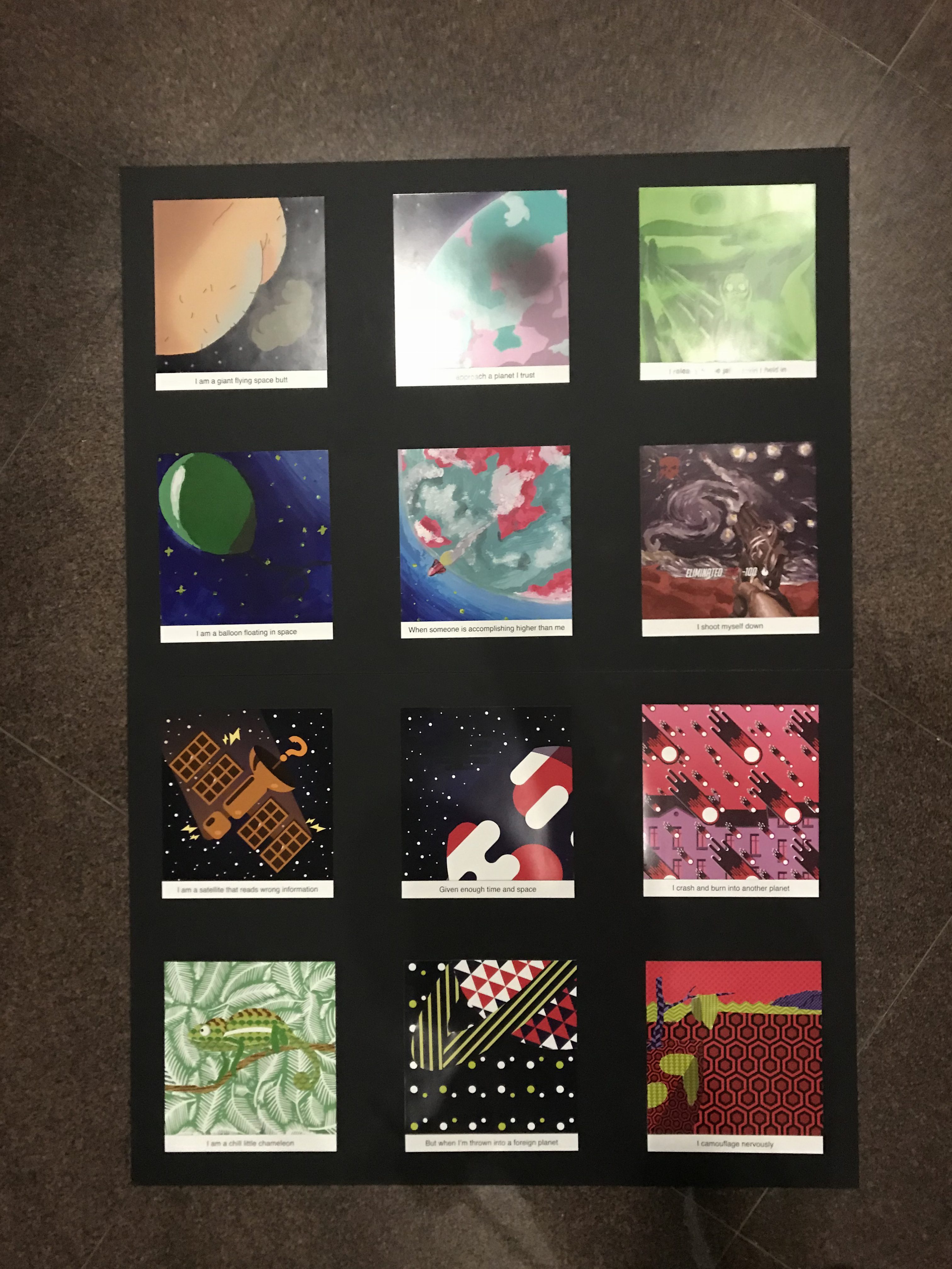
So this is the board I’ll use to present. Let me upload the soft copy of the final pieces:
I am a giant flying space butt
+
When I approach a planet I trust
=
I release the negative toxins held in
I am a balloon floating in space
+
When someone is accomplishing higher than me
=
I shoot myself down
I am a satellite that reads wrong information
+
Given enough time and space
=
I crash and burn into another planet
I am a chill little chameleon
+
But when I’m thrown into a foreign planet
=
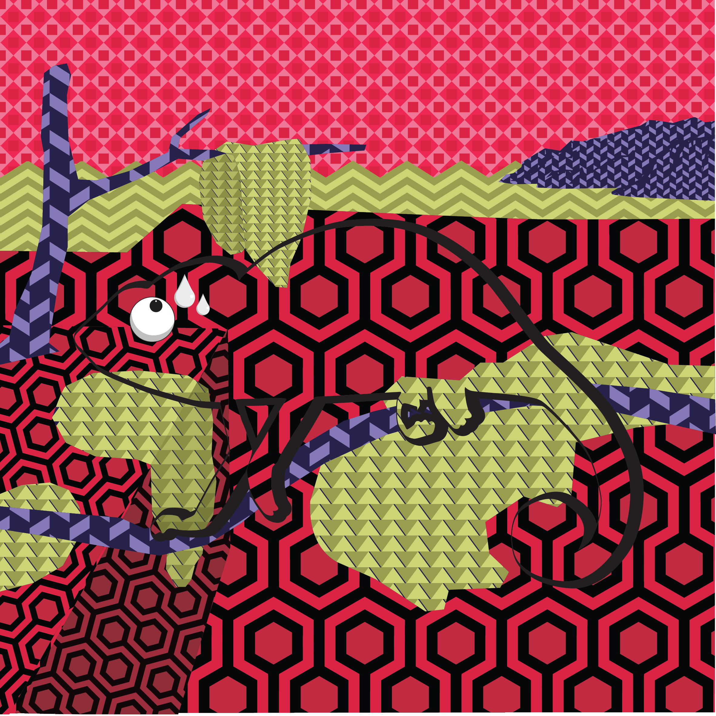
I camouflage nervously
Final showcase
Takeaways
All along, I know I am weak at colours. I don’t understand colours, and I don’t have the patience to tune it properly to fit a look. I get triggered when I see the colour balancing bar (ctrl + B in photoshop if you know what I mean).
I have very little affinity with colours. I always pick the wrong ones, always can’t figure out what’s good with what, even though I used colour theory and picked a decent colour scheme. Like, somehow, they will go wrong (example, last row, last panel)
So, I just know how bad I am at colours.
But, I’m trying hard. To compensate for the lack of knowledge in colours, I use my concepts. I tie the panels together so I can unite them, in overall I will use less colours so it won’t throw me off.
What did I learn from this project? Definitely better understanding of colours, colour schemes. I won’t say that I didn’t know colour theory before, but I’m definitely better at it now.
I also got friends to help me judge my work, but I asked them too late before I can do anything because submission is near so I can’t edit. Their comments are painful because I suddenly see the flaws in my work, my colours suck. But they really gave very helpful comments to improve myself. I wish I asked earlier so I can change it. Anyway, what I learnt here is to get feedbacks early.
Overall, it is fun to express myself through these panels. I wish to get more personal (actually I already am) with this project, but I shouldn’t share too much ahahahhahahahahaha
I hope you guys enjoyed the butt drawing. Peace out. *putttttttttttttt*
EGO Egg rolls (Research & Process)
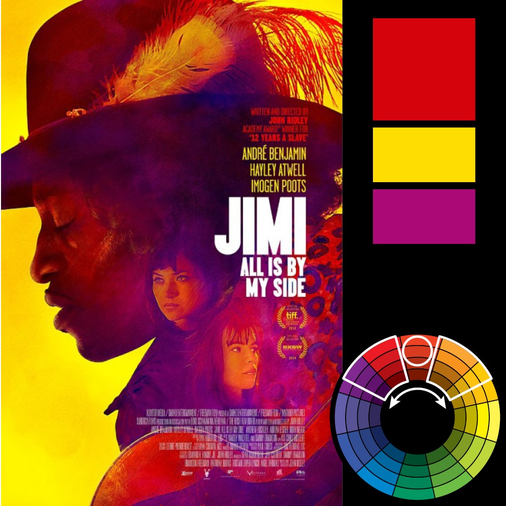
It’s time for a new project. Yay. Let’s look at what these colour mean:
Monochromatic:

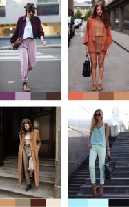
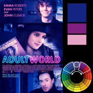
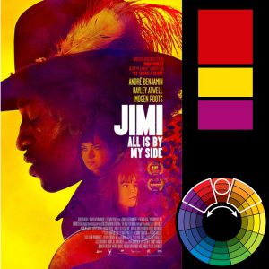
Monochromatic colours are colours that are of the same hue, but different saturation. This gives a very balanced and harmonic result that is comfortable for the eyes.
Analogous:
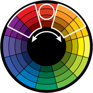

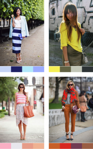
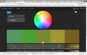
Analogous colour is a combination of a hue and its neighbouring hue in the colour wheel. The saturation and brightness, again, can be adjusted. Generally, if the colours are not too far apart, the saturation can remain the same and yet not create a messy result. It’s still a pretty balanced and harmonic colour palette. Best to have one or two outstanding colours to create the ‘wow’. Also, its not the best to focus on the hue of the colours but the saturation, which will make things more harmonious. Also, avoid combining cool and warm colours.
Other examples:
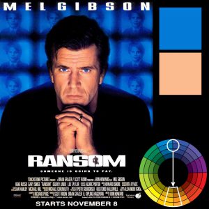
Complementary:
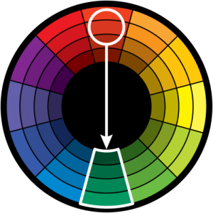

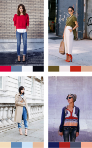
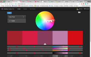
Complementary colours are a combination of two colours of different hue, roughly opposite of each other in the colour wheel. The useable colours are basically two sets of monochromatic combination, meaning you can manipulate the saturation or brightness within the two selected hue. This creates a high contrast, so more consideration should be taken when using the colours. The high contrast can be used in a way where one colour is dominant while the other works as an accents. The other spaces are best to be covered with neutral colours to let the eyes rest.
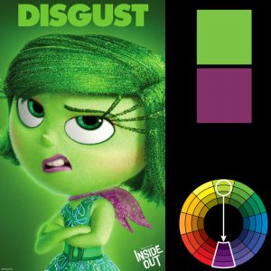
Split complementary:
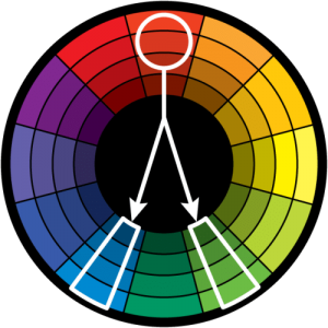
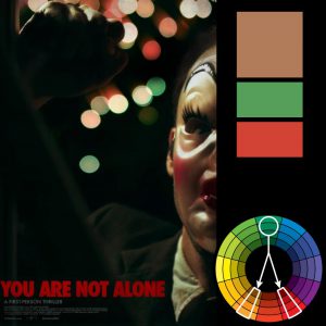
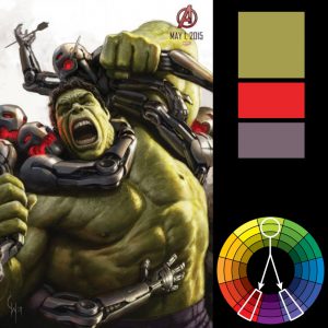
Split complementary colour scheme is the use of three colours, one main one and the other 2 being a split of the first colour’s complementary colour. There is an idea that this colour scheme is best used for beginners because it’s hard to mess up.
Triadic:
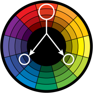
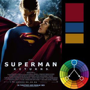
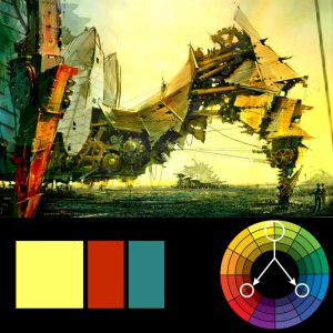
Triadic colours is a scheme that uses three colours spaced equally apart. It is like complementary, which has a very high contrast. However, it is more balanced. The trick is to use one colour as the dominant one in a design and accent the design with the other two.
WHO AM I???
What is Ego? Ego is a representation of myself. But how do I represent myself? Theres a lot of ways to do it, so what do I pick?
I have thought about it for a while, visualising myself in different scenarios, I decided to create a universe for myself. Basically, I want all my panels to be linked, into a mini universe in the A0 board. Also because I love space stuffs so I really think this ties up all my personalities together in a complete way.
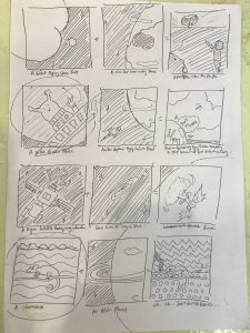
FIRST ROW
First Panel
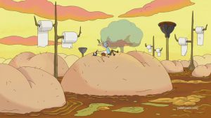
So this row is going to be heavily inspired by Rick and Morty.
I like to hold things in. Like a lot. I have a lot of unexpressed thoughts and feelings that I don’t show out, so as to not create conflict or make others think I am weird. I am self conscious. The thoughts and emotions held in are also mostly negative.
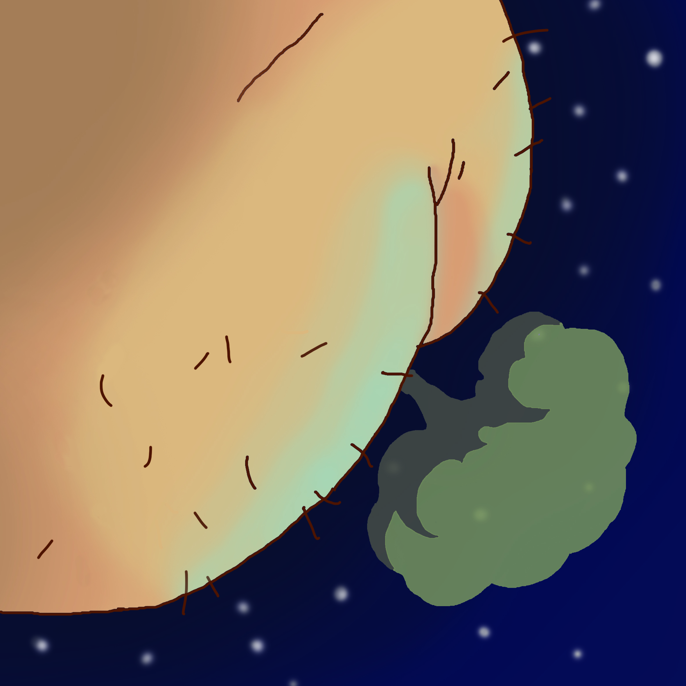
In the first panel, I depict myself as a giant flying space butt. I’m a butt because I hold things in, like fart. It’s crude, but I think that makes it better because of how I always want to show myself as someone who is clean and decent. So, some sprinkle of irony there. Also, I think a butt is perfect for describing someone who holds in too much feelings and thoughts. The space aspect of it is… well, why not?
So I drew the butt in reference to the buttworld’s butt and fart. Using my ideas of lighting, I added some touches here and there.
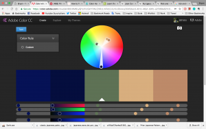
For the colours I went for split complementary colours because I want to just simply use the deep space blue against the yellow-ish skin colour of the butt. But there’s also the fart which is green, so there is a need for that split comp there.
If you notice, there’s glow on the cheeks, which is coming from the light reflected off the planet :’)
Second Panel
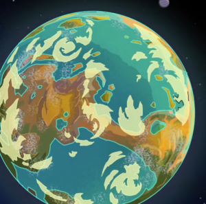
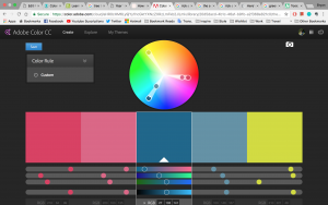
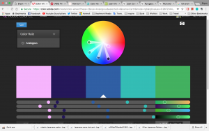
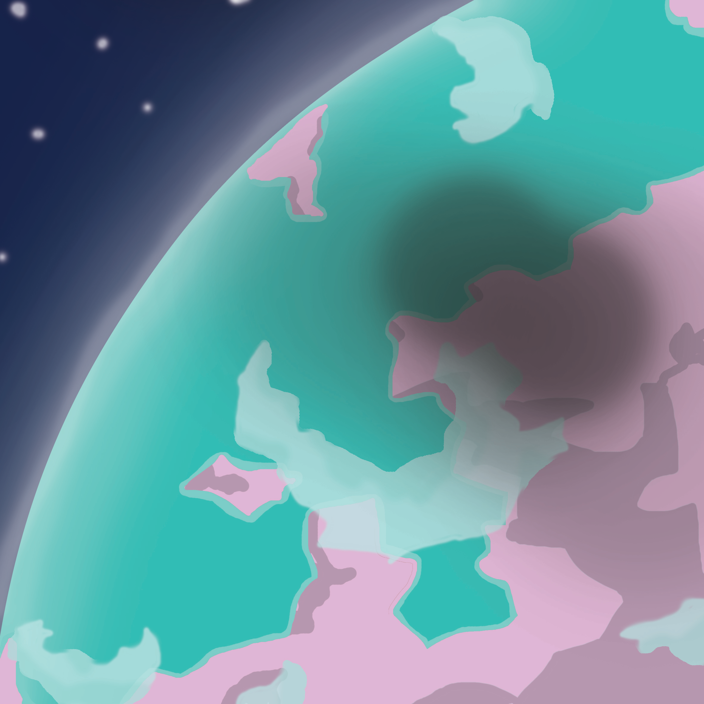
The second panel is a depiction of a planet. I will describe it as a friendly and trust worthy planet, so maybe I will use friendly colours and more rounded edges to depict a planet that won’t bite. I will be using analogous to create a colourful but not too overwhelming colour palette. This planet represents my close friend and thus it is friendly to me. I used pink and turquoise because I think this combination creates an eccentric colour that represents an alien planet, yet these colours are soothing, which represents the friendliness.
p.s. see the shadow of the butt!!!!!!!!!!!!!!
Third Panel
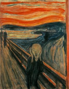
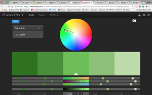
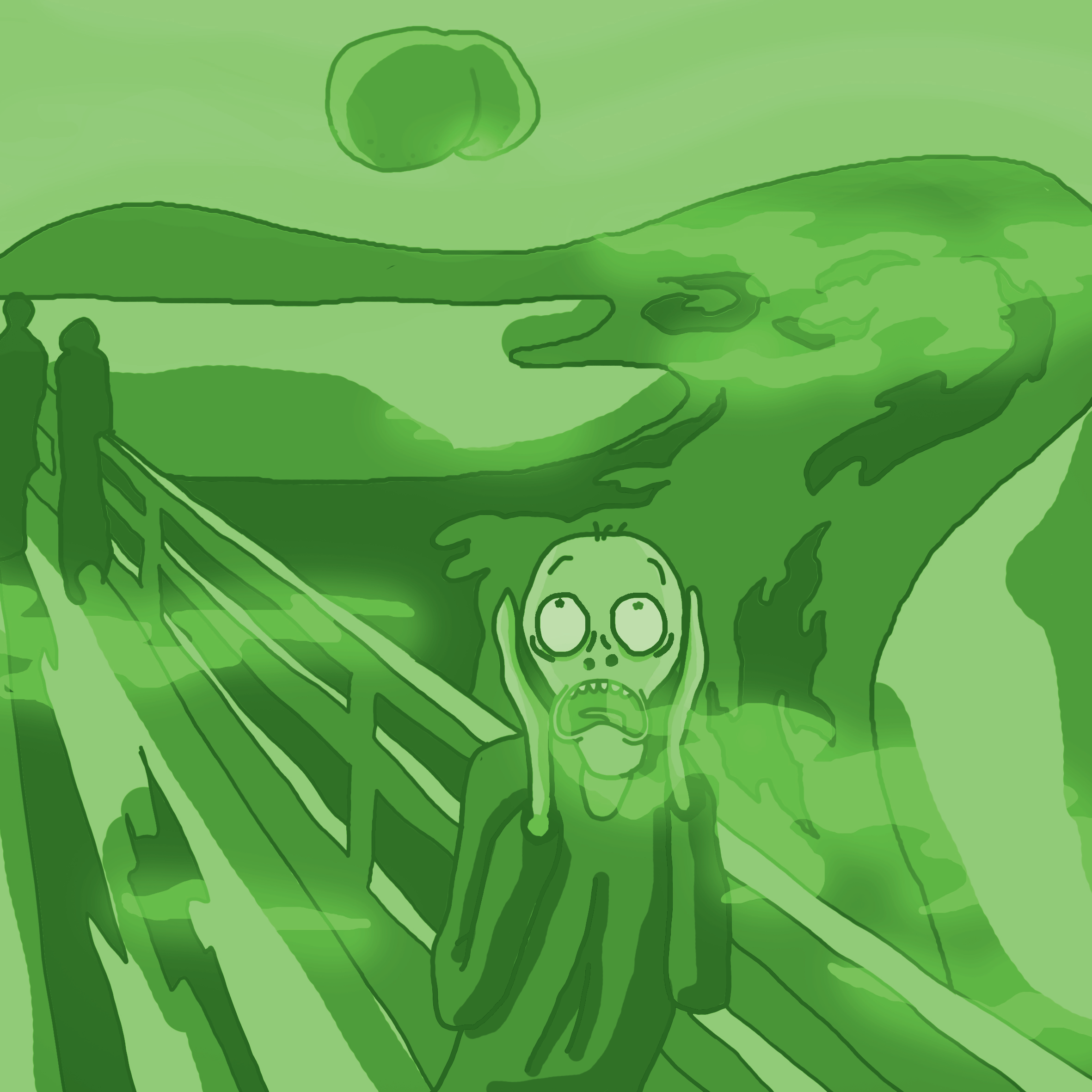
The outcome of a giant flying space butt flying towards a friendly planet: Apocalypse. When I have a close friend with me and when I got something to rant about, I will let loose all my negative emotions to them. I show them the ugly side of myself. In this panel, the poor people of the planet will be overwhelmed by the toxic fart. Thus, it will be monochrome, in toxic green colour. The panel will also be a parody of The Scream by Edvard Munch, which depicts the kind of emotion that the people in the planet feels when hell is let loose.
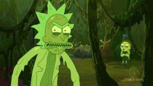
Oh. And also, inspired by Toxic rick and morty
Overall
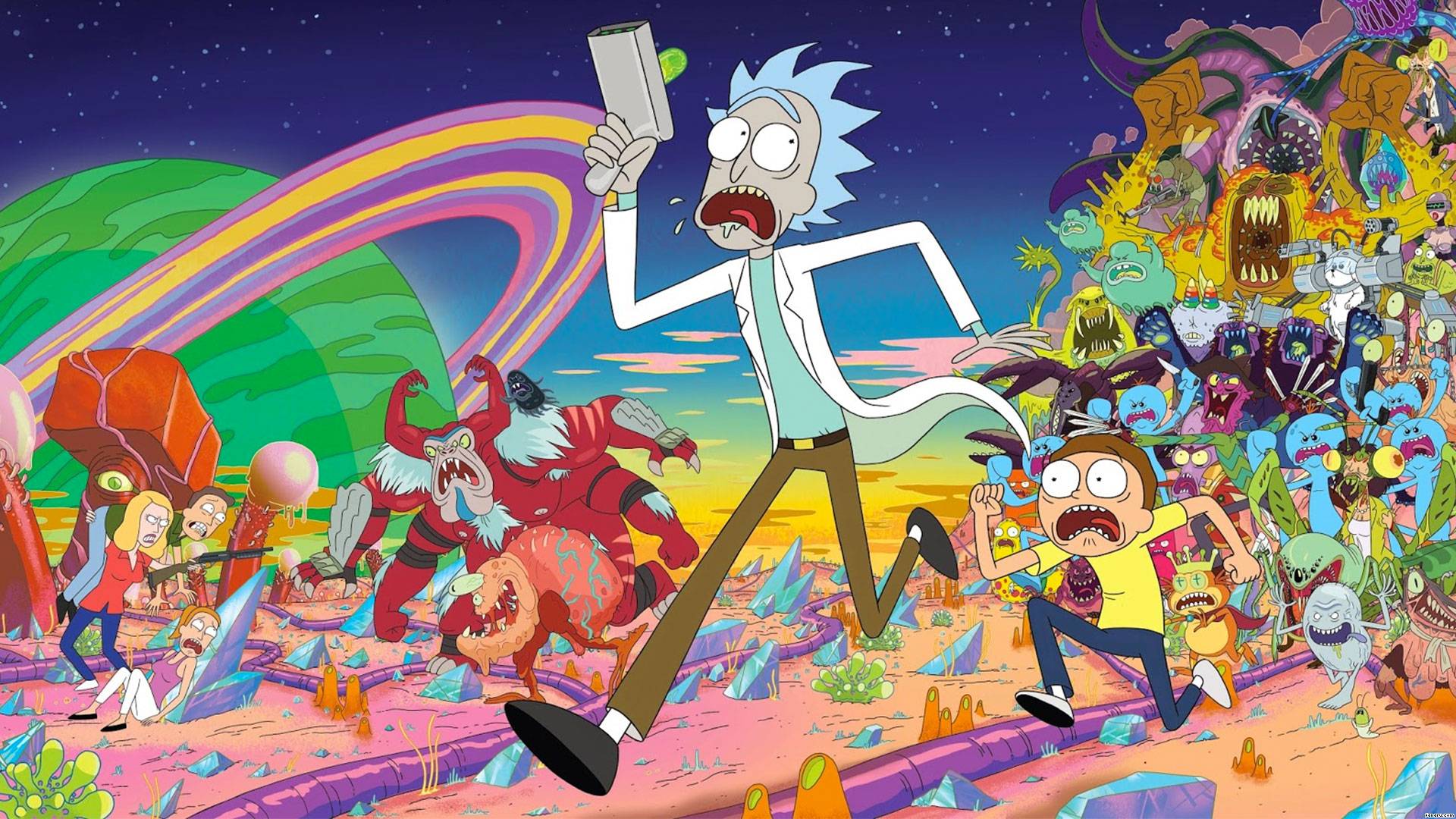
Overall, the row will be digitally drawn in Rick and Morty cartoon style, as most of the elements in this row is inspired by Rick and Morty. The first panel’s butt is a reference to one of the settings in Rick and Morty, the Butt World. The planet I will be drawing will also be in the style of R&M. Finally, the way I use Edvard Munch’s work is a reference to how R&M can travel to different dimensions. This is also supported by an actual fan artwork shown here:
The Scream from rickandmorty
BUTT…. DISCLAIMER: I really did have the idea before I see this so… Quite surprised to see this lmao. The overall space theme is also inspired by the cartoon.
Anyway, I think the Rick and Morty style fits the crude look of this row, so yeah.
SECOND ROW
First Panel
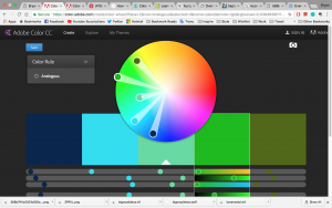
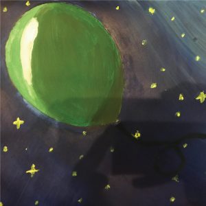
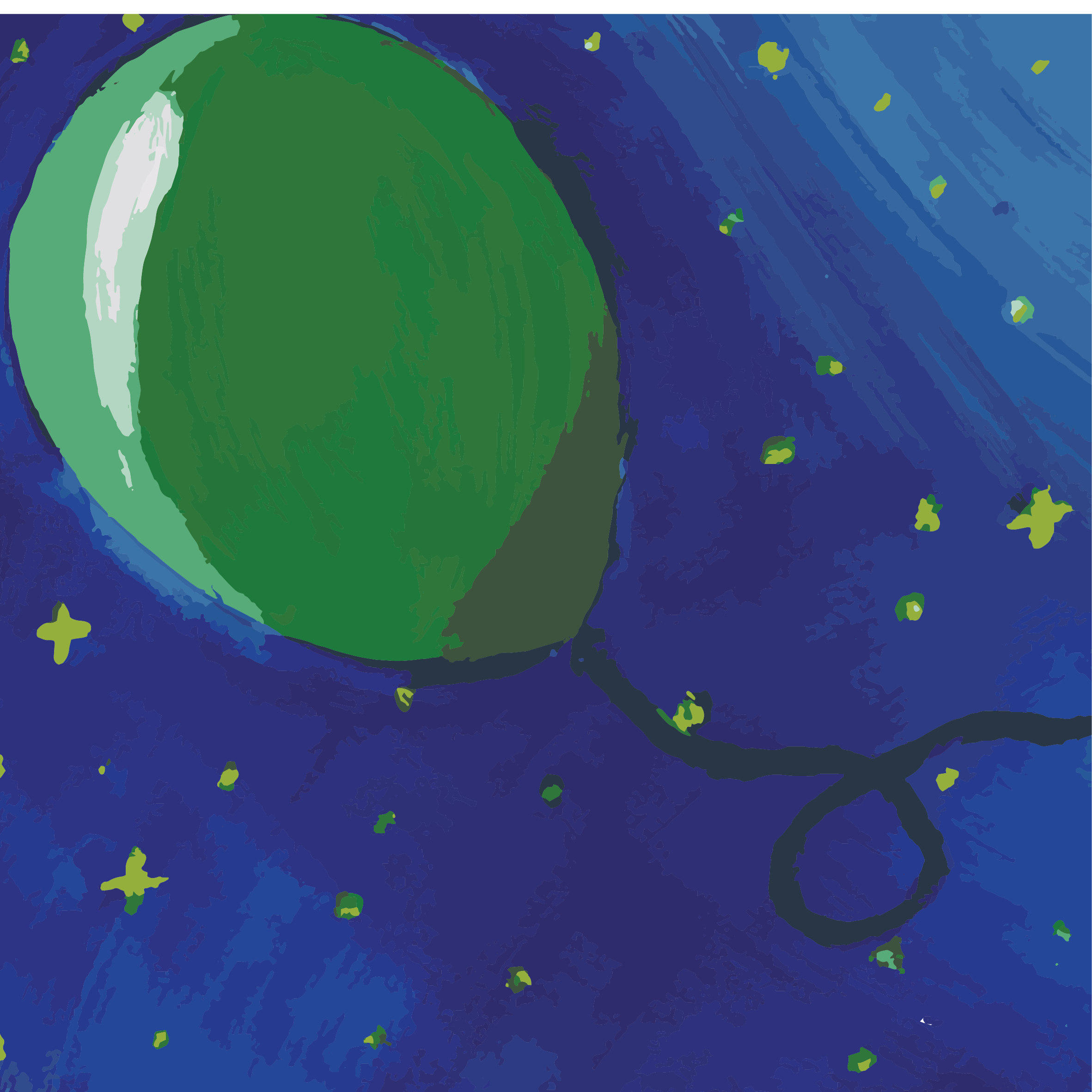
First panel, I am a balloon. The reason for a balloon is because balloons get inflated. I want it to represent my ego, because of how it can be inflated / deflated / popped. The balloon is also a fragile thing, which is how I view my ego. At some points, I will be confident, with inflated ego. At other points, my ego just goes pop. I want to use the colour green to represent my ego, because I am a person that envy people easily. So ego + envy = not a good thing, right? Anyway, since the background is going to be spacey, I’m going for analogous colours, Green + Blue + yellow (stars). For this, I try to make the blue dark, so the green can stand out.
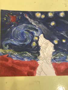
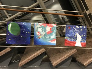
Process: I first went to paint this with acrylic paint. This is consistent with the other 2 panels. However, the colour seems off for one of the panels, so I decided to do a scan for all of them and did image trace to create the paint-ish look instead. I can then alter the colours. Although, what’s lost is the 3D-ness of the paint, which is a pity.
Second Panel
So this inflated balloon is going to meet something he don’t want to see. A person achieving. Oh no! Someone is going to be better than me? OR someone that is already better than me. What will happen???
So this person is going to be represented as a spaceship, as spaceships are launched high up in the sky, to achieve a goal in space which is like out of ordinary. To stay consistent, the design of the planet should be the same as the previous row’s because of continuity. So I’m stuck with the same colour scheme. Nonetheless, I’ve throw in a bit of red on the spaceship to make it more of the highlight, focus, rather than the planet. The colours are going to be triadic due to the way the colour turns out using acrylic paint.
Oh, the planet is the same one, but painted in a different way. You can see the complexity have increased. This is due to me trying to follow the art style of Overwatch to make it consistent.
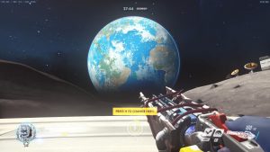
Third Panel
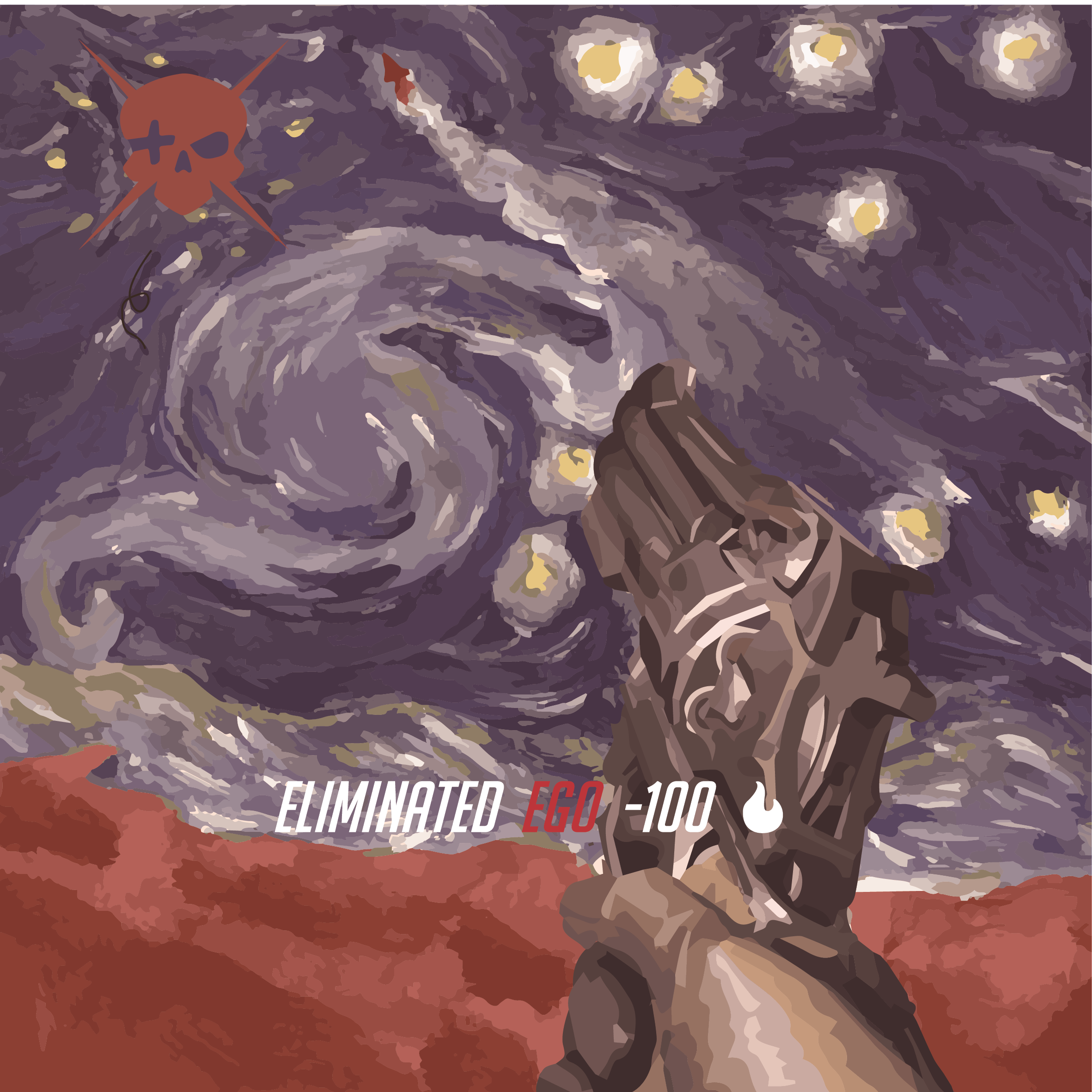
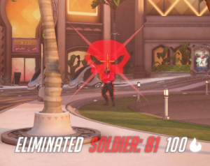
If I see someone that can achieve high, I get jealous. I feel like I can’t achieve as high as anyone else, and I beat myself down. So to illustrate this, I zoom into the planet once again, and in this panel, my favourite character in the game ‘Overwatch’, McCree, is going to shoot me down. McCree is basically a cowboy that has an ultimate ability to instantly kill his enemy(ies).
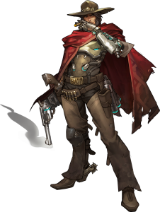
This is McCree
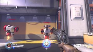
His gun
When he uses this ability, everything looks sepia. I’m basically trying to use the style of the game to create the overall look of this panel.
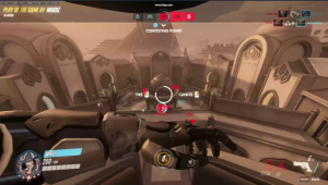
Skull reference and ‘ELIMINATED’ text:
The panel is going to also be inspired by Starry Night by Vincent Van Gogh.
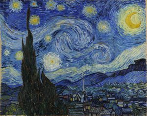
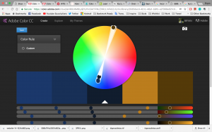
The colour scheme I’ll go for… The sky is blue, like the Starry Night painting. The ground, however, due to consistency with the planet’s reddish ground colour, is going to be red. However, blue and red don’t match, unless it is split complementary (with yellow for stars). So that’s the only colour scheme I can go for. To make everything more harmonic, I added the sepia filter.
I made the swirl into the smoke coming out of the gun. The spaceship can be seen here, flying high up in the sky, red in colour. So there you go.
A family portrait :3 . These are the original painted pieces
THIRD ROW
First Panel
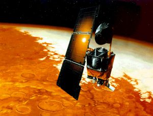
I am a satellite. A lost one. I got lost because
1. I don’t really listen to people or instructions because I *SPACE* out. (get it?)
2. I read information wrongly, or interpret some things wrongly.
SO, that’s me. A lost satellite reading wrong information. I got inspired by the Mars rover that’s supposed to go to Mars but missed it or crashed ( can’t remember) due to it being coded by imperial units, and then input by metric units (which caused it to calculate wrongly or something). For this row, I am heavily inspired by Kurzgesagt, AKA ‘In A Nutshell’. They are an educational science youtube channel that has a distinct style.
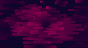
The way they illustrate deep space
I noticed the way they draw clouds/cloudy things, which is lovely, and I noticed how their clouds are used in many other designs around ADM as well as other places. So, I think they’re pretty influential. The colour scheme for this, I have to stick with dark blue and something else because the ‘space’ part needs to stay consistent.
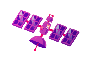
This is the satellite I’m referencing.
Initially, I wanted to make a realistic render of a satellite:
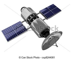
But, it was a bit weird, and I suddenly remembered I wanted to do a Kurz Gesagt row. So I scrapped it. I experimented with different colours:
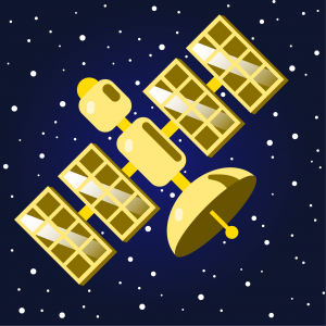 Gold
Gold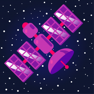 Purple, the original colour
I was just messing around with the colours, and eventually I settled for bronze, and applied complementary colours : Blue and Orange.
I used a gradiented backdrop to make it not so flat. The stars are indivudually made circles of different sizes, so it’s diverse. I added a ‘?’ and some electric sparks to show that it does not know where it is going and probably is damaged. I also added a gradiented layer behind the satellite to show that it’s moving quickly towards the right.
Second Panel

So this panel, I wanted to just put empty space, as in, illustrated space. But it doesn’t bring context to the next panel.
Reference:
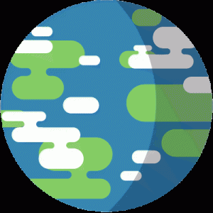
Empty space, with a small planet in distance.
Therefore I forced a planet in, and try to make it blend as much to the space as possible so it isn’t so visible, but adds to the context of having a planet. So anyway, second panel is ‘give it enough time and space’, so meaning the situation is to give my lost satellite enough time and space. You can already expect what’s next. It’s not going well.
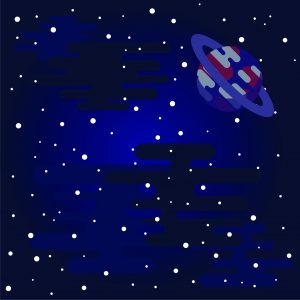
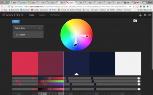
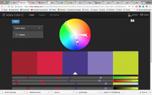
For colour scheme, I want to portray the planet as a more hostile one, reason is I want the next row to be set in a hostile place, and for consistency sake, I need this side of the planet to have the same colour scheme too. I used purple and red because it gives an ominous look. Somewhat poisonous. I used split complementary:
The yellow is being thrown all the way into the white area, so technically still split complementary?
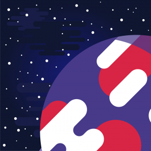
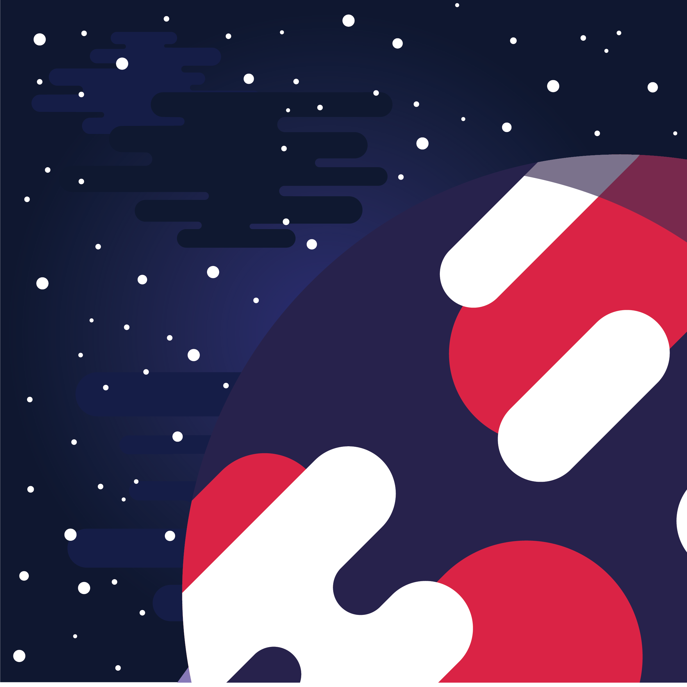
This is the first version, which I think is too bright. The purple makes the whole composition unbalanced and messier, I feel. I want to keep the red. So in order to make the red stand out, I darken the purple.
(I ended up enlarging the planet and changing the colour to blend it with the background, covering the ‘clouds’ which I feel sad about 🙁 )
Third Panel
Third panel, I crash and burn into the planet. Yep. So at first, I didn’t know what artwork to reference to. Shirley gave me a good reference: Raining Men by Rene Magritte.
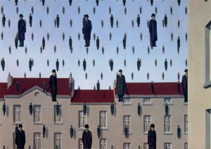
I also referenced a Kurz Gesagt-inspired digital art of a comet
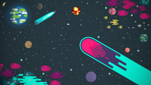
The colour scheme, together with the last panel and last row, is inspired by Disney villains colour scheme.
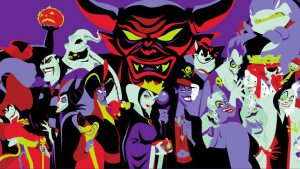
You can sort of tell the purple and red are also in the planet’s colours.
So the colour’s gonna be analogous
So, combine all these together, you get:
Crash and burn.
FOURTH ROW
First Panel
So for the last row, I will be using paper collage. I am inspired by overlaponeanother:
https://www.instagram.com/overlaponeanother/
They are a design studio that specialises in paper with patterns, and they will present their photos with lots of patterns overlapping one another.
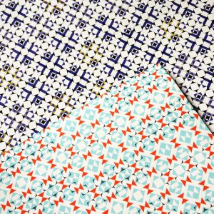
I really like the kind of stuffs they do, the kind of patterns they use. So I thought about making my own patterns and put them together to form shapes.
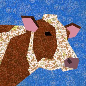
I came to realise that this type of paper collage has a name called piecing quilt patterns.
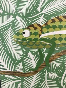
So in this panel, I am a chameleon because I can adapt to places easily. I can learn and mimic people quickly so as to adapt to their style and make friends that way. I am also very carefree and very ‘anything’, so I want to be depicted as a calm/chill little chameleon.
Chameleon reference:
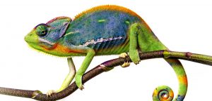
Idea of applying patterns:
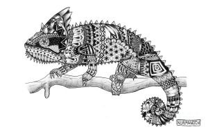
So this chameleon is going to be in a tropical setting, it’s home. Where it’s comfortable, where it doesn’t need to blend in.
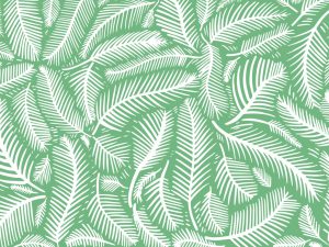
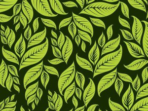
So I decided to use these leaf patterns for the background.
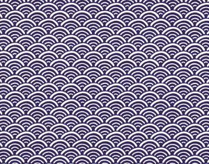
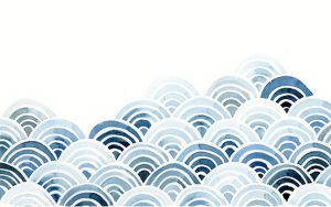
So the chameleon is going to be depicted by these circular wave things, to indicate that it is chill.
Lastly, the tree branch that it stands on:
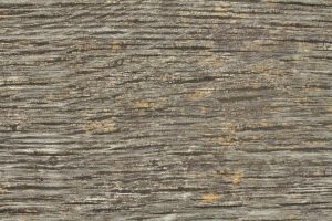
The colour scheme I will use is analogous, more to the green side:
The outcome:
Looks pretty chill to me 🙂
Second Panel
Second panel is going to be in space again. The situation is a foreign and hostile planet, symbolising an environment that I, the little chameleon, am not familiar with. It will be the same planet as the 3rd row’s 2nd panel.
I want to depict the place as hostile, so I used triangles.
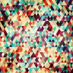
And once again, the same colours, but with green as the other end of the split complementary, as I added a ring to the planet (invisible in the other panel, visible in this panel). The reason for the ring is to distinguish this planet from the other planet at the top 2 rows, other than the colours.
We can see that this scheme is taken from the villain colours:

Outcome:
So yeah. Even the stars in the background is made of patterns. I kinda was imagining a wrapping paper kind of effect, so yeah. I’m happy with the outcome!
Third Panel
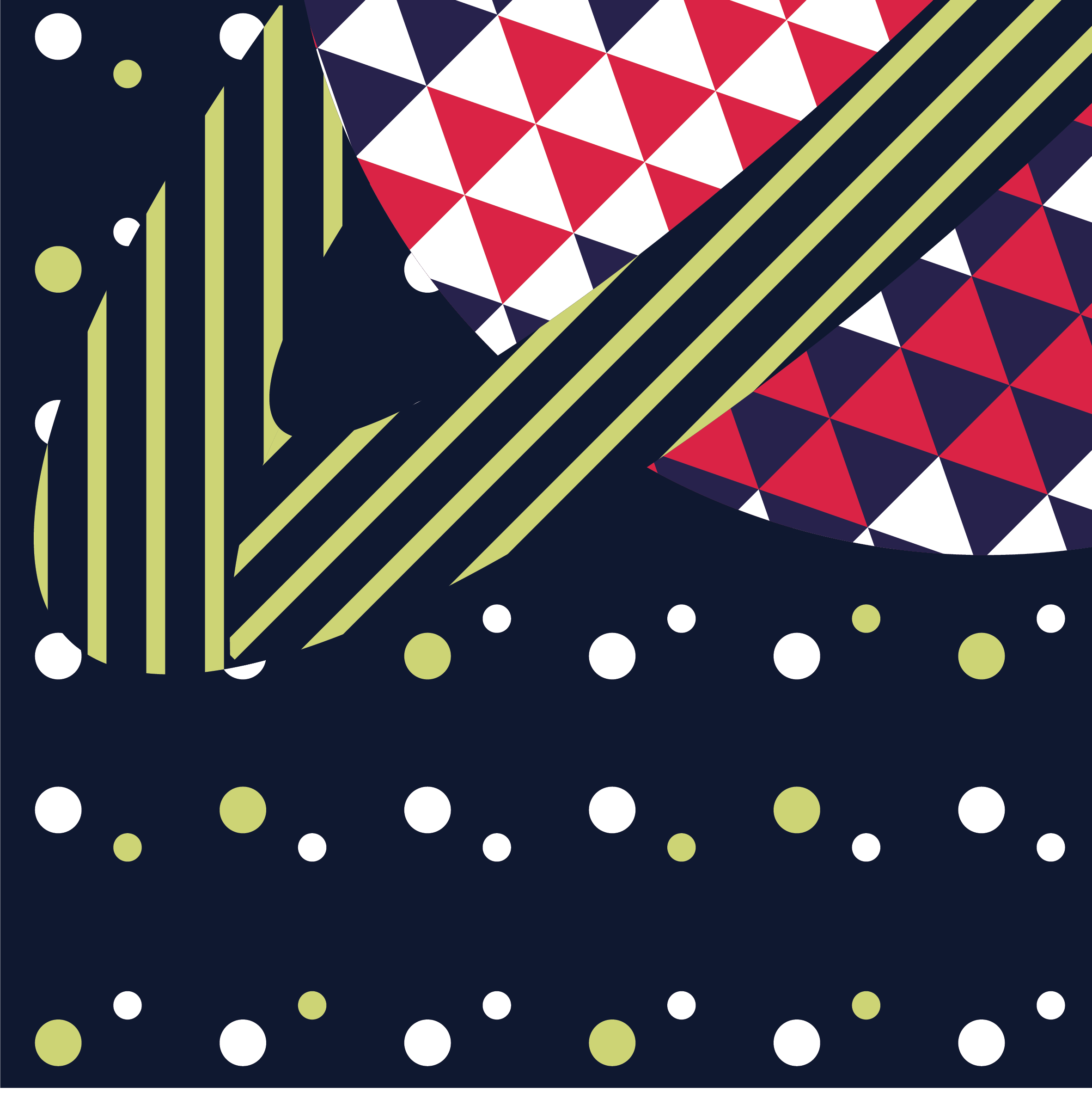
Last panel of the last row. This is going to be my reaction to being in a foreign and hostile environment. I once again zoomed into the planet for the last panel. When I am in a foreign place, no matter how well I can adapt, I will still feel nervous. On the outside, I seem okay I think. But on the inside, I am trying hard to adapt, to blend in. I feel nervous because I don’t like interacting with people that much. But ironically, I can adapt well so… It’s a bit weird, and hard to explain.
I decided to use a lot of sharp-looking shapes like diamonds, squares, zig-zags, etc.
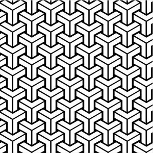
They’re mostly geometric.
So, with these patterns, I form a hostile looking place. The reference for the background will be The Persistence of Memory by Dali:
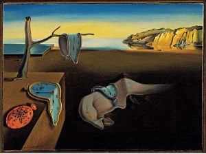
The reason for this is that it is a strange place to be.
The colour scheme will once again be the split complementary colours in the disney villains. I feel like it’s very repetitive to use it, but it is only because I have to be consistent with the overall look. Now come to think of it, it’s not a very good idea cos in the end, there’s very little colour choices to play around with…
Then again, I played around with the weight of the colours, so that’s something I tried. For this composition, I used more red and green than the purple, using purple only as a touch to not make everything too bold. Whereas for my other compositions, it’s mostly red and purple, which is to give a more harmonic look. The colours picked here, together with the patterns, make everything quite messy. But it is quite intended because I want it to be a hostile place. In a way, it works, but again, it doesn’t because it’s a bit too messy. I can justify, though, because there really is a need to separate the different elements of the painting with colours and patterns.
The outcome:
Oh, if you realised, I used the floor patterns from The Shining, a horror film made by Stanley Kubrick (originally from Stephen King’s book) to depict the floor. This floor pattern is pretty iconic, and I want to use it to depict the horror setting.
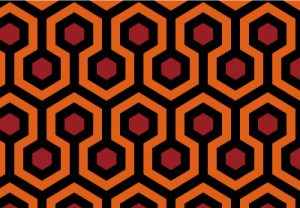
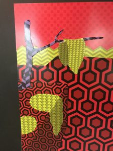
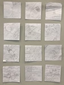
Overall for the last row, I will cut and paste the pieces to form an image, rather than it all being on the screen and printed out nicely.
The final look at the board:
The cut out and pasted pieces of the last row:
Protected: Assignment 2 4D
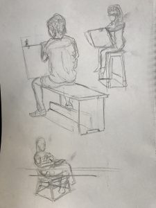
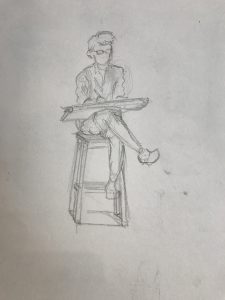
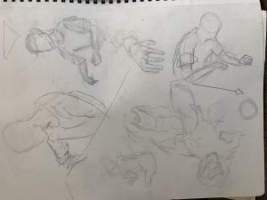
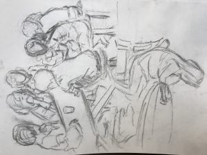
FD Drawings
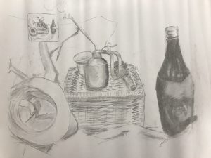
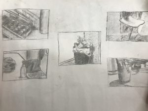
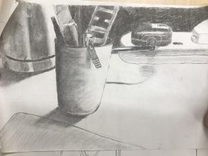
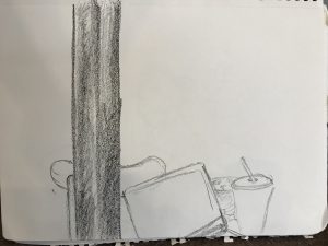
Week 1 : Still life
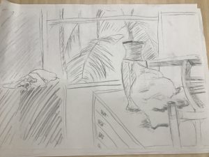
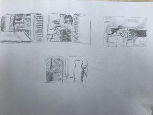
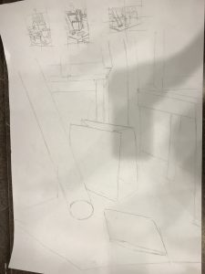
Week 2 : Compositions
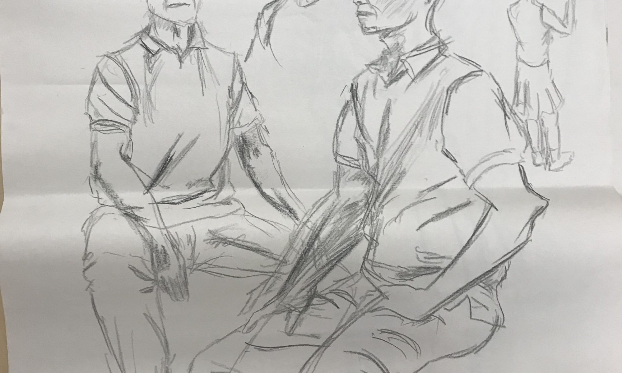
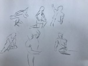
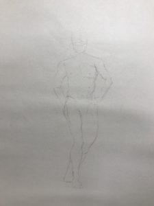
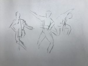
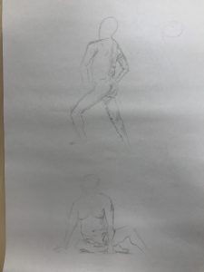
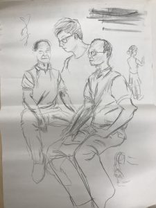
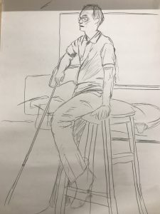
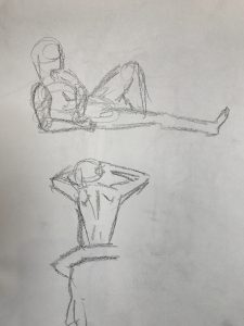
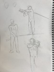
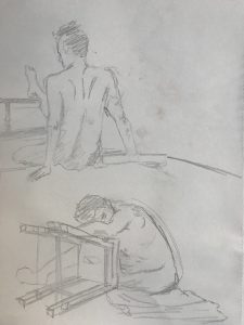
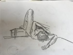
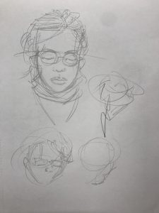
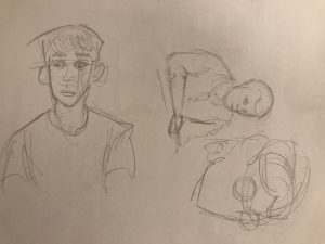
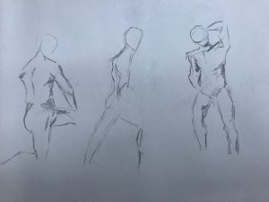
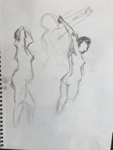
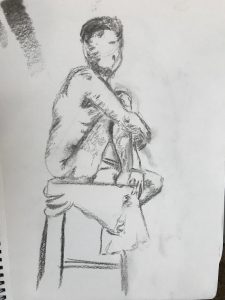
Week 2+ : Model Drawing (Kim)
1 /2 minutes :
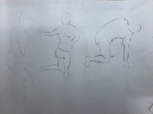
4 / 5 minutes :
Week 2 Homework: Still Life
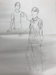
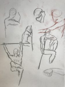
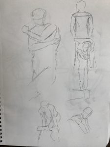
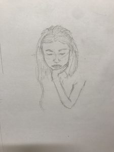
Week 3 : Model Drawing (Eddie)
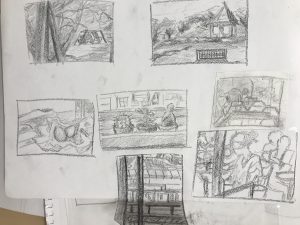
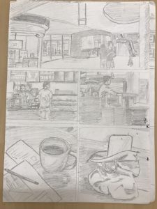
Week 3 Homework: Starbucks
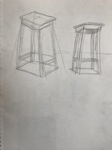
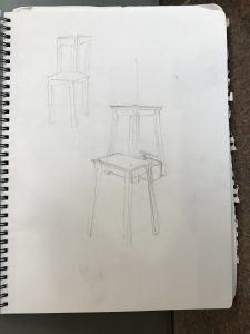
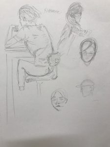
Week 4 : Chair Drawing (perspective)
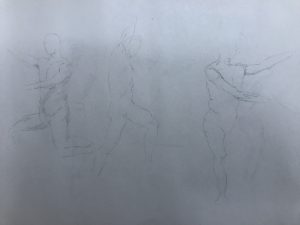
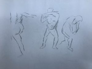
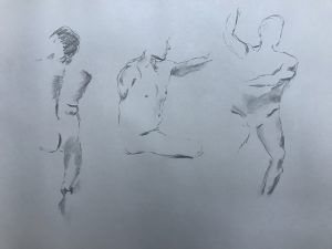
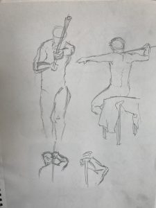
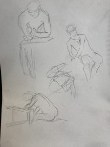
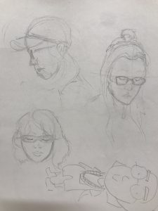
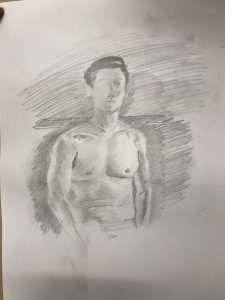
Week 4 Homework : 1 Hour Model Drawing (Jack)
1 minutes:
5 minutes:
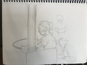
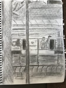
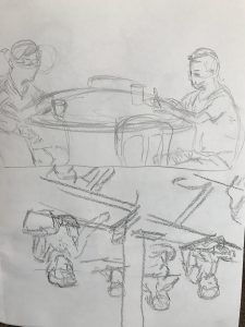
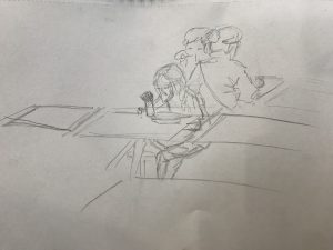
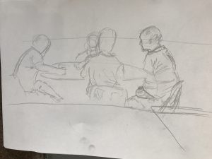
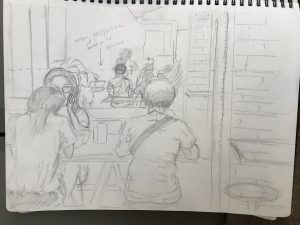
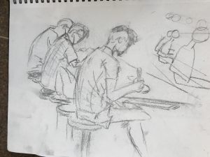
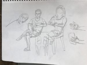
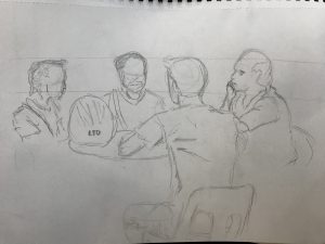
Week 5 : Kopitiam (+ improved hands)
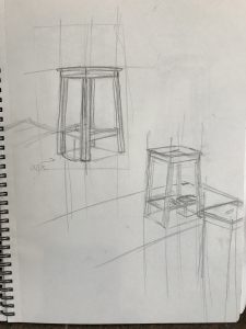
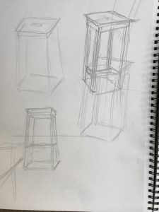
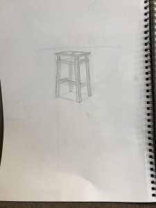
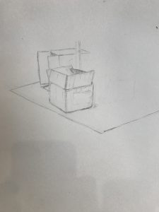
Week 6 : Accurate Perspective Drawing
Drawing boxes accurately (warm up)
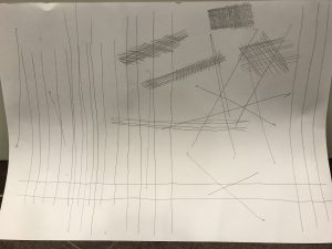
Drawing straight lines
Perspective drawing of boxes, paper bags, and chairs
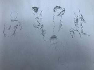
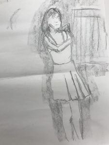
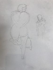
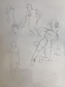
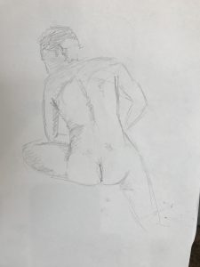
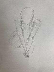
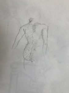
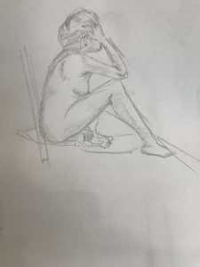
Week 6 Model Drawing : Nina

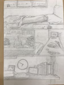
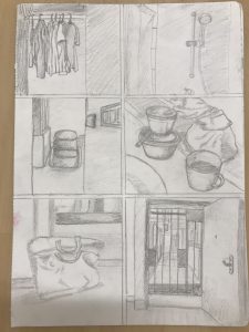
Assignment 1 : Visual Narrative
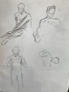
Week 10 Model + Other drawings
Assignment 2 : Diptych
Protected: 2D PPT
4D Assignment 1
The semiotics in my images here are not very obvious. I am a logical person, so my approach to this assignment is to take it literally, but also, let people infer what are the things I love doing, my identity, and my lifestyle through my placement of objects and choice of items.
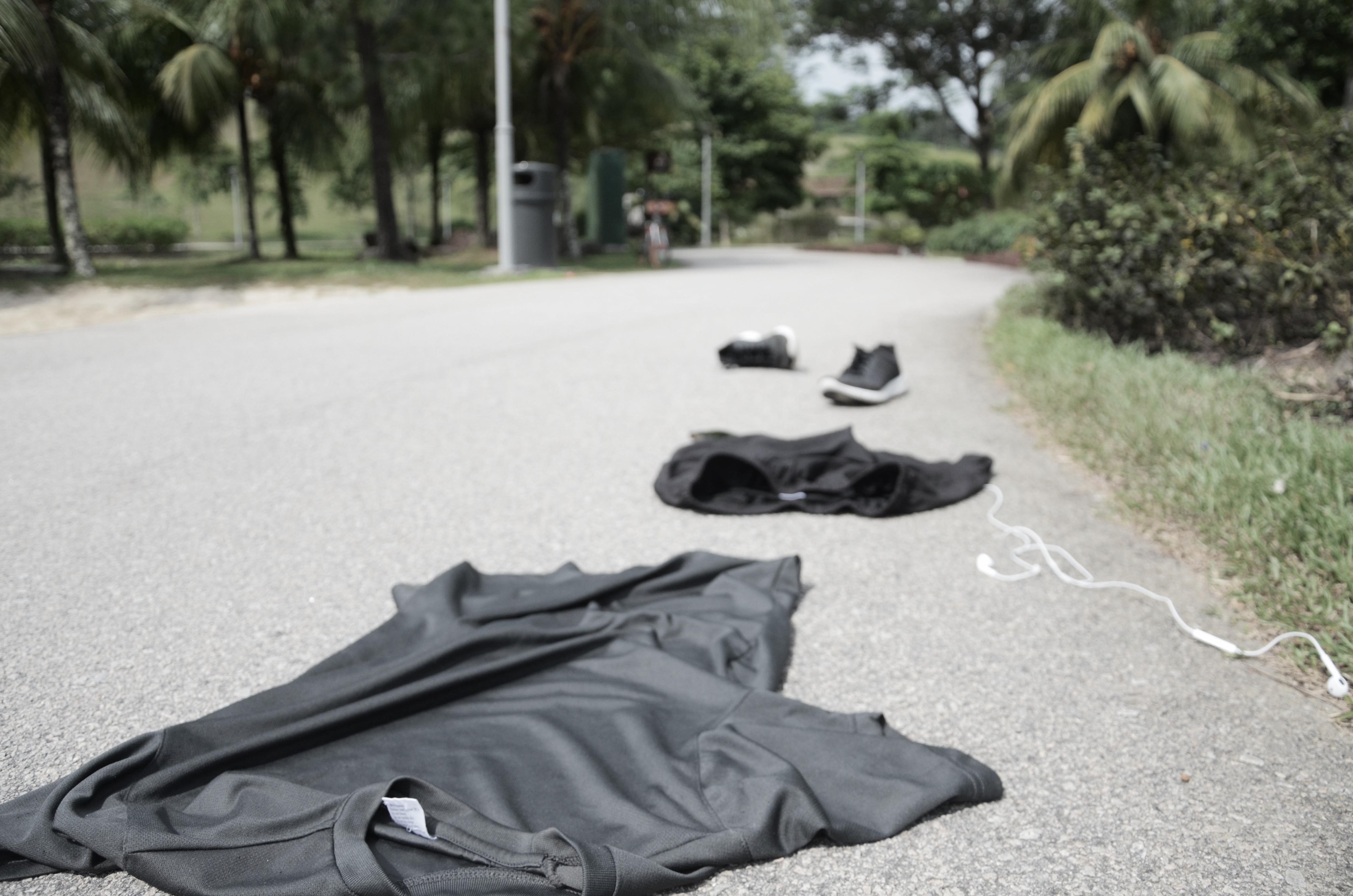
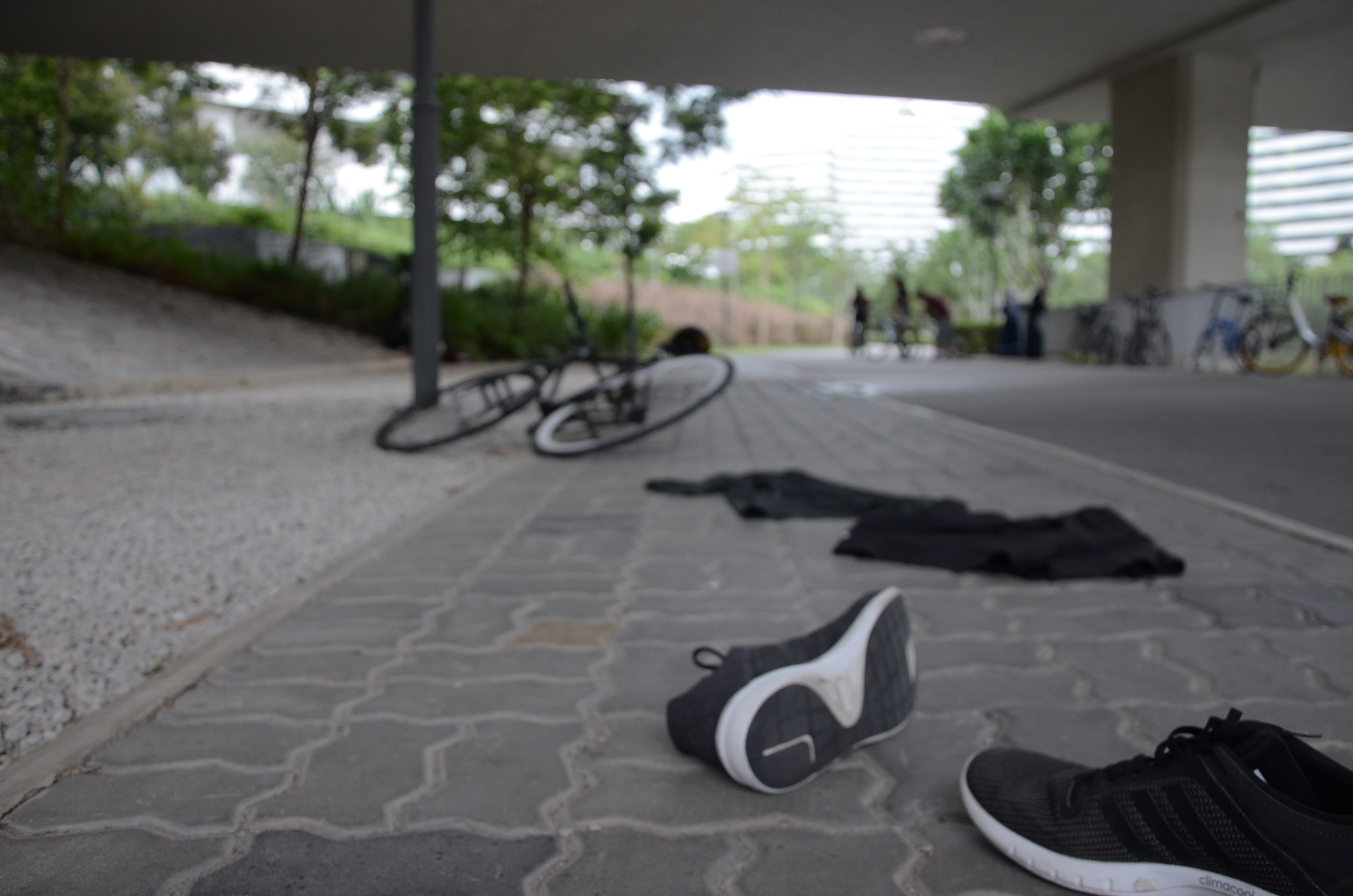
Death by jogging // I love to run, and when I run, I run fast. My goal for 2.4km used to be 10 minutes, and so I know my running pace well. This image depicts me disappearing while running. The clothes are separated in the way I imagine my clothes to spread when I run. I’ll be listening to music while I do so, which explains the earpiece. If you look closely, my phone is in the shot too. The phone weighs my pants down, so it drops quite a distance away from the shirt. I tried using action space at first for this picture, but it doesn’t work as there is too little subject. I tried leading lines, which leads the eye from the bottom left to the middle (shoes). I chose this spot to take the picture because the background has winding road which makes the image looks more interesting (although it failed because this shot isn’t high enough)
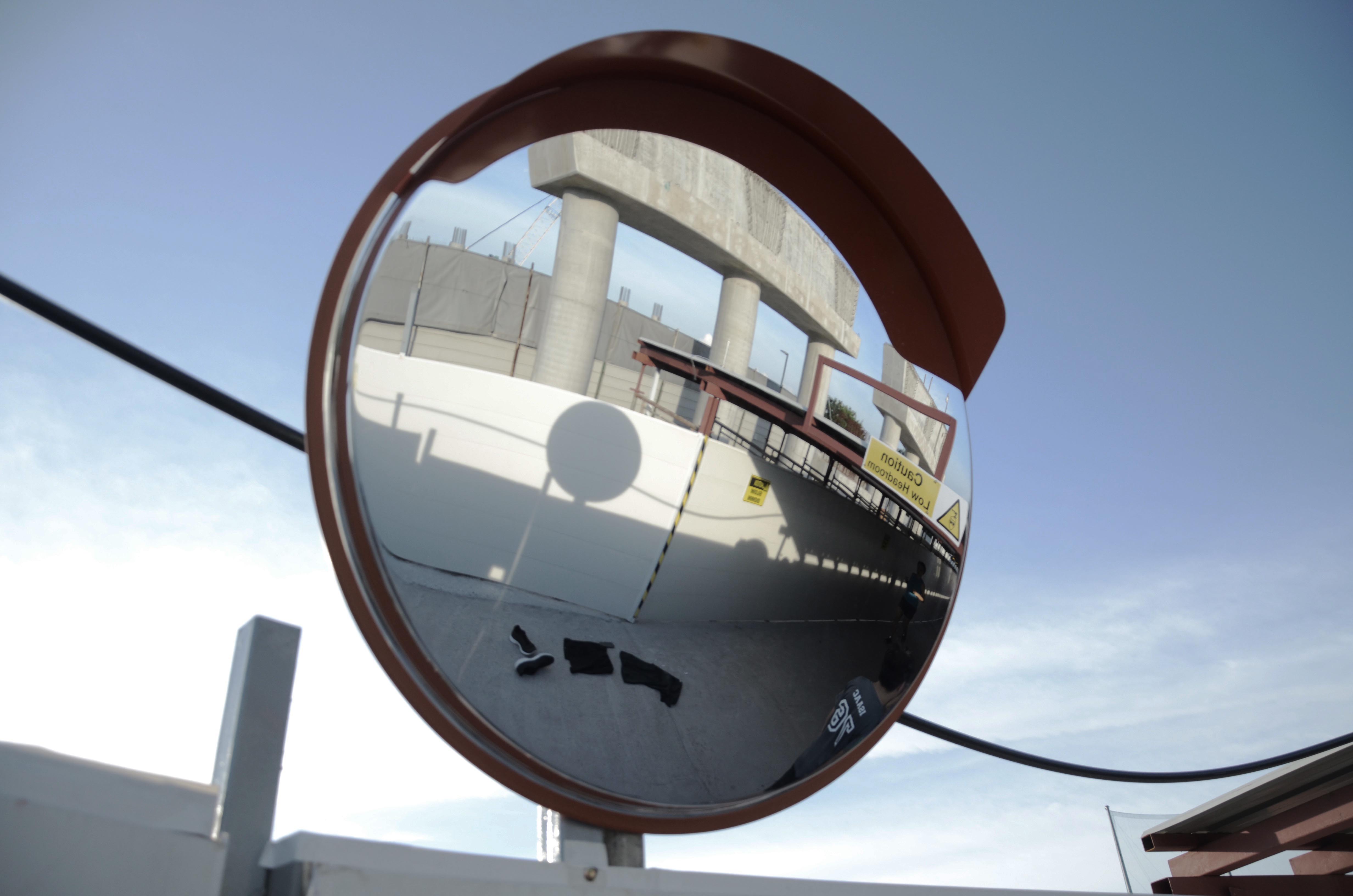
Death by mirror // I happened to see this mirror and I like the environment, so I thought to give it a try. The pavement is very busy, as it was a Sunday evening. I had a lot of trouble taking this shot, trying to make sure I don’t block anyone or my stuffs don’t get crushed. Little time was spent here due to the traffic and so I didn’t take a good picture. If only there is more time spent here… I tried to frame my clothes in the picture, but once again, the subject is too small.
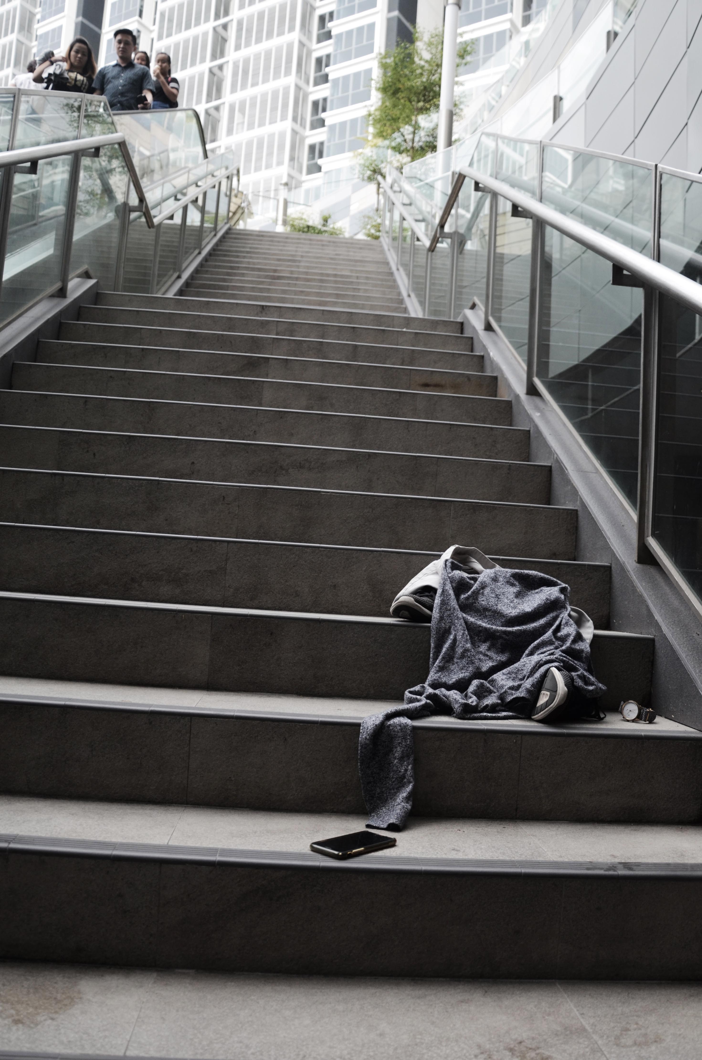
Death by stairs // I thought this was my winning shot, but many people like other shots. This shot, I tried leading lines. The eye will scan from the clothes to the top of the image, which goes to the people looking at what I’m doing (Getting so judged right here). The people’s eye will lead our eyes back to the pile of clothes. Thats the effect I’m trying to get. I also used rule of thirds in this shot, as well as a bit of strong (weak) diagonals. Weak, because it wasn’t enough diagonals. What I’m trying to portray here is my love to just go out and chill. I’ll be listening to music and using my phone, and I’ll opt to take a walk down the stairs instead of using the escalator.
Death by brunch // Here is a depiction of another thing I love doing — chilling. Eating brunch is so relaxing, especially when there is a friend to talk to about things. I don’t think I used any photography methods here, which is why the shot don’t look that good.
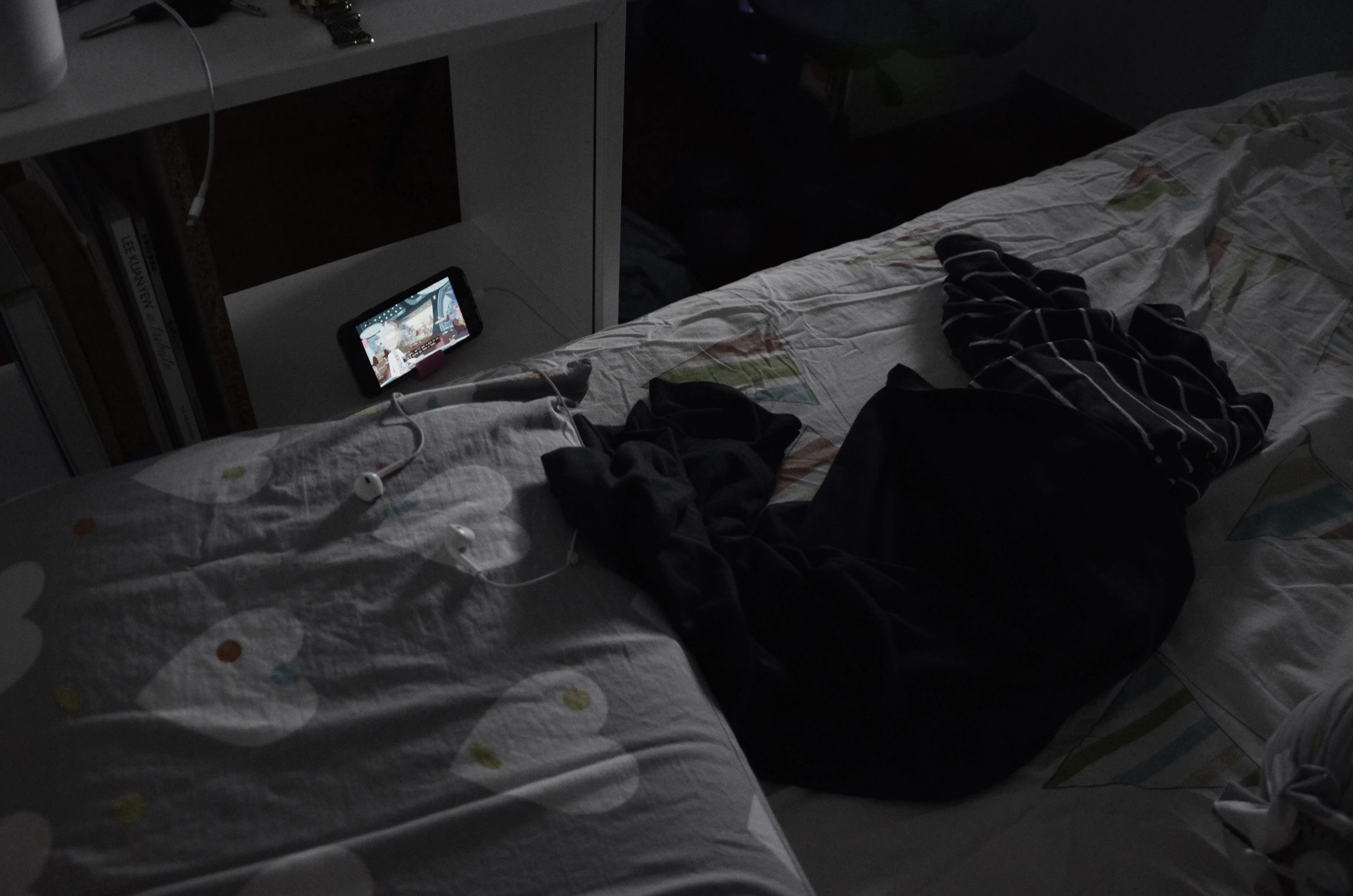
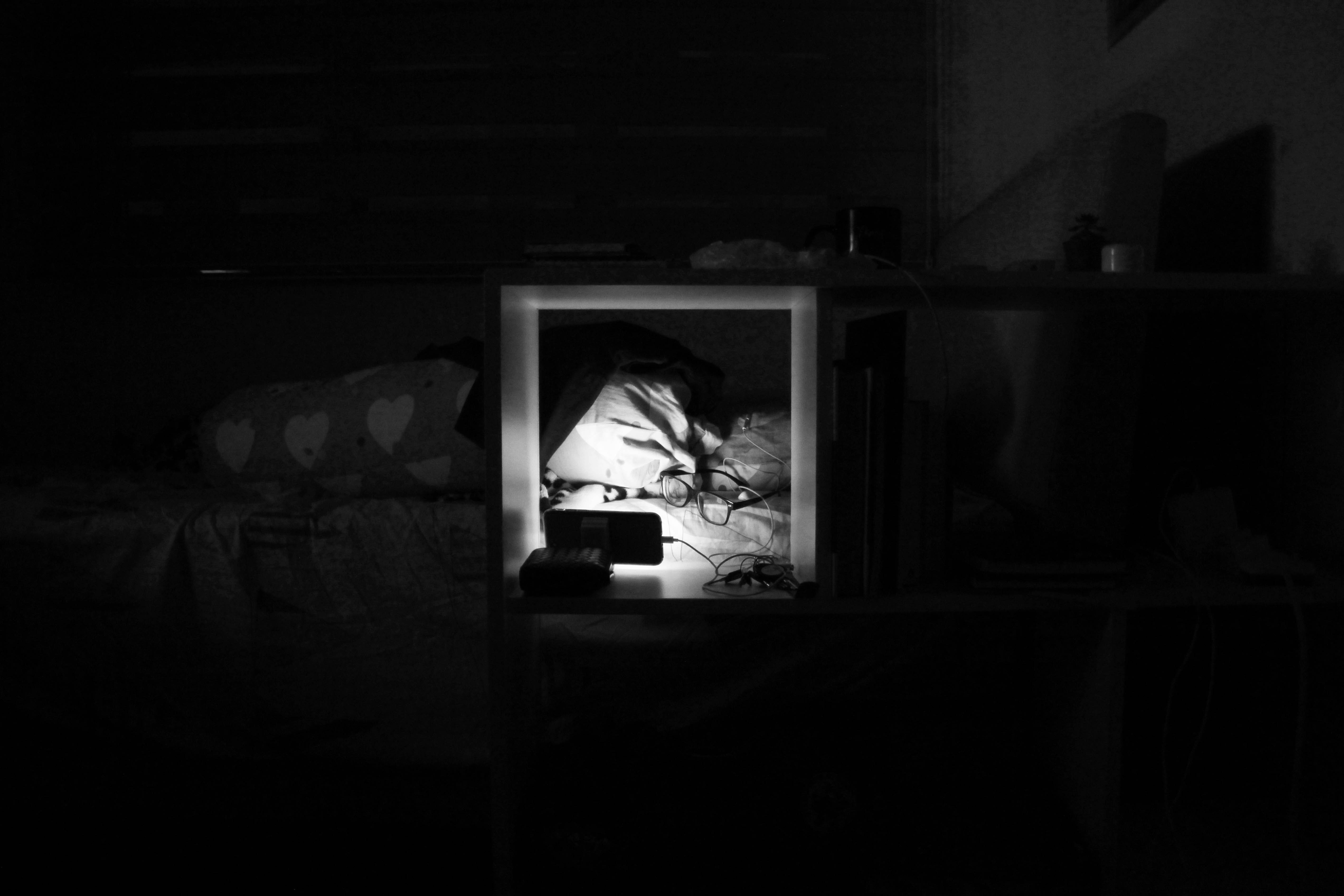
Death by Netflix // I like the lighting here. I tried to use leading lines with my bed’s edge and my clothes to the phone, showing my favourite show as of now, Rick & Morty. There is a bit of framing as well, on the phone, due to the shelf. The idea behind this image: I love to watch rick and morty at night, and other youtube videos. I’ll plug in my ear piece and watch it at the side of my bed, like I do here. You can also spot some of my own stuffs like books, watch, charger. The placement of the items there depicts my lifestyle in some ways, but also hidden in a way.
Death by bridge // I tried using rule of thirds and framing (Which failed because my clothes are not in the space). I love to go out to the park to walk. This bridge has a meaning to me in particular, because I used to be from the Air Force during my NS. I like to stand here and look out to the reservoir, and watch the F15-SGs taking off / landing at Paya Lebar Air Base. This is a good spot to watch.
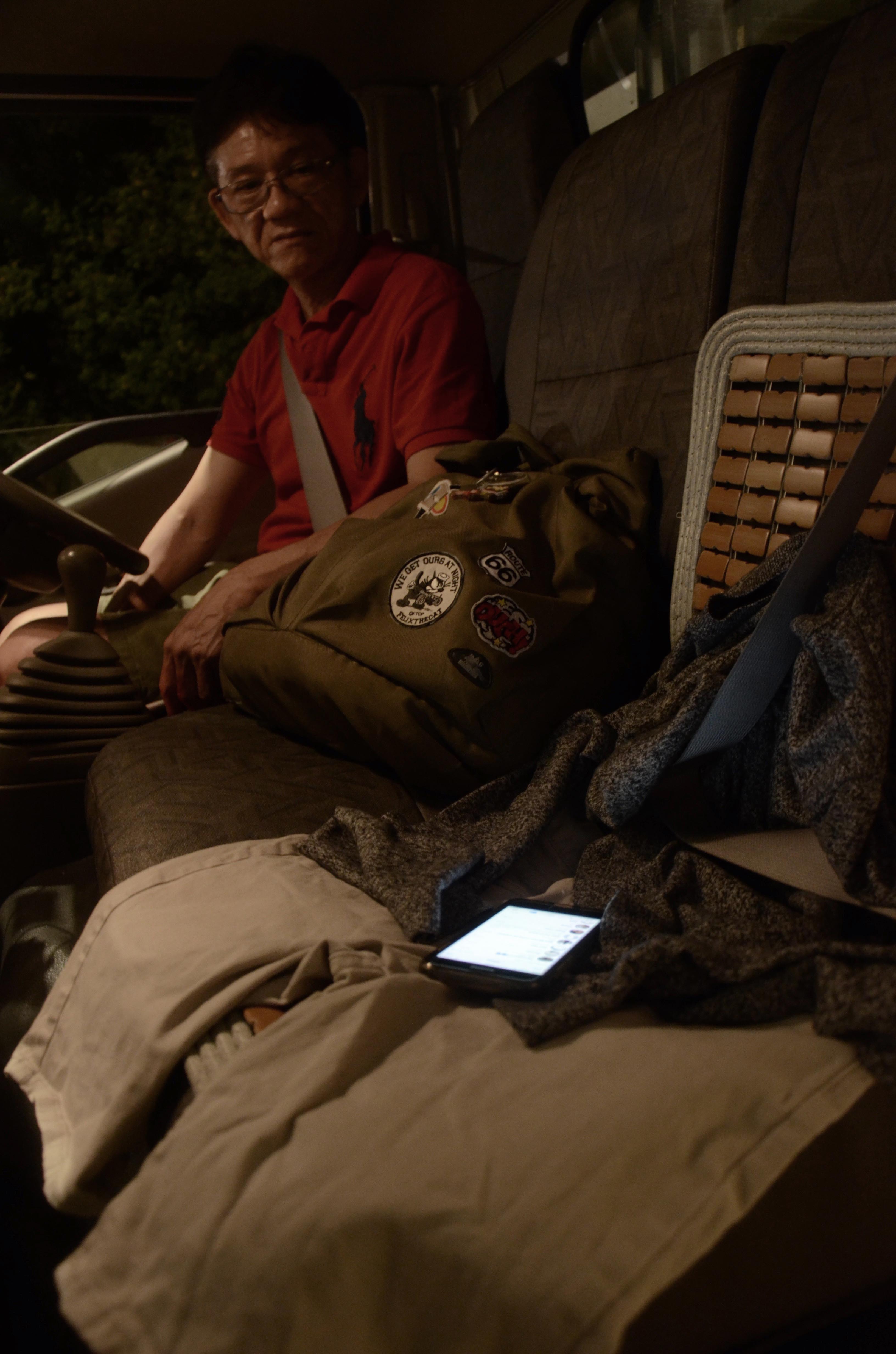
Death by transport // I want to try taking a shot inside my dad’s car while going to NTU. It’s a part of my life now since I’m here. I’m trying to depict the night setting, me and my bag which is fat and contain lots of stuffs. Using my phone (on whatsapp). My dad’s face at the moment I disappear (not so convincing, though haha). The reason I want to try this shot is because I like how the lights inside the car creates a certain serious mood. However it isn’t captured here. I tried using leading lines from the end of the lorry (doors) to the phone.
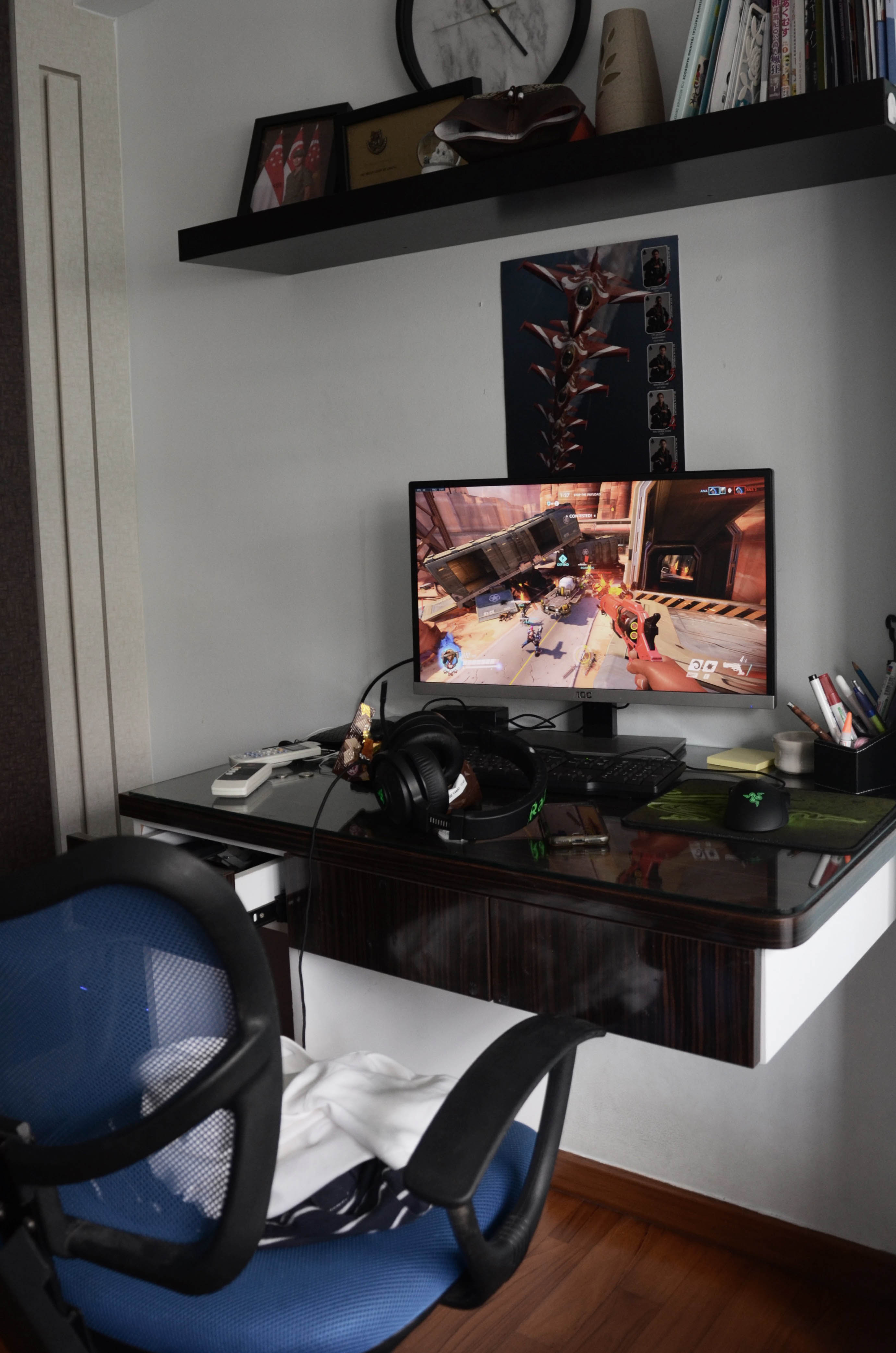
Death by game // I love gaming. I’m good with shooter games and I take pride in it. In the screen, I’m playing Overwatch, my favourite game now. I’m playing my favourite character, Mccree, and depicting a part where I’m on fire, which shows I’m doing well, but because I disappeared, I am taking damage and just standing still, which can be seen by the red colour border in the screen. The objects around the table are really stuffs on my table. I often eat snacks while gaming so I have the snacks packet on the table (hard to see cos of the angle). My headphone dropped on it while I disappeared because of the way I position it and the way I always move forward to my screen when the game gets intense. I opened the drawer a bit to create a more interesting shot. Well, but overall the photo isn’t very interesting.
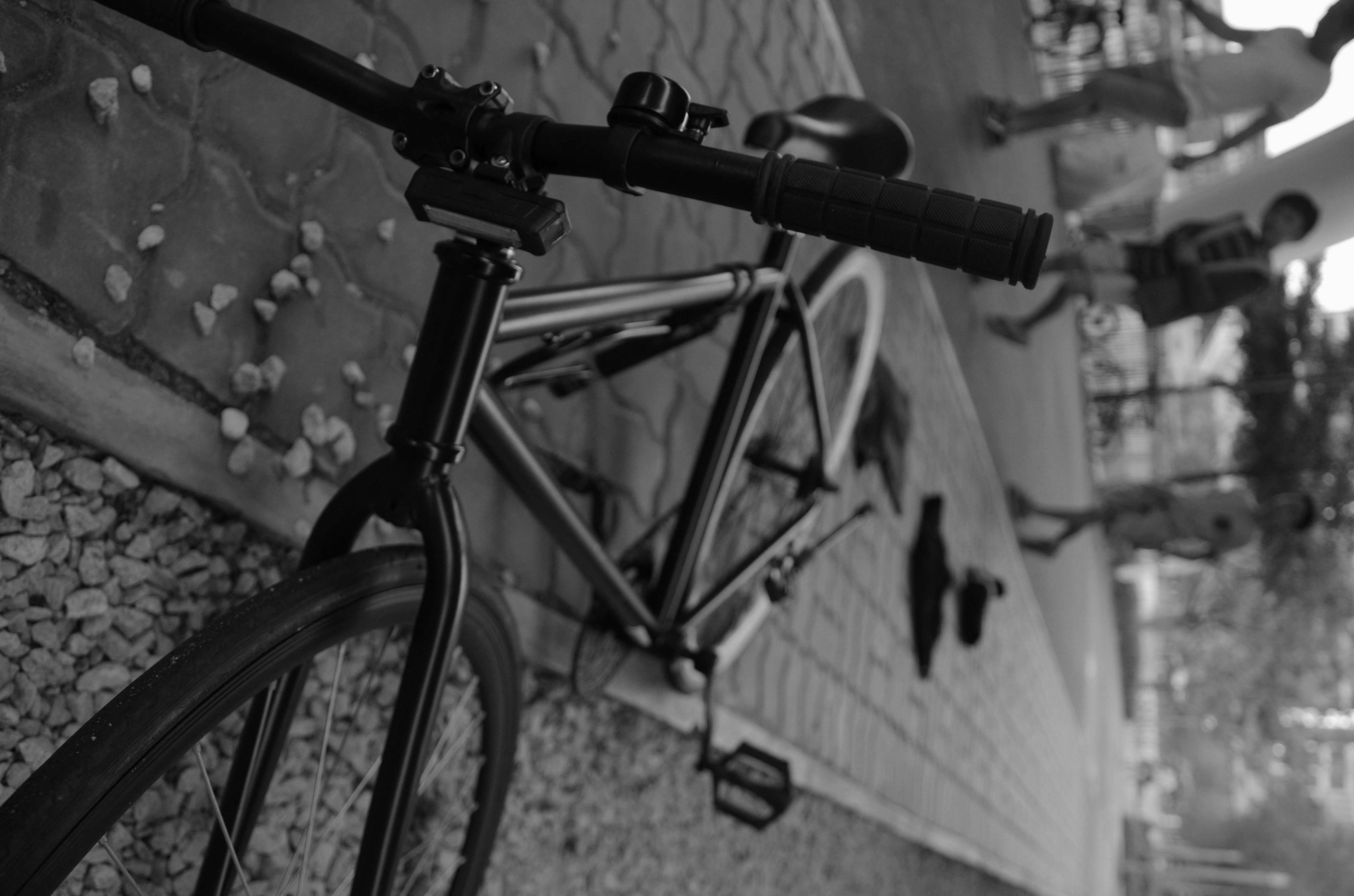
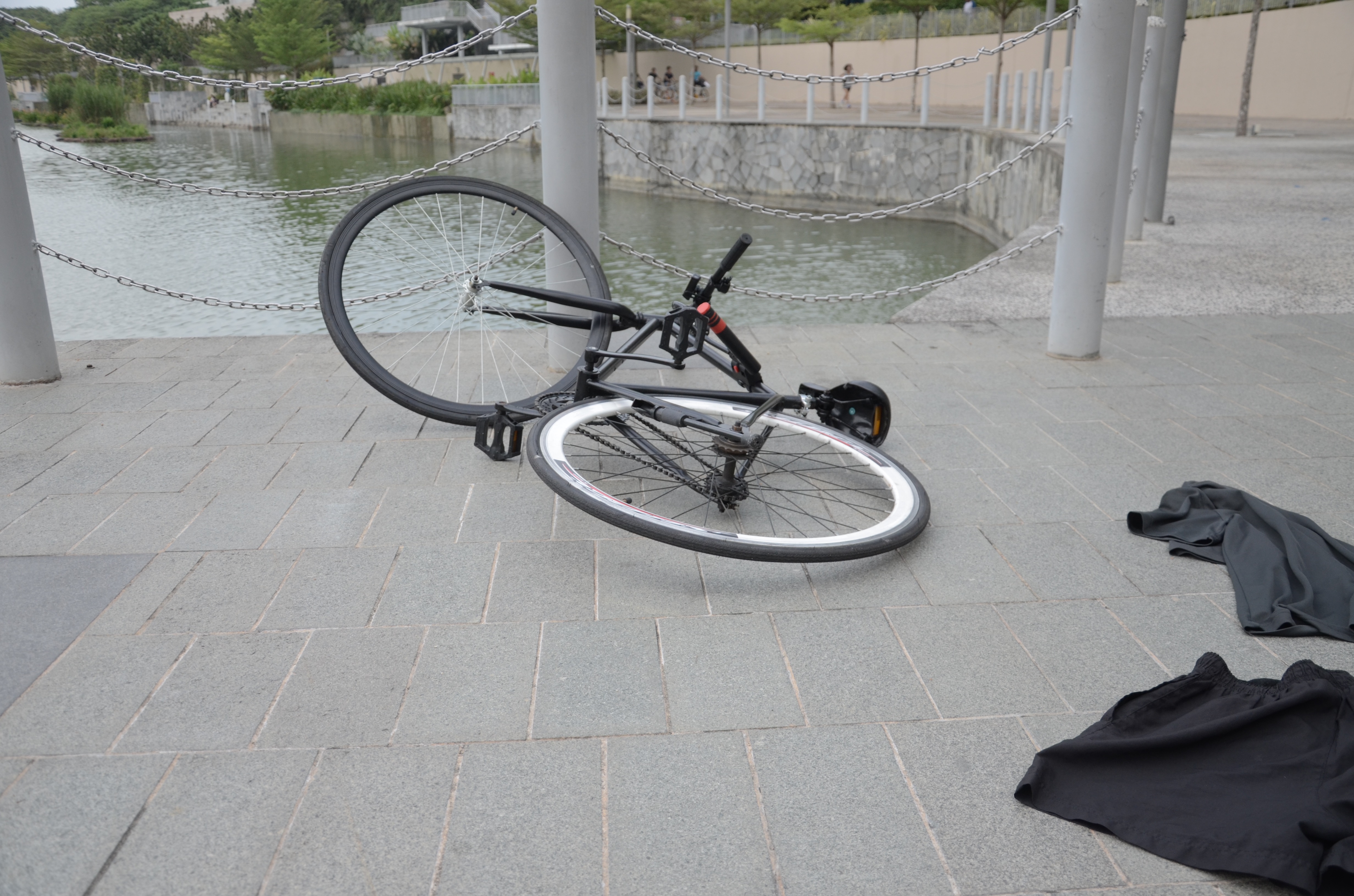
Death by bike // I took a long time with this shot. I tried to use leading lines to lead the eye from the bike to the clothes, then to the curious kids. The eyes of the kids will lead the eye back to the bike. Also, I tried to do an extreme closeup of the bike and also tilted the image to as such to play with the perspective. The bike looks like it is standing up, but it is actually lying down. I threw rocks around to create the effect that it crashed. So yeah. Oh, and also, bike because I love my bike and I love biking.
Death by bike 2 // same thing, different angle, same leading line i’m creating, less successful.
Death by bike 3 // This isn’t as successful too, even though I tried using the background as a leading line. The overall image is just too plain, although the lighting is better.
Runner up: Death by Netflix 2 // Same semiotic, different angle. I really like using my book shelf to create the framing. But if I get too close, it loses the the overall mood of the whole image becaus the image will look too plain and so doesn’t really convey much meaning. Too far, and the image will lose its focus on the framing. This image is alright but I think I might have made it too dark on the right side, which creates a lot of weight on that side, something that will distract from the frame. The frame is also too plain, I feel, which is why I didn’t choose this for my final. I want to take a picture at this distance so I can show the other parts of the room not within the frame, which also adds in to the lonely mood. In this shot, a cup can be seem, as well as some more items around (see previous shot, which don’t show that much), just that the way I play with the contrast sort of covered it up (bad.) Anyway, framing, a love for Rick and Morty at midnight, my stuffs lying around.
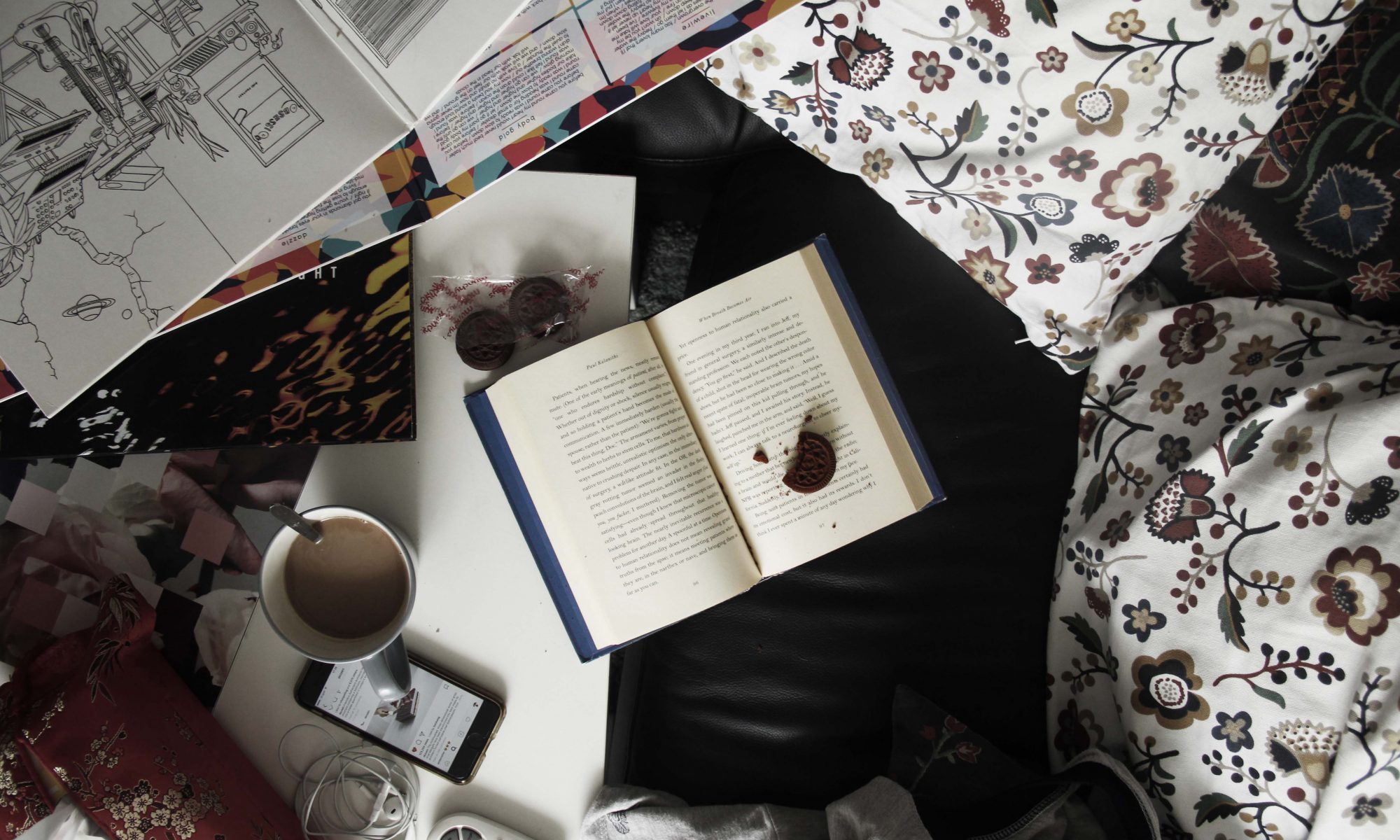
Final choice: Death by book // This is the clearest depiction of who I am and also looks interesting. Firstly, I like to read books, specifically non-fiction (which is what I’m reading here, an autobiography / biography cos the dude died while writing but yeah its called Breath Becomes Air) ANYWAY. I like to eat while I read, and LOVE to have coffee with me. Basically, chill. I love doing it in my living room because of the space, the light, the fresh air. My sofa is comfortable too, with cushion and stuffs. I’ll lie on it while I read.You can see my clothes at the bottom right, which I left behind while I disappeared, so you can imagine the way I lie on the sofa before I disappeared. Oh man, the cushions are so soft. My table has tissue, and a fan remote controller, and some of my stuffs like my earpiece, my phone on instagram, cookies which I eat. Basically, what I use while I read, chill. (except for the tissue which is permanently there) I LOVE music too, and have a collection of vinyl albums. I’ll take them out and listen once in a while, but in this picture, I just sort of take them out and never play them, spread them around while I’m choosing the music but I’m distracted by the book. Overall, this creates a frame for the book, which is my main objective when I was taking the photo. I’ve also taken a bite on the cookie before I disappeared, leaving crumbs on the book. So yeah, this is the depiction of my perfect afternoon, IF I DIDN’T DISAPPEAR. The main thing, the book. The side things — a depiction of who I am, at the corner, creating the frame.
Anyway, I wanted to make the image not so perfect, because life isn’t perfect. You can’t have everything arranged neatly. The image’s saturation is also lowered slightly, so as to create a more soft feel.
SO YEAH. THAT’S ALL FOR MY ASSIGNMENT 1 🙂
Forrest Gump – Process, Research, and Final
Quotes
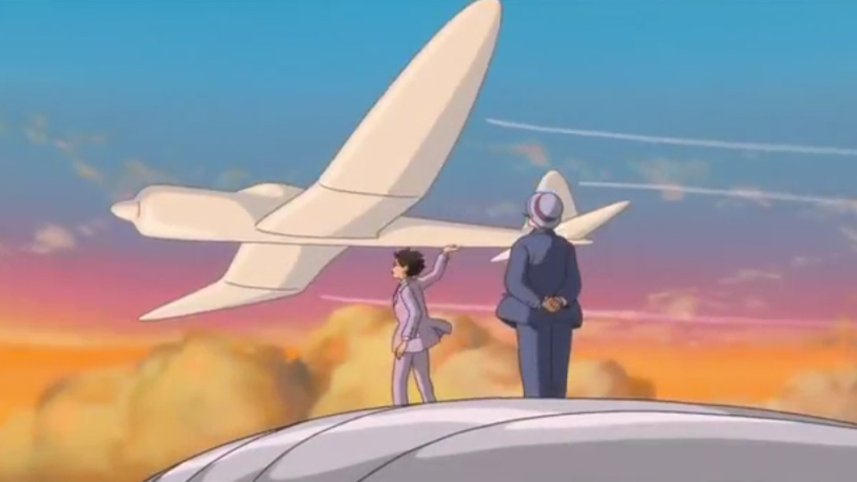
Image taken from http://www.nerdophiles.com/2014/03/06/discussing-dreams-and-reality-with-the-wind-rises/
Airplanes are beautiful, cursed dreams, waiting for the sky to swallow them up. – The Wind Rises
She was beautiful, just like the wind. – The Wind Rises
Every engineer has his 10 years in the sun – The Wind Rises
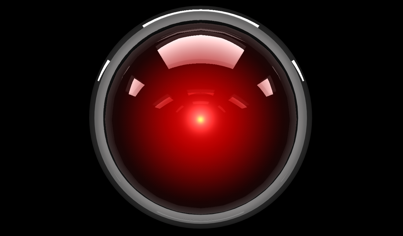
I am afraid I can’t do that Dave. – 2001: A Space Odyssey
I’m afraid. I’m afraid, Dave. Dave, my mind is going. I can feel it. I can feel it. My mind is going. There is no question about it. I can feel it. I can feel it. I can feel it. I’m a… fraid. – 2001: A Space Odyssey

Which knot did you tie, Borden? – The Prestige
That’s why every magic trick has a third act, the hardest part, the part we call “The Prestige” – The Prestige
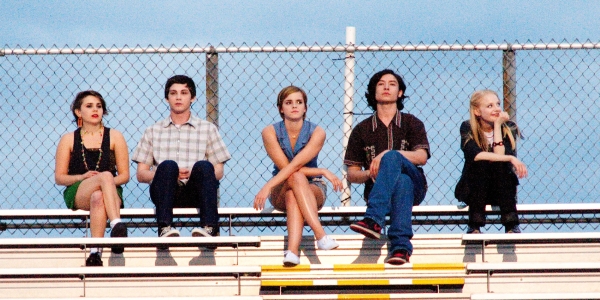
So, I guess we are who we are for alot of reasons. And maybe we’ll never know most of them. But even if we don’t have the power to choose where we come from, we can still choose where we go from there. We can still do things. And we can try to feel okay about them. – Perks Of Being A Wallflower
Right now we are alive and in this moment. I swear we are infinite. – Perks Of Being A Wallflower
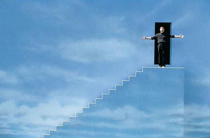
We accept the reality of the world with which we’re presented. It’s as simple as that. – Truman Show

In your face, Neil Armstrong! – The Martian
I’m going to have to science the shit out of this. – The Martian
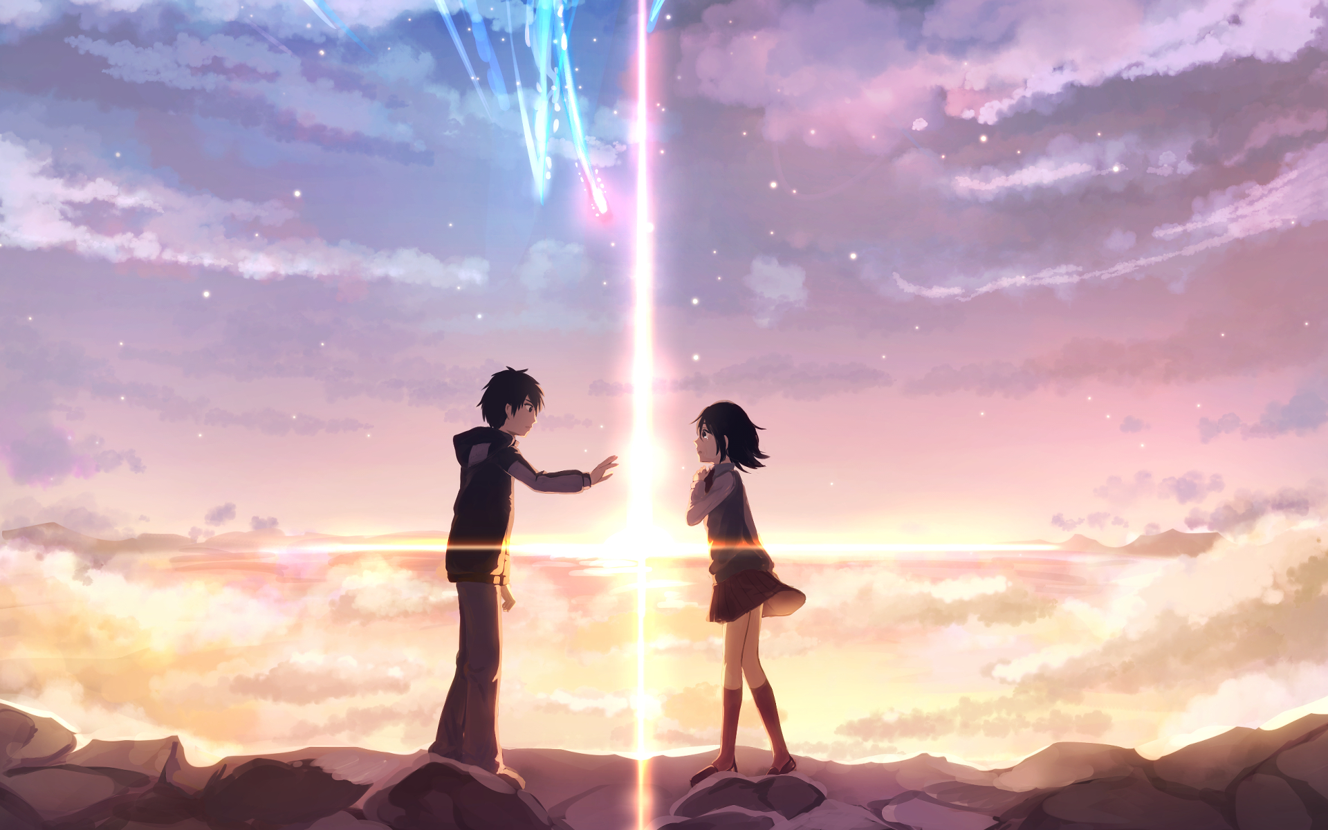
Let’s write our names on each other’s palms – Kimi no na wa
Please make me a handsome Tokyo boy in my next life! – Kimi no na wa

Despite knowing the journey… and where it leads… I embrace it… and I welcome every moment of it. – Arrival
“Language is the foundation of civilization. It is the glue that holds a people together. It is the first weapon drawn in a conflict.” – Arrival
Abbott is death process. – Arrival
Coffee with some aliens… – Arrival

I love this thing because you gave it to me. But the truth is… it is one fuckin’ ugly tie! – Shutter Island
Which is worse, to live as a monster or to die as a good man? – Shutter Island
SELECTED QUOTES
Those aren’t mountains, they’re waves. – Interstellar, 2015
https://www.youtube.com/watch?v=4Hf_XkgE1d0 01:39
You see things. You keep quiet about them. And you understand. You’re a wallflower. – Perks Of Being A Wallflower, 2002
Mars will come to fear my botany powers. – The Martian, 2015
https://www.youtube.com/watch?v=5KsVojEaoms 00:34
Good morning, and in case I don’t see ya, good afternoon, good evening, and good night! – Truman Show
https://www.youtube.com/watch?v=-_zYn-HHcyA 03:57
Abbott is death process – Arrival, 2016
https://www.youtube.com/watch?v=-o0MwXqS0Q4&t=558s 08:59
Alright, with these quotes, let’s break them down!
1. Mountains, waves, doubt, fear, reaction.
- Mountains: Rock, giant, wall,
- Waves: Ripples, fishes
- Fear: Constricted eye
2. Sight, quiet, understand, wallflower.
- Sight: Eye, bird, light, camera (without button),
- Quiet: Lips closed or covered, water,
3. Fear, botany, powers, mars, plant.
- Fear: retreating action, constricted eyes,
- Botany: Plant parts / whole plant, soil, spade
- Powers: Electricity, muscles,
- Mars: Ares, chocolate bar, rock, boy, curiosity
4. Morning, speculate, afternoon, evening, night.
- Morning: Breakfast, sunrise, 8am, people going one direction, (transport)
- Afternoon: Lunch, sun high, 1pm, people at work (work)
- Evening: Dinner, sunset, 6pm, people going the other direction (chilling)
- Night: Bed, moon, 10pm, people at home (home)
5. Abbott, alien, heptapod, death, process.
- Abbott (alien): alien crab, octopus,
- death: corpse, skull,
- process: duration, 4th dimension,
Compositions and detailed explanations
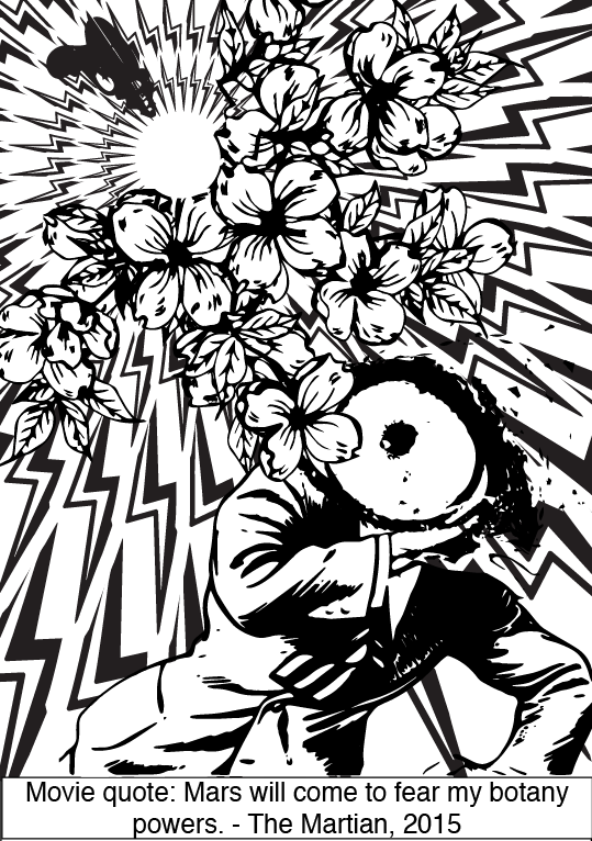
First composition: Mars will come to fear my botany powers. – The Martian
I’ve gotten an idea from the quote ‘Men are from Mars, women are from Venus’. Upon further research, I realised tha the male symbol is the same as the Mars symbol:

So, I used a man to represent Mars.

Next, botany is the study of plants, so plant designs will suffice. I used an alien gun to represent the main character in the movie, who is a botanist stranded in Mars. I like the idea of using a man to represent Mars, and an ‘alien’ to represent the human, who is really an alien to Mars. By using the alien gun shooting plant parts to ‘Mars’, I want to create the idea of an invasion, man invading Mars with botany.
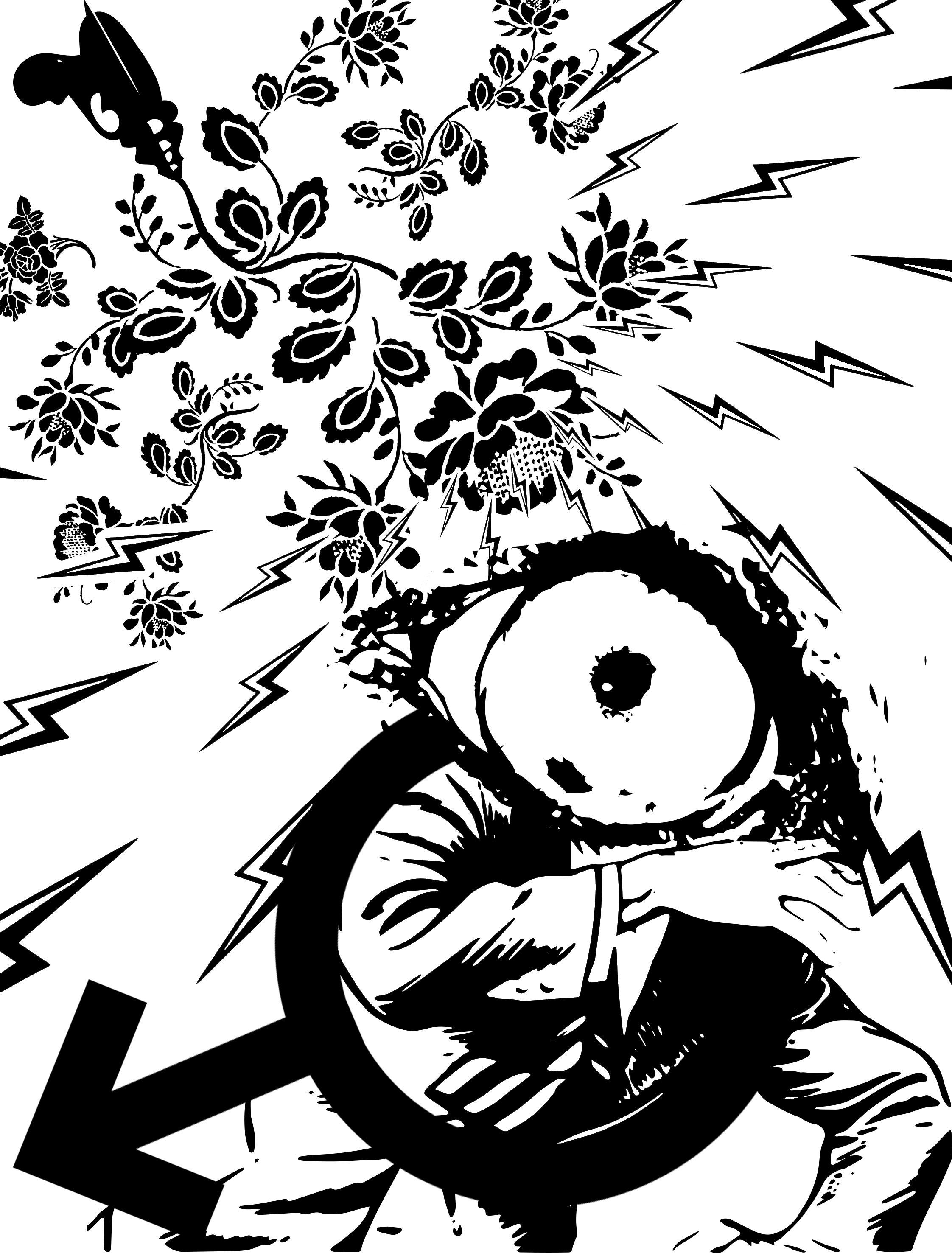
I further enhance the idea of an invasion by spreading electricity in a circular manner, making it look like the powers are spreading across the whole of Mars. I tried to arrange the bolts in a way that makes it look like it is coming from the flowers, instead of the other way round. It works by making the flowers big and having small bolts overlapping the flowers, making it seems like it’s coming out from the flowers.
Then, I added an eye, covering the entire face of the man representing Mars, and constrict its pupil to represent fear itself.
Although the meaning is present, the composition looks a bit plain, so I added the symbol itself to enhance the identity of the man being Mars.
And there we go. The first composition, filled with meaning, but lacking in composition.
Here are thumbnails of my work process / variations
Composition 2: Those aren’t mountains, they’re waves. – Interstellar, 2015
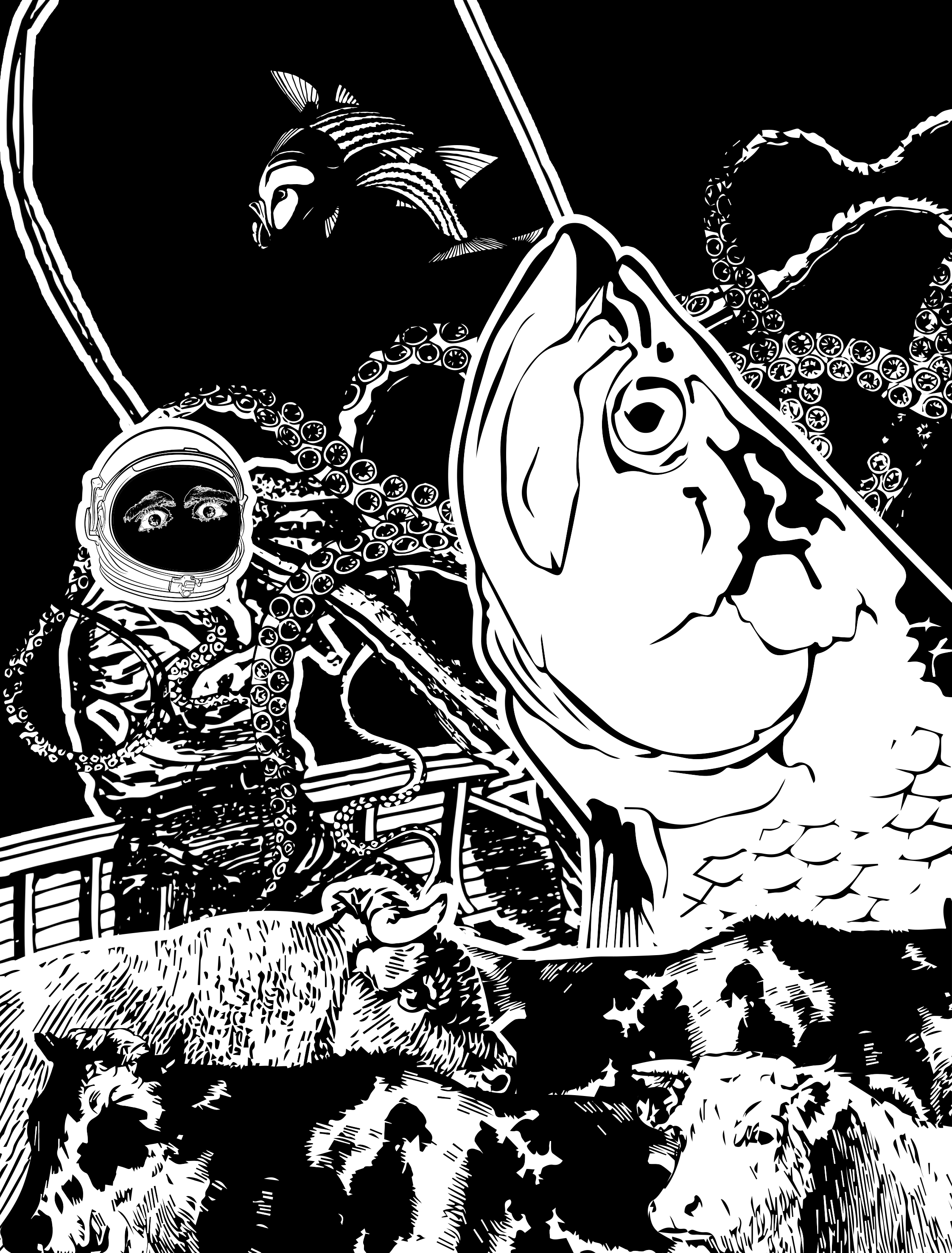
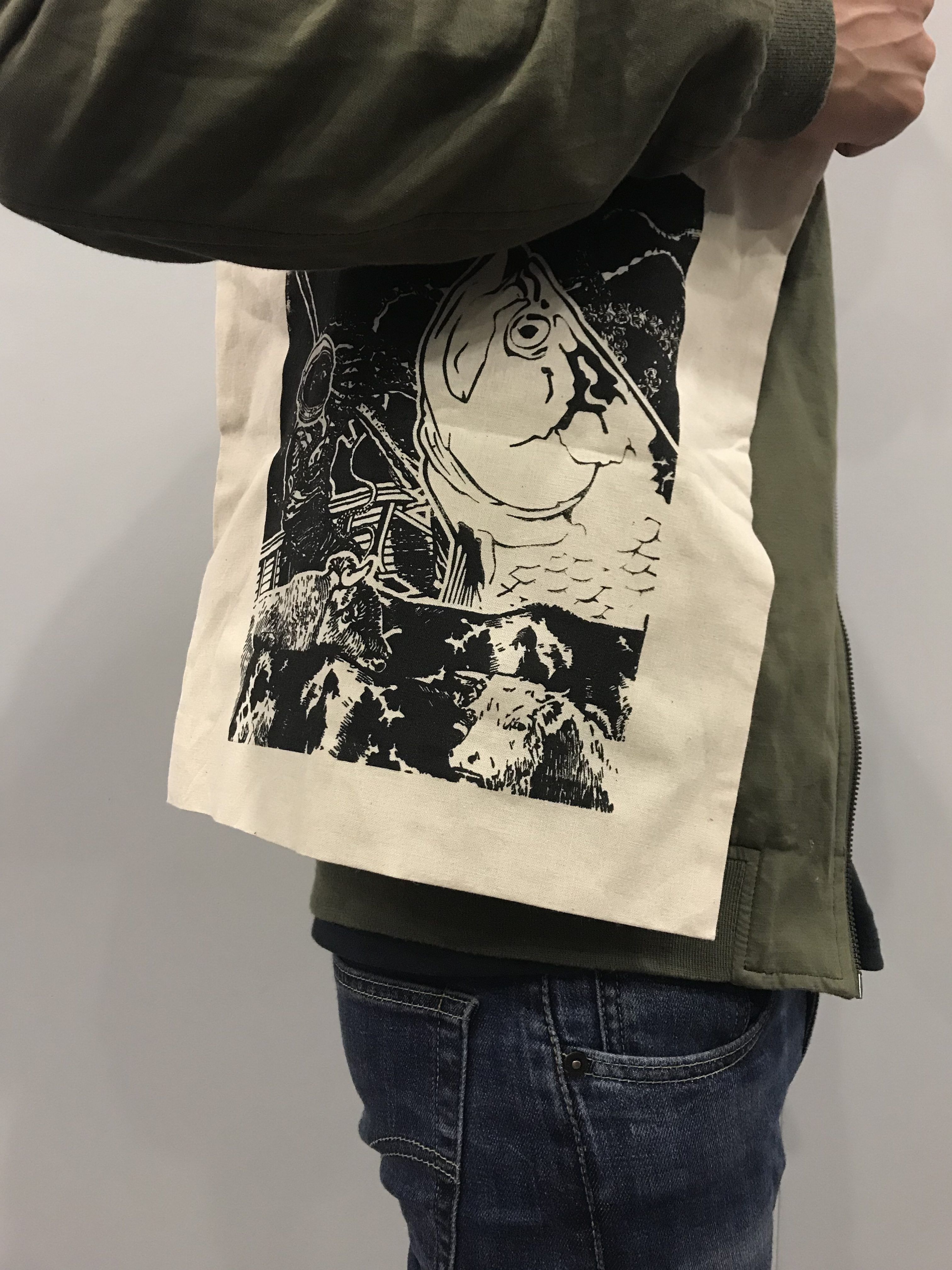
Initially, I wanted to use giants or fences to represent mountains, but I ended up using cows, as cows’ bodies have interesting shapes that looks like mountain. Cows are also grounded and strong, so they are good representation of mountains.


To represent waves, I use fishes and sea creatures, because they’re not just a part of the ocean, their movements are also like waves, left and right.


At first, I wanted to use an octopus to represent the waves, hiding behind a cow. But it’s very odd. I decided to have a fisherman, because I just like the idea of fishing.

I think it adds on to the whimsicality of the whole composition, and it is also very symbolic. In the movie, the characters are like the fishermen, trying to find the source of a GPS signal in a planet filled with water. Their spaceship is like the boat, and they are the fishermen, fishing for the GPS. They looked afar and saw mountains, which, upon closer inspection, are huge tidal waves.
In the composition, I used the sea of cows (strong foreground) to represent the water world, and the fishermen are fishing within the cows. (if you look from far, the cows do look like mountains) But to their surprise, a fish came up, and sea creatures crawled upon the boat, causing havoc, like the waves in the movie. The fisherman, conveniently wearing a space helmet, has eyes that expresses fear, like in the movie.
The composition is designed to bring the quote to another context, while maintaining its meaning. For instance, the mountains are usually on the background, but I’m using it as a foreground in this case. This also creates a visual hierarchy, fish, fisherman, cow.
I applied rule of thirds to the fish, making sure that the focus is the fish, even though there are other elements fighting for attention. I also arranged the elements around to lead the eyes from the fish to the fisherman, through the curves and the movements of the tentacles.
So there we go, the most precise composition I did, the one I am most proud of.
Other variations:
Composition 3: You see things. You keep quiet about them. And you understand. You’re a wallflower. – Perks Of Being A Wallflower, 2002
The initial idea is to literally have an eye, mouth, zip on mouth, connected to a brain. The idea is too literal, despite how nice I could imagine it to be. I scrapped the idea completely, and went on with something more in depth.
I liked the idea of having a prism. A prism captures light, then refracts it internally, and then spreads the light out into a rainbow. In a way, it can be a metaphor to the whole seeing and talking and understanding thing.

I’m inspired by this fanart of Pink Floyd’s album ‘The Dark Side of the Moon’, which showcases a prism spreading light. The prism basically ‘sees’ the light by absorbing it, processing it (understanding) by refracting, and then spreading it out into a rainbow, like when someone talks about something they see, it tends to be a bit different from the original.
For my composition, I’m using different elements to craft the idea of seeing, keeping quiet, and processing. Oh, and the last part, wallflower.


These are some of the images I intended to use for my composition. After some iteration, I decided to drop the zippers and the brain, and add in some dingbats of eyes, locks, and keys, which I feel enhances the overall idea.
The eye enhances the idea of sight. The lock is used to lock away the scattered beam of light, and the keys are behind the prism, suggesting that the keyholder has the power over the light scatter but it doesn’t do so. Finally, a flower is in the background, representing the wallflower.
The overall composition is framed around the prism, which is the representation of the main character in this quote. The rest are just supporting elements. I want to use lock and keys to create some distortion of reality, so as to make the overall composition more interesting, and also break away from any literal meaning in the composition.
Other iterations:
Composition 4: Abbott is death process – Arrival, 2016
This is a tricky one, but I am not daunted! I really like this quote for its sheer simplicity and its meaning is so strong and whole, it’s one of the most impactful quote in the movie. This quote leaves the viewers in the mystery of what it means by ‘death process’, and makes us wonder where did Abbott go in the movie. Did he really die? Why can’t Costello just say that Abbott is dead? Is it because of the lapse in understanding between the alien language and the human’s? Or is it a way of saying ‘death’? (turns out, it’s the last one).
In the movie, the alien don’t see time as we humans do. They see it as a whole, and they know the timeline of themselves and everything they interact with. To them, time is like space, you can always revisit yourself in another time. In short, they live in the fourth dimension, where time is just like another spatial dimension.
Okay, I digress. So these aliens look like octopuses because they are squid like creatures with 7 legs (named heptapods). Initially, I wanted to create a heptapod out of insect limbs, and then remove them along a path, like in my sketch.


Here are some examples of images I used. I was also inspired by the image of evolution:

However, I try to break away from creating a linear design because I want to amplify the idea of the creature’s perception of time. I want something that is happening all at one time.
This was my first lazy design. It wasn’t that great even though the background is pretty cool. Now, I’m thinking of creating something more surreal.


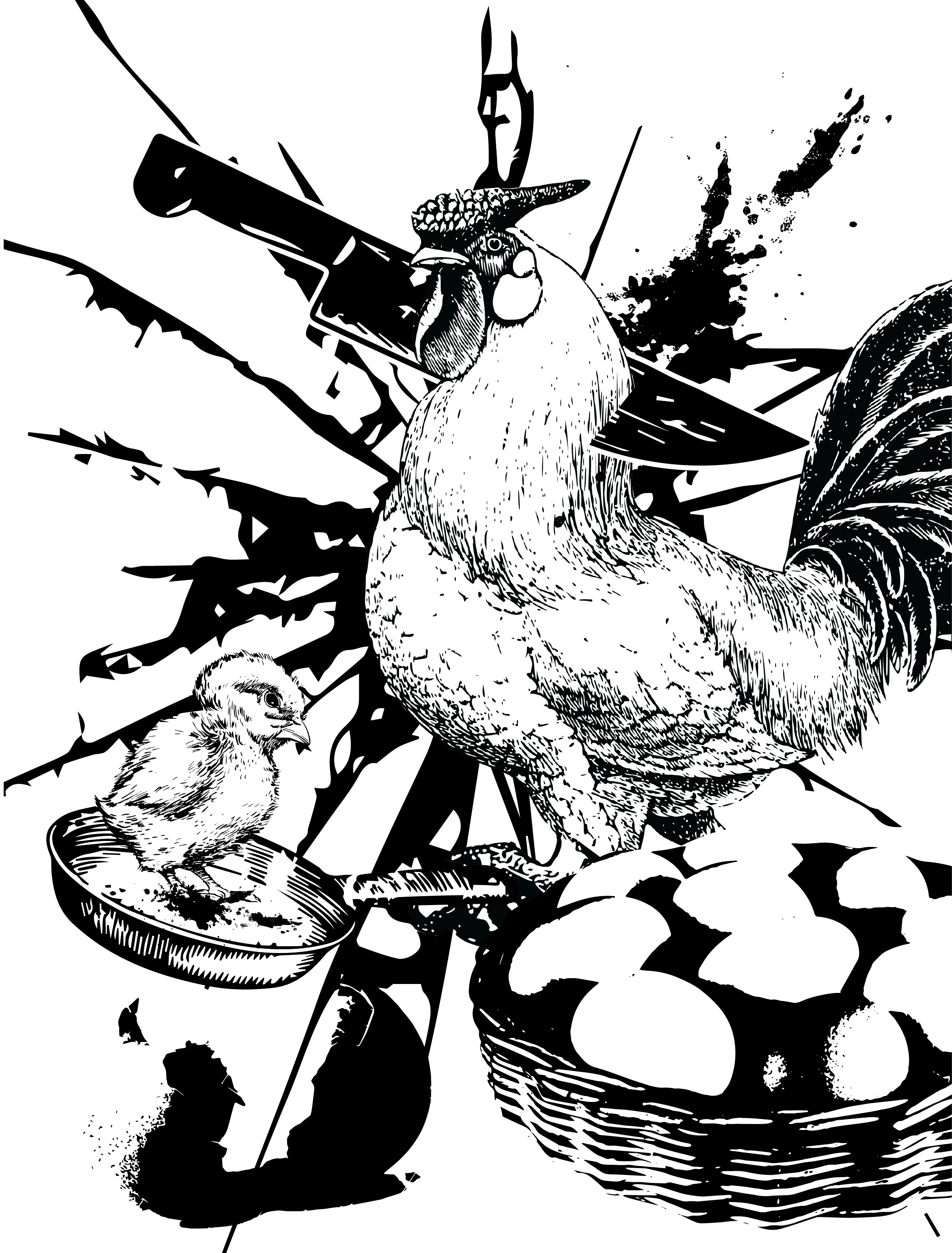
I’m using chicken as the subject. Why? I am inspired by how every part of the chicken, from the unborn to the adult, can be killed for food. I am also inspired by the question ‘which comes first, the chicken or the egg?’.
All these properties of the chicken describes the character in the quote, Abbott. Abbott cannot see time, therefore he is the unhatched egg, the chick, the chicken. I want to show here that every version of Abbott is dying, thus him being in ‘death process’.
I wanted all of Abbott to be in the frame, and all of Abbott to be dying, that’s the idea. Although it isn’t really the same as the exact meaning in the quote (which is that at that moment in ‘time’, Abbott is dying), I feel that this composition holds the meaning of the quote out of context and in its own interpretation.
Anyhow, I use leading lines and rule of thirds to lead the eye to the chicken.
p.s. now come to think of it, it may look funnier to have the chick lie down instead of standing up. I guess I’ll consult first and edit it in the refinement.
Refinements
Composition 1 improved: changed the background to more consistent lightning bolts, to create more density and depth. Changed the flowers from ding bats to an image, which works better as it makes the composition more ‘whole’. Made use of negative space within the lightning bolts to create the effect of an energy ball coming from the gun. Overall give a more powerful feeling, less bland. Satisfied.
This is my final one for print. I only resized some elements slightly and added a black background to make the fish more outstanding, and also dampening the other elements that are fighting for attention.
Unfortunately I have printed the wrong version for silkscreen, so for the test print I will just do the one I printed, and I will redo this during recess week. (cons of having too many versions 🙁 )
Silkscreen Trial and Process
It was hard for me to decide which composition to use. I grew attached to the right one, but I like the overall composition of the left one!!!
In the end, after asking for different opinions, I chose the one on the right, as it explains more about the movie and has decent composition.
After drying the silkscreen board, coated both sides of the board with emulsion, drying it again before sticking our transparency onto the front of the silk screen board.

Next, we send the silkscreen into the UV light machine thing, which uses UV to harden the parts that aren’t covered by the black ink in our transparency.
After that, we sent the silk screen to wash. Here’s a video of the process:
Shag face aside: Yay! My silkscreen is ready.
It was at this point when I realised that I printed the wrong design, which means I have to redo it on recess week.
Once the edges are taped off, coins are used on all 4 corners of the screen to create a gap between the screen and the medium that is to be used for the print.
The next few shots are taken by Claire, and Tiffany helped with holding the board for me. The MVPs!!!
Aligning
Spreading ink like butter
Here we gooooo
The outcome
A failed attempt
Takeaway from this is, the first print will always be bad, so there is a need to ‘season’ the silkscreen first to allow the ink to be spread more easily on the second attempt. It’s best to nail it on the second or third attempt, because the ink will seep through the board if there’s too much ink (too many attempts).
The squeegee should glide across the board, not pressed down hard. It should be one motion, swift and accurate.
I’m looking forward to printing this on my tote bag, and also on a spare t-shirt. Actually, I might use both designs and see which works best. I may also want to try my own designs!!! A bit xiao exciting 🙂
Silkscreen Final
Before I go with the final prints, I wanna show some of the other prints made on newsprint which I find successful and worth showing hahaha
I decided to try printing my other design on my tshirt as a trial, since I feel that it is visually more appealing than my final one, even though my final one is more meaningful.
Turns out so well! I’m really proud of this. Unfortunately, this isn’t the print that I’ve chosen for my final. Because I love this design so much, I’ve made it into my own tshirt 🙂
But then, there’s new instructions that there isn’t a rule that the design must be on a tote bag, so yay! I’m gonna wear this during submission and bring my tote bag as well!
IT DIDN’T TURNED OUT WELL D:
The tote bag was too uneven, and the design seems to be too complicated, so the results ended up wonky. It is hard to gauge how much ink I need, and my design on emulsion wasn’t aligned well on the screen, basically everything was wrong.
Here’s the video of the fail:
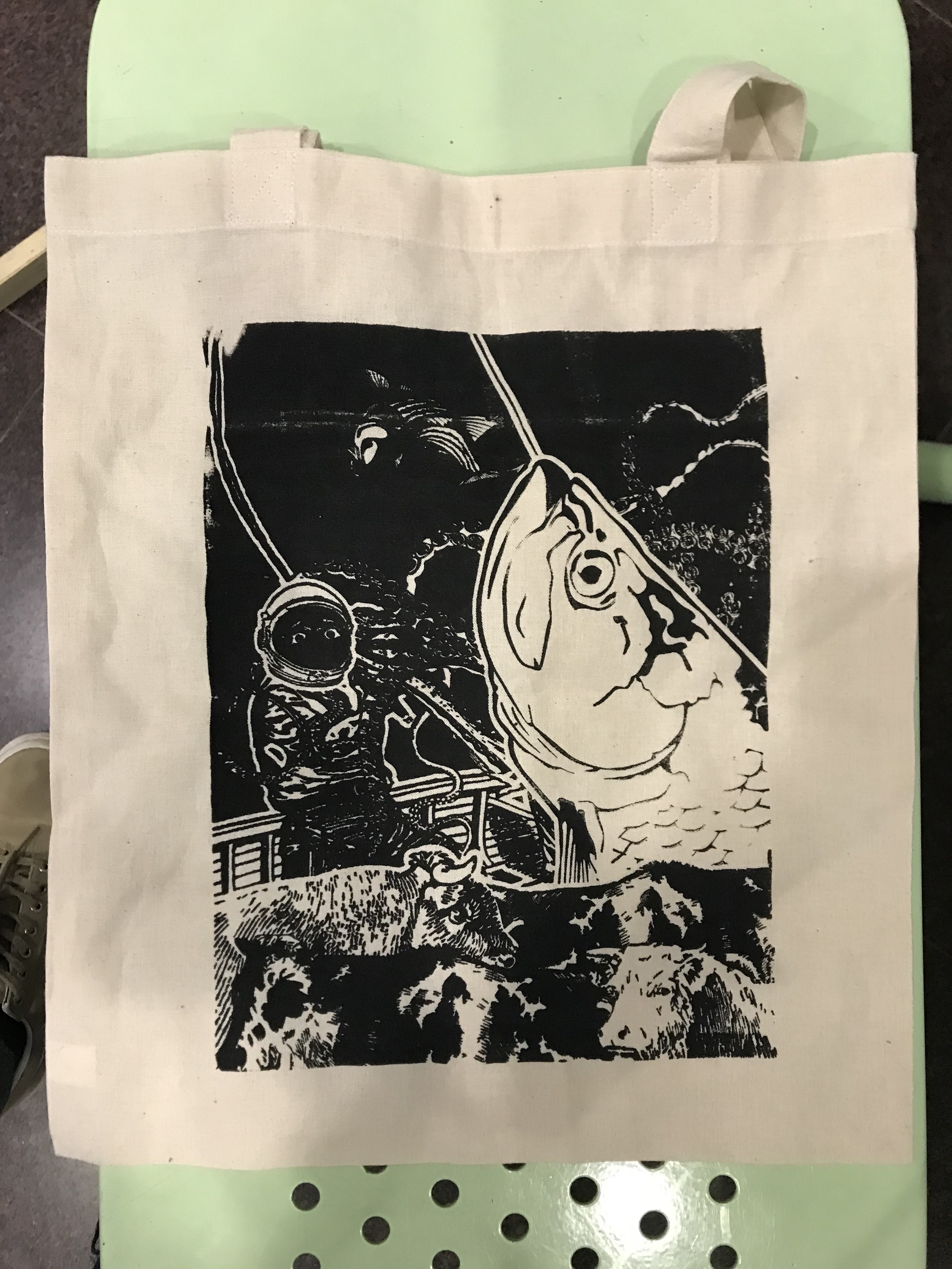
I had to go get another tote bag. I’M REALLY GRATEFUL TO JOY (not the teacher) FOR PROVIDING ME WITH HER TOTE BAG TO PRINT T . T
I went to try again, this time, pressing harder, using more ink, and aligning better
AND YES. IT TURNED OUT WELL
There we go.
My A4 printed pieces:
That’s this assignment, all done and well. Yay!
Before I end off, I’d like to share some extra stuffs we done too!
Making of the basement crew tshirts (2 different designs)
Outcomes
Timelapse of printing:
Final thoughts
What I learnt from this: I did silkscreen before in poly, using stencils. This time, I learnt that there is another way to do it, which is much simpler and more effective, that opened my eyes to new processes I never seen before. Also, I learnt to be more flexible with my adobe programs, as I have learnt photoshop now, I can mix both photoshop and illustrator skills together to create more things.
Working on silkscreen is so fun, especially when you get to keep what you make! The satisfaction from a successful print is like… woooooooooooooowz.
I also enjoy the process of creating the visuals from the quote. It is fun to conceptualise and create something unique and holds meaning too.
Mark Making Final
Final Pieces
So, crit is over, and here we have what I submitted. My ‘Anxiety’ piece is the one most liked by everyone, even though I feel that my best work is ‘Longing’ and ‘Captivate’. Still, thanks everyone for the loves there :’)
Submission descriptions
Board 1
Optimism. Optimism, to me, feels like rhythmic pulses of positive energy, which is depicted in the waves as seen on the image. It is full of power, so its whiteness is intense. The stroke shows direction, moving from down up, which represents the upwards feeling from optimism. This piece is inspired by the song ‘Miracles (Someone Special)’ by Coldplay, which upon listening, had me knowing I can go on and on, to not give up.
Captivated. Captivated means to be completely drawn by something. I used fabric to depict this emotion because fabric flows, and has creases which can lead people’s eyes to the center. To me, being captivated is to be blind to anything else, which explains the pure blackness and the single white focal point. The crease allows the piece to be full black, while still create a way of drawing people’s eyes to the middle. It represents the tunnelling of the vision to the focal point without the use other marks. This piece is inspired by the song ‘Captivate’ by Midst, which has instrumentals that depict what it’s like to be captivated (muffled and spiralling sounds).
Regret. Regret is a process to me. It starts from an event which happened, which can produce a certain effect to the person. To me, that effect is something dreading, and it lingers. This is depicted through the smoky marks made by a candle flame. The next stage of regret is the thought processing. When the person thinks back on the event, and the feelings. This makes the person feel more uncomfortable, and is depicted by watered ink, dabbed in a manner to create a clearer smog. Finally, the regret hits the person hard, and the person feels a very intense and somewhat aggressive feeling, which is depicted through the jagged and solid marks. This piece is inspired by the song ‘Talking with Strangers’ by Miya Folick, which has a similar flow of emotions depicted here. In the final chorus, she sings with great pain ‘how did I miss this lesson when I was young?’ which was very intense and haunting.
Board 2
Longing. Longing is an intense, achy, yet somewhat sweet and gentle feeling. The reason why I use tissue is that when ink dries on tissue, it create little creases or wrinkles that creates a feeling of the aches in longing. I use solid ink on the tendril looking mark as longing is an intense emotion. Yet, the emotion dances within the heart, which is depicted by the gentle curves of the stroke. The smoky parts are made of watered ink, which depicts the lingering feeling of longing someone you miss. The tendrils are made in a way that it depicts a longing for joining together, but it is broken by the boundaries of the torn tissue. This piece is inspired by the song ‘Touch’ by Shura, which had always made me feel bittersweet when I listen to it.
Fury. Fury is a very intense emotion, an intense emotion of hate. But for a person to hate someone, there has to be a back story. In the background, I used watered ink to create a cloudy mark, which symbolises the turmoil that a person have to bear before getting angry. Then, fury strikes down hard. Intense and sharp lines are made, focusing into the middle as if clashing down upon something. This piece is inspired by ‘Free’ by Broods, which isn’t about fury, but it creates a fiery feeling, and it feels like she is ready to strike down on someone.
Anxiety. Anxiety, to me, is an invisible thing on the big picture. It seems small and calm, which is depicted by the horizontal stroke in the middle. Then, the anxiety builds up, and reaches the point where the person breaks down, depicted by the disturbance in the middle. But upon closer inspection, one can detect the jaggedness of the strokes, which depicts the jittery feeling of anxiety, quite often missed by observers. The strokes are also covered in coarse salt crystals, which depicts the inner jabbing feeling in a person with anxiety. The white clouds can be seen when looking at the piece closer, which is something invisible seen from far. This is to enhance the idea of anxiety being invisible, but within, it is lingering around. This piece doesn’t have a song, sadly 🙁
Reflections
I have mentioned about material exploration in class today during my presentation. To me, material exploration is the most fun part of this activity because I really like playing with those stuffs and seeing what each creates. Unfortunately, I had wasted a lot of time on doing that and planning my experiments, that I did not spend enough time developing on what emotions I should work on. Partially also because I feel that doing the emotions first will seem like ‘working backwards’ to me, which I would avoid doing. I thought I could feel the emotions through the materials I use, but it didn’t happen.
I also have spent a lot of time on one piece, Captivated, which all failed and I reused the original work. I had to move on because I really was spending too much time on that. What I learnt here is to be ready to work on the same thing multiple times, and work earlier.
That’s all. It’s been a tiring but fruitful project 1. Looking forward to project 2!




 DOOM.
DOOM.