~muse Smol Updates (Not final)

I just want to collect my thoughts in a post. OSS is really a great way for me to not just update on my project but to just think as I write.

CONCEPT UPDATES

FORM

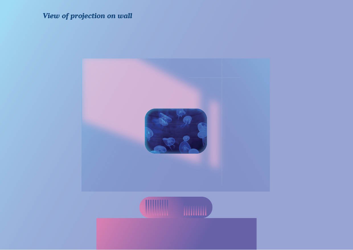
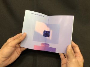
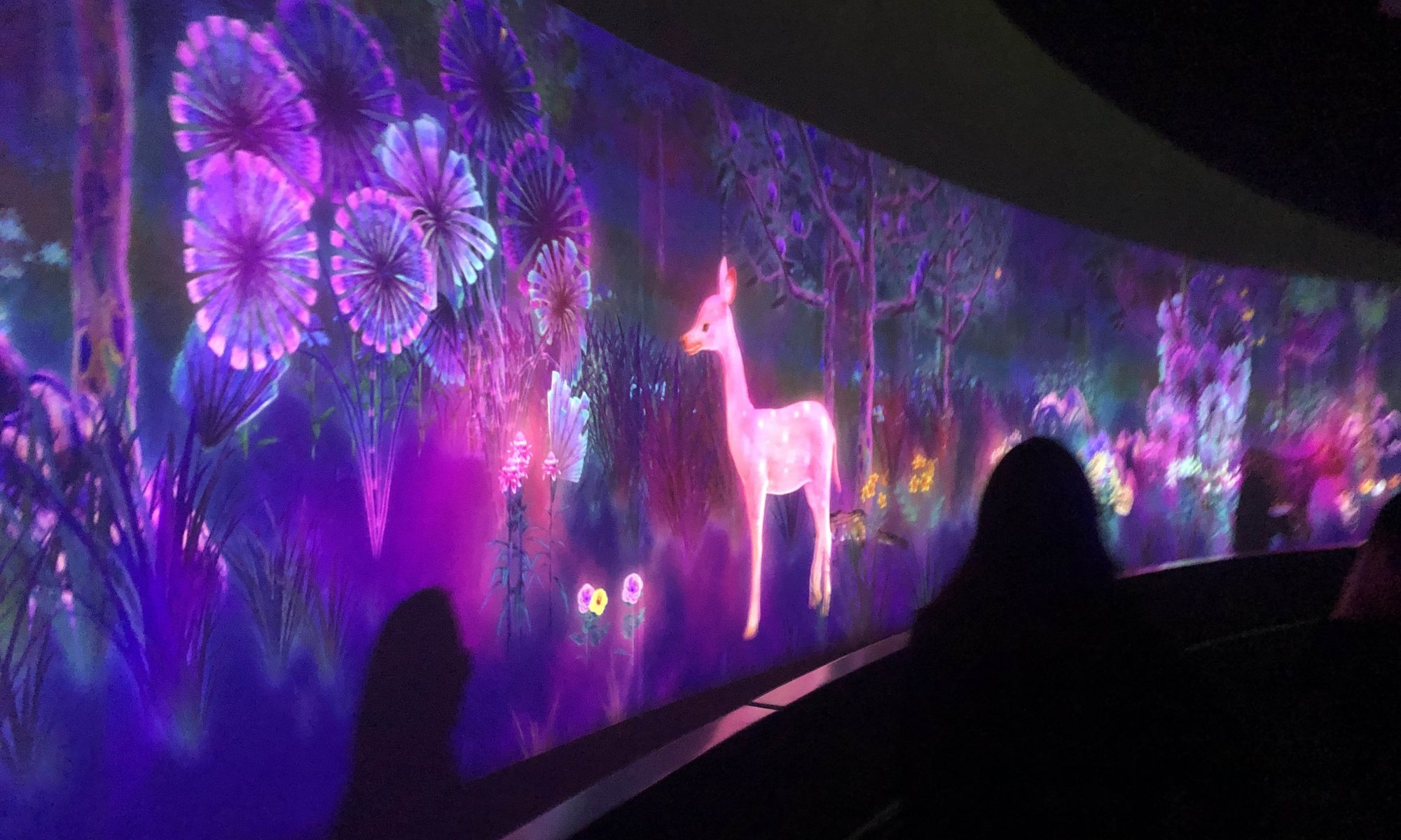
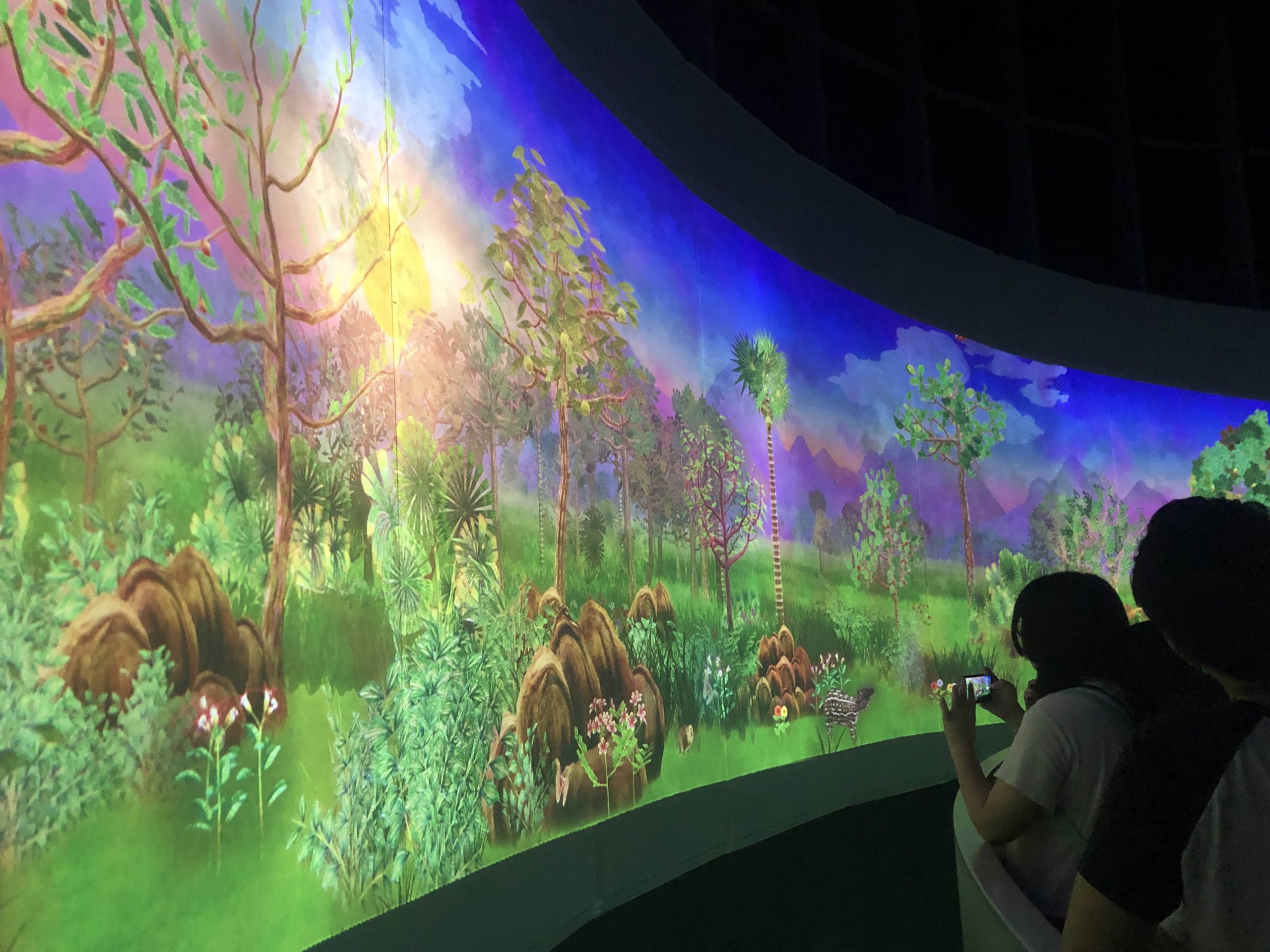
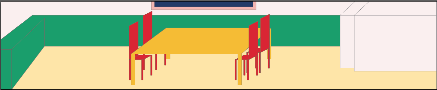
I’ve decided that the projector should be a ceiling lamp that projects the effect onto walls. After testing, I realised that the projector cannot be too close to the wall even though its short-medium throw. The projection is too small to create a decent effect.

I’ve tried to put the projector on the shelf at the back of my room and found it effective, although it still casts my head shadow. I offset the projection to the left of my desk and it works well.

This made me think that hanging it up will work better. And if it’s going to be a ceiling lamp, it should have some additional light for mood as well. I was thinking, in the best case scenario, the lamp can also drown the room into a specific coloured light based on creating the right mood also. For example, blue for calming down, red for active activities, etc.

SENSOR

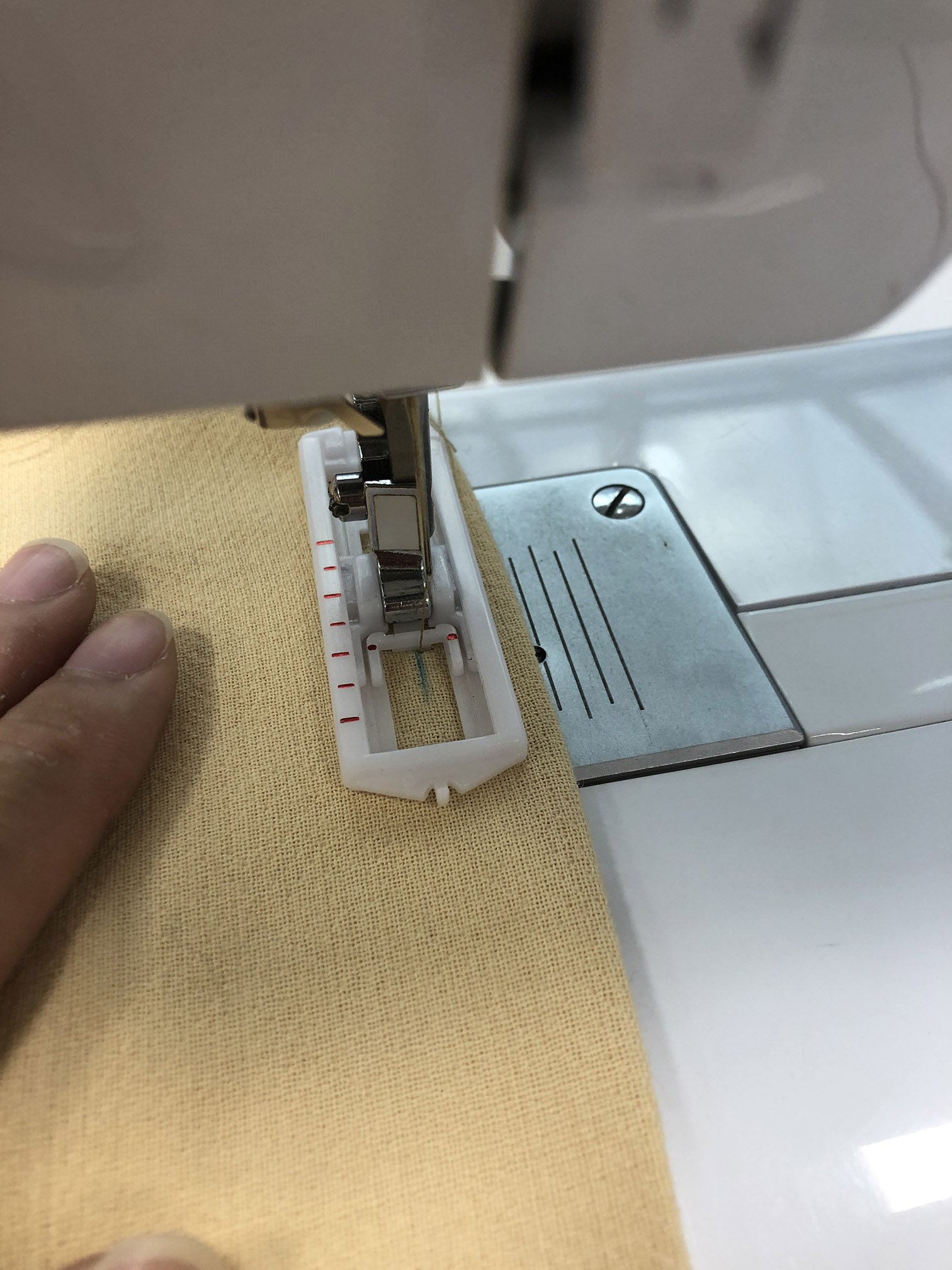
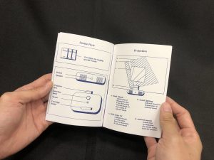
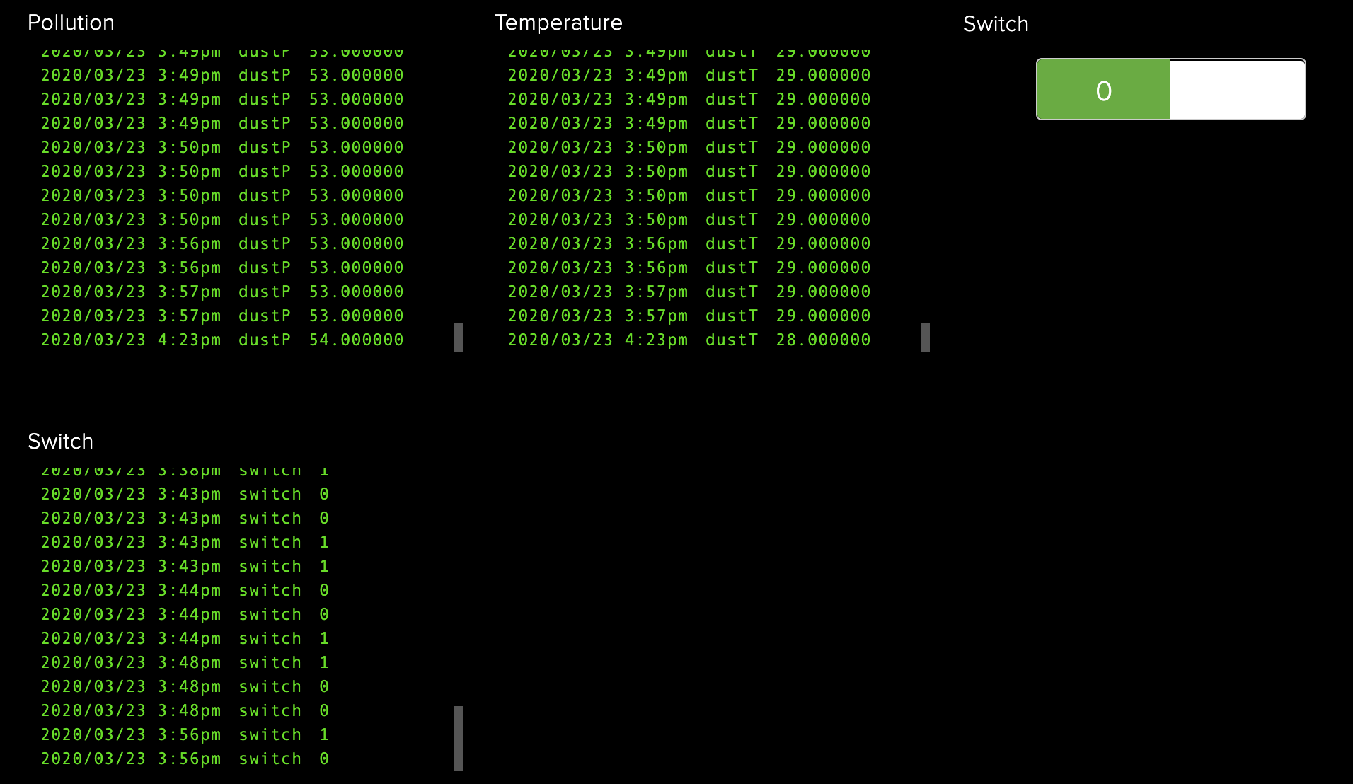
For the sensor, I wish for it to be a motion detector, but I don’t have it with me so I’ll make do with infrared distance sensor to sense change in distance which suggests fidgeting (not ideal, I know).

OVERALL

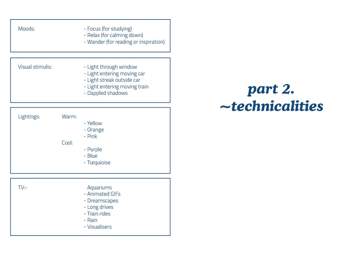
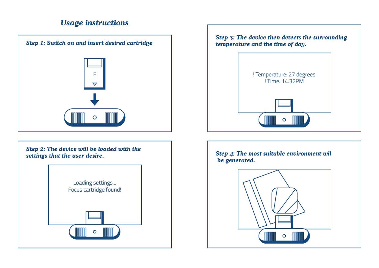
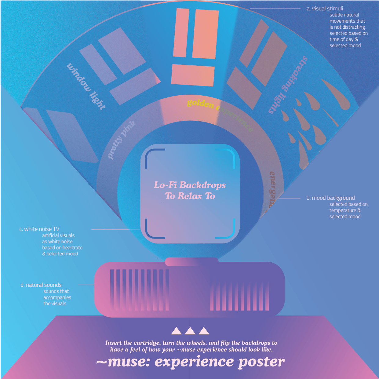
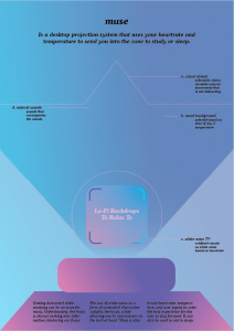
For this project, I can’t make it as well as I wish it can, as there isn’t enough time and materials. As mentioned previously, I’ll only work on the visuals for “focus” mode, which is just window light effect, relaxing TV visuals, relaxing sounds. In addition to that, I’ll work on a using the sensor to alter LED colour (to indicate change in mood), TV visuals change, sound cue change (if possible).

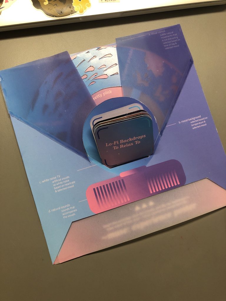
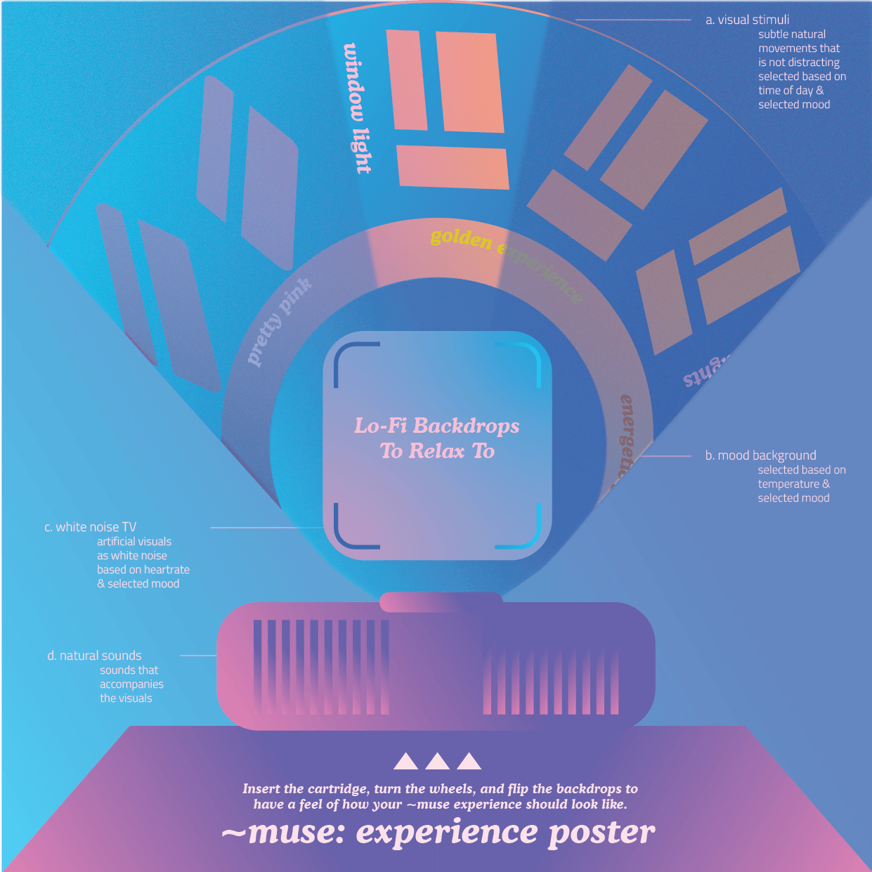
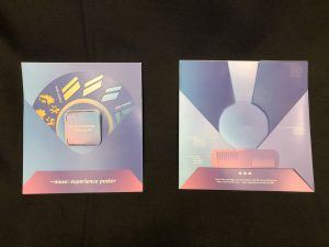
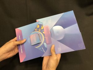
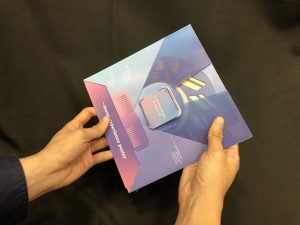
For presentation, I’ll also create an interface and graphics to show how the controls and the lamp will look like.

PROGRESS WITH THE PROJECT

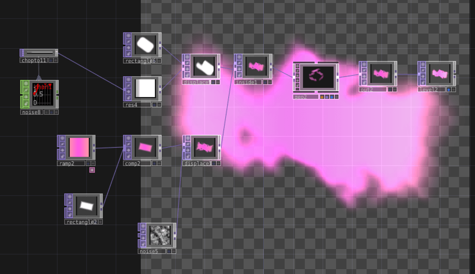
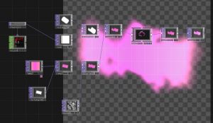
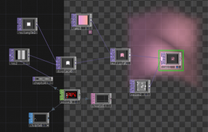
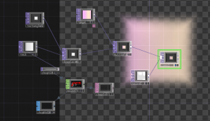
So far I’ve been playing with TouchDesigner and learnt quite a bit.

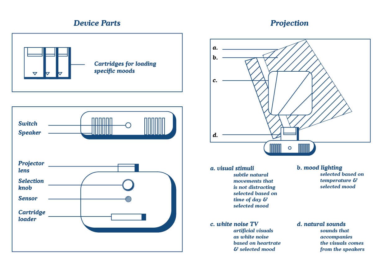
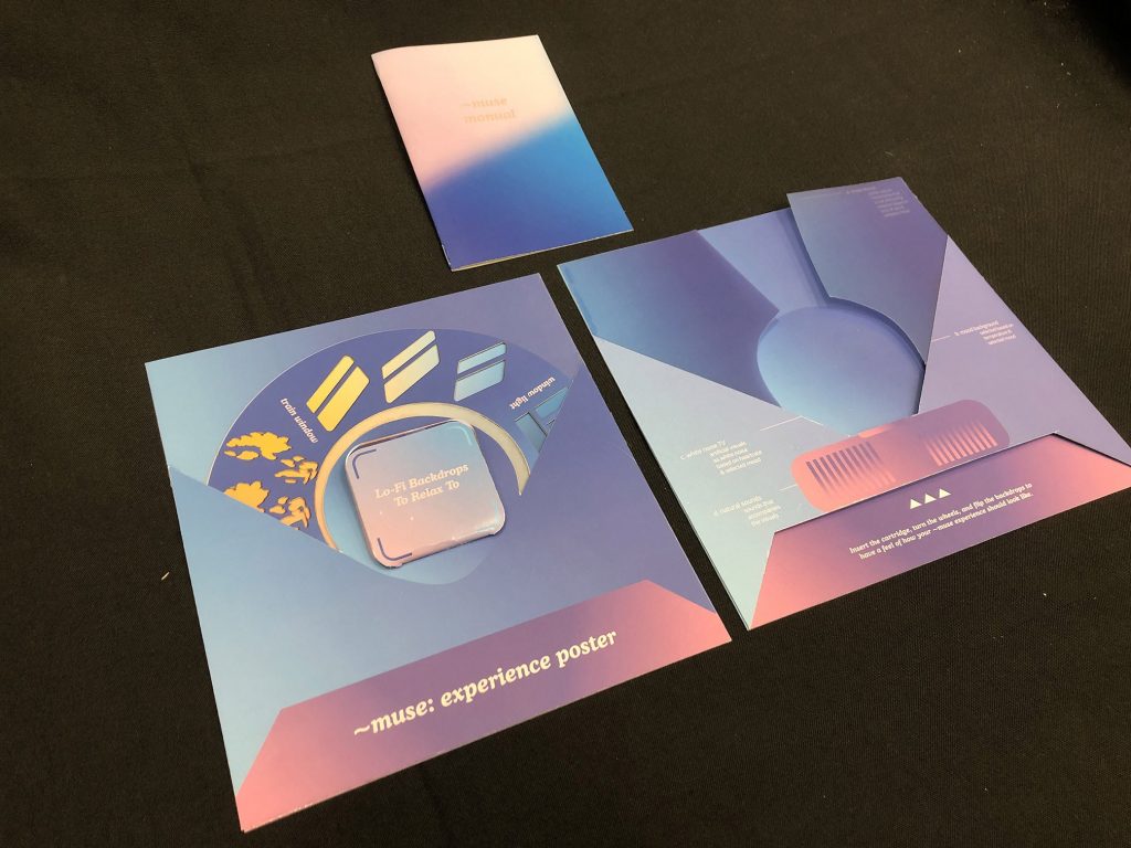
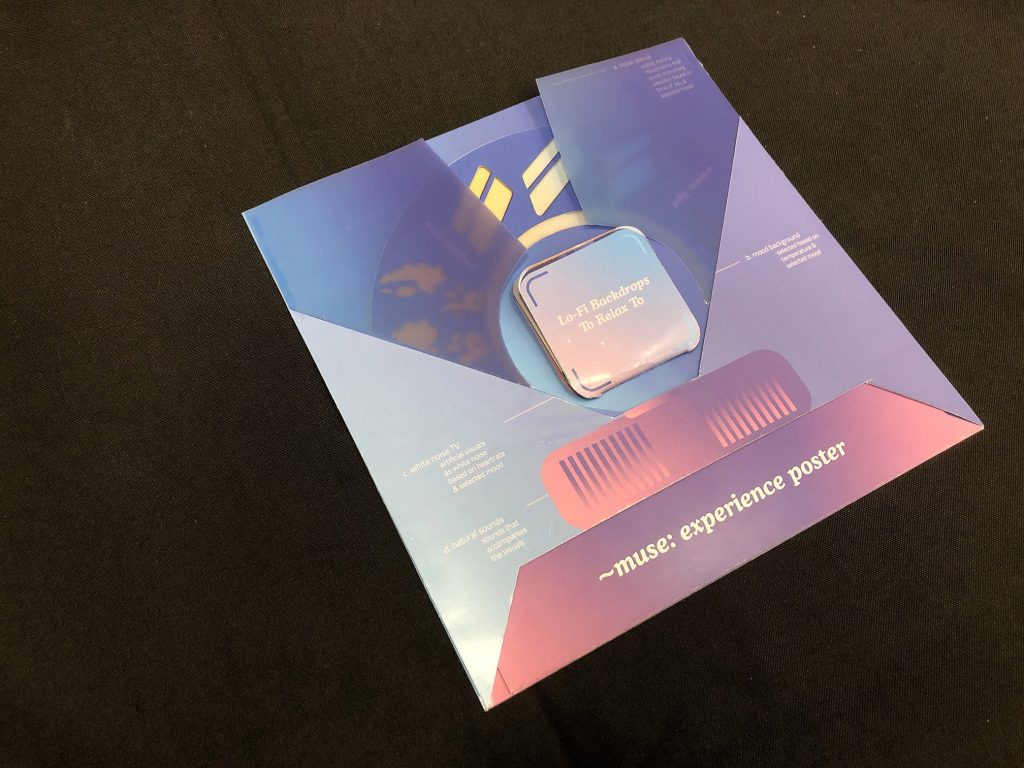
For this project, there are a few parts:

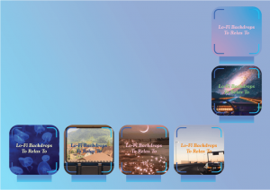
  1. Window: the window light effect
    1. random opacity change
    2. random window effect (multiplied noise)
  2. Window colour: The time of day light colour
    1. controlled by time of day (for this project, I’ll let it run)
  3. LED mood lighting: To change the mood of the room, but I’ll only use a strip of LED to indicate for now.
  4. TV: Visuals to help stimulate the brain
  5. Distance sensor: To detect fidgeting (temporary solution)
    1. Once fidgeting is detected, a counter goes up. If fidgeting stop, counter goes down
    2. When counter reaches max, all activities within TouchDesigner will activate
    3. This includes: change of TV size, change of TV visuals*
  6. Projection case / Lamp case*: Won’t be having this as I don’t have the materials and workshop accessibility
  7. Selector*: Within TouchDesigner, I’ll create different assets and will allow for selection of different assets (in real life, adjusted through interface)
  8. Interface: This will be a graphic just to show how it will look like.

* Not feasible / will only be done when theres enough time!

Also, Pin Yi is working on something similar to mine in terms of the window light visuals, and he shared this reference which I think is very similar to mine. Although its quite the same, I wanna point out that my concept involves interactivity with the visuals which brings about immersion.

leslie nooteboom’s ‘komorebi’ lamp projector plays video looped light-patterns


So this OSS post ends here abruptly because I’ve moved on and continued (and finished!) the work instead of typing away. Kinda figured it out…? so I’ll just post this as post for my own thought I guess. You can see everything else in my presentation!

Tutorials (may be helpful to people reading this in the future!)

1. TD for projection mapping: This is useful if you want to know how to do projection mapping with TouchDesigner. The tutorial goes through Kantan Mapper in TD which IMO is quite buggy for Macs but useful nonetheless.

https://www.you- tube.com/watch?v=1Qy- Fy6aJM4U&t=179s

2. TD for different animation effects: This tutorial goes through different animation effects that can help you in learning how different nodes work and how they work together.

https://www.you- tube.com/watch?v=WS4iZxoQT5s

3. Intro to TD: Super long video but worth watching! Recommended by Amanda Lee! The video goes through the different basics of TD. It’s kinda like a crashcourse so after a while you may forget how certain parts work so it goes very well with more tutorials.

https://www.youtube.com/watch?v=w- mM1lCWtn6o&t=2915s

Comments about my project after presentation (reflection…?)

I realised there isn’t much to add as I’ve posted the process in the slides which is in the final project post. So I’ll just write my reflections.

I think it’s fruitful that I learnt a new software that I know I will continue using through the years. Kind of an excuse but I think the pandemic affected my productivity as I settle into the work from home environment. Halfway, I lost sight of the project’s meaning and just went with what I had at that moment and build it from there. But overall I’m quite content with the project.

I wish I can test it more because I think the feeling you get from the projection isn’t very strong. Best if I’m able to test if it can actually help in making you feel focused. I’m honestly more interested in the “reading” mode for this project which I’ll use an effect similar to window light inside a vehicle and a window into the outside of a moving train. That sounds like a nice environment for reading for me haha.

Anyways, yeah if we get to really exhibit it that’ll really be nice. If I’m able to create a cubicle for it. Sadly we can’t so I guess this project will never be fully realised unless I have the discipline to continue it after the pandemic. Will I? I don’t know. But that’s that. It’s been nice working on this and learning new things. Really thankful for Prof. Elke and Merlin for all the useful resources and lessons through the class! Especially the intro to VR which I never experience before, and Unreal Engine which may help in the future.

Ok bye!


Week 11 Wearable Tech Updates

Last week, I was drawing this to collect my thoughts and it helped me figure out the logistics of my tech

Last week’s electronics setup:

LED + wifi
Servo + wifi

Last week’s progress:

I managed to complete the jumpsuit with help from Galina for the zippers and connecting the 2 pieces together!

Galina also taught me how to sew button holes which was very fun!!

What’s left for the jump suit is for me to hand sew the buttons, to create button holes for the sleeves, to add front pockets, and belt holding thing. But that’s not my priority now.

This week, I’m working on the cape and armour pieces.

This Week’s Progress: (incomplete as theres more days this week to work on this!)

I was playing with the materials to create the look of desert beetles, but it failed so I will just stick to the pvc without material alterations.

putting pins before heating it to create round bumps but it ended up folding
only heating the PVC creates this effect

Cutting and putting things together: I was experimenting with the materials and turns out its more flimsy than I previously thought. It’s also much thinner than I thought so it doesn’t look as good if it’s single layered. Sewing 2 pieces together makes it look better, which means now I need 2x the amount of PVC ($$$$$$$!!!!!!) but at least I have 1m left of the pink piece which I’m not gonna use as pink contrasts too much with my garment. I’m switching to green instead.

What was previously the neck piece was tested on the shoulder to see how it looks like as a shoulder piece.

I was having a hard time trying to figure out which cloth to use. Using both cloth together with the armour will make the whole look very weird. Too much is going on. Using only 1 cloth and the armour works, but I need to decide which to remove. In the end, I removed the metallic mesh cloth.

The final decision (except the pink parts will now be green)\

I also started sewing the cape piece to make it more frilly / have pleats. So yeah. (no pics tho)

So in conclusion, this week was more of a start of the next phase, and I am more or less confirmed for the entire design and I’m happy with it. I’m gonna continue the cape till I’m happy with it then I’ll start with the armour which is gonna be a pain 🙁 and I need to go buy the PVC also. Hopefully finish this by week 12 end so I can finish the electronics and have time to finish up the small details. And also work with Shah with the fashion runway!!! AHHHH!!!

Oh and also Mayle was working on a PVC vest and I took a pic of the pattern so I can tweak it (thanks Mayle!!!)

it’s actually just a pants pattern but if you drape it over the shoulder it becomes some kind of vest which looks like my chest armour!

My sketch of how I think it will look like:

The perfect vision of my garment

Ok out of topic but I think what helped me a lot was to imagine my concept as an Overwatch character. Anyway, here’s an updated concept:

Concept: nomad from a future dystopia city which is covered in dust from sandstorm due to desertification and global warming. Cyberpunk elements (iridescent armour + tech) to create a sense of urban-ness (because he’s still from a city) and sandy garment to blend with the desert city. A bit of inspiration from beetles also (in terms of their colour and appearance)

ALSO… I’m thinking what if the controller on my belt can control which city to look at. And because different cities have different temperatures and pollution levels, the values will cause the garment to react to it. Hmmm…

Media Art Nexus Progress (so far)

Wall test last week:

We found that low vibrance / slight desaturation works well, but not too much. The colours (now when I think about it) works good, just that there needs to be some kind of texture to even out the solidness of the colour.

UPDATE:

The final look of the backdrops looks something like this: (note these are screenshots so its low res)

There are some additional textures which are not updated on these images but it’s okay, will show them next time.

The past weeks, Van was working on animating the characters while I’m finishing up the backdrops. Now that the backdrop is more or less done, I’m working on animating the objects.

Using tutorials, we learnt how to loop the animations which will complete everything. So for now, everything is going well and we just need to mass produce the animations and test it. Good thing is that we can still tweak the colours after we are done animating so if there’s any problems we can always fix it!

Animation test: (with van’s character animation + some of my bg animations)

So for now, we’ll continue animating.


Week 11 Interactive Environment Updates

For the final, I wish to do a smaller version, which only includes the environment for studying, and if possible, reading.

For this week, I’ve watched Touch Designer tutorials and this one taught me a lot:

Here’s some of the bunch of stuffs I made along with the tutorial that I think is helpful in my project:

Visualiser-like effect
Oil in water effect

I was using noise a lot to randomly generate effects.

Best results: noise bg + moving gradient + distortion on frame
another version which is not as great but can work out

In conclusion, I’ll continue working on this and refine it to look good.

Today’s consultation notes:

– brochure is useful in showcasing the work before people see it so it should be showcased during presentation / exhibition and can even be used as a brochure for selling my device if its a real product 😀

– like an app or something that can connect to the device, or link to heartrate, etc. However personally, I feel like I should have everything to be attached to the device directly to make it as simple as possible. I think an IR distance sensor (to detect restlessness / movement) and a gesture sensor will work well with the interface, together with IoT to detect time and temperature.

– studying colours and colour theory psychology and colour in mood lighting can be helpful

Interactive Environments Midterms

Brochure

Experience “Poster”

Prototype 1:

My first prototype which did not work very well as I forgot to account for spacing at the side, resulting in me needing to manually down-size the wheel crudely.

Final 

The “Poster” is made to be an abstract version of the actual work. Using wheels and pages of images, the poster is interactive and is made to be intuitive for users to understand how to actual work may feel and look like.
Wheel rotation changing the animation of the projection
Colour will also change with the rotation of the wheel below
The image on the middle can be changed by flipping

Images

Interaction:


Brochure:

Documentation:


More Updates & Electronics

Presentation

https://docs.google.com/presentation/d/17-Pvo66K8ttybAE1qZW7n7R4OzupP-roymF4opGizro/edit?usp=sharing

Updates

I would really like to thank Galina for helping me with the sleeves, collars, and the fitting! Also… IT HAZ POCKETS NOW!!! The pockets are really useless for my concept but having them makes the garment looks really whole and useable after the show, AND I LOVE IT! THANK YOU MOTHER GALINA :’))) Without you my garment will be just a floppy beige thing that’ll be thrown to a corner after the show…

Anw, so here are images of the growth of my garment…

It starts from me working on my “final” on my own and….. turns out many things I’m doing is wrong.

Although I got some parts correct, the overall look is quite shabby. I’m ok with it, but turns out it can be much much better.

I went to buy more fabric as I ran out, but then I saw a nicer fabric and it costs $8/m at Gim Joo. I thought I can redo it and do better so I Bought 3m. Came back to school to cut. Lucky Galina spotted that I was cutting it in the wrong direction (not along the grain) so she flipped it for me. After cutting, I went to sew the back and front pieces together, then Galina started teaching everyone on how to work on the sleeves.

I then worked on the other sleeve of the shirt (note: this image may not be the sleeves part cos I didnt document the process :’) )

After finishing the sleeves, the garment looks like this:

So afterwards we worked on the lapels, then the collar. Again, not well documented process, but heres an image of Galina ironing the collar!

nice!

To finish the collar, I have to handstitch the collar and facing so it will be nice and invisible. Galina showed me how to do it and I brought it back to hall to finish it.

Here’s some photos of me looking at the mirror after sewing!

After being happy about the collar, I sew the pants and wore the pieces together:

I m the star in mario games — i forgot who said it

Galina helped me with the fitting afterwards to make sure that I can bend my body with it.

Can’t really see much here, but the fitting is better. The sides are tucked in cos they’re cut and restitched, while the front and back are slack to allow bending

Then, we begin with the pockets. There’s nothing much to see cos I didnt document this also :’)

Now, I’m just left with the zipper and buttons and then I’ll refine the sleeve ends and pants ends and I think I’m done with the garment. Then… the tech part. Which I’m working on right now.

Concept

Ok you see, although my concept have always been revolving around the futuristic cyberpunkish desert, I haven’t really gotten the hang of the exact things I want. So today I clarified it. I also tuned it to fit what I can do and what’s best for a wearable, while also noting that this is a 13 week school project.

Previously, I had an illuminator, respirator, a cape, and sensors on arm that are like armour. Now, I want to make use of the belt and tone down on the components on the garment itself, so I can still impact viewers with the show, make it easy for me, and also stick to the theme.

  • The illuminator now lights up all the time.
  • The temperature and pollution sensors now uses IoT so I dont need actual sensors anymore
  • The mask is the only part that has a motor. This is because motor costs a lot of electricity and very bulky to wear on
  • The belt will now be a piece of armour, and it conceals the utility items (knife, bottle, device)

Code & Electronics

I was playing with OpenWeatherMap API, after Naga recommended it to me. I tried many codes but it doesn’t work and was going to give up. But yesterday, I consulted Zi Feng and we figured out a bit of the code, and I think it was like those kind of moment where you dont look at code for a while and come back and you realised how things work… Yeah… So it worked for me.

So basically, I used the api with the api key and I ran it in arduino and the code will generate the information and pluck out what’s relevant (temperature, humidity, wind speed, etc)

http://api.openweathermap.org/data/2.5/weather?q=singapore,sg&appid=[insertAPIkeyhere]

Then I switched to this other API called Air Visual which has much more information (including pollution)

http://api.airvisual.com/v2/nearest_city?lat=1.3521&lon=103.8198&key=[insertAPIkeyhere]

So after figuring out how API works, I’m able to draw relevant information directly from the website to my NodeMCU wifi module. This means that I don’t even need an external program (eg. Python) to feed my program.

Here it’s taking temperature and humidity

So I’ve decided to use this instead of components so I can lessen the wires and energy. I worked long enough with wifi to have enough faith with it i guess…

So I tried using the data to control servos and LEDs, it worked. But after a while I think the servos burnt out (SORRY ZIFENG I WILL Buy BACK FOR U :((( ) so I needed to plan properly for the power and components.

Photo documentation of code:

Circuit

Prototype main component with servo and LED
Prototype arm component with LED

Electronics Logistics:

  • 3x NodeMCU (ESP8266 wifi modules)
    • Main controller
    • Temperature arm armour
    • Pollution arm armour
    • IF POSSIBLE: 1 more for Device controller
  • 4x 3.7V Lipo batteries (or higher but not more than 5V) 
    • Main NodeMCU + main LED
    • Mask servo motor
    • Temperature arm armour NodeMCU + temperature LED
    • Pollution arm armour NodeMCU + pollution LED
    • IF POSSIBLE: 1 more for Device controller
  • 4x LED strips
    • Main LED (10 bulbs)
    • Shoulders LED (50 bulbs)
    • Temperature LED (20 bulbs)
    • Pollution LED (20 bulbs)
    • IF POSSIBLE: a few bulbs for Device controller
  • 1x servo motor
    • Mask servo
    • IF NEED: another one for mask servo to make it more reliable. (if that’s so, need add 1 more Lipo)

What’s next?

After today’s breakthrough, I’m gonna start getting the necessary stuffs

  • Code for individual electronics
  • Buy whatever’s left that I need
  • Work on final armour pieces
  • Put electronic together
  • Refine garment
  • Test test test! and also charge my batteries.

So for today’s presentation, I’ll show my progress with electronics and my plans.

Wearable Tech updates

Hi so I’m just gonna spam some photos here as a form of update. This is for documentation for myself.

MATERIALS EXPLORATION / RESEARCH

I went online to look at some materials for my armour. I want to find shiny iridescent stuffs cos I can’t get enough of it. I think it’s a weird phase and I hope it works well with my other pieces cos I really don’t know what I want and I’m just winging it with shiny stuffs…

SEE SO MANY COOL STUFFS!!

CLOTHES I BOUGHT:

Duotone Rayon (brown / green): $6/m at 90 Arab Street, Gim Joo Textiles.

Duotone Satin (red / green): $12/m at Chinatown Complex, Yong Zhi Trading.

Duotone polyester (green / yellow): $6/m at 90 Arab Street, Gim Joo Textiles.

Beige cloth (IDK WHAT MATERIAL): $6/m (i think) at Gim Joo also.

So I bought some of those, will keep them as samples and hopefully show my collection of samples sometime!

FOUND COOL BUG. INSPIRING MY CONCEPT!! MORE SHINY STUFFS


TRYING DIFFERENT WAYS TO COMPOSE PART 1

Didn’t like it that much. The duotone satin is too feminine and flowy, does not fit the rugged desert jumpsuit look. The rayon is nice on closeup, but from far, it looks like an ugly brown cloth. I didn’t like it. Both don’t combine well also.

COMPOSING PART 2 (digital)

I tried looking at illustrator to help me:

I think solid colours work the best. And I think beige works well.

COMPOSING PART 3

I’m indecisive. I think beige works best though. I’ll run with it first. Meawhile, shiny stuffs bought from Spotlight. $18/m 🙁

BROWN BASE:


BEIGE BASE


OTHERS (i don’t want to rotate the images anymore, takes too much work cos OSS isn’t that good at portrait photos. So i’ll have them here sideways since I’m more interested in seeing the beige and brown)

I got a lot of feedbacks that this looks StarWars-y, which I think is good and bad. StarWars kind of goes for a space nomad kind oflook?, so it kinda makes sense for my concept to have that element as well. I mean, pretty sure they have similar concept as me. I just didn’t realised it’s similar.

Also, I like shiny cloth as the base. But it’s too soft. As for green, I also really love it, but it does not fit my concept.

PAPER PROTOTYPING: ROUND 1 (pattern tracing)

ROUND 2: better sleeves, torso, copied from Muji shirt that fits me really well

MY FIRST MUSLIN PROTOTYPE IS TOO UGLY TO BE SEEN SO BYE

FIRST TRY WITH SLEEVES!!!

FINISHED FIRST PROPER MUSLIN PROTOTYPE!


WHAT’S NEXT?

I think too much so I’ll probably ramble if I keep going. I’ll just start on the actual piece this week (WK 8). Next week I’ll start on electronics (WK 9). But before really going into electronics, I still need to plan out the armour pieces so good luck to me ha ha ha. Working on the armour pieces and thinking about electronics will be week 9. Week 10 will really start working on the electronics.

Also, this weekend I’ll go buy more cloth cos I realised I don’t have enough. I may scout for new materials for my body piece cos I’m still not super satisfied with it. So I’ll probably make 2 garments if I find a new material. (lol)

AH ALSO forgot to mention that I’ll think about adding collars and pockets after I’m done with the whole thing since I think it looks really cool la. Also want to add buttons and zippers and interfacing so… IDK MAN… I’M REALLY AMBITIOUS AND THINK LIKE I WANT TO HAVE ALL THESE THINGS BUT I KNOW I CANT HAVE EVERYTHING AND IT KILLS ME INSIDE AHHHH


ok bye


edit: ok btw im watching some tutorials

and and and… i want to update some new inspos but I think that’s a lot of extra work 😛

But basically…

https://hypebeast.com/2020/1/undercover-fall-winter-2020-menswear-collection-fallen-man-runway-show-presentation-paris-fashion-week

Museum Field Trip Review

  • Pick 1 interactive installation and describe what you like and dislike about it

    • Story of the Forest is the installation that attracted me the most. As always, teamLab is able to create an immersive and mystical world that is also aesthetically pleasing. It brings some kind of fantastic environment from the digital world that can’t really exist in our physical world. I really like the algorithmic behaviours of the animals which is entertaining to watch in my opinion. I love it when the animals glitch out too! I think these kind of appearance made it more interesting for the viewers, as they try to see what the individual animals can do or react to its environment. I am also really impressed with how they seamlessly connected the projectors together into one long piece of work.
A section of the panoramic projection
One of the rare bois
One projector only do a small part, but when everyone comes together, its beautiful. Just like ants.
    • What I don’t like about the work is that the interaction level is not just low, but is also unintuitive. The interaction only happens when participants stand near the walls at the bottom of the Glass Rotunda, which spawns a tree and animals. The spawning is very slow, which is quite disconnecting for viewers.

  • Describe how does this installation that you have selected fit into the overall environment, did it work? Why or why not?

    • The installation do not really fit into the overall environment in my opinion. It is quite a big jump in both the use of technology and style compared to the other exhibits. I don’t feel that it tells me much about William Farquhar’s drawings of the animals. It felt more like teamLab is doing their own thing and that it’s just animals without much meaning behind it. Although I appreciate the effort and style that is being put into the work, I can’t make that connection with history. I guess history is really much more boring and its difficult to represent it in artistic ways.

  • How is the audience invited to engage with the installation and how do they interact?

    • I think people want to get closer to the animals, and that’s how they are invited to view the installation. However, as mentioned earlier, the interaction only happens at the bottom of the Glass Rotunda, and there is no prompts for users to interact with the walls by going closer. I guess this kind of gives an element of surprise, and it also kind of adds to a different experience to the installation. But, I think that it’s not the best way to engage viewers to interact with the work.

  • From the installation that you have selected, pick at least 1 feature/idea/concept and discuss how you can incorporate it into your own interactive environment project
    • I think I may want to incorporate some kind of motion sensor to my project, actually. Like the spawning of the trees, it can maybe create some kind of ripples or be used to switch the visuals in my installation.


Assets + Quick Look on Wall

I worked on the background while Vanessa worked on the characters!

Background Assets:

Sketches:

Living room (Process)

Originally gonna skip the sketch so I made this but it was very very geometric and lack planning / detail so i did a sketch in the end (see above)

Still not done yet on the right side.

Detailed view.

Bathroom (Process):

Still not done yet.

Kitchen (process):

Also not done yet!

Characters (done by Van)


UPDATE: These are photos and notes from the visit to the wall.

Forgive the quality as I just quickly did a screenshot of the images as they are too big size for OSS to load 🙁

I kinda liked how the screen converts the linework into thin pixels, kinda have an effect. The scale also looked alright but the colours are very very bright.

So here are our notes on improvements:

  • Desaturate and darken red
  • Brighten blue
  • Scale maybe try to make it smaller
  • More textures and shadows, less solid colours
  • Try control the colours more, maybe colour-code certain areas (eg. bathroom = more blue, living room = more yellow, etc)

Thanks fo reading! For reward, here’s Celine posing with our character! Beep!