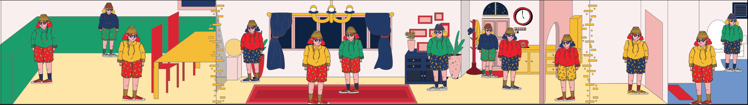
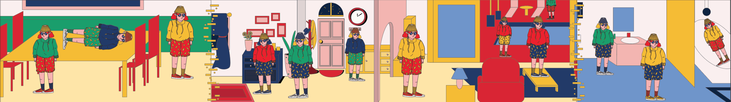
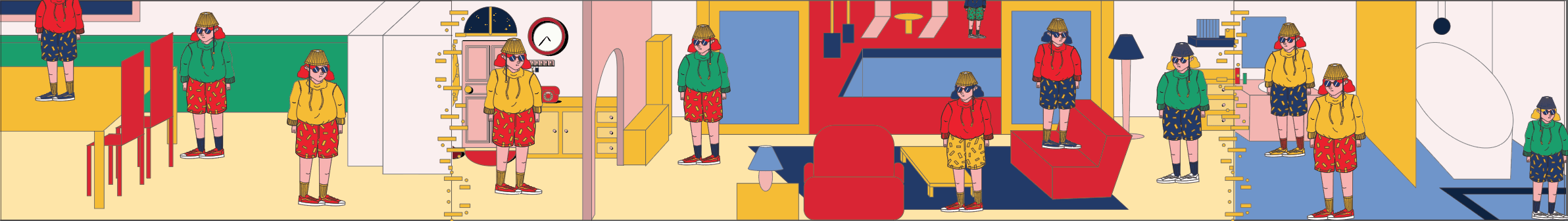
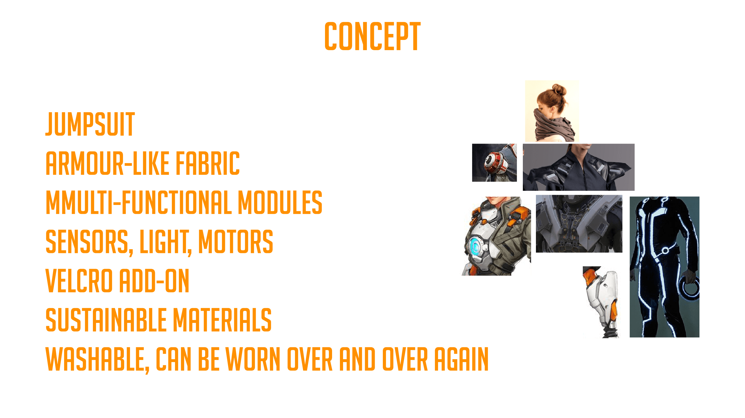
There will be 3 panels, the kitchen, the living room, and the bathroom. All 3 backgrounds will scroll to the right at their own speeds. Between each panels is a particle effect that is some kind of portal.
The house is filled with party goers which is actually just a few same people wearing different outfits doing different random things that is absurd and funny. The objects and the people will be animated.
The wall reaches the end of the artwork and all the people will look at the observer, out of the fourth wall. At this point, they realised that they are being watched, so the wave function collapses and the superposition becomes a fixed state, which in this case is the characters waving at the audience. The screen then turns off with a old school TV screen switch off effect together with some static.
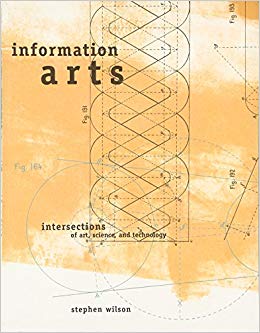
This encyclopedia-like book by Stephen Wilson investigates the relationship between art, technology, research, and science to discover that they are interconnected in many ways.
A brief introduction
Technology is always associated with science, and science is always associated with the frontiers of technological advancements. But this notion of the specialisation of roles in science and art is a idea that only started since the Renaissance. Art making and scientific research actually goes through similar methodologies, as well as pushes the boundaries of technology. For the longest time, people have always been creating and inventing, figuring out how something works before knowing why it does. This intuitiveness and creativity generate new ways of using technology, while a deeper understanding of its mechanisms further pushes it; all in all improving and generating new technology. In this manner, art and science worked hand-in-hand in the creation of technology. Are we able to break away from the notion of art being “creative” and science being “technical”? This book aims to address that issue and see how art and science is coming together in the information age.
The book
Included in the book are some of the best research-inspired artworks that Wilson believes to be thought-provoking and revolutionary, in hopes to challenges our notion of art and science.
Wilson explains the relevant ideas in understandable chunks in the introduction, followed by a categorisation of works based on a group of topics (eg. “Biology: Microbiology, Animals and Plants, Ecology, and Medicine and the Body”). Within the categories, Wilson further explains information that is relevant to the topics and lists a few artists that uses such ideas.
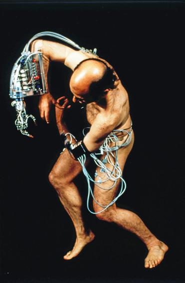
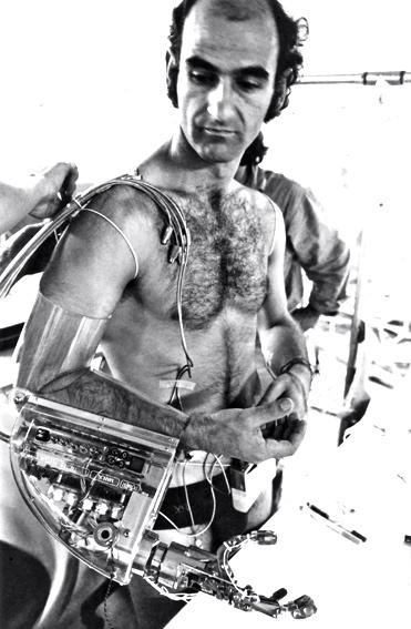
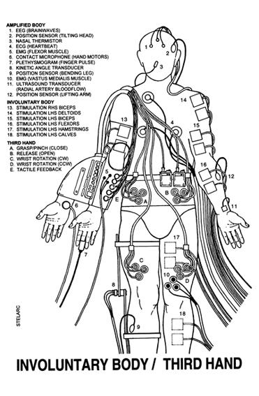
In “Third Hand”, A manipulable robotic arm is attached to the body activated by the host via EMG (sometimes from other body areas) or tele-operated by others. Images taken from https://stelarc.org/?catID=20265
Personal thoughts
I had no time to read through everything, but I was really interested in many of the examples and ideas he listed, especially under the “Medicine and the Body” section as that is within my current interest. It is a very comprehensive and informative book which talks about a really relevant topic in our current time.
I am also interested to learn more about what he said about science, art, and technology. I guess I find it relatable as pop-science (despite its bad reputation as being too watered down) really inspires me. Video channels like VSauce and Kurzgesagt shaped my ideas and thoughts to where I am now, and I love to base my project and works around these ideas.
Source:
Wilson, Stephen. Information Arts: Intersections of Art, Science and Technology. Cambridge, MA: The MIT Press, 2002.
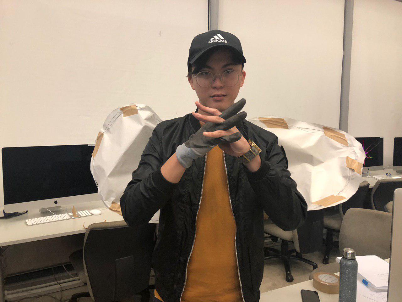
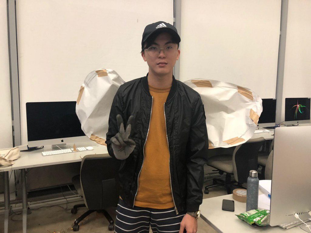
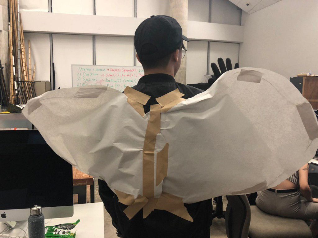
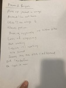
Wings that expresses itself through LED lights, motor movements, and sound
Heart rate detector on gloves that changes the LED light
Movement and interaction with other people will make heart rate change, altering the LED outcomes
Ultimately, interlocking fingers will cause the a different set of reactions on the wings
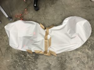
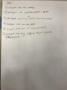
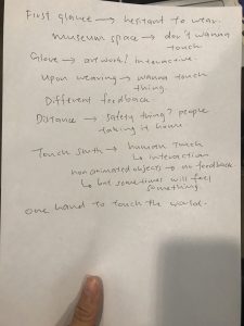
Last week, we spent 25mins building a quick prototype using tapes, wires, paper, and some random materials lying around. With the limited time we have, we only could make 1 set of wings for 1 person, where we initially wanted to have 2 interacting people.
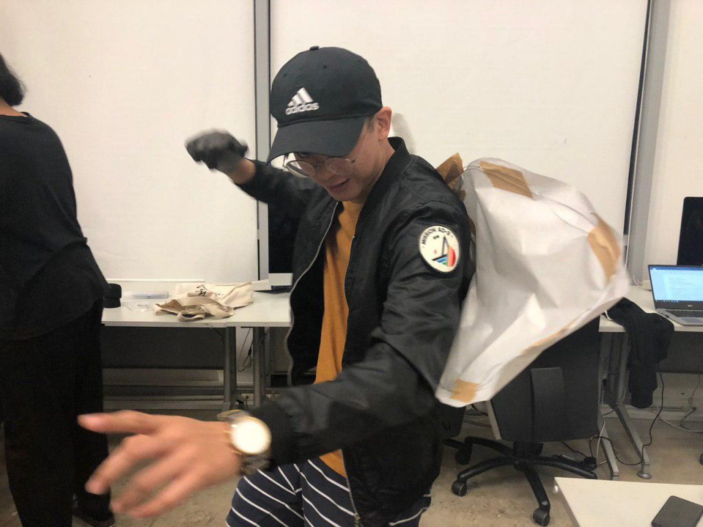
We had Syahrul as our tester. Here is our instructions:
Here is the video of what happened:
So Syahrul was hesitant to wear the prototype due to how fragile it looks. When he do so, he started interacting based on the feedback he is receiving from the beeping and the shaking of the wings, despite there being lights too. This proves that wings are not the greatest idea as the tester could not see its effects.
We also found that Syahrul was interacting with other non-participants and objects around him. This problem could have been solved if we made another set of wings and gloves for him to interact with. Interestingly, he only interacted with people with the hand that had the gloves on.
Other concerns are related to the safety of the artwork and people around, where wearable artworks can easily be taken home by accident or damaged by wearing.
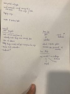
Here are the feedbacks from the notes taker:
What did we learn:
We missed out the effect of external factors that could impact the actions of the participant. During the Body Storming exercise, Syahrul started interacting with other objects in the surrounding.
What we need to ensure for our final project is that the audience should be able to identify what they should be interacting with.
What surprised us:
It became natural for Syahrul to only interact with his his surroundings using his gloved hands.
Syahrul also expected instant feedback from his actions through constantly tapping his gloved hands. He also tried every possible interactions he could do on his surroundings
How we can apply to designing our installation:
We learnt that wings are not very effective as the participants cannot see the effects. We can use a cloak or blanket instead. We need to make 2 wearable pieces for 2 people to interact with each other, if not they will interact with others. We have to make the 2 of them interact with each other and only with each other.
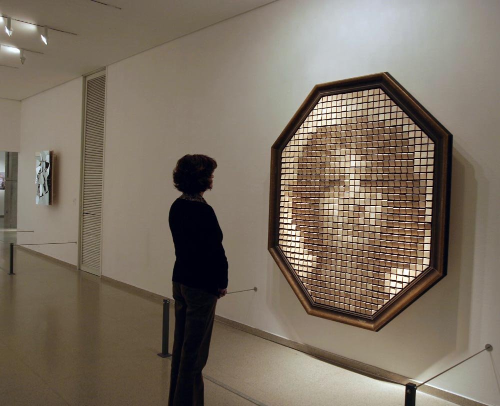
Image taken from https://www.smoothware.com/danny/woodenmirrormuseum.jpg
Daniel Rozin – ‘Wooden Mirror’, 1999 830 square pieces of wood, 830 servo motors, control electronics, video camera, computer, wood frame.
170cm , 203cm, 25cm
The Wooden Mirror is an interactive installation made of 830 wood pieces and motors that moves according to an image captured by the camera which tilts the wood pieces in a certain angle, creating the illusion of depth and therefore the illusion of a ‘reflection’.
“Mechanical mirrors are a platform in which Rozin investigates the borderline and contrasts between digital and analog worlds, virtual and physical experience, or order versus chaos. The first of this series, Rozin’s Wooden Mirror explores the inner workings of image creation and human visual perception.”
Q: Why do you find this artwork or project intriguing? A: I stumbled upon this artwork on Facebook around last year and was fascinated by how the artist managed to show depth using just wood plates and the shadows they cast, which seems pretty impossible. I find it really interesting as I tried to figure out how technology allows us to make what appears to be impossible, which is to make a mirror out of a non reflective material. I was even more fascinated after thinking through the process of making this installation work the way it does.
Q: What is the situation or interaction created for the viewer?
A: The Wooden Mirror appears counter-intuitive to viewers at first, when a reflection casts on a non-reflective ‘mirror’ is made. Through instilling curiosity within viewers, the viewers would be made to look into the Wooden Mirror and interact with it by moving about and observing how the wooden plates move in relation to their own body movement.
Q: What is the intention of this interaction?
A: Other than the testing and application of a crazy but successful idea, the artwork has allowed people to question the potentials of materials, such as using a non reflective surface to create properties of a reflective surface. It also suggests to us the wonders of technology, in how each plate can be intricately programmed to display a certain shade to create a big image as a whole.
Q: What is the role of the viewer?
A: The role of the viewer is perhaps just an observer of the artwork’s effects, despite being actively engaged in the artwork when a viewer happen to walk in front of it. The viewer interacts through the act of just moving around and looking at the artwork. This generates a feedback to the artwork, allowing the artwork to keep changing.
Q: Who has control over the outcome of the artwork or project? Is it the creator / artist or the viewer/audience?
A: The creator has the primary control, ultimately, in terms of how he set the stage to make the wooden plates move in response to viewers (eg. he could have made it hard for viewers to discern their own image). However, the creator decided to make the artwork as it is now, and as such, the audience has more control over the outcome in term of how they directly affect the images portrayed on the Wooden Mirror.
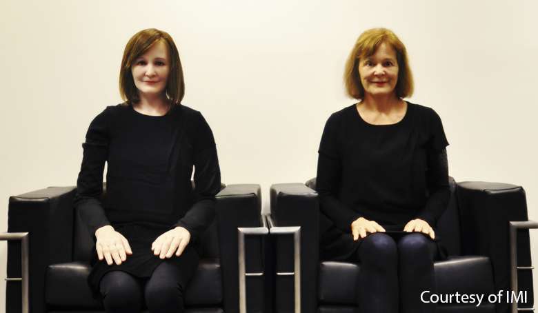
Image taken from https://www.marinabaysands.com/museum/exhibition-archive/human-plus/life-edges.html
Institute for Media Innovation (IMI) Nanyang Technological University (NTU) Singapore – ‘Nadine’, 2013
Nadine is a social robot modelled after Professor Nadia Magnenat Thalman. She is considered the ‘most realistic female humanoid social robots in the world’ at that time. She was created to assist people with special needs, and she can read stories, show images, and communicate with her user. She is also able to answer questions in different languages, simulate emotions in her gestures and her expressions, make eye contact with users, and can remember all the conversations she had with people.
Q: Why do you find this artwork or project intriguing? A: My first encounter with Nadine was during the Human+ exhibition some years ago and was deeply intrigued by it. It was fascinating to me how technology is so advanced for a robot to exhibit (or simulate) social behaviours.
Q: What is the situation or interaction created for the viewer?
A: The viewers can ask Nadine questions and respond to it, creating a flow of conversation. This back to back conversations creates feedback loop between Nadine and viewers. The viewers can talk about many different things like the weather, ask about Nadine, etc.
Q: What is the intention of this interaction?
A: The main purpose of the interactivity with Nadine is to assist people in different ways. She can be a receptionist, or an assistance to people with special needs. But within the Human+ exhibition, the interaction is perhaps to awe viewers in how smart a robot can be and imagine the future where quality and advancedness of robotics can be useful to humanity.
Q: What is the role of the viewer?
A: The role is to just ask Nadine questions and talk to Nadine and reply. The viewer is also perhaps made to think about what to say, and think about pushing the limits of the robot.
Q: Who has control over the outcome of the artwork or project? Is it the creator / artist or the viewer/audience?
A: In this case, I’m quite uncertain as Nadine is programmed to learn. As such I think perhaps both the project (Nadine) and the viewers have control over the outcome of the artwork, which is their conversations, while the creator only have the parameters for the interaction set beforehand (like gestures, things Nadine will talk about, etc).
Q: Come up with 2 thoughtful questions in your essay that will benefit the class with regards to this week’s topic on interactivity.
Interactive art can be something that can respond to our actions. In this case, would you think that an interactive artwork could one day kill someone? Do we need regulations in interactive art in future?
.
Imagine a future where robots co-exist with us. Would an interaction between a viewer and an advanced robot similar to Nadine be considered as a performance? A normal conversation? Or something else?
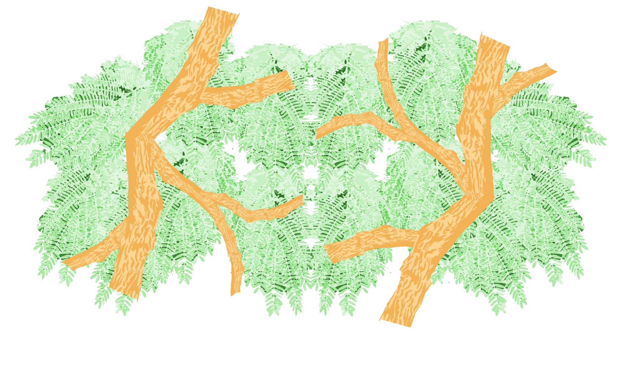
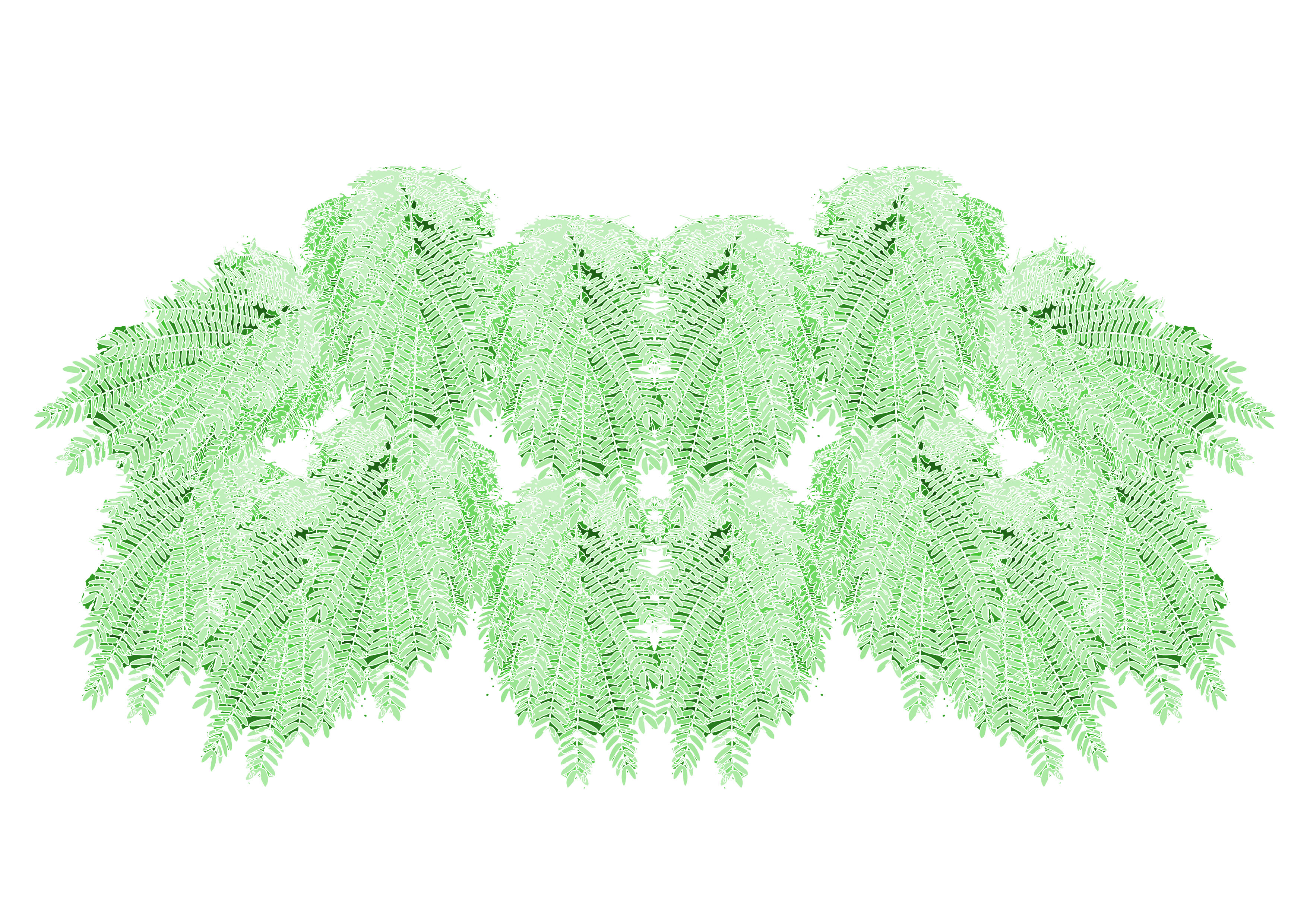
I went out to Punggol Waterway Park and found these patterns in nature.
This green leaves are connected together and look very lively, which reminds me of Singapore as a country that is united and also active. I picture the individual leaves as a little person, all connected together into a bigger bunch. The leaves are also healthy and un-damaged, which made me thought of them as young, which is also a reflection of how I view Singapore.
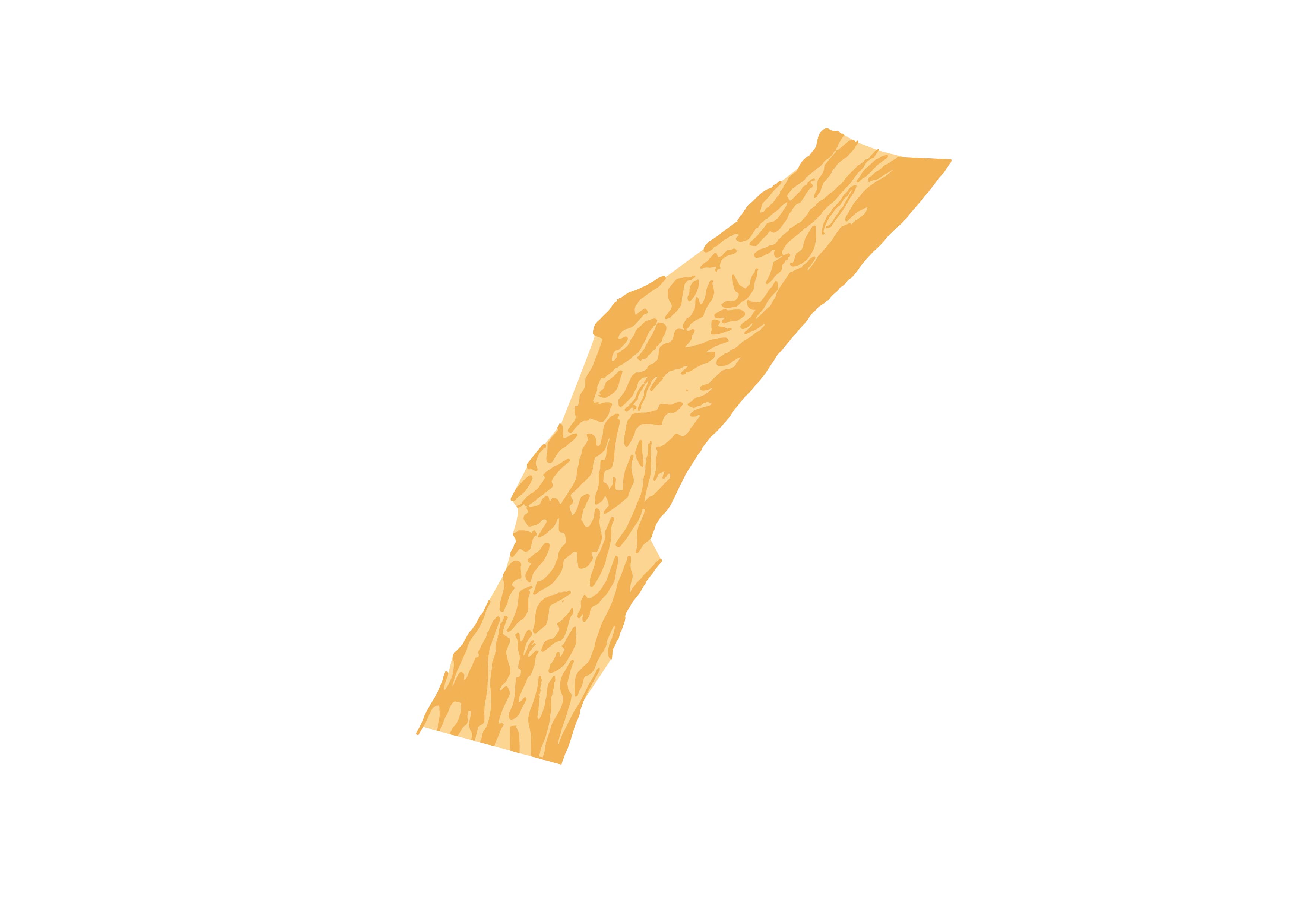
This tree bark patterns are very flowy and have a lot of action going on in there, which also supported by view of Singaporeans being active and constantly on the move. The upward direction of the wavy pattern also reminds me of the country’s growth as a young nation.
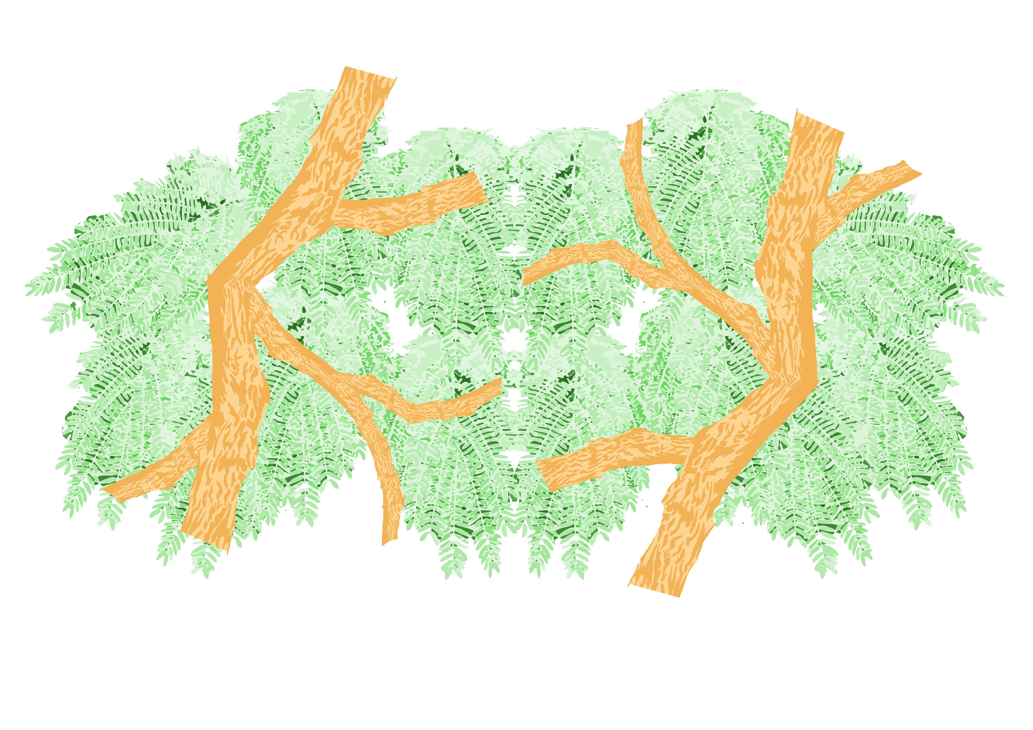
With the first image, I traced and took a part of the bunch and repeated them to form a symmetrical lion, depicting Singapore. I like how the leaves at the bottom created the teeth of the lion.
The next image, I traced over using pencil and then coloured it in with Illustrator to create this part of the tree bark. I then use it to form a tree that covers the front of the ‘lion’.
As I tried to make the image more dynamic, I realised I can use the branch to form the silhouette of Singapore in the negative space. Overall, this composition represents Singapore as an active and young nation that still growing. The arrangement also made it seems like the lion is looking directly onto the silhouette, which also represents how we are still watching ourselves and shaping ourselves. The colour I chose are closer to the natural colours, and I try to make it vibrant to reflect the youthfulness of our country.
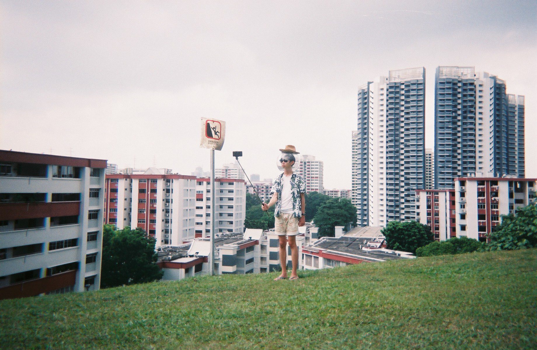
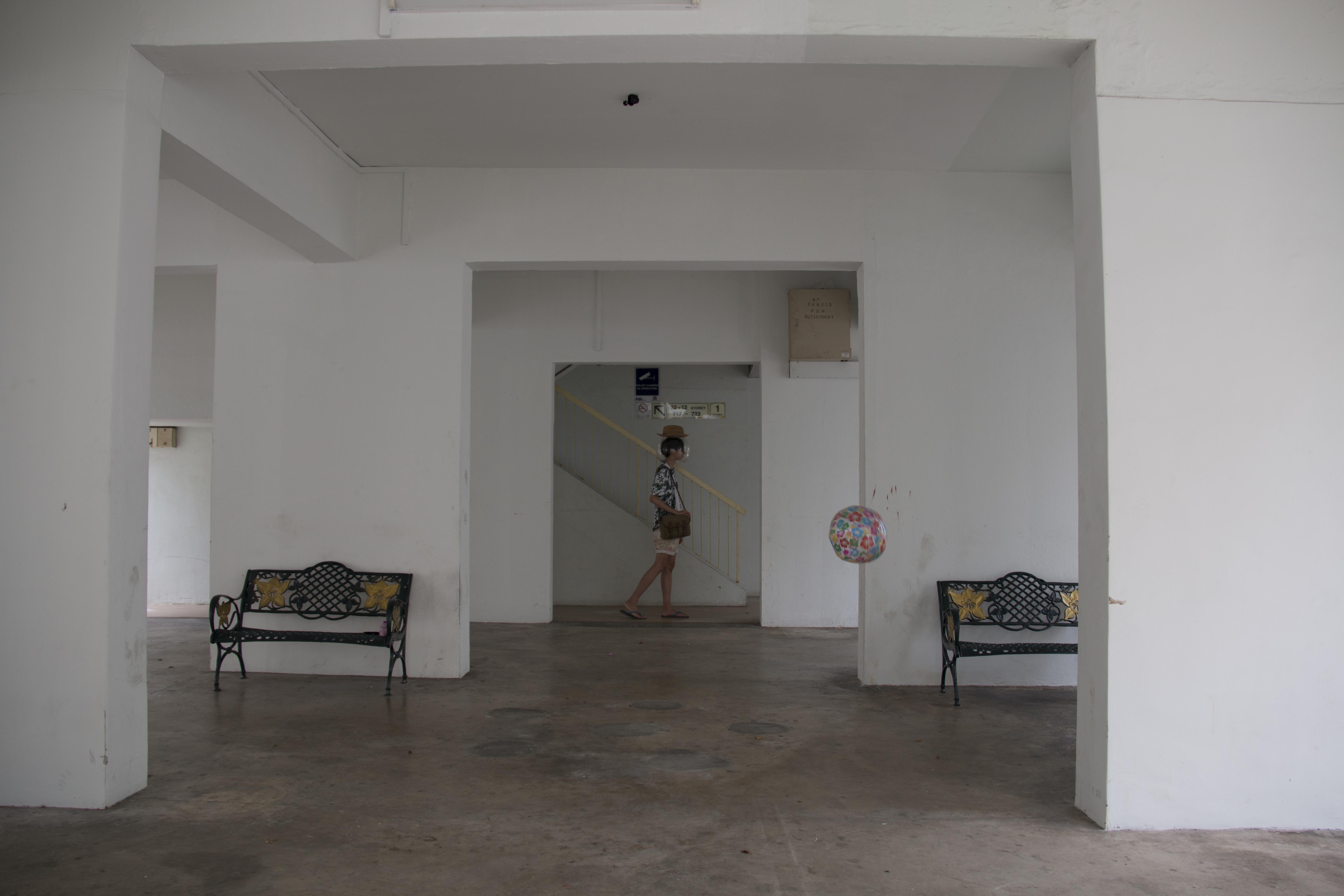
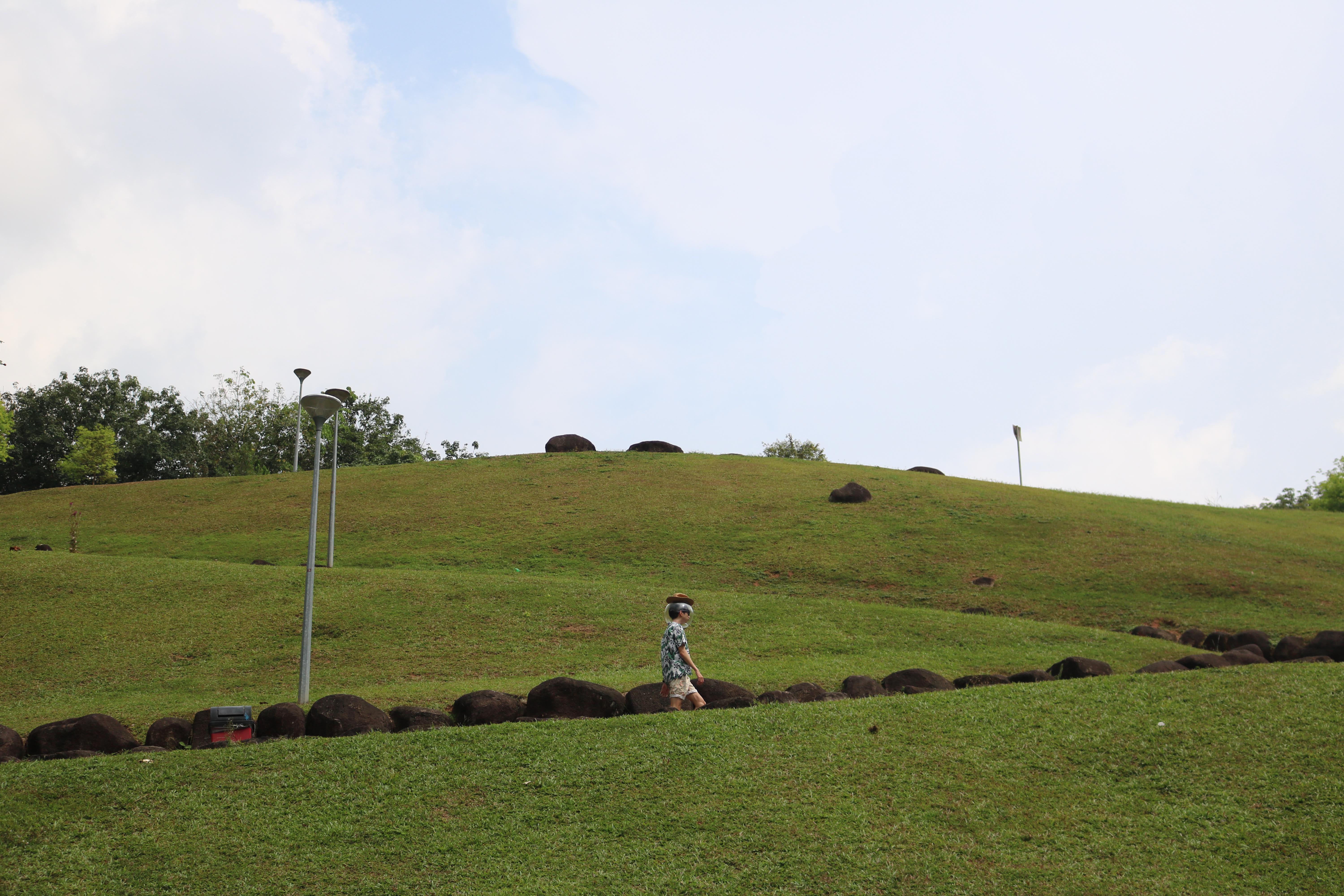
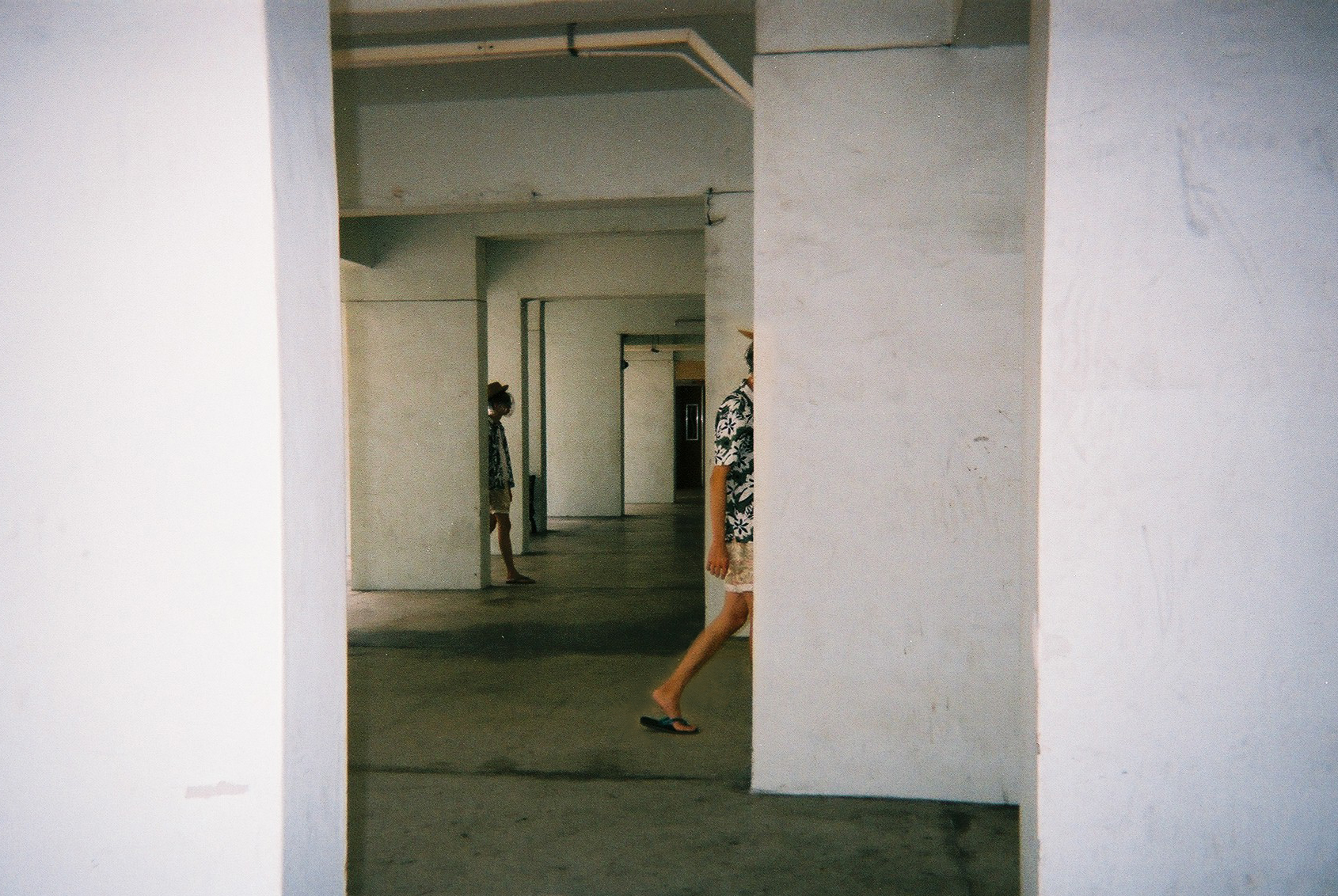
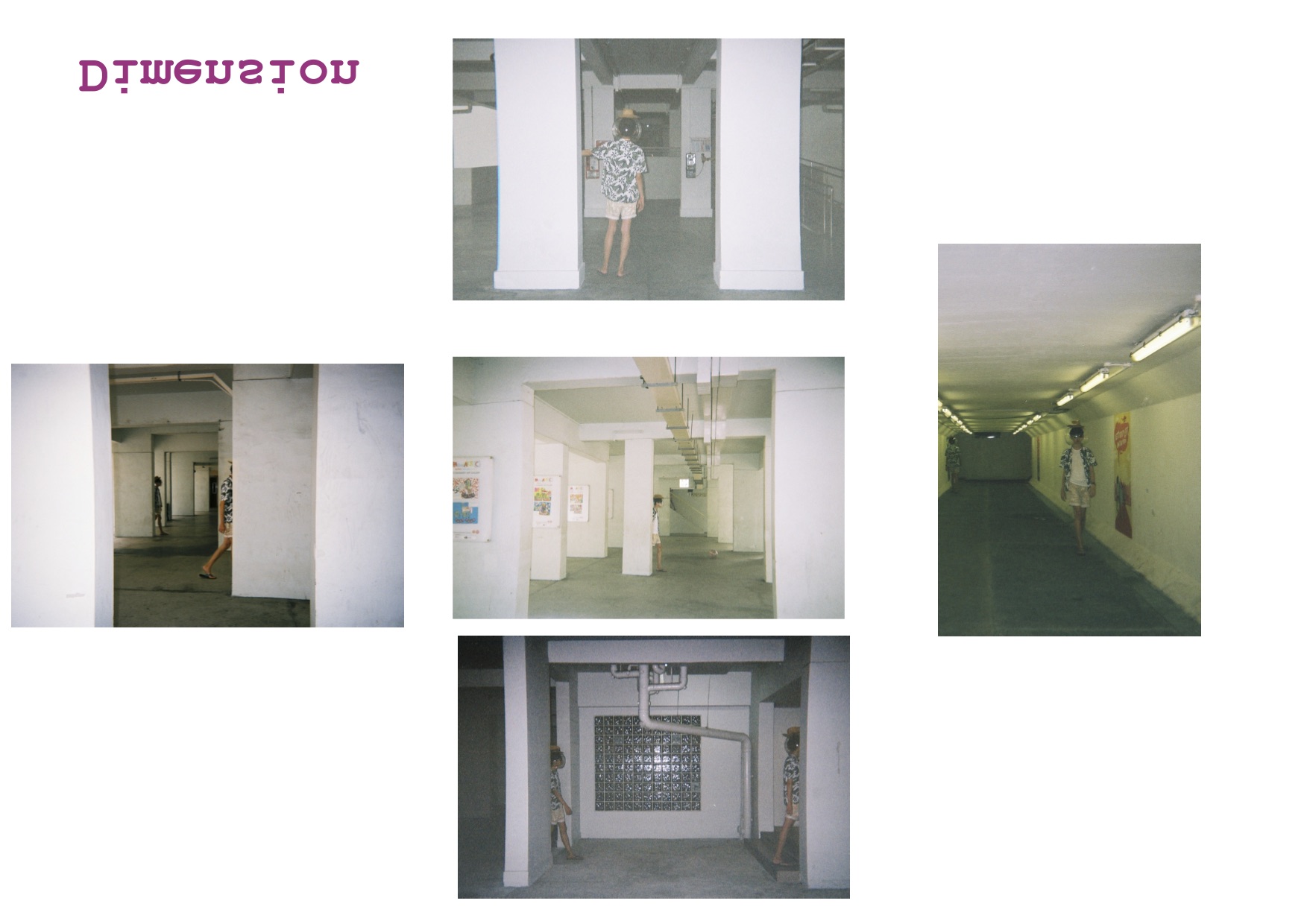
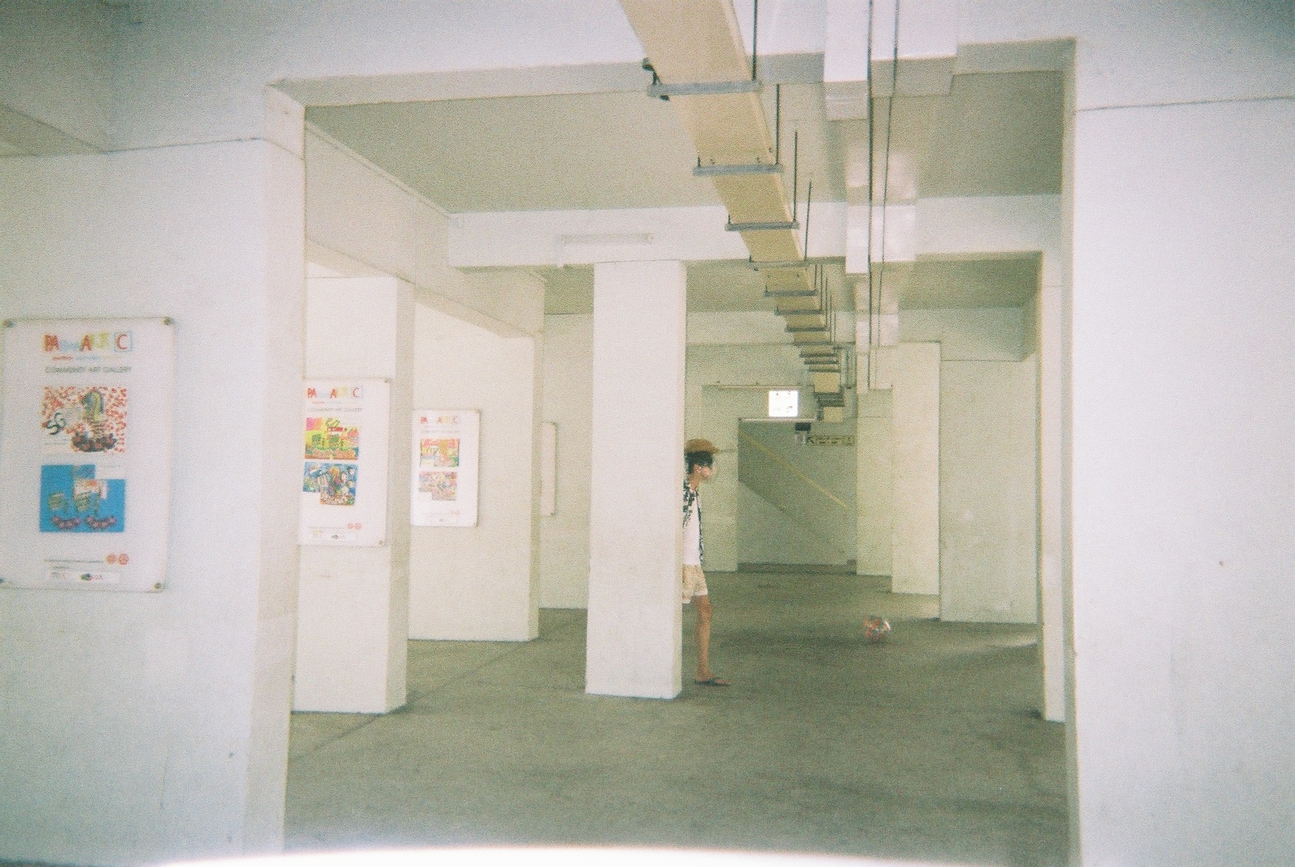
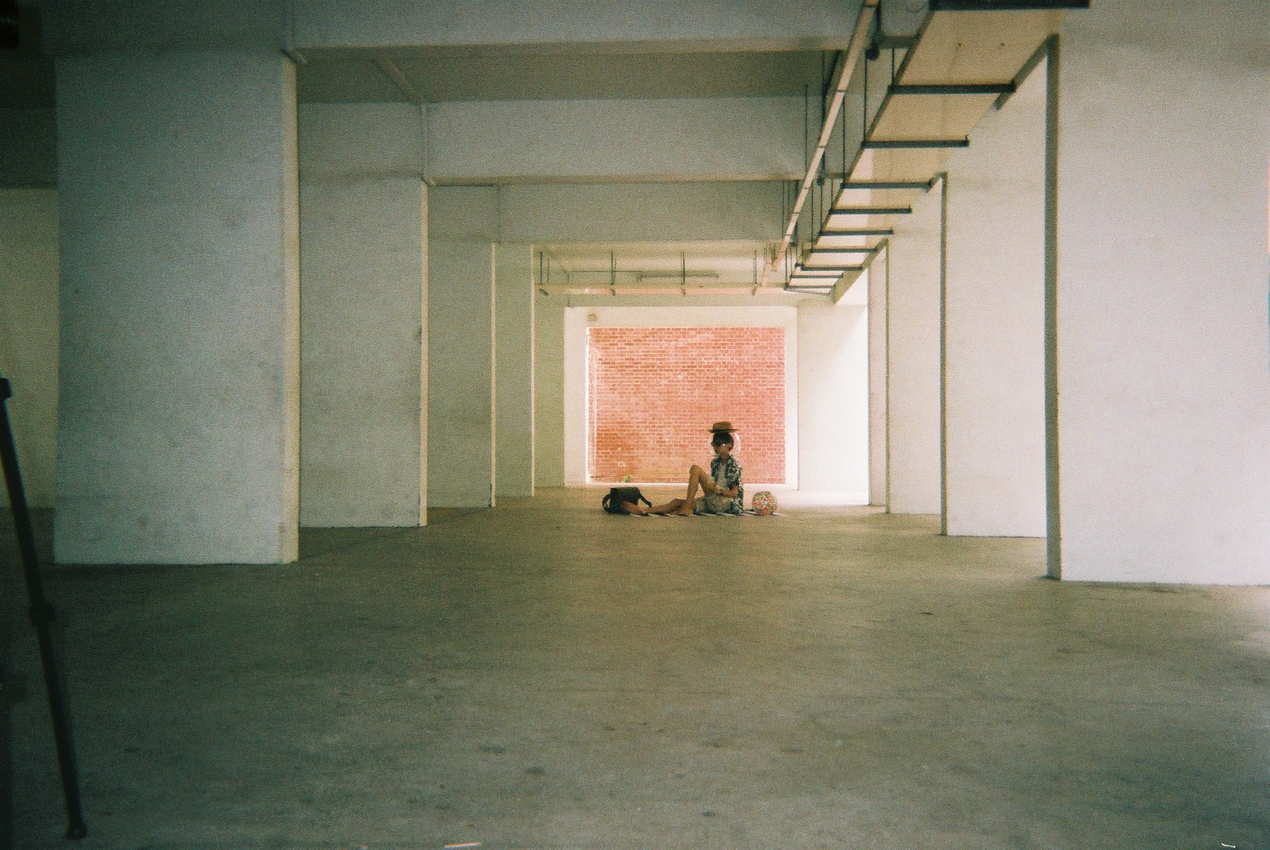
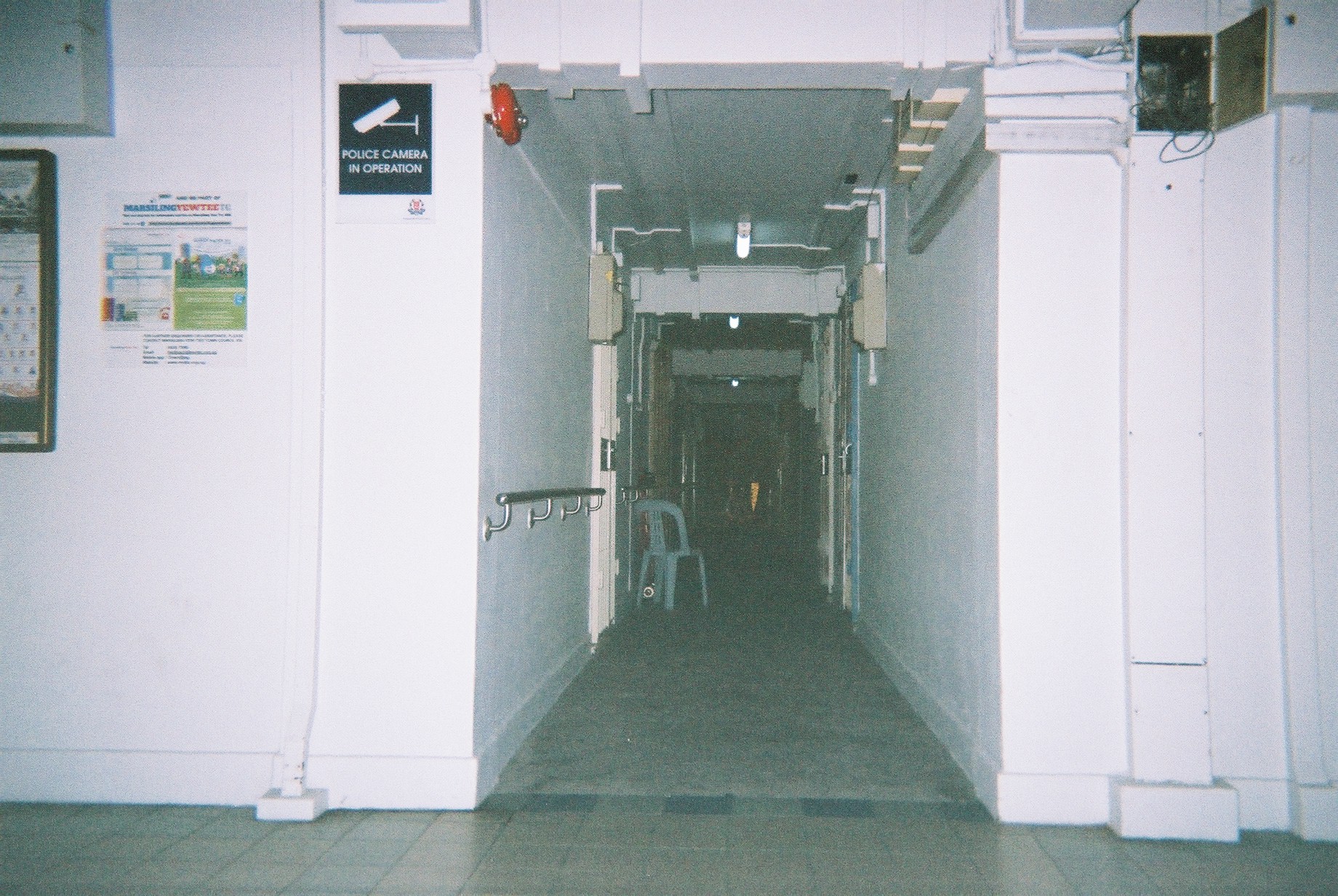
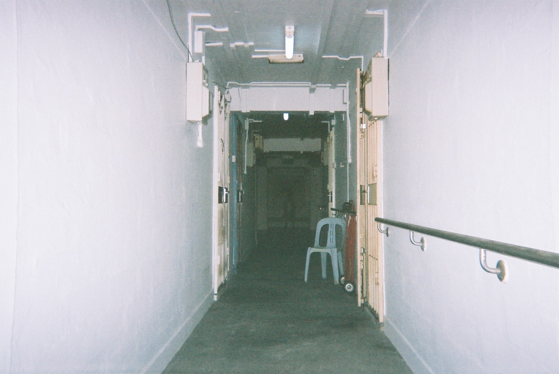
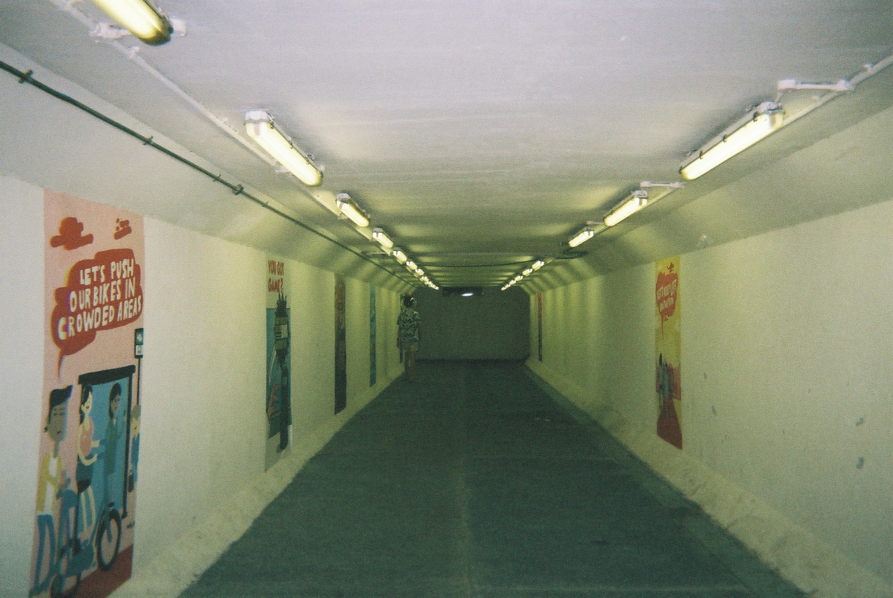
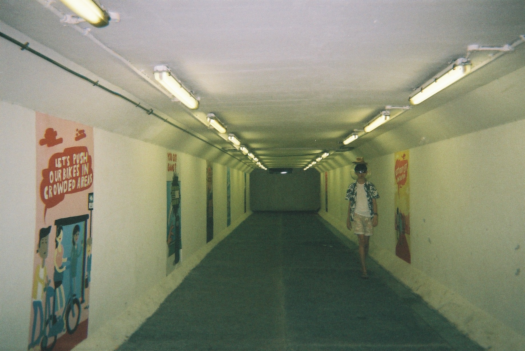
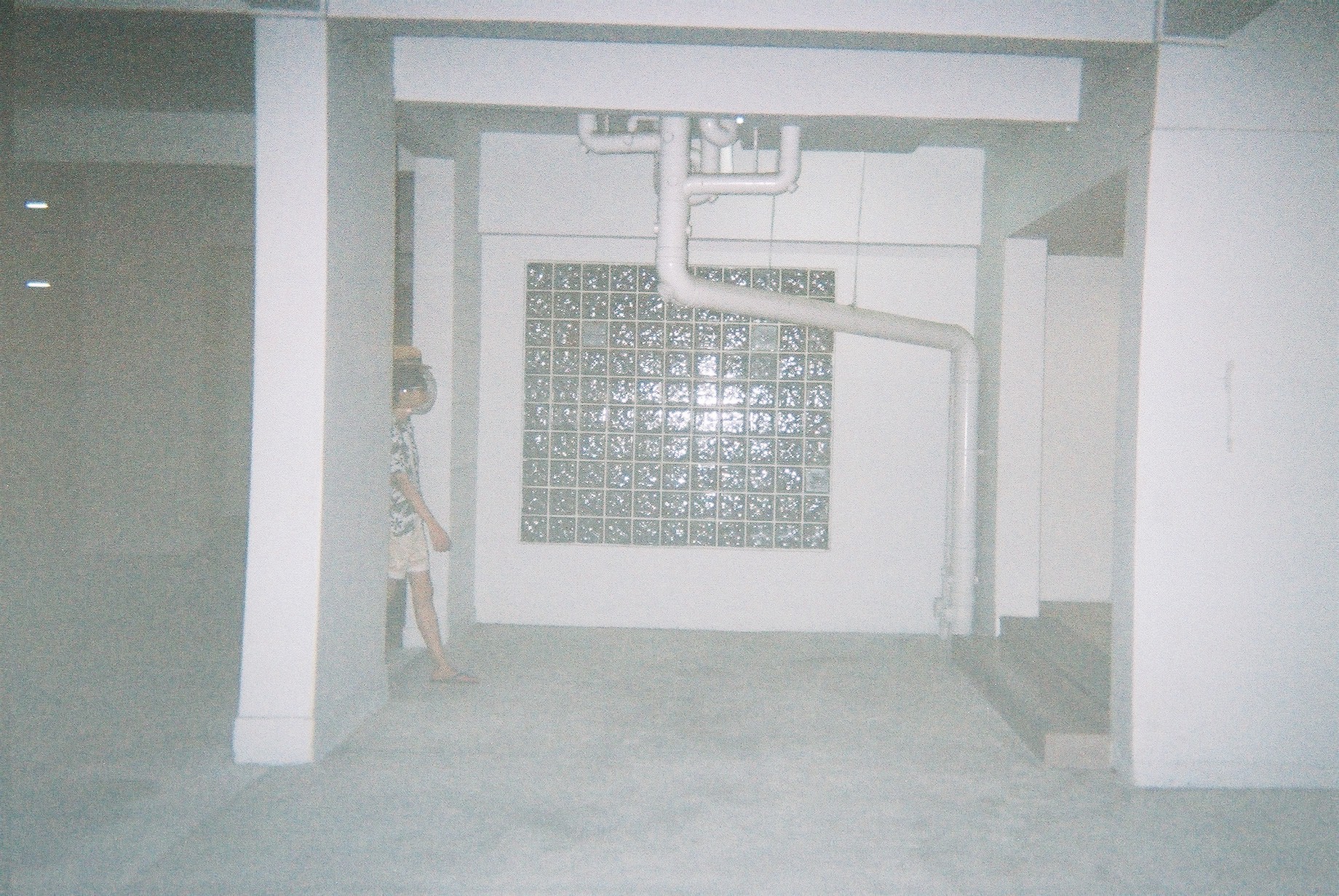
After the 17th March visit to Marsiling, I decided to revisit it to plan my shoot. Here are the few selected locations:
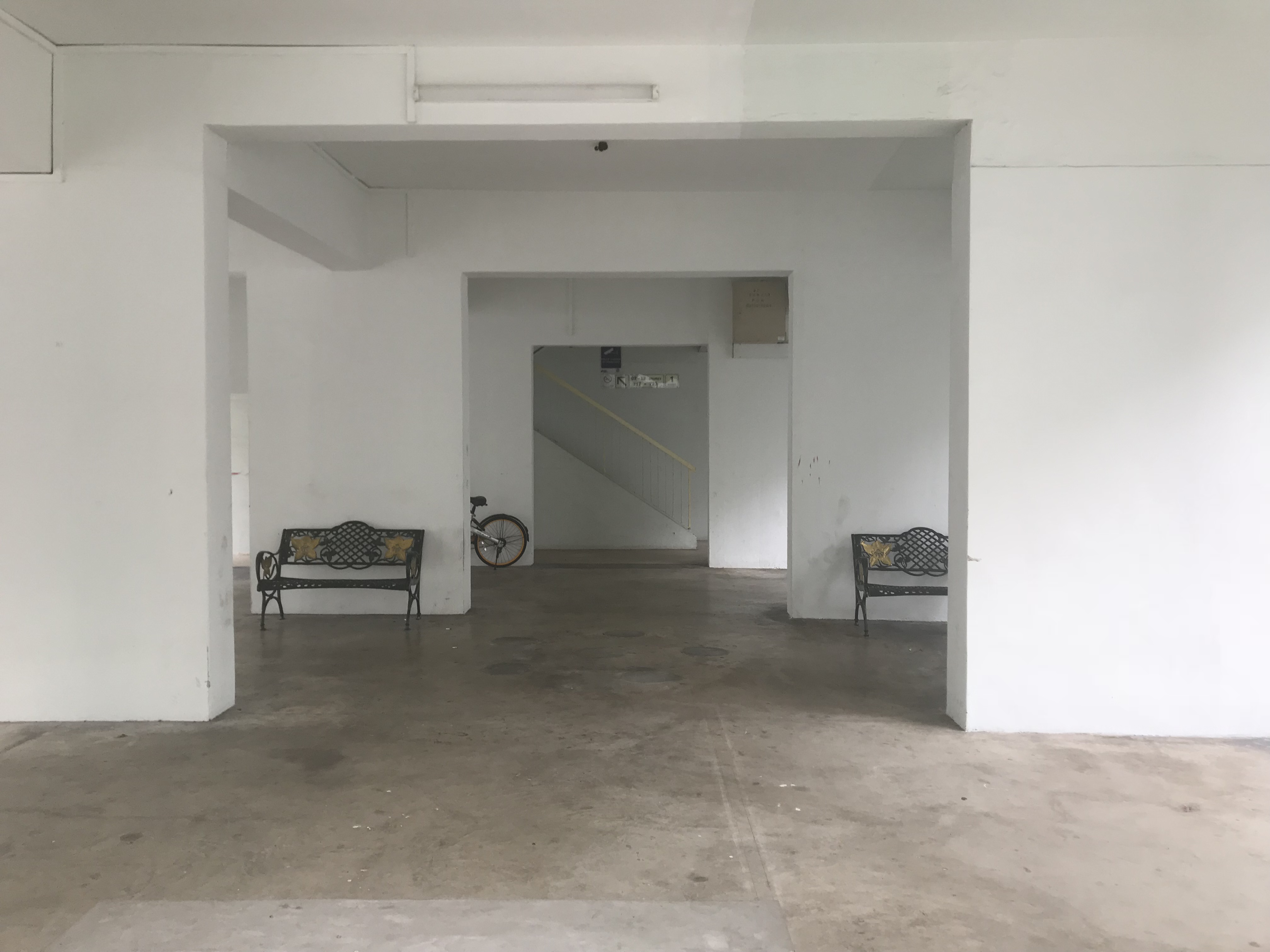
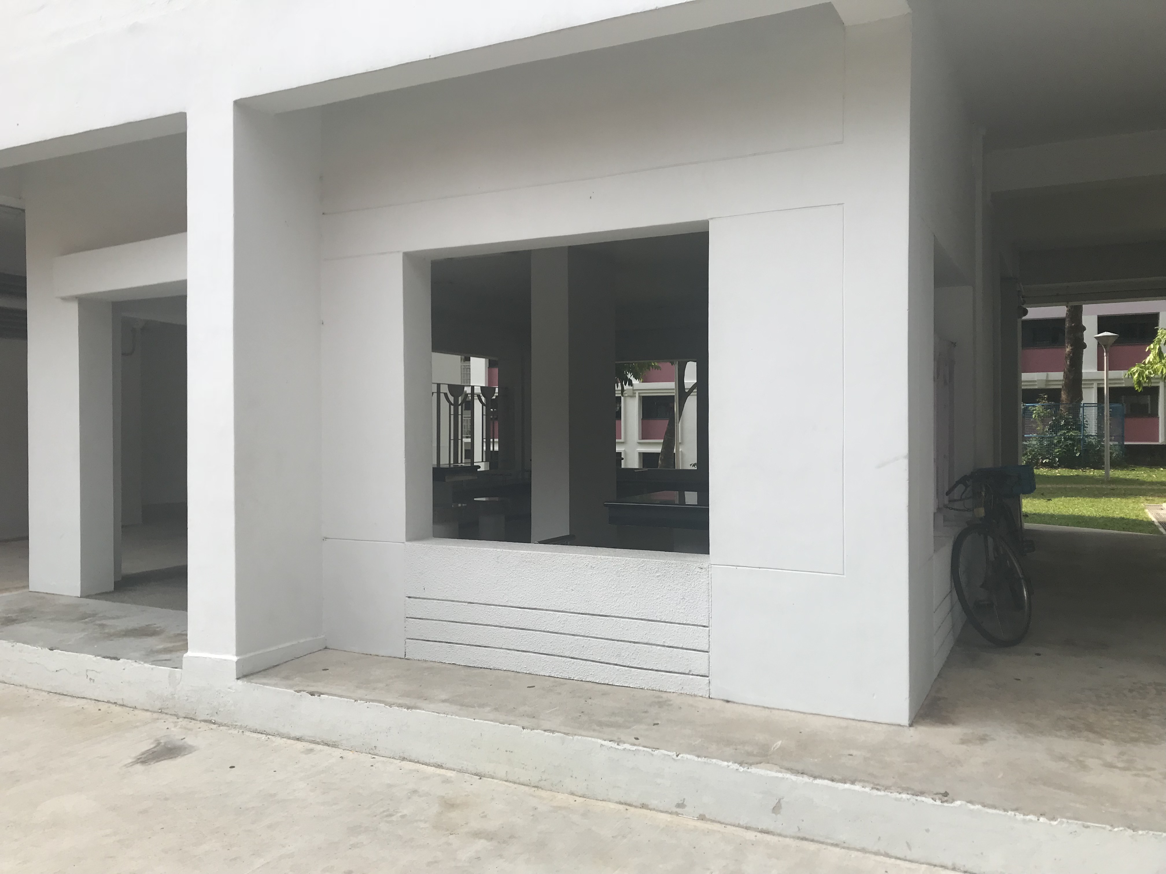
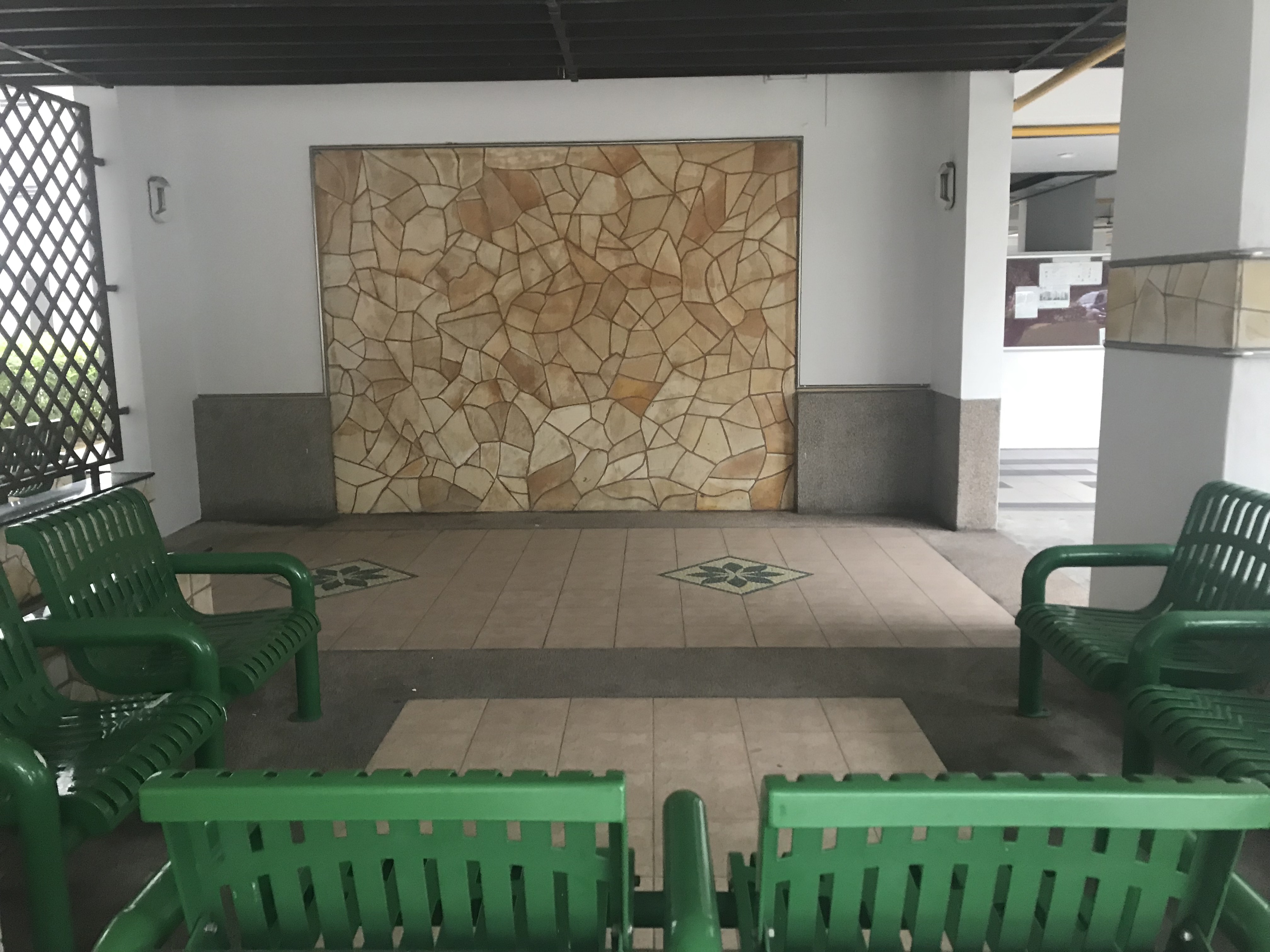
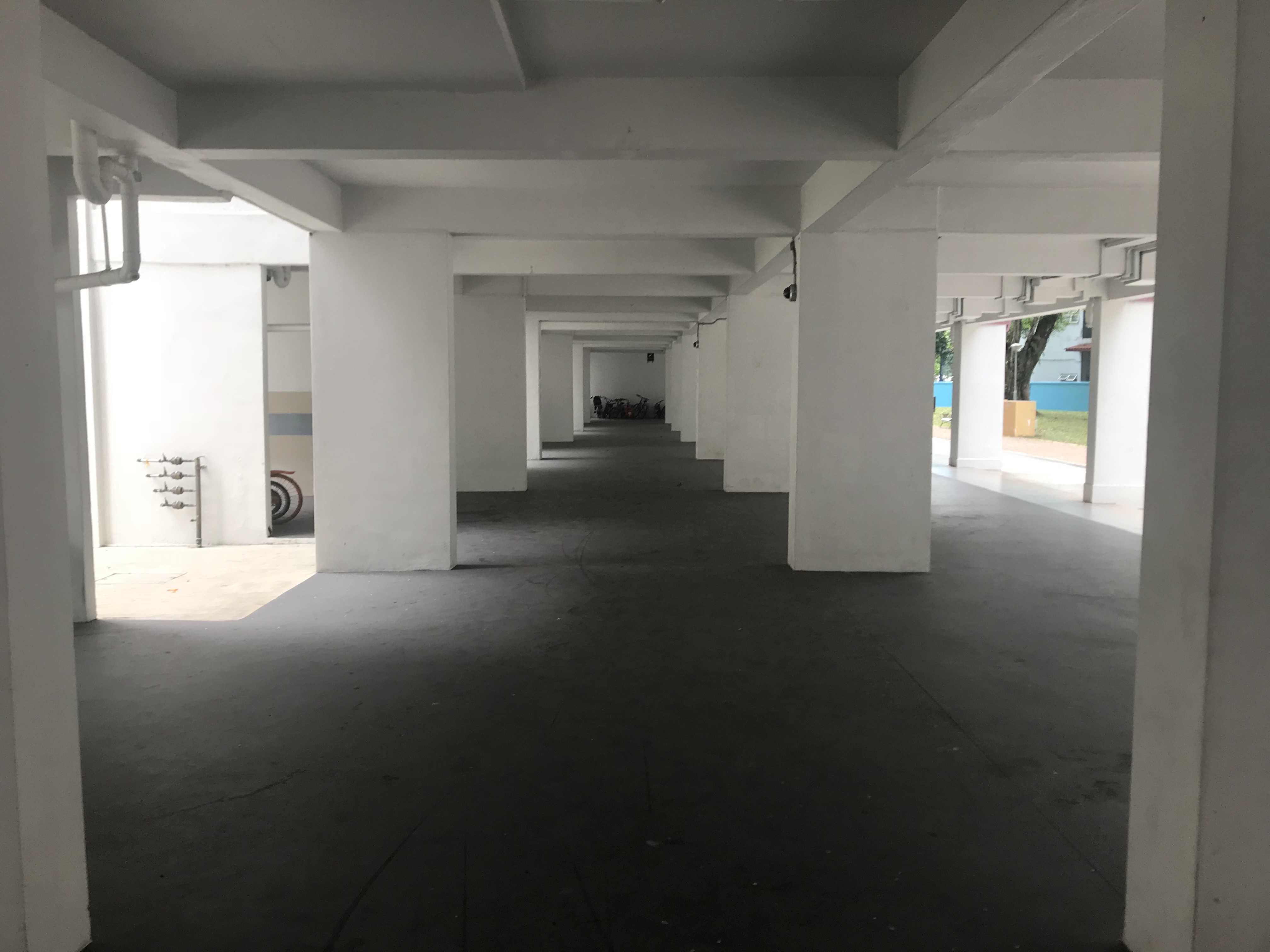
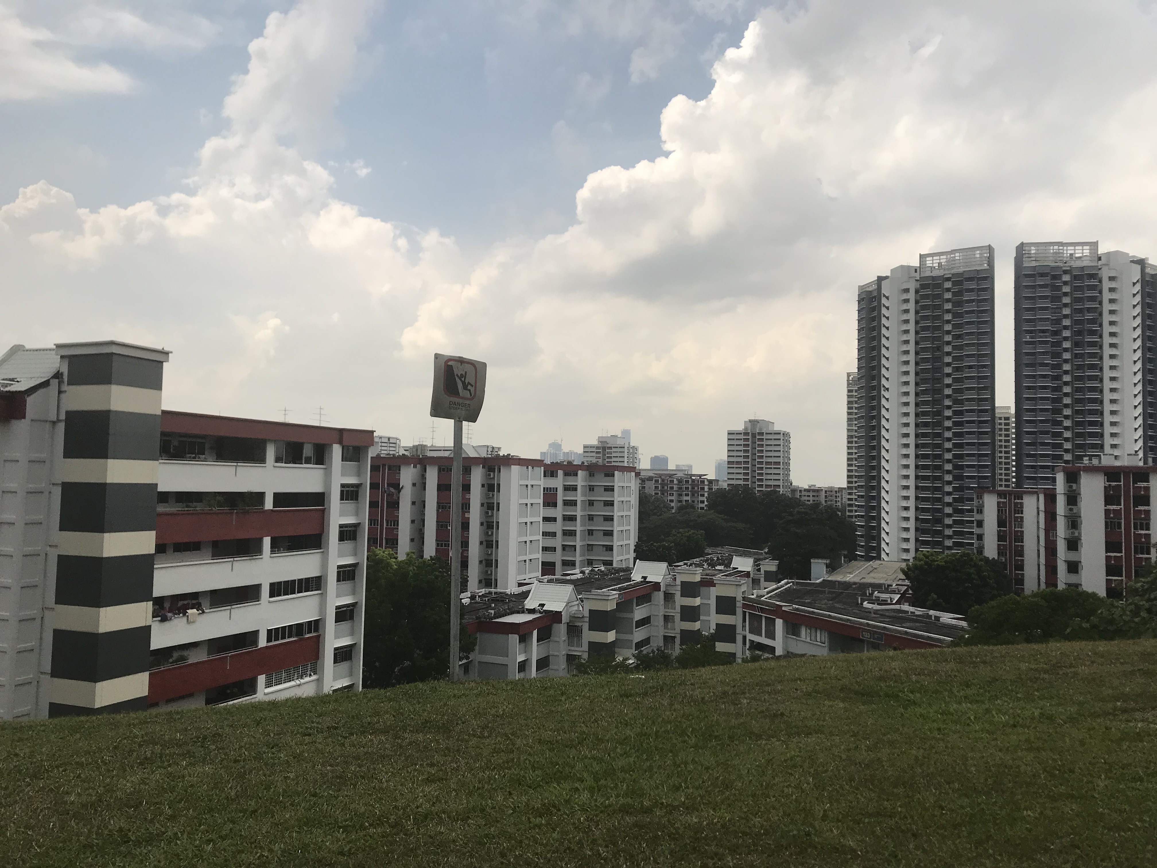
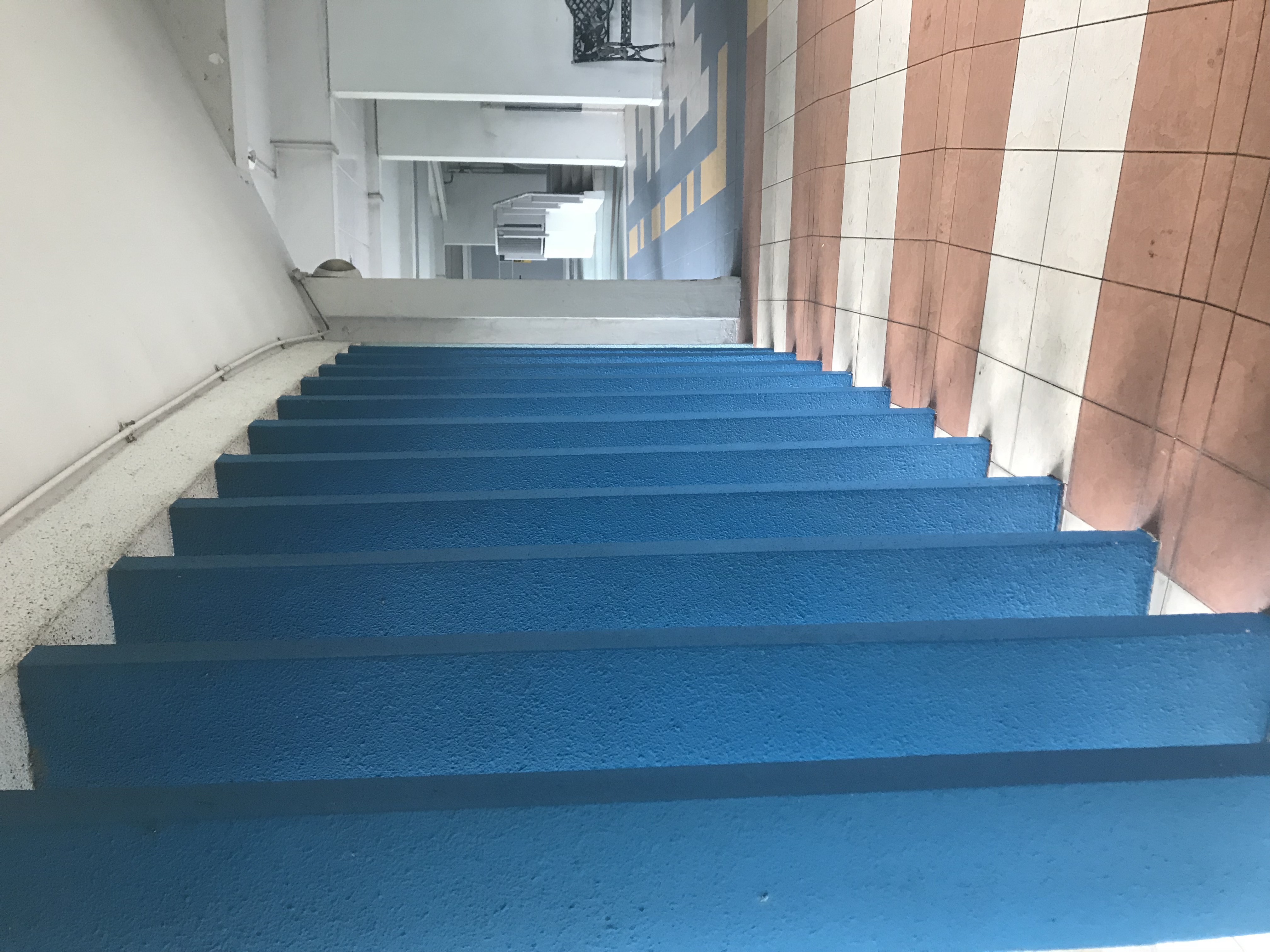
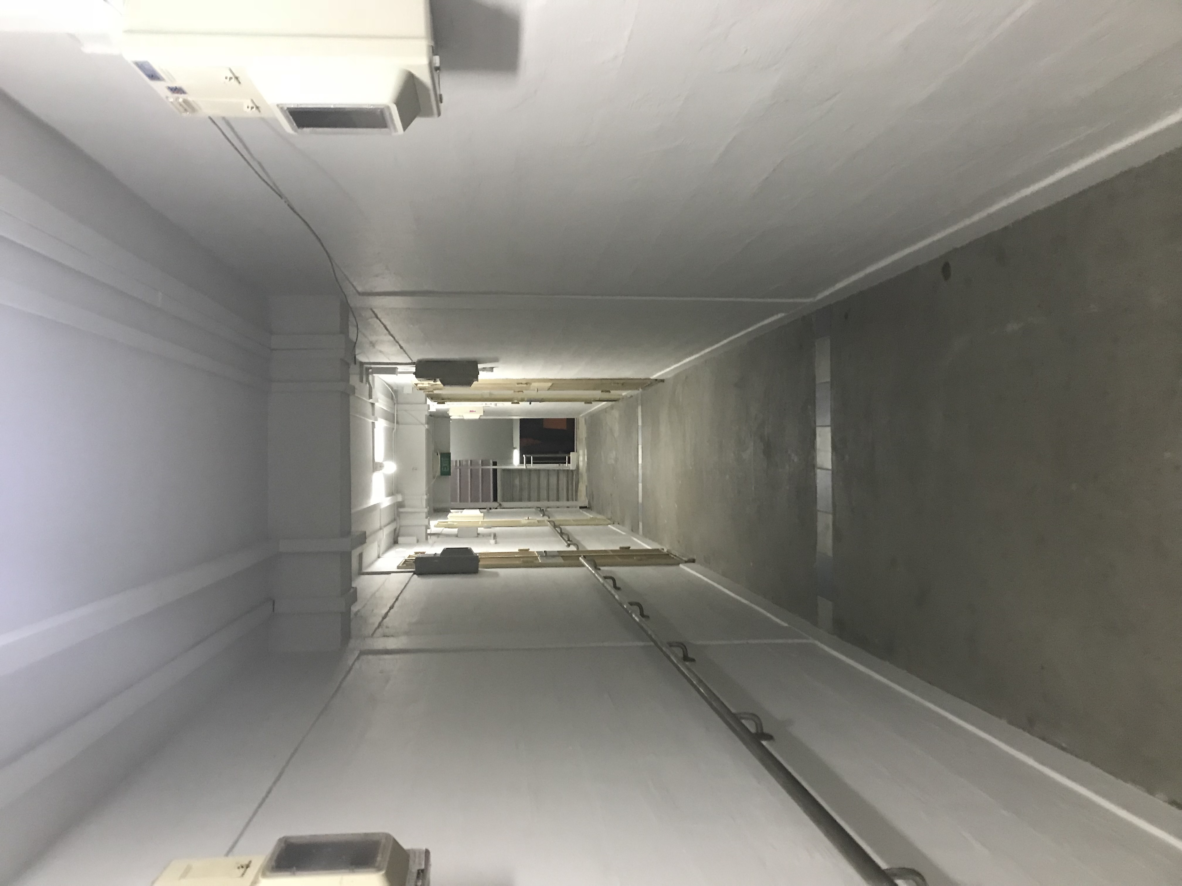
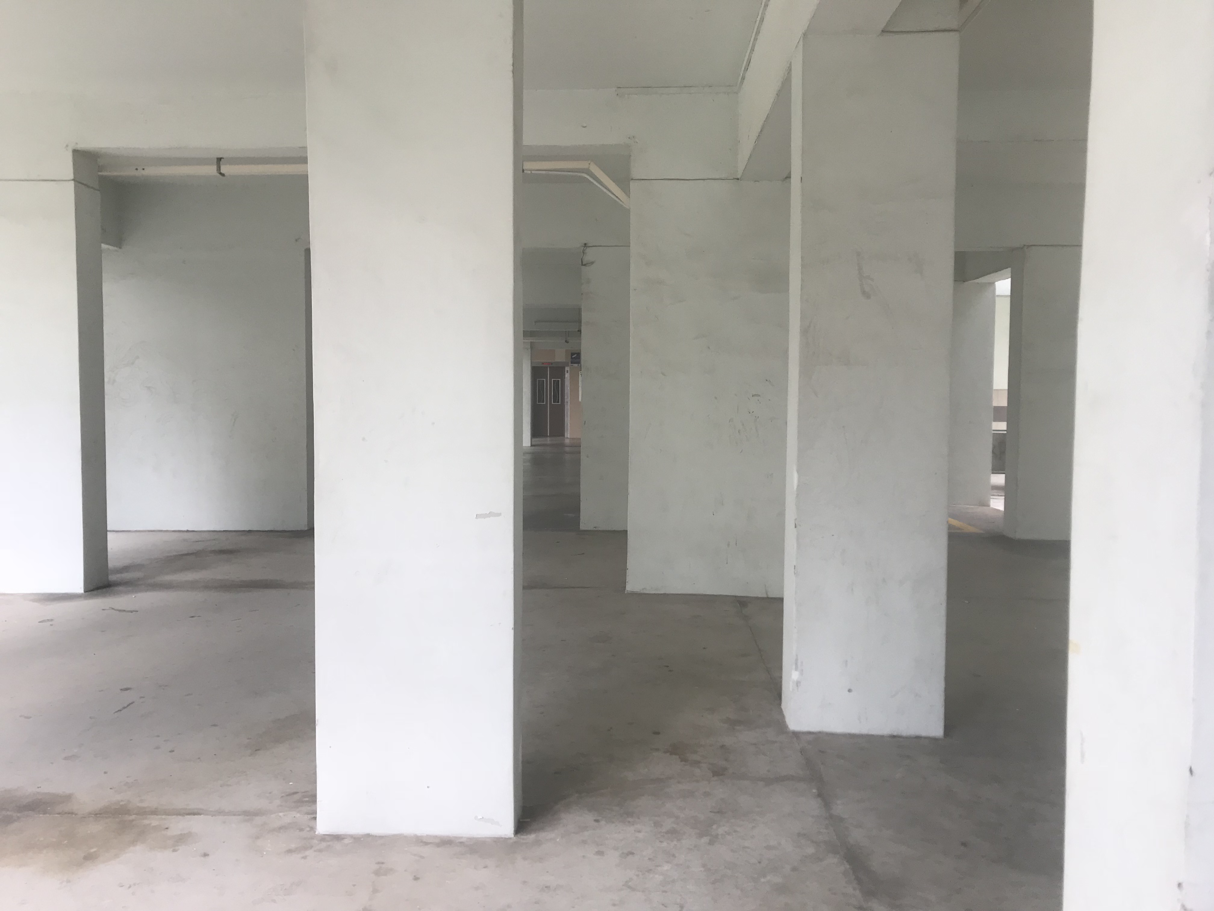
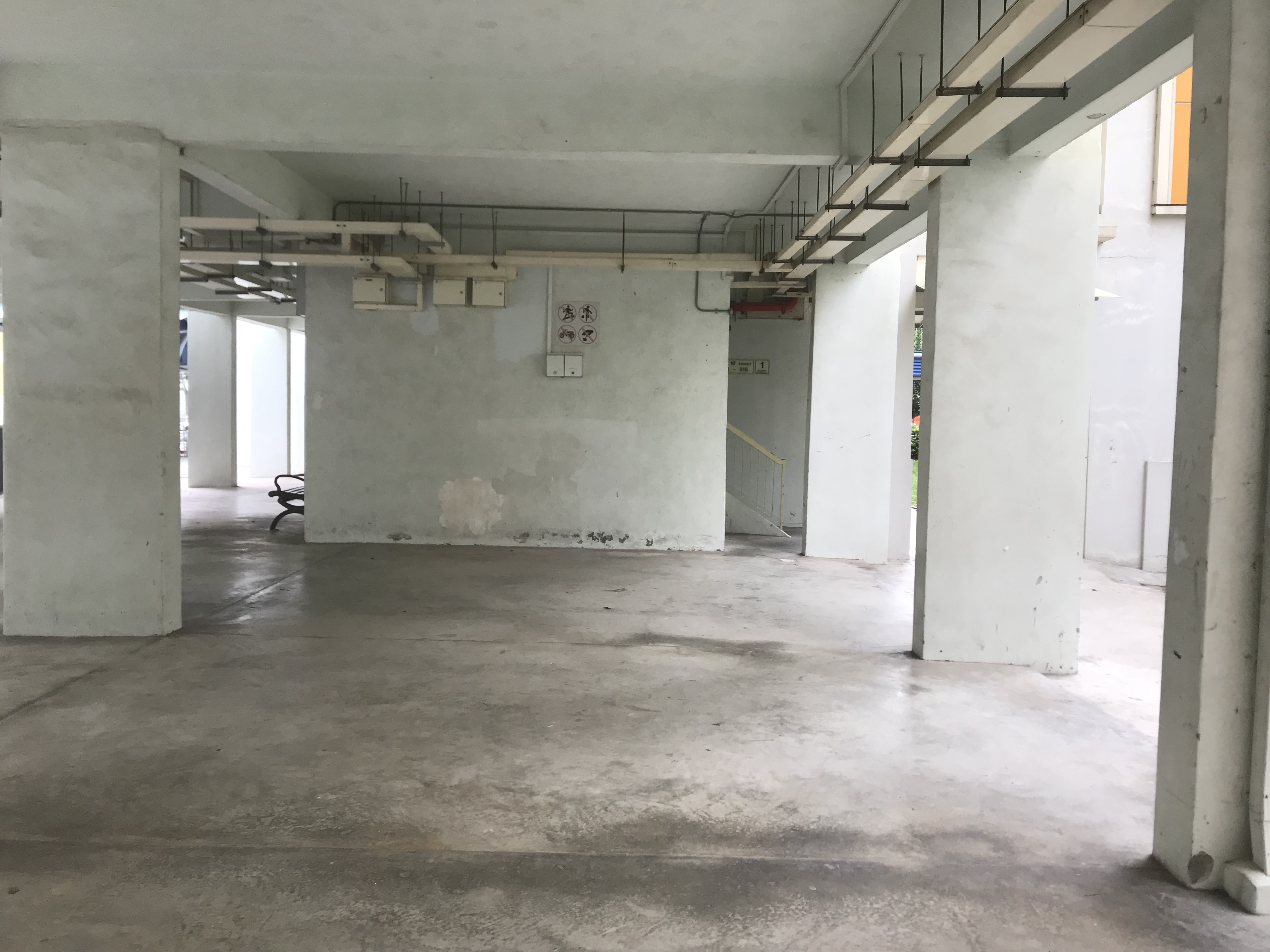
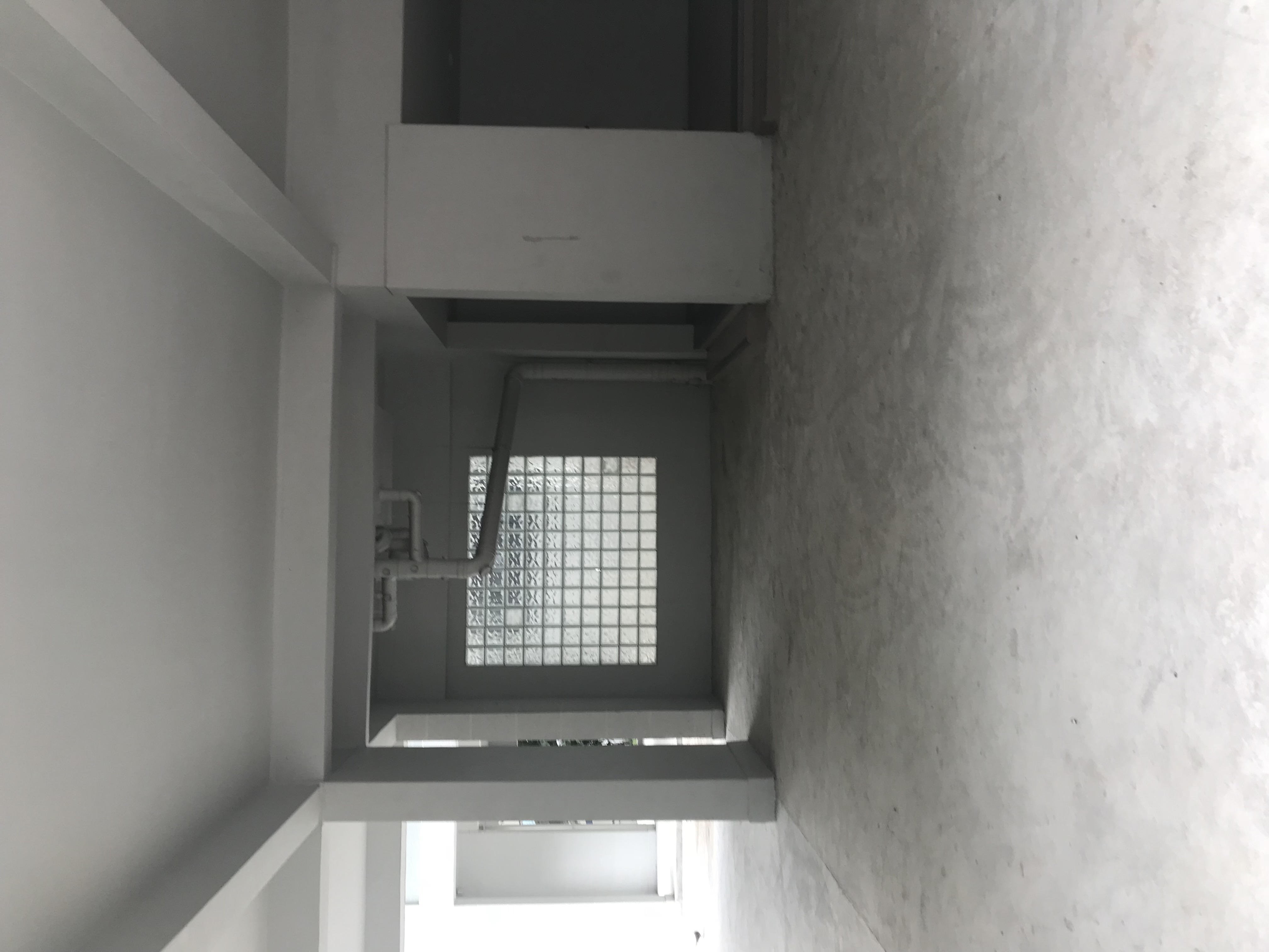
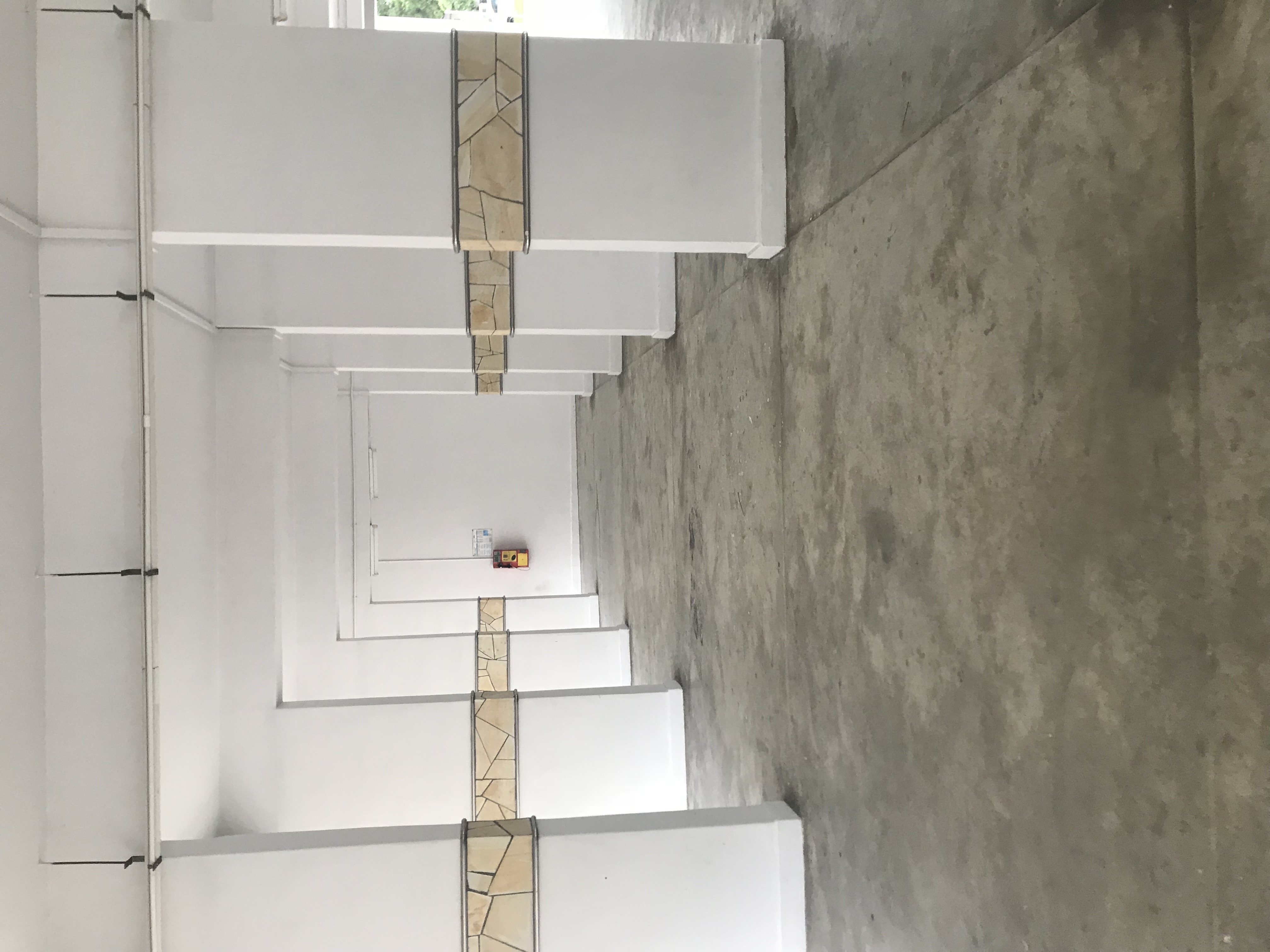
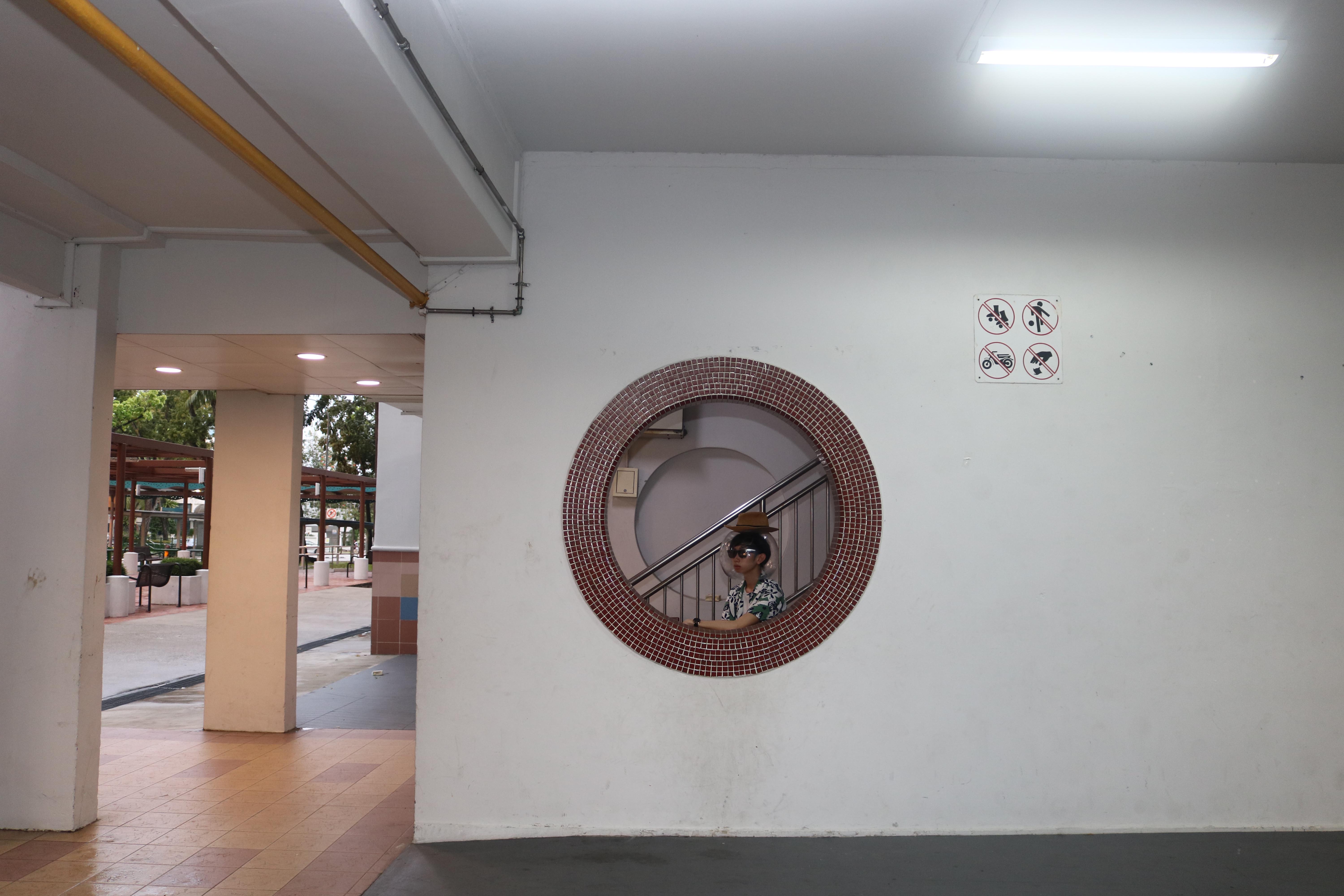
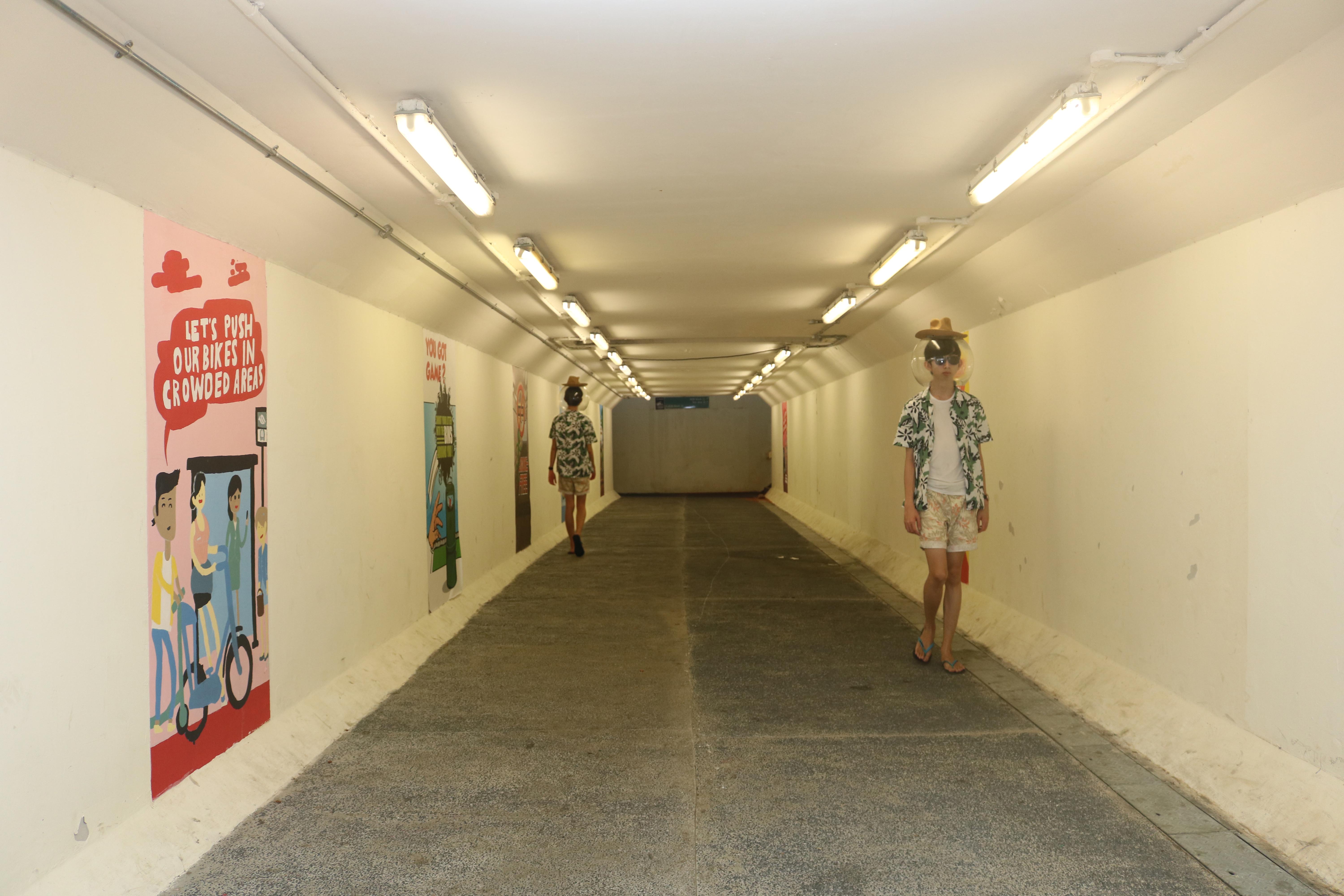
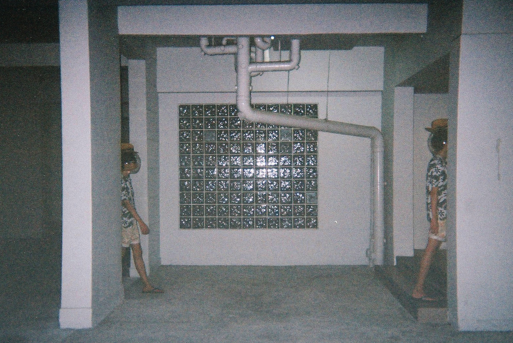
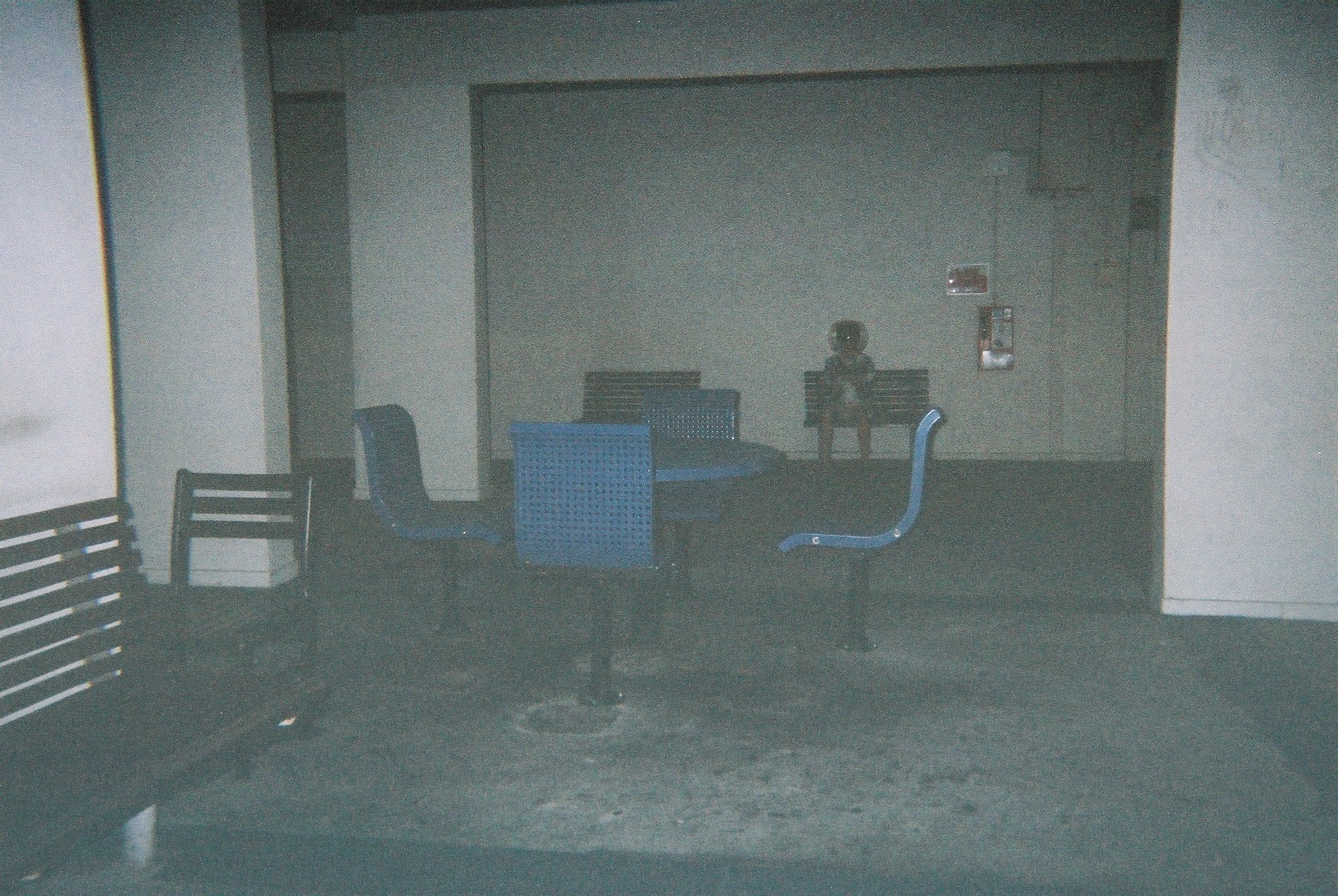
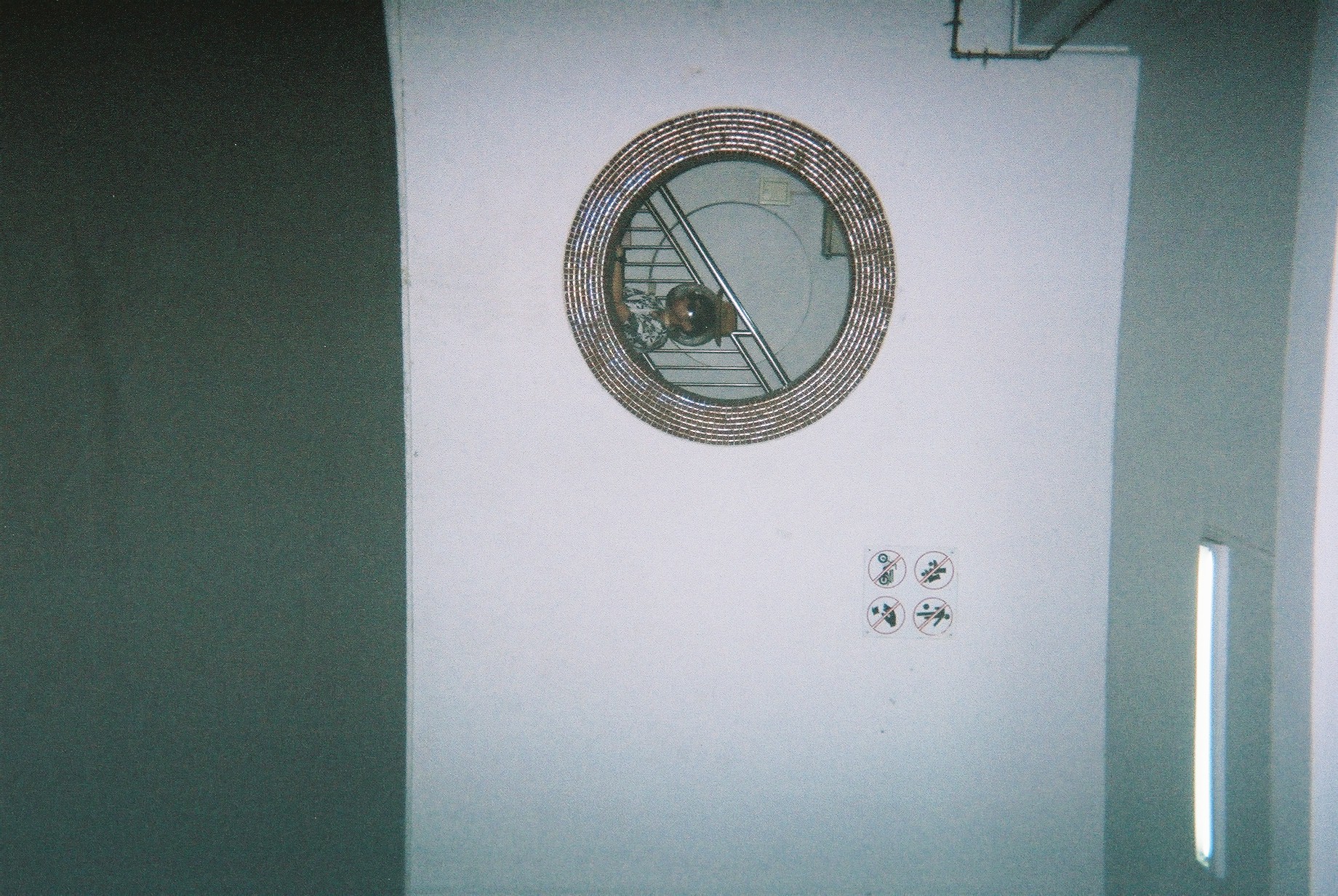
Around Blk 177 areaUnderpass near Blk 24Blk 158 – nice compositionSomewhere near Blk 142Blk 5ASomewhere near Blk 211Blk 9 I thinkMarsiling HillBlk 132 – SpaciousBlk 36 – interesting blue pillarsBlk216 – Round iconic windowBlk 4 – Old residential areaBlk 5ABlk 158 areaBlk 158Forgot where this is but nice wall texturesBlk 9 cool window panelForgot where this is but it’s niceBlk 6, hierarchy “portals”Blk 34 windows by the envelope boxNear blk 142
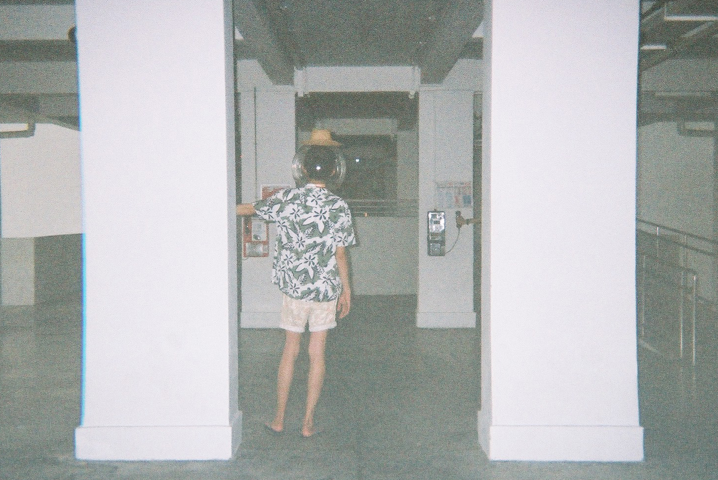
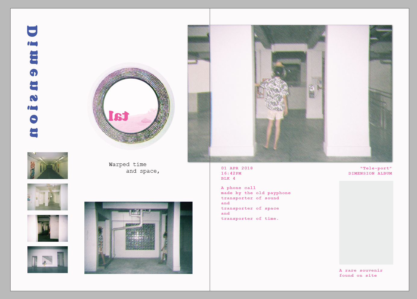
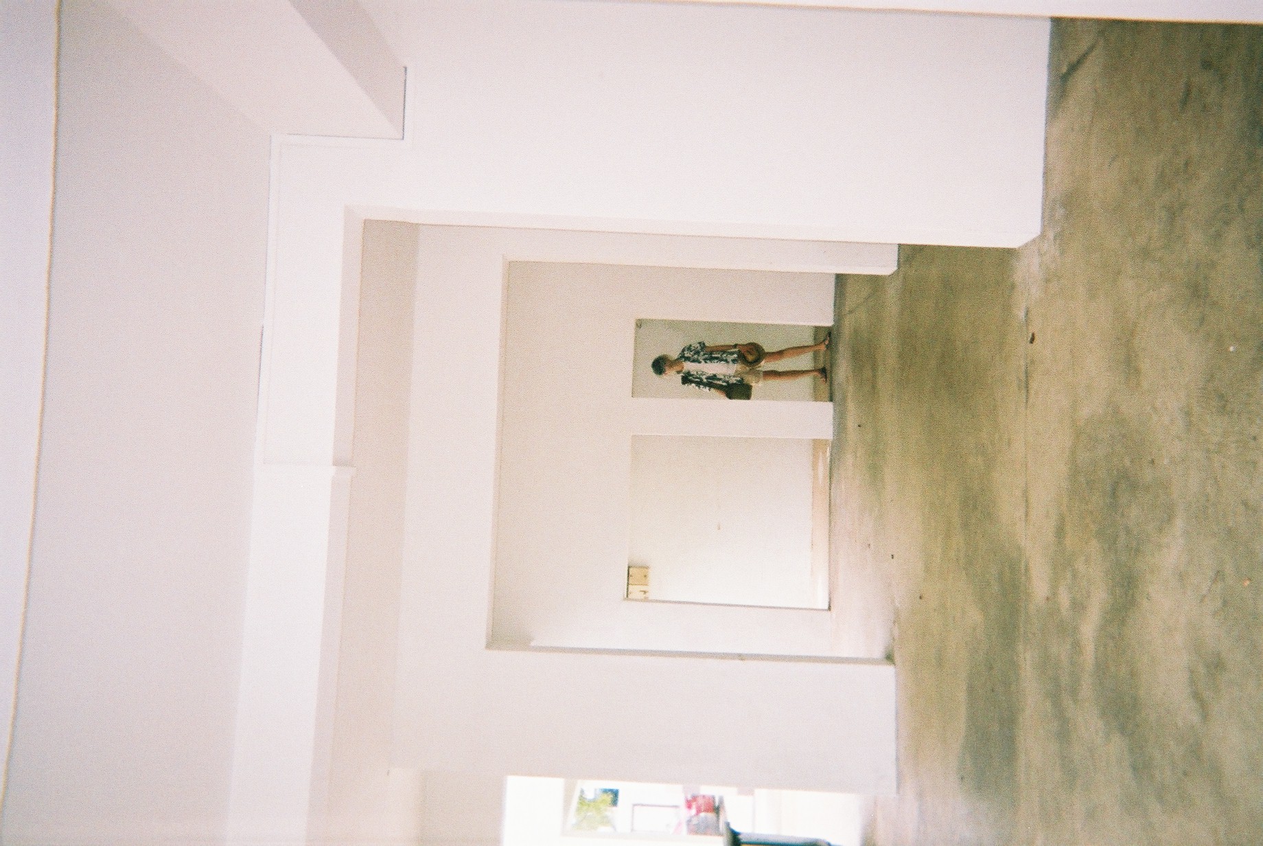
Blk 4 foyer
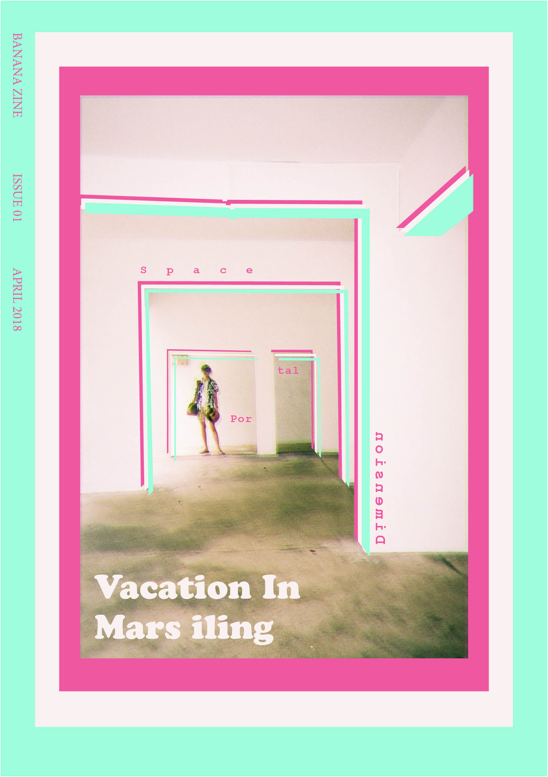
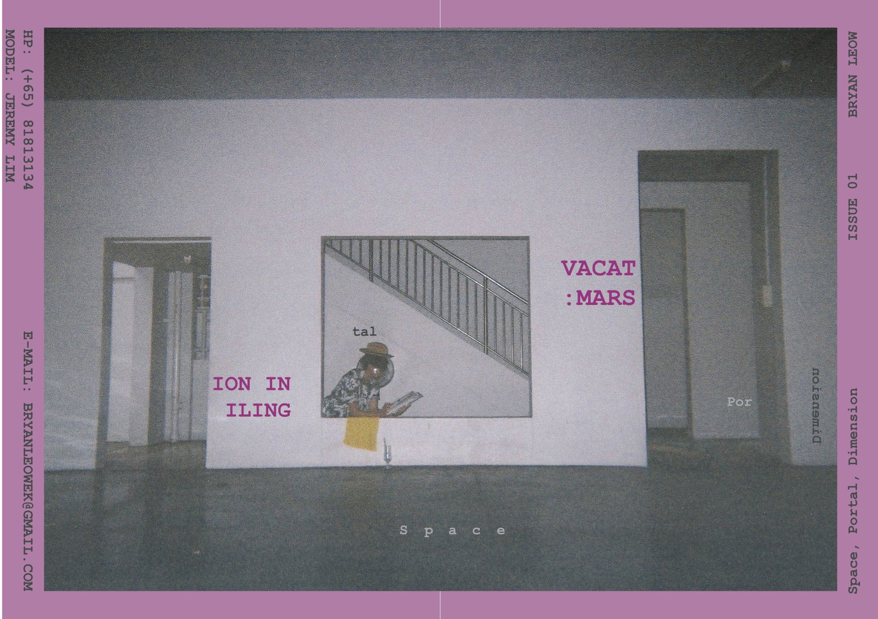
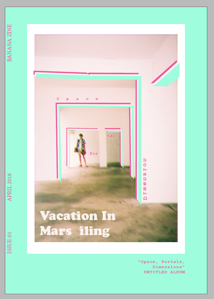
So, pinpointing these locations, I planned my zine’s Art direction. I decided to go for a spacey theme as I want to depict Marsiling as a strange “planet”, using a pun I got from Marsiling (Mars and iling). Using this idea, I want to try to depict a tourist’s trip to this strange land called Mars iling.
Here’s my mood board:
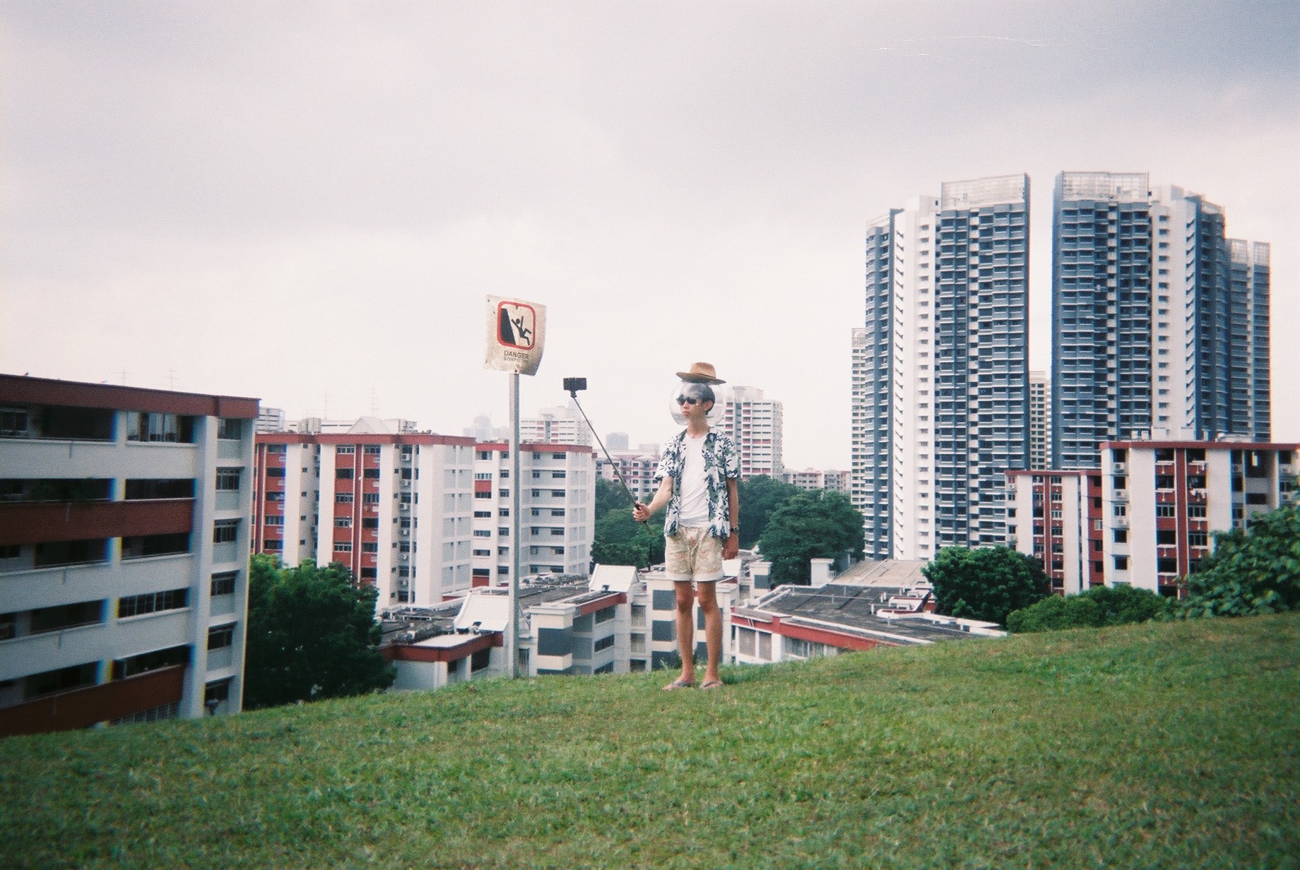
I want to go for a vacation-esque style stereotypical tourist. So by merging this theme and the space theme, I designed my character — a space tourist.
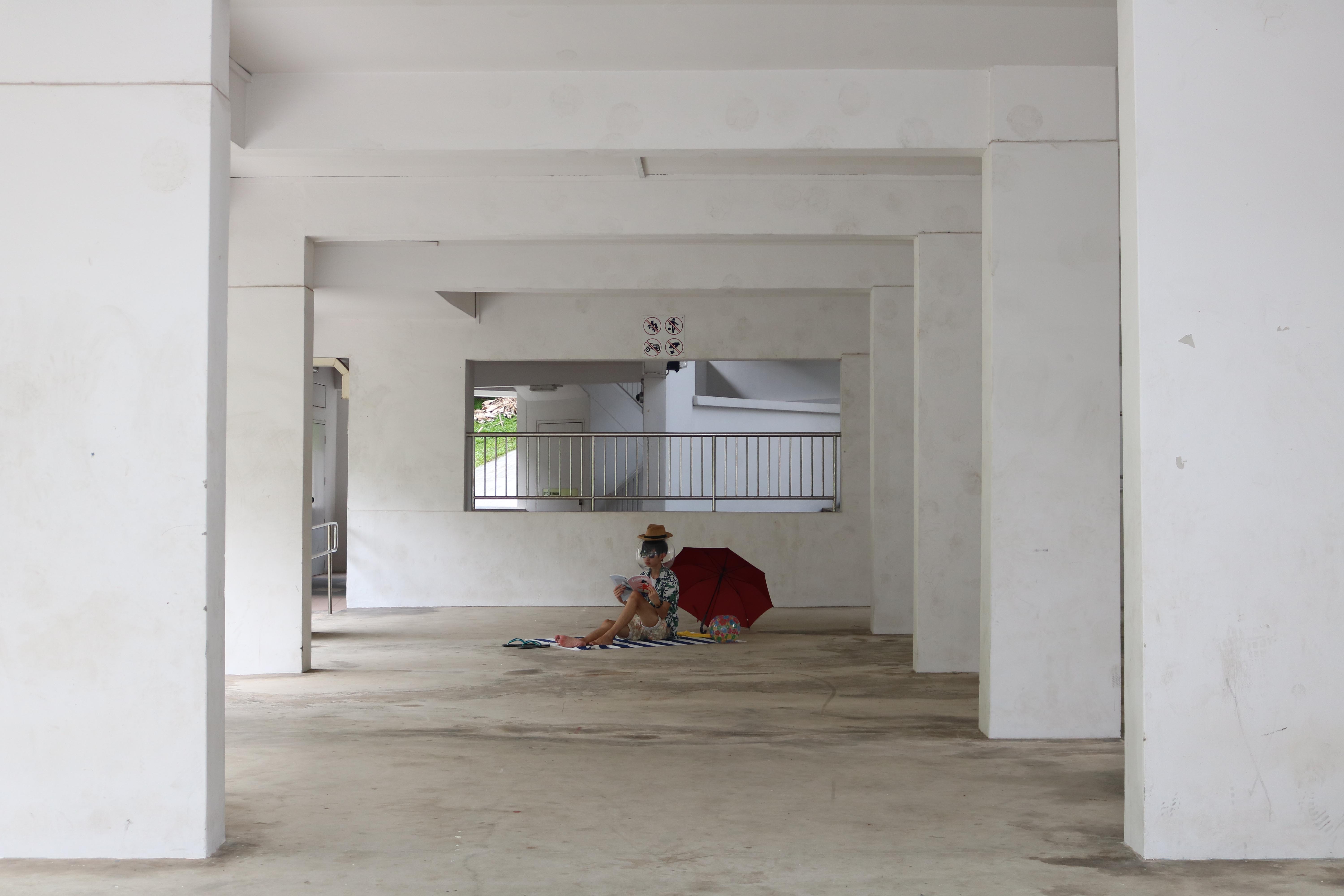
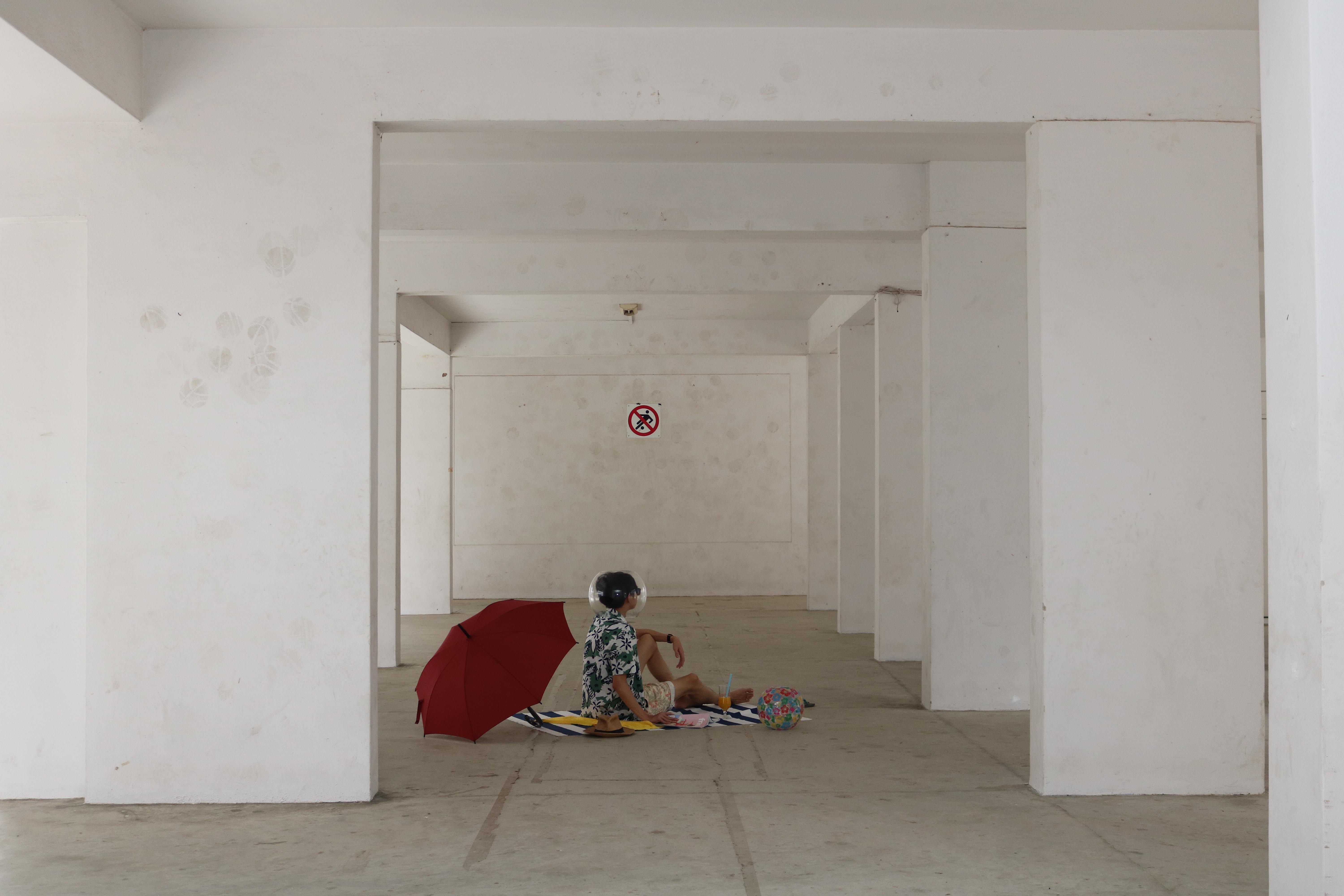
With these in mind, I prepped my props.
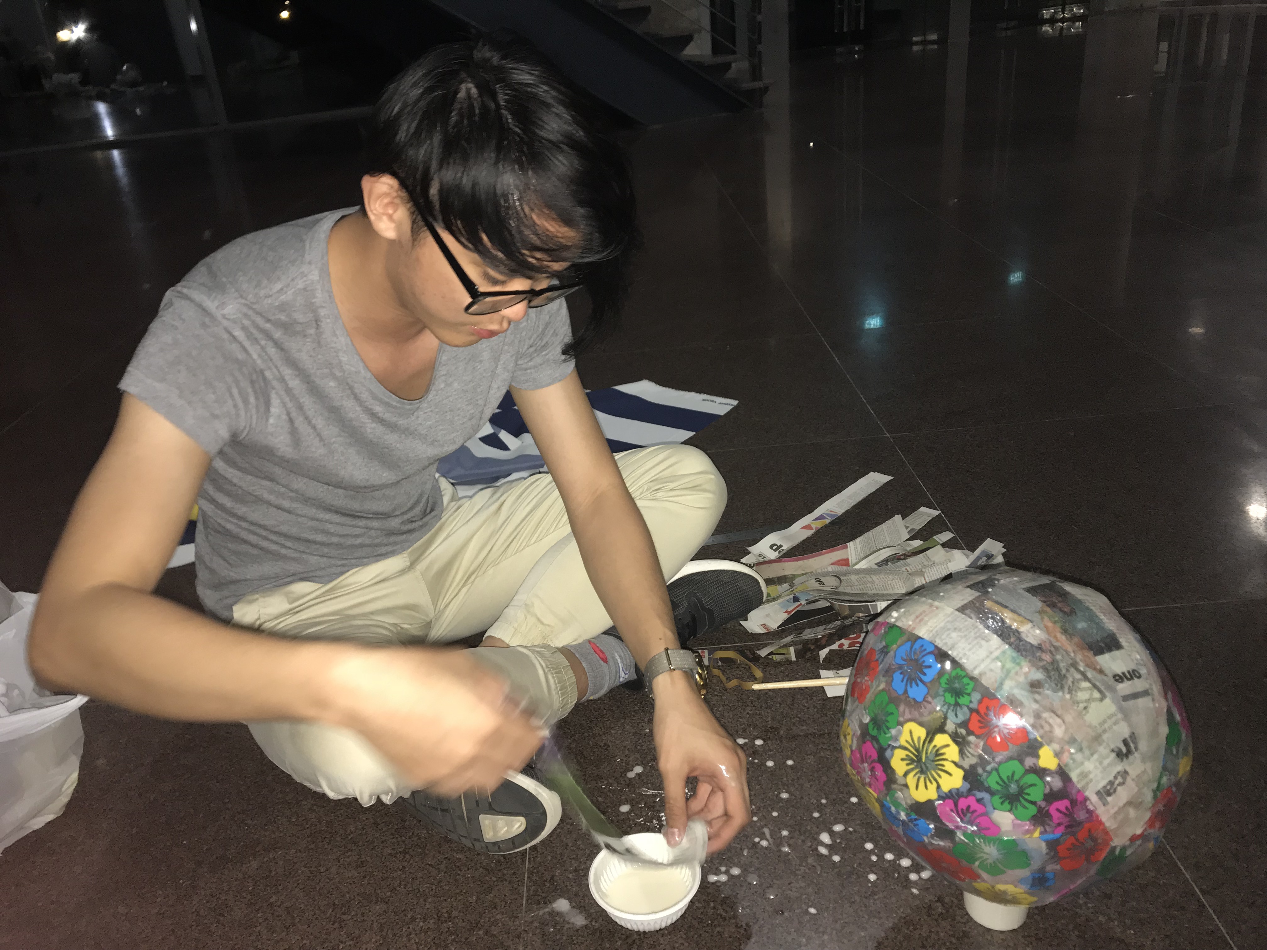
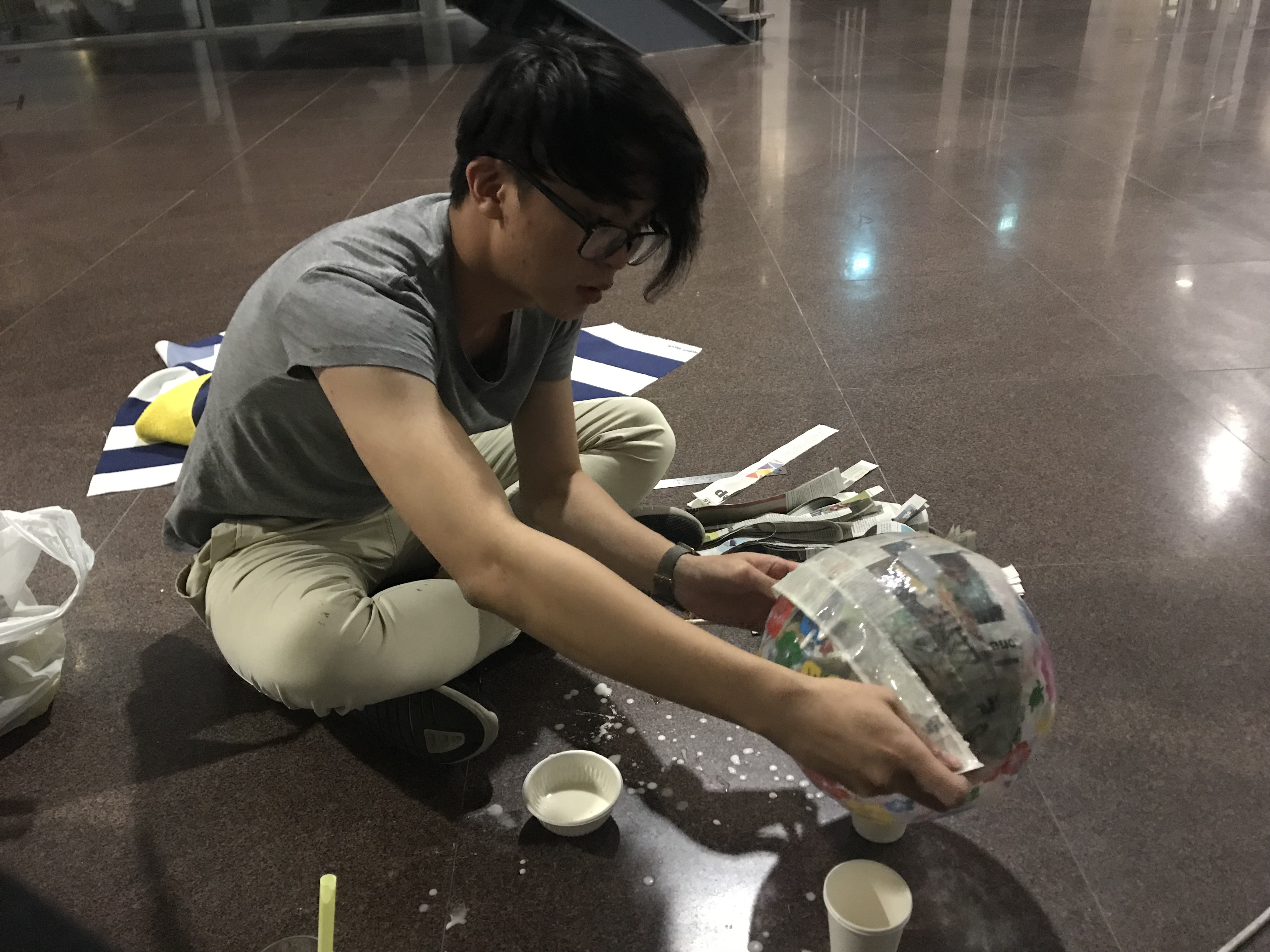
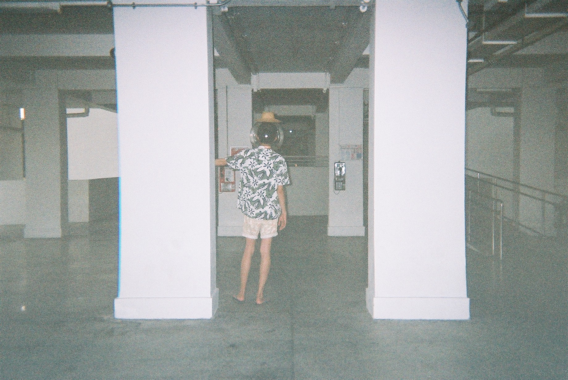
Space Helmet
I couldn’t find a space bubble helmet so I got a beach ball from Daiso and started making paper mache.
Afterwhich I used a heat gun to melt a few sheets of transparencies to create the “glass” capsule.
It fits but I really dislike it as it became very crumply due to the transparency sheet not being the proper shape to warp it down to a sphere. Still, I rolled with it since I couldn’t find any other materials.
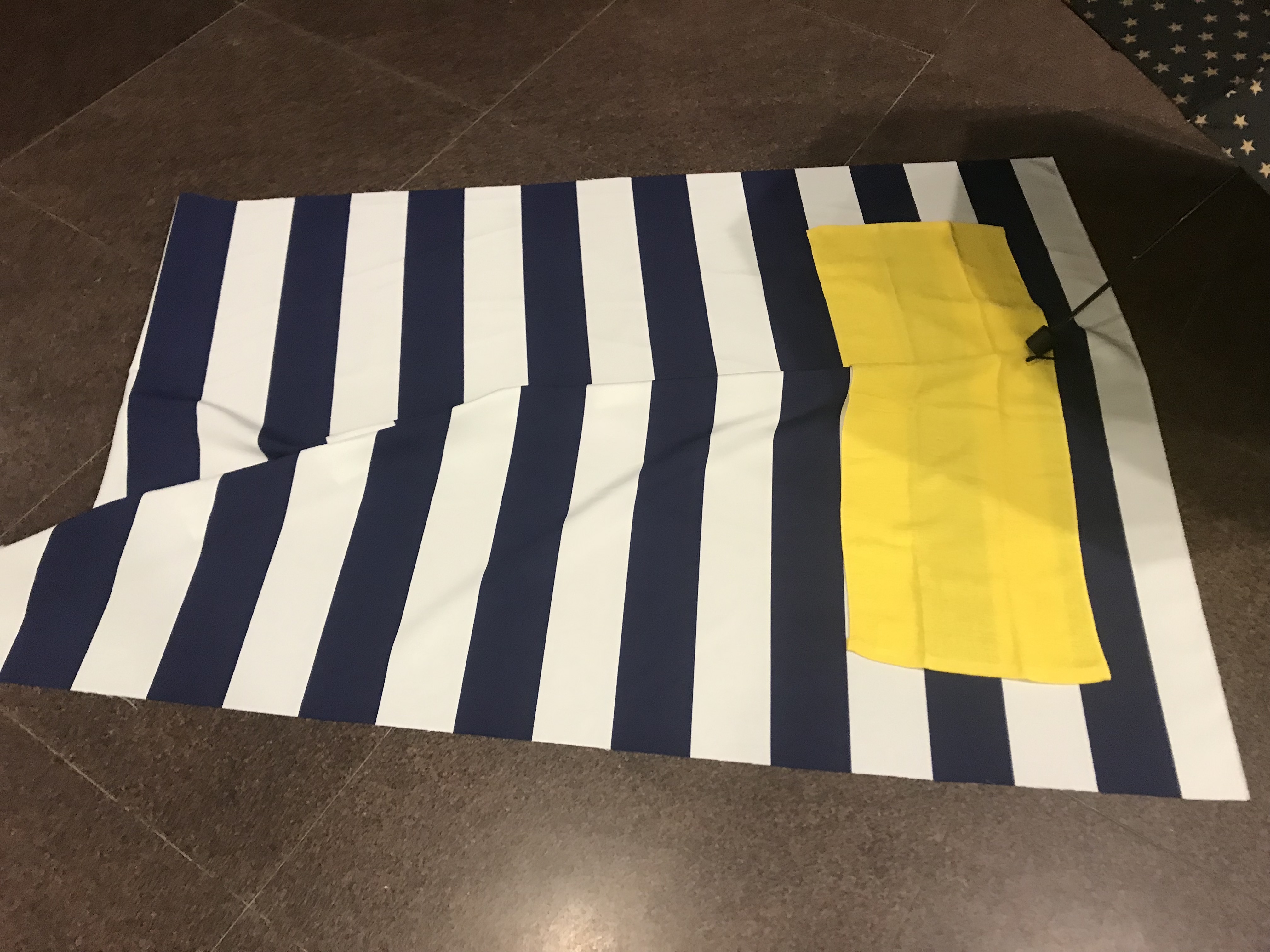
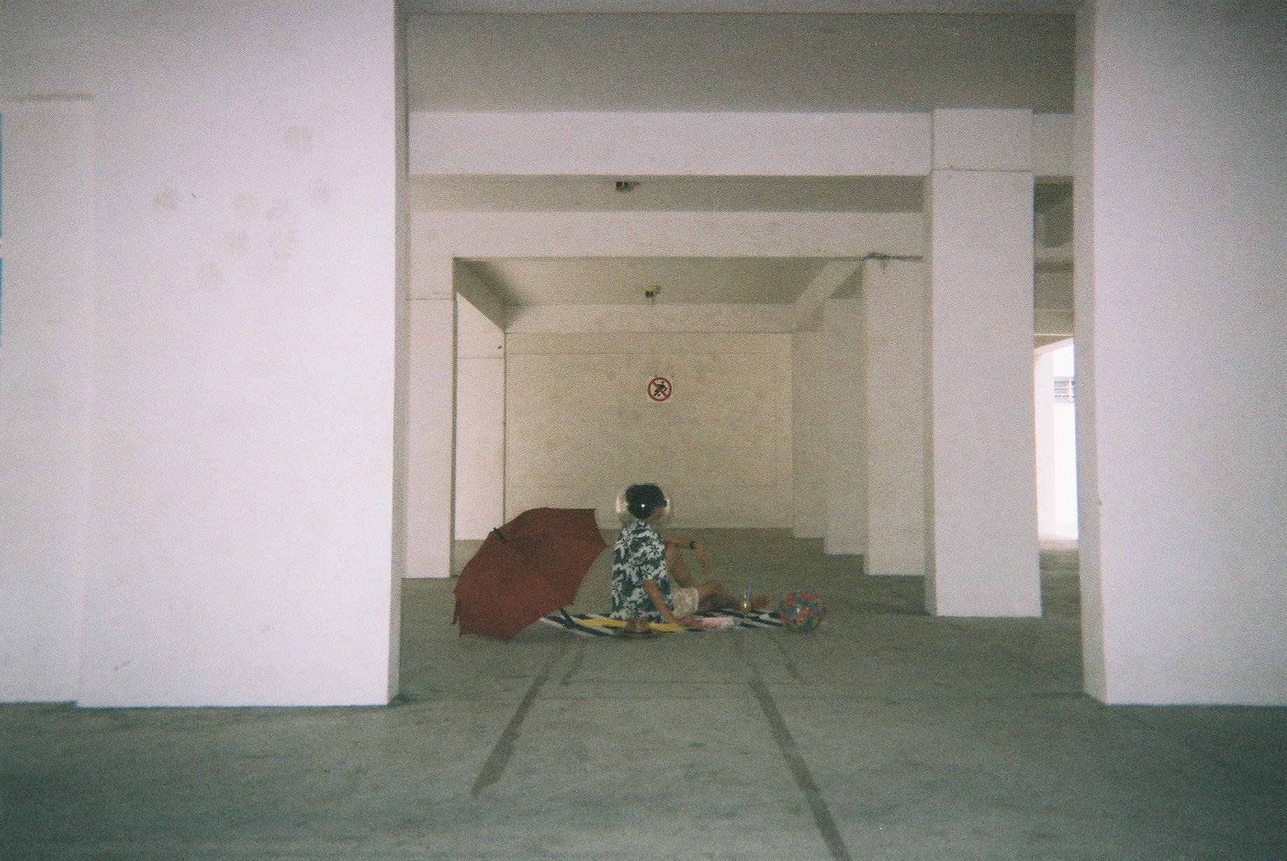
Other Props
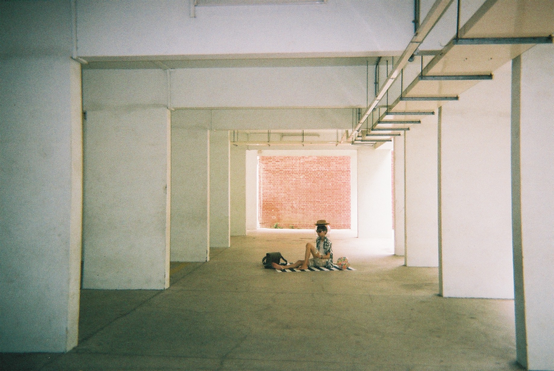
I also bought some other props: this beach-mat looking canvas and a yellowtowel. I also bought an extra beachball, red umbrella, books&magazines and wine glass to add to the aesthetics.
My model is Jeremy Lim, my good friend from my NS days.
Please follow @j.emery on Instagram 🙂
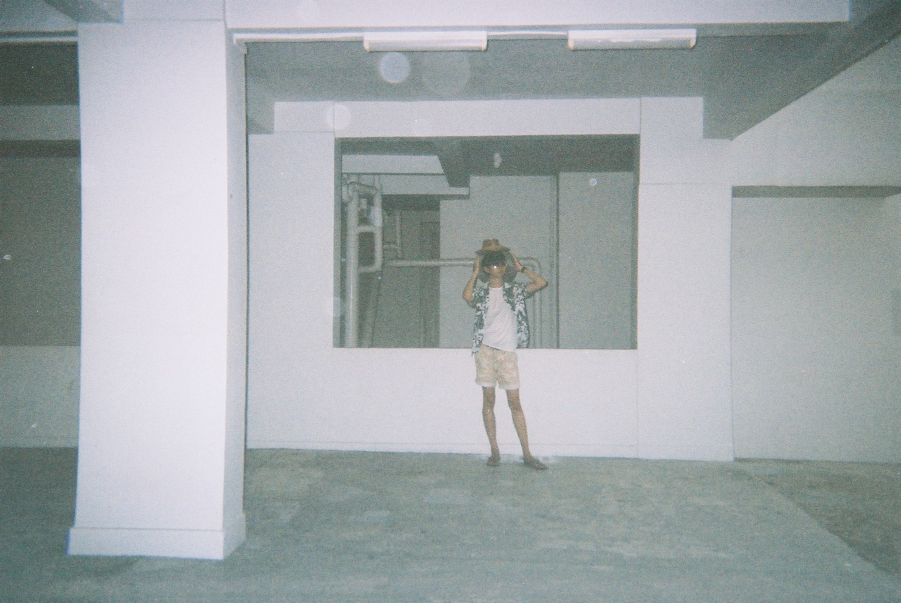
For the attire, I went for holiday shirt, a straw hat, shades, shorts, and slippers.
Shoot
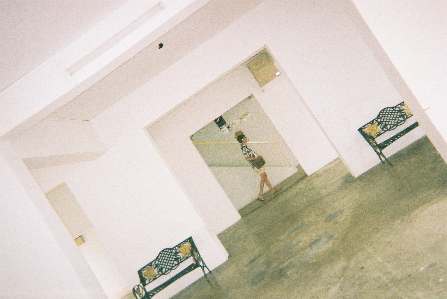
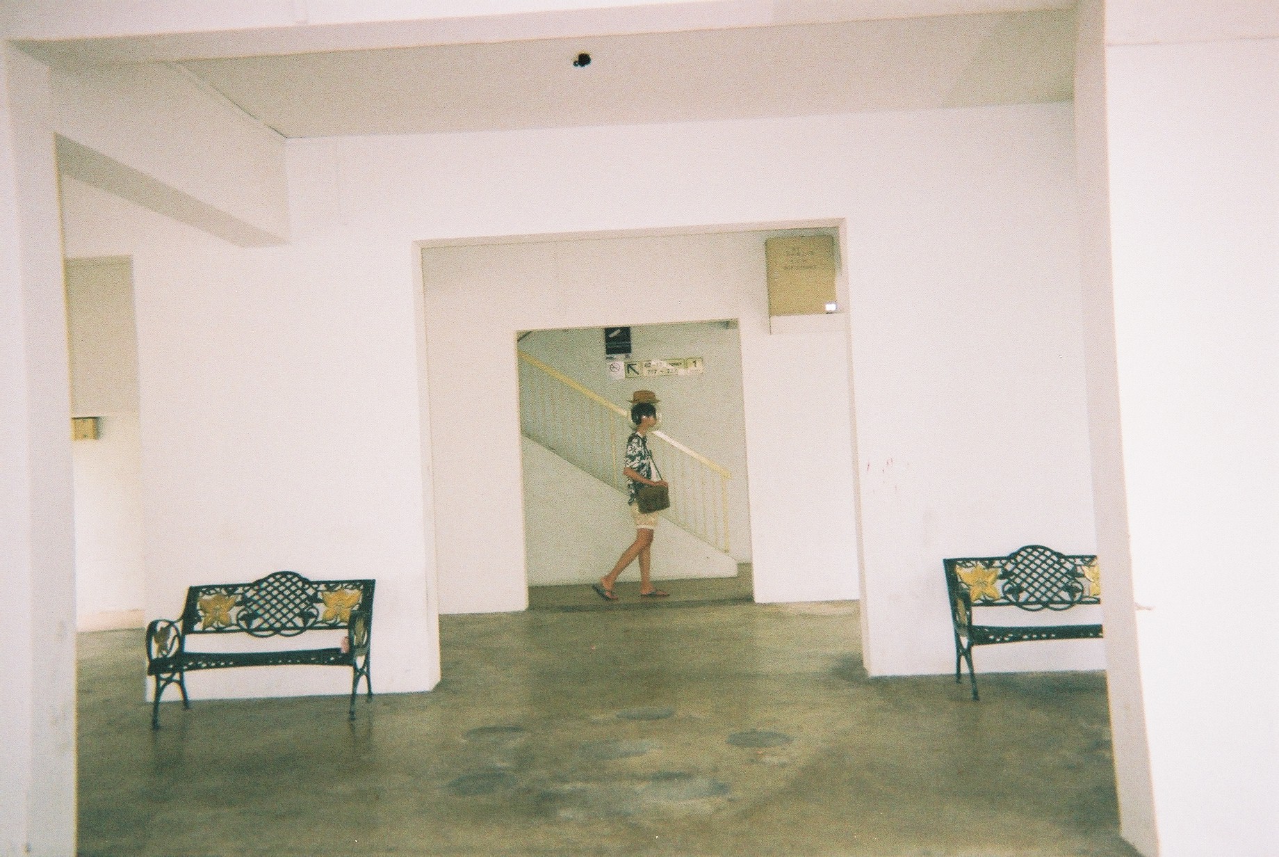
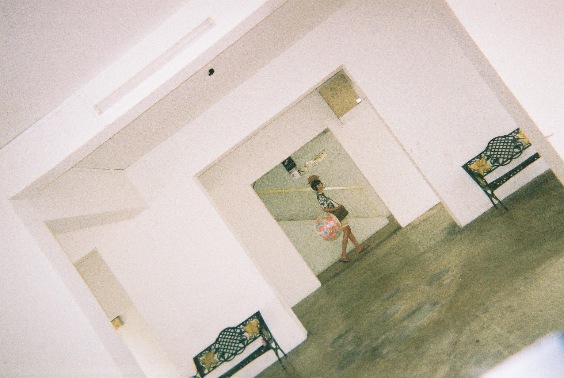
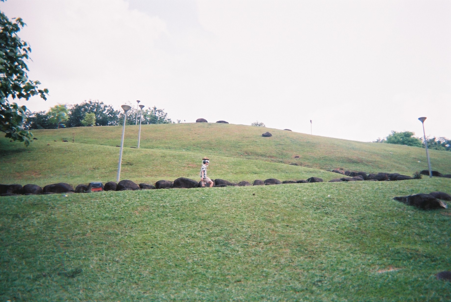
I went on a shoot on 30th March. I brought all the props, as well as a DSLR and a disposable camera (Fuji Simple Ace, 39 shots, 400 ISO). The DSLR is a backup to the disposable camera in case the shot did not go well, as do with all disposable cameras. The DSLR is also a really great way for me to test my shots and compose it before taking it on the DSLR. Despite the higher quality, I opt for the film for a more personal effect. I shot halfway and it rained, so I couldn’t continue and decided to go back and shoot again.
On the 1st of April, we went on another shoot and this time, we braved through the rain (AGAIN, it always rains when I go Marsiling) and we completed the shoot by 8PM.
Halfway through, I found an actual fish bowl in an aquarium shop and I went for it! So the second half of the photos are Jeremy with an actual fish bowl on his head.
Here are some shots:
These are from the disposable camera.
The shots from the DSLR:
Getting the ball to be in the frame properly took a few tries and this can only be done on DSLR so it’s worth trying out first before taking on disposable camera!
Although the quality is MUCH better, I decided to stick to the disposable film shots as it really creates some sentimental value and uniqueness.
Photo edits
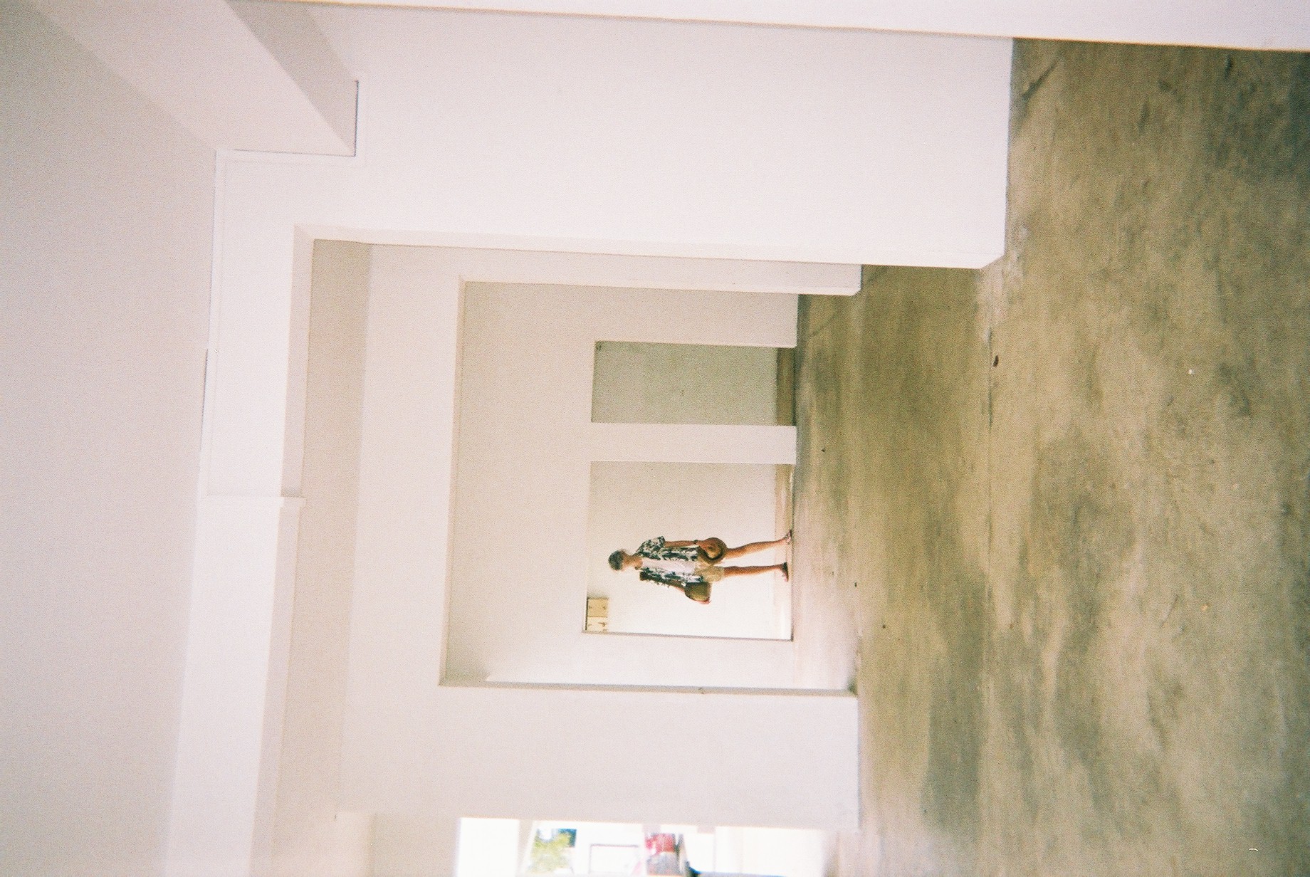
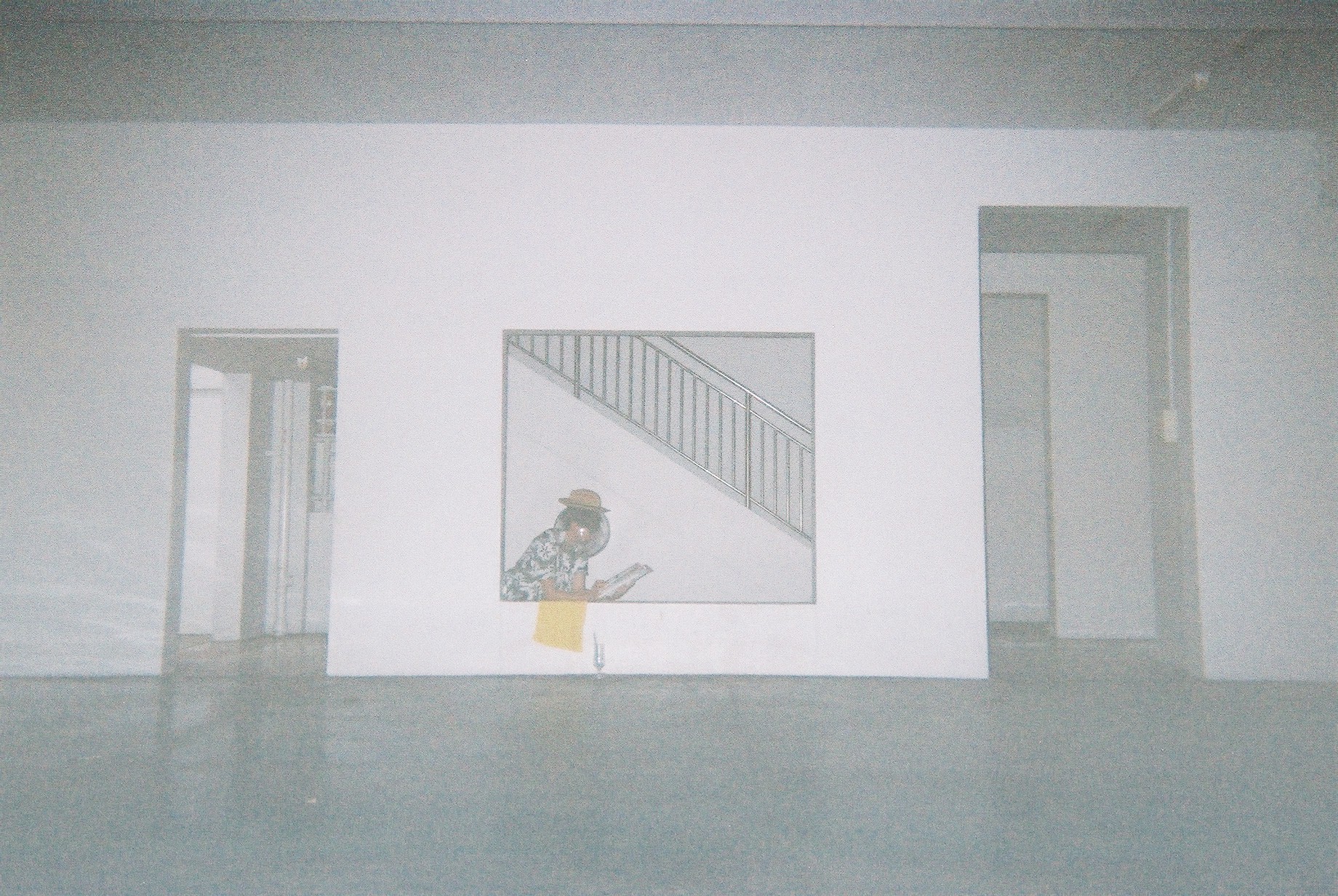
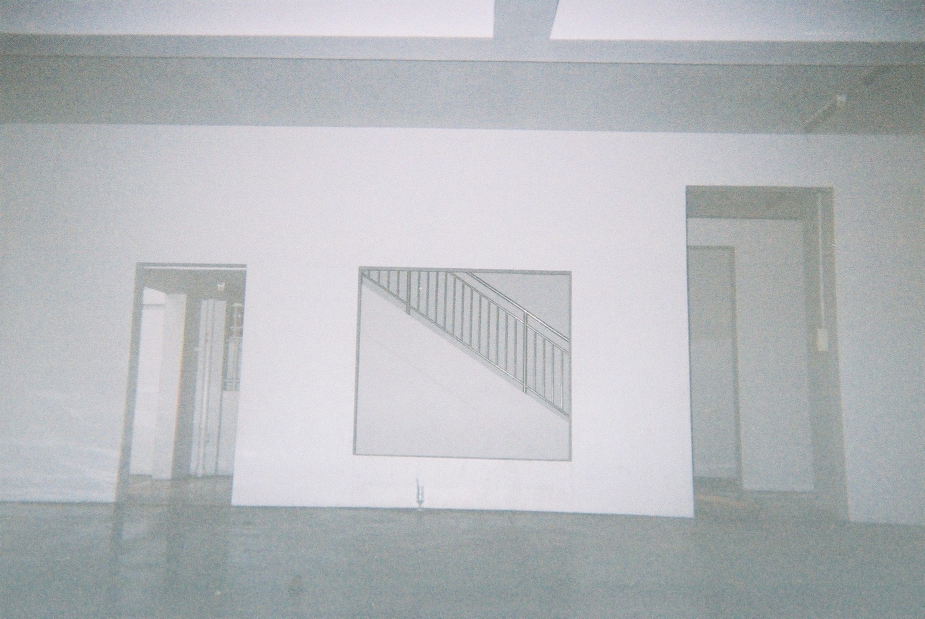
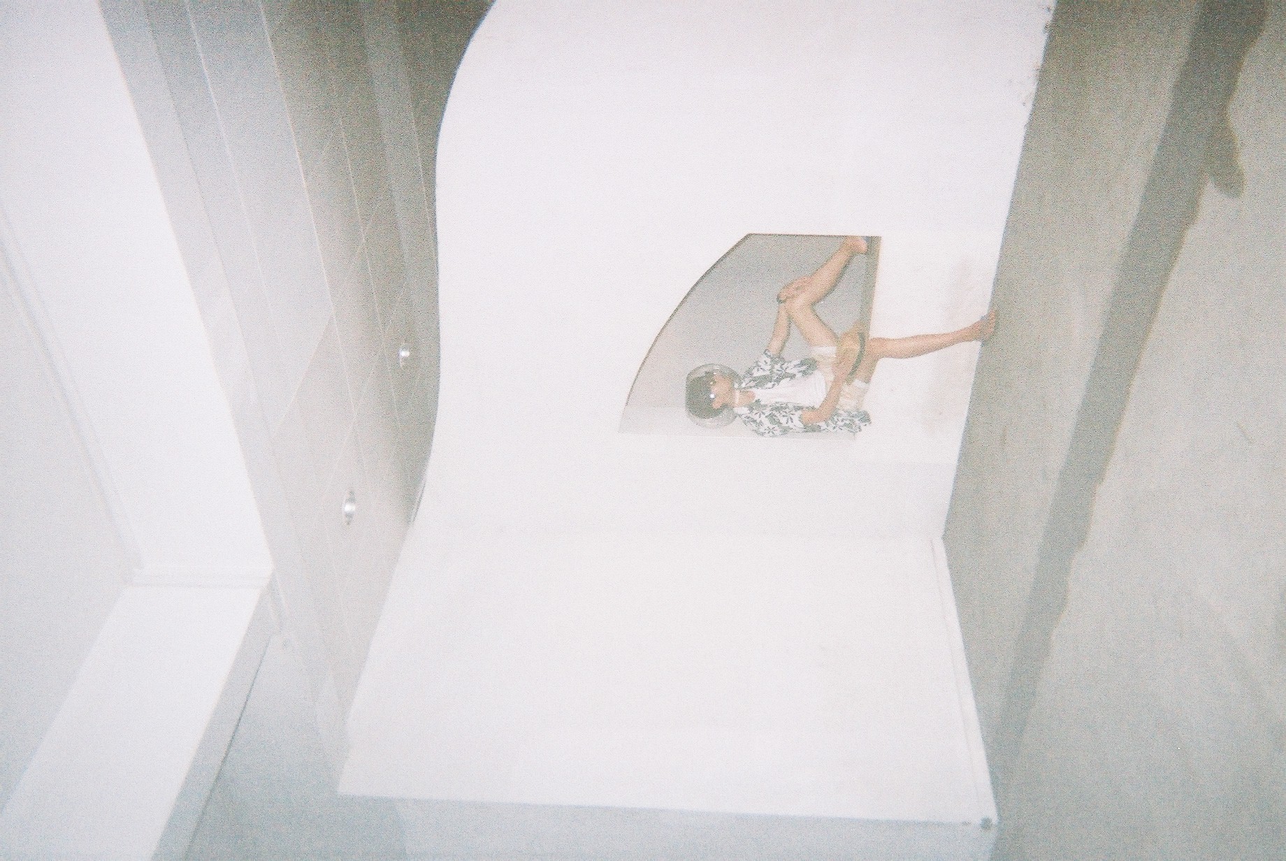
So in order to get the effect of the “portal” and “strangeness”, I decided to photoshop my friend such that two of himself is in the frame.
This is one example of said edit, but on a DSLR photo. I tried around with editing the DSLR shots before moving to the films.
Here are some examples of the shots I have edited. These are to convey the “portalling” between pillars.
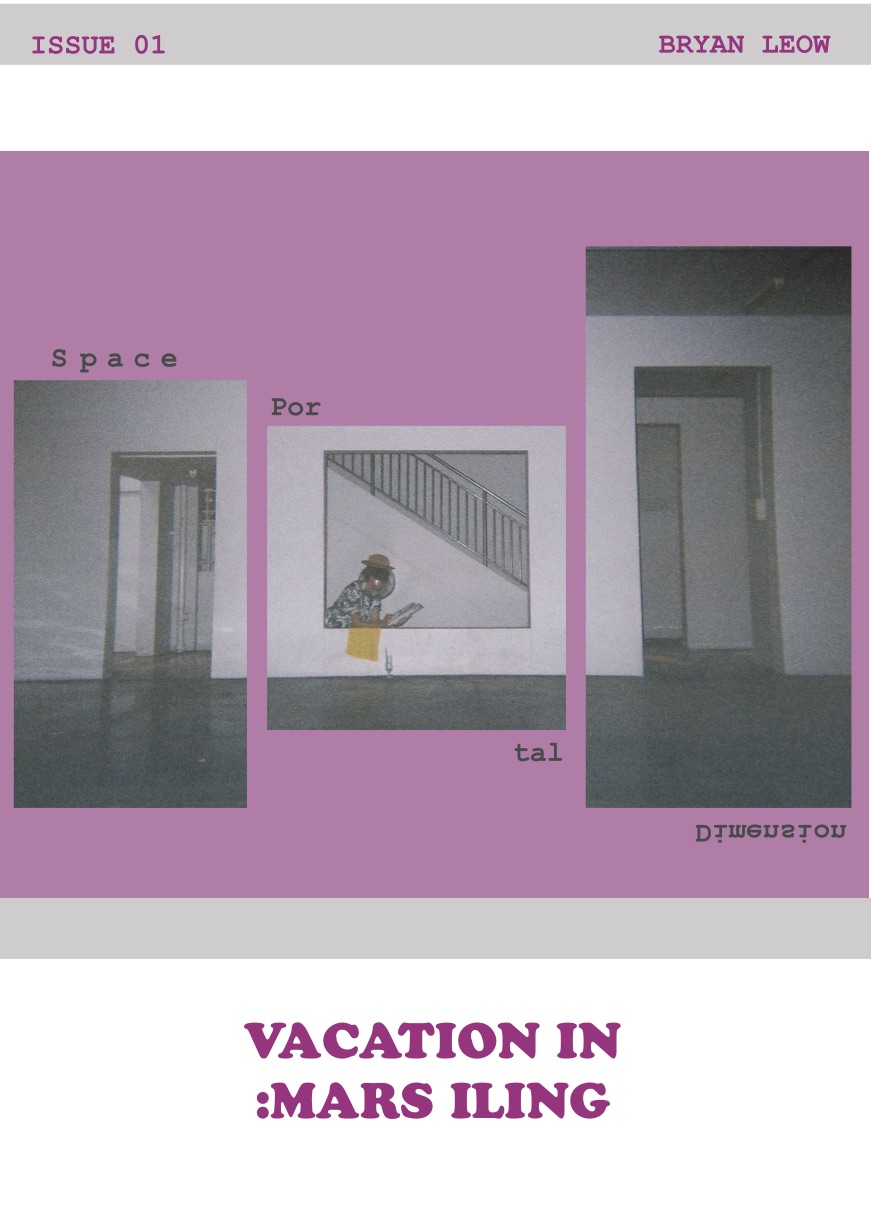
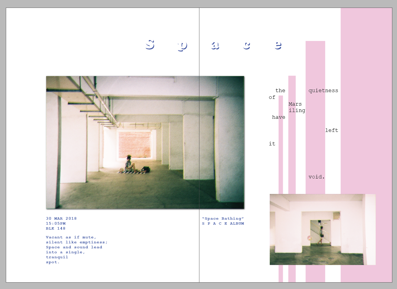
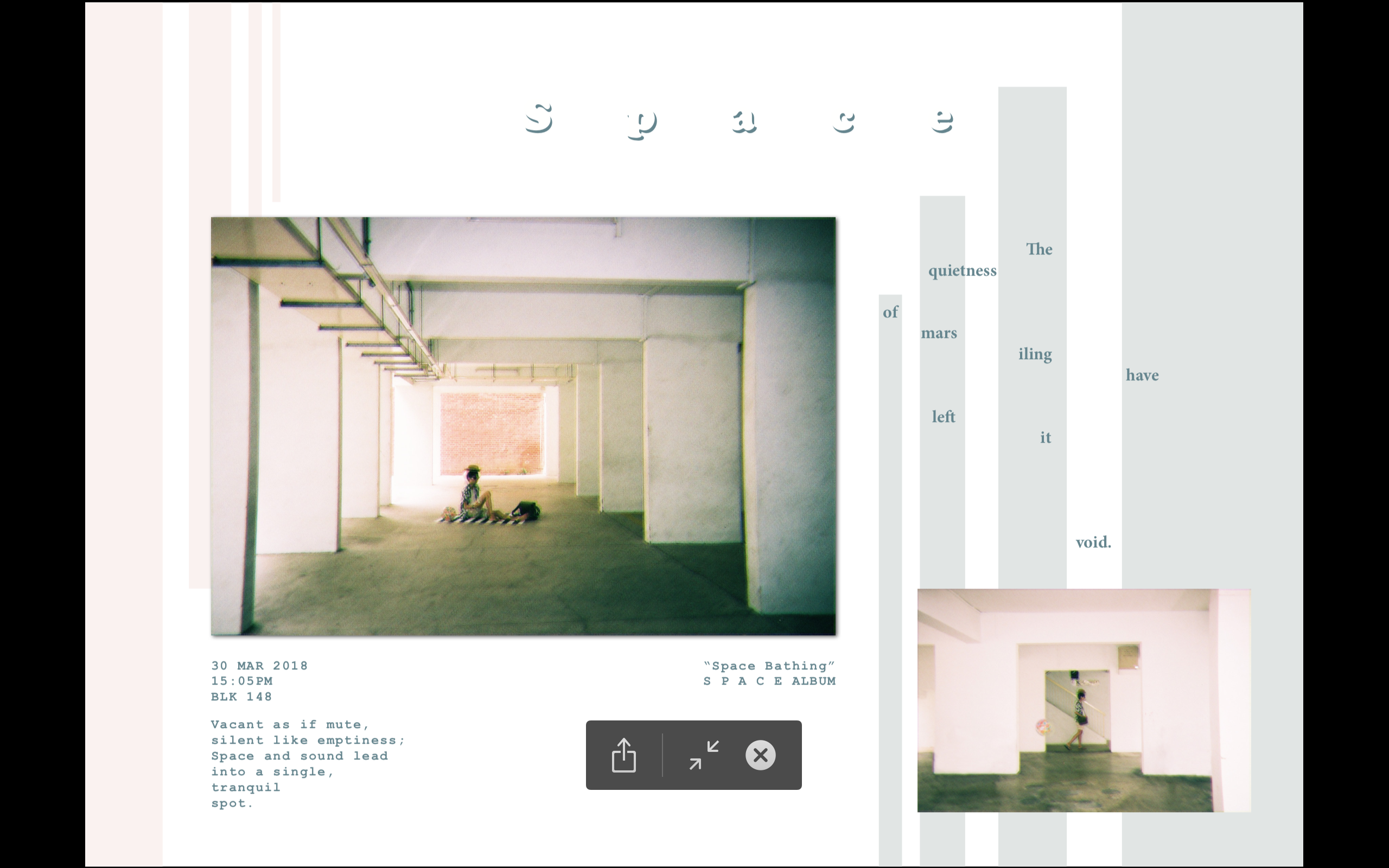
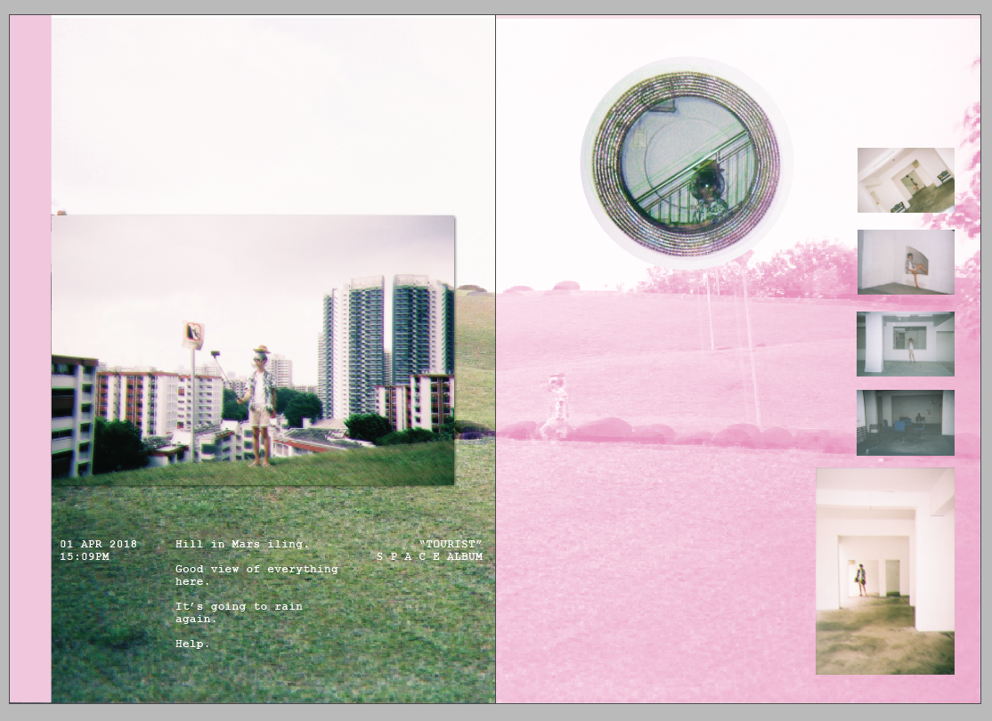
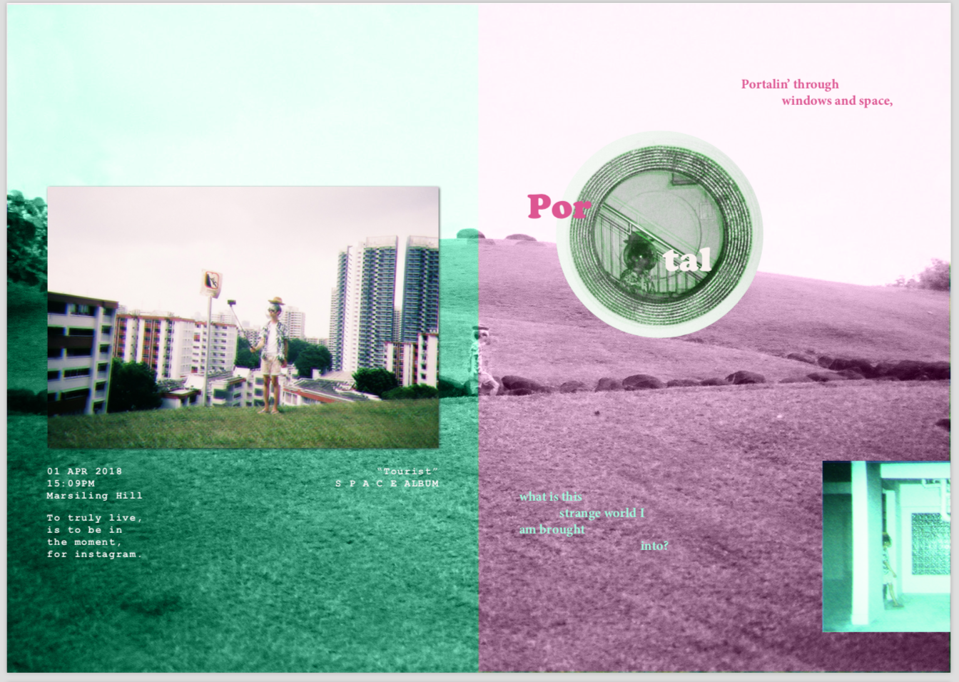
Zine!
So finally, I went to do on the ACTUAL ZINE!!!
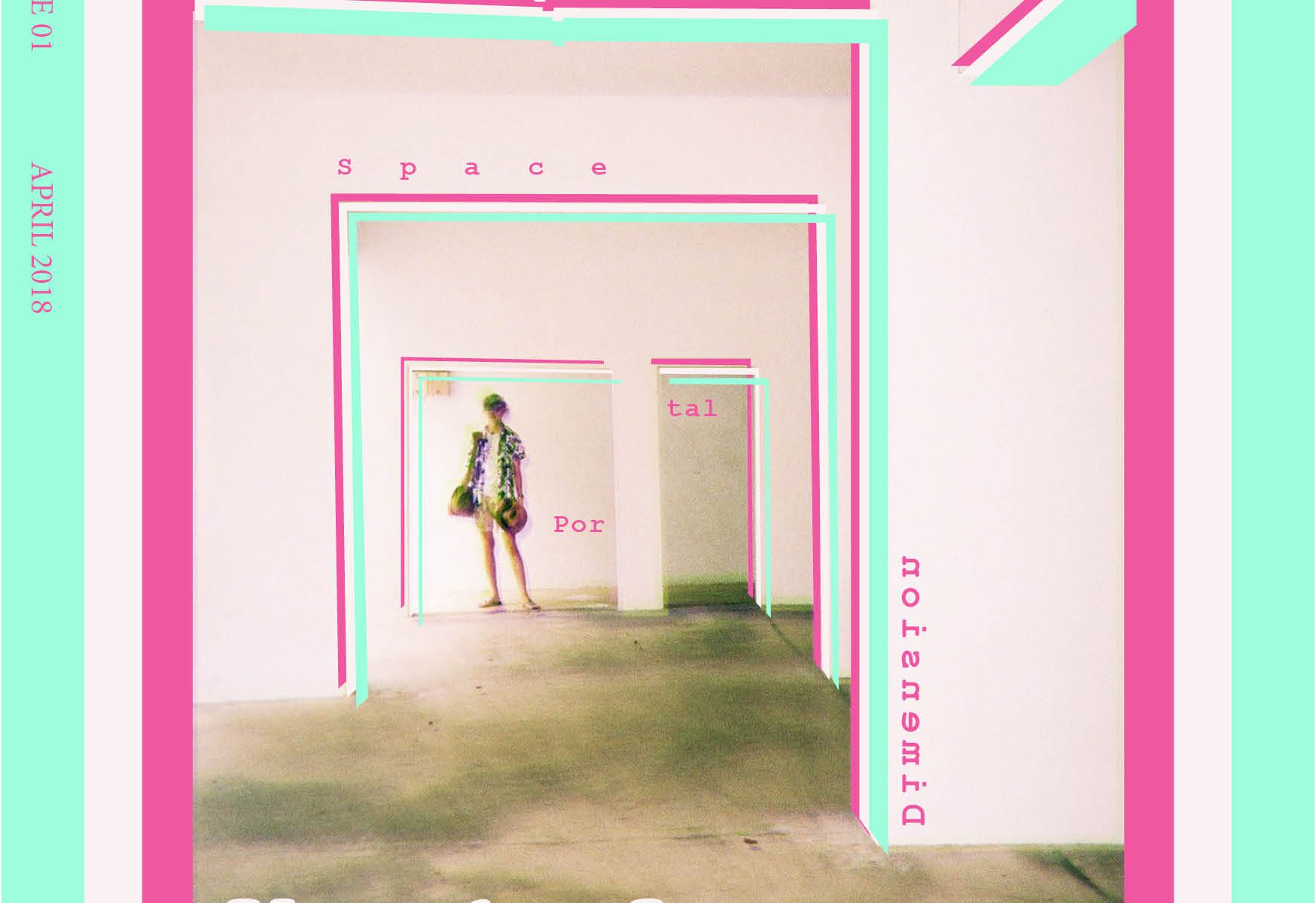
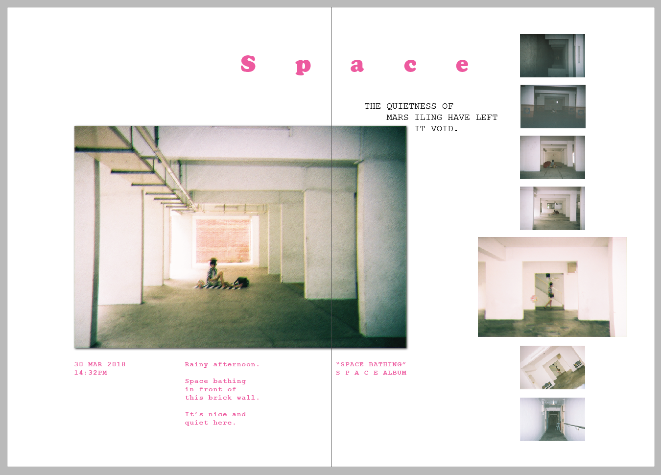
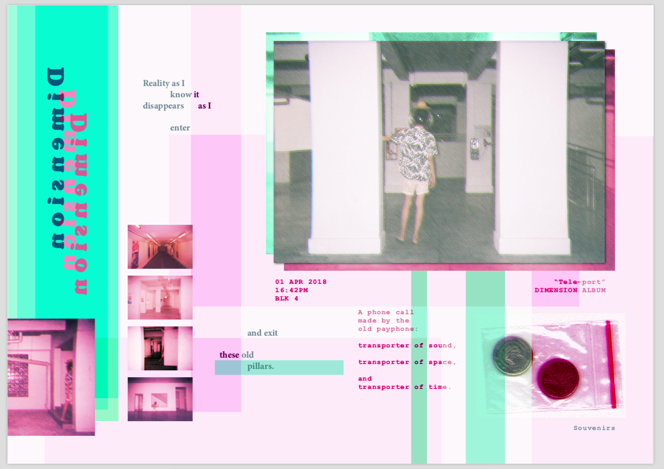
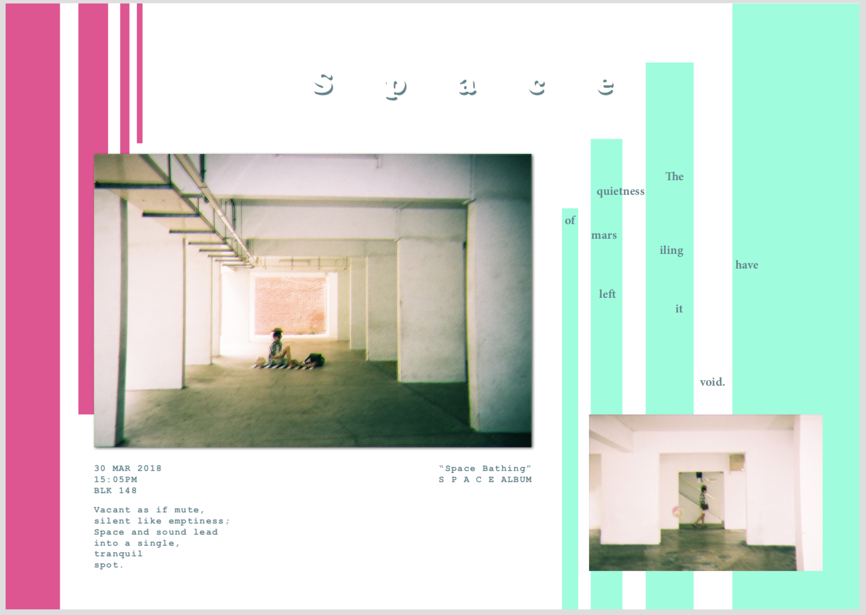
I separated the zine into 3 parts: Space, Portals, and Dimensions.
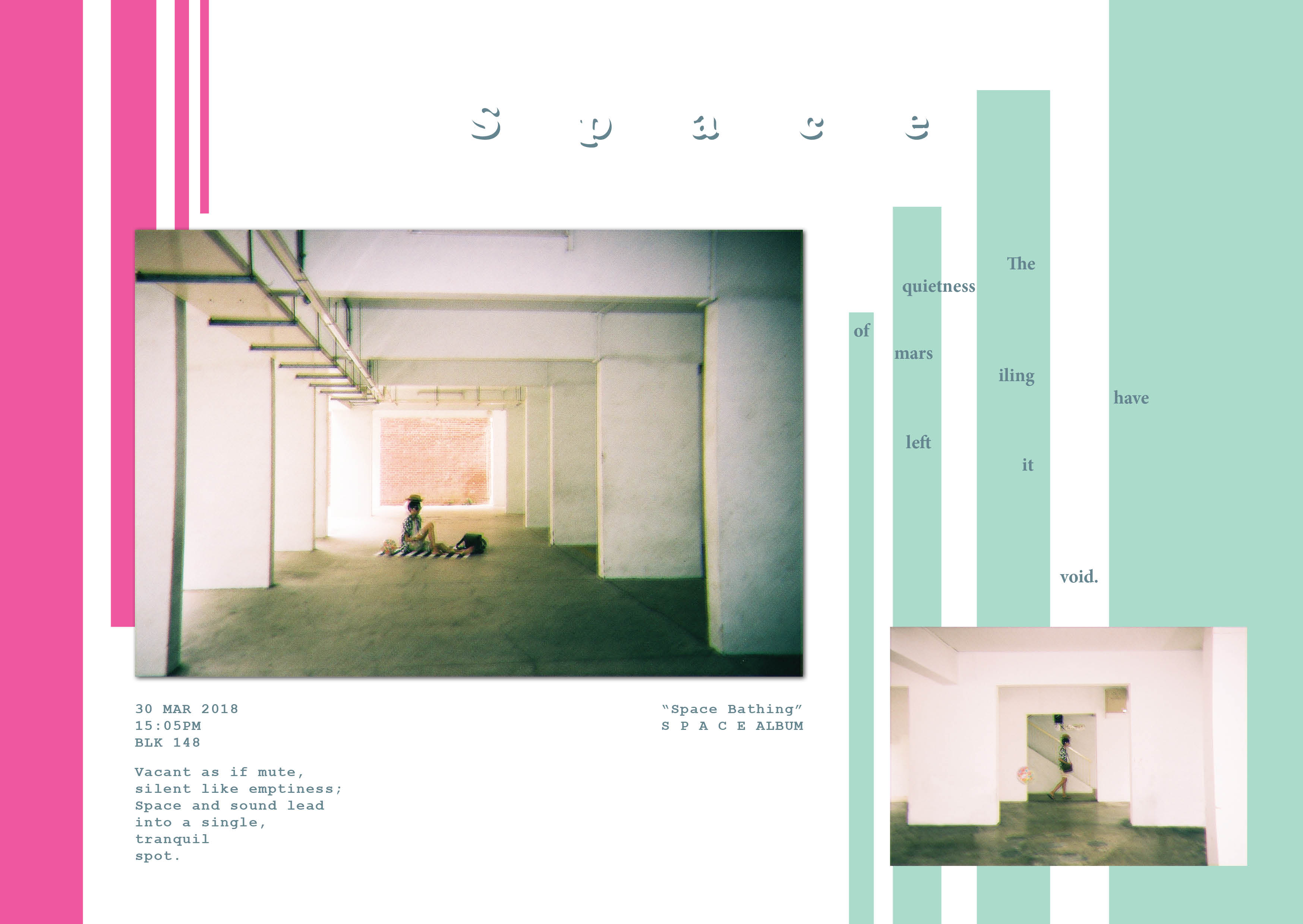
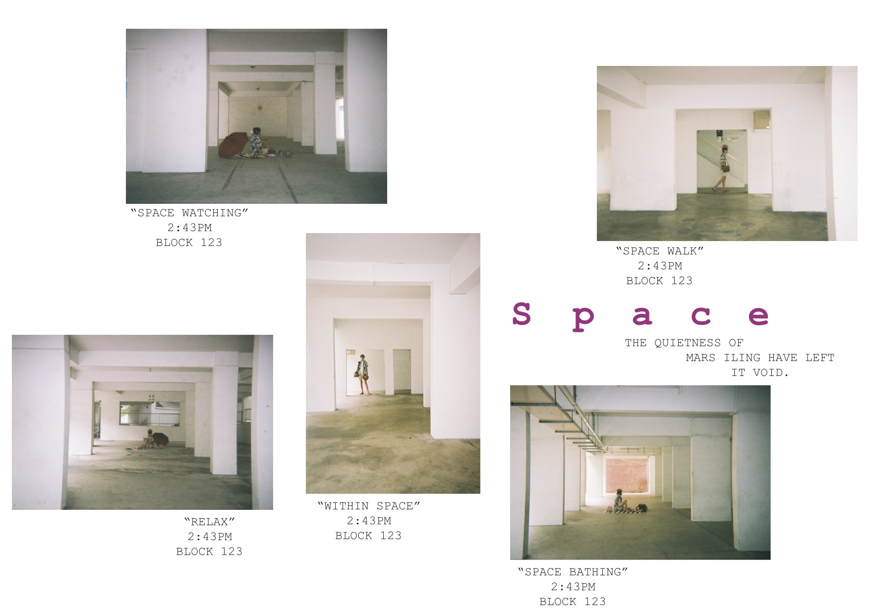
Space – Showcase the quietness of the location by using spaciousness
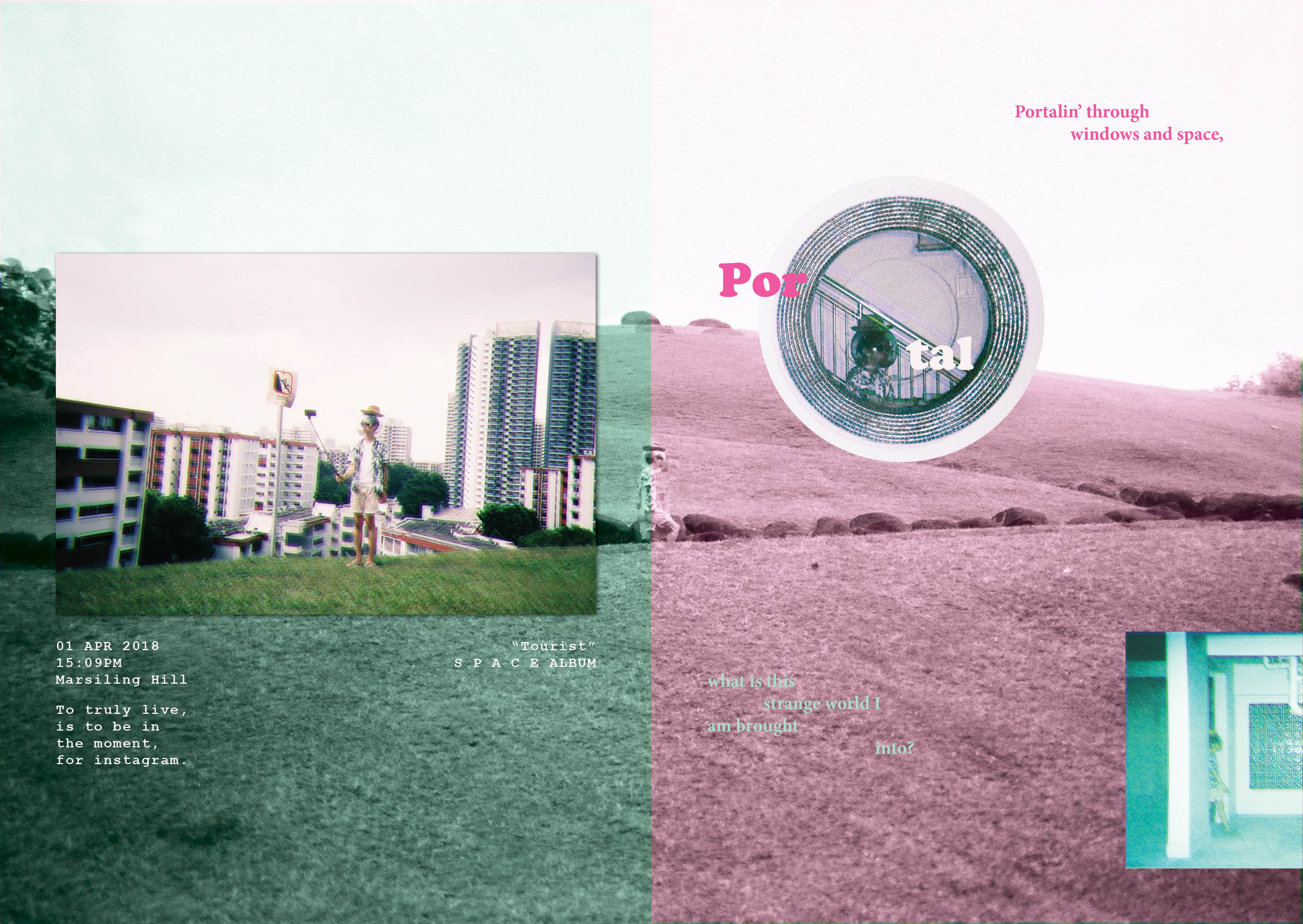
Portals – Show the transportation from a world I am familiar with into a different world (Mars iling)
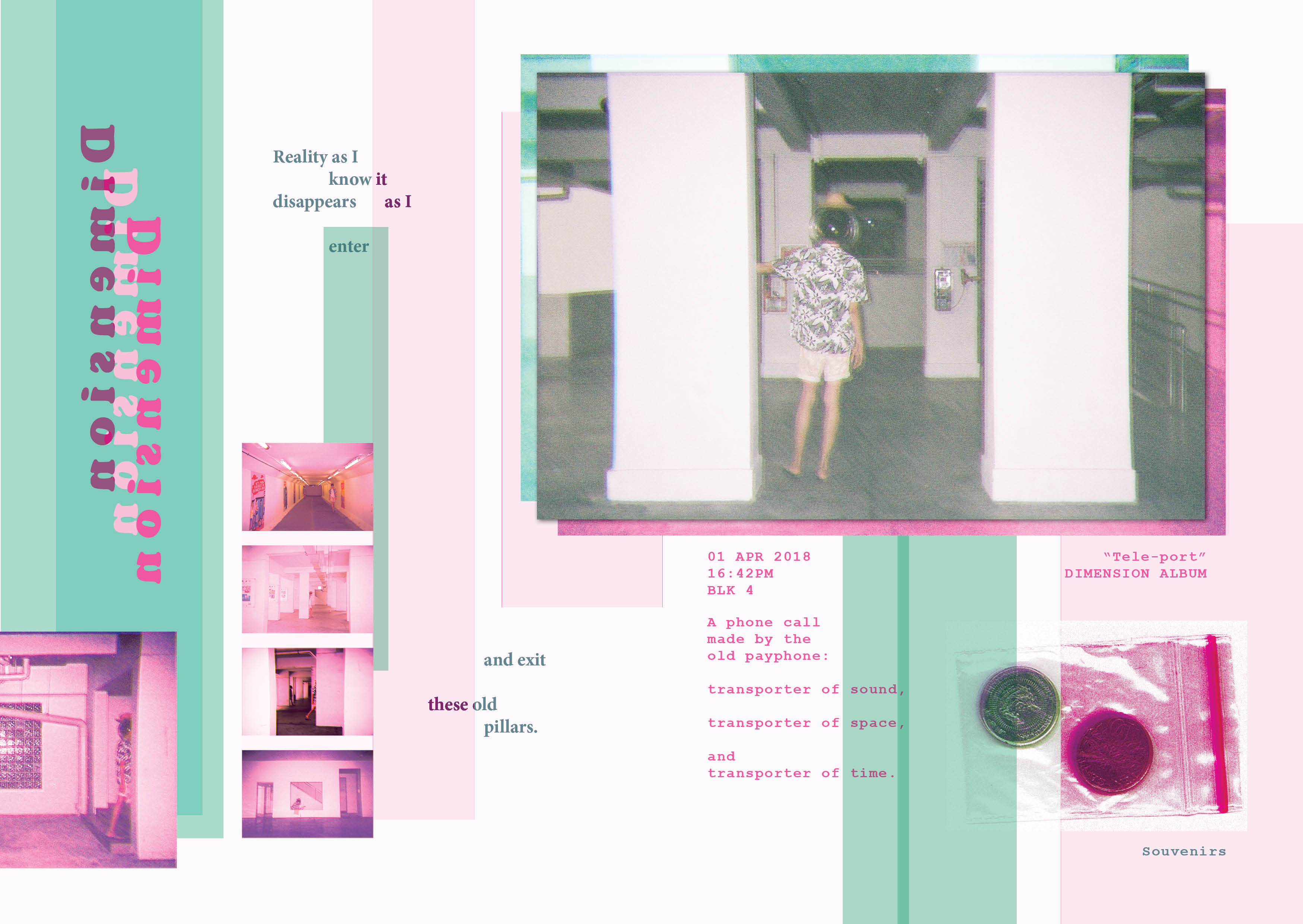
Dimensions – Show the strangeness of Mars iling
Using some inspiration from Rubbish famzine by HolyCRAP, as well as zines from my moodboard, I decided to create a vacation documentary that is not just personal, but also minimalistic.
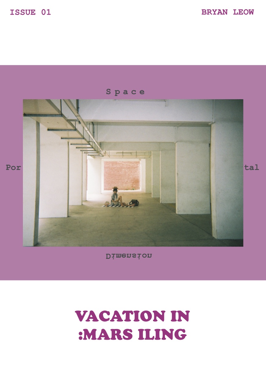
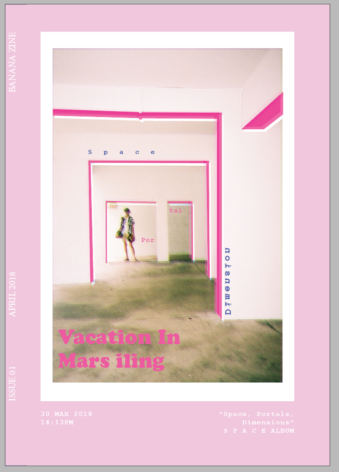
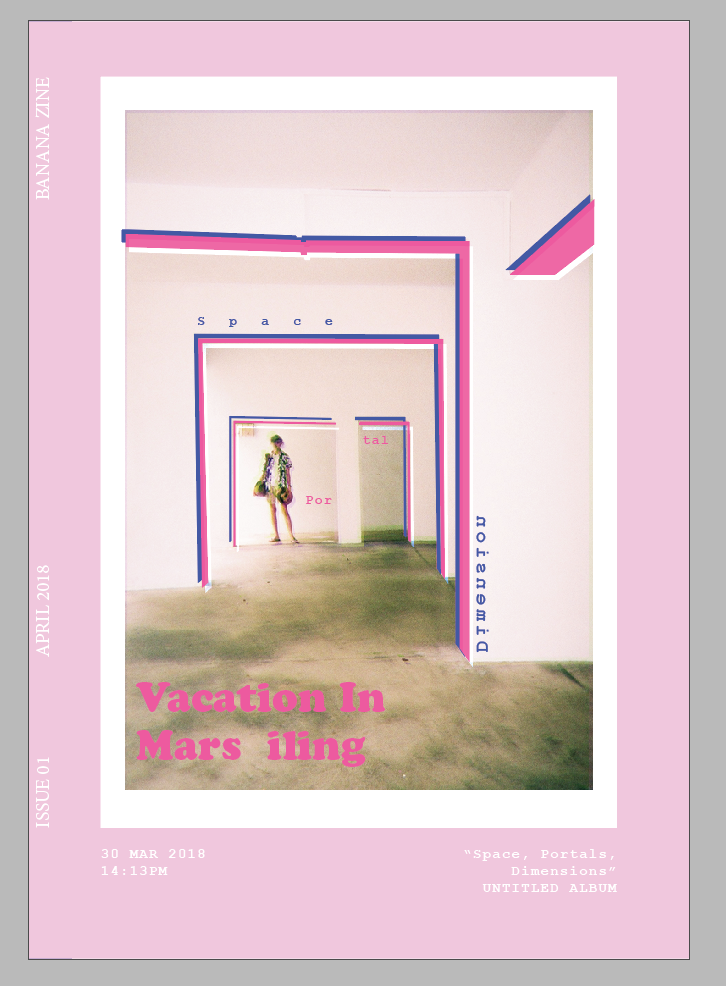
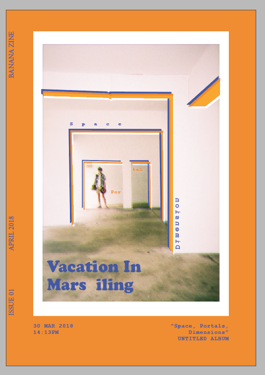
I started with a few variations of my cover page:
Then, I tried out some spreads:
With these, I consulted and selected my cover page. I also got the feedback that my images are all the same size, which is undesirable. I wanted to try for the photobook effect where all images are the same size, but it seems to not be working. I was more harsh on my image selections and tested out new spreads.
Evolution of my Cover Page
trying out adding graphics onto the photoAdding more stuffsexperimenting with the colour schemediscovered a nice scheme using complementary colours
Evolution of SPACE Spread
experimented with adding more images as layouts as I don’t want to waste my imagesAdding void deck appearance to add complexityAdded pillars using gestalt’s law to imply pillarsadded some poetic linesswitched colour palette
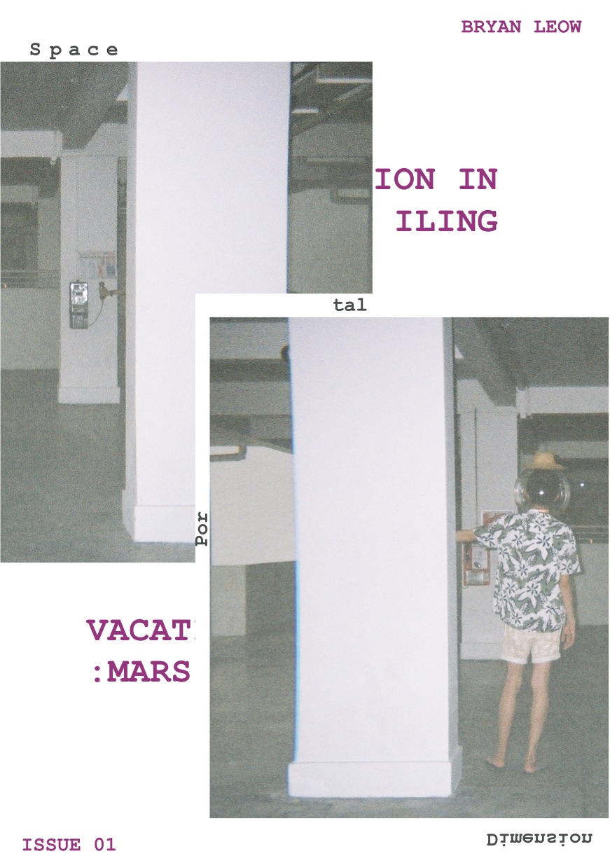
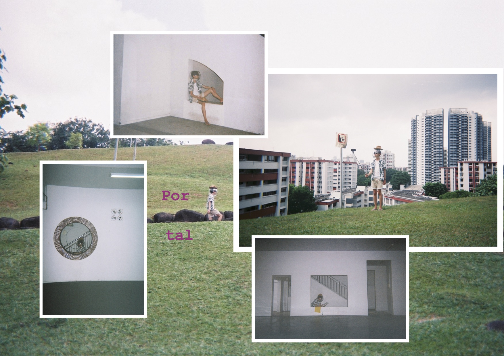
Evolution of Portal Spread
added images to not waste them, and also added duality by making the 2nd part pinkdecided not to have the images and added the word portaladded more colour and glitch, which amplifies the portal effect
Evolution of Dimension Spread
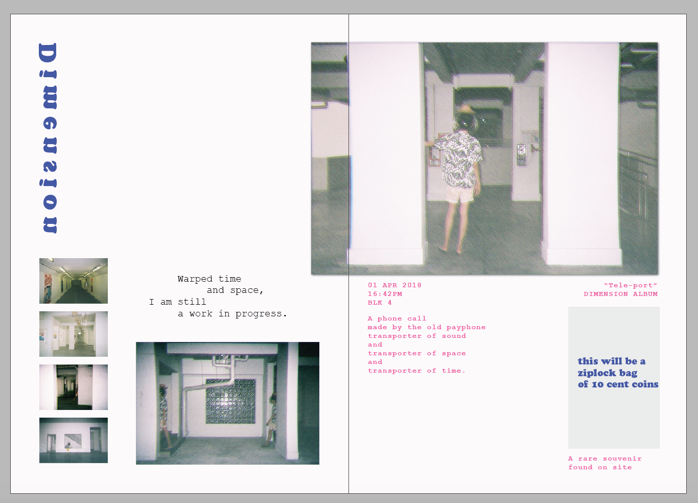
I had the most difficulty with this spread as I don’t really know what to do with it. I added a lot of elements to experimentDecided that the portal has got to go, and focused the page mostly to dimensionsglitching it up to showcase the idea of a world that’s beyond our own
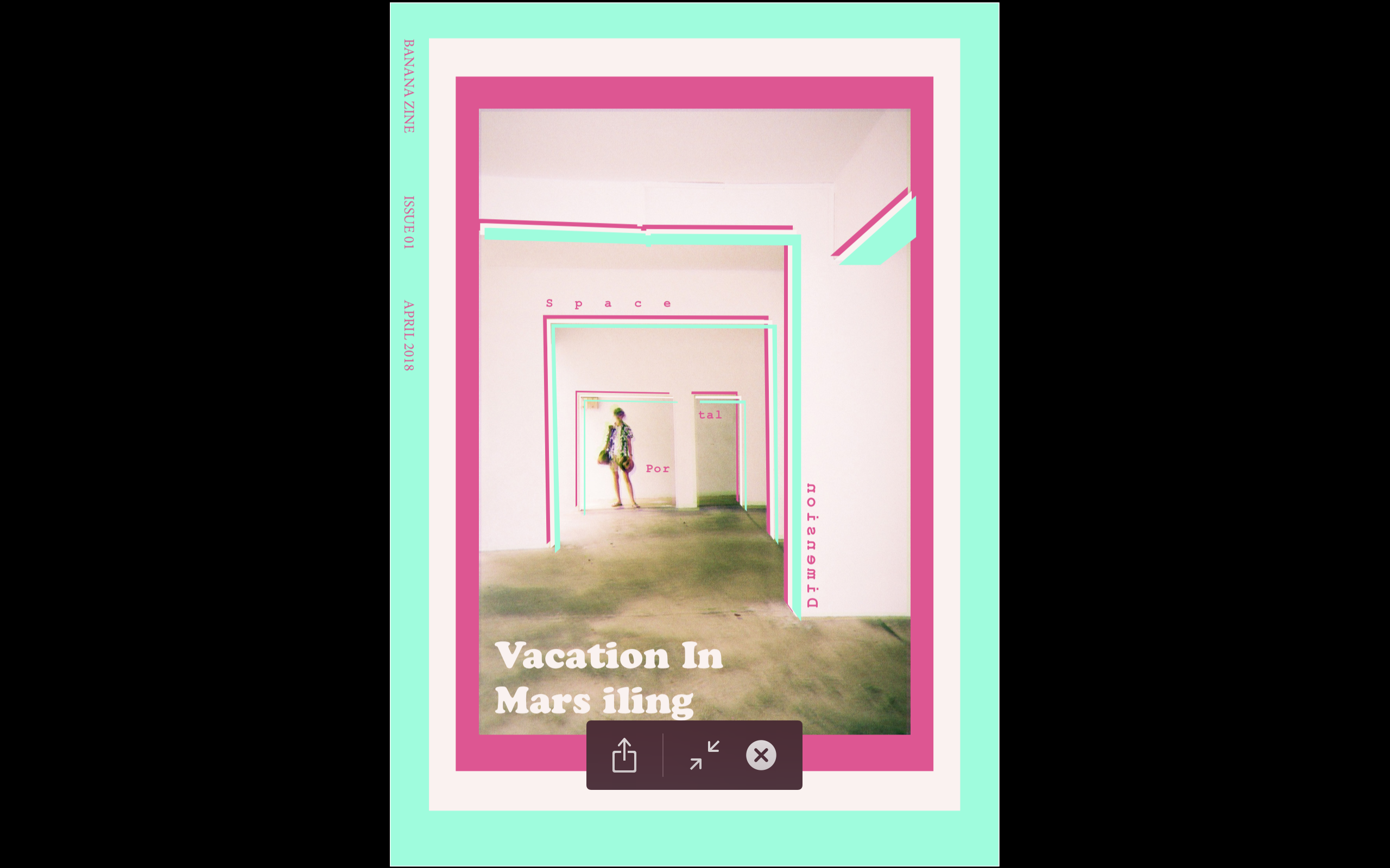
FINAL
Overall, all my images are glitched somewhat to create a more otherworldly feel, although I try not to overdo it so as to keep it subtle.
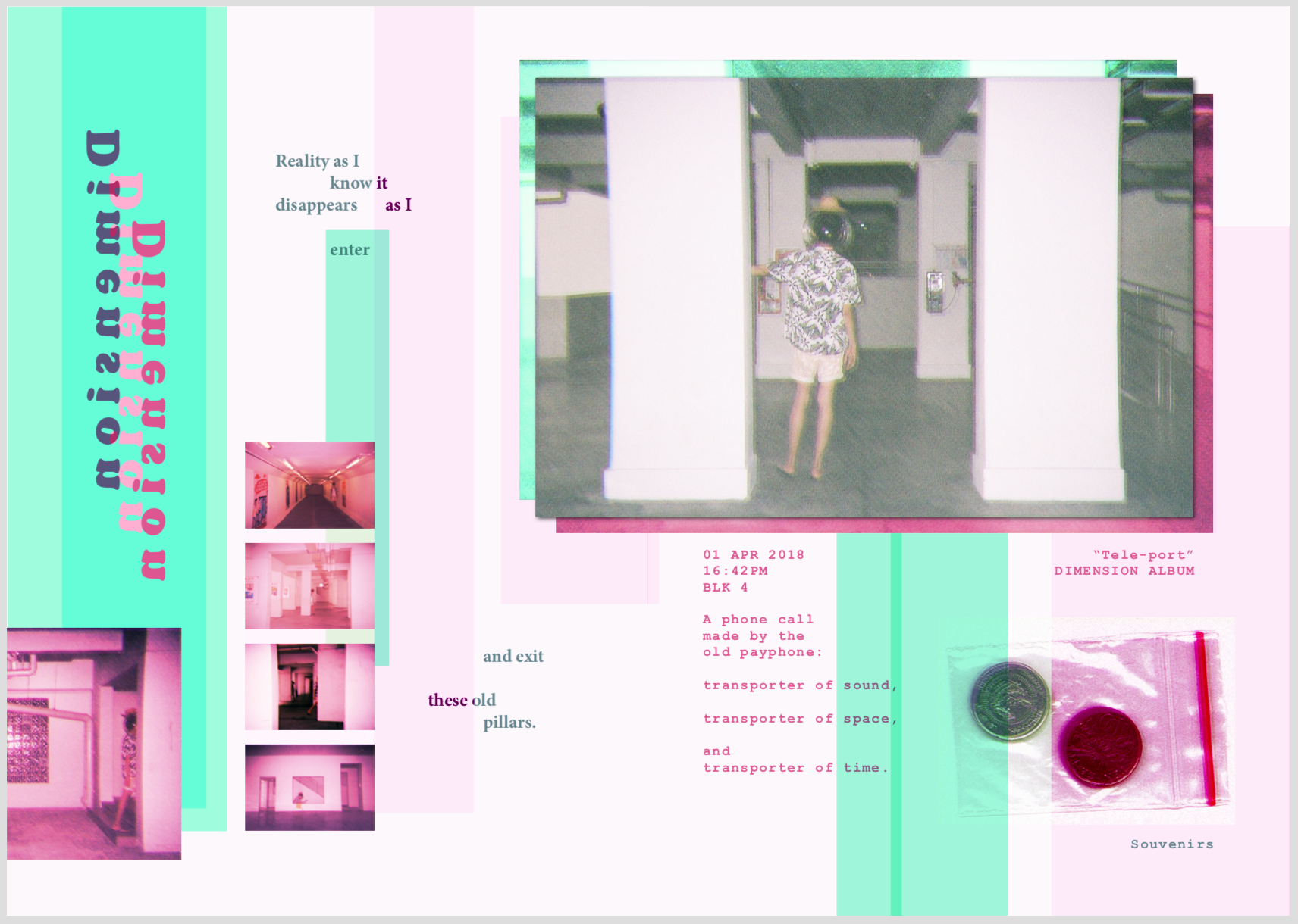
For the cover page, I chose this image because it embodies everything I want to convey in the zine. It also have the best composition and colours. I really love the pink that the disposable camera created, which reminded me of the photographer nguan. This inspired me to use the pink scheme. I used a mint-green colour to complement the pink, creating a zine that is unconventional, energetic, but strange.
The extra graphics I added are to frame the model, as well as to bring out the pillars.
For this spread, I spaced out the kerning for the word “Space” so that I can get the message across by typography. The whole page was supposed to be very spacious and empty, but it does not fit the other pages. So I added in the complementary colour scheme to make it harmonious. The lines are arranged to look like pillars so I can show that the idea of space and quietness is in the spaces between the pillars and void decks.
The image used was a 4R image of the tourist sitting on the beach mat enjoying himself. This is to convey the idea of a vacation right from the beginning so as to set the mood. The poetry is used to explain what I am trying to do with the space to depict emptiness. At the same time, as this zine is supposed to be personal, I want it to be expressive and not just informative. I want the information to be understood through expression.
The text at the right side is spaced to not just amplify the idea of space, but also to create the idea of the texts aligning to the pillars.
Finally, the image on the right is another image that I want to show to depict the holiday-ness that goes together with the spaciousness.
This spread talks about portals. Although the background does not have much to do with it, I really liked it as I think it have a lot of potential to be an image that covers the entire spread. I instead use the difference between an outdoor and an indoor area to suggest the idea of portals. The odd placement of the circular HDB void deck window in the middle of the spread is to add on to the idea of portals and strangeness. The usage of the complementary green/pink is very present here. This is to expand on the idea of duality in portals. In terms of placement of texts, photos, and colours, I have played around with increasing the space between linked objects to distant them. eg, distancing a single image with 2 colours, but they are linked in the same image, or distancing two sentences, even though they go together.
Another thing I did here is to connect the photo of Jeremy holding the selfie stick with the background. The grass and buildings align with the background, creating a separate, yet interlinked relationship between the image and background.
The poetry and the subject’s touristy action is a representation of the tourist. Again, I made sure to make him very stereotypically touristy. The background of the image is also a suggestion of emptiness as there are nobody there. I also purposely made the poem pretentious so as to convey the pretentiousness of stereotypical tourists.
Finally, I added half an image on the bottom right side so as to link the spread to the next page, conveying another idea of portals. In this case, it’s the portal from one page to another.
This spread is about dimensions. I combined the first two spread together to create this page — a combination of space and portals. Repeated and glitched “pillars” are created to show the idea of space, but also in a different world. I try to arrange everything vertically, so as to construct the pillars like in the first spread. The usage of all images present here are images of Jeremy entering from one pillar and exiting another pillar. This helps convey strangeness, and some sense of portalling.
In the 4R image, Jeremy is holding a telephone. This is to represent tourists’ curiosity with strange object, specifically objects with heritage like an old telephone. It suddenly clicked in me that phone is a representation of a transportation of sound. I tied everything together like this:
Jeremy is going through a portal through space
the phone represents sound, which is the main thing I am focusing on actually about Marsiling, which is that it is quiet
At the same time, this telephone is old, so its also a link in time
Combining everything together, I formed the poem.
The colours, again, I used the complementary scheme that is consistent to my other spreads.
At the bottom right, I added a ziplock containing two 10 cents coin, which I labelled as “souvenirs”. This is a representation of tourists keeping souvenirs found in foreign lands. This concludes what I think about what tourists in Mars iling will do, as well as concludes my perception of Mars iling.
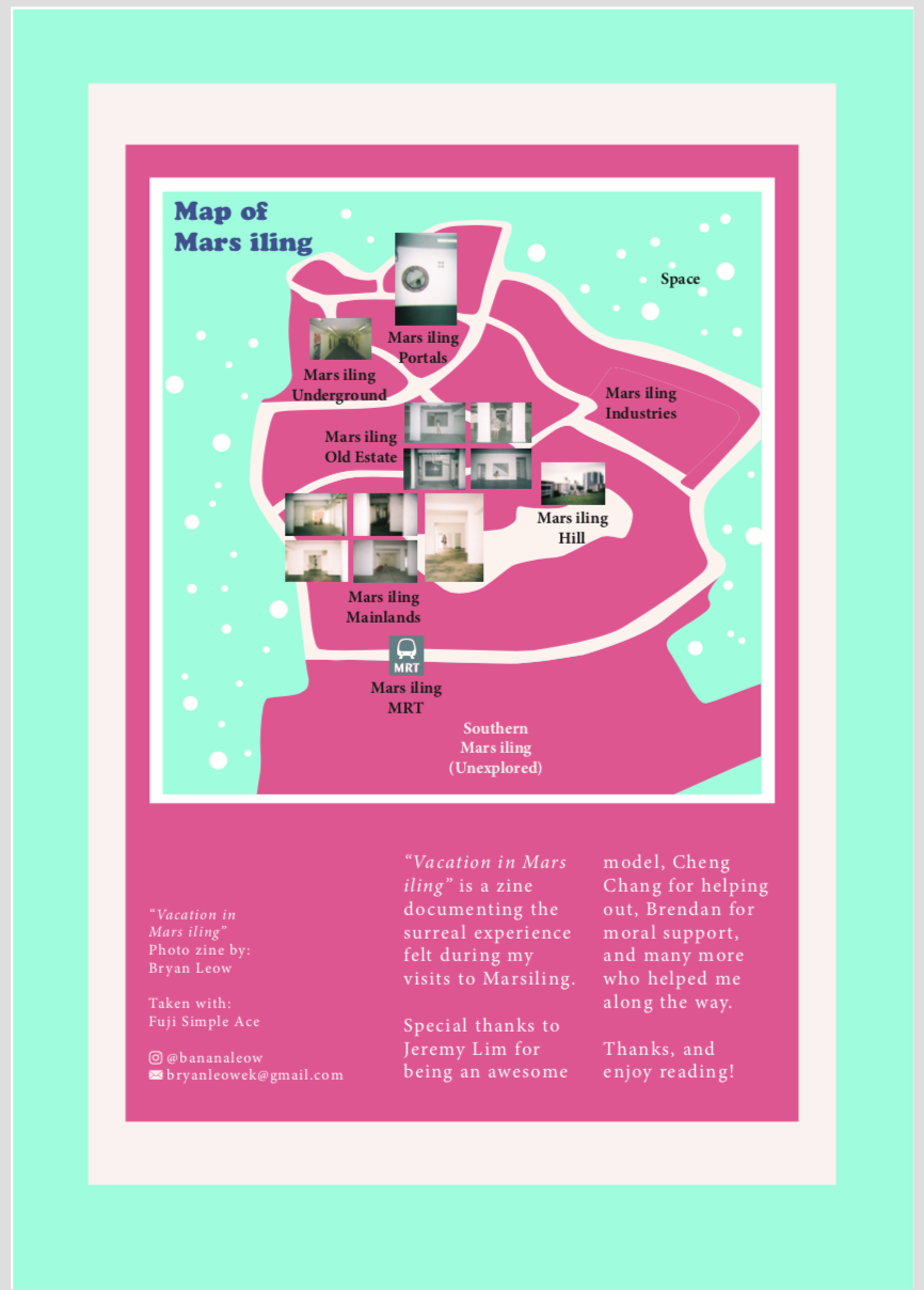
On the last page, I included credits and contact details, as well as a map. In the map, I try to label the different parts of Mars iling, categorising them into zones that I find define each area best. In specific areas, I placed the few significant images that I took at the area to let readers know which image is from which zone. I try to make it as if Mars iling is a planet, which is why I added “stars” and a label “space” outside the map.
And that’s my zine!
LASTLY
I’d like to show off all my disposable camera photos. I REALLY LOVE THEM.
Takeaways & Reflections
I really enjoyed this project, even though it was really tough. I am really grateful of my friend Jeremy for carrying all the camera equipment and props around Marsiling with me for two days. I enjoyed shooting with an intention in mind and directing the shots, as I have never done it before and it’s about time I actually do something that helps me to train my assertiveness and decisiveness. I also enjoyed thinking about the art concept and direction, and generally love the idea of having props and weird props around. There was even once I wanted to buy an inflatable flamingo float just for this shoot and I held back. I REALLY LOVE THE BEACH I GUESS?
OH. and I was also exposed to like a lot of different zines and that PUMPED ME UP a lot. They are really nice to look at and inspiring.
I also have discovered a new love for film and I really would love to go do more photoshoots from now on.
About the zine, I have relearnt how to use InDesign, and it’s quite good even though I disliked it at first. I was a bit reluctant to use it as I was too comfortable with illustrator. After a while, I decided to bring everything to Indesign so as to try it out. That was when I realised that the guides and spreads in InDesign actually makes everything easier.
One more thing is I learnt about composition, layout, and colours. These are always important, but I finally knew how to control it in pages.
I am proud to have created this zine even though I could still improve it, and even though I am not pursuing graphics design, I believe I’ll continue making zines for fun!
I am a messy artist, but that’s okay. I make things work, out of what doesn’t.
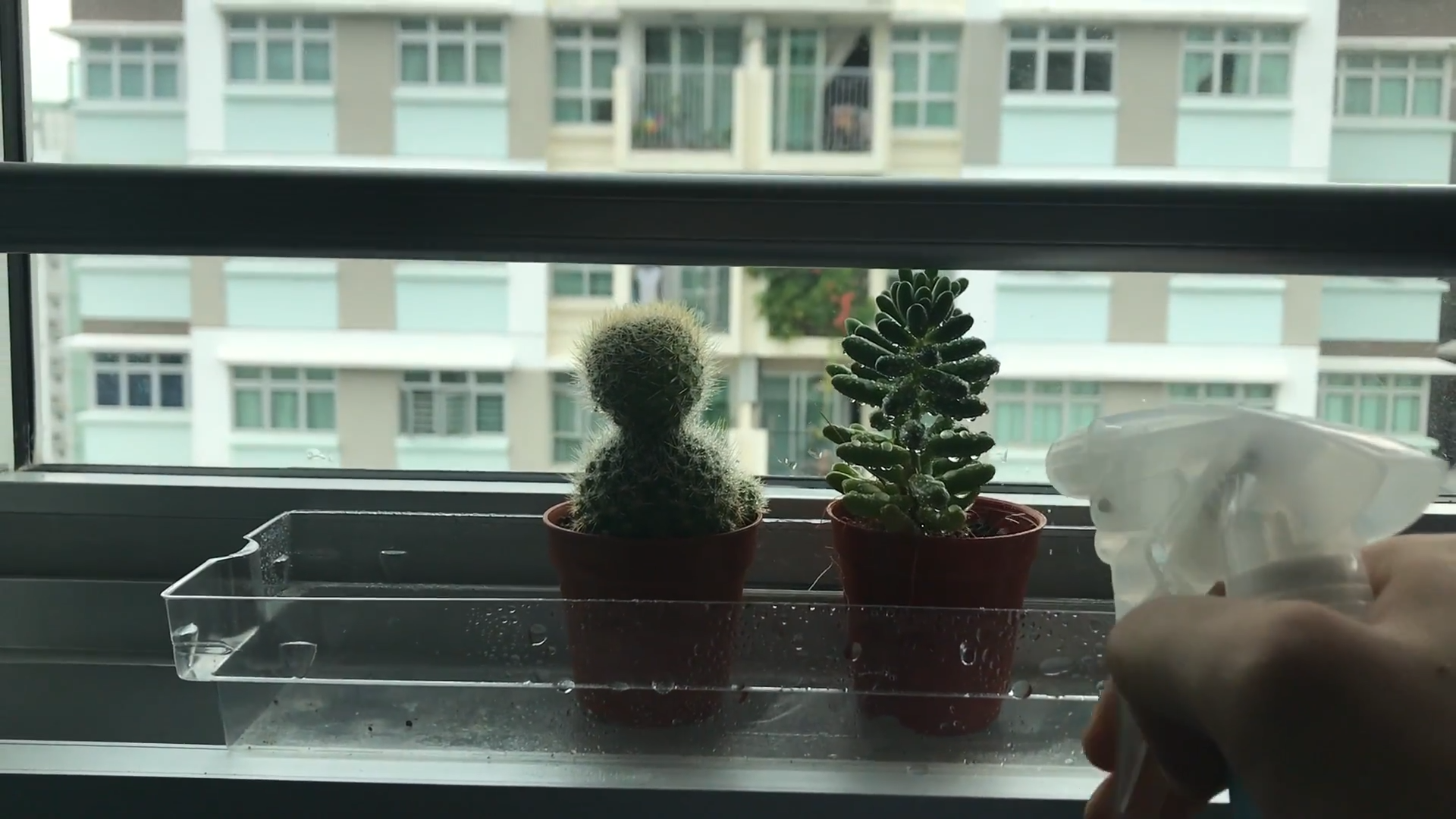
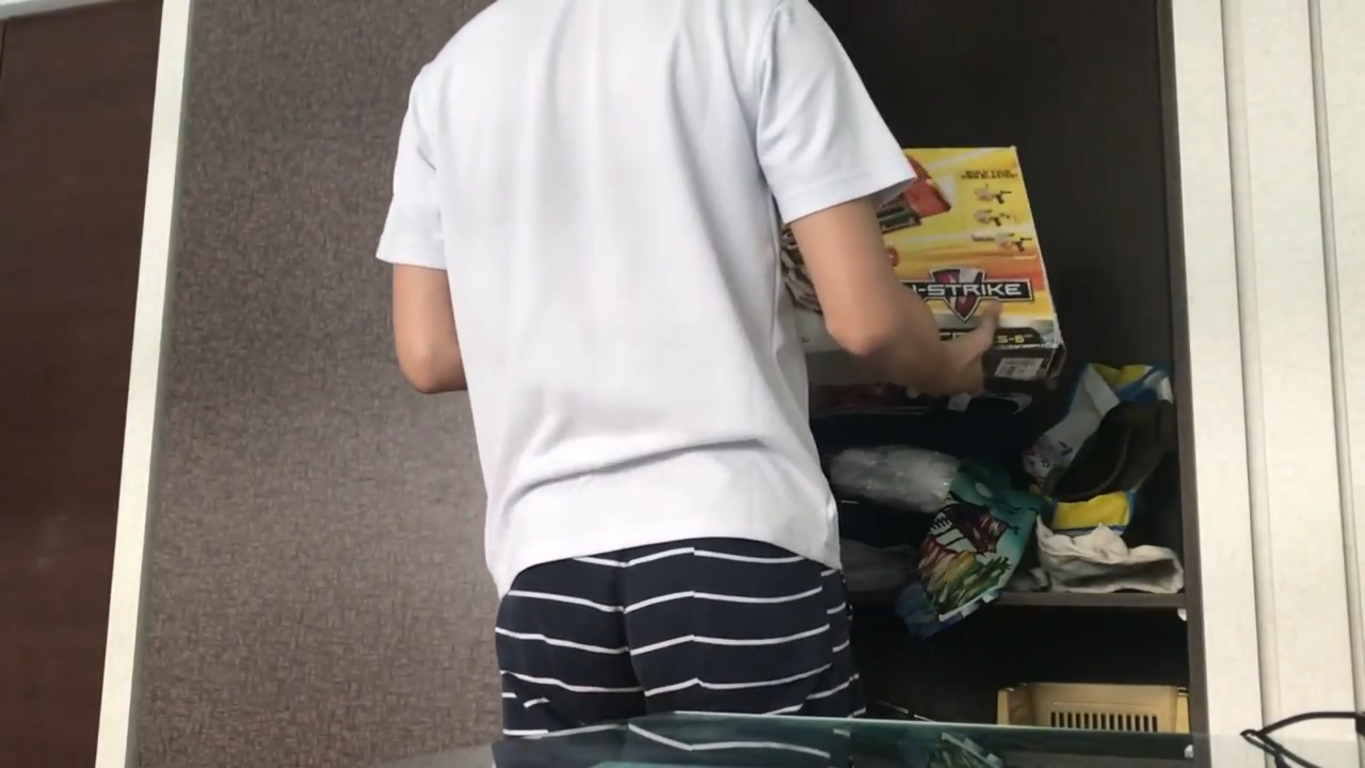
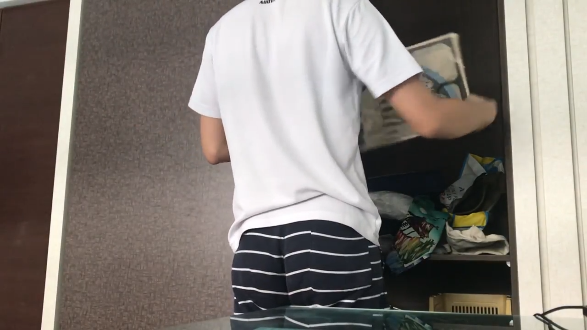
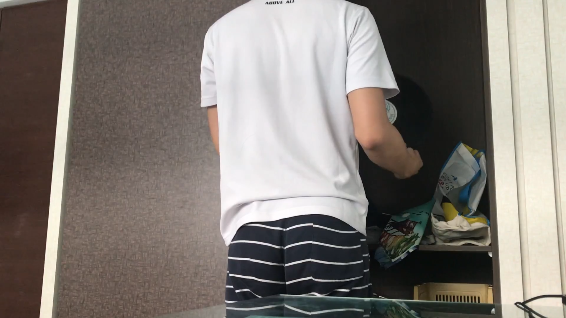
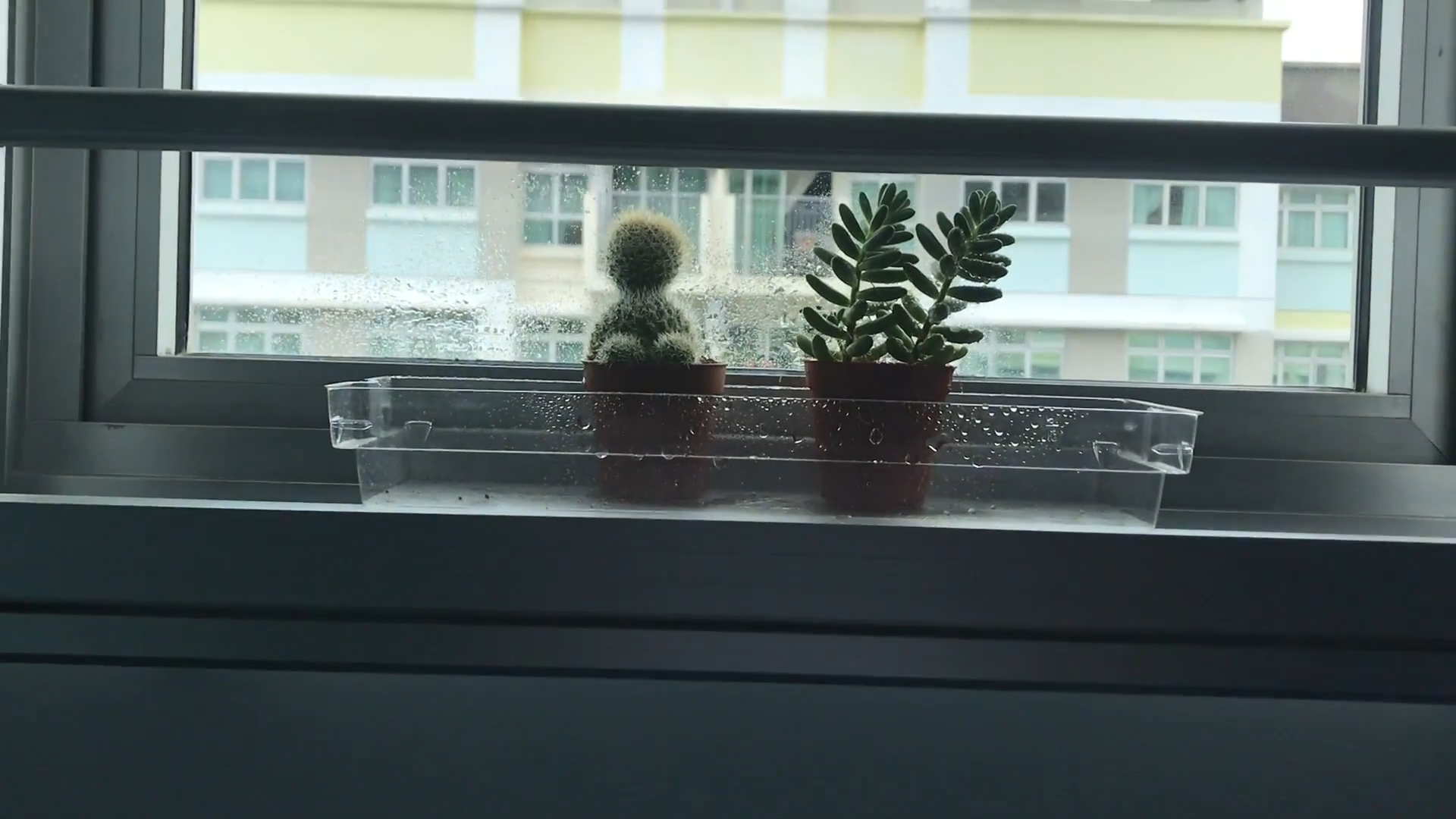
This is my performance for the video selfie. What I did was to open my wardrobe to a mess and start rummaging through it. I picked out certain objects to look at it / wear it. Finally, I found the item I am looking for and turns around, to which I pick up my phone to show what it is — a cactus and a succulent. I watered them and rotated them to reveal that there are more parts of the plants than what it was initially shown to look like.
Some screenshots:
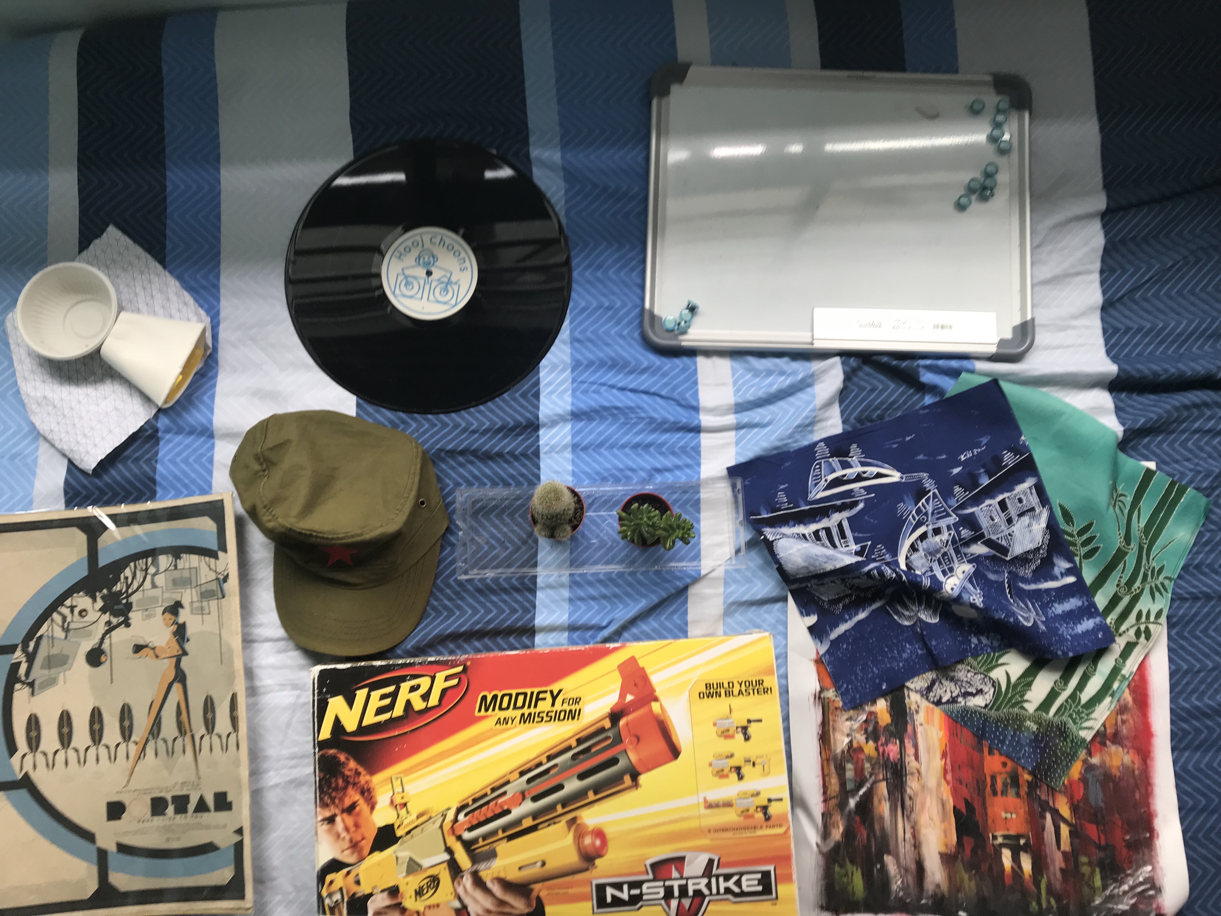
Looking at my nerf gunLooking at my Portal (game) posterLooking at an old vinyl recordONE OF THE JUNK COINCIDENTALLY LANDED IN FRONT OF THE CAMERAWatering my plantsThe final scene
Meaning
Here are the significant objects I used
From top left:
Some random junk – Junk thoughts
Spoilt vinyl record – My love for music
Whiteboard – My love for organisation
Poster of the game “Portal” – My love for gaming
Vietnam hat – Just a prop honestly
My plants – The representation of a good idea that can be developed
Batik prints from Penang – My appreciation for art
Nerf Gun box – My love for fun stuffs
Acrylic painting from Hong Kong – My appreciation for art
This video represents me as an artist in the way that I search for ideas. My mind is a haphazard mess and my ideas are represented by the objects.
By opening the wardrobe to reveal the mess, I am showing the inner workings of my mind. The items I threw out are what occupies my mind. Random thoughts, music, plannings, games and playing, art.
After searching throughout and emptying my thoughts, I found my idea and brings it to the window. These are revealed to be my cactus and succulent. I water them, which represents me nurturing the idea. Afterwhich I turn the plants to reveal that the cactus has small buddings (unintentional that it looks phallic… It’s just the way my cactus grew #dontjudge) and that the succulent have an extended part to it. This represents the way I can grow ideas to change perspectives.
Music Choice
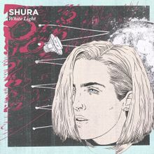
Image taken from https://genius.com/Shura-white-light-lyrics
I chose White Light by Shura, specifically the part from 5:17~.
What I love about it is that at about 5:51, there is a sequence which reminds me of a journey (through space). I tried to time everything so this part will start when I pick my plants from the wardrobe. This represents the finding of something important and a shift in pace.
Also, this song stuck with me for about 3 years, which is a classic for me, so I thought it was appropriate to have it to represent me.
Questions
How can the video selfie be used to alter identity?
To me, the video selfie is just a representation of my inner identity and not something that alters it. It may be scripted, which can show people what you want them to see, so it can be faked easily. I feel that the video selfie says little about a person, unless the video selfie shows something impactful or shocking. Perhaps, like any other selfies, they are mostly insignificant.
How might video be used to conceal identity?
As mentioned above, it can be scripted. It can be made into a very elaborate performance, but that may not represent you.
How do the objects that surround you contribute to your sense of identity?
They are representation of my inner thoughts, and so they do offer some insights for others to know who I am. In some ways, the objects create intimacy.
Conclusion
Overall I want to portray myself as haphazard and messy, but also can provide the world with a piece of myself that is fresh and can change perspectives.
“For me this approach to noise or noisiness, or dirt, or dirtiness, is a way to foreground as you say, an aberrance or perversion of normative message or what we might perceive to be logical reasoning. Because there is a poetics to that obviously and people who inspired me most directly in that matter would be Netochka Nezvanova, who did this comingling of functional code with highly politicized and poetic language.” – Glitch Expectations: A Conversation with Jon Cates
The idea of noise as aberrance is obvious but at the same time, poetic in a sense. Noise, defined as a disturbance of the norm, can be compared to glitch and destruction. We deconstruct a subject through destruction; and through this abstraction, our minds go through a different thought process to create a whole new meaning to the subject. Rather than seeing destruction as vandalism or something offensive, we see through the eyes of the artist and realise that destruction is a statement.
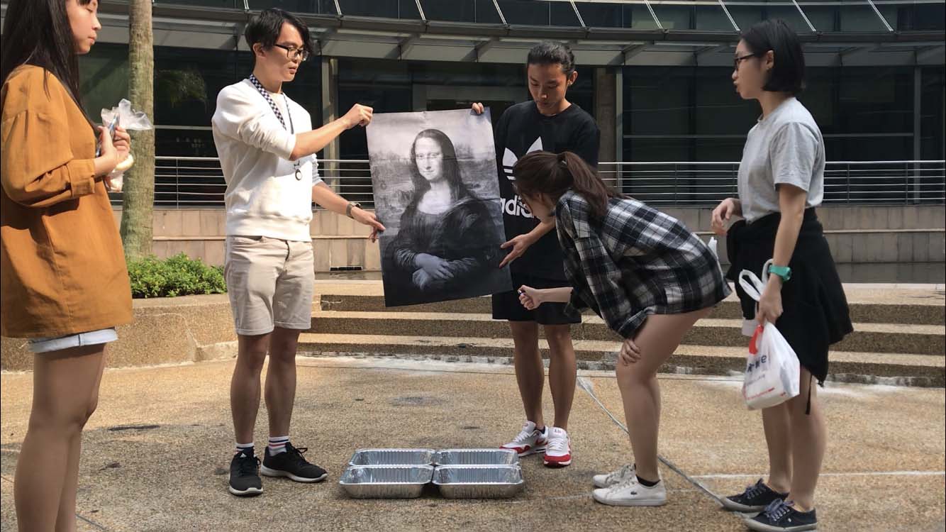
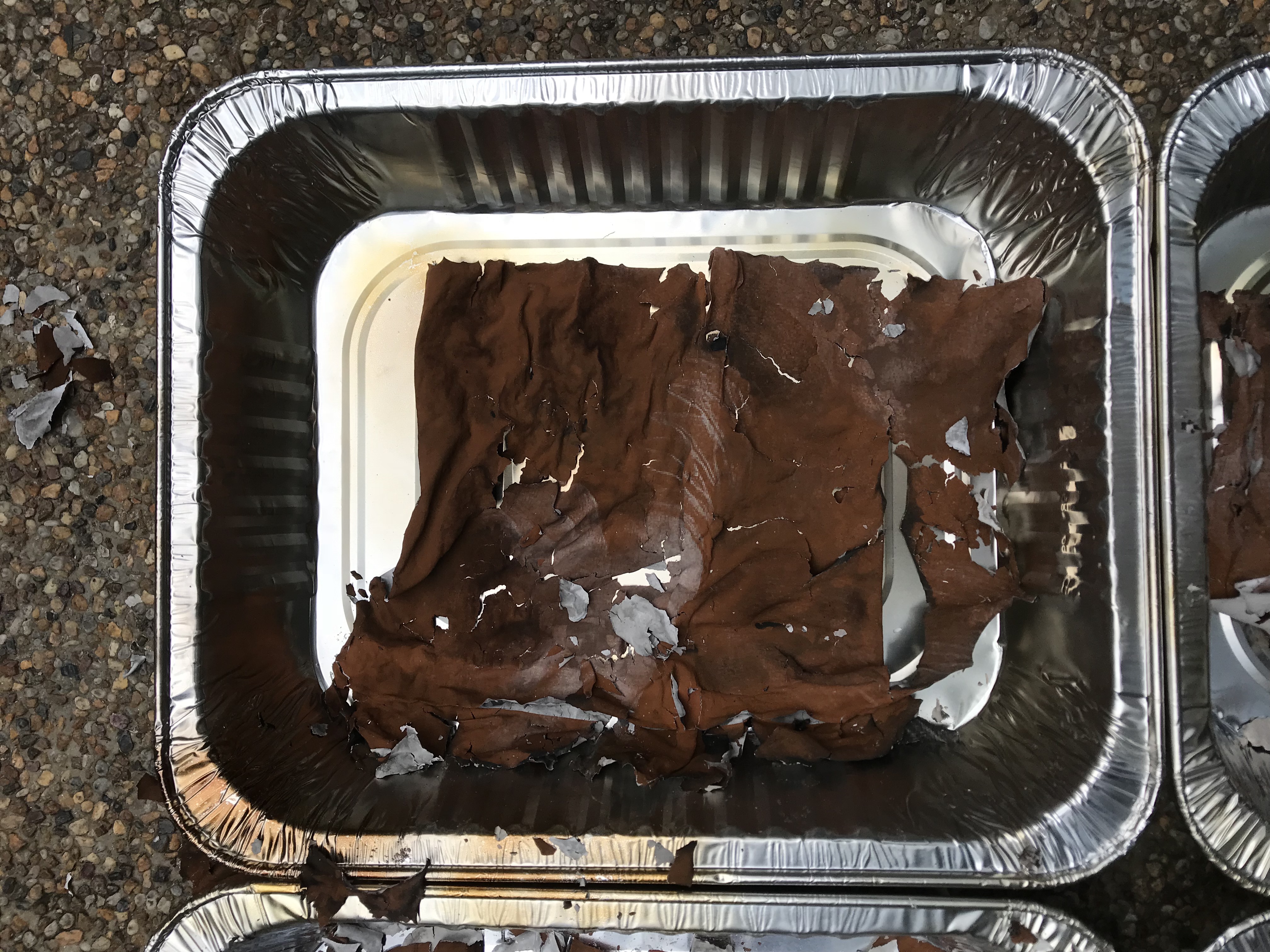
The iconic Mona Lisa, masterpiece by Da Vinci, was chosen as a symbol of traditional art form, representing not just all the paintings that exists in history, but also and the rules and properties tied to it. We printed an image of it on paper in black-and-white pieces before being assembled together into one image. Stripped from its colours, texture, and proper medium, this artwork is glitched intentionally. Devoid of its original meaning, the artwork is recreated as a symbol rather than to replicate the original.
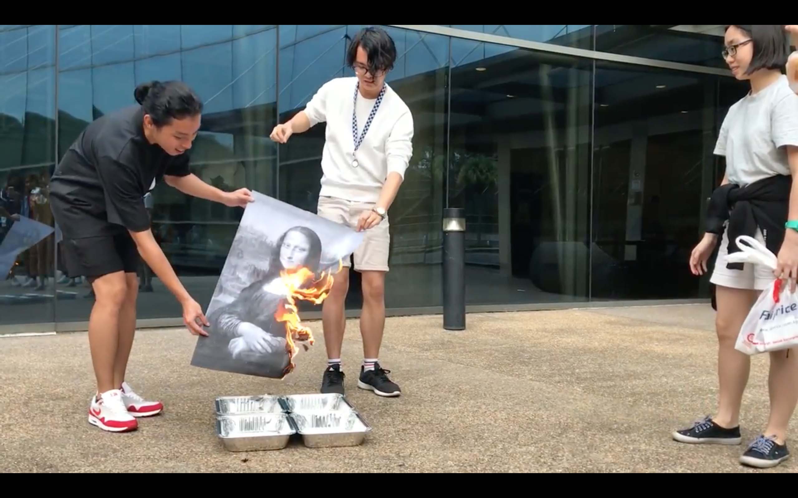
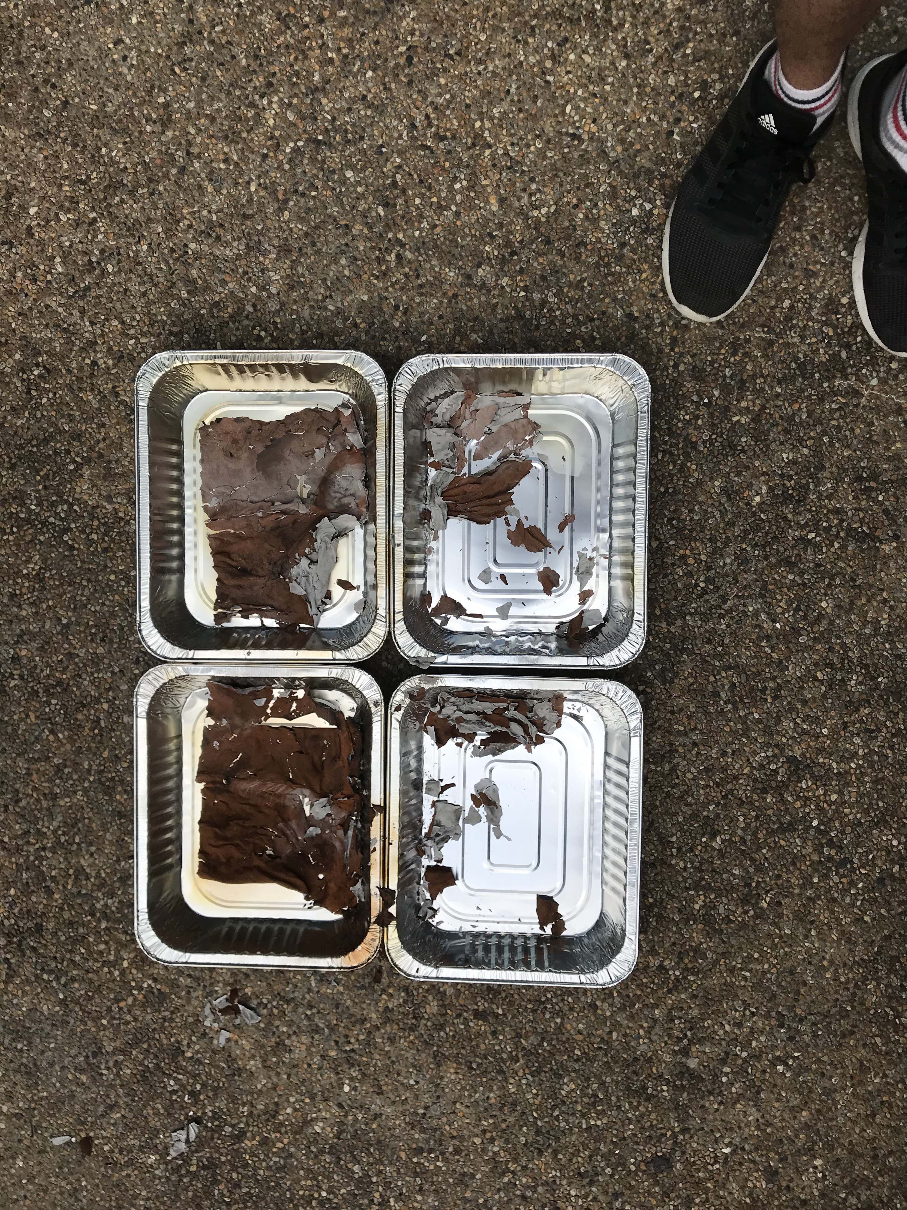
In our iconoclastic performance of burning the Mona Lisa, we do not only reject traditional art rules and forms, but also releases “art” from its static medium, freeing itself from its own rigidity into a formless, seamless entity that is ever present. The resulting corpse, its ashes, is now a soulless and empty shell that flakes away. This corpse bears no resemblance to the original at all and is now just a relic of what it used to be.
The entire process of destruction — from the careful handling of the image of the Mona Lisa, to it being engulfed in flames, to the ashes it left behind — is captured in a video. By watching the video, the audience can get the idea that we are trying to convey. The new meaning of art that we have created have left the image that we burnt and enter the medium that we have recorded it in!
Video:
We see a similarity in Ant Farm’s Media Burn (1975), a performance that made an impactful statement against the influence of television and the American lifestyle. By smashing the car and television together, Ant Farm demonstrated, through destruction, the clash of the two core subjects that Americans were obsessed with at that time. The spectacle of the performance, rather than the destroyed meaningless pieces left behind, have caused awe and mass media attention which amplified its intended meaning as it have made use of the very medium that is is trying to address.
“Here noise exists within the void opposite to what (already) has a meaning. Whichever way noise is defined, the negative definition also has a positive consequence: it helps by (re)defining its opposite (the world of meaning, the norm, regulation, goodness, beauty and so on).” – Glitch Studies Manifesto
The idea of what brings meaning and what does not is in the matter of perspective. One can see positive in something negative, and thus, by shifting our perspectives to align to that of the artist, we are able to find a new meaning defined by the artwork. Similarly, the lack of imagery in the new Mona Lisa, although meaningless and ephemeral, is the product of a process that represents the new icon for art. The “corpse’s” lack of meaning is the very definition of its meaning, which is that art is finally freed, and its meaning can be everywhere.