Who is Hannah Baker Hoch?
Hannah Hoch is a German Dada artist. She was one of the few woman who is involved in dadaism, who also consciously promoted the idea of women working creatively more generally in society, and is a pioneers of photomontage art form. She used photomontages to express her frustrations with the ideas of woman in the modern society in her time.
But first, we must know that Dadaism is a movement that reacted to World War I, which rejects logic and reasoning and instead, embraces nonsense, anti-capitalism, and irrationality. It is formed as a way to criticise issues with the world, a form of ranting or venting of dissatisfaction. Dadaism is a movement evolved from anti-art; other factors that brought Dadaism to life are Italian Futurism and German Expressionism.
Dadaism is a protest towards the war and its roots, which are reason and logic, are the cause of the war. In turn, they express chaos and irrationality as a form of protest. Being anti-art, dadaism ignored aesthetics and instead intended to offend people with their expressions.
One of Dadaism’s creation is the photomontage, which artists use scissors and glue instead of paint brushes to express their views using existing objects or images that are presented by the media.
One of the originator of the photomontage is none other than Hannah Hoch herself. Borrowing images from popular culture to create androgynous figures, which went against the Nazi’s idea of the ‘New Woman’. She rejected this idea and expressed herself through her photomontages.
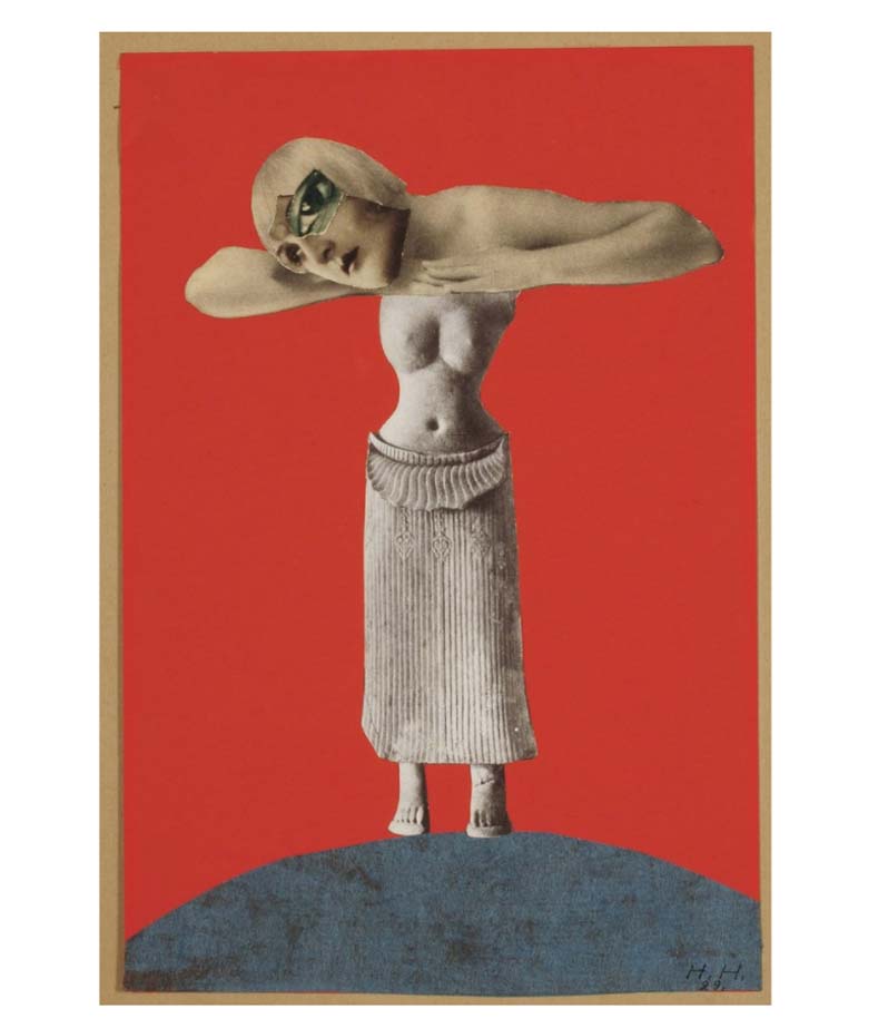
One of her work, Ohne Titel (Aus einem ethnographischen Museum), 1930, which depicted a deformed androgynous person.
Dadaism, to me, is a movement that redefined the idea of expression. Expression can be political, too, and the use of photomontage to protest is an interesting take on art. The artwork used existing images, and that represented the current world. By creating a vulgar image using such collages, the artist is insulting the subject that he or she is tackling on. In another way, it has its own beauty. Despite the chaotic nature, it is still arranged in a meaningful way that allows for interpretation.
What is Russian Constructivism?
It is a movement that started in 1913 that is essentially the beginning of abstraction of art. The themes surrounding this movement are stripped to its fundamental appearance: minimal, geometric, experimental and rarely emotional. Taken apart, the minimal pieces, together with the use of new media affected the style of art, making them more orderly, representing understanding, unity and peace.
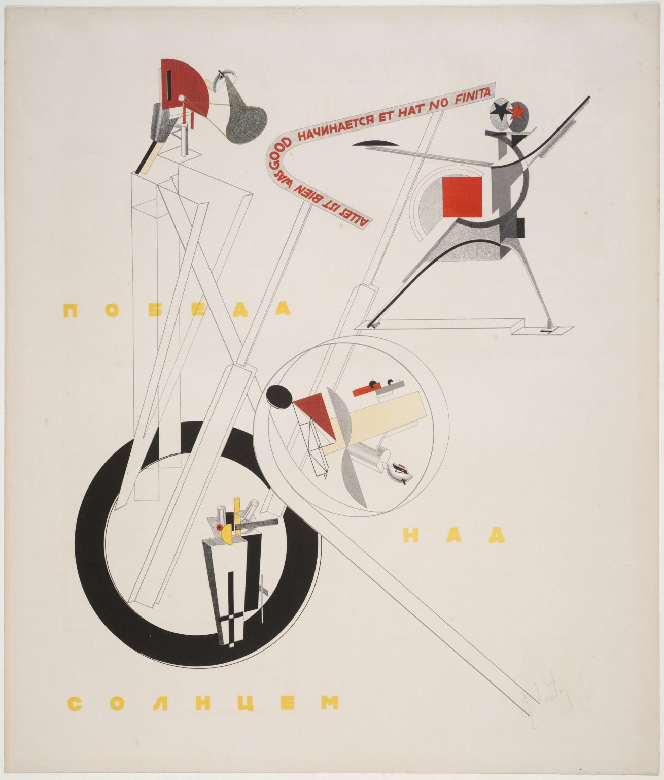
“Part of the Show Machinery” by El Lissitzky, 1923. This piece is an example of a work showing the essences of Russian Constructivism. The things depicted here are abstracted and arranged in an orderly manner.
Because of their admiration for machines and technology, functionalism, and modern mediums, members were also called artist-engineers.
http://www.arthistoryarchive.com/arthistory/constructivism/
http://www.tate.org.uk/art/artworks/lissitzky-1-part-of-the-show-machinery-p07138
László Moholy-Nagy
László Moholy-Nagy was a Hungarian Painter and photographer. He is highly influenced by constructivism and very interested in integrating technology and indutry into art. He is very experimental, and very fascinated by light throughout his career.
His ended the Bauhaus’s expressionistic teaching and moved into teaching design and industrial integration. Despite being proficient and innovative in many fields, he is known for his photography. He coined the term Neues Sehen (New Vision), as he believed that photography can create a new way of seeing things outside of what the human eyes could. He have also greatly influenced on modern art education.
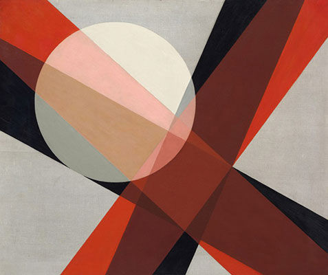
This is one of his famous work, Composition A 19 (1927), where he depicted light and transparency in painting by used geometric shapes and layered them over one another. I believe this have reflected his fascination with light.
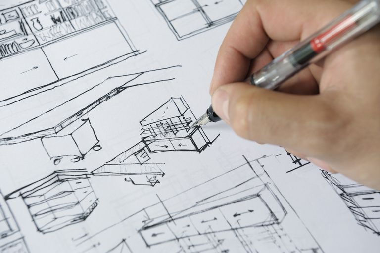
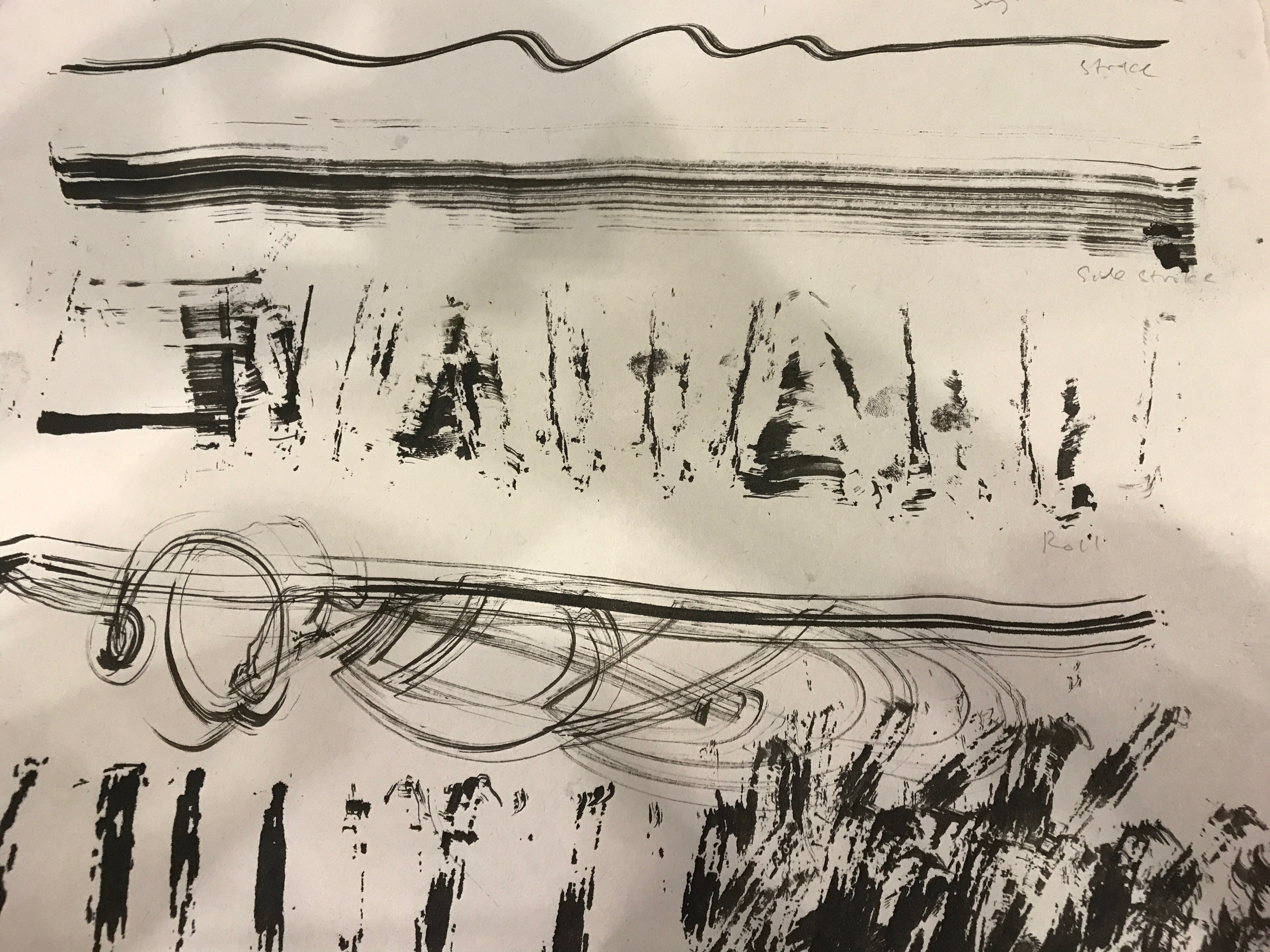
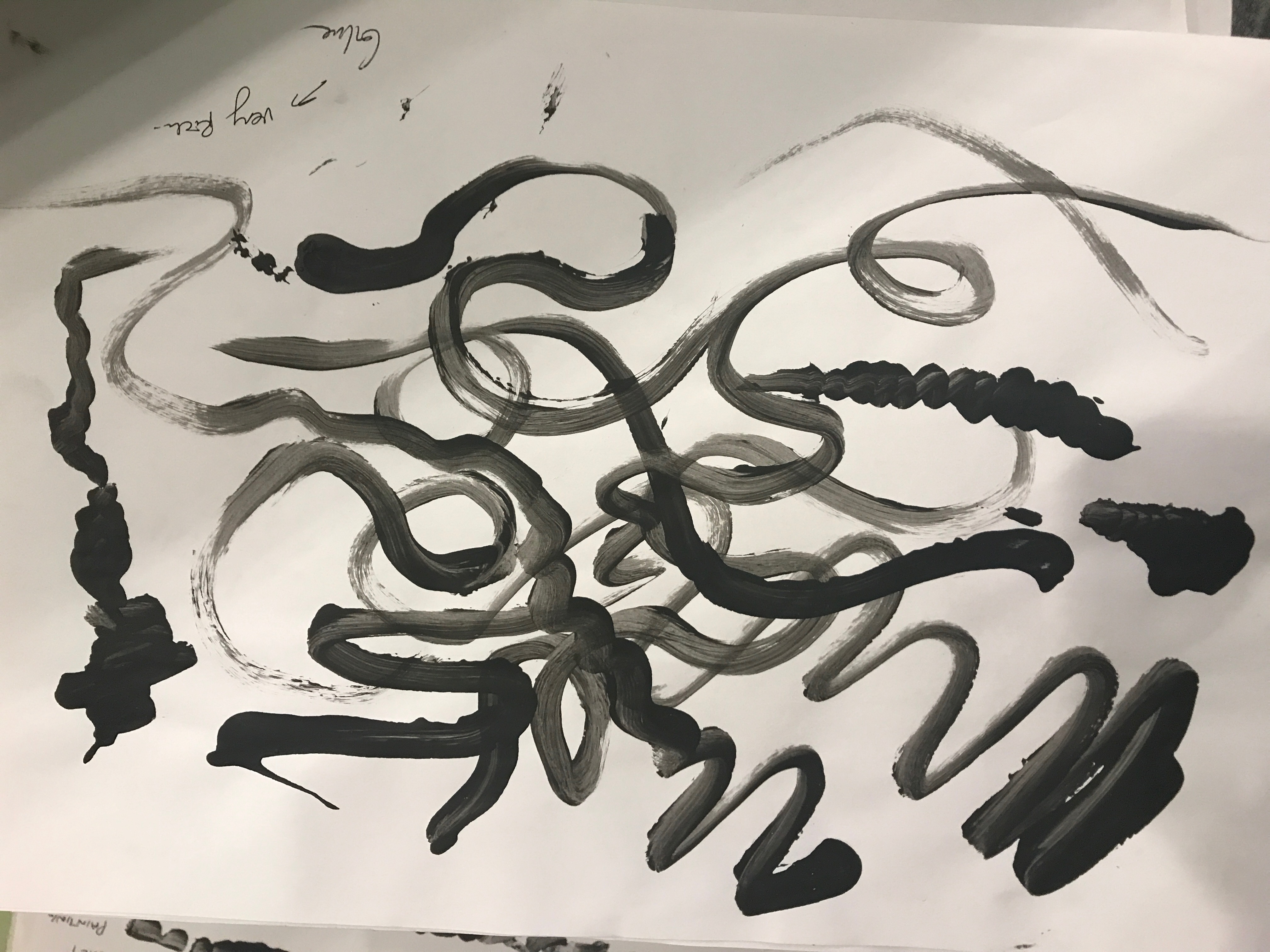
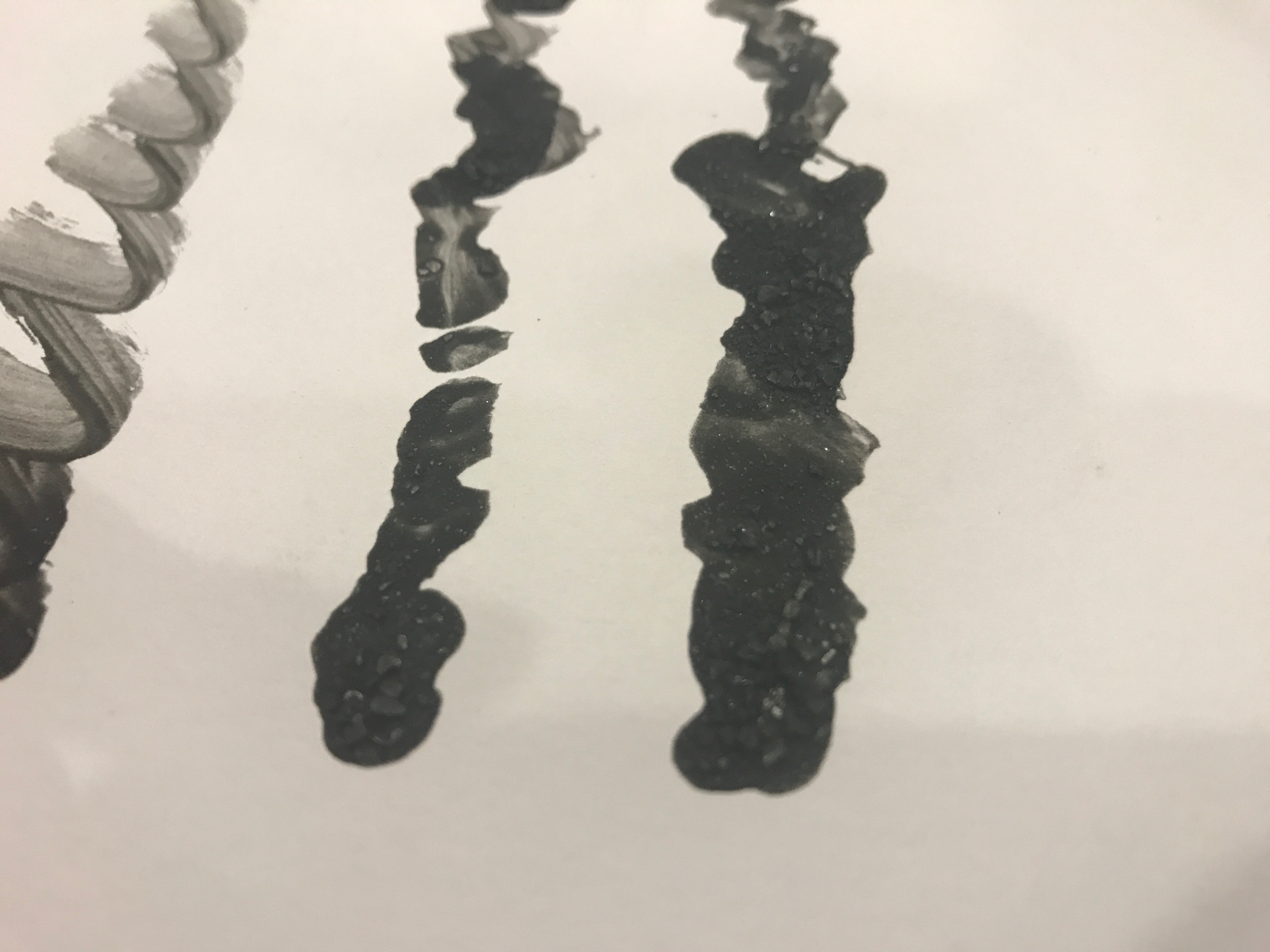
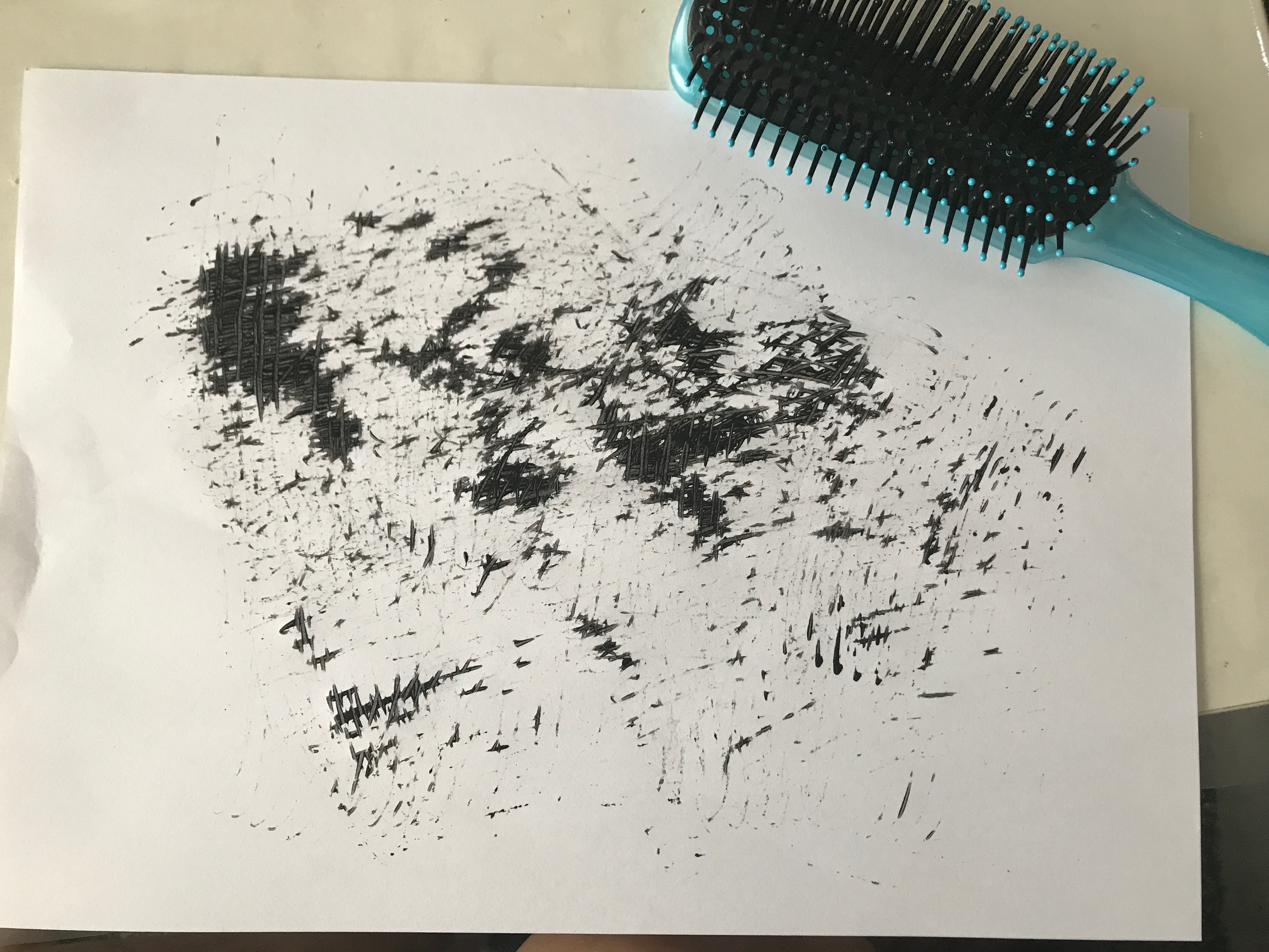
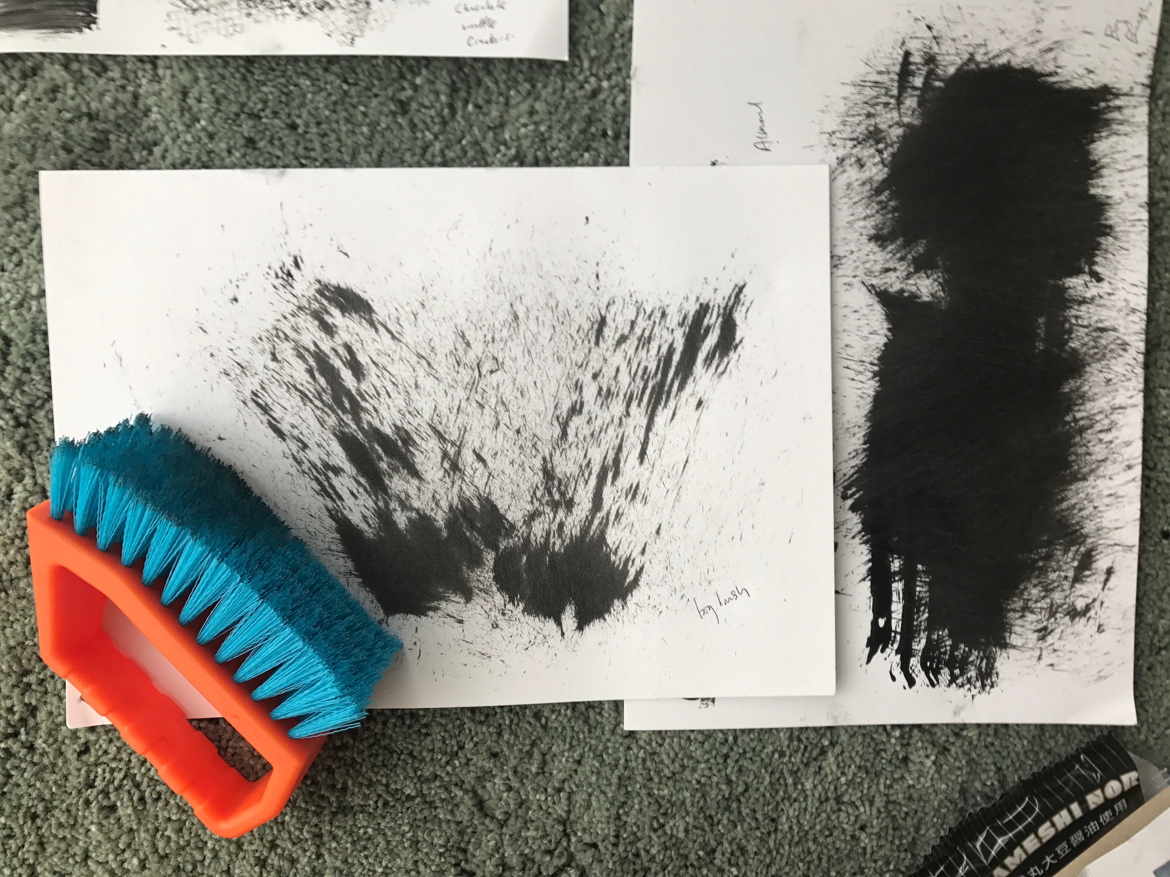
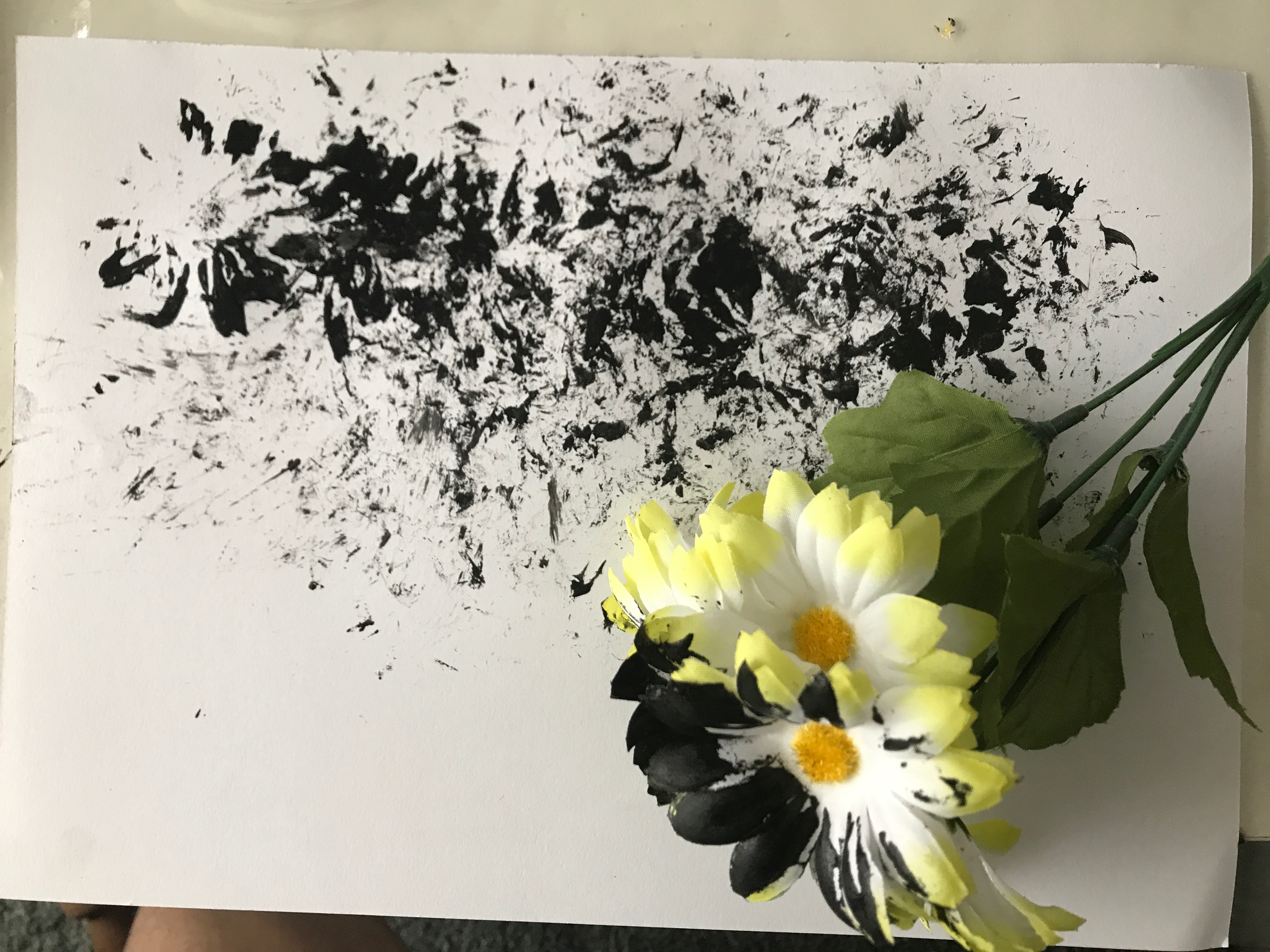
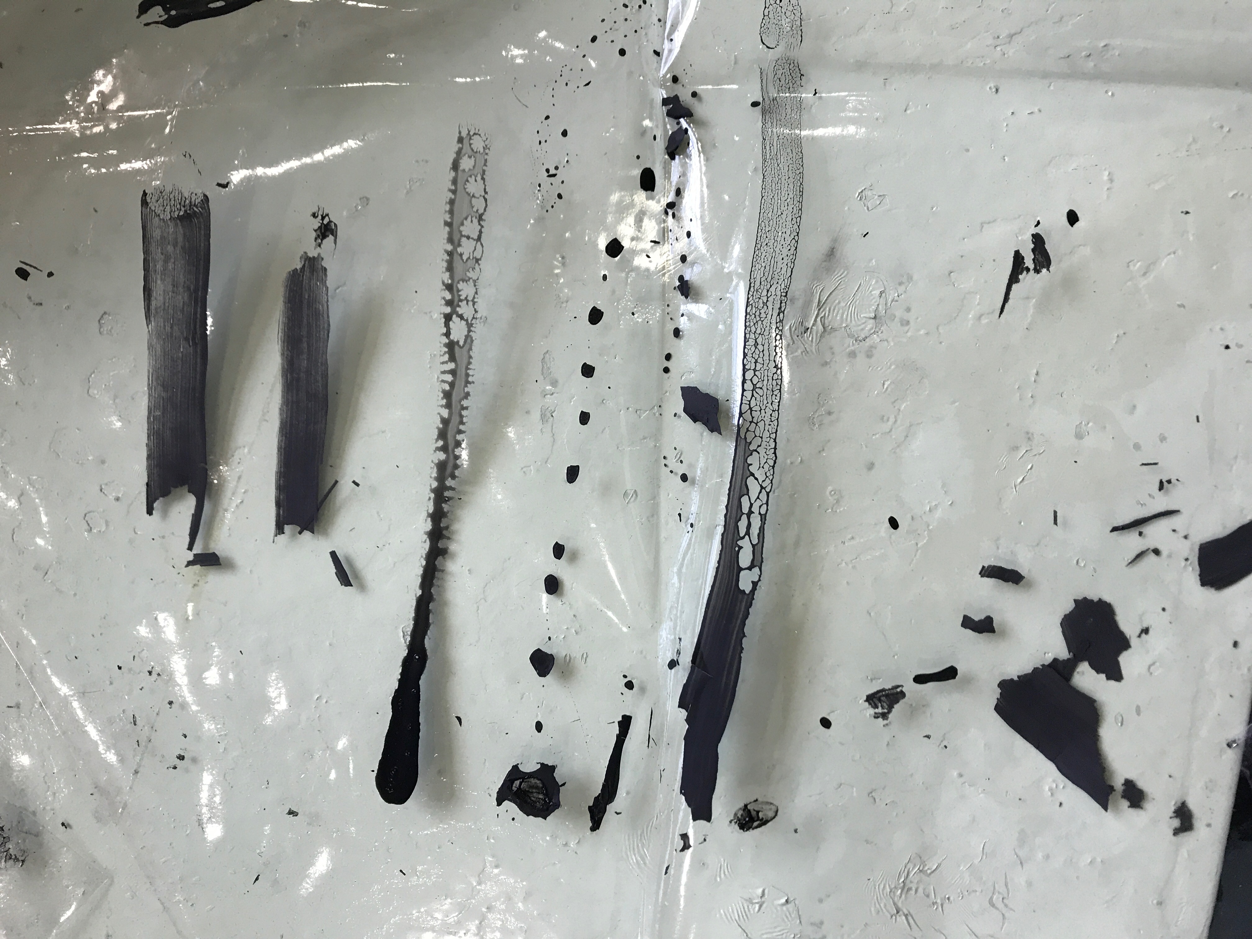
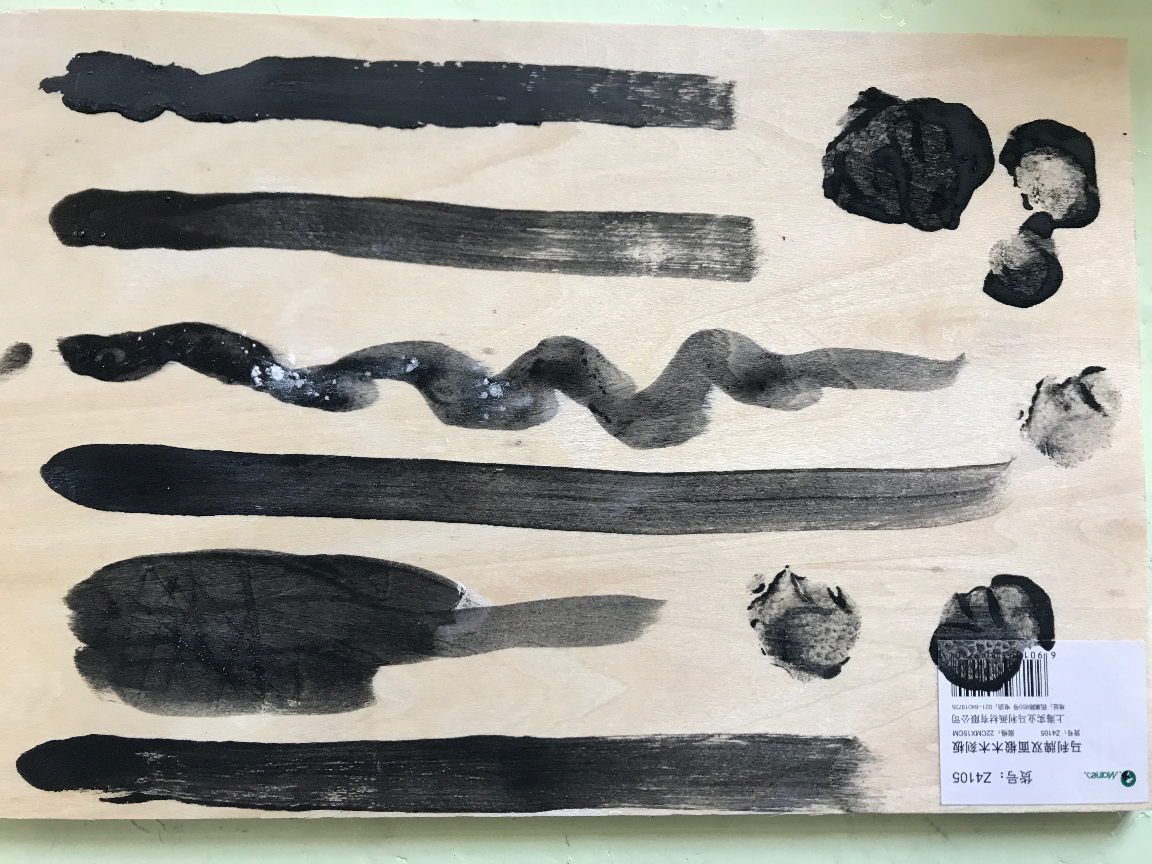
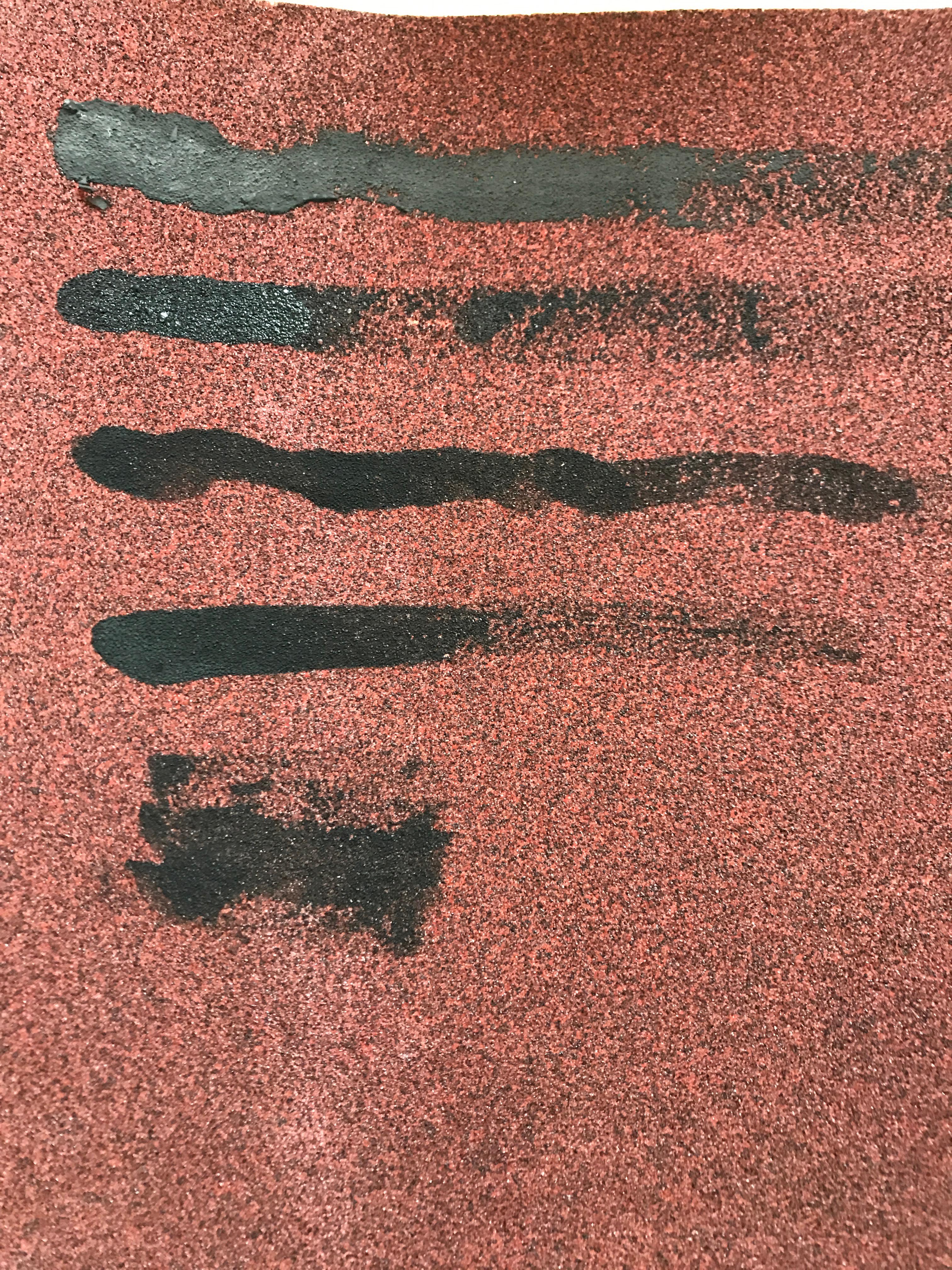
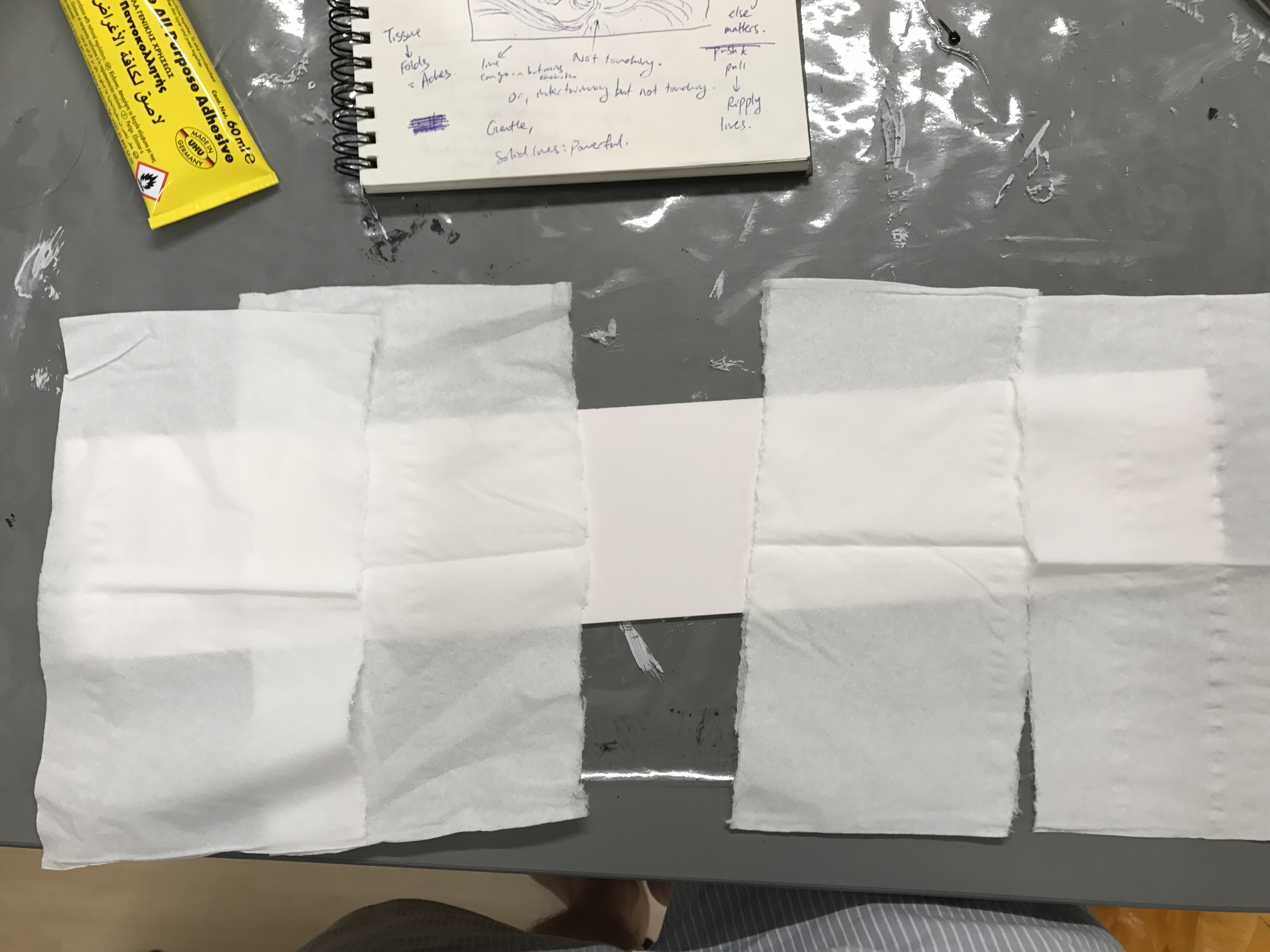
Unconventional Art Tools
I’ve went to search up for unconventional tools and came across a website where students posted unconventional drawings. They are very interesting.

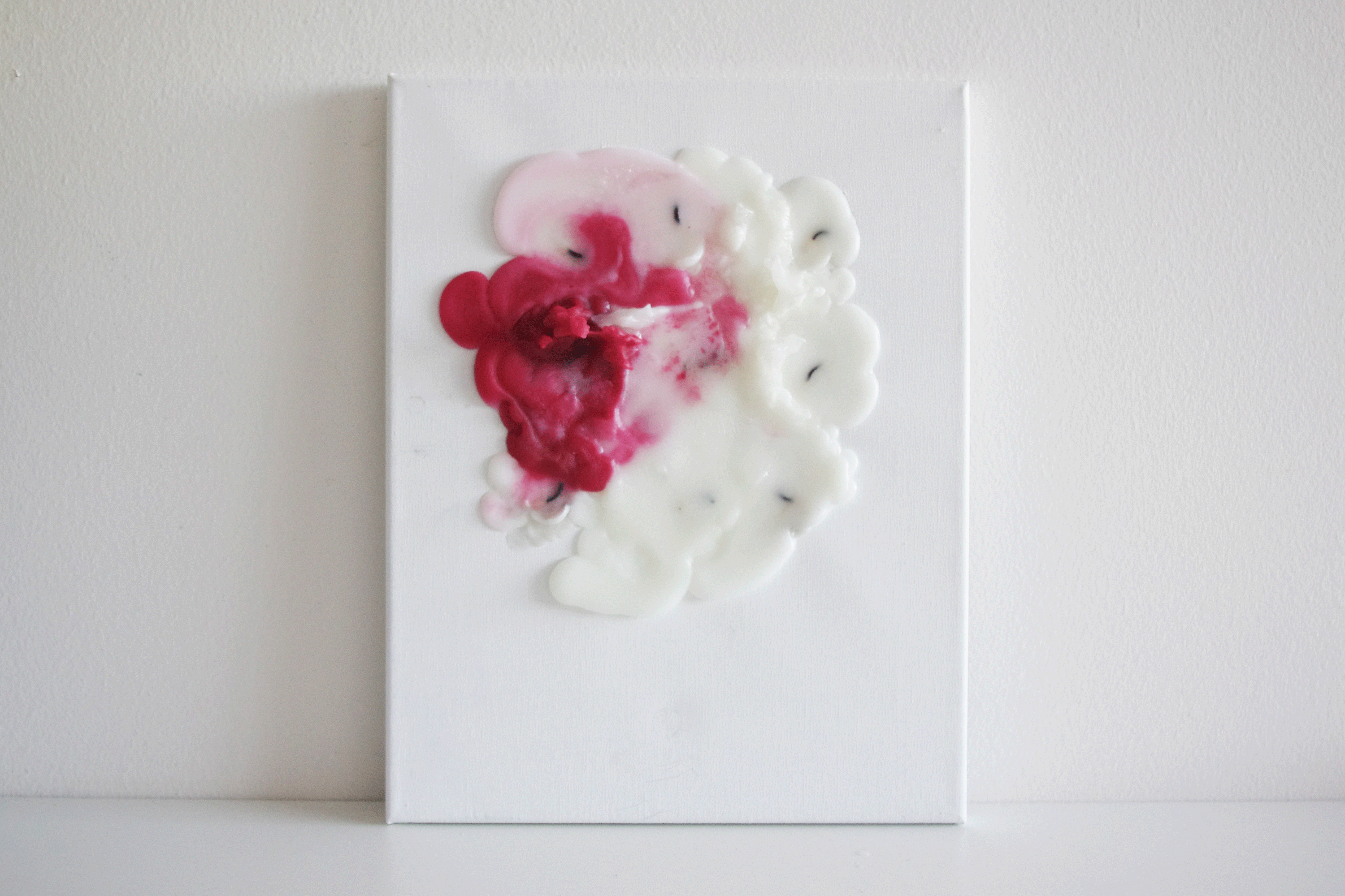
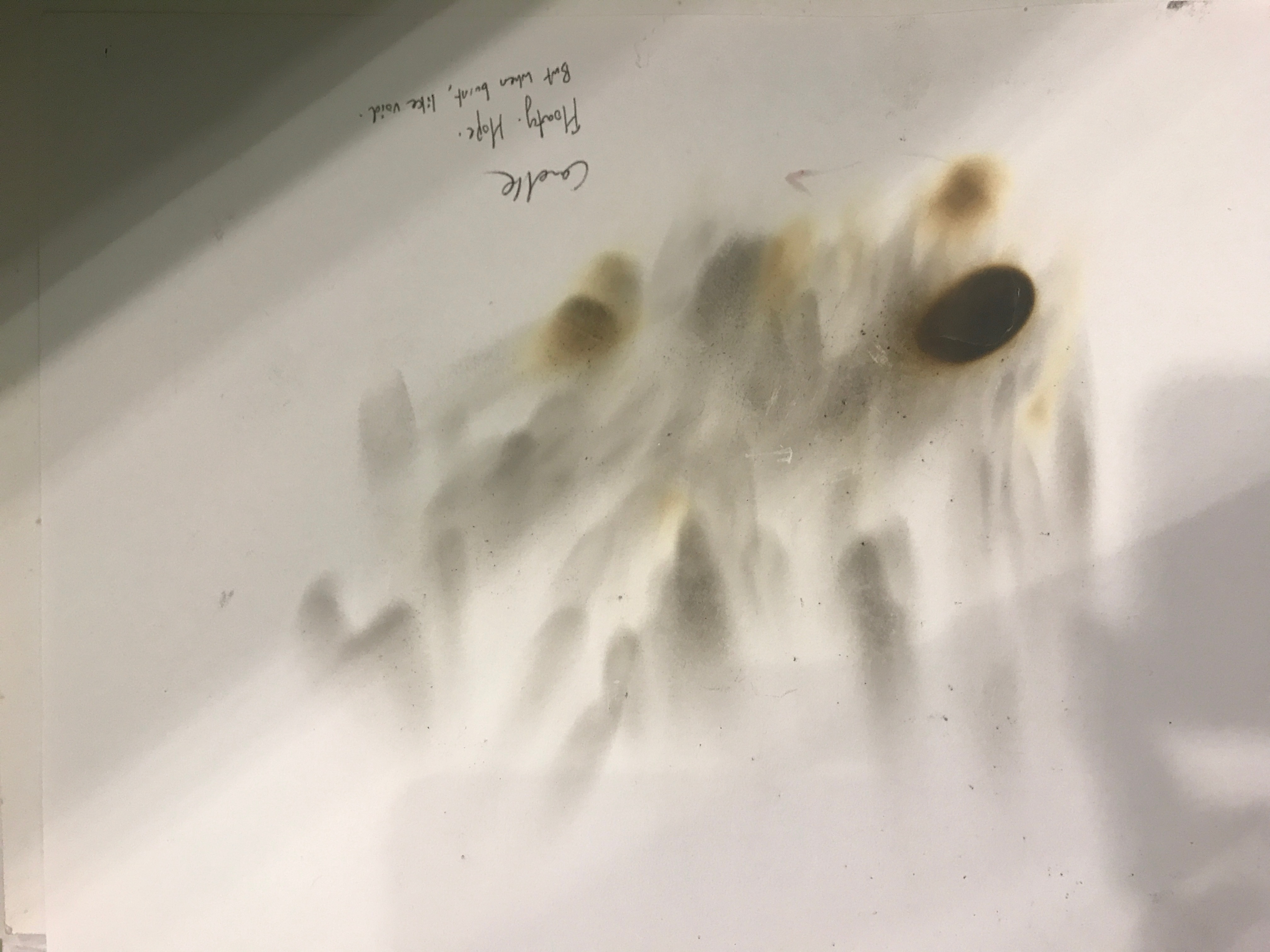
Using candles to create art — the outcome will definitely be unexpected. The way it melts, the direction it melts in, the speed of which different candles melt that creates a different layering. All these creates variation.
Heres a video of Alberto Breccia using different parts of a razor blade to create marks that indicated different textures, which I thought was pretty cool as I’d think of only using the blade and not the different parts of it.
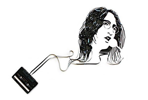
Other forms of unconventional art found on https://www.hongkiat.com/blog/unconventional-art/
Here are some ideas taken from online that can be useful for this project:
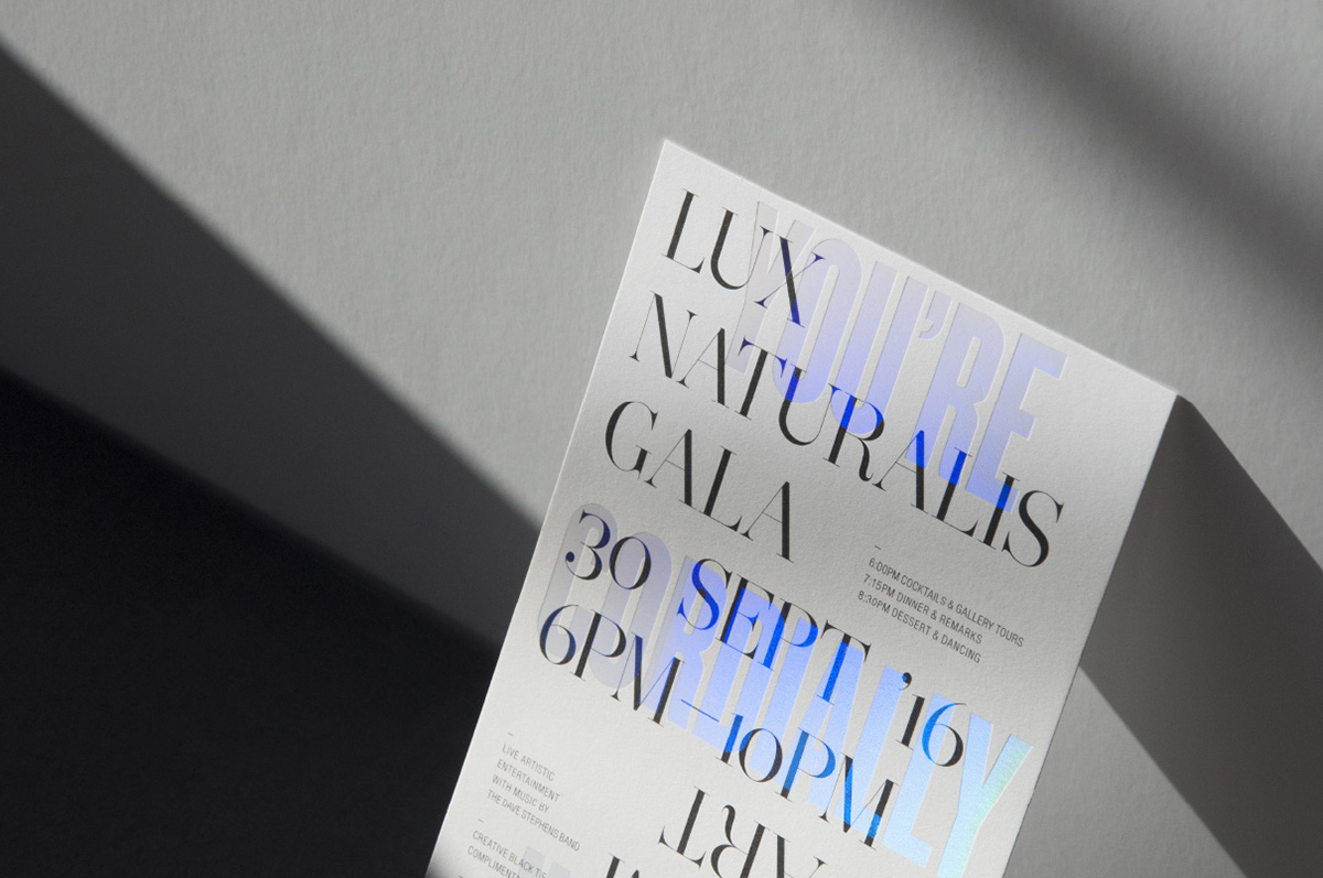
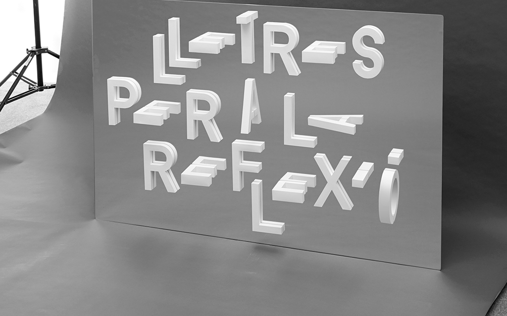
Holographic type — use of materials + layering


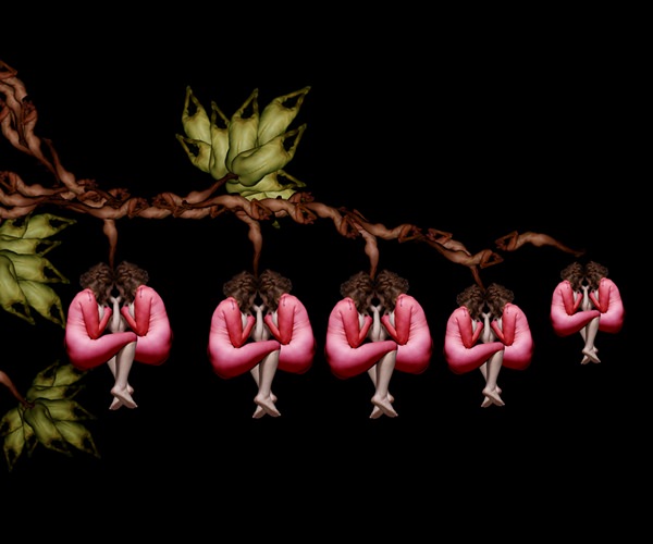
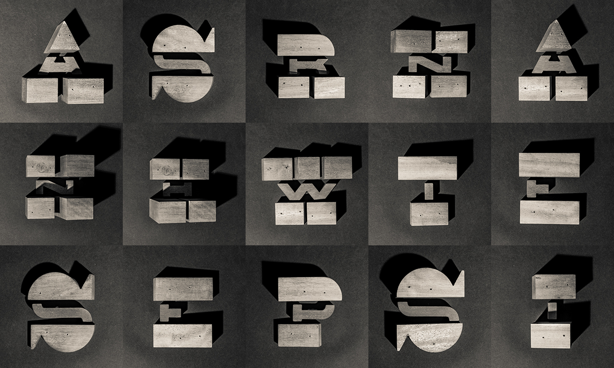
The artist used 3D modular parts to form letters
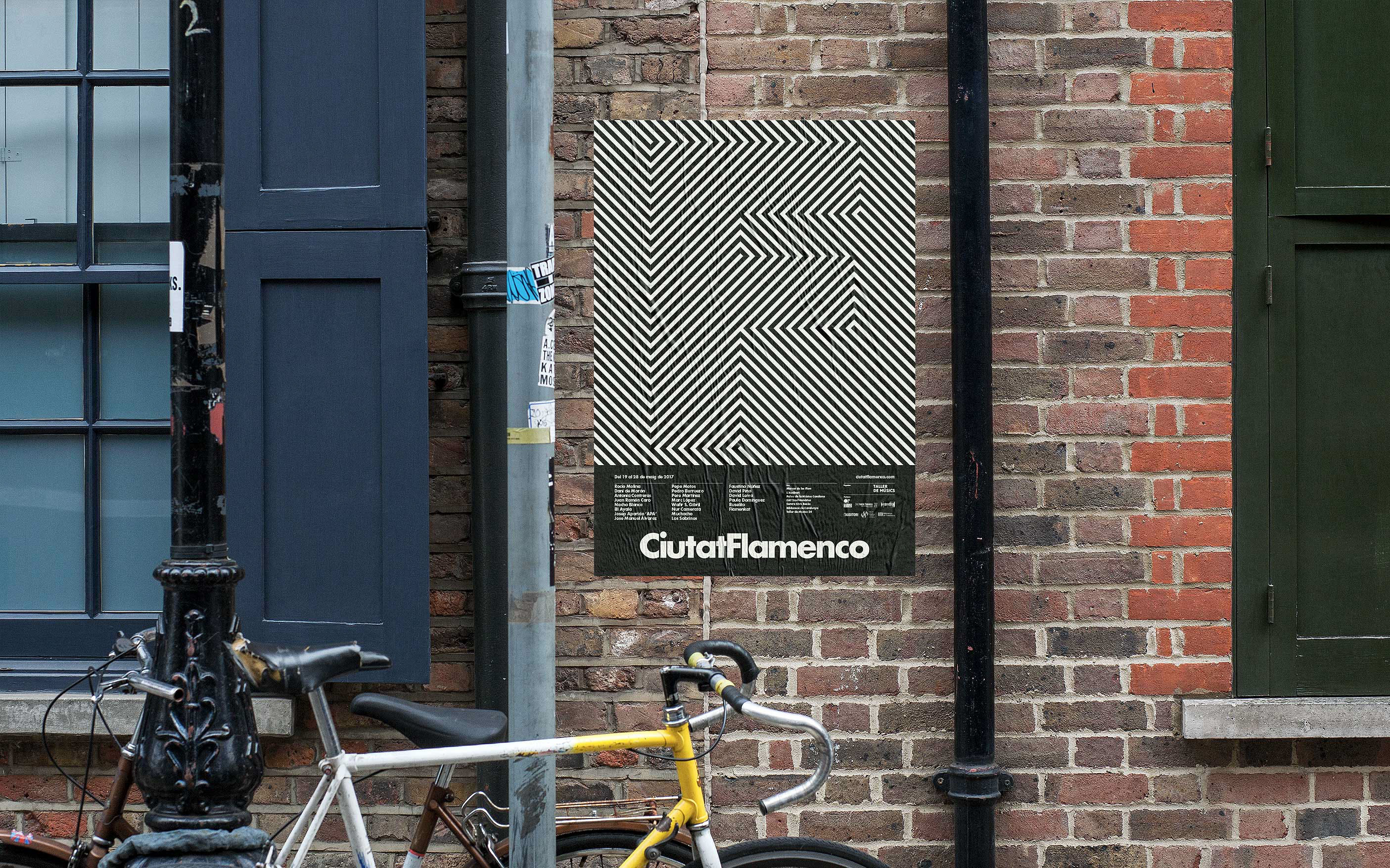
This is subtle, yet impactful. The use of optical illusion to create a subtle contrast is interesting.

This is so nice!!! I love it. The 3D fonts have expressed the playfulness of the TV channel nickelodeon, and the colours are bold and loud.
Something that moves – Research on paper folding that have mechanism.
Something that moves by rotating, or generally moves
Optical illusions
tshirt folding
The use of mirror and 3D shapes that form letters created this surreal floating fonts that seems to be out of the world. Very interesting concept.
Inspired by artist Josef Albus, this artist layered acrylic to create numbers, and at the same time, celebrated the style of Josef Albus. I like how we can determine the numbers even though it is greatly abstracted.
Job Researches
Mainstream Lifeguard
Mainstream is defined as the ideas, attitudes, or activities that are shared by most people and regarded as normal or conventional. Some ideas of what mainstreams are pop-culture elements, popular brands, and to some extend, social media.
Some things that a mainstream thing have in common is in its influent on media and people. As such, there is a link from what is mainstream to mediums like the internet, TV, radio, or any sort of broadcasting medium.
A lifeguard is an expert swimmer employed to rescue bathers who get into difficulty at a beach or swimming pool. They are always on standby to look for people in trouble. Their standard objects are:
whistle, life buoy or flat, towel, shades, caps, sunblock, swimming attire (usually red), lifeguard chair, umbrella, pool, beach


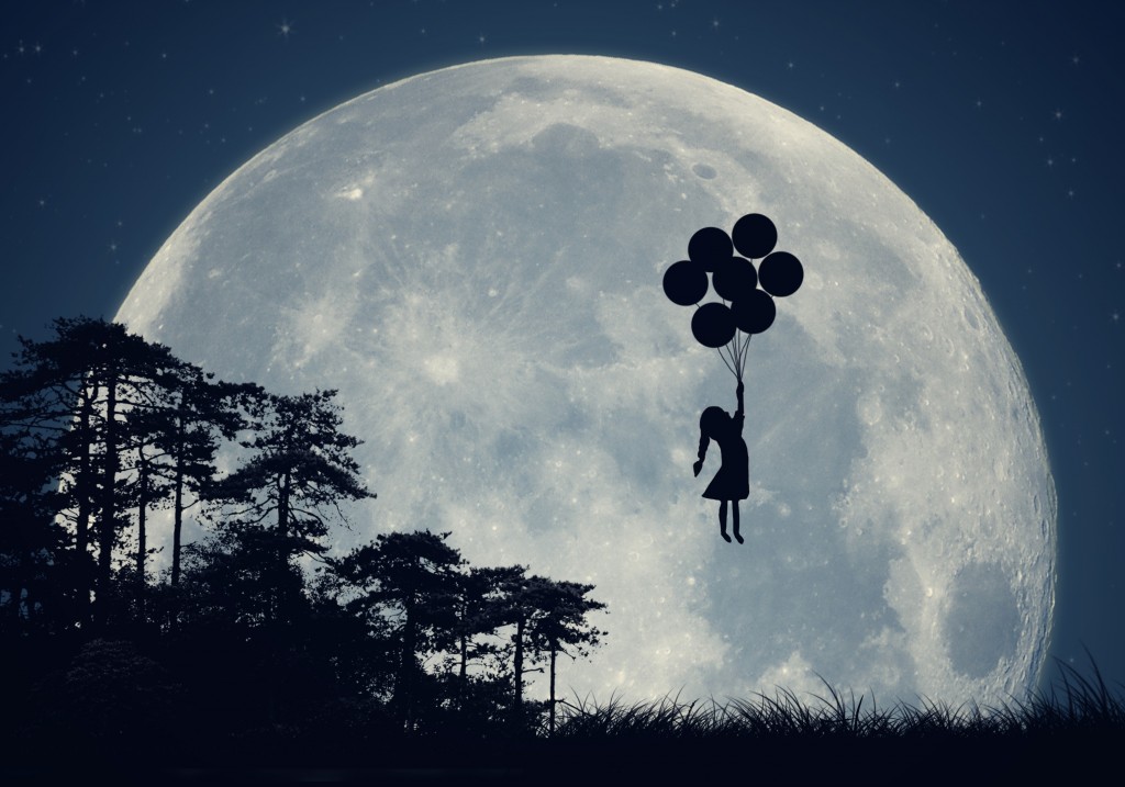
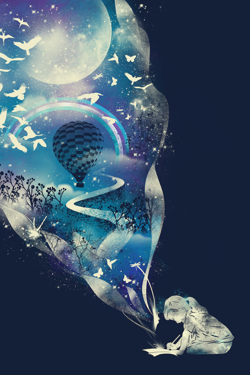
Dream is defined as a series of thoughts, images, and sensations occurring in a person’s mind during sleep.
As written from https://www.psychologytoday.com/blog/dream-factory/201411/what-are-the-most-common-dream-themes, the common themes in a dream are:
- Warped spaces, new doors that opens up to new places in a familiar room, sometimes leading to another space of another familiar room
- Being chased
- falling
- school / studying
- sexual encounter
- Embarrassment, like being inappropriately dressed, being naked, unable to find the toilet, failing an exam, or arriving to a place too late.
- Finding money
- eating good food
- flying
These are semiotics that can be used in the design. Other than that, dreams are also usually symbolised by surreal images that are also calming. Blurring and vignettes are also clues about a dream. The night sky, stars and moon are other signs. Most iconic of all, is the dream bubble and the “zzz”.

https://www.123rf.com/photo_9591766_smiling-architect-and-3d-project-house.html
Singaporean Spy
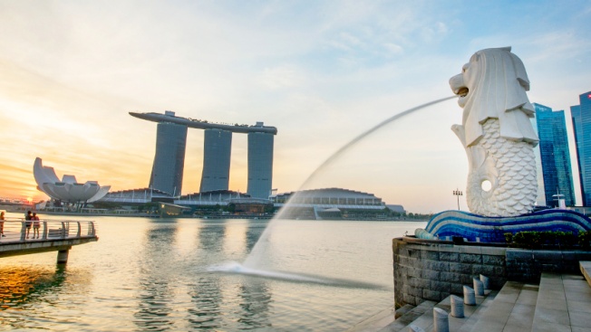
It is hard to describe a Singaporean. Singapore is known for the merlion, durian, kopi, chicken rice, rules and fines, banned cheweing gums, people dressed too casually for the hot weather (typical tshirt, shorts, slippers).


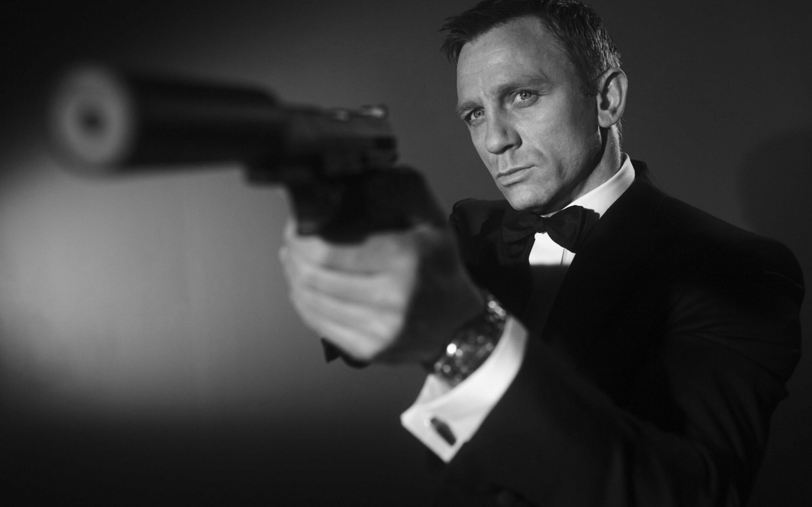
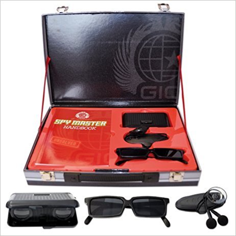
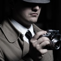
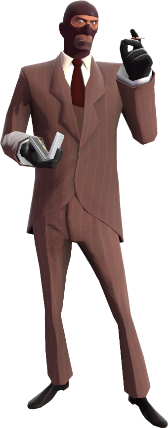
A spy is a person employed by a government or other organization to secretly obtain information on an enemy or competitor. There are 2 kinds of spy:
- Secret agent that have their secret gadgets and weapon, wearing suits and doing impossible missions.
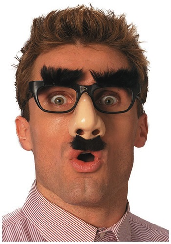
- Spy that wear disguises and infiltrate a place without being detected and stealing information
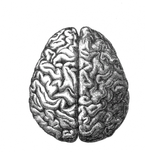
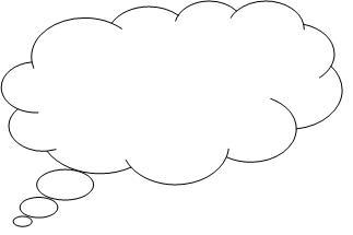
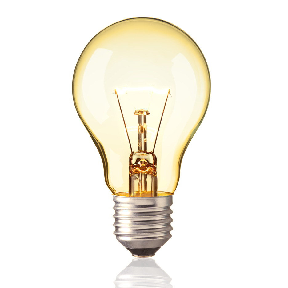
A thought is an idea or opinion produced by thinking, or occurring suddenly in the mind. Semiotics relating to Thought is:
- Light bulb
- Thought bubble
- Brain

https://www.virginexperiencedays.co.uk/vintage-steam-train-trip-on-the-spa-valley-railway-with-dinner-and-wine-for-two
https://www.seat61.com/Australia.htm
A train conductor is person that controls the train
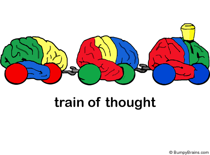
A thought train refers to the interconnection in the sequence of ideas expressed during a connected discourse or thought, as well as the sequence itself, especially in discussion how this sequence leads from one idea to another.

New Jobs:
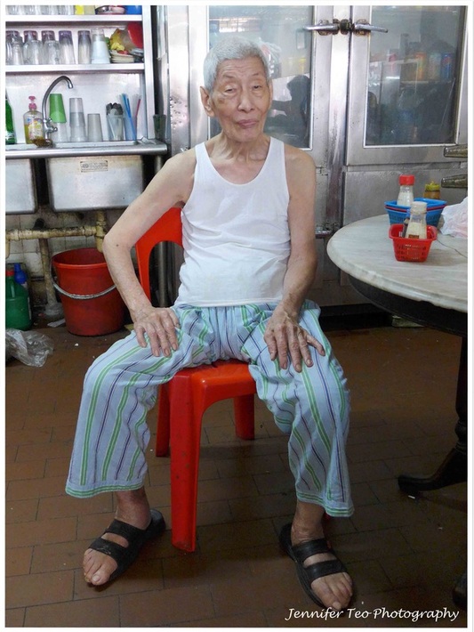
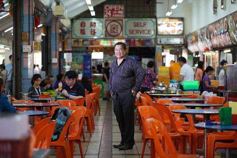
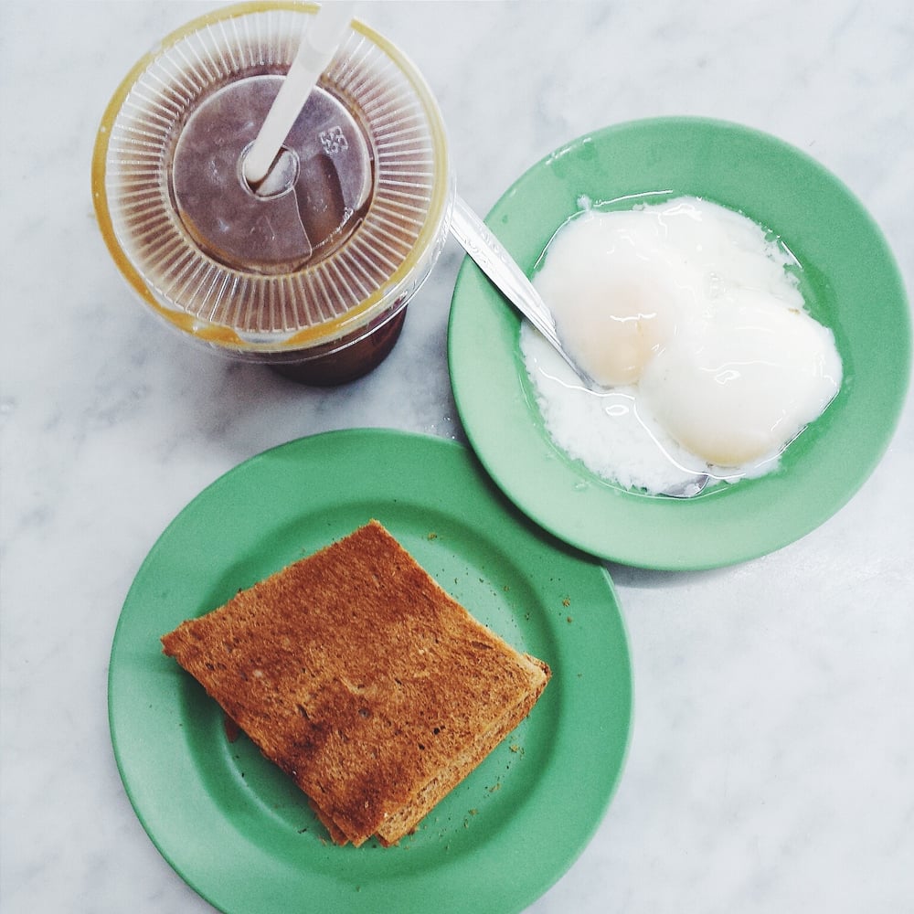
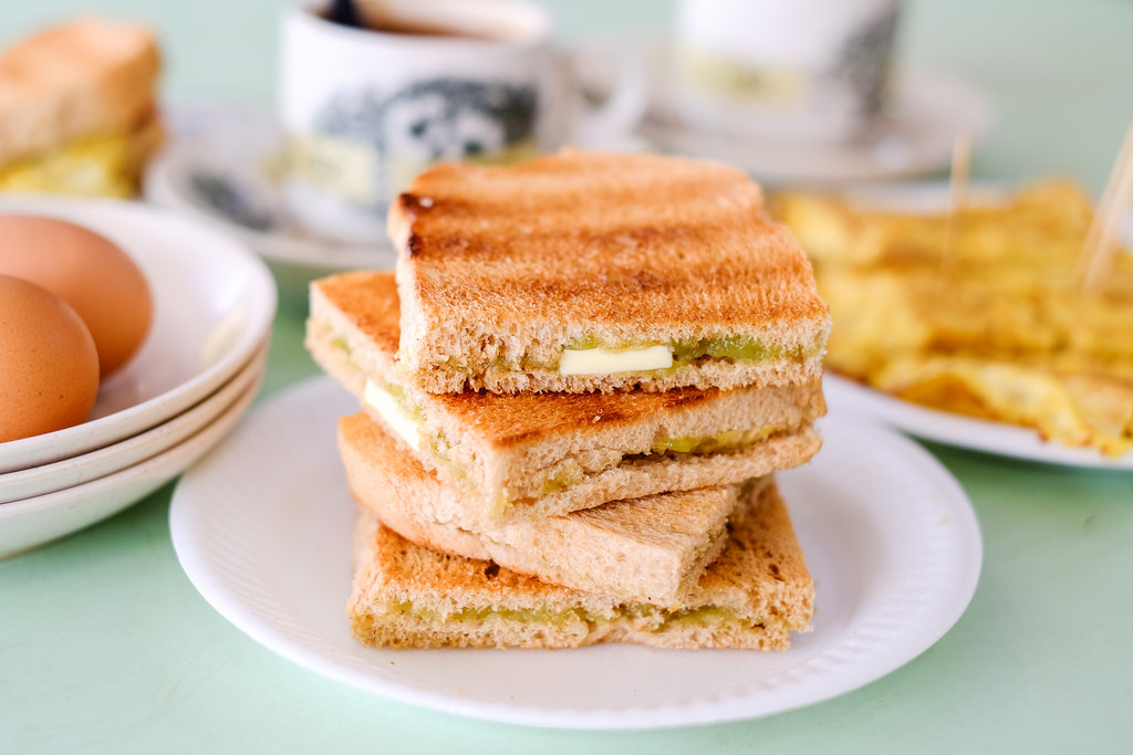
Kaya Toast Maker
Kaya toast is… well just kaya toast. As a kaya toast maker, I am the hawker uncle.

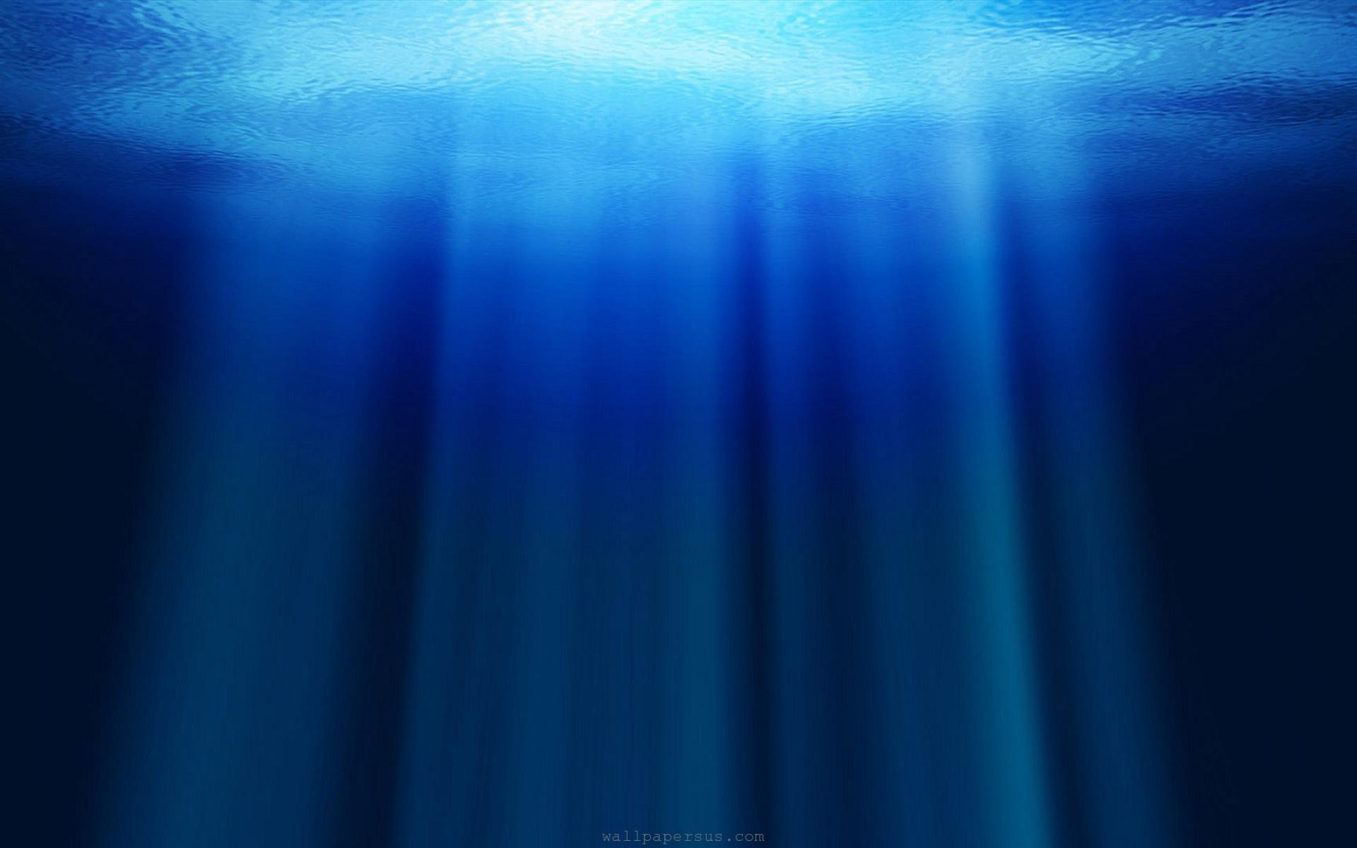
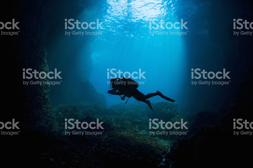
Deesea is the deeper parts of the ocean, especially those beyond the edge of the continental shelf.


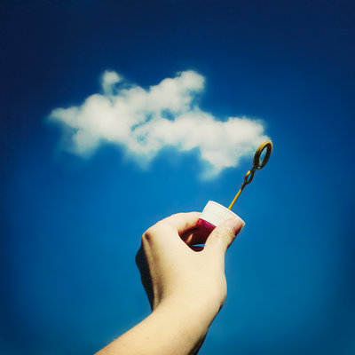
Cloud is a visible mass of condensed watery vapour floating in the atmosphere, typically high above the general level of the ground.


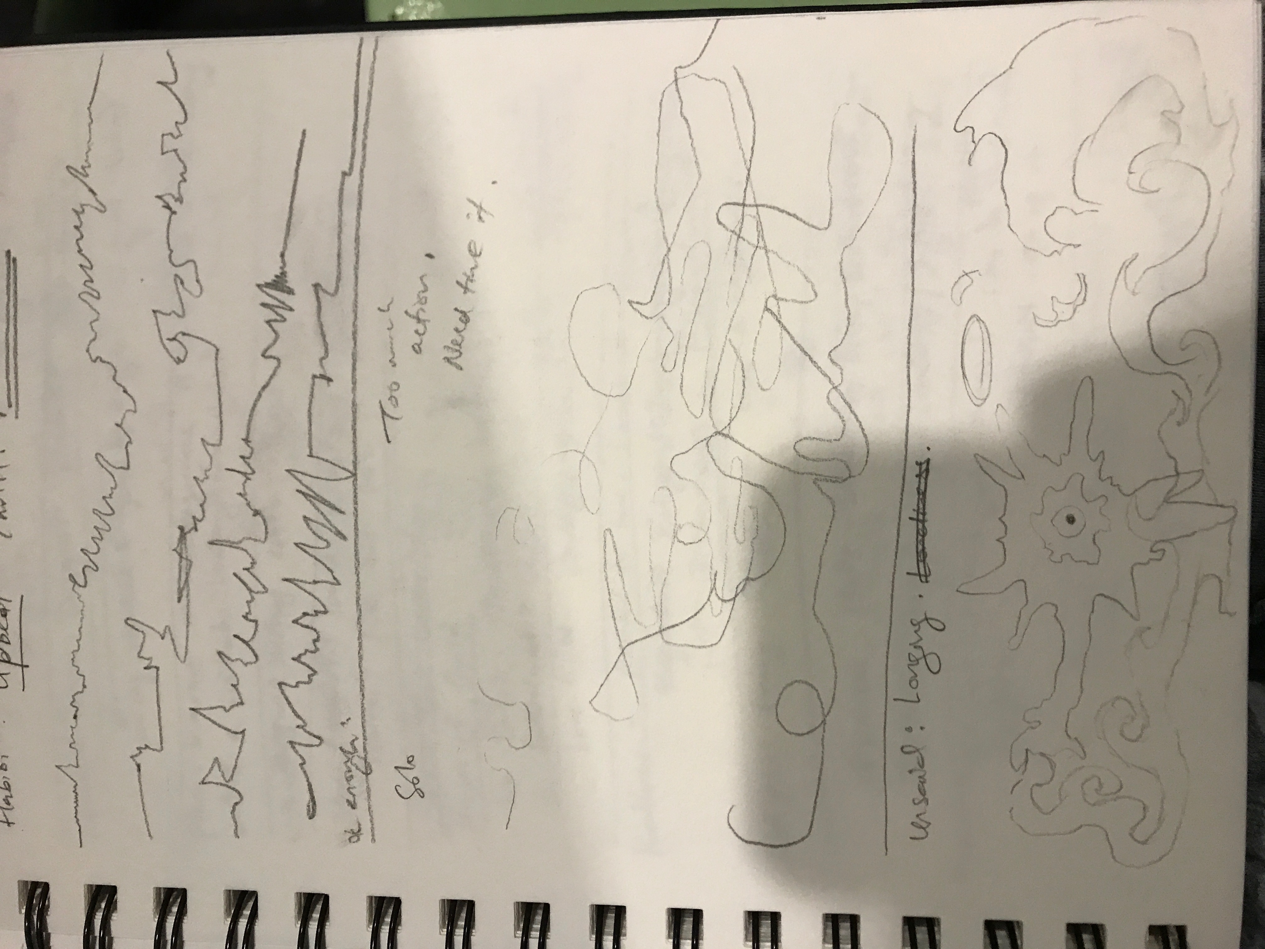


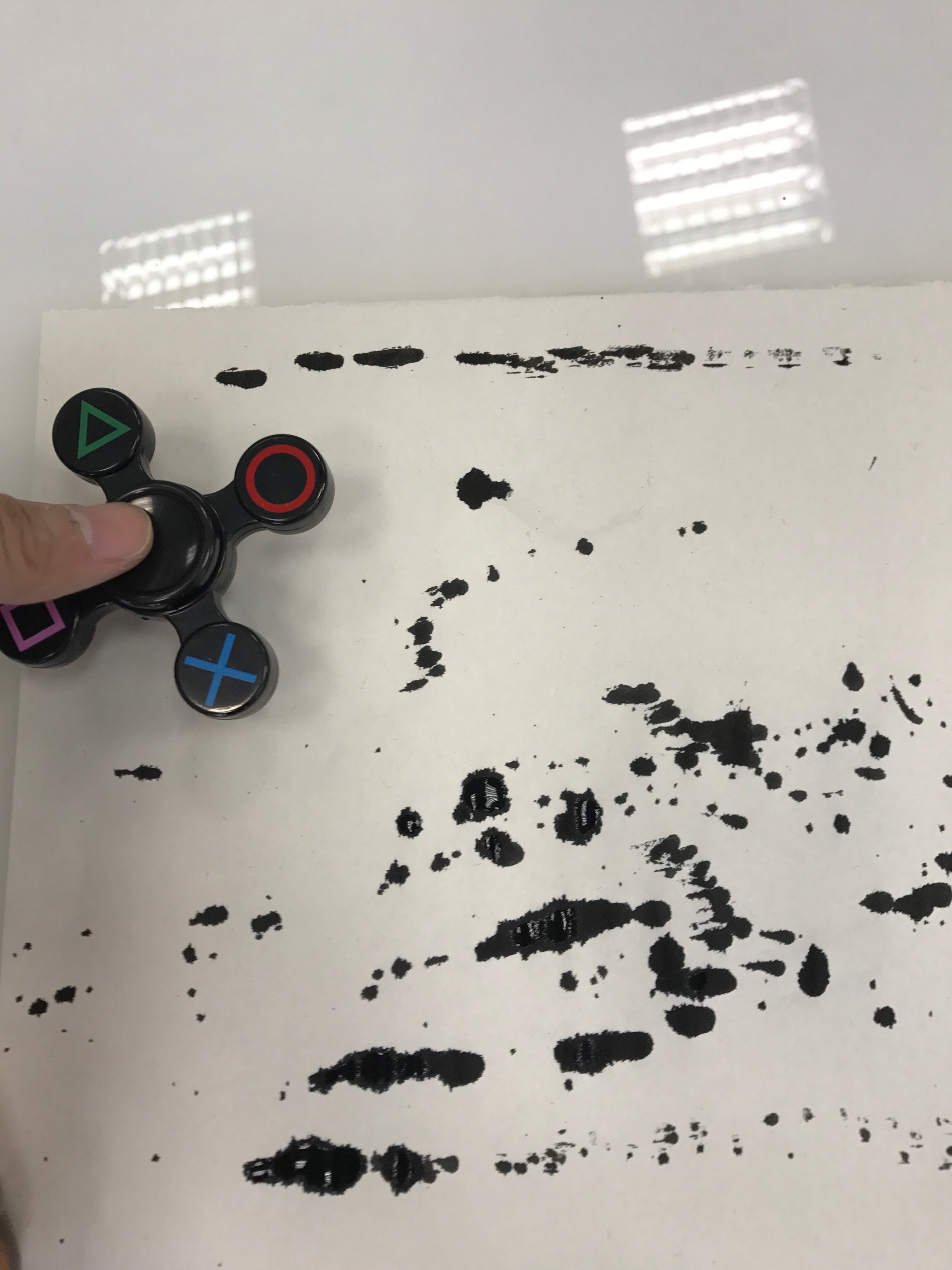
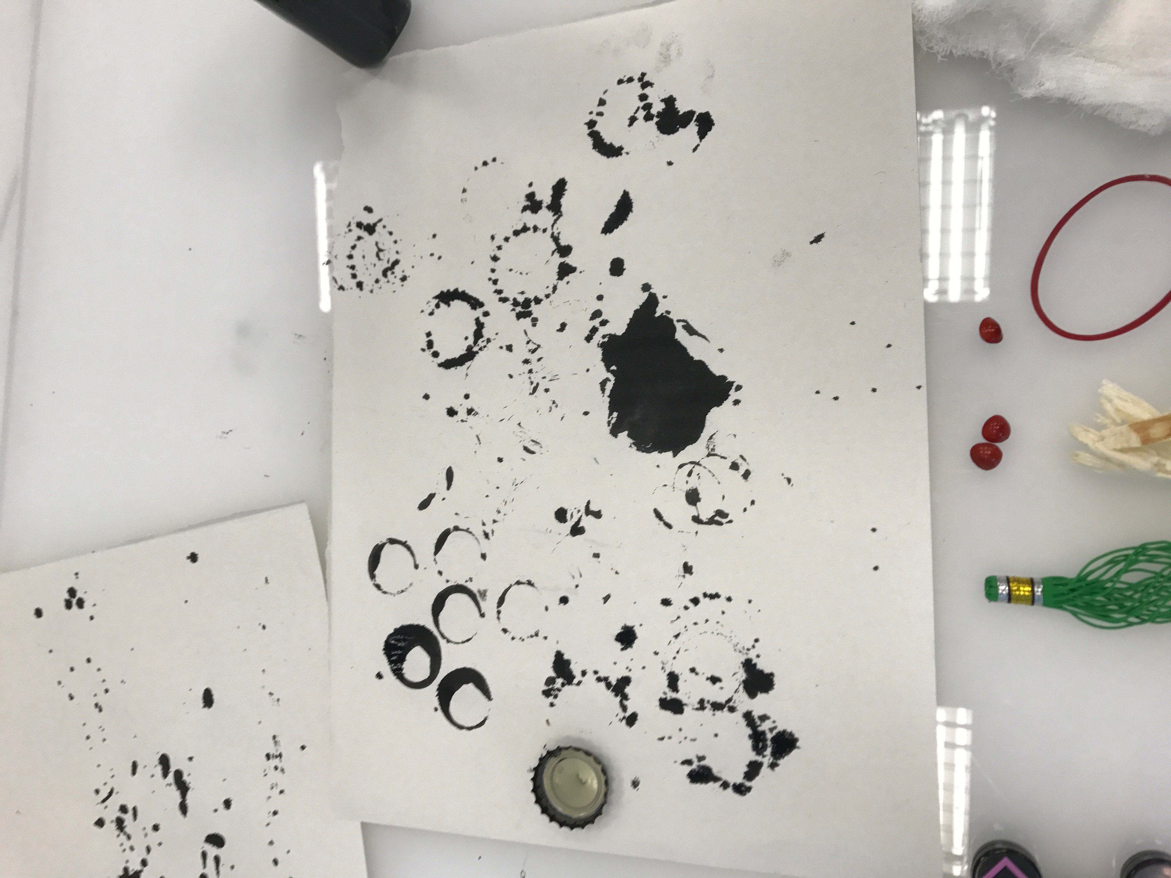
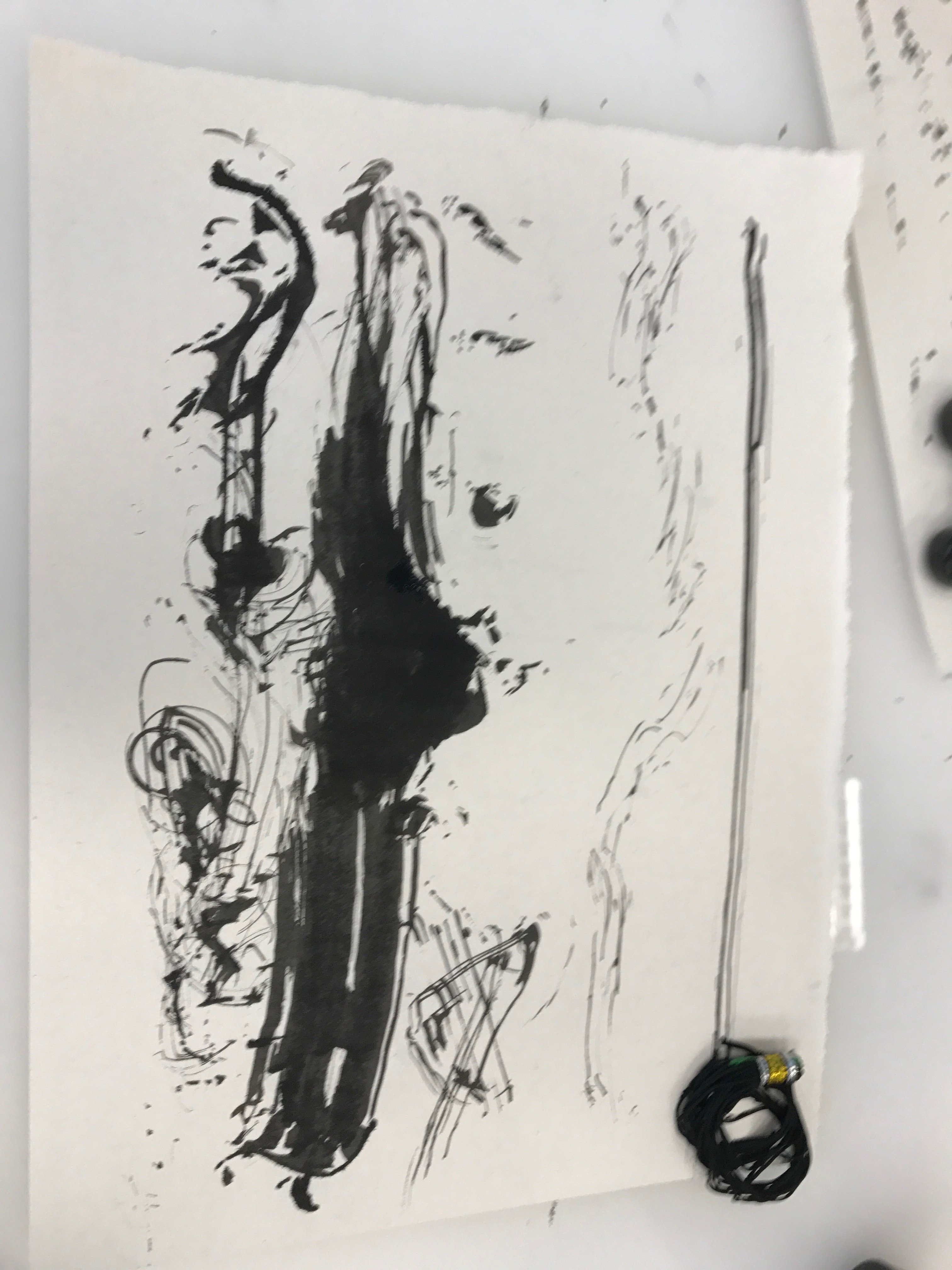


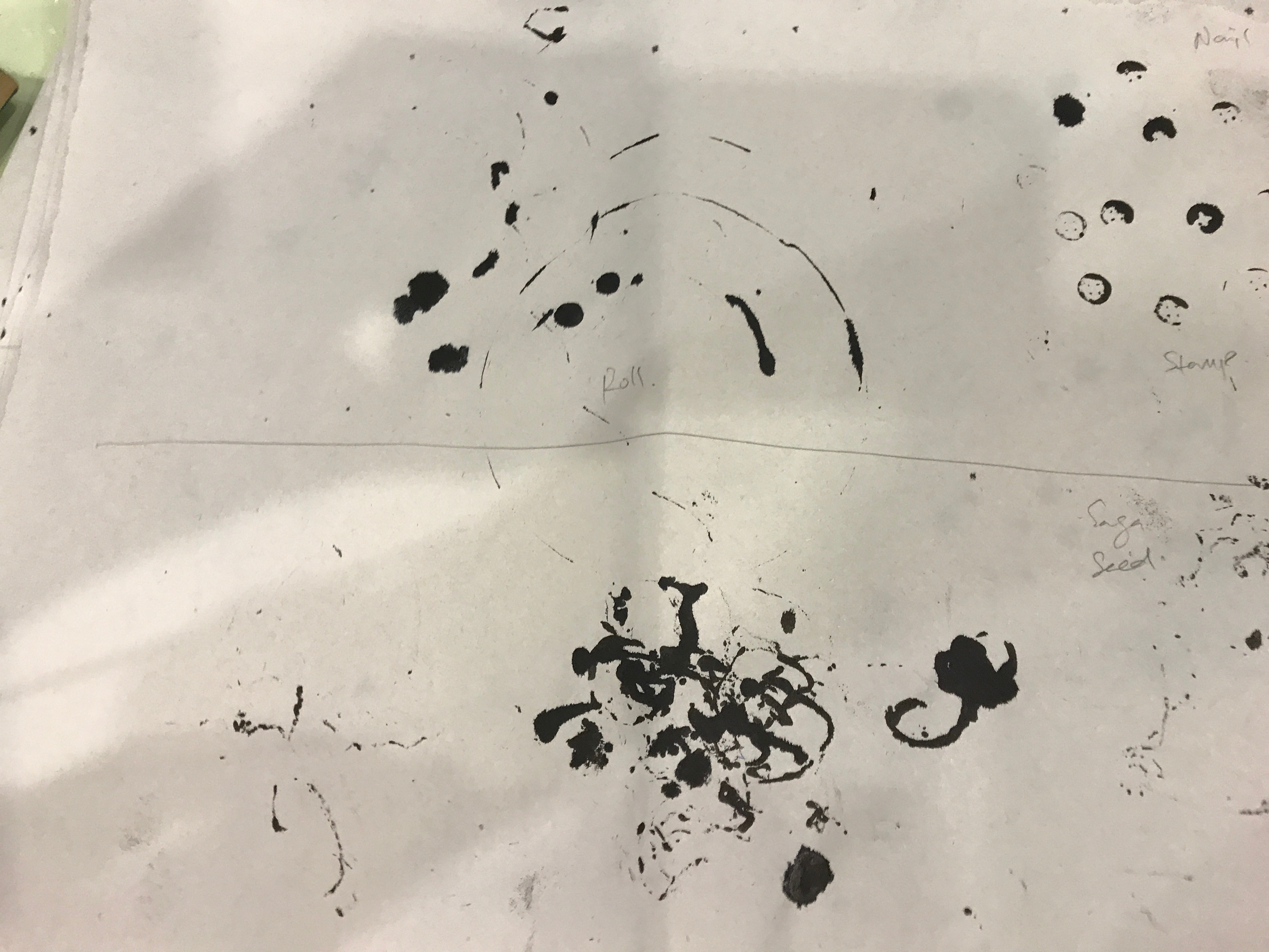
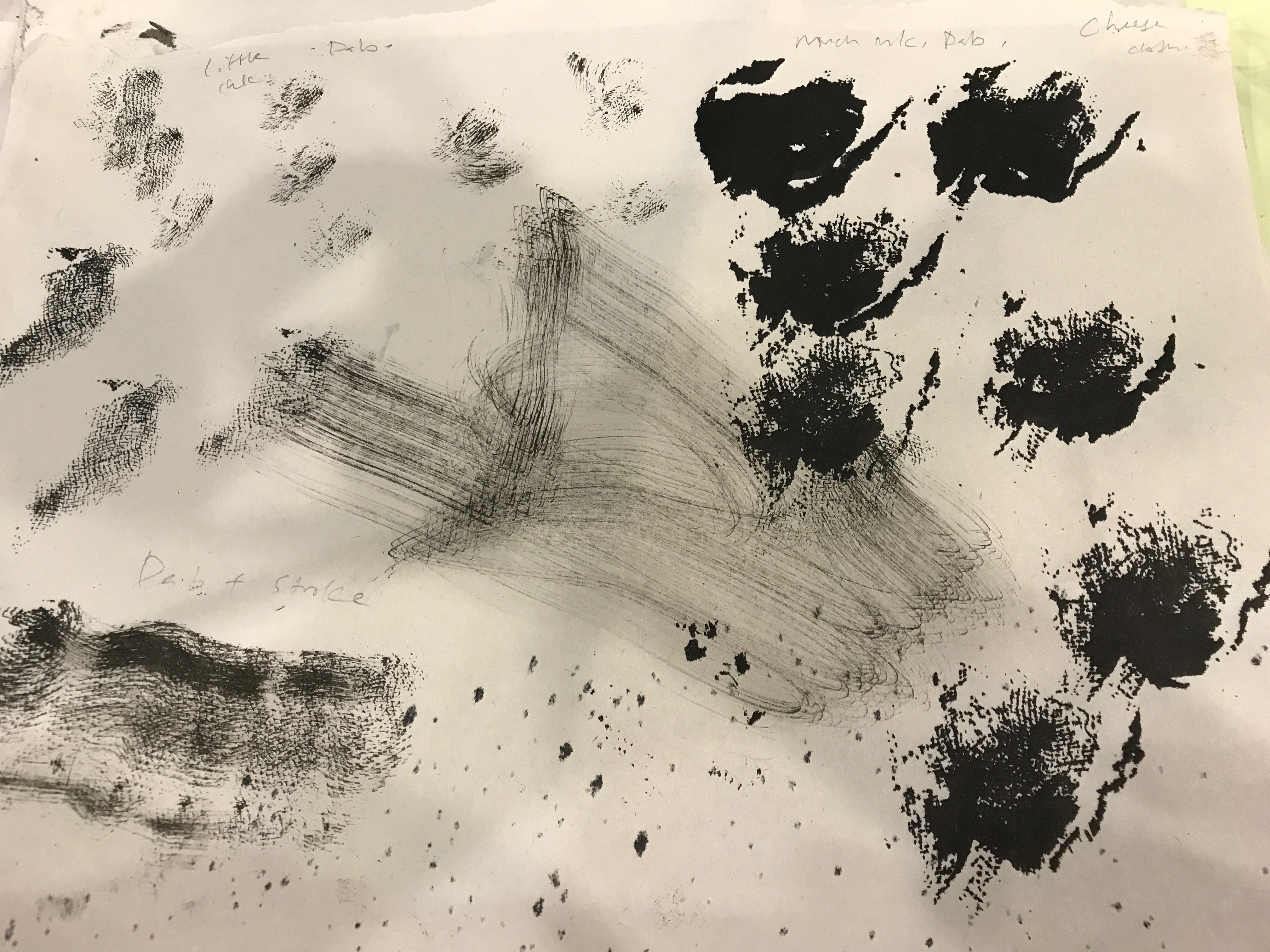
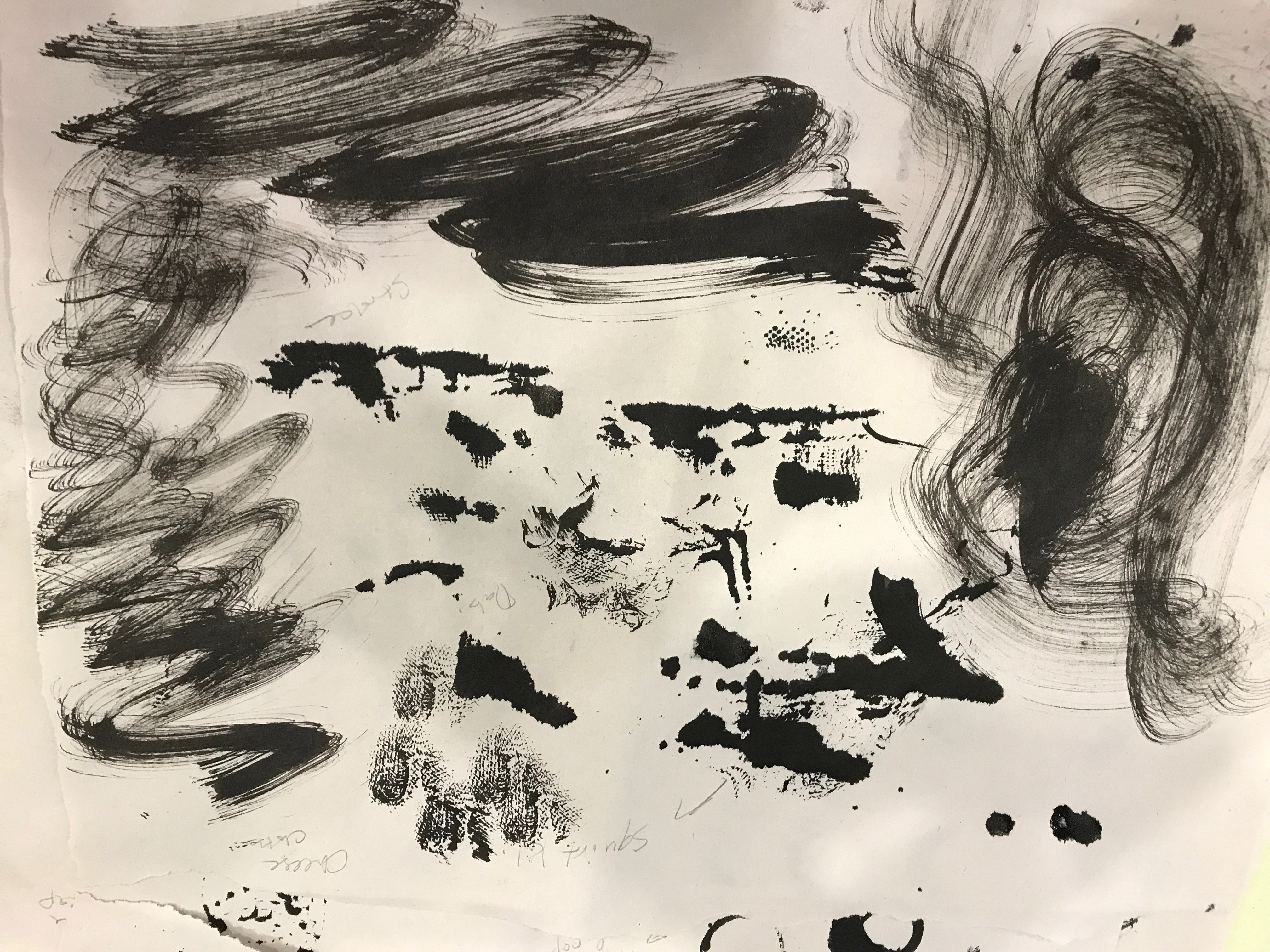


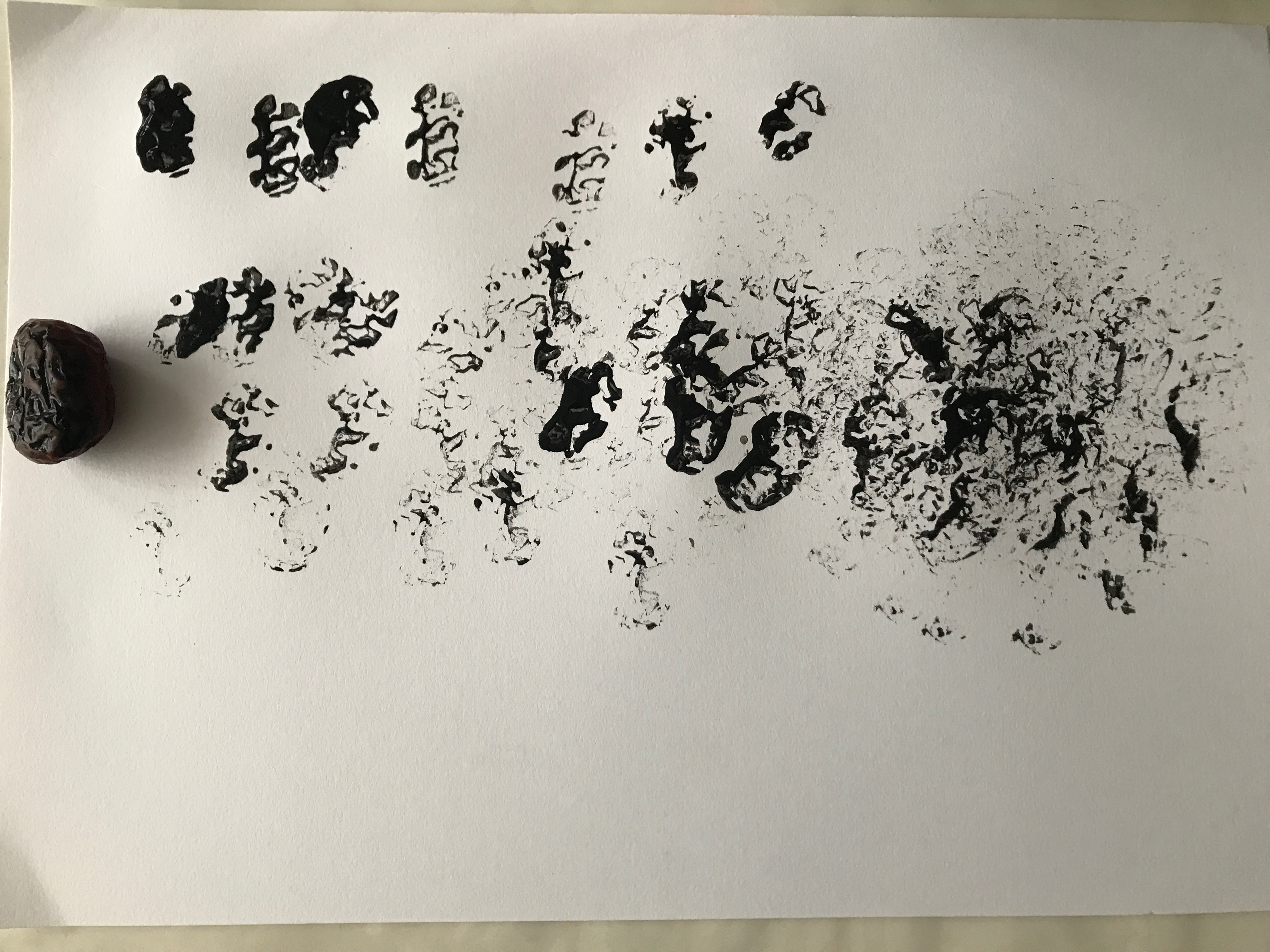


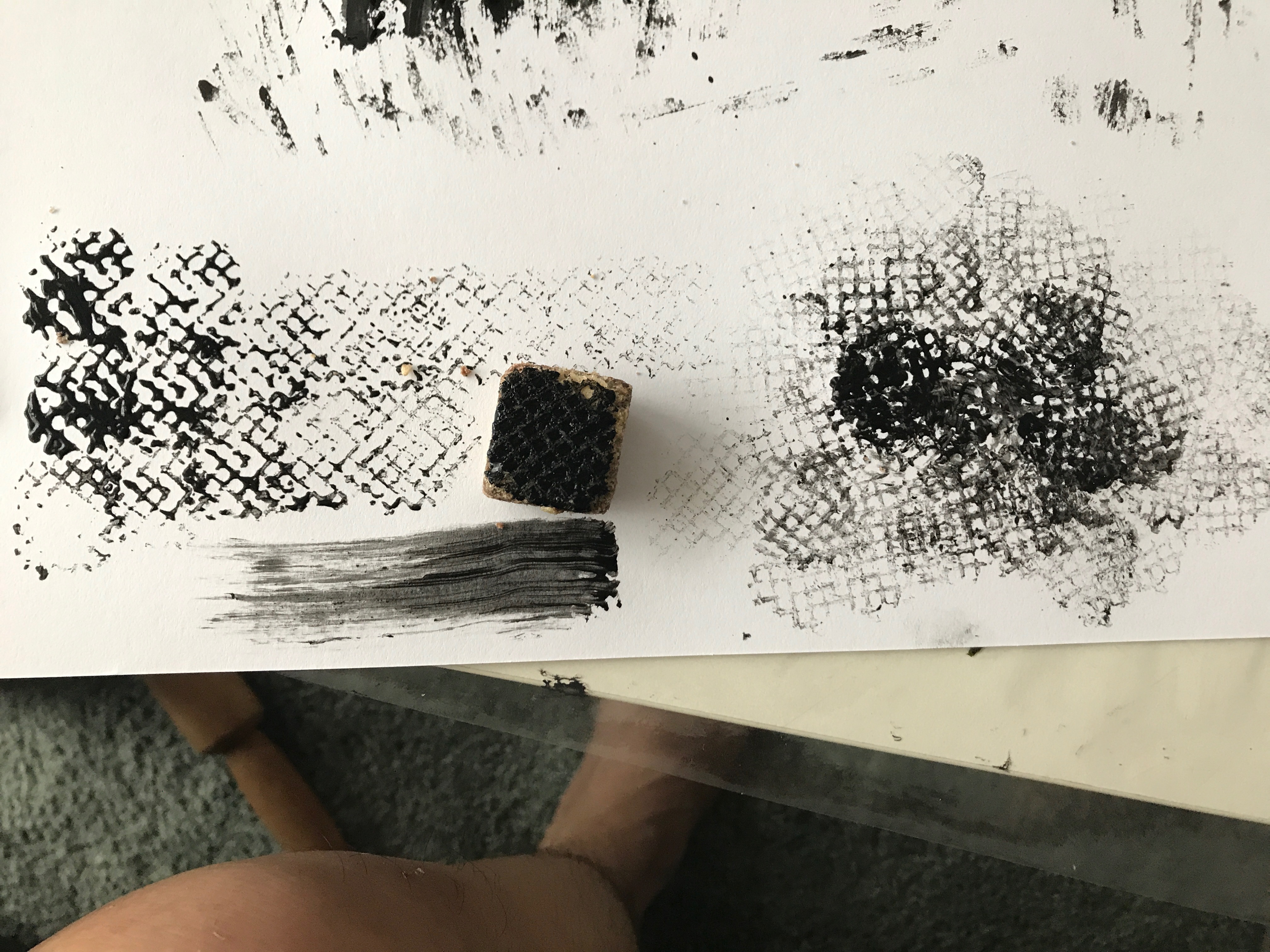
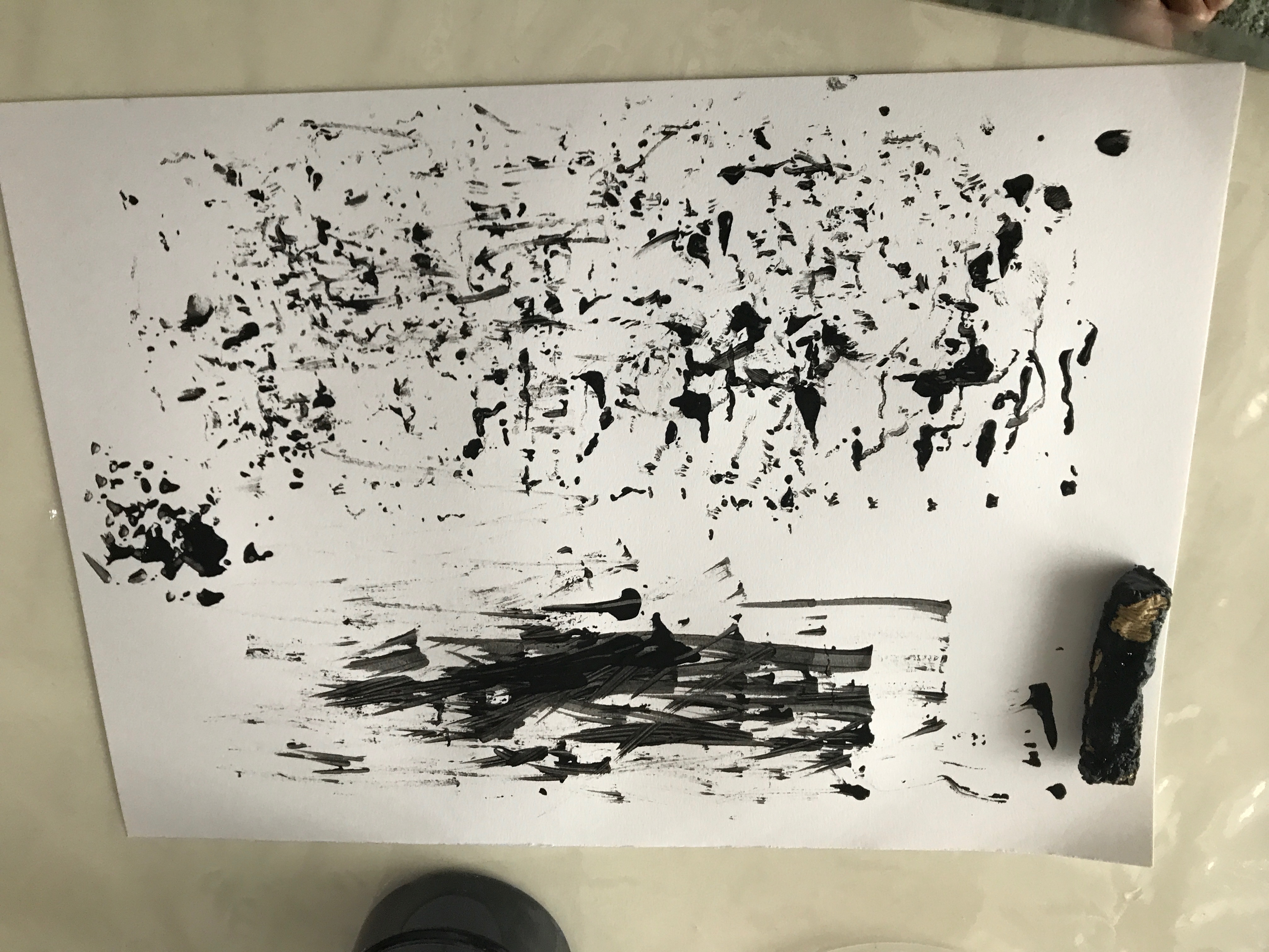
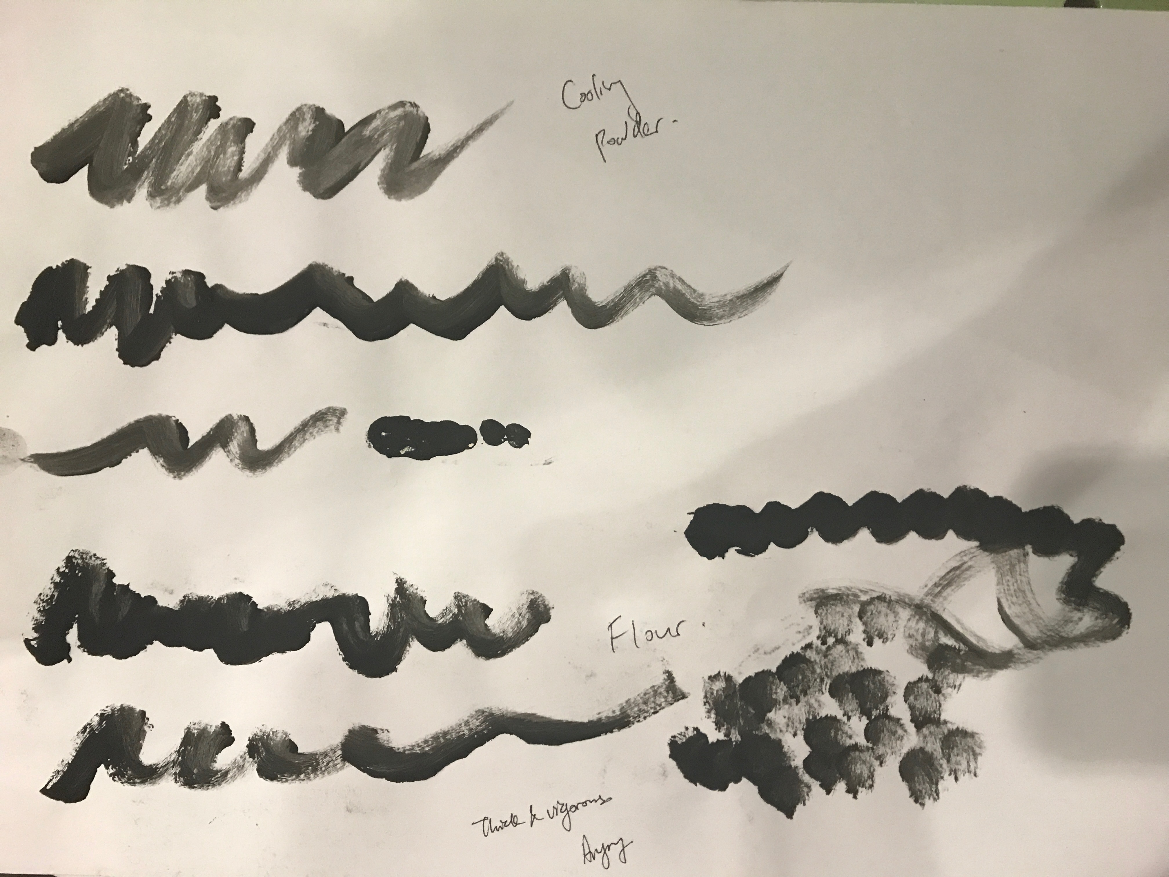
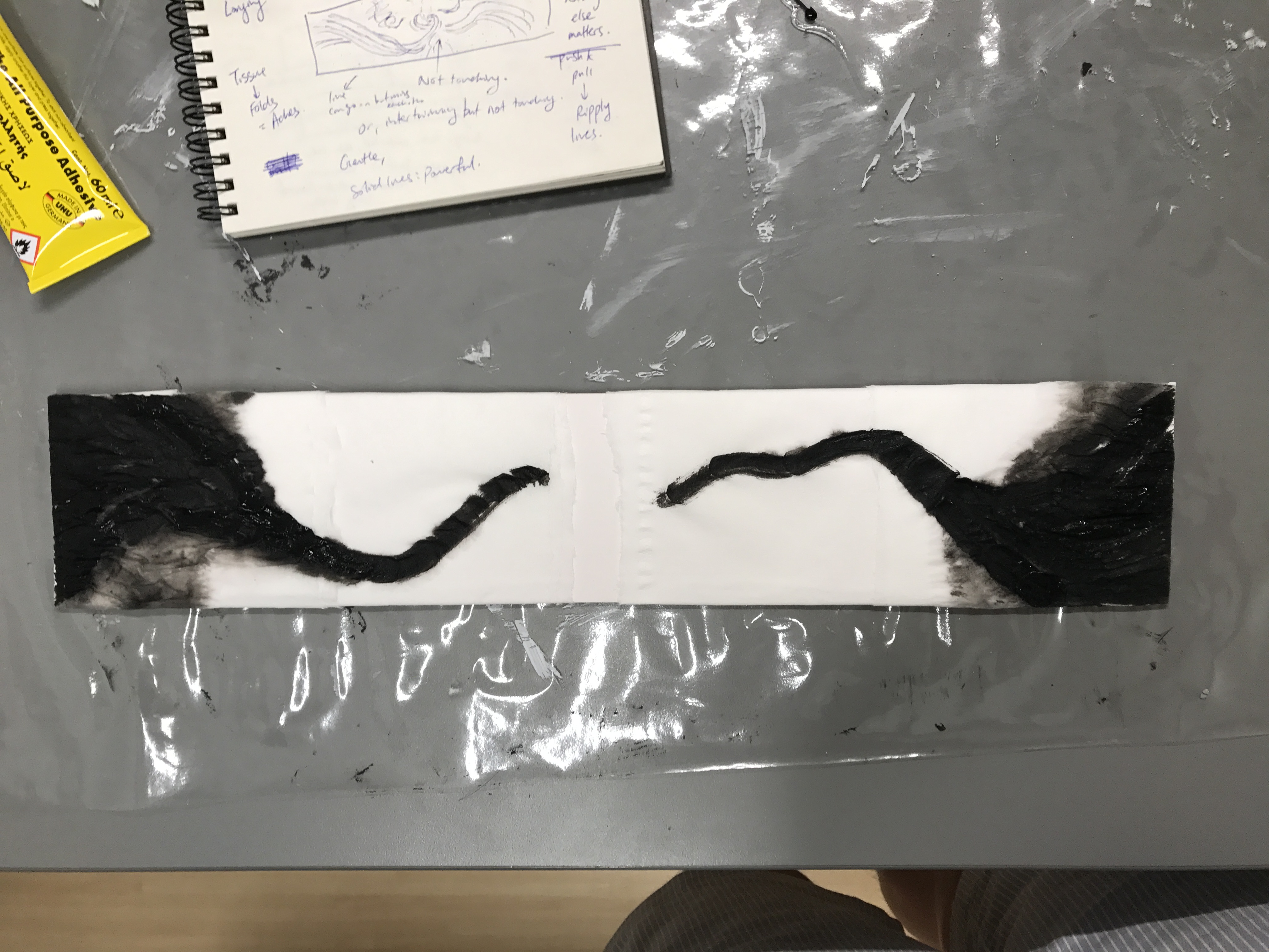

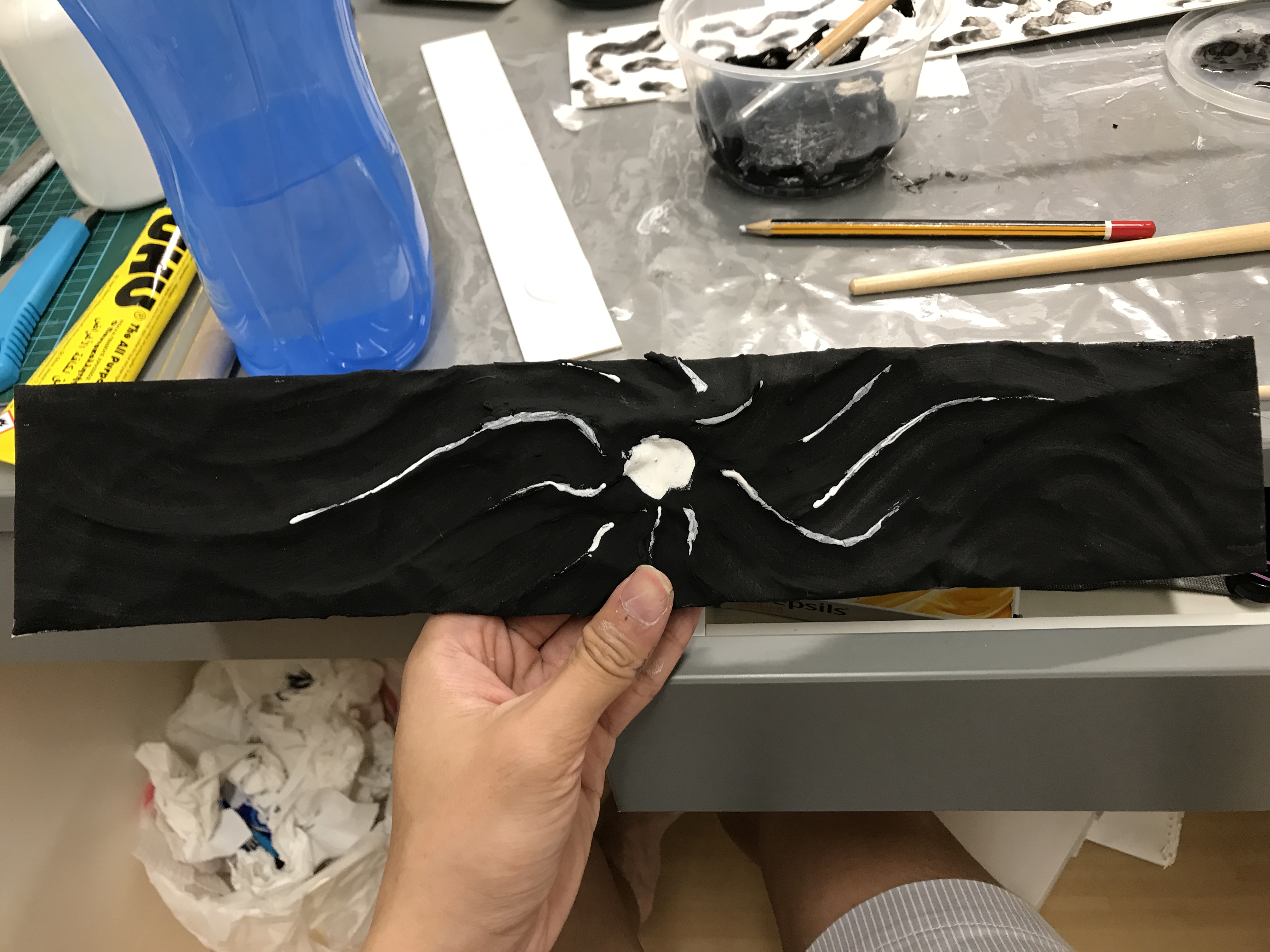
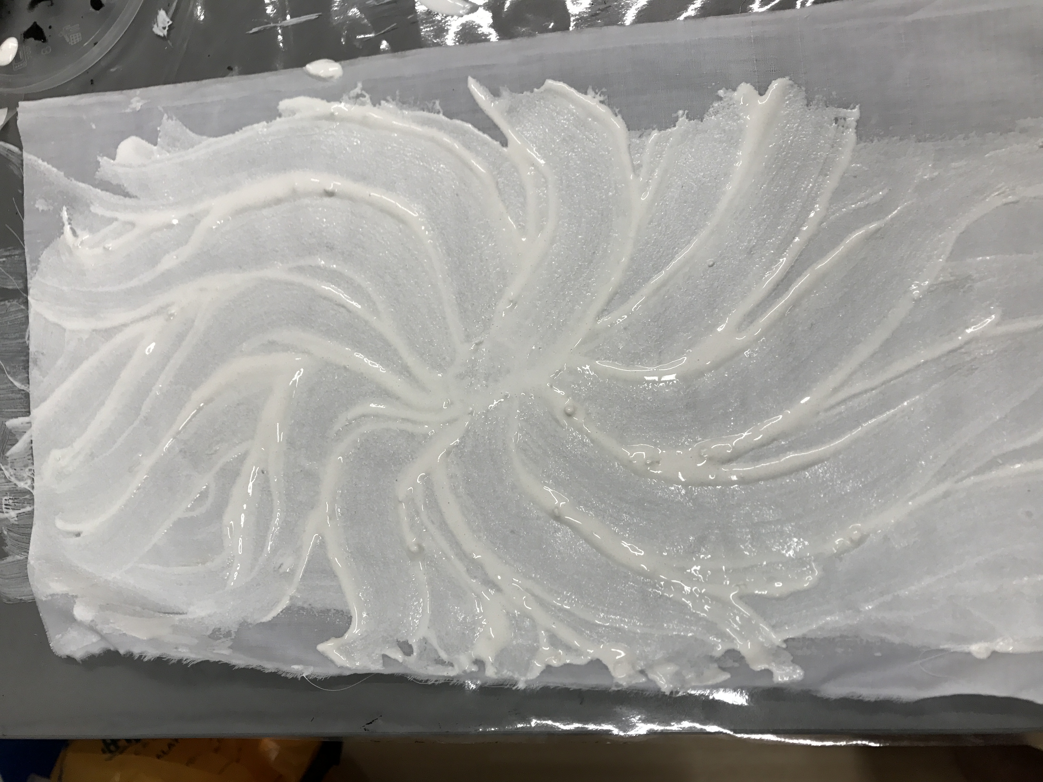
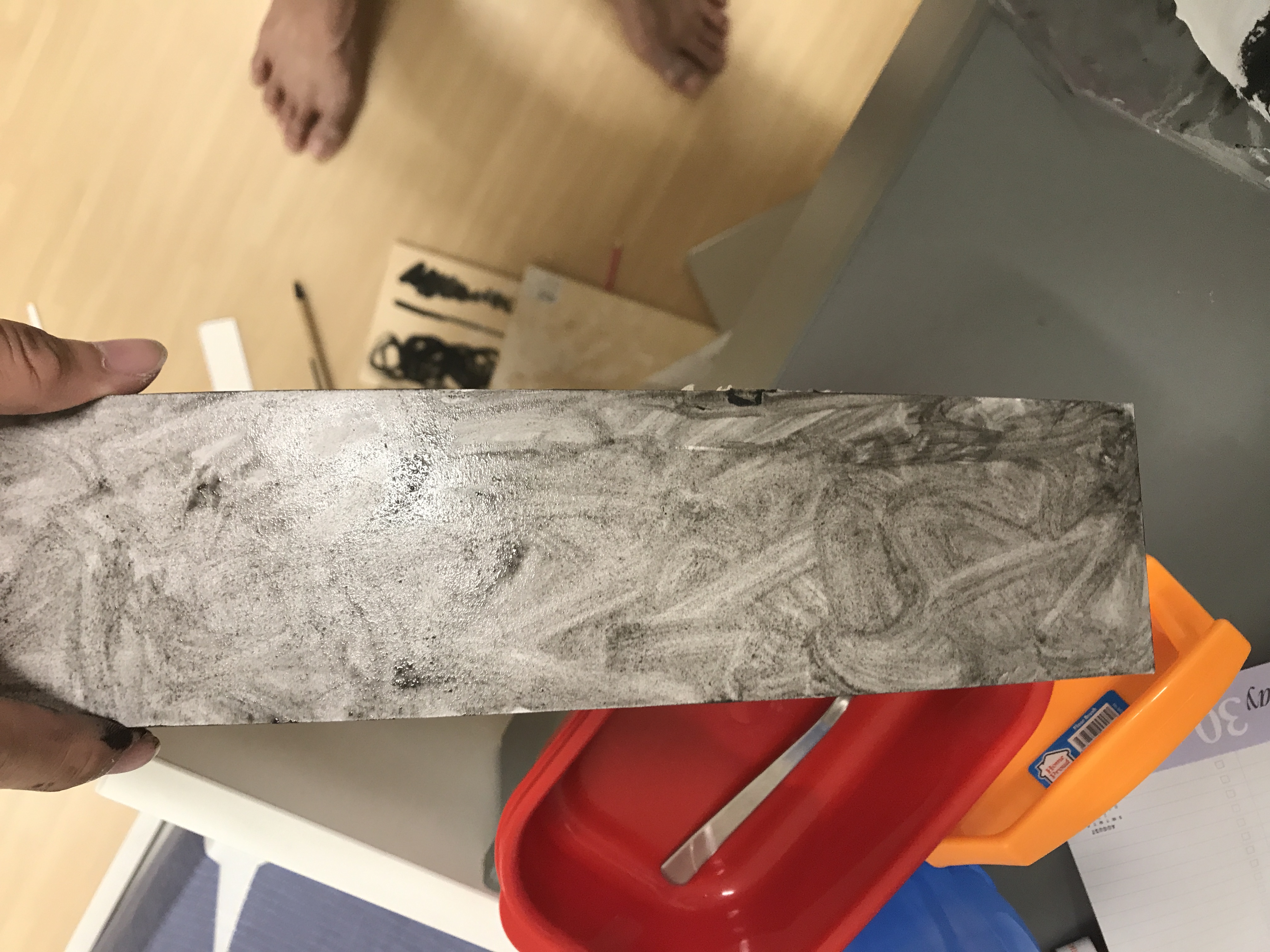
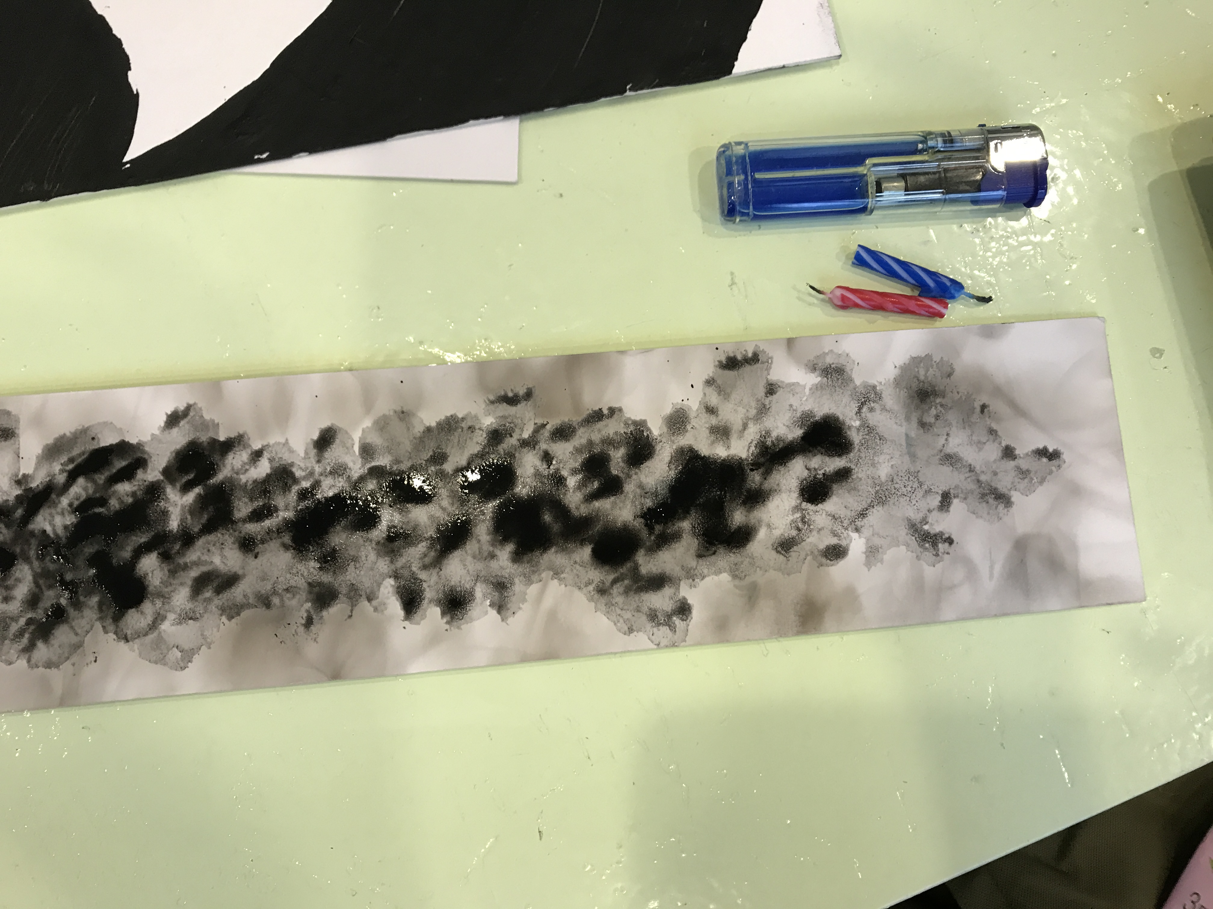
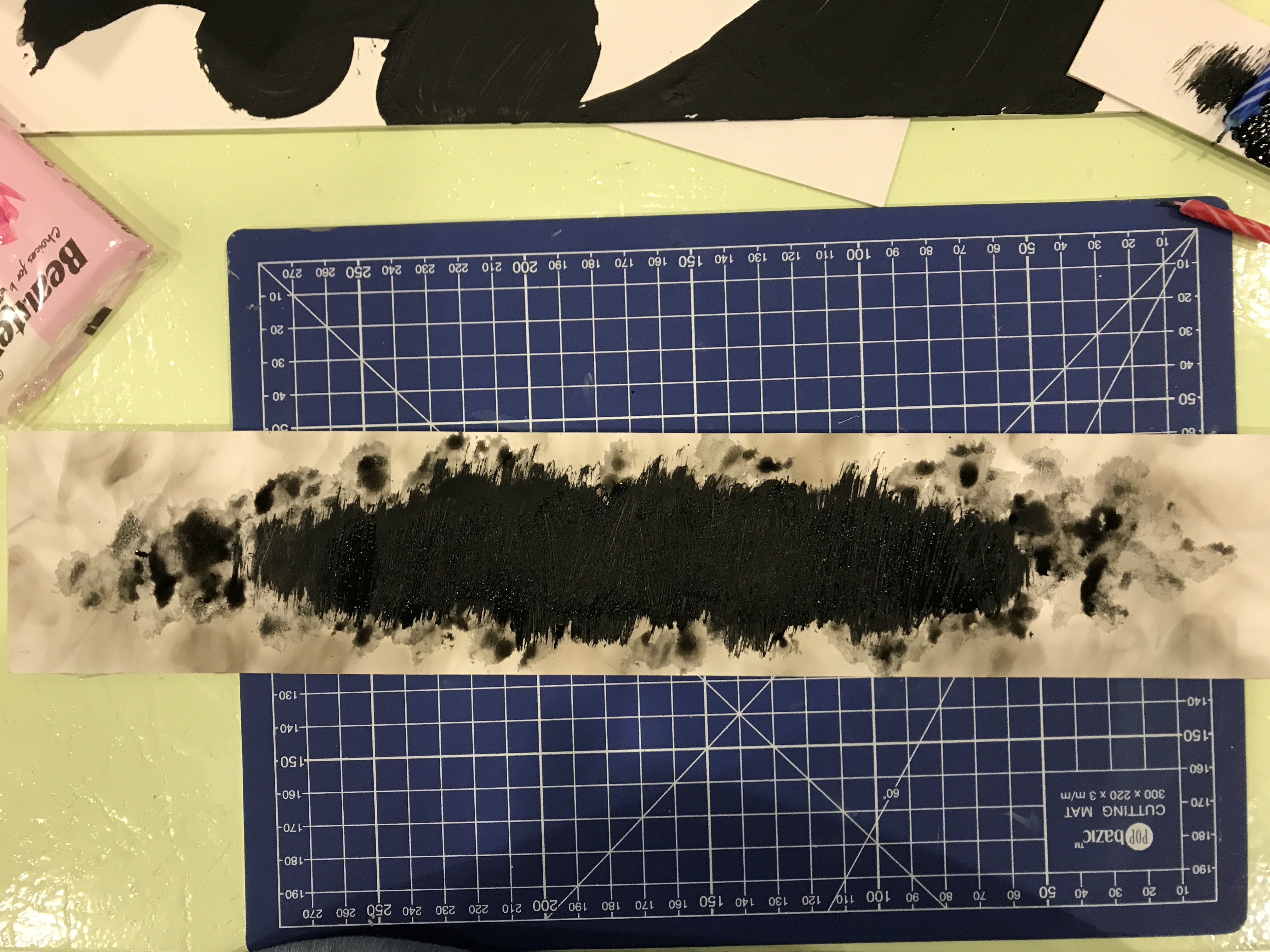
 Here’s a mixture of ink and flour for my next emotion.