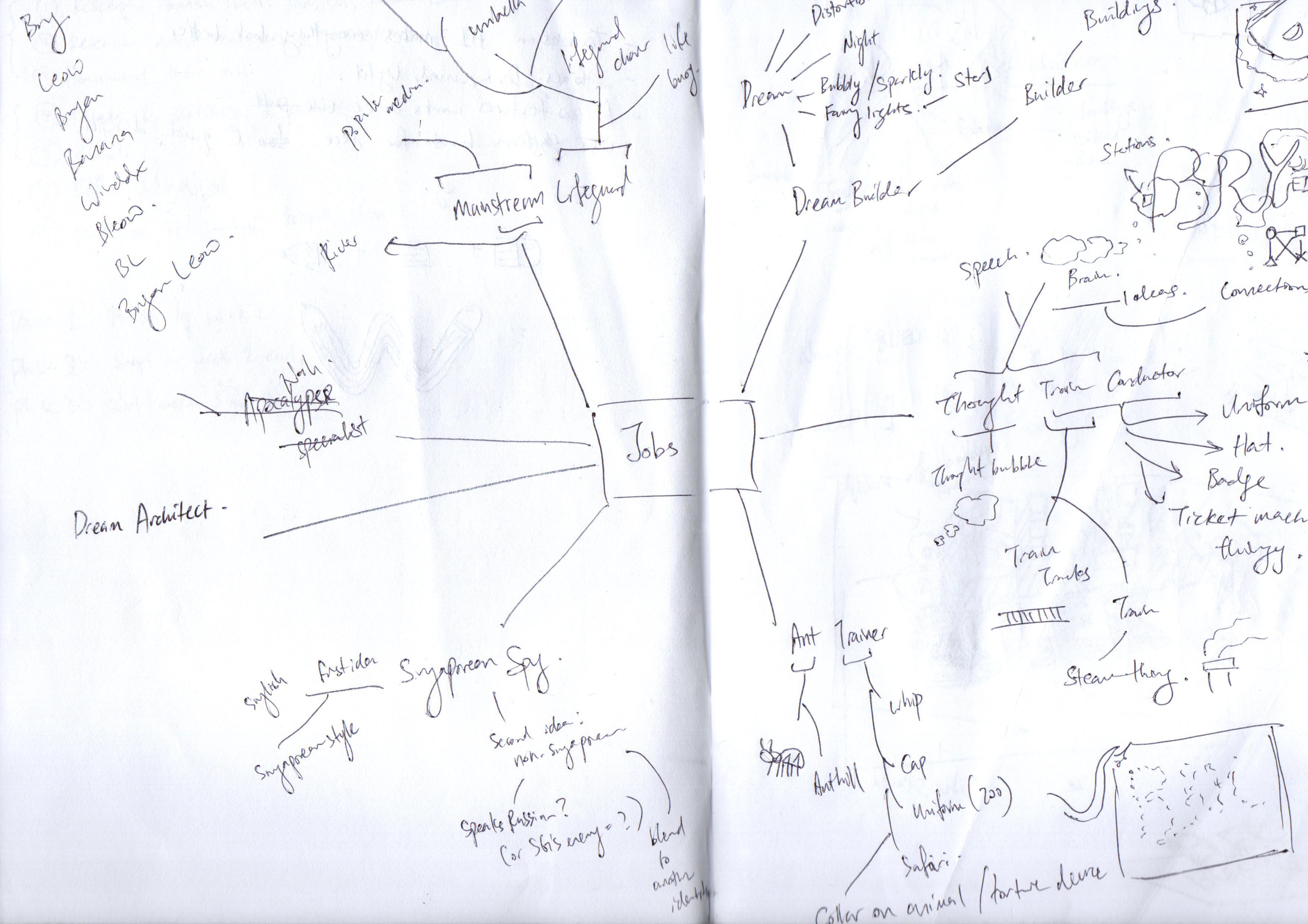
Keeping my researches in mind, I’ve came up with a few ideas on the jobs. I want to be as experimental and creative as possible.
Here is my list:
Job Idea 1: Dream Builder or illusionist
Using optical illusion to create 3D within 2D. The idea is that a dream builder builds a dream, so I would use this optical illusion as a foundation to whatever that is going to be built.
This is inspired by the 3D illusion artworks seen in trickeye museums and on youtube videos:
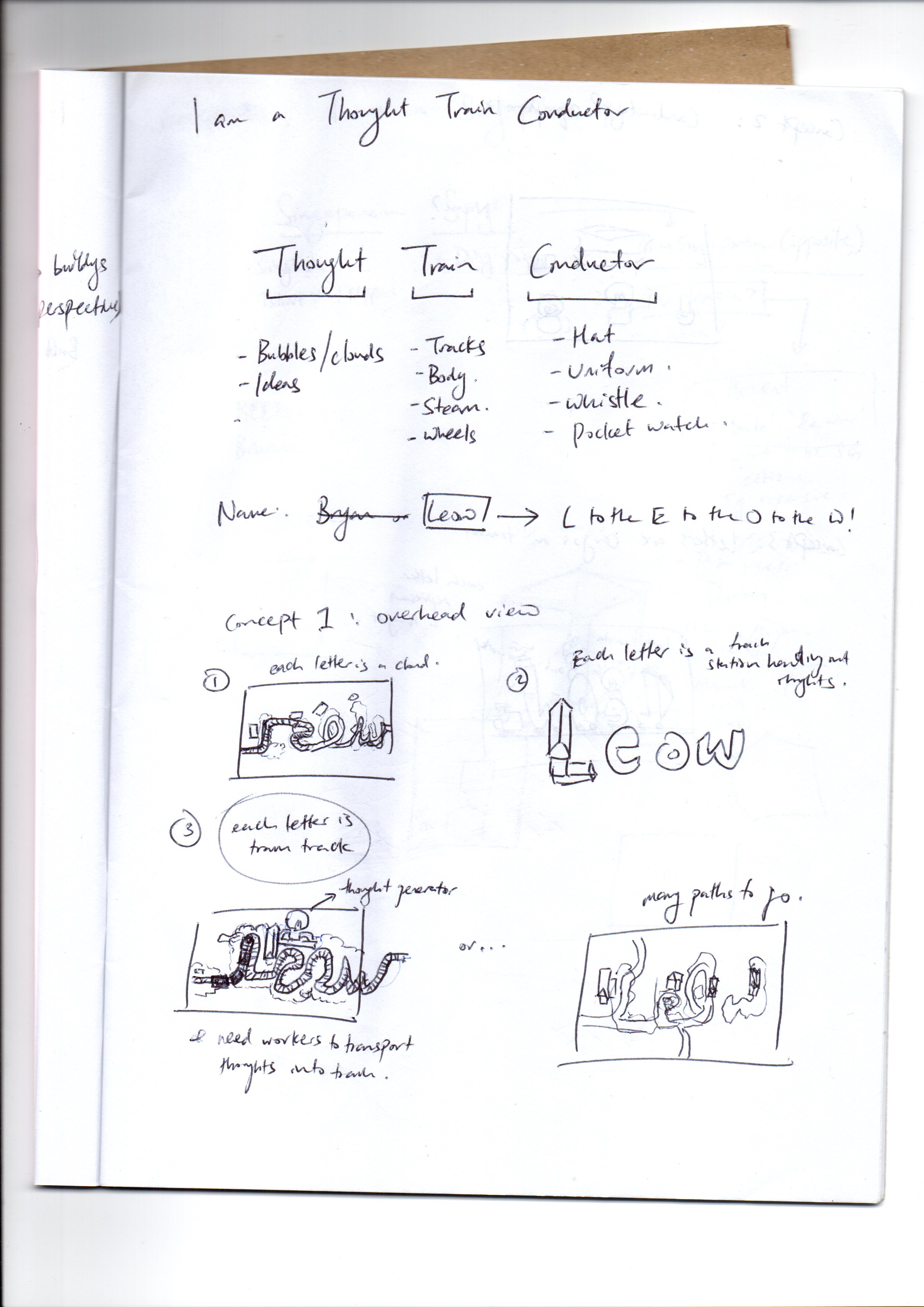
Job Idea 2: Thought Train Conductor
I merged a ‘train conductor’ with ‘thought train’ to create a Thought Train Conductor. This job is basically someone who controls a person’s thoughts by conducting the thought train. The idea is inspired by Pixar’s Inside Out
Job Idea 3: Ant Trainer
I thought it will be funny to have a trainer that control ants to make them do tricks. I got inspired by looking at animal trainers, and I stumbled upon a thing called Flea Circus
It intrigued me, it’s so weird, I feel like it made the cut for an imaginative job. So I decided to be an ant trainer instead of a flea trainer.
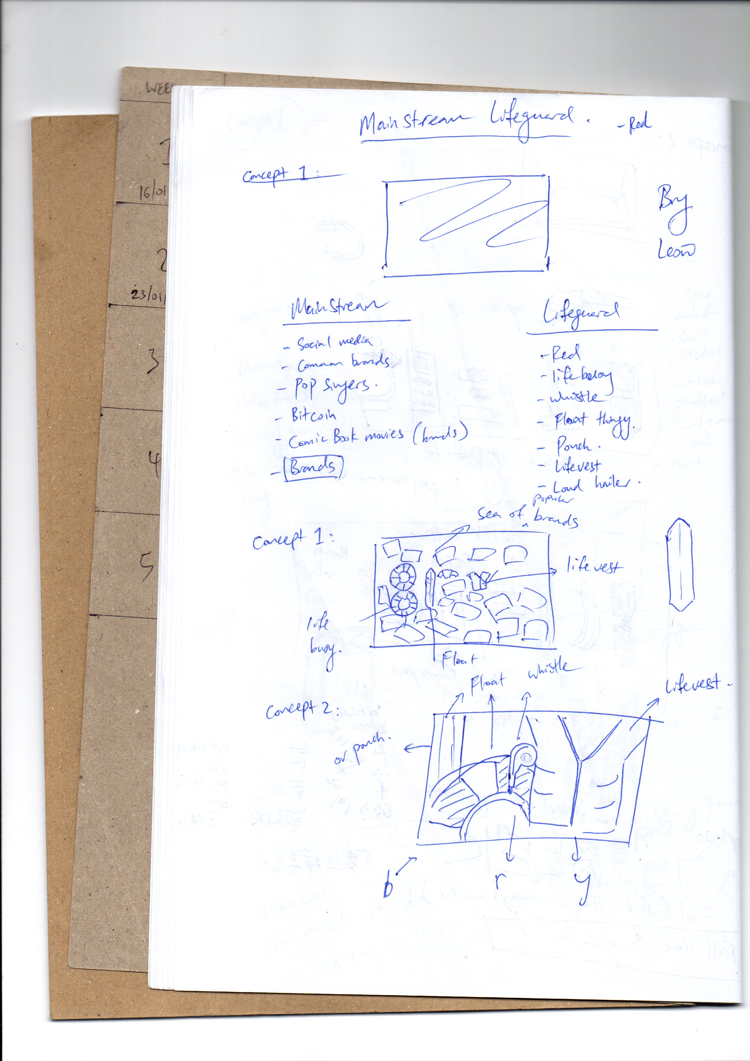
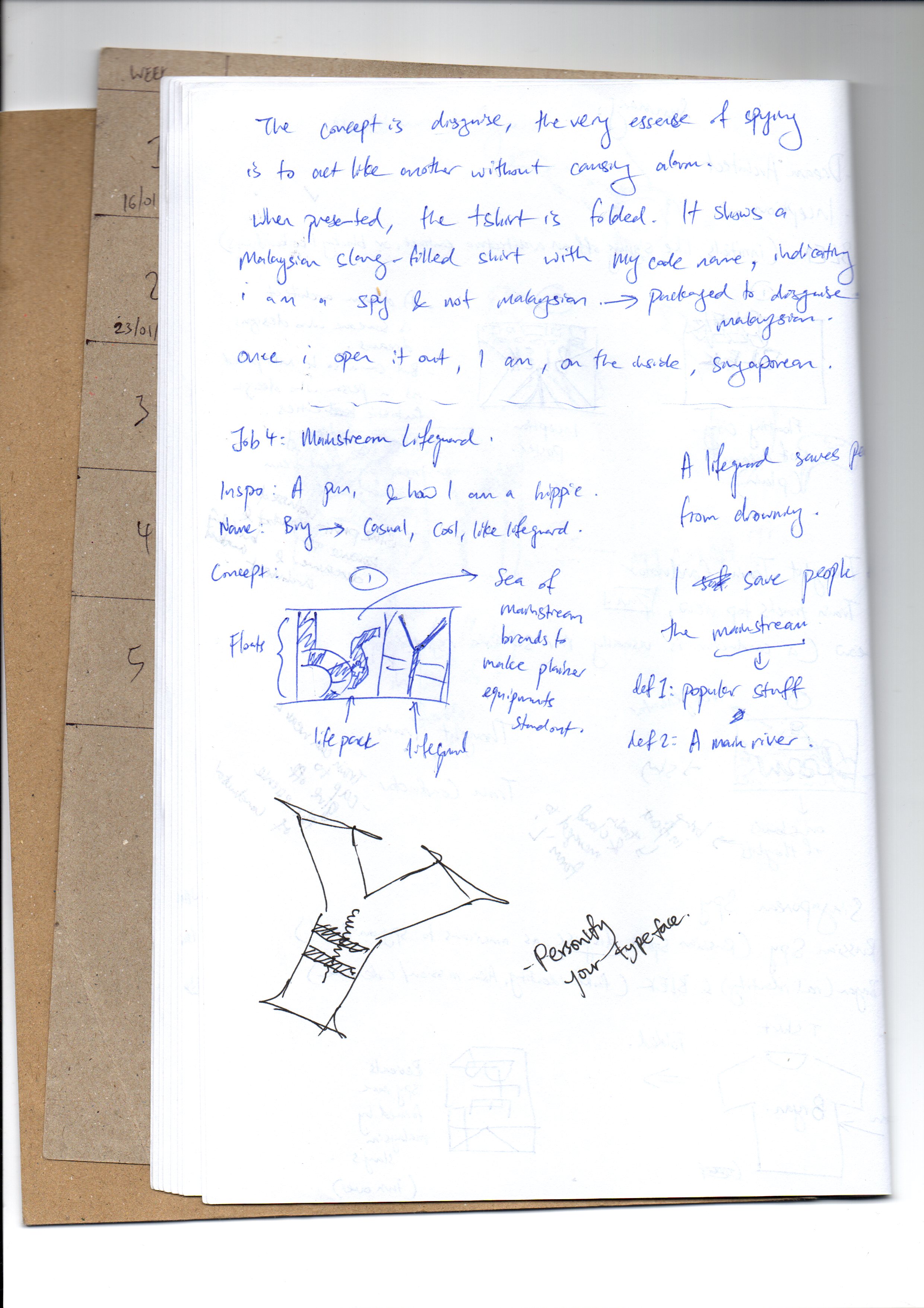
Job Idea 4: Mainstream Lifeguard
The idea is that a mainstream is not just what is popular, but also something like a river. To be a lifeguard at a mainstream is to be someone who rescues people from what is popular. It’s a complex idea. I would combine elements of a lifeguard and popular stuffs like social media, pop culture, popular fashion brands, etc.
Job Idea 5: Apocalypse specialist
An apocalypse specialist is a person that is an expert at all kinds of apocalypses (zombies, alien invasion, nuclear war, etc). I’d imagine taking apart the destructiveness of all sorts of apocalypses.
Job Idea 6: Singaporean Spy
I thought about the idea of a “Russian Spy” in USA, and I thought about how a spy that Singapore sends out is oddly called a “Singaporean Spy”. Sounds funny. Anyway, to be a “Singaporean Spy”, one have to be in another country, so I thought it should be Malaysia. The idea is to create an artwork that looks Malaysian, but secretly hides elements from Singapore.
Other jobs that didn’t make the cut:
Tilt Master (because I’m always tilted)
Space Traffic Controller (I love space)
Cloud Traffic Controller (like, iCloud, Dropbox, etc)
Alien Biologist (alien body parts)
Doomfist (The Overwatch character)
Sneeze Blesser (Someone who blesses anyone who sneezes)
Earth Rotator (The person that rotates the Earth)
I decided to stick with just 4 jobs:
- Dream Builder
- Thought Train Conductor
- Mainstream Lifeguard
- Singaporean Spy
I started creating drafts for the jobs.
What my idea were for them:
Dream Builder
Idea 1: To make use of the movie Inception’s idea of a dream to let audience know the idea of a dream builder.
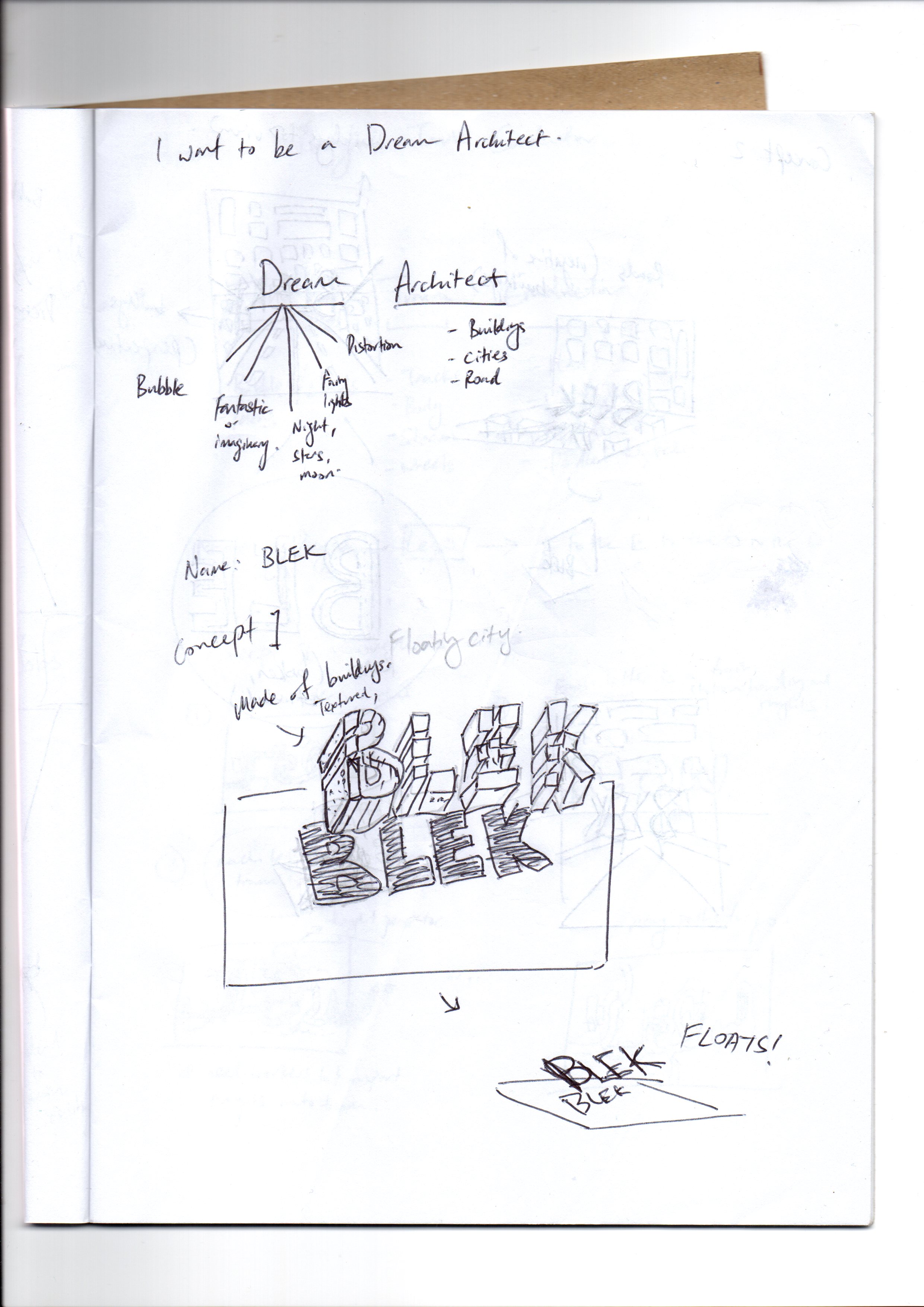


This is where I got my inspiration from. I like the idea that a 2D drawing can trick the mind to think that it is 3D. By doing so, it became in line with my concept of turning dreams into reality.
To breakdown thought train conductor, it’s Thought, and Train Conductor. For thought, it can be brain, thought bubble, and for train conductor, it can be train tracks or train body.

Mainstream Lifeguard
My idea is to use elements of lifeguard and put it into a sea of brands. The lifeguard objects will form my name.

Singaporean Spy
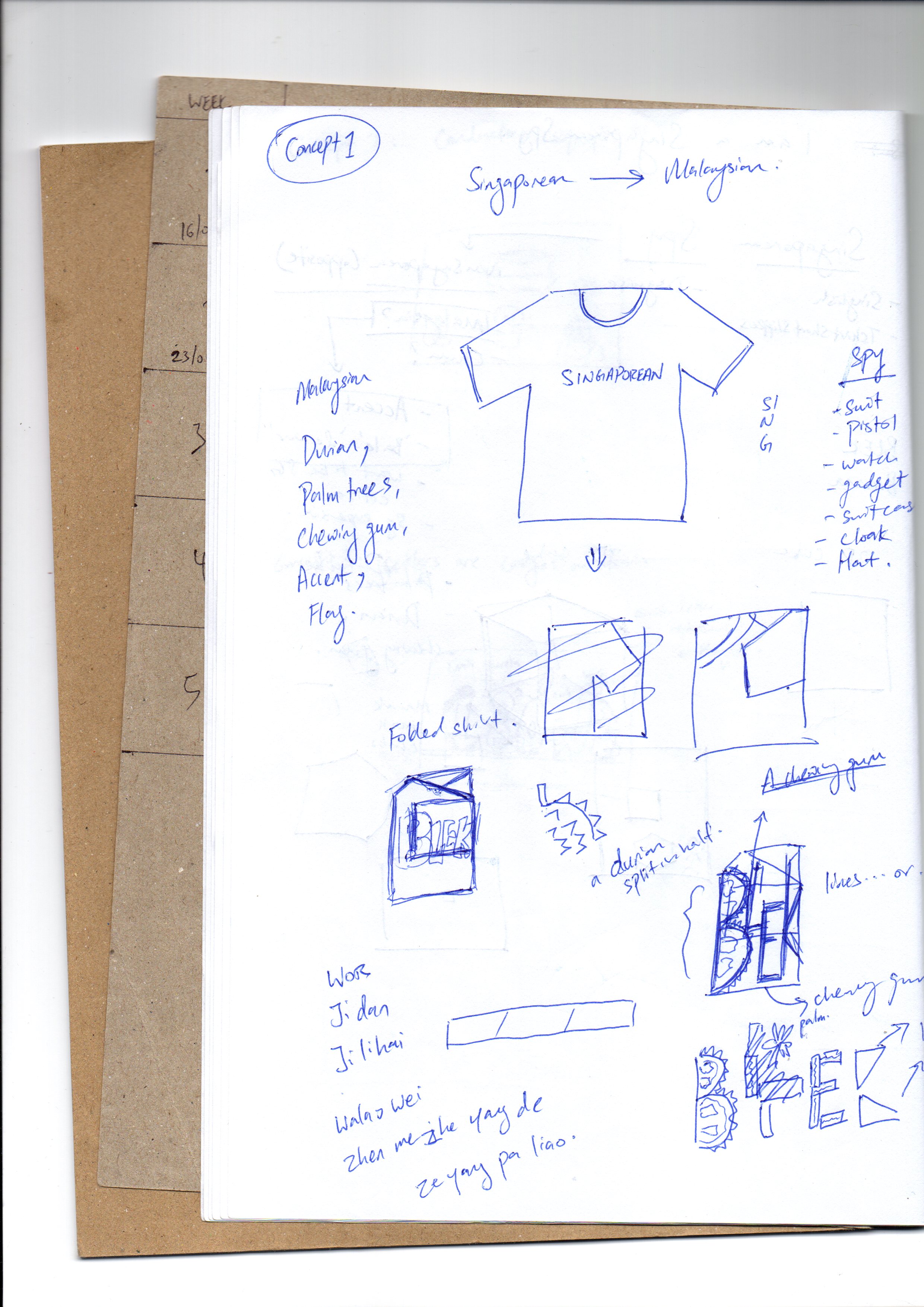
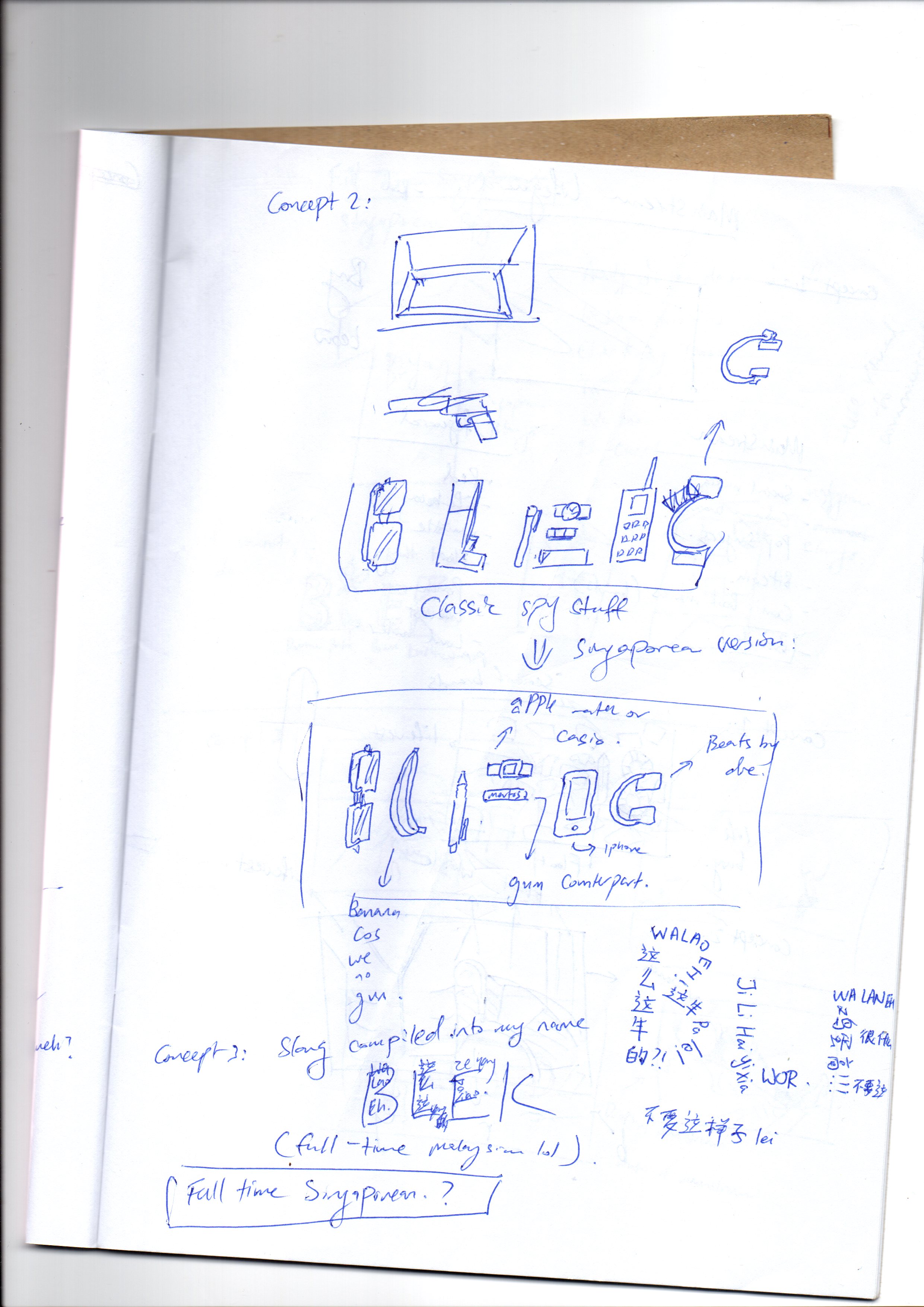
I have a very interactive and complex idea for this one. Let’s talk about the simple one first: I wanted to use a spy suitcase containing very Singaporean items to convey the idea of a Singaporean spy. The complex idea is to scrap the entire idea of conveying a straightforward message, and strip the idea of a Spy to its fundamentals.
To be a Singaporean is to have T-shirt / shorts / slippers combo. That goes the same for Malaysians. So using this idea, I intended to create a disguised t-shirt.
A tshirt is folded whenever we first see it in a store. Therefore, my idea is to fold a tshirt as if it is new from a store, and on it, it will reveal my nickname, formed out of chains of Malaysian slang. This represents the first impression of a stranger to the tshirt, a Malaysian. And this also represents my “Singaporean Spy’s” alter ego, the disguised Singaporean acting like a Malaysian, speaking their slang.
Once opened, there will be another name, my real name, this time, it is in Singaporean slangs.
Another idea is simply to use the super secret spy suitcase and use Singaporean items to fill it up.
Consultation One

I received feedbacks that the texts must be created first before the image is added in. I couldn’t really understand what that means, but I supposed I need to create something that is more straightforward and use semiotics to convey the job. The feedbacks for the jobs are:
Dream Builder
Generally alright to go the direction I am heading, but I must keep in mind not to do anything that is physically 3D. The idea of using Inception as a clue to the concept is not recommended as it didn’t take the real essence of the job title. An example given by Shirley was to use architectural blueprints, but I thought those are too literal.
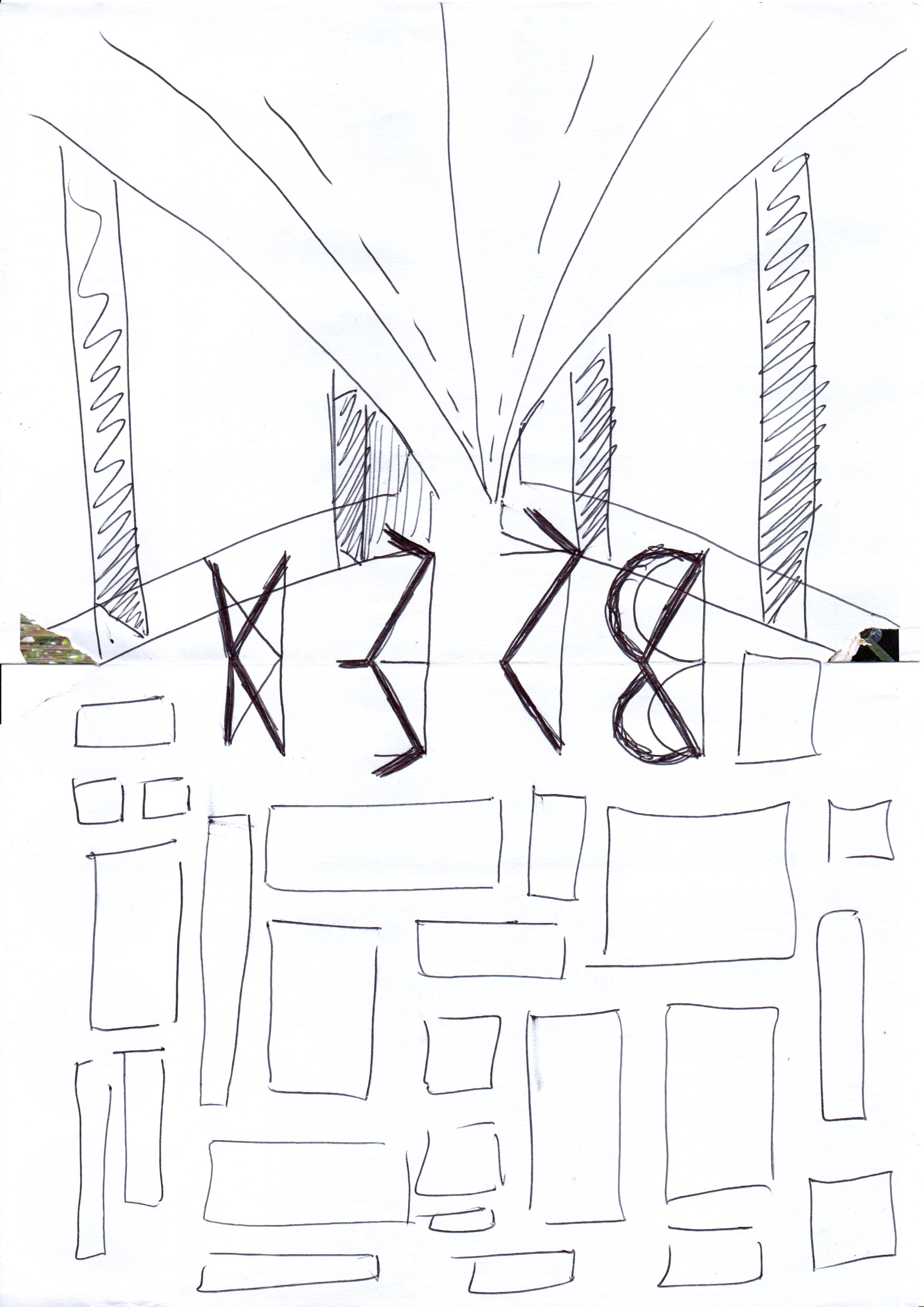
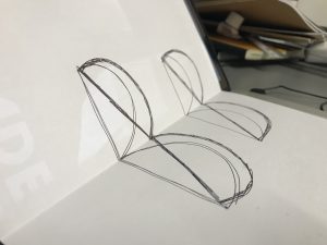
To move myself forward, I decided to use the same concept of using 3D illusions. With that, I made an accurate template that I can use to trace out for other ideas:

Thought Train Conductor
The idea is generally accepted, but there are some issues too. Using just clouds and train tracks, it does not really convey the idea of a “conductor”.
Mainstream Lifeguard
The usage of objects to form the letters is not recommended. Instead, I was told to personify the letters (giving it character instead of using objects to form it)
Singaporean Spy
The idea is too interactive and did not use semiotics to convey the message. The assignment’s objective is to use visual cues to suggest the job to people. The idea was rejected, and I had to look for other ideas as this job is too hard to illustrate for me.
I finally understood the brief this time. With feedbacks in mind, I decided to change some ideas around.
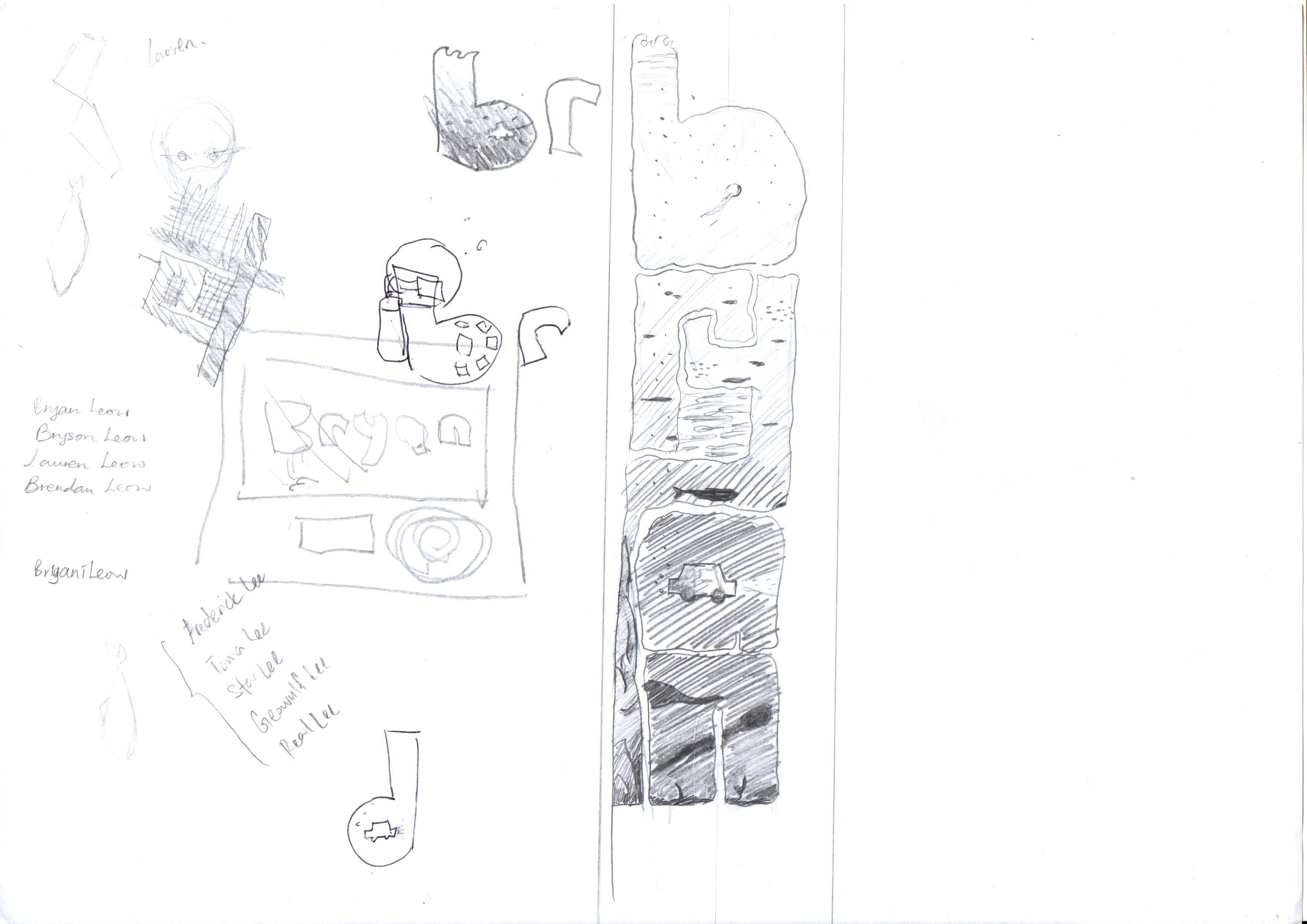
I changed Dream Builder into Cloud Maker, as it would be easier to convey than a Dream Builder, using semiotics. There are very little association with “Dream Maker” to me.
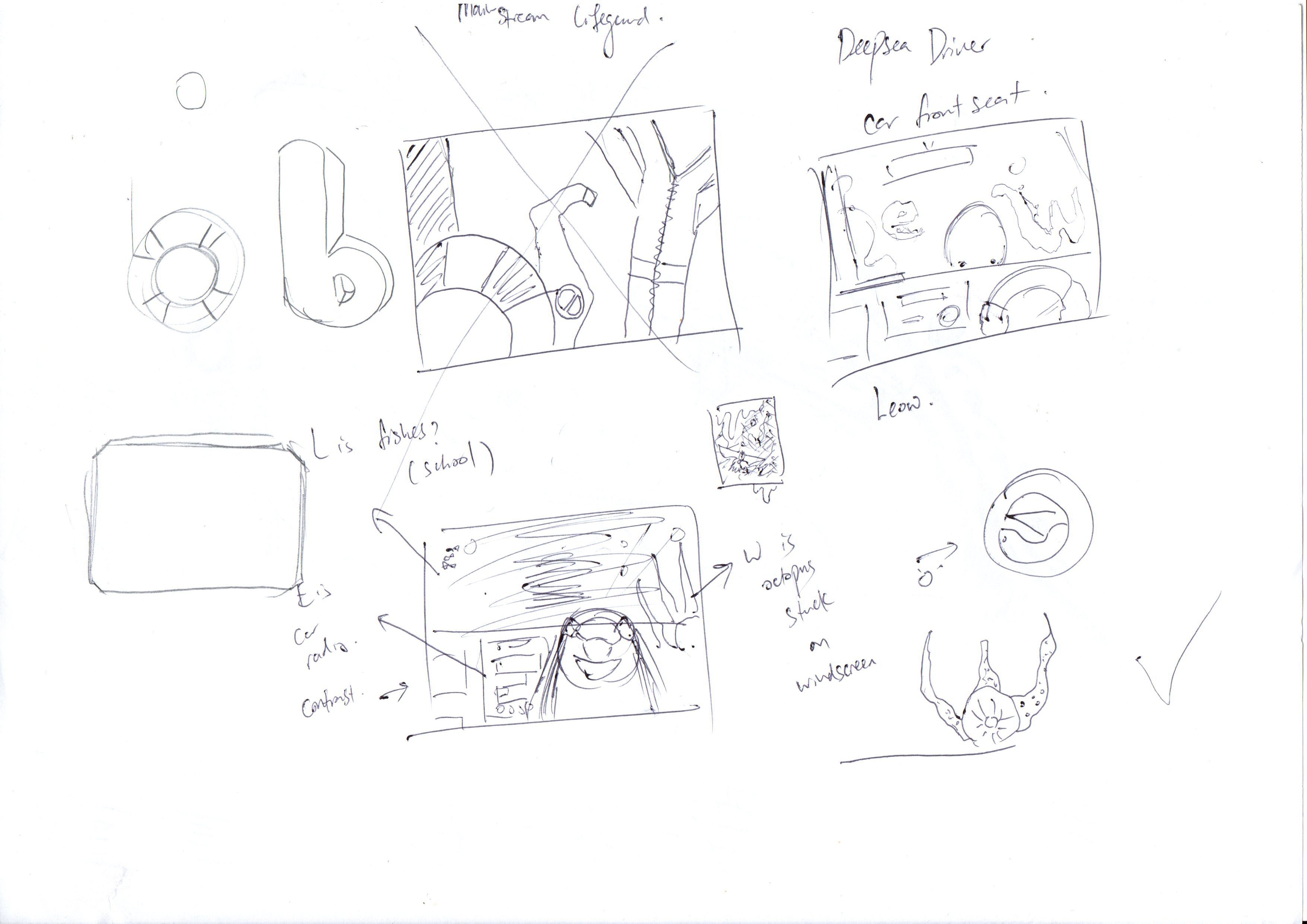
I removed Mainstream Lifeguard as it is too hard to depict, too, and thought of a new job out of puns: Deep Sea Driver (not diver). I believe this would be not only easier for me, but would also be successful.
I also changed Singaporean Spy to Singaporean Breakfast Enthusiast, keeping the idea of something Singaporean, but make it easier to do, too. Idea is to use Singaporean breakfast set to form the name.
Consultation Two
The next consultation, I had most of my concepts settled. However, there are still some changes. Most of my text are not of the same typeface, which is one of the requirement for this brief. Understanding this, I know how to move forward. With that information, I moved away from sketching drafts and tried doing the actual artwork.
In the meantime, I changed to Breakfast Enthusiast to Kaya Toast Maker, as I intend to use only the kaya toast to build the text.
Consultation Three + Final
Deepsea Driver

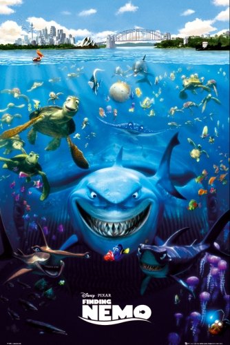
Deepsea driver was moved to be done horizontally, and the “underwater vibes” is done such that it will be consistent with each letter.
The look was inspired by the Finding Nemo poster
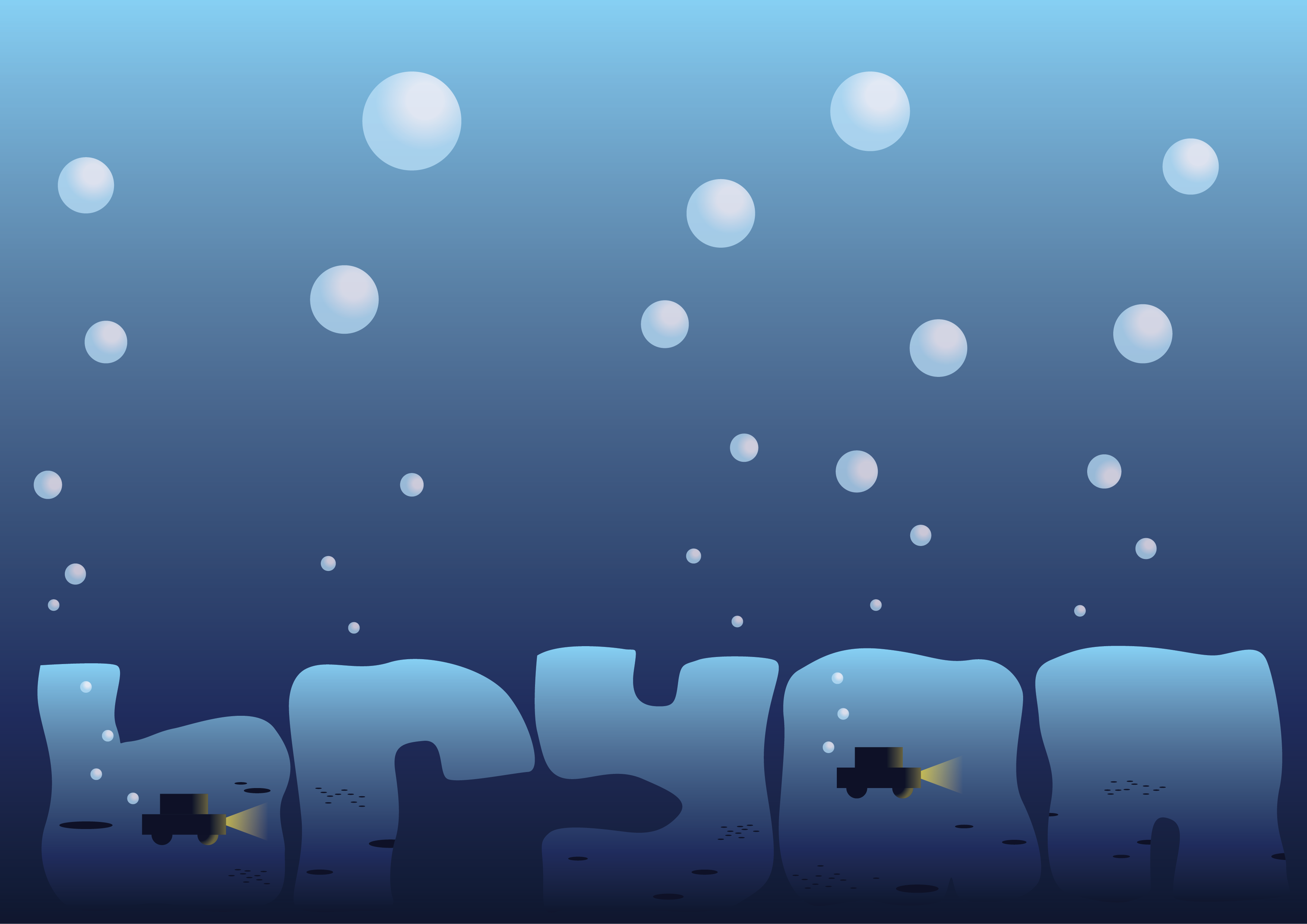
I received feedback that I was one of the few that put my text at the bottom (so I’m unique, yay?) But there are some things that still needs to be fixed. The background seemed too plain, and the texts have no texture.
I went online to see if there are any tutorials to create such effect and found a really good video that did the under sea texture really well!
Taking some references from the method, I created the final work:
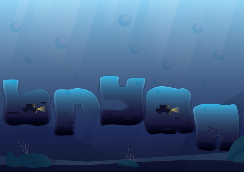
That’s the end of Deepsea Driver process!
The name is made with my name “bryan”. The gradient inside the name signifies the descending depths of the ocean. The cars replace the holes in the letters that have them, which signifies that there is some driving involved in the job. The letters are made with multiplied layers over it to create the wavy effect of being underwater. The background further sets the context for the job.
Semiotics: Depth, water movement, car, bubbles, light stream, seabed
Colour Palette: monochromatic, blue to symbolise the ocean
Textures: the clarity of water and the light that stream through to indicate rough waves that refracts light
Composition: sinking, at the bottom, as though it is like moving at lower depths, floaty. Horizontal to depict the vastness of the sea
Cloud Maker
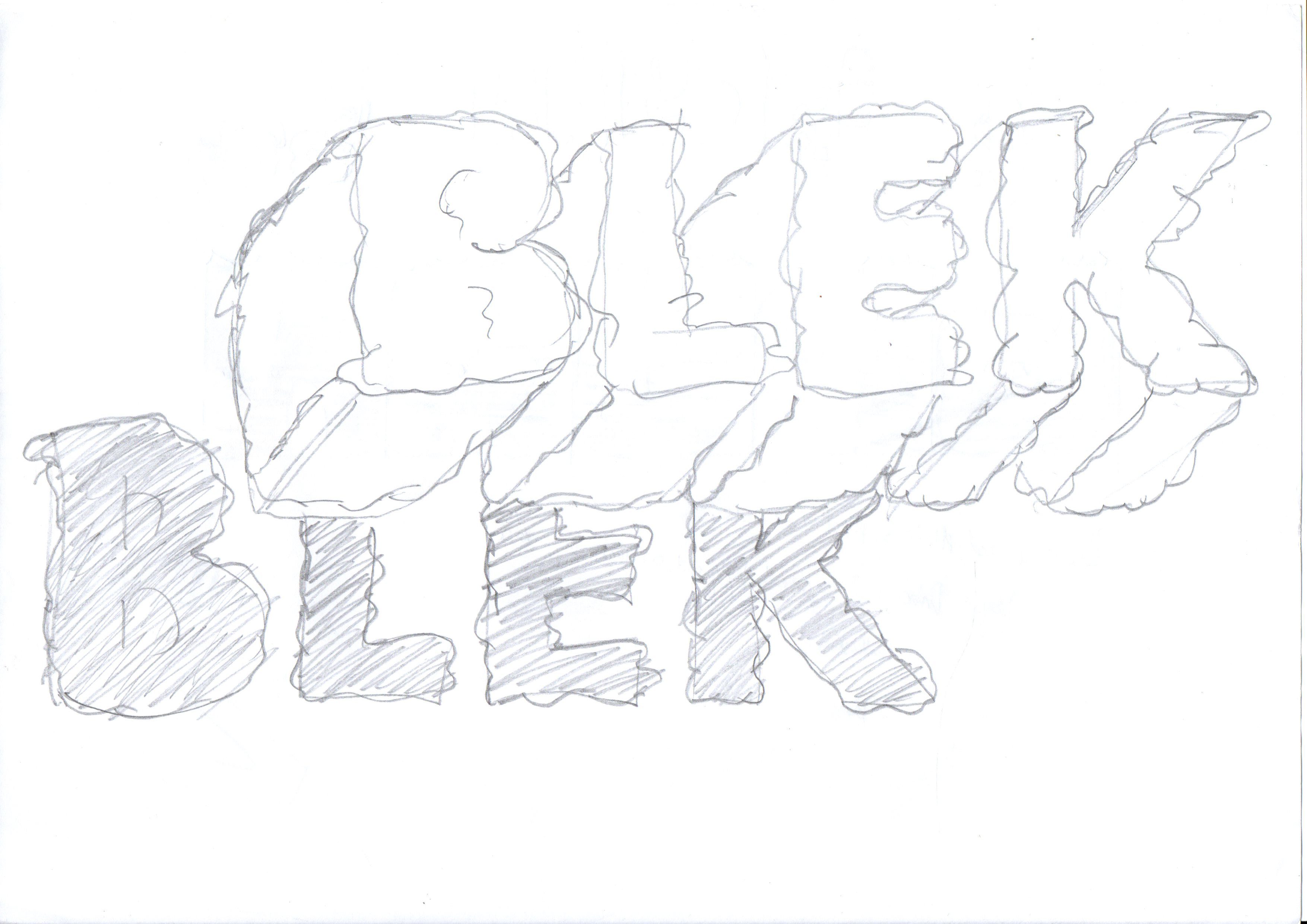
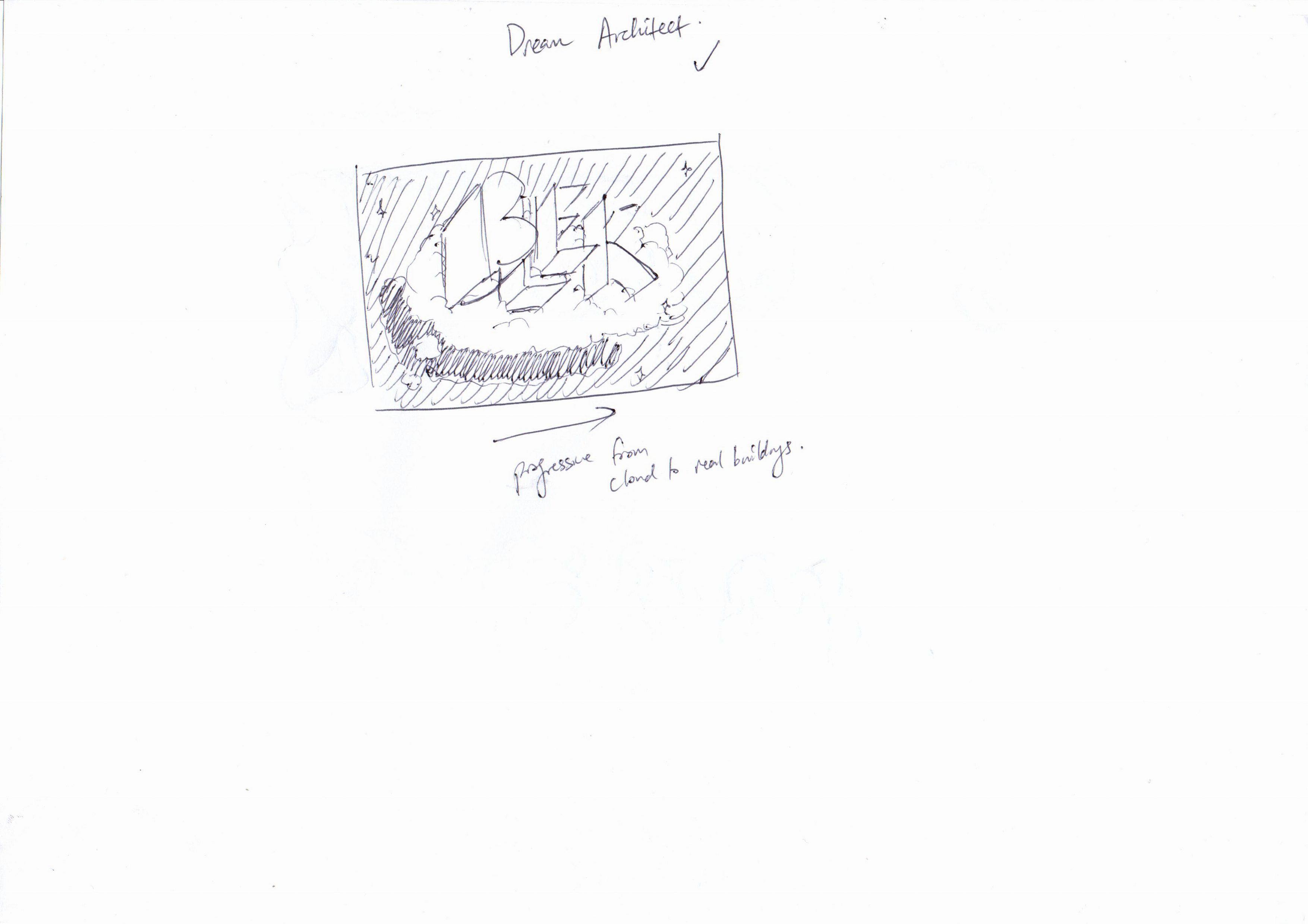
Using the template I made, I traced a cloud texture to the text. I then scanned the new sketch and added texture onto illustrator using a random cloud brush I made using a guide I found online:
The outcome:
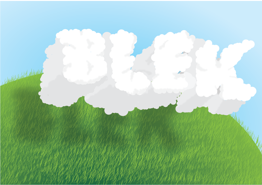
The clouds form my initials “BLEK”, as I’d imaging an builder or maker to use their initials. The grassland creates a context for the audience to understand that these are clouds, as well as to split the page into two different colours so the 3D effect can be seen if the page is tilted to the side.
Semiotics: Cloud, shadow of cloud, and the grass to indicate that it is outdoors
Colour Palette: Analogous, calming
Textures: Cloud’s puffy texture, grass
Composition: Central and slightly to the right to enable for the 3D effect
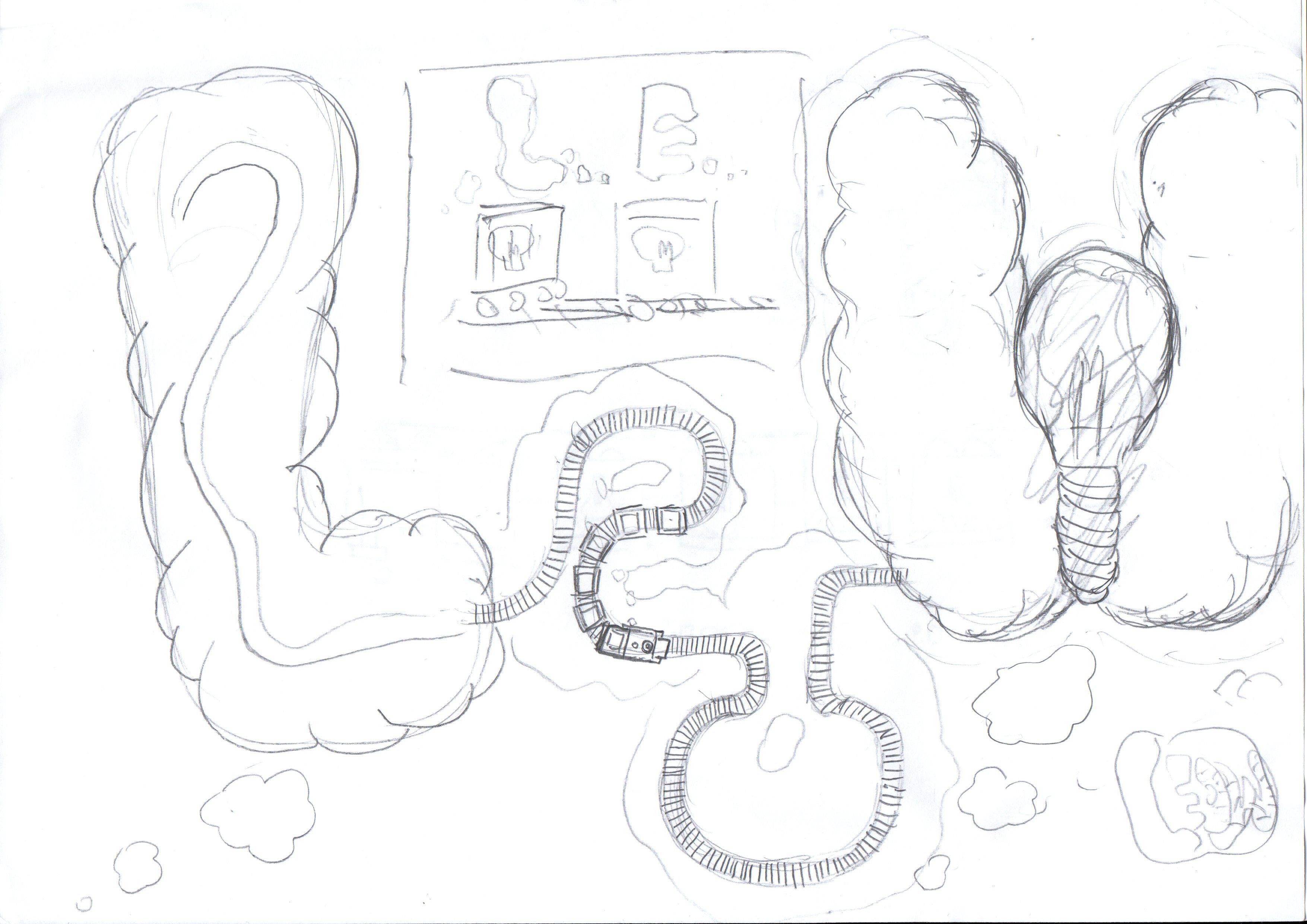
Thought Train Conductor
I decided to add brain textures to the text to create a more obvious idea that there is some thinking involve and therefore, thought.
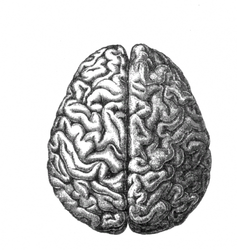
I used the brain image as a reference to the texture of the text.
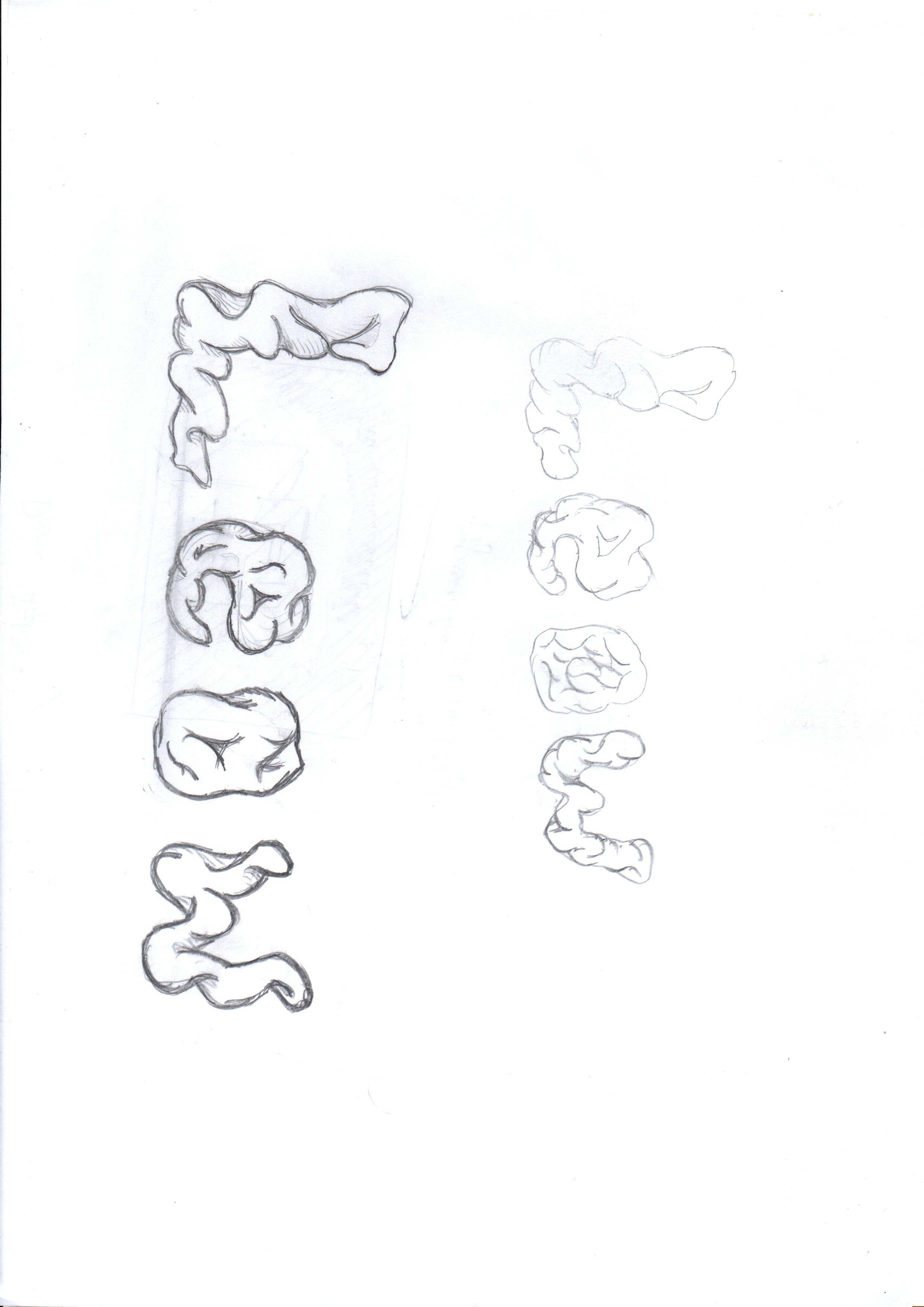
I did a mockup on Adobe Illustrator to have a brief look at the outcome. They looked too much like intestine to be thought of as a brain, although there are clues from the thought bubble. Feedbacks suggested me to give the font more brain texture.
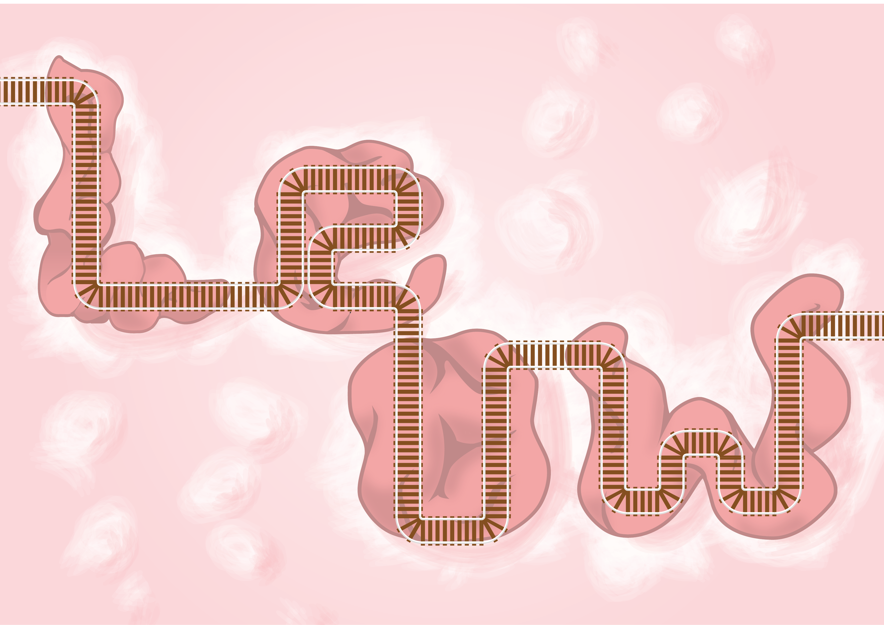
A close up to the train tracks made by vectors
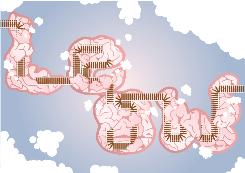
The Thought Train Conductor is made by using my surname, Leow. The reason is that as a train conductor, I will be addressed by my surname.
The tracks are coming from the left side, as if connected from something, and goes around the brain, weaving in and out the brain loops. With each weave, the thought bubbles comes out. This represents the train tracks being interconnected to the different parts of the brain, and with each passing, generates thoughts. This defines the thought train.
Semiotics: Train tracks, brain, thought bubble
Colour Palette: Analogous, with purple ~ pink gradient in the background as the representation of the deep, calm, inner side of our subconscious
Textures: Brain folds, train tracks, thought clouds
Composition: to create the idea of a continuous path, yet trying to not make it look boring, so I split Le and ow to make the train track route more dynamic
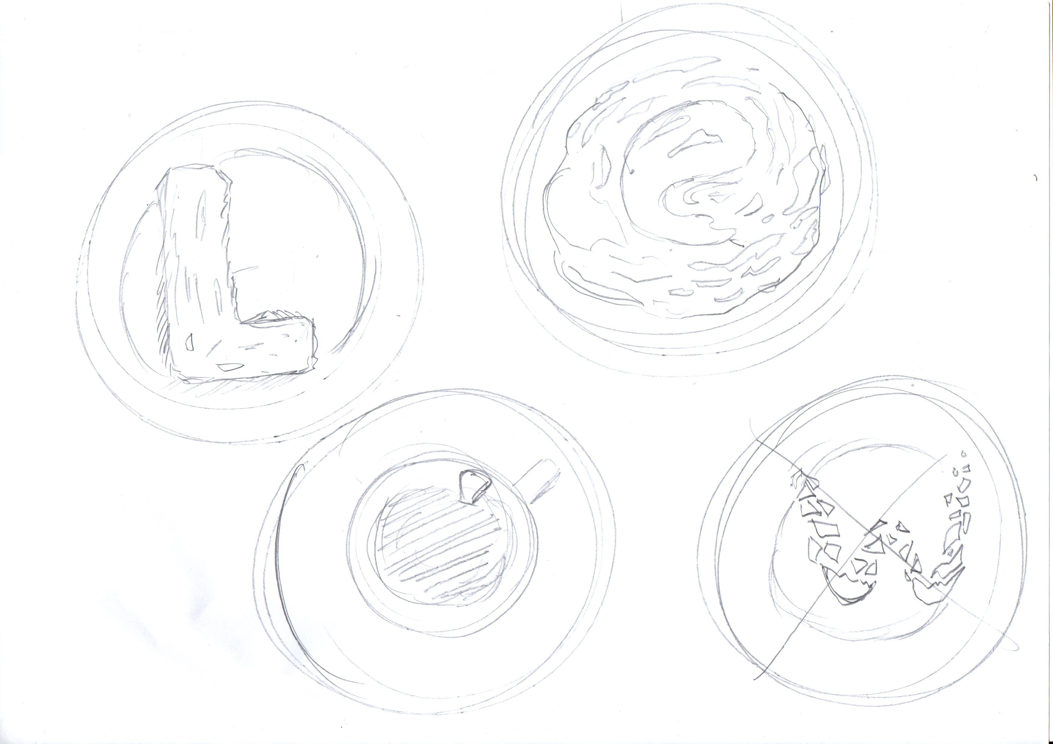
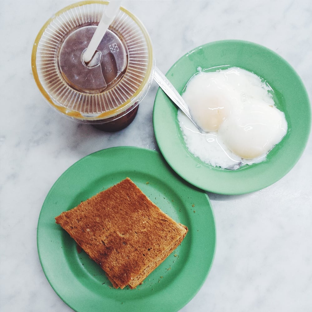
Kaya Toast Maker
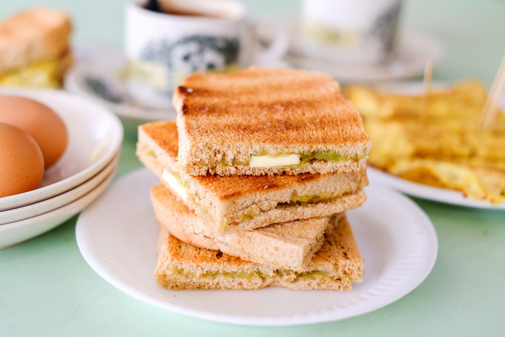
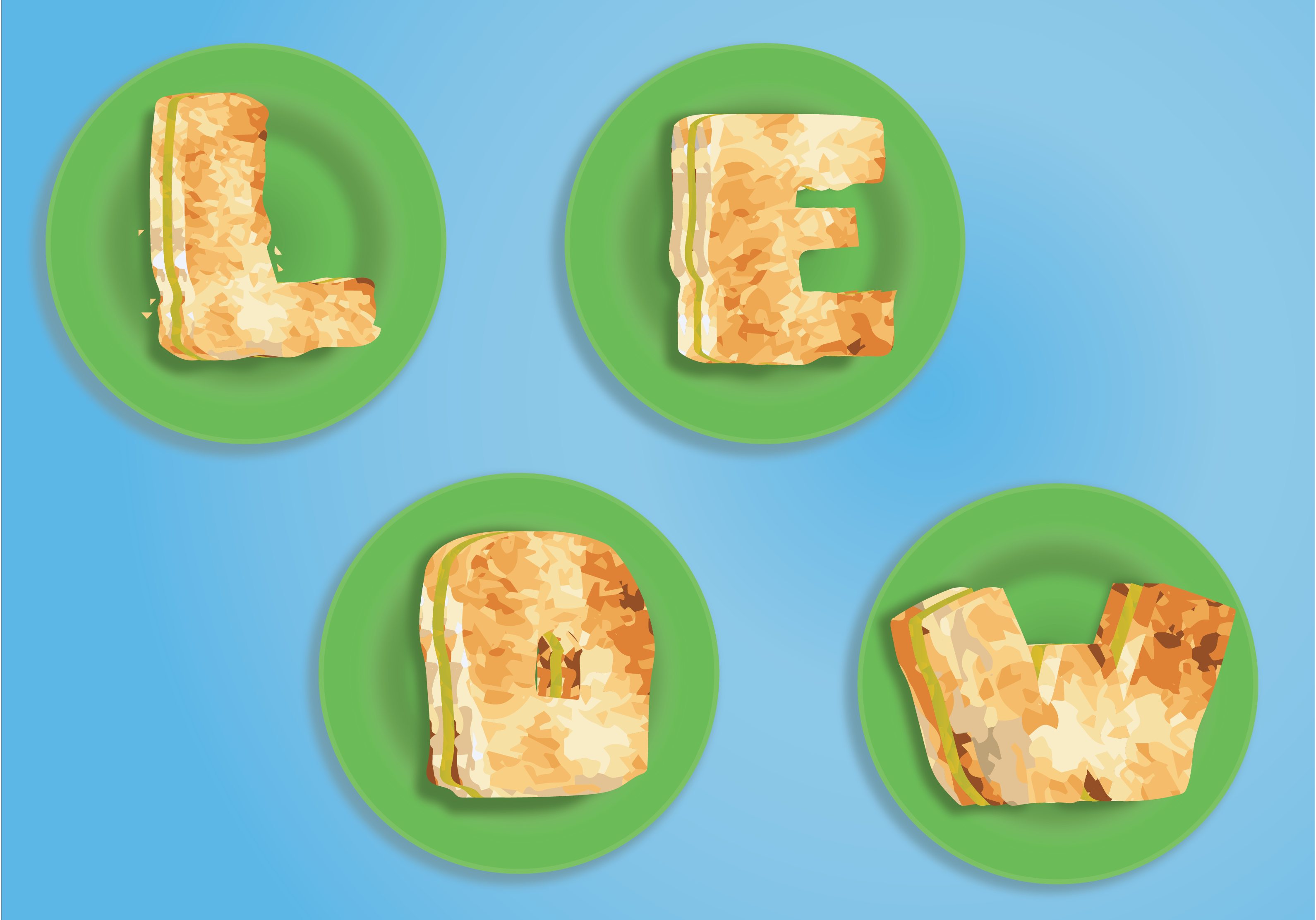
I took the texture from a photo of kaya toast and did an image trace, which I then edit some of the colours individually to fit the shape of words. The green plates, the dull green kaya, and the blue table are coloured according to image references.

I used my surname for this composition as I imagine a kopitiam uncle would always be called by that. “AH LEOW AH, LIANG BEI KOPI!” then I’ll be like “OK”
Semiotics: Toast, condiments, kaya
Colour Palette: RGB, but I used blue as the background as with blue tables in kopitiam. The kaya is interesting as, if the colour is off by a bit, it will look like lettuce.
Textures: Kaya toast, kaya, plastic plates.
Composition: I made it look like an instagram shot taken from above so that it will bring the context of it being food.
Final works
Take aways and Lessons
I thought I had good Illustrator knowledge until I came across this project. The usage of Illustrator to create graphics design and texture is so different from that of creating 2D renderings of object in product design.
I also learnt to appreciate the flexibility and fluidity of Photoshop, as Illustrator did have its limitations.
Also, I learnt through the hard way to stick to the brief instead of doing what I want. As I did not understand it initially, I had to back track a lot, wasting a lot of precious days (or even weeks).
There is chance to create better works, so it was unfortunate that this happened. Nonetheless, I am excited for the next project Zine, and hope I will do better there.