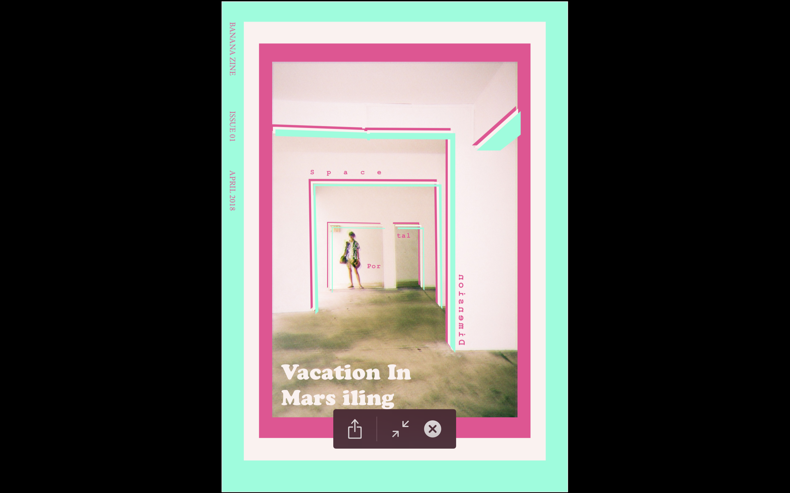
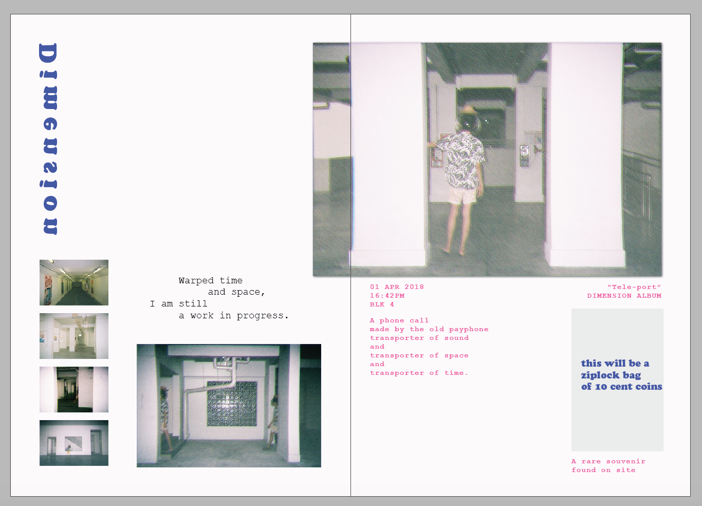
Programming Final – Strang

Our Research:

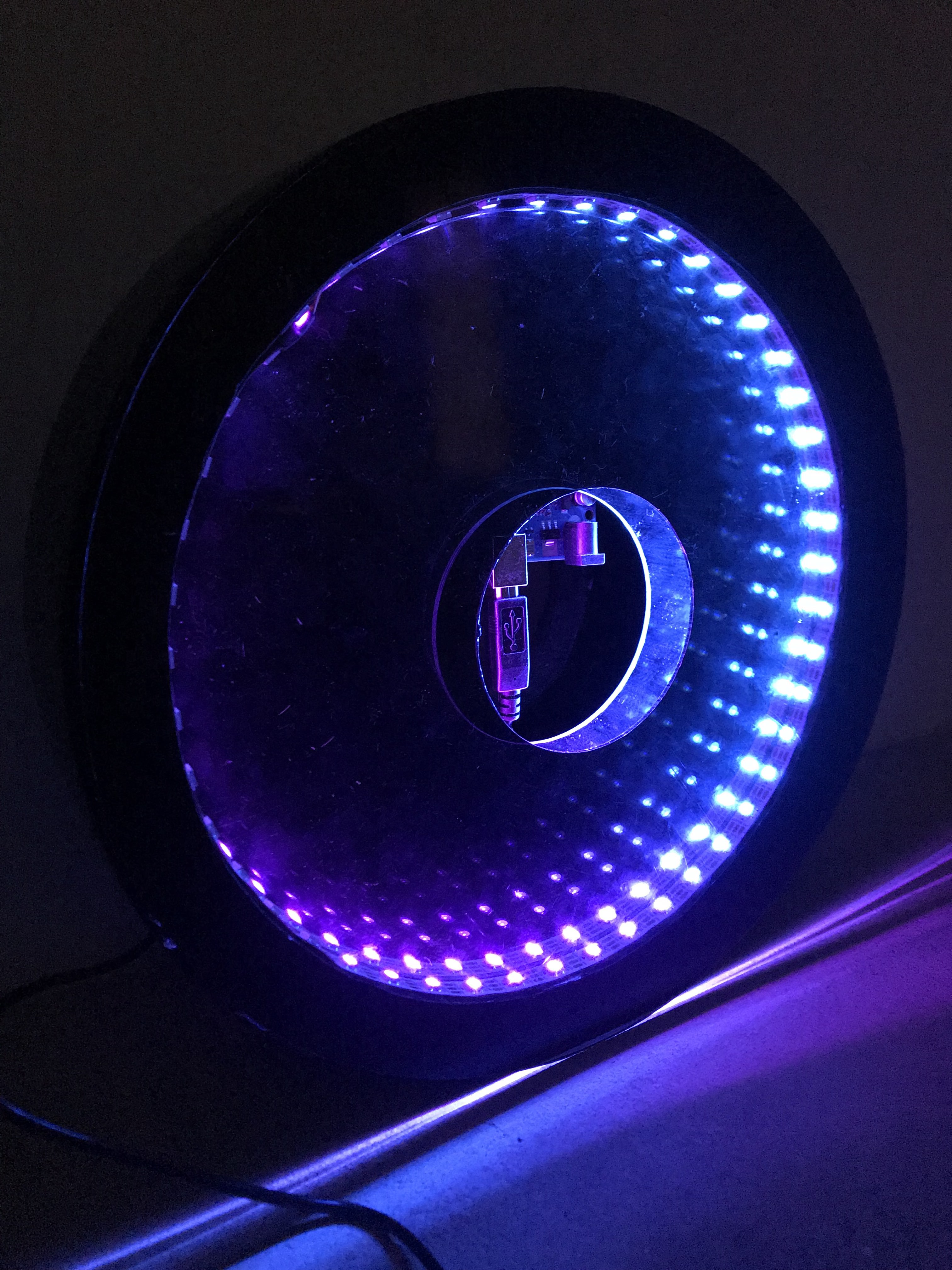
So we wanted to work on something like a clock. After Yue Ling and I looking at some online examples and ideas, we decided to settle on an infinity mirror with LED lights that changes as the user interacts with the clock.

As clock measures time, we wanted to play with the idea of a clock not measuring what it’s supposed to measure. So by changing the speed and colour of the clock through interaction, it will create an inaccurate idea of time, and as such, becomes an interesting observation of our relationship with interaction and time.

Our Proposal:

Our Project

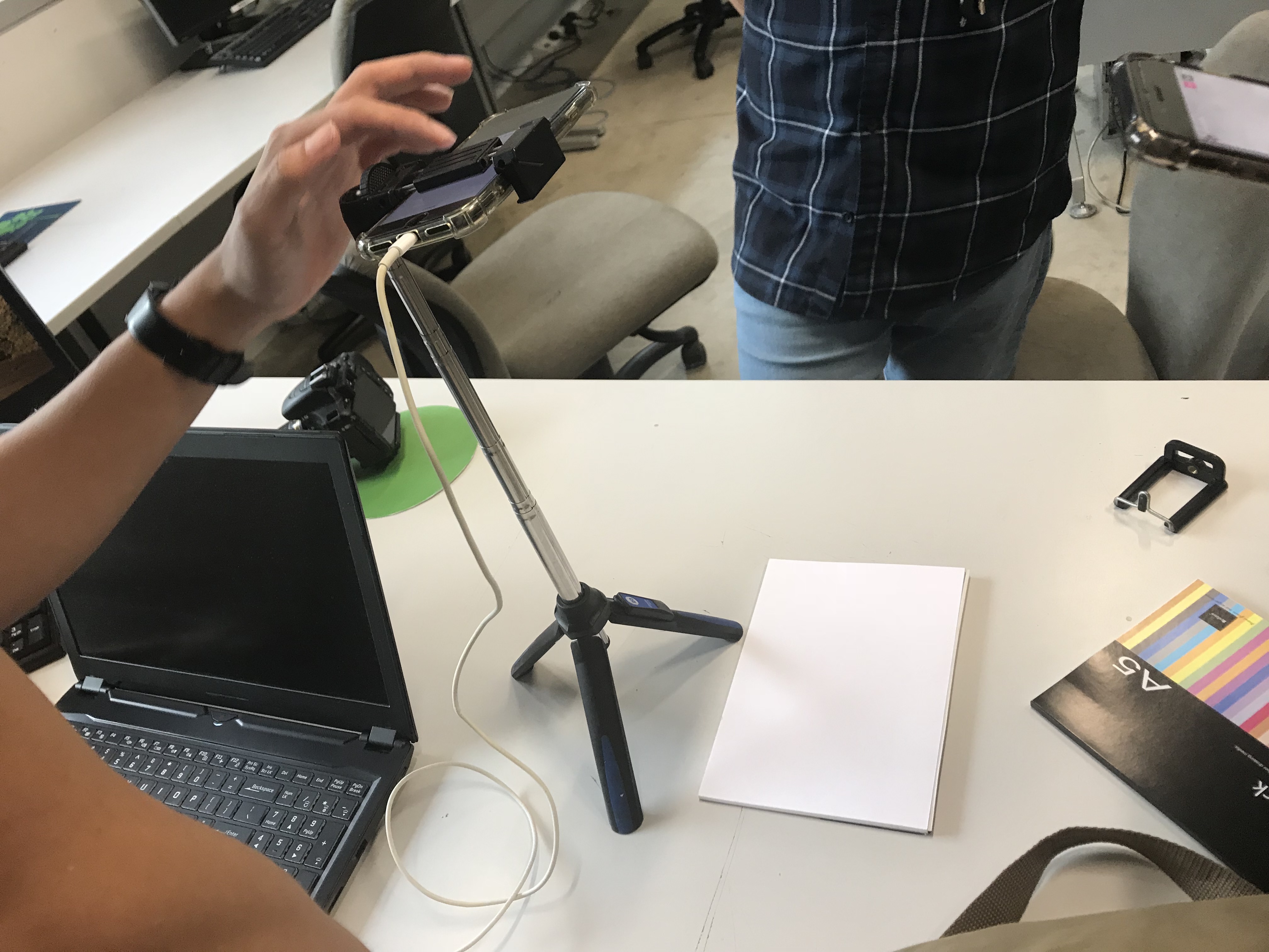
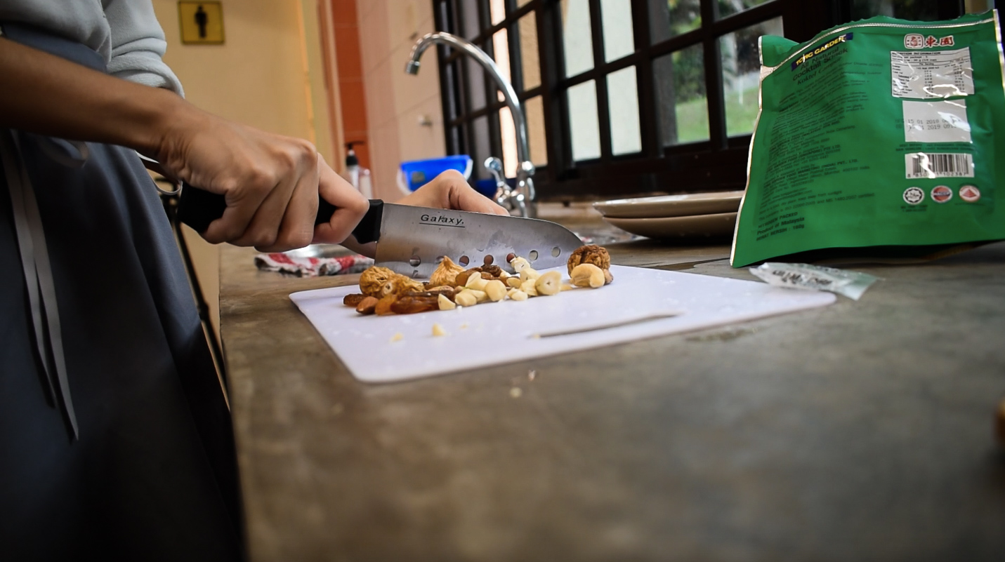
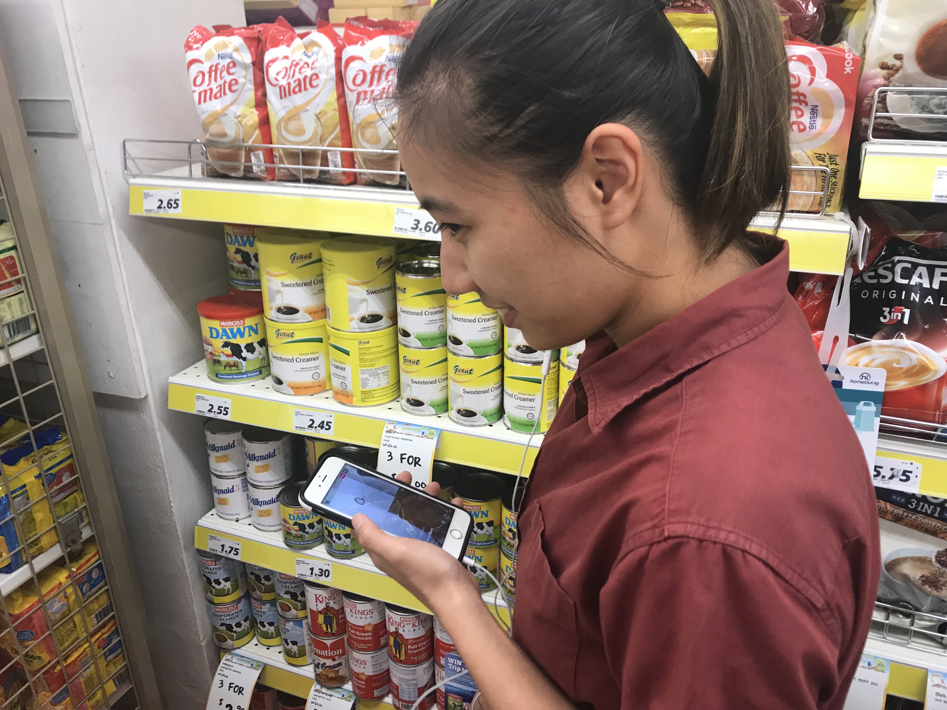
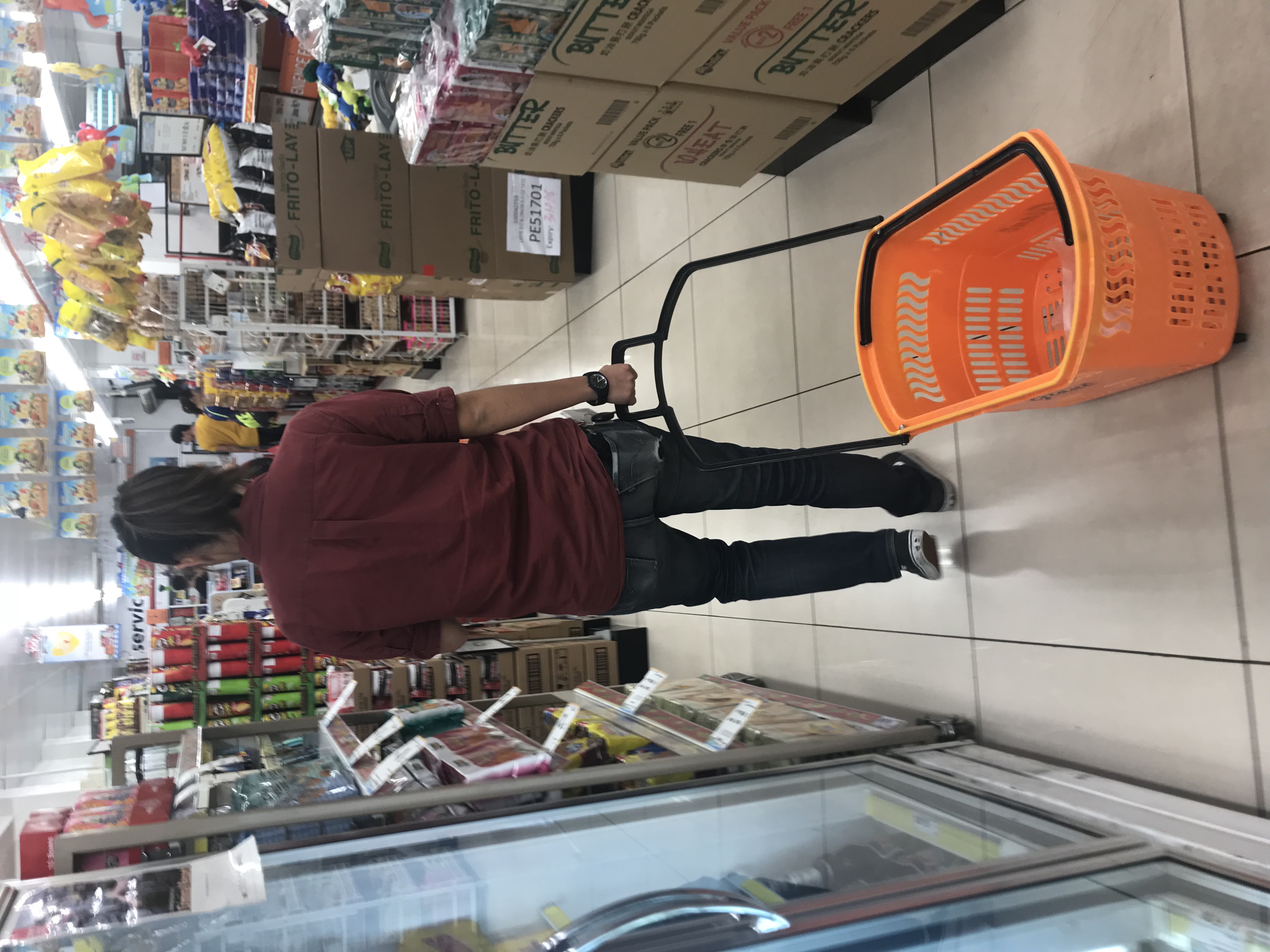
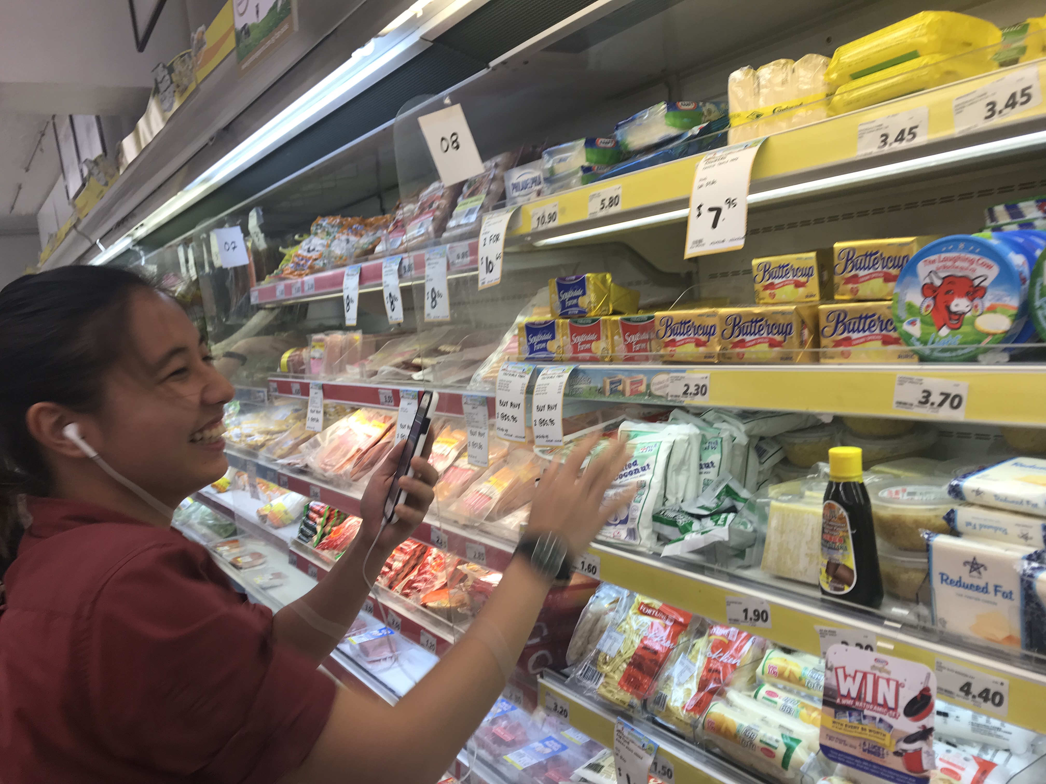
Yue Ling and I went to Sim Lim and Art Friend to purchase the items, and after getting some help from Charissa, Jia Yi, Nok Wan, Mark, and Vienna, we managed to get the items we need!
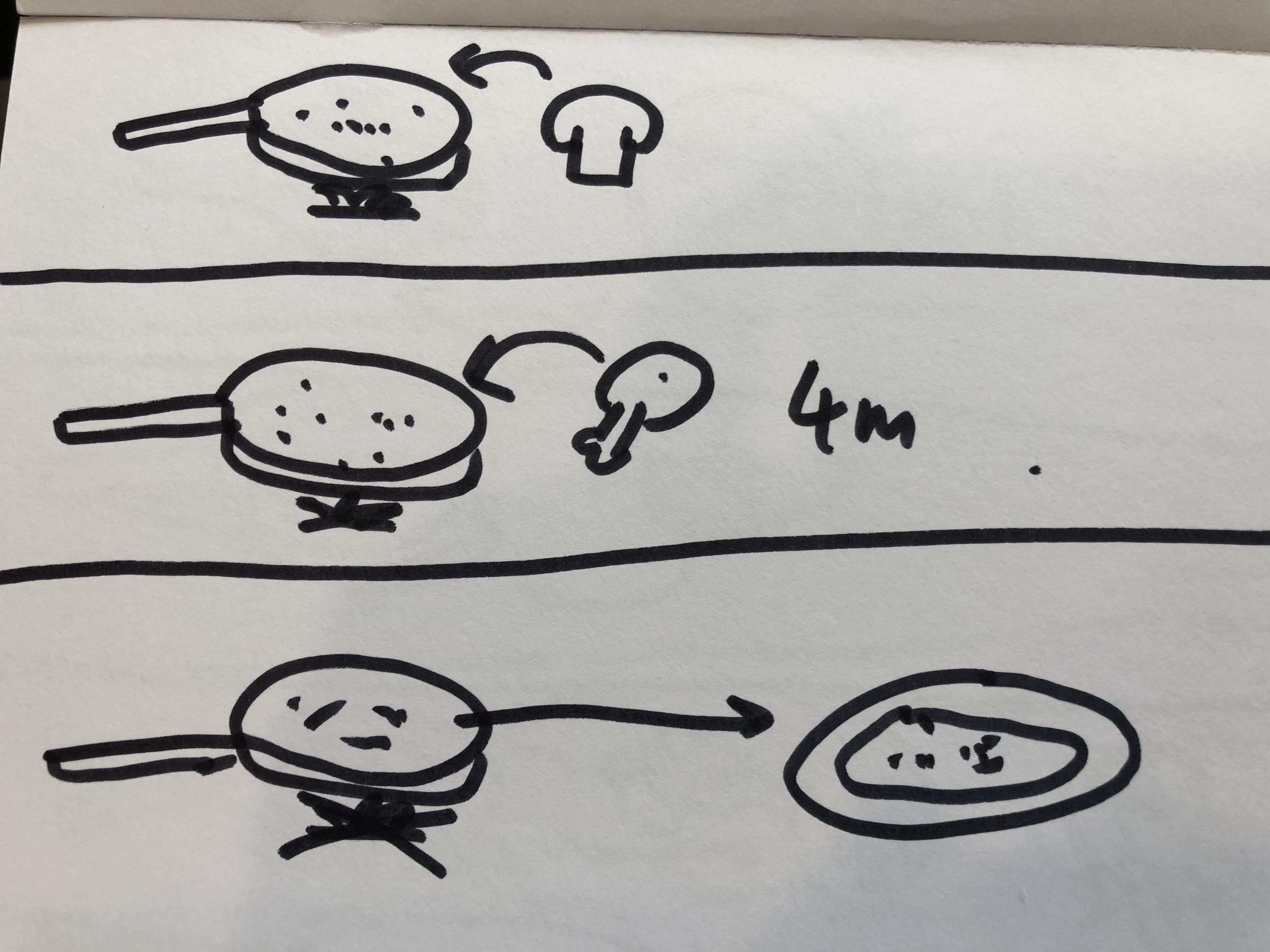
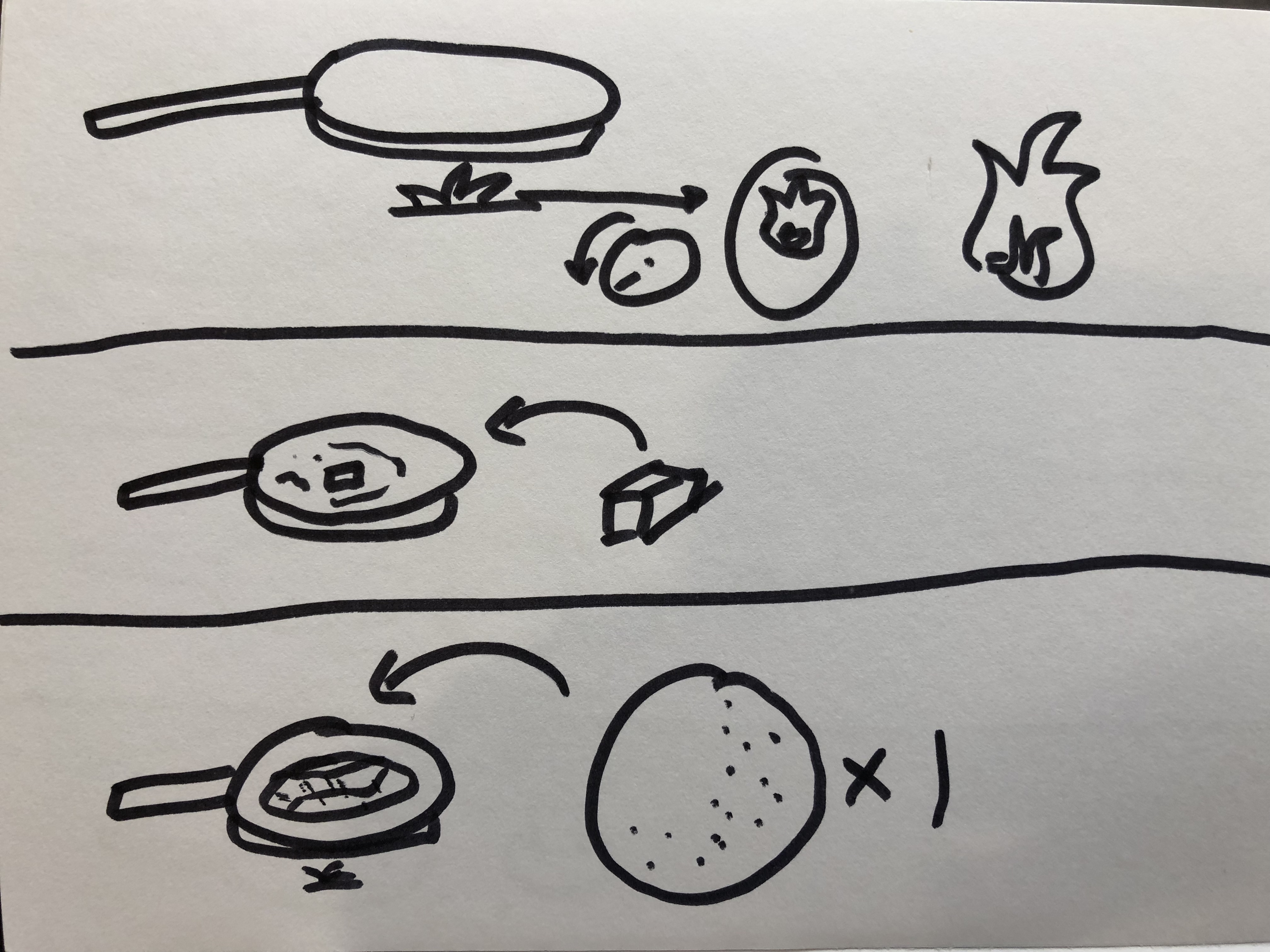
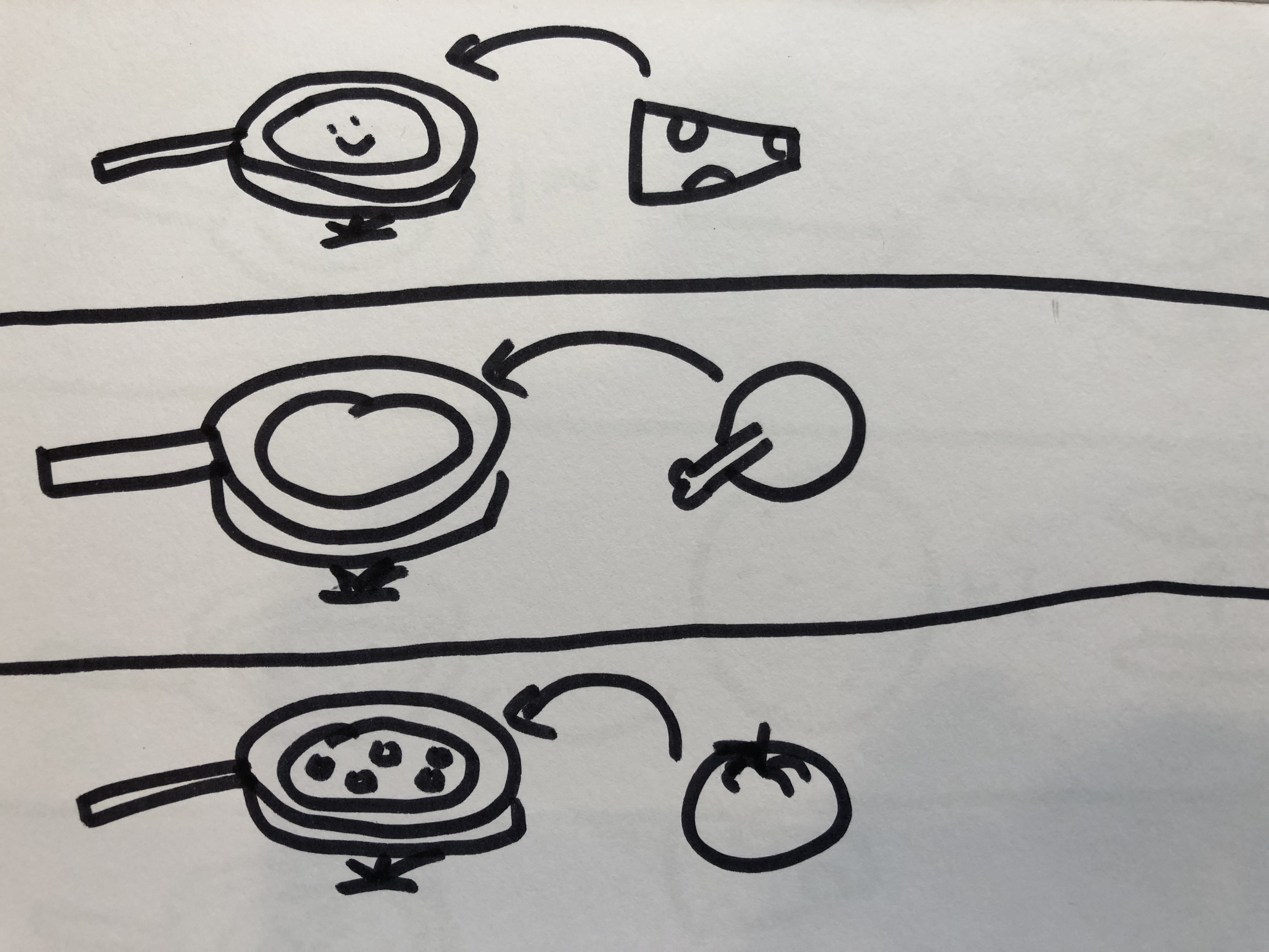
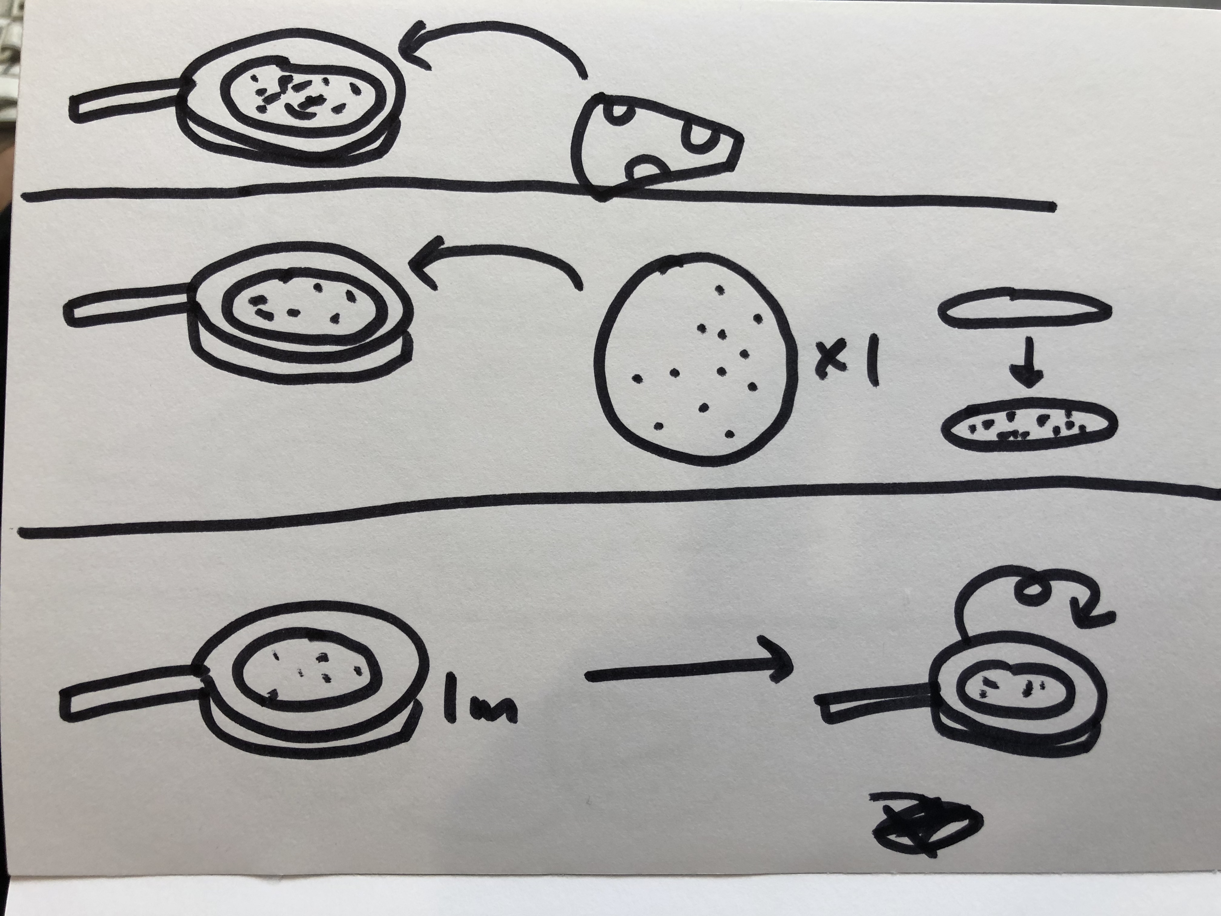
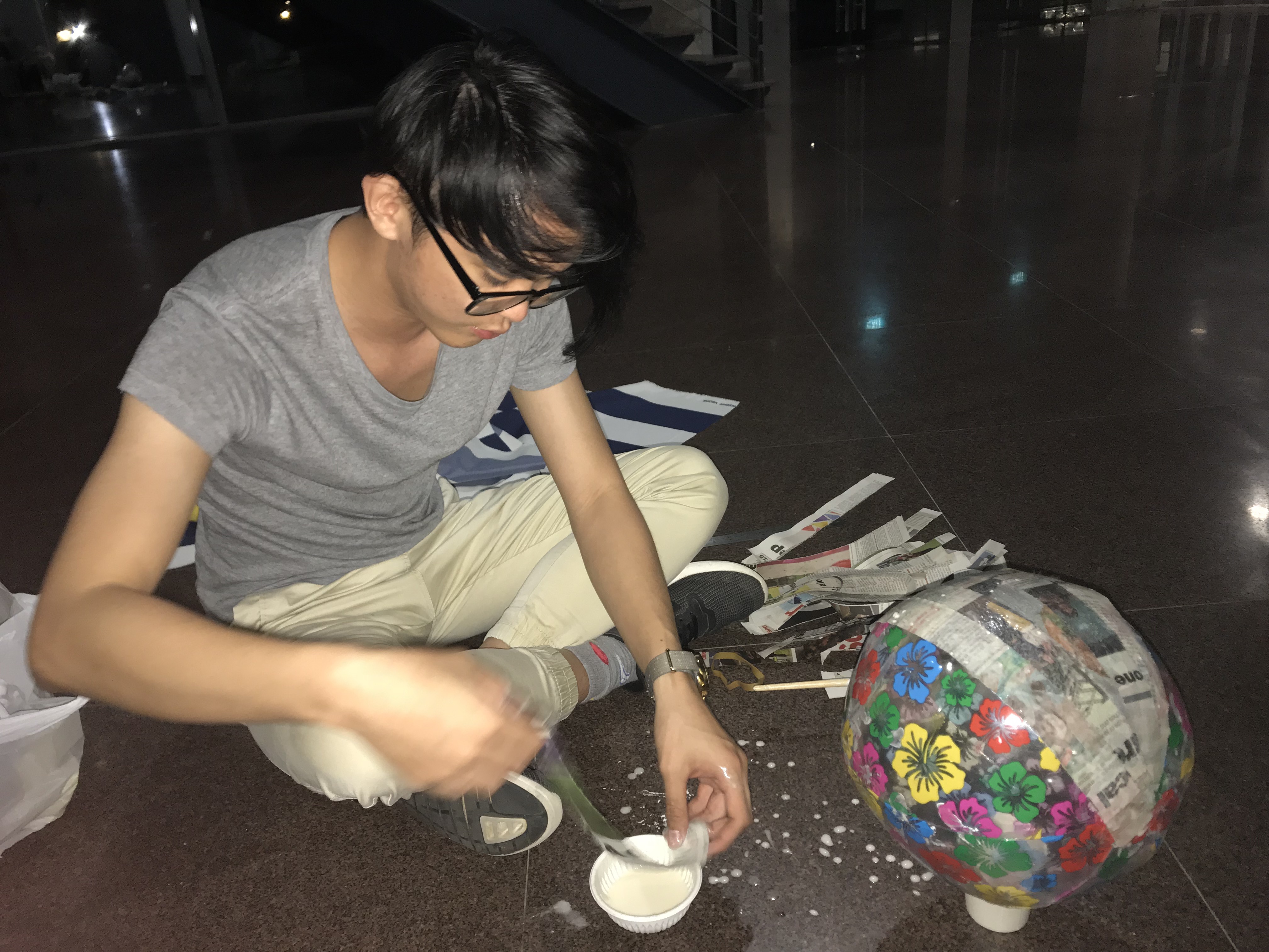
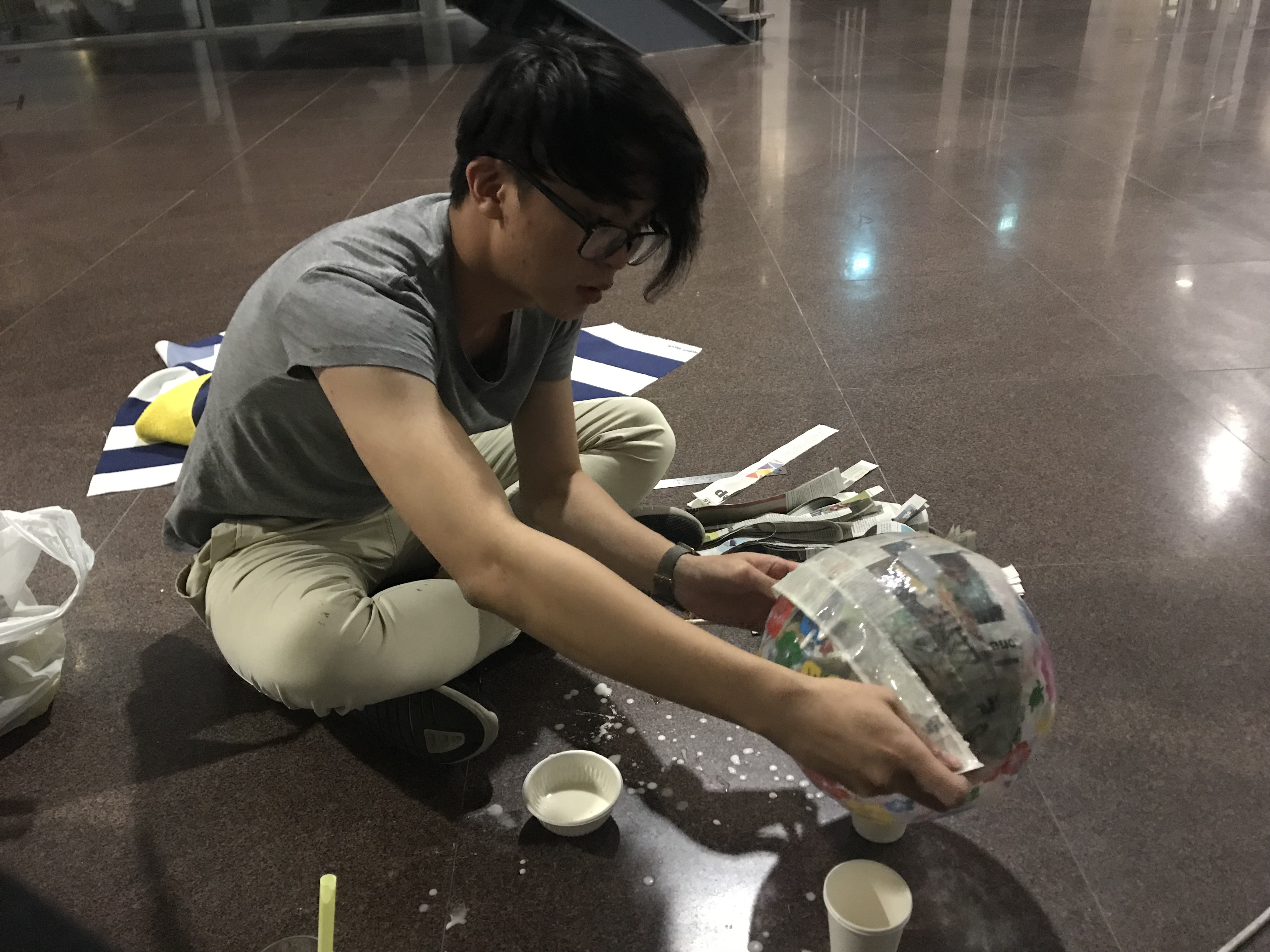
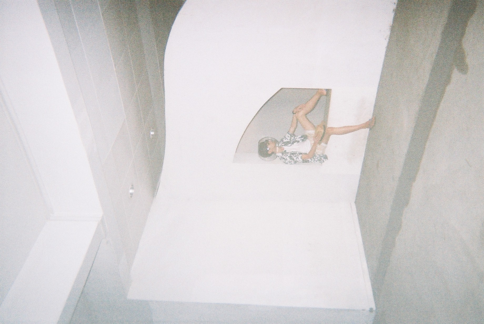
Assembly

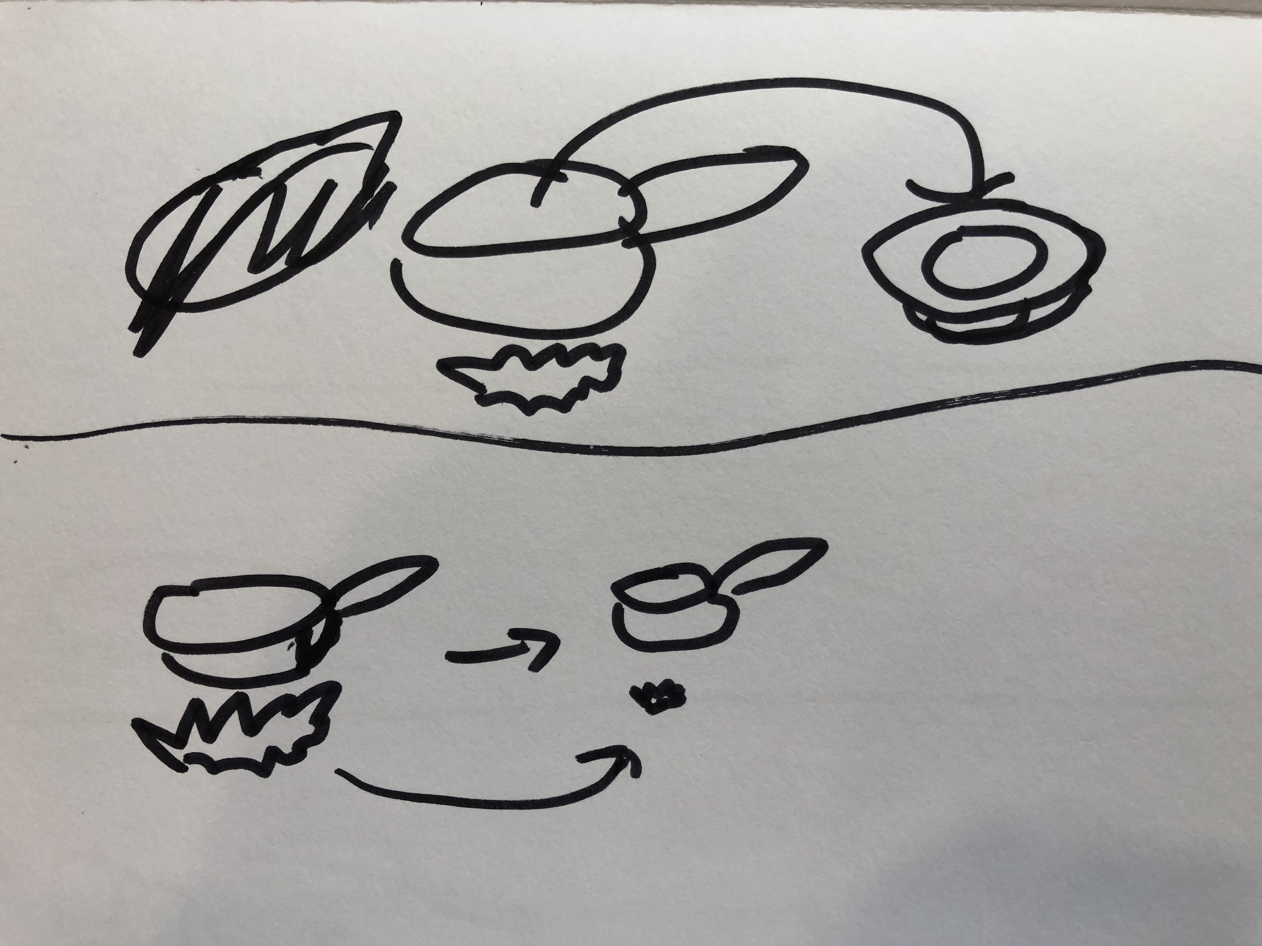
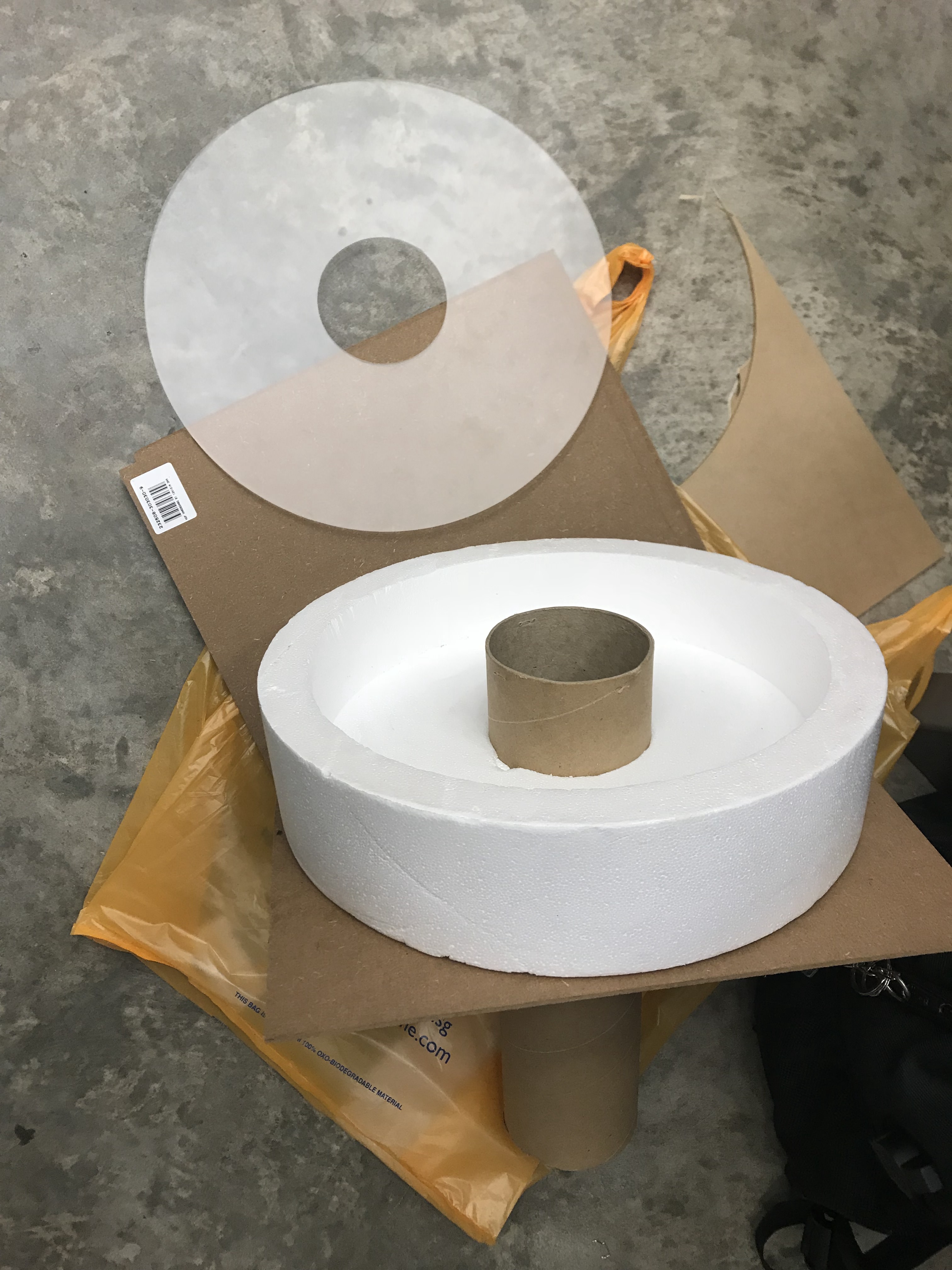
Fixing up the main structure of the clock

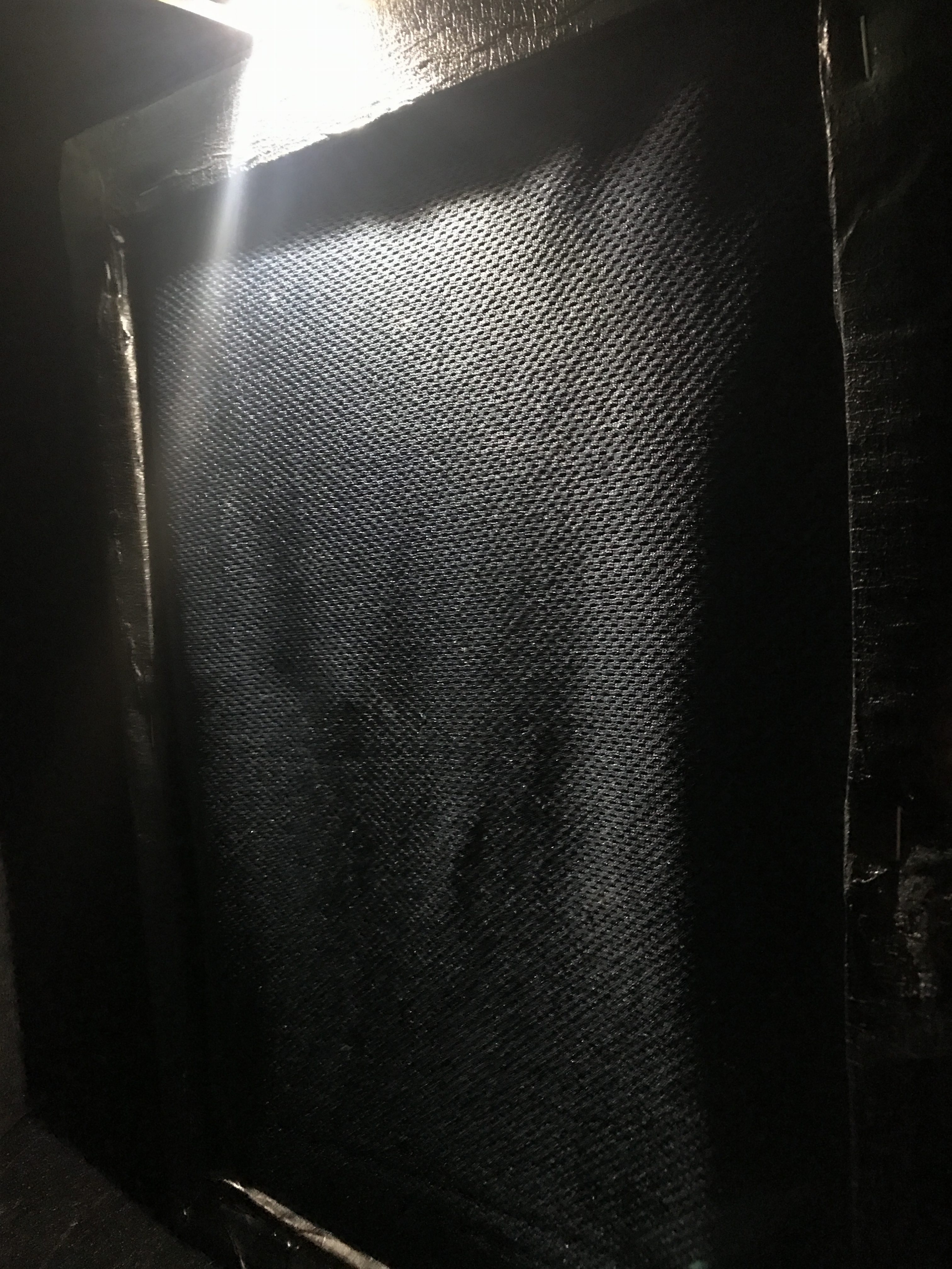
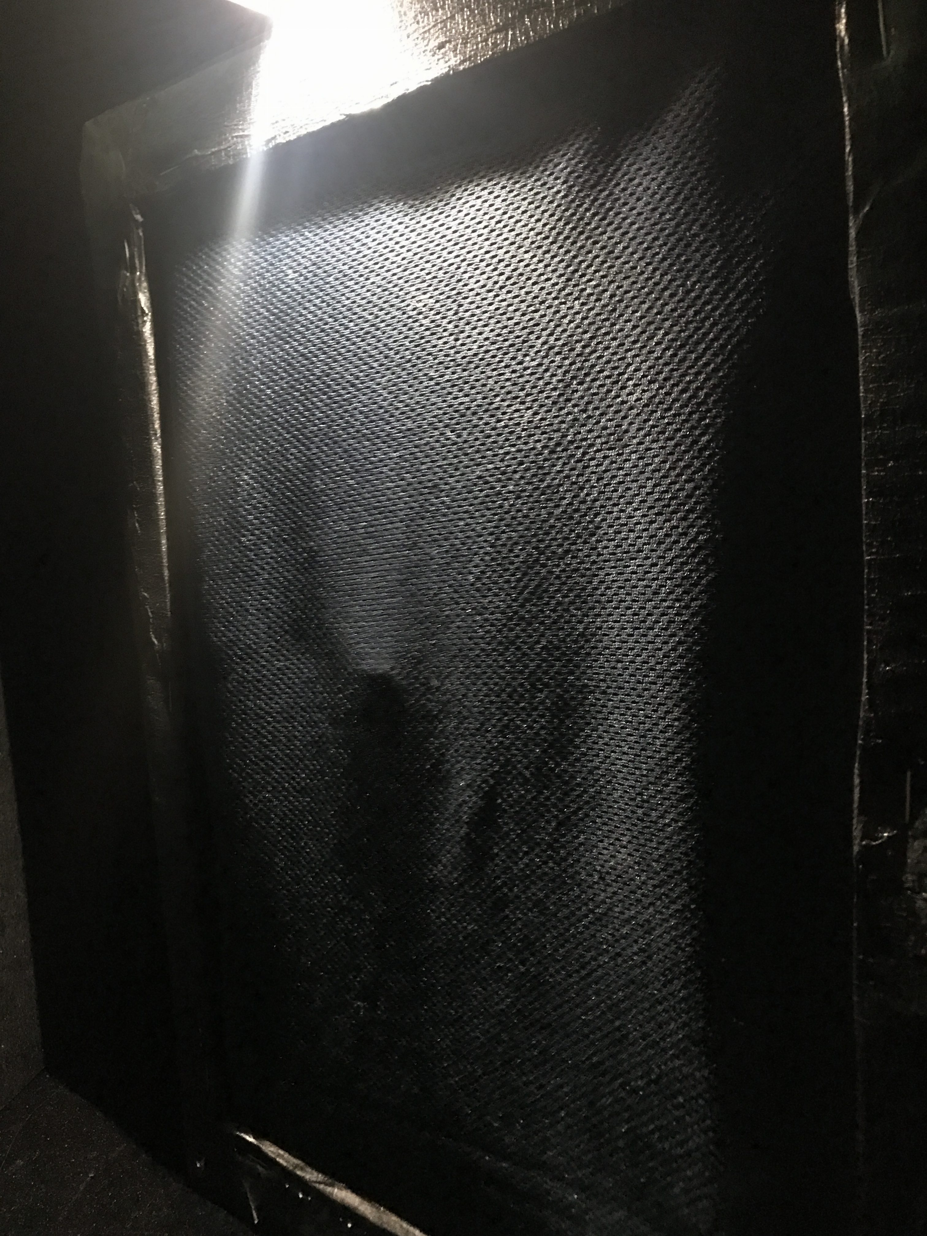
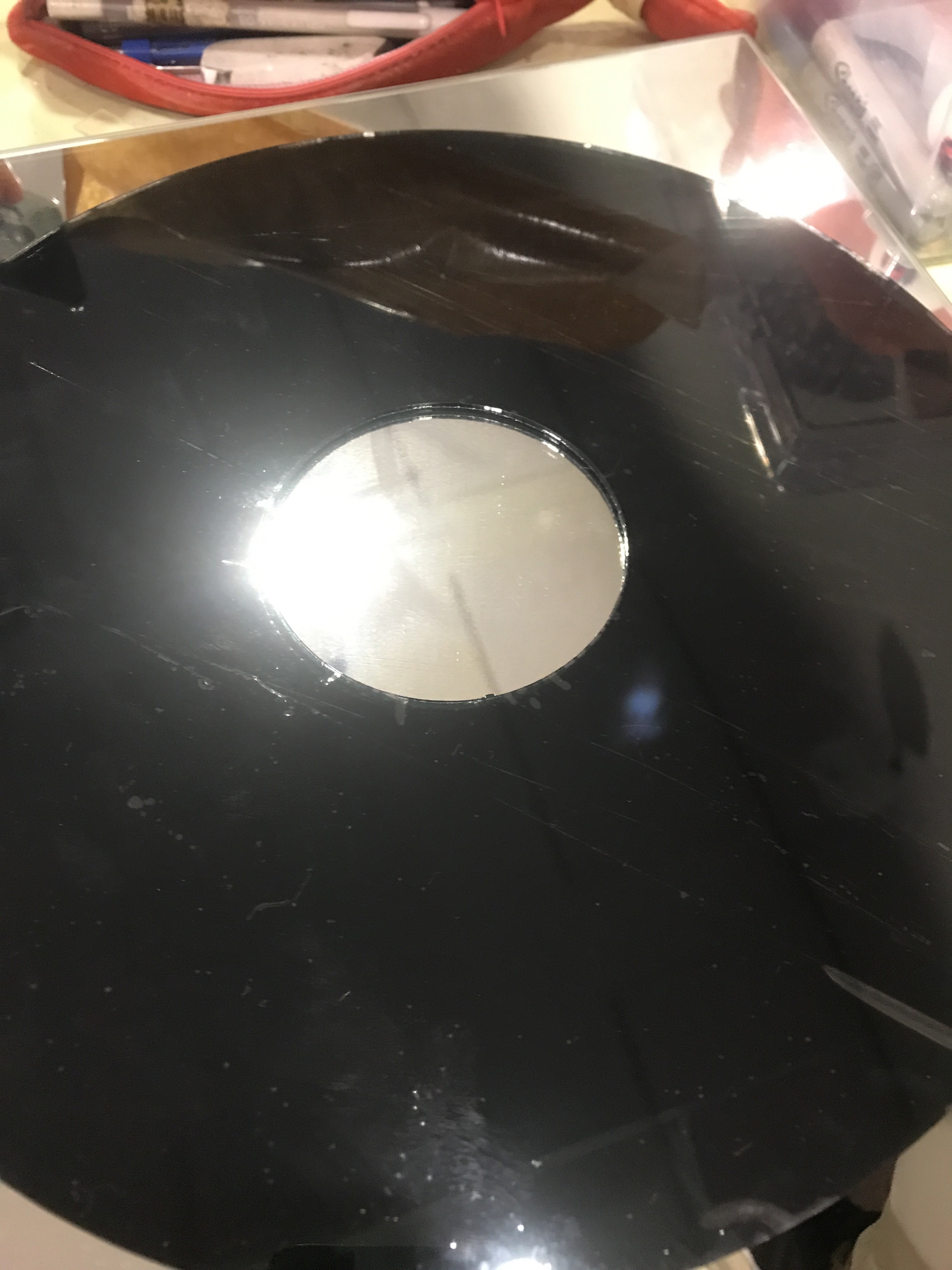
Applying of black one-way mirror film

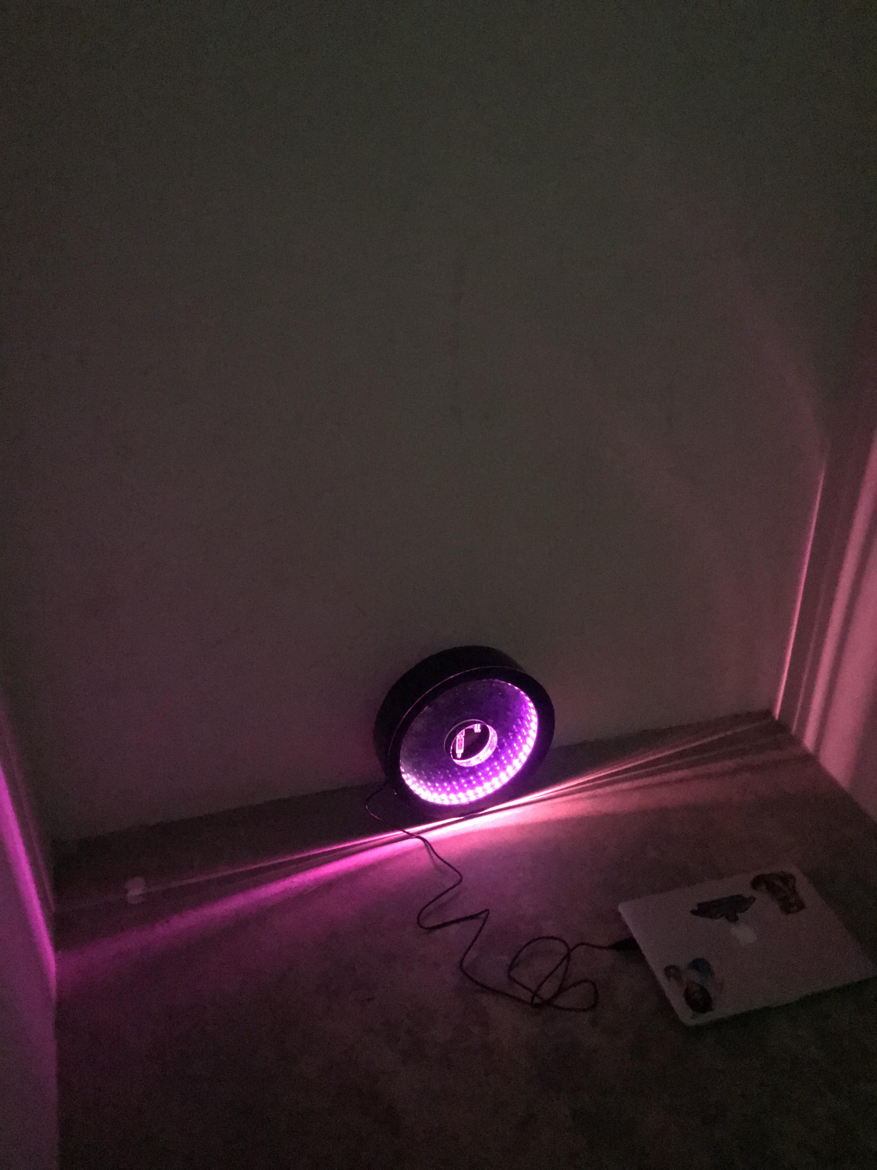
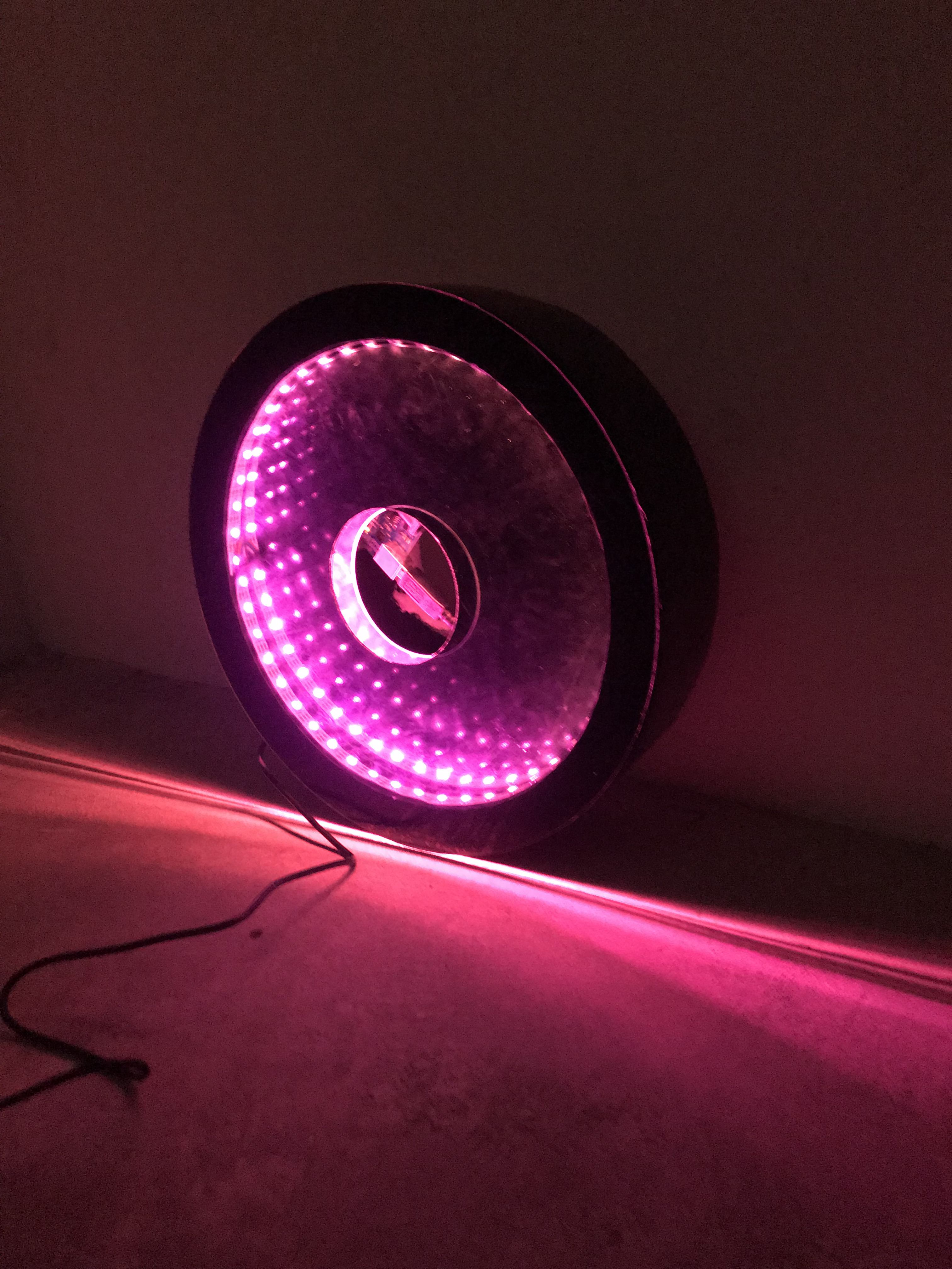
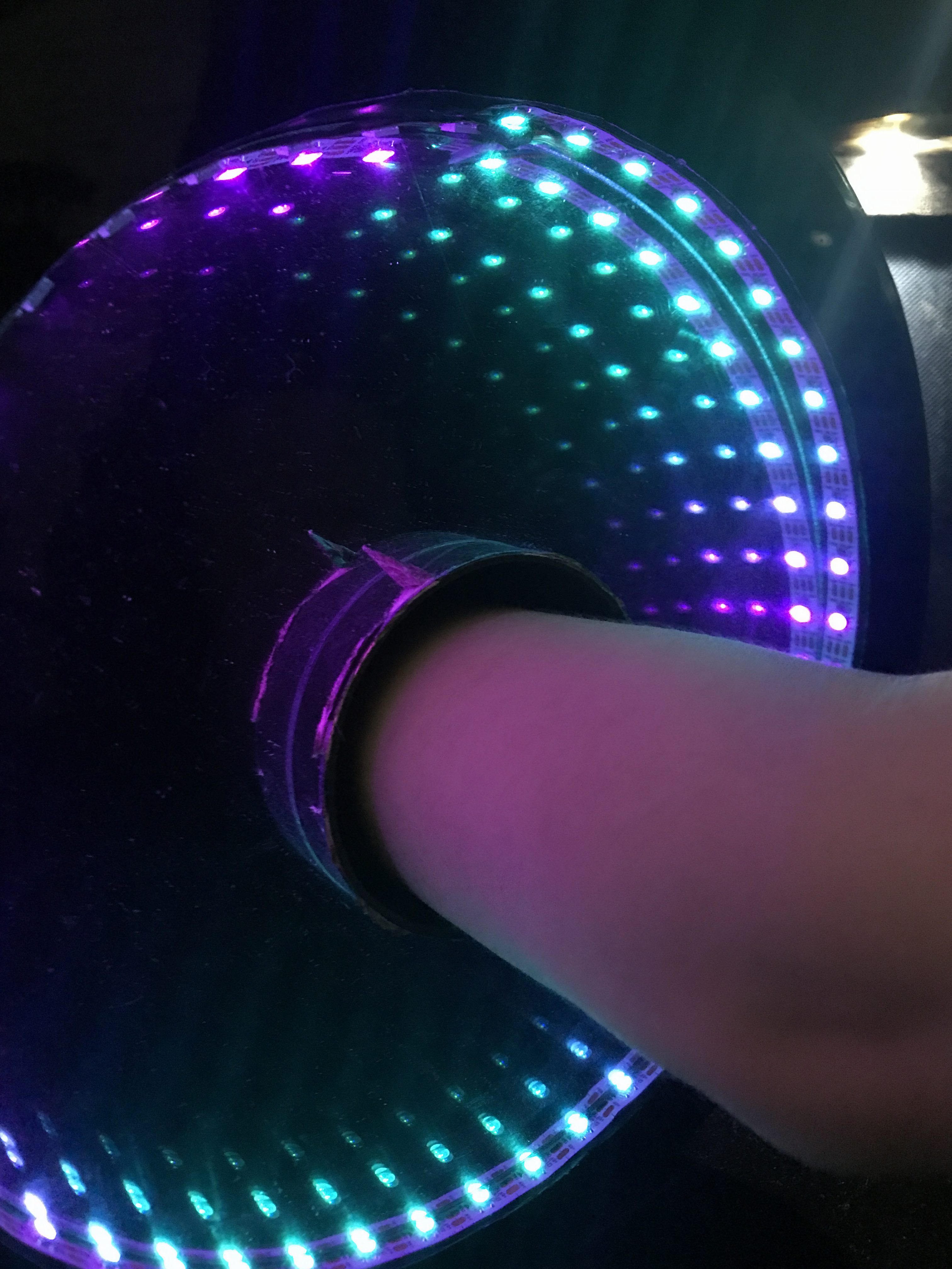
After assembly, we put in the LED

The Prototype Code:

Yue Ling found an example online:

Guide for WS2812B Addressable RGB LED Strip with Arduino

With this example, we were able to use a timer to change the LED states, and as we are unable to find an elegant way of coding the colours to change smoothly, we have to create different set of colours and code different timings to different set of colours:

#include <FastLED.h>

#define LED_PIN 13
#define NUM_LEDS 51
#define BRIGHTNESS 200
#define LED_TYPE WS2811
#define COLOR_ORDER GRB
CRGB leds[NUM_LEDS];

#define UPDATES_PER_SECOND 100

CRGBPalette16 currentPalette;
TBlendType currentBlending;

extern CRGBPalette16 myRedWhiteBluePalette;
extern const TProgmemPalette16 myRedW4hiteBluePalette_p PROGMEM;

int x = 1000;
int xspeed = 100;
int p1, p2, p3;
int o1, o2, o3;

void setup() {
delay( 3000 ); // power-up safety delay
FastLED.addLeds<LED_TYPE, LED_PIN, COLOR_ORDER>(leds, NUM_LEDS).setCorrection( TypicalLEDStrip );
FastLED.setBrightness( BRIGHTNESS );

// currentPalette = RainbowColors_p;
currentBlending = LINEARBLEND;
}

void loop()
{

ChangePalettePeriodically();

static uint8_t startIndex = 0;
startIndex = startIndex + 1;

FillLEDsFromPaletteColors( startIndex);

FastLED.show();
FastLED.delay(x / UPDATES_PER_SECOND);
}

void FillLEDsFromPaletteColors( uint8_t colorIndex)
{
uint8_t brightness = 255;

for ( int i = 0; i < NUM_LEDS; i++) {
leds[i] = ColorFromPalette( currentPalette, colorIndex, brightness, currentBlending);
colorIndex += 3;
}
}

void ChangePalettePeriodically()
{
uint8_t secondHand = (millis() / 1000) % 21;
static uint8_t lastSecond = 99;

if ( lastSecond != secondHand) {
lastSecond = secondHand;
if ( secondHand == 0) {
SetupPurpleAndGreenPalette();
currentBlending = LINEARBLEND;
}
if ( secondHand == 1) {
SetupPurpleAndGreenPalette();
currentBlending = LINEARBLEND;
}
if ( secondHand == 2) {
SetupPurpleAndGreenPalette2();
currentBlending = LINEARBLEND;
}
if ( secondHand == 3) {
SetupPurpleAndGreenPalette3();
currentBlending = LINEARBLEND;
}
if ( secondHand == 4) {
SetupPurpleAndGreenPalette4();
currentBlending = LINEARBLEND;
}
if ( secondHand == 5) {
SetupPurpleAndGreenPalette5();
currentBlending = LINEARBLEND;
}
if ( secondHand == 6) {
SetupPurpleAndGreenPalette6();
currentBlending = LINEARBLEND;
}
if ( secondHand == 7) {
SetupPurpleAndGreenPalette7();
currentBlending = LINEARBLEND;
}
if ( secondHand == 8) {
SetupPurpleAndGreenPalette8();
currentBlending = LINEARBLEND;
}
if ( secondHand == 9) {
SetupPurpleAndGreenPalette9();
currentBlending = LINEARBLEND;
}
if ( secondHand == 10) {
SetupPurpleAndGreenPalette10();
currentBlending = LINEARBLEND;
}
if ( secondHand == 11) {
SetupPurpleAndGreenPalette11();
currentBlending = LINEARBLEND;
}
if ( secondHand == 12) {
SetupPurpleAndGreenPalette10();
currentBlending = LINEARBLEND;
}
if ( secondHand == 13) {
SetupPurpleAndGreenPalette9();
currentBlending = LINEARBLEND;
}
if ( secondHand == 14) {
SetupPurpleAndGreenPalette8();
currentBlending = LINEARBLEND;
}
if ( secondHand == 15) {
SetupPurpleAndGreenPalette7();
currentBlending = LINEARBLEND;
}
if ( secondHand == 16) {
SetupPurpleAndGreenPalette6();
currentBlending = LINEARBLEND;
}
if ( secondHand == 17) {
SetupPurpleAndGreenPalette5();
currentBlending = LINEARBLEND;
}
if ( secondHand == 18) {
SetupPurpleAndGreenPalette4();
currentBlending = LINEARBLEND;
}
if ( secondHand == 19) {
SetupPurpleAndGreenPalette3();
currentBlending = LINEARBLEND;
}
if ( secondHand == 20) {
SetupPurpleAndGreenPalette2();
currentBlending = LINEARBLEND;
}
if ( secondHand == 21) {
SetupPurpleAndGreenPalette();
currentBlending = LINEARBLEND;
}
}
}

void SetupPurpleAndGreenPalette()
{
CRGB pink = CRGB( 250, 0, 100);
CRGB pink2 = CRGB( 225, 0, 100);
CRGB pink3 = CRGB( 200, 0, 100);
CRGB pink4 = CRGB( 175, 0, 100);
CRGB purple1 = CRGB( 150, 0, 100);
CRGB purple2 = CRGB( 125, 0, 100);
CRGB purple3 = CRGB( 75, 0, 100);
CRGB purple4 = CRGB( 75, 0, 125);
CRGB purple5 = CRGB( 75, 0, 150);
CRGB purple6 = CRGB( 75, 25, 150);
CRGB purple7 = CRGB( 75, 50, 150);
CRGB orange = CRGB( 250, 100, 50);
CRGB orange2 = CRGB(200, 100, 50);
CRGB orange3 = CRGB(150, 100, 50);
CRGB orange4 = CRGB(100, 100, 50);
CRGB orange5 = CRGB(50, 100, 50);
CRGB orange6 = CRGB(0, 100, 50);
CRGB orange7 = CRGB(0, 100, 100);
CRGB orange8 = CRGB(0, 100, 150);
CRGB orange9 = CRGB(0, 100, 175);
CRGB orange10 = CRGB(0, 100, 200);
CRGB orange11 = CRGB(0, 100, 250);
CRGB yellow = CRGB(255, 255, 0);
CRGB green = CRGB(100, 255, 0);
CRGB turquoise = CRGB(0, 255, 100);
CRGB grue = CRGB( 0, 100, 255);
CRGB purple = CRGB( 255, 100, 255);
CRGB black = CRGB::Black;
currentPalette = CRGBPalette16(
pink, pink, orange, orange,
orange, orange, pink, pink,
pink, pink, orange, orange,
orange, orange, pink, pink );
}

void SetupPurpleAndGreenPalette2()
{

CRGB pink = CRGB( 250, 0, 100);
CRGB pink2 = CRGB( 225, 0, 100);
CRGB pink3 = CRGB( 200, 0, 100);
CRGB pink4 = CRGB( 175, 0, 100);
CRGB purple1 = CRGB( 150, 0, 100);
CRGB purple2 = CRGB( 125, 0, 100);
CRGB purple3 = CRGB( 75, 0, 100);
CRGB purple4 = CRGB( 75, 0, 125);
CRGB purple5 = CRGB( 75, 0, 150);
CRGB purple6 = CRGB( 75, 25, 150);
CRGB purple7 = CRGB( 75, 50, 150);
CRGB orange = CRGB( 250, 100, 50);
CRGB orange2 = CRGB(200, 100, 50);
CRGB orange3 = CRGB(150, 100, 50);
CRGB orange4 = CRGB(100, 100, 50);
CRGB orange5 = CRGB(50, 100, 50);
CRGB orange6 = CRGB(0, 100, 50);
CRGB orange7 = CRGB(0, 100, 100);
CRGB orange8 = CRGB(0, 100, 150);
CRGB orange9 = CRGB(0, 100, 175);
CRGB orange10 = CRGB(0, 100, 200);
CRGB orange11 = CRGB(0, 100, 250);
CRGB yellow = CRGB(255, 255, 0);
CRGB green = CRGB(100, 255, 0);
CRGB turquoise = CRGB(0, 255, 100);
CRGB grue = CRGB( 0, 100, 255);
CRGB purple = CRGB( 255, 100, 255);
CRGB black = CRGB::Black;
currentPalette = CRGBPalette16(
pink2, pink2, orange2, orange2,
orange2, orange2, pink2, pink2,
pink2, pink2, orange2, orange2,
orange2, orange2, pink2, pink2 );
}

void SetupPurpleAndGreenPalette3()
{
CRGB pink = CRGB( 250, 0, 100);
CRGB pink2 = CRGB( 225, 0, 100);
CRGB pink3 = CRGB( 200, 0, 100);
CRGB pink4 = CRGB( 175, 0, 100);
CRGB purple1 = CRGB( 150, 0, 100);
CRGB purple2 = CRGB( 125, 0, 100);
CRGB purple3 = CRGB( 75, 0, 100);
CRGB purple4 = CRGB( 75, 0, 125);
CRGB purple5 = CRGB( 75, 0, 150);
CRGB purple6 = CRGB( 75, 25, 150);
CRGB purple7 = CRGB( 75, 50, 150);
CRGB orange = CRGB( 250, 100, 50);
CRGB orange2 = CRGB(200, 100, 50);
CRGB orange3 = CRGB(150, 100, 50);
CRGB orange4 = CRGB(100, 100, 50);
CRGB orange5 = CRGB(50, 100, 50);
CRGB orange6 = CRGB(0, 100, 50);
CRGB orange7 = CRGB(0, 100, 100);
CRGB orange8 = CRGB(0, 100, 150);
CRGB orange9 = CRGB(0, 100, 175);
CRGB orange10 = CRGB(0, 100, 200);
CRGB orange11 = CRGB(0, 100, 250);
CRGB yellow = CRGB(255, 255, 0);
CRGB green = CRGB(100, 255, 0);
CRGB turquoise = CRGB(0, 255, 100);
CRGB grue = CRGB( 0, 100, 255);
CRGB purple = CRGB( 255, 100, 255);
CRGB black = CRGB::Black;
currentPalette = CRGBPalette16(
pink3, pink3, orange3, orange3,
orange3, orange3, pink3, pink3,
pink3, pink3, orange3, orange3,
orange3, orange3, pink3, pink3 );
}
void SetupPurpleAndGreenPalette4()
{
CRGB pink = CRGB( 250, 0, 100);
CRGB pink2 = CRGB( 225, 0, 100);
CRGB pink3 = CRGB( 200, 0, 100);
CRGB pink4 = CRGB( 175, 0, 100);
CRGB purple1 = CRGB( 150, 0, 100);
CRGB purple2 = CRGB( 125, 0, 100);
CRGB purple3 = CRGB( 75, 0, 100);
CRGB purple4 = CRGB( 75, 0, 125);
CRGB purple5 = CRGB( 75, 0, 150);
CRGB purple6 = CRGB( 75, 25, 150);
CRGB purple7 = CRGB( 75, 50, 150);
CRGB orange = CRGB( 250, 100, 50);
CRGB orange2 = CRGB(200, 100, 50);
CRGB orange3 = CRGB(150, 100, 50);
CRGB orange4 = CRGB(100, 100, 50);
CRGB orange5 = CRGB(50, 100, 50);
CRGB orange6 = CRGB(0, 100, 50);
CRGB orange7 = CRGB(0, 100, 100);
CRGB orange8 = CRGB(0, 100, 150);
CRGB orange9 = CRGB(0, 100, 175);
CRGB orange10 = CRGB(0, 100, 200);
CRGB orange11 = CRGB(0, 100, 250);
CRGB yellow = CRGB(255, 255, 0);
CRGB green = CRGB(100, 255, 0);
CRGB turquoise = CRGB(0, 255, 100);
CRGB grue = CRGB( 0, 100, 255);
CRGB purple = CRGB( 255, 100, 255);
CRGB black = CRGB::Black;
currentPalette = CRGBPalette16(
pink4, pink4, orange4, orange4,
orange4, orange4, pink4, pink4,
pink4, pink4, orange4, orange4,
orange4, orange4, pink4, pink4 );
}

void SetupPurpleAndGreenPalette5()
{
CRGB pink = CRGB( 250, 0, 100);
CRGB pink2 = CRGB( 225, 0, 100);
CRGB pink3 = CRGB( 200, 0, 100);
CRGB pink4 = CRGB( 175, 0, 100);
CRGB purple1 = CRGB( 150, 0, 100);
CRGB purple2 = CRGB( 125, 0, 100);
CRGB purple3 = CRGB( 75, 0, 100);
CRGB purple4 = CRGB( 75, 0, 125);
CRGB purple5 = CRGB( 75, 0, 150);
CRGB purple6 = CRGB( 75, 25, 150);
CRGB purple7 = CRGB( 75, 50, 150);
CRGB orange = CRGB( 250, 100, 50);
CRGB orange2 = CRGB(200, 100, 50);
CRGB orange3 = CRGB(150, 100, 50);
CRGB orange4 = CRGB(100, 100, 50);
CRGB orange5 = CRGB(50, 100, 50);
CRGB orange6 = CRGB(0, 100, 50);
CRGB orange7 = CRGB(0, 100, 100);
CRGB orange8 = CRGB(0, 100, 150);
CRGB orange9 = CRGB(0, 100, 175);
CRGB orange10 = CRGB(0, 100, 200);
CRGB orange11 = CRGB(0, 100, 250);
CRGB yellow = CRGB(255, 255, 0);
CRGB green = CRGB(100, 255, 0);
CRGB turquoise = CRGB(0, 255, 100);
CRGB grue = CRGB( 0, 100, 255);
CRGB purple = CRGB( 255, 100, 255);
CRGB black = CRGB::Black;
currentPalette = CRGBPalette16(
purple1, purple1, orange5, orange5,
orange5, orange5, purple1, purple1,
purple1, purple1, orange5, orange5,
orange5, orange5, purple1, purple1 );

}

void SetupPurpleAndGreenPalette6()
{
CRGB pink = CRGB( 250, 0, 100);
CRGB pink2 = CRGB( 225, 0, 100);
CRGB pink3 = CRGB( 200, 0, 100);
CRGB pink4 = CRGB( 175, 0, 100);
CRGB purple1 = CRGB( 150, 0, 100);
CRGB purple2 = CRGB( 125, 0, 100);
CRGB purple3 = CRGB( 75, 0, 100);
CRGB purple4 = CRGB( 75, 0, 125);
CRGB purple5 = CRGB( 75, 0, 150);
CRGB purple6 = CRGB( 75, 25, 150);
CRGB purple7 = CRGB( 75, 50, 150);
CRGB orange = CRGB( 250, 100, 50);
CRGB orange2 = CRGB(200, 100, 50);
CRGB orange3 = CRGB(150, 100, 50);
CRGB orange4 = CRGB(100, 100, 50);
CRGB orange5 = CRGB(50, 100, 50);
CRGB orange6 = CRGB(0, 100, 50);
CRGB orange7 = CRGB(0, 100, 100);
CRGB orange8 = CRGB(0, 100, 150);
CRGB orange9 = CRGB(0, 100, 175);
CRGB orange10 = CRGB(0, 100, 200);
CRGB orange11 = CRGB(0, 100, 250);
CRGB yellow = CRGB(255, 255, 0);
CRGB green = CRGB(100, 255, 0);
CRGB turquoise = CRGB(0, 255, 100);
CRGB grue = CRGB( 0, 100, 255);
CRGB purple = CRGB( 255, 100, 255);
CRGB black = CRGB::Black;
currentPalette = CRGBPalette16(
purple2, purple2, orange6, orange6,
orange6, orange6, purple2, purple2,
purple2, purple2, orange6, orange6,
orange6, orange6, purple2, purple2 );

}

void SetupPurpleAndGreenPalette7()
{
CRGB pink = CRGB( 250, 0, 100);
CRGB pink2 = CRGB( 225, 0, 100);
CRGB pink3 = CRGB( 200, 0, 100);
CRGB pink4 = CRGB( 175, 0, 100);
CRGB purple1 = CRGB( 150, 0, 100);
CRGB purple2 = CRGB( 125, 0, 100);
CRGB purple3 = CRGB( 75, 0, 100);
CRGB purple4 = CRGB( 75, 0, 125);
CRGB purple5 = CRGB( 75, 0, 150);
CRGB purple6 = CRGB( 75, 25, 150);
CRGB purple7 = CRGB( 75, 50, 150);
CRGB orange = CRGB( 250, 100, 50);
CRGB orange2 = CRGB(200, 100, 50);
CRGB orange3 = CRGB(150, 100, 50);
CRGB orange4 = CRGB(100, 100, 50);
CRGB orange5 = CRGB(50, 100, 50);
CRGB orange6 = CRGB(0, 100, 50);
CRGB orange7 = CRGB(0, 100, 100);
CRGB orange8 = CRGB(0, 100, 150);
CRGB orange9 = CRGB(0, 100, 175);
CRGB orange10 = CRGB(0, 100, 200);
CRGB orange11 = CRGB(0, 100, 250);
CRGB yellow = CRGB(255, 255, 0);
CRGB green = CRGB(100, 255, 0);
CRGB turquoise = CRGB(0, 255, 100);
CRGB grue = CRGB( 0, 100, 255);
CRGB purple = CRGB( 255, 100, 255);
CRGB black = CRGB::Black;
currentPalette = CRGBPalette16(
purple3, purple3, orange7, orange7,
orange7, orange7, purple3, purple3,
purple3, purple3, orange7, orange7,
orange7, orange7, purple3, purple3 );

}

void SetupPurpleAndGreenPalette8()
{
CRGB pink = CRGB( 250, 0, 100);
CRGB pink2 = CRGB( 225, 0, 100);
CRGB pink3 = CRGB( 200, 0, 100);
CRGB pink4 = CRGB( 175, 0, 100);
CRGB purple1 = CRGB( 150, 0, 100);
CRGB purple2 = CRGB( 125, 0, 100);
CRGB purple3 = CRGB( 75, 0, 100);
CRGB purple4 = CRGB( 75, 0, 125);
CRGB purple5 = CRGB( 75, 0, 150);
CRGB purple6 = CRGB( 75, 25, 150);
CRGB purple7 = CRGB( 75, 50, 150);
CRGB orange = CRGB( 250, 100, 50);
CRGB orange2 = CRGB(200, 100, 50);
CRGB orange3 = CRGB(150, 100, 50);
CRGB orange4 = CRGB(100, 100, 50);
CRGB orange5 = CRGB(50, 100, 50);
CRGB orange6 = CRGB(0, 100, 50);
CRGB orange7 = CRGB(0, 100, 100);
CRGB orange8 = CRGB(0, 100, 150);
CRGB orange9 = CRGB(0, 100, 175);
CRGB orange10 = CRGB(0, 100, 200);
CRGB orange11 = CRGB(0, 100, 250);
CRGB yellow = CRGB(255, 255, 0);
CRGB green = CRGB(100, 255, 0);
CRGB turquoise = CRGB(0, 255, 100);
CRGB grue = CRGB( 0, 100, 255);
CRGB purple = CRGB( 255, 100, 255);
CRGB black = CRGB::Black;
currentPalette = CRGBPalette16(
purple4, purple4, orange8, orange8,
orange8, orange8, purple4, purple4,
purple4, purple4, orange8, orange8,
orange8, orange8, purple4, purple4 );

}

void SetupPurpleAndGreenPalette9()
{
CRGB pink = CRGB( 250, 0, 100);
CRGB pink2 = CRGB( 225, 0, 100);
CRGB pink3 = CRGB( 200, 0, 100);
CRGB pink4 = CRGB( 175, 0, 100);
CRGB purple1 = CRGB( 150, 0, 100);
CRGB purple2 = CRGB( 125, 0, 100);
CRGB purple3 = CRGB( 75, 0, 100);
CRGB purple4 = CRGB( 75, 0, 125);
CRGB purple5 = CRGB( 75, 0, 150);
CRGB purple6 = CRGB( 75, 25, 150);
CRGB purple7 = CRGB( 75, 50, 150);
CRGB orange = CRGB( 250, 100, 50);
CRGB orange2 = CRGB(200, 100, 50);
CRGB orange3 = CRGB(150, 100, 50);
CRGB orange4 = CRGB(100, 100, 50);
CRGB orange5 = CRGB(50, 100, 50);
CRGB orange6 = CRGB(0, 100, 50);
CRGB orange7 = CRGB(0, 100, 100);
CRGB orange8 = CRGB(0, 100, 150);
CRGB orange9 = CRGB(0, 100, 175);
CRGB orange10 = CRGB(0, 100, 200);
CRGB orange11 = CRGB(0, 100, 250);
CRGB yellow = CRGB(255, 255, 0);
CRGB green = CRGB(100, 255, 0);
CRGB turquoise = CRGB(0, 255, 100);
CRGB grue = CRGB( 0, 100, 255);
CRGB purple = CRGB( 255, 100, 255);
CRGB black = CRGB::Black;
currentPalette = CRGBPalette16(
purple5, purple5, orange9, orange9,
orange9, orange9, purple5, purple5,
purple5, purple5, orange9, orange9,
orange9, orange9, purple5, purple5);
}

void SetupPurpleAndGreenPalette10()
{
CRGB pink = CRGB( 250, 0, 100);
CRGB pink2 = CRGB( 225, 0, 100);
CRGB pink3 = CRGB( 200, 0, 100);
CRGB pink4 = CRGB( 175, 0, 100);
CRGB purple1 = CRGB( 150, 0, 100);
CRGB purple2 = CRGB( 125, 0, 100);
CRGB purple3 = CRGB( 75, 0, 100);
CRGB purple4 = CRGB( 75, 0, 125);
CRGB purple5 = CRGB( 75, 0, 150);
CRGB purple6 = CRGB( 75, 25, 150);
CRGB purple7 = CRGB( 75, 50, 150);
CRGB orange = CRGB( 250, 100, 50);
CRGB orange2 = CRGB(200, 100, 50);
CRGB orange3 = CRGB(150, 100, 50);
CRGB orange4 = CRGB(100, 100, 50);
CRGB orange5 = CRGB(50, 100, 50);
CRGB orange6 = CRGB(0, 100, 50);
CRGB orange7 = CRGB(0, 100, 100);
CRGB orange8 = CRGB(0, 100, 150);
CRGB orange9 = CRGB(0, 100, 175);
CRGB orange10 = CRGB(0, 100, 200);
CRGB orange11 = CRGB(0, 100, 250);
CRGB yellow = CRGB(255, 255, 0);
CRGB green = CRGB(100, 255, 0);
CRGB turquoise = CRGB(0, 255, 100);
CRGB grue = CRGB( 0, 100, 255);
CRGB purple = CRGB( 255, 100, 255);
CRGB black = CRGB::Black;
currentPalette = CRGBPalette16(
purple6, purple6, orange10, orange10,
orange10, orange10, purple6, purple6,
purple6, purple6, orange10, orange10,
orange10, orange10, purple6, purple6);
}

void SetupPurpleAndGreenPalette11()
{
CRGB pink = CRGB( 250, 0, 100);
CRGB pink2 = CRGB( 225, 0, 100);
CRGB pink3 = CRGB( 200, 0, 100);
CRGB pink4 = CRGB( 175, 0, 100);
CRGB purple1 = CRGB( 150, 0, 100);
CRGB purple2 = CRGB( 125, 0, 100);
CRGB purple3 = CRGB( 75, 0, 100);
CRGB purple4 = CRGB( 75, 0, 125);
CRGB purple5 = CRGB( 75, 0, 150);
CRGB purple6 = CRGB( 75, 25, 150);
CRGB purple7 = CRGB( 75, 50, 150);
CRGB orange = CRGB( 250, 100, 50);
CRGB orange2 = CRGB(200, 100, 50);
CRGB orange3 = CRGB(150, 100, 50);
CRGB orange4 = CRGB(100, 100, 50);
CRGB orange5 = CRGB(50, 100, 50);
CRGB orange6 = CRGB(0, 100, 50);
CRGB orange7 = CRGB(0, 100, 100);
CRGB orange8 = CRGB(0, 100, 150);
CRGB orange9 = CRGB(0, 100, 175);
CRGB orange10 = CRGB(0, 100, 200);
CRGB orange11 = CRGB(0, 100, 250);
CRGB yellow = CRGB(255, 255, 0);
CRGB green = CRGB(100, 255, 0);
CRGB turquoise = CRGB(0, 255, 100);
CRGB grue = CRGB( 0, 100, 255);
CRGB purple = CRGB( 255, 100, 255);
CRGB black = CRGB::Black;
currentPalette = CRGBPalette16(
purple7, purple7, orange11, orange11,
orange11, orange11, purple7, purple7,
purple7, purple7, orange11, orange11,
orange11, orange11, purple7, purple7);
}

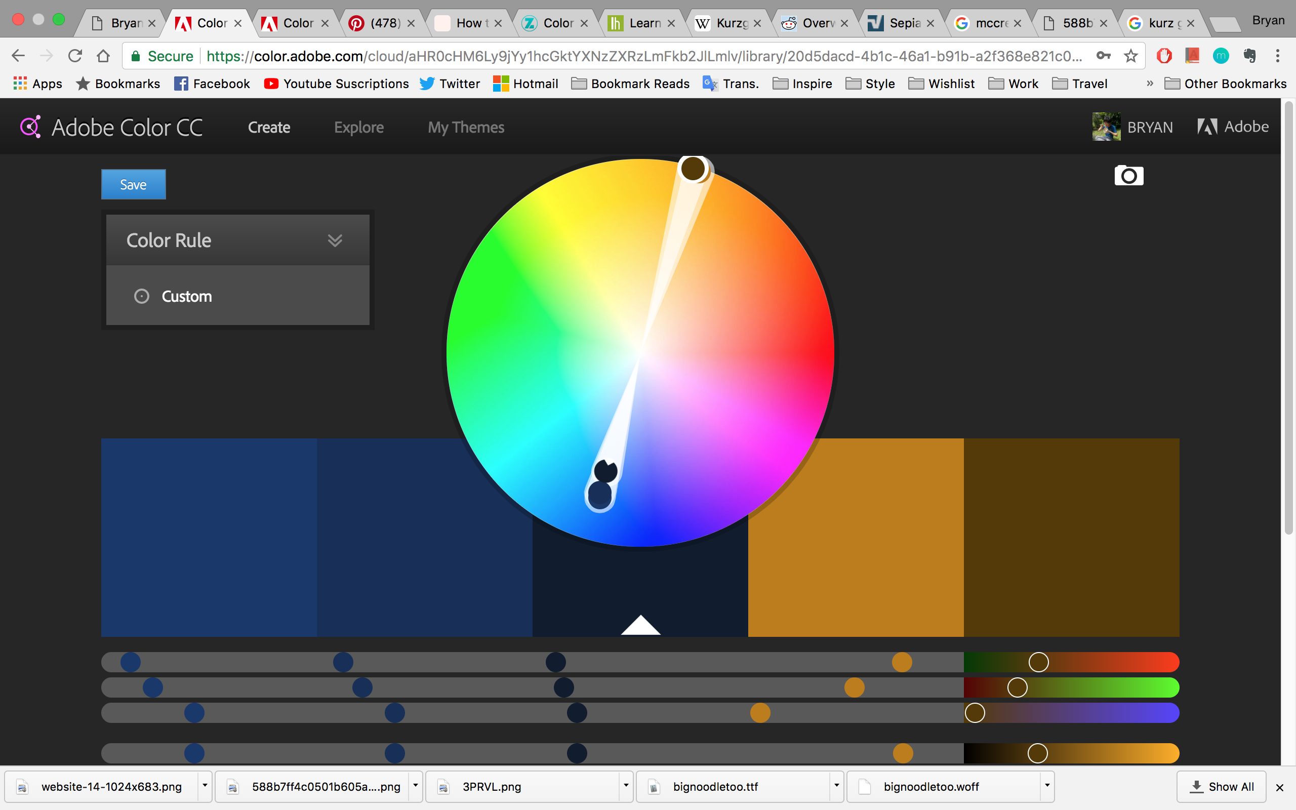
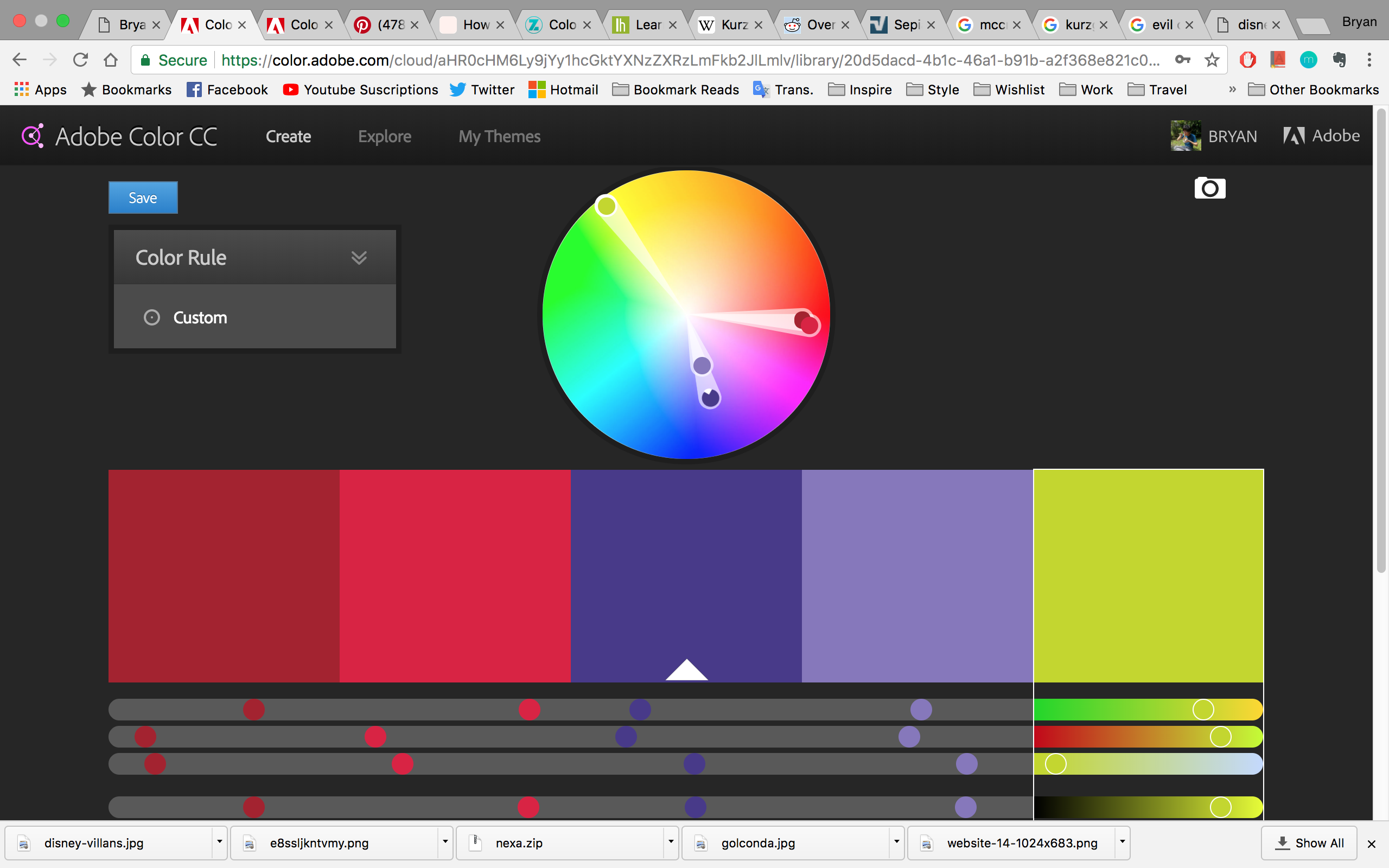
As you can see, we created combinations of different colours manually, which is not practical. We hope to improve on this.

Prototype outcome:

So I tried to fix everything up and here is the result:

Ultrasound

So Brendan worked on the ultrasonic sensors after looking through some codes online:

https://create.arduino.cc/projecthub/unexpectedmaker/ultrasoniceyes-b9fd38?ref=tag&ref_id=ultrasonic&offset=2

https://www.hackster.io/gowrisomanath/the-positronic-brain-my-techno-heart-9084be

He made a code that detects distance based on how far an object is in CM

const int trigPin = 9;
const int echoPin = 10;
const int ledPin = 13;

// defines variables
long duration;//travel time
int distance;//travel distance
int safetyDistance;

void setup() {
pinMode(trigPin, OUTPUT); // sets the trigPin as an Output
pinMode(echoPin, INPUT); // sets the echoPin as an Input
pinMode(ledPin, OUTPUT);
Serial.begin(9600); // Starts the serial communication for serial monitor
}
void loop() {
// Check trigPin
digitalWrite(trigPin, LOW);
delayMicroseconds(2);
//generate ltrasound wave at high state
// Sets the trigPin on HIGH state for 10 micro seconds
digitalWrite(trigPin, HIGH);
delayMicroseconds(10);
digitalWrite(trigPin, LOW);

// reads the echoPin, read the sound wave travel time
duration = pulseIn(echoPin, HIGH);
// Calculating the distance
distance= duration*0.034/2;
//blinker
safetyDistance = distance;
if (safetyDistance <= 20) {
digitalWrite(ledPin, HIGH);
}
else{
digitalWrite(ledPin, LOW);
}
Serial.print("Distance: ");
Serial.println(distance);

}

With this code, we merged the lights code with the ultrasonic sensor code and simplified it to be slightly more elegant:

const int trigPin = 9;
const int echoPin = 10;
const int ledPin = 13;
const int flexPin = A0; //pin A0 to read analog input

// defines variables
long duration;//travel time
int distance;//travel distance
int safetyDistance;
int value; //save analog value

#include <FastLED.h>

#define LED_PIN 13
#define NUM_LEDS 51
#define BRIGHTNESS 200
#define LED_TYPE WS2811
#define COLOR_ORDER GRB
CRGB leds[NUM_LEDS];

#define UPDATES_PER_SECOND 100

CRGBPalette16 currentPalette;
TBlendType currentBlending;

extern CRGBPalette16 myRedWhiteBluePalette;
extern const TProgmemPalette16 myRedWhiteBluePalette_p PROGMEM;

int x;
int a, b, c;
int d, e, f;
int col1, col2;

void setup() {
pinMode(trigPin, OUTPUT); // sets the trigPin as an Output
pinMode(echoPin, INPUT); // sets the echoPin as an Input
pinMode(ledPin, OUTPUT);
Serial.begin(9600); // Starts the serial communication for serial monitor

FastLED.addLeds<LED_TYPE, LED_PIN, COLOR_ORDER>(leds, NUM_LEDS).setCorrection( TypicalLEDStrip );
FastLED.setBrightness( BRIGHTNESS );

// currentPalette = RainbowColors_p;
currentBlending = LINEARBLEND;

}

void loop() {

value = analogRead(flexPin); //Read and save analog value from potentiometer
Serial.println(value); //Print value
value = map(value, 700, 900, 0, 255);//Map value 0-1023 to 0-255 (PWM)

// Check trigPin
digitalWrite(trigPin, LOW);
delayMicroseconds(2);
//generate ltrasound wave at high state
// Sets the trigPin on HIGH state for 10 micro seconds
digitalWrite(trigPin, HIGH);
delayMicroseconds(10);
digitalWrite(trigPin, LOW);

// reads the echoPin, read the sound wave travel time
duration = pulseIn(echoPin, HIGH);
// Calculating the distance
distance= duration*0.034/2;
//blinker
safetyDistance = distance;

Serial.print("Distance: ");
Serial.println(distance);

ChangePalettePeriodically();
static uint8_t startIndex = 0;
startIndex = startIndex + 1;

FillLEDsFromPaletteColors( startIndex);

FastLED.show();
FastLED.delay(x / UPDATES_PER_SECOND);
}

void FillLEDsFromPaletteColors( uint8_t colorIndex)
{
uint8_t brightness = 255;

for ( int i = 0; i < NUM_LEDS; i++) {
leds[i] = ColorFromPalette( currentPalette, colorIndex, brightness, currentBlending);
colorIndex += 3;
}
}

void ChangePalettePeriodically()
{
// uint8_t secondHand = (millis() / 1000) % 21;
// static uint8_t lastSecond = 99;

// if ( lastSecond != secondHand) {
// lastSecond = secondHand;
SetupPurpleAndGreenPalette();
currentBlending = LINEARBLEND;
if (safetyDistance >= 30) {
x=500;
a = 250;
b = 0;
c = 100;
d = 250;
e = 100;
f = 50;
}
if (safetyDistance <=29) {
x=800;
a = 225;
b = 0;
c = 100;
d = 200;
e = 100;
f = 50;
}
if (safetyDistance <=26) {
x=1200;
a = 200;
b = 0;
c = 100;
d = 150;
e = 100;
f = 50;
}
if (safetyDistance <=23) {
x=1500;
a = 175;
b = 0;
c = 100;
d = 100;
e = 100;
f = 50;
}
if (safetyDistance <=20) {
x=1800;
a = 150;
b = 0;
c = 100;
d = 50;
e = 100;
f = 50;
}
if (safetyDistance <=17) {
x=2200;
a = 125;
b = 0;
c = 100;
d = 0;
e = 100;
f = 50;
}
if (safetyDistance <=14) {
x=2500;
a = 75;
b = 0;
c = 100;
d = 0;
e = 100;
f = 50;
}
if (safetyDistance <=11) {
x=2800;
a = 75;
b = 0;
c = 125;
d = 0;
e = 100;
f = 100;
}
if (safetyDistance <=8) {
x=3200;
a = 75;
b = 0;
c = 150;
d = 0;
e = 100;
f = 150;
}
if (safetyDistance <=5) {
x=3500;
a = 75;
b = 25;
c = 150;
d = 0;
e = 100;
f = 200;
}
if (safetyDistance <=2) {
x=3800;
a = 75;
b = 50;
c = 150;
d = 0;
e = 100;
f = 250;
}
}

void SetupPurpleAndGreenPalette()
{
CRGB col1 = CRGB( a, b, c);
CRGB col2 = CRGB( d, e, f);

CRGB pink3 = CRGB( 200, 0, 100);
CRGB pink4 = CRGB( 175, 0, 100);
CRGB purple1 = CRGB( 150, 0, 100);
CRGB purple2 = CRGB( 125, 0, 100);
CRGB purple3 = CRGB( 75, 0, 100);
CRGB purple4 = CRGB( 75, 0, 125);
CRGB purple5 = CRGB( 75, 0, 150);
CRGB purple6 = CRGB( 75, 25, 150);
CRGB purple7 = CRGB( 75, 50, 150);
CRGB orange = CRGB( 250, 100, 50);
CRGB orange2 = CRGB(200, 100, 50);
CRGB orange3 = CRGB(150, 100, 50);
CRGB orange4 = CRGB(100, 100, 50);
CRGB orange5 = CRGB(50, 100, 50);
CRGB orange6 = CRGB(0, 100, 50);
CRGB orange7 = CRGB(0, 100, 100);
CRGB orange8 = CRGB(0, 100, 150);
CRGB orange9 = CRGB(0, 100, 175);
CRGB orange10 = CRGB(0, 100, 200);
CRGB orange11 = CRGB(0, 100, 250);
CRGB yellow = CRGB(255, 255, 0);
CRGB green = CRGB(100, 255, 0);
CRGB turquoise = CRGB(0, 255, 100);
CRGB grue = CRGB( 0, 100, 255);
CRGB purple = CRGB( 255, 100, 255);
CRGB black = CRGB::Black;
currentPalette = CRGBPalette16(
col1, col1, col2, col2,
col2, col2, col1, col1,
col1, col1, col2, col2,
col1, col1, col2, col2);
}

Motors + Flex

Brendan went back to fix the motors up with the second part of our project which is to make the screen move. We also went to the film store to borrow some flex sensors.

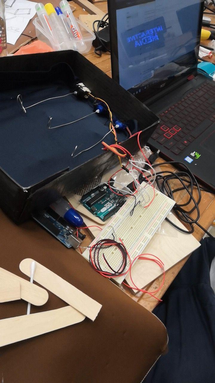
It was really difficult to connect everything as we have so many wires that are too loose. Eventually, we managed to put everything up and taped the wires down.

Yue Ling found a code for the motors and we merged it with a flex sensor code such that the motor will move directly proportionate to the flex’s bend.

/* Sweep
by BARRAGAN <http://barraganstudio.com>
This example code is in the public domain.

modified 8 Nov 2013
by Scott Fitzgerald
http://www.arduino.cc/en/Tutorial/Sweep
*/

#include <Servo.h>

const int flexPin = A0; //pin A0 to read analog input
int value; //save analog value

Servo myservo; // create servo object to control a servo
// twelve servo objects can be created on most boards

int pos = 0; // variable to store the servo position

void setup() {
Serial.begin(9600); //Begin serial communication
myservo.attach(9); // attaches the servo on pin 9 to the servo object
}

void loop() {

value = analogRead(flexPin); //Read and save analog value from potentiometer
Serial.println(value); //Print value
value = map(value, 400, 500, 0, 180);//Map value 0-1023 to 0-255 (PWM)

//if(value < 399){

myservo.write(value);
// pos = 0;
// pos--;
// delay(1);
}

//if(value> 400){bb
// value = map(value, 700, 900, 0, 255);//Map value 0-1023 to 0-255 (PWM)

//pos+=3;
// myservo.write(pos); // tell servo to go to position in variable 'pos'
// delay(1); // waits 15ms for the servo to reach the position
// }
//}

So with both parts complete, we fixed up the box. The wiring was a major headache for us as we do not have the correct kit and enough wires. We managed to fix everything after much troubles. Yue Ling also borrowed female-to-male wires from Vienna which is a great help! Without that, we would not be able to connect our flex sensors and our ultrasonic sensors.

Unfortunately we don’t have an image of our final wirings.

Final Model

Before placing hand inside (lights)
Before placing hand inside (motor)
After placing hand inside (lights)
After placing hand inside (motor)

Video demonstration:


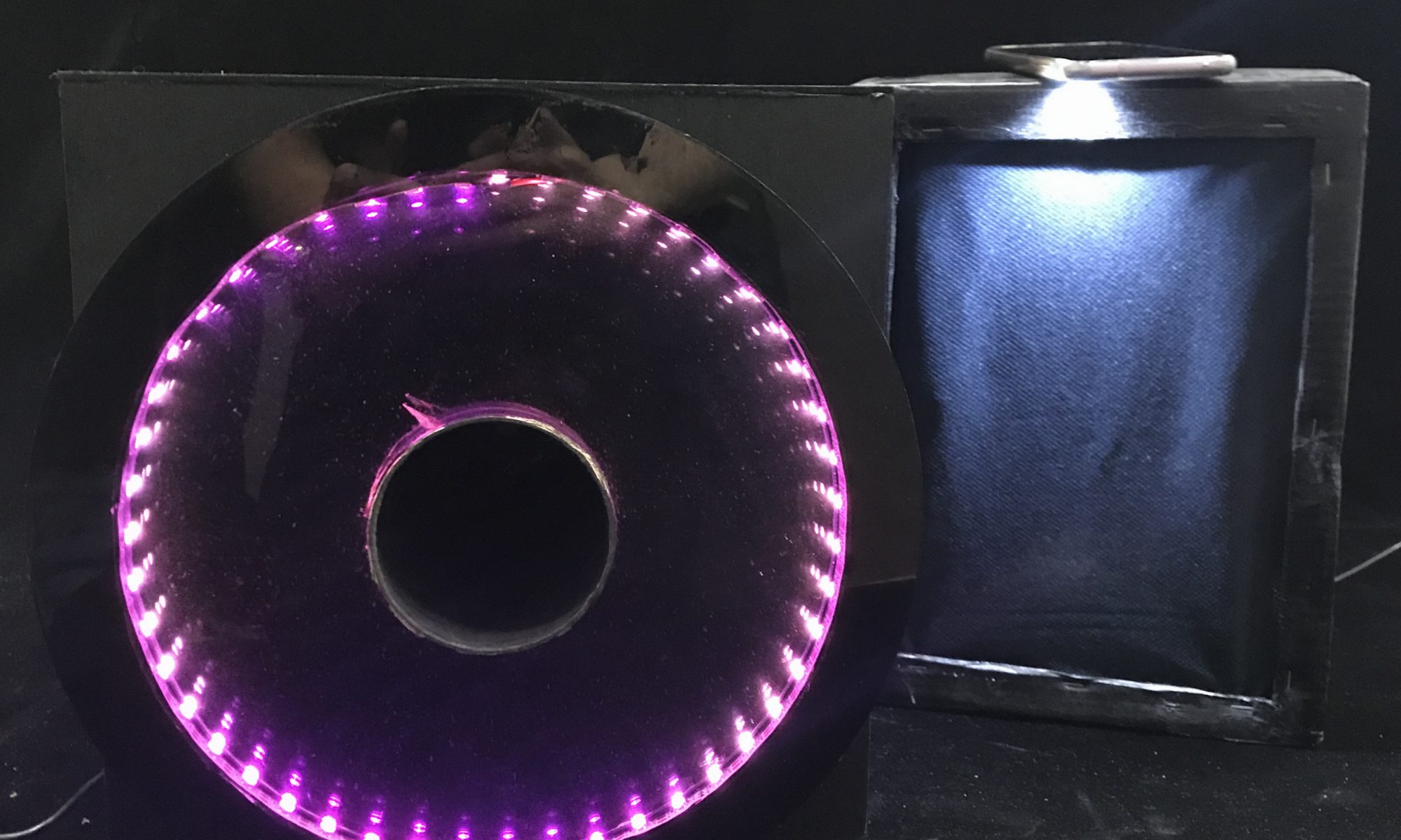
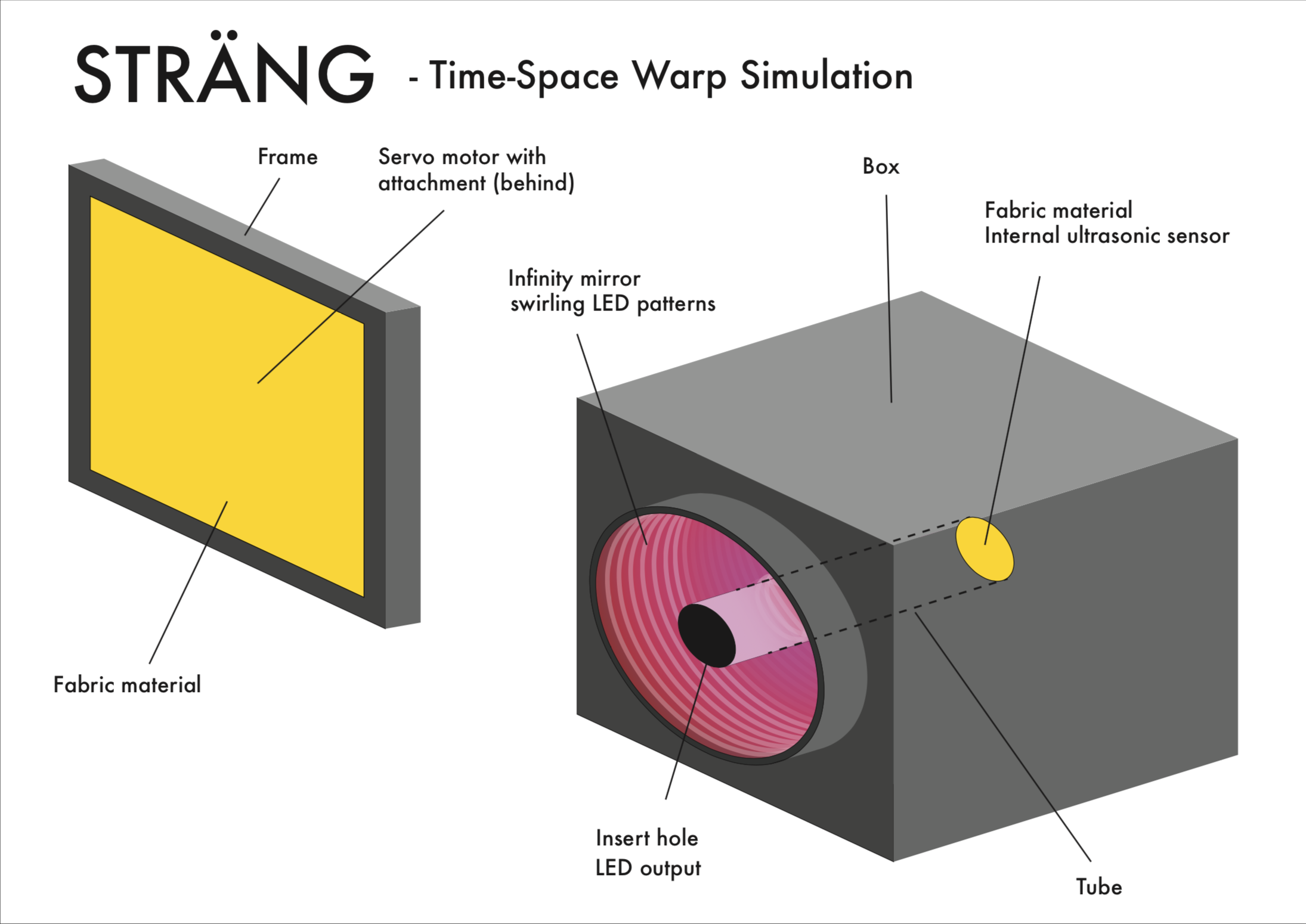
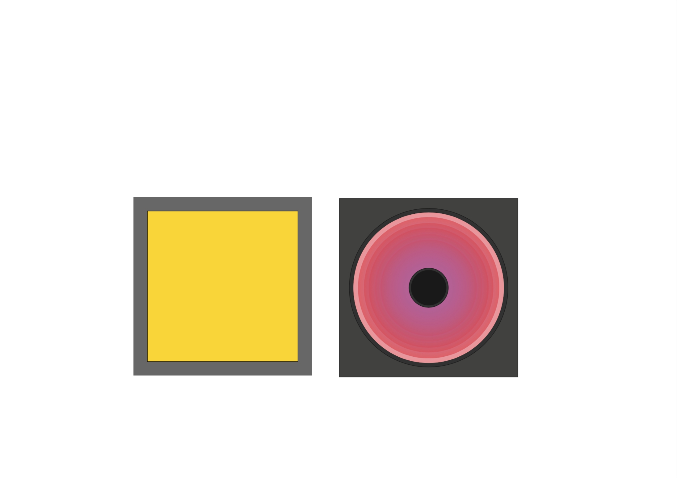
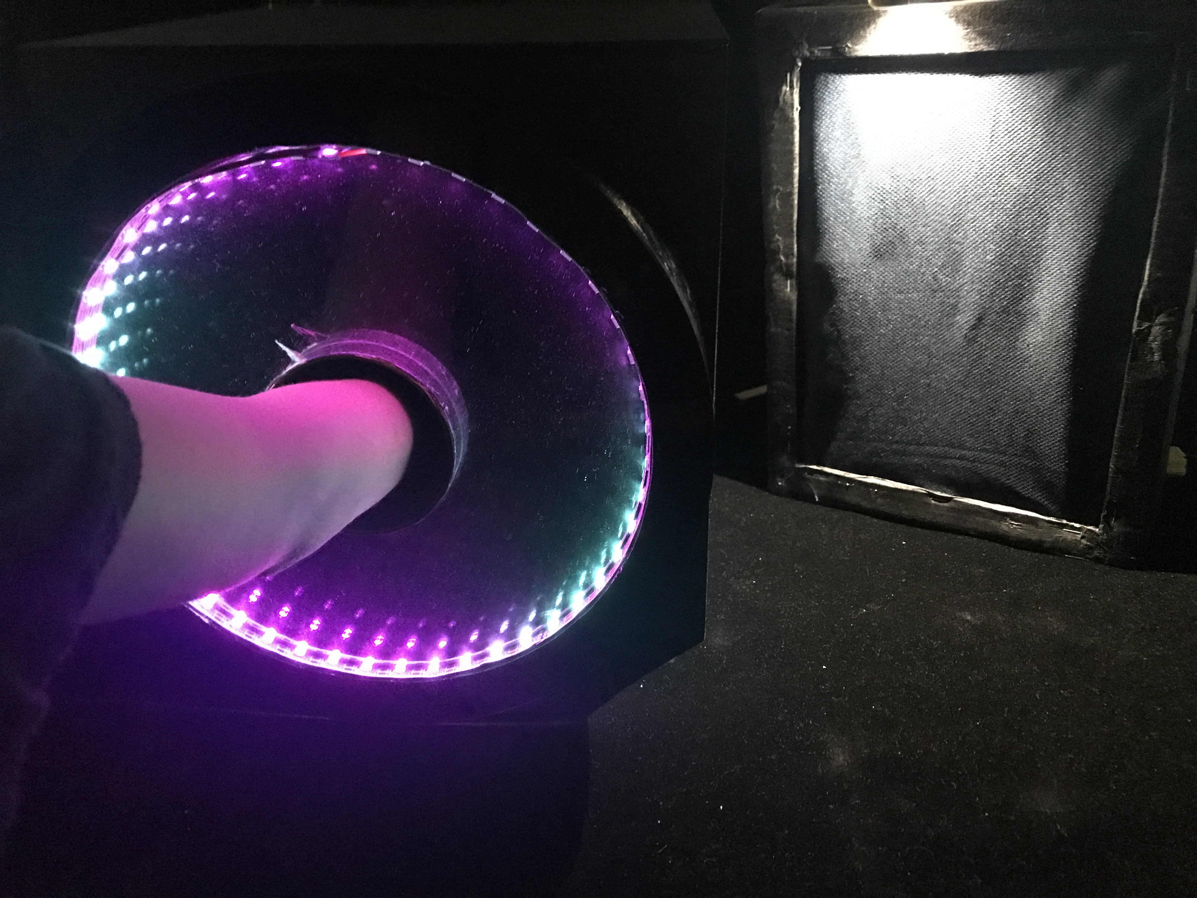
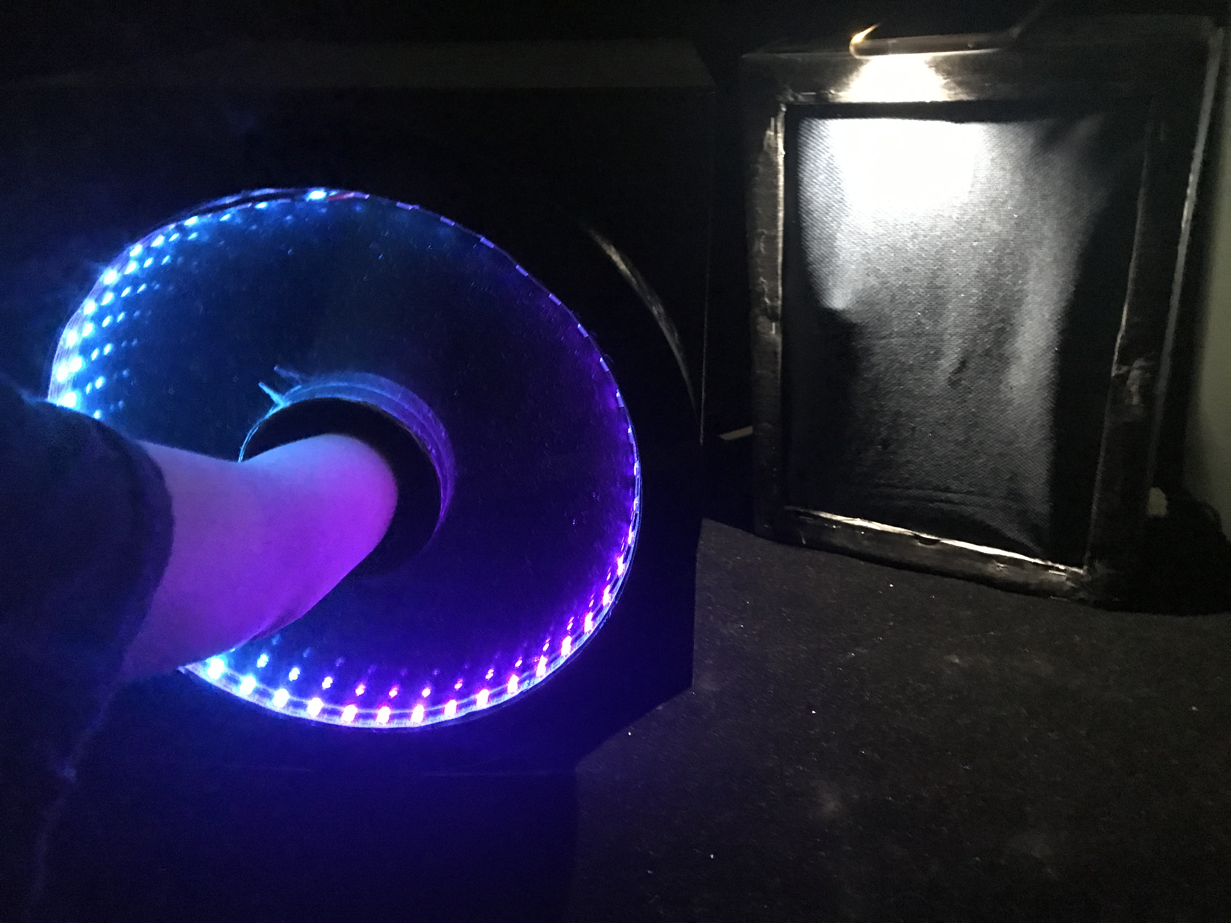
Concept is that by putting your hand through the hole, we bend space and time. Bending time is through slowing down of the rotation of the ‘clock’ as well as turning the colours from pink/orange to purple/blue, which began from the idea of ‘blue shifting’ like how light will look like if time slows down.

By pushing the fabric at the end of the installation, the motors move, emulating fingers that seems like as if the user’s hands have traversed through a wormhole into another location.

The overall feeling we aimed to get is the sense of amazement from the shifting in colours and also being able to teleport their hands through space.

Presentation Slides:

https://docs.google.com/presentation/d/1QqwL3OJHkvuKO2NJf1szHjSbgNvObOalTWKNzutuSV4/edit?usp=sharing


Problems Encountered

  1. LED lights code settings could be better, as we don’t know how to make it smoothly transit between colours. We could possibly make the value from the distance detected by the ultrasonic sensors directly control the colour range, but we don’t know how to do that so that can be an area of improvement.
  2. Circuit is a very big mess for us and we don’t have the right kits provided so we have to keep sourcing from our friends. We could have bought a long roll of wire so we can have all the wire we need and not use tiny short wires which breaks the circuit easily.
  3. We bought some wrong items along the way too, like the acrylic piece that is in front of the clock, we accidentally bought a matt acrylic. We had some difficulty finding the correct LED too and it was thanks to Vienna who helped us with where we can get it.
  4. Ultrasonic Sensor is buggy and there is no solution to fixing it. We speculate that it was because of bad wiring that it kept reading weird readings once in a while.
  5. The ‘fingers’ stuck on the motor wasn’t really sticking well and if we had more time, we would have improved it by securing it better.

What I learnt:

I learnt to control the motor using the flex sensor values, as well as how to work around a problem (the LED one) by manually writing individual code for individual colours. I’ve also learnt to use 4 different components and making them work together.

Tasks Deligation

Brendan:

  • Ultrasonic Sensors code + circuit
  • Motors setup
  • Fabric board assembly

Bryan:

  • LED code + circuit
  • motor circuit
  • general assembly and troubleshooting

Yue Ling:

  • Item sourcing
  • LED code + testing
  • Motors code + circuit
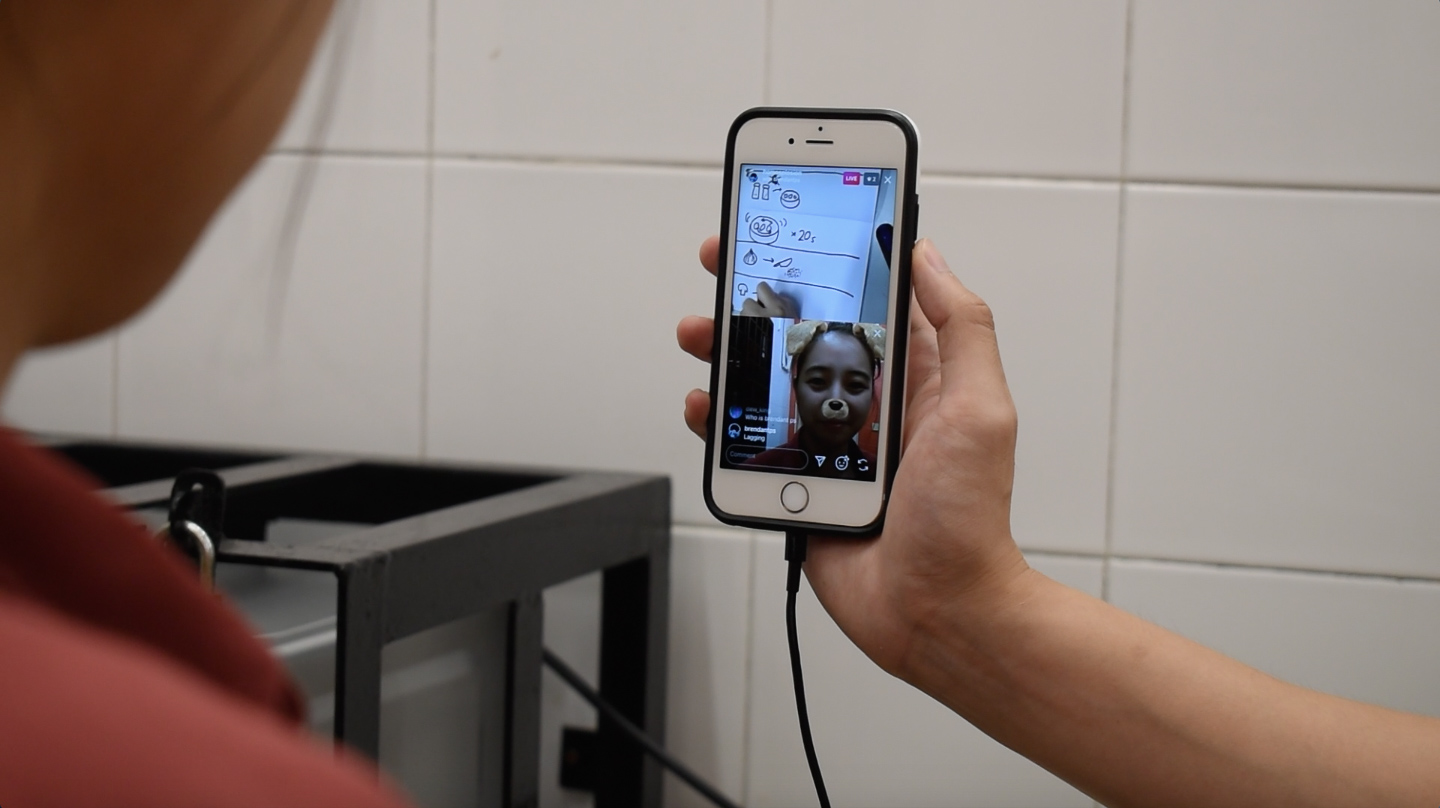
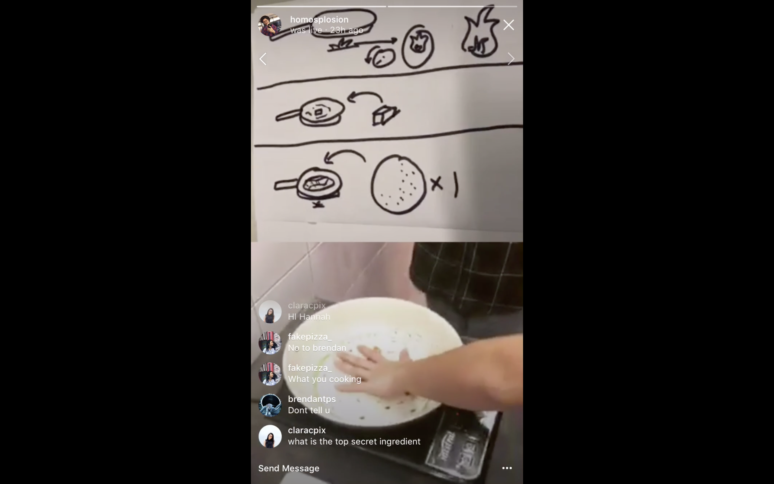
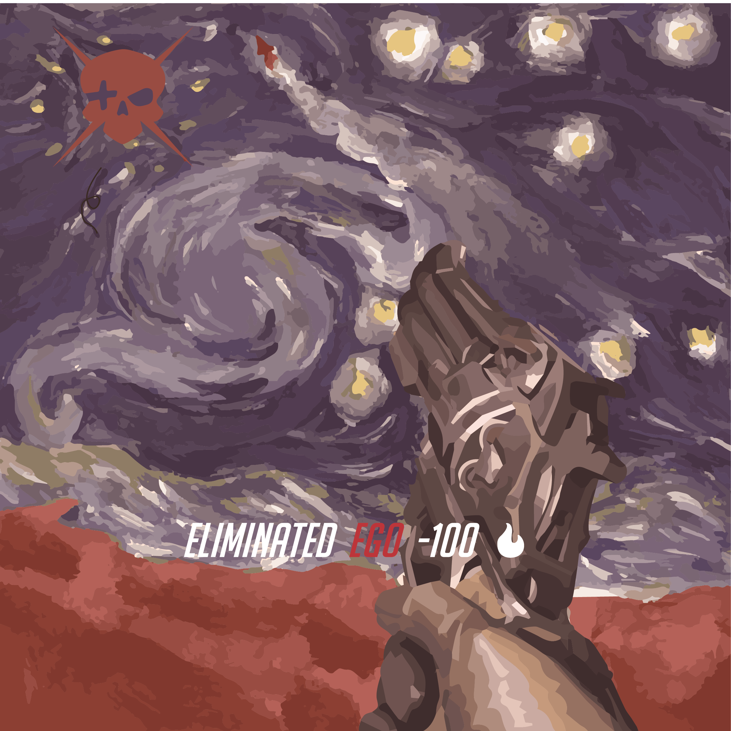
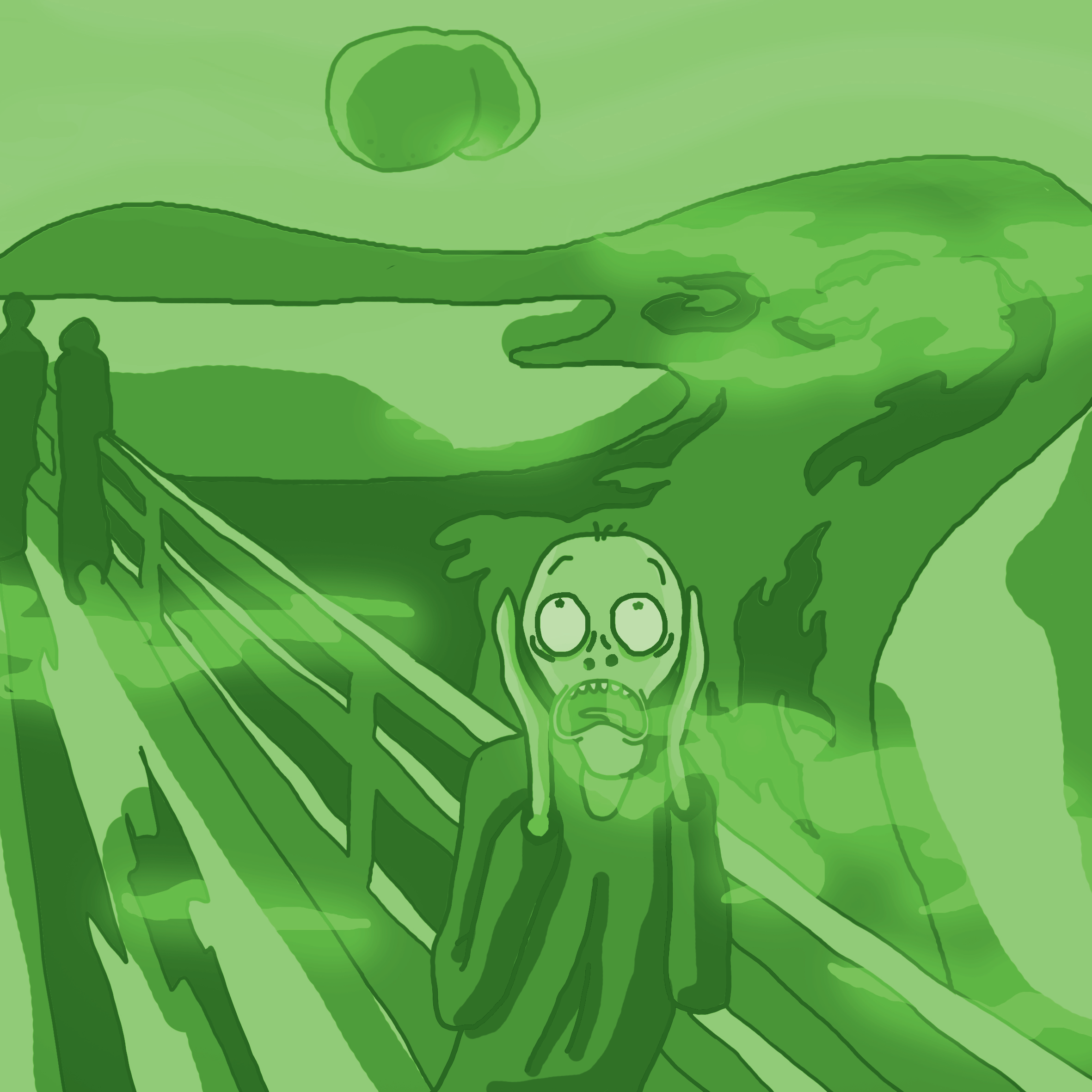
Final Proj E&I

The day before the actual game, we sent out an online notification through Instagram story to let everyone know that we are going to play a game. We invite the live audiences to come in to watch the stream and allow them to influence the results too.

Meanwhile, we also have set up a set of briefs for the chef and artist

We have chosen our artist and drawers for the two groups of people we want to compare: The Noobs in Round 1 and The Pros in Round 2.

The Noobs

Artist: Jacob

Chef: Tiffany

We have deliberately moved them away from their strengths, as Jacob can cook well but cannot draw, and Tiffany can draw well but cannot cook. It is also funny because she initially said that she could cook rice without a rice cooker, which was quite a difficult thing to do. Turns out, she could ONLY cook rice. Oops.

The Pros

Artist: Alena

Chef: Hannah

This time, we deliberately let them play in the role that they are good at so that we can compare the results between people who knows what they are doing and people who don’t.

We have also ironed out the kinks in the logistics. We will stick to cooking in Hall 2 but find a location with better connectivity.

and have split up our roles: Brendan and I will be the facilitators for the Chef, while Dion and Joel are the facilitators for the Artist.

We have decided to split up the equipments we bring. I brought the plates, bowls, and utensils; Dion brought the chopping board, knife, and cards; Joel brought the condiments and his trusty pan; and Brendan brought his camera equipments.

The final recipe:

Recipe for Quesadilla, including the random ingredients we added in to throw the chef off.

So before anything else, let’s talk about the game.

The flow of the game

This is the flow of the game in both rounds. The game starts with the facilitator giving the ingredient name to the artist, which the artist will have to draw within 7 seconds. After that, they will be stopped and the drawing will be shown to the chef. The chef will then interpret the item and buy the item that fits best to the interpretation. If the chef gets confused, the audience can help or influence the chef by interpreting their own version of the item. After purchasing the items, the chef will move to the kitchen for part 2. During part 2, the facilitator will then show the artist the steps to cook the dish, and within 40 seconds, the artist will have to draw it and show the chef. The chef will then interpret the drawing without using their instincts to guide them. This means that they have to follow what is drawn, no matter how illogical it seems. Audiences can still influence and help the chef at this point. After the dish is done, the artist will be invited to the kitchen to eat the dish they have made together.

The DIWO

DIWO: Players Tiffany and Jacob participating together in the game
DIWO: Players Alena and Hannah participating together in the game

DIWO comes in with the players, as they work together with other players to create the dish together. This thus becomes an unscripted performance that is participated by the players. The DIWO aspect also comes in from the audiences where the audience can interact with the players as well to “do it together” (although I’d say, the audiences join merely for the entertainment). The outcome of the game will be a combined effort between all parties.

The Third Space

The Third Space is the online platform in Instagram Live.

Instagram Live icon created by me

On this platform, we are able to reach out to a massive audience of friends, family members, and friends of friends. Within the Third Space, the players are able to communicate with each other despite the distance, as well as communicate with the audience. This online space bridges the spacial gap and allows for maximum participation in all parties with minimal effort, making the entire game really fun and engaging. Although the players do not actually create a Third Body, the players have made full use of the abilities of the Third Space to create the final dish.

The Glitch

The glitch comes in the form of mis-drawings, mis-interpretations, and mis-cooking. There is a complexity in the flow of the game that allows for multiple opportunities for glitches to happen. This is very visible in the first round , The Noobs, and less apparent amongst The Pros. It is interesting that glitches that happen at the from affects the glitches at the end quite a lot, and this amplified glitching reminded me of the glitch micro-project that used a similar activity of glitching a glitched image.


Gameplay

Set-up

The 2D room setup

We set up our booth in a quiet and isolated room so as to allow our artist to concentrate on the game without any interference. The tripod holds Joel’s phone that will livestream the artist’s perspective of the game. The drawing block is for the artist to draw on.

On the other side, we have Tiffany meeting Brendan and I at Giant supermarket near Canteen 2 to get ready for the game.

Round 1: The Noobs

Part 1: The Grocery

After getting ready, we kick off the game with the first ingredient drawn: Tomato. Tiffany got it right immediately. Moving on, we have Onions.

Abstract onions. Or maybe a striped ball?

Tiffany immediately shouted “ONIONS!”, but proceeds to buy garlics as onions ran out of stock. This is quite unfortunate as we knew that Giant sold onions.

Sock bananas

The next ingredient is the banana which is a decoy ingredient. Tiffany got it right again, but as she doesn’t have any cooking experience, she do not find it weird.

Chicken?

Next, Jacob drew a quite interesting take on Chicken Breast: a side profile roasted chicken, with the arrow pointed at the breast part. HOWEVER, the facilitators, audience, and the chef couldn’t understand it because it looks like vegetables on a plate. Thus, Tiffany bought peanuts.

Phone macaroni
Satay? Hotdogs?
Cheese!
Box or butter, or eggs?
Mushrooms or middle fingers?

These are the remaining drawings, with some that are comprehensible and some that are difficult to understand.

Tiffany figuring out what this drawing means
Cheese! Tiffany shouted
Tiffany goes for the hot dogs

Here are some screenshots of the actual live stream during some of these drawings.

The livestream – behind the scenes
behind the scene part 2
Tiffany looking for the halal symbol on the cheese

Here are some shots on-site with Tiffany.

The items we bought – Bananas, slice cheese, shiitake mushroom, eggs, orange, tomato, garlics, cucumber, peanuts, macaroni, chicken hotdogs

At this point, the live stream was filled with audiences, that gave a lot of comments. It was interesting as they are participating a lot, giving not just a lot of tips but also funny comments that entertained all of us.

After this part, I have noticed that the glitch is very real. The mis-drawing and mis-interpretation have thrown off the entire recipe. I can’t imagine what we can cook out of what we have. The lack of an actual way of communication between the players have really glitched the recipe. Even the audience can’t help now…

Part 2 – The Cooking

After getting ready, we started part 2.

I’d say Jacob’s drawing here are very comprehensive. He even stuck to using the same drawings as he did in the previous part to not confuse Tiffany. However, because the items are already wrong, he couldn’t unglitch it. Tiffany blatantly follows as she does not really know what is going on. This results in hilarious things that she do.

Chopping peanuts
Cutting the garlic as a whole instead of splitting first
Burning the pan!!! OH NO.
Looking at the drawing
Tiffany chopping the peanuts into tiny pieces according to the instructions which calls for chicken to be chopped up instead
Tiffany cooking
Tiffany chopping garlic
Tiffany marinating peanut

Here are some screenshots documenting what happened.

RESULTS:

Reaction to taste test
Taste test
Round 1 final food

Tiffany made scrambled eggs with cheese, hotdogs, mushroom, and peanuts. I am very surprised that we still managed to make something that is edible. It was not that bad tasting it, just that the mushrooms are slightly undercooked, and the pan is burnt. The glitch have not just taken place, but also snowballed from the beginning down to the end. Still, despite this uncontrolled glitch, we manage to create a result that is somewhat satisfactory, and it have at least created an outcome that falls within the boundaries of what we have in mind (something edible).

I think that the cooking phase is the part that fixed everything together, as the cooking part will allow any of the ingredients to become edible. Thus, we can actually use this round as an example of how uncontrollable glitch can still somewhat be controlled, and that cooking isn’t all that hard. We can pretty much shuffle the ingredients we buy, use the same cooking steps, and end up with pretty okay edible food.

Reflections from Tiffany: She enjoyed the whole process even though she knew she screwed up a lot. It was a learning experience for her because she hardly cooks. She also find it fun to be entertaining others.

Reflections from Jacob: He enjoyed the game and finds it interesting and funny when the two players are chosen to get out of their comfort zone. The audience comments are funny to him too. However he felt that as the artist, the game is more fun at the front than at the back.

After we concluded the first part, we took a 15 minutes break and cleaned up. We managed to salvage the pan and everything was fine.


Round 2: The Pros

Hannah Ready!

Once we are ready, we started the

Part 1: The Grocery

Tortilla that looks like orange
Shell Macaroni which looks like ???
BBQ Sauce that looks like Ketchup
Jalapeno banana
Sugar cube butter
Shredded cheese
onions
mushroom
chicken fillet
lime that looks like orange

Overall, Alena drew alright. But there are quite a few items that are glitchable. For example, the tortilla wrap looks so much like oranges that Hannah almost got oranges. But as she knows how to cook, she find that it does not make sense to have oranges. So she went around and found tortilla wrap.

Another example is the butter, which Alena just drew a cube. I like how, due to our understanding of what butter is usually depicted, we understand that a slab of something is usually butter.

Despite the potential for glitch, Hannah still understood them right!

Hannah looking at the stream
Hannah moving around
Hannah putting down butter
Hannah looking for butter

Here are some screenshots from the livestream:

Lime? Lemon? Orange? Huh?
Oranges or tortilla wrap?
BBQ sauce got right
Thinking… what is this?
Turning chicken into fish nugget since there isn’t any chicken left
Alena drew butter and Hannah got it right

One thing that happened was that the staff of Giant was on a lookout for us as we were asked to stop filming during round one. To avoid getting caught, we kept our distance so there wasn’t much documentation or footages.

During this round, there wasn’t much audience also, which is probably because of the lateness (we started at 7pm). It could also be because we have done it once, so the second time wasn’t as entertaining. Thirdly, it could be because Hannah was doing everything very smoothly so it became somewhat boring.

It was also impressive to see that Hannah actually got most of the stuffs correct. I would hypothesise that this is due to her instincts, being someone who knows how to cook and assemble recipes together.

So after the shopping, we bought all the things and went back to the kitchen. As we have already went through it once (actually, twice, including the test run), we could do it properly this time. With that, we quickly started the second part.

Part 2: Cooking

For this part, Alena did pretty well, and like Tiffany, she used the previous visuals to make sure Hannah understands the different ingredients.

Meanwhile at the kitchen:

Dicing up the tomatoes
Watching Alena draw
The final product
Cheers!

Again, here are some live stream footages:

Alena draws as Hannah waits patiently (by patiently I mean play with the dog filter)
Hannah, being pro at this, effortlessly cooks

As Alena and Hannah are also friends, the entire stream was more friendly and conversational. It didn’t really mattered that there wasn’t much audience, as there is a lot of communication between the two of them. We even started playing with Instagram filters like the dog filter, which made the stream more fun and engaging.


It was also interesting that Hannah keeps requesting for the next step while the previous step is still ongoing. This is perhaps also part of her instinct as a person with cooking experience, as she do not want to be waiting for instructions while the food is cooking so as to not overcook or burn the food. Hannah also have done everything properly and really well, showing off her excellent cooking skills. She fully understands what Alena draws as the instructions are very straightforward to her.

Overall, this round was much smoother, quicker, and effortless. Despite this, we were bored easily and went with the motion sometimes without actually seeing what is going on because we had too much trust in Alena and Hannah handling on their own. This creates a situation where the game wasn’t as entertaining and engaging compared to round one. This also winds up in lesser viewers, and I think this actually created another effect where the two can be more intimate with each other as they don’t have to entertain anybody.

Compared with the first round, this round was really a lot different in terms of the smoothness, the viewers, the entertainment, the timing, the speed, and communication. Perhaps one really important aspect of a good game is the glitch itself. Without mistakes, what is there to watch? 

With these, we created a trailer and highlight video. REALLY APPRECIATE BRENDAN for doing these videos!!! He did a really good job compiling everything and presenting this awesome videos!!!


Final words

In conclusion, I conclude that the Noobs did a better job entertaining everyone, despite the food being badly done. While it was enjoyable to eat the perfect Quesadilla, I do not really enjoy the process. As I have mentioned in Research Critique 3, a successful performance is in its process and not the outcome. Therefore, I believe that, despite the Pros winning this game, the Noobs have won our hearts.

Also, I would like to reiterate the DIWO aspects of the game. With the players, we have allowed people to come together to participate and perform together in this game. Audience also came in to be part of the game, commenting, chatting, helping, and influencing the outcome of the game. This have created a large body of players, creating a whole DIWO experience. This could not be done without the Third Space, as we need everything to be communicated through the screen and the chatroom. The usage of the Third Space as  a means of communication have allowed for maximised participation, making the entire game more successful. Lastly, without the Glitch, the game would be unentertaining and lose viewers like in Round 2.

My personal take away would be to be able to create an experience of such complexity using these concepts that are sort of closely related. It got me to be more aware and observant in these concepts on other platforms that helps me to understand certain digital arts better.

If there would be an improvement to the game, I would separate the days such that Hannah will be playing on another day. I would also change some parts of the game at round 2 (eg. maybe change the recipe) so that audiences will join in to watch the difference instead of watching them cook the same thing.


Our group presentation can be found here:

https://docs.google.com/presentation/d/1E7nOSiH_iG4l8tcNk47lWRyv0n70YQZAoOwIZnZWO6g/edit?usp=sharing


It was a great experience hosting the game and learning to apply these concepts. It’s been a great sem learning with you Lei 🙂 I really learnt a lot. So yup. That concludes the project, as well as the semester. Byeeeeeeeeee!


Project 2B – Locale (Process)

I revisited Marsiling on 25th March.

After the 17th March visit to Marsiling, I decided to revisit it to plan my shoot. Here are the few selected locations:

Around Blk 177 area
Underpass near Blk 24
Blk 158 – nice composition
Somewhere near Blk 142
Blk 5A
Somewhere near Blk 211
Blk 9 I think
Marsiling Hill
Blk 132 – Spacious
Blk 36 – interesting blue pillars
Blk216 – Round iconic window
Blk 4 – Old residential area
Blk 5A
Blk 158 area
Blk 158
Forgot where this is but nice wall textures
Blk 9 cool window panel
Forgot where this is but it’s nice
Blk 6, hierarchy “portals”
Blk 34 windows by the envelope box
Near blk 142


Blk 4 foyer


So, pinpointing these locations, I planned my zine’s Art direction. I decided to go for a spacey theme as I want to depict Marsiling as a strange “planet”, using a pun I got from Marsiling (Mars and iling). Using this idea, I want to try to depict a tourist’s trip to this strange land called Mars iling. 

Here’s my mood board:


I want to go for a vacation-esque style stereotypical tourist. So by merging this theme and the space theme, I designed my character — a space tourist.

With these in mind, I prepped my props.

Space Helmet

I couldn’t find a space bubble helmet so I got a beach ball from Daiso and started making paper mache.

Afterwhich I used a heat gun to melt a few sheets of transparencies to create the “glass” capsule.

It fits but I really dislike it as it became very crumply due to the transparency sheet not being the proper shape to warp it down to a sphere. Still, I rolled with it since I couldn’t find any other materials.

Other Props

I also bought some other props: this beach-mat looking canvas and a yellow towel. I also bought an extra beach ball, red umbrella, books&magazines and wine glass to add to the aesthetics.


My model is Jeremy Lim, my good friend from my NS days.

Please follow @j.emery on Instagram 🙂

For the attire, I went for holiday shirt, a straw hat, shades, shorts, and slippers.

Shoot

I went on a shoot on 30th March. I brought all the props, as well as a DSLR and a disposable camera (Fuji Simple Ace, 39 shots, 400 ISO). The DSLR is a backup to the disposable camera in case the shot did not go well, as do with all disposable cameras. The DSLR is also a really great way for me to test my shots and compose it before taking it on the DSLR. Despite the higher quality, I opt for the film for a more personal effect. I shot halfway and it rained, so I couldn’t continue and decided to go back and shoot again.

On the 1st of April, we went on another shoot and this time, we braved through the rain (AGAIN, it always rains when I go Marsiling) and we completed the shoot by 8PM.

Halfway through, I found an actual fish bowl in an aquarium shop and I went for it! So the second half of the photos are Jeremy with an actual fish bowl on his head.

Here are some shots:

These are from the disposable camera.

The shots from the DSLR:

Getting the ball to be in the frame properly took a few tries and this can only be done on DSLR so it’s worth trying out first before taking on disposable camera!

Although the quality is MUCH better, I decided to stick to the disposable film shots as it really creates some sentimental value and uniqueness.


Photo edits

So in order to get the effect of the “portal” and “strangeness”, I decided to photoshop my friend such that two of himself is in the frame.

This is one example of said edit, but on a DSLR photo. I tried around with editing the DSLR shots before moving to the films.

Here are some examples of the shots I have edited. These are to convey the “portalling” between pillars.

Zine!

So finally, I went to do on the ACTUAL ZINE!!!

I separated the zine into 3 parts: Space, Portals, and Dimensions.

Space – Showcase the quietness of the location by using spaciousness

Portals – Show the transportation from a world I am familiar with into a different world (Mars iling)

Dimensions – Show the strangeness of Mars iling

Using some inspiration from Rubbish famzine by HolyCRAP, as well as zines from my moodboard, I decided to create a vacation documentary that is not just personal, but also minimalistic.

I started with a few variations of my cover page:

Then, I tried out some spreads:

With these, I consulted and selected my cover page. I also got the feedback that my images are all the same size, which is undesirable. I wanted to try for the photobook effect where all images are the same size, but it seems to not be working. I was more harsh on my image selections and tested out new spreads.

Evolution of my Cover Page

trying out adding graphics onto the photo
Adding more stuffs
experimenting with the colour scheme
discovered a nice scheme using complementary colours

Evolution of SPACE Spread

experimented with adding more images as layouts as I don’t want to waste my images
Adding void deck appearance to add complexity
Added pillars using gestalt’s law to imply pillars
added some poetic lines
switched colour palette

Evolution of Portal Spread

added images to not waste them, and also added duality by making the 2nd part pink
decided not to have the images and added the word portal
added more colour and glitch, which amplifies the portal effect

Evolution of Dimension Spread

I had the most difficulty with this spread as I don’t really know what to do with it. I added a lot of elements to experiment
Decided that the portal has got to go, and focused the page mostly to dimensions
glitching it up to showcase the idea of a world that’s beyond our own

FINAL

Overall, all my images are glitched somewhat to create a more otherworldly feel, although I try not to overdo it so as to keep it subtle.

For the cover page, I chose this image because it embodies everything I want to convey in the zine. It also have the best composition and colours. I really love the pink that the disposable camera created, which reminded me of the photographer nguan. This inspired me to use the pink scheme. I used a mint-green colour to complement the pink, creating a zine that is unconventional, energetic, but strange.

The extra graphics I added are to frame the model, as well as to bring out the pillars.

For this spread, I spaced out the kerning for the word “Space” so that I can get the message across by typography. The whole page was supposed to be very spacious and empty, but it does not fit the other pages. So I added in the complementary colour scheme to make it harmonious. The lines are arranged to look like pillars so I can show that the idea of space and quietness is in the spaces between the pillars and void decks.

The image used was a 4R image of the tourist sitting on the beach mat enjoying himself. This is to convey the idea of a vacation right from the beginning so as to set the mood. The poetry is used to explain what I am trying to do with the space to depict emptiness. At the same time, as this zine is supposed to be personal, I want it to be expressive and not just informative. I want the information to be understood through expression.

The text at the right side is spaced to not just amplify the idea of space, but also to create the idea of the texts aligning to the pillars.

Finally, the image on the right is another image that I want to show to depict the holiday-ness that goes together with the spaciousness.

This spread talks about portals. Although the background does not have much to do with it, I really liked it as I think it have a lot of potential to be an image that covers the entire spread. I instead use the difference between an outdoor and an indoor area to suggest the idea of portals. The odd placement of the circular HDB void deck window in the middle of the spread is to add on to the idea of portals and strangeness. The usage of the complementary green/pink is very present here. This is to expand on the idea of duality in portals. In terms of placement of texts, photos, and colours, I have played around with increasing the space between linked objects to distant them. eg, distancing a single image with 2 colours, but they are linked in the same image, or distancing two sentences, even though they go together.

Another thing I did here is to connect the photo of Jeremy holding the selfie stick with the background. The grass and buildings align with the background,  creating a separate, yet interlinked relationship between the image and background.

The poetry and the subject’s touristy action is a representation of the tourist. Again, I made sure to make him very stereotypically touristy. The background of the image is also a suggestion of emptiness as there are nobody there. I also purposely made the poem pretentious so as to convey the pretentiousness of stereotypical tourists.

Finally, I added half an image on the bottom right side so as to link the spread to the next page, conveying another idea of portals. In this case, it’s the portal from one page to another.

This spread is about dimensions. I combined the first two spread together to create this page — a combination of space and portals. Repeated and glitched “pillars” are created to show the idea of space, but also in a different world. I try to arrange everything vertically, so as to construct the pillars like in the first spread. The usage of all images present here are images of Jeremy entering from one pillar and exiting another pillar. This helps convey strangeness, and some sense of portalling.

In the 4R image, Jeremy is holding a telephone. This is to represent tourists’ curiosity with strange object, specifically objects with heritage like an old telephone. It suddenly clicked in me that phone is a representation of a transportation of sound. I tied everything together like this:

  1. Jeremy is going through a portal through space
  2. the phone represents sound, which is the main thing I am focusing on actually about Marsiling, which is that it is quiet
  3. At the same time, this telephone is old, so its also a link in time
  4. Combining everything together, I formed the poem.

The colours, again, I used the complementary scheme that is consistent to my other spreads.

At the bottom right, I added a ziplock containing two 10 cents coin, which I labelled as “souvenirs”. This is a representation of tourists keeping souvenirs found in foreign lands. This concludes what I think about what tourists in Mars iling will do, as well as concludes my perception of Mars iling.

On the last page, I included credits and contact details, as well as a map. In the map, I try to label the different parts of Mars iling, categorising them into zones that I find define each area best. In specific areas, I placed the few significant images that I took at the area to let readers know which image is from which zone. I try to make it as if Mars iling is a planet, which is why I added “stars” and a label “space” outside the map.

And that’s my zine!


LASTLY

I’d like to show off all my disposable camera photos. I REALLY LOVE THEM.


Takeaways & Reflections

I really enjoyed this project, even though it was really tough. I am really grateful of my friend Jeremy for carrying all the camera equipment and props around Marsiling with me for two days. I enjoyed shooting with an intention in mind and directing the shots, as I have never done it before and it’s about time I actually do something that helps me to train my assertiveness and decisiveness. I also enjoyed thinking about the art concept and direction, and generally love the idea of having props and weird props around. There was even once I wanted to buy an inflatable flamingo float just for this shoot and I held back. I REALLY LOVE THE BEACH I GUESS?

OH. and I was also exposed to like a lot of different zines and that PUMPED ME UP a lot. They are really nice to look at and inspiring.

I also have discovered a new love for film and I really would love to go do more photoshoots from now on.

About the zine, I have relearnt how to use InDesign, and it’s quite good even though I disliked it at first. I was a bit reluctant to use it as I was too comfortable with illustrator. After a while, I decided to bring everything to Indesign so as to try it out. That was when I realised that the guides and spreads in InDesign actually makes everything easier.

One more thing is I learnt about composition, layout, and colours. These are always important, but I finally knew how to control it in pages.

I am proud to have created this zine even though I could still improve it, and even though I am not pursuing graphics design, I believe I’ll continue making zines for fun!

Final Project – Split Chef (Discussion)

that little icon at the top right ruined this picture

We have transcended through time and space to meet up in the third space — Skype. Joel happen to me unable to meet us, so we decided to conduct a skype meeting.

During our skype meeting, we discussed on the things that we have to iron out so we can move on to the final work.

  • We finalised the player roles and what kind of players we want

  • We decided on the kitchen location to be either Hannah’s (our friend) hall, or one of the hall that we are staying in. The backup plan is to actually use someone’s house.
  • Next, we asked if we should have audiences to watch our show, and allow them to comment to help the chef. I think it will be fun and engaging to both the audience, the players, and facilitators.
  • Next, we finalised on the recipe so we are sure of the ingredients to buy and the steps we have to take
  • We also planned out what kind of materials we exactly need to bring and tasked each of us to bring certain items
  • We also ironed out some of the other stuffs that may affect the game

So what’s what we have discussed over this week. We wanted to go straight to playing the game for real, but was unable to find a good time to conduct it since everyone is busy.

I’d say, we are ready for this!!! This weekend, we will bring and make the things we need and prepare for the game on the following Monday! Excited!!!

Research Critique II: Third Space is Participation

I find an age old philosophical question relevant to our attempt at trying to understand the third space. “If a tree falls in a forest and no one is around to hear it, does it make a sound?” Similarly, if a device that can connect people across a distance is active but no one participates, is there a third space?

I would say that the answer to that question is: no. I believe a third space is a non-physical space that forms once people interact with each other between space and time, and its very essence is that its inhabitants are its participants, deliberate actors within the space that keeps it alive.

As what Randall Packer described,

“The laws of the known world have been all but abandoned in the third space: it is a space of invention and possibility, like lucid dreaming, where participants might assume their avatar identities, engage in post-human, cyborgian manifestations, or perhaps reinvent the world in the image of their own making.”

Posted by Bryan Leow on Wednesday, 31 January 2018

In our telematic performance, Samantha and I reached out to each other using our Cup Noodle Telephone. Our telephones are not connected physically, which will be necessary for it to work physically. In this third space, we are not just able to talk to each other in spite of our disconnection from the physical space, but also play our roles to ensure maximum realism in this alternate world, despite being stripped away from realism. In this case, we try to talk into the cup, and listen out from the cup even though we could just talk to each other directly. Our engrossment with this performance detached us from the physical space, and therefore created a sense of intimacy and connection between us. The very act of participating in the third space creates the third space.

Role playing to fit our own reality


We can see our performance as a reflection of Telematic Dreaming by Paul Sermon (1993), where the act of pretending to interact with one another as though the other person is physically there creates an alternate and intimate world that exists only between the two person.

Maria Chatzichristodoulou made a comment about Telematic Dreaming, “The ability to exist outside of the users own space and time is created by an alarmingly real sense of touch that is enhanced by the context of the bed and caused by an acute shift of senses in the telematic space.”

Interrupted space

The intimacy-enhancing bed is an example that physical reality will still affect us and the third space. Unlike what happened in Telematic Dreaming where the physical world enhanced the telematic experience, we were interrupted by a passerby towards the end of our performance which broke our third space. Despite the detachment from reality, our physical reality still shapes our third space. Perhaps the reason for such a phenomenon is due to the physical world altering the way we participate, and therefore altering the third space.

EGO Egg rolls (Research & Process)

It’s time for a new project. Yay. Let’s look at what these colour mean:

Monochromatic:

https://anuschkarees.com/blog/2014/06/03/how-to-pair-colours-a-short-intro-to-colour-theory

Monochromatic colours are colours that are of the same hue, but different saturation. This gives a very balanced and harmonic result that is comfortable for the eyes.

Analogous:

https://zevendesign.com/color-harmony-hulk-wears-purple-pants/
https://anuschkarees.com/blog/2014/06/03/how-to-pair-colours-a-short-intro-to-colour-theory

Analogous colour is a combination of a hue and its neighbouring hue in the colour wheel. The saturation and brightness, again, can be adjusted. Generally, if the colours are not too far apart, the saturation can remain the same and yet not create a messy result. It’s still a pretty balanced and harmonic colour palette. Best to have one or two outstanding colours to create the ‘wow’. Also, its not the best to focus on the hue of the colours but the saturation, which will make things more harmonious. Also, avoid combining cool and warm colours.

Other examples:

https://zevendesign.com/color-harmony-hulk-wears-purple-pants/

Complementary:


https://zevendesign.com/color-harmony-hulk-wears-purple-pants/
https://anuschkarees.com/blog/2014/06/03/how-to-pair-colours-a-short-intro-to-colour-theory

Complementary colours are a combination of two colours of different hue, roughly opposite of each other in the colour wheel. The useable colours are basically two sets of monochromatic combination, meaning you can manipulate the saturation or brightness within the two selected hue. This creates a high contrast, so more consideration should be taken when using the colours. The high contrast can be used in a way where one colour is dominant while the other works as an accents. The other spaces are best to be covered with neutral colours to let the eyes rest.

https://zevendesign.com/color-harmony-hulk-wears-purple-pants/

Split complementary:

https://zevendesign.com/color-harmony-hulk-wears-purple-pants/

Split complementary colour scheme is the use of three colours, one main one and the other 2 being a split of the first colour’s complementary colour. There is an idea that this colour scheme is best used for beginners because it’s hard to mess up.

Triadic:

https://zevendesign.com/color-harmony-hulk-wears-purple-pants/

Triadic colours is a scheme that uses three colours spaced equally apart. It is like complementary, which has a very high contrast. However, it is more balanced. The trick is to use one colour as the dominant one in a design and accent the design with the other two.


WHO AM I???

What is Ego? Ego is a representation of myself. But how do I represent myself? Theres a lot of ways to do it, so what do I pick?

I have thought about it for a while, visualising myself in different scenarios, I decided to create a universe for myself. Basically, I want all my panels to be linked, into a mini universe in the A0 board. Also because I love space stuffs so I really think this ties up all my personalities together in a complete way.


FIRST ROW

First Panel

http://rickandmorty.wikia.com/wiki/Buttworld

So this row is going to be heavily inspired by Rick and Morty.

I like to hold things in. Like a lot. I have a lot of unexpressed thoughts and feelings that I don’t show out, so as to not create conflict or make others think I am weird. I am self conscious. The thoughts and emotions held in are also mostly negative.

In the first panel, I depict myself as a giant flying space butt. I’m a butt because I hold things in, like fart. It’s crude, but I think that makes it better because of how I always want to show myself as someone who is clean and decent. So, some sprinkle of irony there. Also, I think a butt is perfect for describing someone who holds in too much feelings and thoughts. The space aspect of it is… well, why not?

So I drew the butt in reference to the buttworld’s butt and fart. Using my ideas of lighting, I added some touches here and there.

For the colours I went for split complementary colours because I want to just simply use the deep space blue against the yellow-ish skin colour of the butt. But there’s also the fart which is green, so there is a need for that split comp there.

Outcome: 

If you notice, there’s glow on the cheeks, which is coming from the light reflected off the planet :’)

Second Panel

http://rickandmorty.wikia.com/wiki/On_a_Cob_Planet

The second panel is a depiction of a planet. I will describe it as a friendly and trust worthy planet, so maybe I will use friendly colours and more rounded edges to depict a planet that won’t bite. I will be using analogous to create a colourful but not too overwhelming colour palette. This planet represents my close friend and thus it is friendly to me. I used pink and turquoise because I think this combination creates an eccentric colour that represents an alien planet, yet these colours are soothing, which represents the friendliness.

p.s. see the shadow of the butt!!!!!!!!!!!!!!

Third Panel

https://en.wikipedia.org/wiki/The_Scream

The outcome of a giant flying space butt flying towards a friendly planet: Apocalypse. When I have a close friend with me and when I got something to rant about, I will let loose all my negative emotions to them. I show them the ugly side of myself. In this panel, the poor people of the planet will be overwhelmed by the toxic fart. Thus, it will be monochrome, in toxic green colour. The panel will also be a parody of The Scream by Edvard Munch, which depicts the kind of emotion that the people in the planet feels when hell is let loose.

Oh. And also, inspired by Toxic rick and morty

https://rick-and-morty-amino.aminoapps.com/page/item/toxic-rick/PZBE_DGC3I6WzqMvkEjZkvWemPBlB6vlg7

DOOM.

Overall

http://www.geekexchange.com/news/rick-and-morty-characters-in-real-life/

Overall, the row will be digitally drawn in Rick and Morty cartoon style, as most of the elements in this row is inspired by Rick and Morty. The first panel’s butt is a reference to one of the settings in Rick and Morty, the Butt World. The planet I will be drawing will also be in the style of R&M. Finally, the way I use Edvard Munch’s work is a reference to how R&M can travel to different dimensions. This is also supported by an actual fan artwork shown here:

The Scream from rickandmorty

BUTT…. DISCLAIMER: I really did have the idea before I see this so… Quite surprised to see this lmao. The overall space theme is also inspired by the cartoon.

Anyway, I think the Rick and Morty style fits the crude look of this row, so yeah.

SECOND ROW

First Panel

First panel, I am a balloon. The reason for a balloon is because balloons get inflated. I want it to represent my ego, because of how it can be inflated / deflated / popped. The balloon is also a fragile thing, which is how I view my ego. At some points, I will be confident, with inflated ego. At other points, my ego just goes pop. I want to use the colour green to represent my ego, because I am a person that envy people easily. So ego + envy = not a good thing, right? Anyway, since the background is going to be spacey, I’m going for analogous colours, Green + Blue + yellow (stars). For this, I try to make the blue dark, so the green can stand out.

Process: I first went to paint this with acrylic paint. This is consistent with the other 2 panels. However, the colour seems off for one of the panels, so I decided to do a scan for all of them and did image trace to create the paint-ish look instead. I can then alter the colours. Although, what’s lost is the 3D-ness of the paint, which is a pity.

Second Panel

So this inflated balloon is going to meet something he don’t want to see. A person achieving. Oh no! Someone is going to be better than me? OR someone that is already better than me. What will happen???

So this person is going to be represented as a spaceship, as spaceships are launched high up in the sky, to achieve a goal in space which is like out of ordinary. To stay consistent, the design of the planet should be the same as the previous row’s because of continuity. So I’m stuck with the same colour scheme. Nonetheless, I’ve throw in a bit of red on the spaceship to make it more of the highlight, focus, rather than the planet. The colours are going to be triadic due to the way the colour turns out using acrylic paint.

Oh, the planet is the same one, but painted in a different way. You can see the complexity have increased. This is due to me trying to follow the art style of Overwatch to make it consistent.

https://www.reddit.com/r/Overwatch/comments/6i74cx/in_overwatchs_universe_earth_seems_to_not_go_very/

Third Panel

If I see someone that can achieve high, I get jealous. I feel like I can’t achieve as high as anyone else, and I beat myself down. So to illustrate this, I zoom into the planet once again, and in this panel, my favourite character in the game ‘Overwatch’, McCree, is going to shoot me down. McCree is basically a cowboy that has an ultimate ability to instantly kill his enemy(ies).

https://overwatch.gamepedia.com/McCree

This is McCree

https://i.ytimg.com/vi/_p82fiQ3U2w/maxresdefault.jpg

His gun

When he uses this ability, everything looks sepia. I’m basically trying to use the style of the game to create the overall look of this panel.

http://www.12up.com/posts/4478149-video-epic-mid-air-mccree-ult

Skull reference and ‘ELIMINATED’ text:

https://gaming.stackexchange.com/questions/301380/how-to-remove-skull-which-obscures-the-vision

The panel is going to also be inspired by Starry Night by Vincent Van Gogh.

https://en.wikipedia.org/wiki/The_Starry_Night

The colour scheme I’ll go for… The sky is blue, like the Starry Night painting. The ground, however, due to consistency with the planet’s reddish ground colour, is going to be red. However, blue and red don’t match, unless it is split complementary (with yellow for stars). So that’s the only colour scheme I can go for. To make everything more harmonic, I added the sepia filter.

I made the swirl into the smoke coming out of the gun. The spaceship can be seen here, flying high up in the sky, red in colour. So there you go.

A family portrait :3 . These are the original painted pieces

THIRD ROW

First Panel

https://www.visionlearning.com/blog/2012/09/21/tragedies-in-science-the-crash-of-the-mars-climate-orbiter/

I am a satellite. A lost one. I got lost because

1. I don’t really listen to people or instructions because I *SPACE* out. (get it?)

2. I read information wrongly, or interpret some things wrongly.

SO, that’s me. A lost satellite reading wrong information. I got inspired by the Mars rover that’s supposed to go to Mars but missed it or crashed ( can’t remember) due to it being coded by imperial units, and then input by metric units (which caused it to calculate wrongly or something). For this row, I am heavily inspired by Kurzgesagt, AKA ‘In A Nutshell’. They are an educational science youtube channel that has a distinct style.

http://create.adobe.com/2015/7/2/kurz_gesagt_mockup.html
https://www.pinterest.com/pin/83246293091014368/?lp=true

The way they illustrate deep space

I noticed the way they draw clouds/cloudy things, which is lovely, and I noticed how their clouds are used in many other designs around ADM as well as other places. So, I think they’re pretty influential. The colour scheme for this, I have to stick with dark blue and something else because the ‘space’ part needs to stay consistent.

http://kurzgesagt.org/

This is the satellite I’m referencing.

Initially, I wanted to make a realistic render of a satellite:

https://www.canstockphoto.com/satellite-8244081.html

But, it was a bit weird, and I suddenly remembered I wanted to do a Kurz Gesagt row. So I scrapped it. I experimented with different colours:

  Gold
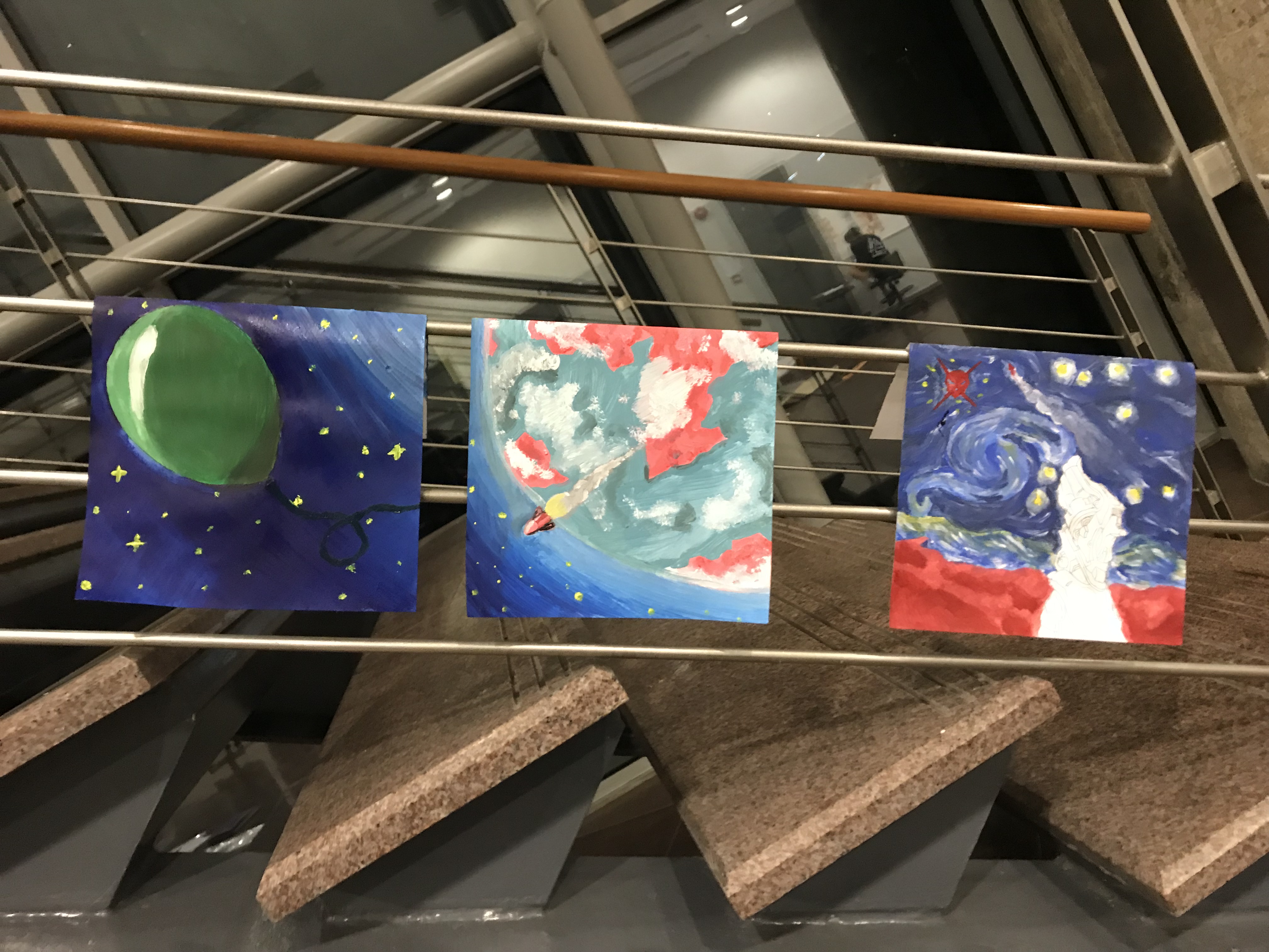
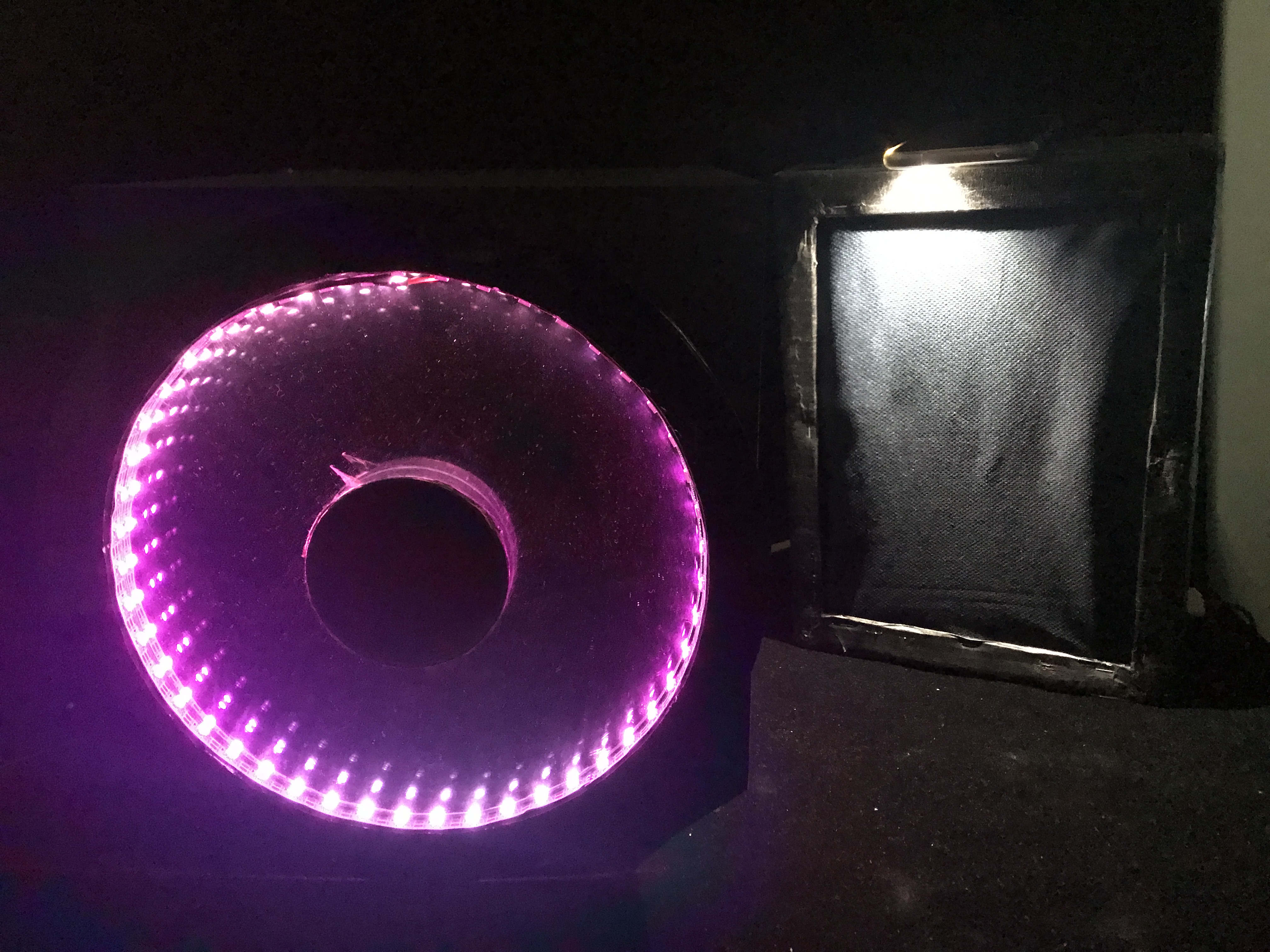
Purple, the original colour

I was just messing around with the colours, and eventually I settled for bronze, and applied complementary colours : Blue and Orange.

I used a gradiented backdrop to make it not so flat. The stars are indivudually made circles of different sizes, so it’s diverse. I added a ‘?’ and some electric sparks to show that it does not know where it is going and probably is damaged. I also added a gradiented layer behind the satellite to show that it’s moving quickly towards the right.

Second Panel

https://www.pinterest.com/pin/83246293091014368/?lp=true

So this panel, I wanted to just put empty space, as in, illustrated space. But it doesn’t bring context to the next panel.

Reference:

https://yt3.ggpht.com/-leCLR4PA2oM/AAAAAAAAAAI/AAAAAAAAAAA/snXCKoKYAp8/s900-c-k-no-mo-rj-c0xffffff/photo.jpg

Empty space, with a small planet in distance.

Therefore I forced a planet in, and try to make it blend as much to the space as possible so it isn’t so visible, but adds to the context of having a planet. So anyway, second panel is ‘give it enough time and space’, so meaning the situation is to give my lost satellite enough time and space. You can already expect what’s next. It’s not going well.

For colour scheme, I want to portray the planet as a more hostile one, reason is I want the next row to be set in a hostile place, and for consistency sake, I need this side of the planet to have the same colour scheme too. I used purple and red because it gives an ominous look. Somewhat poisonous. I used split complementary:

The yellow is being thrown all the way into the white area, so technically still split complementary?

This is the first version, which I think is too bright. The purple makes the whole composition unbalanced and messier, I feel. I want to keep the red. So in order to make the red stand out, I darken the purple.

(I ended up enlarging the planet and changing the colour to blend it with the background, covering the ‘clouds’ which I feel sad about 🙁 )

Third Panel

Third panel, I crash and burn into the planet. Yep. So at first, I didn’t know what artwork to reference to. Shirley gave me a good reference: Raining Men by Rene Magritte.

https://en.wikipedia.org/wiki/Golconda_(Magritte)

I also referenced a Kurz Gesagt-inspired digital art of a comet

http://rebrn.com/re/kurzgesagt-style-wallpaper-x-3213272/

The colour scheme, together with the last panel and last row, is inspired by Disney villains colour scheme.

http://sobadsogood.com/2011/09/26/the-superhero-colors-of-good-vs-evil-infographic/

You can sort of tell the purple and red are also in the planet’s colours.

So the colour’s gonna be analogous

So, combine all these together, you get:

Crash and burn.

FOURTH ROW

First Panel

So for the last row, I will be using paper collage. I am inspired by overlaponeanother:

https://www.instagram.com/overlaponeanother/

They are a design studio that specialises in paper with patterns, and they will present their photos with lots of patterns overlapping one another.

https://mulpix.com/overlaponeanother

I really like the kind of stuffs they do, the kind of patterns they use. So I thought about making my own patterns and put them together to form shapes.

http://gallerily.com/paper+piecing+quilt+patterns+animals

I came to realise that this type of paper collage has a name called piecing quilt patterns.

So in this panel, I am a chameleon because I can adapt to places easily. I can learn and mimic people quickly so as to adapt to their style and make friends that way. I am also very carefree and very ‘anything’, so I want to be depicted as a calm/chill little chameleon.

Chameleon reference:

https://www.publinews.gt/gt/tendencias/2015/03/11/c2a1misterio-resuelto-asi-cambian-color-camaleones.html

Idea of applying patterns:

https://fineartamerica.com/featured/zen-chameleon-drew-normandin.html

So this chameleon is going to be in a tropical setting, it’s home. Where it’s comfortable, where it doesn’t need to blend in.

https://weheartit.com/lulugz/collections/98933271-espiral-de-sensaciones
http://low.onvacations.co/graphic-leaf-patterns/

So I decided to use these leaf patterns for the background.

https://www.picquery.com/c/asian-patterns_Q6v1t7bVTh5JdDQ7PiP*keGhyxAbUF6S98V7D4cxHlM/
https://www.etsy.com/de/shop/gajamay

So the chameleon is going to be depicted by these circular wave things, to indicate that it is chill.

Lastly, the tree branch that it stands on:

http://seamless-pixels.blogspot.sg/2014/07/wood-10-dry-cracked-bench-plank-tree.html

The colour scheme I will use is analogous, more to the green side:

The outcome:

Looks pretty chill to me 🙂

Second Panel

Second panel is going to be in space again. The situation is a foreign and hostile planet, symbolising an environment that I, the little chameleon, am not familiar with. It will be the same planet as the 3rd row’s 2nd panel.

I want to depict the place as hostile, so I used triangles.

https://www.pinterest.com/pin/291115563387307924/?lp=true

And once again, the same colours, but with green as the other end of the split complementary, as I added a ring to the planet (invisible in the other panel, visible in this panel). The reason for the ring is to distinguish this planet from the other planet at the top 2 rows, other than the colours.

We can see that this scheme is taken from the villain colours:

http://sobadsogood.com/2011/09/26/the-superhero-colors-of-good-vs-evil-infographic/

Outcome:

So yeah. Even the stars in the background is made of patterns. I kinda was imagining a wrapping paper kind of effect, so yeah. I’m happy with the outcome!

Third Panel

Last panel of the last row. This is going to be my reaction to being in a foreign and hostile environment. I once again zoomed into the planet for the last panel. When I am in a foreign place, no matter how well I can adapt, I will still feel nervous. On the outside, I seem okay I think. But on the inside, I am trying hard to adapt, to blend in. I feel nervous because I don’t like interacting with people that much. But ironically, I can adapt well so… It’s a bit weird, and hard to explain.

I decided to use a lot of sharp-looking shapes like diamonds, squares, zig-zags, etc.

https://www.graphicpear.com/hexagon-geometric-pattern-vector/
https://www.wallpaperwarehouse.com/product-details/Vertex-Green-Diamond-Geometric-2625-21827-Wallpaper-Brewster-Wallcoverings/1431627687HQWYORJF
http://www.dianliwenmi.com/postimg_5382947_16.html
https://pepperlu.com/products/chevron-multi
https://vimeo.com/dlvlb

They’re mostly geometric.

So, with these patterns, I form a hostile looking place. The reference for the background will be The Persistence of Memory by Dali:

https://en.wikipedia.org/wiki/The_Persistence_of_Memory

The reason for this is that it is a strange place to be.

The colour scheme will once again be the split complementary colours in the disney villains. I feel like it’s very repetitive to use it, but it is only because I have to be consistent with the overall look. Now come to think of it, it’s not a very good idea cos in the end, there’s very little colour choices to play around with…

Then again, I played around with the weight of the colours, so that’s something I tried. For this composition, I used more red and green than the purple, using purple only as a touch to not make everything too bold. Whereas for my other compositions, it’s mostly red and purple, which is to give a more harmonic look. The colours picked here, together with the patterns, make everything quite messy. But it is quite intended because I want it to be a hostile place. In a way, it works, but again, it doesn’t because it’s a bit too messy. I can justify, though, because there really is a need to separate the different elements of the painting with colours and patterns.

The outcome:

Oh, if you realised, I used the floor patterns from The Shining, a horror film made by Stanley Kubrick (originally from Stephen King’s book) to depict the floor. This floor pattern is pretty iconic, and I want to use it to depict the horror setting.

https://design.tutsplus.com/categories/patterns?page=2

Overall for the last row, I will cut and paste the pieces to form an image, rather than it all being on the screen and printed out nicely.


The final look at the board:

The cut out and pasted pieces of the last row: