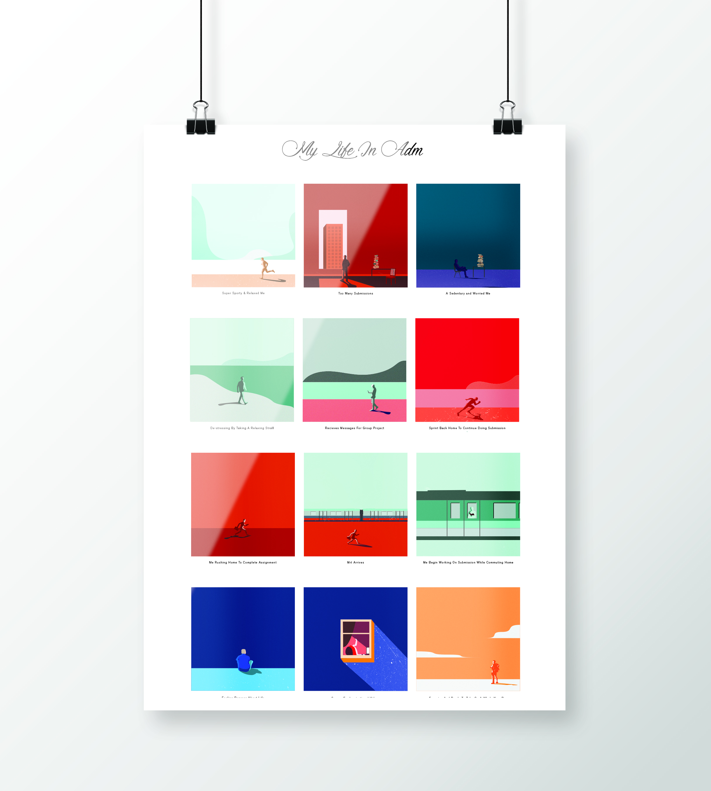
INITIATION
I start off the project by understanding the brief and objectives. After identifying the requirements, I would choose to find potential quotes that I am interested in to realise it in a visual form. Lastly, I would start researching and gaining insights for the project.
The reason why I pick a quote first then delve into the research phase, instead of doing my research straightaway, because it gives me the ability to better relate to my quote and simultaneously play around with potential idea in my own head during those ‘aha’ moments as I do my research, rather than sourcing for a new quote, then find ways to relate to my research data.
Brief Requirements:
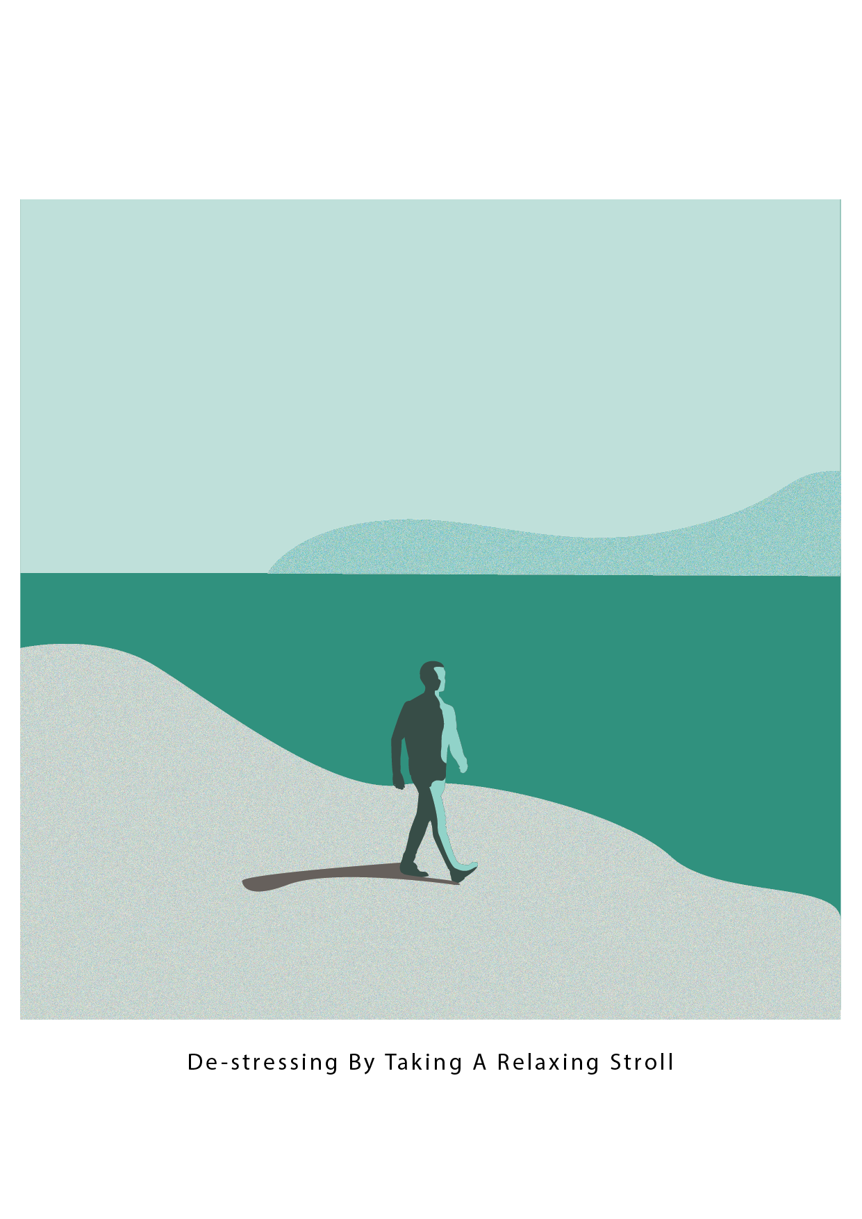
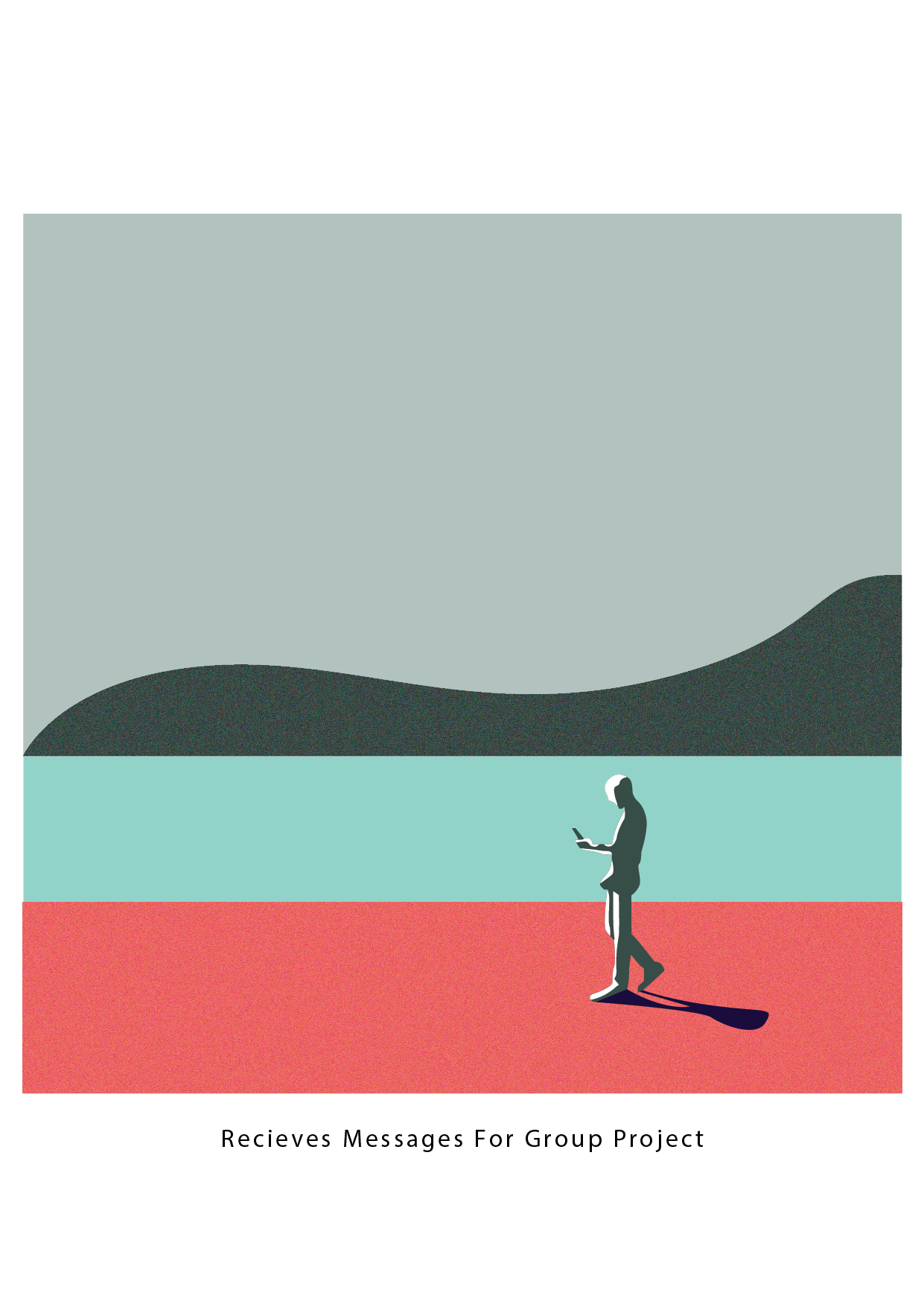
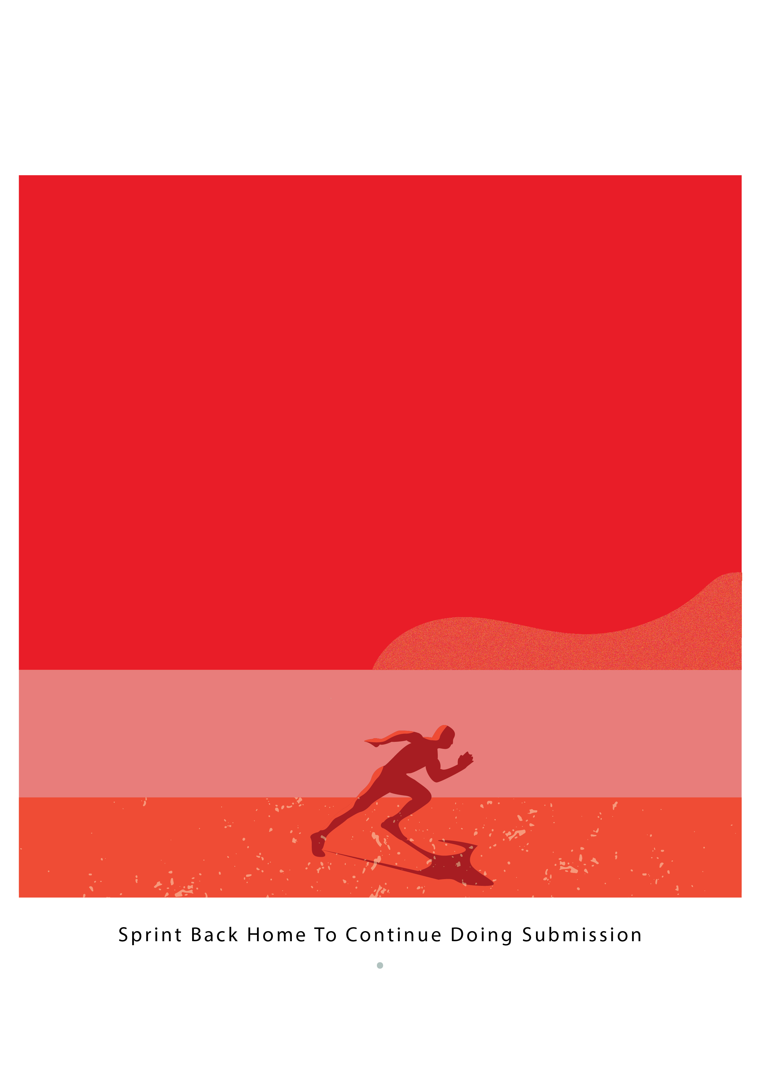
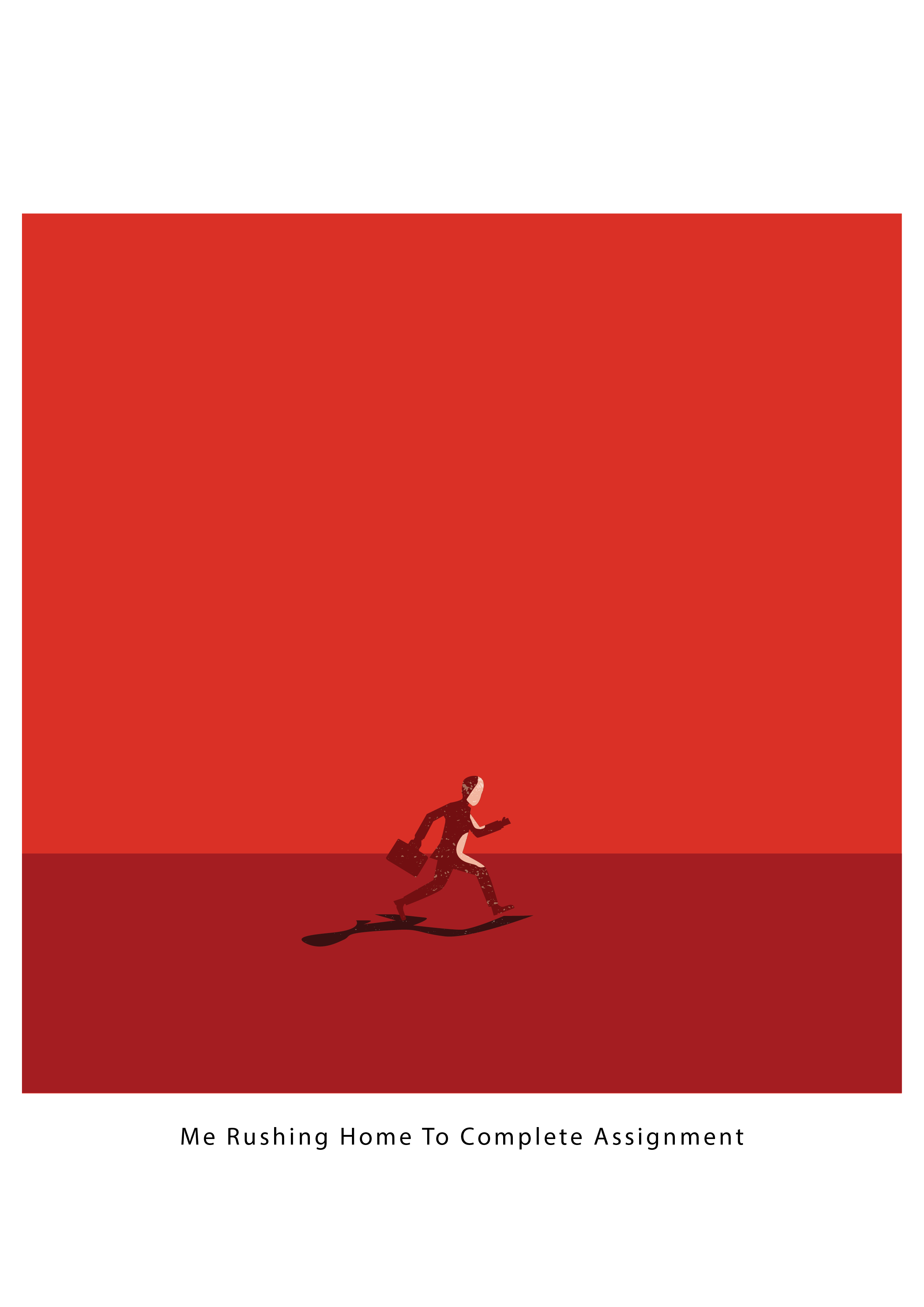
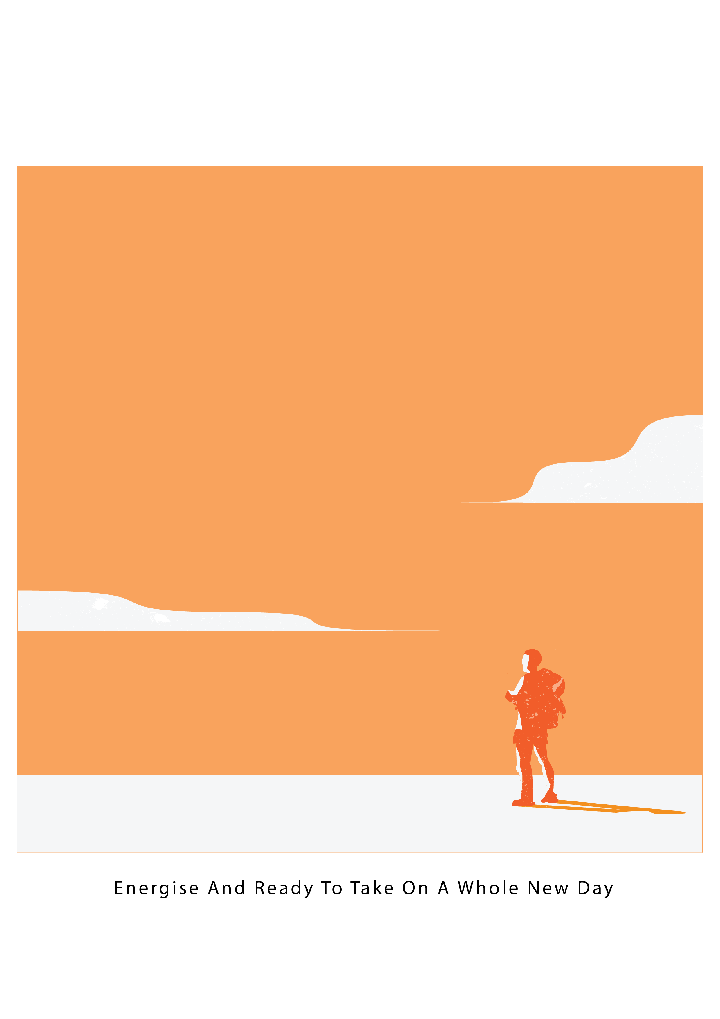
- The aim is to get the gist of the quote and communicate in a clear and concise manner. Try to also capture the character emotion, behaviour, character, attitude, personal reality. Convey all this through visual metaphor, beyond cliche
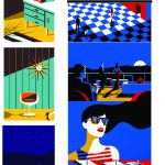
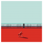
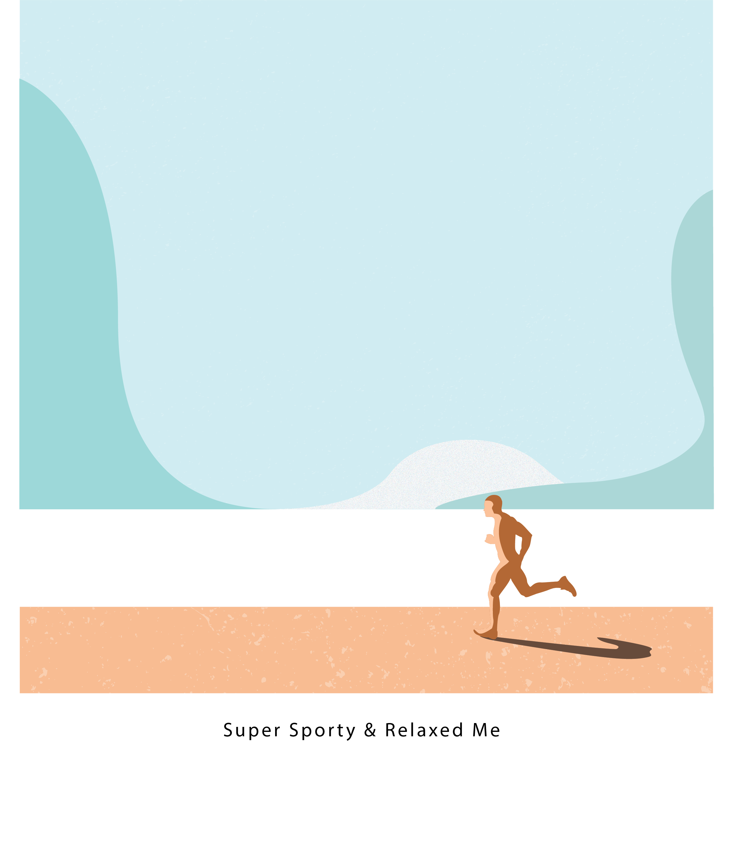
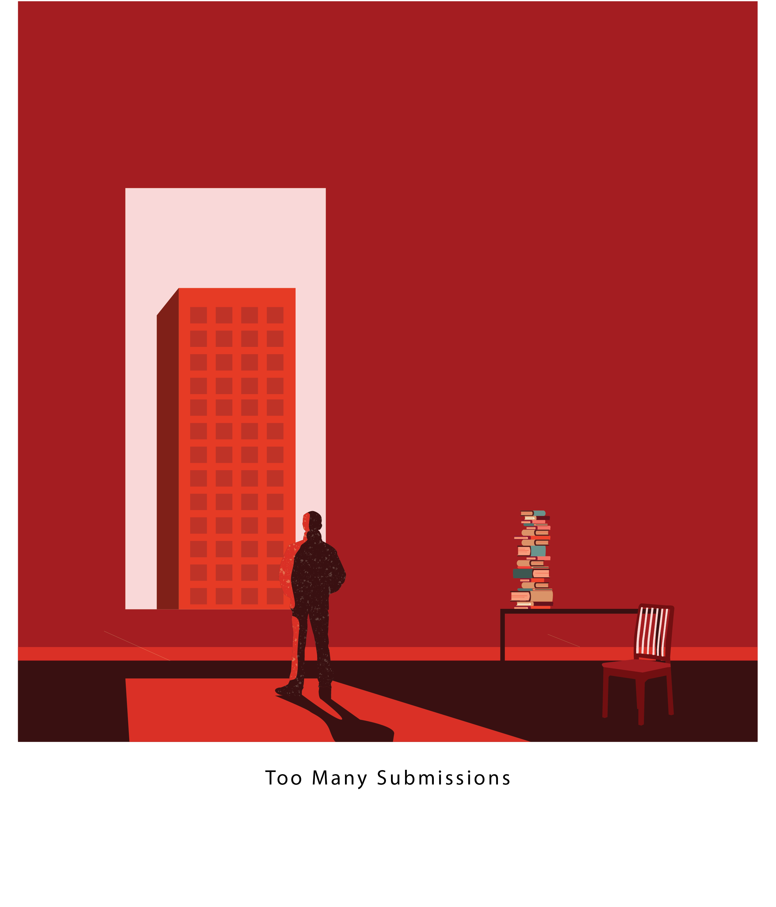
Movie & Quotes :
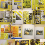
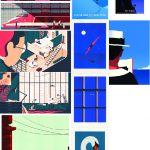
RESEARCH/REFERENCE
 A really simple ad, but you do get the message. It is not cliche in terms of showing how tough the car is by banging it against the wall or anything that shows toughness. But rather, it places a body of a rhino to showcase the ‘essence’ of this vehicle is really tough!

For this work, it shows a picture of a bulb through the negative space created by the hand. I think it because of its creative approach towards creating such an image, but I don’t get the context that it is trying to educate its audience? Is it that the subject is trying to take the light bulb? Is it that the bulb has a human touch of a hand? This composition is not clear in communicating what its intention is but only did communicate one thing, the glass of the bulb.

This ad are effective in communicating through visual metaphor! Its when I look at Heinz, I know it is a brand that sells tomato, and it makes it even more clear by slicing the bottle up into pieces, showing that it is made of pure tomato in that sense (of course it is not, its freaking processed sauce)

(will add in more description later)


DADA MOVEMENT

The Pillars Of Society 1926
This picture uses visual metaphors to show the corruption, the evil, the egotistical side of the people who hold higher power. It is also another good reference to showcase visual metaphor in a more traditional media.

‘Fountain’ 1917
I was inspired by this iconic work of art because it was the usage of visual metaphor with a sarcastic undertone. The visual metaphor used is the signature itself, as well as the hyperbole of using an object that is completely distasteful and opposite of what art is about, an object that accumulates waste or urine. And by signing off, it shows the meaning that ‘anything can be interpreted as art’
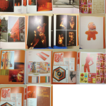
COMICS

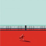
Disconnected From Reality
This shows the message of disconnected from reality, and I like the use of wires and socket to show the disconnection. However, in this project, if there is a way to showcase reality without words in this picture, that would be extremely awesome!
VIDEO ADS

http://adsoftheworld.com/collection/experiential_advertising_highlights#showdelta=3
This WWF ads is about global warming, which they serve their customer cold beverages at room temperature, without ice. This ad is created during the summer, and the people usually like to drink cold beverages at that point in time. Not serving the cold beverages cold, they drive a very direct message to their audience that if each of us do not take care of our planet, it will just keep on getting warmer.
What I learn through this ad is not just simply think about cliche method of presenting my ideas. Think one step further about the topic of global warming, what are the major issue revolve around it, what are the component that makes up the theme of global warming, etc, then build my ideas from there.
Summarising The Data
It is the play of visual metaphor to bring out the meaning the artist or company wants to portray.
Clarity is of utmost importance. At a glance, the audience must know what the message is, and it is something I definitely strive to work towards in this project.
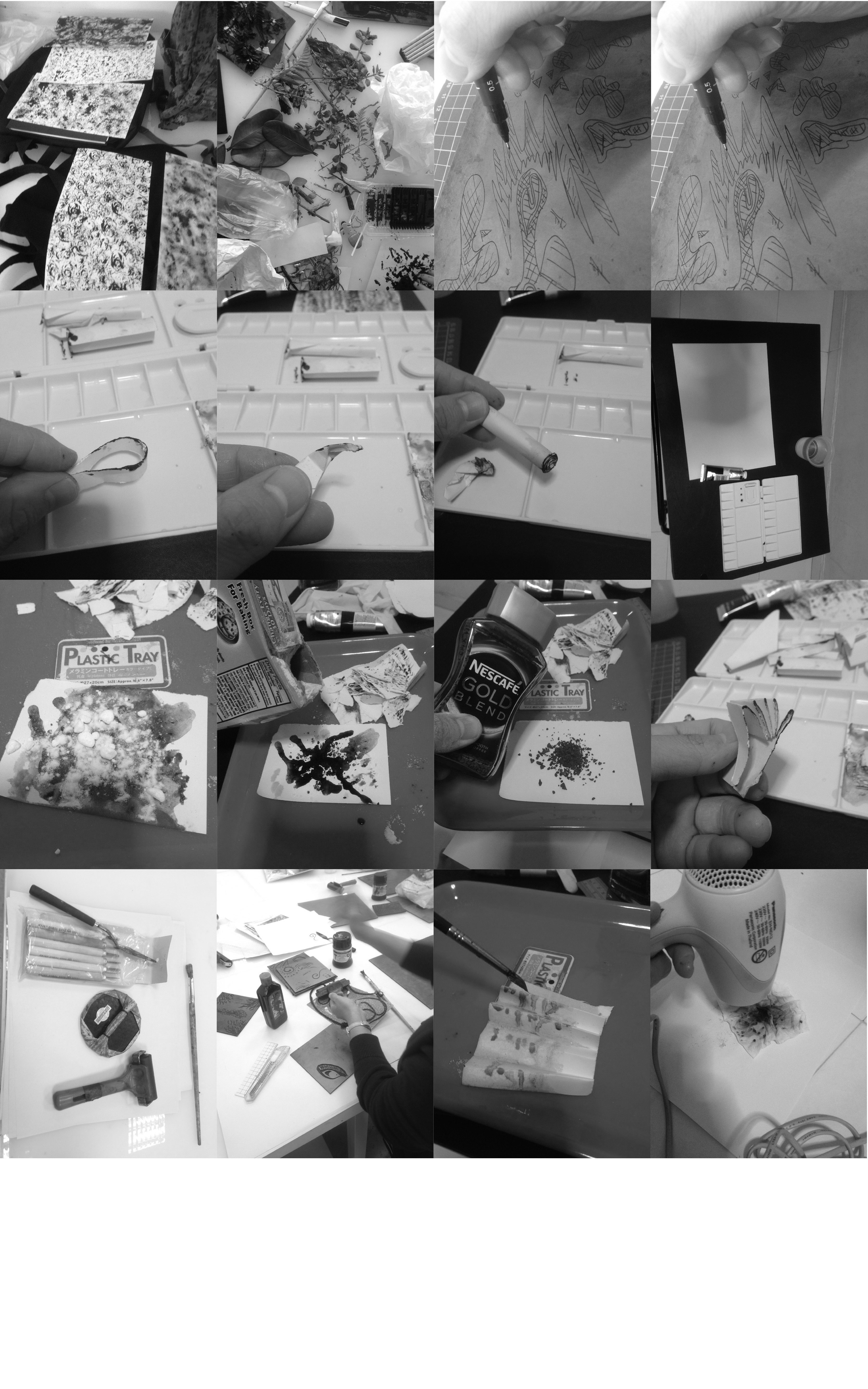
Consider the mood, colour tone, values, contrast, and many other elements of design, such as rule of thirds, unity, harmony, emphasis, etc for your composition. Such as the ads I have research, the colour, tonal values have to reflect the mood, and emotions relevant to the context of their ads, company branding, etc, in order to achieve the objective of the brief. This is a subtle yet crucial step as I need to stay within context of my character in the movie, such that their attitude, personality, can be presented within the composition, to show a more cohesive and accurate message as shown in the movie.
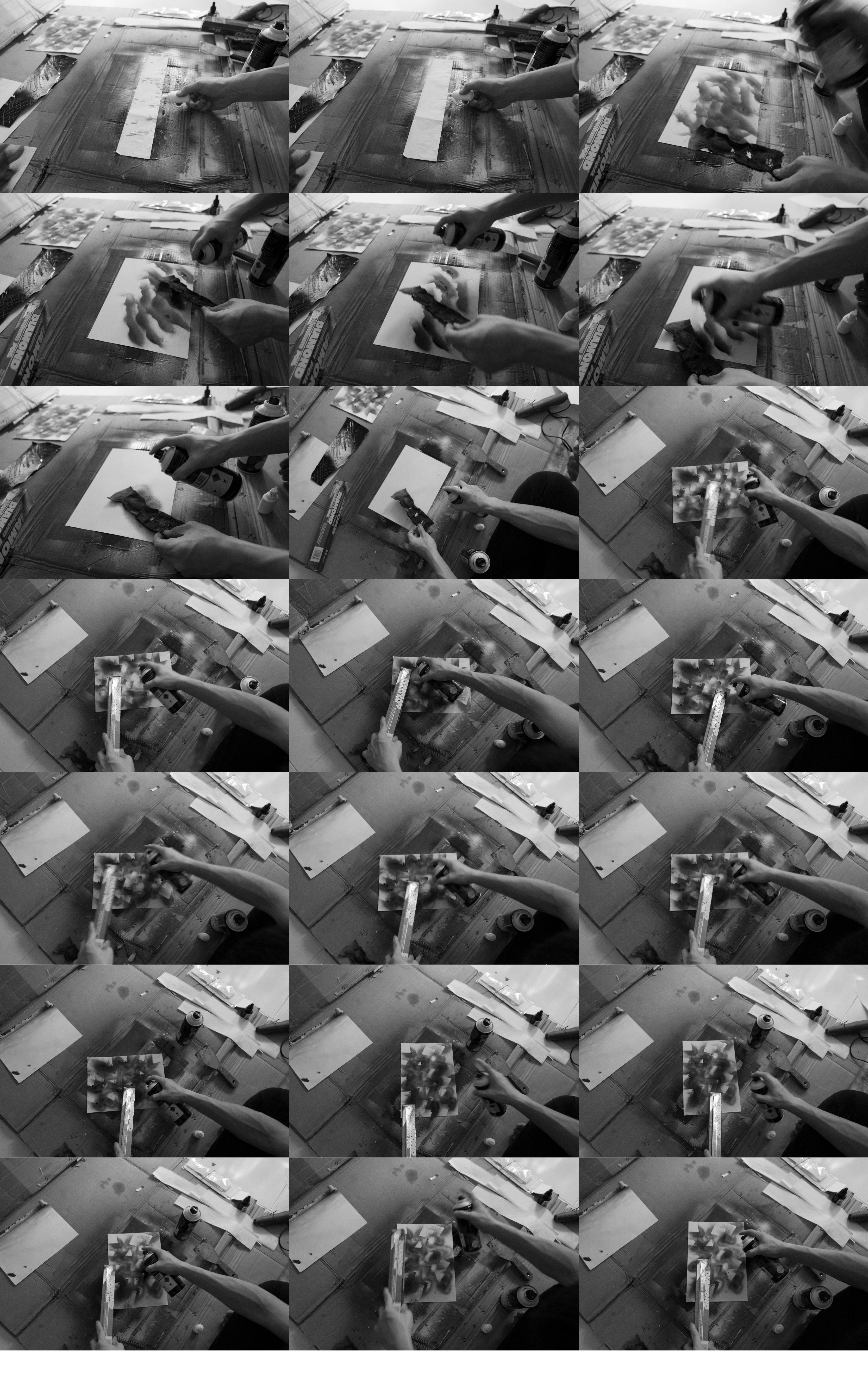
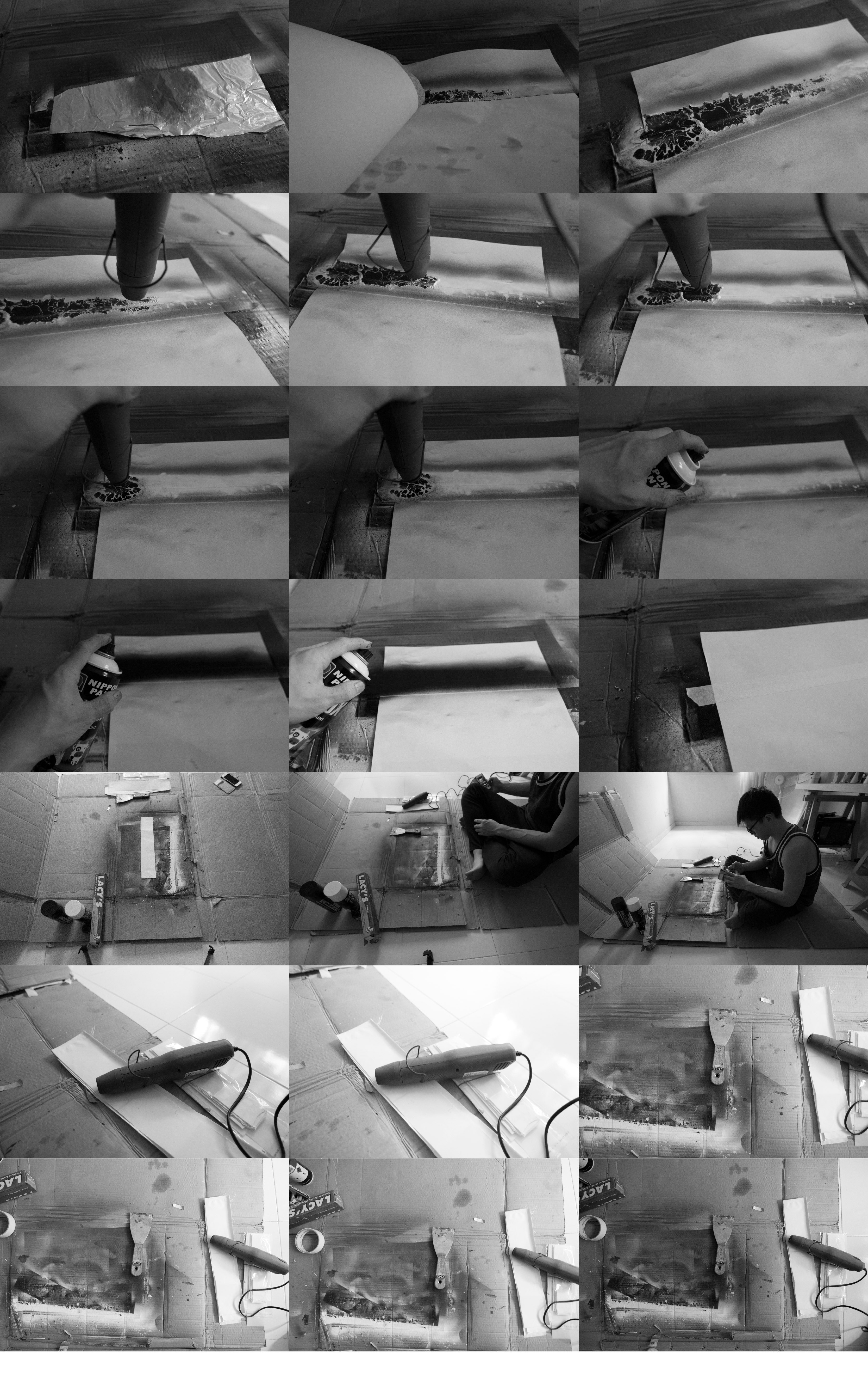
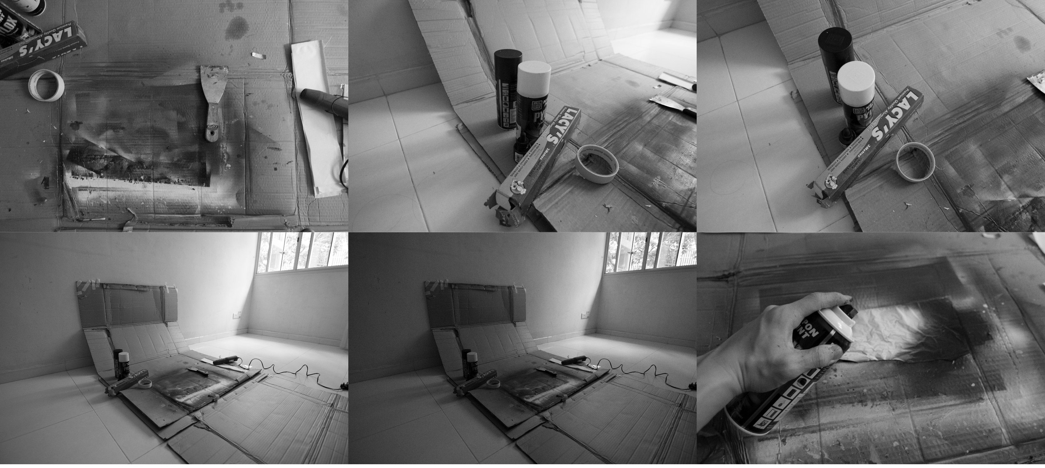
Hyperbole, exaggeration & photoshop skills play a huge part in bringing out the essence of the message in the composition, as shown in the Jeep ad.
\\\
IDEATION
“There are no two words in the English language more harmful than good job” – Whiplash
Synopsis of movie :
Andrew Neiman (Miles Teller) is an ambitious young jazz drummer, in pursuit of rising to the top of his elite music conservatory. Terence Fletcher (J.K. Simmons), an instructor known for his terrifying teaching methods, discovers Andrew and transfers the aspiring drummer into the top jazz ensemble, forever changing the young man’s life. But Andrew’s passion to achieve perfection quickly spirals into obsession, as his ruthless teacher pushes him to the brink of his ability and his sanity.

Design 1

“There are no two words in the English language more harmful than good job” – Whiplash, 2014
Thought process: So at this point in time during my creation of my quote, I did not reference my idea from my research as I thought it was too painful to think of complicated ideas, which was a great mistake and a time waster as well.
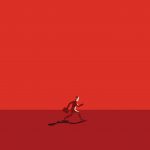
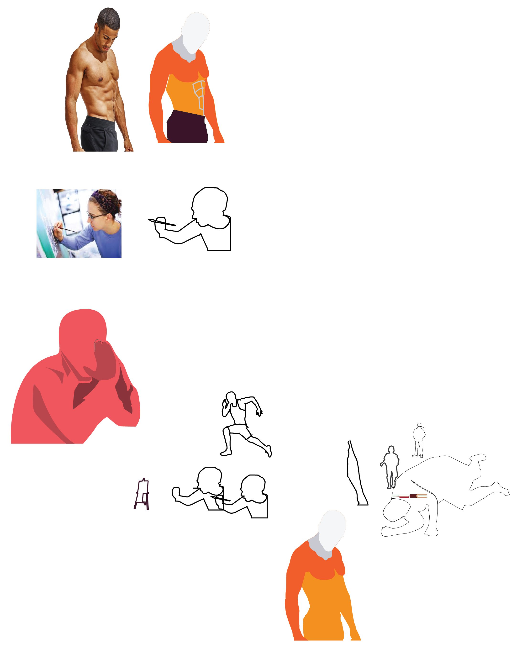
Proceeding forward , the first thing that came to my mind is that danger represent harm. As such, I remembered how Mimi shows the class a work that uses symbols, signages or logo to represent the quote. As such, I began to look at signages of ‘danger’ and began thinking of ways to incorporate danger in my first composition.

So I came across signages of danger which uses the element of a crossbones and skull.
After completing the composition, I felt that the concept was too simplistic and weak as the audience wouldn’t know exactly what it means, as it requires decoding of the meaning of the element. That is also what Mimi has emphasized that the imagery has to reflect its meaning accurately when looking at the imagery. I think that is extremely true as I have to take into account of the visual experience the mass public/audience have when relating to my print.

Reference/Inspiration: Crossbones and Skull
Design 2

“There are no two words in the English language more harmful than good job” – Whiplash, 2014
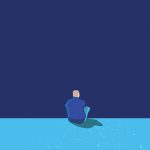
Thought process: This time around, I am still exploring along the lines of danger equals to harm. As such, I thought of the Grim Reaper, I use demonic wing and a scythe to represent the concept of grim reaper, and instead of using the grim reaper body, I substitute it with ‘good job’. I try to use this approach to show how Grim Reaper represents danger and harm, therefore the birth of this composition. However, I somehow felt that the composition is not showing the message in a clear, creative and aesthetically pleasing manner. Instead, it is cliche and lacks creativity.
Side Note: Till this point in time, I identified the problem is that I am trying to ideate a composition digitally, instead of taking a step back and think through the possible manner of presenting the concepts, then follow through to find the imagery I need. In addition, I NEED TO DO SOME RESEARCH AND ALSO DO MY FIRST CONSULTATION WITH MIMI.
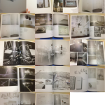
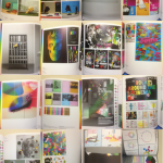
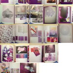
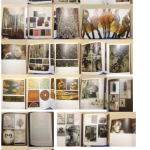
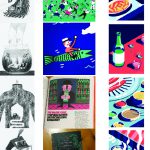
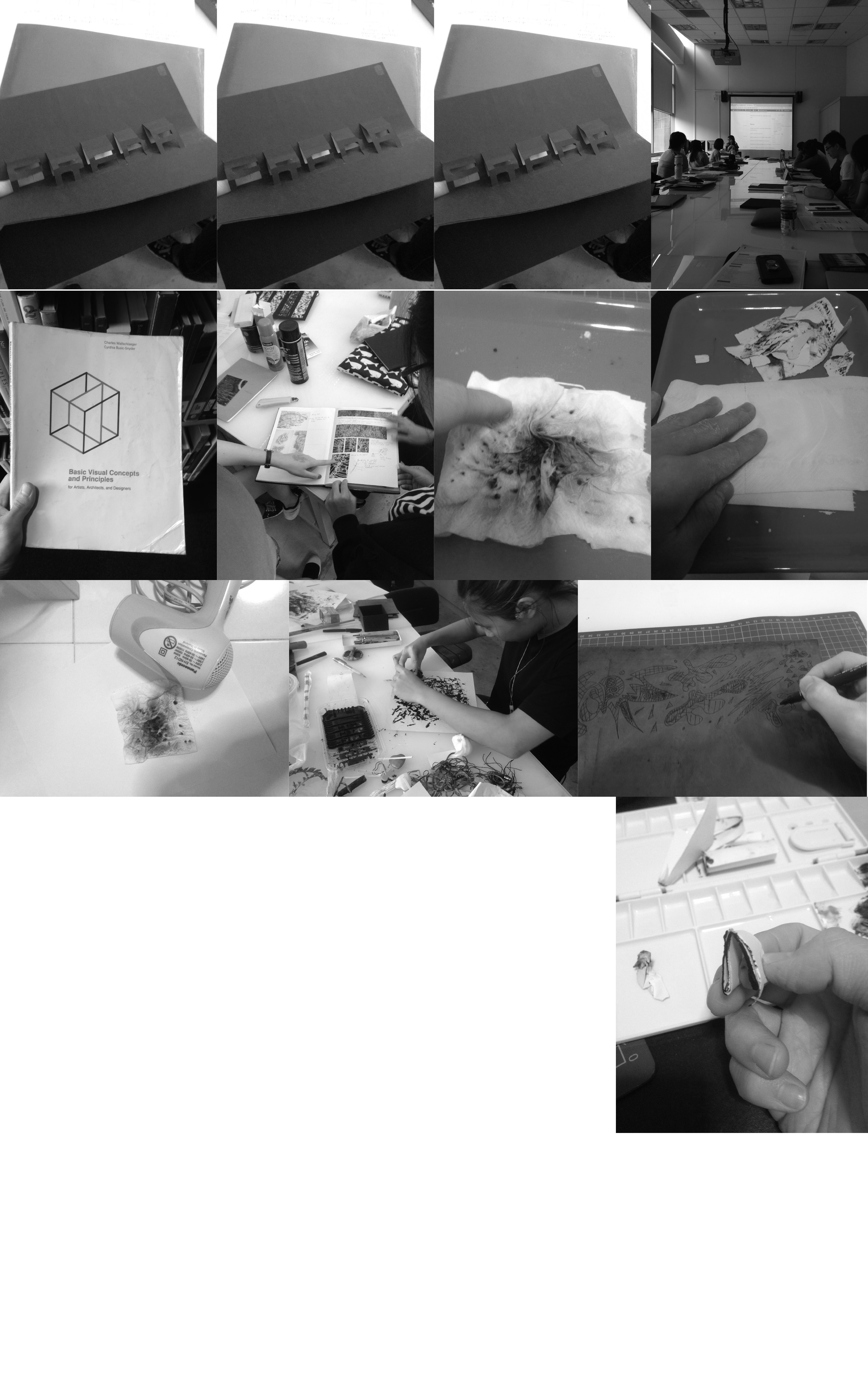
For the rest of the project, it has been documented in the sketchbook


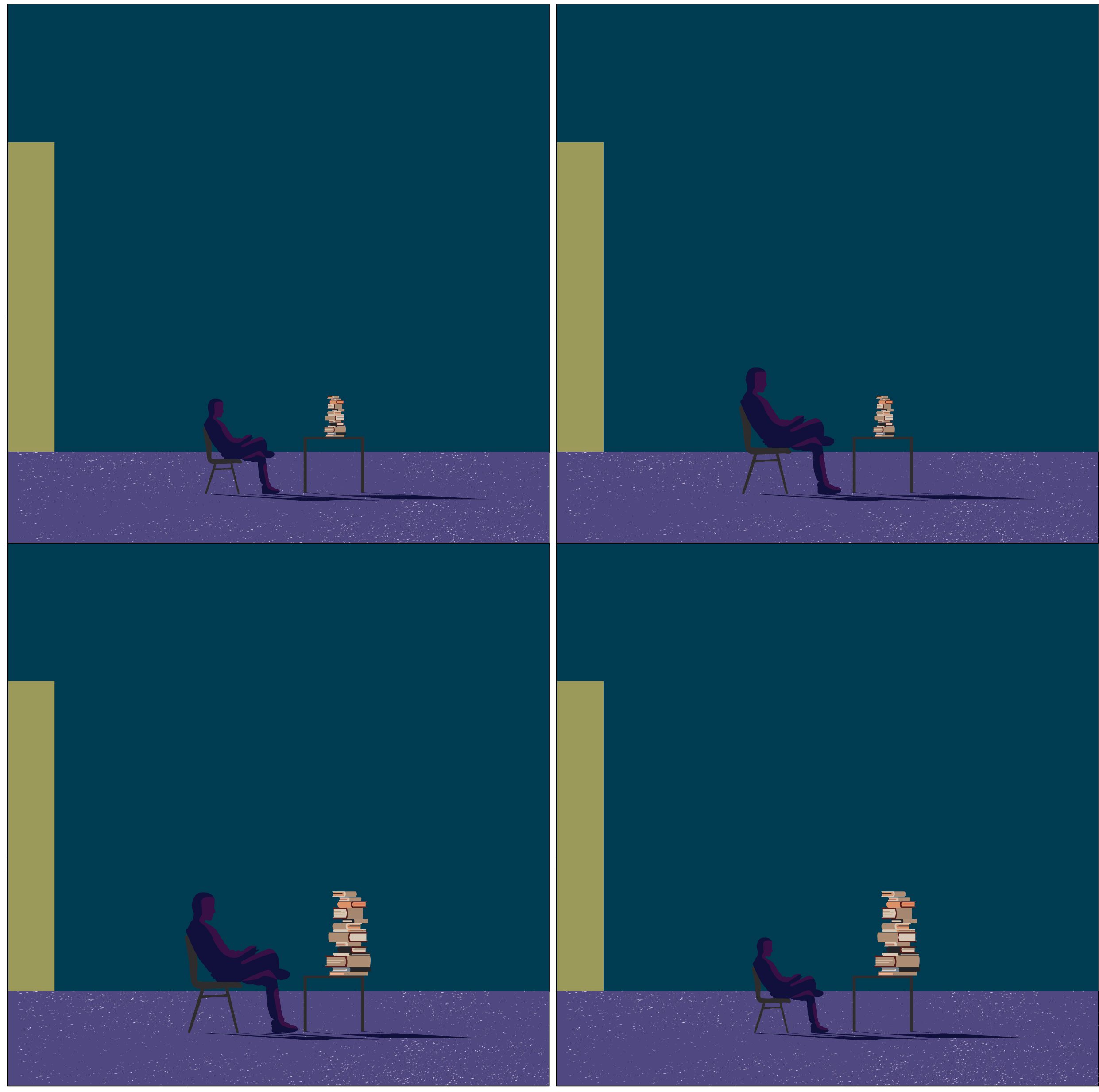 This point gonna do much in the proportion such that it doesn’t look odd since my composition is more realistic than surrealistic.