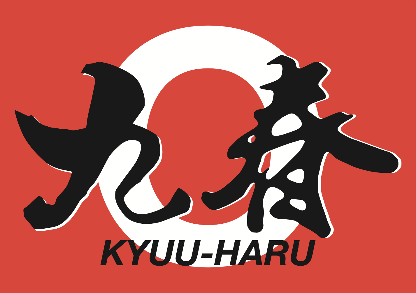
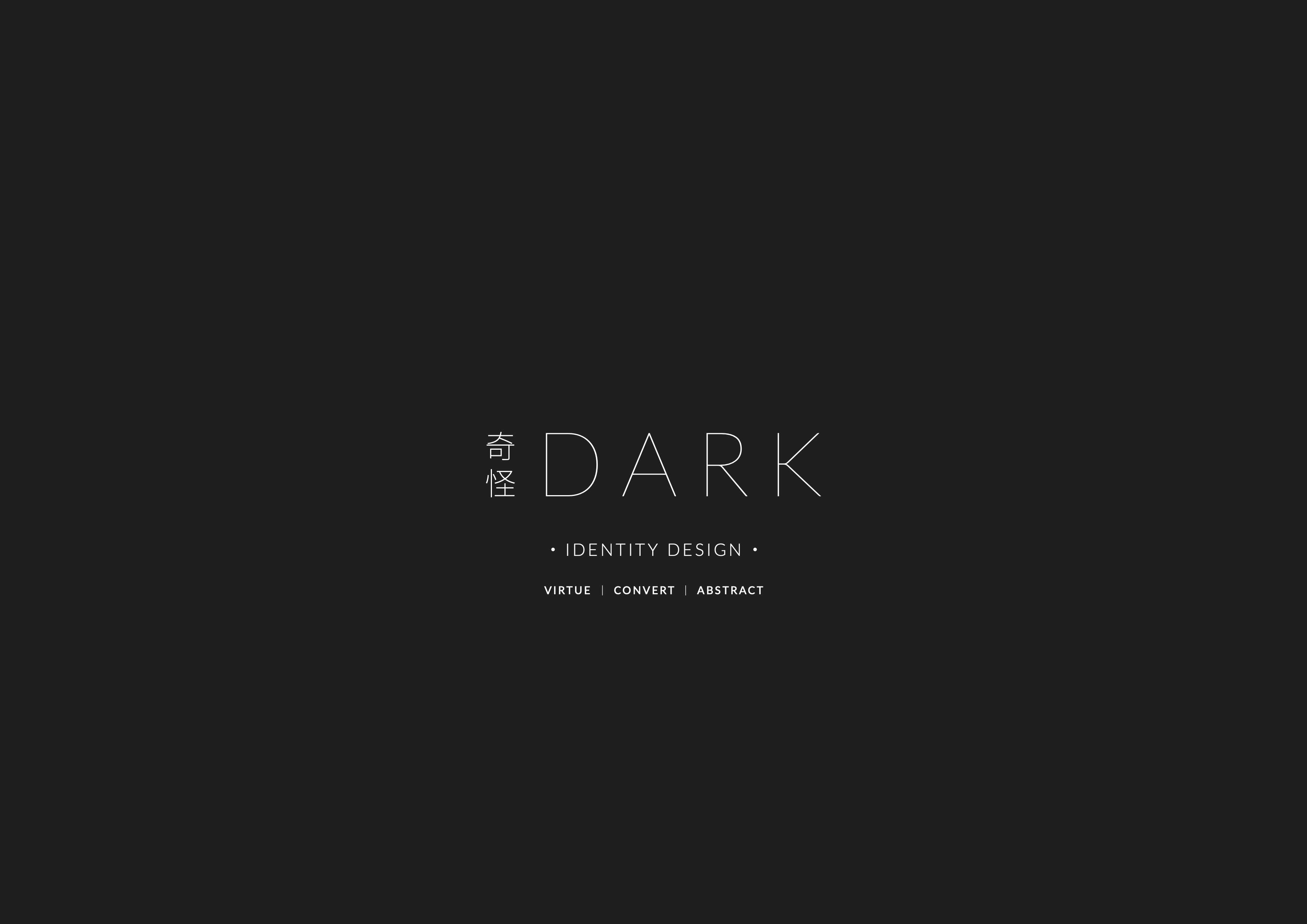
奇怪 | DARK COFFEE
Predicated upon the intensive research and concept development from the first half of the semester, my pseudo brand ‘奇怪’ or ‘DARK’ was born.
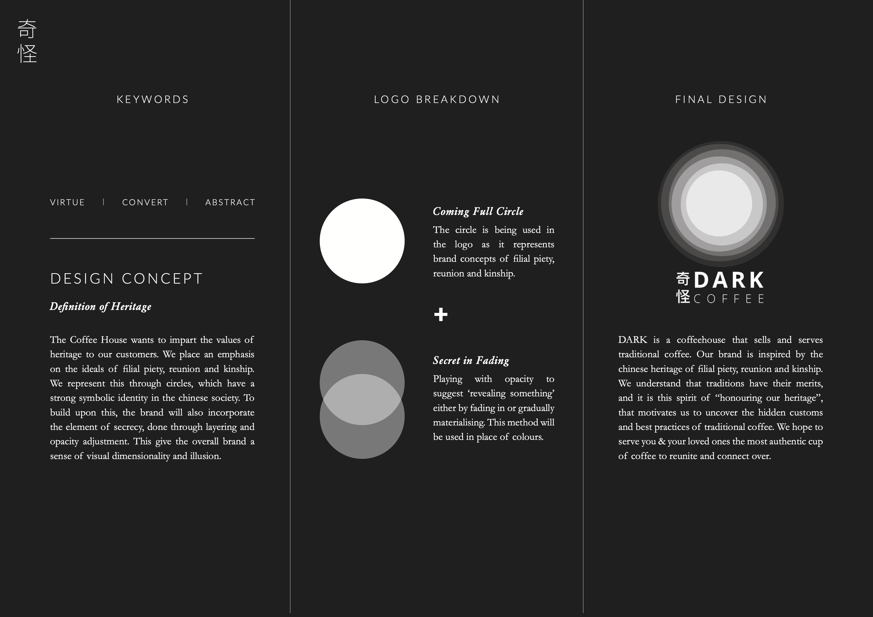
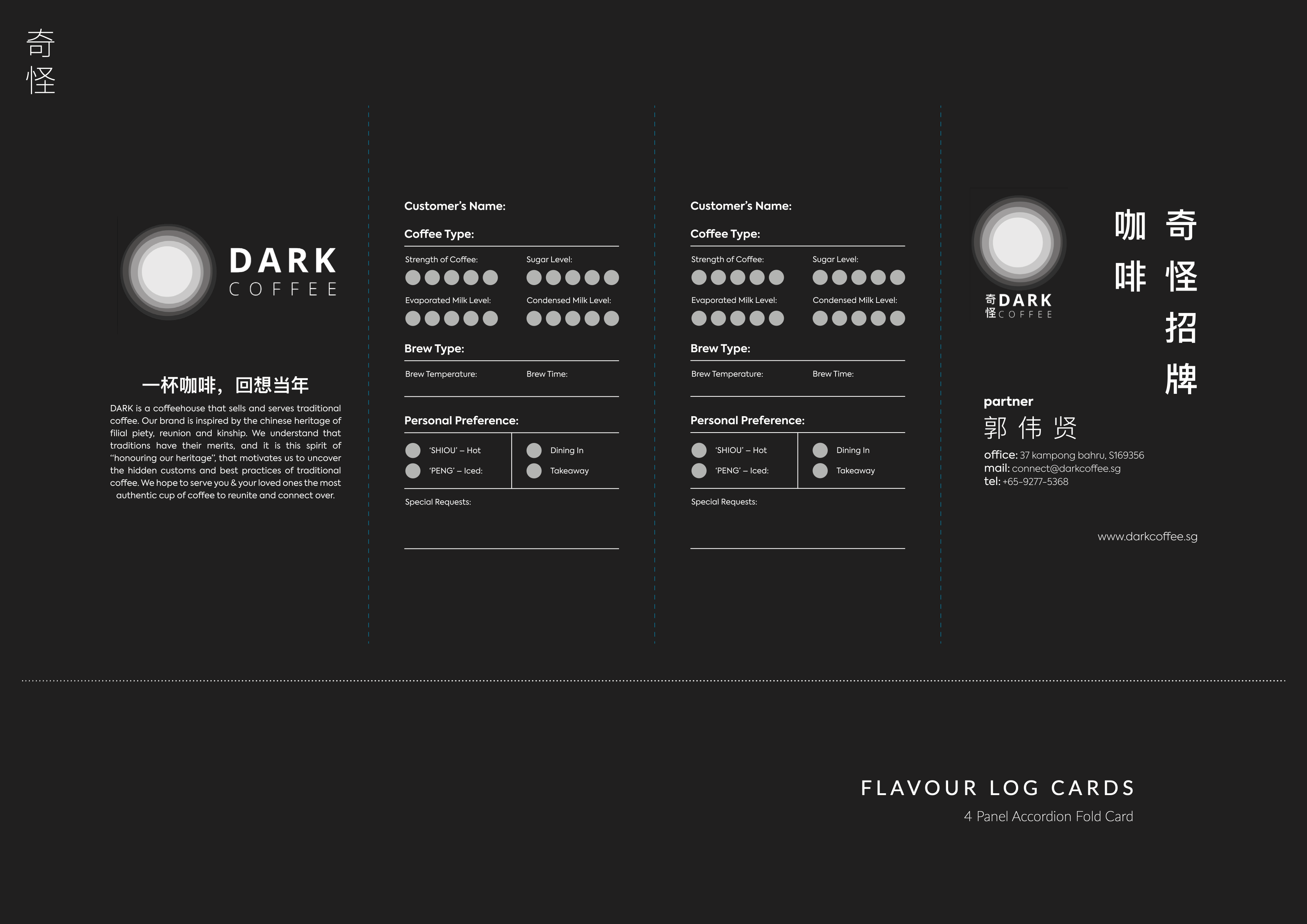
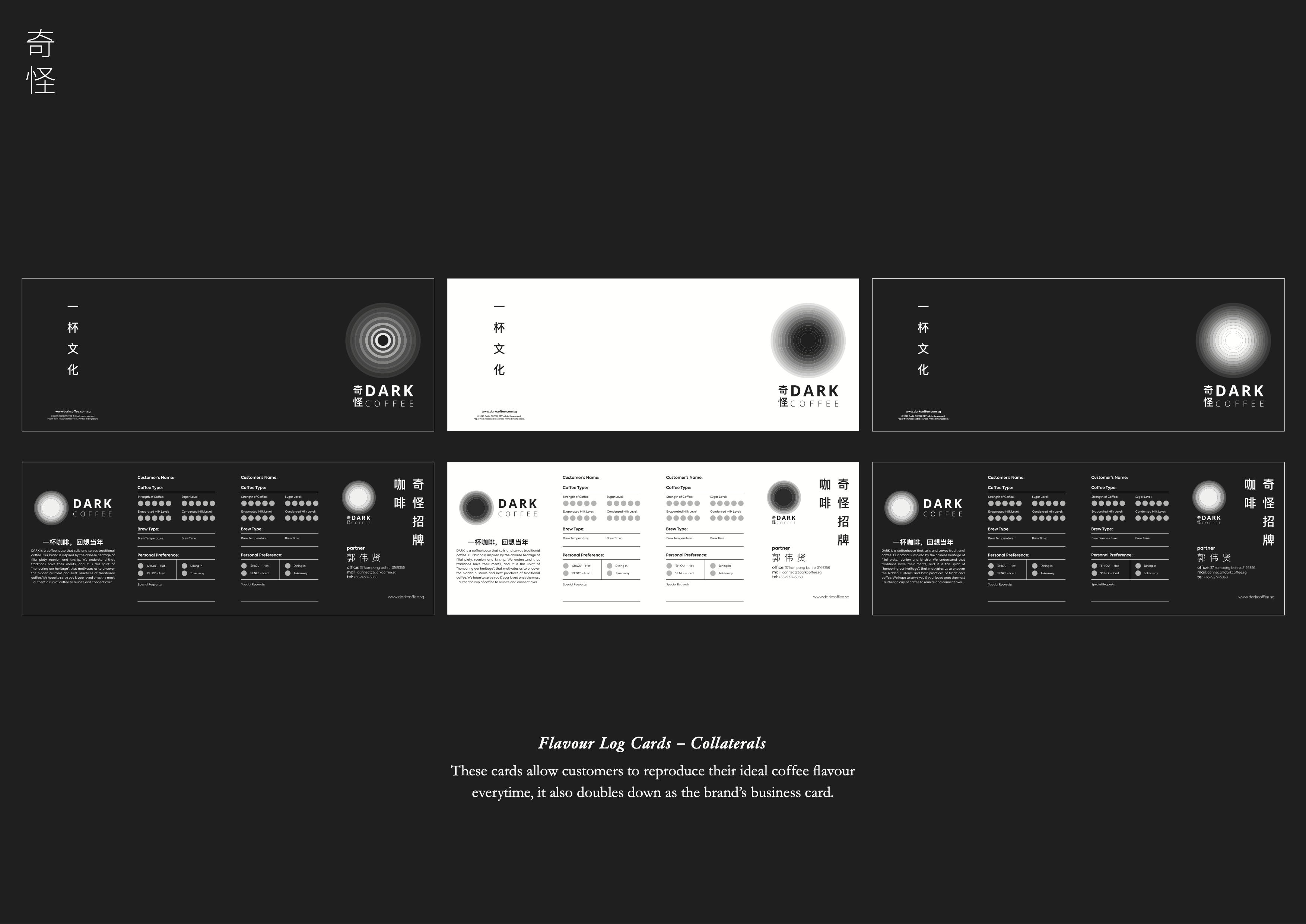
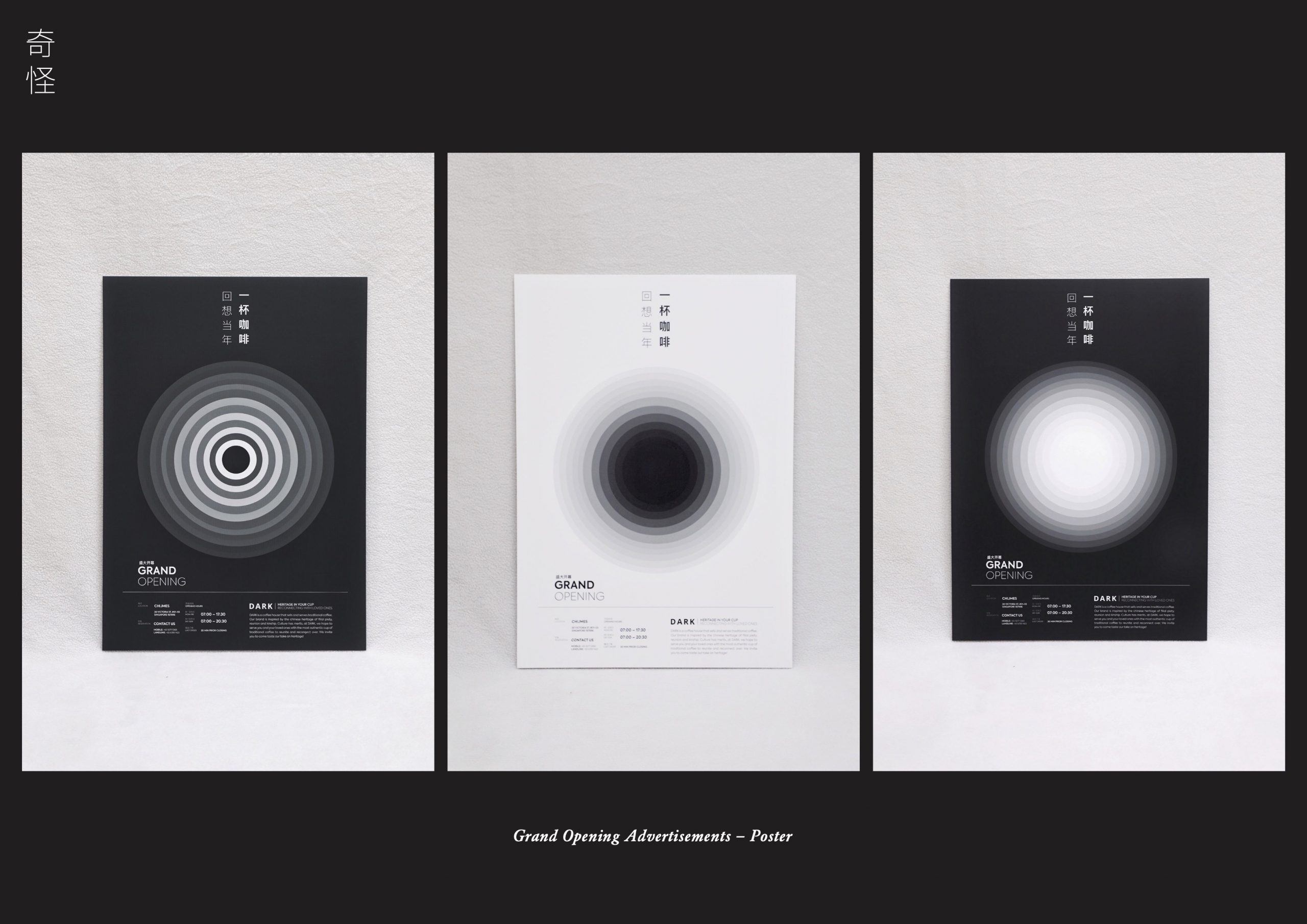
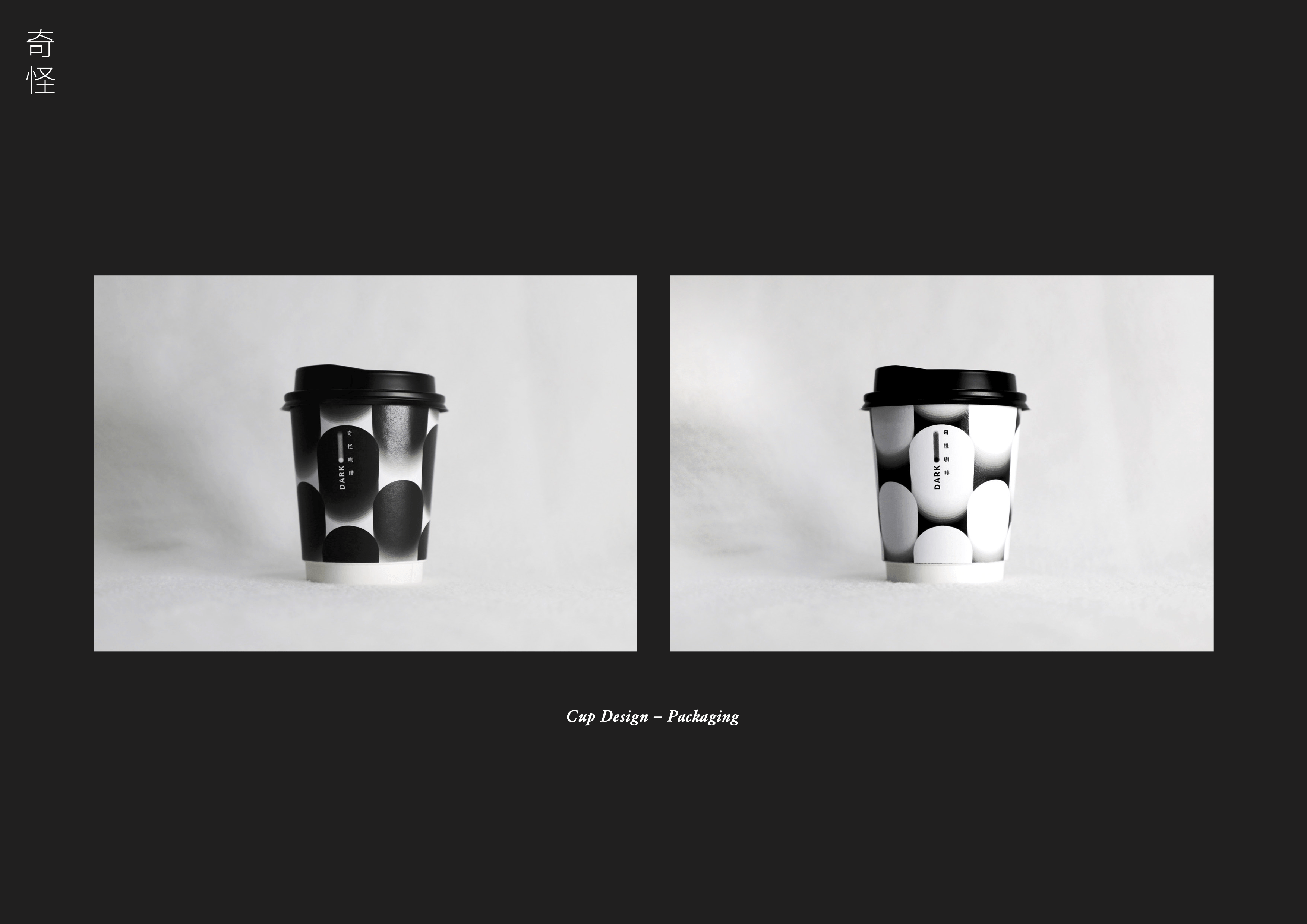
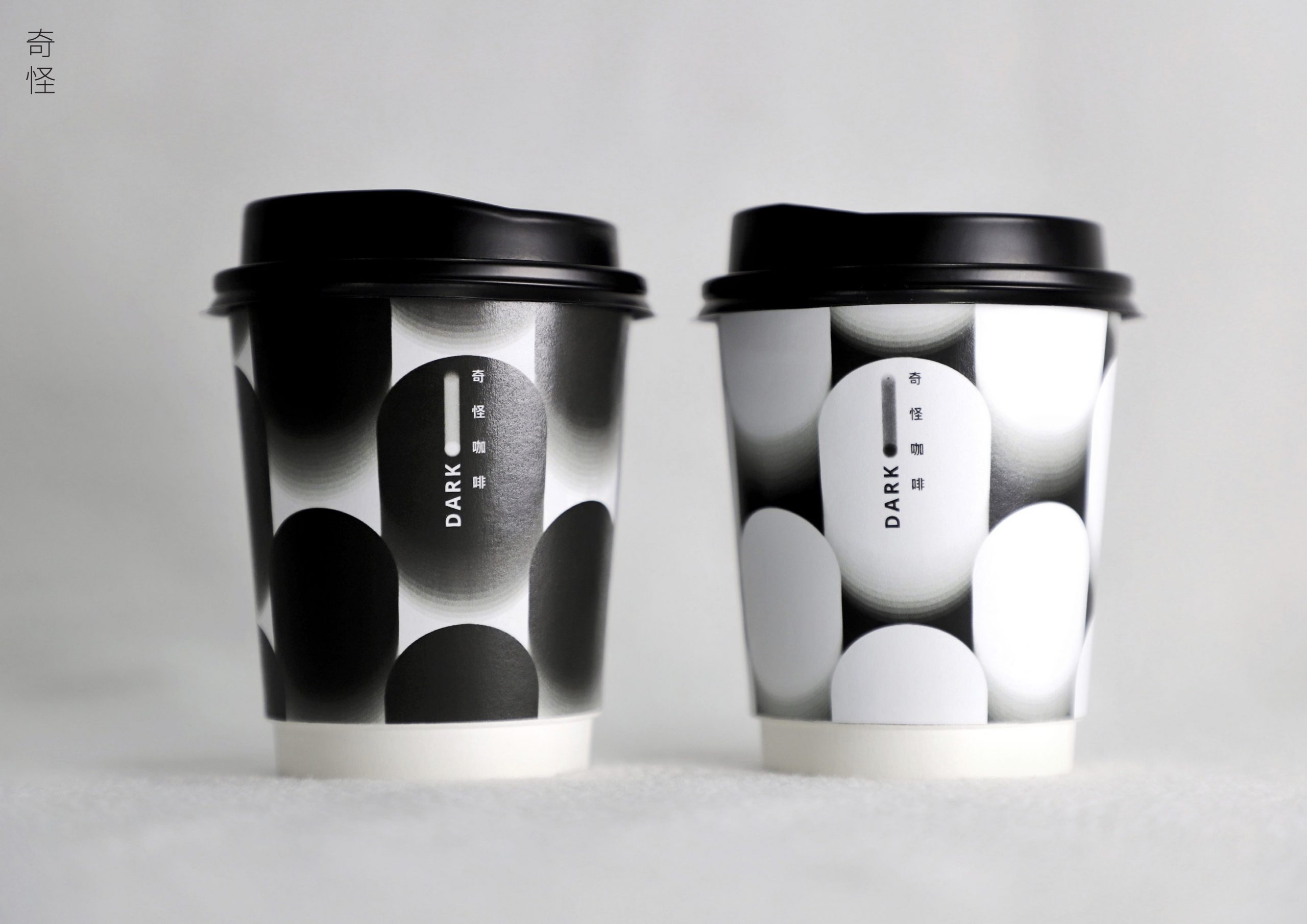
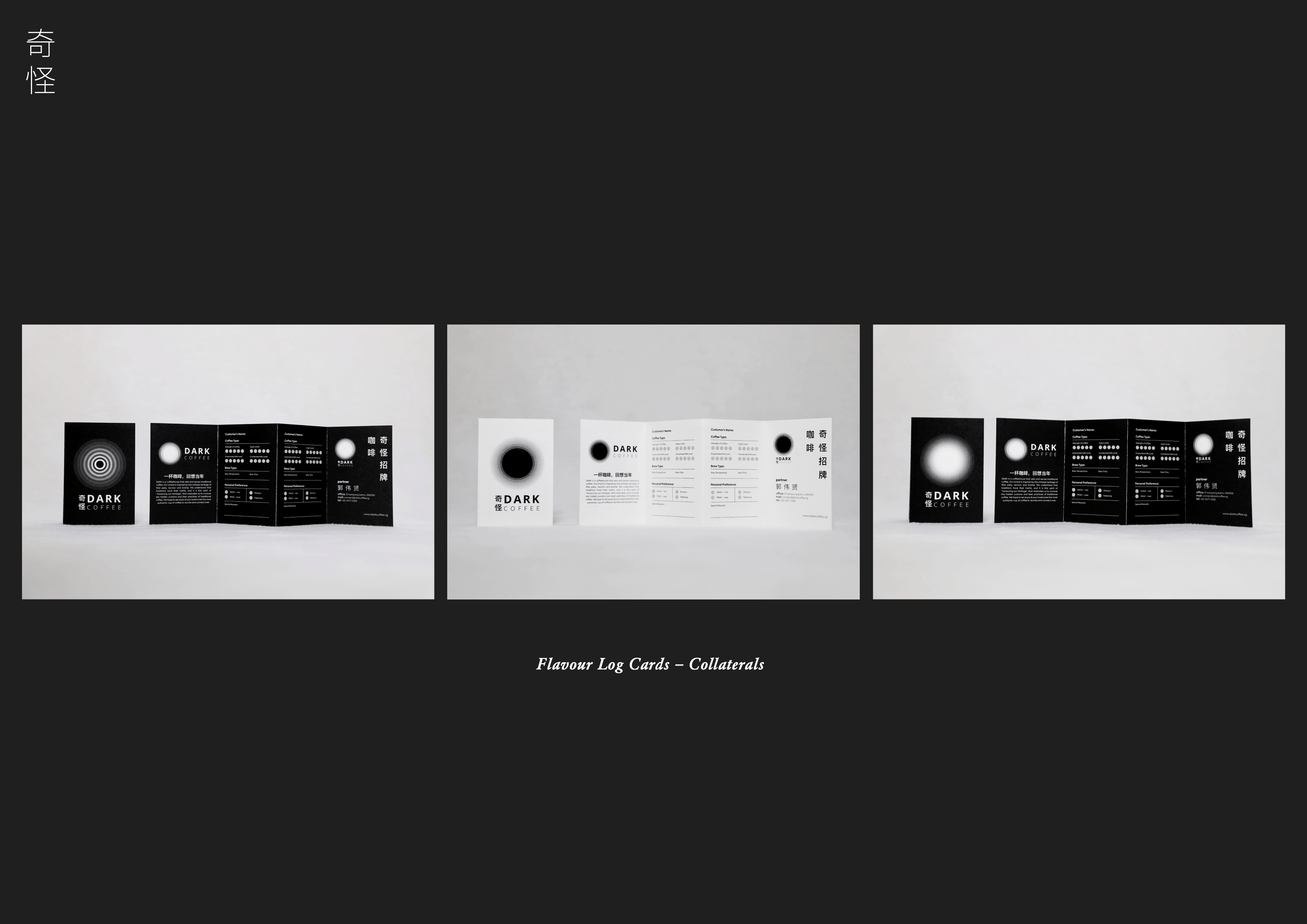
DARK is a coffeehouse that sells and serves traditional coffee. Our brand is inspired by the Chinese heritage of filial piety, reunion and kinship. We understand that traditions have their merits, and it is this spirit of “honouring our heritage”, that motivates us to uncover the hidden customs and best practices of traditional coffee. We hope to serve you & your loved ones the most authentic cup of coffee to reunite and connect over.
DESIGN CONCEPT | HERITAGE OUR SECRET INGREDIENT
Chinese Heritage + Modern Expressions = Relevant Traditions
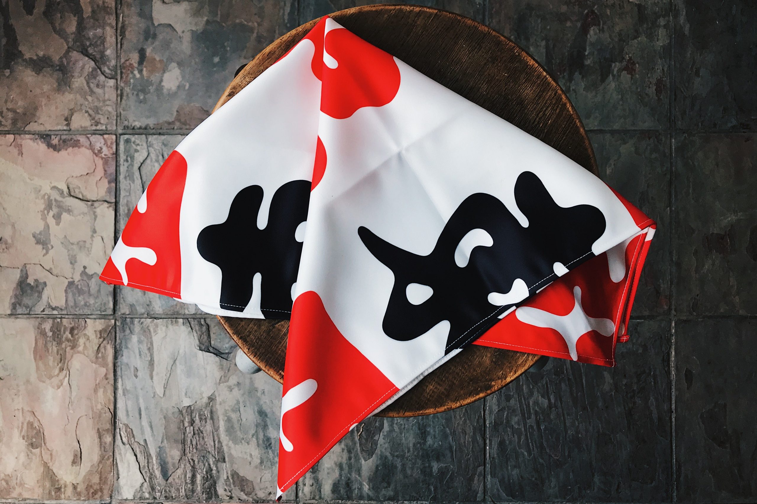
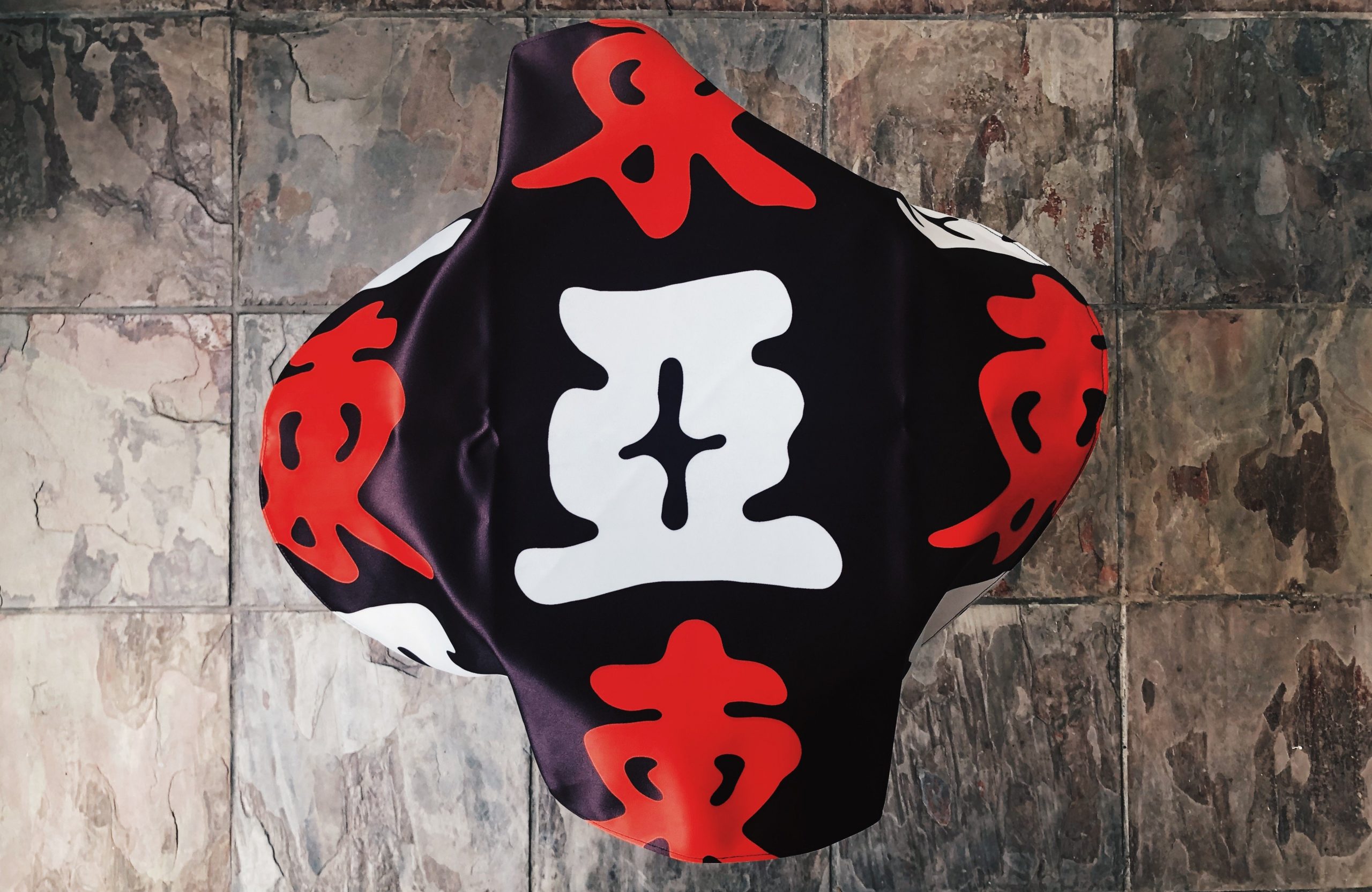
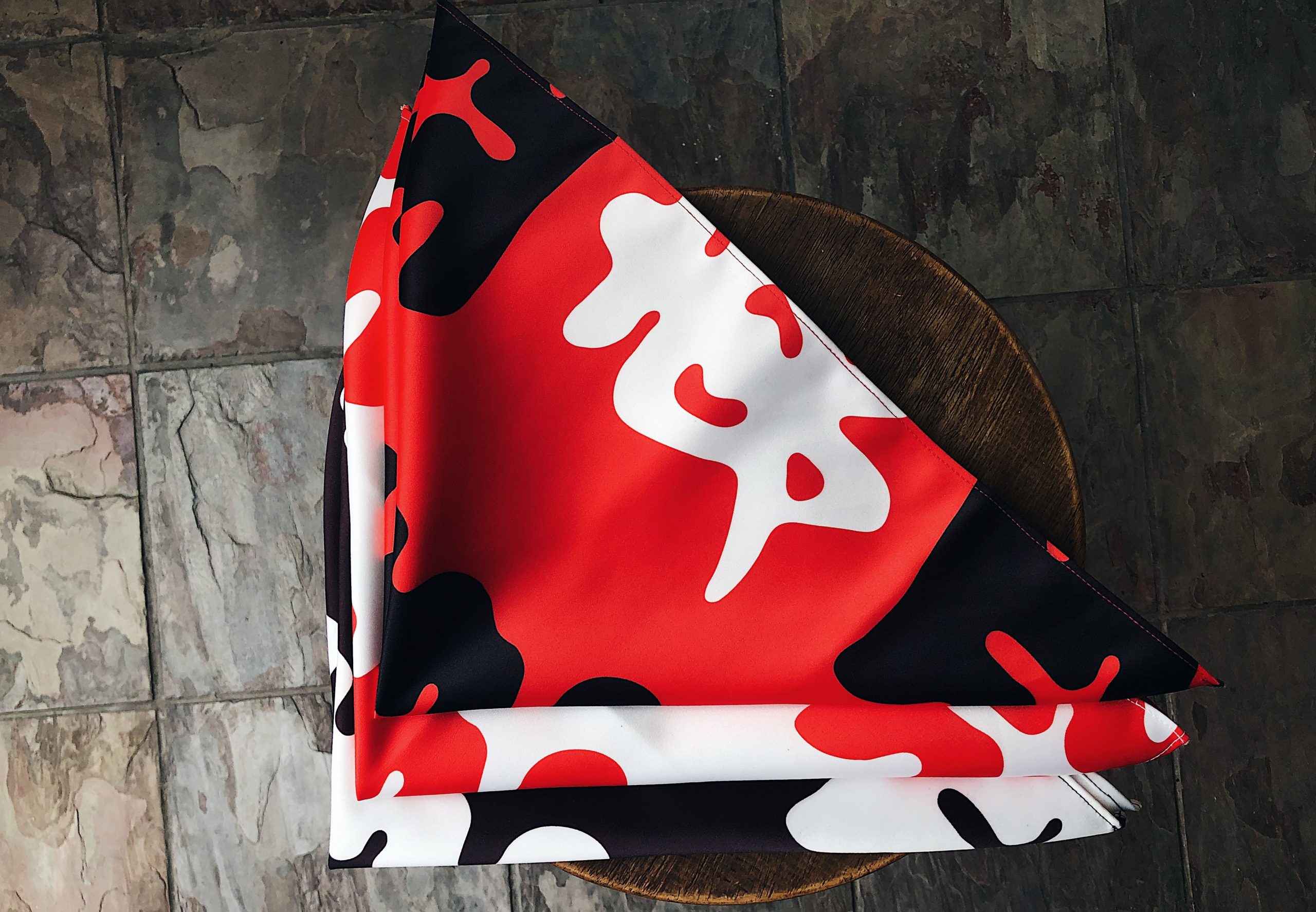
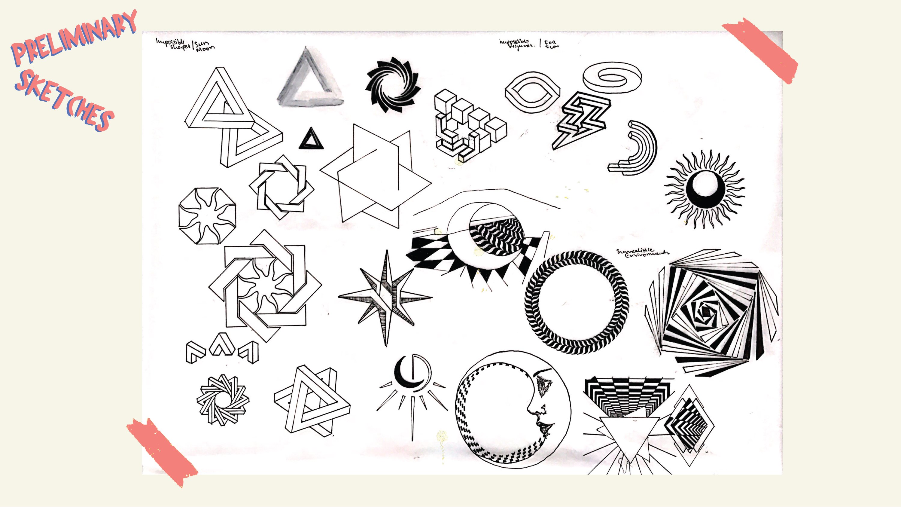
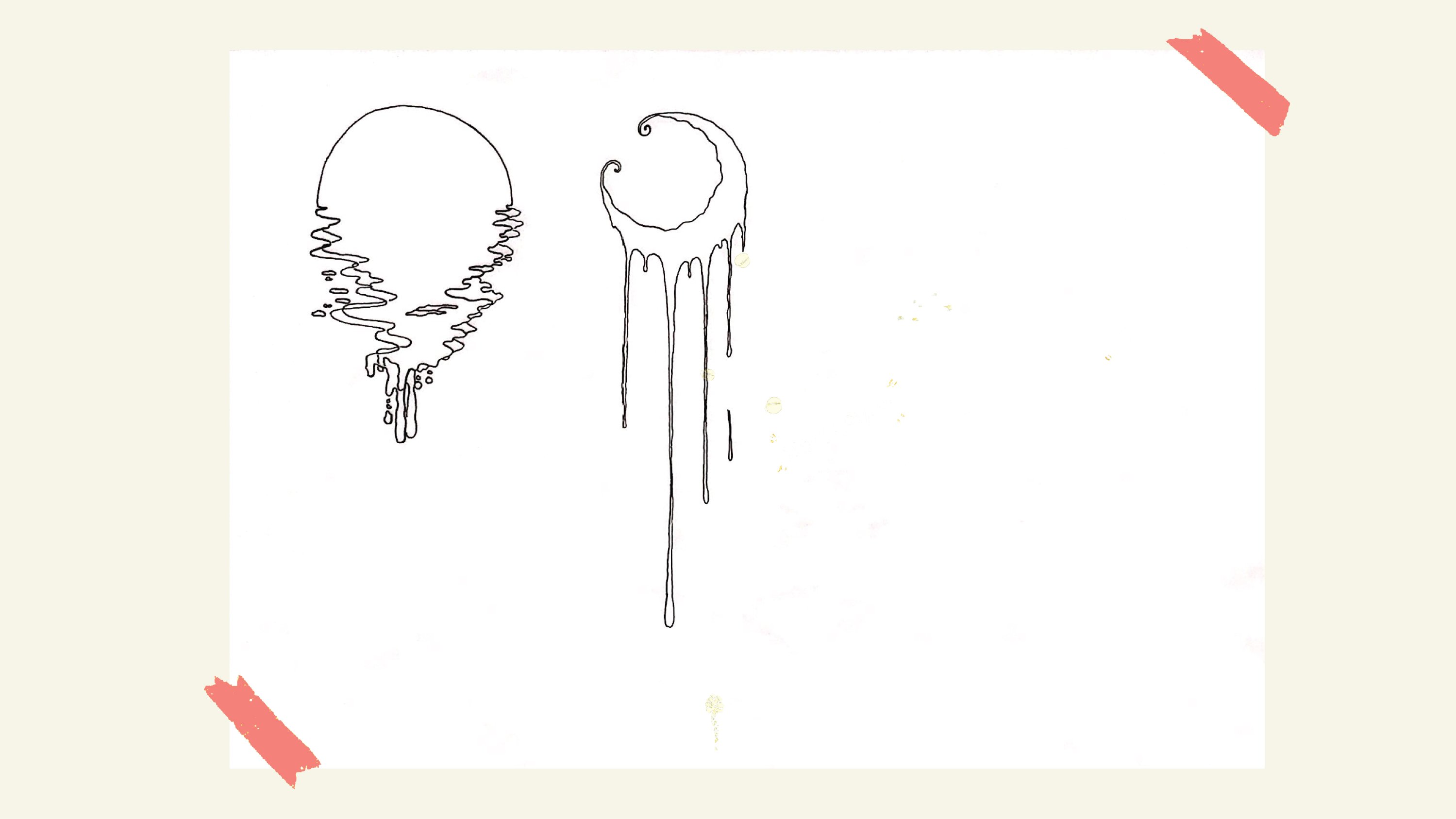
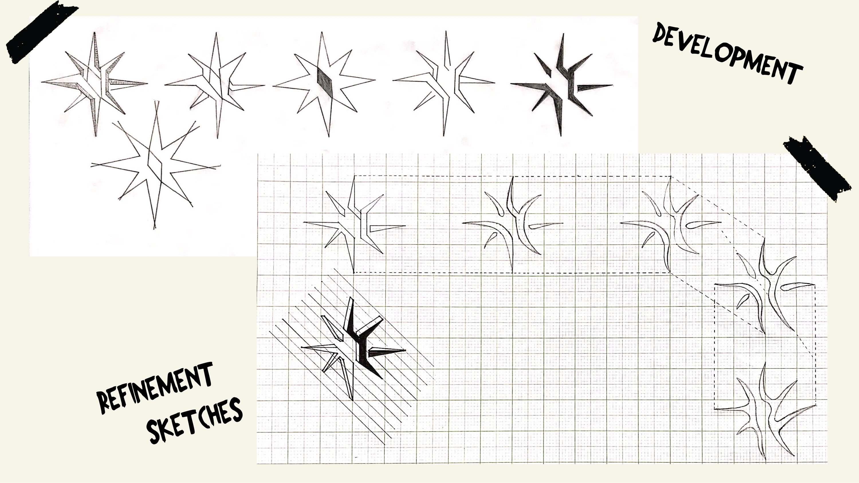
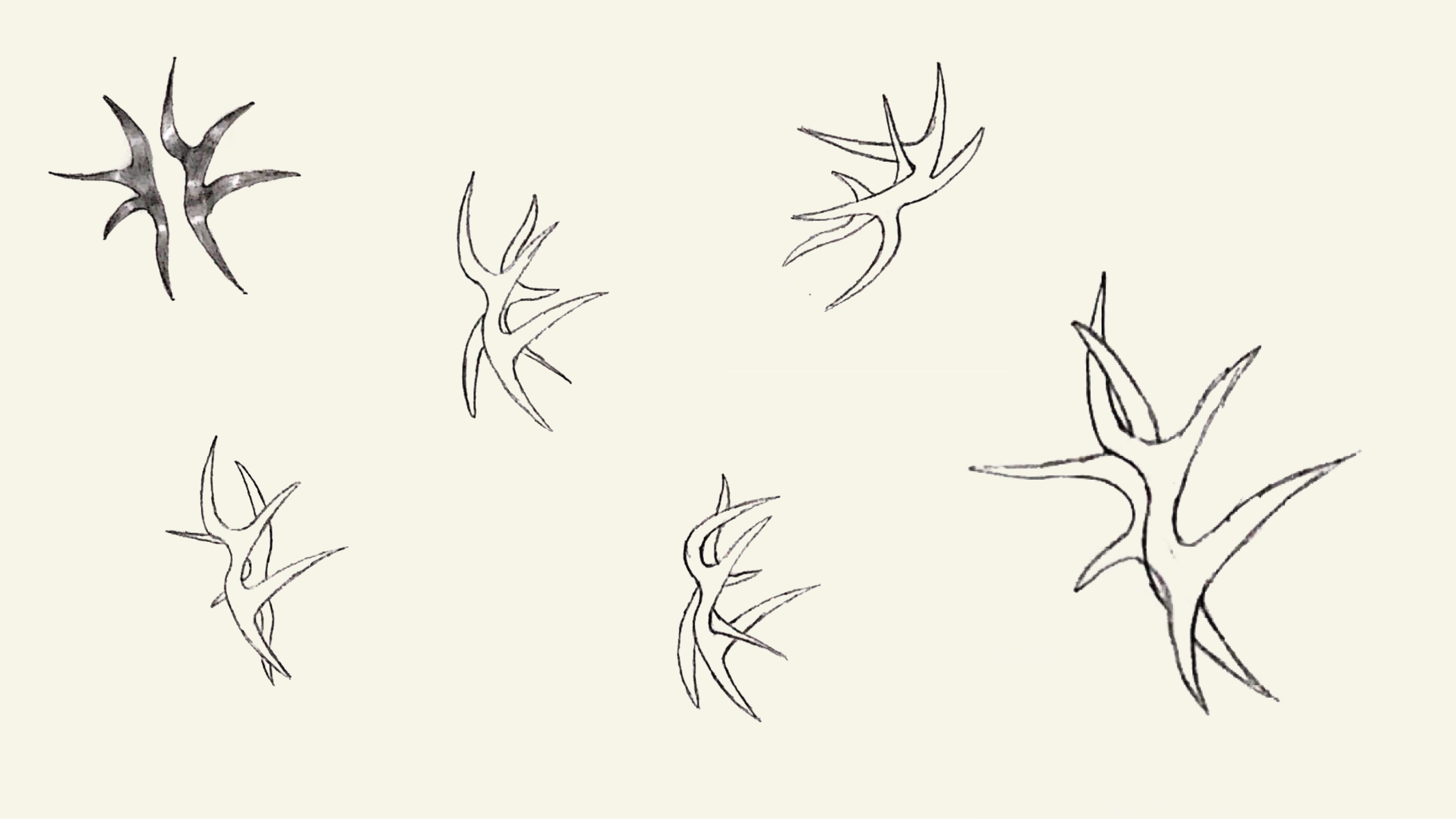
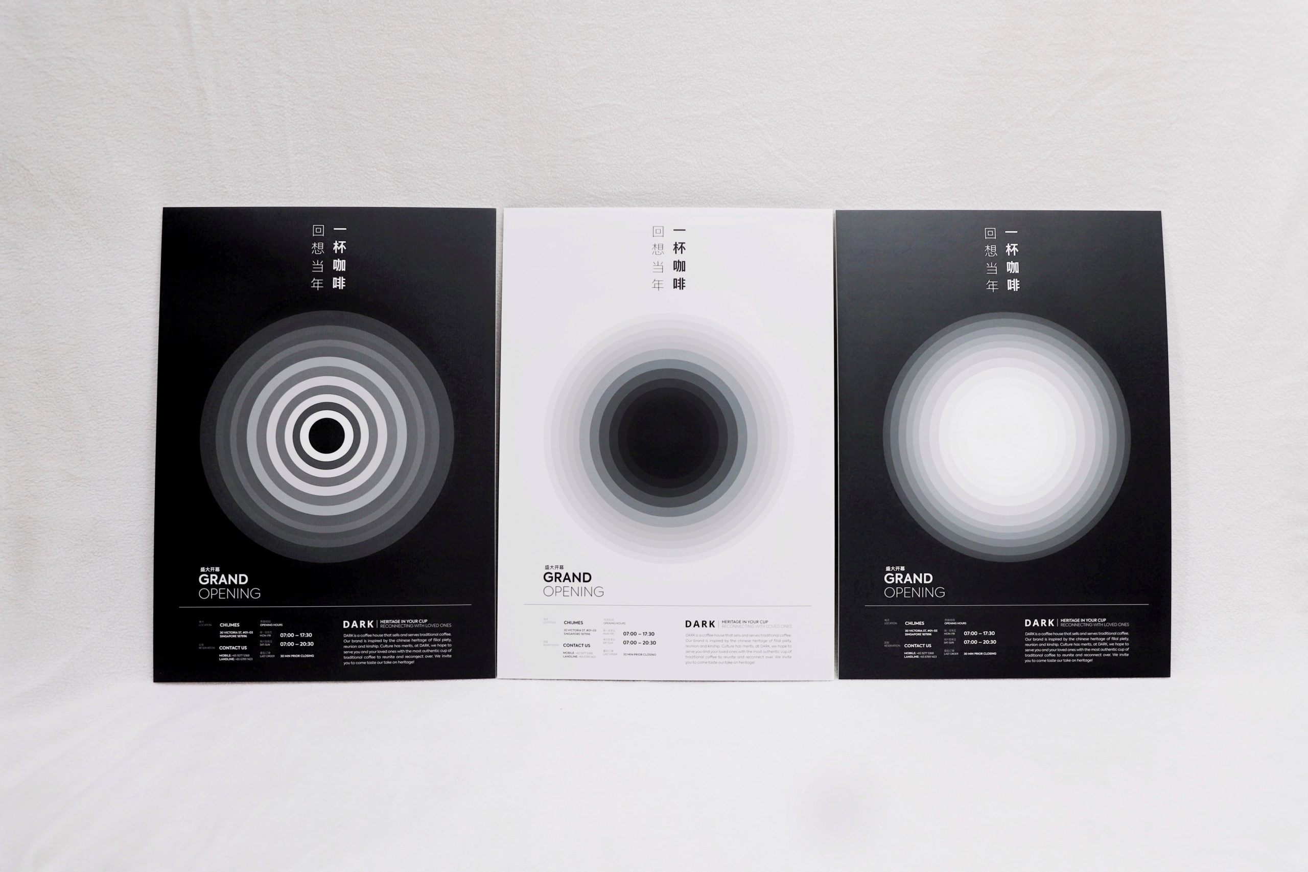
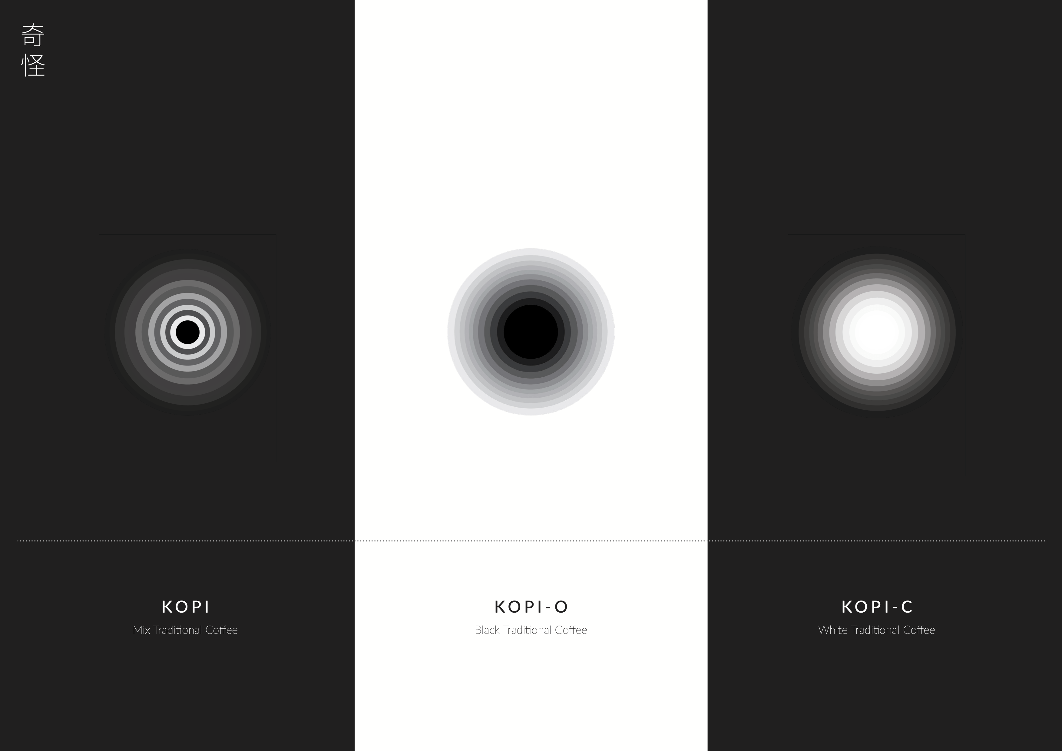
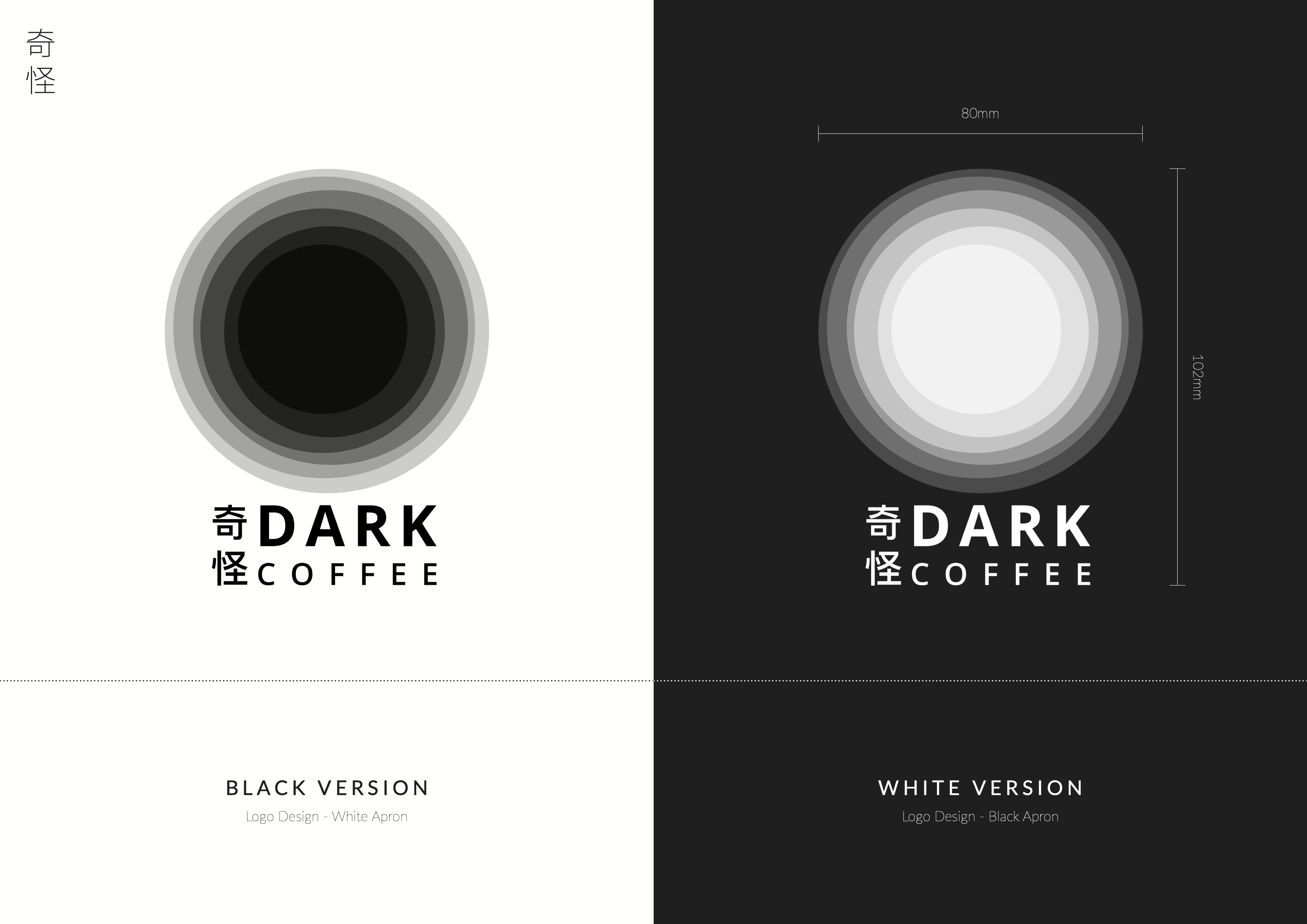
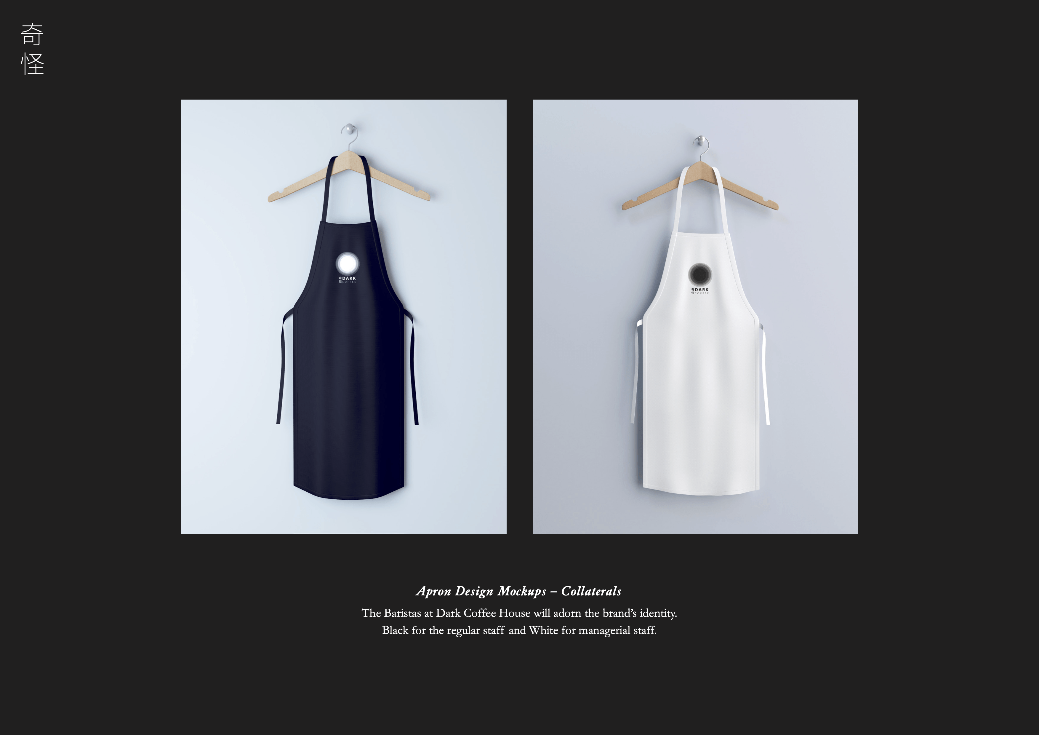
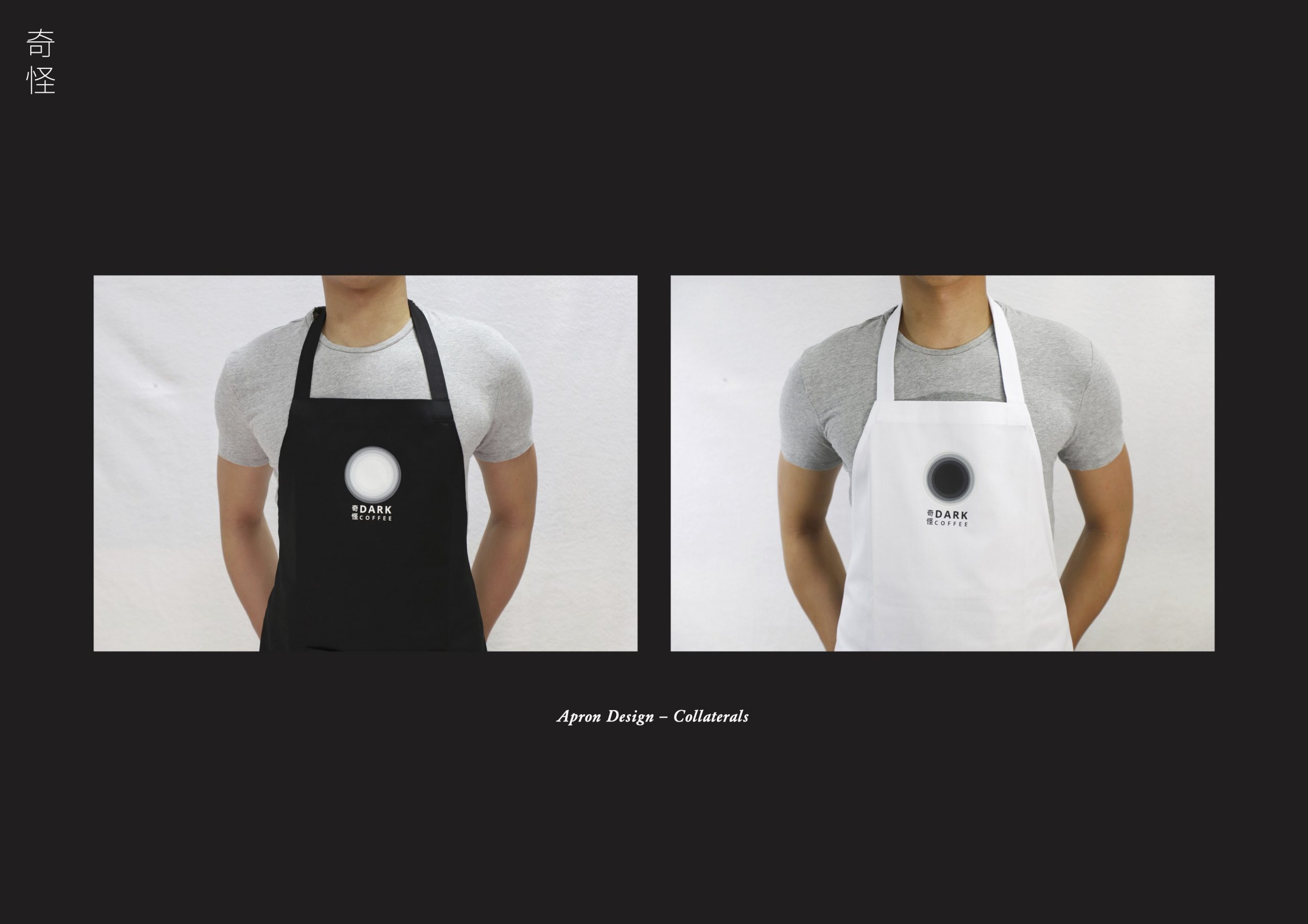
LOGO DESIGN | FADING CIRCLES
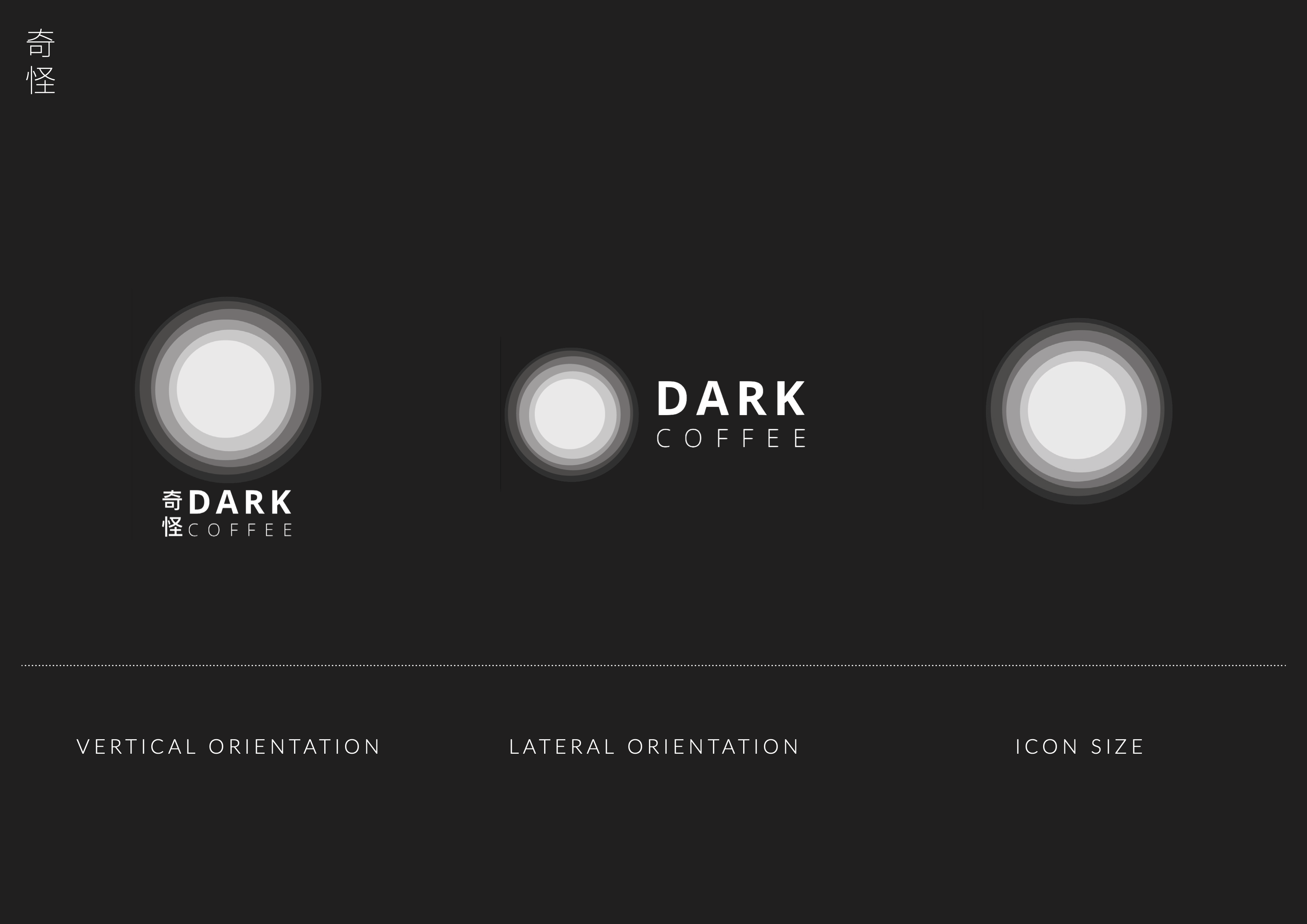

(Click on thumbnail image to maximise)
Coming Full Circle
The circle is being used in the logo as it represents brand concepts of filial piety, reunion and kinship.
Secret in Fading
Playing with opacity to suggest ‘revealing something’ either by fading in or gradually materialising. This method will be used in place of colours.
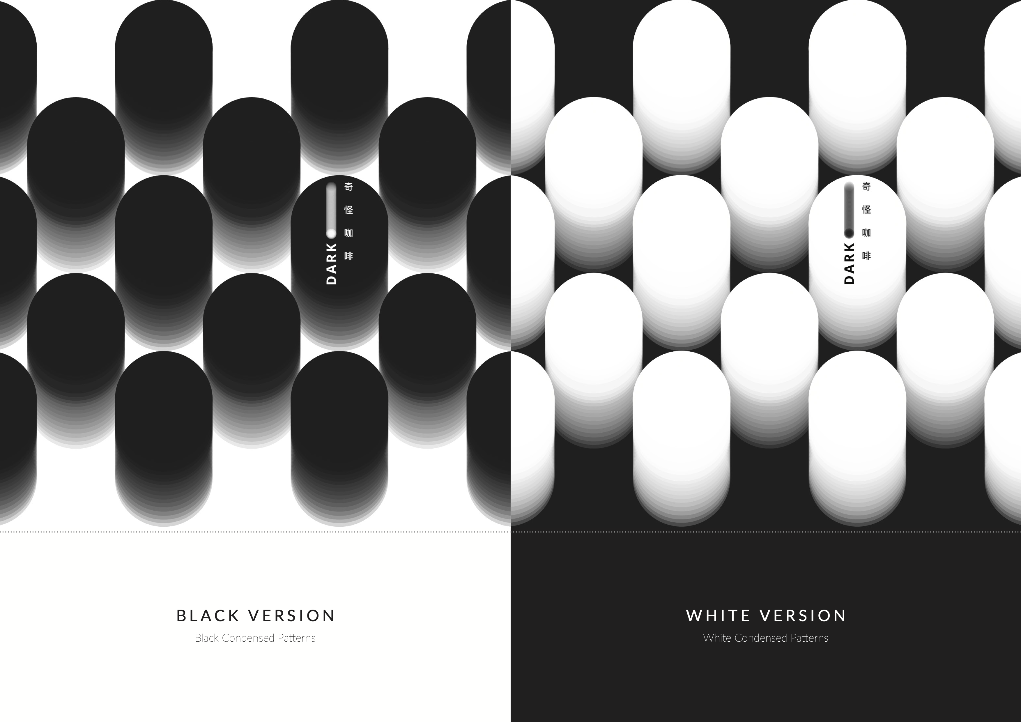
COLLATERAL DESIGN | PROFESSIONAL PHOTOS
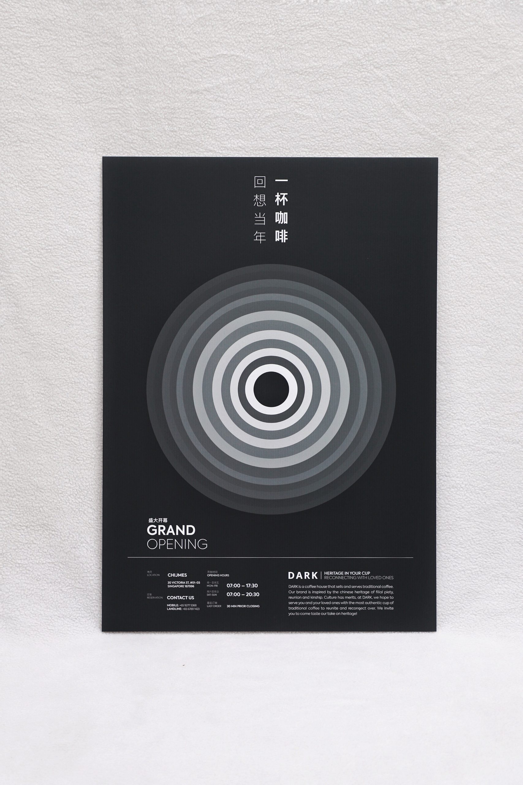

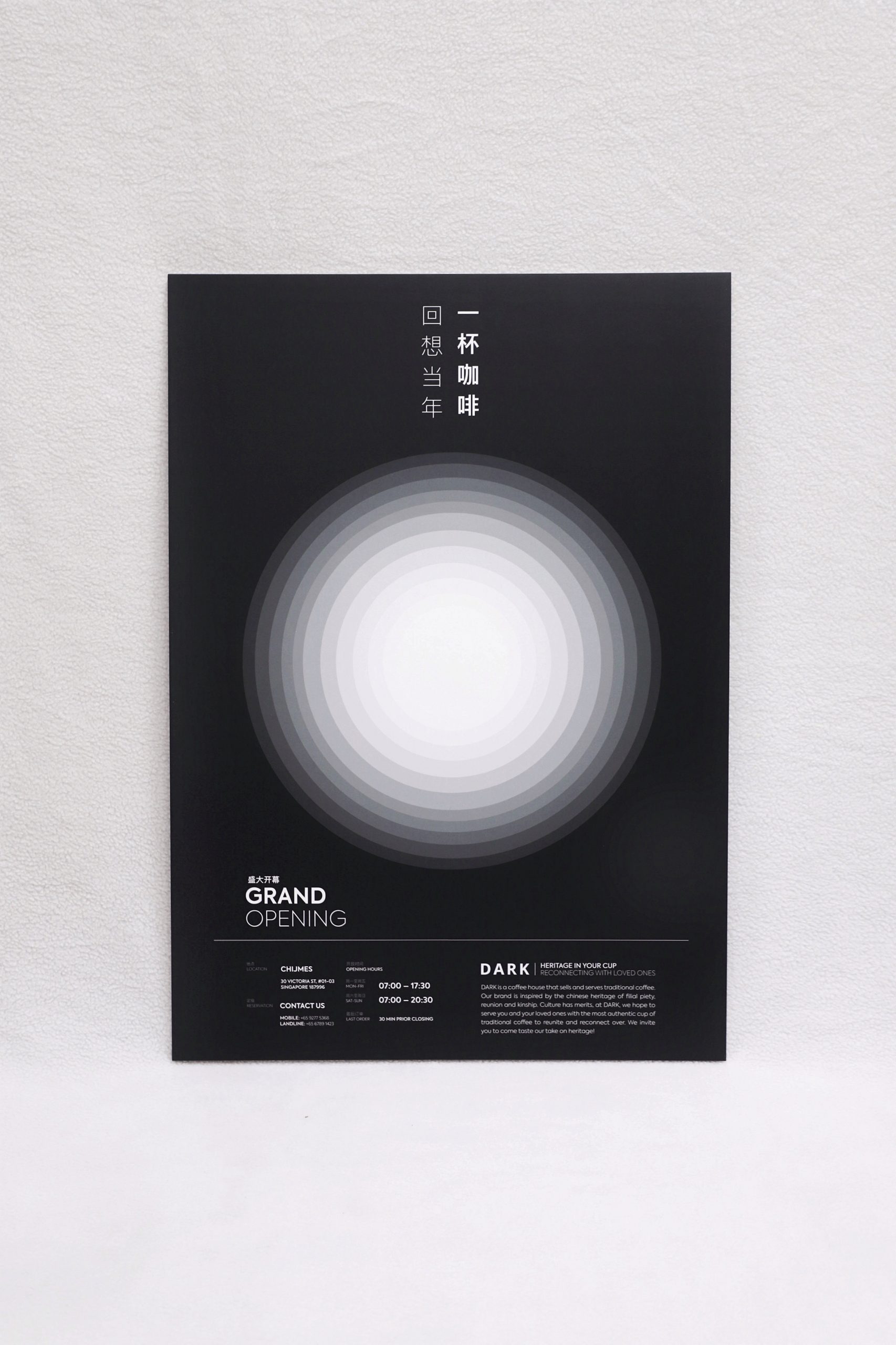


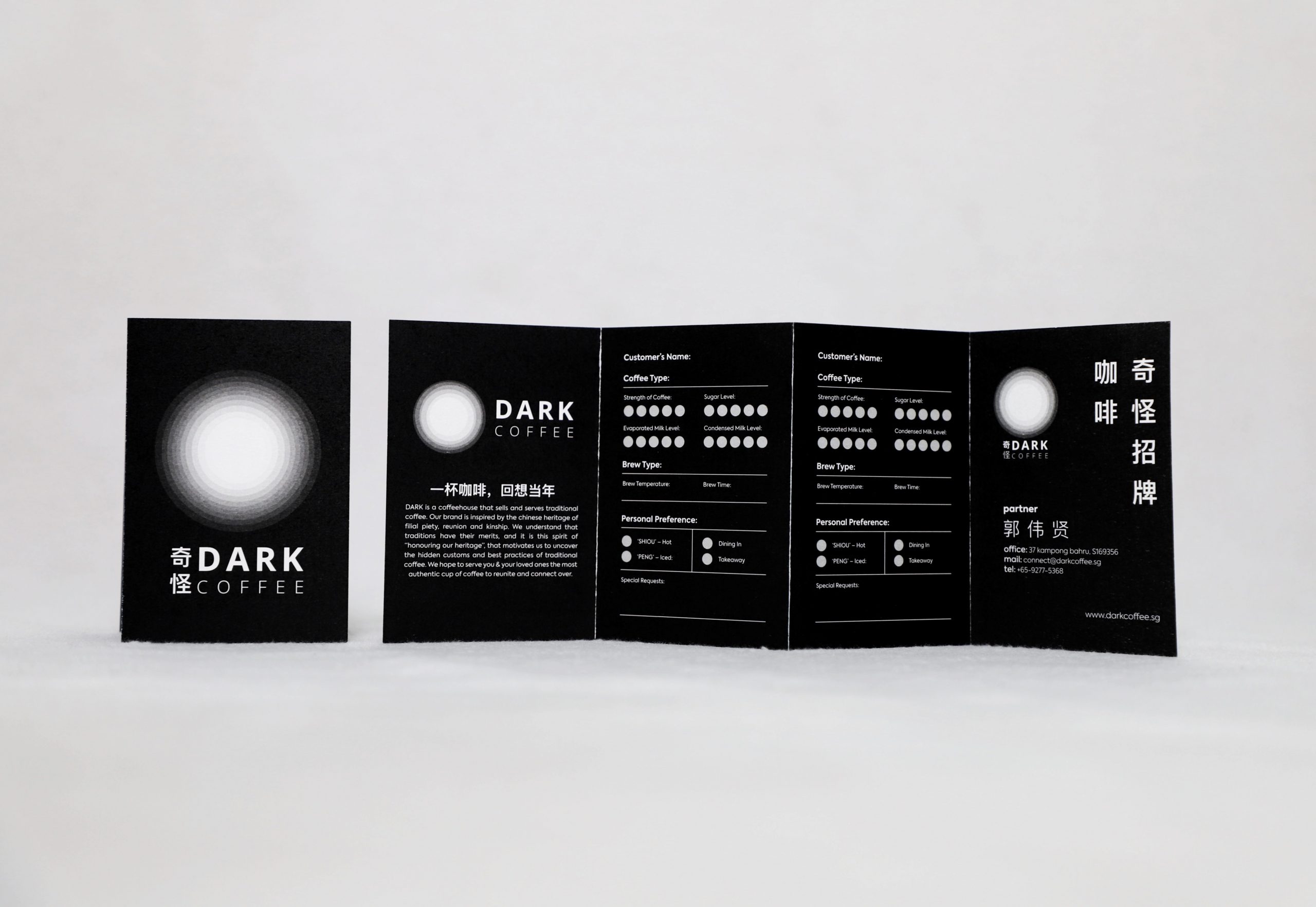


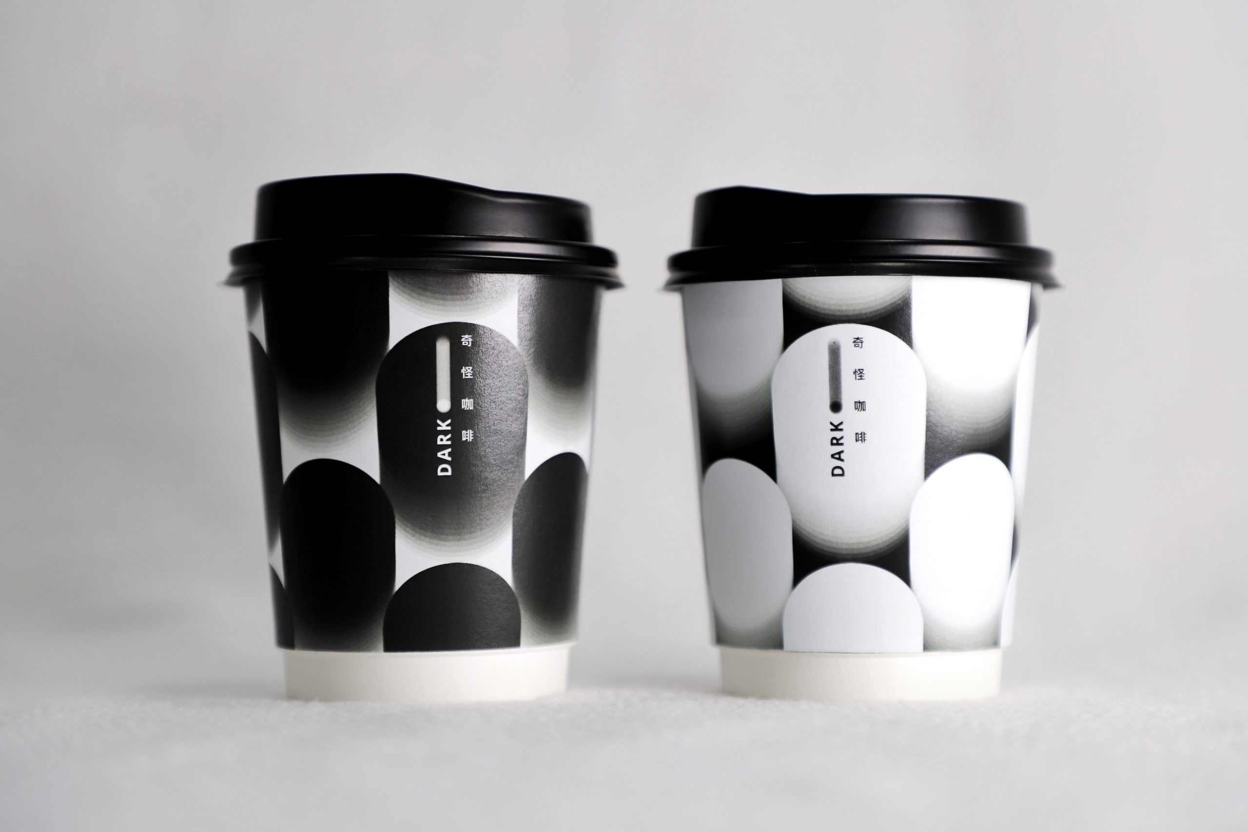

(Click on thumbnail image to maximise)
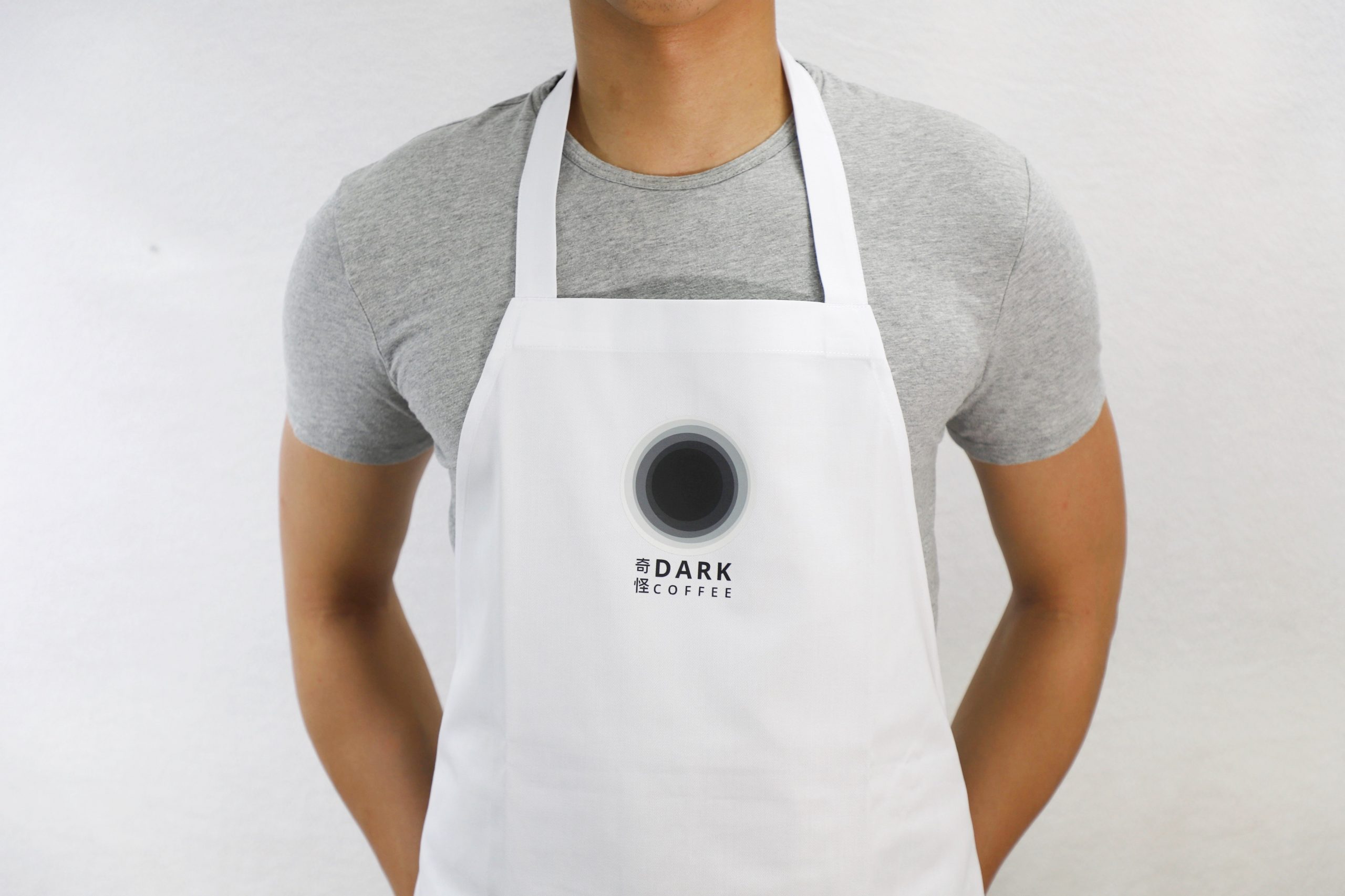
BRAND IDENTITY | HERITAGE IN YOUR CUP

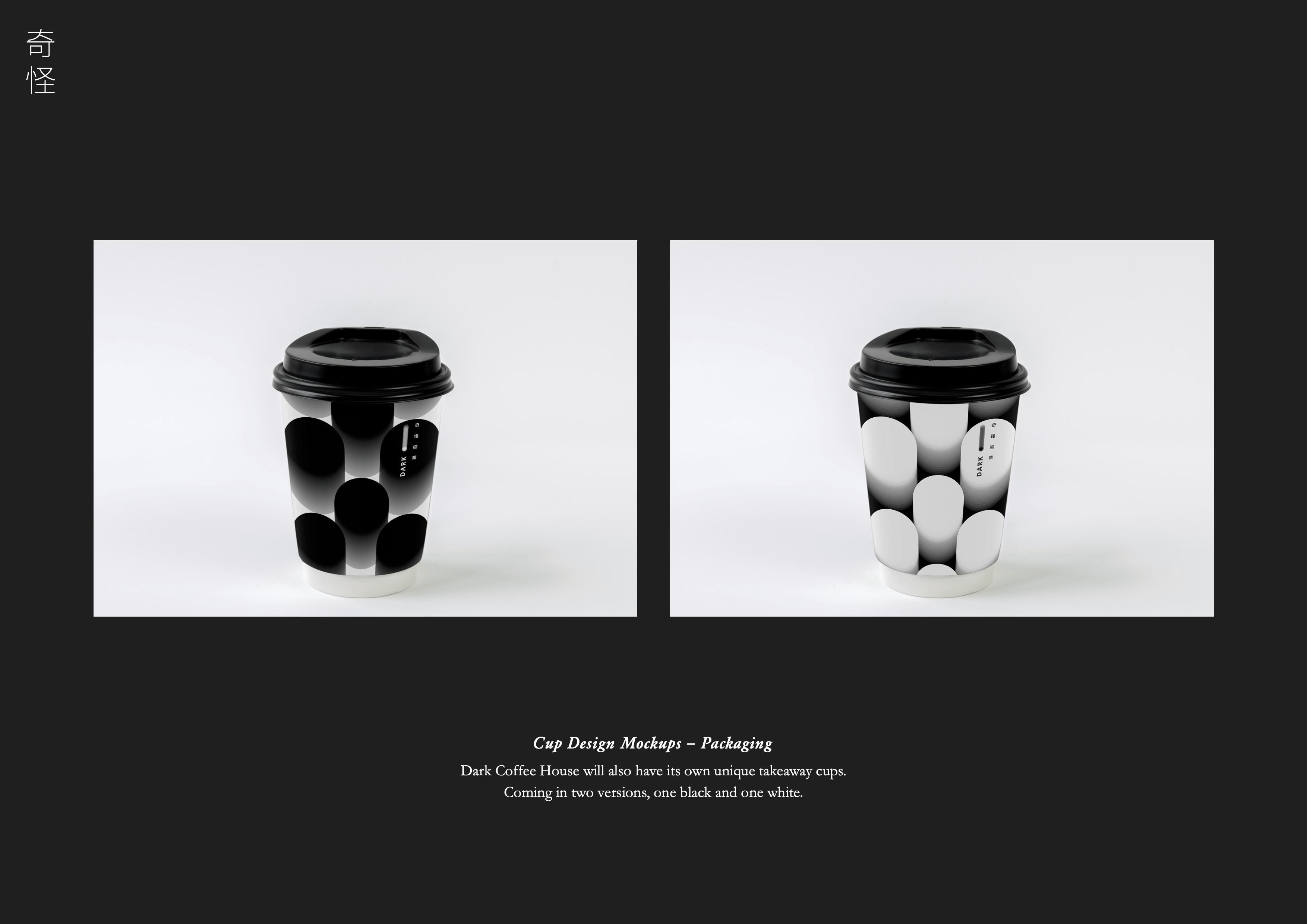


(Click on thumbnail image to maximise)