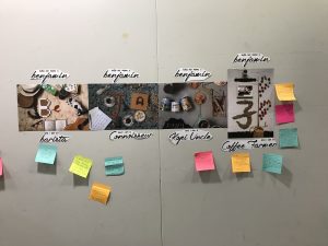
Image Making Through Type//Final
Final
Hello, my name is Benjamin and I am a
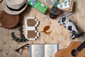
Barista
For this composition, I chose to an upper case ‘B’ and lower case ‘e’ & ‘n’.
I chose a brown and white colour code to run through the type as I wanted to emphasize the idea of a ‘fusion’; synonymous with a barista as baristas are essentially drink mixers. Furthermore, the latte style typography in the lowercase letters pays homage to the first Baristas in Seattle; the ones who popularised the latte drink.
For the letter B, I chose sugar cubes as baristas often made drinks that were sugar-laden. Furthermore, sugar cubes’ edges are blocky and rough, fitting nicely into the hard-lined structure of the upper case ‘B’. The hollowed out areas of the B are not left empty but filled with brown sugar cubes in contrast; this showcases how a ‘curvy stroke’ need not be composed of curved lines, but hard-edged elements do the job as well. I thought it would be appropriate to juxtapose the first letter of the composition from the others, hence a deviation from soft, curved lines.
For the letter e, I made a lower case e out of black ‘americano’ coffee from Starbucks. Its tail end conjoins with the lower case n fusing seamlessly.
For the letter n, I made use of whole milk (the dairy product baristas use) to create the soft curvy letterforms.
For this composition, I wanted to show the kind of life I as a Barista would probably be associated with. Staging a “White Girl” scene through the surrounding elements, I felt the use of a “wooden table” background was a nice touch that enhanced this feeling; a laidback and carefree demeanour.
Hello, my name is Benjamin and I am a
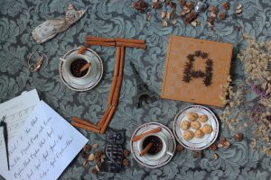
Coffee Connoisseur
For this composition, I thought of using different elements to create my types. The elements would reflect the qualities that a coffee expert would be proud of. I attempted to bring out the “intelligent” aspect of my future job as a coffee know it all, not just through the type but in the surrounding objects and background as well. Spiced coffee is often enjoyed by very niche groups of coffee drinkers; therefore I decided to play with spices to create my type form.
For the J, I used cinnamon sticks which therefore explains why I chose the upper case J instead of lowercase j. Working around the confines of the elements resulted in a type that reflected much sophistication.
For the letter A, I placed star anise spices on top a chess board. I arranged the star anis within the squares of the checkerboard to mimic chess pieces.
I think this composition brings out the “sophistication” or some would say “atas” part of my future job as a coffee connoisseur. Through the various items that represent different facets of intellect. I like how the emerald green tapestry really complemented the shades of brown from the spices and dark coffee granules.
Hello, my name is Benjamin and I am a
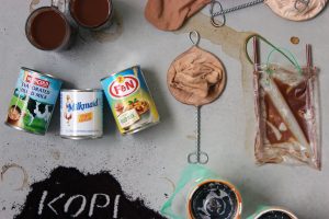
Kopi Uncle
I had a bit of fun with this composition. Recalling my own coffee experiences, the Kopi Uncles that I have come across are often clumsy and in a way reckless as they serve you your drinks; resulting in spills and stains all over the acrylic tables. I wanted to create a spread that would reflect this messiness and chaotic environment of a coffee shop. I decided to use what I like to call “accidental” type forms, whereby the elements positioned appear somewhat random and unintentional but upon closer look, the letter form will become reveal and become apparent.
I used tin cans containing evaporated and condensed milk to create my letter ‘M’, arranging it in a subtle manner as the two ends seem to dent in just slightly.
The ‘i’ is represented from a used coffee strainer a very common tool to brew coffee in local kopitiams. I used a lower case ‘i’ as I realise the type form had already been created for me; albeit a little weird with the ‘dot’ being so much larger than the thin metal body. Somewhat unorthodox, but I felt it worked perfectly.
For the letter N, this is by far my favourite handmade type even though no one really drinks ice coffee with two straws haha. I gained inspiration for this while resting at a coffee shop. Someone earlier had finished drinking his bag of tea and had thrown the plastic bag on the floor. The remaining tea in the bag had created unique patterns by filling up the empty creases of the compressed plastic bag. Took a while to get this type. I used an uppercase ‘N’ as a lowercase ‘n’ with its cursive top would create a very unnatural crease that I found quite forced.
I think this composition manages to achieve something quite unique compared to all the other spreads, in that the letterforms created are subtle and less ‘in your face’. The background of this set was especially hard to find as it was not easy to find an unwanted coffee table. However, I eventually manage to find a floorboard with a texture that resembled what I was looking for.
Hello, my name is Benjamin and I am a
Coffee Farmer
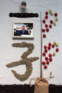
This composition lays a foundation for the previous three compositions. Coffee Farmers obviously play a vital role in the process of coffee making. Without them, the other 3 would not exist. As farming is often a family affair, I used my Chinese surname 郭as the type form for this spread. The goal was to achieve an oriental look; resembling the kind of photos you usually get on the cover of a primary school 好公民课本。I also wanted to showcase the process of coffee farming through the type, therefore I broke down my surname into smaller Chinese elements; 一,子,etc.
Starting from the ground up, the Chinese type 子, translates to son/child, therefore, I sourced for green unroasted coffee beans and used them to form the type as a way to represent the immature nature of a child.
The 口, at first glance, resembled a window to me; I placed a picture of my father as a way to link back to the ancestral superstitious blessings some farmers continue to practice to this very day. With the picture of my father above the 子type, it made drawing the family connection much clearer.
For the 一, I used grounded up coffee granules to mimic a coffee plantation’s soil.
I placed the green coffee beans at regular intervals to display the sowing of seeds.
I represented the side Chinese character using “coffee cherries” (actually cherry tomatoes and grapes). Growing out from the soil, the coffee cherries twist and turn to form two hollow spaces that resemble a ‘B’
The dot at the top of the composition is represented by a freshly brewed cup of espresso. The end product of coffee farming.
Essentially this composition pays homage to my family name as the tradition of coffee drinking was passed down to me by my Dad (much like how a farmer typically inherits their land from their own forefathers). Creating this Chinese character was very exciting as the more I compiled the better it looked; reflecting how Chinese characters usually work best and form more complex words when they are put together.
Critic