
A VISUAL COMMENTARY
‘more than just a Fold’, the first of a three part deliverable series that targets the issue of homelessness in Singapore. The poster title is a pun on the word cardboard. Something synonymous with the homeless and ties in with my second deliverable.
A bright yellow sheet of paper smacked right in the centre of the poster contains the details of an event (deliverable 2). Having a ‘Wet-Glue’ texture, the poster is akin to the art styles we see on the streets. The sheet of paper very much blocks out the underlying photo; alluding to the fact that although visible, we tend not to see the full picture.
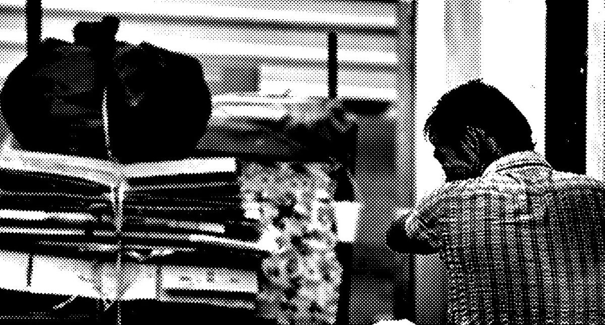
The poster also offers the viewers something more. Though obscured by the yellow sheet of paper, it is clear that the background image is of a homeless elderly man who seems to be going about his daily routine – cardboard collection. Intentionally monochromatic, a halftone filter is also applied over the photograph; both is meant to induce a sense of dissipation and ‘hard of seeing’. The elderly man back faces us, and even though we cannot see his face, we can tell from his ragged attire and exhausted posture that he is just trying to get by.
The poster is a call to action for volunteers to offer their help and services.
Attachment to high resolution pdf:
more than just a Fold
Great exploration and good to see the working coming together!