


benjaduck
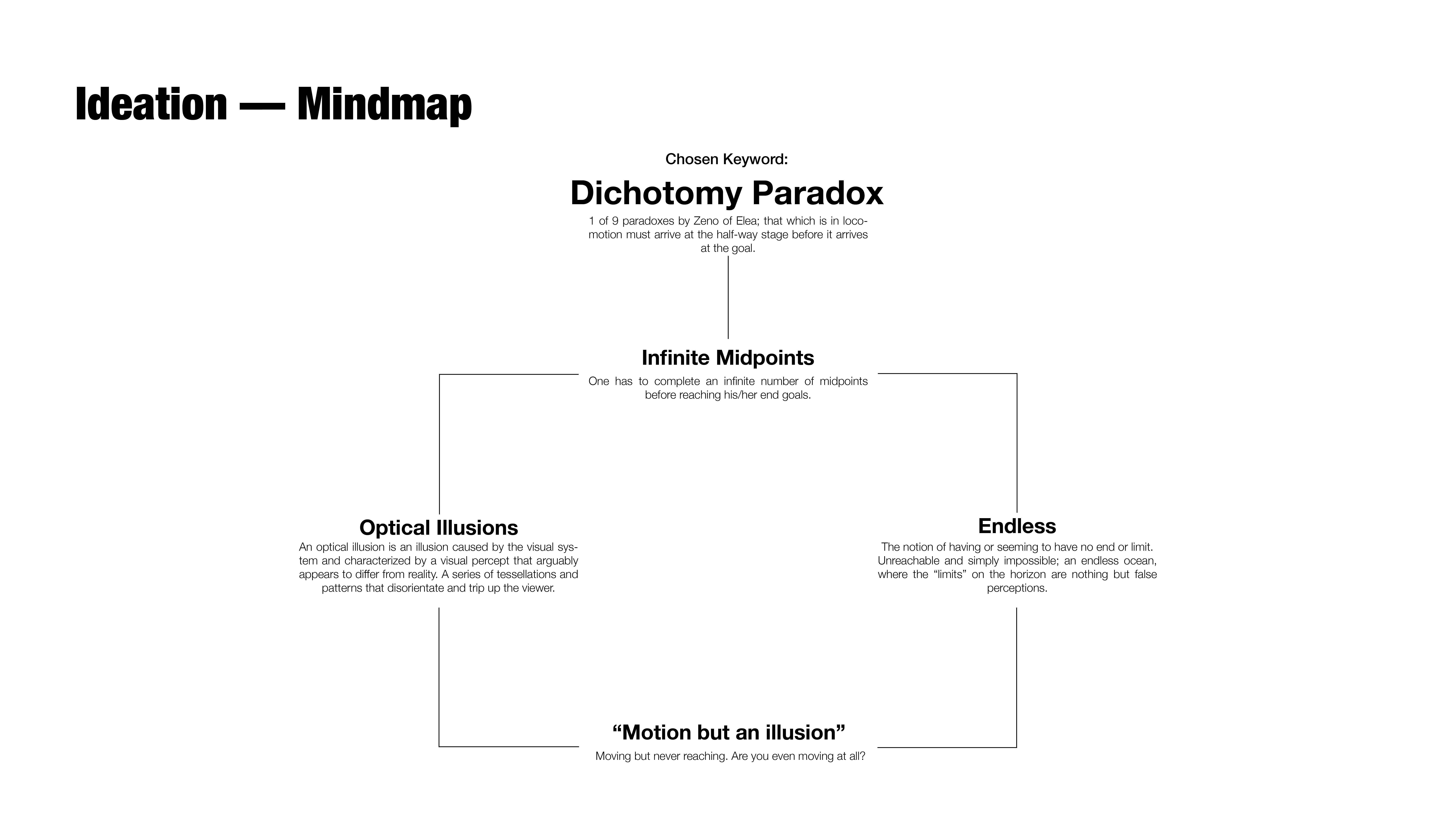
Project Topic: Zeno’s Paradox of Dichotomy; the counter-intuitive nature of quantum physics.
Prelude: Paradoxes are a case of bad logic making sense.
Zeno of Elea, a Greek Philosopher, has the neck for inventing highly intuitive philosophical problems. He is most renown for his paradoxes, which I have explored during project 1 & project 2.
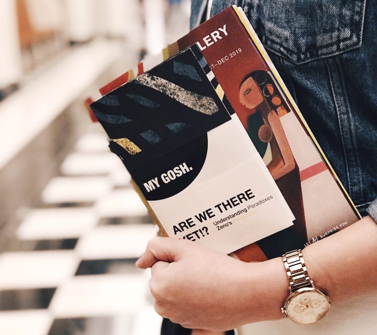
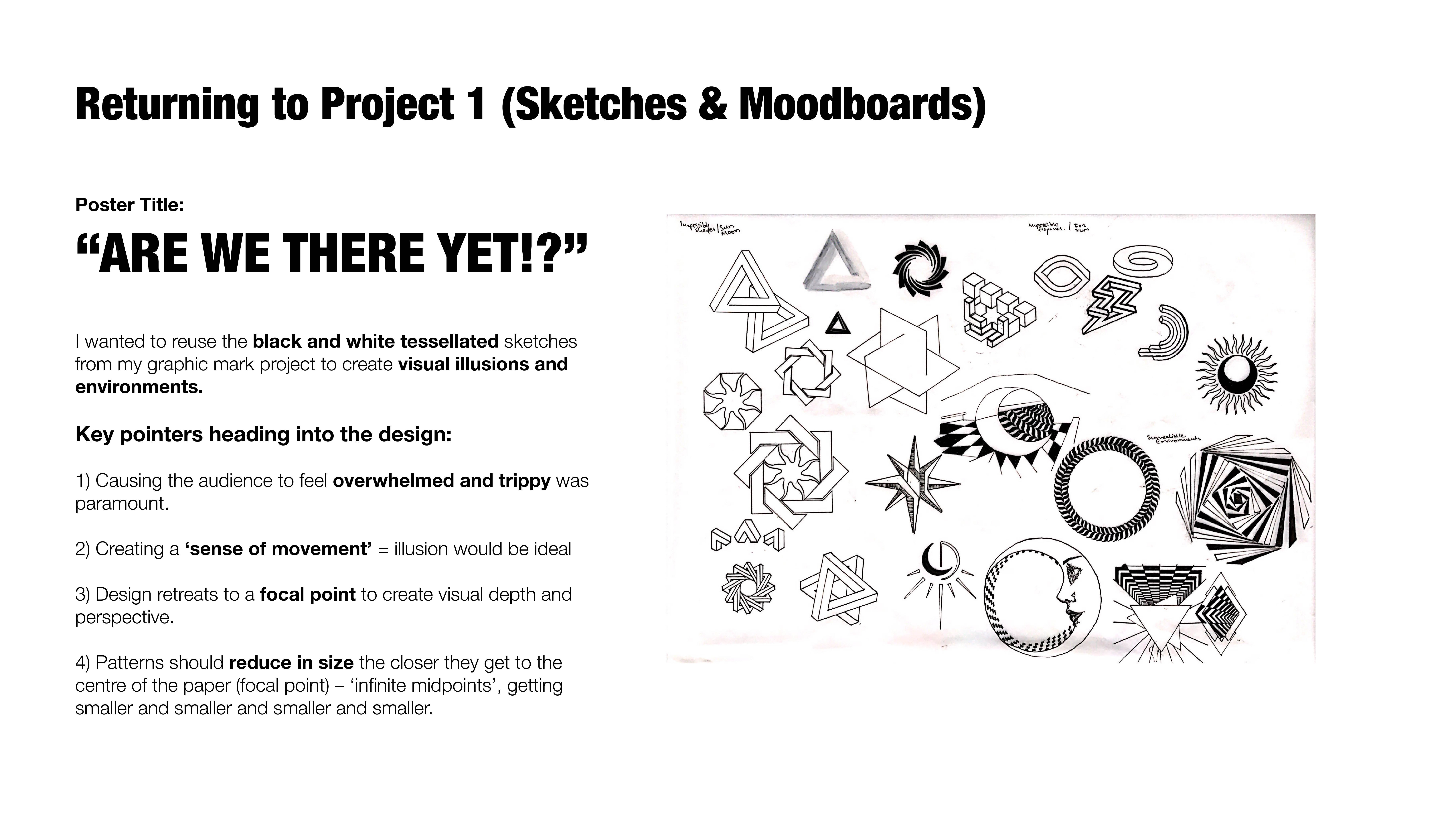
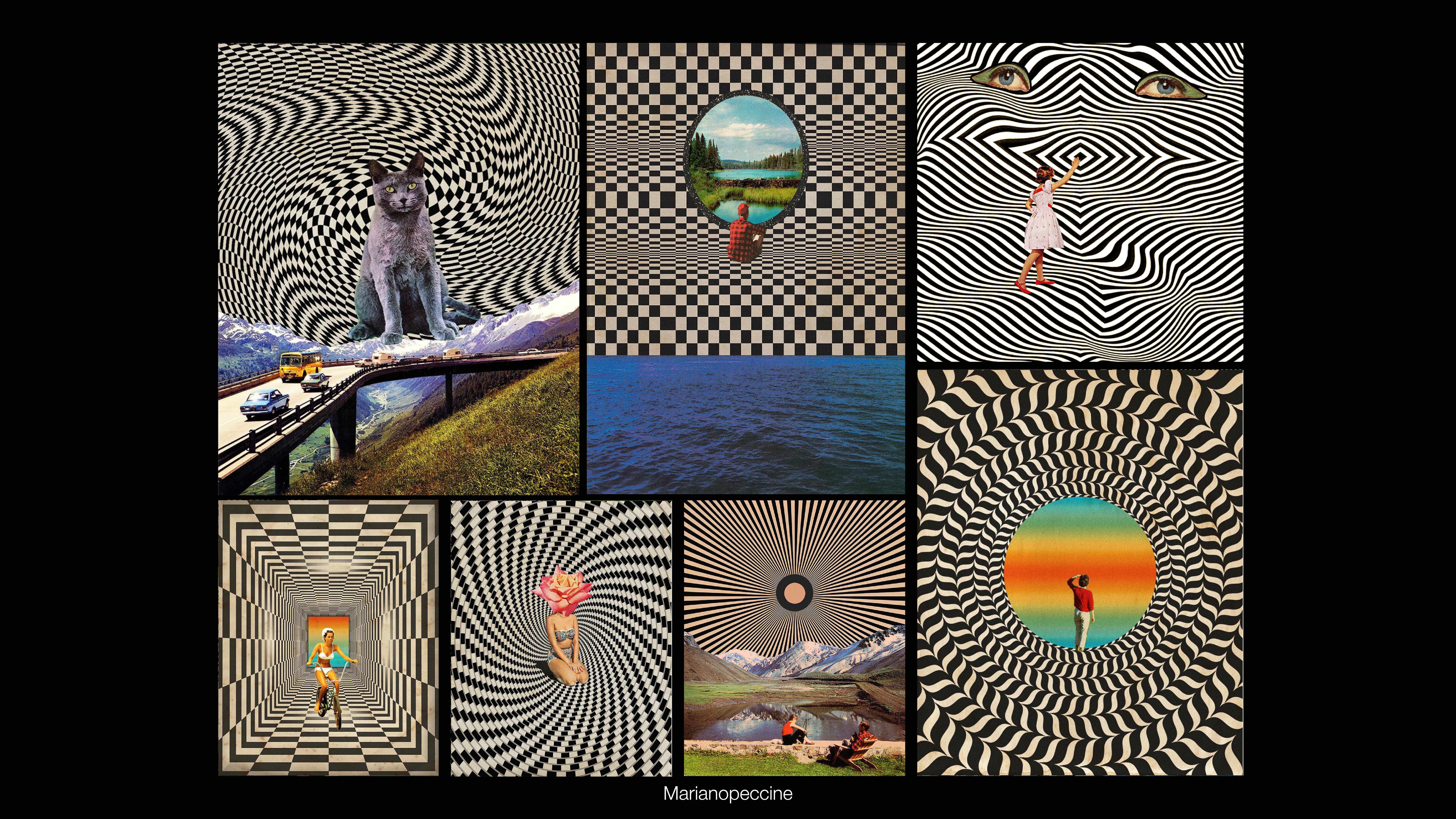
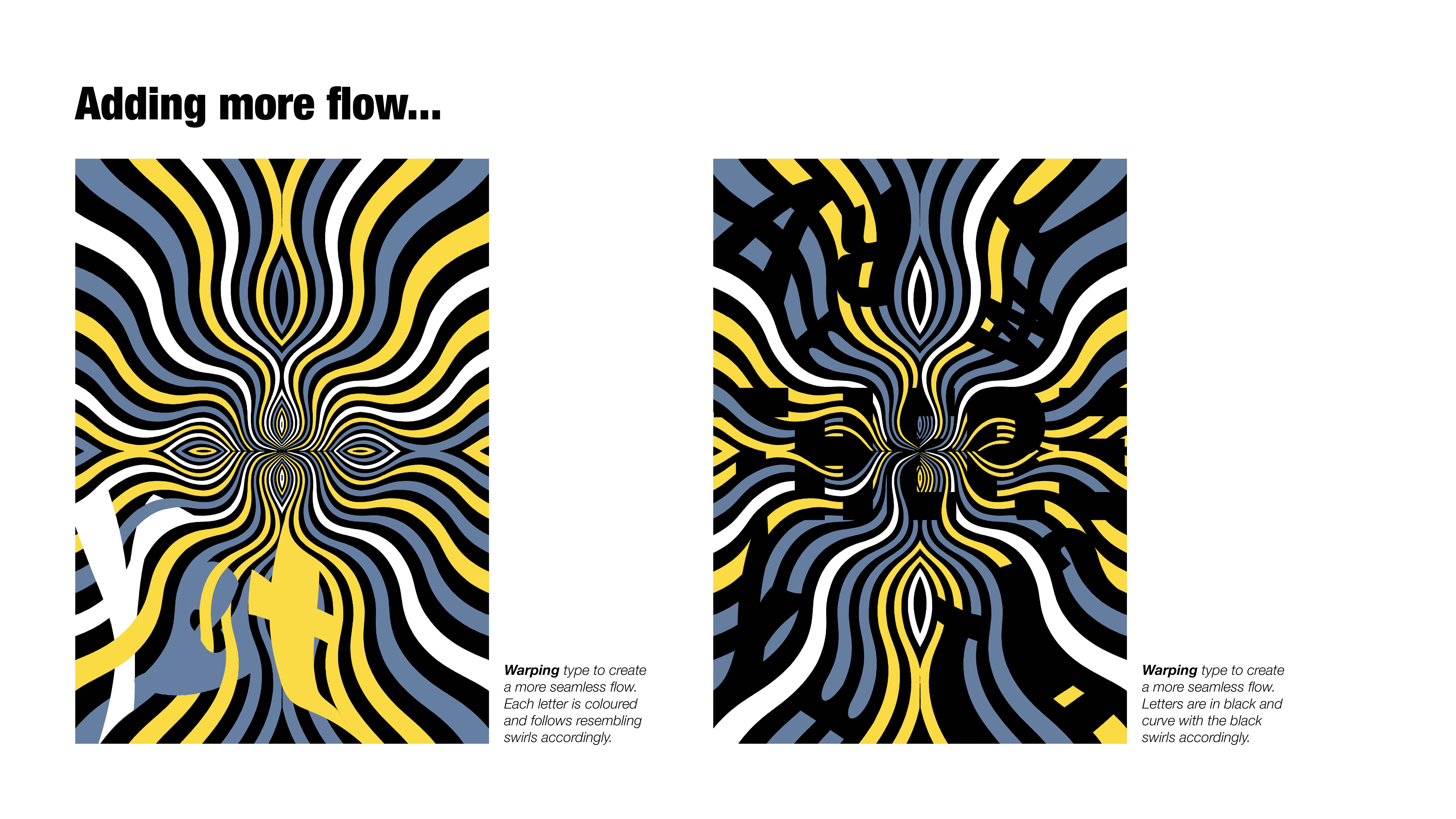
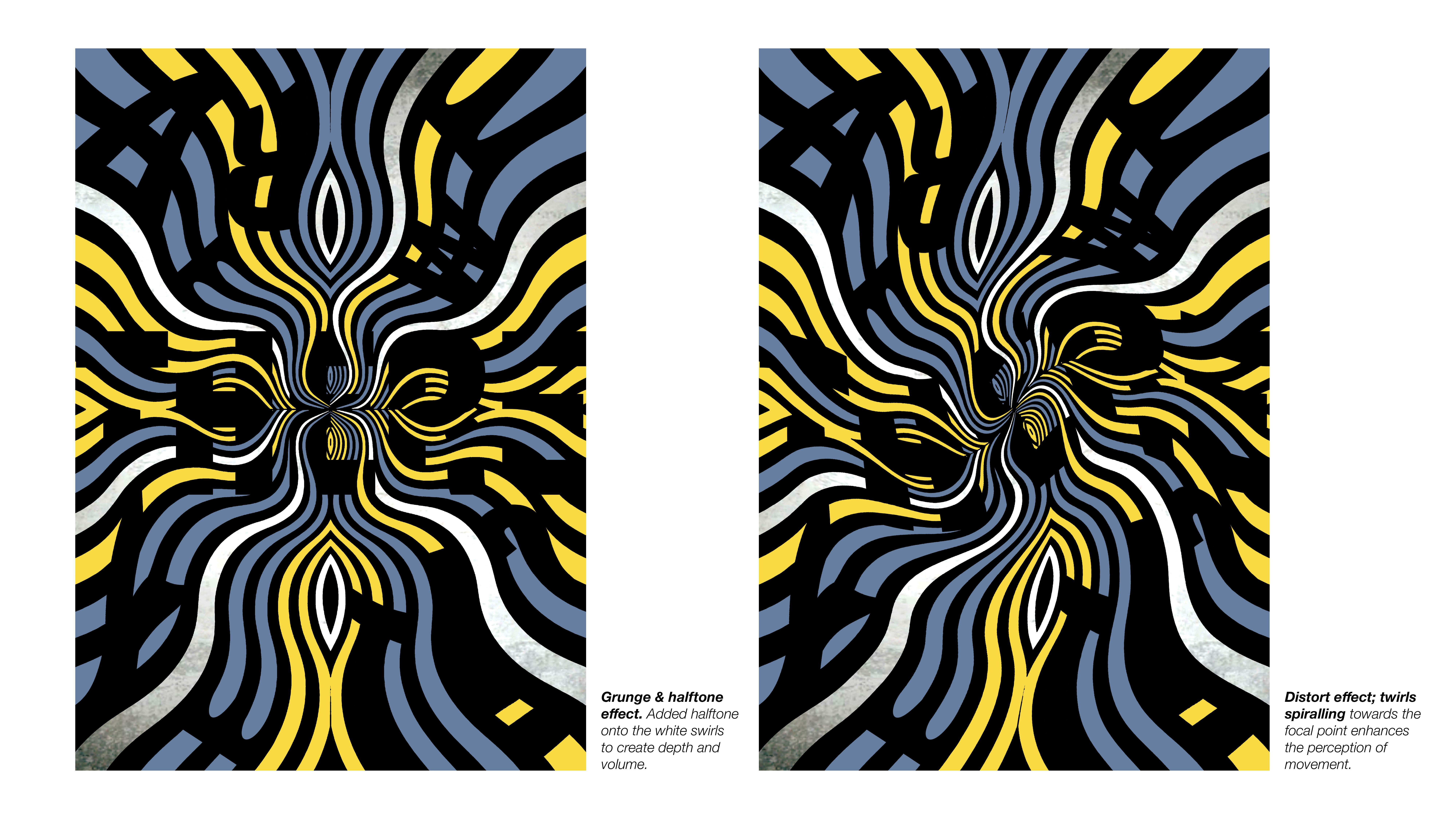
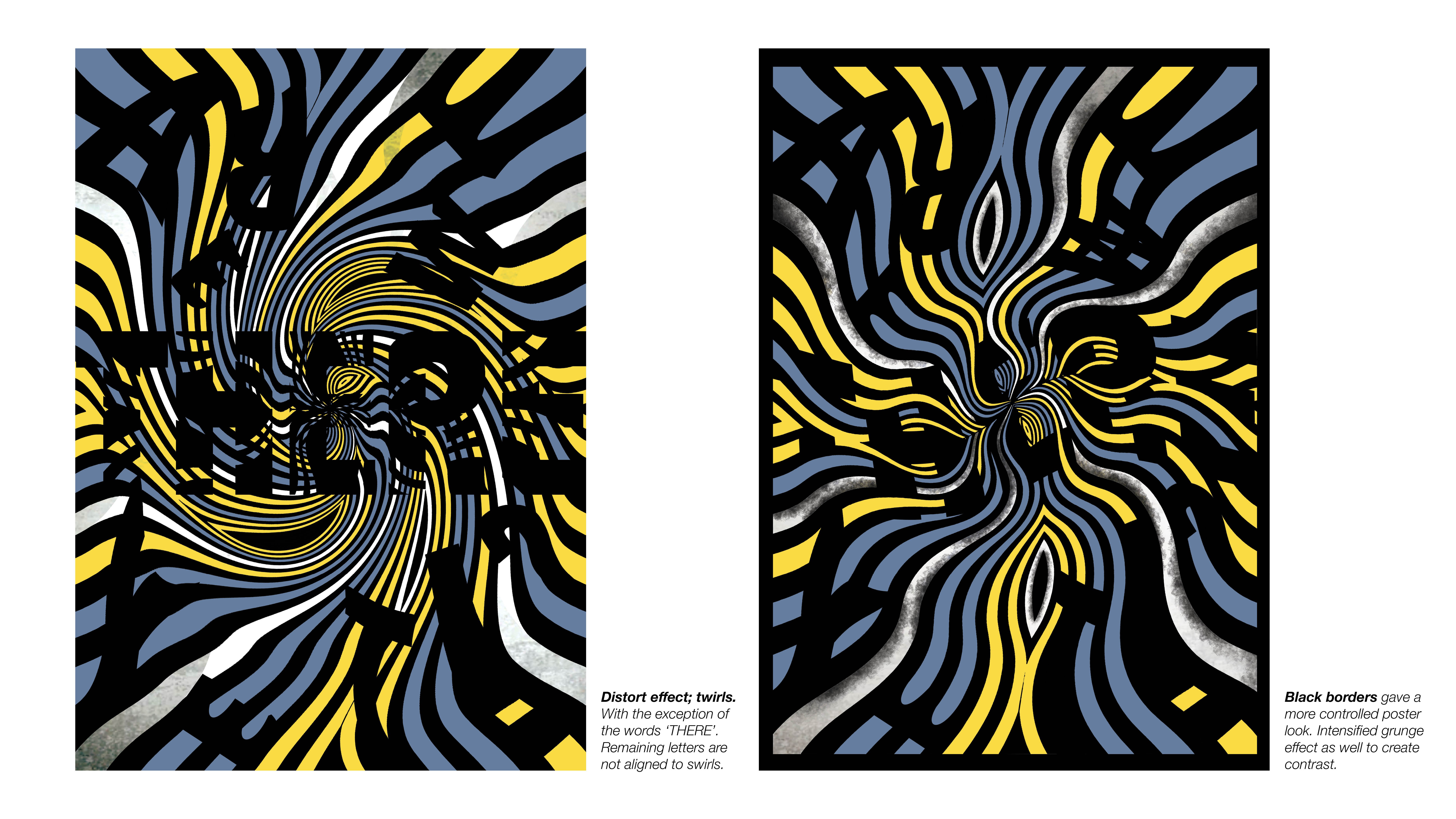
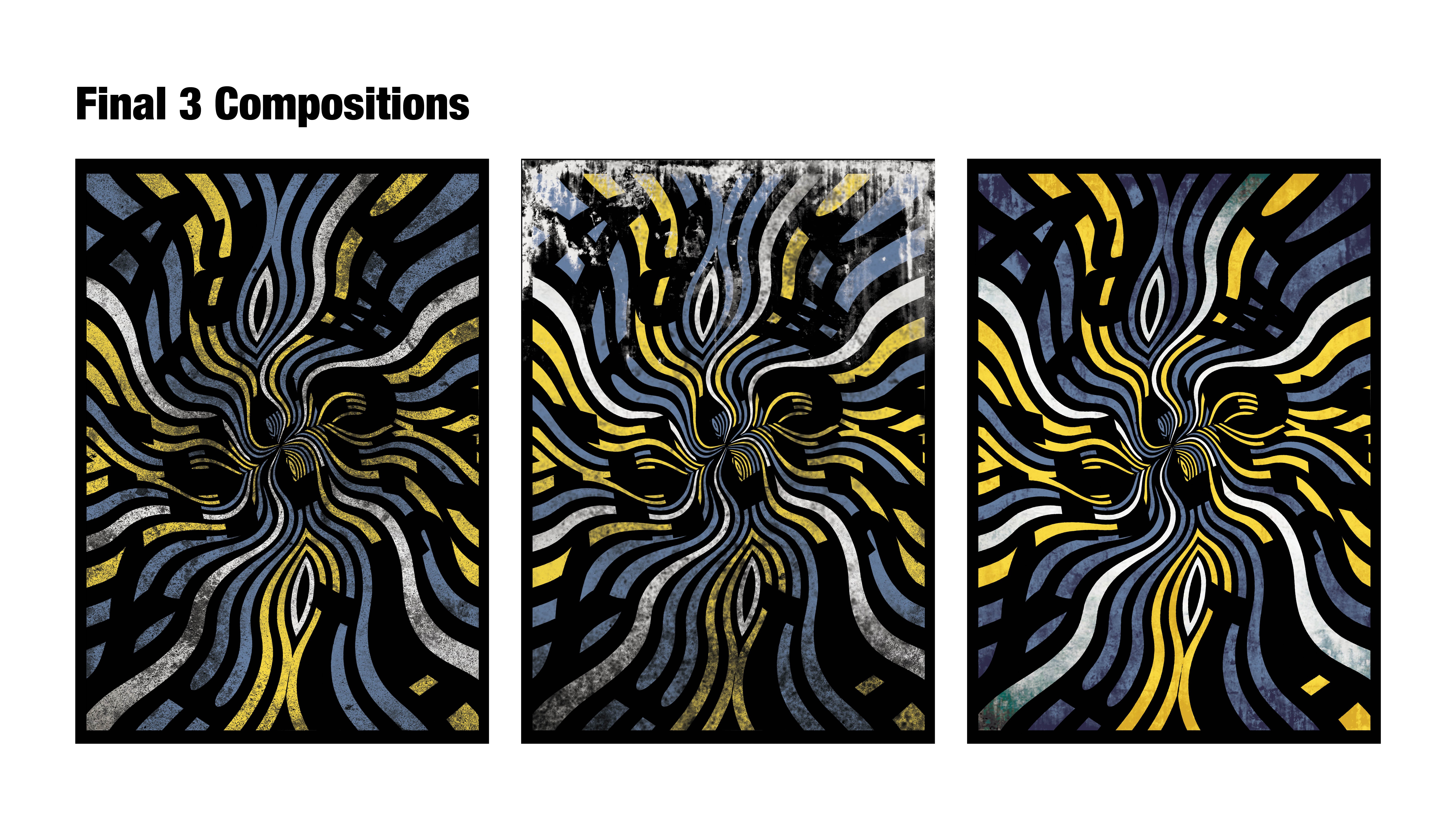
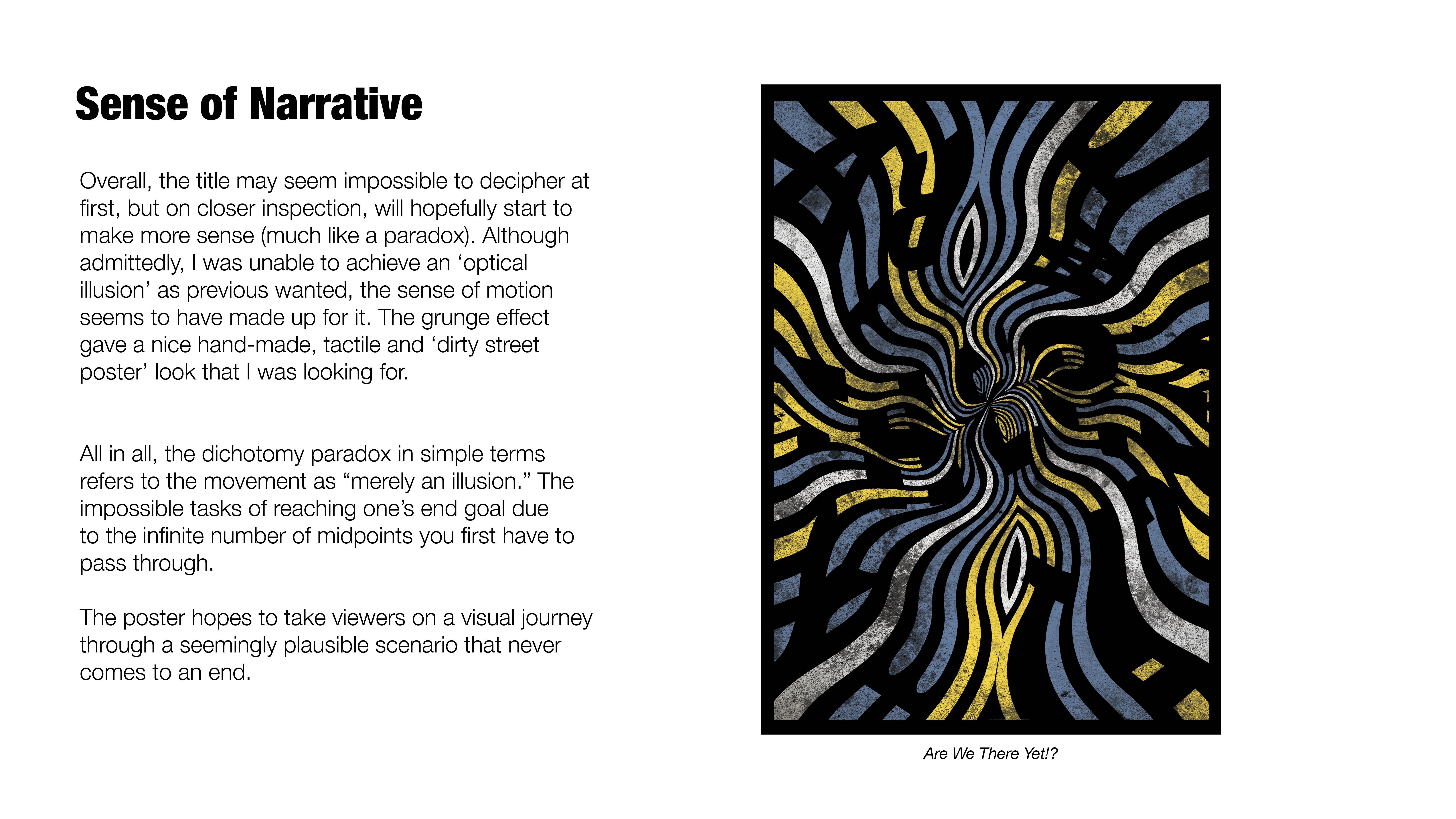
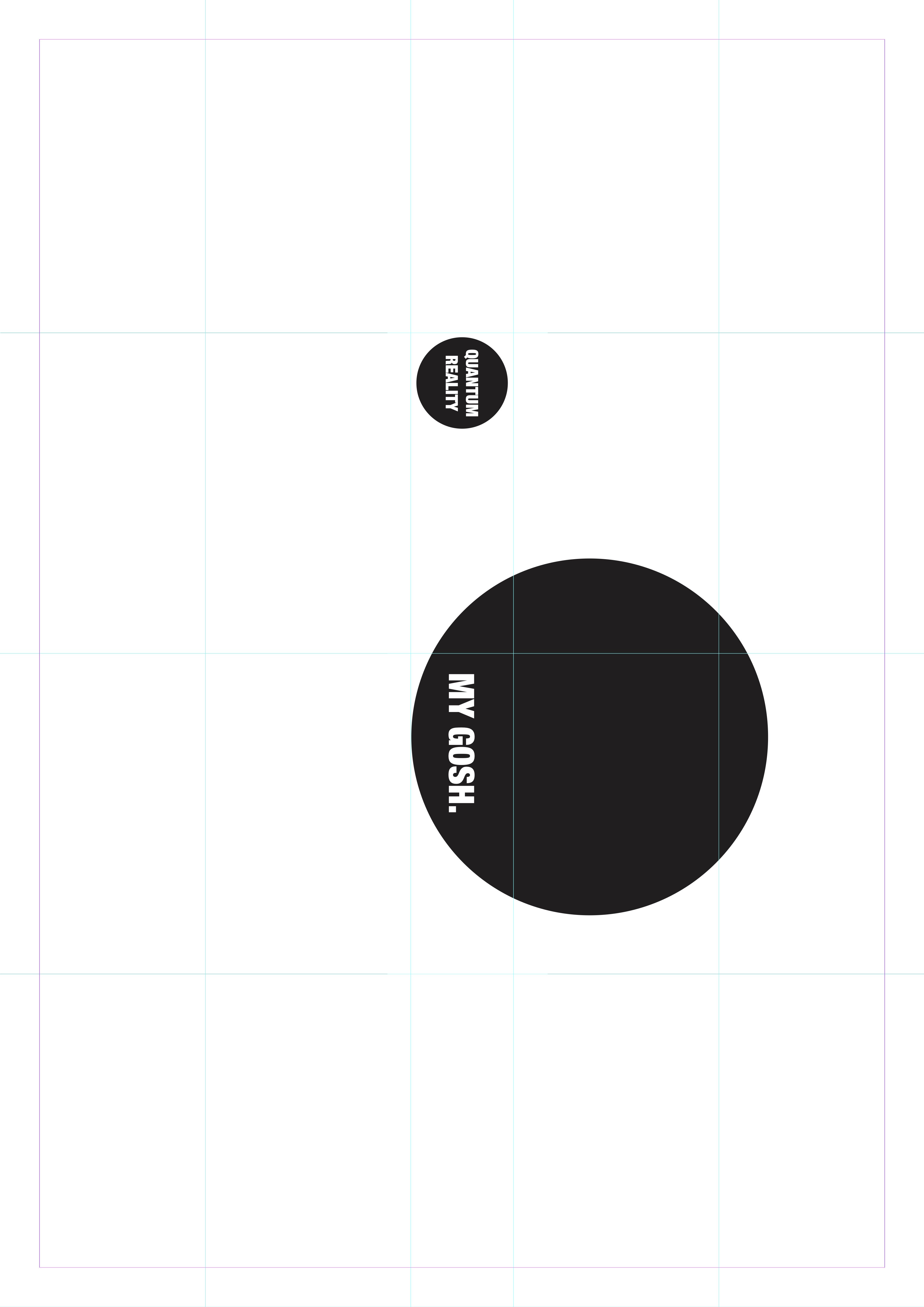
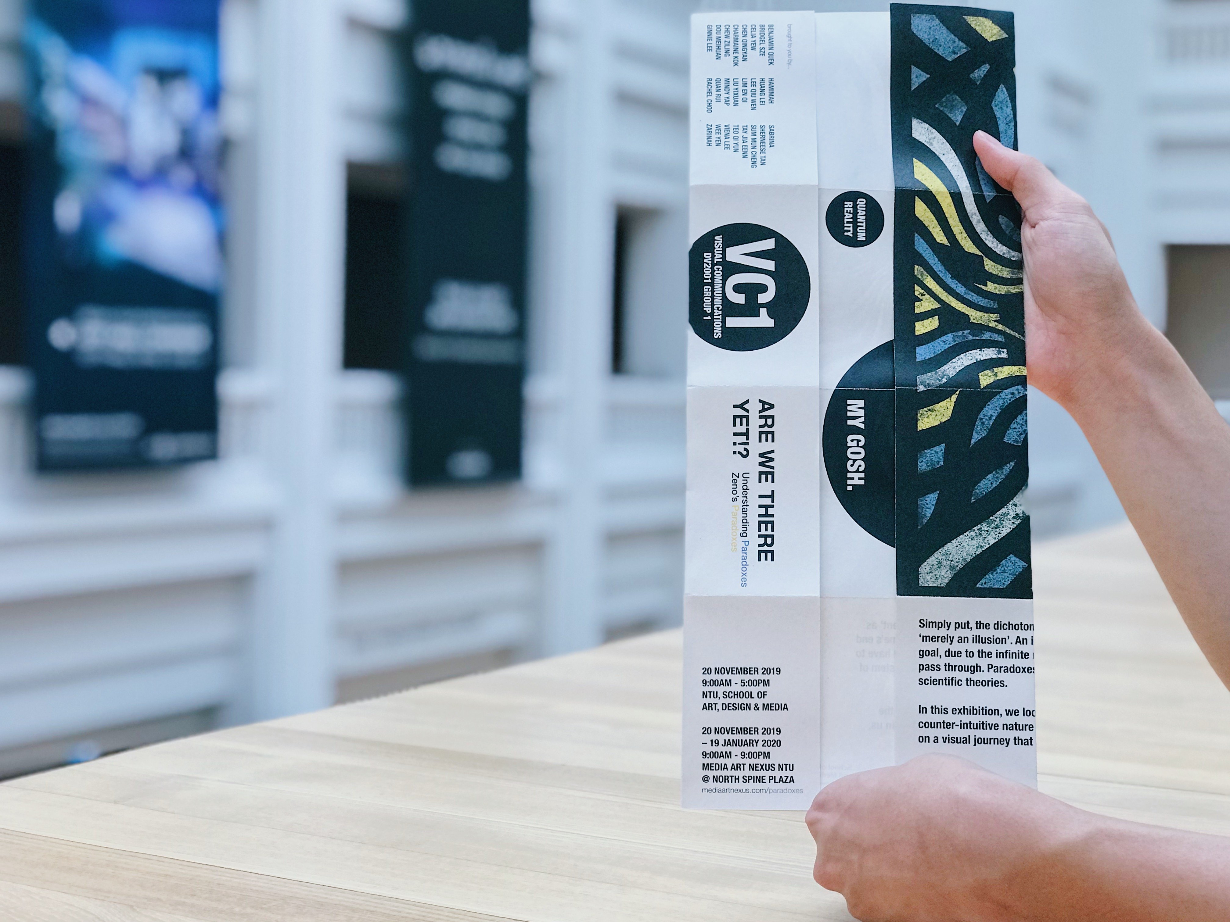
Picking up from where I left off, project 3 tasked us with applying what we have learnt about our topic and communicating this knowledge into the multiple folds of a single-page print (no bigger than A3). Having gone for a street inspired poster prior; seen below:

I wanted my invite to resemble and carry forward a similar aesthetic. As paradoxes can often be difficult and complicated to the average joe, I didn’t want to add further. Therefore, like a museum brochure, I intended to juxtapose the complexity of the topic/exhibit within a simple and comprehensive fold. Understanding & expressing the vast and profound knowledge of our universe, should not be limited to the niche professionals!
Digital Mockups:
Front & Back

Front & Back (Grid)
Link: Compilation PDF of iterations & alternative layouts
Invite:

Photoshoot @ National Gallery Singapore:


Chosen Paper: A3 Newsprint 100 gsm
Type used: Helvetica Neue
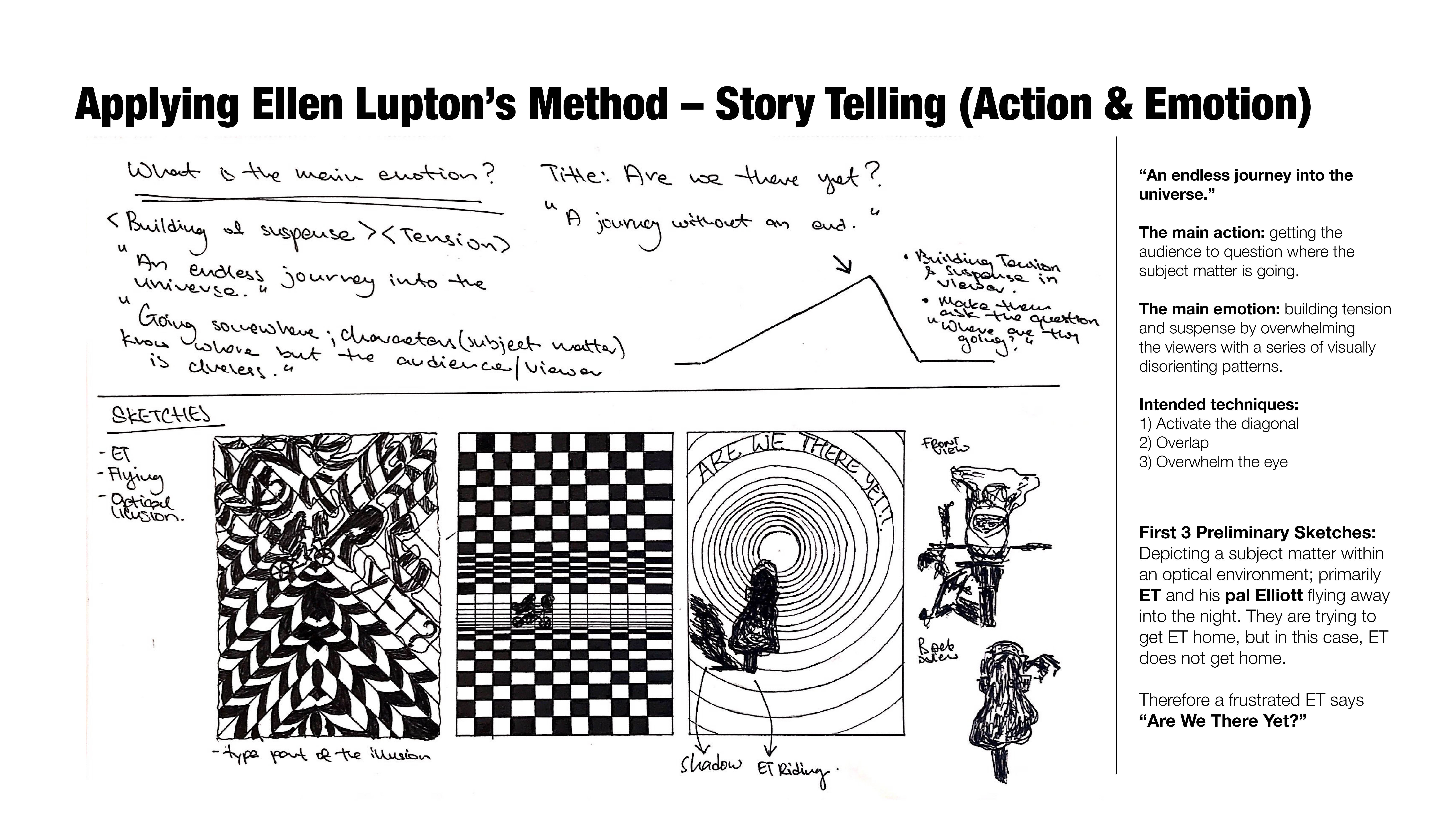
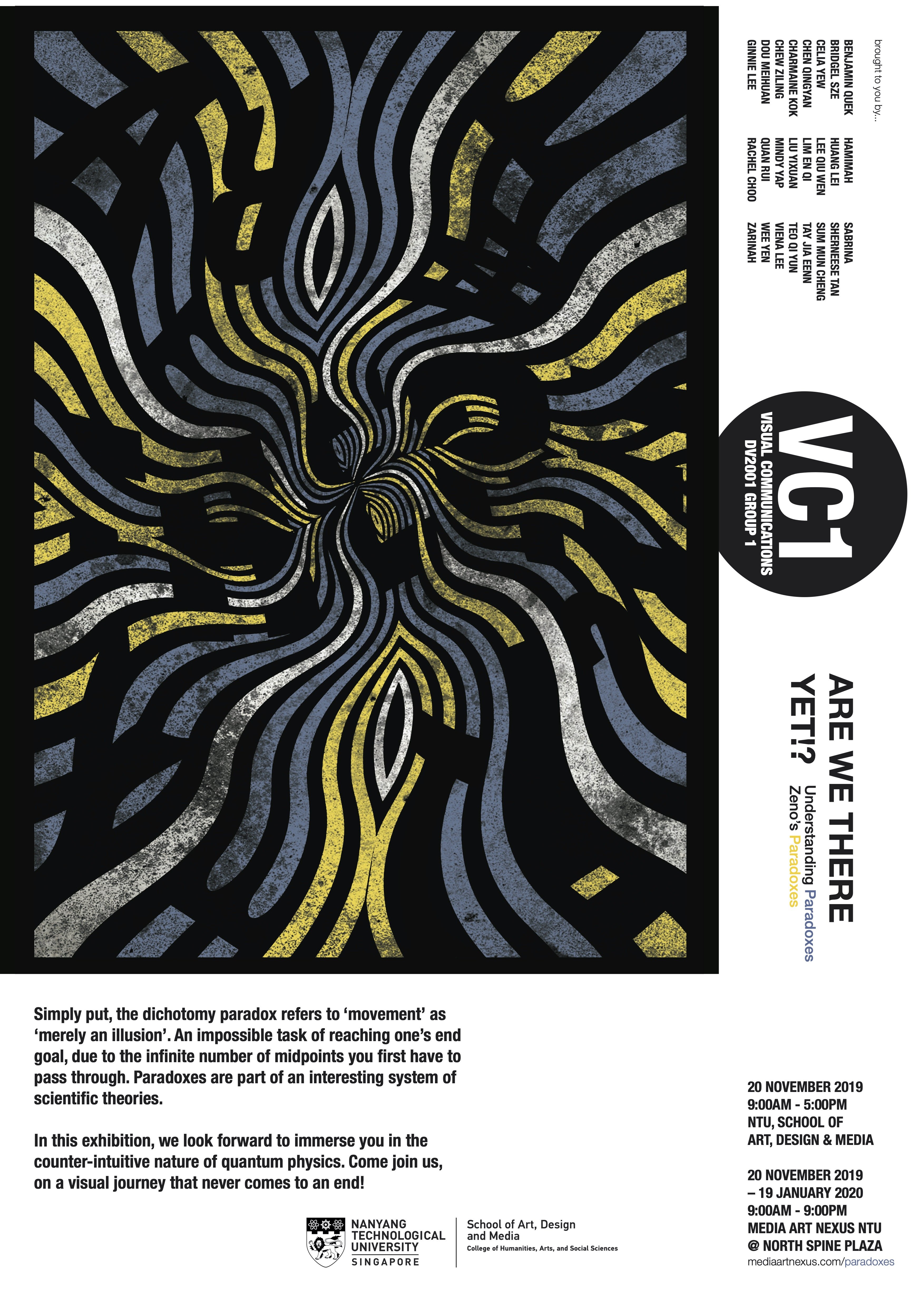
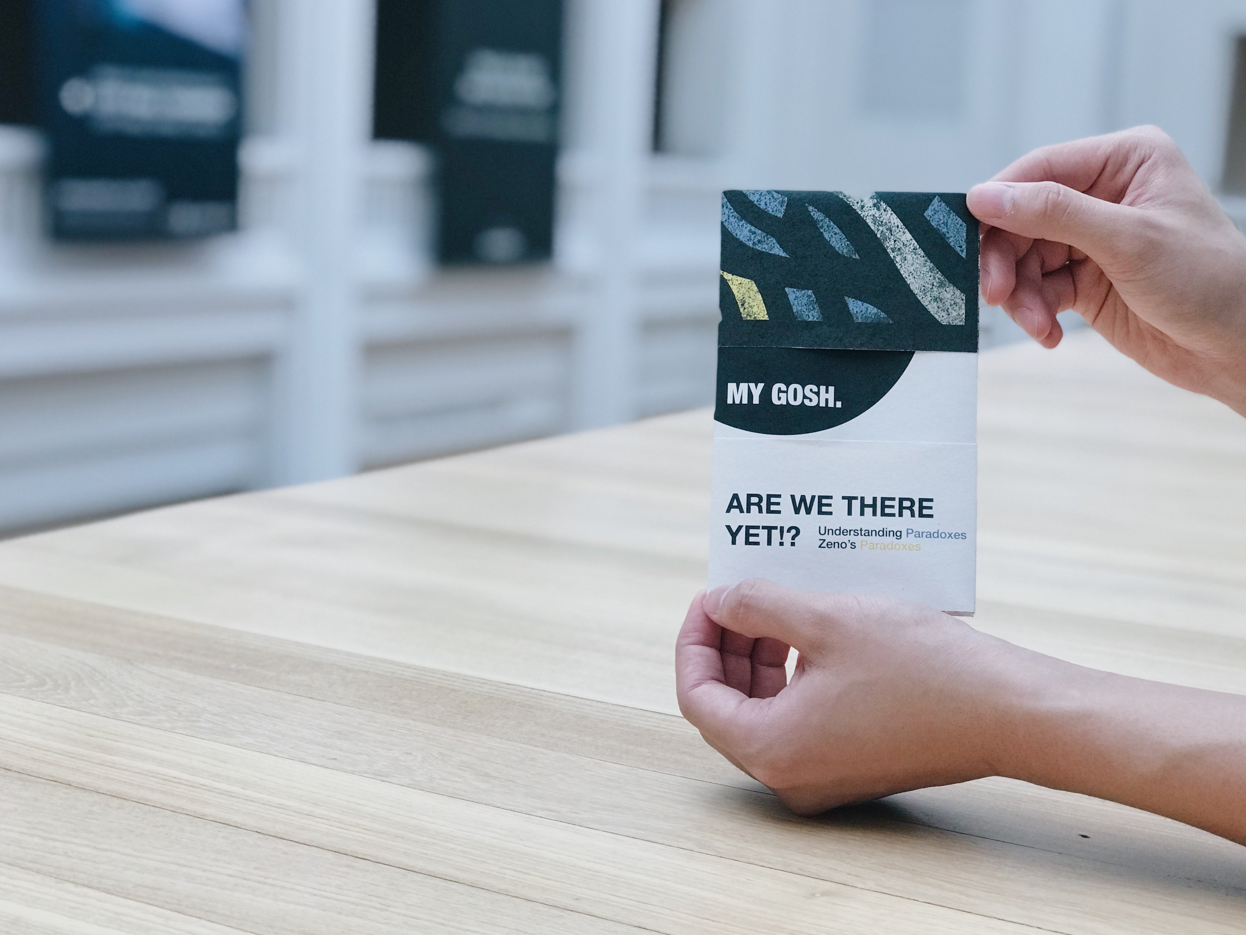
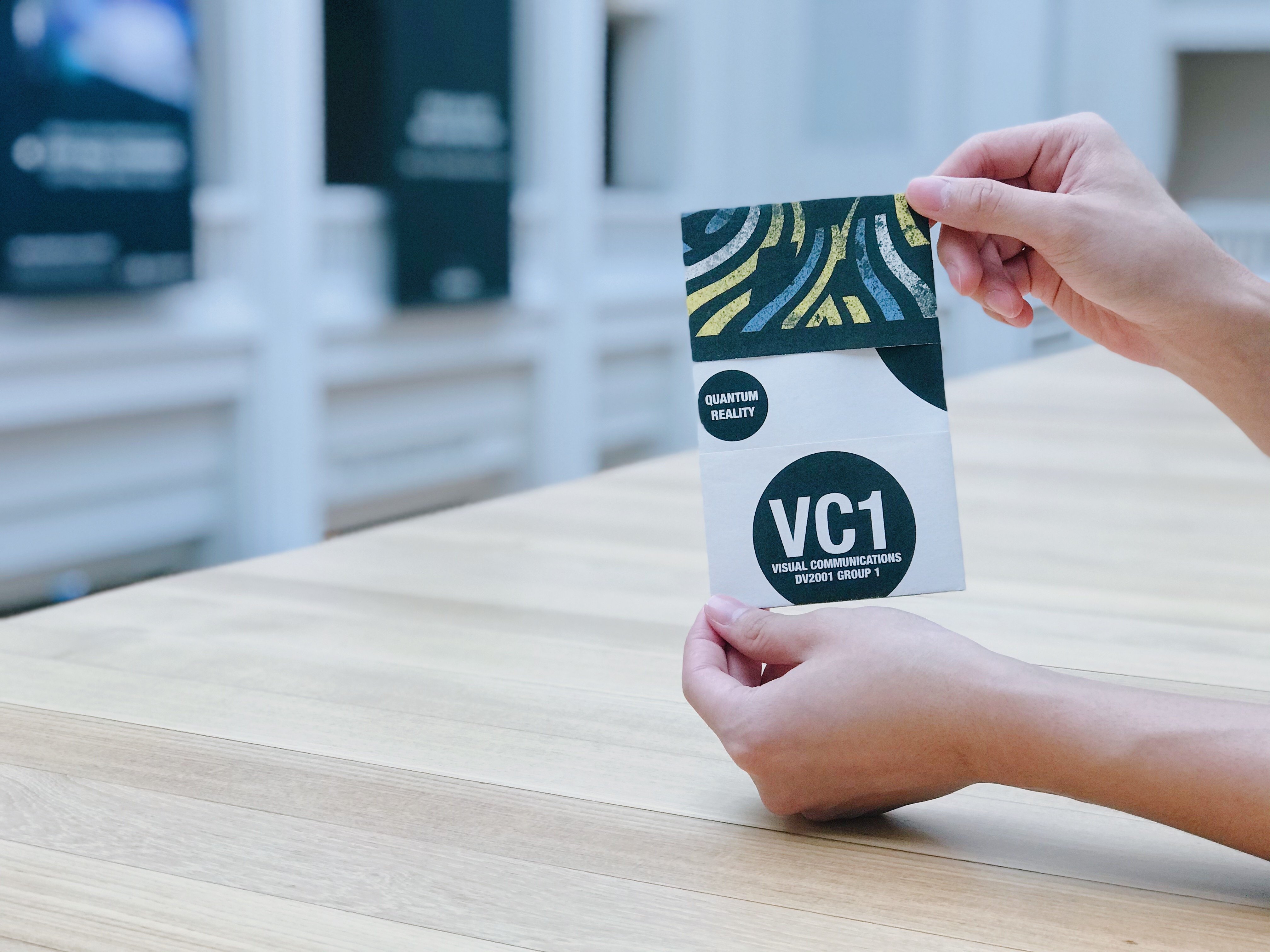
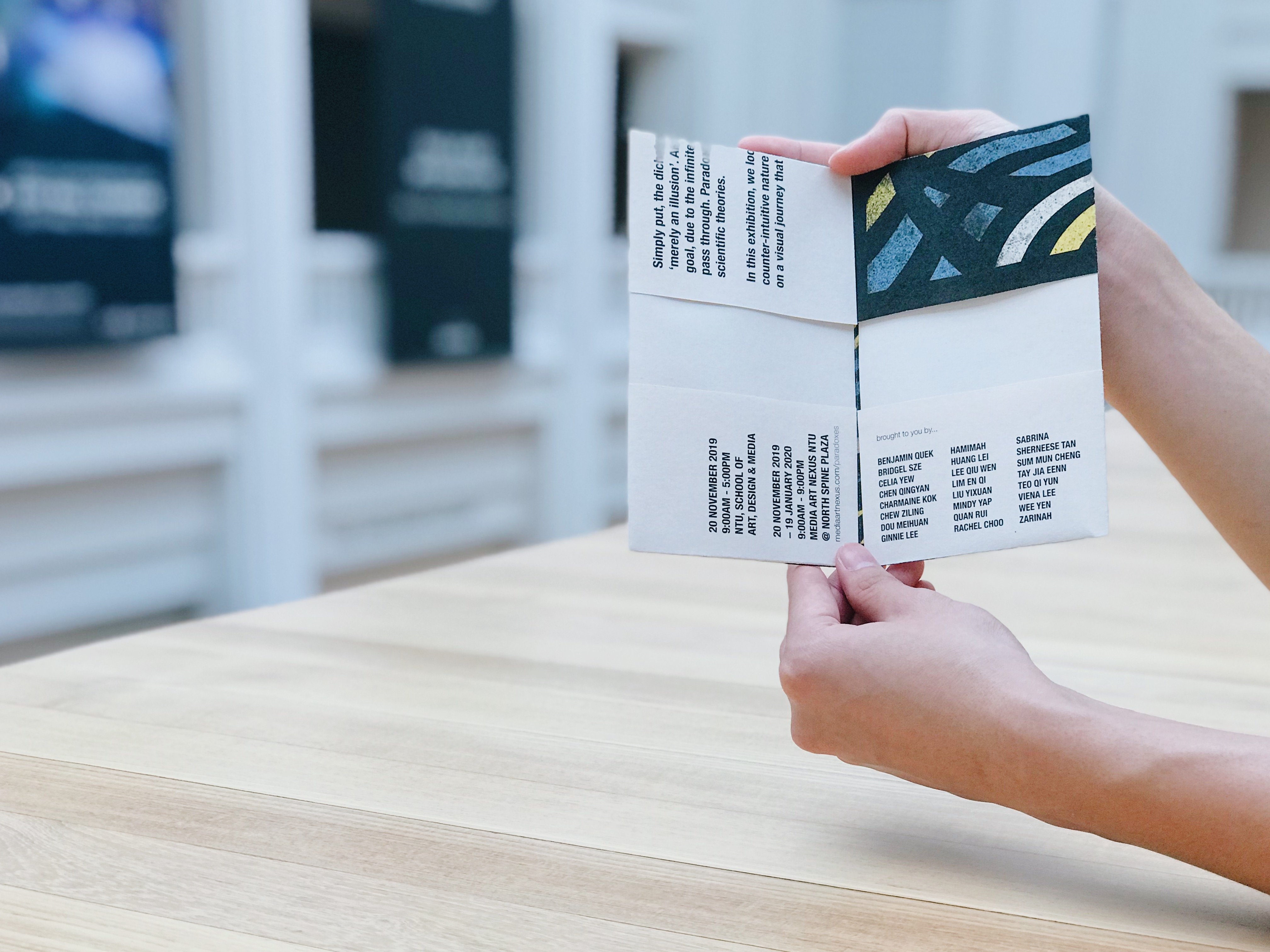
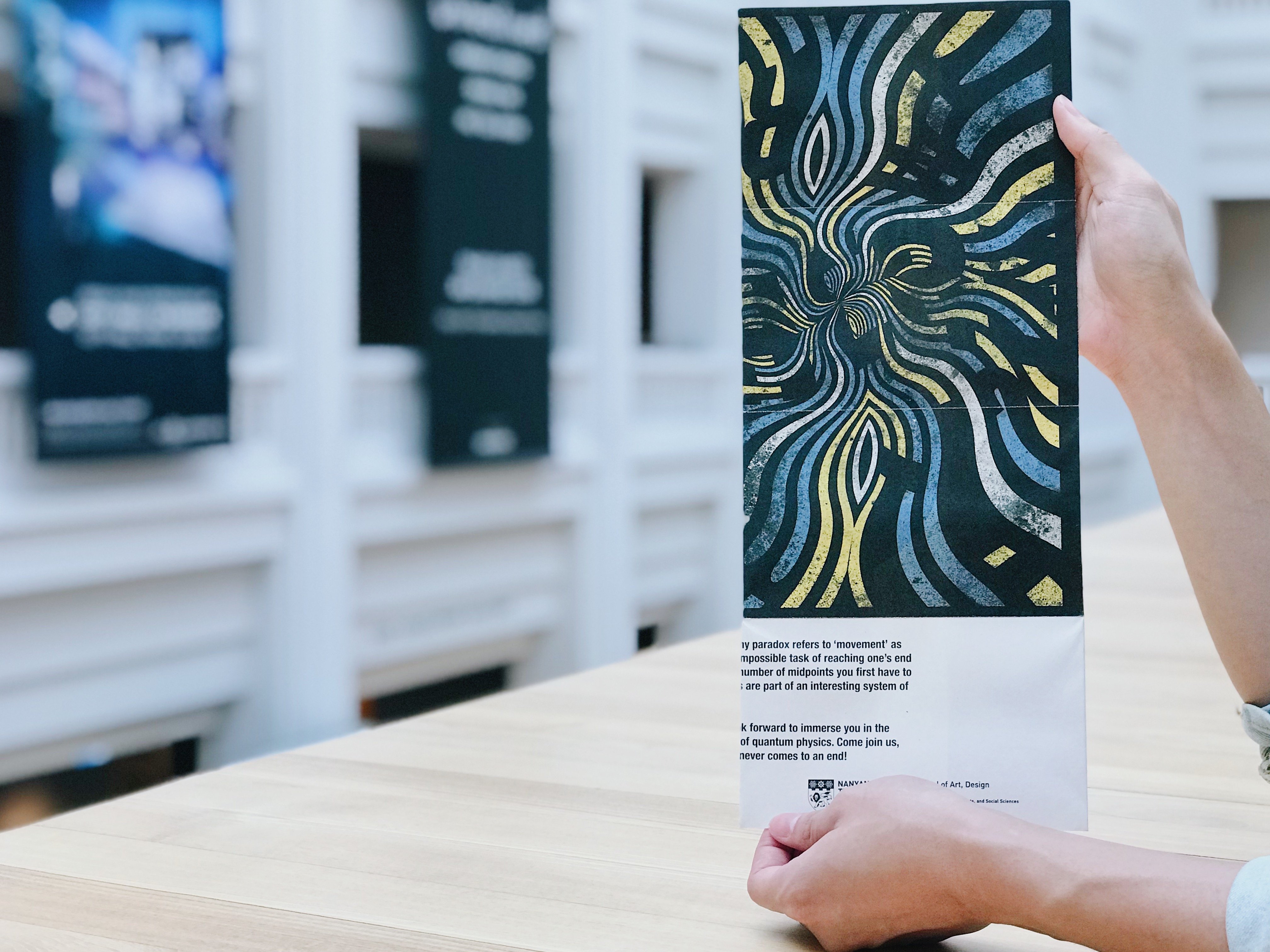
Simply put, the dichotomy paradox refers to ‘movement’ as ‘merely an illusion’. An impossible task of reaching one’s end goal, due to the infinite number of midpoints you first have to pass through. Paradoxes are part of an interesting system of scientific theories.
In this exhibition, we look forward to immerse you in the counter-intuitive nature of quantum physics. Come join us, on a visual journey that never comes to an end!
Disclaimer: NO, I did not choose to write about the Book of Kells because I am a Christian boy.
Ever since Prof. Michael Walsh taught us about Christian Art, the Book of Kells has always fascinated me. More specifically, the illustrative extravagance and overall complexity it achieves, given its respective historical context! In simple terms, I cannot fathom how creating something like that is even possible given the time stamp of the work.

Surface value suggests the Book of Kells be hardly typographic at all. Upon flipping the cover, motifs and geometric shapes flood the entire opening page. What piques my interest has to be the fact, that monastery monks were able to create such intricate masterpieces despite the limitations. The monks went through a tedious and unforgiving process of weaving tempera onto a delicate parchment of vellum. The immense dedication it took, wins my admiration as I would imagine months maybe even years, of discipline, precise painting, just for a single page. Funny enough, this truly reflects the Christian teachings, one of long-suffering and patience.

During Desmond’s lecture, he introduced something that I never before saw. The half uncials implemented within the manuscript portion of the book. Beautifully handcrafted typography with the prominent extension of the capital letters and individual ascenders. What strikes me most here is the incredible readability of each word. What more, the distinct spacings between words and impeccable separation between sentences value add significantly to its overall legibility.
I’ve always been a fan of clean, minimalistic layouts. Seeing how the monastery monks have achieved seamless perfection without the need of a computer much less a printing press is truly mesmerising.
Desmond’s lecture truly supplements my initial preconception of the work, echoing the sentiments of the renown archdeacon Giraldus de Barri:
‘Examine it carefully and you will penetrate to the very shrine of art…the work of an angel, not a man.’
One of the first few artists under the ‘Art Nouveau’ movement that Desmond went through during class.
 I love this set of posters for a few reasons. Visually, the art style reminds me of the good old days; watching cartoons on the television either through a cassette tape or CD.


Hayao Miyazaki’s films come to mind instantly for some reason, although in hindsight perhaps there wasn’t much of a link to begin with! Maybe the free-spirited, whimsical composition (colour, subject matter and type choice) aided the connection. But I guess you can be the judge of that!
However, apart from the nostalgia talking, personally, the part of the poster that appeals to me most has to be the interaction of the two distinct subject matters. I think it’s hilarious to see that the intense, passionate looks on the women’s faces, is merely from an interaction with an oil lamp. Not too sure what went through Jules Chéret’s mind during the design process, but he seems to be wanting to tell his viewers…
“BUY OUR LAMP OIL & THIS COULD BE YOU TOO!”, downright weird…
Don’t get me wrong, I meant no disrespect to the “Father of Modern Posters”. In fact, I wanted to highlight just how influential Jules Chéret’s contributions are, to the advertisements of today. Take, for example, the recent ‘Shopee’ adverts done in collaboration with football superstar ‘Christiano Ronaldo’. We can sit here and cringe with disapproval all day, but at the end of it, the reach of the ad is evidently far and widespread. In other words, a seemingly lousy ad can still be an effective one. Shopee drew upon a marketing tool still extensively used in the advertising world; incorporating influential figures or an ideal human state to promote their service.
I think it’s just incredible to see where it all started.
Calligrams! was what caught my attention this week! A series of text arranged in a manner that formed and reflected a thematically related visual/image. Executed through a myriad of ways; in a poem, a phrase, tiny bits of scripture or even single words. The visual arrangement of the typeface was paramount to it working, because if you think about it… you have nothing to work with apart from typography, no pictures, no gifs and certainly no videos.
No he is not wearing a head-band, he got shot in the temple when serving in the World War.
Guillaume Apollinaire was a poet, playwright, short story writer, novelist and art critic. This guy is amazing, he is considered one of the most prominent poets of the early 20th century. Better still, upon further research I realise he was the one who actually coined the names of the two movements ‘cubism’ & ‘surrealism’ in 1911 & 1917 respectively. I wouldn’t be surprise if the term ‘calligrams’ was also coined by him.
Apollinaire is a renown calligram writer and also the author of a book of poems called Calligrammes, subtitled Poems of Peace & War. I found a link by the ‘Public Domain Reviews’ that allows you to view the whole book in its entirety, HOHOHO (The Link)
In his own words,
“The Calligrammes are an idealisation of free verse poetry and typographical precision in an era when typography is reaching a brilliant end to its career, at the dawn of the new means of reproduction that are the cinema and the phonograph.”
Many of the poems deal with Apollinaire’s wartime experience, and through his calligrams, exude a sense of longing and desire for liberty and peace. Here are some examples that caught my attention. Calligrams value added to the poetry Apollinaire wrote, the ingenious arrangement of typefaces intensified each composition and perhaps, even allowed the reader to get a glimpse and relate closer to the artist’s intentions.
Here are some examples of modern day calligrams that are really fun to look at.


The past four weeks learning about history has been fast paced, overloading yet quirky and informative one. Admittedly due to the wide learning scope (there were so many names involved!!!!!!), I found myself struggling to glean as much as I could during lectures. So I would say my knowledge of each artists is merely surface. However, what felt like a hectic and tedious routine at the start of each week soon became an efficient process of analysing and understanding. As much as it requires more effort and time, the reflection posts have really been helping me to swallow better and additionally encouraging my ‘lazy ass’ to do personal research outside class time. Thank God as well for the split test; on hindsight a much better option over the alternative. The set list of keywords coupled with the bi-weekly pop quiz really aided my study and research process; as I was able to search up relevant terms and slowly draw the links myself. All in all, albeit a little overbearing at the start, but progressively, I realise the entire work system was benefitting me a lot more than I thought it would; for starters:
“Fast paced lectures with heavy content + own personal research and reflections”
Surprisingly, this really motivated me to learn independently, and in the process, I’ve retained a whole lot more compared to Art History I & II last year! It has been a joy learning about the History of Graphic Design under Desmond and this new found appreciation and knowledge will go a long way in my own Graphic Design journey!
Thank you, thank you so much!
And of course, the story of Paula Scher blew my mind. I also want to sell a logo for 1.5 million dollars :(…
iv) What ideals, principles, motto and design qualities might you use to describe and define the next emergent design trend valid over the next 5 years, current to your practices? What name would you give to the design movement?
For this project, Peter told us to design and construct a 3-dimensional sculpture/device that makes a record of its own movement. We had to synthesize the relationships between material form and movement.
The device should have at least 3 of the following movements:
Free Fall
Rising
Falling
Spiralling
Arc
Penetration
Extraction
Rotation
Pushing
Displacement
Stepping
Bouncing
Transformation
Important Considerations
– The system must be able to repeat its drawings
– Mark making needs to be visible
– No applied colour onto the machine itself
IDEAS
-Musical Box
-Piano System
-Musical Box + Piano System
I knew I wanted to play around with an idea that could create/recreate “music”. As ‘sound’ wasn’t of paramount importance, I decided to substitute the sound aspect with colour; with each colour representing a different note. Here are some sketches of me playing around with the above ideas:
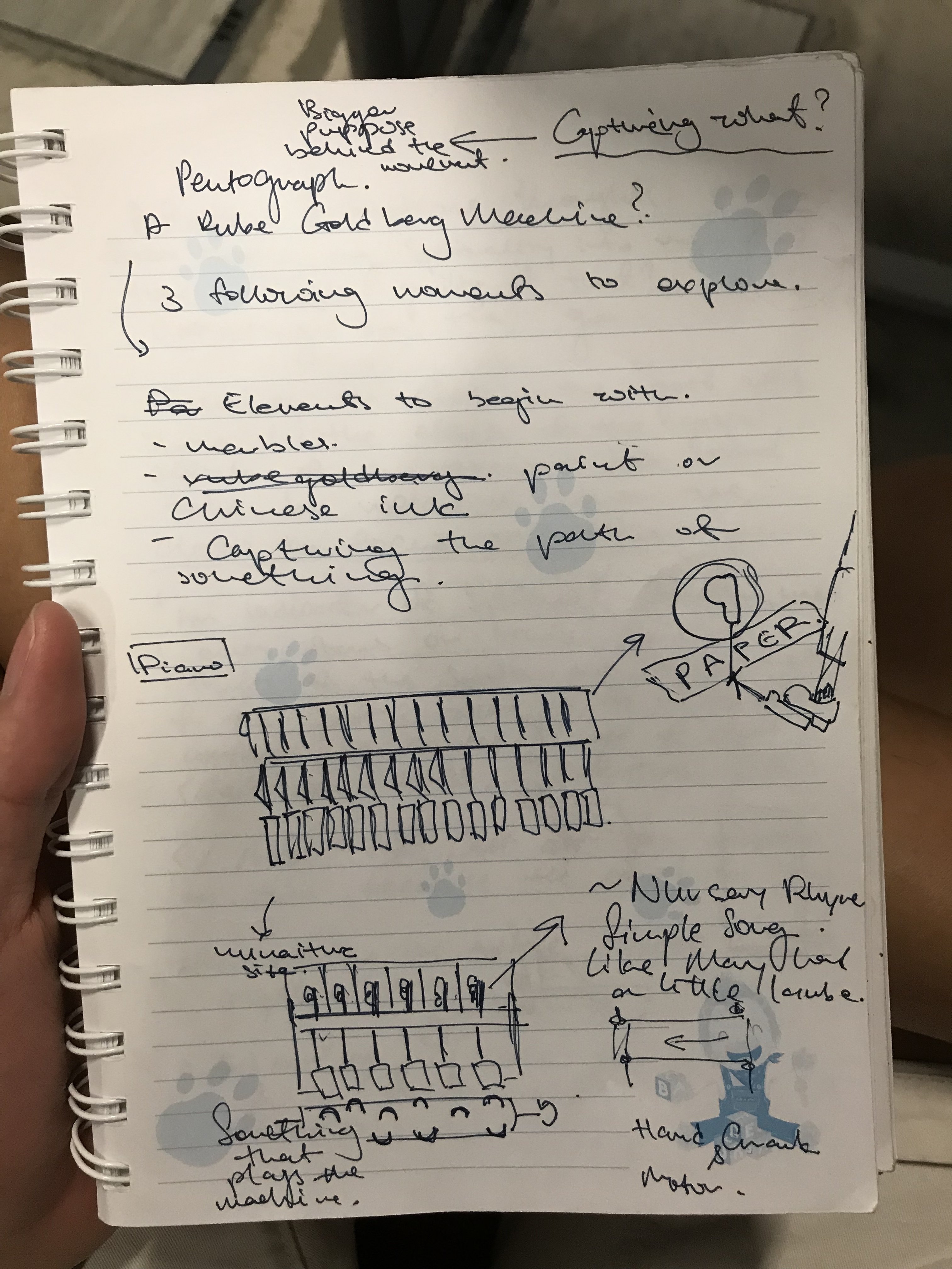
Ultimately, I decided to focus down onto the piano system alone as I wanted a degree of interaction the player would have with the machine; the musical box would not achieve that as it would probably be a fully automated system.
For the piano system to even work, I needed to figure out a way to recreate the internal hammer system of the piano as seen below.
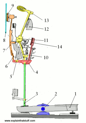
Credit: explainthatstuff.com
This would prove to be the most daunting part as the entire system working hinged upon how functional I was able to create this “hammer”. Here are some draft mockups:

Video of how it works: IMG_4176
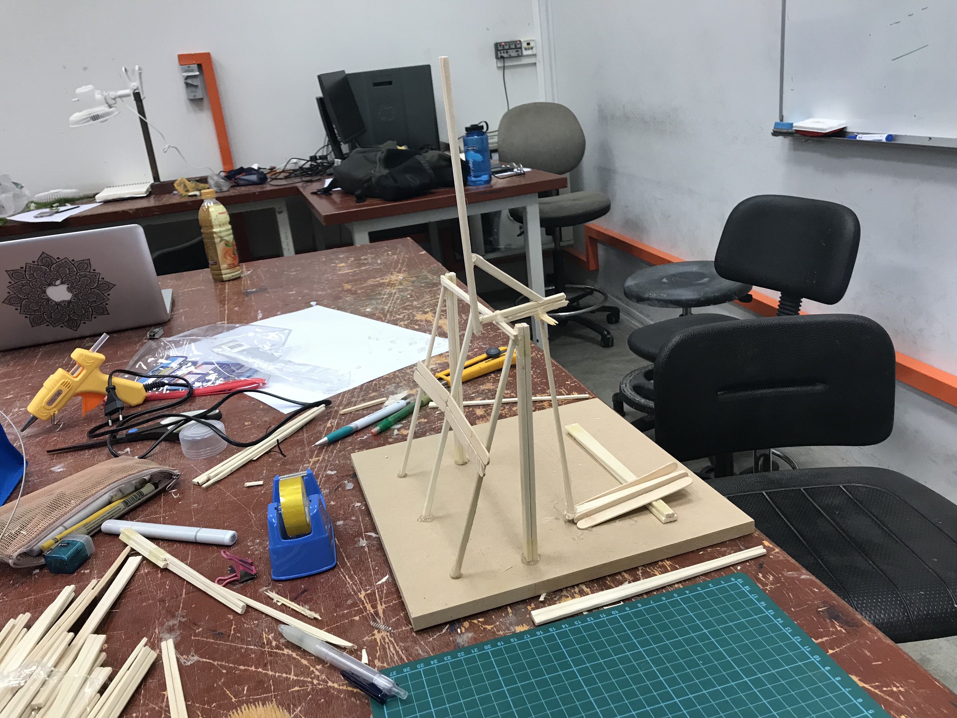
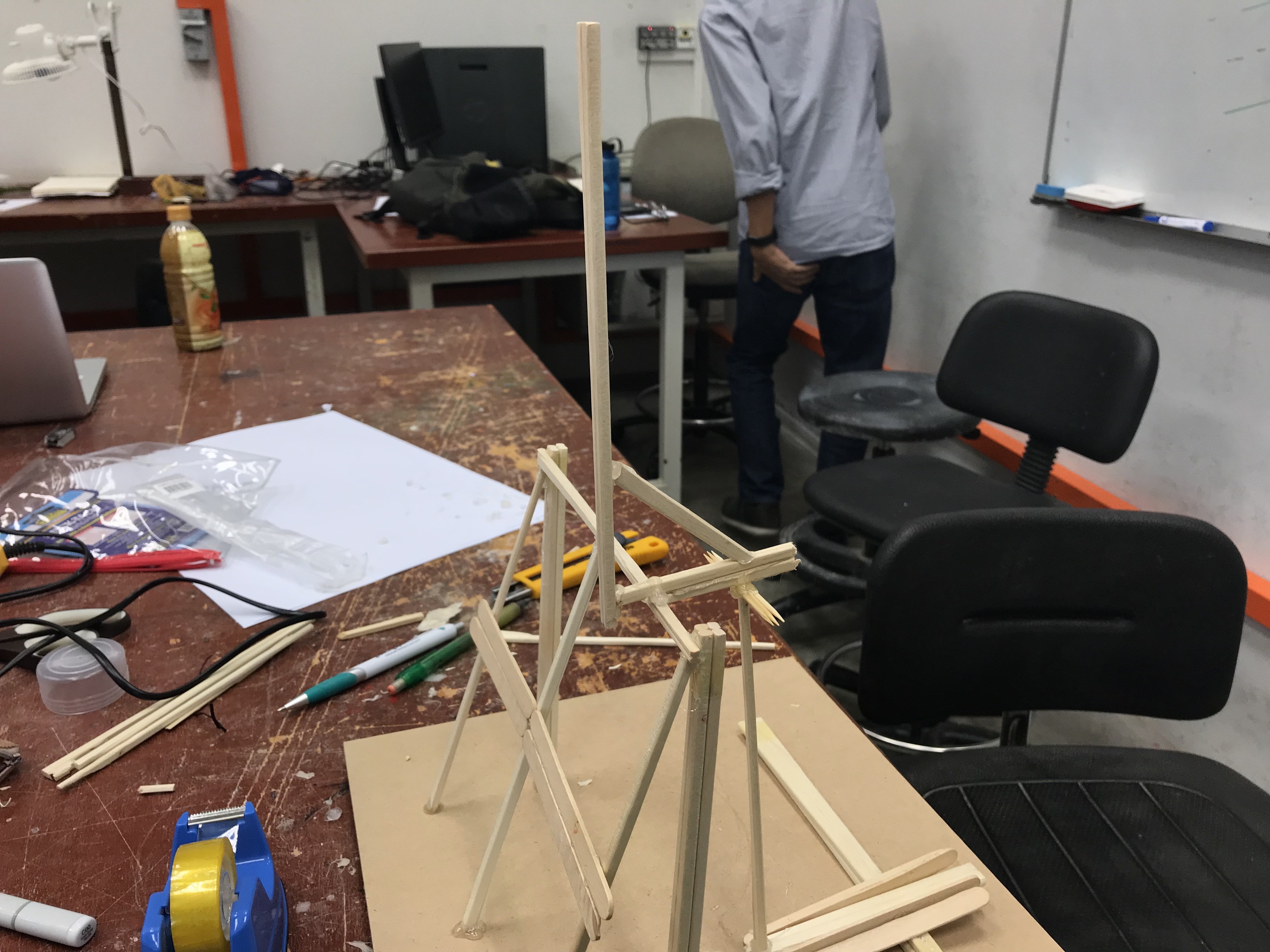
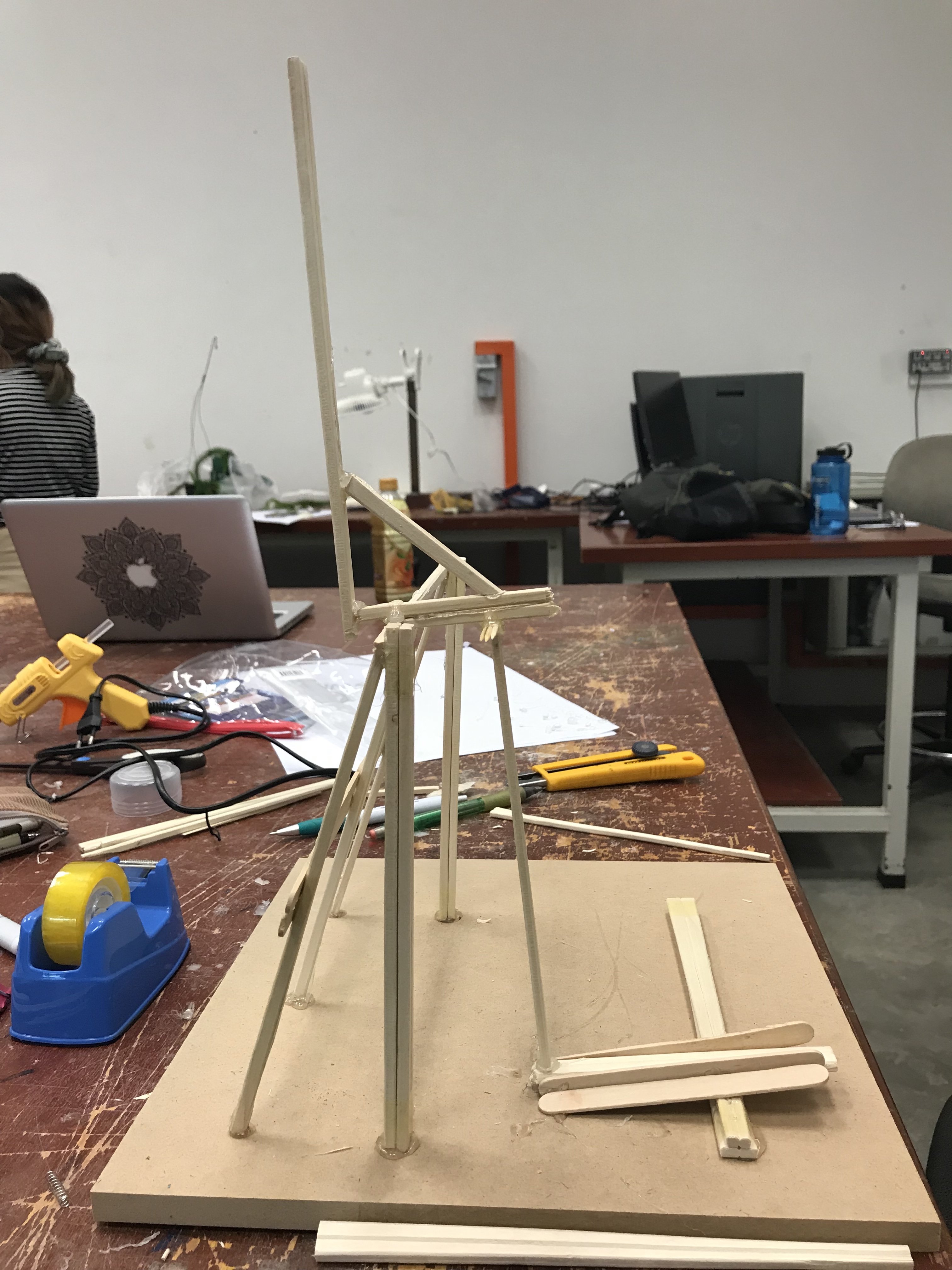
Although this version worked out, it was unreliable as the hammer hinges upon hardened hot glue (had a bit of flexibility to it) and was aesthetically pathetic:
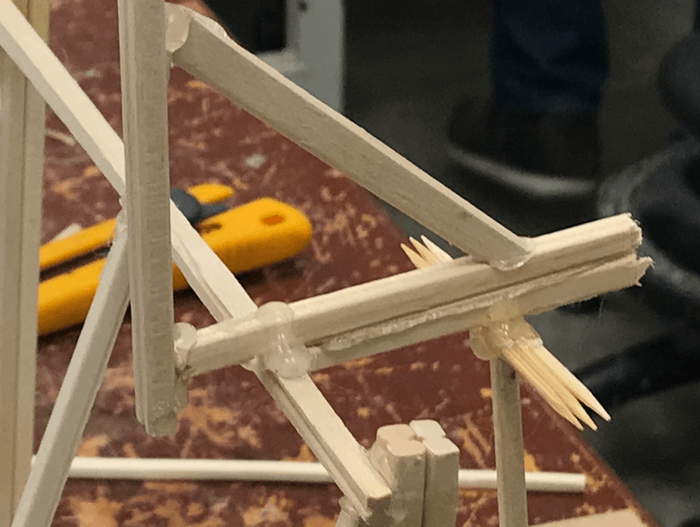
Consulting Peter, we came up with a solution to improve the fulcrum ability.
Broken down into 3 parts:
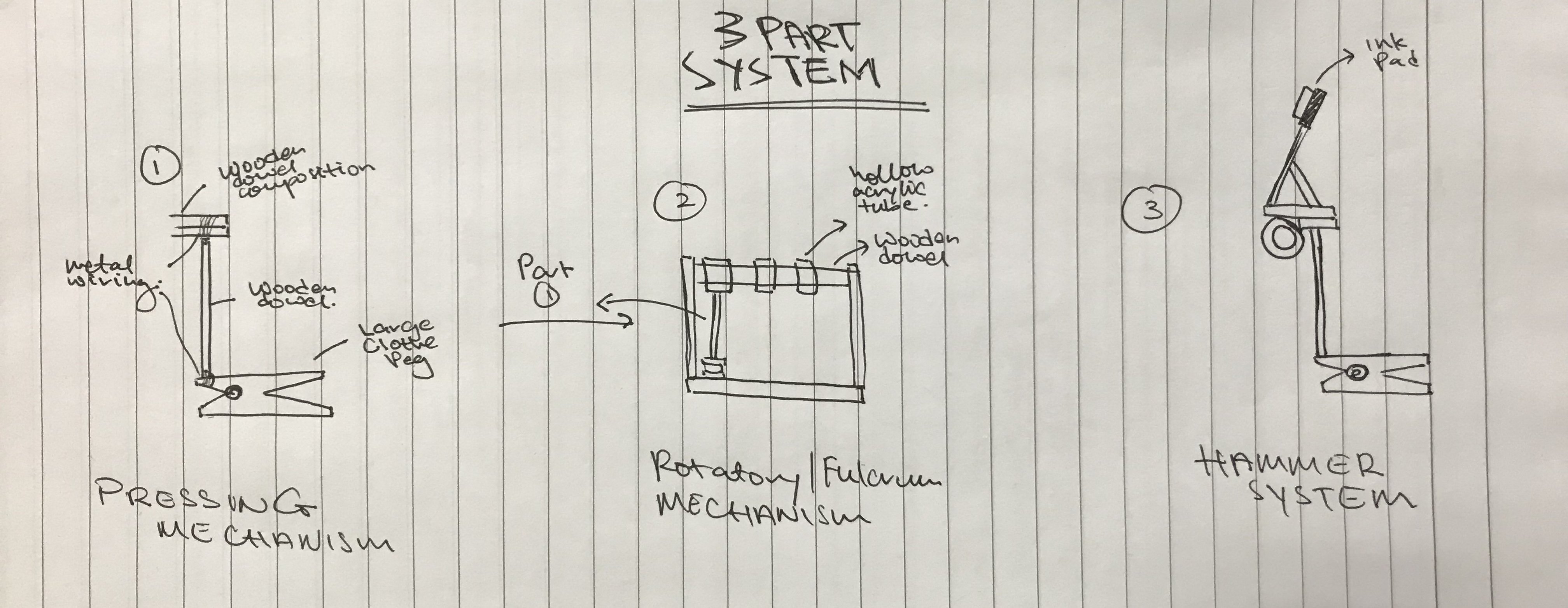
Pressing Mechanism
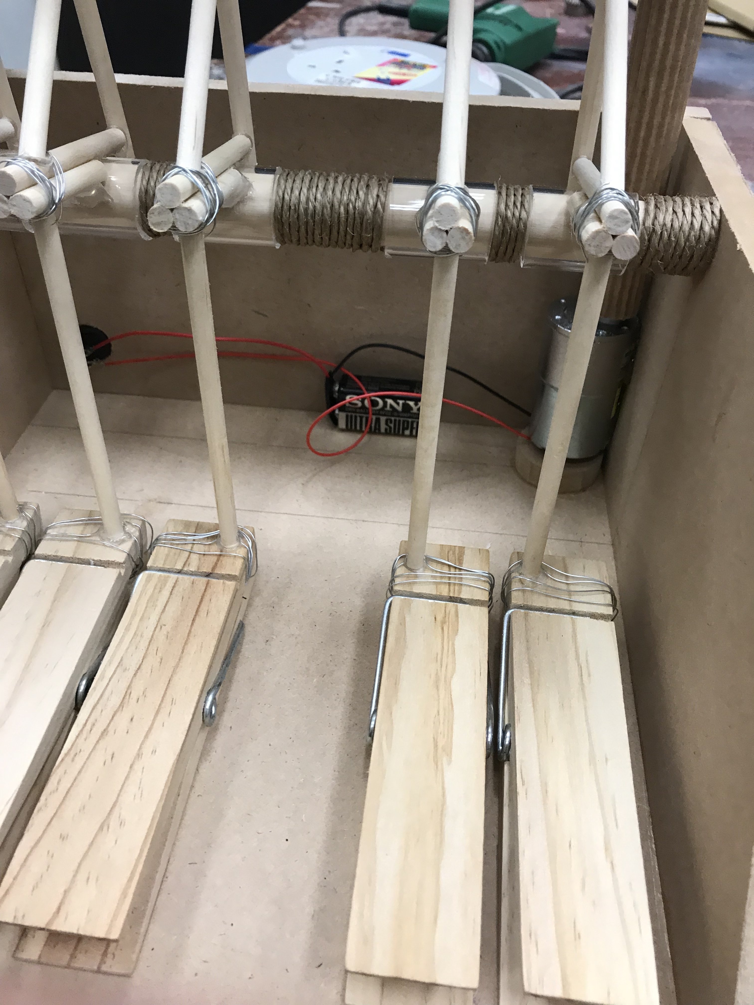
Instead of using hot glue as the cement, a thin aperture would be drilled through a wooden dowel and a thin metal wire would pass through. The wire wines tightly around a giant wooden clothe pegs (used to retain height and size consistency across all keys). This allows for less pressure on the turning points of the wooden dowel
Rotatory/Fulcrum Mechanism
The supporting structure holding up the hammer portion would be made out of two tubes, one large wooden dowel and a larger hollow acrylic tube. This enables a rotating feature (acrylic tube) about a fixed axis (wooden dowel).
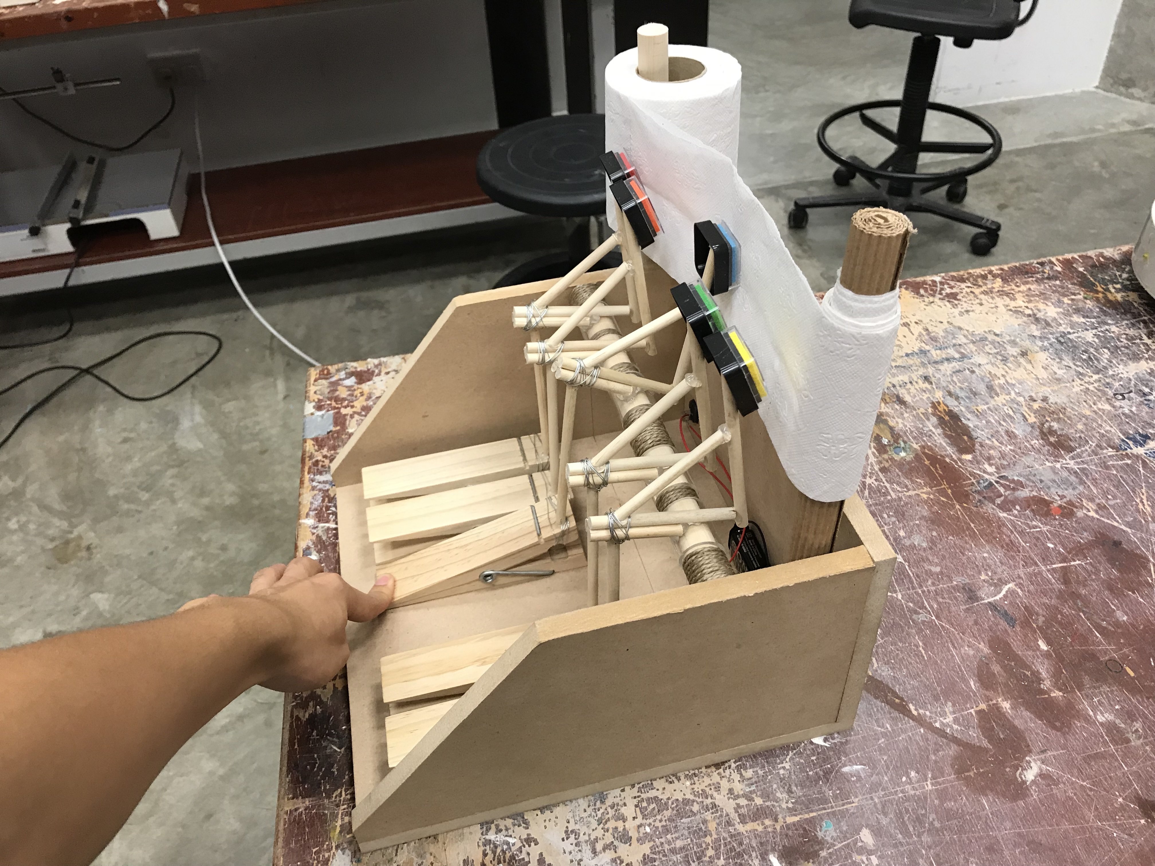
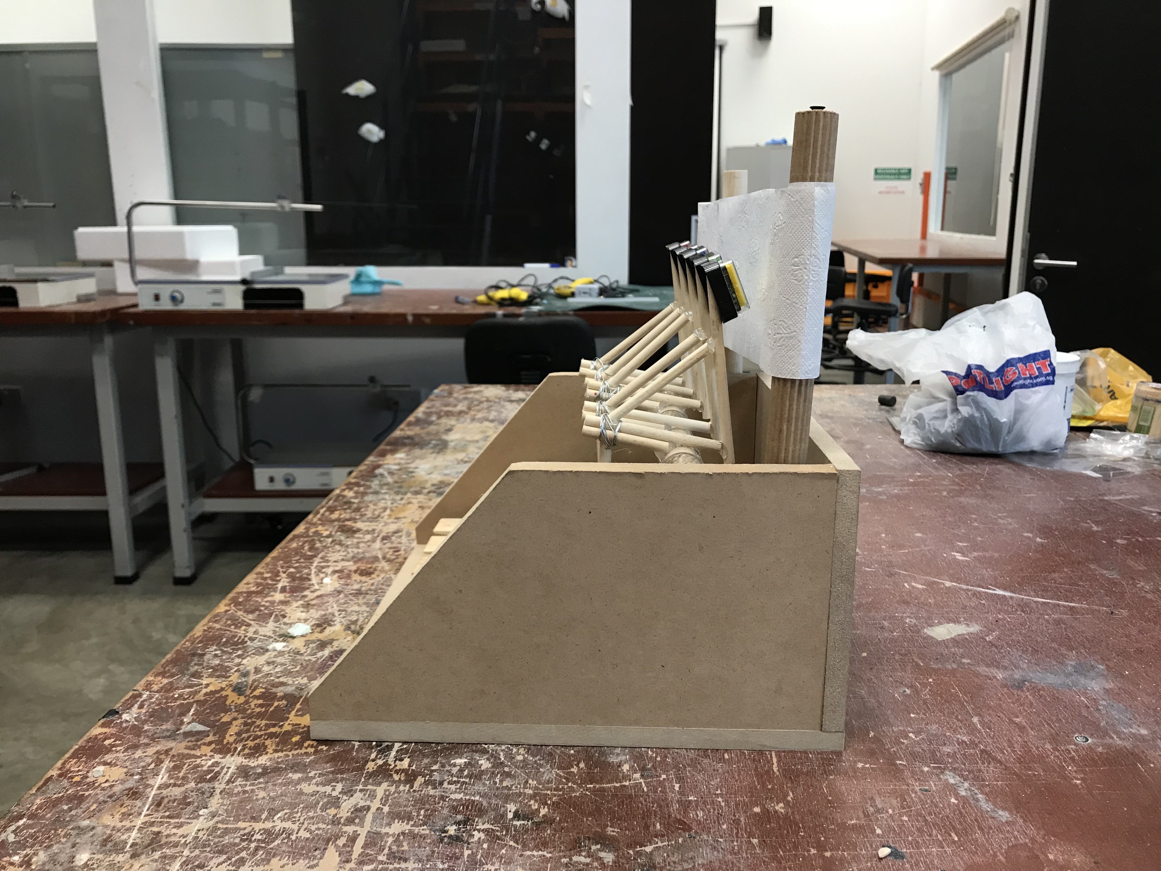
Hammer System
Put both mechanisms together and you get the hammer system. Fitted with an ink pad at the very end; when the key (clothe peg) is depressed, it activates a series of connections that causes the hammer to strike down onto the mark making surface.
Video to illustrate the descriptions: IMG_4320
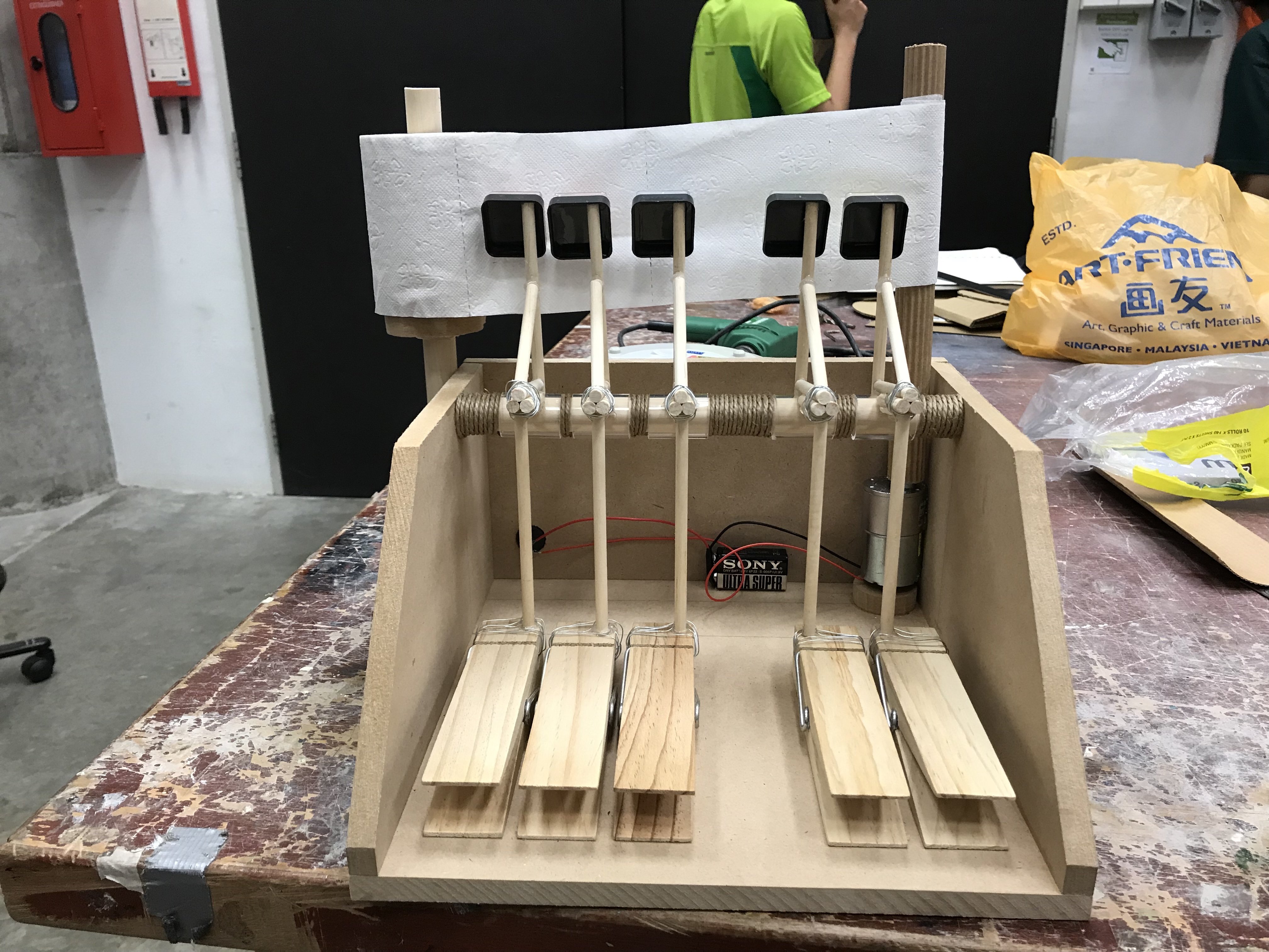
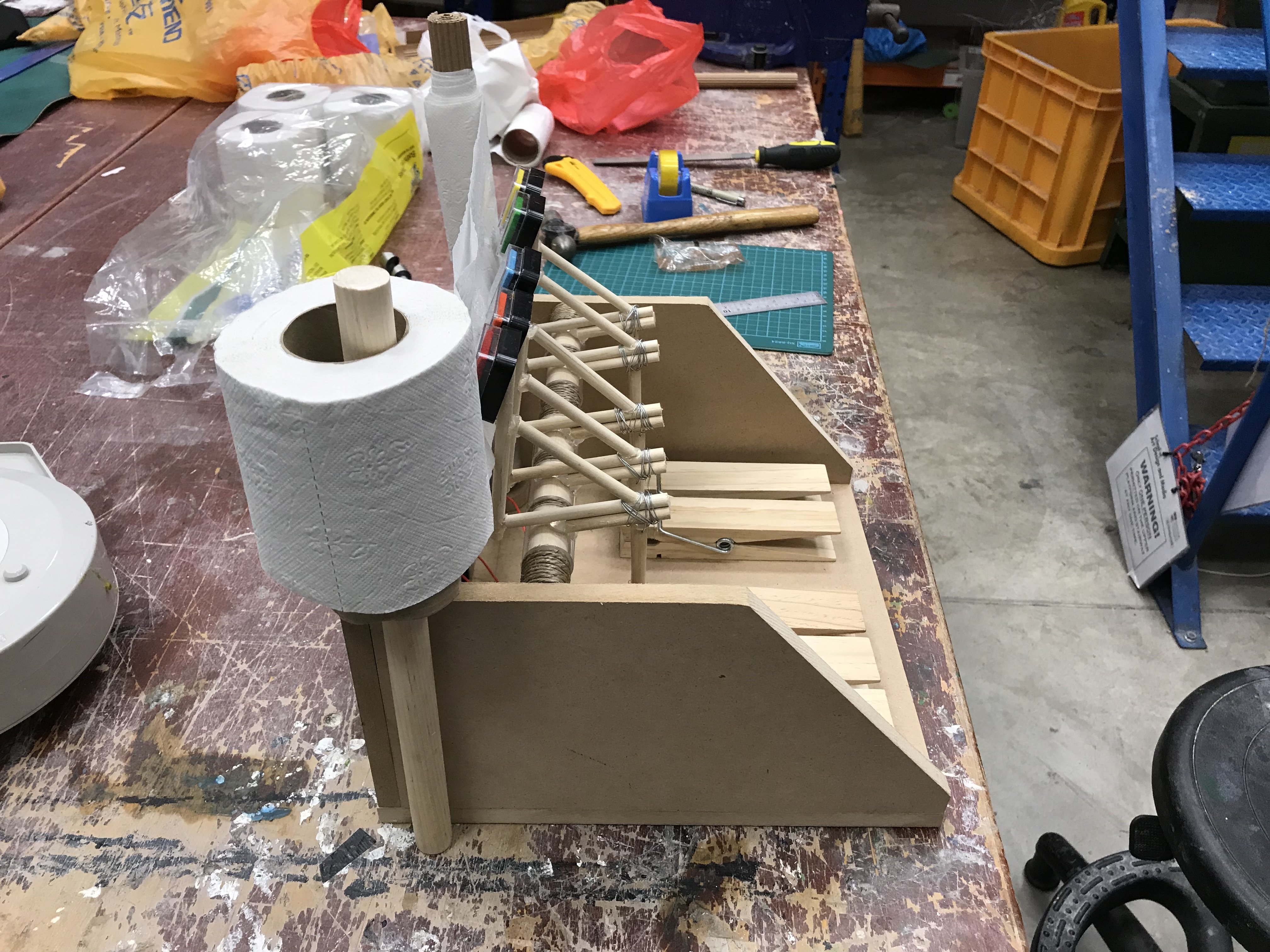
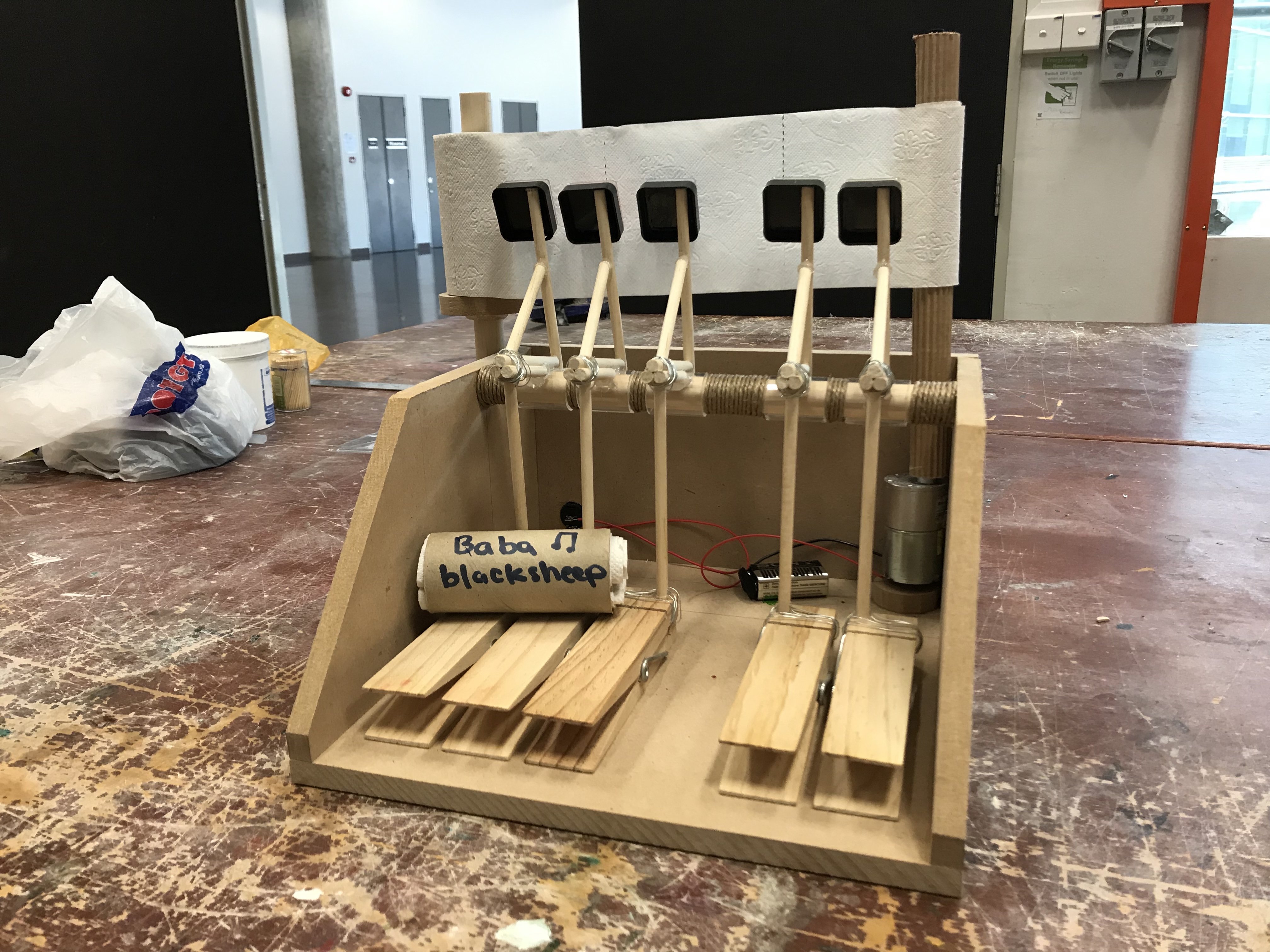
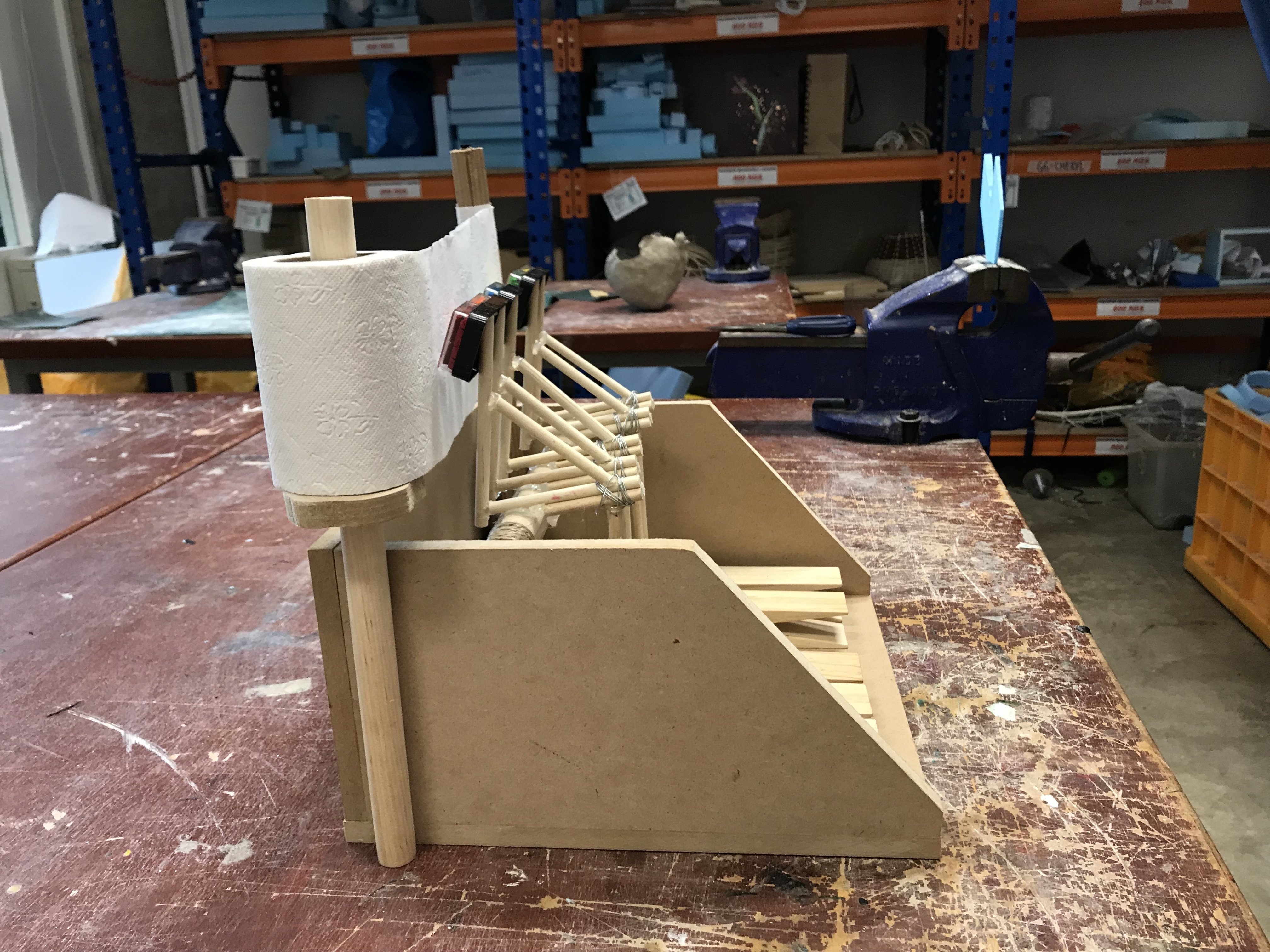
With the essential hammer system out of the way, I proceeded to build the main body of the piano system:
1) Fitted all the piano keys in the position that I wanted.
2) I jigged-sawed two identical sides and backboard for my piano system.
3) Added in pivoting bar (wooden dowel and acrylic tube)
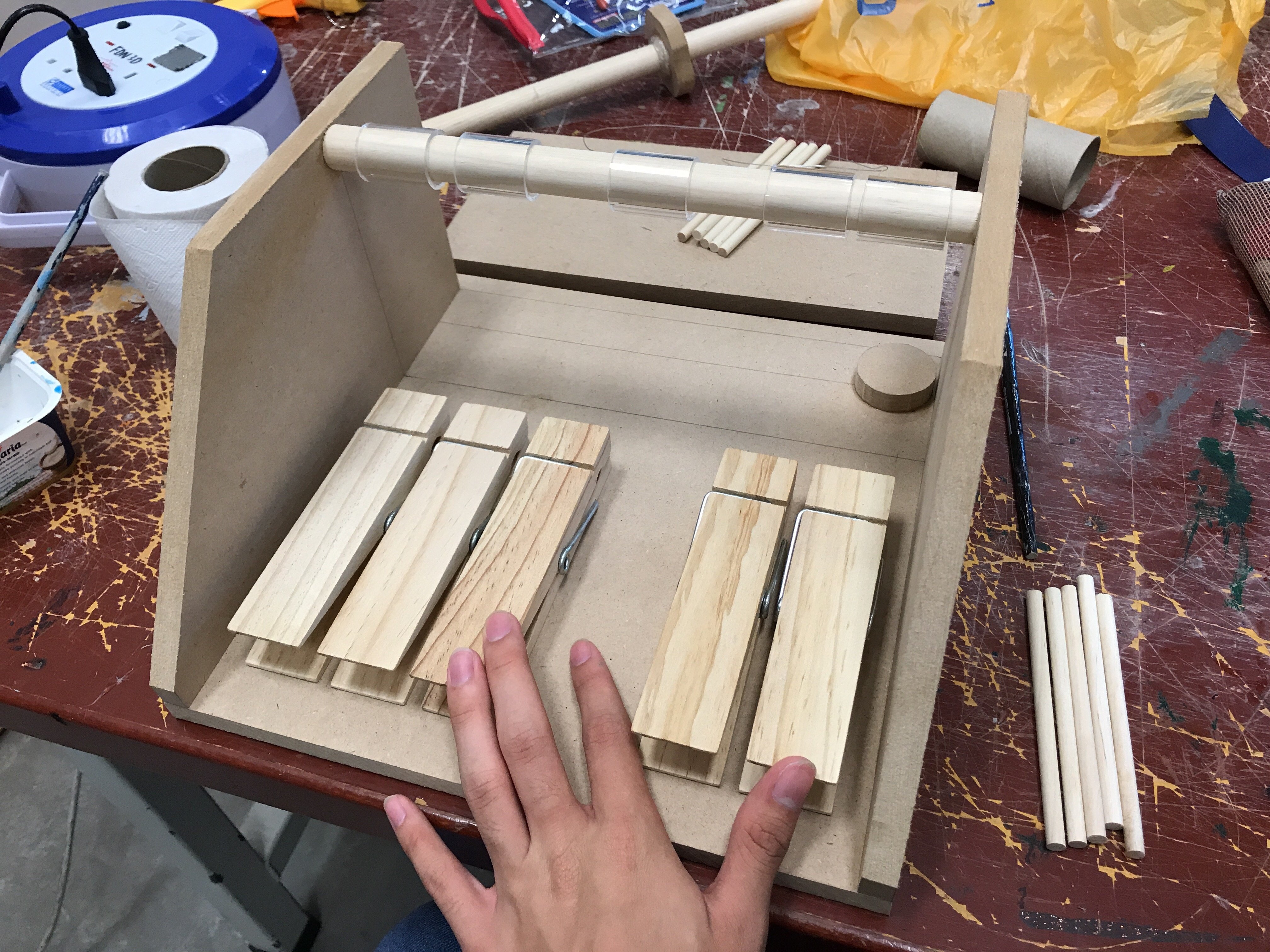
As the hammers are stationery, a stationary mark making surface would not be ideal as it would just be the hammer striking the same spot over and over again.
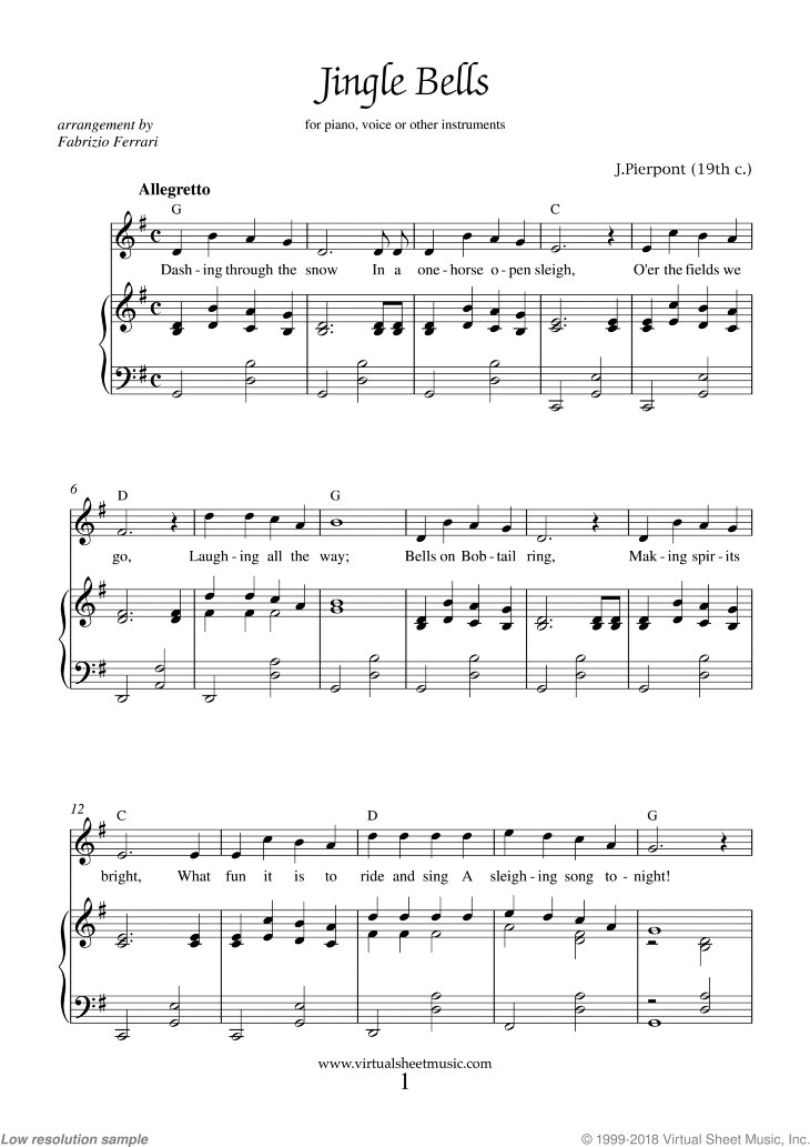
Credits: Virtualsheetmusic
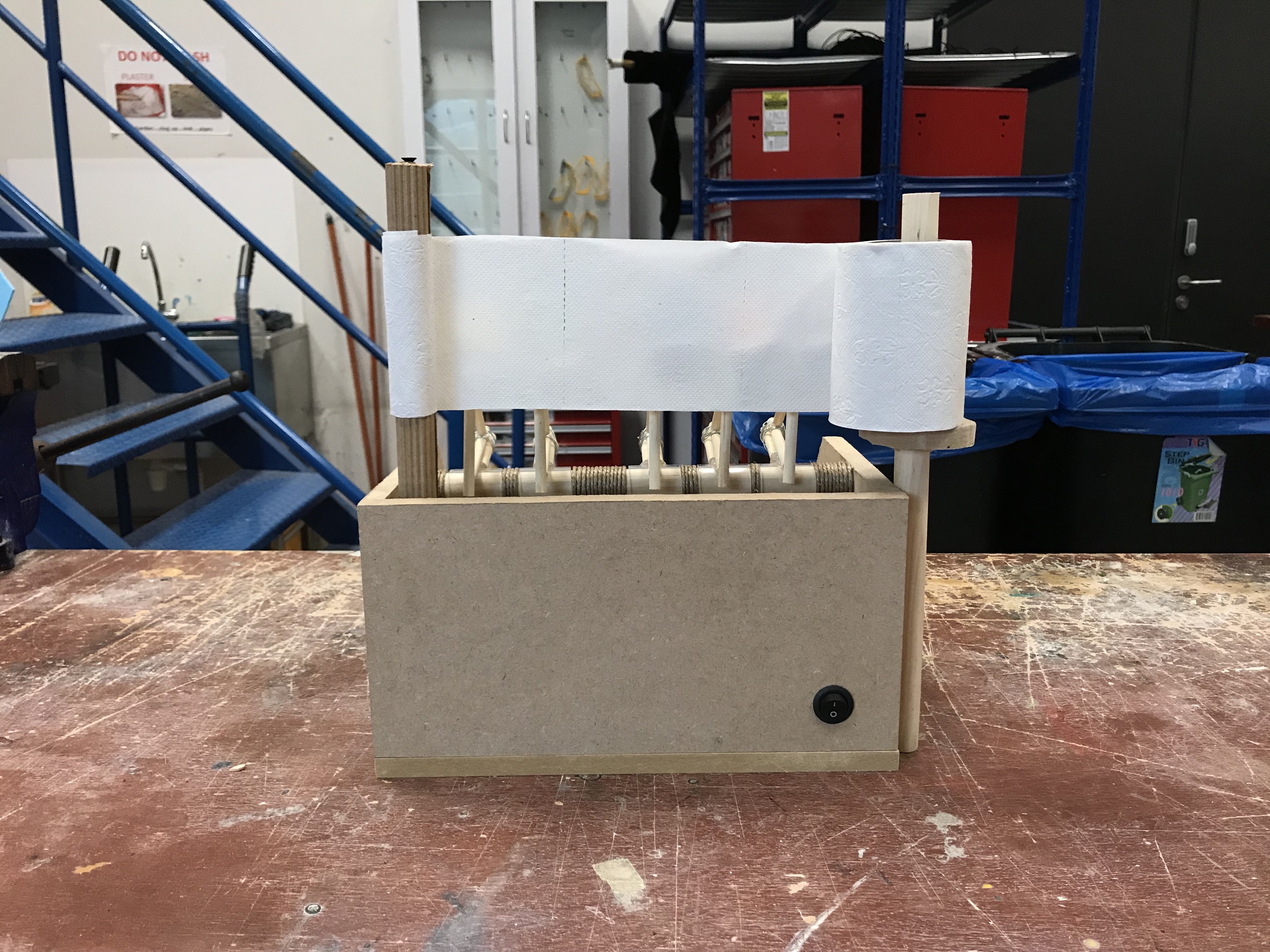
Inspired by the idea of a piano manuscript; I decided the best way to capture the movement and flow of a song would be for the manuscript to be in constant motion (left to right). My mark making surface was going to be a roll of toilet paper as apart from it’s cylindrical shaped that enabled for rotation about an axis, it was cheap, easily replaceable and the more absorbent surface would collect much more ink, making for a clearer mark.
Learning basic electronics was going to be necessary as a motor would be needed to pull the manuscript. I tested with two motors procured from Sim Lim Tower:
1) a weak, fast and cheap motor
2) a strong, slow but incredibly expensive motor.
Unfortunately, after much testing, I realise the latter was needed as the cheap motor would be too fast much less powerful enough to pull the toilet paper. As a result, I had to settle for the expensive motor as there weren’t any alternative solutions to troubleshoot the situation.
At last, everything was coming together. After fitting all the components together, I soldered the electronics and added an on/off button to activate the machine by.
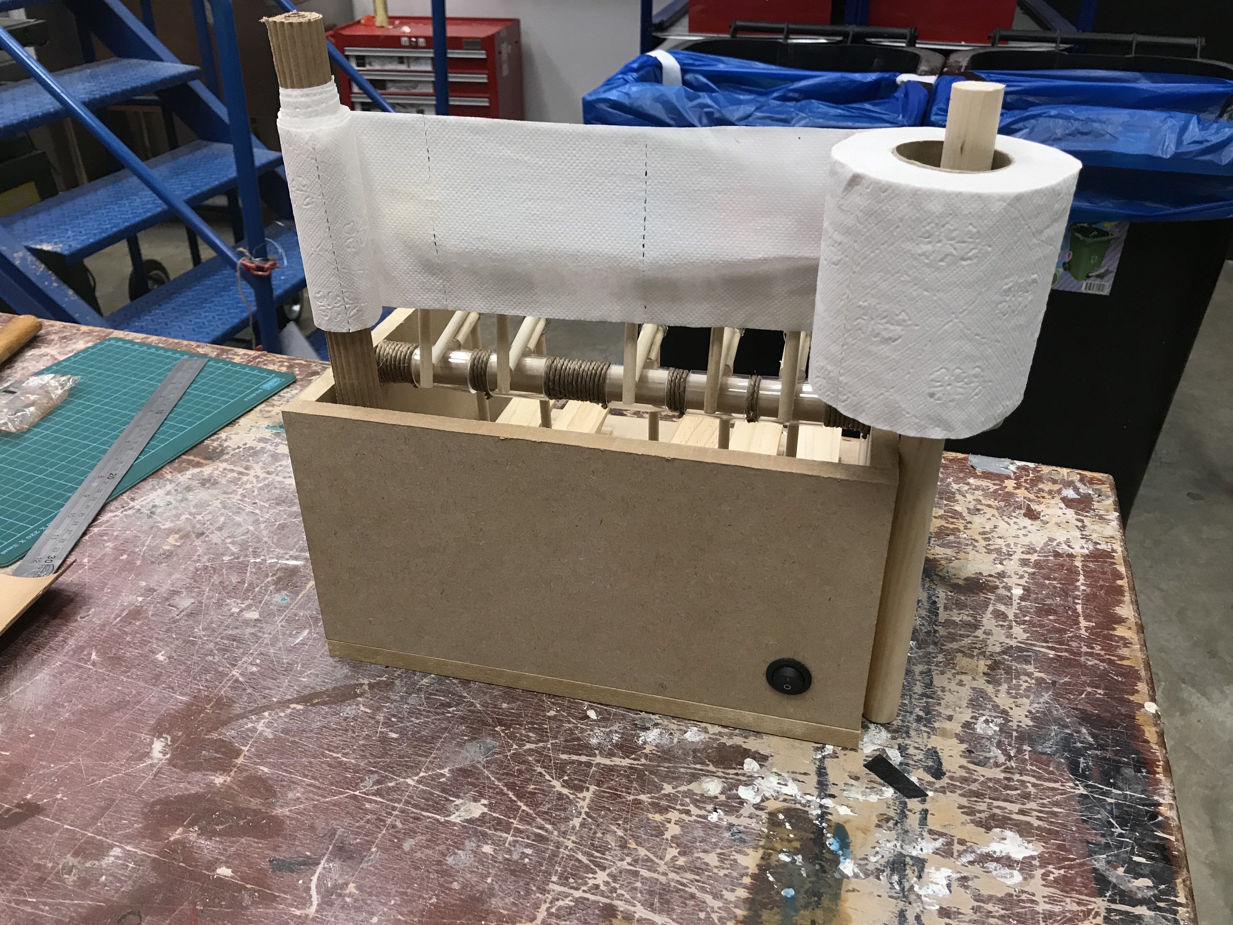
Functioning piano system with implemented manuscript motor function.
Then, I met with another issue. The inkpads were not translating the ink well enough, the resulting marks were thin and lacklustre. I thought of a few solutions to this problem such as adding a solid surface backing behind the mark-making surface and using a more expensive toilet paper that would hopefully absorb even more ink. But nothing seemed to be working. Eventually, I decided the best way forward would be to saturate the inkpads with food colouring.
Video to illustrate: No Ink Video
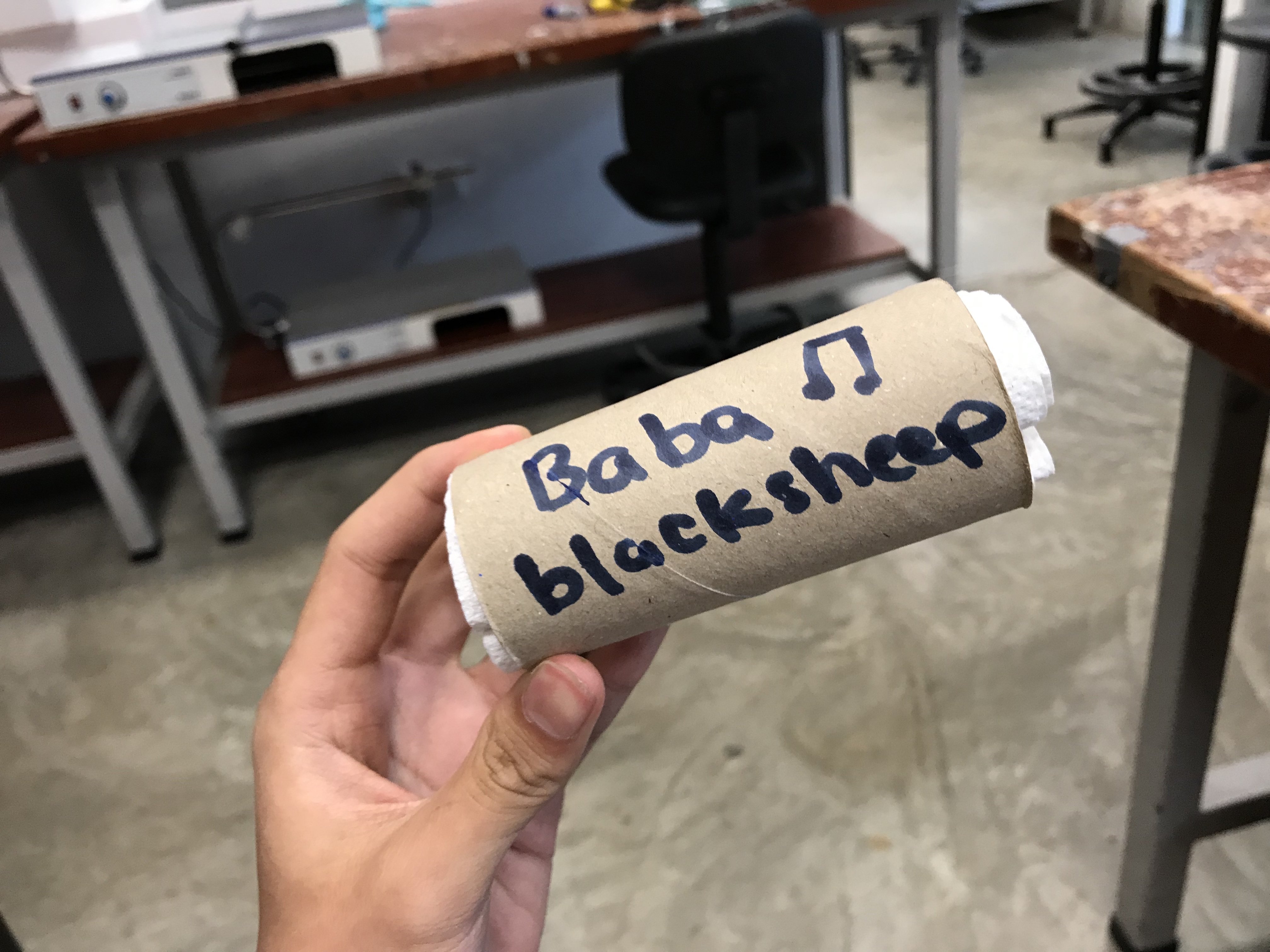
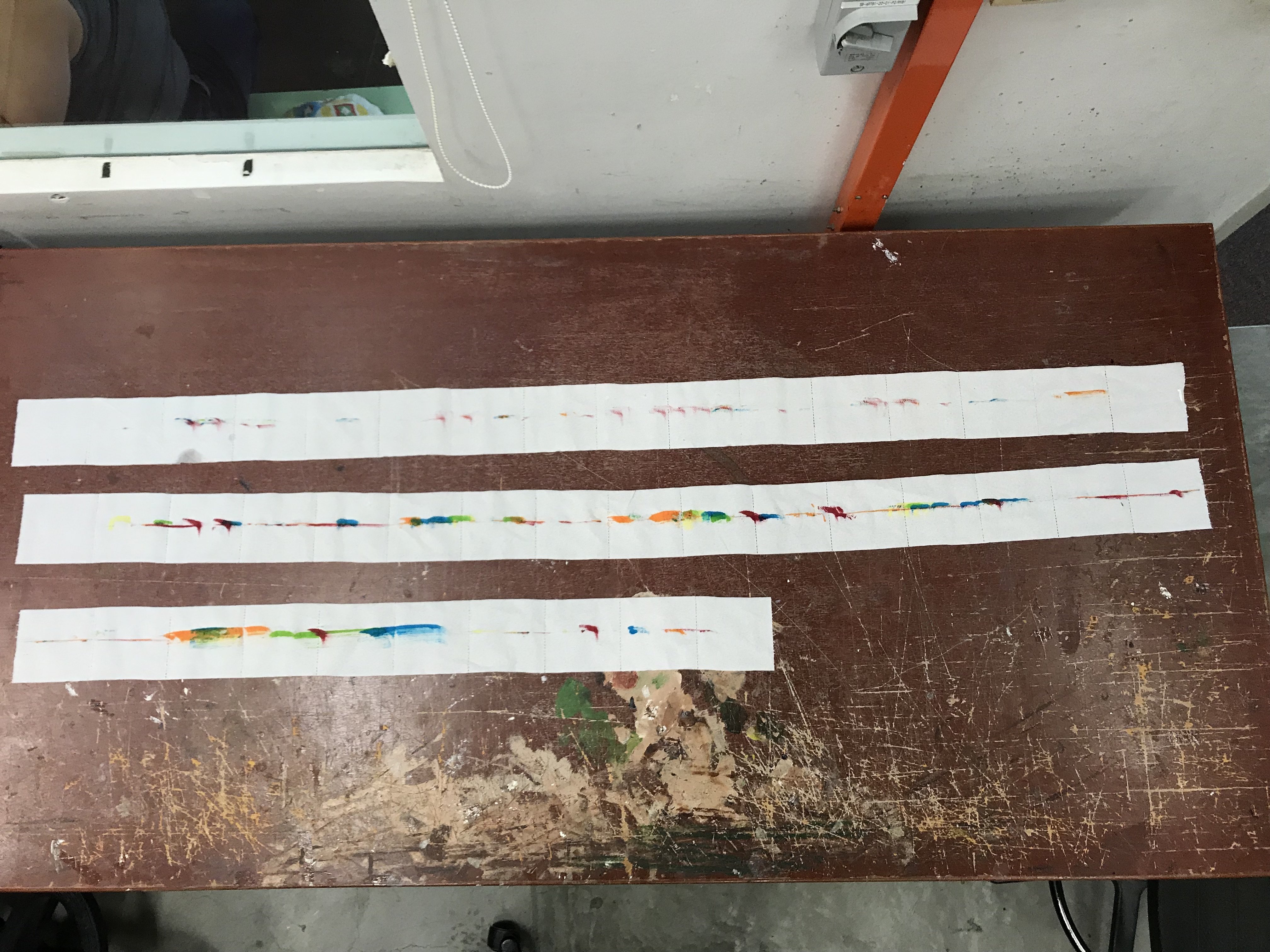
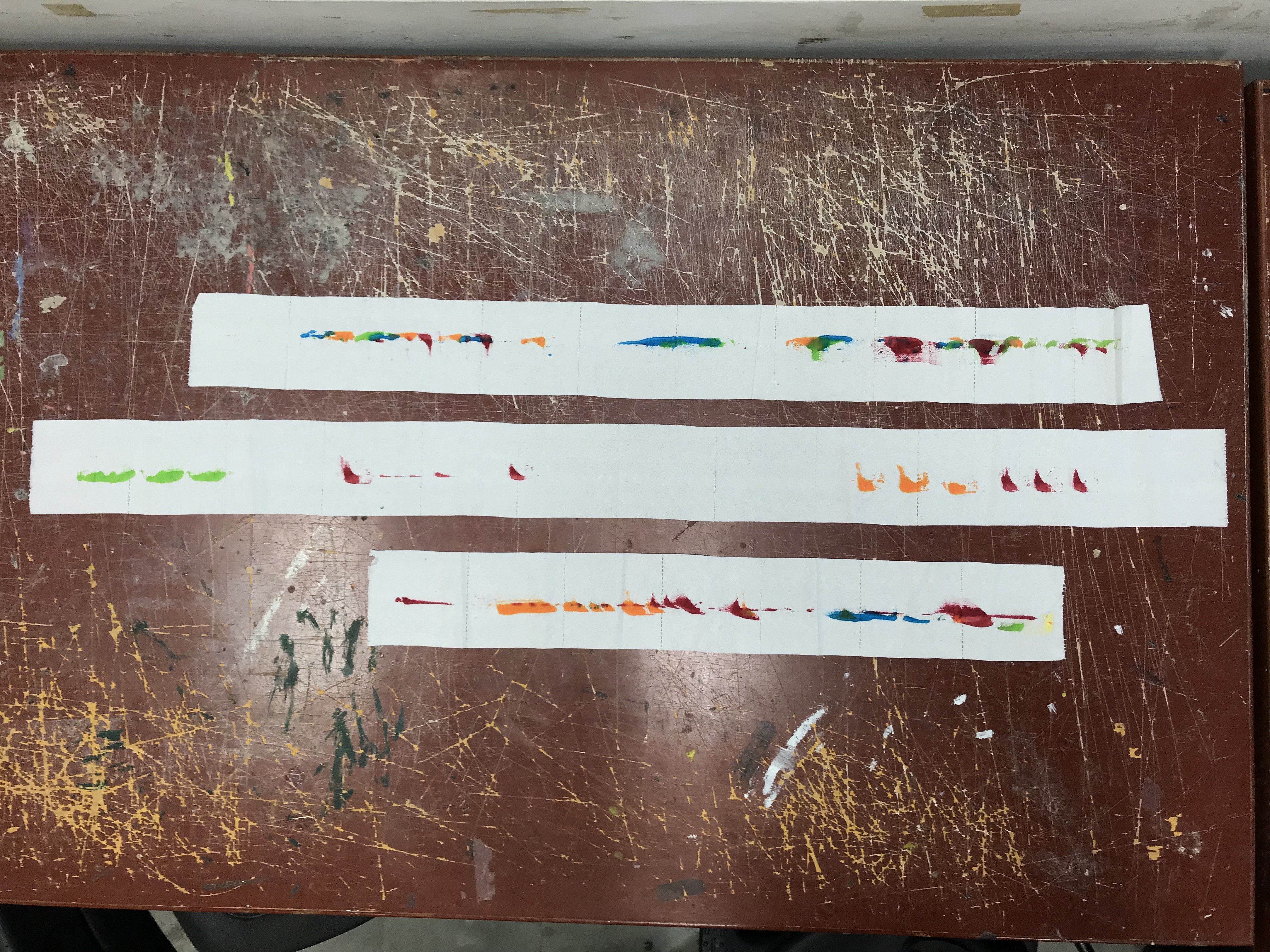
The piano system captures music in colour instead of actual musical notes and sounds. The idea of this work is to capture and reflect the tune of any song into beautiful colour patterns. Upon completion, the ink pads can be capped back on to reserve ink and the “manuscript” tears easily for safekeeping (as seen in pictures below).
Video of me playing ba ba black sheep : Ba Ba Black Sheep
Samples of Marks

Something Cool
Although I didn’t plan for this, if you look close, you will see that some strokes are longer while others are short, this is not because the machine ran out of ink but reflects how long each key is being pressed for. Longer depression results in stronger, bolder marks while short depressions result in light staccato repetitions.
Orthographic Drawing
For the final project, we were tasked to explore the relationship between, form, space and visuals in order to choreograph and optically driven experience.
I drew inspiration from an American artist called Micheal Murphy, a perceptual artist who created incredibly optical works through the play of 3D objects. A set of installations using hand-cut bulletproof glass really intrigued me:

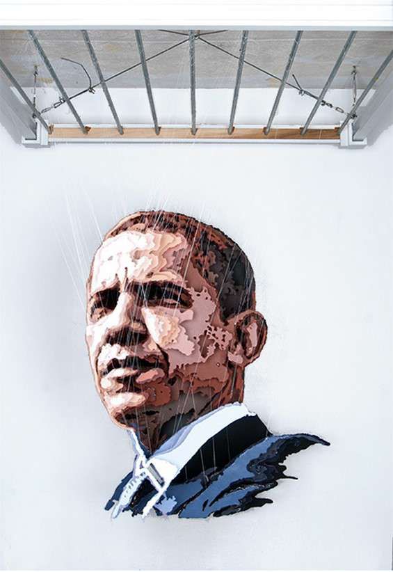
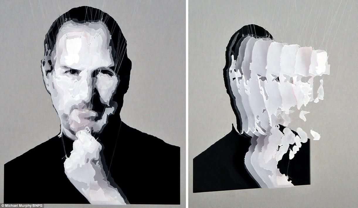
Held up by strong invisible steel cables, Murphy layers different coloured panels over each other achieving a visual work that is best appreciated from only one angle, the front. I wanted to try recreating and implementing His concepts for my final project.
After consultation with Peter, I realise this wasn’t exactly going to be an optical illusion per se. However, it was still going to be a visual experience.
As this was “recreating” rather than ideating our own, I figured I’d try to stick as closely as possible to how the artist himself would create these works. As starters, I sketched out an image and rendered it out digitally. I stuck to grayscale as I was unfamiliar with the process and wanted to limit to just 4 layers at most. I felt working with a coloured image would end up making it very difficult to separate into just 4 layers as a subject matter such as the human face often contains a myriad of tonal range for it to look realistic. Furthermore, working in plain grayscale would expedite the process of paper cutting as colour could be achieved through the paper itself.

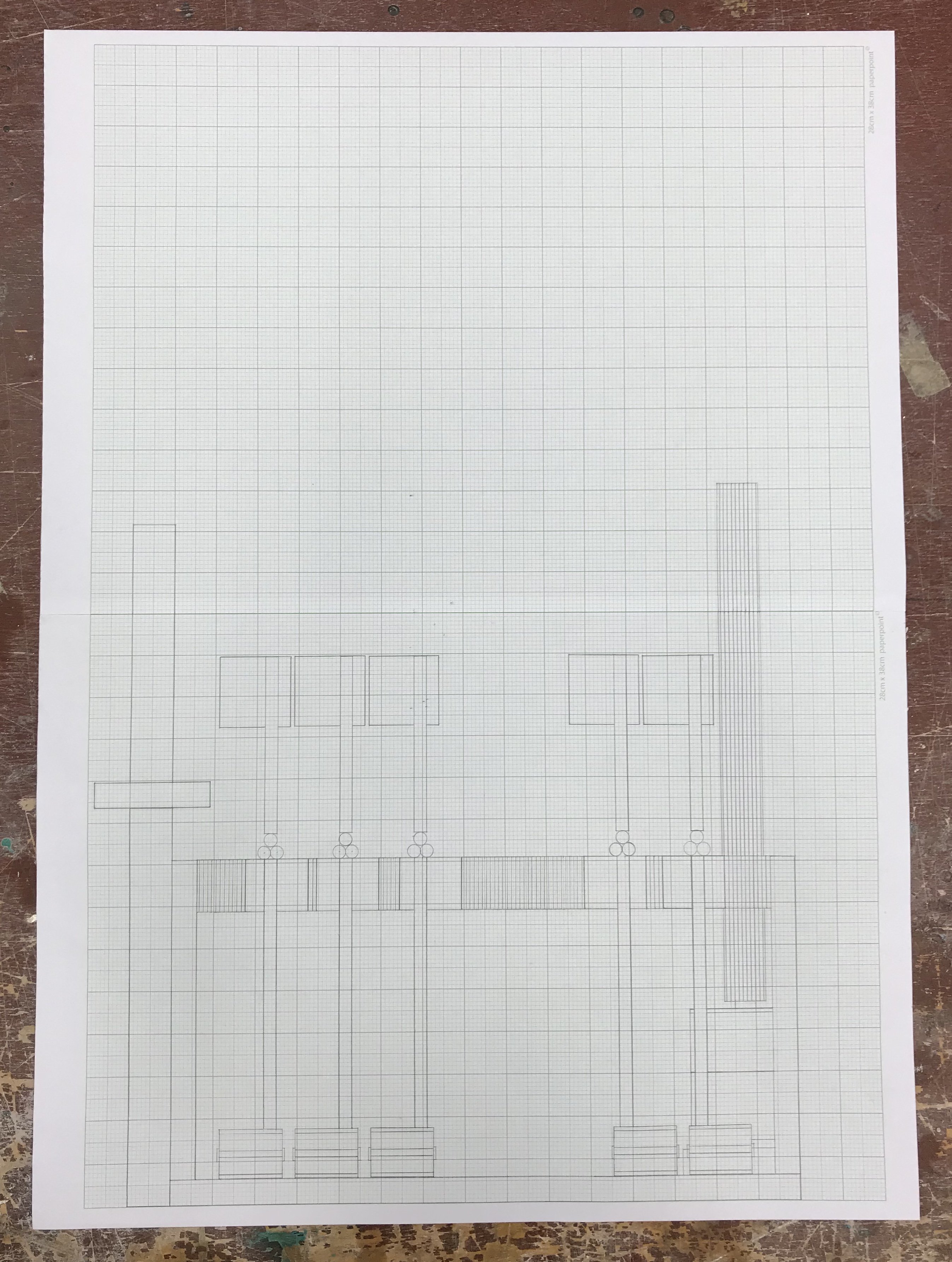
Making sure for there to be various tonality as I wanted to split the image into their different colour layers. Using a 3D rendering tool; I separated the different layers as such:
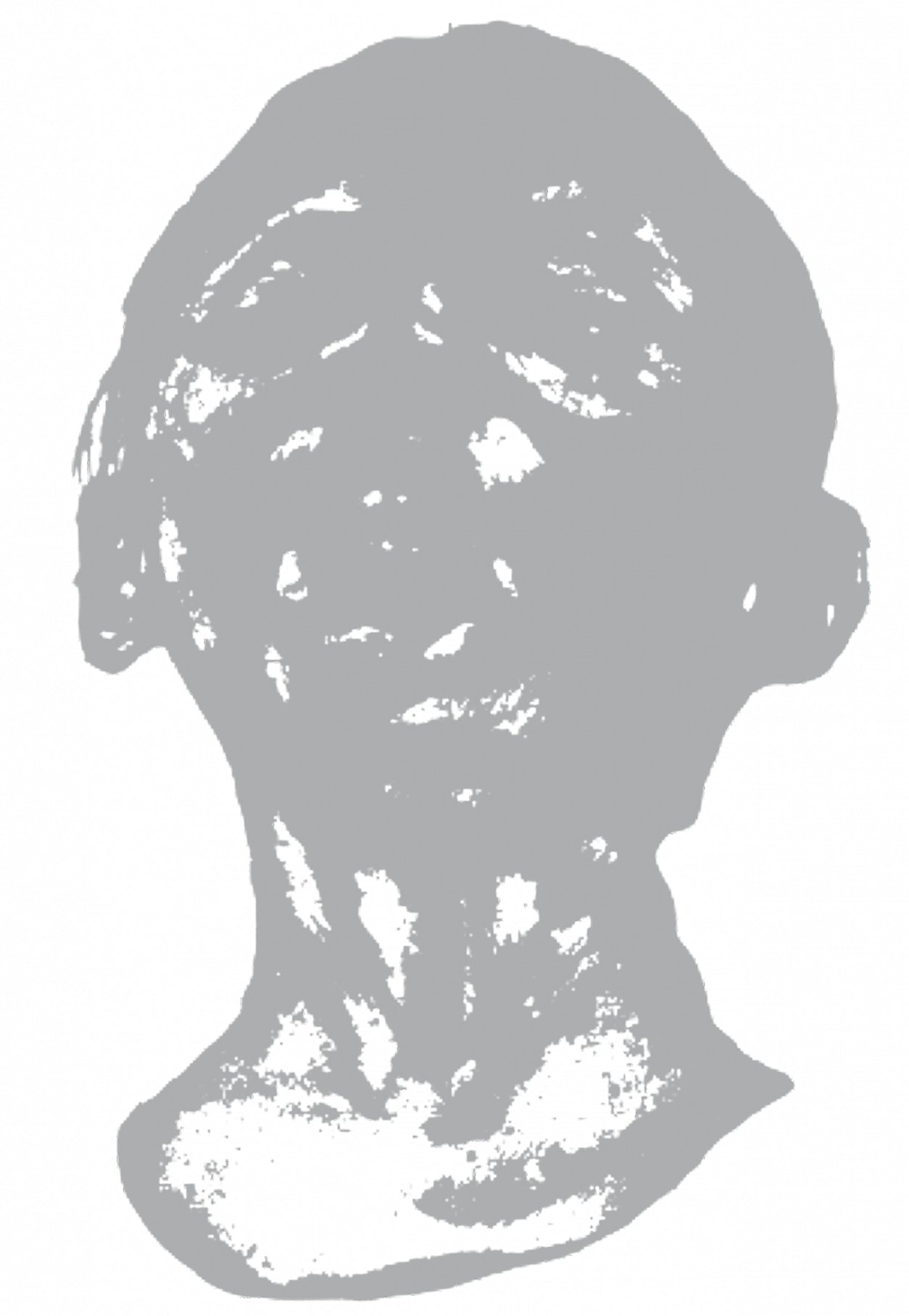


The idea was to print out each individual layer and overlay the layers on top of coloured paper. I would proceed to use an xcto-knife to trim off all white areas leaving only the colour portions. The cutting should reflect quite nicely on the coloured paper.

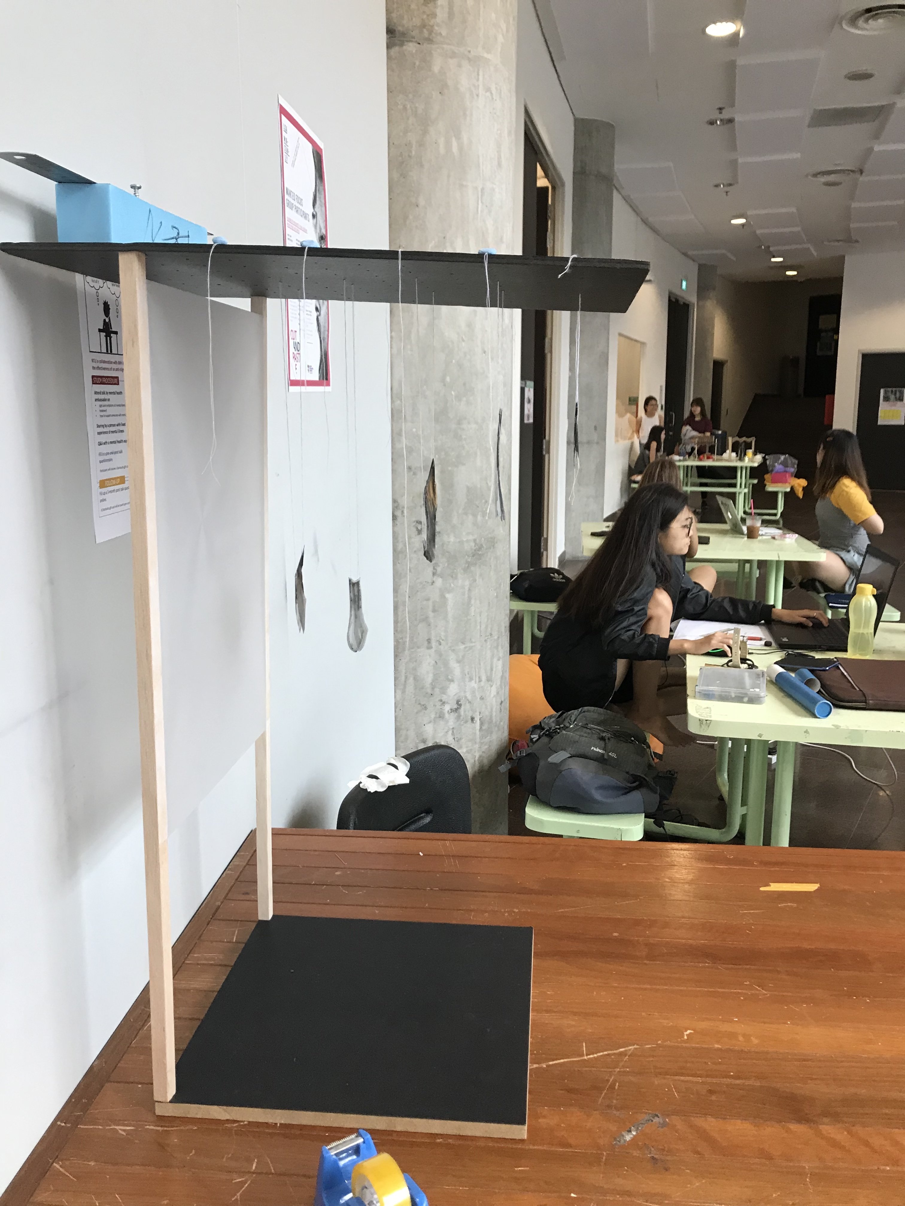
However, after cutting the first two layers and hanging them up on a suspended boarded, I realise there were a few problems:
1) Bottom layer needs to be the lightest area
2) The images were much too to be appreciated from afar.
As a result, it was difficult to tell what the image even was. In order to troubleshoot the issue, I tried to incorporate light at various angles:


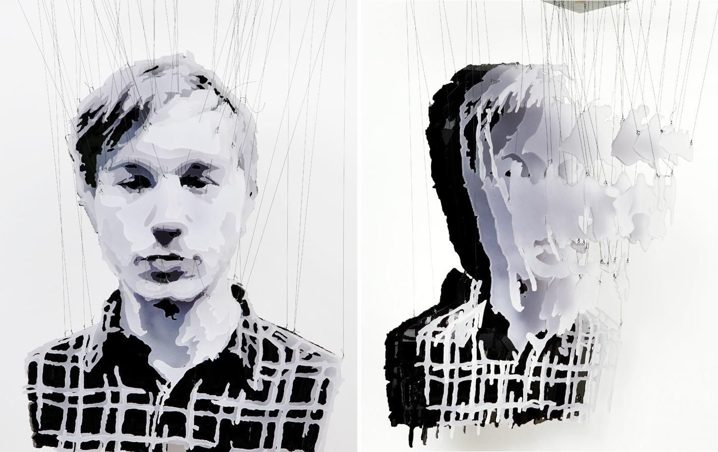
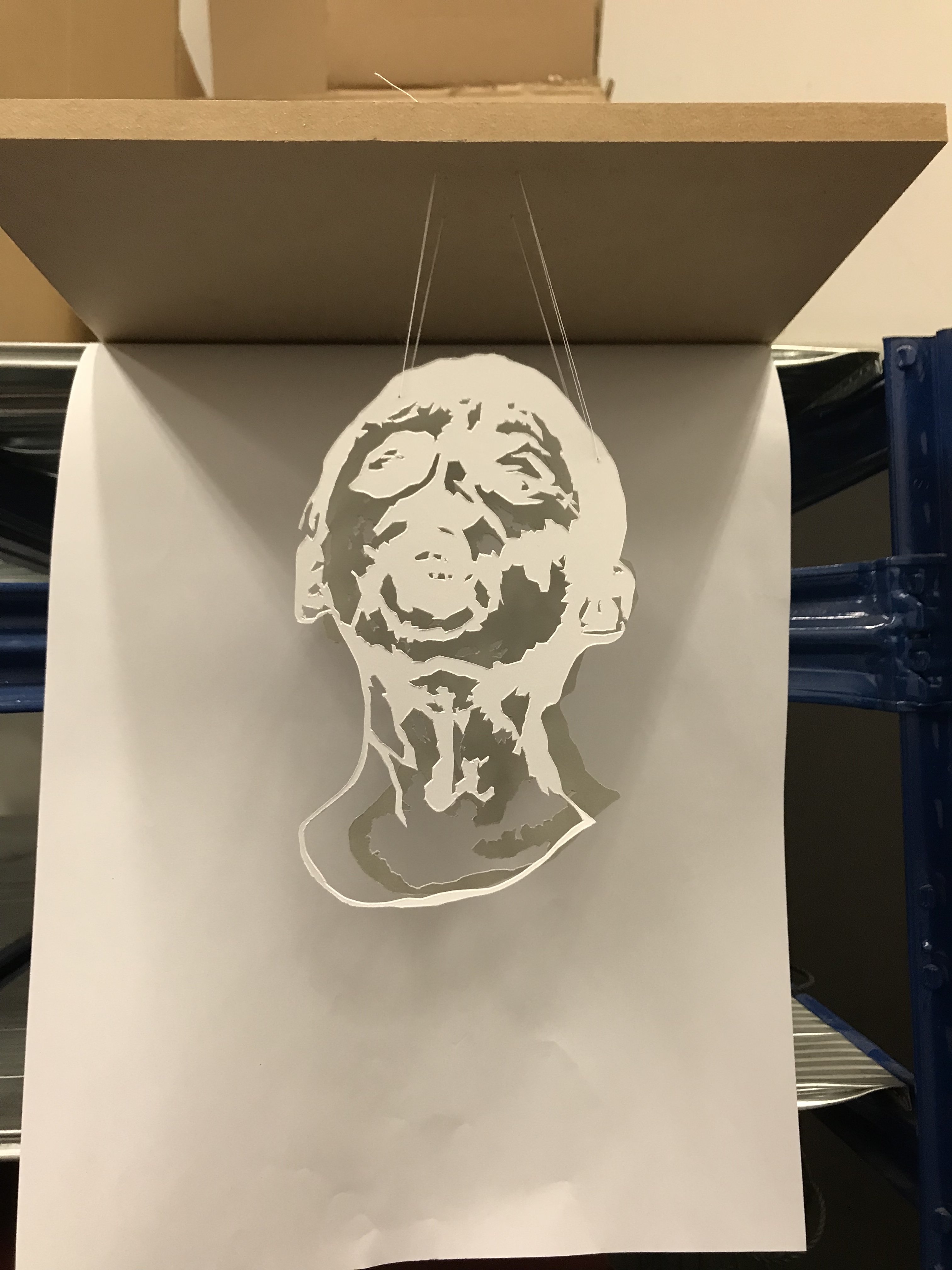
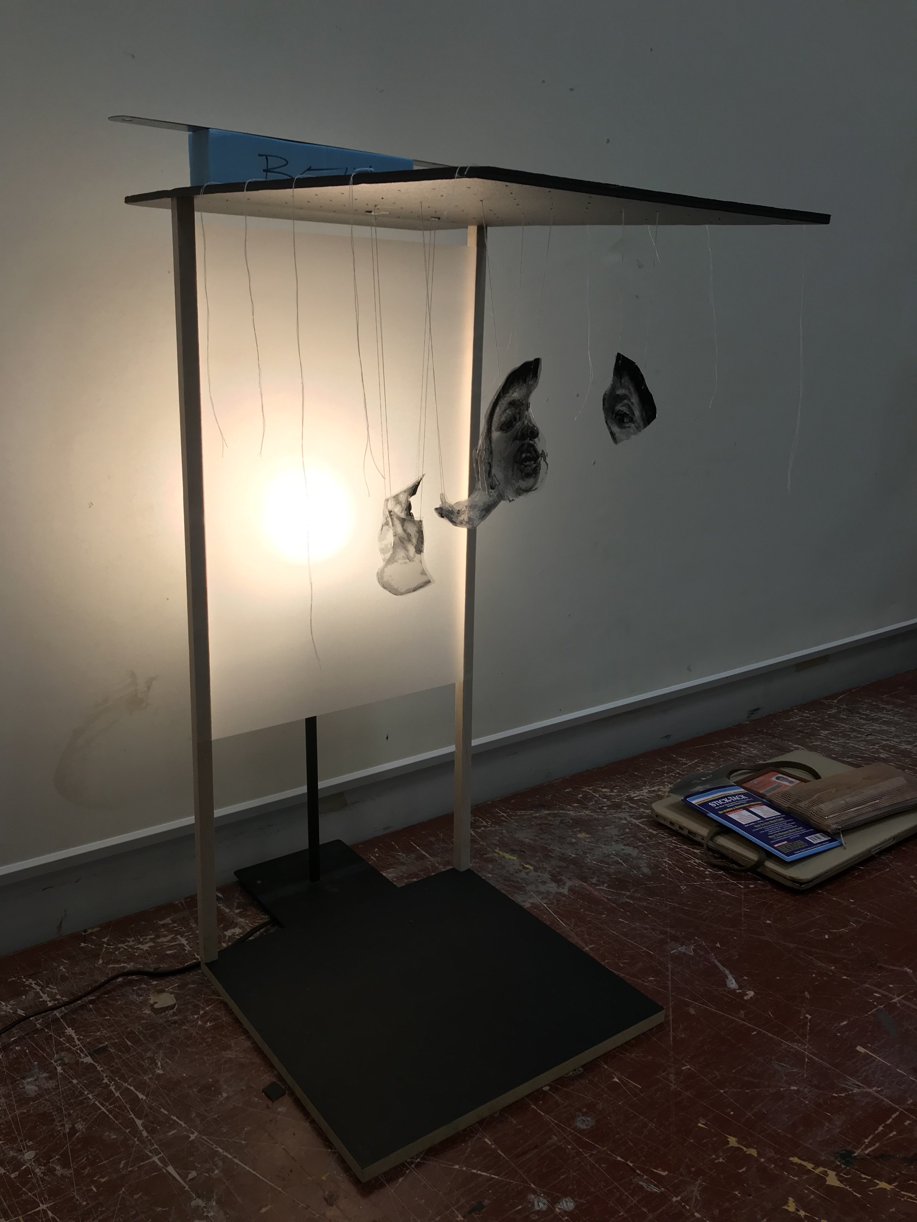
The light didn’t do much apart from giving me another idea. I decided to try out transparency instead of paper cutting.

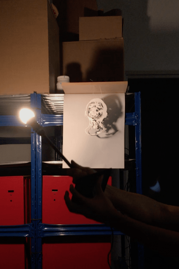
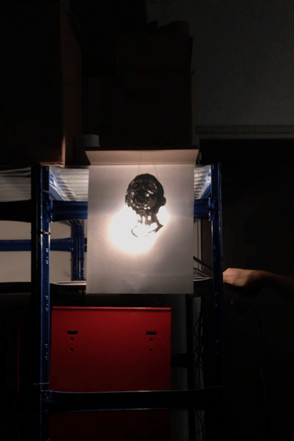
From far transparency worked a lot better with the resulting image being clearer and at the same time so much more detailed. I followed up by implementing the light source to see what it would do:


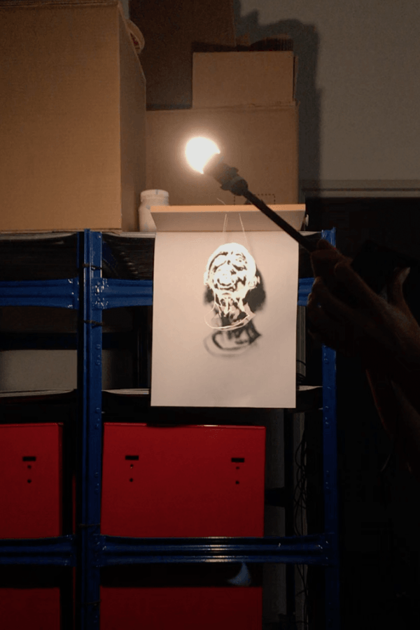
Nice! However, I felt from the side view, it would still be pretty obvious that the forming image would be that of a girl. I wanted the ambiguity when viewed the sculpture from the side. This is to force a visual perspective onto the viewer so that they would see from the front only.
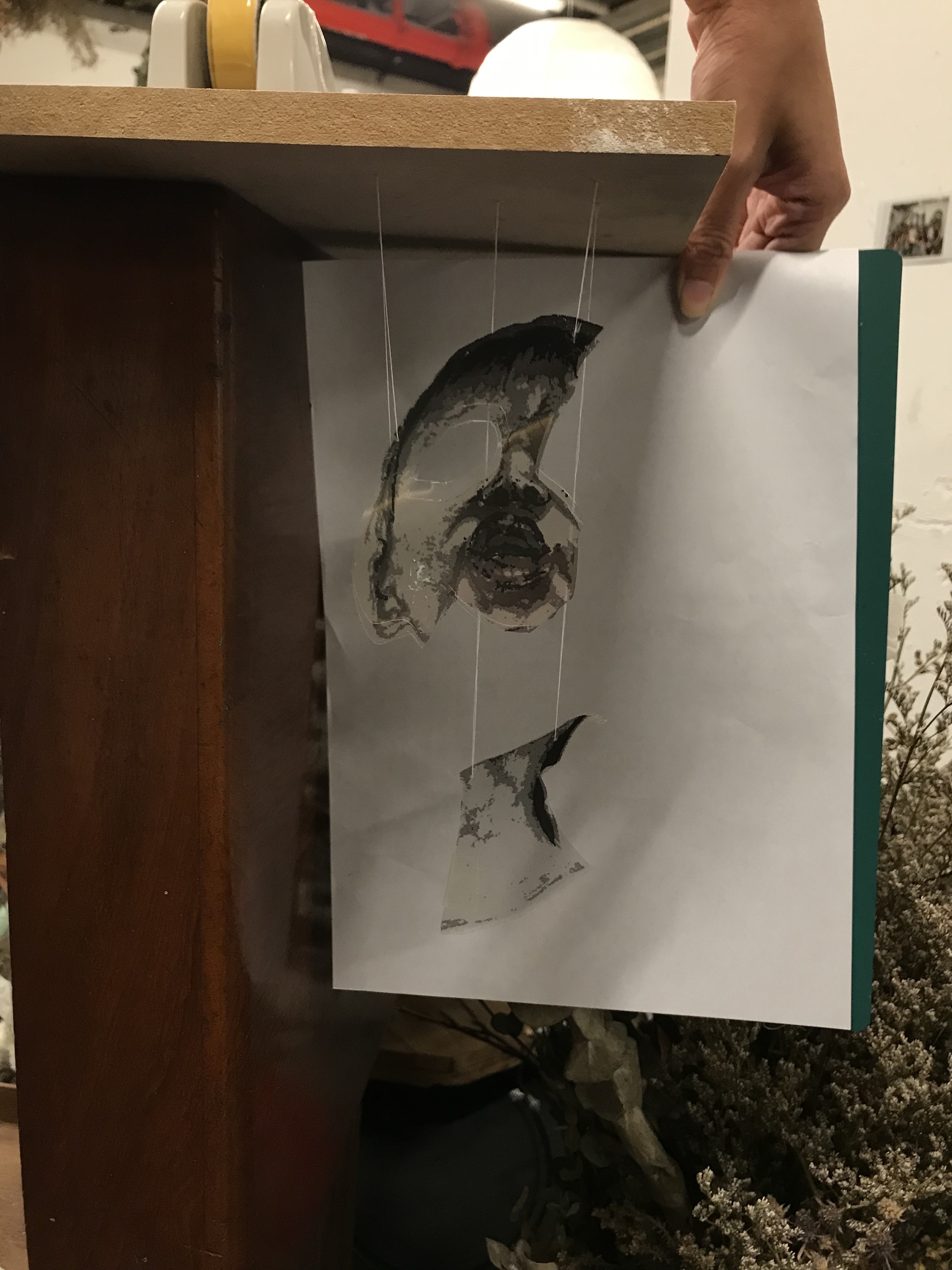

Instead of separate layers, I compiled all the layers together and spliced the image by parts.

I created a suspension board and glued on a piece of tracing paper to disperse the light from the lamp. This was important as without the dispersion, the light would be too glaring and the image would be obscured completely from view.

The reference photo I viewed to draw my image is of a young girl whom I’ve taken care of since she was 6. I found it ideal as even though she still resembles her young self, it is merely a fragmented reflection of who she is now; a past illusion. Visible only from the frontal perspective; my work advocates that our past and complete self can only be appreciated when viewed from the right angle.
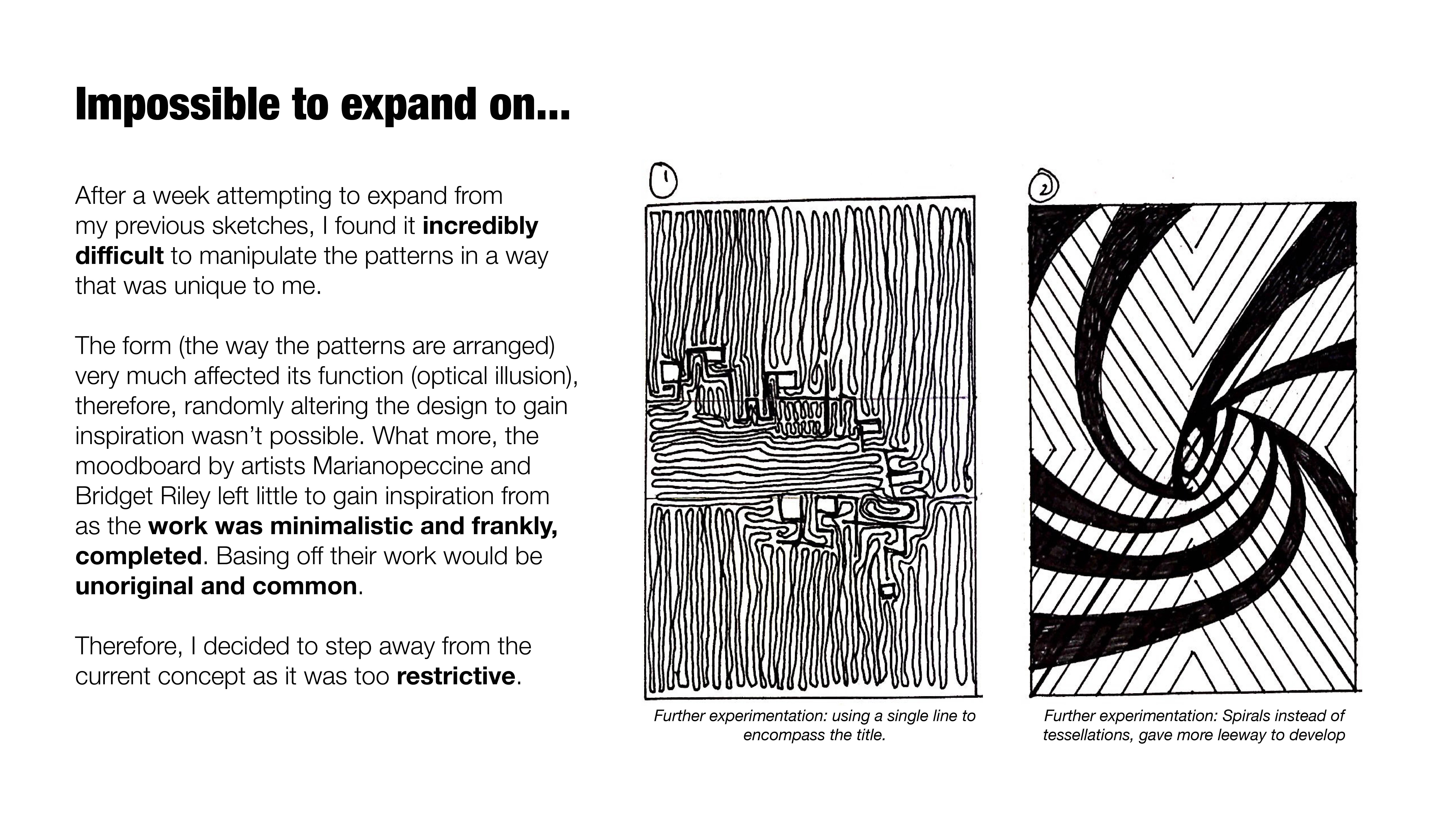
Peter Summarised the last lesson by explaining to us the rationale of this last assignment. He told us that it was critical to understand the process of making something even when it has already been made by someone else. It is one thing to understand visual knowledge but it is another to construct it in real life. Comprehending visual knowledge is always going to be different when you have to do it for yourself. For instance, a different skill that wasn’t previously taught to you doesn’t always make sense, but when we try it for ourselves, the process of delivering the outcome often makes us realise why.
I found this assignment restrictive at the start. As I started to work on it, even though I was the one constructing it, it seriously didn’t feel like my own. But after Peter’s explanation, it kinda made sense why we were doing what we were doing. Ideas and concepts are always being borrowed, and sometimes, it’s best that we take the time and effort to understand them on a deeper level. What we think isn’t always what it is!
For our first project, we were tasked to express our future jobs through typographic portraits of our names (whole, part, nickname or initials).
Clueless as I don’t really have aspirations in life, I set out to list down impractical dream jobs more than concrete ambitions. This really helped as the brief did not restrict the occupation to be something practical or logical at all; I could be anything I wanted, even a Krispy Kreme Doughnut Maker. With Joy’s help, I narrowed to these 4 from an intense mind map of job possibilities:
A narrative is always important! Which is why the 4 occupations I narrowed down to are all intrinsically linked to the best drink in the world! COFFEE! In fact, when I think about it as impractical and unambitious it is to be a coffee farmer, I saw all these jobs as LEGITIMATE considerations (funny how I set out without actually thinking these were real prospects.)!
In my lifetime, I could be all of these!
Barista (Teen) -> Coffee Connoisseur (Adulthood) -> Kopi Uncle (Elderly) -> Coffee Farmer (photo shop this)
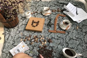
In a way this was my timeline with coffee, linking back to typography I wanted all four spreads to spell out my name fully. I, therefore, broke down each letterform of my name into parts to fit each composition.
Ben -> JA -> MiN -> 郭
More details on letter form as I explain each spread individually!
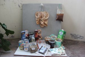
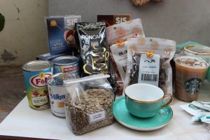
Due to its light-hearted and simplistic aesthetic (which fits my concept of “simply coffee” well), I knew I wanted to work with flat-lay photography across all my spreads. Even though I knew it wasn’t going to be easy as I am not the most proficient photographer, I took this on as a personal challenge! Therefore things to get done; prep, art direction and the actual shoot itself!
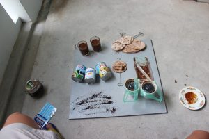
Staying at home made this daunting task much more achievable as I had more creative space and leeway to obtain all the various props that I needed for my photoshoot. BUT, it was still not easy as some of the items were seriously hard to find; especially the old school coffee strainer. At the same time, the background for each spread was a pain to procure as well as I wanted to use backdrops reflective of each occupation as opposed to just some random vanguard sheet.
Barista -> Conventional Wooden Tables
Connoisseur -> Intricate Table
Kopi Uncle -> Kopitiam Acrylic Table
Coffee Farmer -> Sack Clothe
The entire scavenger hunt for all the necessary props took more than two weeks but alas I had everything I needed. I bought extra things just in case I changed my mind along the way as I felt the process of flat-lay photography was going to require quite a bit of improvisation depending on the resulting aesthetic during the shoot itself.


The way to decorate the spread around the letterform was limitless, therefore I made sure to be strict with the design of the letterform, only allowing the decorations to complement the typography and not the other way around. Here are some behind the scenes from the photoshoot:
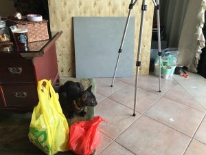
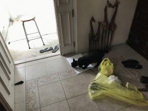
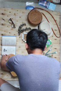
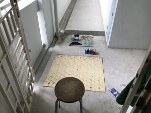
Doing a photo shoot alone was an insanely tedious process as you can probably tell from the set-up; nothing but a tall chair and a DSLR. Using a tripod was out of the question as the flat lay photography style would not allow for it. Furthermore, each time a piece of décor was out of place in the view cam, I would have to stow the DSLR, get down from the chair, arrange by estimation, get back onto the chair and recalibrate the shot.
The process would repeat several times until FINALLY, FINALLY, I WOULD GET A “IT MIGHT WORK SHOT!” I also had to be careful to shoot all that I needed as the process of retaking would require me to reset the entire spread again. Daylight was an issue as well as I did not have proper studio lights to back me up in case it got too dark. Working against the clock, I met with countless setbacks along the way, but thankful I was able to recover and improvise solutions on the spot. So I must say I am quite contented with the end product!