
Hello!
I couldn’t decide between 2 nursery rhymes and I didn’t want to limit myself to one, so I decided to work both, Hickory, Dickory, Dock and A sailor went to sea. I’ll choose either one to work on after this. 🙂
1)
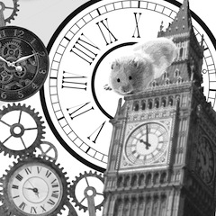
Hickory, dickory, dock.
The mouse ran up the clock.
The clock struck one,
The mouse ran down,
Hickory, dickory, dock.
For this rhyme, I wanted to focus on the second sentence “The mouse ran up the clock”. I immediately thought of using the Big Ben as it is an iconic clock and it would be interesting to see a gigantic mouse climbing up the clock. I also decided to change the mouse to a hamster because I am afraid of mice and I wouldn’t want to be looking at one whilst working on the project. Lol. As I was playing around with the graphics, the scene where King Kong on top of the Empire State Building came to my mind, so I decided to create a similar scenario with aeroplanes in the sky. I feel that I can explore more with this idea, maybe making everything a little more dramatic. I could add some laser eyes to the hamster to make it ferocious because it looks a bit too cute now.


2)
A sailor went to sea, sea, sea
To see what he could see, see, see
But all that he could see, see, see
Was the bottom of the deep blue sea, sea, sea.
I thought this rhyme had a lot of potential and many ideas came to me while I was brainstorming. Firstly, the duotone effect gave everything a vintage feel and I think that it would be great if I could incorporate this style to my work. For the final work, I would like to do something similar to a vintage nautical poster (not sure if I’m allowed to), and I’ll continue exploring on that. This rhyme concentrates a lot on the word “SEE” therefore I chose an image of a sailor that has cross-eyes to add a little bit of humor to it. I also really like the idea of a message in a bottle, so I explored that idea too.
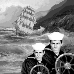
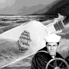
At this stage, I’m not sure which rhyme to pick, but I think I’m leaning towards A sailor went to sea!


