2D Foundation II – Point of View (Research)

Hi everyone!

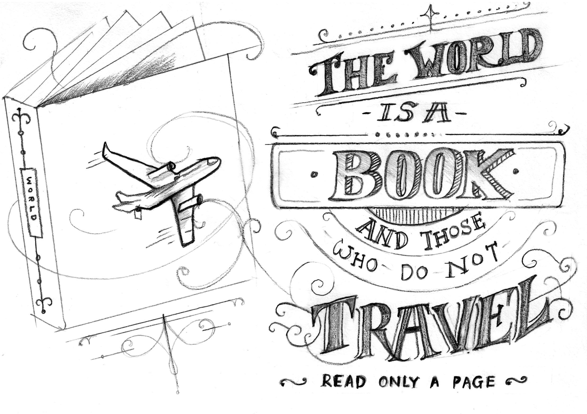
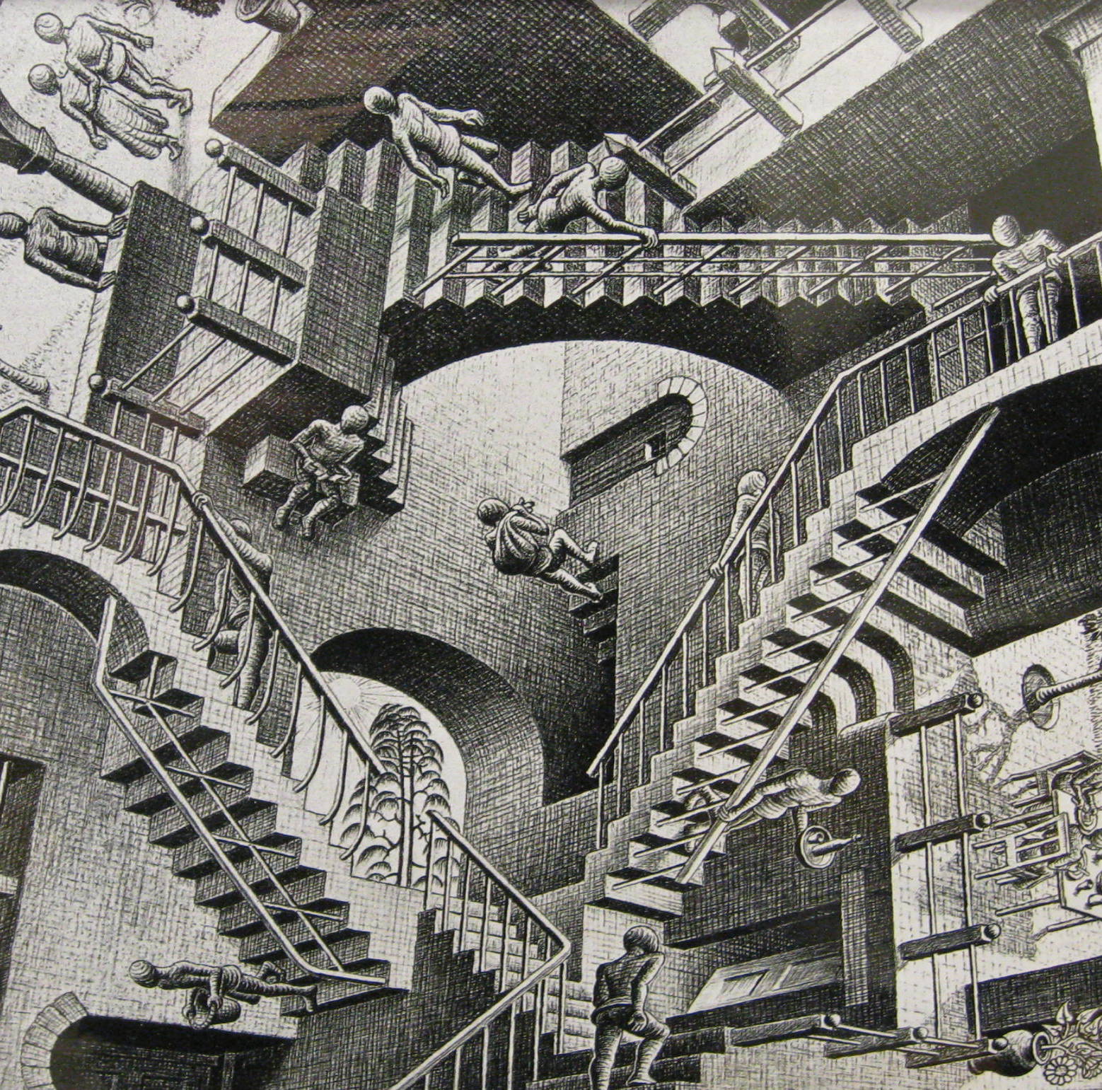
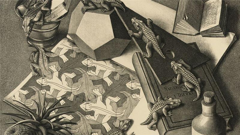
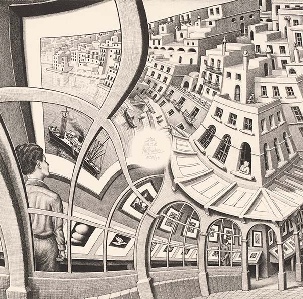
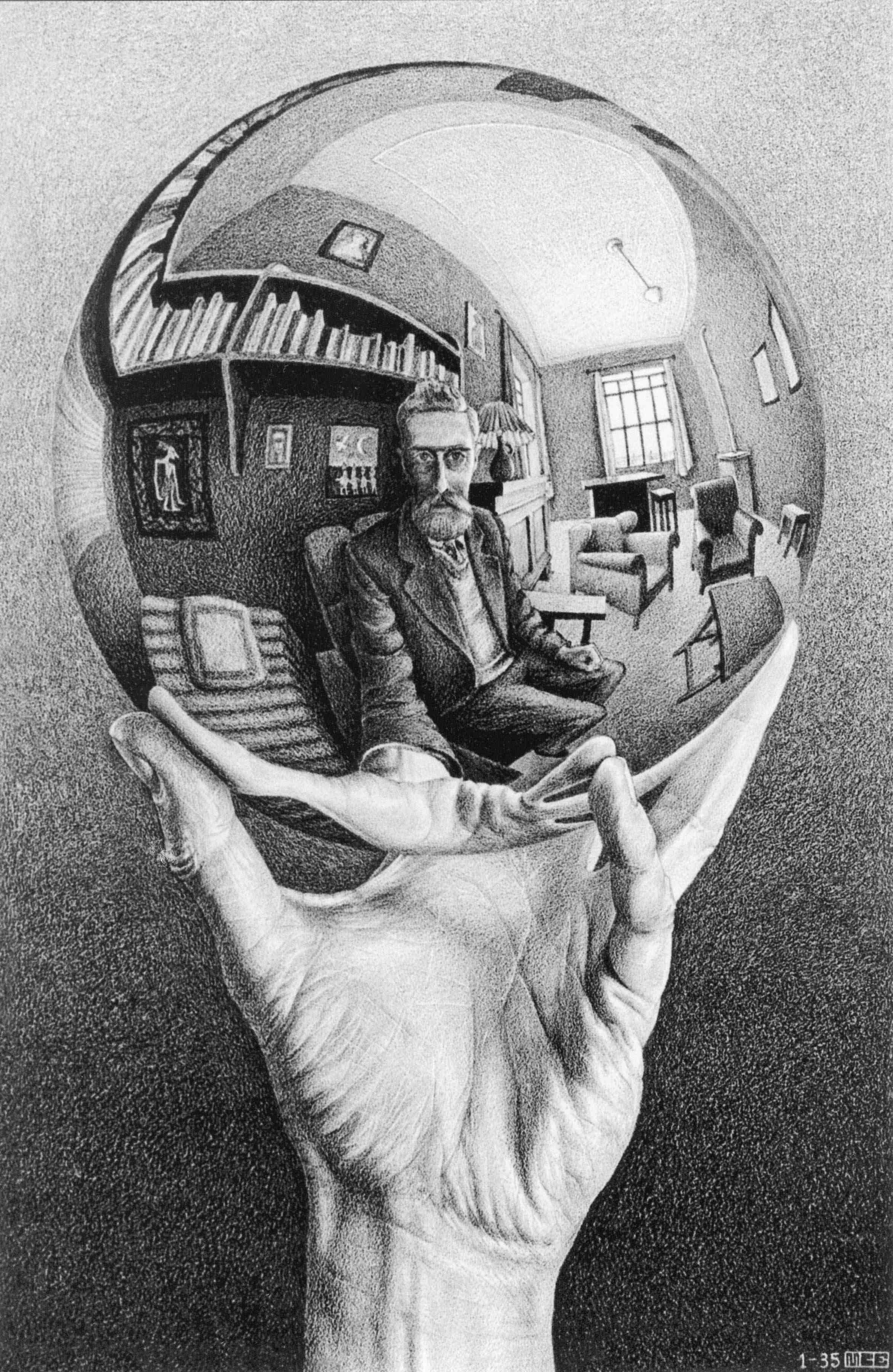
I’ve thought of several possible concepts regarding perspective, some ideas I got were “zooming in and out”, optical illusions, and playing with scale. One artist reference would be MC. Esher. He is a dutch artist that draws inspiration from insects, landscapes and plants, and most of his works play along the use of infinity, reflection, symmetry, and lastly, perspective.

3-IMG_1871 2182e9f279f44127a14c07c7cdc1b7be_18 LW410-MC-Escher-Print-Gallery-19561 Escher.HandSphereLR


Attributes (with the word “Dot”)

  1. dot from the point of view of the world is Singapore
  2. dot from the point of view of the a sentence is the end
  3. dot from the point of view of the NYC is the moon
  4. dot from the point of view of a burrito is a speck of pepper
  5. dot from the point of view of a countryside is a crashing plane
  6. dot from the point of view of an artist is a million dollars
  7. dot from the point of view of an photoshop is one-millionth of an image (dot art?)
  8. dot from the point of view of “connect-the-dots” is a bridge
  9. A dot from the point of view of a designer is fashion (polka dots)
  10. A dot from the point of view of a snake is food (the game)
  11. dot from the point of view of caterpillar is eaten food (perspective of looking up)
  12. dot from the point of view of an assassin is a target (binoculars)
  13. dot from the point of view of Japan is the circle of sun
  14. dot from the point of view of Miami beach is a shark/ a drowning man
  15. A dot from the point of view of the rainforest is a new species

    Attributes (with the word “water”)

  1. Water from the point of view of the world is Singapore
  2. Water from the point of view of the whale is life
  3. Water from the point of view of a plant is growth
  4. Water from the point of view of an amazon is refreshing
  5. Water from the point of view of Singapore is Waterloo Street
  6. Water from the point of view of the bartender is gin & tonic
  7. Water from the point of view of a child is a reflection
  8. Water from the point of view of the ink is Art
  9. Water from the point of view of the hot air balloon is fuel (liquefied gas)
  10. Water from the point of view of the a jellyfish is wonderland

Attributes (with the word “trees”)

  1. Trees from the point of view of the Tarzan is shelter
  2. Trees from the point of view of an architect is a treehouse
  3. Trees from the point of view of an office is a piled up work
  4. Trees from the point of view of the ocean is a transport (sampan)
  5. Trees from the point of view of an owl is a hiding spot
  6. Trees from the point of view of a bulldozer is a work
  7. Trees from the point of view of a Christmas is a money making
  8. Trees from the point of view of a kids is Christmas


2D II Project 1 – Typography (Final)

Final Development

I have settled on several attributes about myself that I felt I could best incorporate this vintage theme – I’m a breakfast foodie, I love travelling, I am a believer of karma, I’m a type artist in training.

Brainstorming for ideas…

brainstorming-02 brainstorming-01

Final Work

I’m a breakfast foodie

I love breakfast food and I feel that it’s important to start your day with something to eat. I love carbs, that’s why 80% of the graphics drawn are carbs. I thought the caption Rise and Shine deemed fit because we should start the day bright and right, with breakfast. Breakfast makes me happy. Food makes me happy.

typo1

I’m a believer of Karma.

I’ve always believed that what goes around, comes around. Like we learnt in art history, we should do good to have a good after life. However, Karma also teaches you to be a better person by doing good, thinking positive and by saying good words. It is something I remind myself daily! The circles and arrows indicate “what goes around, comes around”. I also tried to made the type more circular and round to further emphasise that point/ coincide with the background circles.  The lotus flowers symbolize spiritual enlightenment in Buddhism.

typo3

I love travelling.

I’m quite an adventurous person and nothing makes me happier than gaining new experiences to share with my grandkids next time. I found a quote that should be a constant reminder to me and everyone that travelling is life. Life is short and the world is wide, hence, we should take every moment we can to explore and learn before we die.

typo4

I’m a type artist in training.

People might not be aware that vintage can be brought back to “life”. Old is gold! I feel very strongly for this statement especially since I love vintage type and I feel like people should appreciate it more. Stranger and Stranger’s vintage themed designs are inspiring because they “make old (vintage) things, new (modern) again”.

typo2

2D II Project 1 – Typography (Research II)

Hi everyone!

As some of you may know, I’m drawn to vintage typography, especially hand-drawn letterings. Having identified a style that I’m passionate about allowed me to easily visualise ideas of what I could possibly illustrate for this project. Adding on, I mentioned that I have plans to work for a company called Stranger and Stranger, a bespoke design firm specialised in packaging for beers, spirits and alcoholic beverages.

Joy reminded me that I should always have them in consideration whilst working on my projects here in ADM. Since Stranger and Stranger are a company based in USA and UK, their products are mostly targeted to Americans and Europeans. She suggested that I could do a variety of Singaporean/ Asian type art with a European influence, a bridge between a “local S&S” and the existing company.


ATTRIBUTES

I have settled on several attributes OR just one (I’ll make the final decision after brainstorming for more ideas)

  • 4 Attributes: I’m a breakfast foodie, I love travelling, I am a believer of karma, I’m a type artist in training
  • Focusing on 1 attribute: I’m a type artist in training

Will be posting sketches in the next OSS post!


STYLE

I decided to hand-draw all four cards and also to keep everything black and white to let the imagery speak for itself, without the distraction of colours. Moreover, pencil is my all-time favourite medium to use and it will give the illustrations a “raw” feel. I’ll explain further during the presentation! Adding on, I felt that the group discussion was a great way to share ideas and help each other improve. My group members gave me some fantastic suggestions to how I could incorporate the “Asian” theme into Stranger & Stranger influenced graphics; one great example was to use different languages, colours, and symbols.

Over the past two weeks, I’ve been researching on artist references to learn more about vintage type. Here’s what I’ve concluded about vintage type…

  1. Use of intricate borders and detailed, stylized decorative graphics to accentuate type
  2. Use of shapes to highlight/ define certain areas
  3. Symmetrical layouts – Balance
  4. Relevant imagery to beautify type Illustrations (done in an “etching style”) – Found a tutorial on how to create the etching effect!
  5. Each typeface has a character of it’s own, usually “mismatched”
  6. Colours used are usually monotone/ duo-tone or colours that are muted and rustic

I also spent some time scanning really useful books, will create a separate post for that 🙂 In the meantime, here are some inspiring typography I found online.

vintage-typography-lettering-styles-2 vintage-typography-lettering-styles-1 vintage-typography-lettering-styles-inspiration-header tumblr_ly5pqeyu081qifteyo1_1280 c0c2f739e792049444082abe9632218f 5117ed10007913.560ddef82a52e 4ed15e31966673.566898bf7d014 01b66531966673.566898bf8182e

d25ce031966673.56689326bbb67

2871602f39c0613777cb7b7f3cf2c844 c9a630526c3ed6650988d0bbf70c8759 fb1b9e2ad5ba6df8d49eb15184b3afa8 (1) Retro-Typography-Designs-41 8bfb26a00ebf6491c15ccac4cfeeb0bf