Hey everyone!
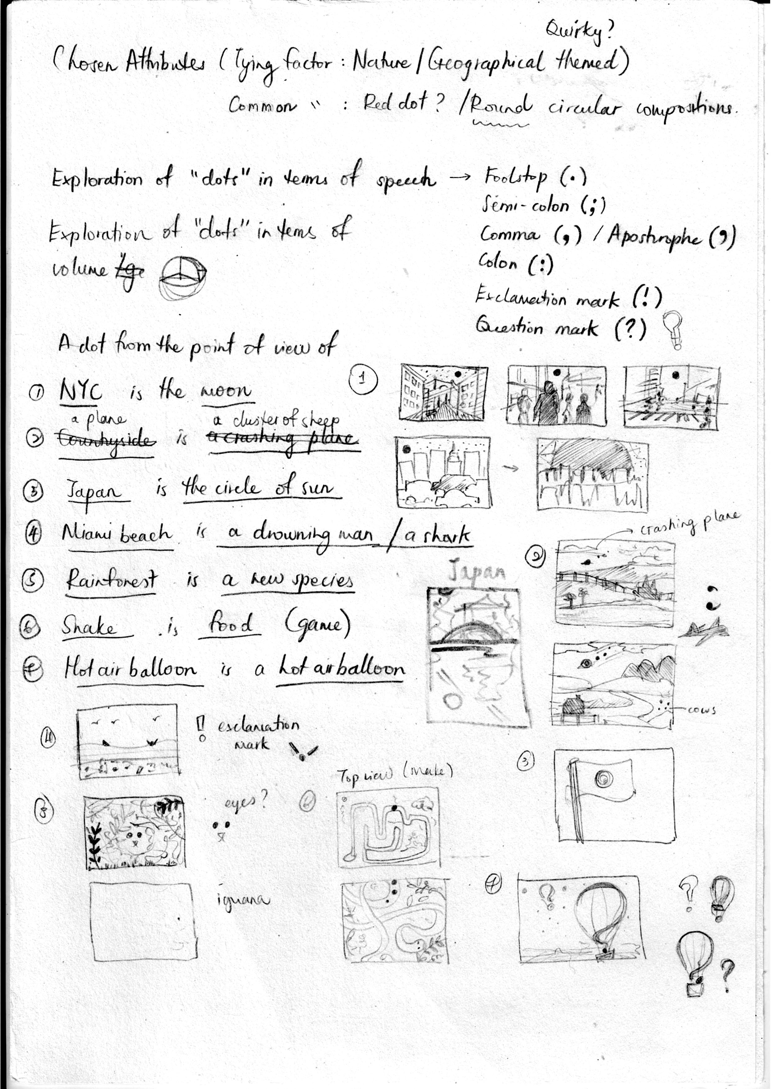
When I came out with the different POVs, Joy pointed out that they were rather quirky and a few of them were geographical themed. So for this project I decided to go with a geographical theme! 🙂
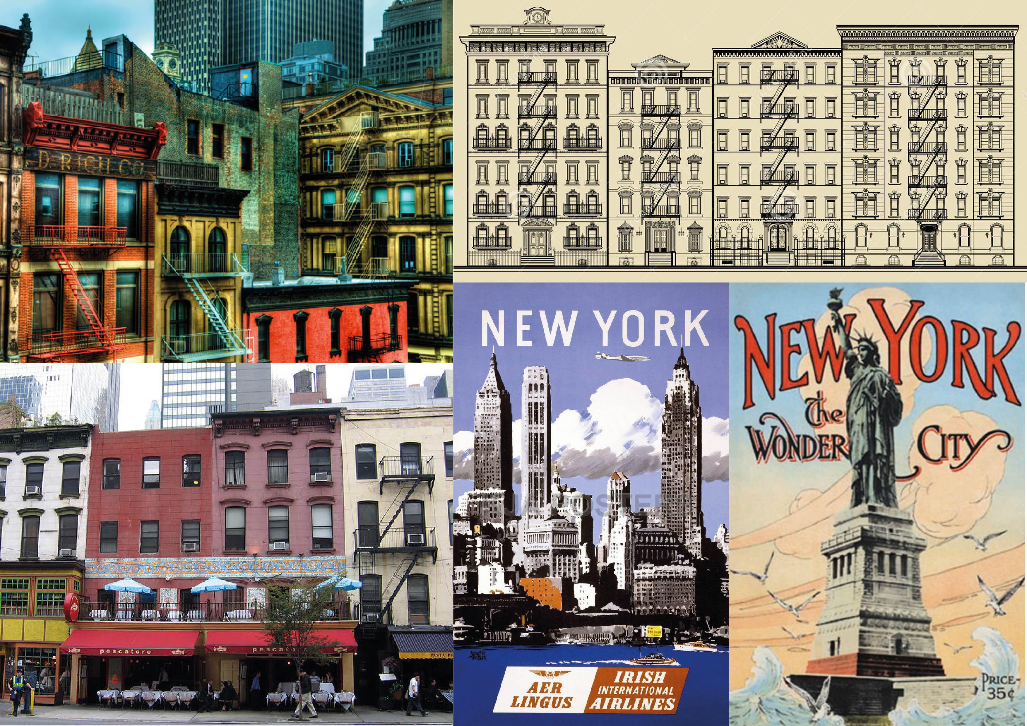
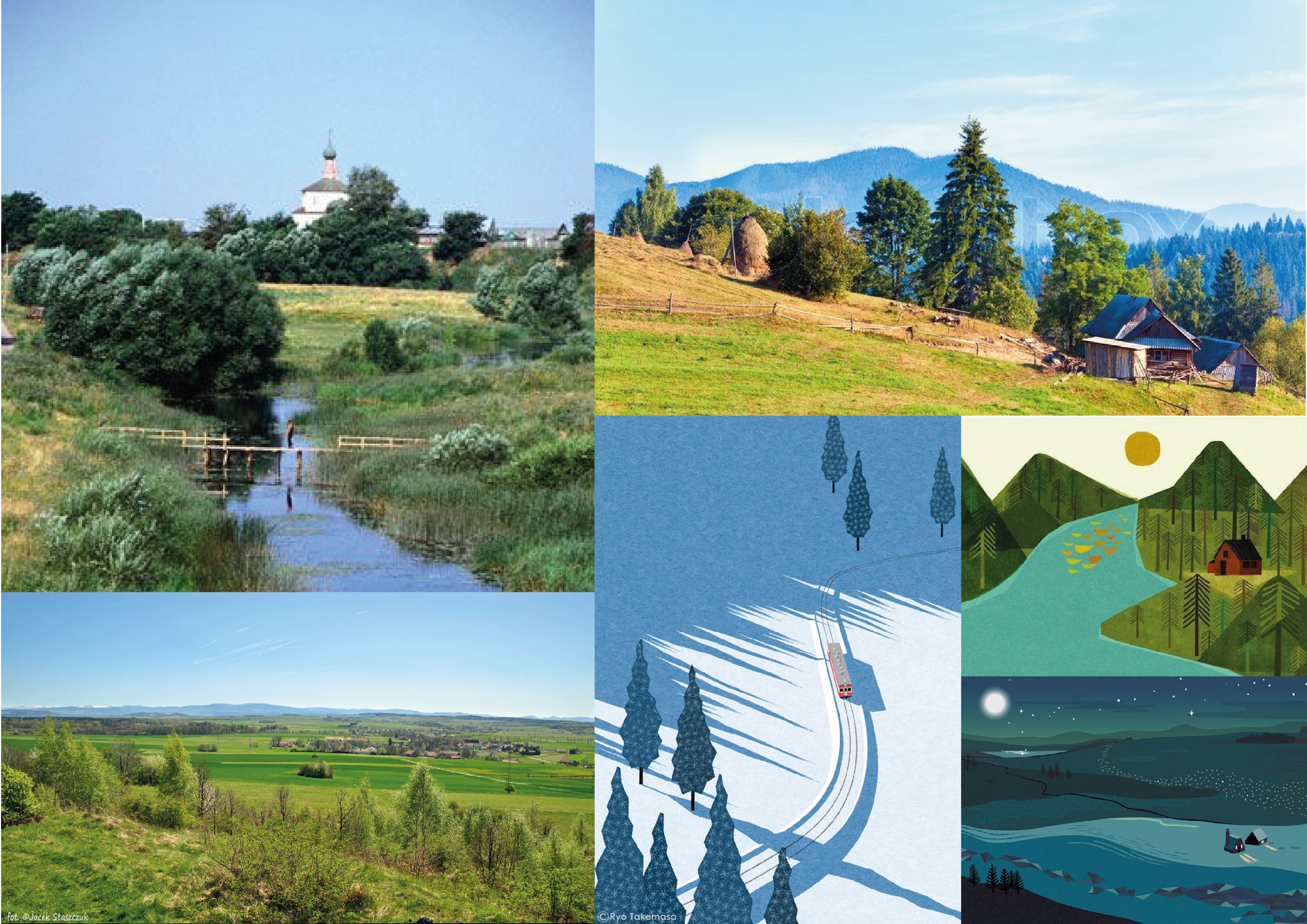
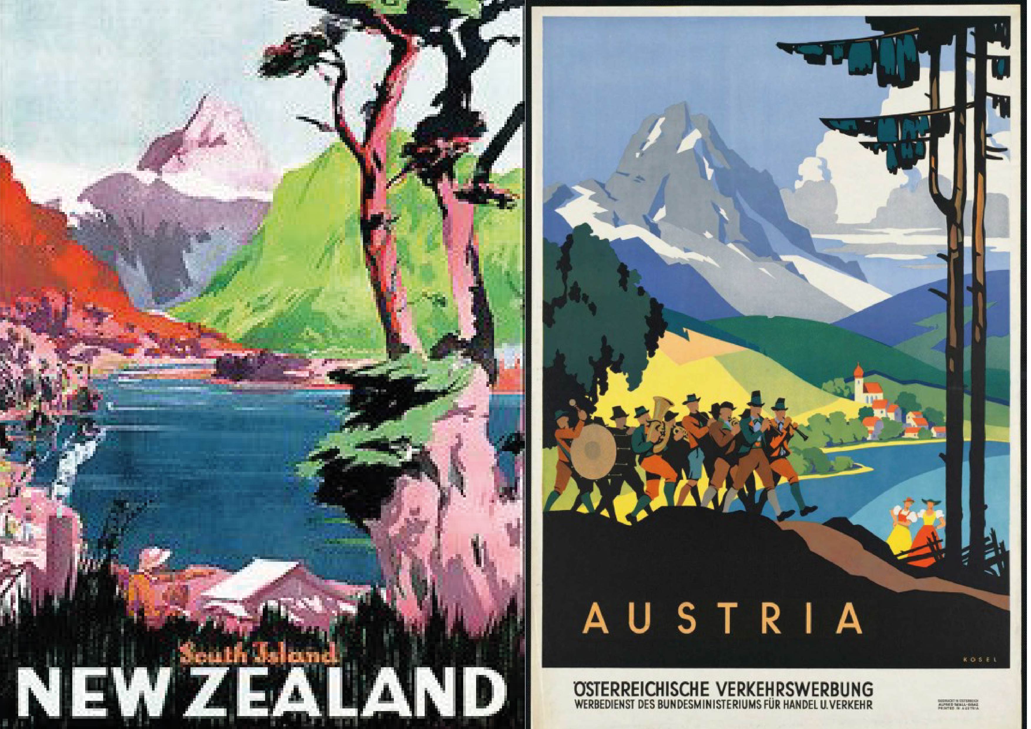
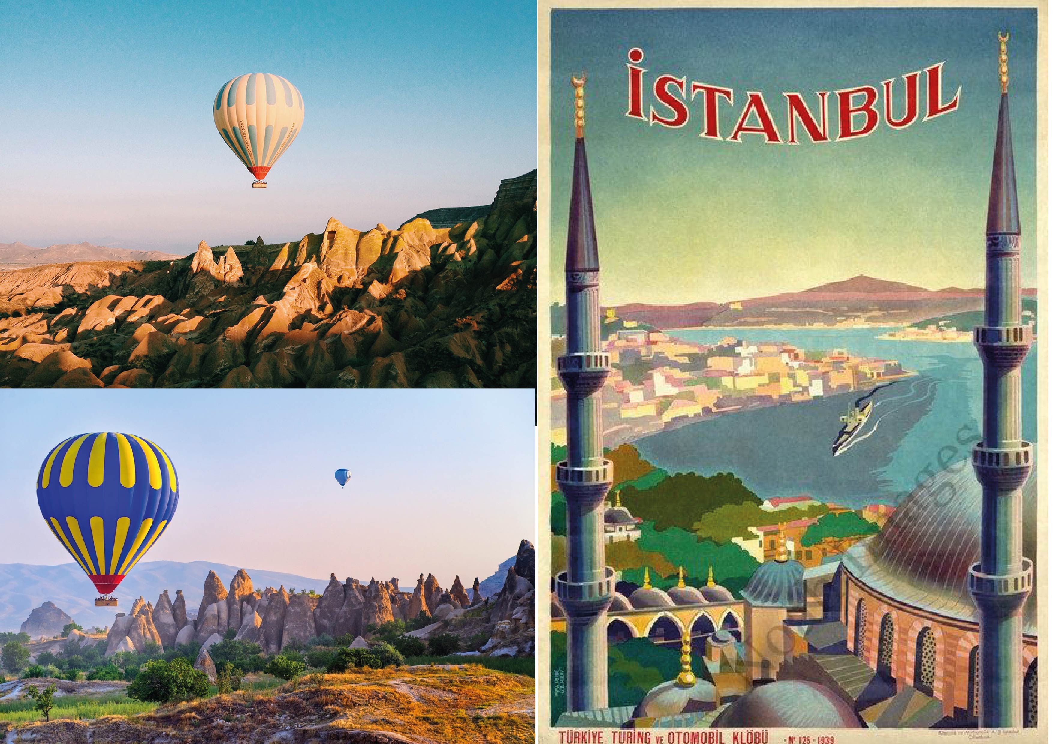
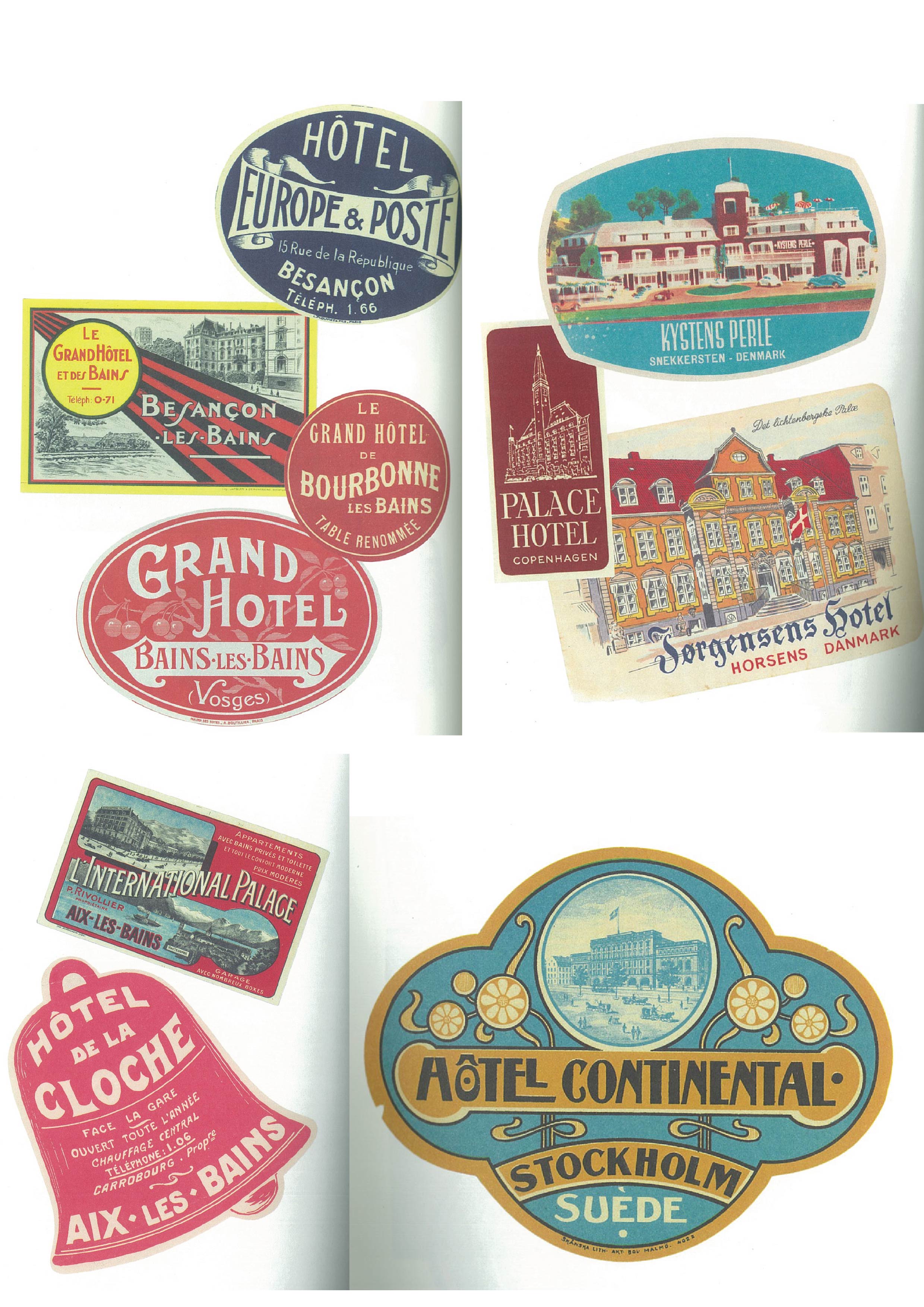
Joy suggested during consult that doing travel brochures or postcards would be quite apt. I personally really love retro vintage posters of the 1970s. What I love about them are the use of muted yet vibrant colours and how they compliment one another minimally, even if it’s just 2 or 3 colours.
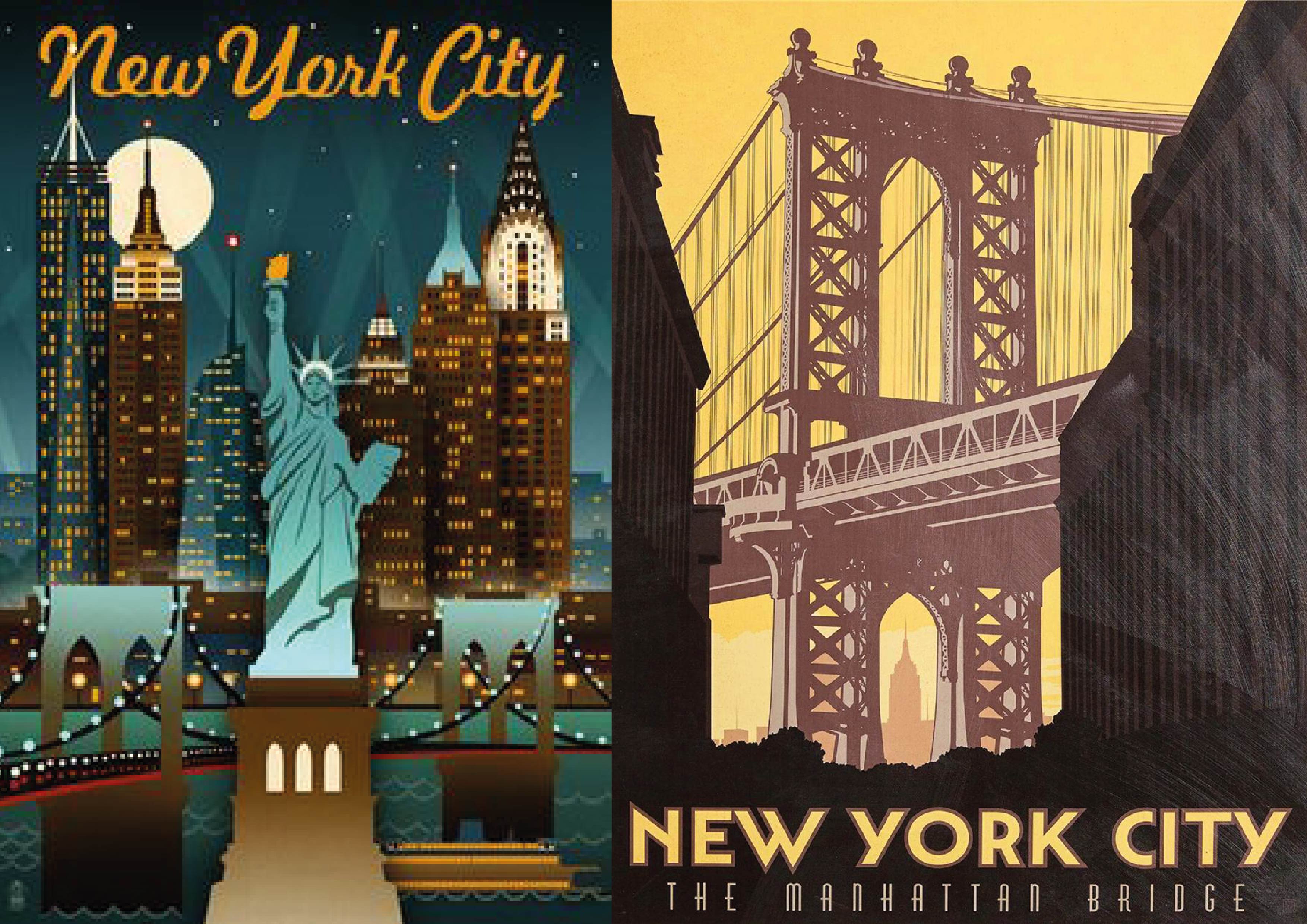
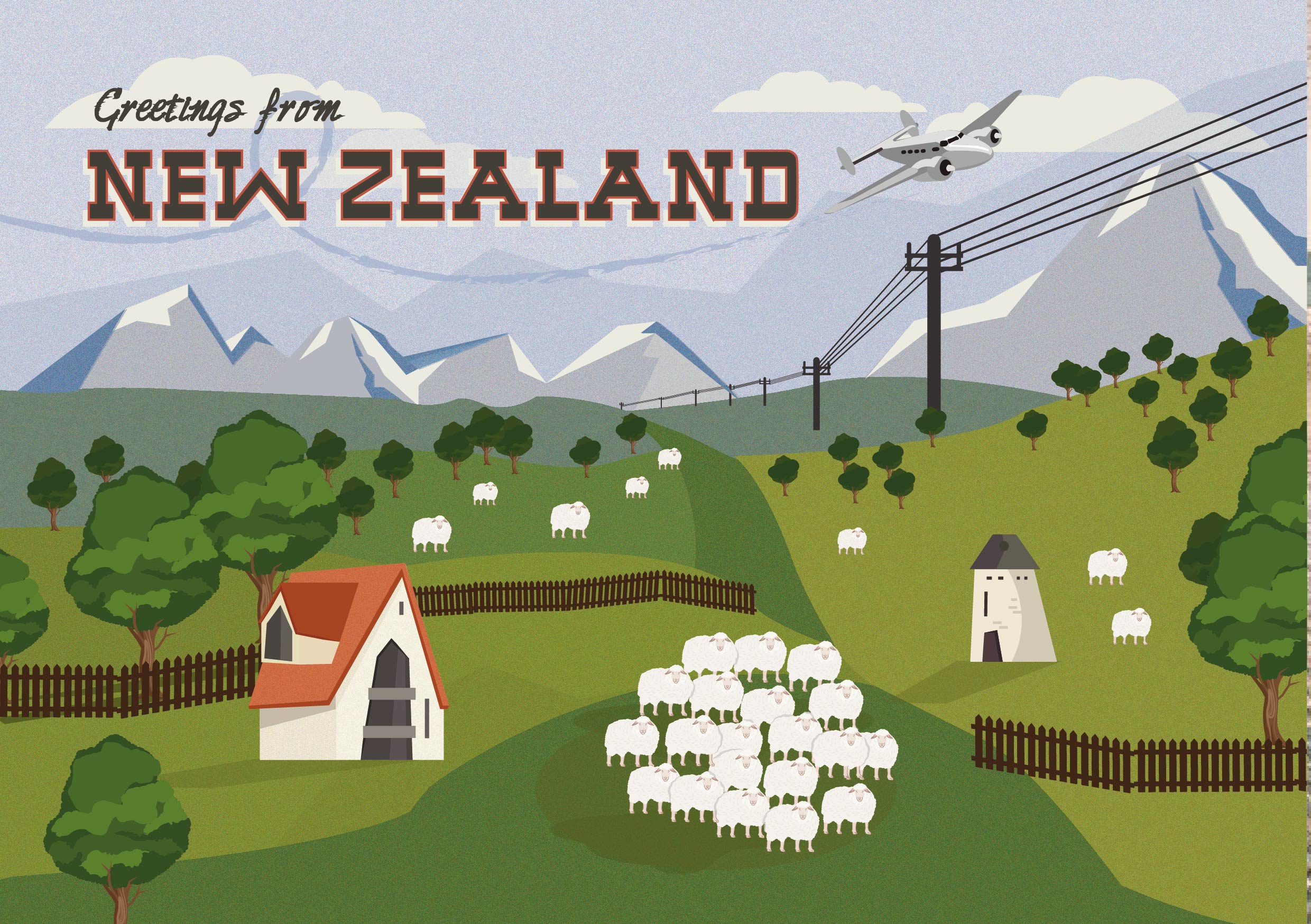
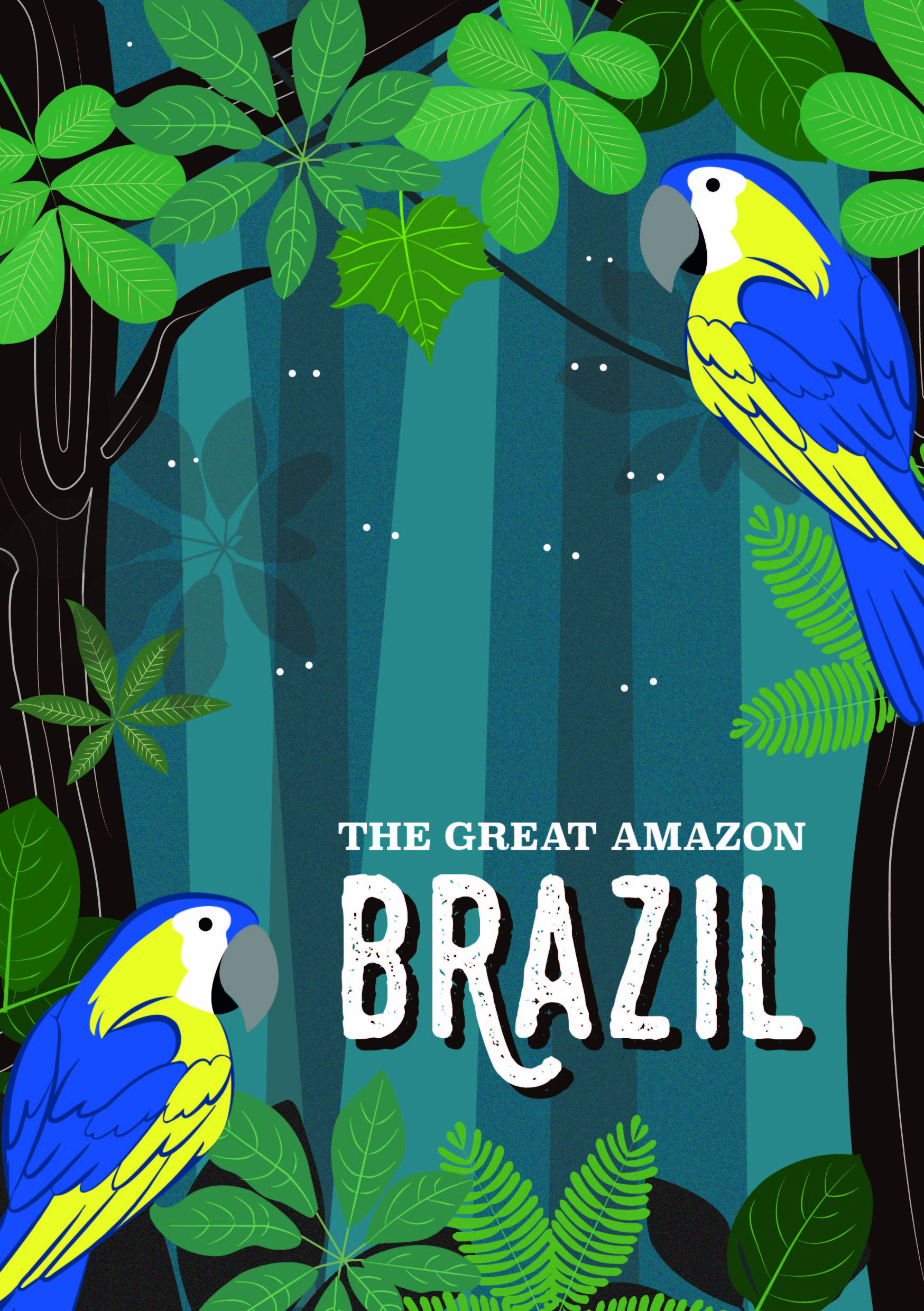
Retro graphics are usually irregular shapes or kept simplistic. To create the graphics, I referenced original photographs of the locations, and I made sure the style was kept constant throughout. To emphasize the retro look, I used vintage textures in the background. I also wanted to bring the message across in a subtle way, hence, it wouldn’t be the first thing you notice about most of the compositions. I also like playing with scale to emphasize distance/ of certain areas in the illustrations.
Since I went with a quirky theme, I wanted the “dots” to be subtle and not “in your face” so that viewers can find it themselves.
 So here they are…
- A dot from the POV of New York City is the moon
 2. A dot from the POV of a plane is a cluster of sheep
3. A dot from the POV of a Hot air balloon is another hot air balloon
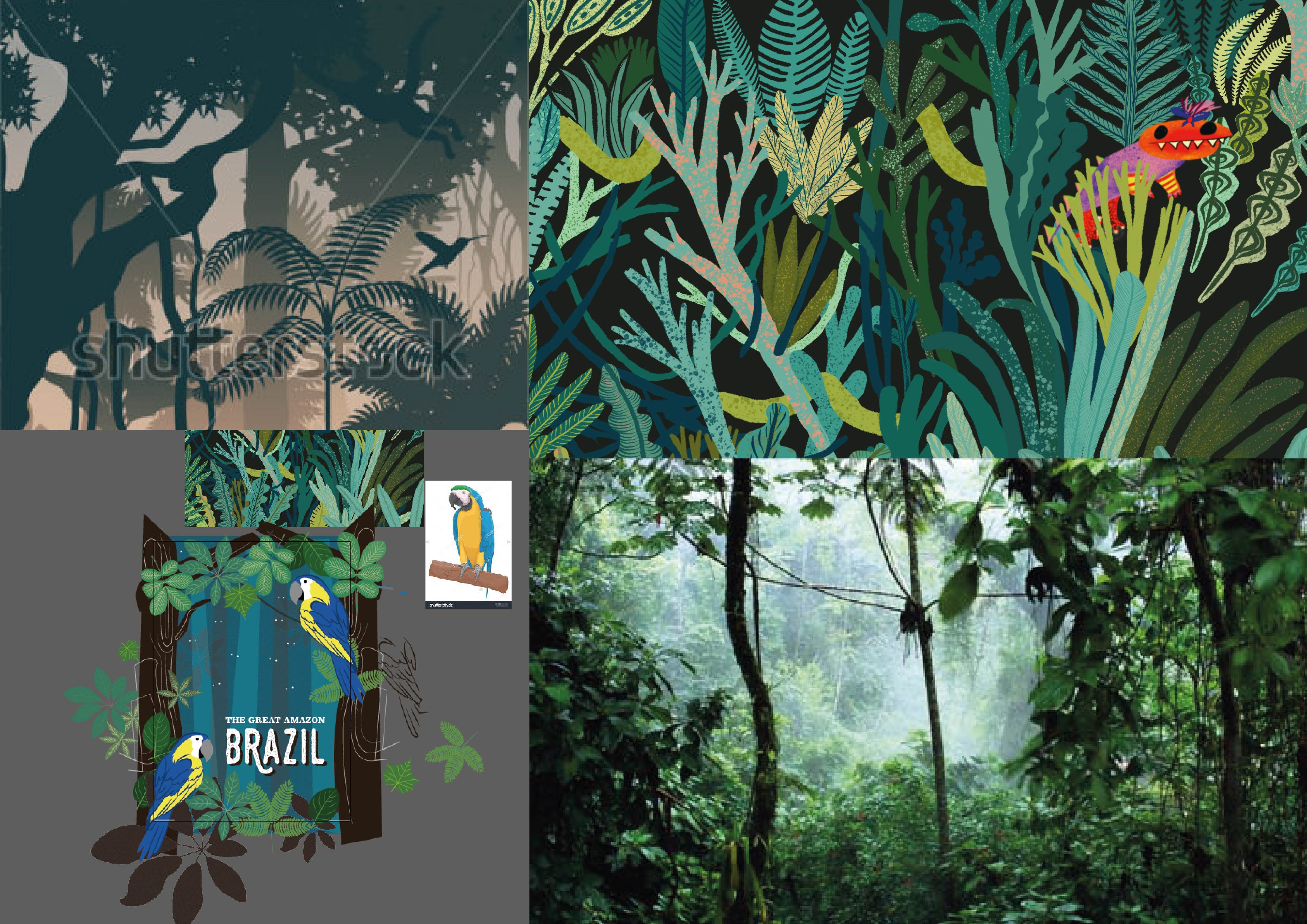
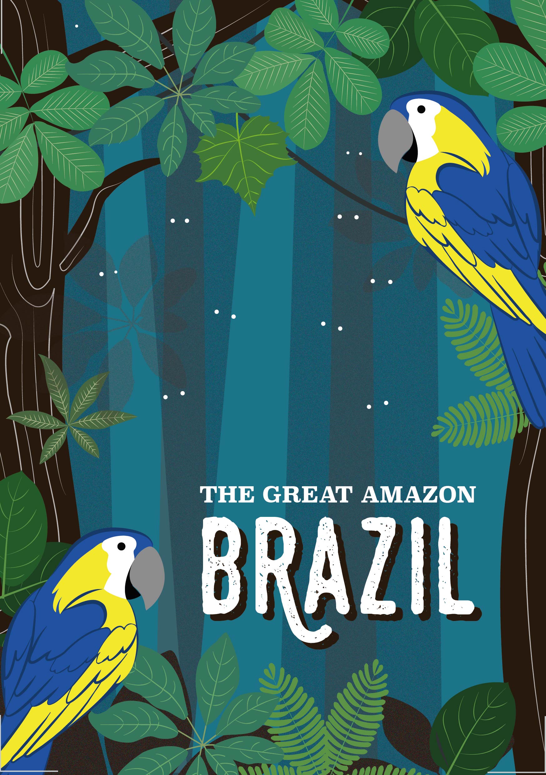
 4. A dot from the POV of the Amazon forest is a new species
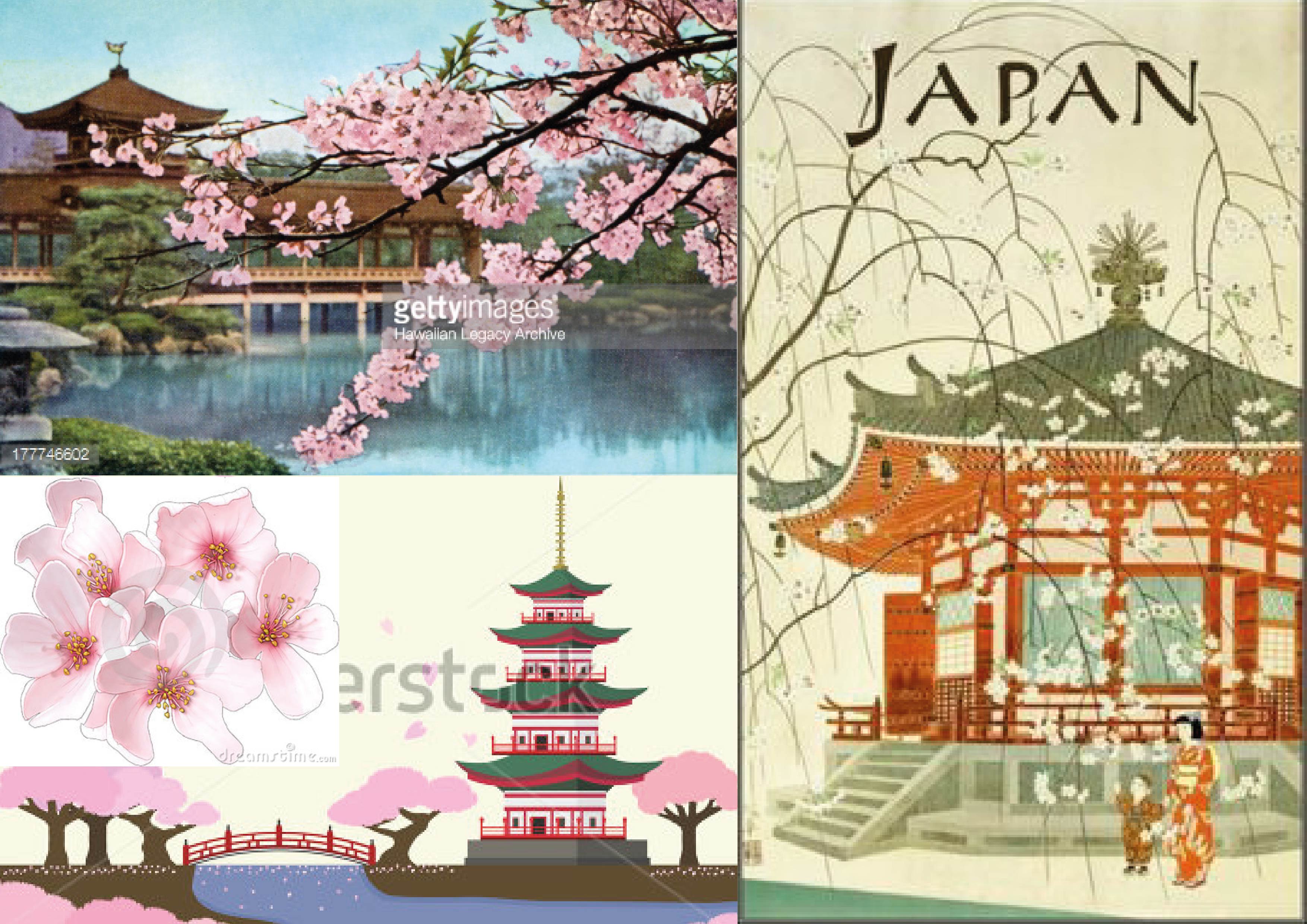
 5. A dot from the POV of Japan is the circle of sun
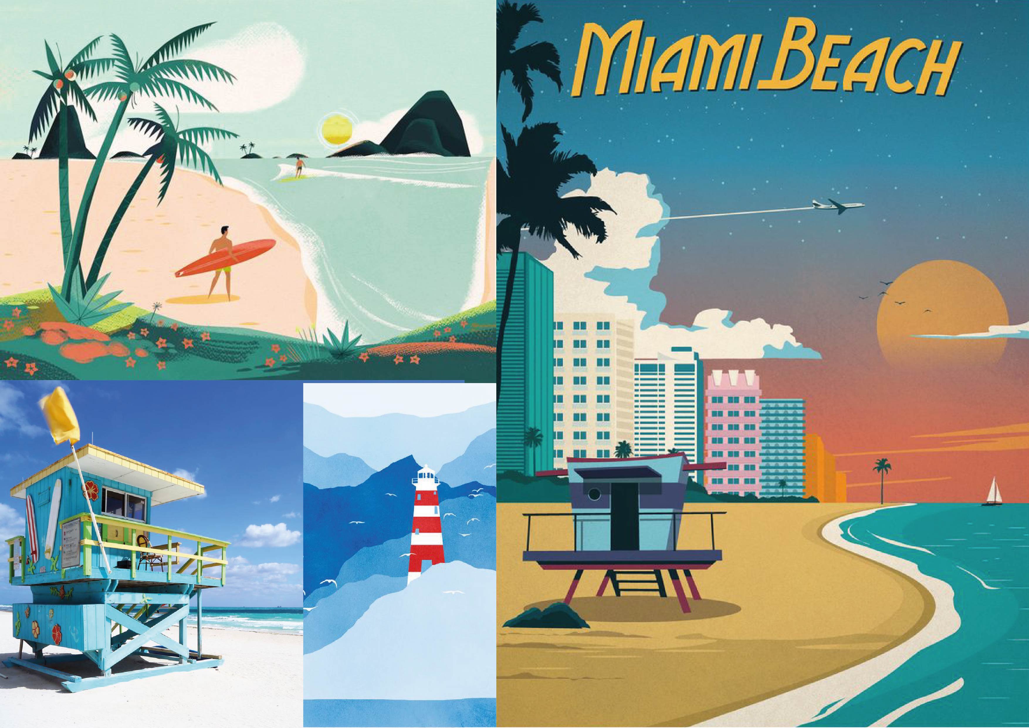
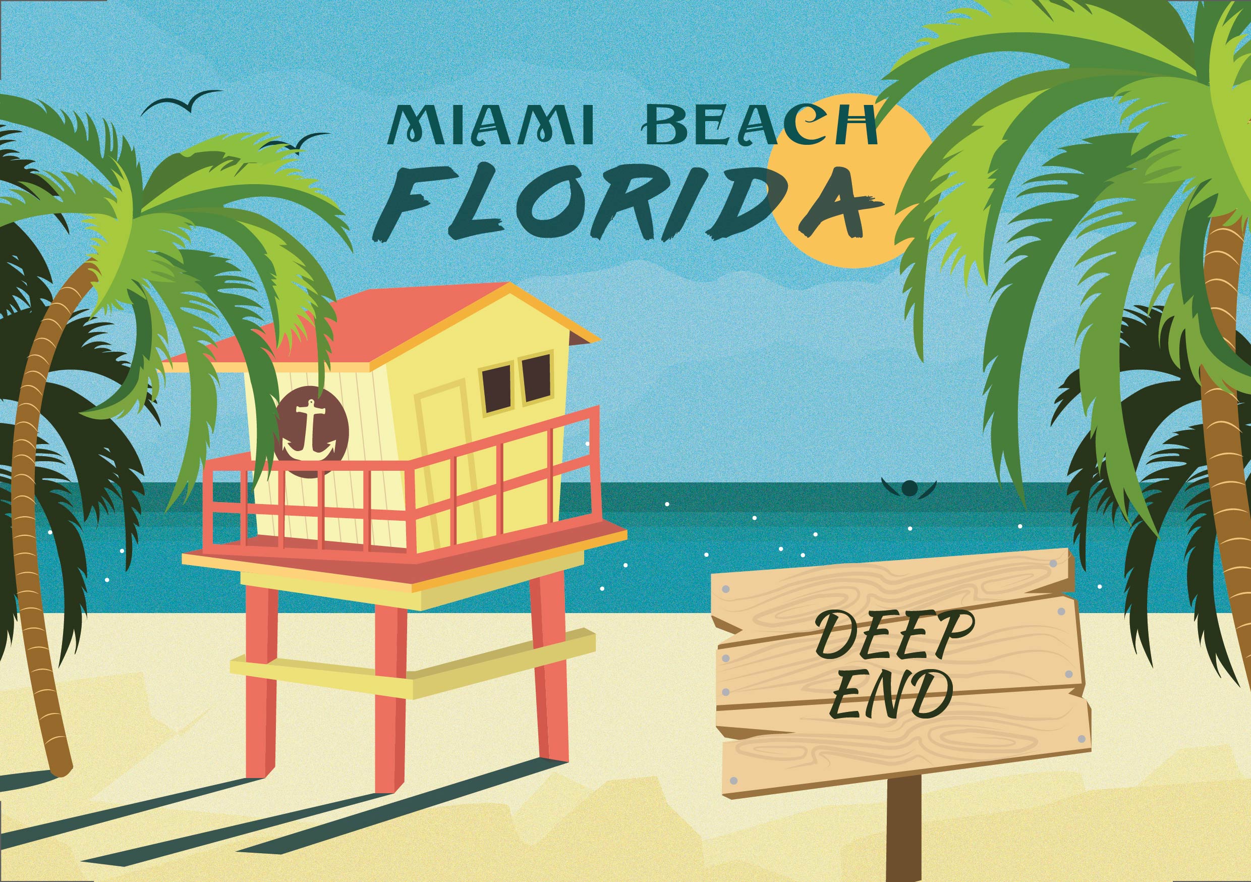
 6. A dot from the POV of Miami beach is a drowning man


