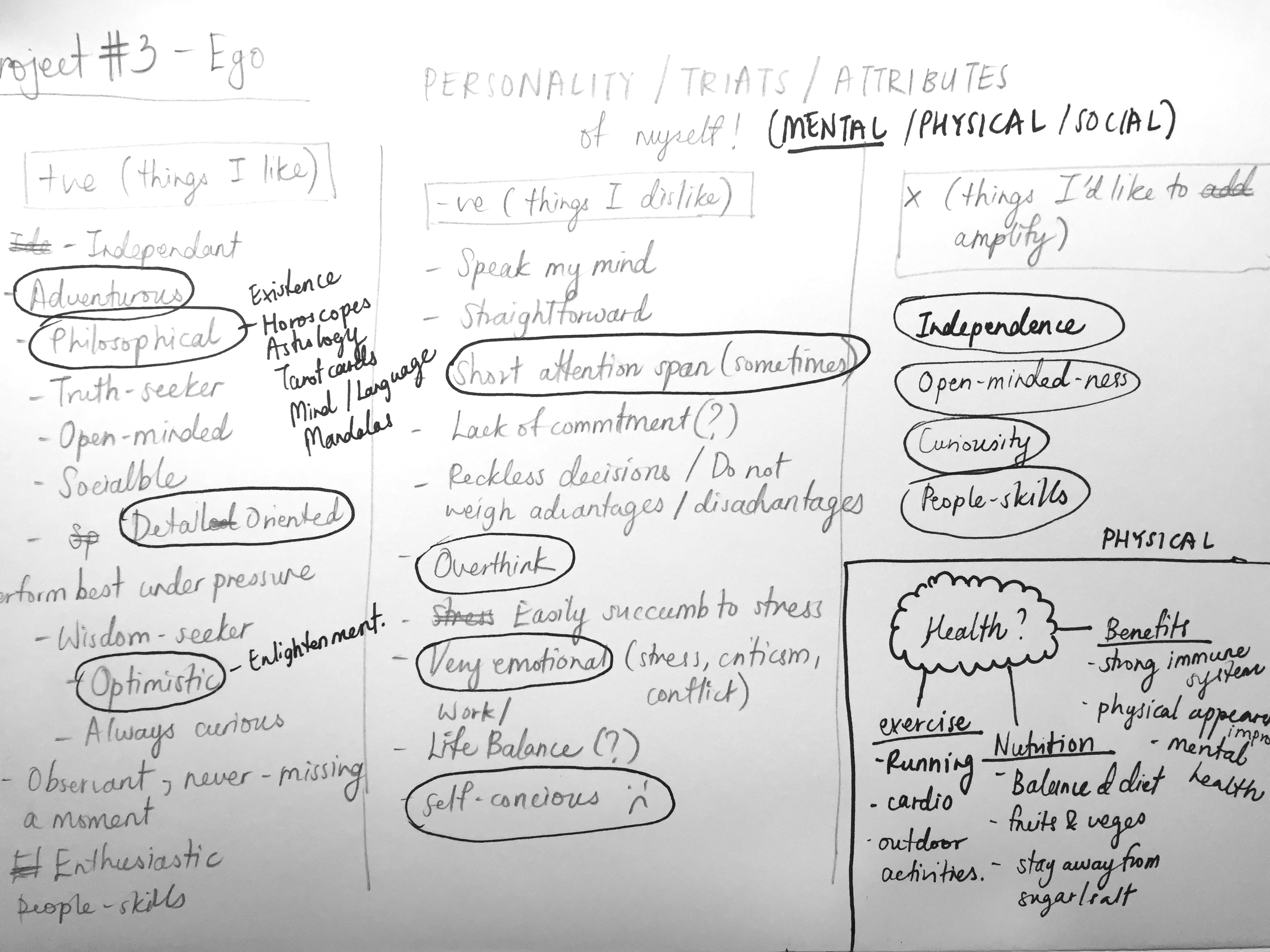
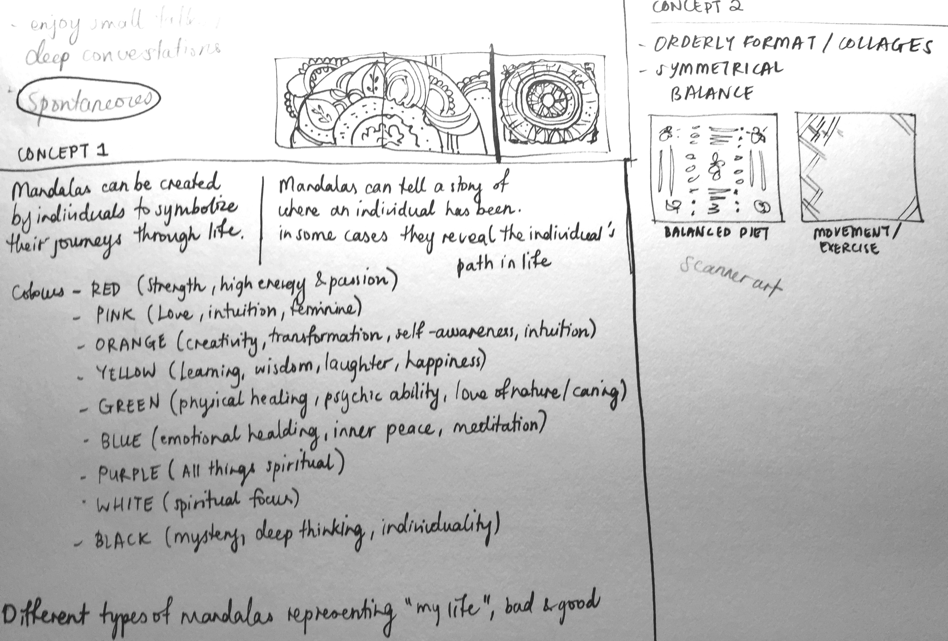
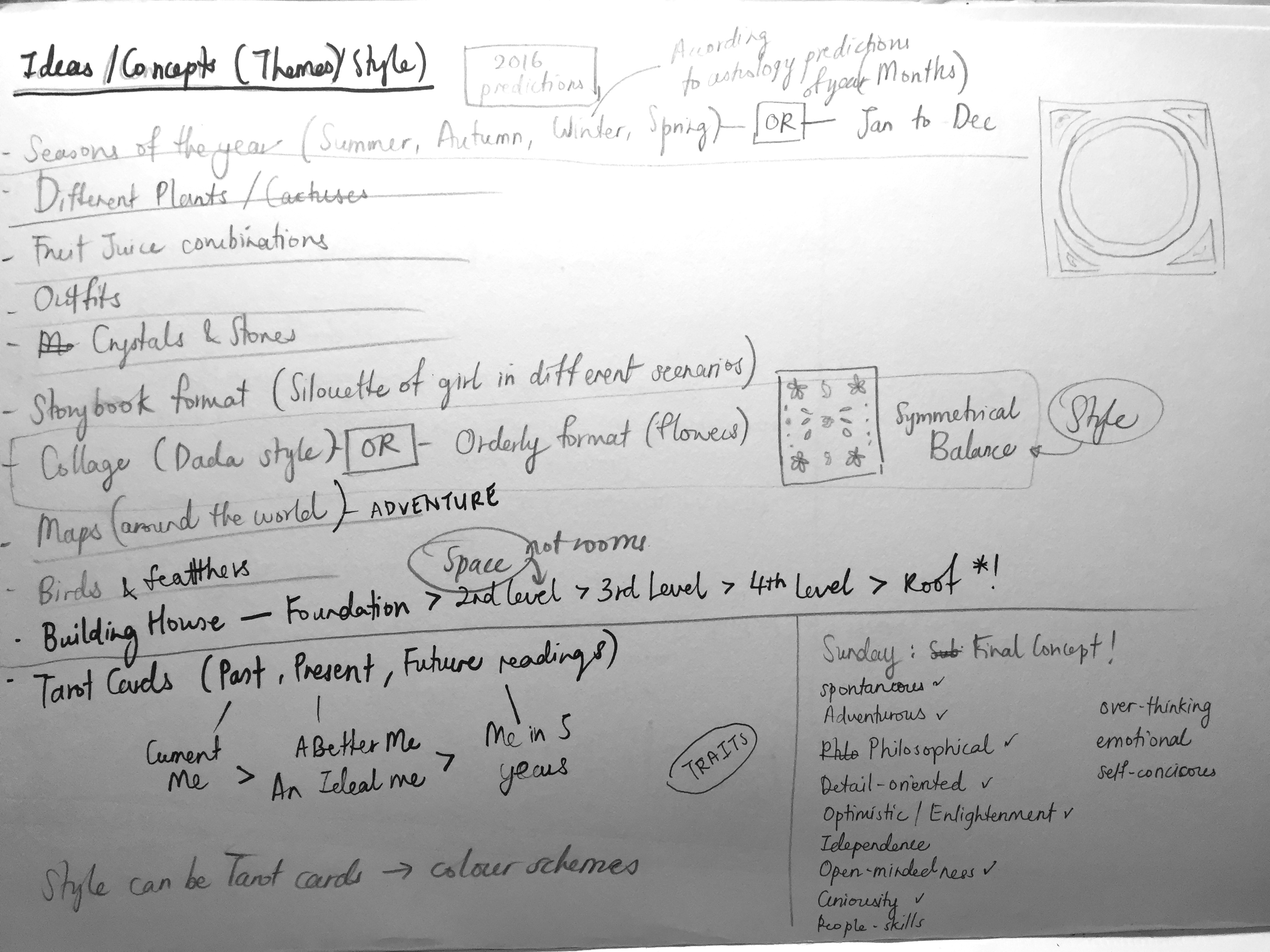
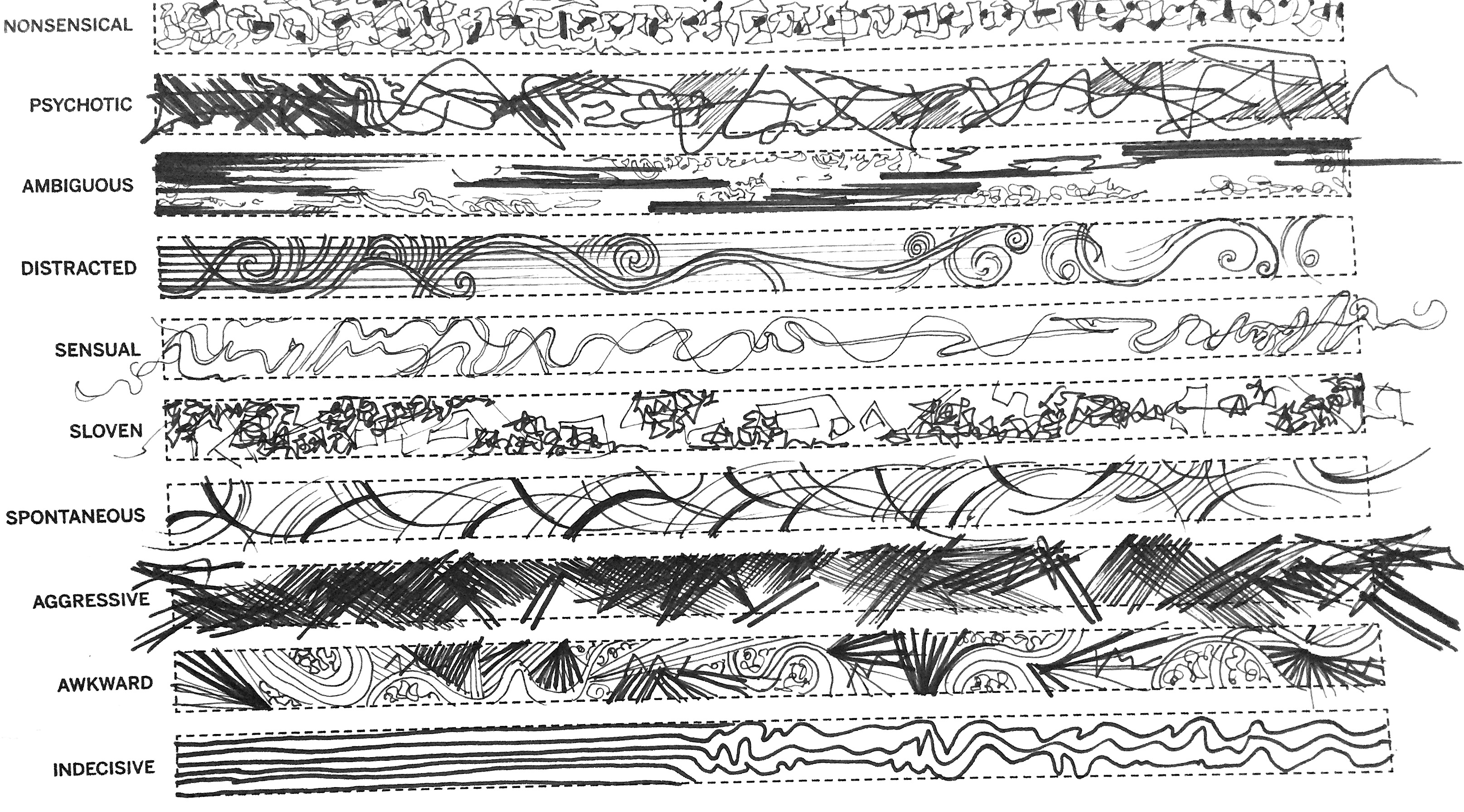
2D Project 3 – Ego (Final Work)

CONCEPT

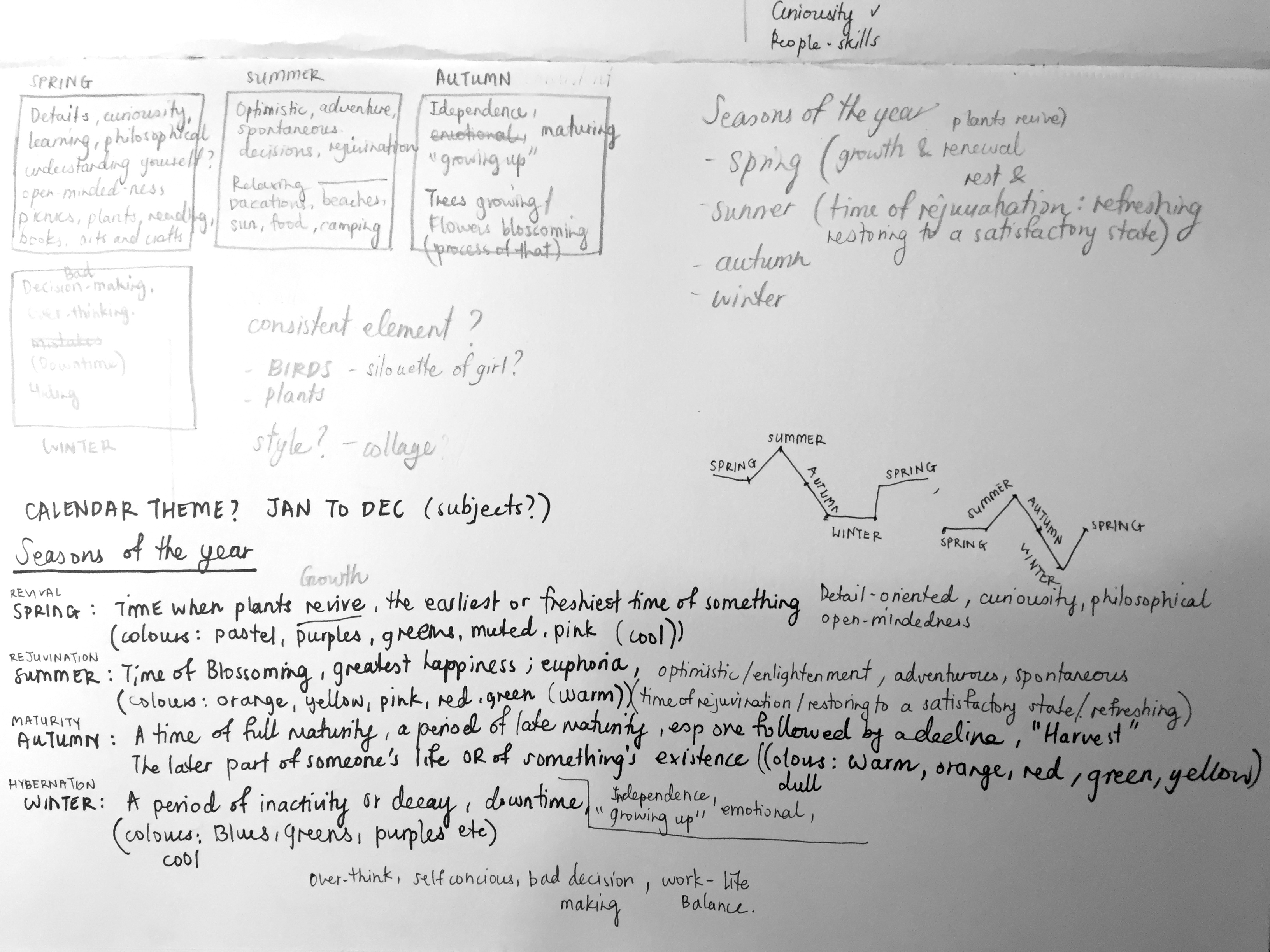
My concept is based on the 4 seasons of the year – Spring, Summer, Autumn and Winter and I grouped each personality trait according to each season and their moods/ meanings.

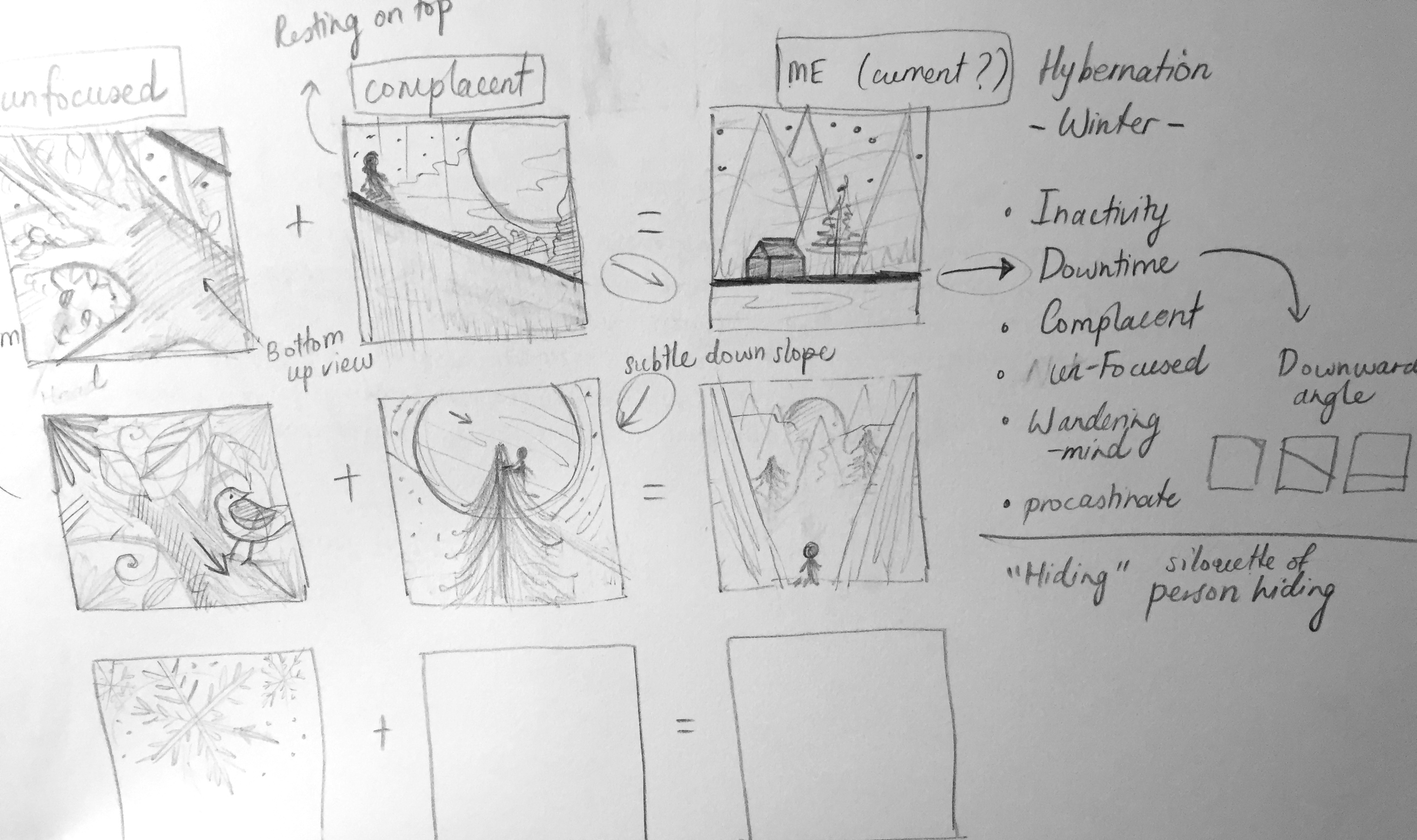
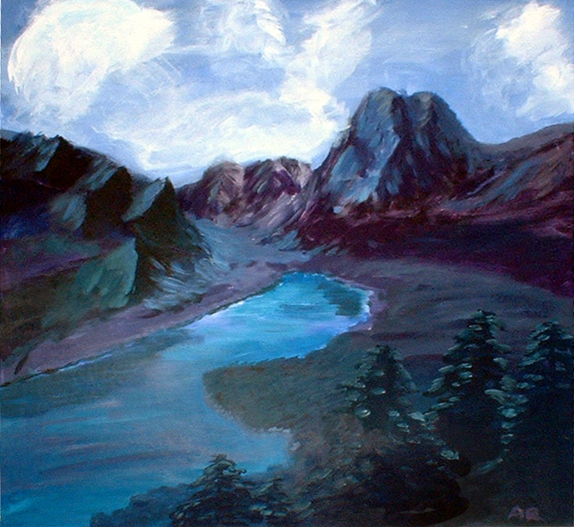
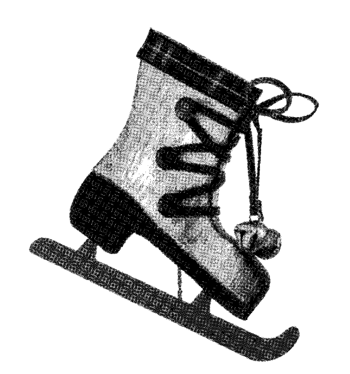
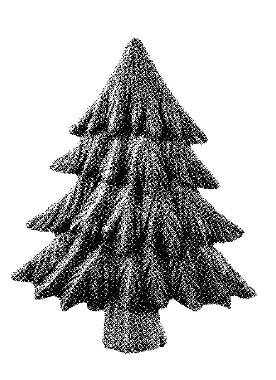
WINTER (Hibernation): A period of inactivity, downtime, “decay” (plants)

Personality traits: Over-think, self-conscious, complacent, unfocused, procrastinate

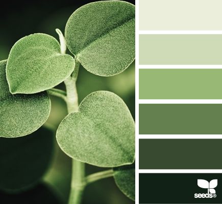
Winter colours: Cool tones, blues, greens, purples

SPRING (Revival): The earliest or freshest time of something, growth, “wake up”, self development.

Personality traits: detail-oriented, curiosity, open-minded

Spring colours: pastel/ muted tones, purples, greens, orange, pink

SUMMER (Rejuvenation): Time of blossoming, greatest happiness, euphoria, “restoration”, refreshing

Personality traits: Optimistic, adventurous, spontaneous

Colours: bright colours, orange, yellow, pinks, red, green

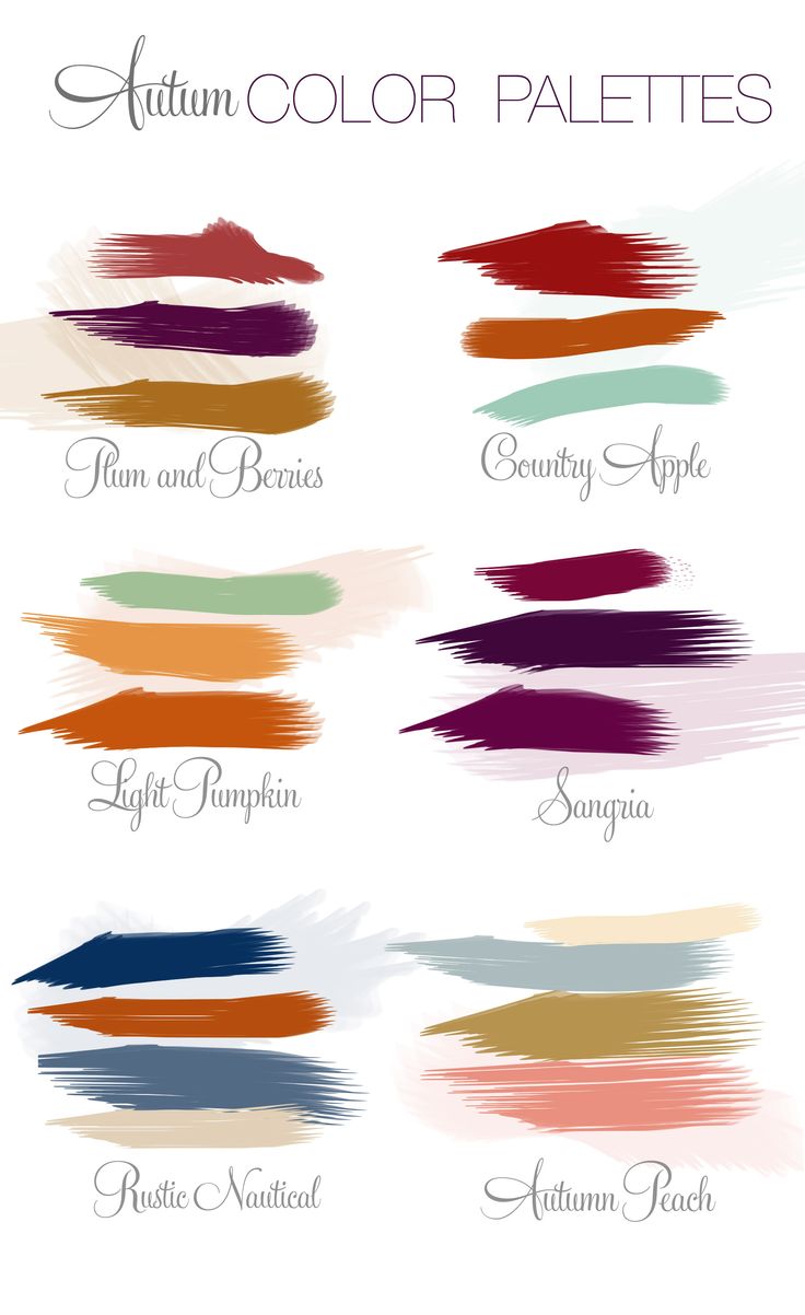
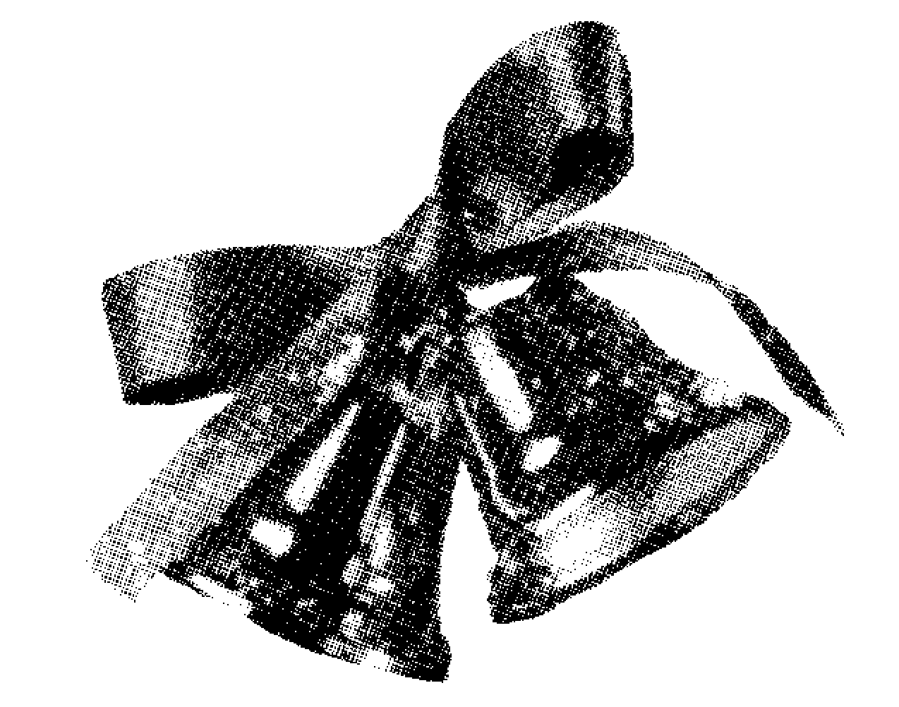
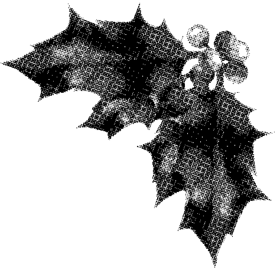
AUTUMN (Maturity):  A time of full maturity, “Harvest”, a later part of someone’s life/ something’s existence

Personality traits: “Growing up”, Independence, Hardwork

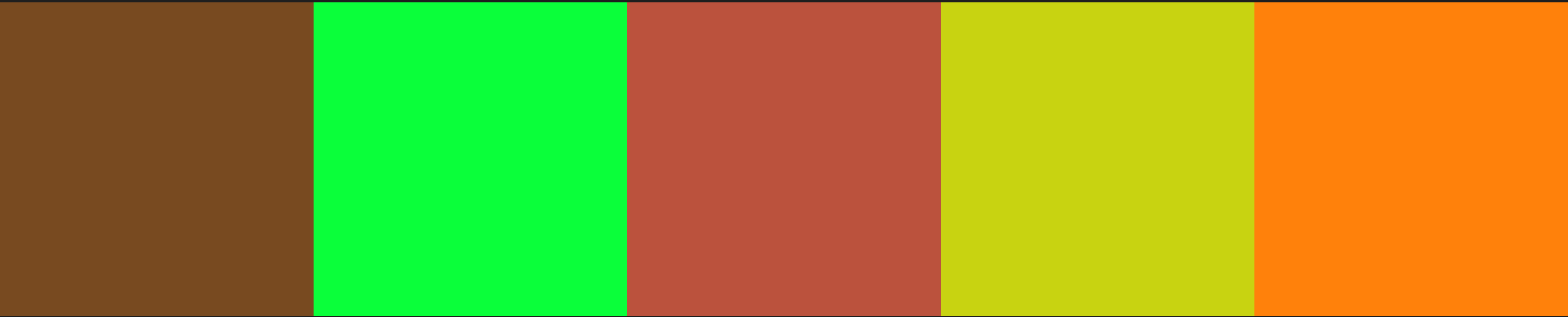
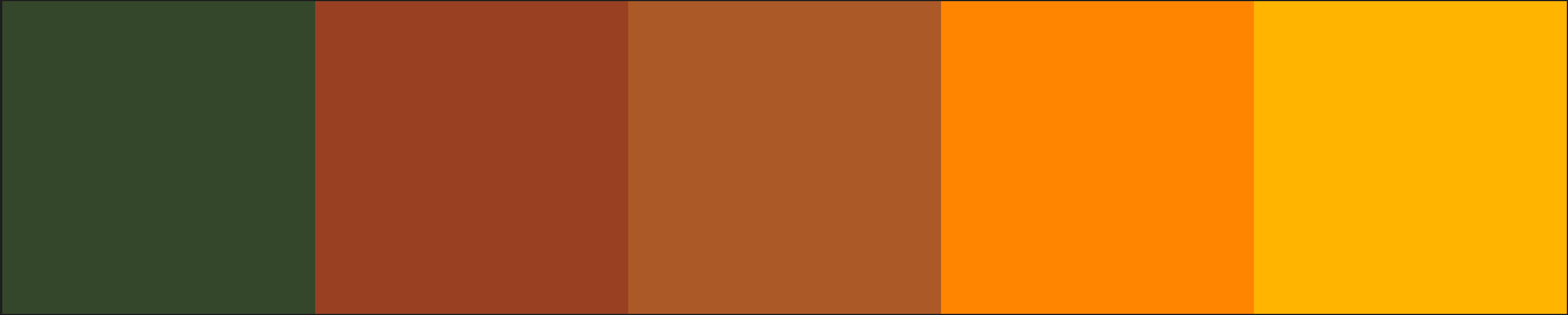
Colours: warm tones, orange, yellow, greens, reds, dull colours

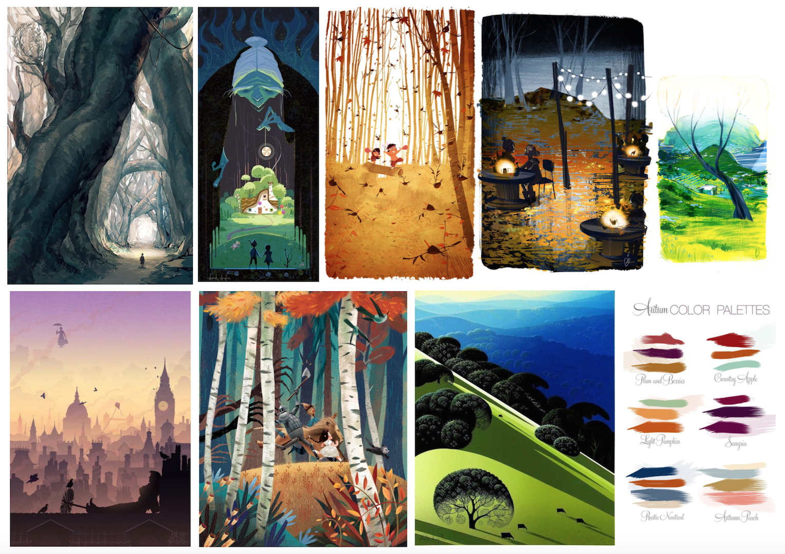
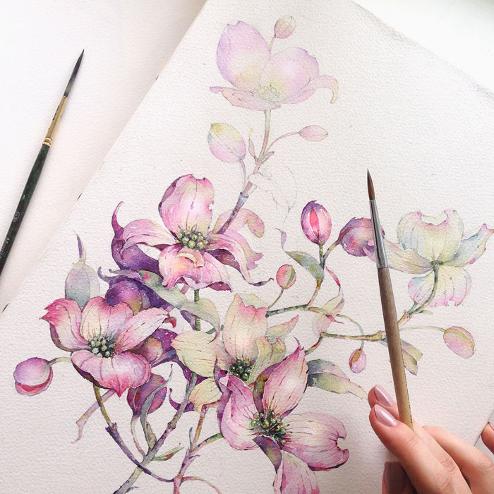
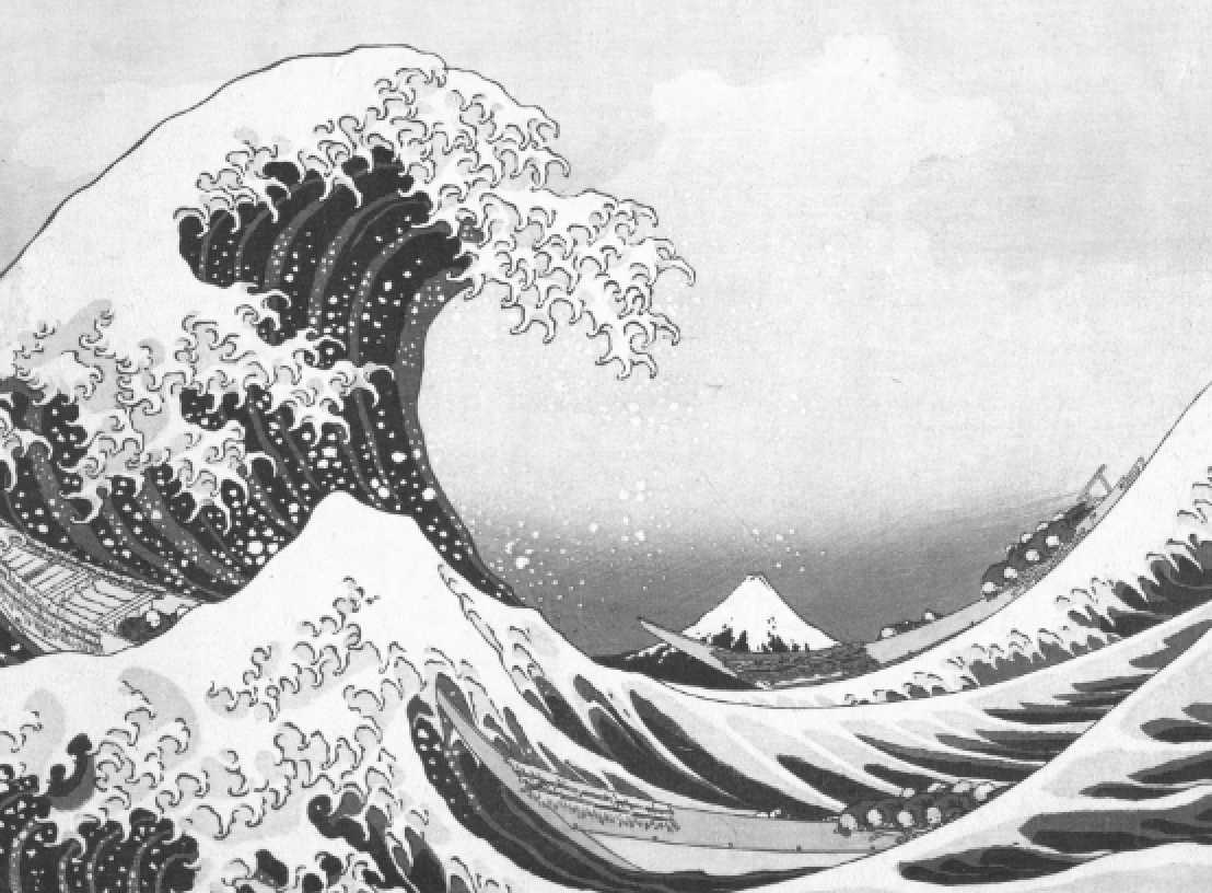
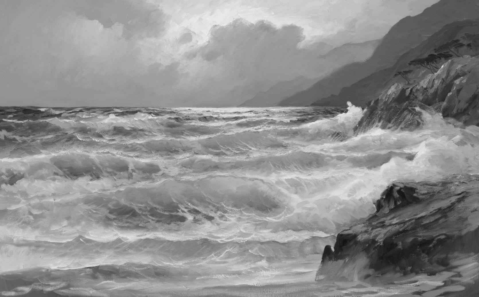
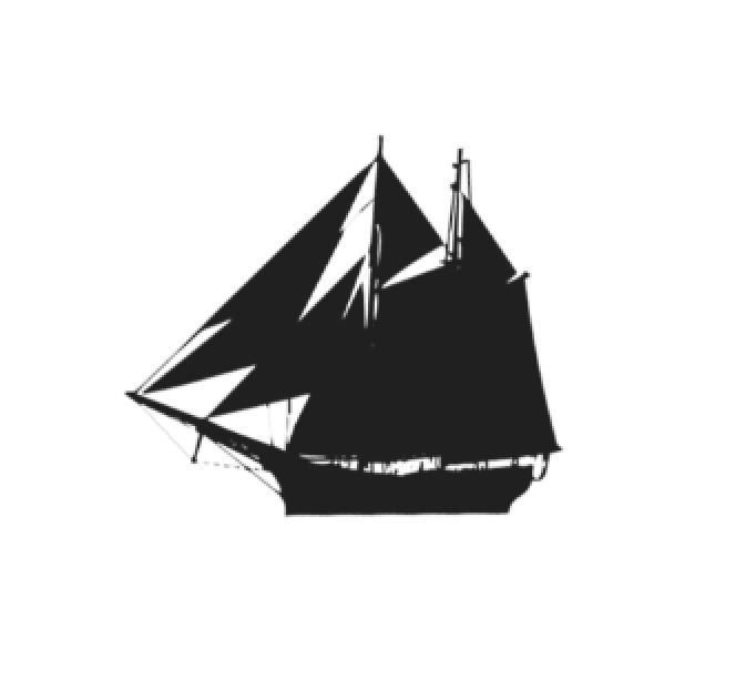
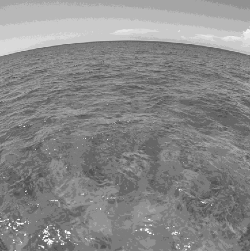
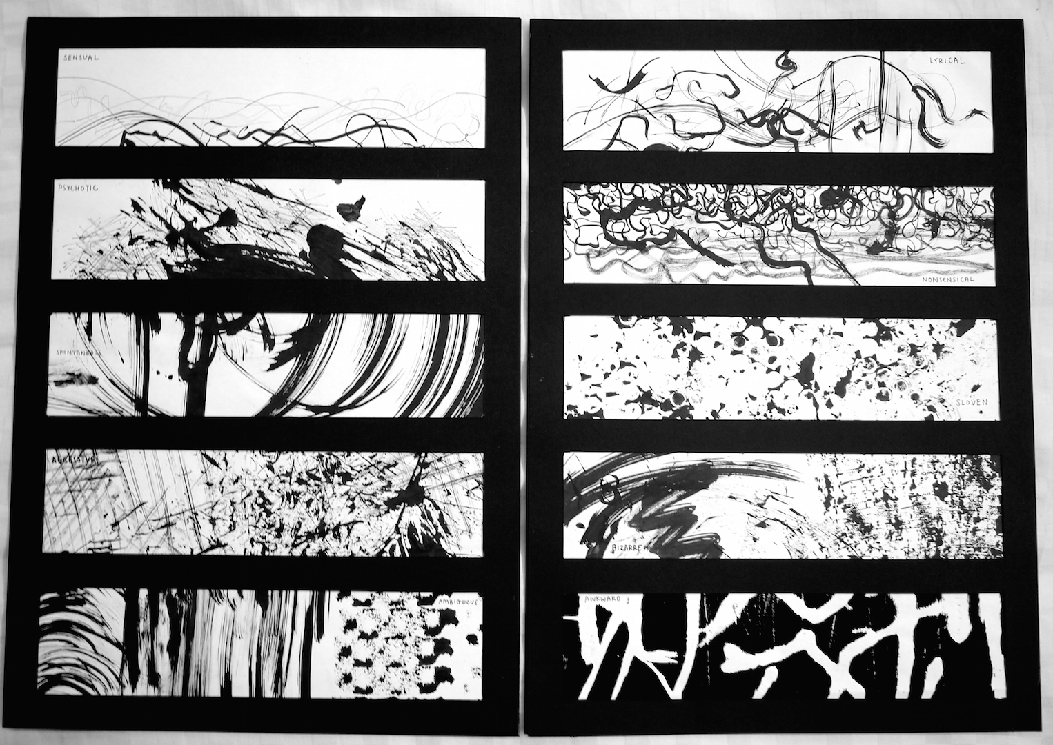
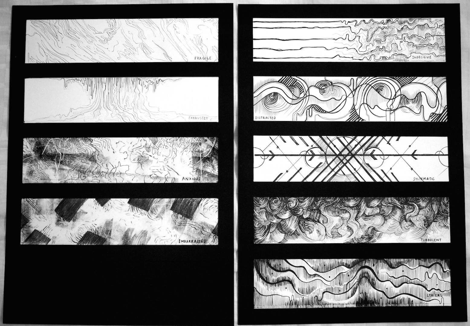
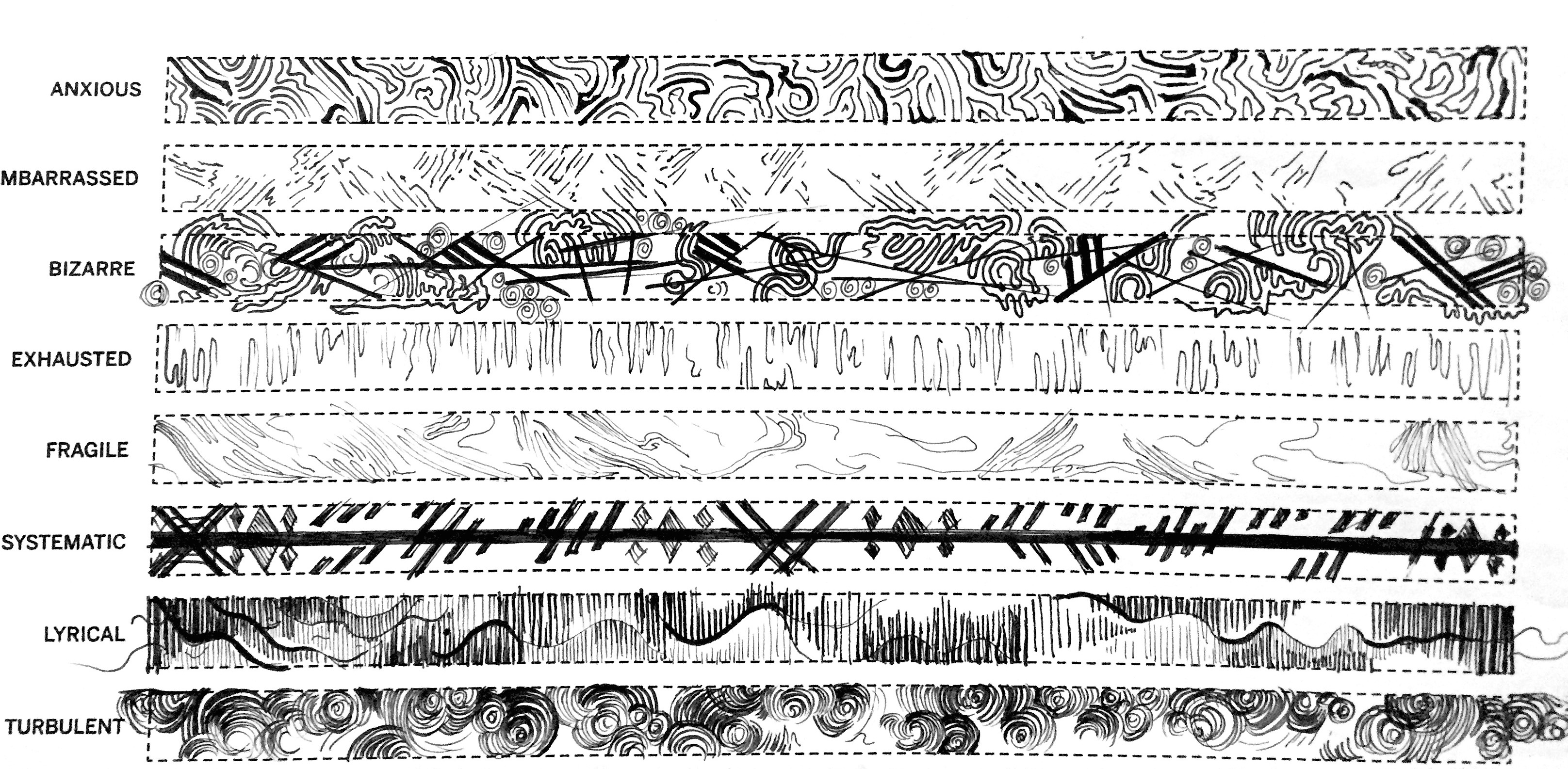
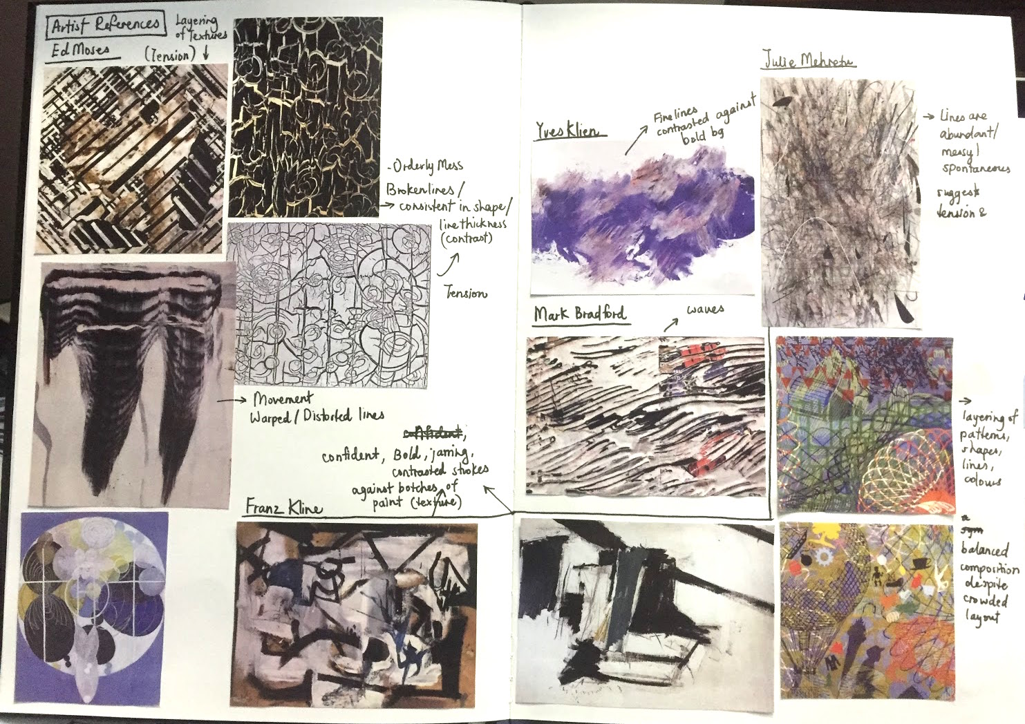
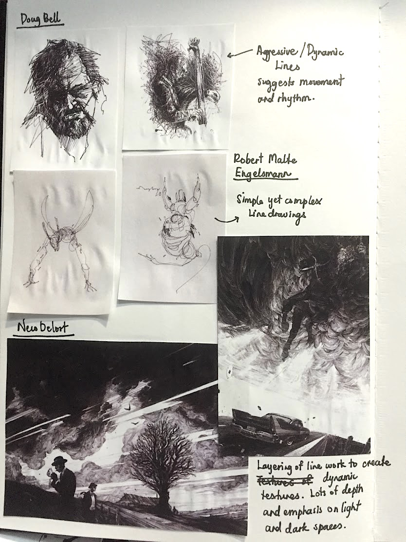
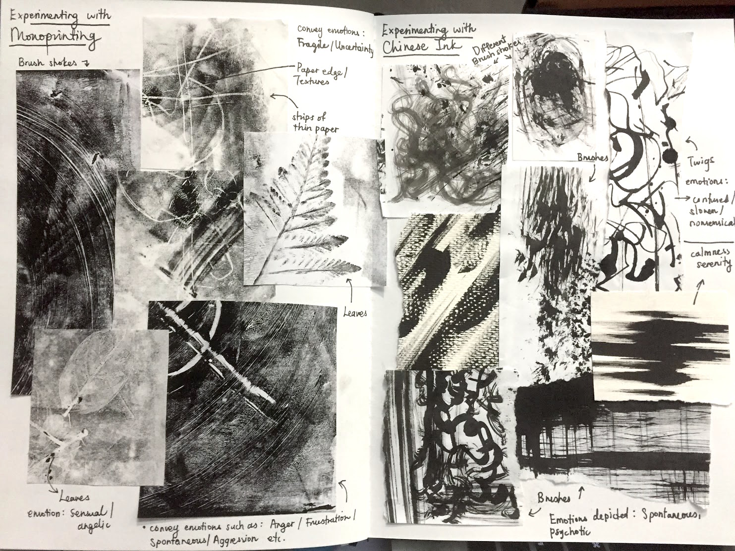
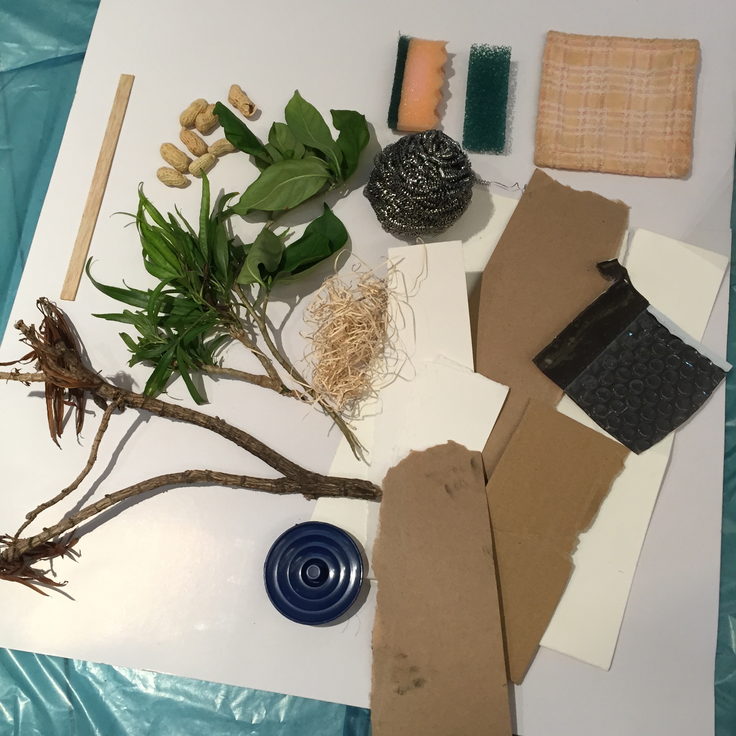
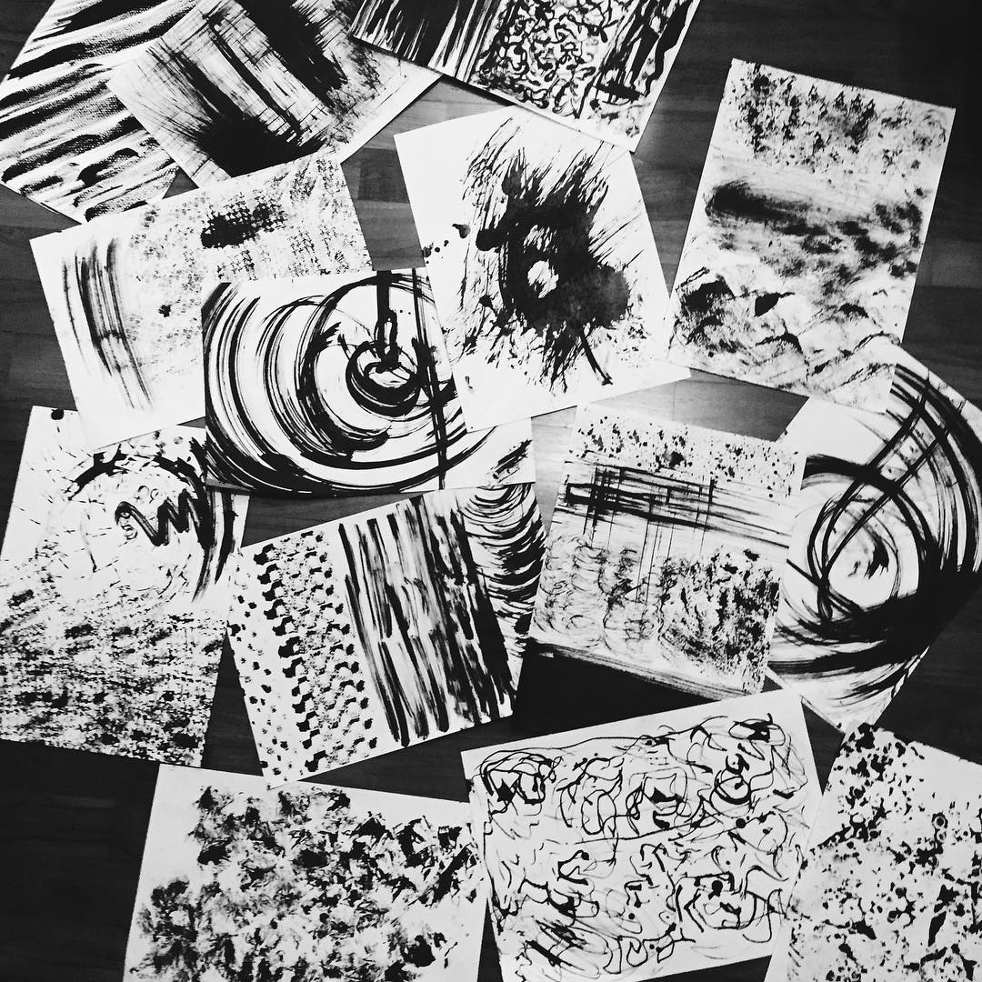
For this assignment, I focused a lot on the artistic elements/ aesthetics and I kept the concept rather simple. In terms of style, I took a lot of references from images I found online. I chose them because I liked their use of positive and negative spaces, how they match colours, their use of scale, contrast, shapes, texture overlays, and overall illustrative style. I really like how these illustrations also portray a certain “mysteriousness” and wonder, it’s rather whimsical too! I wanted to incorporate the use of silhouettes in my work too, because I knew that the over all compositions were going to be pretty overwhelming, and a dark solid-coloured silhouette will allow the character to stand out.

Screen Shot 2015-11-21 at 5.28.25 pm Screen Shot 2015-11-21 at 5.28.33 pm

FINAL WORKScreen Shot 2015-11-21 at 5.26.51 pmOSS-01
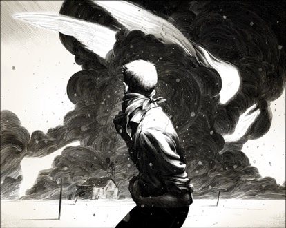
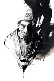
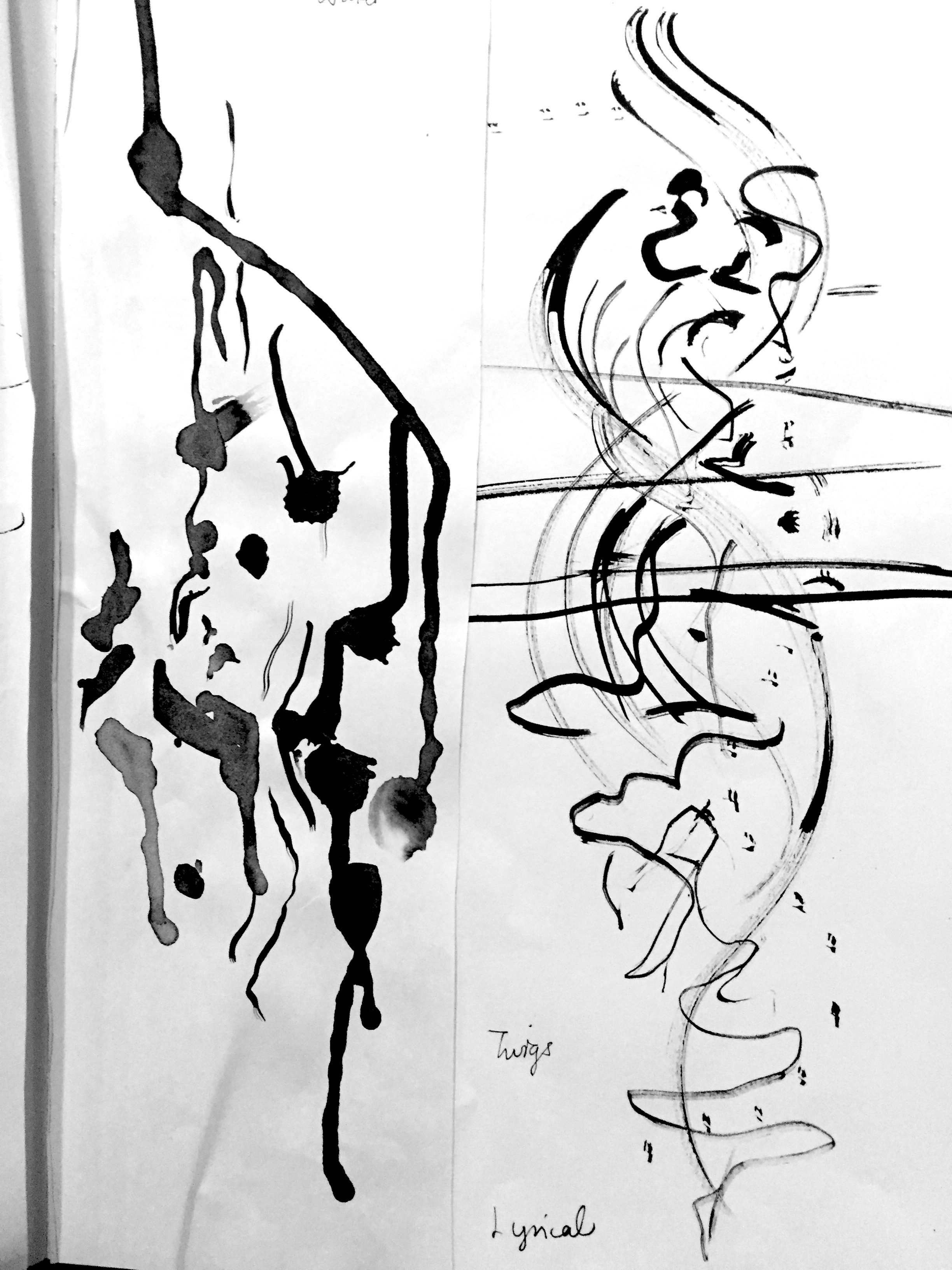
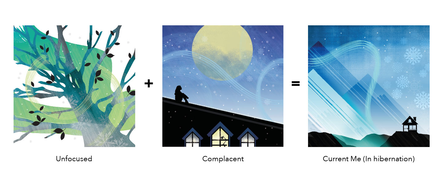
Unfocused – The overlapping branches and leaves, brush strokes accentuates confusion and “unfocus-ness”. The brush strokes also suggests exasperation and a sense of chaos. This is how I feel about life currently, where it is tough to live up to expectations of myself, prioritising different modules, in addition to balancing out my personal life.

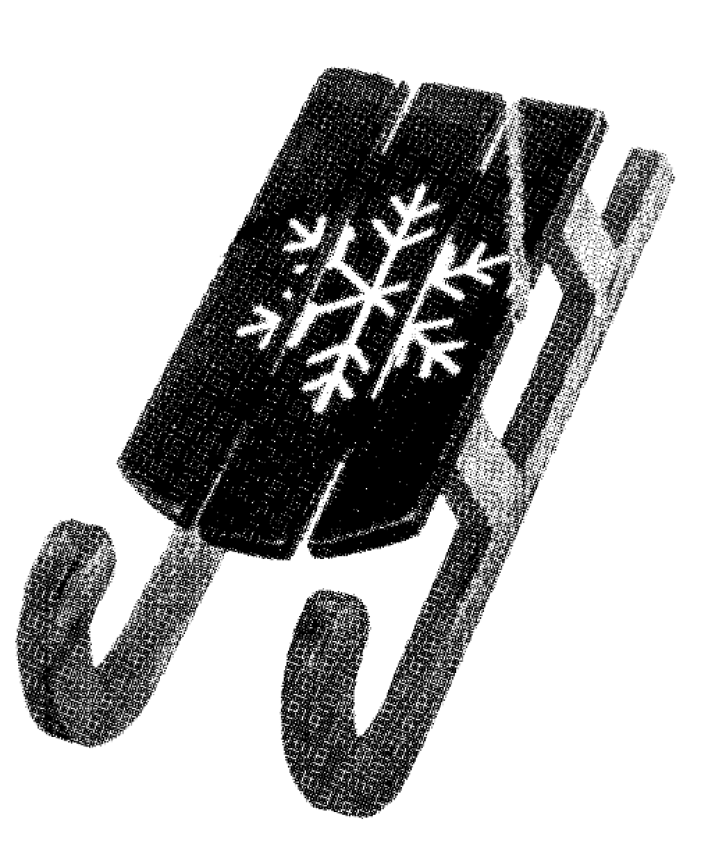
Complacent – Sometimes when the stress gets to me, I tend to push everything aside and procrastinate. This is me “relaxing” amidst the hectic work load.

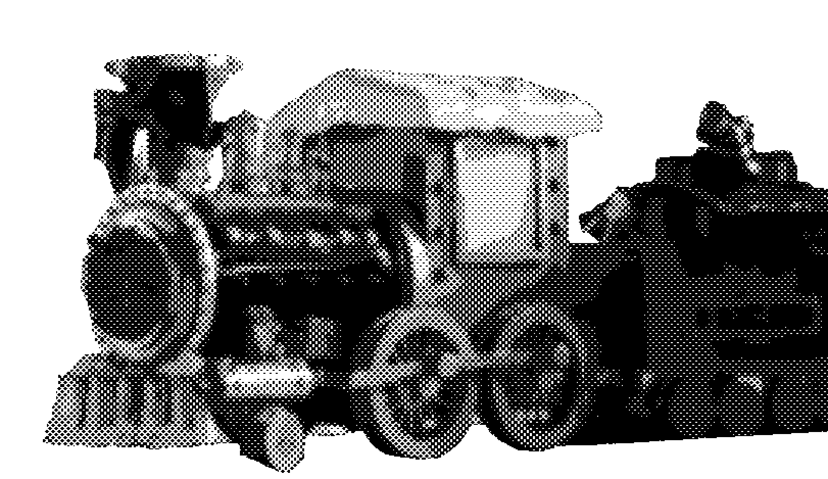
Current me – Therefore, I feel that I’m currently “In hibernation”. In terms of school work, I feel that I’m too relaxed for my own good sometimes. It’s time to wake up from hibernation!

When viewed together, you can see that the graphics are “downward sloping” and this this further emphasizes inactivity.

Screen Shot 2015-11-21 at 5.26.38 pmOSS-02

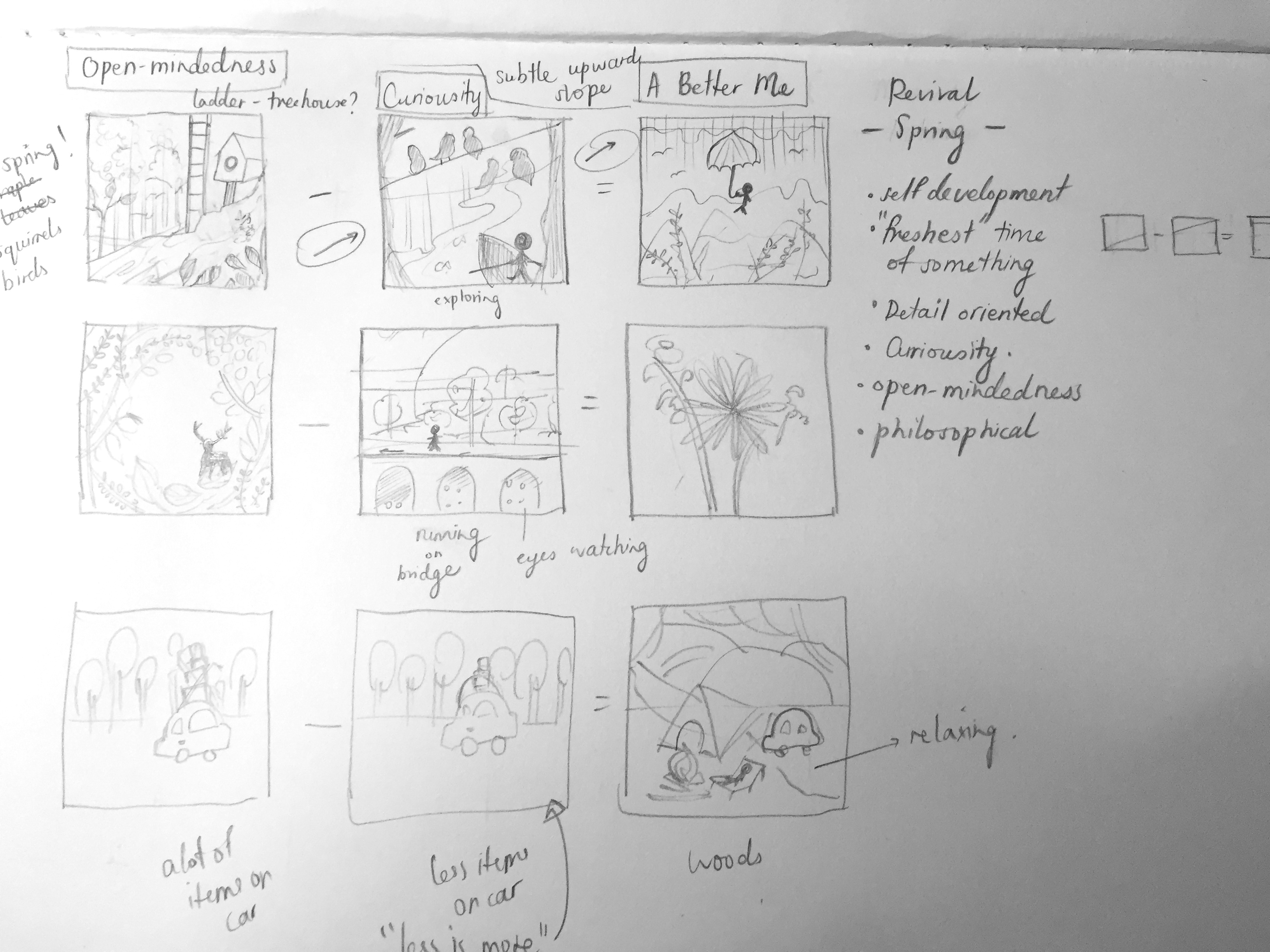
Open-minded –  In order to stay relevant in the design industry, it’s important to always be open minded and develop fresh ideas whenever possible, to set you apart from the rest. The ladder indicates that there are endless possibilities to ideas and you’ll just have to keep “climbing the ladder” to success.

Curiousity – We have to also instil curiosity into the things we do because it helps us move forward, gives us direction and leads us to new paths in life. “Curiosity is the wick in the candle of learning” – William Arthur Ward 

A better me – Being more open-minded and always having curiosity will help me fulfil my goals in life.

The graphics here are upwards sloping.

Screen Shot 2015-11-21 at 5.16.49 pmOSS-03

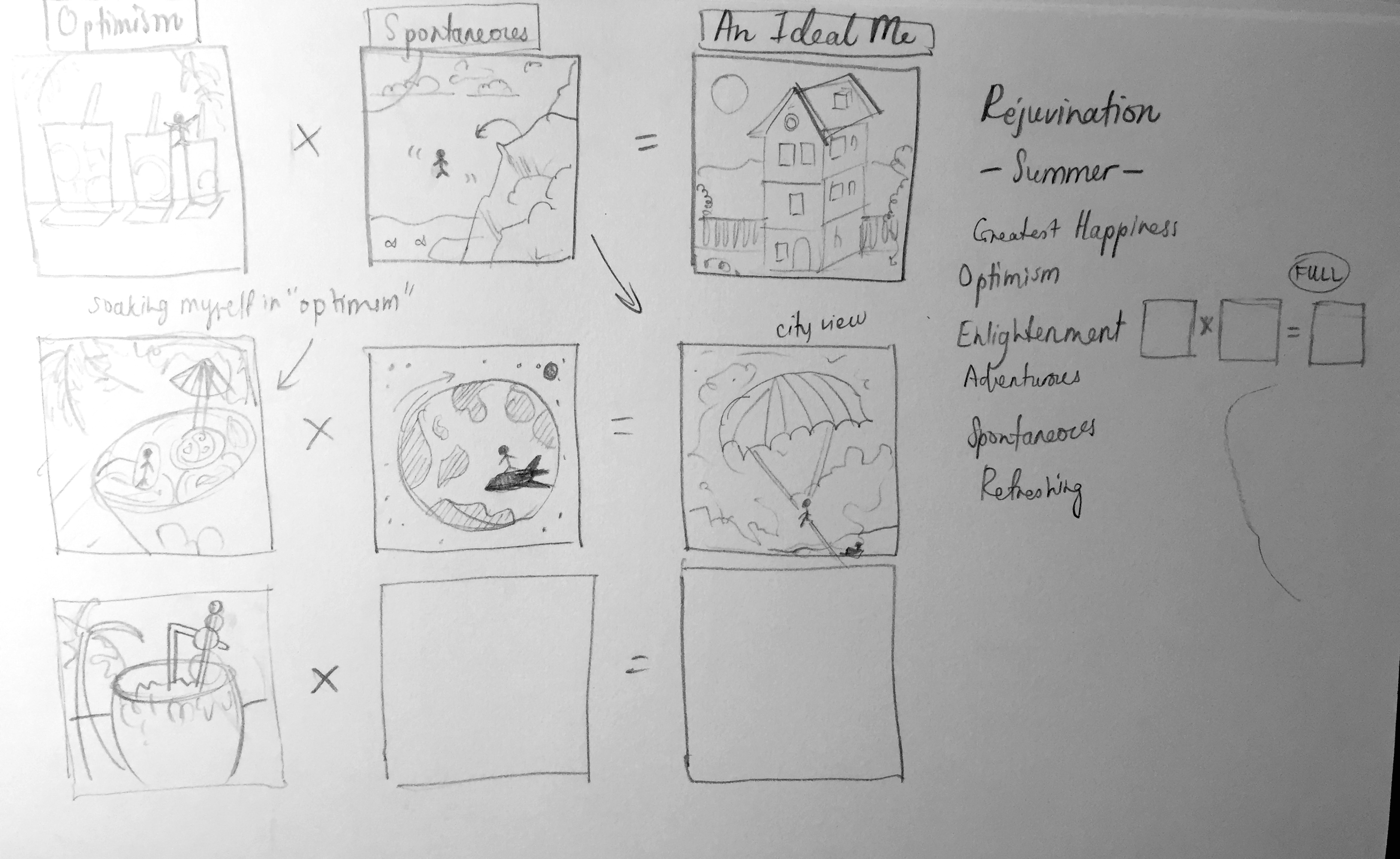
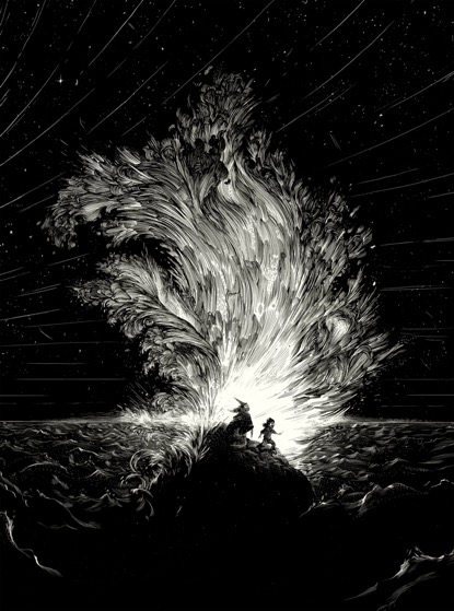
Optimistic – Even though I’m usually quite an optimistic person, I feel there I can instil more positivity in my life. This is me soaking in all the optimism that I need. Everyone needs a positive push; hope, confidence and faith that there are bright days ahead. 🙂 I have to remind myself that life is too short for worries.

Spontaneous – Things will not always go as planned in life. Being spontaneous and adaptable will definitely prepare myself for challenges ahead.

An ideal me – Taking life as it comes and adding more optimism and spontaneity to everyday situations will take me a step further to being a person that I want to be ideally. With that, I can achieve great things like my dream job in the UK and having houses all over the world! 🙂

Screen Shot 2015-11-21 at 5.26.23 pm OSS-04

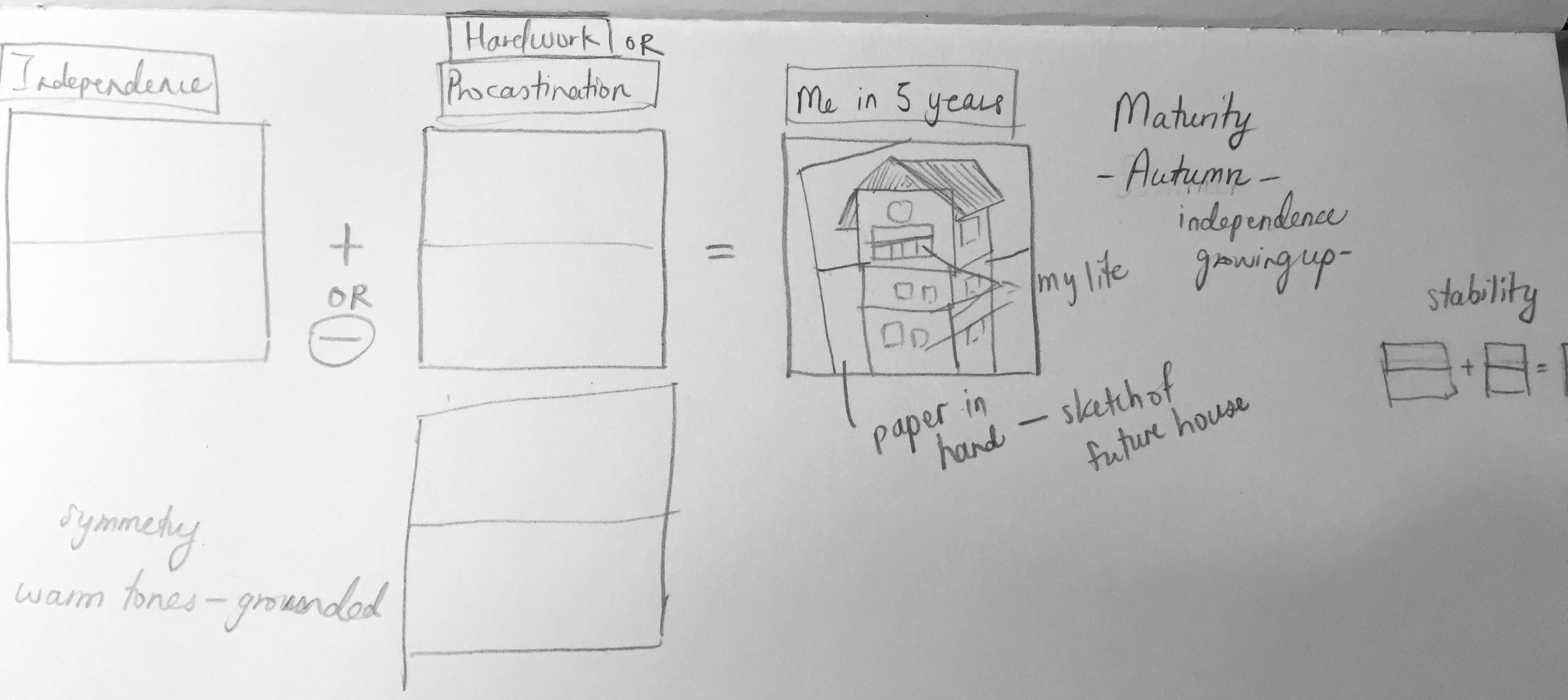
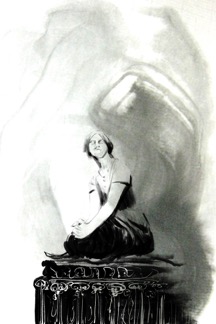
Independence – One day, I wish that I’ll be independent enough to not depend on others. Being entirely comfortable with myself and being alone, having only positive thoughts, setting big goals and constantly discovering things for self improvement is what I consider independence. My goal is to be able to buy a house by myself, to be capable enough to live on my own, with my own little studio space to draw and paint as an artist.

Hard work – Of course, it takes a lot of hard work to achieve great things in the real world. There will always be competition and new challenges that you have to face, while achieving your goals. Grades and a degree will get you to places but hard work and determination will keep you there. I strive to work hard to the best of my ability. The trick is to always have hope and never give up on your dreams. Seeking new opportunities and setting goals is necessary in creating the personal, professional and spiritual life that I want.

Me in 5 years (or more) – In 5 years or more, I hope that I would be at the epitome of success and happiness. A house is not a home without a family, people you love and care about. Home is a connection of family, safety, and is your own little sanctuary. One of my greatest goals in life is to start a family with the love of my life (haha), and to watch my children and grandchildren grow up happy. I may be a little too young to think of that now, but the first step to realising your vision is to define it. 🙂

The balanced elements in the compositions here suggest “grounded-ness” and maturity.

THOUGHTS ON PROJECT 3

Overall, this assignment was very personal to me, and I feel that it was a good way of getting to know yourself, as well as my classmates. I’m glad that we went through this project because this gets us thinking about what we really want in life and how we can get there. I feel that ADM has provided us with really great assignments thus far and I am learning a lot about myself as an artist too. 🙂
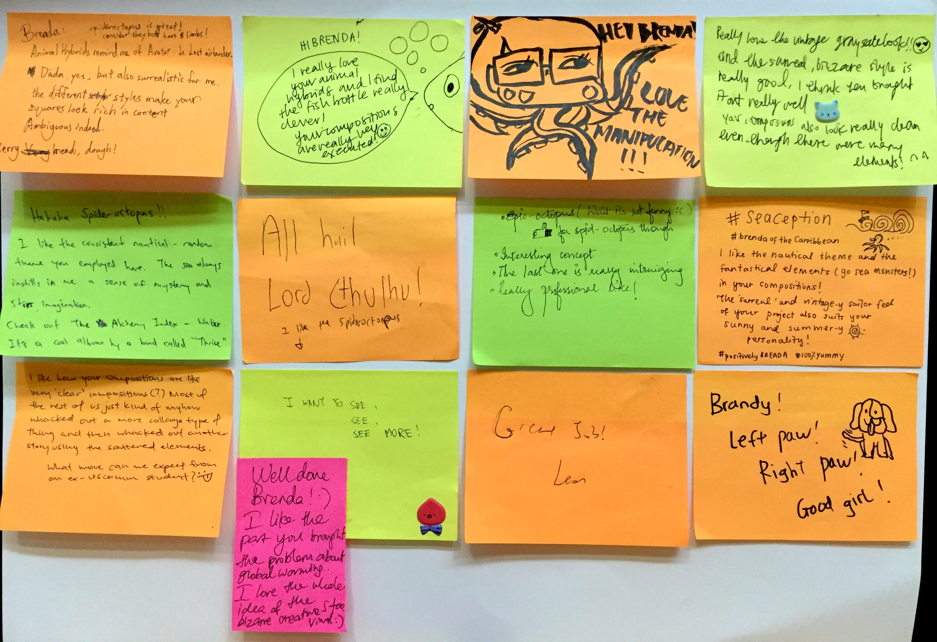
CLASSMATES THOUGHTS 

IMG_3947

– THE END – 

2D Project 3 – Ego (Research) Part II


Brainstorming

During the week, I came up with many ideas on how I could execute this very personal project. Firstly, I thought of how I could showcase and explain my many different personality traits, graphically. I brainstormed and these are some of the themes that came to me…

  • Seasons/ Months of the year (Jan to Dec)
  • Subjects – Plants (e.g. cactuses), fruits (e.g. fruit juice combinations), outfits, crystals and stones, maps, birds, flowers
  • Storytelling/ narrative (A girl on a journey)
  • Style – collage (e.g. Dada, surrealism)
  • A house and rooms (rooms and spaces can portray different traits/ time, before and after)
  • Tarot cards (Past, present, future readings, explaining the 1) current me 2) an ideal me 3) me in 5 years)
  • Mandalas (Symbolize my journey through life, colours represents different meanings, bad and good)
  • Health – Exercise, nutrition, benefits (items are drawn in an orderly format/ playing with balance and symmetry)

Final Concept

I picked the seasons/ months of the year as my final theme as I thought there was a lot of room to explore in terms of conceptualising, subject choice, colours and compositions. Joy helped me further develop my idea by adding on a good point on how different seasons can portray a particular mood or meaning. For instance, “summer” is a time of “blossoming” and rejuvenation. It is also a period associated with euphoria. Hence, traits such as optimism/ enlightenment/ adventure/ spontaneity can fall under “summer”.

I did a variety of sketches per personality trait and the the “seasons” they fall into. Will explain further in the final Ego post! I apologise for the untidy notes 🙁

Adding on, I found a website that helps you pick colours you need according to the various colour theories 🙂 Check it out here: http://colorschemedesigner.com/csd-3.5/

Screen Shot 2015-11-09 at 12.04.33 am

Joy also gave me a really helpful website that has all sorts of colour palettes according to themes, that can be uploaded by anyone. For example, if you key in “summer”, you’ll be able to select all sorts of palettes that people define as summer. https://color.adobe.com/explore/newest/

Screen Shot 2015-11-08 at 10.18.16 pm03cca03b8c7a2e3a25062edfa3219e7c

SPRING: Screen Shot 2015-11-08 at 10.20.55 pm

SUMMER:

Screen Shot 2015-11-08 at 10.19.15 pm

AUTUMN: Screen Shot 2015-11-08 at 10.20.05 pm

WINTER: Screen Shot 2015-11-08 at 10.20.25 pm

IMG_3717 IMG_3718 IMG_3719 IMG_3720 IMG_3722 IMG_3723 IMG_3724 IMG_3725


– WIP –

2D Project 3 – Ego (Research)

THOUGHTS ON CLASS ACTIVITY

For the first class activity, using materials given, we were tasked to mind-map a summary of our personality, traits and attributes of ourselves. Some attributes I’ve written down were that I am adventurous, open-minded, sociable, care-free, meticulous and philosophical (haha). Later on, we passed this piece of paper to our classmates and they would write something else that describes you/ add on to your work. My classmates wrote that I am pleasant, funny, nice, friendly, sweet, caring, I have nice vibes, I’m chill (NOT TRUE), good time management ^^, and that I had a lovely design style. I felt really touched to see all that! Thank you friends :’) Overall, I thought it was a really fun way to get to know yourself/ your peers more. I think that this exercise was rather personal too and it was nice to see the class expressing themselves openly.

The second class activity follows the same concept. However the question given to us was what our predictions were for the year 2020. Upon graduation, I would want to travel and start a career in the design industry (possibly in UK – I adore this company: Stranger & Stranger), save up for my future house and have strong relationships with my loved ones. Personally, I felt that I haven’t really thought much about my future and I have to definitely set more goals because 5 years is a short period of time! 🙁

Thirdly, we had to come up with some attributes that we would like to add (+), remove (-), and multiply (x) from ourselves. Some things I wrote initially were… (+) I want to be more positive and always think about the big picture. (-) Overthink/ worry less. (x) Be more enthusiastic with everything I do, strive for excellence. This is all I got so far but I’ll be brainstorming more for the next consultation. 🙂


5 COLOUR THEORIES

  1. Monochromatic Harmony – A monochromatic colour scheme uses a variety of lightness and saturation of a single colour harmoniously.

67b009b1e65a48666d9b732aa3cd4d73 da37fc766c294b0d72cd410d1bcdd418


Images from – aunatural.tumblr.com and http://design-seeds.com/home/entry/leaf-greens2

  1. Analogous Harmony – Analogous colours are located next to one another on the colour wheel. The colours green and blue are analogous. The colours are matching and are pleasing to the eye. When choosing an analogous colour scheme, one colour will dominate and the second colour supports it.

97c4d9c08397b5fb52f2686eb291d7d7

9124eba74fad1de1588ee9253ba66b60


Images from – saatchionline.com and colorpalettes.net

  1. Analogous Harmony Warm and Cool – Warm: Strong, energetic, bright colours. E.g. orange, red, yellow. Cool: Calming, soothing, mild, muted colours. E.g. blue, green, purple.

Analogous Harmony - Warm 2Analogous Harmony - Cool


Images from – amandapowellsellars.weebly.com and blog.lili.farm

  1. Complementary Hues – Complementary colours are opposite one another on the colour wheel. For example red and green. They are highly contrasting and vibrant. They are used to draw attention to something in particular.

Complementary Complementary 2


Images from – http://www.applearts.com/content/bicycle-morning-shadows and https://www.bloglovin.com/blogs/design-seeds-1753322/citrus-brights-4258012874

  1. Split Complementary – Split complementary colours uses two colours adjacent to its complementary base colour. The third colour to eases the eye despite the strong visual contrast.

Split complementary sPlit 


Images from – http://www.thejungalow.com/2012/08/elephantastic.html and https://500px.com/photo/32575387/steps-by-yiannis-pavlis


ARTIST REFERENCES (COLOUR + STYLE)

I found several illustrations with colour schemes and styles that I really like. Will be looking out for more! 🙂

Mimi Kim (Los Angeles, USA)

Mimi Kim

Mimi Kim (Los Angeles, USA)

Tobias Hall (London)

Tobias Hall (London)

Owen Davey

Owen Davey

Mar Hernandez (Spain)

Mar Hernandez (Spain) – Beer bottle label

Katerina Pytina (Russia)

Katerina Pytina (Russia)

b8e9ce6d6c0695dbfa84e24a9d202b35 (1)


2D Project 2 – Rhymes (Final)

INITIAL SONG CHOICE + CHALLENGES

Initially, I wanted to work on the Christmas songs, “Winter Wonderland” or “It’s beginning to look a lot like Christmas” as Christmas is my favourite holiday of the year and it has great significance to me as I celebrate it religiously every year. I truly enjoy the whole essence of Christmas as it brings my loved ones and I together after being away from one another through the year. Hence, my initial dingbats were based on a Christmas theme.

When we were told to change our chosen songs to rhymes, I couldn’t decide to work on either “Hickory, dickory, dock, a mouse went up the clock” or “The sailor went to sea”. I concluded that “The sailor went to sea” had more potential to play around with compositions and ideas. I think that I am a rather process driven, because most of the times I think of how I want the final outcome of the artwork to look like, what kind of style it will possess and how it flows. At the start, I intended to come up with something similar to retro nautical posters of the 1930s because the duotone effect could give the vintage feel. However, I thought that the overall style should be more of a collage, rather than a poster design. Furthermore, I felt that it was easier to create a sense of flow from the composition of collages of different stories combined.


RHYME CHOICE + CONCEPT

“The sailor went to sea, sea, sea, to see what he could see, see, see.”


was easy after doing several developmental sketches. Firstly, from a literal point of view, I came up with things that could easily represent a sailor and his life at sea (e.g. ship, coral reefs, marine life, binoculars etc., as seen in my sketches) Hence, concepts and topics like the titanic, global warming and pollution, the vastness of the sea, or a sailor and his story, came to my mind. This rhyme concentrates a lot on the word “SEE” too, so I thought that the concept could circle around this idea of what he sees on his journey. Also, after drafting out my compositions, I decided that I wanted the boat to be the key factor in connecting the four compositions together. The boat is small and simple and just in solid black to create emphasis to the contrast and vastness of the sea. The subtle placement of the ship in every piece will evoke curiosity as it’s supposed to be the main focus, yet it’s “hidden” amongst the other “happenings” in the sea.

USE OF DINGBATS

After studying Dadaism and surrealistic art, I’ve come to a conclusion that they are wacky and don’t make sense most of the times. So it was fun and exciting to come up with things that are unconventional and bizarre. I had to remind myself that the more unusual it looks, the more interesting it gets. Hence, it was rather easy to manipulate my classmates dingbats into my concepts.

COMPOSITIONS

After my discussion with Joy, she gave me some ideas of how I could make my work more intriguing. My compositions show the ship sailing the seas, (people would think that the sailor is in the ship, for the first two compositions), or could the sailor be outside of the ship? (the third and fourth compositions showed a pair of hands holding a bottle with the ship in it, were those the sailor’s hands and could he been watching it from outside it’s confinements?) I like how Dada and surrealistic art is ambiguous/ sometimes confusing and I played around with that concept through the 4 compositions. I wanted to keep it mysterious and leave the audience wanting to find out more.

2D Assignment 2 (1)

The first composition illustrates the ship in the midst of danger. A lunatic spider-octopus (SPI-DOCTOPUS) sea monster is about to devour a poor little helpless puny lamb. As if the spi-doctopus wasn’t scary enough, the huge waves and strong currents made it impossible for the ship to escape this chaos. Throughout my work, I explored with a lot of layering and textures in my work. Also to add to the surrealistic feel, I mixed several styles together for example, this composition has a mix of realism, vintage etching, cartoon, pop art, not forgetting the duo tone and posterize effect, all in one.


2D Assignment 2 (2) copy

Miraculously, the ship managed to escape the drama and was even in perfect condition! After sailing through calm waters for a day or two, the ship decides to take a rest. Beneath calm and serene waters, mutated sea creatures inhabited the polluted sea such as the BURTLE (BEAR-TURTLE) or T-EAR (lol). Untreated waste such as plastic bottles get dumped into the ocean and sea creatures can become snagged on the plastic or mistake it for food, slowly killing them over a long period of time. Also, is that the sailor underwater? Or is he just a random diver in a suit?

2D Assignment 2 (4)

The third composition shows a man holding a pair of binoculars, watching the ship as it sails the seas. Could this possibly be the sailor too? If so, who is he watching? Also, is he underwater?

2D Assignment 2 (3) copy

The final composition shows a hand holding a bottle, of which contains the ship sailing the stormy seas. Maybe the ship was actually in the bottle all along and entire scenario (first two compositions) were actually happening inside it? I made it more surrealistic and confusing by adding 2 suns, one in the bottle, and one outside in real life. I played with the concept of a message in the bottle here too. Maybe the ship is actually stuck in that horrifying world (in the bottle) and is in need of some serious help? Perhaps it is trying to SOS to the outside world?

2D Final


REFLECTIONS

Personal Thoughts

Overall, I really really enjoyed this project as it made me really think out of the box. Keeping it just black and white does have it’s limits too, so I knew that I needed to create interesting compositions to keep the focus on the subjects. This was elaborated using the different styles and textures as mentioned earlier. Though the use of our classmates dingbats makes it hard for us to visualize and work on the exact compositions we want, it actually trains us to “make do with what we have” and surprise ourselves with the unconventional art we can create from it. I’m glad I went through this exercise as it widens my perspectives of visual art.

Tutor’s Thoughts

Joy liked the use of consistent elements (circles, circular shapes, wave “shape”) as it indicates movement. The theme “bizaare” was used intelligently as well. She liked the use of different digital styles and the execution. She also thought that I accentuated the “dream-like” state of surrealism.

Classmates’ Thoughts

IMG_3333

OLD DINGBATS + NEW DINGBATS IN SEPARATE POSTS 🙂

2D Project 2: Updates

“A sailor went to sea, sea, sea, To see what he could see, see, see”

My concept is based on “what the sailor sees” on his journey to sea. With a nautical theme in mind, I drafted out many compositions, playing with scale a lot to show different perspectives of the ocean/ how big the sea is. I’ve tried incorporating optical illusions in some of the compositions too.

I used the same ship in every composition to show a sense of flow in story. The subtle placement of the ship in every piece will evoke curiosity as it’s supposed to be the main focus, yet it’s “hidden” amongst other things. The first composition features a gigantic octopus + spider, which represents the sailor’s greatest fear – SPIDERS. The second composition reflects the effects of global warming and pollution e.g. mutated sea creatures. The final composition shows a hand holding a bottle, with the ship in it. This adds to the ambiguity of the work as the audience will be curious to find out if the sailor is on the ship or actually outside of it.

After studying dadaism and surrealistic art, I’ve come to a conclusion that they are wacky and don’t make sense most of the times. I guess that’s the beauty of it! I was excited to work on this because I’ve always been keen in this art movement as it gives us a sense of freedom to express our ideas.

Initial Sketches

IMG_3310IMG_3311

Compositions

2D Assignment 2 (1)

Sailor’s greatest fear; spiders

2D Assignment 2 (2)

Effects of pollution; mutated sea creatures

2D Assignment 2 (3)

Is the sailor in the ship or is he outside of it?

WORK IN PROGRESS…

2D Project 1 – Lines (Final)

I chose each particular medium based on emotion or aesthetics (whether it looks good/ compliments one another well). For example, I interpreted “fragile” as delicate and gentle. Hence, my medium choice was pigment pen in 0.03mm, the finest point, because it creates the rigidity that I need, at the same time, giving you a gentle effect. As for “exhausted”, I interpreted it as weak and tired. My medium choices were HB and 2B pencils because the softness of this medium can be controlled easily, giving you a variety of tones to portray “weakness”. I also grouped the emotions according to the level of control I had over the mediums chosen. The emotions represented by the pigment pens needed the most amount of control, as I needed to draw more “harsh lines”. For example, “turbulent” was an emotion that required depth and controlled spontaneity, hence, I used pigment pens to show a light to dark gradation.

This project was a rather fun one as I enjoy drawing and painting. Certain emotions were challenging to evoke as they were hard to convey through simply drawing lines. However, what I learnt about this project was that a lot of patience is needed to create good art that speaks to the audience. I also tried my best to put my feelings and emotions into the drawings in the process of experimenting.

OLYMPUS DIGITAL CAMERA

OLYMPUS DIGITAL CAMERA

2D Assignment 1 – Lines (Research)

Week 1

We were introduced this assignment in the first week and were tasked to express the emotions given through drawing lines, making marks, creating textures etc. My work was very much focused on the process of evoking these emotions. I tried to incorporate my feelings into drawing the lines. I played around with a lot of thick and thin lines, tonal values, contrast in scale of shapes, and intensity of shading according to the “level” of intensity of the particular emotion. 

IMG_3220

IMG_3221


Week 2

At the start of week 2, I researched more into artists whom uses the same technique based approach to create lines. I drew inspiration from some of the artists we’ve researched upon and others such as Neco Delort, an illustrator based in France. His work expresses deep emotions and I felt that it was very inspiring. He focuses a lot on textures and dynamic patterns. I was particularly drawn to harsh, bold and dark lines as they came off as more “confident” and expressive. We also had the chance to experiment with mono-printing in class and I really liked how subtle and sensual the “blurry” prints came out to be. This could portray anxious and “uncertainty” well.

IMG_2699

IMG_2700

IMG_2701


Week 3 & 4

In week 3, I did more in-depth research of artists and their style and techniques. I’ve decided that my concept would be to focus on a medium centric approach which is more process, rather than concept driven. The particular mediums that I focused on are pen, chinese ink, charcoal, graphites and collages. Despite my concept being on exploring mediums and techniques, I also tried to get inspiration from music and book quotes/ references. I feel that music is a good medium of expression and could be key to developing a greater sense of depth in my work.

Nico Delort is one good example of an artist that gets inspired through sentences of books and music. His work “Winterreuse” is nonetheless one of Schubert’s most famous and acclaimed song titles. It features dark and deary, haunting melodies.

Other examples of Nico Delort and his work…

1) A rumour of angels” based on the book by Dale Bailey.

“I sometimes have a hard time describing with words what a story makes me feel —which I guess is why I became an illustrator— so I’m just going to say what really struck me here was the heavy, raw and burnt out atmosphere. Images of harsh light, scorching heat and swirling dust came to me as I was reading it and that’s what I wanted to transcribe in this piece.”Picture1


2) The Cave

Harry could smell salt and hear rushing waves; a light chilly breeze ruffled his hair as he looked out at moonlit sea and star-strewn sky.”

Picture2


Medium wise, Nico experiments with Faber Castell pigment pens and scratch tools to create defined and intricate marks on his canvas and artwork. I’ve also watched some of his process viedos and I noticed that he etches over black ink and that looked similar to white ink drawn on black. I would like ti experiment on this!

I’ve also found other Charcoal artists such as Judith Ann Braun, Adeline Chong and Wenjing Zhu inspiring. Judith uses 4 basic rules in her work; Symmetry, Abstraction, keeping her work square, and carbon medium. The similarity I found in their work is that they are all process driven. Adeline creates line and form through feeling and reaction from each stroke. Wenjing believes that by reducing details, lines speaks their language and stands out by their own; the minimal attempt enlarges viewers’ imaginary space.

Picture3 Picture4 Picture5


Here are my experimental works… I used tools such as bubble wrap, twigs, plastic bags, toilet scrubs/ sponges etc. and many random things.

Experimenting…

IMG_2654

11925847_1914658462093693_1393724315_n

IMG_3213

IMG_3214

IMG_3215

IMG_3216

Further brainstorming…

IMG_3211

IMG_3212

IMG_3217 IMG_3218

Rhymes (Research) – Explorations

Hello!

I couldn’t decide between 2 nursery rhymes and I didn’t want to limit myself to one, so I decided to work both, Hickory, Dickory, Dock and A sailor went to sea. I’ll choose either one to work on after this. 🙂

1)

Hickory, dickory, dock.

The mouse ran up the clock.

The clock struck one,

The mouse ran down,

Hickory, dickory, dock.

For this rhyme, I wanted to focus on the second sentence “The mouse ran up the clock”. I immediately thought of using the Big Ben as it is an iconic clock and it would be interesting to see a gigantic mouse climbing up the clock. I also decided to change the mouse to a hamster because I am afraid of mice and I wouldn’t want to be looking at one whilst working on the project. Lol. As I was playing around with the graphics, the scene where King Kong on top of the Empire State Building came to my mind, so I decided to create a similar scenario with aeroplanes in the sky. I feel that I can explore more with this idea, maybe making everything a little more dramatic. I could add some laser eyes to the hamster to make it ferocious because it looks a bit too cute now.

Screen shot 2015-09-30 at PM 09.45.05Screen shot 2015-09-30 at PM 09.44.04


Hickory1

Hickory2


2)

A sailor went to sea, sea, sea

To see what he could see, see, see

But all that he could see, see, see

Was the bottom of the deep blue sea, sea, sea.

I thought this rhyme had a lot of potential and many ideas came to me while I was brainstorming. Firstly, the duotone effect gave everything a vintage feel and I think that it would be great if I could incorporate this style to my work. For the final work, I would like to do something similar to a vintage nautical poster (not sure if I’m allowed to), and I’ll continue exploring on that. This rhyme concentrates a lot on the word “SEE” therefore I chose an image of a sailor that has cross-eyes to add a little bit of humor to it. I also really like the idea of a message in a bottle, so I explored that idea too.

Sea1 Sea2


At this stage, I’m not sure which rhyme to pick, but I think I’m leaning towards A sailor went to sea!