2D Project 3 – Ego (Research) Part II


Brainstorming

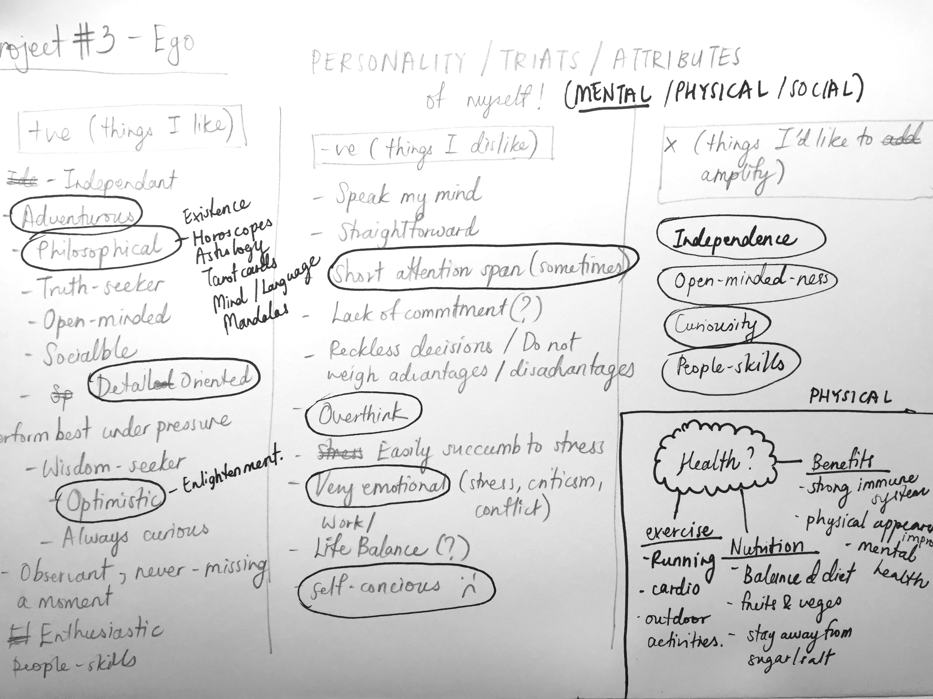
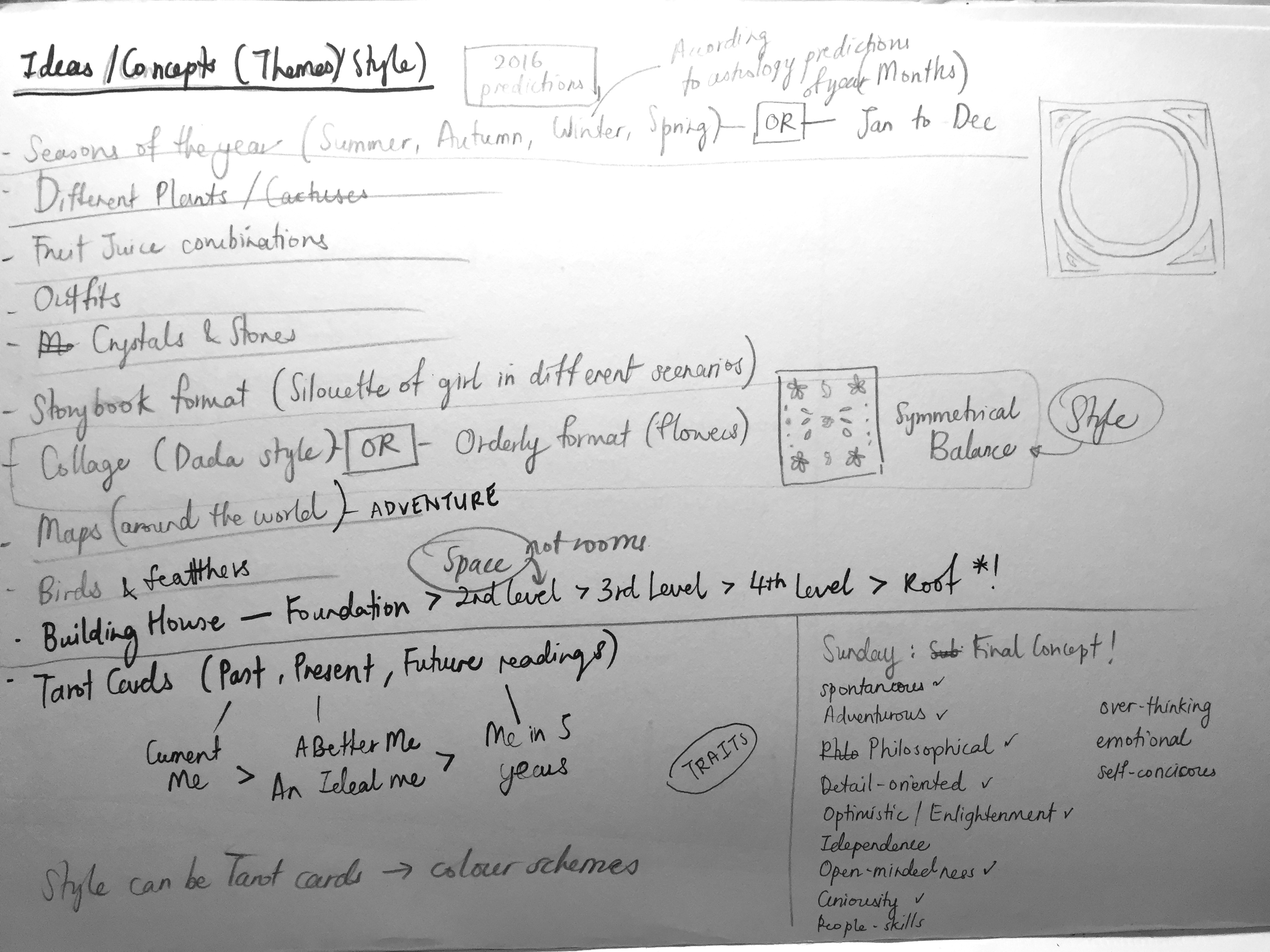
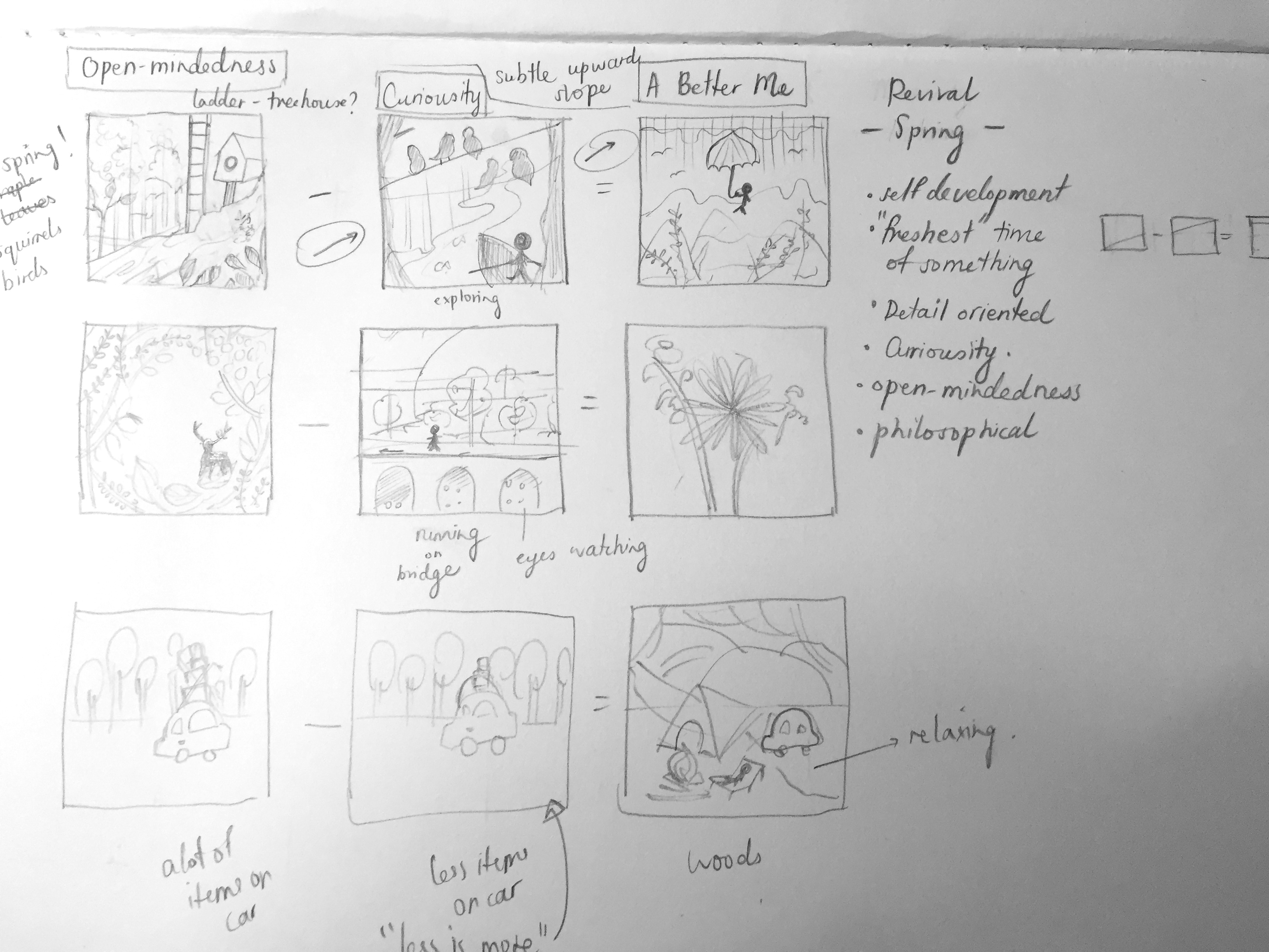
During the week, I came up with many ideas on how I could execute this very personal project. Firstly, I thought of how I could showcase and explain my many different personality traits, graphically. I brainstormed and these are some of the themes that came to me…

  • Seasons/ Months of the year (Jan to Dec)
  • Subjects – Plants (e.g. cactuses), fruits (e.g. fruit juice combinations), outfits, crystals and stones, maps, birds, flowers
  • Storytelling/ narrative (A girl on a journey)
  • Style – collage (e.g. Dada, surrealism)
  • A house and rooms (rooms and spaces can portray different traits/ time, before and after)
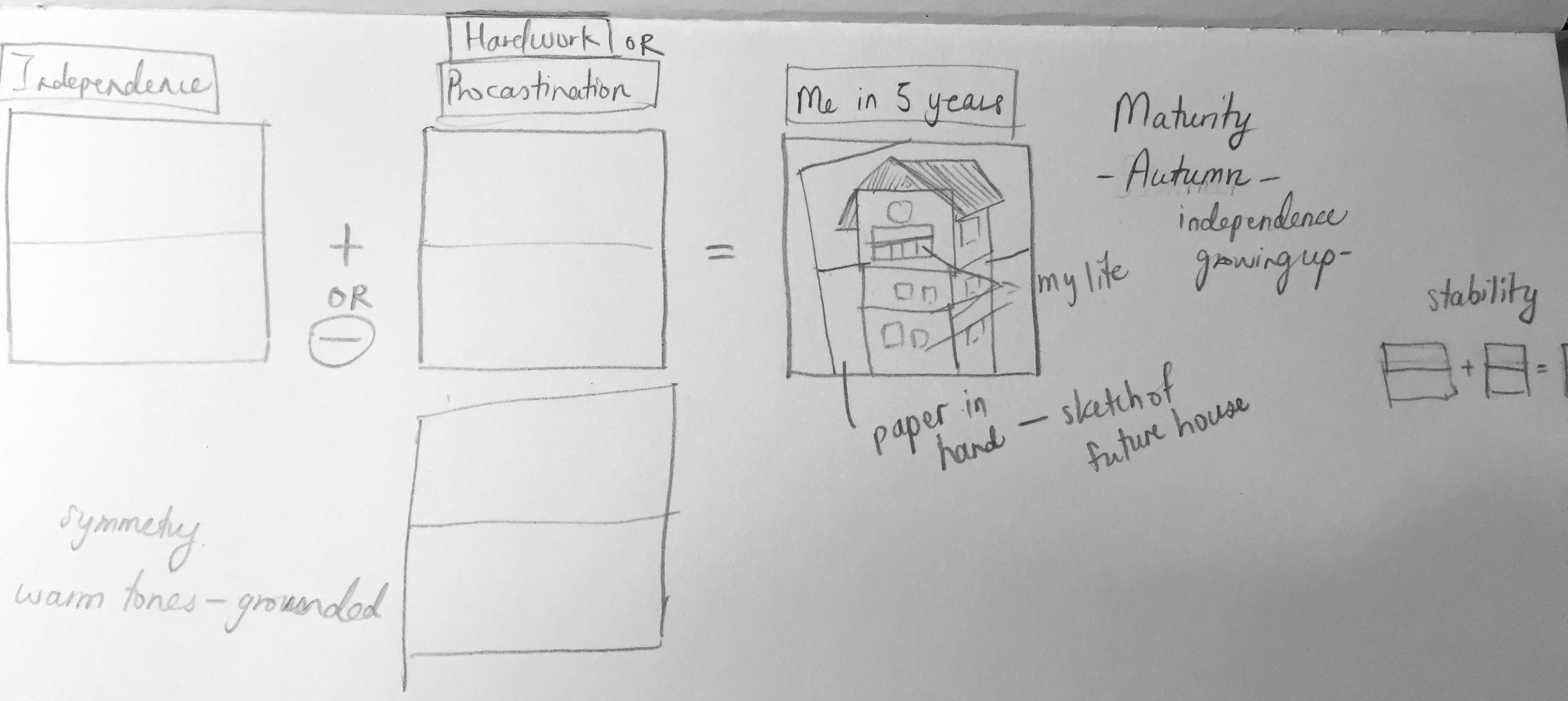
  • Tarot cards (Past, present, future readings, explaining the 1) current me 2) an ideal me 3) me in 5 years)
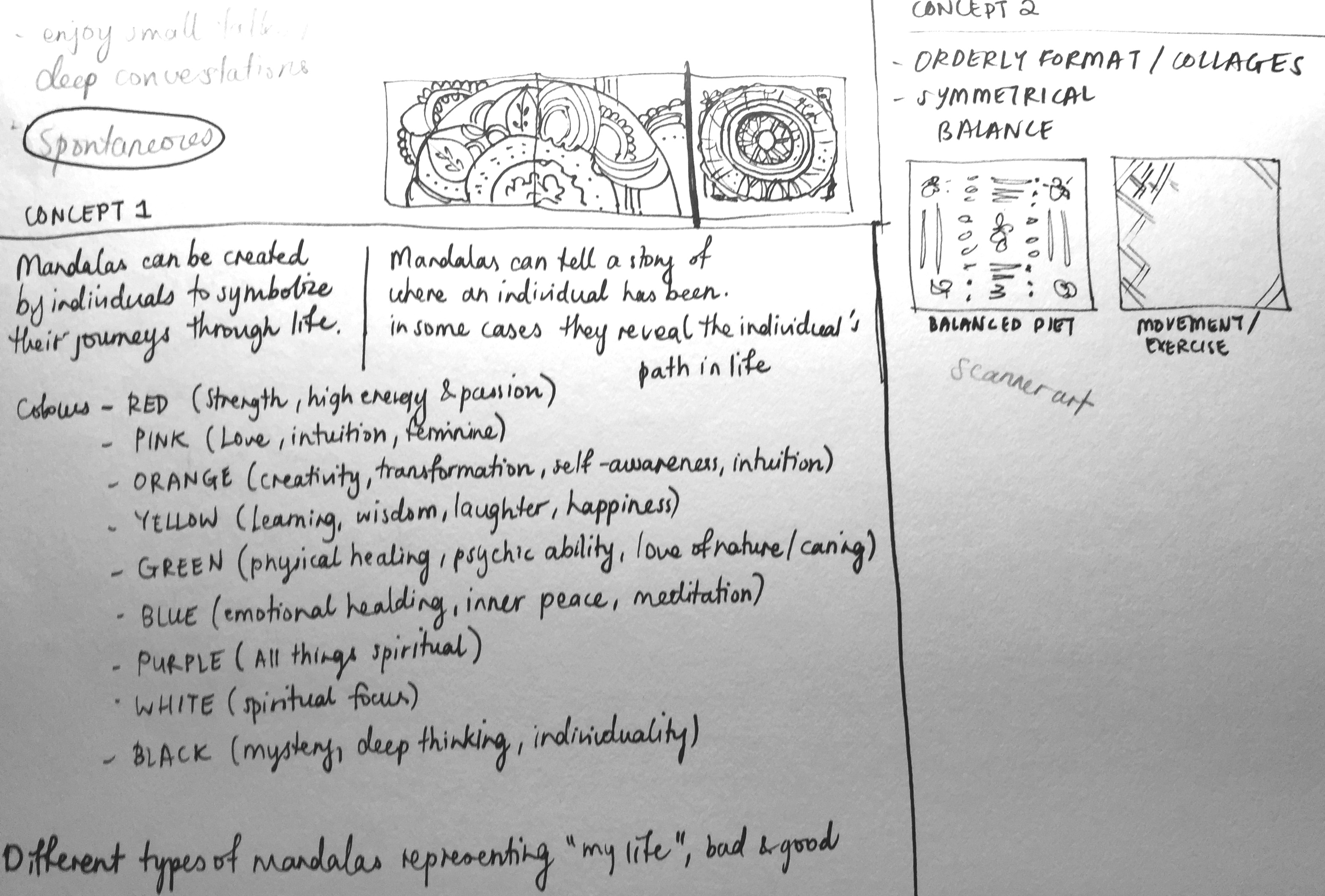
  • Mandalas (Symbolize my journey through life, colours represents different meanings, bad and good)
  • Health – Exercise, nutrition, benefits (items are drawn in an orderly format/ playing with balance and symmetry)

Final Concept

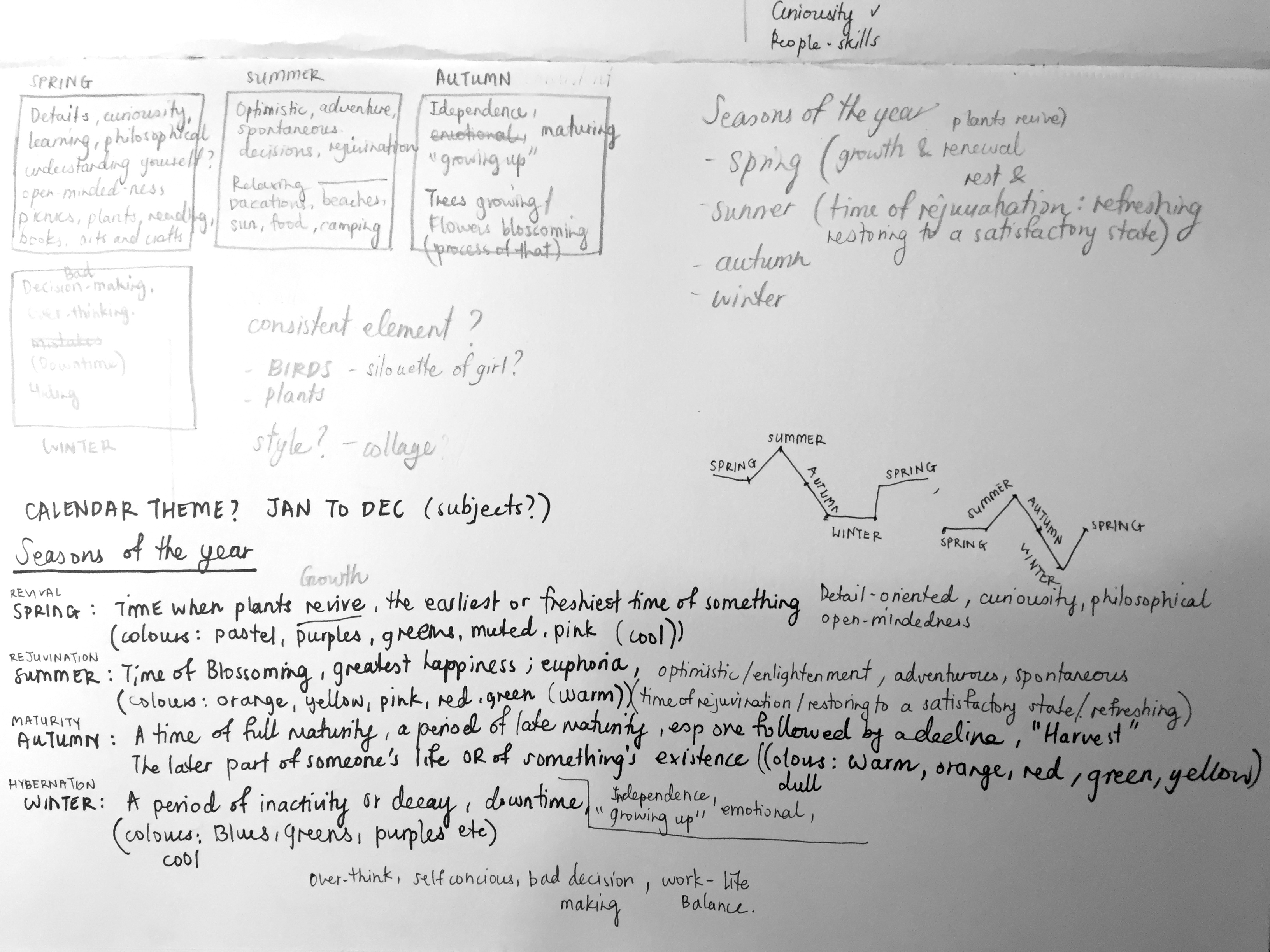
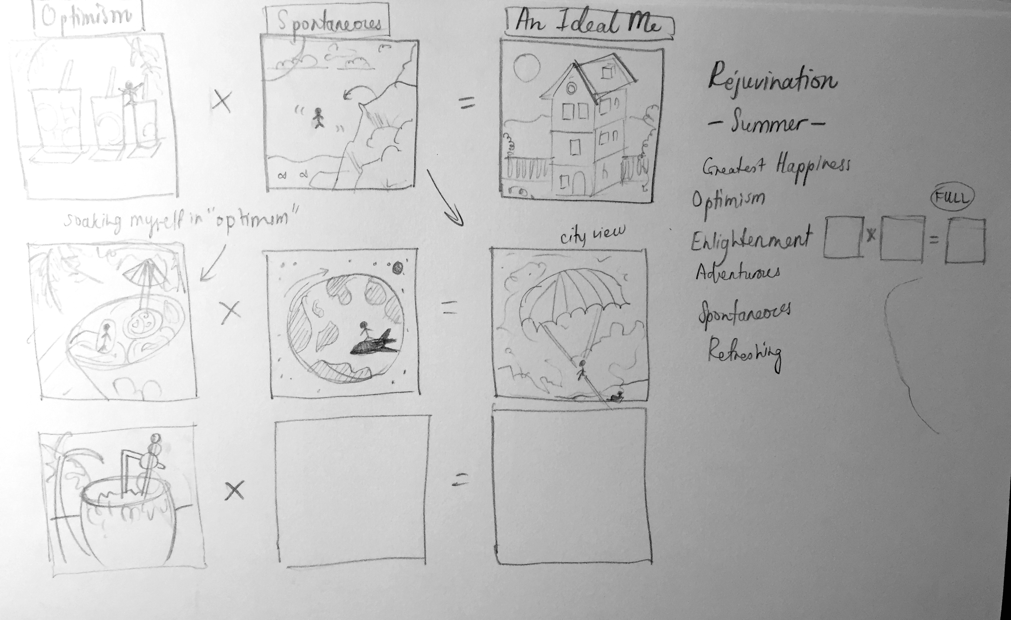
I picked the seasons/ months of the year as my final theme as I thought there was a lot of room to explore in terms of conceptualising, subject choice, colours and compositions. Joy helped me further develop my idea by adding on a good point on how different seasons can portray a particular mood or meaning. For instance, “summer” is a time of “blossoming” and rejuvenation. It is also a period associated with euphoria. Hence, traits such as optimism/ enlightenment/ adventure/ spontaneity can fall under “summer”.

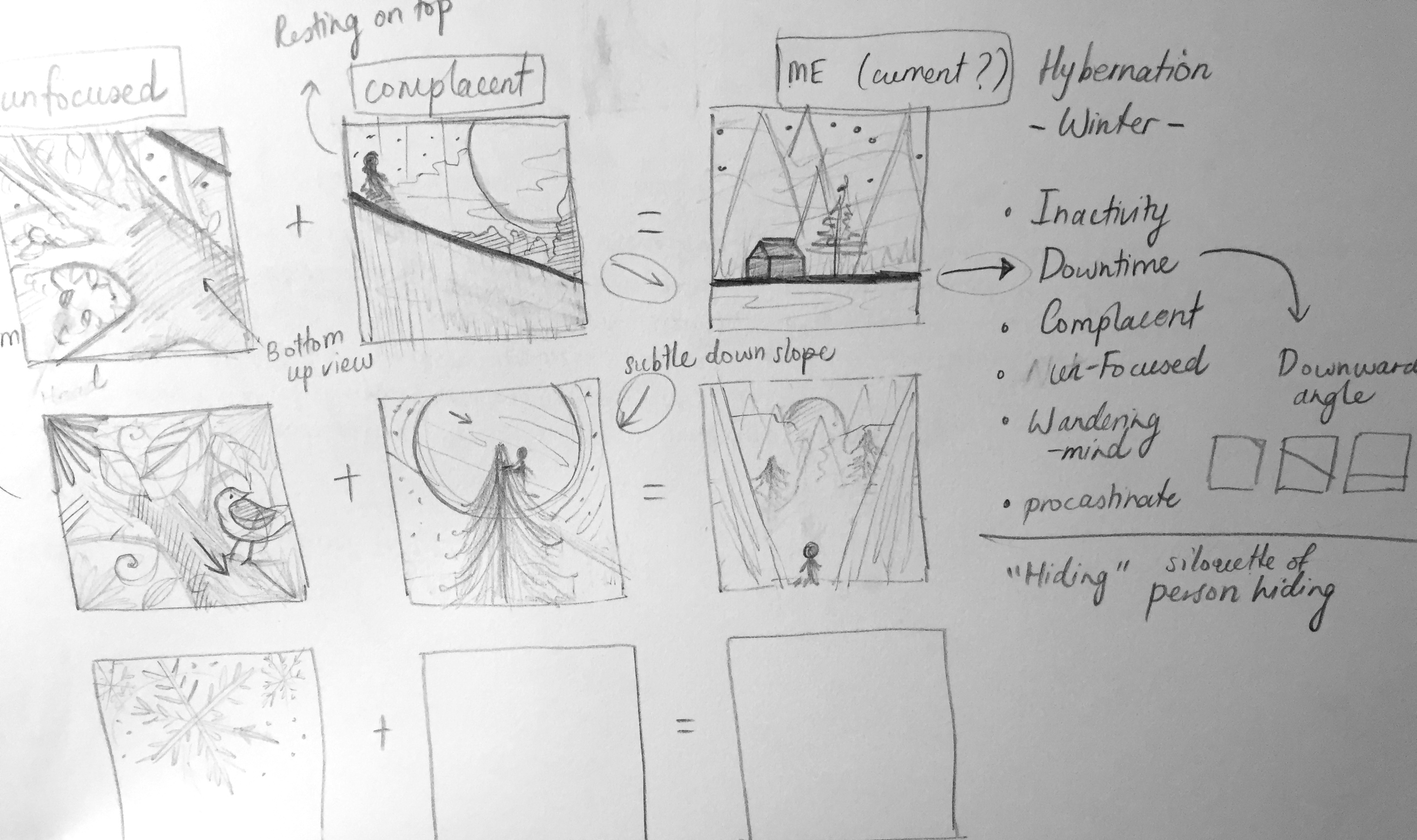
I did a variety of sketches per personality trait and the the “seasons” they fall into. Will explain further in the final Ego post! I apologise for the untidy notes 🙁

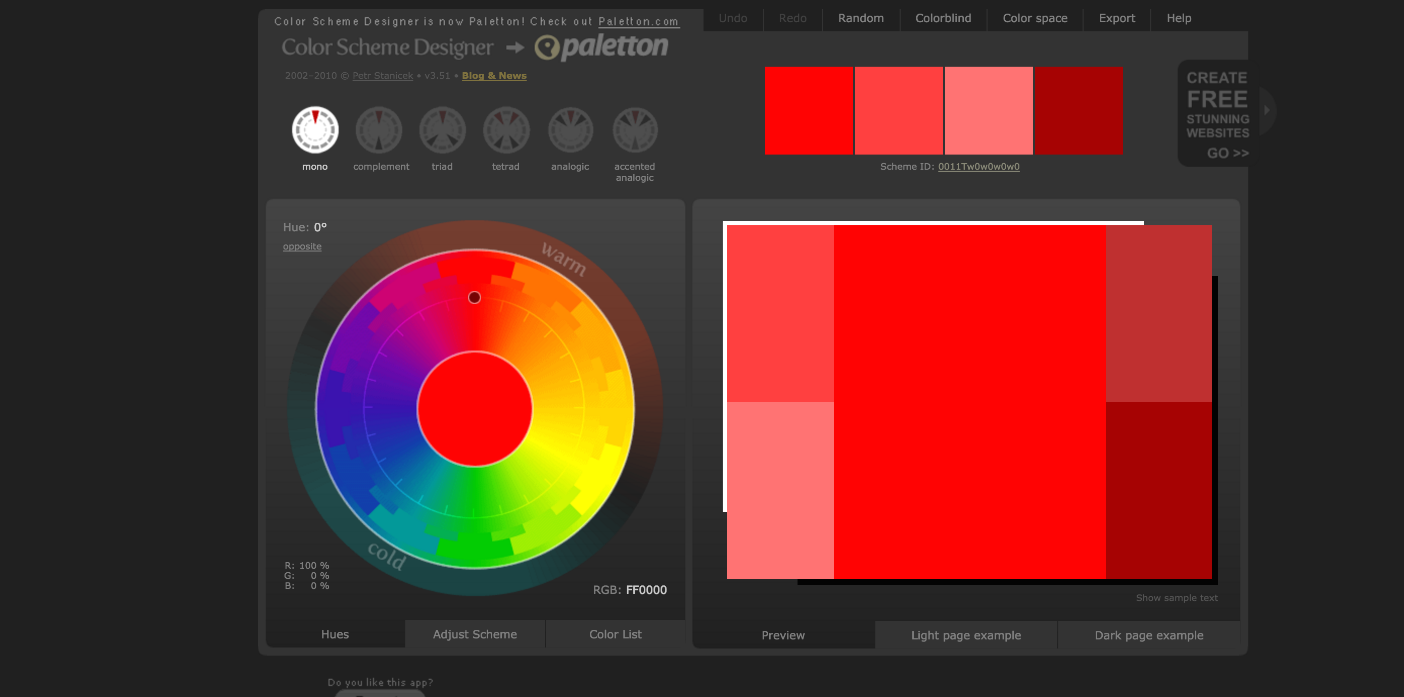
Adding on, I found a website that helps you pick colours you need according to the various colour theories 🙂 Check it out here: http://colorschemedesigner.com/csd-3.5/

Screen Shot 2015-11-09 at 12.04.33 am

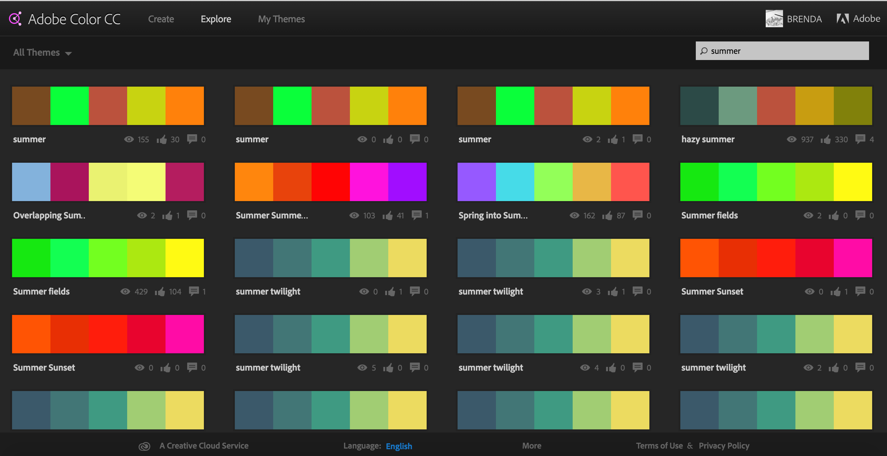
Joy also gave me a really helpful website that has all sorts of colour palettes according to themes, that can be uploaded by anyone. For example, if you key in “summer”, you’ll be able to select all sorts of palettes that people define as summer. https://color.adobe.com/explore/newest/

Screen Shot 2015-11-08 at 10.18.16 pm03cca03b8c7a2e3a25062edfa3219e7c

SPRING: Screen Shot 2015-11-08 at 10.20.55 pm

SUMMER:

Screen Shot 2015-11-08 at 10.19.15 pm

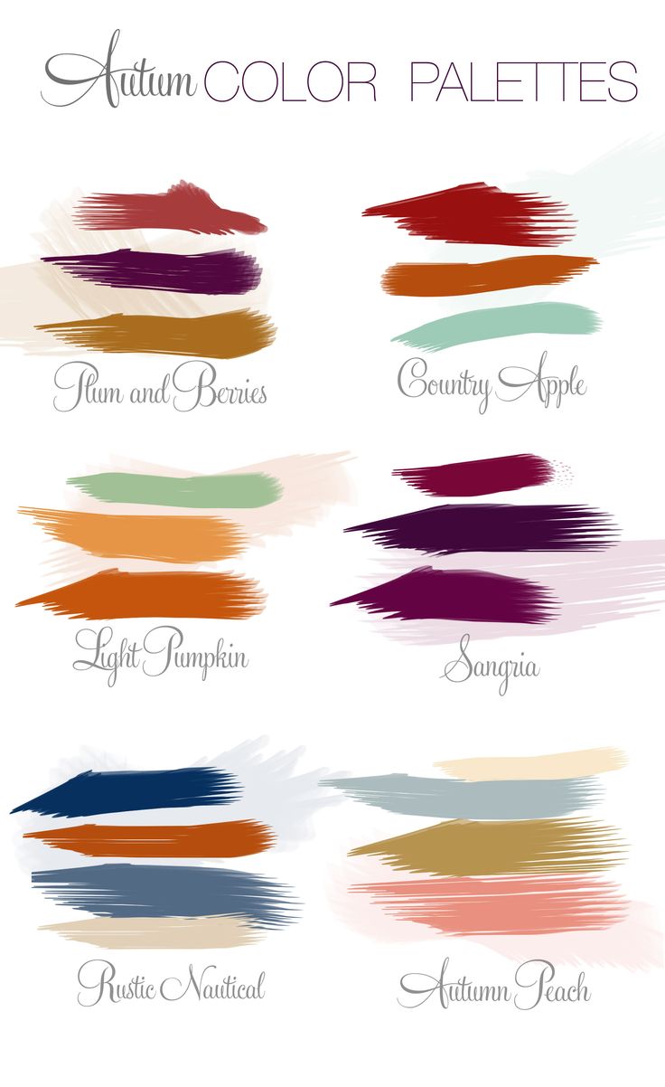
AUTUMN: Screen Shot 2015-11-08 at 10.20.05 pm

WINTER: Screen Shot 2015-11-08 at 10.20.25 pm

IMG_3717 IMG_3718 IMG_3719 IMG_3720 IMG_3722 IMG_3723 IMG_3724 IMG_3725


– WIP –
2D Project 3 – Ego (Research)

THOUGHTS ON CLASS ACTIVITY

For the first class activity, using materials given, we were tasked to mind-map a summary of our personality, traits and attributes of ourselves. Some attributes I’ve written down were that I am adventurous, open-minded, sociable, care-free, meticulous and philosophical (haha). Later on, we passed this piece of paper to our classmates and they would write something else that describes you/ add on to your work. My classmates wrote that I am pleasant, funny, nice, friendly, sweet, caring, I have nice vibes, I’m chill (NOT TRUE), good time management ^^, and that I had a lovely design style. I felt really touched to see all that! Thank you friends :’) Overall, I thought it was a really fun way to get to know yourself/ your peers more. I think that this exercise was rather personal too and it was nice to see the class expressing themselves openly.

The second class activity follows the same concept. However the question given to us was what our predictions were for the year 2020. Upon graduation, I would want to travel and start a career in the design industry (possibly in UK – I adore this company: Stranger & Stranger), save up for my future house and have strong relationships with my loved ones. Personally, I felt that I haven’t really thought much about my future and I have to definitely set more goals because 5 years is a short period of time! 🙁

Thirdly, we had to come up with some attributes that we would like to add (+), remove (-), and multiply (x) from ourselves. Some things I wrote initially were… (+) I want to be more positive and always think about the big picture. (-) Overthink/ worry less. (x) Be more enthusiastic with everything I do, strive for excellence. This is all I got so far but I’ll be brainstorming more for the next consultation. 🙂


5 COLOUR THEORIES

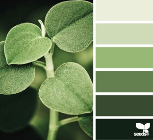
  1. Monochromatic Harmony – A monochromatic colour scheme uses a variety of lightness and saturation of a single colour harmoniously.

67b009b1e65a48666d9b732aa3cd4d73 da37fc766c294b0d72cd410d1bcdd418


Images from – aunatural.tumblr.com and http://design-seeds.com/home/entry/leaf-greens2

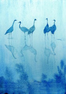
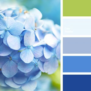
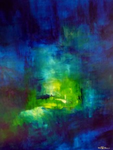
  1. Analogous Harmony – Analogous colours are located next to one another on the colour wheel. The colours green and blue are analogous. The colours are matching and are pleasing to the eye. When choosing an analogous colour scheme, one colour will dominate and the second colour supports it.

97c4d9c08397b5fb52f2686eb291d7d7

9124eba74fad1de1588ee9253ba66b60


Images from – saatchionline.com and colorpalettes.net

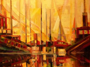
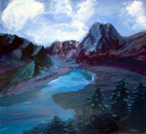
  1. Analogous Harmony Warm and Cool – Warm: Strong, energetic, bright colours. E.g. orange, red, yellow. Cool: Calming, soothing, mild, muted colours. E.g. blue, green, purple.

Analogous Harmony - Warm 2Analogous Harmony - Cool


Images from – amandapowellsellars.weebly.com and blog.lili.farm

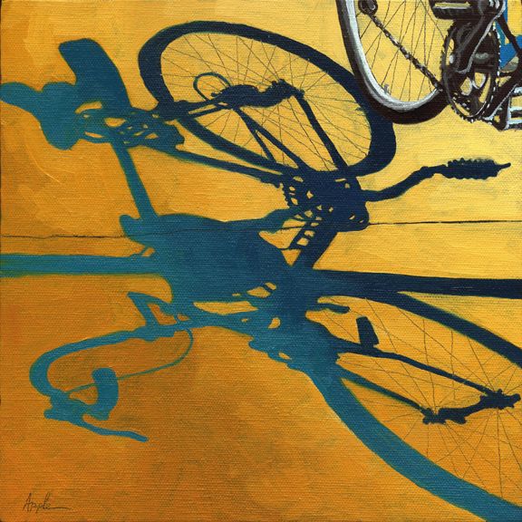
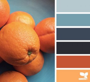
  1. Complementary Hues – Complementary colours are opposite one another on the colour wheel. For example red and green. They are highly contrasting and vibrant. They are used to draw attention to something in particular.

Complementary Complementary 2


Images from – http://www.applearts.com/content/bicycle-morning-shadows and https://www.bloglovin.com/blogs/design-seeds-1753322/citrus-brights-4258012874

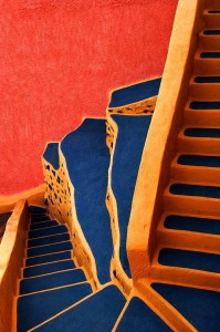
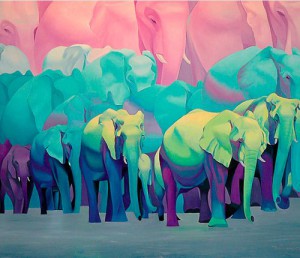
  1. Split Complementary – Split complementary colours uses two colours adjacent to its complementary base colour. The third colour to eases the eye despite the strong visual contrast.

Split complementary sPlit 


Images from – http://www.thejungalow.com/2012/08/elephantastic.html and https://500px.com/photo/32575387/steps-by-yiannis-pavlis


ARTIST REFERENCES (COLOUR + STYLE)

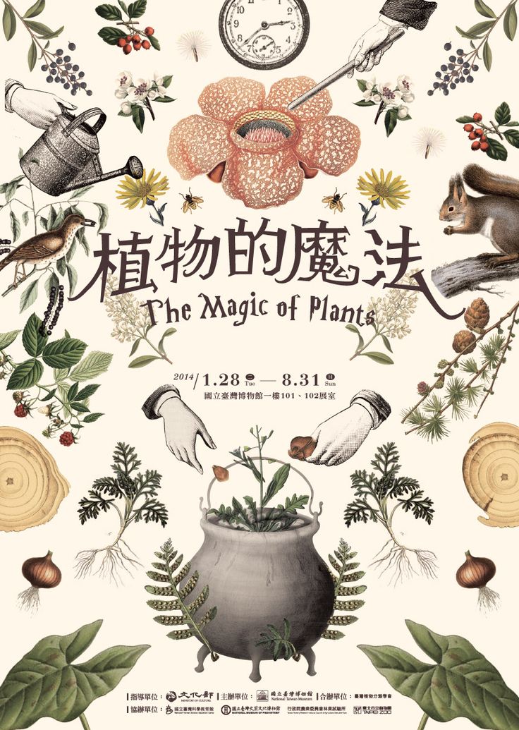
I found several illustrations with colour schemes and styles that I really like. Will be looking out for more! 🙂

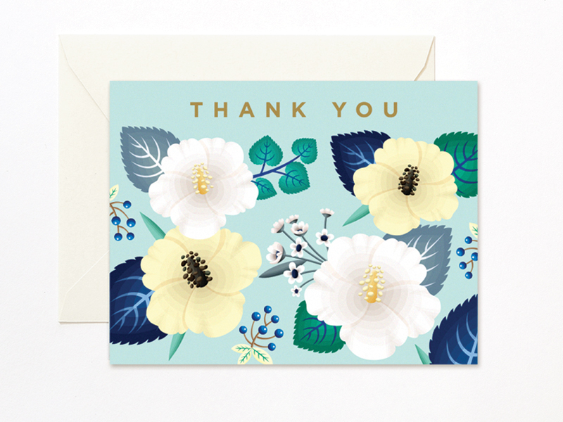
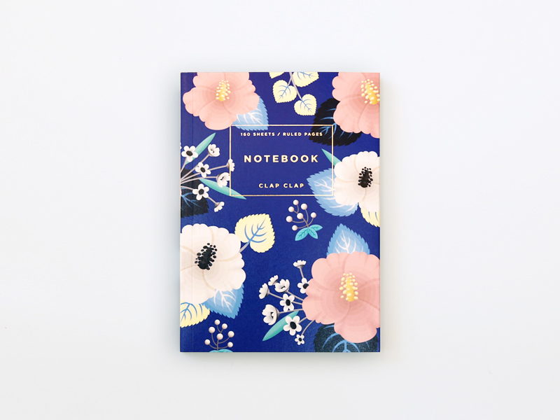
Mimi Kim (Los Angeles, USA)

Mimi Kim

Mimi Kim (Los Angeles, USA)

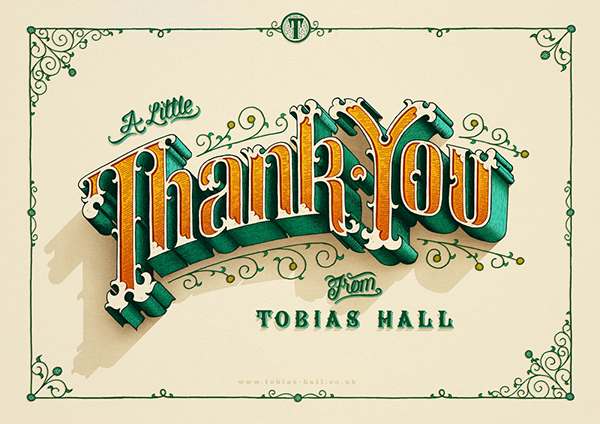
Tobias Hall (London)

Tobias Hall (London)

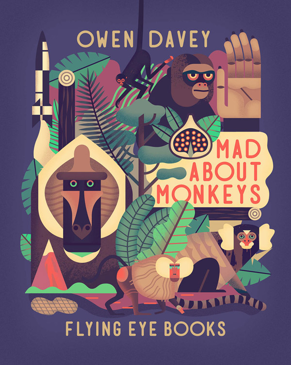
Owen Davey

Owen Davey

Mar Hernandez (Spain)

Mar Hernandez (Spain) – Beer bottle label

Katerina Pytina (Russia)

Katerina Pytina (Russia)

b8e9ce6d6c0695dbfa84e24a9d202b35 (1)