2D ZINE (Final) – Part II

Continued from the previous post…

Here’s my final work, printed and bound 🙂

ZINE 1ZINE 1.2 ZINE 2 ZINE 3 ZINE 4 ZINE 5 ZINE 6 ZINE 7 ZINE 10 ZINE 8ZINE 9ZINE 11 ZINE 12 ZINE 13

THE END


I would like to thank Joy, for being such a caring, encouraging and wonderful tutor for Foundation 2D, it was such a JOY being in your class. 🙂 You encouraged and pushed each and everyone of us to create works that were out of our comfort zone, yet you recognise our strong qualities and bring out the best in us. Thank you for all the food you’ve given us, knowing that we’ll get hungry during long crit sessions/ classes :’) Most importantly, thank you for all the great and useful advise/ learning lessons that we can carry along with us through the next few years of ADM and in the future. We are very blessed to have a tutor like you. Stay amazing!

2D ZINE (Final) – Part I

Hi everyone! Congrats on completing 2D! Despite this being the last project for this module, I’m definitely still looking forward to the works produced by this class for the next 3 years.

When we first got this brief, I was excited to start on it because I’ve always wanted to create a book with a collection of my designs and illustrations. Adding on, I love exploring new creative techniques of paper crafts and binding methods. I feel that it’s essential as a graphic design student to know the basics of printing, choosing the right paper, and ways you can further enhance your digital work.

Initial Ideas/ Experiments

I had quite a lot of inspiration for this project because we could make use our previous work (#yay) and I already had ideas to develop some of my projects further. I chose to do a continuation of previous project (Point of View) because it was my favourite out of all my 2D works. I had a lot of fun and it didn’t seem like a chore despite spending countless hours vectoring little houses/ sheep/ plants etc 😛

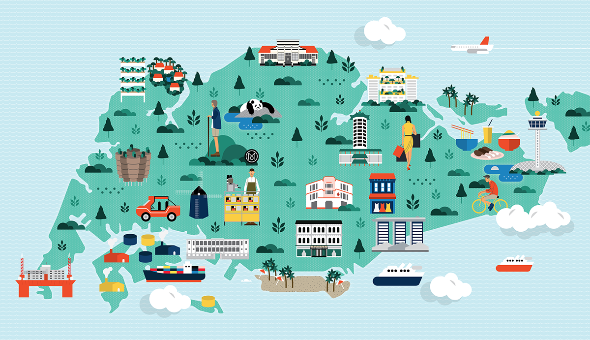
Initially, I had some ideas such as creating a set of accordion post-cards, with perforation, so that people can tear them out for fun. With this idea in mind, I thought it’ll be great if I could “connect” all the “locations” together, in a continuous format emphasizing it’s “quirkiness”. Some edits I made were changing the background to a nice blue and purple gradient sky that “flows through” the set of post cards. I also made subtle changes like adding several birds to the sky, sand from “Miami beach” to “New York” and the plane trail from “Miami beach” to “New Zealand” etc, again connecting the cards.ZINE 11ZINE 12 ZINE 13

Adding on, I sourced for some textured papers so that I could test print my designs on, enhancing the vintage look. I also “broke down” and separated the different layers of the design and printed them on different papers (transparency, tracing paper). For example, for the NYC design, I printed the car and the sun onto a tracing paper, and on another piece, I cut out the shape of the buildings so that it can become an interactive book, however I felt that it might be a little too much. (Sadly, I didn’t take photos of this but they’re in my visual journal, Joy) 🙂

Another idea I had was to create a travel guide book for one of the cities. Some pages can contain information like the city’s history, dos and don’ts as a tourist, places to go, places to eat, places to shop and travel tips. I wanted it to be part of a travel company’s branding, and it could be a way to advertise a certain city!

Final Concept

So my final concept is a travel guide book to London. Why London? I chose London because firstly, I’ll be going on holiday there for the first time and it would be a fantastic way to “explore” the city and do early research! Also, it’s one of the cities that I’ve adored since young and hopefully, will be able to work at in the future (S&S hehe).

Formatting/ Art Direction

Since it’ll be quite illustration heavy, I decided not to go with a complicated binding technique as it will be quite distracting. Furthermore, staple bind/ saddle stitch, is more applicable for commercial productions. I had to carefully plan out my book and draw sketches to identify where everything is going to be, and I thought that adding a pocket behind for a small map and postcards would be quite a good idea – because people do need maps to explore.

ab43b236fc44cd849bdf9b2e24e42b7b matt-chase-monocle43cef728984339.55dc87f47c0fc
113f0c0e250f6f55151eb44d1ae3afffI used adobe illustrator to illustrate and layout everything. Here’s a SS of my workspace and an unprofessional “template grid” HAHA 🙂 I thought that it’ll be easier if it was a 2 column grid, making it straightforward and easy to read. I am definitely more comfortable with illustrator and I’m AFRAID of indesign, but I think it’s something I can’t run away from being in Vis comm. 🙁 Will learn it properly over the holidays.

Screen Shot 2016-04-16 at 3.12.41 pmScreen Shot 2016-04-16 at 3.12.31 pm

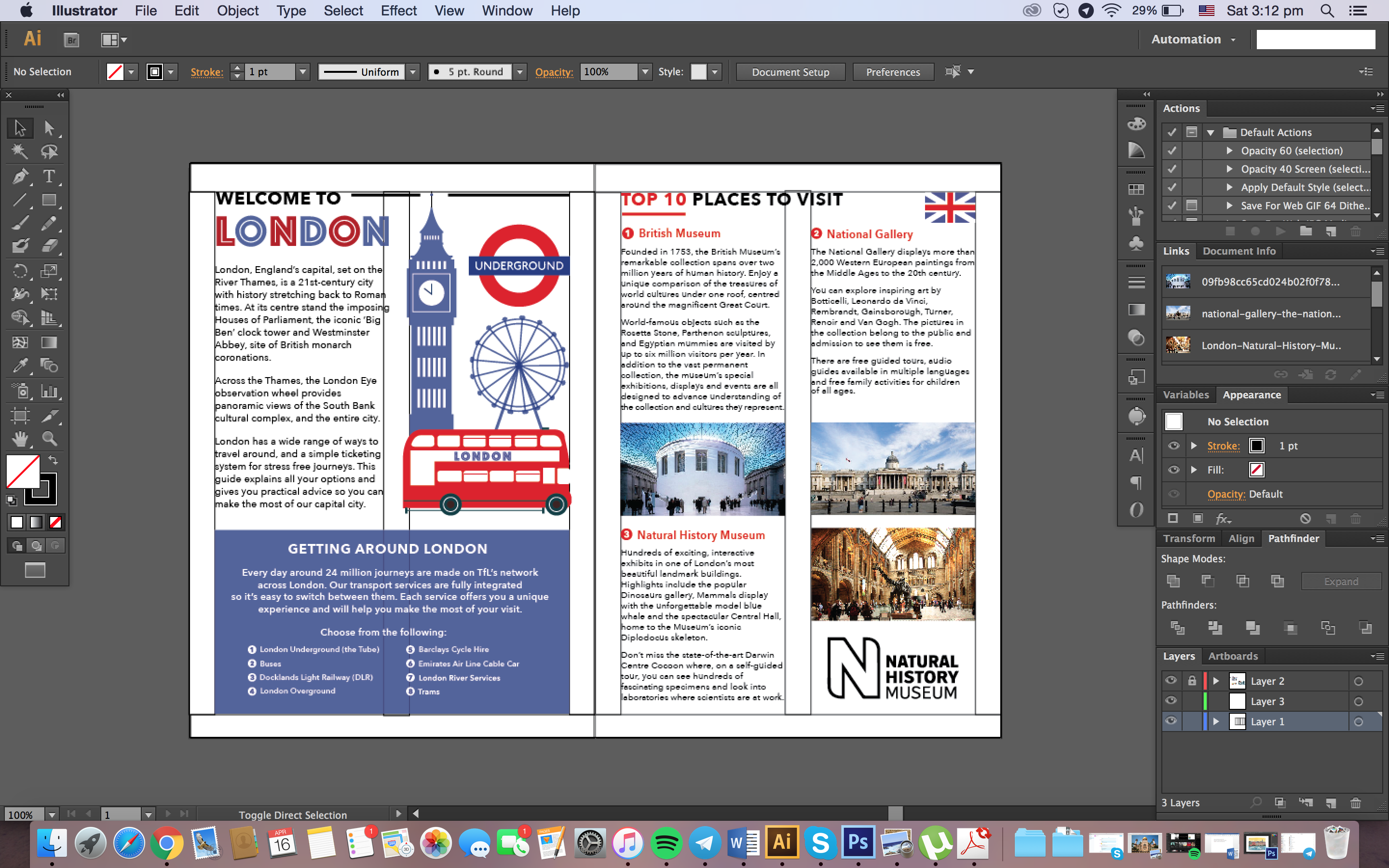
I spent most of the time working on the illustrations, especially the cover – that took me 2 days. I felt the need to keep the inside pages to 2 colours and 2 fonts – to not complicate things and so that the emphasis would be on the cover page. The content and most images were taken from http://www.visitlondon.com/ 🙂

Final Zine (Digital Spreads)

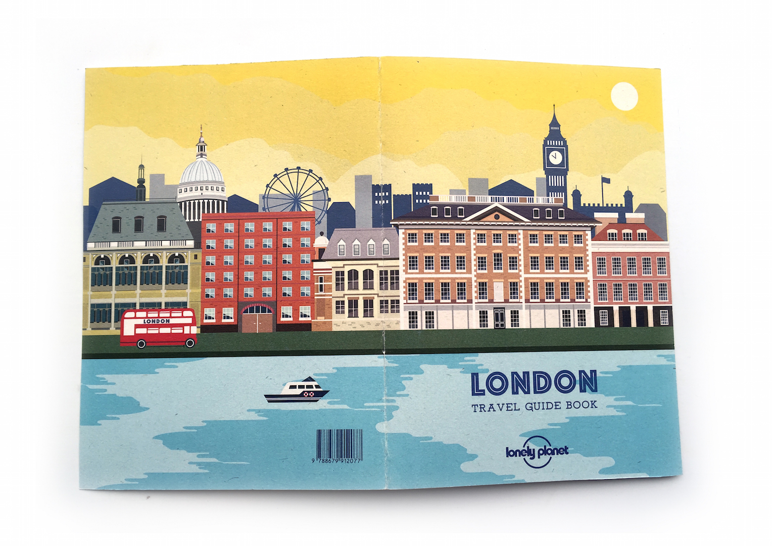
  1. Cover – As you can see, I extended the vectors out (“bleed”) so that there will be alot of additional space, incase cutting goes wrong OR for alignment purposes when printing on double-sides of a page.
ZINE COVER.pdf

Front

ZINE COVER-02

Back

2. Introduction to London/ Travel tips, Top 10 Places to Visit (1)

ZINE 2-01

3. Top 10 Places to Visit (2) and (3)

ZINE 3-01

4. Best Restaurants in London (1), (2) and (3)Screen Shot 2016-04-16 at 3.44.40 pm

ZINE 4-01

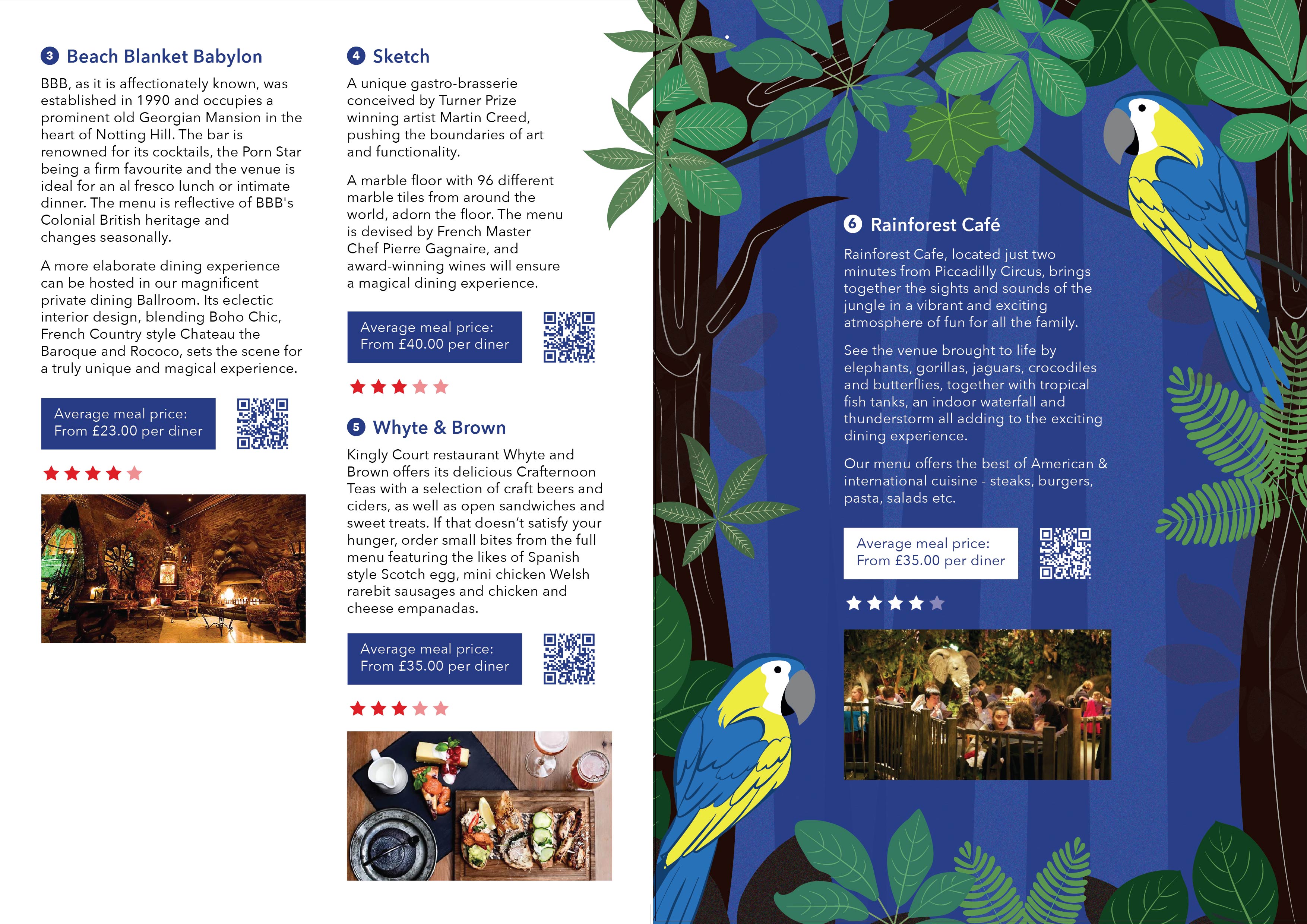
Added the star ratings and QR codes to make it more “legit”

5. Shopping in London (1) and (2)

ZINE 5-01

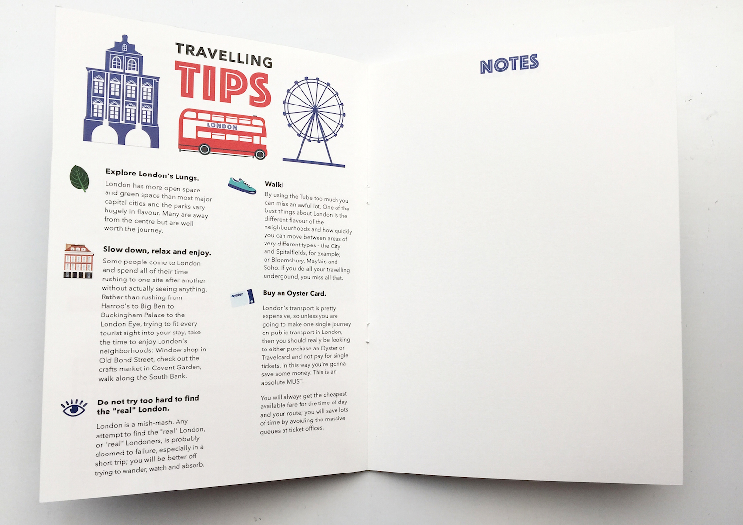
6. Travelling Tips, Notes

ZINE 6-01

Had to take out the “NOTES” border in the end, for alignment purposes

7. Map

ZINE 7 (MAP)-01

Bleed ^

To be continued…

2D Typography (Research) – Part II

Hi everyone! I finally managed to compile some really inspiring retro typography projects I found in a couple of books. Accumulated a massive library fine in the process of it but it’s alright 🙁 Hope the publication pages will give you some inspiration for the final zine project as well. The book titles are 1) Elegantissisma by Louise Fili, 2) I wonder by Marian Bartjes 3) World Tour by Francisca Matteroli. I lost the title for the final book but I’ll update it ASAP. Enjoy!!!!! 🙂 🙂 🙂

Typo scans-31 Typo scans-30 Typo scans-28 Typo scans-29 Typo scans-27 Typo scans-25
Typo scans-20 Typo scans-22 Typo scans-21 Typo scans-24 Typo scans-23 Typo scans-26 Typo scans-19 Typo scans-17Typo scans-18 Typo scans-16 Typo scans-14 Typo scans-15 Typo scans-11 Typo scans-13 Typo scans-05 Typo scans-07 Typo scans-06 Typo scans-09 Typo scans-08 Typo scans-10 Typo scans-12 Typo scans-03 Typo scans-04 Typo scans-02 Typo scans-01


2D II Project 1 – Typography (Final)

Final Development

I have settled on several attributes about myself that I felt I could best incorporate this vintage theme – I’m a breakfast foodie, I love travelling, I am a believer of karma, I’m a type artist in training.

Brainstorming for ideas…

brainstorming-02 brainstorming-01

Final Work

I’m a breakfast foodie

I love breakfast food and I feel that it’s important to start your day with something to eat. I love carbs, that’s why 80% of the graphics drawn are carbs. I thought the caption Rise and Shine deemed fit because we should start the day bright and right, with breakfast. Breakfast makes me happy. Food makes me happy.

typo1

I’m a believer of Karma.

I’ve always believed that what goes around, comes around. Like we learnt in art history, we should do good to have a good after life. However, Karma also teaches you to be a better person by doing good, thinking positive and by saying good words. It is something I remind myself daily! The circles and arrows indicate “what goes around, comes around”. I also tried to made the type more circular and round to further emphasise that point/ coincide with the background circles.  The lotus flowers symbolize spiritual enlightenment in Buddhism.

typo3

I love travelling.

I’m quite an adventurous person and nothing makes me happier than gaining new experiences to share with my grandkids next time. I found a quote that should be a constant reminder to me and everyone that travelling is life. Life is short and the world is wide, hence, we should take every moment we can to explore and learn before we die.

typo4

I’m a type artist in training.

People might not be aware that vintage can be brought back to “life”. Old is gold! I feel very strongly for this statement especially since I love vintage type and I feel like people should appreciate it more. Stranger and Stranger’s vintage themed designs are inspiring because they “make old (vintage) things, new (modern) again”.

typo2

2D II Project 1 – Typography (Research II)

Hi everyone!

As some of you may know, I’m drawn to vintage typography, especially hand-drawn letterings. Having identified a style that I’m passionate about allowed me to easily visualise ideas of what I could possibly illustrate for this project. Adding on, I mentioned that I have plans to work for a company called Stranger and Stranger, a bespoke design firm specialised in packaging for beers, spirits and alcoholic beverages.

Joy reminded me that I should always have them in consideration whilst working on my projects here in ADM. Since Stranger and Stranger are a company based in USA and UK, their products are mostly targeted to Americans and Europeans. She suggested that I could do a variety of Singaporean/ Asian type art with a European influence, a bridge between a “local S&S” and the existing company.


ATTRIBUTES

I have settled on several attributes OR just one (I’ll make the final decision after brainstorming for more ideas)

  • 4 Attributes: I’m a breakfast foodie, I love travelling, I am a believer of karma, I’m a type artist in training
  • Focusing on 1 attribute: I’m a type artist in training

Will be posting sketches in the next OSS post!


STYLE

I decided to hand-draw all four cards and also to keep everything black and white to let the imagery speak for itself, without the distraction of colours. Moreover, pencil is my all-time favourite medium to use and it will give the illustrations a “raw” feel. I’ll explain further during the presentation! Adding on, I felt that the group discussion was a great way to share ideas and help each other improve. My group members gave me some fantastic suggestions to how I could incorporate the “Asian” theme into Stranger & Stranger influenced graphics; one great example was to use different languages, colours, and symbols.

Over the past two weeks, I’ve been researching on artist references to learn more about vintage type. Here’s what I’ve concluded about vintage type…

  1. Use of intricate borders and detailed, stylized decorative graphics to accentuate type
  2. Use of shapes to highlight/ define certain areas
  3. Symmetrical layouts – Balance
  4. Relevant imagery to beautify type Illustrations (done in an “etching style”) – Found a tutorial on how to create the etching effect!
  5. Each typeface has a character of it’s own, usually “mismatched”
  6. Colours used are usually monotone/ duo-tone or colours that are muted and rustic

I also spent some time scanning really useful books, will create a separate post for that 🙂 In the meantime, here are some inspiring typography I found online.

vintage-typography-lettering-styles-2 vintage-typography-lettering-styles-1 vintage-typography-lettering-styles-inspiration-header tumblr_ly5pqeyu081qifteyo1_1280 c0c2f739e792049444082abe9632218f 5117ed10007913.560ddef82a52e 4ed15e31966673.566898bf7d014 01b66531966673.566898bf8182e

d25ce031966673.56689326bbb67

2871602f39c0613777cb7b7f3cf2c844 c9a630526c3ed6650988d0bbf70c8759 fb1b9e2ad5ba6df8d49eb15184b3afa8 (1) Retro-Typography-Designs-41 8bfb26a00ebf6491c15ccac4cfeeb0bf