
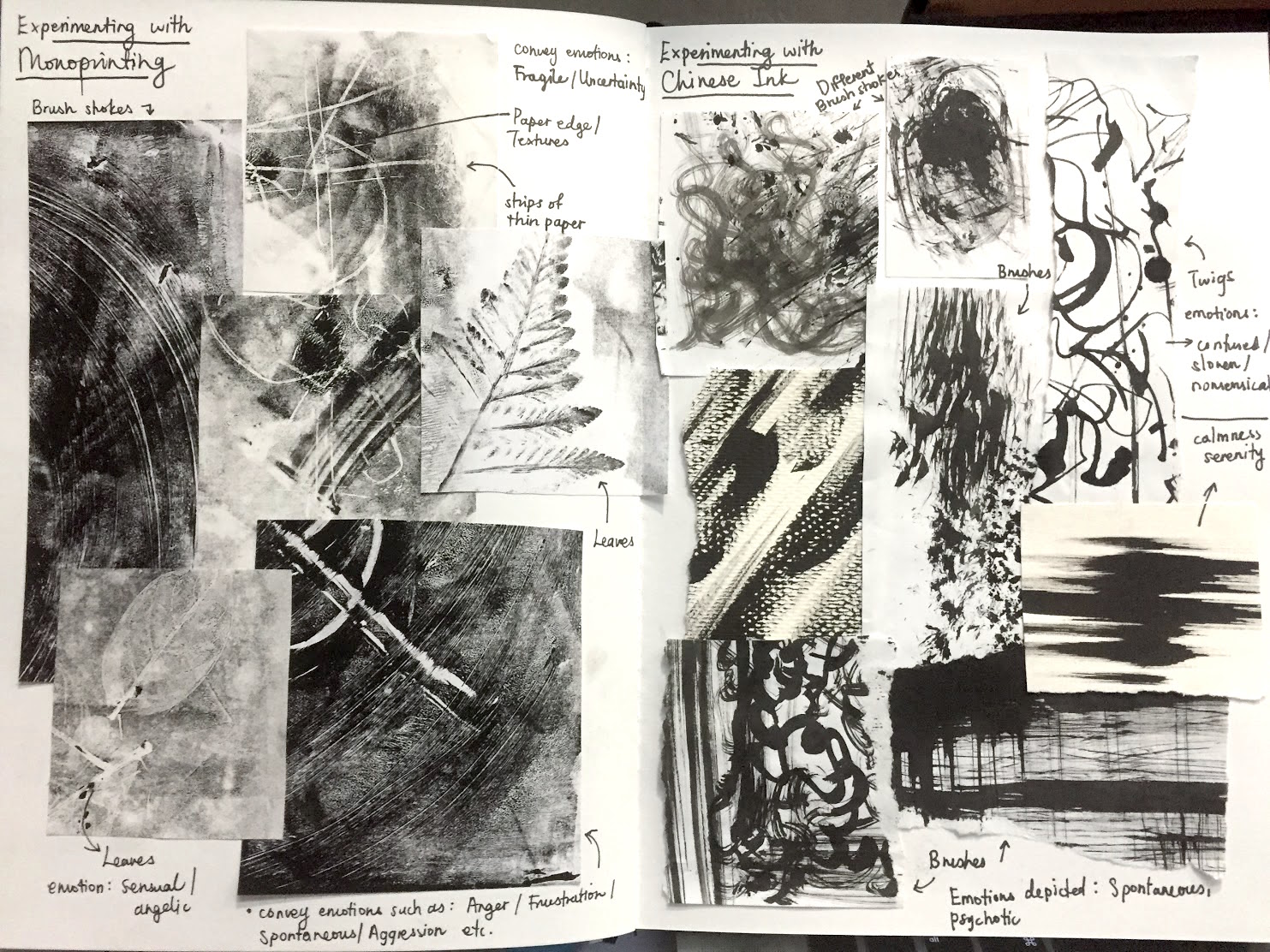
INITIAL SONG CHOICE + CHALLENGES
Initially, I wanted to work on the Christmas songs, “Winter Wonderland” or “It’s beginning to look a lot like Christmas” as Christmas is my favourite holiday of the year and it has great significance to me as I celebrate it religiously every year. I truly enjoy the whole essence of Christmas as it brings my loved ones and I together after being away from one another through the year. Hence, my initial dingbats were based on a Christmas theme.
When we were told to change our chosen songs to rhymes, I couldn’t decide to work on either “Hickory, dickory, dock, a mouse went up the clock” or “The sailor went to sea”. I concluded that “The sailor went to sea” had more potential to play around with compositions and ideas. I think that I am a rather process driven, because most of the times I think of how I want the final outcome of the artwork to look like, what kind of style it will possess and how it flows. At the start, I intended to come up with something similar to retro nautical posters of the 1930s because the duotone effect could give the vintage feel. However, I thought that the overall style should be more of a collage, rather than a poster design. Furthermore, I felt that it was easier to create a sense of flow from the composition of collages of different stories combined.
RHYME CHOICE + CONCEPT
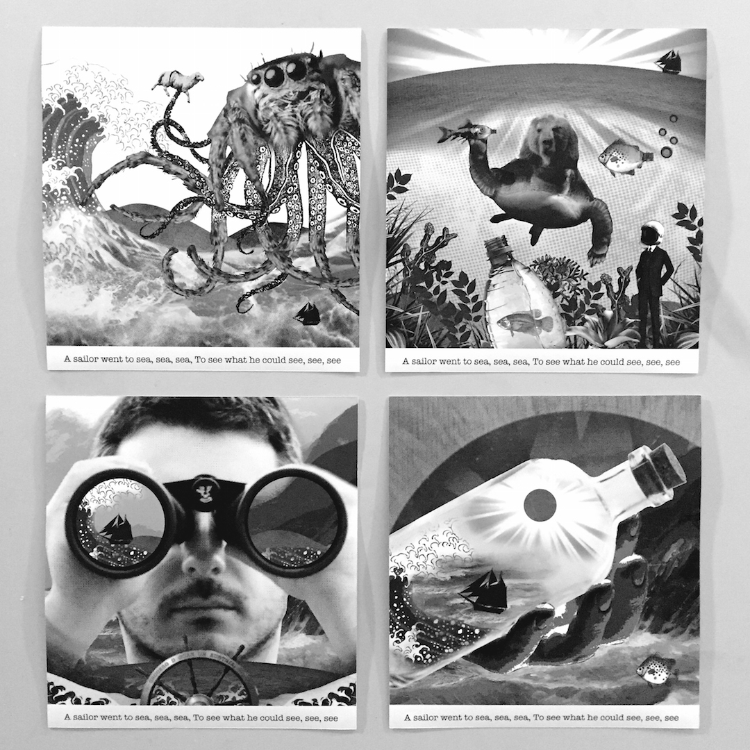
“The sailor went to sea, sea, sea, to see what he could see, see, see.”
was easy after doing several developmental sketches. Firstly, from a literal point of view, I came up with things that could easily represent a sailor and his life at sea (e.g. ship, coral reefs, marine life, binoculars etc., as seen in my sketches) Hence, concepts and topics like the titanic, global warming and pollution, the vastness of the sea, or a sailor and his story, came to my mind. This rhyme concentrates a lot on the word “SEE” too, so I thought that the concept could circle around this idea of what he sees on his journey. Also, after drafting out my compositions, I decided that I wanted the boat to be the key factor in connecting the four compositions together. The boat is small and simple and just in solid black to create emphasis to the contrast and vastness of the sea. The subtle placement of the ship in every piece will evoke curiosity as it’s supposed to be the main focus, yet it’s “hidden” amongst the other “happenings” in the sea.
USE OF DINGBATS
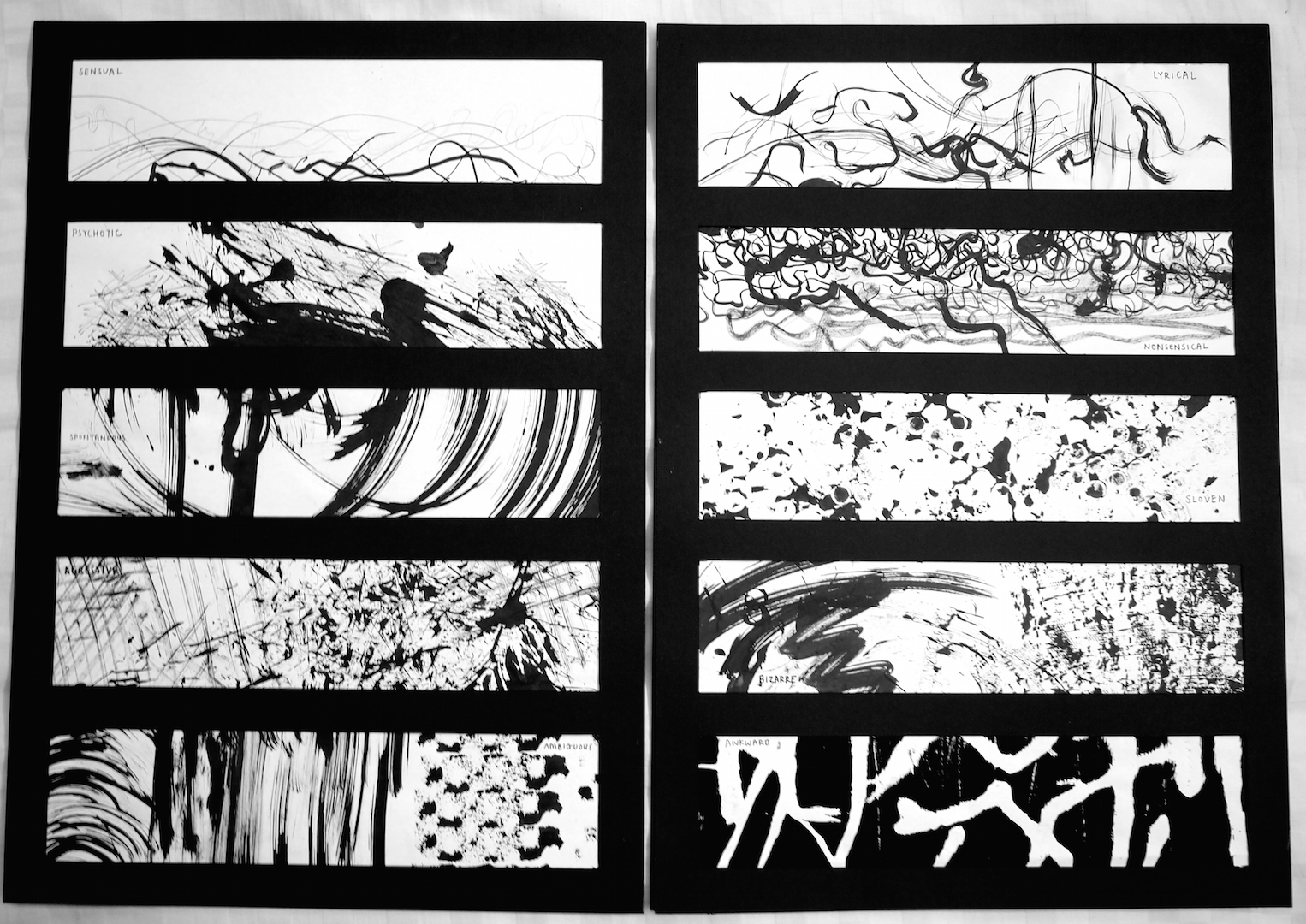
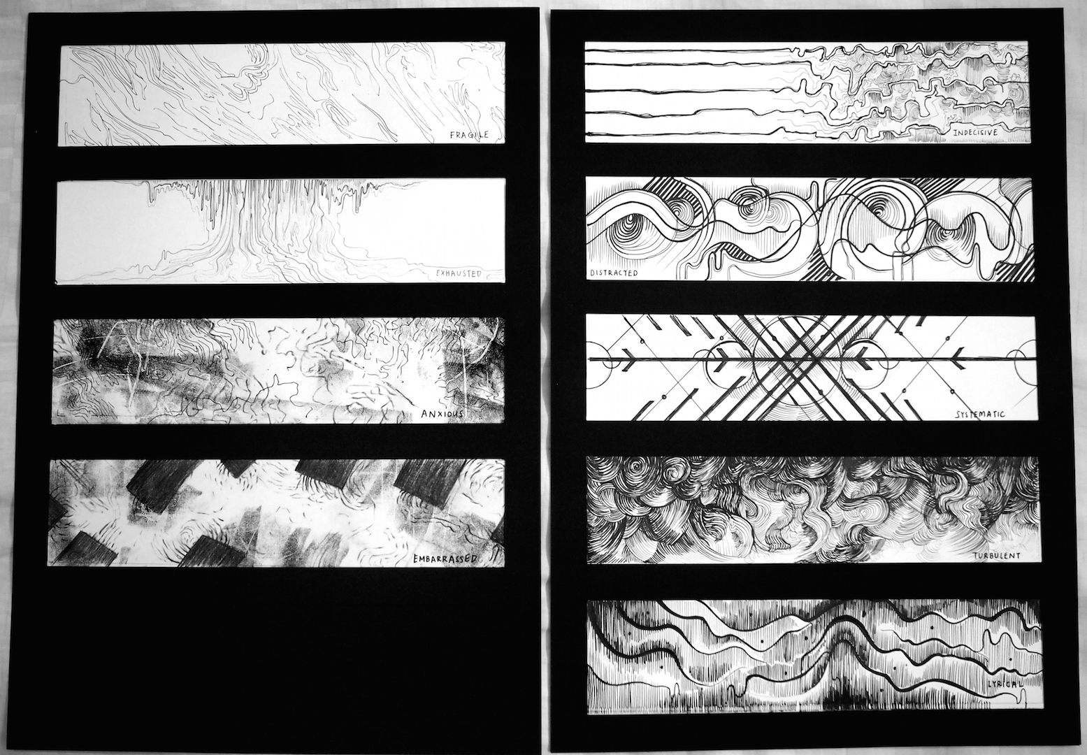
After studying Dadaism and surrealistic art, I’ve come to a conclusion that they are wacky and don’t make sense most of the times. So it was fun and exciting to come up with things that are unconventional and bizarre. I had to remind myself that the more unusual it looks, the more interesting it gets. Hence, it was rather easy to manipulate my classmates dingbats into my concepts.
COMPOSITIONS
After my discussion with Joy, she gave me some ideas of how I could make my work more intriguing. My compositions show the ship sailing the seas, (people would think that the sailor is in the ship, for the first two compositions), or could the sailor be outside of the ship? (the third and fourth compositions showed a pair of hands holding a bottle with the ship in it, were those the sailor’s hands and could he been watching it from outside it’s confinements?) I like how Dada and surrealistic art is ambiguous/ sometimes confusing and I played around with that concept through the 4 compositions. I wanted to keep it mysterious and leave the audience wanting to find out more.
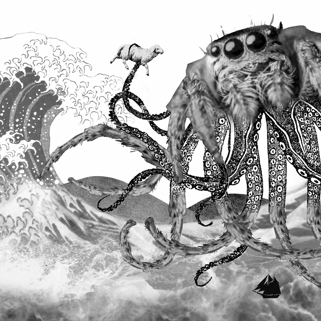
The first composition illustrates the ship in the midst of danger. A lunatic spider-octopus (SPI-DOCTOPUS) sea monster is about to devour a poor little helpless puny lamb. As if the spi-doctopus wasn’t scary enough, the huge waves and strong currents made it impossible for the ship to escape this chaos. Throughout my work, I explored with a lot of layering and textures in my work. Also to add to the surrealistic feel, I mixed several styles together for example, this composition has a mix of realism, vintage etching, cartoon, pop art, not forgetting the duo tone and posterize effect, all in one.
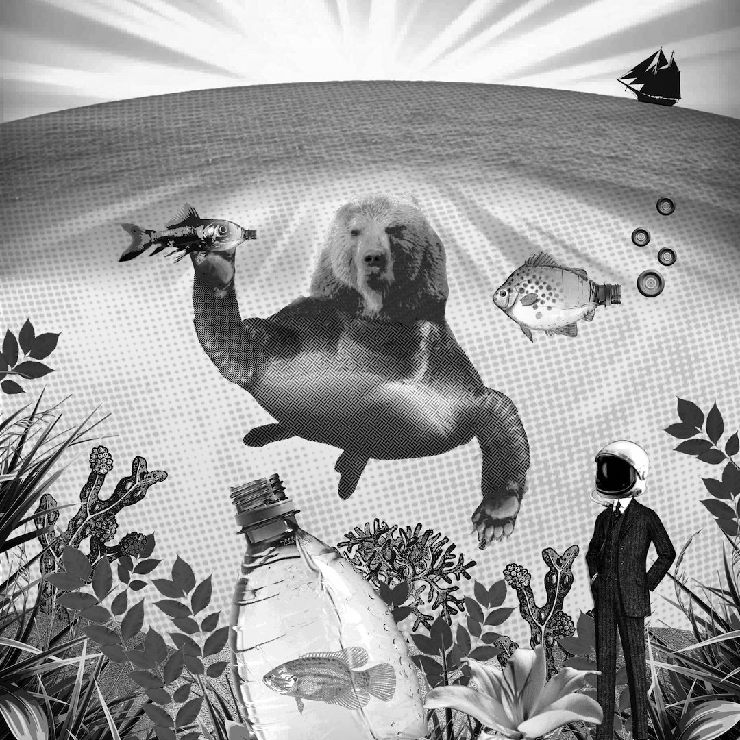
Miraculously, the ship managed to escape the drama and was even in perfect condition! After sailing through calm waters for a day or two, the ship decides to take a rest. Beneath calm and serene waters, mutated sea creatures inhabited the polluted sea such as the BURTLE (BEAR-TURTLE) or T-EAR (lol). Untreated waste such as plastic bottles get dumped into the ocean and sea creatures can become snagged on the plastic or mistake it for food, slowly killing them over a long period of time. Also, is that the sailor underwater? Or is he just a random diver in a suit?
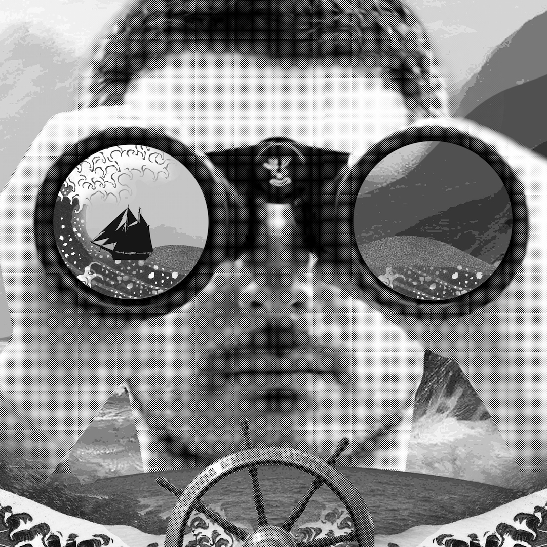
The third composition shows a man holding a pair of binoculars, watching the ship as it sails the seas. Could this possibly be the sailor too? If so, who is he watching? Also, is he underwater?

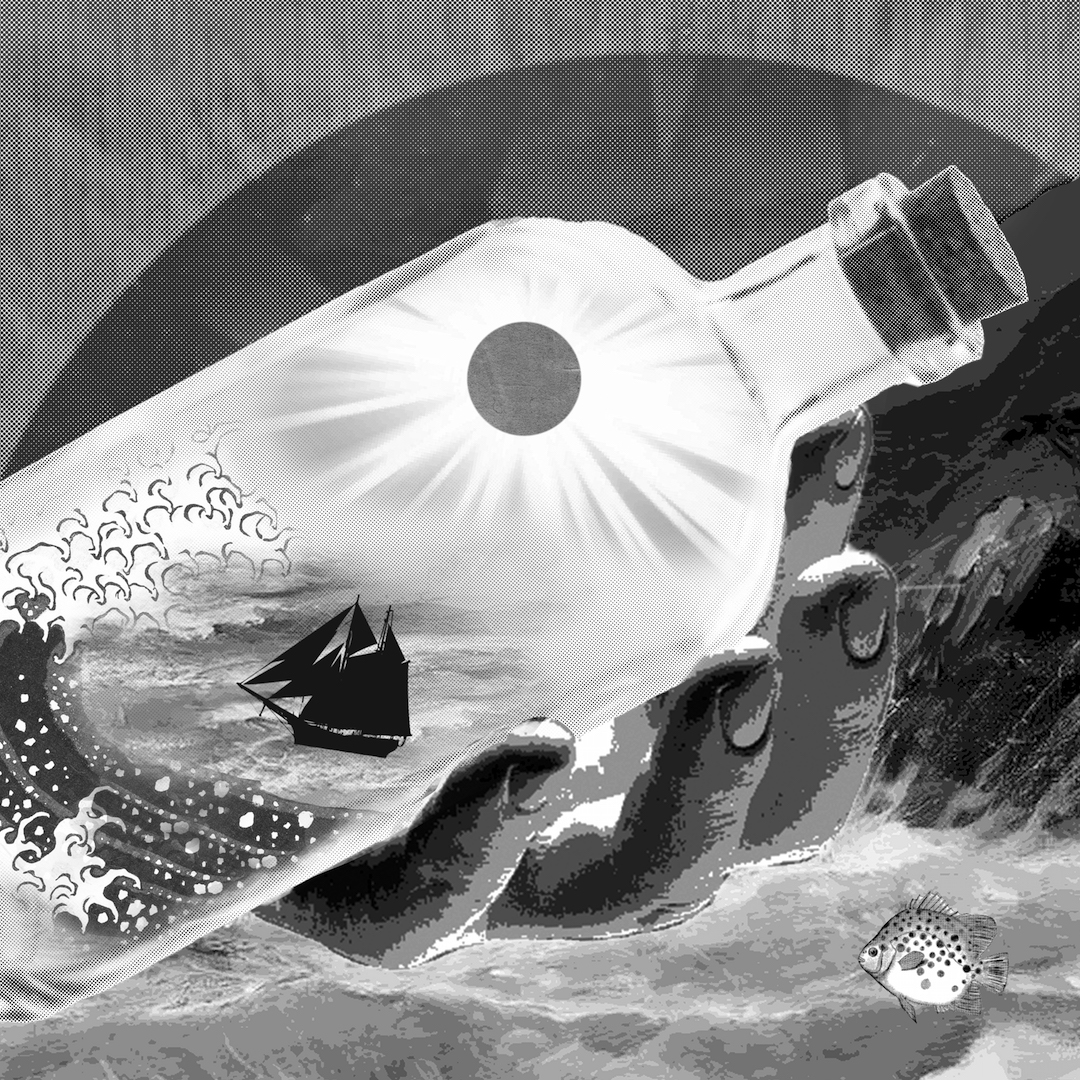
The final composition shows a hand holding a bottle, of which contains the ship sailing the stormy seas. Maybe the ship was actually in the bottle all along and entire scenario (first two compositions) were actually happening inside it? I made it more surrealistic and confusing by adding 2 suns, one in the bottle, and one outside in real life. I played with the concept of a message in the bottle here too. Maybe the ship is actually stuck in that horrifying world (in the bottle) and is in need of some serious help? Perhaps it is trying to SOS to the outside world?
REFLECTIONS
Personal Thoughts
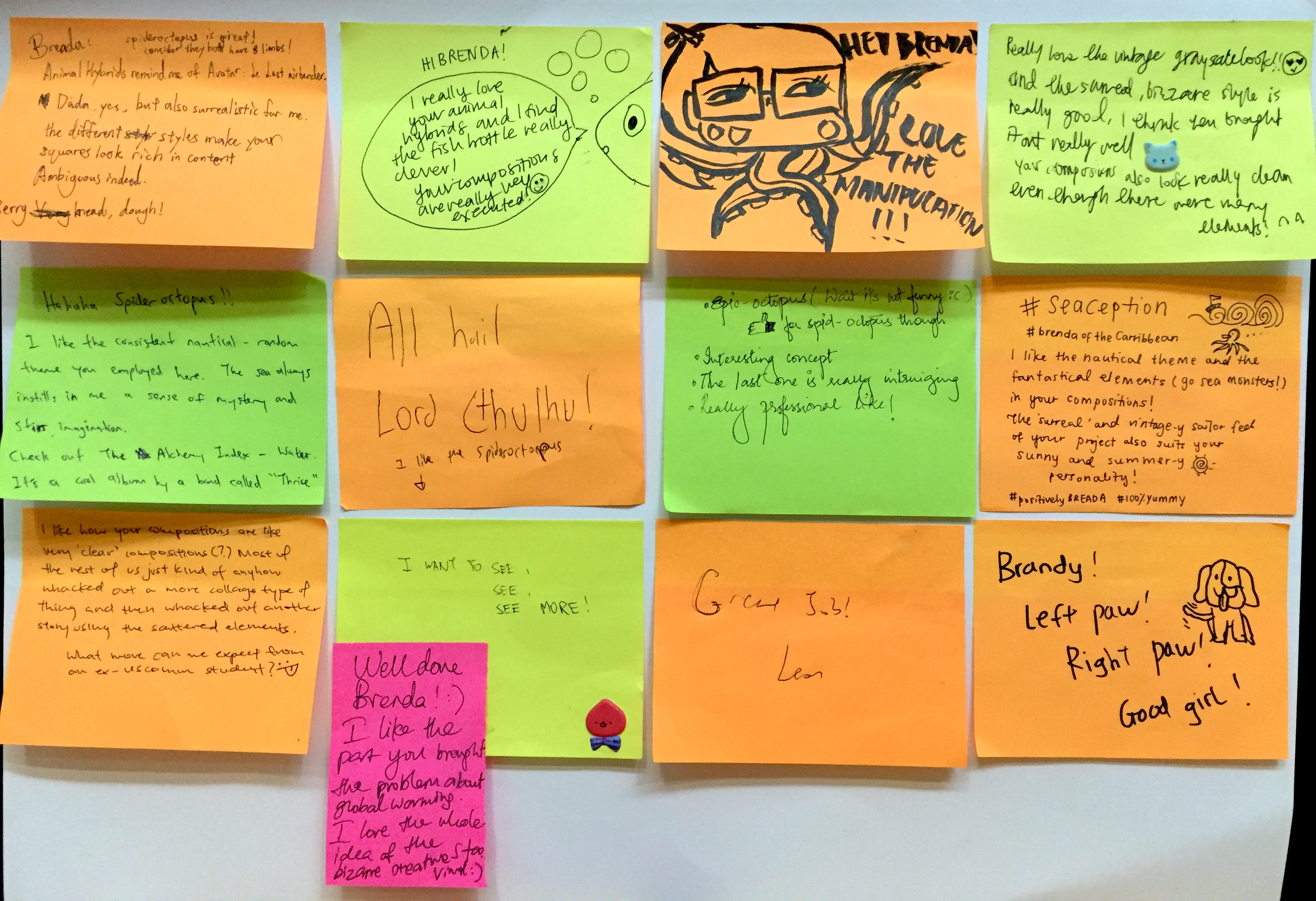
Overall, I really really enjoyed this project as it made me really think out of the box. Keeping it just black and white does have it’s limits too, so I knew that I needed to create interesting compositions to keep the focus on the subjects. This was elaborated using the different styles and textures as mentioned earlier. Though the use of our classmates dingbats makes it hard for us to visualize and work on the exact compositions we want, it actually trains us to “make do with what we have” and surprise ourselves with the unconventional art we can create from it. I’m glad I went through this exercise as it widens my perspectives of visual art.
Tutor’s Thoughts
Joy liked the use of consistent elements (circles, circular shapes, wave “shape”) as it indicates movement. The theme “bizaare” was used intelligently as well. She liked the use of different digital styles and the execution. She also thought that I accentuated the “dream-like” state of surrealism.
Classmates’ Thoughts
OLD DINGBATS + NEW DINGBATS IN SEPARATE POSTS 🙂

