Week 1
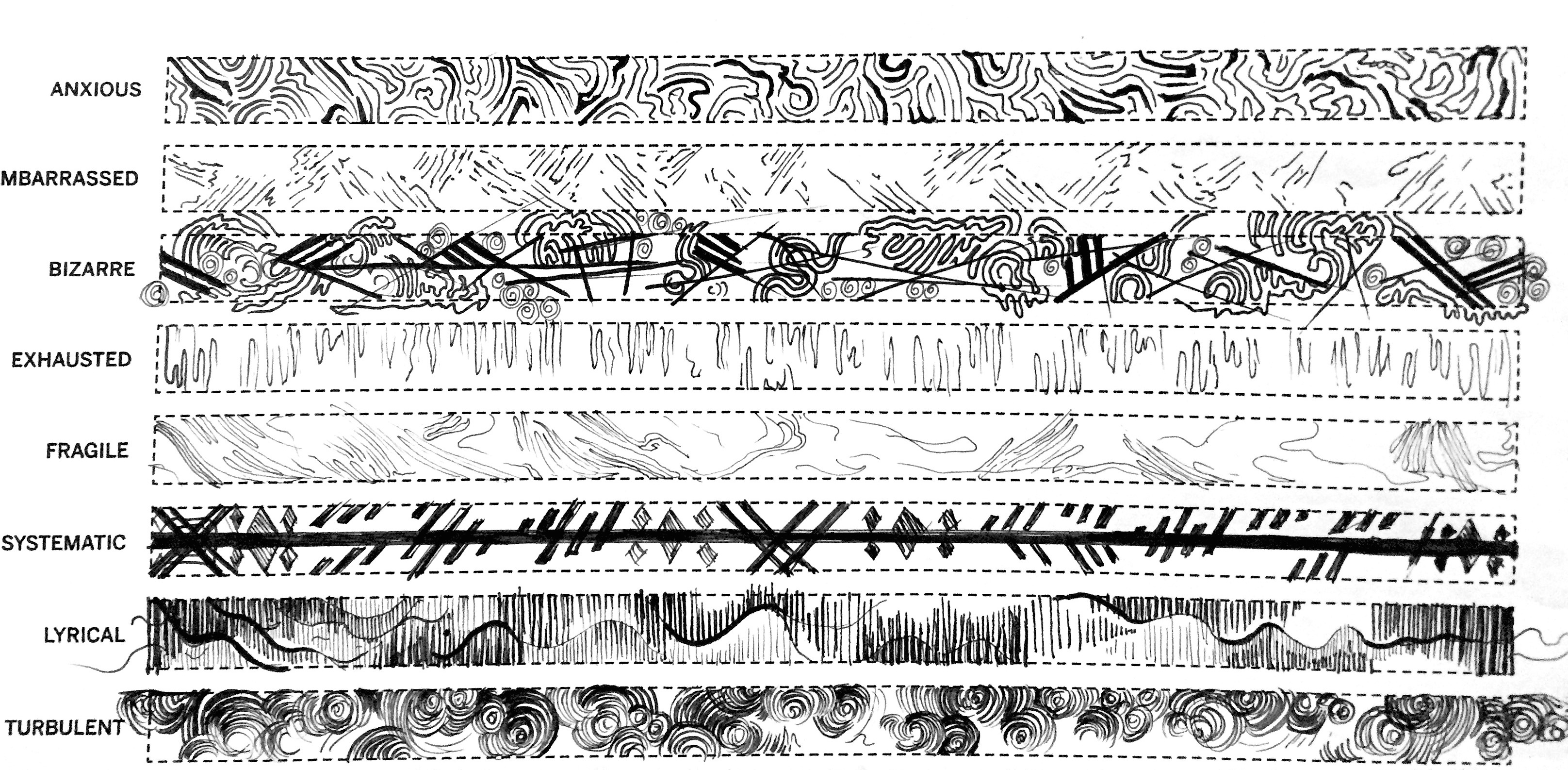
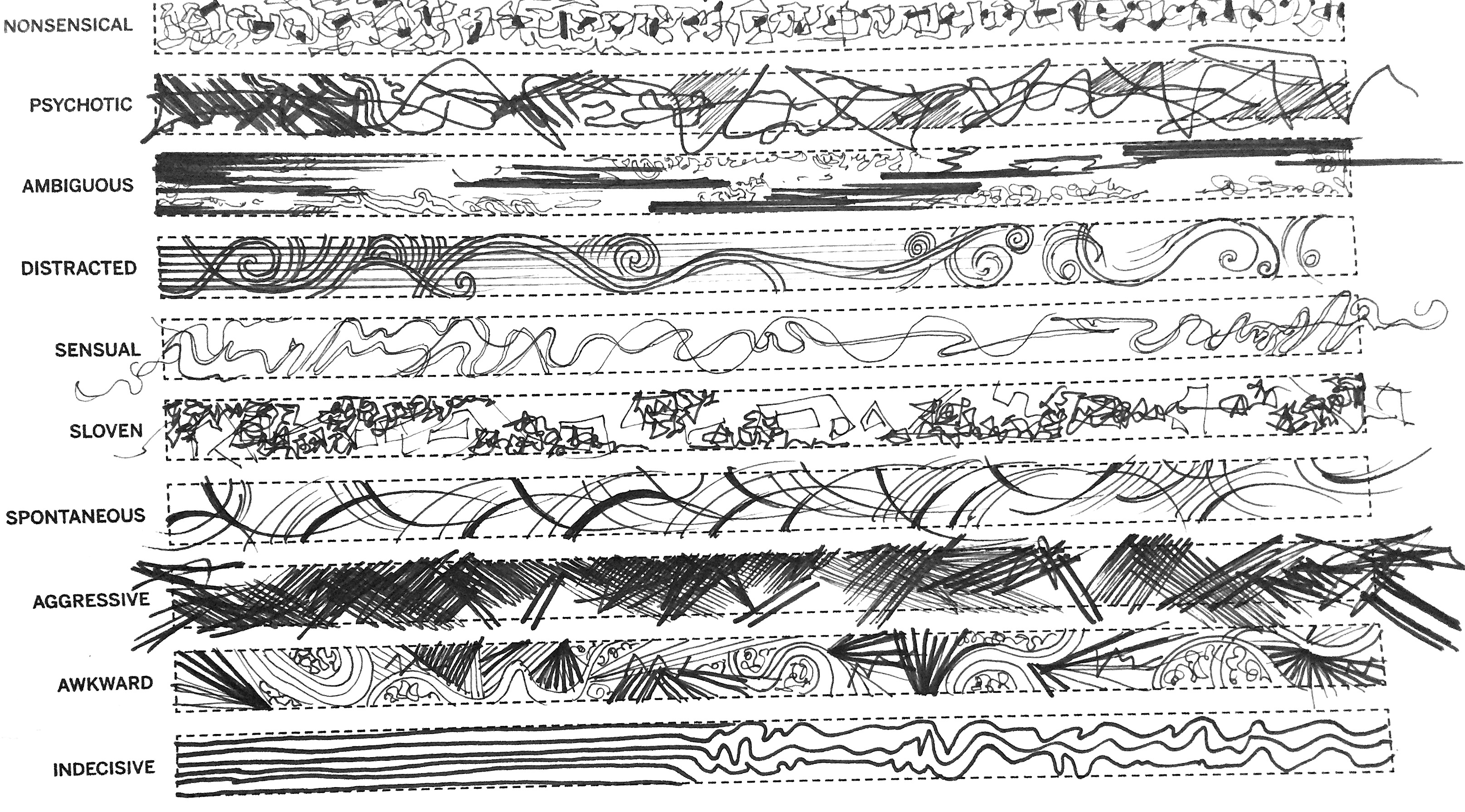
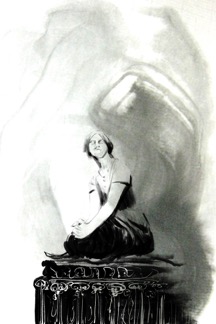
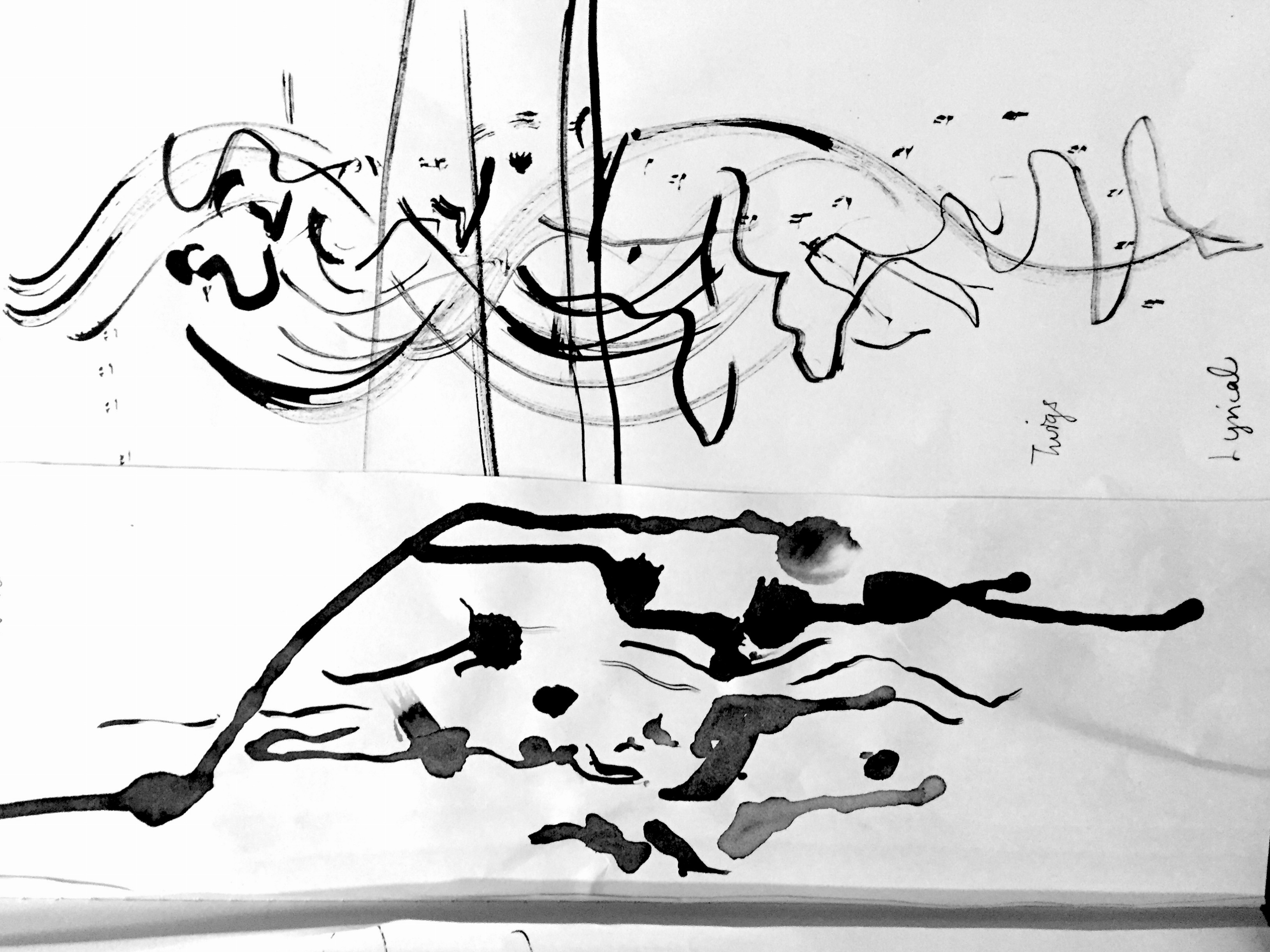
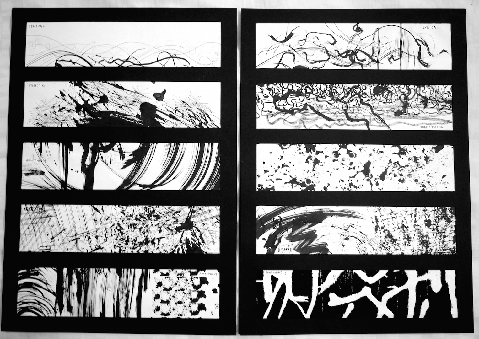
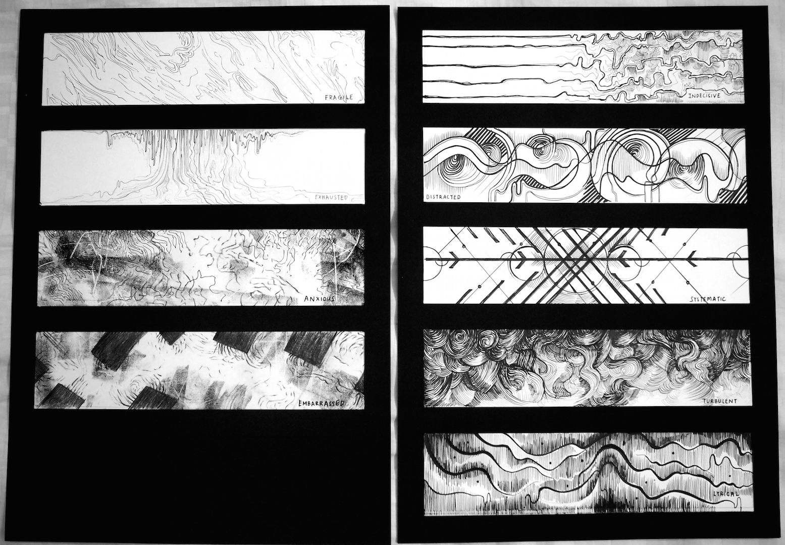
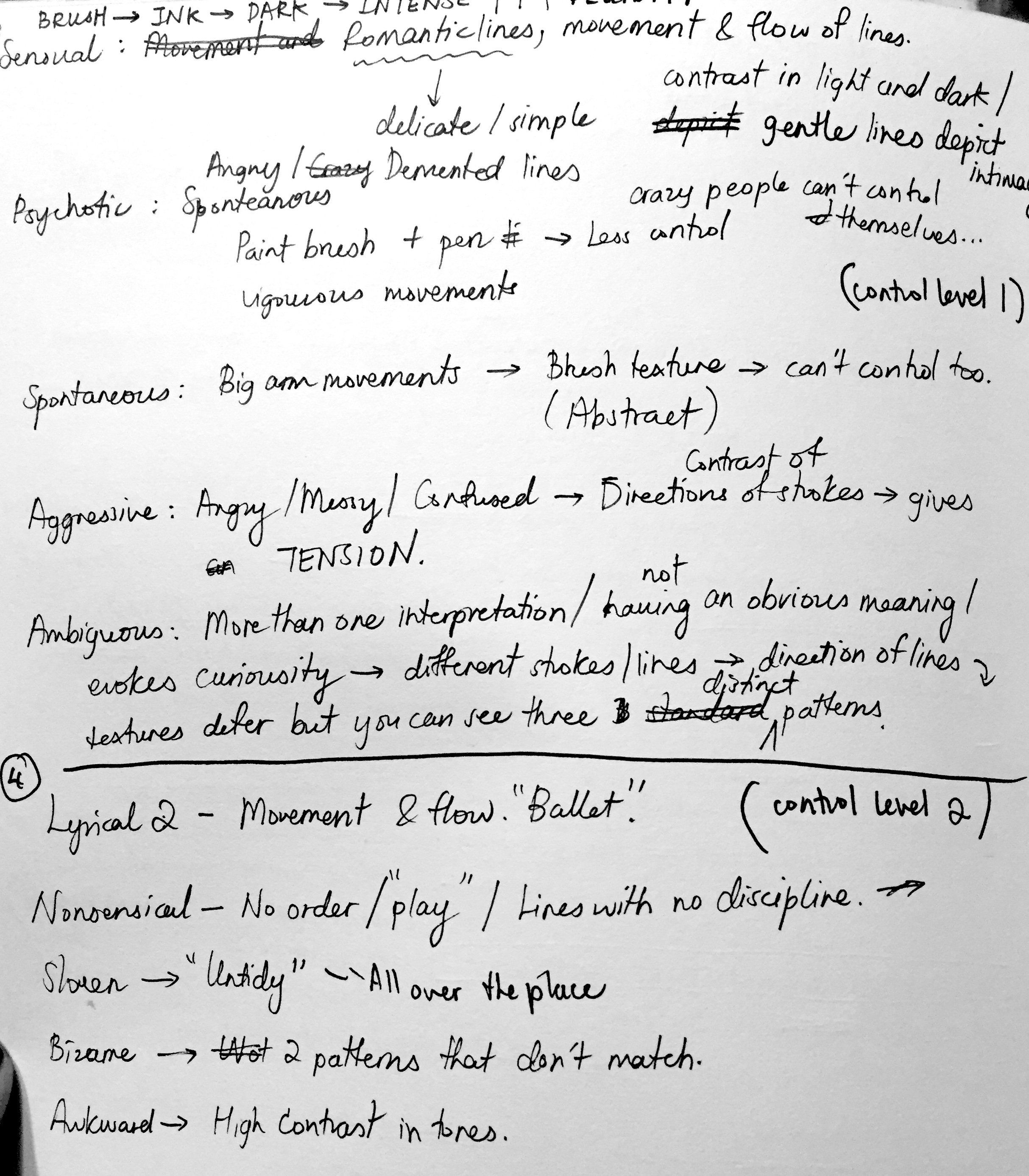
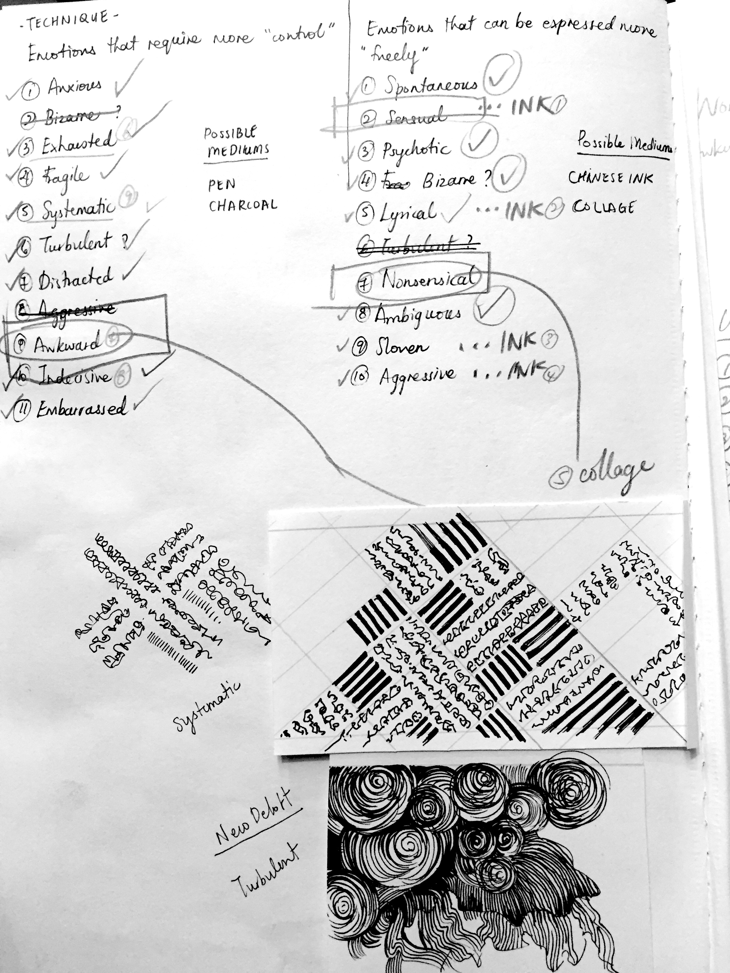
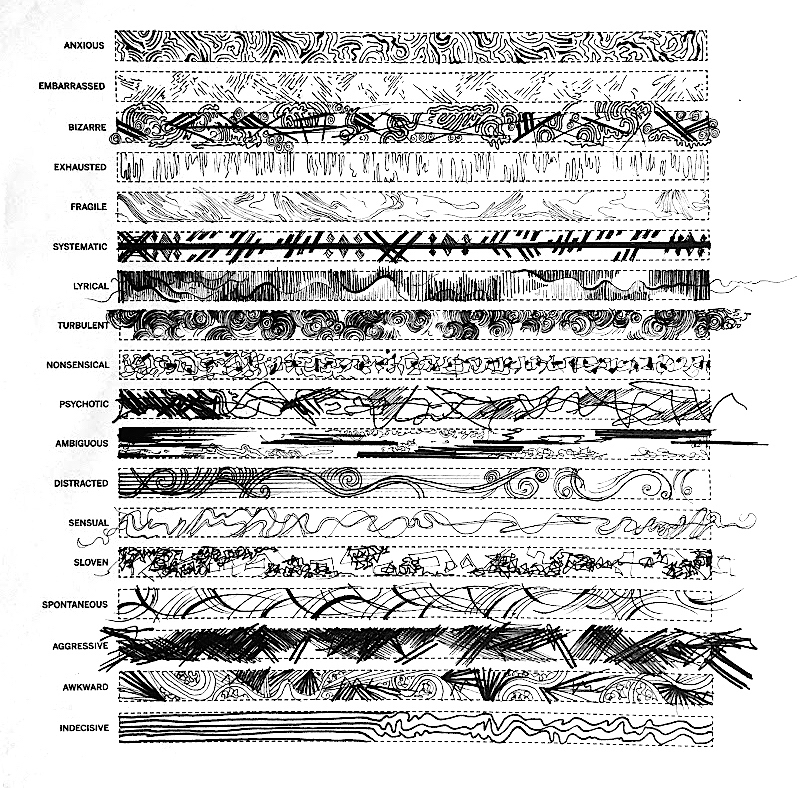
We were introduced this assignment in the first week and were tasked to express the emotions given through drawing lines, making marks, creating textures etc. My work was very much focused on the process of evoking these emotions. I tried to incorporate my feelings into drawing the lines. I played around with a lot of thick and thin lines, tonal values, contrast in scale of shapes, and intensity of shading according to the “level” of intensity of the particular emotion.

Week 2
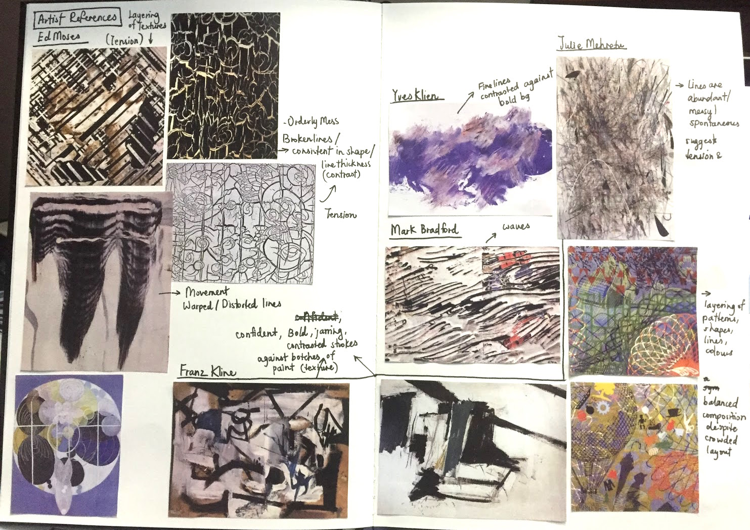
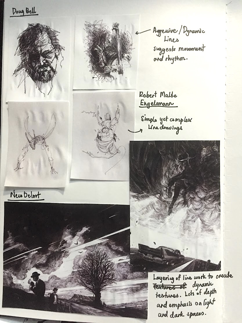
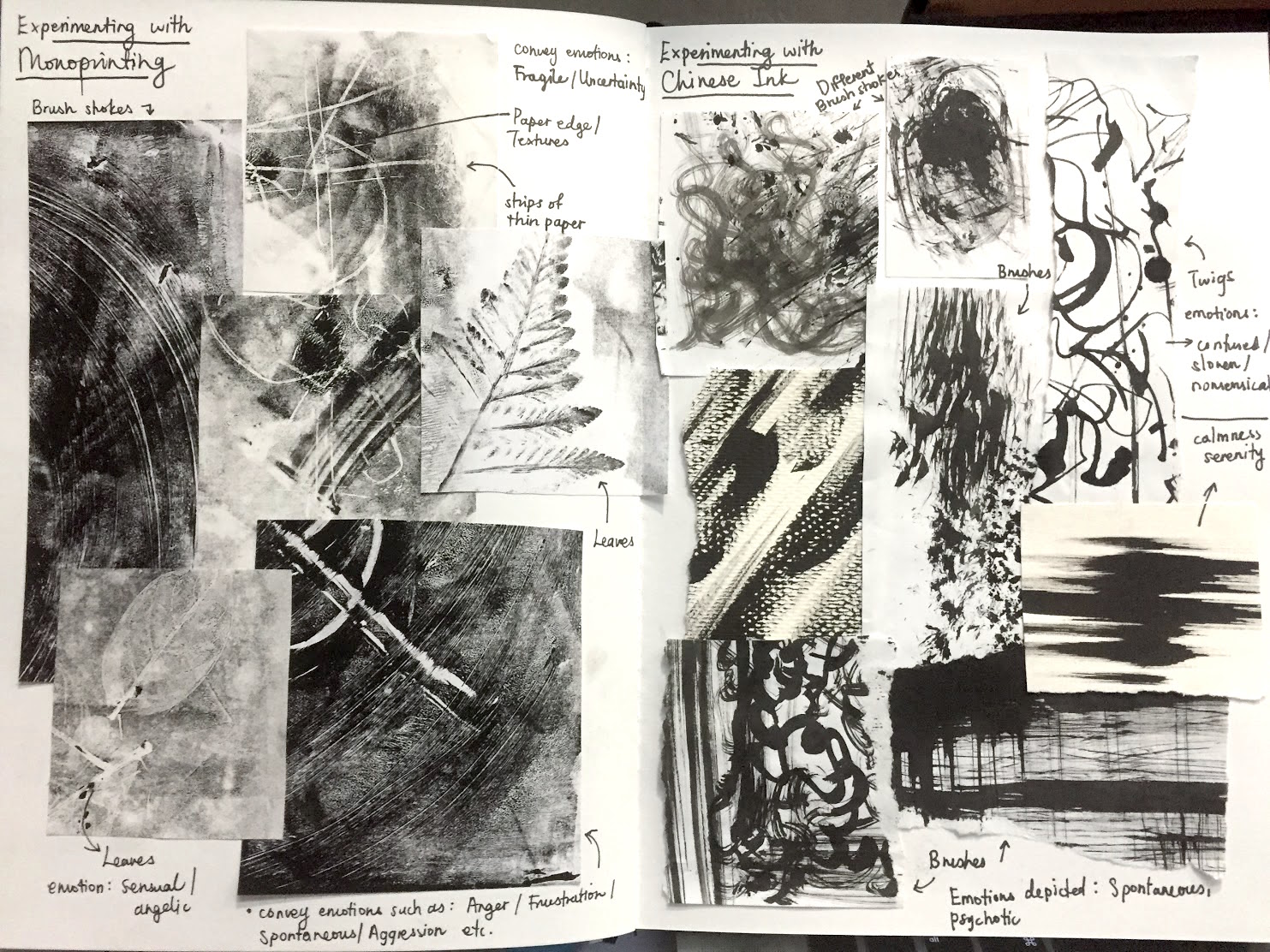
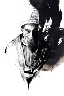
At the start of week 2, I researched more into artists whom uses the same technique based approach to create lines. I drew inspiration from some of the artists we’ve researched upon and others such as Neco Delort, an illustrator based in France. His work expresses deep emotions and I felt that it was very inspiring. He focuses a lot on textures and dynamic patterns. I was particularly drawn to harsh, bold and dark lines as they came off as more “confident” and expressive. We also had the chance to experiment with mono-printing in class and I really liked how subtle and sensual the “blurry” prints came out to be. This could portray anxious and “uncertainty” well.
Week 3 & 4
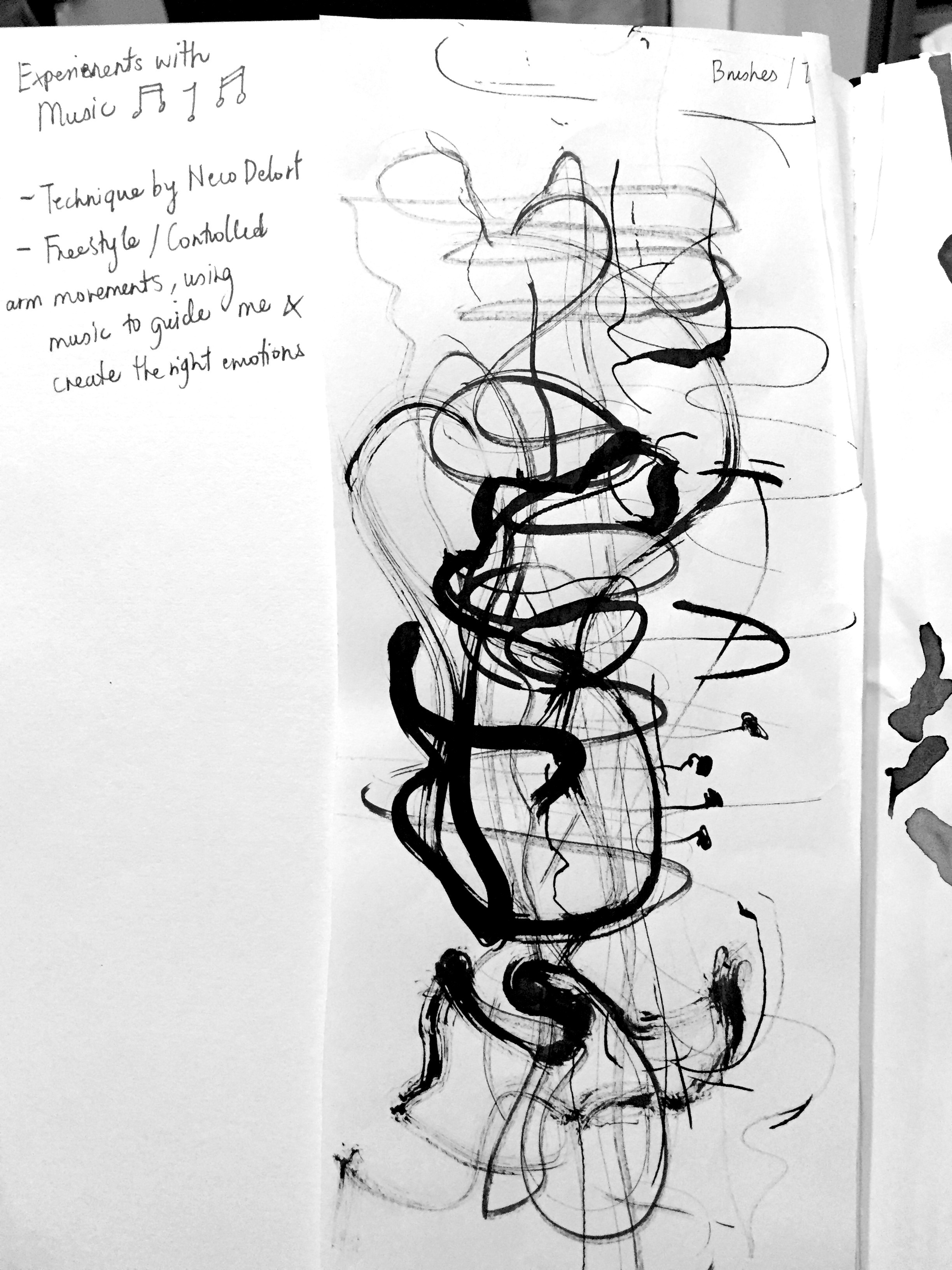
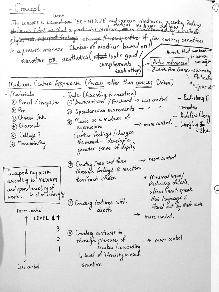
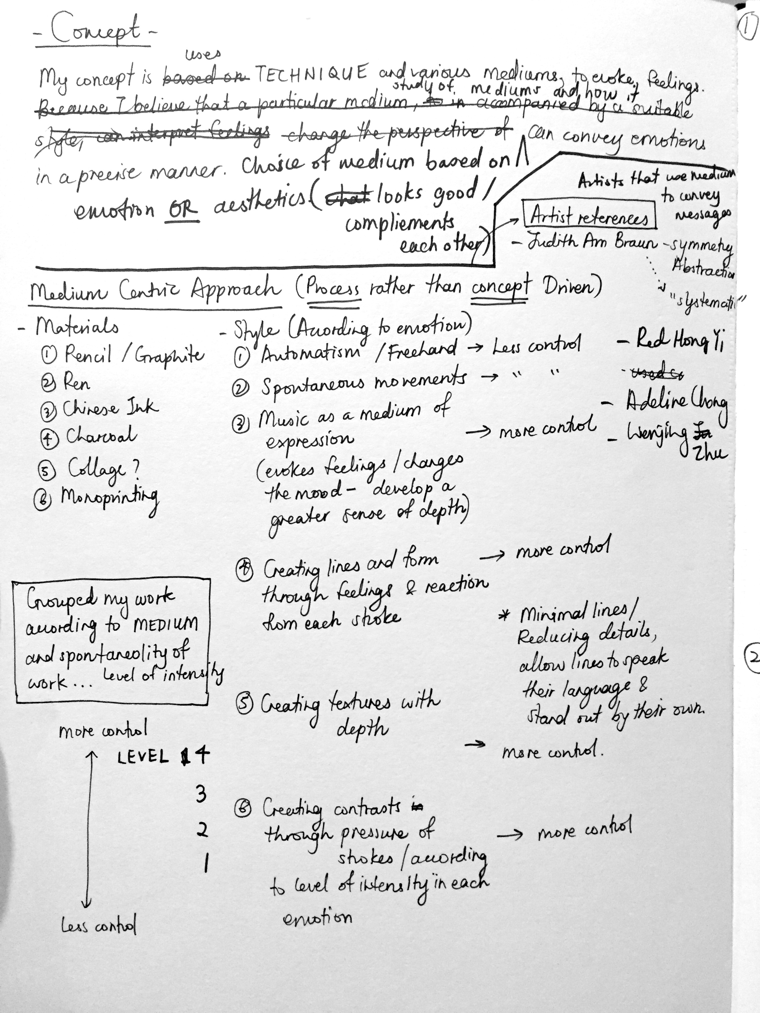
In week 3, I did more in-depth research of artists and their style and techniques. I’ve decided that my concept would be to focus on a medium centric approach which is more process, rather than concept driven. The particular mediums that I focused on are pen, chinese ink, charcoal, graphites and collages. Despite my concept being on exploring mediums and techniques, I also tried to get inspiration from music and book quotes/ references. I feel that music is a good medium of expression and could be key to developing a greater sense of depth in my work.
Nico Delort is one good example of an artist that gets inspired through sentences of books and music. His work “Winterreuse” is nonetheless one of Schubert’s most famous and acclaimed song titles. It features dark and deary, haunting melodies.
Other examples of Nico Delort and his work…
1) A rumour of angels” based on the book by Dale Bailey.
“I sometimes have a hard time describing with words what a story makes me feel —which I guess is why I became an illustrator— so I’m just going to say what really struck me here was the heavy, raw and burnt out atmosphere. Images of harsh light, scorching heat and swirling dust came to me as I was reading it and that’s what I wanted to transcribe in this piece.”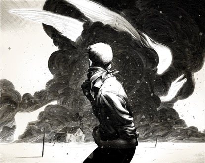
2) The Cave
“Harry could smell salt and hear rushing waves; a light chilly breeze ruffled his hair as he looked out at moonlit sea and star-strewn sky.”
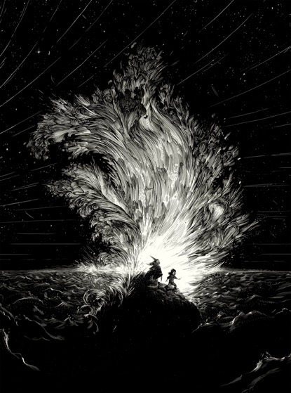
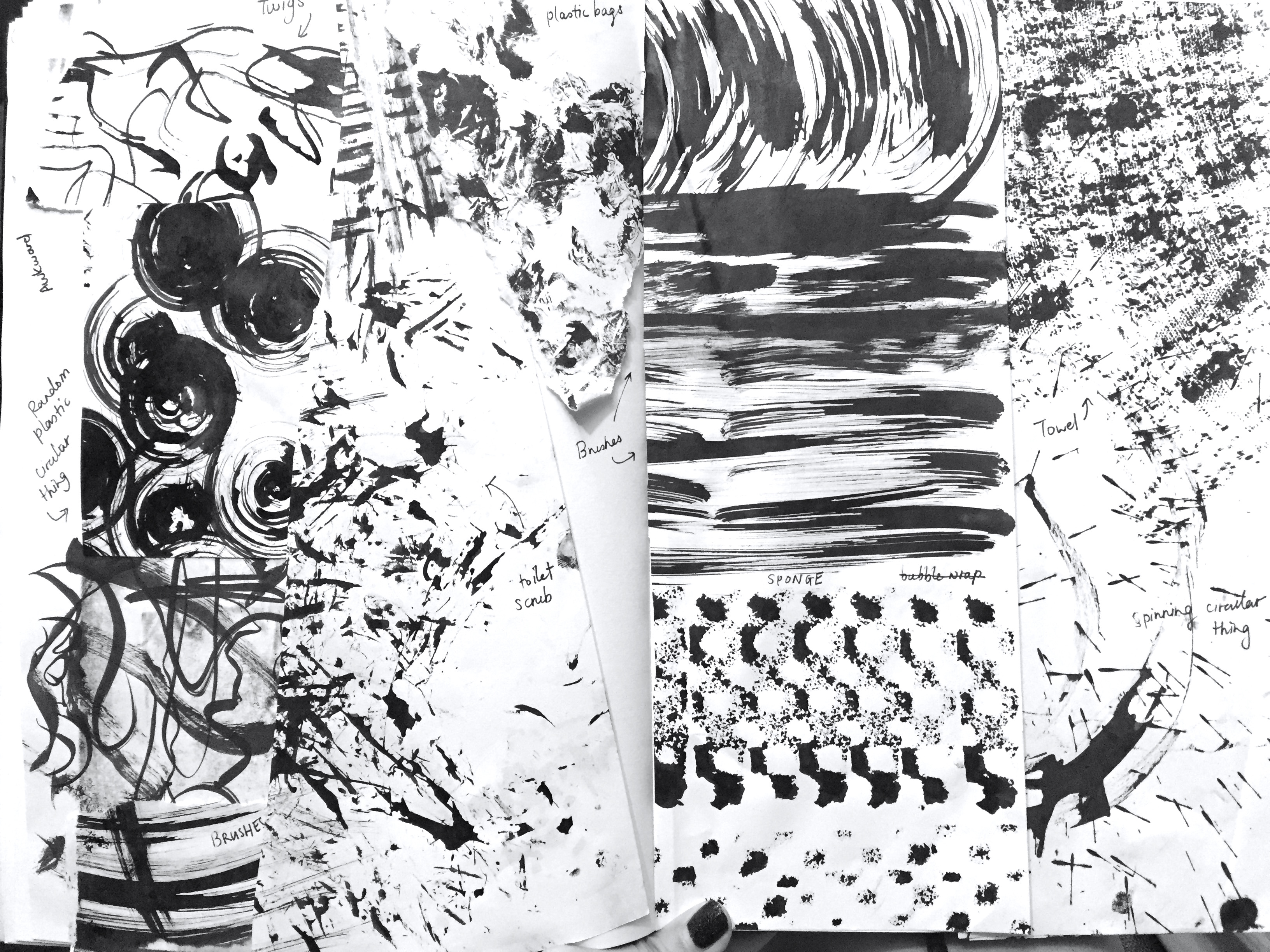
Medium wise, Nico experiments with Faber Castell pigment pens and scratch tools to create defined and intricate marks on his canvas and artwork. I’ve also watched some of his process viedos and I noticed that he etches over black ink and that looked similar to white ink drawn on black. I would like ti experiment on this!
I’ve also found other Charcoal artists such as Judith Ann Braun, Adeline Chong and Wenjing Zhu inspiring. Judith uses 4 basic rules in her work; Symmetry, Abstraction, keeping her work square, and carbon medium. The similarity I found in their work is that they are all process driven. Adeline creates line and form through feeling and reaction from each stroke. Wenjing believes that by reducing details, lines speaks their language and stands out by their own; the minimal attempt enlarges viewers’ imaginary space.
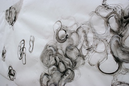
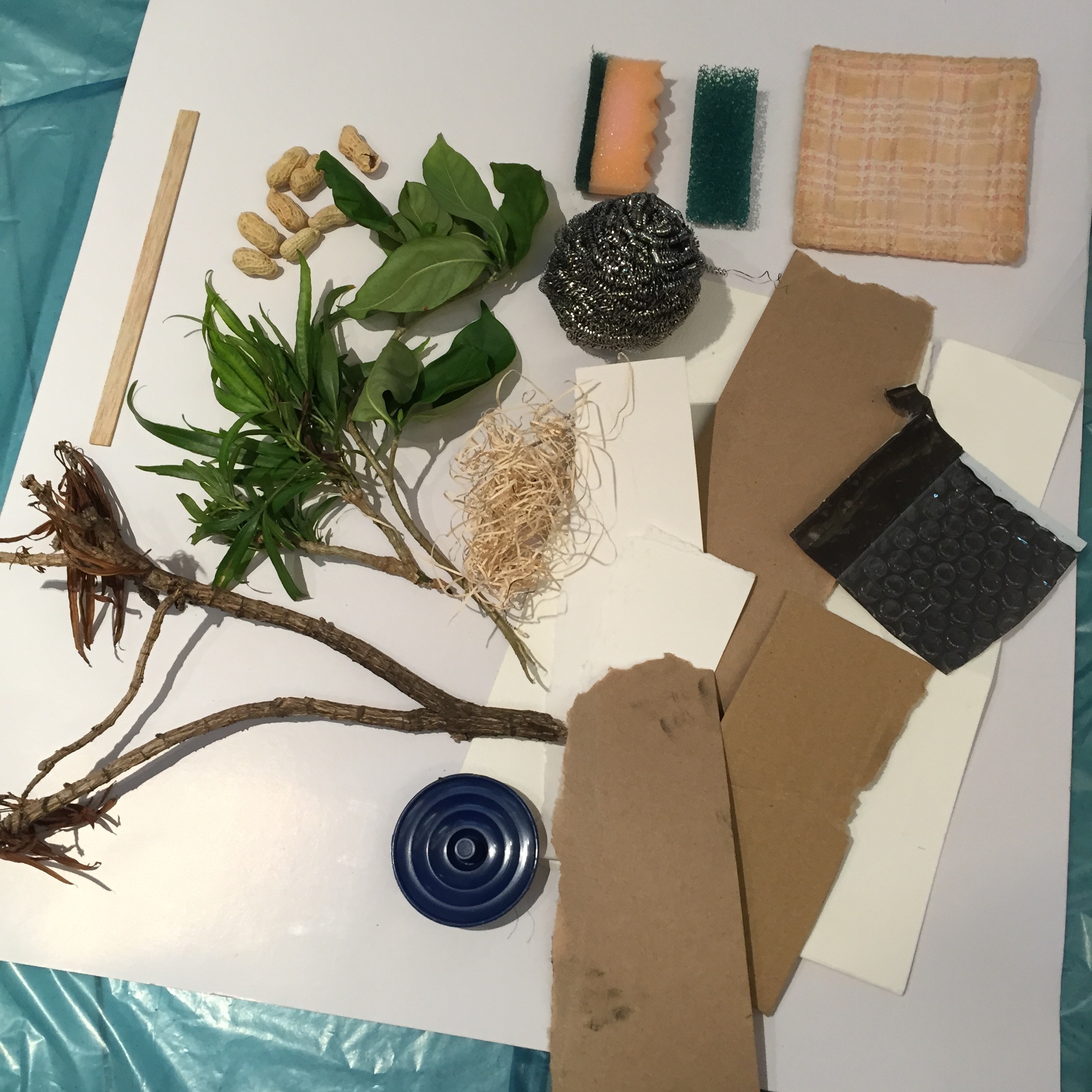
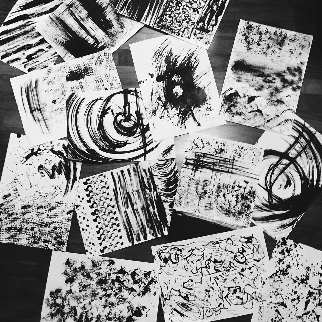
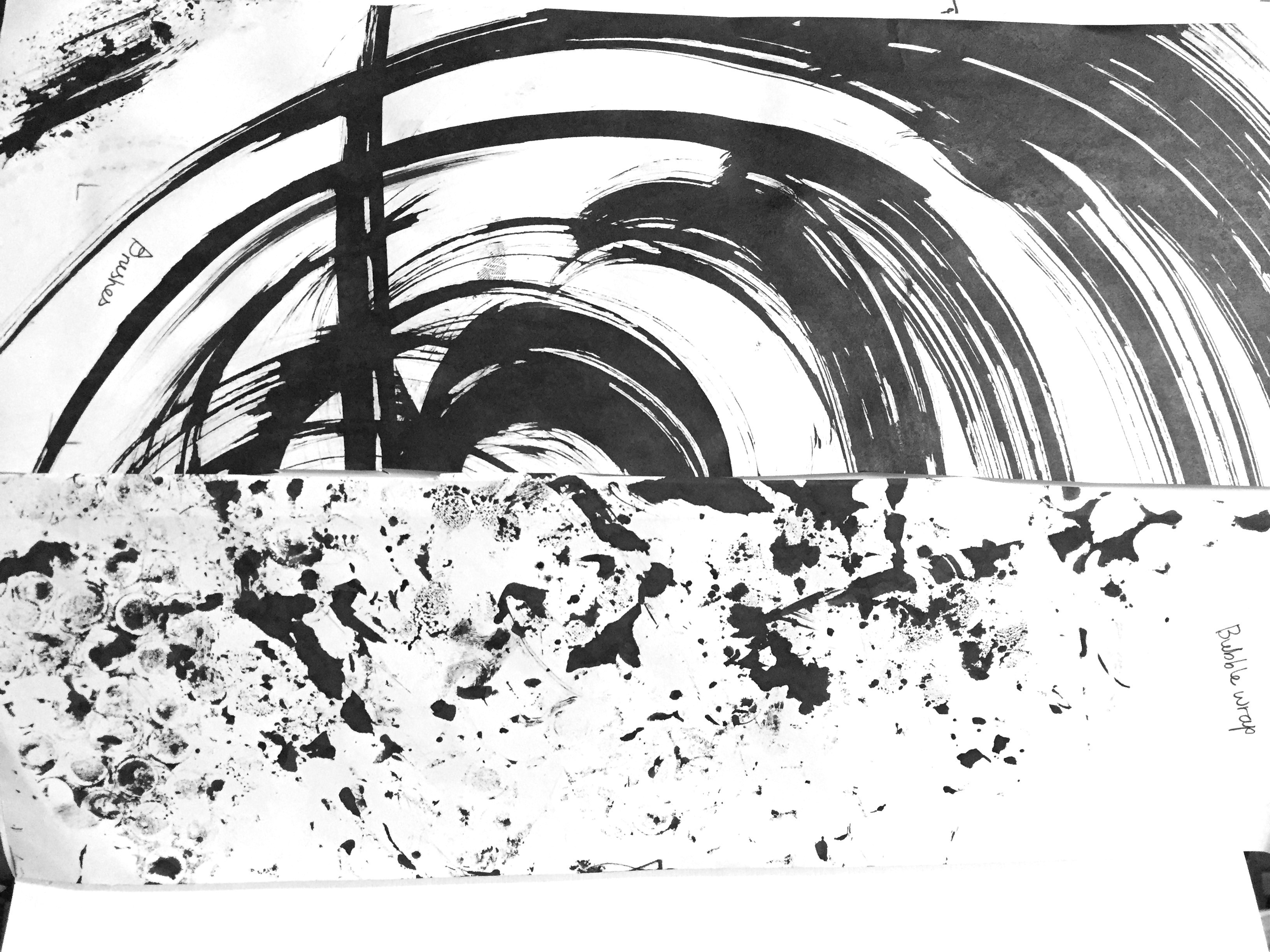
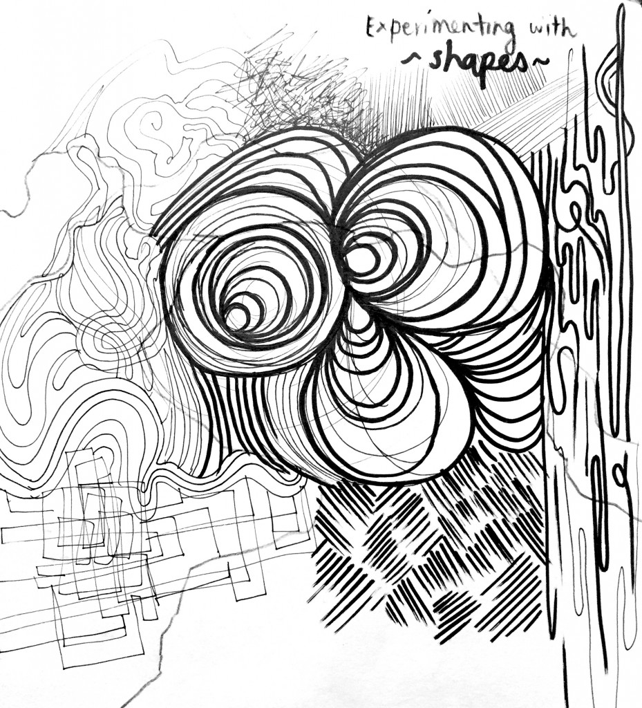
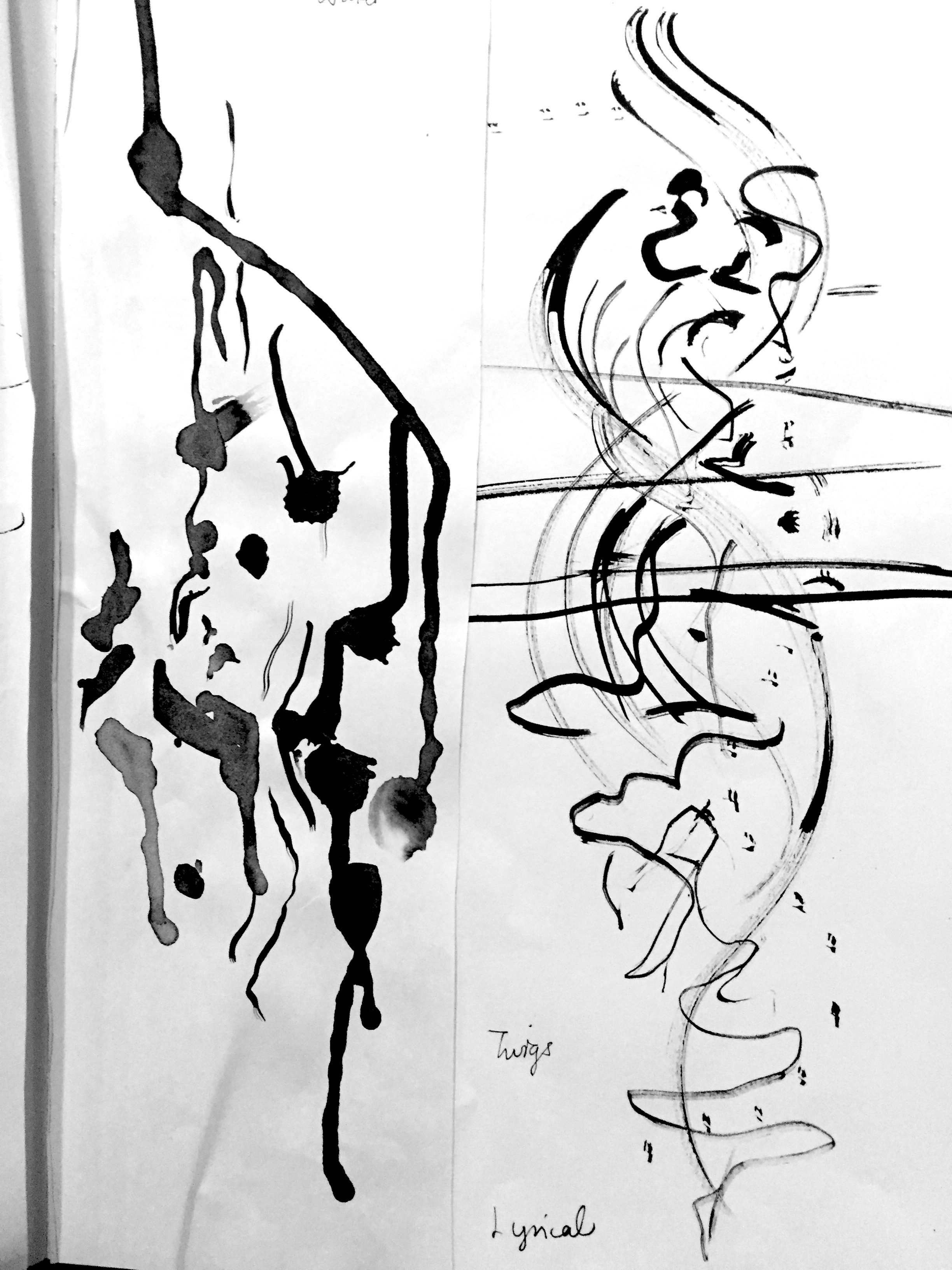
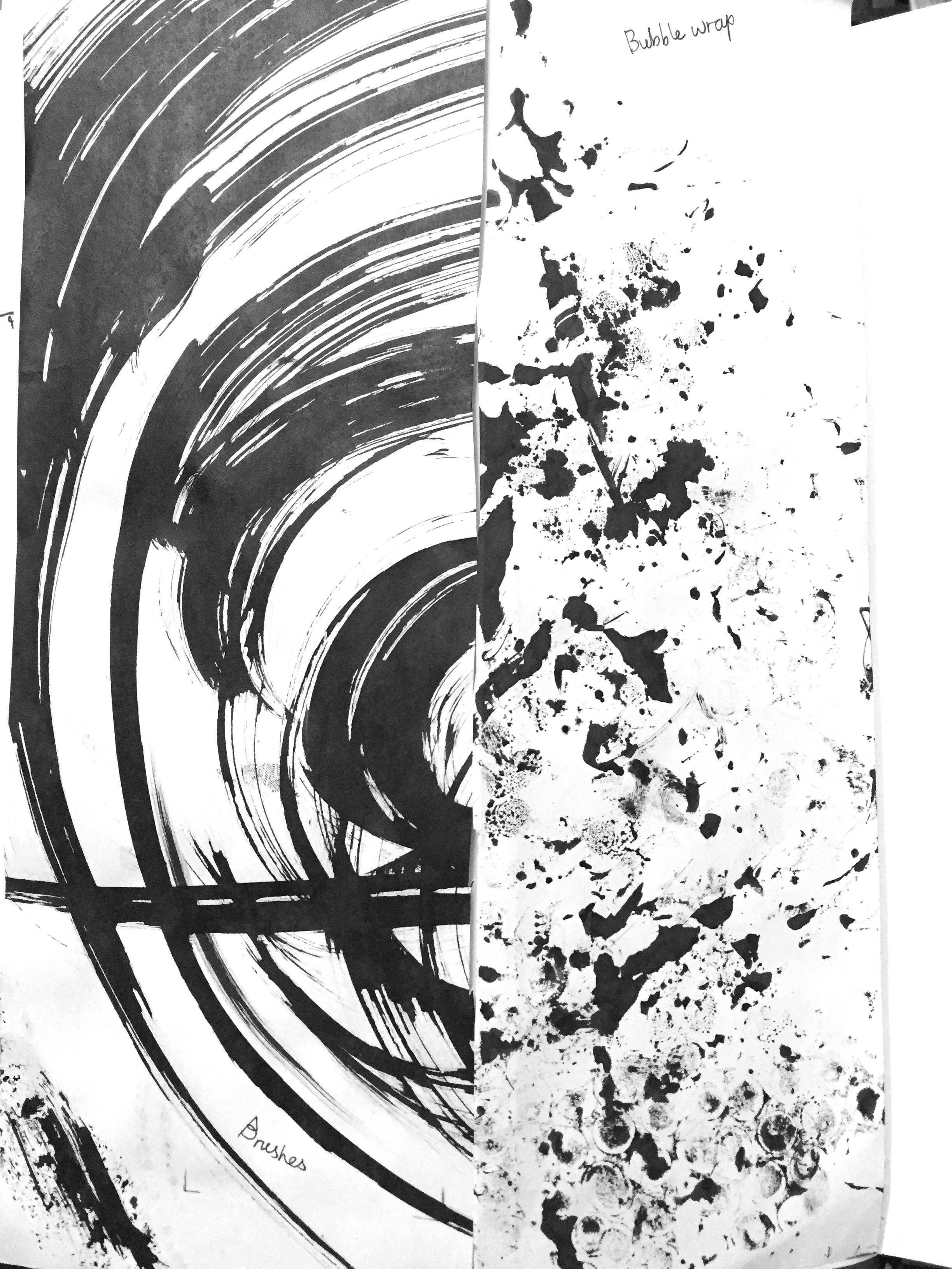
Here are my experimental works… I used tools such as bubble wrap, twigs, plastic bags, toilet scrubs/ sponges etc. and many random things.
Experimenting…
Further brainstorming…


