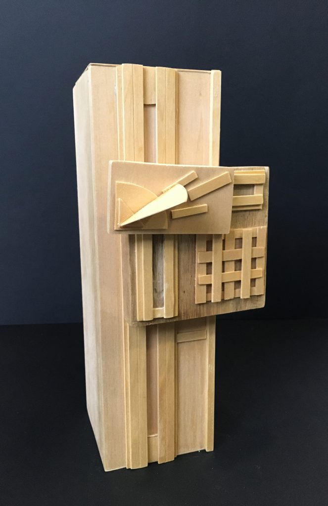
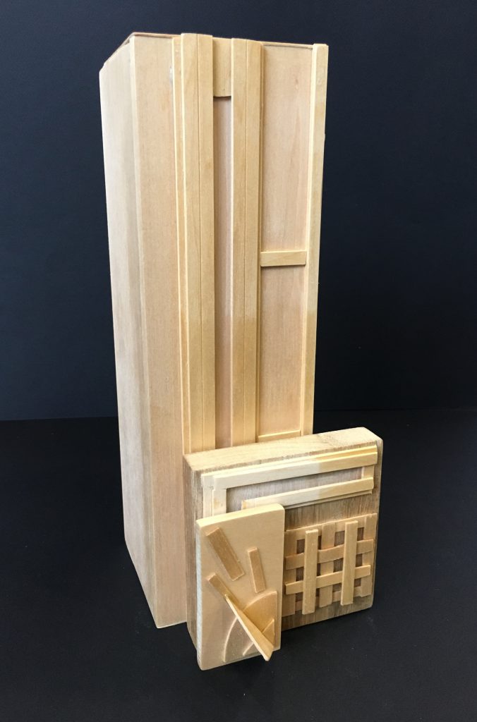
In Project 2: Gaia’s Ikebana, we had to combine different elements together to create a final design. The composition requires the play of a sphere, cylinder, cone, tree branch and an extra element of your choice. It is a combined investigation of curvilinear form, food components, seasonal elements, and Ikebana.
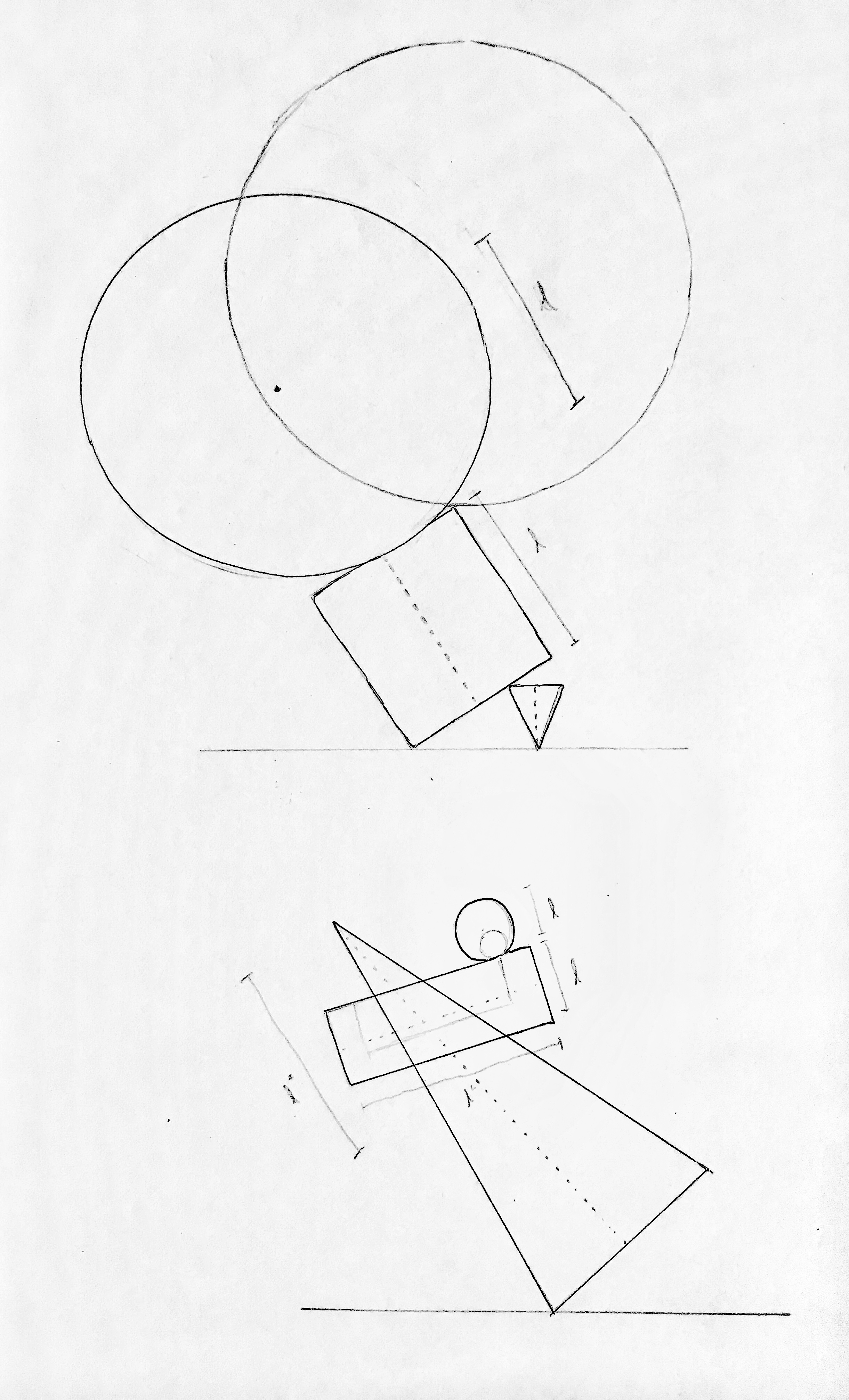
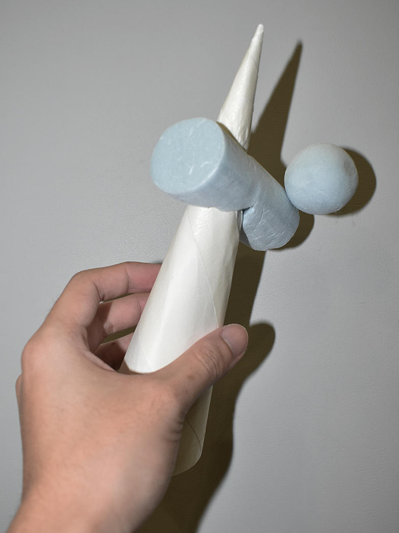
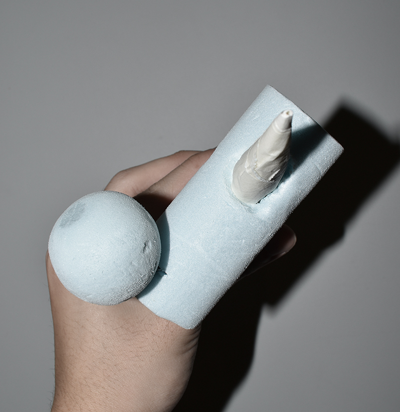
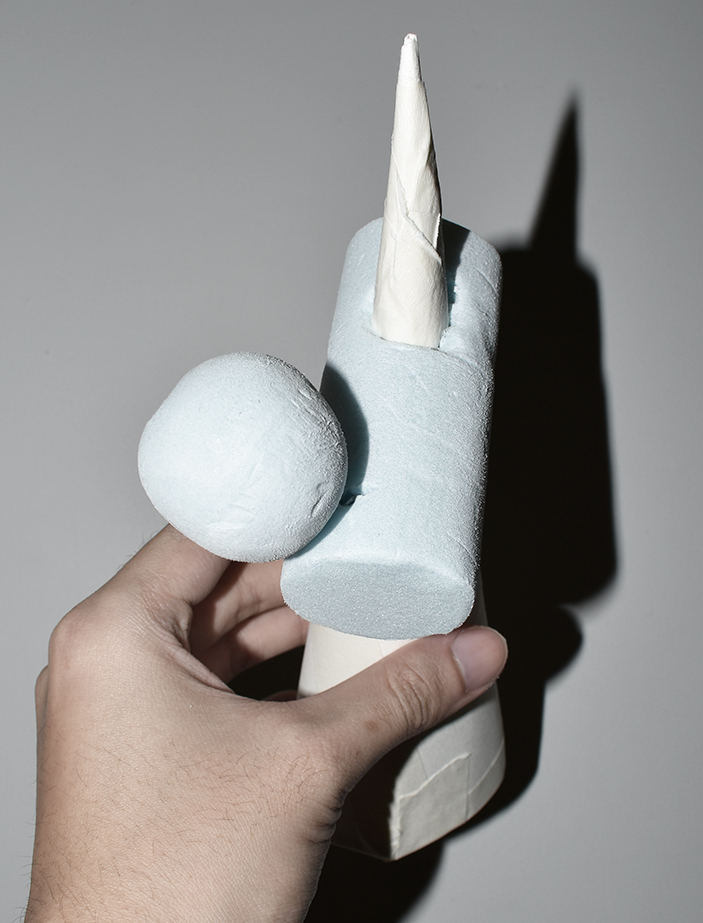
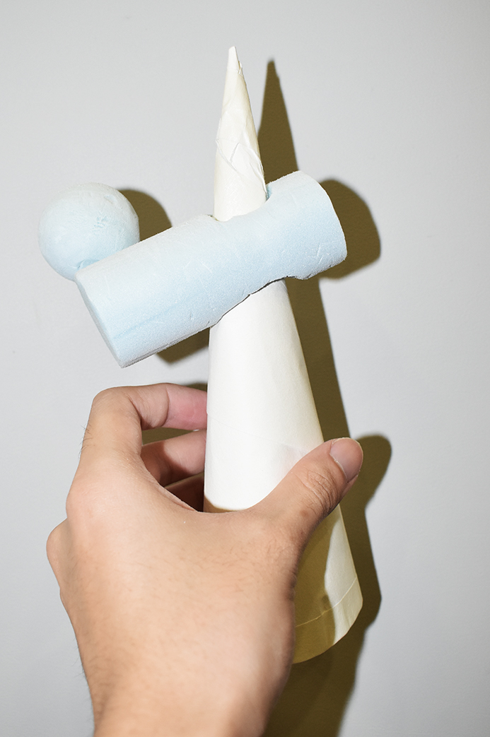
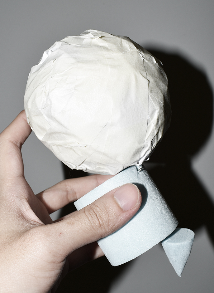
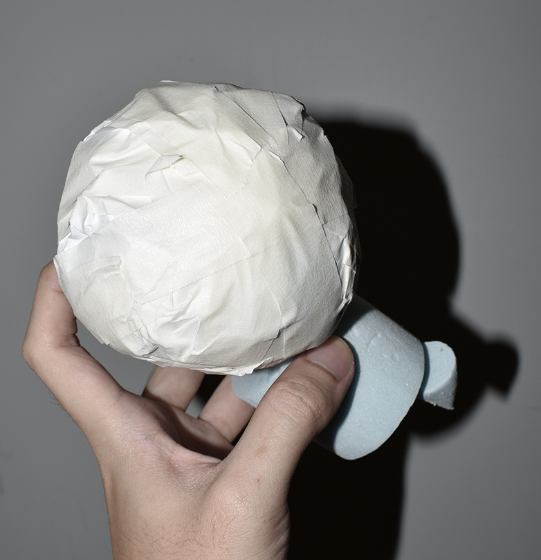
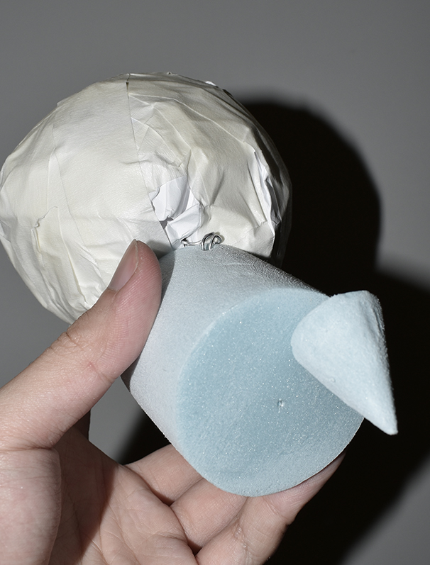
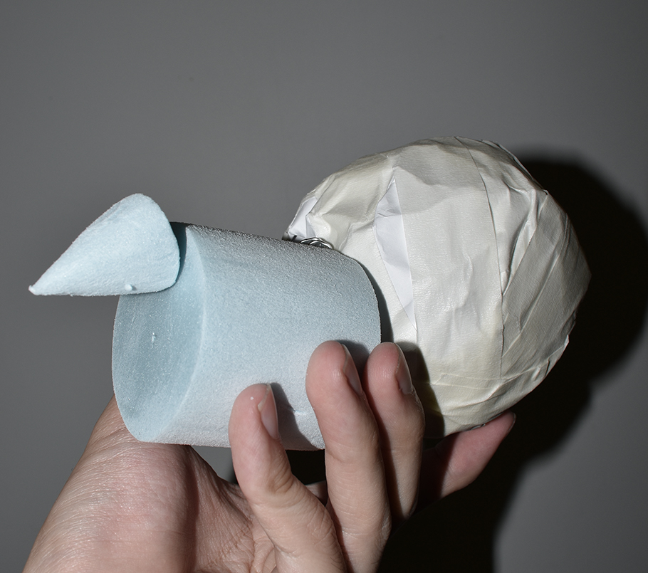
The project started out with the investigation of cones, cylinders and spheres shown in the link. (https://oss.adm.ntu.edu.sg/bren0022/a-cone-a-sphere-and-a-cylinder/) . After consultation, necessary changes were made to the design of the 3D model. In the top model, the Dominant sphere is enlarged to provide a stronger presence as a Dominant component. In the bottom model, the Subordinate Sphere is too similar in circumference size to the Subdominant cylinder, thus the sphere is shrunk to avoid similar visual sizing. After much consideration, the top model was chosen as it was comparatively more dynamic in composition due to the Dominant sphere balancing on the Subdominant Cylinder, whereby the Subdominant Cylinder and Subordinate Cone are balancing off each other.
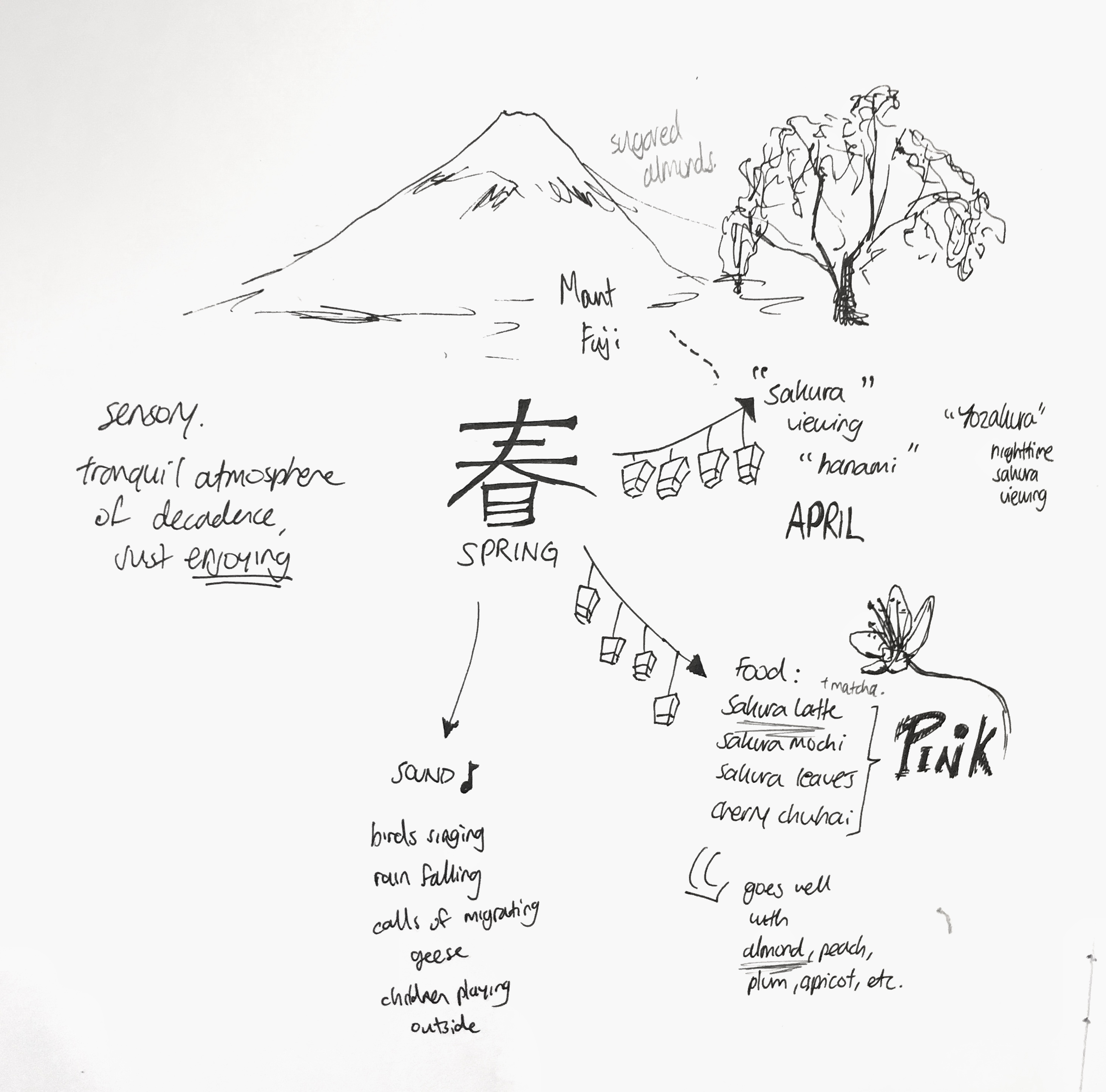
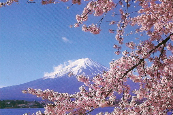
Moving on from this, we were given themes of different season to incorporate into our models and I received the theme of Spring. The mind map below highlights the features of spring as a season. Keeping with the theme of Ikebana, which is Japanese flower arrangement, I decided to investigate the idea of Spring through the scopes of Japan. Spring in Japan is largely recognised as the time of the year around March or April, where people take part in Hanami, or sakura watching (Cherry blossom). Families and friends would gather together to watch as the cherry blossoms bloom, enjoying time while they eat and chat. I have summed up the idea of spring in Japan into categories, with food that they consume, to the sensory aspects like sound and smell as well. The variety of food consumed during this season could be used in my final model as well, with different combinations like almond and sakura latte. The location of sakura watching is also concentrated around Mount Fuji, an element I could incorporate into my model.
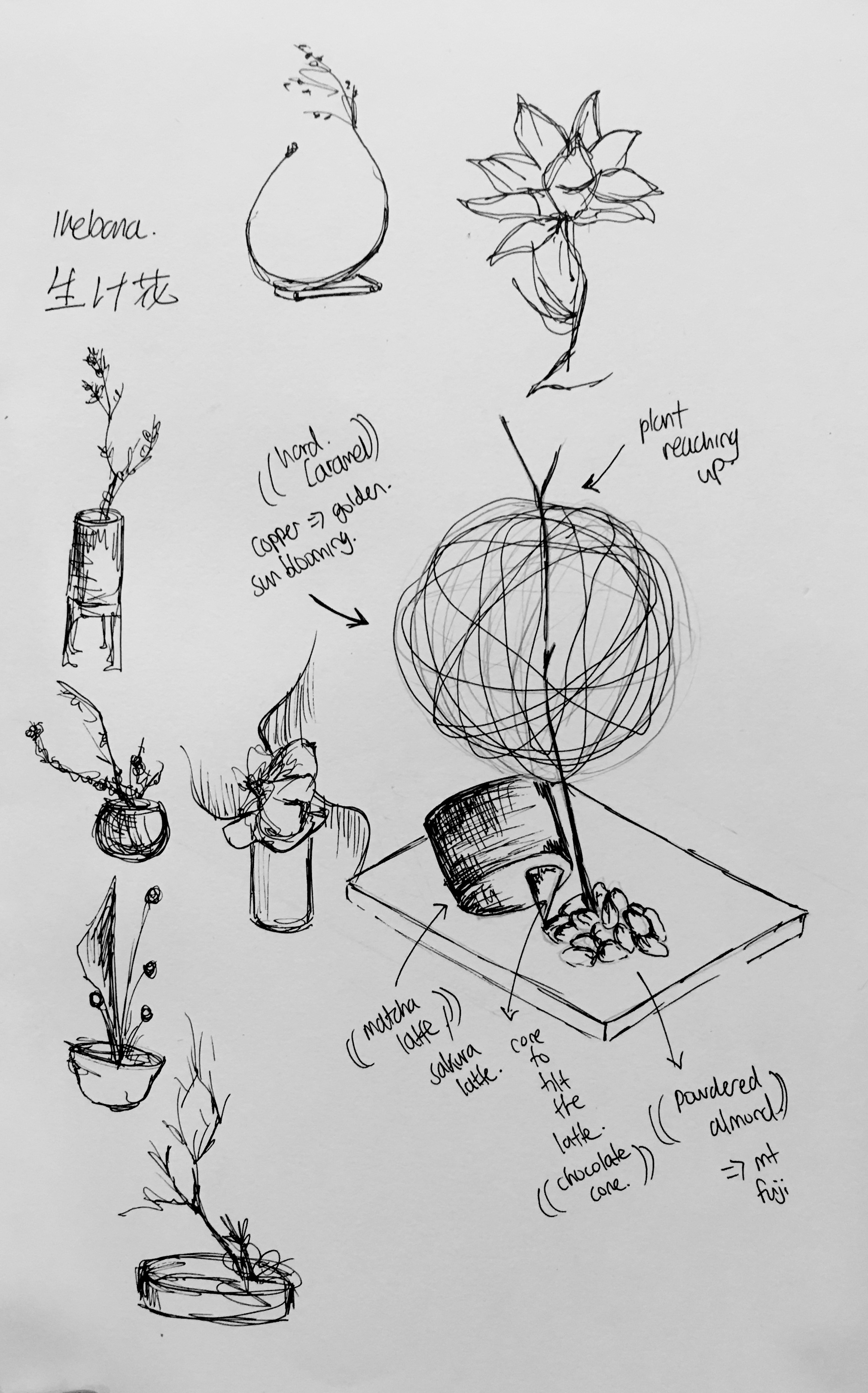
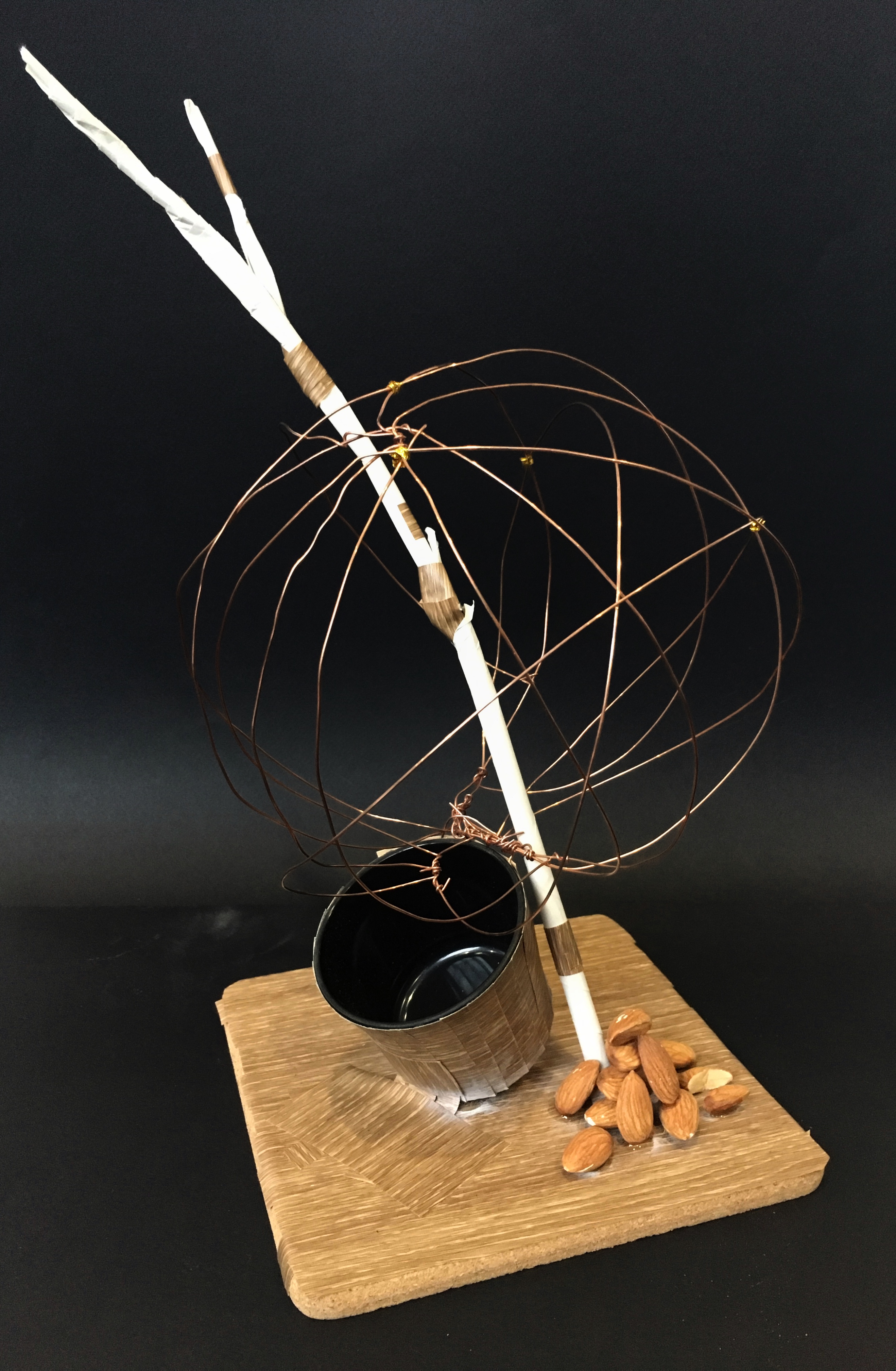
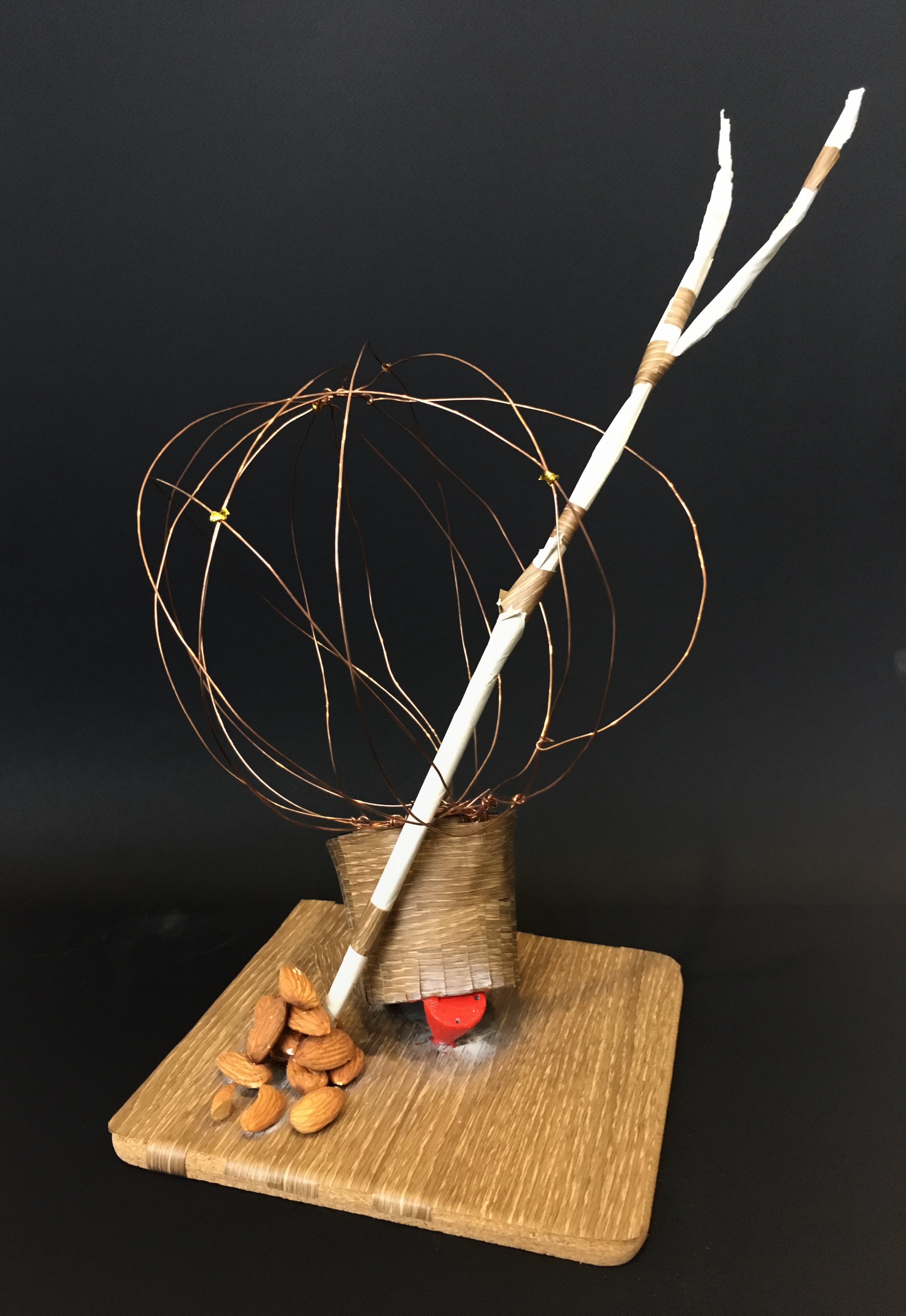
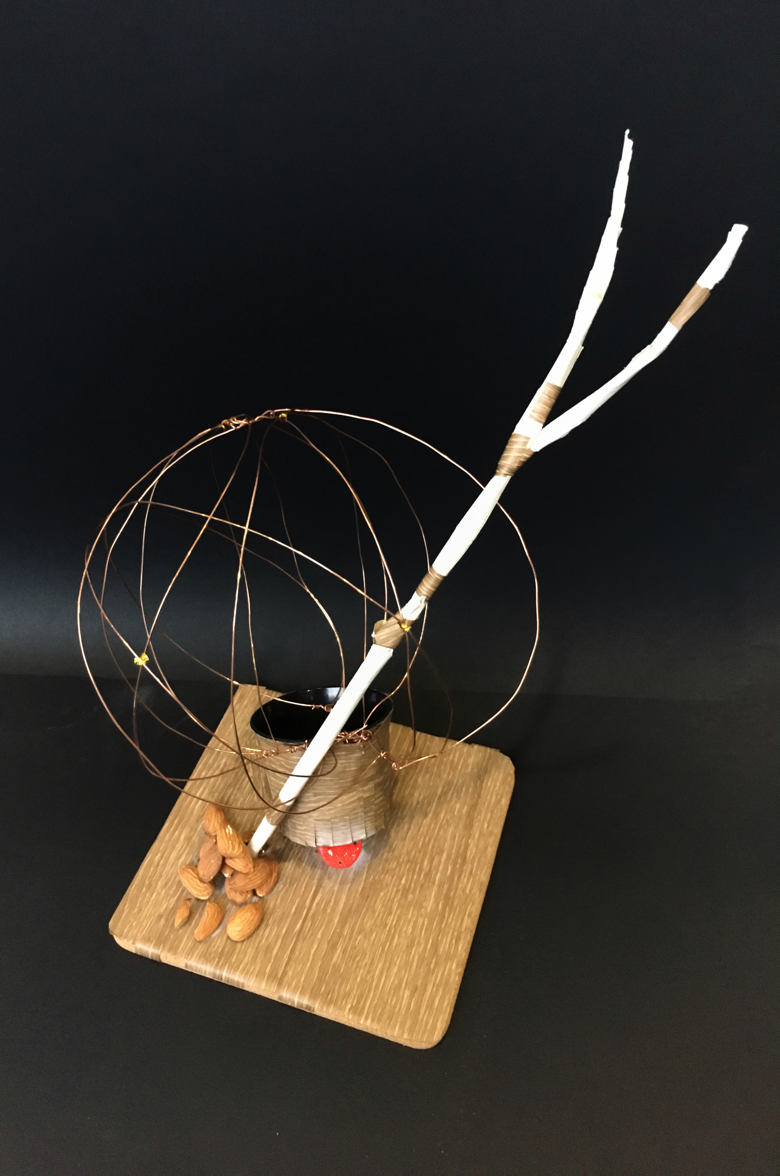
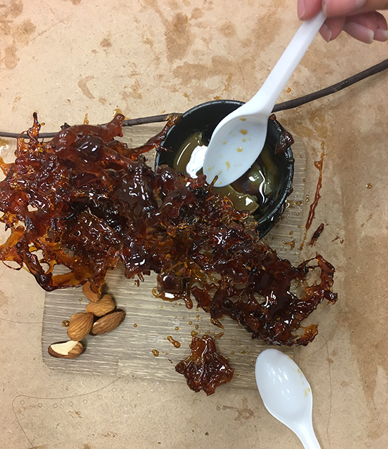
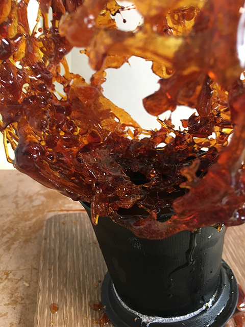
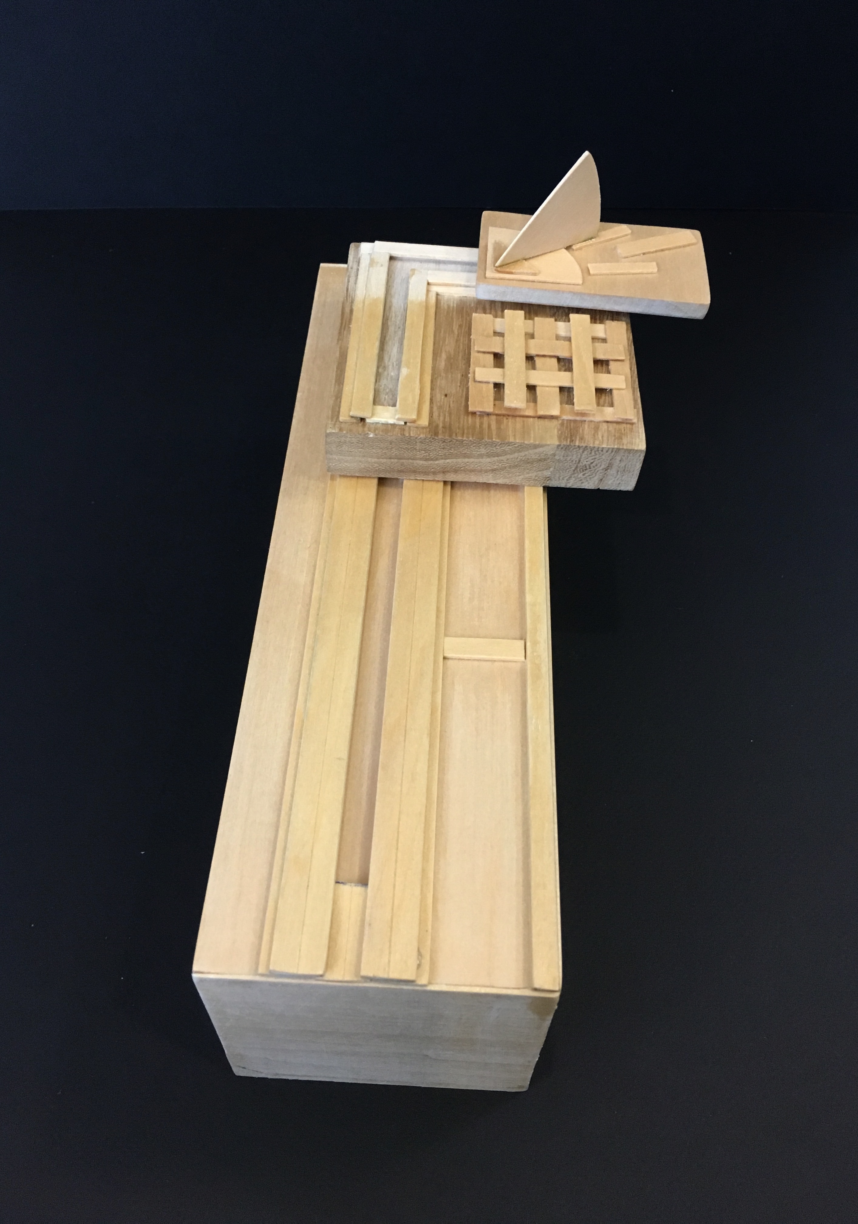
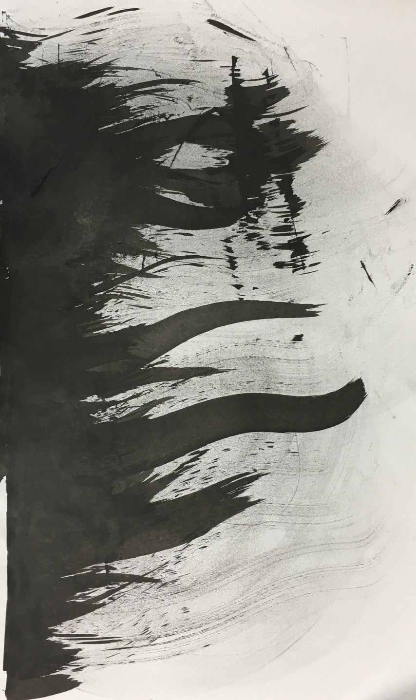
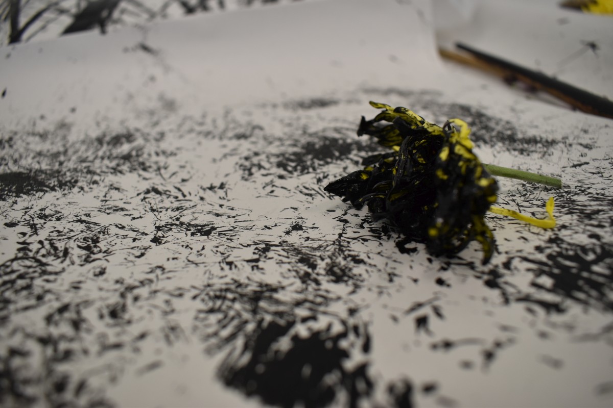
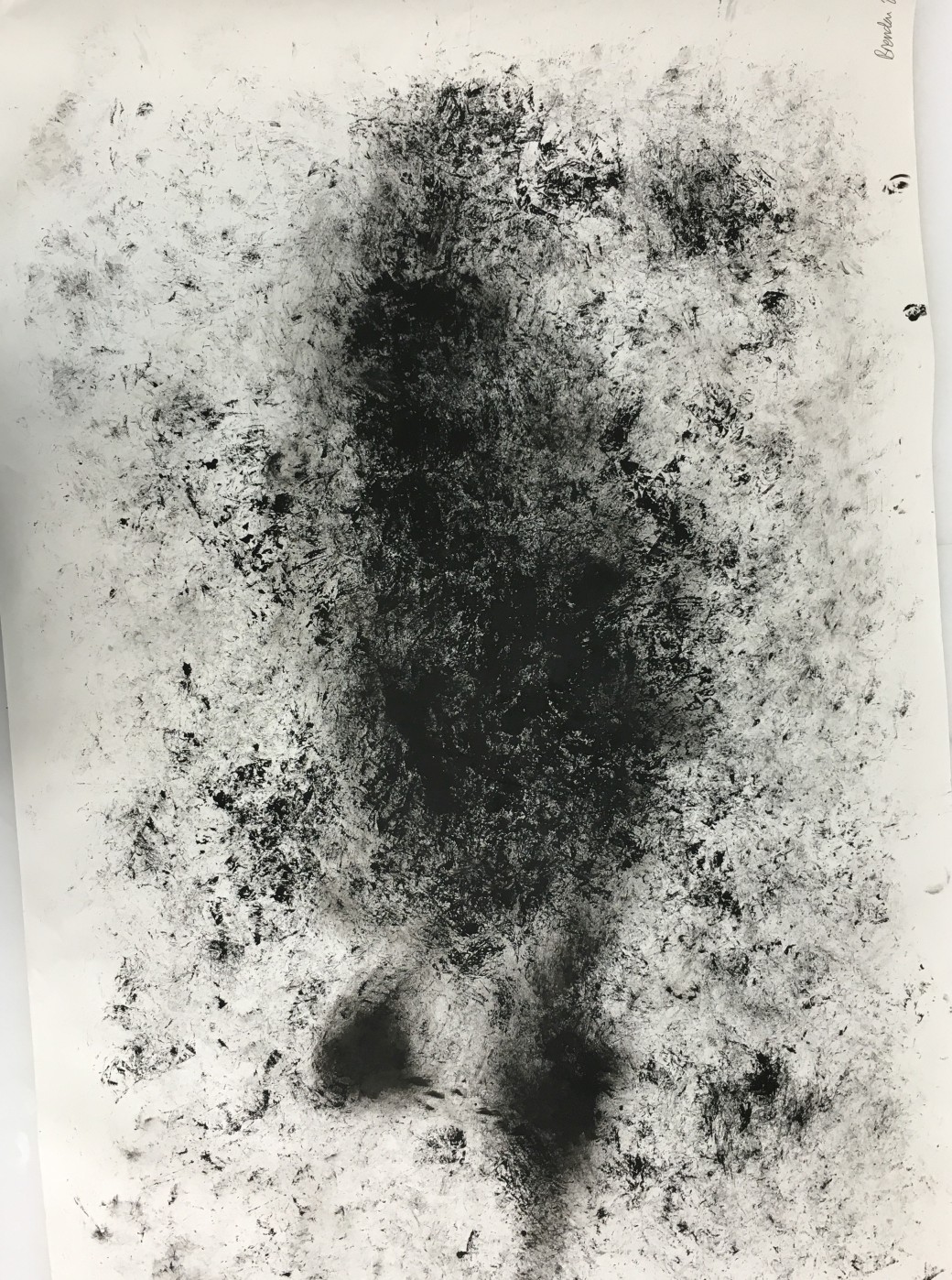
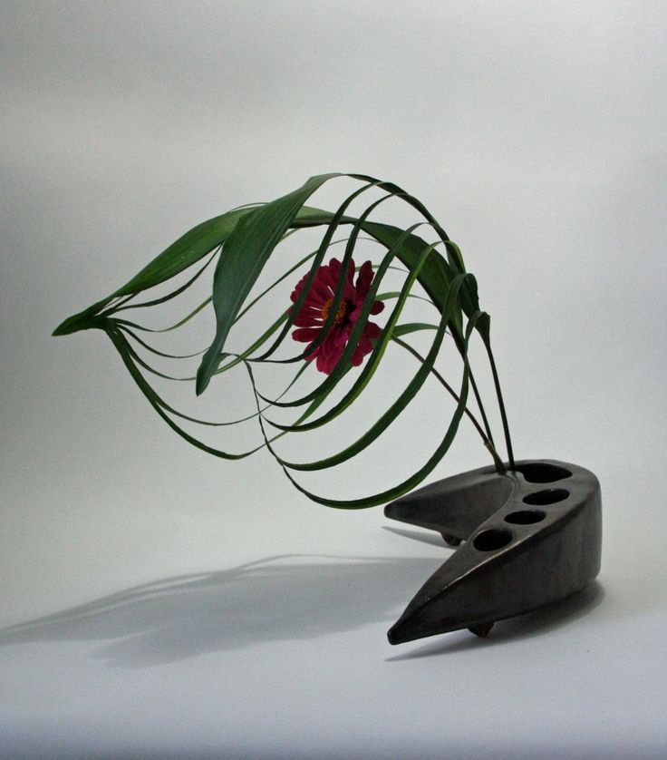 After looking through some designs online, I found that Ikebana examples with an elongated element often catches my eye due to the overall symmetry and balance. And using my initial 3D sketch model, I create the above design, and the one below for a close up. In the spirit of using food as components for the final model, I decided to create two models, one with food and one with non-food materials. For the non-food model, I decided to use bronze wire to create the Dominant Sphere on top of a found cylindrical cup balancing on a painted foam cone. For the food model, I decided to use hard caramel to create the sphere, balancing on a Japanese tea cup with chocolate cone. For both models, almonds will be placed at the corner to achieve an asymmetrical balance. The tree branch will also be placed within the sphere, held on by the pile of almonds.
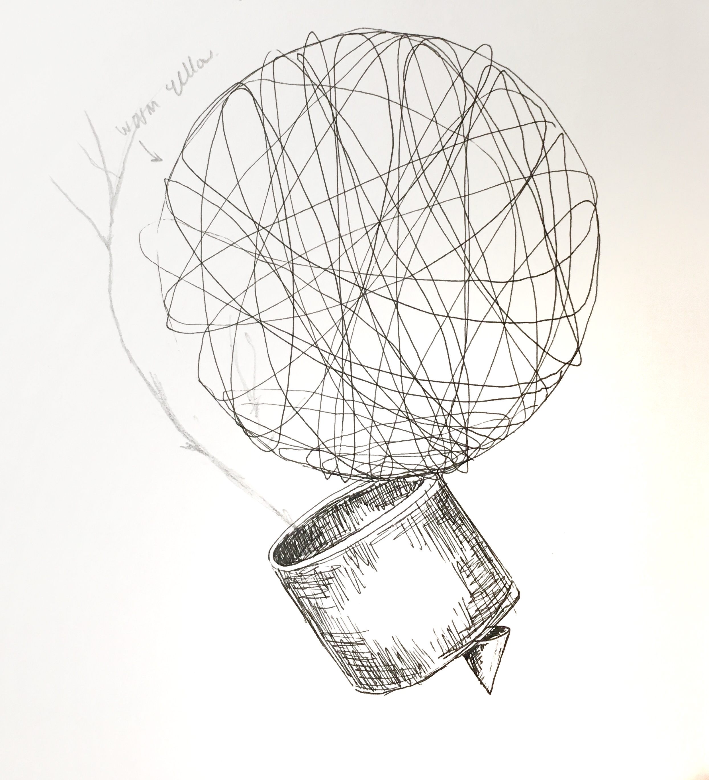
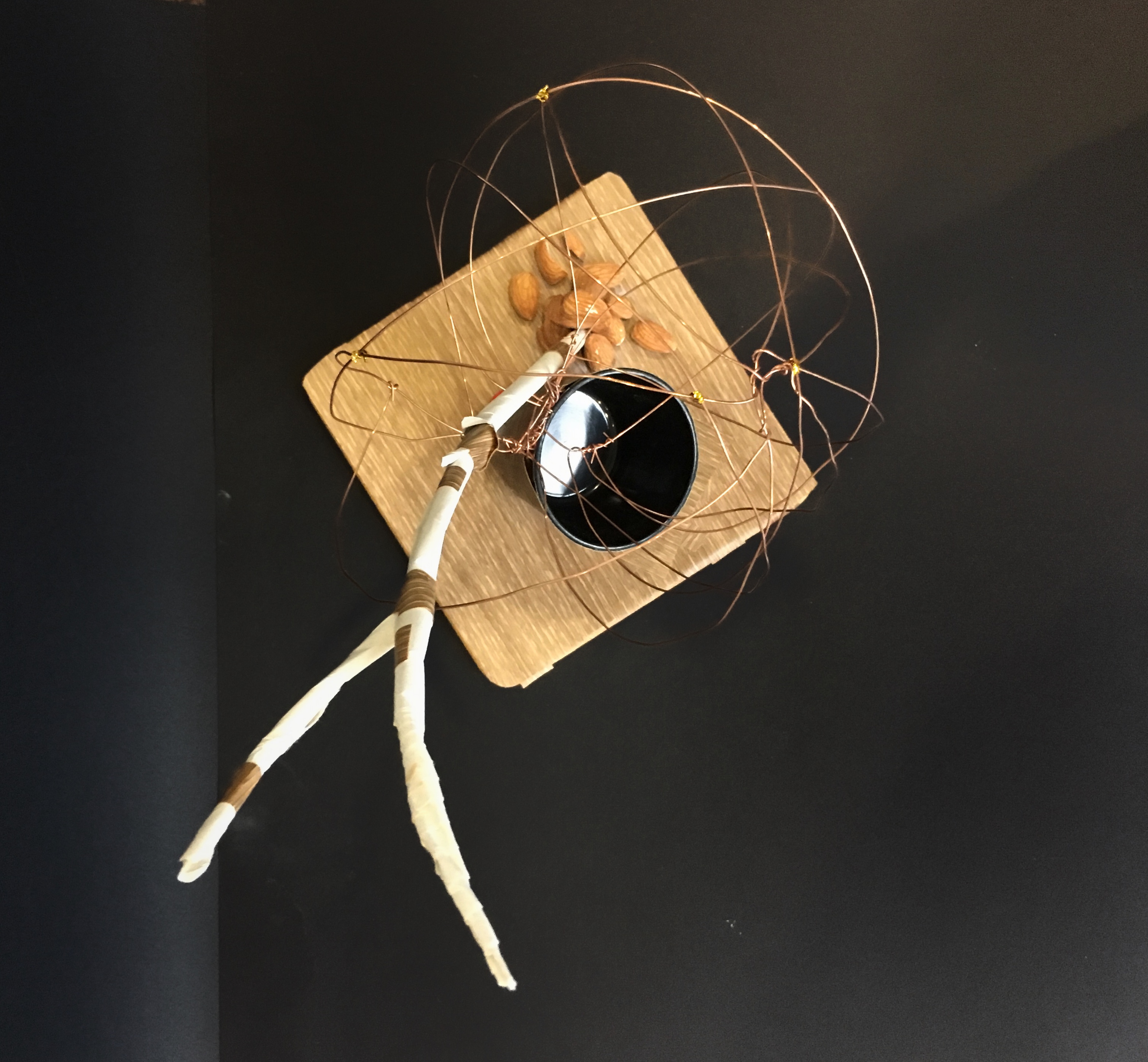
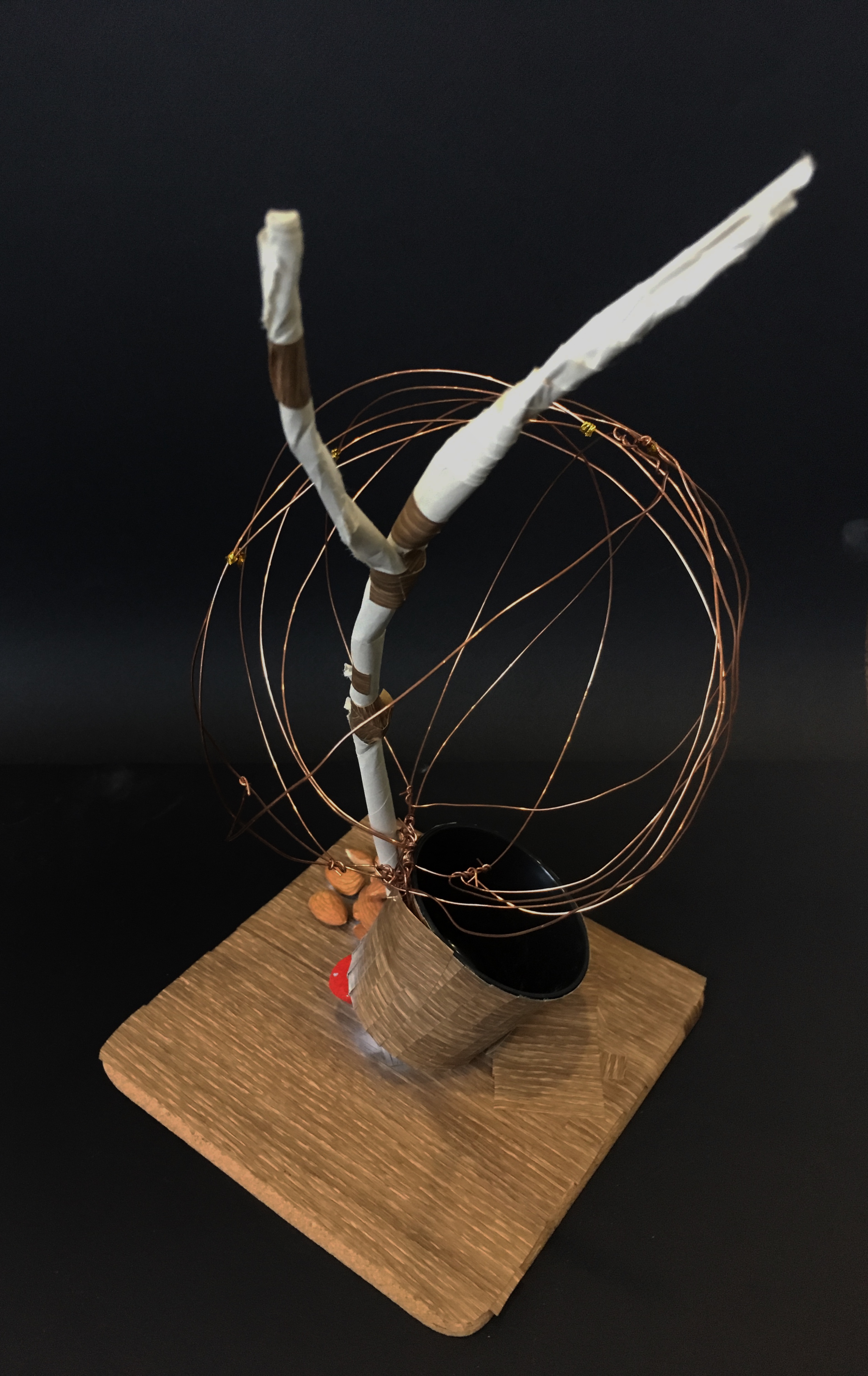
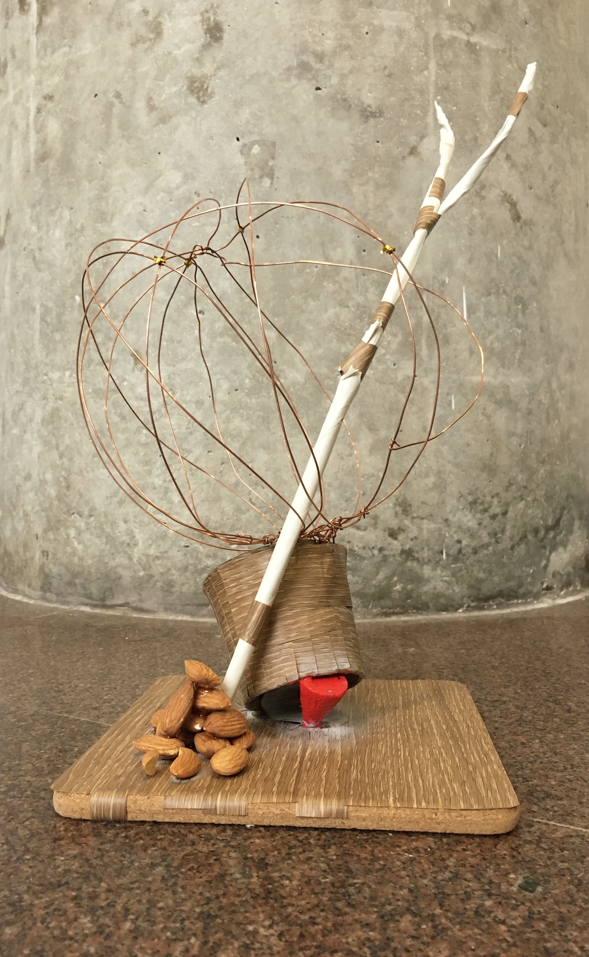
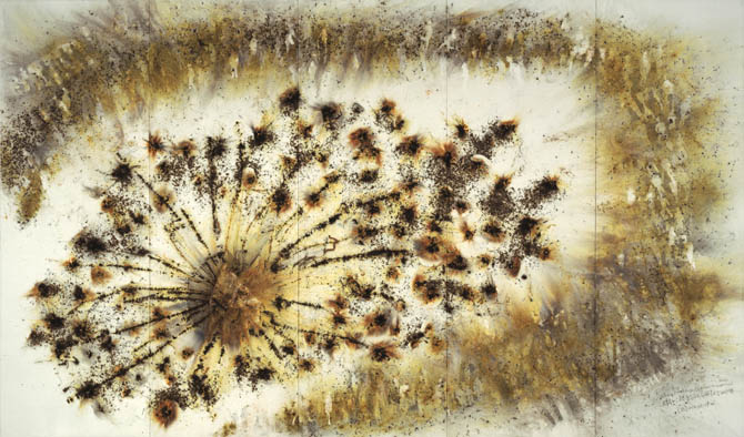
In my non-food model, shown in the photographs provided below, I tried to follow the theme of positivity and energy as that was what Spring is Japan was about. I chose bronze to make the wired sphere as it encompassed the idea of a warm and glowing Sun. The tree branch shoots out of the sphere from the base as I realised that this would provide a stronger narrative of growth as compared to the sketch shown above. The addition of almonds in this model is to provide more details to a Minimalistic sketch. The numerous almonds, Subdominant, gives a strong composition due to its number. The composition sizing in this model is Dominant (Sphere, Tree branch), Subdominant (Teacup, Almonds) and Subordinate (Cone). The design of the model largely follows the texture of wood, even the almonds. The contrast of the red cone, bronze wire and wood is strong, allowing the audience to be visually guided from the base to the top.
________________________________________________________
Tasting Spring- Ikebana
Ingredients
- 2 cups of coarse sugar
- 1 packet of rubber balloon
- 1 teaspoon of vanilla essence
- 1 cup of matcha milk
- 1 packet almond jelly powder
- 1 packet of almonds
- 1 packet of dark chocolate
Makes: 4 servings
Prep time: 30 minutes
Waiting time: 60 minutes
Directions
Caramel Sphere
- Heat pan to low heat and pour in 2 cups of coarse sugar.
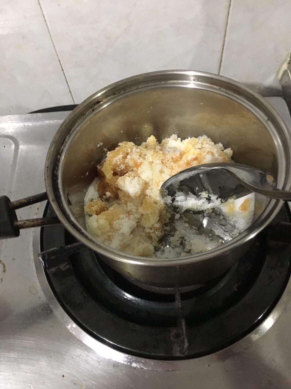
- Stir constantly to avoid burning caramel
- Cook the caramel until melted and golden brown (Add vanilla essence for additional flavour)
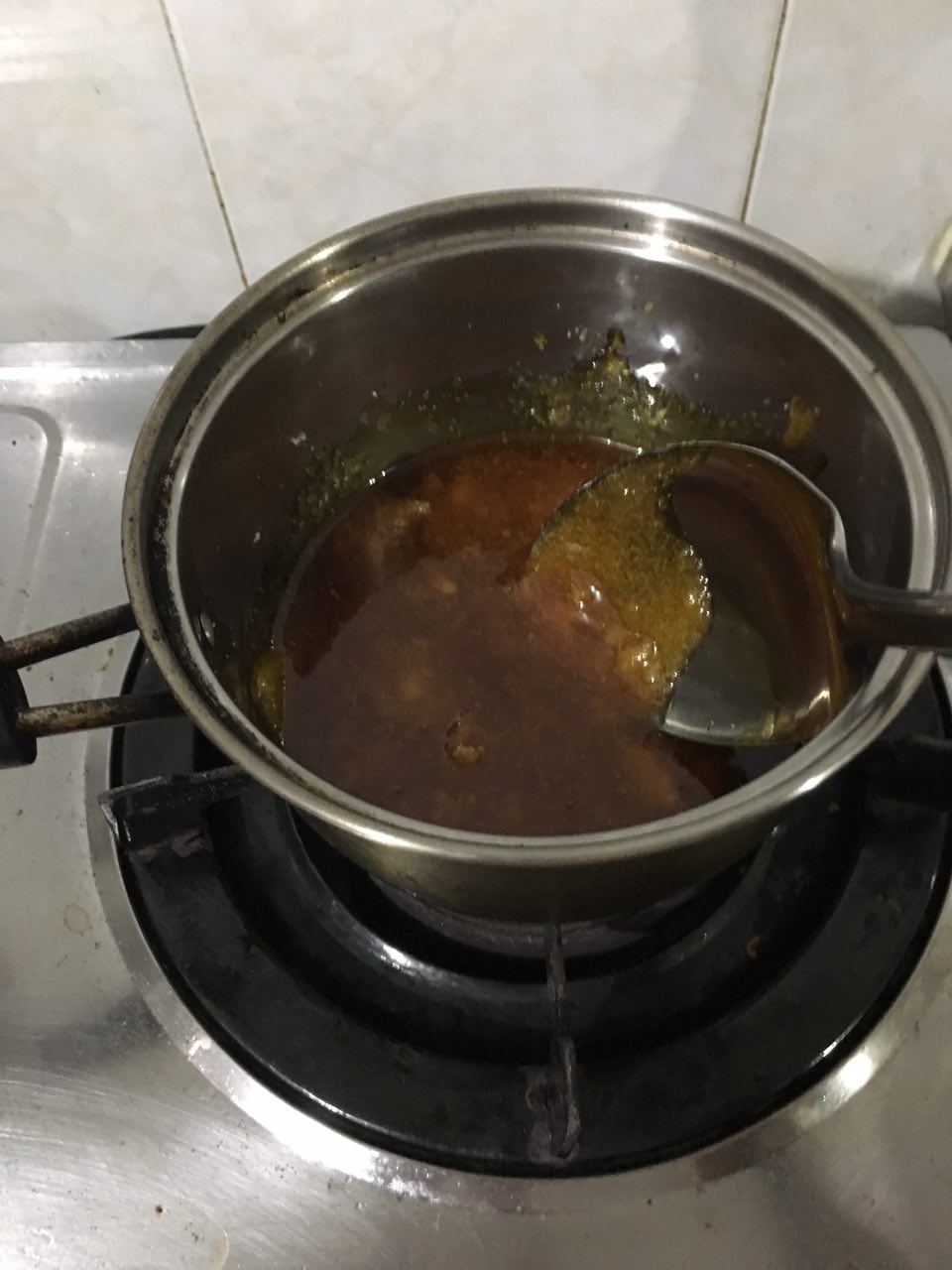
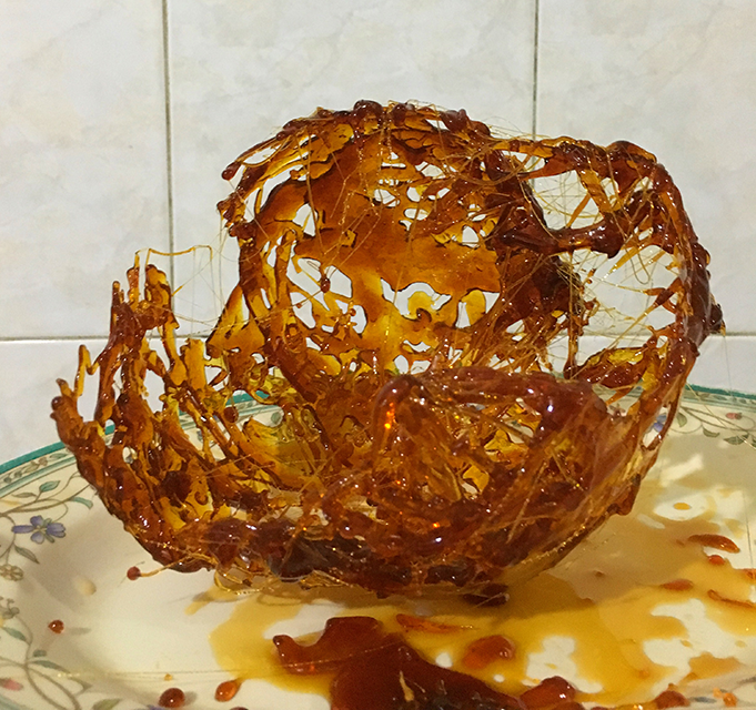
 4. Fill balloon with water to avoid bursting, then place the balloon on a cup for support.
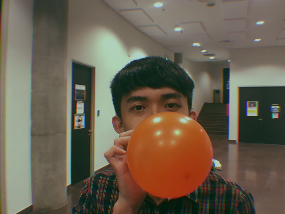 5. Use a spatula and drip melted caramel over balloon, layer it for more details
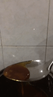
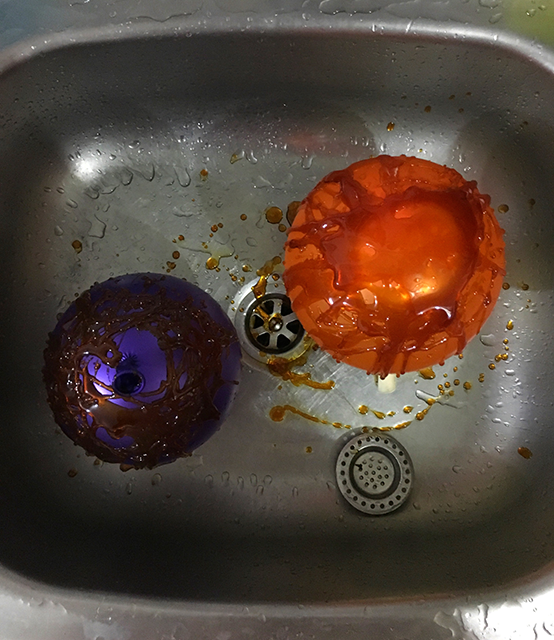 6. Lift up the spatula to stretch out the caramel, giving finer caramel strings.
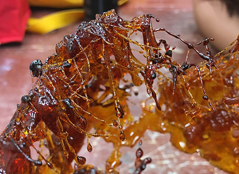 7. Wait for caramel to cool, around 5 minutes. Pop the balloon (Be careful)
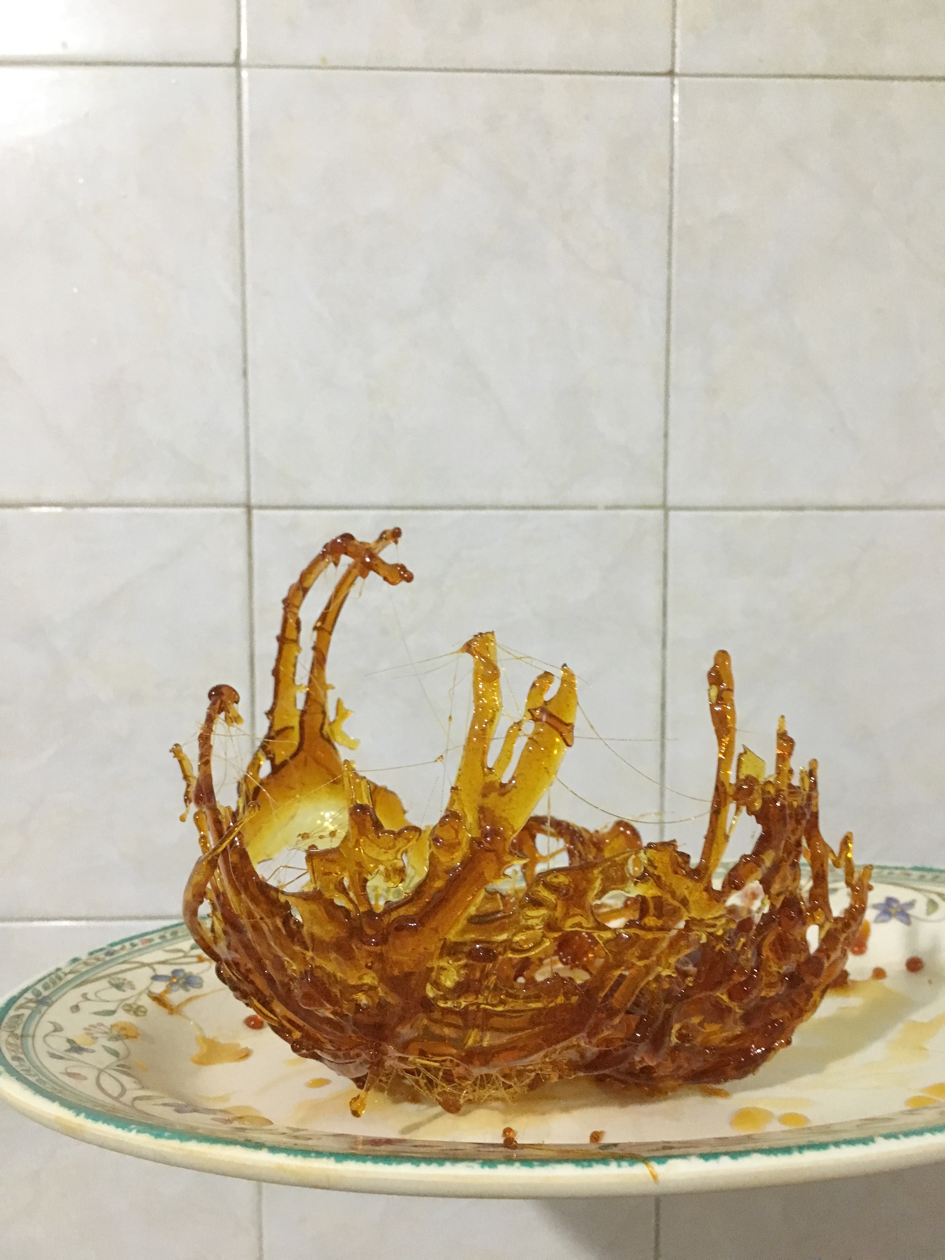
Repeat step 4 to 7, hold the final pieces to form a sphere and use caramel to glue together
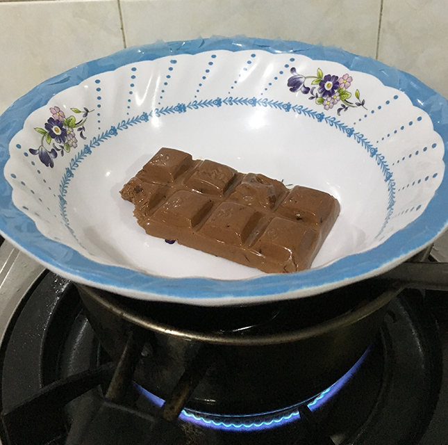
Chocolate Cone
Heat up piece of chocolate using water bath, pour it into a cone after molten.
Matcha Pudding
Take 1 cup of matcha milk and boil it over a pan to enhance matcha taste.
Add in one satchel of Agar agar powder and stir well.
Drizzle caramel diluted with water and chill for 30 minutes.
Putting it together
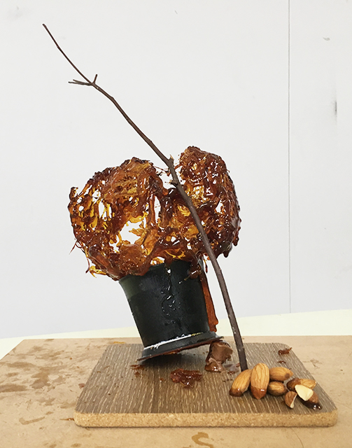
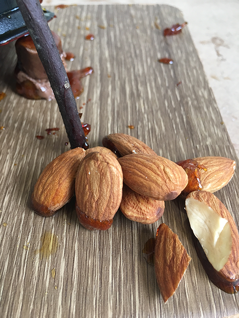
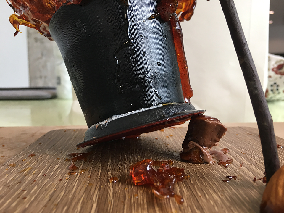
- Take a wooden platform and pile up almonds with melted caramel on one side of the platform. This brings out an asymmetrical balance to the piece.
- Using the same pot of caramel, glue the chocolate cone and matcha pudding down with a dependent balance at different directions. This allows the texture of the pudding and chocolate to be seen easily.
- Glue the caramel sphere down to the cup with more caramel.
- Place the tree branch carefully by the sphere, anchoring to the almonds as support.
How to enjoy it:
- Go to the nearest park and sit beside a tree that is flowering
- Start the meal with a caramel almond to cleanse palette.
- Visually follow the tree branch up to caramel sphere and use tree branch to break the caramel sphere.
- Think about the warm sun in the spring and how the rain drizzles droplets down blooming flowers like melting caramel
- Consume the matcha pudding with nibbles of the caramel to alternate between the taste of light bitterness and sweetness.
- Smell the air and enjoy the scenery
- Finish off the meal with a chocolate cone to clear off the heavy caramel.


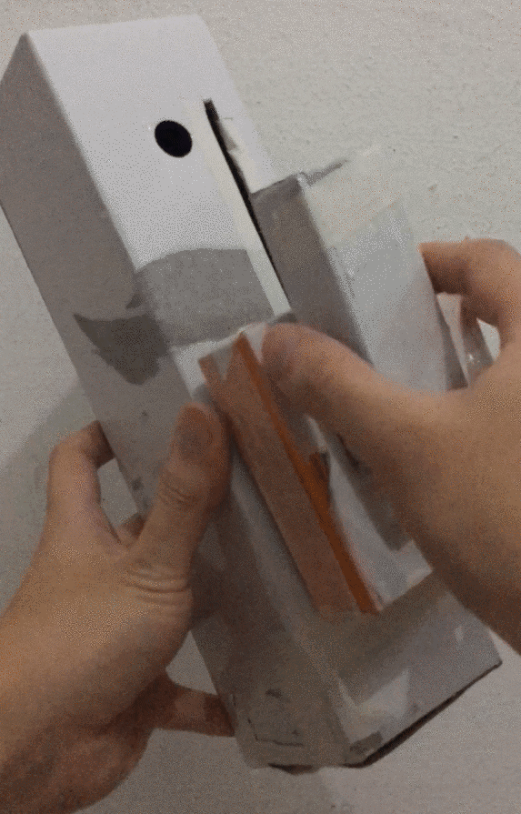
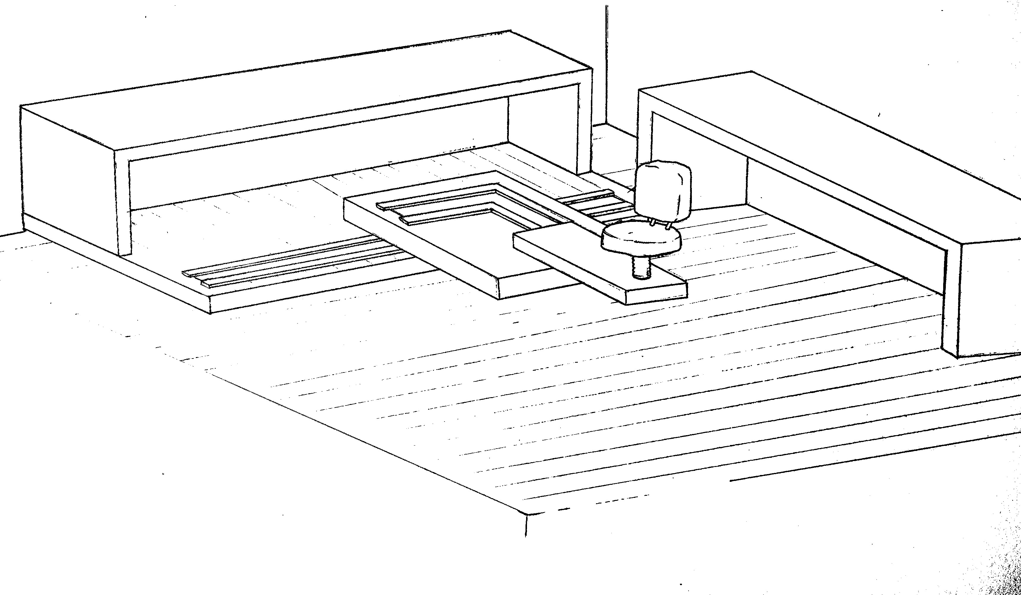
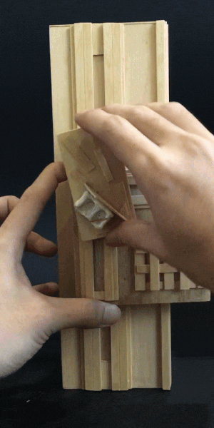 GIF 1. SO block rotating at one point
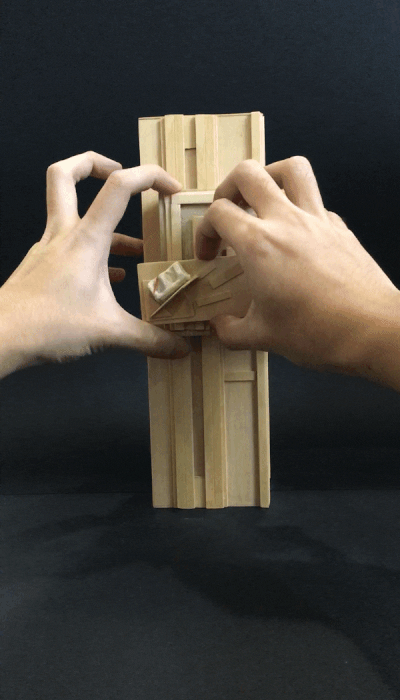 GIF 2. SO moving on SD
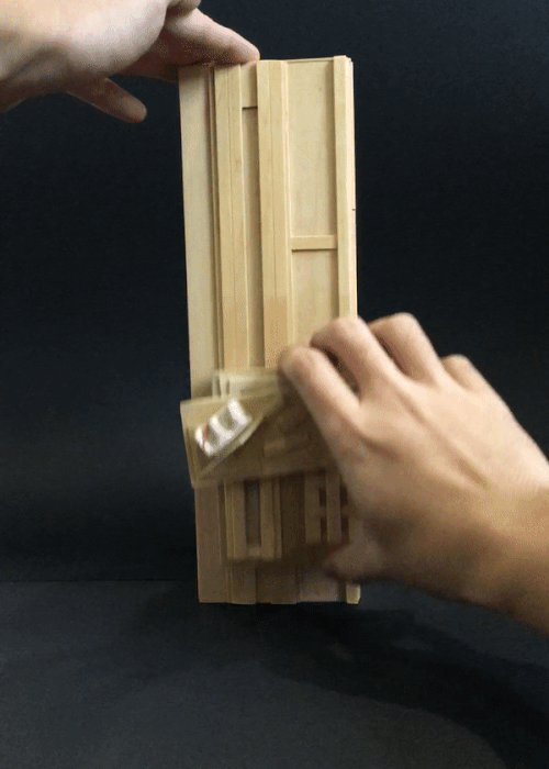 GIF 3. SD moving up and down along D

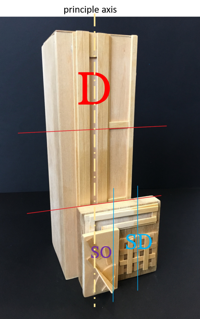
 Side View
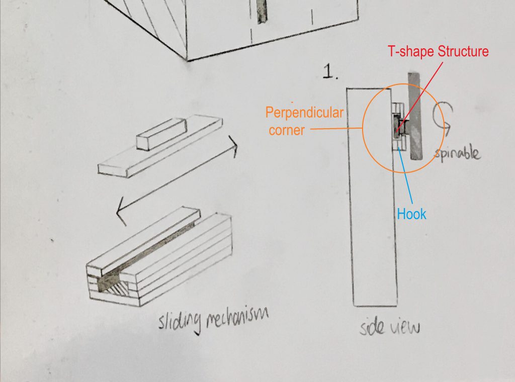 Close up on Sketch


 In task 1, we were assigned to introduce ourselves using only three photographs, at which when placed together, leads audience into a constructed reality. I was doubtful of the task initially, not because of the objective, but the ideation. As a coming-to-age adult, expression of self identity is a common issue for most people, where most of the population never finding out who they truly are as real, introspecting human beings.


