As we venture into the last assignment under 4D, we begin our investigation with time and space. This trait opens up the arena of art-making onto installations, kinetic sculptures and even performance art. We applied what we learnt from the previous lecture held by Lei and sieved out a few artworks that we enjoyed, paralleling its pros and cons.
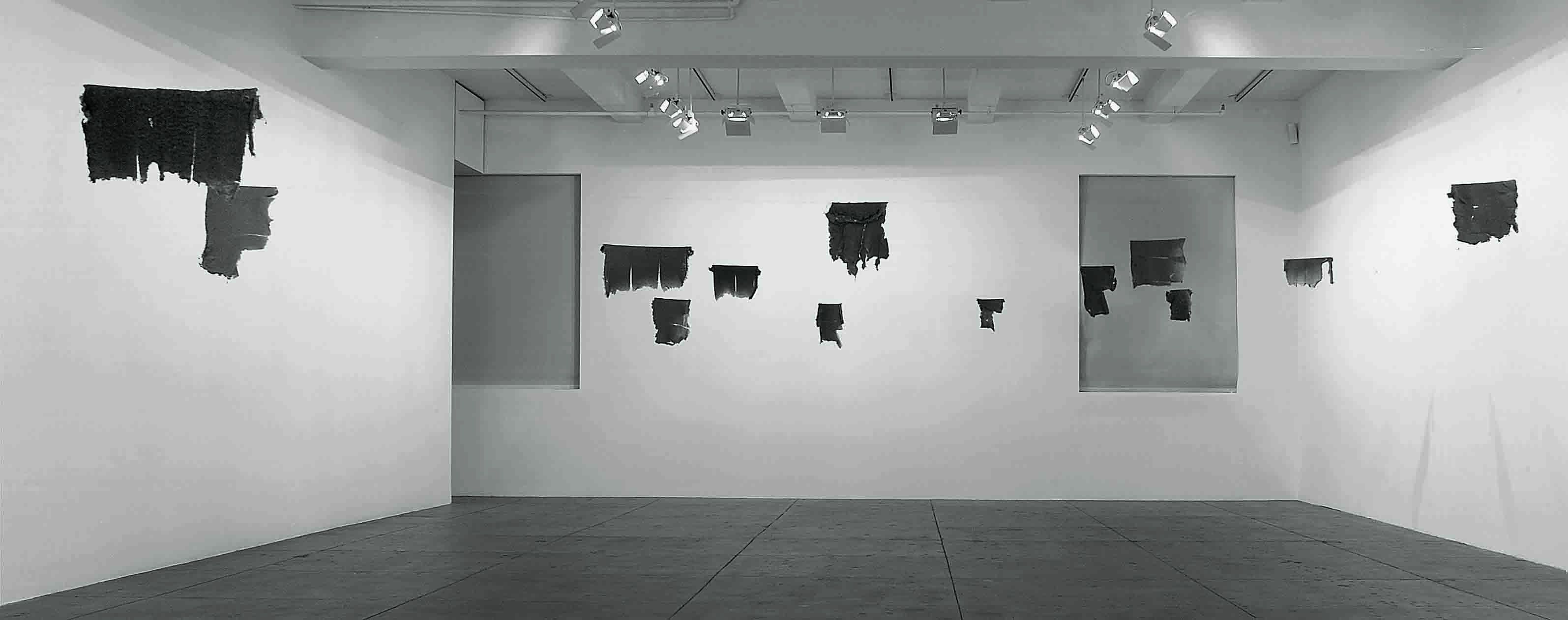
Lintels- Gabriel Orozco, 2001
Gabriel Orozco is a Mexican artist who is fond of a wide genres of art, ranging from installations to photography to sculptures. He is a Conceptualist, juxtaposing the artistic traditions of his birth place to values he learnt from found object artists like Marcel Duchamp. In doing so, he extract everyday objects from their supposed environment and focuses on the fragile relationship it has to society. This can be seen in many works, such as Cinco Problemas (Five Problems) 1992, where he placed five potatoes on five different notebooks in a stationery store.
Cinco Problemas (Five Problems), Gabriel Orozco 1992
Orozco’s work may seem banal at first glance, but it always requires a second look or more. It harps on the idea that the audience would need to look at the work for an extended period of time, and gradually realising the intentions of the work. It is the simplicity of the aesthetics that creates a dramatic realisation of the themes, which can extend to ideas like mortality and the human existence. In Lintels 2001, Orozco hung up dried and torn lintels from the laundromat after the events of the September 11 terrorist attack. This work shows the tiniest strands of human hair and dust, hinting to the audience the idea of mortality in a subtle way. The audience question the origin of the torn fabric, whether the owners survived the attack or they are left because the owners have bought new clothes. The fragility of human lives is shown without the actual depiction of human blood, becoming a silent yet morbid approach. Furthermore, Orozco’s work dwell on the simplicity, telling the audience that introspection does not require a heavy aesthetics, even the simplest composition can produce the same effects.
Piece of lintel from Lintel, 2001Lintels, Gabriel Orozco 2001
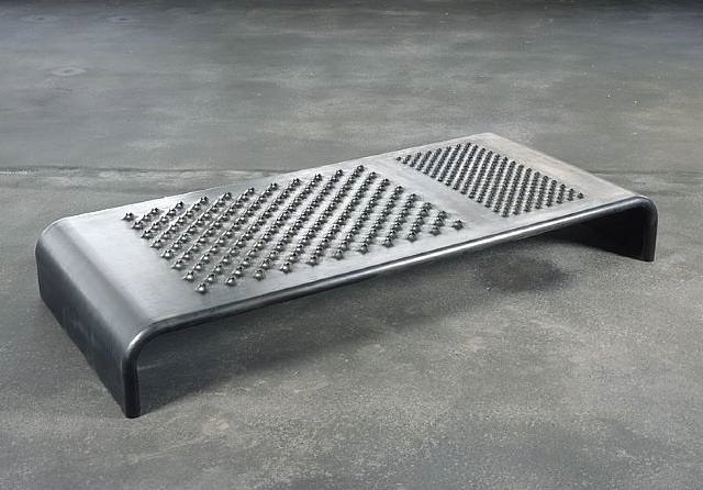
+ and – Mona Hatoum, 1994- 2004 (Recreation)
Mona Hatoum is a Palestinian artist who explores greatly with video and installation art. She is known to explore on themes of war and immigration given her exile from her home country. She is a Conceptualist who dwells on the fine line between visual and meaning, often using the visual characteristics of found object to intensify the meaning of her works. In works like Daybed, Hatoum uses the jarring visuals of a cheese grater and juxtapose these traits onto a bed, and created the eerie sculpture of the Daybed. It is inviting in a sense where it resembles a bench or a bed, drawing in audience to want to lie on it. However, as audience comes closer, the grating holes are apparent and it repels the audience thinking of the impending dangers of touching it.
Daybed, Mona Hatoum 2008
In + and -, Hatoum used a toothed metal arm and rotated it on a circular bed of sand, with exception that one side of the radius is covered with teeth while the other has a clean line. In doing so, one semicircle will have thin lines drawn on it as the metal arm moved while the other side gets constantly covered as the clean metal arm wipes over it, shown in the video below.
This artworks talks about the idea of displacement, a strong commentary by Hatoum since she was exiled from her home. The perpetual loop of making marks and cleaning it up speaks heavily of the problem from the displacement of war. It speaks of how war destroys the life of many people even as the try to rebuild said life, destruction happens all over again.
Time as an element
In both works, time is an important feature as it affects the outcome of the understanding by the audience.
In Lintels, the aspect of time is in the literal present, where the audience will have the take time in the specific space to understand the meaning of the artwork. They may be shunned from the work initially due to its banality and therefore misinterpret the artwork. The time aspect stems from the linear timeline that begins once the audience walk into the installation. Hence, as time progresses, the understanding and introspection of the artwork would set in, be it right or wrong.
In + and -, the aspect of time is metaphorical, where the audience will have to reference the kinetic sculpture’s perpeptual loop of time to Hatoum’s commentary of displaced war refugees. The sculpture loops continuously, meaning an infinite loop where one cannot get out of, such as the disasters of war that refugees are stuck in. The time aspect is circular in nature, a harsh commentary of a problem by depicting it as never ending.
Furthermore in both artworks, the aspect of time could be similarly interpreted in the way where it is symbolic in nature. This refers to the events that the work serve to remind and pay homage to. In Lintels, it represents the event of September 11, whereas in + and -, it is the event of Hatoum being displaced from her home country.
All in all, time is a versatile measure that can be depicted in a variety of manner, be it in a linear form, edited form or circular form. It is a psychological understanding towards the changing environment, and if utilised correctly, could change the meaning of an artwork completely.
In this assignment, we explored on visual sequence and how sound can affect the intentions of a film. We were tasked to investigate the relationship between imageries and sound, be it a harmonious parallel or a paradox conflicting the audiences’ mind.
Brainstorming
We started out brainstorming a few locations that we have never visited, listing down the most ludicrous spots like the Space, Heaven and even a toilet bowl. I finalised my location as the morgue, as I found that this particular subject has a lot of room for investigation, sound and visual ambience wise. In a morgue, you can hear loud wails as the family of the deceased grief over their loved one. You can hear a cacophony of metallic trays clanging as the mortician uses surgical scissors to cut the bodies open and proceed to throw it aside. You can also hear the eerie fluorescent light and bug zapper permeate the entire morgue due to the awkward silence. It is an interesting location, apart from its morbid content.
Storyboard
We proceeded to create our storyboards to have an idea of how we want the visuals to look like, and mine turned out to be like this after two sets of consultations since I used the same storyboard for lo-fi and hi-fi testing, altering mostly the sound effects.
Part 1Part 2
Description
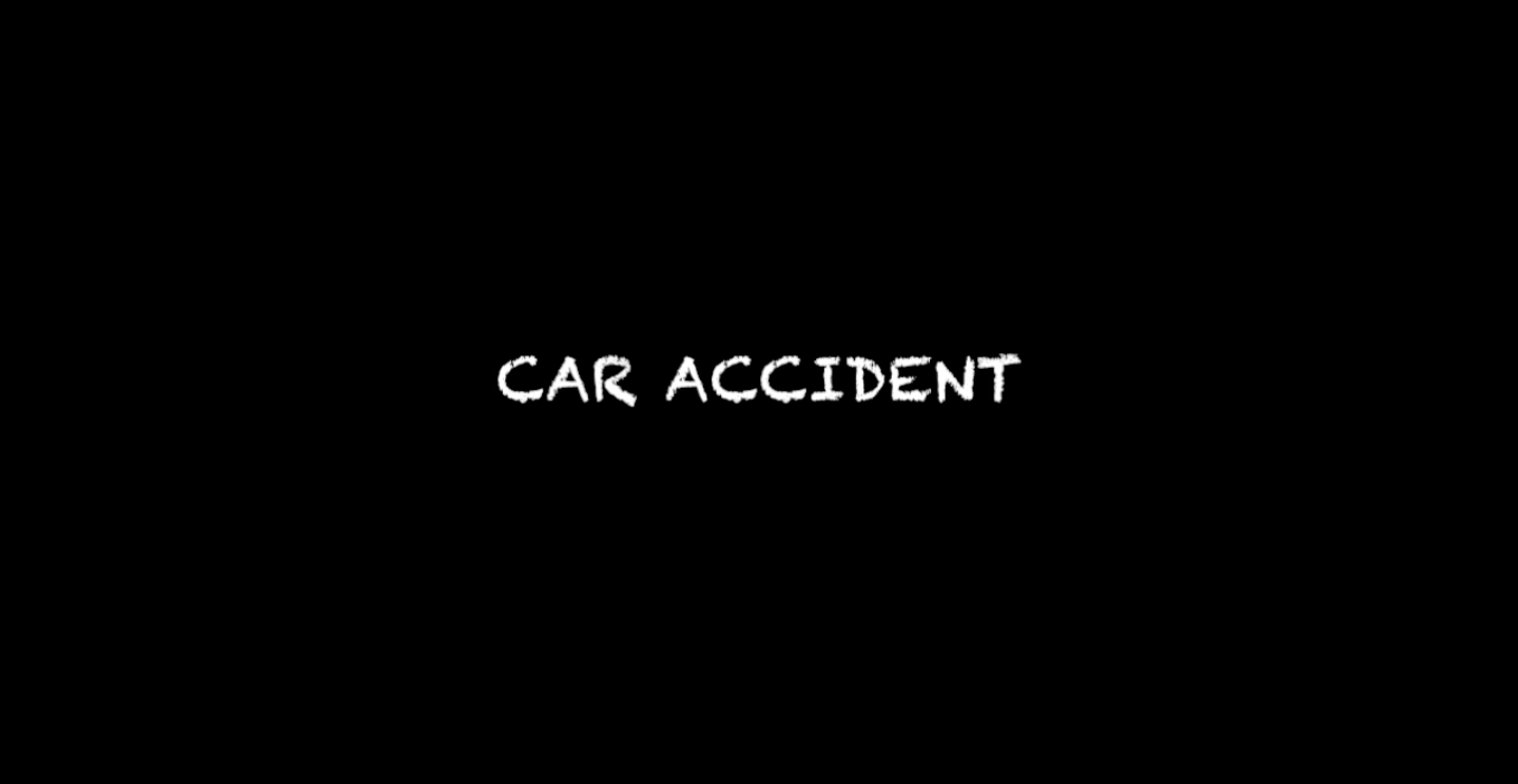
The narrative of this short video parallels between two concurrent scenes with a black background. Firstly, the video fades in with a silent slow motioned scene of a group of people whimpering. Then it quickly changes to a scene of a group of dead bodies lying down, breathing against a background noise of metal clanging- symbolising the metal racks a mortician uses. It rapidly transits back to the group of living, crying a bit more intensely with a louder voice, against a background noise of fluorescent and bug zapper. Moving back to the row of dead bodies, they are accompanied with actions that hints of their death: drowning, suffocation and excessive loss of blood. It moves back to the slow motion crying, this time with aggressive actions and louder, deeper moans. Keeping in the momentum of the loud noises, the scene exaggerates as the dead are seen shouting in pain and instantly cut off back to the livings’ crying, who are equally loud at this point. In the midst of this, the scene turns back to the dead, but it is now a close up head shot. The dead confronts the audience with their pain but is interrupted with a bright light from below, accompanied with the sound of a metal trolley being pulled open (hinting of the morgue door being opened). The dead are now silent and still like they are supposed to, with a background sound of people crying and buzz of the fluorescent light. The words “car accident” sets into a black screen, ending the video.
Explanation
I was tasked to explore the theme of a morgue and fully express its quality within the short video with sound. This was physically challenging due to the law restriction and privacy issues regarding the morgue, since it is a sensitive area with emotional people, presumably. I decided to play on a narrative that was more experimental and theatrical, hinting of a morgue and not an actual one.
This narrative is the interaction of a group of people grieving outside the morgue and the dead suffering in the afterlife. Firstly, the living are seen grieving outside. They are in their private psychological space of grieving, but are seen interacting in a shared physical space, having that thin line of boundary and privacy. These are all under the microscope of the audience as the visuals and sound are slowed down, with every micro-expressions they have, seen and scrutinised. There is no grief left un-judged.
The dead are seen in a fantastical manner, suffering in their morgue body shelves, with the elements that killed them. This wasn’t actually happening in reality, and that is why when the morgue door opened (the light from below opened), the dead bodies remained still like they are supposed to. The one who drowned is seen having water poured on him continuously, the one who suffocated is seen having a visual cue of a plastic bag over his head, and the one who bled out is seen moaning in pain as his shirt is covered in blood.
The tempo of the entire video builds up with an increasing volume, moving from soft whimper to loud screams and moans. The psychological sound of the fluorescent light aids in providing the chilling environment, as the fluorescent lights are not that exaggerated in reality. The play of slow motion sound and fast beat metal clanging creates a paradox in the audiences’ head, confusing them even more. This was inspired by sound and video artist Bill Viola, which I will elaborate below. As the video moves on, the audience would eventually realise that the two group of people are related. The last scene sets with the three dead bodies not moving, but in a distance is the sound of the weeping family. The ending with “car accident” hints to the audience that the dead actually died of a shared car accident, and the living are crying over this event- putting an end to the questionable narrative.
Ultimately, this short film questions the possibility of how emotions and time parallel or may not parallel. In reality, emotions does not translate well into time as it is a biological, real-time sensation, and when time is warped like sped up or slowed down, emotions are heightened in terms of sensitivity.
Bill Viola is a video artist who explores on the theme of mortality, religion and spirituality through big screen videos. He also engages in slow motion and times speed to make the audience question the intentions of his videos. In The Quintet of the Unseen, the actors are seen in a crescendo of emotions as the video plays in a loop. They are scrutinised as their suffering are seen by the audience in every contort of their face and body. It has the visual effects of a tableau-vivant- a silent and motionless group of people put together to narrate a scene or event. Compared to his past videos, this work does not have a strong religious connotation to it.
In many of Viola’s works, he also uses elements like water and fire to bring out the idea of spiritual suffering. This is enhanced with the effects of slow motion, as every drip of water can be clearly seen on a large screen.
Difference
In my work, I decided to draw reference from Viola’s Quintet of the Unseen composition as I found that this spatial composition was really strong and theatrical, which i will elaborate later. I would parallel it with a triptych of “dead bodies”, which will have a different visual effect since they are seemingly in an afterlife state. I will also play with the tempo of foreground and background sound, along with psychological sound, making it much like a live action theatre scene. There will also be a resolution in my narrative, which tends to be only hinted in Viola’s works.
________________________________________
Disclaimer: According to the brief, the assignment tasks for a 1 minute video to be made. In the spirit of the slow motion editing, I found that a 1 minute video constrains the ability for the micro-expressions of the actors to be shown, and there were really good moments that would be wasted if left in the gallery and not used in the actual video. Thankfully Lei allowed for some leniency on this aspect.
Final Video
________________________________________
Directing and production
Production began with the planning of the usage of actors as well as the location, since my short video was live action and highly dramatic, it required strong theatre lights with a versatile environment that allowed me to pour water and light up fire. (Fire was not lit in the end)
Lighting
I proceeded to set up a one directional light that shines at an angle towards the actors, mimicking a stage light. There was an attempt to seek out other light options as the stage light was mildly too strong, but it was still the best option. A black clothed background was also set up to create a black backdrop that enhanced the details of the actors’ faces.
On set with easel constructed backdropStage LightIphone Light
Black Screen LightingAdjusting Lighting
Composition
In the attempts of achieving a harmonious composition, various attempts of demarcation were made to highlight areas where the actors are supposed to and not supposed to stand. The markings tells the actors where the vantage point of the camera ends, and which corners they will recede into the shadow if necessary. There is also a main focal point where the actors can stand to be in the focus of the audience. Information regarding the narrative was also given out to the actors to ensure that the point of conversation would be effectively used, as if speaking to the audience one to one. Whereas the rest of the actors can loiter around the interaction space with one another when not communicating with the audience.
layoutComposition where everyone can be seenFocal point where actors become the highlightTriangle Composition
Props
Props were also used to highlight the narrative of the video, such as fake blood, plastic bags and pail of water. They are all used to enhance the visuals of the story. This was especially important in the scene of the “dead” as the visual aesthetics are desaturated and lowered in warmth to create a clinical and depressing environment, as if looking into a strange an unfamiliar environment. The props bring out the fantastical theme.
Direction and actors
The actors also acted upon the theme and narrative of the video, understanding the reason of the slow motion was to enhance the visuals in showing the micro-expression of grief. Micro-expressions could reveal itself in the tiniest form, as the name suggests, such as biting ones lips or shielding one’s eyes due to sudden inertia.
Before the shoot itself, the actors were also introduced to a series of sad videos revolving around mortality and distancing from loved ones to inculcate a sense of depression, adding a depth to the performance.
Covering mouth to isolate from the crowdBiting onto lips to withhold painCovering face from overwhelming visualsFrowning eyebrowsGaping mouth to show disbeliefLingering touch of comfort
Sound
Sound was one of the main component of this assignment, and the usage of sound must be at its optimum to bring out the thrilling momentum required in this narrative. As shown in the screenshots below, I tried to build momentum by increasing volume and the overlay of sound gradually. The first scene of the video sets in with only the buzzing of the morgue, but gradually builds up to the intense second last scene where three people are screaming among the seven layers of metal clanging. There was also the play of heavy and elongated sound from the slow motion bits.
The clip shown below is a recording of metal lockers being knocked on, mimicking the metal trays in morgue. It was later sped up to create tension.
Recordings of weeping was also carried out, but it was not used in the actual video.
First half of the video soundscapeSecond half of the video soundscape
The car accident phrased ending was also taken out after critique as the presence of a worded direction limits the possibility of the narrative.
________________________________________
Thanks to,

(Left to Right) Yo Zhen Qi, Daphne Tan Shu Fang, Frederick Lee Zhi Bei, Claire Chew Tze Ning

Also,

Thaddy Lim Fang Xiang and Bryan Leow Yee Kiang

Actors Reflection:
Frederick- Brendan is a good director because he sets the mood right for acting and helped me in overcoming my challenge, which is to act with co workers because it is quite difficult to accommodate with the other’s emotions on set.

Claire- Being very certain of what he wanted to achieve out of his project, Brendan was meticulously detailed in carrying out his plans - by allowing his actors to watch sad videos before the filming to set the right mood for it, and also by patiently explaining his storyline to them repeatedly such that they were crystal clear in what they had to execute. Brendan too was very understanding and polite towards his actors even when they had made mistakes along the process of the filming, and had no qualms about reshooting the scenes over and over again till it was near perfection. Overall, Brendan makes a marvellous director in terms of his punctiliousness towards his project and also his considerate behaviour towards his actors to ensure a smooth and fun filming procedure.
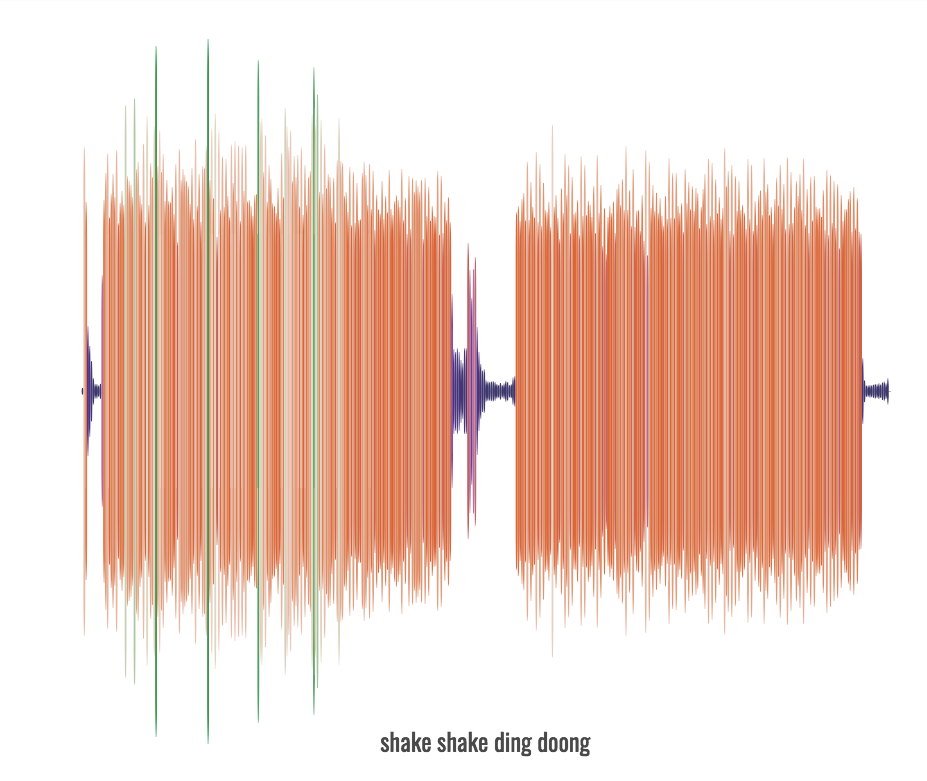
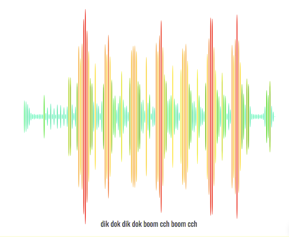
As we explore into the City of Void, we experimented with space as a visualisation of sound. Sound solidifies as positive physical space; while silence becomes the negative void around it. A symphony becomes a sculpture for those who can appreciate whereas a musician becomes its master. We wobbled the shaker, we rang the bell, we hit the xylophone with a sharp knock:
We could feel the freshly composed music solidifying in the air, visualising into a soundscape with peaks and undulating ridges our ears once felt. The mint green and magenta peaks soared out of the ridges overlooking the rhythmic mundane bunch. While the sangria and emerald trenches fell as deep as they sound. Silence permeated the rest where sound doesn’t exist.
A symphony hall stems out from the City of Void, from a void, celebrating the newly composed song “dik dok dik dok boom cch boom cch”.
The SymphonyThe rough hoboHobo’s childrenHobo’s ChildrenLooking up in awe
Plodding up the stairs of the symphony, a rough green hobo lies waiting, looking up the stage in awe. He is rough like sandpaper because he is sandpaper. He is firmly grounded and laying to rest, while his children tears up the stage. He is loud and sharp, even the smallest of his knocks can cause vibrations and tremors. If he stands up and walk, his meaty thigh’s sheer friction makes a nerve-wrecking “ccchhhh”
The Loud Diva
In the middle of the stage, hovering in the air, floats a metallic cone that steals the hobo’ gaze. Its shiny and sharp, the highest point, no one dares to climb higher. Its a big diva who screeches and yell, ding, ding, ding.
The White Infinity
Reliable as always is the White Infinity, its hardworking and honest, two beats at a time. Its undisturbed by the Diva, although its spotlight is always stolen. Its nervous around the Hobo, drowning it with tremors.
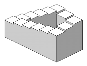
In preparation of the next project revolving around time, we experimented with clock time as a technique of our work. Clock time, also known as objective or actual time, is time quantitively measured by regularly recurring events of intervals. This stems out into both linear and circular time, shown by my short video below.
My idea stems from the penrose stairs, which is an infinite illusion of a staircase. I got the inspiration from the definition of circular time, which was an infinite cycle of a repetitive scene. The narrative goes along with a VR perspective of someone walking down the staircase, but the staircase keeps repeating itself as you descend it.
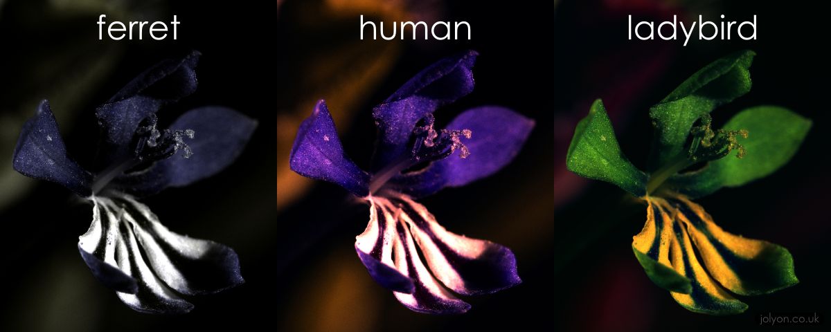
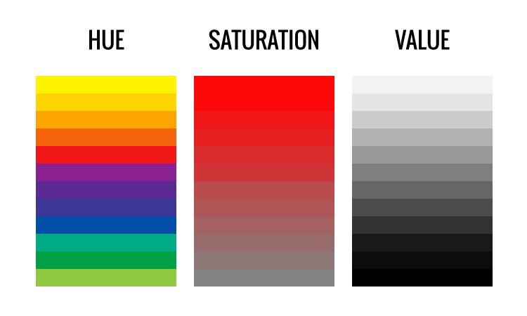
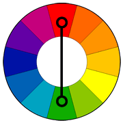
Moving on from Forrest Gump, we finally ventured into colours for Ego. Colour is a visual perception, projected through the wavelength of light against the biological structure of our eyeballs. There is a wide spectrum of colours that is humanly possible to see, shown below. Other animals like birds can see up to five or seven colours, compared to the three primary colours that humans can see. Some unfortunate ones, mostly sea creatures, can only see up to two, (blue or red) since the ocean has a limited colour scheme. The triptych below shows the comparison of vision between a ferret, human and a ladybird. In this comparison, the inherent feeling achieved from the same flower is different in the three subjects: the ferret sees a heavy setting with a depressed looking flower; the human seeing a purple flower with a pink interior; the ladybird seeing a saturated green flower with a yellow interior. This is the result of colour psychology.
Comparison of animal visions
Colour psychology is the effects of different colour on human behaviour and perception, with different colours having a different inherent effect.
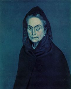
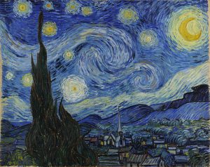
Blue is an intellectual colour that recedes into the background. This is because the colour is inherently cooling, hinting of strong clear thought and light calmness of mind. However, it can also remind people of coldness and loneliness, such as Pablo Picasso’s blue series.
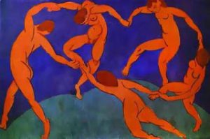
Red is a physical colour that pops out of the foreground, stimulating the eyes. It is visually strong and powerful, no subtlety in the traits. It can be perceived as either friendliness or aggressiveness, depending how the energy is perceived.
Pink is a colour derived from changing the tint of red, thus it is a physical colour. Pink soothes the viewer physically. However, over-usage of pink can be visually draining.Yellow is an emotional colour that stems from both spectrum. It is both optimistic and depressive. This is because the yellow light has the longest wavelength and is visually stimulating. The over-saturation of yellow would incite anxiety, commonly seen in traffic police coats.
Green is a balanced colour, seemingly because it is in the middle of the colour spectrum. It is harmonious, being found in nature. It requires no visual adjustments, thus easy on the eyes. It is a primitive reminder of humans of peace since a lush green reminds of food. water and settlement.
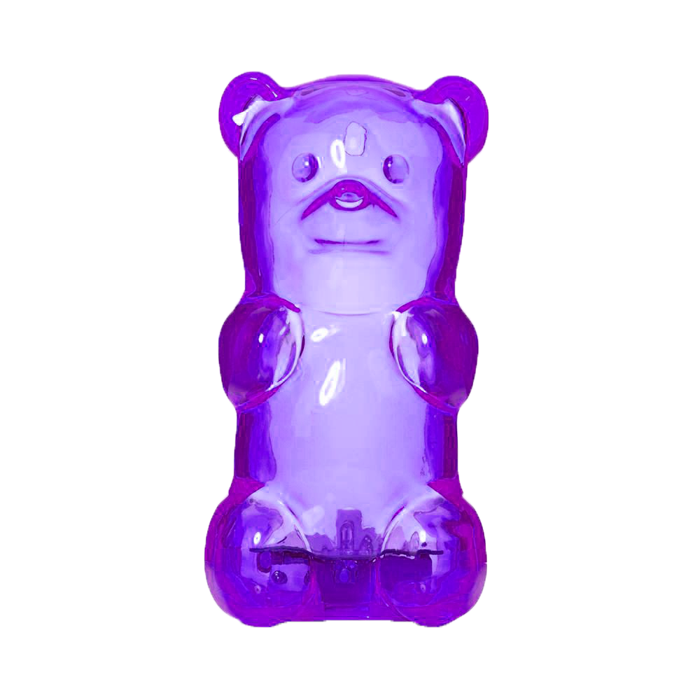
Purple is spiritually aggressive, but also suppressive. It has the shortest wavelength out of all the colours, but having the strong polarity in its effects. Purple can remind viewers of royalty and luxury, but excessive use can bring out introspection, and also inferiority.
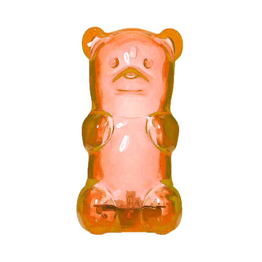
Orange is a passionate colour that can be derivative also. Since it is a combination of red and yellow, it is both a physical and emotional colour. It inherits traits of both yellow and red, mostly its vibrancy and energy. However, too much orange can bring frivolity, drawing out intellectual values.
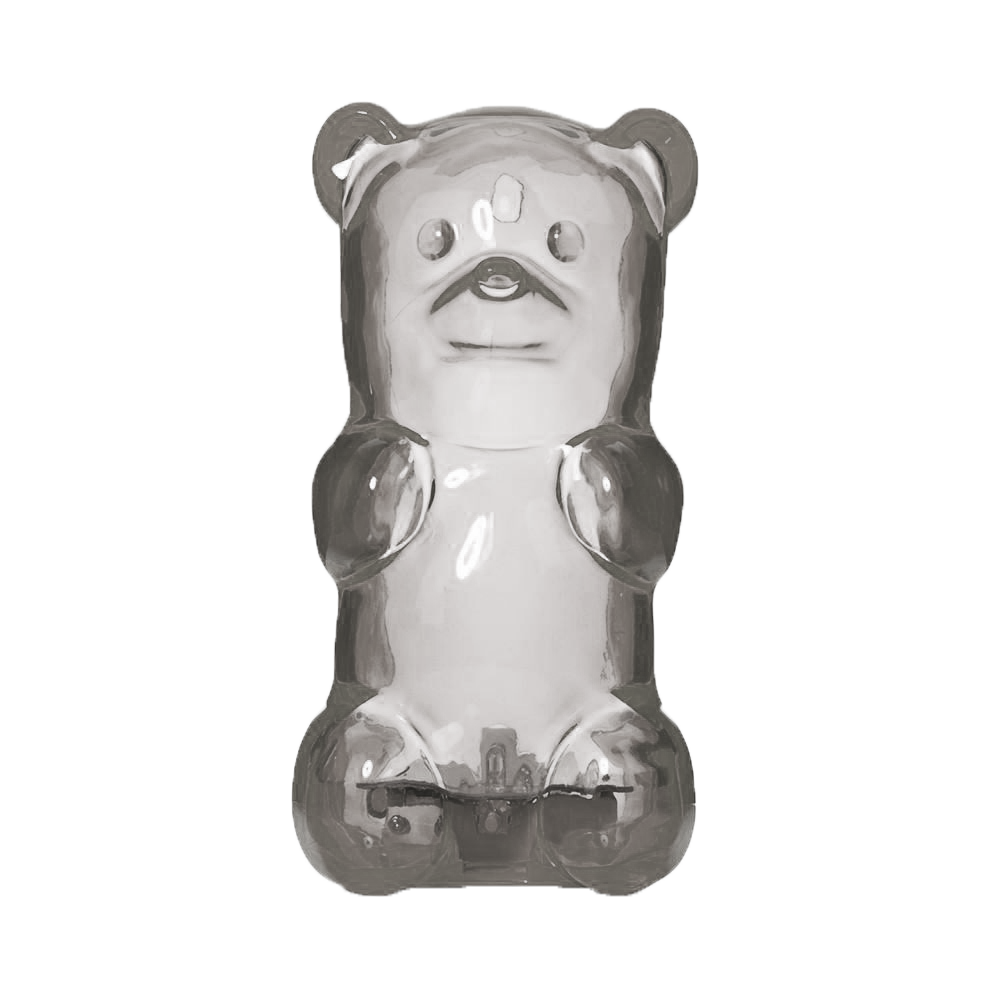
Grey is psychologically neutral, but is also suppressive in nature. It visually draws the audience into a murky space. However, it can be a sign of insecurity and fear of exposure, compared to black.
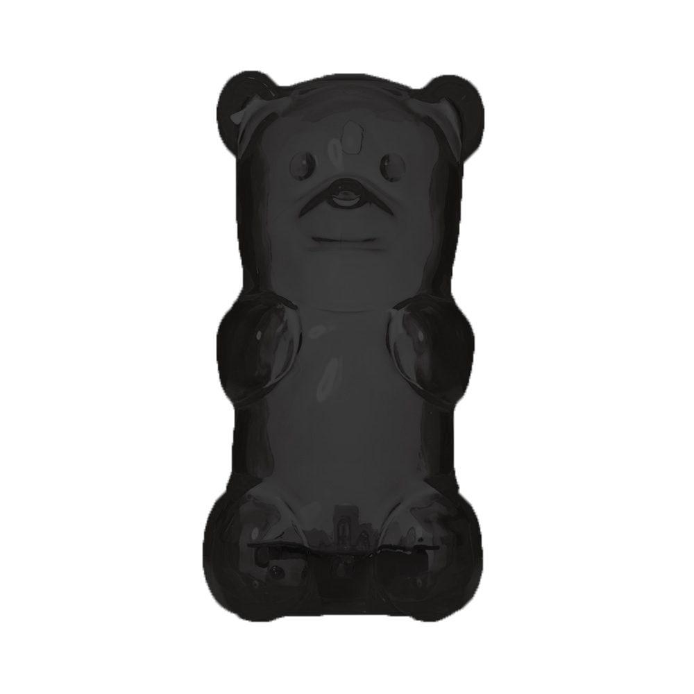
Black is a strong colour that hints of sophistication. It can also be menacing due to the lack of details. The bold body of black can absorb colour, becoming a protective barrier. There is an absolute clarity, with no subtle nuances in the colour.
White is the opposite of black, being reflective in nature than absorptive. It is sterile and pure, giving a false sense of space, very much like black.
Saturation is the intensity of a colour, how red becomes pink when desaturated, then proceed to fade into a plan white.
Value is the brightness or darkness of a colour. When the value of black is increased, it becomes grey, then proceeding to become white.
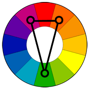
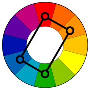
Complementary are opposing colours on the colour wheel, they are naturally pleasing to be paired off together. However, they tend to be used with one colour more predominantly than the other, especially the visually weaker colour.
Split Complementary is when one end of the complementary colour is split and accompanied with the other end. It creates a joyful and energetic composition.
Tetratic (Double Complementary) is two pairs of opposing colours, best used for background/foreground compositions. Although advised to not used with 25% for each colour.
My mama always said, “Life was like a box of chocolates. You never know what you’re gonna get.”
Forrest Gump 1994
In this project, we were tasked to reinterpret our chosen movie quotes and create imageries using Photoshop and found pictures. It draws inspiration from Surrealism and Dadaism, making imageries that transcends cliche solutions and responses, strongly based on spontaneity and randomness. (https://oss.adm.ntu.edu.sg/bren0022/a-surreal-nonsensical-dream/)
Brainstorming
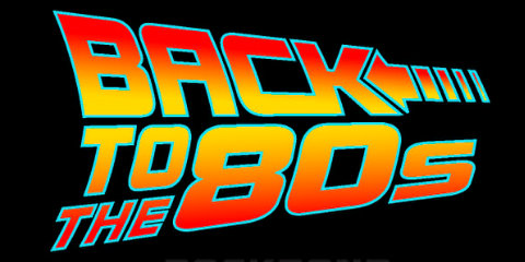
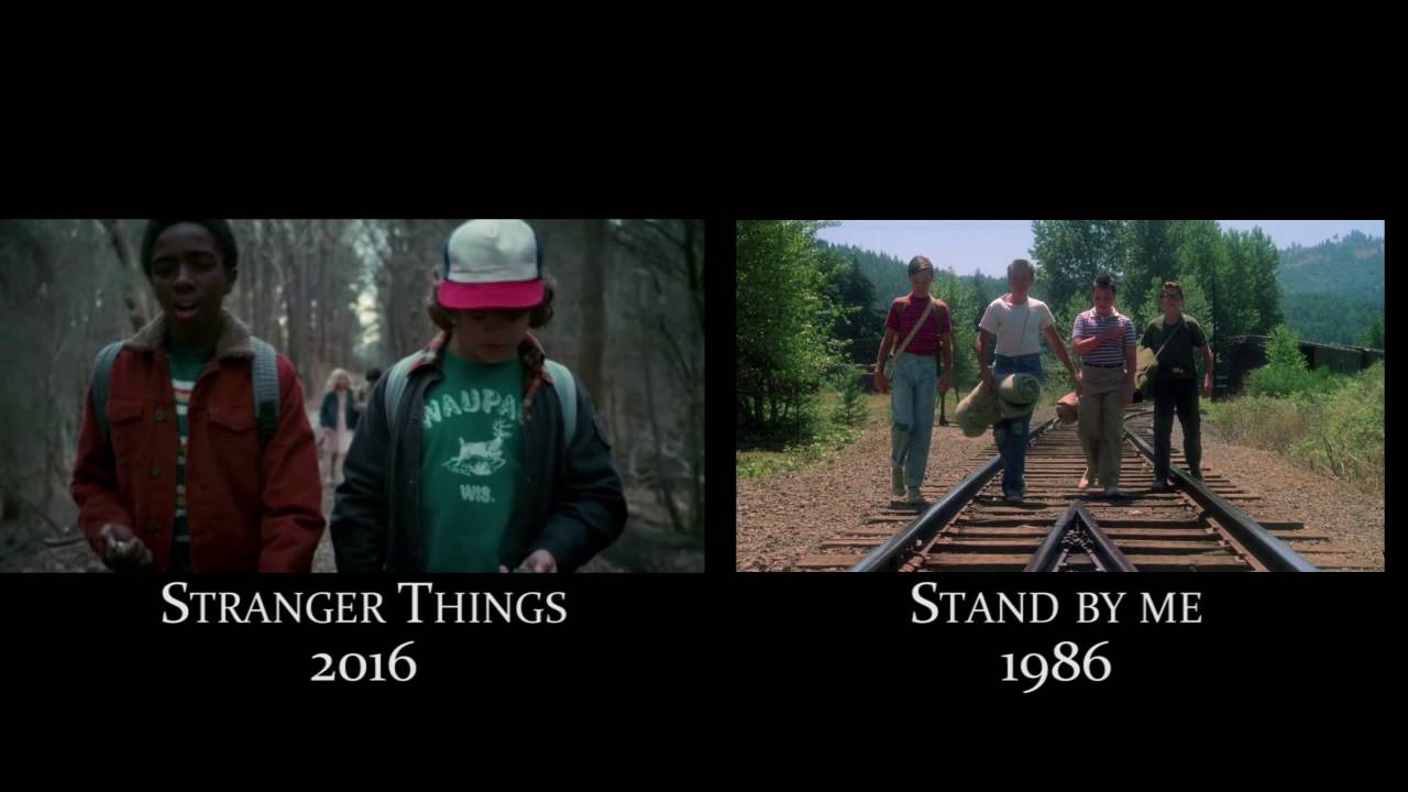
Before embarking on the tedious but fun journey of surrealistic image collaging, I thought through and brainstormed for a concise theme that summarises my love for film- and that answer is the 1980s movies. In the recent years, 1980s nostalgia has been on a rise and 1980s themed homages is prevalent in many films, such as the Duffer Brother’s Stranger Things, Andy Muschietti’s IT or James Gunn’s Guardians of the Galaxy, to name a few.
1980’s Homage
1980s
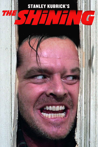
I decided to follow this theme since I loved watching 1980 blockbusters growing up as a teenager, movies like Ghostbusters (1984), The Shining (1985), or Nightmare on Elm Street (1984), etc. The 1980s was a special time as it was the aftermath following the wave of film popularity preceding Hollywood’s Golden Age. The film in this period of time was characterised as high concept films with a cinematic plot that could be easily distinguished by one or two sentences, typically with a few strong characters to build up a narrative. It was the rise of blockbusters, but not built on special effects like the films today. It was also a period with many political tension since it was the rise of political conservatism, particularly Thatcher and Reagan; Filmmakers pivoted to make their form of entertainment uplifting and joyful.
Before I begin, I would have to list out a series of movies I loved that were from the 1980s, and that was a long list:
Ghostbusters (Comedy) (1984),
Back to the Future (Sci-Fi) (1985),
Blade Runner (Neo-Noir) (1982),
The Shining (Horror) (1980),
Nightmare on Elm Street (Horror) (1984),
Honey, I Shrunk the Kids (Family Comedy) (1989),
Breakfast Club (Coming-to-age) (1985),
Dead Poet Society (Coming-to-age) (1989),
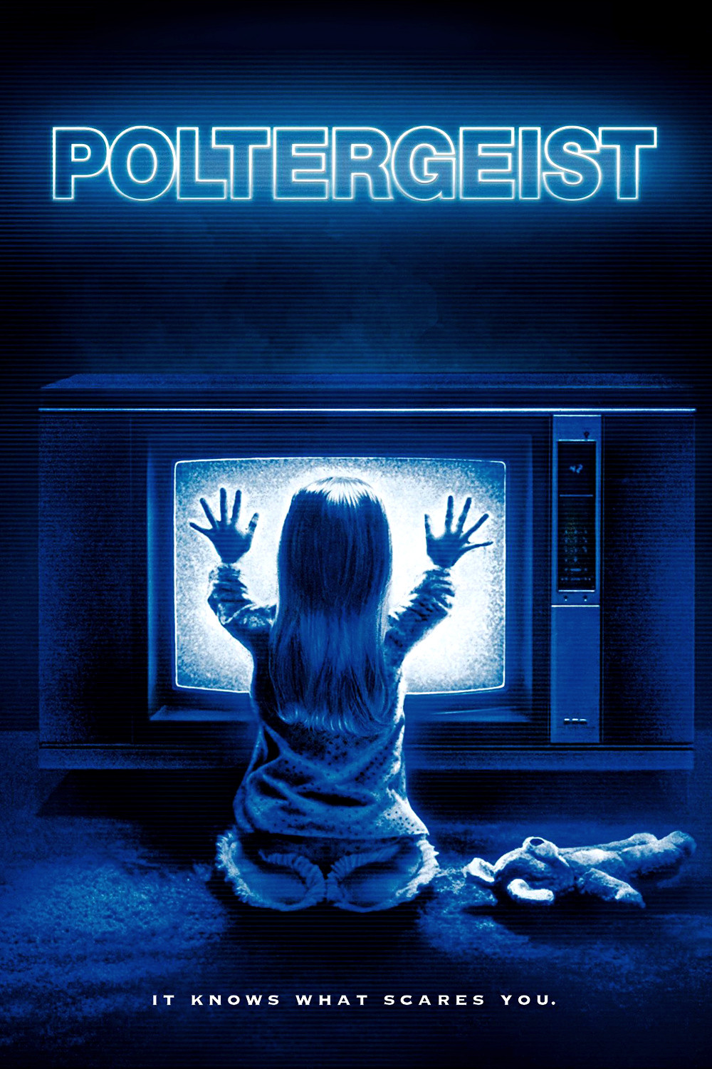
The Poltergeist (Horror) (1982),
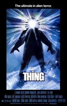
The Thing (Thriller) (1982)
Ferris Bueller’s Day Off (Coming-to-age) (1986)
The Evil Dead (Horror) (1981)
Predator (Thriller) (1987)
Etc
With a list of my favourite 1980’s movies, I had to come up with a few to quote from and that could only be done through re-watching everyone of them. After a few movie marathons, I realised that the movies that I quoted from were predominantly from coming-to-age related movies, which was a genre of film that focused on the protagonists’ growth into adulthood- to say the least, was relatable to me.
In spirit of Surrealism and Dadaism, I decided to incorporate an essence of a Surrealist/Dada artist for each imagery that I have, creating a 1980’s surrealism confusion.
I also wanted to pay homage to 1980’s movie posters, particularly the usage of one central subject figure that plays along to the audiences’ perspective, acting out an action/narrative imperative to the film. With that, I would recreate any iconic scene within the movie, and retell it in my perspective in a fantastical context, like the movie posters below.
“You see us as you want to see us- in the most convenient definitions” – Breakfast Club 1985 + Lucia Hartini
Referencing the quote to the meaning I understood from the movie, I interpreted the quote as a summation of how the characters feel from the stereotype society places on everyone one of them, looking at their every moves. In the film still above, they are in a midst of confessing to one another regarding their problems and trouble, how they are fallen into a particular stereotype and probably cannot mix around as real friends when they are out of that tiny space.
In this work, I referenced to Lucia Hartini’s work “My Child”. She is an Indonesian artist that focuses on broadcasting sensitive subject matters like gender equality in a predominantly Islamic Community through surrealistic paintings. She focuses on symbols like clouds, horses and babies to communicate an idea of a bigger and almighty entity looking down on her without being crude in the context of expression. In the work “My Child”, she is seen looking up, interacting with the deity, which is also her child by blood, interacting through a thin veil of spiritualism and religion without being specific to any religion. The usage of clouds also enhances the fantastical aesthetics.
Lucia Hartini’s My Child 1989
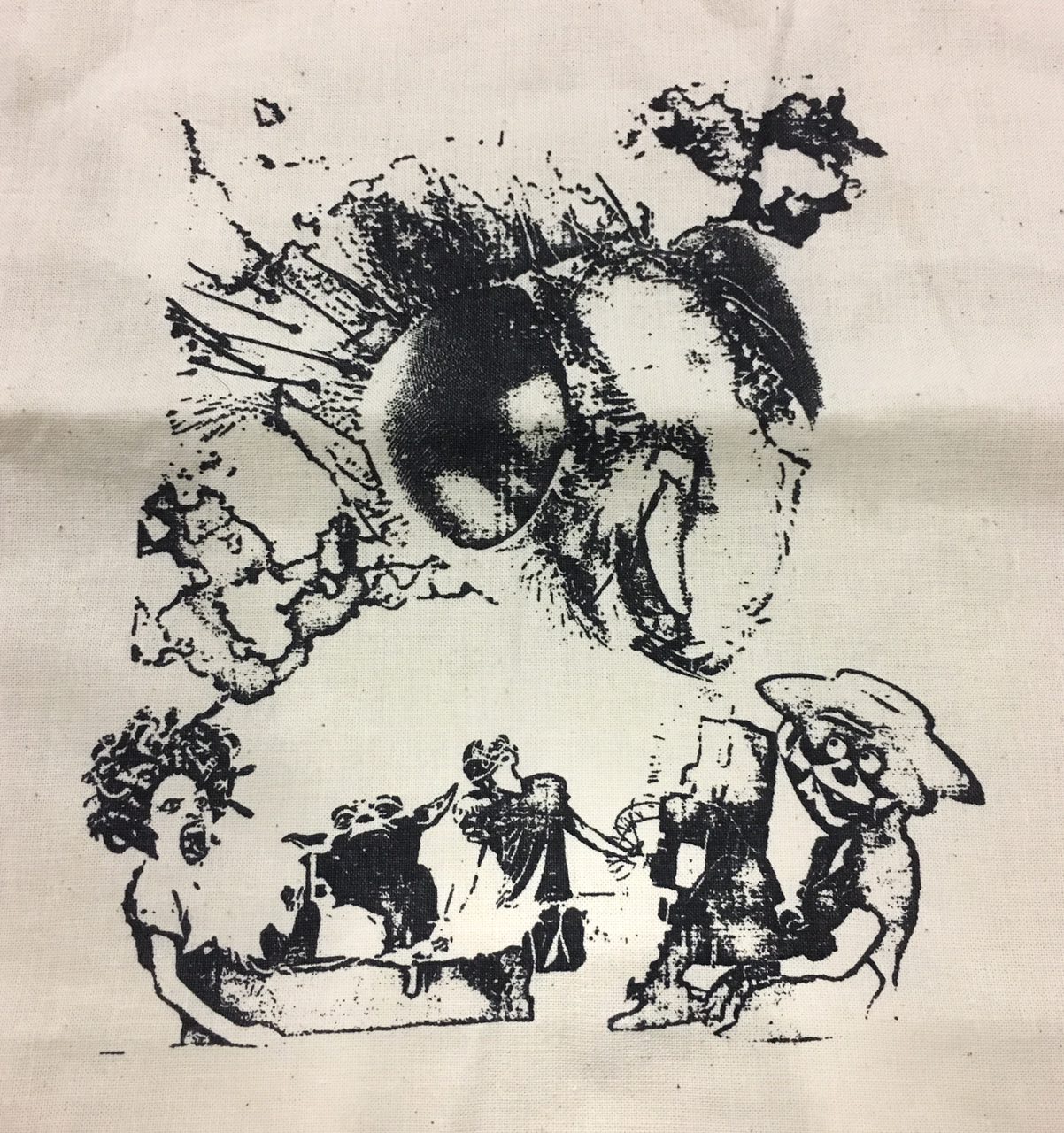
“You see us as you want to see us- in the most convenient definitions” – Breakfast Club 1985 + Lucia Hartini
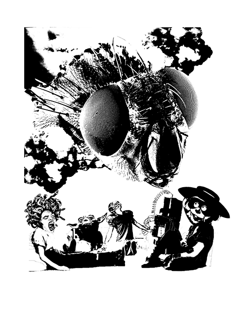
Using the techniques I learnt from Hartini’s work, I created this collage referencing to the quote above. In this imagery, I wanted to exaggerate the stereotype each characters face from society, with the society imagined as a fly in this context- Flies see the world in a slower speed, giving them the ability to place judgement and react faster. I turned each character into a caricature: the beauty into Medusa, the nerd into Yoda, the jock into a football player, the crazy into a timebomb and the criminal into the hamburglar. The medusa represents a beautiful character that lacks of self confidence and leeches on compliments. The yoda represents a socially awkward character that is from another realm or environment. The football player, quite literally is a stereotype of a jock, one who focuses too much on sports and the events that come with it. The timebomb represents the quality of unpredictability and the damage it can do to people around it. And the hamburglar is the caricature of a burglar/criminal who is also the comic of the group. The fly (society) is seen coming out from the clouds like in Hartini’s works, it is essentially imagined as an almighty deity looking down and deciding the fate of the characters, with every facade on the compound eye looking at every directions. The characters are seen looking up at the fly, providing a visual direction for the audience. However, they are still in a comfortable position of leaning, unable to react to the impending judgement. The characters are also seen in a tight space, with the little breathing space implying the physical privacy that was seen in the film still, insinuating a conversation between them.
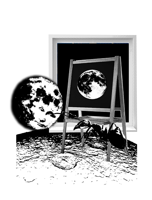
“Its funny, the moon looks the same size whether you’re big or small.”- Honey, I Shrunk the Kids 1989 + Rene Magritte
With my understanding of the movie, I interpreted the quote as an expression of figurative size. Throughout the beginning of the movie, the children are placed under a microscope of judgement by the adults, who fear that they are incapable of responsibility and protecting themselves. The adults on the other hand, are placed in a caricature of illogicality and insensibility. The quote expresses a paradox of “size”, the figurative size the characters felt and the literal size that they were in compared to the moon.
Rene Magritte’s Human Condition 1933
Hence, I wanted to play with the idea of a figurative and literal size, and this led me to the artist Rene Magritte. In Magritte’s work, he played with the idea of perspective and size. In this work, he places an easel in front of a window. The precise and intentional placing challenges the audience’s perspective of whether the tree stems from the environment outside the window or is the tree a physical painting. Hence, there is only two options for the audience, whether the tree is a few centimetres short or a few metres tall. The question is left unsolved and left for audiences to predict or think.
In my work, I wanted to play with Magritte’s perspective paradox and apply it to the moon and ant, which are the main characters apart from the children. In my work, I applied the same composition of an easel and a window, of which the subject matter is a moon. Hence, audience will question whether if the moon is the size of a painting or is the moon outside the window, broad as the space it is in. However, there is another moon right beside the window and easel, seen looking down at the ant. The conversation between the two characters leads to the question of which moon is of the real and actual size. The presence of the ant makes audience question if the moon is the size of an ant, or is the ant the same size as the moon. Further more, zooming out of the pictorial space, the ant is seen stepping on a ground that is textured like the moon, playing with the idea of three possible moons. This imagery references to the quote as to how there isn’t any real physical size, and the idea of “size” or “ability to withstand responsibility” is one’s entitlement and how you strive to achieve it.
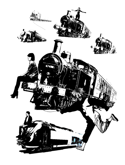
“Your future is whatever you make it, so make it a good one.” – Back to the Future 1985 + Dede Eri Supria
In the film still shown above, it is the last scene in the movie where Doctor Brown and Marty say goodbye. Doctor Brown was implied to have succeeded in his time travelling endeavors and had travelled back from the future with a time travelling train. I imagine the quote as an implication to wanderlust and passion, how Doctor Brown is encouraging Marty to chase his dreams and to never give up, as you are the one who decide where you are going.
In my work, I wanted to reimagine the scene of Doctor Brown flying off in a train, with the train as a representation of wanderlust. However, I had to use another caricature to portray Marty and I chose to reference to another Indonesian artist named Dede Eri Surpia, with his usage of clowns are protagonists. I liked the idea of using clowns as the characters fighting for their passion as in Dede’s works, they are always seen in industrialised environment, struggling to pursue their passion in an ever confusing environment that is rapidly growing and moving. In the work shown below, the clowns are seen floating in the air, struggling to make ends meet in a ghastly background that is almost a caricature of an industrialized city, like Jakarta where Dede is from.
Dede eri Supria “Clowns in the Capital” 1999
Back to the Future 1985
In my work, I wanted to play homage to the original film of Back to the Future by placing all the direction of the trains following the original film poster, which was the left side. I juxtaposed the the trains with same sized human beings sitting on the train, looking at the left side, as if looking forward to something in the distance. There is a clown at the right bottom of the image, representing the essence of passion I wanted to draw from Dede’s work, making him hold on to a string that is being pulled by the floating train. The idea of clowns and train contrasts strongly as there is subtle difference of metal versus skin, passion versus robotic movements. In any environment, trains are supposed to be a logical mode of transport with only one direction at a time, implying logic. However, with the theme of floating, it can move to any direction at any given time, hinting of wanderlust passion. In pursuit of technical accuracy, I used motion blur to hint of visual space, depicting how the trains are moving from a distant location to the audience’s eyes.
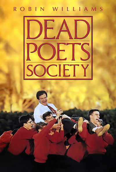
Dead Poets Society 1989Film still of Dead Poets Society 1989
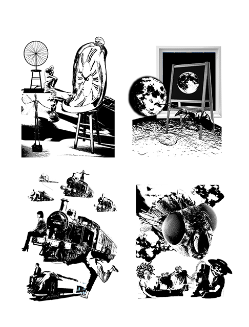
“Because believe it or not, everyone one of us in this room is going to stop breathing turn cold and die.” – Dead Poets Society 1989 + Salvador Dali
Last but not least, I have a quote from Dead poets Society as shown above. It is predominantly similar to the previous quotes as it is from a coming-to-age movie revolving around a group of teenagers with an inspiring teacher helping them pursue their passion. I wanted to bring out the idea of everyone being in a precarious position of “turning cold and die”, and emphasis on the aspect of time, since that is an element important in the movie itself since mortality is greatly discussed inside. In the film still and even the movie poster shown above, the teacher Mr Keatings is always shown with a certain level of hierarchy implying that he is a teacher and the guide to these children, via techniques in composition or colours.
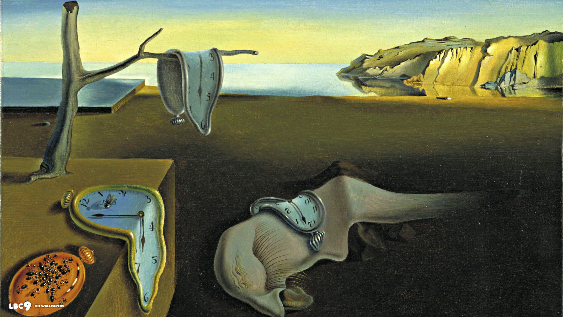
Salvador Dali’s Persistence of Memory 1931
In my work, I referenced to Salvador Dali as I found that his works to have an eerie sense of mortality without any physical depiction of death itself. There is a morbid language that is unspoken, through the symbol of a melting clock. Hence, I extracted the melting clock as Mr Keatings, overlooking the characters in a higher and bigger position then the rest, symbolising death of passion. The play of size allows audience to direct their gaze at the clock, which is the focal point of the image. I chose to represent each of the main characters as a sculpture as I found that sculptures tend to lose their visual value when they are placed in a 2 dimensional plane, effectively losing their life, much like the idea of “turning cold and die”. I represented each character as a sculpture using their personality: the fun and joker as Marcel Duchamp’s Bicycle Wheel 1931, the quiet but thoughtful as Alberto Giacometti’s Pointing Man 1947, the romantic and innocent as the Cupid and the goal-oriented dreamer as Auguste Rodin’s the Thinker. The sculptures are seen standing on a barren wasteland looking up on the melting clock, just wasting their time away until a perpetual mortality. In homage to the film itself, where the main character of the goal-oriented dreamer dying, I decided to blur the Thinker in the background, hinting that something is happening to it in a still wasteland, probably it being the first to die off in this scenario.
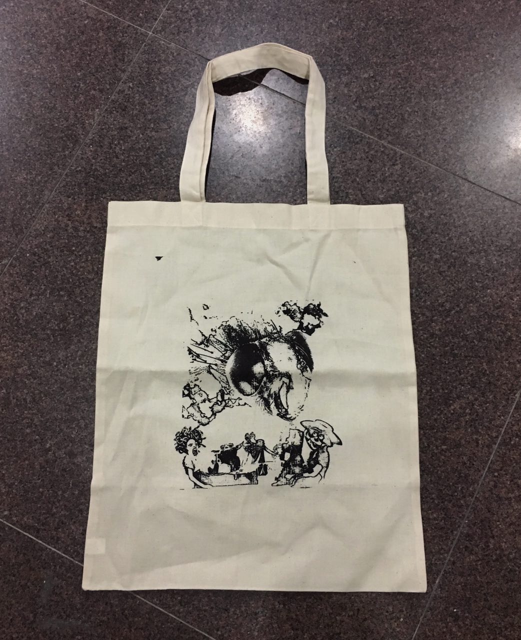
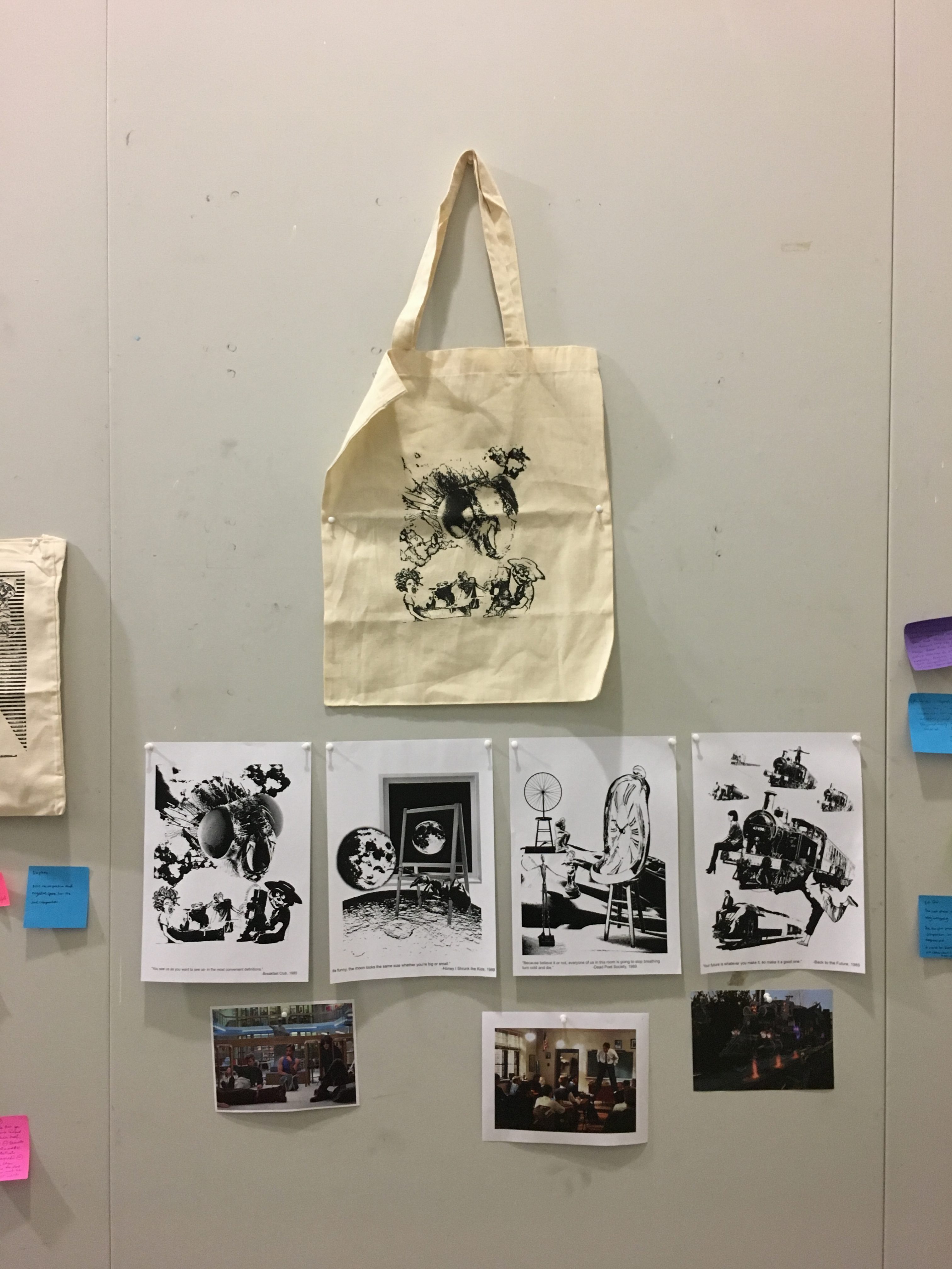
Following the process of Photoshopping and collaging the found images, we were required to silk screen the chosen quote onto a tote bag and present it. After a few attempts, the above photograph shows my final work of the quote from Breakfast Club, arguably my most favourited movie in the world. The process of silkscreen was tedious and difficult, especially since I tore one silkscreen board by accident. It is a process that is heavily underestimated, at which subtle difference in pressure and moisture can affect the final results.
Final Presentation
Throughout this assignment, I faced the challenge of patience and dexterity as both are tested in the context of photoshop and silkscreening. The journey of not knowing any Photoshop techniques to having tried both photoshop and silkscreen has been really challenging, but a fulfilling one nevertheless. From the comments I received from the post-presentation commentary, my main problems were technicality issues like the cutting of border from the Breakfast Club imagery, as well as the composition of the Back to the Future imagery.
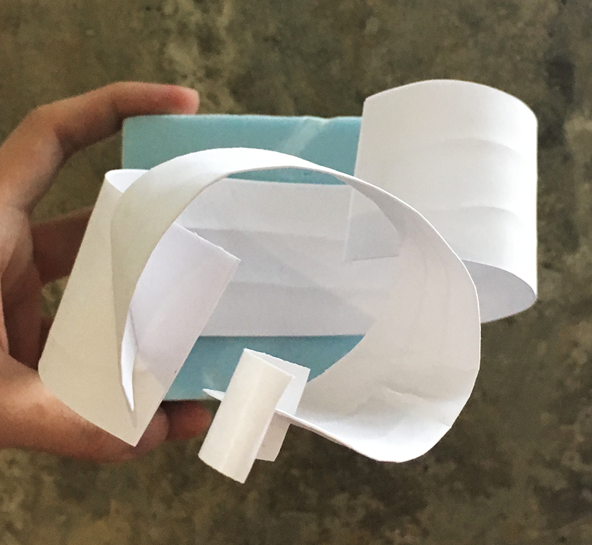
As we dwell deeper into the topic of abstract composition, we discussed various techniques of showcasing the beauty and elegance of a plane. Using the information taught by Cheryl, we modified our models accordingly to achieve the intended outcome.
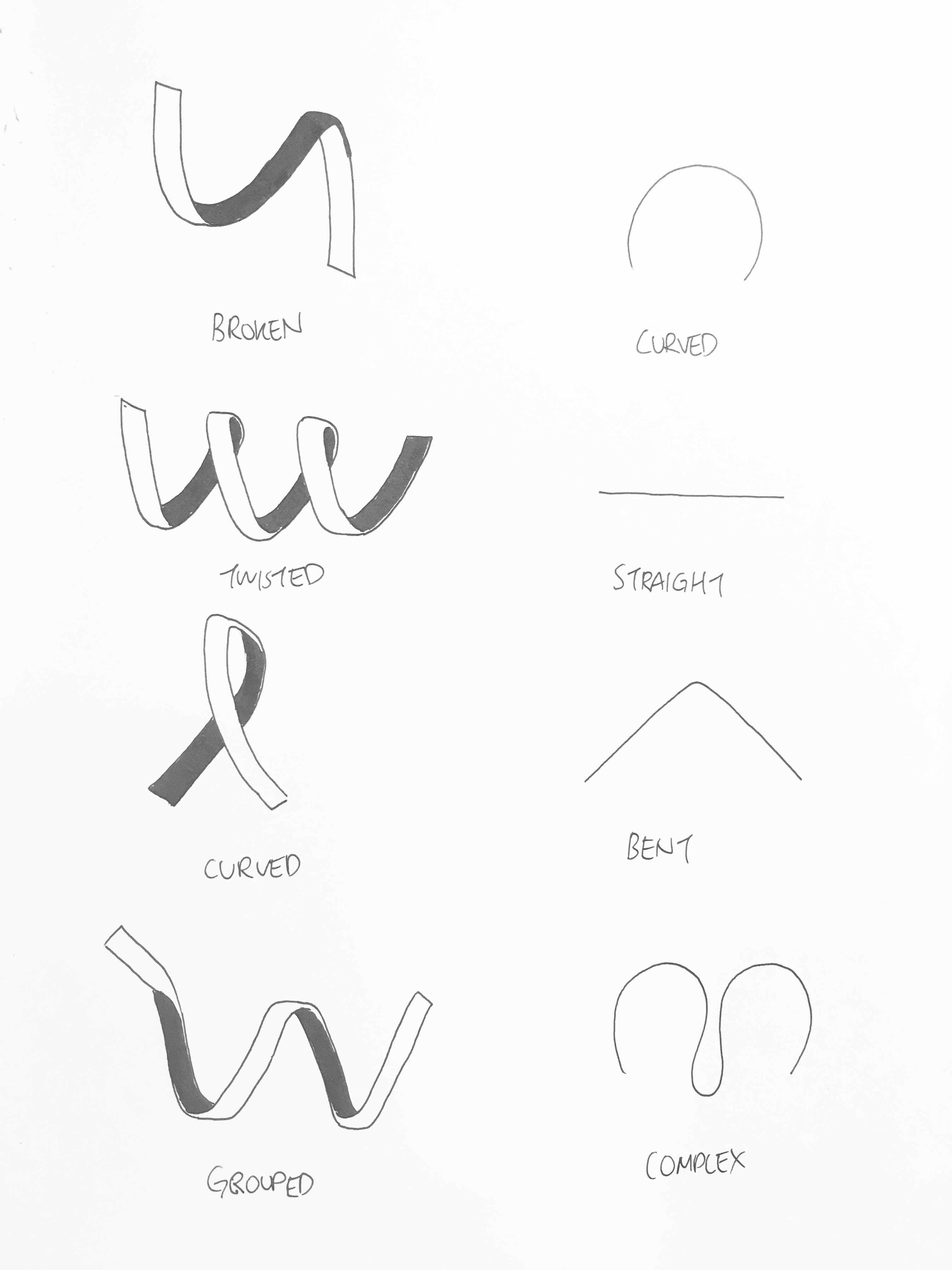
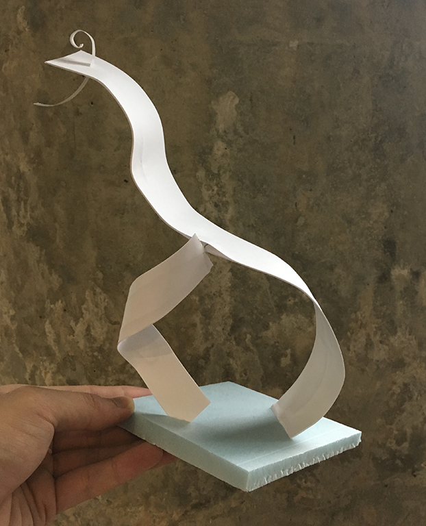
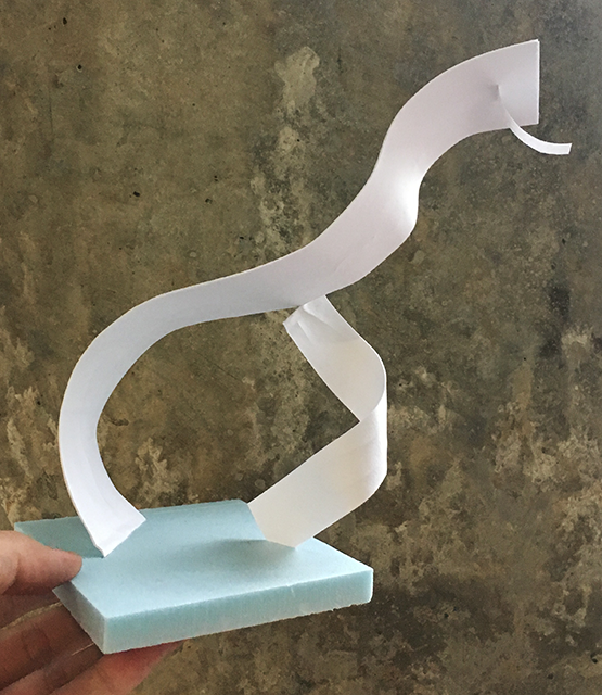
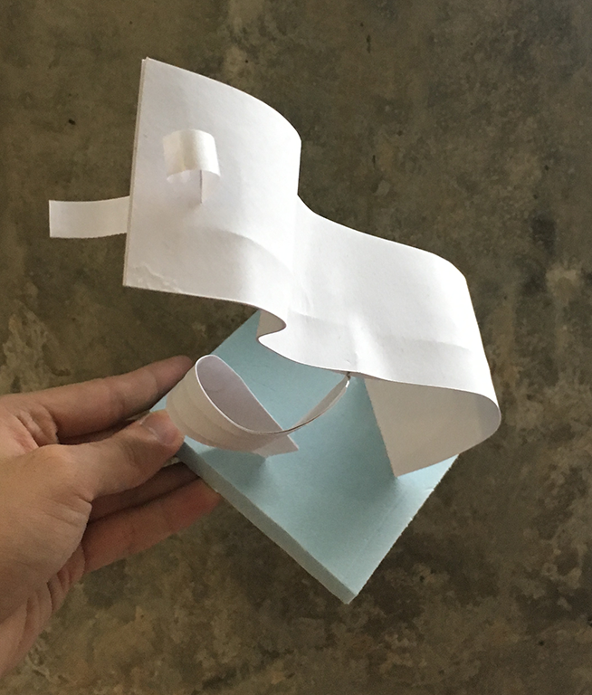
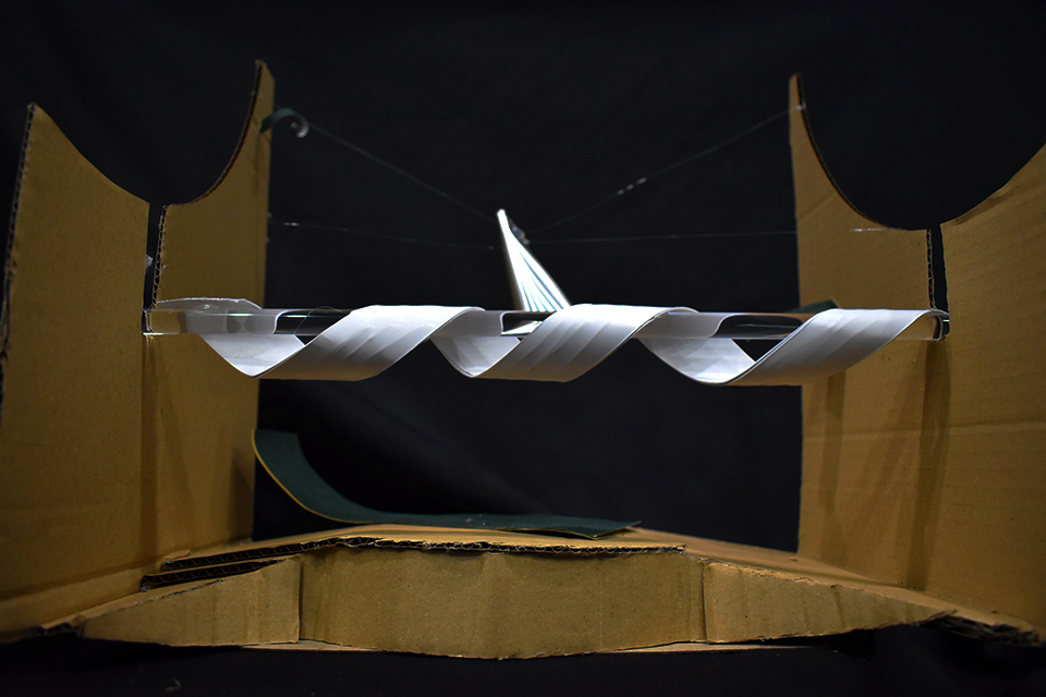
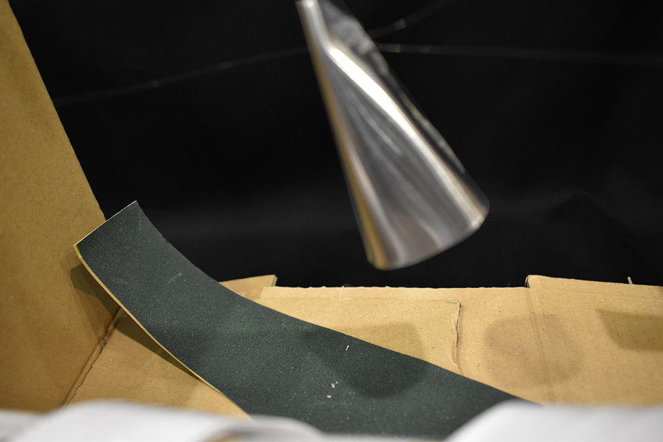
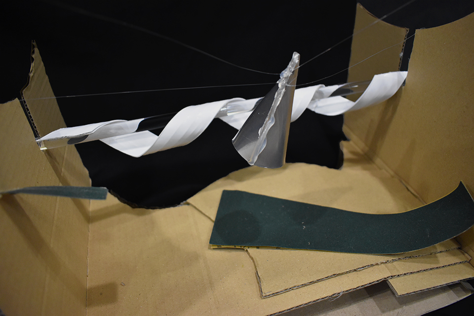
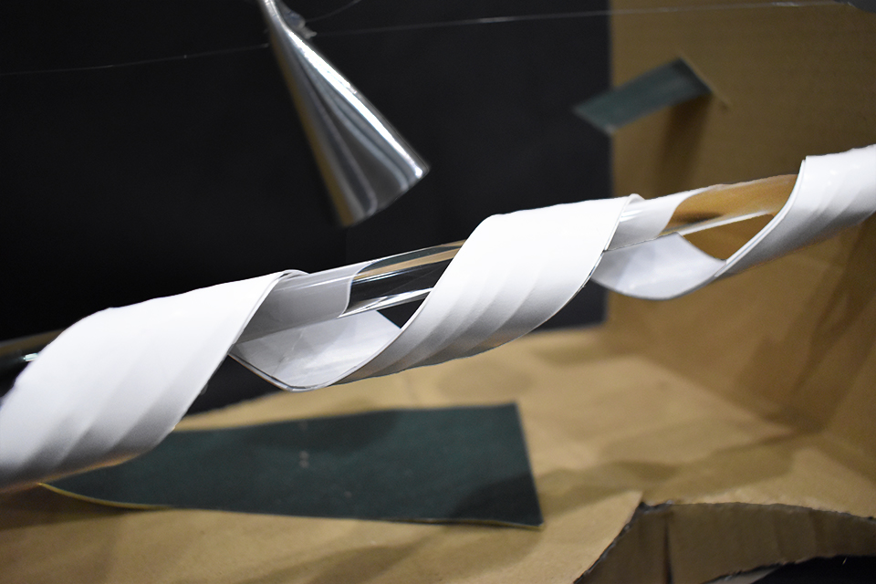
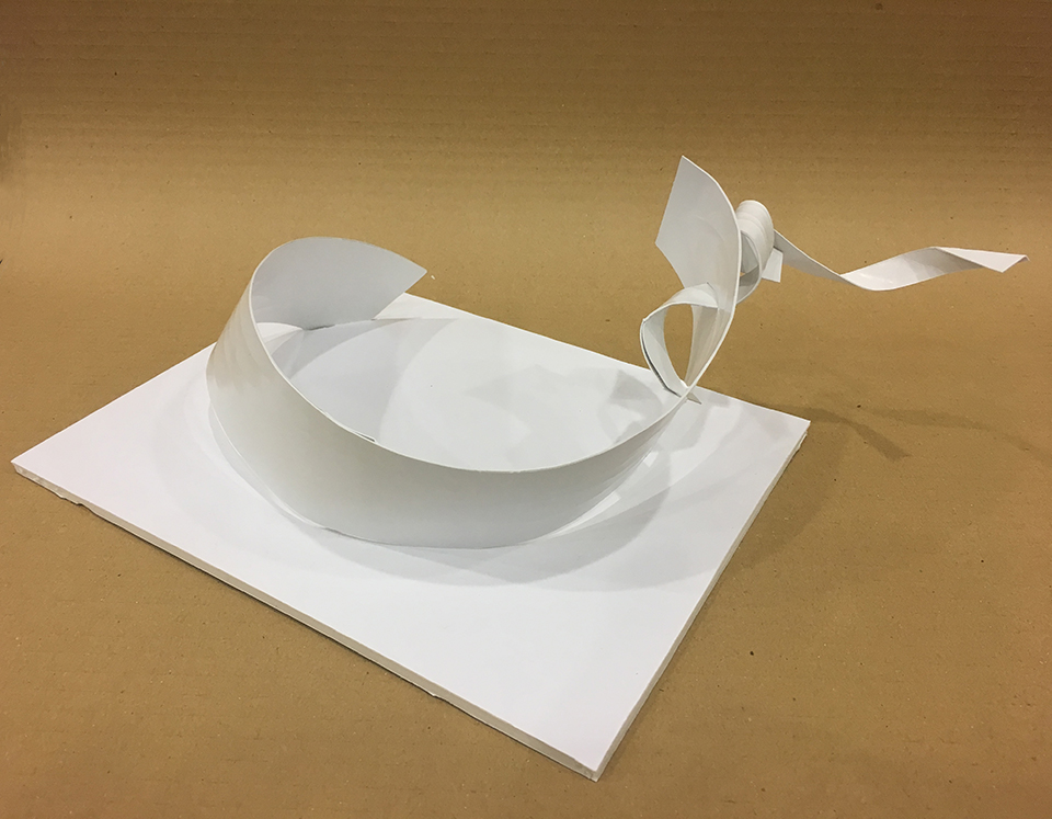
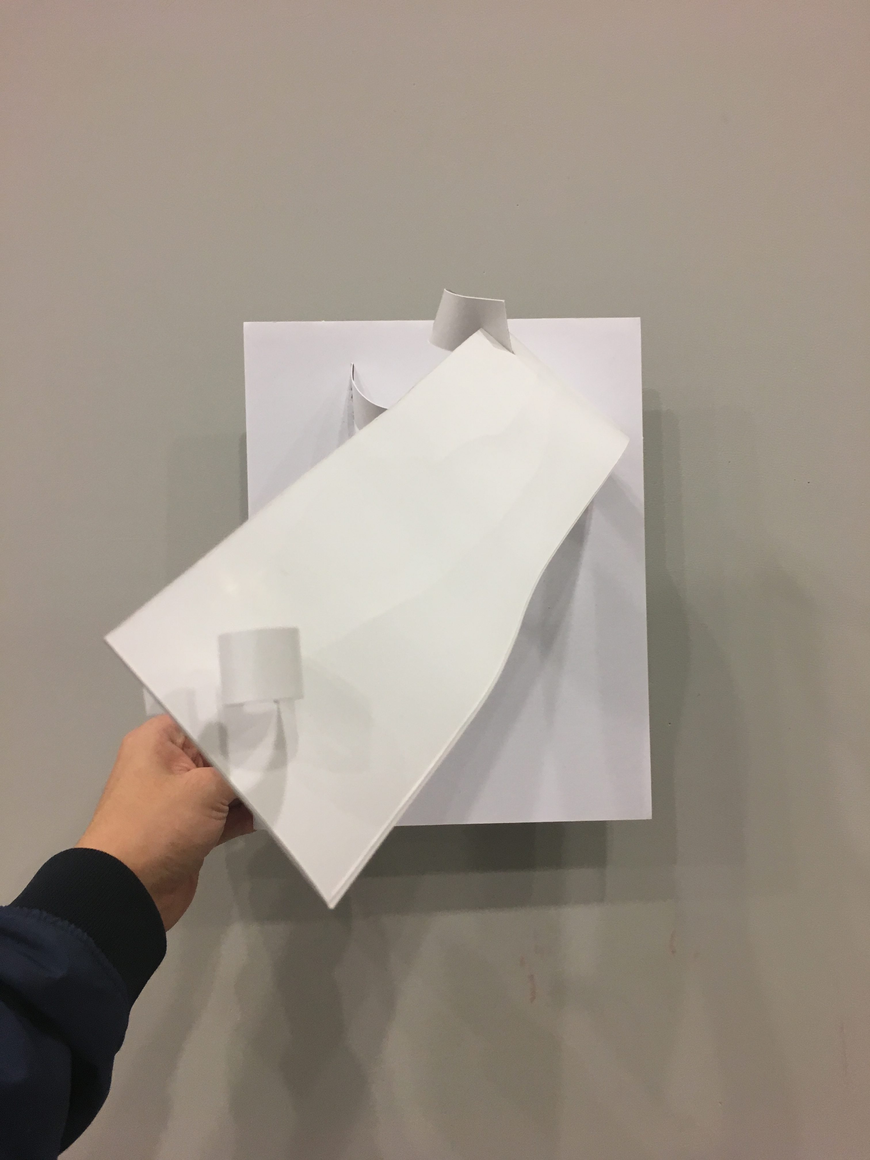
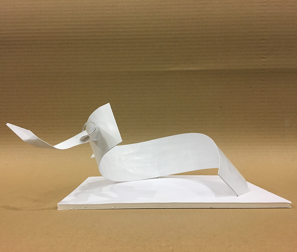
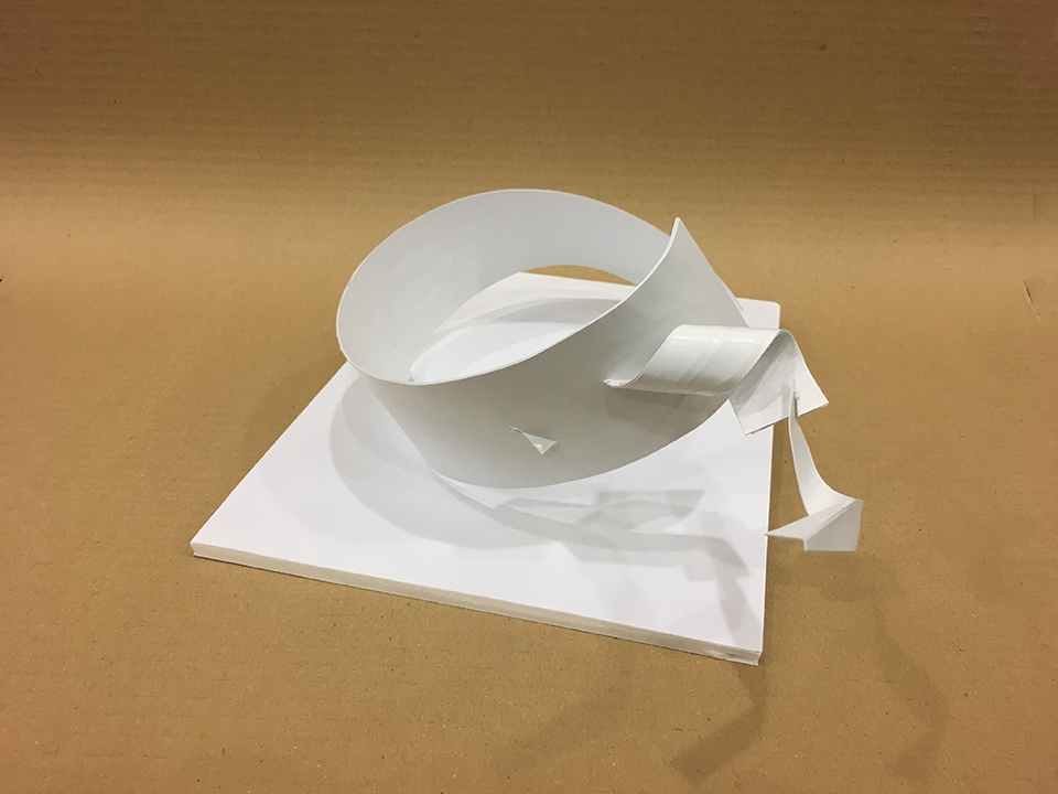
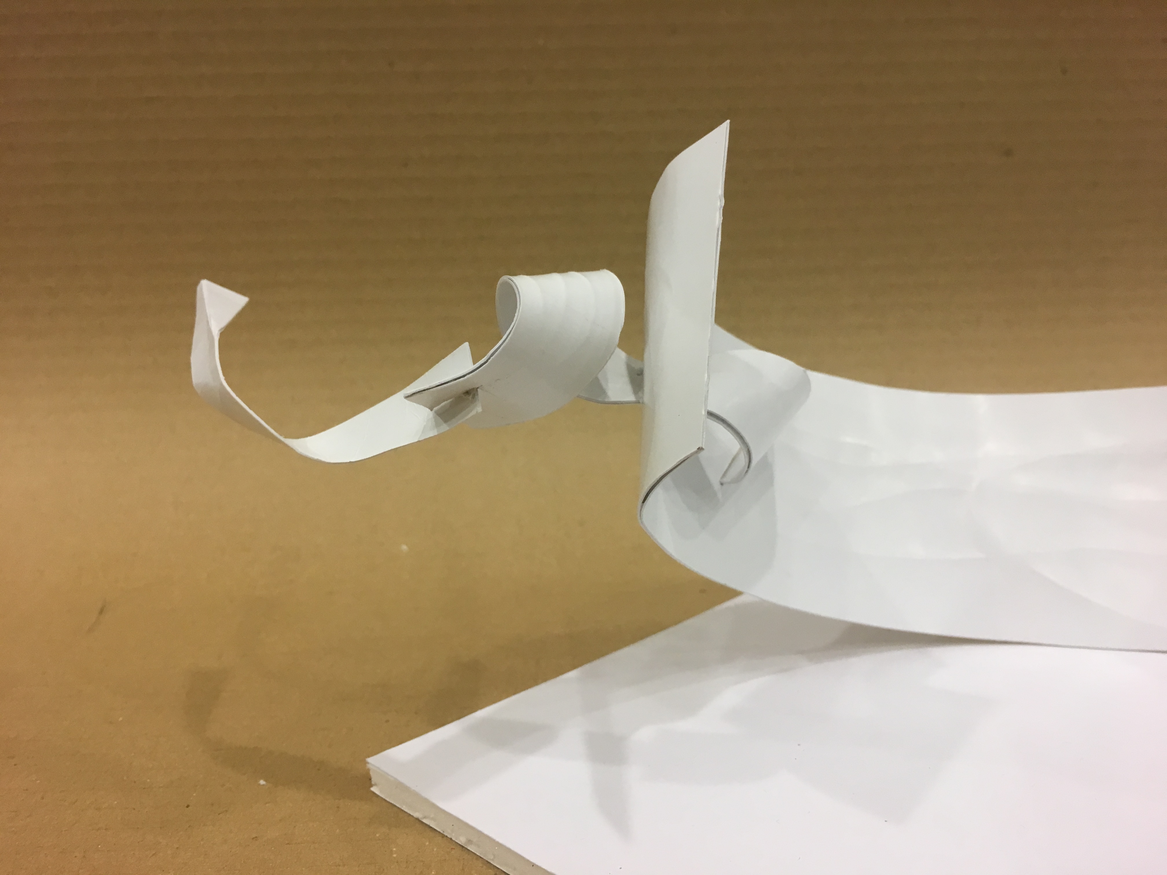
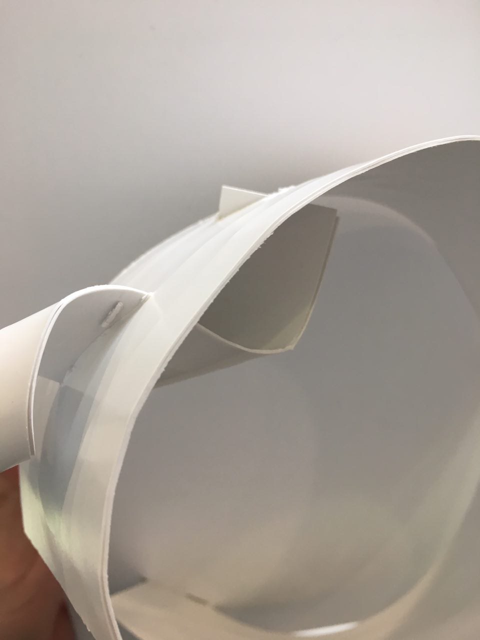
This adds on to the initial post under the link (https://oss.adm.ntu.edu.sg/bren0022/a-smelly-plane/), which I will reference to to elaborate on the edited models. In Model 1 shown below, the relationship between the planes remained the same, with the main body being the dominant, the twisting support being the subdominant and the curling plane at the peak a subordinate to the main body. The position of the twisting support was moved closer to the base of the main body instead of it being located in the middle of the platform- this enhances the elegant curves of the plane that I wanted to highlight. The closer negative space between the dominant and subdominant creates an illusion of a stronger base. Using the idea of receding planes, I also wanted to create that illusion of a varying widths, as I found that the composition becomes more dynamic as such. With reference to the photograph “Receding view”, I bent the plane at an angle along its length, creating an illusion of different width on the dominant strip. In this model, the dominant strip is significantly larger than the subdominant and subordinate as I really wanted to emphasis on the curves of the plane, paralleling to the crane robot. I used the small strips of subordinate and subdominant to pierce and wedge through the dominant strip, this technique provides an element of dynamism and it gives an illusion of life to the strips, interacting with one another in a context that is not gluing. I feel that the technique of gluing applies a robotic structure that is not as organic compared to the wedging and piercing.
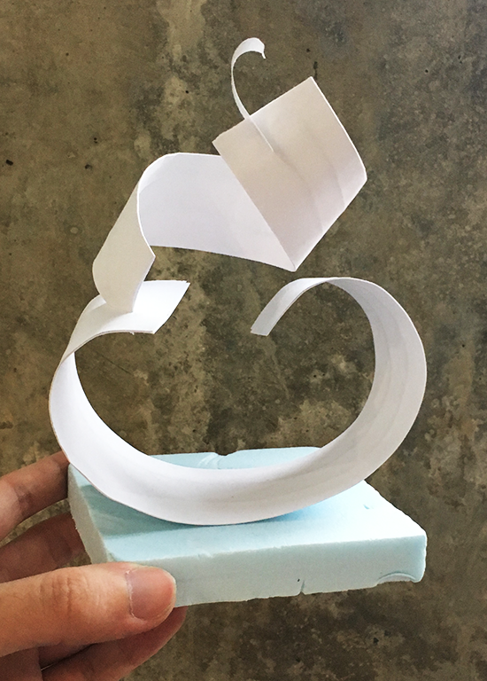
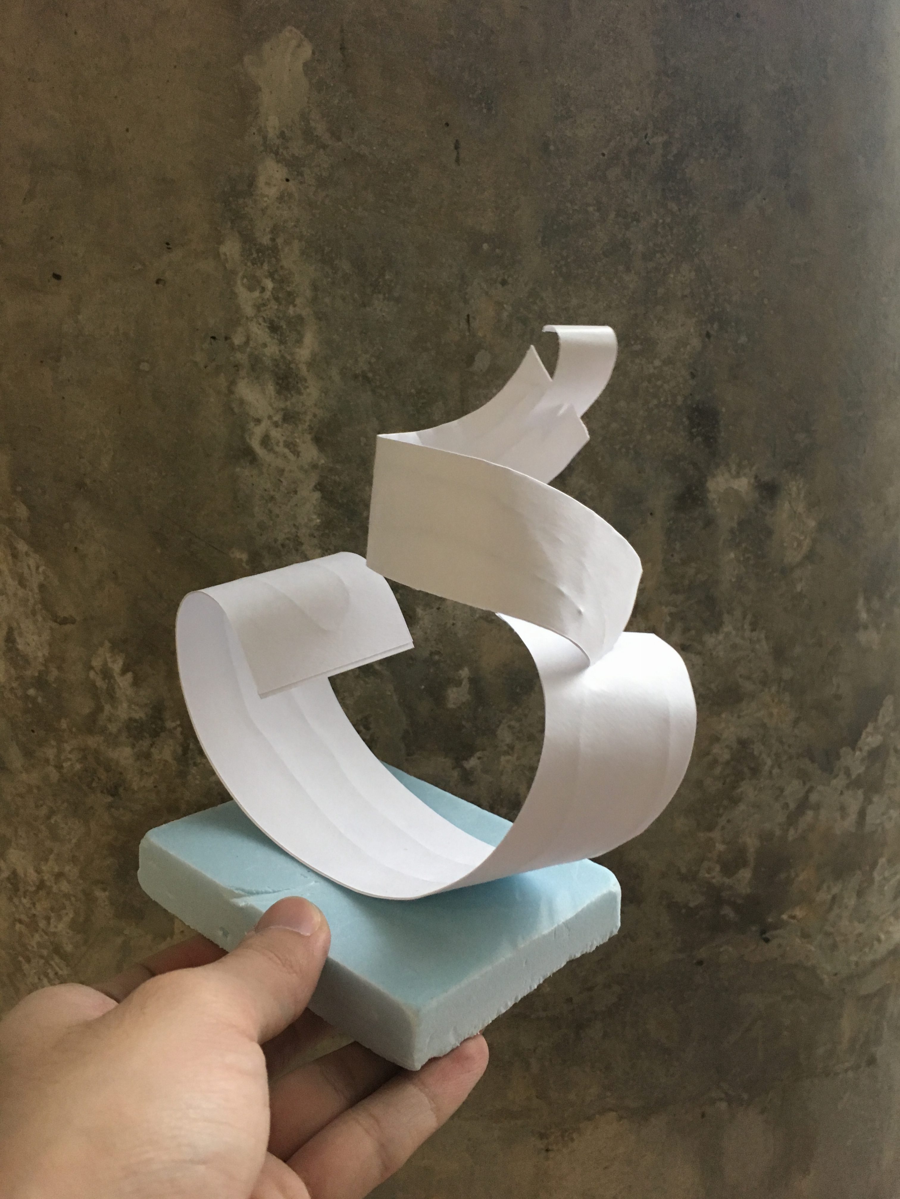
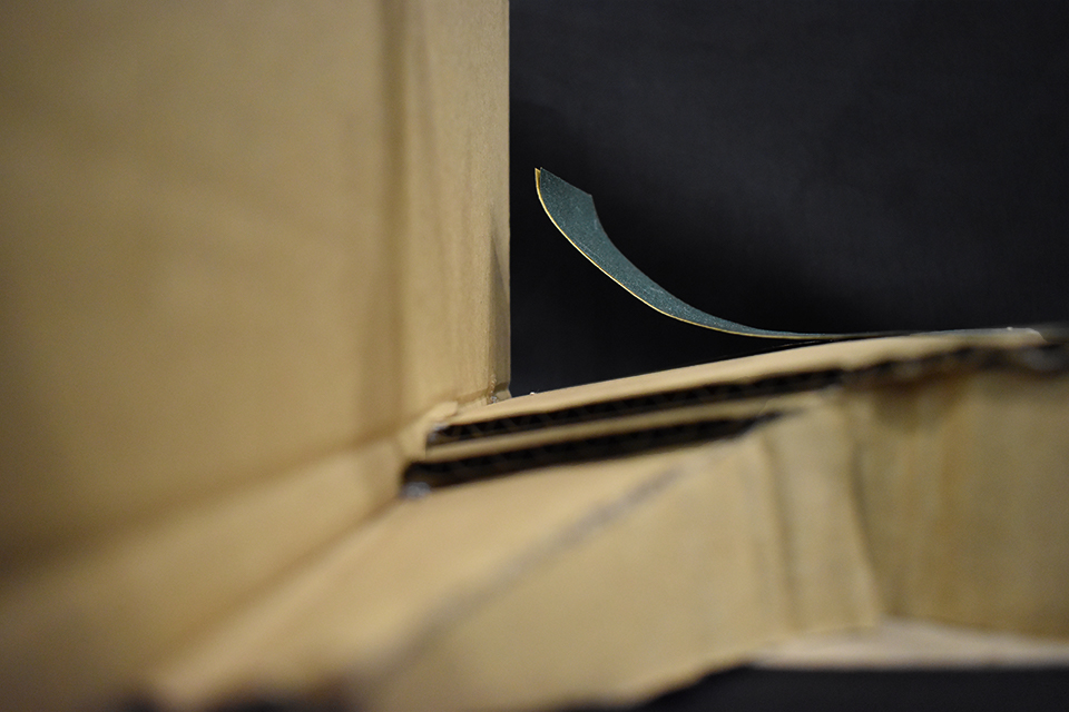
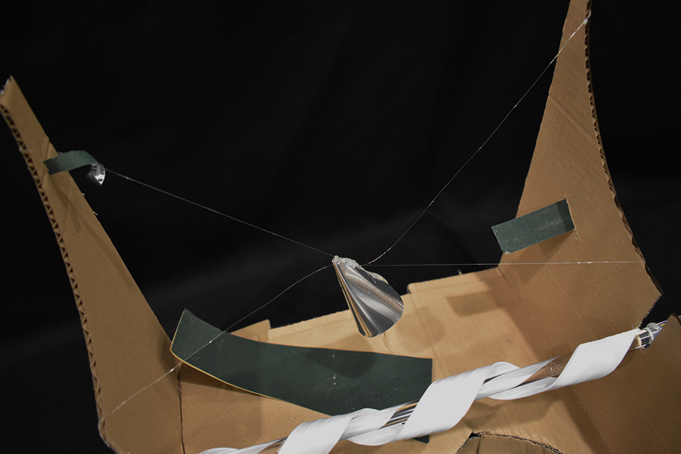
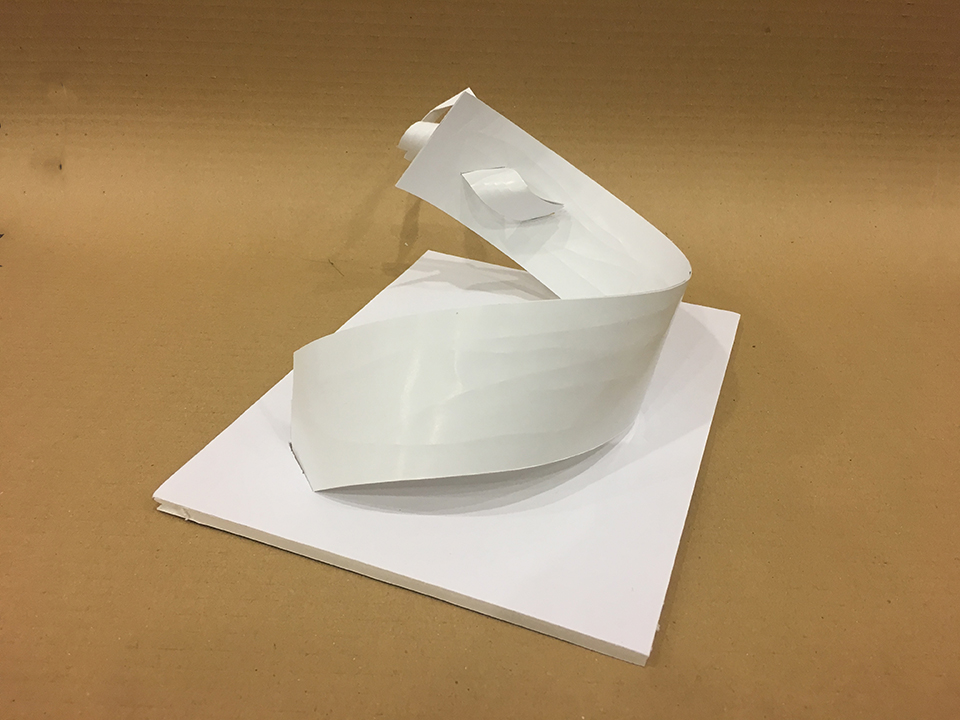
In this work, I altered the curvature of the strips, effectively altering the negative space within each plane. Since my artist reference was Anthony Poon’s Sense Surround, my initial model was similar to Poon’s execution in terms of the relatively similar negative space. However, the purpose of the exercise is to investigate how the difference in length and curvature can create different negative space, volume and receding points. Hence, I had increased the outward curvature of the dominant strip, creating a bigger negative space within, as if a body crouching down. I also exaggerated the twisting of the subdominant strip that interacts with the dominant strip, shown in the photograph labelled “Close up”. The subdominant strip then interacts with the subordinate, which is wedged into it and tapered off at the side. The complex movements of the subordinate and subdominant contrasts to the other side of the sculpture, then ends with the dominant strip receding into the ground.
Front View
Top Left ViewTop Right ViewTop Left Angled ViewInteraction between D,SD, SOClose up
As a continuation from the investigation of smell, we attempted to project the sensory qualities we drew from our chosen smells and turn it into a physical sculpture. In this project, we were tasked to explore the theme of abstract forms and planes using found plastic (without any limitation of our techniques), and produce a sculpture that portrays the two smells interacting with out another.
*However, I made a slight edit on my initial choice of a bad smell and chose yeast instead of train farts. Yeast, to me, has a flat but distinct smell that hints of mould. It is a slow paced and gentle smell that lingers, in other words start off small but loiters as a strong and pungent smell. It incites a sense of nervousness in me.
Before I embarked on my project, I decided to list out a comparison of characteristics that rain and yeast have, allowing me to tell the narrative of the rain and yeast interacting, or opposing for that matter. I found rain to be a distinct and refreshing smell, as if my brain is being massaged. Even though the energy and dynamism of rain is difficult to process in terms of smell, the idea of rain itself reminds me of infinite potential, as if the smell is falling down from the sky in a mass. I would like to incorporate an additional sensory aspect of sound to exaggerate the effects of rain as the sound itself puts me in a calm state of mind- a quality I would like to portray in the sculpture. In comparison, yeast is the polar opposite to the smell of rainwater. Yeast has a flat smell that lingers, but instead of dynamism, it just reminds me of dead mould. It has a distinct smell as well, but starts off weak and strengthens over time.
Using the characteristics I pointed out, I started to brainstorm for an idea of how my sculpture would look like, and here it is.
–
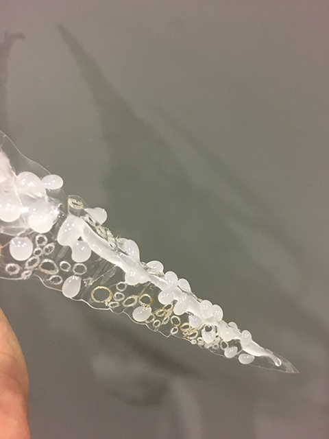
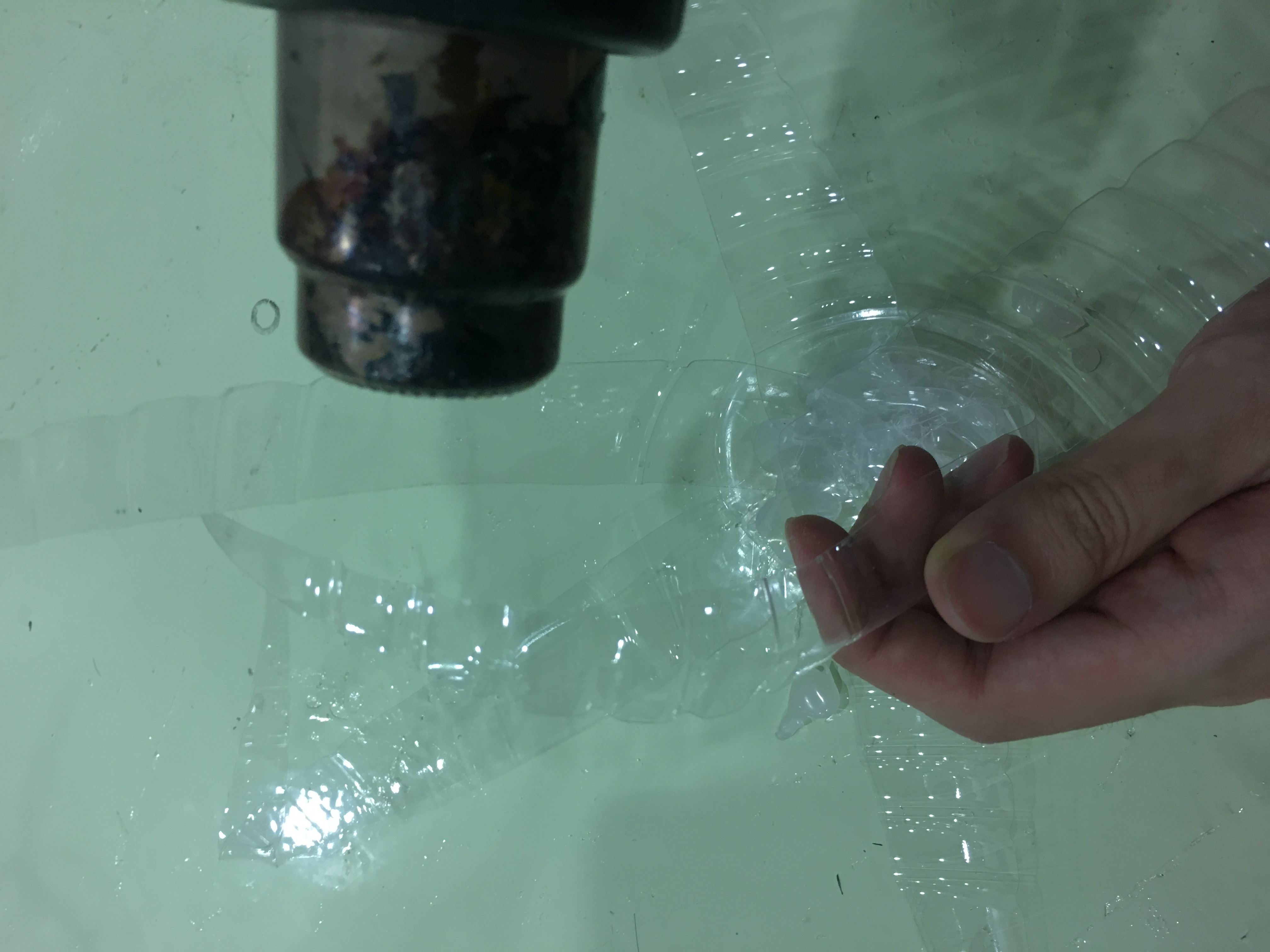
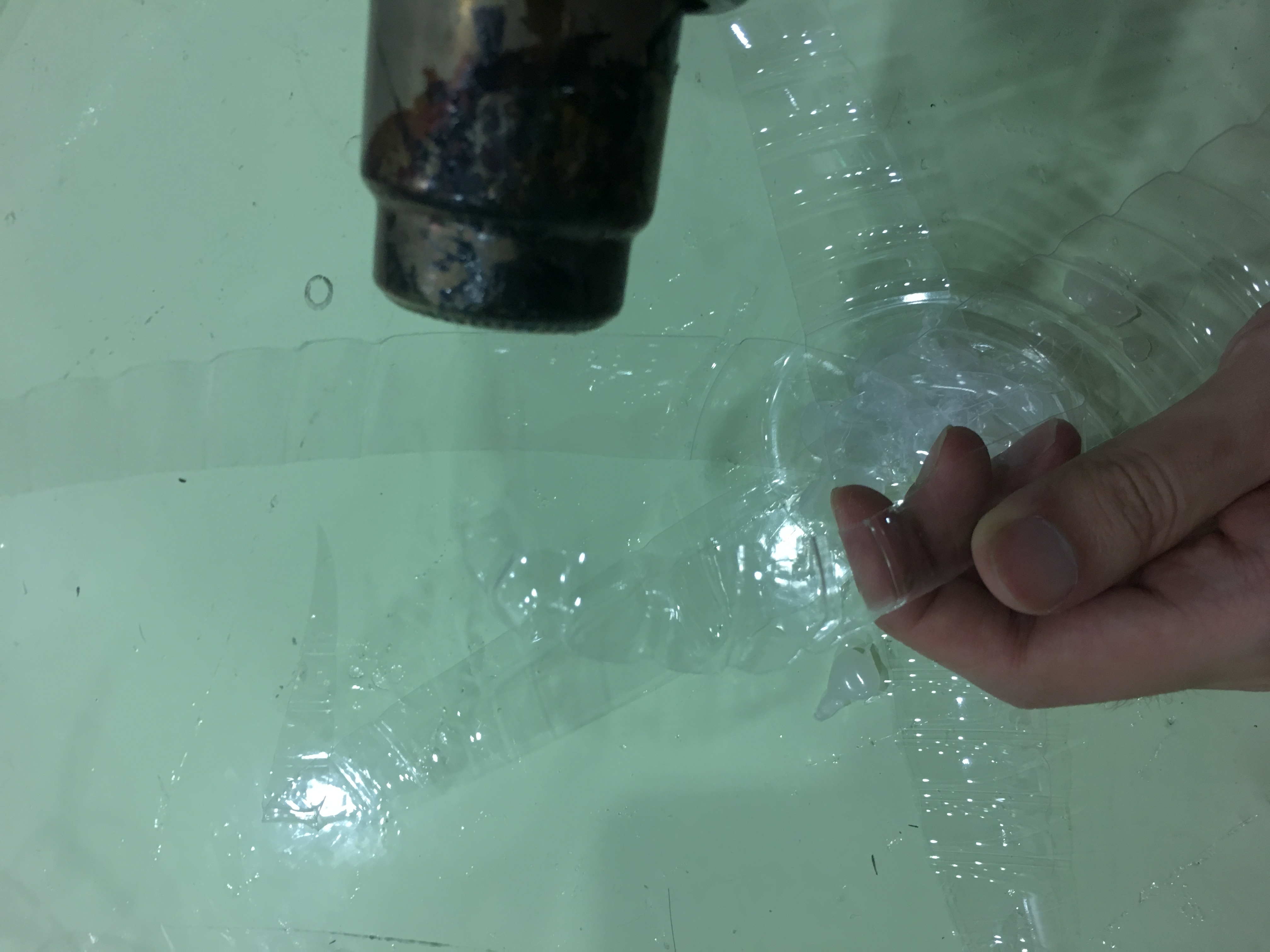
From there, I proceeded to investigate plastic as a material in terms of malleability and durability, with mediums like heat and applied force to bent it. The photograph shown below is an example of how the heat gun was used to bent the plastic strips I had cut out, bending it into a streamline abstract form. I wanted to achieve the natural form the water has when it drips, as the physical sight of it reminds of rainwater dripping down. It also reiterates the idea of how the smell of rainwater plunges down in a mass and the strip attempts to portray a downwards motion.
Heat gun contorting the plastic strip to a streamline shape
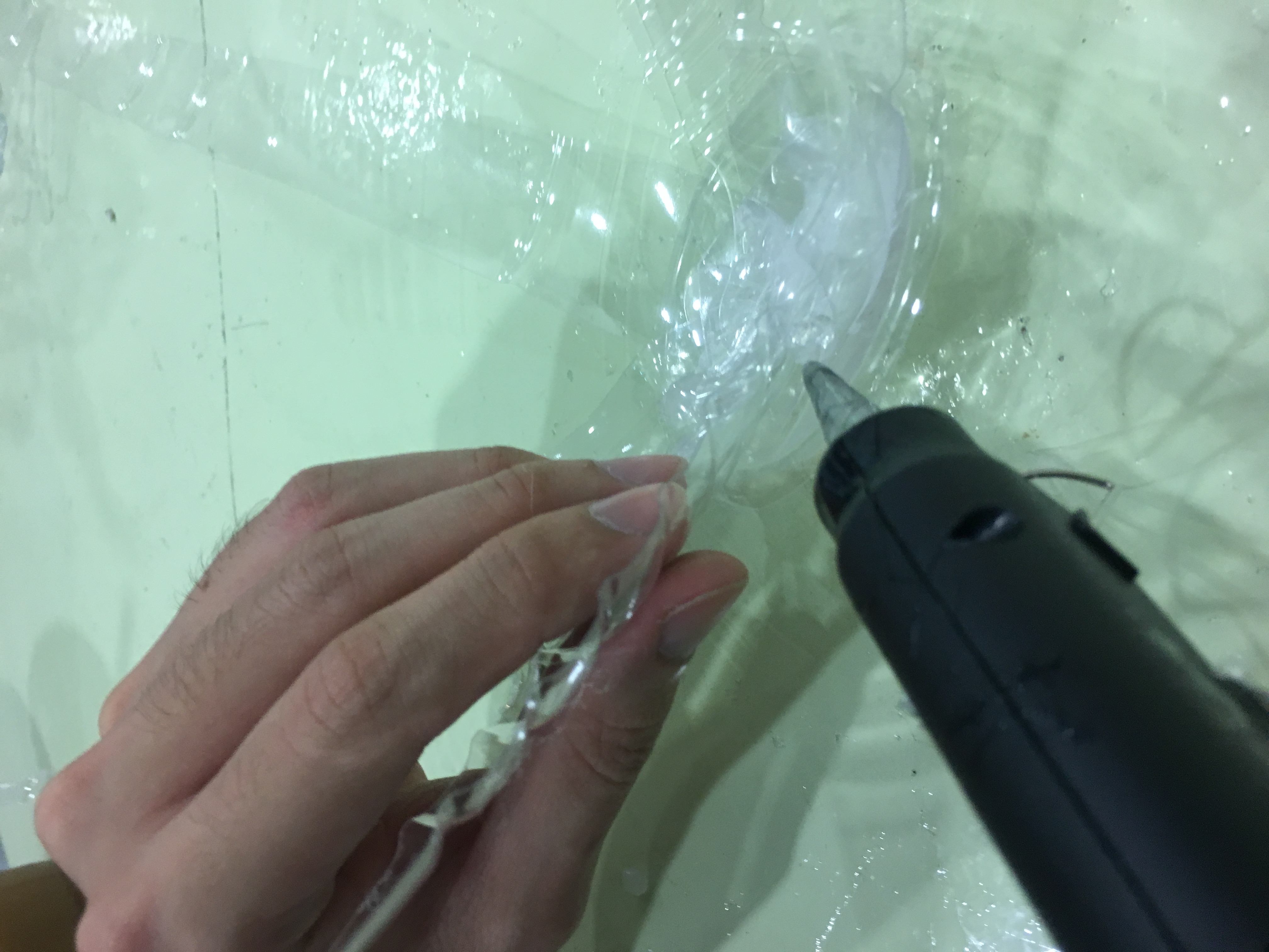
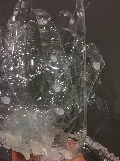
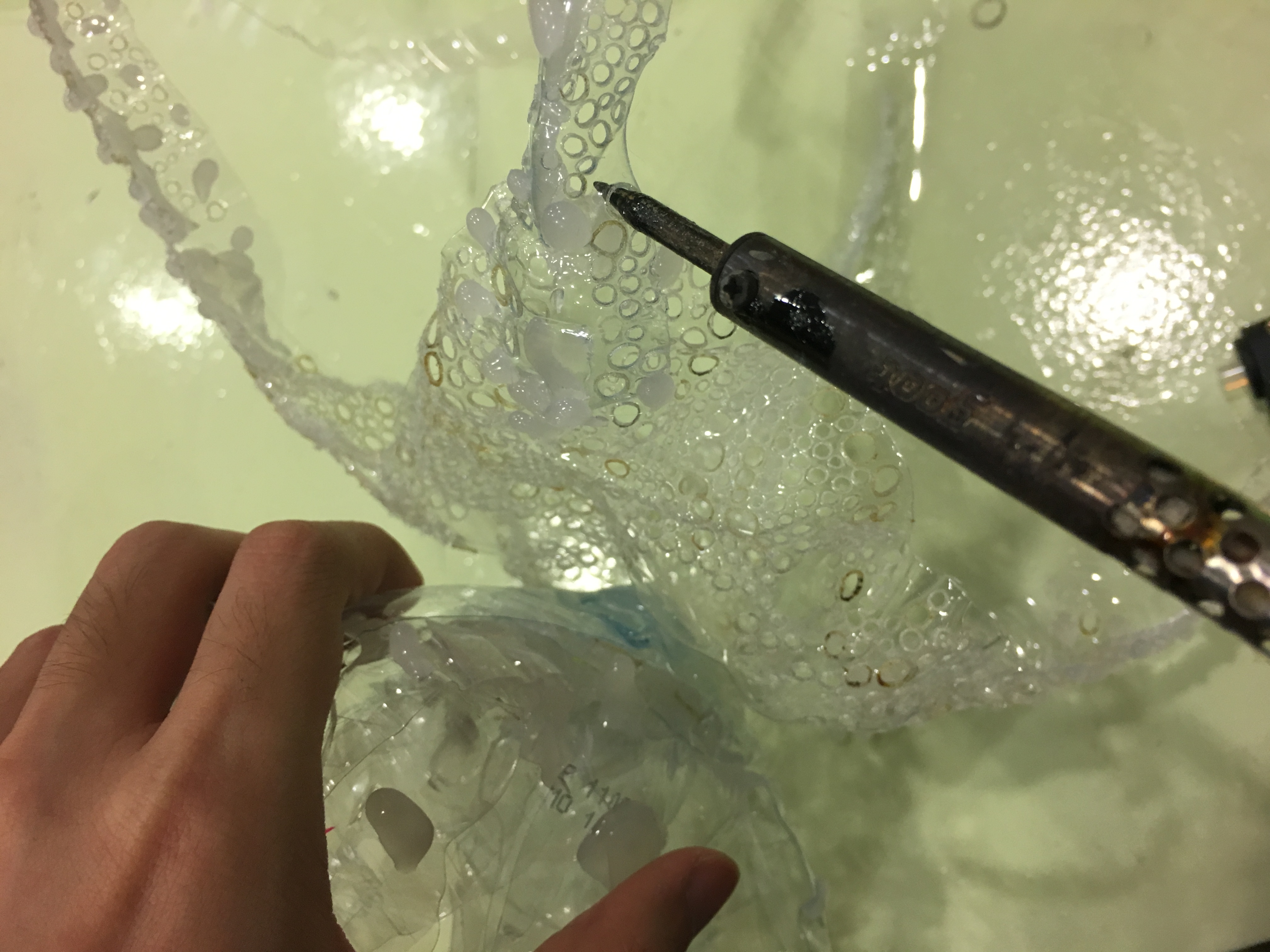
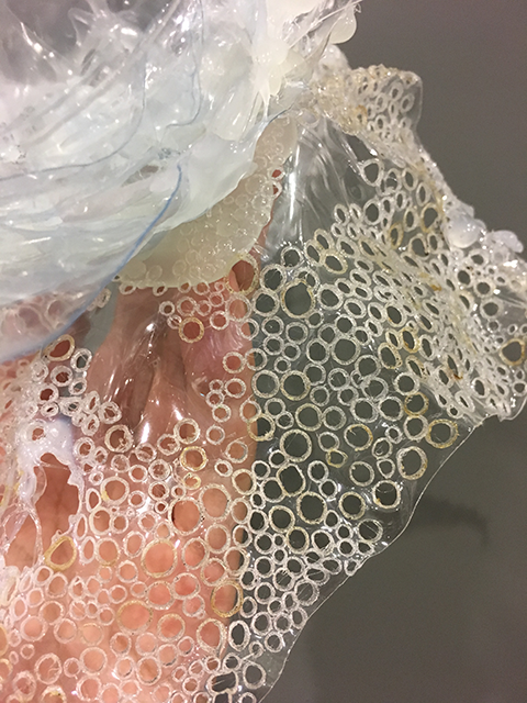
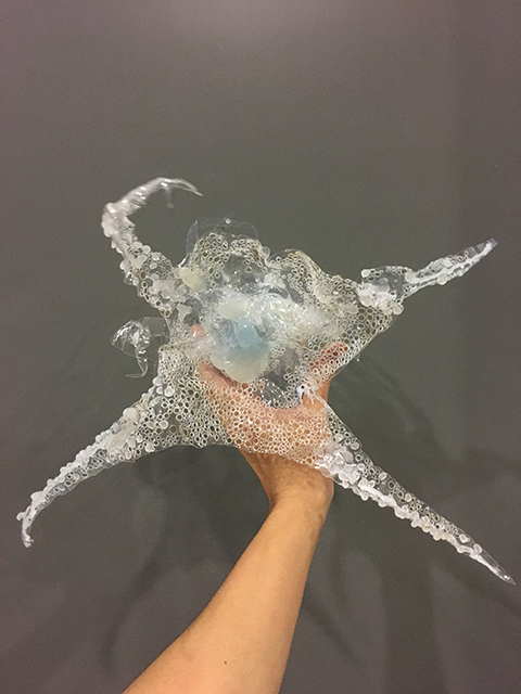
Throughout this project, the main medium of holding the sculpture together is hot glue gun. I found that hot glue resembles the visual quality of plastic and is able to camouflage as part of the artwork quite easily. Apart from gluing the work together, I also attempted to create some textural qualities using the glue, forming spheres that hints of droplets and mould.
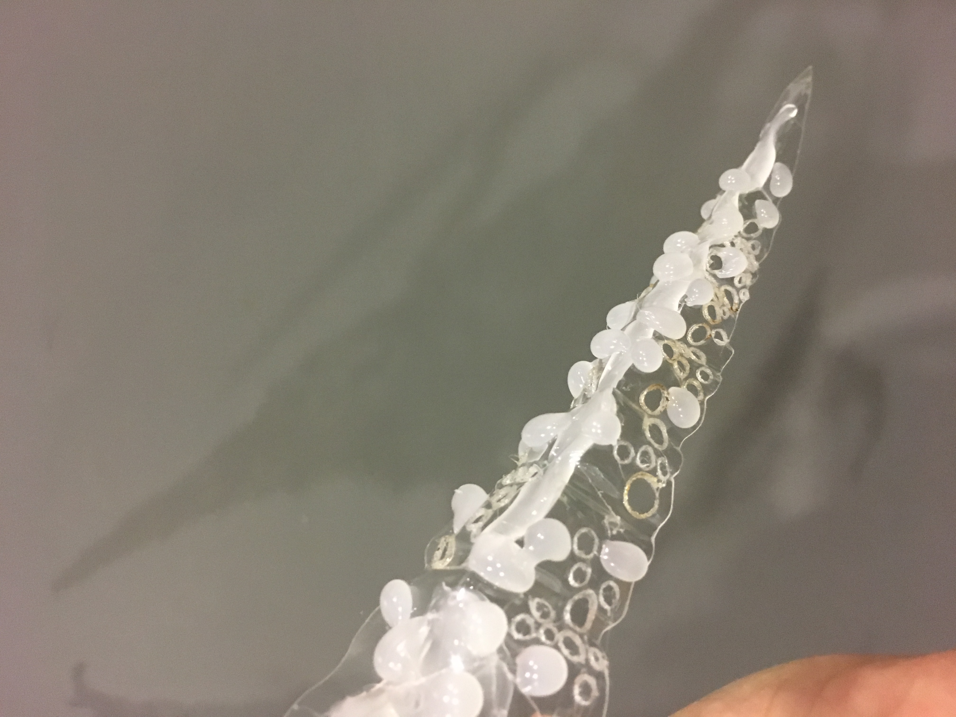
Hot glue to hold the sculpture togetherHot glue experimentation- DropletHot Glue Experimentation- MouldSoldering to create holes that exaggerate the mouldSoldered holes incite nervousness and negative texture that the finger can feel
However, a problem I noticed was that the usage of the hot glue “rainwater” and “mould” is too similar in terms of sizing and texture- This creates a visual confusion. Hence, I played with the idea of quantities, with the yeast having more hot glue “mould”, with the addition of soldered holes to incite the nervousness as mentioned before. With both of the hot glue and soldering techniques used, there is a positive and negative texture created. Positive texture being the lumps created by the hot glue, while negative texture being the holes that audience can feel by touching, shown below.
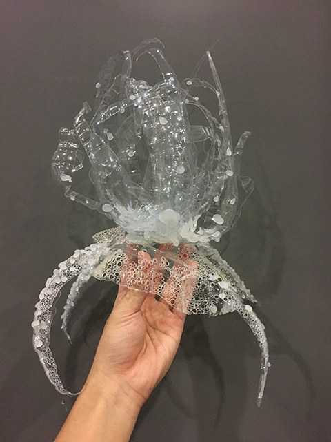
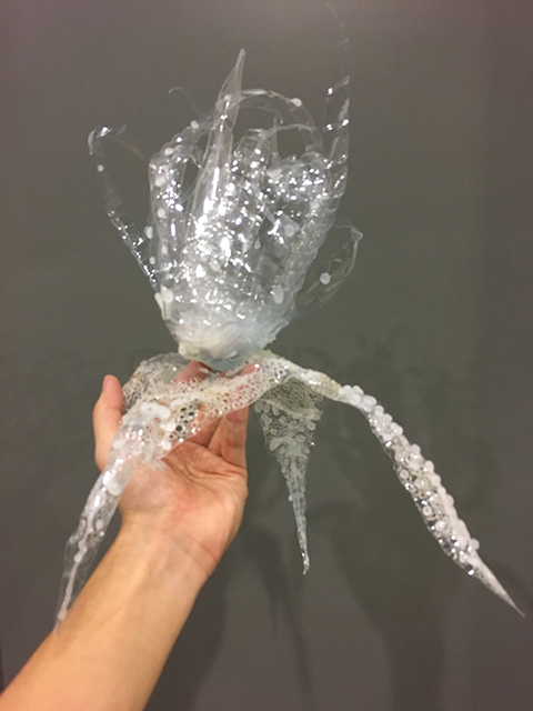
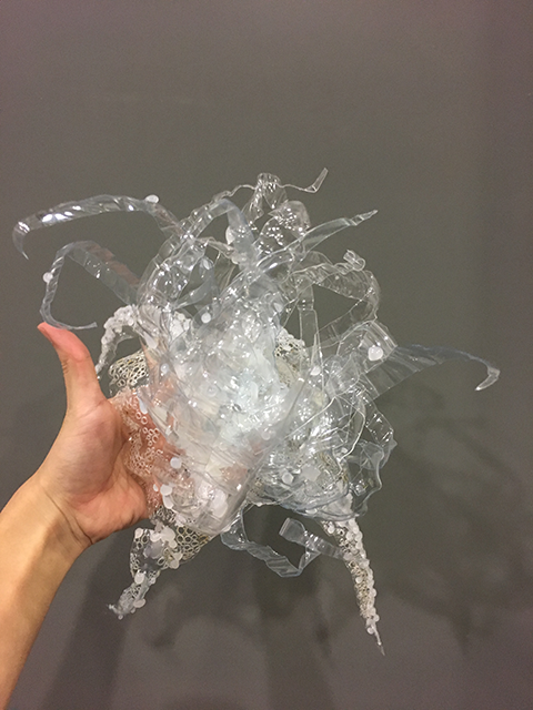
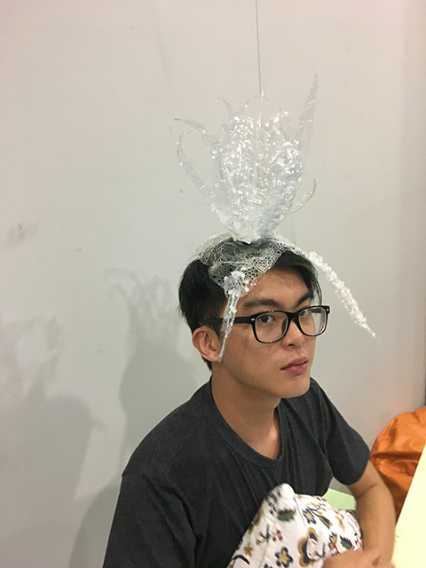
Through experimentation and attempts to control the volatile hot glue and plastic, I created the final model shown below. As mentioned above, it represents the struggle of rainwater and yeast as two opposing smells. However, shown in the GIF below, the rainwater is stronger and cleansing smell, therefore the yeast is almost weakened and pushed backwards, yet lingering on. The sculpture uses the comparably heavy weight of the “rainwater” to introduce the conversation between the two smells, pushing back and forth using gravity. Ultimately, the flat “yeast” is unable to take the weight due to its weak body of smell. The addition of tendril-like features at random suggests life to the sculpture due to the resemblance to an otherworldly life form.
The recording is of the plastic tendrils of the “rainwater” swirling around, mimicking the droplets hitting the ground during rain.
Front ViewBack ViewTop ViewBottom ViewClose up of “Rain”Close up of “Yeast”Close up of YeastA Fashion Accessory
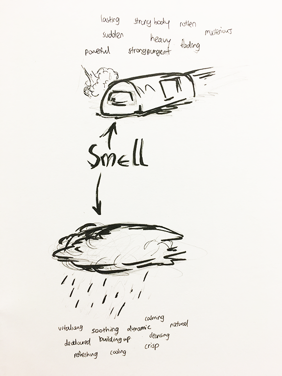
As we move on from the previous project to Project Mnemosyne, we investigated planes and smell.
These are the various form of planes we learnt, divided into 3D and 2D planes.
We were also tasked to pick two distinct scents, one that you favour while the other one you disliked. I picked the scent of incoming rain as the scent that I liked. In describing the scent that appears before rain happens, I googled for a scientific explanation. This strangely pleasant smell occurs when the plants release a chemical as they expect rain to fall, combined with the bacteria and ozone from the ground, creates the unique smell that symbolises “pre-rain”. The reason that I like this smell is because it is calming, as it is a precursor for the event of rain and the idea of rain comforts me. I would describe the smell of rain as dynamic as it is symbolic of nature building up energy as rainclouds. It is cleansing as the environment smells better after a heavy rain, so it smells soothing and “clean”.
The smell that repulses me would be the smell of “fart” early in the morning on the MRT train. It is a confusingly pungent smell of eggs, fart and fertiliser that is from an unknown source, especially around the MRT tracks along Kranji station. The smell has a strong body that enters your nostril suddenly, but stays around for quite a while. It is rotten and powerful, much like a human fart. It might be the smell of methane. It is heavy and loiters around, making you squirm your throat. It is repulsive also because it reminds me of the journey I took every morning while going to school, a combination of bad experience and horrible smell. With the continual experience everyday, the smell became an instant reminder of the horrible experience.
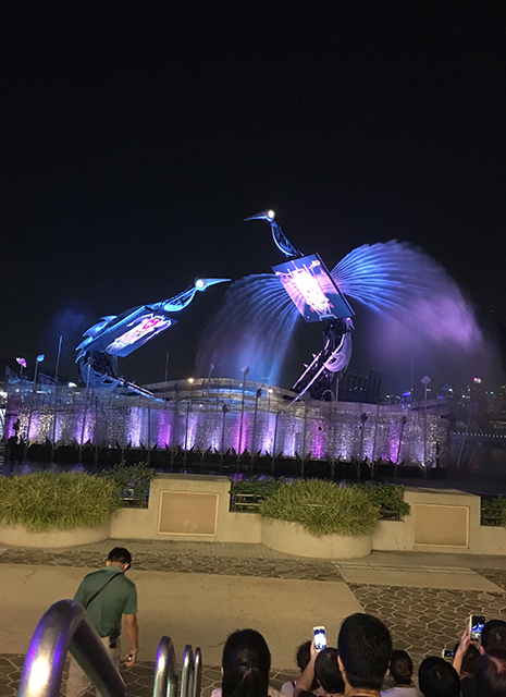
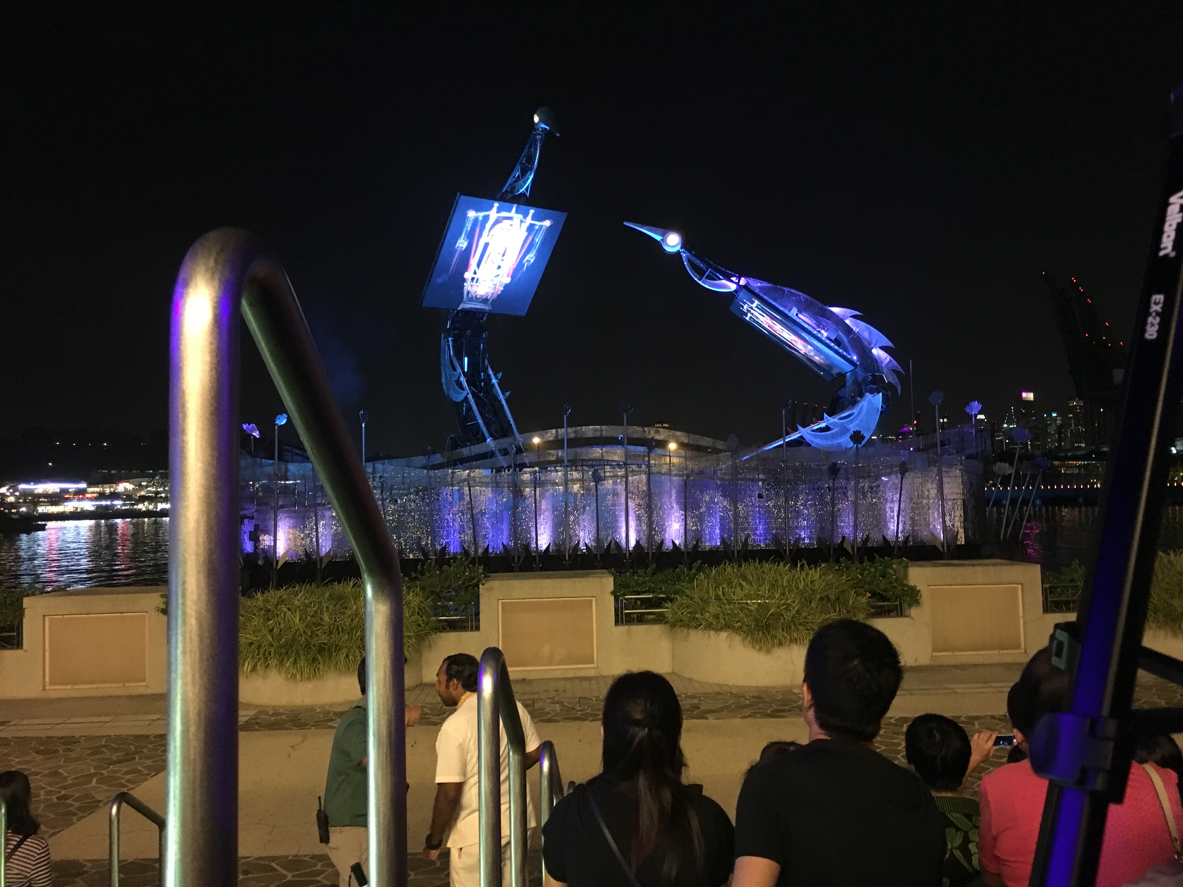
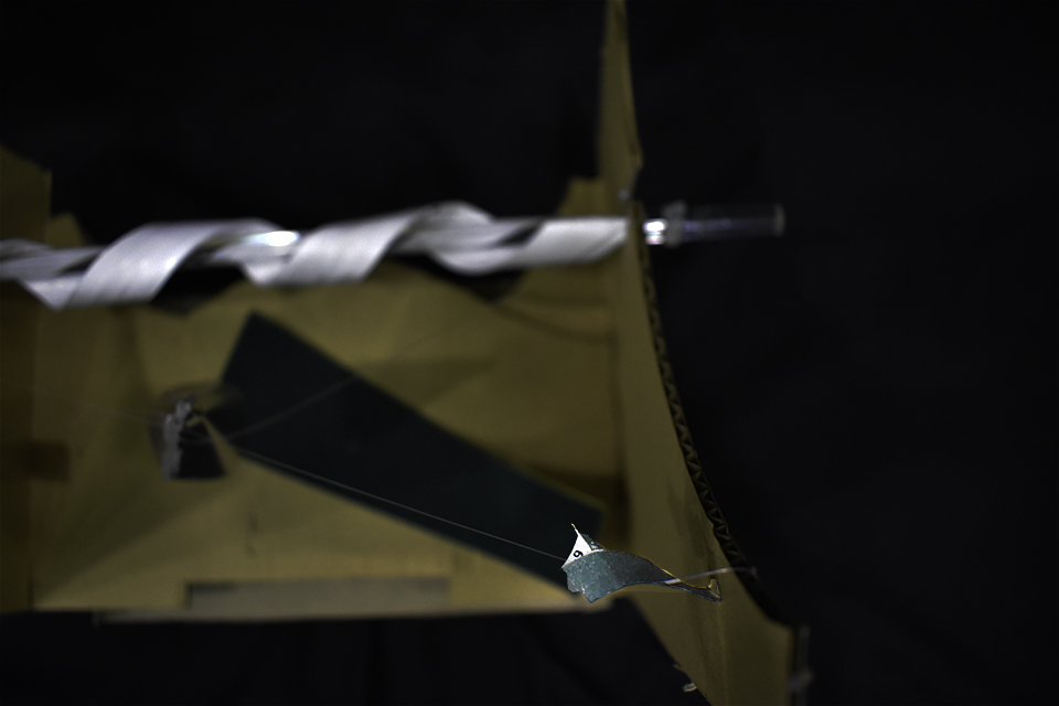
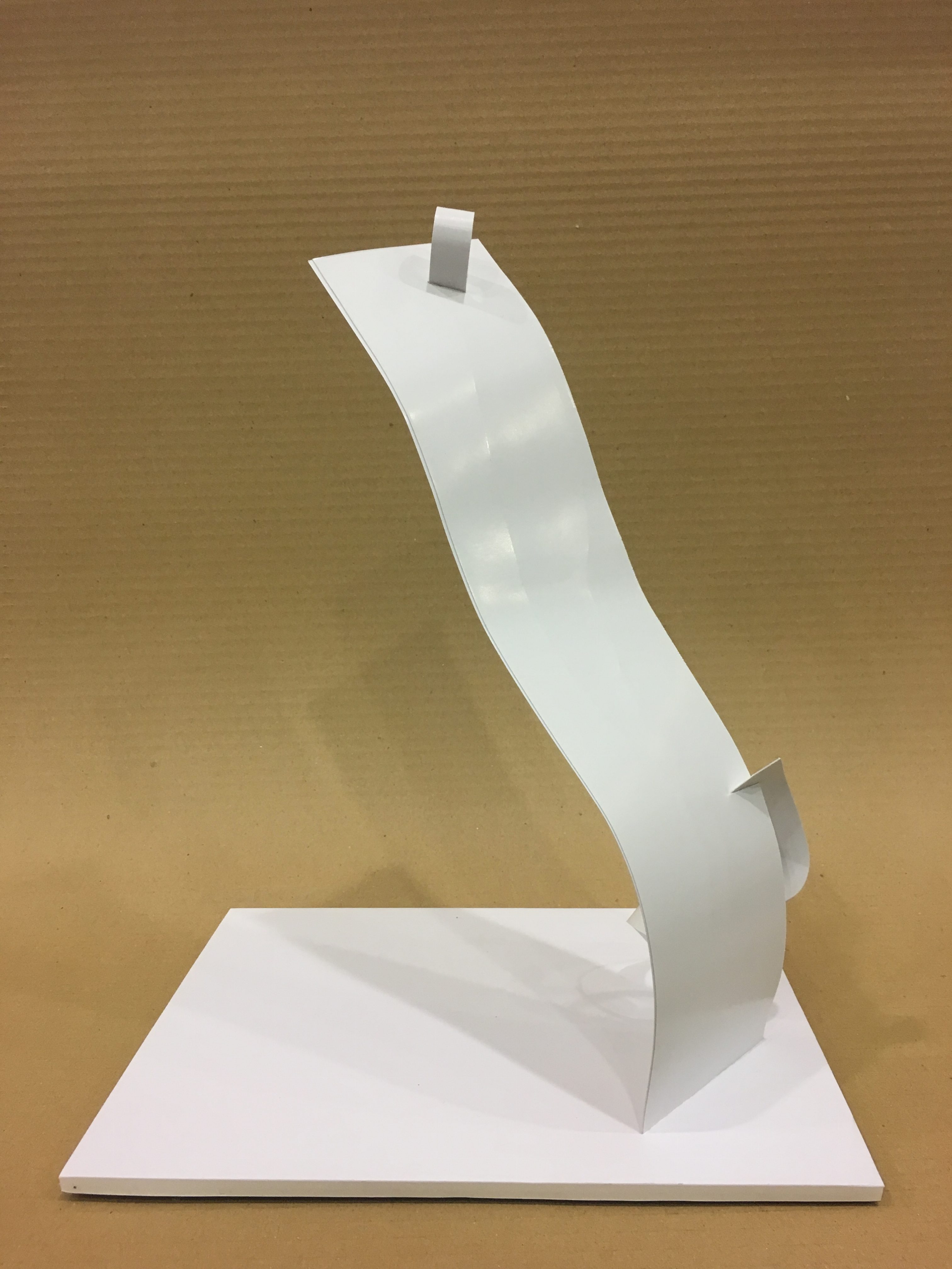
In exploring planes, I saw inspiration in many architecture and artworks. In Model 1, I referenced to the Crane Dance from Resorts World Sentosa. I wanted to capture the features and hint of the crane, but not the physical replication of a crane. I wanted to explore on the curvature that inspires the elegance and idea of flight, spiralling up into the sky. Hence, the dominant strip is the main body that has the “spiral of water” (subdominant strip) holding it up, having a precarious balance. The subordinate strip is an accessory to provide a whiplash effect, enhancing the elegance to the model. A problem I envision with this model would be the over-personification of the idea of a crane as the theme of planes should be limited to abstract designs.
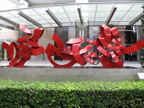
The next model was inspired by Anthony Poon’s “Sense Surround”. Poon explored on geometric abstraction, known for his flat and relief painting. Poon also explored on sculptures and his influences from 2D can be seen in his 3D works as well. In Sense Surround, he took notice of balance as a whole in art and tried to achieve a unity in his work on every single plane. It looked almost as if the planes are placed intentionally on an invisible grid line, forming the unified work shown below. The planes are meandering through one another, however, never forming an imbalance as they are of the same density throughout. This idea of the red sculpture interacting with one another becomes a universal language as there would not be any meaning that is lost in translation- It is purely pictorial. In my Model 2, I used the dominant strip as the base, referencing to Poon’s work. I used piercing in both subdominant and subordinate, enhancing the personification of the planes, interacting with one another. I tried to lay the planes with the negative void fused together, giving a visual balance throughout.
Anthony Poon Sense Surround 2006Front ViewBack ViewTop View
.jpg)


 (Left to Right) Yo Zhen Qi, Daphne Tan Shu Fang, Frederick Lee Zhi Bei, Claire Chew Tze Ning
Also,
Thaddy Lim Fang Xiang and Bryan Leow Yee Kiang
Actors Reflection:
Frederick- Brendan is a good director because he sets the mood right for acting and helped me in overcoming my challenge, which is to act with co workers because it is quite difficult to accommodate with the other’s emotions on set.
Claire- Being very certain of what he wanted to achieve out of his project, Brendan was meticulously detailed in carrying out his plans - by allowing his actors to watch sad videos before the filming to set the right mood for it, and also by patiently explaining his storyline to them repeatedly such that they were crystal clear in what they had to execute. Brendan too was very understanding and polite towards his actors even when they had made mistakes along the process of the filming, and had no qualms about reshooting the scenes over and over again till it was near perfection. Overall, Brendan makes a marvellous director in terms of his punctiliousness towards his project and also his considerate behaviour towards his actors to ensure a smooth and fun filming procedure.
(Left to Right) Yo Zhen Qi, Daphne Tan Shu Fang, Frederick Lee Zhi Bei, Claire Chew Tze Ning
Also,
Thaddy Lim Fang Xiang and Bryan Leow Yee Kiang
Actors Reflection:
Frederick- Brendan is a good director because he sets the mood right for acting and helped me in overcoming my challenge, which is to act with co workers because it is quite difficult to accommodate with the other’s emotions on set.
Claire- Being very certain of what he wanted to achieve out of his project, Brendan was meticulously detailed in carrying out his plans - by allowing his actors to watch sad videos before the filming to set the right mood for it, and also by patiently explaining his storyline to them repeatedly such that they were crystal clear in what they had to execute. Brendan too was very understanding and polite towards his actors even when they had made mistakes along the process of the filming, and had no qualms about reshooting the scenes over and over again till it was near perfection. Overall, Brendan makes a marvellous director in terms of his punctiliousness towards his project and also his considerate behaviour towards his actors to ensure a smooth and fun filming procedure.


 Blue is an intellectual colour that recedes into the background. This is because the colour is inherently cooling, hinting of strong clear thought and light calmness of mind. However, it can also remind people of coldness and loneliness, such as Pablo Picasso’s blue series.
 Yellow is an emotional colour that stems from both spectrum. It is both optimistic and depressive. This is because the yellow light has the longest wavelength and is visually stimulating. The over-saturation of yellow would incite anxiety, commonly seen in traffic police coats.


 _______________________________________________________


 With a list of my favourite 1980’s movies, I had to come up with a few to quote from and that could only be done through re-watching everyone of them. After a few movie marathons, I realised that the movies that I quoted from were predominantly from coming-to-age related movies, which was a genre of film that focused on the protagonists’ growth into adulthood- to say the least, was relatable to me.


 Throughout this project, the main medium of holding the sculpture together is hot glue gun. I found that hot glue resembles the visual quality of plastic and is able to camouflage as part of the artwork quite easily. Apart from gluing the work together, I also attempted to create some textural qualities using the glue, forming spheres that hints of droplets and mould.